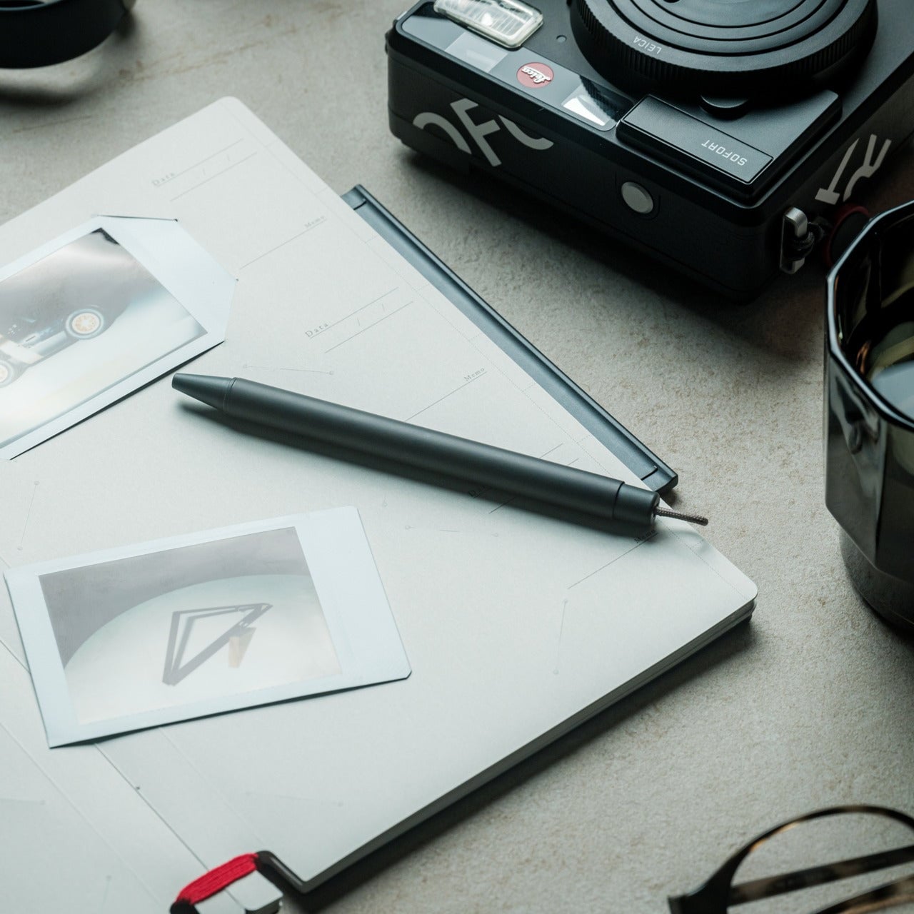
The EDC community is particular about what earns a place in their pockets. Titanium hardware, precision multitools, and machined accessories all go through plenty of scrutiny before they make the cut. Yet for all that attention to detail, accurate measurement is still largely a workshop activity. A full-size caliper stays on the bench. A rough estimate fills the gap. Something between the two has been missing.
TiCal Pro 2.0 is designed to fill that gap and makes a bold case for being the first pocket caliper you’d actually trust for real measurement work. It’s not trying to replace the full-size tool on your workbench, but to bring genuine vernier precision down to something that clips to your keychain, hangs from a cord, or disappears into your pocket.
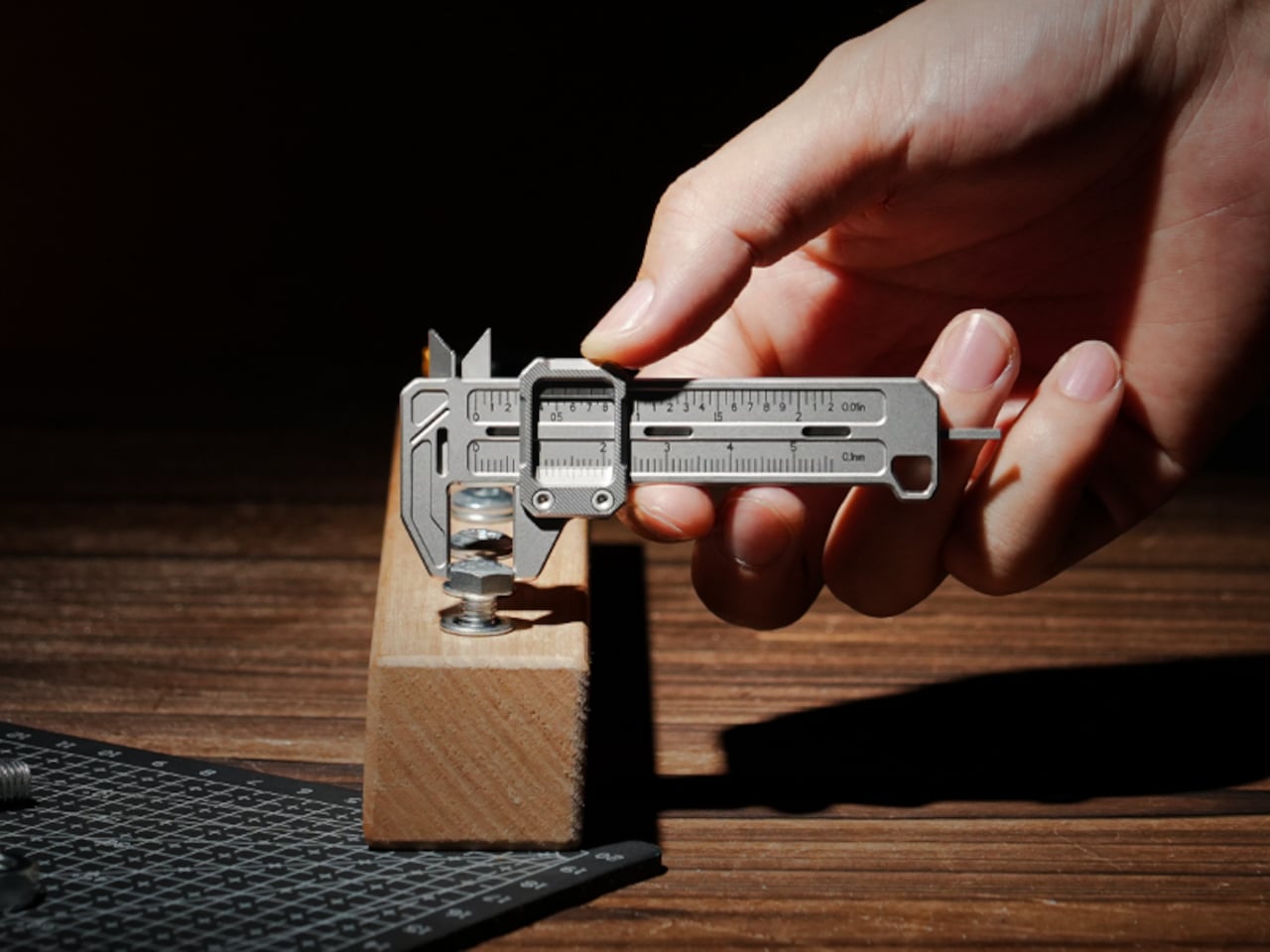
What sets it apart from the usual pocket-tool crowd is a deliberate narrowness of purpose. There’s no bottle opener, no ruler on the back, and no attempt to make it busier than it needs to be. TiCal Pro 2.0 does one thing: it measures. Outer diameters, inner diameters, and depth, with jaws and a depth rod machined as integral parts of a single titanium frame.
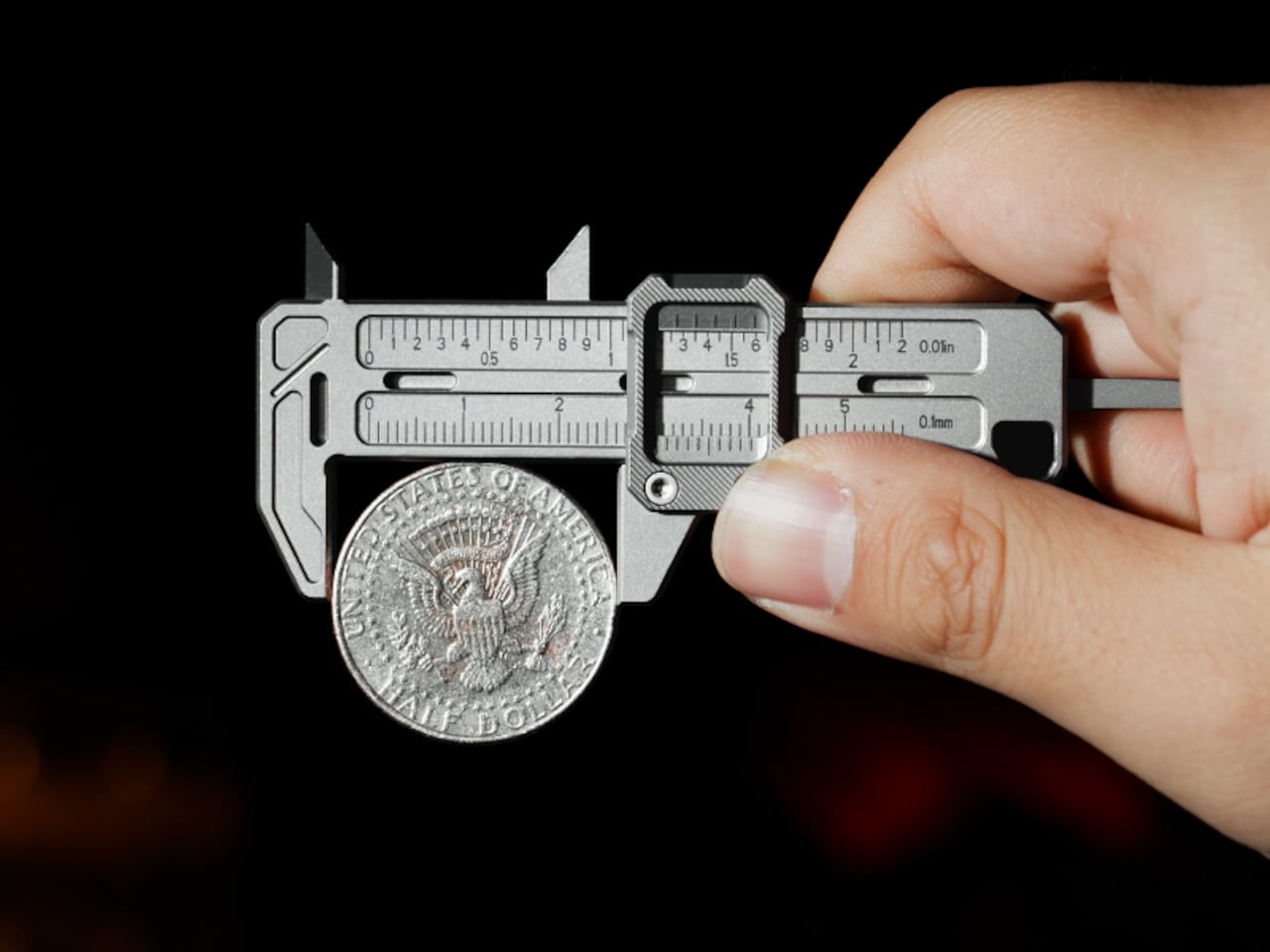
One of the more practical details is the dual-scale vernier system. Makers who move between metric drawings and imperial hardware know the frustration of converting on the fly. TiCal Pro 2.0 carries both inch and millimeter scales simultaneously, synchronized so that a single glance gives you both readings at once. There’s no mental math involved and far less room for the errors that unit conversion can invite.
With a resolution down to 0.01-inch for imperial measurements and 0.1mm for metric ones, it’s built for the kind of small-dimension work that usually gets left to guesswork outside the workshop. The scales themselves are laser-engraved deeply enough to resist daily wear, which matters a lot for something that lives in your pocket. Shallow printed markings fade quickly; these stay sharp and legible through regular carry.
Precision tools have a tactile dimension that often gets overlooked. TiCal Pro 2.0 addresses this with a self-lubricating POM ball rail system that delivers a silk-smooth slide with no oil and no grinding. The damping is also adjustable with a standard T5H driver, letting you set the slide resistance to your preference so the jaw stays exactly where you put it, no locking screw needed.
The choice of Grade 5 titanium for the body is practical rather than decorative. It offers the strength of steel at half the weight and is corrosion-proof, shrugging off sweat, rain, and shop fluids without complaint. For a tool meant to stay on your person at all times, that kind of durability makes a genuine difference in how willing you’ll actually be to carry it.
Think about the moments when a precise measurement would’ve been useful. A screw that looks like the right size but isn’t. A 3D-printed part that fits almost perfectly but not quite. A watch lug you’re trying to match without guessing. A keyboard stabilizer that needs a bit of finessing. These are the moments where a quick estimate wins by default simply because the right tool isn’t close enough.
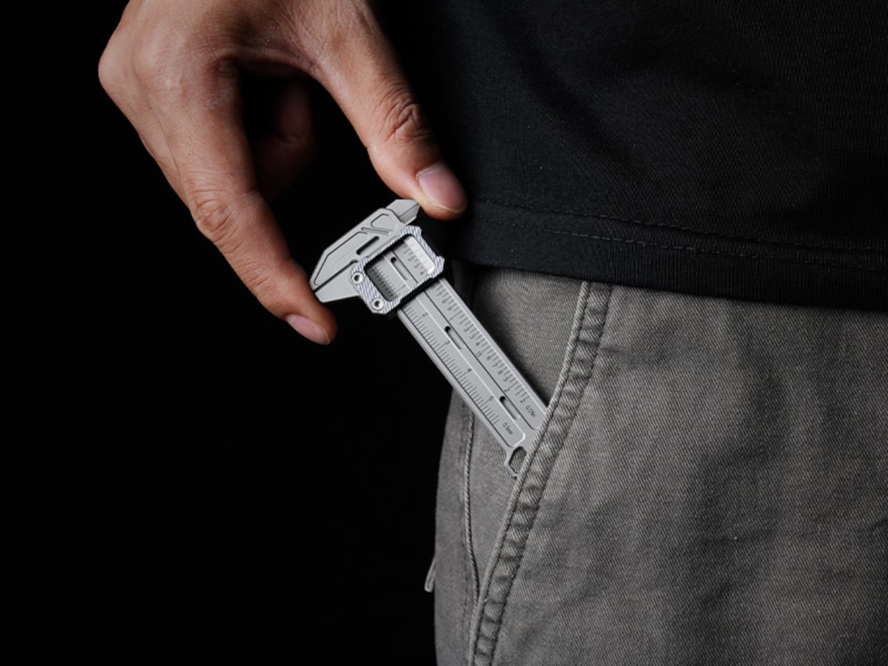
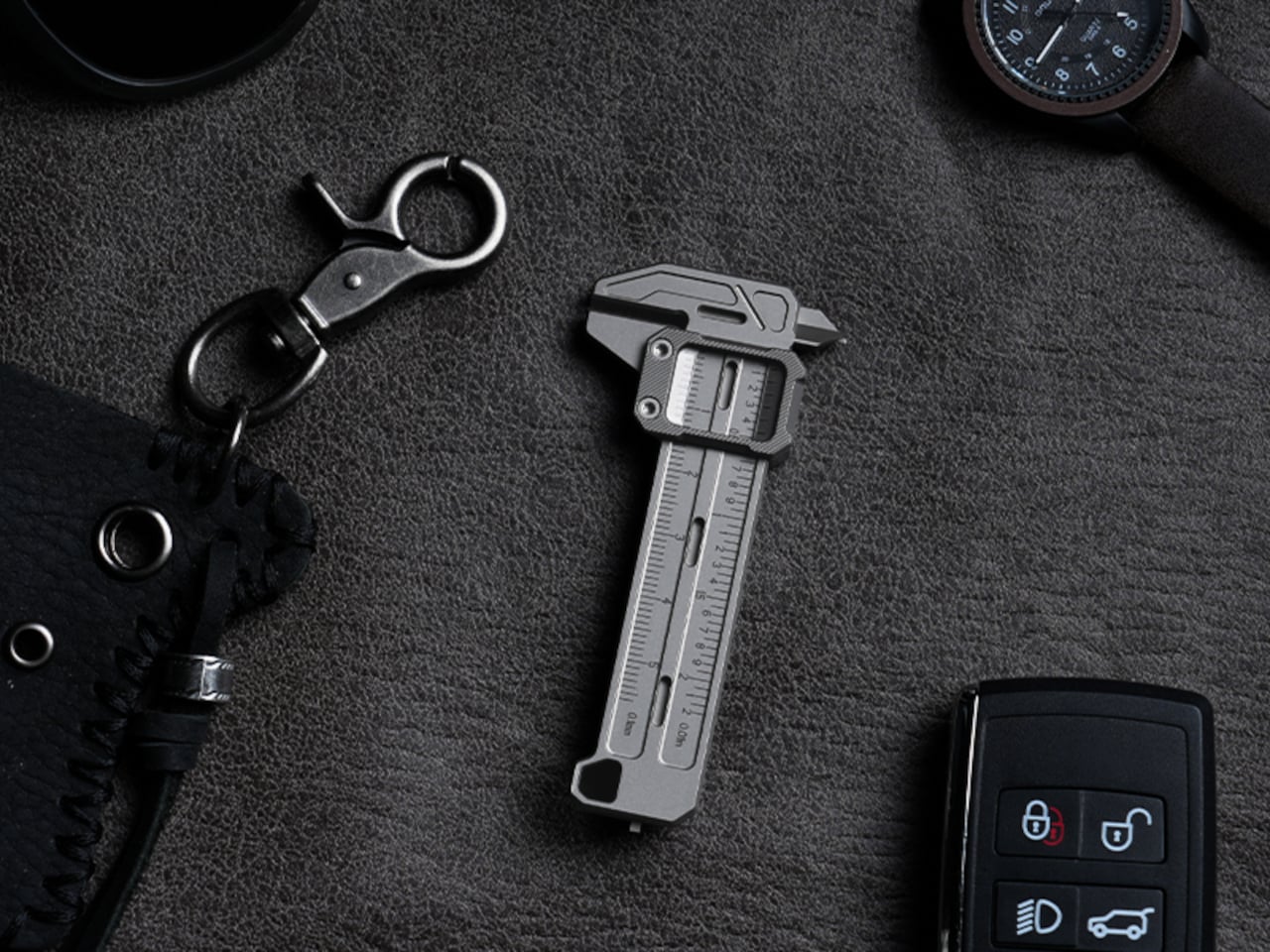
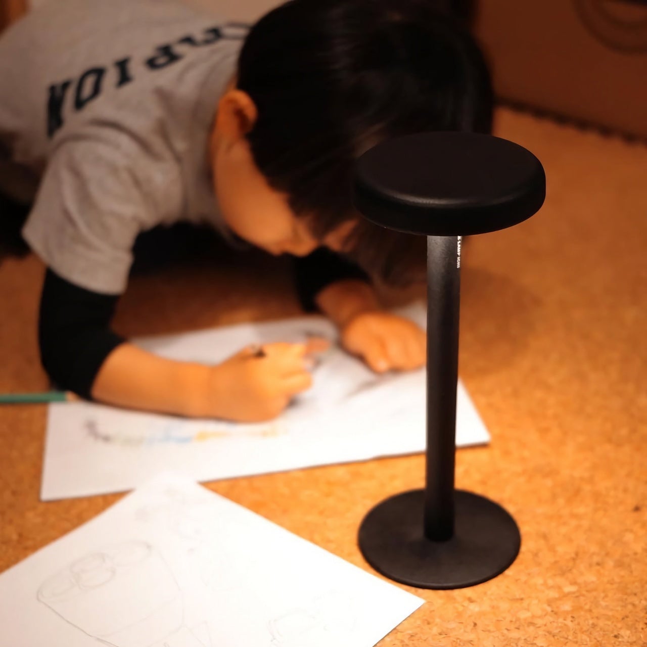
At 3.37 inches long and weighing only 37.6g (1.33 oz), it’s compact enough to clip to a keychain or hang as a pendant, always within reach but never in the way. Four integrated tritium slots add a subtle glow for low-light situations, and the tool is available in either Sandblast Titanium or PVD Black, two very different expressions of the same object.
None of that changes the fact that a full-size caliper will always offer more range and a longer measurement stroke. But TiCal Pro 2.0 isn’t competing with the bench tool; it’s filling the space where that tool never goes. Precision doesn’t always happen in a workshop, and this small titanium instrument quietly makes the case that it doesn’t have to.
The EDC community is particular about what earns a place in their pockets. Titanium hardware, precision multitools, and machined accessories all go through plenty of scrutiny before they make the cut. Yet for all that attention to detail, accurate measurement is still largely a workshop activity. A full-size caliper stays on the bench. A rough estimate fills the gap. Something between the two has been missing.
TiCal Pro 2.0 is designed to fill that gap and makes a bold case for being the first pocket caliper you’d actually trust for real measurement work. It’s not trying to replace the full-size tool on your workbench, but to bring genuine vernier precision down to something that clips to your keychain, hangs from a cord, or disappears into your pocket.
What sets it apart from the usual pocket-tool crowd is a deliberate narrowness of purpose. There’s no bottle opener, no ruler on the back, and no attempt to make it busier than it needs to be. TiCal Pro 2.0 does one thing: it measures. Outer diameters, inner diameters, and depth, with jaws and a depth rod machined as integral parts of a single titanium frame.
One of the more practical details is the dual-scale vernier system. Makers who move between metric drawings and imperial hardware know the frustration of converting on the fly. TiCal Pro 2.0 carries both inch and millimeter scales simultaneously, synchronized so that a single glance gives you both readings at once. There’s no mental math involved and far less room for the errors that unit conversion can invite.
With a resolution down to 0.01-inch for imperial measurements and 0.1mm for metric ones, it’s built for the kind of small-dimension work that usually gets left to guesswork outside the workshop. The scales themselves are laser-engraved deeply enough to resist daily wear, which matters a lot for something that lives in your pocket. Shallow printed markings fade quickly; these stay sharp and legible through regular carry.
Precision tools have a tactile dimension that often gets overlooked. TiCal Pro 2.0 addresses this with a self-lubricating POM ball rail system that delivers a silk-smooth slide with no oil and no grinding. The damping is also adjustable with a standard T5H driver, letting you set the slide resistance to your preference so the jaw stays exactly where you put it, no locking screw needed.
The choice of Grade 5 titanium for the body is practical rather than decorative. It offers the strength of steel at half the weight and is corrosion-proof, shrugging off sweat, rain, and shop fluids without complaint. For a tool meant to stay on your person at all times, that kind of durability makes a genuine difference in how willing you’ll actually be to carry it.
Think about the moments when a precise measurement would’ve been useful. A screw that looks like the right size but isn’t. A 3D-printed part that fits almost perfectly but not quite. A watch lug you’re trying to match without guessing. A keyboard stabilizer that needs a bit of finessing. These are the moments where a quick estimate wins by default simply because the right tool isn’t close enough.
At 3.37 inches long and weighing only 37.6g (1.33 oz), it’s compact enough to clip to a keychain or hang as a pendant, always within reach but never in the way. Four integrated tritium slots add a subtle glow for low-light situations, and the tool is available in either Sandblast Titanium or PVD Black, two very different expressions of the same object.
None of that changes the fact that a full-size caliper will always offer more range and a longer measurement stroke. But TiCal Pro 2.0 isn’t competing with the bench tool; it’s filling the space where that tool never goes. Precision doesn’t always happen in a workshop, and this small titanium instrument quietly makes the case that it doesn’t have to.
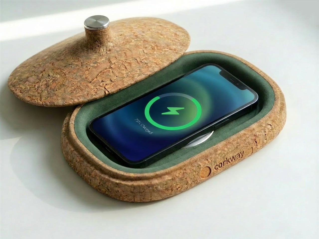
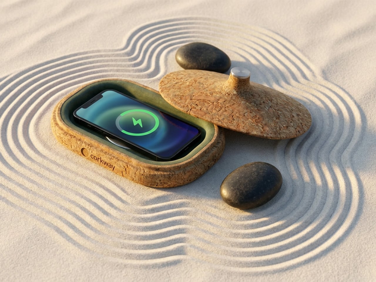
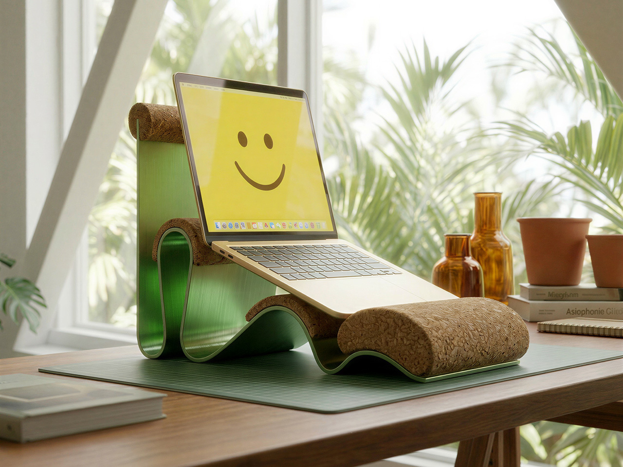
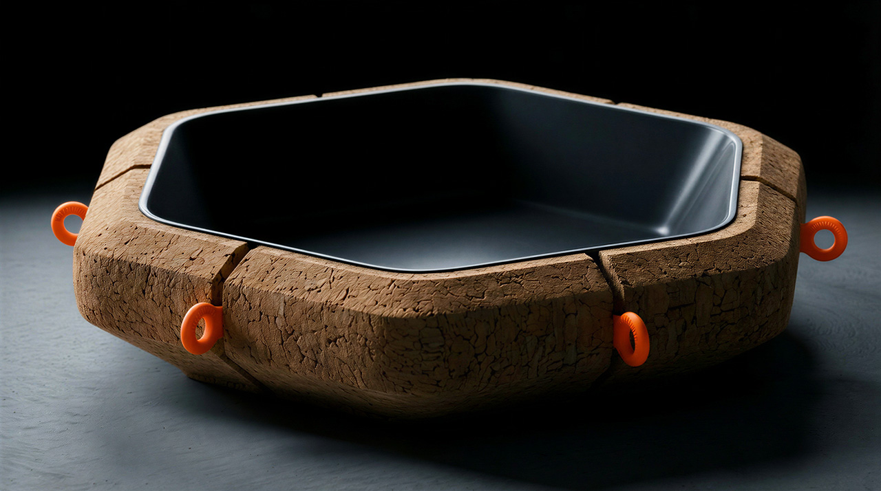
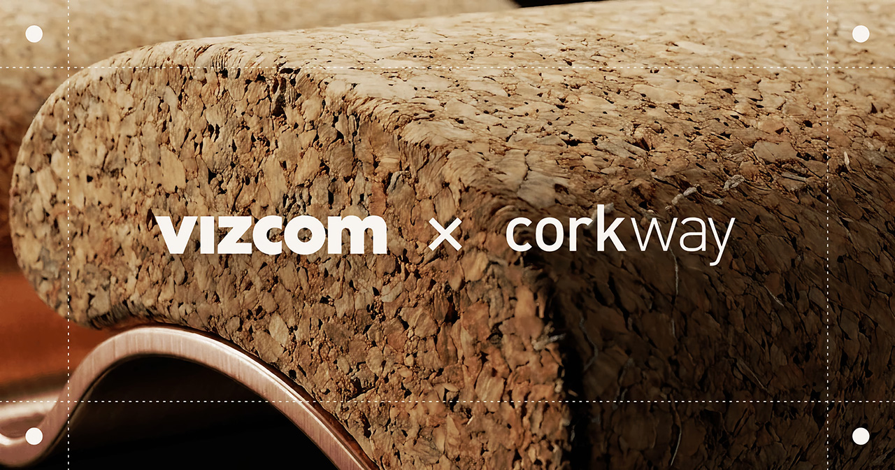
Cork has spent decades being underestimated. Wine stoppers, bulletin boards, yoga mats, the occasional floor tile. Somewhere along the way, a material with genuinely remarkable engineering properties got slotted into the background of everyday objects.
That changed when designers started paying attention to cork’s unique properties: it absorbs sound, repels moisture, insulates against heat, compresses without cracking, and comes from a tree that absorbs more carbon than it releases. The story of cork is really a story of a material waiting for the right question to be asked of it.
Vizcom and Corkway are asking that question now. Their Cork Design Challenge invites designers worldwide to reimagine cork in the spaces where people live, gather, and work, from home interiors to public installations to office environments. The brief is intentionally wide, letting designers push the boundaries of the material: from wall coverings, ergonomic objects, acoustic installations, to even sculptural décor. What makes the challenge compelling is that the top three designs get physically manufactured, CNC-milled from cork blocks in Portugal, and shipped to the winners. Submissions are open through June 8, 2026.
Vizcom and Corkway have structured the challenge around three spatial contexts: home, public, and office — each offering a different lens on how cork can enhance our everyday lives.
Designers are invited to think about how cork can enhance the comfort, experience, or functionality of a home? Could it redefine public installations or elevate office spaces?
At home, the intent is to push cork into décor and wall treatments that reframe how the material reads in a living space.
In public environments, the scope opens to installations, wayfinding systems, and seating concepts that could meaningfully transform communal areas.
Office applications lean into cork’s acoustic and tactile properties, where sound-absorbing partitions, ergonomic desk objects, and creative meeting environments are all fair game.
The Constraints
Creativity comes from constraints and these are the non-negotiables participants must keep in mind while they design:
Your design must be able to be CNC milled
Painted cork designs must be RAL colors
Must be at least 70% cork
Supplementary material can only be metal or plastic
Objects must be no larger than 890 (L) x 590 (W) x 180 (H) mm in total volume
The Submission
All entries must be designed in Vizcom: from early sketches through to final renders — and include a 3D model generated using Vizcom’s Make 3D tool as part of the submission.
All submissions must include:
Project name and description
Project inspiration
Vizcom project file link
Main hero image
Five final design images
One optional animation file
The best part: the winning concepts are made real. Corkway, the manufacturing partner behind the challenge will CNC-mill the top three designs from cork blocks at their production facility in Portugal and ship the finished objects to the winners. The challenge highlights the workflow from sketch to render, to real.
Access the Vizcom Template file from the Learn section
Design your concept within Vizcom, ensuring your project meets the production constraints outlined in the challenge guide
Generate a 3D model in Vizcom and set your project file to “Anyone with link” sharing
Submit your final entry at the challenge page before June 8 at 11:59 PM EST, including your project file link, hero image, five final design images, and a written project description and inspiration
Competition Dates
May 25, 2026 – Prompt released at 9:00 AM EST
June 8, 2026 – Submission deadline at 11:59 PM EST
June 16, 2026 – Top 30 announced
June 23, 2026 – Top 3 announced
Month of July – Production begins with Corkway
Judging Criteria
Entries will be evaluated by a panel of industry designers across five criteria:
Creativity and Originality (30%) – How well the design explores cork’s texture, flexibility, acoustic properties, and sustainability in meaningful ways
Design Quality and Spatial Experience (25%) – How well the concept integrates into a space, enhancing atmosphere, usability, and visual appeal
Feasibility and Material Understanding (20%) – Demonstrated understanding of cork as a material, including its strengths, limitations, and manufacturing possibilities
Process and Use of Vizcom (15%) – How ideas were explored, iterated, and developed using the platform
Alignment with Brief (10%) – How clearly the design connects to home, public, or office contexts while enhancing comfort, functionality, or experience
What You Can Win
Your design, manufactured – in collaboration with Corkway, the top 3 winning designs will be CNC-milled and shipped to the winners
Featured story – winning designs will be showcased across Vizcom’s site, social channels, and newsletter
Vizcom Pro licenses – each winner receives 3 months of Vizcom’s Pro plan, free
Challenge Resources
Need feedback before you submit? Vizcom and Corkway are hosting two open office hours (May 28 at 12PM ET and June 5 at 10AM ET) — and keeping a #cork-challenge Discord channel open throughout the competition for material questions, design advice, and production guidance.
Join the Challenge
If you’re a designer who’s ever wanted to see your idea made real, this is your chance. Design in Vizcom and submit your work by June 8 at 11:59PM for a chance to see it come to life.
How will you imagine cork in spaces we live, gather, and work?
The minimalist desk setup has become one of the most documented trends in home office design, particularly as hybrid work continues pushing people to invest more seriously in the spaces where they spend their days. Most products marketed toward that crowd lean hard on the visual side, neutral finishes, restrained forms, nothing that draws attention to itself. What they’re less reliable at is spatial logic.
The ten accessories on this list were chosen with that in mind. Each one has to pass a practical test, not just look calm on a desk, but actually justify the space it occupies. That means hiding clutter, combining functions, freeing surface area, or removing a small friction before it turns into a habit.
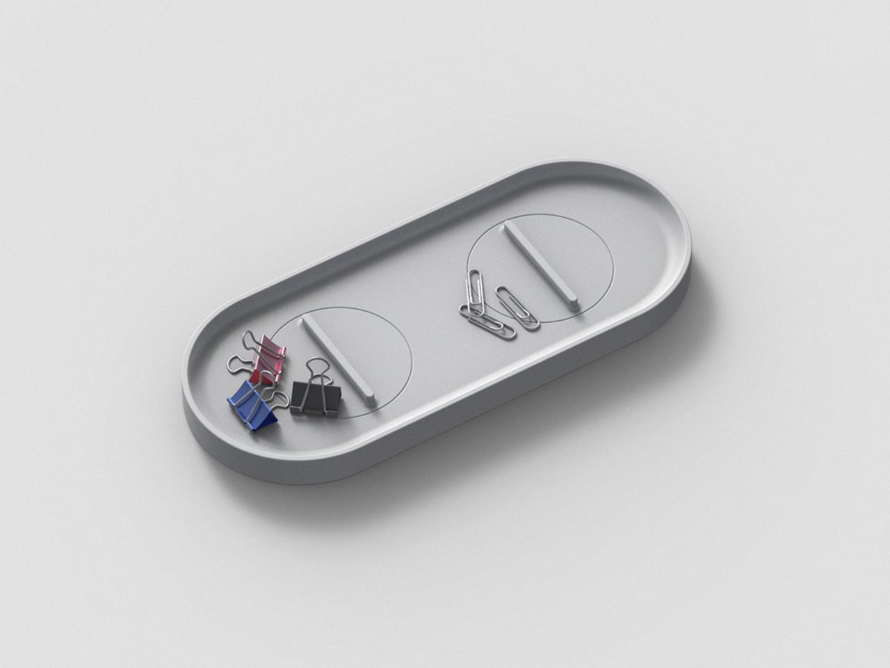
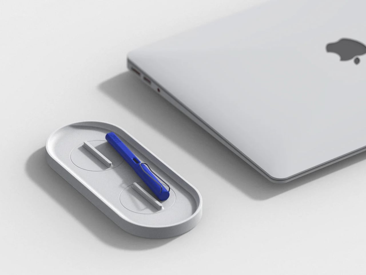
KNOB. Pen Tray
Most pen trays solve a narrow version of the problem. They give you a fixed layout, usually a rectangle divided into two or three compartments, and expect you to work around it forever. That’s fine until your tools change, and they always do. Changho Lee’s KNOB. Pen Tray takes a different approach by making the interior of the tray something you can actually reconfigure.
The dividers are controlled by knobs that take their cues from gas burner controls, a design reference that also gives the tray its name. Turn them and the internal layout shifts, letting you organize pens alongside rulers, adapters, or whatever else needs a place. One tray handles what might otherwise require three, which makes a convincing case for its footprint. The mechanism can feel fiddly if you reorganize often.
Inseparable Notebook Pen
There’s a particular kind of frustration that comes with reaching for a pen and finding it’s no longer where you left it. It’s small enough to ignore once, but it happens often enough to become a genuine irritant. The Inseparable Notebook Pen doesn’t try to solve desk organization broadly. It solves this one specific problem by keeping the pen attached to the notebook it belongs with.
A magnetic clip secures the pen directly to the notebook cover, so the two travel as a unit and stay that way on the desk. There’s also a built-in silencer that softens the attach-and-release motion, which sounds like a small detail until you use it daily. The pen works best when paired with its intended notebook, so it’s less convincing as a standalone writing instrument.
Orbitkey Desk Mat
Desk mats often get treated as the last layer of a setup, something you add once everything else is in place to make the whole thing look polished. The Orbitkey Desk Mat earns more than that role. It addresses one of the quieter problems on any active desk, the gradual spread of loose papers, sticky notes, and reference sheets that slowly take over the surface.
A document hideaway built beneath the top layer lets you slip papers out of view without throwing anything away. They stay flat and within reach, invisible until you need them. A toolbar along one edge keeps stationery and smaller tools from drifting. Available in Black and Stone across two sizes, the mat works whether you’re running a compact home setup or a larger studio table.
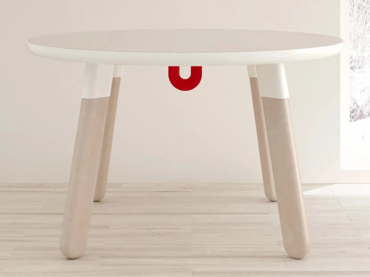
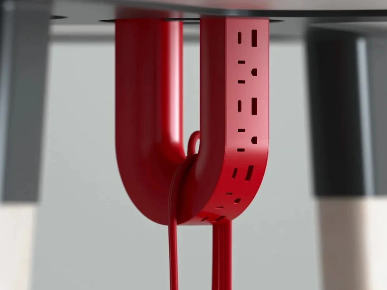
ME-1 U-shaped Power Strip Concept
Cable management is one of those desk problems that most solutions only partially solve. You gather the cords, clip them together, maybe run them through a box, and the result is still visible, still part of the desk’s noise. Michael Kritzer’s ME-1 power strip concept takes a different position, arguing that the power strip itself should hang below the work surface rather than claim space on top of it.
Curved into a U-shape, it can hang under a table or stick to metallic surfaces, while its two legs give you somewhere to wrap cables so they don’t trail freely. There’s also enough spacing between the alternating three-prong sockets and USB ports to fit bulky chargers without blocking each other. It’s still a concept, and questions about how far it protrudes remain, but the logic behind it is sound.
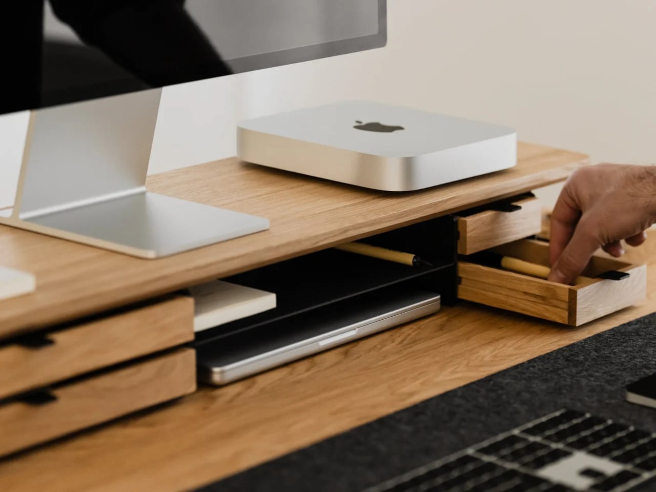
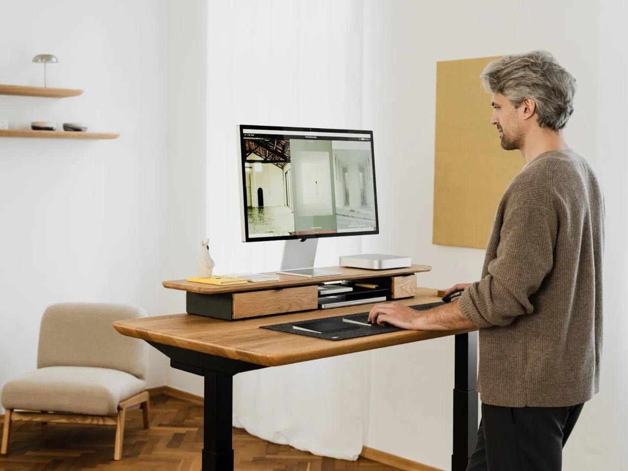
Oakywood Desk Shelf Pro
Monitor risers are supposed to help, and usually they do, but only as far as ergonomics go. The desk surface often ends up just as crowded as before, just with a platform sitting in the middle of it. The Oakywood Desk Shelf Pro approaches the problem differently, treating the riser not as an accessory but as furniture that earns its size by doing more than one job.
The shelf spans desk width, lifting the monitor to eye level while clearing space underneath for a keyboard or laptop, with steel legs at each end creating a floating effect. Built-in drawers tuck away stationery and small tech, and a felt-lined open shelf handles tablets or a closed laptop. It’s built from solid oak or walnut, not MDF with a plastic skin, and can hold up to 100 kg without flexing.
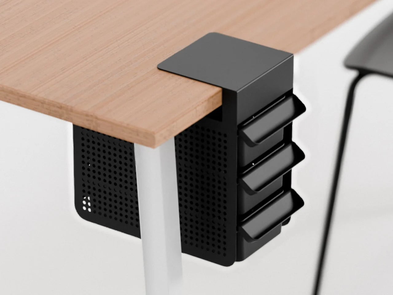
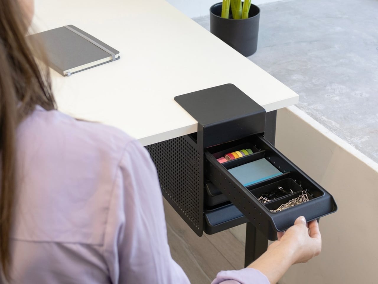
Practiko Otis Hanger 3.0
Minimalist desks look clean partly because many of them don’t come with built-in drawers. That’s a reasonable design choice until the pens, sticky notes, charging cables, and paper clips have nowhere to go and start accumulating on the surface instead. The Practiko Otis Hanger 3.0 adds that missing storage back without a single screw or permanent alteration.
The system clips onto the desk edge and hangs beneath the work surface, giving you three trays and the full top plane back. The 3.0 version features more perforation points for finer divider adjustments, and three nested mini trays handle smaller items like paper clips, thumbtacks, or earbuds. Larger handles on each tray let you pull them out smoothly without looking down, which makes more of a difference in daily use than it sounds.
Nuka Eternal Stationery
There’s a version of minimalism that’s about owning as little as possible. There’s also one that’s about how much the things you do own keep asking of you. Nuka’s Eternal Stationery belongs to the second kind. Built around permanence rather than disposability, it’s a notebook-and-writing-tool system designed to stop demanding replenishment, which is its own quiet argument for staying on a well-edited desk.
The notebook is waterproof and tear-proof, and pairs with a metal alloy tip that writes with the consistency of a traditional pencil but requires no sharpening and never breaks. Pages clear completely with the Nuka Magic Eraser, ready to be written on again. For anyone who writes regularly, the appeal is straightforward, though writers accustomed to ink on paper may need some adjustment time with the metal alloy tip.
Quiver Ruler
A ruler is one of the few tools that earns a place in a minimalist setup by compressing several small tasks into a single flat form. Tunir Maity’s Quiver does that more thoroughly than most. It’s an anodized aluminum ruler designed primarily for people who actually cut with one, not just measure. It treats shaky hands and imprecise cuts as design problems worth solving, not limitations the user is expected to compensate for.
A clip mechanism holds paper in place, a blade slit guides the cut in a straight line, and the weight distribution favors the cutting end, so you don’t have to press down as hard. It also includes a carabiner attachment for clipping to a bag. Quiver is currently a concept, so availability hasn’t been confirmed, and it’s more specialized than what a casual desk user would reach for day to day.
Ichi Portable Lamp
Desk lamps rarely fail in the obvious ways. Most give off enough light and last long enough. What they tend to get wrong is the base, which on wider models claims an entire desk corner, and the cord, which invariably ends up somewhere visible. The Ichi Portable Lamp, born from the collaboration between Fujita Kinzoku and TENT Design, keeps the form slim and goes cordless, addressing both without turning the lamp into a statement piece.
Powered by four standard AA batteries, it runs cordless without the limitations of proprietary chargers. Its warm, high-color-rendering CRI 95 LED creates a soft, radiant glow suitable for task work or winding down. The modular design disassembles into three parts and packs down to a slim 20mm thickness. It’s more portable than a permanent desk fixture, which is worth knowing if you need sustained, high-output lighting for long stretches.
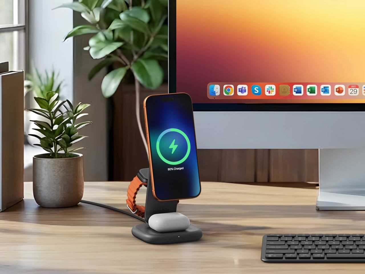
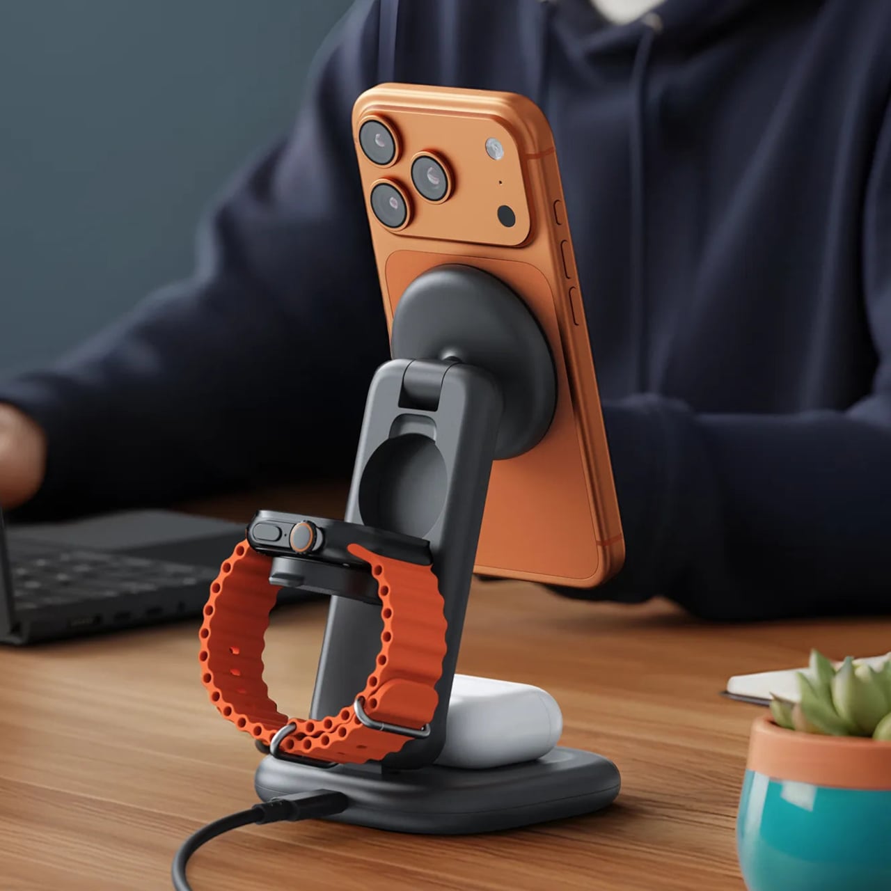
Satechi 3-in-1 Foldable Wireless Charging Stand
Getting a phone stand onto a minimalist desk requires a stronger argument than just holding the phone upright. The Satechi 3-in-1 Foldable Wireless Charging Stand with Qi2 25W makes that argument by doing three jobs at once, replacing the tangle of separate charging pads that Apple users typically accumulate. Wireless charging was supposed to simplify things, but most setups end up with a different kind of mess instead.
Set the iPhone down, and Qi2 snaps it into position, the Apple Watch gets its own fast-charge arm, and the AirPods rest on a pad below, all drawing from a single cable to the wall. The stand folds flat for travel and fits easily in a carry-on. A 45W USB-C adapter with US, EU, and UK plugs ships in the box. It’s most compelling for people already working within the Apple ecosystem.
Building a cleaner desk comes down to the same question applied to every object on it: what is it giving back for the space it takes? Color and material can make things look minimal, but they don’t make them earn their place. That’s a footprint budget, and it’s a much better framework for deciding what stays than any mood board, setup guide, or neutral palette.
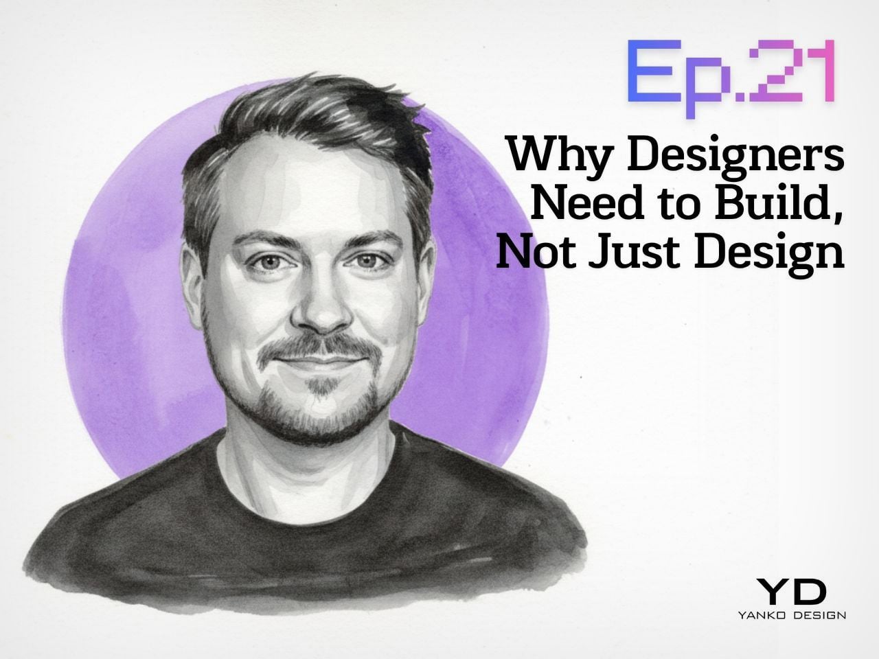
Yanko Design’s Design Mindset, powered by KeyShot, continues to carve out a thoughtful space for conversations around creativity, process, and the way design is evolving in real time. Now at Episode 21, the weekly podcast has become a compelling extension of the publication’s larger design lens, moving beyond products and visuals to focus on the people, principles, and practices shaping the creative world today. Each episode opens up a deeper look at the mindset behind modern design, asking what it really means to create with relevance in a landscape that keeps changing.
This week’s guest is Ben Fryc of Framer, a creative voice whose work sits at the intersection of storytelling, digital product thinking, and workflow design. In conversation with Radhika Sood, Ben speaks about a shift many designers are already feeling, where the role is expanding from someone who visualizes ideas to someone who can actively bring them to life. The result is a timely discussion about momentum, confidence, tools, and the growing value of designers who know how to build.
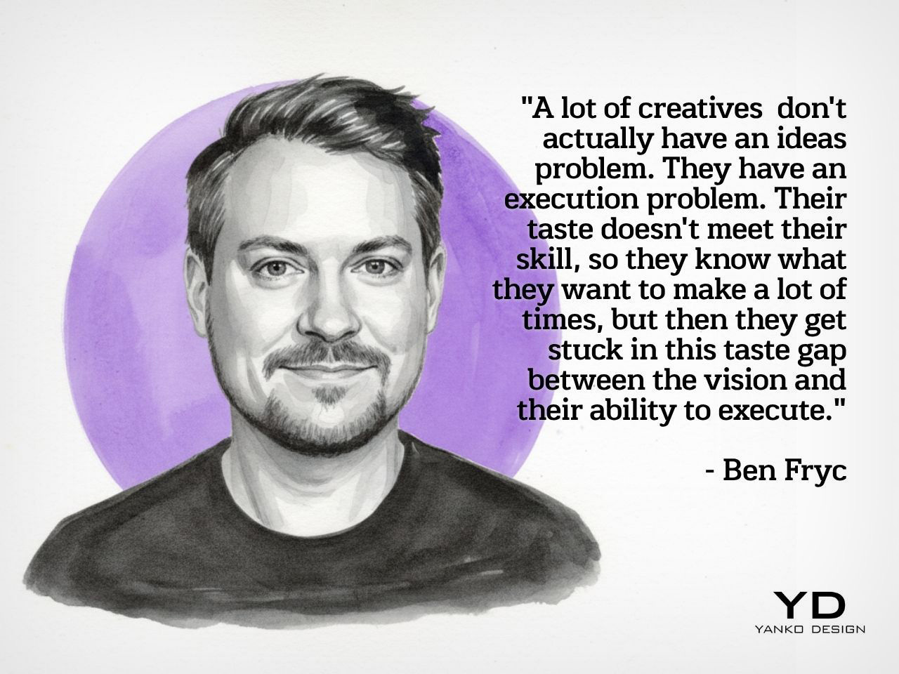
Ben’s central argument lands quickly and stays with you through the rest of the episode: most creatives do not struggle with ideas, they struggle with execution. That distinction gives shape to a frustration many designers know well. The vision is there, the taste is there, and the instinct is often sharp, but the path from concept to finished outcome can still feel longer than expected. Ben attributes that gap to experience, or more specifically, the lack of enough repetition to turn instinct into capability. He speaks candidly about the misconception that strong execution should arrive early, especially for young designers stepping out of school and into the profession.
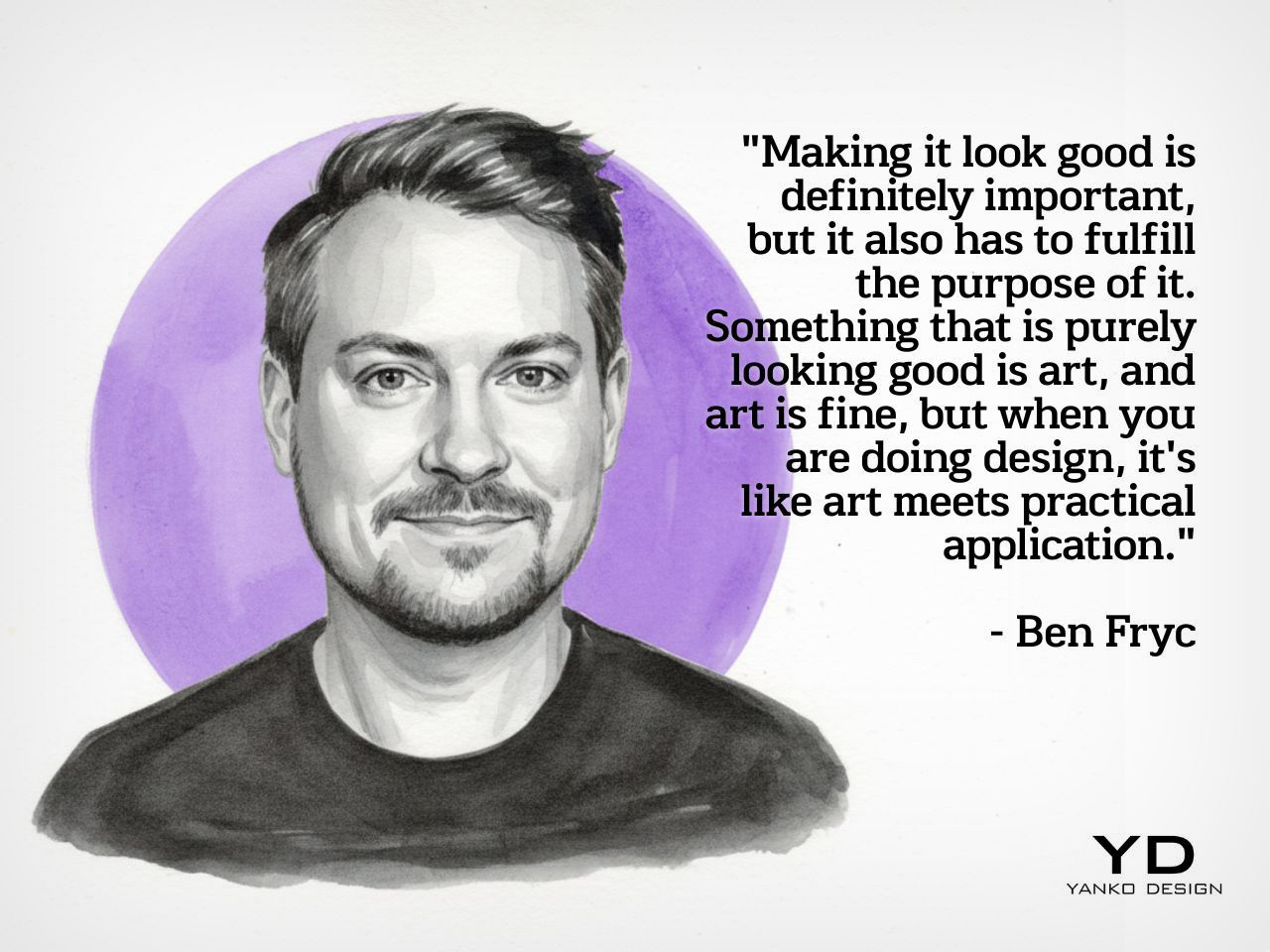
What makes his perspective resonate is the way he strips away the mythology around creative success and replaces it with something more useful. Good ideas matter, but the people who move forward are usually the ones who learn how to carry those ideas through constraints, revisions, and real-world expectations. Experience becomes the bridge between taste and output, and that bridge is built over time. In Ben’s framing, becoming a stronger designer is less about waiting for talent to click and more about putting in enough cycles of making to close the distance between what you imagine and what you can actually produce.
When Designers Start Becoming Builders
A major theme in the episode is the changing role of the designer, especially in a world where tools have made prototyping, publishing, and testing much more accessible. Ben talks about how the shift often begins the moment a designer starts thinking beyond the static mockup and becomes interested in how something actually works in motion. Once that curiosity enters the process, design starts to feel more active and more complete. The act of building no longer belongs exclusively to another team or another discipline. It becomes part of the designer’s own creative vocabulary.
Ben describes this transition almost like unlocking a new layer of ability, where confidence grows because the work can finally move out of presentation mode and into lived experience. That shift changes more than output. It changes the way a designer thinks about learning, problem-solving, and authorship. Coding, prototyping, 3D modeling, and other adjacent skills begin to feel less like optional extras and more like natural extensions of the design process. What emerges is a broader creative identity, one rooted in agency and in the satisfaction of making something real enough for others to use, experience, or respond to.
Workflow as a Creative Force
One of the most interesting parts of the conversation comes when Ben talks about workflow, not as a backstage concern but as a genuine creative advantage. He pushes back on the idea that workflow is simply a matter of optimization and instead frames it as something that shapes the quality of thinking itself. For him, a smooth workflow creates the conditions for ideas to evolve naturally, especially in projects where the final outcome only becomes clear through the act of making. That kind of process depends on iteration, room for discovery, and enough flexibility to let references, instincts, and experimentation inform the direction of the work.
He also makes an important point about communication, especially in collaborative environments where creative momentum can either build quickly or lose energy just as fast. Sharing work early, being clear about process, and inviting feedback before everything is fully polished all become part of a healthier workflow. Ben’s view is that better work often comes from showing progress sooner rather than later, because feedback strengthens the idea while it is still flexible. In that sense, workflow is not just about personal efficiency. It is also about preserving momentum, protecting creative energy, and giving ideas a better chance to grow into something stronger.
The Tools That Shape Ambition
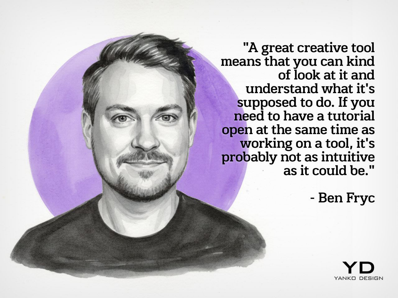
Because Ben works at Framer, the discussion naturally moves into the role of tools, though what makes his take interesting is that he avoids reducing the conversation to features alone. He speaks instead about the feeling of a tool, how quickly it communicates its purpose, how naturally it invites experimentation, and how much friction it introduces between thought and action. In his view, the best creative tools are the ones that feel legible early on, even if they reveal more depth over time. Complexity can have value, but approachability matters because it determines whether someone begins with curiosity or hesitation.
That idea becomes especially relevant in the context of today’s no-code and low-friction creative platforms, which have changed what designers can realistically attempt on their own. Ben notes that when tools lower the barrier to making, people often become more ambitious because the path from idea to execution feels more direct. Instead of getting lost in abstraction, they can start building, testing, and refining with greater immediacy. The result is not just speed for its own sake, but a more intentional creative process where the tool amplifies possibility and supports the designer’s ability to act on instinct while learning along the way.
Why Shipping Changes the Designer
The episode closes on a note that feels especially relevant for creatives who spend too long refining, adjusting, and waiting for the right moment to release something. Ben speaks honestly about perfectionism and how easily it can interrupt momentum, especially when creators become so focused on improving the work that they never let it exist in the world. His answer is not careless speed, but a healthier relationship with progress. Making something real, even in an imperfect form, creates a kind of confidence that reflection alone cannot produce. The act of shipping becomes a turning point because it changes how the creator sees their own role.
That is ultimately what gives this conversation its energy. Ben is not presenting building as a trend layered on top of design, but as a deeper evolution in how designers participate in their own ideas. Once something moves from concept to reality, even on a small scale, it carries a different weight. It becomes proof of capability, proof of momentum, and proof that taste can be translated into action. For a weekly podcast like Design Mindset, that kind of conversation feels exactly on point, because it captures the creative shift defining this moment. Designers today are being asked to do more than imagine. They are being invited to make.
Design Mindset drops every week on Yanko Design. Catch Episode 19 in full wherever you listen to podcasts. For a free trial of KeyShot, visit keyshot.com/mindset.
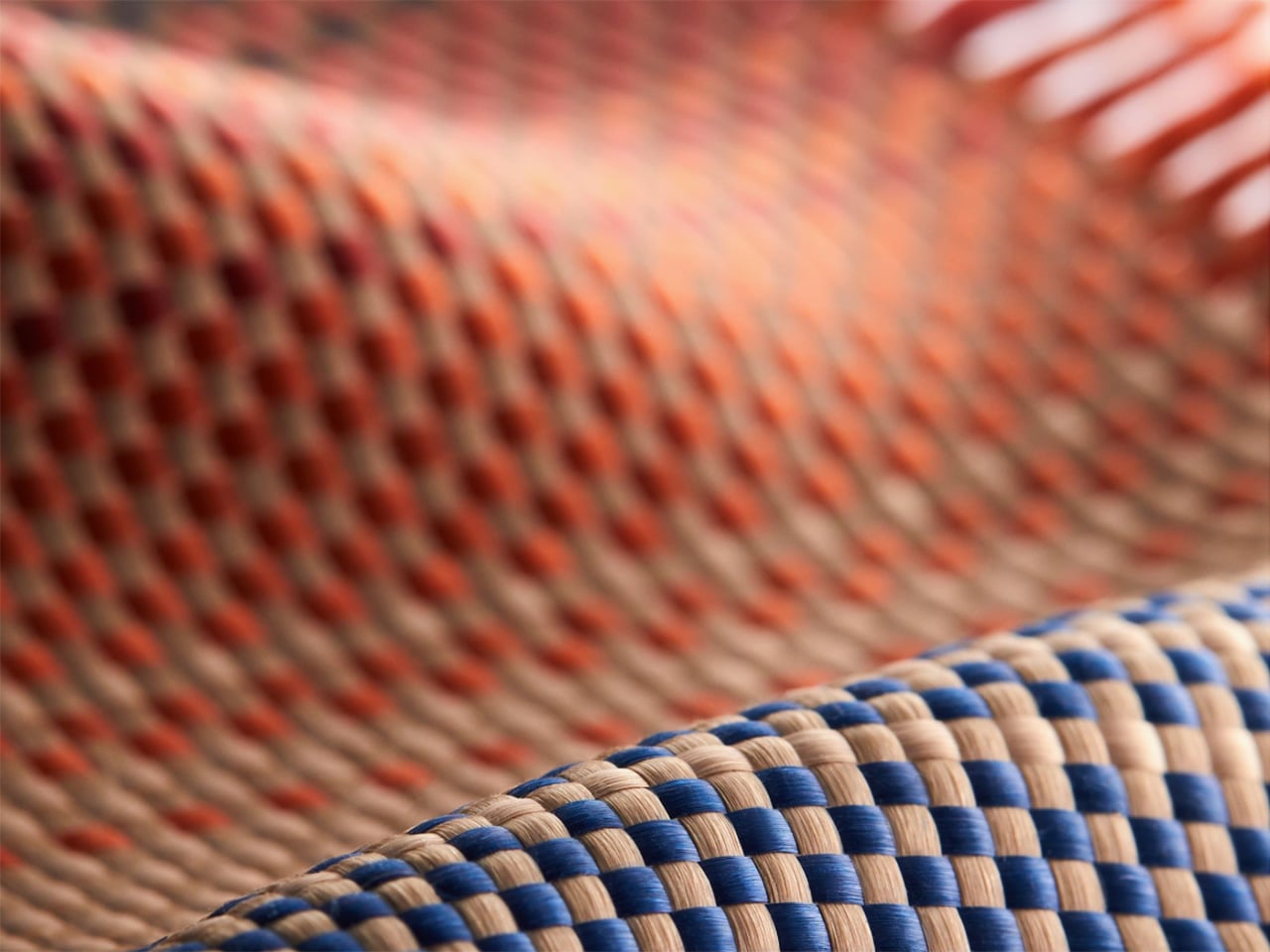
Pattern has always been one of humanity’s most instinctive forms of expression. Before there was writing, there was weave, the repetition of motifs in cloth, stone, and ceramic that encoded identity, belief, and belonging long before language could do the same. The Japanese asanoha, the Nordic Fair Isle, the geometric armor vocabulary of ancient Chinese craft, these are visual systems developed over centuries that survive precisely because they carry emotional weight. In 2026, those same systems are finding a new surface to live on, and the conversation around what that means has quietly become one of the more compelling ones happening in product design.
When PITAKA launched “Weave the Next, Weave Our World,” the brief it handed designers was deceptively open. Submit a texture system, anchor it in one of four broad themes, and consider how it might actually live on a physical product. No prescriptions on culture, no mandate on aesthetic direction. The entries that came back reflected the full range of what happens when that kind of creative latitude meets genuine material ambition. A few of them stand out, not for spectacle, but for the quality of thinking they bring to a surface most people never stop to examine.
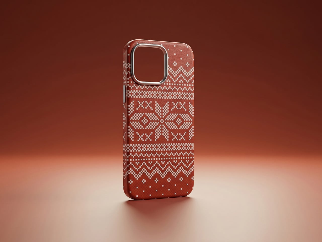
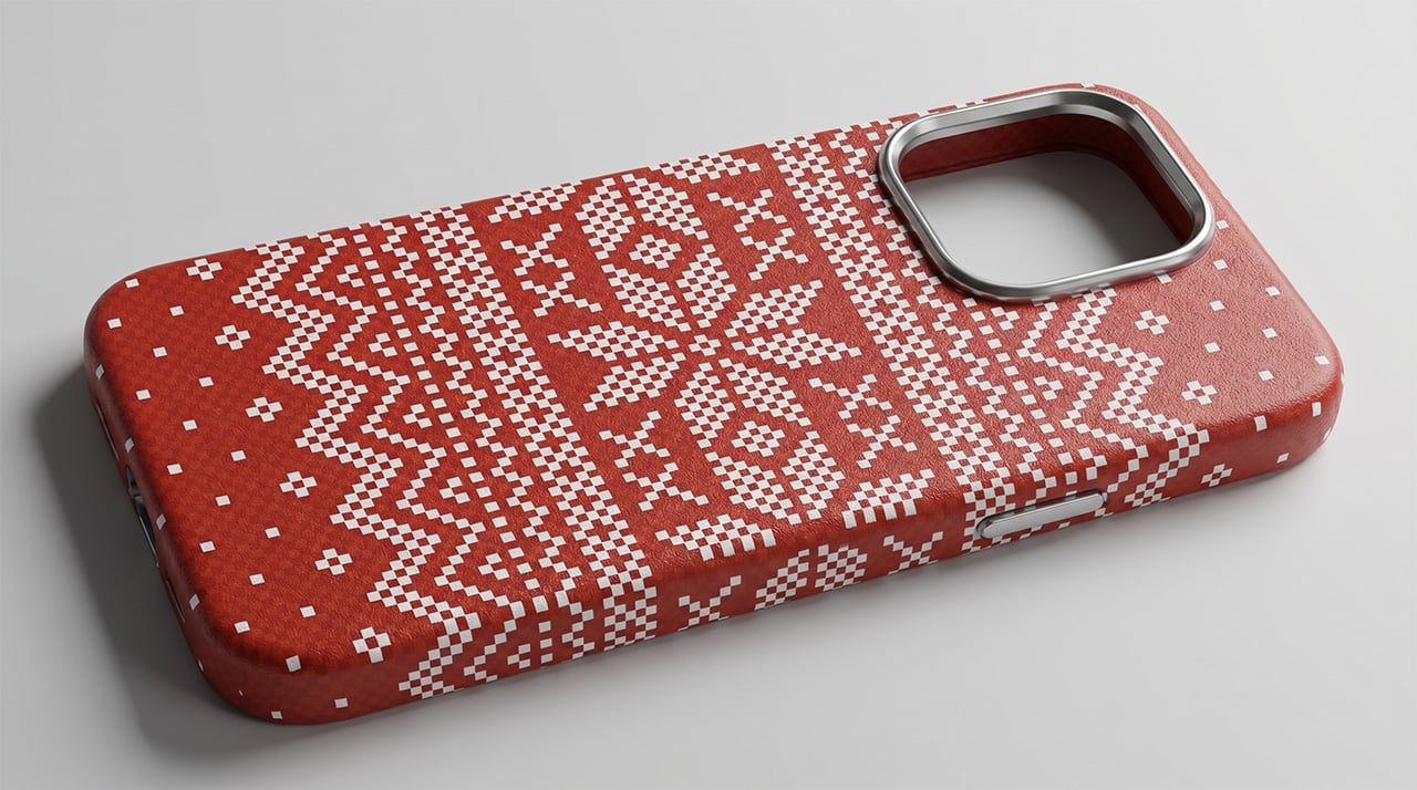
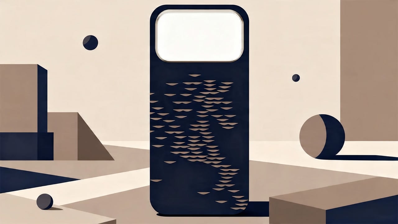
Nathan.c’s “Nordic Knit Dream” feels instantly familiar and comforting. The design is inspired by Fair Isle knitwear, the classic two-color style from the Shetland Islands, turning its traditional geometry into a clean, pixel-like pattern. It’s a smart nod to the grid-like nature of knitting, but updated for a modern tech accessory. The choice of a vintage red and crisp white feels both festive and timeless. This concept connects directly with PITAKA’s own manufacturing, as the Fusion Weaving process literally weaves patterns into the aramid fiber, making it a perfect modern counterpart to a traditional textile art.
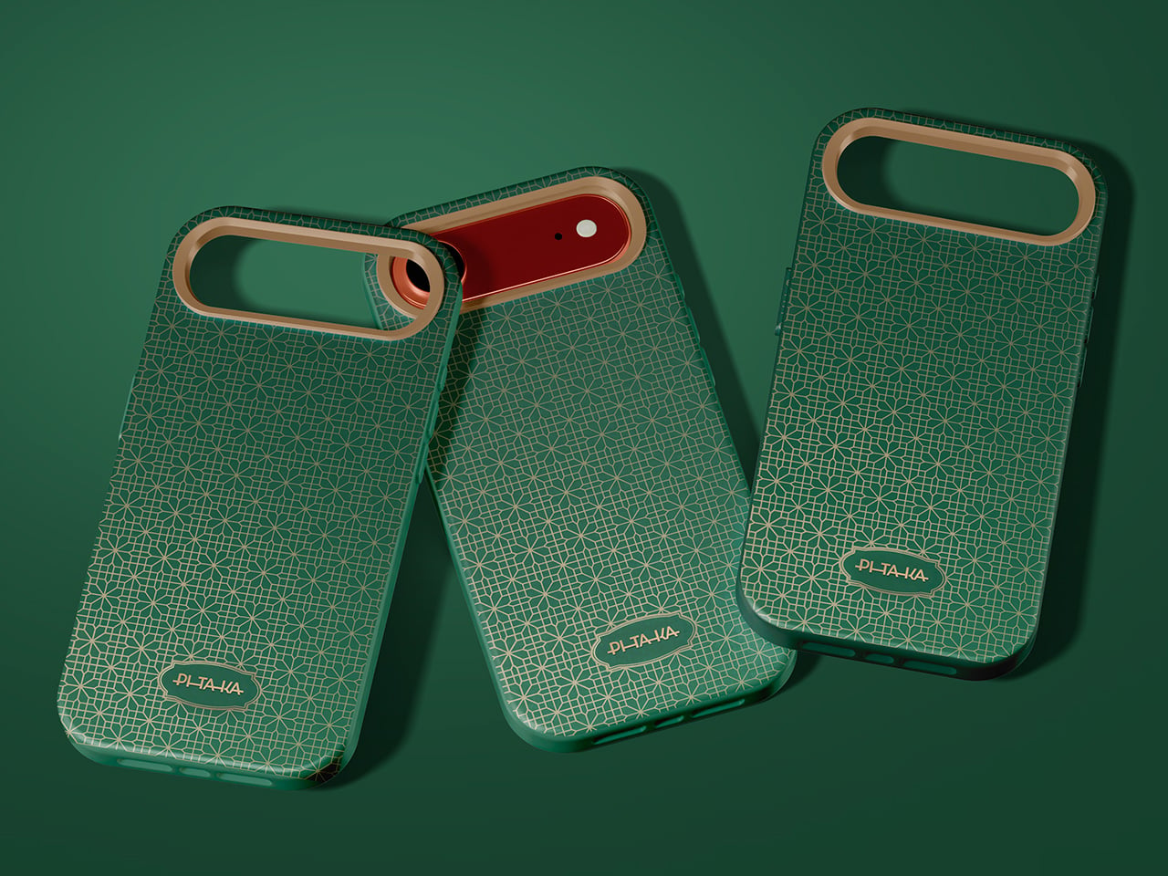
From Japan, Mahkciw’s “Emerald Lattice” takes the asanoha, or hemp leaf pattern, and gives it a modern twist with a deep emerald green and accents of champagne gold. This color choice makes the pattern feel less like a traditional craft and more like a luxury item, but without losing its classic power. The design is confident and polished, showing a great understanding of how a historical pattern can be updated for today’s products. It feels ready to go, a testament to the idea that good design is often about smart, subtle translation rather than loud invention.
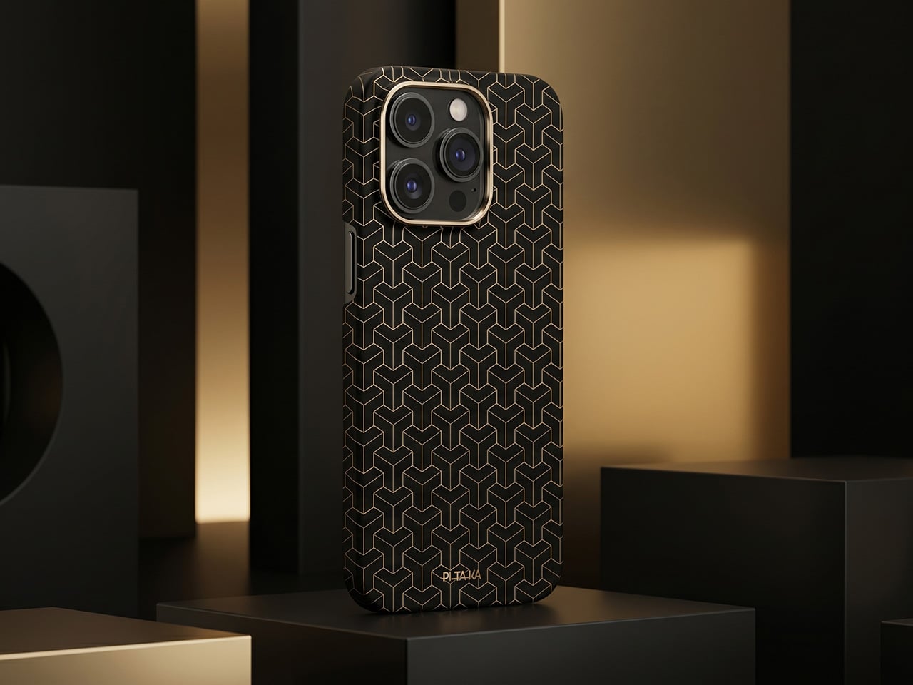
The same designer also submitted “Golden Armor,” which has a completely different energy. Inspired by ancient Chinese armor, this black-and-gold design feels more like architecture than decoration. It’s a fascinating test to see if a pattern designed to look powerful on a large scale can still feel just as strong when shrunk down to fit a phone. The sharp, commanding lines suggest it absolutely can. Seeing both this and “Emerald Lattice” from the same person shows a remarkable ability to work with different cultural vocabularies and bring them to life.
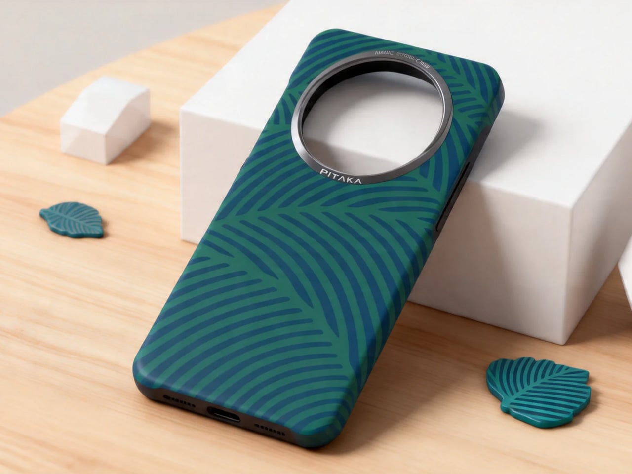
Finally, marc_’s “Feathery Green Flow” is the quietest of the bunch, and that’s its strength. Inspired by the veins of a leaf, the design uses flowing lines in a soft teal-on-navy palette. It doesn’t shout for attention; instead, it creates a mood and asks you to look a little closer to really appreciate it. This kind of subtle, nature-inspired work relies on texture to make its point, which is exactly what PITAKA’s aramid fiber material does best. It’s a design that would feel as good as it looks.
These submissions are more than just beautiful concepts; they are proof of the incredible creativity that emerges when a brand opens its doors to the world. They show how a single material technology can become a canvas for countless cultural stories, from the cozy warmth of a Scottish sweater to the disciplined elegance of Japanese geometry. Each design is a conversation starter, a small piece of art that carries a much bigger story, which is precisely what the Weave the Next, Weave Our World initiative set out to find.
The competition is a search for the next visual language for tech, but it’s also a bridge between global creativity and real-world production. The most exciting part is that this is just the beginning. With the submission period open until May 25th, there is still time for more designers to add their voices to this global dialogue. For creators, this is a rare opportunity, a chance to have their work seen by a jury that includes industry leaders like Ross Lovegrove and to potentially see their vision become a real product. For the rest of us, it’s a front-row seat to the future of design, one woven pattern at a time.
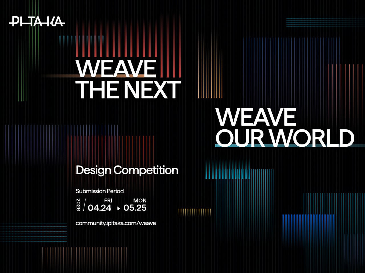
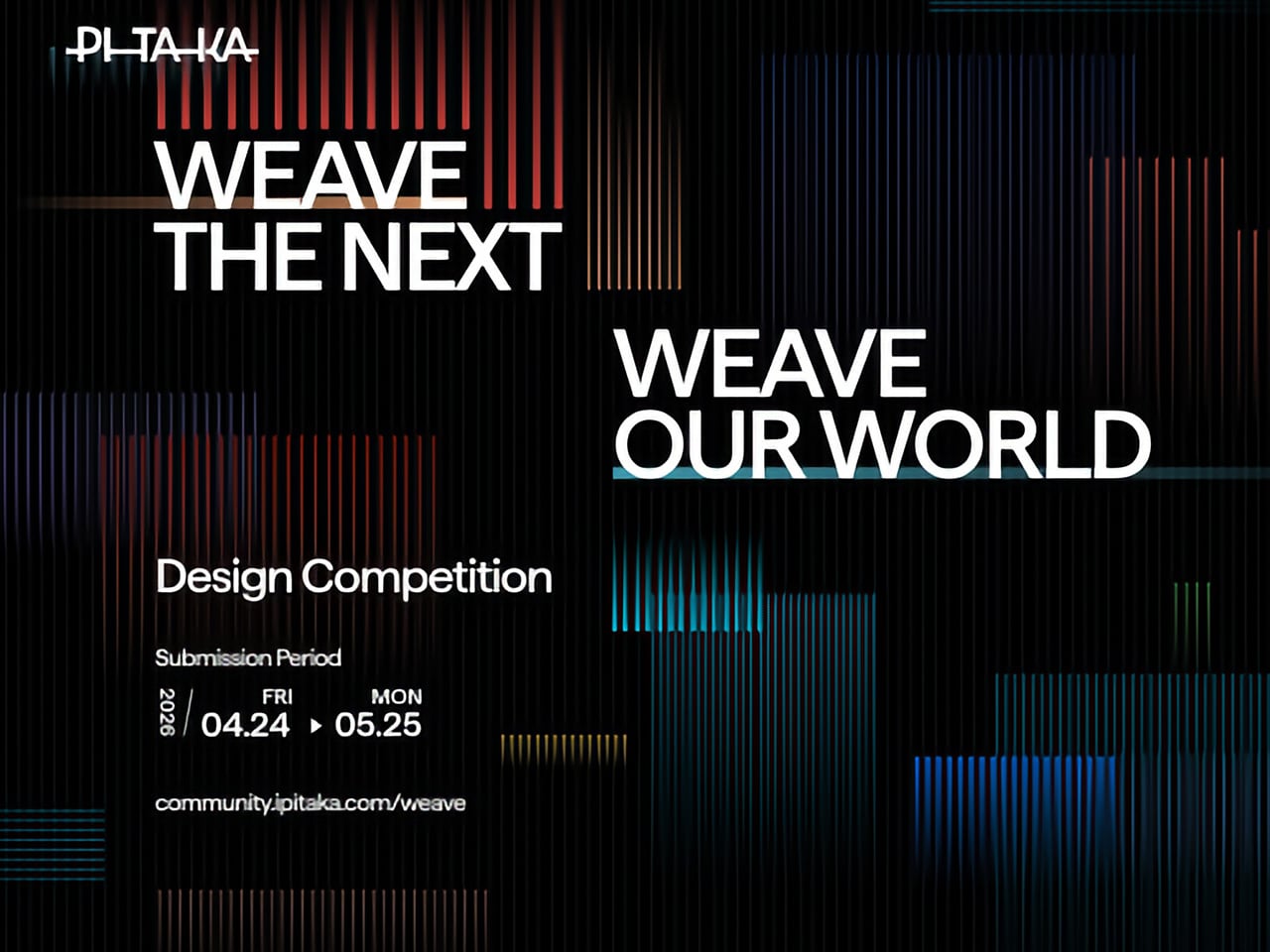
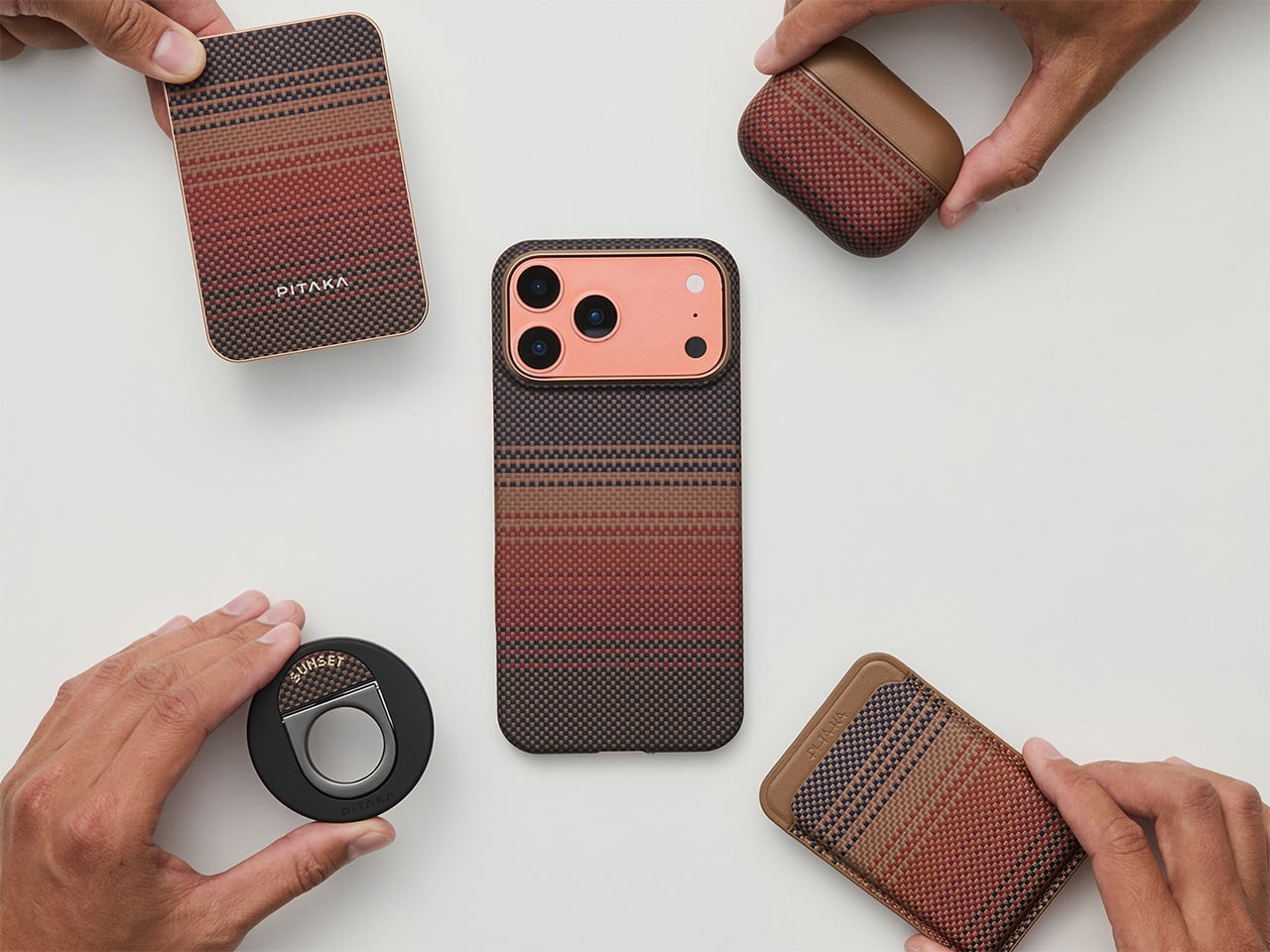
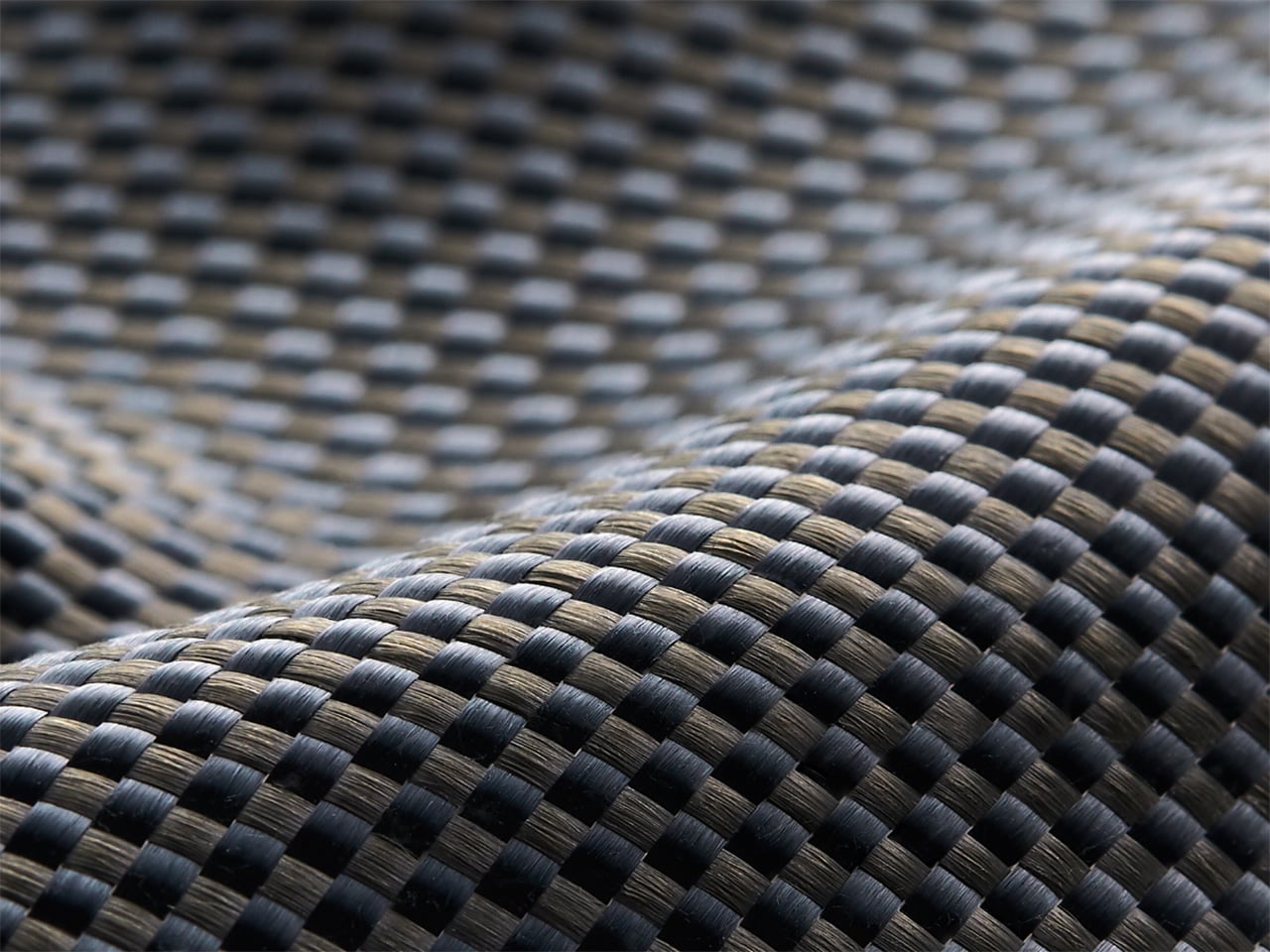
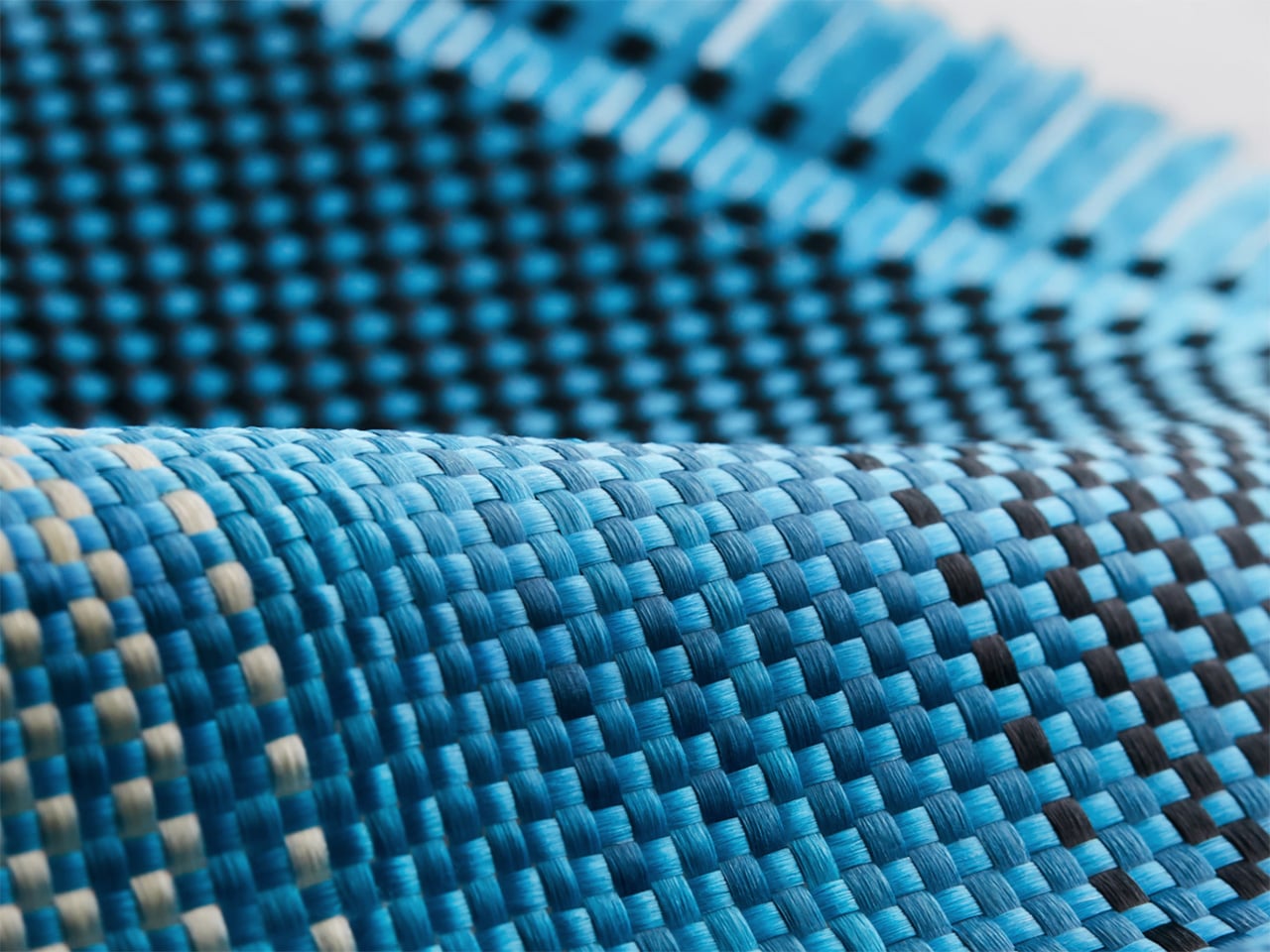
Tech accessories have hit a curious inflection point. The last year trained us to worship thinness and glass, but somewhere between the tenth identical ‘Air’ or ‘Edge’ smartphone and the fifteenth glossy case, a countermovement quietly took root. Texture matters again. Grip, weave, and tactile identity are no longer afterthoughts, they’re the differentiators that keep objects from sliding into the sea of sameness. PITAKA, a brand built on aerospace-grade aramid fiber and what it calls “fusion weaving,” has spent years proving that phones don’t have to feel like jewelry-store display pieces. Now, with the launch of “Weave the Next, Weave Our World,” the company is turning that philosophy outward, inviting designers worldwide to imagine the surfaces and visual languages that will define the next generation of tech we carry, hold, and interact with every day.
Launching April 24th, 2026, the competition is framed explicitly around the intersection of technology and art, which is less marketing speak and more PITAKA’s operational DNA. The brand’s cases have always leaned hard into material science, using woven aramid fibers (the same stuff in bulletproof vests and aircraft components) that are five times stronger than steel and a fraction of the weight. But strength alone doesn’t sell. What makes PITAKA cases notable is the texture vocabulary they’ve developed over years of refining weave patterns, experimenting with 600D and 1500D aramid densities, and pushing techniques like “fusion weaving,” where multiple patterns coexist on a single loom to create intricate, layered surface designs. “Weave the Next, Weave Our World” extends that exploration beyond the company’s internal design studio and into the hands of students, professionals, and independent creators who might see texture, pattern, and tactility from entirely different cultural or aesthetic starting points.
PITAKA’s “Weave the Next, Weave Our World” global design competition invites designers to create texture and visual language systems for the brand’s future product series, positioned explicitly at the intersection of technology and art. Participants choose from four thematic directions: “These Moments,” which captures the raw beauty and shifting rhythms of the natural world; “Timeless Threads,” weaving stories of culture, memory, and human journeys; “Beyond Tomorrow,” exploring visionary futures where innovation reshapes daily life; or “Roots of Rhythms,” celebrating the textures, symbols, and spirit born from each land’s heritage. The competition aims to explore emerging global trends in tactile and visual design, strengthen PITAKA’s art-tech identity, and potentially commercialize winning designs through royalties, co-branding, and official recognition.
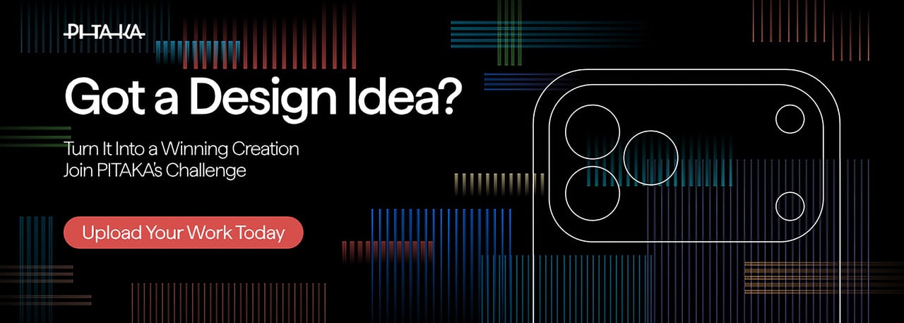
How To Participate
Visit the official competition website or Dribbble page to submit your entry
Provide participant information and upload your texture designs
Include a written design explanation with your submission
Entries will be evaluated through a combination of professional jury review and public voting
Winners will be announced and showcased in an online exhibition
Competition Dates
Competition Launch: April 24, 2026
Submission Period: April 24 – May 25, 2026
Judging Period: May 26 – May 31, 2026
Winners Announcement: June 9, 2026
Jury Panel
Qiongzhi Xie (Artist; Founder of Daxing Jizi Studio)
Matteo Menotto (Head of Design, Prints & Textile Accessories at Bulgari)
Sarang Sheth (Editor-in-Chief, Yanko Design)
James (Founder / CEO, PITAKA)
Important Information
The most compelling entries are likely to do three things at once:
Treat texture as a system, not a single image
PITAKA’s products live across multiple form factors, so a strong entry will propose a visual/tactile system that can scale and adapt, not just a one-off pattern.
Anchor the concept in one of the four themes without being literal
“These Moments” does not need a photo-real print of a wave; “Roots of Rhythms” does not need a direct copy of a folk motif. Abstraction, distillation, and translation into a tech-accessory context will matter.
Consider manufacturability and user experience
Even in a speculative competition, the jury includes industrial design and brand leadership. Textures that look stunning in render but collapse in real material or feel uncomfortable in hand will likely be deprioritized.
If you already experiment with materials, parametric patterns, or culturally rooted visual systems, “Weave the Next, Weave Our World” is essentially an invitation to push that work into a space where it might actually ship.
Tech accessories have hit a curious inflection point. The last year trained us to worship thinness and glass, but somewhere between the tenth identical ‘Air’ or ‘Edge’ smartphone and the fifteenth glossy case, a countermovement quietly took root. Texture matters again. Grip, weave, and tactile identity are no longer afterthoughts, they’re the differentiators that keep objects from sliding into the sea of sameness. PITAKA, a brand built on aerospace-grade aramid fiber and what it calls “fusion weaving,” has spent years proving that phones don’t have to feel like jewelry-store display pieces. Now, with the launch of “Weave the Next, Weave Our World,” the company is turning that philosophy outward, inviting designers worldwide to imagine the surfaces and visual languages that will define the next generation of tech we carry, hold, and interact with every day.
Launching April 24th, 2026, the competition is framed explicitly around the intersection of technology and art, which is less marketing speak and more PITAKA’s operational DNA. The brand’s cases have always leaned hard into material science, using woven aramid fibers (the same stuff in bulletproof vests and aircraft components) that are five times stronger than steel and a fraction of the weight. But strength alone doesn’t sell. What makes PITAKA cases notable is the texture vocabulary they’ve developed over years of refining weave patterns, experimenting with 600D and 1500D aramid densities, and pushing techniques like “fusion weaving,” where multiple patterns coexist on a single loom to create intricate, layered surface designs. “Weave the Next, Weave Our World” extends that exploration beyond the company’s internal design studio and into the hands of students, professionals, and independent creators who might see texture, pattern, and tactility from entirely different cultural or aesthetic starting points.
PITAKA’s “Weave the Next, Weave Our World” global design competition invites designers to create texture and visual language systems for the brand’s future product series, positioned explicitly at the intersection of technology and art. Participants choose from four thematic directions: “These Moments,” which captures the raw beauty and shifting rhythms of the natural world; “Timeless Threads,” weaving stories of culture, memory, and human journeys; “Beyond Tomorrow,” exploring visionary futures where innovation reshapes daily life; or “Roots of Rhythms,” celebrating the textures, symbols, and spirit born from each land’s heritage. The competition aims to explore emerging global trends in tactile and visual design, strengthen PITAKA’s art-tech identity, and potentially commercialize winning designs through royalties, co-branding, and official recognition.
How To Participate
Visit the official competition website or Dribbble page to submit your entry
Provide participant information and upload your texture designs
Include a written design explanation with your submission
Entries will be evaluated through a combination of professional jury review and public voting
Winners will be announced and showcased in an online exhibition
Competition Dates
Competition Launch: April 24, 2026
Submission Period: April 24 – May 25, 2026
Judging Period: May 26 – May 31, 2026
Winners Announcement: June 9, 2026
Jury Panel
Qiongzhi Xie (Artist; Founder of Daxing Jizi Studio)
Matteo Menotto (Head of Design, Prints & Textile Accessories at Bulgari)
Sarang Sheth (Editor-in-Chief, Yanko Design)
James (Founder / CEO, PITAKA)
Important Information
The most compelling entries are likely to do three things at once:
Treat texture as a system, not a single image
PITAKA’s products live across multiple form factors, so a strong entry will propose a visual/tactile system that can scale and adapt, not just a one-off pattern.
Anchor the concept in one of the four themes without being literal
“These Moments” does not need a photo-real print of a wave; “Roots of Rhythms” does not need a direct copy of a folk motif. Abstraction, distillation, and translation into a tech-accessory context will matter.
Consider manufacturability and user experience
Even in a speculative competition, the jury includes industrial design and brand leadership. Textures that look stunning in render but collapse in real material or feel uncomfortable in hand will likely be deprioritized.
If you already experiment with materials, parametric patterns, or culturally rooted visual systems, “Weave the Next, Weave Our World” is essentially an invitation to push that work into a space where it might actually ship.