Decorative lighting has become one of the more satisfying corners of the maker movement. Most off-the-shelf lamp designs don’t bring much that’s genuinely distinctive into a space, and the ones that do tend to cost far more than the task deserves. That’s pushed a growing number of people toward building their own, using 3D printing and open-source lighting firmware to create objects that simply wouldn’t exist any other way.
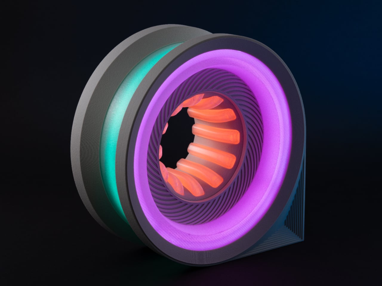
The Cyber Loop Lamp is the kind of result that tends to stop people mid-scroll. It takes the shape of a vertical wheel, somewhere between a car’s rim and a navigation pin laid flat, and wraps that form in a layered lighting system that creates an infinity-like depth effect. The files are available for free on MakerWorld, and building one is a genuinely demanding project.
Designer: LightCore3D
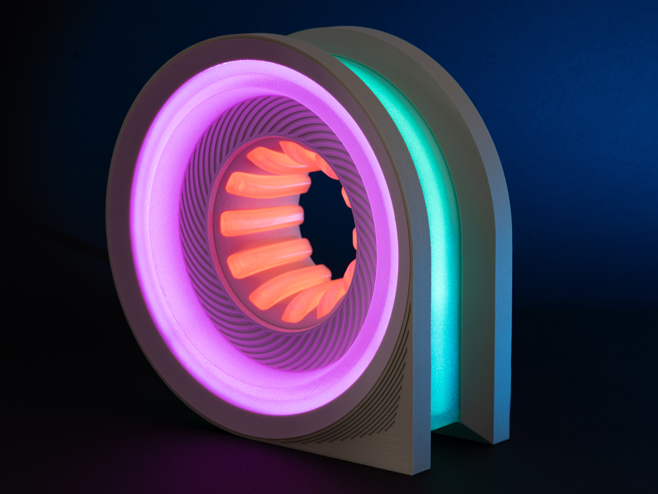
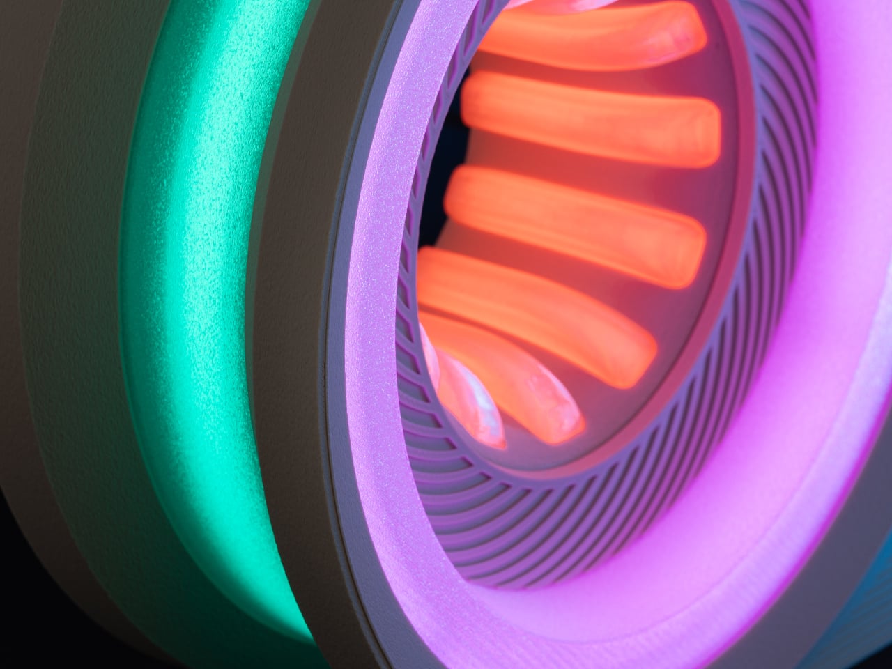
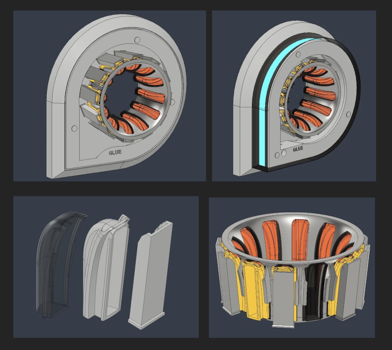
At approximately 25cm tall, the lamp has enough presence to anchor a desk corner without overwhelming it. The design uses colored filament for the outer shell and clear filament for a transparent inner diffuser layer. That separation between the light source and the outer shell produces the glowing, almost holographic depth that makes the lamp look so unlike anything that came off a 3D printer.
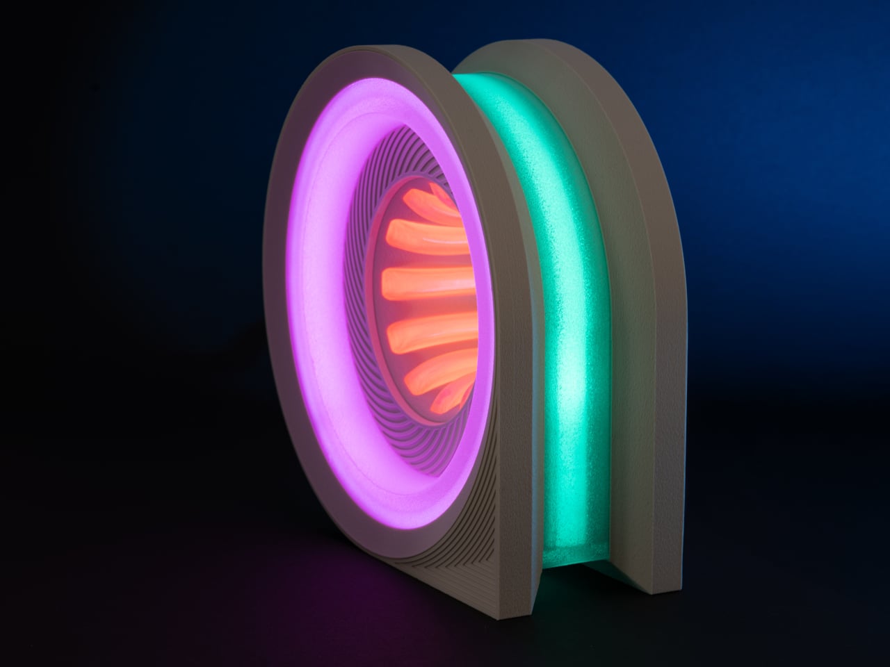
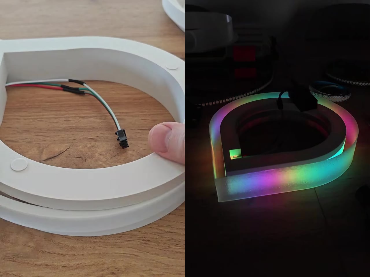
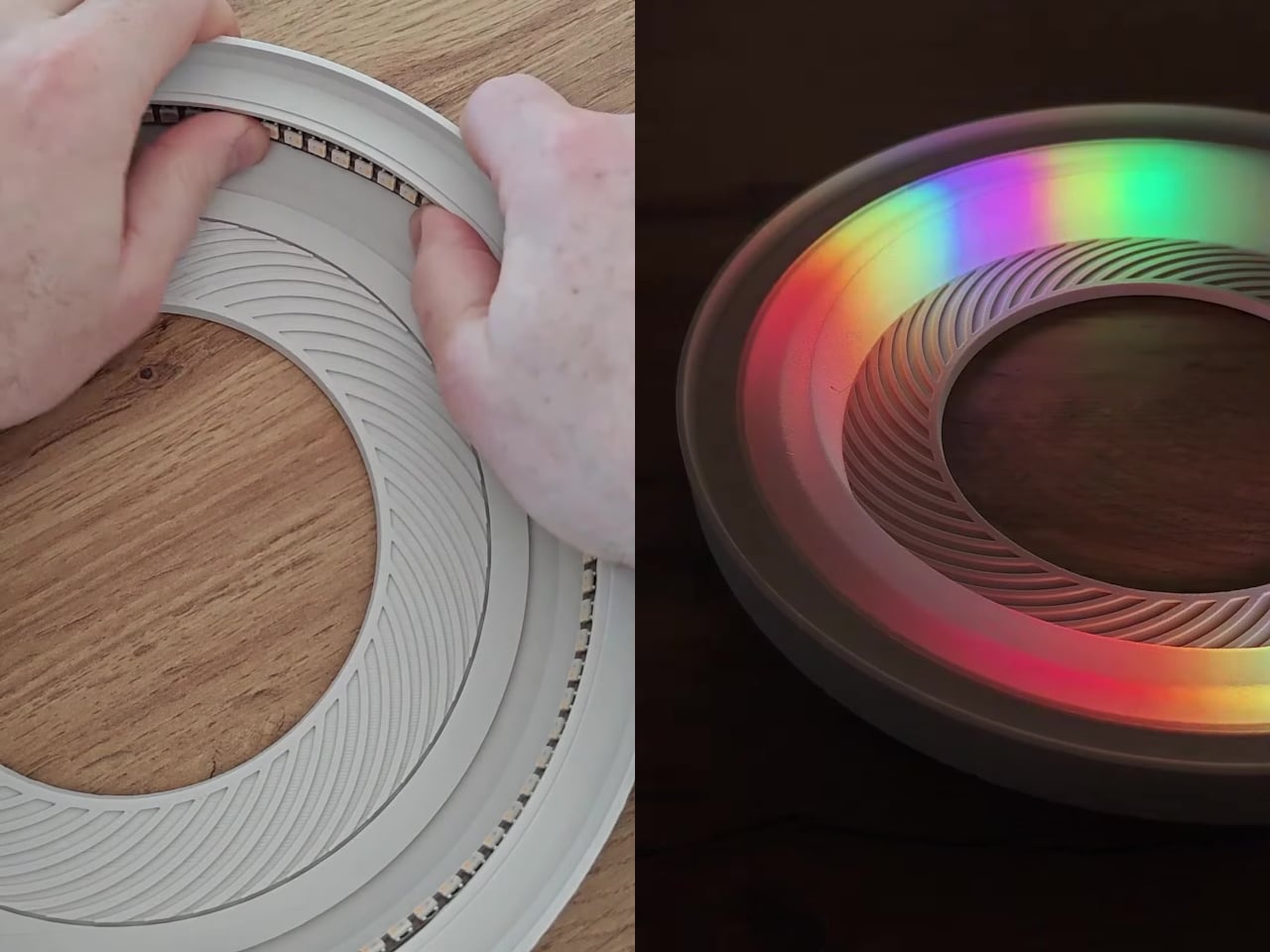
The lighting system draws from nearly 300 individually addressable RGB LEDs, packed into a 2m WS2812B strip running at 144 LEDs per meter. Three distinct zones handle the display: a central funnel, the outer perimeter ring, and roughly a dozen inner spokes. Each zone runs its own color and effect independently, giving the lamp that layered, animated quality that holds attention in a way static ambient lighting usually doesn’t.

Control comes from an ESP32 board running WLED firmware, which lets you map each LED zone to its own effects group and cycle through custom presets. WLED is open-source and widely supported, with a large built-in animation library and enough room to create your own sequences on top. The entire system draws from a 5V, 6A power supply, relatively modest for something delivering this amount of visual output.
Getting there takes real commitment. The model spans 12 print plates with an estimated print time of roughly 35 hours, and that’s before assembly begins. Soldering is required, and components like resistors and capacitors join the LED strip and controller in the electronics stack. The creator is upfront that the assembly process isn’t fully documented, so some steps will require problem-solving on the fly rather than following a defined guide.
That friction is part of what makes the result feel earned. A lamp that takes 35 hours to print and several more to assemble isn’t something you’d put together casually, which means it carries weight as an object in the room beyond what any store-bought light could. It sits at a desk or shelf and reads as something deliberately built for exactly the space it occupies.
The Cyber Loop Lamp lands in that unusual territory between a functional accent light and something closer to a display piece, the kind of object that draws questions from people in a room before they figure out what it even is. The model is free on MakerWorld, and the full bill of materials is available directly from the project page for anyone ready to commit to the build.
The post This Free 3D Lamp Has 300 LEDs and Looks Nothing Like a Printed Object first appeared on Yanko Design.