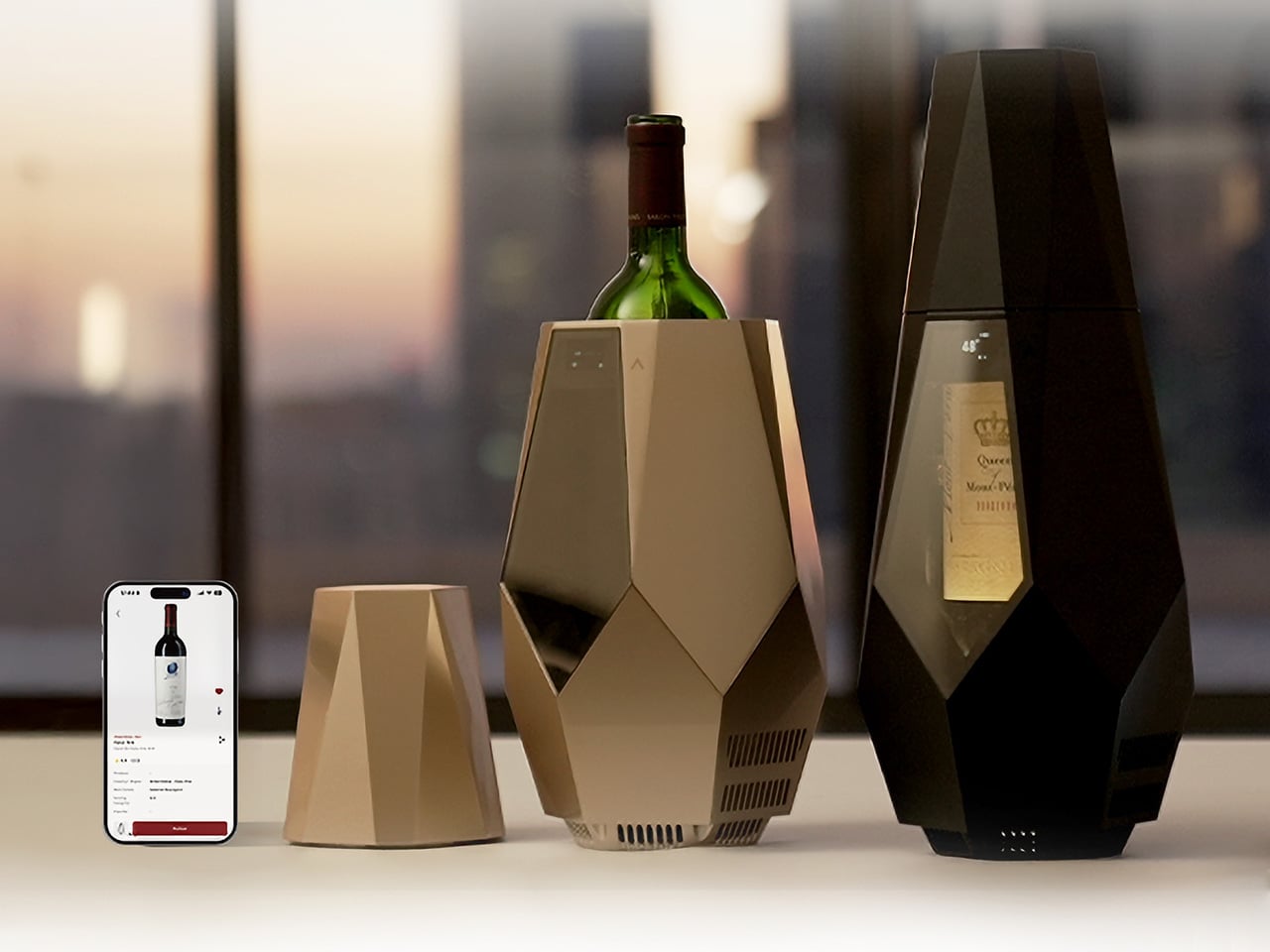
Wine culture has never been more accessible, with good bottles showing up at rooftop dinners, backyard gatherings, and weekend trips just as often as they do at restaurant tables. What hasn’t quite kept up, though, is how we actually serve them once we’re there. Temperature is the detail that most people overlook, and it’s arguably one of the most important variables in how a wine actually tastes.
That’s the gap that Porta is designed to fill. It’s a smart, portable wine cooler that keeps a bottle at the right serving temperature without ice, without a power outlet, and without any of the fuss that usually comes with trying to manage these things outside of a dedicated wine space. It’s compact, rechargeable, and built for the kind of drinking occasions that happen well beyond the kitchen.
A bottle can come from a great producer, be stored perfectly, and still taste flat if it’s poured too warm or too cold. Serve a red too warm, and the alcohol starts to overwhelm everything else. Too cold, and the aromas shut down. There’s a narrow window where the flavors actually show up the way they were intended, and that window closes faster than most people realize.
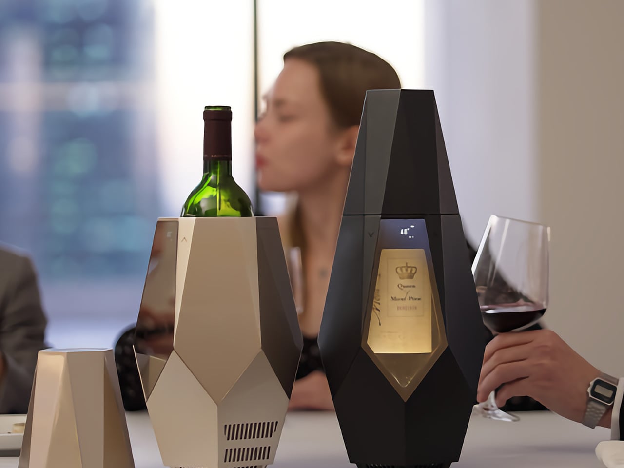
Cellars and wine fridges solve the storage part just fine. But once the bottle comes out and ends up on the dinner table, or worse, goes into an ice bucket, the situation changes pretty quickly. An ice bucket drops the temperature too far and strips the wine of the very character you chose it for. Porta addresses that moment specifically, which is where it actually matters.
The companion app is where Porta’s smarter side comes in. Pair it with your phone, point the camera at the label, and the app identifies the grape variety and sets the chiller to an appropriate temperature automatically. You can also adjust manually, log wines, add tasting notes, and build a personal wine list, making it quite useful for something that just sits quietly on your table.
There’s also a decanting timer built into the workflow, a small detail that makes a real difference. Once you open the bottle and let it breathe, Porta tracks the time and lets you know when it’s ready to pour. It removes the guesswork from a process that casual drinkers tend to skip entirely, adding a bit of structure to the ritual without making it feel like homework.
What makes Porta genuinely interesting as a design object, though, is how cordless it actually is. It runs on an internal 10,000 mAh battery good for up to eight hours of sustained cooling, and charges via USB in about three and a half hours. That makes it as useful on a terrace or a picnic blanket as it is at a formal dinner table.
The cooling itself is handled by a thermoelectric system that operates without any mechanical movement, which keeps things quiet and vibration-free. The interior circulates chilled air around the bottle while a cork-filled insulating frame holds the temperature steady, even when the ambient conditions outside change. It can bring wine down to 46°F and sustain those conditions throughout a meal without needing you to fuss over it.
The design itself is worth noting separately. Porta comes in Champagne Gold and Matte Black, with a faceted, geometric silhouette that tends to draw attention at the table. That’s intentional. The front window keeps the label visible while the bottle chills, turning it into part of the setting rather than something to be tucked away. It’s the kind of object that actually belongs where the drinking happens.
Flowers are easy. A thoughtful card is even easier. But the gifts that actually stay — the ones she sets on the counter without being asked, reaches for every morning, or pauses to show every guest — those take a different kind of thinking. They ask you to know your mom not just as your mom, but as a person with a specific eye: someone who notices when something is made well.
These five picks are for exactly that kind of mom. Each one is thoughtfully designed with intention, made from materials that justify themselves, and beautiful enough to earn a visible spot rather than get buried after the weekend. No generic spa sets, no predictable indulgences. Just five objects that a daughter with genuine taste would be proud to give, and a mom with genuine taste would genuinely want to keep.
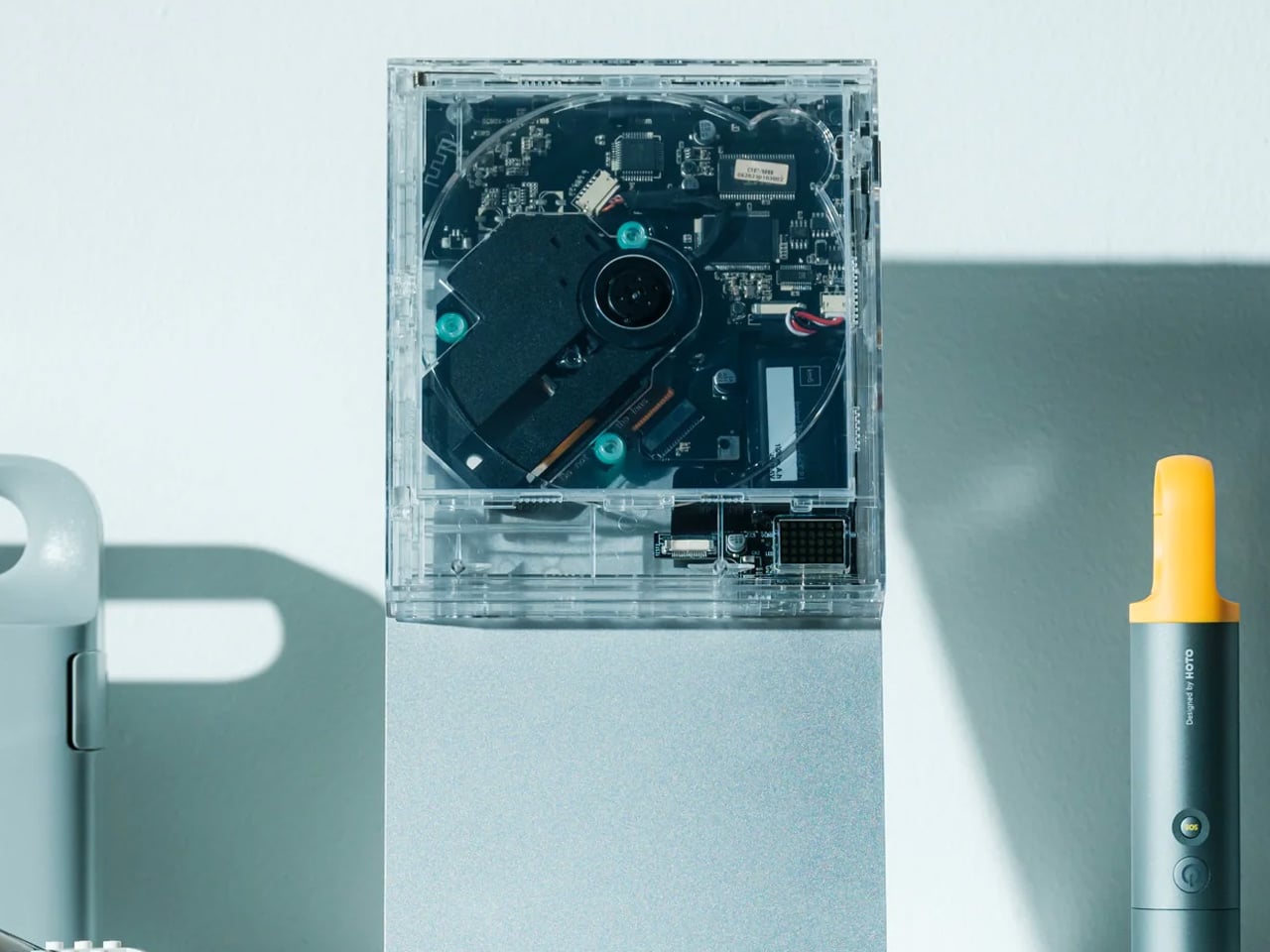
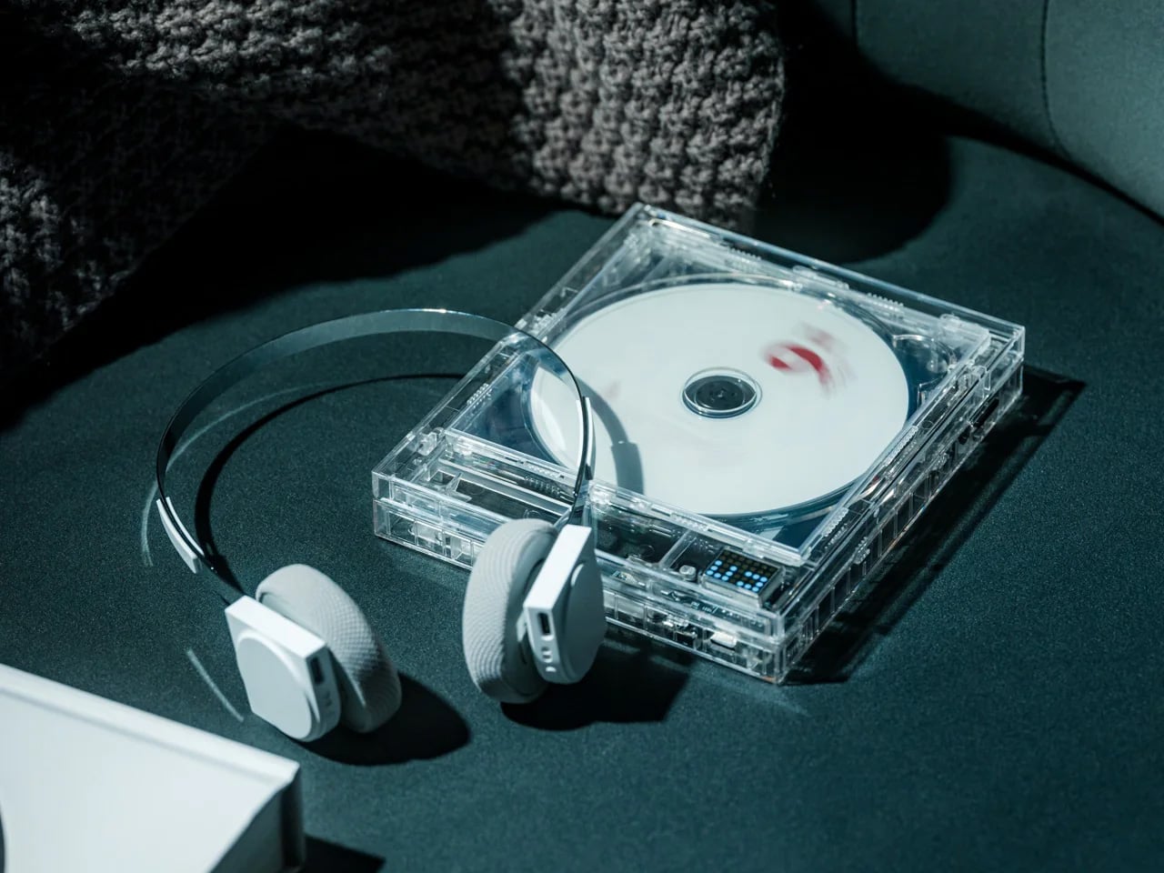
1. ClearFrame CD Player
The ClearFrame CD Player earns its spot on any shelf before it plays a single note. Its crystal-clear polycarbonate body puts the circuit board fully on display, turning every glance into a small moment of discovery. Slip in a disc, slide the album cover into view, and it becomes part music player, part art object, part conversation starter. For a mom who still reaches for a physical album over a playlist, this makes that habit feel modern, considered, and completely intentional.
Bluetooth 5.1 connects it to any speaker already in the house, and a seven-hour rechargeable battery means it moves freely from kitchen counter to bedroom shelf without hunting for a cord. Multiple playback modes let her loop a single track or move through a full album the way it was always meant to be heard. It’s rare to find a piece of technology that genuinely belongs in a design-forward space. This is one of them.
Transparent body doubles as an album art display and is wall-mount ready
Bluetooth 5.1 and a rechargeable battery add genuine cord-free portability
What We Dislike:
Requires physical CDs, which may take some digging out of storage
Won’t resonate with a mom who has fully committed to streaming
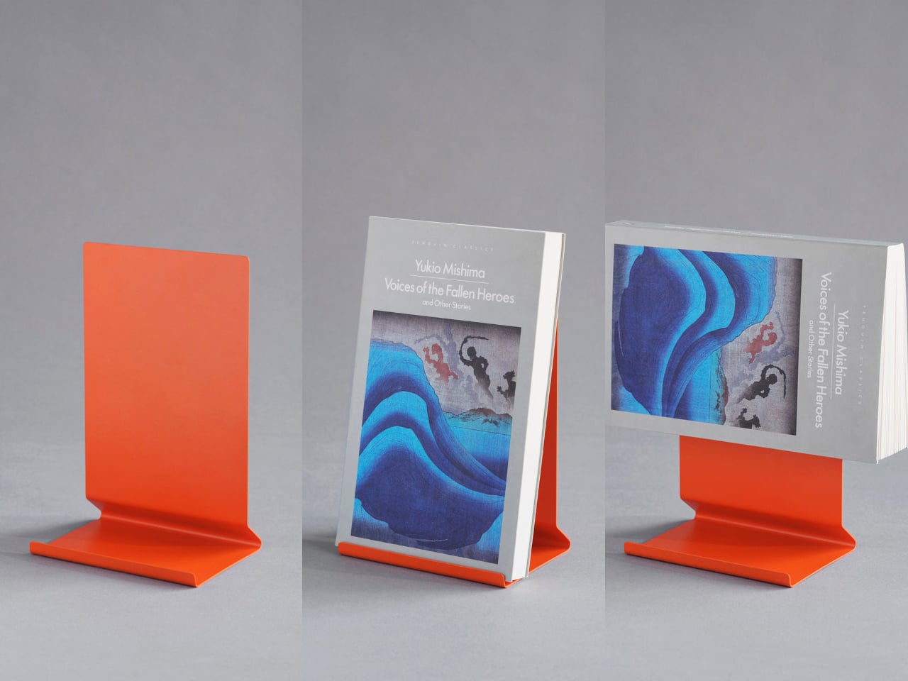
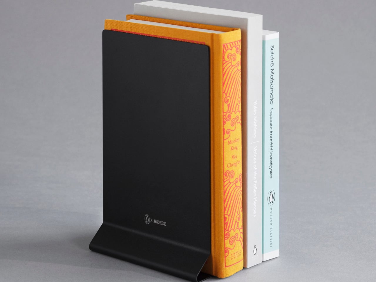
2. The Penguin x MOEBE Book Stand
The Penguin x MOEBE Book Stand treats books as objects worth displaying rather than just storing. Created to celebrate Penguin’s 90th anniversary, it gives reading material a visible, considered place in the room — the kind that makes returning to a current page feel like a natural part of the day rather than a task. Whether she reads at a desk, on a kitchen counter, or in a dedicated reading corner, the stand fits without asking for much in return.
Its bent steel construction works in multiple configurations: holding a book open, displaying a single volume upright, or functioning in pairs as bookends. Available in stainless steel, cream, black, and Penguin’s signature orange, each version uses a single seamless sheet of bent steel with no visible fasteners and a matte finish that stays quiet without disappearing. The angled base handles books of varying thickness without wobbling, and the Penguin and MOEBE marks sit on the base where they belong — present but never in the way.
What We Like:
Single bent steel construction with no visible fasteners gives it a clean, seamless profile
Works as a book display, reading stand, or pair of bookends, depending on the need
What We Dislike:
Limited to one book at a time when used as a display stand
The signature orange colorway may not suit every shelf aesthetic
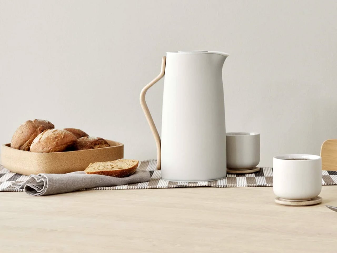
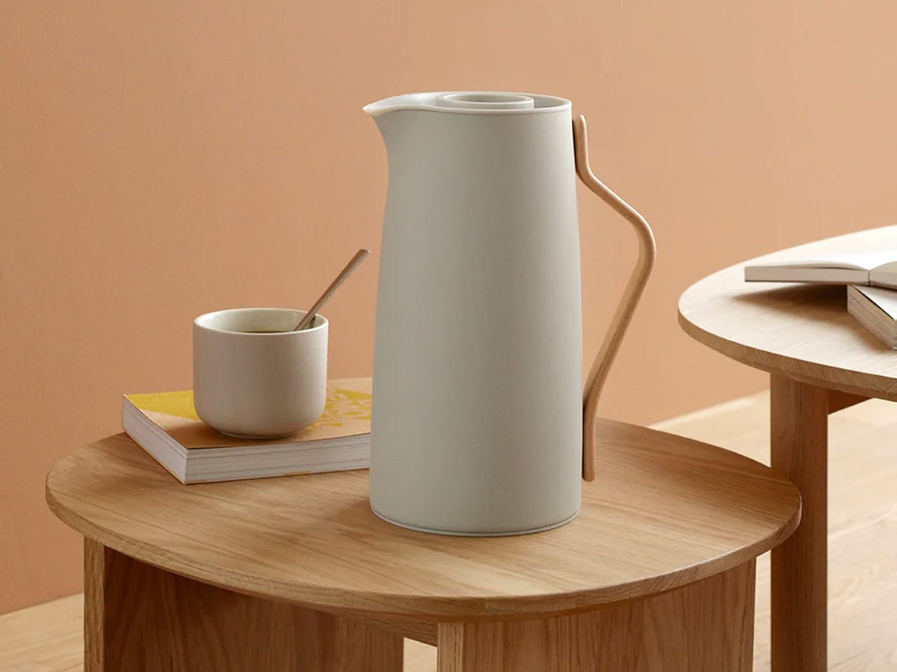
3. Emma Vacuum Coffee Jug
The Emma does something genuinely difficult: it makes a daily routine feel more considered without changing a single thing about it. Designed by HolmbäckNordenoft, the lacquered steel body in soft sand pairs with a Scandinavian beech wood handle, sitting precisely in that space between warm and refined where the best Nordic objects tend to live. The insulated steel interior holds 1.2 liters and keeps coffee hot for hours, which means the fourth cup of the morning is still worth pouring.
The matte-like surface reads almost ceramic, which feels unexpected for steel and earns a second look from anyone passing through the kitchen. The one-hand easy-click lid is the kind of detail that only reveals its value through daily use — unremarkable on paper, essential in practice. Traditional in function and quietly modern in form, the Emma is the kind of object that never gets put away between uses. It simply becomes part of the counter, part of the morning, part of how the day starts.
What We Like:
Insulated steel interior keeps coffee hot for hours without reheating
Beech wood handle and sand finish give it a real, lasting counter presence
What We Dislike:
The 1.2-liter capacity may be more than a single-person household needs
Requires hand washing rather than a dishwasher
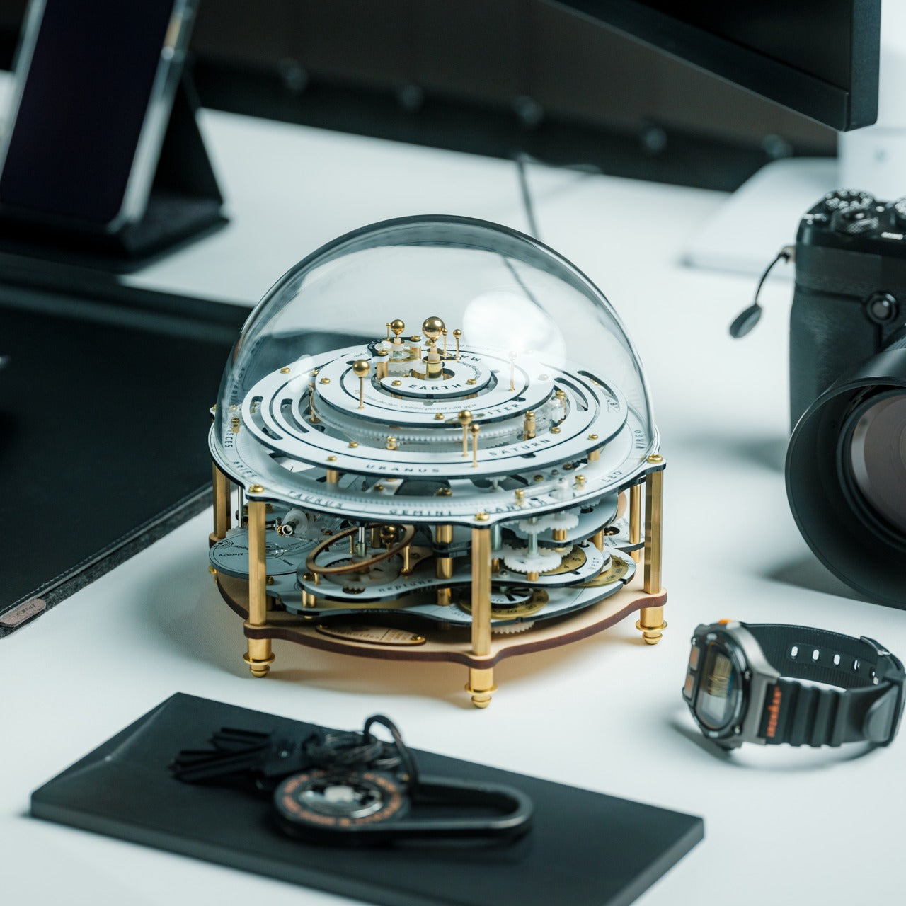
4. Perpetual Orrery Kinetic Art
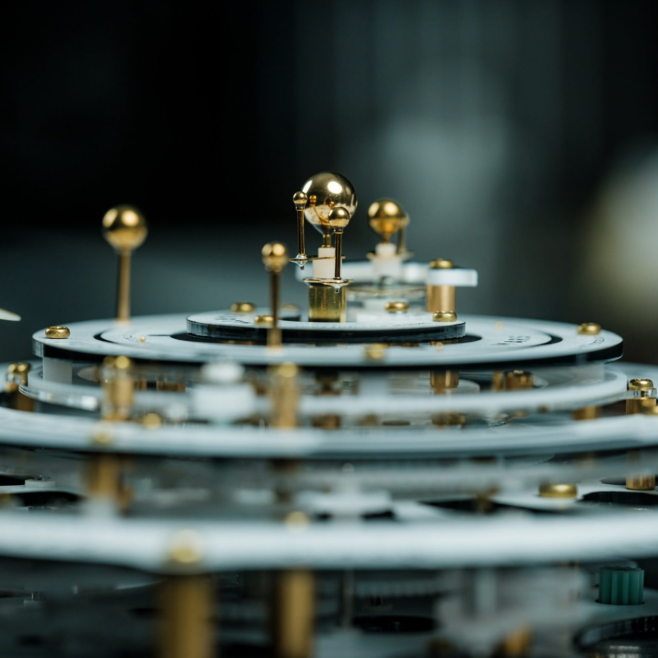
Modeled after the 18th-century European Grand Orrery, this kinetic piece uses wristwatch-grade gear mechanisms to animate the solar system in continuous real time. Planets trace their orbits, the moon moves through its phases, and the Tempel-Tuttle comet follows its elliptical path quietly in the background. For a mom who keeps objects that reward slow, repeated attention — who would rather look at something that genuinely moves than something that merely occupies space — this earns permanent shelf status.
What separates it from other decorative objects is that it is never quite the same twice. The mechanics are always in motion, meaning every glance catches something slightly different from the last. It earns its visual weight through perpetual movement rather than size alone, working just as naturally in a home office as it does anchoring a living room shelf. Scientific and beautiful, because to the right person, those two things have always belonged in the same sentence.
Real mechanical movement powered by wristwatch-grade gear precision
18th-century Grand Orrery aesthetic with genuine historical grounding
What We Dislike:
Requires meaningful surface space to be properly appreciated
Visual complexity may feel busy in strictly minimal interiors
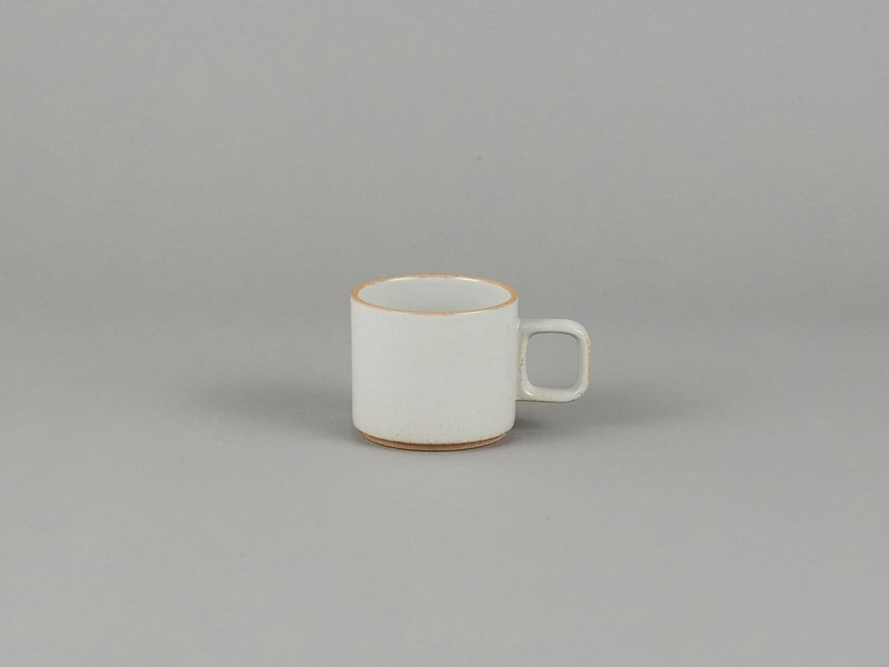
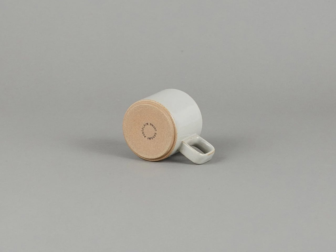
5. Hasami Porcelain Small Mug, Gloss Gray
The Hasami mug doesn’t announce itself, and that’s entirely the point. Made in Hasami, Japan, from a proprietary blend of crushed Amakusa stone, it carries a ceramic lineage that the gloss gray glaze reflects without performing. Designed by Taku Shinomoto of Tortoise General Store in Venice Beach, it sits at a precise intersection of Japanese craft tradition and California restraint. The proportions feel right in the hand from the very first use, the glaze is clean and consistent, and the form looks deliberate wherever it lands.
It’s also part of a larger stackable, modular system that pairs with bowls, plates, and larger mugs as a single coherent family — something to build on over time rather than a standalone piece. For a mom who cares where things come from, who values a real material from a real place over a clever label, this mug delivers without ever showing off. Simple, precisely made, and quietly exceptional — the way the best gifts tend to be.
What We Like:
Made from Amakusa crushed stone with genuine craft heritage from Hasami, Japan
Stackable and modular, pairs with the full Hasami Porcelain collection over time
What We Dislike:
Small size may not suit moms who prefer a larger morning cup
Higher price per piece relative to mass-market ceramics
The Best Gifts Already Know Where They Belong
One last thought on presentation: the way you give something shapes how it lands. Set the ClearFrame out with a CD already loaded inside. Present the Bookstand, with her current read already propped in it, so she sees the idea before she reads a word about it. Give the Orrery real room to breathe, and wrap the Hasami mug with the same care it carries.
The best version of any gift arrives already knowing exactly where it belongs. These five were all designed with that built in — objects made to live somewhere visible and get used every day. Not what it costs or how it photographs, but whether she’ll still reach for it years from now, when the occasion is long gone, and the object has simply become hers. That’s the only standard that matters.
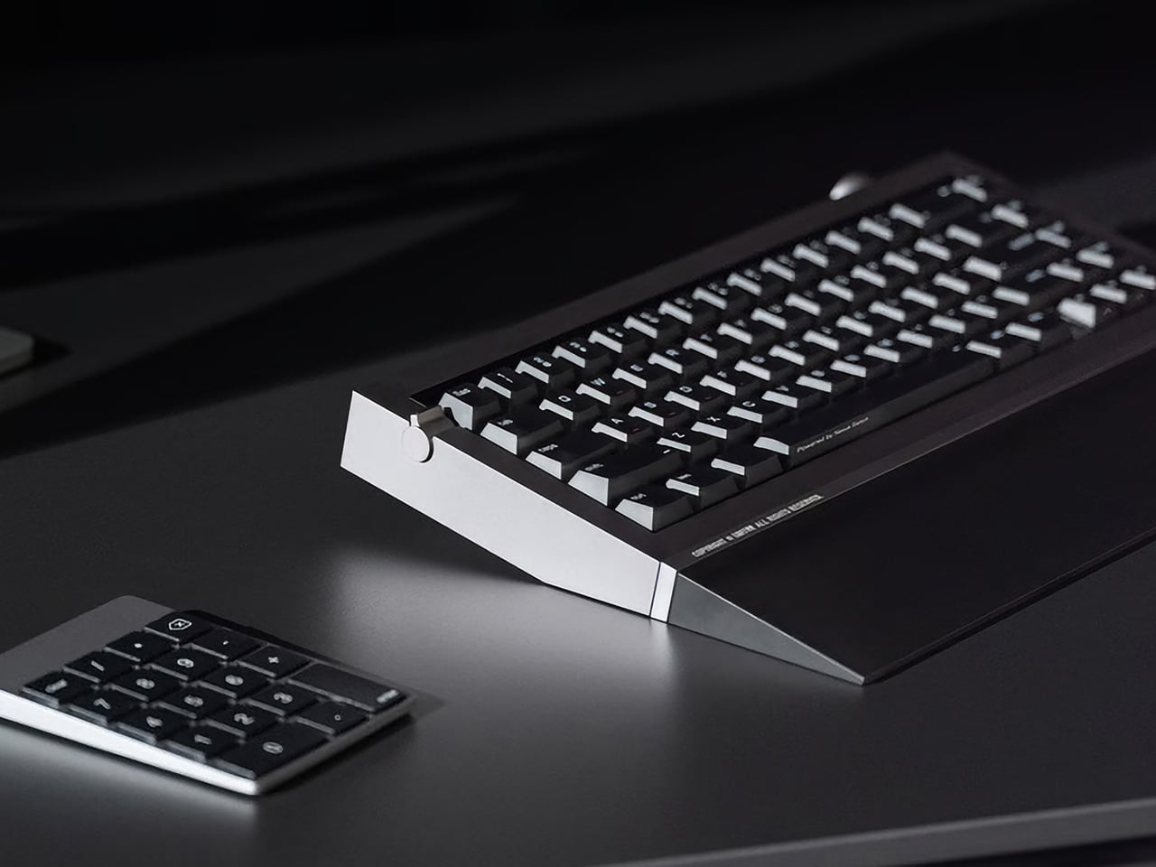
The keyboard market often feels split into two very different camps. Mechanical boards have long been the preferred choice for people who care about typing feel, delivering consistent keystrokes and a tactile quality that makes long sessions more enjoyable. Magnetic keyboards, meanwhile, have become the go-to for gamers needing precise, adjustable input and rapid trigger performance. Both are capable, but each comes with its own trade-offs.
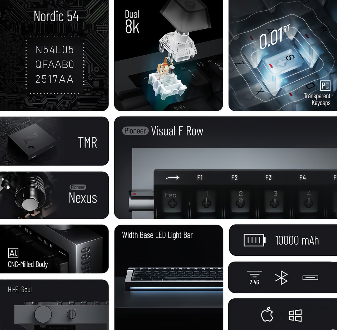
That split is exactly what Lofree is trying to bridge with the Hyzen, a compact 67-key keyboard that approaches the category with a slightly different proposition. Working with Kailh, Lofree developed the Nexus switch, combining a mechanical structure with magnetic sensing in a single unit. The idea, of course, is that you shouldn’t have to choose between how a keyboard feels and how quickly it responds.
Beyond the technology inside, the Hyzen is clearly built to belong on a thoughtfully put-together desk. The CNC-machined aluminum body, clean geometry, and balanced proportions give it a composed presence that doesn’t lean into the visual language typical of gaming hardware. Available in Space Gray and Silver, it carries far more of the character of a premium desk accessory than a performance peripheral.
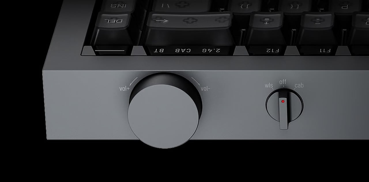
The lighting follows the same restrained approach. Rather than making RGB the main event, Hyzen uses subtle front ambient lighting and a light strip along its front edge that adds atmosphere without taking over. High-transparency PC keycaps with a matte UV coating and front-printed legends keep the visual detail quiet. It’s the kind of setup that works best in calmer, low-light arrangements where you want mood without the theatrics.
The Nexus switch is where the Hyzen’s concept actually becomes tangible. A single shortcut toggles between mechanical mode, which uses traditional contact-based actuation, and magnetic mode, which unlocks the performance features. According to Lofree, the physical typing feel stays consistent across both. What changes is how the input gets detected, which is Lofree’s answer to a problem many users know well.
On the productivity side, Hyzen carries a 10,000 mAh battery for solid wireless runtime, whether you’re writing documents or hopping between devices. Connectivity covers wired USB, 2.4 GHz, and Bluetooth, so switching between a work machine and a personal setup doesn’t take much effort. The PCB gasket construction and FR4 fiberglass plate also contribute to a more considered typing feel that holds up well over longer sessions.
Switch to gaming, though, and things get considerably more interesting. Magnetic mode unlocks adjustable actuation with 0.01 mm precision, rapid trigger with 0.01 mm accuracy, and a dual 8K polling rate at 8,000 Hz on both keyboard and receiver. Wired latency sits at 0.36 ms, with 2.4 GHz at 0.65 ms. Those are numbers competitive setups look for, in hardware that, for once, doesn’t look aggressive doing it.
There’s also a multi-function key window that lets you toggle between the F-row and number row, with a visual indicator showing the active mode at a glance. It’s a small detail, but a genuinely useful one on a compact layout where function layers can get confusing fast. Hot-swap support, macro functionality, and web-based key mapping round out a package that covers more ground than you might expect.
Keyboards that try to balance aesthetics and performance this explicitly still feel relatively uncommon. Most still ask you to pick a lane, whether that means living with something that looks aggressive on a clean desk or one that feels clinical when you’d prefer more character. Hyzen is trying to sit in between, which is either the smartest place to be or the most difficult one, depending on who you ask.
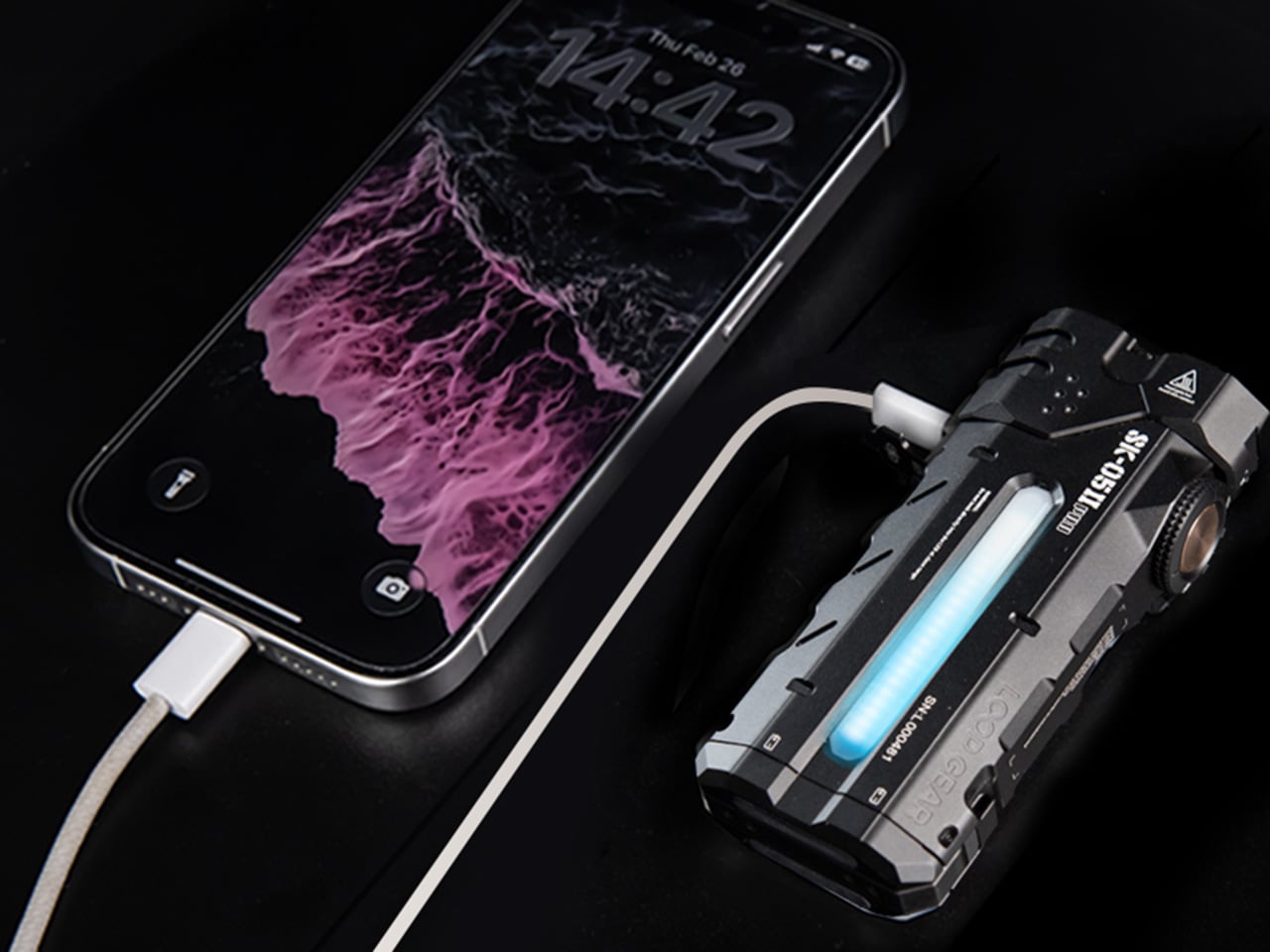
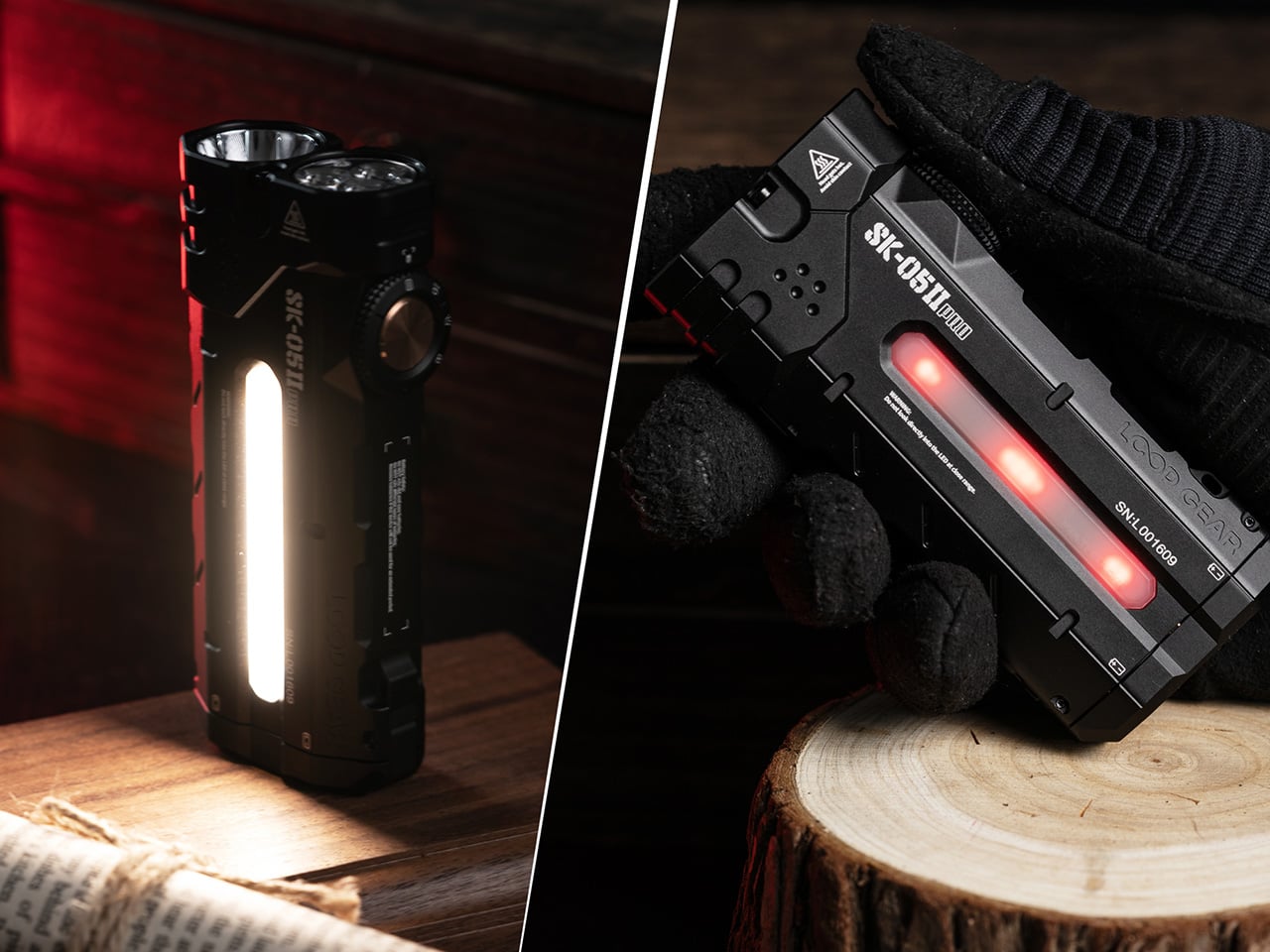
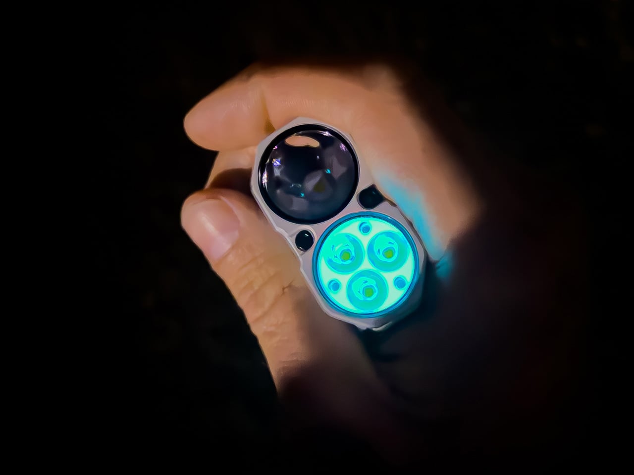
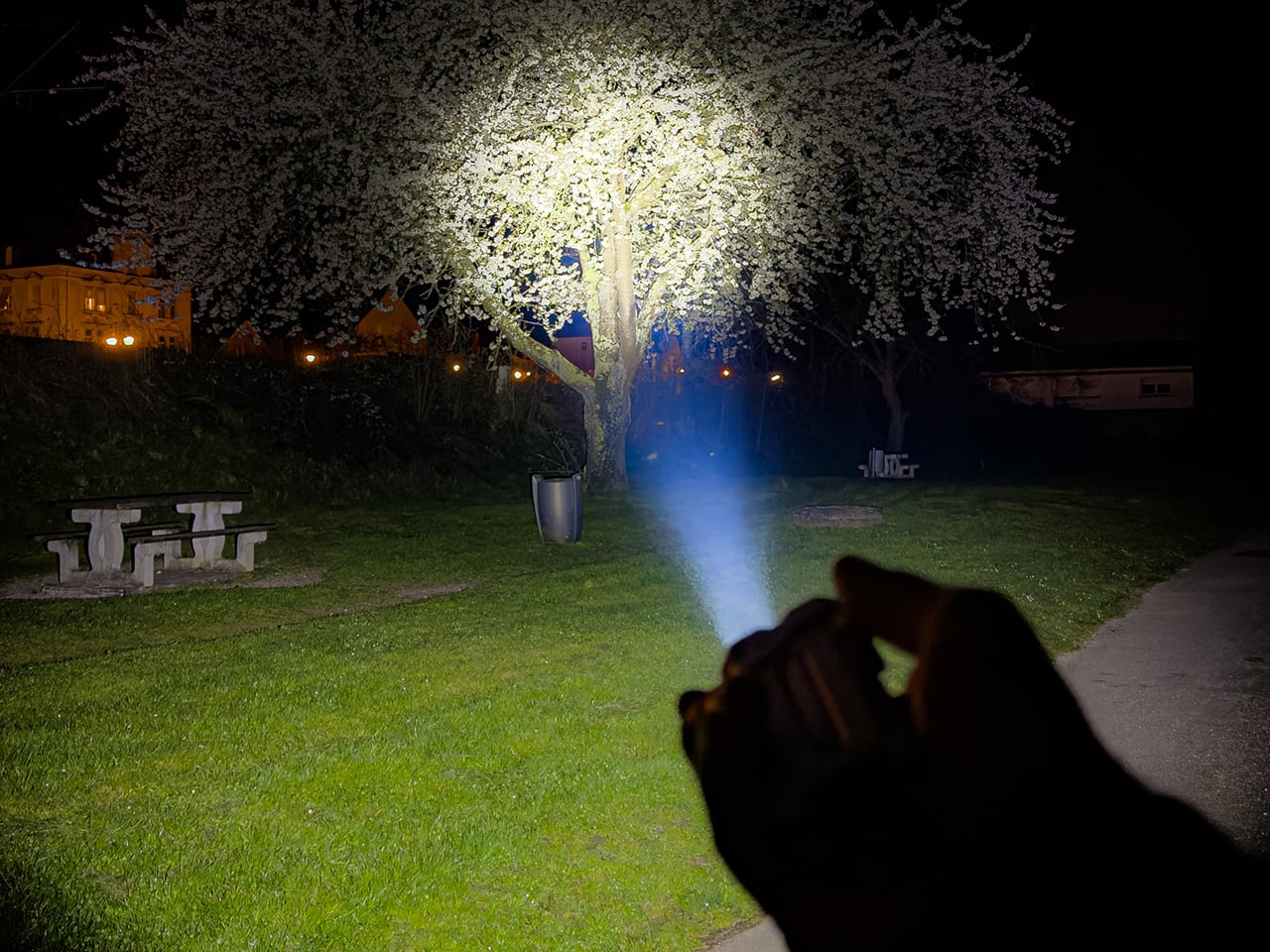
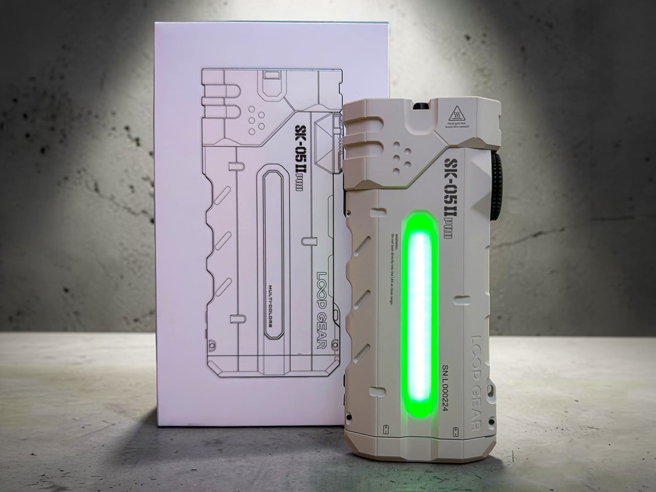
Flashlight manufacturers love to brag about lumen counts, but raw output means very little when the beam profile can’t match the task at hand. A spotlight punches distance but leaves your peripheral vision in the dark. A floodlight washes everything in even brightness but can’t reach past thirty meters. LOOPGEAR’s SK05 Pro 2 solves this by housing both emitter types in a single body, controlled independently through a Rose Gold rotary dial that snaps between modes with mechanical precision. This is the second generation of their dual-light platform, and the performance gap between versions is staggering. Spotlight output jumped 92 percent, from 1300 lumens to 2500, while the floodlight climbed 24 percent to 3800 lumens.
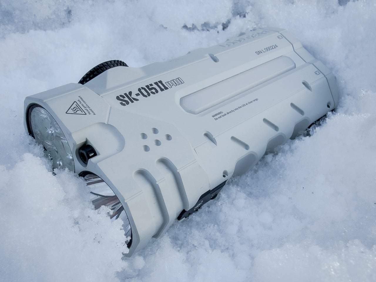
The SK05 Pro 2 measures 106mm long, 47.8mm wide, and 22.5mm thick, a form factor that sits somewhere between a smartphone and a multi-tool. Two 18650 cells run in parallel, giving you 8000mAh of capacity that charges devices at up to 12 volts, a rare feature in the EDC flashlight category. LOOPGEAR offers two emitter choices for the floodlight: Nichia 519A for high color rendering or RE-SF18-W for higher raw output. Both versions use the same SFT42R LED for the spotlight channel. The entire package shares the same machined metal body, IP68 waterproofing, magnetic base, and integrated sidelight with true white and RGB modes. The body ships in black or white MAO (matte anodized) finishes, and the overall design language leans heavily into tactical geometry with angular cutouts and textured gripping surfaces.
The rotary dial controls everything, and its mechanical feedback feels deliberate in a way touchscreens and membrane buttons never will. Twist clockwise and you cycle through the spotlight’s four brightness levels: 40 lumens for map reading, 320 for general navigation, 950 for serious illumination, and a 2500-lumen turbo that steps down after 40 seconds to prevent overheating. Twist counterclockwise and you access the floodlight’s range, from a 50-lumen low that won’t destroy your night vision to the 3800-lumen turbo that lights up a campsite like midday. Hold the dial for two seconds and both emitters fire simultaneously, combining for 5000 lumens of output that reaches 410 meters in the spotlight channel. The dial itself is CNC-machined with knurling that grips even when wet, and the detents are firm enough that accidental mode changes in a pocket or bag are nearly impossible.
Two 18650 batteries slide into the body from the bottom, both oriented the same direction thanks to the parallel wiring configuration. This setup has practical advantages beyond the 8000mAh total capacity. If one cell dies mid-trip, the light continues running on the remaining battery, albeit at reduced runtime. The cells LOOPGEAR includes are standard 4000mAh units, meaning replacements are easy to source. The USB-C port sits on the side, protected by a magnetic metal flap that seals tight enough to maintain the IP68 rating. Charging happens at up to 22 watts, which fills both batteries in roughly three hours. What separates this from most rechargeable flashlights is the powerbank output capability, specifically the ability to deliver 5V, 9V, or 12V depending on what your device negotiates. Most EDC lights with powerbank features max out at 5V, which limits you to slow-charging phones and basic USB accessories. The SK05 Pro 2 can fast-charge a laptop, power a USB-C monitor, or run higher-voltage gear in the field.
The sidelight runs along the length of the body, a COB (chip-on-board) LED strip that outputs white light in four brightness levels or switches to RGB mode for signaling and ambient lighting. LOOPGEAR upgraded this to a high-CRI emitter in the Pro 2, and the difference is immediately visible when you’re working on anything that requires color accuracy. The white mode ranges from a sub-lumen moonlight setting that lasts over 100 hours to a 120-lumen high that floods your immediate workspace without the harshness of the main emitters. The RGB mode cycles through red, green, and blue, useful for preserving night vision, map reading, or just making the light visible in a packed bag. The sidelight activates through a separate button near the dial, so you can run it independently or combine it with either the spotlight or floodlight for layered illumination.
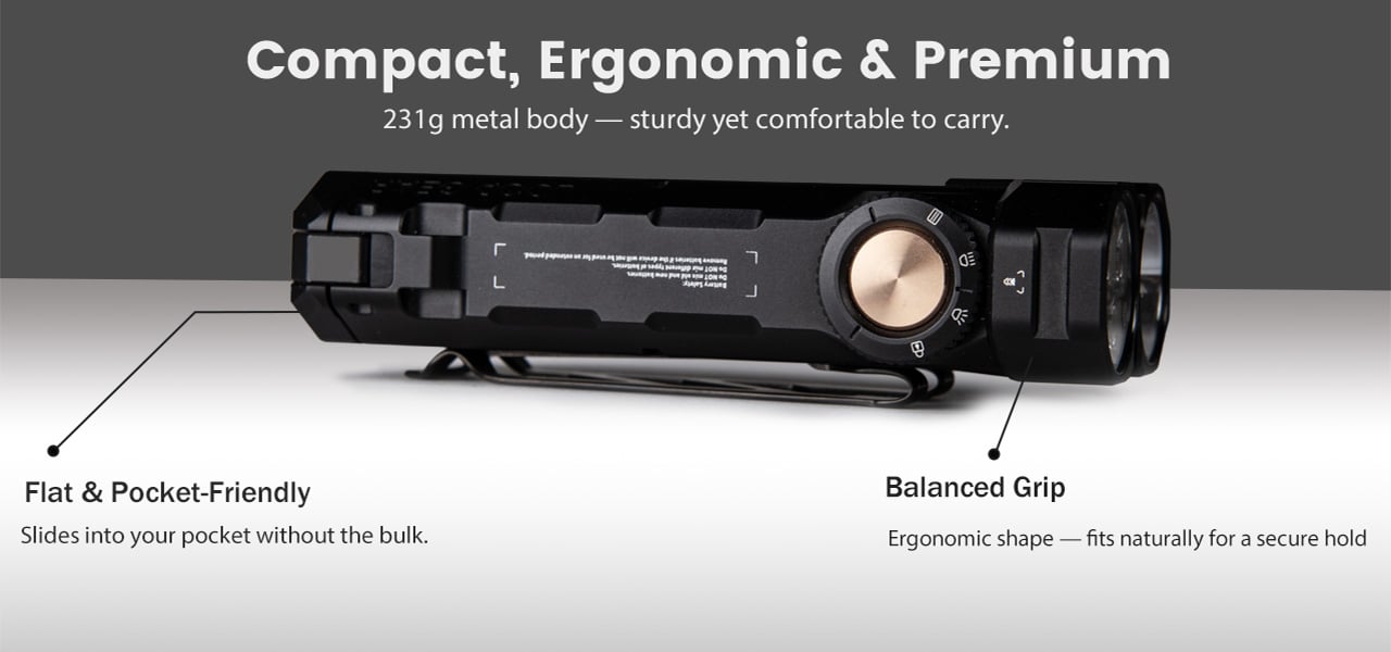
LOOPGEAR machined the body from metal (likely aluminum based on the weight-to-size ratio) and applied a matte anodized finish that resists scratches and provides grip without being aggressively textured. The corners are chamfered, the sides feature cutouts that reduce weight and add visual interest, and the overall aesthetic skews tactical without crossing into mall-ninja territory. A magnetic base sits at the tailcap, strong enough to hold the light vertically on a car hood or toolbox while you work hands-free. The pocket clip along with a separate nameplate mount via screws (included, along with the installation tool), and you can position it in multiple orientations depending on how you carry. At 231 grams with batteries loaded, this sits heavier than a typical EDC pen light but lighter than most full-size tactical flashlights, and the flat profile distributes that weight in a way that disappears in a cargo pocket or bag.
The competitive landscape for dual-emitter flashlights is sparse, mostly because the engineering complexity tends to drive prices into the $200-plus range where brands like Acebeam and Nitecore operate. LOOPGEAR positioned the original SK-05 Pro around $150, and early indications suggest the Pro 2 will land in similar territory despite the significant performance upgrades. That puts it well below premium dual-channel lights while offering comparable (in some cases superior) output and feature density. The closest analog is probably the Acebeam E70, which offers similar throw and flood capabilities but weighs more, costs more, and lacks the powerbank voltage flexibility. The Sofirn IF22A delivers comparable spotlight performance at a lower price, but it’s a single-emitter design with no floodlight option and no powerbank functionality.
The SK-05 II Pro currently retails at $113.98, down from the original $159.99 list price, a $46 discount that positions it aggressively below the dual-channel competition. Comparable lights from Acebeam and Nitecore typically land in the $180 to $200 range, and most lack the multi-voltage powerbank capability that makes the LOOPGEAR viable as a backup charging solution for higher-draw devices. LOOPGEAR ships the light with both 18650 cells, a USB-C charging cable, pocket clip hardware, and installation tools, so you’re field-ready out of the box. The company’s track record with the original SK-05 Pro and the LOOPDOT platform suggests consistent firmware updates and responsive customer support, which matters when you’re trusting a single device to handle both illumination and emergency power in remote environments. Whether this becomes your primary EDC light depends on whether you value dual-emitter flexibility over the slimmer profile of a traditional cylindrical flashlight, but at this price point with this feature set, few competitors deliver comparable performance per dollar.
There is a particular kind of Tuesday that gets you. Not Monday, which at least carries the clean energy of a fresh start. Tuesday is when the week begins to feel long before it has any right to, when the desk stops feeling like a chosen space and starts feeling like a place you were assigned. The objects surrounding you have more influence over that feeling than most people acknowledge.
Wabi-sabi, the appreciation of imperfection and transience. Ma, the intentional use of space. Ikigai, the reason to get up. These are not aesthetic trends or interior design keywords. They are deeply considered frameworks for how the material world supports a good life. The five accessories here carry those values in practical, beautiful, desk-ready form — not to impress anyone walking by, but to make every Tuesday worth being present for.
1. ZenFlow Personal Aroma Diffuser
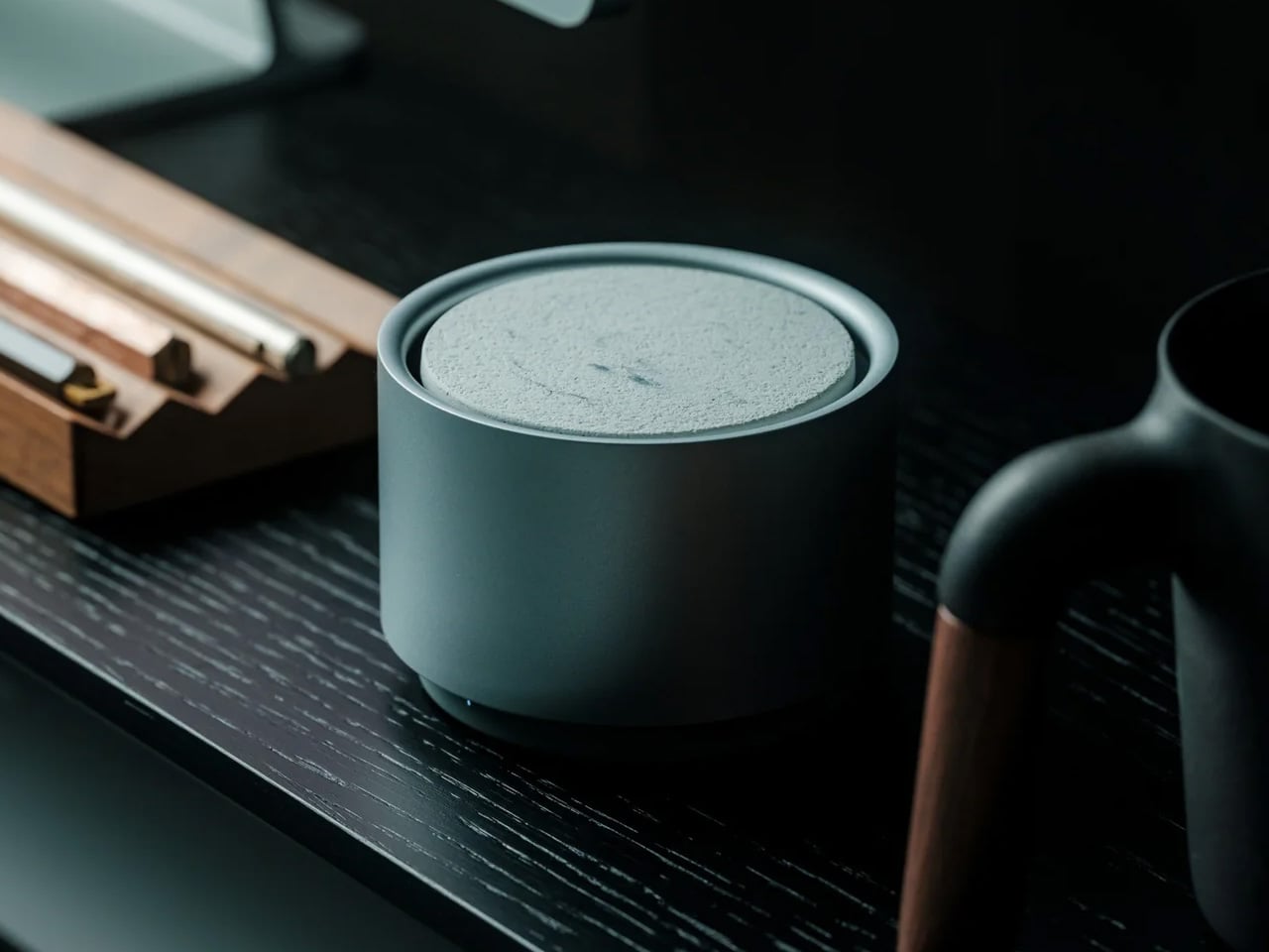
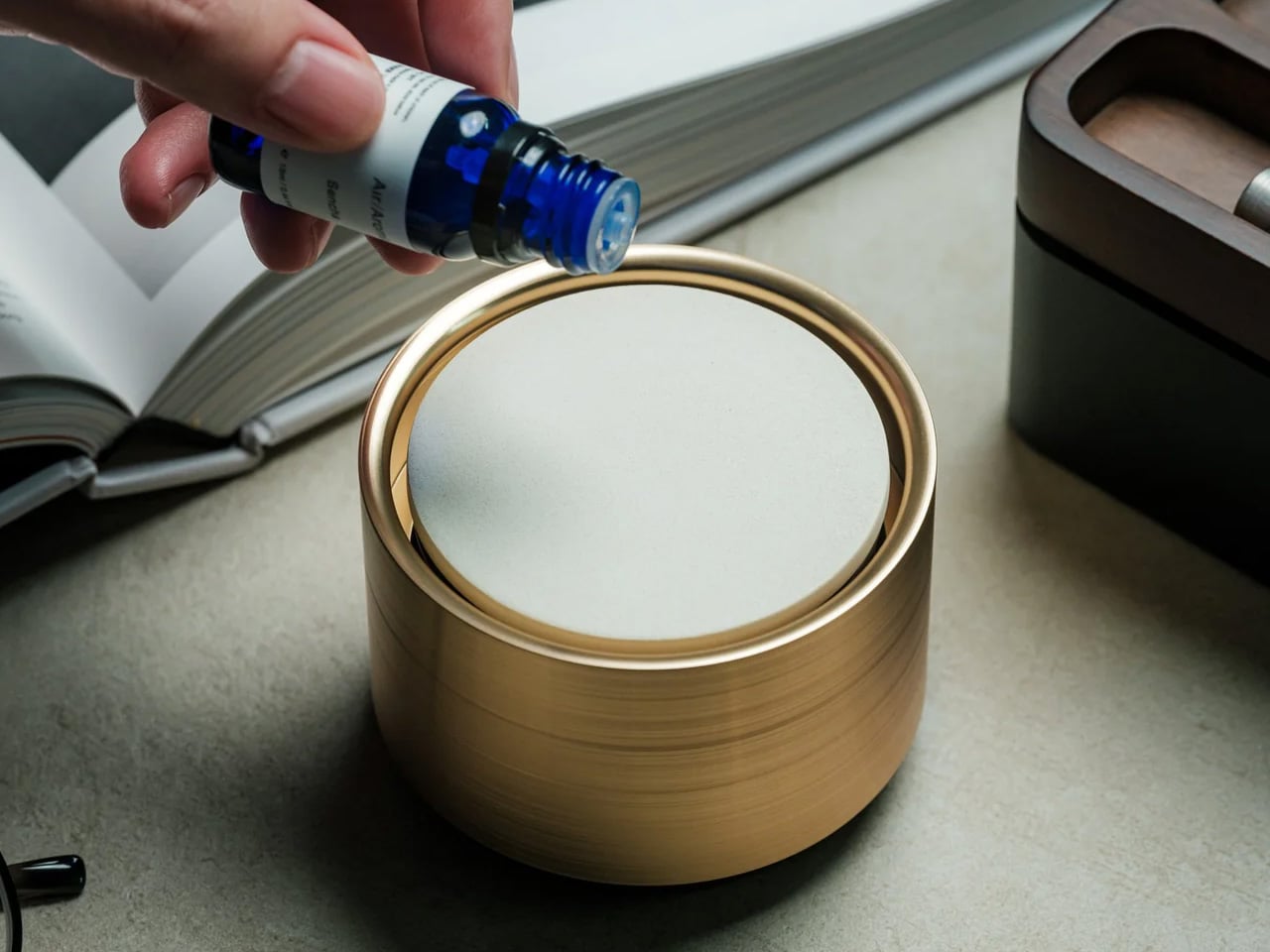
The ZenFlow Personal Aroma Diffuser earns its place on your desk through all your senses at once. It looks sculptural — a handcrafted porcelain filter sitting atop an anodized metal base in Silver, Gold, or Black — but the experience it creates is what makes it genuinely useful. The diffuser combines heat and airflow technology to evenly disperse essential oils through the air without water or mist, keeping your workspace clean and calm. It is aromatherapy without the clutter, without the fuss, and without the puddle on your desk.
For you, this means a desk environment that actively supports focus rather than merely existing around it. Switch between Normal Mode for stronger scent presence during deep work, Airflow Mode when you want subtlety, or ECO Mode for energy-efficient background relaxation throughout the day. The handcrafted porcelain filters are a product of Shibukusa Ryuzo Porcelain’s 180-year legacy, adding a layer of cultural weight to a device that already justifies itself on practicality alone. When the air around you smells intentional, the entire morning shifts slightly in your favor.
Water-free technology keeps your desk surface completely clean and mess-free
Three adjustable modes let you match the diffuser to your energy level throughout the day
What We Dislike
Essential oil refills add an ongoing cost over time
The handcrafted porcelain filter requires careful handling to avoid breakage
2. Magboard Clipboard
Paper notebooks are personal things. They carry the texture of actual thinking — the crossed-out lines, the sketches in the margins, the half-finished sentences that eventually turn into something better. The Magboard Clipboard understands this in a way that most stationery products do not. Its magnet and lever mechanism lets you bind up to 30 loose sheets without any predefined layout, order, or margin, giving your note-taking the same flexibility as your actual thought process. The hardcover construction is rigid enough to write on while standing.
What it gives you is freedom from the structure that most notebooks quietly impose. Pull out a page, reorder your notes, add a fresh sheet mid-thought, and put everything back in whatever sequence makes sense for how your brain works that day. The water-resistant surface means the board travels without hesitation — into a client meeting, a coffee shop, or a commute in unpredictable weather. For anyone who thinks with a pen in hand, Magboard removes every practical reason not to write, and in doing so, makes the act of capturing ideas feel genuinely frictionless.
Loose-sheet format lets you reorganize, remove, and add pages freely without tearing
Hardcover design supports writing without needing a flat surface underneath
What We Dislike
Loose pages can be easy to misplace if not managed with some care
The magnet and lever mechanism may feel unfamiliar to those used to traditional bound notebooks
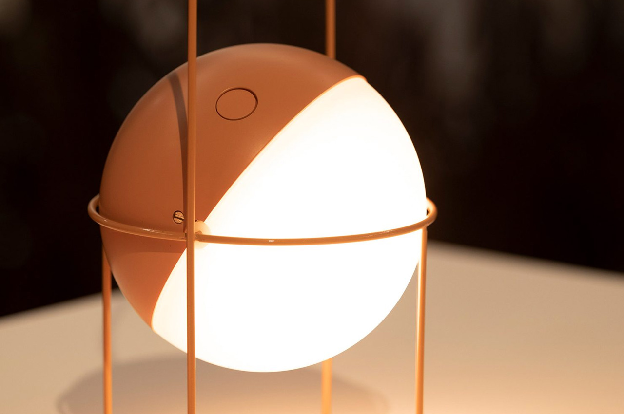
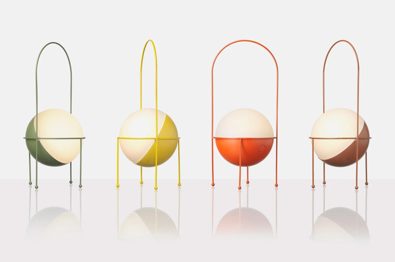
3. Madco Table Lamp
Designed by Italian designer Elisa Ossino for Japanese brand Ambientec, the Madco Table Lamp takes the warmth of a festive Japanese lantern and distills it into something small, quiet, and considered. A sphere-shaped diffuser sits suspended within a sleek metal frame, available in five colors chosen to add playful elegance without overwhelming a space. It marks the first time Ambientec introduced color into its design language, and the restraint with which they did it says everything — there is nothing loud here, only warmth and a kind of confident understatement.
For you, the Madco is the kind of light source that changes the felt quality of your desk at the start or close of a working day. It is rechargeable via USB-C, fully portable, and waterproof, meaning it moves with you from desk to balcony to garden without complaint, creating soft visual conversations with plants and outdoor textures along the way. The 360-degree rotating light source lets you direct warmth exactly where you need it. It is less a lamp and more a mood rendered in physical form — the sort of object that makes the transition into work feel like a deliberate choice.
What We Like
USB-C rechargeable and waterproof, making it genuinely portable for indoor and outdoor use
The 360-degree rotating diffuser lets you customize and redirect light output precisely
What We Dislike
Battery life will limit continuous use, particularly at higher brightness settings
Available in five fixed colors only, which may not suit every interior palette
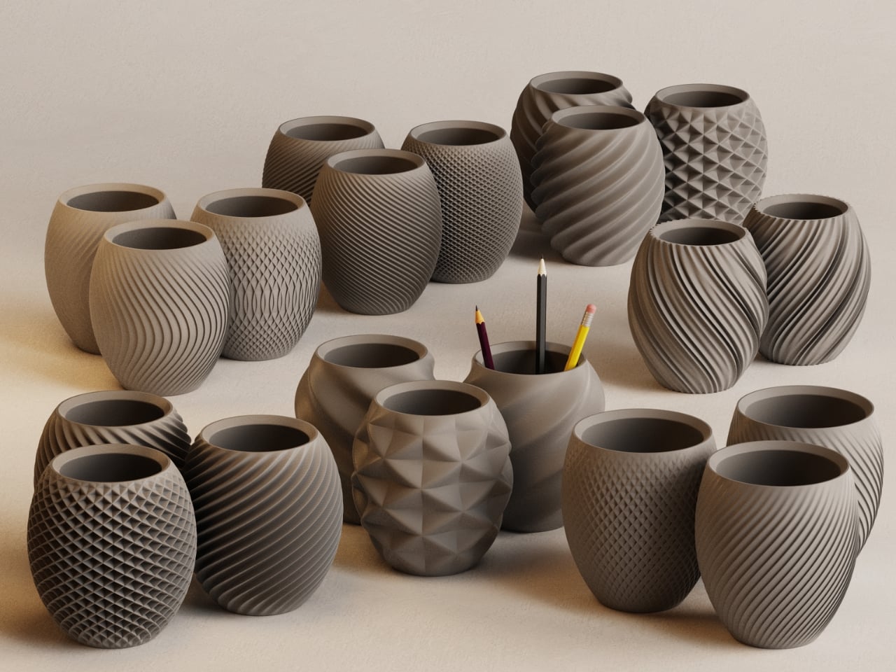
4. Aya & Sfera Desk Organizers
Ikigaiform describes their practice as Japanese minimalism meeting parametric design, a combination that produces objects feeling simultaneously ancient and quietly futuristic. Aya and Sfera began as full-size self-watering planters before being scaled down into desk-sized cups, carrying the same organic forms and intricate surface patterns into a far smaller footprint. The result is a pen holder — or catch-all, or shelf object — that shares design DNA with a living planter, blurring the line between the functional and the living in a way that feels entirely natural on a working desk.
What makes these organizers genuinely useful for you is the way they bring considered calm to whatever surface they occupy. Wabi-sabi aesthetics and Japandi sensibility run through every curve and surface pattern, making each piece feel deliberate rather than merely decorative. Whether you use them to hold pens, cables, a small succulent, or simply as a visual anchor on an otherwise noisy desk surface, they carry an almost-living quality that rewards closer attention. On a Tuesday morning when everything feels like an obligation, these small objects quietly remind you that your environment is something you actually designed.
What We Like
Organic forms and intricate surface textures make these genuinely rewarding to study up close
Compact size fits naturally on desks and shelves without claiming excessive space
What We Dislike
As a niche studio product, availability and restocking may be limited
The soft, organic form may not align with stark industrial or heavily geometric desk setups
5. Heritage Craft Unboxing Knife
Most box cutters are purely transactional. You use them, drop them into a drawer, forget them completely. The Heritage Craft Unboxing Knife refuses that fate entirely. Carved from a block of aluminum, its circular form directly references Paleolithic hand axes, a shape carrying the entire arc of human tool-making history within it. The wave-like patterns left by precision machining are not purely decorative — they give the object grip, texture, and a visual richness that makes you want to pick it up. It is the rare tool that actively asks to be handled.
For you, this is the object that stays on top of the desk rather than inside it. It is effective — genuinely sharp for slicing tape and opening packages — but it holds its position through presence as much as through function. The tapered form sits confidently on any surface, operating simultaneously as a tool and a quiet sculpture. Japanese design philosophy holds that objects should be worthy of the attention we give them, that usefulness and beauty are not separate qualities. The Heritage Craft Unboxing Knife takes that idea seriously, and in doing so, makes even the small ritual of opening a package feel like something worth noticing.
Sculptural aluminum form means it stays visible on the desk rather than disappearing into a drawer
Wave-patterned machining provides both a secure grip and a distinctly artisanal visual quality
What We Dislike
The circular form may require a short adjustment period for those used to standard box cutters
Aluminum construction may accumulate visible surface scratches with regular daily use
The Desk Is the One Space You Actually Get to Choose
The desk is one of the few environments you actually control. Most of what shapes a Tuesday is decided before you sit down — the calendar, the emails, the inbox count. The objects you choose to keep in your immediate space are one of the last genuinely personal decisions left. These five accessories share a quality that goes beyond mere aesthetics: they each slow the eye down, just for a moment.
And in that pause, the morning becomes slightly less automatic. That is exactly what Japanese design has always understood — that objects worthy of attention gradually change the quality of attention you bring to everything else. You cannot redesign your calendar, your inbox, or your Tuesday. But you can redesign the surface in front of you. Fill it with objects that ask something of you. That, quietly, is more than enough.
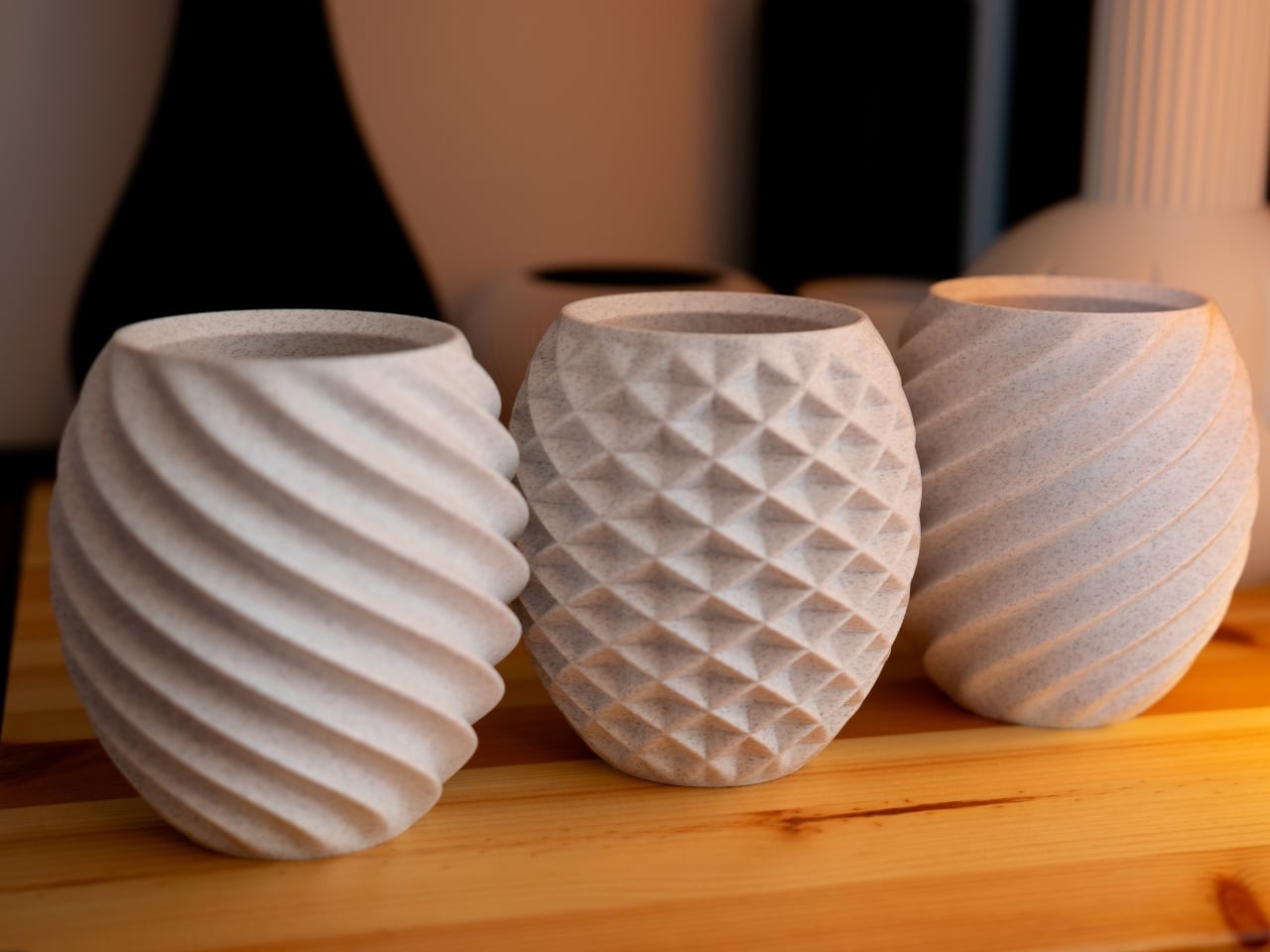
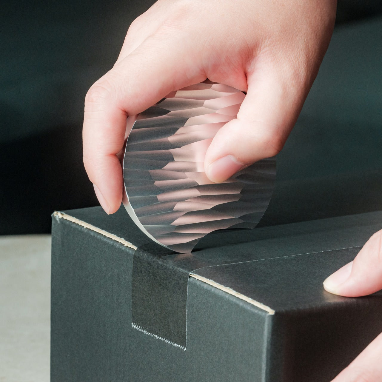
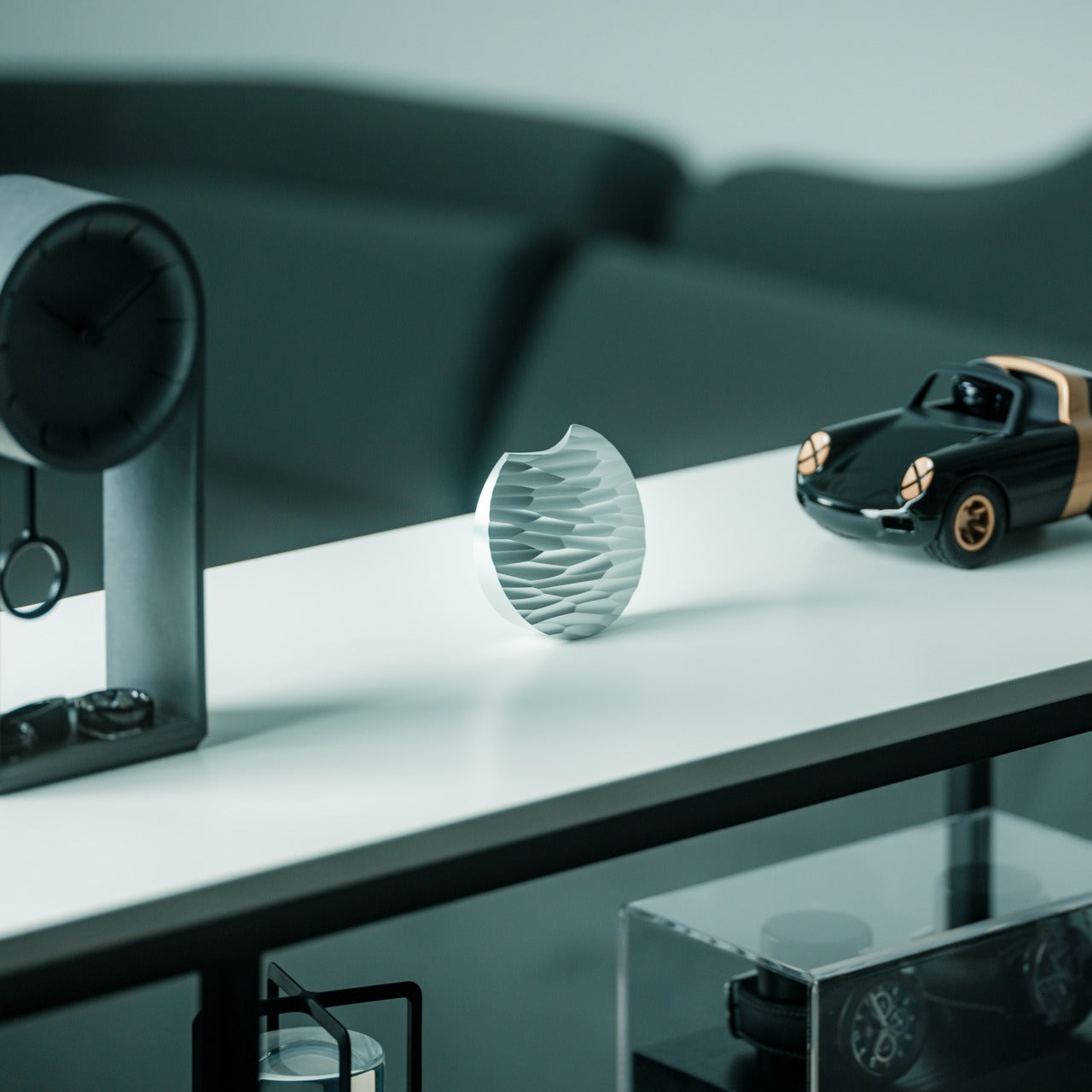
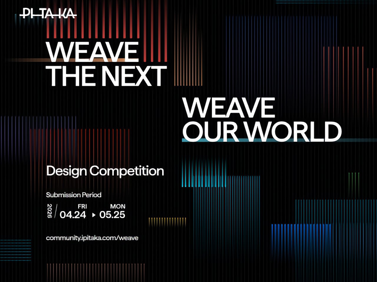
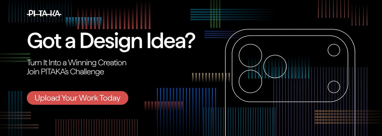
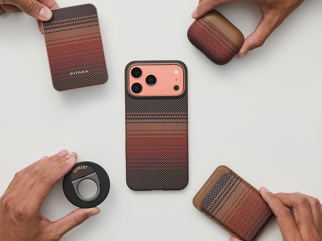
Tech accessories have hit a curious inflection point. The last year trained us to worship thinness and glass, but somewhere between the tenth identical ‘Air’ or ‘Edge’ smartphone and the fifteenth glossy case, a countermovement quietly took root. Texture matters again. Grip, weave, and tactile identity are no longer afterthoughts, they’re the differentiators that keep objects from sliding into the sea of sameness. PITAKA, a brand built on aerospace-grade aramid fiber and what it calls “fusion weaving,” has spent years proving that phones don’t have to feel like jewelry-store display pieces. Now, with the launch of “Weave the Next, Weave Our World,” the company is turning that philosophy outward, inviting designers worldwide to imagine the surfaces and visual languages that will define the next generation of tech we carry, hold, and interact with every day.
Launching April 24th, 2026, the competition is framed explicitly around the intersection of technology and art, which is less marketing speak and more PITAKA’s operational DNA. The brand’s cases have always leaned hard into material science, using woven aramid fibers (the same stuff in bulletproof vests and aircraft components) that are five times stronger than steel and a fraction of the weight. But strength alone doesn’t sell. What makes PITAKA cases notable is the texture vocabulary they’ve developed over years of refining weave patterns, experimenting with 600D and 1500D aramid densities, and pushing techniques like “fusion weaving,” where multiple patterns coexist on a single loom to create intricate, layered surface designs. “Weave the Next, Weave Our World” extends that exploration beyond the company’s internal design studio and into the hands of students, professionals, and independent creators who might see texture, pattern, and tactility from entirely different cultural or aesthetic starting points.
PITAKA’s “Weave the Next, Weave Our World” global design competition invites designers to create texture and visual language systems for the brand’s future product series, positioned explicitly at the intersection of technology and art. Participants choose from four thematic directions: “These Moments,” which captures the raw beauty and shifting rhythms of the natural world; “Timeless Threads,” weaving stories of culture, memory, and human journeys; “Beyond Tomorrow,” exploring visionary futures where innovation reshapes daily life; or “Roots of Rhythms,” celebrating the textures, symbols, and spirit born from each land’s heritage. The competition aims to explore emerging global trends in tactile and visual design, strengthen PITAKA’s art-tech identity, and potentially commercialize winning designs through royalties, co-branding, and official recognition.
How To Participate
Visit the official competition website or Dribbble page to submit your entry
Provide participant information and upload your texture designs
Include a written design explanation with your submission
Entries will be evaluated through a combination of professional jury review and public voting
Winners will be announced and showcased in an online exhibition
Competition Dates
Competition Launch: April 24, 2026
Submission Period: April 24 – May 25, 2026
Judging Period: May 26 – May 31, 2026
Winners Announcement: June 9, 2026
Jury Panel
Qiongzhi Xie (Artist; Founder of Daxing Jizi Studio)
Matteo Menotto (Head of Design, Prints & Textile Accessories at Bulgari)
Sarang Sheth (Editor-in-Chief, Yanko Design)
James (Founder / CEO, PITAKA)
Important Information
The most compelling entries are likely to do three things at once:
Treat texture as a system, not a single image
PITAKA’s products live across multiple form factors, so a strong entry will propose a visual/tactile system that can scale and adapt, not just a one-off pattern.
Anchor the concept in one of the four themes without being literal
“These Moments” does not need a photo-real print of a wave; “Roots of Rhythms” does not need a direct copy of a folk motif. Abstraction, distillation, and translation into a tech-accessory context will matter.
Consider manufacturability and user experience
Even in a speculative competition, the jury includes industrial design and brand leadership. Textures that look stunning in render but collapse in real material or feel uncomfortable in hand will likely be deprioritized.
If you already experiment with materials, parametric patterns, or culturally rooted visual systems, “Weave the Next, Weave Our World” is essentially an invitation to push that work into a space where it might actually ship.