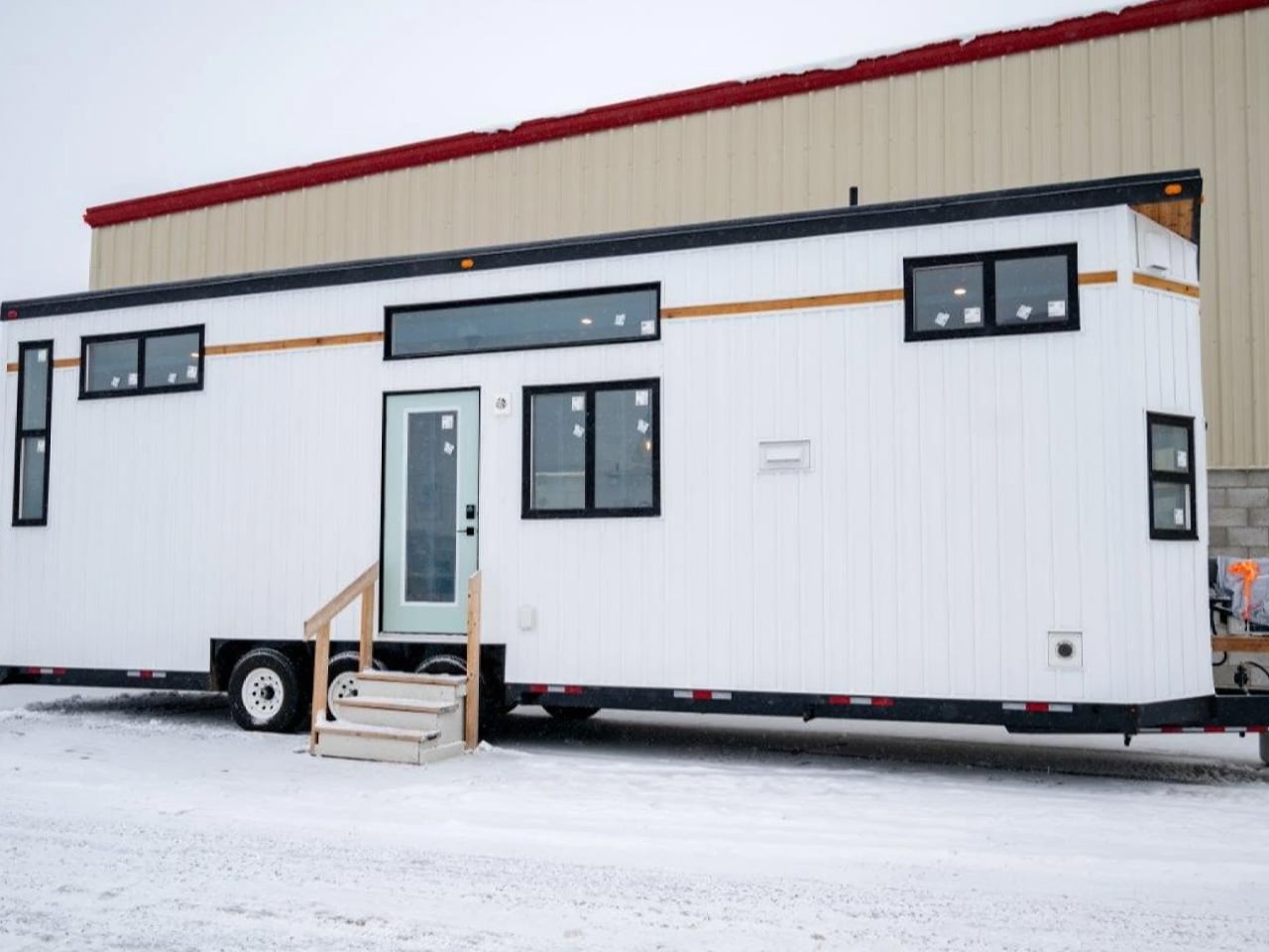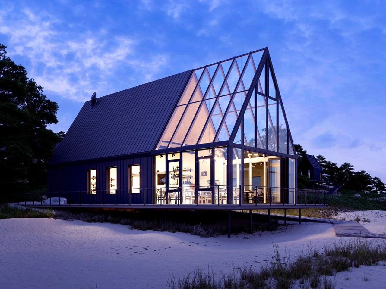
This 24-Foot Tiny Home From Australia Proves Small Space Design Is All About Intention

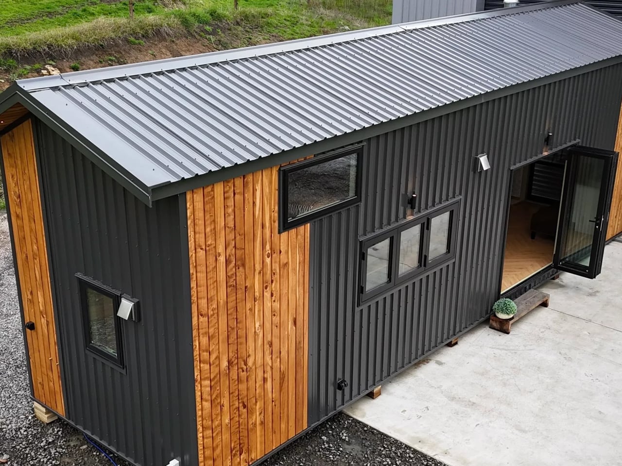
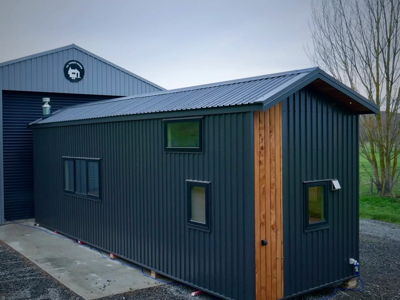
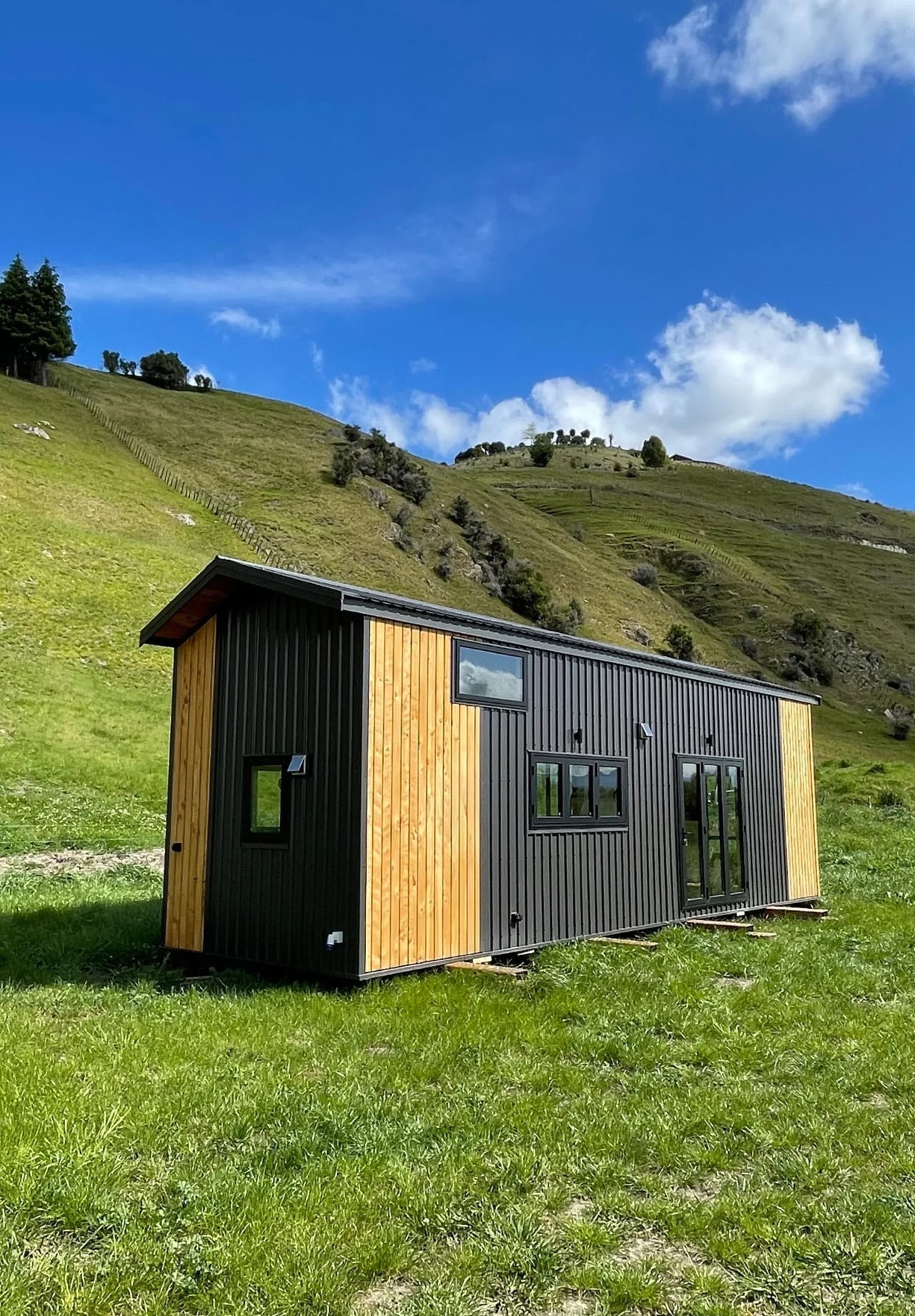
Most tiny homes ask you to sacrifice. The Springbrook 7.2 doesn’t. The Springbrook 7.2 from Gold Coast–based Removed Tiny Homes is the opposite of that. Named for its 7.2-meter length (23.7 feet), it’s a build that makes a convincing case for intentional design over raw square footage.

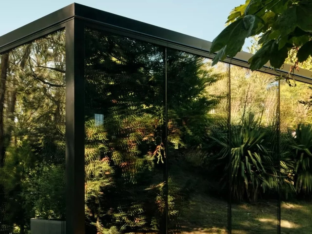
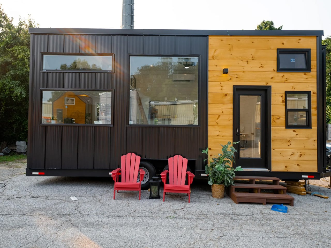
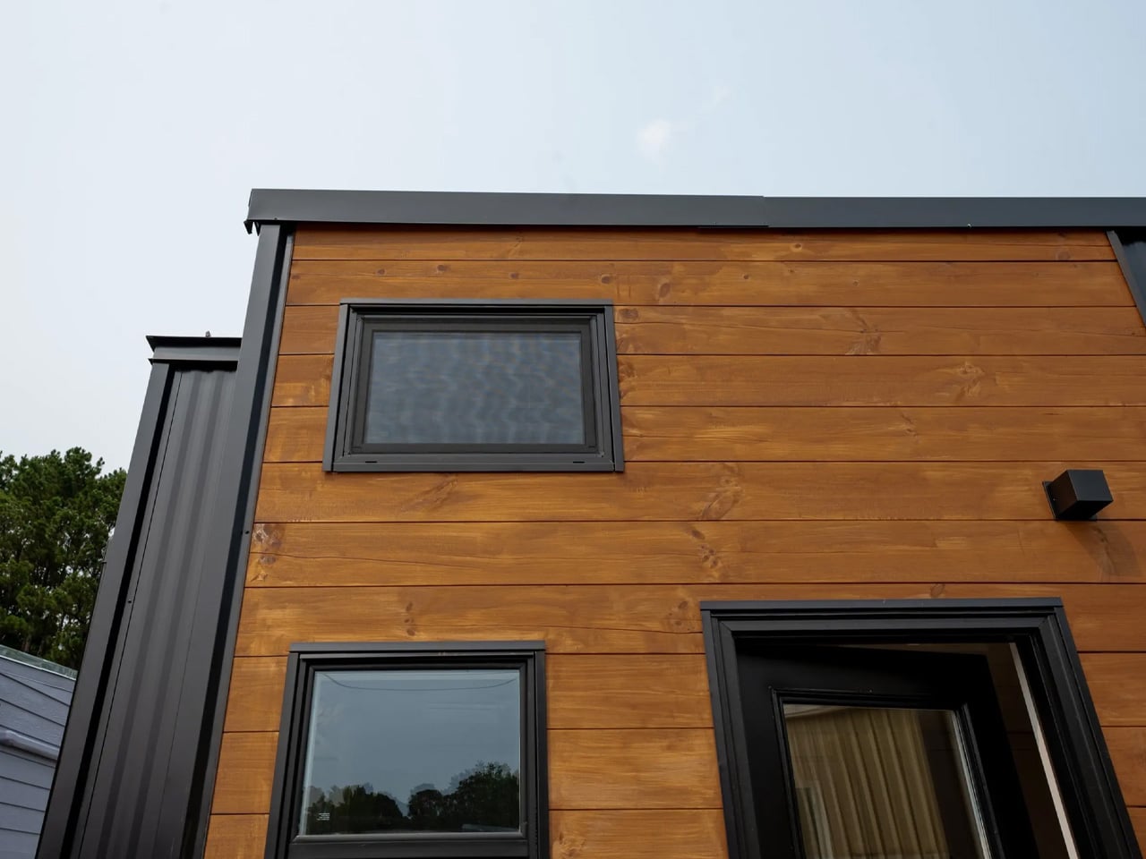
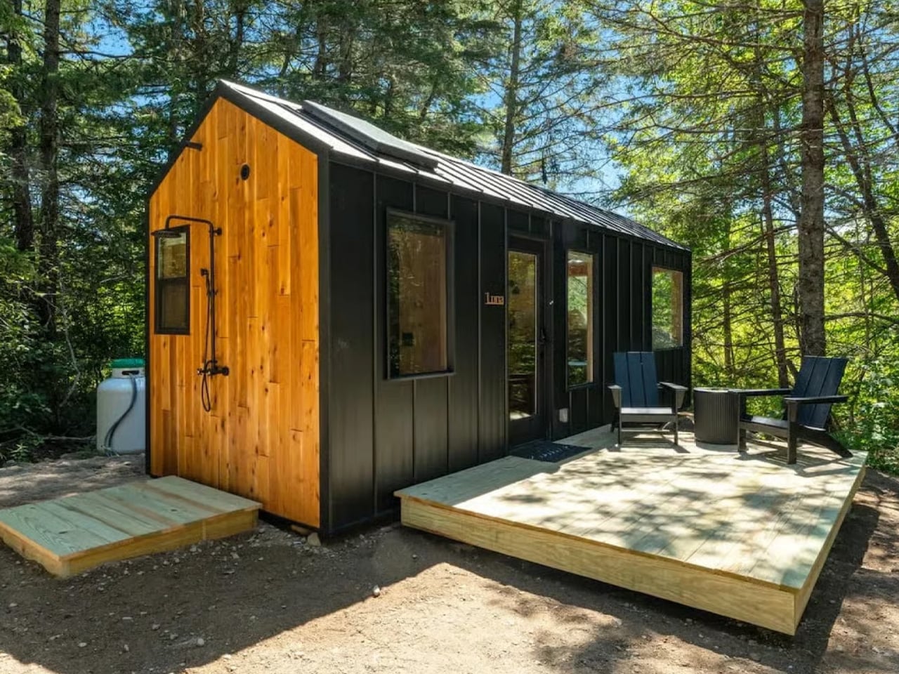
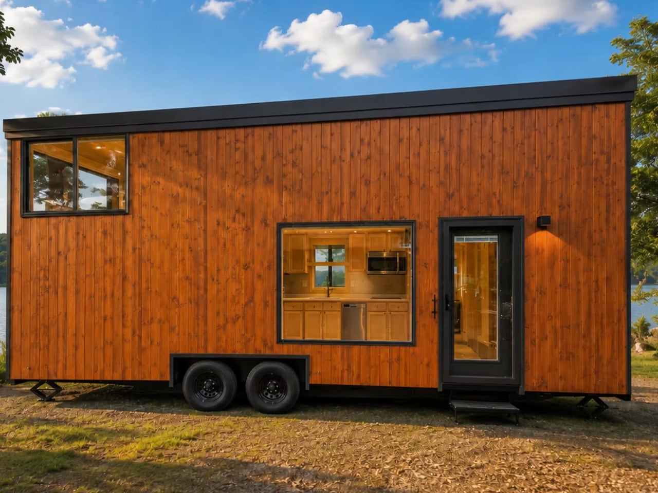
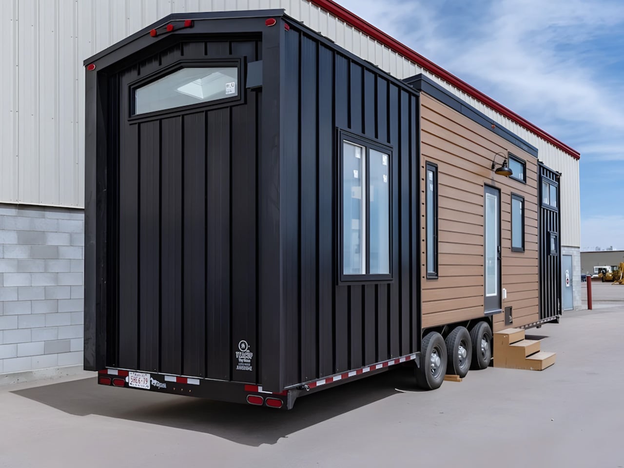
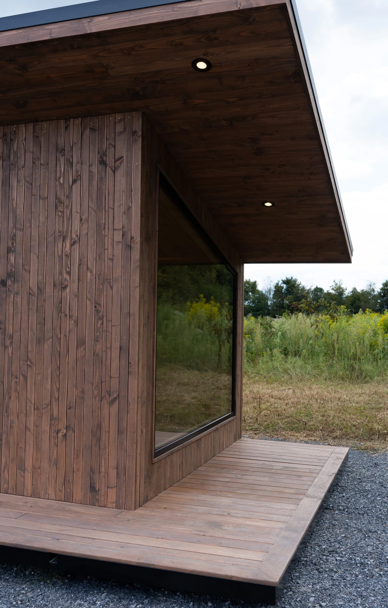
Built on a standard trailer and clad in Colorbond steel, the home’s exterior is durable and weatherproof — Colorbond is a popular choice across Australia precisely because it holds up in extreme climates without losing its clean, contemporary finish. An awning runs along the exterior, extending the home’s livable edge and softening its profile against the surrounding landscape.

Designer: Removed Tiny Homes

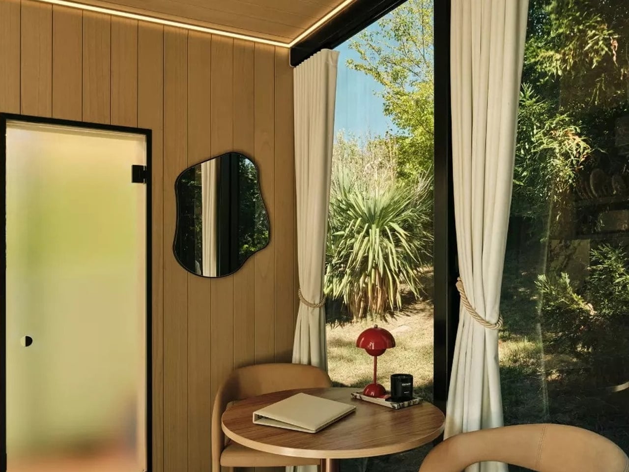
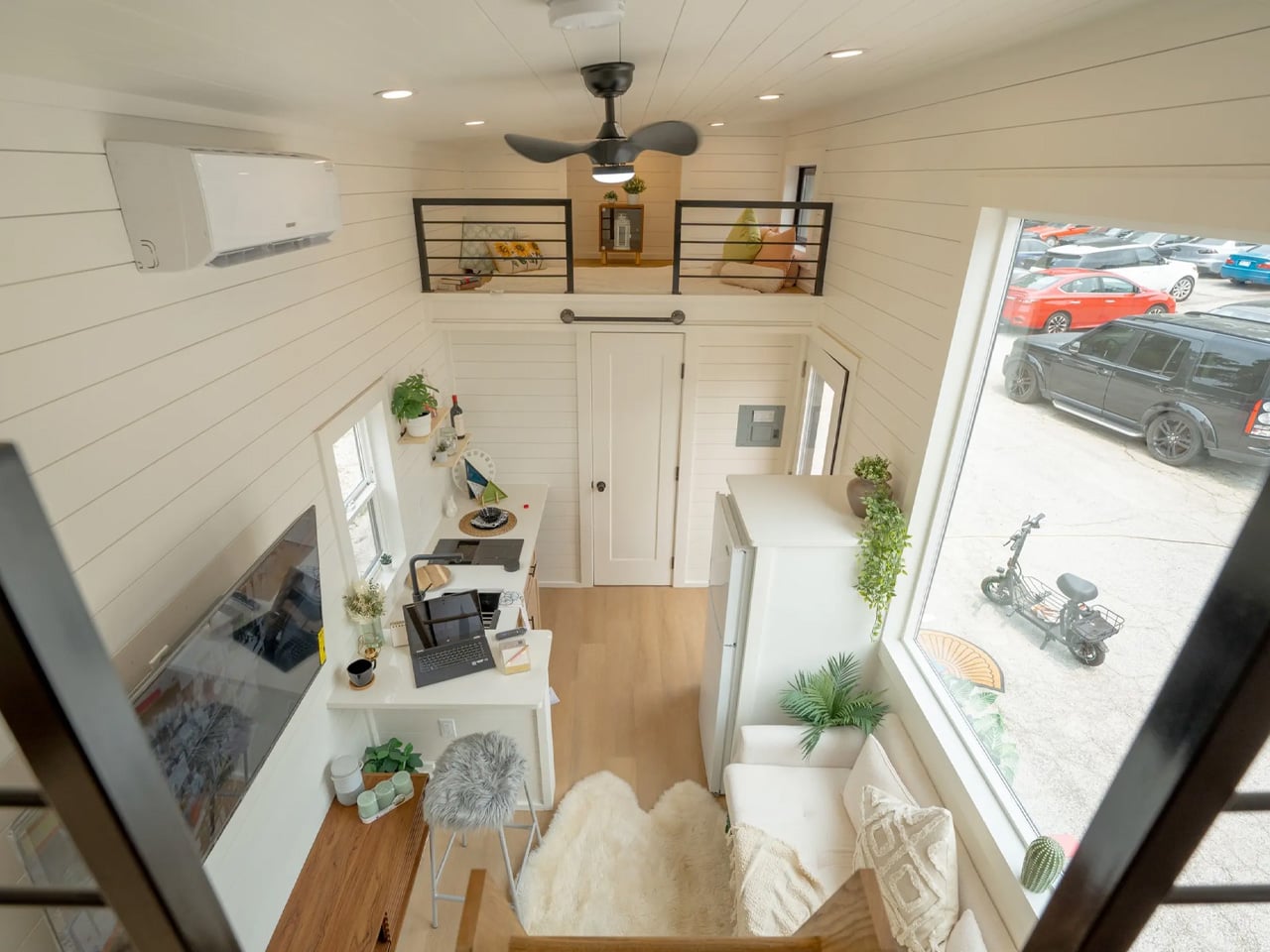
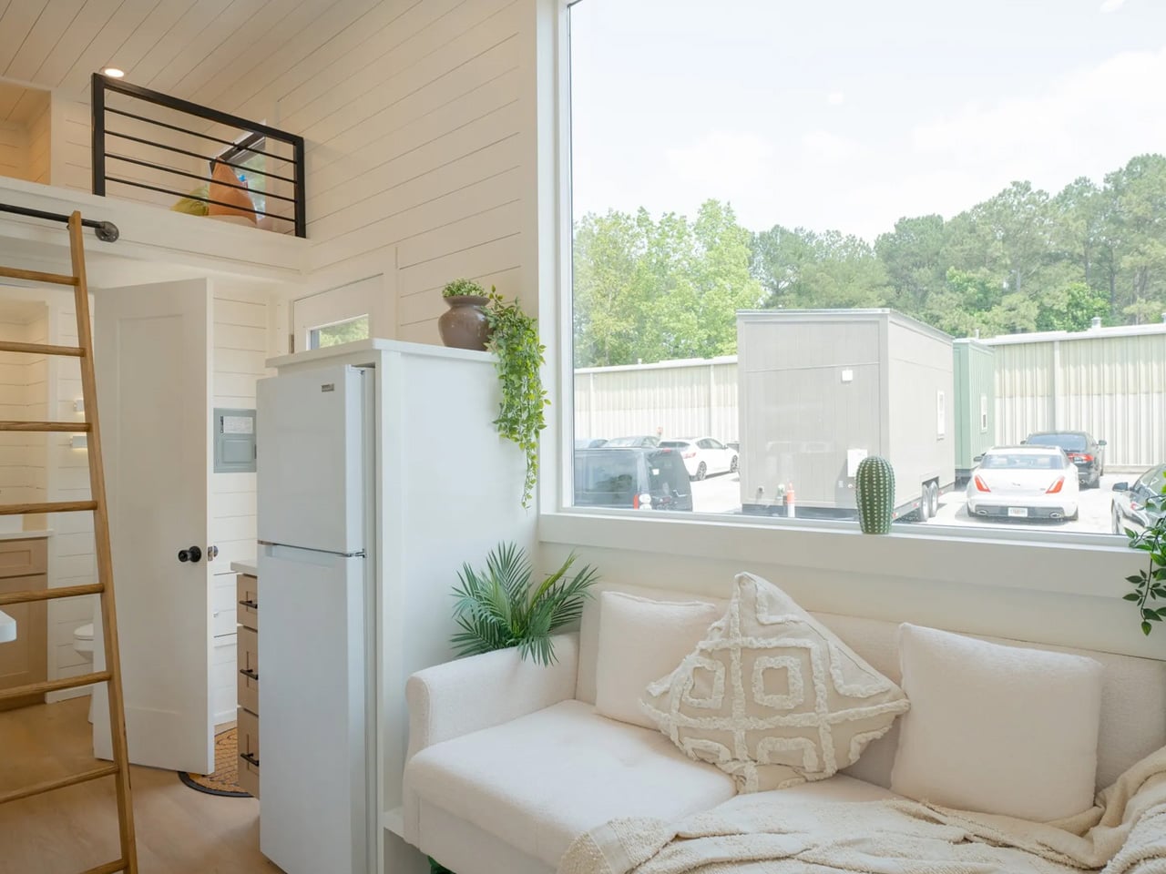
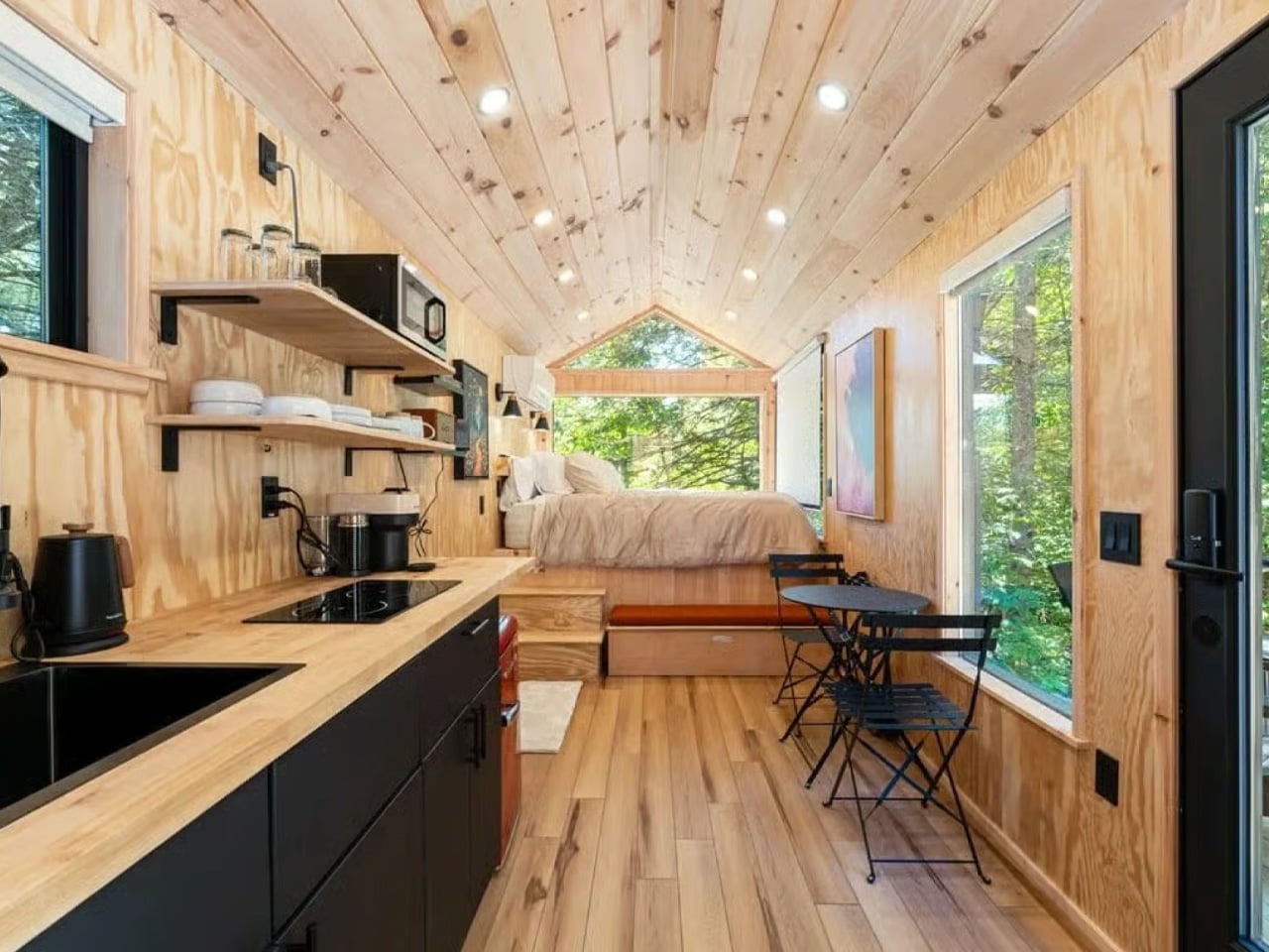
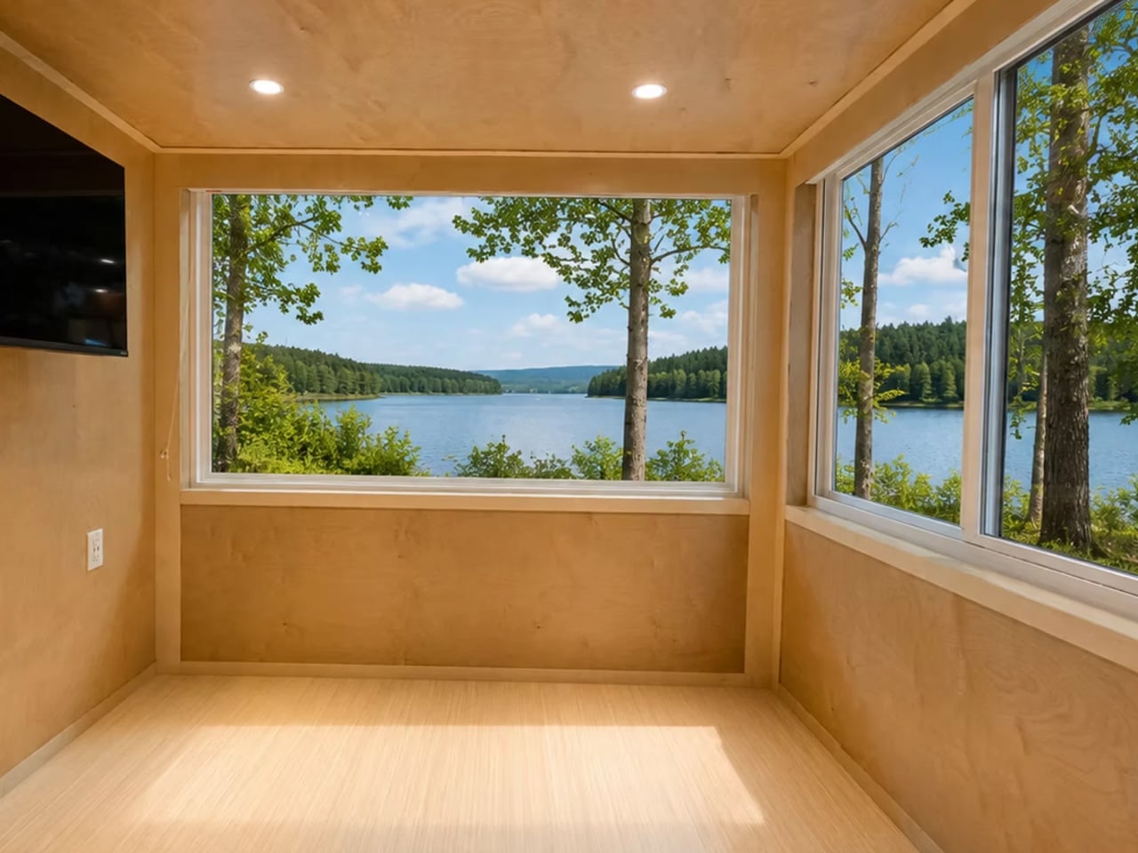
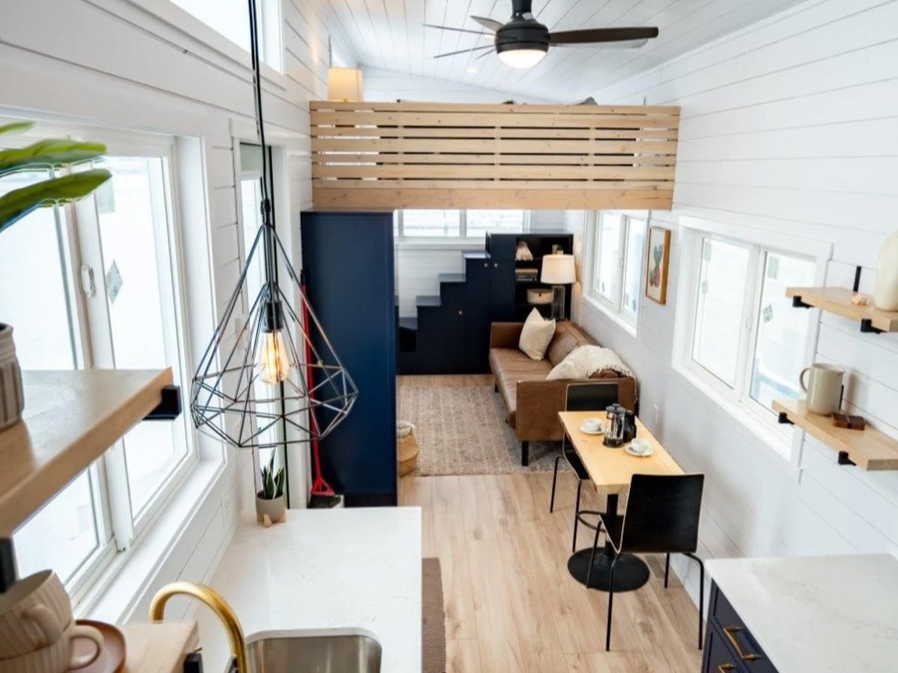
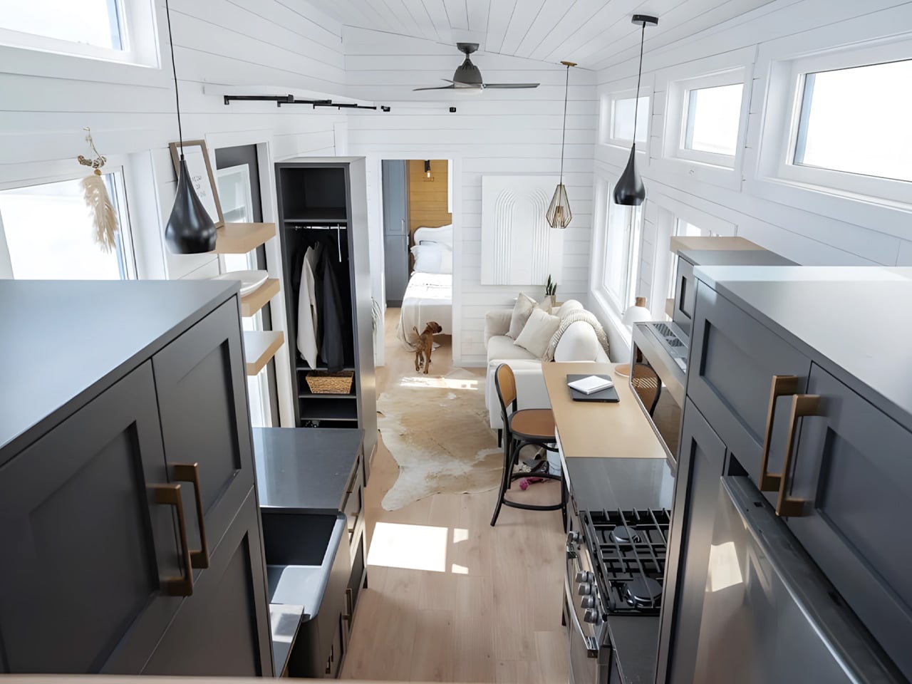
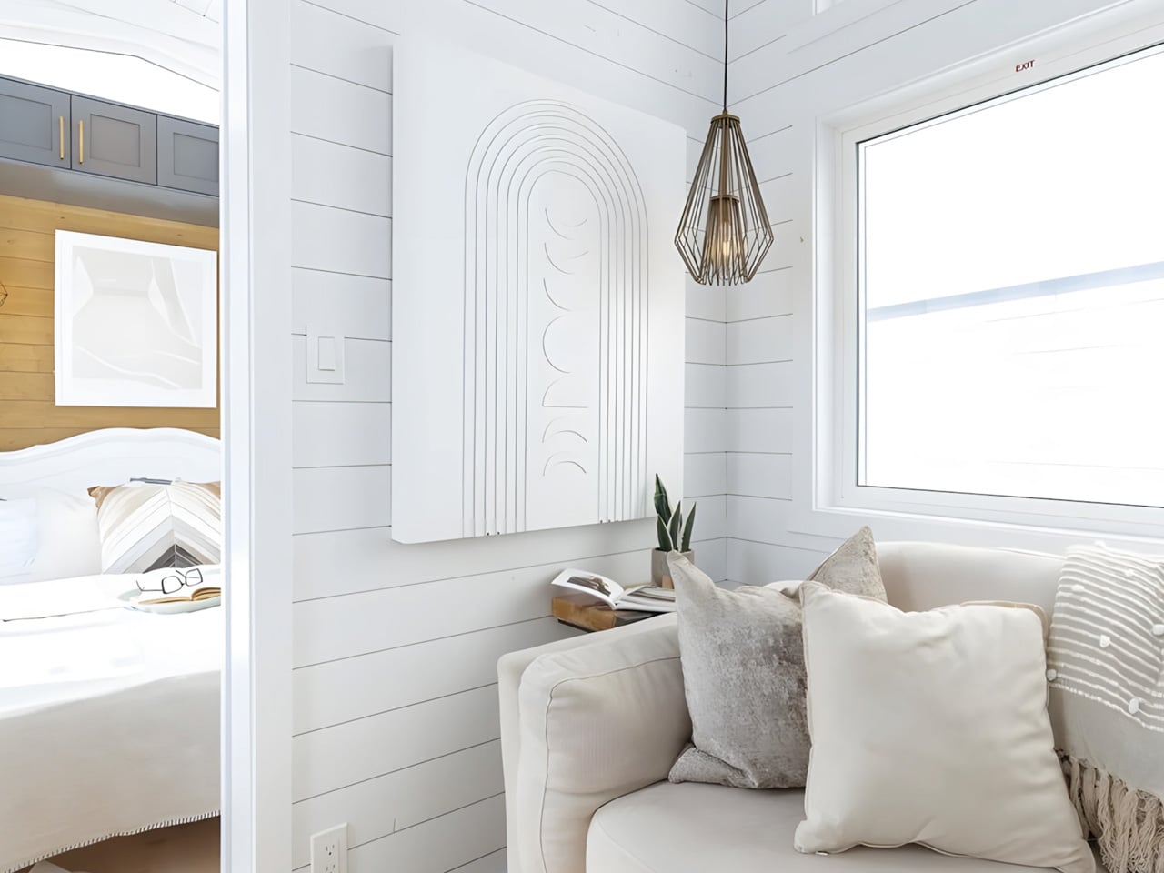
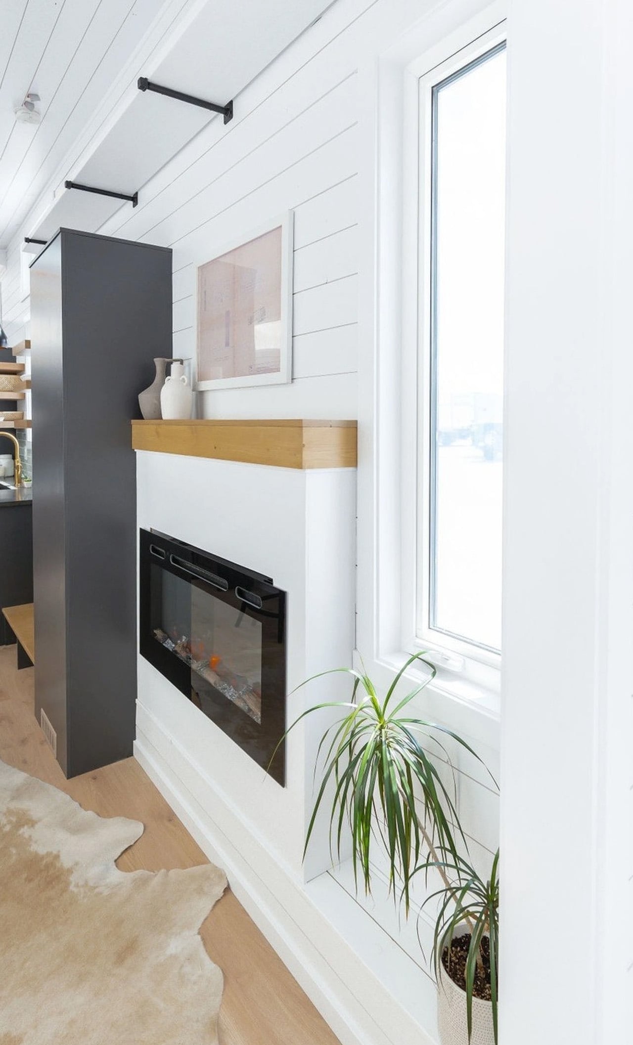
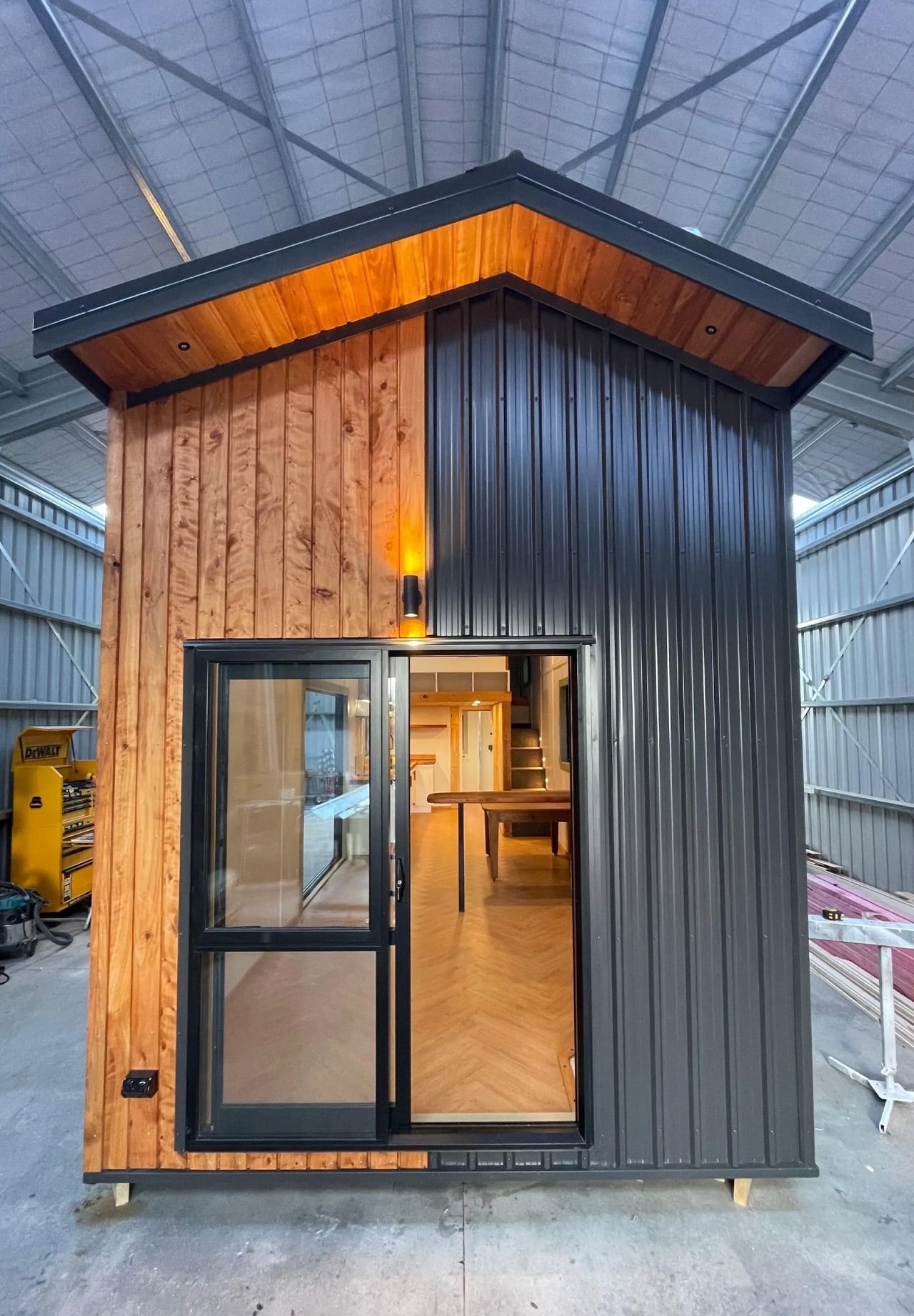
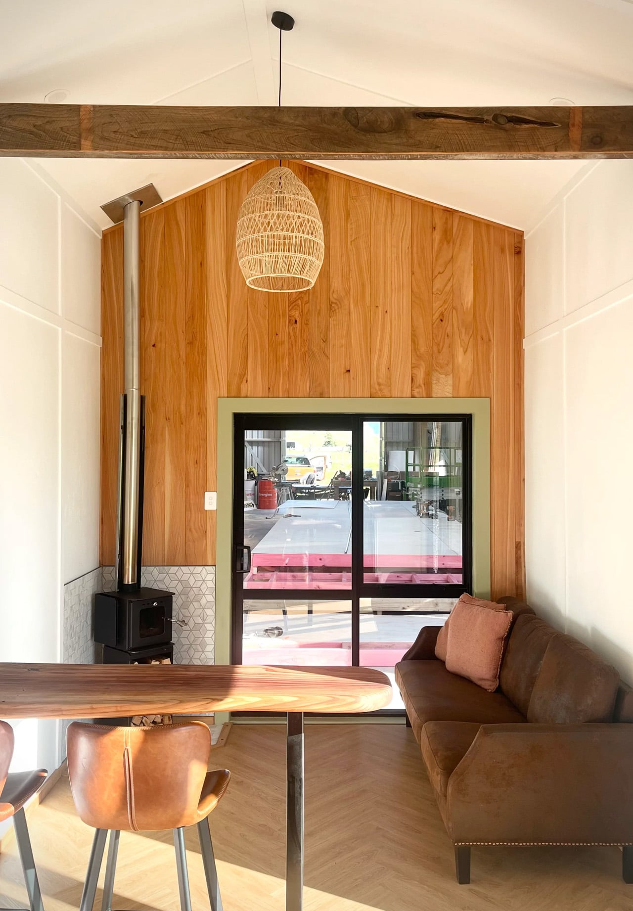
The interior greets you through double glass doors that open into a living area anchored by an L-shaped sofa. The ceiling reads high, and generous glazing keeps the space from contracting inward the way so many compact homes do. Light fills the room freely, which is less a given than it sounds in a build this size. Removed’s design instinct here is to borrow volume from the outside rather than manufacture it through material trickery alone.

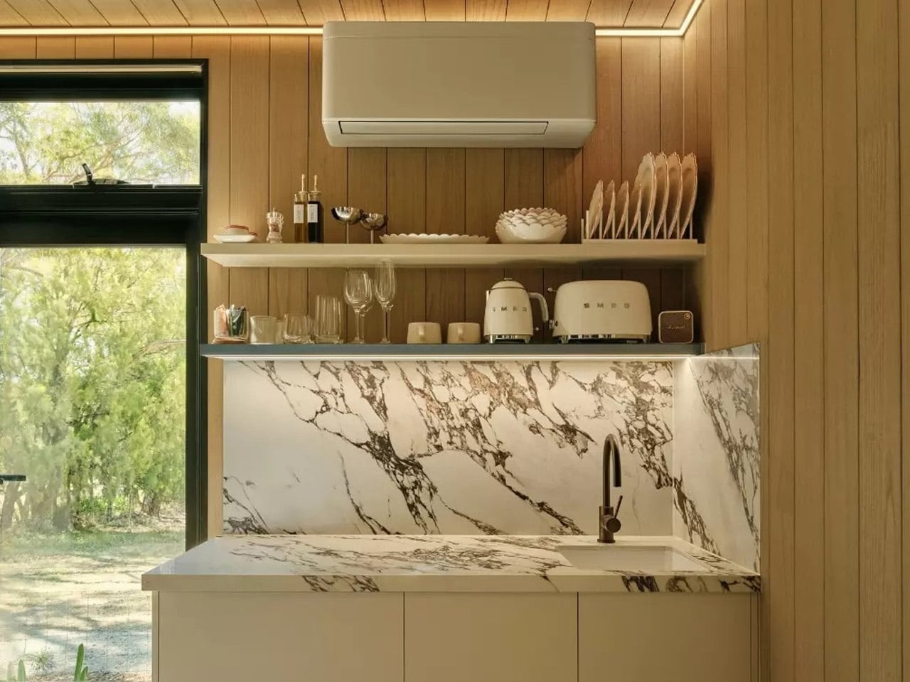
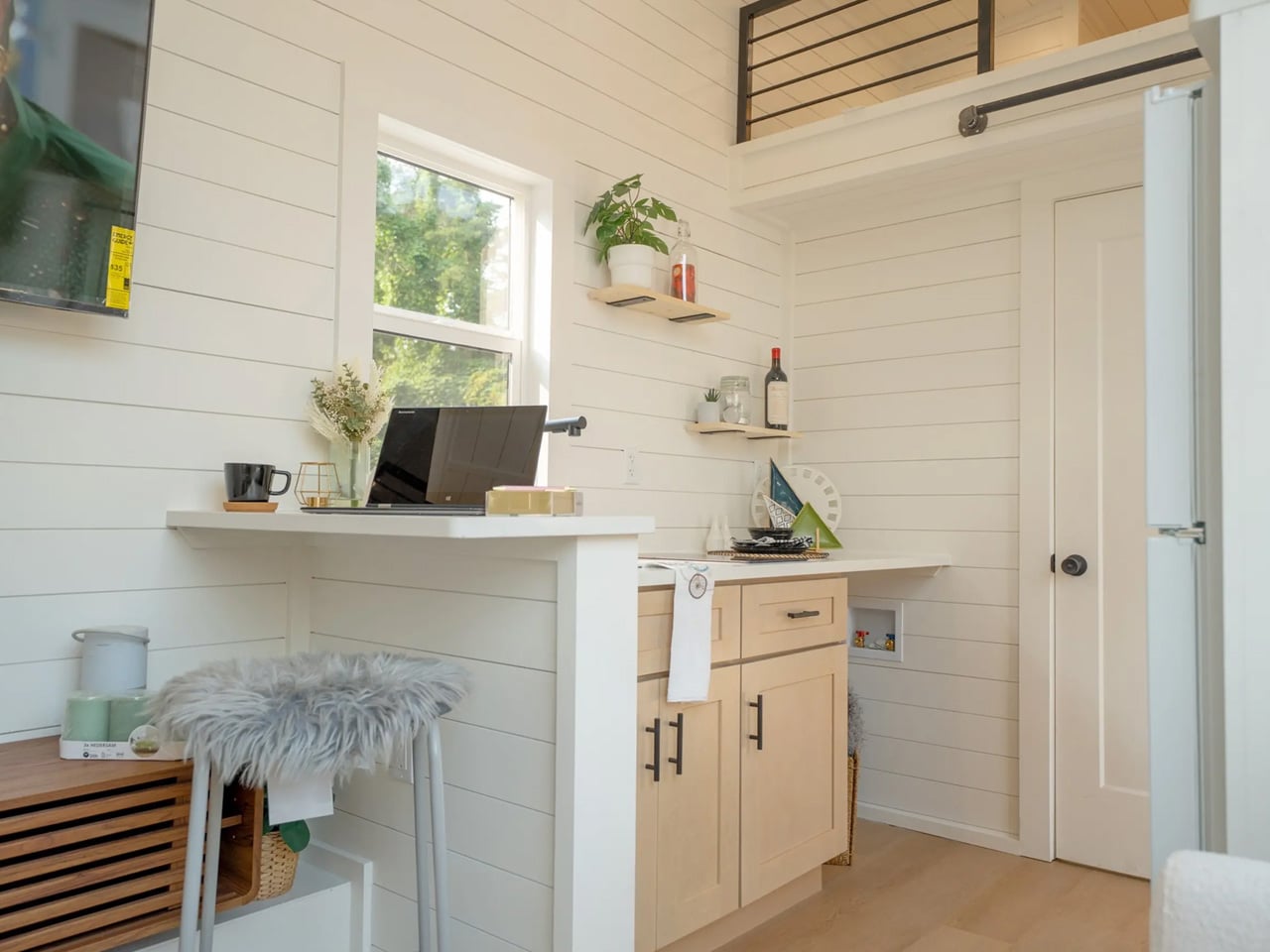
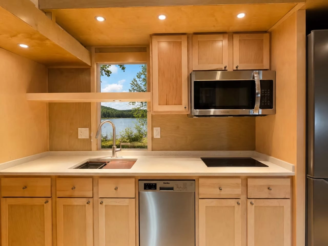
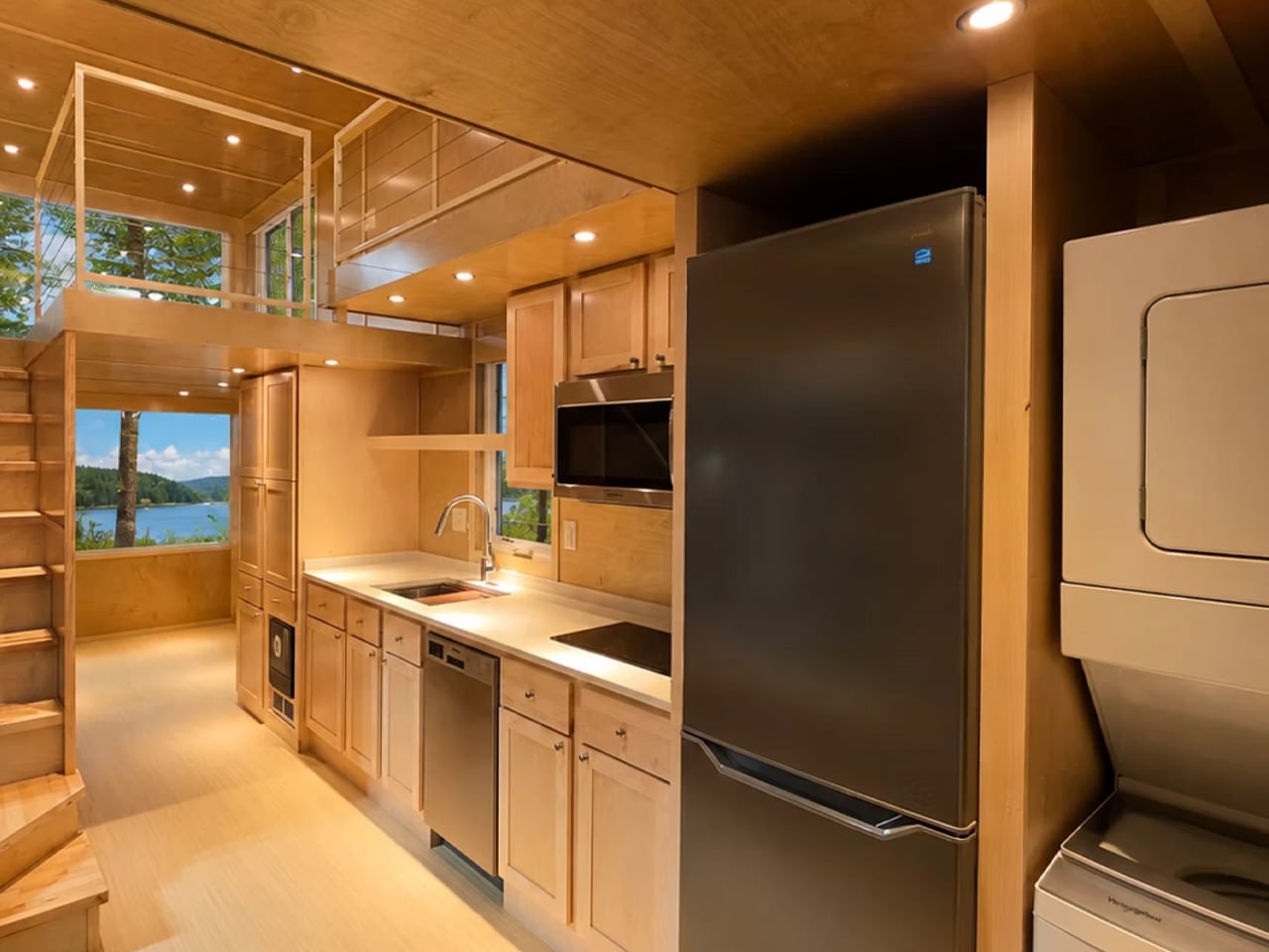
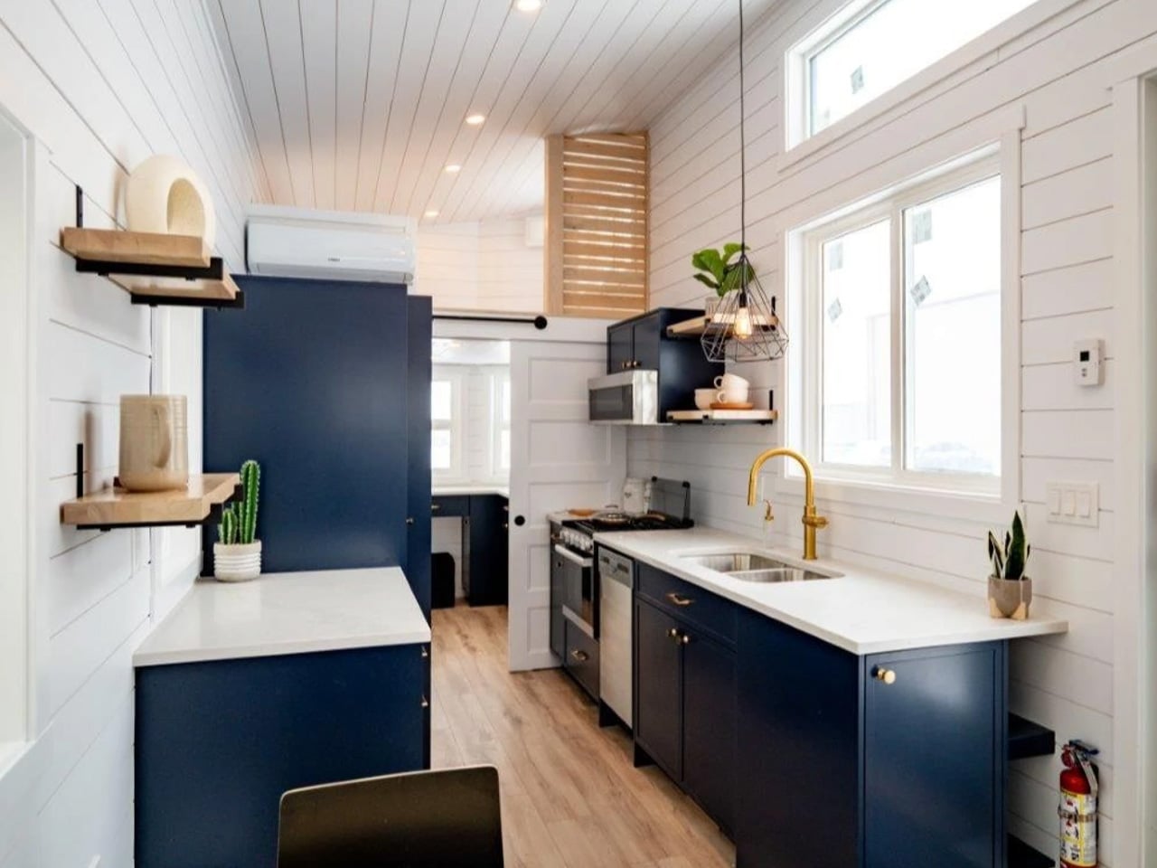
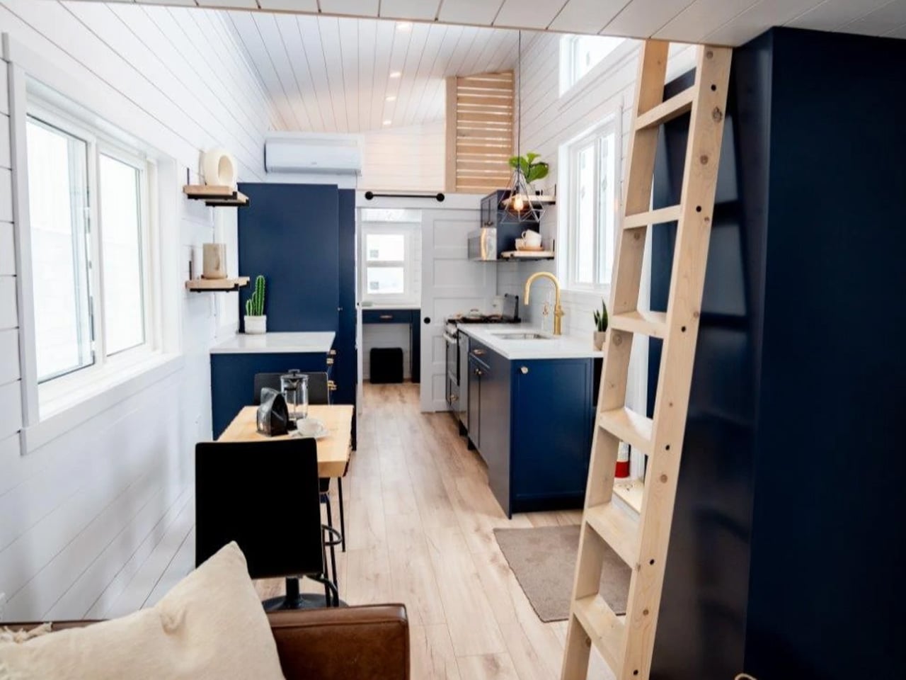
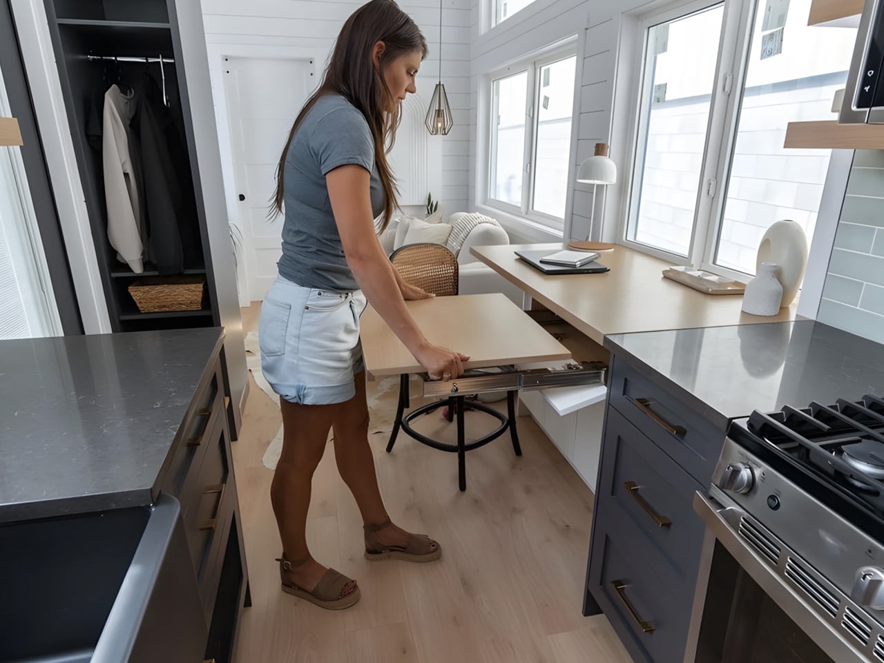
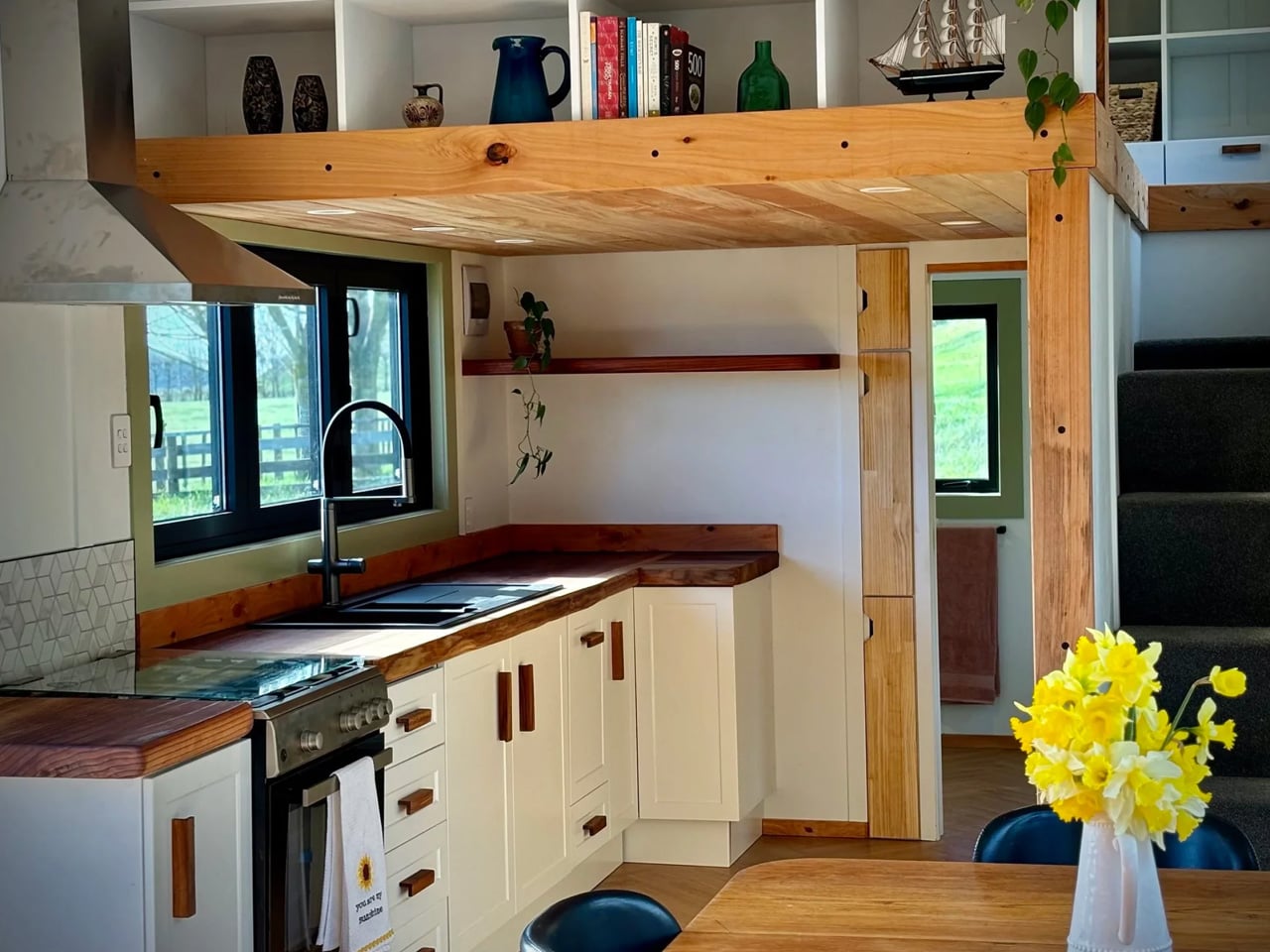
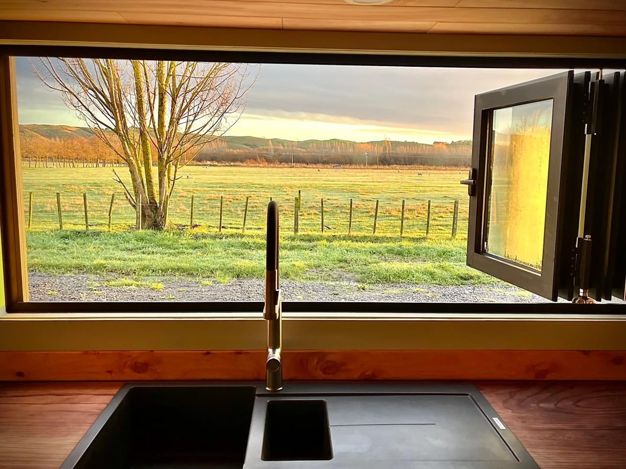
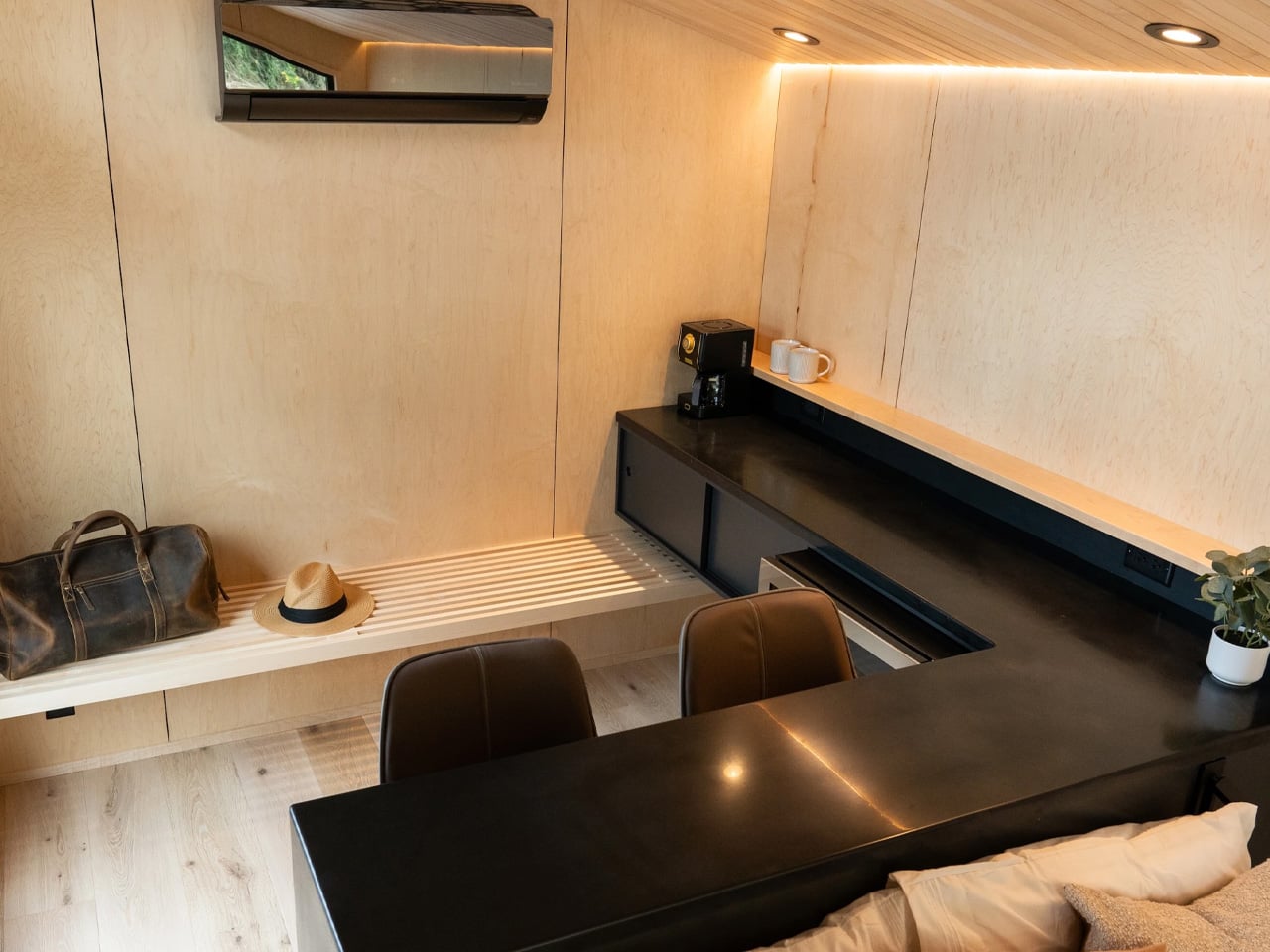
The kitchen, positioned deeper into the plan, is remarkably complete. There’s a sink, an oven, a two-burner propane stove, a fridge and freezer, and a full complement of upper and lower cabinetry. Beside it sits a booth-style dining nook with bench seating and a table — the kind of tucked-away setup that feels more intimate than cramped, more considered than squeezed in.

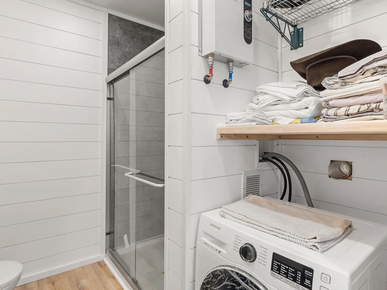
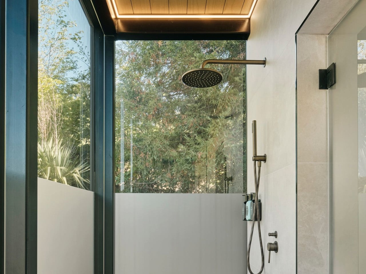
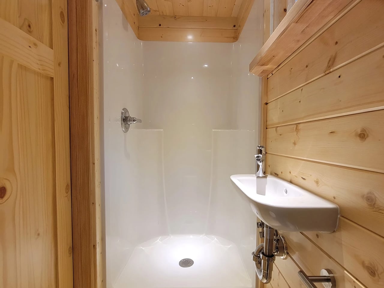
The bathroom sits at the far end of the home. A composting toilet, a vanity sink, and a walk-in shower occupy the space with no sense of conflict. The shower is topped by a skylight, a small detail that does a lot of work — it draws natural light straight down into what could easily have been the home’s darkest corner, and keeps it private without compromising that openness.

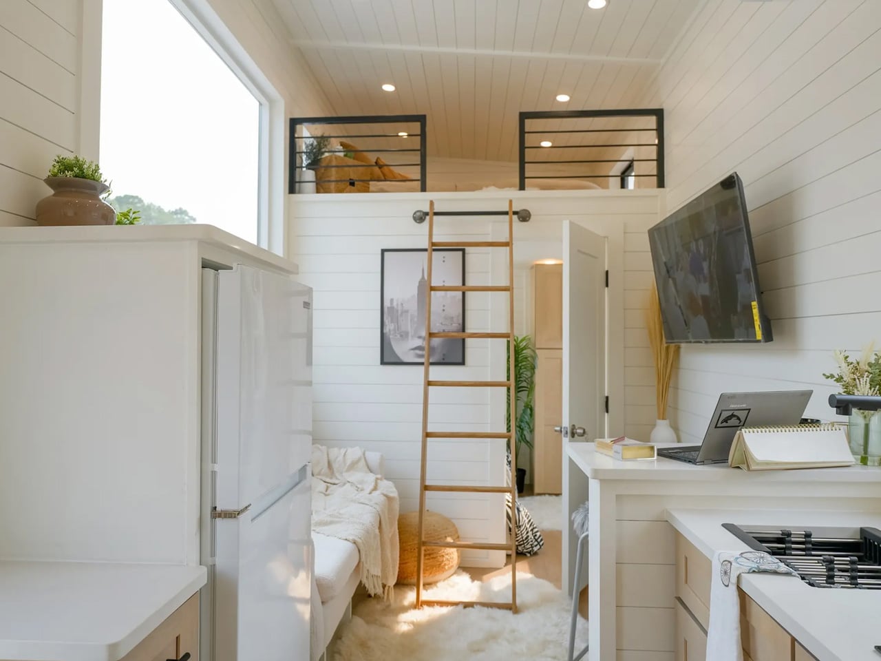
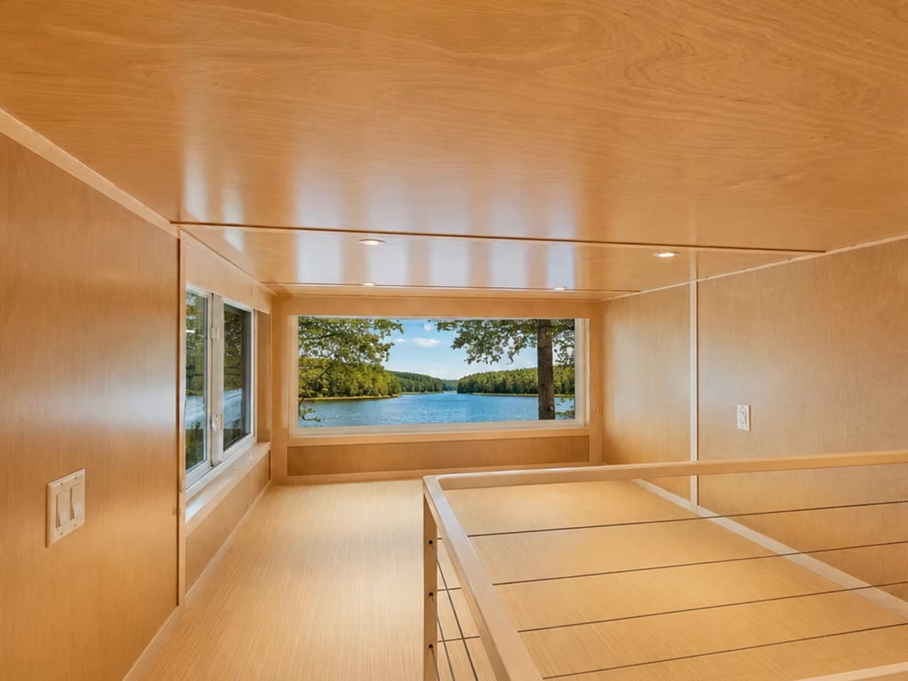
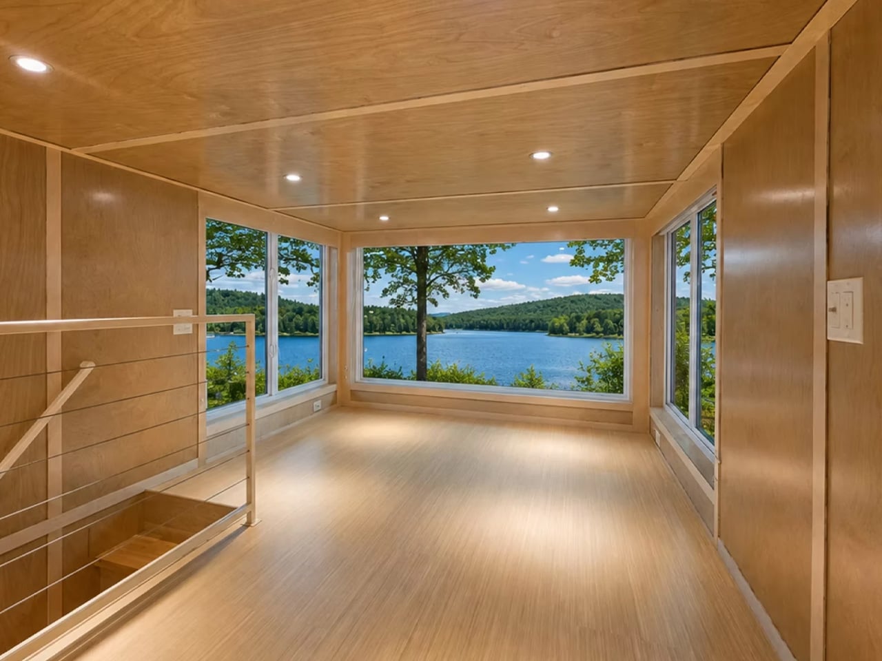
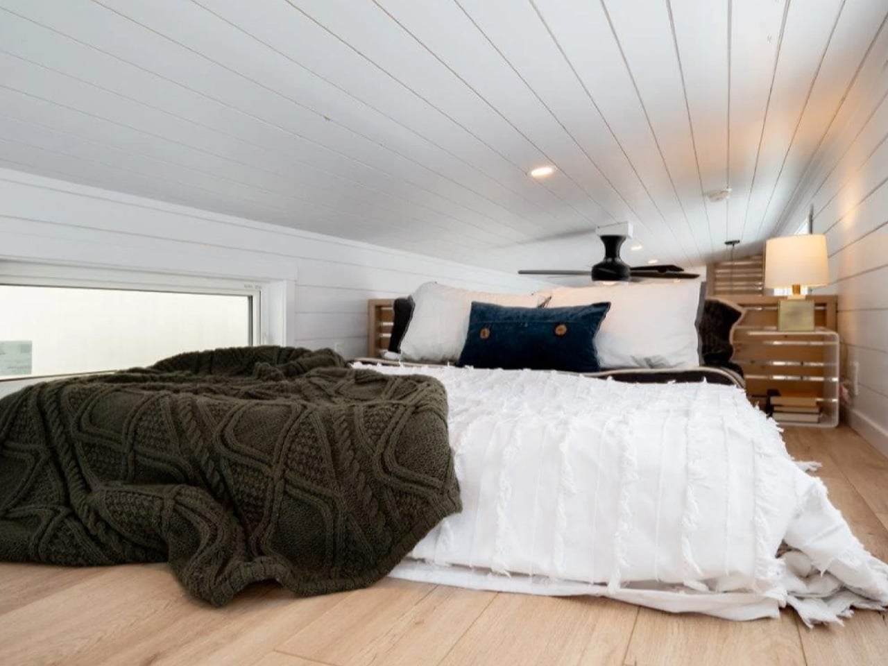
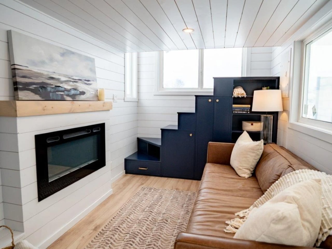
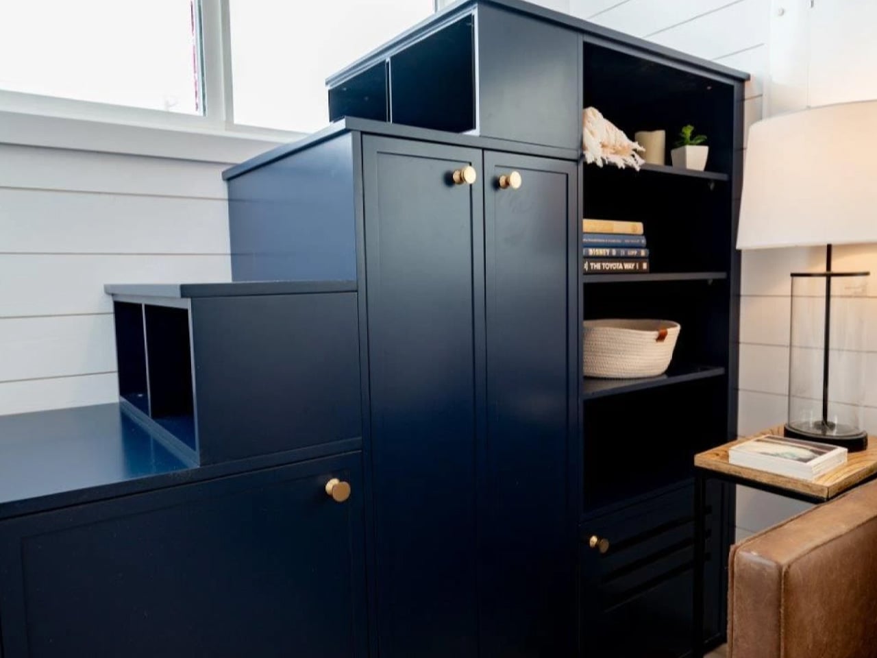
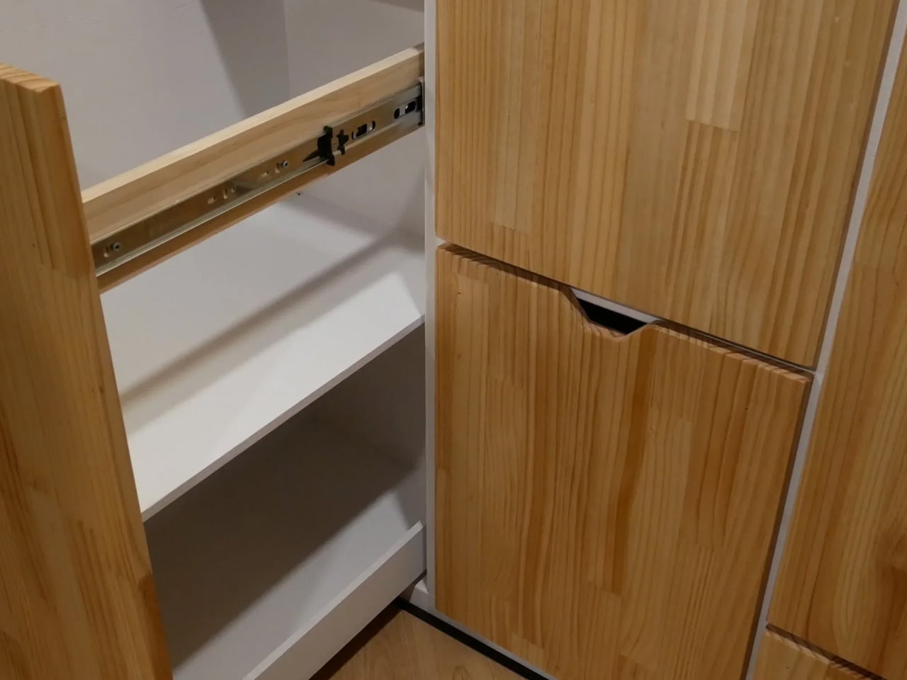
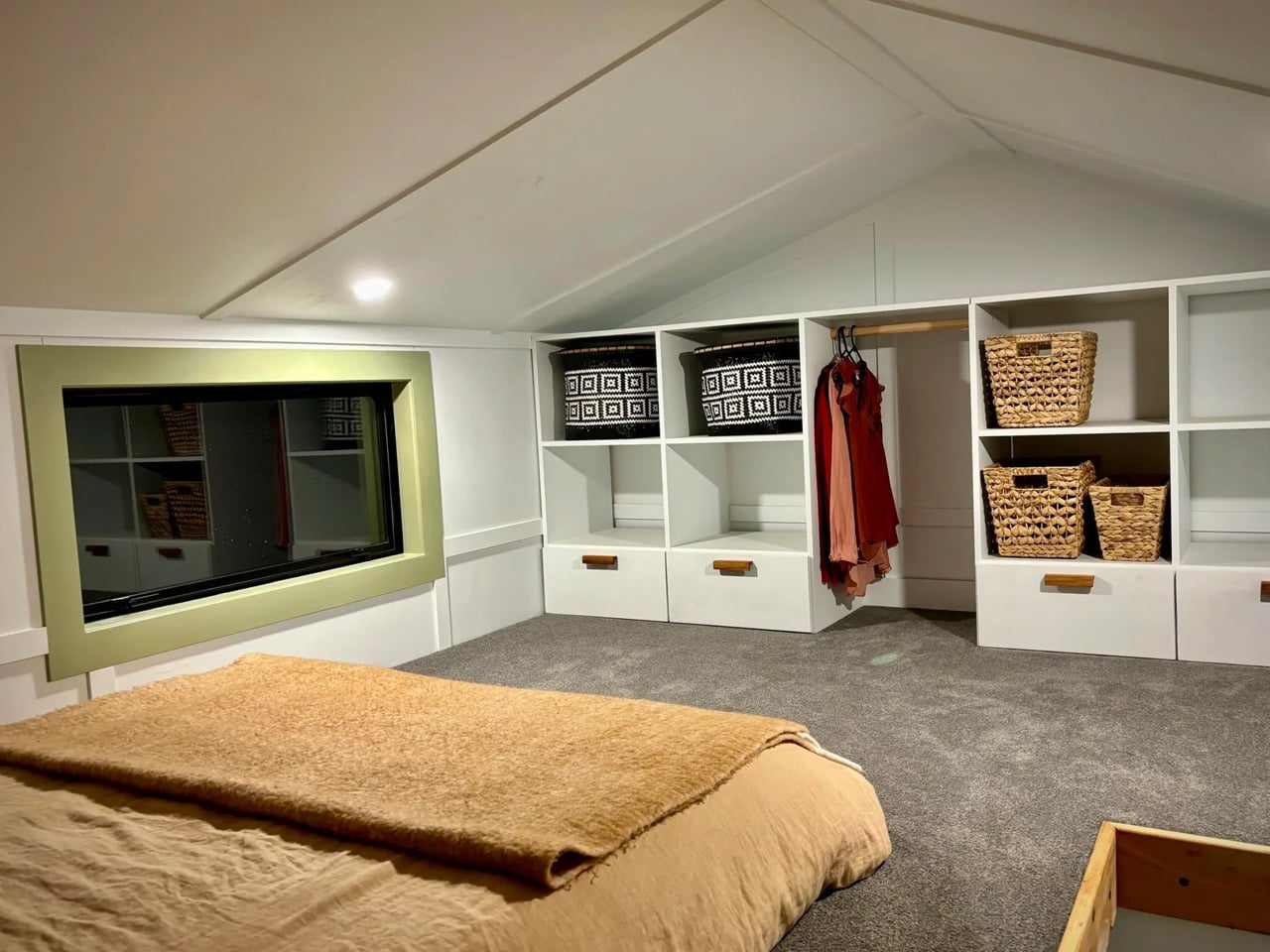
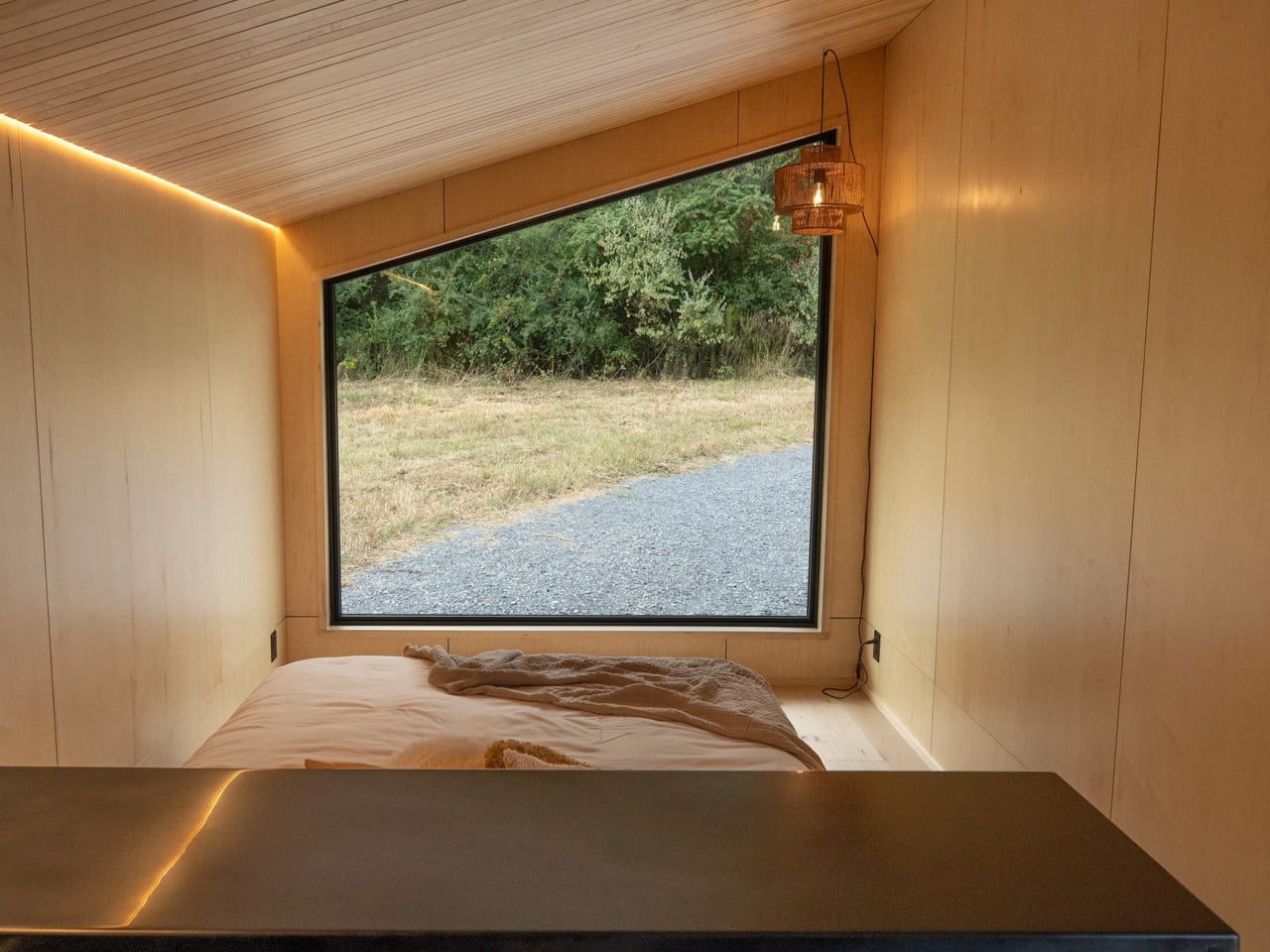
Circulation between levels is handled by a corner staircase that integrates storage into its structure, winding up to the loft bedroom above. The loft holds a queen-sized bed and a desk built directly into the balustrade, converting the sleeping area into a workspace without any additional furniture. The ceiling sits low up here, but the resolution is smart: it makes the space feel cocooning rather than confined.

The Springbrook 7.2 was designed and delivered as a custom commission. Pricing is available on request directly through Removed Tiny Homes.

The post This 24-Foot Tiny Home From Australia Proves Small Space Design Is All About Intention first appeared on Yanko Design.

This 24-Foot Tiny Home From Australia Proves Small Space Design Is All About Intention

Most tiny homes ask you to sacrifice. The Springbrook 7.2 doesn’t. The Springbrook 7.2 from Gold Coast–based Removed Tiny Homes is the opposite of that. Named for its 7.2-meter length (23.7 feet), it’s a build that makes a convincing case for intentional design over raw square footage.

Built on a standard trailer and clad in Colorbond steel, the home’s exterior is durable and weatherproof — Colorbond is a popular choice across Australia precisely because it holds up in extreme climates without losing its clean, contemporary finish. An awning runs along the exterior, extending the home’s livable edge and softening its profile against the surrounding landscape.

Designer: Removed Tiny Homes

The interior greets you through double glass doors that open into a living area anchored by an L-shaped sofa. The ceiling reads high, and generous glazing keeps the space from contracting inward the way so many compact homes do. Light fills the room freely, which is less a given than it sounds in a build this size. Removed’s design instinct here is to borrow volume from the outside rather than manufacture it through material trickery alone.

The kitchen, positioned deeper into the plan, is remarkably complete. There’s a sink, an oven, a two-burner propane stove, a fridge and freezer, and a full complement of upper and lower cabinetry. Beside it sits a booth-style dining nook with bench seating and a table — the kind of tucked-away setup that feels more intimate than cramped, more considered than squeezed in.

The bathroom sits at the far end of the home. A composting toilet, a vanity sink, and a walk-in shower occupy the space with no sense of conflict. The shower is topped by a skylight, a small detail that does a lot of work — it draws natural light straight down into what could easily have been the home’s darkest corner, and keeps it private without compromising that openness.

Circulation between levels is handled by a corner staircase that integrates storage into its structure, winding up to the loft bedroom above. The loft holds a queen-sized bed and a desk built directly into the balustrade, converting the sleeping area into a workspace without any additional furniture. The ceiling sits low up here, but the resolution is smart: it makes the space feel cocooning rather than confined.

The Springbrook 7.2 was designed and delivered as a custom commission. Pricing is available on request directly through Removed Tiny Homes.

The post This 24-Foot Tiny Home From Australia Proves Small Space Design Is All About Intention first appeared on Yanko Design.

Craft House’s Latest Model Fits Two Bedrooms Into a Tiny Home You Can Actually Tow

Two bedrooms in a tiny home that fits on a double-axle trailer sounds like a promise that usually ends in compromise. Craft House’s latest model, the Alan, makes a compelling case that it doesn’t have to. Measuring 8.4 meters long, the Polish builder has packed a full master suite, a mezzanine loft, a proper kitchen, and a bathroom into a towable frame with enough practicality to work as a full-time residence.

The exterior sets the tone without making a fuss. Engineered wood cladding meets metal paneling beneath a metal roof, giving the Alan a quiet, modern character that sits closer to a Scandinavian cabin than a trailer. Two separate glass-door entrances open along either side, flooding the interior with natural light and softening the line between indoors and out. Pair each entrance with a deck, and the sense of space expands considerably.

Designer: The Craft House

Inside, Scandinavian spruce lines every surface, warm and tactile against the structure’s harder geometry. The center of the home is a combined dining and living area, anchored by a wall-mounted TV and a table that seats four. A mirrored wall and a high ceiling work together convincingly to make the space feel larger than it is, while underfloor heating and a mini-split keep it comfortable year-round.

The kitchen is compact but genuinely functional, with an induction cooktop, oven, fridge/freezer, and sink, plus upper and lower cabinetry that provides ample storage for daily living. The bathroom, meanwhile, is clean and well-considered, with a glass-enclosed shower, vanity sink, and a flushing toilet. Craft House has kept both spaces tight without letting them feel like afterthoughts.

The standout detail is the folding staircase. It leads to the mezzanine loft bedroom, and when not in use, it folds away entirely, reclaiming the downstairs floor space it would otherwise occupy. The master bedroom sits below with full standing headroom, a double bed, a large window, and a second mini-split for independent climate control. It’s a small mechanical solution with a disproportionately large effect on how the home actually lives.

Craft House offers the Alan with a range of optional upgrades: full off-grid capability, deck areas, and flexibility on both materials and layout configuration. For those who want to live untethered, the off-grid option in particular makes the package worth considering seriously. The base price starts at roughly $57,500 USD, with delivery details available directly from the builder.

For a two-bedroom towable home that doesn’t demand too many trade-offs, the Alan earns its attention. The folding stair, dual entrances, and spruce-wrapped interior give it a livability that most homes this size struggle to reach. It’s the kind of build that makes downsizing feel like a choice, not a concession.

The post Craft House’s Latest Model Fits Two Bedrooms Into a Tiny Home You Can Actually Tow first appeared on Yanko Design.

Japan Keeps Designing Tiny Home Accessories That Make Small Spaces Feel Like Enough – Here Are 8 of the Best

Japanese design has always understood something that took the rest of the world considerably longer to figure out: a small space only feels limiting when the objects inside it aren’t doing enough. The country’s most enduring domestic products aren’t space-savers in the utilitarian sense — they’re space-earners, pieces that justify every square inch they occupy through beauty, purpose, or both. That distinction is subtle until you live with it, and then it becomes the only distinction that matters.

The eight pieces here come from studios, foundries, and workshops rooted in Japan’s craft traditions, alongside makers who have absorbed that same design philosophy. Some are subtle enough to disappear into a shelf. Others carry enough presence to anchor a room. What they share is an indifference to the idea that small living requires compromise. Each one proves, in its own way, that constraint and quality are not opposites — and that the most considered rooms are rarely the largest ones.

1. Portable CD Cover Player

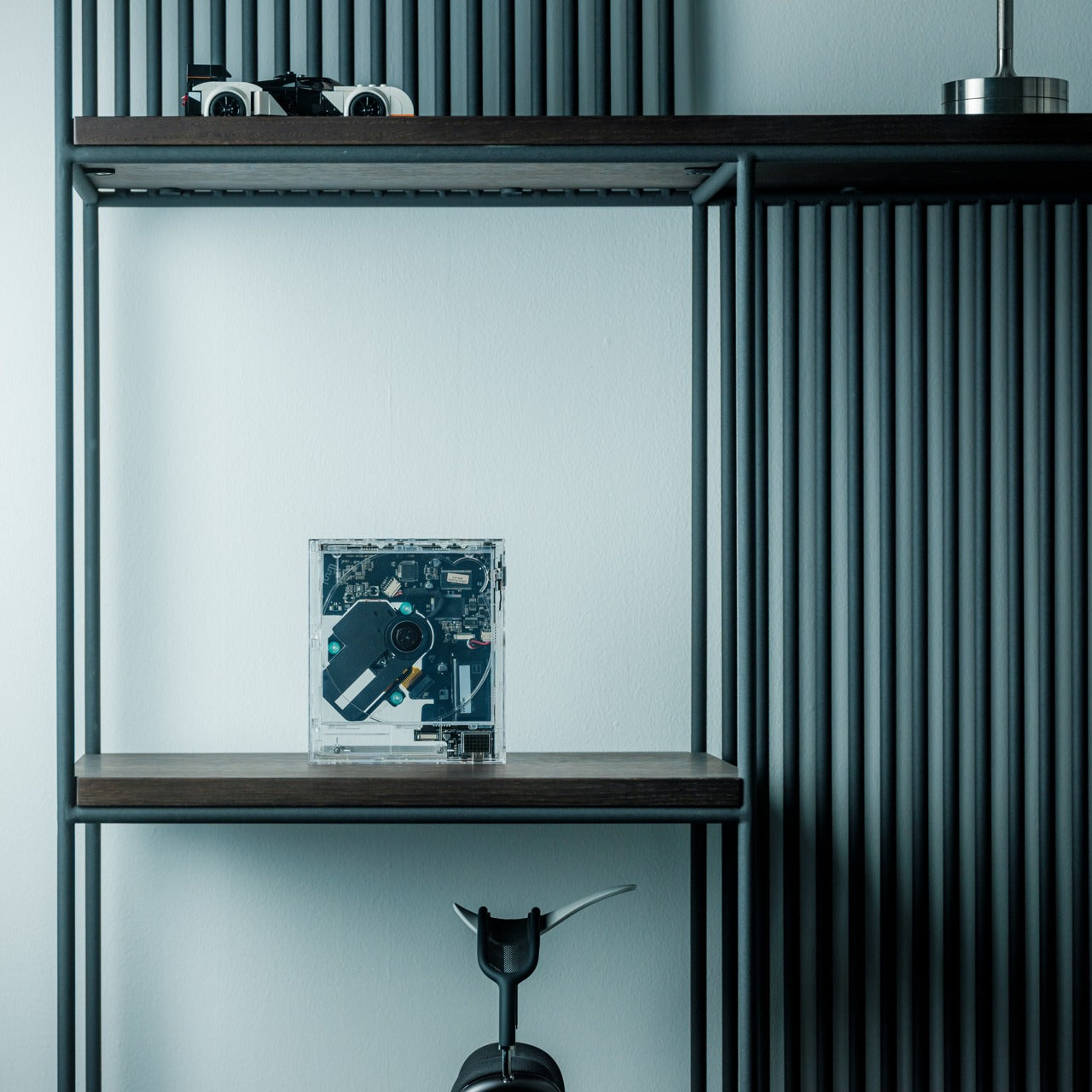
There is something specific about the weight and ritual of a CD that streaming never quite replicated. You hold the case, read the liner notes, make a choice that takes slightly more commitment than a tap. This portable player leans into that ritual without apologizing for it, designed to sit alongside the disc itself in a form thin enough to slide into a bag or stand upright on a shelf. It belongs in the same category as the best Japanese audio objects: things built for an experience, not merely a function.

In a small home, audio gear tends to bulk up the room. Amplifiers, cable nests, speaker pairs that demand real estate — they all negotiate with the architecture in ways that rarely end quietly. This doesn’t. Its proportions are closer to the music than to the equipment, and in a tiny apartment that distinction changes the whole register of a shelf. Pick an album, commit to it, and let the room fill with something chosen rather than algorithmically served.

Click Here to Buy Now: $199.00

What we like

  • The physical form reinforces intentional listening in a way a streaming app simply cannot
  • Slim enough to share shelf space with the very collection it plays

What we dislike

  • Limited to physical media, which requires maintaining an actual disc collection
  • Output depends on headphones or an additional speaker to fill a room

2. Aji Stone Book End Large

Quarried exclusively from the northeastern corner of Takamatsu City in Kagawa Prefecture, Aji granite has been considered Japan’s diamond of stone for centuries — dense, refined in grain, and resistant to moisture in ways that most decorative stone is not. The Large Book End is split from a single piece. No two are identical. Its surface carries the particular quality that only extraction rather than manufacture can produce: the sense that the material was always this way, waiting to be found rather than made.

What sets this apart from conventional bookends is what it refuses to do. It doesn’t decorate. It doesn’t try to be noticed. It simply holds what you’ve placed beside it with enough physical authority that the shelf around it immediately reads as more considered. In a small home where books live in plain sight — on open shelving, stacked on side tables — the presence of Aji stone changes how the whole arrangement reads. It turns a collection into a curation, which is a more significant shift than it sounds.

What we like

  • Split from a single stone, making each piece genuinely one of a kind
  • Dense enough to anchor the heaviest books without shifting or lifting

What we dislike

  • At $240, it asks for real confidence in its permanence as a purchase
  • Significant weight makes repositioning effortful once it has found its place

3. Frying Pan Omurice Chopstick Rest

Made in Mino Province — a region with over 1,300 years of ceramic production history and the source of roughly half of Japan’s tableware output — each of these rests is a miniature cast-iron frying pan with a curled dome of omurice sculpted in stoneware inside it. The craftsmanship is so specific and so unselfconscious about its playfulness that it reads as genuine rather than precious. Set it beside a bowl, or a plate, and the table shifts immediately from functional to considered.

In a small home, the dining table is rarely only a dining table. It doubles as a desk, a landing pad, a reading surface, a gathering point. When it becomes a table again for an actual meal, small objects like these do significant emotional work — they signal that the meal was planned, that the setting was thought about, that eating is worth a moment’s attention. The Mino tradition behind this rest gives that signal real weight.

What we like

  • Authentic Mino Province stoneware carries 1,300 years of regional craft tradition into an everyday ritual
  • Small enough to earn its place without competing with the food or the company

What we dislike

  • Textured stoneware requires more careful cleaning between uses than a glazed alternative
  • The omurice reference lands most fully for those already familiar with Japanese comfort food

4. Rolling World Clock

The Rolling World Clock treats time as something physical rather than abstract — a globe-like form that lets you reach out and find where the world’s hours currently sit. For anyone living across time zones, whether that means remote work, family spread across continents, or the particular restlessness of people who travel often, the constant mental arithmetic disappears. What remains is an object that earns its place on a desk or shelf not through utility alone but through the quiet pleasure of its form.

Small homes accumulate necessities that rarely pull their weight visually. A conventional world clock reads as office furniture regardless of where you put it. This one reads as an object you chose deliberately, which in a space where every surface is permanently on display is the difference between clutter and character. The minimal form holds its own without competing for attention — present without being loud, functional without being forgettable.

Click Here to Buy Now: $49.00

What we like

  • The form turns a practical need into a considered object worth displaying
  • Works as a conversation piece and a functional tool in the same breath

What we dislike

  • Requires some familiarity with the interface to read quickly at a glance
  • May need repositioning as your primary time zones change over time

5. Kinto Aqua Culture Vase

Kinto has built one of Japan’s most internationally trusted design practices on a single principle: objects for daily use deserve the same clarity of form as objects made purely for display. The Aqua Culture Vase applies that principle to water propagation — growing plants directly in water, without soil, without mess, without the maintenance schedule that keeps most people from keeping anything alive. A clean borosilicate vessel, a single stem or cutting, a windowsill. That is the entire arrangement, and it is entirely enough.

In a small home, anything requiring ongoing care competes for the same attention as everything else. Plants are often the first thing to go. This removes the friction almost entirely. The vase holds water, supports a cutting, and does both in a form so stripped of anything unnecessary that it could sit beside a stack of books or on the edge of a kitchen shelf without announcing its presence. The plant does the announcing. The vase makes it possible, which has always been Kinto’s design posture.

What we like

  • Removes almost every barrier to keeping something living in a small space
  • The borosilicate glass form is completely honest about its purpose and its beauty

What we dislike

  • Works best with propagating cuttings rather than established root systems
  • Water clarity requires more attention than a soil-based planter over time

6. Yamazaki Home Tower Step Trash Can

Yamazaki Home’s Tower collection has become one of the most reliable benchmarks for Japanese functional minimalism at an accessible price point, and the Step Trash Can is central to that reputation. The step mechanism opens the lid without contact — genuinely useful in a bathroom or kitchen where hands are occupied — and the one-gallon capacity is sized for the spaces where it actually belongs rather than the idealized rooms in which most home goods are photographed. It holds liner bags without clips or visible hardware. The integrated handle makes emptying effortless.

In a small apartment, the waste bin is rarely hidden behind a cabinet door. It sits beside the toilet or under the counter in full view, which means it is part of the room’s visual language whether anyone intended it to be or not. The Tower can treats that reality with enough seriousness to design a bin worth looking at. Matte white or black ABS resin, no ornamentation. It looks like a choice — and in a small space, that quiet distinction between something assembled and something designed makes the whole room feel more intentional.

What we like

  • No-touch lid mechanism works for hygiene and convenience in equal measure
  • The slim profile fits flush beside toilets and under counters without claiming floor plan

What we dislike

  • One-gallon capacity means more frequent emptying than larger household bins
  • The liner ring is an additional component to source and replace over time

7. Corcelain Modular Porcelain Cups

224 Porcelain operates in Ureshino City in Saga Prefecture, a region whose ceramic tradition — Hizen-Yoshidayaki — stretches back through centuries of tea culture and meticulous clay work. Designer Kosuke Takahashi arrived at the studio with a specific question: what happens when you build a porcelain cup not as a finished object but as a platform? The result is Corcelain, the first modular porcelain system, where each cup accepts 3D-printed attachments — feet, handles, lids, decorative elements — through a precision mounting system integrated directly into the ceramic surface.

The appeal for a small home is not just the modularity. It is the philosophy underneath it. These cups evolve rather than accumulate. You don’t replace them when your needs or aesthetic shifts — you adapt them, download new components from MakerWorld, print what you need and nothing more. In a space where every object must justify its continued presence, a cup that changes alongside you is worth considerably more than one that doesn’t. The porcelain is serious. The system around it is generous. That combination is harder to achieve than it sounds.

What we like

  • Open-source attachments via MakerWorld keep the design evolving without requiring replacement
  • Hizen-Yoshidayaki ceramic tradition grounds a genuinely forward-looking concept in centuries of real craft

What we dislike

  • Full modularity requires access to a 3D printer or a printing service to realize
  • Mounting points need careful handling to avoid wear from frequent component changes

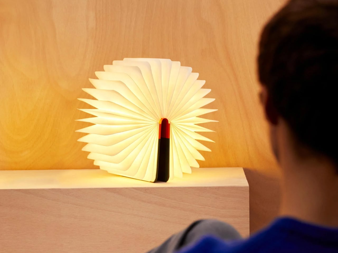
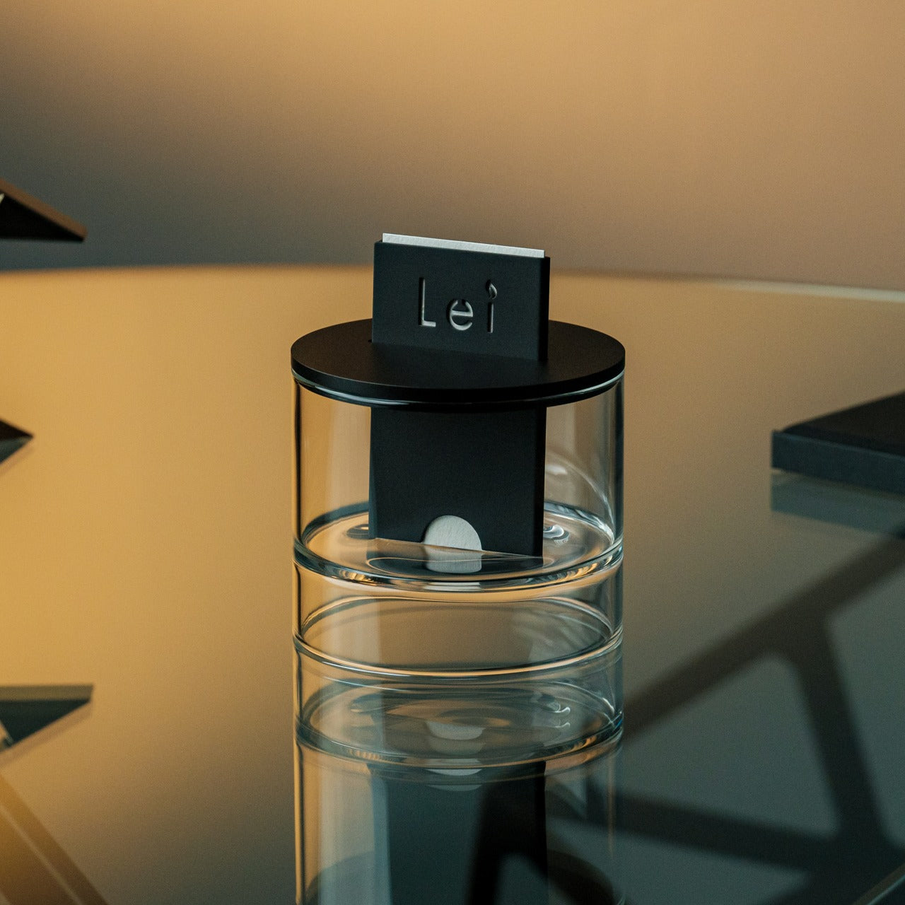
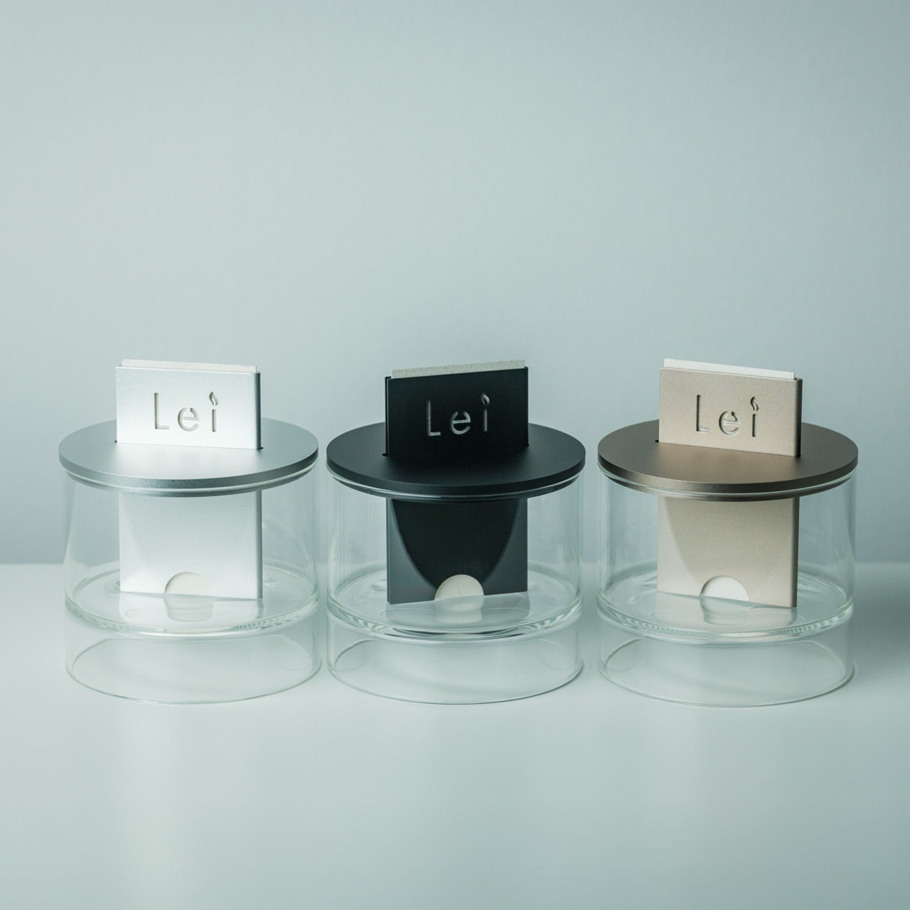
8. 3-in-1 Luminous Diffuser

Most diffusers ask you to choose between function and appearance, settling somewhere in the middle of both. This one refuses that negotiation by combining scent diffusion, ambient light, and a third mode into a single object whose form is considered enough to leave out permanently. The luminous element is not a decorative afterthought — it anchors a corner of a small room at low light, turning it into the kind of atmosphere you usually have to travel somewhere to find. Japan has always been good at making objects that shift a room without announcing how.

For a tiny home, the real value of a 3-in-1 is not the three functions — it is the three objects it replaces. No separate night light sitting on a cable. No ceramic diffuser vessel with a reservoir you forget to fill. No ambient lamp taking up a full socket and a surface. This consolidates all three into something with enough visual restraint to disappear when you want it to and enough presence to hold its own when you don’t. That economy of space and decision is exactly the point.

Click Here to Buy Now: $800.00

What we like

  • Three functional modes in a form minimal enough to leave permanently on display
  • Handles scent, light, and atmosphere without a separate object for each

What we dislike

  • Diffuser capacity suits smaller rooms better than open-plan living areas
  • Three functions mean one item to troubleshoot when something eventually needs attention

Small Rooms, Considered Objects

Japan’s design output at its best doesn’t ask you to reshape your life around what you own. It works the other way — finding the form that fits the space and routine you already have, then making that space feel more like itself. These eight pieces come from different regions, different craft traditions, and different centuries of making, but they share the same posture. None of them demands attention. Each one earns it through what it does and what it quietly refuses to do.

The tiny home movement has always been as much about intention as square footage. Living small works when every object in a room is genuinely worth having. These eight don’t fill a space — they complete one, each in its own register, from the density of Aji granite holding a shelf together to a modular porcelain cup that adapts alongside the person drinking from it. Start with one. The room will tell you what comes next.

The post Japan Keeps Designing Tiny Home Accessories That Make Small Spaces Feel Like Enough – Here Are 8 of the Best first appeared on Yanko Design.

This Skyscraper-Style Tiny Home Packs Two Floors Into Just 107 Square Feet

Most tiny homes go wide. La Ruche goes up. Designed by Quadrapol, the French company behind some of Europe’s most refined compact living solutions, La Ruche is a vertical two-story tower that fits a full kitchen, bathroom, dining area, and bedroom into just 10 square meters of total floor space. At 107 square feet, it is exceptionally small — even by the standards of a category that has made minimalism its identity.

The name translates to “The Hive” in French, and the form earns it. The structure rises to 4.12 meters tall on a footprint of just 2.17 by 2.3 meters. Built on a KVH finger-jointed solid wood timber frame, the exterior is clad in FSC and PEFC-certified treated pine siding available in a choice of colors, with a roof finished in either EPDM or steel pan. Quadrapol guarantees the structural frame for 20 years, and a 10-year warranty covers the broader build. This is not a weekend shed project. It is a precision-manufactured habitat delivered by truck, ready to drop into a back garden, campsite, or vacation lot without requiring any planning permit or administrative authorization.

Designer: Quadrapol

Step through the single glass door and you arrive in the kitchen, which is smaller than most studio apartment bathrooms but remarkably well-equipped. There is a two-burner induction hob, a built-in fridge, a sink, and cabinetry. A wall-mounted drop-down table unfolds to seat two. Separated from the kitchen by a curtain, the ground floor bathroom contains a 70 by 70 centimeter shower and a floor-mounted toilet. The spruce paneling and laminate flooring run throughout, keeping the interior palette tight and coherent.

A wooden ladder leads to the upper level, designed to stow flush against the wall when not in use. Up top, the bedroom fits a double bed alongside a storage unit and a netted shelf. It is snug in the way only intentional design can pull off — the kind of snug that feels considered rather than cramped, at least for a weekend or seasonal stay. Quadrapol positions it for permanent housing, second homes, vacation rentals, and student accommodation, though the curtain-divided bathroom and ladder access suggest it is best suited to shorter-term use or solo living.

La Ruche is priced at approximately $31,000 USD. With delivery running two to three months, it sits in a price bracket that makes it a genuinely accessible entry into compact ownership. For those willing to rethink what a home needs to be, Quadrapol’s answer is simple: four meters tall, two floors, and not a centimeter wasted.

The post This Skyscraper-Style Tiny Home Packs Two Floors Into Just 107 Square Feet first appeared on Yanko Design.

Escape’s Shoreline Is a Tiny Home That Doesn’t Ask You to Compromise

Most tiny homes make you work for it. The Shoreline doesn’t. Escape’s Shoreline sits firmly on that side of the line. Permanently installed at the builder’s own Canoe Bay Village community in Wisconsin, it’s a non-towable park model that measures 47 feet long and a generous 17 feet wide — nearly double the standard tiny house width. That extra real estate changes everything about how the space feels.

The exterior reads like a Scandinavian chalet that wandered into the Wisconsin woods. Timber cladding, a metal roof, and a screened front porch give it a grounded, architectural presence rather than the prefab anonymity of most park models. Step through the double glass doors and the interior opens up into something that genuinely competes with a modest apartment — wood walls, wood floors, and a layout that keeps everything on one level.

Designer: Escape

The living room is the first thing that earns its keep. A full sofa, a coffee table, an entertainment center, and an electric fireplace fill the space comfortably, while a mini-split unit and ceiling fan handle the temperature. Large windows push natural light deep into the interior, making the room feel bigger than the square footage suggests. The kitchen sits just beyond — and this is where Escape earns real points. A four-burner propane cooktop, an oven, a microwave, a fridge/freezer, a dishwasher, a pull-out pantry, and a dining table make it a kitchen you’d actually cook in. Dishwashers in tiny homes are rare. This one has one.

The bathroom continues the pattern of refusing to underprovide. There’s a bathtub and shower — another genuine rarity at this scale — alongside a vanity sink with stone countertop, a flushing toilet, and a washer/dryer stacked neatly into the space. The bedroom, reached from the kitchen through a wooden door, holds a king-sized bed, built-in wardrobes, a closet, a TV, and a picture window that frames the outdoors like a painting.

The Shoreline is priced at $199,360. Buyers own the home and pay $680 per month for the plot and services at Canoe Bay Village. It’s not cheap, but for a single-level home built with this much care and this much genuine liveability, the math holds up. Escape has been building tiny homes for over 30 years, and the Shoreline shows exactly what that experience looks like when the brief is comfort without compromise.

The post Escape’s Shoreline Is a Tiny Home That Doesn’t Ask You to Compromise first appeared on Yanko Design.

This Tiny Home Has No Loft, No Ladder, and No Compromises

Most tiny homes solve the space problem by going vertical. Justine disagrees. Stack a loft above the kitchen, add a ladder, and call it a bedroom. Craft House took one look at that logic and went the other direction entirely.

The Justine is a single-floor tiny home on wheels, and its refusal to go up is exactly what makes it stand out. Built on a double-axle SYMA trailer, it measures 8.4 meters long (27.5 ft) and 2.5 meters wide (8.2 ft), with a gable roof that peaks at 3.5 meters. That height isn’t wasted on a sleeping loft. It goes straight to the bedroom ceiling, giving you genuine, upright headroom in a room that actually functions like a bedroom.

Designer: Craft House

The exterior follows Craft House’s established design language — thermo-pine cladding paired with aluminum standing-seam sheet metal. It’s a combination that reads more Scandinavian cabin than trailer park, and the large double glass entry doors reinforce that impression from the moment you arrive.

Inside, the surfaces are finished in Scandinavian spruce, warm and light without being fussy. The kitchen sits at the center of the floor plan and is where Craft House spent the most attention. There’s an induction cooktop, an oven, a fridge/freezer, upper and lower cabinetry, and a dishwasher — that last one being genuinely rare in a European tiny home at this price point. Underfloor heating and smart air conditioning round out a spec sheet that feels closer to a well-appointed studio apartment than a mobile structure.

The bedroom holds a 160 x 200 cm double bed and a wardrobe. A small crawl space above offers overflow storage. The bathroom keeps things efficient: a glass-enclosed shower, flushing toilet, sink, and a cupboard that houses both a washer/dryer and the water heater. The living area includes a dining table with seating for four, though that configuration can be swapped for a sofa depending on how you use the space.

Power connects via a standard RV-style hookup, though Craft House offers a full off-grid configuration for buyers who want to move the Justine around regularly or park it somewhere remote. Every aspect of the build — layout, materials, finishes, energy setup — can be customized to order.

Pricing starts at around $52,500 USD at current exchange rates. That figure will climb with options, but for a fully finished, single-level home with a kitchen this complete and a bedroom this livable, it’s a reasonable entry point into full-time tiny living.

The post This Tiny Home Has No Loft, No Ladder, and No Compromises first appeared on Yanko Design.
This 368 Sq Ft Tiny Home Has a Murphy Bed, Incinerating Toilet, and More Clever Storage Than Most Apartments

Most 30-foot tiny homes feel like they’re apologizing for their size. The Smidge, a new build from Alberta-based Teacup Tiny Homes, doesn’t bother — every wall, staircase, and fold-down surface has been quietly doing double duty the whole time.

Sitting on a triple-axle trailer, the Smidge stretches 30 feet long and wraps 368 square feet of living space inside a clean exterior of horizontal lap siding and a black standing-seam metal roof. It’s a familiar silhouette in the tiny home world, but the interior is where Teacup’s thinking gets interesting.

Designer: Teacup Tiny Homes

The entry opens directly into the living room, which features a full-size storage unit, space for a sofa, and a wood-burning stove tucked against the wall. Underfloor heating and a propane-powered forced-air furnace handle the cold — a deliberate choice for a builder that operates in Alberta and knows Canadian winters aren’t gentle. Windows run generously along the walls, pulling in natural light and keeping the interior from feeling like a cabin.

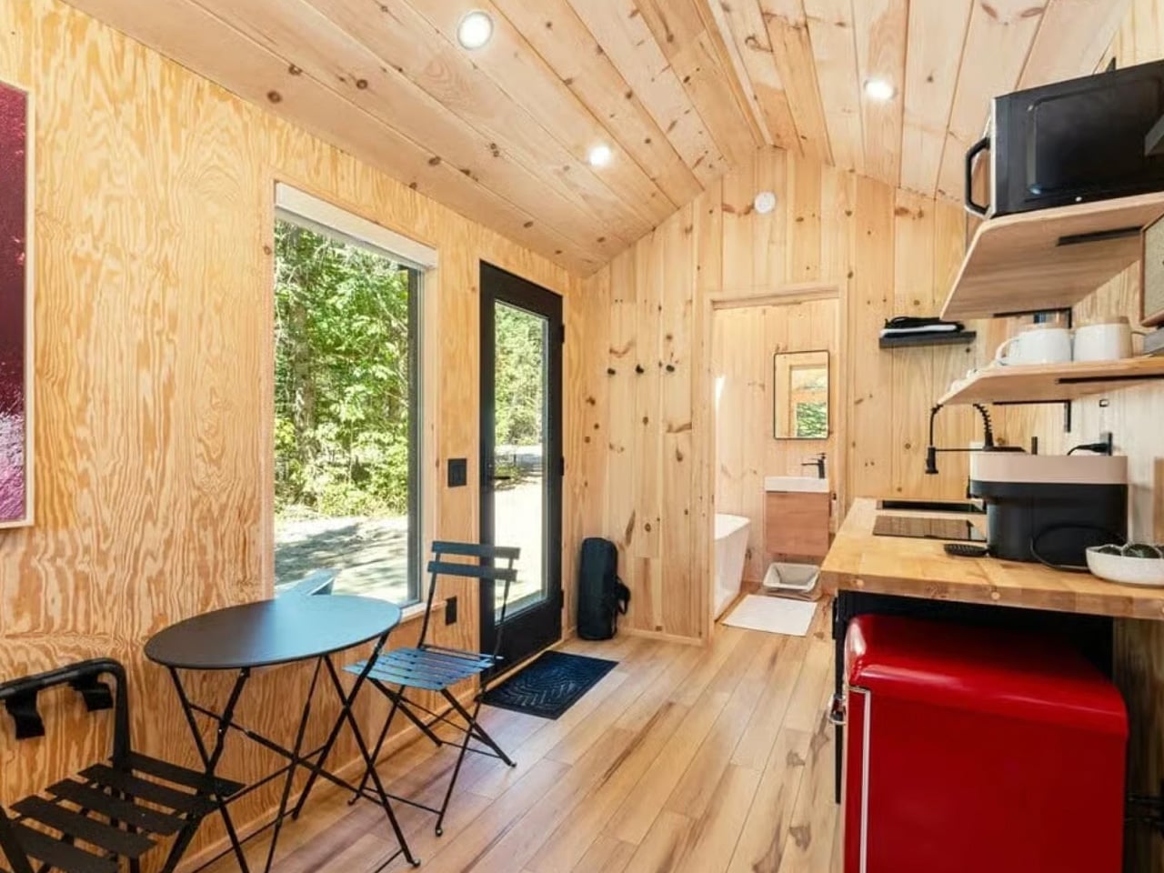
Just off the living room sits what Teacup calls an office, though calling it that undersells it. The space houses a Murphy-style bed with a folding desk mounted to its underside. During the day it functions as a proper work area; at night, the whole unit folds down to reveal a queen-sized bed. It’s one of those solutions that feels obvious in retrospect and rarely gets executed this cleanly.

The kitchen manages to fit a double-basin sink, induction cooktop, oven, fridge/freezer, and washer/dryer without feeling like a galley. The storage-integrated staircase beside it — fitted with drawers, cupboards, and a pull-out pantry — is the kind of detail that makes you look twice. Every riser is pulling weight.

The bathroom holds a walk-in shower, vanity sink, and an incinerating toilet, which burns waste down to ash. Teacup compares the system to an air fryer, which is either reassuring or unsettling depending on how you look at it, but off-grid functionality is rarely poetic.

Upstairs, a loft bedroom with a double bed sits under a low ceiling, accessed by that same storage staircase. It’s cozy rather than cramped — the difference being entirely in how you frame it. The Smidge is based on Teacup’s Margo range, which starts at approximately US $116,000, with pricing varying by configuration. Custom commissions are available directly through the builder.

The post This 368 Sq Ft Tiny Home Has a Murphy Bed, Incinerating Toilet, and More Clever Storage Than Most Apartments first appeared on Yanko Design.
The Burleigh 9.6 Is the Tiny Home That Proves You Don’t Have to Give Anything Up

Tiny home living has a reputation it hasn’t quite shaken — that at some point, you’re trading a real life for a smaller one. The Burleigh 9.6 by Removed Tiny Homes isn’t that. Built by the Gold Coast, Australia–based maker as a fully custom project, this 9.6-meter (31.5 ft) home on wheels sits at the intersection of real architecture and everyday livability, and it does it without making you feel like you gave something up to get there.

From the outside, it reads differently from most tiny homes. The angular, stepped roofline and wraparound NewTechWood composite cladding give it a presence — something that looks designed rather than assembled. Double glass doors open onto a living room wrapped in picture windows, where a sofa, swivel-mounted TV, and ceiling fan create a space that genuinely invites you to sit down. The surrounding bush pulls straight through the glass, and because the whole room is bathed in natural light, the sense of space stretches well past the actual square footage.

Designer: Removed Tiny Homes

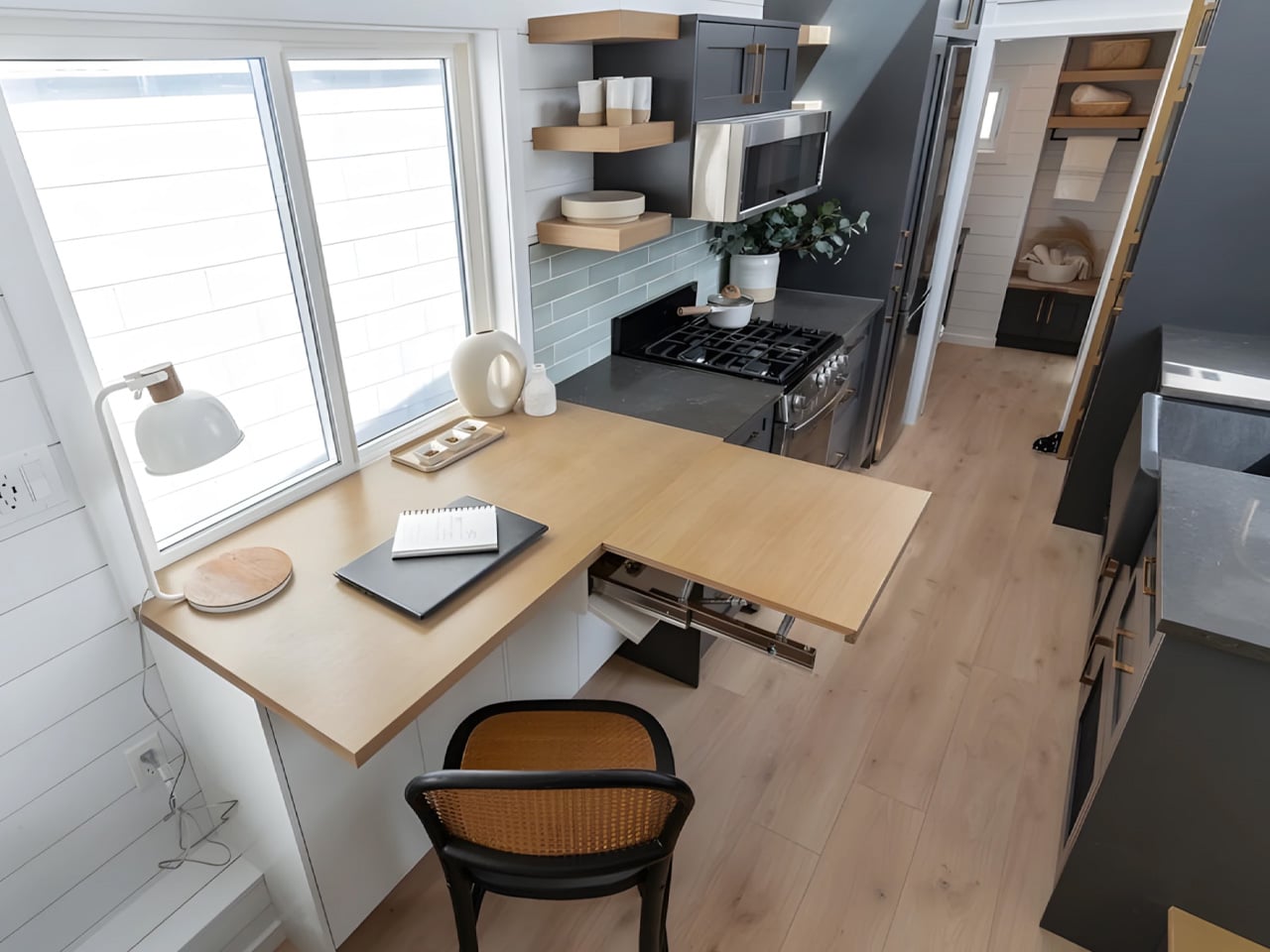
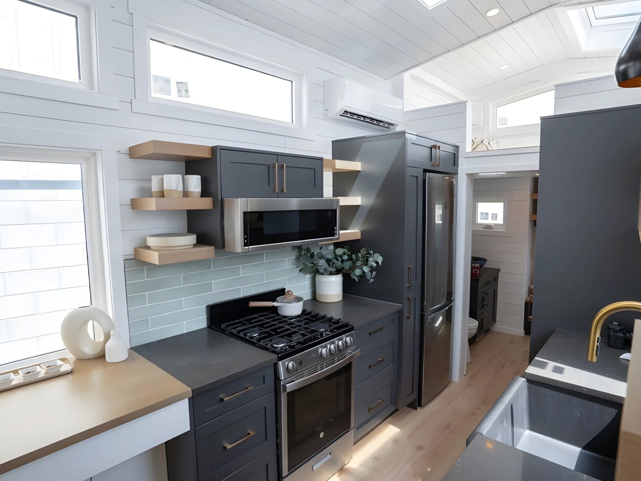
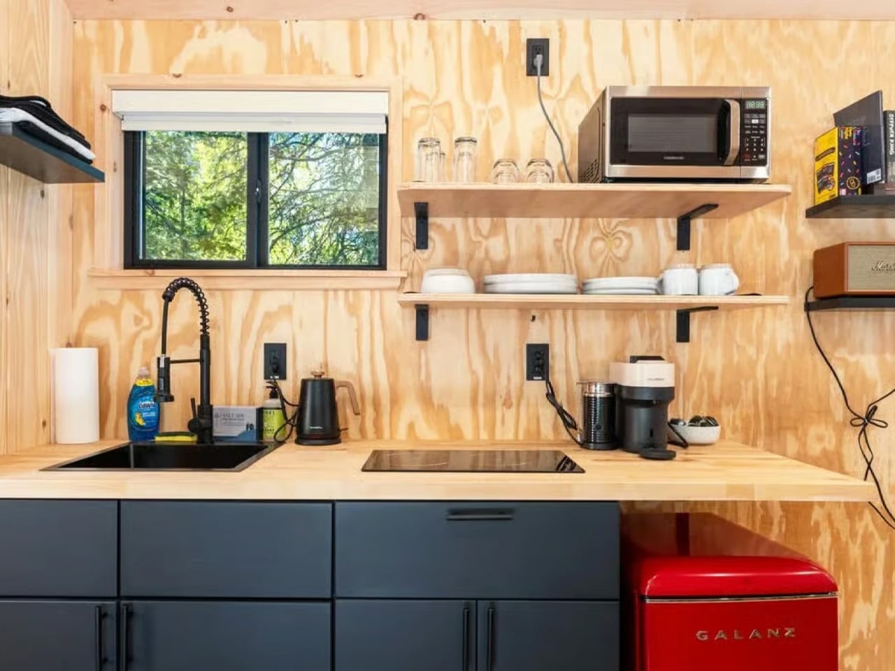
The kitchen runs galley-style through the center of the home — stone benchtops, a gas cooktop, an oven, a full-height fridge-freezer, and a lineup of SMEG appliances that would feel right at home in a full-sized apartment. A serving window opens to the outside deck, and a drop-down counter extension gives extra prep space when you need it. The interior palette is pure Japandi: light oak cabinetry, white VJ walls, matte-black hardware. Calm, warm, and considered.

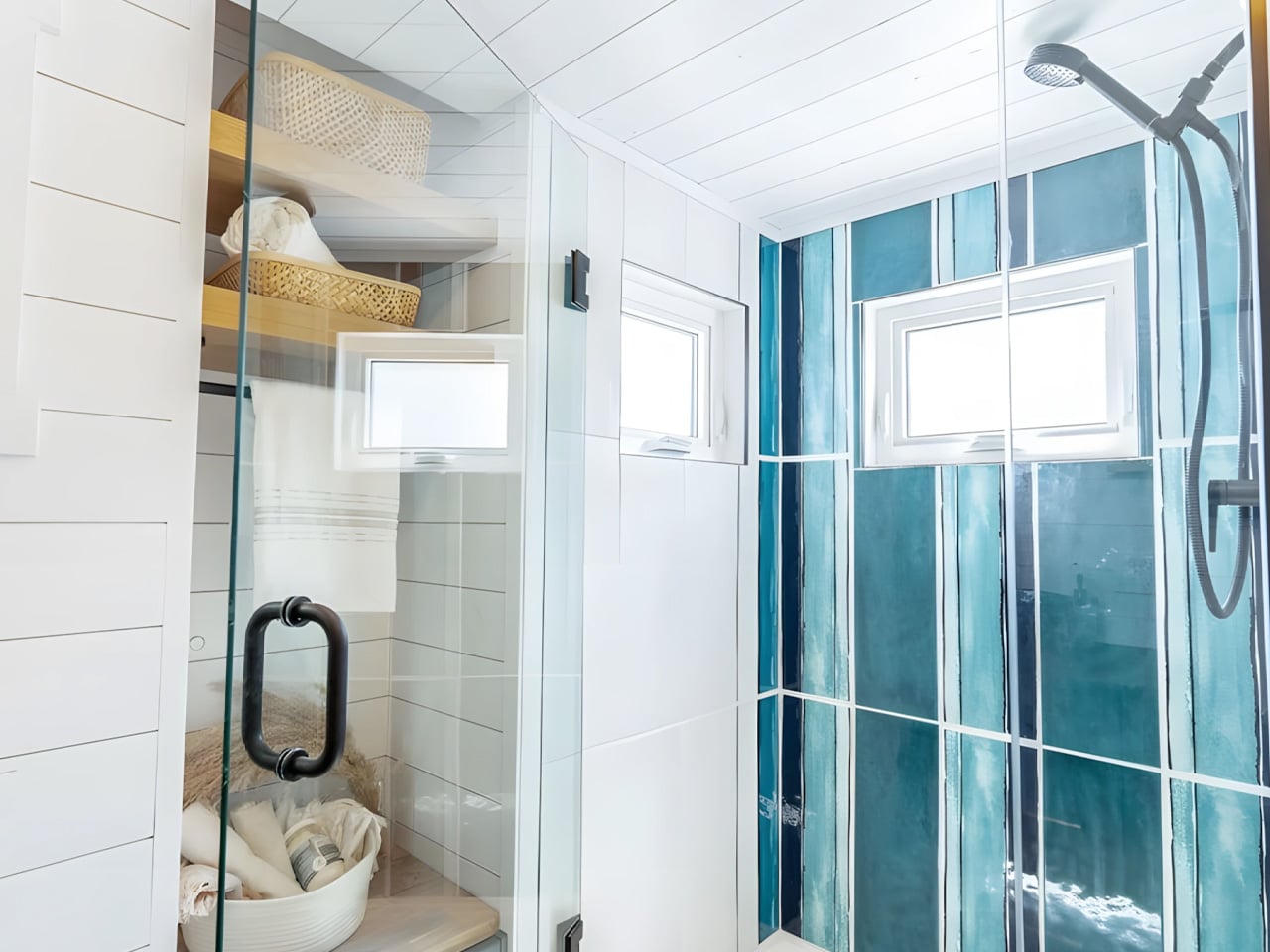
The bathroom is where the Burleigh genuinely surprises. Most tiny homes fight to fit a single basin. This one carries a full double vanity — two round vessel sinks side by side on a white stone top, with twin black wall-mounted taps and a backlit mirror. Beside it, a glass-enclosed double shower runs two separate shower heads. A built-in washer-dryer and a louvred window round it out, making the bathroom feel residential rather than a scaled-down afterthought.

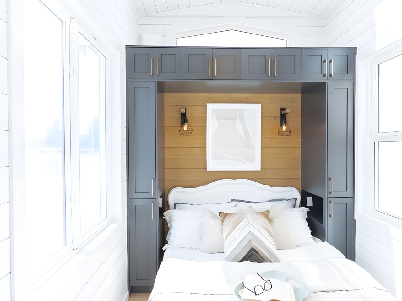
Sleep arrangements are split across two levels. The master bedroom sits at the far end of the home, accessed through the bathroom, with a double bed, a ceiling fan, full headroom, and its own separate entrance to the outside. A loft bedroom above the kitchen, reached by a removable ladder, offers a second double bed with the privacy of real separation. Power runs through a roof-mounted solar setup.

The Burleigh 9.6 is a custom build — designed and quoted individually through Removed’s custom program. It’s the kind of home that makes the case not just for living smaller, but for living better.

The post The Burleigh 9.6 Is the Tiny Home That Proves You Don’t Have to Give Anything Up first appeared on Yanko Design.
Most Homes Are Built to Last 10 Years. These 5 Designs Are Built for 100

Slow architecture asks a simple but powerful question: should buildings be designed for short-term trends or for the next hundred years?
At a time when much of construction is driven by speed, cost-cutting, and fast-changing aesthetics, this approach brings the focus back to durability, function, and long-term value. True luxury today is not excess, but the ability of a space to remain useful, relevant, and well-crafted over time.

Designing for a 100-year lifespan means making smarter choices from the start, from honest materials and adaptable layouts to lower environmental impact and easier maintenance. It turns architecture into a lasting asset and not just a temporary product. The five principles ahead explore how thoughtful, future-ready design can create buildings that perform better, age beautifully, and continue to support everyday life for generations.

1. Build with Materials That Last

A long-lasting building starts with materials that can handle time, weather, and daily use without losing their value. Stone, solid wood, brick, and other durable natural materials often perform better over decades than finishes chosen only for appearance. They need fewer replacements, age more gracefully, and usually reduce long-term maintenance costs. Instead of designing for quick upgrades, this approach creates a stronger, more reliable building envelope that can stay relevant for generations.

These materials also improve how a space feels in everyday life. The texture of timber, the weight of stone, and the character that develops over time add warmth and authenticity that synthetic finishes often cannot match. They create interiors that feel grounded, calm, and connected to nature. Choosing fewer artificial materials can also lower environmental impact while helping the building remain practical, beautiful, and honest for years to come.

Spanish studio Agora Arquitectura redesigned a neglected agricultural site on the outskirts of Barcelona by transforming a ruined red-brick structure into the foundation for a contemporary raised home. Named House on a Brick Base, the project preserves the character of the original building while introducing a new layer of living above it. Instead of demolishing what was already there, the architects restored the old brick shell and extended its presence across the site, turning a forgotten structure into a meaningful architectural anchor.

The lower brick volume is organized by two perpendicular walls that divide the interior and structurally support the timber addition above. A perforated brick boundary wall, outdoor staircases, and a sloped access route create a carefully choreographed arrival, leading visitors past a century-old olive tree before entering the home. Above, the new volume is built from prefabricated cross-laminated timber and clad in whitewashed cork, combining warmth with sustainability. Large windows, a steel spiral staircase, and a generous skylight bring daylight deep into both levels, creating a strong visual dialogue between old masonry and new timber.

2. Design Spaces That Can Change Over Time

A home built to last 100 years should not be locked into one lifestyle or one stage of life. Flexible planning makes it easier for spaces to adapt as needs change, whether that means creating a home office, adding privacy for older family members, or reworking rooms for future use. Features like non-load-bearing walls, practical room sizes, and good ceiling heights make these changes easier without major structural work. This keeps the home useful and relevant for much longer.

Adaptable design also improves everyday comfort. When the layout is planned well, rooms can shift in function without feeling awkward or disconnected. Good natural light, smart circulation, and strong core services like plumbing and electrical systems help the home work smoothly even as it evolves. Instead of becoming outdated, the house stays functional, resilient, and ready to support different ways of living over time.

GM House by Frederico Bicalho Arquitetura shows how a flexible layout can be naturally shaped by the land itself. Set on a steep site in Minas Gerais, the home follows a long, linear plan that allows each zone to respond differently to views, sunlight, privacy, and circulation. Instead of forcing the house into a fixed or compact arrangement, the architects used the slope to create a more open and adaptable sequence of spaces that feels practical, balanced, and deeply connected to the site.
This adaptability is reflected in how the home organizes everyday living. The social areas open directly onto the veranda and pool, creating a seamless indoor-outdoor environment that can support different activities with ease. On the upper level, the bedrooms are divided into two separate volumes connected by a walkway, allowing for both privacy and connection within the same home. This thoughtful spatial arrangement gives the residence a more dynamic rhythm and shows how flexible layout planning can make architecture feel both highly functional and effortlessly livable.

3. Prioritize Comfort Through Passive Design

A home designed for the long term should stay comfortable without depending too heavily on mechanical systems. Passive design helps achieve this through better orientation, cross ventilation, shading, insulation, and materials that can naturally regulate indoor temperature. These decisions reduce energy use, lower utility costs, and make the home more resilient in the face of rising energy prices or unreliable power supply. Over time, this creates a building that performs better with less effort and fewer resources.

Passive resilience also improves the daily experience of living in a space. Rooms feel cooler in summer, warmer in winter, and more stable throughout the day without constant adjustments. Good airflow, balanced daylight, and thermal comfort create interiors that feel calm and easy to live in.

Long Grass House in New Zealand shows how a flexible layout and passive design can come together in a home that feels both practical and uplifting. Recognized by the New Zealand Institute of Architects, the house balances affordability, sustainability, and everyday comfort without sacrificing character. Its compact form helps reduce energy demand, while the angled rooflines and carefully placed overhangs improve shading and thermal performance. Designed to feel relaxed and open, the home creates a holiday-like atmosphere while still functioning as a durable, year-round family residence.

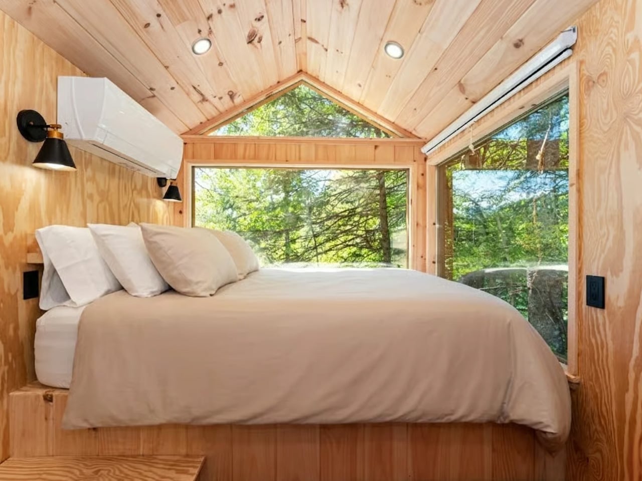
Inside, the layout is simple yet highly efficient, with spaces arranged to support changing needs over time. The bathroom, laundry, entrance, and loft are organized in a way that makes the plan feel dynamic without becoming complicated. A long skylight and vertical window bring daylight deep into the interior, while plywood finishes add warmth and visual continuity. Combined with durable steel cladding outside, the material palette keeps the house low-maintenance, cost-effective, and built to adapt gracefully to family life over the years.

4. Create a Design That Will Not Date Quickly

A 100-year home should not be built around short-lived trends that feel outdated within a decade. Lasting design comes from strong proportions, balanced layouts, quality finishes, and details that remain relevant over time. Instead of chasing what is popular for the moment, the focus should be on choices that continue to look good and function well across changing tastes. This helps protect the long-term value of the property and reduces the need for frequent cosmetic updates or renovations.

Timeless spaces also feel more comfortable to live in every day. Natural light, simple forms, and carefully chosen materials create interiors that stay calm, elegant, and adaptable rather than overly styled or visually exhausting. When a home is designed with restraint and clarity, it remains easier to maintain, update subtly, and is far more likely to be appreciated by future generations without needing to be completely redesigned.

House Hökarn by Per Bornstein is a strong example of timeless design, where simplicity, proportion, and material honesty take priority over visual trends. Set within a meadow in Floda, the home feels calm, restrained, and deeply connected to its landscape. Its minimalist expression does not aim to impress through excess, but through balance and permanence. By avoiding unnecessary gestures and focusing on enduring architectural fundamentals, the house achieves a quiet character that is more likely to remain relevant and beautiful over time.

This sense of longevity is reinforced through a carefully considered material palette and clear spatial planning. Lime-plastered walls, pine timber interiors, and precisely integrated concrete and steel create a home that feels contemporary and lasting. Natural light, framed forest views, and seamless room transitions further support an atmosphere that is serene rather than overstated. Together, these elements show how timeless design can create architecture that feels deeply livable today while still holding its value and appeal well into the future.

5. Plan the Landscape to Mature with the Home

A home designed for 100 years should include a landscape strategy that improves with time, not just at handover. Trees, native planting, shaded outdoor areas, water-sensitive planning, and healthy soil can all strengthen the long-term performance of the property. As the landscape matures, it can provide natural cooling, privacy, wind protection, and better biodiversity. This makes the site more resilient while also increasing the everyday usability and long-term value of the home.

A well-planned landscape also changes how the home is experienced. Views from inside become more meaningful, outdoor spaces feel more comfortable, and the property develops character year after year. Instead of treating the garden as decoration, this approach sees it as part of the architecture itself. When the built form and landscape are planned together, the result is a home that feels more grounded, more livable, and more connected to its environment over time.

Set along the winding edge of Poland’s Vistula River, 77 Studio’s House in the Slope feels less like a building and more like part of a living garden. Embedded into the riverside embankment, the home is surrounded by layered greenery, wild grasses, native planting, and a restored meadow that softens its presence. A planted green roof helps the house disappear into the landscape, while preserving the site’s natural contours and strengthening its bond with the riverbank ecosystem. The design allows vegetation, open views, and quiet privacy to define the experience.

The home’s orientation was carefully shaped around its most beautiful outlooks, where garden-like riverside planting unfolds toward the water and distant skyline. Terraces, courtyards, and recessed outdoor spaces extend the feeling of living within greenery, while a rooftop meadow adds another immersive layer of nature. Every move in the design celebrates the surrounding landscape, turning the house into a calm architectural frame for the site’s abundant natural beauty.

Slow Architecture offers a more lasting kind of luxury, rooted in the confidence that a home is built to endure. Through durable materials, adaptable planning, and passive performance, it creates spaces that remain resilient, comfortable, and valuable while continuing to serve present needs and future generations.

The post Most Homes Are Built to Last 10 Years. These 5 Designs Are Built for 100 first appeared on Yanko Design.