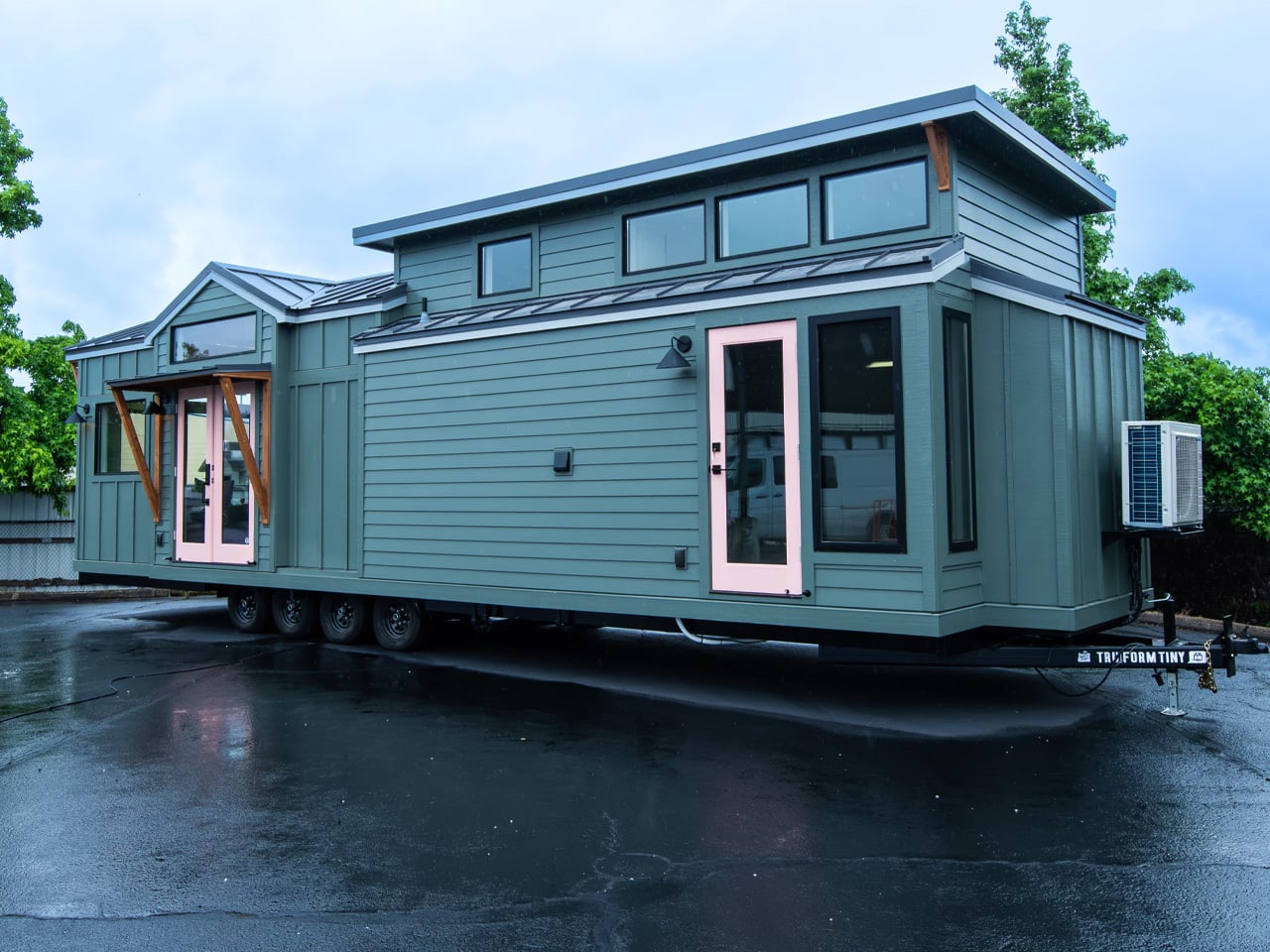
The consumer tech market has a crowding problem, mostly driven by products that try to do too much for too many people. The most interesting hardware lately has been doing the opposite, building around one specific inconvenience that hasn’t been properly addressed yet. Shenzhen has always had a knack for this, and InnoX Academy has been quietly developing the next generation of builders who make those products happen.
Founded in 2021 by Professor Li Zexiang of Hong Kong University of Science and Technology, Shenzhen InnoX Academy is a structured ecosystem that develops engineers and entrepreneurs into product builders. At the Global Connect Show 2026, it gave the world a look at its latest batch of startups, from home fitness and pet care to ambient design objects, each taking a more considered approach to a specific problem.
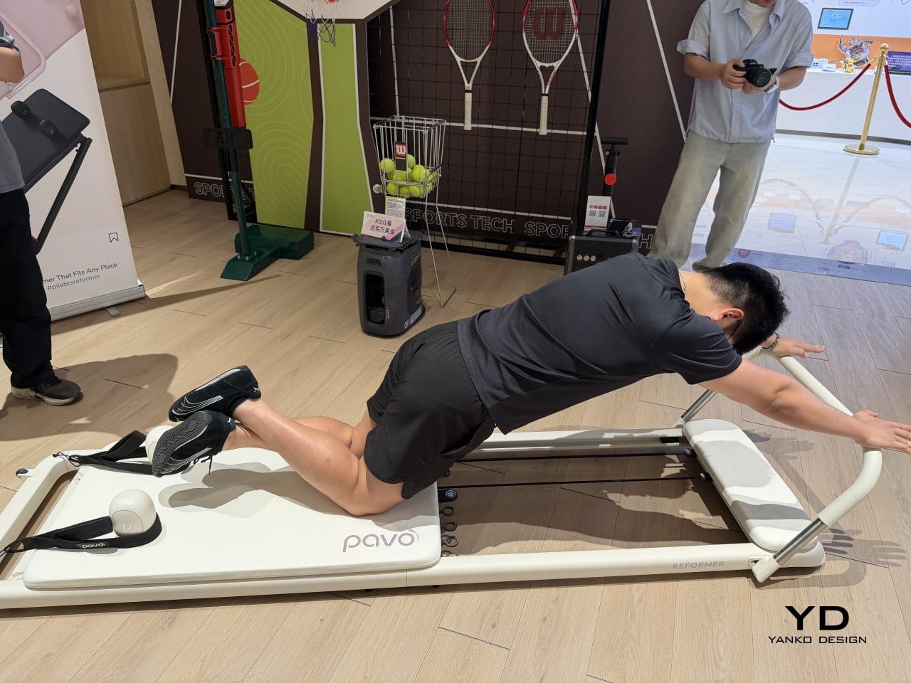
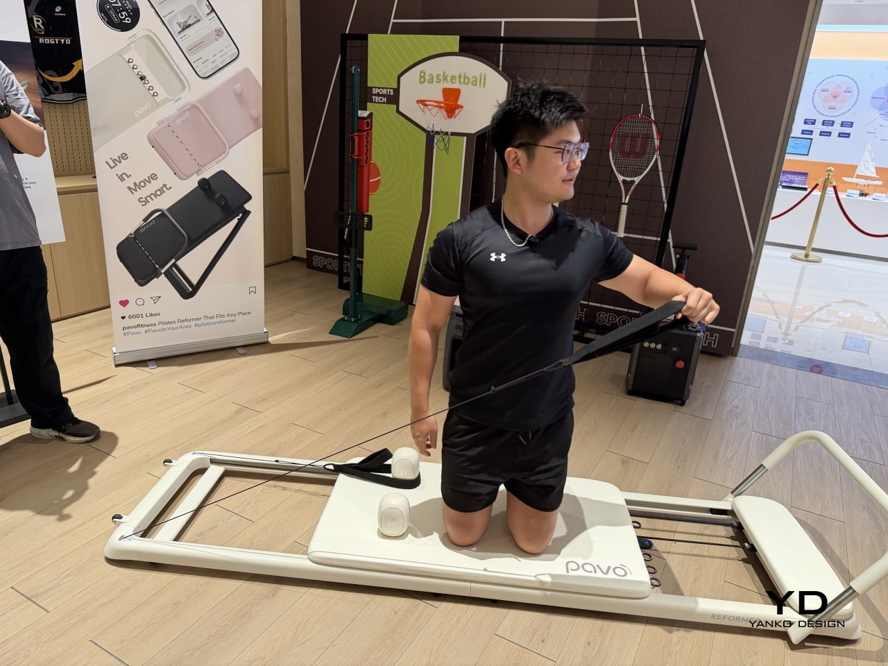
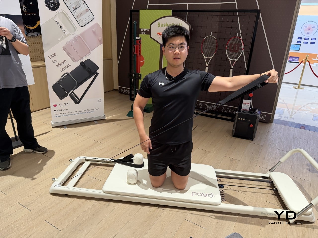
Pilates reformers have always been the kind of equipment you’d only find in a dedicated studio, too large and bulky for most apartments to accommodate. Pavo Fitness, started by a team of architects, industrial designers, and professional Pilates instructors, saw that as a solvable problem. The Pavo Reformer is their answer: a compact, foldable machine designed to bring studio-quality resistance training into a regular home.
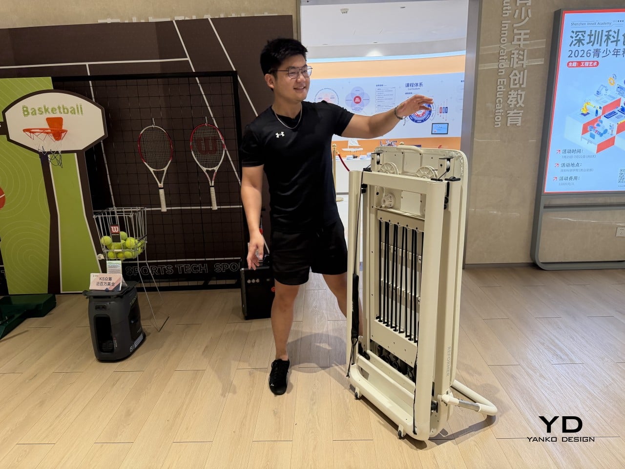
Designer: PAVO
Once a session is done, it packs away without being disassembled or moved to a corner, so it doesn’t have to become a permanent fixture in your living space. The onboard smart system keeps tabs on workouts, which matters more in a home setting where there’s no instructor watching your form. It adds a layer of accountability that a conventional reformer simply can’t offer.
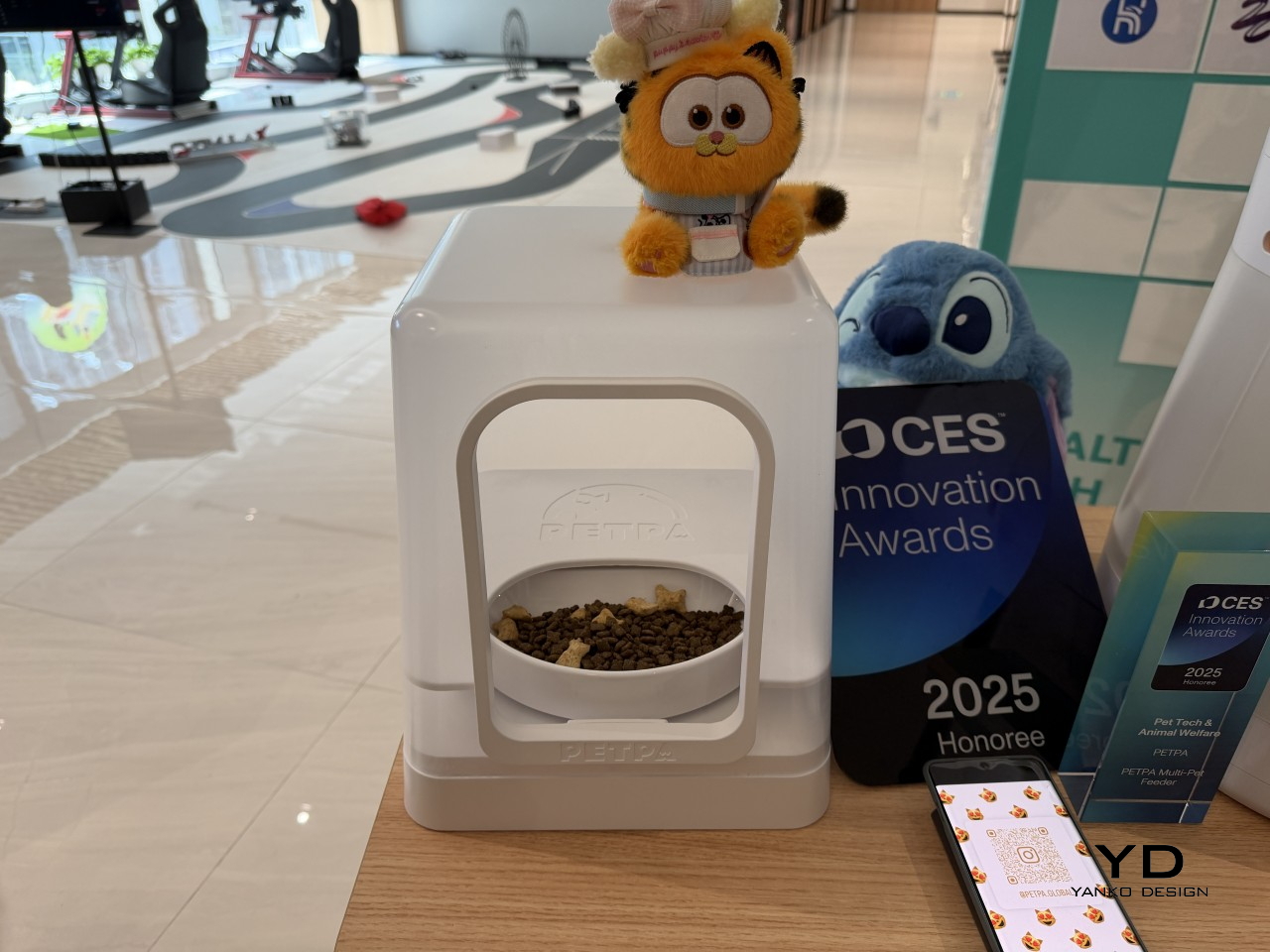
Multi-pet households have a feeding dynamic that most smart feeders don’t actually address. A timed dispenser works for one pet, but when multiple cats have different dietary needs, scheduling meals is only part of the problem; the harder challenge is making sure each cat only gets its own food. That’s what PETPA was built to solve, by a team that previously worked on hardware at DJI, Narwal, and RoboMaster.
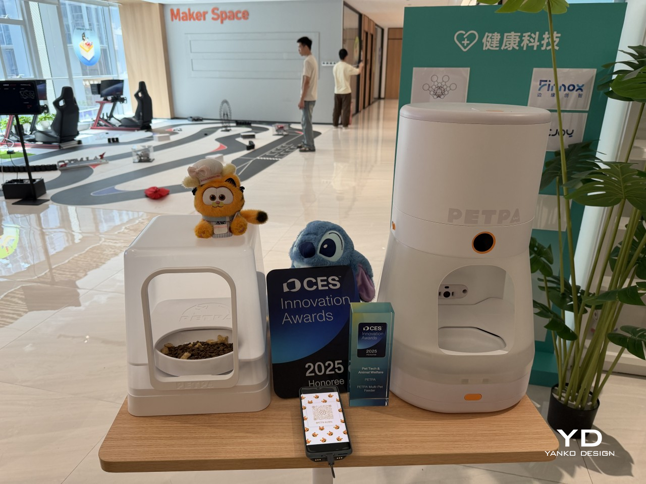
Designer: PETPA
The PETPA Multi-pet Feeder uses individual pet recognition to identify each cat and control access to their food, particularly useful in homes where one cat needs to lose weight or follow a prescription diet while the others don’t. It launched at CES 2025 and earned a CES Innovation Award in the Pet Tech and Animal Welfare category, recognizing a product solving a problem most smart feeders still overlook.
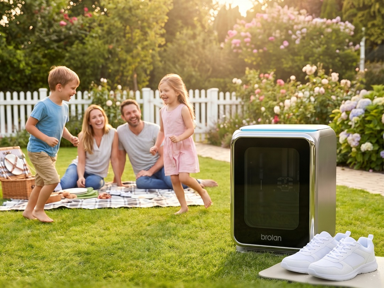
Sneaker care has evolved into its own dedicated ritual for collectors and sports enthusiasts who’d rather not take chances with a stiff brush and soapy water. The typical cleaning routine still carries the risk of fading colors, weakening materials, or warping the structure of more delicate footwear. Brolan’s ClearX is a compact home machine that moves through cleaning, low-temperature drying, and sterilization all in one automated cycle.
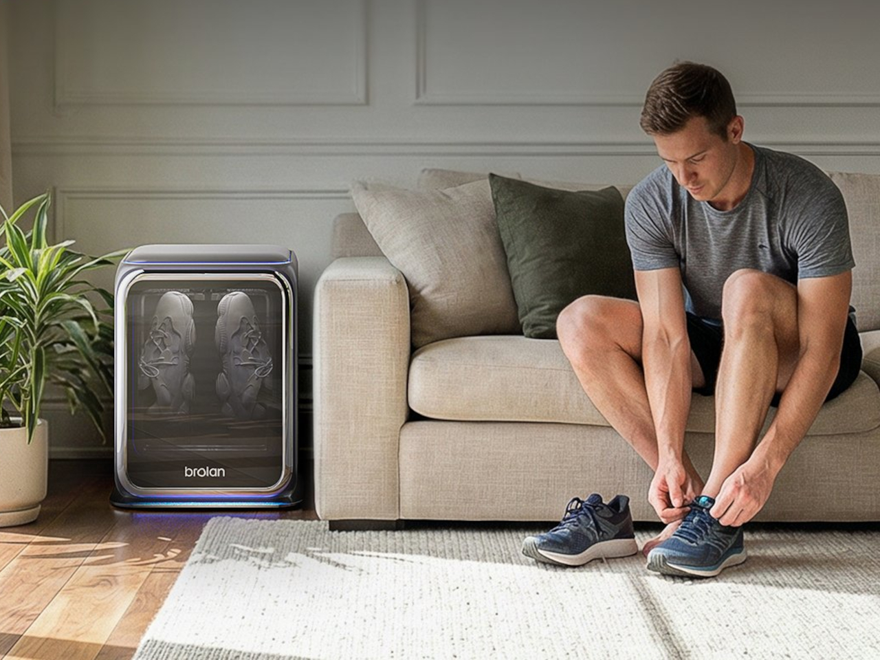
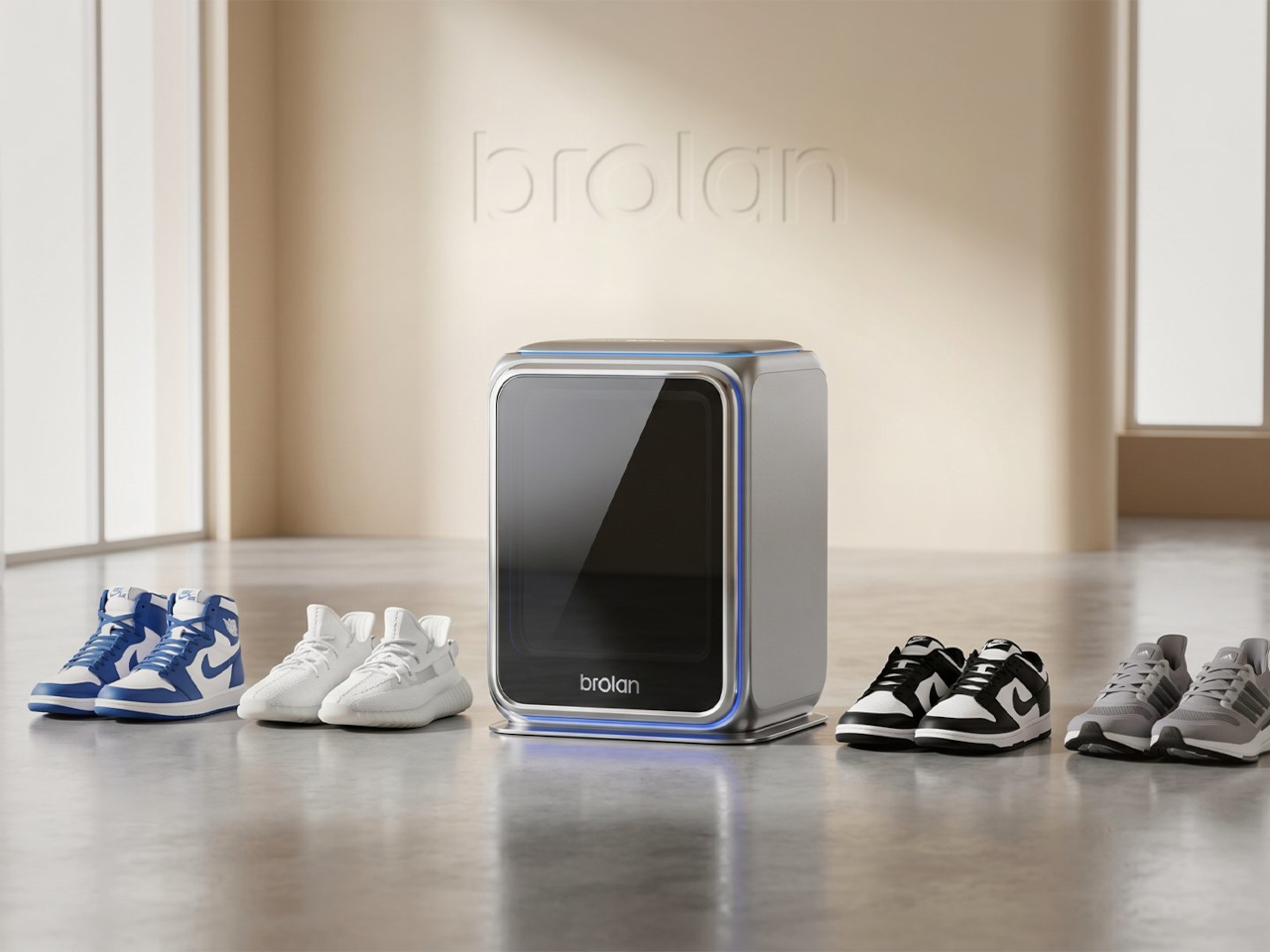
Designer: Brolan
Founded in 2025 by a team drawing from Nanyang Technological University, Harbin Institute of Technology, and Tsinghua University, Brolan designed ClearX specifically to clean without the harshness of manual scrubbing. The idea is to get footwear thoroughly clean without putting materials at risk, which matters most for anyone who owns suede, knit, or premium leather shoes that even a careful hand-wash can easily ruin.
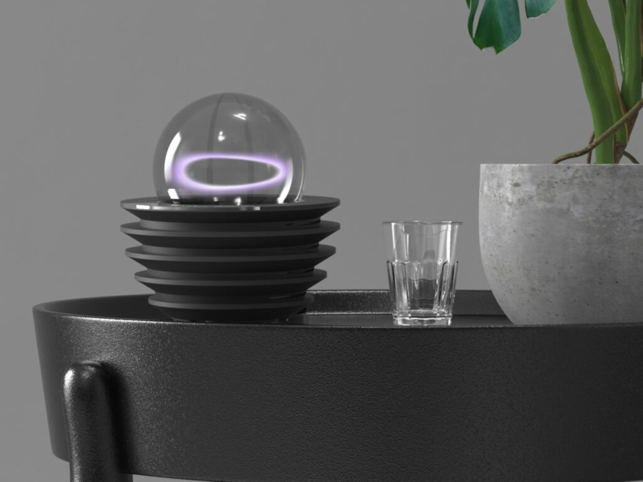
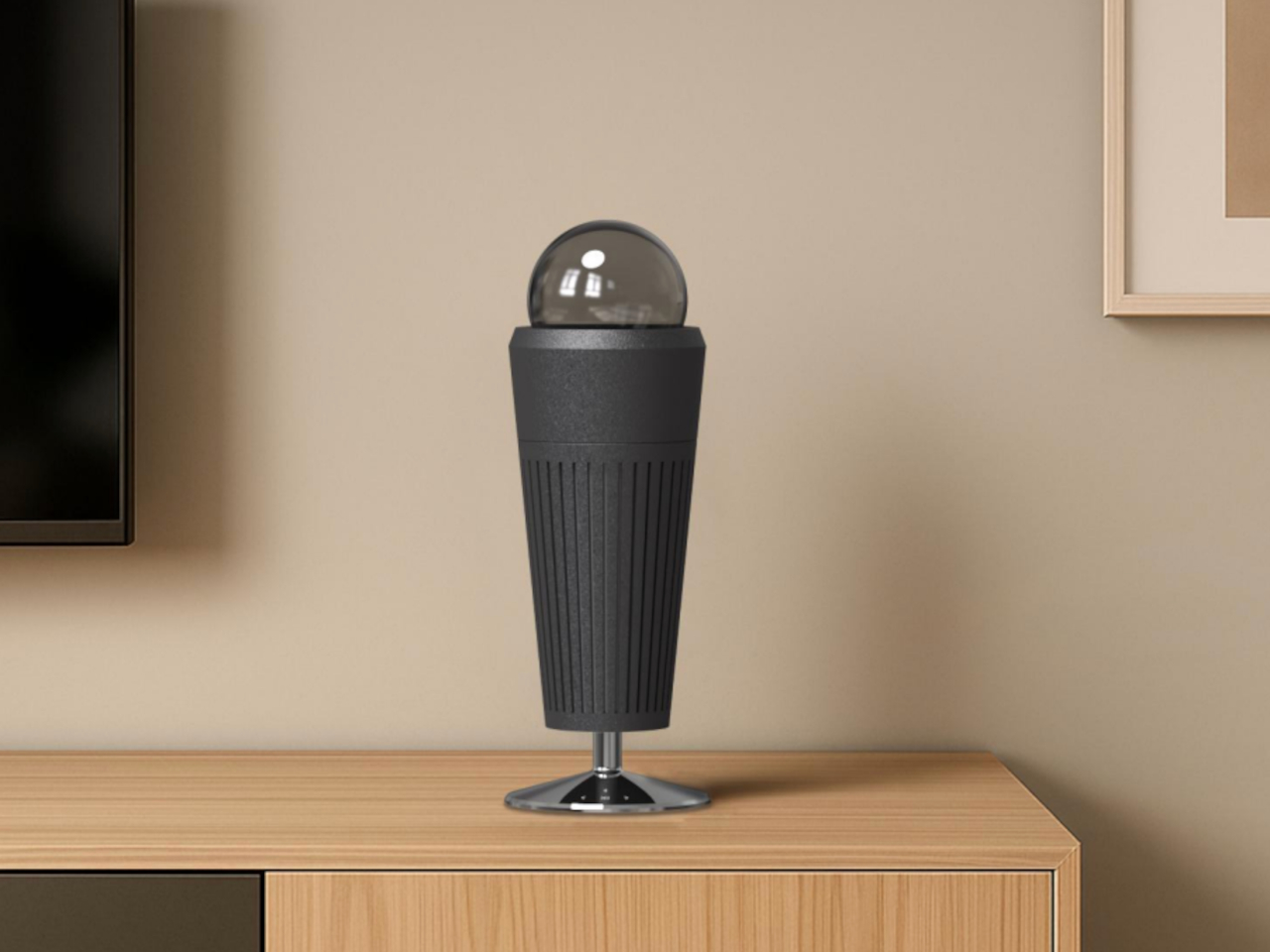
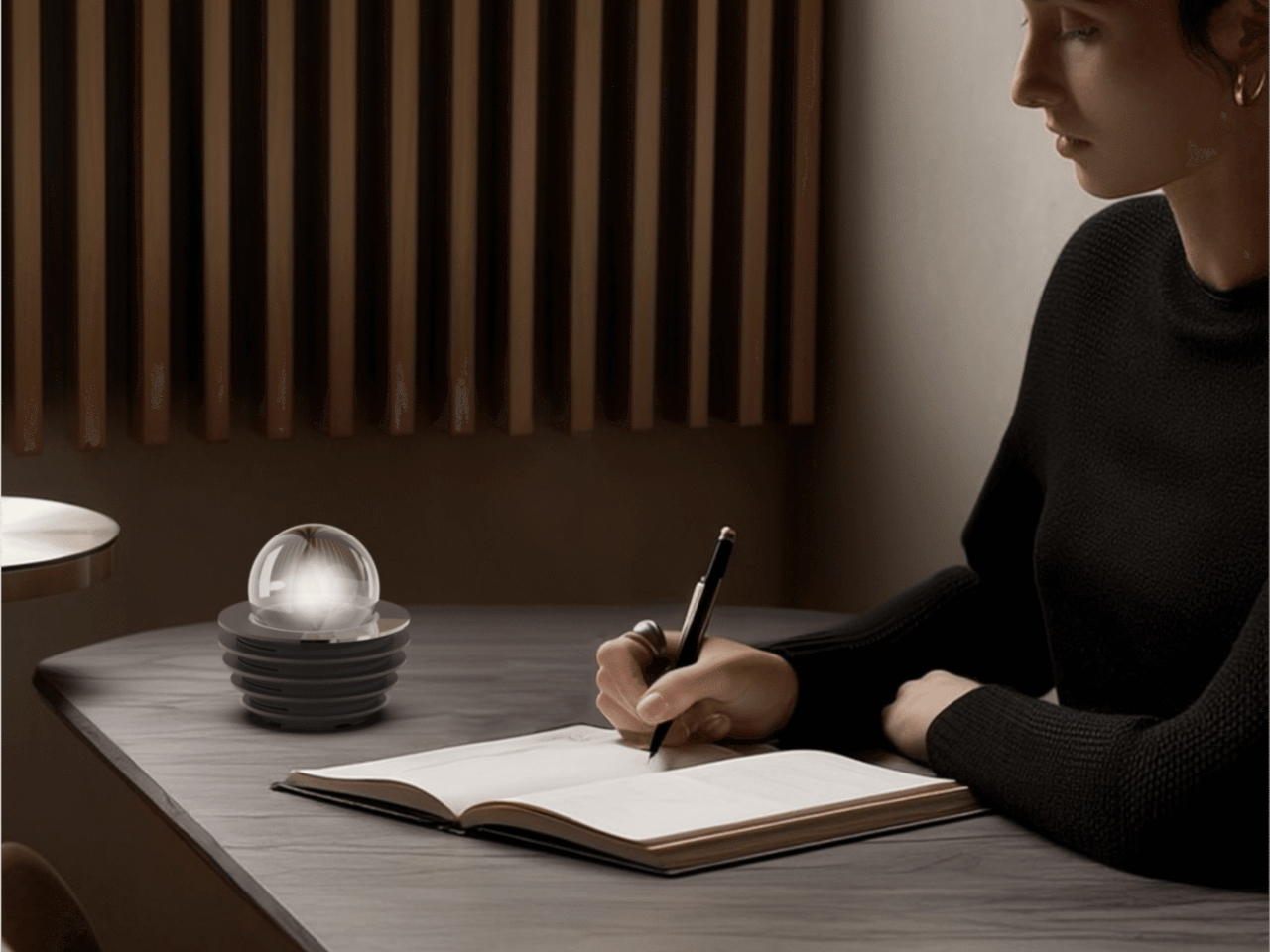
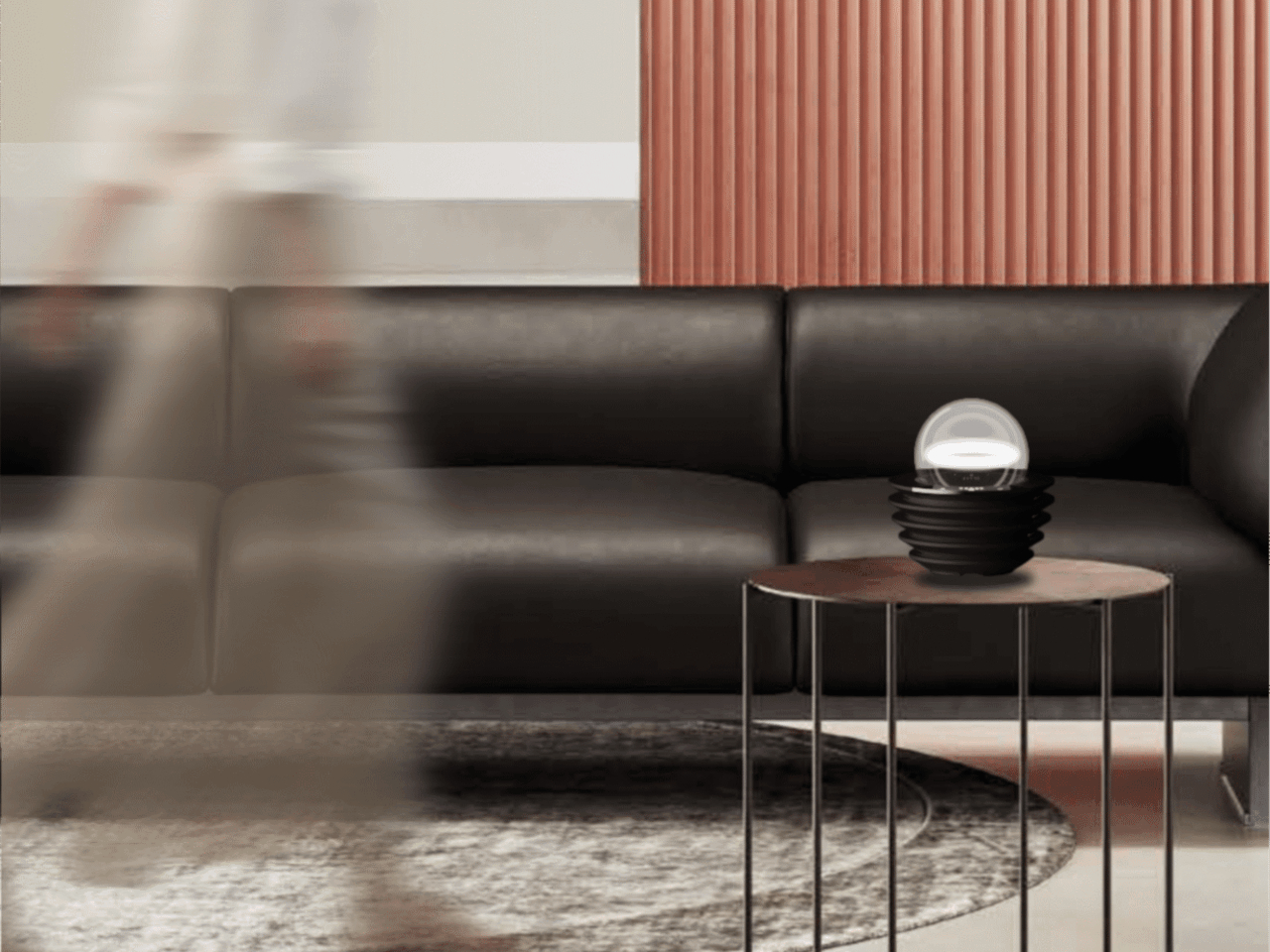
Not everything in the InnoX lineup is about automation or performance tracking. REAZENABLE takes a different direction with the REAZE Sandstone Series, a collection that sits somewhere between smart lighting and decorative object, aimed at people who’d rather their home feel calmer than more connected. The brand’s philosophy, technology empowering nature and light reshaping emotion, gives a clear sense of where its priorities are.
Designer: REANZENABLE
The collection includes the Halo light and three aroma vessels, all made from sand-based materials and shaped with ribbed surfaces that recall an uneven lunar landscape. The technical structure is deliberately concealed within those soft architectural forms, so nothing on the shelf reads as a gadget. Atmospheric light, mineral textures, and scent work together into something that feels more like a ritual object than a piece of hardware.
Several other InnoX startups addressed more personal routines. Rootique brought the DUO, a scalp atomizing applicator using patented DuoTrace and IntelliMist technology for precise serum delivery in about 15 seconds, already validated through an Indiegogo campaign that found backers across 52 countries. OCJOY presented the OCJOY Air, a home micro-air oral cleaning system that brings a water-air-powder cleaning method from dental offices to your own countertop.
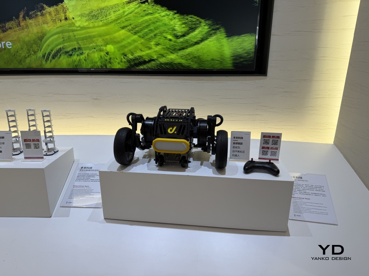
Direct Drive Tech D1
The lineup stretched into less expected territory, too. Blucalm’s StrikeDeck delivers AI-assisted game audio through a desktop controller, while ORULINK’s Watcher-Robot is an open-source desktop AI companion built for everyday interaction. CHEERLUCK brought a sausage vending robot for campuses and public spaces, and both Y-H2O and ANAVI presented electric watercraft, a hydrofoiling vessel, and a smart personal watercraft, each designed to cut the noise and emissions of traditional marine engines.
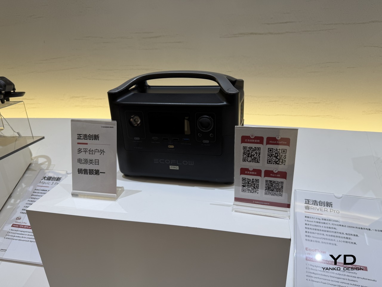
EcoFlow
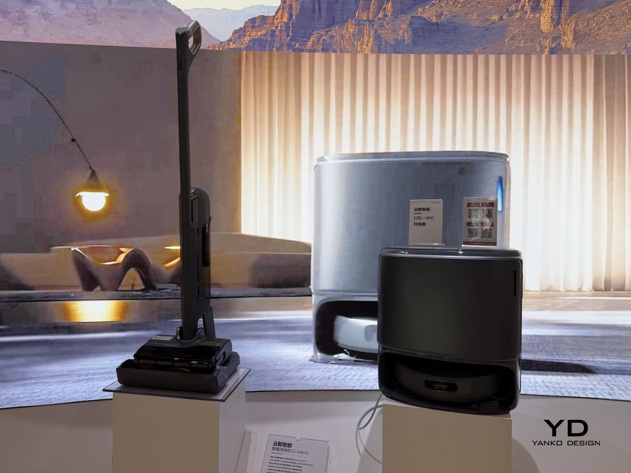
Narwal
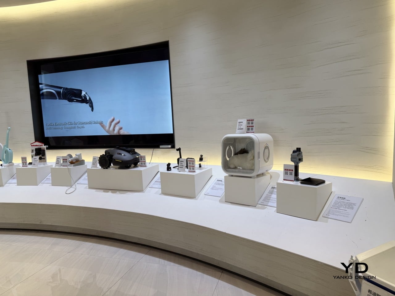
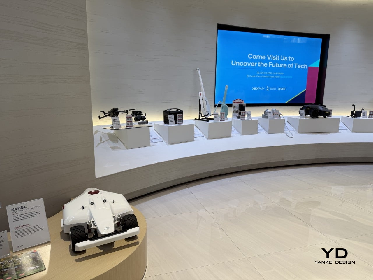
What gives the InnoX lineup credibility beyond the show floor is the academy’s broader history. Brands like Narwal, SwitchBot, DJI, EcoFlow, AgileX, and LiberLive are all part of InnoX’s wider ecosystem, a track record that makes it worth paying attention when the academy’s latest batch of incubated products steps out in front of an international audience for the first time.
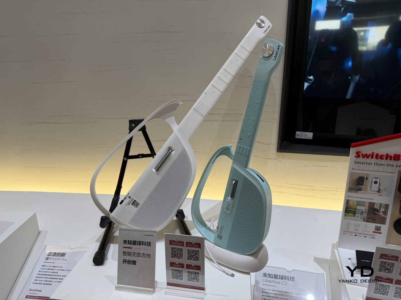
LiberLive
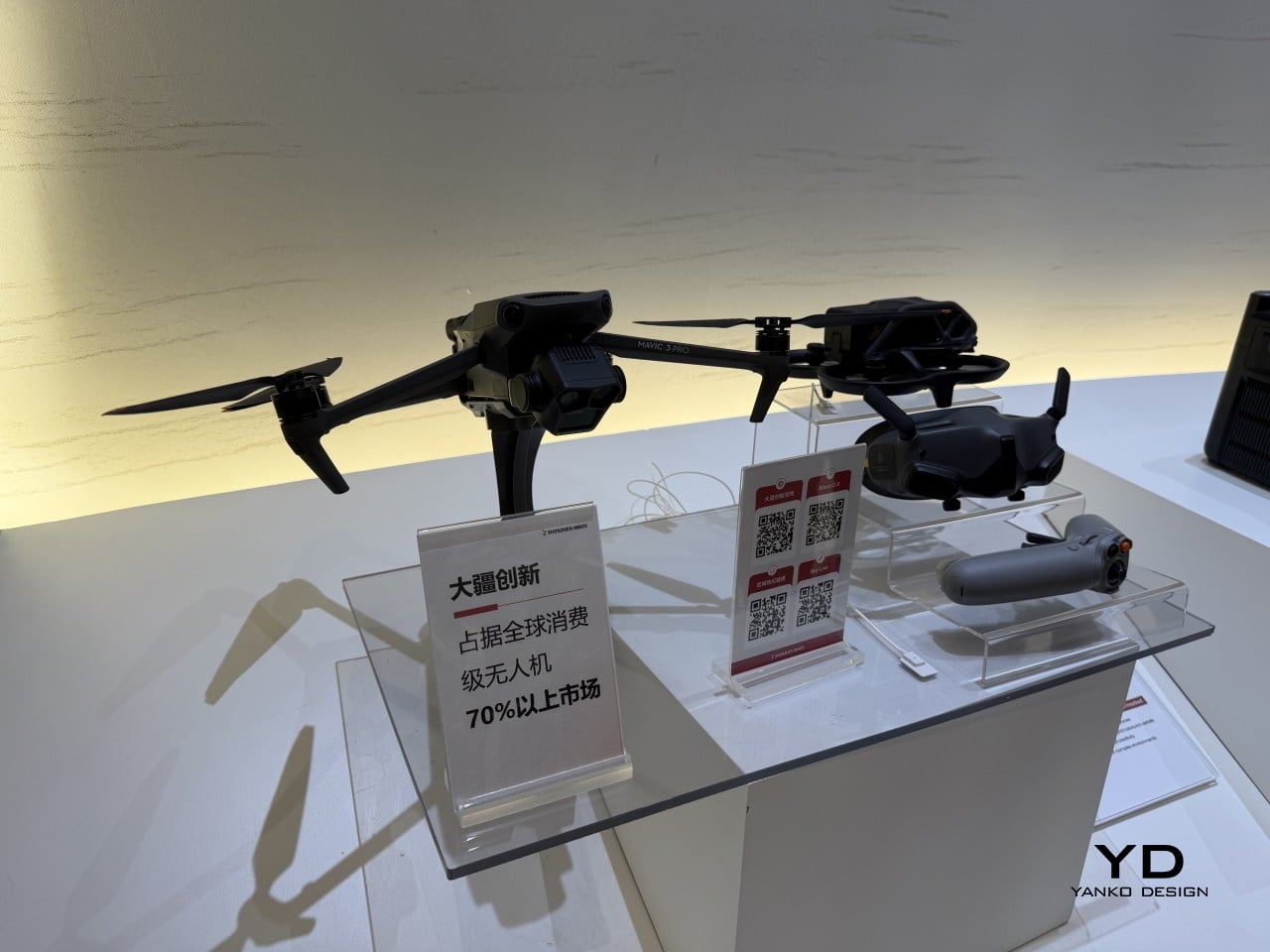
DJI
The post From Foldable Pilates to Shoe Robots: InnoX GCS 2026’s Best Startups first appeared on Yanko Design.