Packing for a camping trip is really just a series of small arguments with yourself about what’s worth the weight. June 2026 has produced a strong batch of designs that tend to win those arguments. Across five very different product categories, the same principle quietly surfaces: the best outdoor gear doesn’t add complexity to your trip. It takes it away.
From a hammock tent that rethinks how you sleep off the ground, to a radio that earns its keep long before conditions turn difficult, the designs ahead share something most camping gear doesn’t: a point of view. Each one started from a genuine problem and arrived at something you’d actually want to carry. These are the five that stood out this month.
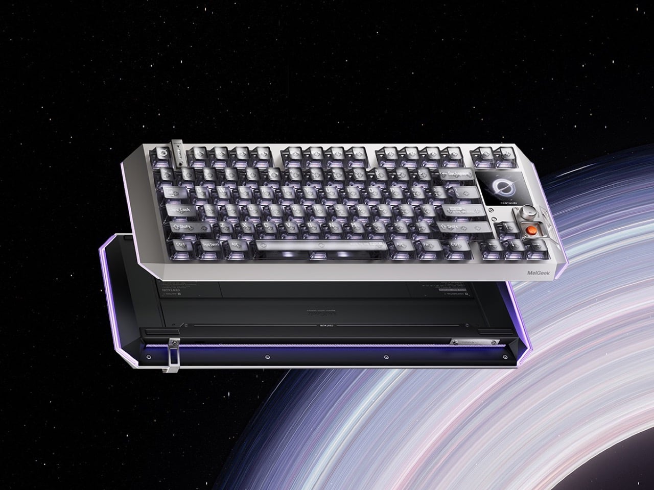
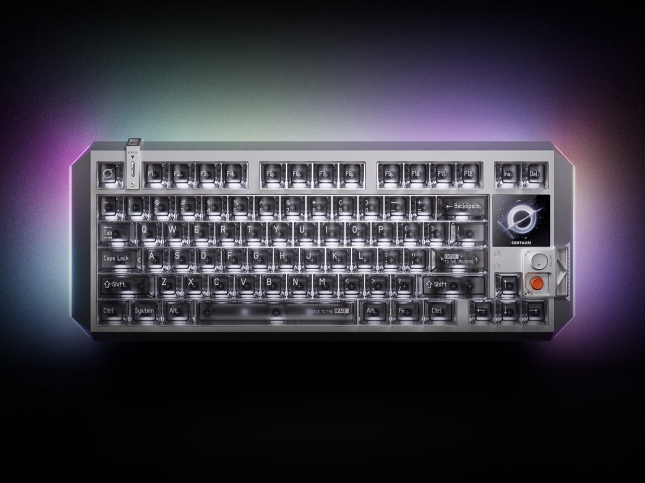
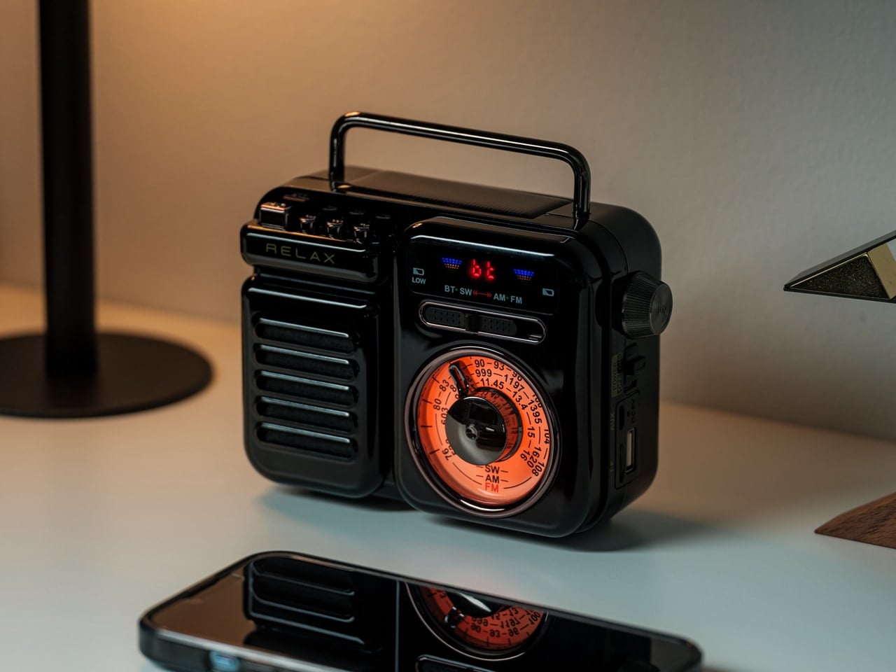
1. RetroWave 7-in-1 Radio

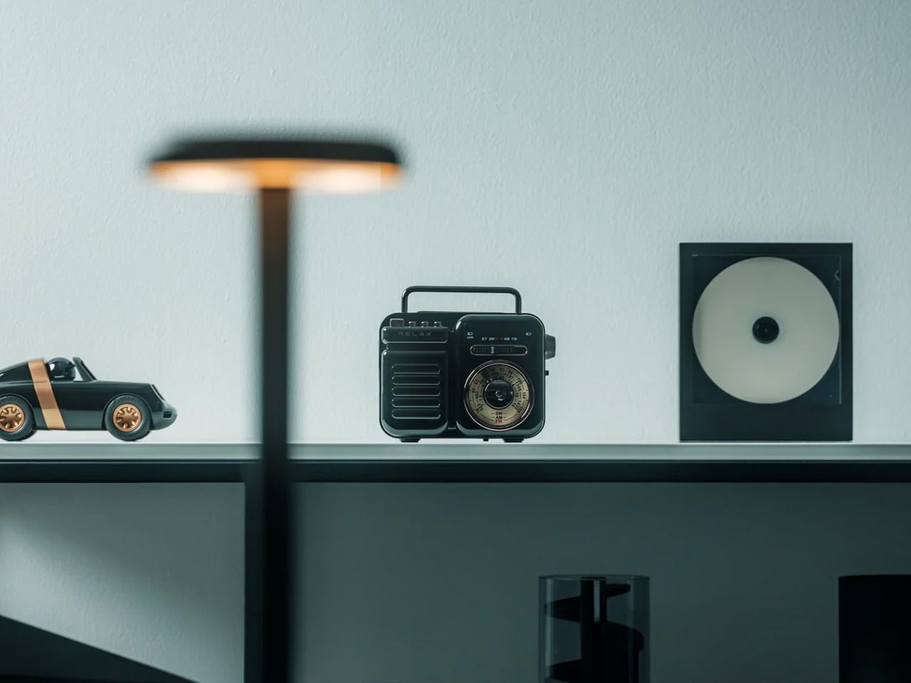
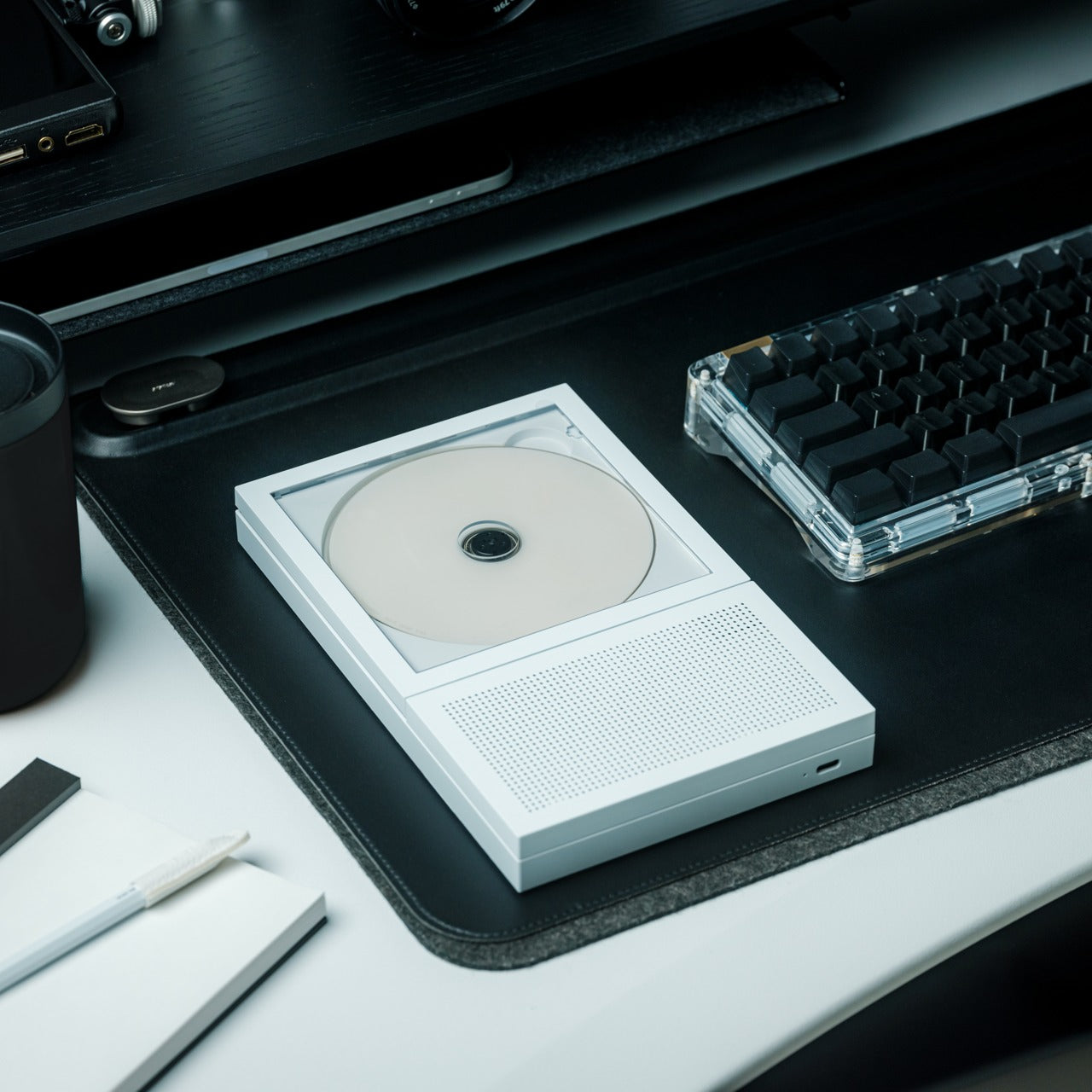
The RetroWave looks like a deliberate throwback to classic Japanese radio design — a tactile tuning dial, compact body, warm aesthetics that earn a shelf rather than beg for a drawer. But the retro form is doing something more purposeful than nostalgia: it frames a genuinely self-sufficient piece of kit that works when conditions aren’t perfect and removes the decision fatigue of choosing every piece of music you play. AM, FM, and shortwave for signal without an app. Bluetooth streaming when connectivity holds. A hand-crank and supplemental solar panel for when it doesn’t. SOS alarm and built-in flashlight, quietly tucked in.
What the RetroWave actually solves is the fragility of modern audio. Smart speakers go silent when the Wi-Fi drops. Earbuds die at the wrong moment. Phones drain precisely when you need them most. The RetroWave doesn’t ping you with reminders or demand perfect conditions. It simply plays, charges, and illuminates across seven functions. For campers who want fewer devices in the pack and more reliability in the field, it does the work of four separate items without asking for four separate charging cables. That’s a trade worth making before any trip where things might not go smoothly.
What We Like
- Seven functions in a single body significantly reduce the number of individual items you need to carry and manage
- Solar and hand-crank charging keep it functional entirely off-grid with no outlets and no power bank required
What We Dislike
- The retro aesthetic, appealing as it is, may read as decorative novelty to buyers who haven’t yet used it in an actual off-grid context
- Shortwave reception quality can vary noticeably depending on geographic location and surrounding terrain
2. Haven Spectre Ultralight Hammock Tent
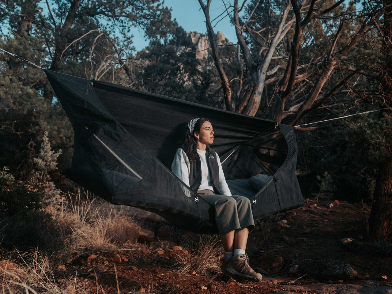
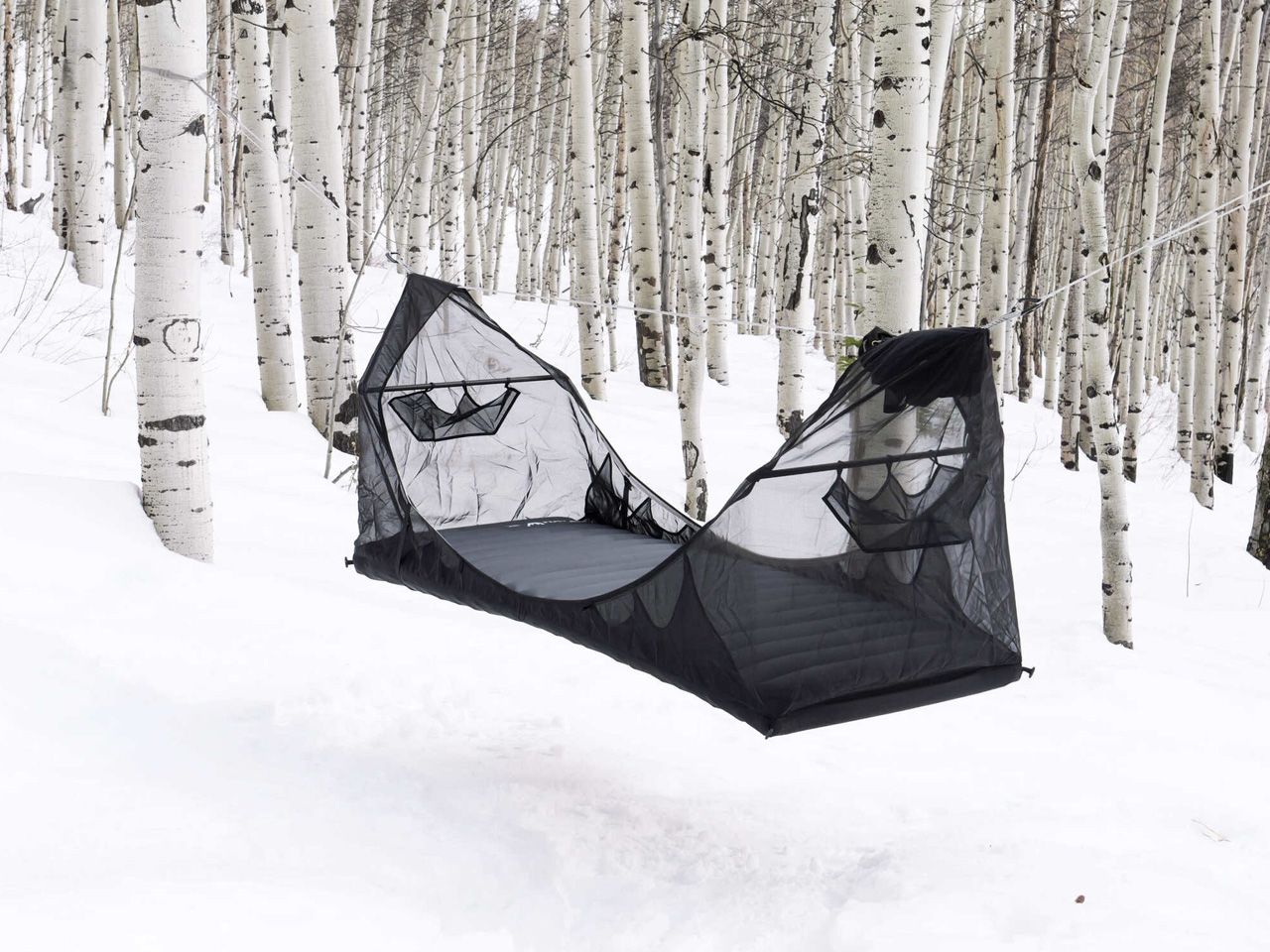
The Haven Spectre solves the problem every experienced hammock camper knows but rarely admits out loud: traditional hammocks fold your body into a shape that doesn’t encourage real sleep. The Spectre counters this with a flat-lay design that keeps your spine aligned and your night predictable. For backpackers who have tried and quietly abandoned hammock camping after a single rough night, this is the iteration worth revisiting. It’s featherlight without feeling compromised, built from years of field-tested feedback, and light enough to disappear into a pack you’re already carrying.
What separates the Spectre from its predecessors isn’t just weight reduction — it’s the thinking behind how a person actually sleeps in the field. The integrated structure holds its form without demanding constant re-adjustment mid-night. You string it up, get in, and it works. For long-distance hikers and weekend backpackers alike, that reliability reduces the cognitive load of a night outdoors. Less time fussing with rigging means more energy for the trail ahead, which is exactly the kind of trade-off a well-designed piece of kit should make for you.
What We Like
- Flat-lay sleeping position solves the banana-curve problem that makes traditional hammocks genuinely uncomfortable for full nights
- Years of customer-driven refinement make this Haven’s most advanced and polished iteration to date
What We Dislike
- Requires trees at the right spacing and height, which limits viable campsite choices in open terrain
- Premium price point puts it out of reach for casual or occasional campers who might only use it a handful of times a year
3. Blavor Power Station + Camping Lantern
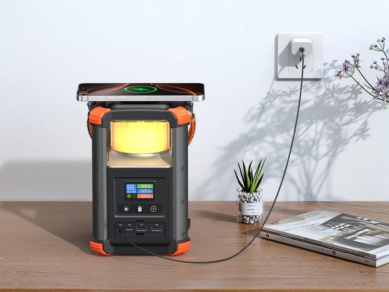
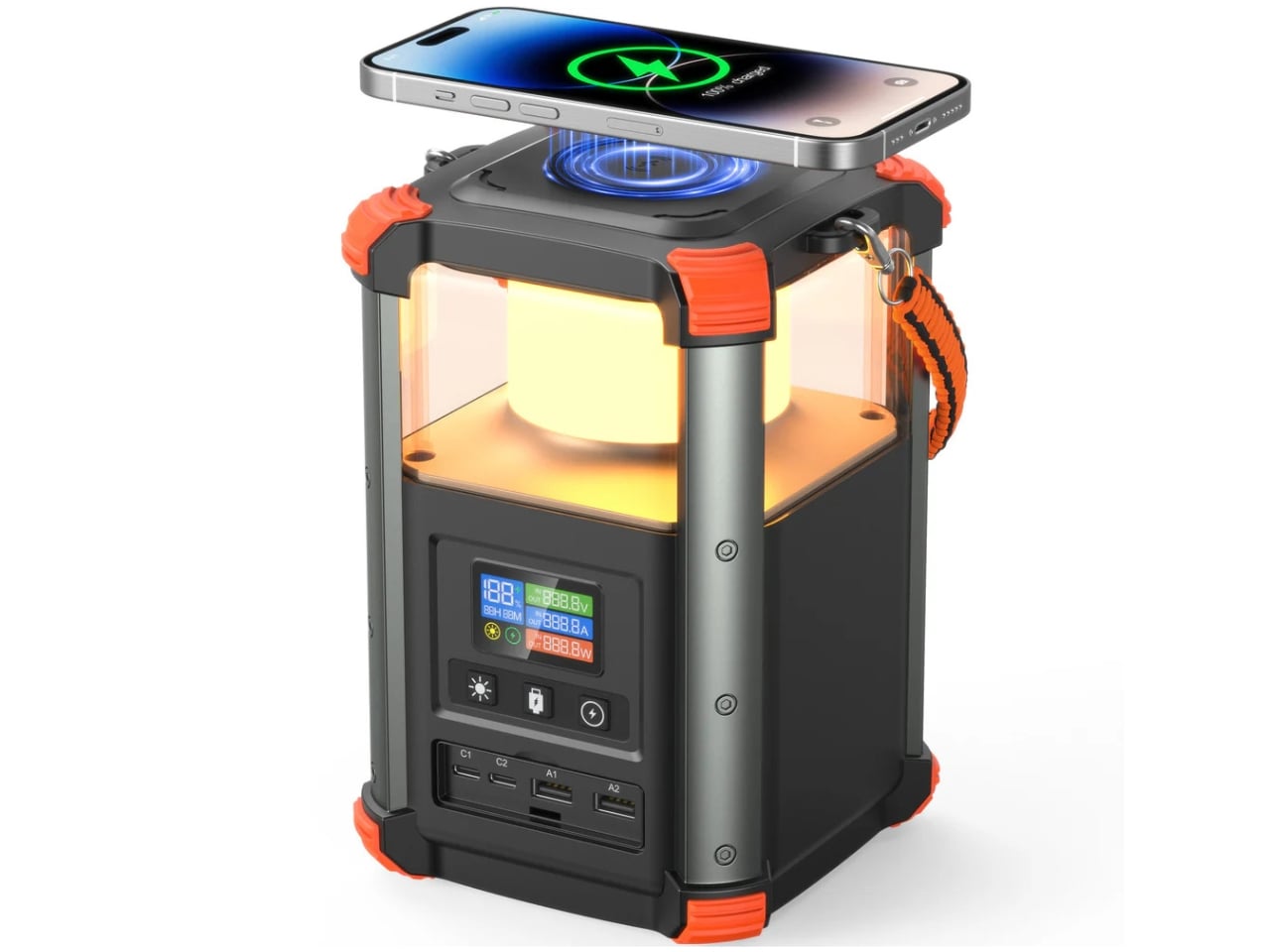
Most portable power stations look like they were designed by someone who has never spent a night outdoors. The Blavor sidesteps that problem entirely by building a camping lantern into the form factor from the start. The result is a device barely bigger than a tall water bottle that functions as both a light source and a five-pathway charging hub, covering solar, AC, car adapter, USB-C, and micro USB — with a digital display that keeps you updated on battery status without any guesswork. It’s the kind of consolidation that makes you rethink everything else in your kit.
The real value here is how naturally the two functions coexist. When the lantern is on, the power bank is right there. When you’re charging your phone overnight, the ambient glow does quiet work inside the tent without needing a separate light source. It doesn’t ask you to choose between illuminating your site and keeping your devices alive — it simply does both. For campers who’ve always carried a separate lantern and a separate battery pack, the consolidation alone is worth the price. This earns its spot in the pack before the first trip is even planned.
What We Like
- Five charging pathways give it a flexibility that most single-use power banks simply can’t match across different environments
- Lantern and power station coexist without compromising each other — the dual function feels designed in, not bolted on
What We Dislike
- Battery capacity, while solid for a weekend, may leave multi-day off-grid users reaching for supplemental charging sooner than expected
- The cylindrical form factor, while compact, can be slightly awkward to pack flush alongside flat gear in a structured bag
4. Chopsticks Maker
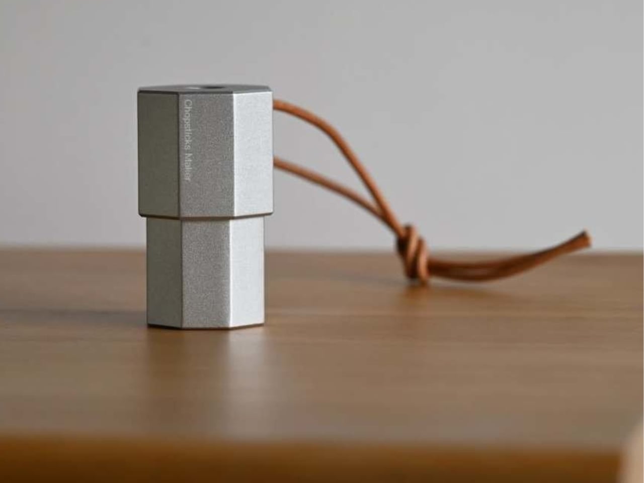
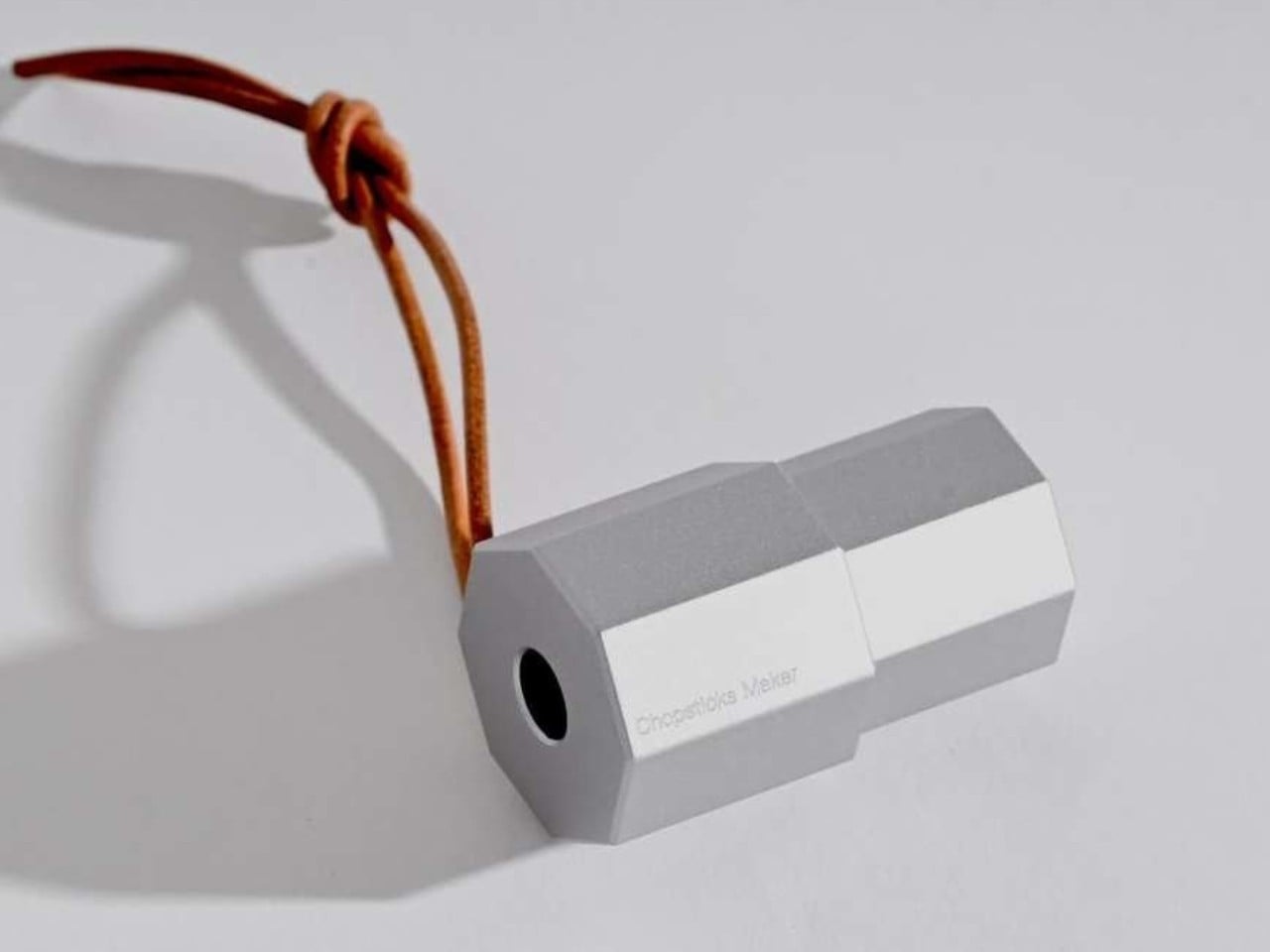
The Chopsticks Maker by Shanghai-based designer Mario Tsai is a direct reinterpretation of the pencil sharpener — same rotational mechanics, different raw material. Feed a thin foraged branch through the tool, and it carves a clean, usable chopstick in seconds. It’s a clever design move because it borrows its logic from an object whose function is already completely understood. The result is an outdoor tool with zero learning curve, an intuitive interaction, and a form compact enough to disappear into any kit without taking up meaningful space or weight.
Beyond cutlery, the same shaving mechanics produce fine wood shavings suitable for fire-starting, which quietly expands the tool’s usefulness without a single redesign. For campers who prioritize carrying less and sourcing more from the environment around them, the Chopsticks Maker represents a genuine shift in how outdoor utensils are framed as a category. It’s not about carrying better tools — it’s about carrying a tool that makes what you need from what’s already there. That’s a different design ambition entirely, and one that makes this concept one of the most interesting camping objects to emerge this year.
What We Like
- Dual function as both a cutlery maker and a fire-starting aid significantly increases utility beyond its primary purpose
- The foraged-material approach removes the need to carry disposable utensils or heavier stainless alternatives altogether
What We Dislike
- Relies on finding suitable wood nearby, which is not guaranteed across all camping environments or terrain types
- Currently a design concept, meaning production details, materials, and final pricing remain unconfirmed at time of publishing
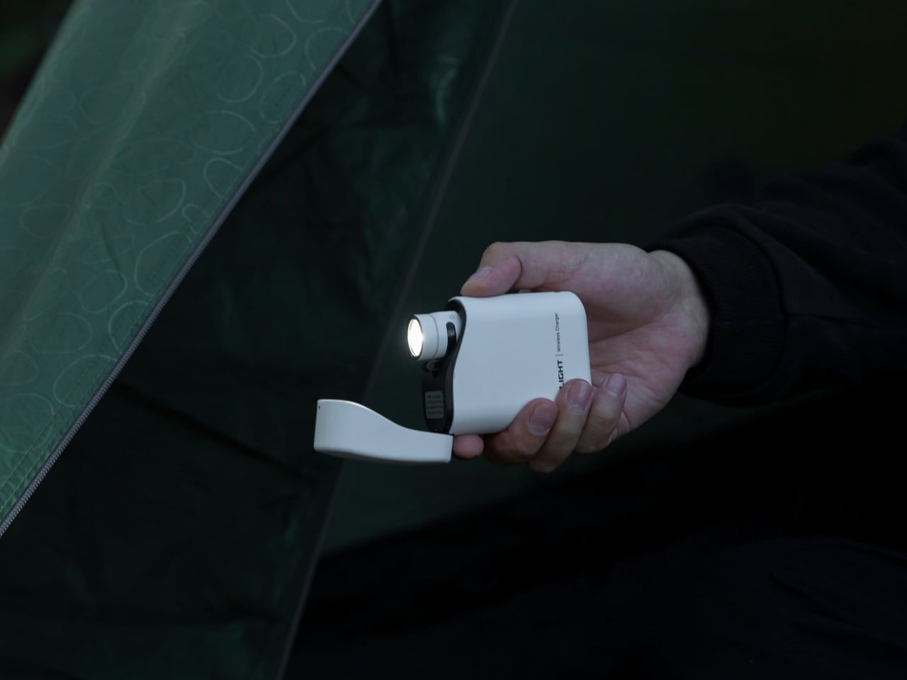
5. TriBeam Camplight
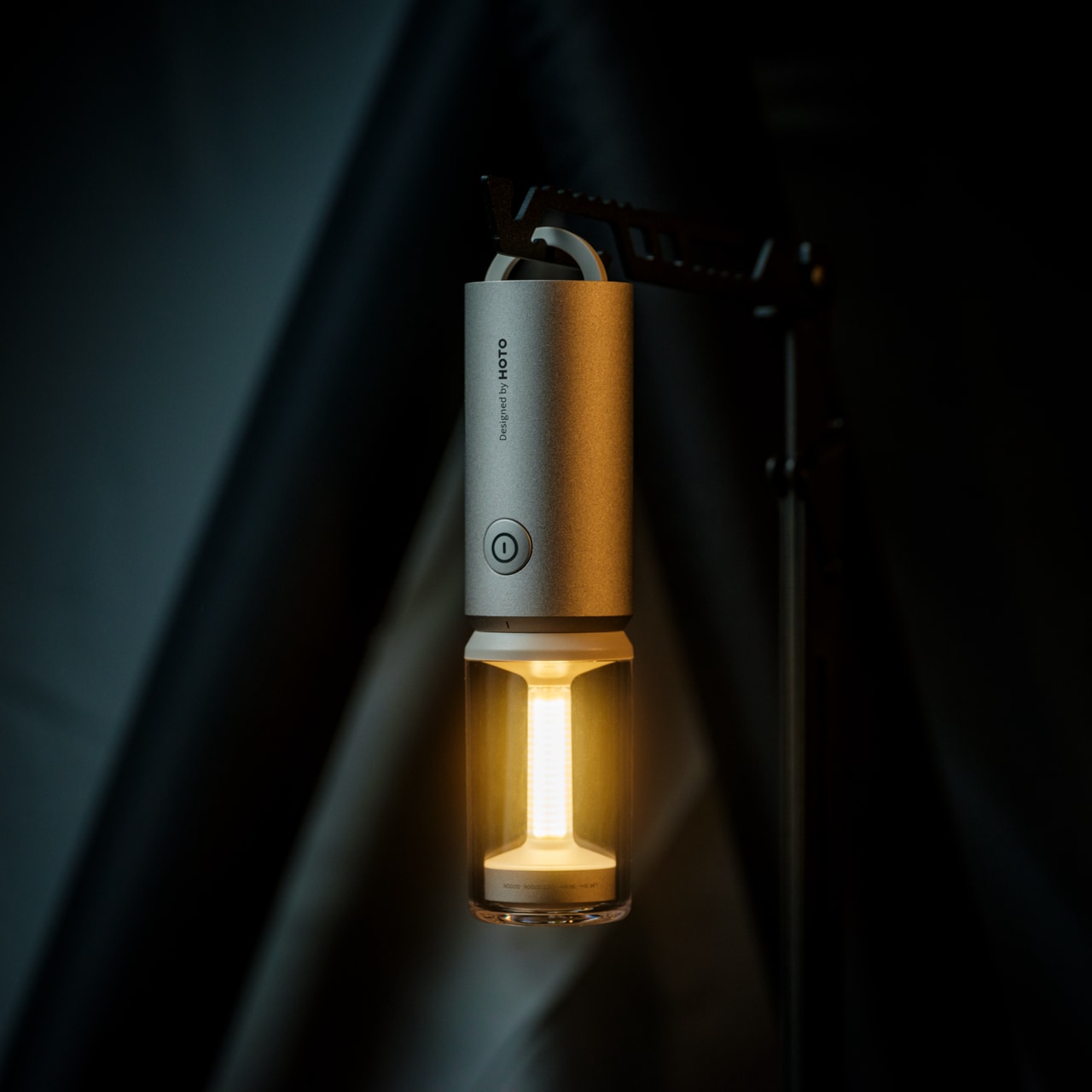
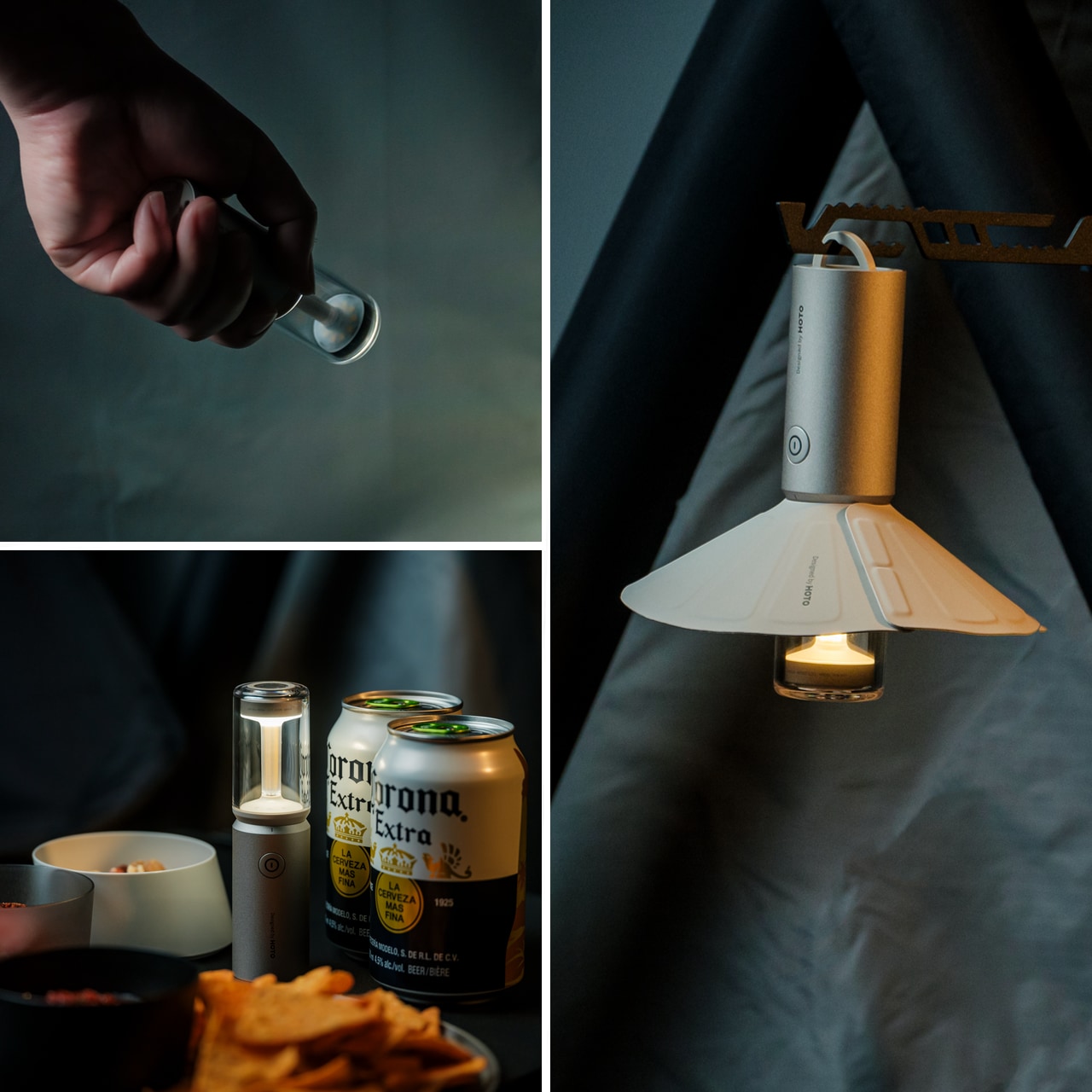
The TriBeam Camplight fits in a jacket pocket without negotiation — 12.8 centimeters, 135 grams, three distinct lighting modes. The ambient setting runs at 5 lumens, enough to navigate a darkened tent or campsite without destroying your night vision. The diffused camping mode spreads light evenly across shared spaces. The focused flashlight pushes 180 lumens for anything that demands real visibility. What makes it compelling isn’t any single mode in isolation, but the fact that all three feel genuinely purposeful rather than checkbox features added to pad a spec sheet.
A 50-hour battery life is the detail that tips this into essential territory. For most camping trips, a single charge carries you through the full weekend with meaningful margin to spare. The detachable magnetic lampshade shifts the light quality without adding friction — snap it on, snap it off. The hidden handle tucks away cleanly until you need to hang it from a ridgeline, a tent loop, or a bag strap. The TriBeam is the kind of gear that earns a permanent place in the kit long after the trip it was first bought for.
What We Like
- 50-hour battery life is generous enough for multi-night trips without requiring a recharge in the field
- Three genuinely distinct modes that adapt to different environments without overlap or redundancy
What We Dislike
- 180-lumen maximum output is well-suited to camp-scale use but falls short for longer-distance signaling or search scenarios
- The magnetic lampshade, while elegant, could detach unintentionally inside a packed bag during transit
The Best Camping Gear Thinks Before It Packs
What these five designs share isn’t a price point or a product category — it’s the sense that someone thought carefully about what a camper actually needs, rather than what the outdoor market has assumed they want. The Haven Spectre rethinks sleep. The TriBeam and Blavor rethink lighting and power. The RetroWave rethinks connectivity. The Chopsticks Maker rethinks what you need to bring at all. Each one narrows the gap between what’s in the pack and what actually gets used on the ground.
June 2026 didn’t produce the loudest season of outdoor gear. It produced one of the more considered ones. The standout designs this month are quieter than their competitors and more purposeful for it. If the trend holds, the next generation of camping gear will continue moving in this direction — fewer features performed well rather than many features performed adequately. For anyone who has ever come home from a trip with half their kit untouched, that’s a welcome shift in the right direction.
The post The 5 Best Camping Gear of June 2026 first appeared on Yanko Design.