Most everyday carry accessories are built on compromise. Flashlights need batteries. Multi-tools go through pockets without ever being opened. Tiny gadgets get charged for a few days, forgotten about, and eventually lost to a drawer somewhere. The smaller something is, the more disposable it tends to feel, and the less likely it is to stick around long enough to actually earn its place on your keys.
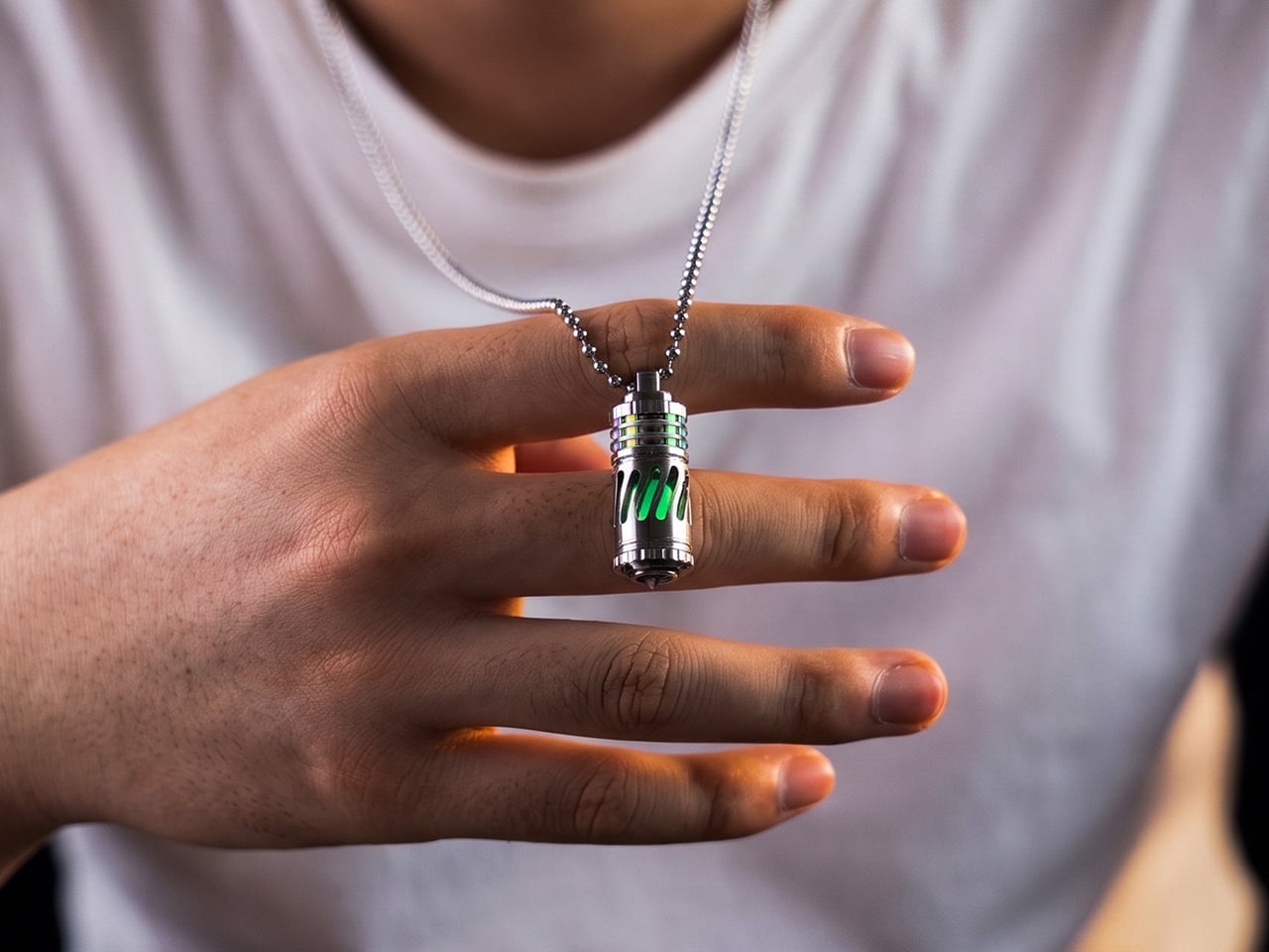
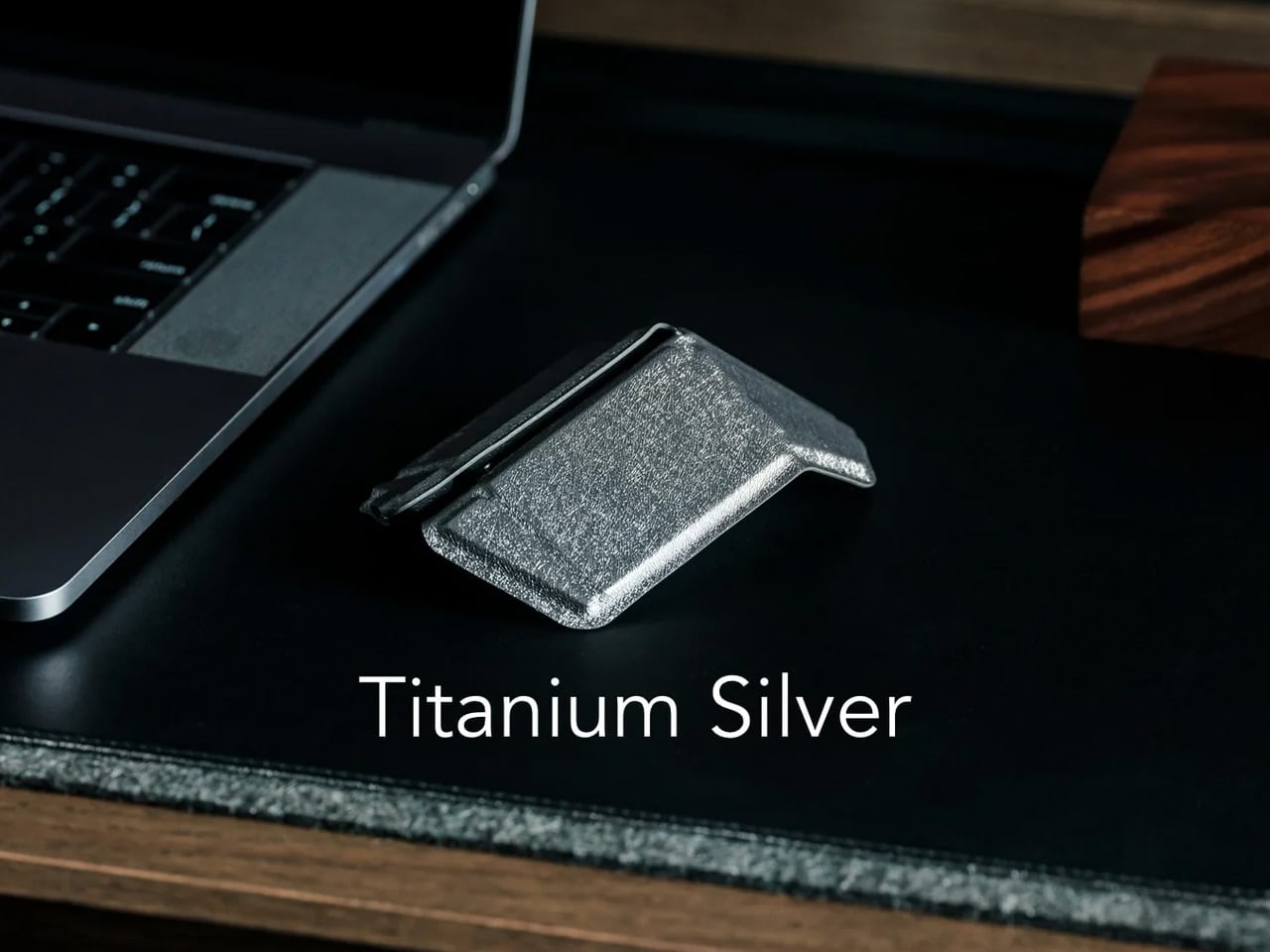
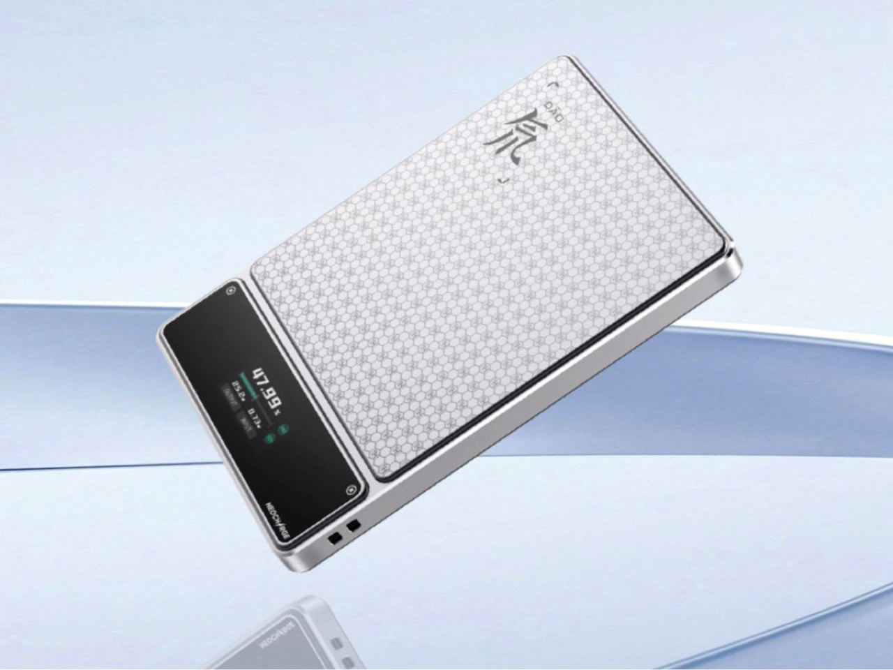
The SpinTi is a different kind of answer to that problem. Machined from Grade 5 titanium and measuring just 35mm at 8g, it’s a rotating tritium keychain that doesn’t need a power source, battery replacements, or a switch to activate. Its glow is passive and constant, driven by the natural properties of the tritium vials sealed inside. Once it’s on your keychain, it simply does its thing.
At 8g, it’s as light as a single credit card, and its 35mm frame is shorter than an AA battery. You’d clip it to your keys, toss it in your bag, or hang it from a zipper and forget about it for weeks. Then one night, in a dark room or a pitch-black campsite, your hand finds the keys, and there it is, that quiet, steady glow.
What sets SpinTi apart from other tritium markers is that spinning body. The body rotates on a solid-state pivot with no bearings, while the core is secured by a full-metal compression system instead of rubber O-rings. It’s the kind of thing your fingers gravitate toward during a long commute or a slow afternoon, giving it a secondary life as a tactile object that goes well beyond locating your keys in the dark.
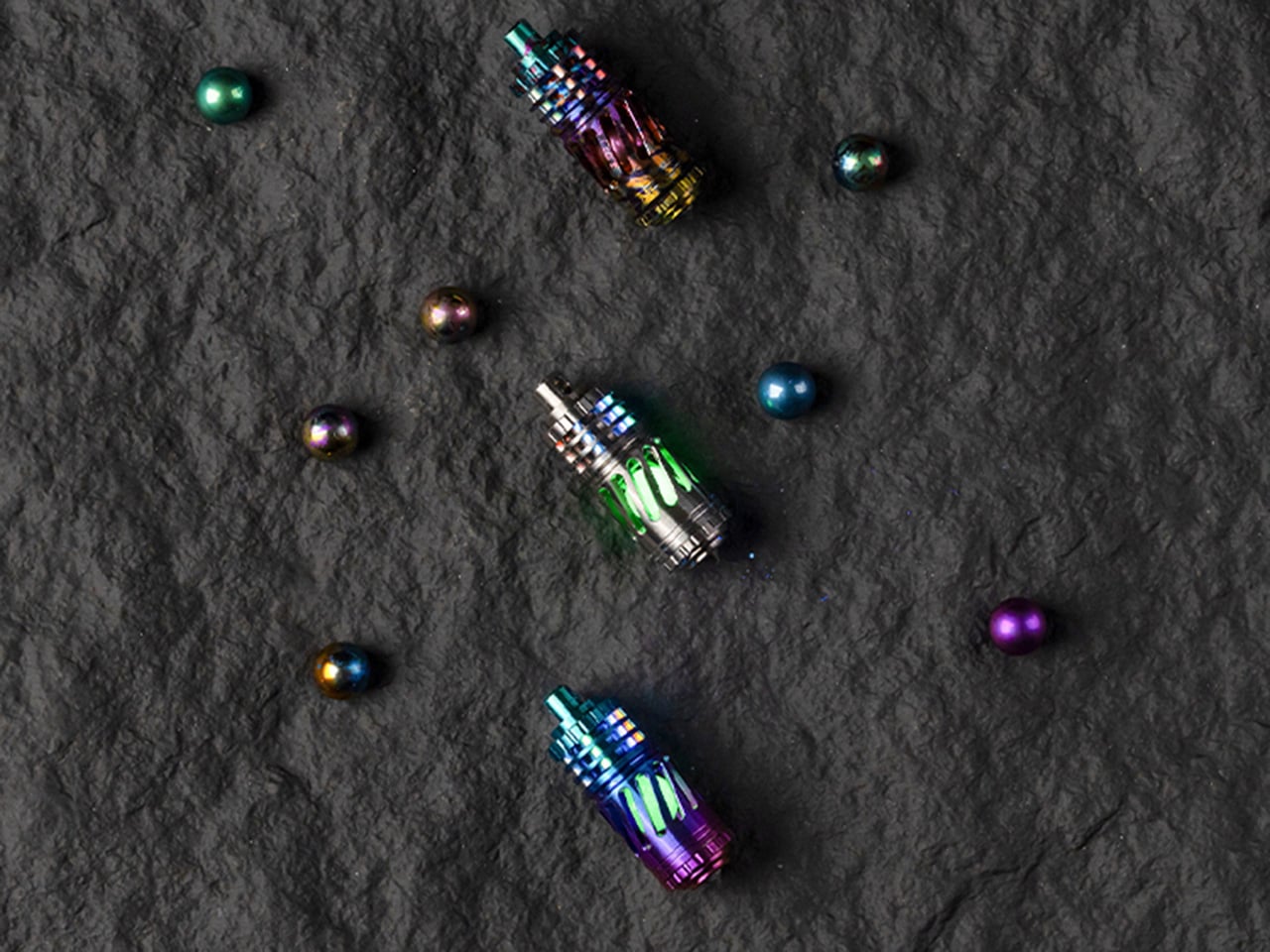
The glow itself comes from tritium vials seated inside a six-slot core. As tritium decays, the beta particles it releases hit a phosphor lining, producing continuous light without any power source at all. It’s not meant to flood a room with light, and it doesn’t try to. What it offers instead is a low-level, always-on glow that stays usable over roughly 25 years, even as brightness gradually declines.
The body is CNC-machined from Grade 5 titanium, the same material used in aerospace components and surgical hardware. The skeletonized exterior has generously cut slots that expose the luminous core from every angle, while a precision metal compression system holds the vials firmly without relying on epoxy or rubber. It’s built to genuinely outlast the phone in your pocket by several decades.
SpinTi isn’t limited to keychain duty either. It can hang around your neck as a pendant, clip to a zipper pull for finding your bag in the dark, or attach to a tactical pack as a quick identifier. The tail end has a hardened glass-breaker tip for emergencies, and the hollow interior can carry small items like emergency pills or a micro memory card.
There’s room to make SpinTi feel personal, too. The vials come in six colors, from ice blue and apple green to midnight violet, and you can mix them across all six slots however you like. Three finish options are available for the titanium shell: raw titanium for a minimal look, a splash finish for something bolder, and a gradient anodized finish for something closer to wearable art.
And since the core unscrews for service, you’re not locked into any one configuration. Swap a dimming tube after years of use, change the color to suit your mood, or drop in glass luminous tubes as a more affordable alternative. SpinTi is built to be updated and refreshed over time, and that’s part of what makes it feel less like a purchase and more like a long-term companion.
Nobody really announced the CD comeback. It didn’t arrive with a glossy campaign or some grand industry reset. It just started happening quietly, then all at once. Record stores began giving discs more shelf space. Artists started slipping them into merch drops. And younger listeners, people who grew up with every song ever made living inside an app, started buying physical albums they could have streamed in seconds.
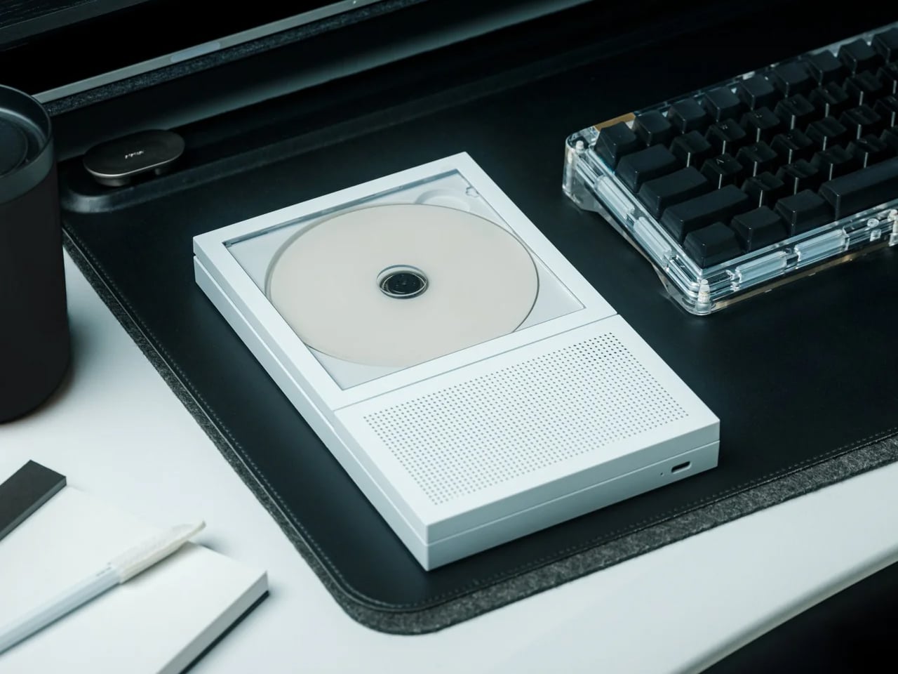
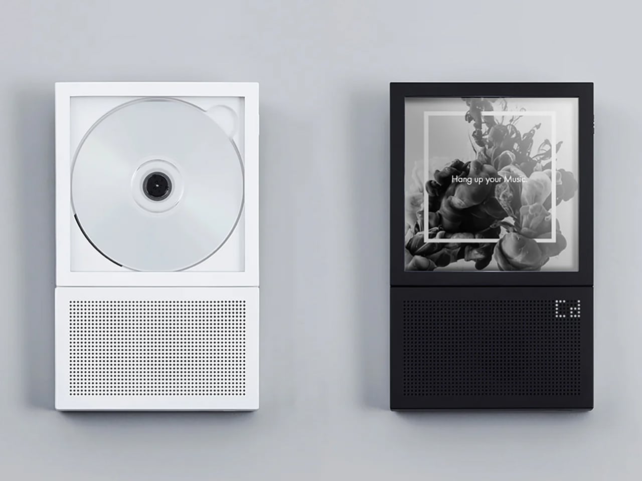
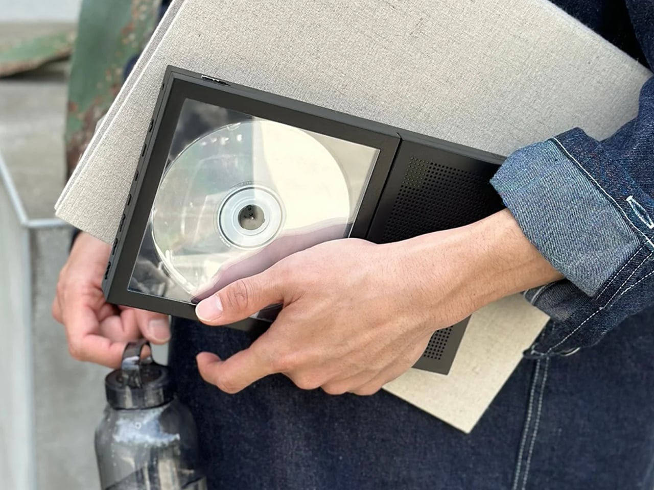
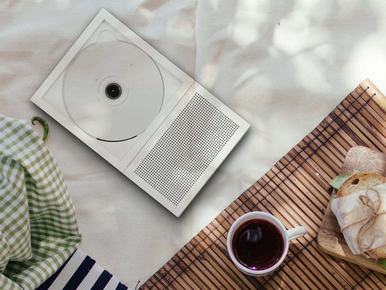
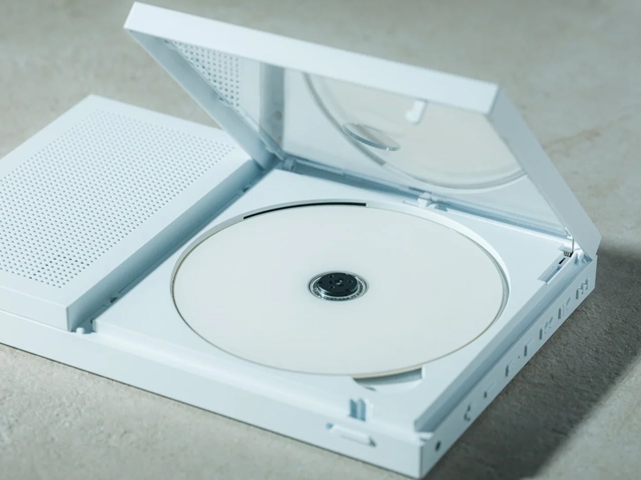
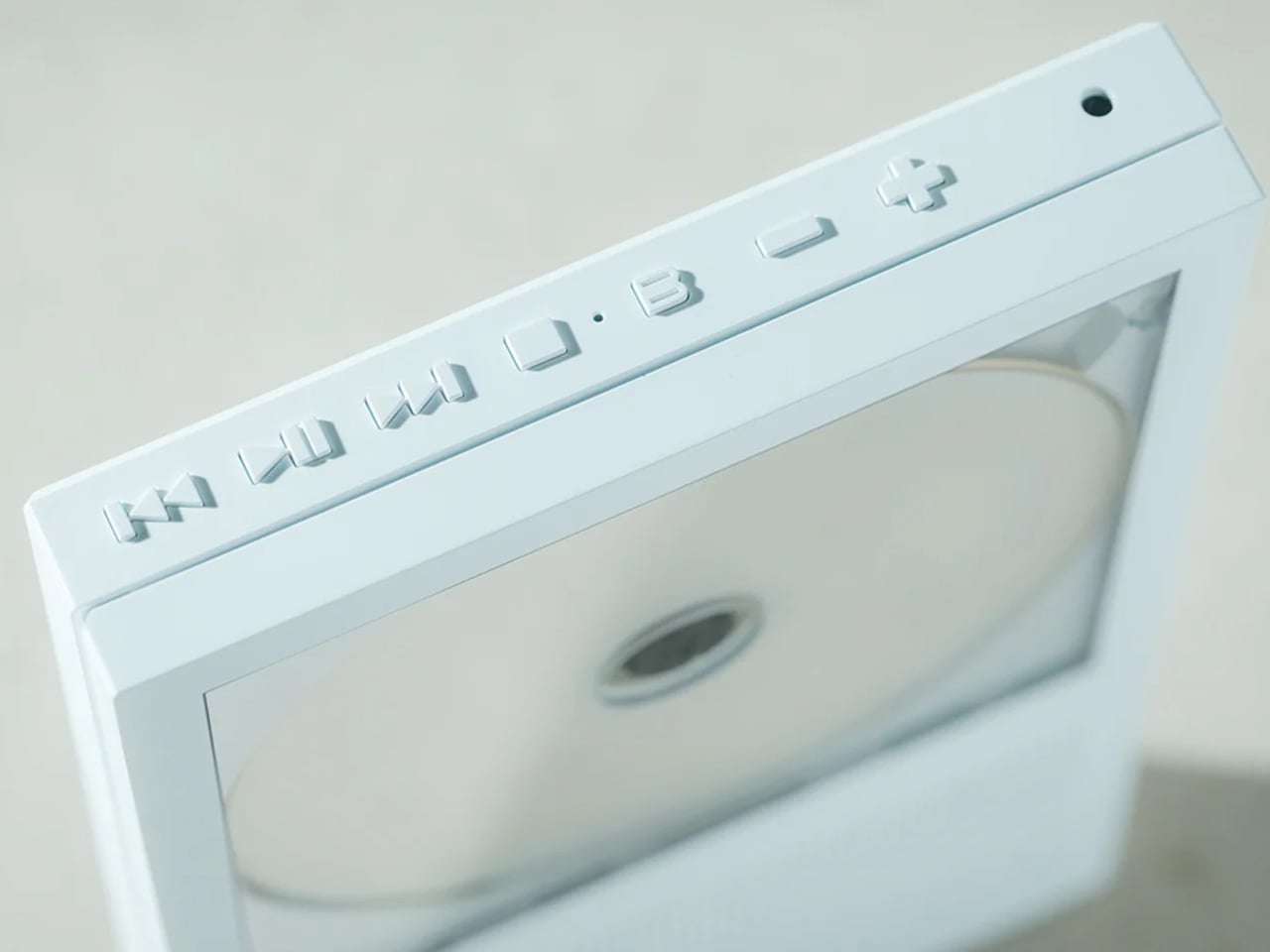
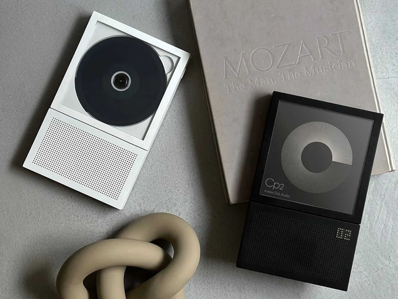
Quick take: This Portable CD Cover Player is designed around displaying the album cover while it plays. Compact, Bluetooth-connected, USB-C charged, and $199. The best reason to start buying CDs again.
The easy explanation is nostalgia, but that no longer covers it. A lot of the people buying CDs in 2026 do not miss the nineties. What they miss is something streaming never fully replaced: the feeling that music had shape. That an album was more than a handful of tracks waiting to be shuffled into the background. Streaming solved access completely. It never solved presence.
The Player That Makes the Comeback Make Sense
That is exactly why the Portable CD Cover Player feels so right for this moment. Most CD players treat the disc as the point and the cover art as packaging. This one flips that. The album cover faces outward while the disc plays, turning the artwork into part of the listening experience instead of something you glance at once and put away.
At first, that sounds like a small design decision. In practice, it changes the whole feel of the object. Music that used to sit invisibly inside a playlist suddenly has a face again. What you are listening to is no longer buried inside a phone screen or reduced to a thumbnail in a queue. It is present, visible, and strangely harder to ignore.
The player itself is compact, clean, and easy to move from desk to shelf to bedside table. It connects via Bluetooth or 3.5mm, charges over USB-C, and plays standard audio CDs. None of that is especially radical. What makes it interesting is that someone thought carefully about what should happen to the album art while the music plays, and built the whole object around that answer.
Why CDs Feel Different Again
When every song is equally available, every song starts to feel a little less anchored. The album loses its edges. The sequence matters less. Even the act of choosing starts to feel thinner. CDs bring some of that back. Not because they are more efficient, but because they ask for a little more intention. You pick an album. You put it on. You let it occupy space.
After a couple of weeks of listening this way, the shift is subtle but real. Albums I had not touched in years felt worth revisiting. New releases felt more memorable. I found myself choosing records partly because I wanted to see the cover on the desk while I worked, which turned out to be a better reason than most algorithmic suggestions ever offered. More importantly, it made streaming feel flatter by comparison. Not useless. Just thinner. Less present. Like music had been pushed slightly out of the room without me noticing.
Who It’s For
The listener rediscovering physical music
For anyone with a stack of CDs who wants a reason to use them again.
The desk listener
A better answer than propping your phone against a monitor and calling it a setup.
The album person
For people who still think in full records, not playlists and singles.
The Portable CD Cover Player is for $199. In a moment when music is available everywhere but feels present almost nowhere, that starts to sound less like a novelty and more like a correction.
Beyond Expo 2026 arrived with a clear message for the tech world, AI has moved past the screen and into the objects people wear, hold, and live with every day. Our own preview of the show framed this year’s edition as a turning point, arguing that AI software was only the warm-up for what the industry was really building toward. The event ran from May 28 to 30 at The Venetian Cotai Expo in Macau, centered on the theme of AI moving from digital to physical. That theme played out across robotics, smart machines, wearable intelligence, and real-world utility products on the show floor. It set up exactly the kind of environment where a product built around ambient AI communication could land with real meaning.
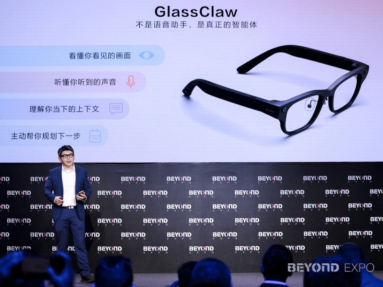
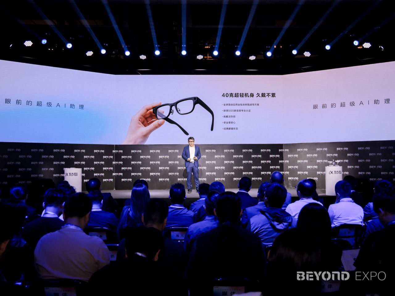
That made Macau the perfect stage for iFLYTEK’s AI Glasses, a 40 gram wearable built around communication, translation, and ambient intelligence. Announced at BEYOND Expo 2026, the glasses pair a lightweight magnesium-aluminum frame with a resin waveguide display, real-time translation, teleprompting, advanced noise recognition, and the GlassClaw AI agent, all wrapped into a device designed to keep information in sight and conversation in flow. iFLYTEK, the Shenzhen-listed AI company founded in 1999 and best known for its speech and language technology, framed the launch under the theme “Communication Without Boundaries, the World Before Your Eyes.” For a company whose core competency has always been understanding and generating human language, a glasses product aimed at communication is a logical next step. The pitch is a strong one: AI belongs in the line of sight, ready when you need it, invisible when you do not.
Designer: iFLYTEK
Getting a display, waveguide, processing stack, and speaker array under 40 grams in a glasses form factor is not a given, and the material choices iFLYTEK made to hit that number tell most of the hardware story. The frame uses an aerospace-grade magnesium-aluminum alloy, keeping the structure rigid without the front-loaded weight that makes smart glasses genuinely uncomfortable after twenty minutes. The display runs on a resin waveguide paired with a customized micro-optical module, a combination chosen to balance visual quality against physical footprint. Ergonomic adjustments calibrated specifically to Asian facial structures add another layer of intent, signaling that the wearability goal goes beyond a marketing claim. That kind of constraint-driven design work is what separates a considered wearable from a concept render that happens to ship.
GlassClaw, the AI agent built into the glasses, handles the intelligence layer across multiple modes (not related to OpenClaw). It captures conversations, generates AI meeting summaries, enables full-scenario real-time translation, and pulls in life services, functioning as a persistent contextual companion rather than a novelty voice assistant. The teleprompter feature stands out from a practical design standpoint, giving the glasses a repeatable use case in presentations, live video, and multilingual business settings. Advanced noise recognition ties the system together by giving the speech-processing layer a cleaner audio signal in conference halls, trade floors, and the ambient chaos of travel. iFLYTEK’s deep history in speech AI means the noise handling and translation accuracy are the features most likely to determine whether these glasses earn daily wear.
The iFLYTEK AI Glasses are priced at 4,299 yuan, roughly $635, with presales beginning June 15. iFLYTEK also staged an ecosystem partner forum at the expo alongside Sunny Optical, Wanxin Optical, and Conant Optics, treating the launch as the beginning of a product line rather than a one-time debut. For a product category that has struggled to articulate a daily reason to exist, iFLYTEK’s communication-first positioning is a credible answer. The Ray-Ban Meta glasses proved that lightweight wearable audio could build a real user base when the form factor stopped fighting the face, and iFLYTEK is making a similar bet with a display and translation stack on top. At 40 grams, with a clear professional use case and a company whose entire identity is built around understanding human language, these glasses have the ingredients to matter.
Summer is a season that selects for you. The heat strips every bag to its absolute minimum, and what stays tells you something honest about what you actually value. This list isn’t built around a unified theme. It’s built around intention: five pocket-sized objects that each solve something different without competing for space. None of them is there to fill a slot. Each one earns its position by being genuinely hard to leave behind.
The common thread isn’t material or category. It’s the quality of being designed for a life that doesn’t pause for weather, plans, or inconvenience. A camera that rethinks how a gimbal folds. A flashlight the size of a lighter. A speaker that belongs at the beach as naturally as on a shelf. A bottle that brews, infuses, aerates, and chills with equal conviction. A carabiner that tracks what it carries. Five objects, one honest summer bag.
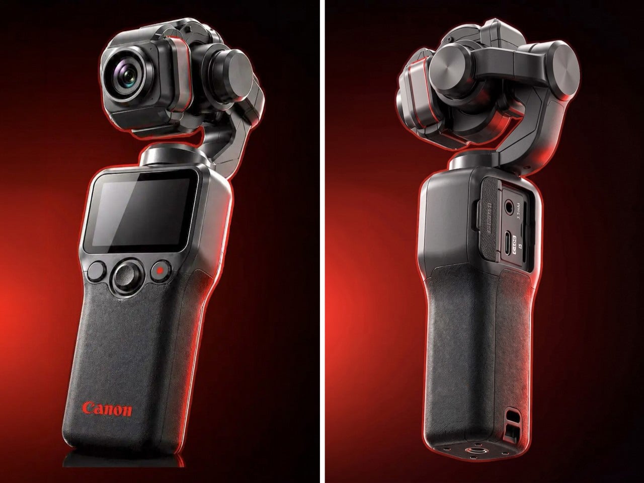
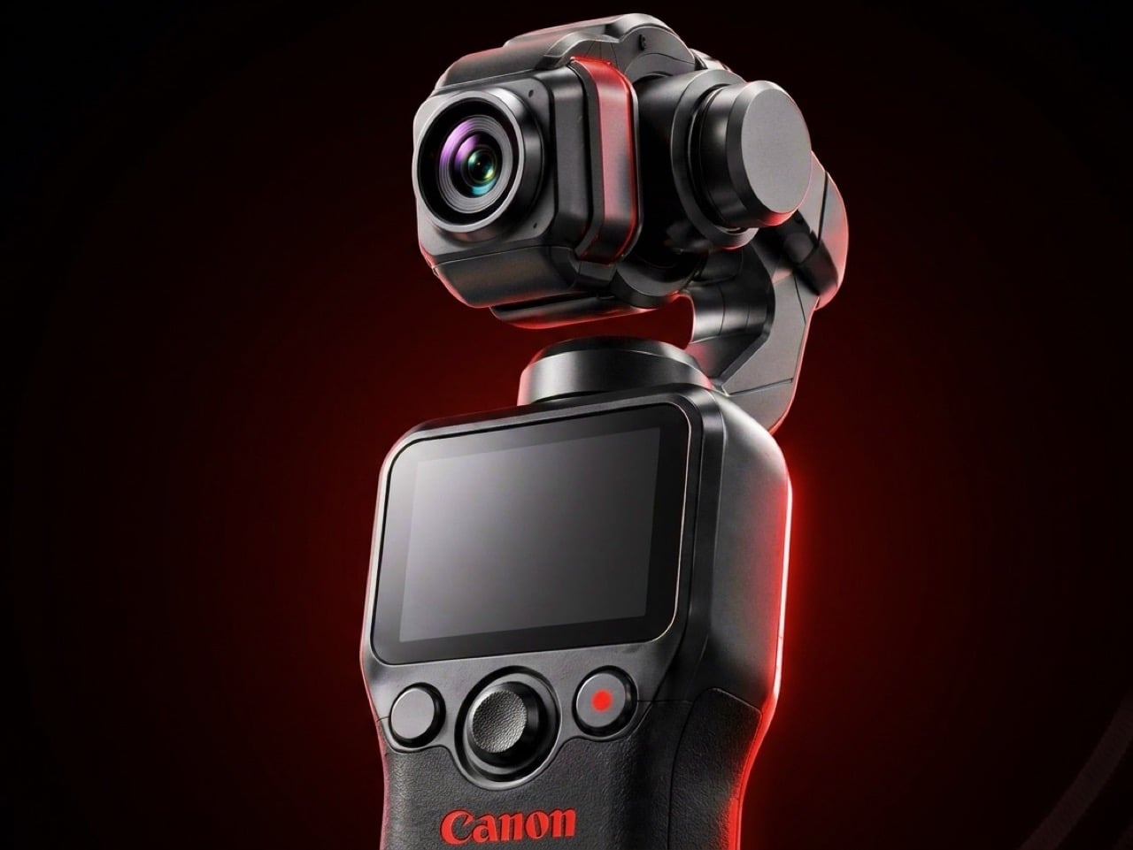
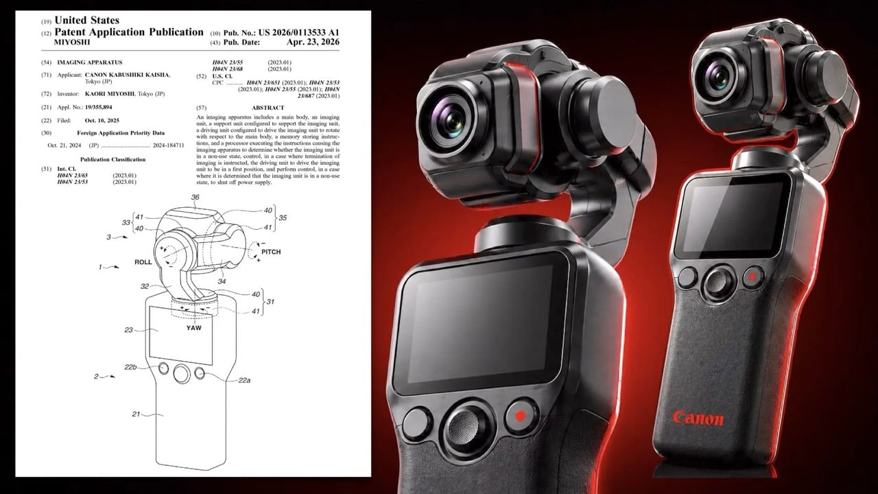
1. Canon Gimbal Camera
Canon has spent five years building toward this moment through a deliberate sequence of three patents, each one more product-ready than the last. The April 2026 filing describes a compact handheld body with a fixed lens, three-axis stabilization, a grip-mounted screen, and a folding mechanism that guides the gimbal head into a safe resting position before cutting motor power. That shutdown sequence is smarter than it sounds. Mechanical wear from limp-motor shutdowns is the quiet reason cameras in this category age faster than they should.
What the patent arc reveals is a company that spent its early filings dreaming wide and its later ones getting practical. The 2021 version imagined an interchangeable-lens cinema device. The 2025 follow-up solved for uninterrupted shooting. This filing drops the interchangeable lens entirely and focuses on fixed-lens portability with intelligent motor behavior baked into the design. Summer light is the most demanding light there is, and Canon’s color science has always handled it with more warmth and more restraint than anything else competing in this category.
What We Like
The smart folding shutdown mechanism addresses a real mechanical failure point that the rest of the pocket gimbal category has consistently overlooked
Canon’s five-year patent arc signals a product shaped by sustained R&D rather than a reactive response to market pressure
What We Dislike
This remains a patent with no confirmed release date or pricing, making it the most compelling item on this list and also the only one you cannot buy
Canon’s track record in premium compact categories suggests a launch price that will give most buyers reason to pause before committing
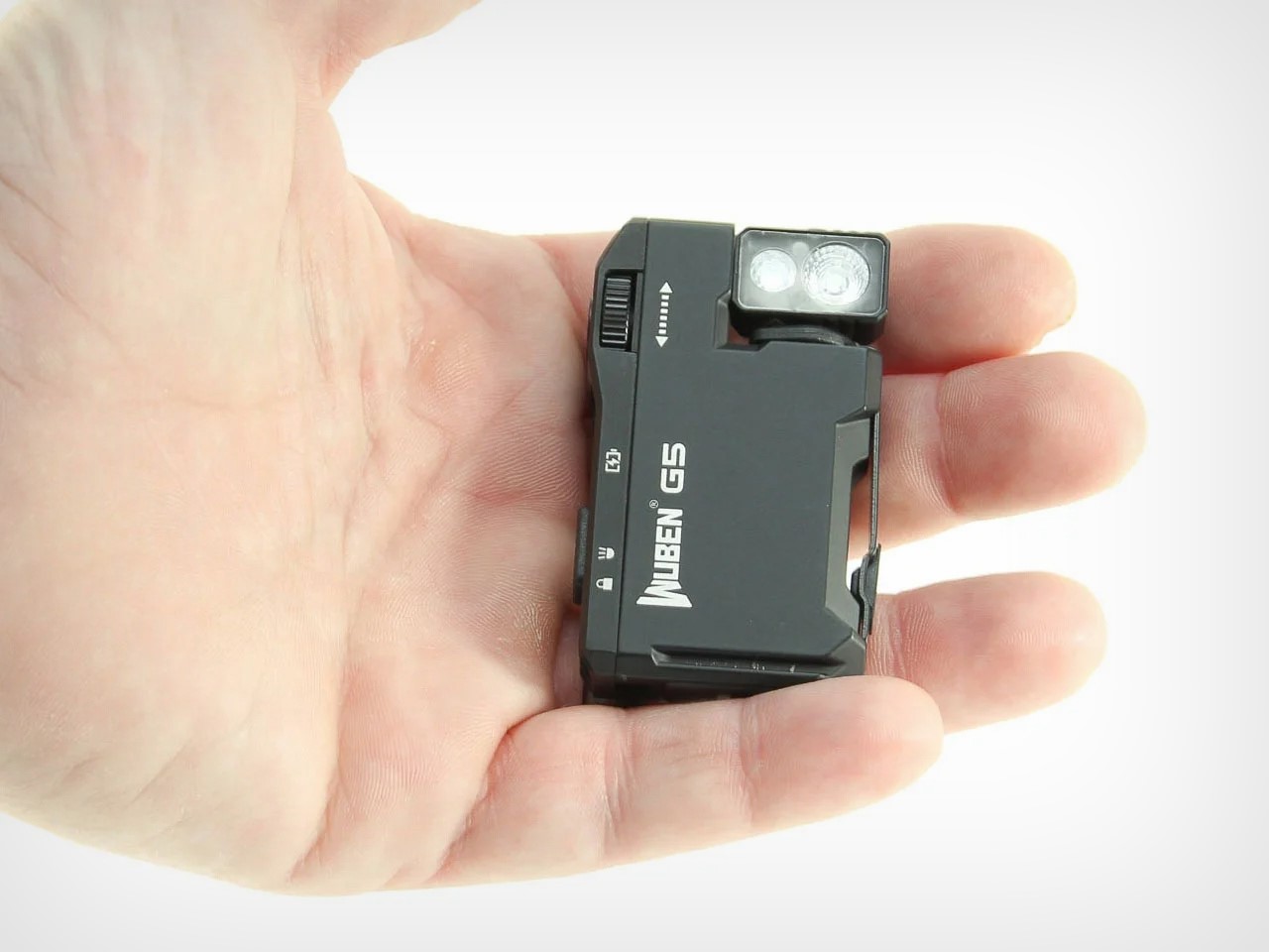
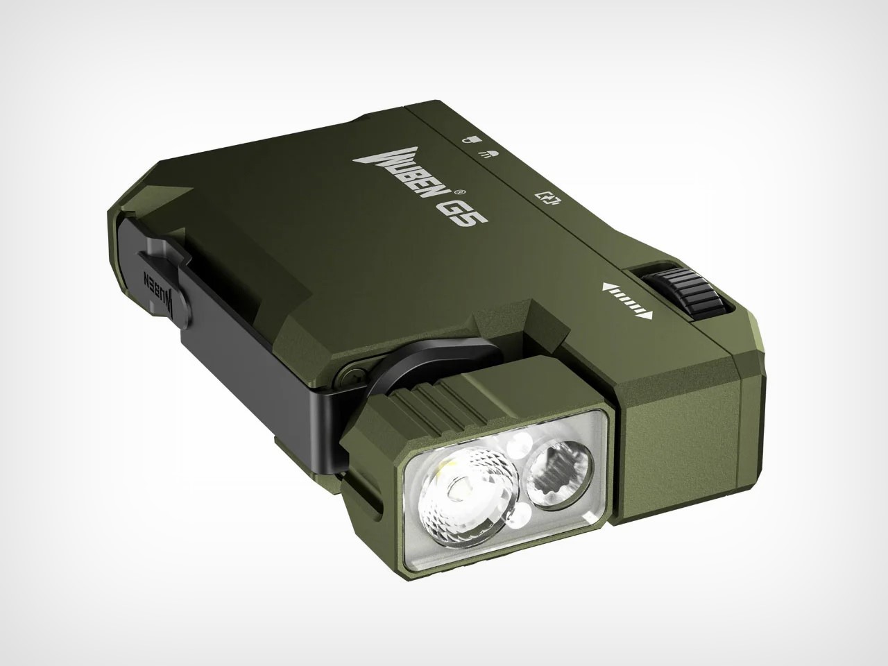
5. Wuben G5
Most flashlights solve for brightness or runtime. The Wuben G5 solves for carry, and that turns out to be the harder design problem. The body is flat and squarish, sized closer to a lighter than any conventional torch, and weighs 52 grams. A 180-degree rotating head lets you angle light wherever it needs to go without repositioning your hand. The spring-tensioned clip grips fabric, straps, and pocket edges with reliable force. A magnetic base sticks it to any metal surface hands-free.
At $25, the G5 delivers 400 lumens, an 82-metre beam, RGB color modes, IP68 waterproofing rated to 2 metres, and an emergency beacon that flashes blue and red. USB-C charging hides neatly behind the tactile rotary switch, a deliberate design choice that keeps the profile clean. Summer makes every feature feel obvious: evening trails, beach bags, festival fields after dark, and camping trips where a headlamp feels like too much and a phone torch never quite feels like enough. It carries like nothing and performs like something far more expensive.
What We Like
The 180-degree rotating head and spring-tensioned clip solve the hands-free lighting problem with mechanical elegance rather than extra accessories
IP68 waterproofing, magnetic attachment, and USB-C charging at $25 is a combination that flashlights three times the price often fail to match
What We Dislike
Battery runtime at full 400-lumen output runs around 50 to 60 minutes, which requires some planning on longer outings or extended sessions
The blue-and-red emergency beacon is designed for genuine distress situations, and using it casually creates a real risk of being misread by people nearby
3. Side-A Cassette Speaker
There is a specific pleasure in a speaker who has a point of view. The Side-A wears its design intention openly, taking the cassette tape as its structural reference and arriving at something that sits between functional object and collected artifact. Bluetooth audio in a body that references one of the most culturally significant formats in sound history: it is a design brief that could have landed in a dozen wrong places, and it does not. The form has restraint, which is what separates a considered design reference from a costume.
What makes it a summer essential is its willingness to be present without announcing itself. It belongs on a table outside as naturally as it belongs on a shelf. The cassette format has always carried a sense of intentionality around music, the feeling that someone made a deliberate selection and committed to it. The Side-A carries that quality into Bluetooth territory without apology. Summer listening deserves something with genuine character, and this brings character alongside the sound without asking you to compromise on either.
The cassette tape aesthetic is specific enough to be genuinely distinctive without crossing into novelty design territory
The form reads as a collected object rather than consumer electronics, which is a rare quality at any price point
What We Dislike
The retro design language is strong enough that it may feel tonally out of place for buyers who want their audio hardware to read as visually neutral
Buyers who prioritize raw audio specifications over design intention will find more technically competitive options at a similar price
4. All-Day Adventure Flask
The All-Day Adventure Flask is built around a single useful idea: one vessel, every drink the day asks for. The 32-ounce insulated stainless steel body keeps drinks hot or cold for hours, which is the baseline. What lifts it past every other flask on the market is the split-body design. Unscrew the top, invert it, line it with a filter, and you have a wide-mouth pour-over coffee kit. The same configuration decants wine, aerating it without the taste compromise that stainless interiors typically introduce, because the inside is finished in non-breakable glass that stays flavor-neutral regardless of what you put in it.
The modular system extends that range even further. A mesh container brews tea, infuses water, or cold-brews coffee, depending on how long you leave it. A slatted lid converts the whole flask into a cocktail shaker. A thermal core chills drinks without diluting them with ice. A silicone tumbler is built into the base and pops out as a cup, doubling as a shock absorber when the flask gets dropped. It won a Red Dot Design Award in 2020, comes with a 5-year warranty, is built to be carbon neutral, and Hibear commits a percentage of every sale to 1% for the Planet. The flask that carries all of summer, one mode at a time.
What We Like
The split-body pour-over and wine decanting function solves two completely different outdoor rituals in the same design move, with zero additional kit
The built-in silicone tumbler and non-breakable glass interior address both the drinking experience and long-term durability in one considered detail
What We Dislike
The full modular system involves multiple components that need tracking, cleaning, and reassembling, which adds friction on days when simplicity is the priority
The range of functions is genuinely impressive, but most users will find themselves returning to two or three of them regularly and barely touching the rest
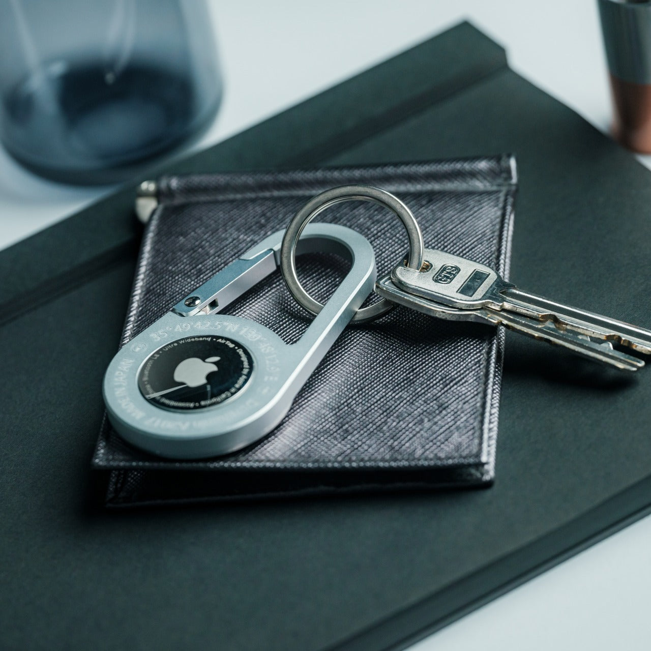
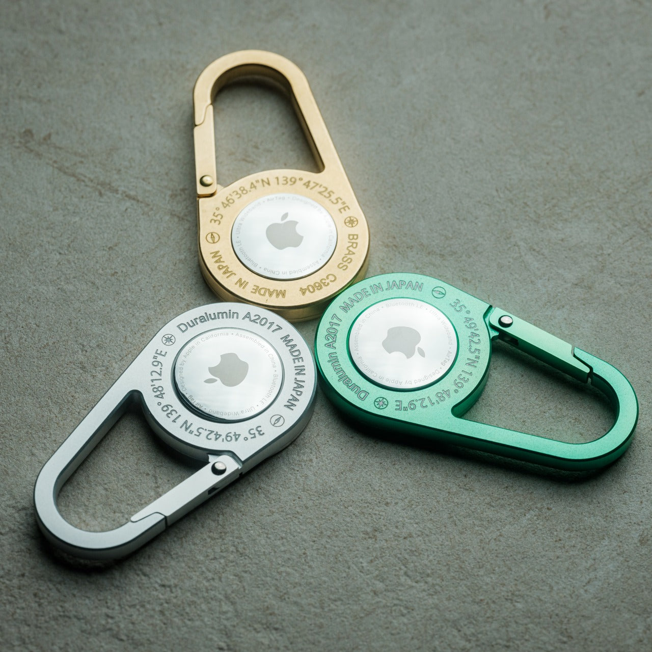
5. AirTag Carabiner
The weakest version of any tracking solution is one you forget to use. An AirTag left loose in a bag pocket, or sitting on a key ring that stays home when the bag leaves, solves nothing. The AirTag Carabiner earns its place by removing the forgetting entirely: the tracking is built into the clip mechanism, so the moment it is attached to something, the Apple Find My network is engaged. No secondary step, no separate attachment decision, no choosing whether today is the day you bother.
Summer creates more opportunities to misplace things than any other season. Bags move between people. Keys get set down at the beach and claimed by the wrong table. Gear left on a trail gets collected by the person walking faster. The AirTag Carabiner sits at the intersection of utility and peace of mind without adding weight or bulk to anything it clips onto. Bags, straps, belt loops, keyrings: it clips to all of them. Summer is unforgiving to the disorganized, and this is the most considered possible answer to that specific problem.
Integrating the AirTag directly into the carabiner mechanism removes the secondary step that makes most tracking setups feel optional or easy to skip
Find My network coverage means location data is available across virtually any populated environment without additional hardware or ongoing costs
What We Dislike
Full functionality is locked to the Apple ecosystem, which limits the product’s value significantly for anyone outside of it
Find My operates through a network of nearby devices rather than live GPS, which means there is always a lag between an item moving and its location updating
The Right Five Things Make Summer Easier
The five products on this list share one quality that never makes it onto a spec sheet: they do not complain about summer. They are waterproof, pocket-sized, or designed to adapt, and none require a protective case or a separate pouch to survive a day that gets more complicated than planned. That quiet durability is exactly what the season demands, and it is what separates a genuinely considered kit from a collection of things you meant to bring.
Pick the two or three that close the gaps in what you already carry. The Canon will arrive when Canon is ready, and based on five years of increasingly precise engineering, it will be worth the wait. Everything else on this list is available now, none of it requires much justification, and all of it is designed to stay out of your way while doing its job. Summer does not want to be curated. It wants to be lived. The right five things make that easier.
A phone does a bunch of things – it clicks photos, it sends/receives emails, it tells you the weather, it also plays music. There’s a case to be made that a phone is worth owning for how multifaceted it is. Similarly, there’s also a case to be made for owning a vinyl player. A vinyl player doesn’t give you weather updates, doesn’t let you access ChatGPT, all it does is plays music, and does it well to the point of being a ritual. These two spectrums exist in almost every industry, but more so in the EDC world. You’ve got multitools thumping their chest for how multi and how tool they are. And you’ve got specialized EDC that’s made to do one job but do it with pleasure. The TiArc falls into the latter camp.
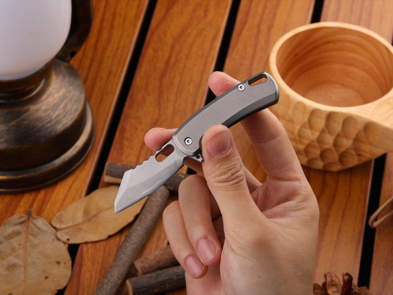
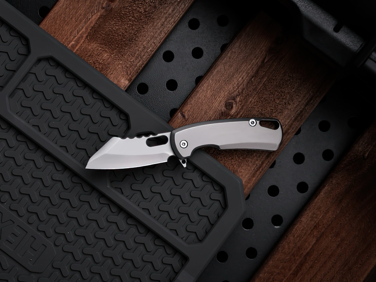
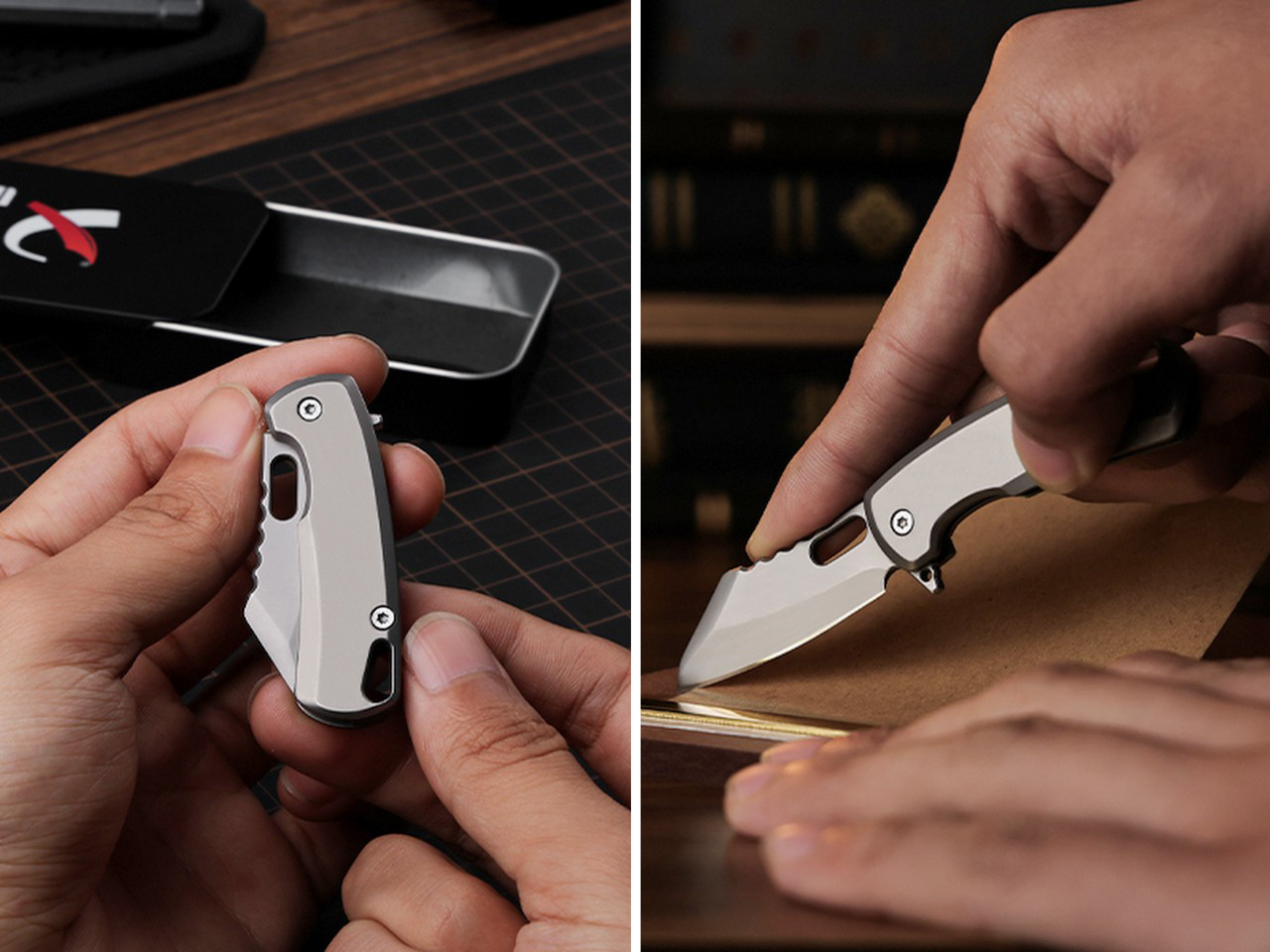
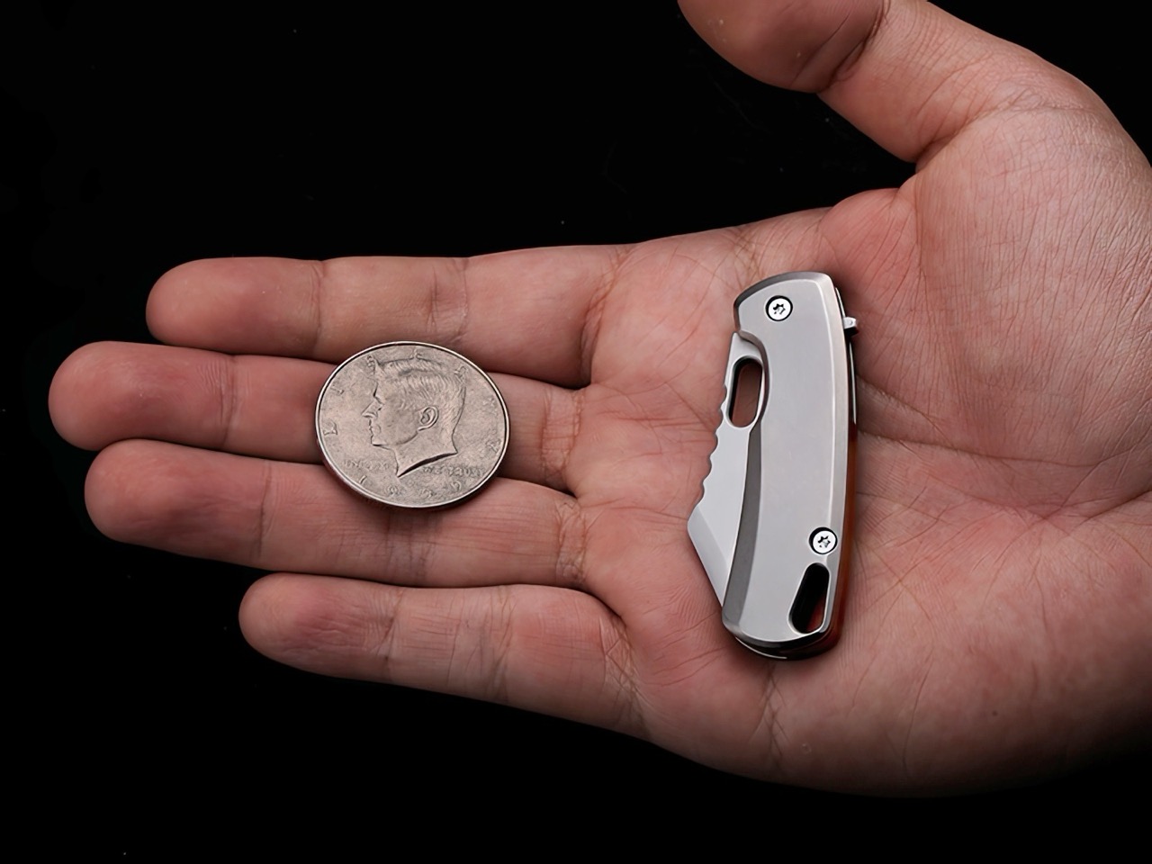
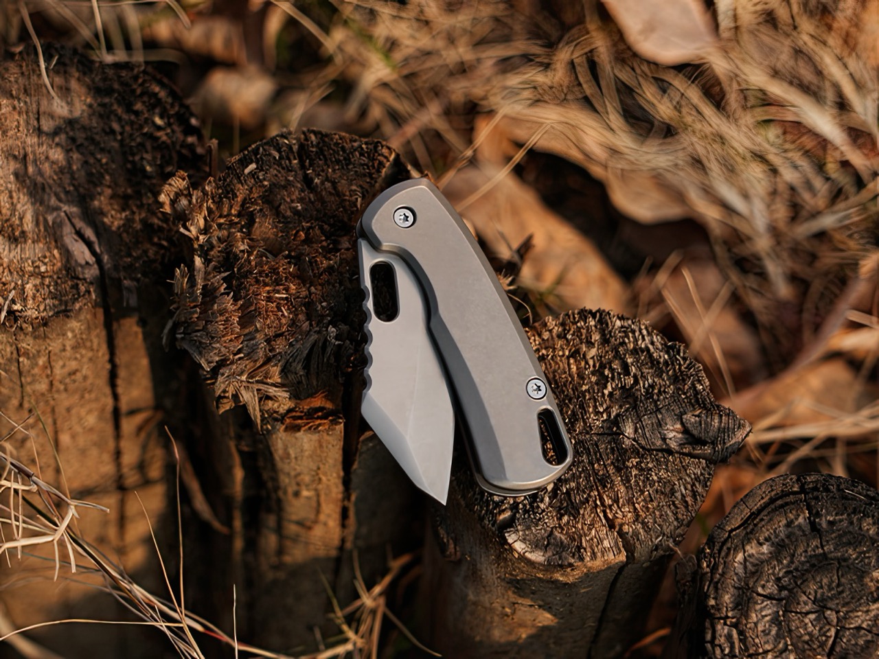
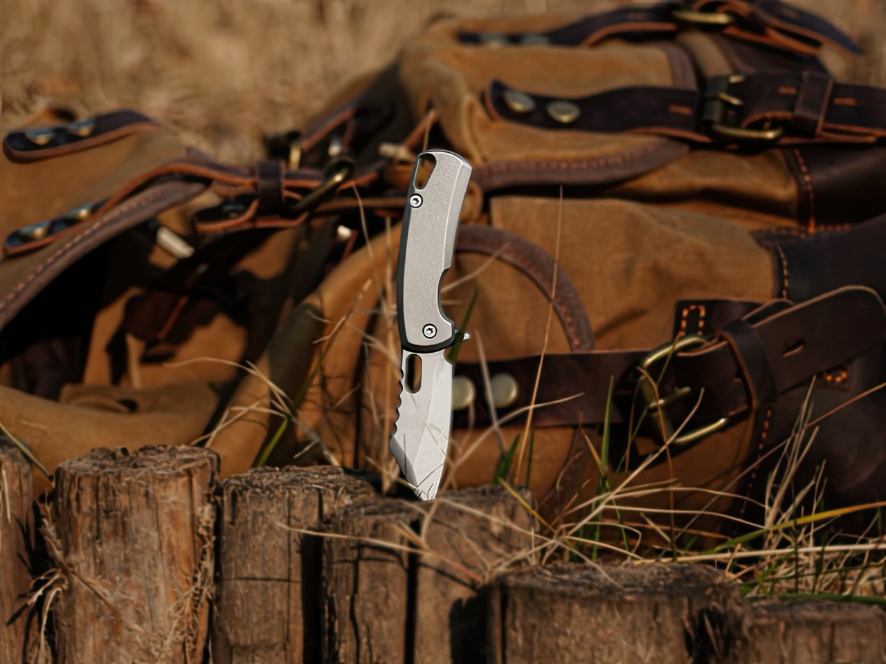
No bottle-opener, no pry-bar, no complications. The TiArc is built like a tank, and it’s built to be three things – reliable, robust, and for the most part, repairable. The thing’s tiny enough to fit on a keychain, in your palm, or your pocket. It measures 4.16″ when open, and 2.34″ when closed, weighing in at 30 grams or just above an ounce (that’s as much as an AirPods case). As unassuming those specs sound, the TiArc packs a Grade 5 titanium body and a D2 steel shell, making it the EDC equivalent of a ninja, invisible most of the time, but lethal when wielded.
The tiny knife category is more vast than I originally imagined. While anyone will agree that bigger is (for the most part) better, sometimes you don’t need a 4-inch fixed blade. Sometimes even a cutter under 2 inches actually gets the job done, whether it’s opening boxes, slicing through paracord, whittling wood, starting fires, or even working on craft projects. The TiArc’s 1.82 blade gets the job done, whatever the task may be. The D2 steel has a HRC rating of 60, which means it won’t dull easy, even with rough usage.
That sheepsfoot blade profile is a classic in the EDC world. Also known as the ‘wharncliffe’ design, it features a curved belly blade that you can slice with running motions or even rock the way a chef rocks their knife while finely cutting something. The blade’s tip is pointy enough for piercing actions, making it fairly versatile no matter the task. You could be opening rations in the outdoors, defending yourself from danger, or doing something as benign as cutting open a lime to make yourself a margarita. The TiArc’s compact design means it’s on your person all the time, and the reliable build lends itself to almost every activity that would require a cutting edge.
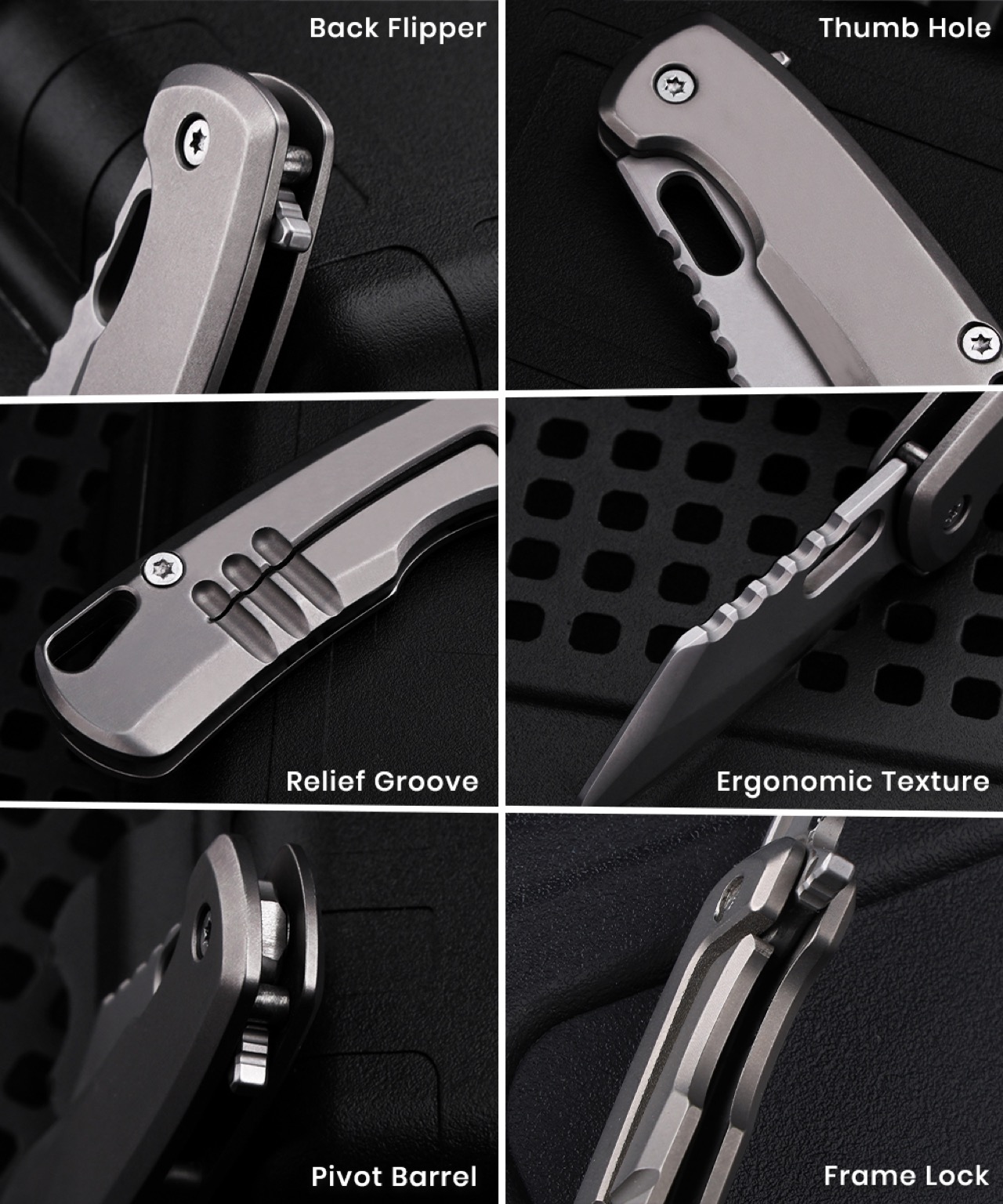
TiArc’s makers iterate that the knife’s made with simplicity – but that doesn’t mean ‘basic’. It’s fairly capable the same way a Kalashnikov from the 40s still happens to be the gold standard for rifles, even after nearly 8 decades. The tiny knife packs an all-metal design that can be disassembled in a jiffy using two screws integrated into the body. A cutout in the blade lets you open meticulously, or just use the flipper on the back to flip open with panache. Once open, it holds its positions with stern resolve, and you can literally chuck the blade tip-first into hardwood and the knife won’t buckle. A frame-lock holds the blade in place, and to close your TiArc, simply coax the frame lock open to have the blade glide right back smoothly into its sheathe.
The Grade-5 titanium body is cool to the touch, practically destruction-proof, hypoallergenic, and comes with a stone-wash finish that genuinely feels great when you hold it, providing just enough friction while in use. Titanium has become a bit of a mainstay in the EDC world, but it’s always a mark of a premium tool given that you won’t find cheap knives made from titanium. You’re paying for the craftsmanship, the material, and the fact that this thing is built forever. I’ve long said that if you’ve got yourself a titanium EDC, chances are it doesn’t even need to come with a warranty because it’ll last long enough to pass down to your great grandkids. The TiArc, to that end, comes with a lifetime warranty.
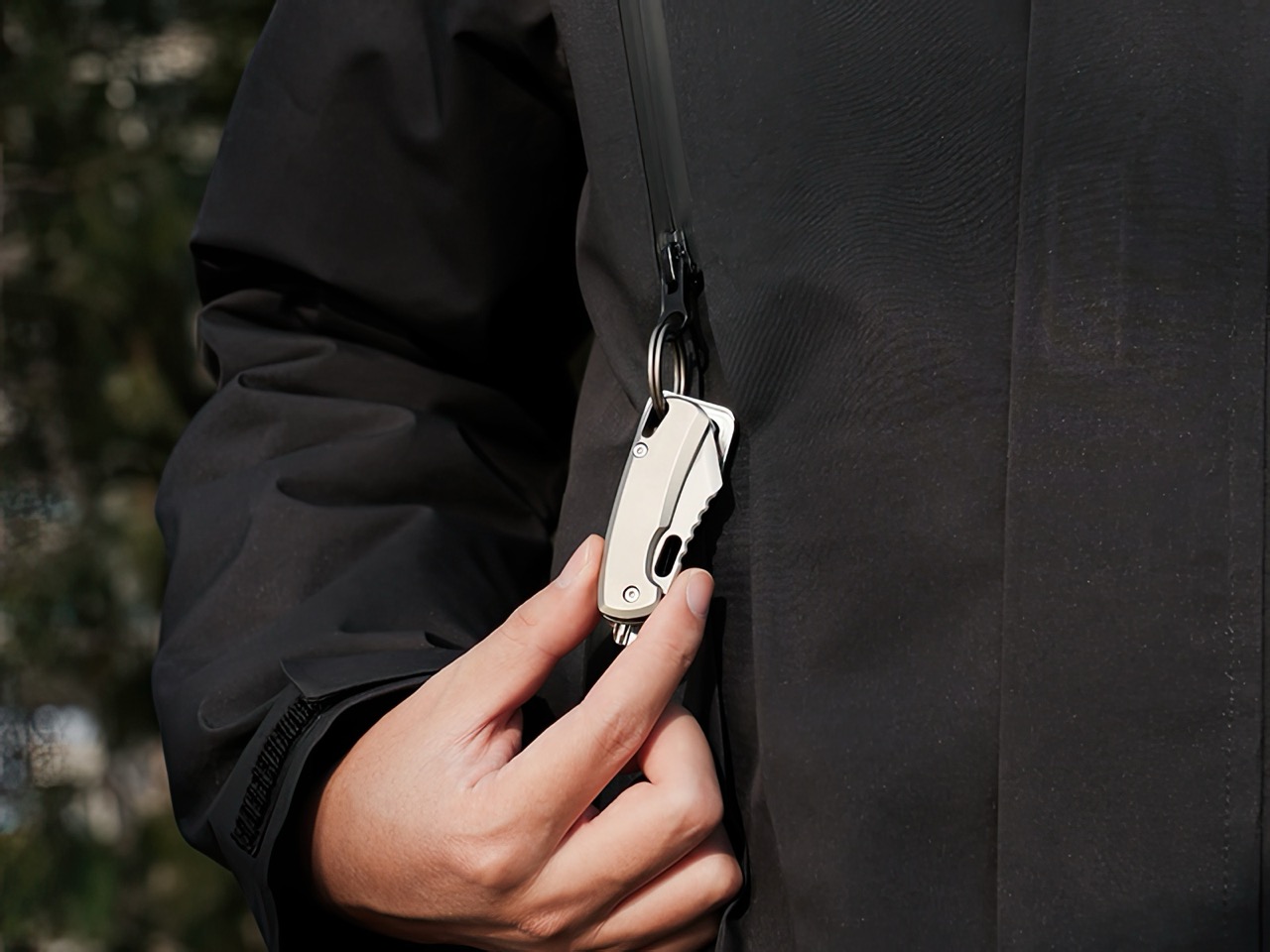
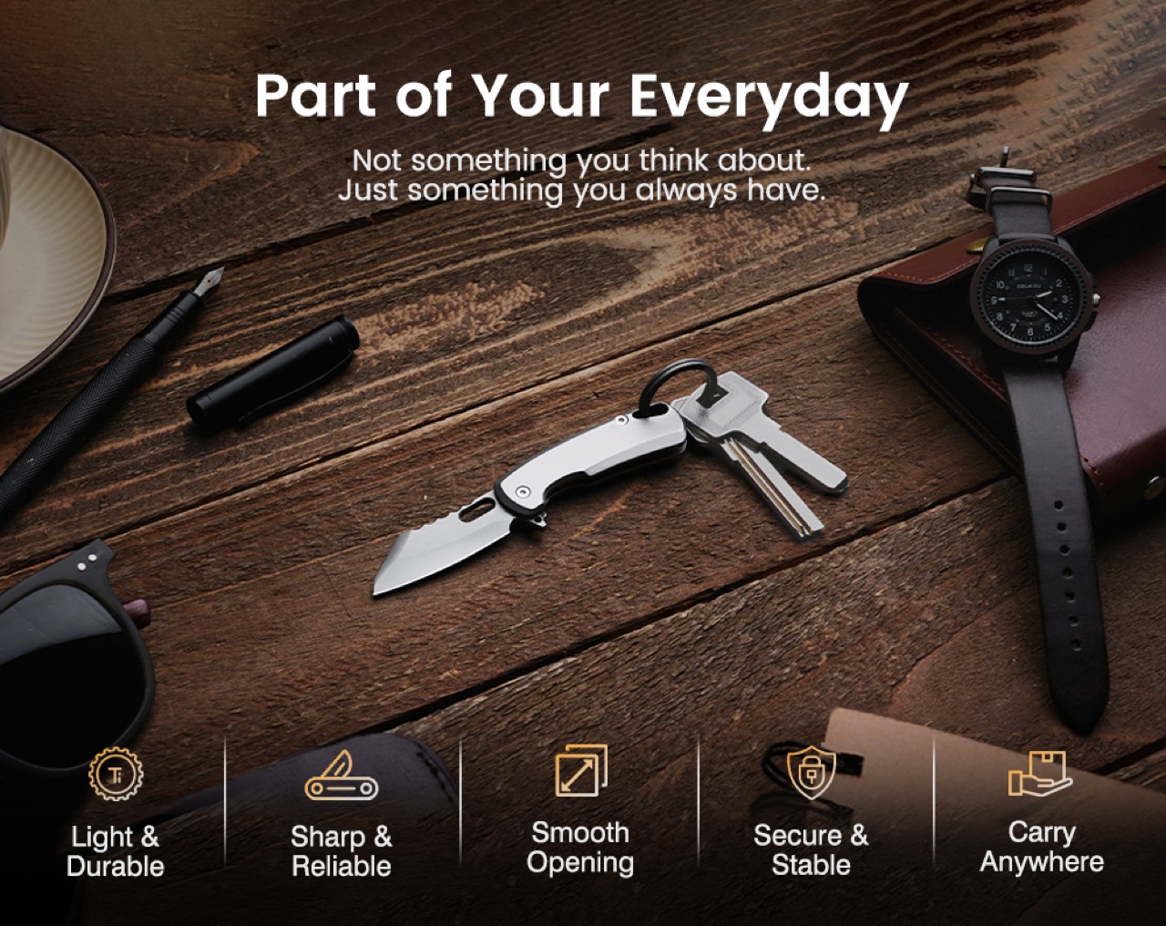
At just 1.06 ounces, the TiArc is really made for everyday carry. Clip it to a carabiner, string it on your keyring, secure it on your outdoor backpack, or even stash it on your pocket. It goes where you go, doesn’t announce itself, but steals the show once you need to use it. No extra features adding any complexity, not even as much as a pocket clip – the thing is designed with the same minimalist mentality of a MacBook Air, which famously cut down on ports to keep things focused and still managed to become one of the most popular laptops out there. I’m writing this article on one as we speak.
The TiArc starts at $39 USD, discounted from its original $50 price tag. For that, you get the TiArc itself, a titanium split keyring to match, free global delivery, and a lifetime warranty. For an extra $14.6 USD, you can grab either one of the following – a custom engraving on the blade, a PVD black coating to give your knife a stealthy look, or a special quick-release keyring with a single-piece carabiner machined from titanium. The TiArc begins shipping as early as September 2026.
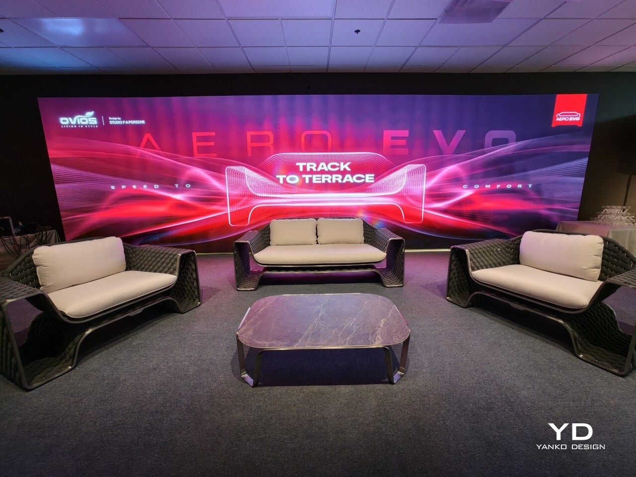
Ovios introduced Aero Evo at the launch event in California, a new outdoor furniture collection created with Studio F. A. Porsche. The line includes a sofa, lounge chairs, and a coffee table, and it marks the studio’s first outdoor furniture project. The collaboration brings together Ovios’s experience in premium furniture manufacturing and Studio F. A. Porsche’s minimalist, performance-led design approach, with comfort and function treated as part of the design rather than an afterthought.
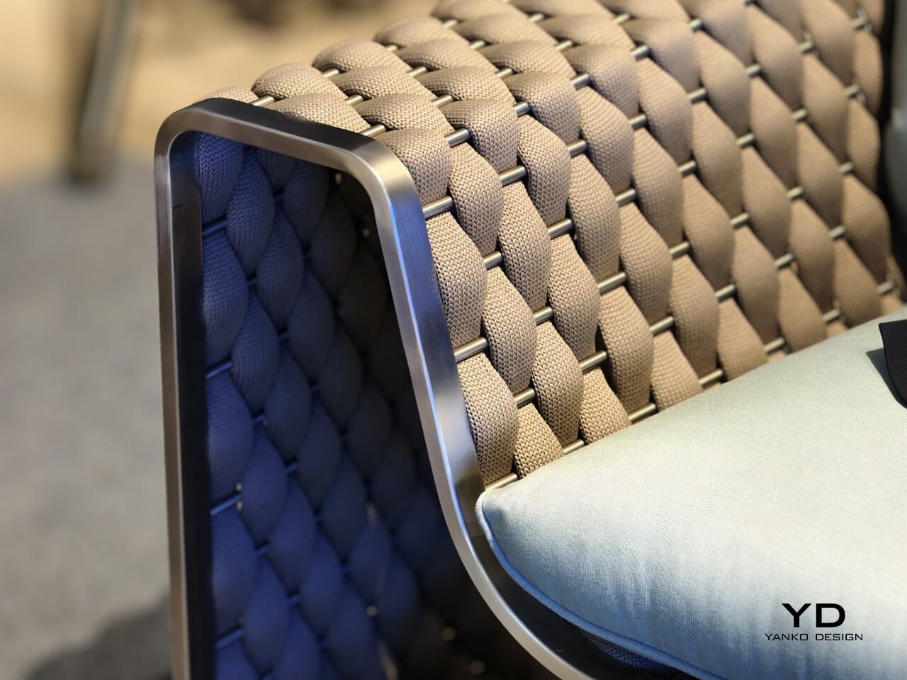
Seen in person, Aero Evo feels softer and more sculptural than the Porsche connection might suggest. The woven side and back panel give the pieces presence, while the exposed metal frame and open structure keeps them visually open. It does not read like furniture trying to imitate a car. The link is more understated than that, showing up in the control of the lines and the clarity of the structure.
Henning Rieseler, Design Director at Studio F. A. Porsche, said the collection was developed with the American market in mind, particularly California. That lighter, more relaxed mood comes through, but the collection stops short of the usual resort furniture look. The forms are cleaner and more restrained, which gives the pieces a stronger identity.
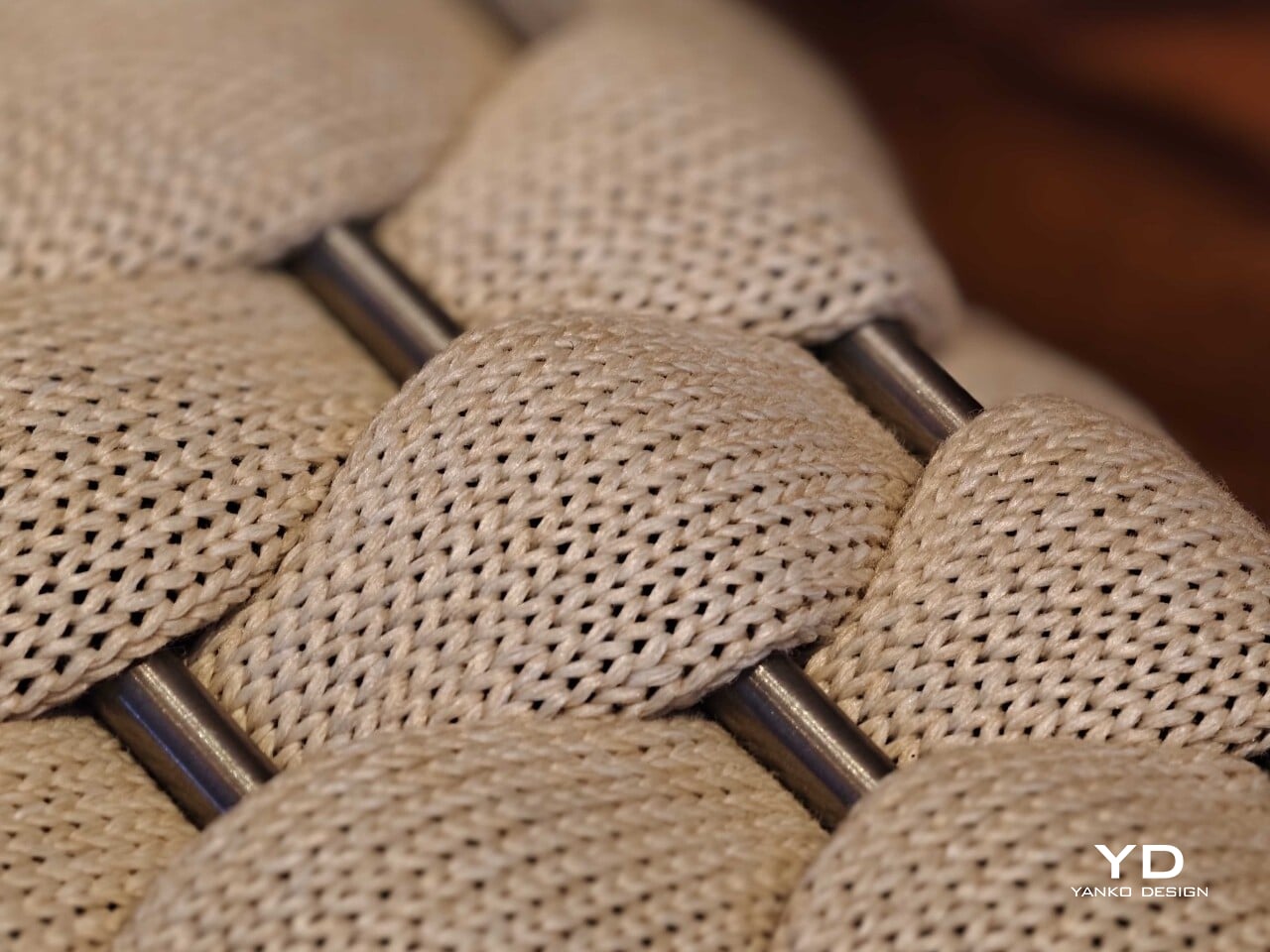
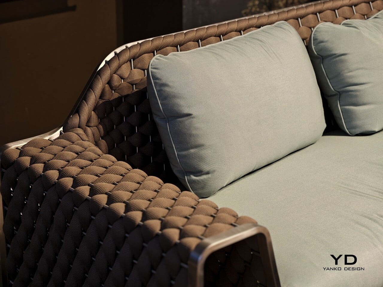
The woven rope is central to that. It is not there simply to soften the frame. It shapes the way the sofa and chairs are read, giving them texture and volume, while the visible frame keeps the overall profile open. That contrast is where much of the collection’s appeal lies.
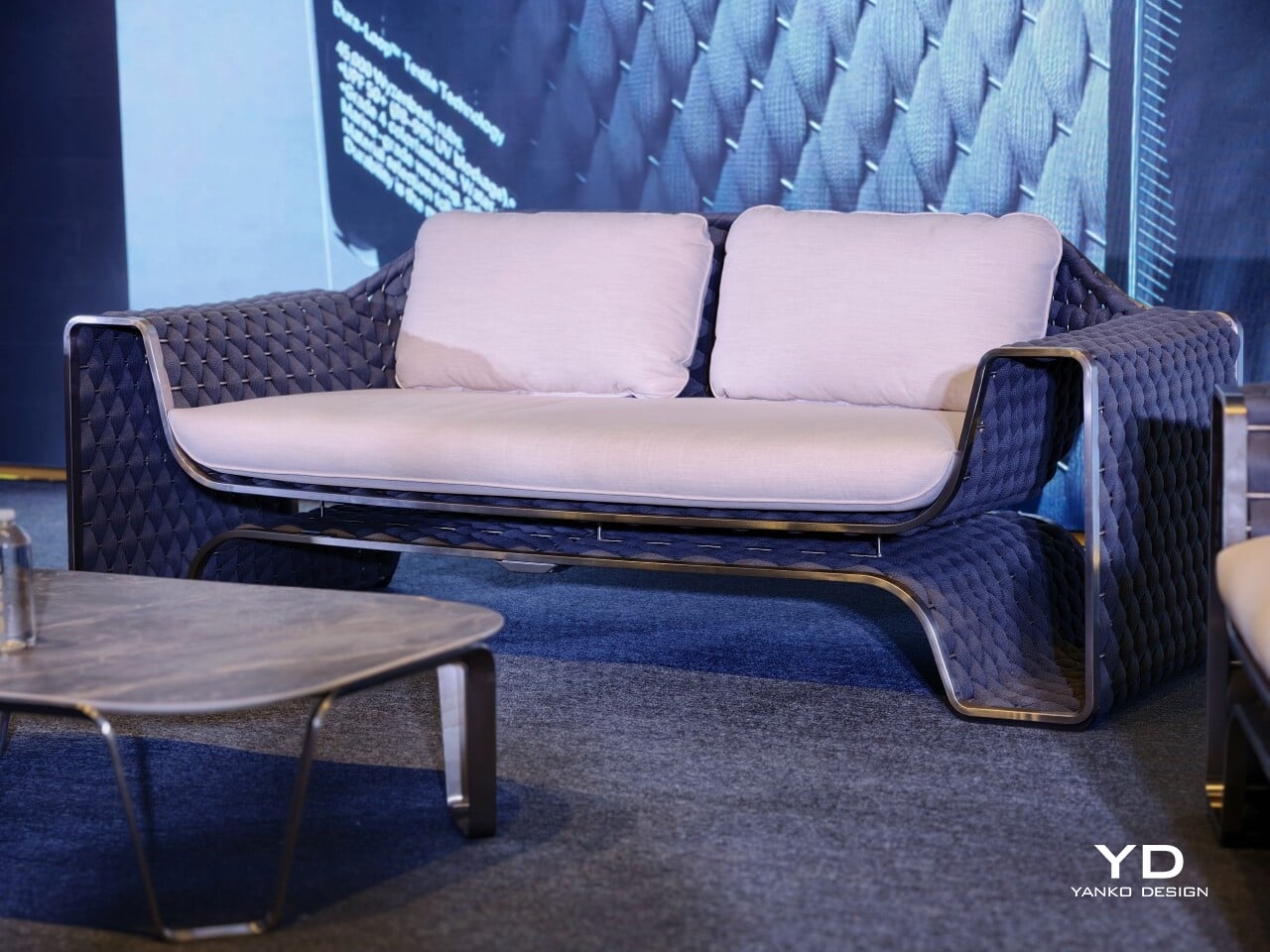
Aero Evo works best when the frame and weave are read together. The stainless steel frame gives the collection its outline and support, while the woven rope adds warmth and softness. The raised base and open structure create a sense of airflow that keeps the furniture from feeling too solid. The pieces have enough presence to anchor a space, but they do not feel heavy.
Rieseler said the collection went through several iterations, including adjustments to the height of the back panel and the size of the cushions. The goal was to keep the metal frame and woven back visible while maintaining comfort. That helps explain why the final proportions feel so controlled. The cushions are generous, but they do not cover up the structure or blur the silhouette.
The collection comes in three woven rope colors, charcoal, brown, and beige, along with four cushion color options. The charcoal version brings out a more graphic side of the design, while the brown and beige versions feel warmer and more relaxed. The lighter combinations suit open terraces and poolside settings especially well, while the darker option gives the collection a sharper presence.
Seen together, the sofa, lounge chairs, and coffee table read as a complete outdoor setting rather than a group of separate products. The seating carries most of the visual identity, and the coffee table sits more quietly within the arrangement. That feels right for a collection aimed at terraces, patios, garden lounges, and hospitality spaces, where the atmosphere matters as much as the individual pieces.
Ovios is releasing Aero Evo as a limited collection of 919 pieces worldwide, a nod to the Porsche 919 Evo that informed the project. Even so, the most convincing part of the collection is not the automotive reference on its own. It is the way the design handles structure, texture, and comfort without pushing any one idea too hard. For Studio F. A. Porsche, it is a confident first move into furniture. For Ovios, it is a collaboration that feels well matched. The result is a collection that feels considered, distinctive, and easy to imagine in use.
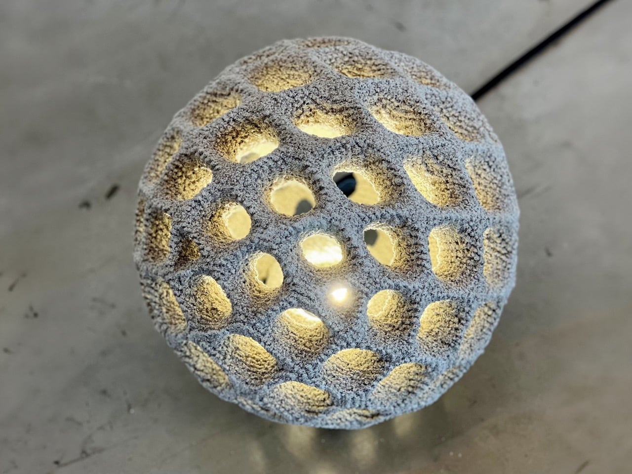
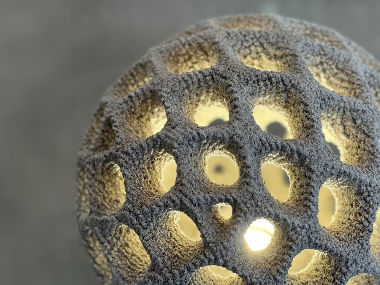
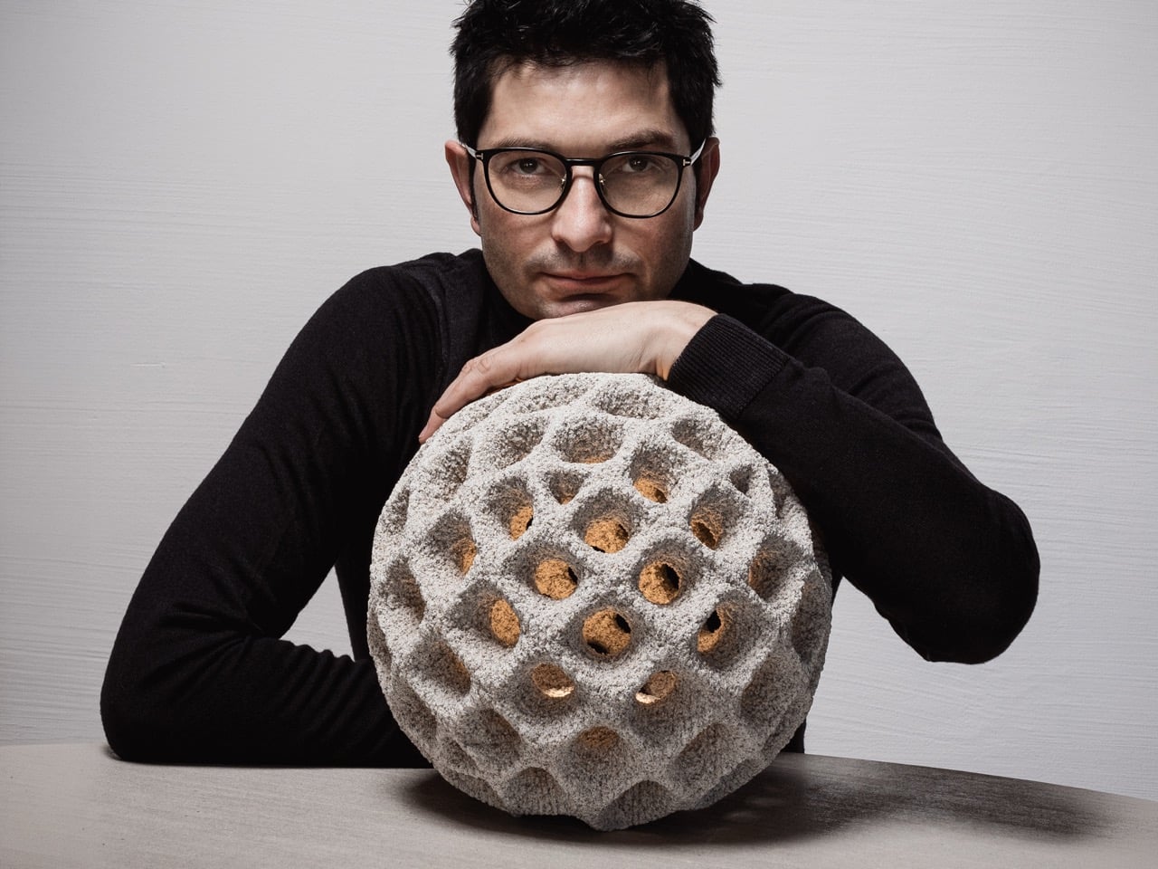
Outdoor lighting is usually seen as something practical. It lights up a pathway, softens a garden, marks an entrance, or creates a mood after dark. Oberhauserer’s Balloon takes that familiar idea and pushes it into a more experimental space. Designed by Martin Oberhauser, the lamp brings together concrete, light, and digital manufacturing in a way that feels surprisingly poetic. It has the presence of a sculptural object, but it still belongs naturally in outdoor spaces.
The most interesting part of the lamp begins with its production method. Oberhauserer’s Balloon is made using powder bed concrete 3D printing, also known as Selective Paste Intrusion, or SPI. In this process, cement paste is injected into a powder bed only where the structure needs to form. The lamp is built gradually, layer by layer, allowing the final shape to emerge with a level of detail and complexity that would be difficult to achieve through traditional concrete casting.
This process removes the need for conventional formwork, which is one of the biggest limitations in concrete design. Traditional molds can restrict the shape of an object, especially when the geometry becomes more detailed or organic. SPI gives the designer more freedom to explore curved forms, softer surfaces, and intricate details without being limited by the mold-making process. This freedom is what gives Oberhauserer’s Balloon its distinctive character.
The lamp plays with a beautiful contradiction. Concrete is usually associated with heaviness, buildings, and permanence. A balloon suggests lightness, air, and softness. Bringing those two ideas together makes the object feel unexpected. The form looks rounded and almost inflated, even though it is made from cement. That contrast gives the lamp a quiet charm. It does not try to disguise the material. Instead, it shows how concrete can feel softer, more atmospheric, and more expressive than we usually expect.
Oberhauserer’s Balloon is available in three sizes: 30 cm, 70 cm, and 100 cm in diameter. Each size changes how the lamp interacts with a space. The 30 cm version can work as a small accent in a garden, terrace, or along a walkway. The 70 cm version has a stronger visual presence and can suit courtyards, hospitality spaces, and residential landscapes. The 100 cm version becomes a bold installation piece, shaping the atmosphere around it while still functioning as a source of light.
The largest version is especially impressive. With a diameter of 100 cm, it is described as the largest known 3D-printed lamp made from cement. This makes the project more than a beautiful outdoor luminaire. It becomes an example of how far 3D concrete printing can be pushed. What could have remained a small material experiment has been developed into a durable, full-scale lighting product.
The material itself is designed for outdoor use, with high weather resistance that allows the lamp to withstand changing environmental conditions. This durability makes Oberhauserer’s Balloon suitable for gardens, terraces, public landscapes, and architectural outdoor settings. Its strength does not take away from its visual softness. Instead, the lamp balances permanence with atmosphere, making it feel grounded during the day and quietly luminous at night.
The production method also supports a more sustainable approach to manufacturing. Since 3D concrete printing places material only where it is needed, it helps reduce waste and makes material use more efficient. The absence of traditional formwork also cuts down on excess production materials. This gives the lamp a smaller ecological footprint while still allowing for a high level of design detail.
Oberhauserer’s Balloon feels like a glimpse into where lighting design is heading. It shows how technology can create forms that feel warmer, more expressive, and more human when handled with sensitivity. The lamp carries the strength of concrete, the precision of digital fabrication, and the softness of glowing light. In outdoor spaces, it becomes less like an object placed in the landscape and more like a calm presence within it.
Meta’s Ray-Ban smart glasses sold over 7 million units in 2025, a number that would have seemed improbable two years earlier when the category barely existed outside enterprise pilots and conference demos. Google confirmed its own entry at I/O 2026, with Gemini-powered frames and eyewear partnerships with Warby Parker and Gentle Monster already in place. The market Apple is entering has already been legitimized by its competitors, which is an unusual position for a company that typically defines the categories it enters. All of that makes the N50, Apple’s first smart glasses, feel like a response to a race that started without it. The honest version of that story includes the fact that Apple’s engineers were busy building something else entirely.
The N50 is the product that absorbed the engineering resources originally aimed at a Vision Pro sequel. Bloomberg’s Mark Gurman confirmed in May that no headset successor is in active development, and that the Vision Air, a cheaper model codenamed N100, was canceled last year to redirect talent toward smart glasses. Apple restructured the Vision Products Group, splitting engineers across hardware and software divisions, with many redeployed to the glasses program, to Siri, and to camera-equipped AirPods. The glasses carry cameras, microphones, speakers, and Apple Intelligence inside a conventional eyeglass frame with no display, no pass-through video, and no external battery, functioning as an iPhone accessory in the same way AirPods or Apple Watch do. A late 2026 reveal and 2027 commercial launch is the expected window, with analyst Ming-Chi Kuo projecting 3 to 5 million units shipped in the first year.
Designer: Oleh Koval
Four frame styles are in testing, two rectangular and two oval, built in premium acetate with colorways including black, ocean blue, and light brown (the images shown here are just a concept mocked up by designer Oleh Koval back in 2018). Apple initially experimented with embedding electronics into established eyewear brand frames, similar to Meta’s EssilorLuxottica arrangement for the Ray-Ban lineup, before moving toward designing its own frames in multiple sizes. Meta’s partnership gave the smart glasses category immediate cultural legitimacy because Wayfarers were already objects people wanted on their faces before any chip was inside them. Apple is betting its own design language in premium acetate can carry the same weight without borrowed heritage. Whether that holds against consumers who have already spent two years wearing Ray-Ban Metas is the sharpest design question the N50 faces at launch.
Two cameras are planned inside the frame: a high-resolution sensor for photos and video, and a second dedicated to computer vision tasks, helping the device read its environment and measure spatial relationships between objects. The N401, a custom chip derived from Apple Watch silicon, handles the compute with a design emphasis on ultra-low power draw, targeting a total frame weight below 50 grams. That weight target is the industrial design achievement the whole product depends on. A sub-50 gram device sits within the weight range of premium optical frames, which means the person wearing it makes a fashion decision first and a technology decision second. That ordering is exactly what the smart glasses category has needed to move beyond enthusiast territory into genuine everyday carry.
The M5 Vision Pro that arrived in October 2025 reads now as a holding action rather than a product commitment. The chip swap kept the SKU alive but left the device’s foundational problems untouched: 650 grams of front-heavy glass and aluminum, a mandatory external battery, and a $3,499 entry point that stranded it between developer hardware and enterprise curiosity. The Vision Air was supposed to address the weight and price simultaneously, and its cancellation signals that those two problems couldn’t be reconciled inside an enclosed headset on any timeline Apple found workable. A Vision Pro sequel won’t arrive before 2028, meaning it enters a market the N50 will have already spent a year conditioning. That sequencing is either very deliberate or very revealing, and I’d argue it’s both.
Pricing estimates cluster between $299 and $499, placing the N50 directly against the Meta Ray-Ban Gen 2. Privacy is a genuine competitive lever here: nearly 47% of potential smart glasses buyers cite data concerns, and neither Meta nor Google carries credible on-device processing as a core value proposition. Apple’s Apple Intelligence architecture, built around local compute rather than cloud offload, gives the company a story neither competitor can cleanly replicate. A second-generation model with an in-lens display is reportedly expected as early as 2028, which is also the window when enclosed headset technology might finally be miniaturized enough to make a Vision Pro sequel viable. The N50, by that reading, is the product Apple had to build before it could build the one it always imagined.
The bag you carry into every café, co-working space, and airport lounge tells a story before the laptop opens. For years, that story was graceless — a tangle of cables, a charger shaped like a building block, a mouse that felt borrowed from a hotel business center. Nomad gear was assembled around survival rather than intention. Every surface it landed on looked worse for the visit.
Something has shifted. The tools built for people who work from everywhere are beginning to reflect the same care as the work itself. These eight gadgets share a quality that is harder to name than it is to recognize: they look considered. Each one earns its place in the bag not just by solving a problem, but by solving it in a way that leaves nothing clumsy on the table.
1. OrigamiSwift Folding Mouse
The travel mouse problem has never been about making mice smaller. Smaller mice create smaller hand cramps. The real solution is transformation, not compression, and the OrigamiSwift understands this from the geometry up. Borrowing the logic of its name, it collapses to card-sized flatness and snaps open — via magnetic clips — into a fully contoured ergonomic mouse that actually fits a palm. At 40 grams, it weighs less than a pen and disappears into a jacket pocket without announcing itself.
The polygonal folded surface earns its grip through geometry rather than rubber texture, which gives the form a visual coherence that most travel mice never achieve. Bluetooth 5.2 connects without a dongle, and three months of battery life on a single USB-C charge keeps it out of the daily rotation entirely. For the nomad whose work demands precision that a trackpad fails to deliver in the critical stretch of an afternoon, this removes every excuse for not carrying a proper mouse.
Folds to true card-size flatness without compromising full ergonomic comfort when open, which is the only trade-off that actually matters in a travel mouse
Three-month battery life means it charges about as often as a passport gets stamped
What we dislike:
The hinge mechanism is structurally the most complex part of the design, and daily fold cycles over the years could introduce wear that a solid-body mouse would never accumulate
Scroll feedback is softer than premium stationary alternatives, something certain users notice immediately, and others never register
2. Lana Laptop Stand
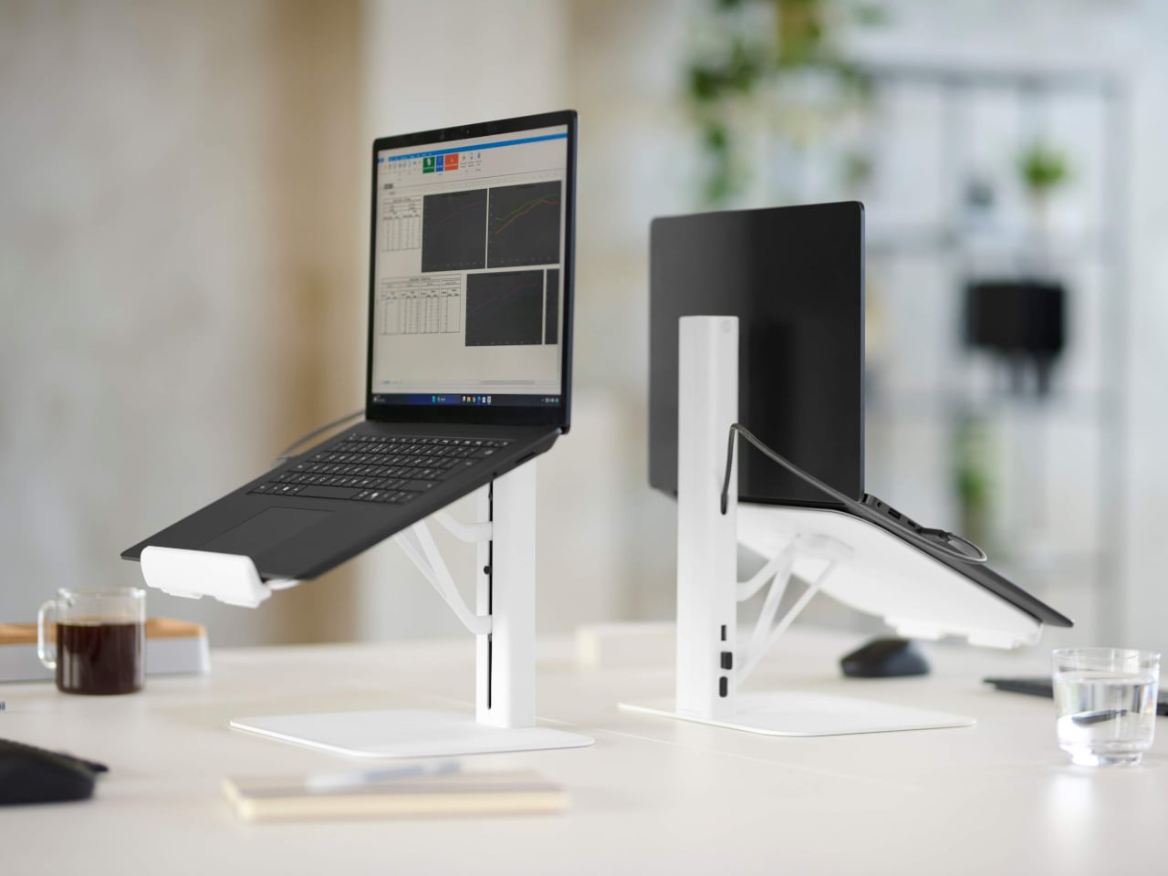
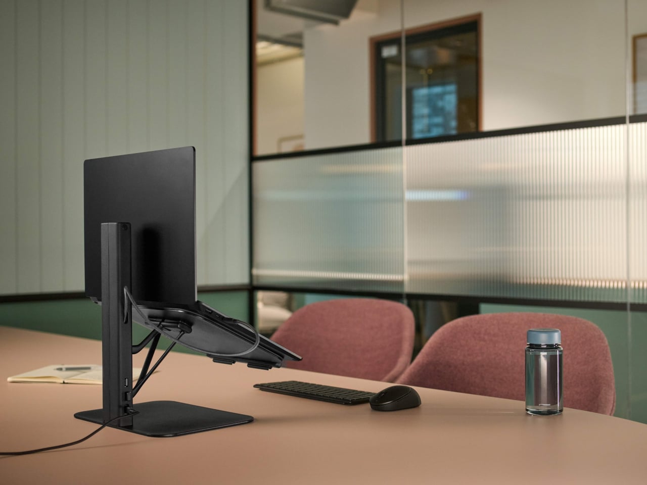
Working from borrowed surfaces has always involved a compromise that people accept rather than solve. Laptop too low, neck forward, shoulders rounded inward — the session ends the same way regardless of how productive the hour before felt. The Lana laptop stand from Colebrook Bosson Saunders is a compact riser with a USB hub integrated directly into its spine, meaning a single USB-C cable connects the laptop, keyboard, mouse, and power simultaneously. The temporary desk stops feeling improvised from the moment everything clicks into place.
Lana was designed specifically for the shared spaces nomads actually inhabit: pods, booths, communal benches — furniture built for lunch breaks, not extended output. The footprint is small enough for a café booth table, but tall enough to bring the screen level. A 12-year warranty from a British-designed and engineered product communicates something important. This is not a disposable gadget but a long-term fixture in a kit that gets used every single day, on surfaces that were designed for everything other than this.
What we like:
An integrated USB hub means one cable manages everything, collapsing the connectivity setup into a single plug-in rather than a small archaeology project
The 12-year warranty reflects an engineering confidence that most portable accessories never earn the right to claim
What we dislike:
Works best alongside an external keyboard, meaning it adds an item to the bag rather than replacing one
Price sits at the premium end of the laptop stand category, which is a real consideration for a product that functions before anything else as a riser
3. Nimble WALLY Pro Wireless
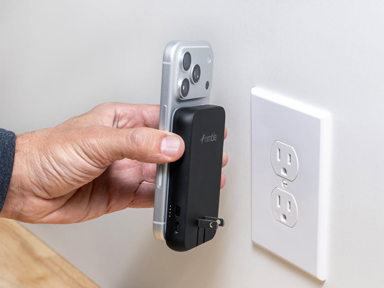
Traveling with electronics has long meant traveling with three separate charging accessories: a wall charger for the laptop, a power bank for the phone, and a wireless pad for overnight top-ups. Most people pack all three, use each one just enough to feel justified in carrying it, and leave one at a hotel room in a different country at least once a year. The Nimble WALLY Pro Wireless is a direct answer to that pattern. At 0.61 inches thin, it functions as a wall charger, a 5,000mAh power bank, and a Qi2 wireless charging pad, simultaneously.
Plug it into any outlet globally using folding prongs, and it charges its own internal battery while sending up to 15W wirelessly to a phone placed on its back. Pull it from the wall, and it switches to power bank mode without missing a step. The housing is 100% post-consumer recycled plastic, carbon-neutral certified, TSA-approved, and biodegradably packaged. At $49.95, it removes a genuine category of bag-packing anxiety rather than simply reducing it, which is the kind of simplicity that only feels obvious after someone else has done the work.
What we like:
Three accessories in one device, at under six ounces, address the entire charging layer of the nomad kit without requiring any rethinking of the rest
Recycled housing and carbon-neutral certification make the sustainability story as important as the engineering story
What we dislike:
A 5,000mAh capacity handles phones and earbuds cleanly, but will not meaningfully extend a laptop’s battery under any serious workload
Wireless charging tops out at 15W, which suits passive overnight top-ups more than emergency fast-charges before a gate closes
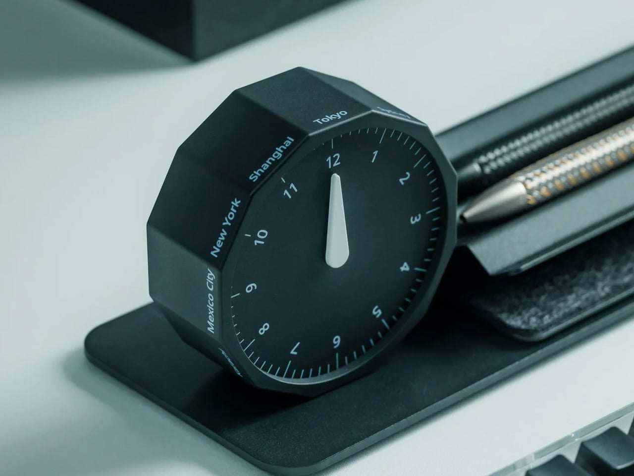
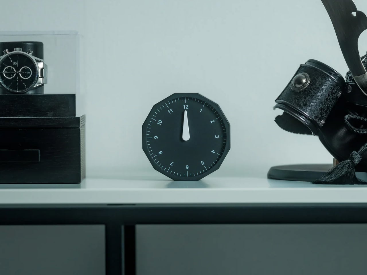
4. Rolling World Clock
Working across time zones involves an arithmetic problem most people solve by unlocking a phone and navigating to a setting buried several menus deep. The Rolling World Clock removes the phone from that interaction entirely. A 12-sided dodecahedron, one analog hand per face, each face assigned to a city: roll it to any side, and it reads the correct local time in that location. The entire interaction takes less time than the lock screen.
Available in black and white at $49, it occupies the surface area of a hockey puck and sits at the precise intersection of functional object and desk sculpture. The design works because it resists adding more — no digital layer, no companion app, no charging port. On a surface full of screens and cables, a clock answered by physically rolling it is the object every person at the adjacent table wants to pick up and examine. That kind of unselfconscious utility is genuinely rare at any price.
Rolling to read a time zone is a screen-free physical gesture that removes a phone unlock from the workflow without requiring any habit change
The form communicates its function completely without a label, a tutorial, or a single button
What we dislike:
Twelve faces cover most regular international relationships, but nomads managing more than twelve cities regularly will need a secondary solution
The face-to-city mapping takes roughly a week of regular use before the interaction becomes fully automatic
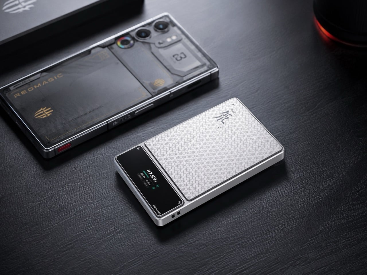
5. RedMagic Power Bank with Flight Mode
Aviation rules around lithium batteries have changed significantly in 2026 — multiple major carriers now ban in-flight power bank use entirely, and the regulations are still tightening. Most power bank manufacturers have responded to this by doing nothing. RedMagic responded by designing for the regulation directly. Their power bank includes a dedicated flight mode switch that disables active output functions on command, aligning with carrier requirements that previously involved gate-side arguments about a device nobody could quickly verify.
The one-touch flight mode cuts wireless transmission instantly, transforming a potential boarding problem into a one-press demonstration. Beyond the compliance story, the honeycomb aluminum finish suggests RedMagic wants you to leave this on your desk even when you are not traveling — a power bank that earns surface rights rather than disappearing into a pocket. For a brand that built its credibility making hardware for people who care about how their tools look and feel, the application to travel infrastructure is a natural extension rather than a category stretch.
What we like:
The dedicated flight mode switch turns a potential boarding conflict into a physical demonstration rather than a verbal explanation
Honeycomb aluminum finish gives the device a desk presence that most power banks, designed purely for pocket anonymity, never consider
What we dislike:
The flight mode feature is more useful than ever, but represents a design workaround for a regulatory gap that clearer aviation policy could simply close
Gaming-adjacent branding will read as the wrong register for some professional nomads who prefer their gear to carry no identity beyond the work
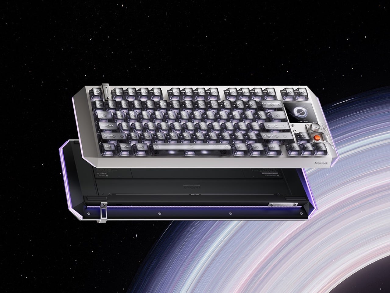
6. Centarui80
Fifty years of keyboard design produced better switches, heavier plates, and an entire hobbyist economy built around sound profiles — but the object itself stayed stubbornly analog in its ambitions. The Centauri80 breaks that contract. MelGeek embedded a 1.78-inch OLED touchscreen directly into the board at 325 PPI, the same pixel density as an Apple Watch face, alongside a physical rotary encoder called the Super Dock. Live wallpapers, macros, and lighting adjustments happen on the board itself, without alt-tabbing out of whatever the afternoon actually requires.
The engineering underneath supports the ambition. Six microcontroller chips drive TTC Flip King Hall Effect magnetic switches to 0.125ms latency at an 8000Hz polling rate — numbers that make the 80% aluminum unibody the most responsive input device on most desks, not just the most considered one. At $299 from MelGeek’s own store, the Centauri80 competes directly against the Wooting 60HE and the rest of the Hall Effect field while carrying something none of them have: a visual interface that turns the keyboard into a control surface with its own design language.
What we like:
A 325 PPI OLED screen embedded into the board makes macro and lighting control a keyboard-side interaction rather than a software detour through a menu nobody enjoys navigating
Hall Effect magnetic switches at 8000Hz polling deliver the kind of input responsiveness that makes every other keyboard in the same price range feel noticeably behind
What we dislike:
An onboard touchscreen and six microcontroller chips add genuine complexity to a device category where simpler hardware has historically outlasted ambitious feature sets
At $299, the Centauri80 is considered a purchase rather than an impulse one — the OLED and polling rate premium asks for conviction before checkout
7. Orbitkey Desk Mat
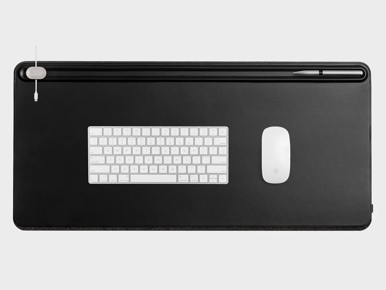
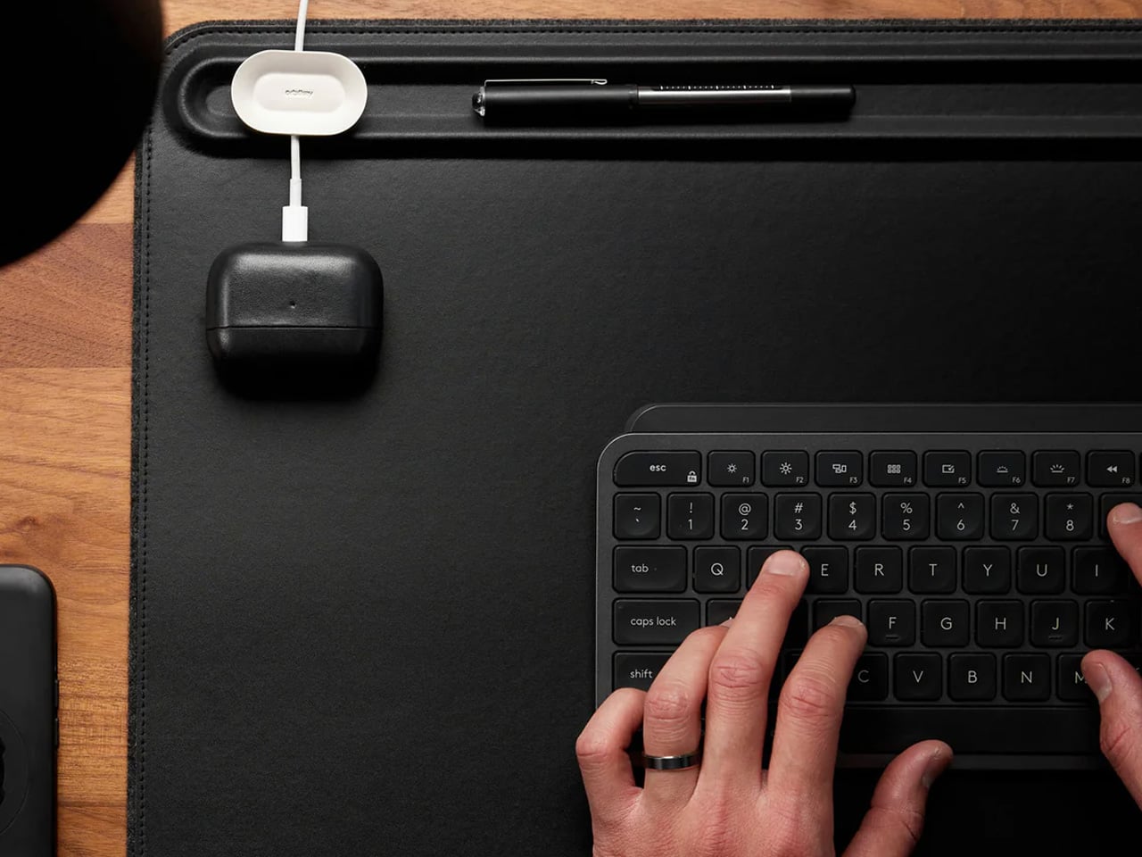
A borrowed table is still a borrowed table until something on it says otherwise. The Orbitkey Desk Mat doesn’t announce itself — it simply reframes the surface it occupies. Full vegan leather across the top, recycled PET felt underneath, a document slot along the upper edge, and Qi wireless charging embedded invisibly into the upper-right zone. Place a phone there, and it charges. No cable surfaces anywhere in the composition. The mat claims the desk and turns it into something that belongs to you, at least for the session.
It rolls tight enough to travel inside most laptop sleeves, deploys completely flat, and develops a surface character over months of use that reads as the quality indicator it actually is. Magnetic cable holders keep charging cables from drifting off the edge mid-session. A pen loop stitched into the left side holds exactly one pen. These details were thought through rather than listed on a spec sheet, which is the difference between a product designed for desk photography and one designed for daily work. At $99.90, it is the kind of surface investment that compounds quietly over the years.
What we like:
Wireless charging disappears so cleanly as a feature that it stops being a feature and becomes simply a behavior: phone down, phone charges
Rolls compactly enough to travel inside a laptop sleeve, adding no dedicated bag volume to the packing equation
What we dislike:
Wireless charging tops out at 10W, making it a passive convenience layer rather than a serious fast-charging solution
The leather surface requires periodic conditioning at the fold line after extended travel use to maintain its original finish
8. HubKey Gen2
Every modern ultrabook ships with two USB-C ports. Every modern nomad workflow needs more than two ports running simultaneously. The HubKey Gen2 resolves the gap with eleven connections in one compact 7 × 7 × 3cm cube: dual 4K/60Hz HDMI outputs, USB-A 3.1, USB-C 3.1, SD and TF card readers, 2.5Gbps ethernet, a 3.5mm audio jack, and 100W power delivery through a single cable into the laptop. The port problem disappears from the workflow rather than being permanently managed around it.
The programmable shortcut keys and central control knob on the top panel are what distinguish this from a standard travel hub. Volume, mute, display toggle, and screenshot become physical actions handled by the left hand while the right hand stays on the mouse. For nomads driving external displays across video calls and creative sessions in co-working spaces, turning a connectivity device into a tactile control surface is the kind of upgrade that feels immediately obvious on the first day and genuinely irreplaceable from the second. The cube form fits anywhere without announcing itself.
What we like:
Dual 4K/60Hz HDMI outputs let you build a two-monitor workstation from a single cube that fits inside a laptop sleeve pocket
Programmable shortcut keys and a control knob give the desk a physical control layer that no other travel hub currently offers
What we dislike:
Tightly spaced ports mean thick cables or large flash drives can crowd each other along the edges during a fully loaded setup
The cube form, while genuinely compact, is less pocketable than flat card-style alternatives when volume and weight are being counted carefully
The Desk You Build Is Better Than the One You’re Given
The kit assembled here is not a packing list. It is a position that the tools a nomad carries every day deserve the same design attention as the work those tools are used to produce. A mouse that folds with geometric logic. A clock answered by rolling it. A charger that stopped being three separate objects. A hub that turned its top surface into a control panel. Each object solves a specific problem in a way that leaves the desk better than it found it.
The best version of working from anywhere is not about freedom from a particular address. It is about arriving at any table with a kit that makes the table feel chosen. These eight products do that together in a way that none of them manages alone — and that is the standard worth holding to when every other square centimeter of the bag is already spoken for.
Bolt-action pens command a fanbase that splits neatly into two camps. There are the fidget enthusiasts, the ones who cycle the bolt compulsively mid-conversation and genuinely cannot put the thing down, drawn entirely by the sensory reward of a well-tuned spring mechanism. The satisfying click and return of a well-machined bolt has an almost compulsive quality that most people who have owned one will recognize immediately. Then there are the EDC traditionalists, who carry bolt-action pens with something closer to reverence, appreciating how a mechanism borrowed from military rifles found its way into writing instruments and became a small, tactile piece of mechanical history worth keeping in a pocket. For that second group especially, the bolt-action pen occupies the same mental space as a quality pocket knife or a classic field watch: a precision object that earns its keep through both performance and heritage.
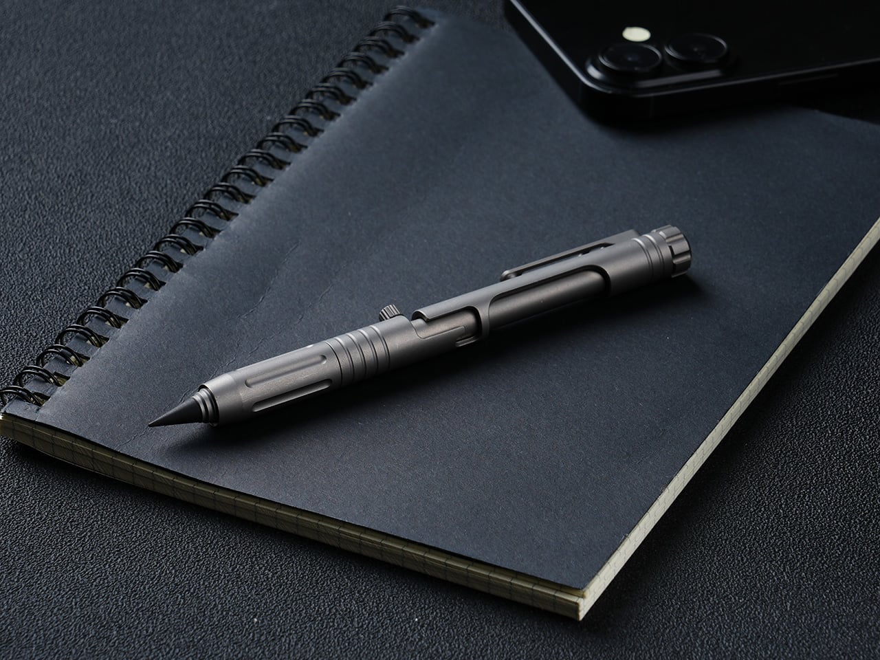
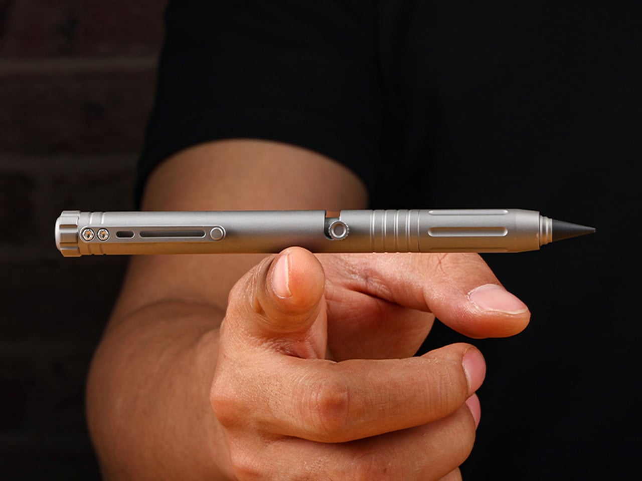
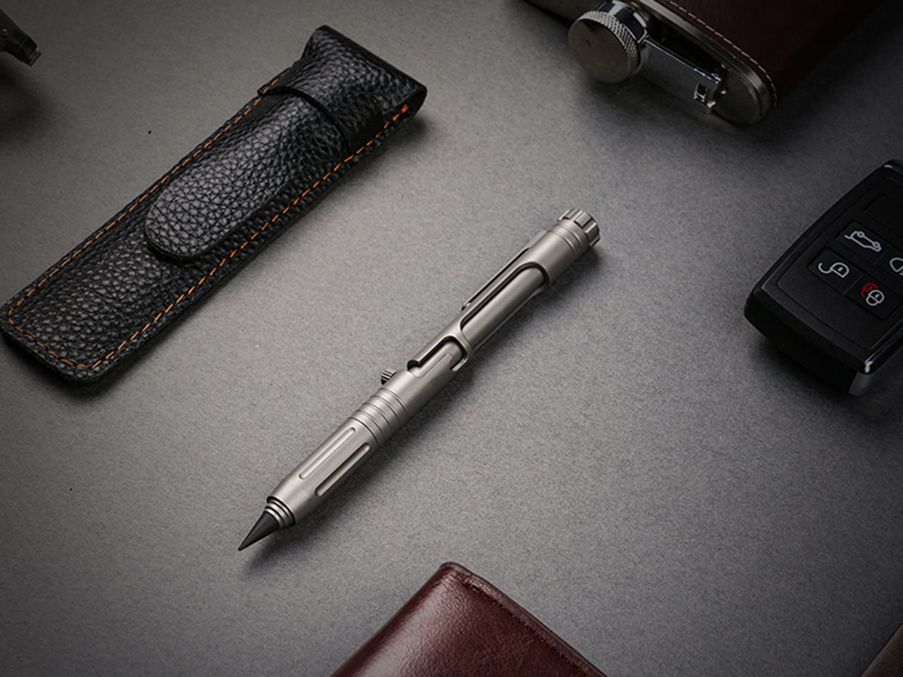
The Bullet Ant 4.0 by MeTool builds on that foundation and loads it with function. The bolt-action mechanism deploys a top-mounted 4mm bit driver the moment the bolt flicks forward. Nested inside the barrel is a magnetic bit garage holding a spare, and a hidden blade sits flush in the lower section, locked by two magnets that hold it against shaking, jostling, or being tossed in a bag. The rear tip swaps between a graphite and metal writing point, with a tungsten glass breaker completing the set. All of that in 32 grams of Grade 5 titanium.
A single forward flick of the bolt deploys the 4mm magnetic bit driver into working position, with no caps to remove and no secondary steps to take. The magnetic mount keeps the bit seated precisely, and the same magnetic logic governs the bit garage inside the barrel, which stores a second 4mm bit as a permanent spare. Losing a bit mid-job is a real-world frustration that MeTool clearly heard from earlier-generation users, and the solution is architectural rather than behavioral: one extra 4mm bit, always with you, no loose parts, no hunting through a bag for the Phillips you dropped. Both the working bit and the stored backup are standard 4mm, keeping compatibility with common interchange systems rather than locking the user into proprietary accessories. The bolt mechanism also carries the distinction that made this whole category worth caring about: positive tactile feedback on both extension and retraction, the kind of mechanical click that turns a tool into something you actually look forward to using.
The blade lives flush inside the lower barrel, producing zero poke, zero rattle, and zero external profile, and when you don’t need it, it simply disappears, leaving a clean, cylindrical pen that looks like nothing but a pen. Two small but powerful magnets keep the bit blade perfectly seated, with no wobble and no creep, meaning you can throw the pen in a bag, run down stairs, or shake it aggressively without the blade budging until a deliberate thumb pull releases it. In practical daily use, it handles the mundane cutting jobs that otherwise require hunting for scissors: tape, packaging, zip ties, rope, plastic clamshells. Slip the blade out in two seconds, make the cut, click it back, and the pocket knife can stay home. The design intent leans firmly toward daily micro-cutter territory rather than survival blade ambition, which keeps the tool honest about its actual scope.
The everlasting pen tip carries no ink and no limits, writing on paper, metal, wood, plastic, or underwater. Two tip configurations are available: the graphite tip delivers smooth, paper-friendly contact suited for notebooks and daily writing, while the metal tip offers rigid marking performance on hard surfaces in outdoor conditions. The new alloy tip survives waist-high drops onto concrete without cracks or flakes, in either metal or graphite form, and swaps between configurations in seconds. The tungsten glass breaker occupies the same interchangeable slot at the rear of the barrel as a third configuration, converting that end into a hardened emergency strike point capable of breaking automotive glass. Concentrating the writing, glass-breaking, and emergency functions at the rear of the barrel is a coherent spatial decision that keeps the bolt-action end clean and dedicated entirely to the driver.
136mm of titanium at just 32 grams, with six precision grooves machined into the grip section that give ultimate hold in any condition, wet, cold, or gloved. Grade 5 titanium, the Ti-6Al-4V aerospace alloy, is the material for the entire body, chosen for its strength-to-weight ratio rather than its premium associations. The all-new ball-detent contact point lets the Bullet Ant 4.0 glide over any fabric, whether pocket, bag, or strap, without snags or scratches. Earlier generations of the pen were known to catch and drag on pocket linings, a small but genuinely irritating daily friction that the redesigned clip eliminates cleanly. Finish options include sandblasted titanium, raw and untouched in the way titanium comes out of the earth, and black, stealth and matte, a finish that disappears in low light.
Anodized blue and purple finishes are available as add-ons, and the distinction MeTool draws is worth noting: anodizing is an electrochemical bond that becomes part of the metal itself, and won’t chip or peel. Regardless of chosen finish, the underlying material is the same Gr5 titanium with identical performance throughout. The Bullet Ant 4.0 is built for a specific kind of person: someone whose environment demands improvised repairs, a cutting edge within reach, and legible notes all within the same hour, whether that person is a hiker tightening gear on a trail, a field technician working a job site, or an outdoors-oriented carry enthusiast who wants glass-breaking capability without a dedicated tool eating up pocket space. The pen cycles between five roles through mechanical reconfiguration rather than physical disassembly, shapeshifting from writing instrument to bit driver to blade to emergency tool without ever requiring a bag dig or a secondary carry item. It manages all of this without looking overtly tactical, which, for a category that sometimes leans too hard into military aesthetics, is a meaningful restraint.
Gen 1 proved the concept, Gen 2 made it tactical, Gen 3 packed in more tools, and MeTool has been running this annual design cycle since 2023. The two complaints every Bullet Ant 3.0 user raised were the same: why unscrew a cap every time a screwdriver is needed, and why does the metal tip crack on a drop. MeTool listened, and rebuilt. Gen 3 hid the blade under a cap that required unscrewing before driving a screw. Gen 4 hides the blade inside the bit itself. Gen 3’s tip could crack on a hard drop. Gen 4’s alloy tip survives waist-high falls onto concrete. That pattern of user-feedback-to-design-decision shows in how purposeful the Gen 4 upgrades feel when set against the earlier versions, each fix traceable directly to a complaint someone actually filed.
Each Bullet Ant 4.0 ships with the pen body in Gr5 titanium, an alloy tip for the everlasting pen system, one magnetic hidden blade, and two 4mm magnetic bits, with worldwide shipping included at no extra cost. That represents a complete functional loadout without any additional purchases required for core use. Anodized blue and anodized purple finishes are available as paid add-ons, with the electrochemical finish applied to the same Gr5 substrate across all color options. The campaign runs through June 17, 2026. Pricing and full reward tier details are live on the Bullet Ant 4.0 Kickstarter page.