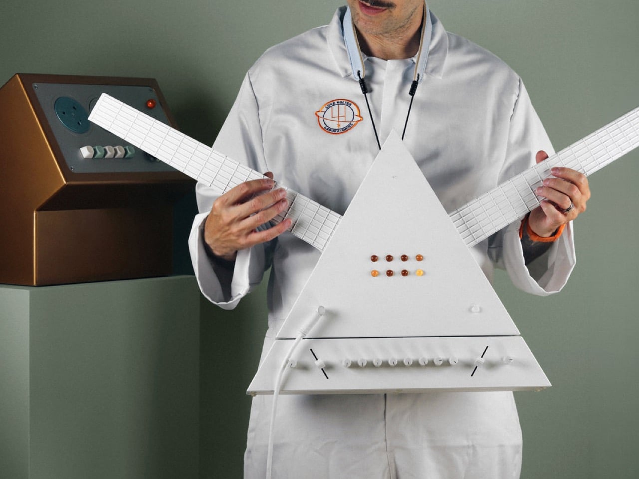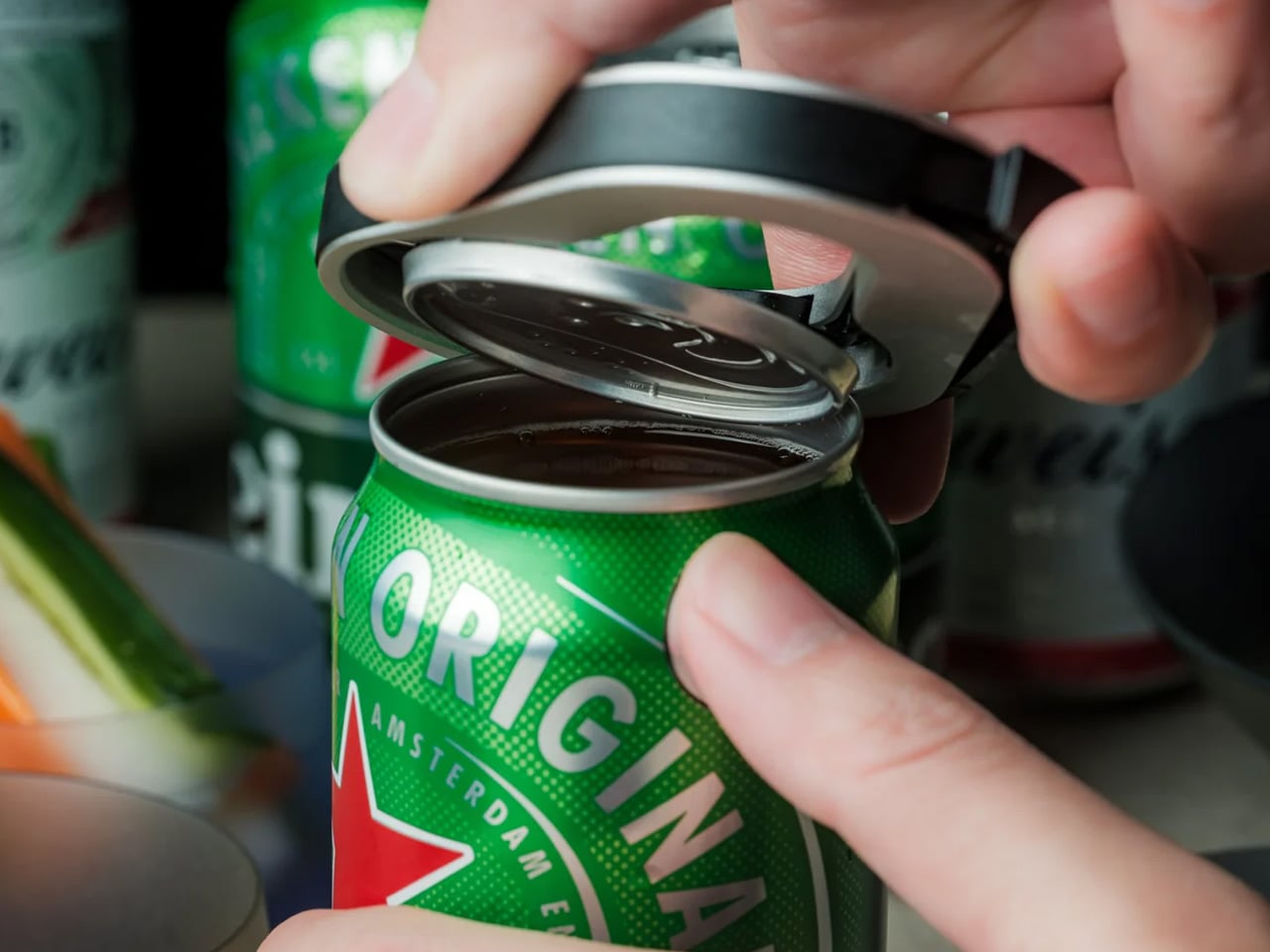
The best Father’s Day gifts aren’t found in department store gift sets or tucked inside branded packaging. They live somewhere more specific, in the overlap between things a man reaches for every single day and things he’d never quite justify buying himself. Everyday carry occupies that exact territory. It’s a category built on considered objects: tools that earn their pocket weight, wallets that age beautifully, lights compact enough to forget you’re even carrying them.
Every product on this list passed a simple test. We asked whether we wanted to keep it after reviewing it, and in each case the answer was yes. These aren’t gifts bought by someone who doesn’t know the person. They’re objects that get used every single day, noticed by whoever sits across from your dad at dinner, and occasionally borrowed without being returned. Father’s Day is June 21. The window is closing.
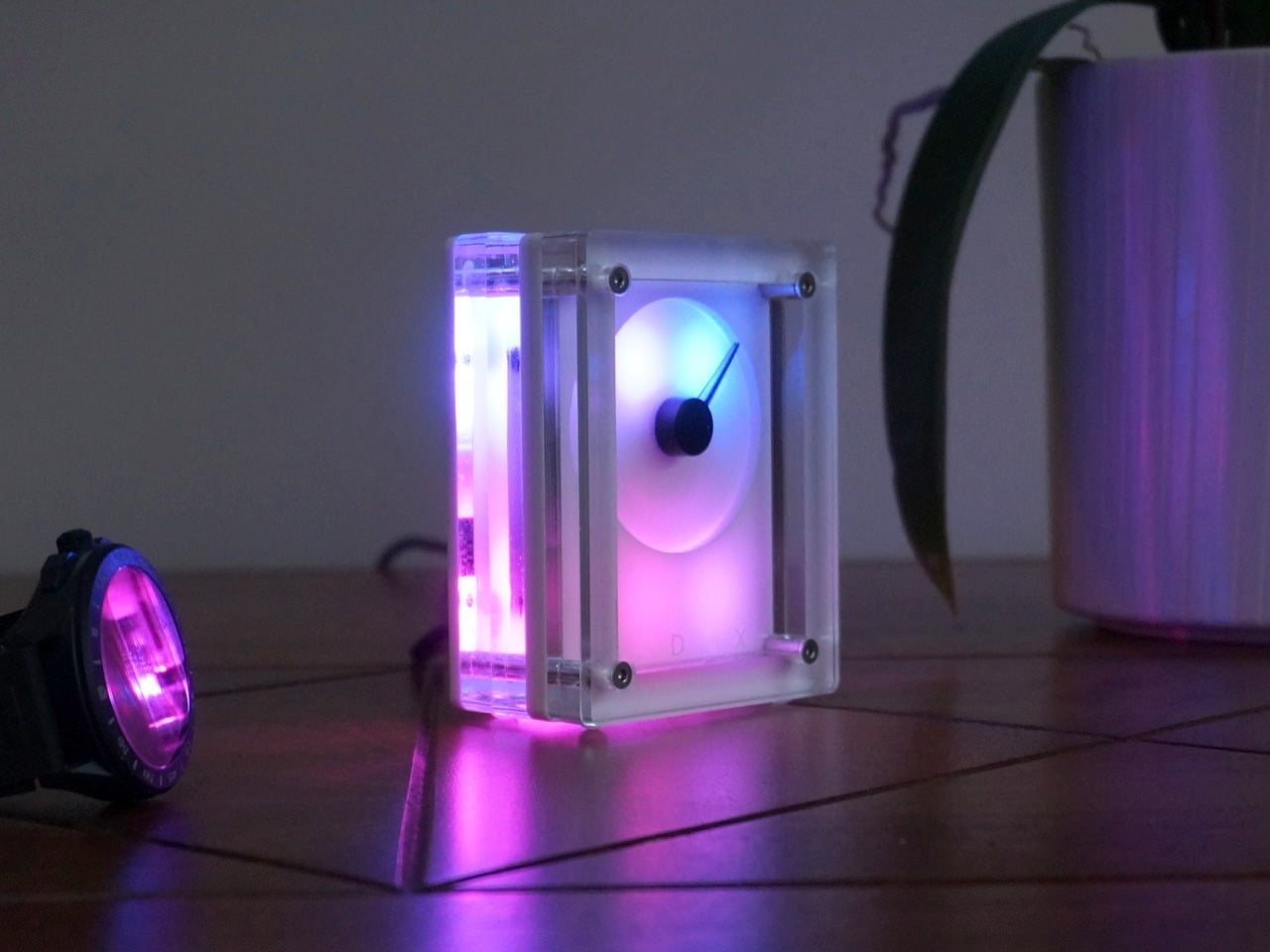
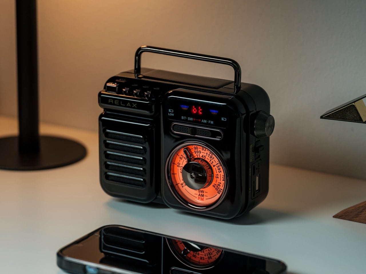
1. RetroWave 7-in-1 Radio

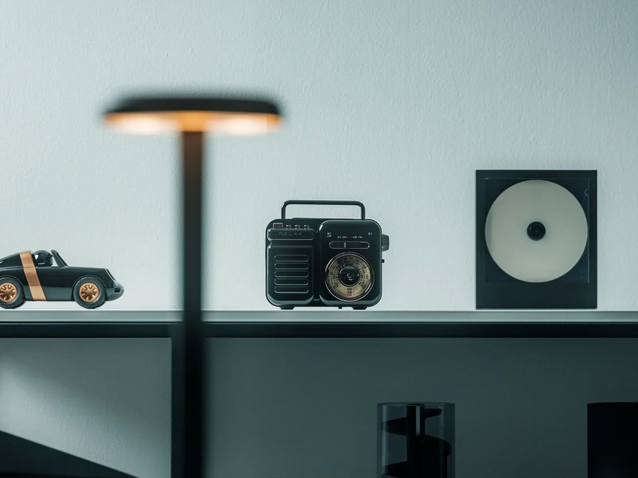
There’s a specific kind of object that doesn’t need to be the most useful thing in the room to earn its place there. It just needs to make the room feel more like itself. The RetroWave 7-in-1 Radio does exactly that. Built with analog dial aesthetics and a warm retro presence, it packs AM, FM, and shortwave radio alongside Bluetooth streaming into a form that looks like it was pulled from a better decade. For a desk, workshop, or kitchen counter, this is the object that earns its place through presence as much as performance.
The seven functions include AM, FM, and shortwave reception alongside Bluetooth connectivity, which means your dad can stream from his phone or tune into a local station without touching two different devices. The design language is deliberate and specific. This isn’t retro-themed tech; it’s a considered object that happens to be wireless. At $89, it doubles as a reliable emergency radio while looking like something a design museum would want on permanent display. That combination rarely arrives at this price.
Click Here to Buy Now: $89.00
What We Like
- The design brings genuine character to whatever surface it occupies. Most modern speakers disappear into a room; this one earns a second look and usually a question about where it came from.
- The AM/FM/shortwave plus Bluetooth combination covers both nostalgia and utility in one device, making it relevant in a power outage and equally relevant on a quiet Sunday morning.
What We Dislike
- Anyone expecting audiophile-level output from a compact lifestyle radio will need to adjust expectations. This is a design object first and a speaker second.
- The retro aesthetic is specific enough that it won’t suit every interior. A very minimal, contemporary space may not be the right home for it.
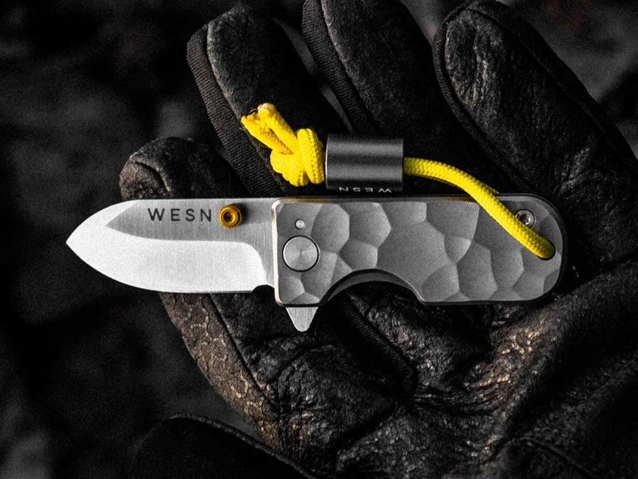
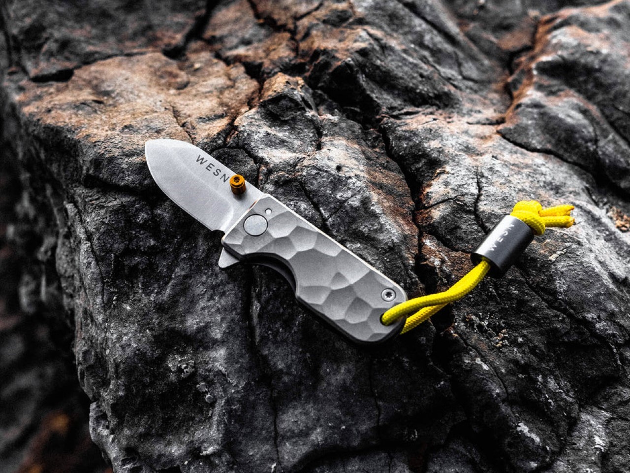
2. Cubik Knife

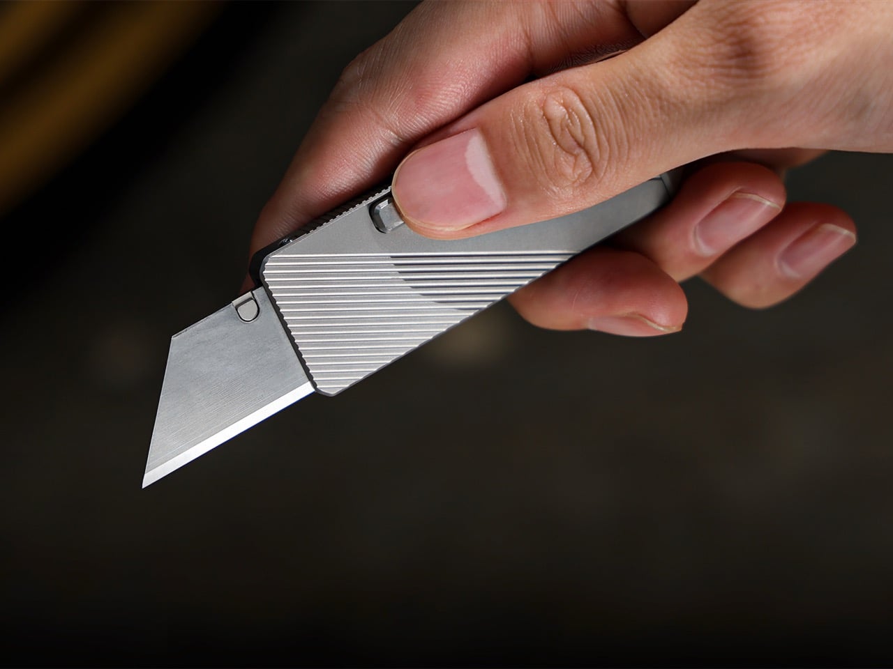
The Cubik by IF opens the way a gravity-defying trick should: tilt the handle downward and the blade deploys through gravity alone, no thumb pressure, no fidgeting. It’s a deployment mechanism that sounds like a party trick until you’ve used it, at which point it becomes the only way opening a knife makes any sense. The swappable blade design adds a layer of practicality that most folding knives refuse to offer. You replace a worn blade rather than retiring the entire tool.
For a father who carries every day, the Cubik makes the case that a pocket knife doesn’t need to look tactical to be genuinely useful. The block-shaped geometry of the closed handle sits flat in a pocket without printing or adding uncomfortable bulk. One-handed deployment is the default rather than the exception. Swappable blades mean the knife stays sharp in the way that actually matters: you replace the edge when it’s worn rather than tolerating a dull carry or buying another knife you didn’t need.
What We Like
- The gravity-activated deployment is a genuinely original mechanism in a category that rarely produces genuine originals. It changes the entire experience of opening a pocket knife.
- Swappable blades solve a problem every EDC knife eventually creates. A worn edge becomes a blade swap rather than a reason to start the whole search over again.
What We Dislike
- The gravity deployment mechanism requires a specific wrist motion that takes some practice to execute cleanly. The first few attempts will feel more deliberate than effortless.
- The block-form geometry is distinctive but not for everyone. Carry traditionalists who prefer the classic teardrop profile of a standard folding knife may find it takes genuine adjustment.
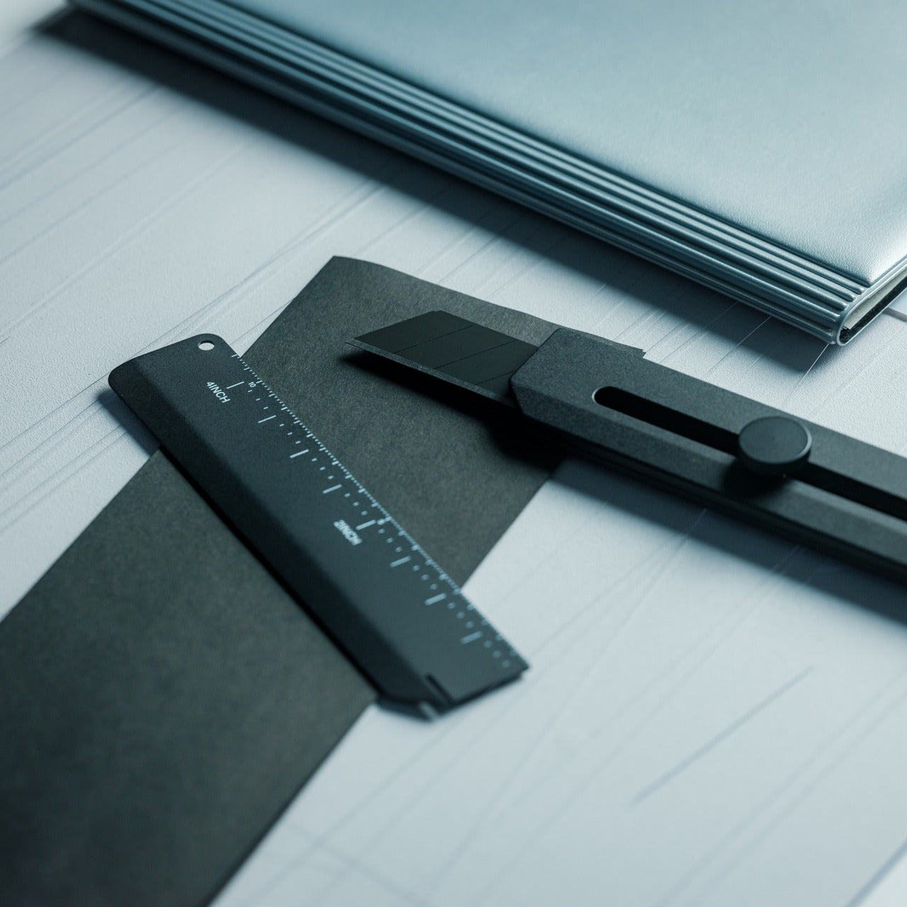
3. 8-in-1 EDC Scissors
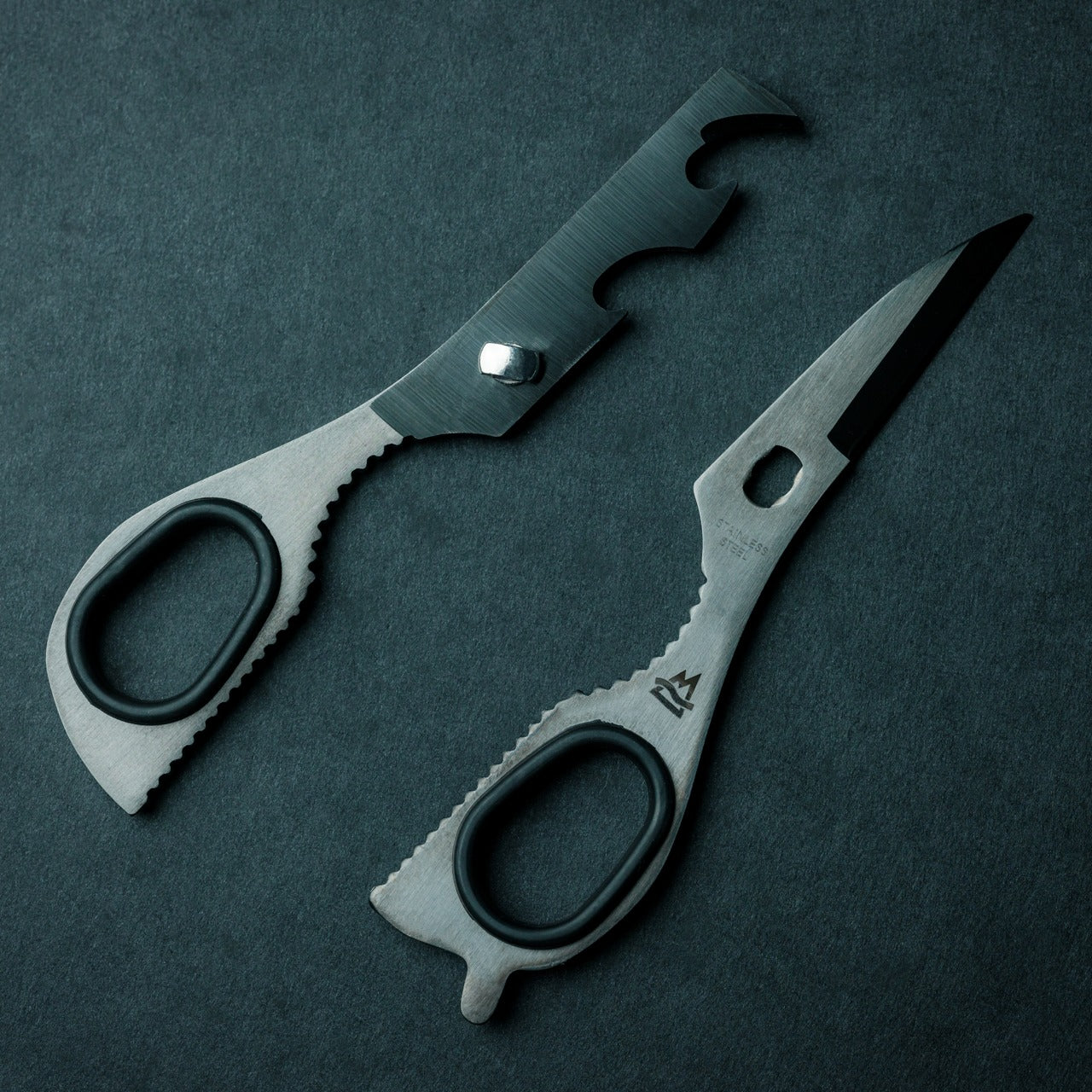
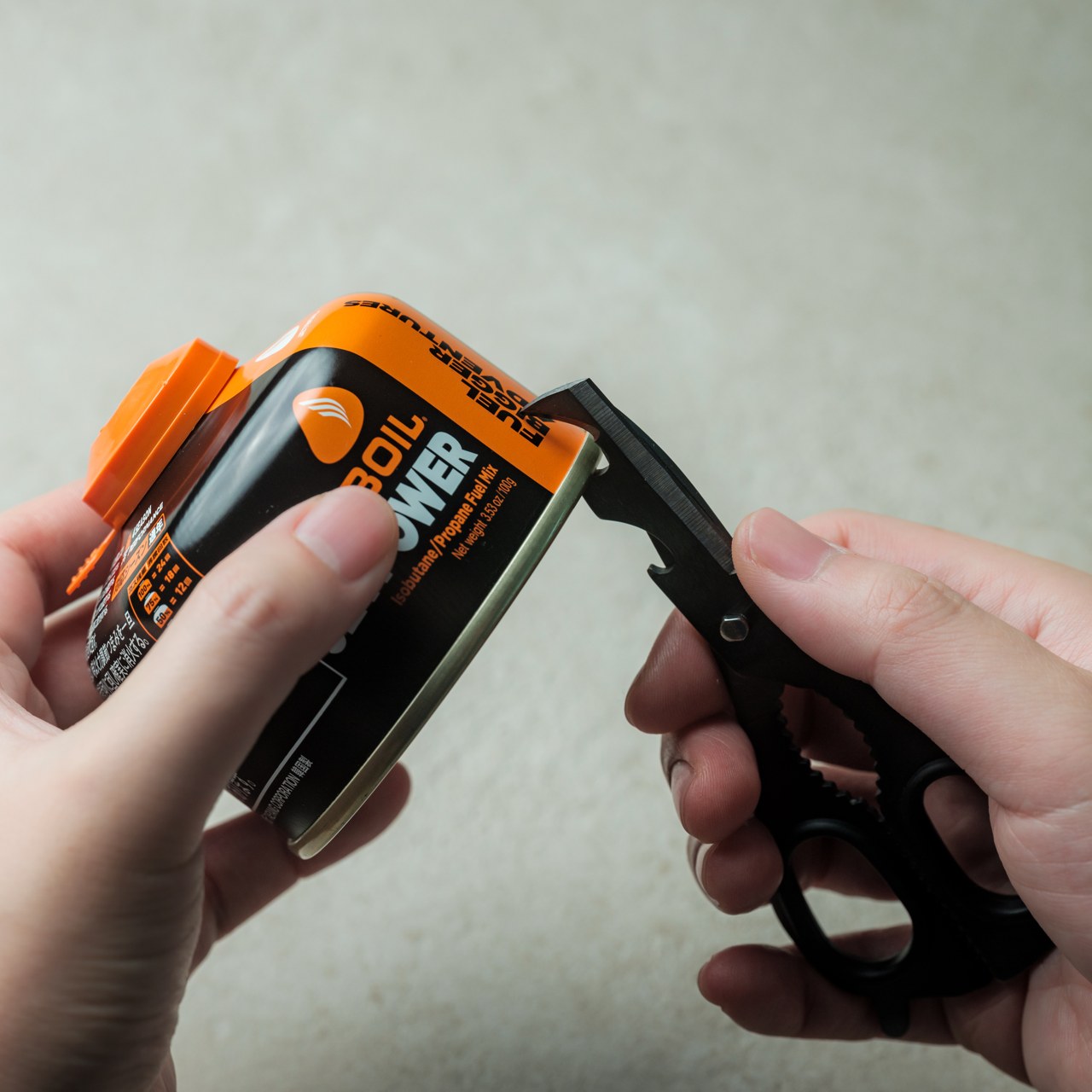
Scissors aren’t the first thing most people consider when building an EDC kit, and that’s exactly the blind spot this tool exploits. The 8-in-1 EDC Scissors fold multiple functions into what looks, at a glance, like a compact pair of scissors. It’s the kind of object that rewards closer inspection. For anyone who carries every day, adding scissors to the rotation solves a daily inconvenience you didn’t realize existed until it isn’t there anymore, which is the best kind of problem-solving.
At 13cm closed, the scissors fit comfortably in a pocket, bag inner sleeve, or travel kit without creating bulk. Each of the eight functions is genuinely useful rather than included for the sake of a number on the packaging. For a father who travels, works with his hands, or simply encounters the daily friction that a well-made compact tool resolves without ceremony, this is the gift that earns a permanent spot in the rotation within the first week of carrying it.
Click Here to Buy Now: $59.00
What We Like
- The scissors-first form factor makes this genuinely different from every multitool on the market, solving a carry gap that most people don’t notice until they’re reaching for something that isn’t there.
- It’s compact enough to slip into a shirt pocket or travel kit without adding meaningful weight, which means it disappears into the kit until the exact moment it’s needed.
What We Dislike
- Multi-function scissors tools involve a compromise at the individual tool level. For heavier or more frequent use, a dedicated pair will always outperform a compact version.
- The scissors form factor doesn’t visually communicate all eight functions, so your dad may need a quick walkthrough before he fully understands what he’s been given.
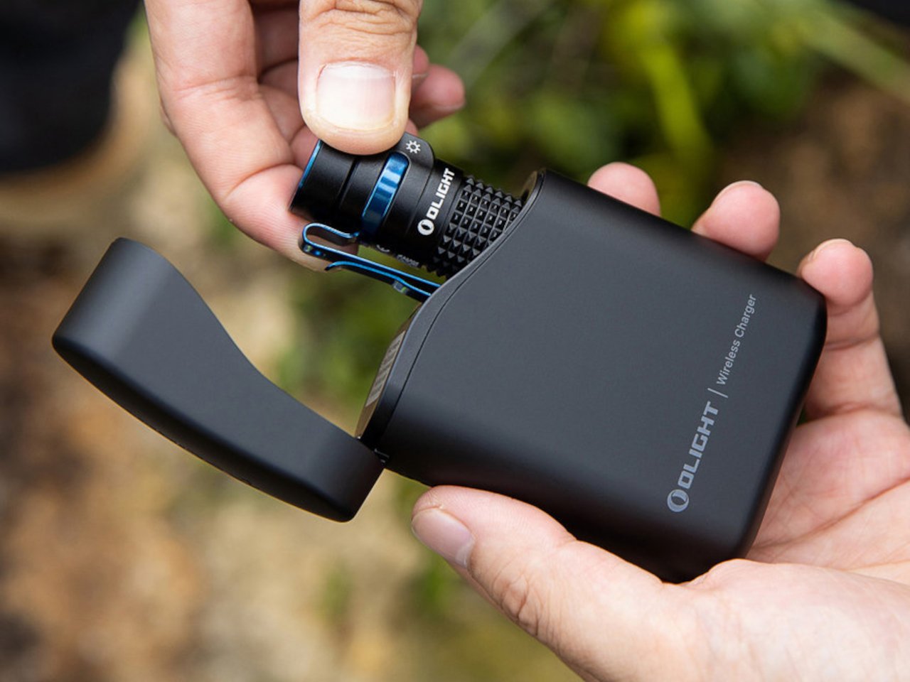
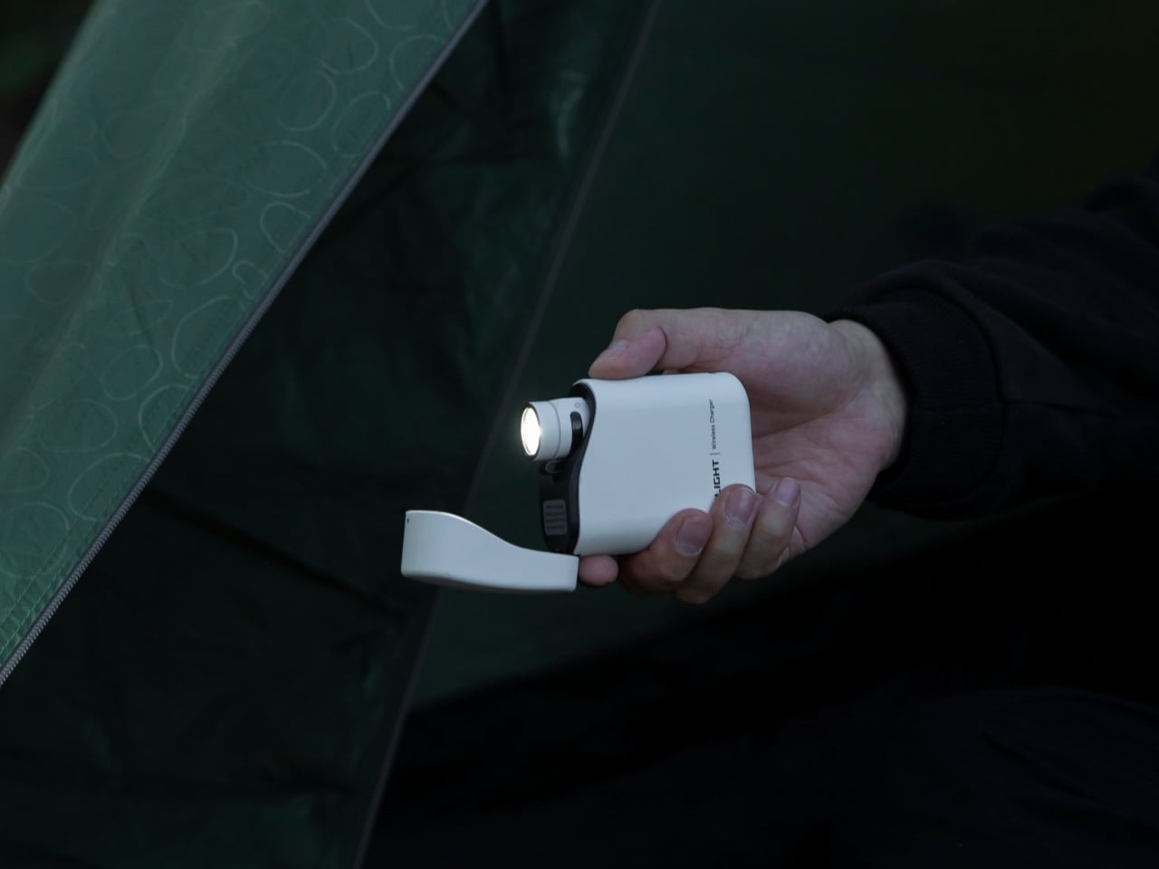
4. Loop Gear SK05Pro MAO


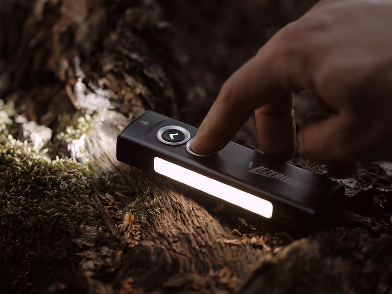
Most people don’t carry a flashlight because they’ve never had one small enough to forget they were carrying it. The Loop Gear SK05Pro MAO resolves that argument with 4,360 lumens from a body small enough to disappear into a front pocket. The MAO finish gives it a matte oxidized appearance that reads more like a precision instrument than a hardware store purchase. The output range spans from a low moonlight mode useful enough for reading to a maximum that makes darkness feel briefly offensive.
The built-in power bank turns what could have been a single-purpose tool into something considerably more useful during travel, camping, or the daily commute. Your dad can top off his earbuds or phone without reaching for a separate charging brick. Magnetic charging keeps it perpetually ready on a desk or nightstand without cables to manage. At $111.99, this is the most useful thing most men aren’t currently carrying, and the smallest possible argument against that continuing to be true.
What We Like
- The 4,360-lumen output from a pocket-sized body resets what you expect from compact carry lighting. The size-to-output ratio is genuinely remarkable at this form factor.
- The built-in power bank adds a second use case that justifies the carry weight entirely. One object replaces two, which is the only math that matters in EDC.
What We Dislike
- The built-in power bank adds some bulk compared to a pure flashlight at this size. Anyone optimizing purely for minimal weight may prefer a single-function alternative.
- At $111.99, the SK05Pro MAO is the highest-priced item on this list. The quality justifies it, but the number requires some confidence when wrapping the gift.
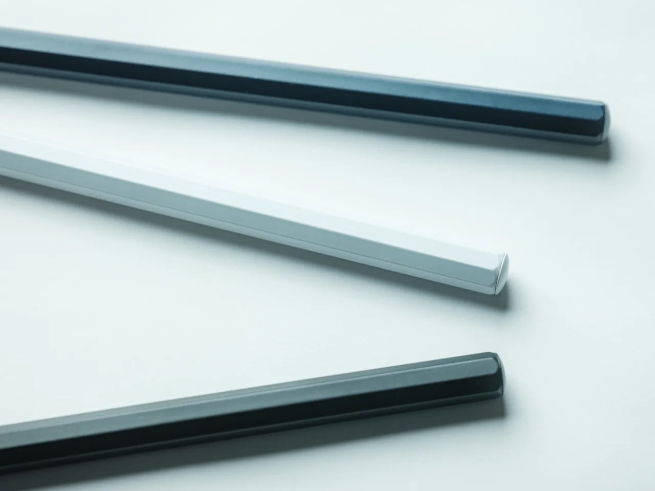
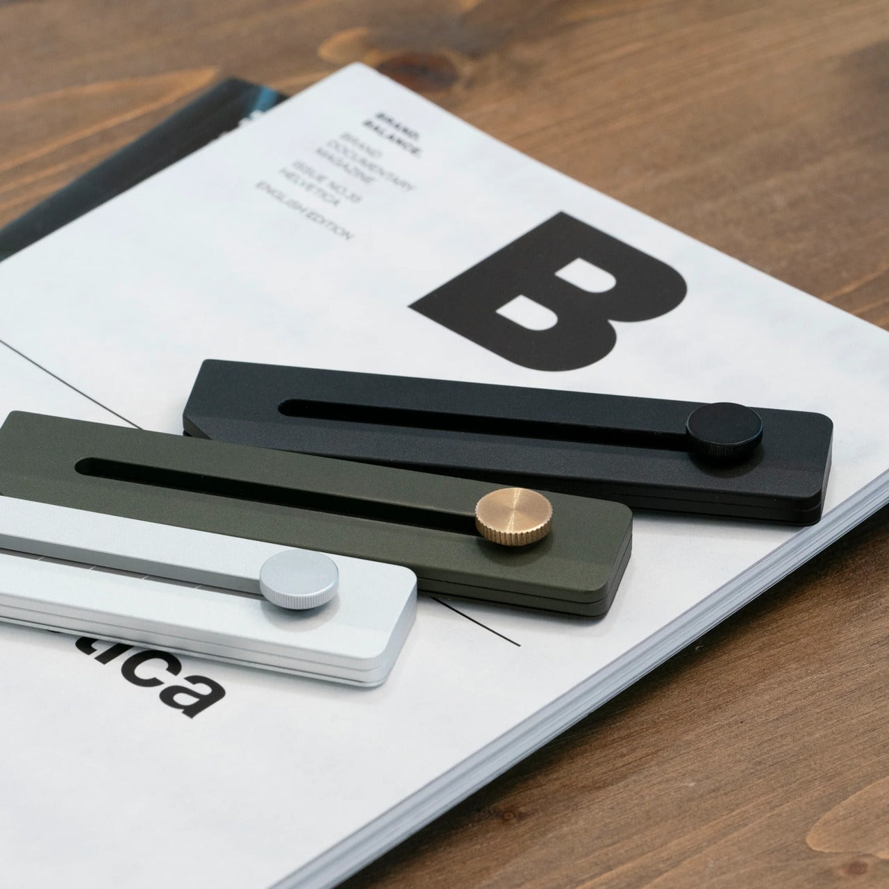
5. Titanium 6-in-1 Multi-Tool


The case against most multitools is the same every time: too many functions included to justify buying a dedicated tool for each one, but not quite good enough at any single task to feel like the right choice when it matters. The COMANDI-CC Titanium 6-in-1 avoids that trap through restraint. Six functions, each genuinely useful: an adjustable wrench, a pry bar with nail puller, a screwdriver bit holder, a ratchet mechanism, a bottle opener, and a window breaker.
Machined from titanium, the tool carries the weight argument that most multitools can’t make cleanly. It disappears into a pocket without the heft that makes you leave tools at home on the days you most need them. At $95, it occupies the sweet spot between a novelty keychain gadget and a professional-grade tool. For a father who fixes things, builds things, or simply moves through the world with a preference for being prepared, this is the object that earns its carry without negotiation.
What We Like
- Six genuinely useful functions rather than twenty marginally useful ones. The restraint in the feature count is the design decision that makes this worth carrying every day.
- Titanium construction keeps the weight honest. A tool that stays in the drawer because it’s too heavy has already failed at its primary job.
What We Dislike
- The adjustable wrench function works within a limited size range. Anyone needing serious torque will still need a dedicated wrench for anything beyond light fastening work.
- The $95 price point is fair for titanium construction but sits above most impulse gift budgets. It rewards knowing your dad will actually reach for it regularly.
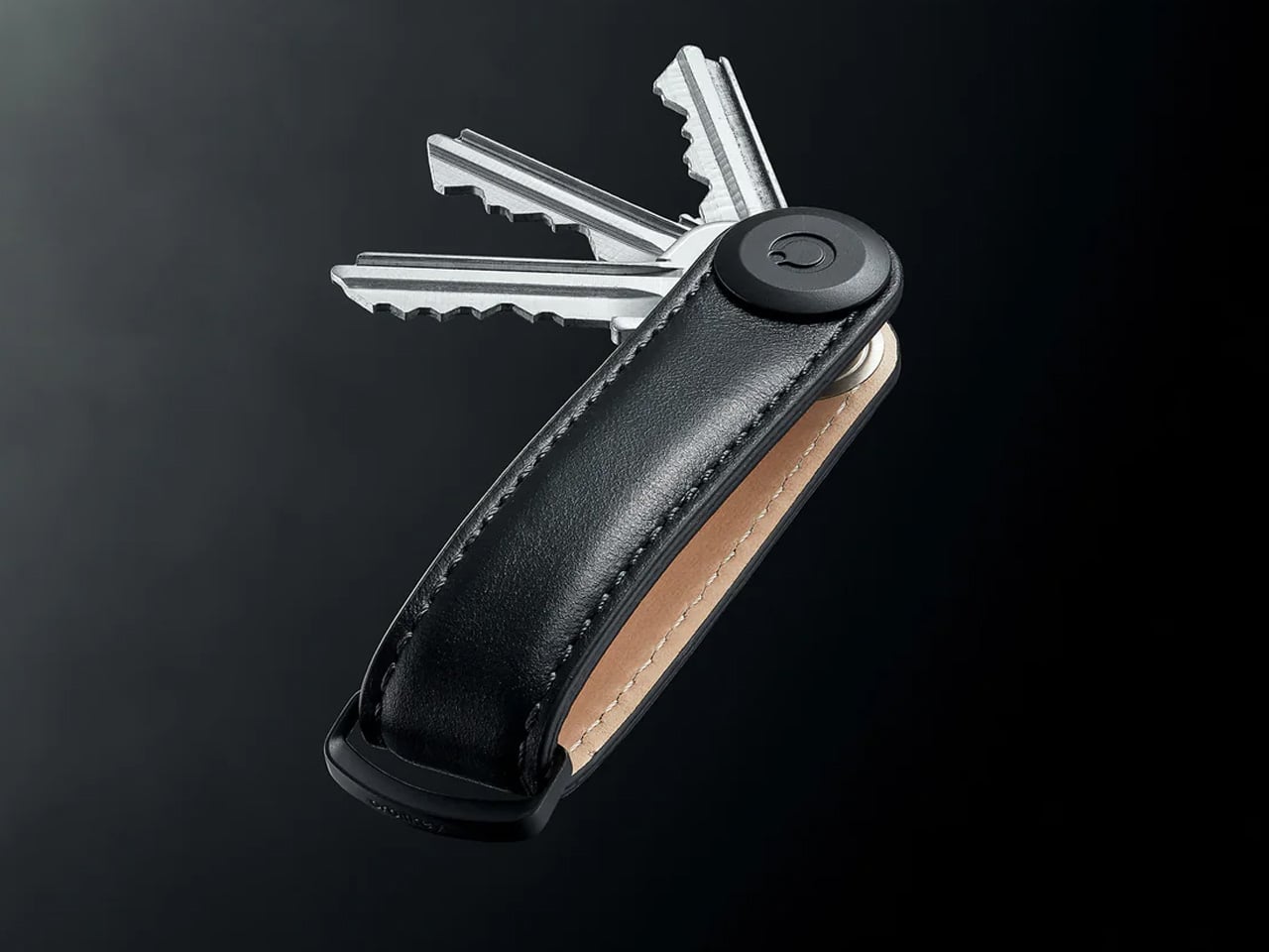
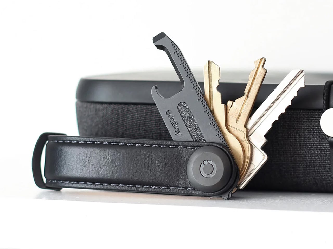
6. The Fantom X Wallet
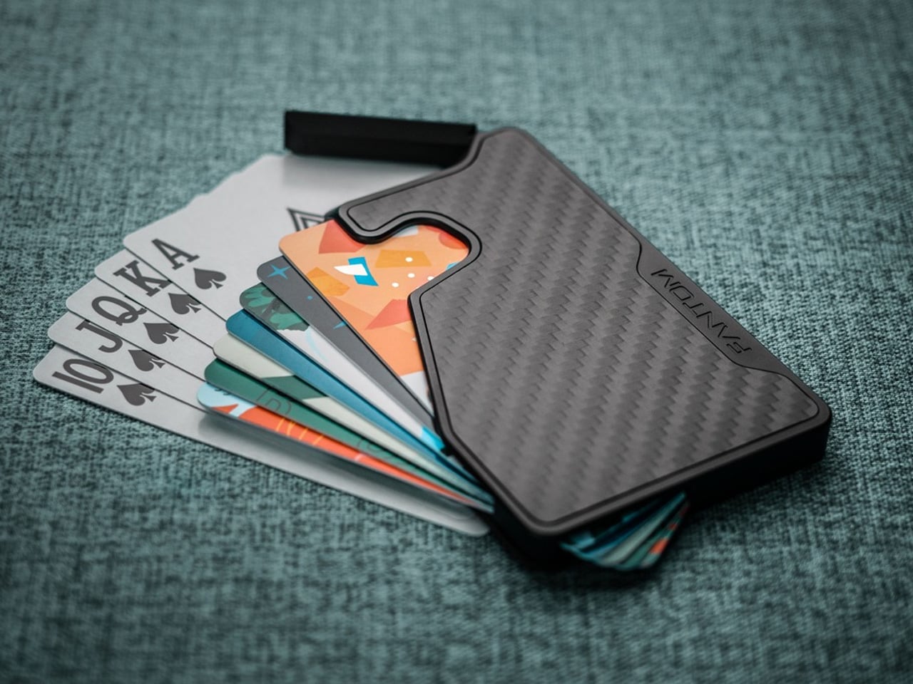
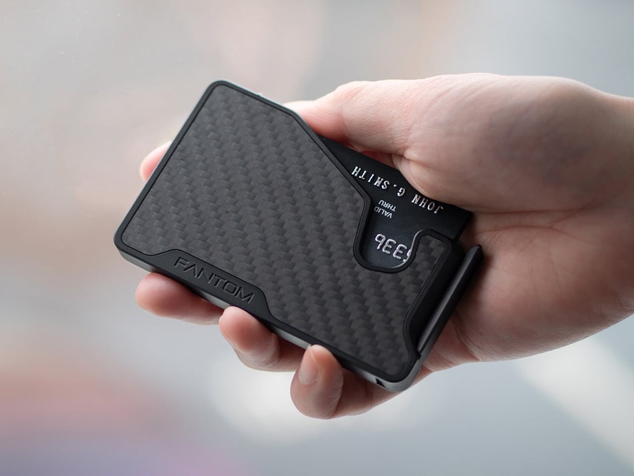
The Fantom X is the third wallet in Fantom’s minimalist series and the one that finally answers every objection the earlier versions created. It comes in three sizes, holding anywhere from seven to thirteen cards depending on which you choose, and the fan-out mechanism deploys your cards with a single thumb motion rather than the digging and shuffling that defines the billfold experience. For anyone still carrying a leather fold stuffed with loyalty cards and expired receipts, this is a confronting object.
The design forces a kind of carry discipline that turns out to feel like freedom once you’ve adopted it. The slim profile sits flat in a front pocket, eliminates back pocket bulge entirely, and never creates the sitting discomfort that makes poorly designed wallets quietly unbearable. For a father who carries a phone, keys, and cards as the complete daily kit, the Fantom X completes the minimalist triangle with something that looks as considered in the hand as the phone sitting next to it on the table.
What We Like
- The three-size range means you can calibrate the gift to your dad’s actual carry habits rather than asking him to edit his entire wallet life to fit the product’s capacity.
- The fan-out card deployment is the kind of mechanism that feels obvious in retrospect. Once you’ve accessed cards this way, the standard billfold feels like a design problem nobody bothered to solve.
What We Dislike
- The Fantom X is a card-first wallet. Anyone who carries folded cash regularly will find the experience less seamless, and a separate money clip becomes an additional consideration.
- The minimalist philosophy requires buying into the premise that fewer cards are better. Dads with full wallets may resist the transition more than the wallet deserves.
7. The Rodent Bottle Opener
Kairi Eguchi designs objects the way a good sentence is written: by removing everything that isn’t necessary until what remains is exactly right. The Rodent bottle opener is that philosophy applied to the most overlooked object in most men’s kitchens. The form references its namesake with just enough visual suggestion to reward the comparison without leaning on it. It sits in the hand the way a well-made tool should, with a presence that makes you reach for it over everything else on the counter.
For a father who appreciates objects that have been genuinely considered rather than generically manufactured, the Rodent is the kind of gift that communicates something specific about the person giving it. It says that you noticed the difference between a thing that works and a thing that works beautifully. An opener this considered earns a permanent place on the counter rather than a drawer. It’s also the gift on this list most likely to be commented on by a guest before being handed back.
What We Like
- The design communicates its intent without explanation. You pick it up, you understand it, and you’re immediately aware it has been thought about far more carefully than the task usually demands.
- The Rodent works as both a functional daily tool and a display-worthy object. Most bottle openers earn neither description. This one earns both without effort.
What We Dislike
- The design specificity means it will resonate deeply with people who notice objects and matter very little to people who don’t. Know your audience before wrapping this one.
- As a single-function tool, the Rodent works best alongside something else on this list rather than standing alone as the complete gift.
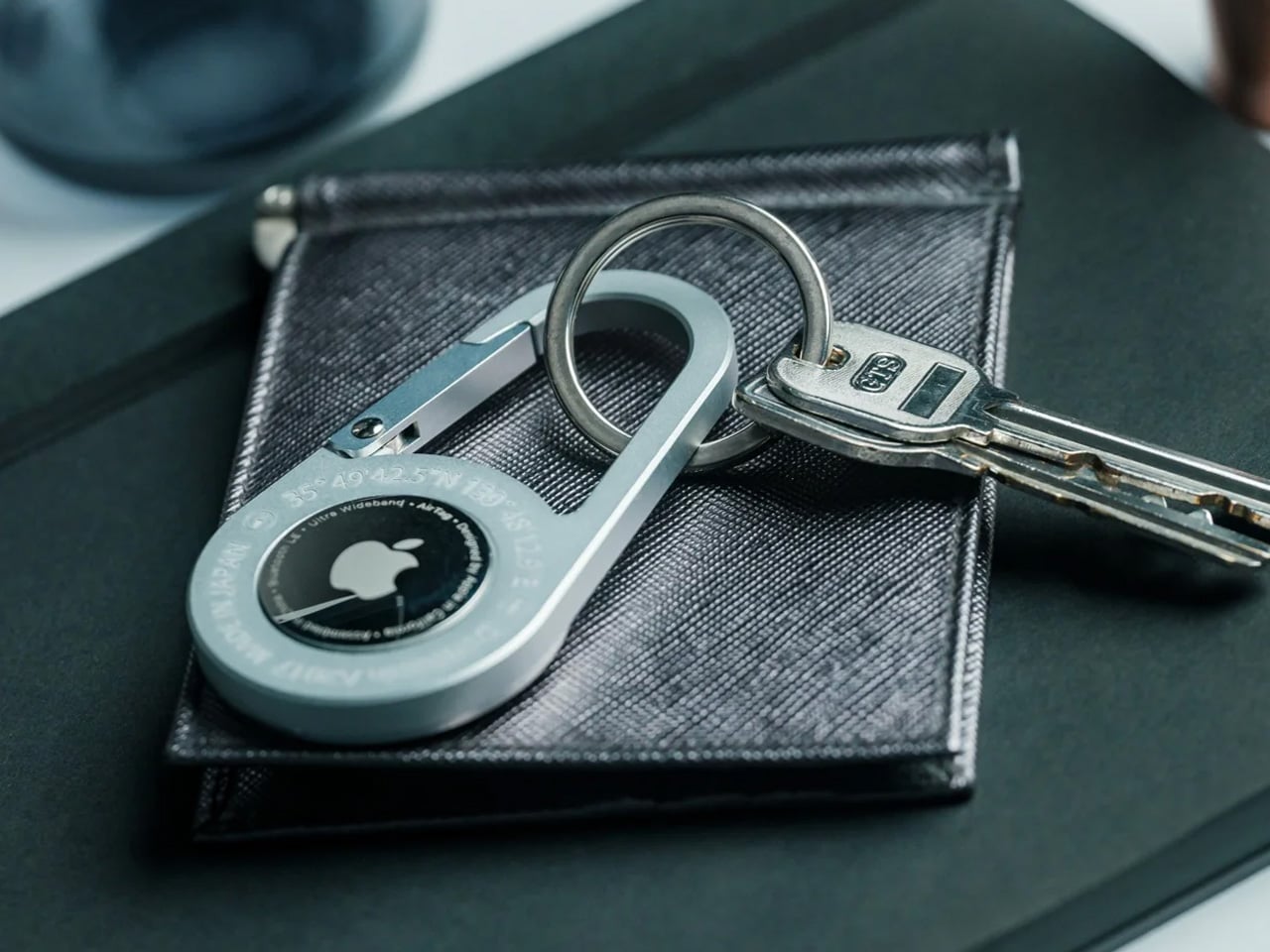
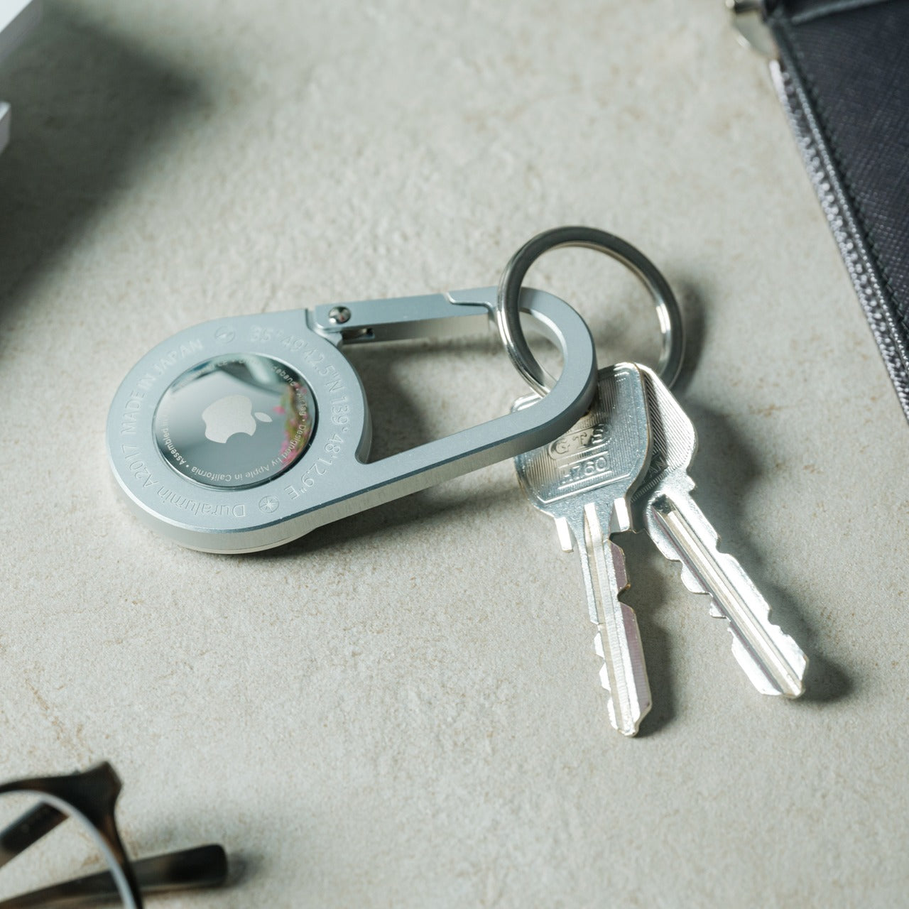
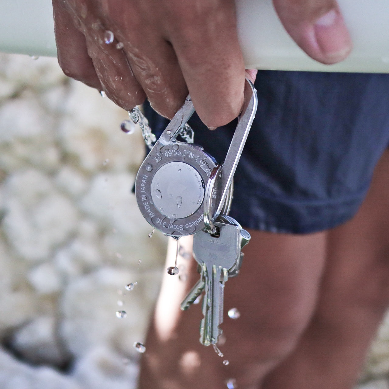
8. AirTag Carabiner
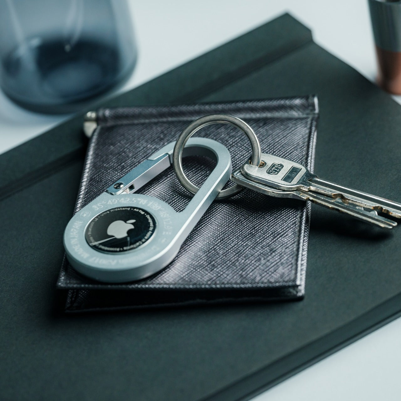
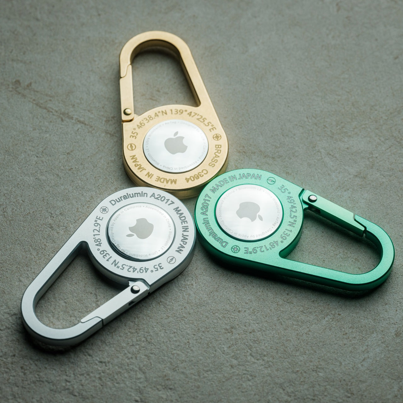
Losing things isn’t a character flaw. It’s a design problem, and the AirTag Carabiner is the most elegant solution to it available right now. Machined from Duralumin composite alloy, the same material used in aircraft, boats, and spacecraft, this carabiner clips onto a bag, bike, umbrella, or key ring and turns Apple’s AirTag into something worth carrying rather than something you tolerate carrying. The construction is individually hand-crafted, which means no two are identical, and the finish holds up in water and at altitude without complaint.
The genius of this object is that it doesn’t ask you to change your behavior at all. Snap it onto whatever you already own, drop an AirTag inside, and forget about it in the best possible way. For a father who travels, commutes, or simply moves through a life full of things worth keeping track of, this is the carry addition that works hardest precisely when he’s paying it the least attention. Available in Duralumin, untreated Brass, and Stainless Steel. Apple AirTag sold separately.
Click Here to Buy Now: $149.00
What We Like
- The Duralumin composite alloy makes a serious material argument at a compact scale. This isn’t a novelty keychain accessory — it’s built from the same specification that keeps aircraft components intact under pressure.
- The hand-crafted construction gives each carabiner a subtle individuality that mass-produced accessories never manage. It’s a detail your dad may not notice immediately, and will appreciate permanently once he does.
What We Dislike
- The AirTag isn’t included, which adds to the total cost and requires a separate purchase. Worth flagging before wrapping, particularly if your dad isn’t already in the Apple ecosystem.
- The carabiner’s opening gate is sized specifically around the AirTag form factor. Anyone hoping to clip it onto thicker straps or larger hardware may find the gate too narrow for comfortable daily use.
The Gift That Gets Used Every Day Is the Only Gift That Counts
Every gift here has something in common beyond the pocket it lives in. Each one rewards daily use rather than occasional appreciation, which is the only test a genuinely good gift should pass. Your dad isn’t going to look at a well-made multitool or a considered bottle opener once and put it in a drawer. He’s going to reach for it the next morning and the morning after that, until it stops being a gift and becomes just the thing he carries.
The best objects become invisible in the best way, so integrated into a daily routine that their absence would be noticed before their presence ever was. You’re not giving your dad something to unwrap on a Sunday in June. You’re giving him a new default, a small but lasting upgrade to the way he moves through every day after this.
The post 8 Father’s Day EDC Gifts So Good We Bought Them for Ourselves First first appeared on Yanko Design.