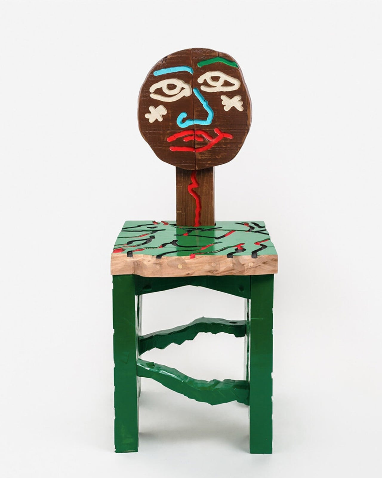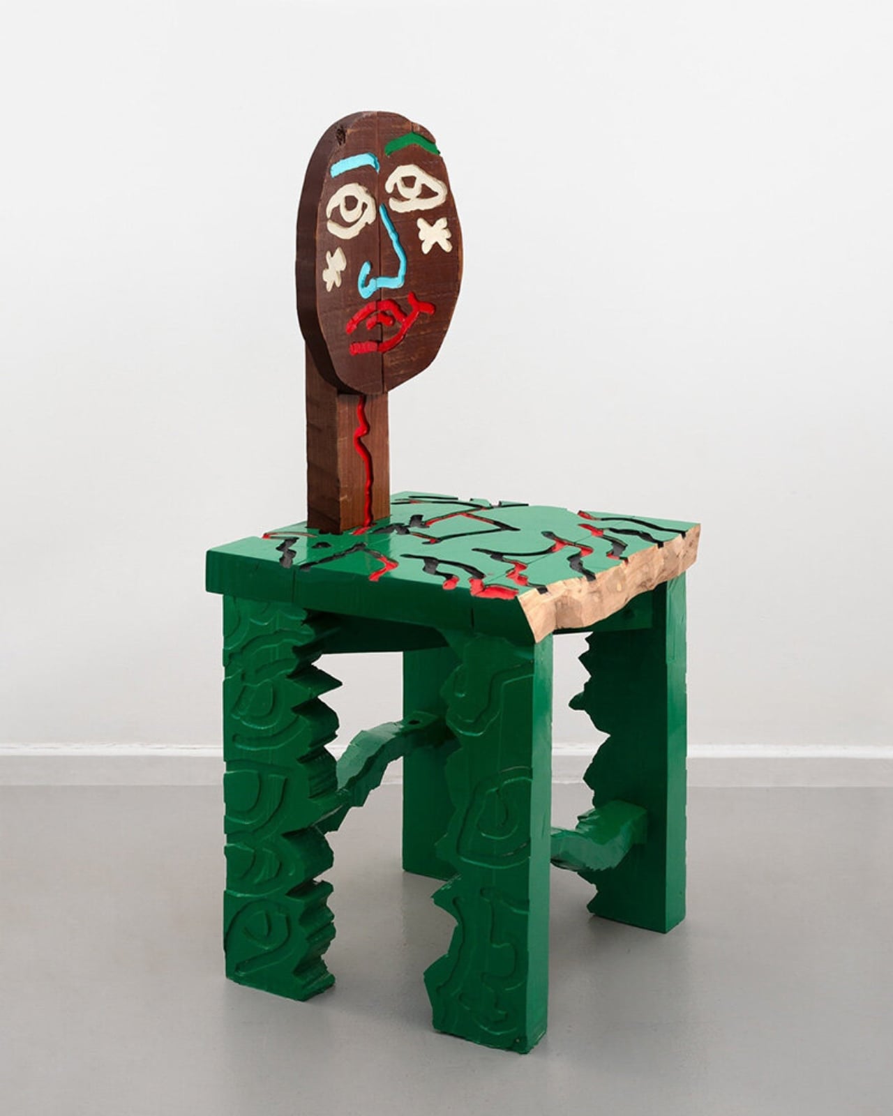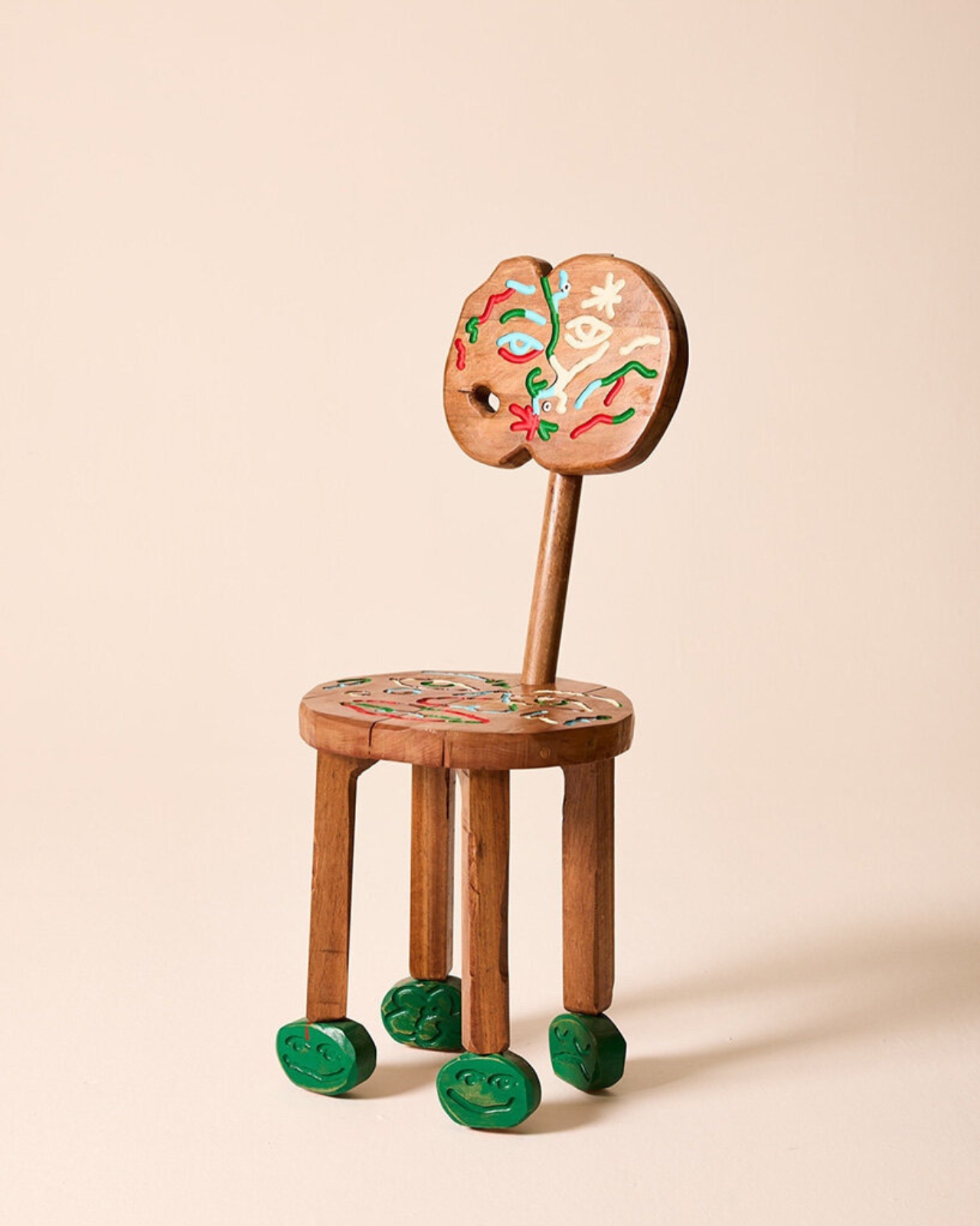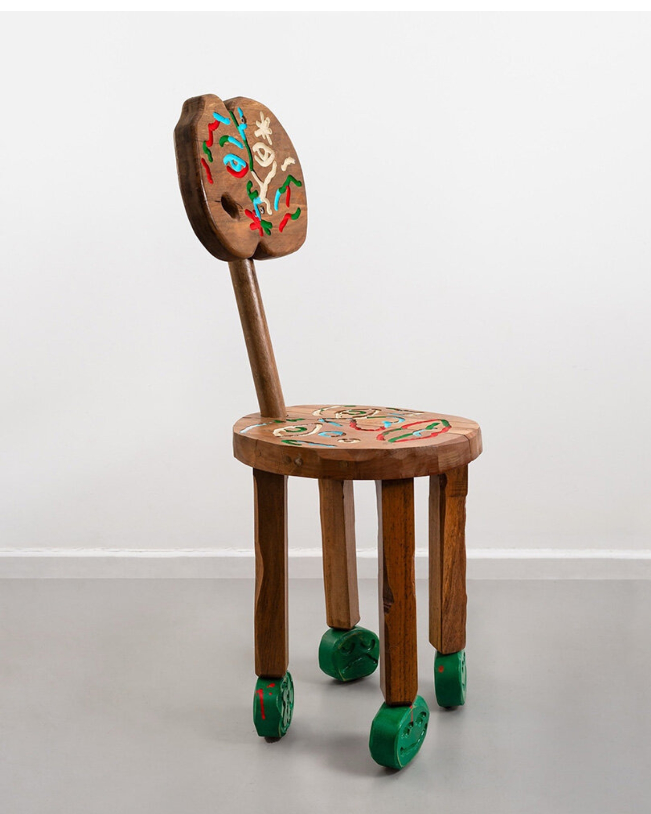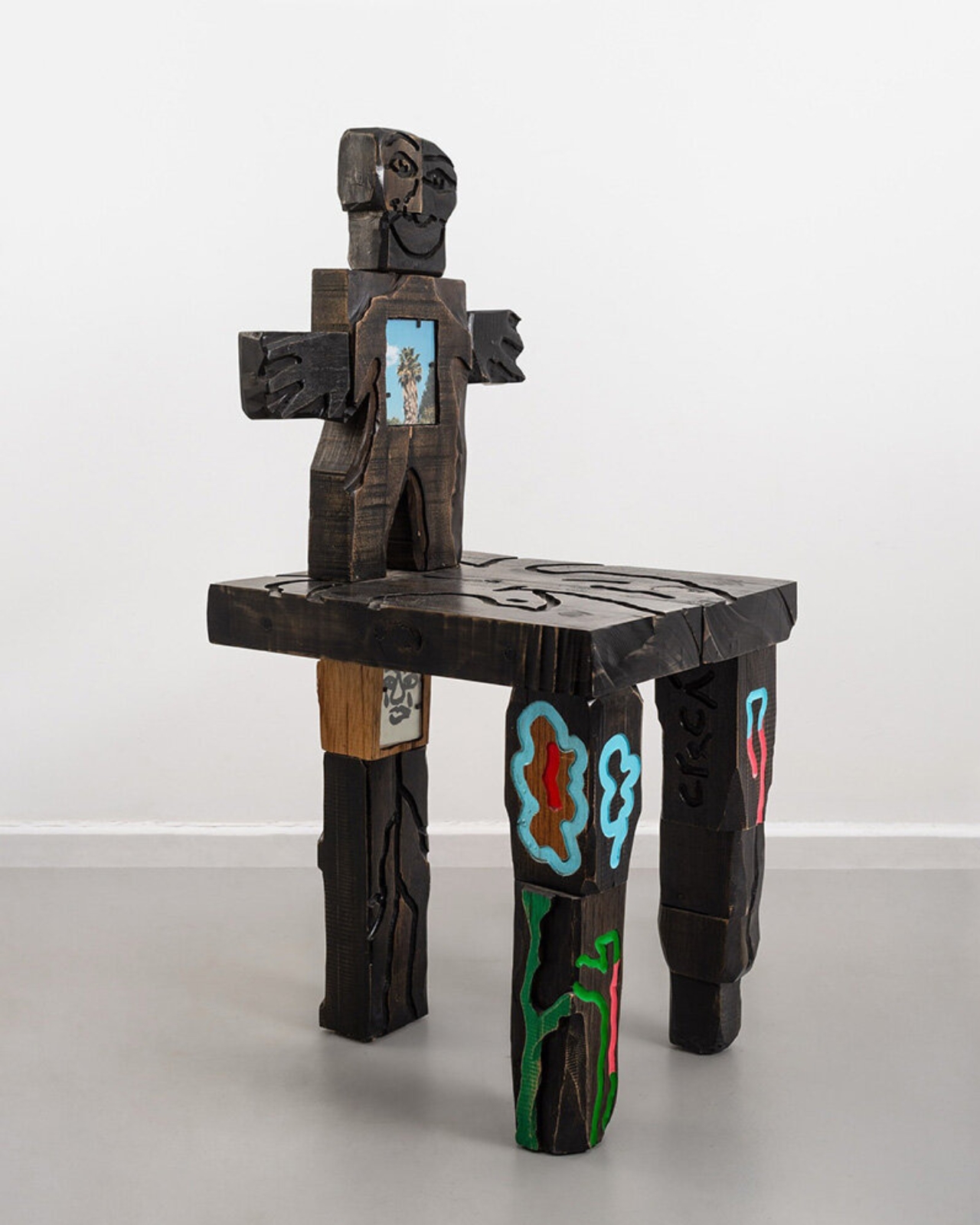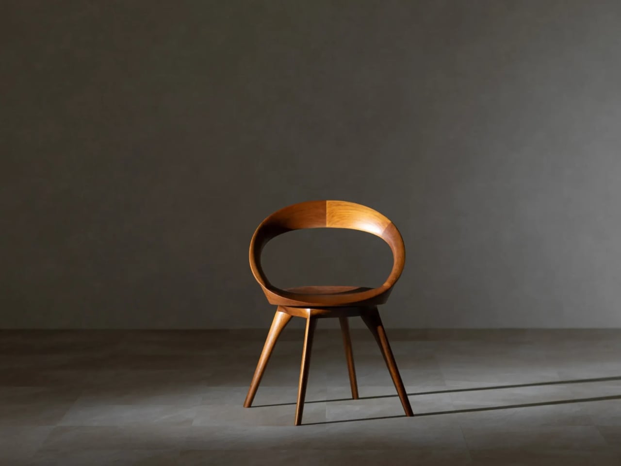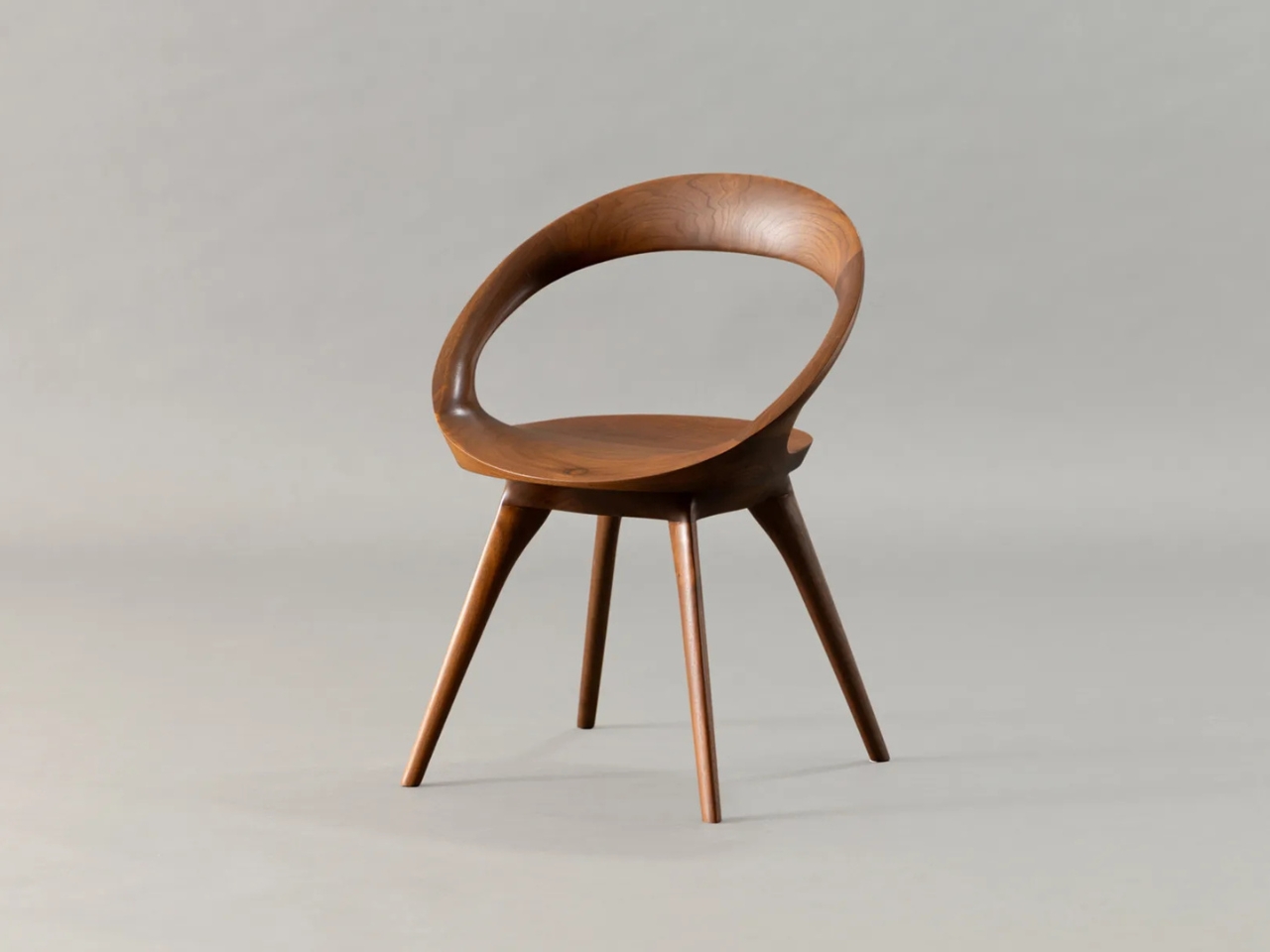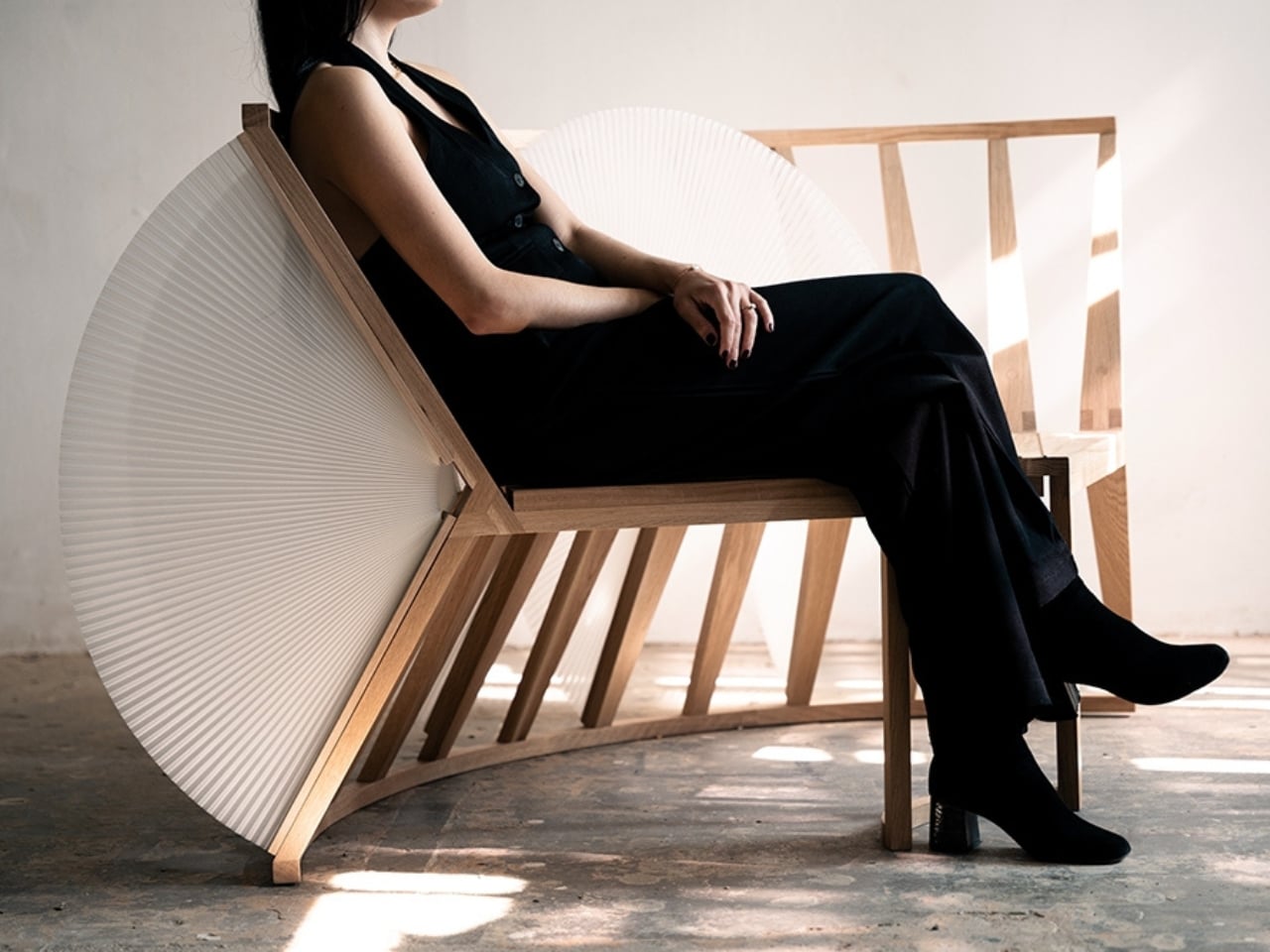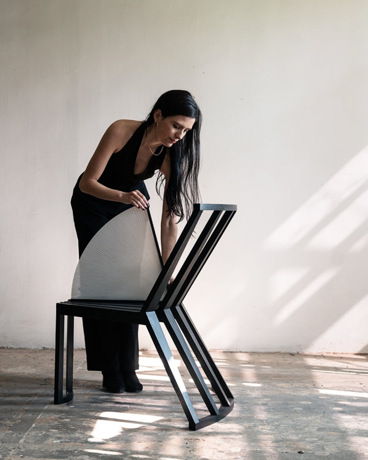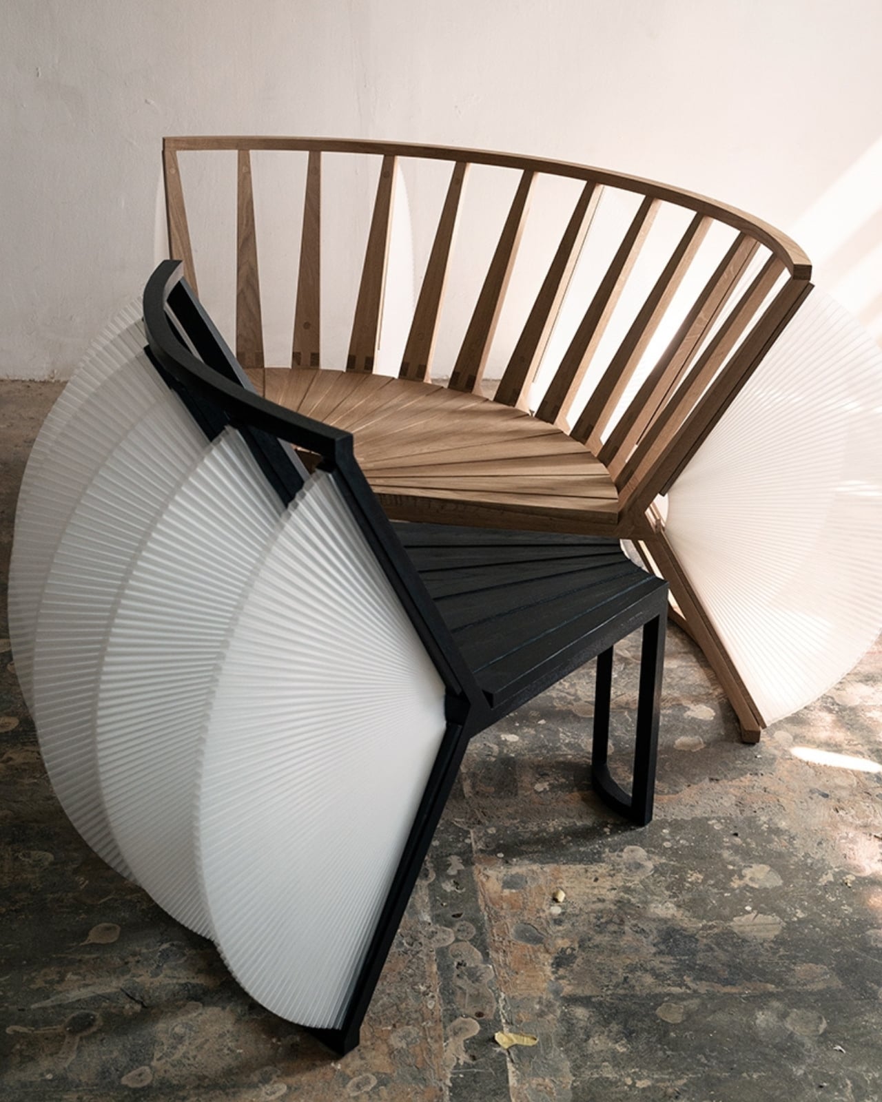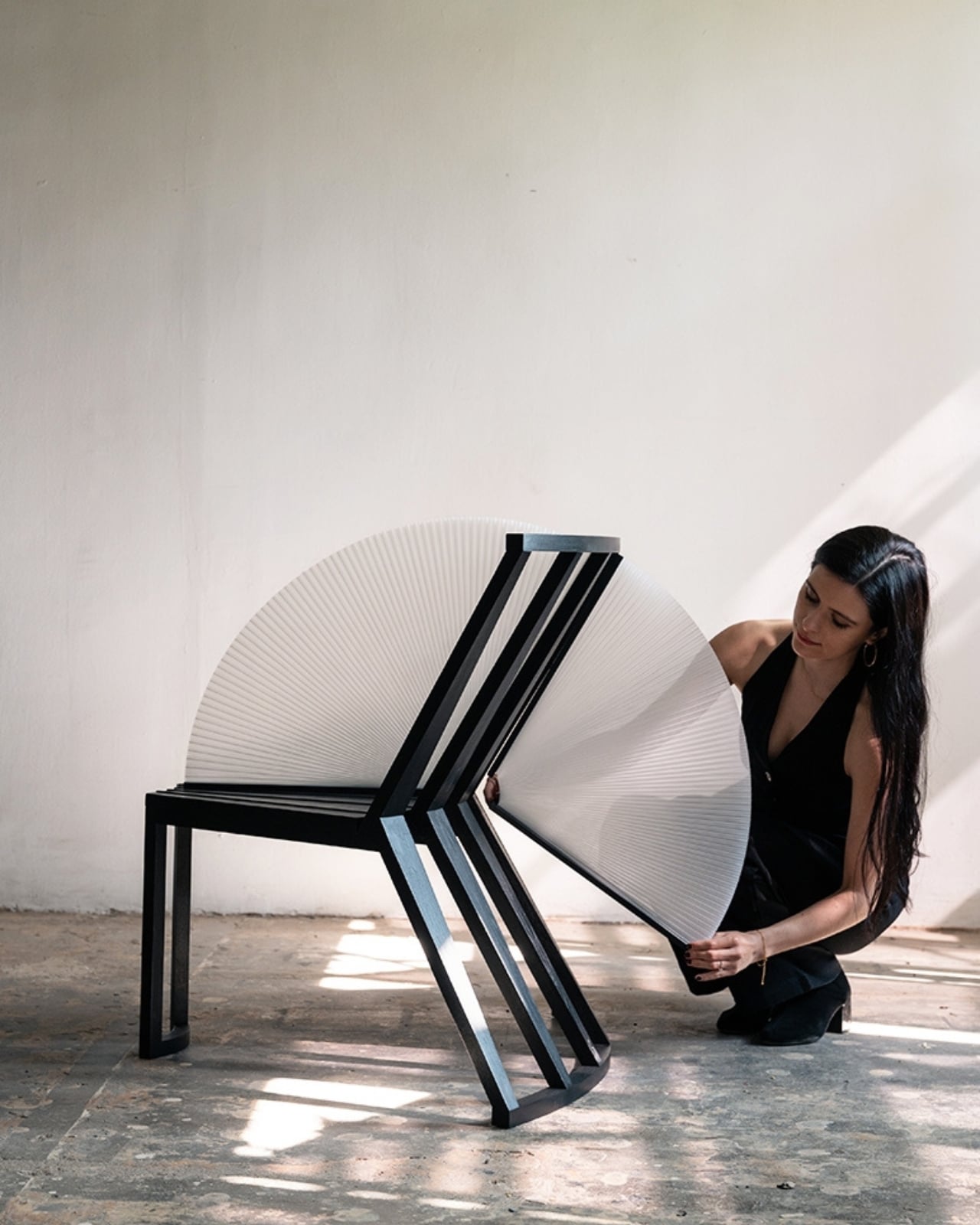
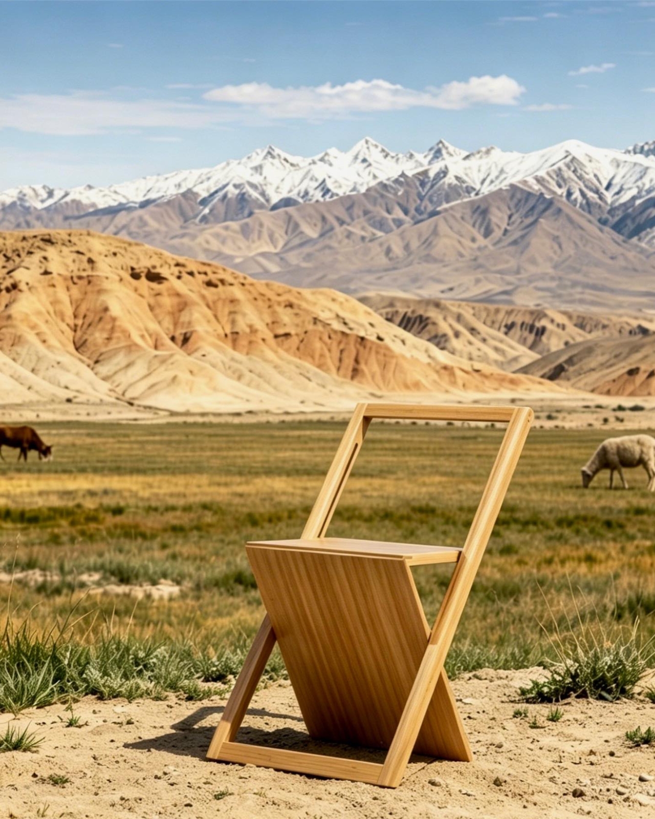
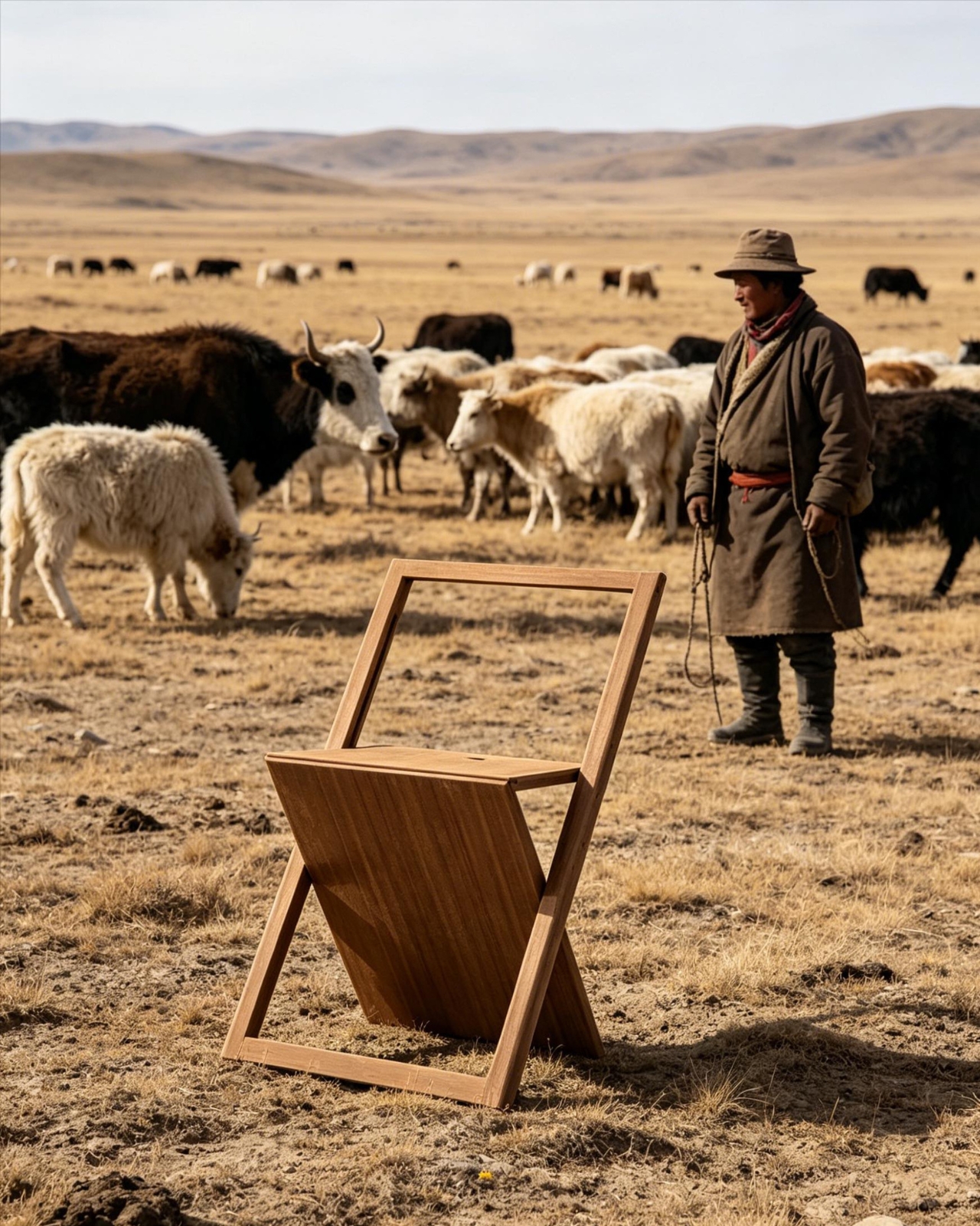
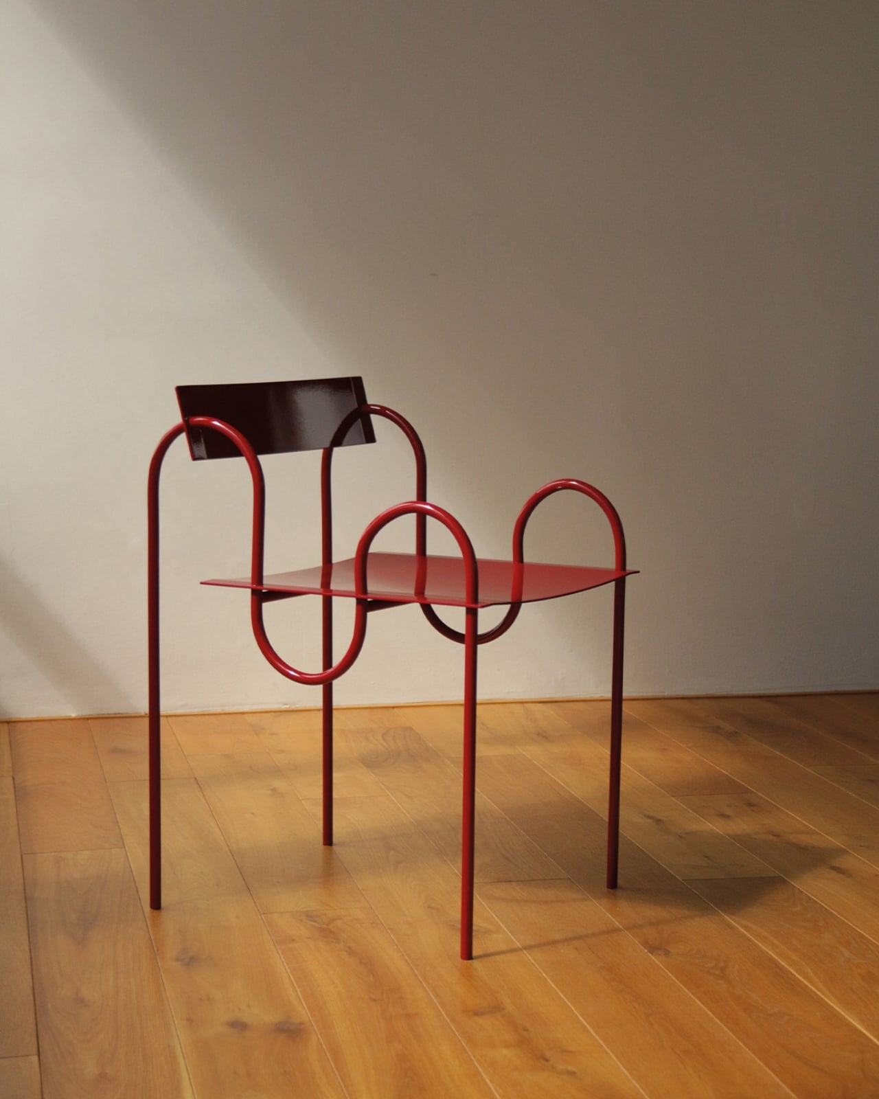
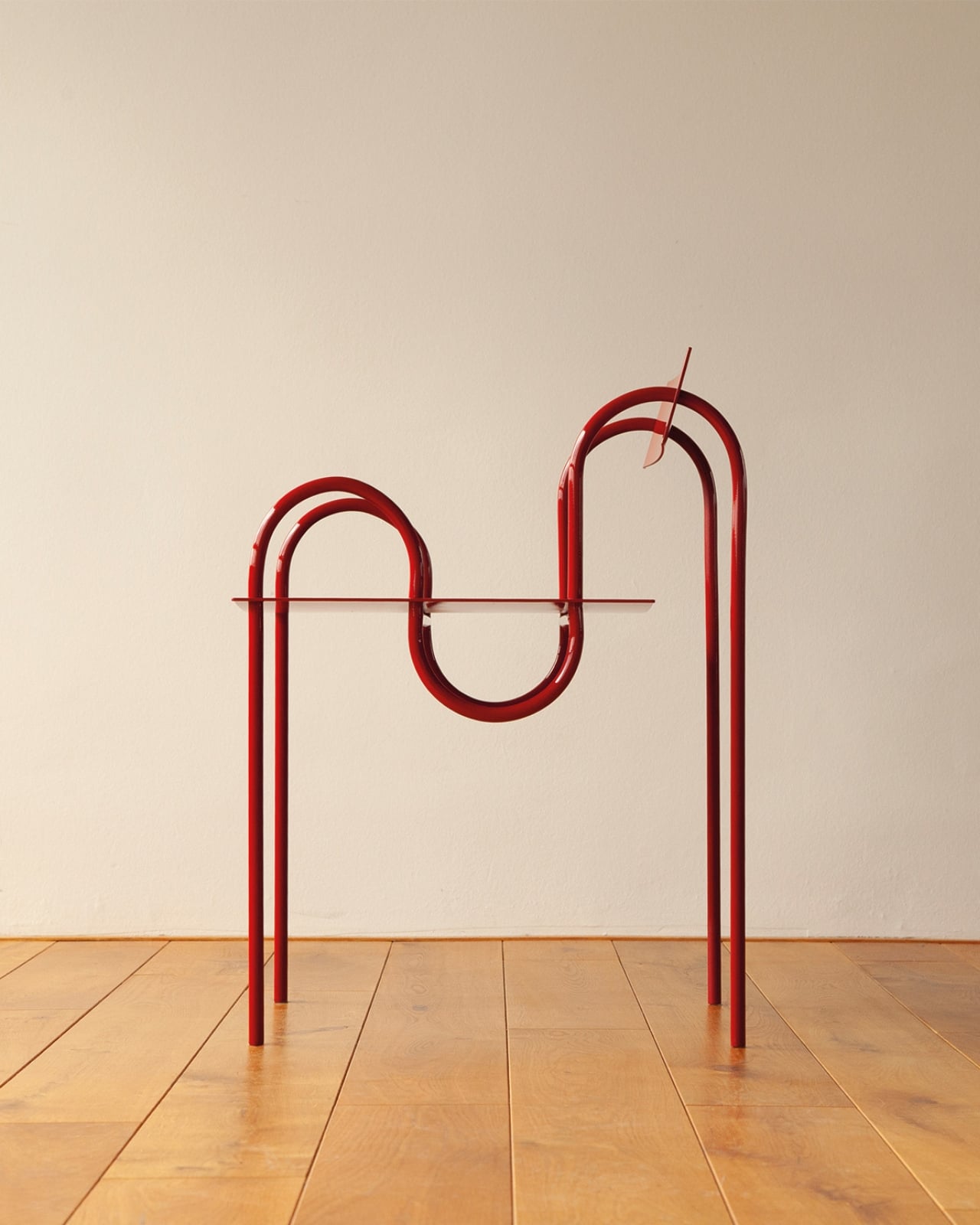
At some point in our collective design consciousness, we collectively decided that a chair could be aspirational. Not just functional. Not just well-made. Aspirational. And Nor Casa’s folding chair, recently described as “flawed but Instagram-friendly,” is basically a case study in exactly that shift.
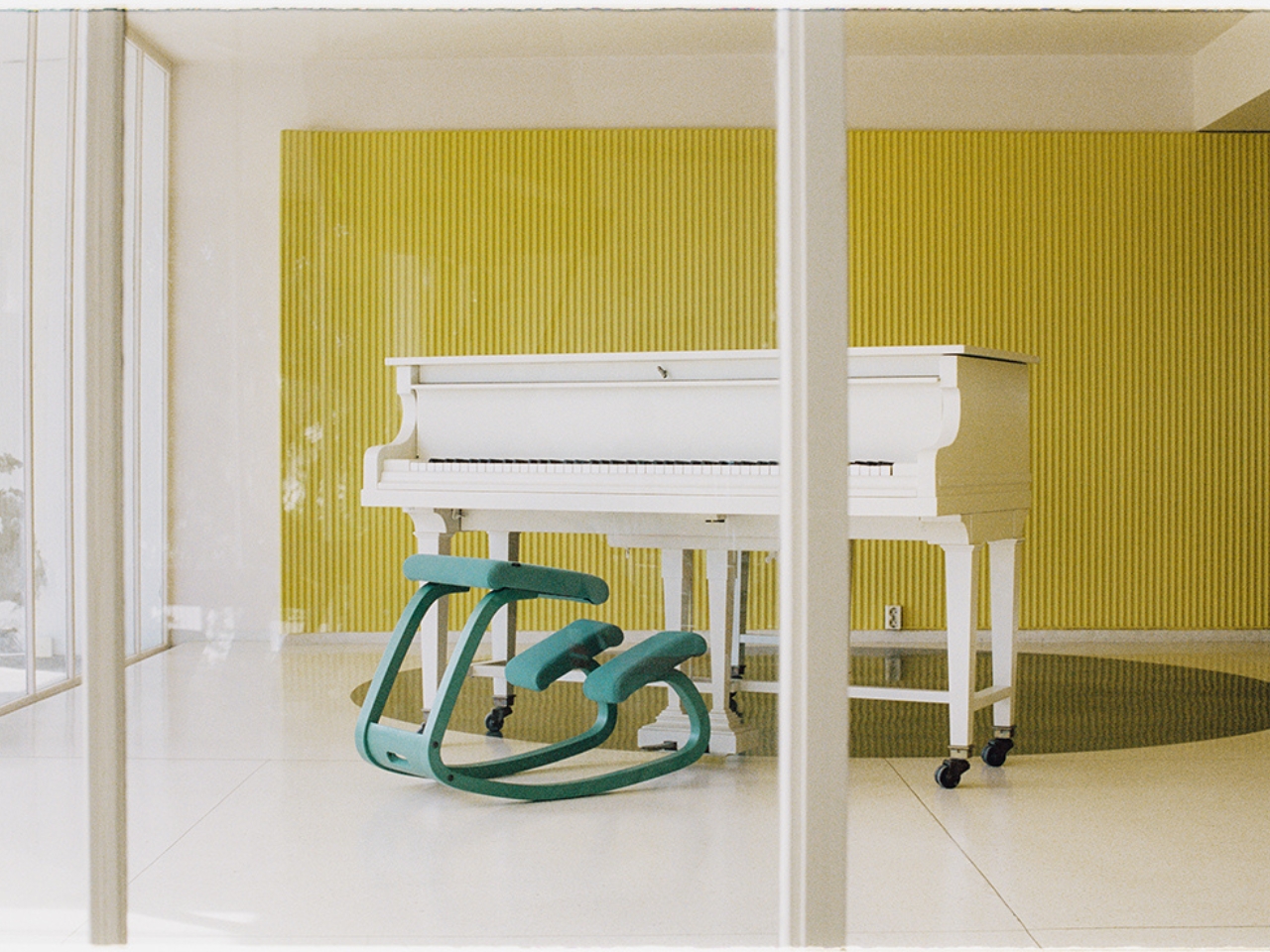
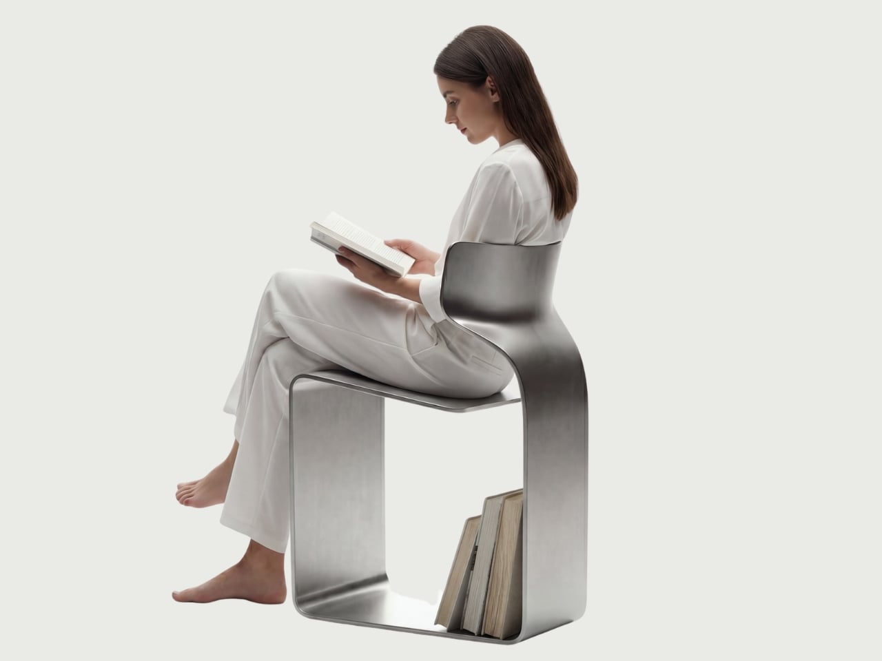
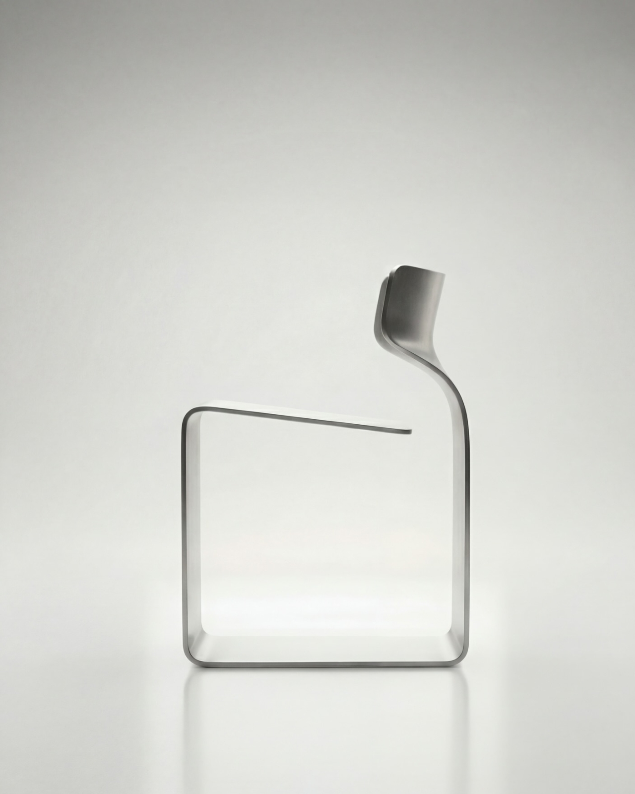
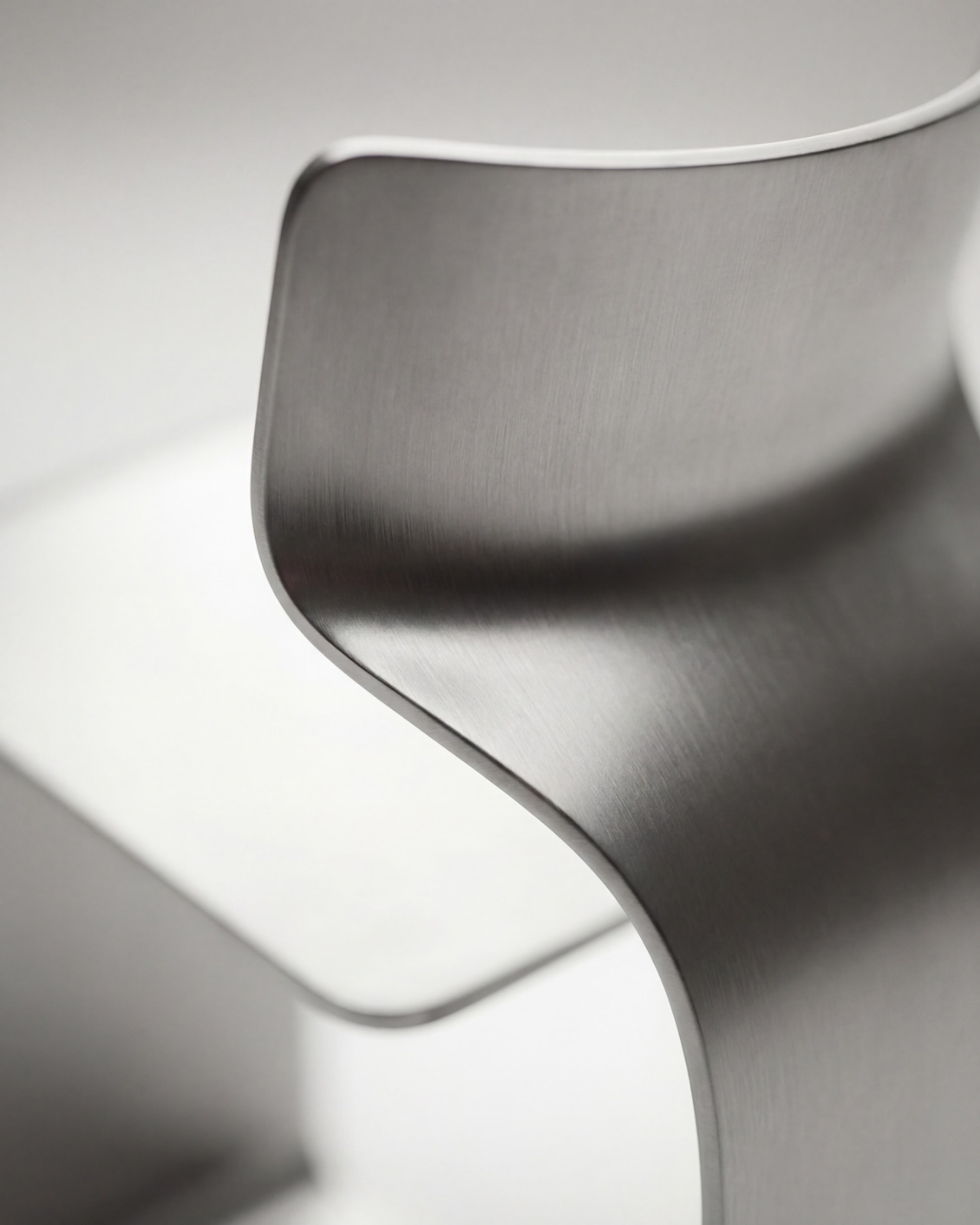
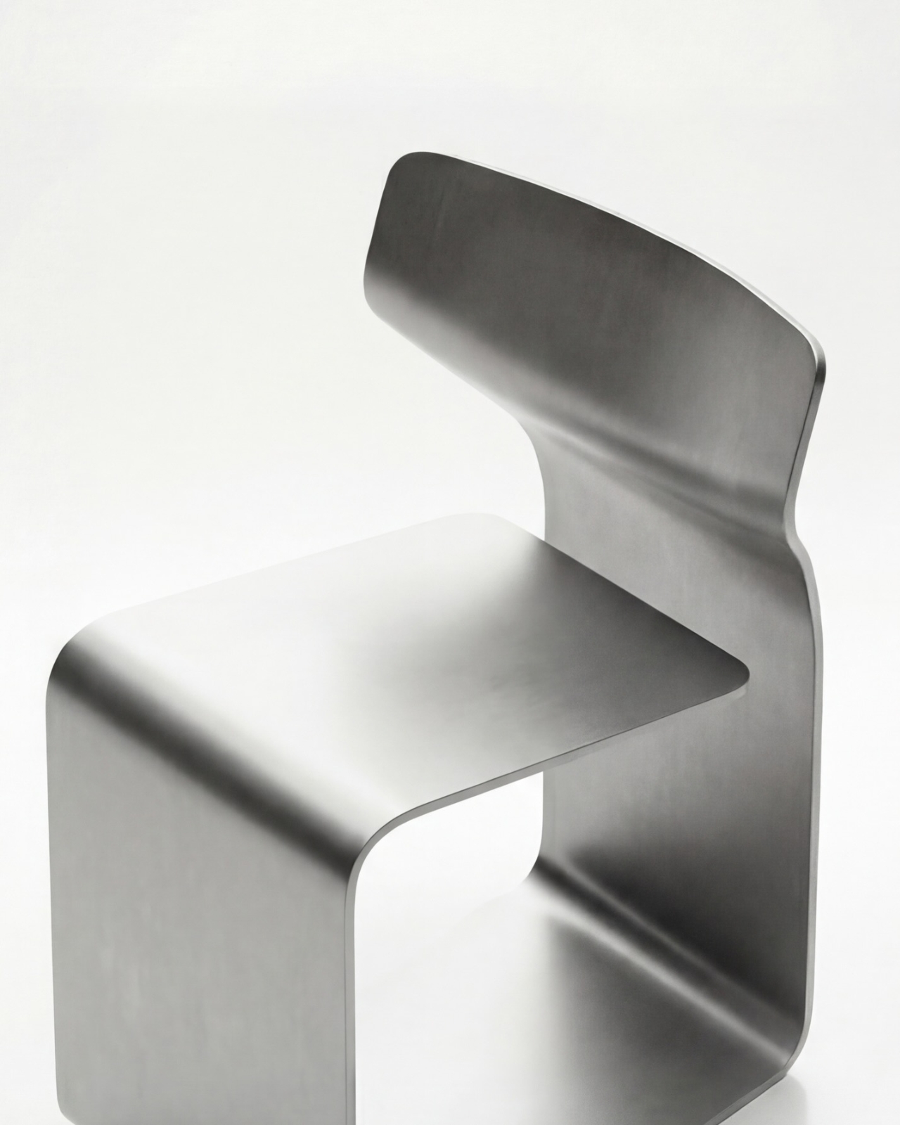
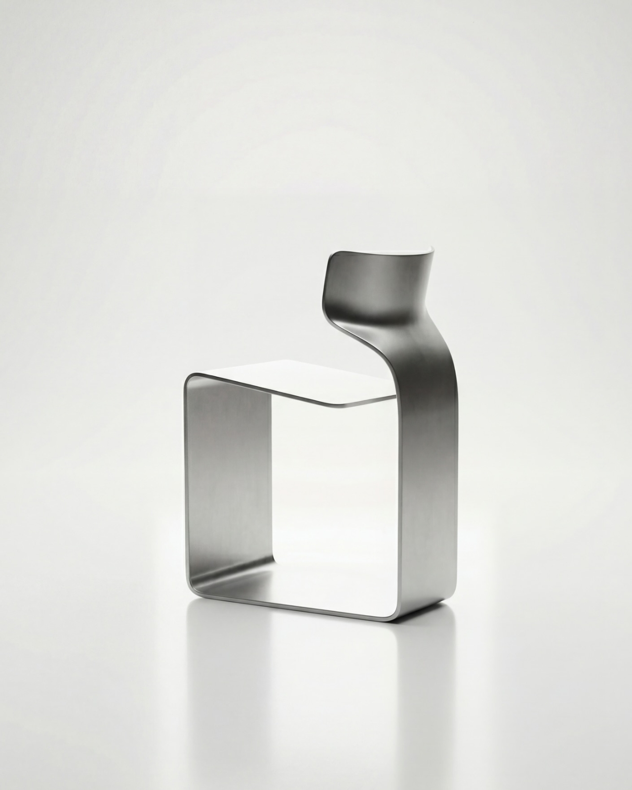
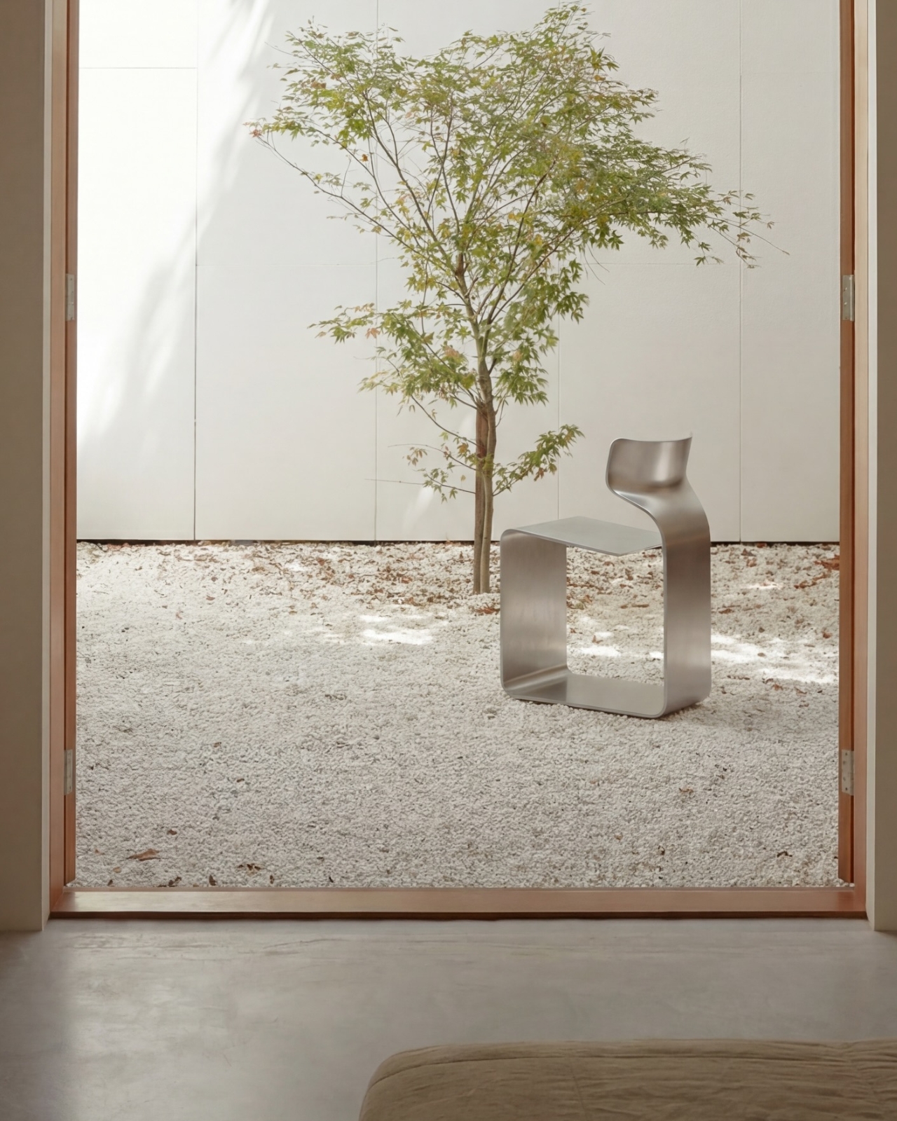
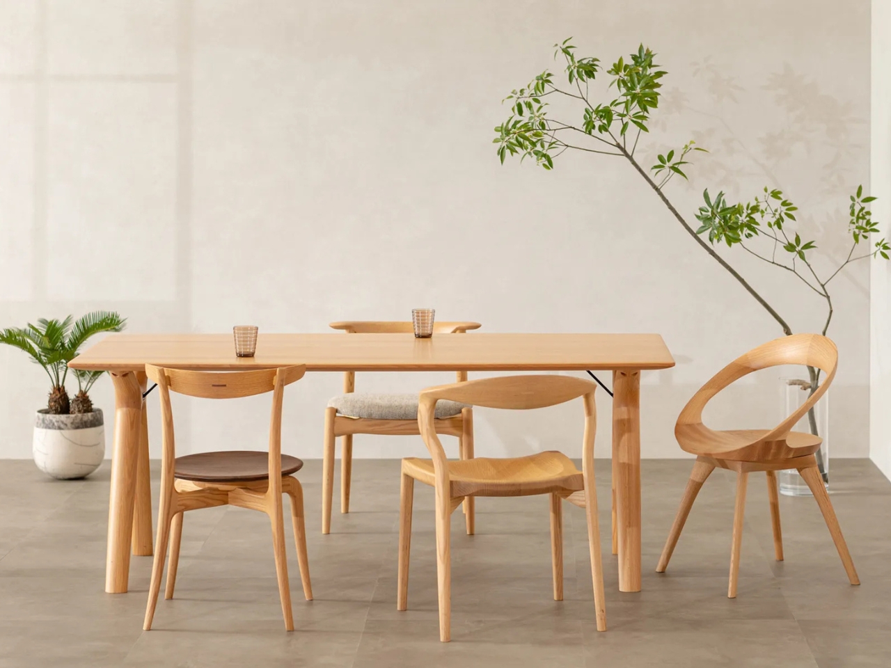
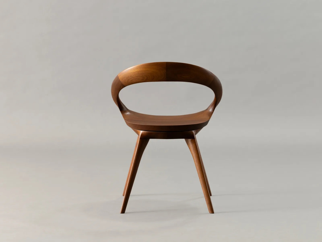
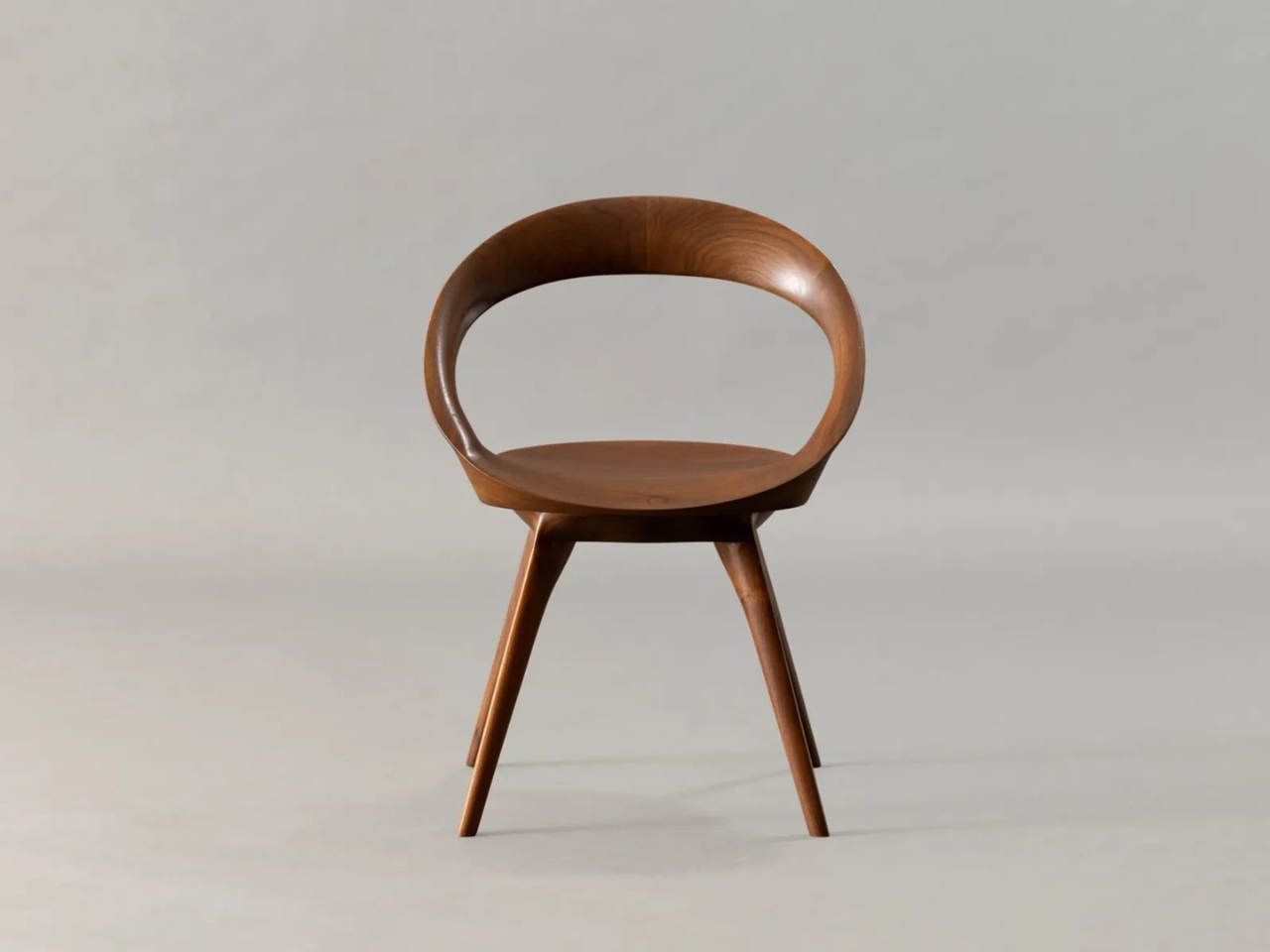
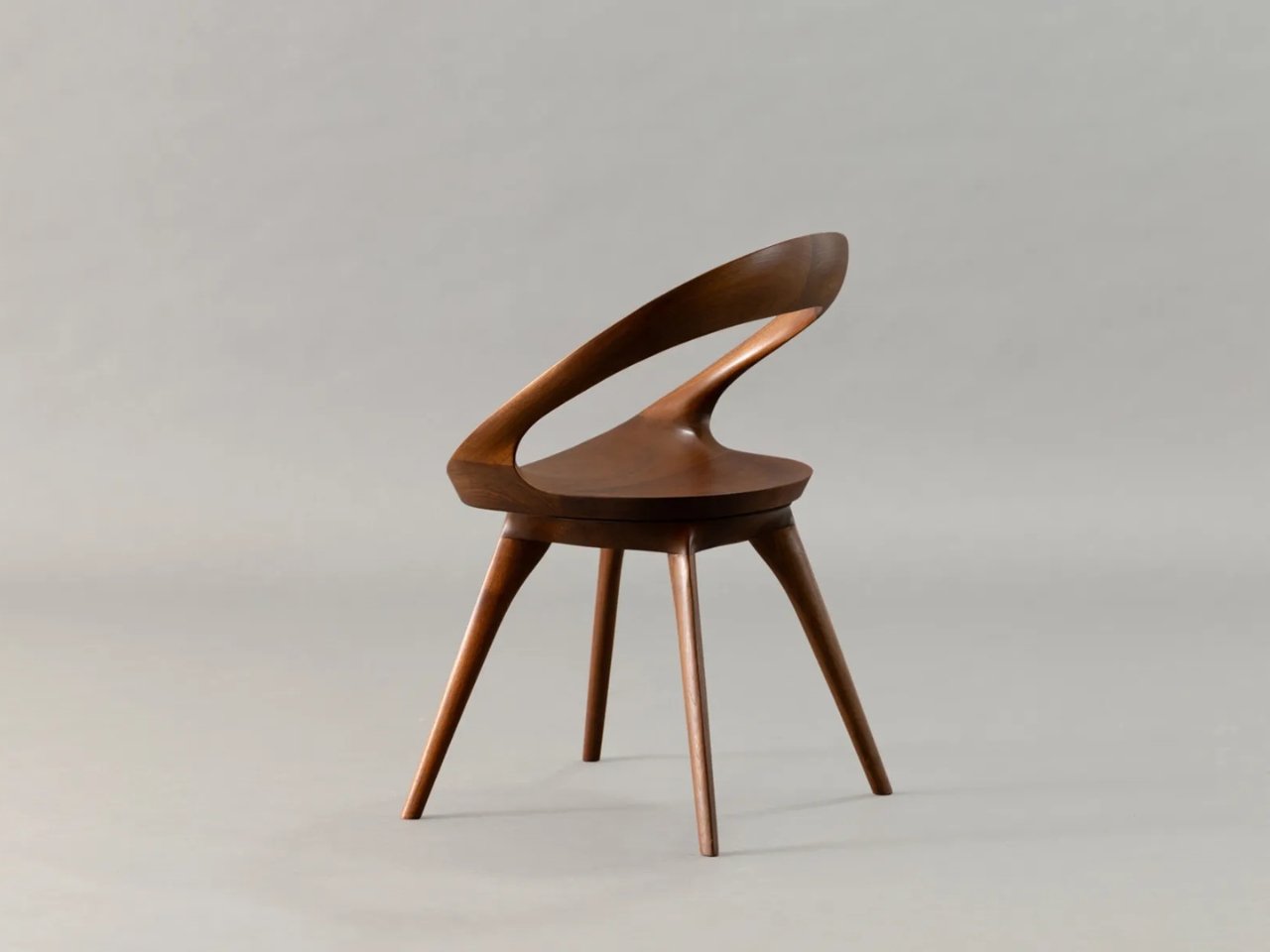
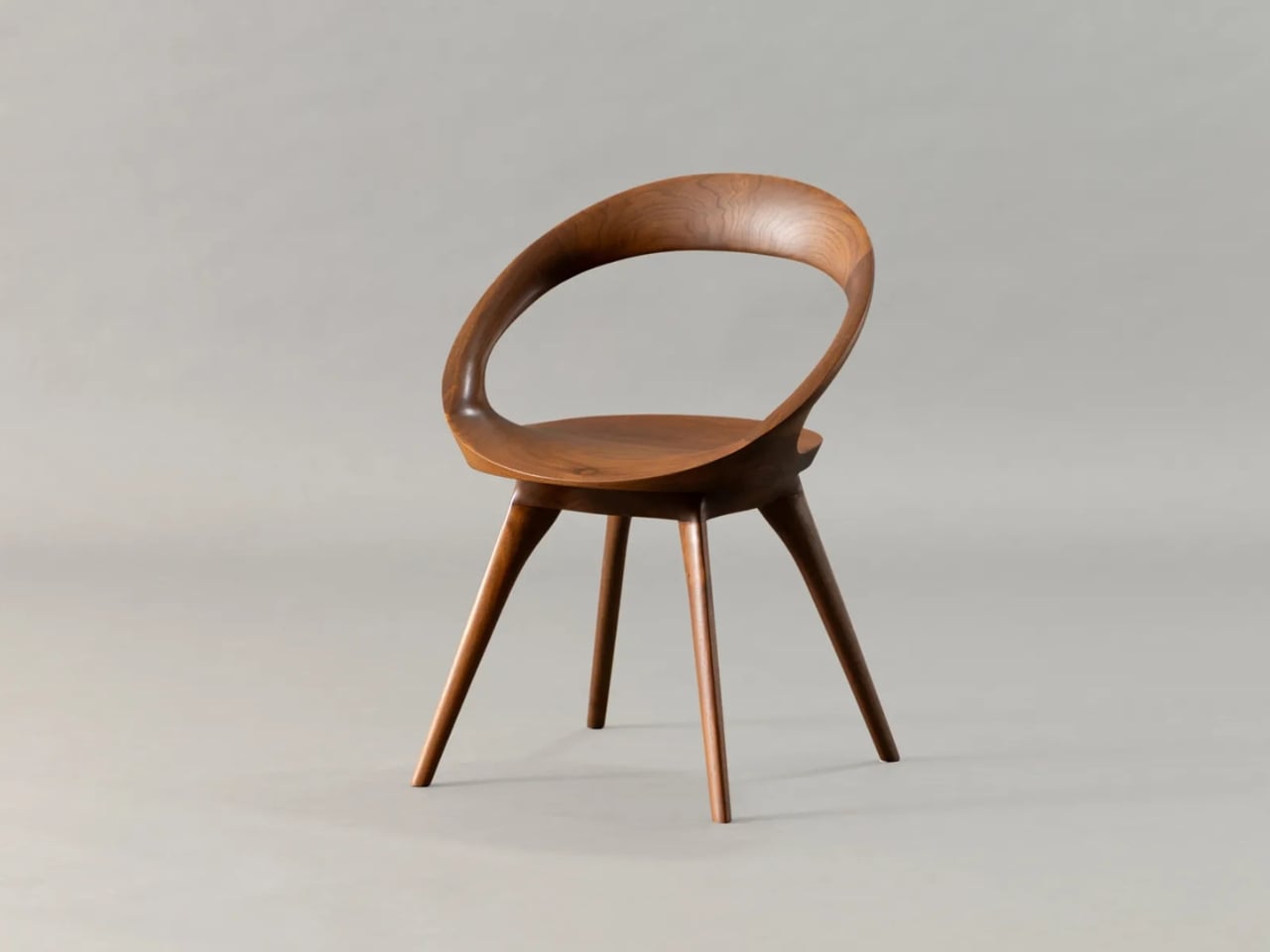
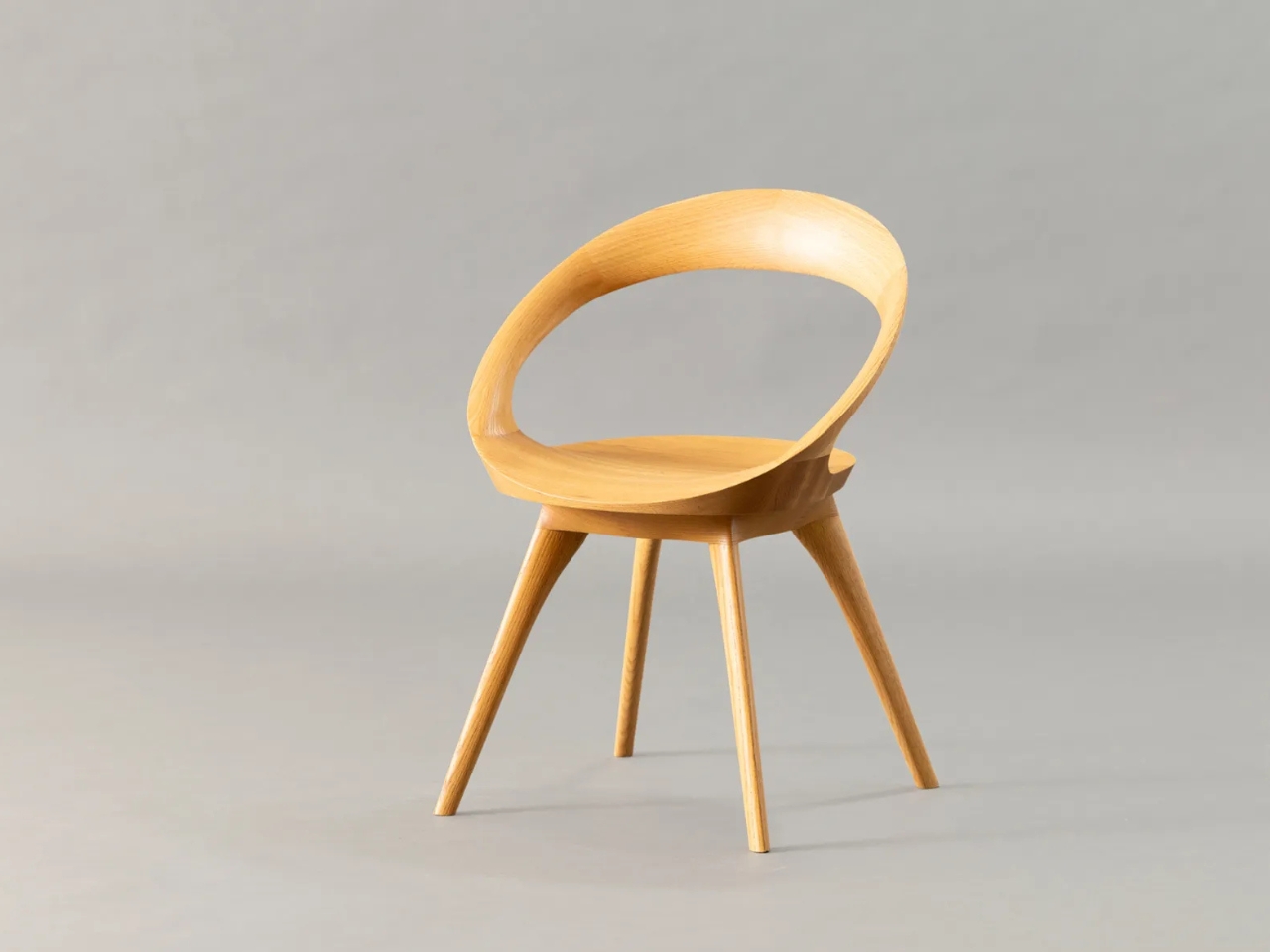
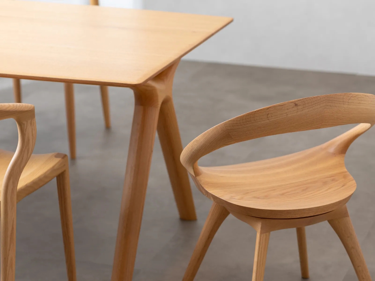
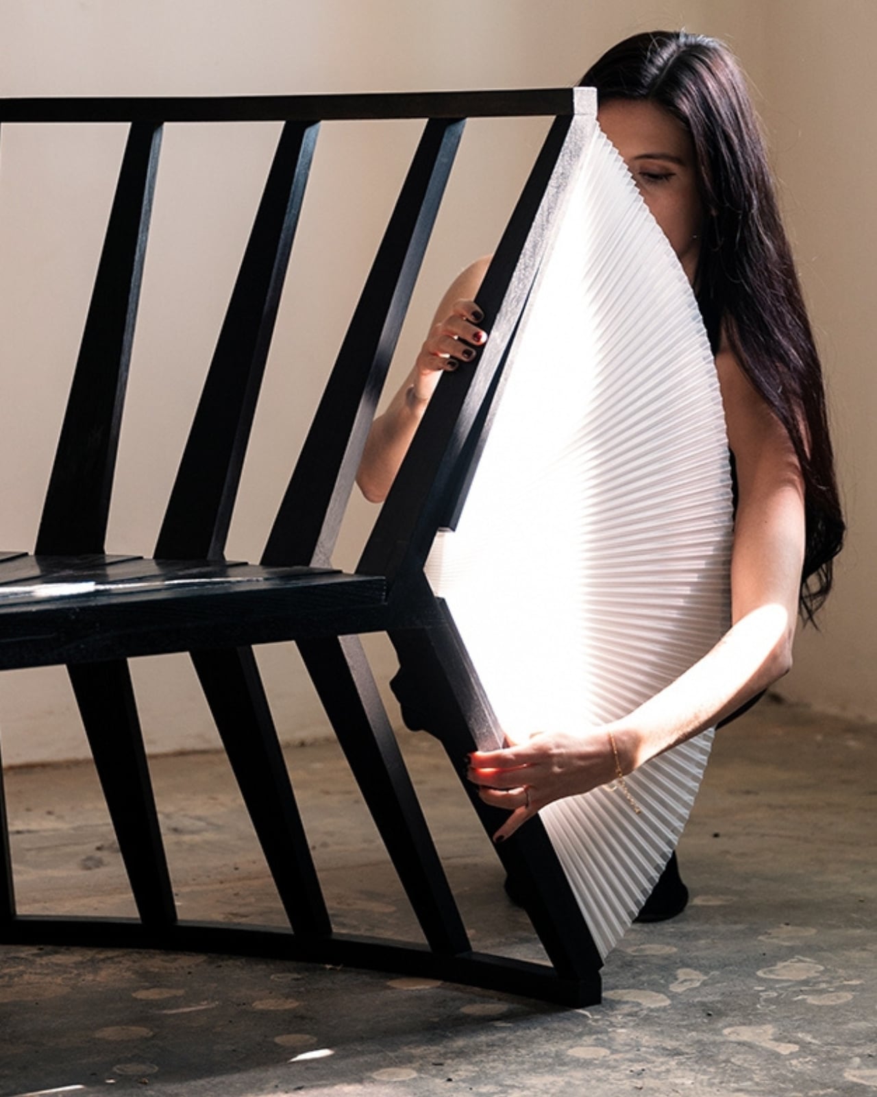
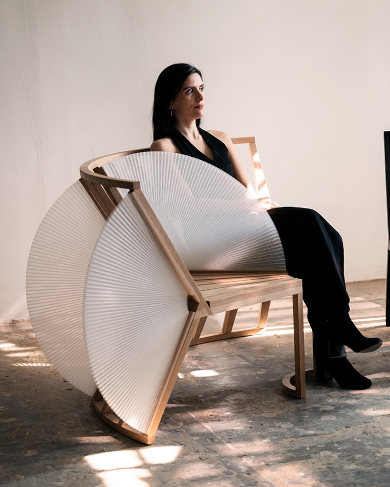
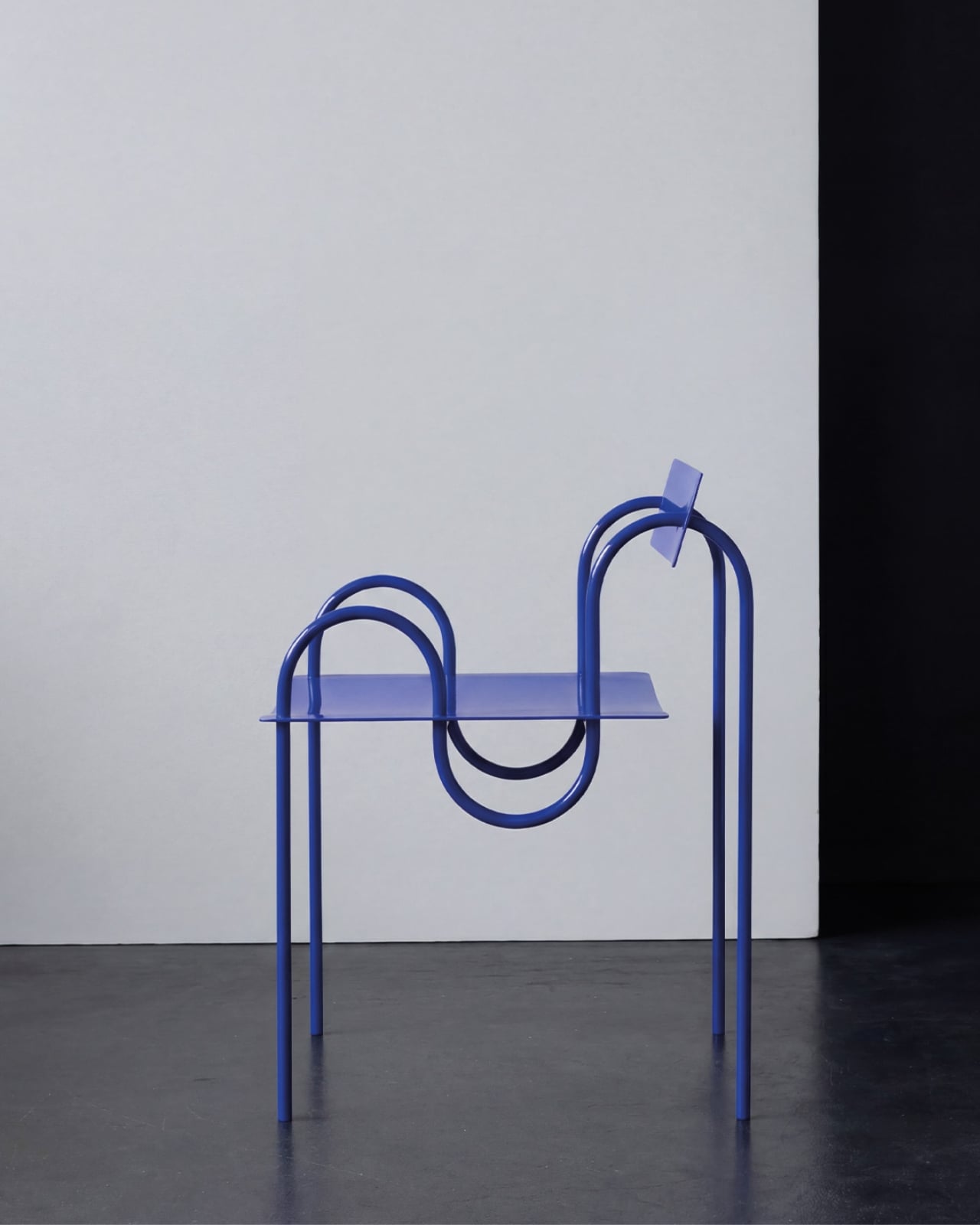
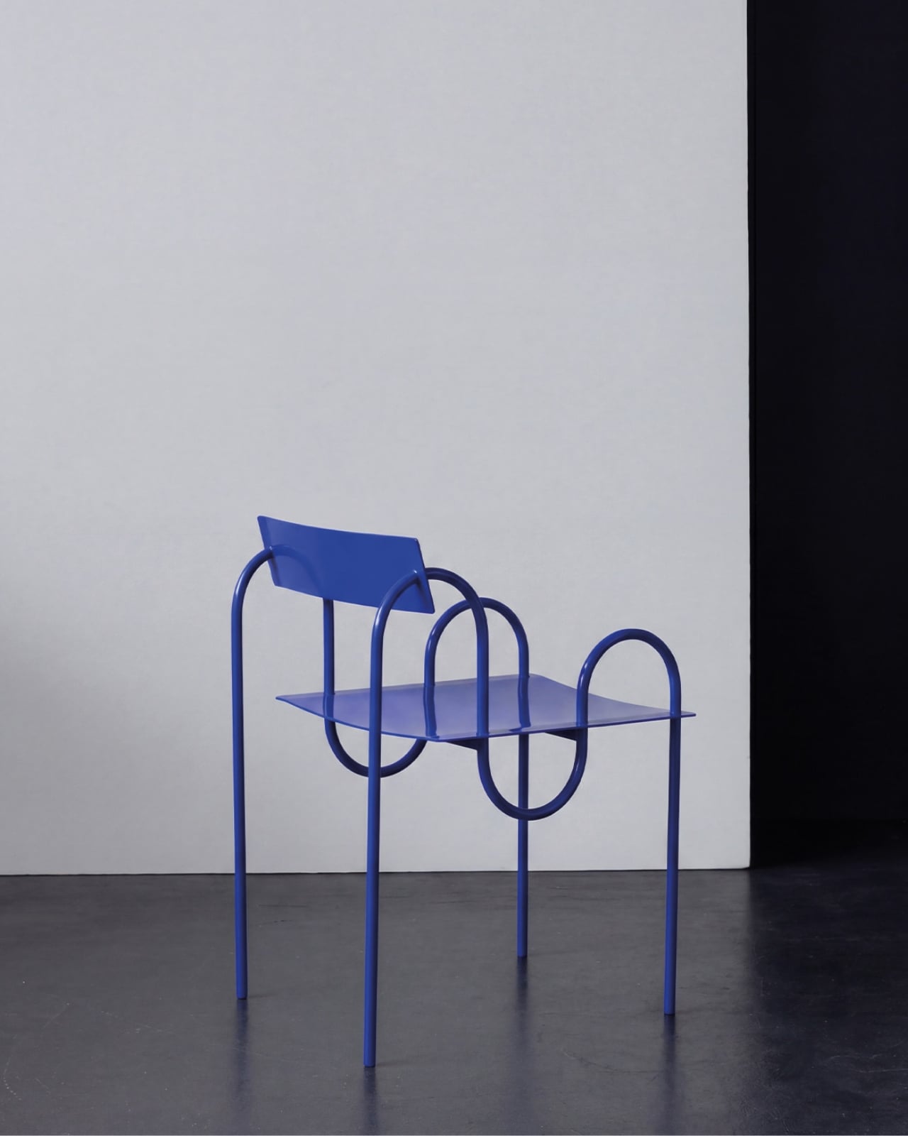
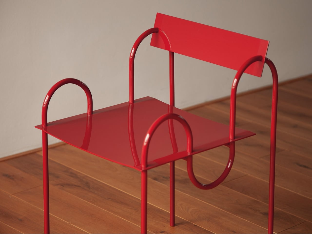
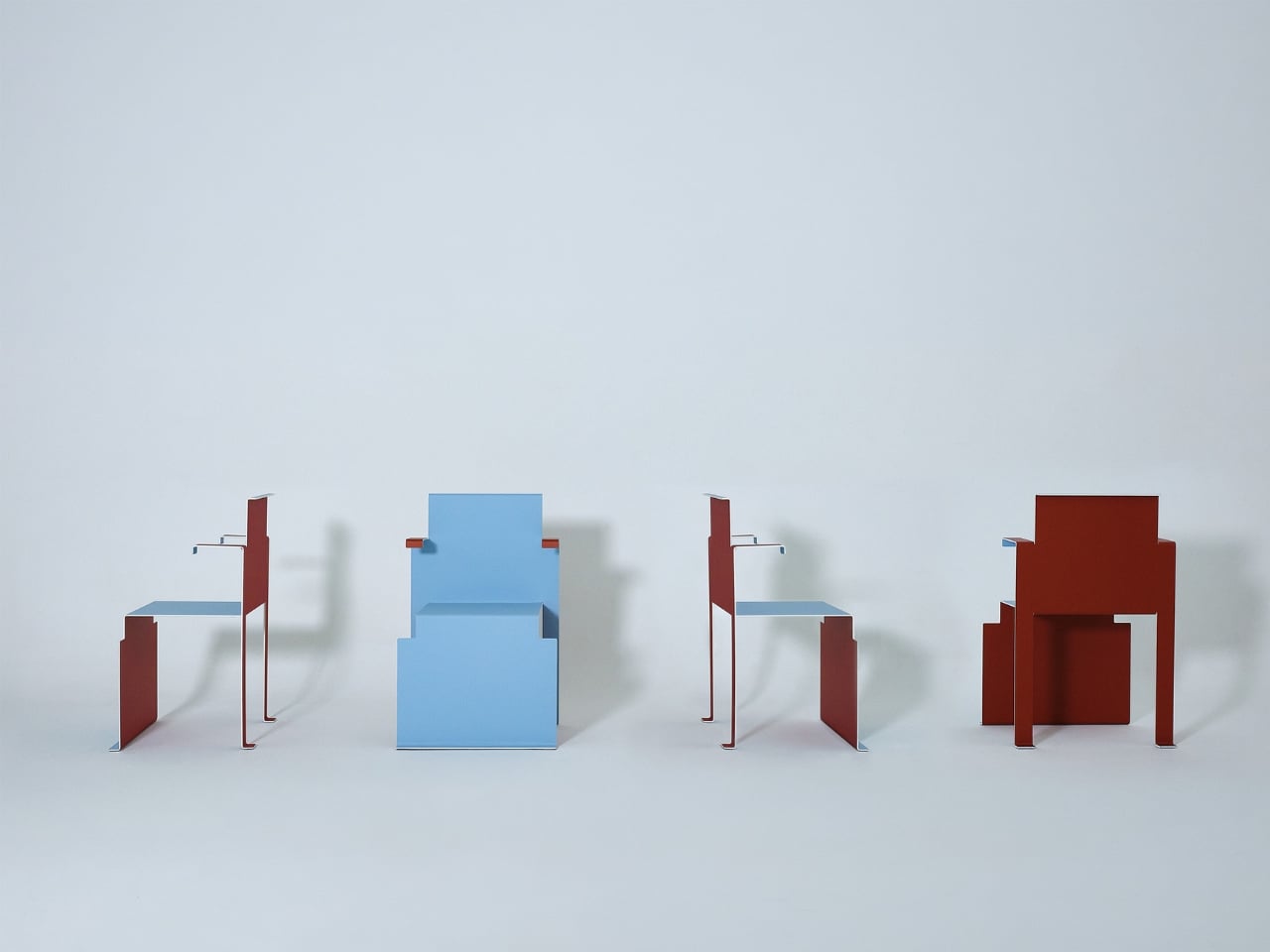
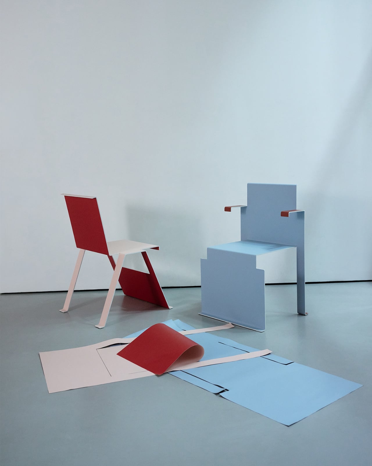
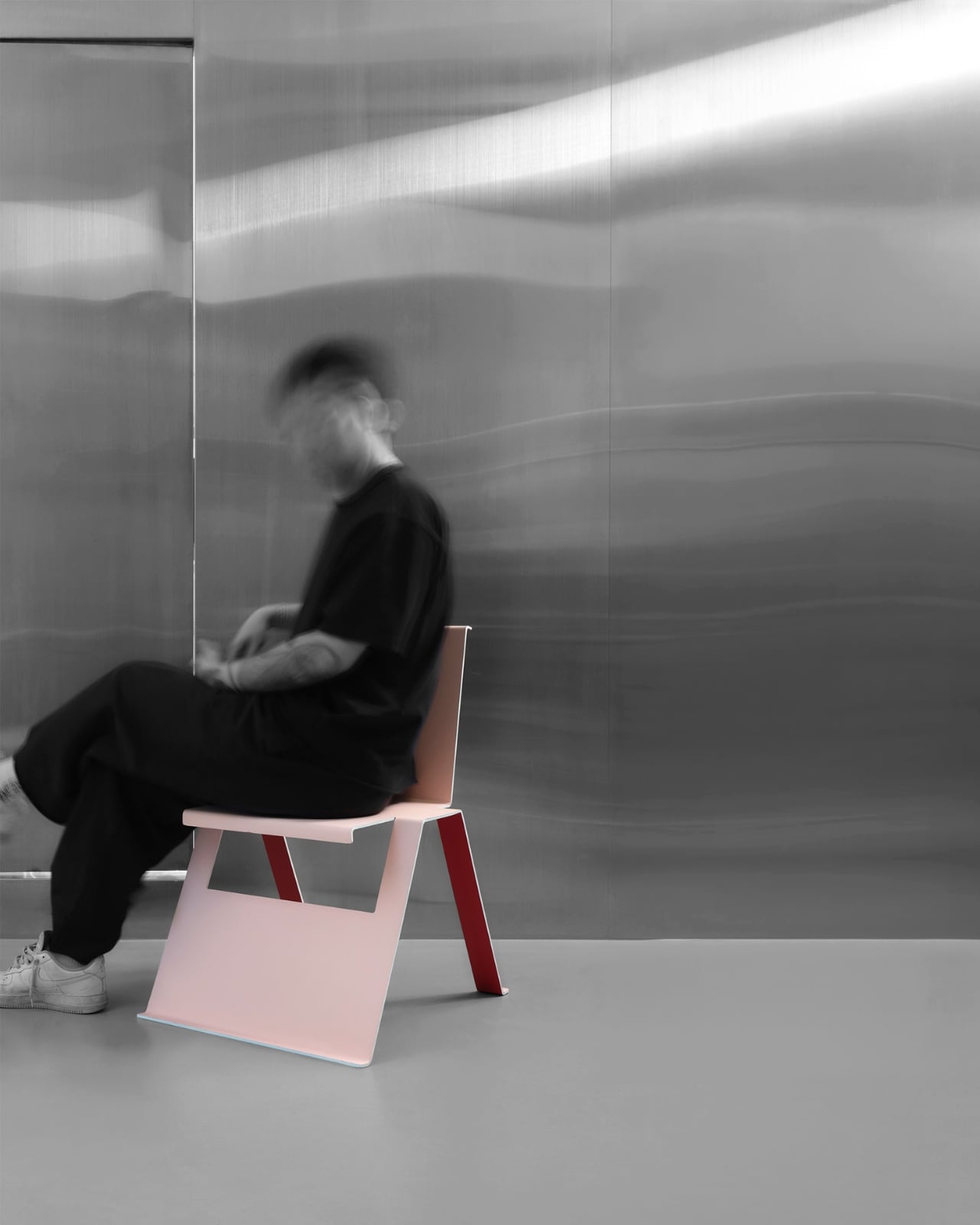
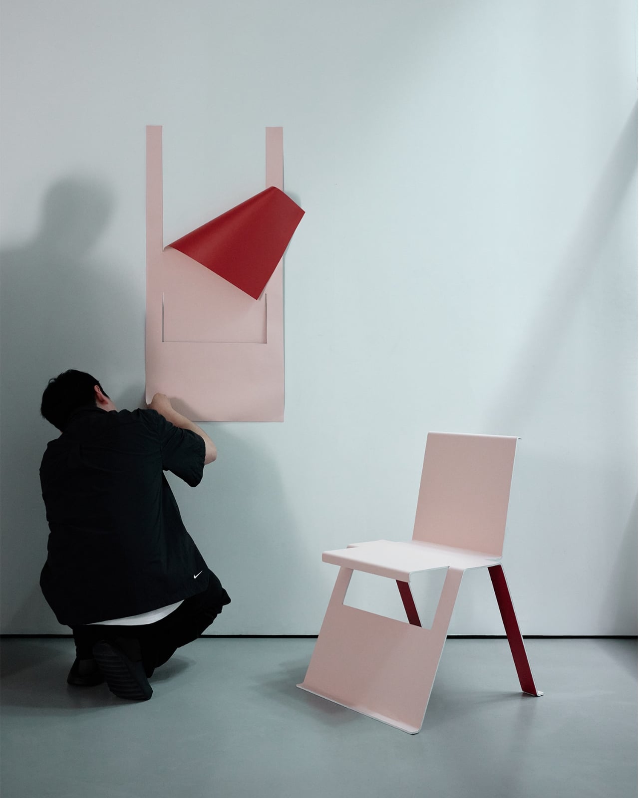
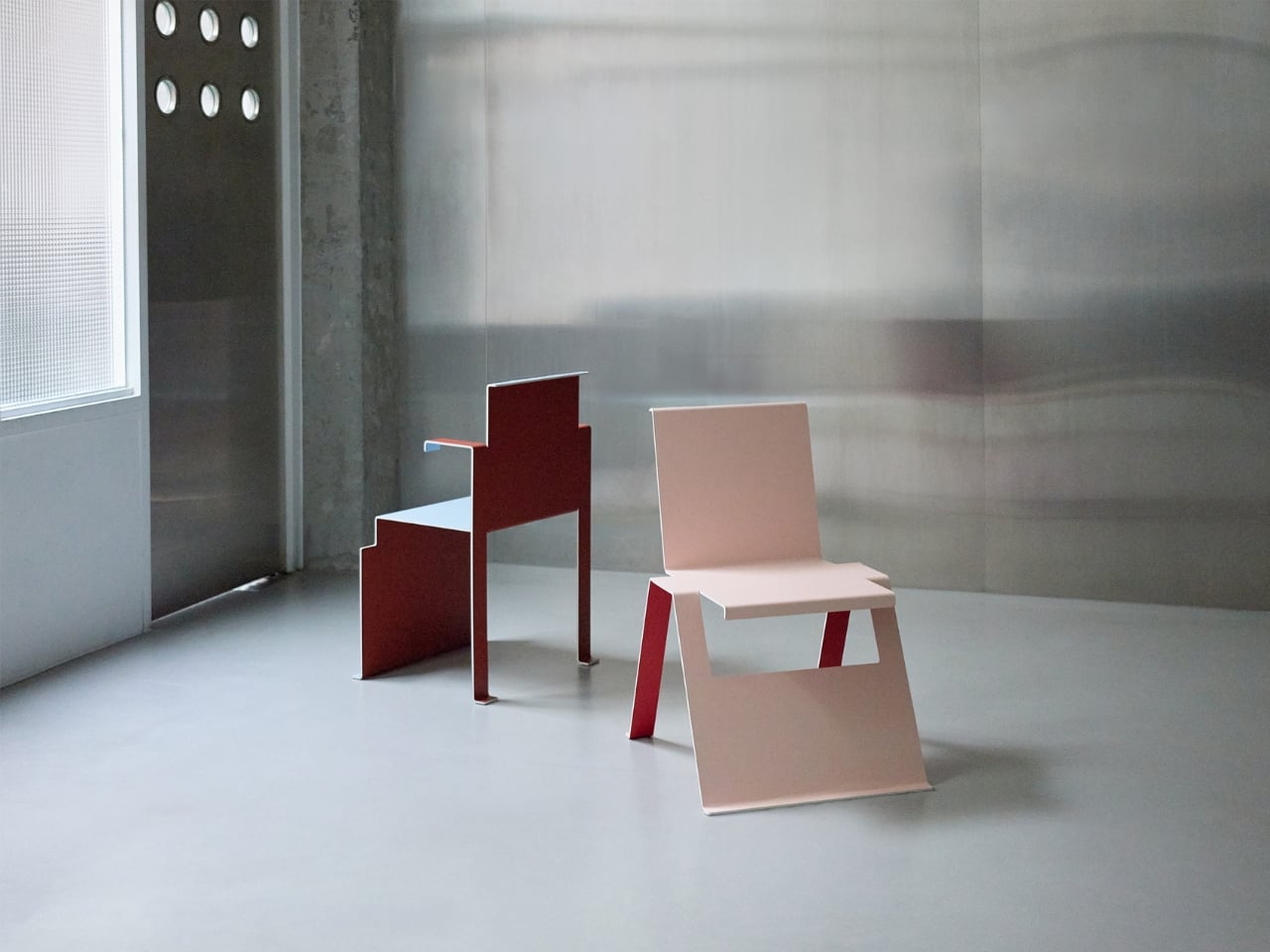
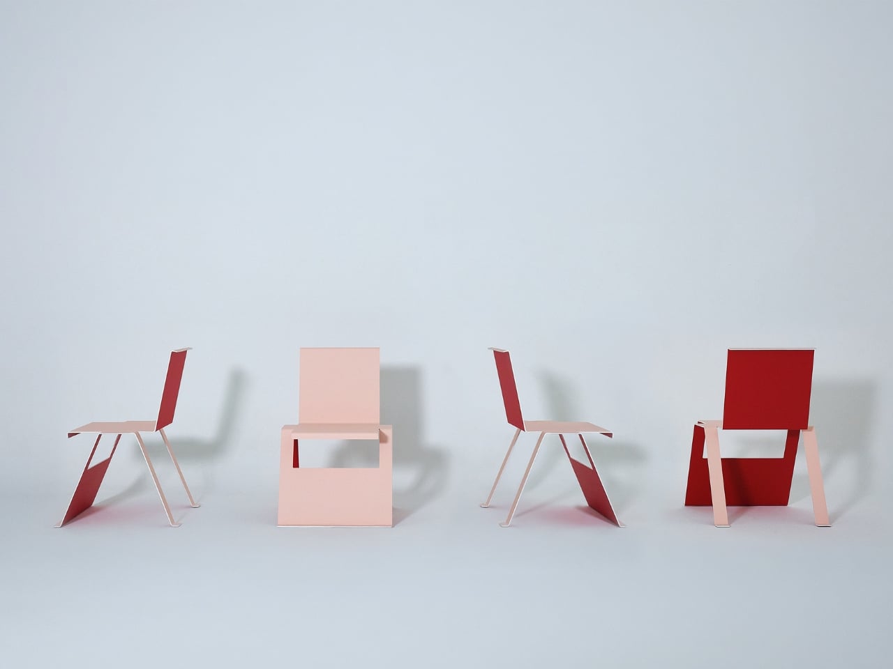
The chair is striking. The kind of thing that stops your scroll on a Tuesday afternoon when you’re supposed to be answering emails. It has the visual language of something you’d find in a curated boutique hotel lobby or a design fair in Milan: clean lines, considered proportions, the kind of silhouette that photographs beautifully against a white wall or a sunlit concrete floor. Nor Casa, positioned as a distributor rather than a heritage design house, knows their audience. They’re selling a look, and the look lands.
Designer: Nor Casa (distributor)
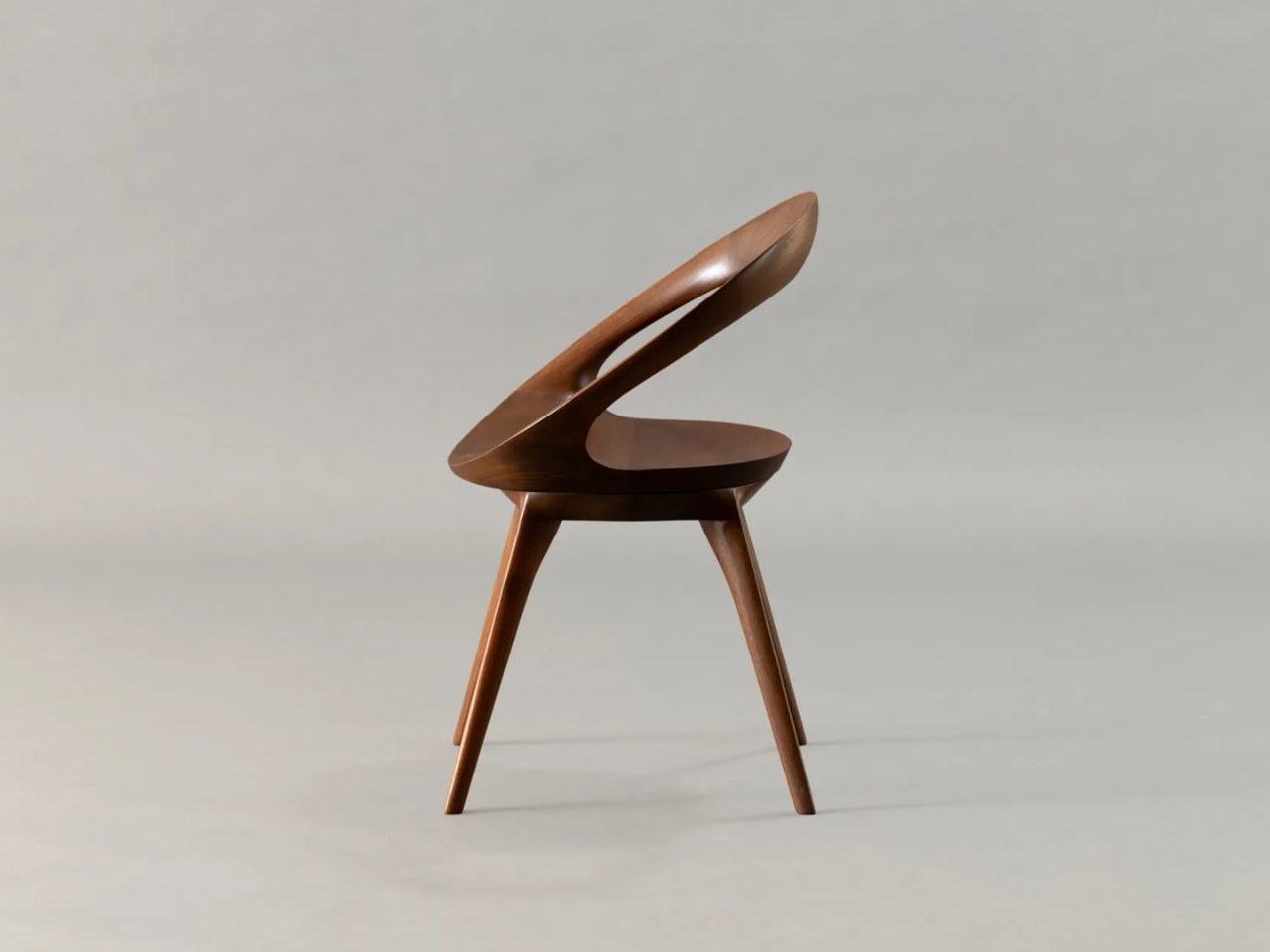
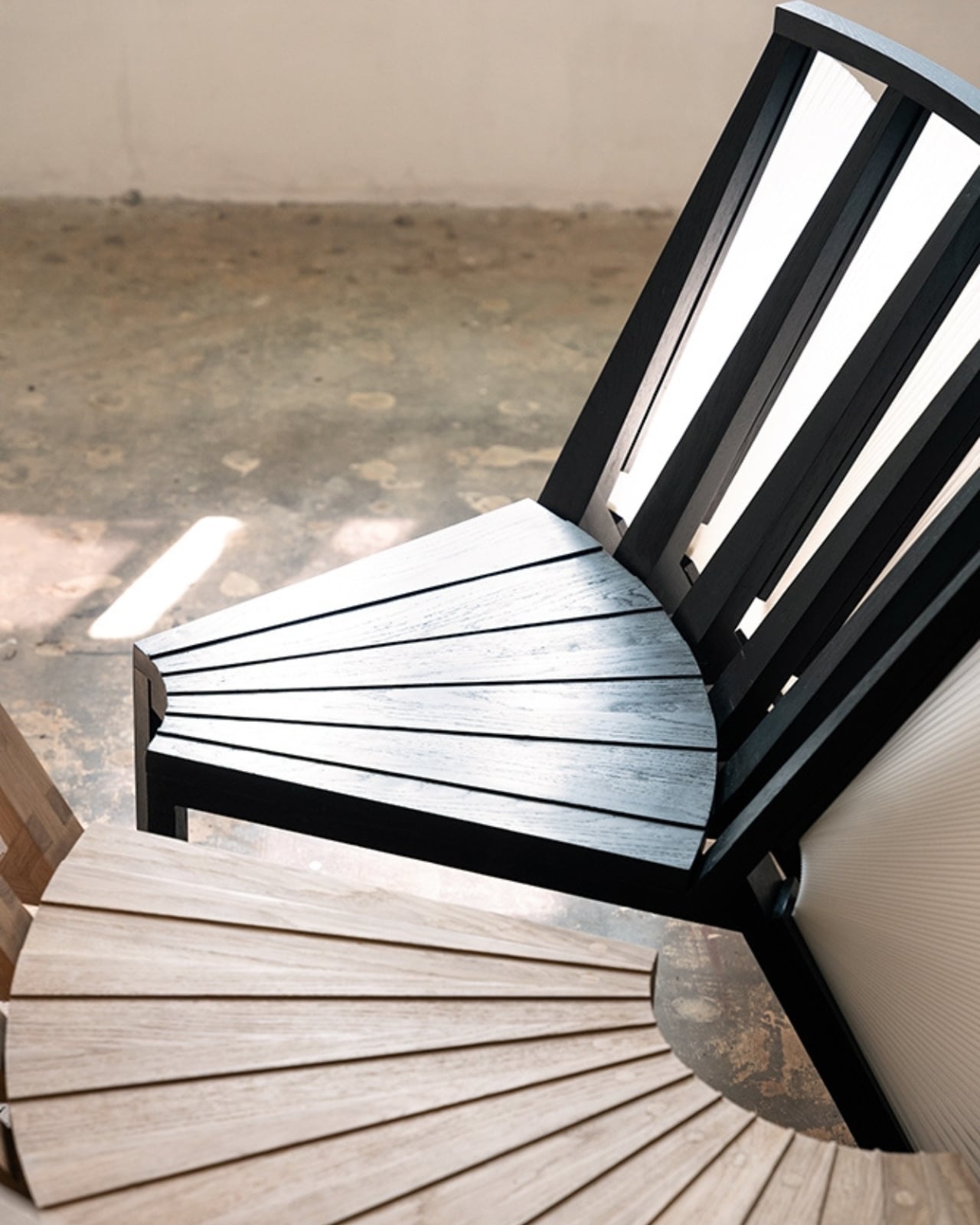
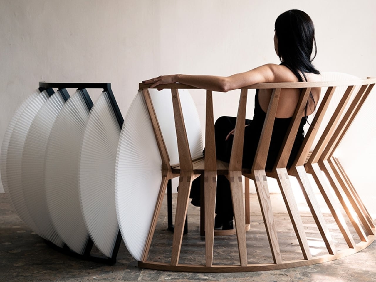
But here’s where it gets interesting. “Flawed but Instagram-friendly” is a phrase that deserves unpacking, because it points to what usually gets compromised when form takes the lead over function: structural integrity, seat comfort, longevity, the kind of quiet durability that makes a chair worth keeping for twenty years instead of two seasons. And I’ll be upfront about where I personally stand. I would rather sit comfortably in an unremarkable chair than perch awkwardly in a beautiful one. A chair’s first job is to hold you well. Everything else is a bonus.
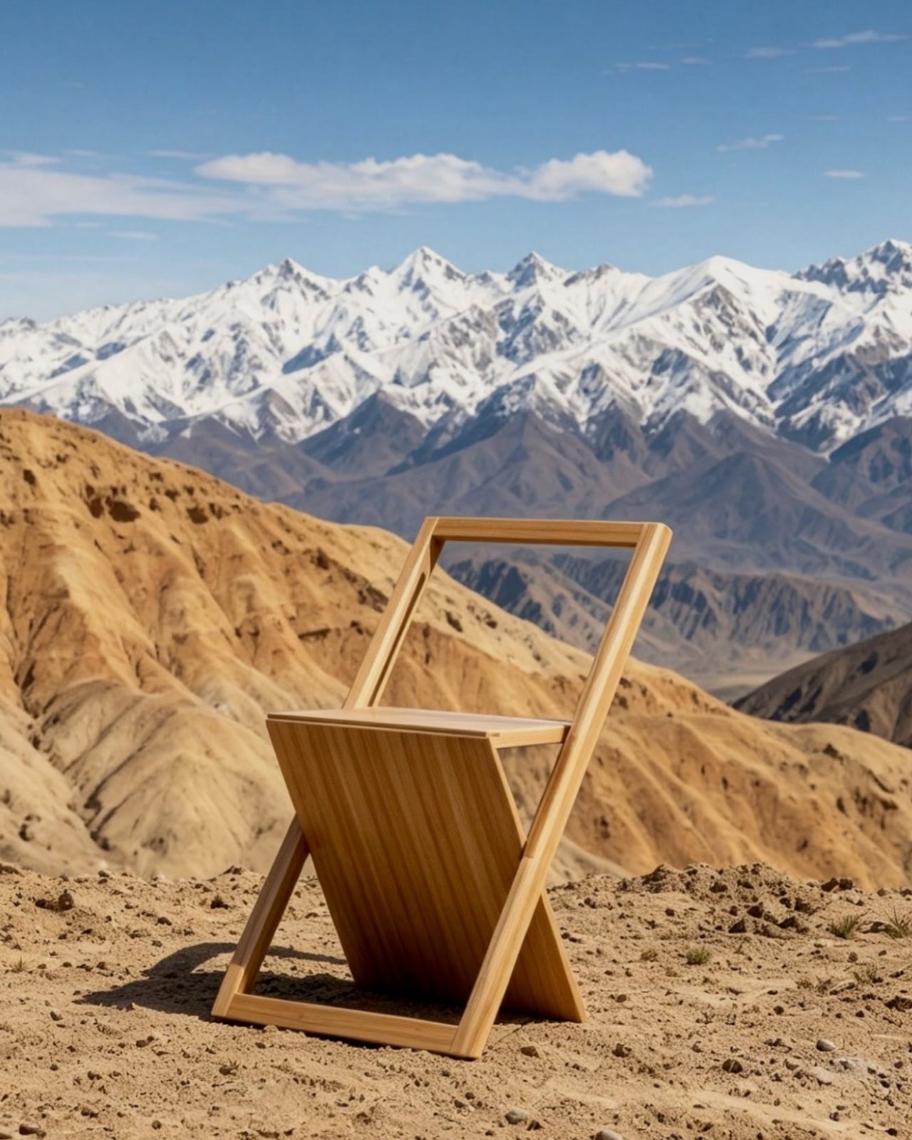
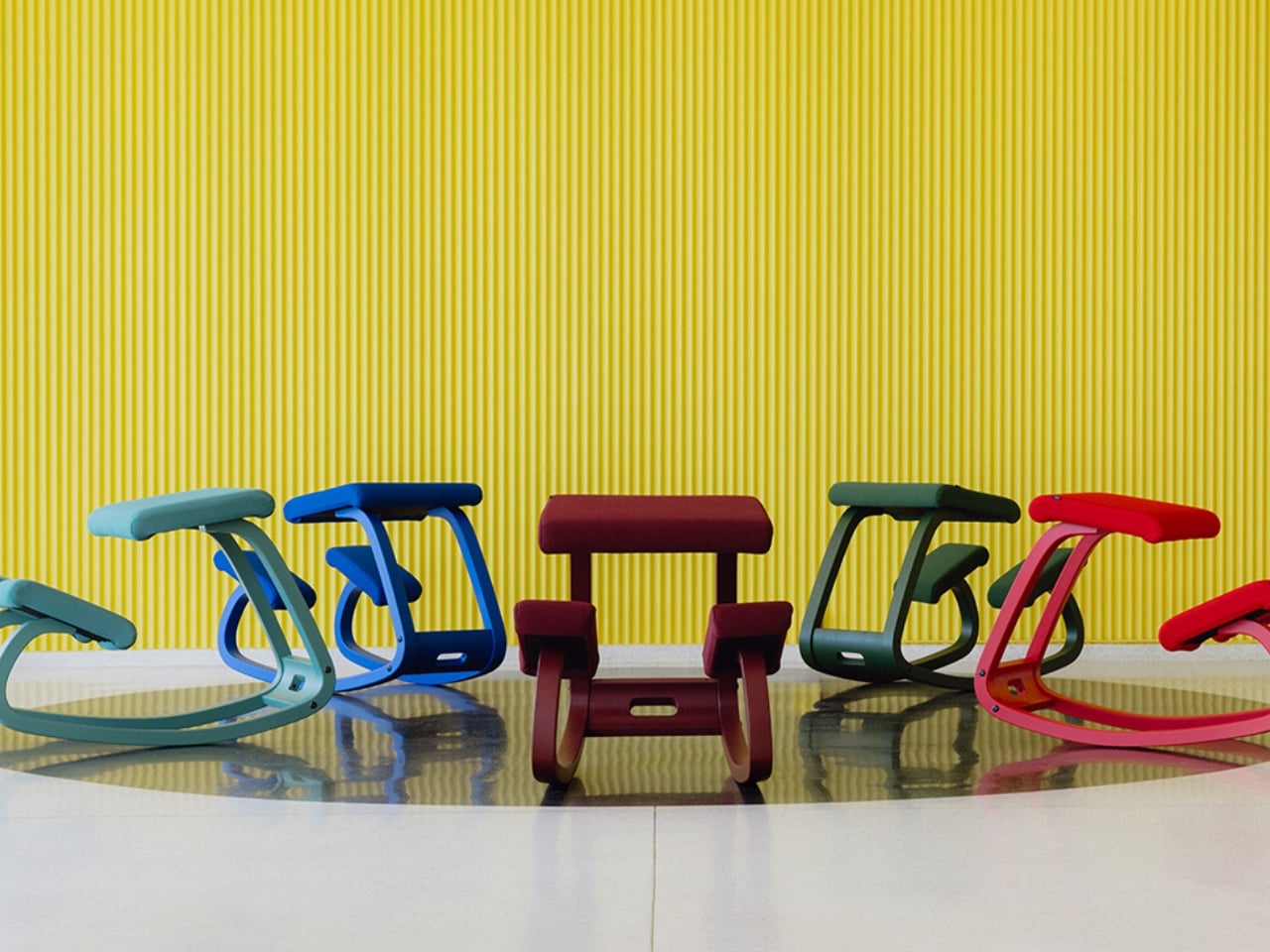
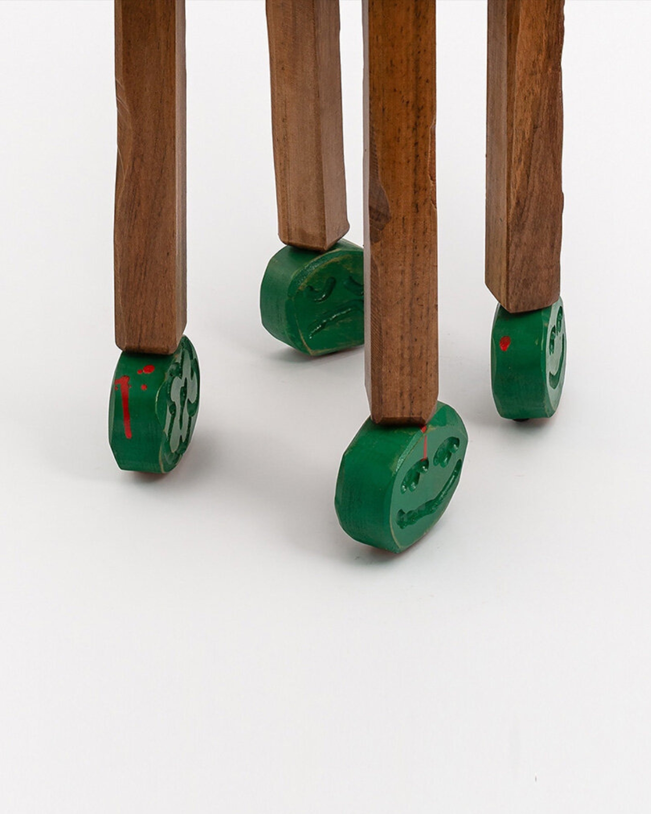
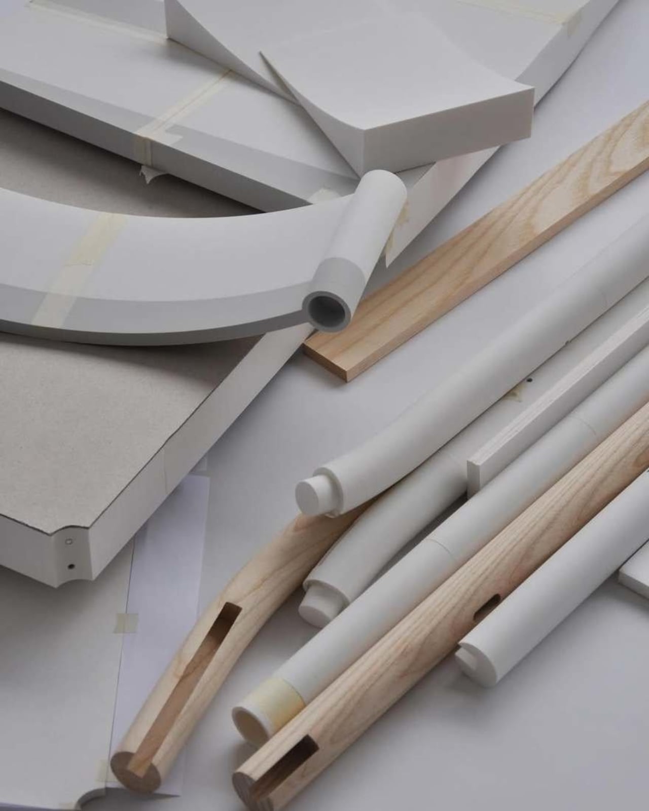
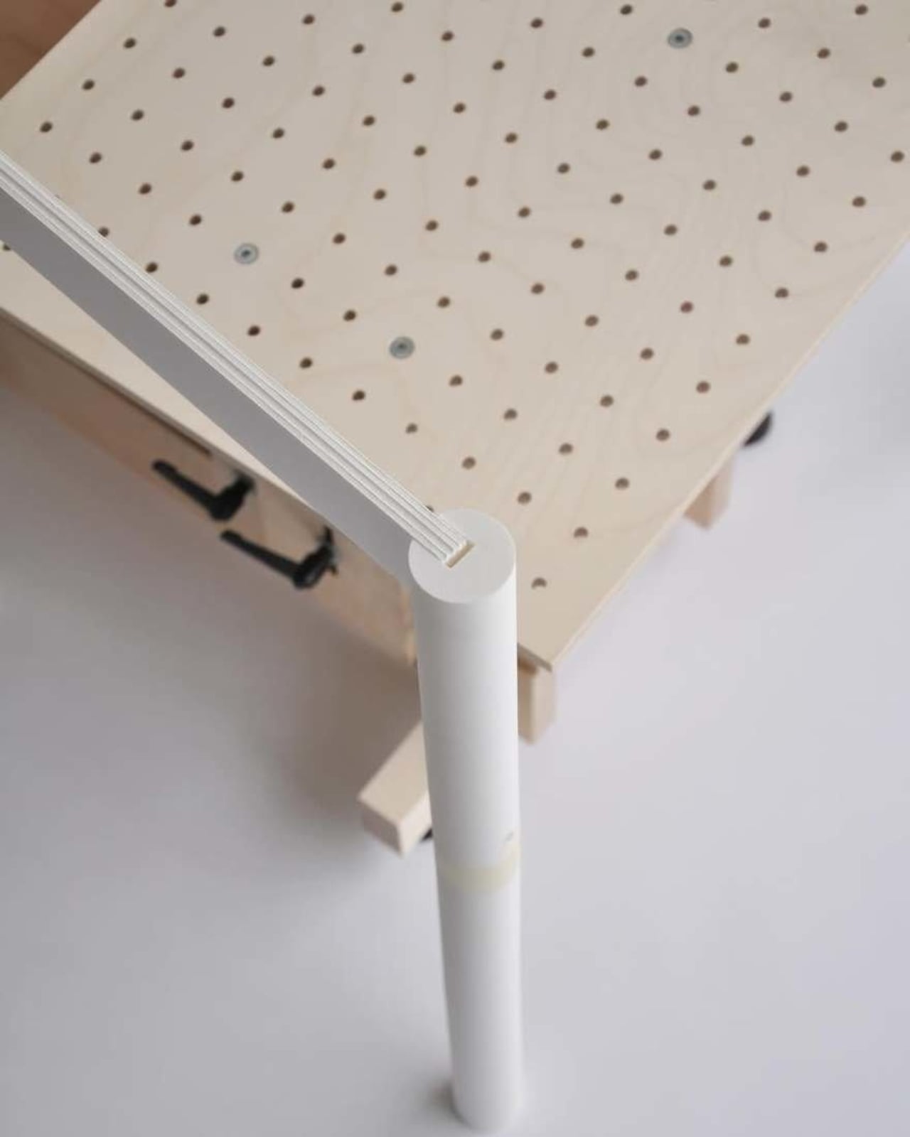
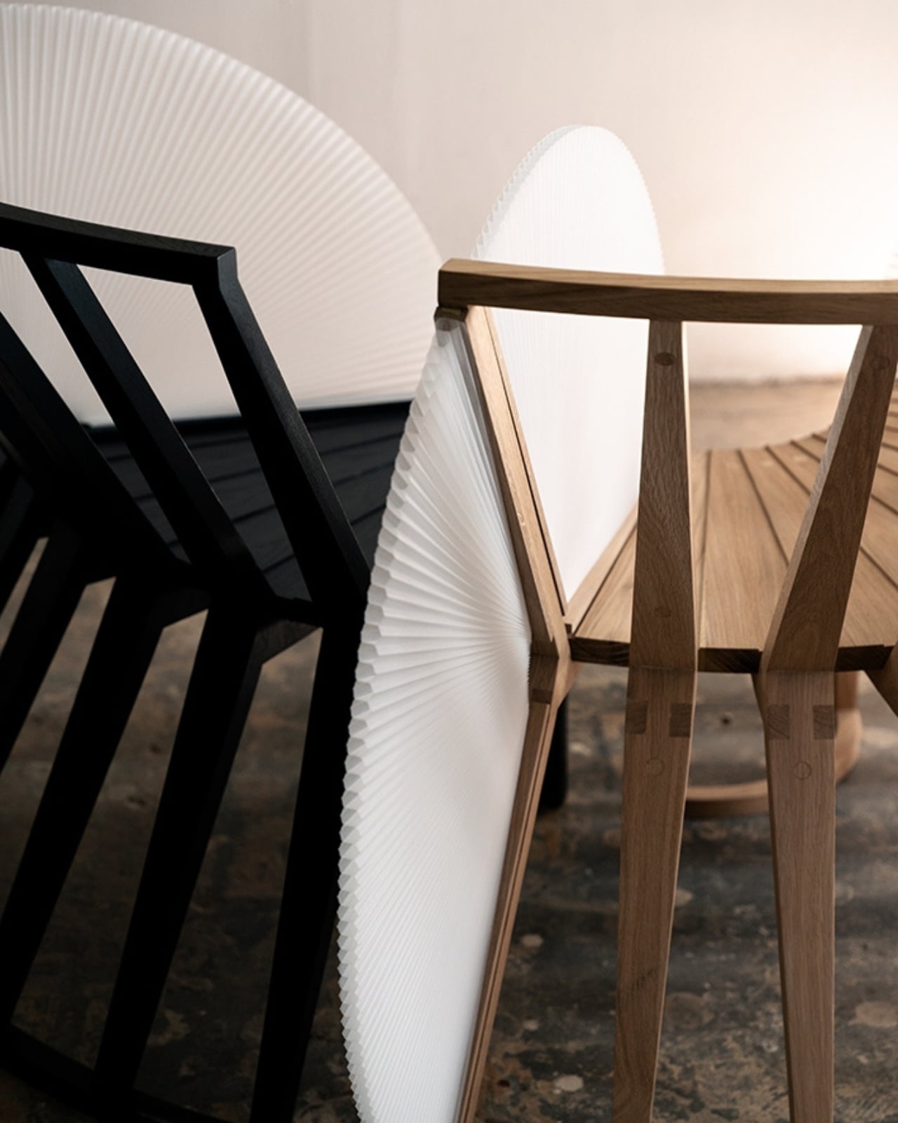
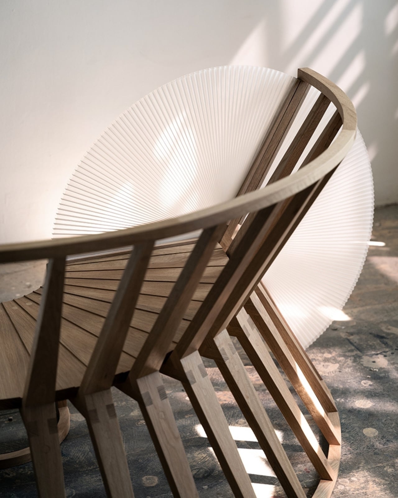
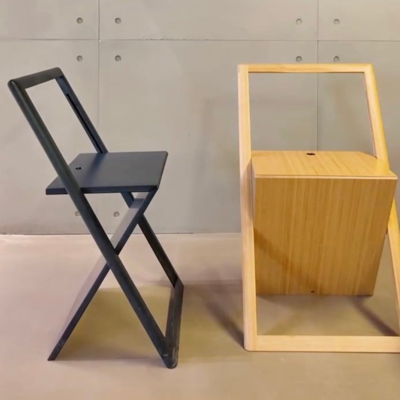
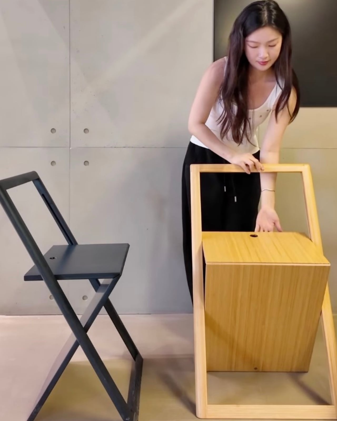
Folding chairs have always occupied an awkward rung in the design hierarchy. They’re the furniture world’s equivalent of the understudies: useful, necessary, but rarely celebrated. The good ones tend to be purely utilitarian, the kind you pull out of a closet for extra guests and fold back up with relief when everyone goes home. The beautiful ones have historically been expensive design objects, carved out of rare wood or engineered with mechanisms that cost as much as a small appliance. Nor Casa seems to be attempting a middle path: a folding chair that photographs like the former and costs closer to something accessible.
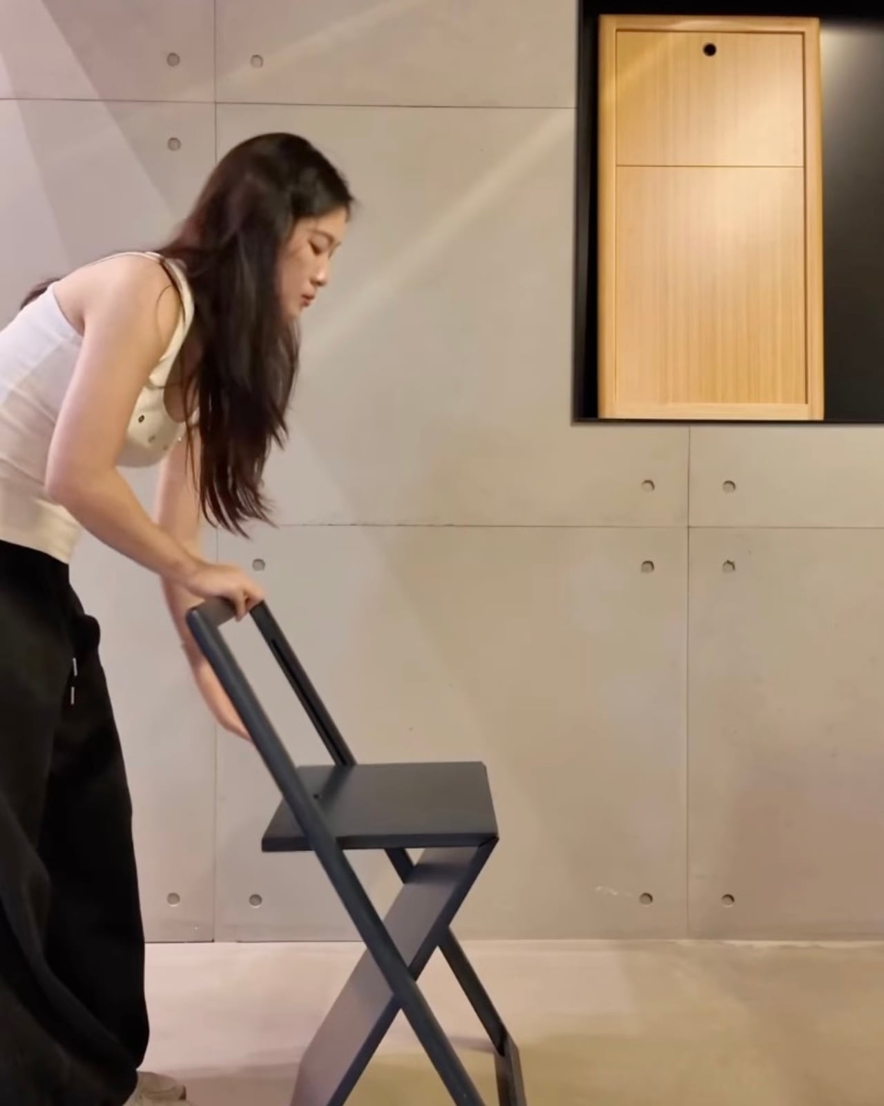
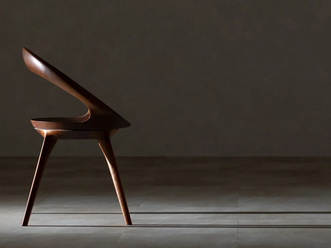
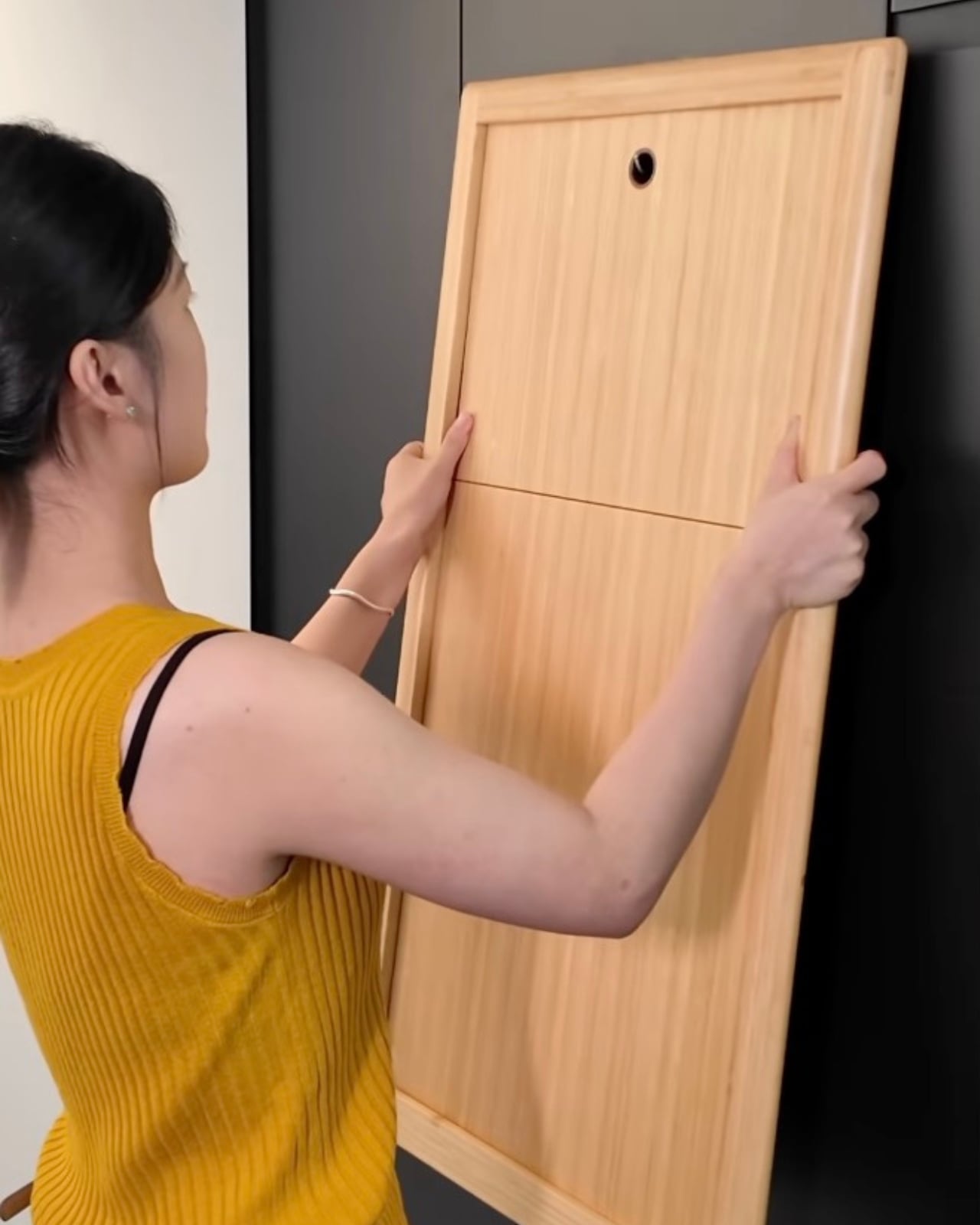
That balance is genuinely hard to get right. The chair may wobble. The finish may not hold up the way the images suggest. The folding mechanism might feel less elegant in person than it does in a product shot with perfect lighting and a muted background. These are not small concerns when you’re buying something meant to be sat in repeatedly by actual human beings. And yet, I find the effort worthwhile to discuss, even if the execution doesn’t fully deliver.
We are living through a moment where design fluency has become democratized in a way that would have been unthinkable thirty years ago. Millions of people who aren’t interior designers or architects now have an eye trained by years of scrolling through design accounts, renovation reveals, and aesthetic-obsessed content creators. They know what a good chair looks like. They want to live with beautiful things. The demand Nor Casa is chasing is real, and it didn’t come from nowhere.
The issue is that visual aspiration without material honesty is a shortcut that tends to disappoint. A chair that performs flawlessly in a photo but creaks under pressure the first time a real person sits in it is not just a design failure. It’s a trust failure. And once a brand earns that reputation, it’s very hard to unlearn.
So I’d say this to anyone tempted by the Nor Casa chair: go in with eyes open. If you want it for the way it looks in a corner of your apartment, on a terrace, in the background of every call you take from home, it might genuinely deliver that. But if you need it to hold up under daily use, to last, to justify itself beyond aesthetics, do your homework before you check out.
For me, the choice is simple. Give me the chair I can sink into for hours without thinking about it. The prettiest chair in the room is only as good as the conversation you can have sitting in it. And that conversation gets very short, very fast, when your back starts to ache.
The post The Folding Chair That Looks Great and Sits Terribly first appeared on Yanko Design.
 Monochrome is that answer.