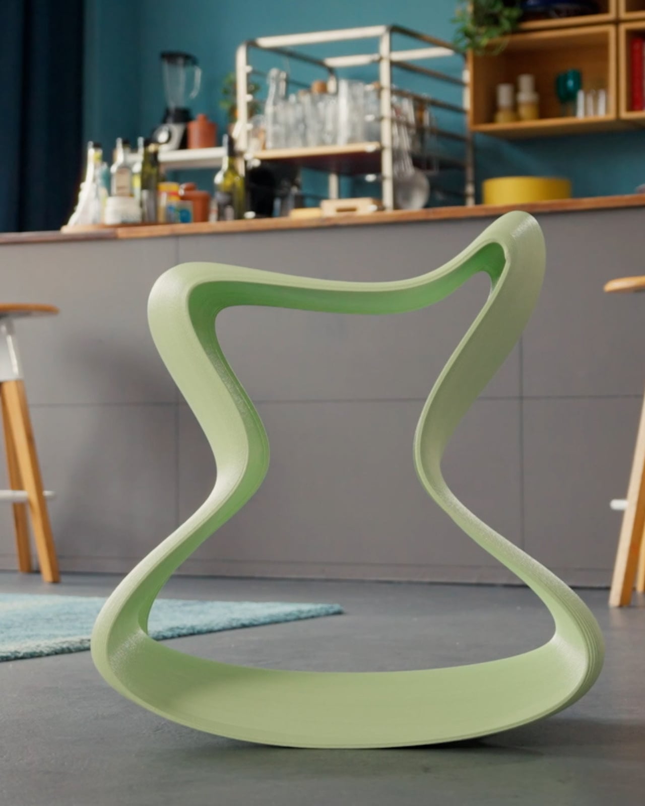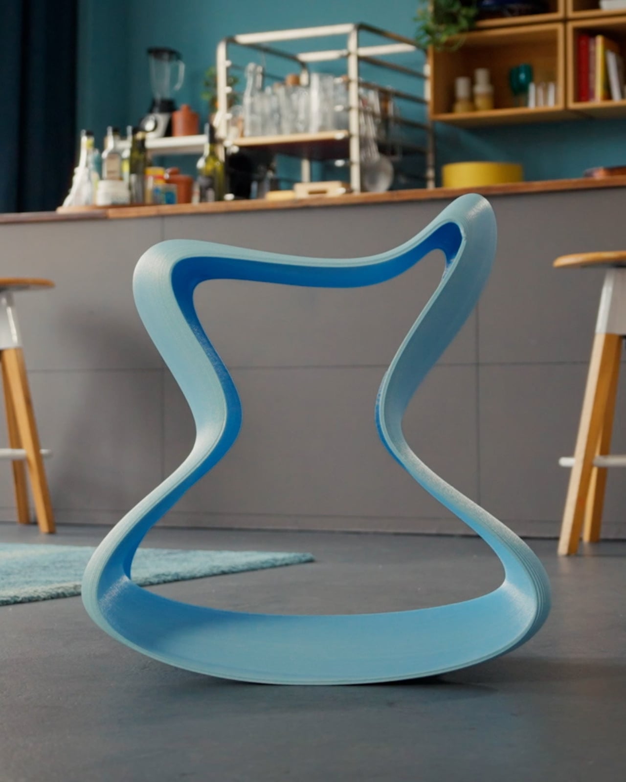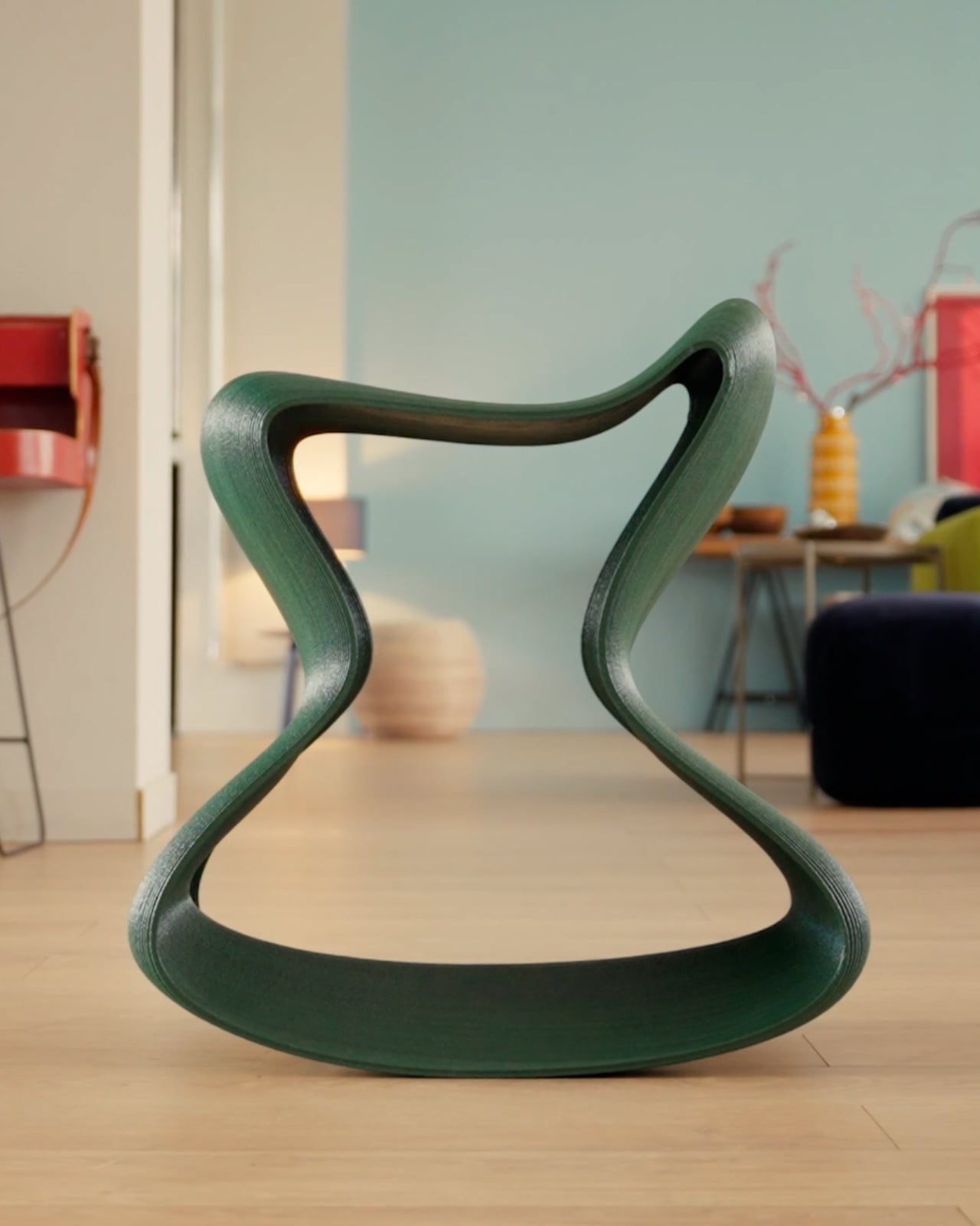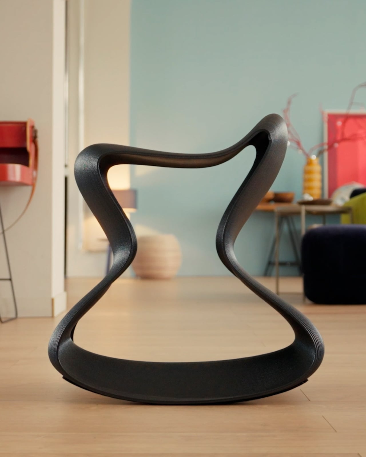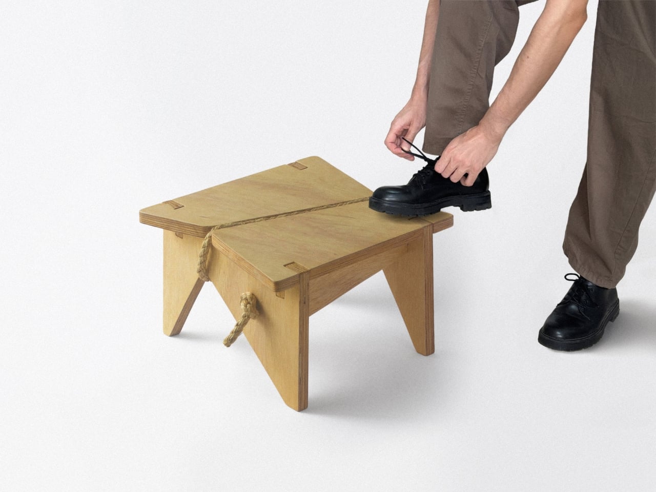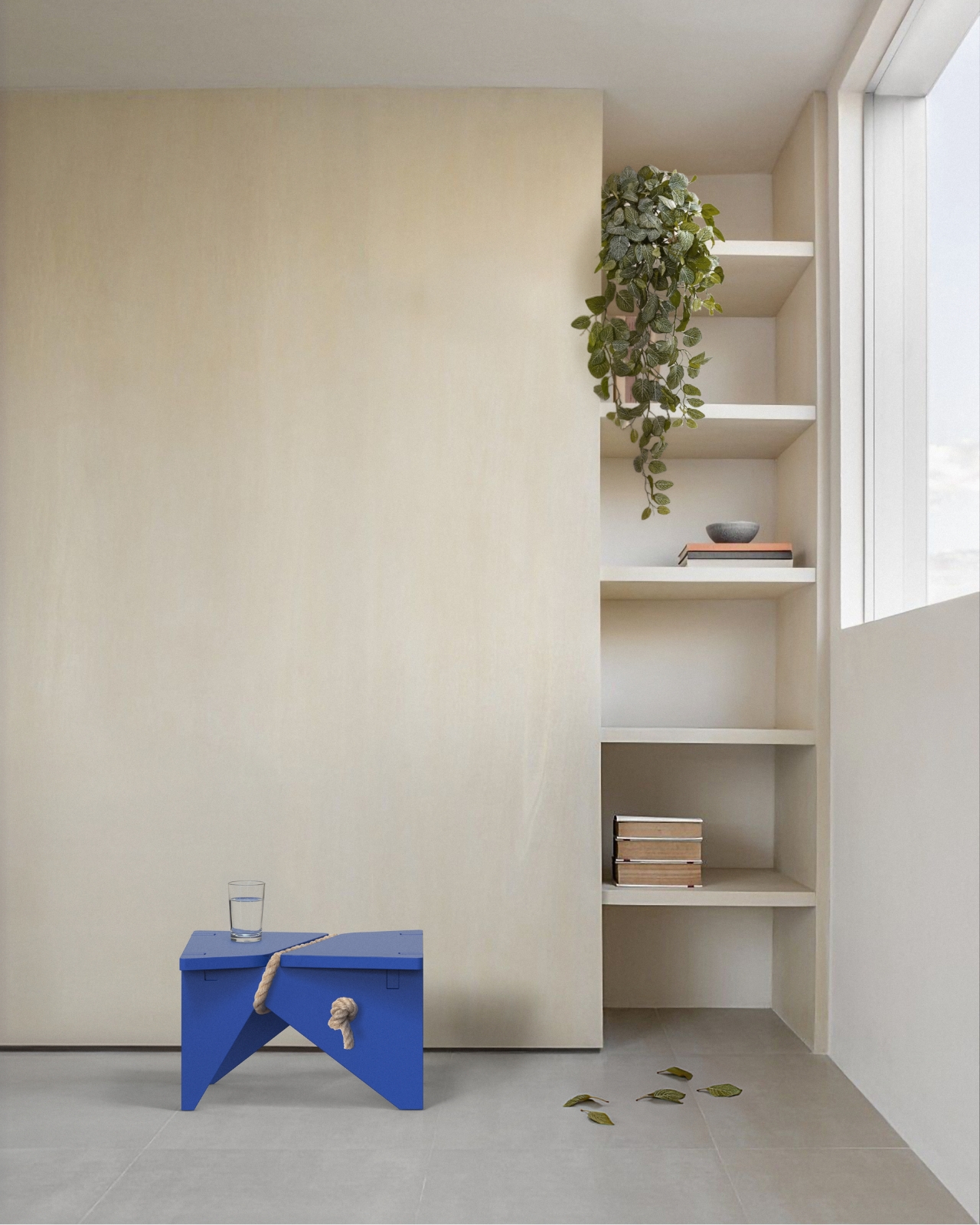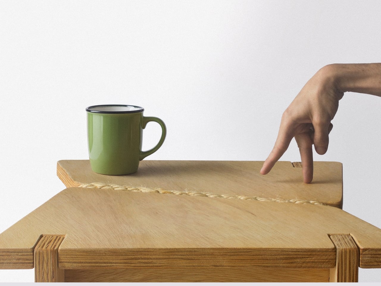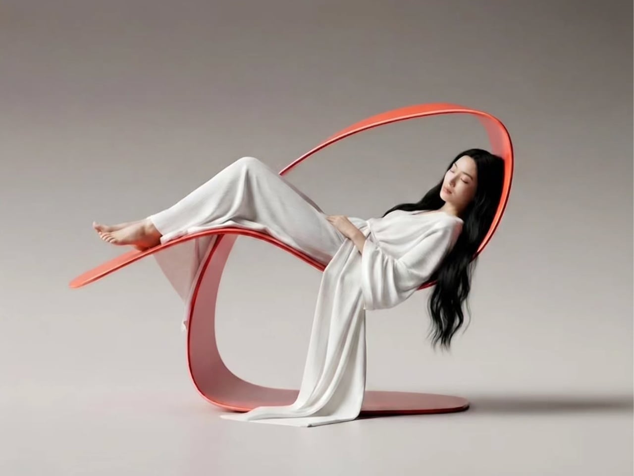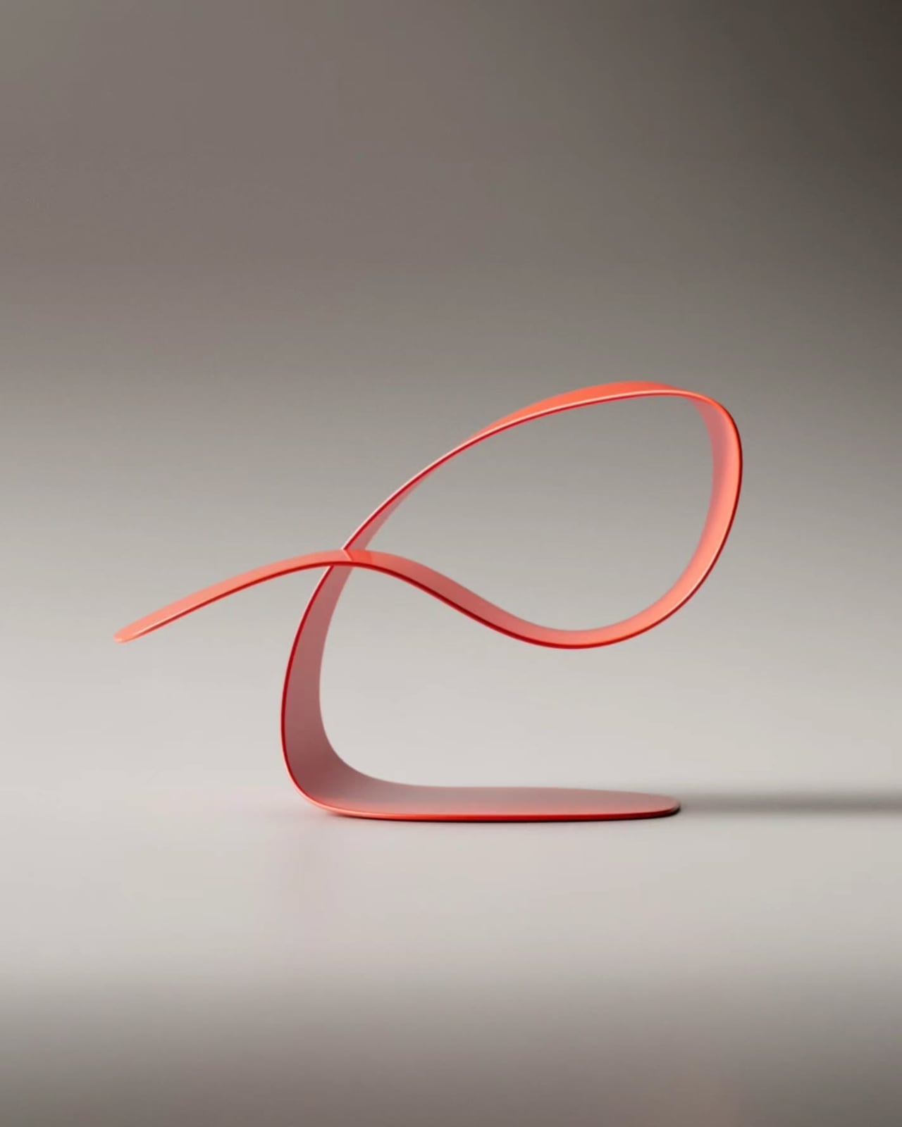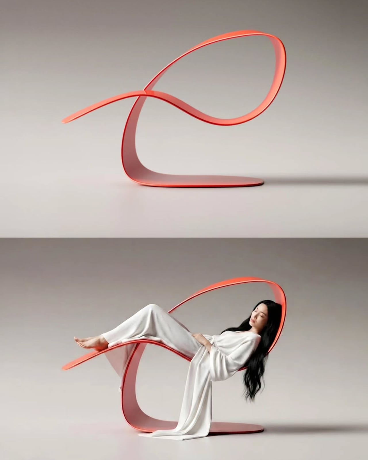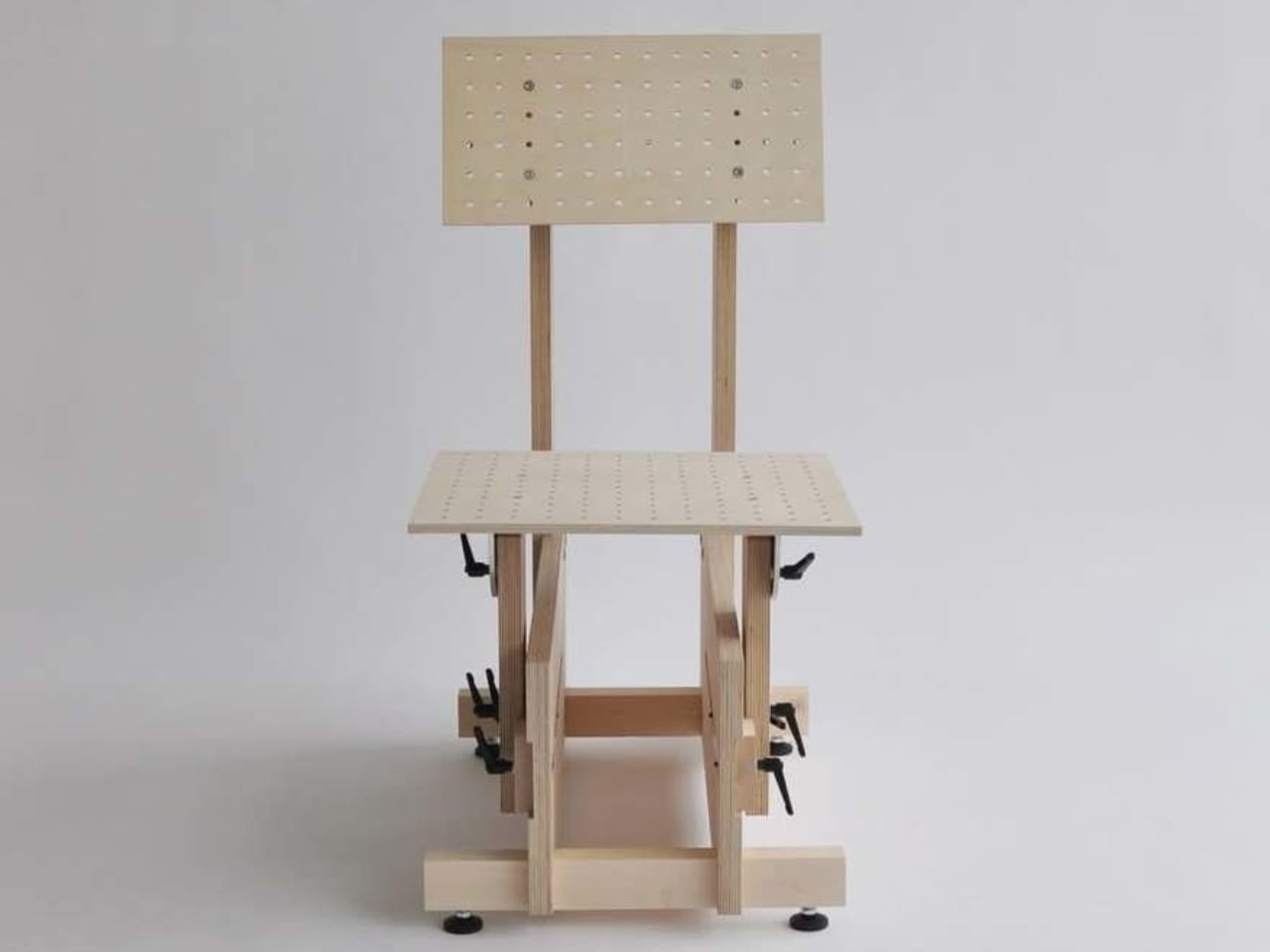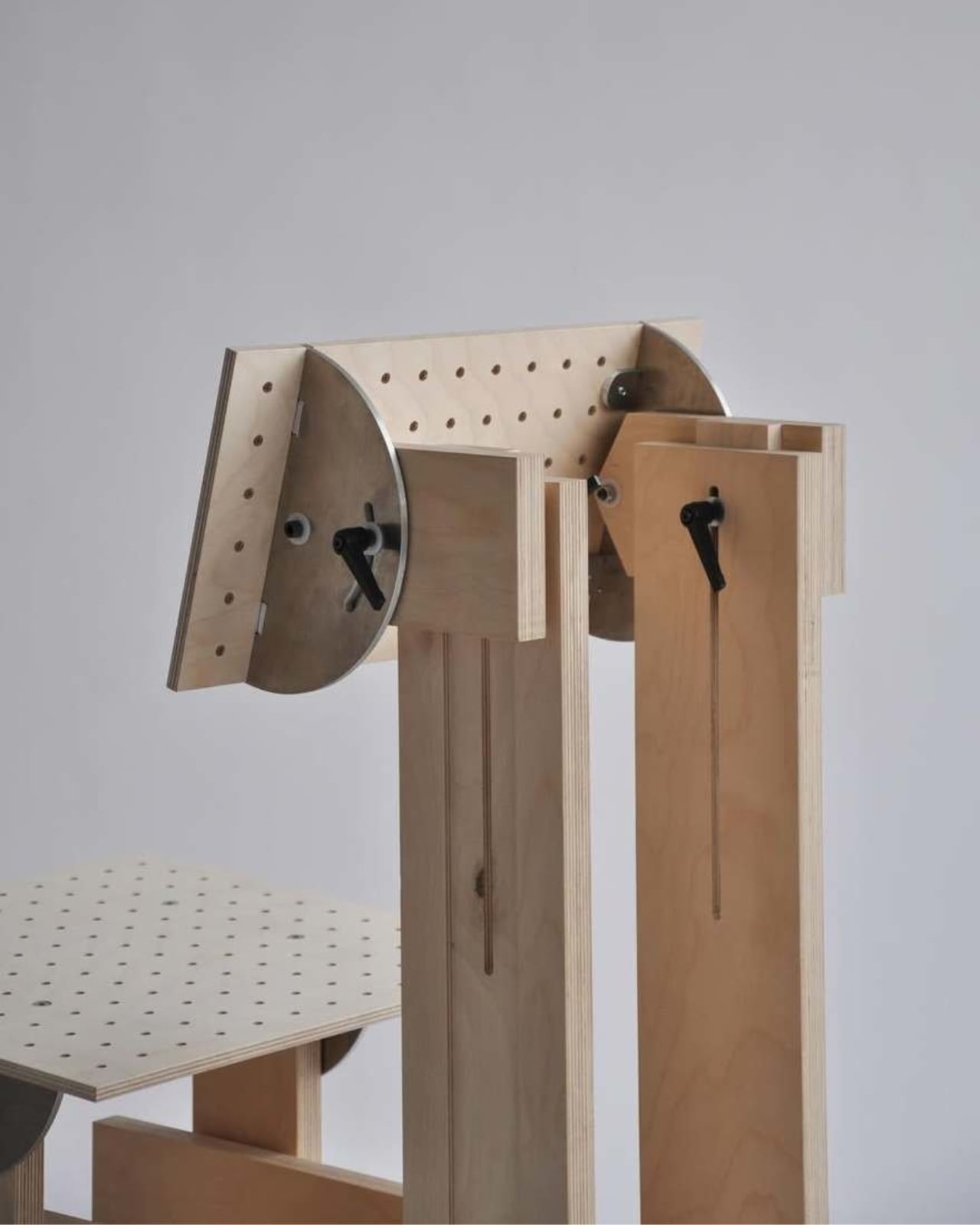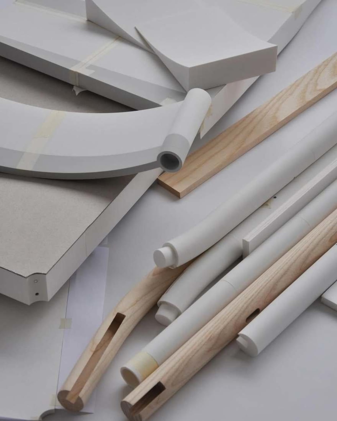
These Steel Chairs and Lamps Look Like Sitting Inside a Pergola

Walking under a pergola or slatted canopy, sunlight breaks into stripes, and the structure feels more like a drawing in space than a solid roof. That rhythm of beams and shadows is both architectural and strangely calming, turning overhead shelter into something closer to a pattern you move through. Foln takes that outdoor language and shrinks it down into objects you can live with indoors.

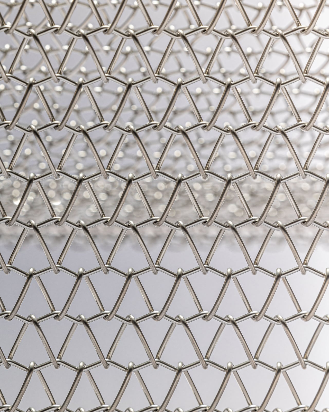
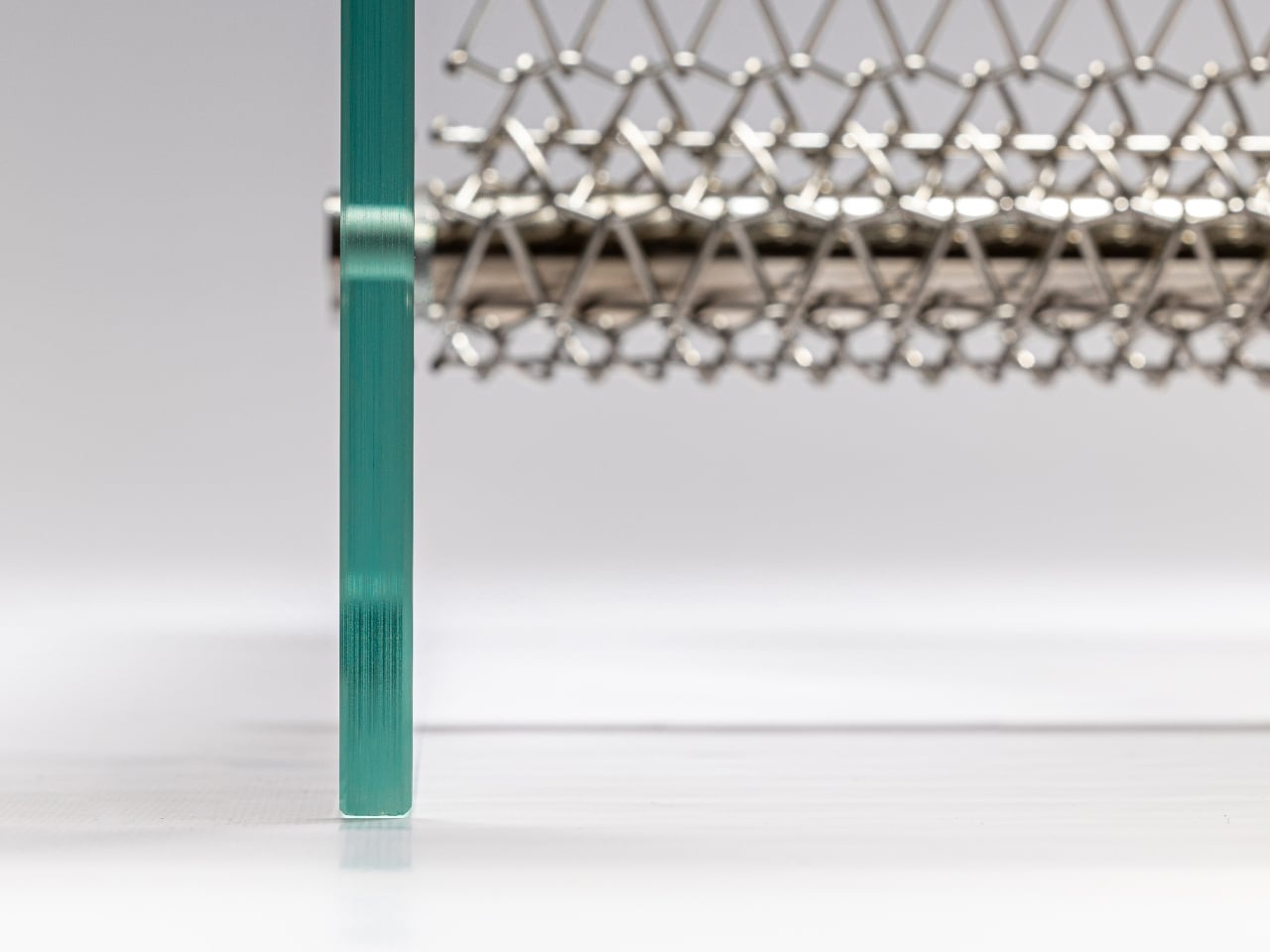
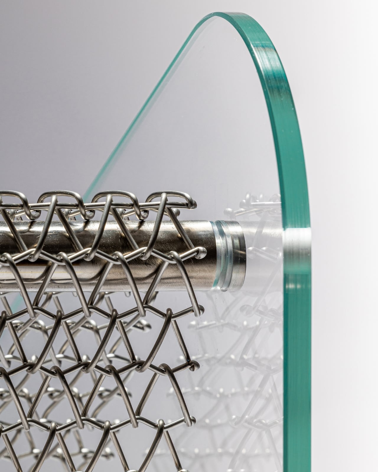
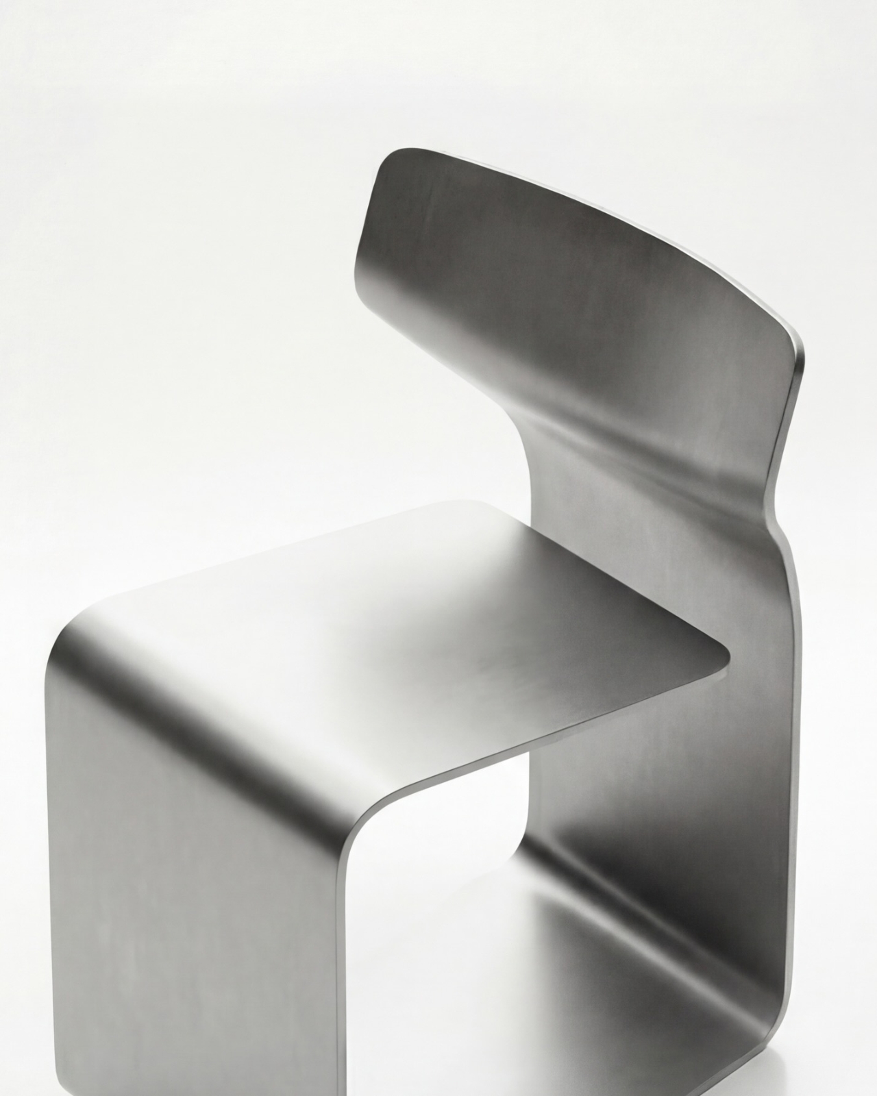
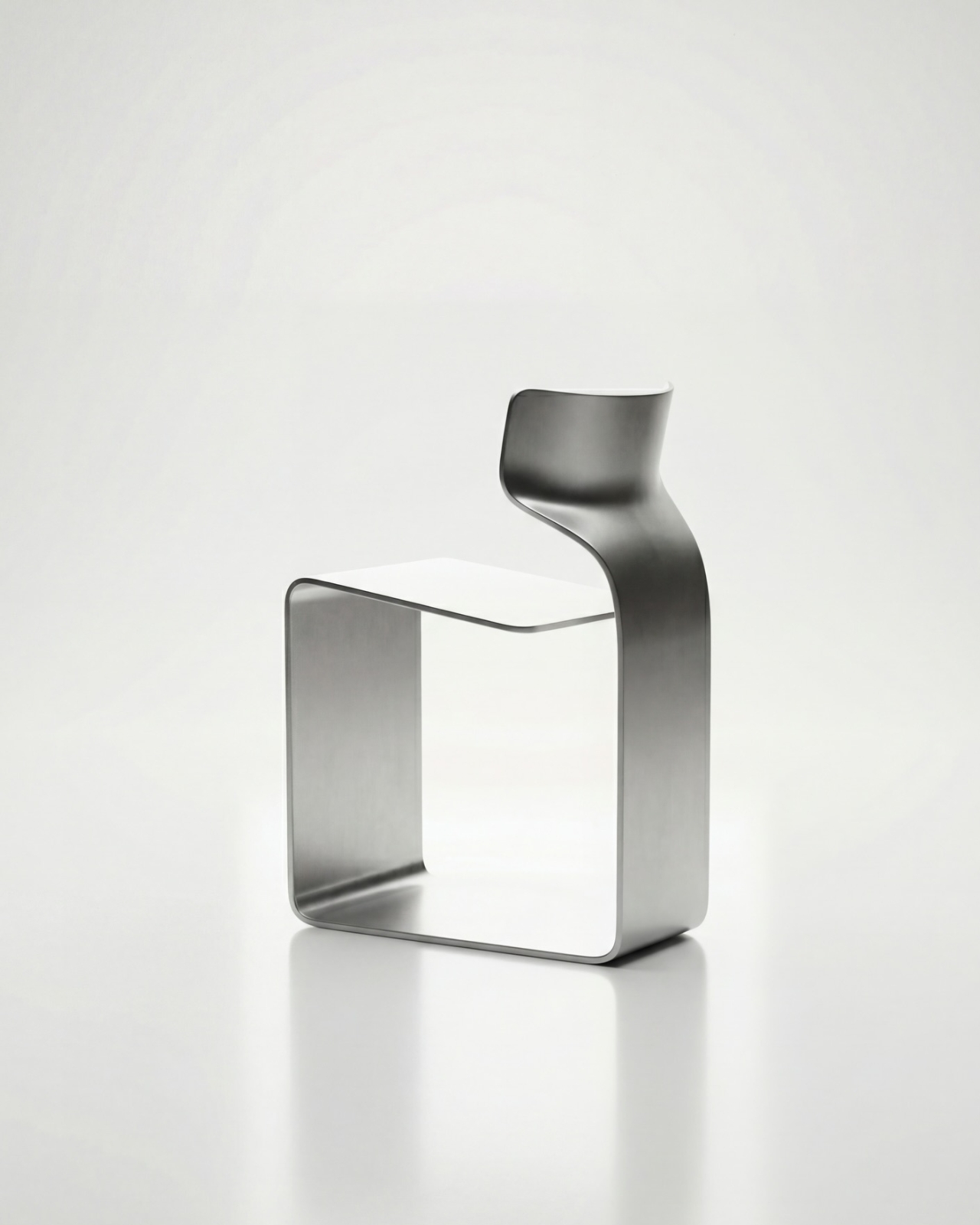
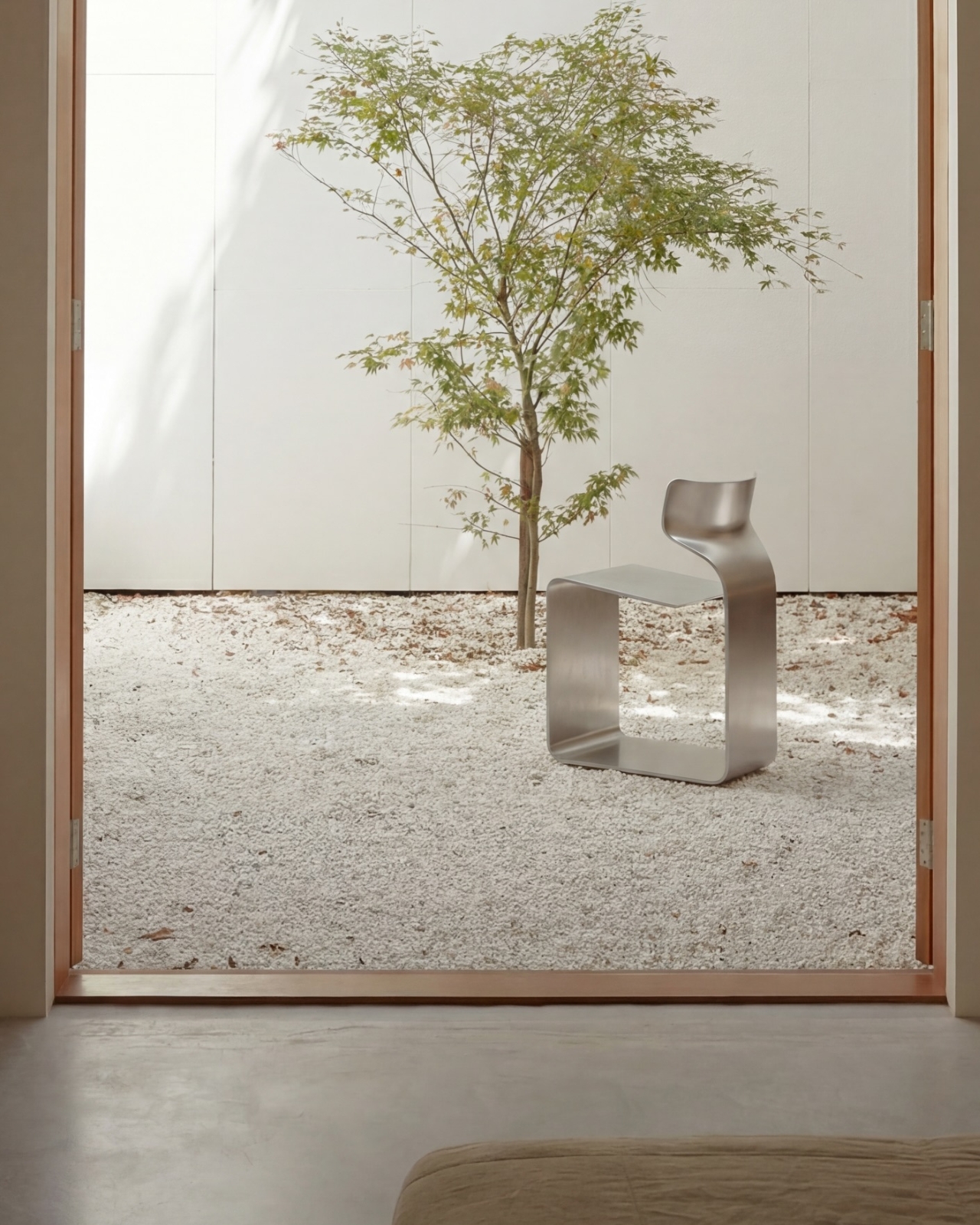
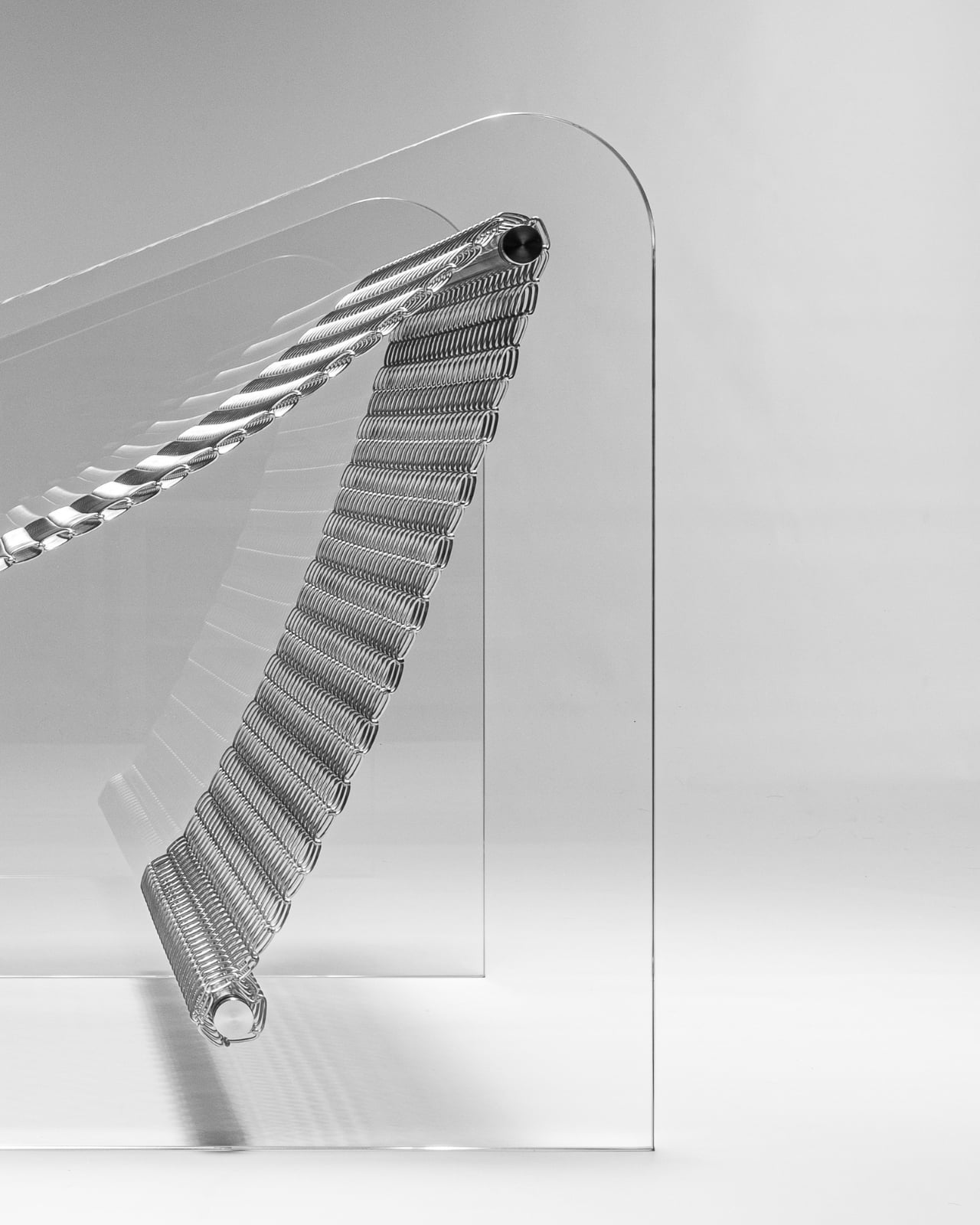
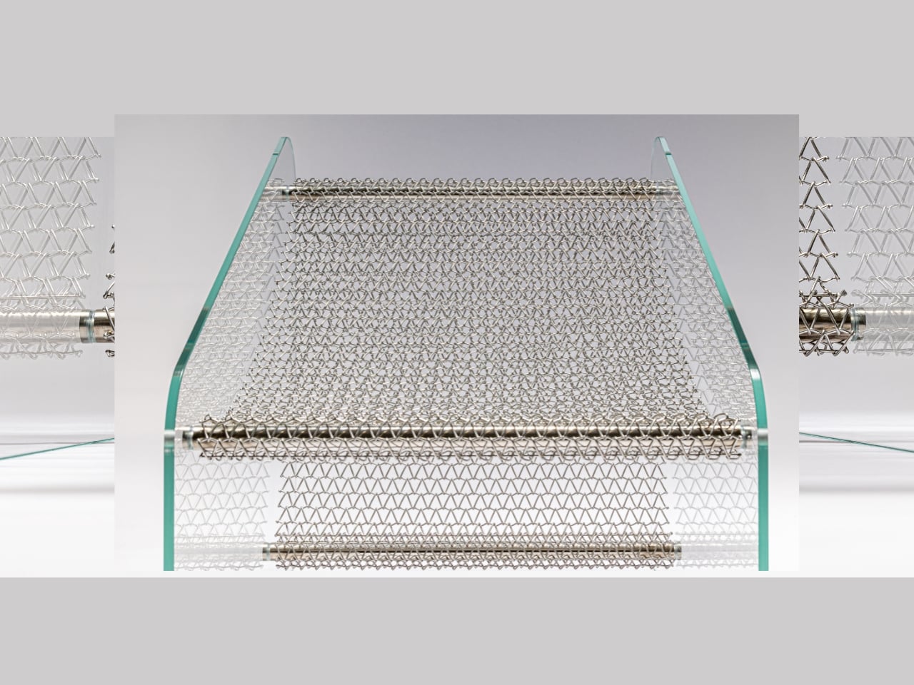
Jiyun Lee’s Foln series is a family of three stainless-steel pieces: the Linear Chair, a floor lamp, and a wall lamp, all built from folded metal lines. Each element is made entirely of stainless steel, with dimensions that keep it slender and vertical. The project is less about adding another chair or lamp to the world and more about importing a structural idea into a domestic scale, treating furniture and lighting as small frameworks you inhabit or move around.

Designer: Jiyun Lee

Encountering the Linear Chair, you see a small framework first, a set of repeated uprights and crossbars that read like a fragment of pergola. Only when you get closer does the seat reveal itself as a crossing of beams, with the back continuing the same rhythm upward. It is clearly functional, but it also feels like sitting inside a drawing, surrounded by lines and the shadows they cast on the floor and wall behind you.

The floor and wall lamps extend the same language into light. The floor lamp becomes a vertical corridor where illumination travels up and down between nested frames, while the wall lamp compresses that idea into a compact cluster that hovers off the surface. In both cases, lighting is less about a glowing bulb and more about how brightness slips between the metal and onto nearby surfaces, treating the surrounding wall as part of the composition.

Foln changes as you move around it. From one angle, the lines stack and the pieces look dense, almost solid; from another, they open up and nearly disappear. The designer’s statement that shadows become architectural elements in their own right comes through when you realize the real composition includes the dark stripes on the floor and wall as much as the polished steel itself, rewriting the room with every shift in daylight.

Stainless steel, sharp geometry, and unpadded surfaces mean Foln is not chasing ergonomic softness or maximum light output. The chair will feel firm, and the lamps will behave more like ambient or accent pieces than task lights. That trade-off is intentional, prioritizing a contemplative, spatial experience over conventional comfort and placing the series closer to collectible design than everyday contract furniture you buy in bulk.

Foln reframes interiors as places where structure, light, and emptiness can be as present as color or texture. By borrowing the pergola’s rhythm and translating it into folded metal, the series turns a familiar outdoor gesture into a quiet indoor ritual. Rhythm is not only seen in the lines of steel but felt in the way light and shadow keep rewriting the room around them, turning simple objects into small, inhabitable frameworks that change how you read the space they sit in.

The post These Steel Chairs and Lamps Look Like Sitting Inside a Pergola first appeared on Yanko Design.
This 1970s Kids’ Desk Flatpacked Before IKEA Even Existed

Here’s something to blow your mind: decades before IKEA convinced us all that assembling furniture with an Allen wrench was somehow fun, a visionary designer named Luigi Colani was already flatpacking children’s furniture in the 1970s. And get this, it wasn’t just about convenience. His Tobifant desk and chair set was actually genius problem-solving at its finest.

If you know anything about Luigi Colani, you know he was the king of curves and organic shapes. This is the guy who designed everything from streamlined trucks to futuristic cameras, always with that signature bio-design aesthetic. But with the Tobifant collection, created for West German children’s furniture brand Kinderlübke, he tackled a problem every parent faces: kids grow way too fast.

Designer: Luigi Colani

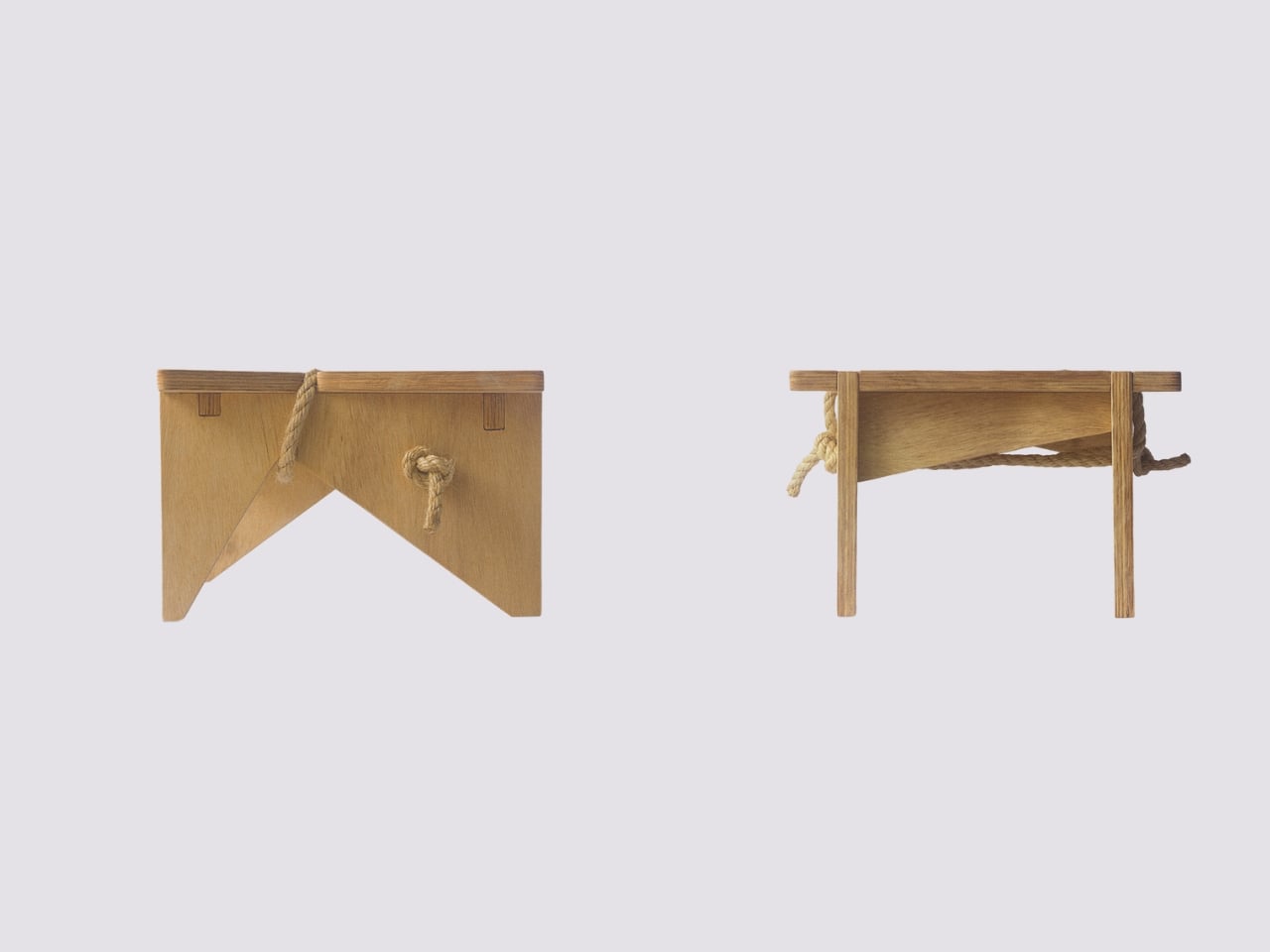
The Tobifant set came flatpacked (yes, in the ’70s!), but that was just the beginning of its brilliance. Made from beech plywood, both the desk and chair featured height-adjustable frames, so you could raise the seat, backrest, and writing surface as your child sprouted upward. Instead of buying new furniture every couple of years, parents could invest once and adjust as needed. It was sustainable before sustainability became a design buzzword.

Think about what a radical concept this was. It was a time when most children’s furniture was either cheap throwaway pieces or expensive heirlooms that kids outgrew almost immediately. Colani created something practical, beautiful, and adaptable. The furniture could literally grow with your child, which meant it could potentially serve them from toddlerhood through their early teens.

But wait, there’s more. Colani didn’t just stop at smart construction. He actually specified that each Tobifant desk should come with one kilogram of modeling clay and three wooden tools. Because apparently he understood that a desk isn’t just a place to do homework. It’s a creative laboratory, and kids need to be encouraged to make things, to experiment, to get their hands dirty (or clayey, as it were). How many furniture designers think about what happens after the sale? Colani was playing 4D chess while everyone else was still figuring out checkers.

The flatpack design wasn’t just about shipping efficiency, though that was certainly a bonus. It was about democratizing good design. By making the furniture easy to transport and assemble, Colani made it more accessible to regular families. This was thoughtful, human-centered design at work.

What’s really striking when you look at photos of the Tobifant set today is how modern it still looks. The clean lines, the warm plywood finish, the elegant simplicity of the adjustable mechanism… it could easily sit in a contemporary home without looking dated. That’s the mark of truly timeless design. While so much ’70s furniture screams its decade with harvest gold upholstery and chrome everywhere, the Tobifant feels almost minimalist in its restraint.

The set went into production in the late 1970s, and today surviving examples pop up on vintage reseller sites, often commanding impressive prices from collectors. It makes sense. Original Colani pieces are increasingly rare, and the Tobifant represents such a perfect intersection of form, function, and forward-thinking design philosophy.

What’s fascinating is how Colani’s approach predated so many trends we think of as recent innovations. Flatpack furniture? Check. Modular, adjustable design? Check. Sustainability through longevity? Check. Child-centered functionality that doesn’t sacrifice aesthetics? Double check. He was essentially doing what today’s best furniture startups are trying to do, except he did it before many of them were even born.

So next time you’re wrestling with those cryptic IKEA instructions, spare a thought for Luigi Colani and his Tobifant collection. He proved that flatpack furniture could be more than just affordable practicality. It could be beautiful, innovative, and genuinely improve how families live. That’s the kind of design legacy that deserves way more recognition than it gets.

The post This 1970s Kids’ Desk Flatpacked Before IKEA Even Existed first appeared on Yanko Design.
This Chair Looks Like a Material Swatch Book

You know those material swatch books at fabric stores where every color fan out in perfect rainbow order? Designer Fatih Demirci apparently looked at one and thought, “What if that was a chair?” The result is the Kartela Chair, a concept design that turns the humble material sample into something you’d actually want to sit on.

Let’s be real. Most furniture design either plays it safe with neutrals or goes so wild that you’d only see it in a modern art museum. The Kartela Chair manages to walk this delightful line between practical and playful. Looking at it feels like stumbling upon a design secret, where function meets whimsy in the most unexpected way.

Designer: Fatih Demirci

The concept is brilliantly simple yet visually striking. The chair features layers upon layers of cushioned upholstery stacked together, creating this incredible rainbow effect along the edges. Each layer represents a different color or texture, much like flipping through pages in a designer’s sample book. It’s the kind of thing that makes you do a double take. From one angle, you see a sophisticated seating piece with a clean, minimalist frame. From another, you catch those vibrant cascading layers that give it personality and depth.

What really gets me about this design is how it celebrates the materials themselves. Usually, upholstery is hidden away, tucked and stapled underneath where no one sees the construction. Demirci flips that script entirely. Here, the layers become the main event. Every fold, every color transition, every texture is on full display. It’s like the chair is saying, “Hey, look how I’m made, and isn’t it beautiful?”

The Kartela Chair comes in different colorways, which honestly makes it even more fun. There’s a lime green version that practically vibrates with energy, perfect for someone who wants their furniture to make a statement. Then there are softer pastel combinations in lilacs, blues, and creams that feel more serene but still maintain that playful edge. And for those leaning toward earthy vibes, there are warm tones in mustards, tans, and terracottas that bring all that visual interest without overwhelming a space.

The frame itself keeps things grounded. Slim metal legs in either white or black powder coat give the chair an airy, almost floating quality. It’s a smart move. With all that cushioned drama happening above, a heavy base would make the whole thing feel clunky. Instead, the minimal structure lets those colorful layers take center stage while still providing solid support.

From a practical standpoint, this concept is interesting because it challenges how we think about customization. Imagine being able to choose your layer combinations like picking nail polish colors. Want more blues? Go for it. Prefer a monochromatic fade? That works too. The design naturally lends itself to personalization in a way that most furniture doesn’t.

There’s also something nostalgic about the aesthetic. Those tufted buttons on the seat and back cushions give off vintage vibes, like something your cool aunt might have had in her 70s living room, but updated for today. It’s retro without being costume-y, which is a hard balance to strike.

Of course, this is still a concept design, which means we’re looking at rendered images rather than something you can order online tomorrow. But that’s part of what makes furniture concepts so exciting. They push boundaries and make us reconsider what’s possible. Even if the Kartela Chair never makes it to mass production, it’s already done its job by sparking conversation and inspiring other designers to think outside the traditional furniture box. Whether this chair ever graces showroom floors or remains a digital darling, Fatih Demirci has created something that makes people smile. And in the end, isn’t that what good design should do?

The post This Chair Looks Like a Material Swatch Book first appeared on Yanko Design.
Furniture That Dances: The Moon Series Reimagines Seating

There’s something almost poetic about furniture that moves. Not in the literal sense, but in the way it invites you to play, rearrange, and reimagine your space. The Moon Series from Craft of Both and MADE does exactly that, and honestly, it’s one of the most captivating furniture concepts I’ve seen in a while.

Picture this: a chair that unfolds like a Chinese paper fan, its pleated form spreading out in a graceful arc. That’s the essence of the Moon Series, designed by Christina Standaloft and Jay Jordan. The collection features two core pieces, the Moon Chair at 60 degrees and the Moon Bench at 120 degrees, both built on radial geometry that gives them this incredibly sculptural quality.

Designers: Christina Standaloft, Jay Jordan

What makes these pieces special isn’t just how they look (though they’re absolutely stunning). It’s how they work. The designers describe the interaction as a “meditative fan dance,” which might sound a bit flowery until you actually see someone adjusting the modules. There’s something genuinely calming about sliding those pleated panels along the wooden framework, customizing the backrest to exactly how you want it. It’s tactile design at its finest.

The modularity here goes way beyond what we usually see in flexible furniture. Each piece can be constantly redefined, changing both its physical form and the amount of space it occupies. Want more privacy? Add modules. Need a more open feel? Remove some. The radial structure means every adjustment changes not just comfort but the entire aesthetic of the piece.

But here’s where it gets really interesting. When you start combining multiple Moon Chairs or Benches together, you’re essentially creating sculptural landscapes in your living space. The arrangement of those fan-like elements determines everything: how the pieces orient toward each other, how much privacy each seating area has, the comfort level, and the overall visual impact. It’s like being handed a set of beautiful building blocks and being told to go wild.

The technical execution is impressive too. Those 60-degree and 120-degree angles aren’t arbitrary. They’re precisely calculated to allow the pieces to connect and configure in multiple ways. A full circle is 360 degrees, so you could theoretically arrange six Moon Chairs or three Moon Benches to create a complete circular seating area. Mix and match them, and the possibilities multiply exponentially.

What strikes me most about the Moon Series is how it bridges Eastern and Western design sensibilities. The inspiration from Chinese paper fans brings this delicate, almost ceremonial quality to the pieces. Yet the execution feels very contemporary, with clean lines and that minimalist aesthetic we’ve come to associate with modern Scandinavian or Japanese design. The wooden slats radiate outward like sunbeams, and those pleated paper or fabric panels catch the light beautifully.

There’s also something refreshingly honest about the design. You can see exactly how it works. The structure is exposed, the modularity is obvious, and the craftsmanship is on full display. In an era where so much furniture hides its mechanics behind upholstery and veneers, this transparency feels almost rebellious. From a practical standpoint, this kind of modular system makes a lot of sense for how we actually live today. Smaller spaces, frequent moves, evolving needs… furniture that can adapt alongside us isn’t just clever, it’s necessary. But the Moon Series doesn’t sacrifice beauty for function. If anything, the functionality enhances the beauty.

The partnership between Craft of Both and MADE brings together thoughtful design philosophy with production expertise, and it shows. These aren’t concept pieces that will never make it past the design blog circuit. They’re real, functional furniture that you could actually live with. I keep coming back to those images of someone adjusting the fan modules, their hands gently pulling the pleated material into place. There’s an intimacy there, a personal relationship between user and object that most furniture just doesn’t offer. Your Moon Chair becomes uniquely yours through how you configure it, day by day, mood by mood.

The Moon Series offers something different when we’re used to flat-pack sameness. It’s furniture that invites participation, rewards creativity, and somehow manages to be both statement piece and practical seating. That’s not an easy balance to strike, but Standaloft and Jordan have done it with grace.

The post Furniture That Dances: The Moon Series Reimagines Seating first appeared on Yanko Design.
Atlanta Airport Has Chairs Made From Campus Trash. They’re Gorgeous

There’s something quietly radical about sitting in a recycled Adirondack chair while you’re waiting for your flight at the world’s busiest airport. Plastic Reimagined transforms locally sourced plastic waste into full-scale seating prototypes, bridging design education, material research, and civic infrastructure at Hartsfield-Jackson Atlanta International Airport, and honestly, I can’t stop thinking about how clever this is.

Here’s what happened. Assistant Professor Hyojin Kwon, founder of the research-oriented practice Pre– and Post–, developed this through a graduate design research studio at Georgia Tech’s School of Architecture, where students took a very practical question and turned it into something beautiful. What if all that plastic waste from campus could actually become something useful again?

Designer: Hyojin Kwon (curator and instructor)

Graduate students collected post-consumer HDPE and PLA from campus makerspaces, waste collection streams, and local recycling facilities. Think about that for a second. The plastic cups from the student union, 3D printing scraps from late-night projects, all that everyday campus detritus that usually ends up in a landfill. Instead of being tossed, the materials were shredded, pressed into sheets, milled with CNC routers, or cast into volumetric forms.

What I love most is that they didn’t try to hide the recycled nature of these pieces. Surface variations, including marbled color patterns and irregular textures, were retained as integral elements of the final designs, so each chair has this gorgeous, swirly aesthetic that screams “I used to be something else.” The imperfections became the personality.

The project started modestly enough. It was first exhibited at Atlanta Contemporary from June to September 2025, where a series of Adirondack chairs and collective seating elements were presented as both design artifacts and material propositions. But then it went public in a bigger way. During SITE 2025 at the Goat Farm Arts Center, the chairs were installed across the 12-acre property during a one-night arts festival and encountered by over 4,000 visitors who could actually sit on them, touch them, use them in the wild.

Now comes the really exciting part. Plastic Reimagined transitioned into a long-term civic setting as part of TRANSPORT | Transform | TRANSCEND, a year-long exhibition partnership between Georgia Tech Arts and Hartsfield-Jackson Atlanta International Airport, installed in Terminal T and on view through November 2026. That means millions of travelers from around the world will see these chairs, and maybe pause long enough to wonder about their own relationship with plastic waste.

As Kwon noted, “These post-consumer materials were coming from our campus, our students’ everyday life. By repurposing them, we created meaningful research outcomes.” There’s something deeply satisfying about that circularity. The students created the waste, then figured out how to give it a second life as functional furniture that other people can actually use.

The individual pieces have names and personalities. There’s Vincent, with its hand-shaped forms and marbled surfaces. There’s Modu-Chair, built from cubic modules that echo quilting patterns. And Framework, a translucent lattice structure that reimagines what an Adirondack chair can even be. Each one asks the same question in a different way: what if we stopped seeing plastic as garbage and started seeing it as potential?

Across its transitions from gallery to festival to global transit hub, Plastic Reimagined argues for sustainability as infrastructural literacy rather than aesthetic signaling. This isn’t performative environmentalism. It’s practical, tangible, and sitting right there in the airport terminal where anyone can plop down and rest their feet.

This project proves something I’ve always believed: the best design solutions come from constraints, not abundance. When you have to work with what’s already there, you get creative in ways you never would with unlimited resources. These Georgia Tech students turned their campus waste stream into a civic contribution, and now their work is literally supporting weary travelers at one of the planet’s busiest crossroads.

The post Atlanta Airport Has Chairs Made From Campus Trash. They’re Gorgeous first appeared on Yanko Design.
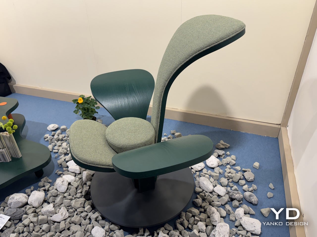
This Wicker Collection Looks Like the Forest Came Indoors

There’s something magical about watching an ancient craft transform into something that feels utterly contemporary. That’s exactly what happens when you encounter Whispers of the Wildwood, a new collection from Hyderabad-based design studio The Wicker Story. Designer Priyanka Narula has taken the humble art of wicker weaving and turned it into something that feels like poetry you can touch.

Wicker has been having a moment lately. You’ve probably noticed it creeping back into the design world, showing up in Instagram-worthy cafes and carefully curated living rooms. But here’s the thing: most wicker pieces still carry that nostalgic grandma’s-porch vibe, charming but predictable. Narula decided to throw that playbook out the window.

Designer: Priyanka Narula for The Wicker Story

Instead of sticking to traditional furniture forms, she looked to the forest itself for inspiration. The collection draws from the organic chaos of nature, from meandering rivers that never quite go straight to forest canopies that filter light in a thousand different ways. There’s the gentle sway of wild grasses caught in the breeze, the textured warmth of tree bark, the unpredictable curves of branches reaching toward the sun. Each piece in the collection becomes a memory of these natural moments, frozen in woven form.

What makes this collection so compelling is how it pushes wicker beyond what we think it can do. These aren’t just chairs and tables with a nature-inspired twist. They’re sculptural pieces that happen to be functional, blurring that increasingly fuzzy line between art and design. The textures are incredibly fine, elevated through contemporary silhouettes and details so subtle you might miss them at first glance.

Take the Pagdandi wall unit, for example. The name itself evokes narrow forest paths, those meandering trails worn by countless footsteps over time. The piece captures that same sense of organic movement, of following where nature leads rather than imposing rigid geometry. It’s the kind of design that makes you stop and look twice, wondering how something woven could feel so fluid.

The earthy tones throughout the collection feel deliberate but never forced. Instead of reaching for trendy neutrals, Narula stays true to the materials themselves, letting the natural warmth of wicker shine through. It’s a celebration of what the material can do when you really understand it, when you’ve spent years researching and experimenting with traditional weaving techniques and then finding ways to push them forward.

This approach makes sense when you learn more about The Wicker Story itself. Founded by Narula in 2018, the studio has built its reputation on research-driven design that respects Indian weaving craft while refusing to let it remain static. It’s not about preservation for preservation’s sake. It’s about honoring the skill and knowledge of traditional artisans while asking what else is possible, what new forms and expressions might emerge when you give craft room to evolve.

The timing feels right for a collection like this. We’re living in an era where people are craving authenticity and connection to natural materials, but nobody wants their space to feel like a museum or a rustic cabin. We want pieces that acknowledge our contemporary lives while bringing in warmth and texture and that ineffable quality of something made by human hands. Whispers of the Wildwood hits that sweet spot perfectly.

What Narula has created isn’t just furniture. It’s a reminder that the best design often comes from deep observation of the world around us. The forest doesn’t use straight lines or perfect symmetry, yet it creates compositions that feel balanced and beautiful. By channeling those organic rhythms into woven forms, this collection brings a piece of that wildwood serenity into our built environments.

For anyone who loves design that tells a story, that carries meaning beyond pure aesthetics, this collection deserves your attention. It proves that traditional craft can speak to contemporary sensibilities, that wicker can be sculptural and sophisticated, and that sometimes the most innovative design comes from looking not to the future but to the timeless patterns of nature itself.

The post This Wicker Collection Looks Like the Forest Came Indoors first appeared on Yanko Design.
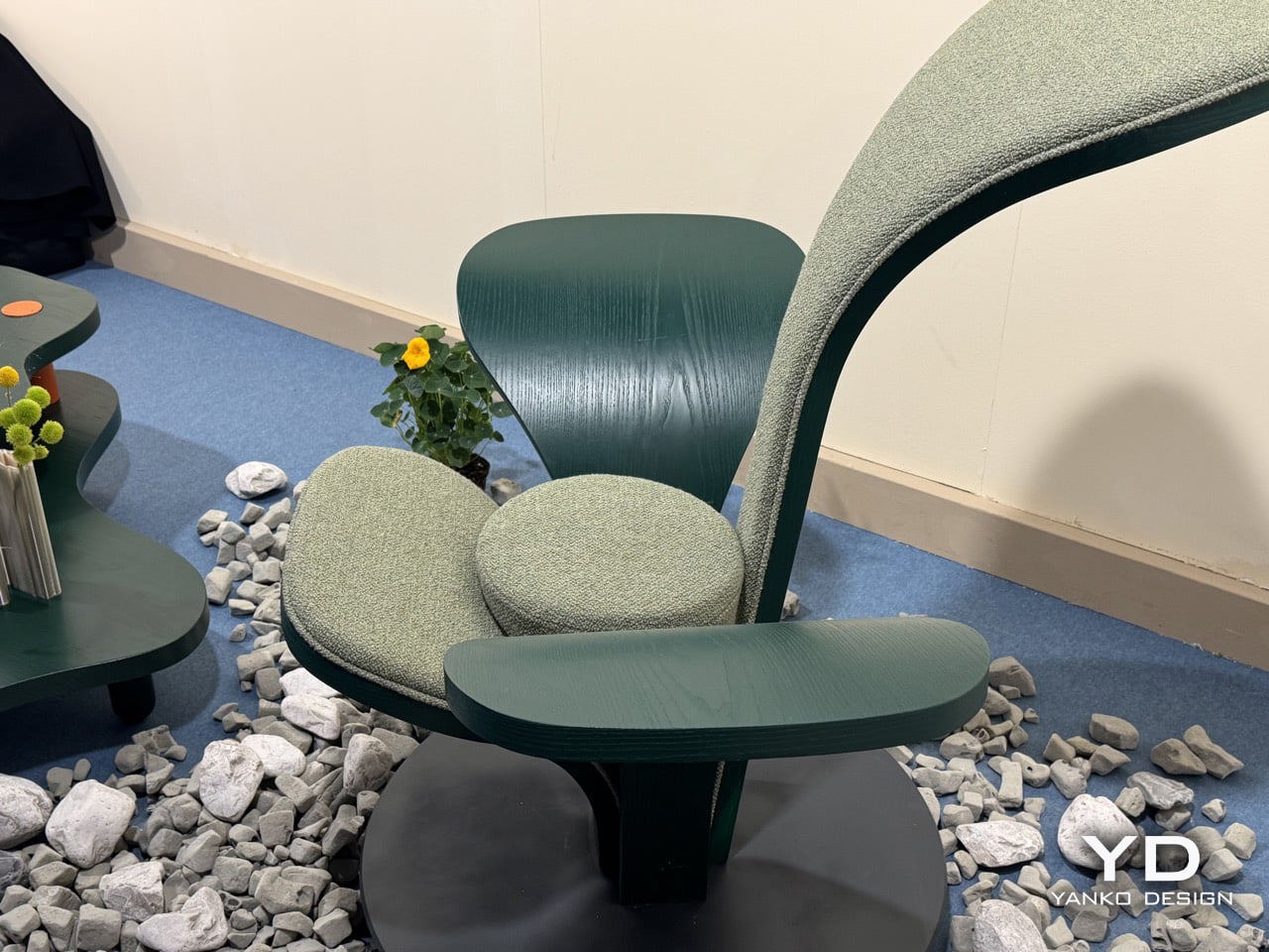
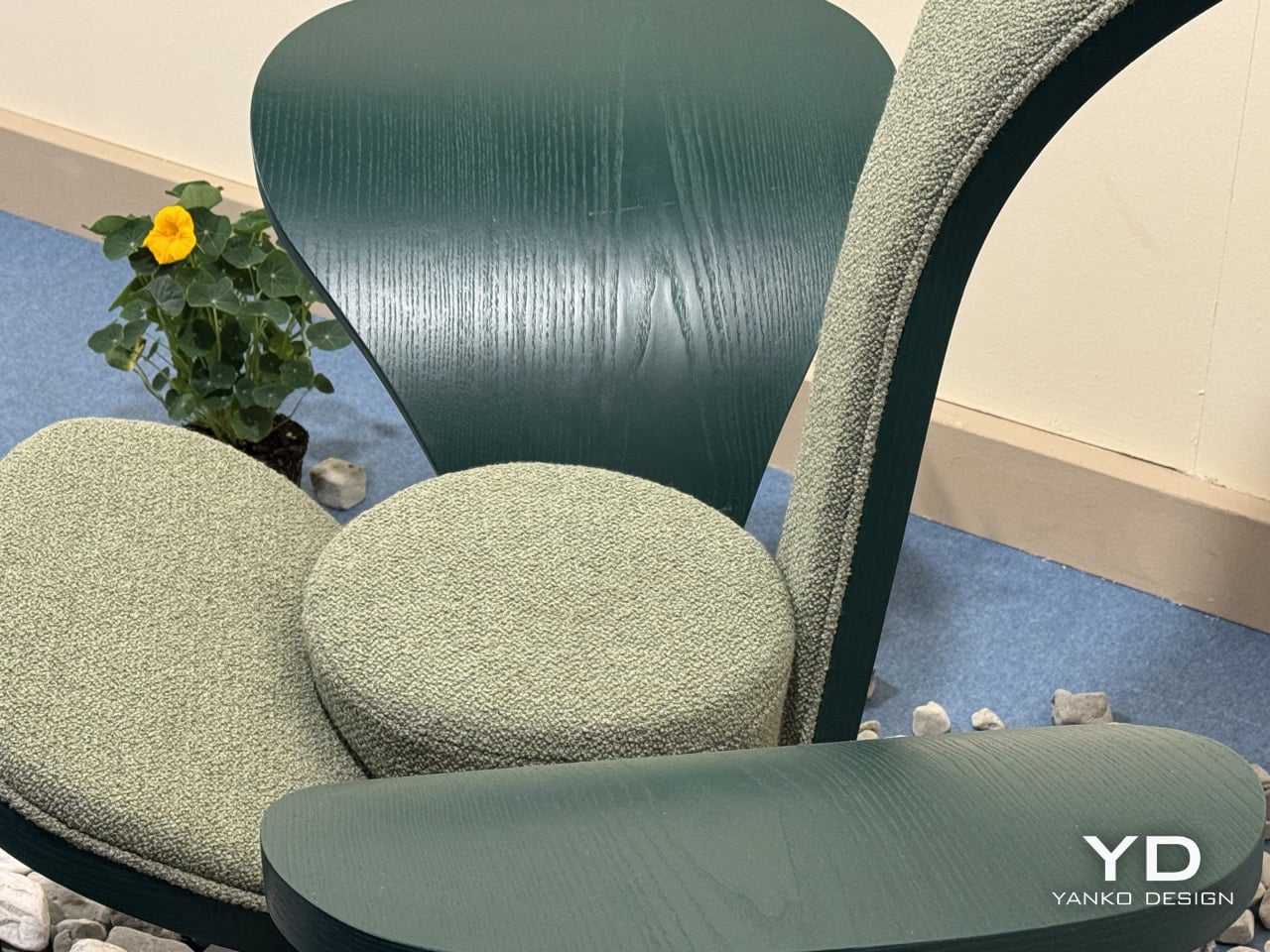
This Doughnut Chair Has One Bite Missing, and That’s Your Seat

Most chairs are clearly assembled objects, with legs, a seat, and a backrest, all stacked and joined together. Sculptural lounge pieces sometimes flip that script and feel more like a single volume that has been carved or sliced. Chunk is a concept that leans into that second approach, imagining seating as a doughnut with a bite taken out rather than a frame with cushions bolted on, treating furniture as something you edit rather than assemble.

The designer imagined a chair that looks like a doughnut with a chunk removed. The missing piece becomes the seat and the opening for the backrest, while the rest of the ring wraps around in a continuous loop. The concept is less about novelty and more about seeing how far a single looping form can be pushed into something you can actually sit in, where the absence of material defines the place for the body.

Designer: Liam de la Bedoyere

Both the seat and backrest share the same oval cross-section, but as the base curves up to become the backrest, that oval quietly swaps its length and width. It is wide and low where you sit, then gradually becomes tall and narrow as it rises behind you. The section never breaks; it just morphs along the path, which gives the chair a sense of motion even when it is still and empty.

The “bite” creates a bowl-like seat that cradles the hips and thighs, while the rising loop offers a relaxed backrest rather than a rigid upright. The proportions suggest a low, lounge-style posture, closer to a reading chair or a corner piece in a living room than a dining chair. The continuous curve encourages you to lean back and sink in, not perch on the edge ready to stand again.

A near-cylindrical form can look like it might roll away, but the geometry and internal structure are tuned to keep the center of gravity low and slightly behind the seat. The base is subtly flattened, and a denser core at the bottom would keep it from tipping forward when someone leans back. The result is a chair that looks precarious from some angles but behaves like a grounded lounge piece once you sit.

The monolithic upholstery, a textured fabric that wraps the entire volume without obvious breaks, reinforces the idea of a single chunk of material. The form reads differently as you move around it, sometimes like a shell, sometimes like a curled leaf, sometimes like a coiled creature. It is the kind of chair that anchors a corner or gallery-like space, inviting you to walk around it before you decide to sit down and settle in.

Chunk uses subtraction as its main design move, starting from a complete ring and then removing just enough to create a place for the body. For a category that often defaults to adding parts, there is something satisfying about a chair that feels like it has been edited down to a single, looping gesture, with one decisive bite turning an abstract volume into a place to rest, read, or just sink into for a while.

The post This Doughnut Chair Has One Bite Missing, and That’s Your Seat first appeared on Yanko Design.
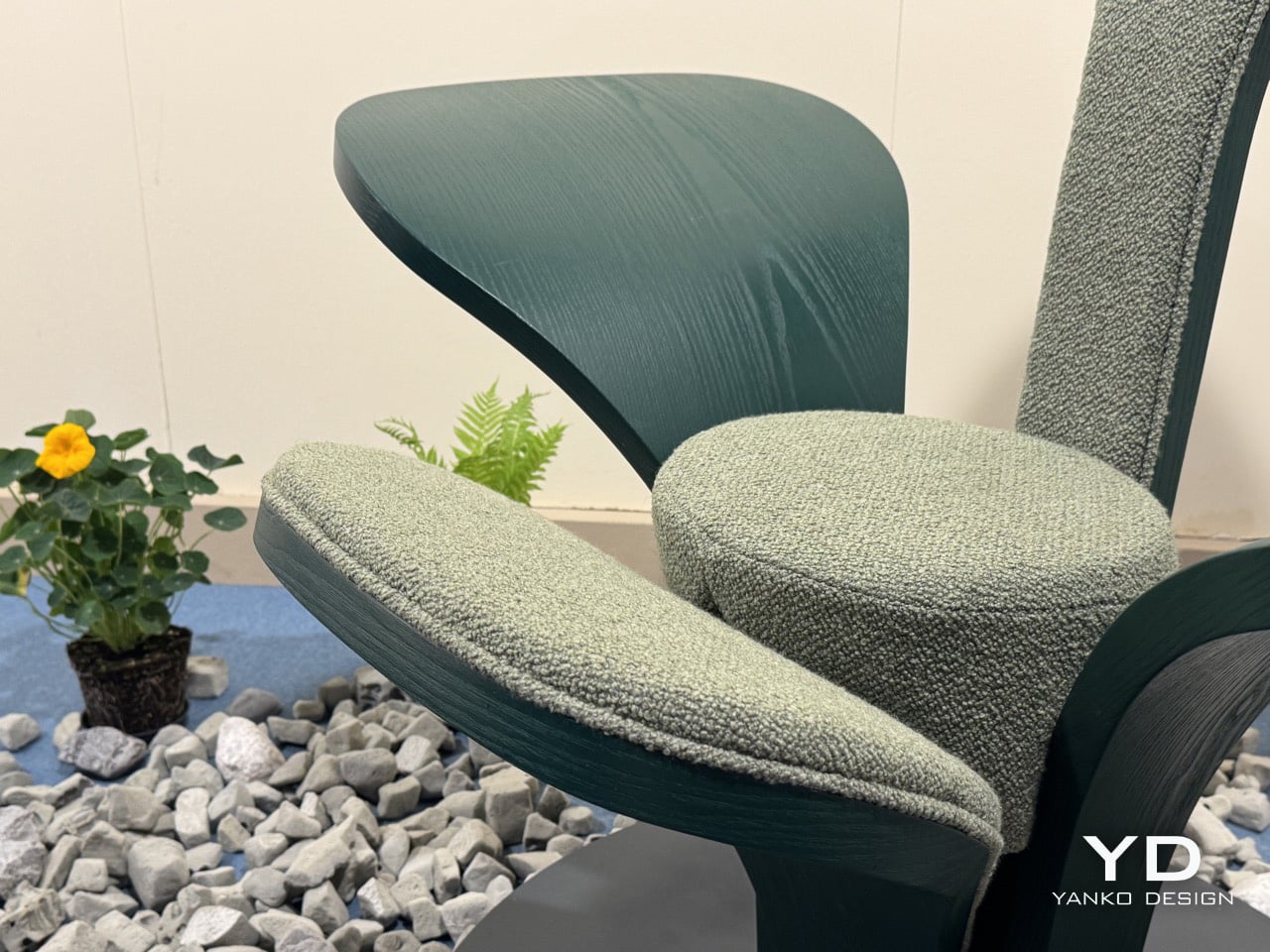
This Modular Chair Transforms Into 3 Designs With One Sphere

Remember when you were a kid and every toy was an invitation to build something new? Designers Sihun Lim and Hyeonggyun Han are bringing that same playful spirit to furniture with their PLA modular chair concept, and honestly, it’s the kind of design that makes you wonder why all furniture isn’t this fun.

The PLA project is built around a simple but brilliant idea: what if you could customize your chair the same way you’d snap together building blocks? At the heart of each design is a spherical connector module that acts like a universal joint, letting you attach different seat backs, legs, and structural elements to create wildly different chair styles. It’s furniture that refuses to be just one thing, and in our era of tiny apartments and ever-changing aesthetics, that flexibility feels genuinely exciting.
Designers: Sihun Lim, Hyeonggyun Han

Create your own Aesthetic Render: Download KeyShot Studio Right Now!

What really sets this concept apart is its unapologetic space theme. Lim and Han didn’t just create modular chairs; they created modular chairs inspired by the cosmos, and that choice transforms what could have been a purely functional exercise into something that sparks imagination. The three main designs (cleverly named O1-P, O2-A, and O3-L) each take inspiration from different space exploration imagery, turning everyday seating into conversation pieces.

The O3-L sunbed takes inspiration from satellites orbiting in space, complete with distinctive panels that evoke solar arrays. The design has this wonderful industrial edge to it, with metal connecting elements that create visual interest while serving the practical purpose of holding everything together. When viewed from above, it really does resemble a satellite, right down to the way the components radiate from that central spherical hub.

Then there’s the O2-A chair, which draws from Saturn’s iconic silhouette. When you look at it from the side, you can see how the designers translated those distinctive planetary rings into flexible curves that wrap around the central sphere. The result is a chair that feels both organic and architectural, with legs that flow in elegant arcs. It’s the kind of piece that would look equally at home in a sleek office or a retro-futuristic cafe.

The O1-P stool channels the moment a lunar rover touches down on the moon’s surface. The body of the rover becomes the seat, while the landing legs translate into the stool’s four individually configurable legs. It’s that perfect intersection of form following function and function following fantasy. You can practically imagine Neil Armstrong’s voice as you pull up a seat.


The color palette is another smart choice. Instead of playing it safe with neutrals, the designers went bold with electric blues, coral pinks, and eye-popping lime greens. These aren’t colors that fade into the background; they’re colors that announce themselves. Combined with the metallic silver pipes and connector elements, the chairs have this retro-futuristic vibe that feels fresh rather than dated. It’s very “The Jetsons meet contemporary Scandinavian design.”

Beyond the aesthetic appeal, there’s something genuinely progressive about the modular approach. We live in a world drowning in disposable furniture, where a wobbly chair leg often means the whole thing ends up in a landfill. With the PLA system, you could theoretically swap out broken parts, reconfigure your setup as your needs change, or completely transform your chair’s personality with new modules. It’s furniture that grows with you rather than becoming obsolete.

The designers describe PLA as embracing the concept of “Universe,” suggesting infinite possibilities for decorating and shaping according to imagination. That might sound a bit grandiose, but when you look at how the same central sphere can anchor completely different chair personalities, the metaphor tracks. It’s about giving users creative agency over their environment, letting them become co-creators rather than just consumers.

Of course, this is still a concept design, which means we can’t run out and buy one tomorrow. But that’s actually what makes projects like this so valuable. They push the conversation forward about what furniture could be, challenging both manufacturers and consumers to think beyond the static pieces we’ve accepted as normal. Whether or not the PLA system ever makes it to production, it’s already succeeding at its most important job: making us reimagine the everyday objects in our lives as canvases for creativity and play.

The post This Modular Chair Transforms Into 3 Designs With One Sphere first appeared on Yanko Design.