In 1914, Ludwig Wittgenstein did something that, depending on your perspective, was either the most logical or the most eccentric thing a Cambridge-trained philosopher could do. He left England behind and built a tiny wooden cabin on the steep shoreline of Lake Eidsvatnet in Skjolden, Norway. The only way to reach it was by boat, or by walking across ice in winter. His mentor Bertrand Russell reportedly told him it would be lonely. Wittgenstein replied that he “prostituted his mind talking to intelligent people.” The anecdote is funny, but the philosophy behind it was completely serious.
What Wittgenstein found in that remote hut was the particular kind of quiet that forces real confrontation with your own thoughts. He was productive there in ways he couldn’t replicate anywhere else, later writing to a colleague that he “couldn’t imagine working anywhere as he did there,” and that the place had “a quiet seriousness” he found nowhere else. Some of his foundational thinking for Tractatus Logico-Philosophicus took shape in that small space, part of it on a boat his friend David Pinsent sailed across the Sognefjord. A philosopher doing his deepest work on open water, surrounded by mountains. That image stays with you.
Designer: Dionisio González
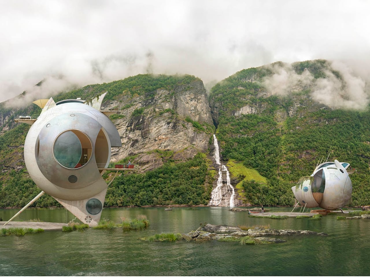
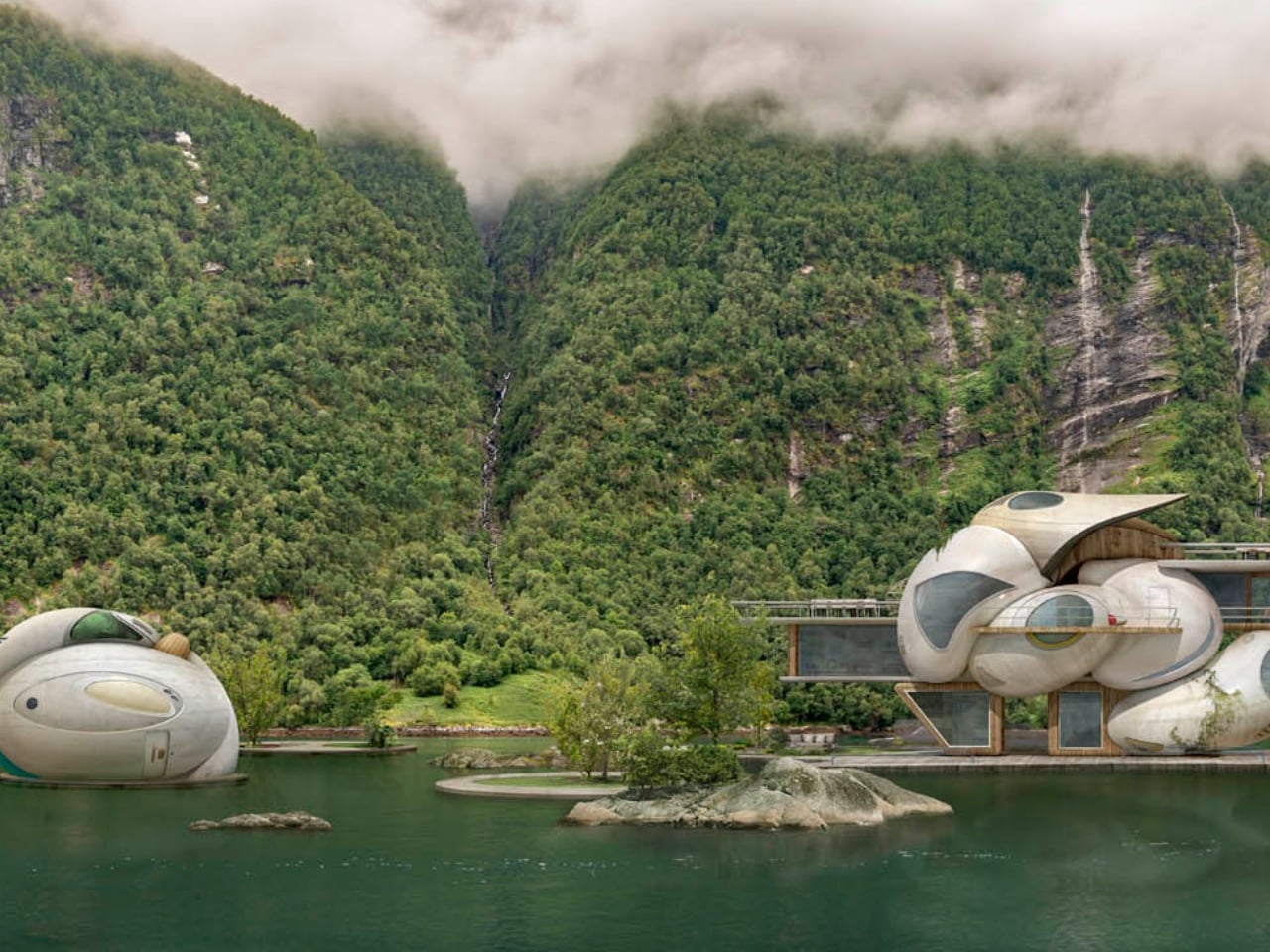
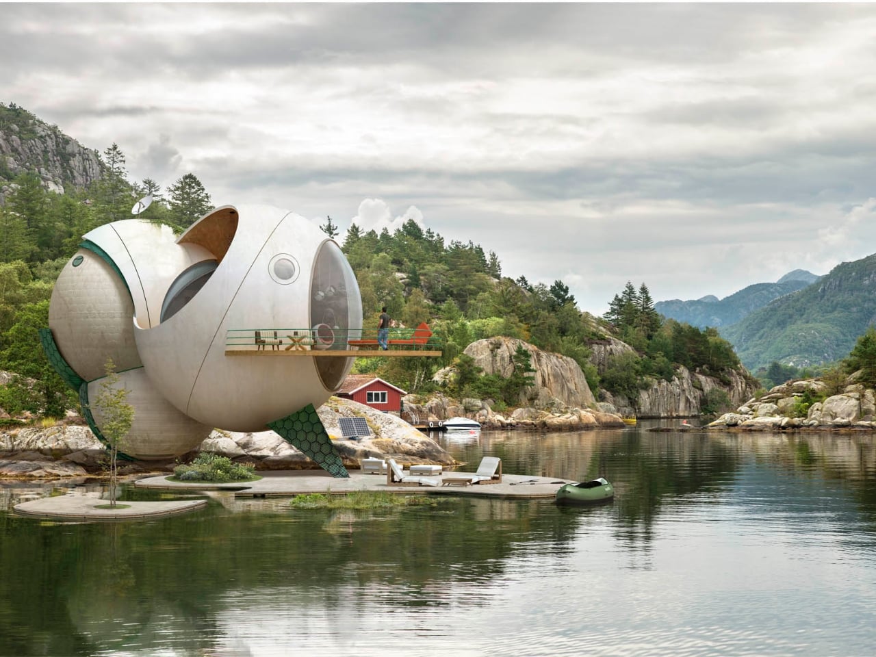
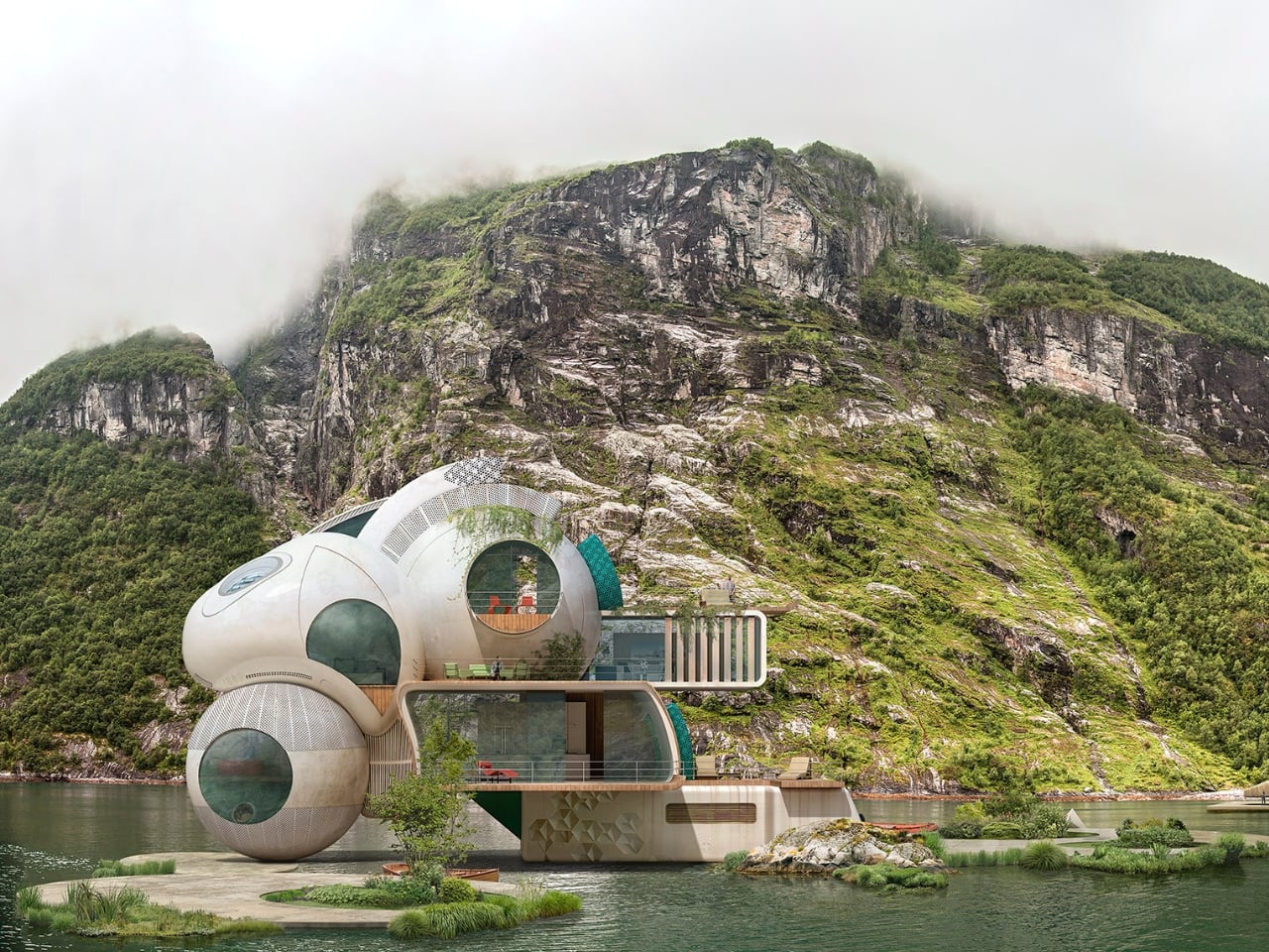
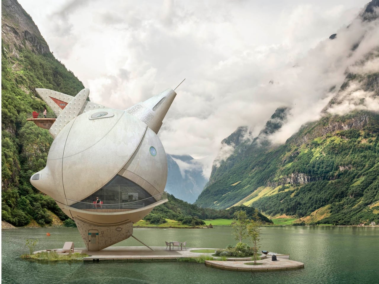
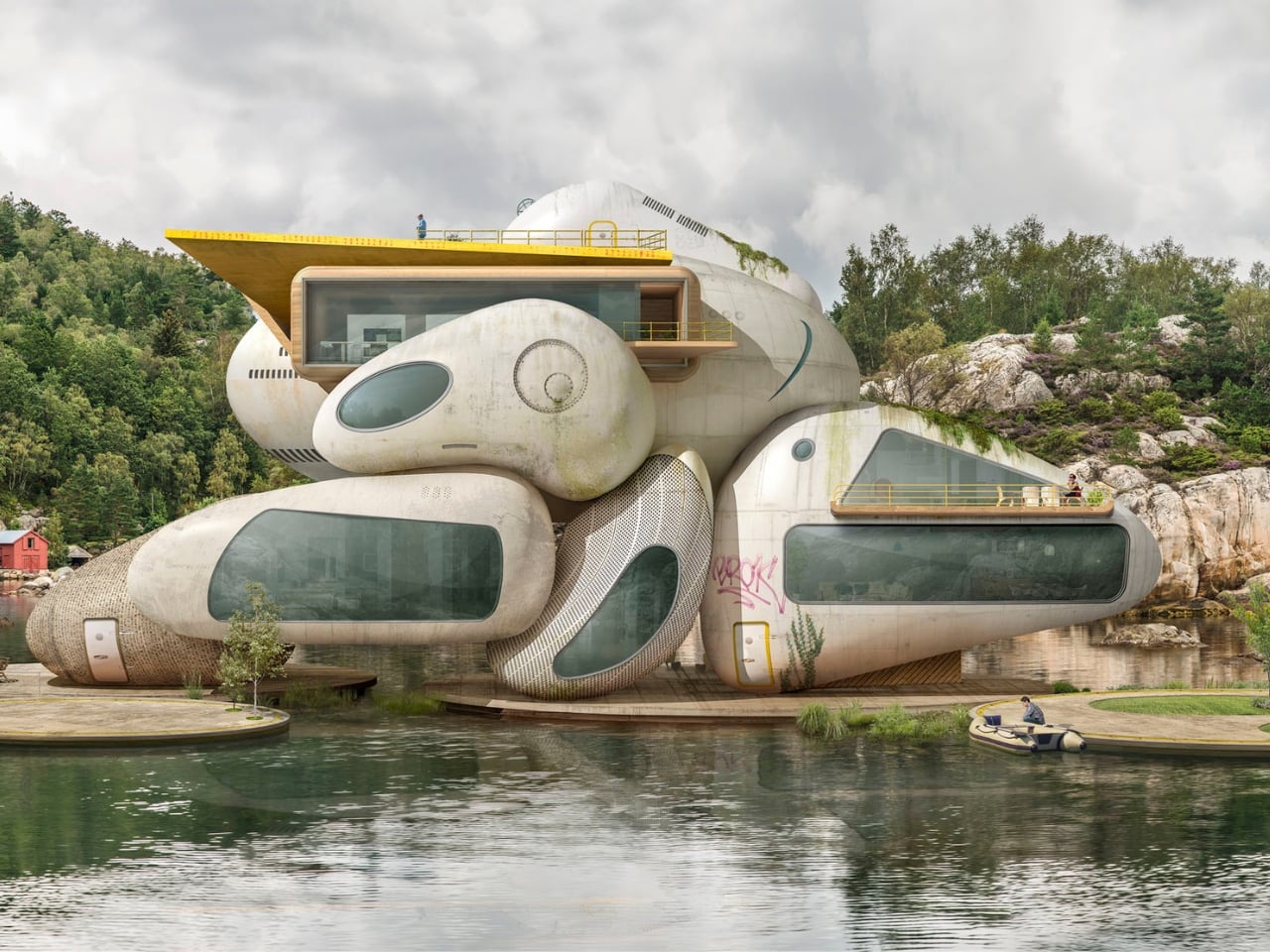
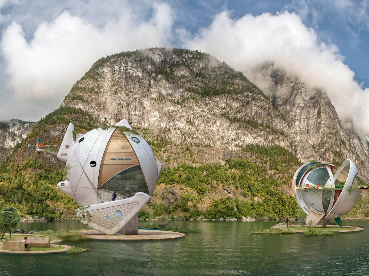
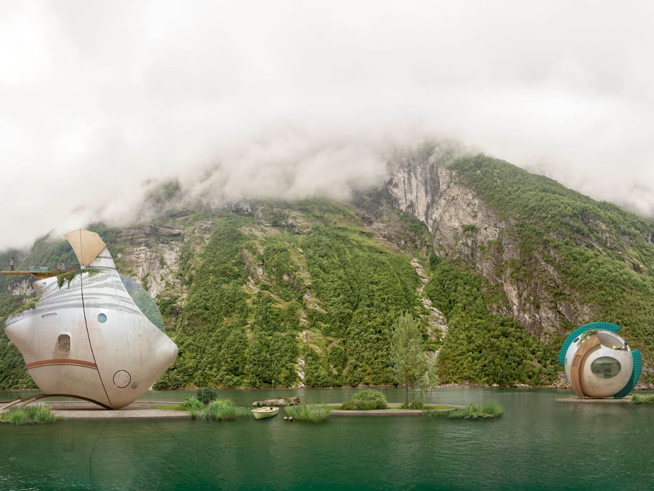
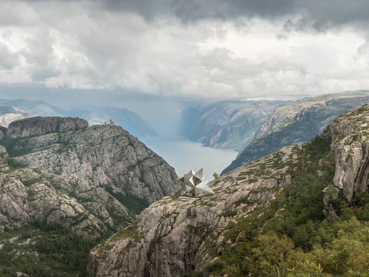
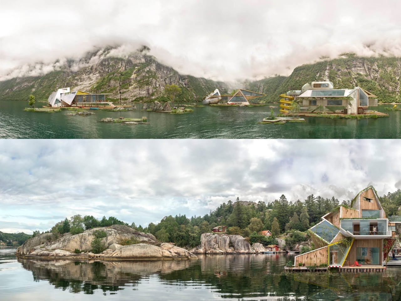
Spanish artist Dionisio González clearly felt it too. His series, Wittgenstein’s Cabin, takes that founding image as both premise and provocation. González works across photography, digital manipulation, and what you might call architectural fiction, and his practice has long focused on reimagining how people live in extreme or overlooked conditions. For this project, he envisioned a cluster of amphibious dwellings set directly on the Norwegian fjords, floating on artificial islands against the same vast and indifferent landscape that Wittgenstein once sought out. They are not proposals for construction. They are something closer to visual arguments.
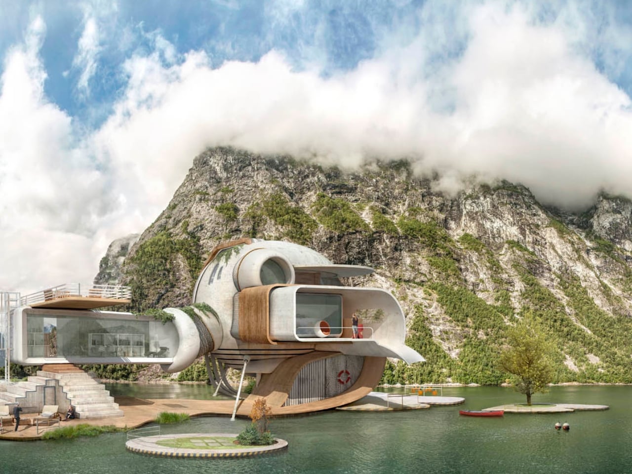
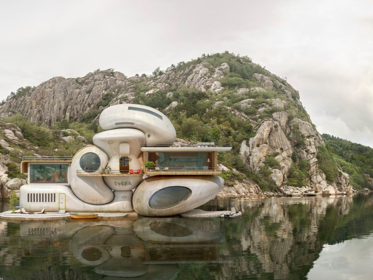
The structures themselves are striking. Made primarily of weathered metal, they feel industrial and oddly organic at the same time. Each one has its own distinct form, but they share a visual family resemblance, like siblings built from the same strange blueprint. They sit on the water in ways that feel simultaneously precarious and deliberate. González has spoken about being drawn to “the confrontation, the frontality” of Wittgenstein’s original cabin with the fjord. For Wittgenstein, the water wasn’t backdrop. It was the actual condition of his solitude. González takes that thought and makes it architectural.
The project keeps pulling me back to one of the more persistent tensions in design conversation: the relationship between isolation and creative thought. The idea that you need to escape in order to think clearly is ancient, but it feels newly charged when genuine silence has become a luxury most people can’t really access. González frames philosophy itself as an “amphibian endeavour,” something that lives between the stable and the fluid, the settled and the speculative. His floating cabins give that metaphor a shape and a weight. They’re not quite houses. They’re more like habitable hypotheses.
None of these structures are intended to be built, and I think that’s precisely where their power lies. Architectural fiction as a practice asks you to sit with ideas rather than just objects. It creates room to think seriously about how we want to inhabit the world, even when the answer falls outside what’s commercially or technically possible. González’s designs carry a visual seriousness that separates them from pure fantasy, a quality that makes them feel genuinely worth spending time with.
Wittgenstein wanted to disappear from the world in order to think more clearly inside it. González takes that same instinct and places it on open water, wrapped in oxidized metal, asking what solitude actually looks like when landscape isn’t just a setting but a condition of being. The answer he offers is beautiful and strange, which feels entirely fitting for a project named after one of the twentieth century’s most beautiful and strange minds.
The post The Philosopher Wanted Silence. The Artist Built on Water. first appeared on Yanko Design.