Fortune cookies are one of those small rituals that carry more weight than they should. You crack it open, fish out the slip of paper, and read whatever odd little prophecy is inside. It’s silly, sure. But it’s also communal. The whole table does it. Everyone compares fortunes, laughs at the vague predictions, and tucks the good ones into their wallets for luck. It’s a shared moment disguised as a throwaway snack. And for visually impaired individuals, that moment stops at the crack of the shell.
Korean designer Hyerim Yoo’s response to that gap is Fortune Dot, a tactile device that lets visually impaired users independently read a daily fortune in Braille. But describing it that way undersells what makes it genuinely remarkable. Because Yoo didn’t just solve the accessibility problem. She solved it beautifully.
Designer: Hyerim Yoo
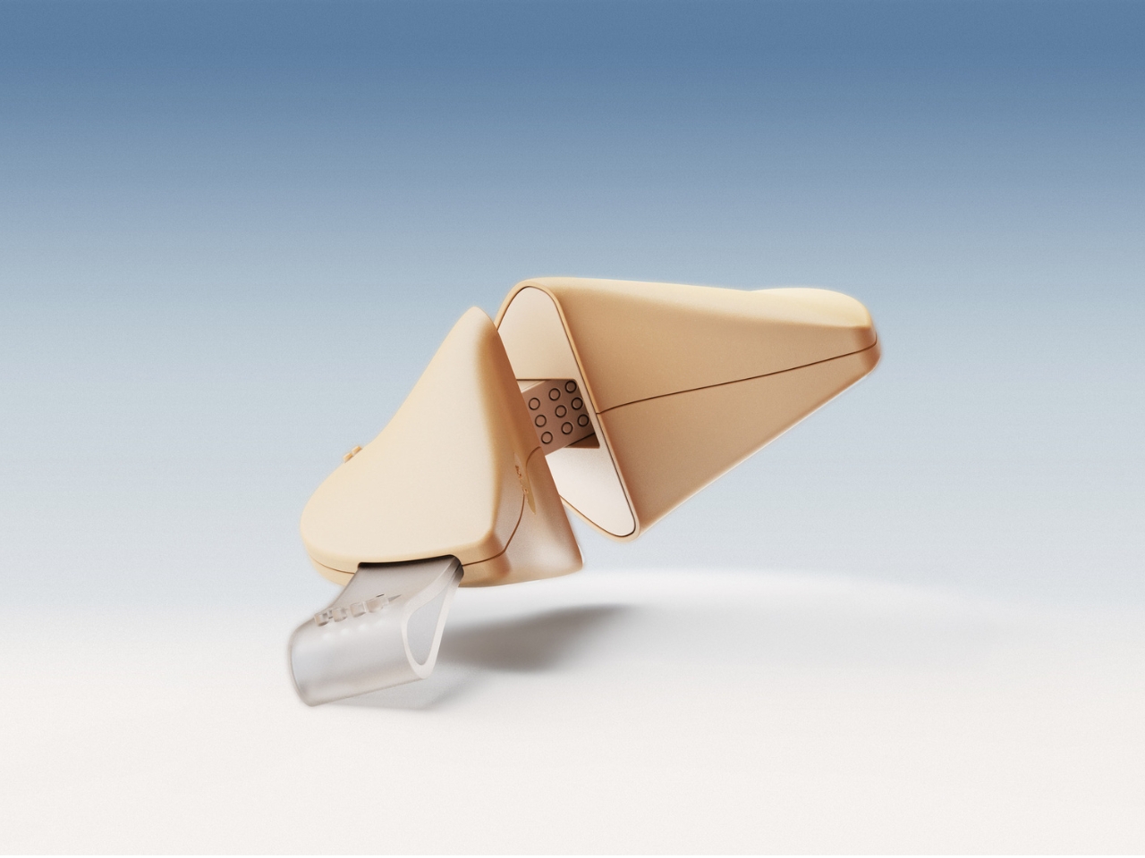
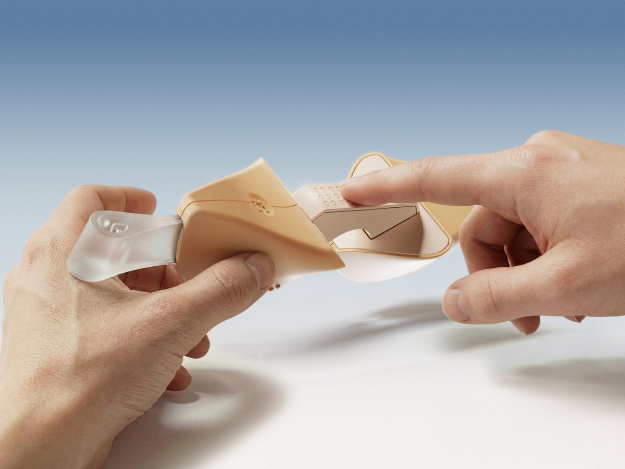
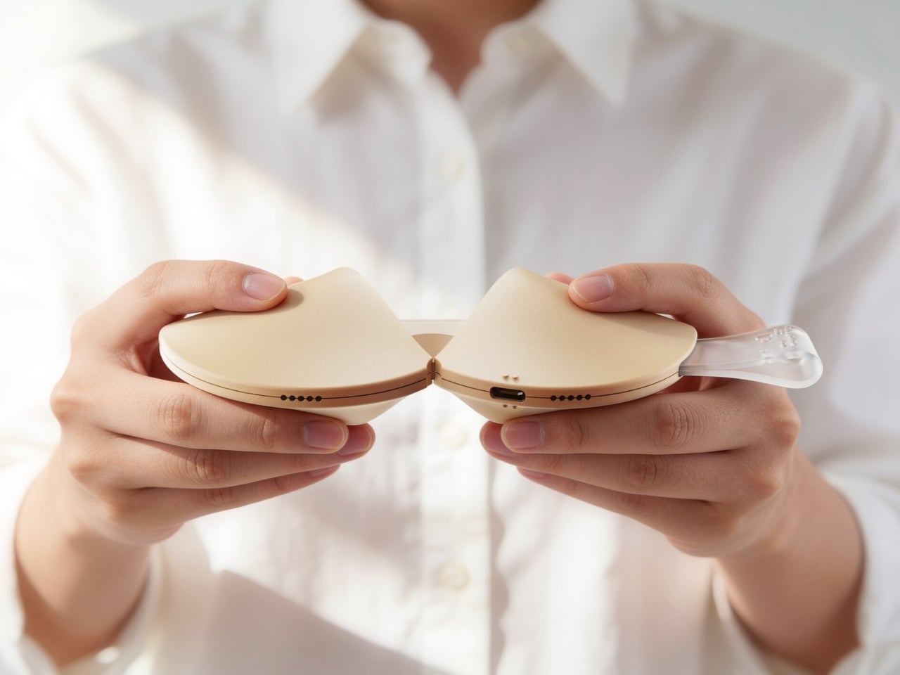
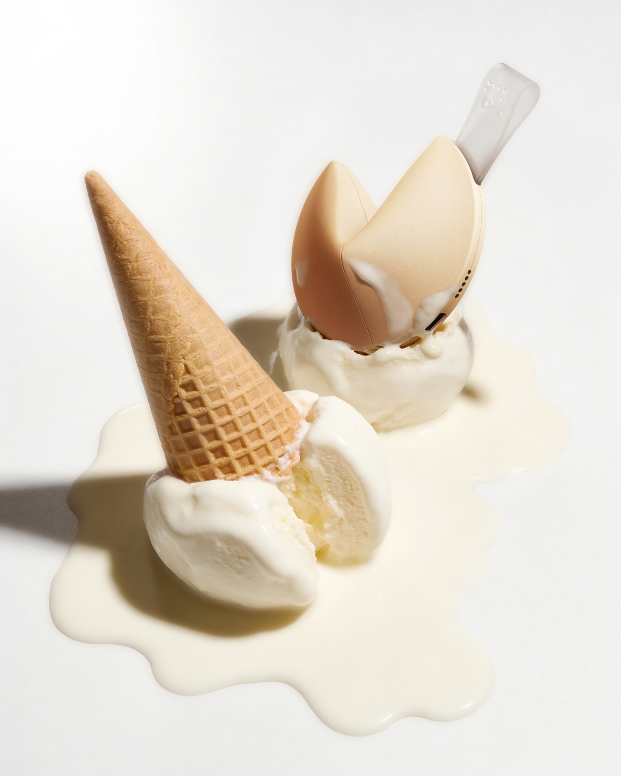
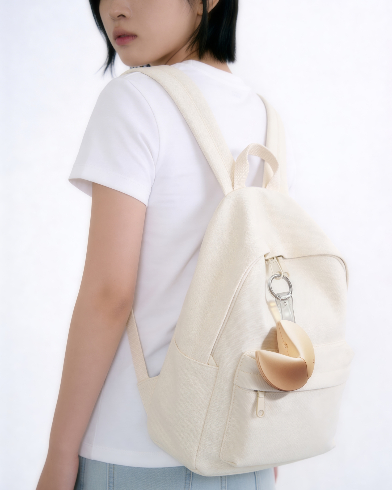
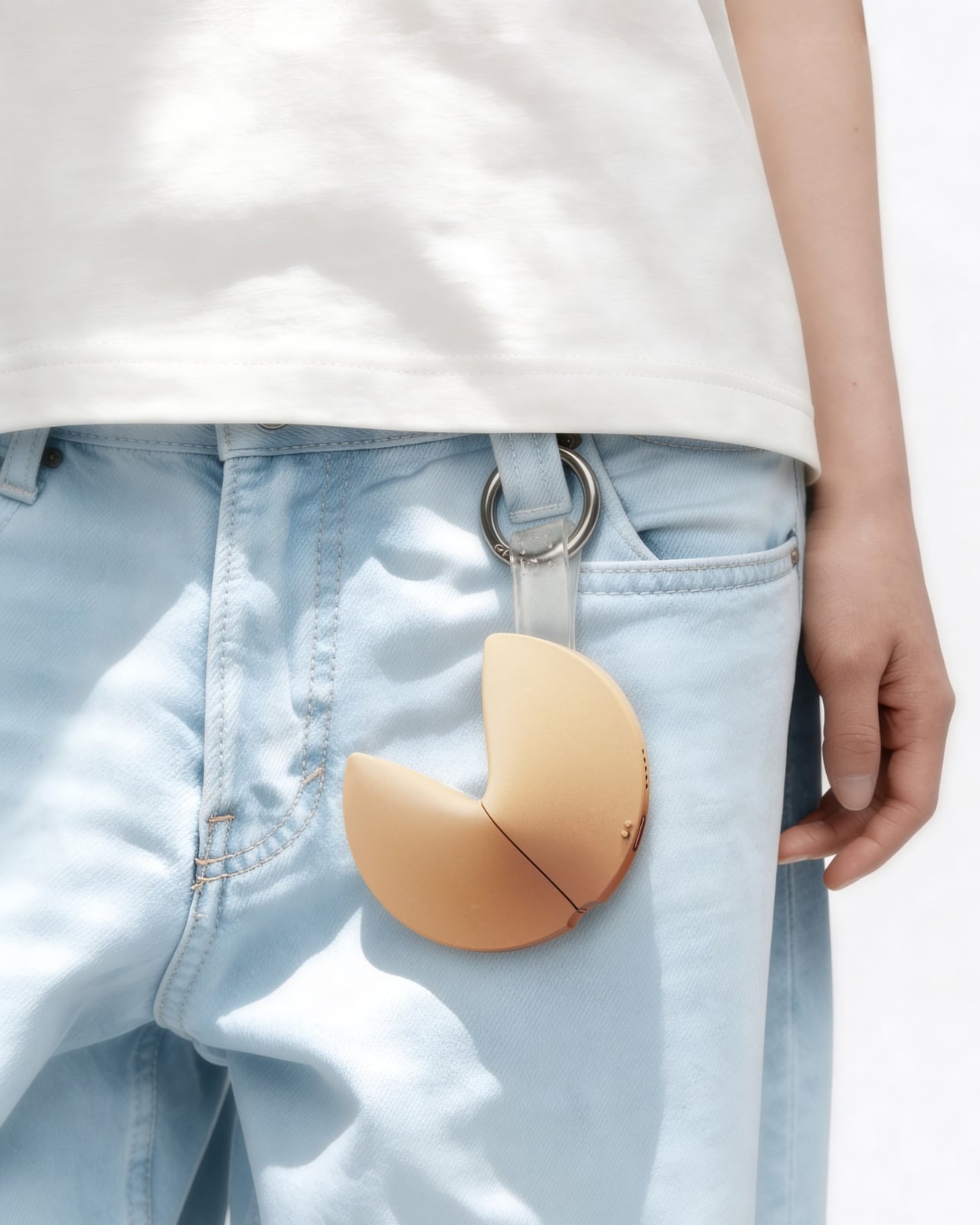
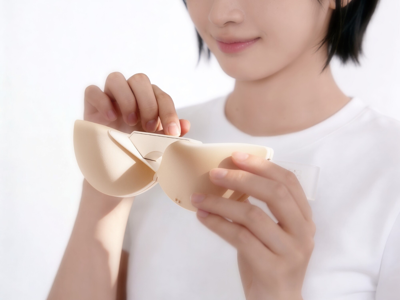
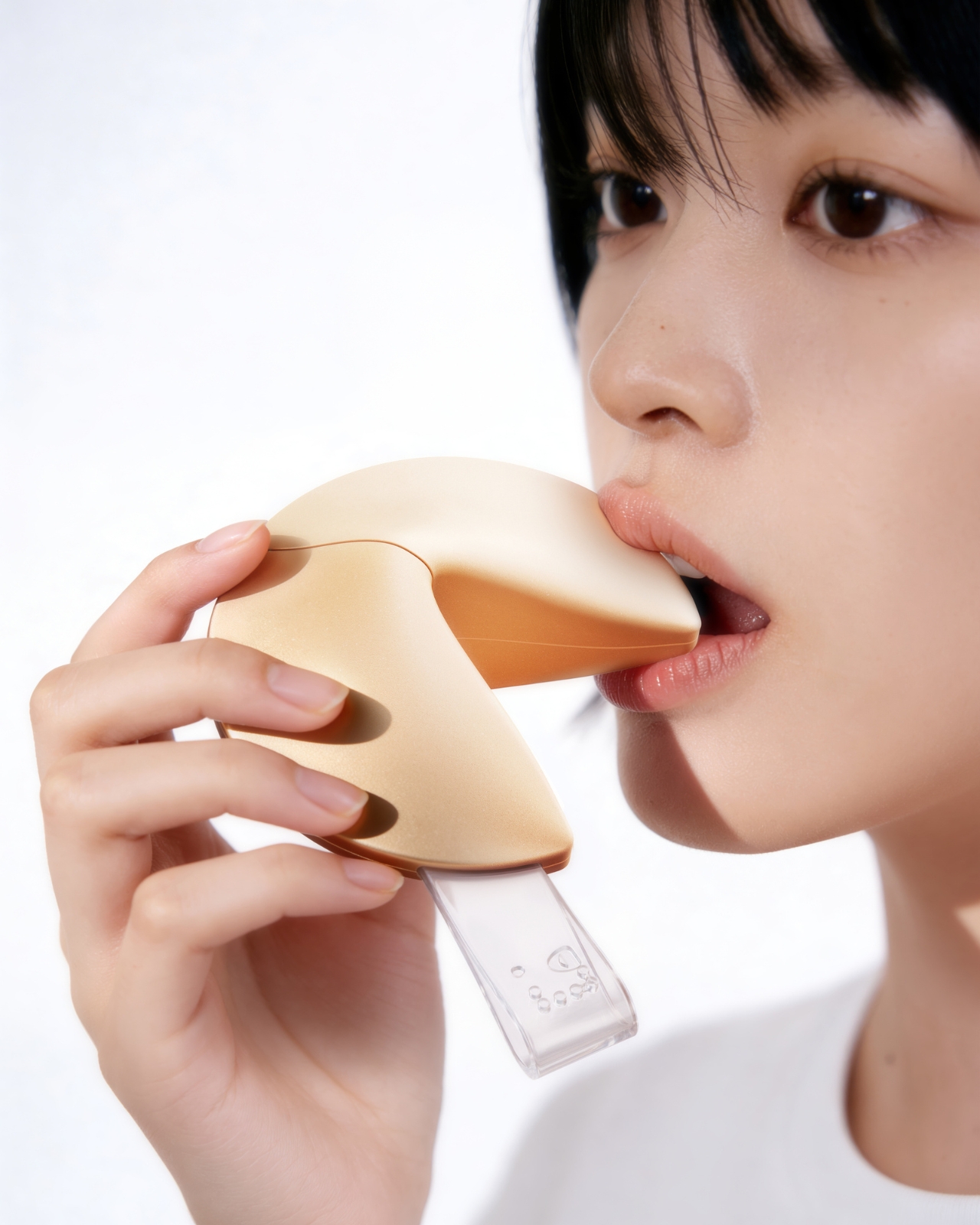
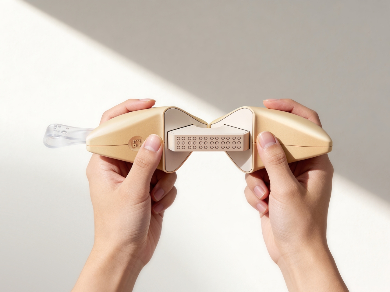
The object is shaped exactly like a fortune cookie. Same rounded form, same warm beige palette, same satisfying heft. A small translucent tab sticks out from the side, the only visual tell that this isn’t actually food. That tab is the “fortune paper,” a design detail so considered it almost makes you laugh. When you pull the two halves apart, the gesture mirrors breaking a real cookie open, and what you find inside is a refreshable Braille display with raised pin cells arranged in neat rows across a recessed panel. The message is there, waiting to be read with your fingertips, exactly as Yoo’s tagline describes it: today’s luck, felt at your fingertips.
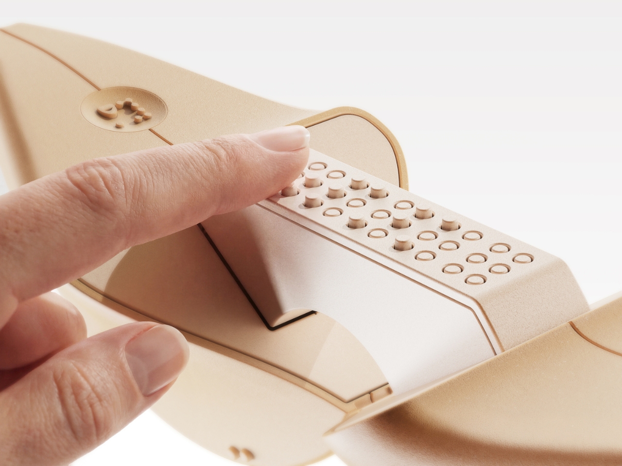
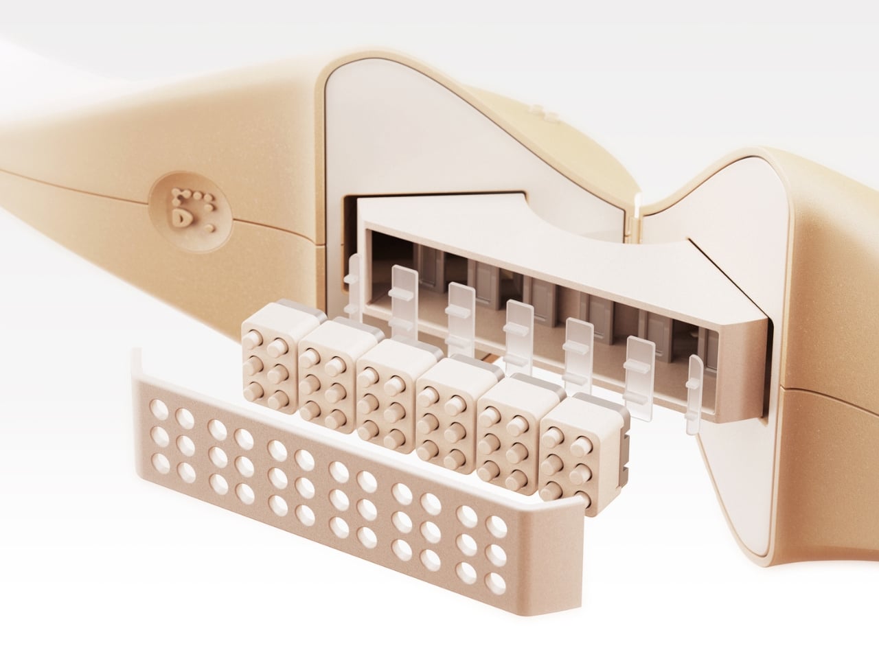
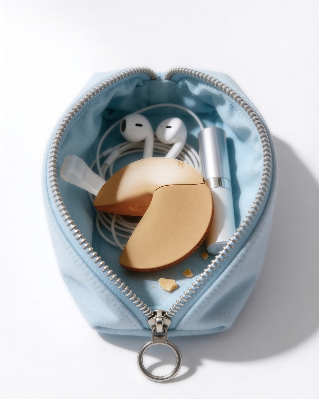
The engineering inside is worth pausing on. The exploded views of the device reveal individual Braille cell modules, each capable of raising and lowering their pins to form different characters. It’s a compact, mechanical system tucked into something that looks like it belongs on a dessert plate. The bottom edge carries a USB-C port for charging, nearly invisible from the outside. The whole thing is small enough to drop into a pouch alongside a pair of AirPods and a lip balm, which is apparently exactly what Yoo intended.
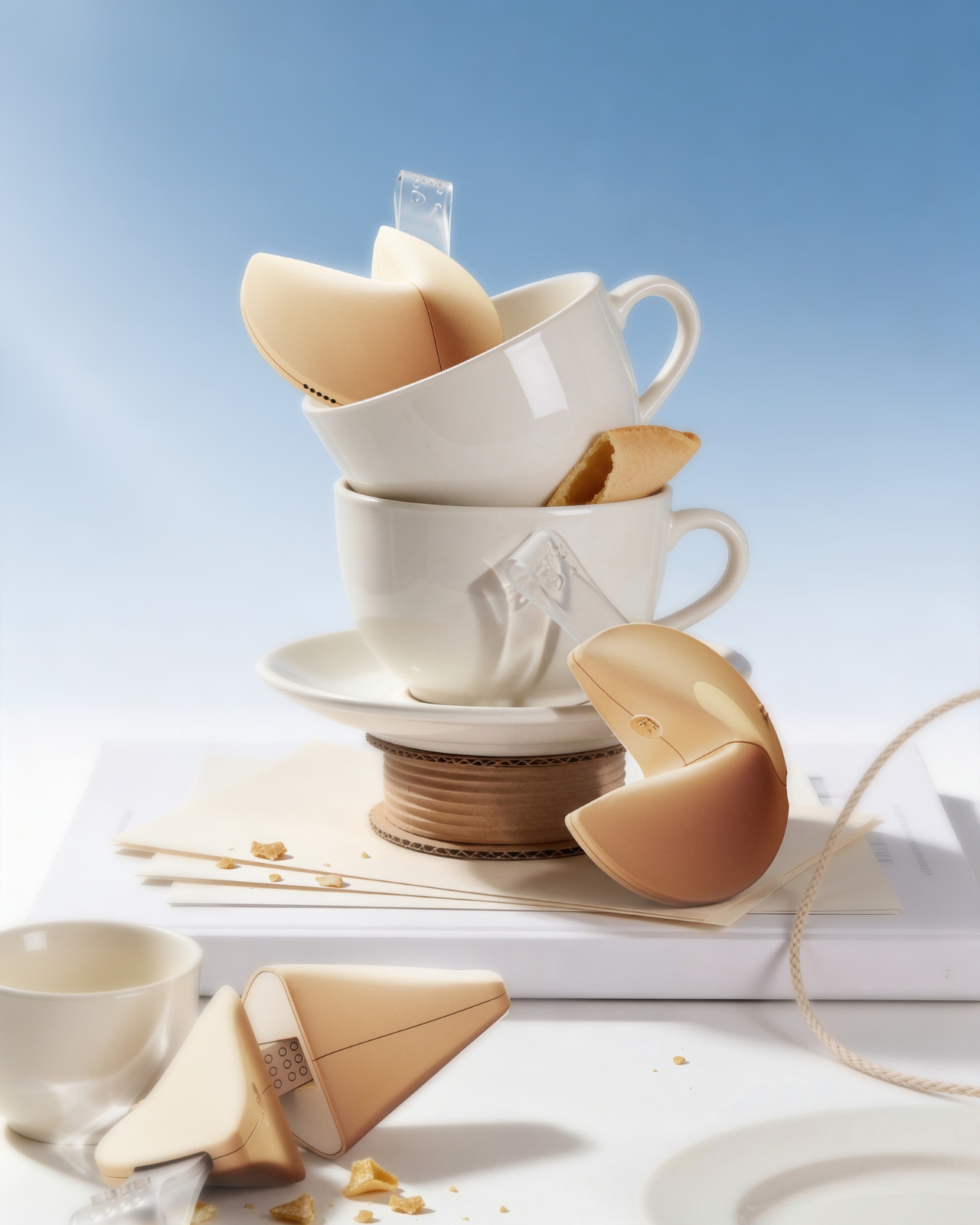
What makes this design stand apart from most inclusive design projects, though, is the color system. Fortune Dot comes in three variants named Soft Bake, Signature Bake, and Dark Bake. The names follow the logic of actual cookie baking, and the colors range from a pale cream to a deep chocolate brown. It’s a playful, smart branding decision that does real work. It removes any clinical association from the product. It makes Fortune Dot feel like something you’d want to own and carry, not something assigned to you by necessity.
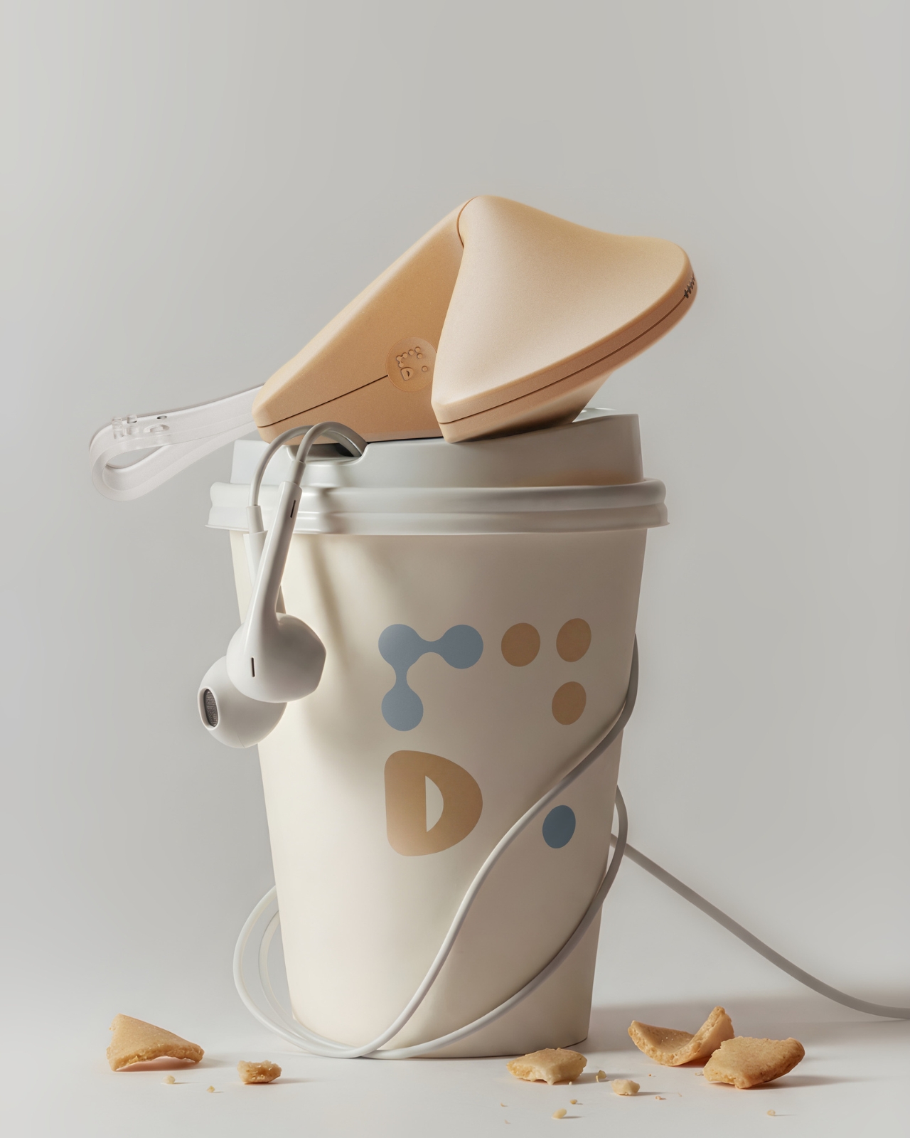
The branding extends outward into a full identity system. The Fortune Dot logo uses a dot-based pattern that quietly references Braille without spelling it out. It appears on a branded coffee cup in one of the campaign shots, wrapped in wired earbuds, Fortune Dot perched on top. That image alone communicates something most accessible product design never manages to: that this object belongs in the texture of everyday life, not apart from it.
The packaging holds up the same way. A light blue box lid features Braille text running across the top, the Fortune Dot wordmark sitting below it in clean type, and a cutout that reveals the cookie silhouette inside. When you lift the lid, the device sits nested in a cream interior, the translucent fortune tab pointing upward. It’s the kind of unboxing that feels like it was designed to be experienced by touch as much as by sight, which, of course, it was.
I’ve seen a lot of inclusive design work that gets the intention right but misses in execution, products that function well but feel set apart, designed for a category of user rather than a person. Fortune Dot doesn’t feel like that. It feels like something a designer fell genuinely in love with, in the best possible way, the kind of love that shows up in every detail, from the baking-level color names to the translucent paper tab to the way the hinges split open just so. That level of care is rare. When you see it, you notice.
The post The Fortune Cookie Redesigned With Braille Is Pure Genius first appeared on Yanko Design.