There is a camera brand that has shown up at International Broadcasting Conference, partnered with the Esports World Cup as an official camera provider, earned Editor’s Choice awards from music and DJ publications, and landed in the desk setups of remote workers, streamers, worship AV teams, and solo creators, all while keeping a relatively low profile compared to the legacy names in the category. OBSBOT, founded in 2016, has built its reputation the way durable hardware brands tend to: by making things that keep working, and keep getting better. Reviewers have consistently noted that firmware updates meaningfully improve OBSBOT cameras after purchase, which is a rarer quality in hardware than it should be.
Prime Day 2026 will put seven OBSBOT cameras on sale simultaneously, running through June 29 across Amazon and the OBSBOT official store. The lineup covers three distinct use cases: the Meet series for plug-and-play video calls and casual streaming, the Tiny series for creators and hybrid workers who want PTZ tracking at their desk, and the Tail 2 for anyone running a live production setup that used to require a full crew. The discounts range from around 15% on the newer Tiny 3 series to over 30% on the Tiny 2, which arrives at a price point that has not been seen before. Discounts hit on June 23rd – here is the full breakdown.
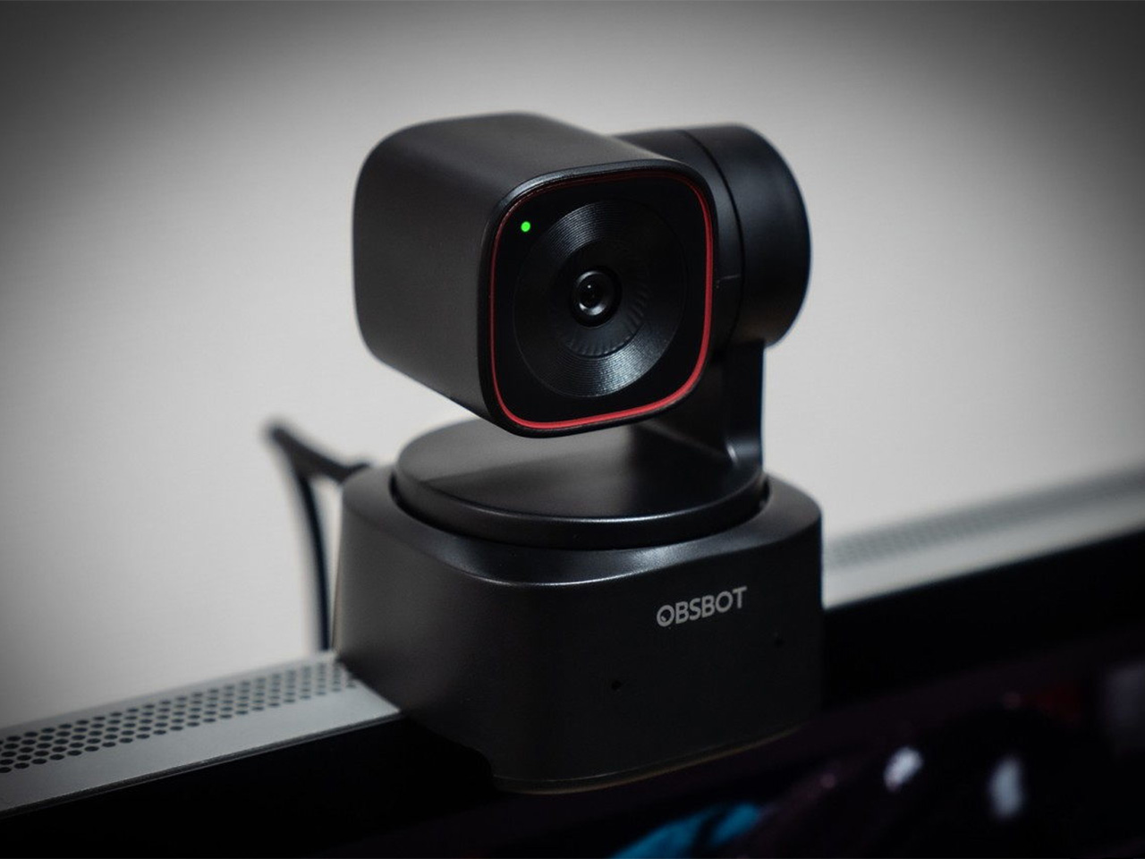
OBSBOT Tail 2 ($1088) – The AI Camera That Puts a Production Crew on Your Tripod
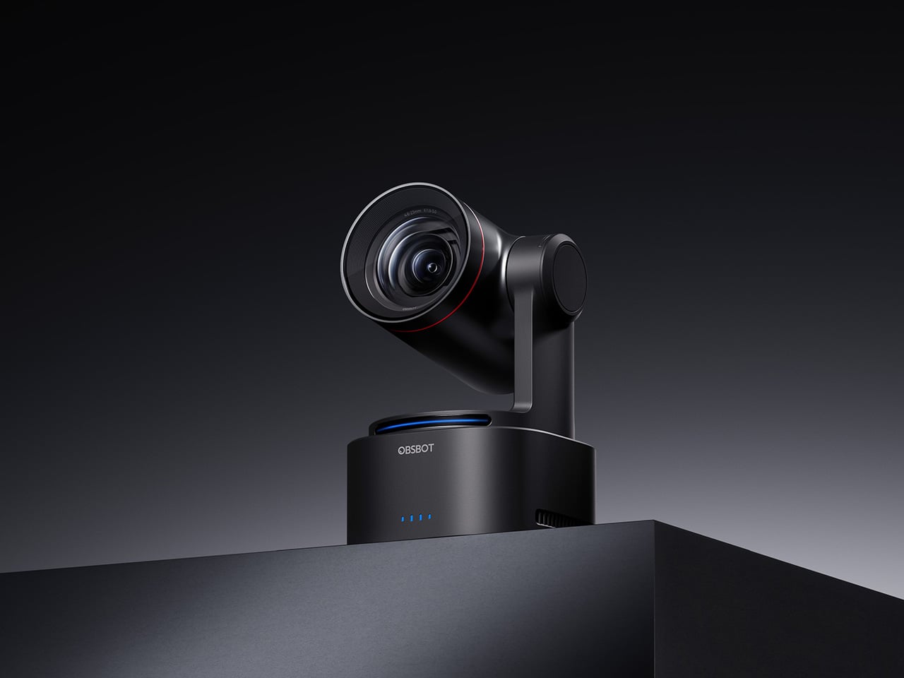
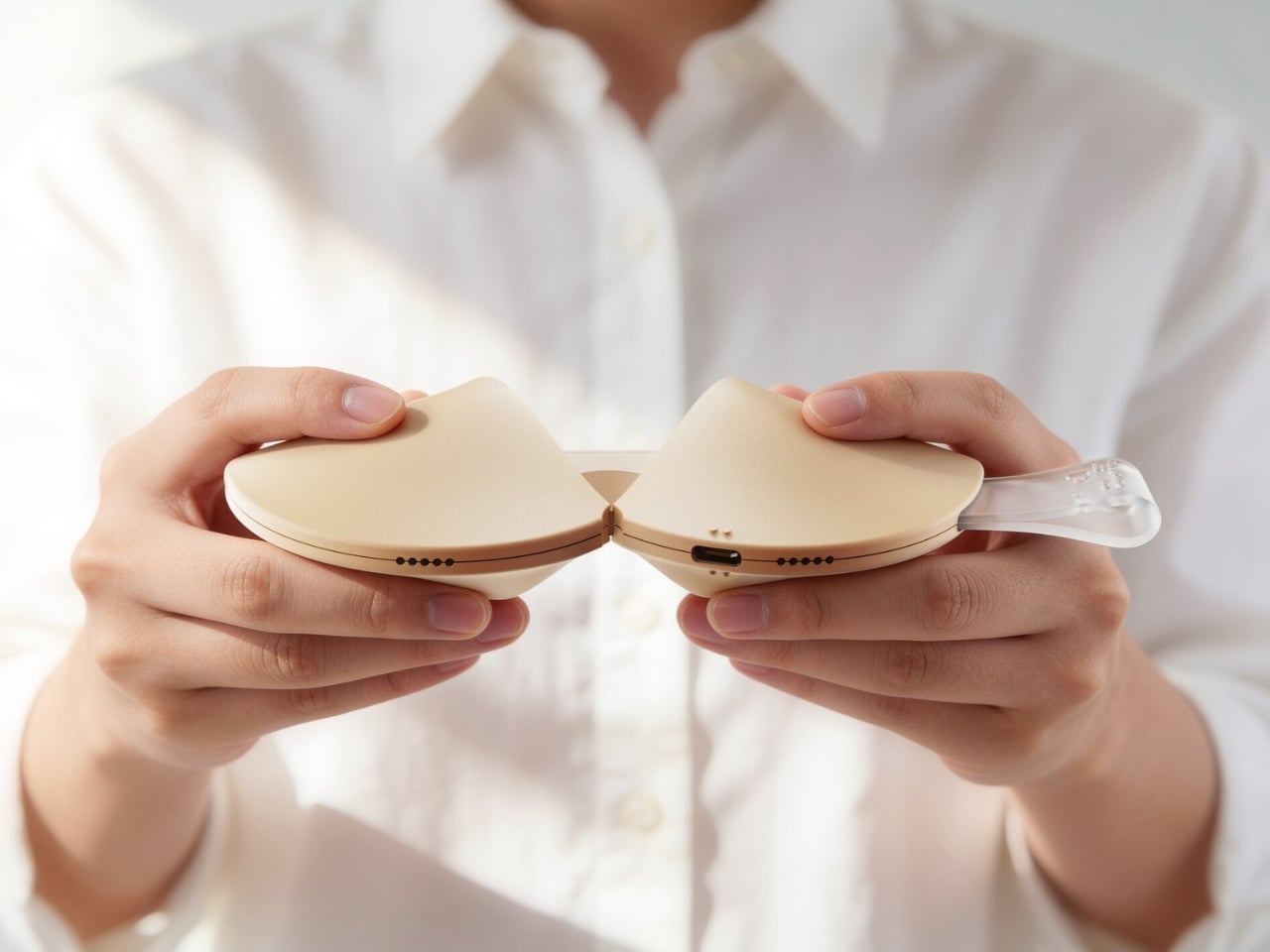
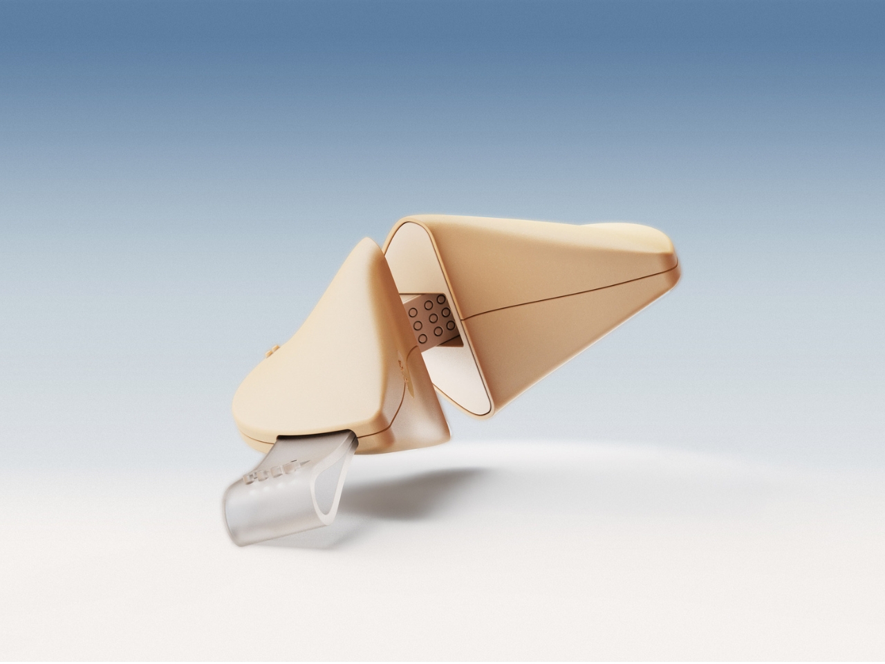
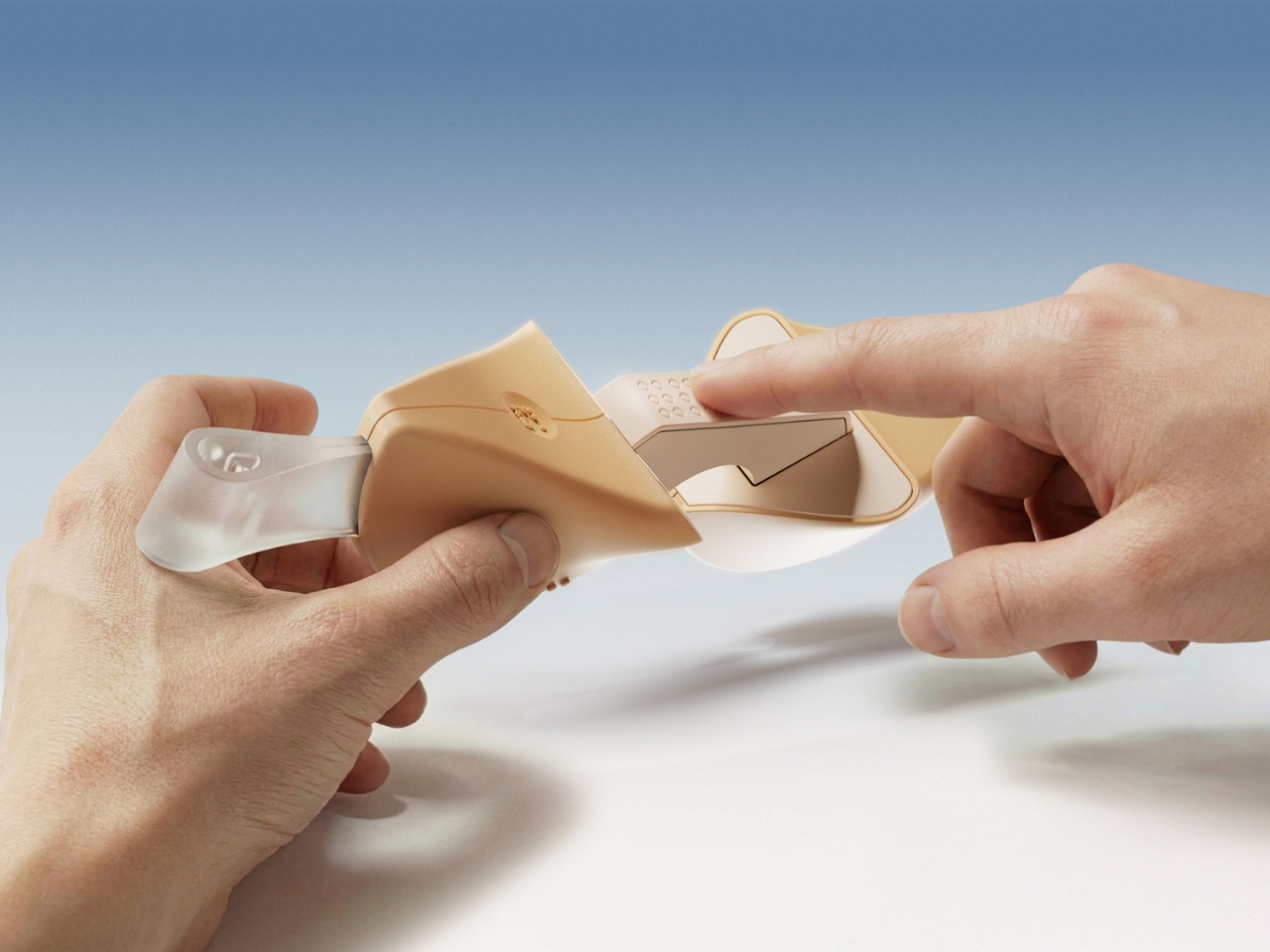
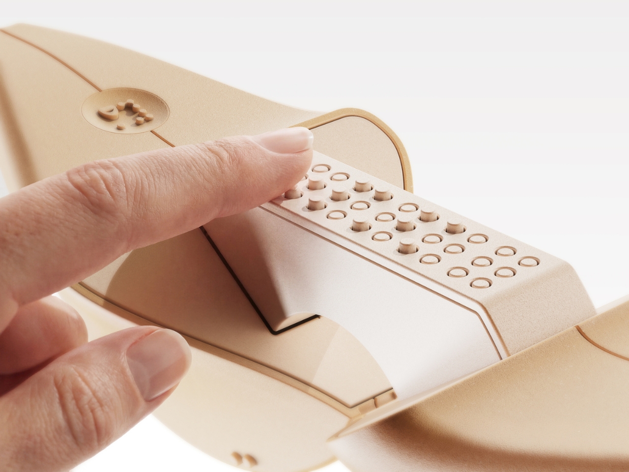
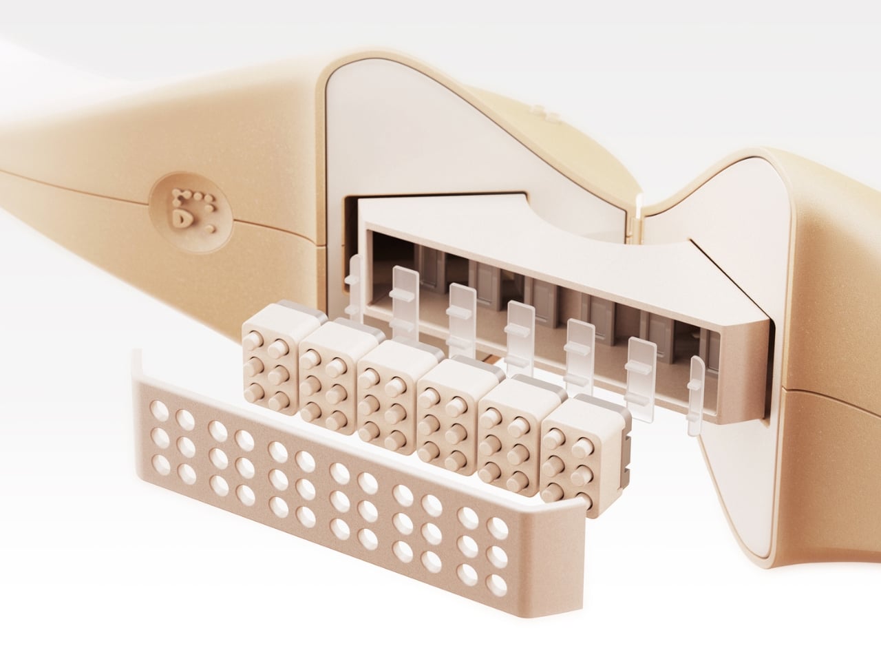
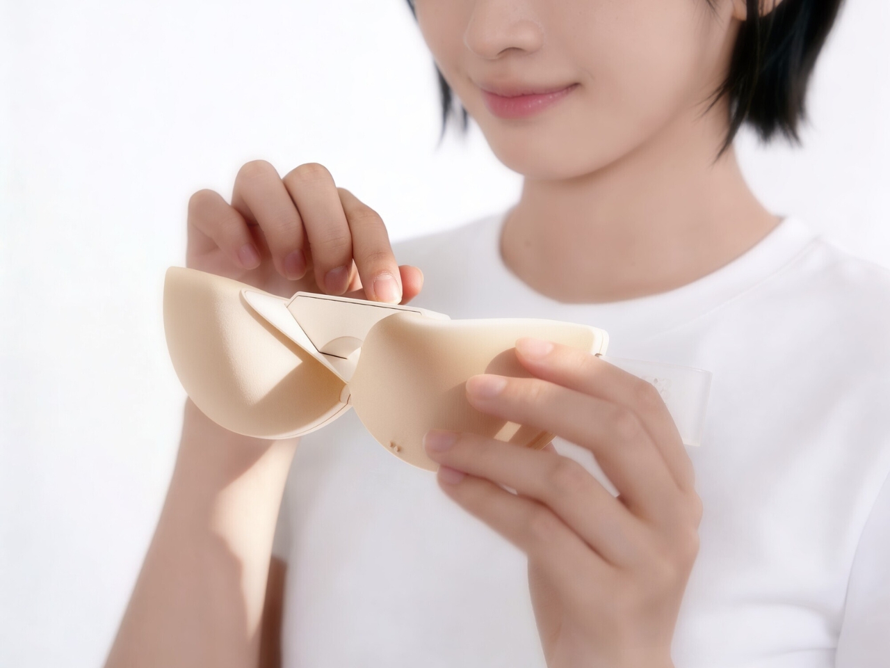
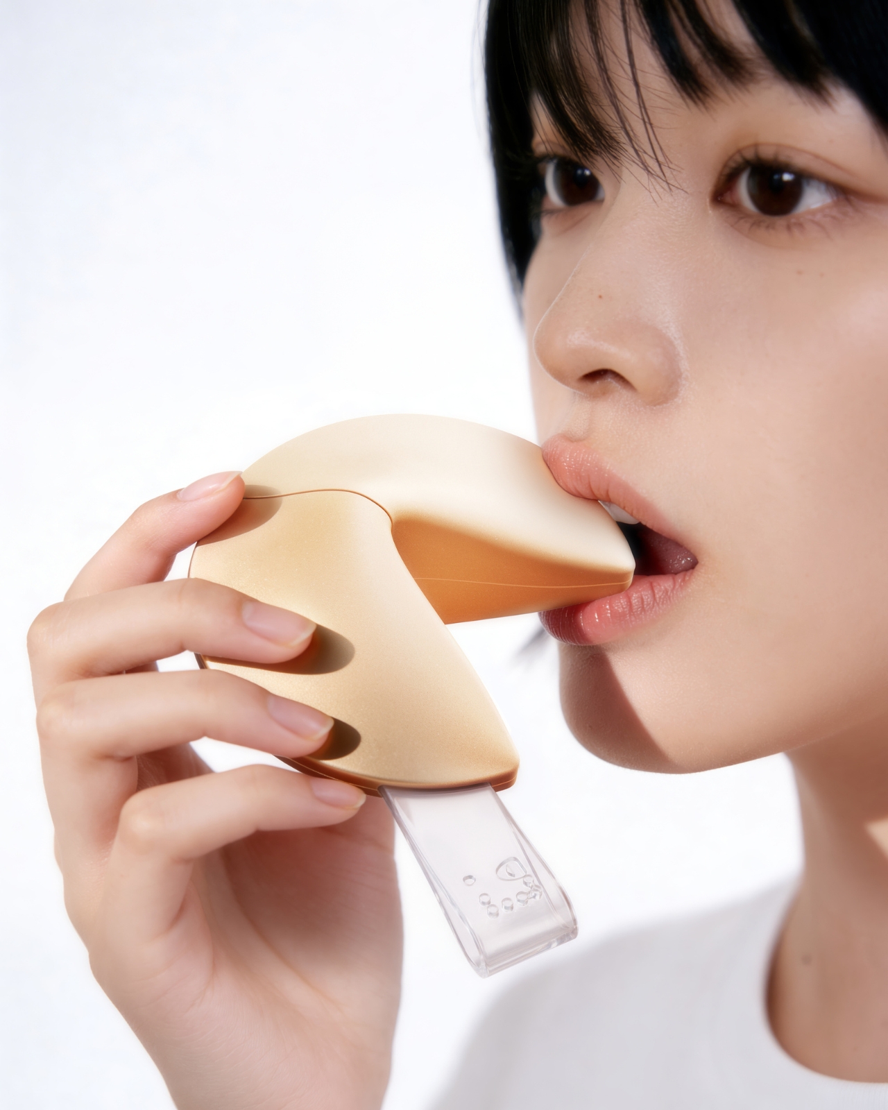
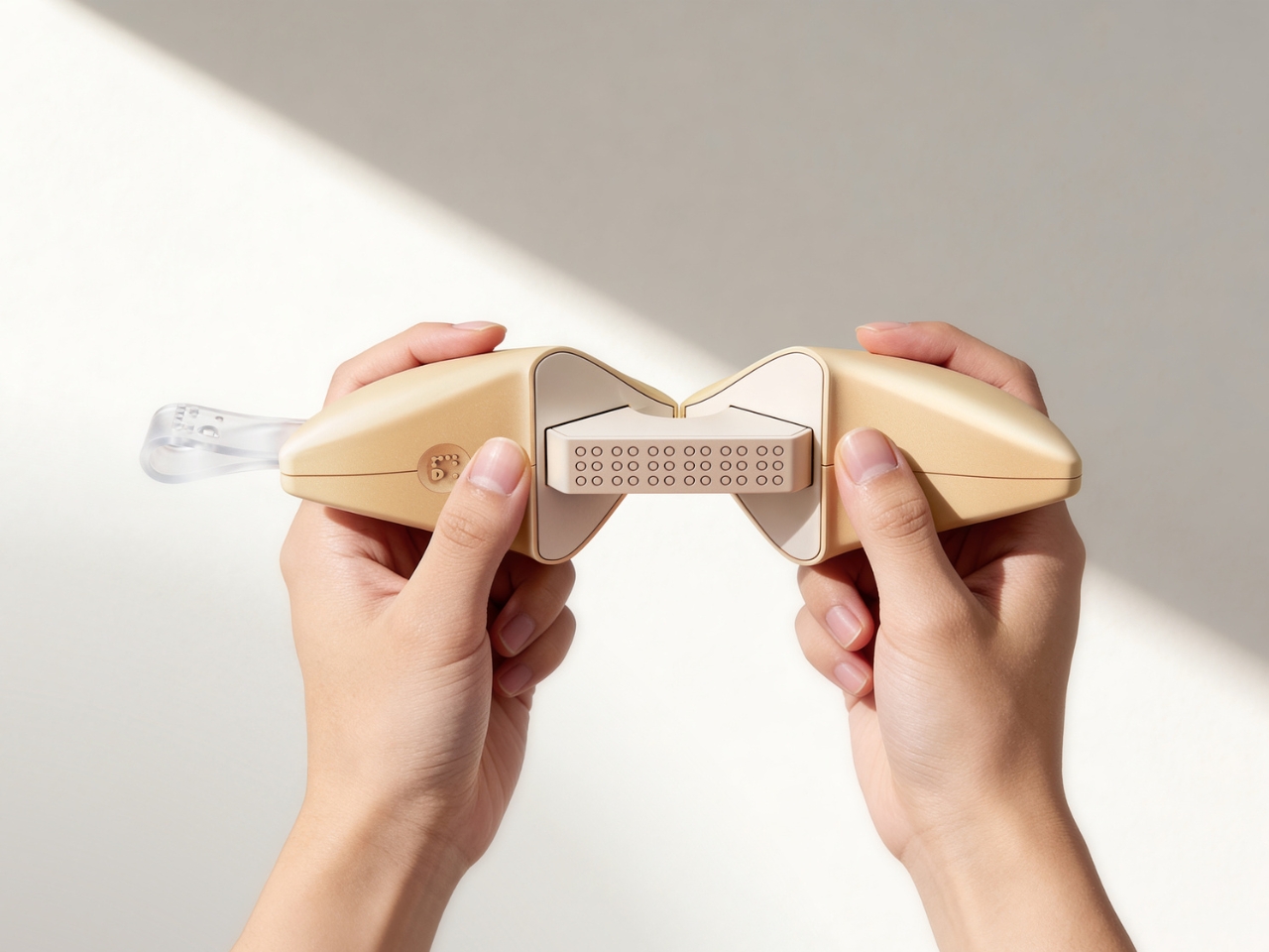
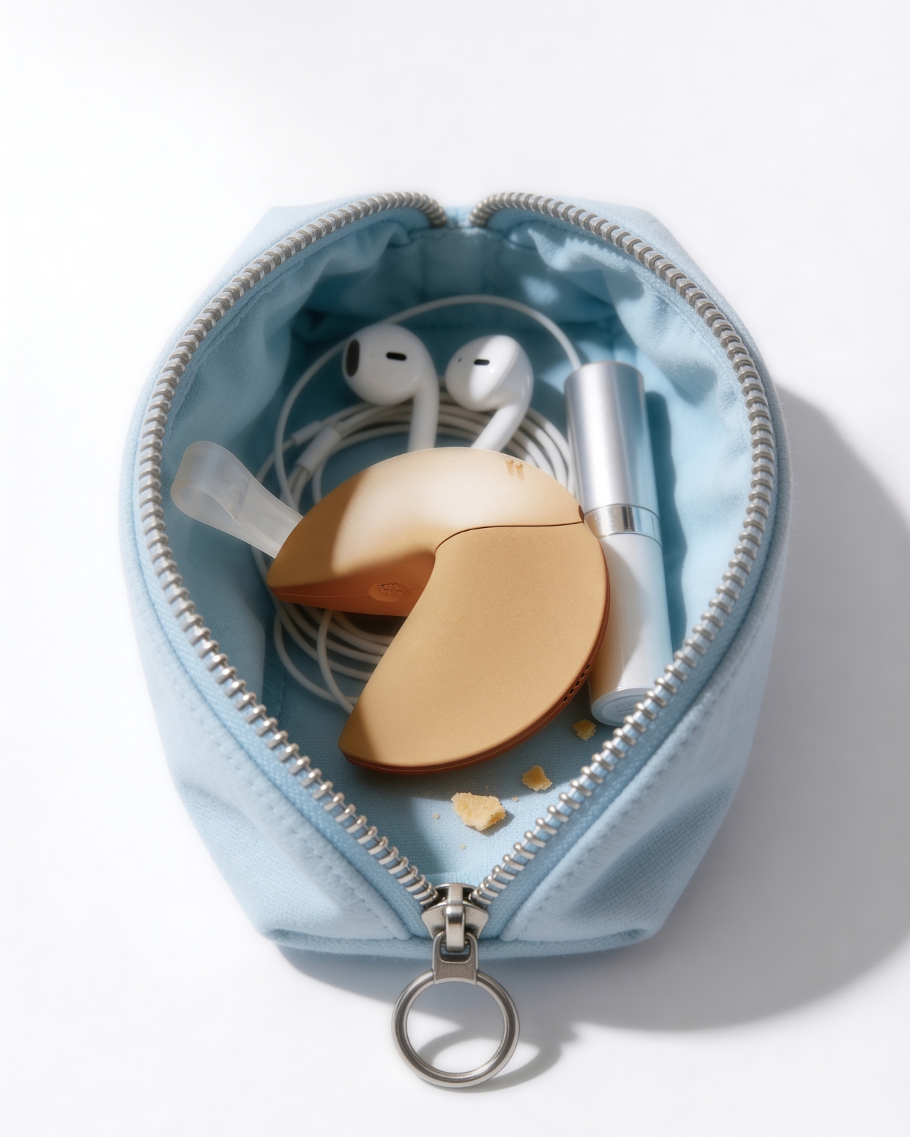
The OBSBOT Tail 2 is what happens when a camera is designed to solve the most persistent problem in solo and small-team video production: the need for a human operator. This is the company’s flagship live production camera, built around an advanced AI tracking system and a three-axis gimbal that does more than just pan and tilt. It is the world’s first PTZR (Pan-Tilt-Zoom-Roll) camera, with the Roll being a new game-changing feature that allows the entire lens and sensor assembly to rotate 90 degrees. This delivers true, uncropped vertical video, a clever piece of engineering that makes it immediately relevant for anyone creating content for mobile-first platforms. It pairs that mechanical intelligence with serious imaging hardware, including a large 1/1.5-inch CMOS sensor, a 5x optical zoom, and the ability to capture sharp 4K footage at a fluid 60 frames per second.
What separates the Tail 2 from a high-end webcam is how it fits into a professional workflow. It comes equipped with a full suite of broadcast-standard ports, including NDI, SDI, HDMI, and Ethernet, allowing it to integrate directly with live switching hardware and streaming software with minimal latency. For solo operators, the system works with gesture controls for hands-free adjustments, and a dedicated app provides granular remote control over framing and movement. This combination of broadcast-grade connectivity and intelligent automation is what makes the Tail 2 so versatile. It is equally at home as the primary camera for a DJ’s live stream, a dynamic tracking camera for a church service, or part of a multi-camera setup for a corporate event.
Why We Recommend
At its core, the Tail 2 is an investment in workflow efficiency. Tech reviewers have consistently framed it as a tool that can pay for itself, replacing the cost and complexity of hiring a camera operator for recurring shoots. The Prime Day discount reinforces that value proposition, knocking $200 off the price and bringing the non-NDI version down to $999. Breaking the thousand-dollar barrier is significant, shifting the Tail 2 from a niche professional tool to a much more accessible option for serious creators, small businesses, and organizations looking to upgrade their production quality. For anyone who needs cinematic, automated camera movement without a dedicated crew, this is the camera to get.
Click Here to Buy: $1088 $1298 ($210 off). Prime Day Deal starts on 23rd June 2026!
OBSBOT Tiny 3 ($296) – A Palm-Sized PTZ Camera with Full-Sized Ambition
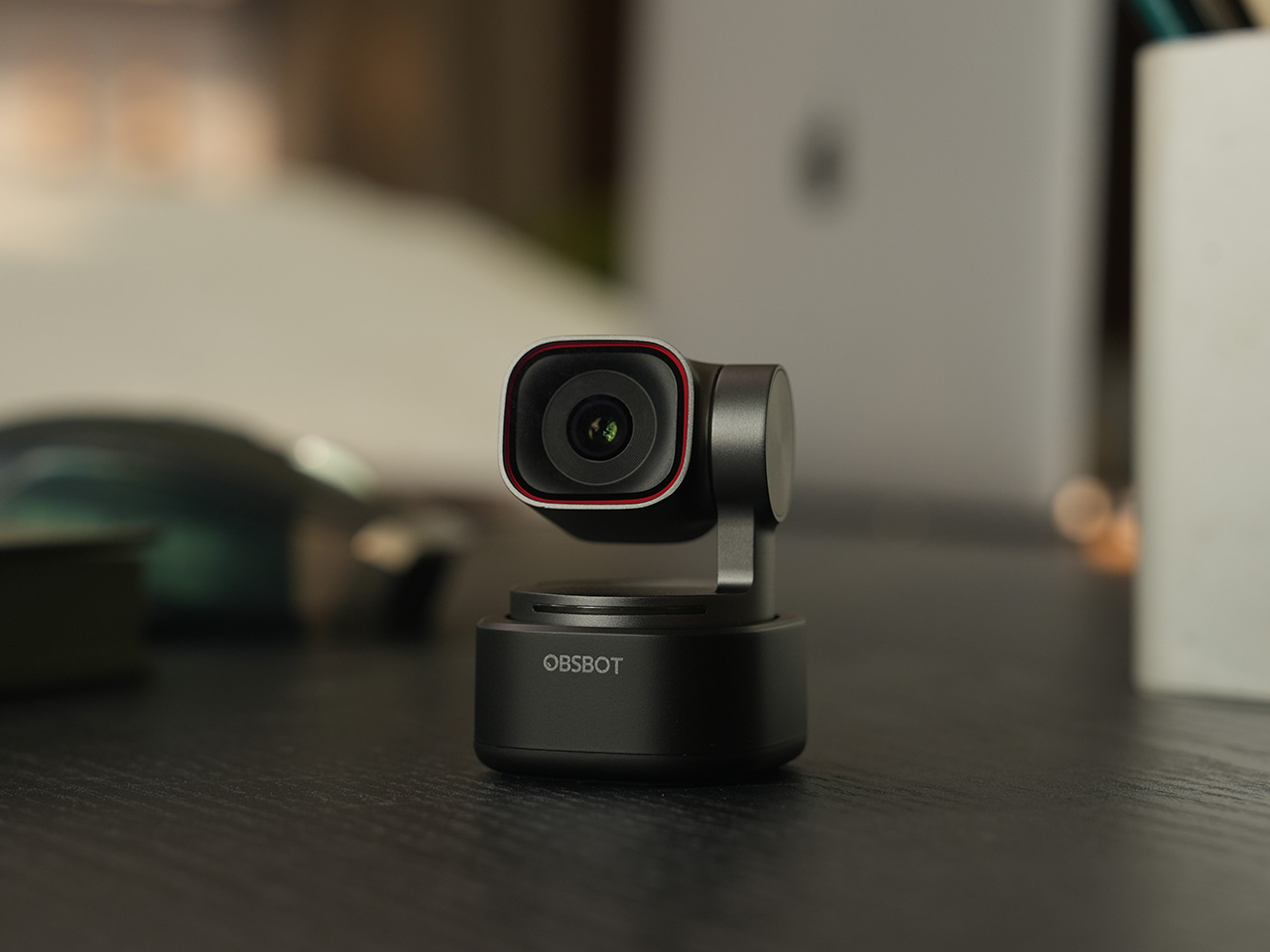
The OBSBOT Tiny 3 is the company’s answer to a simple question: how much professional-grade technology can you fit into a webcam that is smaller than a cup of coffee? The answer, it turns out, is quite a lot. This is the flagship of the Tiny series, designed for creators and hybrid workers who want the absolute best imaging and tracking performance in a desk-friendly format. It starts with a massive 1/1.28-inch CMOS sensor, which is exceptionally large for a webcam and allows it to capture more light for a cleaner, more detailed 4K image. That sensor is paired with a pan-tilt-zoom system that moves with near-silent precision, keeping the subject perfectly framed.
Where the Tiny 3 really shows its intelligence is in the software and processing that drive its hardware. It inherits the refined AI Tracking 2.0 from the larger Tail 2, making its auto-framing and subject tracking remarkably smooth and reliable. It also features Gesture Control 2.0, allowing users to manage zoom and tracking with simple hand signals, a feature that feels genuinely useful in practice. For streamers and power users, the native integration with Elgato’s Stream Deck is a critical addition, bringing PTZ controls directly into their existing workflow. OBSBOT even added creative tools like virtual avatars and improved the audio with a five-mode stereo microphone system, rounding out a feature set that feels both powerful and polished.
Why We Recommend
The Tiny 3 is the pick for anyone who prioritizes having the latest and most refined technology on their desk. While other models in the lineup offer steeper discounts, the Prime Day price drop brings this premium, current-generation flagship under the $300 mark. This is the camera for the user who wants the best sensor, the most advanced AI tracking, and the tightest software integration OBSBOT offers in a webcam. It represents the peak of the Tiny series, and this is the most affordable it has been since its launch.
Click Here to Buy: $296 $349 ($53 off). Prime Day Deal starts on 23rd June 2026!
OBSBOT Tiny 3 Lite ($169) – The Same Intelligence with a Focus on Value
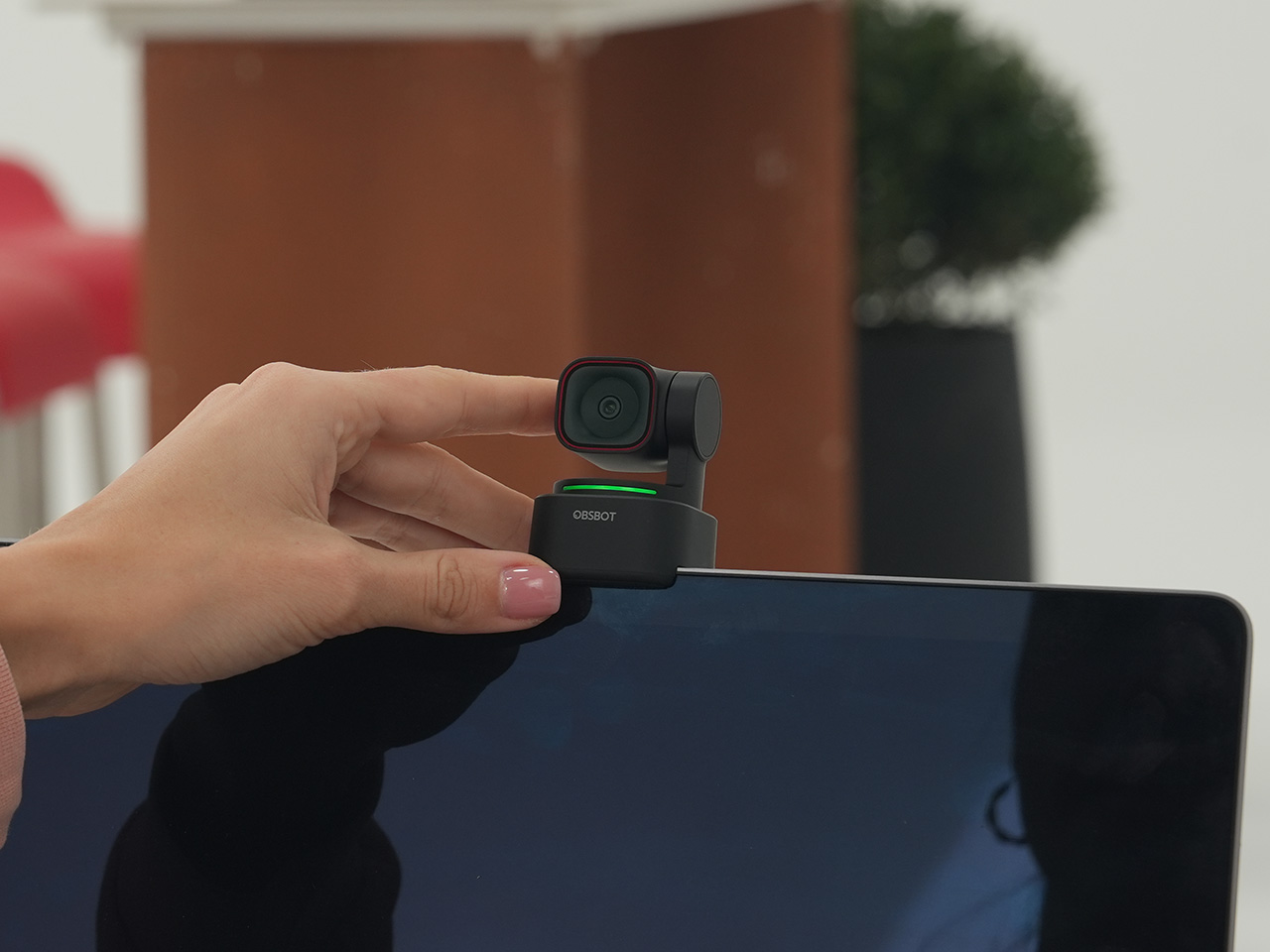
For many users, the appeal of the flagship Tiny 3 lies in its advanced AI brain, not necessarily its top-of-the-line sensor. OBSBOT created the Tiny 3 Lite for exactly that audience. This camera is built on the same intelligent foundation as its more expensive sibling, delivering the same seamless AI Tracking 2.0, responsive Gesture Control 2.0, and sharp 4K resolution. It is, for all practical purposes, the same smart user experience. The key difference, and the reason for its more accessible price, is the move to a slightly smaller 1/2-inch CMOS sensor. This strategic trade-off makes the Tiny 3 Lite an incredibly compelling option for anyone who works in a space with reasonably good lighting.
In practice, the Tiny 3 Lite feels nearly identical to the flagship during everyday use. It keeps you perfectly in frame during video calls, responds to hand gestures to zoom in on a whiteboard, and integrates with the same powerful OBSBOT software suite, including Stream Deck support. It also features a slightly different physical design with an integrated stand, making it incredibly simple to set up on any monitor or desk. By preserving the core software and AI features that define the Tiny 3 experience, OBSBOT has distilled the product down to its most important essentials, creating a camera that performs well above its price point.
Why We Recommend
The Tiny 3 Lite is the pragmatic choice in the Tiny 3 series. It offers access to OBSBOT’s latest-generation AI tracking and software ecosystem for a fraction of the flagship’s cost. The Prime Day deal, which brings the price down to $169, makes it one of the best values in the entire lineup for a current-generation product. If you want the smartest PTZ webcam on the market but do not need the absolute best low-light performance that the Tiny 3’s larger sensor provides, the Lite version is the smarter purchase. It delivers the features that matter most without the premium price tag.
Click Here to Buy: $169 $199 ($30 off). Prime Day Deal starts on 23rd June 2026!
OBSBOT Tiny 2 ($229) – The Champion Webcam Now Available at Under $250
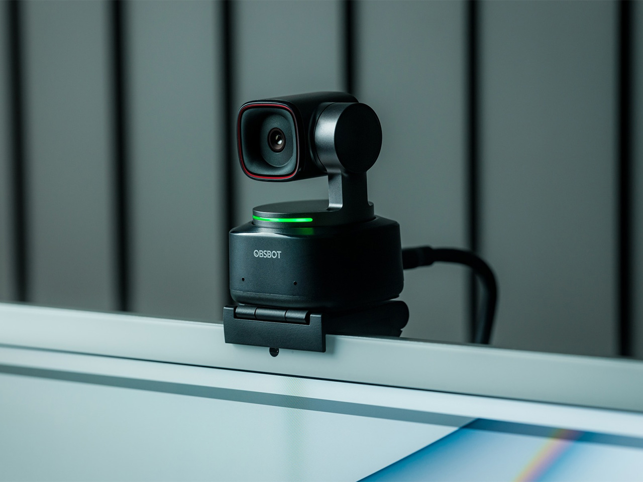
Before the Tiny 3 arrived, the Tiny 2 was OBSBOT’s undisputed flagship desk camera, and it remains a formidable piece of hardware. This is the camera that set the standard for what a premium AI webcam could be, pairing a huge 1/1.5-inch CMOS sensor with exceptionally fast autofocus and reliable AI tracking. That large sensor is a critical detail, as it gives the Tiny 2 excellent low-light capabilities and a natural depth of field that rivals even some of the newer models in the lineup. It established the features that now define the Tiny series, including effective auto-zoom, dynamic gesture controls, and even voice commands for a completely hands-free experience.
The Tiny 2 is a proven workhorse. It has benefited from years of firmware updates that have refined its performance, making it a stable and dependable choice for streamers, content creators, and professionals who need consistently great video. While it may not have every single new software feature from the Tiny 3 series, its core performance remains top-tier. The image quality from its large sensor and premium lens system is still a benchmark for the category, delivering a crisp, professional look that cheaper webcams simply cannot match. For many users, this level of raw performance is far more important than the latest software gimmicks.
Why We Recommend
This is arguably the single best deal of the entire Prime Day event. The Tiny 2 is seeing a massive price drop of $100, bringing it down to just $229, a discount of over 30% and its lowest price ever. This is a rare opportunity to get a former flagship product with a best-in-class sensor for the price of a mid-range webcam. For anyone prioritizing pure image quality over having the absolute newest model, the Tiny 2 offers a value proposition that is impossible to ignore. It is the smartest purchase for the performance-focused buyer.
Click Here to Buy: $229 $329 ($100 off). Prime Day Deal starts on 23rd June 2026!
OBSBOT Tiny 2 Lite ($129) – The Smartest Way to Get into AI-Powered PTZ
The OBSBOT Tiny 2 Lite takes the intelligent core of the celebrated Tiny 2 and packages it into an even more accessible and affordable design. This camera is built for the user who wants to step up from a static webcam to the world of AI-powered pan, tilt, and zoom without paying a premium. It delivers the essential features that made its bigger brother a success, including reliable AI tracking with auto-zoom, crisp 4K resolution, and multipurpose tracking modes that can follow a subject’s whole body or focus just on their head and shoulders. It is a streamlined experience focused entirely on delivering smart, automated framing.
While it does not have the same massive sensor as the standard Tiny 2, the Tiny 2 Lite still produces a clean, professional image that is a significant upgrade over nearly any built-in laptop camera or budget webcam. The real magic, however, is in the motion. For presenters, educators, or streamers who move around, the camera’s ability to smoothly follow them is a game-changer. It also includes useful features like preset PTZ positions, allowing users to instantly switch between a tight shot and a wide view with the press of a button, a function typically found on much more expensive hardware.
Why We Recommend
This is the ultimate entry point into intelligent webcams. With the Prime Day discount bringing its price down to just $129, the Tiny 2 Lite is in a class of its own. At that price, it competes with high-end static webcams while offering a full suite of AI and PTZ features that its rivals lack. For anyone who has been frustrated by fixed-frame cameras but felt priced out of the AI tracking market, this deal removes that barrier. It offers the most important features of the Tiny 2 generation at a cost that makes it an easy and obvious upgrade.
Click Here to Buy: $129 $179 ($50 off). Prime Day Deal starts on 23rd June 2026!
OBSBOT Meet 2 ($99) – The 4K Webcam That Makes Every Meeting Smarter
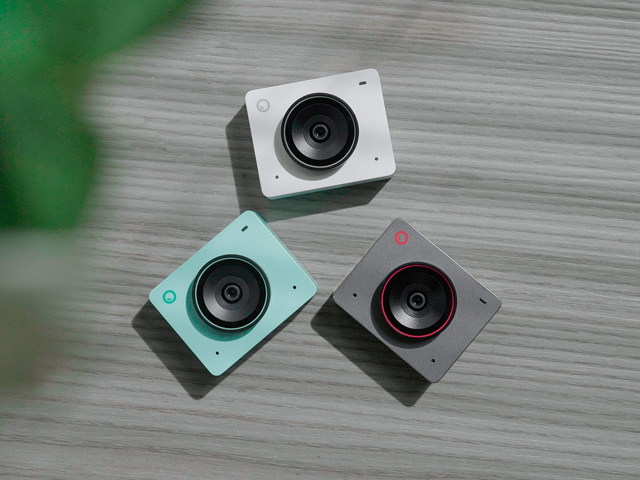
The OBSBOT Meet 2 is designed to solve a very specific, modern problem: making you look and sound as professional as possible on a video call with the least amount of effort. This is not a complex PTZ camera for creators; it is a sleek, intelligent webcam for the hybrid worker, the remote professional, and anyone who spends their day in virtual meetings. It delivers a sharp, vibrant 4K image at 30 frames per second, providing a significant leap in clarity over standard-issue laptop cameras. Its compact and lightweight design allows it to sit discreetly atop any monitor or laptop, instantly elevating the look of a desk setup.
The real intelligence of the Meet 2 lies in its automation. It features fast, reliable AI-powered auto-framing that keeps you perfectly centered in the shot, even if you shift or lean. It can also widen its frame to include a second person, making it ideal for small group meetings in a huddle room. This is paired with a fast autofocus system that keeps the image sharp and professional. The setup is pure plug-and-play; you connect it via USB, and it works seamlessly with Zoom, Microsoft Teams, Google Meet, and other major platforms without requiring any complicated software or drivers. It is designed to be an invisible upgrade that simply makes you look better.
Why We Recommend
The Meet 2 hits the sweet spot between performance and simplicity. It offers two of the most important features from high-end cameras, 4K resolution and AI auto-framing, in an accessible, user-friendly package. The Prime Day deal makes its value proposition even stronger, dropping the price to just $99. For under a hundred dollars, it provides a massive upgrade in video quality and intelligence for any professional. This is the ideal camera for anyone who wants to improve their virtual presence without adding the complexity of a PTZ system.
Click Here to Buy: $99 $129 ($30 off). Prime Day Deal starts on 23rd June 2026!
OBSBOT Meet SE ($58) – The Easiest and Most Affordable Upgrade for Any Setup
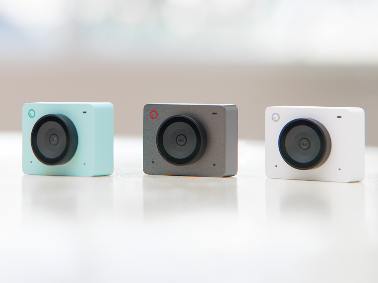
Sometimes, the best upgrade is the one you do not have to think about. The OBSBOT Meet SE is built on that principle. It takes the single most useful intelligent feature from its more expensive siblings, AI-powered auto-framing, and delivers it in a simple, incredibly affordable package. This camera is designed for anyone and everyone who is still using a basic, fixed-frame webcam and wants a better experience without any complexity. It captures clean, clear 1080p video and uses its AI brain to make sure you are always centered in the frame, looking professional and engaged.
The Meet SE is a masterclass in thoughtful, essentialist design. It is a true plug-and-play device that works the moment you connect it, with no drivers to install or complicated settings to configure. It even includes a physical privacy cover, a simple but crucial feature that provides peace of mind for remote workers and students. While its primary focus is on effortless video calls, OBSBOT also included a surprisingly capable 1/2.8-inch stacked CMOS sensor, which gives it better-than-expected image quality and even allows for high frame rate capture for smooth slow-motion effects, a rare bonus in a webcam at this price.
Why We Recommend
This is the definitive “no-brainer” upgrade. With its Prime Day price of just $58, the OBSBOT Meet SE is likely cheaper than the keyboard on your desk, yet it delivers a feature that was, until recently, reserved for premium cameras. It completely eliminates the problem of awkward, off-center framing on video calls for less than the cost of a nice dinner out. For students, remote workers, or anyone who simply wants to look better in their daily meetings without spending a lot of money or time, there is no better value to be found in this entire sale.
Click Here to Buy: $58 $69 ($11 off). Prime Day Deal starts on 23rd June 2026!
The post OBSBOT AI Cameras Are on Sale for Prime Day 2026, and the Tiny 2 Webcam Just Hit Its Lowest Price Ever first appeared on Yanko Design.