7 Rendering Tricks to make your KeyShot Renders look Completely Photorealistic

Render by Ali Rouzbeh

These small tips will take your renders from average to awesome.

If you’re on this website reading this article, there’s a fair chance that you’re an Industrial Designer who 3D models and renders for a living, and if that’s true there’s an even fairer chance that you’ve heard of KeyShot. Touted by 88% of designers as the best software for realistic renders, KeyShot is known for two things, being intuitive and easy to use, and being great at creating good renders with low effort. However, just like how a great camera doesn’t make you a great photographer, a great software doesn’t automatically make your renders incredible. If you’ve used KeyShot for work, personal projects, or the occasional design competition, here are a few lesser-known tips that should completely revolutionize your rendering game. Use these tricks to upgrade your skill set, bookmark the article for later, and give KeyShot 2024 a download so you can put your new rendering skills to the test!

Click Here to Get Free KeyShot Pro + Keyshot Web

1. Perfection lies in imperfection

Render by Jay Bhosale

That might sound like a paradox, but look around you – nothing is perfect. Your phone has fingerprint marks on it, your table’s got a few scratches, the glass you’re drinking water from isn’t 100% geometrically perfect – its surface has marginal imperfections that cause light to reflect/refract in unique ways. If you want to look real, you have to embrace reality… and in reality, nothing’s perfect. Sure, your product render against a white background can be as perfect as possible, but if you’re looking for a photorealistic scenario render, obsess over the imperfections. Add dust and fingerprints to flat glossy surfaces, use bump maps pretty much anywhere you can, create scratches as a layer/label in your material, remove 100% sharp edges (everything is marginally rounded off), and most importantly, push objects out of alignment in your scene. No real-world scenario has stuff aligned perfectly. These settings alone should take you halfway to photorealism, because humans perceive imperfections as a part of reality.

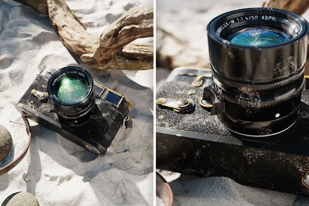
2. Bokehs are everywhere

Render by Mads Hindhede Svanegaard

Your eyes are telescopic. They can’t focus on everything at the same time – you look at one thing and everything else blurs out. The blur is the key here, and it’s why portrait-mode photos on smartphones look great too. Seldom do you see photos of ANYTHING where every single item is in focus, and similarly, your renders need to ‘focus’ on that too. Go to the Camera tab on the top right and scroll down to the part that says Depth of Field. Activate it, adjust your focus distance, use the target button to click on the object you want to focus on, and set your F-stop to an appropriate number to ensure everything else is properly blurred. It’s easy to overdo the blurring, so once you find the right F-stop, raise it a little higher to err on the side of caution (don’t over-blur stuff, it’ll look fake). Remember, blurring takes a significant chunk of your rendering time, so if you DO use this tip, double or triple your rendering time per image. The results will come out fantastic.

3. Adjust your Image Settings

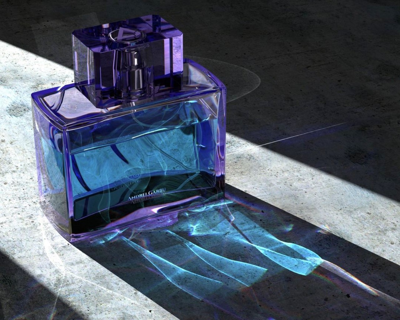
Render by Andrei Garbu

If you’ve ever used a camera, chances are you didn’t just point at a photo and hit the shutter button. You probably adjusted the exposure, aperture, ISO, and maybe played around with the white balance too. Think of the camera in KeyShot as a camera in real life – all it really does is capture the angle and focus… but there are still settings you need to tweak. Here, the Image Settings are your friend. Click on the Image tab on the top right corner and switch from Basic to Photographic. Now you can play with the exposure, contrast, white balance, highlights, shadows, midtones, and other parameters. You can even increase or decrease your image’s saturation to get you that perfect balance of colors, darkness, and light. Select ‘Linear’ in the Response Curve setting, enable the Curve editing feature below, and tinker away! It’s the secret sauce your renders need!

4. Beginners render, legends ‘Denoise’

Render by Sam Gwilt

Sometimes your renders just look grainy because you didn’t give them enough time to render out perfectly. Makes sense, you’re probably on a strict deadline and you don’t have 10-20 minutes to spare per render. Luckily, KeyShot’s Denoise feature in the Image Settings works like magic. They just blur out the grains in your renders, letting you ‘cheat’ your way through a quick render. Enable Denoise and watch as all the grains disappear miraculously. Set your Denoise level to around 0.6 for a balanced effect – setting it too high will give you weirdly blurry/smudgy renders, and setting it too low will give you grainy images. The Denoise feature works VERY well when you’re using the Depth of Field setting too, allowing you to easily cut down your rendering time without cutting down on quality.

5. Caustics are a headache, but they’re worth it

Render by Tommy Cheong

If there’s any transparent object in your render, chances are that it won’t just absorb or block light, it’ll bend light too. If you’ve ever looked at a reflection of a glass of water on a table, or those bright lines at the bottom of a swimming pool, those are caustics. They’re caused by light being manipulated by transparent/translucent objects. Caustics in KeyShot remain disabled by default, but that’s only because they’re kind of an absolute headache. They require a truckload of CPU/GPU power, take a LOT of time to perfect, and even more time to render. But if you nail your caustics, you’re guaranteed to get a few ‘wow’s from people who see your renders. The Caustics setting can be found in the Lighting tab in the top right corner. Enable it and also enable Global Illumination. Increase your ray bounces as well as your global illumination bounces, and if you’re using glass or plastic as a material, go to the material settings and increase the sample size. The problem here is that there will be a difference between what KeyShot shows you in the preview window, and what it actually renders, so the only way to really tell if you’ve done a good job is by rendering images, reviewing them, and then tweaking the settings. Rendering caustics also takes a LOT of time, and here Denoise won’t help you. You just need to trust the process and let KeyShot do its job simulating the bouncing of light to create those caustic refractions. Like I told you, it’s a bit of a headache, but the rewards pay off well.

6. If you’re thinking fabrics, think RealCloth™

Render by Hossein Alfideh Fard

Perhaps one of KeyShot’s most underrated materials, RealCloth adds unbelievably photorealistic cloth effects to any fabric in your scene. Whether it’s a tablecloth, the upholstery of a sofa, or even the strap of a camera, RealCloth’s one job is to mimic the woven effect of any kind of cloth. It adds depth, weave-patterns, and even lets you bake in imperfections like flyaway fibers and threads. If you’re simulating photorealism, chances are one of the objects in your scene has a fabric texture (it could be something as small as a cloth tag on a product). If it does, tap into the power of RealCloth to get that absolutely perfect cloth effect. Don’t rely on fabric bump maps online, trust me they won’t give you the precise control or sheer jaw-dropping dynamism that RealCloth will.

7. Shadows are just as important as lights

Render by Will Gibbons

When you’re setting your scene, don’t focus all your energy on getting the right highlights. Focus also on getting great shadows. This means ditching the HDRI lighting settings and actually adding physical lights to your scene. Photorealism requires work, and those drag-and-drop environments won’t help you achieve it. Sure, you can use the environments to create realistic reflections, like a sky reflecting off a windshield of a car… but there’s NO way that environment will create the dramatic shadows you need. For those, you’ll require area lights, point lights, and/or spotlights. You’ll have to add these lights to your project by assigning them as materials to random spheres and planes within your scene. Unlike the HDRI environments, these lights will create actual shadows that are crisp at some edges, blurry at others, and more importantly, shadows that overlap, warp, and interact with each other. Take your smartphone flash and hold it against your hand. Move the flash closer and see the shadow grow bigger, move it farther and see the shadow get smaller – the shadow’s shape and behavior are determined by physical lights in your scene, not by the environment lights. So add physical lights to your scene and keep those shadows in mind because while the eyes don’t ever focus on shadows, they do register them. A render without accurate shadows will just look… off.

Click Here to Get Free KeyShot Pro + Keyshot Web

The post 7 Rendering Tricks to make your KeyShot Renders look Completely Photorealistic first appeared on Yanko Design.

Pixel Fold renders dream up Google’s next big thing

Google seems to be gearing up to expand its Pixel brand, starting with the shiny new Pixel Watch launched last month. The company also already confirmed that it will be launching its first Pixel-branded tablet next year, and it seems to be taking a rather different course from typical slates like the Apple iPads and the majority of Android tablets. One thing it hasn’t confirmed yet at this point is a foldable device that many are sure is happening next year as well. While nothing is official yet, these beautiful renders and bits of information do paint an almost complete picture of what is being called the Pixel Fold, suggesting that it’s going to be just as divisive as any other foldable phone in the market.

Designer: Jon Presser (Front Page Tech)

Almost everyone is expected to launch a foldable phone these days, including Apple, which is highly unlikely at this point. The reality is that, despite all the buzz and hype, foldables are still seen as an eccentric luxury, a very expensive experiment in what the future of mobile could be. Ironically, that’s exactly the perfect chance for Google to step in with its own take on a foldable Android device, only to announce its retirement a year or two later.

Whether it happens sooner rather than later, these renders, all based on leaked information, represent a close possibility of what the Pixel Fold could look like. Admittedly, it looks very classy and professional, especially with its sparkling chrome edges and reflective glass back. When folded, the external screen looks big enough to be a regular-sized “phablet” or giant phone. Unfolded, however, it means that it would be more square than a typical tablet. There is also no gap near the hinge when the phone is folded, unlike the Galaxy Z Fold series, which isn’t exactly that novel considering that the OPPO Find N and the Huawei Mate Xs 2 have already pulled it off.

While all of the above sound good and expected for such a device, there are a few details that could give would-be buyers pause for thought. The extra large camera bump on the back runs horizontally like the Pixel 7’s, but it is a discrete island rather than a visor. The Pixel 7’s camera design wouldn’t have worked anyway since it would have gotten in the way of the hinge. It’s a rather thick bump, for that matter, and it could make the device wobble when unfolded and laid on a desk. Either way, it looks a bit awkward and very unlike the Pixel 7’s signature design.

The internal screen also has quite some bezel around it, which is a double-edged sword. On the one hand, it’s far wider than what we’re used to these days, even on foldable phones. On the other hand, it possibly leaves enough room for a front camera without resorting to cutouts and under-display gimmicks. According to the leakster, the Pixel Fold is going to be quite heavy in hand, which doesn’t really sound reassuring for this kind of device. That said, that heft could also give it a bit of a premium feel that’s associated with materials like metal rather than cheap plastic.

The biggest deal-breaker, however, might be its rumored $1,800 price tag, a very steep figure at a time when manufacturers like Samsung are trying to make the device category more palatable. Pixel phones do have that mark of being more expensive than comparable phones, so that’s not exactly surprising. It doesn’t inspire confidence, however, given how Google tends to provide or sell products with much buzz only to pull the rug from under people’s feet when they least expect it.

The post Pixel Fold renders dream up Google’s next big thing first appeared on Yanko Design.

The sleek, geometric record player uses linear tracking for a fresh take on the classic turntable!

Turntables are fussy devices. Audiophiles could talk for hours on end about the importance of external speakers versus integrated speakers, or the upkeep of the tonearm and needle, and for good reason– turntables have a long, fine-tuned history. Today, they’ve surged in popularity and new turntable designs are cropping up left and right. Cameron Bresn, an LA-based vehicle designer, has brought his unique rendering into the mix, TTMAC77, which incorporates linear tracking for a fresh take on the classic turntable.

TTMAC77’s sleek half-cover could be constructed from ash wood with stainless steel accents, offering a delicate mix of casual adaptability and a touch of luxe elegance. The rotational, hinge rod allows the turntable’s cover to open and close, allowing for records to be swapped in and out. The turntable’s platter aligns neatly with a typical 12-inch record and without a dust cover, the wooden cover only hides half of the record so the record can always be seen spinning. With minimal frills and whistles underneath, the TTMAC77 appears considerably sophisticated, yet simple.

Bresn’s TTMAC 77 turntable utilizes linear tracking, which means that unlike conventional pivot tonearms, linear-tracking tonearms do not swing across a record, but instead slide over the record in a radial, straight line. Linear-tracking models are for the most part not really produced anymore primarily due to poor timing– it seems CDs stole their spotlight when they first hit the market. Linear-tracking turntables are beloved nonetheless, thanks to their accurate sound and easy tonearm alignment. In order to create a working linear-tracking turntable, Bresn was sure to include an adjustable spring for tension on the needle head to ensure that high-fidelity sound is produced from TTMAC77.

Designer: Cameron Bresn

Bresn’s rendering flaunts slim hardware with stainless steel accents to give TTMAC77 a weighty feel.

With a hinge rod mechanism for opening and closing the turntable, records can be swapped in and out.

Without a dust cover, TTMAC77’s lid conceals only half of the record, so they can always be seen spinning.

This WFH setup is our dream workstation, including everything from virtual reality to detachable screens!

Now that we’ve had a taste of what working from home feels like, we’re all noticing the ways our work setups can be improved. It might be that your desk is too short or that your wires desperately need some organizing. No matter what you do, your workspace should feel comfortable and accessible so that you can move through the workday as smoothly as possible. After one year of intermittently working from home, Lucas Couto dreamed up his ideal WFH setup and it’s safe to say, we all want in.

What appears as a simple computer desk setup turns out to be so much more. For starters, Couto’s workstation setup, “Future of Work,” features a retractable display screen that detaches into a foldable tablet/laptop. The simple OS desktop functions as the workstation base, where files can be created and stored. Then, when Couto needs a tablet or laptop for easy portability, the same files will be made available on the go.

In addition to the desktop’s detachable screen, Couto’s design features another tablet that can attach itself to the desktop for an extended display, offering quick file sharing and supplemental portability. Finally, Couto’s “Future of Work” setup comes equipped with VR compatibility, providing a headset that turns into a dashboard where all of the work station’s appliances are connected. The integration of VR allows for seamless file transferring between devices, like sharing CAD models between devices and other file formats.

Nowadays, it’s important for the technology we use to cater to our needs, from getting stuff done for work to using it at our leisure. When technology doesn’t flow the way we need it to, it can feel like our whole workday has been derailed. Couto’s “Future of Work” conceptual design realizes the ultimate cohesive work setup through multiple device connectivity for a smooth workflow, convenient portability for busier days, and integrative VR assistance for intuitive file transferring.

Designer: Lucas Couto

Following multiple ideations, Couto conceptualized the WFH setup of his dreams.

Following a year’s worth of intermittently working from home, Couto designed a WFH station that includes multiple device sharing platforms and seamless file transferring.

Hinging on portability and accessibility, Couto’s WFH system includes a tablet that transforms into a laptop.

Featuring retractable screens that turn into standalone tablets, Couto’s WFH setup is designed for convenience.

After working on the tablet, it can then be transferred to the desktop’s screen just by dragging your fingers.

By incorporating a supplemental tablet, the desktop’s display screen can nearly double in size.

By including a VR headset, Couto makes it easy to search through his dashboard and organize his work across multiple device platforms.

How to make an old, ancient, rusty metal in Keyshot using the Material Graph

Keyshot’s Material Graph offers the ability to go beyond simply tweaking a material’s color, roughness, or refractive index. If Keyshot’s material library is a restaurant menu-card, the material graph is literally the most versatile salad bar you’ve ever seen. You can pick and choose various aspects of different materials, creating a visually gorgeous mishmash of nodes and blocks to ‘build’ a material that looks stunningly real. I’m probably making it sound complicated, but here’s the truth – it really isn’t. All you need is a little patience and the ability to spot how your material reacts when you make changes to it in the material graph. Combine them and in no time, you’ll have a material that behaves exactly the way you want it to… because it was designed to!

Read further to see how to build this aged, oxidized, grungy material in Keyshot’s Material Graph. You can use this technique to make all sorts of material variants, like rusted iron, oxidized silver, or even aged bronze that’s turning green around the crevasses.

UNDERSTANDING THE BASICS

Imperfections form a major part of what makes a render photorealistic. Scratches, dust, fingerprints, dirt accumulated in tiny corners, signs of aging, all this plays a heavy role in making the eyes believe what they see. You seldom see a phone without some smudges on its screen, or a table without a bit of dust or scratches, or a leather bag without patina. Imperfections are what make life real and embracing them is a great way to make your 3D renders feel “life-like”.

The best way to look at this complex material is by splitting it into its subsequent parts. If you look at the image above, or the material graph below, you see two broad materials. Material 1 is an old, aged, dirty brownish metal, Material 2 is a shiny, golden/bronze metal. Once you create these two materials, it’s just a question of adding them together in a way that allows the right metal to show up in the right place. I’ll explain how we do that, but first, let’s create the two materials.

Before we begin, I’ve set up my scene using a model of the Bearded Man, downloaded for free from Three D Scans. Fun fact, the model is a scanned historic artifact titled ‘Portrait of a Bearded Man’ made in Marble back in the Hellenistic Period in 150 B.C. Greece. It’s perfect for our aged material because it has a stony texture with a stunning amount of detail that causes the material to look incredibly realistic. Remember that your material will only be as good as your model. A model with real-world imperfections will result in a material that’s believable and realistic.

Once you’ve set the scene up with the model, start by opening the material graph and making the old metal first. The key is always factoring imperfections into the model, so rather than just using the same color and roughness throughout, we’ll use texture maps to make sure the color and roughness of the old metal are inconsistent. Similarly, drop a texture into the Bump section too (with a low bump height) to create that undulating imperfect surface. The material interprets these texture images as data to control its properties. Depending on the whites and blacks and greys in the texture maps, the material has high or low roughness, or a higher or lower bump. Play around with the values to get a dark, rough-ish metal with barely any reflectivity… and then make Material 2, which is just the opposite.

Since Material 1 is the base material, Material 2 will sit on top of it as a layer… or in Keyshot parlance, a Label. Right-click in the empty space and create a new metal material, with image maps controlling its color, roughness, and bump. Apart from the bump, which essentially stays the same in both materials, the color and roughness are fundamentally the opposite. Where Material 1 is rough and dark, Material 2 is shiny and golden. Once you’ve made Material 2, link it to the Final Material Node using the Label option. What you now have is a shiny metal ‘coating’ sitting on top of a dirty, rusty metal. Now we control which parts of the model appear dark and rusty, and which parts appear shiny and metallic!

EXPLORING THE MATERIAL GRAPH’S CURVATURE NODE

If you’ve ever taken a walk in the mud with sneakers on, you’ll notice something interesting. The mud gets right into the gaps of your sneaker’s tread pattern. The surface of the sole may stay clean, because it’s constantly rubbing against the ground, but the mud that gets into the negative spaces of your sneaker sole stays there until you clean it out properly. Interestingly enough, that’s exactly what we’re doing with this old, aged material too. We’re sort of keeping the ‘outer surface’ clean and shiny, while allowing the dents, cracks, gaps, and holes to be dirty… and we’re doing this using the Curvature Node.

Simply put, the Curvature Node splits your model into three types of surfaces – Convex surfaces, Concave surfaces, and Flat surfaces. When you connect this node to Material 2’s opacity, what you’re basically doing is making Material 2 visible in certain parts of the model, and invisible in other parts. The Curvature Node comes with three primary controls. One for Negative Curvature or concaves, one for Zero Curvature or flats, and one for Positive Curvature or convexes. What we want is for the shiny material to be visible on all convex surfaces, and the dirt to sort of be lodged into the tough-to-clean concave surfaces. By assigning the color white to the Positive control and the color black to the Negative (and even the Flat) control, you effectively control Material 2’s opacity, making it visible only in convex parts like the tip of the nose, the eyeball, etc. Everything else immediately appears dark and dirty, thanks to the underlying Material 1. You can periodically click on the Curvature Node and press the C key to toggle the preview of the black and white colors instead of the old and new materials.

The Curvature Node also has other controls that let you tweak the output. The Cutoff control basically determines how Keyshot treats the flat surfaces. If there’s a surface that’s almost flat, a high Cutoff value tells Keyshot to treat it as flat. Similarly, if your cutoff is at 0, Keyshot looks at every polygon accurately with no tolerance. Similarly, Radius controls clusters of polygons. A larger Radius value blurs the gap between the blacks and whites, while a smaller radius allows the difference to be sharper. Meanwhile, make sure you un-check the Radius In Pixels box. (That allows the radius to change depending on how much you zoom in or out, and we don’t want that)

Add some dramatic lights and Voila, you’ve got yourself an aged, old metal! If you followed along and built your own version yourself, that’s amazing! If not, just tinker around with the file we made by downloading it here. You could also watch this video by Esben Oxholm who uses this technique to make rusted iron. Similarly, you can use this process to make aged variations of materials yourself, like oxidized silver, greenish oxidized bronze, or your very own rusted metal. Scroll down to check out some results below, and hit us up on Instagram if you’ve got any suggestions for other materials you want us to make tutorials for!

Click Here to Download the Material!

NVIDIA’s RTX Studio driver speeds up ray-traced V-Ray rendering

When you see a particularly shiny, photorealistic 3D scene, there's a good chance it was created on Autodesk's 3DS Max or Maya using Chaos Group's V-Ray renderer. It can take a long time for workstations to crunch through V-Ray scenes, however, so NV...

Final Cut Pro X gets a speed boost through Apple’s Metal

The latest Final Cut Pro X update, released today, takes advantage of Apple's Metal API to provide leaps in performance. With a new Metal-based engine, the updated Final Cut Pro X improves playback and accelerates tasks like rendering, real-time effe...

Philip Lück’s imaginative take on everyday objects includes an iPhone 11 with a fidget spinner!

‘Reality leaves a lot to the imagination’, this quote by John Lennon is what I believe must be the inspiration behind this wonderful mix of reality and imagination displayed by designer Philip Lück. Philip, who goes by the username philiplueck on Instagram has been adding a twist of imagination to the mundaneness of our daily lives. What sets him apart is his sense of humor, be it a fidget spinner in place of the 3 cameras on Apple’s latest iPhone 11 Pro that is causing a wave of fear among trypophobe’s across the world to a dose of creativity you wish you could take every morning. There is a healthy mix of reality, imagination, and a subtle suggestion that asks you to take a harder look at the reality of our everyday lives in each of his renders.

Now here’s a version of the iPhone 11 Pro that adds some fun to the 3 camera setup, and keeps the trypophobia at bay! Not to forget, the hours of screen-free analog procrastination it would provide when the phone was not in use.

Addicted to inspiration is a unique take on the struggle every creative person faces – how do you fuel those creative engines on an everyday basis? Well, a pill as such on a daily basis would sure be helpful!

Are you worthy enough to wield the power of those practically indestructible Nokia phones? Inspired by Thor’s hammer, Mjölnir, these phones were all the rage when having a mobile phone became commonplace. Oh, the hours we spent playing the game ‘snake’ on those phones!

I have often actually imagined what a cool washing machine the Instagram logo would make, and this render surely proves me right. Now if only someone would actually manufacture this…

Mr. Mark Zuckerberg is the name of the book here!

Meet Cokebomb!

Meet the model inspired by OFFF Barcelona. Born as a festival over a decade ago, OFFF showcases three days of electronic music showcases, from some of the most respected names in the world of underground house and techno.

A direct shot of the good stuff for the day’s life has you down.

Moneymaker grates the cash to find you some change!

An ode to morning routines and rituals with a dose of daily updates! With the amount of data thrown at us on a daily basis, we do end up throwing most of it away without consuming it, making this an apt description of our mornings indeed.

Named heavy times, this image is sure to evoke the weight of passing time on our shoulders.

Sipped is for those days when life gives you lemons!

Kickstarter warns creators against calling projects ‘the world’s best’

Kickstarter is asking its users to tone down the hyperbolic language and to layoff the misleading imagery. In an attempt to promote transparency, the now 10-year-old platform issued new rules and guidelines aimed at "honest and clear presentation."