This 1,608-Piece LEGO David Comes with Its Own Historically Accurate ‘Detail’

Michelangelo never gave David a fig leaf. Prudish museum directors did that centuries later, and one particularly famous plaster cast fig leaf still exists today, hanging on removable hooks at the Victoria and Albert Museum, ready to be clipped on whenever Queen Victoria or her modern equivalents came through for a tour. It is one of art history’s great compromises. You cannot un-carve marble, but you absolutely can hang a strategically placed leaf on it and call the problem solved.

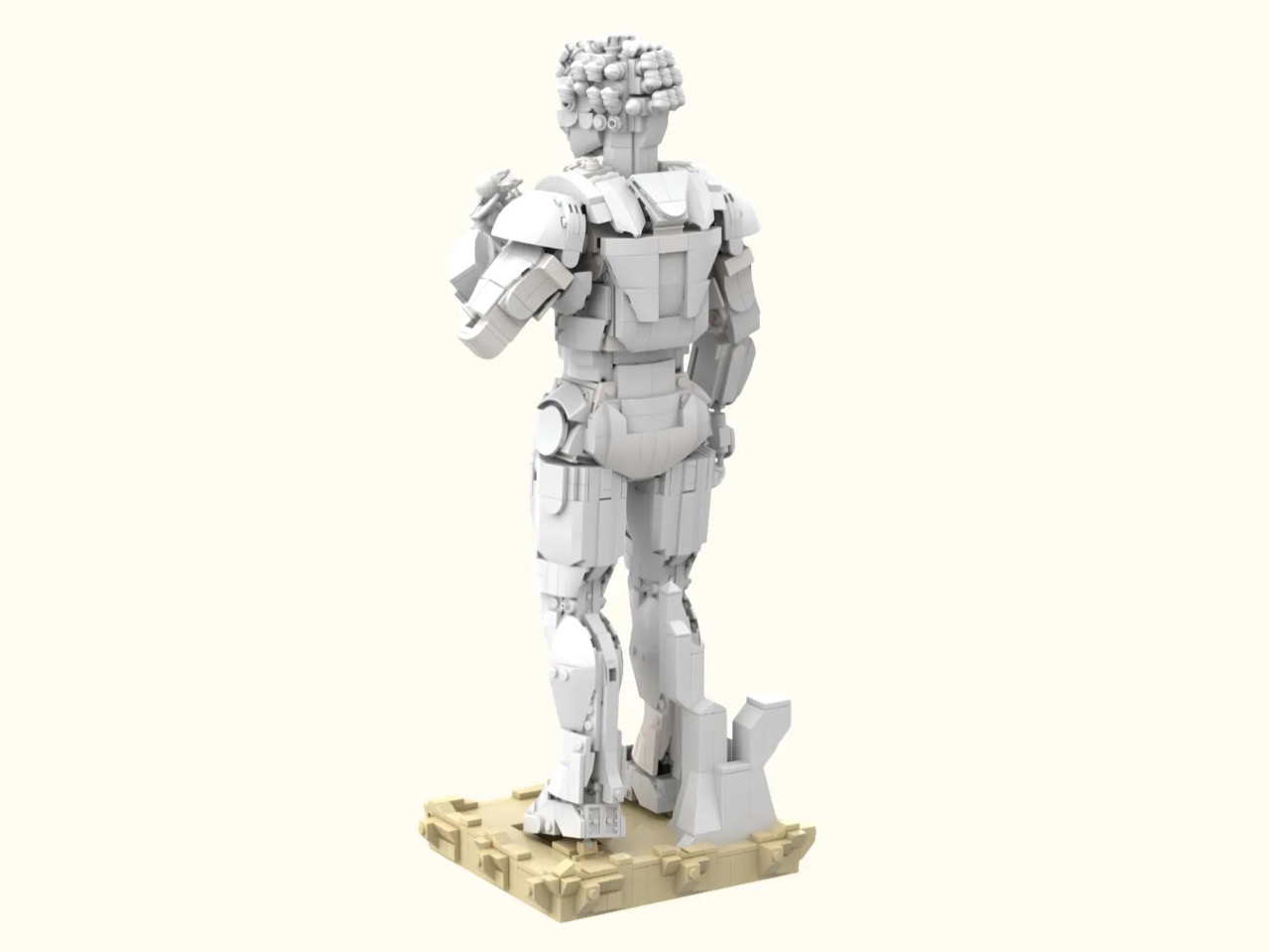
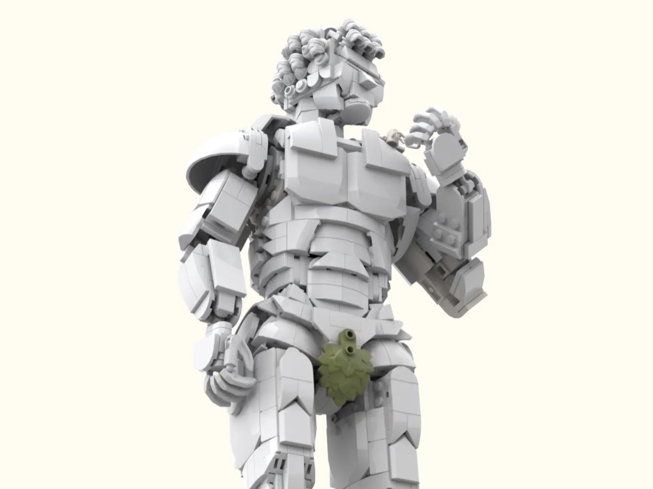
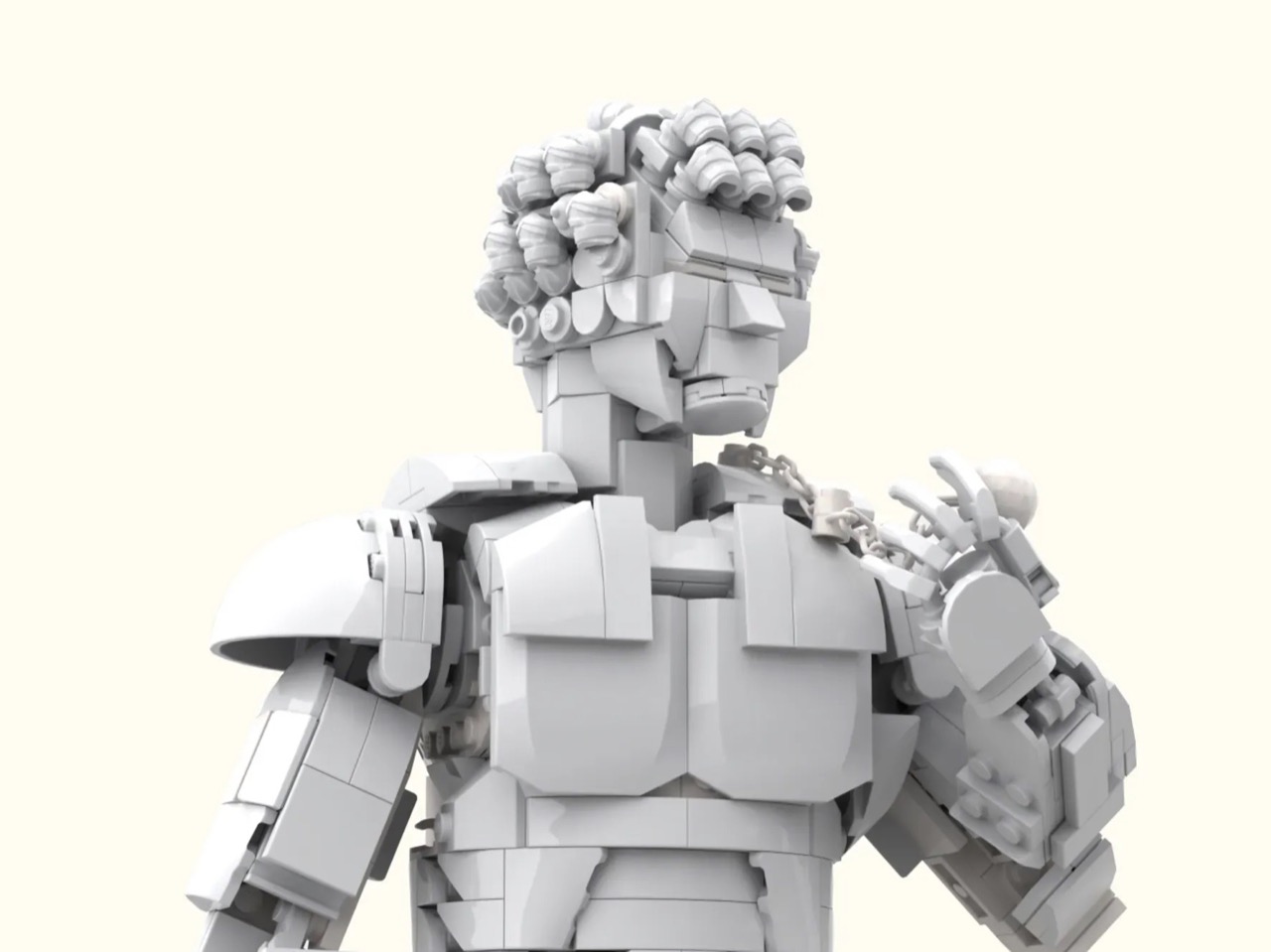
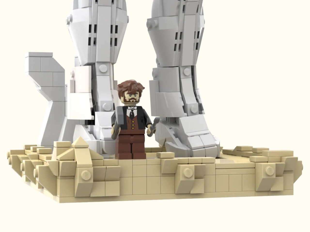
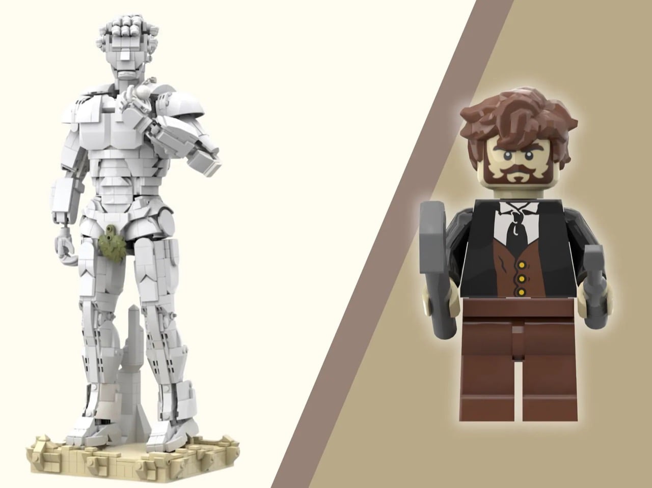
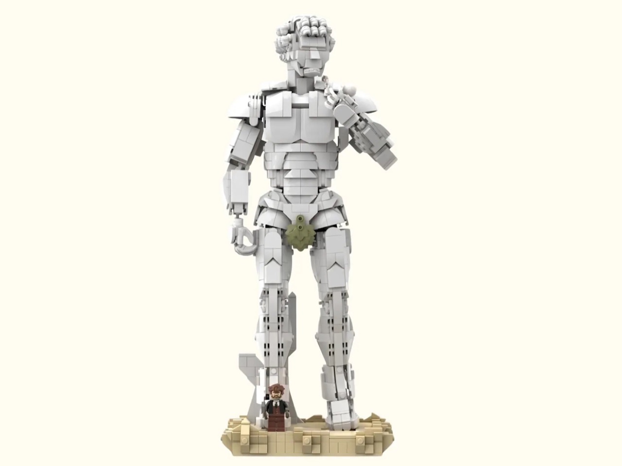
LEGO builder paaadilla.17 just pulled the same move, except this time the leaf is a single green element and the whole statue is made of ABS plastic. His Ideas submission recreates David in full, not just the bust, standing at nearly 41 centimeters tall across 1,608 pieces, fig leaf included as the build’s cheekiest and most historically accurate detail. It already has a Staff Pick badge, which tells you LEGO’s own team appreciated the joke too.

Designer: paaadilla.17

Michelangelo famously carved David before the fight rather than after it, weight shifted onto one leg, sling draped over the shoulder, torso twisted into that slight S-curve that makes the whole figure feel like it is about to move. Getting that tension across in interlocking plastic, without a single curved surface to cheat with, is genuinely hard, and paaadilla.17 leans on layered slopes and offset bricks to fake the contrapposto rather than flatten it into a stiff standing minifig pose. He also gave David a tan colored base instead of matching the white brickwork, a small choice that does the same job as gallery lighting, making the figure pop instead of blending into its own plinth.

My favorite detail, though, is the tiny Michelangelo minifigure standing beside his creation, mallet and chisel in hand, looking like he just stepped away for a coffee. It is a genuinely nice callback to LEGO’s Starry Night Ideas set from 2022, which shipped with its own Van Gogh minifig at an easel, and it suggests LEGO already knows this artist-plus-artwork formula sells. Scale wise, a true minifig-accurate David would only stand about 12 centimeters given the standard 1 to 42 ratio, so this one towers over its sculptor on purpose, which is oddly fitting since the real David was carved oversized to read correctly from 80 meters up on a cathedral roofline that never actually happened.

The build is currently sitting at 1,187 supporters and already picked up that Staff Pick badge, with 575 days left on the clock to hit the 5,000 mark before the real climb to 10,000 begins. If it gets there, LEGO’s review board takes over, and honestly, between the pose, the base, and that fig leaf doing its silent historical duty, this feels like exactly the kind of art-meets-brick submission that has a real shot. Head over to LEGO Ideas and give it your vote, David has waited five centuries for worse odds than this.

The post This 1,608-Piece LEGO David Comes with Its Own Historically Accurate ‘Detail’ first appeared on Yanko Design.

5 Furniture Pieces So Geometric They Could Hang in a Gallery

Geometry has always been the silent language of design. Across architecture and interiors, shapes define how spaces feel, function, and flow. Today, furniture design is embracing this language more boldly than ever, transforming basic forms into expressive, functional art pieces. Clean lines, curves, grids, and volumes are no longer just structural tools as they are becoming the identity of objects themselves.

This shift reflects a deeper cultural move, especially among Gen Z sensibilities, toward objects that are aesthetic and meaningful. Furniture is no longer passive as it speaks, interacts, and often challenges traditional expectations of form and function.

1. Modular Furniture Designs

Modular furniture draws heavily on geometric logic, using repeatable units such as cubes, rectangles, and grids to create flexible systems. These pieces adapt to changing needs, allowing users to rearrange and reconfigure spaces effortlessly. Geometry here is not just visual but it becomes a tool for customization and efficiency.

This approach suits modern living, where adaptability matters more than permanence. Modular designs turn furniture into a dynamic system rather than a fixed object. The clean geometry ensures visual harmony, while the flexibility aligns with evolving lifestyles, making design intelligent and responsive.
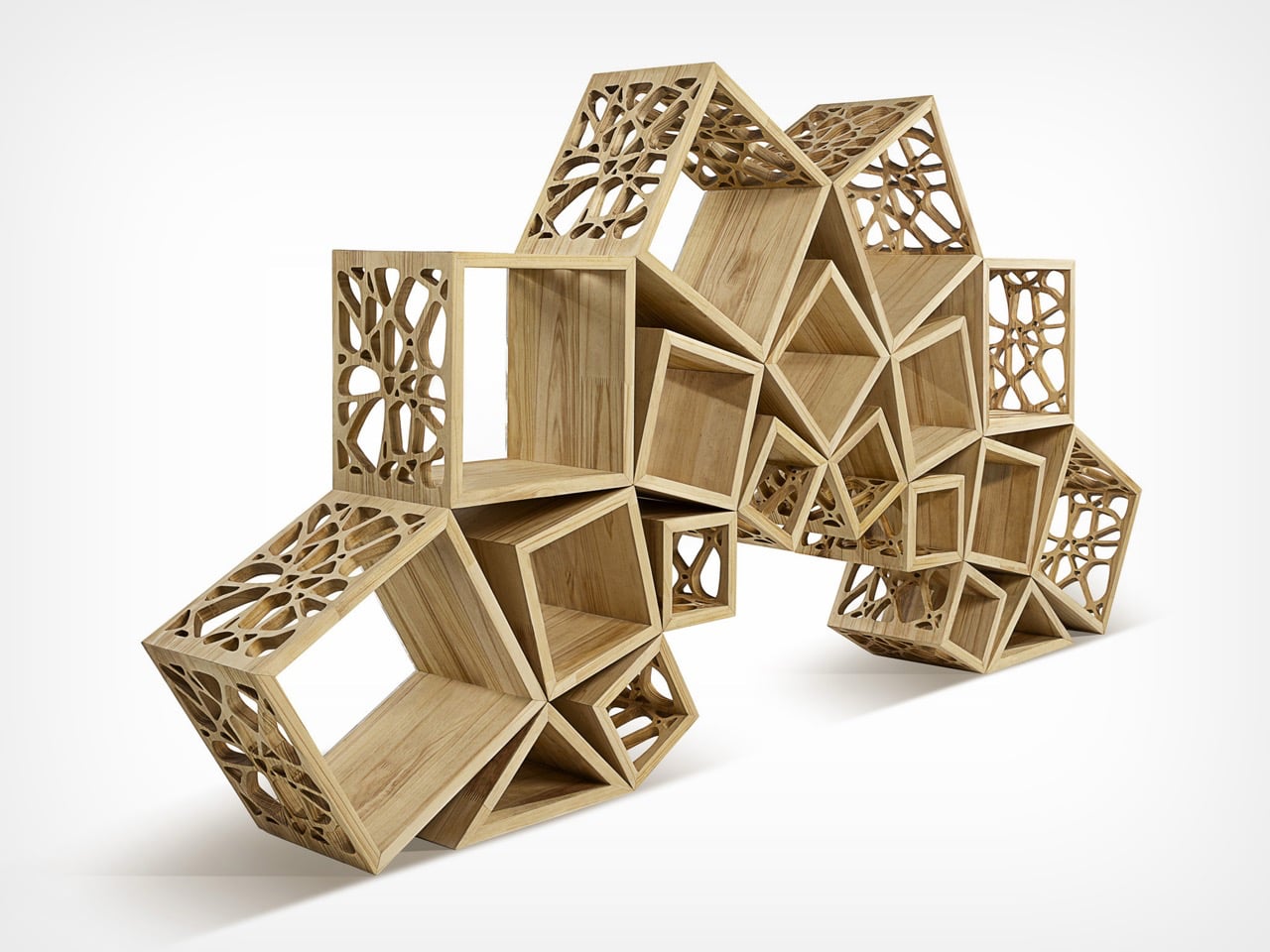
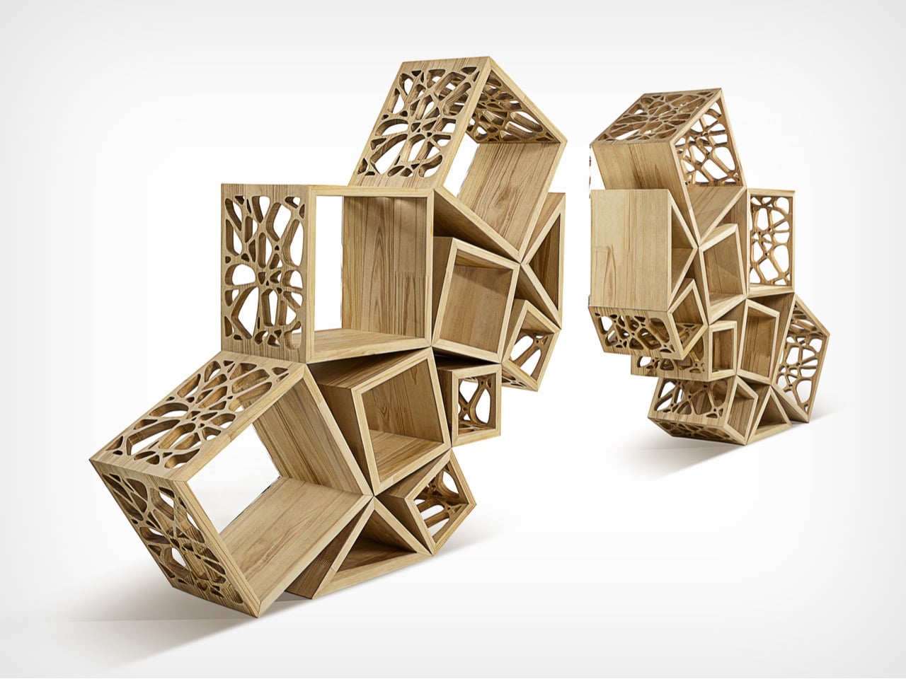
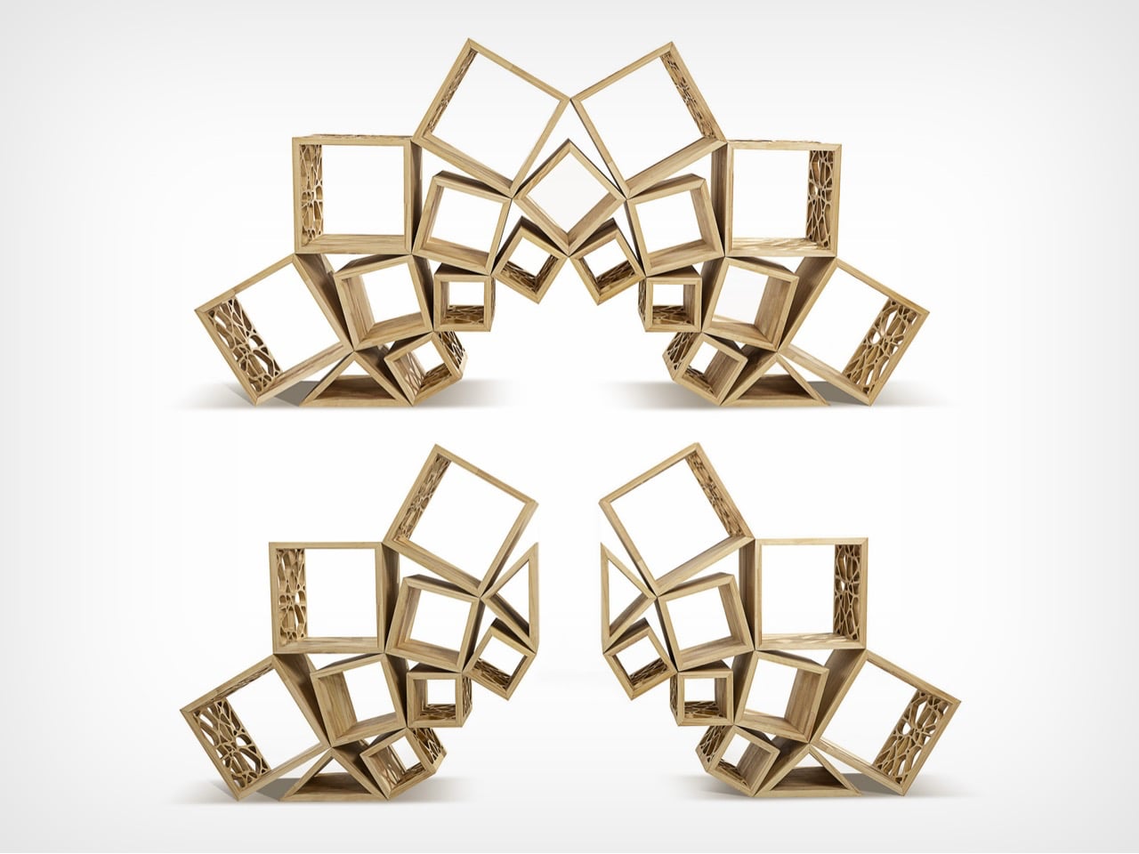
Fractal 9 is defined by its strong geometric identity, where form is driven by precision and not just decoration. The design builds on fundamental shapes like the square, structured through proportions influenced by the golden ratio and the recurring logic of the number nine. These elements guide the composition, creating a balanced system of volumes that feels both ordered and visually dynamic. The result is a piece where every line, angle, and intersection contributes to a cohesive geometric language, giving the object a sculptural clarity that stands out in any space.
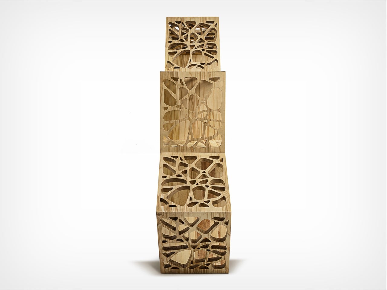
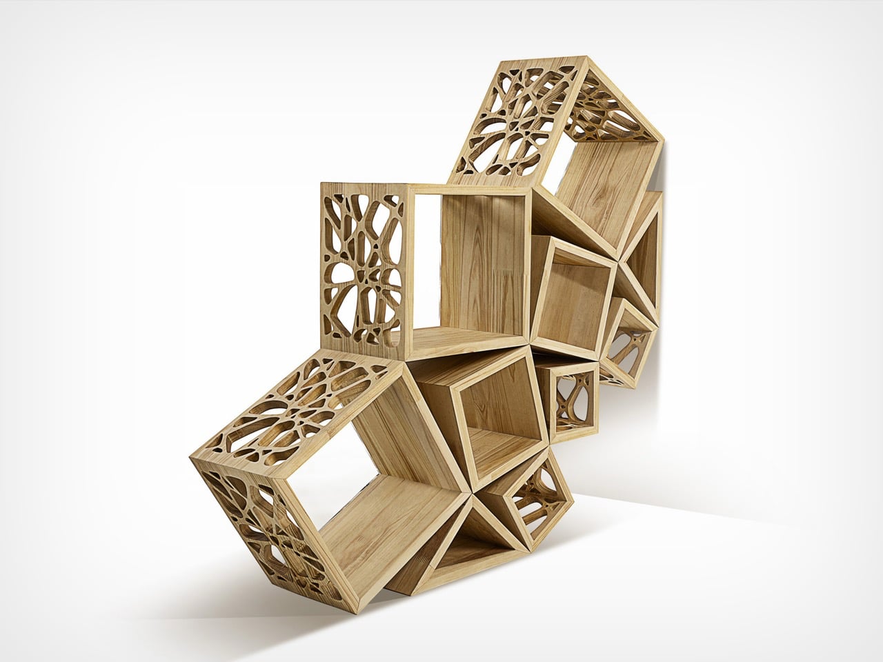
This geometric thinking extends into its modular structure, allowing the form to shift while maintaining harmony. Inspired by fractal patterns, the design repeats and scales its geometry in a way that feels consistent across configurations. Whether assembled as one unit or divided into parts, the proportions remain intact, preserving visual rhythm. The transparency of acrylic elements further highlights the geometry, making connections and alignments visible, turning the structure itself into the defining aesthetic feature.

2. Playful Shapes That Feel Fun

Playful furniture explores geometry with curiosity and experimentation. Bold shapes like spheres, arcs, and asymmetrical forms create pieces that feel lively and unexpected. These designs blur the line between art and utility, inviting interaction and emotional connection.

Such furniture often appeals to a younger audience seeking individuality and expression. Bright colors and unconventional forms transform everyday objects into conversation starters. Geometry becomes less rigid and more expressive, proving that functionality does not have to come at the cost of creativity or joy.
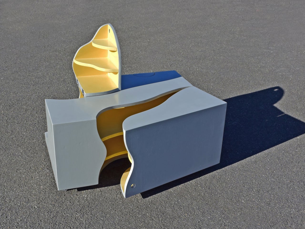
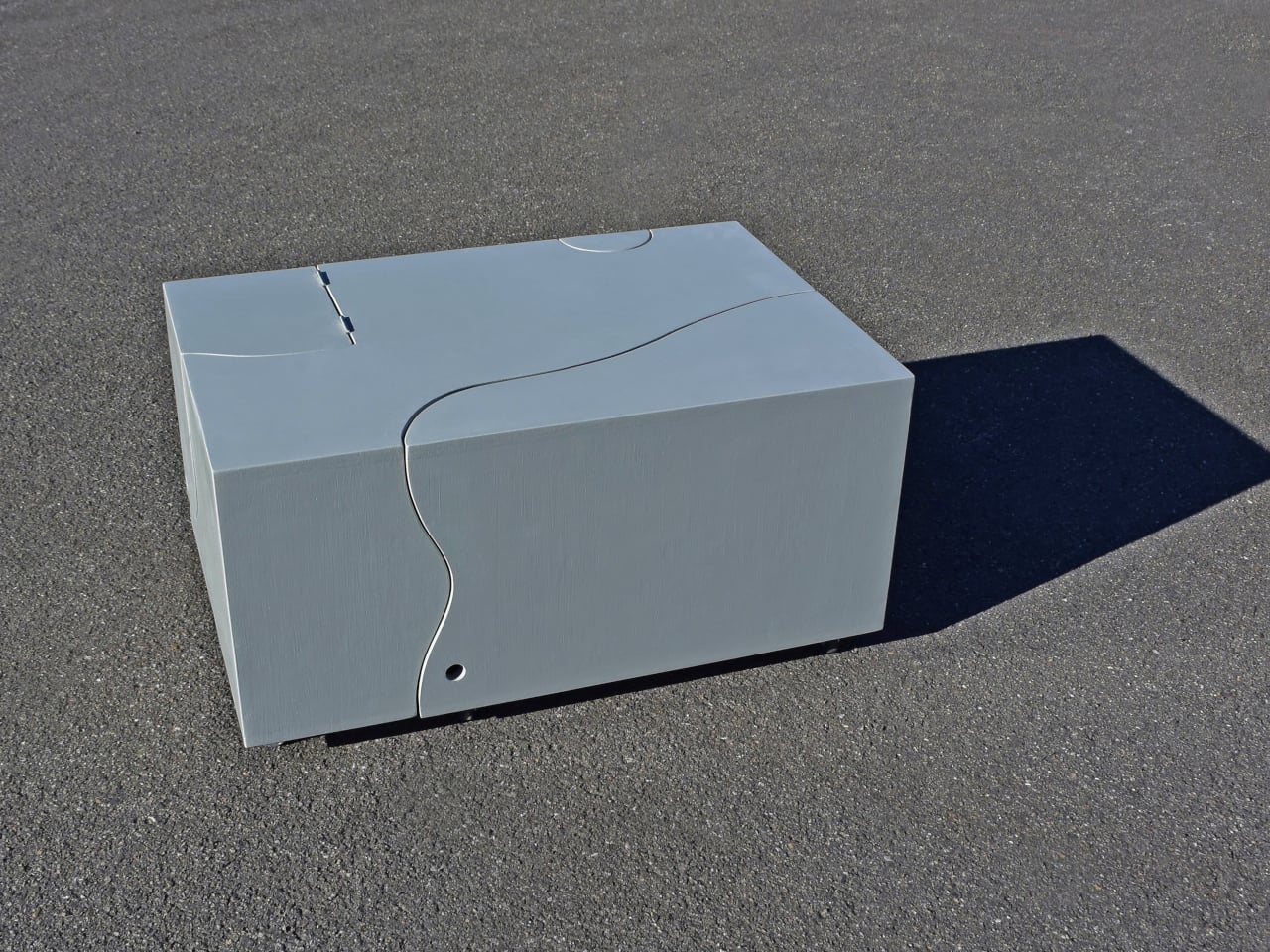
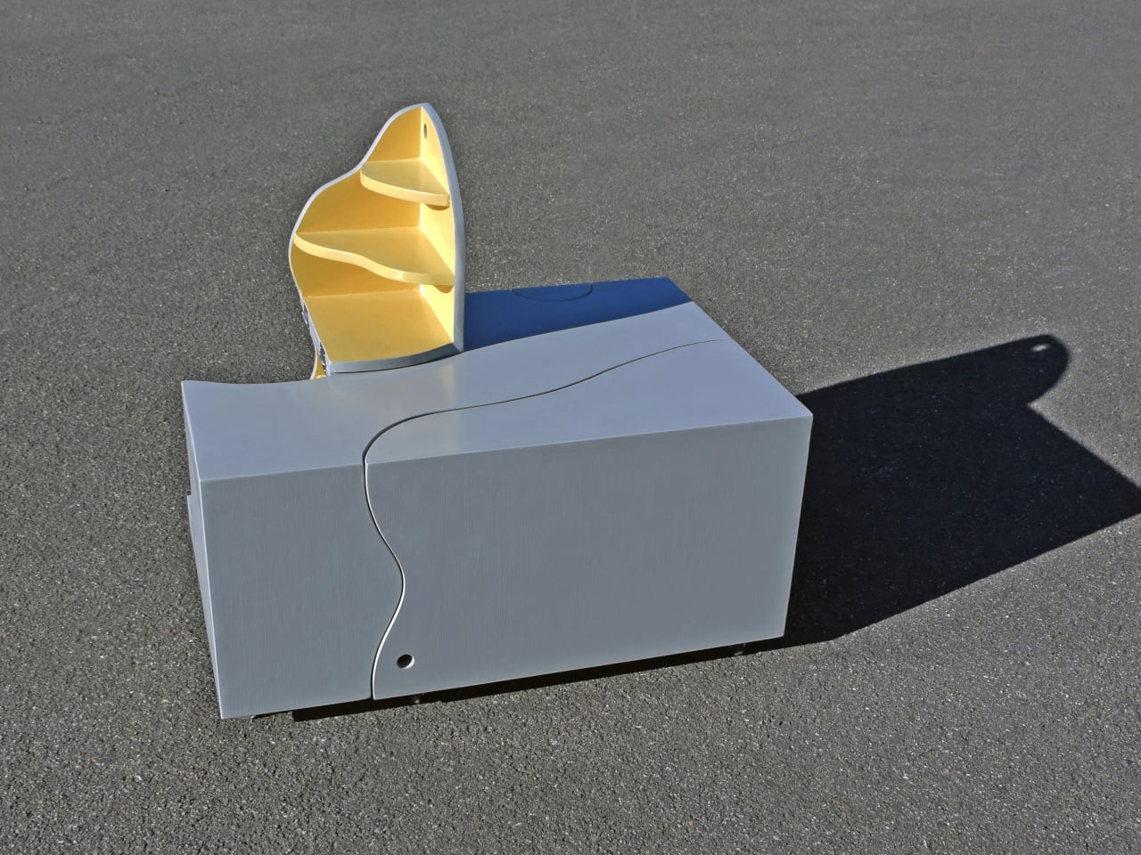
Most furniture stays predictable and is fixed in form and limited in function. The Interactive Transformation Table by Michael Jantzen breaks that pattern by turning a simple object into an evolving, geometry-driven product. At first, it appears as a compact wooden box defined by clean proportions and subtle curved cut lines. These incisions are not random as they introduce a layered geometric logic where straight edges meet flowing curves. The exterior reads as a solid volume, yet the visible seams suggest hidden movement, creating a sense of tension between stability and transformation.
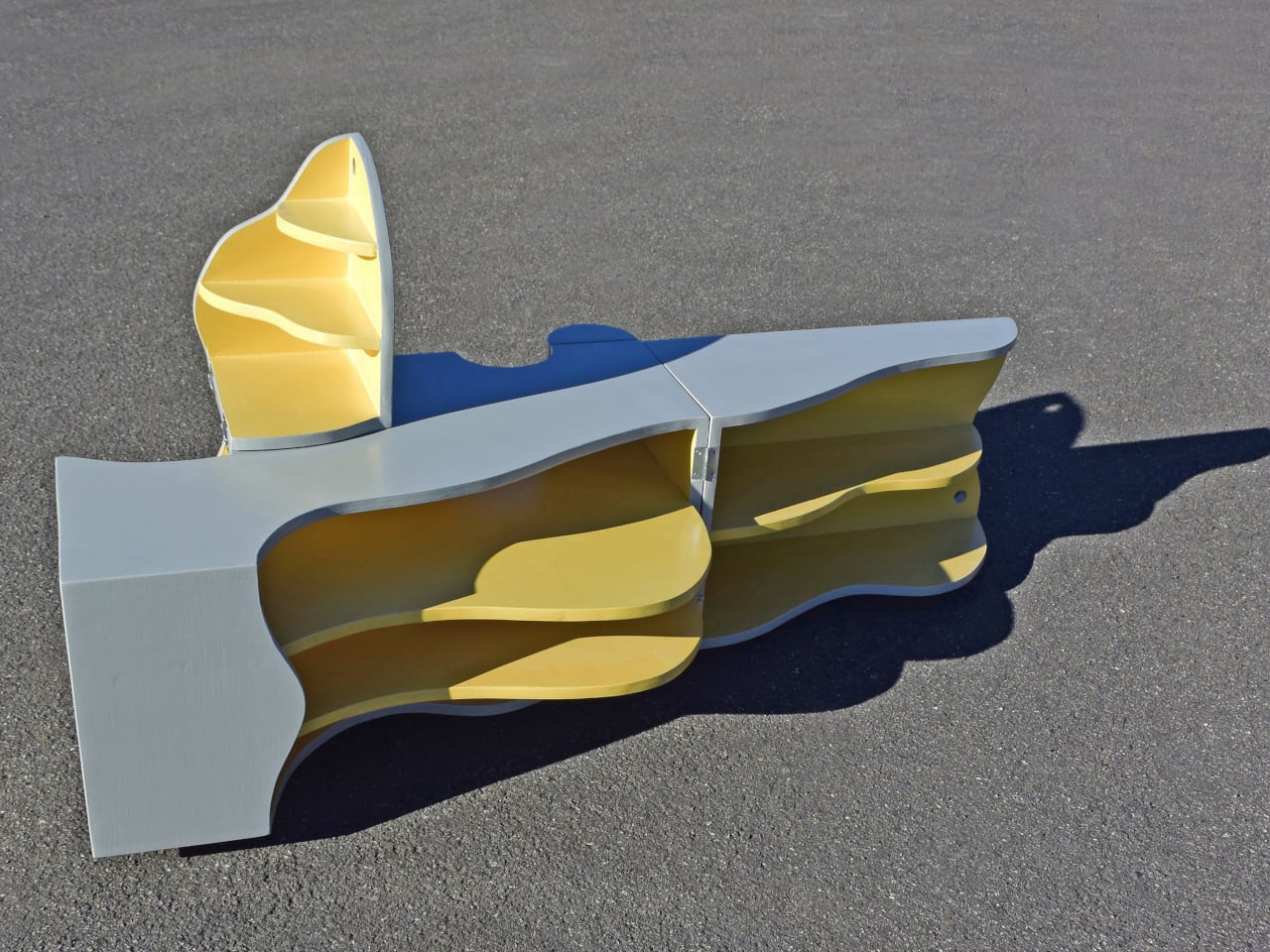
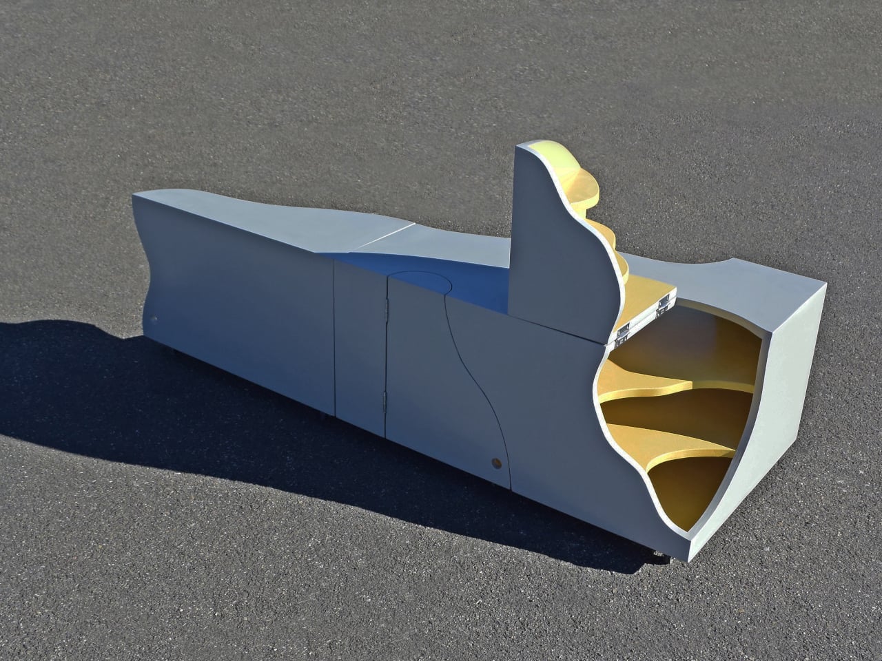
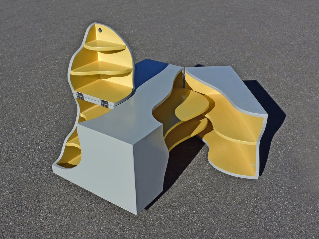
Once engaged, the table unfolds into multiple sections, revealing a complex geometric composition in motion. Hinged parts rotate and expand along precise axes, shifting from a compact rectangular form into a series of organic, interlocking shapes. The contrast between linear geometry and fluid curves becomes more pronounced, while bright interior shelves emphasize depth and structure. Each configuration maintains balance despite constant change, showing how geometry can be both controlled and expressive. The result is a product that uses transformation as its core design language.

3. Smart Storage With Style

Storage solutions are increasingly defined by geometric precision. Shelving units, cabinets, and organizers use grids, hexagons, and intersecting planes to create visually structured systems. These designs bring order not just physically, but visually, making spaces feel organized and intentional.

At the same time, geometric storage enhances spatial efficiency. By maximizing volume through structured forms, these pieces make better use of available space. The result is storage that is practical and sculptural, turning necessity into a design feature and not something to hide.
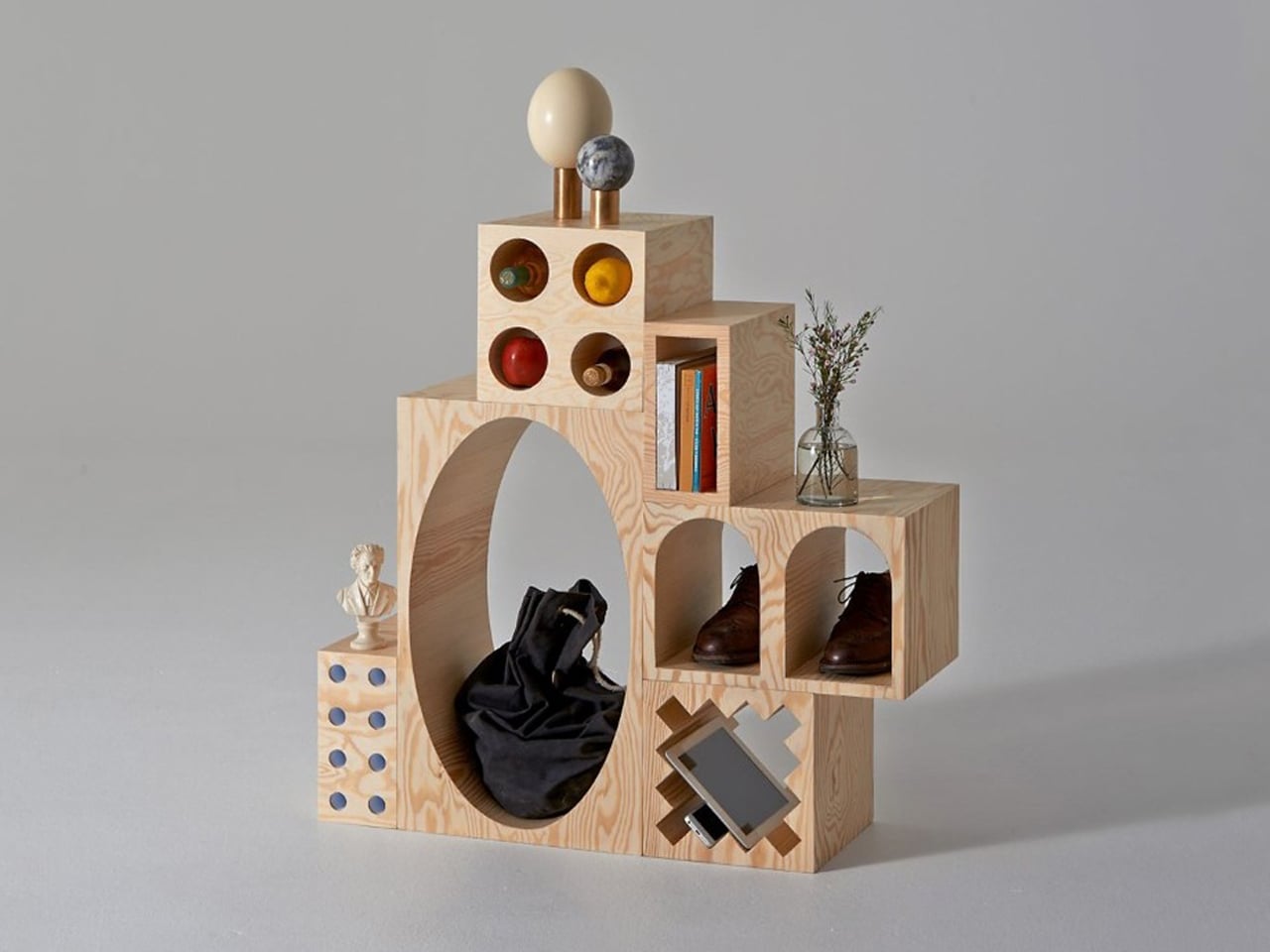
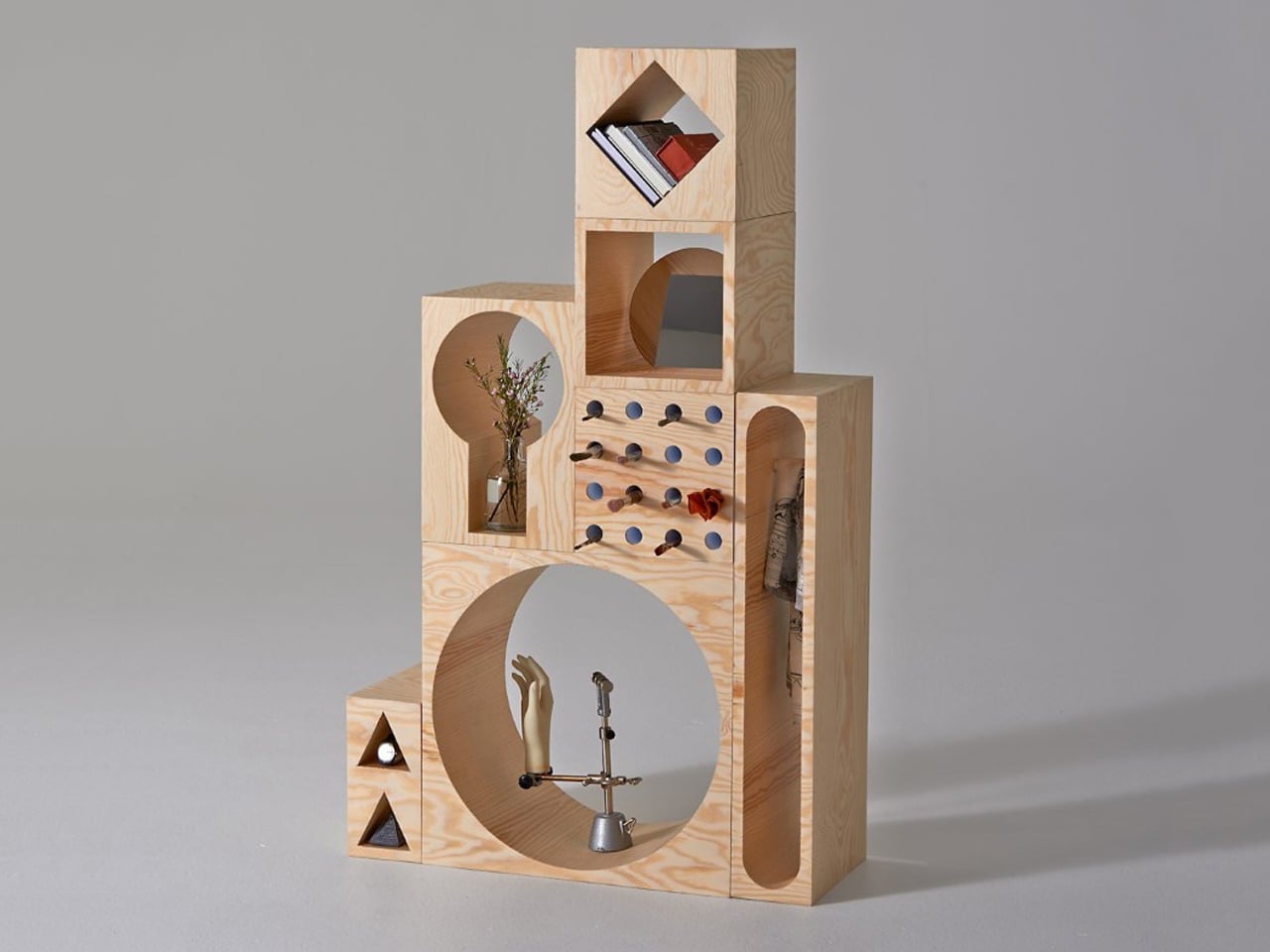
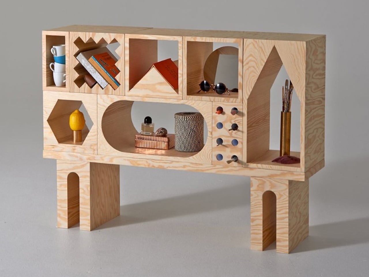
Simple yet unexpected, the ROOM Collection by Erik Olovsson and Kyuhyung Cho redefines furniture through a strong geometric lens. At its core, the system is made of modular wooden blocks, each carved with distinct geometric voids. These negative spaces range from familiar squares and rectangles to more expressive circles, triangles, and hexagons. The contrast between solid mass and carved geometry gives every block a unique identity, turning storage into a study of form, proportion, and spatial rhythm.
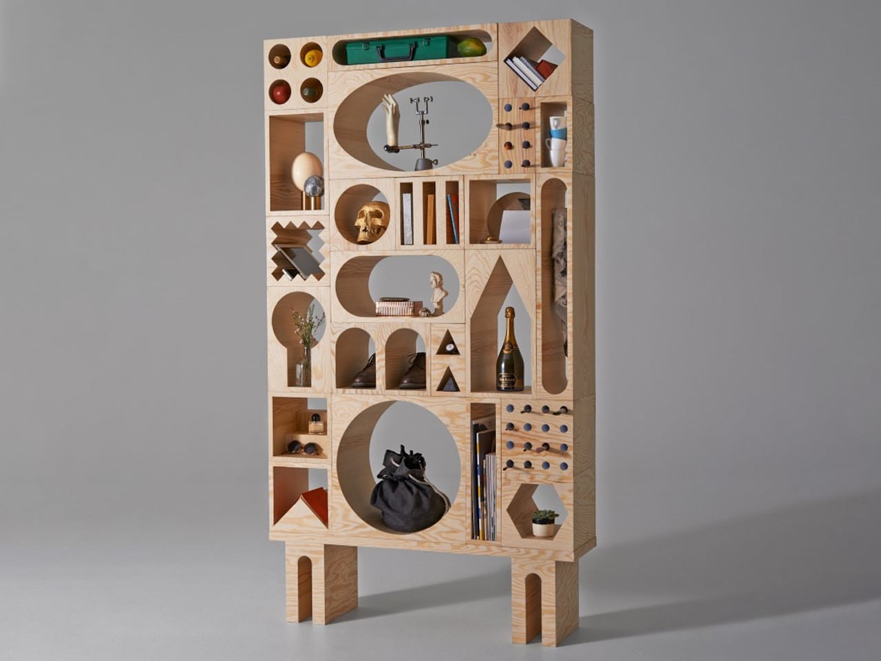
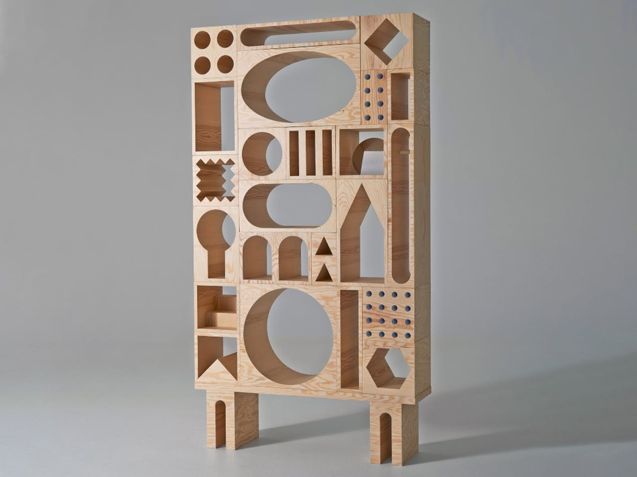
As the blocks are stacked and arranged, they create a dynamic composition of interlocking shapes, almost like a three-dimensional geometric collage. Each cutout acts as a “room,” designed to hold objects while contributing to the overall visual balance. The geometry not only defines function but also drives aesthetics, transforming shelves into architectural compositions. Crafted in plywood with a pine veneer, the system feels structured and playful.

4. Masters Who Shaped Design

The work of Frank Lloyd Wright demonstrates how geometry can shape both architecture and furniture seamlessly. Wright often designed furniture as an extension of his buildings, using strong linear forms and geometric patterns to create a unified visual language.

His furniture was not decorative but integral, reinforcing spatial harmony and function. By aligning form with structure, he showed how geometry could guide design at every scale. This approach continues to influence contemporary designers, proving that thoughtful geometry can transform furniture into enduring functional
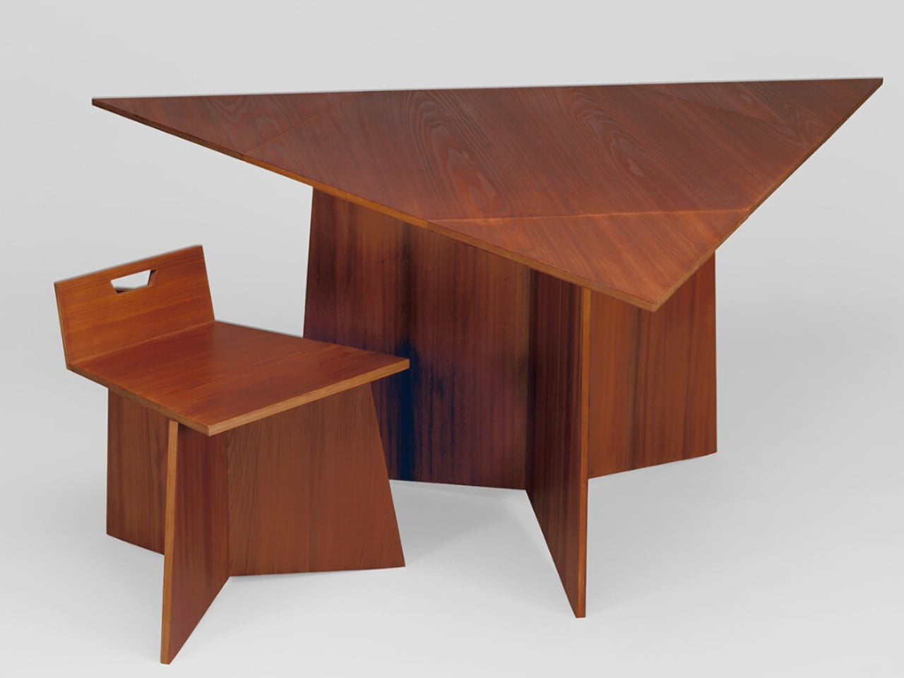
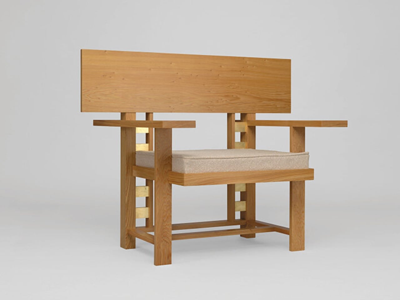
The Museum of Wisconsin Art unveils a remarkable chapter of Frank Lloyd Wright’s legacy by presenting chairs that never moved beyond sketches during his lifetime. Hidden in archives for over seventy years, these designs were reconstructed in 2025, offering a rare glimpse into Wright’s unrealized furniture ideas. The exhibition, Frank Lloyd Wright: Modern Chair Design, features over forty works, including newly fabricated pieces based on his original drawings. Rather than revisiting his well-known furniture, the show highlights concepts that remained incomplete, revealing a deeper layer of his creative vision.
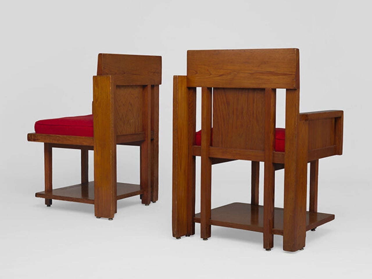
The reconstructed chairs trace Wright’s evolution from early geometric Prairie-style forms to more fluid, organic expressions. Developed through collaboration with the Frank Lloyd Wright Foundation and skilled craftsmen, the pieces combine traditional techniques with modern precision.

5. Minimal Lines Create Big Impact

Minimalist furniture relies on geometry to achieve clarity and balance. Straight lines, simple planes, and proportion-driven forms eliminate excess while maintaining a strong visual presence. The beauty lies in precision, where every angle and dimension serves a purpose.

This approach creates calm, uncluttered environments that feel refined and timeless. Geometry becomes the backbone of simplicity, ensuring that even the most minimal pieces remain impactful. It reflects a mindset that values quality, intention, and the quiet power of well-resolved design.
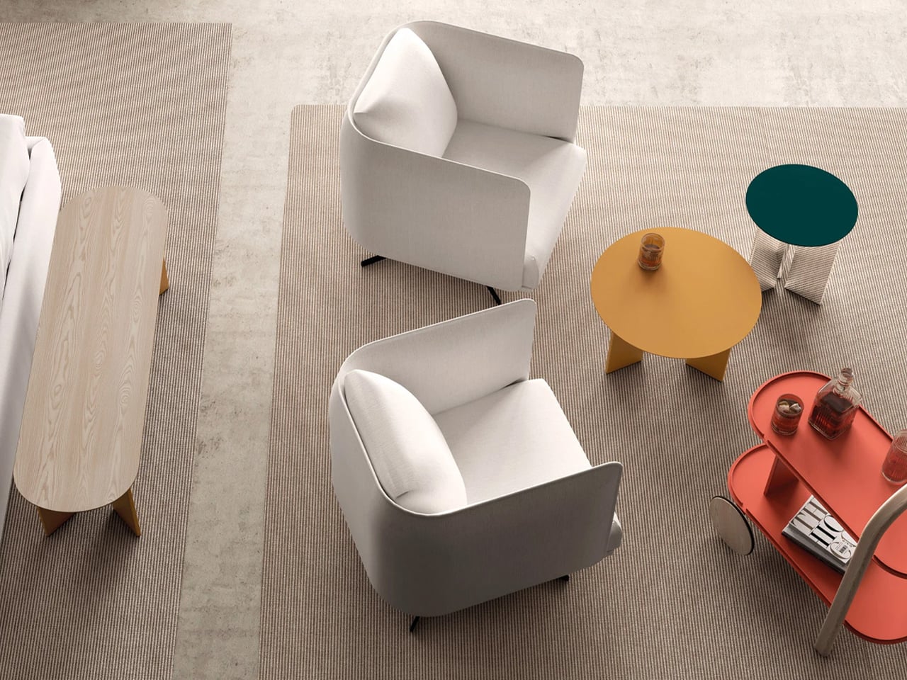
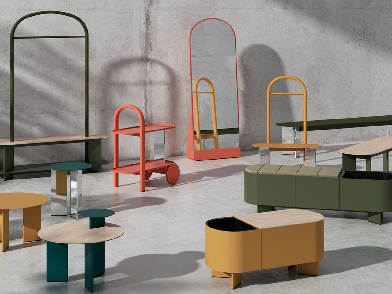
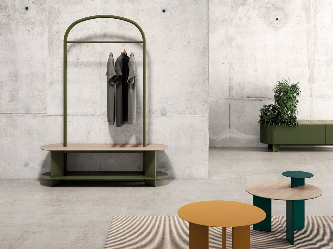
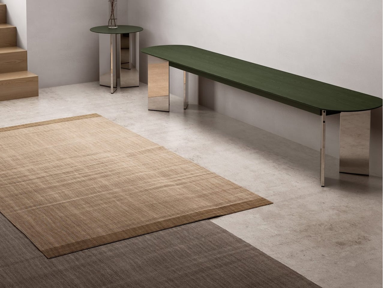
The Croma collection, designed by Lagranja Design for Systemtronic, is defined by a clear and consistent geometric language. Each piece is built around soft curves, circular forms, and gently arched profiles, creating a visual rhythm that feels structured and fluid. The design uses geometry as its core identity, balancing straight lines with rounded edges to achieve a sense of proportion and harmony. This approach allows the furniture to feel minimal yet expressive, with every curve and junction carefully resolved.
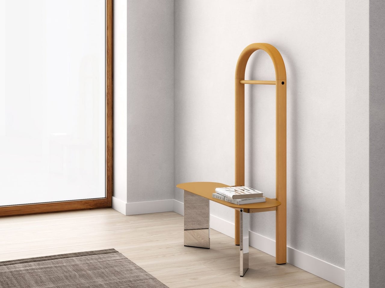
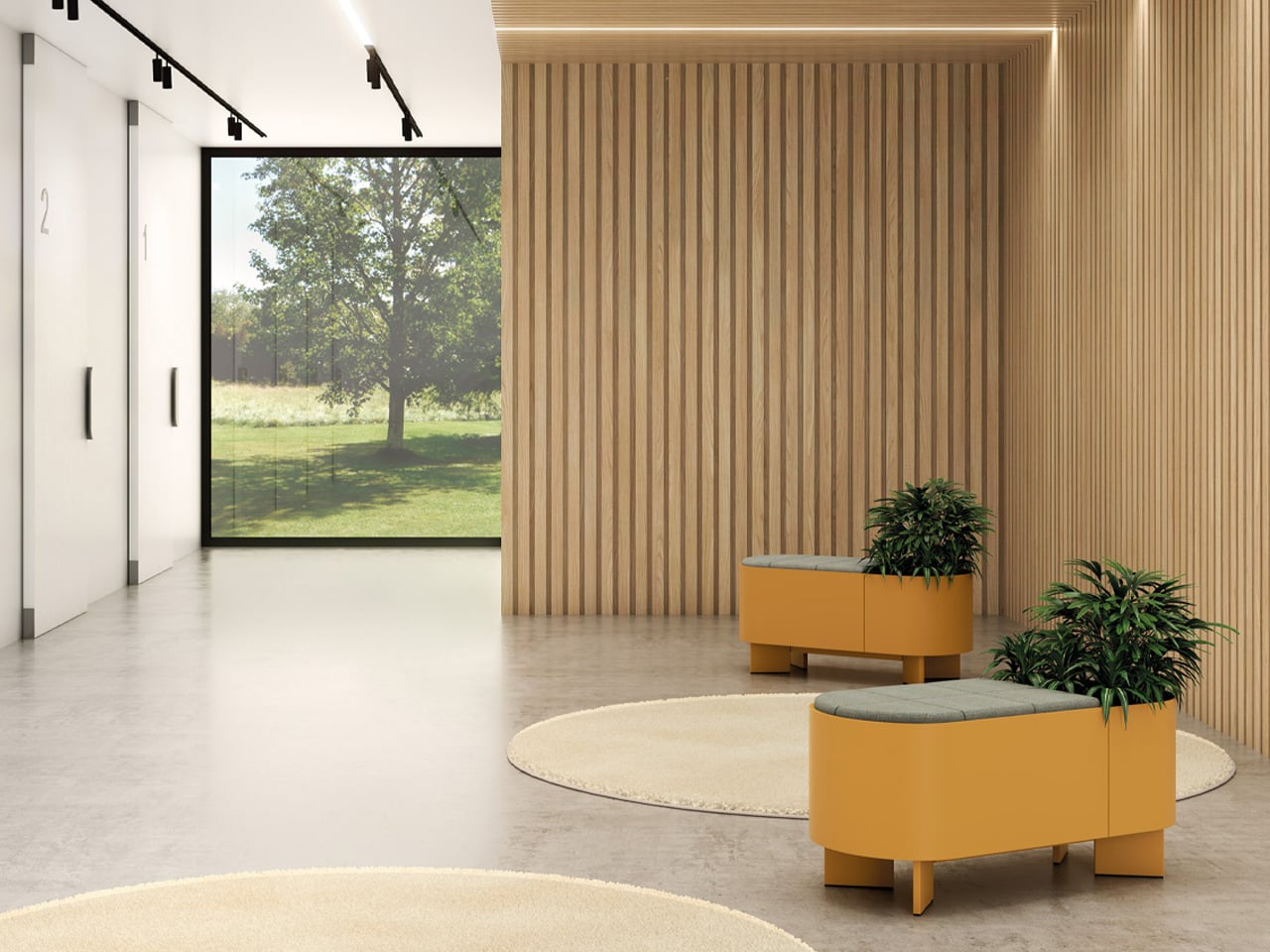
The product range translates this geometry across multiple typologies, including circular tables, arched wardrobes, rounded benches, mirrors, and trolleys. Repetition of forms creates cohesion, while subtle variations keep the collection visually engaging. Materials like ash wood and aluminum further highlight the geometry, contrasting warmth with precision. Each piece functions independently yet fits seamlessly into a larger system, where geometry dictates usability and aesthetics, turning the collection into a unified, sculptural composition.

These concepts show how geometry transforms furniture into purposeful art, where form drives function and emotion. Thoughtful shapes create adaptable, expressive pieces that redefine everyday living, turning spaces into dynamic reflections of design and individuality.

The post 5 Furniture Pieces So Geometric They Could Hang in a Gallery first appeared on Yanko Design.
Ex-McLaren Designers Just Built a $130,000 Carbon Fiber Chair

Luxury furniture has long borrowed the language of high-performance design without much of the substance behind it. Carbon fiber panels get applied as surface decoration, automotive references appear in product copy as shorthand for precision, and racing-inspired silhouettes turn up on lounge chairs. The materials may occasionally be genuine, but the engineering thinking behind them rarely makes the trip from one industry to the other.

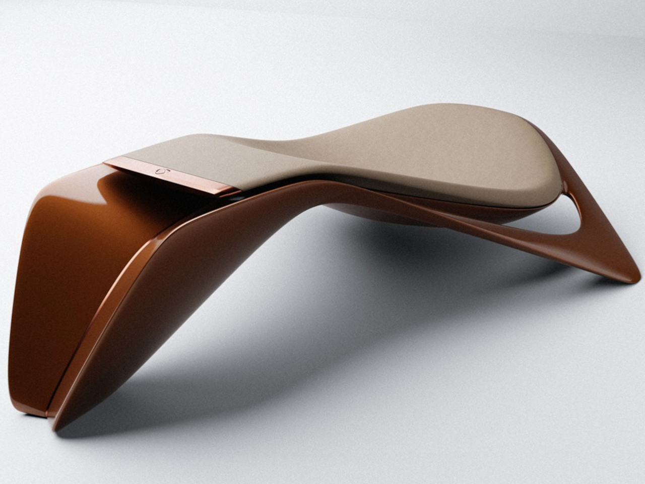
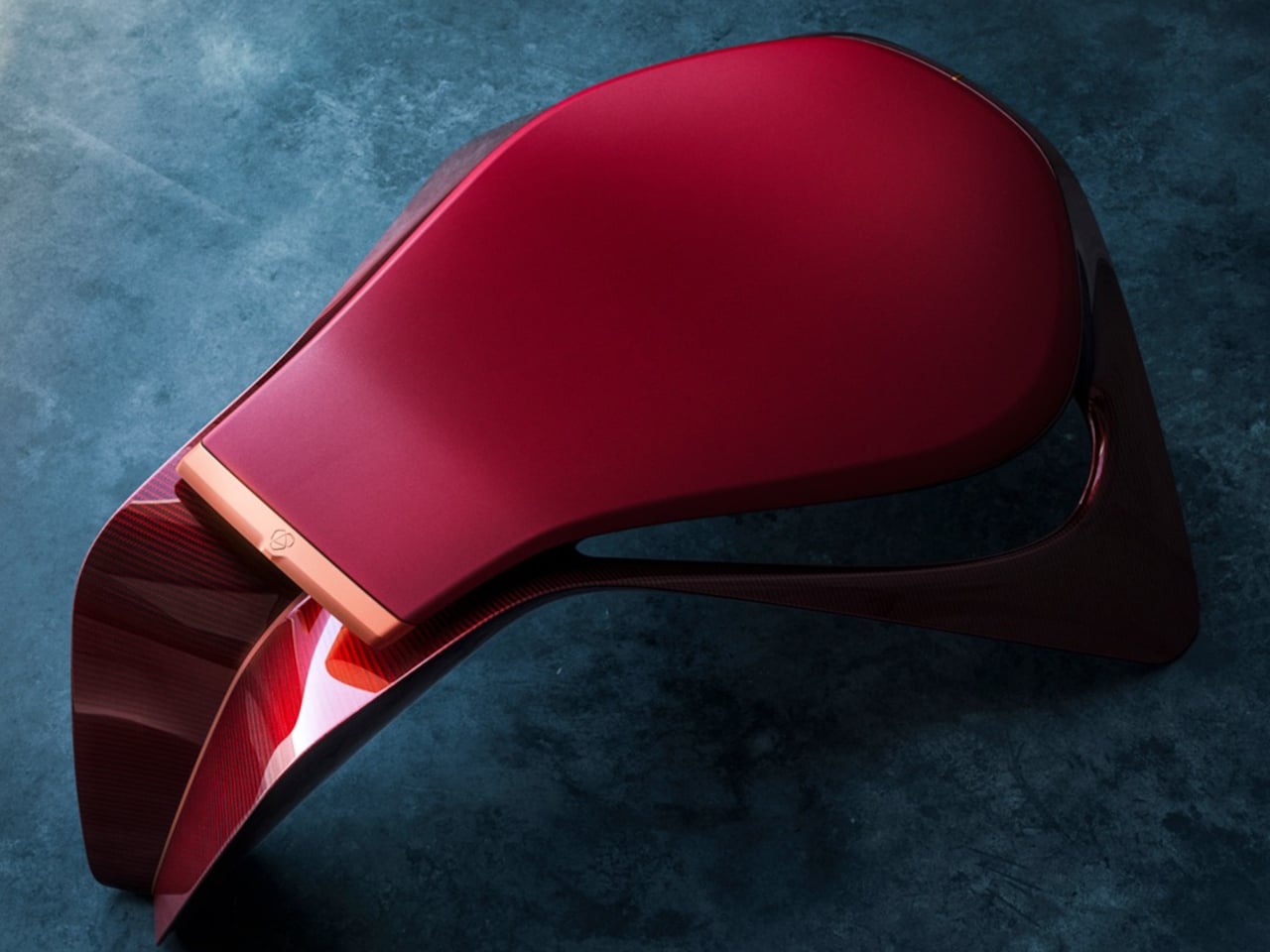
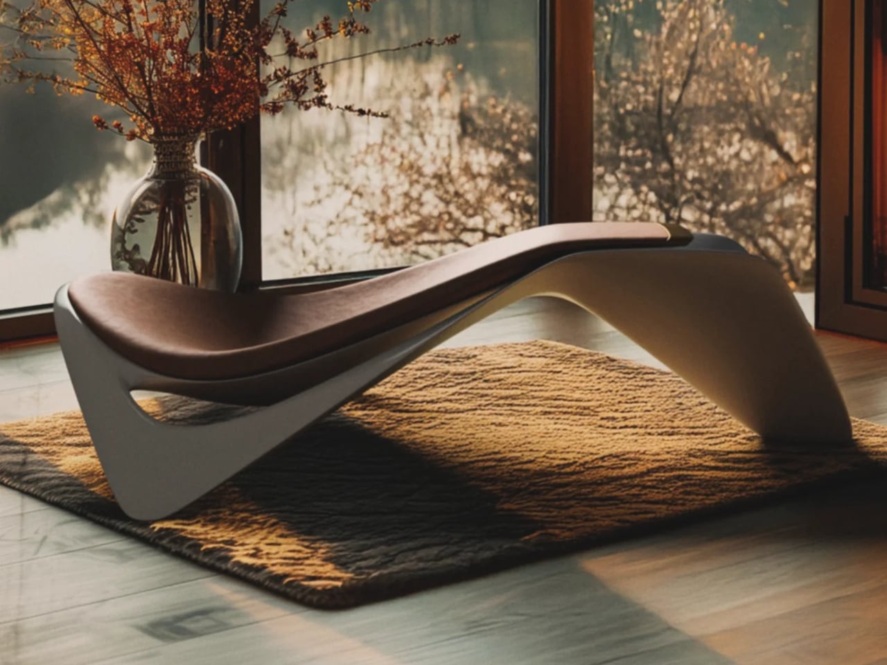
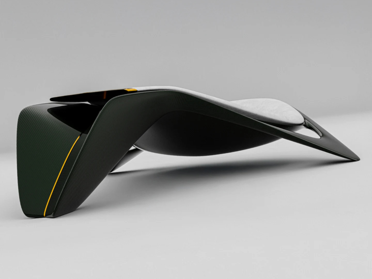
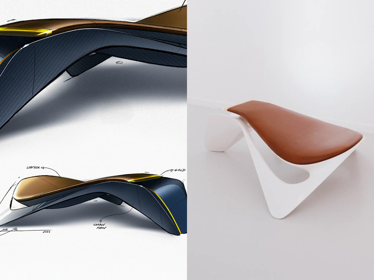
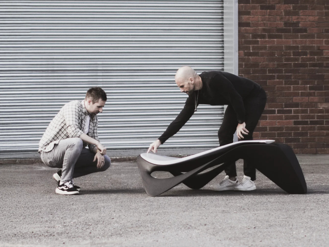
Ennua’s Element 01 takes a different position. The people behind it didn’t simply borrow from the automotive world. They came from it directly, having spent years shaping supercars including the McLaren Speedtail, Elva, and W1. The Element 01 isn’t furniture dressed up in engineering language. It’s the result of applying actual supercar design methodology to a seating object, starting from materials and working outward.

Designers: João Dias and Patrick Carton

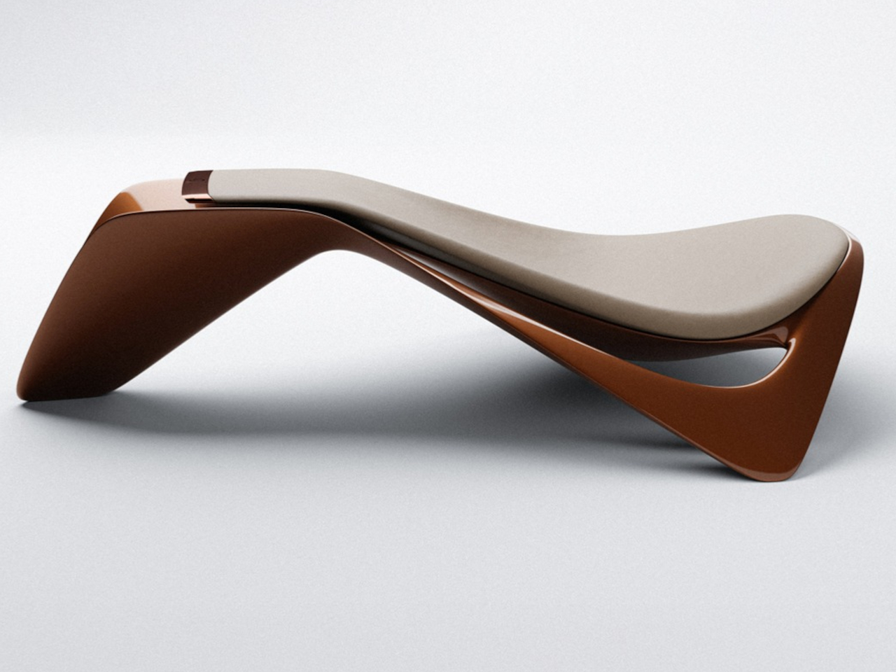
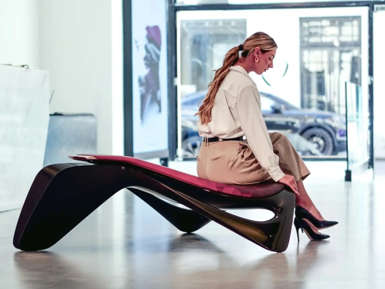
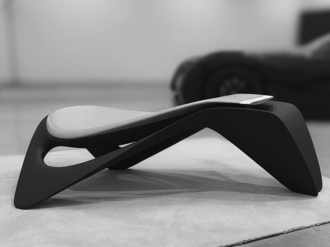
The first thing Element 01 does well is refuse to announce itself. Walk into a room with it, and it doesn’t immediately read as a chair, a sculpture, or a piece of furniture. That ambiguity is deliberate. The design prioritizes silhouette and proportion the way a supercar does, making the form something to encounter before it’s understood. It takes a second look before the seating function even registers.

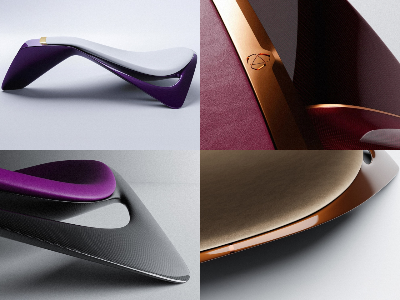
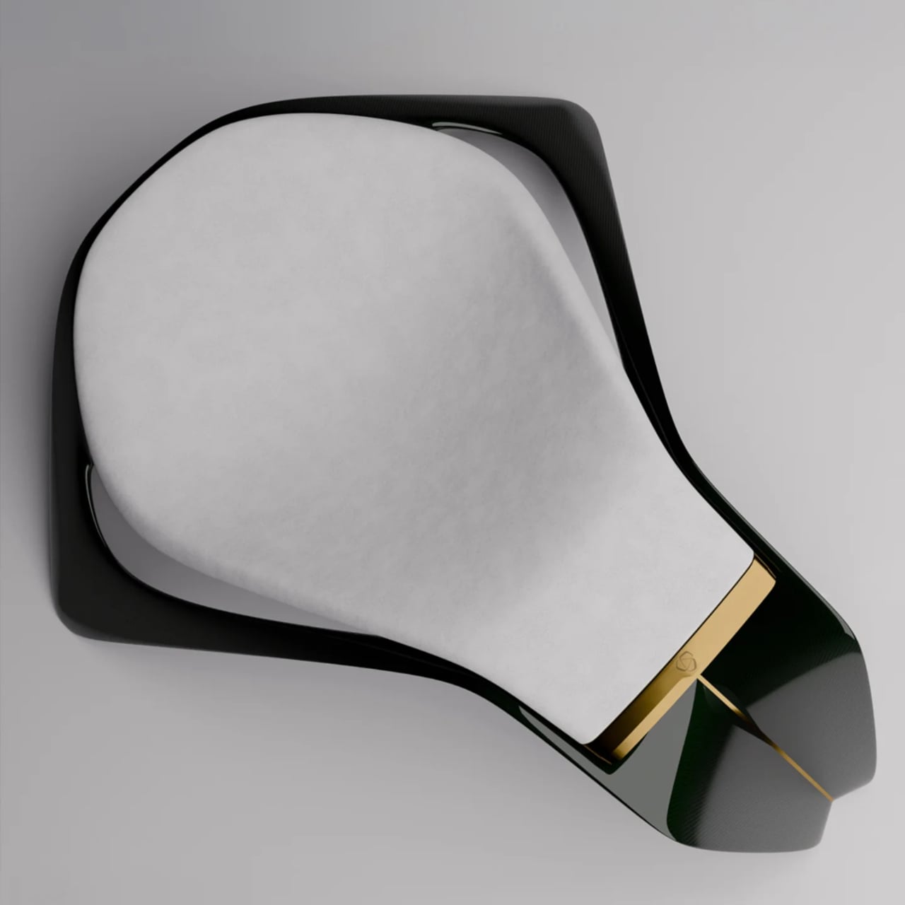
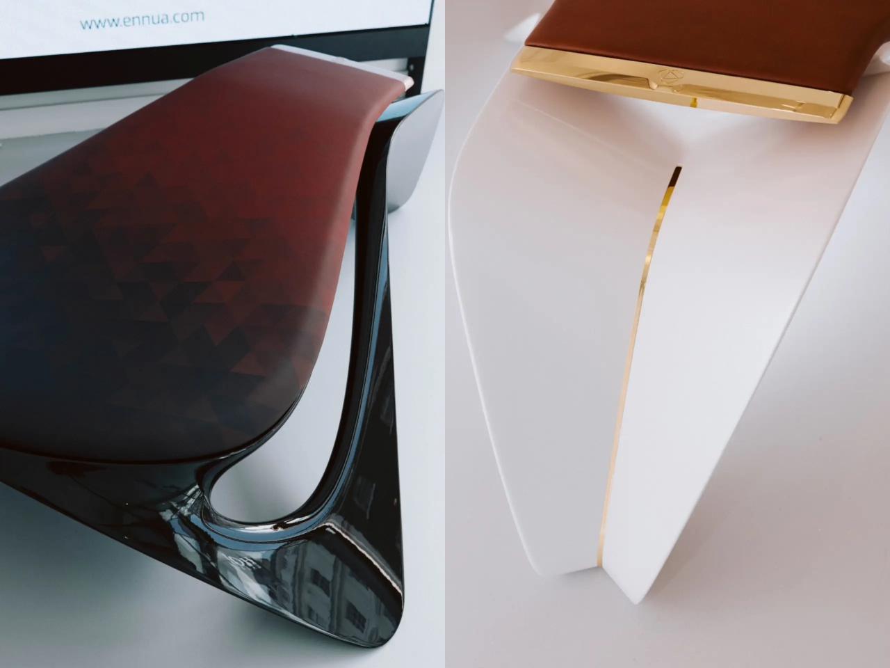
The structure is built from carbon fiber, the same material used on high-performance cars for its exceptional strength-to-weight ratio. The carbon frame can reportedly withstand loads equivalent to around 2,000 kg, more structural assurance than any home seating has any practical need for. Layered over it are automotive-grade leathers chosen for texture and durability, and precision-machined metal components that bring a jeweler’s precision to every connection.

Several named configurations are available, each built around a specific combination of carbon finish, leather tone, and metallic accent. Options like Abyss, Aurora, and Ruler’s Solace suggest a naming sensibility closer to bespoke watchmaking than furniture retail. Each variant is treated as a distinct piece rather than a colorway, making the Element 01 more akin to a collector’s commission than an item that ships from a warehouse.

Ennua positions the Element 01 for private residences and architectural landmarks rather than conventional retail environments, which says something about its intended context. Sit in one, and it functions as a chair. Stand across the room, and it reads as something else entirely, a deliberate quality shared by the cars that influenced it. Most objects are content to be one thing, while this one insists on being at least two.

Element 01 is described as only the opening move for the brand, which already has the next five years of products planned, hinting at everything from audio equipment to fitness gear and a possible return to automotive design. The ambition is to never become known simply as a furniture brand. Every future object is expected to carry the same logic of function and sculptural presence as the chair.

The Element 01 is priced at around $130,000, placing it in the territory of bespoke timepieces and limited-edition automotive commissions rather than furniture purchases. It costs as much as a well-optioned sports car, and that comparison isn’t accidental. It’s built like one, designed with the same tools, and asks to be treated with the same regard that most people reserve for things with four wheels and not four legs.

The post Ex-McLaren Designers Just Built a $130,000 Carbon Fiber Chair first appeared on Yanko Design.
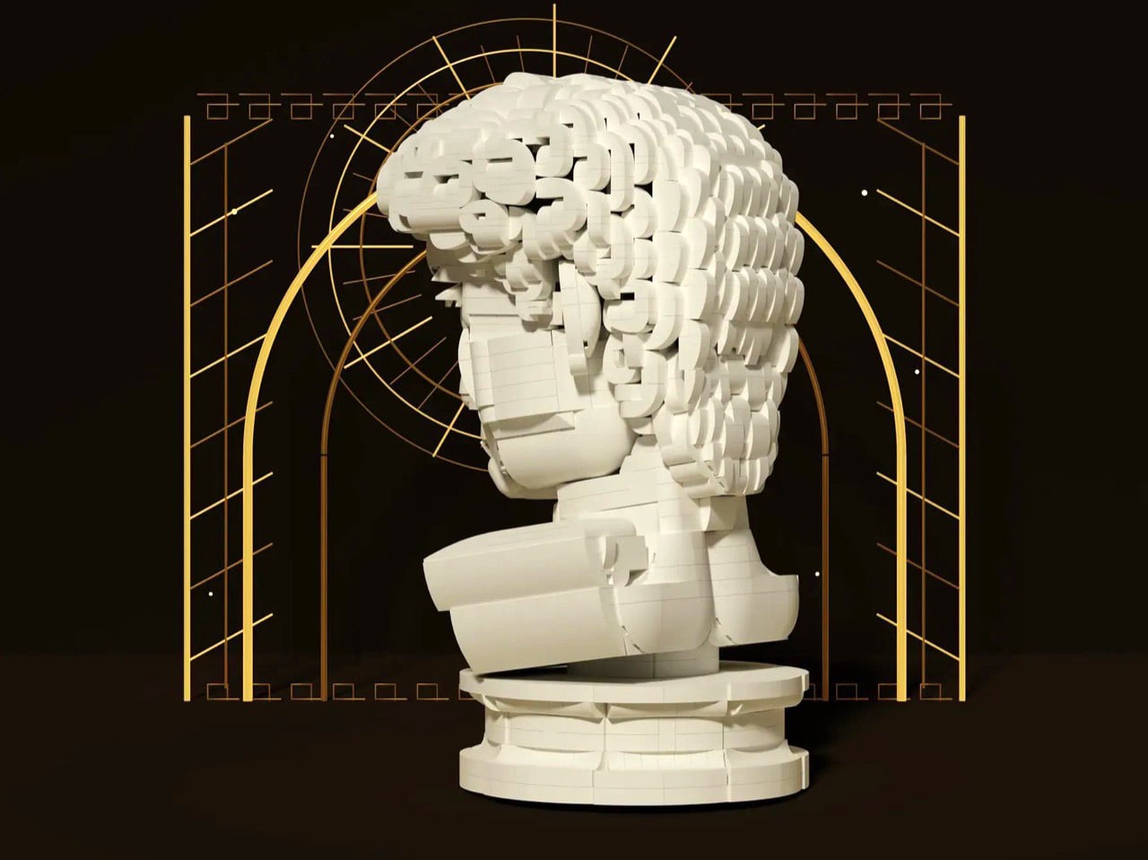
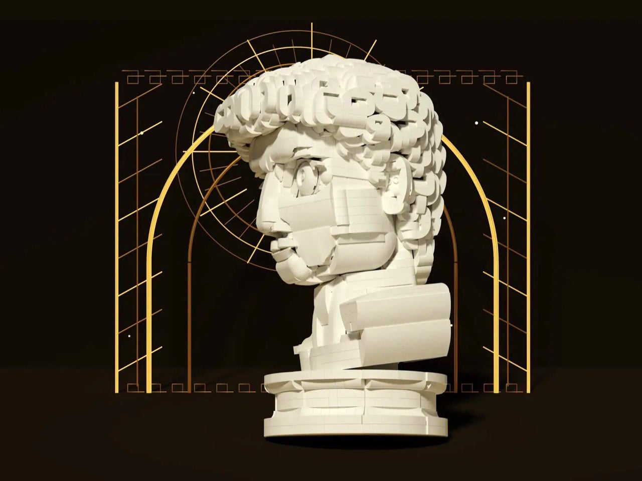
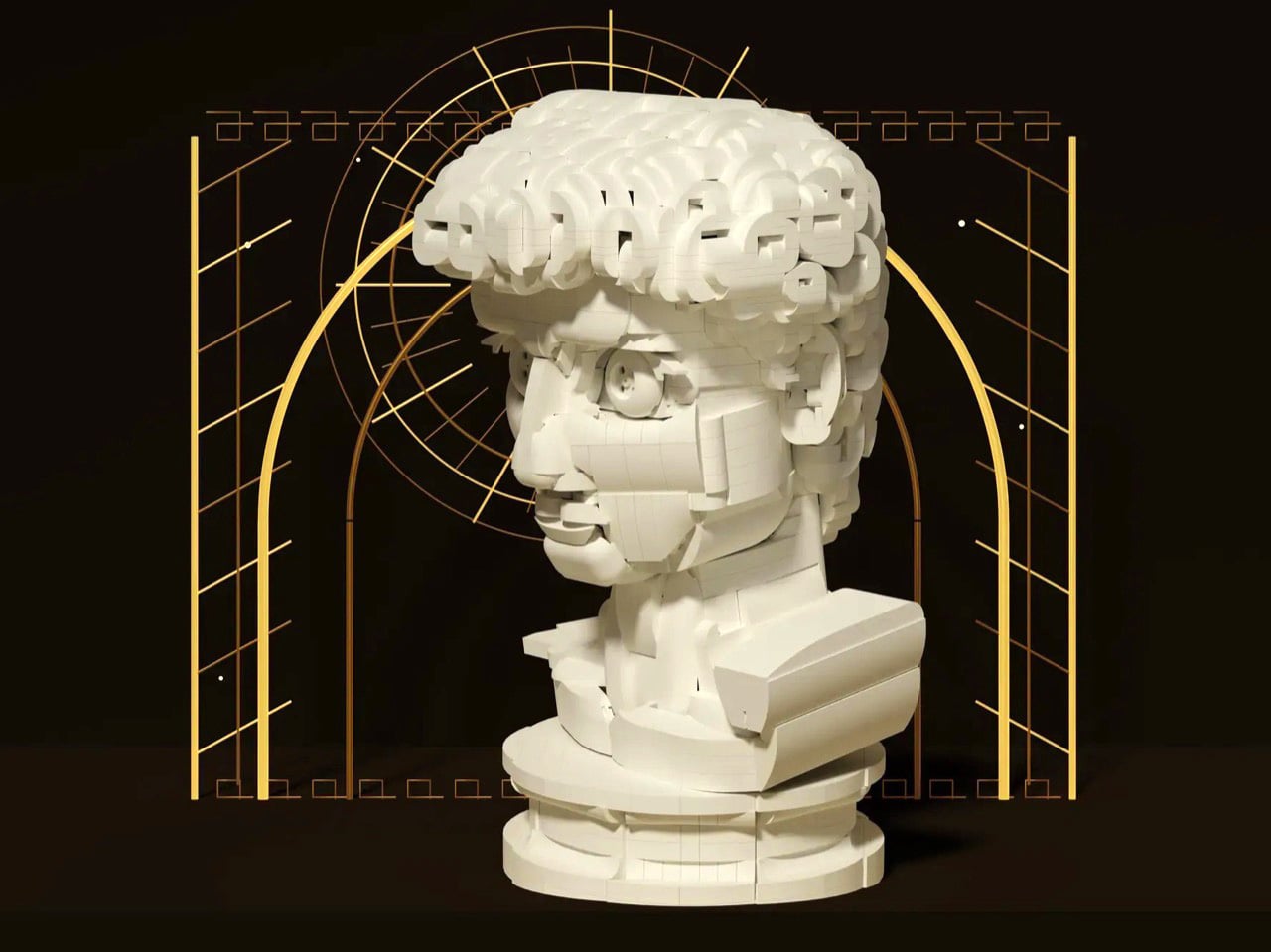
Michelangelo’s iconic David bust gets recreated in LEGO, turning plastic into sculpted marble

If you ever took a drawing class, you have met this face. Art schools spent about two centuries buying plaster casts of David’s head and parking them on shelves so students could sit there for six hours learning to render a nostril. The Victoria and Albert Museum owns a full size cast of the whole statue, and famously kept a plaster fig leaf on standby in case Queen Victoria dropped by and needed the shock absorbed. So David has been getting copied, shrunk, cast, and occasionally censored for a very long time. Turning him into a toy is not the sacrilege it sounds like. It’s basically the family business.

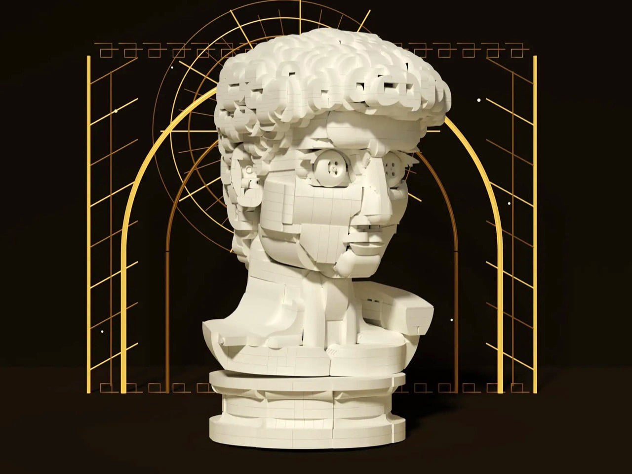
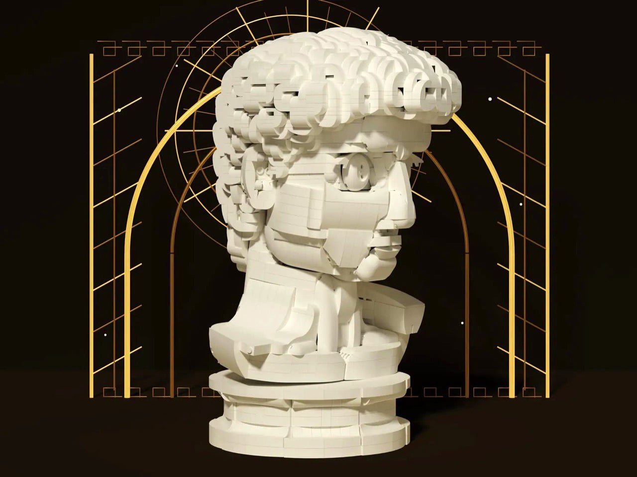
Which brings us to Ysien, a LEGO Ideas builder who decided the next material in that lineage should be ABS plastic. The build renders David’s head, neck, shoulders and upper chest as a classical bust, entirely in white, sitting on a proper stepped pedestal. No color, no minifigure, no cheeky accessories. Just light and shadow doing all the work, exactly like the plaster casts it descends from.

Designer: Ysien

The hair is the whole reason this MOC (My Own Creation) works. Hair is where sculptors get found out, because faces have anatomy underneath that you can reason your way through, while hair is a mass of overlapping nothing that somehow has to read as soft. Michelangelo’s answer was a tangle of deep drilled curls. Ysien’s answer is a genuinely absurd stack of curved slopes and half arch elements layered at varying depths, so each curl throws its own little shadow instead of flattening into texture. “The hair was one of the greatest challenges, with each curl contributing to the overall silhouette, depth, rhythm, and movement,” he says, which is a very polite way of describing what must have been several evenings of quiet suffering.

My favorite decision, though, is that the seams stay visible. Ysien could have chased a smooth marble finish and lost, because bricks do not do smooth. Instead he let the geometry become part of the sculpture, so the thing reads as a portrait from across the room and as unmistakable LEGO up close. The eyes get a similar treatment, built from inverted round elements that give David that vacant classical stare, which is a nice accident given the real statue has heart shaped pupils drilled into it. Monochrome white does the rest, forcing every bit of the anatomy to be described by shadow alone. There’s no piece count listed yet, although I wouldn’t be surprised if it was in the high hundreds.

Ysien’s David is currently sitting at just over 400 supporters with 424 days on the clock, which means there is a long road to the 10,000 votes that trigger an official LEGO review. LEGO Ideas is where fan builds get their shot at becoming retail sets, and this one deserves a look. The only thing I’d add is a black variant, because a basalt David would be an absolute menace on a shelf. You can head to the LEGO Ideas page and cast your vote!

The post Michelangelo’s iconic David bust gets recreated in LEGO, turning plastic into sculpted marble first appeared on Yanko Design.
Michelangelo’s iconic David bust gets recreated in LEGO, turning plastic into sculpted marble

If you ever took a drawing class, you have met this face. Art schools spent about two centuries buying plaster casts of David’s head and parking them on shelves so students could sit there for six hours learning to render a nostril. The Victoria and Albert Museum owns a full size cast of the whole statue, and famously kept a plaster fig leaf on standby in case Queen Victoria dropped by and needed the shock absorbed. So David has been getting copied, shrunk, cast, and occasionally censored for a very long time. Turning him into a toy is not the sacrilege it sounds like. It’s basically the family business.

Which brings us to Ysien, a LEGO Ideas builder who decided the next material in that lineage should be ABS plastic. The build renders David’s head, neck, shoulders and upper chest as a classical bust, entirely in white, sitting on a proper stepped pedestal. No color, no minifigure, no cheeky accessories. Just light and shadow doing all the work, exactly like the plaster casts it descends from.

Designer: Ysien

The hair is the whole reason this MOC (My Own Creation) works. Hair is where sculptors get found out, because faces have anatomy underneath that you can reason your way through, while hair is a mass of overlapping nothing that somehow has to read as soft. Michelangelo’s answer was a tangle of deep drilled curls. Ysien’s answer is a genuinely absurd stack of curved slopes and half arch elements layered at varying depths, so each curl throws its own little shadow instead of flattening into texture. “The hair was one of the greatest challenges, with each curl contributing to the overall silhouette, depth, rhythm, and movement,” he says, which is a very polite way of describing what must have been several evenings of quiet suffering.

My favorite decision, though, is that the seams stay visible. Ysien could have chased a smooth marble finish and lost, because bricks do not do smooth. Instead he let the geometry become part of the sculpture, so the thing reads as a portrait from across the room and as unmistakable LEGO up close. The eyes get a similar treatment, built from inverted round elements that give David that vacant classical stare, which is a nice accident given the real statue has heart shaped pupils drilled into it. Monochrome white does the rest, forcing every bit of the anatomy to be described by shadow alone. There’s no piece count listed yet, although I wouldn’t be surprised if it was in the high hundreds.

Ysien’s David is currently sitting at just over 400 supporters with 424 days on the clock, which means there is a long road to the 10,000 votes that trigger an official LEGO review. LEGO Ideas is where fan builds get their shot at becoming retail sets, and this one deserves a look. The only thing I’d add is a black variant, because a basalt David would be an absolute menace on a shelf. You can head to the LEGO Ideas page and cast your vote!

The post Michelangelo’s iconic David bust gets recreated in LEGO, turning plastic into sculpted marble first appeared on Yanko Design.
China Just Built a Mirrored Heart at the Lake Called ‘The Last Tear

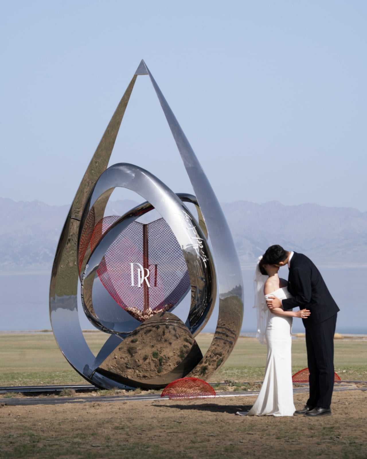
Sayram Lake sits in a remote corner of Xinjiang, China, at an altitude that makes the air feel thinner and the colors feel brighter. It’s the kind of place that deserves a nickname, and it has a good one: “the last tear of the Atlantic.” The story goes that moisture from the Atlantic Ocean travels thousands of miles across the Eurasian continent, losing itself to evaporation along the way, and what finally arrives at Sayram is what’s left. A last, quiet exhale. A tear. It’s a beautiful piece of geography wrapped in a beautiful piece of poetry, and that combination has now inspired a beautiful piece of design.

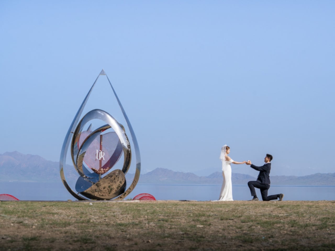
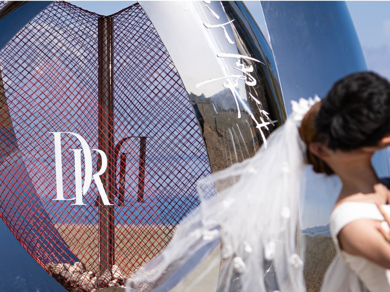
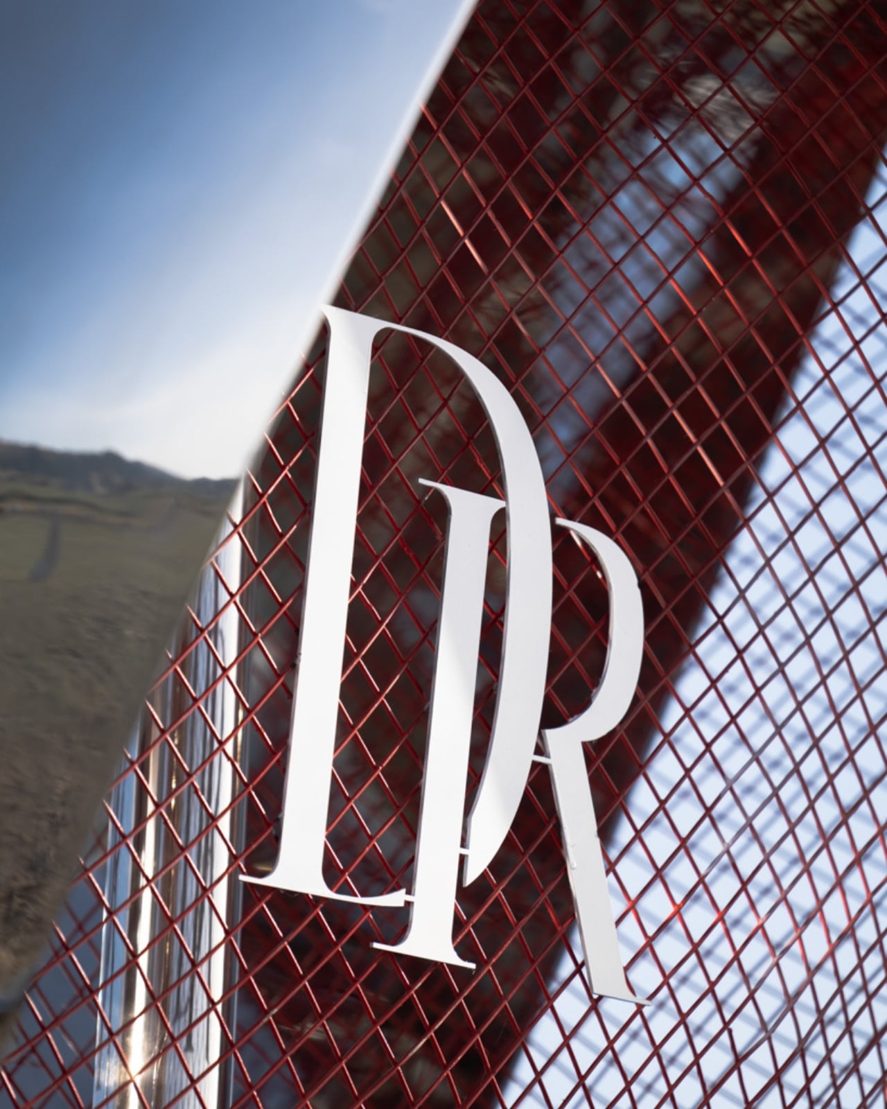
Beijing-based Zhide Architectural Design Consulting recently unveiled Heart of Sayram Lake, a mirrored installation built along the lake’s edge for Chinese jewelry brand DR (Darry Ring), a label known for its philosophy of “One Life, One Only, One True Love.” The partnership makes sense. DR built its entire identity on the idea of a single, lifelong commitment. Sayram Lake built its mythology on the same idea, just in water. Marrying the two was either an obvious move or a brilliant one, and I’d argue it’s a little of both.

Designer: Zhide Architectural Design Consulting (Beijing) Co., Ltd.

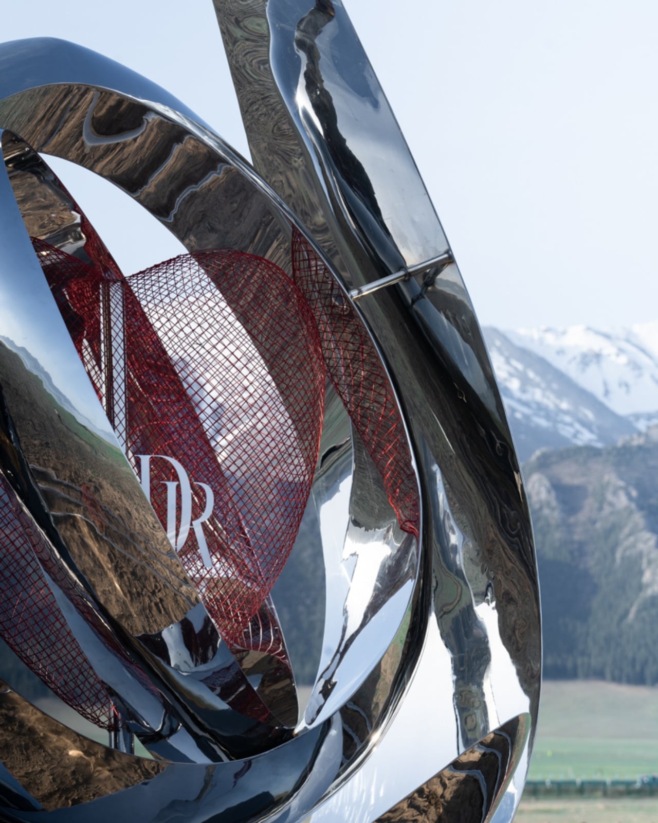
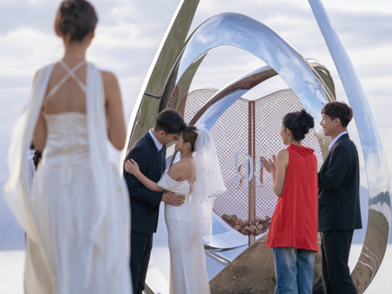
The installation is shaped like a water drop, which reads as a literal nod to the lake’s tearful lore and a visual echo of DR’s engagement-ring sensibility. It’s ground-mounted with circular ripples spreading outward from the base, mimicking the moment a drop hits still water. At its center, two interlocking rings suggest matching diamond bands. It’s sentimental, yes, but the execution keeps it from tipping into kitsch. The full structure is built from mirrored metal, and the effect is genuinely stunning. It doesn’t sit in the landscape so much as absorb it. Snow peaks, meadow grass, the sky, and the lake all fold into its surface, making it look less like an installation and more like a fragment of the world folded back on itself.

Hollow red wire mesh elements run through the design as a secondary layer, contrasting the hard polish of the mirrored metal with something warmer and more open. That contrast works. The red feels intentional against the pale highland palette of the surrounding area: ice blue, snow white, meadow green. The designers clearly understood that the installation would compete with one of the most visually dramatic natural environments in China, and rather than trying to stand apart from it, they let the lake win. The mirror borrows the landscape’s beauty. The result feels collaborative rather than intrusive.

The design also carries a participatory layer that extends its purpose beyond spectacle. Couples visiting the site can place natural Sayram Lake stones and DR custom heart locks inside dedicated compartments built into the installation. As these accumulate, engraved love mottos inscribed on the interior walls gradually become visible. Filled units can eventually be arranged into a larger matrix of interconnected structures, turning the whole thing into something that grows with each visit, each person, each relationship. A landmark that updates itself through the people who come to see it is a more interesting proposition than one that simply stands there being beautiful.

Public art commissioned by brands tends to make critics nervous, and I get it. The line between meaningful cultural contribution and elaborate marketing is often thin. But looking at Heart of Sayram Lake, it feels like the design team at Zhide prioritized the landscape and the experience above the brand’s visibility. Nothing about it screams advertisement. It sits quietly in one of the most dramatic settings in the country, doing its job, which is to give people a way to feel connected to a place and to each other.

Sayram Lake has been turning people poetic for centuries. That a jewelry brand and a Beijing architecture firm found a way to add to that tradition without overwhelming it is worth pausing on. The best design doesn’t shout. It reflects.

The post China Just Built a Mirrored Heart at the Lake Called ‘The Last Tear first appeared on Yanko Design.
China’s New Coastal Installation Looks Like It Belongs in Space

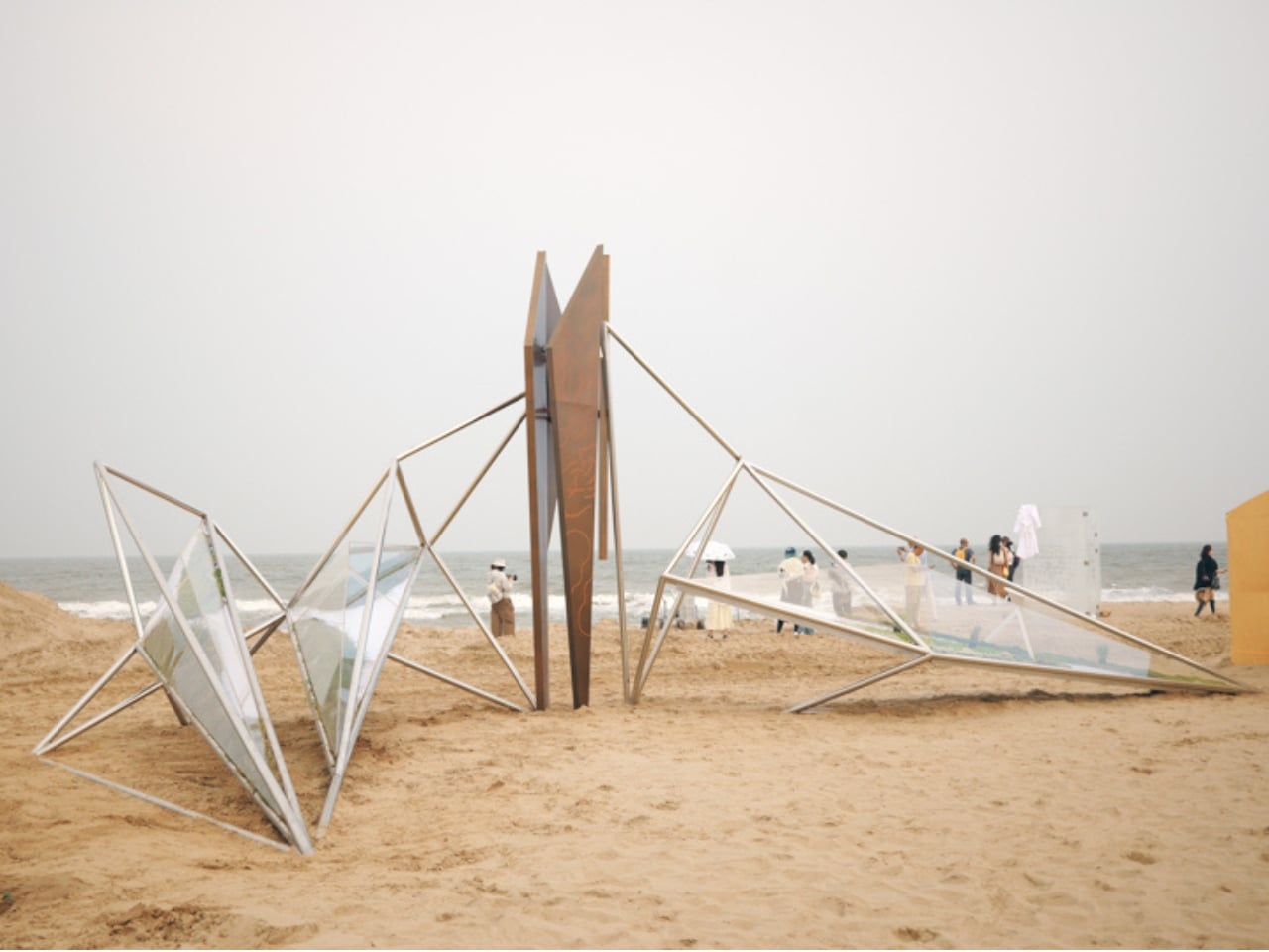
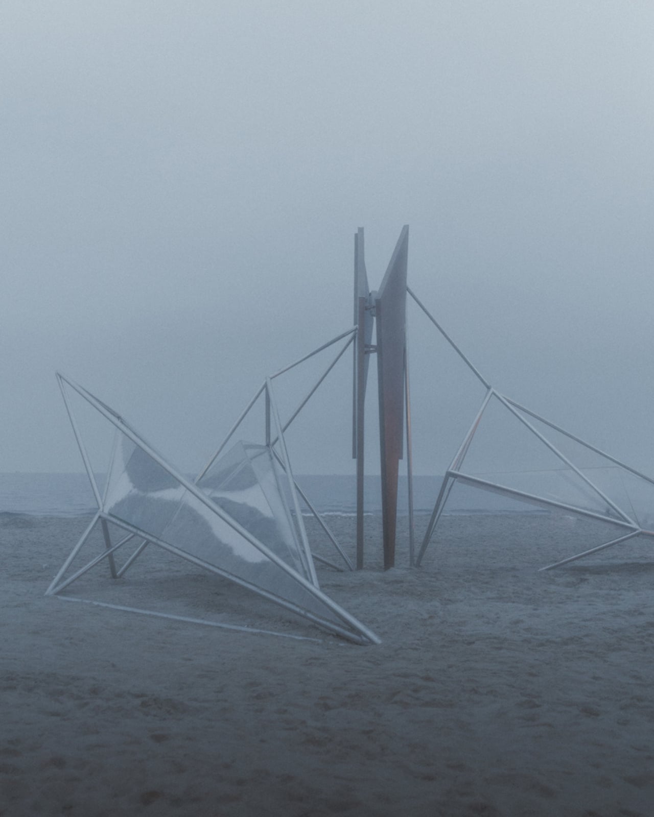
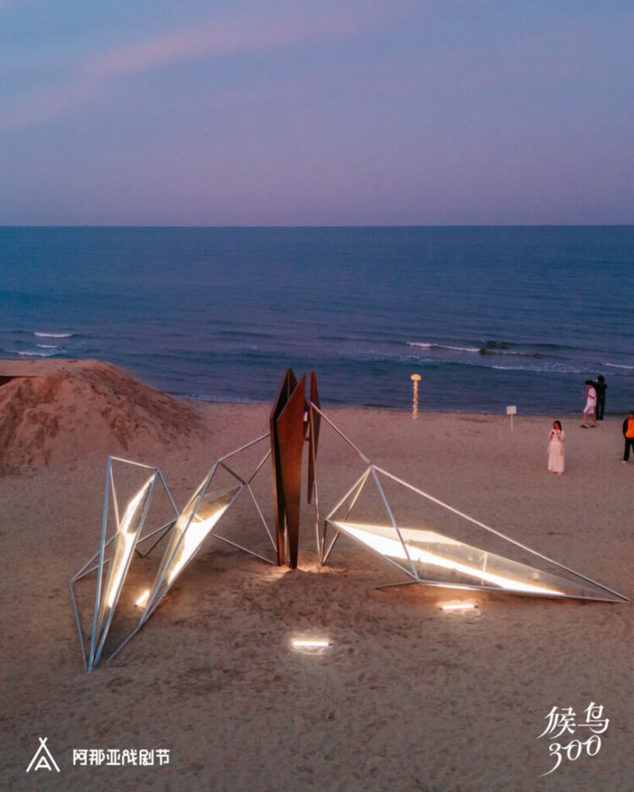
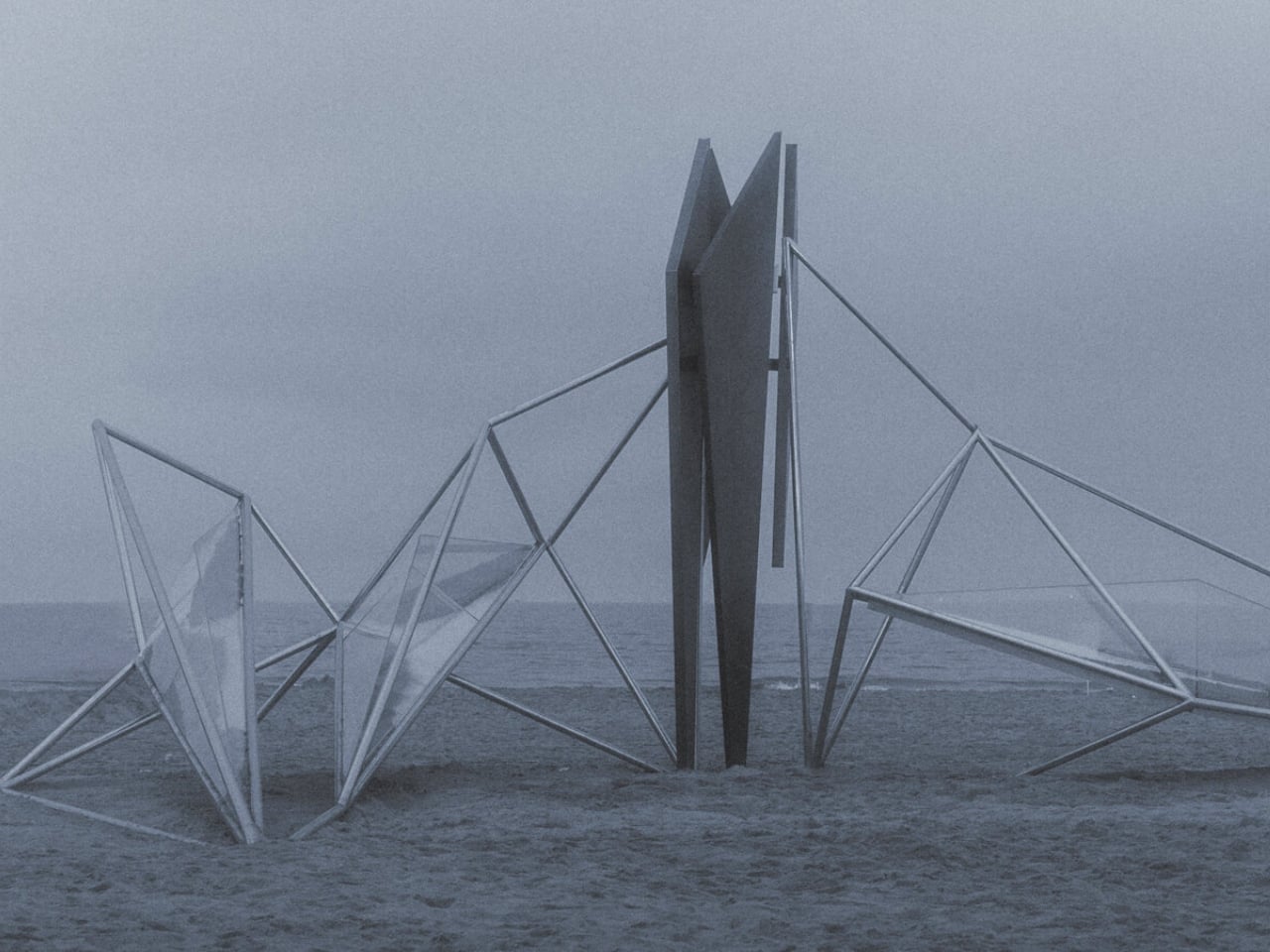
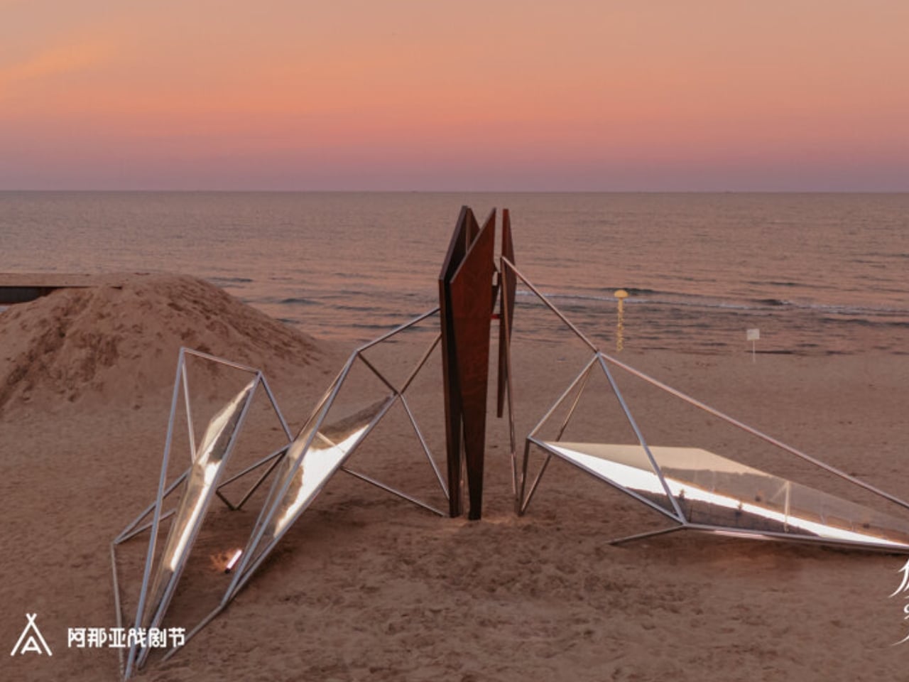
Not every art installation earns the right to exist in a landscape. Most feel like intrusions, objects dropped into nature rather than grown from it. OAS/S-AETHER, the latest work from Beijing-based Zhide Architectural Design Consulting (ZDC), is one of the rare exceptions. Standing on the sandy coastline of Aranya in Qinhuangdao, Hebei Province, this winged structure of interconnected metal rods and glowing acrylic lightboxes manages to feel both ancient and alien at the same time, and that tension is the whole point.

The installation was created for the “Migratory Birds 300” section of the 2026 Aranya Theater Festival, led by architects Zhengdong Li, Rubing Bai, and Xu Wen. The concept draws from “Aether,” the fifth element in classical philosophy, that invisible, luminous substance believed by the ancient Greeks to fill the heavens beyond the earthly realm. It’s a heady starting point, but ZDC pulls it off. The piece doesn’t just reference the idea of Aether. It actually makes you feel it.

Designer: Zhide Architectural Design Consulting (Beijing) Co., Ltd.

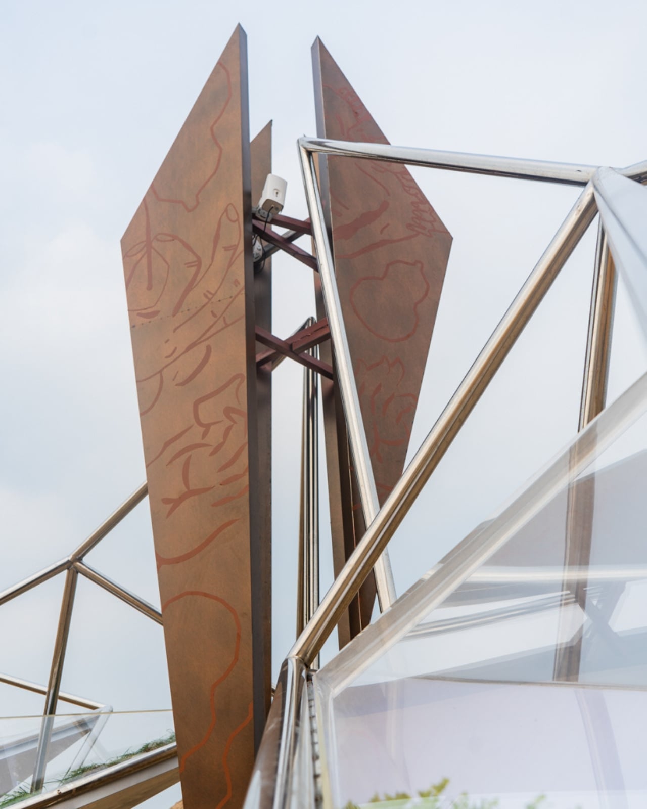
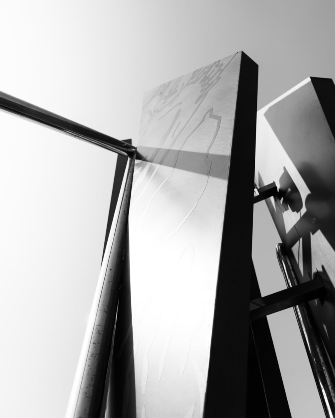
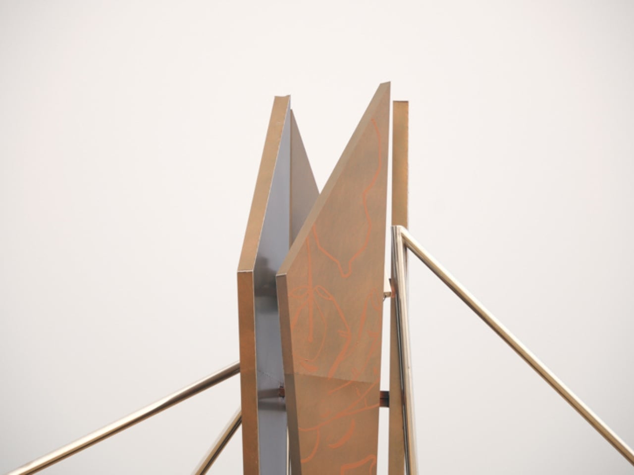
At first glance, OAS/S-AETHER reads as a geometric silhouette against the sky, a skeletal wing shape built from precisely arranged metal rods that catch light differently depending on the hour. Get closer, and the details reveal themselves. Embedded within the framework are acrylic lightboxes that glow from within, engraved copper plates that bring texture and a sense of history to the industrial structure, and, perhaps most surprisingly, living plants tucked inside the illuminated boxes. That last element is the one I keep turning over in my mind. Placing living, breathing vegetation inside a steel and acrylic structure is not a subtle gesture. It’s a declaration. Life and industry don’t just coexist here; they hold each other up.

The choice of location matters too. Aranya is not just any beach town. The coastal community in Qinhuangdao has quietly become something of a pilgrimage site for design-conscious travelers and cultural tourists across China, recognized for its commitment to thoughtful architecture and carefully curated experiences. Placing a work of this ambition in that environment makes sense, but it also raises the stakes. When the bar is already high, every new installation has to work harder to justify itself.

OAS/S-AETHER justifies itself. The way the piece interacts with its natural setting over the course of a single day is genuinely impressive. Sunlight shifts the shadows cast by the metal rods across the sand in slow, changing patterns. At night, the acrylic panels take over, turning the structure into something closer to a lantern than a sculpture. The piece never looks exactly the same twice, which keeps it from becoming the kind of static landmark that gets photographed once and forgotten.

ZDC has been building this design vocabulary for a while now. Their OAS/S series, which also includes OAS/S-NEST in Qinhuangdao and OAS/S-NOMAD in Inner Mongolia, consistently explores what happens when temporary structures are made to feel permanent, and when materials that should clash somehow harmonize instead. AETHER is the most ambitious entry in that series so far, and it shows. There is a quiet confidence to the design that feels earned rather than assumed.

What makes all of this worth discussing beyond the architecture world is the broader question it raises. As public art becomes more globally visible through social media, the pressure on installations to be photogenic often overshadows the pressure to be meaningful. OAS/S-AETHER manages to be both, but the meaning clearly comes first. You can feel the thought behind it before you even see it in full. That is a harder thing to achieve than most people realize, and it is precisely why the work stands out.

Whether you encounter it in person on that Hebei coastline or through photographs shared online, OAS/S-AETHER leaves an impression that is hard to shake. It asks what it means to exist between worlds, between the man-made and the natural, between the visible and the intangible. Most art asks questions. The best art makes you forget it is asking at all.

The post China’s New Coastal Installation Looks Like It Belongs in Space first appeared on Yanko Design.
The Designer Who Hid His Dumbbells Built Bronze Ones Worth Displaying

Home fitness equipment has quietly moved into the living room, but most of it hasn’t earned its place there. Dumbbells in particular are purely functional objects, usually made with rubber-coated iron and sold on practical merits alone. They get used, then tucked away or left on the floor because nobody really wants them on display. For most people, what’s out of sight tends to be out of mind.

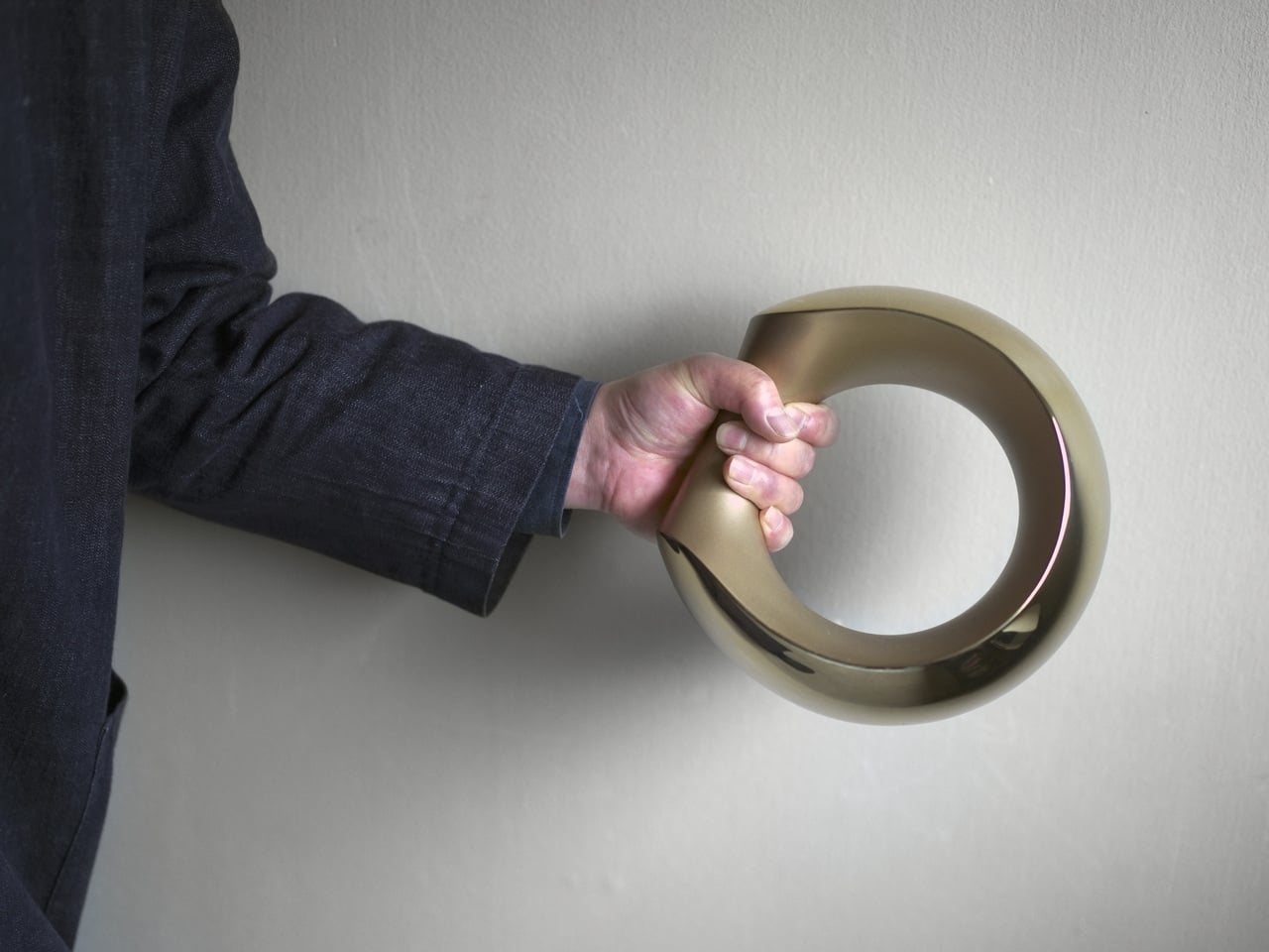
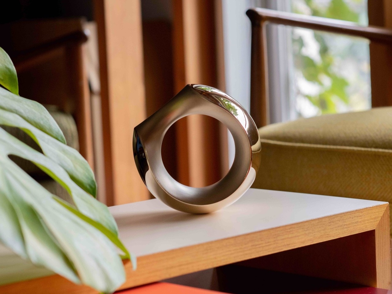
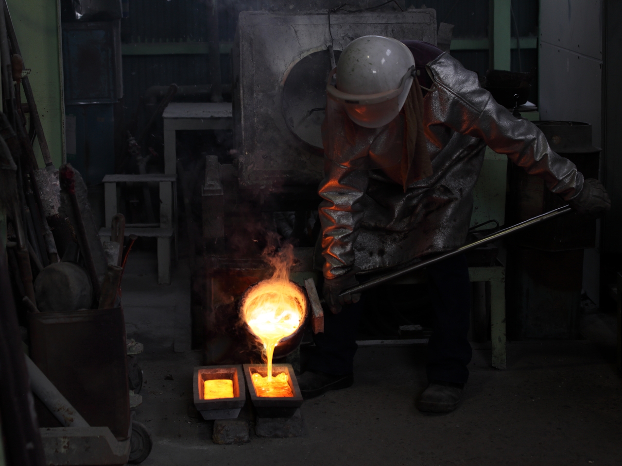
Tokyo-based designer Kenji Abe knows this from personal experience. He would put his own dumbbells in a drawer when friends came over, and then forget about them entirely. That specific frustration became the brief for MANTLE, a pair of bronze dumbbells produced under the ifuki brand in Takaoka City, Japan. The goal was a dumbbell you’d actually want to leave out, all day, even on a good shelf.

Designer: Kenji Abe

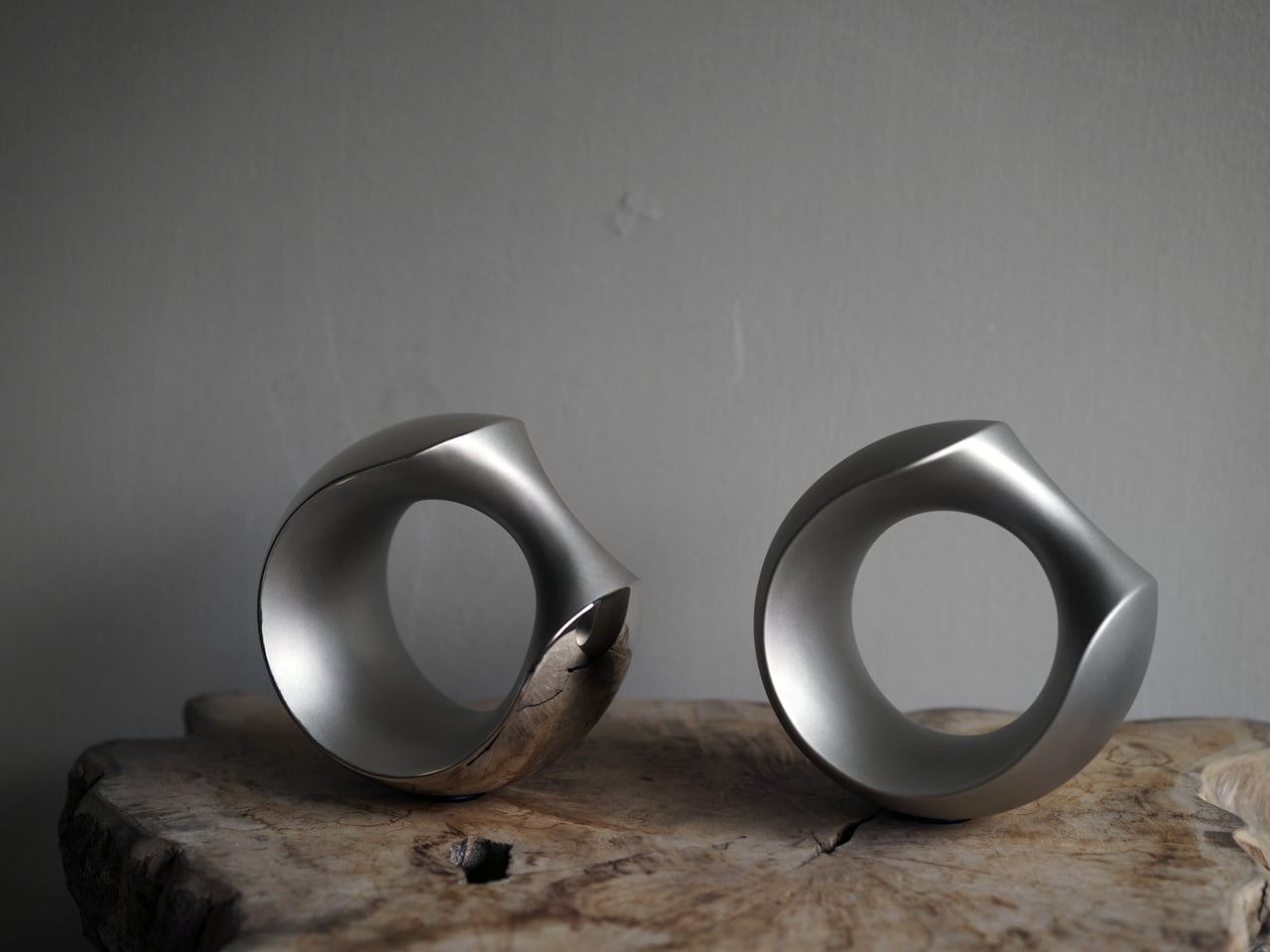
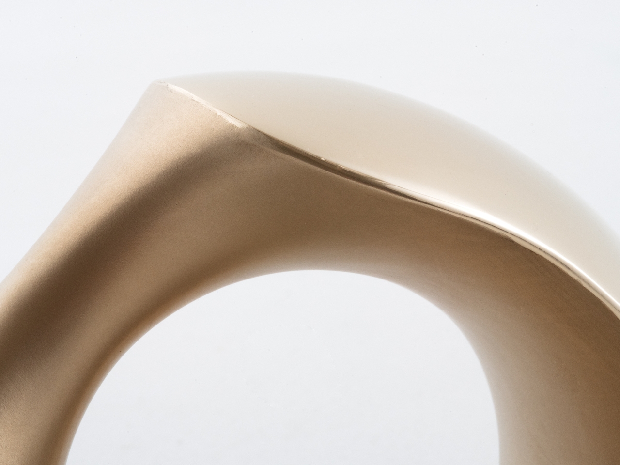
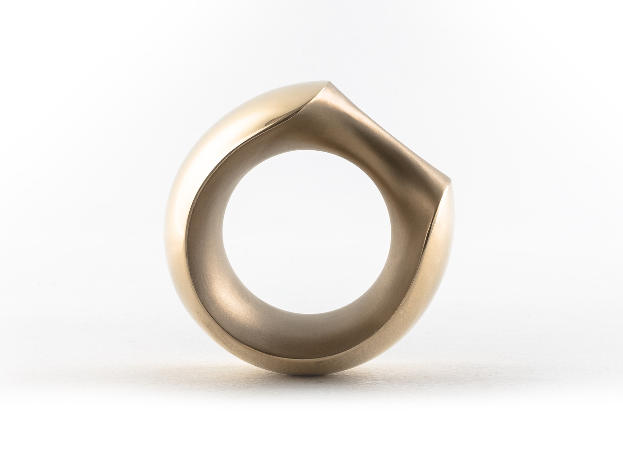
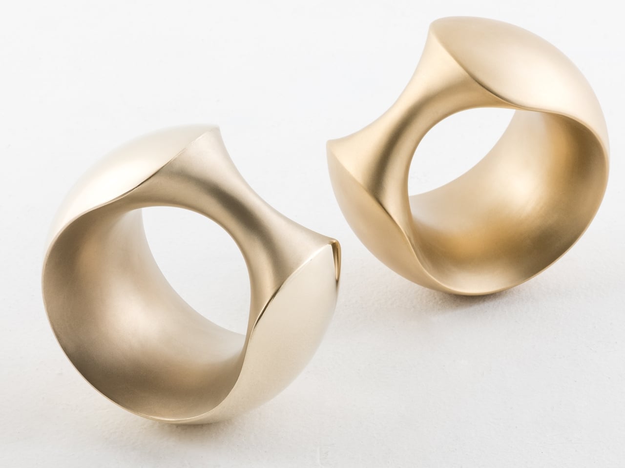
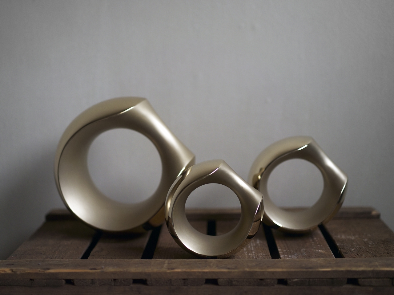
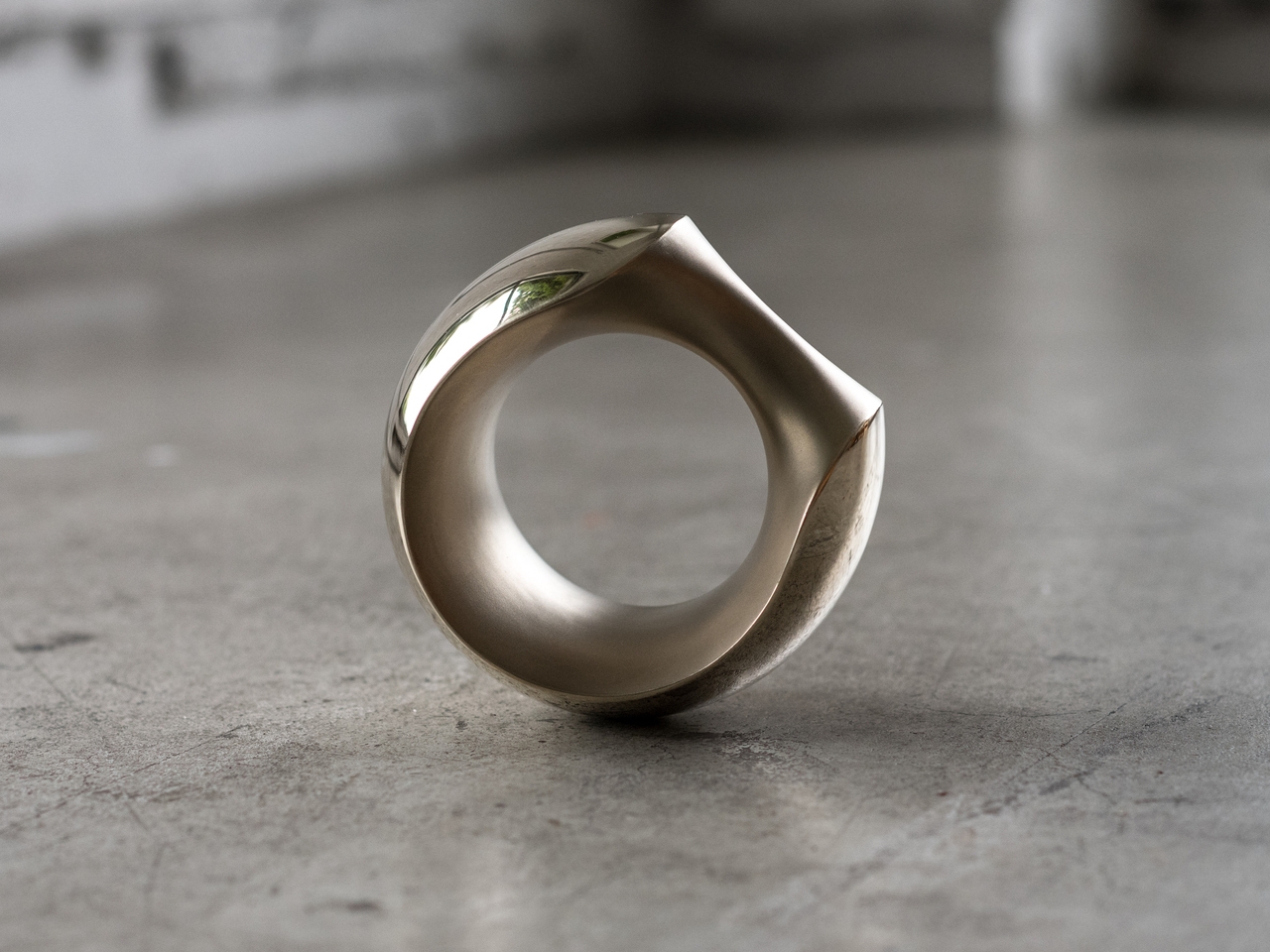
That required rethinking the object from the start. MANTLE combines several surface treatments on a single cast form, with sandblasted sections contrasting against mirror-polished areas. The result carries the visual weight of a sculpture or a piece of jewelry rather than exercise equipment. Set on a side table, it reads as an intentional object, not something that ended up there because there was nowhere else to put it.

The form is just as deliberate. Inspired loosely by the armadillo, the sculptural shape is perfectly balanced, which means the dumbbell stands upright on its own without tipping. A grip tilted at 45 degrees makes it easy to pick up from any angle, and the smooth bronze surface was selected specifically to feel comfortable against skin rather than abrasive during a workout.

The versatility goes further than the grip. You can hold it conventionally for curls or presses, slide it over a wrist to add resistance to arm movements, or hook it around a foot for leg raises. The same object adapts across different exercises without needing adjustments, and the balanced form means it doesn’t fight you regardless of how you’re holding it or what you’re doing.

MANTLE also ages gracefully. Bronze develops character over time, and the combination of matte sandblasting and mirror polishing makes that aging process something worth watching. The material catches light differently across its surfaces, and the contrast in textures gives it a depth that most gym equipment doesn’t have the ambition to pursue.

MANTLE won the Grand Prize at the Toyama Design Competition in 2018 before being developed into a commercial product through ifuki. Abe’s reasoning has always been straightforward: a well-designed dumbbell doesn’t get hidden away, and one that doesn’t get hidden away is one that actually gets used. The drawer stays empty, and the habit becomes a little harder to abandon.

The post The Designer Who Hid His Dumbbells Built Bronze Ones Worth Displaying first appeared on Yanko Design.
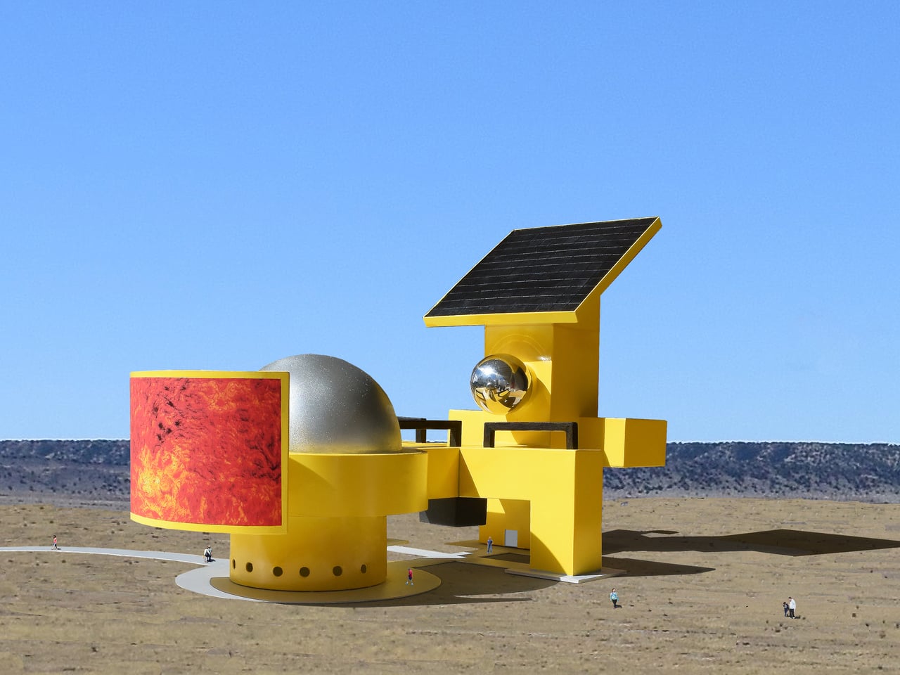
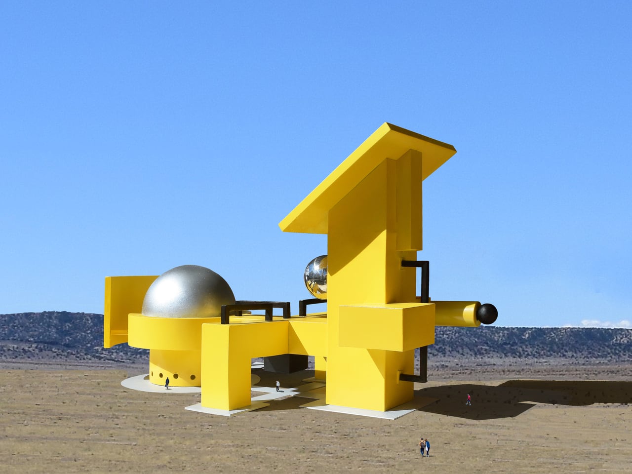
Giant Sculptures Look Like Machines but, Nobody Knows What They Do

Most public sculptures ask you to stand in front of them and feel something, usually reverence, awe, or a vague sense of civic pride. They represent people, events, or abstract ideals, but they rarely suggest function. A figure cast in bronze doesn’t appear to be doing anything, and that’s largely the point. The statue commemorates; it doesn’t operate. The relationship between viewer and object is, by design, entirely passive.

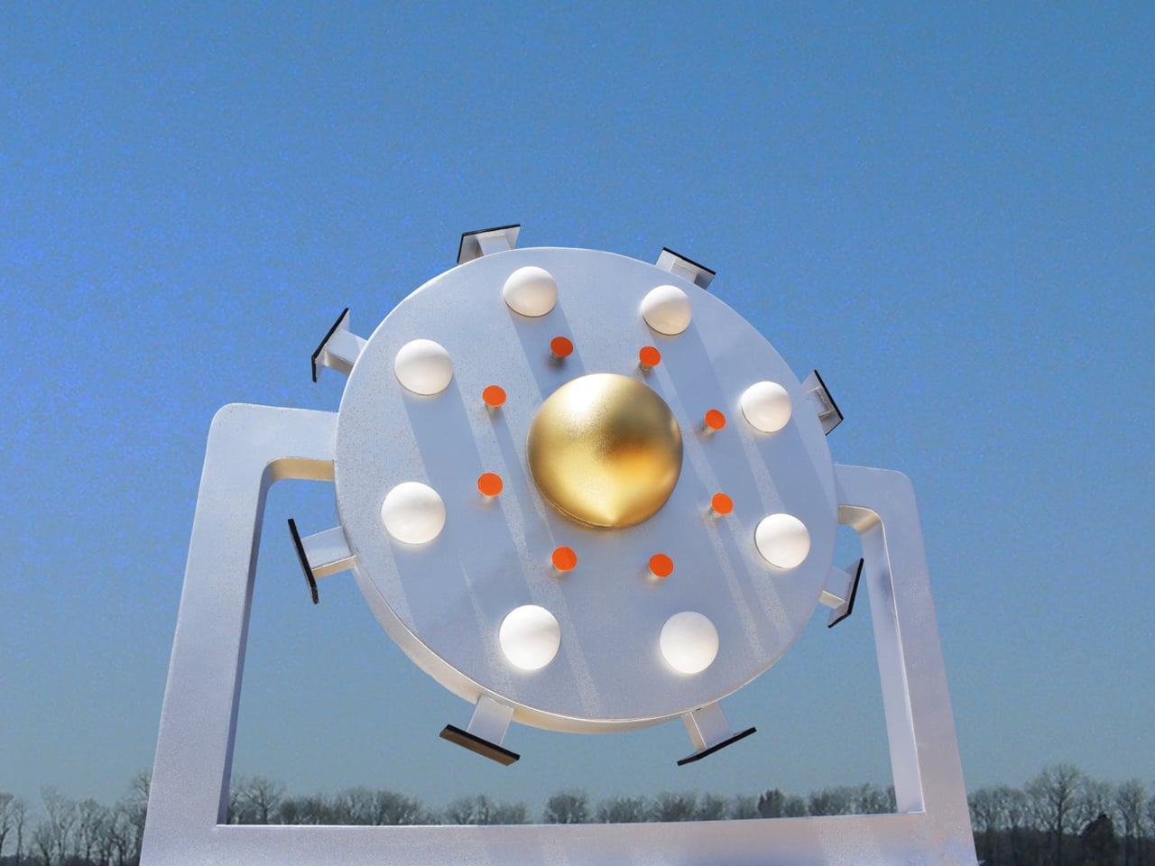
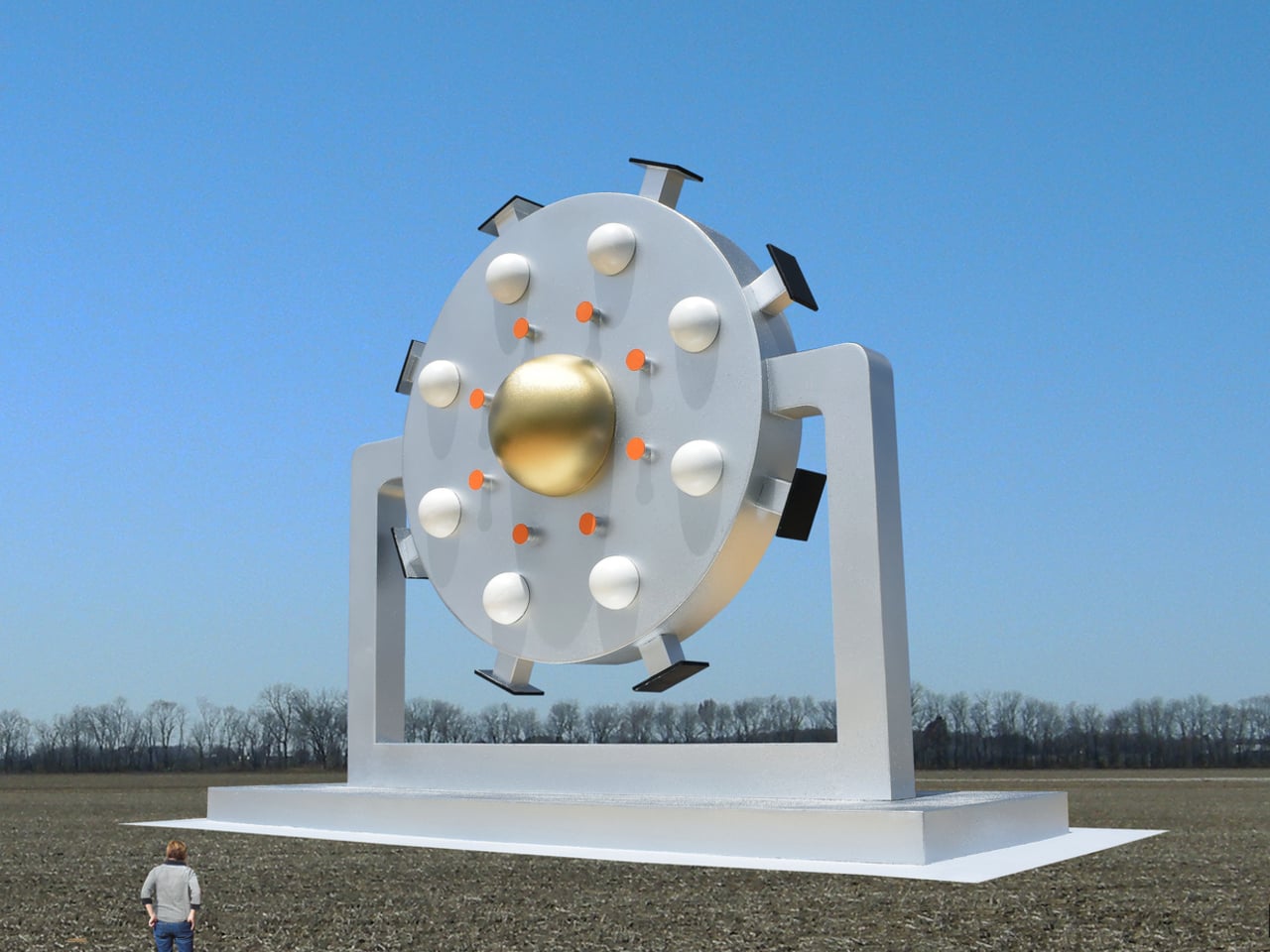
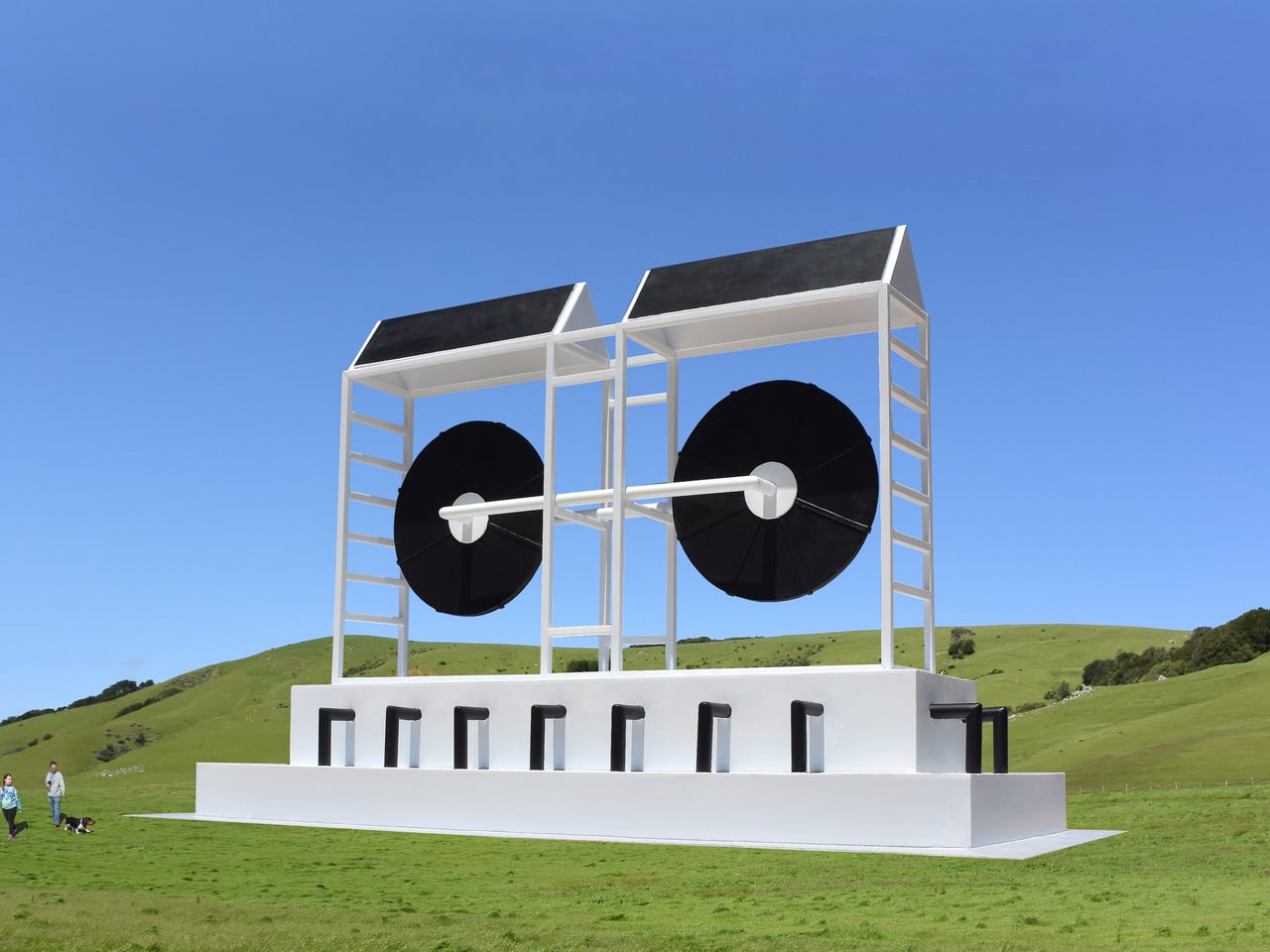
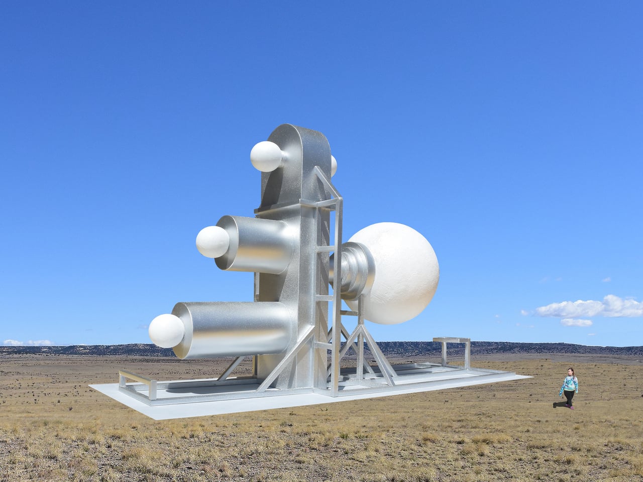
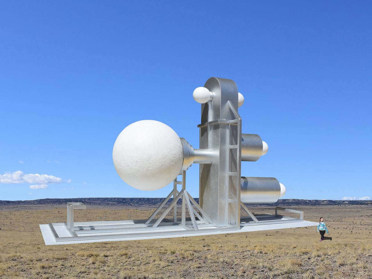
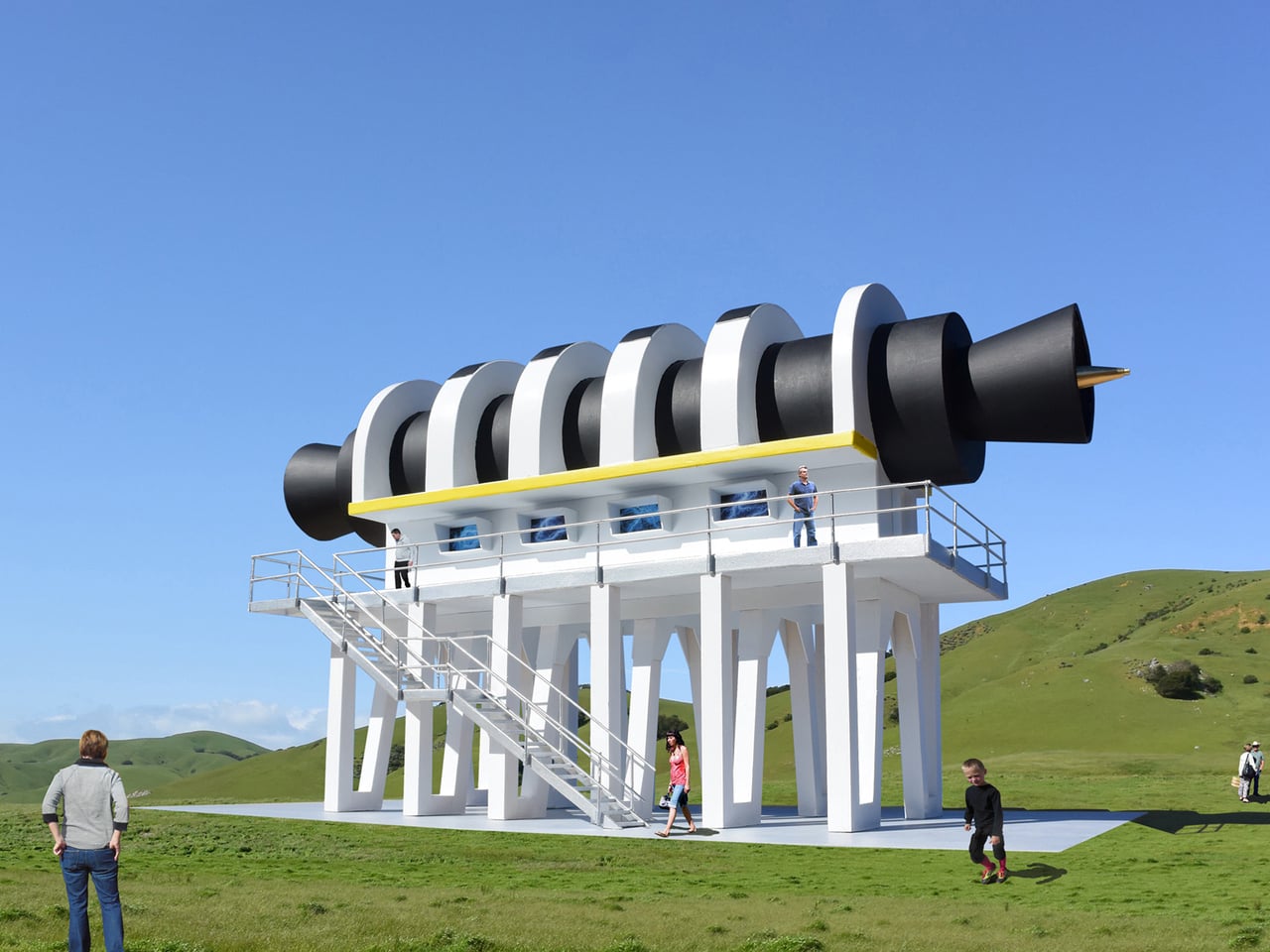
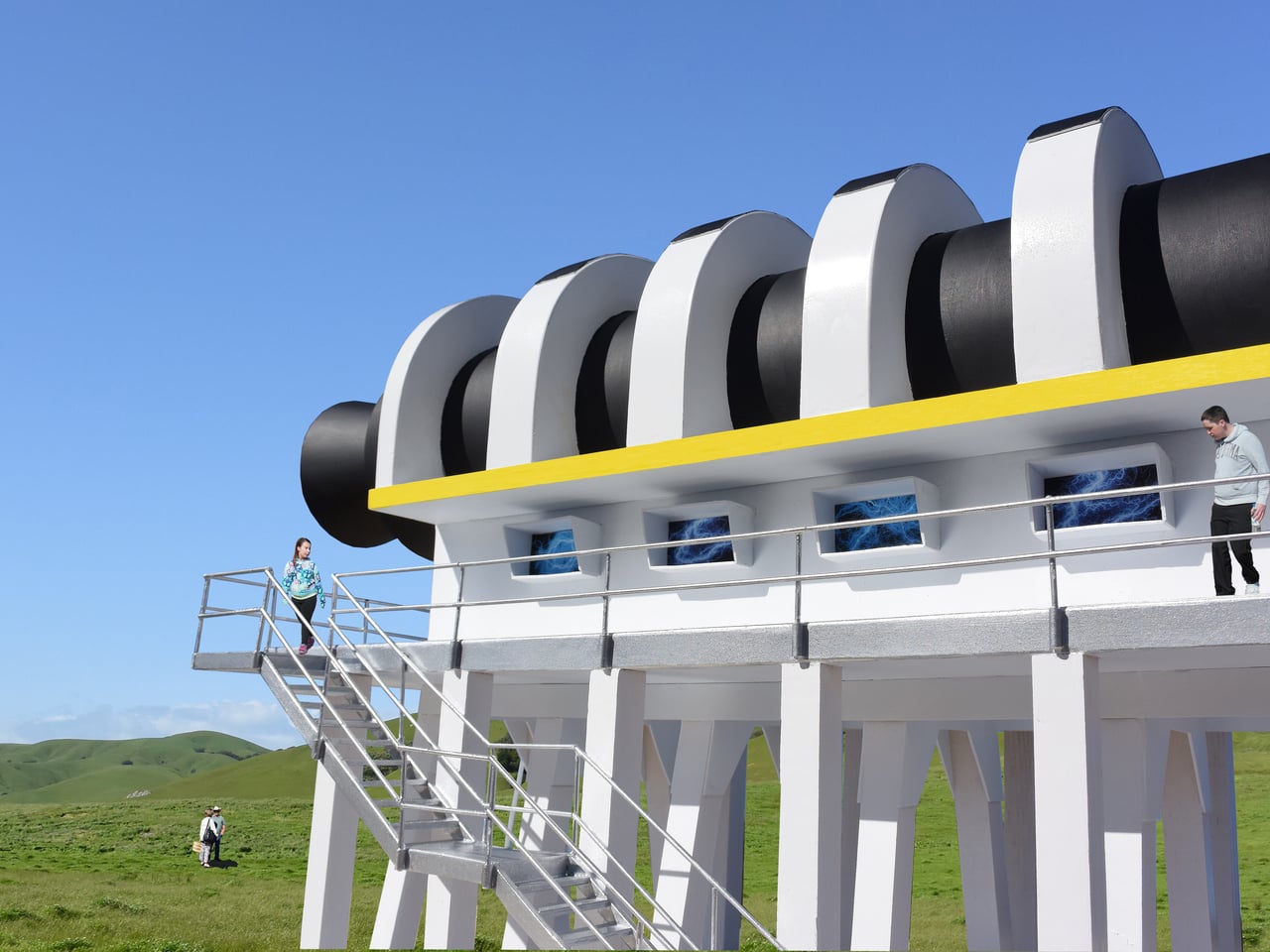
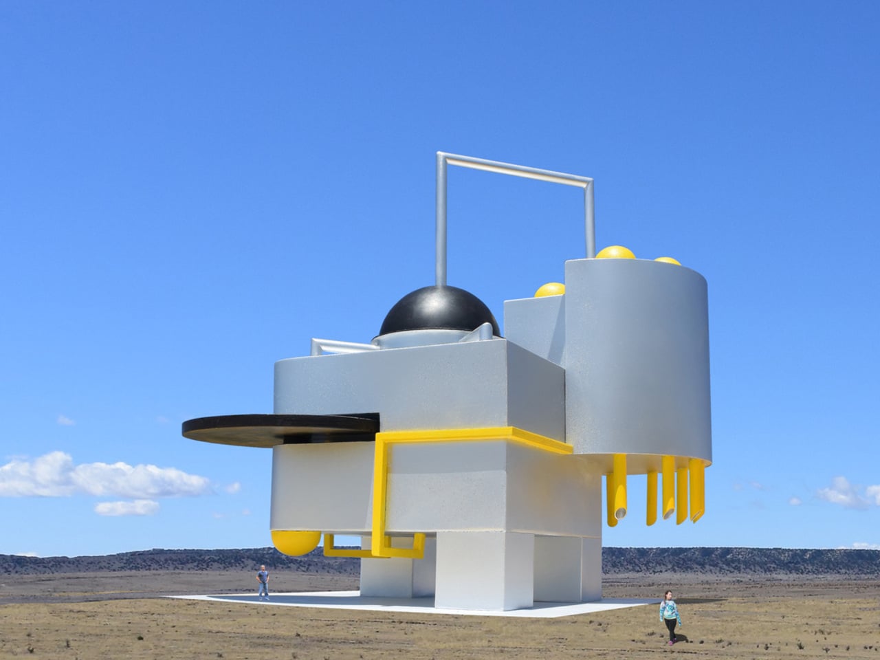
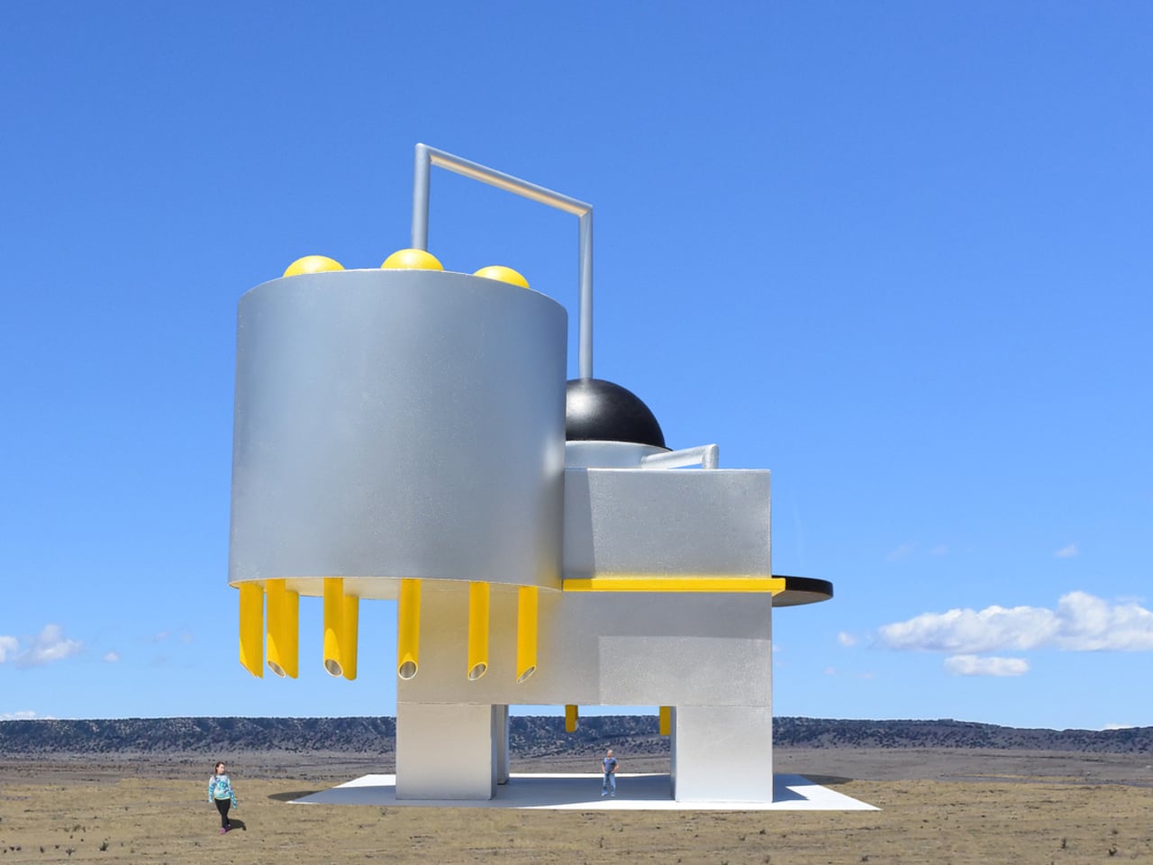
Michael Jantzen had a different idea. The Santa Fe-based designer set out to create public sculptures that look like they’re built to do something, even if no one, including Jantzen himself, can say what that something is. The result is the Monumental Engines of Creation, a concept series drawing from the visual language of high-technology hardware, assembled into objects that feel purposeful, alien, and oddly believable all at once.

Designer: Michael Jantzen

The design process is telling. Jantzen didn’t start with a function and work backward to a form, as industrial designers typically do. He built the pieces intuitively, combining various components into composites that simply suggest some kind of high-level intelligence at work. The question of what they might actually be for was deliberately left unanswered, and that open-endedness is precisely what gives the series its strange pull.

Standing near one of these sculptures, you’d spend a while trying to decode it. Jantzen’s hope is that viewers engage with the objects and find themselves genuinely wondering about their origin, their creators, and their purpose. That kind of sustained curiosity is harder to provoke than it sounds. Most public sculptures deliver their meaning almost immediately; these deliberately withhold it, rewarding prolonged attention with more questions rather than answers.

Part of why that works is scale. Each piece in the series is intentionally gigantic, dwarfing any person nearby to the point of near insignificance. That proportion isn’t accidental; Jantzen designed the scale to convey the symbolic weight of each object relative to its imagined function. A machine built to scatter the seeds of creativity throughout the universe, the thinking goes, should probably look the part.

There’s something worth sitting with in the idea that creativity itself deserves monuments. Most of what we commemorate in public space is history, politics, or governance. Jantzen’s machines point somewhere else, toward imagination, invention, and the strange optimism embedded in building. They don’t ask to be understood. They ask to be wondered at, which turns out to be a different, and arguably more honest, kind of public art.

The post Giant Sculptures Look Like Machines but, Nobody Knows What They Do first appeared on Yanko Design.
The ‘Gentle Geometry’ Of Wood Reflecting Cultures Through Sculptures By Aleph Geddis

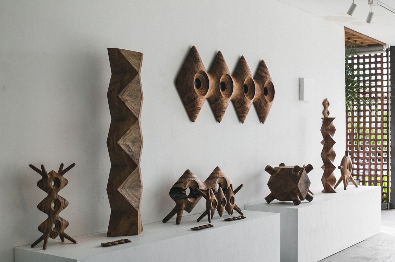
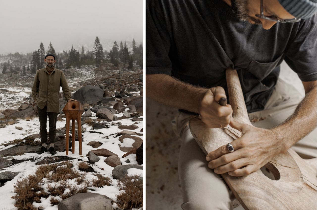
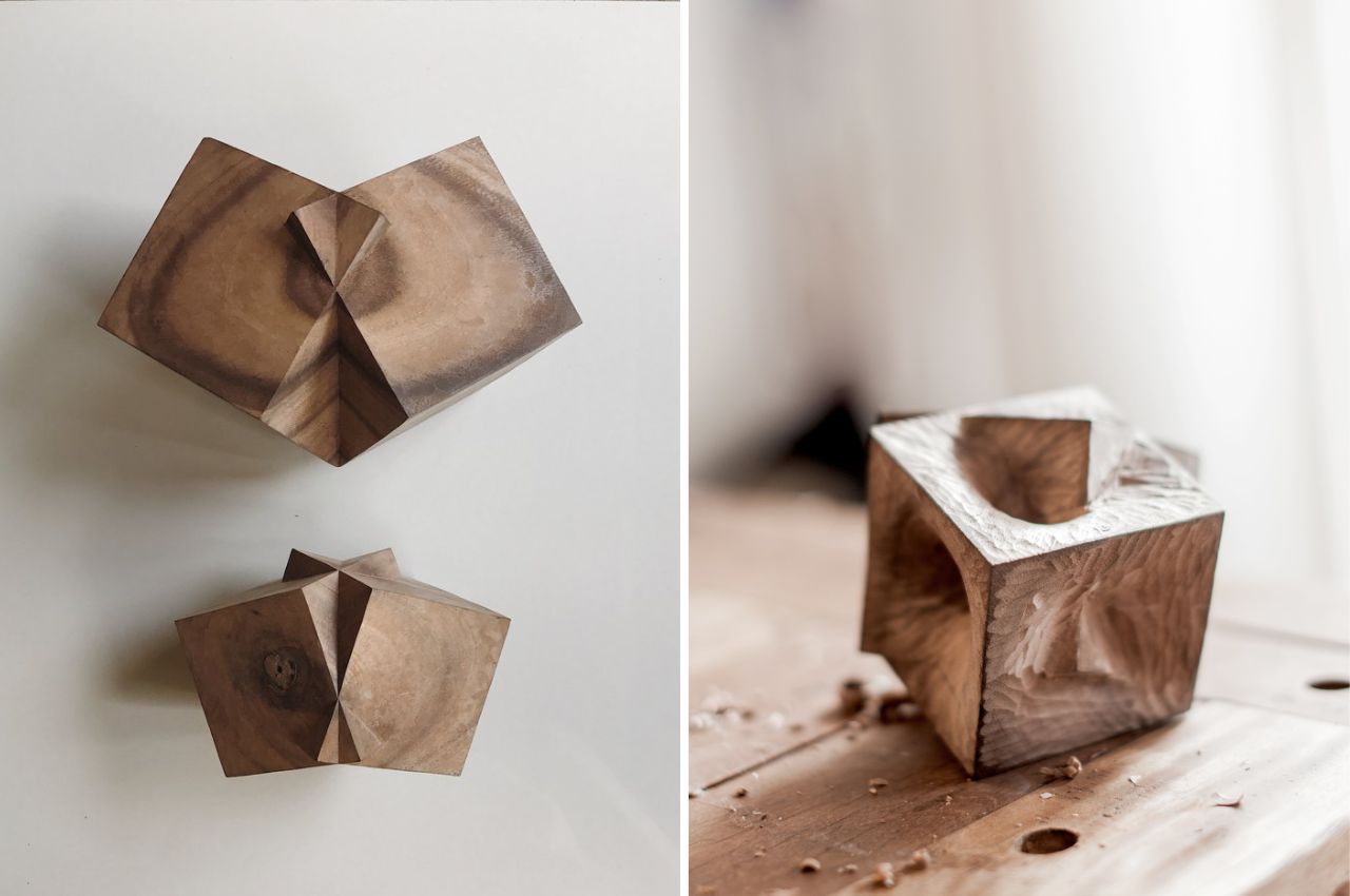
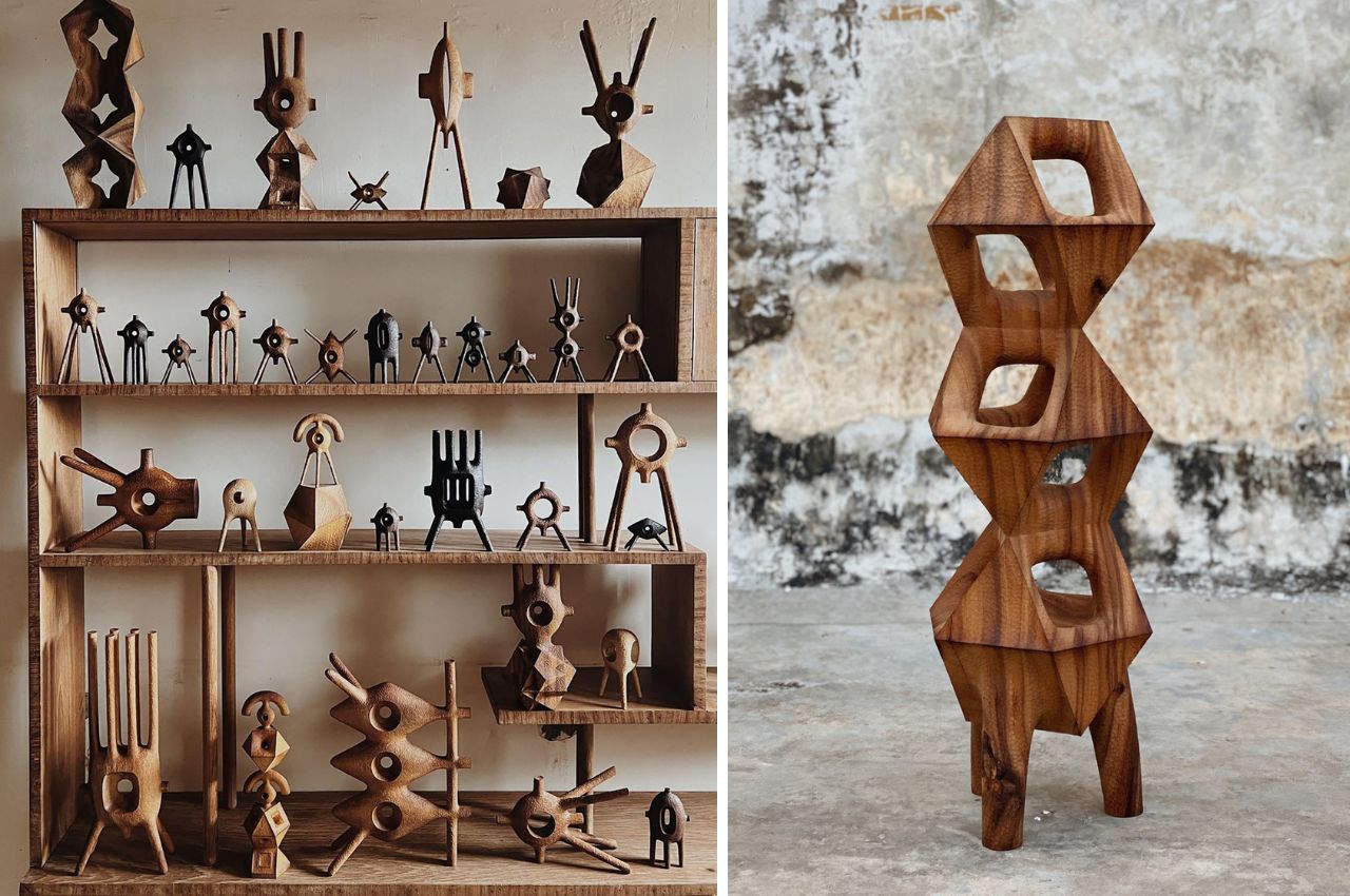
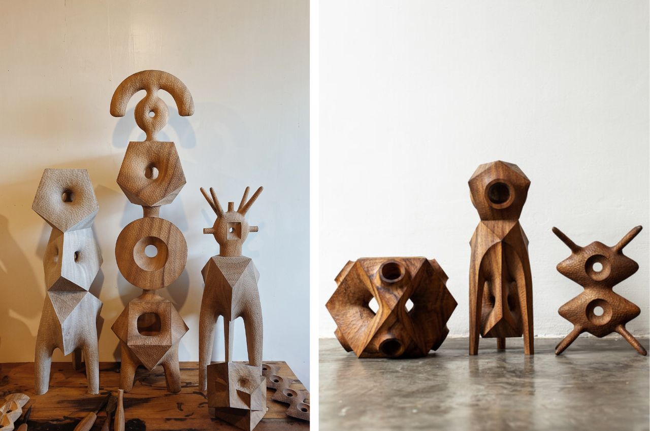
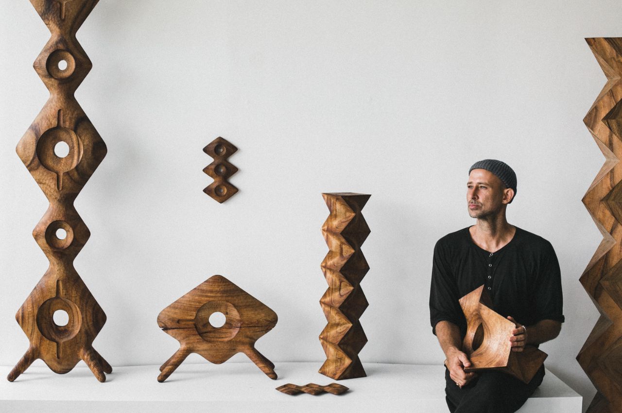
If you are inclined to woodworking, sculpture, or an appreciation for abstract geometric forms, the creations of sculptor Aleph Geddis are sure to captivate your imagination. Geddis’ work is a harmonious blend of traditional craftsmanship, modernist aesthetics, and a deep-rooted fascination with the fundamental structures of our world.
Designer: Aleph Geddis

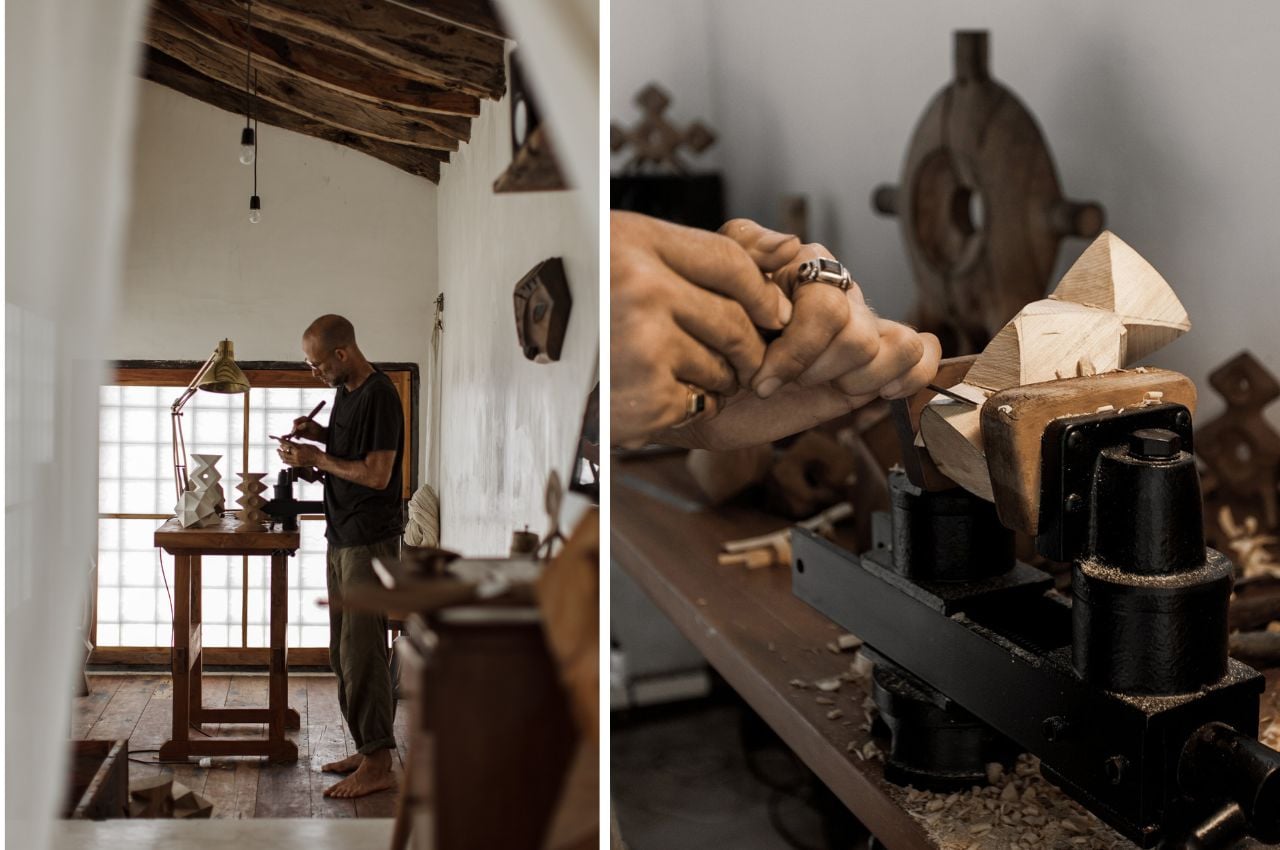
Aleph Geddis’ artistic roots can be traced back to his upbringing on Orcas Island in the Pacific Northwest. Immersed in a creative environment shaped by his stepfather’s expertise in sculpture, carving, and boat building, Geddis found inspiration in the stylized naturalism of Northwest Coast Native carvings. His early works reflected this influence, evolving over time to incorporate diverse cultural experiences, such as a transformative family trip to Japan.

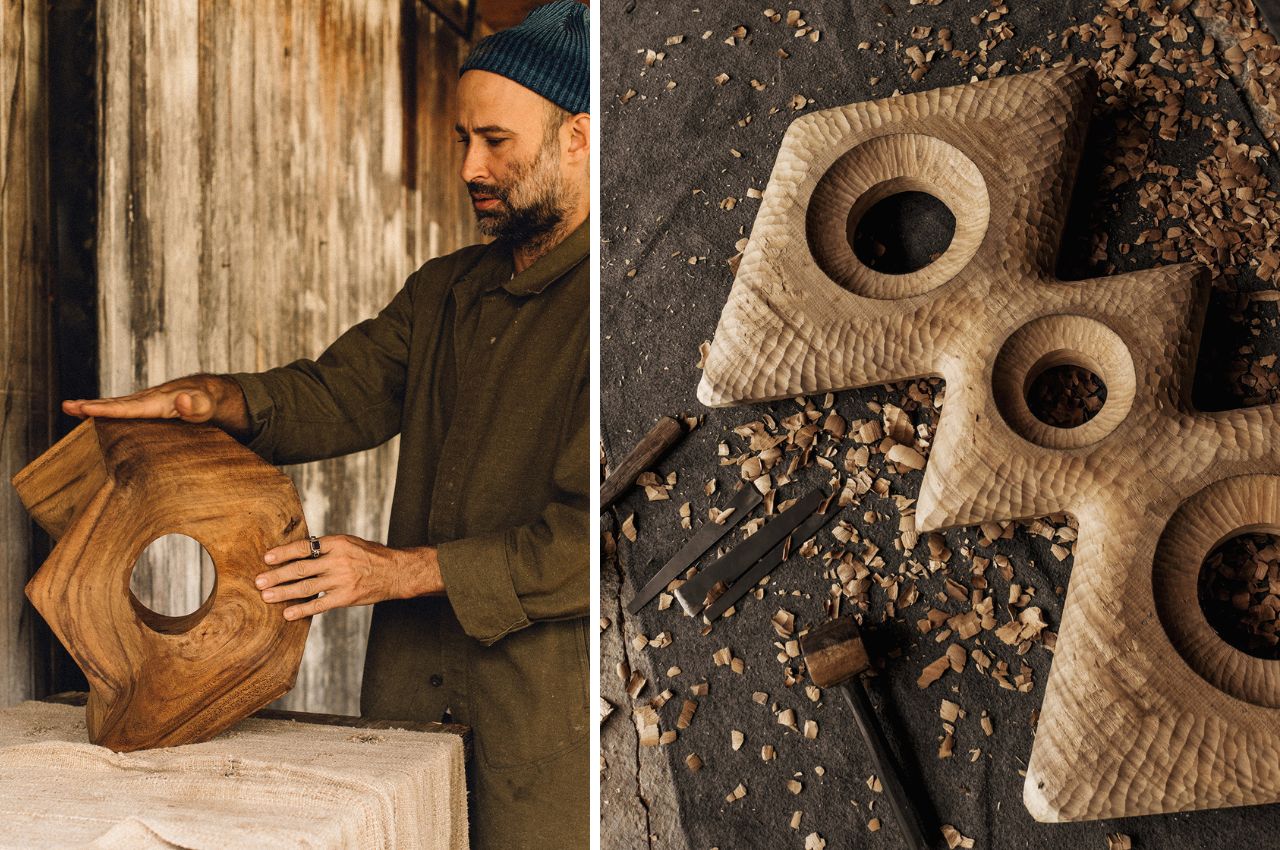
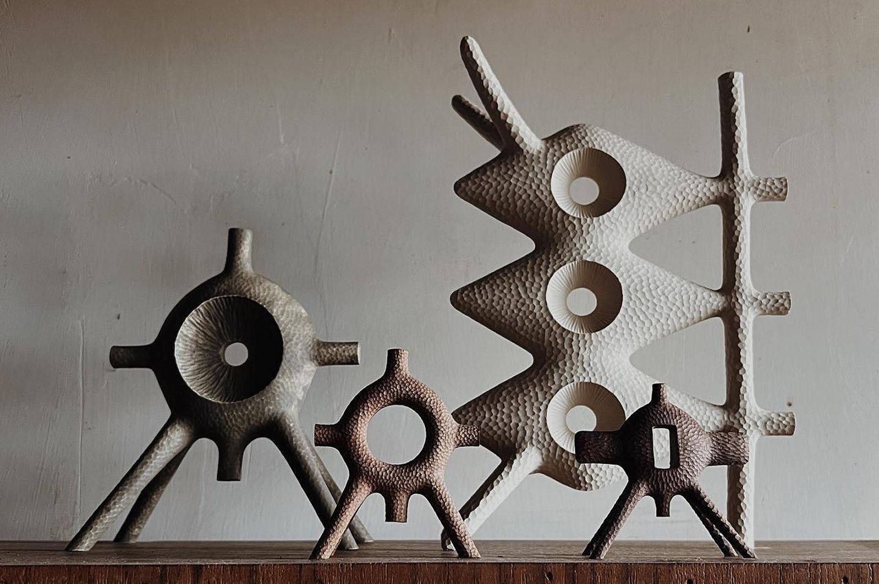
His sculptures beautifully straddle the intersection of different cultures and artistic traditions. Drawing upon the rich traditions of wood carving and totems from the indigenous people of the Pacific Northwest, as well as the intricate woodwork of Bali, Geddis merges these influences with the familial impact of his stepfather’s similar craft. The result is a collection of hand-carved pieces that resonate with a global and timeless aesthetic.

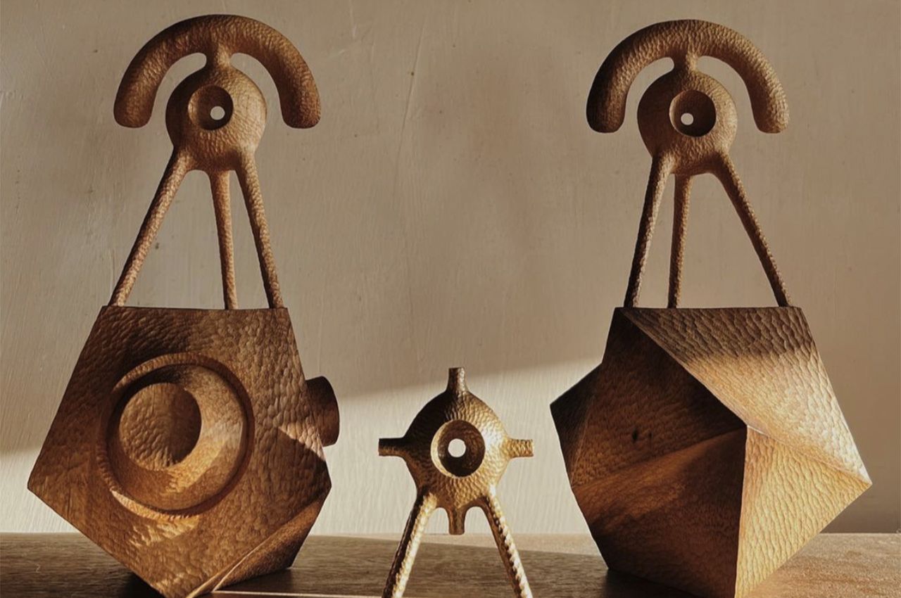
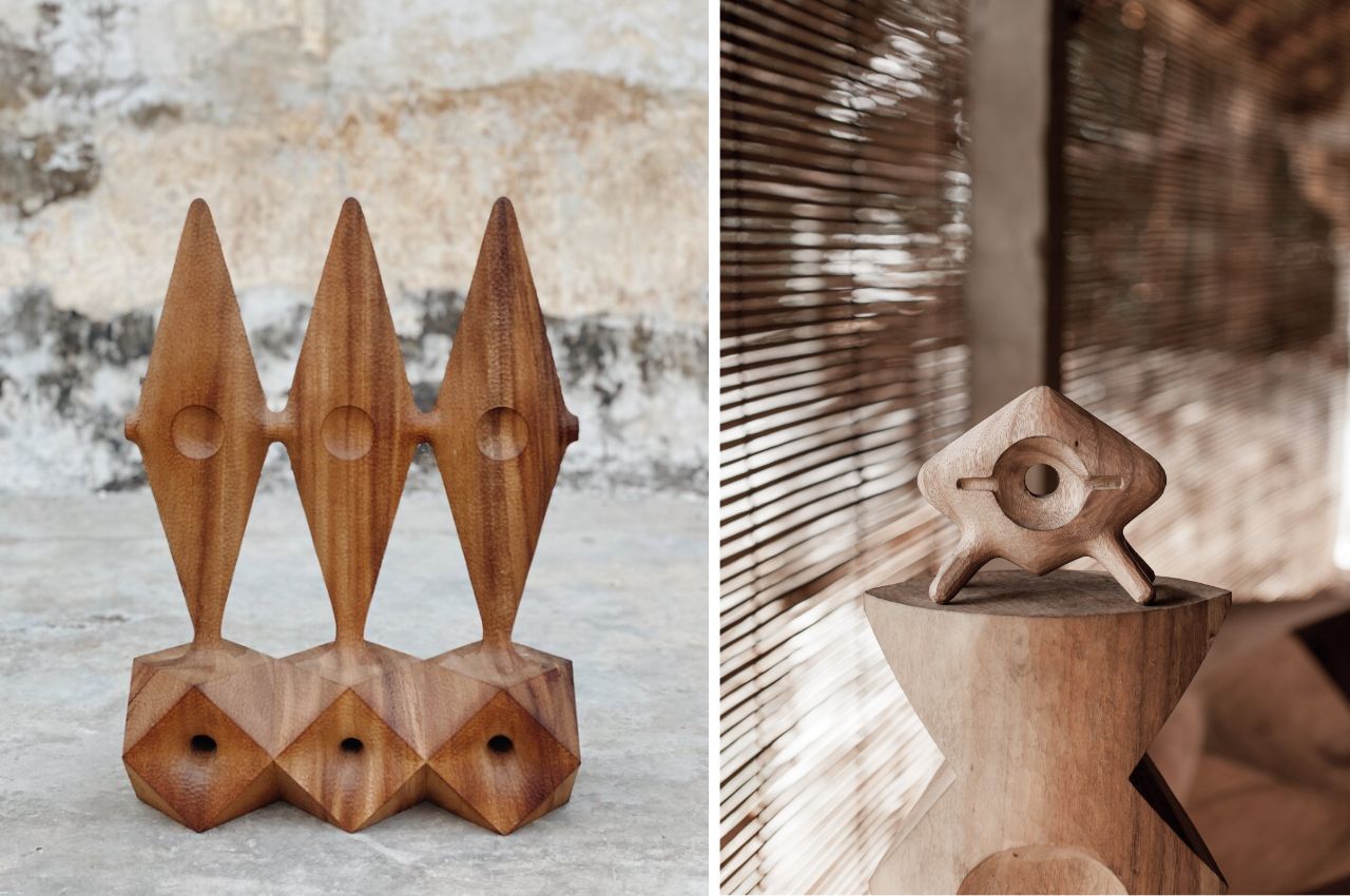
As Geddis’ artistic journey unfolds, a consistent theme emerges—exploring the simple elegance inherent in natural forms. His recent works delve into the integral shapes of Platonic solids, conveying a sense of truth beyond human subjectivity. For the sculptor, these forms possess a magical existence that predates and will outlast humanity, offering viewers the pleasure of interacting with something timeless and profound. His Orcas Island studio serves as the birthplace of each meticulously handcrafted piece, connecting the artist’s work to the landscapes that have shaped him.

The sculptor acknowledges the profound impact of a trip to Japan on his artistic exploration. Exposed to the country’s rich woodworking tradition, he integrates Japanese craftsmanship elements into his sculptural endeavors. This influence adds depth and diversity to his work, contributing to a body of art that seamlessly weaves together figurative, abstract, and even architectural elements.

Geddis’ sculptures cross the rational realm of mathematics and Platonic solids while embracing a spiritually inspired curiosity about sacred geometry. Some of his vertical pieces evoke a softer interpretation of Brutalist forms, while others conjure visions of wondrous alien audio speakers reminiscent of Arcosanti. Each creation invites viewers to contemplate the intersection of the tangible and the transcendent, encouraging a deeper exploration of the mystical dimensions embedded in his wooden sculptures. Each of his pieces is an artwork that makes you think, learn, and build conversations. And trust me, the longer you look at them, the more there is to keep.

Aleph Geddis’ sculptures are more than mere artistic expressions; they are gateways to a world where tradition, culture, and the inherent beauty of natural forms converge. Each piece from the Pacific Northwest to Japan reflects the artist’s journey, inviting viewers to join him on a visual and conceptual exploration of warm geometries sculpted from wood—a testament to the enduring magic found within the simplicity of shapes and the richness of cultural intersections.

The post The ‘Gentle Geometry’ Of Wood Reflecting Cultures Through Sculptures By Aleph Geddis first appeared on Yanko Design.