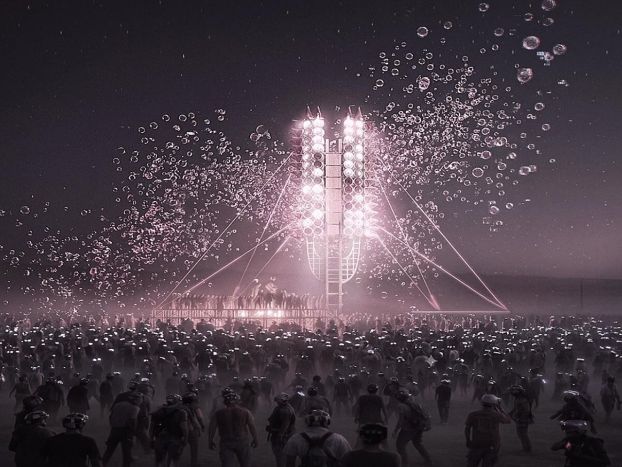
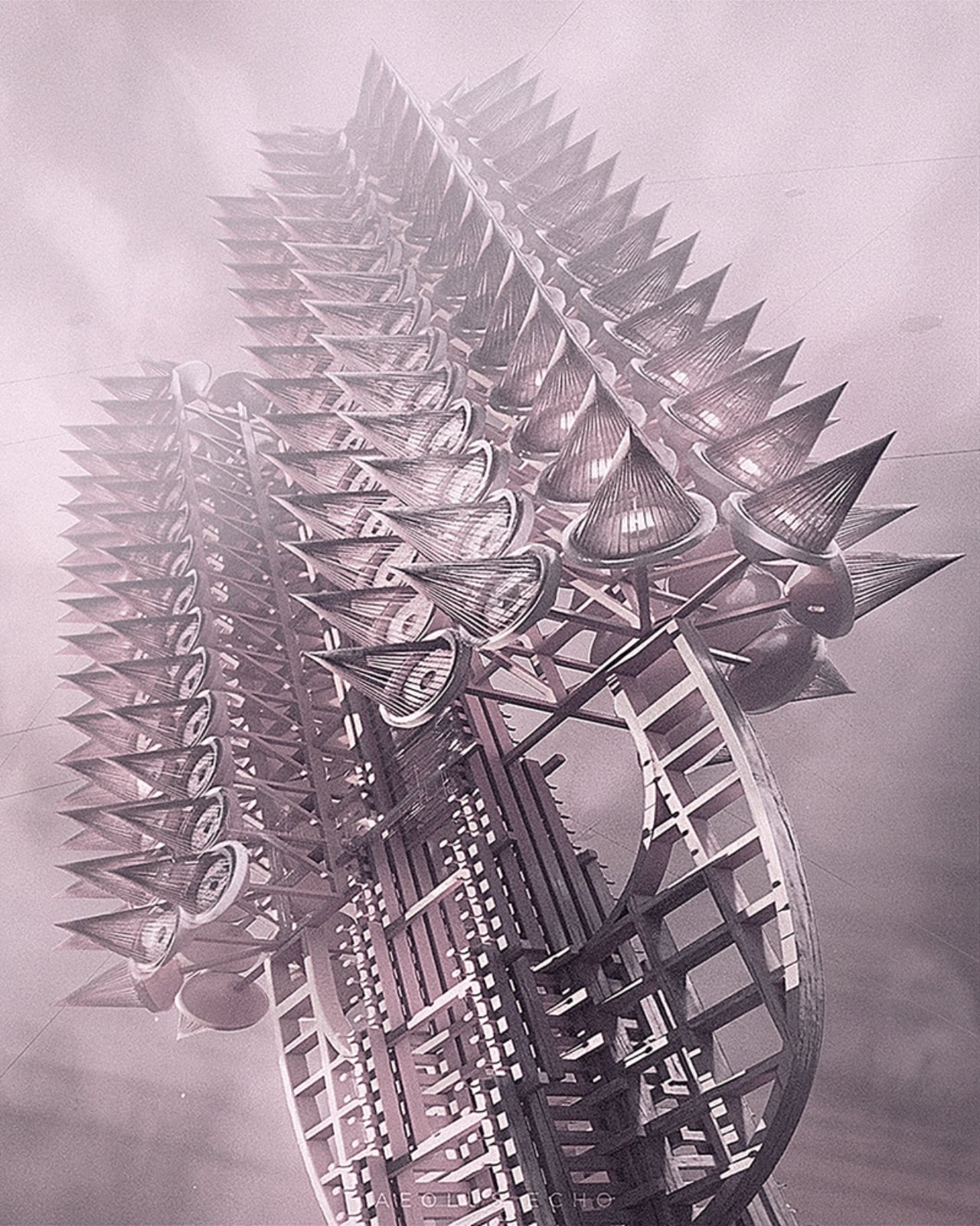
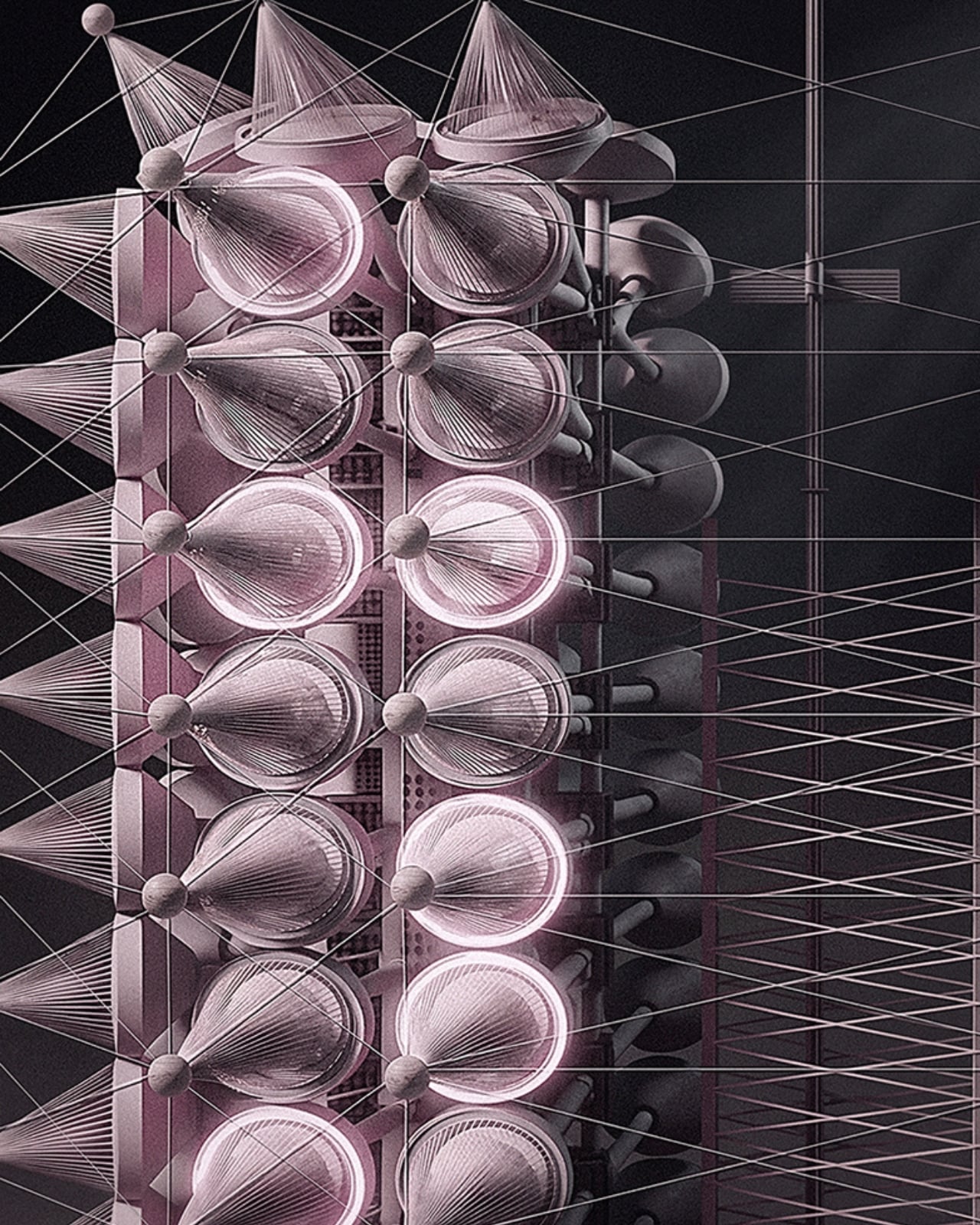
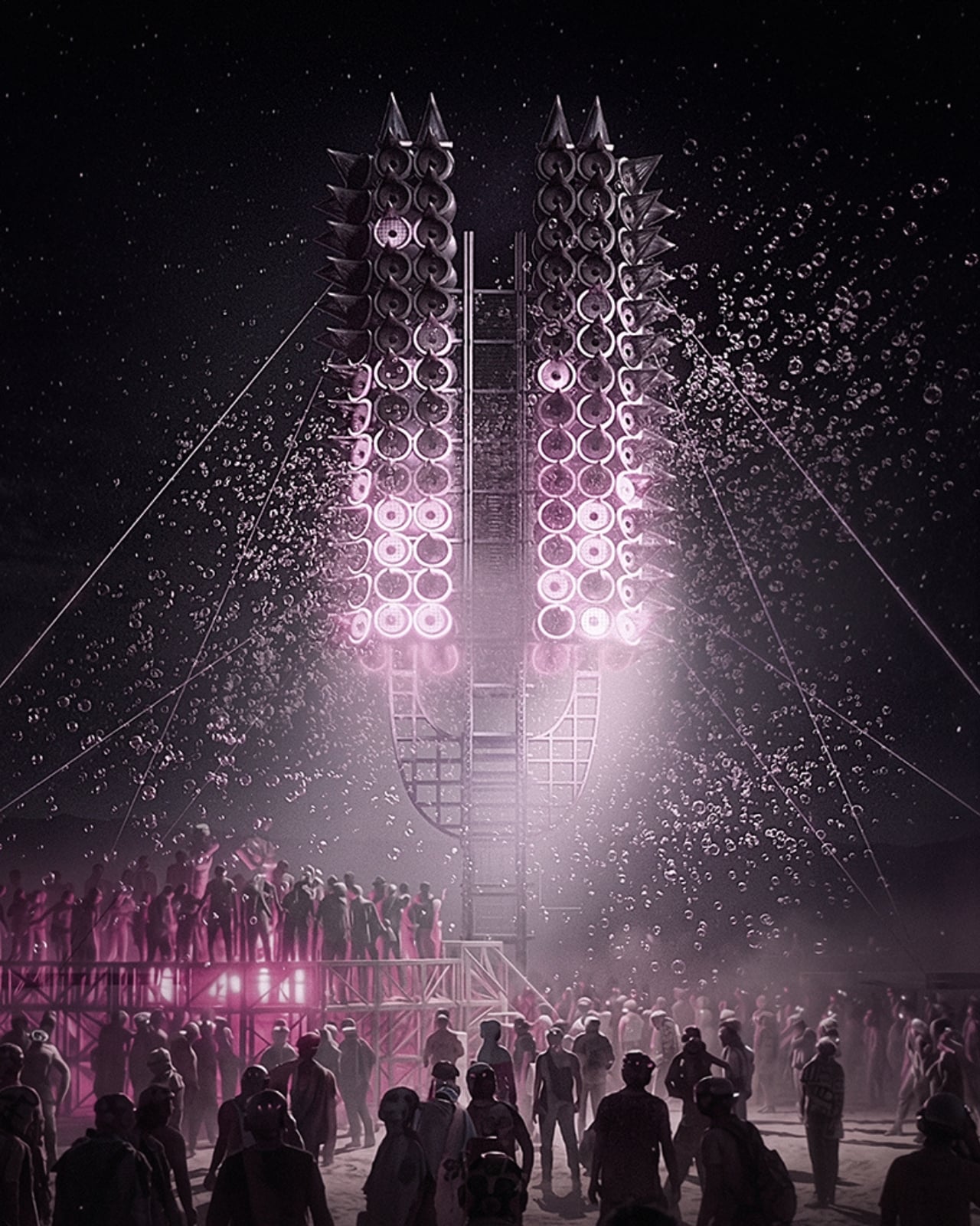
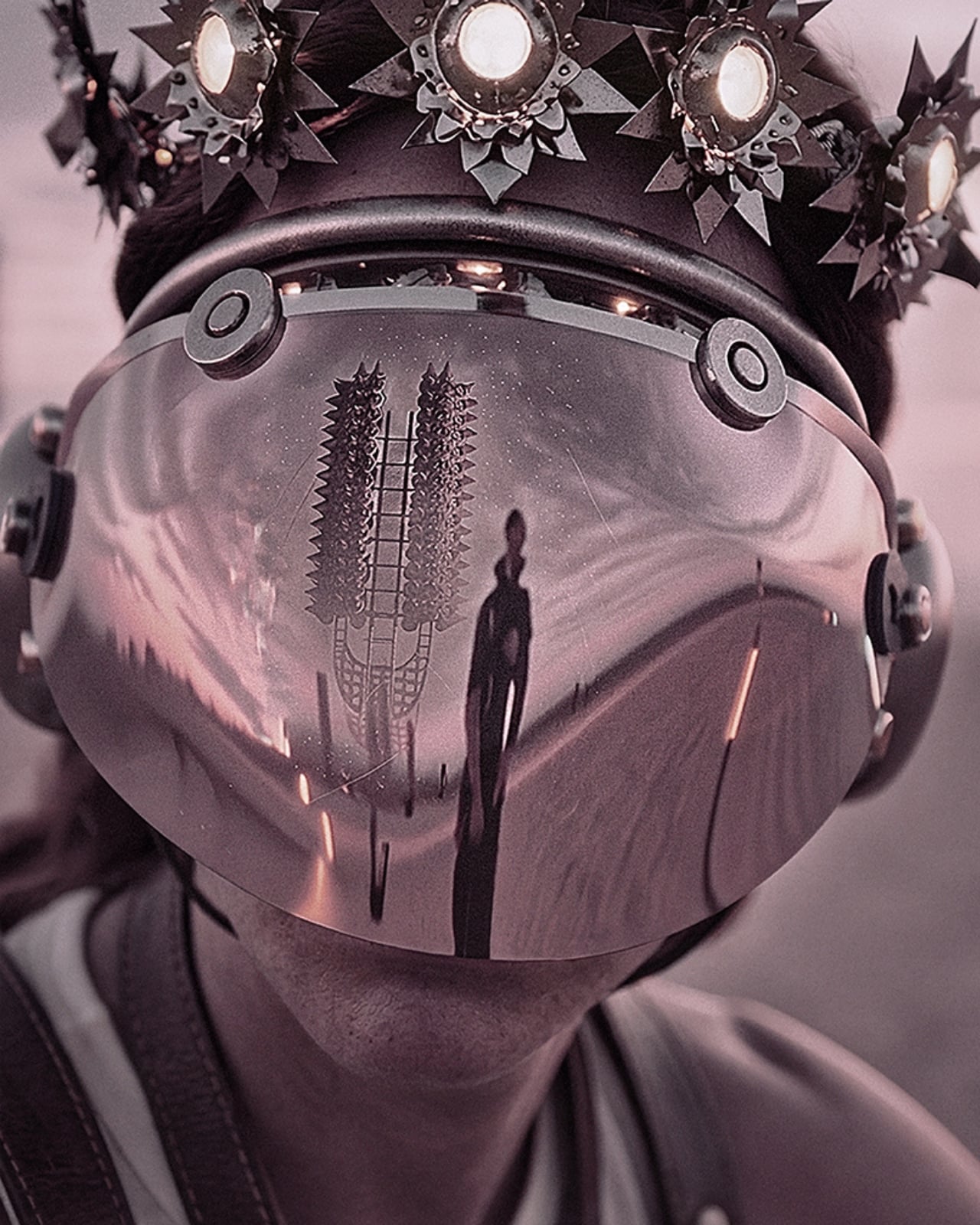
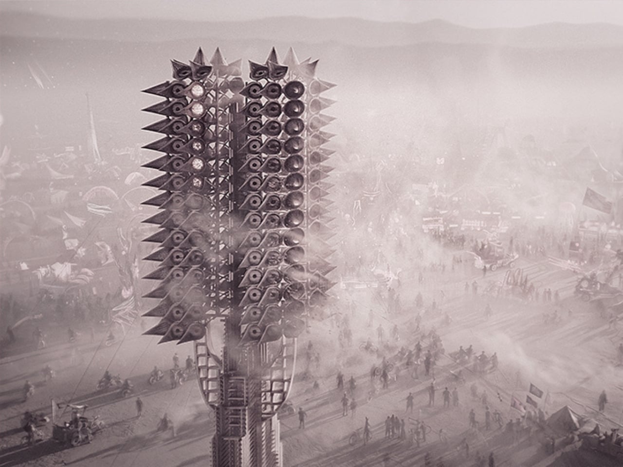
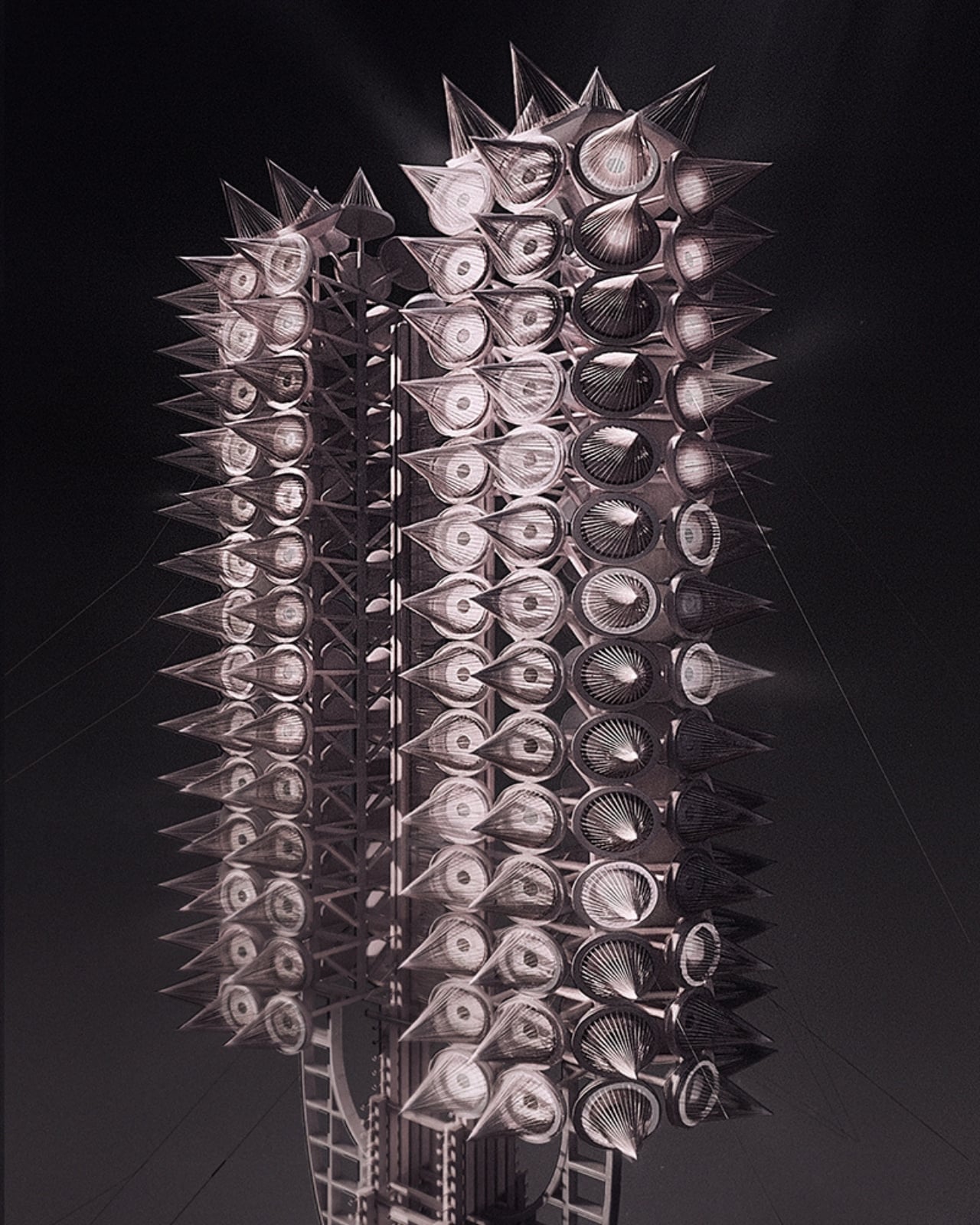
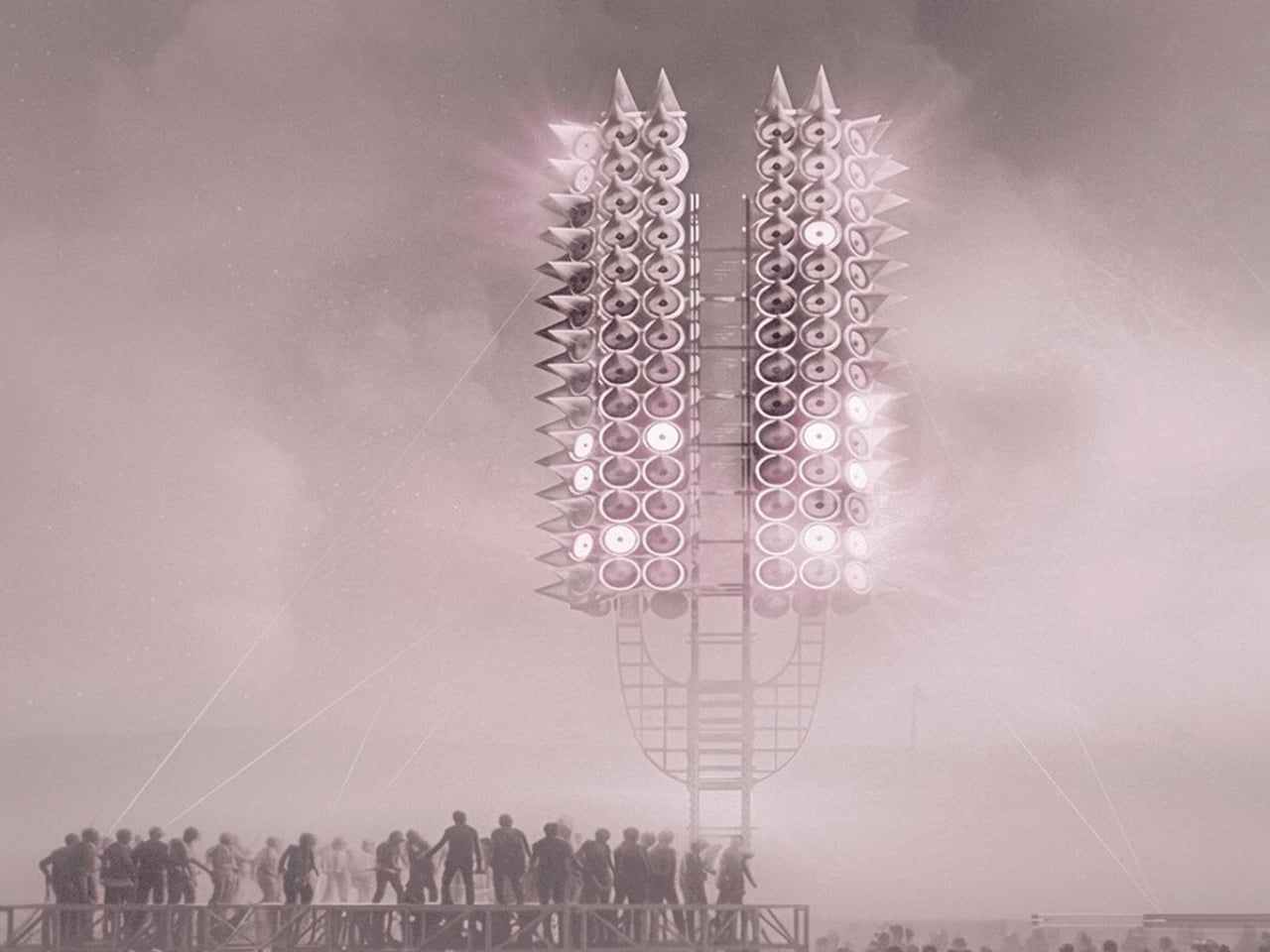
One person shouting into an empty desert doesn’t build much of anything. But what happens when thousands of voices gather around a 12-meter tower made of 300 programmable rings of light, and the structure itself begins to respond? That’s the premise behind Axis Mundi: Resonant Spire, Sergei Konchekov’s installation selected for the 2026 Burning Man Honoraria program, and it might be the most genuinely interesting piece of architecture to emerge this year. Not because it’s the biggest or the most technically complex, but because it actually has something to say.
The concept is both technically precise and philosophically loaded. Konchekov built the tower to translate human voice into a vertical system of light and sound. Speak toward it, and the rings light up. Walk away, and the activation fades. The structure doesn’t generate its own spectacle. It borrows yours. Which sounds like a gimmick when you type it out flat like that, but when you sit with it, it starts to feel like one of those rare design ideas that actually earns its concept.
What makes it more than just an interactive light show is the accumulation logic built into its architecture. The 300 rings function as a kind of vertical archive. Lower rings hold stabilized states built up over time, while the upper rings stay live and reactive to current input. So the tower, in a real and structural sense, carries memory. What a crowd did an hour ago is still visible at the base, while what’s happening right now lives near the top. Light doesn’t disappear here. It accumulates. Time, quite literally, becomes physical form.
Konchekov developed the project through a methodology he calls COLLIZIUM, which frames architectural form through conflict-based computational processes and collective social input. That might sound like a design school thesis, but the output is something more immediate and tactile than the language around it suggests. The architecture doesn’t exist independently of its participants. It is generated through them. Without the crowd, there is no form. Burning Man’s own listings describe it as “neither monument nor machine, but a living signal,” and that description genuinely holds.
The broader conversation Konchekov is entering with this work feels particularly timely. Digital communication is at an all-time volume and an all-time low for meaning. We post, we broadcast, we react, and somehow the cumulative noise produces very little that resembles actual connection. Resonant Spire offers a different model: collective input that actually converges, that creates something legible and shared and visible. A crowd becomes a coherent structure only because they showed up together. That is not a small idea dressed in a large installation.
It’s also worth noting that Burning Man is arguably the right venue for this, not just for the obvious reasons of scale and spectacle, but because the event itself is predicated on temporary community. The playa is a place where the usual rules about permanence and individual credit get set aside. A tower that only works when people gather around it and offer their voices is not a metaphor at Burning Man. It’s just a description of what’s happening there already. Konchekov is, in some ways, building architecture that matches the culture it inhabits.
The visual language of the spire draws from ancient and spiritual references, the axis mundi being a cosmological concept found across many cultures, a central pillar connecting earth and sky. Konchekov takes that idea and routes it through a live data feed. The cone-stacked structure rises with phased waves of light traveling upward, in the project’s own words, “like a visible breath.” It is striking, undeniably, but the aesthetic isn’t really the point. The refusal to be passive is. Most architecture asks you to look at it. This one asks you to mean something together before it shows you what you’ve made.
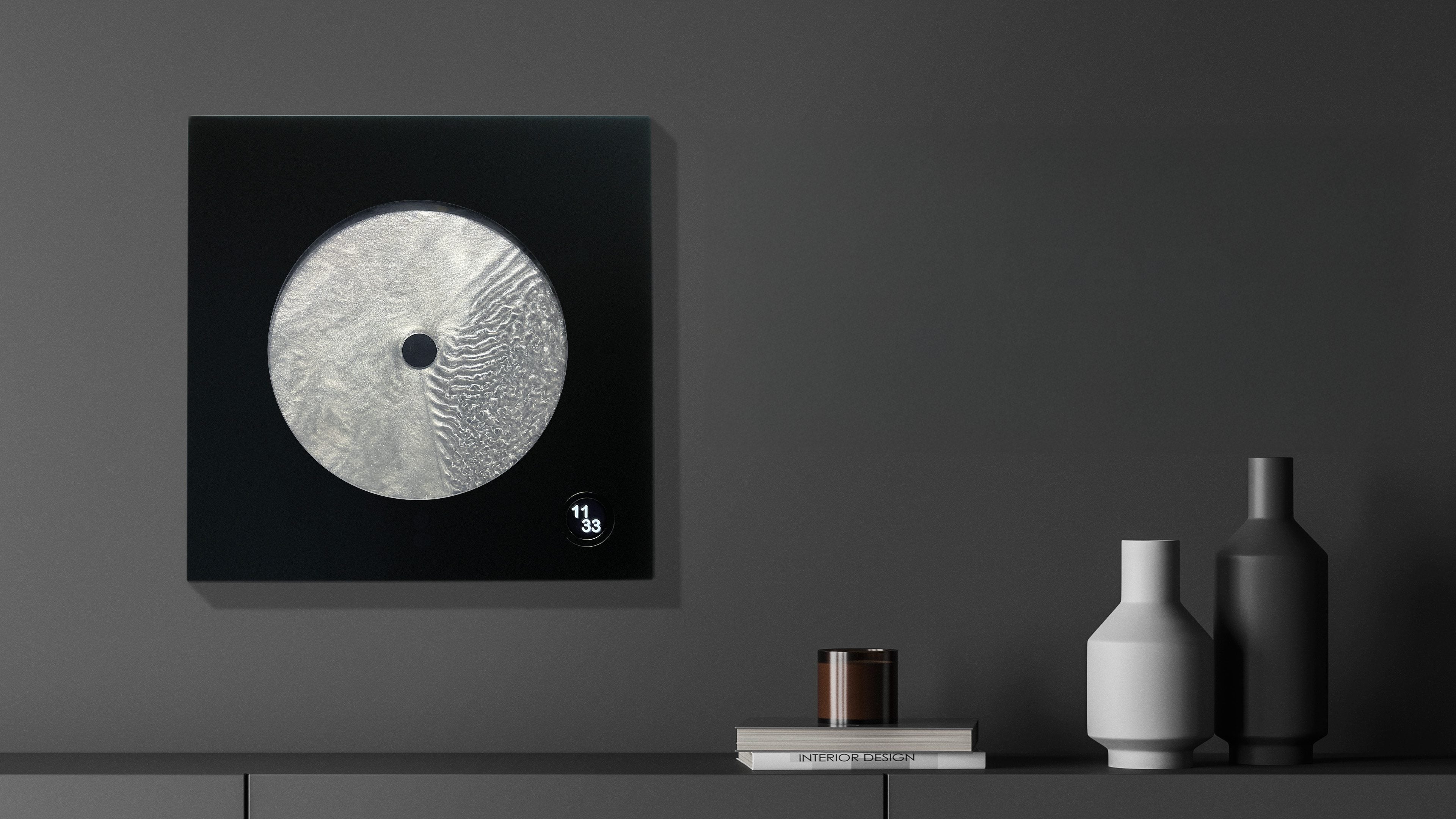
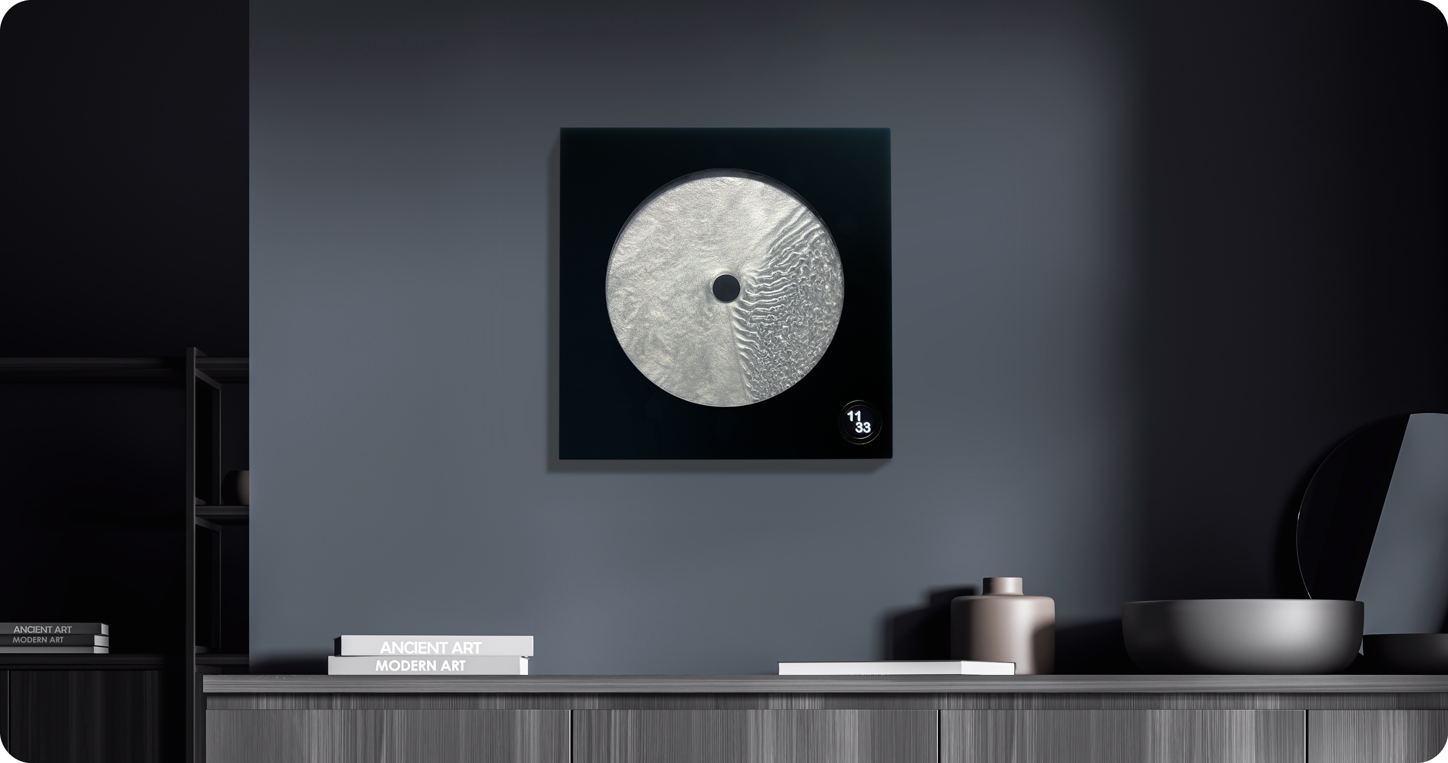
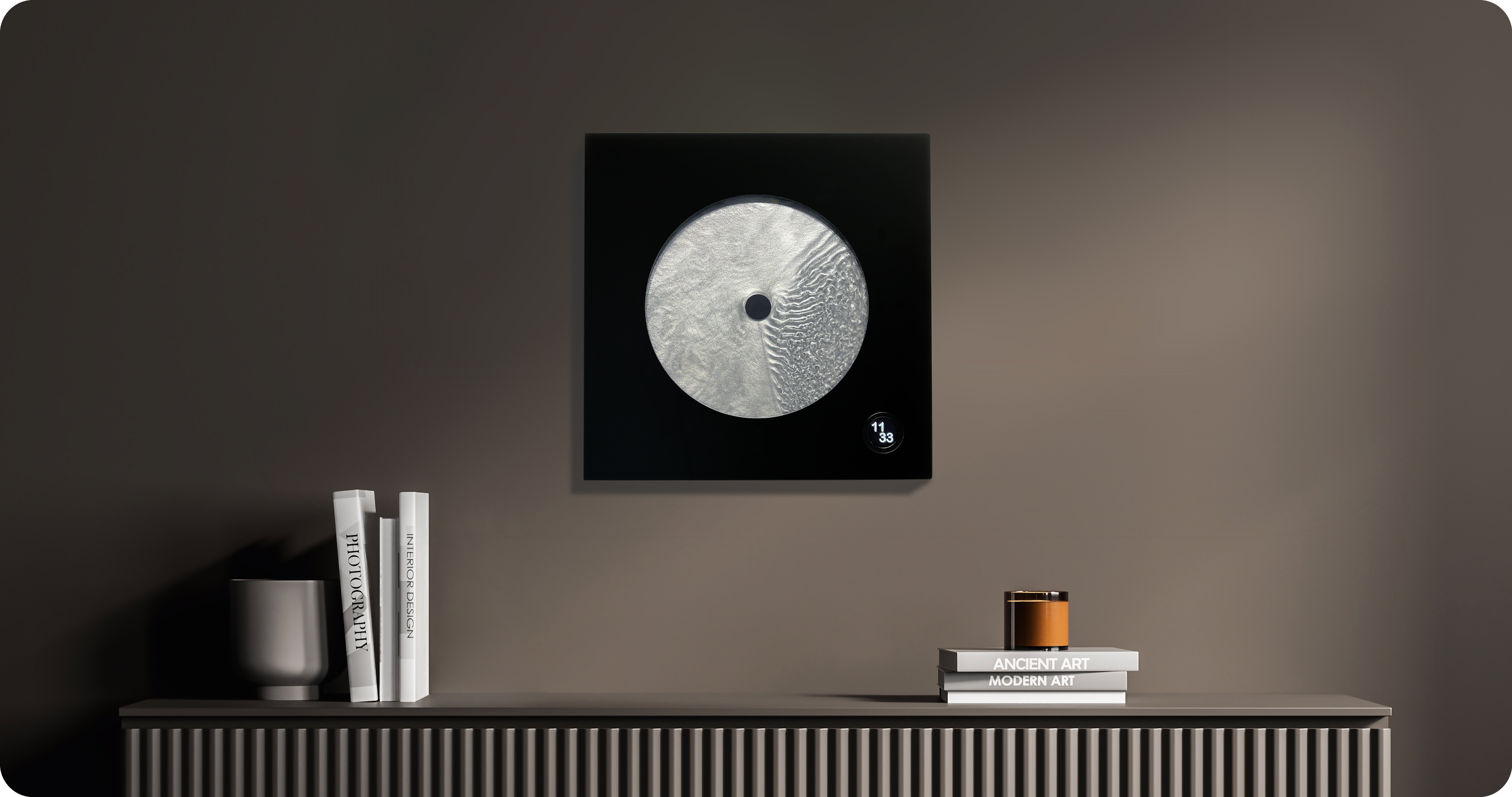
Most clocks are honest about what they are. They count. They tick. They remind you, with mild urgency, that you are late or almost late or about to be. Robert Spillner’s Luna is not a clock that measures time. It stages it. That’s a subtle but loaded distinction, and it’s exactly why this object is worth paying attention to.
Luna is a fluid wall object that translates the principle of the single-hand watch into a kinetic sculpture, making the moment between past and future perceptible. Behind the hand, a trace of turbulent patterns marks the touched past. Ahead of it stretches calm liquid: the untouched future. The present is the thin, moving line between them. It sounds poetic because it is, but it’s also technically precise, which is kind of the whole point.
Spillner trained as an engineer and initially developed components for Formula 1 cars, used by numerous teams, in a culture where speed, optimization, and victory are everything. With Luna, that paradigm is reversed. Instead of lap times, the focus is on mindful observation; instead of chasing the fastest, it is about pausing, about stillness. The pivot reads like a philosophical reversal, not just a career change, and that tension is embedded in the object itself.
At the heart of Luna is a specially developed fluid Spillner calls Zero Flow Technology. Its core consists of distilled water, additives, micro-particles, and a minimal quantity of genuine lunar dust. The exact composition remains deliberately undisclosed, part of the mystery that invites the observer to immerse themselves in the visual experience rather than merely explain it technically. I think that’s the right call. Part of what makes Luna compelling is that it resists easy explanation. You’re not supposed to look at it and think “clever fluid dynamics.” You’re supposed to feel like time has texture.
The lunar dust takes the cosmic concept to its logical conclusion. These are particles billions of years old that once fell from space to Earth, and they are now carriers of time. Each piece comes with a certificate of authenticity documenting the origin of this cosmic additive. That detail is not just a marketing flourish. It changes the nature of the object.
Aesthetically, Luna presents itself as a square wall or stand object, approximately 400 by 400 millimeters, with a black front and a cast acrylic glass pane at its centre that becomes the stage for the fluid time, framed by a solid, matte-black wooden frame. A small LCD touchscreen, 35 millimeters in diameter, merges the cosmic and digital realms. Time and display brightness can be adjusted easily. The screen is discreet enough that it doesn’t compete with the fluid for visual dominance. It supports the piece without stealing from it, and that balance isn’t easy to pull off.
Luna is handcrafted in Germany as a limited edition. The fluid mixture, developed over years in collaboration with a laboratory, requires weeks of fine-tuning for each unique piece. Every Luna carries an engraved serial number and year of manufacture, signed by the artist, and comes with a certificate for the meteorite dust. Only 99 pieces per year are planned, all made on demand. Luna defines itself clearly as an art object with a time function, not as an industrial small series. That self-awareness matters.
The question people tend to ask about objects like this is whether they’re worth it. I’d reframe the question. Luna isn’t competing with your iPhone or your smartwatch. It’s not trying to optimize anything in your day. It’s making an argument about how we relate to time, which is a thing most of us don’t think about until we’re running out of it. The fact that it’s beautiful while doing this isn’t a bonus. It’s the method. Design, when it’s working at its best, changes how you see the thing it’s describing. Luna does that with time. And for an object that started life inside Formula 1 engineering labs, that’s a remarkable distance to travel.
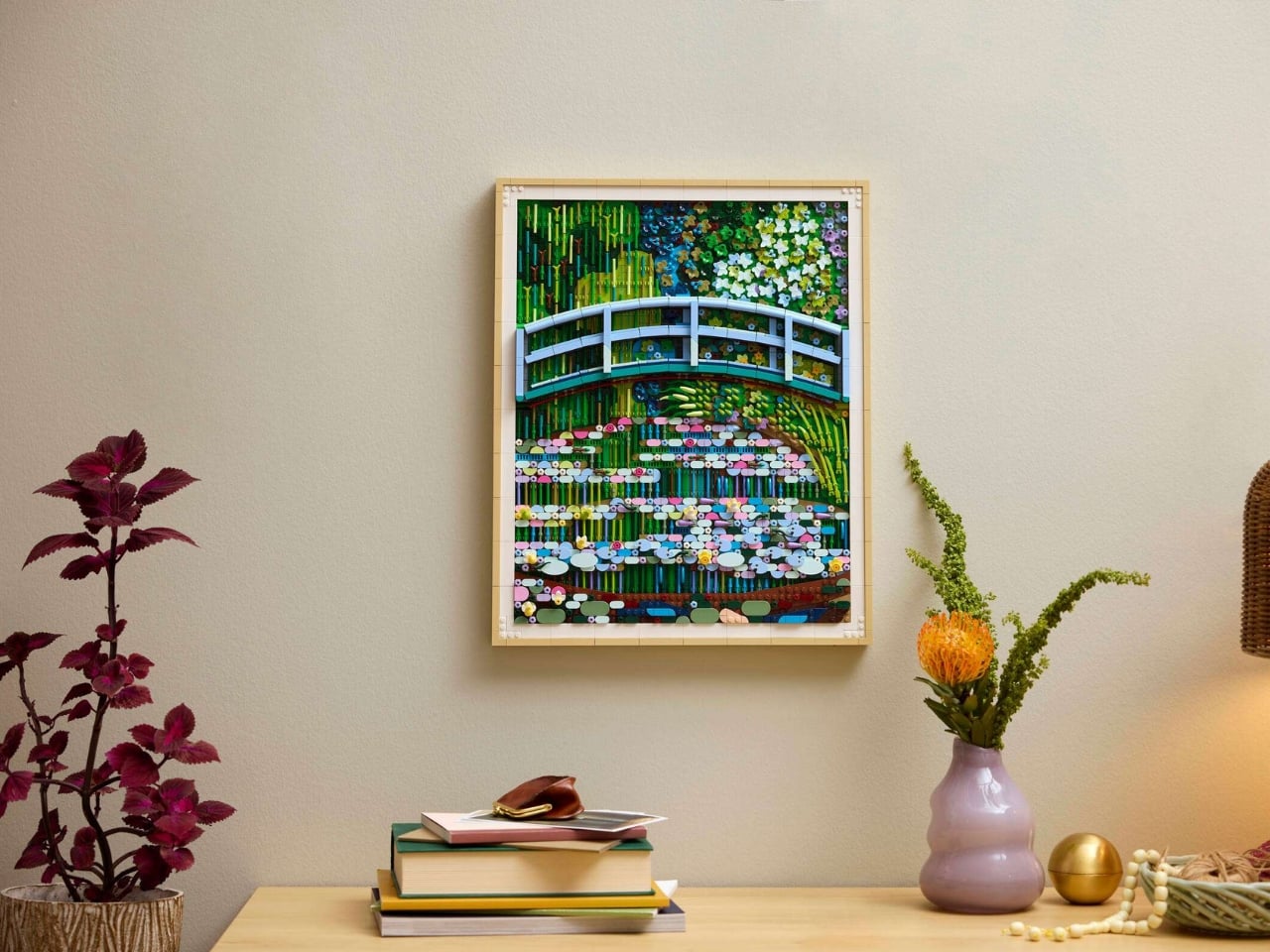
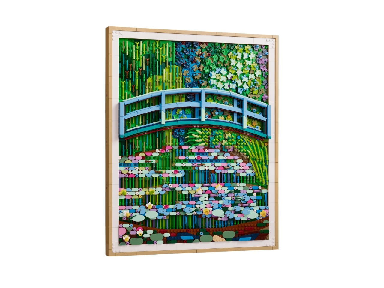
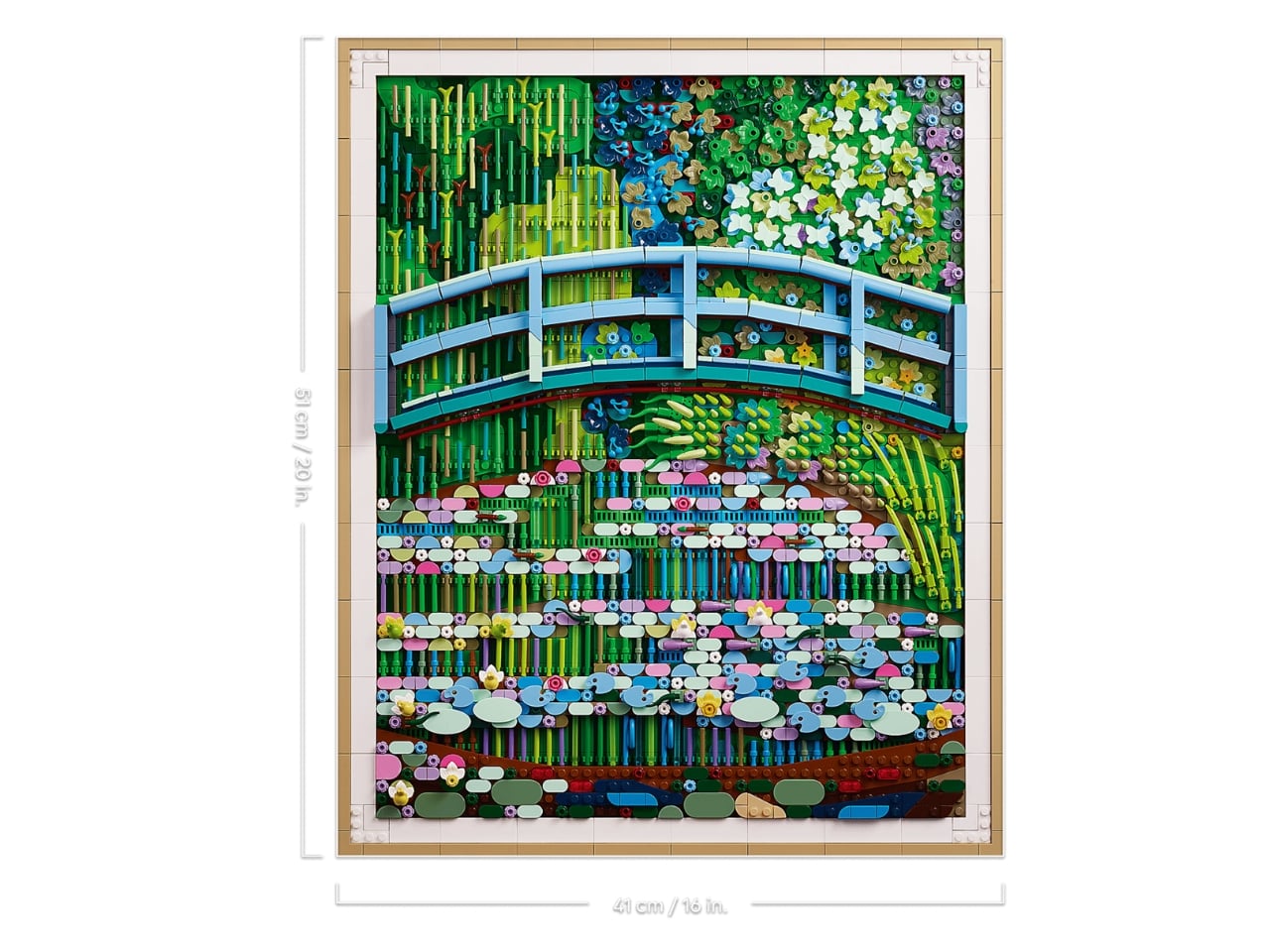
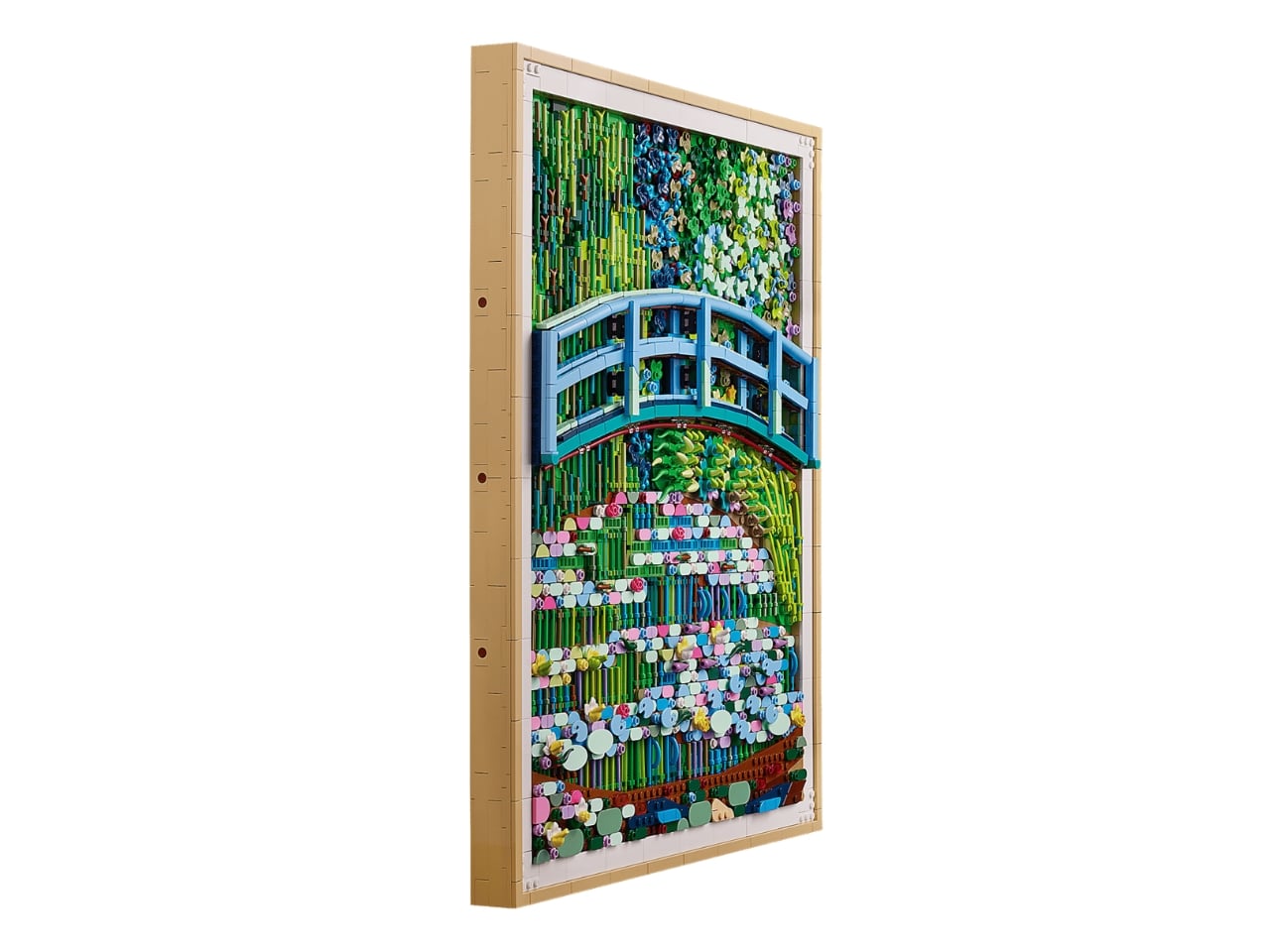
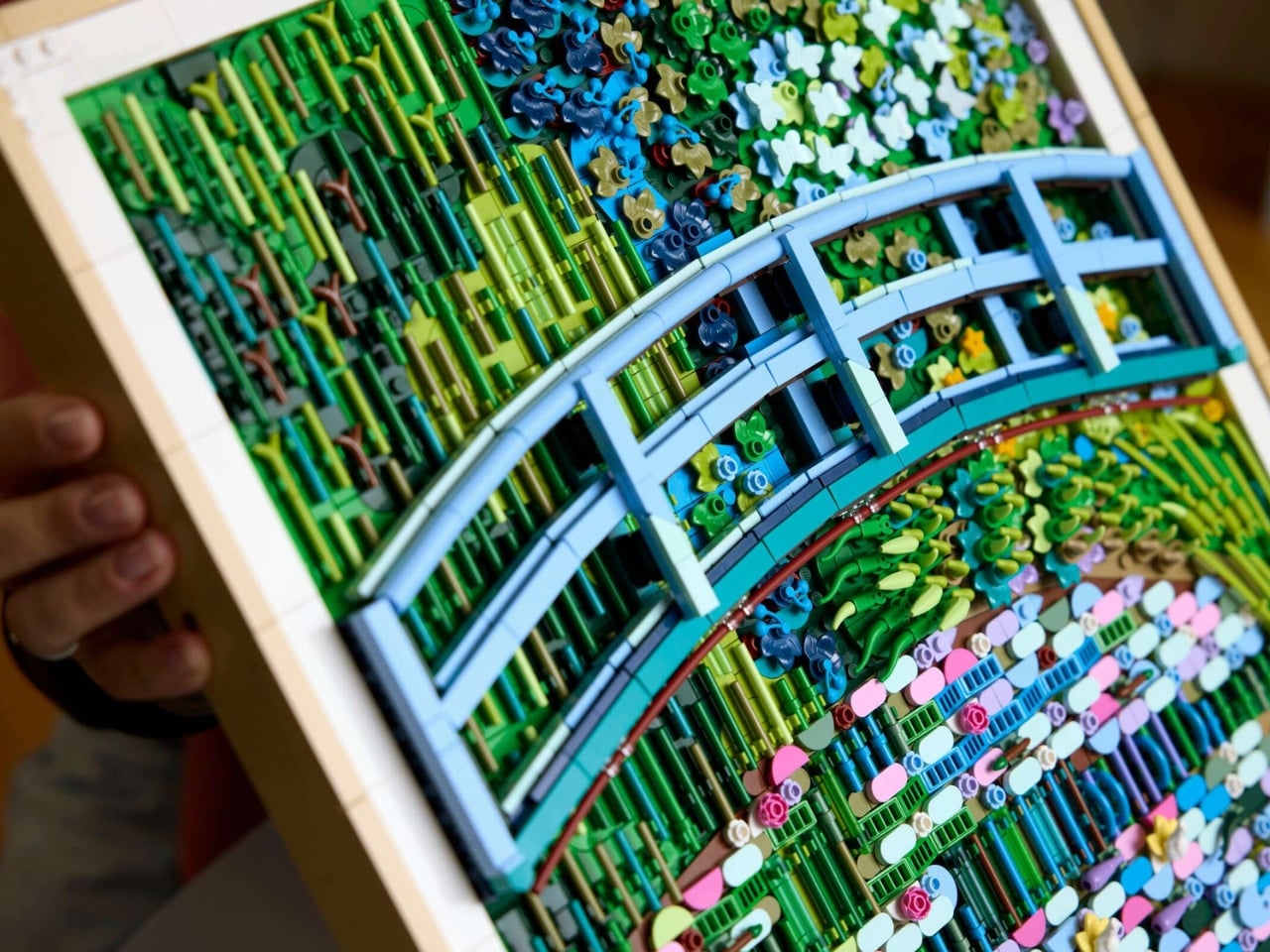
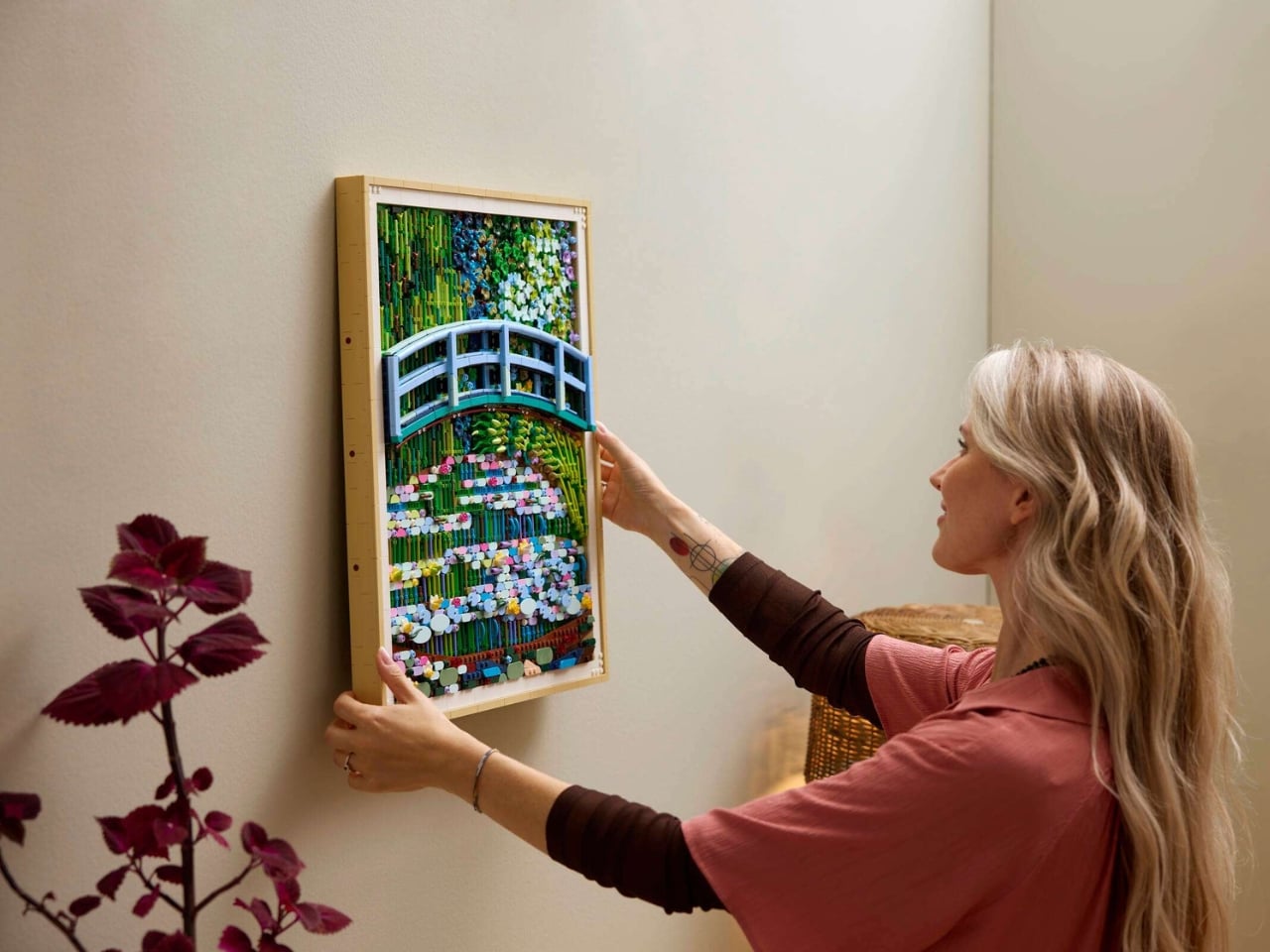
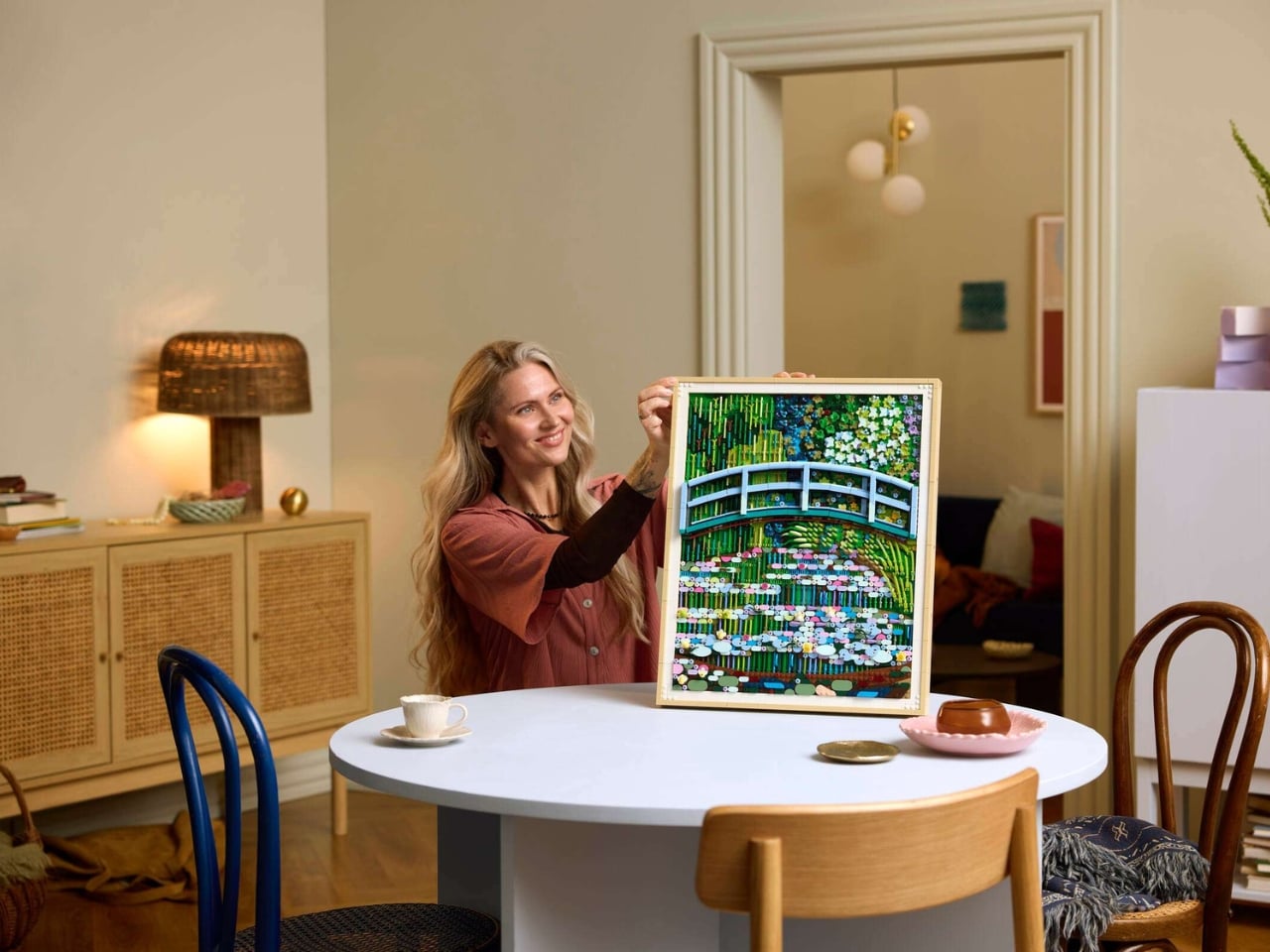
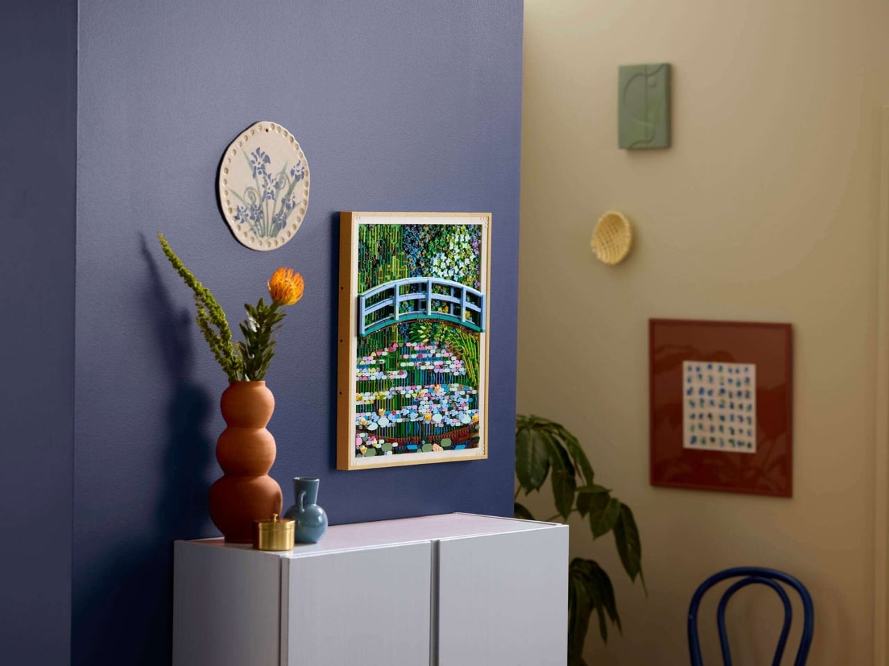
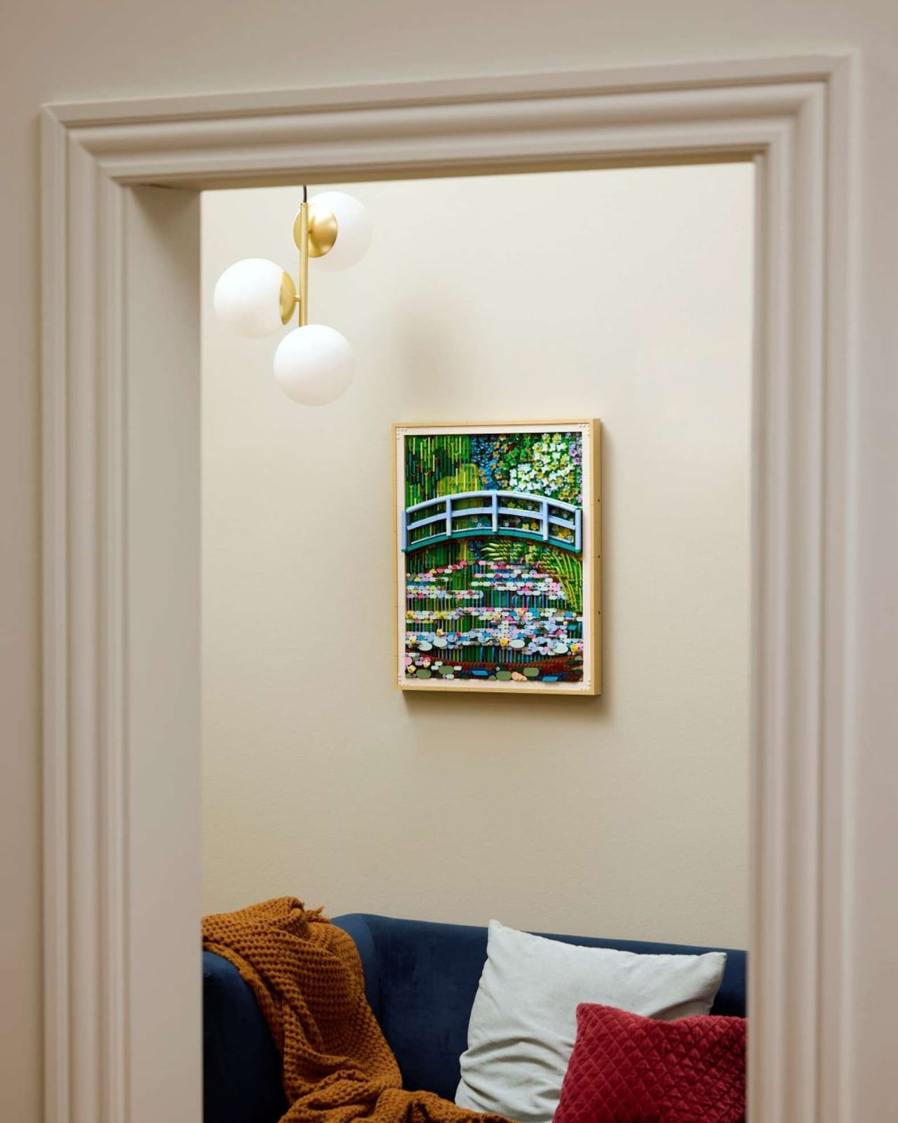
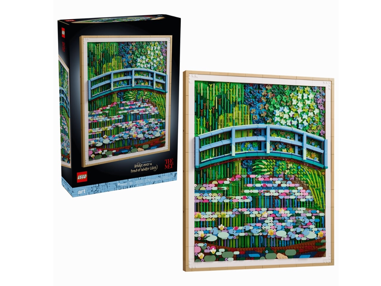
LEGO has done something wild with Claude Monet’s 1899 painting “Bridge Over a Pond of Water Lilies.” The Danish toy company, working alongside The Metropolitan Museum of Art, just released a 3,179-piece set that transforms one of art history’s most serene moments into a brick-built experience. It’s available for $249.99 starting March 1st for LEGO Insiders, with general release on March 4th.
What makes this set stand out isn’t just that someone decided to turn a beloved Impressionist painting into blocks. It’s how they did it. The design team actually visited The Met to study the original canvas, not some digital reproduction. They needed to see how Monet’s brushstrokes caught light, how the colors shifted depending on where you stood. Then Met staffers flew to Denmark to review different versions before settling on the final design. That back-and-forth took over a year.
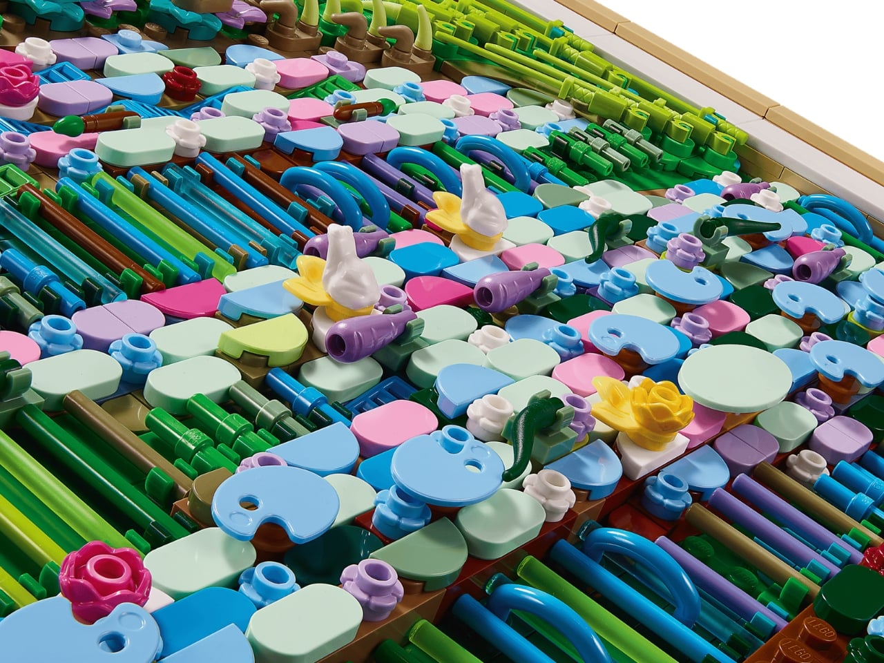
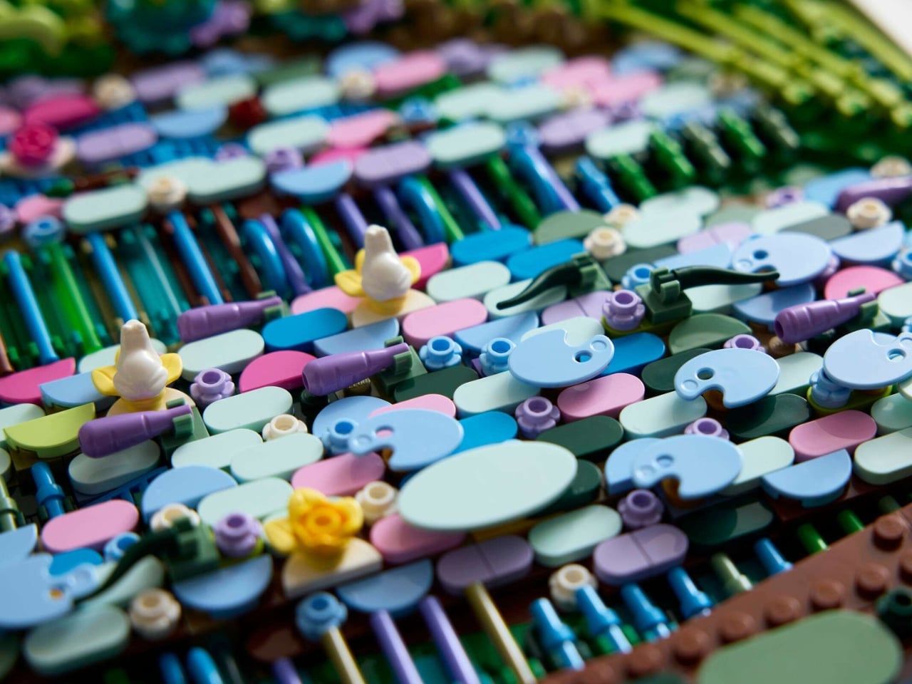
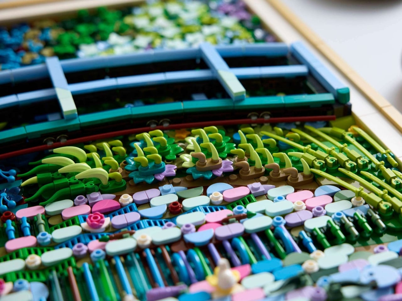
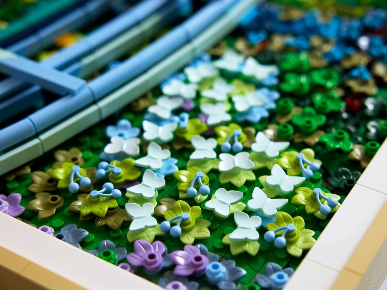
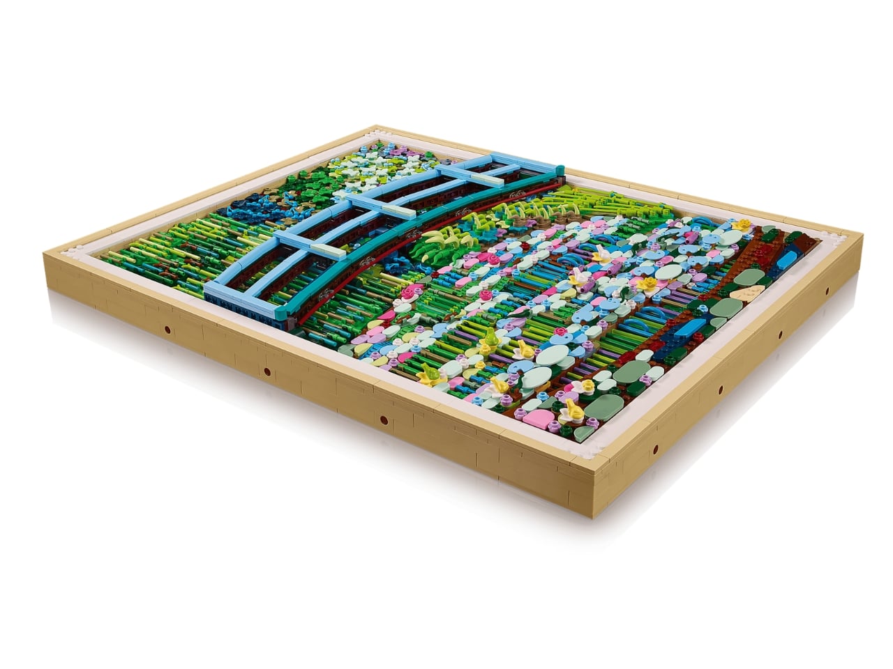
The result plays with perspective in ways that feel faithful to Monet’s intentions. LEGO designer Stijn Oom explained that the team layered tiles and plates both vertically and horizontally to mimic actual brushwork. When you look at the finished piece up close, you see individual bricks, specific colors, the mechanics of construction. Step back, and those details dissolve into water lilies floating on a pond, a Japanese bridge arching overhead, trees drooping with verdant weight.
It’s the same optical shift that happens with Impressionist paintings. Monet wanted viewers to experience his garden in Giverny as atmosphere and light, not as precise botanical documentation. The LEGO version captures that same tension between detail and impression, between what’s actually there and what your brain constructs from the pieces.
The set uses an unexpected range of elements to pull off the effect. There are butterflies scattered throughout, along with flowers and fruit pieces that add dimension. The bridge itself appears in light blue rectangular bricks, while the water incorporates different shades that shift the overall tone. A diagonal band of lighter elements cuts from top right to bottom left, recreating that streak of light that structures Monet’s original composition.
Monet painted this particular scene in 1899, during a period when he was obsessed with his water garden. He’d designed the whole thing himself, importing water lilies and building that iconic bridge inspired by Japanese prints. He’d paint the same view over and over, at different times of day, in different seasons, trying to capture how light changed everything. This painting lives at The Met now, and if you visit starting March 1st, you’ll be able to see the original canvas next to LEGO’s interpretation.
The museum is taking the collaboration further. They’re installing a larger-than-life LEGO reproduction of the painting in The Met Store, complete with a photo opportunity where you can pose behind the bridge. There’s also a podcast launching with Met curator Alison Hokanson, presumably diving into Monet’s techniques and the Impressionist movement.
This isn’t LEGO’s first time turning famous art into buildable sets. The LEGO Art line has tackled everything from Andy Warhol’s pop art to Japanese landscape aesthetics. But translating Impressionism presents specific challenges. The whole point of that artistic movement was to capture fleeting sensory experiences, the shimmer of light on water, the blur of a garden in motion. How do you replicate that with rigid plastic pieces?
Oom and his team decided to embrace the contradiction. The Monet set doesn’t try to smooth over its brick-ness. Instead, it uses the geometry of LEGO to create texture that reads as organic from a distance. Those precise edges and defined shapes accumulate into something soft and atmospheric. It’s a translation rather than a reproduction, which feels more honest to Monet’s experimental spirit than a slavish recreation would be.
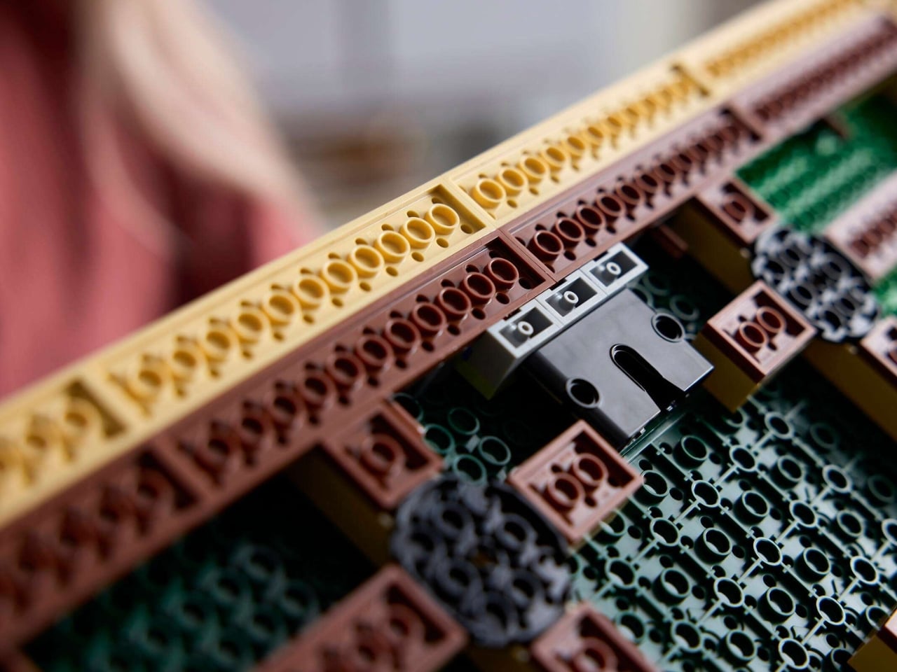
The set comes with a wall hanger so you can display it like actual art. At just over 3,000 pieces and a price point around $250, it’s aimed squarely at adult builders who want something meditative and museum-worthy for their walls. The build process itself becomes a way to slow down and pay attention to color relationships, spatial composition, the way small decisions accumulate into a complete vision.
Long layovers usually mean seas of identical metal chairs, bright signage, and constant motion that makes rest feel impossible. Even premium lounges often feel like slightly nicer waiting rooms, not places with a point of view beyond arranging seating in rows. Schiphol’s Lounge 2 sits in the flat Haarlemmermeer polder outside Amsterdam, which gave Beyond Space a specific landscape and design history to work with when redesigning the 1,000 square meter space.
The studio looked at that polder and the Dutch De Stijl movement it inspired, particularly Mondrian’s orthogonal paintings. His late Boogie-Woogie works are essentially abstractions of that landscape, grids of lines and colored planes forming rhythmic compositions. Beyond Space took those paintings as an organizing principle, using sequences of orthogonal lines and planes to define where and how people sit instead of just dropping furniture onto a floor.
Entering the lounge, you realize you are not looking at rows of chairs but a low wooden city. Connected seats form islands of different sizes that plug into the existing architecture, creating pockets for solo travelers, pairs, and larger groups. You can choose a corner that feels tucked away, a spot with a direct runway view, or a cluster where a family can spread out without blocking circulation.
Instead of Mondrian’s red, yellow, and blue, the designers used solid wood from European tree species Mondrian once painted in his early landscape work. That swap keeps the De Stijl grid and rhythm but trades visual shouting for warmth and calm. In a terminal full of screens and branding, the consistent wood tones and leather upholstery act like a noise-cancelling layer without resorting to beige blandness.
The orthogonal layout hides surprising variety, armchairs with side tables, benches, back-to-back arrangements, and larger platforms for groups. Power outlets are integrated into the wooden blocks, so charging a laptop does not mean hunting for a wall socket or sitting on the floor. The grid gives order, but within it you can find a spot that matches how you actually want to wait.
Because seating follows a clear grid aligned with the architecture, it is easier to orient yourself and remember where you were sitting when you come back with coffee. The repetition of similar forms, combined with daylight from large windows and a neutral floor, creates visual tranquility rare in airports. It feels designed to let your brain idle instead of constantly scanning for threats.
The lounge treats waiting not as dead time to fill with more screens, but as a chance to sit in a space with a clear idea behind it. By abstracting the landscape outside and channeling Mondrian without copying his colors, Beyond Space turns a generic airport zone into a small wooden blueprint of Dutch design history that just happens to be comfortable between flights.
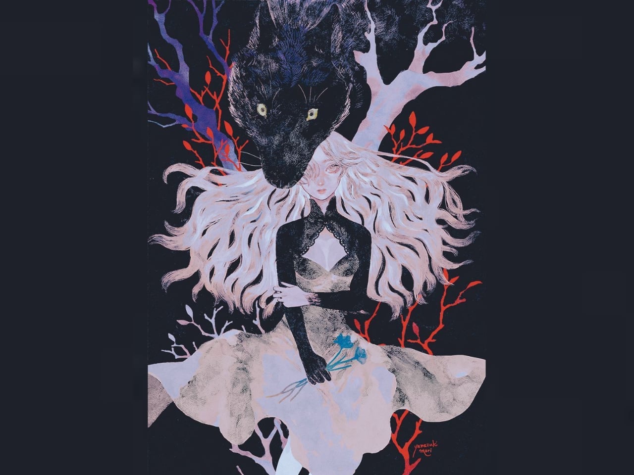
Most illustration that deals with human-animal hybridity treats it as a problem to be solved, a boundary to be crossed or defended, a transformation caught mid-process. Yamazuki Mari refuses this framing entirely. Her figures don’t struggle with their condition. They wear it.
A woman stands before a massive black wolf, their bodies aligned so precisely that the creature reads less as a separate entity and more as an extension of her silhouette. No tension exists between them. No drama of possession or escape. Mari positions the wolf head directly above the woman’s own, along the same vertical axis, creating a visual grammar of doubling rather than confrontation. The relationship feels ceremonial, almost devotional, with the wolf serving as guardian rather than threat.
What makes this work distinctive isn’t the subject matter but the formal clarity she brings to it. Against deep black backgrounds, her figures emerge in pale creams and icy blues, coloring deliberately muted to let compositional geometry carry emotional weight.
Surface as Signal
Mari builds atmosphere through material choices that reward close attention. Fine crosshatched textures give her digital work a tactile quality suggesting engraving or woodcut, linking contemporary illustration to centuries of folk art tradition. When color does assert itself, it arrives as intrusion: coral red branches cutting through darkness like warning signals, their sharpness creating tension against the soft gradients of hair and fur.
Her background in graphic design shows in the disciplined relationship between figure and ground. Black backgrounds create ceremonial weight. White backgrounds create clinical clarity. Neither choice is neutral, and the shift between them across her body of work creates a tonal range that color specification alone can’t achieve.
By introducing fine grain and crosshatching into digital illustration, Mari creates a surface quality that resists the smoothness associated with computer-generated imagery. The textures read as handmade even when they’re not, and this material fiction supports the folkloric atmosphere her subjects require. The wolf’s fur carries the same visual density as the woman’s hair, unifying disparate biological forms through shared treatment.
Color operates with similar intentionality. Limited palettes prevent the images from reading as naturalistic while specific hues, coral red against midnight blue, winter gray against bone white, carry cultural associations that enrich the viewing experience without requiring explicit narrative. Red as warning, white as purity or death, black as depth or the unconscious: Mari leverages these associations without being constrained by them.
Stillness as Strategy
Stillness in Mari’s work isn’t absence of movement but rather the deliberate suspension of it.
Her compositions feel frozen at the instant before something happens, and this temporal ambiguity becomes a structural principle. The woman and wolf don’t move because they exist outside of narrative time. They occupy a space where transformation has already occurred and no further change is necessary. Traditional fantasy illustration often relies on dynamism to generate interest, filling the frame with action that guides the eye along predictable paths. Mari inverts this expectation. Her figures hold their positions, and the viewer must do the work of discovering the relationships between elements.
The result is an experience closer to portrait study than narrative illustration, where the reward comes from sustained attention rather than immediate comprehension.
Motion as Rupture
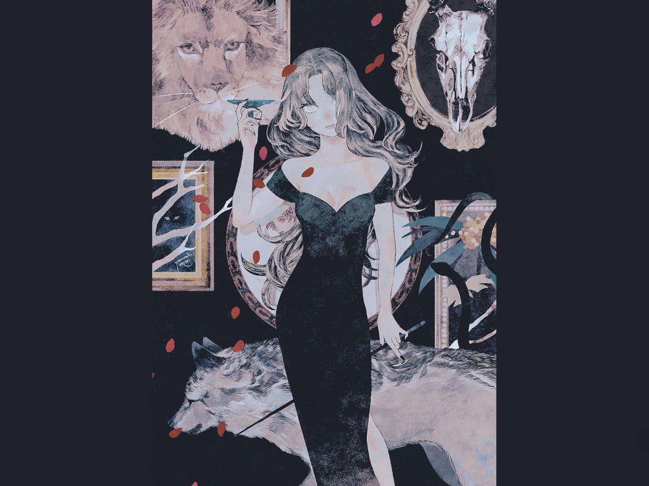
Her second piece abandons stillness entirely, and the contrast illuminates what the first image withholds. A human figure fuses with a lunging wolf in mid-leap, their bodies stretched forward in parallel lines of urgent motion. The wolf’s jaws are open, its eye wide with instinct, and the scene pulses with predatory energy that the first composition suppressed.
Cool grays and winter whites dominate the palette, replacing ceremonial blacks with something closer to raw weather. Sharp white branches frame the movement like cracked ice. The grainy textures that felt archival in the static piece now read as velocity blur. Same technical vocabulary, entirely different emotional results.
What the motion reveals is the cost of transformation. Static imagery presented hybridity as achieved and peaceful. Dynamic imagery shows it as ongoing and violent. These aren’t contradictory statements but rather complementary views of the same condition: the wolf is both guardian and hunter, protector and predator, and the human figure rides that duality rather than resolving it.
Mari doesn’t choose between interpretations because choosing would reduce the complexity her work investigates.
Tenderness Without Sentiment
Her final piece pivots toward something that resembles cuteness but refuses to commit to it. Two small catlike figures stand side by side against a clean white background, their rounded forms and oversized fur collars giving them a plush, doll-like presence. One wears red, the other blue. The color dialogue emphasizes individuality within obvious companionship.
Simplicity here is deceptive. These figures share the hybrid logic of the wolf pieces, with feline ears, tails, and paw-like hands rendering them not quite animal and not quite human. Their expressions are subdued rather than cheerful, and this restraint prevents the image from tipping into pure whimsy.
Mari names them May and Mii, the Nekochi, describing them as inseparable companions ready for playful mischief. The characterization suggests personality and relationship, but the visual treatment maintains distance. She doesn’t animate their mischief or show them in action. Like the woman and the wolf, they simply exist in their hybrid state, present to the viewer without performing.
Grammar of Integration
Across all three works, Mari establishes a consistent visual grammar for depicting hybridity. Human and animal elements don’t compete for dominance within the frame. They occupy the same compositional space with equal formal weight, aligned along shared axes, rendered with equivalent levels of detail.
Neither element reads as metaphor for the other.
The wolf isn’t the woman’s inner nature made visible. The woman isn’t the wolf’s civilized aspect. They exist together as a unified presence that simply happens to contain both forms. This approach distinguishes her work from transformation imagery in the Western fantasy tradition, where hybridity typically signifies conflict, corruption, or metamorphosis in progress. Mari’s hybrids carry no implication of instability. They aren’t becoming something else. They’ve already become, and the images document that completed state with the formal precision of taxonomy rather than the drama of mythology.
Cultural lineage matters here. Japanese visual traditions have long accommodated hybrid beings without requiring them to resolve into single identities. Kitsune, tanuki, and other shapeshifters populate folklore not as monsters to be defeated but as neighbors to be negotiated with. Mari draws on this heritage while filtering it through contemporary illustration sensibilities, producing images that feel simultaneously ancient and digitally native.
Most depictions of human-animal fusion carry anxiety about boundary dissolution, about losing the characteristics that define human identity.
Mari’s figures express no such concern. They wear their hybridity as comfortably as the Nekochi wear their fur collars, as a feature of existence rather than a problem to be solved. This comfort may be the most radical aspect of her visual language. In a design context where character illustration often relies on conflict, transformation, or aspiration to generate viewer engagement, Mari offers figures who’ve arrived at a place of integration and simply occupy it.
The wolf doesn’t need to devour the woman. The woman doesn’t need to tame the wolf. The Nekochi don’t need to choose between their feline and humanoid aspects.
For illustrators working in character design, the approach suggests an alternative to narrative-driven imagery. Not every character needs to be caught mid-journey. Some can simply exist, fully realized, inviting the viewer to spend time in their presence rather than anticipate their next transformation. Mari’s hybrids model this possibility with quiet confidence, their stillness a form of visual authority that movement would only diminish.
Public art is often seen as a standalone feature, a striking sculpture or colorful mural that decorates a park or plaza. Yet its true impact goes far beyond visual appeal. When guided by thoughtful design, public art doesn’t just fill a space; it redefines it, shaping how people move, interact, and emotionally connect with their surroundings.
This seamless blend of art and environment is where design becomes transformative. By carefully considering scale, sightlines, materials, and community involvement, designers ensure that art integrates naturally into its setting. The result is a space that feels alive, engaging, memorable, and deeply connected to its community’s identity.
1. Designing Art with Context
For public art to truly connect, it must feel like it belongs. A site-specific approach begins with the environment itself, its history, architecture, pedestrian flow, and climate. By understanding these layers, designers ensure the artwork feels naturally rooted rather than placed, reflecting the spirit of its surroundings.
This thoughtful process helps art and place work in harmony. A sculpture in a historic district might echo local materials, while an installation in a park could invite interaction and rest. The goal is unity, where art enhances its setting and deepens the public’s connection to the space.
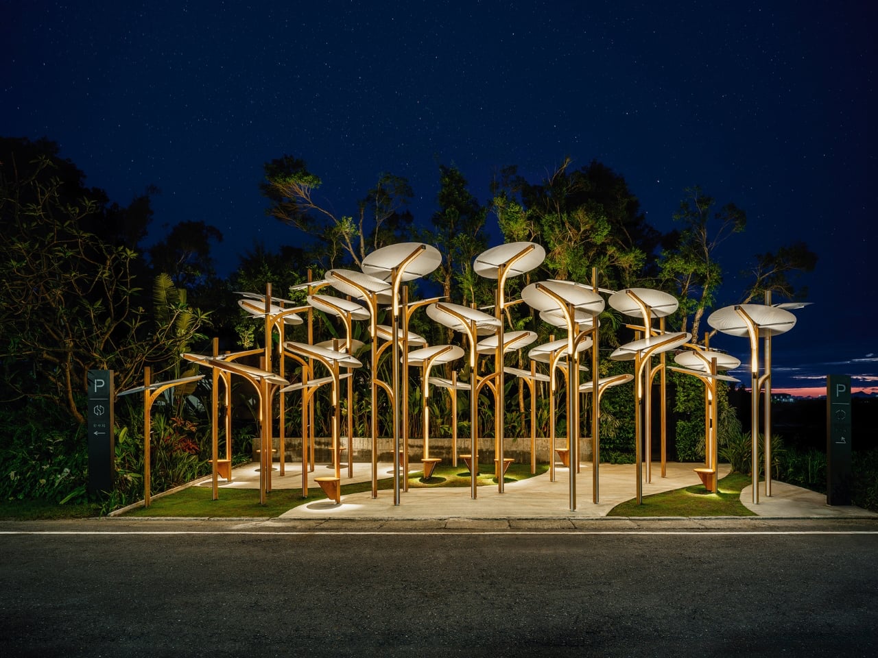
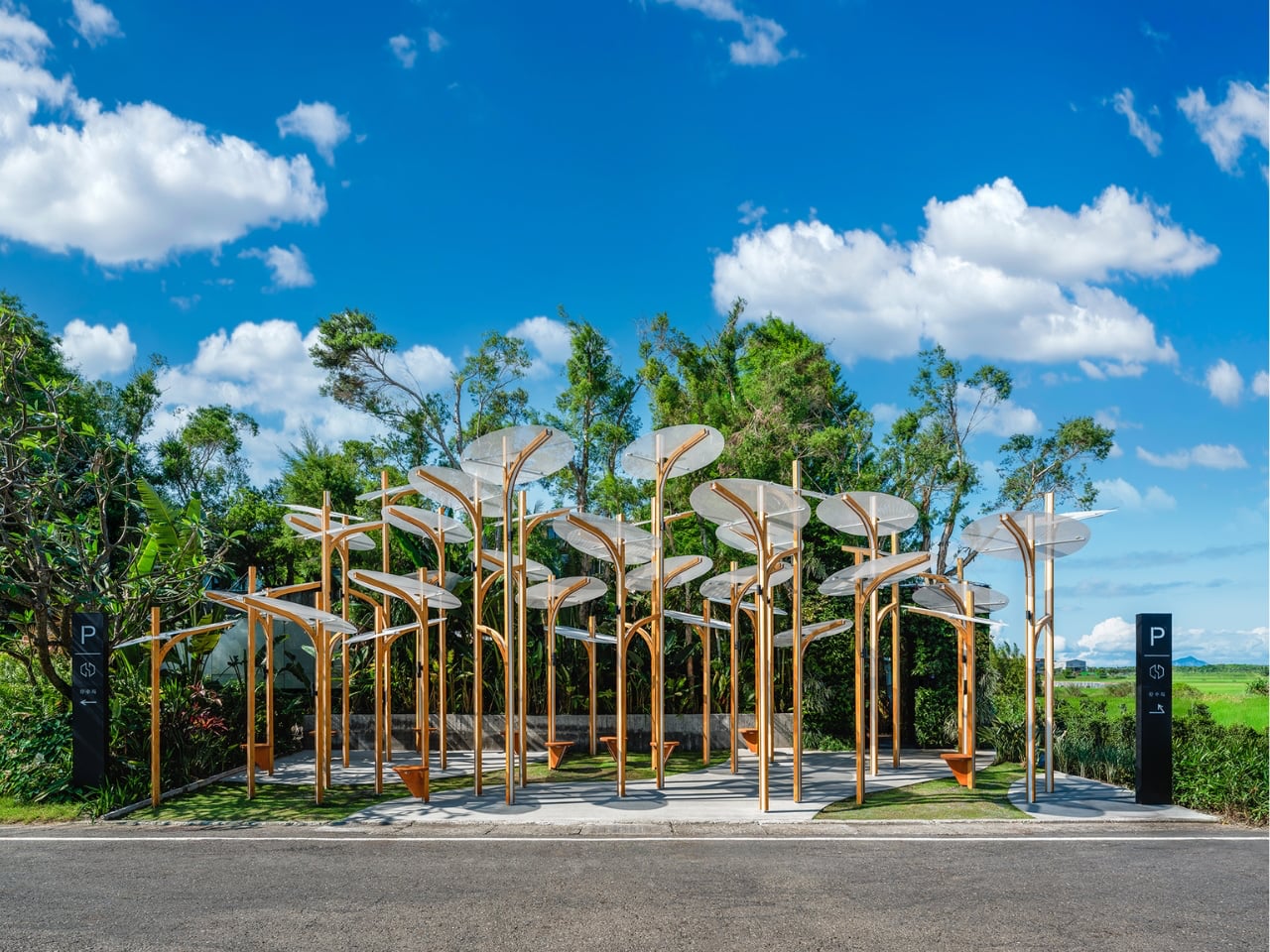
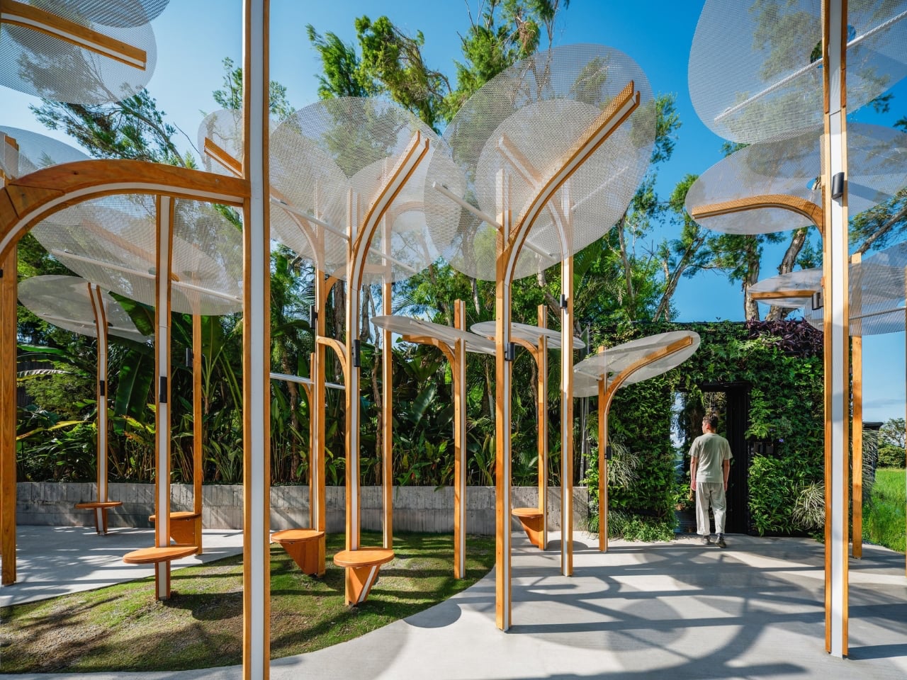
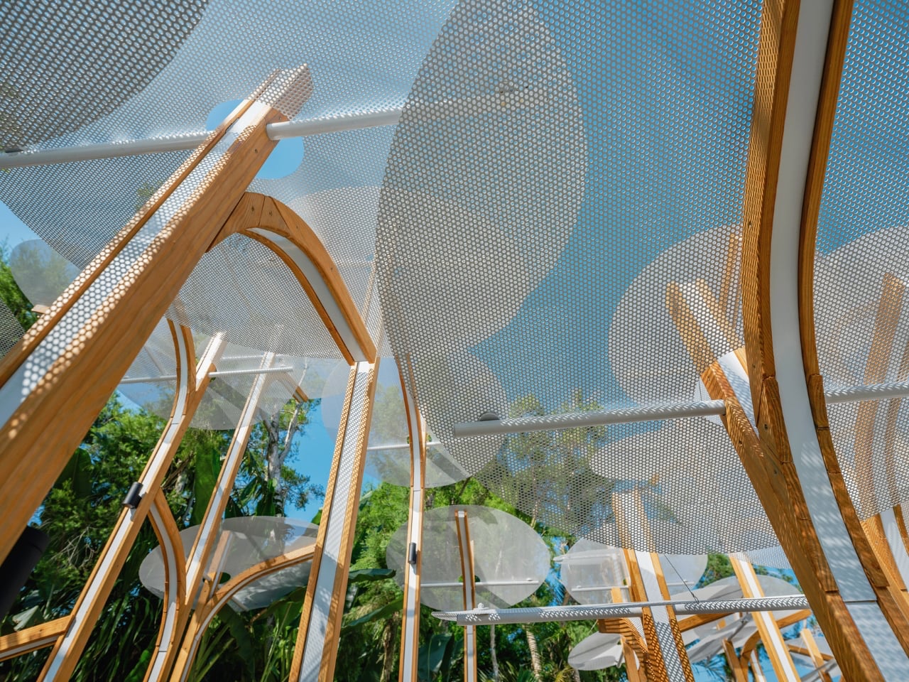
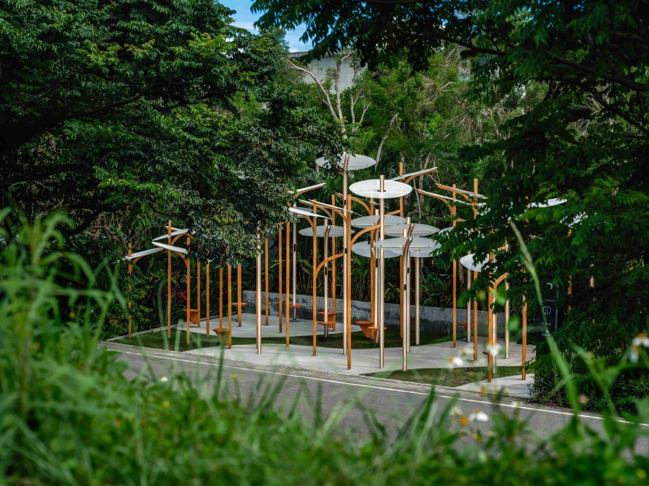
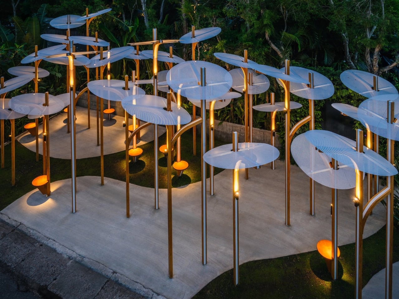
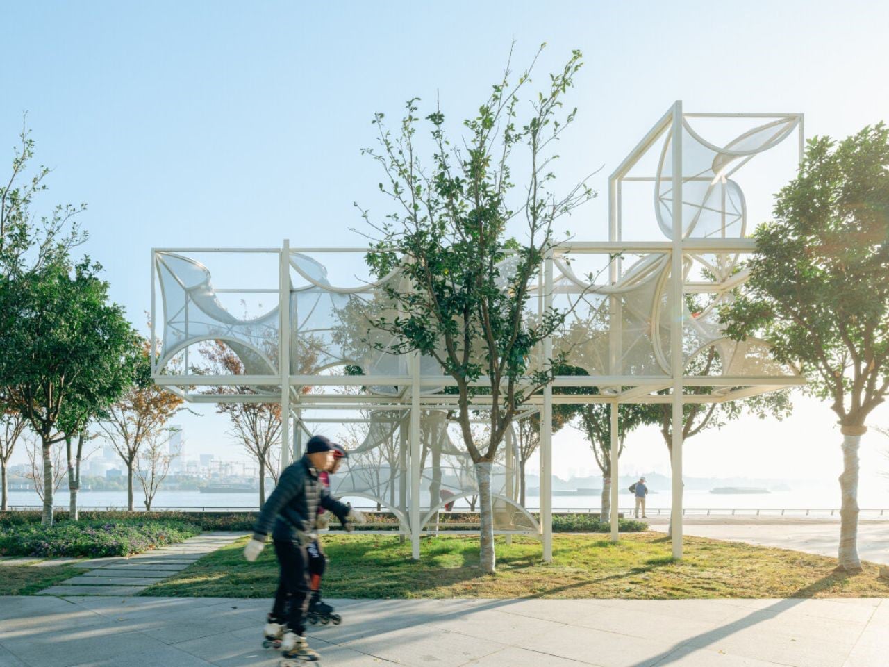
Cheng Tsung FENG’s Structural Botany: 25AP-263-43 is a compelling exploration of the intersection between art, nature, and modular construction. Installed at Swiio Villa Yilan in Zhuangwei, the work draws inspiration from the upright, clustered growth patterns of native plants, translating botanical forms into a sculptural rhythm. Standing between 2.5 and 5 meters tall, the installation consists of repeated modular “stems” that rise independently while maintaining deliberate spacing, echoing the equidistant patterns found in plant communities. FENG’s abstraction focuses on structural qualities rather than literal representation, highlighting resilience, interdependence, and the hidden patterns that govern natural growth.
The modular design allows the work to adapt to different spaces, expanding or contracting like living plants responding to their environment. Its clean lines and muted palette integrate gracefully with the surrounding landscape, inviting visitors to move among the vertical forms. 25AP-263-43 transforms the space into an immersive experience, revealing how art can reflect the processes of growth, rhythm, and community inherent in nature.
2. Design That Shapes Interaction
The true power of design in public art lies in its ability to shape human behavior and foster connections. A well-placed installation isn’t static; it invites curiosity, conversation, and movement. The position of a sculpture, for instance, can turn it into a meeting point or encourage people to explore it from different angles, subtly guiding social flow through space.
Inclusive design ensures that everyone can experience this interaction. By considering pathways, seating, and lighting, designers make art accessible and inviting. The result is not just an artwork but a functional, social space that fosters comfort, inclusion, and community.
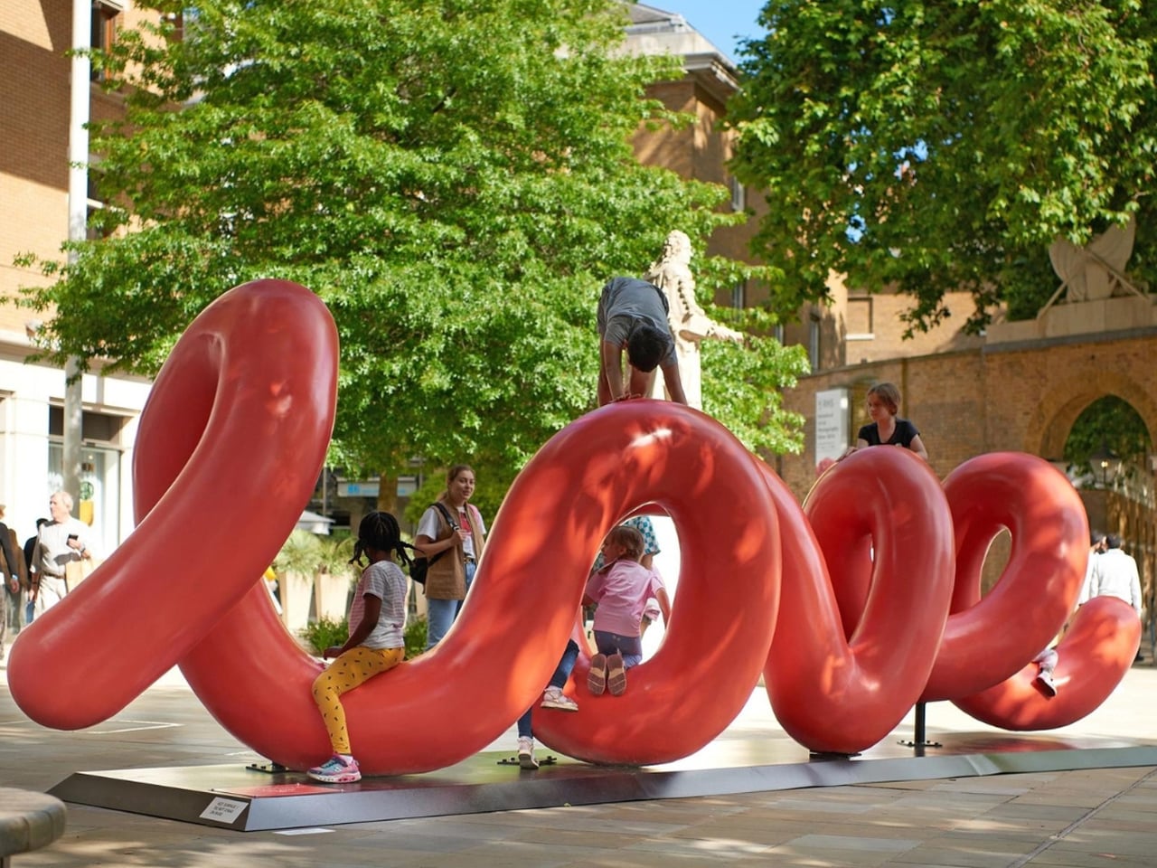
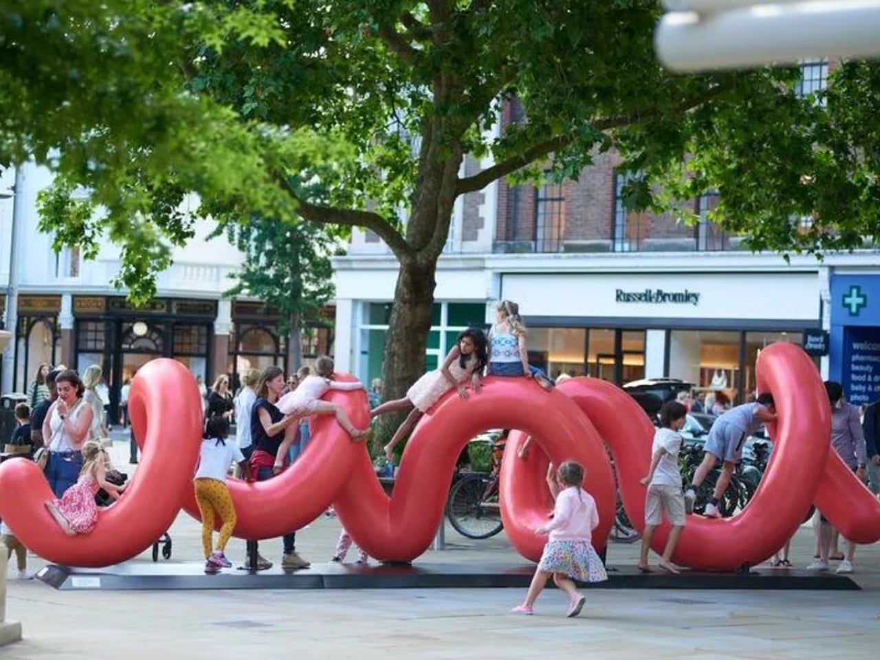
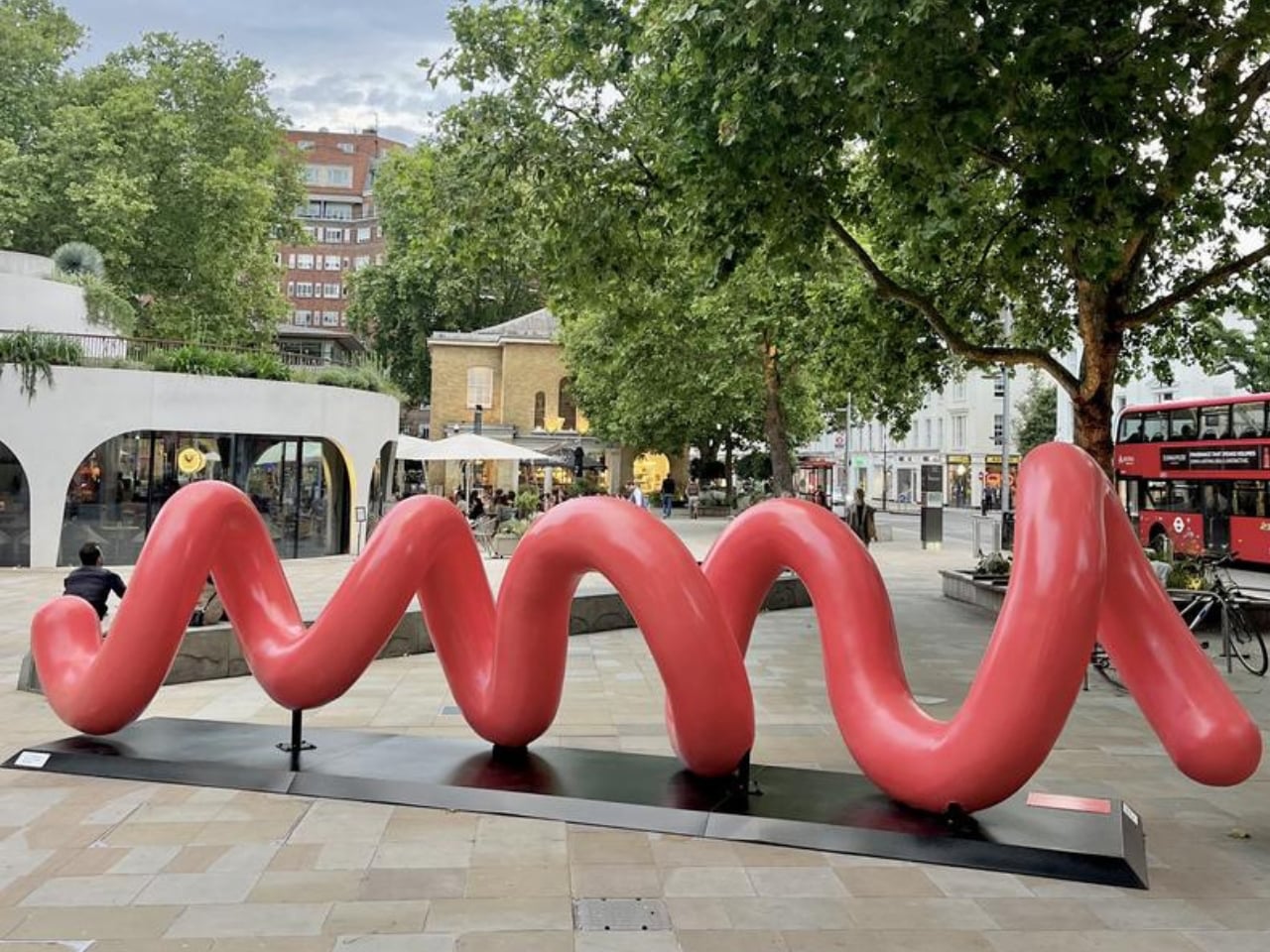
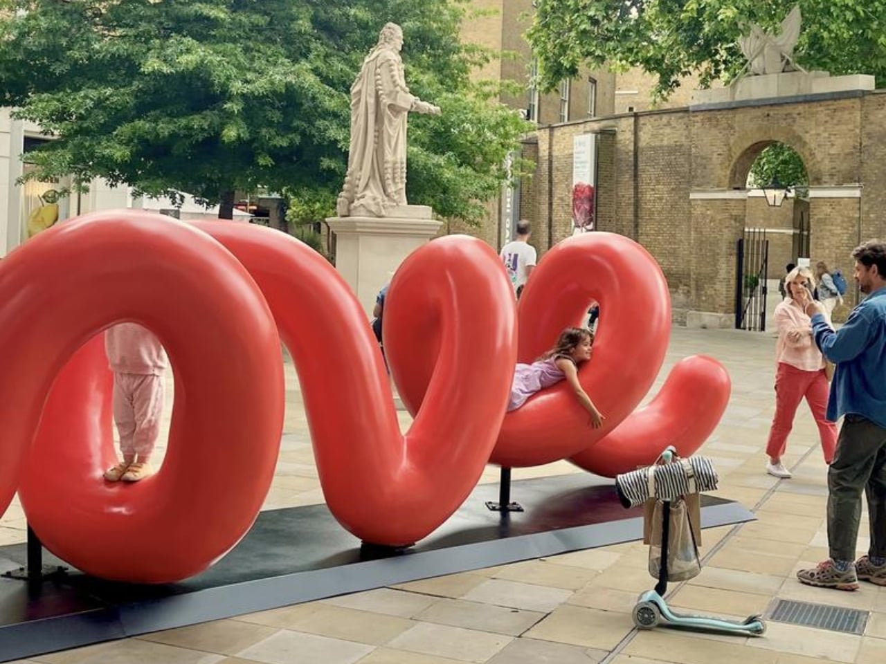
Interactive public art has a unique charm, and Love Continuum in London’s Chelsea area exemplifies this beautifully. Installed at Duke of York Square as part of Kensington + Chelsea Art Week, the piece immediately invites viewers—kids and adults alike—to touch, climb, or simply explore its form. At first glance, it appears to be a giant red spring or whimsical squiggly “worm,” a playful addition to the urban landscape.
The sculpture’s clever twist reveals itself from a certain angle: the word “love” emerges in elegant cursive, turning observation into a joyful discovery. Measuring 7.5 meters in length, Love Continuum continues artist Alter’s exploration of colorful, interactive forms that encourage engagement and play. Its hidden message adds a layer of delight, creating a shared experience for those who notice it. This combination of tactile fun, visual surprise, and thoughtful design makes it a memorable stop on London’s art trail.
3. The Power of Material and Durability
Material choice is one of the most crucial design decisions in public art, shaping its longevity and impact. Unlike gallery pieces, outdoor installations face constant exposure to weather, pollution, and human touch. Designers must therefore balance artistic vision with strength and endurance, using materials that preserve both beauty and integrity over time.
Selecting durable, often local options such as weathered steel, treated stone, or advanced composites ensures resilience and low maintenance. This thoughtful approach keeps the artwork safe, sustainable, and visually compelling for years, safeguarding the artist’s intent while respecting the realities of public spaces.
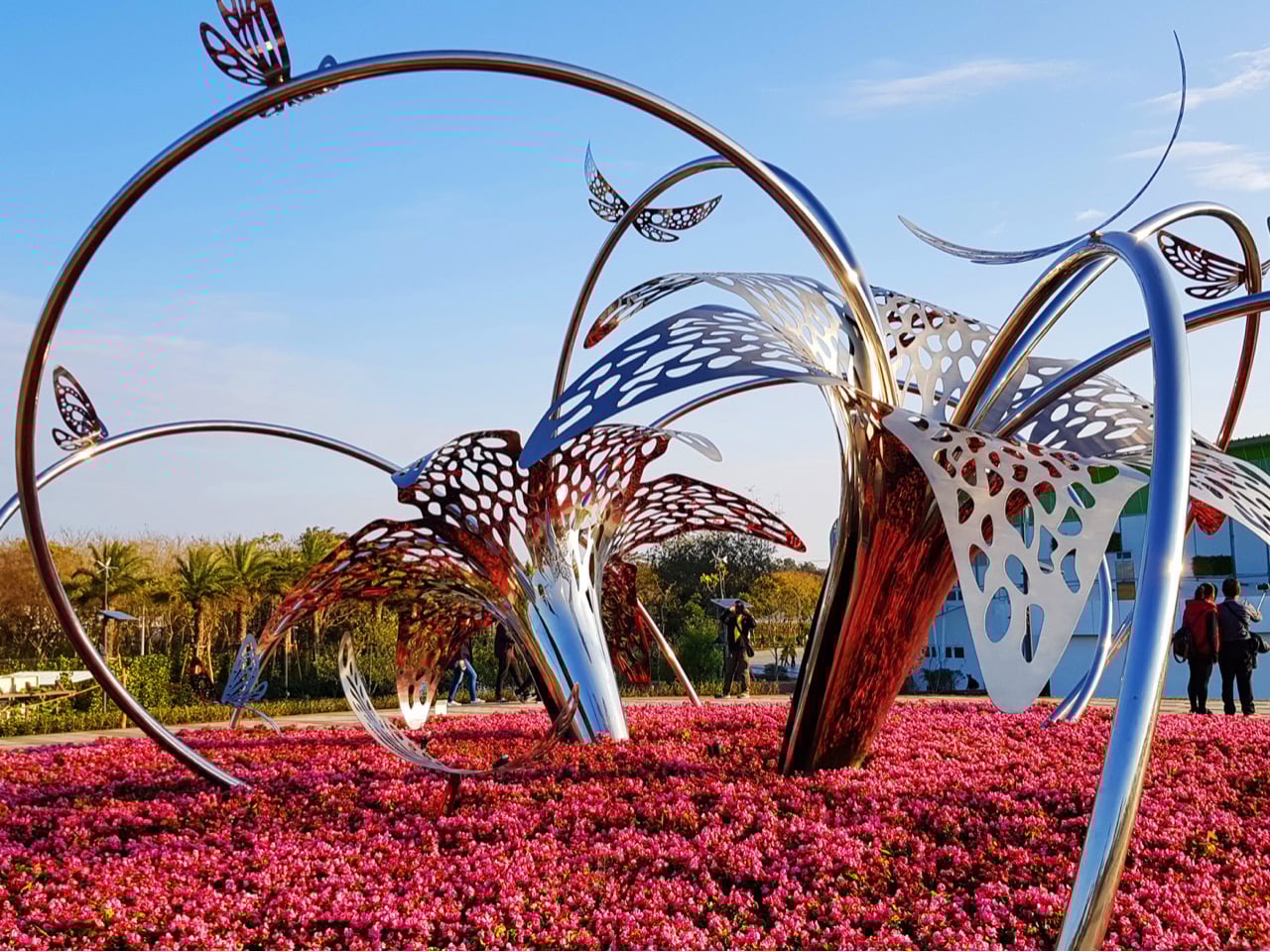
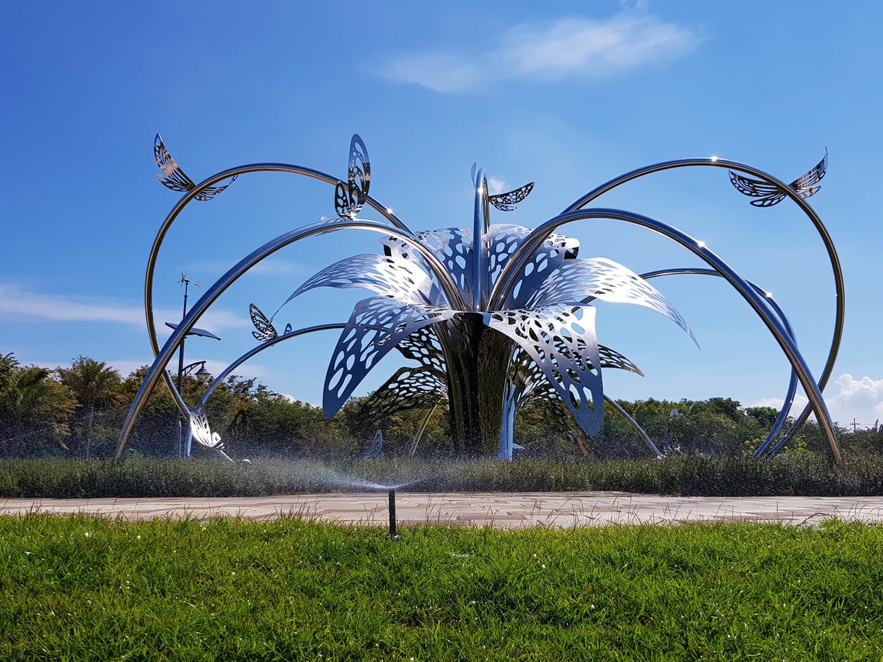
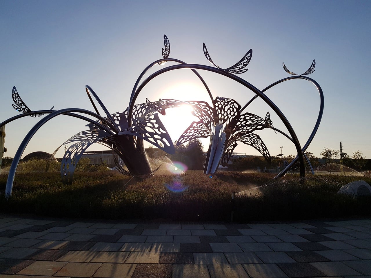
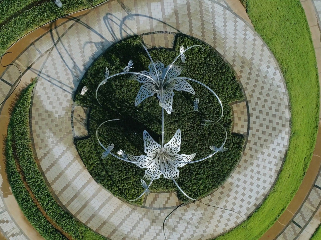
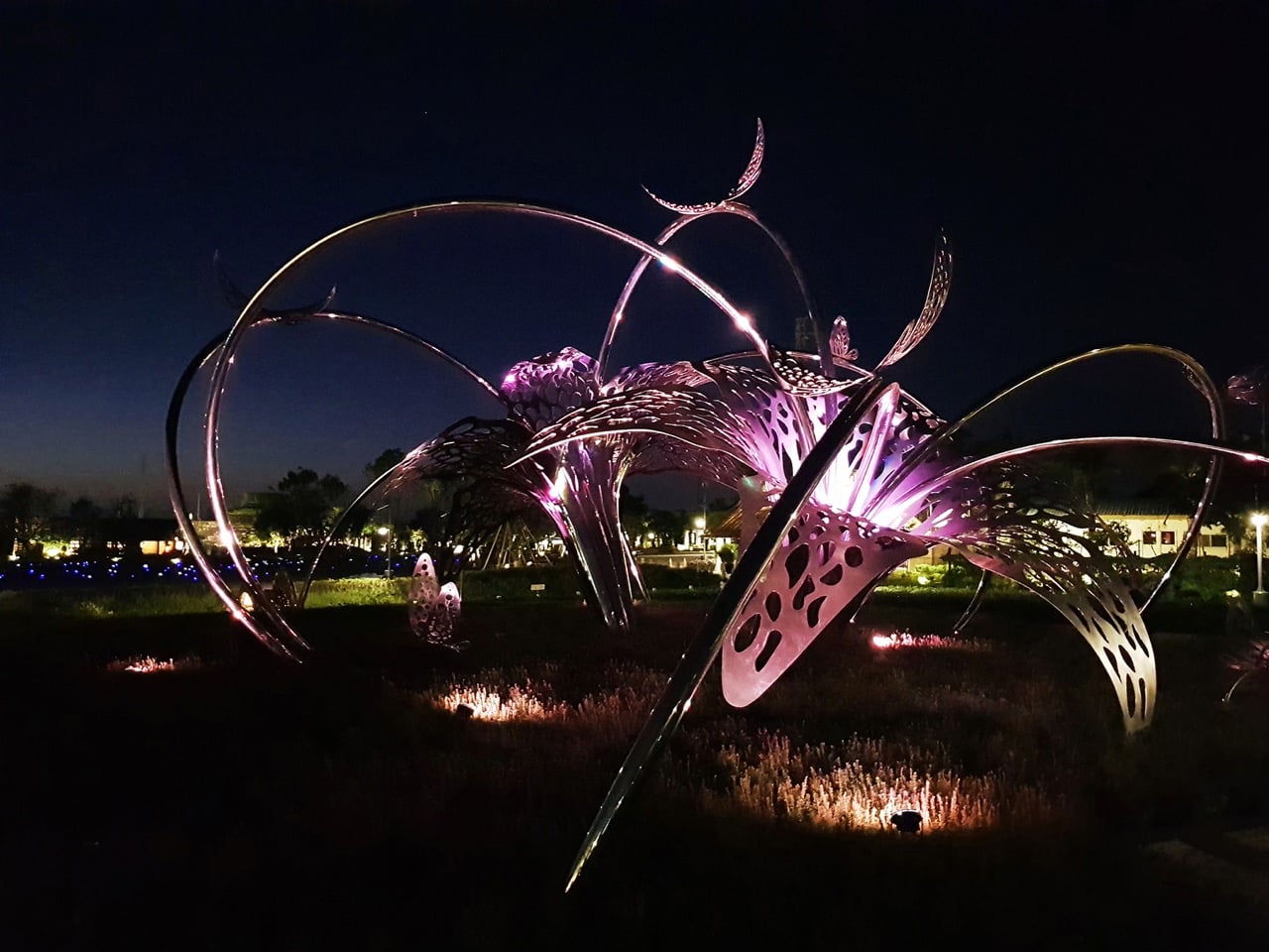
Kuo Hsiang Kuo’s “Flowers and Butterflies Are Dancing”, created for the 2018 Taichung World Flora Exposition in Taiwan, showcases the essence of contemporary public art. Using polished stainless steel, Kuo embraces the material’s reflective quality to mirror the vibrant flowers below and shifting clouds above, creating a constantly evolving dialogue with its surroundings. Sweeping arcs suggest the flutter of butterflies and the sway of flowers, while perforated panels cast intricate shadows. By night, strategically placed lighting transforms the sculpture into a glowing spectacle of purples and pinks, giving it a dynamic day-to-night presence.
The installation balances structural precision with ethereal beauty, inviting visitors to explore it from multiple angles. Referencing Taiwan’s native Formosa Lily and butterfly motifs, it connects local identity with universal themes of transformation and renewal. Its multi-layered appeal engages children, adults, and design enthusiasts alike. “Flowers and Butterflies Are Dancing” proves that public art can be both visually stunning and deeply meaningful, transforming spaces and perspectives.
4. Lighting and Experiential Impact
Public art should shine even after sunset, and this is where thoughtful lighting design transforms perception. Proper illumination enhances textures, casts dramatic shadows, and can introduce dynamic colors, turning a daytime piece into a captivating nighttime feature and making the artwork a continuous part of the cityscape.
Lighting also serves safety and experiential purposes. By subtly brightening pathways while highlighting the art, designers create secure, inviting spaces. This blend of functionality and drama deepens emotional engagement, turning ordinary public areas into memorable, enchanting urban stages that captivate visitors day and night.
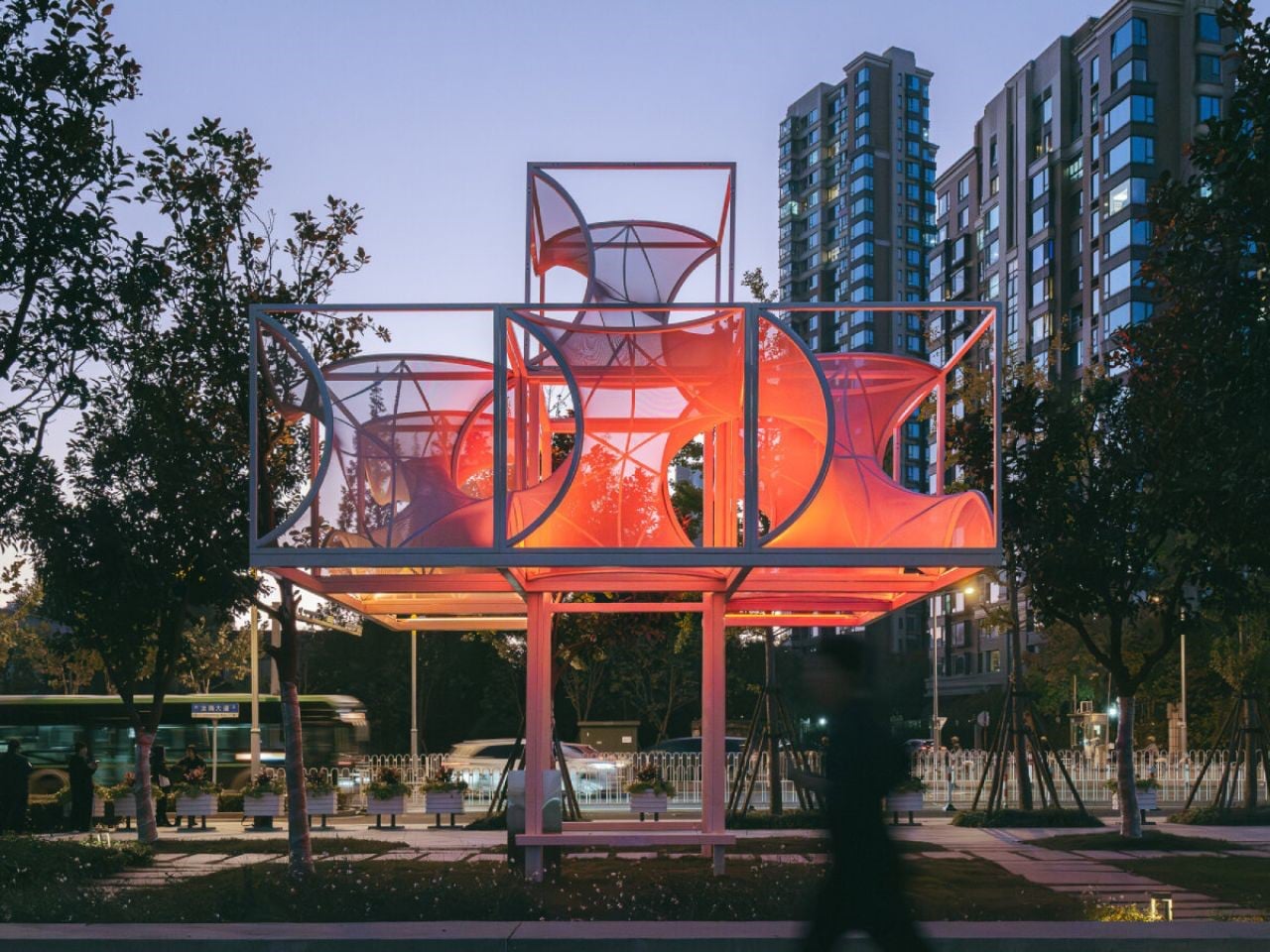
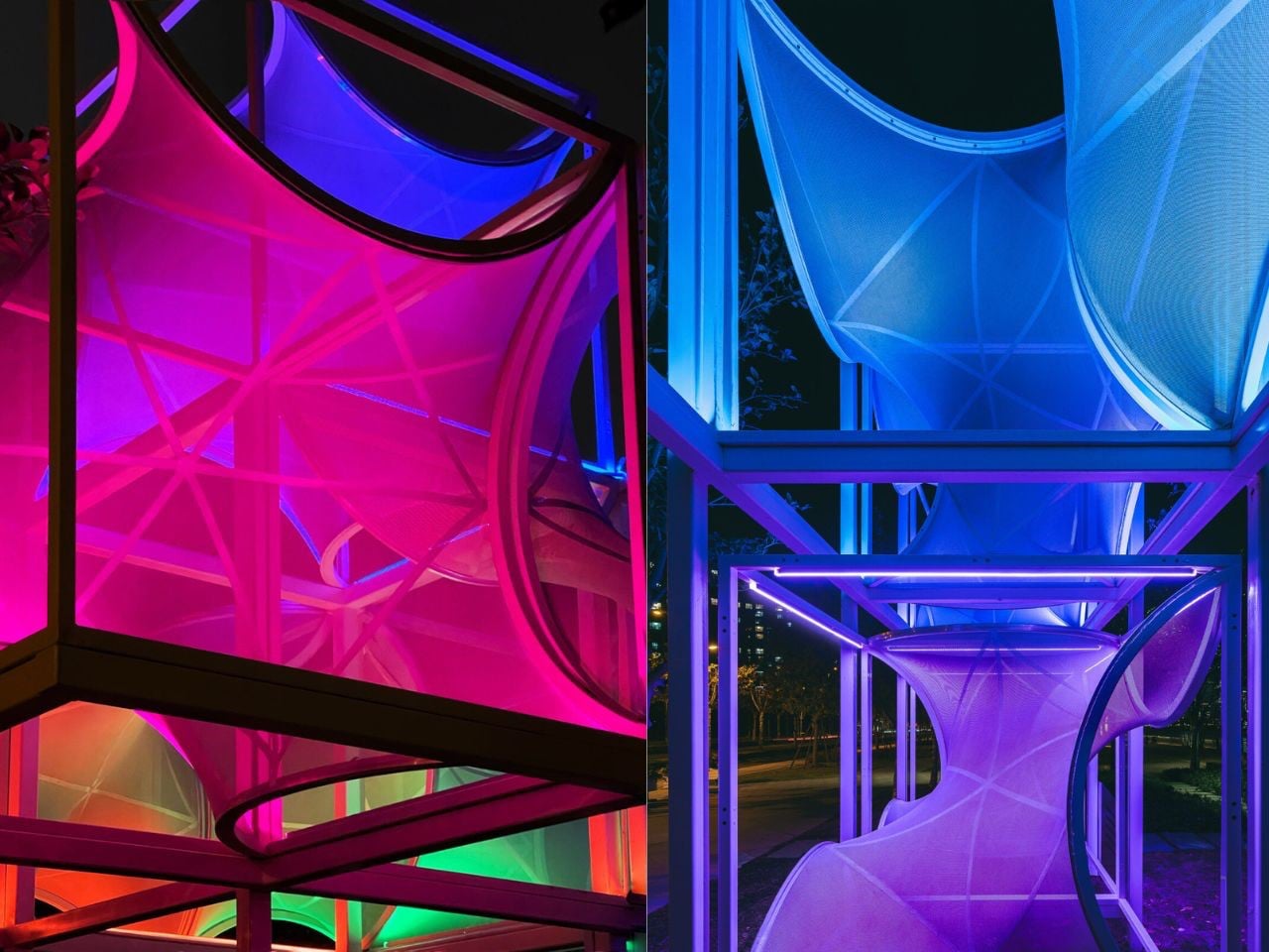
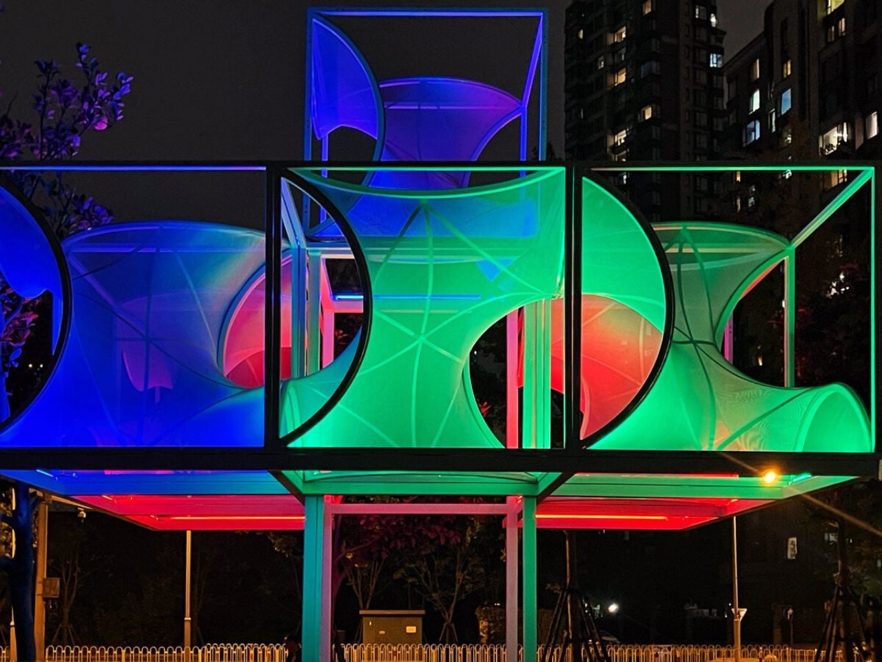
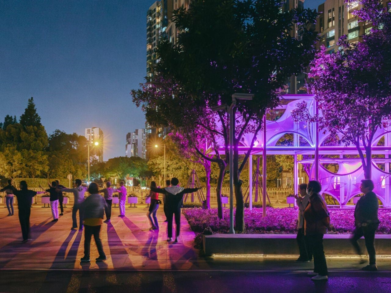
Along Shanghai’s Huangpu River, visitors encounter Curly Cube, a striking modular installation by the People’s Architecture Office (PAO). Combining flowing curves with sharp angles, it transforms an ordinary urban space into a dynamic playground of light, shadow, and interaction. Inspired by the Gyroid minimal surface, a natural form bridging mathematics and nature where the structure employs curvilinear tensile membranes stretched over lightweight square frames. The result is a form that appears both futuristic and organic, soft yet structured. By day, the translucent membranes filter sunlight into gentle, diffused patterns, offering shaded pockets where people can pause, explore, or relax amid the city’s bustle.
At night, integrated lighting casts shifting gradients across the silver membranes, turning the installation into a glowing social hub. Its modular design allows stacking, reconfiguration, or relocation, encouraging tactile and participatory engagement. Curly Cube showcases how adaptable public art can transform urban environments, transforming everyday walkways into immersive and memorable experiences for all visitors.
5. Community and Co-Creation
The most impactful public art grows from the community it serves, making co-creation essential. Designers act as bridges, translating local stories, needs, and identities into physical form. By involving residents, businesses, and leaders from the start, the artwork becomes a true reflection of the neighborhood’s spirit rather than an imposed object.
This collaborative process often enriches the project, making it more meaningful and relevant. When people see their ideas influence themes, materials, or placement, they become invested advocates. Inclusive design fosters public ownership, ensuring the artwork’s lasting cultural, social, and emotional impact.
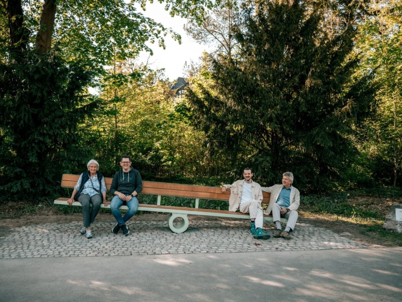
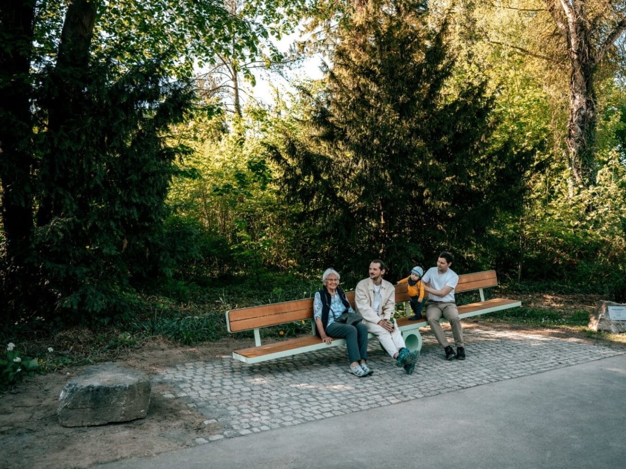
Sitting on a public bench often reflects our comfort with social interaction. Extroverts may happily share a seat with strangers, while others prefer solitude. Martin Binder’s Balance Bench in Einbeck, Germany, challenges these habits by transforming a simple act of sitting into a shared experience. Constructed from oak slats atop a sleek steel frame, the bench rests on a single central cylinder, requiring at least two people on opposite ends to achieve balance. Attempting to sit alone either forces careful adjustment or playful observation, turning rest into cooperation and communication.
Located in the Garden of Generations, the 4.5-meter-long installation can accommodate up to eight people, encouraging dialogue and collective effort. By combining functional seating with interactive design, Binder’s work exemplifies how public art can foster connection, cooperation, and community engagement while making everyday urban experiences more playful and thought-provoking.
By harmonizing art with its site, guiding movement and interaction, ensuring durability, and creating safe, engaging environments day and night, thoughtful design transforms spaces into vibrant destinations. The result is artwork that enriches well-being, fosters community pride, and leaves a lasting social and cultural impact.
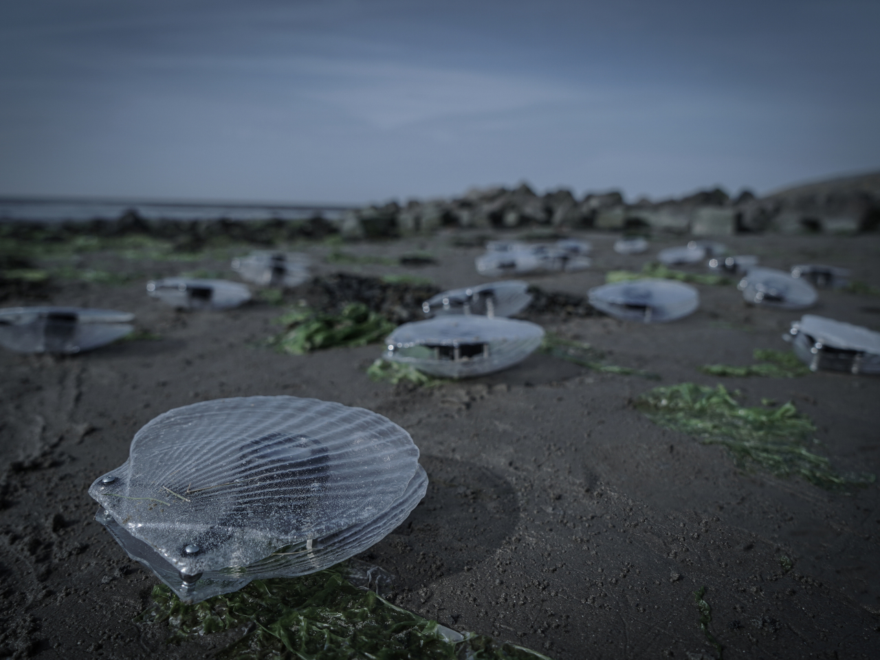
We’ve thankfully become more aware of the quality of our waters, especially with the increase of pollution or drastic changes in the chemical composition of rivers, lakes, and seas. We now have sophisticated equipment and software to monitor such properties, but it might come as a surprise that Mother Nature has her own way of detecting abnormalities in water. Clams, known as nature’s filter feeders, immediately react to sudden changes in water quality, sometimes even faster than scientific equipment.
Taking inspiration from one of nature’s wonder workers, this art installation turns water quality from an incorporeal idea into a tangible representation. Rather than just clamming up, these kinetic sculptures create an eerie melody, as if giving voice to the pain and woes of the water. It creates a surreal yet beautiful manifestation of water quality in a way that you can see and hear beyond just figures and graphs.
Clams aren’t able to filter out toxins (which they turn into pearls), so they would immediately shut close when they detect pollution in the water. Their reaction is sometimes faster than sensors and computers that still have to analyze the data from water samples, though, of course, they won’t be as accurate or specific. This interesting behavior, however, became the inspiration for this kinetic sculpture that, rather than just detecting water quality, translates the data into something just as interesting.
“Clams” is a collection of, well, translucent clam-like objects that have speakers inside. The clams are connected to a sensor that tests the quality of the water in the only way that humans can. Changes in the water quality are translated into sounds that shift over time, creating the semblance of eerie music. The vibrations from the speaker also cause the clamshell to go up and down, making it look like the clams are singing.
The shells themselves are made from recycled waste plastic, adding to the sustainability message of the sculptures. Although the shape of these man-made clams is quite simple, the otherworldly soundscape it produces is quite unique and memorable. It also creates an interesting bridge between media art, data sonification, and environmental awareness, translating intangible concepts and figures into something humans can better appreciate and understand.
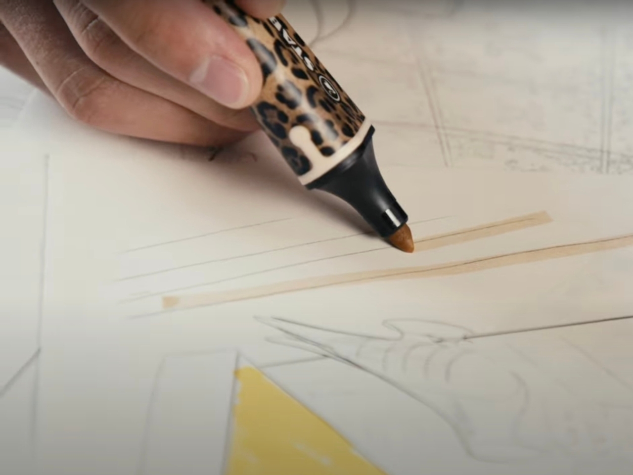
I am a stationery hoarder who has too many pens, notebooks, stickers, and other materials that I just buy and keep and yes, occasionally actually use. So when I see something that looks pretty and functional, my heart skips a beat and even though I have too many of whatever that is (trust me, I have a lot), I still have the urge to buy it. This latest unlikely collaboration between a fashion brand and a highlighter was created specifically for people like me.
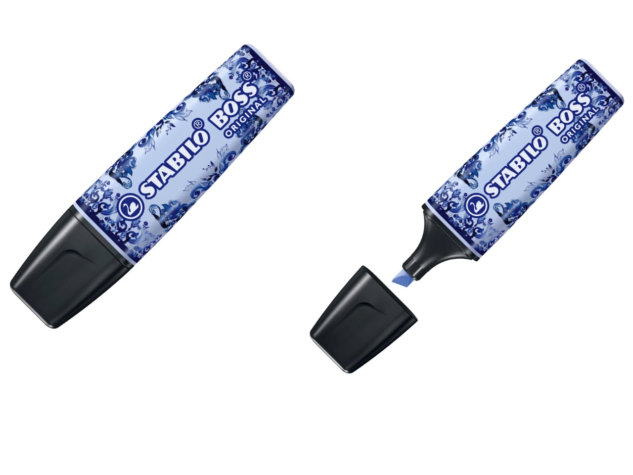
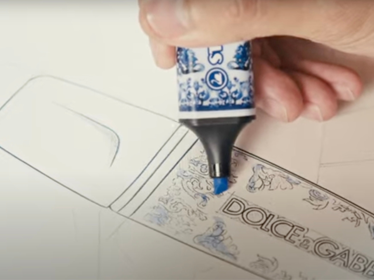
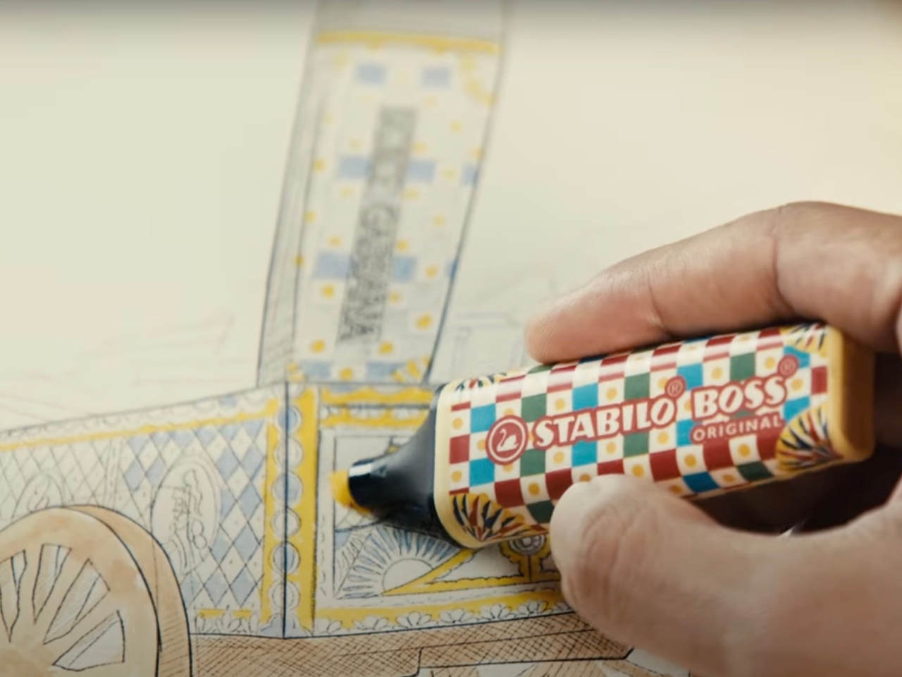
Dolce & Gabbana has applied its colorful and fashionable aesthetics to the unlikeliest of items, the highlighters of Stabilo Boss. This limited edition collection will add more style to your school desk or office space and still be able to function as a stationery item to help you, well, highlight your books, notes, etc. If you’re familiar with the usual D&G designs, then the motifs used for the highlighters’ casing will look familiar.
The collection has four designs: the Blu Mediterraneo motif with its cloud blue colors; the Caretto Sicilliano pattern that has a powdery yellow hue; a bold leopard look in beige; and if you want something monochromatic, a black zebra print design. All four are packed in a premium box with a high-quality magnetic closure, which can also be used to spruce up your desk or to use as a case to hold other stuff later on.
For around $32, it’s pretty expensive if you think of it as just ordinary highlighters. But the fact that it’s Dolce & Gabbana branded and they do look very pretty, then serious stationery collectors wouldn’t mind.
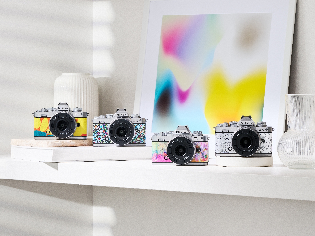
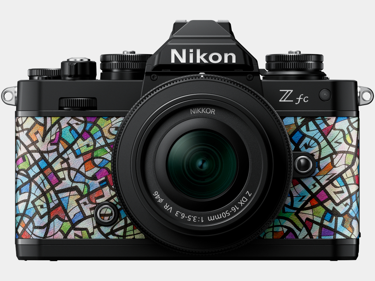
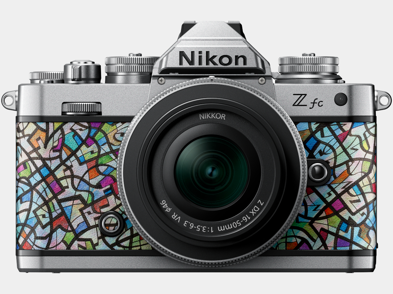
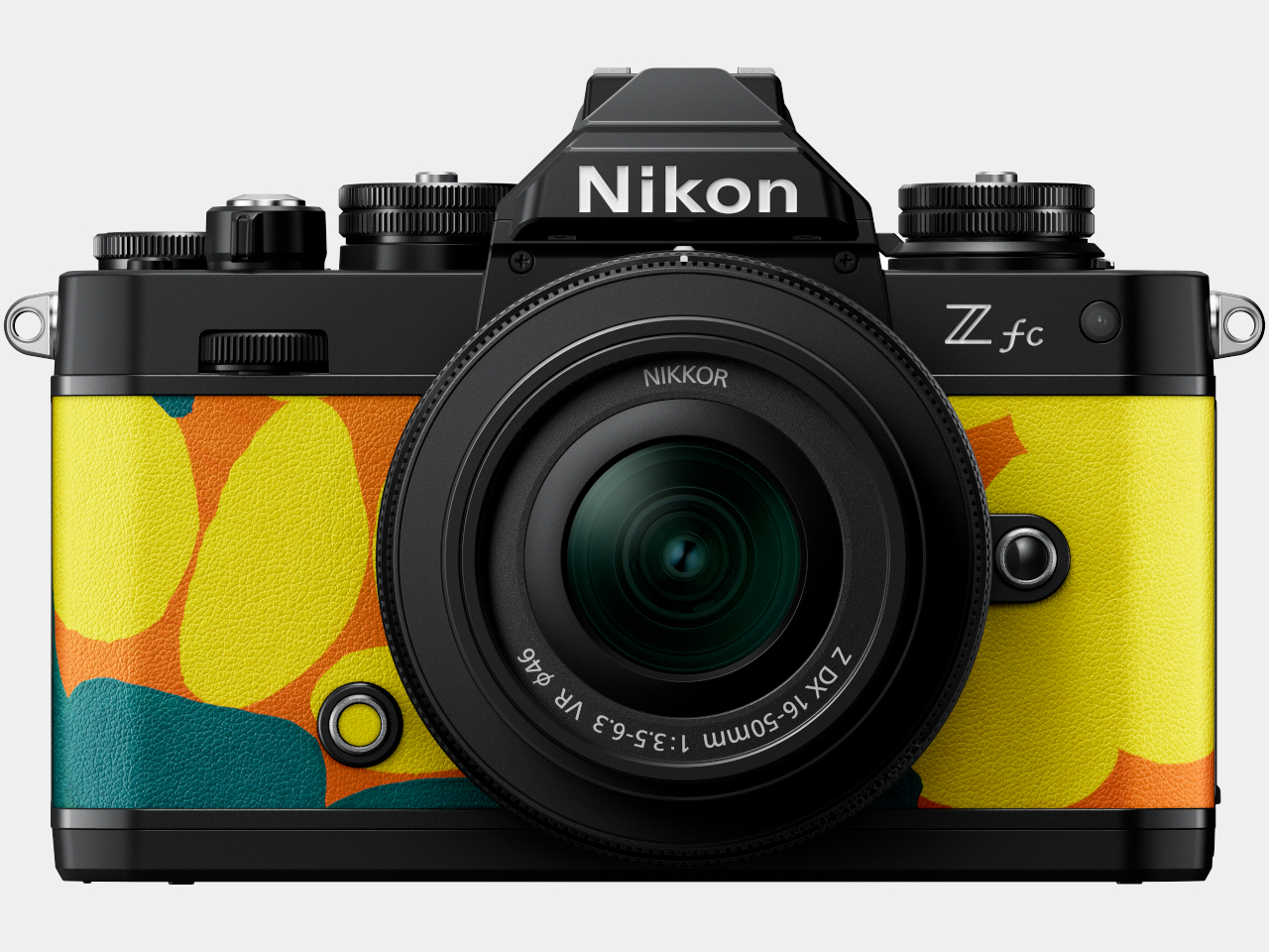
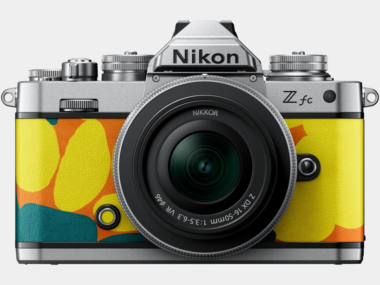
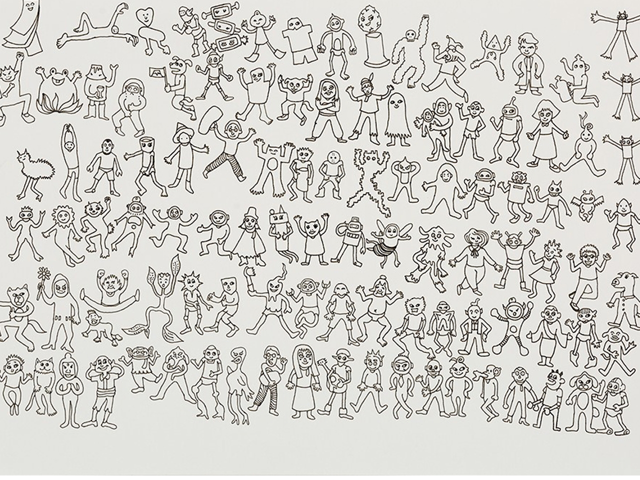
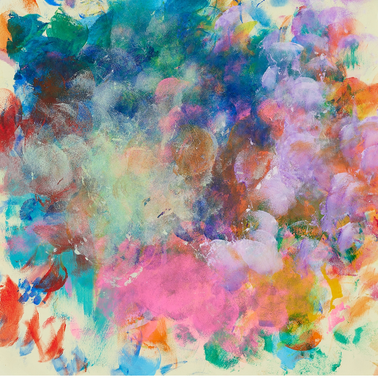
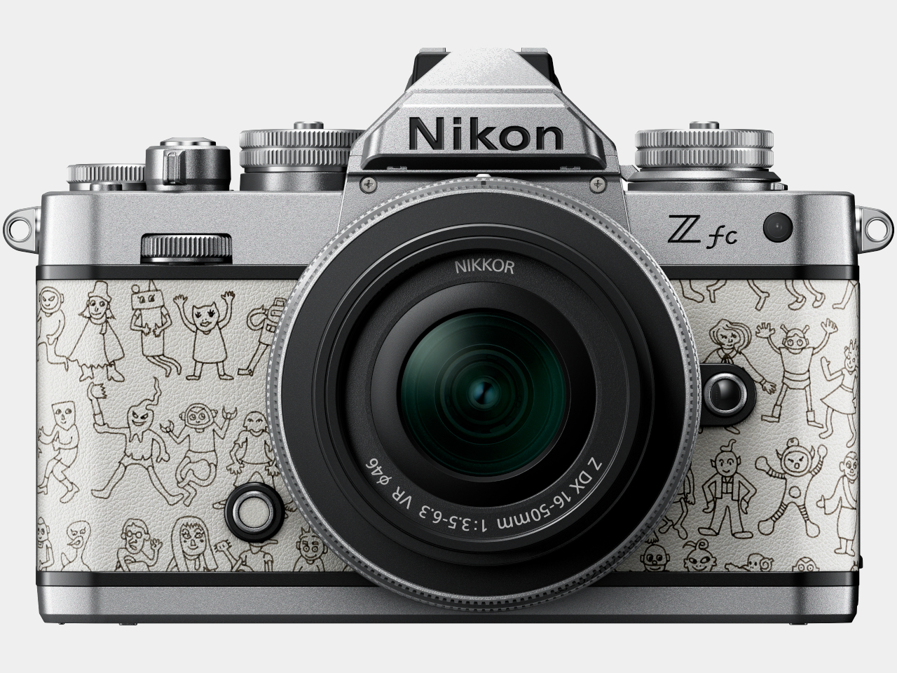
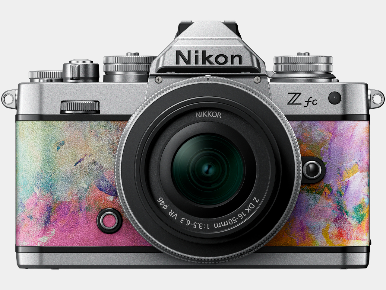
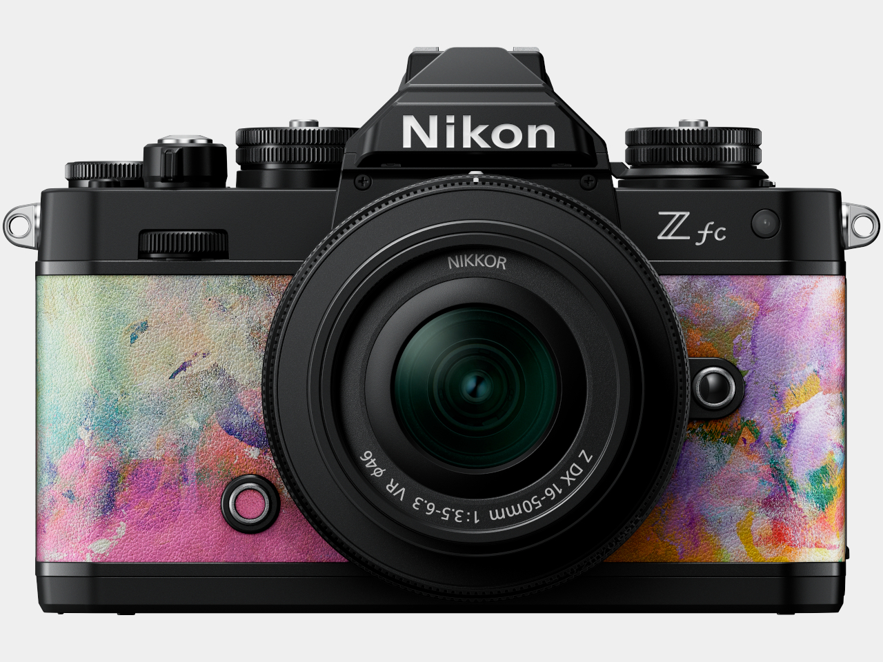
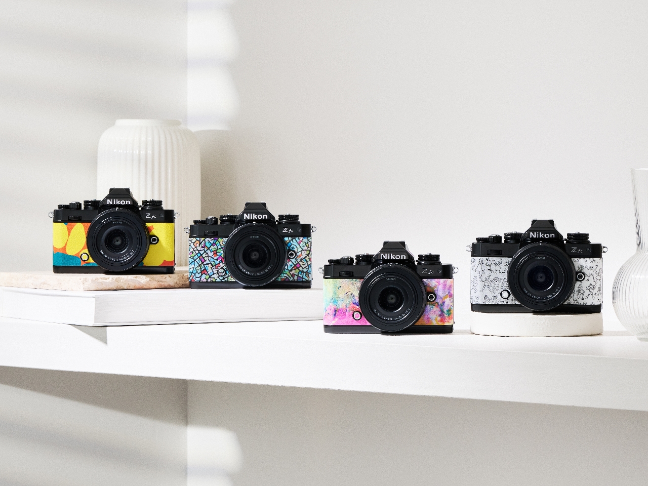
Thanks to the popularity of smartphone cameras, photography is no longer something limited to seasoned veterans, a term that’s often applied to older people. The younger generation has been captivated by the joys of preserving fleeting memories and sharing them with friends, whether it’s snapping up Instagram photos or using a dedicated camera for more professional-looking shots. That said, the majority of these DSLRs and mirrorless cameras still seem to be designed for those veterans who might have less colorful tastes when it comes to their equipment. It’s a bit ironic that such a tool for capturing expressions would itself lack the kind of self-expression that younger photographers thirst for, which is why Nikon is launching a limited edition Z fc camera series dressed up in a few of HERALBONY’s vibrant artwork.
Granted, there are quite a few cameras designed to capture the attention and patronage of younger customers, GenZ or otherwise. Most of these, however, are either of the Polaroid-style instant camera variety or the point-and-click cameras that have been made redundant by smartphones. Professional-level cameras, in contrast, come in the usual shades of black and gray and pretty much nothing else. They look and feel premium, mind you, but they might not have the visual impact some users might want.
That’s what makes the Nikon Z fc mirrorless camera a bit of an outlier because it actually has different color options that don’t sacrifice that premium leatherette material in the process. Admittedly, it’s not a full customization feature, but it’s the closest you’d get in this product category. With this collaboration with HERALBONY, however, there are even more exterior options, ones that convey the liveliness of youth and freedom of expression.
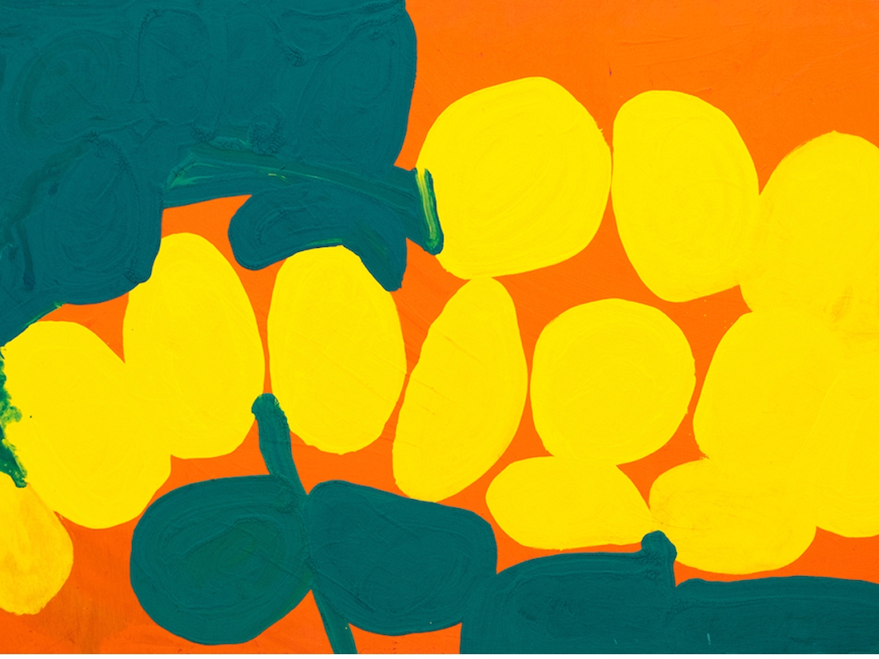
[Yurinoyoakeri] Masaharu Honda
[Cone Flower] Masahiro Fukui
[Joyful Time] Teppei Kasahara
[Samba] Momoko Eguchi
These four pieces come from HERALBONY’s collection of more than 2,000+ artwork, each crafted by artists with neurodiversity and disabilities. The brand’s mission to “Radiate Your Color” seems like a perfect match to Nikon cameras’ ability to capture those colors through photos and videos. With this unique Nikon Z fc edition, cameras are no longer just tools for capturing expressions and moments but become vehicles of expression as well, at least through artful camera exteriors that best capture your own aesthetic inclinations.
The four artful pieces add to the existing eight color options for the Nikon Z fc, creating a wider palette of cameras to choose from. Unfortunately, the HERALBONY cameras will be available for only a limited time and in limited quantities, with details of their availability dependent on the region. And in case you’re wondering, Nikon isn’t selling these Premium Exteriors on their own so you can’t just buy a “skin” to warp around your existing Nikon Z fc either.
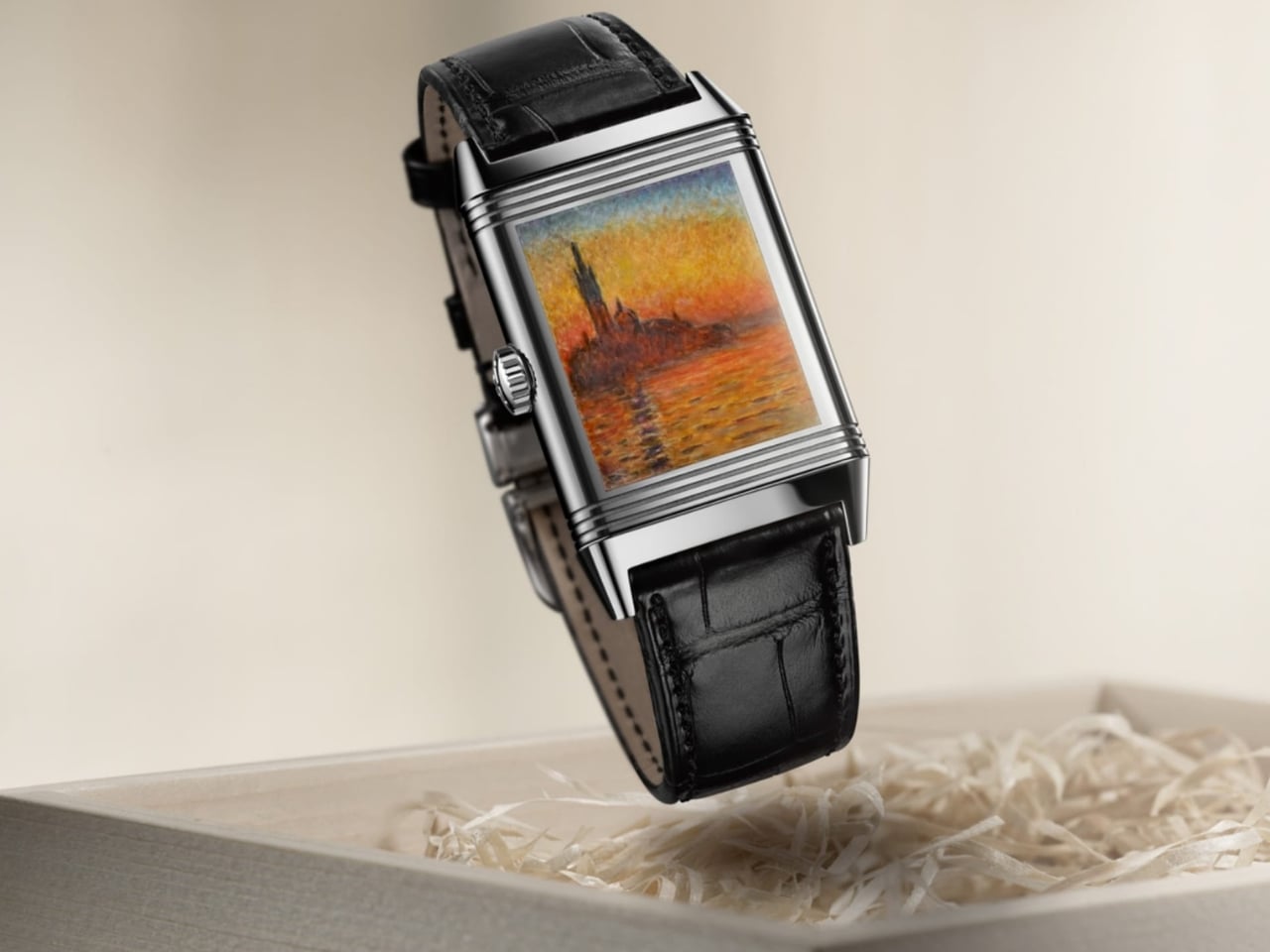
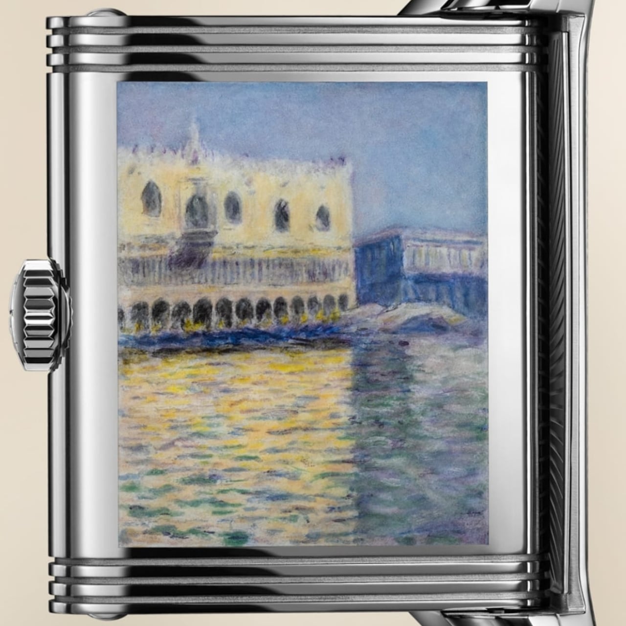
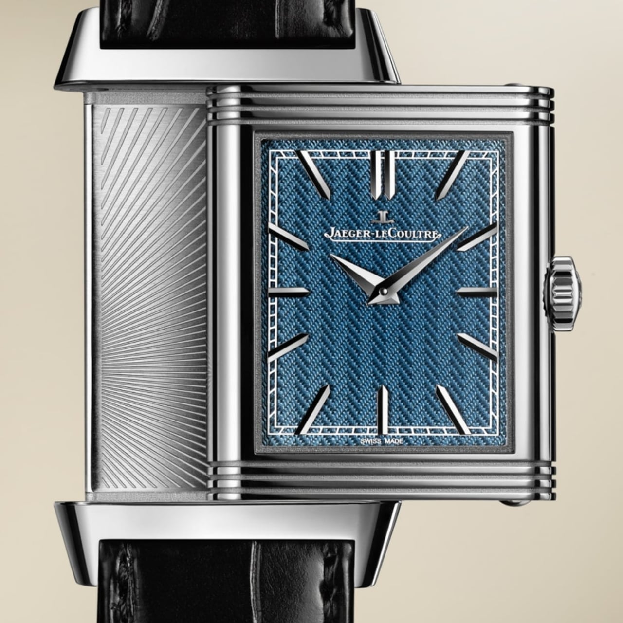
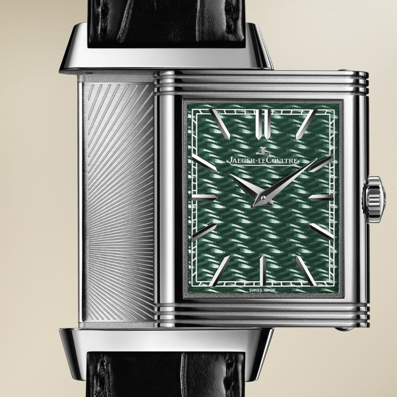
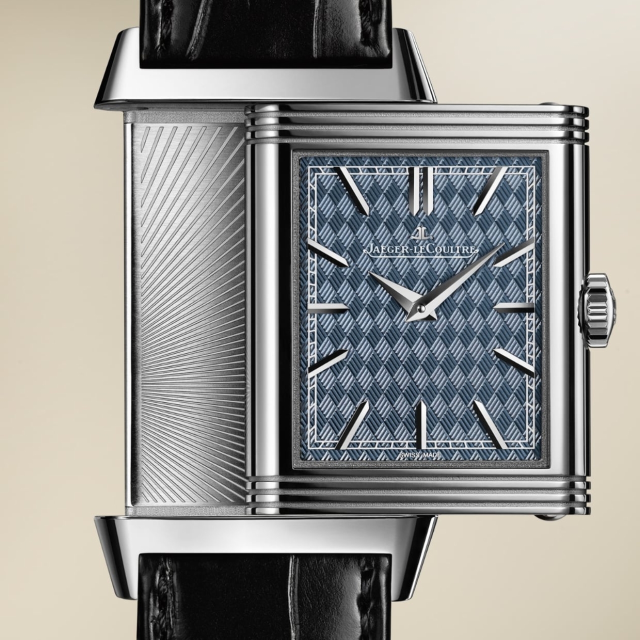
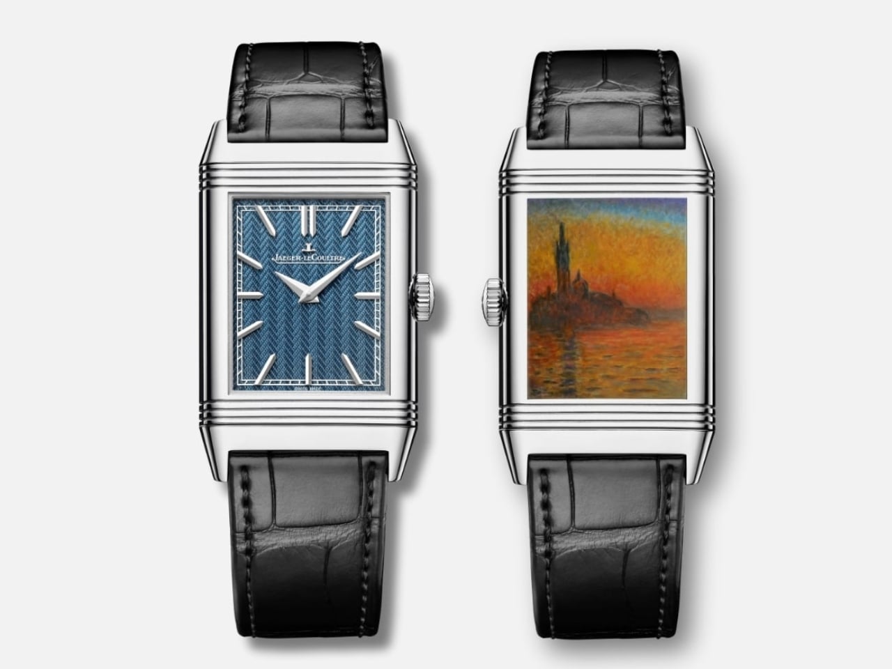
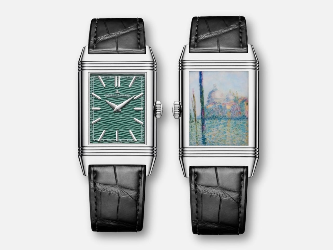
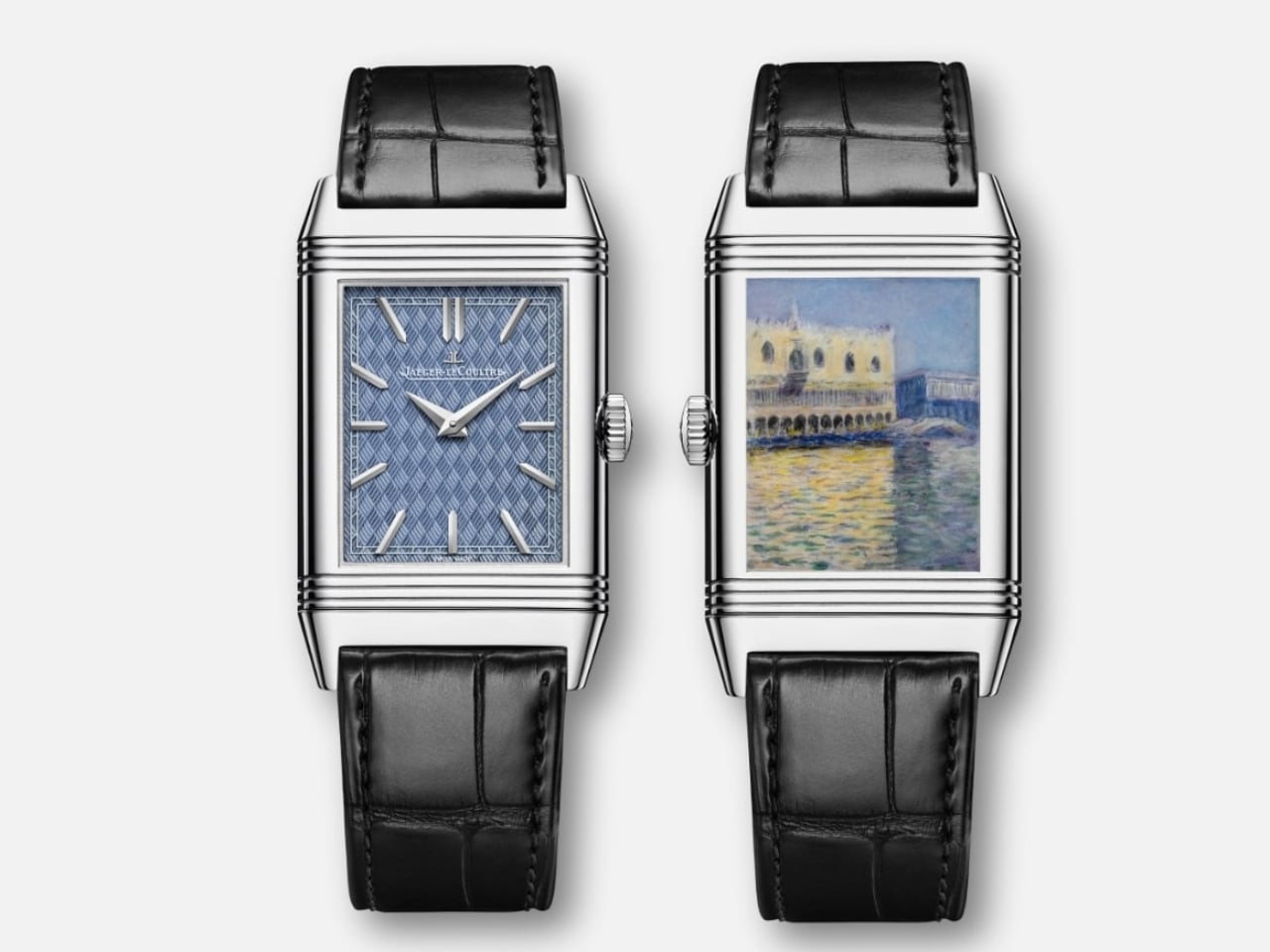
One of my most memorable visits to a museum (so far) is the first time I saw a Monet painting in person at the National Gallery Singapore a few years back. Seeing something in real life that you only previously saw in books and online is a always a magical experience for art lovers. Now imagine being able to carry a replica of this painting on your wrist every day. Well, that is, if you can afford it.
Designer: Jaeger-LeCoultre
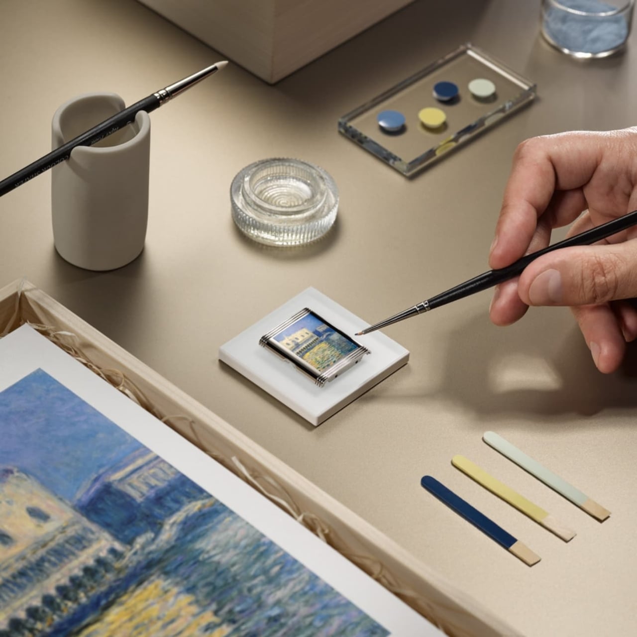
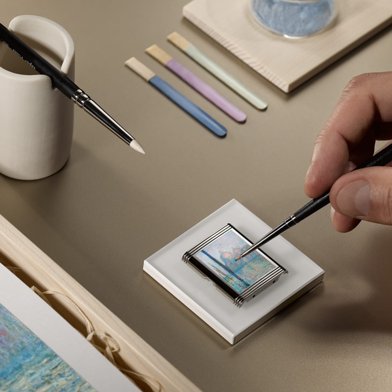
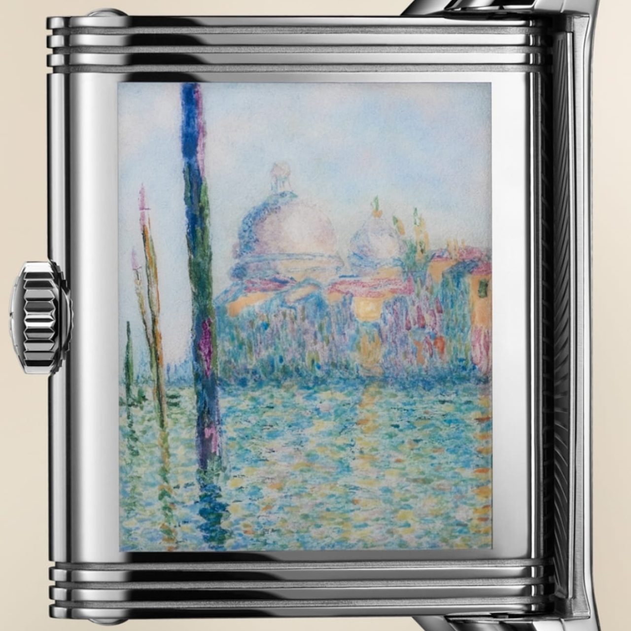
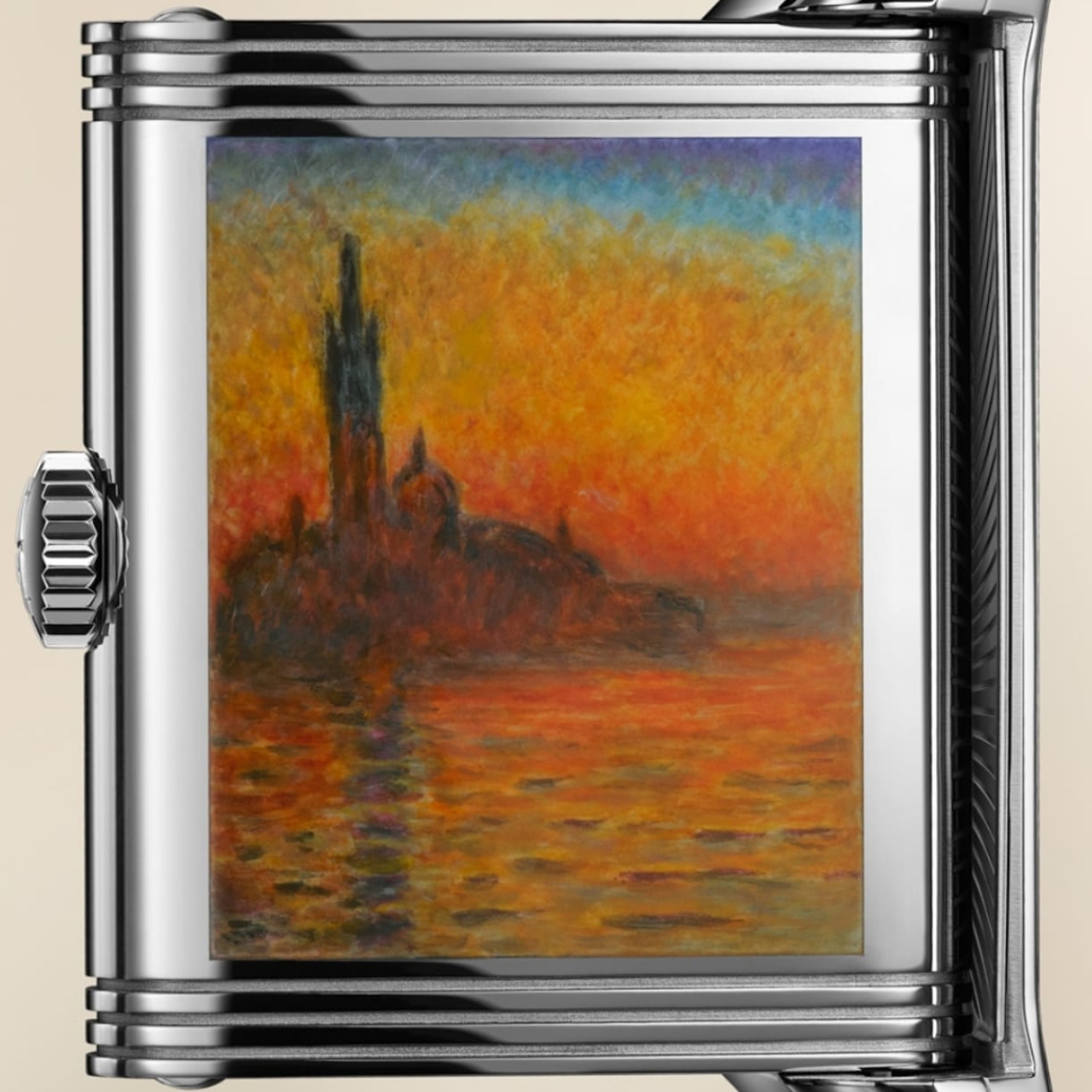
Jaeger-LeCoultre is releasing a very limited edition collection called the Reverso Tribute Enamel Monet “Venice” series. These luxury watches have three of Oscar-Claude Monet’s most famous paintings, the Venice series, hand-painted on the case-back of each watch. The three models – “San Giorgio Maggiore”, “The Doge’s Palace”, and “The Grand Canal” – are reproduced paintstakingly on the 2 centimeters squared case-backs by these master enamellers. They also had to recreate these using the impasto technique to retain the dream-like and ethereal quality of the original paintings.
To make things even more intricate, the three dials are decorated with hand-guilloché distinctive patterns underneath the translucent coloured enamel. Enameling takes nine hours work for each dial since it has up to five layers of enamel and seven separate firings. Each of the models have separate, distinct colors with “San Giorgio Maggiore” and “The Doge’s Palace” sporting two shades of blue while the “The Grand Canal” has a green finish. All three sport the brand’s distinct appliqued hour markers and dauphine hands.
Since the creation of these watches call for extensive man hours and a certain level of intricacy, only 10 pieces for each model will be produced. And if you want to know how much it costs, you’ll have to inquire directly with them, which probably means us mere mortals will not be able to afford this.