Tableware has always had a storage problem. A complete set of cups, bowls, and cutlery takes up a cabinet’s worth of space for the privilege of being used a few times a week. The rest of the time, it sits behind closed doors, out of sight and contributing nothing to the space around it. That’s a lot of material devoted to a fairly passive existence.
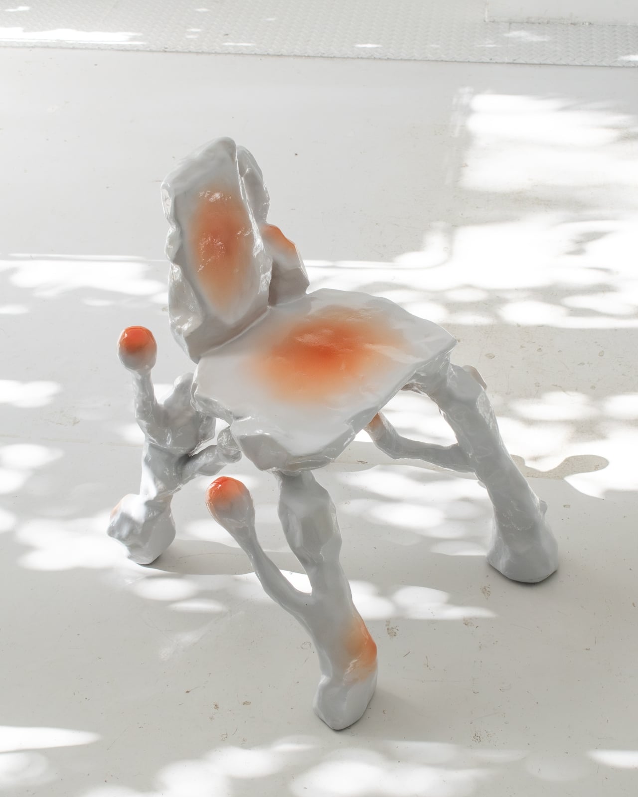
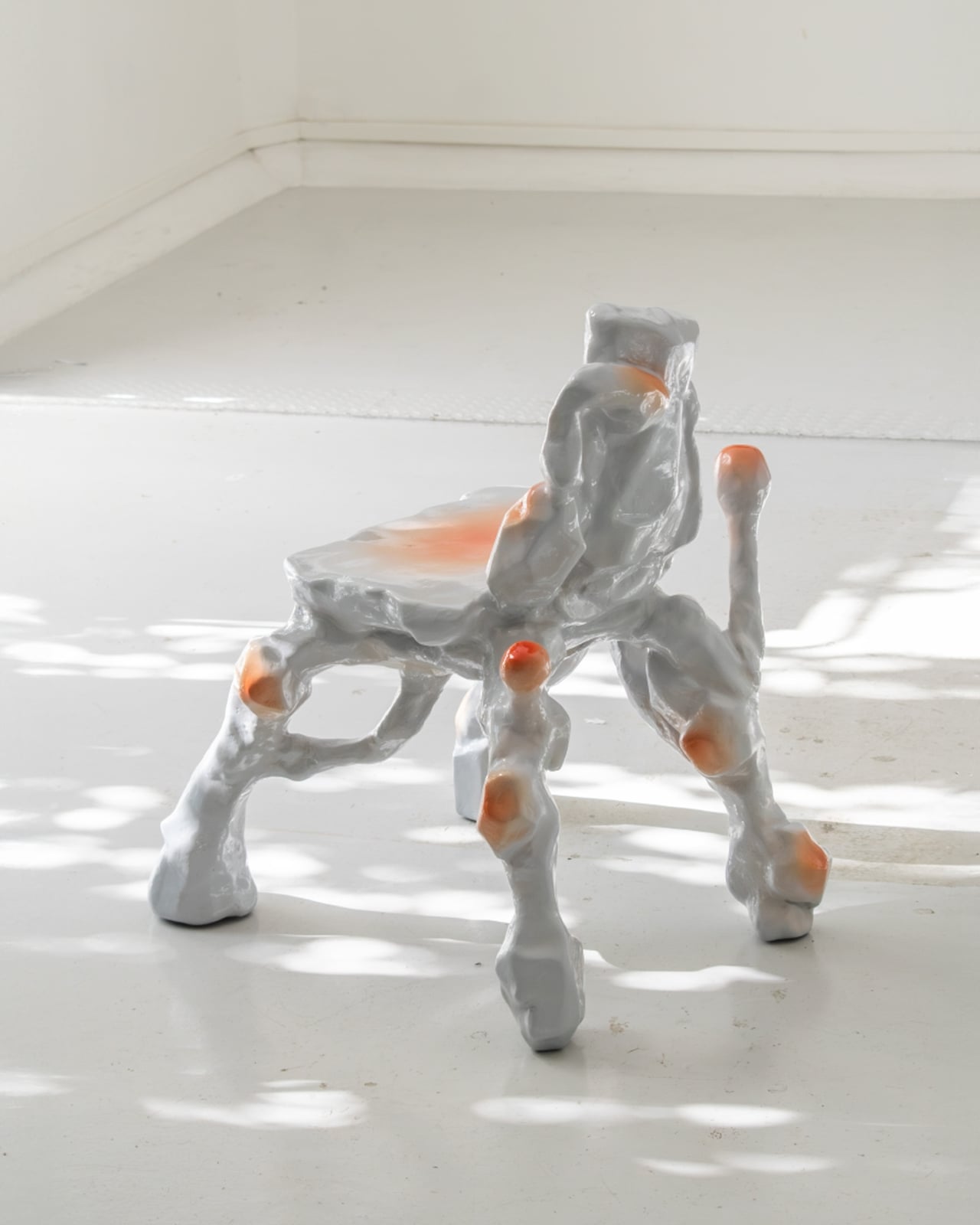
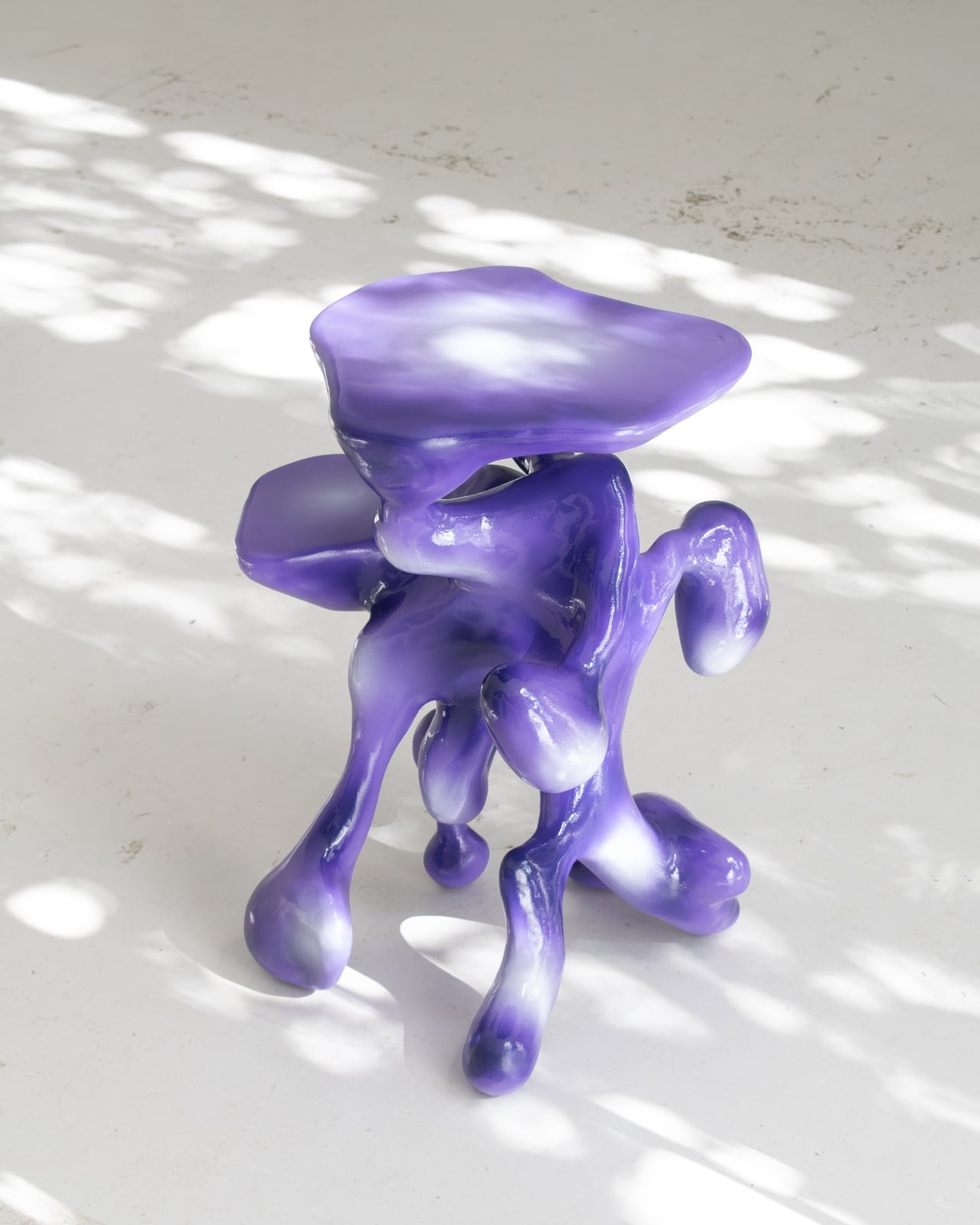
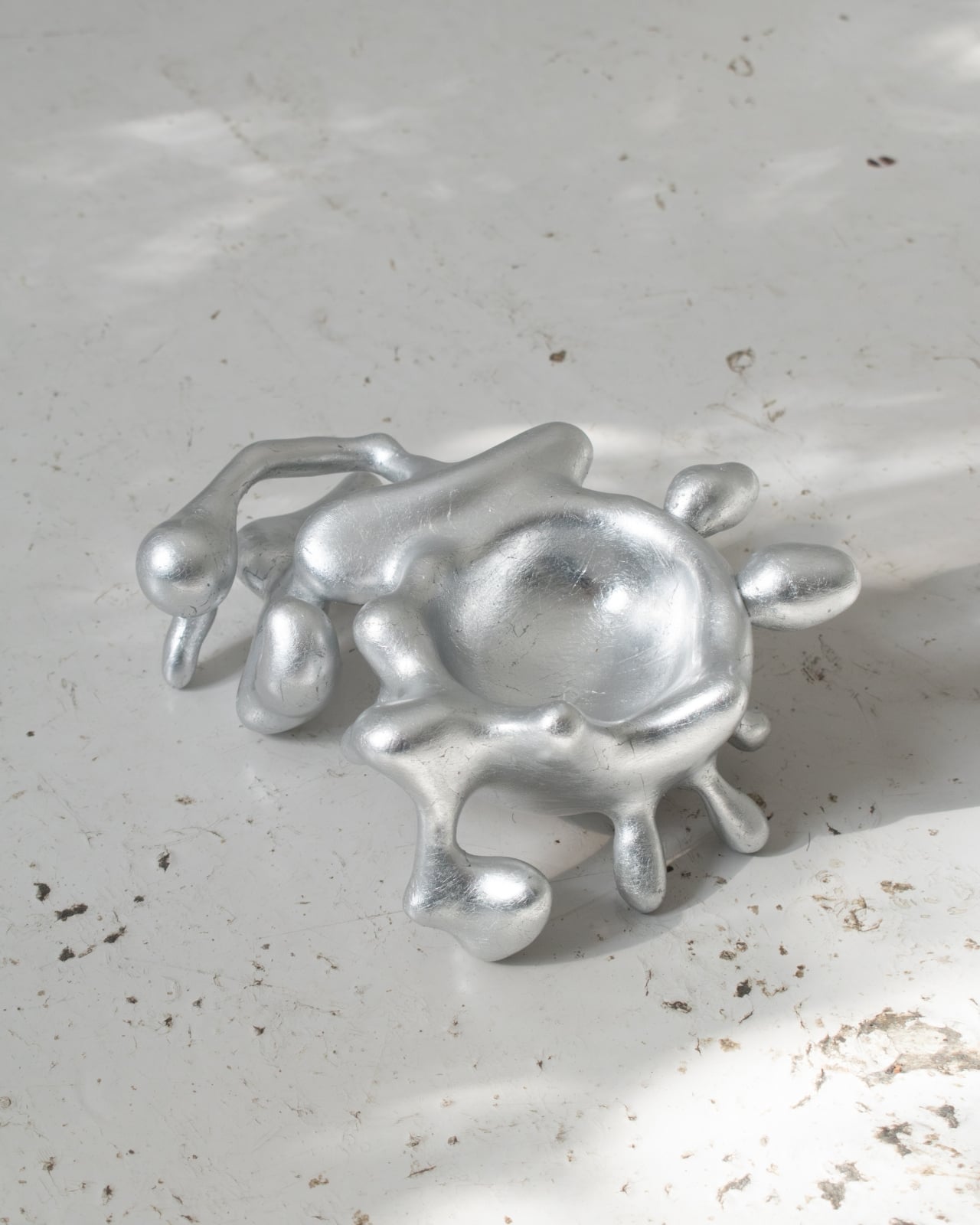
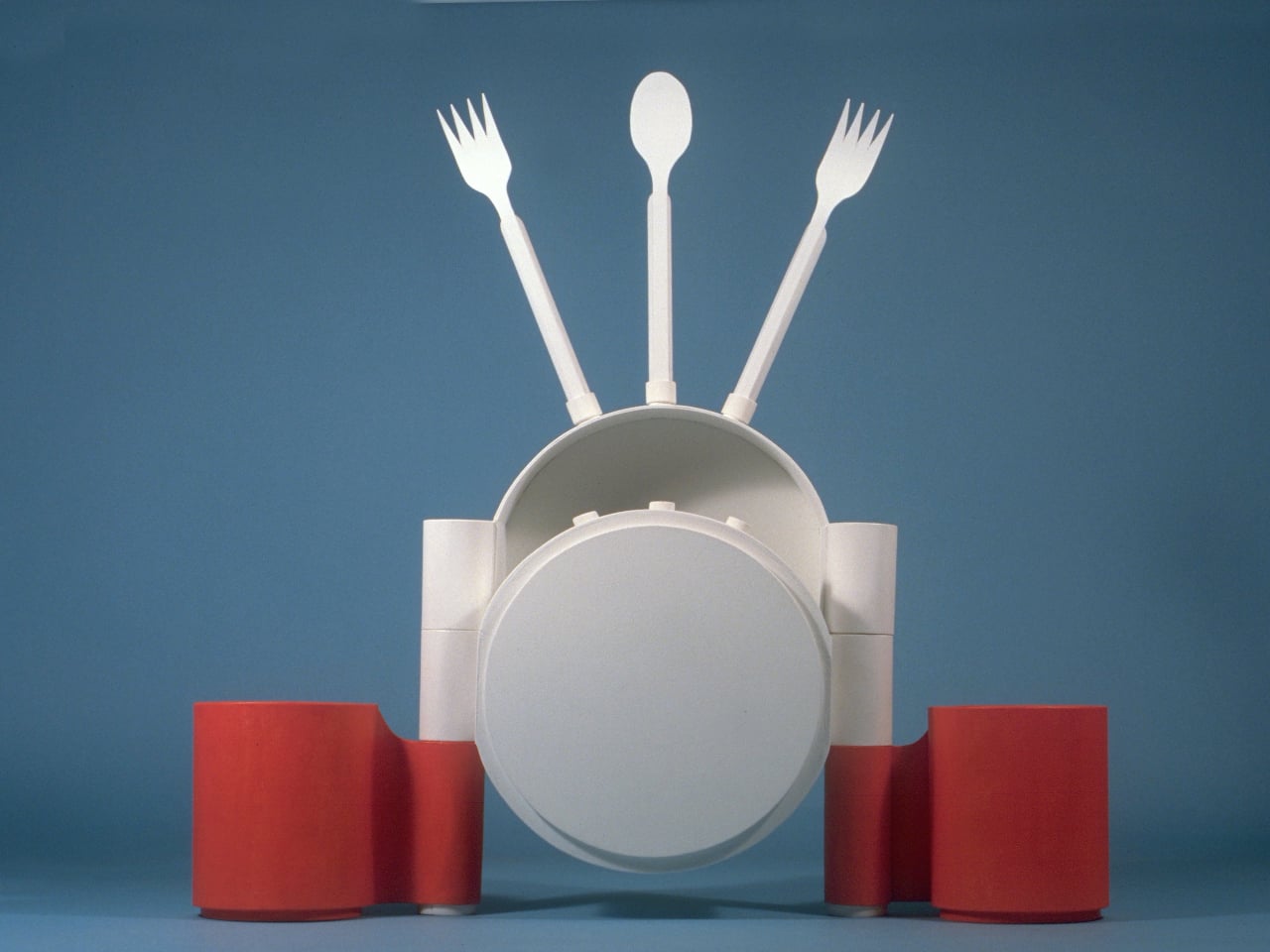
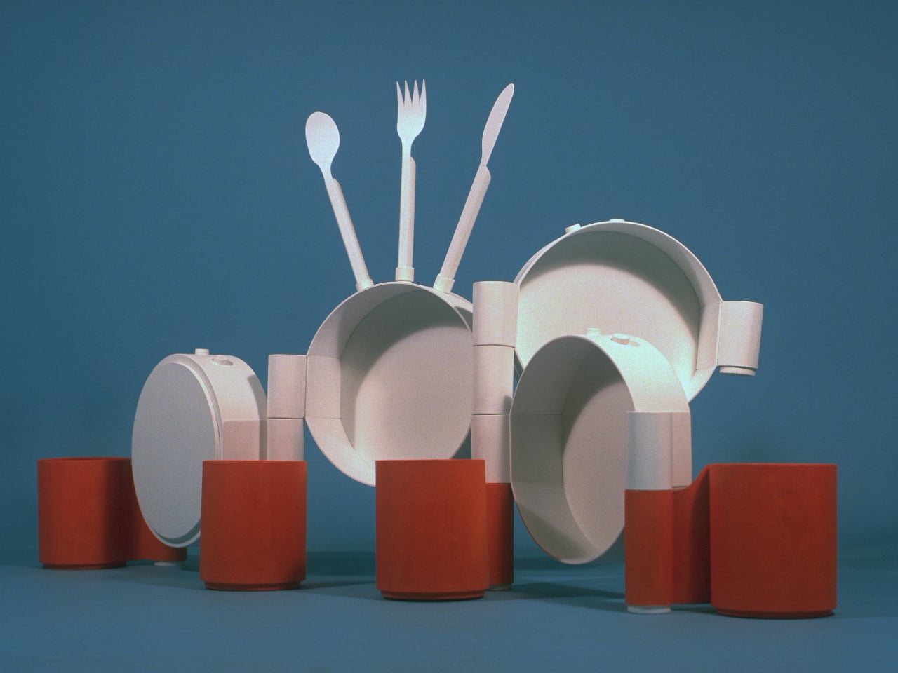
Michael Jantzen’s Art-ware prototype takes a different approach to the same set of objects. Rather than designing tableware that gets put away after a meal, he designed a system where the dishes, cups, and cutlery connect to each other and become something else entirely: freestanding abstract sculptures that live out in the open, doubling as décor when they’re not being used for eating and drinking.
Designer: Michael Jantzen
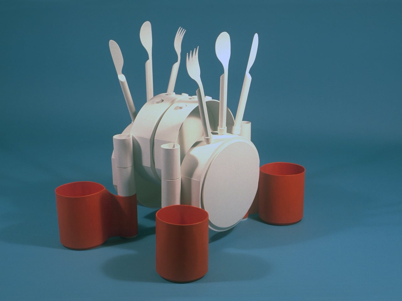
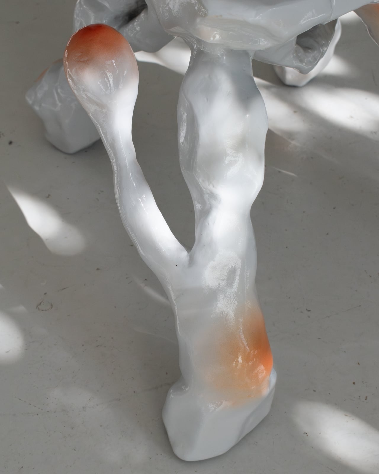
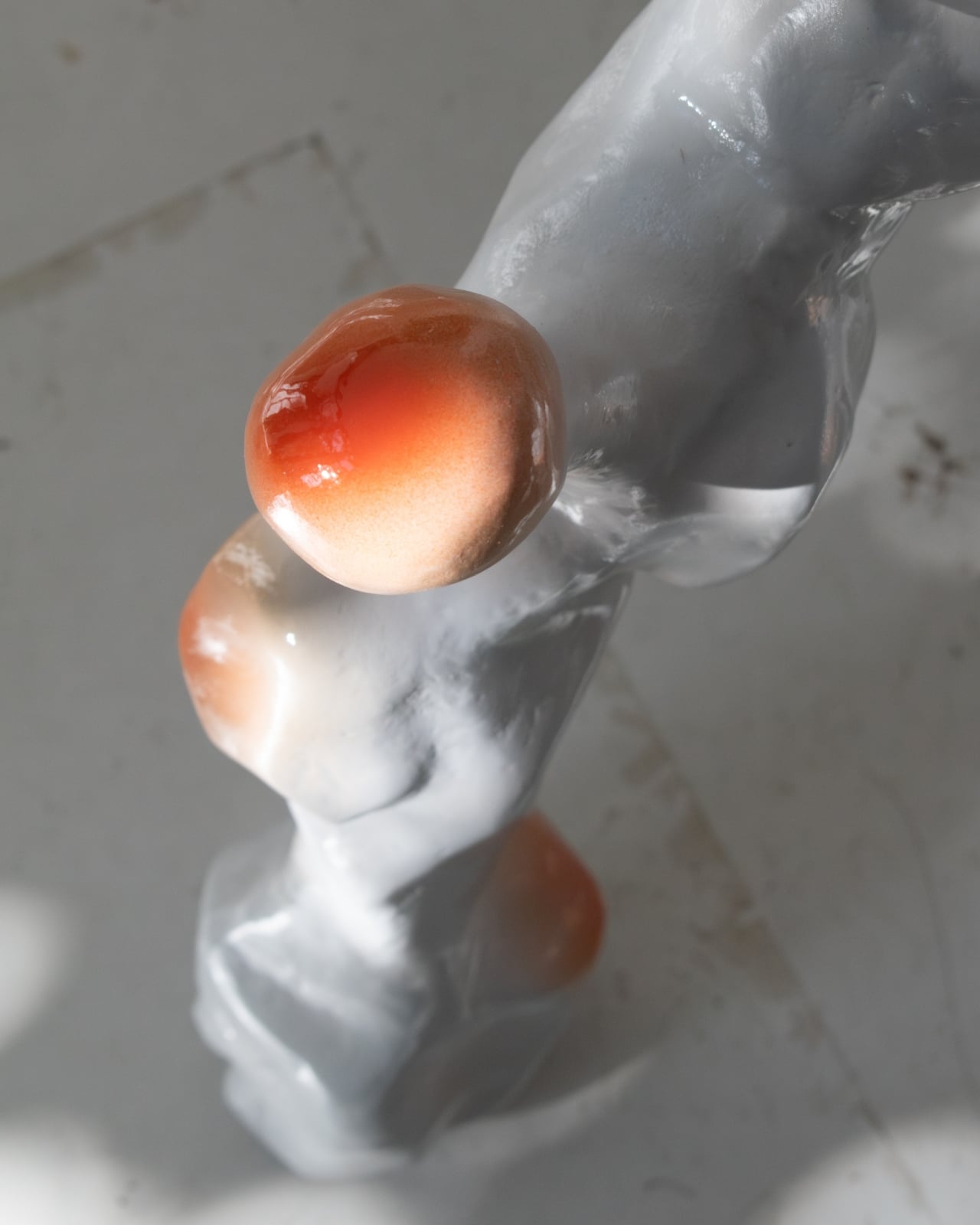
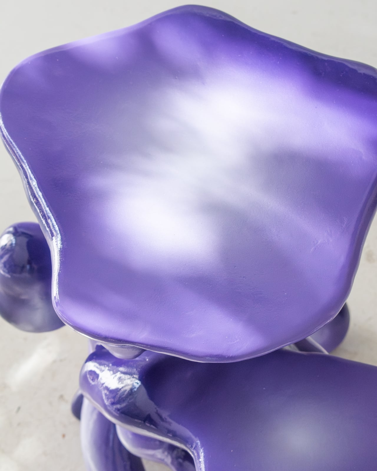
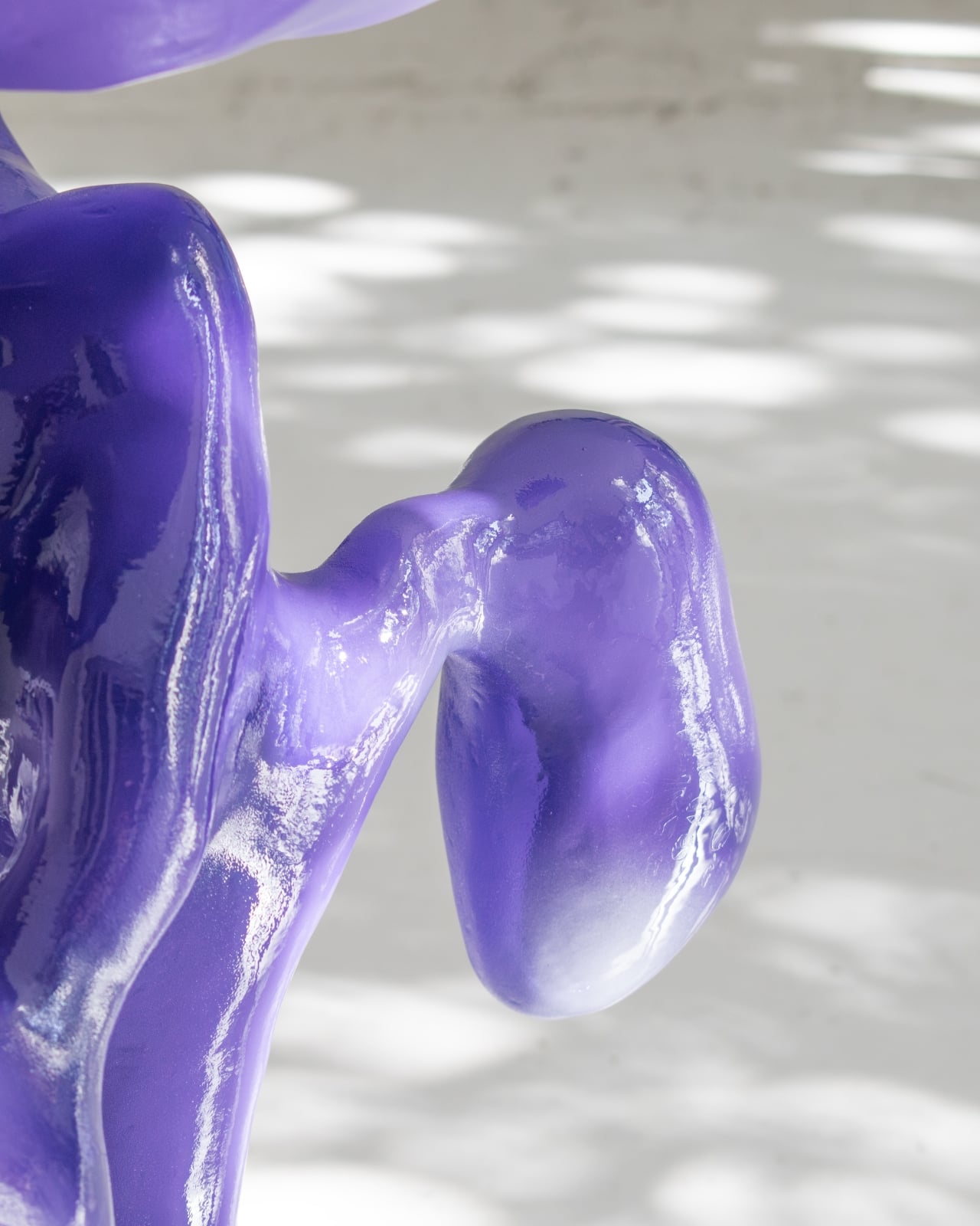
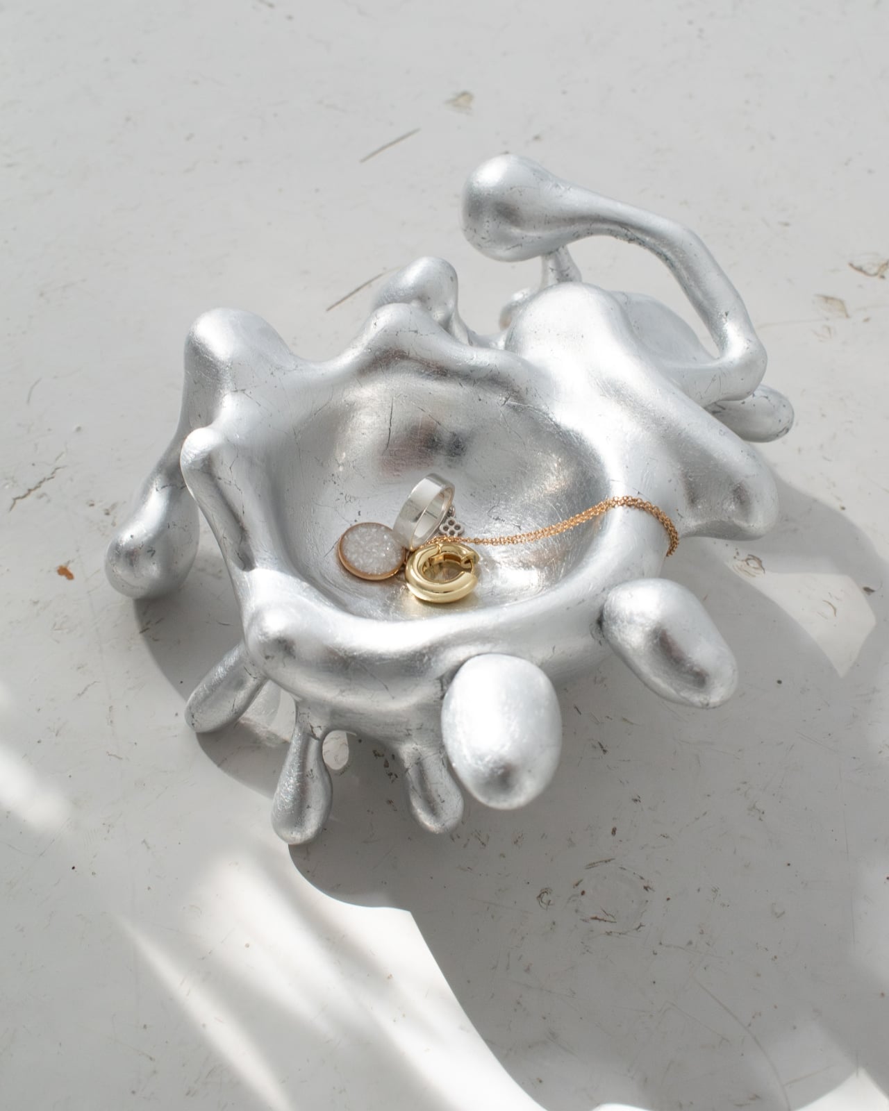
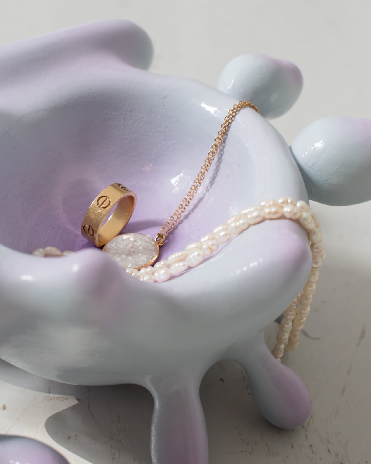
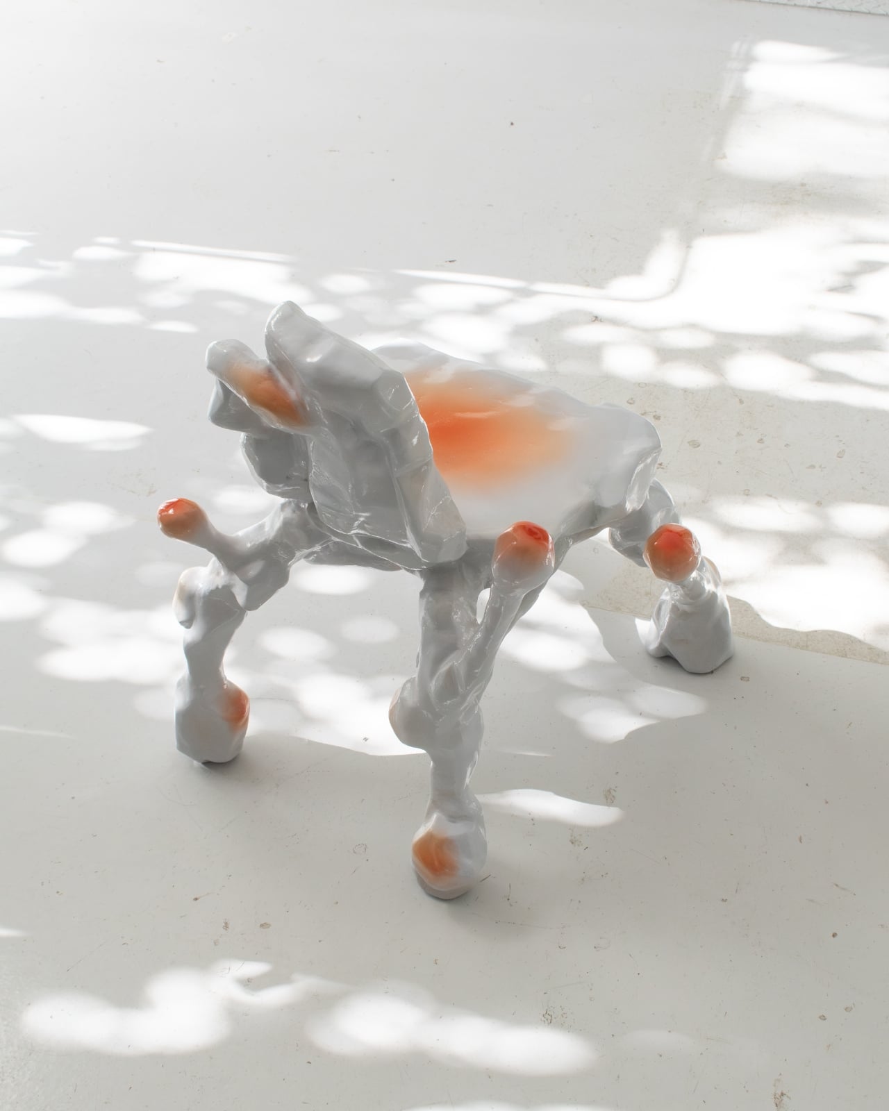
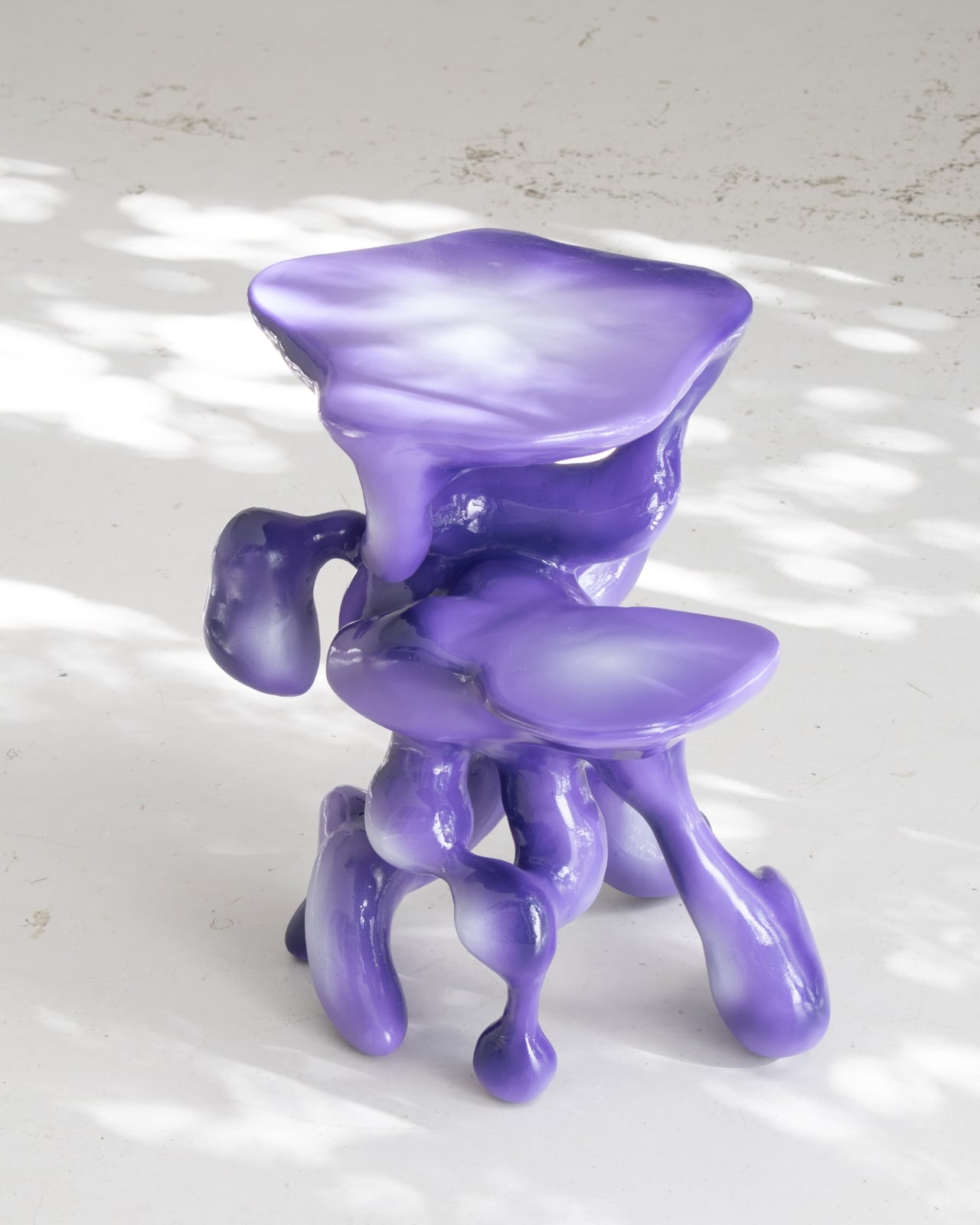
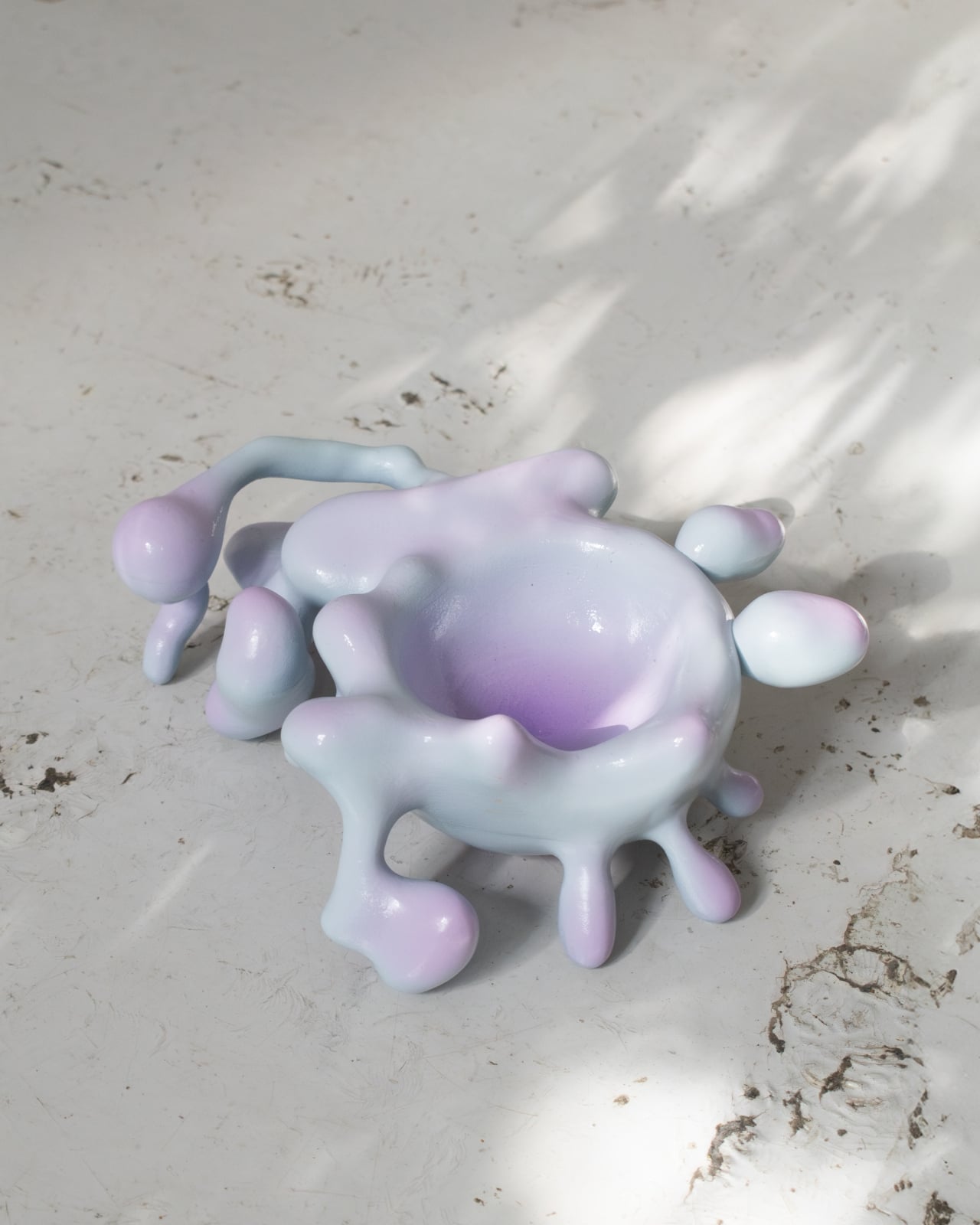
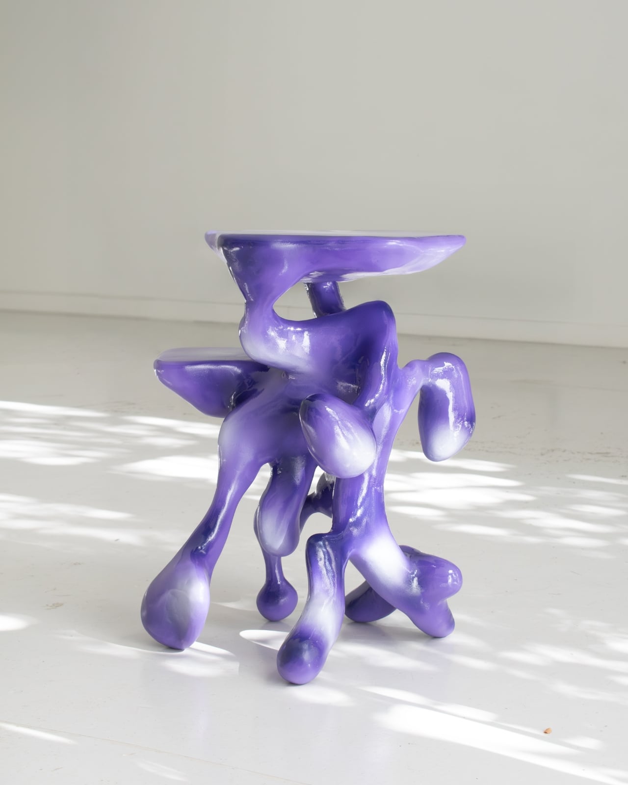
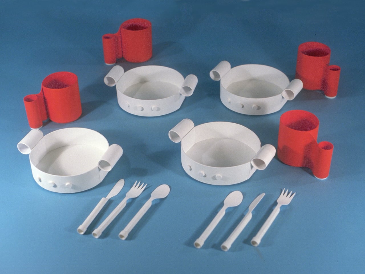
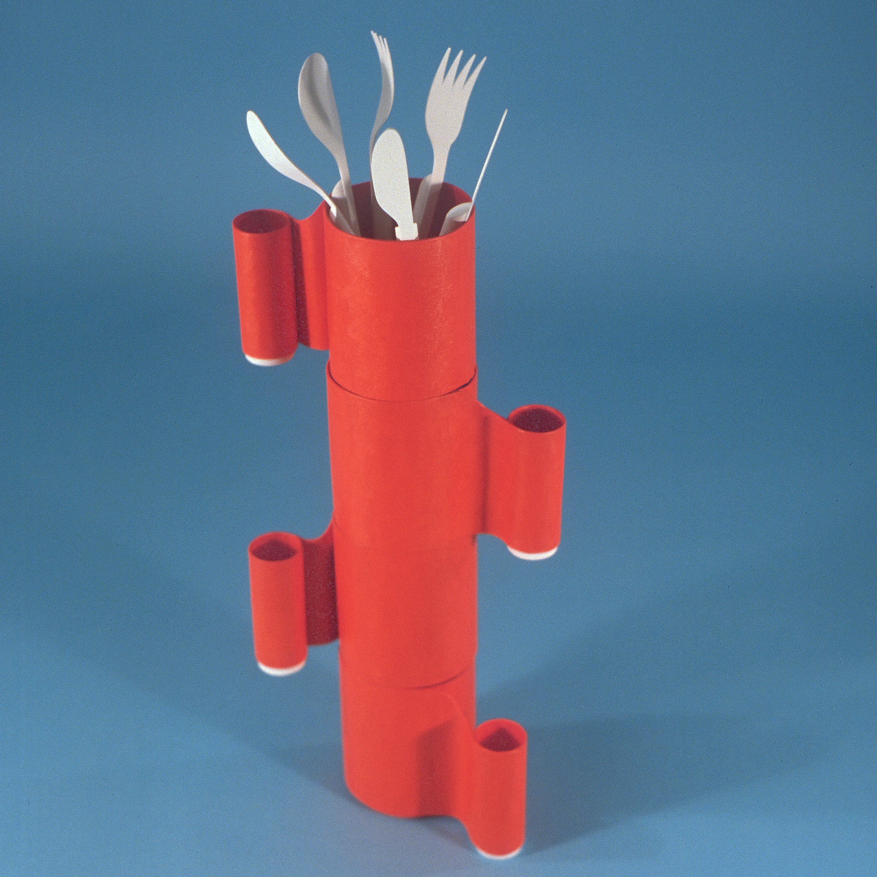
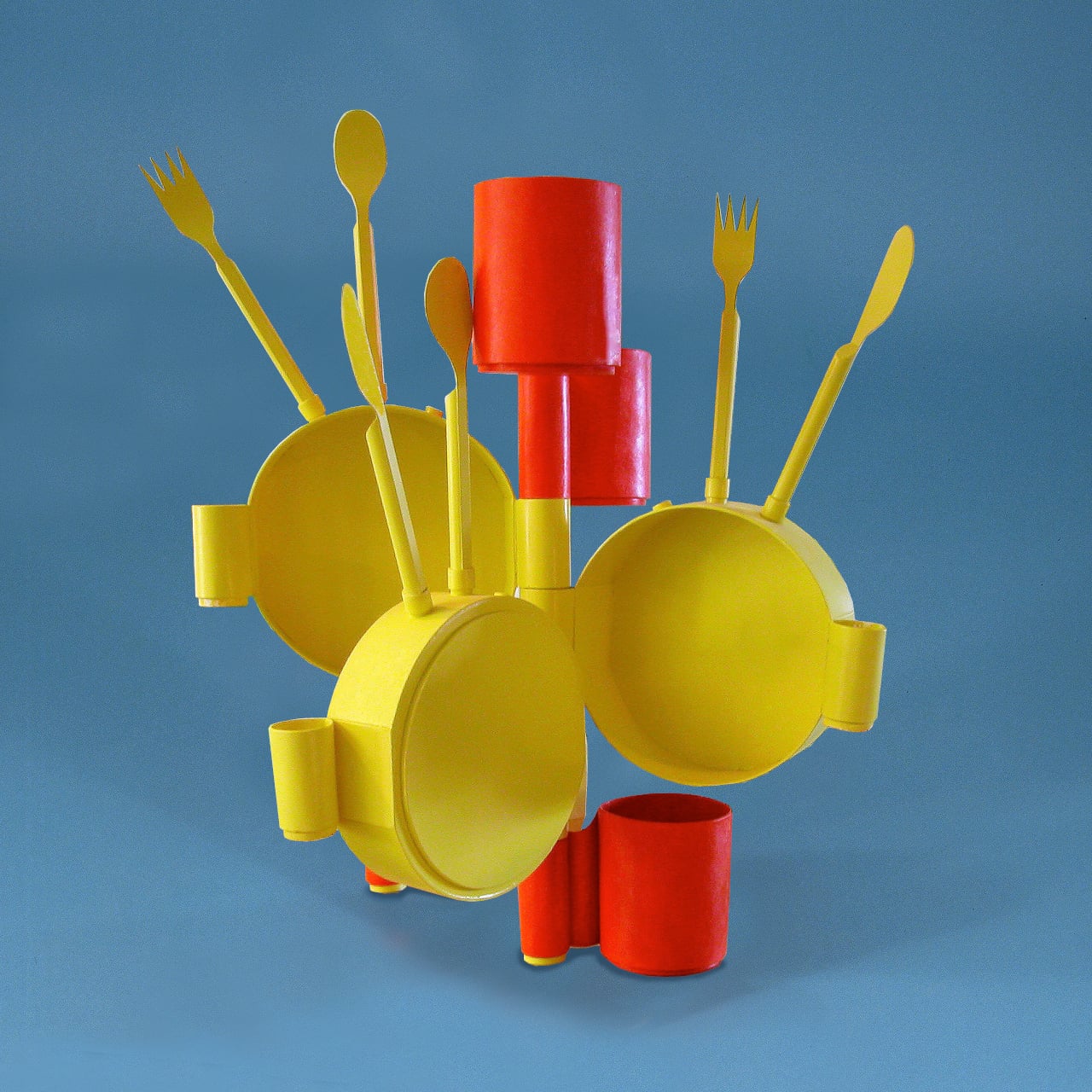
The key to the whole system is a set of male and female connectors molded directly into each piece. These are simple protrusions that stick out from the surfaces of the bowls, cups, and cutlery handles, allowing any component to plug into or stack onto any other. A bowl can lock onto a cup, a cup onto another cup, cutlery can stand upright in an opening or connect through a handle, and the whole assembly stays together without any separate hardware.
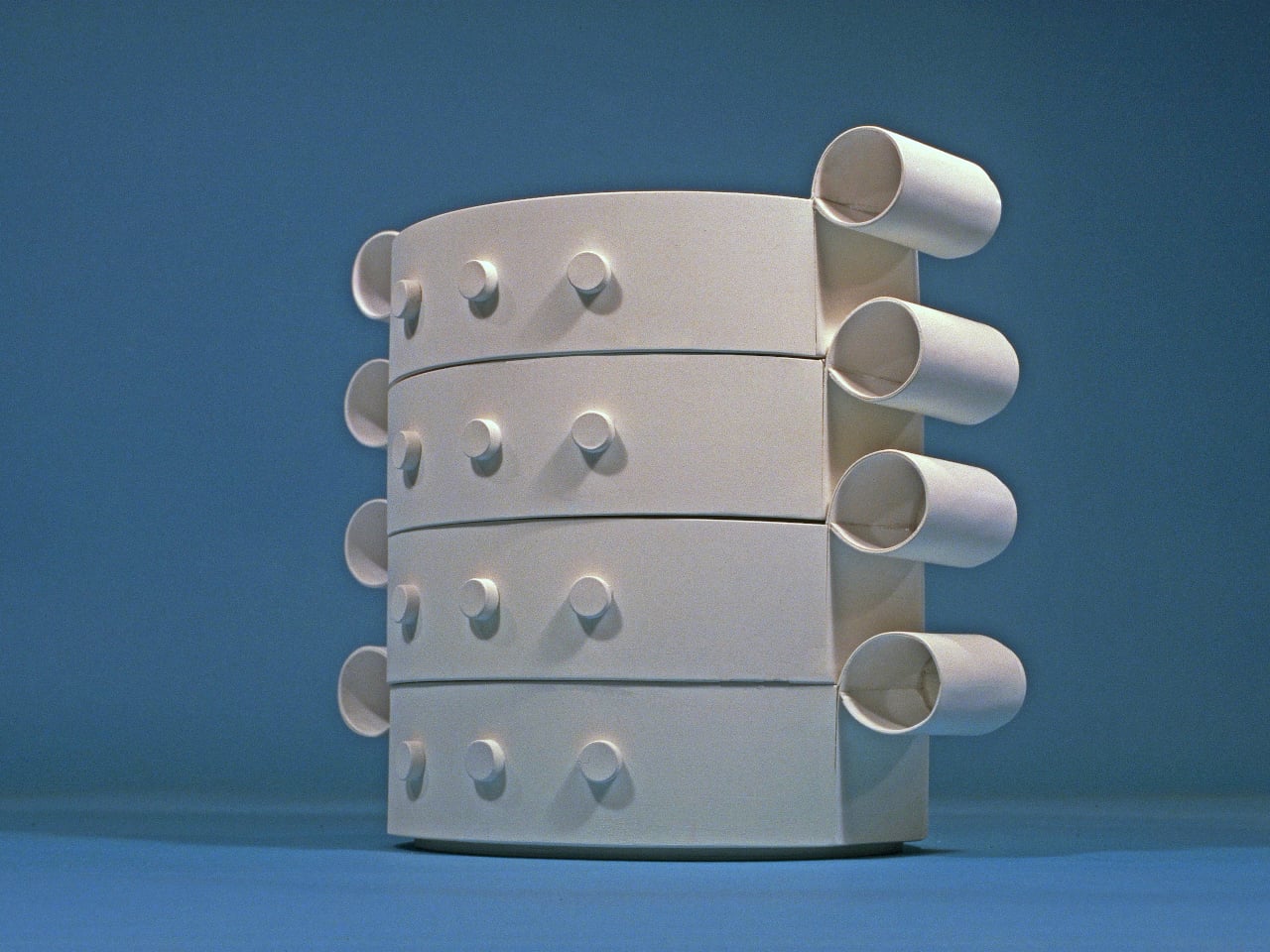
The configurations that result don’t look accidental. Cups stacked and plugged together form vertical columns; bowls assembled at various orientations create clusters that read as organic, almost biomorphic forms. Slide cutlery upright through the assembled pieces, and the resulting structure starts to resemble a piece of abstract art you’d find mounted in a gallery, not something you’d normally find next to a kitchen sink.
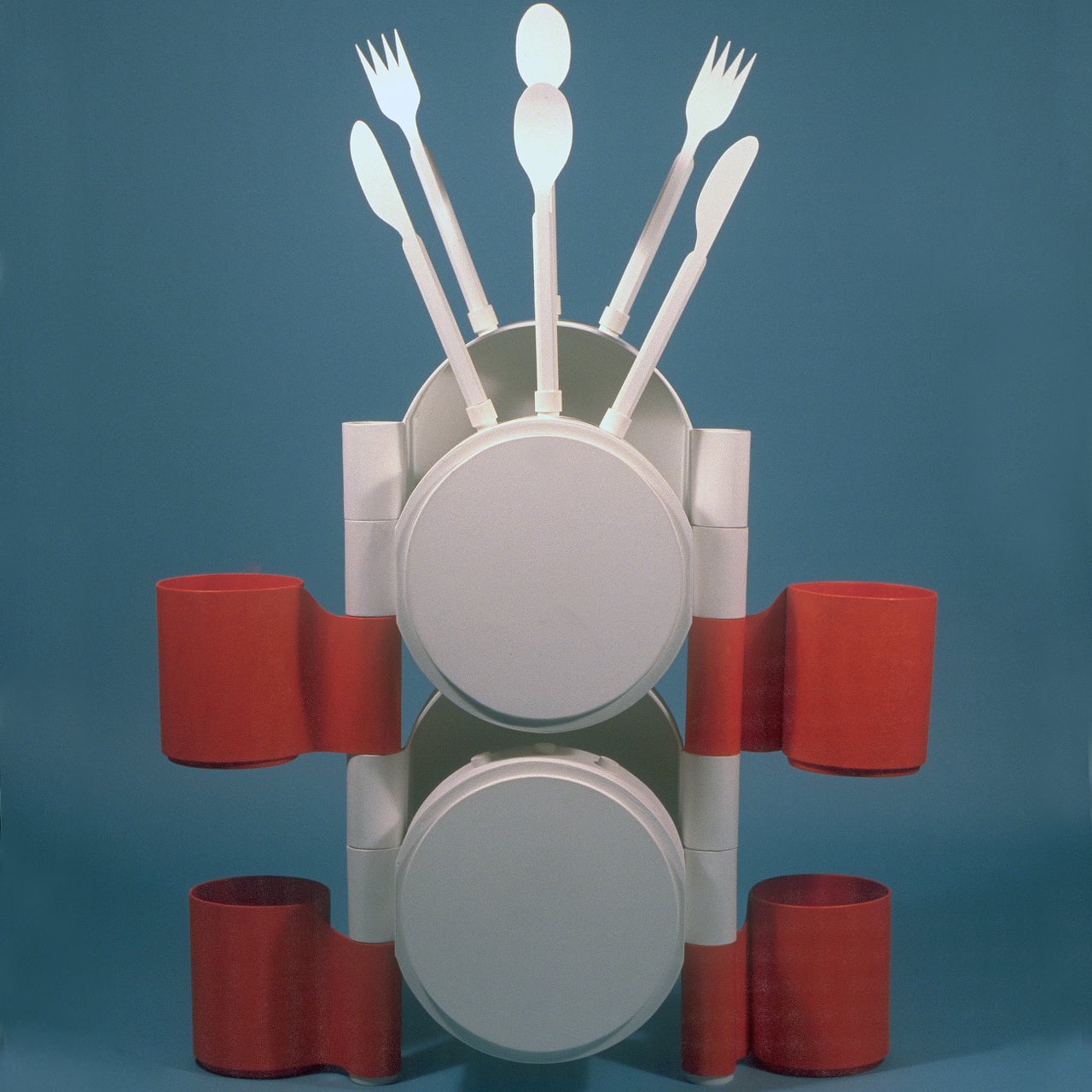
That’s precisely what Jantzen is after. The Art-ware set doesn’t need to be stored in a cabinet because the assembled form is meant to sit on a shelf or table as a decorative object, a sculpture that also happens to be a dining set. You pull it apart before a meal and reassemble it afterward in whatever configuration suits you that day. No two arrangements have to be the same.
The material is recyclable plastic, and Jantzen frames the concept in straightforward sustainability terms: one product that performs multiple functions uses fewer resources than two separate products doing the same jobs independently. There’s no dedicated storage unit needed, no extra display piece required. The dining set is the décor, and the décor is the dining set.
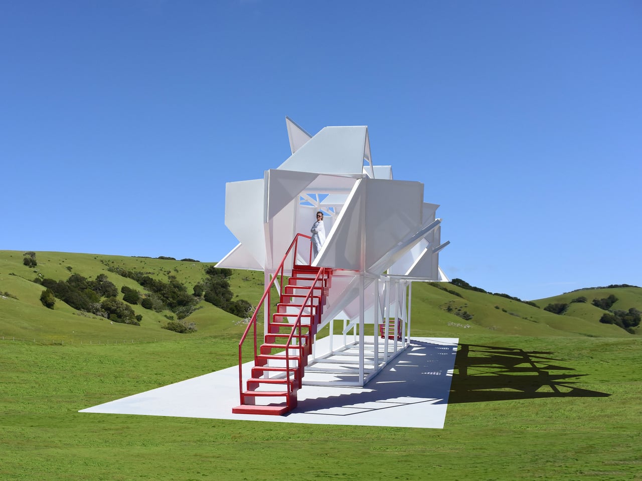
Art-ware is a prototype and the first in a planned series of designs that expand the idea further. The concept is broad enough to go well beyond tableware, and Jantzen has spent decades applying this kind of thinking to furniture, architecture, and public installations. The dining set is a compact version of the same logic: objects that commit fully to their function while quietly doing something else on the side.
The post Art-ware Is the Dining Set That Never Has to Go in a Cabinet first appeared on Yanko Design.