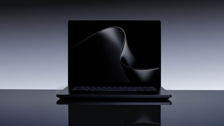
The Surface Laptop Ultra is the most powerful Surface yet, thanks to NVIDIA’s RTX Spark Posted on 01/06/2026 by Devindra Hardawar Microsoft's Surface Laptop Ultra is basically a MacBook Pro clone (that's powered by NVIDIA's RTX Spark).
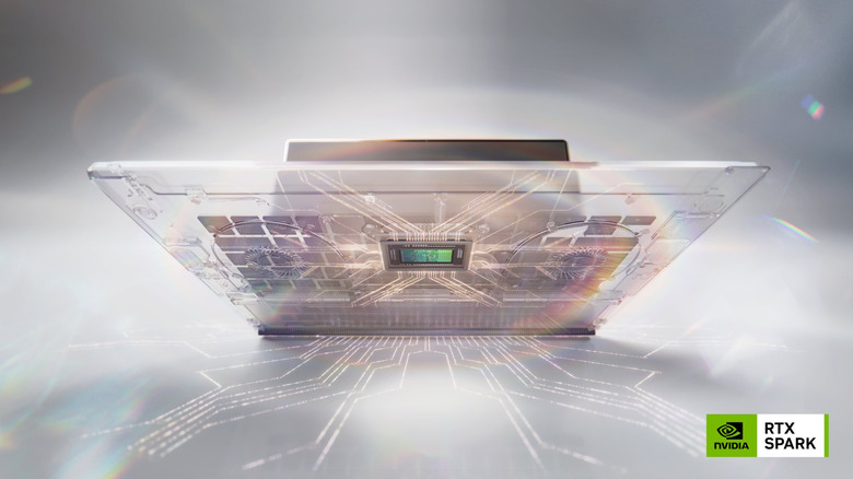
NVIDIA’s RTX Spark is an AI “superchip” that will power Windows laptops and desktops Posted on 01/06/2026 by Devindra Hardawar NVIDIA claims the new RTX Spark chip for PCs will offer 1 petaflop of AI computing power.
Backrooms is a reminder that the internet is the future of cinema Posted on 30/05/2026 by Devindra Hardawar Backrooms is a wild ride, and it's yet another example of how many great directors are coming from the internet
007 First Light is the stealthy James Bond game I’ve dreamed of Posted on 29/05/2026 by Devindra Hardawar Of course the Hitman devs made a great James Bond game.
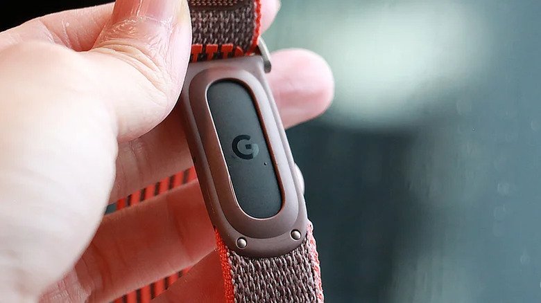
Engadget Podcast: Diving into the Fitbit Air and the Pope’s AI criticism Posted on 29/05/2026 by Devindra Hardawar This week on the Engadget podcast, we chat about our thoughts on the Fitbit Air, as well as Pope Leo's AI criticism with special guest Fr. Robert Ballecer.
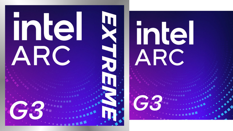
Intel’s Arc G-Series chips will power a new generation of gaming handhelds Posted on 28/05/2026 by Devindra Hardawar Intel isn't giving up on gaming handhelds: meet the new Arc G-Series chips for portable PC gaming.
The Mandalorian and Grogu is a lazy attempt at bringing TV to the big screen Posted on 22/05/2026 by Devindra Hardawar The Mandalorian and Grogu can't quite leave its TV origins behind.
Engadget Podcast: RGB, OLED and the TVs you should buy today Posted on 22/05/2026 by Devindra Hardawar Which new TV should you buy? The Engadget Podcast dives into RGB LCDs, OLED and all the new TV tech
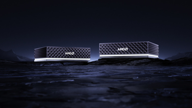
AMD prices its Ryzen AI Halo PC at $3,999, unveils Ryzen AI Max 400 chips Posted on 21/05/2026 by Devindra Hardawar AMD is taking a direct shot at NVIDIA's DGX Spark with its $3,999 Ryzen AI Halo PC.
Engadget Podcast: Google I/O 2026 was AI all the way down Posted on 20/05/2026 by Devindra Hardawar Google I/O was AI all the way down, but it's not clear how much will be useful.