PROS:
- Handsome design exudes both style and strength
- Black D2 steel blade is gorgeous and sharp
- Ceramic ball bearings deliver smooth and satisfying deployment
CONS:
- Pocket clip can't be moved for ambidextrous use
- Straight handle might feel too slim for a solid grip
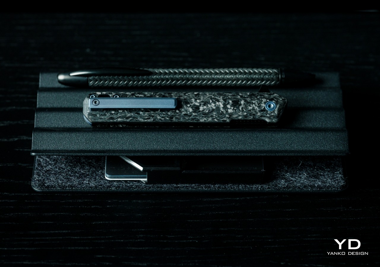
The EDC or Everyday Carry trend has been around for quite a while and there’s no sign of it slowing down anytime soon. Just like with paper notebooks and organizers, each collection of items and tools uniquely reflects the characters that own them. Some have simple packs filled with analog writing tools while others go fully digital with the latest gadgets and accessories. Still, some have an EDC that’s ready to face any task or problem, which sometimes involves cutting or slicing things. There might be a few who are hesitant to add a knife to their kit because most of the designs that can fit in an EDC often look like they’re geared for battle. Tekto has been making a few “tactical” knives designed to cater to this market, so we give the Forged Carbon version of its F2 Bravo folding knife a few flips to see if it makes the cut.
Designer: Tekto
Click Here to Buy Now: $127.50 $149.99 (15% off with coupon code “YANKO”). Hurry, deal ends in 48-hours! Fedex 2 day shipping to all USA orders for free.
Aesthetics
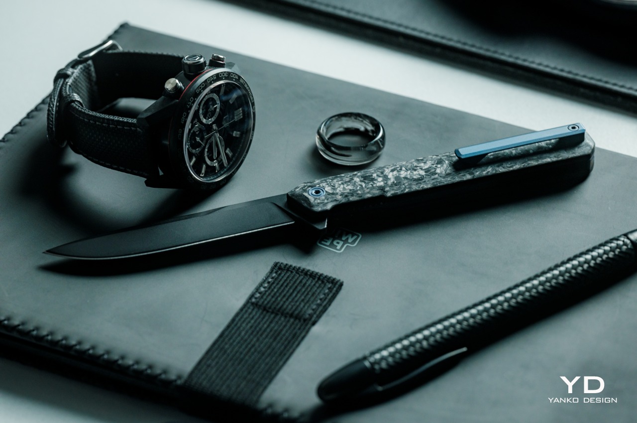
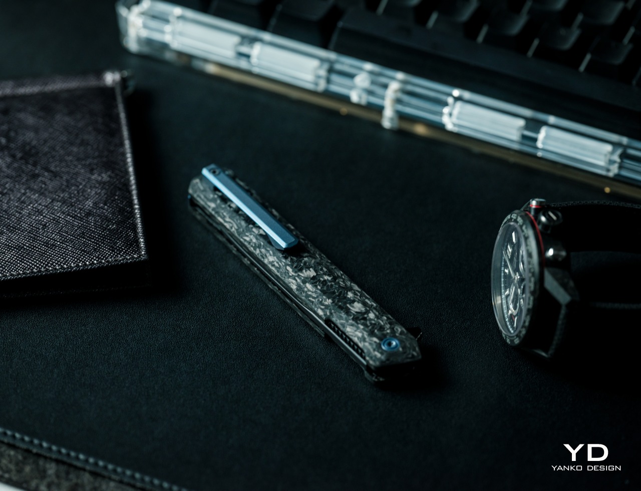
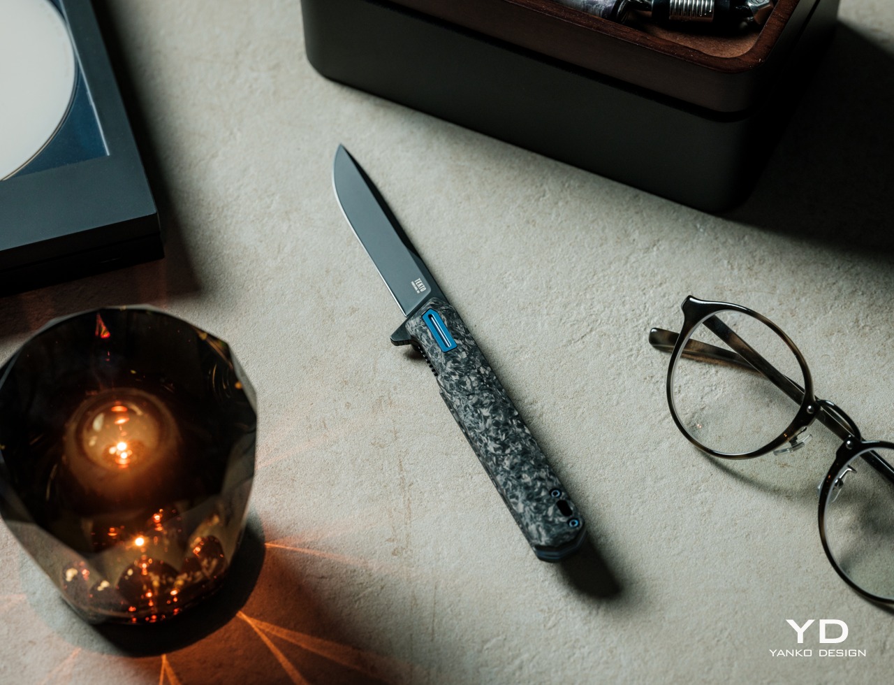
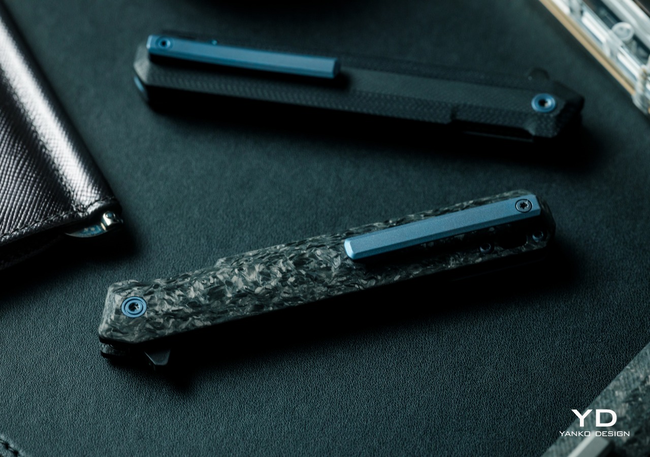
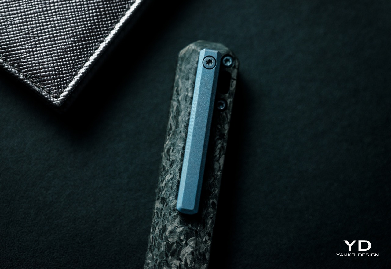
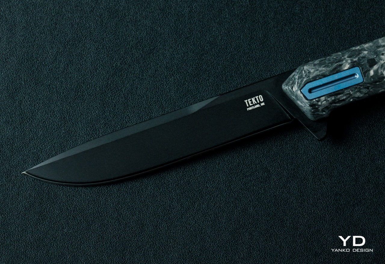
Calling the Tekto F2 Bravo a tactical knife might be a little bit confusing, though depending on the exact variant you’re going for, it does fit the bill in terms of looks. The Forged Carbon with Blue Accents that we have for this review does have that camo-like appearance to the handle, but that’s pretty much the extent of the association with tactical gear. Because at the end of the day, the F2 Bravo is a handsome tool that carries both finesse as well as strength in its appearance alone.
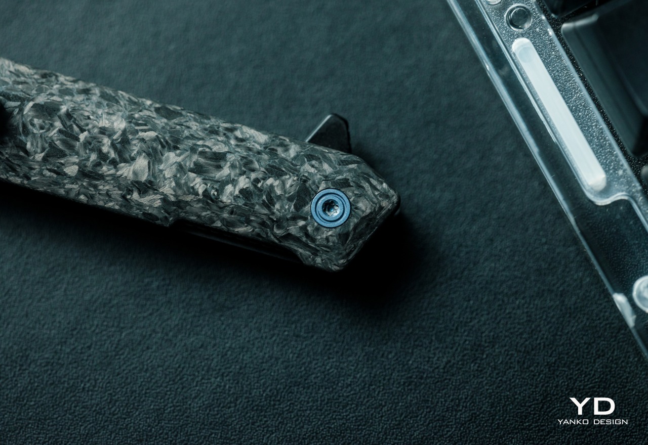
Unlike what you might think of tactical knives or folding pocket knives in general, the Tekto F2 Bravo uses straight, clean lines to portray an image of sharpness and simplicity. The handle itself has a simple and straight structure that avoids excessive curves and embellishments that only get in the way of the knife’s utility. Titanium accents used for the custom pivot, machined clip, and milled spacer add a premium quality to the knife, again an unexpected trait for something labeled as a tactical tool.
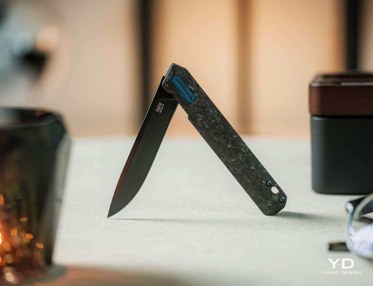
Even the blade, made from durable D2 steel, is a cut above the rest, pun intended. While most EDC knives prefer to show off their flashy blades with shiny silver, the F2 Bravo prefers a dark, black titanium coating. It gives the knife a distinctive appearance that is cold yet also precise, perfectly complementing whatever color the handle has. While it does catch your attention, it doesn’t distract you from the task at hand without a shiny surface to reflect light or the surface of what you’re cutting through.
With its slim profile, simple geometrical shape, and handsome looks, the Tekto F2 Bravo definitely stands above other EDC knives. It’s neither flashy nor flimsy, perfectly balancing aesthetics and a solid feel that we’ll get to in a bit.
Ergonomics
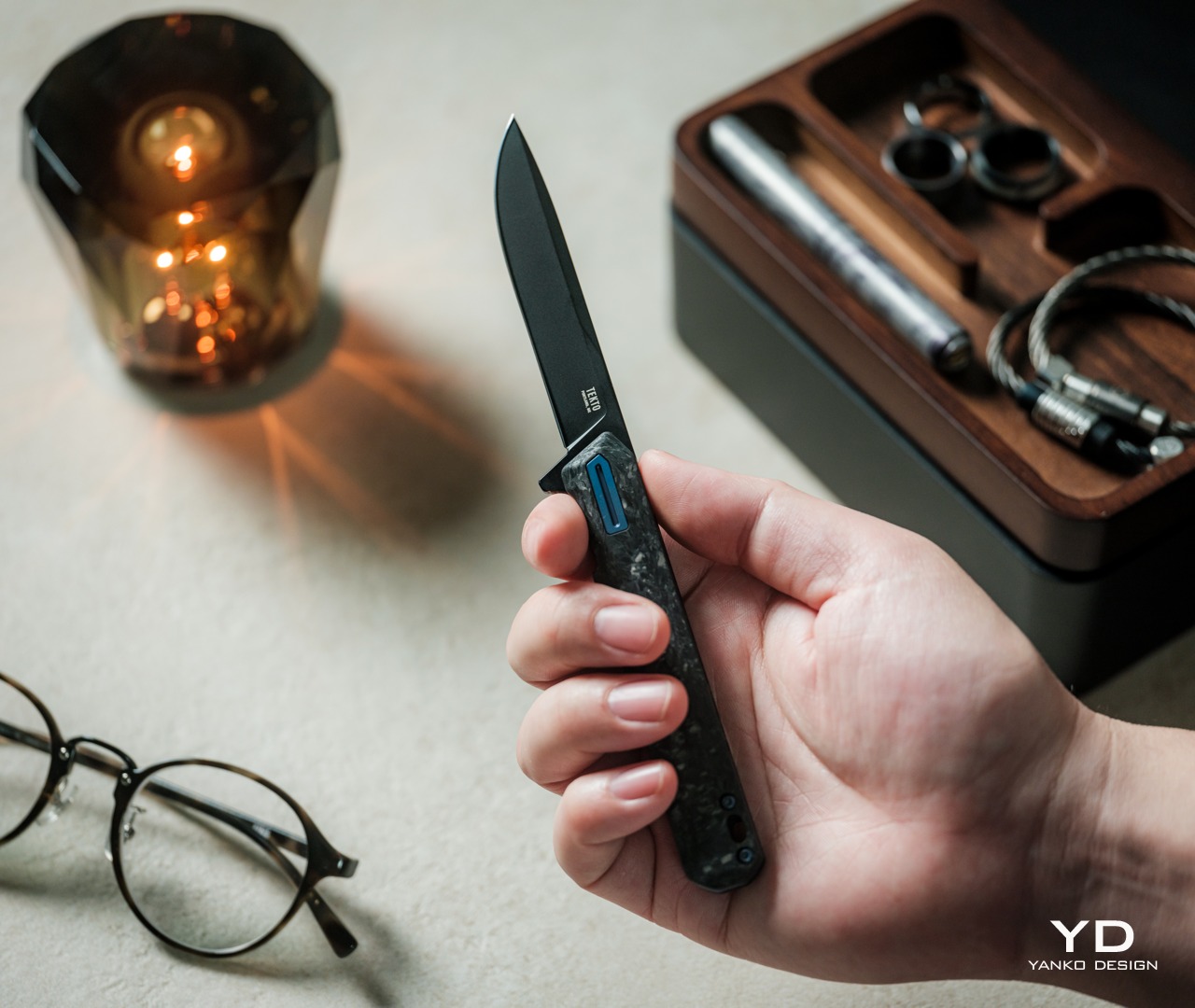
Just like its comparatively small size, the F2 Bravo is also surprisingly lightweight at only 2.04oz (68g). That’s not an insignificant number, considering this knife will take up space in small EDC bags or even pockets. For the latter, there’s a deep-carry titanium clip that makes it easy to secure in pants or shirts. That clip, unfortunately, is also one of the very few flaws in this knife’s design. You can’t remove the clip to switch it to the other side, unlike Tekto’s other ambidextrous clips. It’s not a deal-breaker definitely, but it’s something that buyers might want to consider when it comes to their comfort.
Despite its lightweight body, the knife still feels solid in your hand, especially when you deploy and close the blade. The one thing you might want to take note of is the size and shape of the handle. Unlike some of those more rugged knives, the F2 Bravo’s body doesn’t have specialized nooks and crannies to rest your fingers, except for the front guard for your index finger and jimping for the thumb. Some larger hands might even find the handle too small for a secure hold, and they might find themselves gripping it more forcefully and experiencing strain over time.
In most cases, however, the Tekto F2 Bravo offers a design that gives you confidence every time you grip the handle and deploy the blade. Exactly what you need for a sharp, cutting tool
Performance
The F2 Bravo’s fine edge drop point blade is quite a beast. It easily cuts through paper, cardboard, fabric, ropes, and other materials you might meet in your day-to-day travels. Given its size and purpose, it’s not fit for heavy-duty work, especially if you need some tooth to saw through harder materials. Then again, it’s an EDC knife more than an actual outdoor “tactical” blade, an aspect that might cause some confusion due to the name chosen by Tekto’s marketing.
Ceramic Ball Bearings – Enables quick and smooth blade deployment.
A sharp blade, however, is pointless if you can’t get it out of its hiding place fast enough and with little difficulty, and this is where the F2 Bravo really shines the brightest. It uses a ceramic ball bearing mechanism to rapidly and smoothly deploy the blade, and it definitely works as advertised. The action is smooth and the trigger is easy, giving you a satisfying feeling each and every time you make the blade spring into action. It might sound like a simple thing, but you shouldn’t underestimate the feeling of fulfillment from using a tool that not only works well but also gives you joy.
In addition to its rapid deployment, the F2 Bravo also delivers much-needed safety so that you can confidently slip it in your EDC bag or even your pocket. The discreet liner lock gives all the assurance you need that the sharp blade won’t just accidentally deploy or fold at the slightest pressure. At the same time, the strategically placed jimping makes it just as stable to close the blade when you’re done with your task. More than just its handsome looks, every part of the Tekto F2 Bravo is designed to provide maximum comfort without sacrificing its cutting performance.
Sustainability
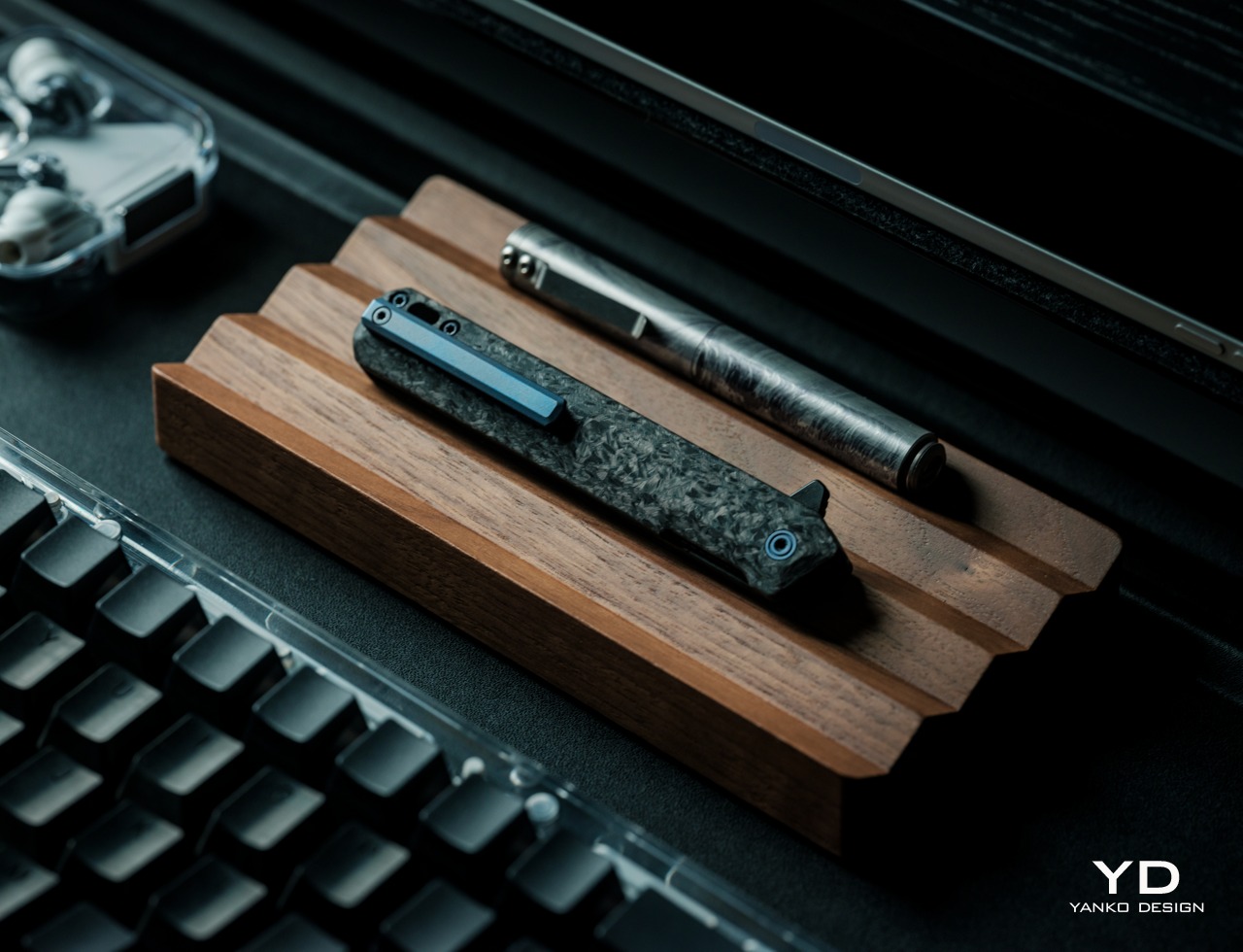
For a tool that will most likely be used for rough purposes, it’s only reasonable to expect the Tekto F2 Bravo to be made to last. It uses plenty of durable materials, primarily Forged Carbon and D2 steel, that provide longevity while also making the folding knife lightweight and comfortable to hold. And thanks to its premium design, it uses very little plastic materials, making the knife inherently sustainable.
Sooner or later, however, the knife will meet some mishap that can’t be solved simply by sharpening the blade. Unfortunately, the F2 Bravo isn’t made to be easily repairable, at least not by untrained hands. The good news is that for most damages, Tekto accepts repairs or refurbishing, though you’ll have to ship the knife back to them. That said, you can replace lost screws on your own, but you’ll have to contact Tekto to get official replacement parts. Given that Tekto has a very responsive in-house customer service center, which responds within hours and usually ships parts on the same day, getting a replacement part should be a relatively quick and painless process.
Value
There are many pocket knives presenting themselves as EDC-friendly, but most of them fall under two categories. There are larger knives that are clearly made for outdoor use, and there are smaller knives that feel like they’ll break even before you finish cutting. The Tekto F2 Bravo proudly stands somewhere in the middle, with a tactical guise that speaks to its durability and performance, all while keeping a stylish and elegant design. It’s almost the perfect EDC knife, but there are a few things you’ll want to consider before committing to buying one.
The first is that it’s not a “one size fits all” affair and larger hands might find the knife a bit uncomfortable to hold for long periods of time. It’s also not the most affordable option of its kind, give or take around $140, depending on sales or discounts. That said, you do get a quality product that looks handsome in any EDC toolbox, so if you’re the type that needs to cut or slice a lot, the Tekto F2 Bravo definitely pays for itself in the long run.
Verdict
Something billed as a “tactical” knife is probably something you’d never consider for your EDC collection. It conjures up images of rugged or militaristic tools, probably more than you’ll ever want or need for everyday use. Fortunately, that’s really just a marketing strategy, because the Tekto F2 Bravo is anything but bulky and menacing.
It has a simple yet elegant design that belies the power it hides within, literally. Its lightweight yet durable Forged Carbon body makes it a pleasure to hold, while the black titanium-coated D2 steel blade looks as cool and sharp as it really is. Ceramic ball bearings make deployment swift and smooth, while the liner lock provides the confidence you need in every cut. With its handsome looks, a sharp blade, and a satisfying deployment mechanism, the Tekto F2 Bravo easily carves a place for itself in any EDC.
Click Here to Buy Now: $127.50 $149.99 (15% off with coupon code “YANKO”). Hurry, deal ends in 48-hours! Fedex 2 day shipping to all USA orders for free.
The post Tekto F2 Bravo EDC Folding Knife Review: Sharp, Stylish, Satisfying first appeared on Yanko Design.