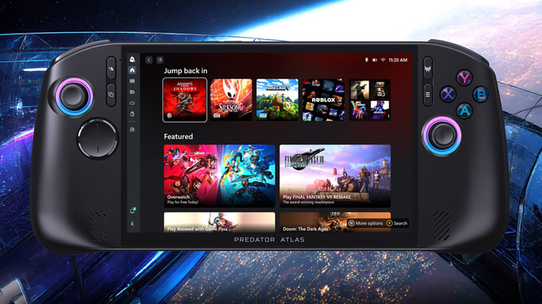
The Acer Predator Atlas 8 is one of the first handhelds to feature Intel’s latest Arc G3 chips Posted on 28/05/2026 by Sam Rutherford Its silicon supports up to Arc B390 graphics and XESS 3 upscaling.
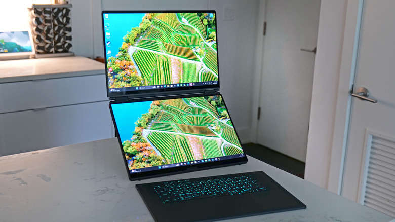
ASUS ROG Zephyrus Duo review: Outrageously expensive, totally awesome Posted on 27/05/2026 by Sam Rutherford The ASUS ROG Zephyrus Duo is a gamer's dream machine, but its price is a nightmare.
AT&T is letting you ‘build your own’ wireless plan starting at just $15 a month Posted on 21/05/2026 by Sam Rutherford AT&T's 'build your own' wireless plan starts at just $15 a month, but only comes with 1GB of data to start.
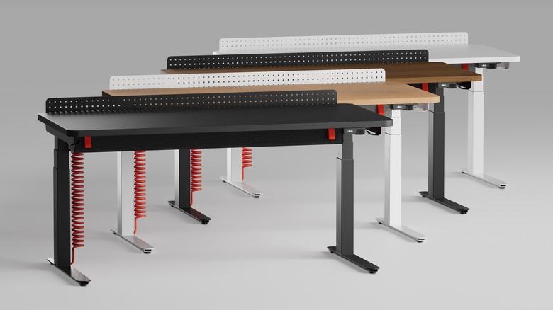
The Herman Miller Coyl is a very handsome and modular gaming desk Posted on 20/05/2026 by Sam Rutherford Legendary furniture maker Herman Miller has made a gorgeous gaming desk that has a price tag you'd expect from the brand.
Samsung and Google just teased their upcoming Android XR smartglasses at Google I/O Posted on 19/05/2026 by Sam Rutherford The two models were created in partnership with Warby Parker and Gentle Monster.
Samsung’s has produced the world’s first 6K gaming monitor Posted on 19/05/2026 by Sam Rutherford Samsung's new displays include a 6K gaming monitor and a larger version of the MovingStyle.
Volvo reveals $58,400 starting price for the EX60 Posted on 18/05/2026 by Sam Rutherford Volvo's upcoming mainstream EV SUV is available to order now.
The VW ID.Buzz is returning for model year 2027 with a new trim for camping Posted on 14/05/2026 by Sam Rutherford The Tourer model features a fold-out mattress, removable window binds and more.
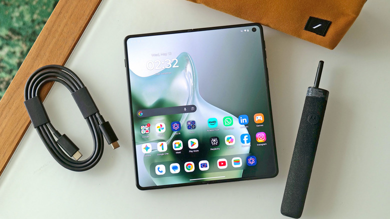
Motorola Razr Fold review: A worthy rival to Google and Samsung Posted on 14/05/2026 by Sam Rutherford It even has native stylus support, which Samsung dropped on the Galaxy Z Fold 7.
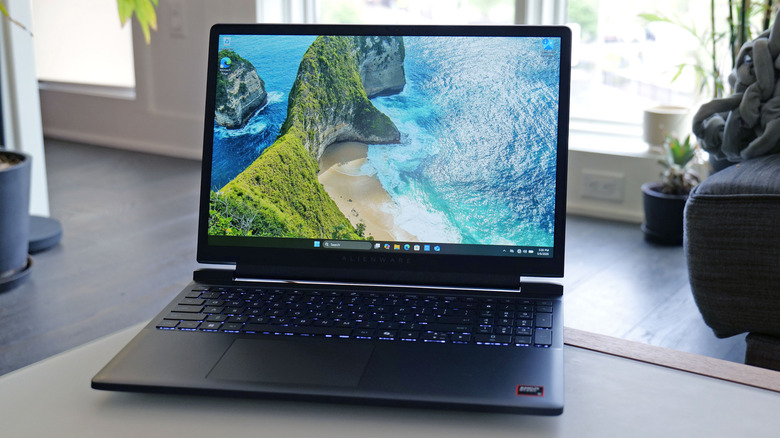
Alienware’s first affordable gaming laptop is arriving at the perfect time Posted on 14/05/2026 by Sam Rutherford The entry-level Alienware 15 starts at $1,299 with an AMD CPU or $1,349 for an Intel config.