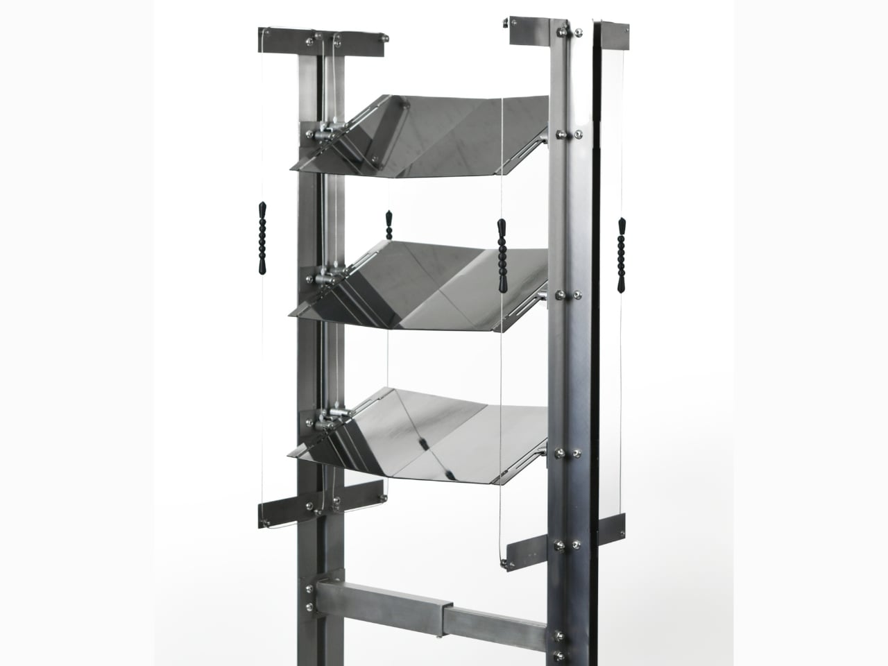
This Korean Partition Uses A Periscope-Inspired Design To Reflect The Sky In Your Room

Most of us living in cities have gotten used to a very particular kind of light. It comes in flat and filtered through glass, bounced off neighboring buildings, and stripped of any real sense of time. Morning looks a lot like afternoon. The sky, if you can see it at all, is a narrow strip somewhere above the roofline. It’s become the default setting of urban life, and most of us have stopped noticing.

That quiet loss is exactly what CHAGYEONG is designed to address. Created by designers SeongJin Hwang (Neo), Soyeon Kim, and Minje Park, this series of metal craft-based living objects isn’t trying to replicate nature or substitute it with some wellness trend. It’s doing something more deliberate than that: it’s pulling an ancient architectural principle out of history and asking whether it still has something useful to say about the way we live now.

Designers: SeongJin Hwang (Neo) / Soyeon Kim / Minje Park
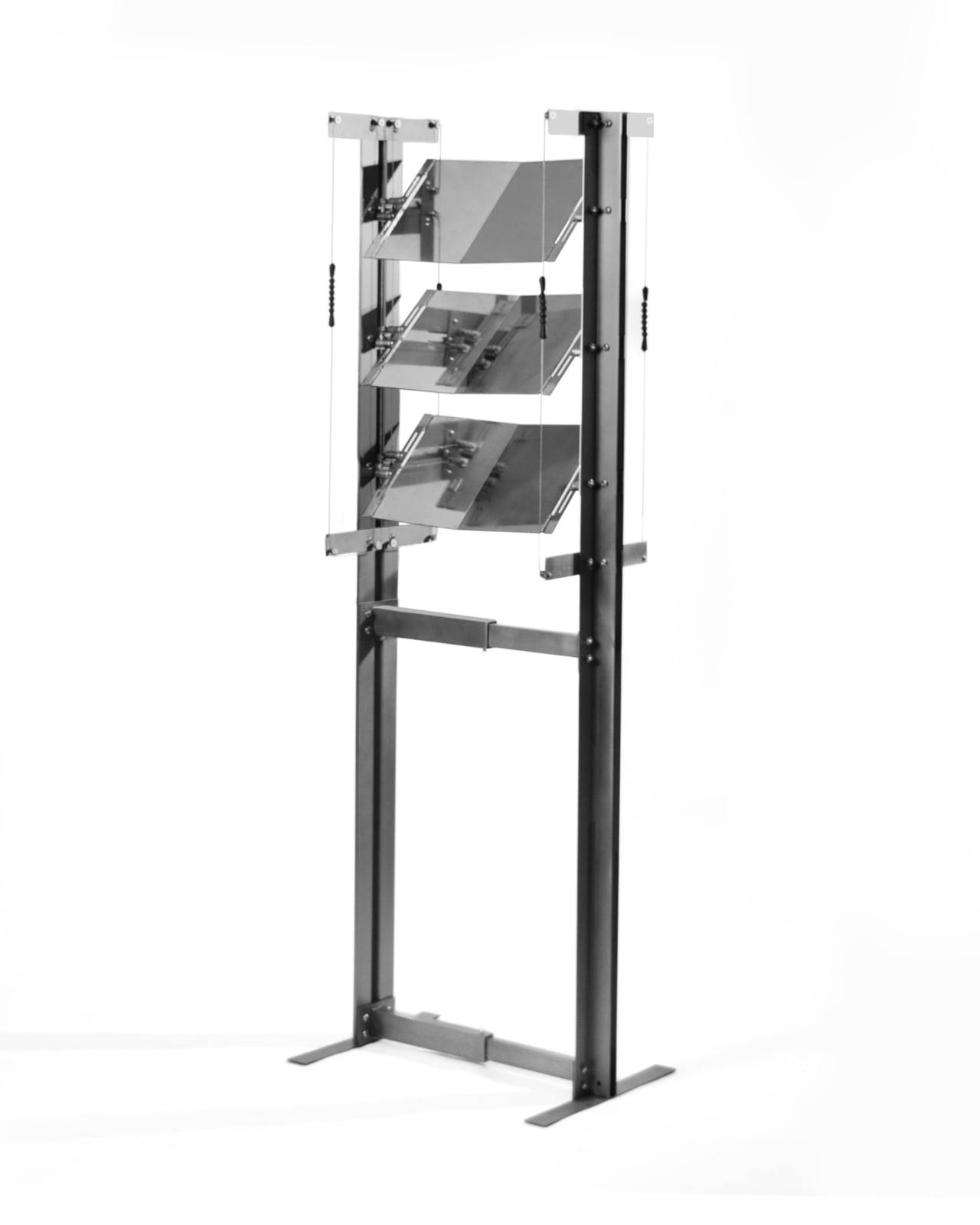
The concept borrowed from (and named after) is chagyeong (借景), a traditional East Asian practice that translates literally to “borrowed scenery.” The idea is that a space doesn’t have to generate its own landscape. It can simply frame, redirect, and invite the one that already exists outside. Korean architects used this principle for centuries, orienting pavilions and residences so that distant mountains, seasonal foliage, or the open sky became part of the interior experience. The environment wasn’t something to block out. It was a resource.

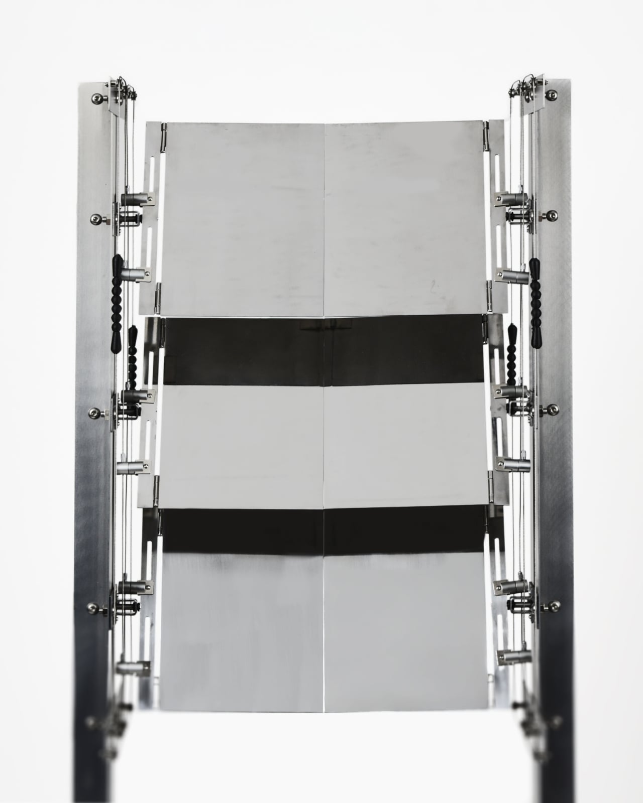
What Hwang, Kim, and Park have done with the CHAGYEONG partition is apply that sensibility to a very specific contemporary problem: urban apartments where privacy and natural light are constantly in tension with each other. The partition sits near a window, and through its rotating mirror-like metal panels, it manages to block direct sightlines from the outside while redirecting the changing colors of the sky inward. You get privacy without the heavy curtain. You get natural light without the exposure. The sky, in a very literal sense, comes inside.
The mechanics of this are more interesting than they first appear. Each reflective metal panel can be angled to adjust the view, which means the object responds to the space rather than dictating to it. The structure is also freestanding, using load distribution instead of wall fixation, so it doesn’t require drilling or permanent installation. This matters more than it sounds. Design objects that require commitment are design objects that most renters never get to own. The flexibility here feels intentional, not just practical.
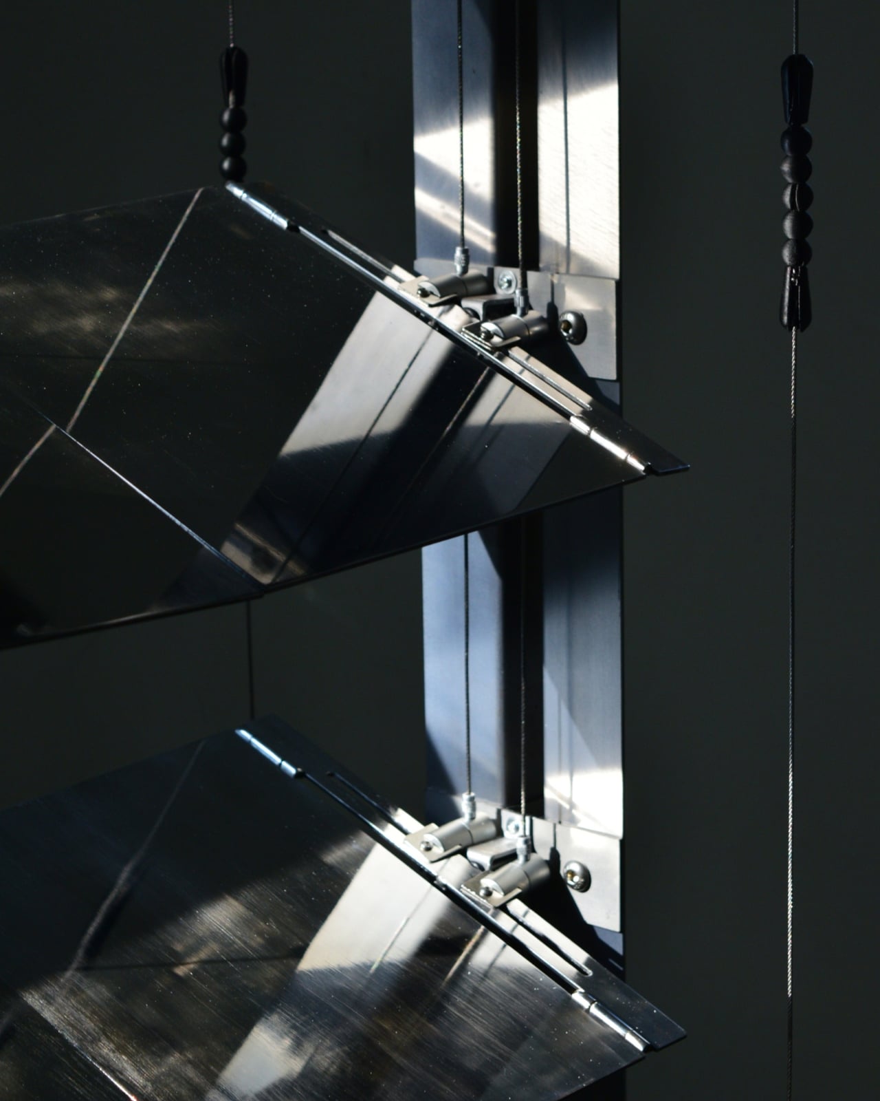
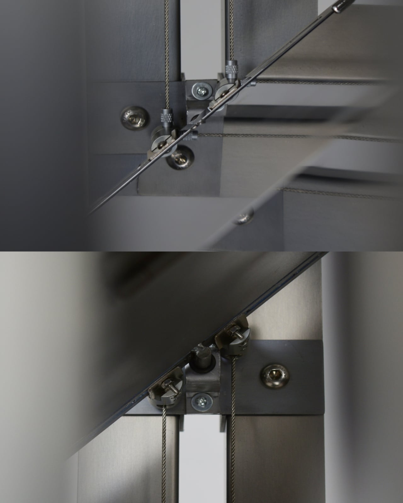
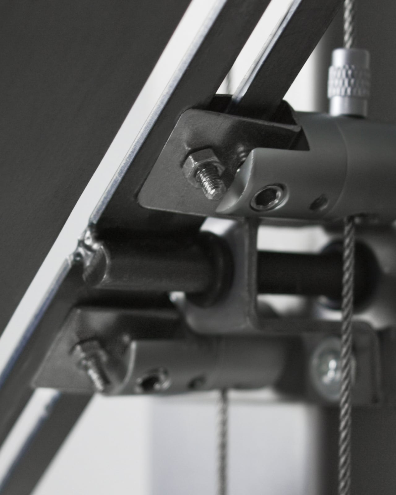
Visually, it reads as sculpture before it reads as furniture. The finely finished metal surfaces, the suspended panels, the small articulated joints and cables connecting everything: it looks like something that belongs equally in a gallery and a living room. That’s a difficult balance to strike, and the team has managed it. The industrial precision of the hardware sits alongside something quieter, almost contemplative, in the overall form.
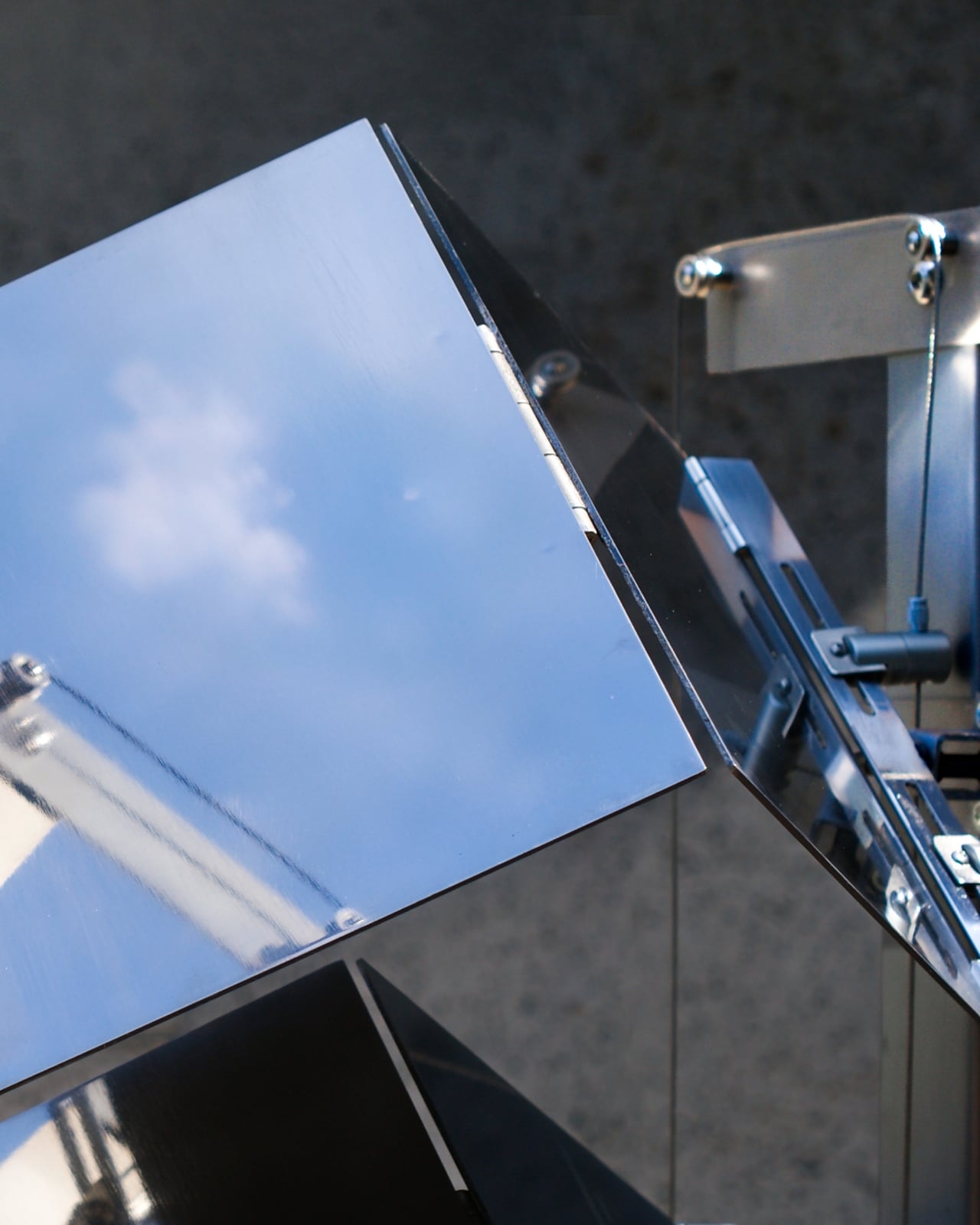
I’ll admit that the first time I looked at it, the engineering detail drew my attention more than anything else. Looking at the close-up images of the rotating joints and the tension cables, you realize how much considered problem-solving sits behind what appears to be a minimalist aesthetic. The freestanding structure, the angled panels, the wire suspension system: none of it is accidental. Everything is load-bearing in the most literal and conceptual sense.
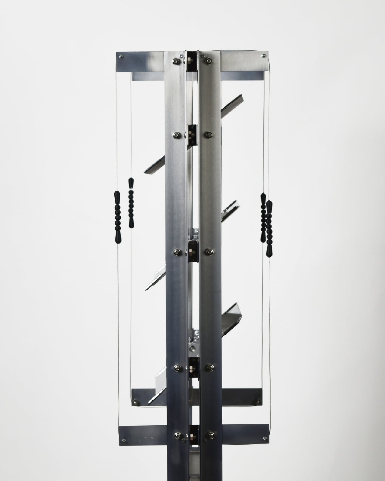
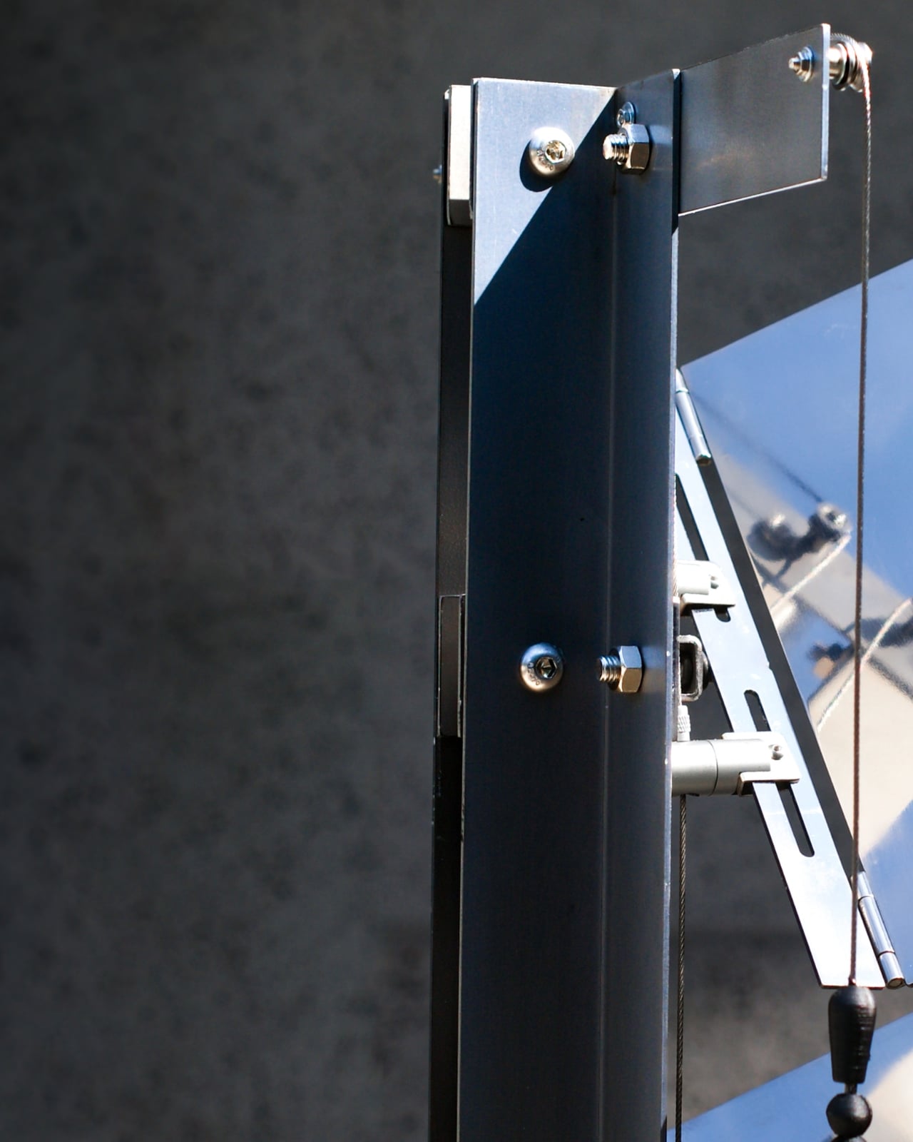
What stays with me, though, is the premise. The idea that a piece of furniture could be designed specifically around giving you back the sky. Not a wellness app, not a daylight lamp, not a houseplant. A metal object, engineered to redirect your attention upward and outward at the part of the world we’ve quietly agreed to stop looking at. Urban living asks us to trade a lot of things in exchange for density, convenience, and connection. Natural time, that slow visible shift from morning to dusk, is one of them. CHAGYEONG is making an argument, calmly and without drama, that the trade doesn’t have to be permanent.
The post This Korean Partition Uses A Periscope-Inspired Design To Reflect The Sky In Your Room first appeared on Yanko Design.
A $57 Stand Finally Solves the Vinyl Storage Problem

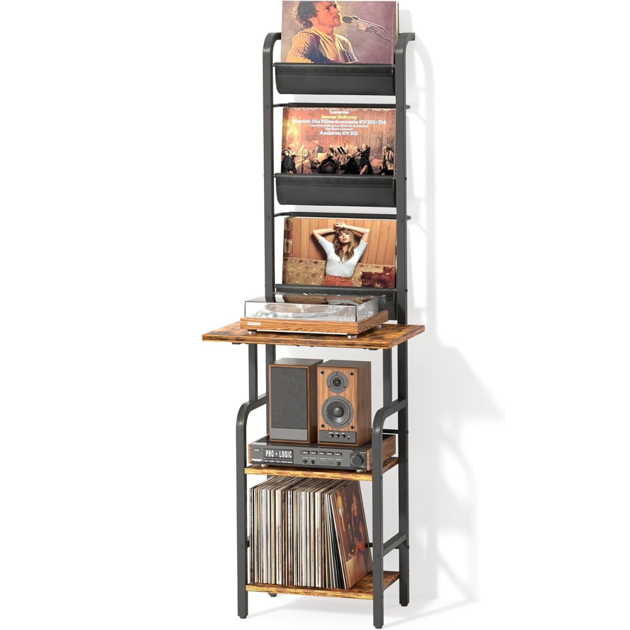
The vinyl revival has been going on long enough now that nobody’s surprised by it anymore. What started as audiophile nostalgia quietly became a full-blown lifestyle choice, and record players are back in living rooms, bedrooms, and studio apartments everywhere. But while turntable manufacturers spent years perfecting their hardware, the furniture side of the equation mostly got left behind. A lot of collectors are still balancing their record player on a spare shelf, stacking their albums in milk crates, or worse, just leaving them on the floor in some optimistic pile that says “I’ll organize this eventually.” Tewinko’s Record Player Stand feels like a direct response to that gap.

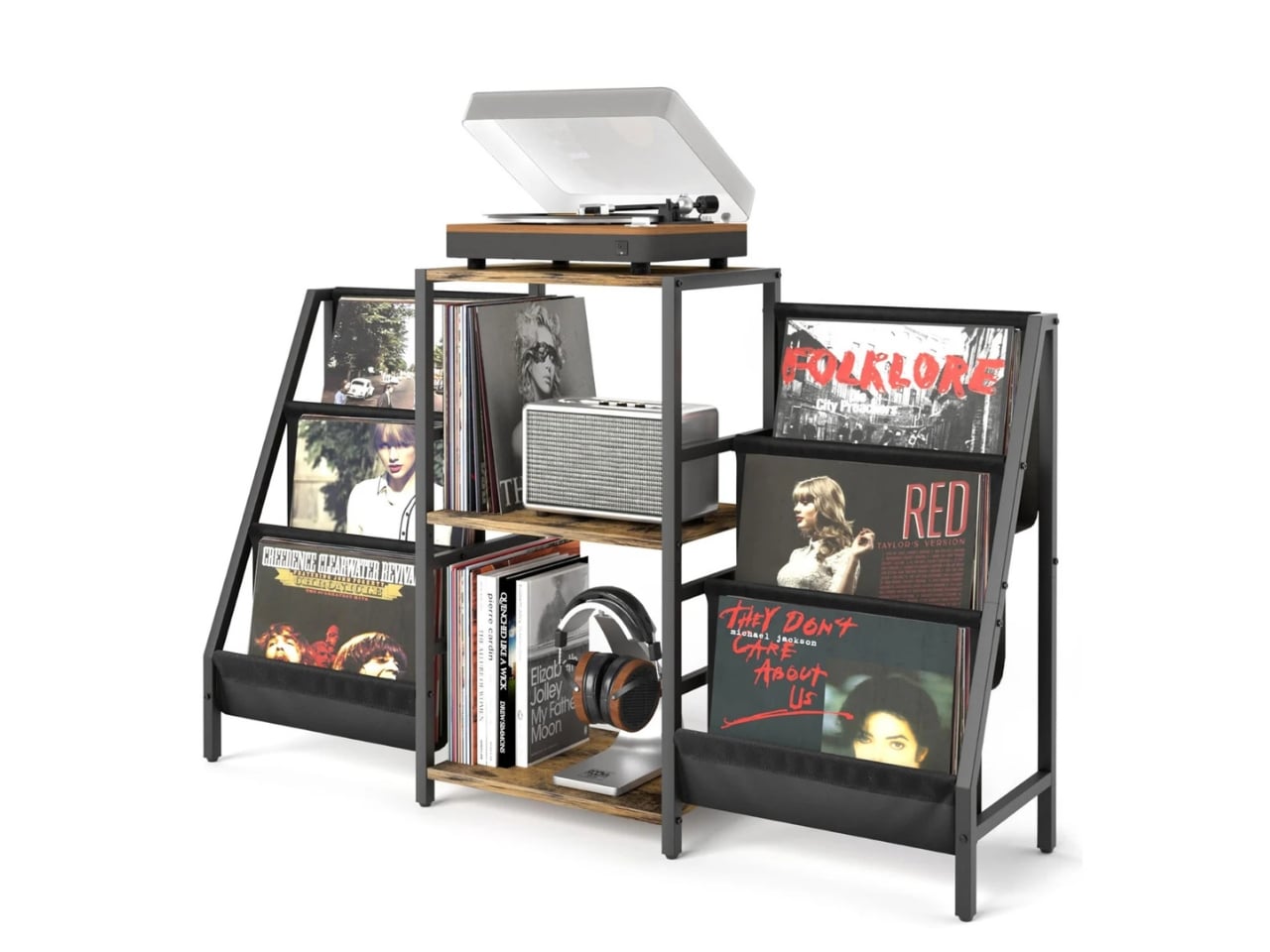
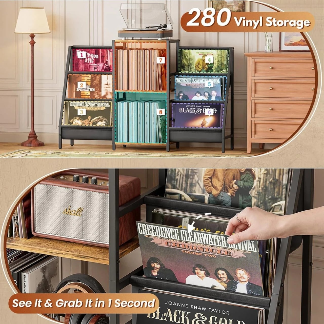
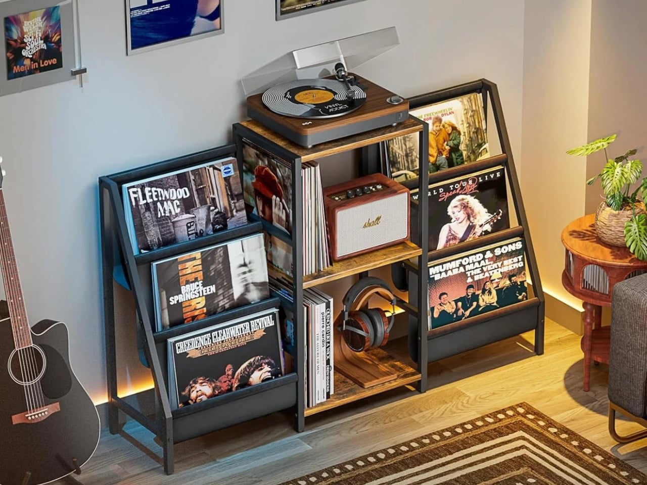
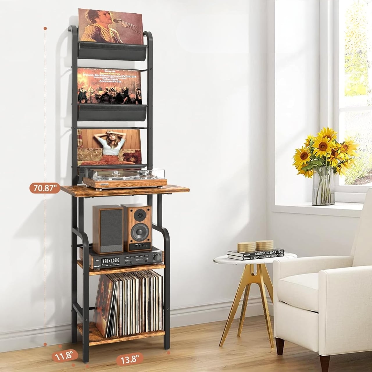
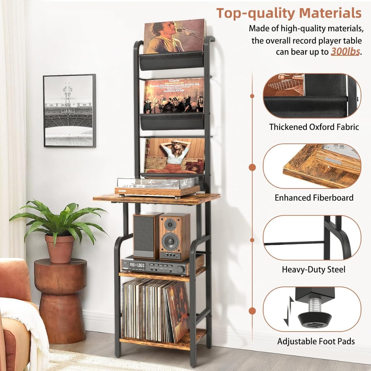
At first glance, the design reads as industrial meets mid-century, the kind of aesthetic combination that tends to age well and works in almost any room. It uses a black metal frame as its backbone, with wooden shelves sitting inside it for the actual weight-bearing surfaces. That alone would make for a decent stand. But the detail that sets this piece apart is the six fabric slings positioned along the middle section of the unit. Each one is made from high-grade Oxford fabric and designed to hold records facing outward, so your collection isn’t just stored, it’s displayed. That distinction matters more than it might sound. Displaying your records is an invitation for conversation. Storing them is just an obligation.

Designer: Tewinko

The whole unit holds up to 280 records when you’re also using the bottom two shelves for vinyl, which is a genuinely impressive number for something this compact. The design leans vertical rather than wide, which is a smart call for anyone living in a smaller space. You get your full setup, the turntable on top, albums front and center, and room for speakers or accessories on the lower shelf, without sacrificing a significant portion of your floor plan to do it. Vertical record storage has been a slow-growing trend precisely because it asks designers to solve a more complex spatial problem, and this stand seems to take that challenge seriously.

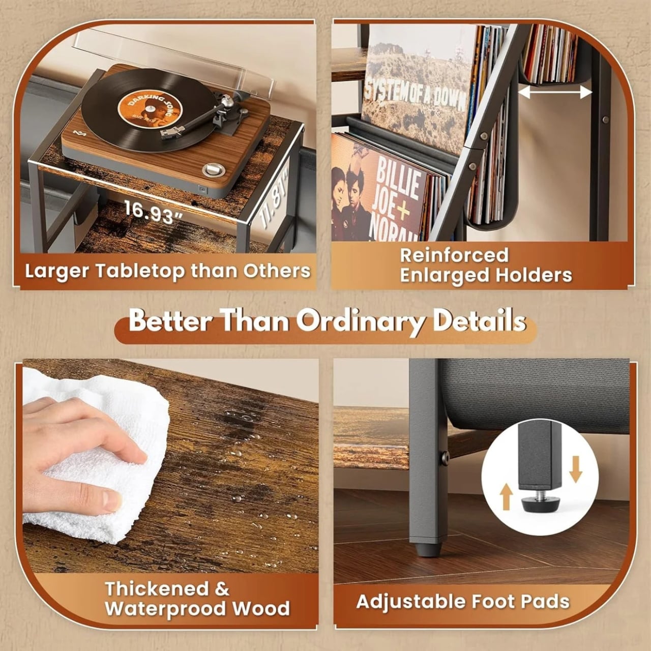
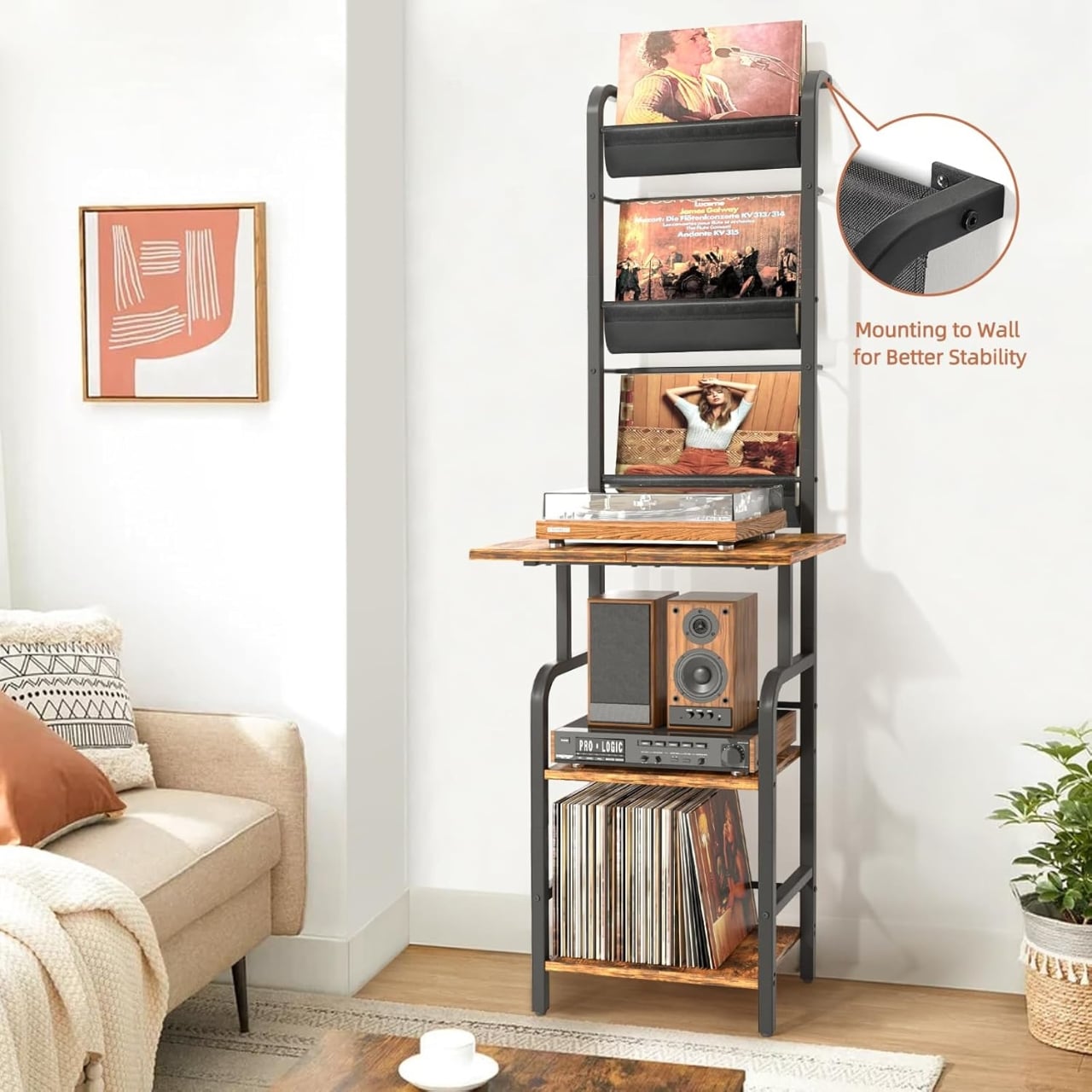
Functionally, the large countertop is sized to fit most standard turntables, and the materials, thickened metal frame, solid wooden board, and Oxford fabric, suggest it was built to carry real weight without wobbling. The assembly reportedly takes somewhere between 20 and 30 minutes and can be done without help, which is a small thing but worth appreciating. Nobody wants to spend their Saturday afternoon wrestling furniture instructions while their records sit in a pile waiting.

The price point is where this gets interesting. At $56.99 and up, the stand sits comfortably below most comparable furniture pieces that lean into the same aesthetic territory. Mid-century record storage tends to get expensive fast, especially when it flirts with any kind of design intentionality. Tewinko’s stand manages to feel considered without charging a premium for the privilege of looking that way. Whether that’s a function of the material choices or the brand’s positioning, the result is a piece that doesn’t ask you to make any real trade-offs between how it looks and what it costs.

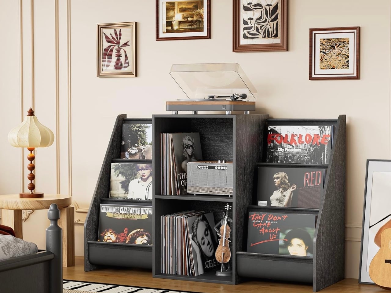
It also comes in two other versions: a white metal frame option and an all-wood version. The white frame works well in brighter, more minimal spaces, while the all-wood version suits anyone who prefers warmth over contrast. Having those variations is a genuinely useful design decision because it means the aesthetic stays consistent while the piece adapts to different interiors. That kind of range is rare at this price point, and it changes the conversation about who this stand is actually for.

Most record player furniture occupies one of two extremes. Either it’s purely utilitarian, just a flat surface that holds your gear, or it’s an expensive statement piece priced for serious collectors. The Tewinko stand sits comfortably in between. It has a visual point of view, it’s practical, it can handle a real collection, and it doesn’t cost more than a few records to get there. For anyone who’s been putting off the storage question while their vinyl pile quietly grows, this feels like a reasonably good moment to stop waiting.

The post A $57 Stand Finally Solves the Vinyl Storage Problem first appeared on Yanko Design.
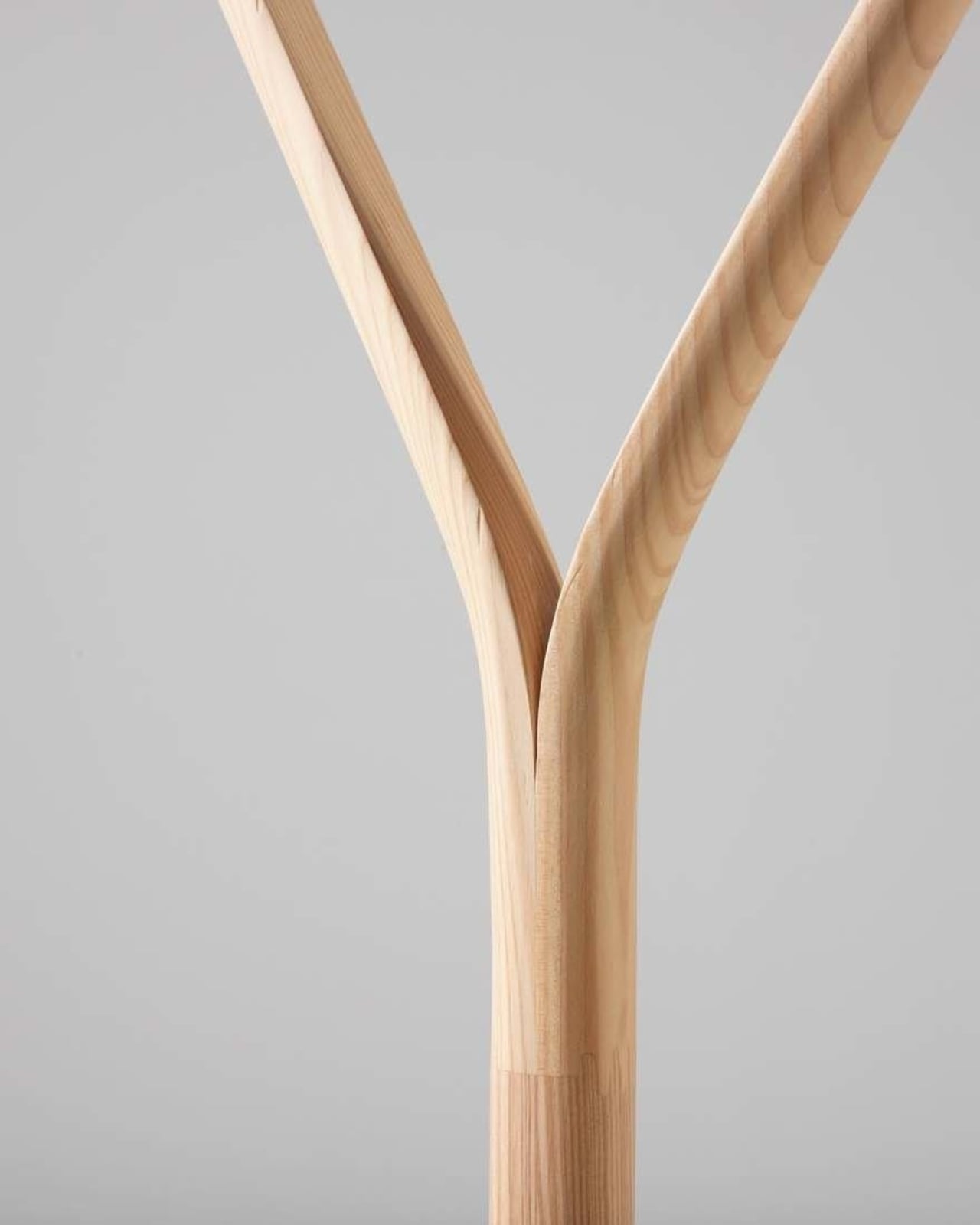
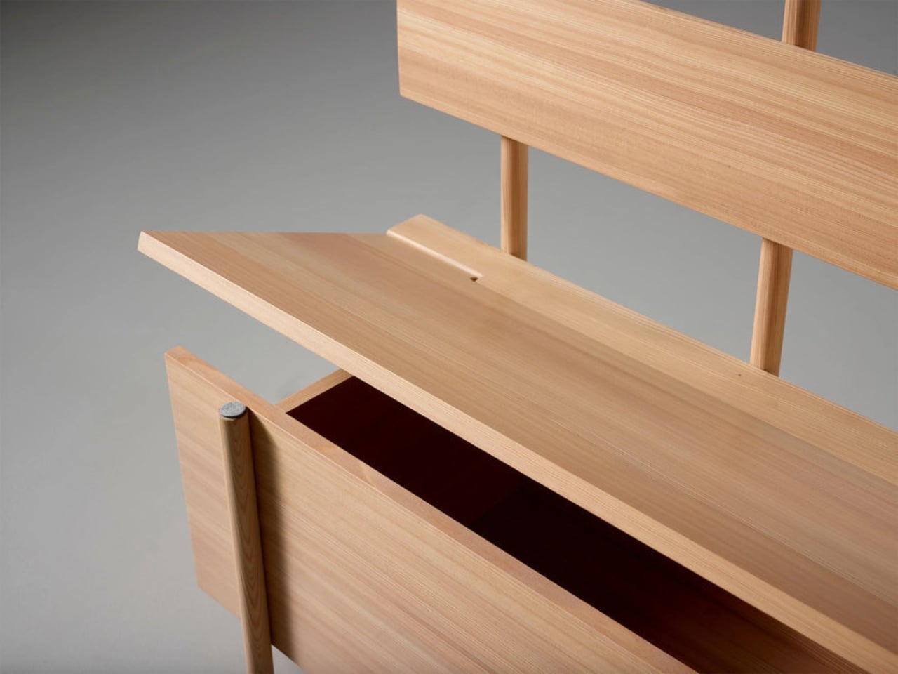
A Hay Rake Inspired This Surprisingly Beautiful Entryway Piece

Most of the furniture we buy tells no story. It comes flat-packed, gets assembled on a Saturday afternoon, and does its job quietly in the corner. We don’t think much about where it came from, what it references, or what it means. And then a piece like Restel comes along and completely reframes what furniture is even supposed to do.

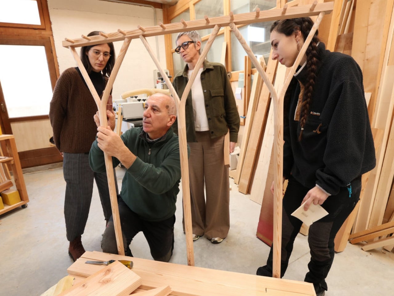
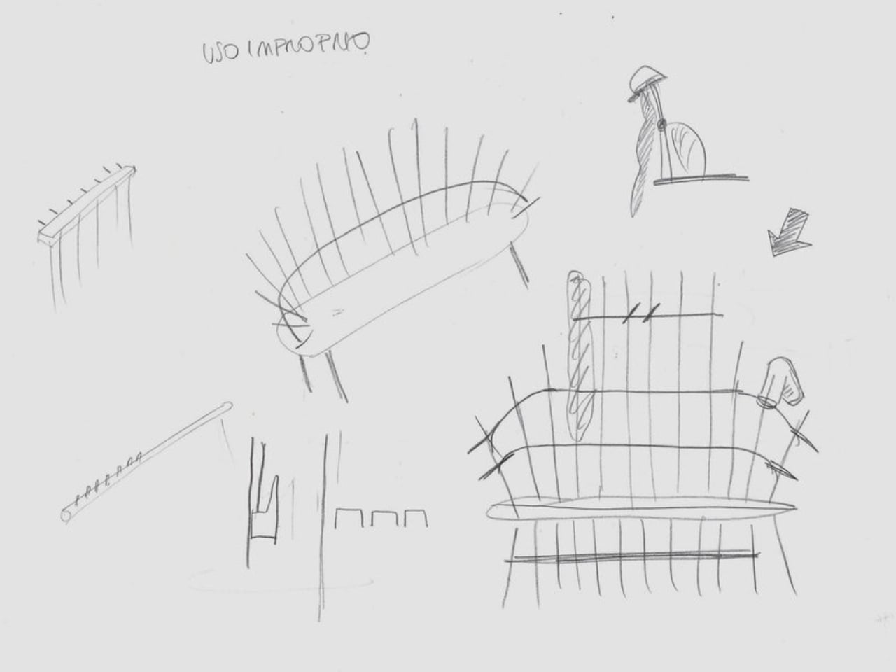
Italian industrial designer Monica Graffeo created Restel after encountering traditional Alpine hay rakes. Not a digital reference, not a museum exhibit, but the actual tools. The kind that have been leaning against barn walls in the mountains for generations. She saw them and started sketching, asking herself whether the rake’s form could be translated into furniture in a way that was actually useful. The answer, clearly, was yes.

Designer: Monica Graffeo

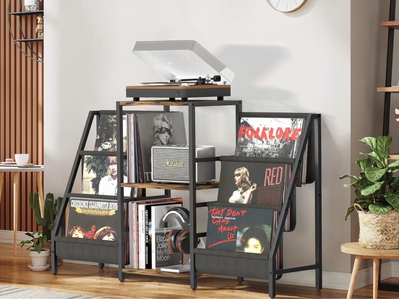
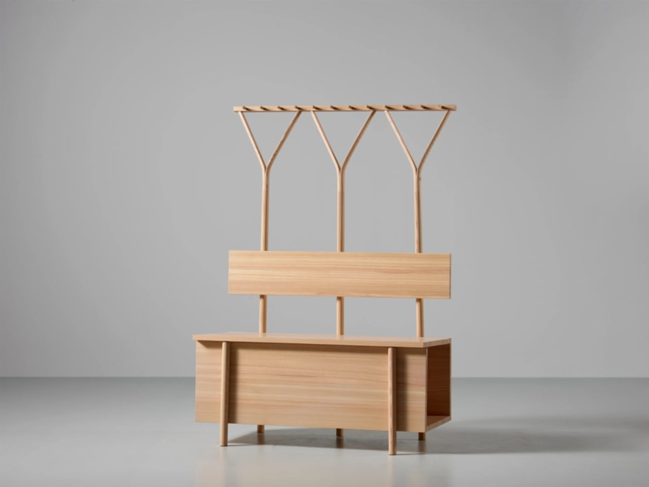
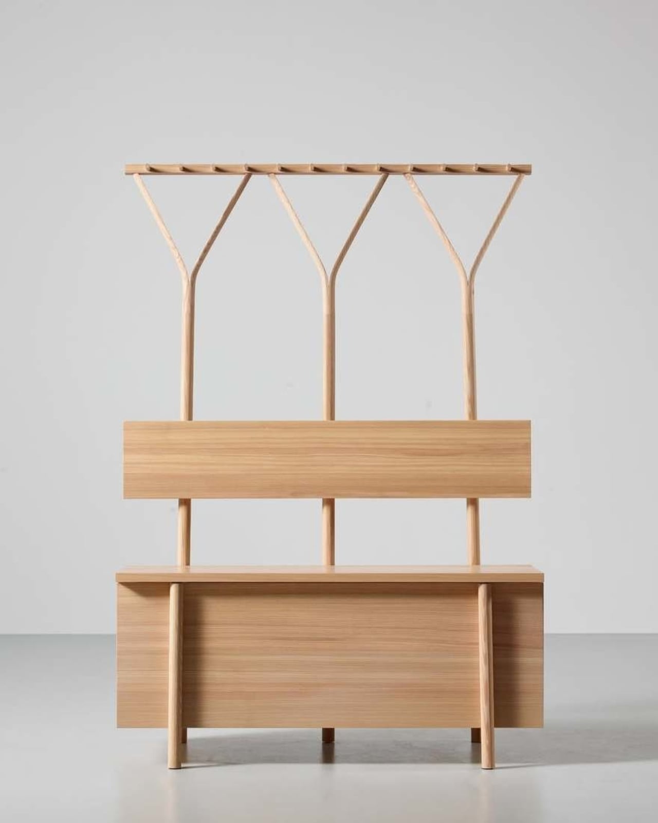
The result is an entryway piece that functions as both a bench and a hanging structure. It’s made from Trentino Larch, a wood native to the Alpine region that gives the piece a warmth and texture you can almost feel through a photograph. Graffeo worked with Falegnameria Bosetti, a traditional carpentry firm based in Trentino, to bring it to life, which means the craftsmanship is as rooted in the region as the inspiration itself.

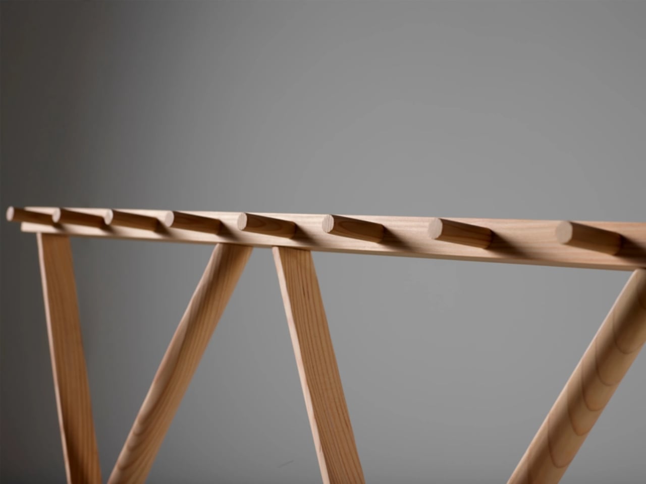
The design logic behind it is clean and honest, and that’s what makes it so compelling beyond the visual appeal. A hay rake’s tines are spread wide and built to hold and gather. In Restel, those same proportions become hooks and structure, organizing coats, bags, and the general chaos of a front entryway. The form isn’t borrowed for aesthetics alone. It actually earns its place by being functional in a way that mirrors the original tool.

This is becoming a more intentional conversation in design circles, and for good reason. For years, the dominant trend in home interiors leaned toward minimal and abstract, stripping objects of any cultural or regional identity in favor of clean lines that could sell anywhere on the planet. That has its appeal, but it also produces spaces that feel like they could belong to no one in particular. Restel pushes in the opposite direction. It carries a specific geography, a specific history, and a specific set of hands that made it. You can feel the Alpine landscape in it even if you’ve never been.

The versatility of the piece is worth noting too. Positioned against a wall, Restel organizes the entryway and creates a clear threshold between the outside and the inside of a home. Move it to the center of a room and it becomes a divider, something that defines space without closing it off. That kind of flexibility in a single piece of furniture is genuinely hard to pull off without the design feeling compromised. Graffeo managed it without losing any of the visual coherence.

The question I keep returning to is how much courage it takes to look at a farming tool and say, I want to put this in someone’s home. Not as a decorative nod to rural life, not as a rustic accent piece, but as a fully considered object that stands on its own as good design. The risk of that kind of referencing is that it tips into costume, into the sort of design that performs a cultural identity rather than embodying one. Restel doesn’t have that problem. It feels earned.

Graffeo’s broader practice as an industrial designer has included work for major Italian furniture brands, so she’s no stranger to furniture. But Restel reads like something more personal, more tied to a specific place and a specific curiosity. That combination of intellectual rigor and genuine affection for material culture is what separates a good design from one that stays with you. If you’ve been on the lookout for a piece that will actually start a conversation, this is it. Not because it’s strange or provocative, but because it’s honest in a way that most furniture simply isn’t.

The post A Hay Rake Inspired This Surprisingly Beautiful Entryway Piece first appeared on Yanko Design.
This Zigzagging Wooden Bookshelf Doesn’t Care How Tall You Are

Most bookshelves are designed around adult convenience. The tallest shelves hold the most books, and the titles at a grown-up’s eye level are the ones that get noticed first. For a small child, this setup turns browsing into a guessing game, with the best finds often too high to reach. Standard shelving quietly tells children that picking out a book on their own isn’t quite something they can manage yet.

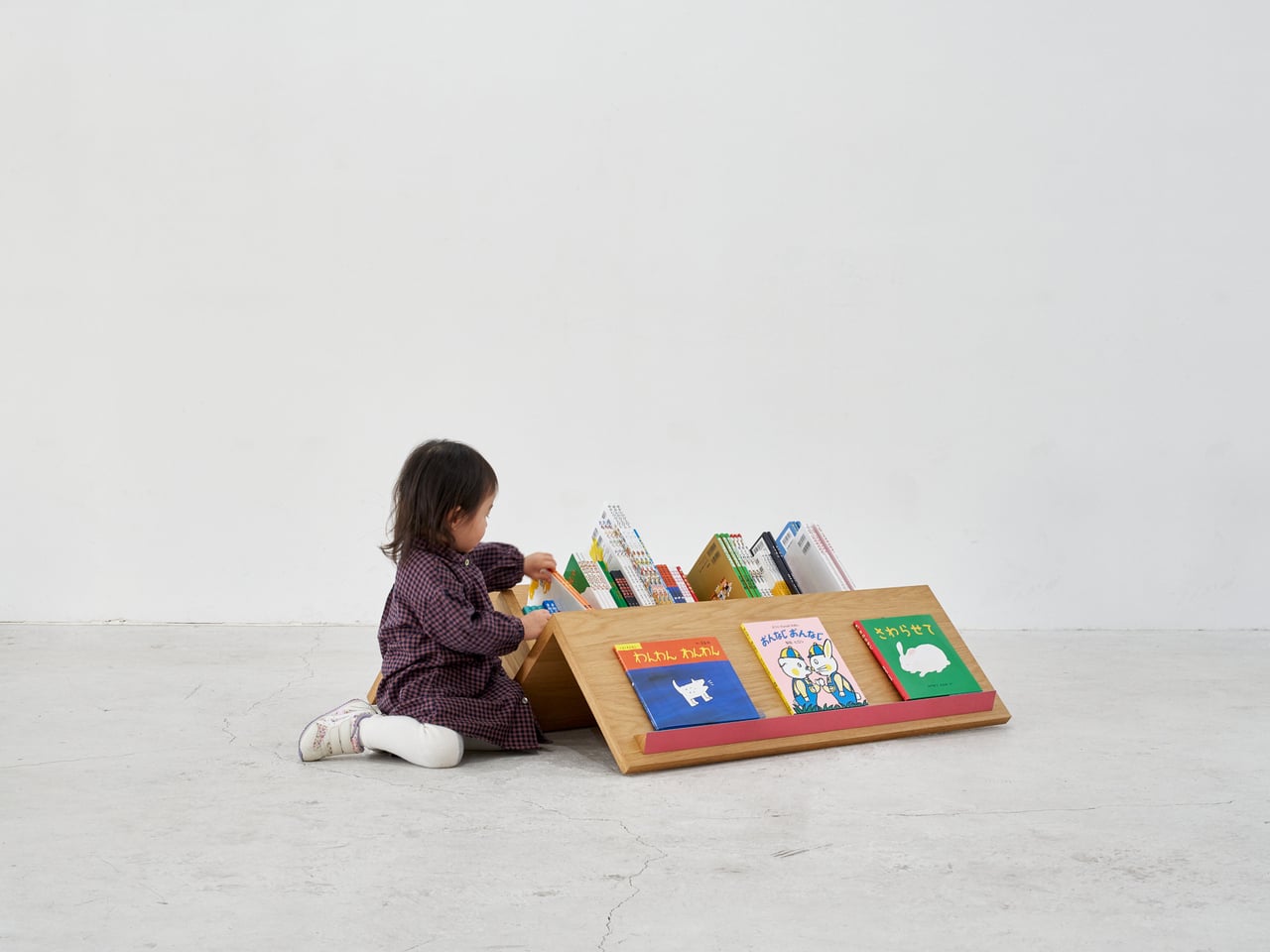
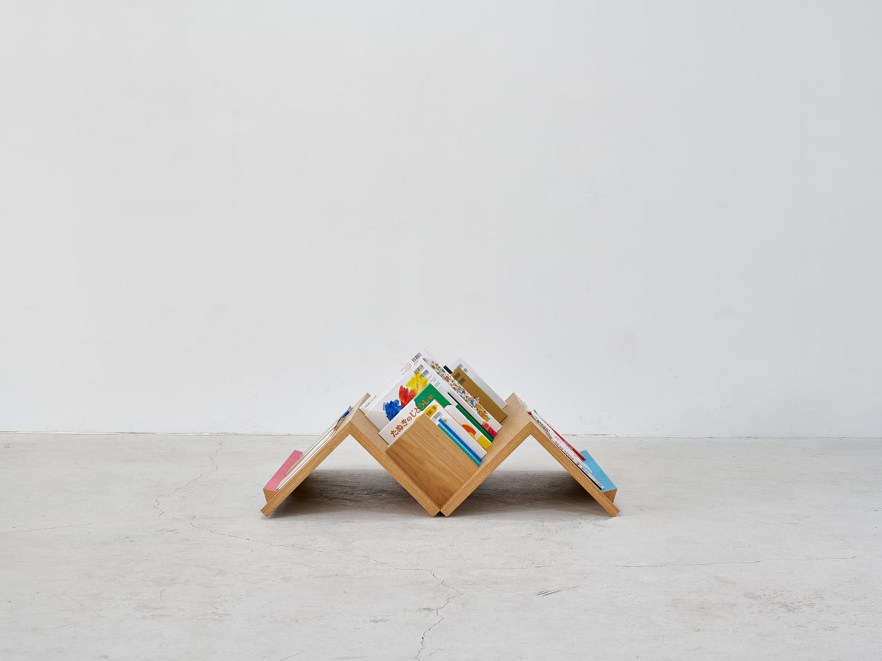
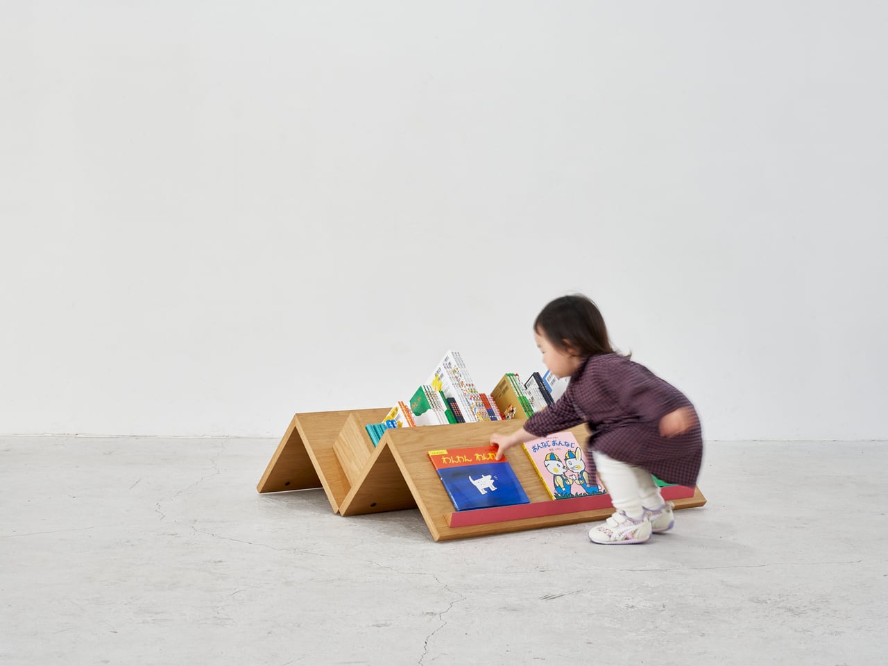
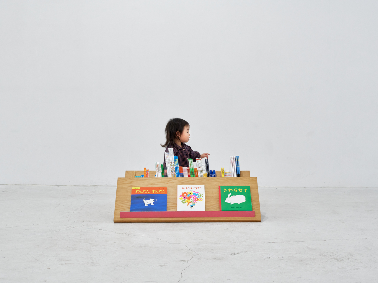
That’s the problem that Tsuranari, a mobile bookshelf by Border Design Architects, directly addresses. Designed for GoGo Marchen House, a Japanese traveling children’s bookstore that brings picture books to schools, parks, and community spaces, it goes a completely different direction from the standard upright shelf format. The whole browsing experience happens low on the ground, where every book sits at an equally reachable distance for everyone gathered around it.

Designer: Nobutaka Torii (Border Design Architects)

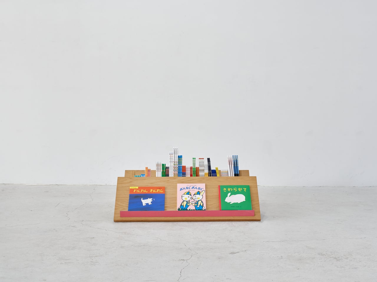
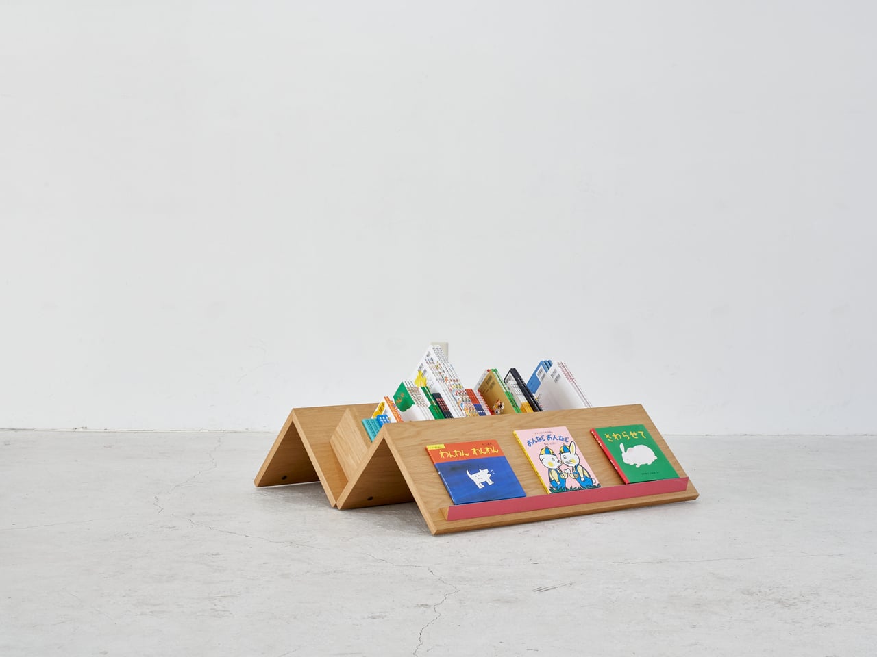
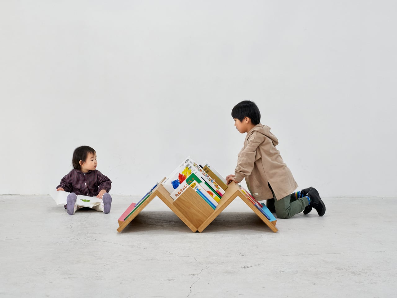
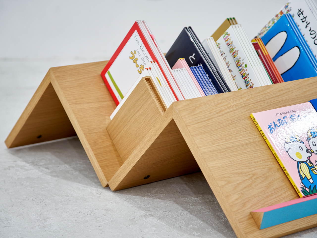
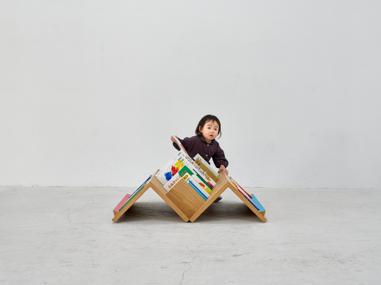
The structure is made up of mountain-shaped wooden modules that link side by side, creating a continuous zigzag profile sitting low on the ground. You’re never looking up at a bookshelf; you’re looking across it from the same level as everyone else. The design accommodates two browsing modes: books tucked spine-out into the V-shaped channels between peaks, and titles displayed face-out on the wider sloped sections.

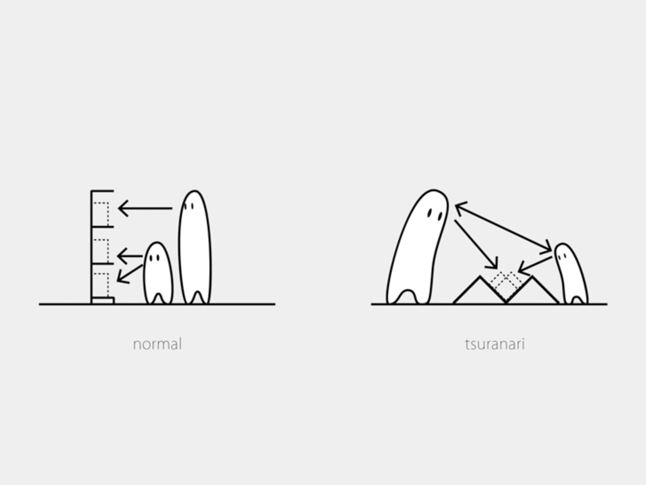
What Tsuranari’s angle actually changes is the body language of browsing. On a regular shelf, a child cranes upward while an adult leans down, and neither has a great view. Here, both stoop and reach at the same incline, heads at roughly the same height. A toddler can run a hand along the wood and pull out a picture book entirely on her own, without waiting for someone taller.

It also helps that Tsuranari can be browsed from every side. Kids browsing from opposite ends end up facing each other without even trying, and adults and young children find themselves side by side at the same slope. It turns a normally solitary task into something more communal, not through any explicit design intention but simply because the form makes it hard to avoid.

For a traveling bookstore, portability matters just as much as the design concept. Tsuranari is built from solid wood and fastened with bolts, making it quick to set up and break down on location. The modules load efficiently into the bookstore’s vehicle, so the same shelf that’s standing at a school festival in the morning can be on its way to a neighborhood park by afternoon.

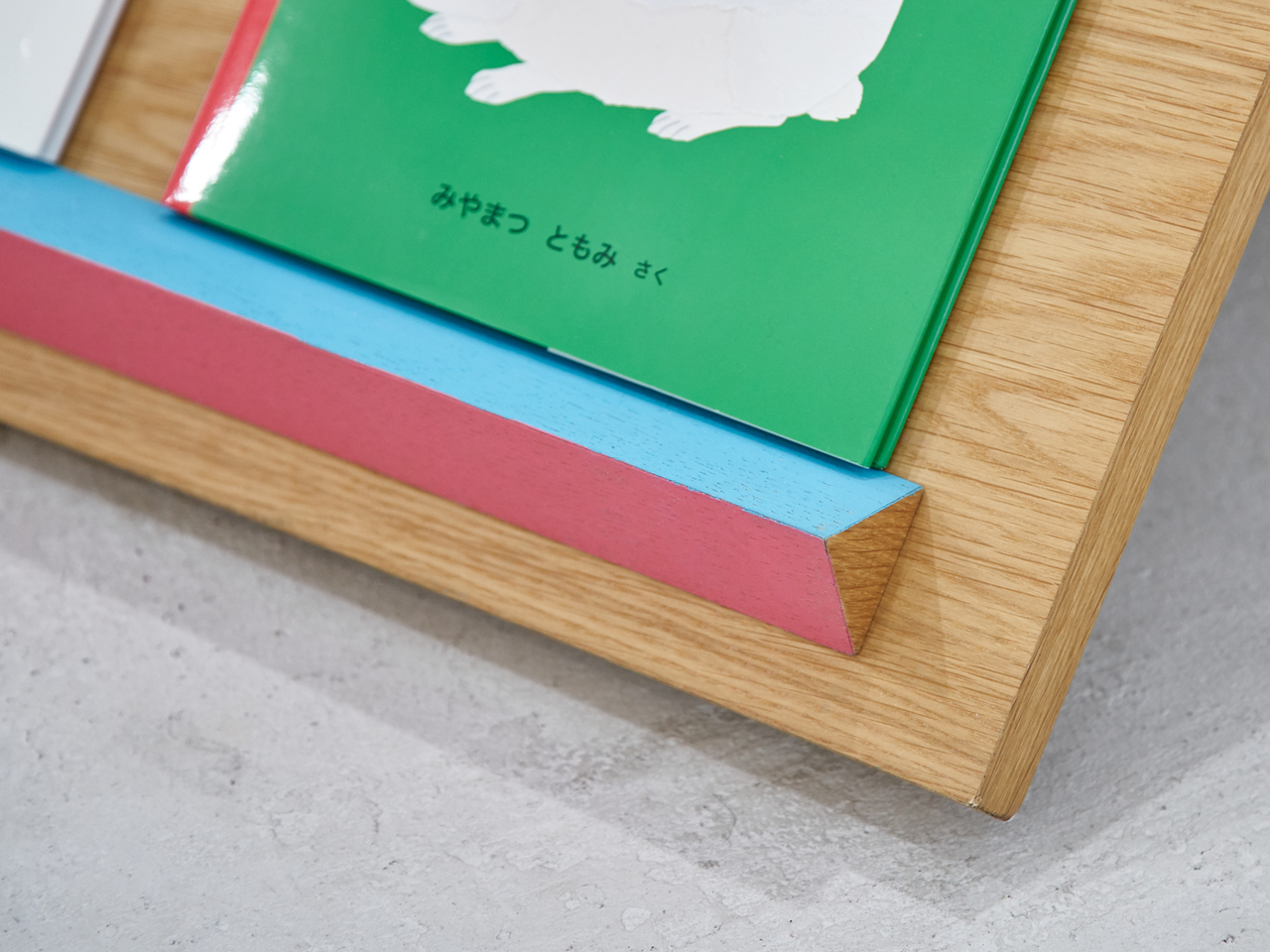
Solid wood has a practicality that goes well beyond how it looks. The material handles the kind of grabbing, leaning, and rough treatment that children bring to anything they enjoy, and it’ll only develop more character with wear. Small painted ledges in pink and light blue run along the face-out display sections, adding the only deliberate color to an otherwise warm, natural wood surface.

The name Tsuranari translates roughly to “a continuous series” in Japanese, which describes the zigzag form, literally. It also captures what the bookshelf is really after: a chain of small encounters between children and books, and between the children themselves. A shelf that stays low and stays open makes those encounters much more likely, turning a visit to the bookstore into something a child walks away from excited.

The post This Zigzagging Wooden Bookshelf Doesn’t Care How Tall You Are first appeared on Yanko Design.
The Smartest Heater Has No App, No Screen, Just Bricks

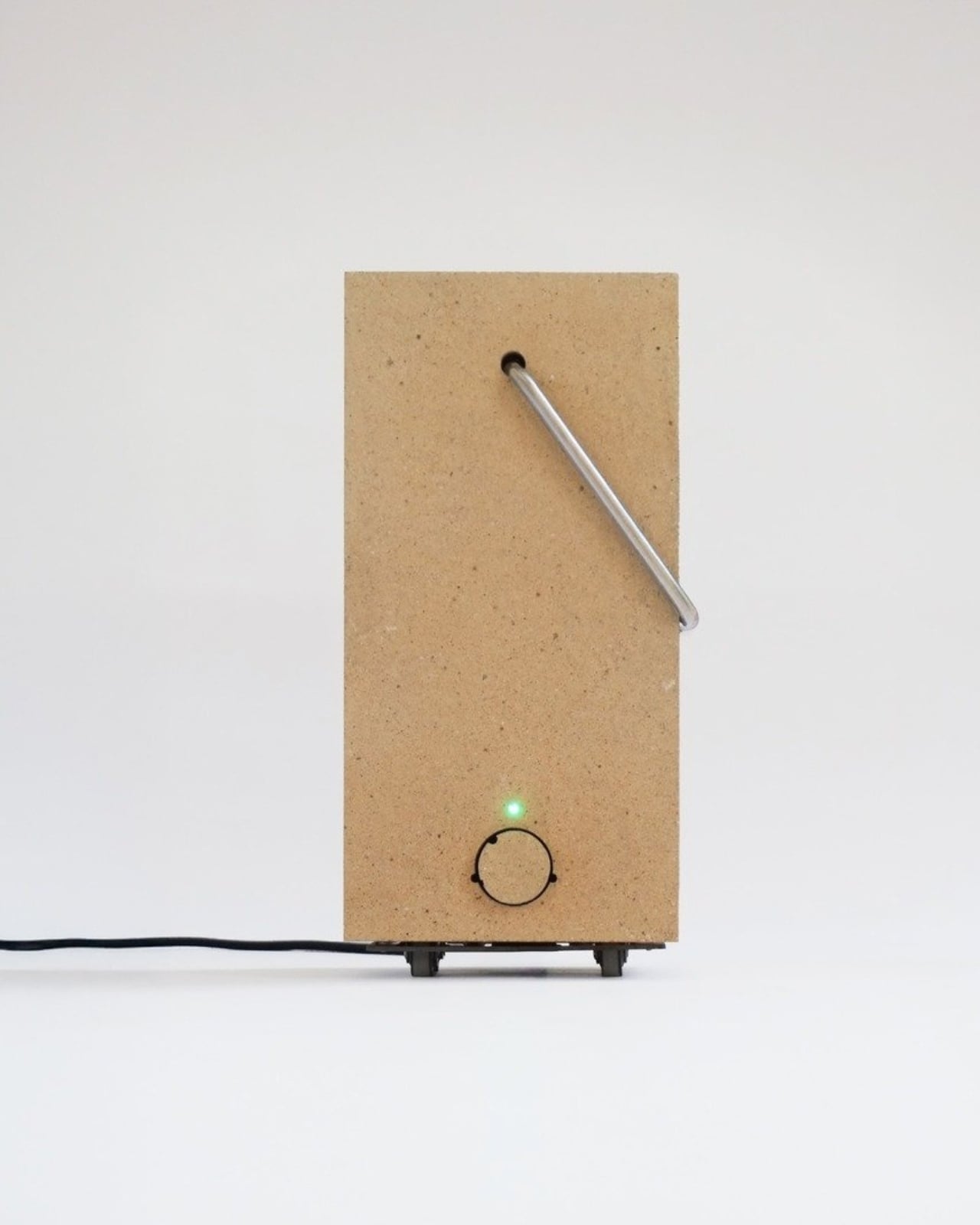
Most of the time, when we talk about innovation in home appliances, we mean sleeker apps, voice control, or some kind of sensor that automatically adjusts to your preferences. Eliot Andrault went in the complete opposite direction, and I think he was right to do it.

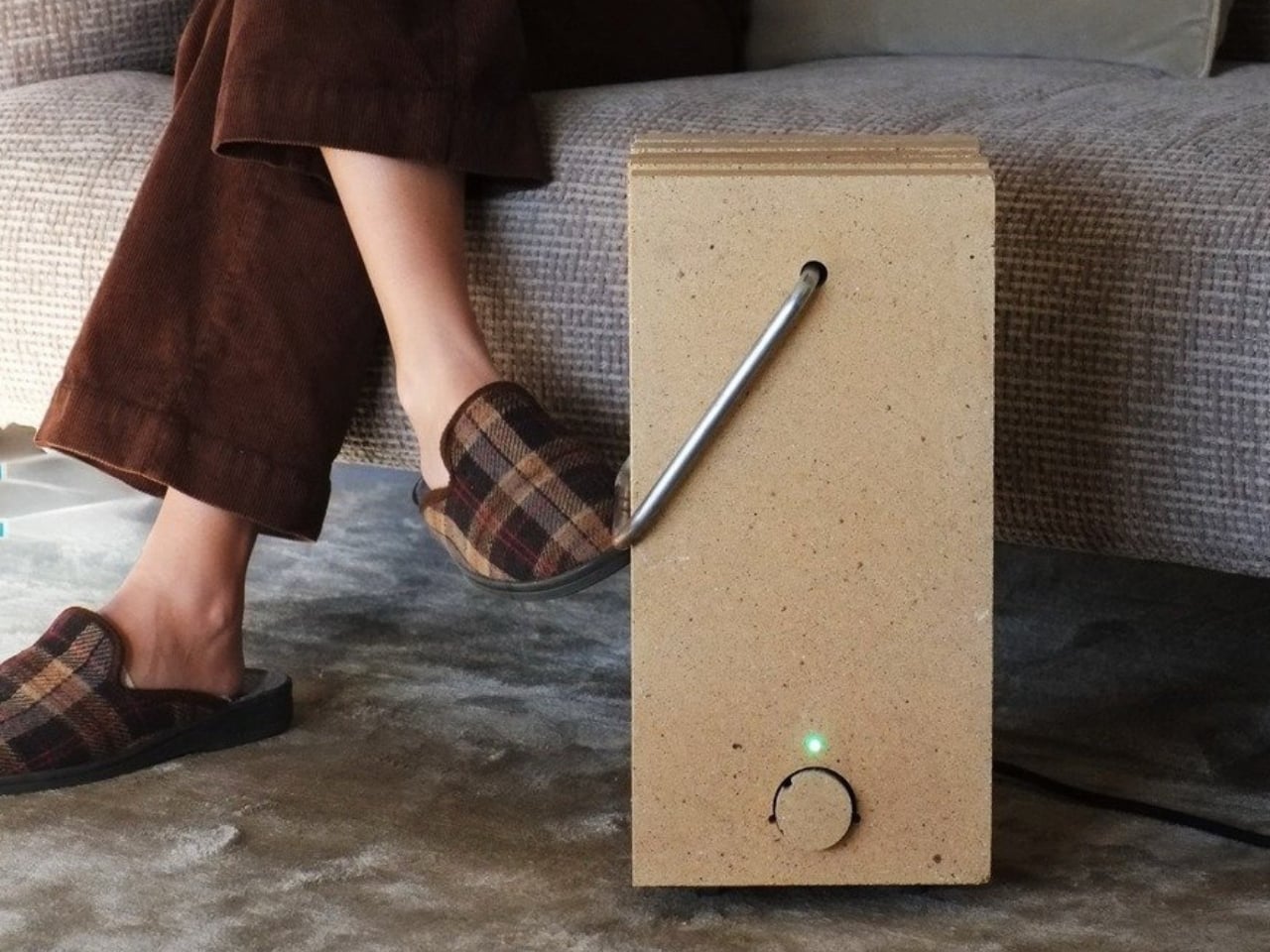
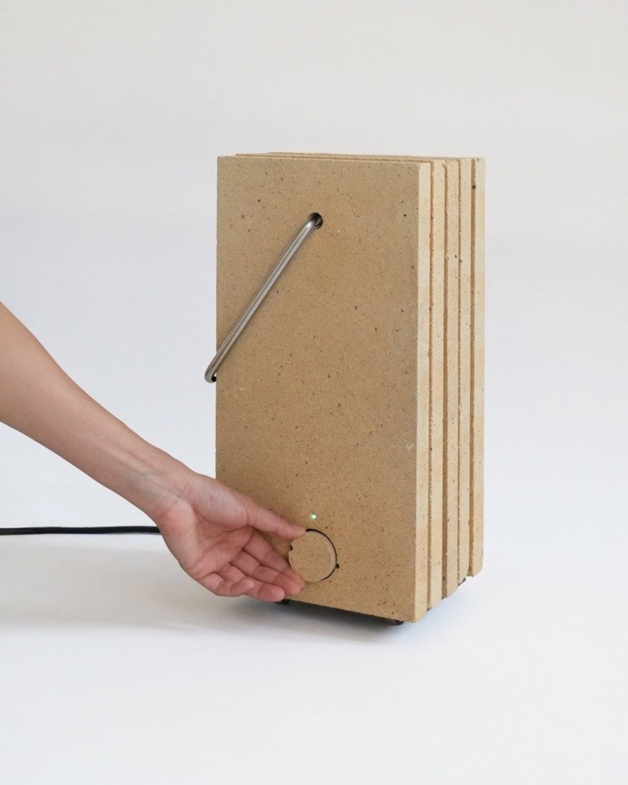
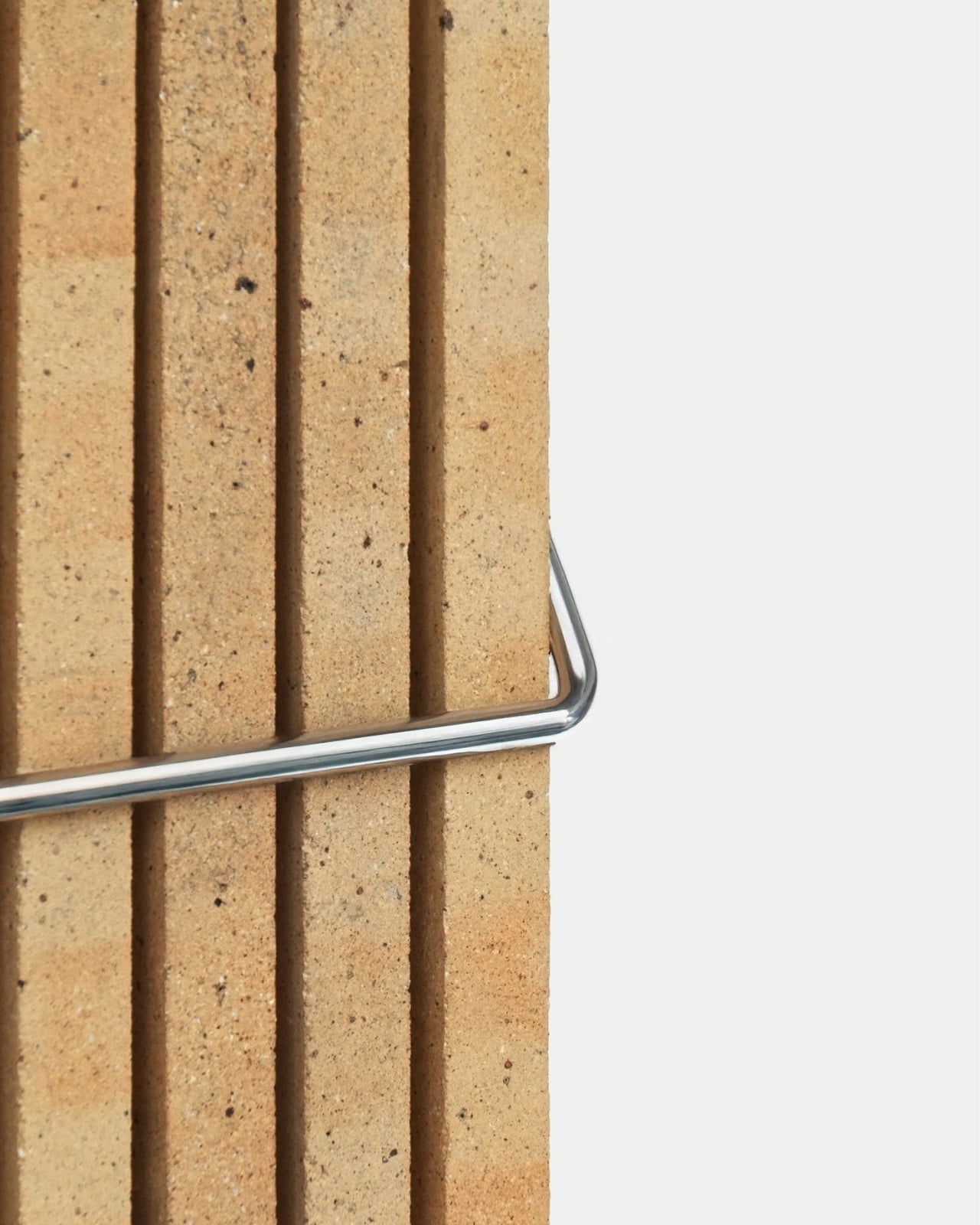
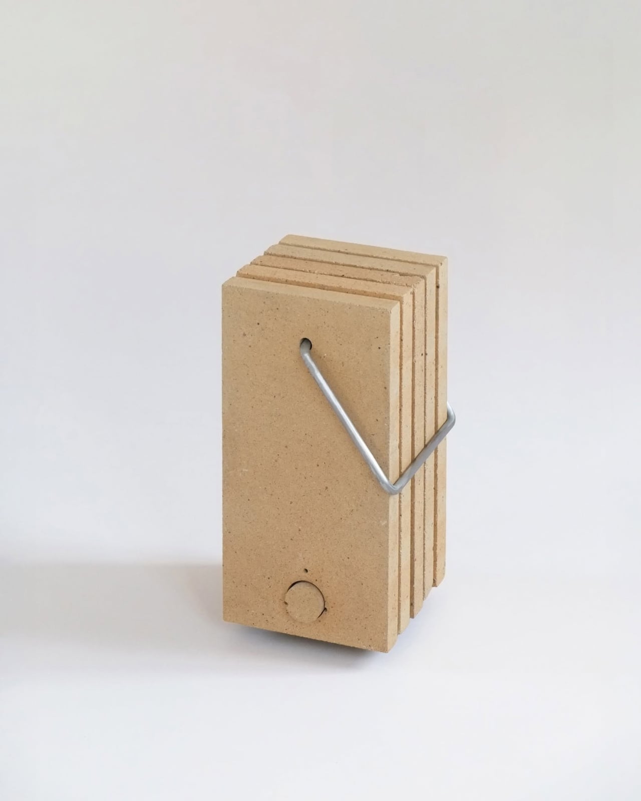
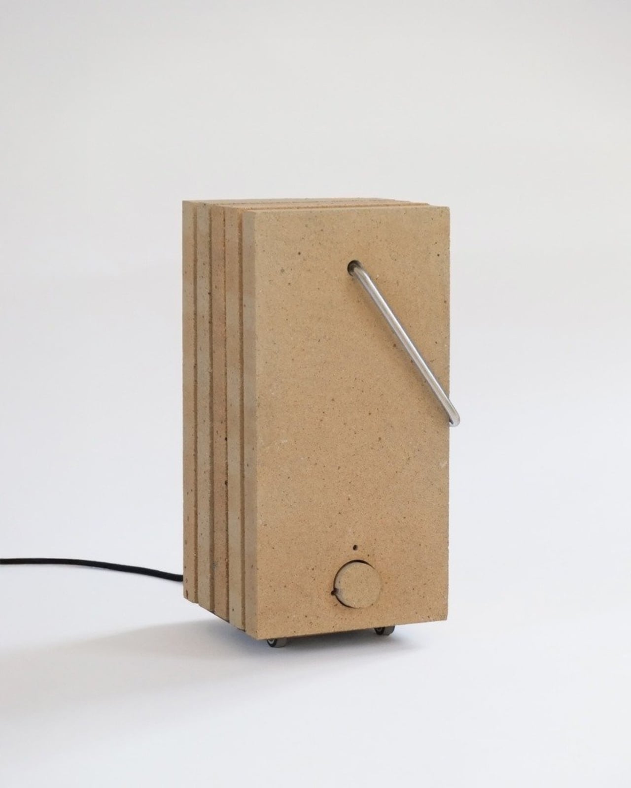
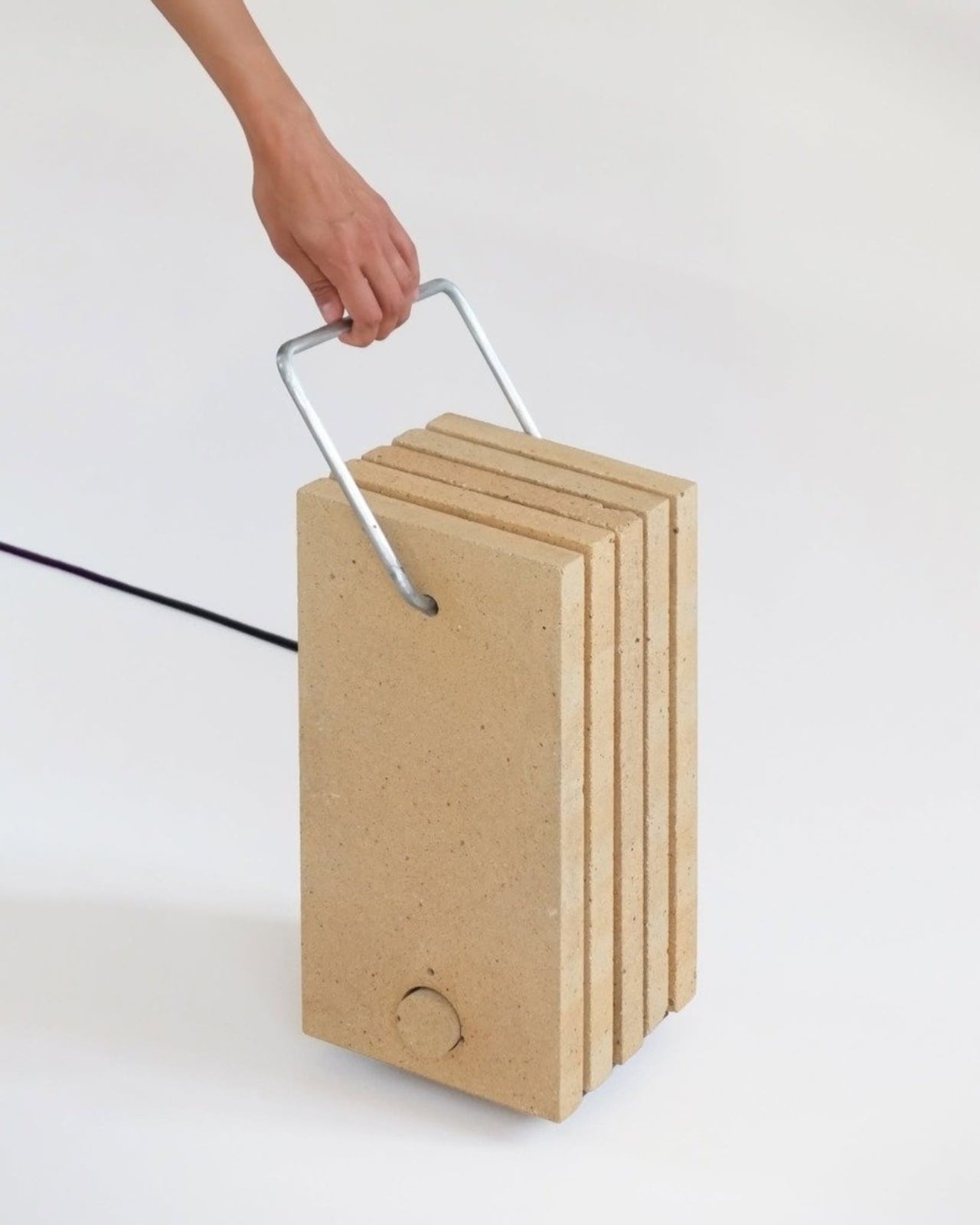
STEA is a personal heater designed by Andrault as his Masters project at École nationale supérieure des arts visuels de La Cambre in France. At its core, literally, are refractory bricks. Not smart chips, not Wi-Fi connectivity, not an OLED display. Bricks. The kind of material you’d find in a kiln or a fireplace, chosen specifically because it stores heat and releases it slowly. That’s the whole point.

Designer: Eliot Andrault

The idea Andrault started with is deceptively simple: how do we heat ourselves differently without giving up comfort? That question sounds obvious, but it almost never gets asked. We default to thermostats and central heating systems that warm up entire rooms, burning energy to heat the air that surrounds you and then some. STEA does something much more targeted. It creates a microclimate around the person using it, right where the body needs warmth most.

The mechanism is equally understated. STEA heats up for ten minutes, then spends the next twenty releasing that warmth. That 1/3–2/3 rhythm means the device is drawing power for only a fraction of the time it’s actually keeping you warm. It’s not a constant draw on electricity. It’s a brief charge followed by a long, quiet exhale of heat.

The material choice matters more than it might seem at first glance. Refractory bricks have what designers call thermal inertia. They don’t just get hot and then cool down the moment power cuts off. They hold that warmth and let it go gradually, which is what gives STEA its particular feeling of comfort. Andrault describes it as enveloping, and that word is accurate. It’s not the sharp, dry blast of a conventional space heater. It’s something steadier.

Formally, STEA is gorgeous in a way that feels earned. Andrault drew inspiration from traditional cast-iron radiators, and you can see it in the vertical stacking of the bricks, the monolithic silhouette, the sense of weight and solidity. What cuts through that industrial seriousness is the tubular steel handle, which introduces a human gesture to the whole thing. It makes the object feel carryable, usable, personal rather than architectural. That balance between raw and refined is harder to pull off than it looks.

I’m also genuinely impressed by how Andrault approached the end of STEA’s life before it even began. The entire device can be disassembled with a single Allen key. Materials are locally sourced and fully recyclable. It’s designed to be repaired, not replaced. In a market where most products are engineered toward obsolescence, this feels like a quiet act of defiance, and an honest one.

The context behind STEA is worth pausing on. Andrault designed this while studying in Belgium, where heating accounts for nearly two tons of CO2 emissions per person per year. That’s not a small number. And STEA doesn’t pretend to be the total solution to that problem. Andrault says explicitly that it isn’t meant to replace existing heating systems. It’s meant to propose a different relationship with warmth, one that’s more local, more bodily, more intentional.

That philosophy puts STEA in a category of objects that are harder to evaluate by spec sheet alone. It’s not competing with your boiler or your smart thermostat. It’s asking whether you could lower your overall energy use by staying warmer at the scale of your body rather than the scale of your apartment. It’s a design that assumes you’re sitting still, reading, working, resting, and gives you exactly what you need for that moment.

The post The Smartest Heater Has No App, No Screen, Just Bricks first appeared on Yanko Design.
The Furniture That Grows Like a Fractal

If you’ve ever watched a fern unfurl or zoomed into the edge of a snowflake, you already understand fractals, even if you’ve never called them that. They’re the patterns nature repeats at every scale, small details that echo the whole. Xubai Li took that idea and built furniture out of it, and the result is one of the more quietly radical pieces of design I’ve come across in a while.

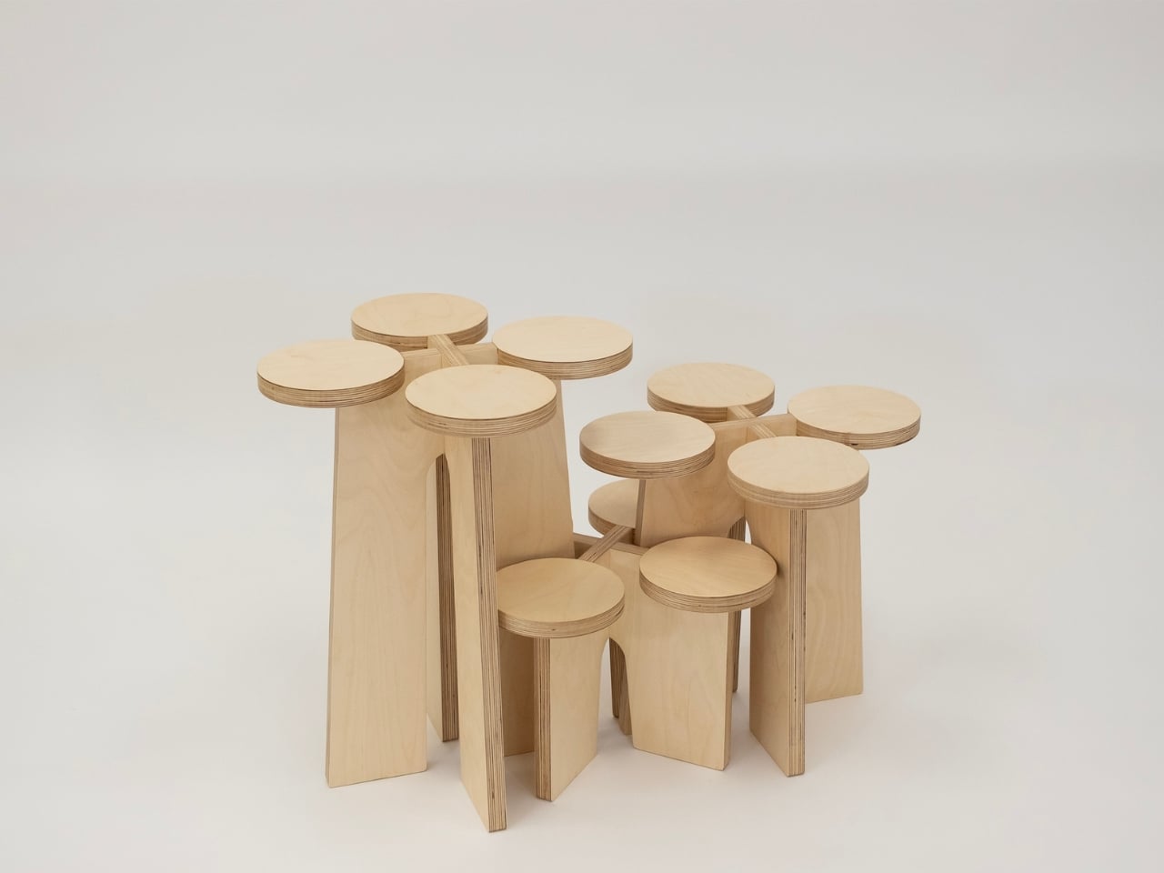
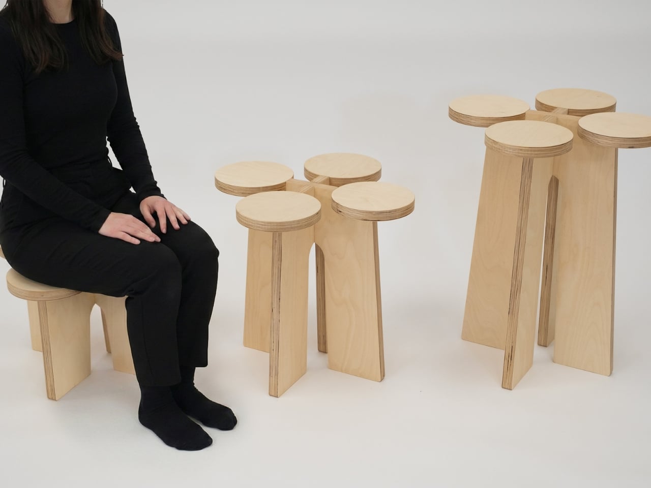
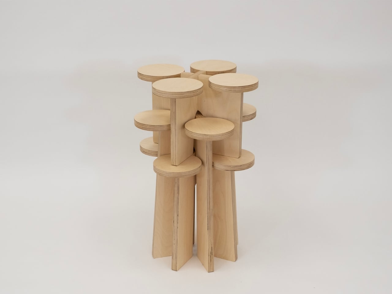
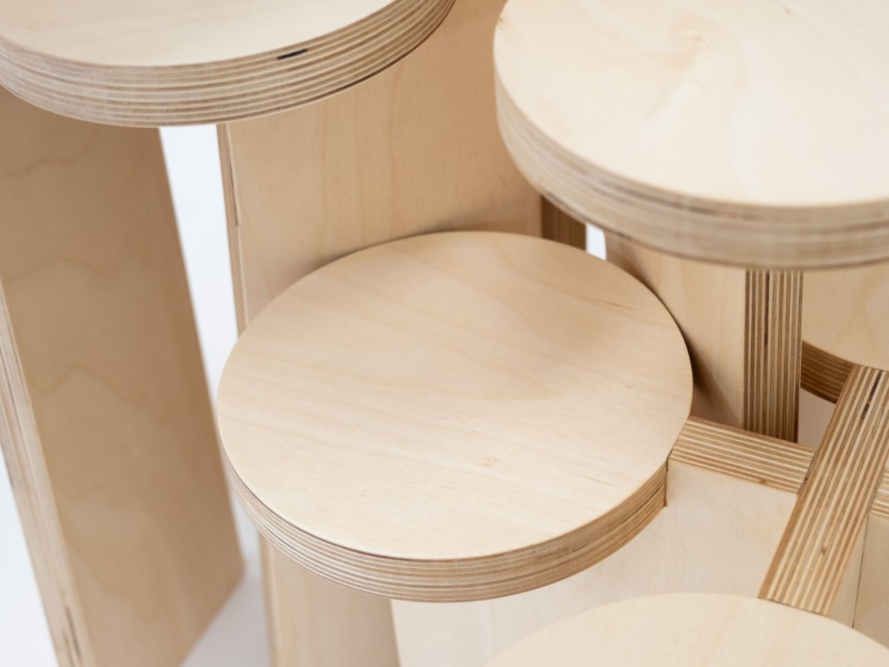
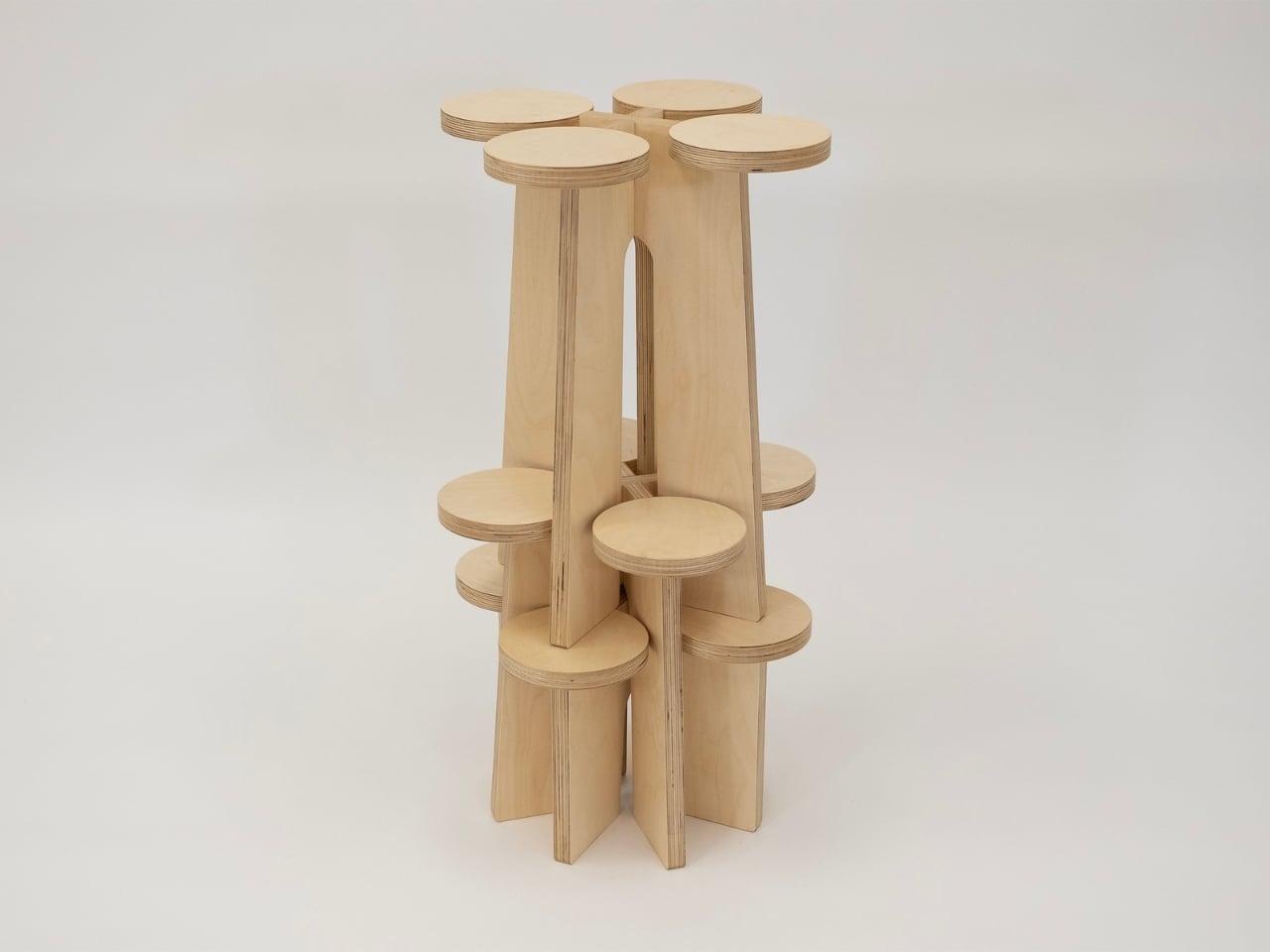
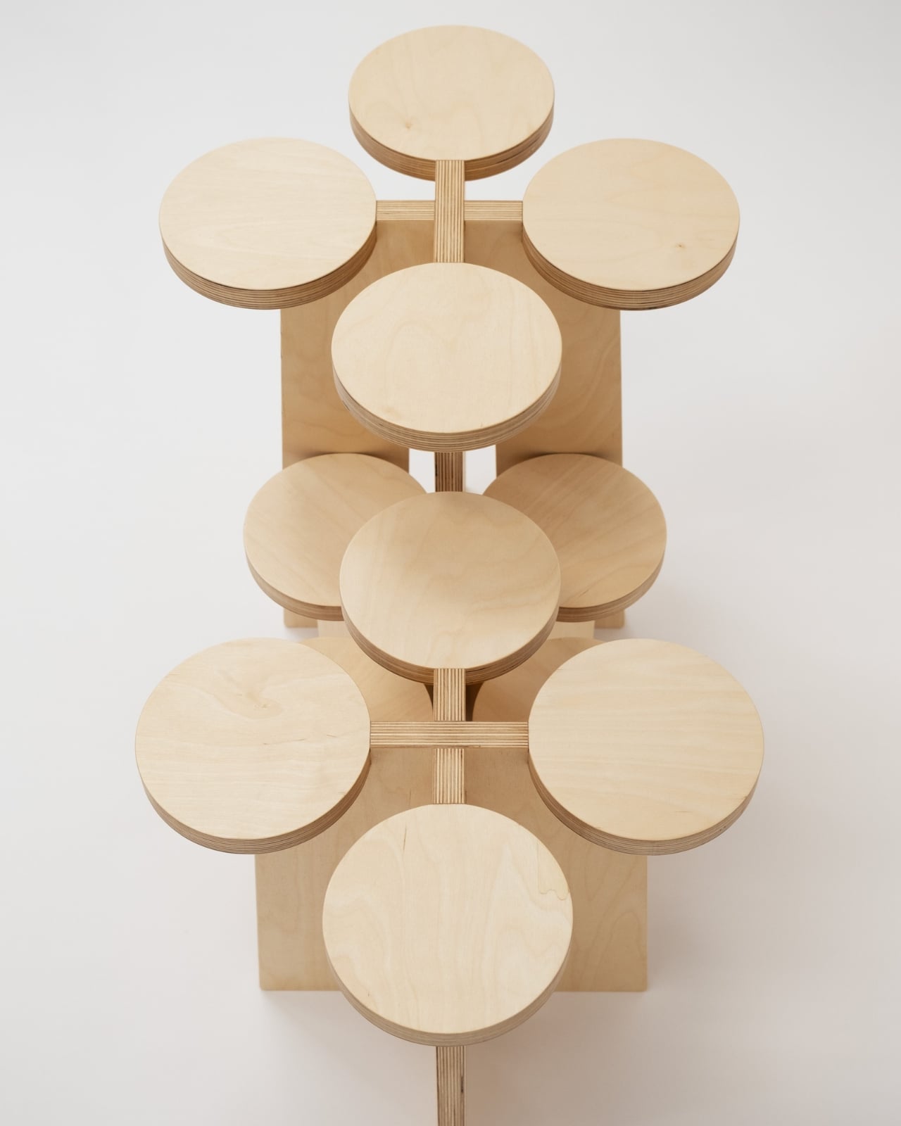
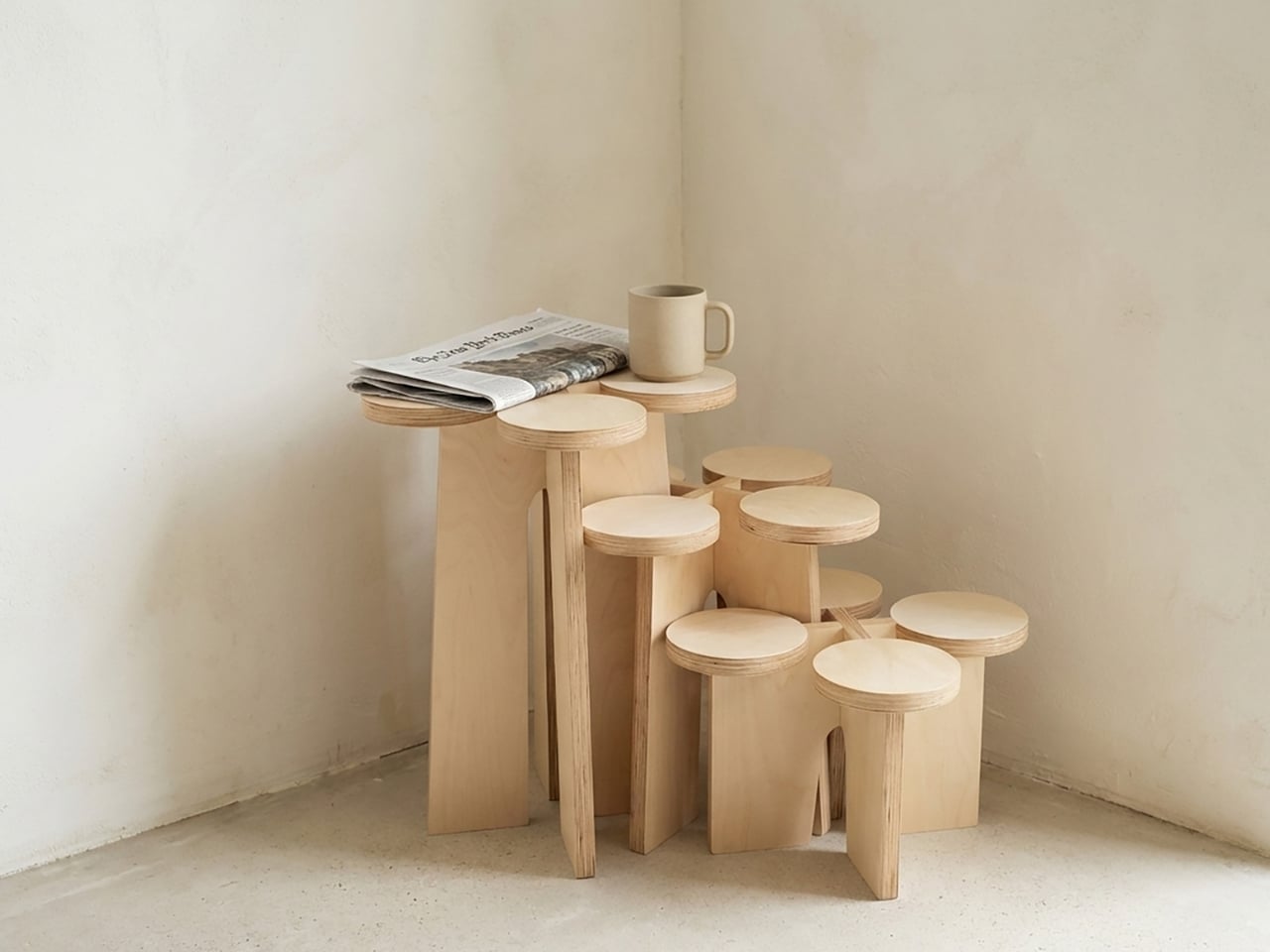
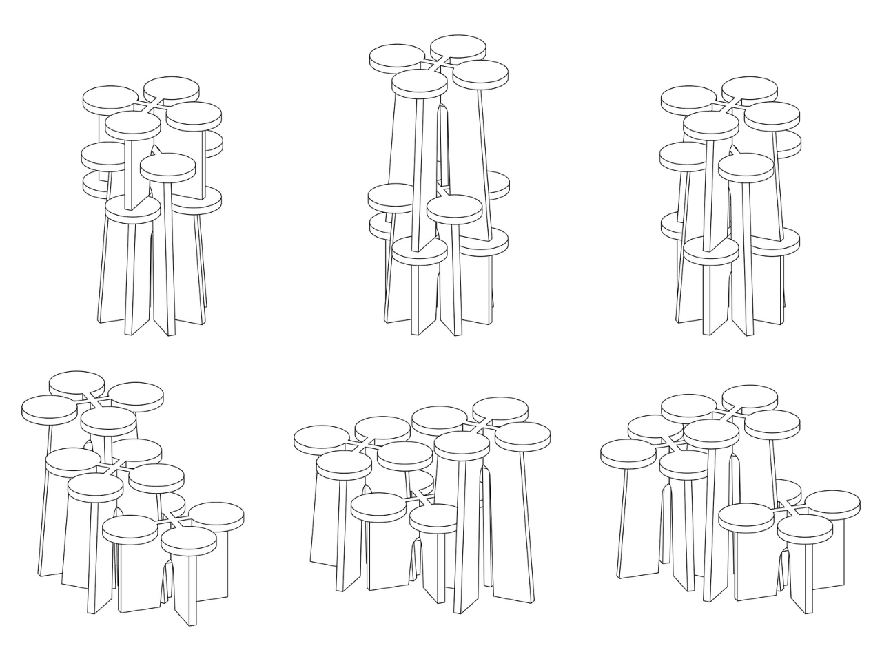
The Fractal System is a set of modular, nestable plywood objects that can function as stools, shelves, or stands, depending entirely on how you choose to arrange them. Each piece is non-directional, meaning there’s no designated top, bottom, or front. You can rotate them, stack them, slot them together, or spread them across a room. The configuration changes, and with it, so does the furniture’s entire personality. A tight cluster becomes a sculptural display unit. A single piece on its own reads as a clean, minimal stool. A sprawling arrangement along a wall becomes something that looks closer to an art installation than anything you’d find at a typical furniture store.

Designer: Xubai Li

Li, who holds an MFA in Furniture Design from the Rhode Island School of Design, was a featured designer at ICFF, and the Fractal System has since earned Silver recognition at both the NY Product Design Awards and the MUSE Design Awards. That’s the kind of trajectory that usually signals a designer to watch, not just a one-off project.

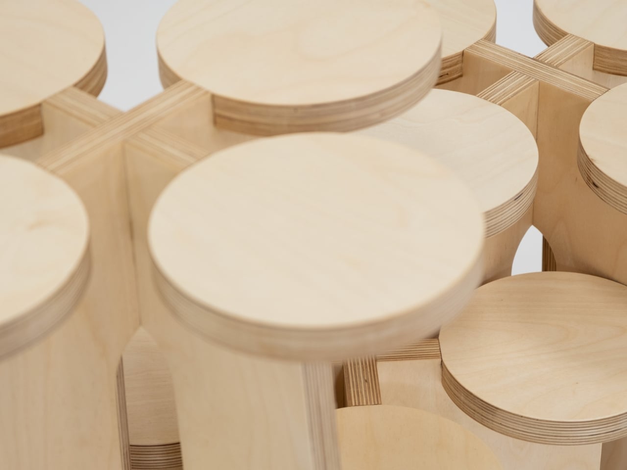
The design’s real appeal, to my eye, isn’t purely aesthetic, though the warm blond plywood with its exposed laminate layers is exactly the kind of material choice that ages well. It’s the philosophy underneath it. Most furniture is prescriptive. It tells you where to sit, where to put your coffee, how to organize your books. The Fractal System does the opposite. It hands you a set of components and essentially says, figure it out. That level of user agency is still surprisingly rare in furniture design, where modularity often comes dressed up in rigid systems and complicated instructions.

The fractal reference isn’t just a clever name, either. Fractals are defined by self-similarity, where the same pattern recurs regardless of scale. Li applies that principle structurally: the more units you add, the more the configuration begins to mirror the logic of a single unit, just expanded. You can see it clearly in the diagrammatic sketches, where each arrangement reads like a variation on the same underlying grammar. It’s rigorous without feeling academic, which is a genuinely difficult balance to strike.

I also think the timing matters. Right now, the design conversation is heavily focused on adaptability. Smaller living spaces, changing households, a collective skepticism toward buying things that only do one thing. The Fractal System fits into that shift without pandering to it. Li wasn’t designing for trends; the work clearly came from a place of genuine conceptual inquiry. The fact that it also happens to answer a real practical need is almost incidental, and that’s often the sign of the best kind of design.

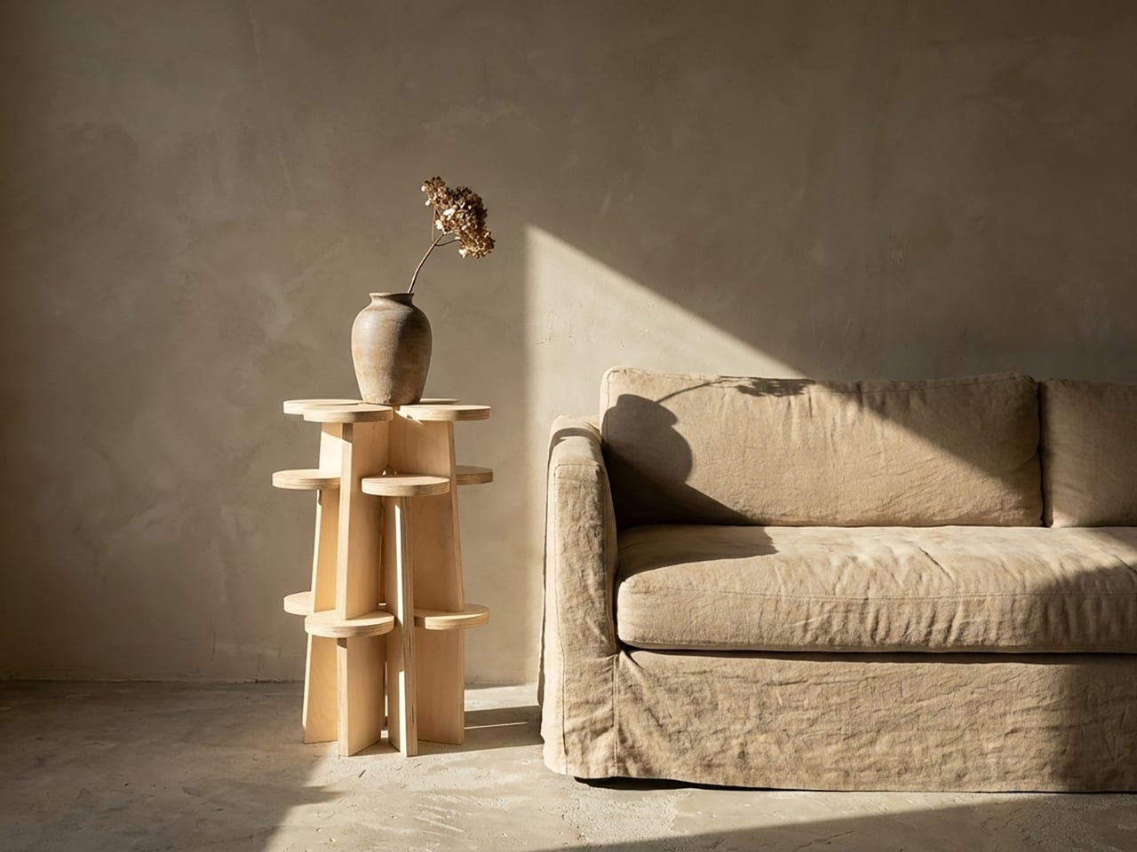
From a collector’s standpoint, this is the sort of piece that rewards attention over time. It doesn’t announce itself loudly. Photographed in a corner with morning light and a ceramic mug balanced on one of the platforms, it looks like the kind of thing someone discovered in a Kyoto studio decades ago. Grouped tightly in a gallery setting, it reads as contemporary sculpture. That range of registers is genuinely hard to manufacture.

Xubai Li’s Fractal System is one of those designs that quietly shifts how you think about the objects around you. Not because it makes a statement, but because it asks a question: why does a piece of furniture only ever have to be one thing? I don’t have a neat answer to that. But I’m glad someone built the question into plywood and let the rest of us sit with it.

The post The Furniture That Grows Like a Fractal first appeared on Yanko Design.
Recycled Plastic Is 10x More Toxic, and This Chair Contains None

The furniture industry has been slow to reckon with its reliance on plastic. From injection-molded shells to synthetic fabrics, plastic finds its way into even the most design-forward pieces. Recycling has long been positioned as the answer, but the numbers don’t hold up. Only 19% of plastic produced globally actually gets recycled, and incineration, a practice that releases pollutants into the air, has surged 34% recently.

Matthew Whatley came to this problem not as a materials scientist, but as a furniture designer who’d spent a decade with his hands in the work. After years of carpentry and concrete formwork, he studied product design in Vancouver and Melbourne, and a trip through Southeast Asia, where plastic waste is impossible to ignore, pushed him toward a specific question: what if furniture didn’t need plastic?

Designer: Matthew Whatley

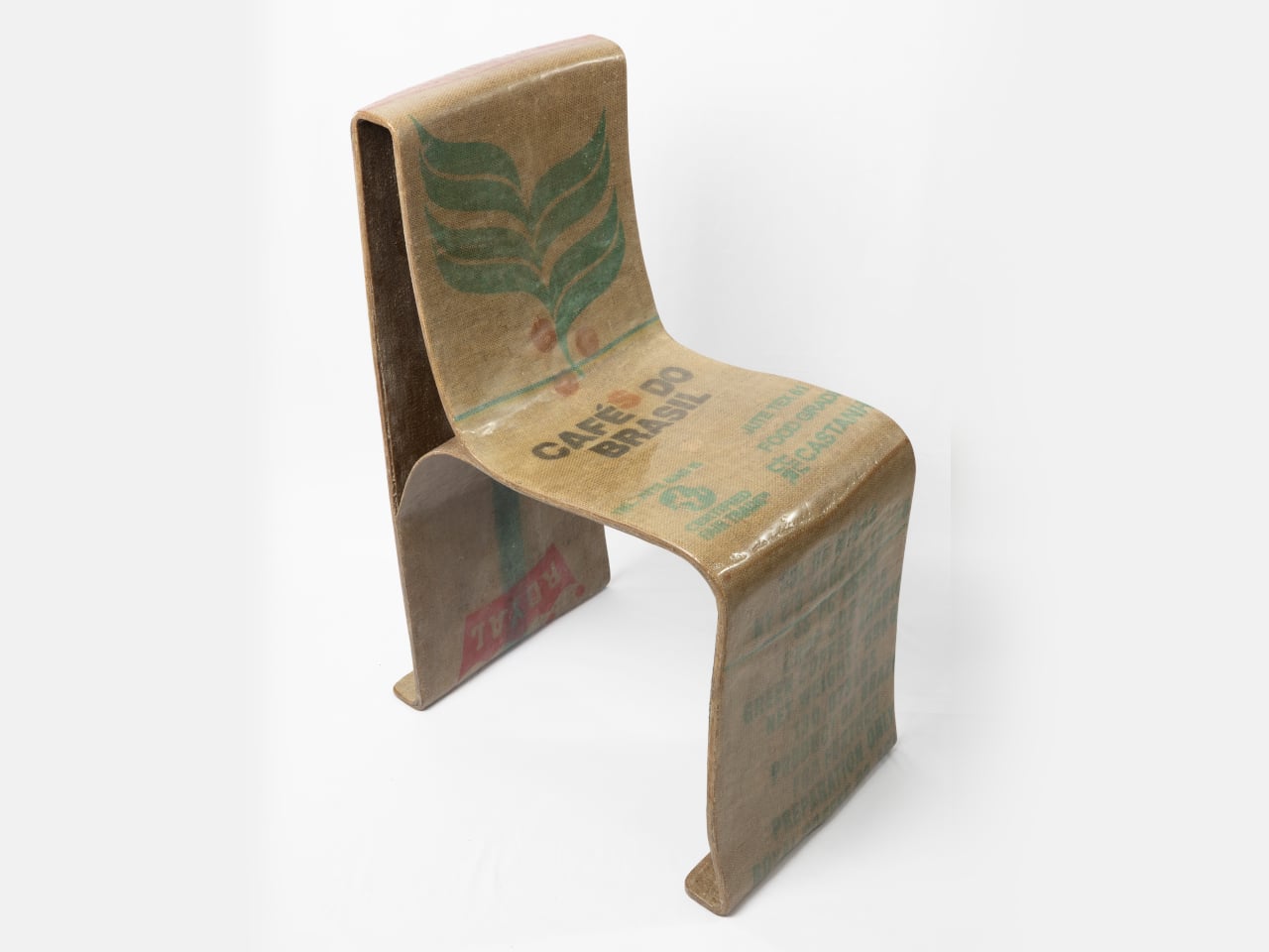
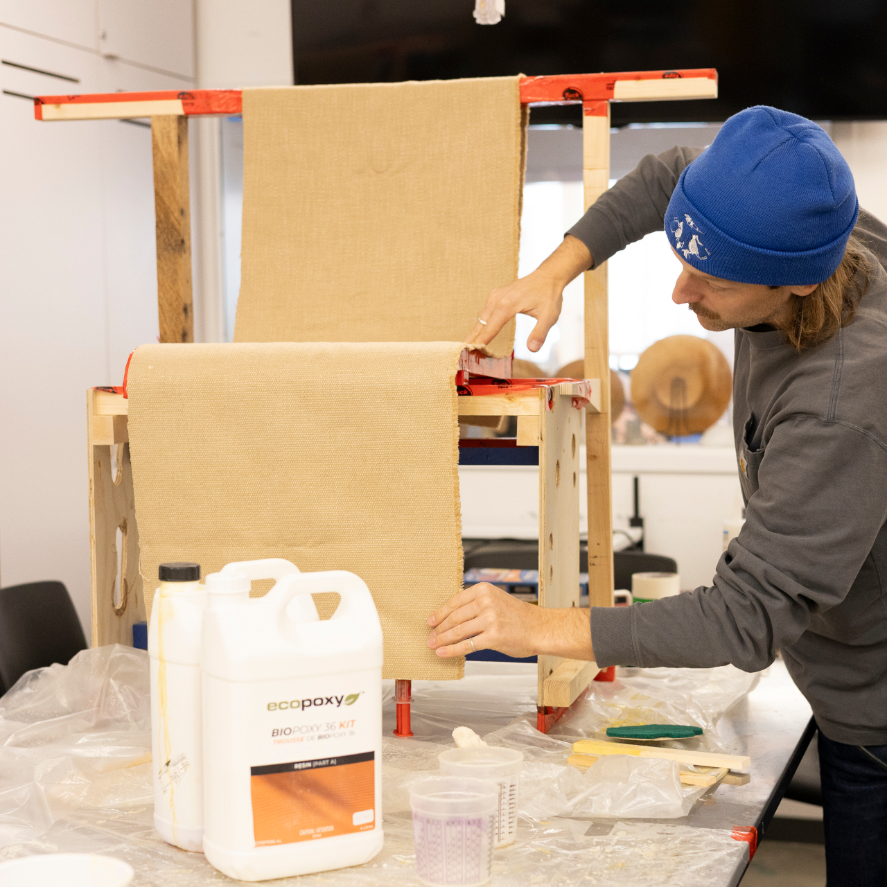
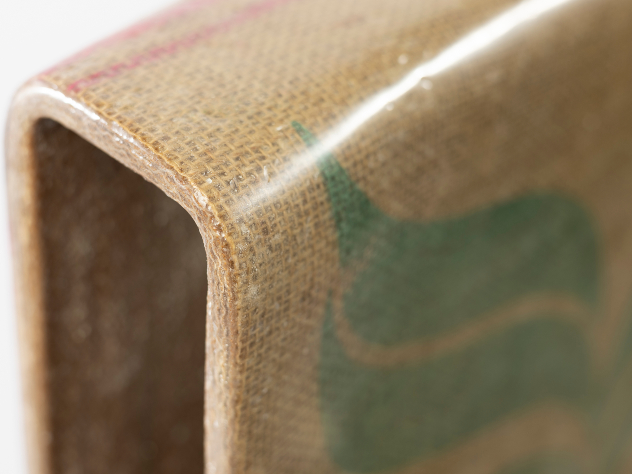
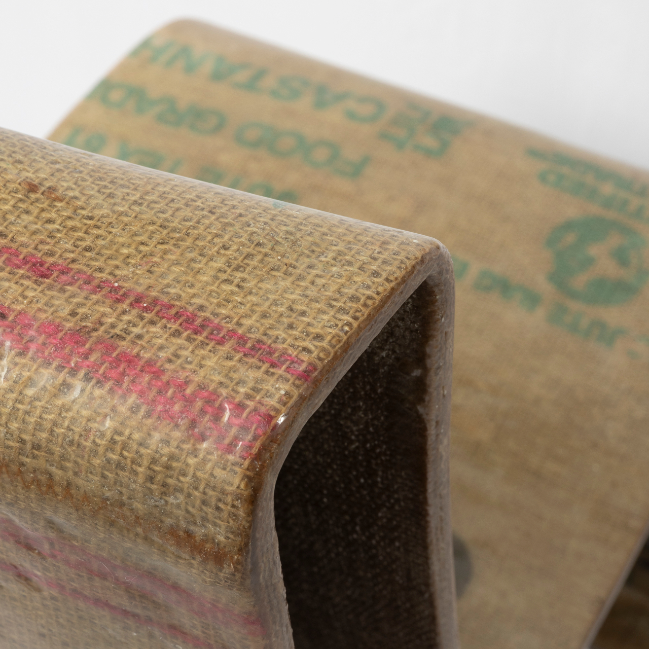
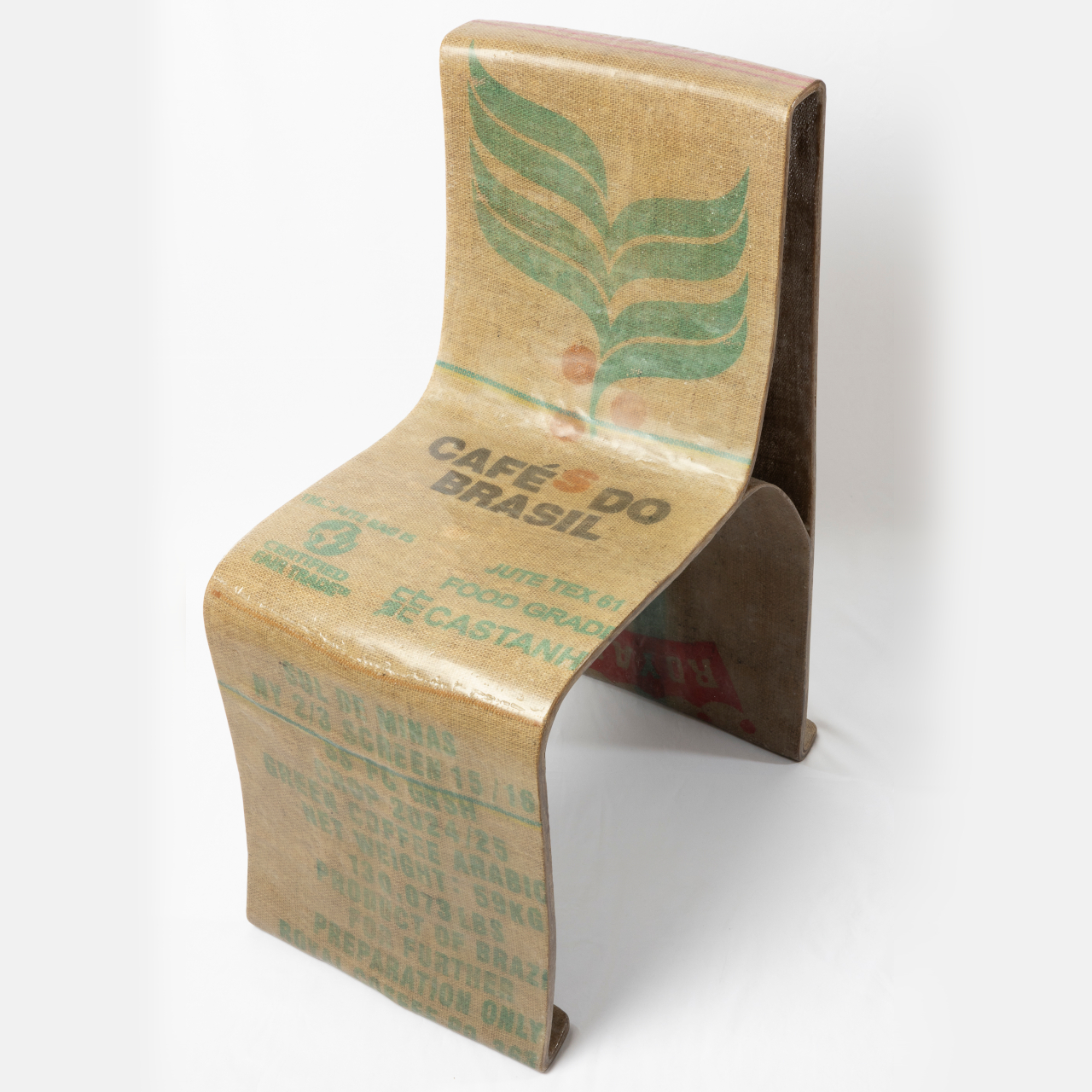
The Novum Chair is his answer, built from a combination of natural woven fiber and bio-based resin. The two materials form a composite: the fiber provides structure and texture, while the resin binds and hardens it into a rigid, load-bearing shell. It’s a relatively simple idea on paper, but getting it to actually hold a person’s weight required significant hands-on material testing.

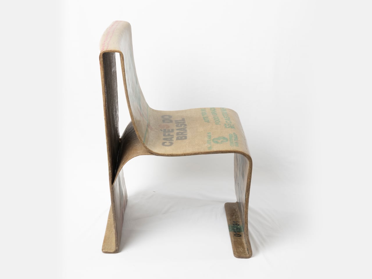
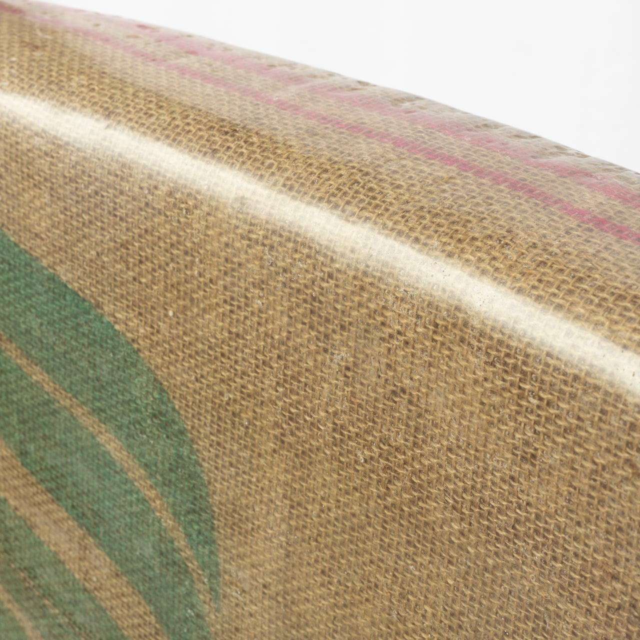
The result is a chair that doesn’t look like it’s making a statement about sustainability; it just looks good. Its form is a single, continuous shell that sweeps from the backrest down through the seat and curls beneath to cradle the sitter. The woven surface is visible through the resin coating, giving it a warm, textile-like quality that reads more like craft than manufacturing.

There’s something refreshing about a chair you could put in a design studio, a cafe, or a considered living space without it demanding attention. The Novum Chair has the kind of understated confidence that lets the material do the talking. The texture and warm amber of the resin-soaked fiber give it a character that shifts with the light, something molded plastic never manages.

Part of what makes this approach worth taking seriously is that it sidesteps one of the more uncomfortable truths about recycled plastics. Re-rendered recycled plastic isn’t the clean solution it’s often portrayed as; it can be roughly 10 times more toxic than the original material. Natural fibers and bio-based resins don’t carry that baggage, which makes this composite a genuinely different starting point.

Whatley is candid about the fact that bio-based resins aren’t perfect yet. They’re relatively expensive, not high enough in bio content, and not yet as accessible as conventional materials. But the Novum Chair isn’t presented as a finished product so much as a proof of concept that structurally sound, beautiful furniture can be built around materials that don’t depend on plastic.

What Whatley has done is take a material problem that feels overwhelming in scale and distill it into something you can sit in. That’s no small thing. The conversation around plastic alternatives tends to stay abstract, caught up in policy and data. A chair that you can actually inhabit, one that looks beautiful, pulls the conversation out of the theoretical and into the everyday.

The post Recycled Plastic Is 10x More Toxic, and This Chair Contains None first appeared on Yanko Design.
This Side Table Tricks You Into Thinking Books Are Holding It Up

Side tables have always been one of the harder pieces of furniture to make genuinely interesting. They’re functional by nature, meant to hold a drink, a remote, or that ever-growing stack of books. Most designs take the easy route: a flat surface, four legs, and nothing more. A few try to add storage or visual flair, but the table and whatever sits on it rarely share anything deeper than proximity.

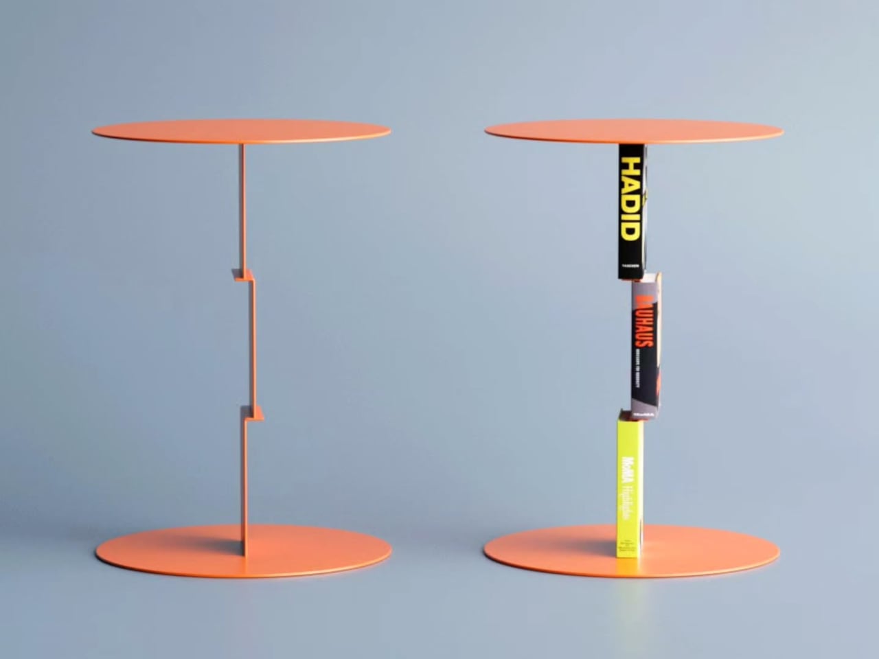
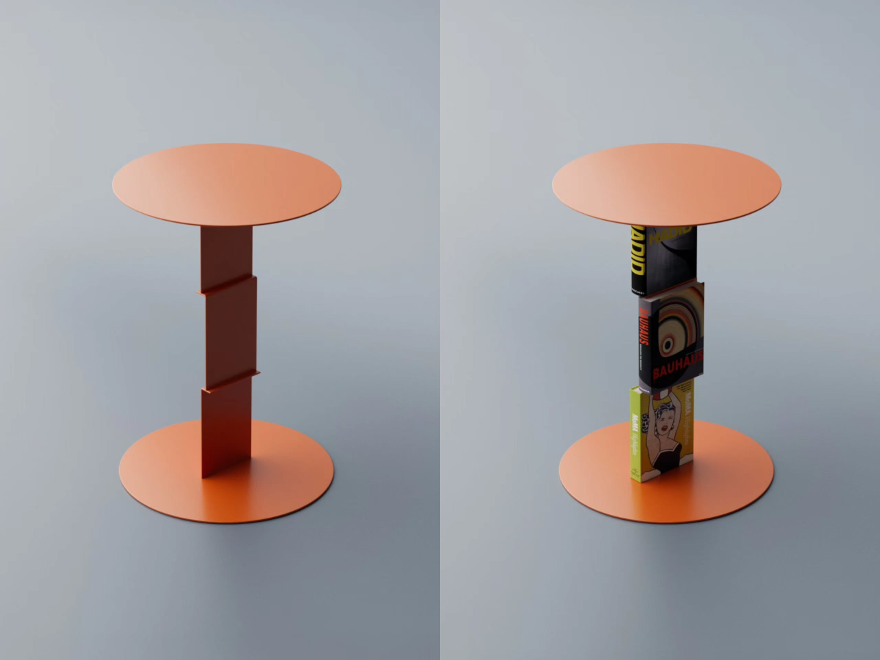
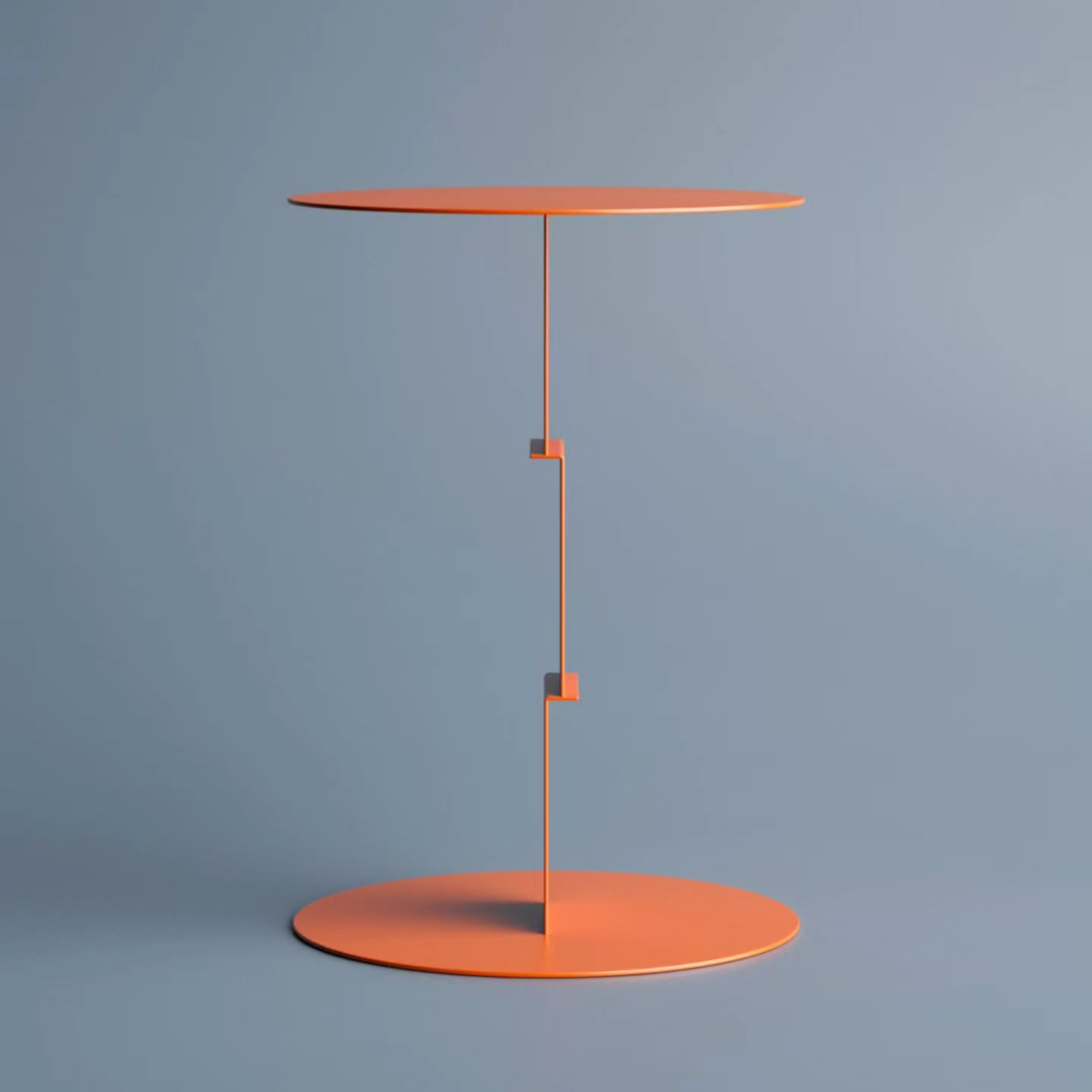
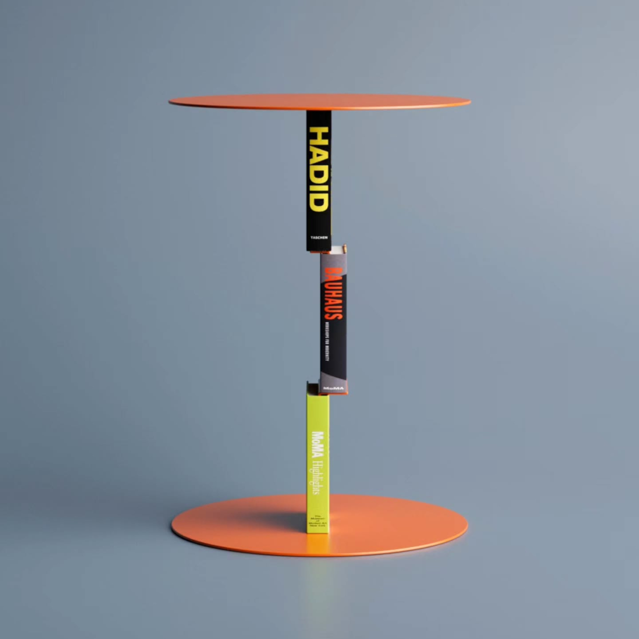
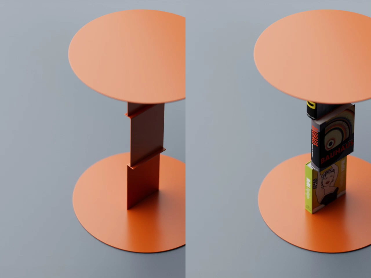
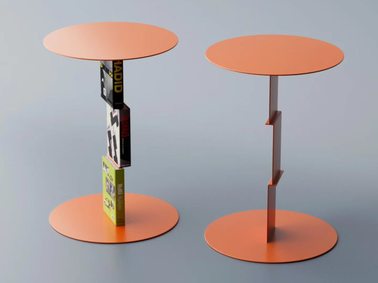
Deniz Aktay’s Delusion Table turns that relationship on its head. The Stuttgart-based designer has crafted a side table concept where books aren’t just accessories resting on the surface; they become part of the table itself, or at least appear to. The idea is simple but arresting: a purpose-built metal framework connects the tabletop to the base, and once books are loaded onto it, the metal structure all but disappears.

Designer: Deniz Aktay (dezinobjects)

The trick borrows from a principle already used in certain bookmarks and floating wall shelves, where a thin metal channel slides between a book’s pages and disappears behind the covers. Aktay applies the same logic vertically: the table’s central stem has integrated clips that hold books upright against the structure. Slot a few thick art or design volumes in, and the metal seems to dissolve quietly into the spines.

What results is a table that looks as if a small stack of books has somehow defied physics to hold an entire surface aloft. It’s a visual gag, but an elegant one. The books aren’t floating or leaning on something concealed behind them. They’re gripping the structure, pages pressed against the clips, covers facing outward, spines reading clearly, creating something that looks accidental but is actually very deliberate.

That deliberateness extends to the books themselves. The volumes you choose to insert don’t just support the illusion; they become part of the design statement. A stack of oversized architecture monographs communicates something entirely different from a row of photography books or a handful of paperbacks. The table changes with whoever assembles it, which is a quiet but genuinely meaningful layer of personalization built right into the concept.

It’s also worth considering where a table like this fits most naturally. A reading nook, a home office corner, or a bedside setup for someone who always has a few books in rotation: in any of these settings, the Delusion Table doesn’t need anything extra to feel complete. The books it needs to function are probably already nearby, waiting to serve a purpose they weren’t originally designed for.

Aktay has made a habit of designing furniture that asks questions as much as it answers them, and the Delusion Table is no exception. It’s a concept that works on two levels: as a functional object that holds books and a tabletop, and as something that quietly unsettles your perception. You look at it, pause a moment, and find yourself genuinely unsure of what’s doing what. That’s exactly the point.

The post This Side Table Tricks You Into Thinking Books Are Holding It Up first appeared on Yanko Design.
Magician’s Rope Is the Table Your Home Didn’t Know It Needed

Most furniture gets categorized before it even enters a room. That’s a dining table. That’s a desk. That’s a side table for the corner where nothing important ever happens. We sort, we label, we arrange our spaces accordingly, and then our lives proceed to ignore all of it. A laptop ends up at the dinner table. A coffee mug finds its way to the workspace. The categories we assign to our furniture rarely survive contact with how we actually live.

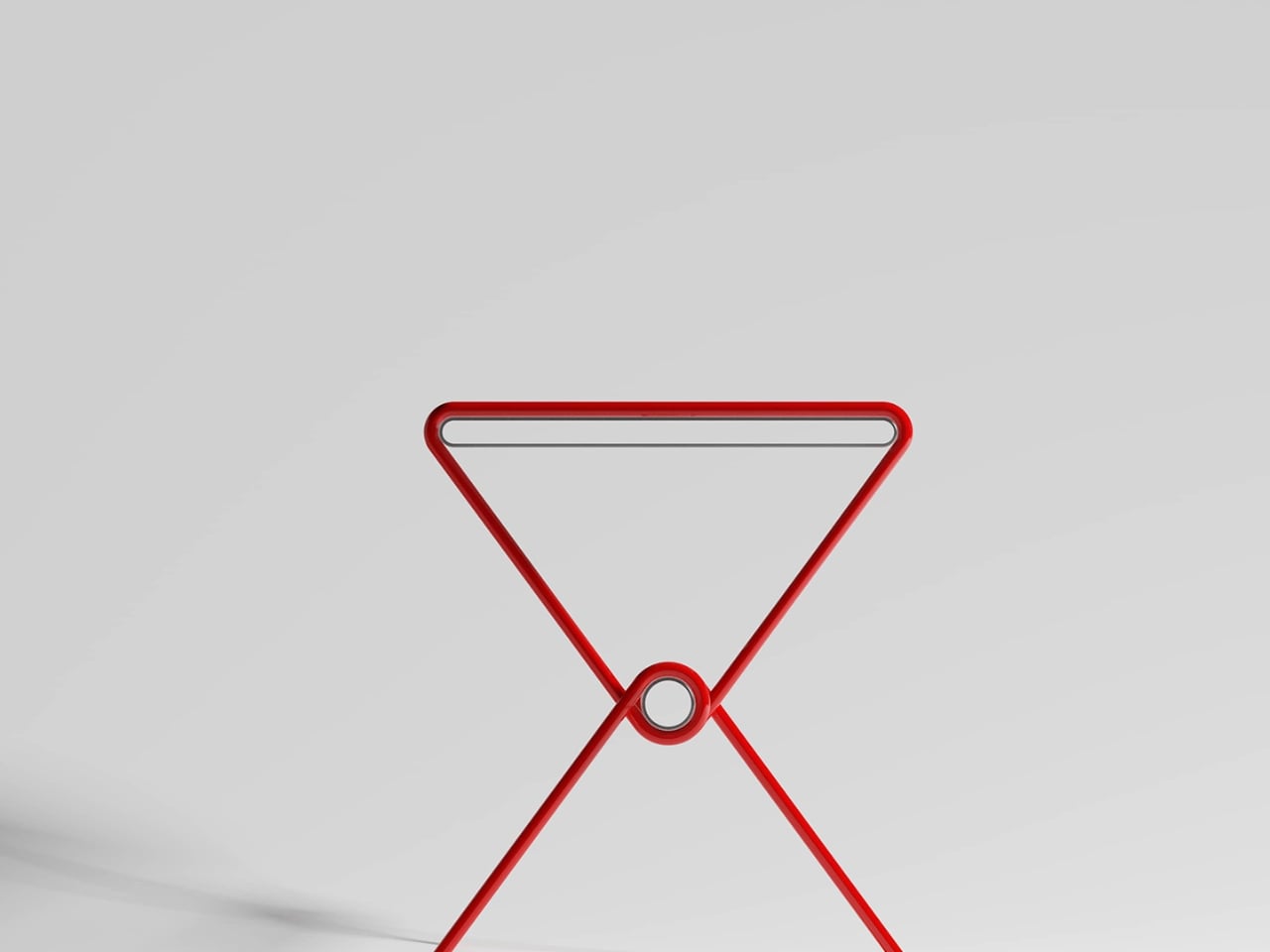
Designer Hanqi Jia seems to have taken that observation seriously. Magician’s Rope, her table concept that recently earned recognition at the NY Design Awards, is built around the idea that a piece of furniture doesn’t need to announce its purpose. It just needs to be useful, beautiful, and quiet enough to let the room breathe around it.

Designer: Hanqi Jia

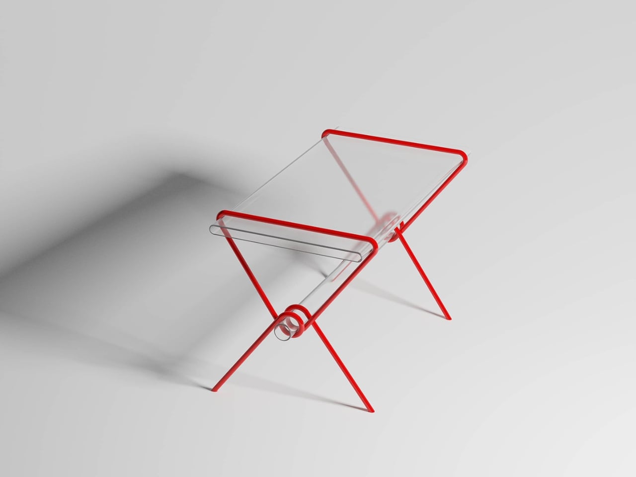
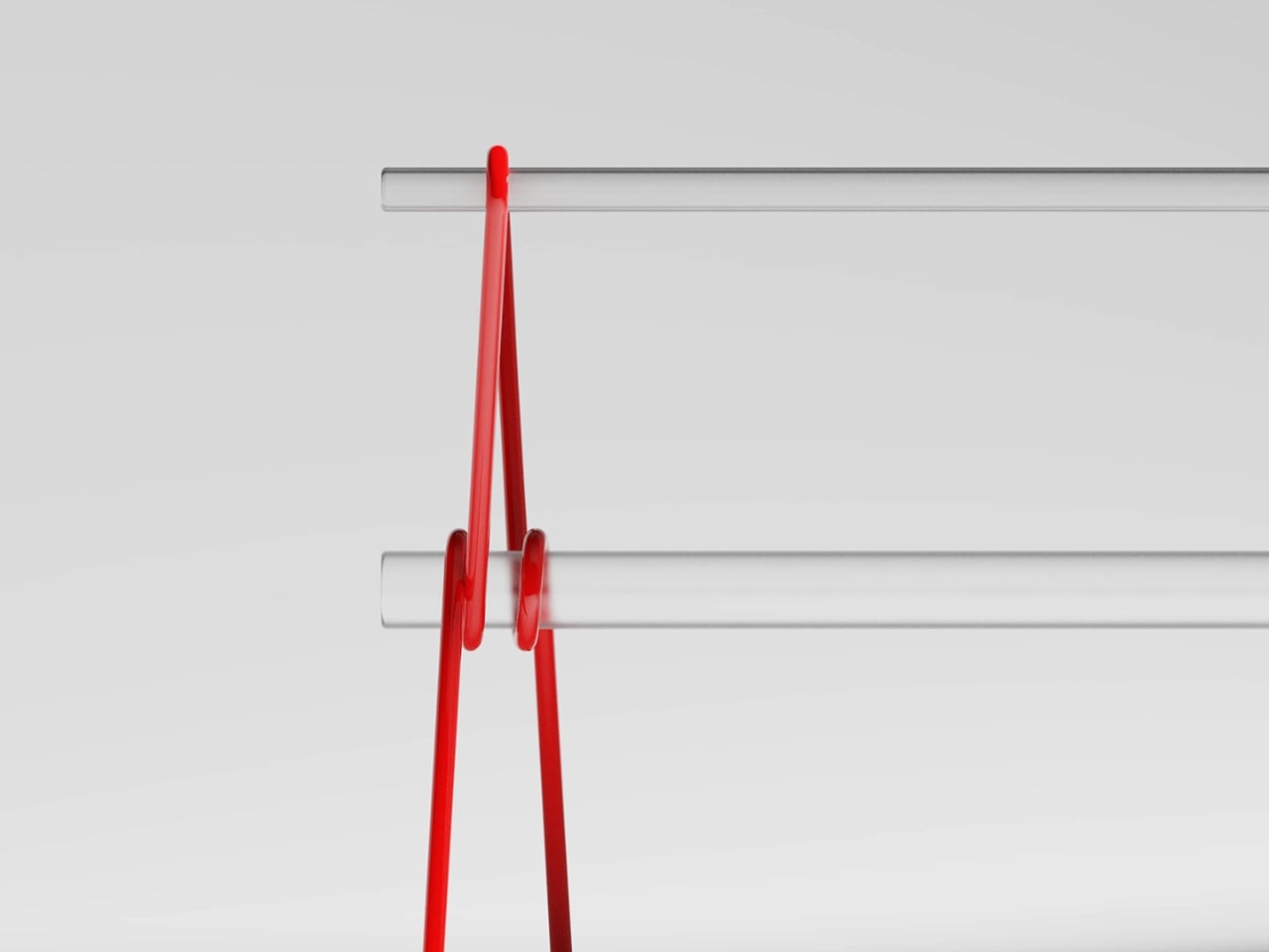
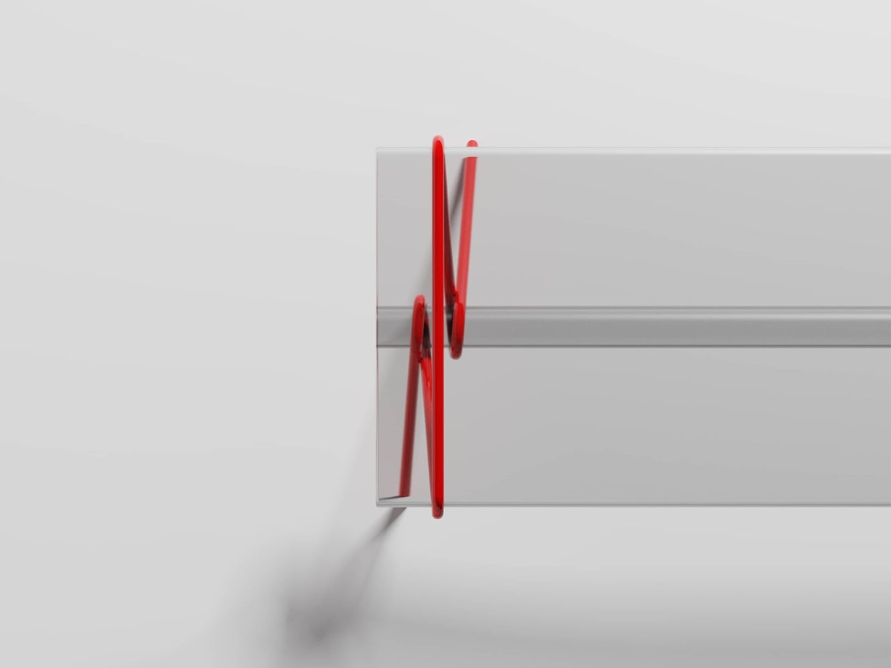
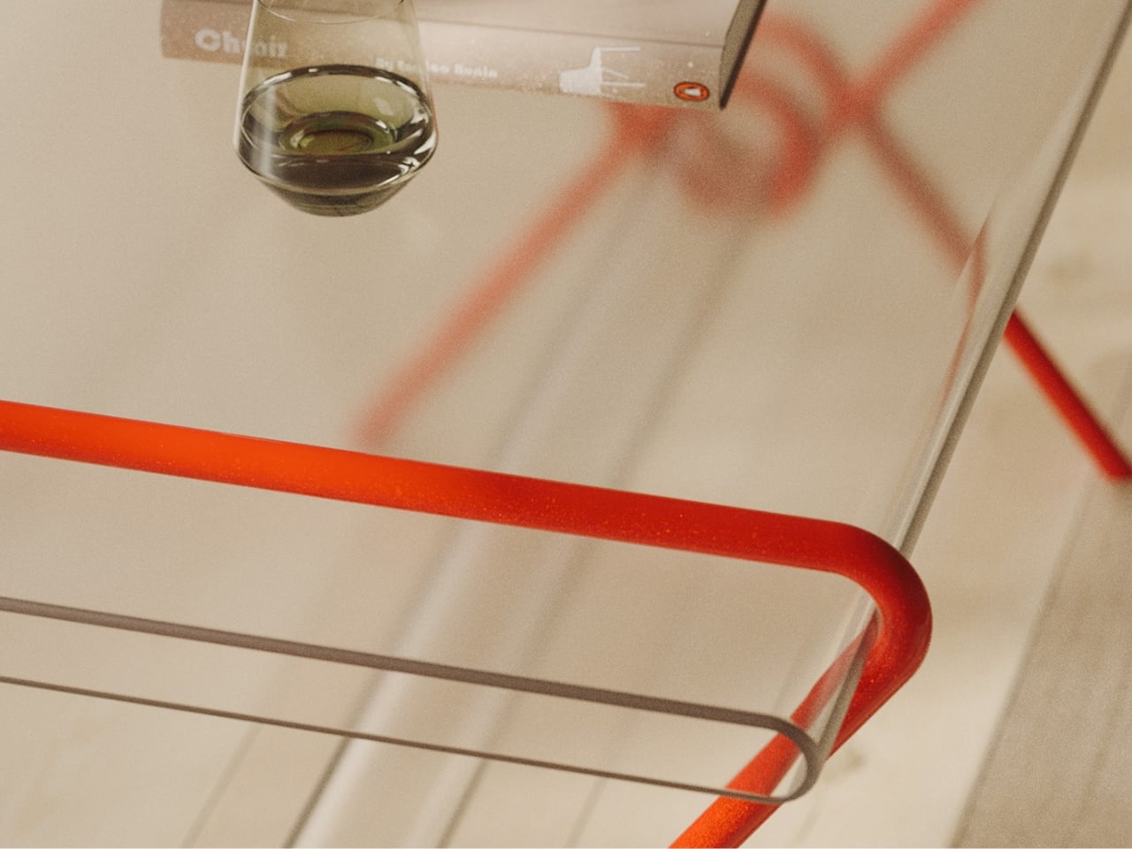
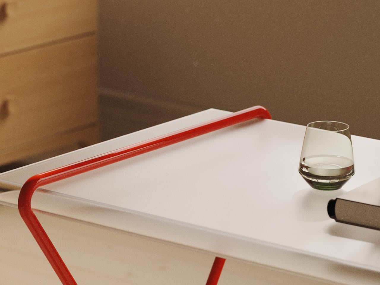
The construction is striking at first glance. A continuous red metal line bends, loops, and crosses itself into a structure that holds a transparent tabletop with almost suspicious ease. It looks like a sketch brought into three dimensions, or a gesture caught mid-motion. The structure doesn’t feel assembled so much as drawn, and that distinction matters more than it might seem. Assembled things feel permanent, fixed, committed to their identity. Something drawn feels like it could become something else.

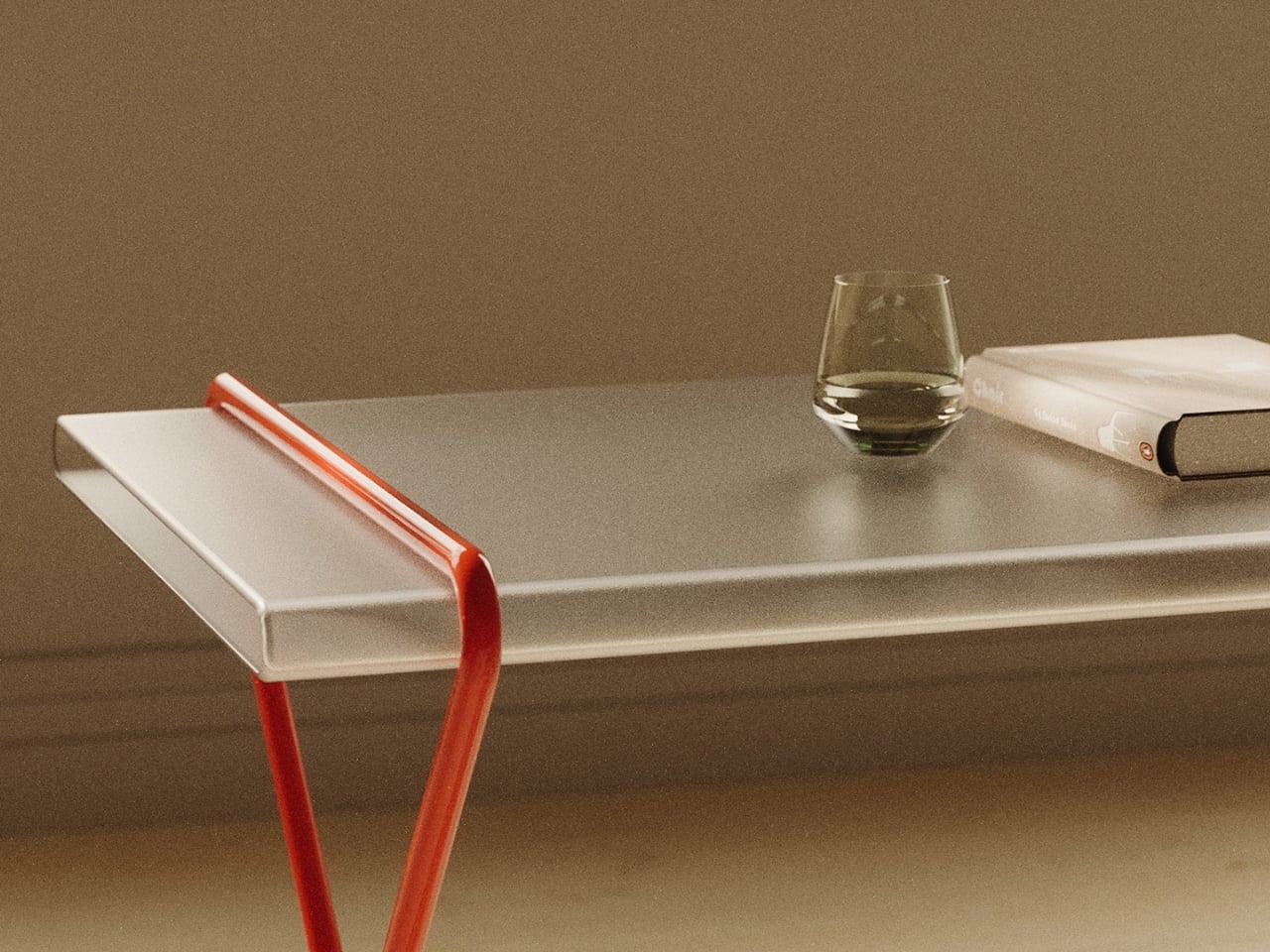
That quality of lightness is intentional. The transparent surface lets light pass through rather than absorbing it, which reduces the table’s visual footprint significantly. In a small apartment or a room already doing a lot of visual work, that kind of restraint is genuinely valuable. A heavy, opaque table makes itself the center of attention whether you want it to or not. This one participates in a room without demanding to run it.

I keep coming back to the red line, though. It’s the detail that makes this more than a clever concept. Red, in design, is rarely neutral. It carries energy and urgency and a certain willingness to be noticed. Here, it pulls off a more interesting move: asserting itself visually while the overall form stays quiet. The red line says look at me while the rest of the table says I’ll be here whenever you need me. That balance is hard to achieve and easy to appreciate once you see it.

The name, Magician’s Rope, earns its reference. Stage magic has always been less about the trick itself and more about misdirection, timing, and the illusion of effortlessness. A good magician makes you forget you’re watching a performance. A good piece of furniture, by the same logic, makes you forget you’re using it. It just supports whatever the moment requires without calling attention to the effort involved. Magician’s Rope leans into that comparison deliberately, and the design holds up under it.

The refusal to over-explain might be the most quietly radical thing about it. A lot of contemporary furniture design tries to tell you exactly what it is and what it’s for. There are dining tables that are obviously dining tables, desks that are unambiguously desks, coffee tables that could not possibly be mistaken for anything else. Magician’s Rope doesn’t bother with that kind of insistence. It works as a dining surface, a work surface, a display surface, or something in between. The ambiguity is the feature, not a flaw.

It’s also worth noting that the concept addresses a real tension in how we live now. The lines between work and home have shifted in ways that most furniture hasn’t caught up with. A piece that can sit comfortably inside both modes of a day, without visual disruption, without demanding a room reorganization, without looking like an office prop or a formal dining relic, fills a gap that plenty of people have been quietly feeling for years. Magician’s Rope is a confident piece of work, and it carries the kind of assurance that makes you want to see what Hanqi Jia does next.

The post Magician’s Rope Is the Table Your Home Didn’t Know It Needed first appeared on Yanko Design.
If Fidget Spinners Were Furniture: This Marble Table Has a Brass Sphere You Push Around Endlessly

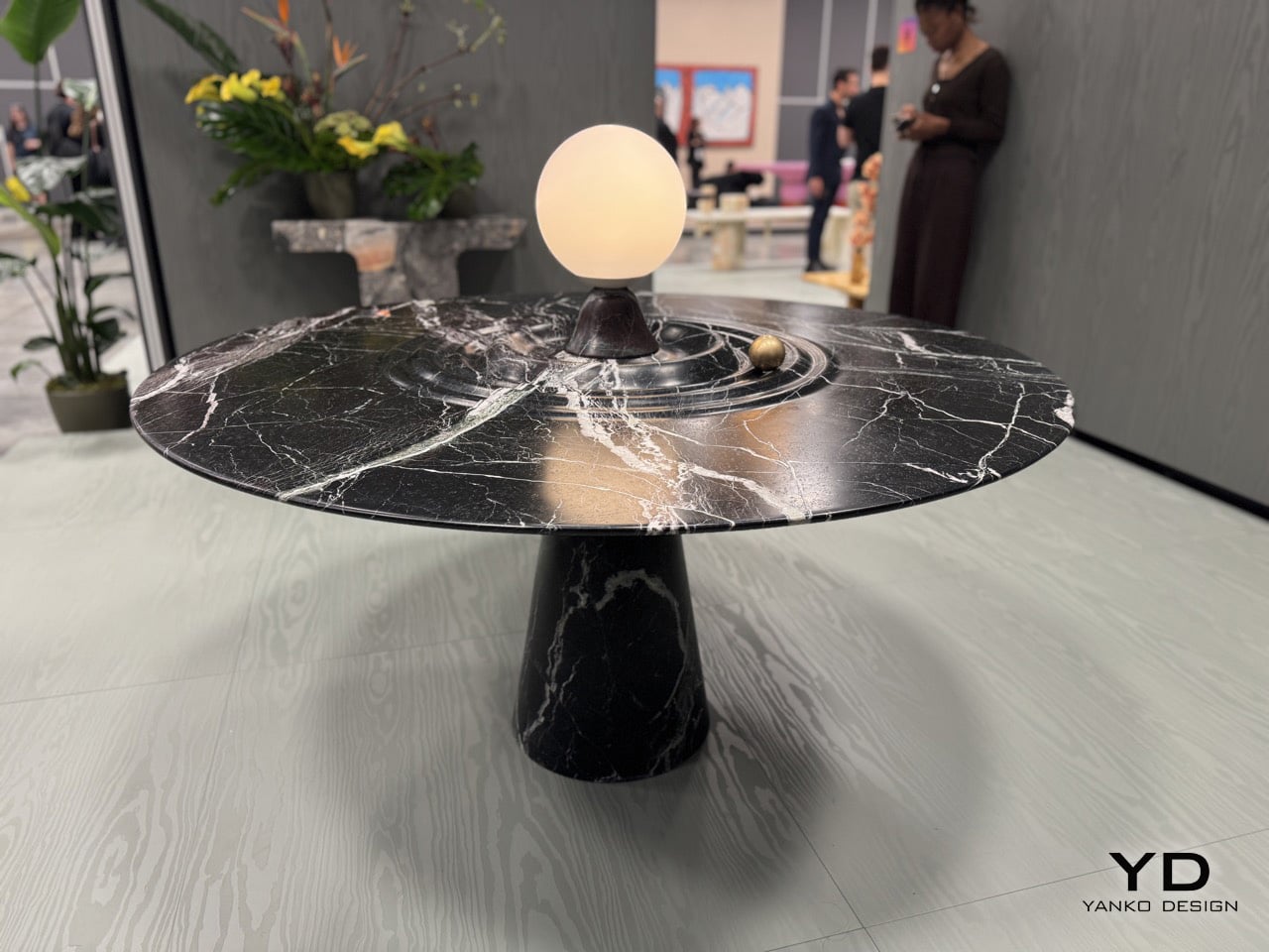
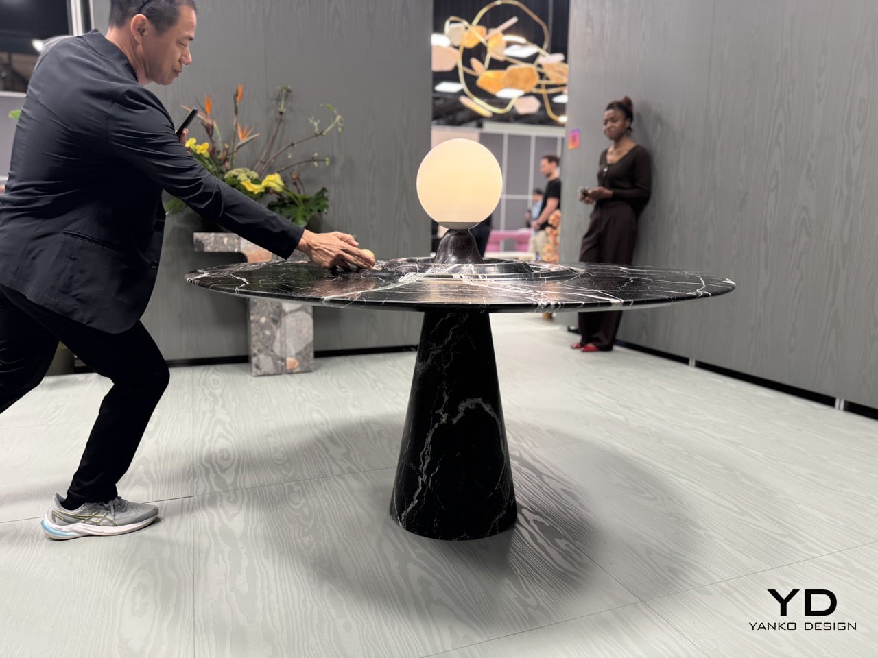
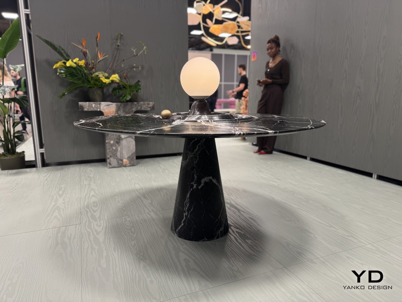
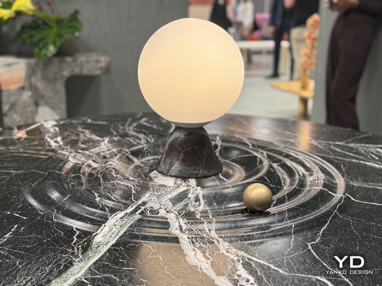
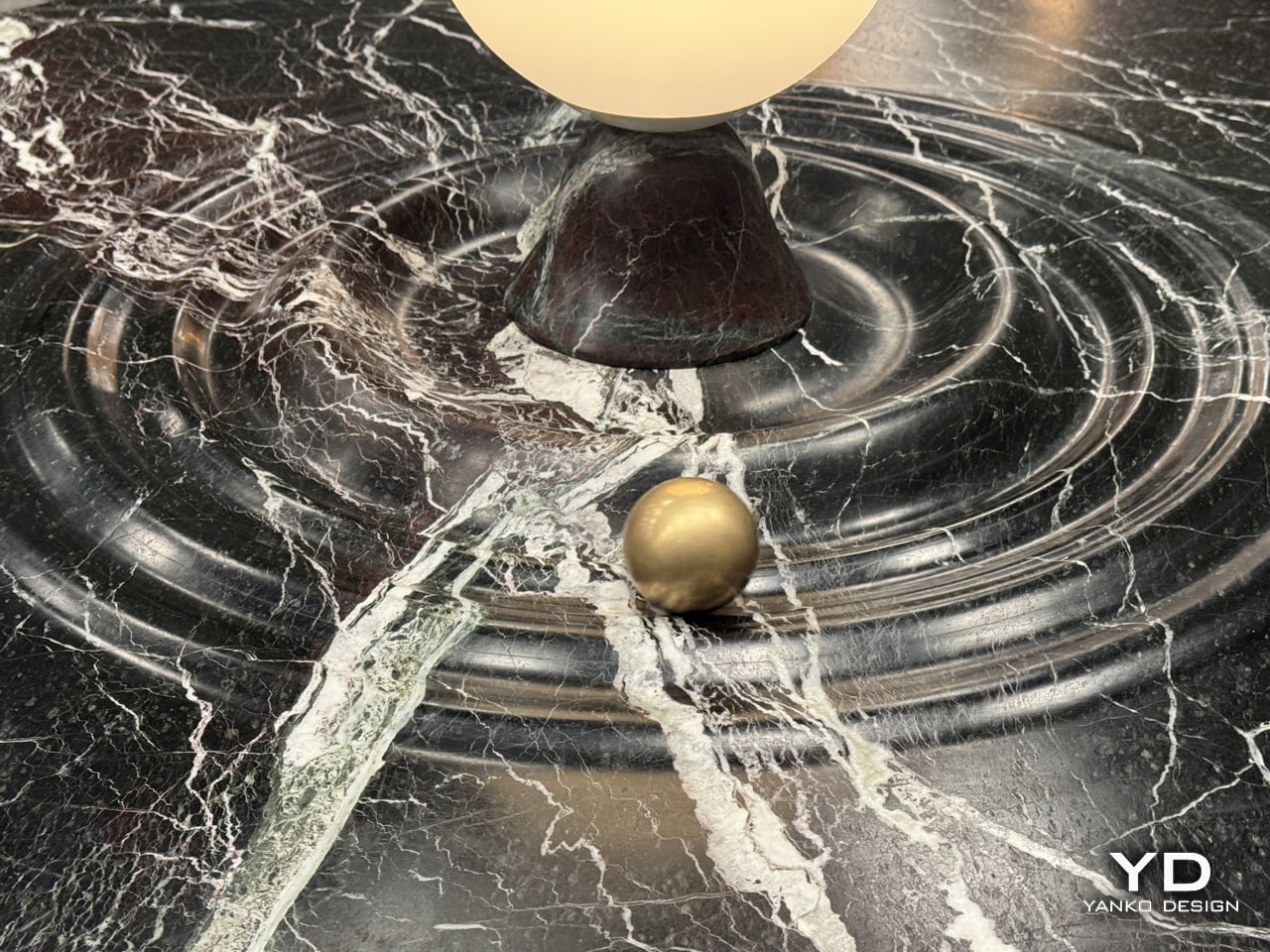
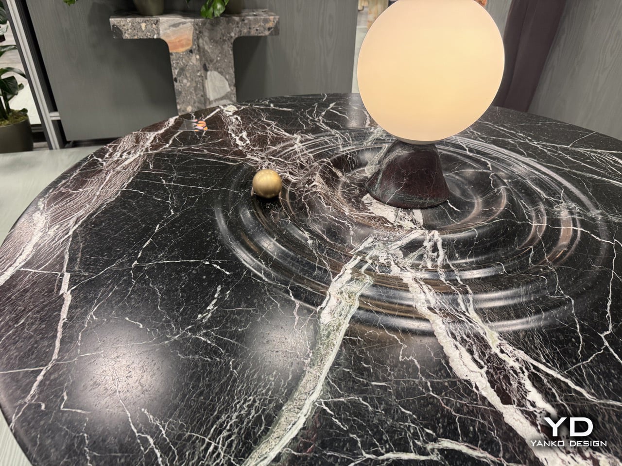
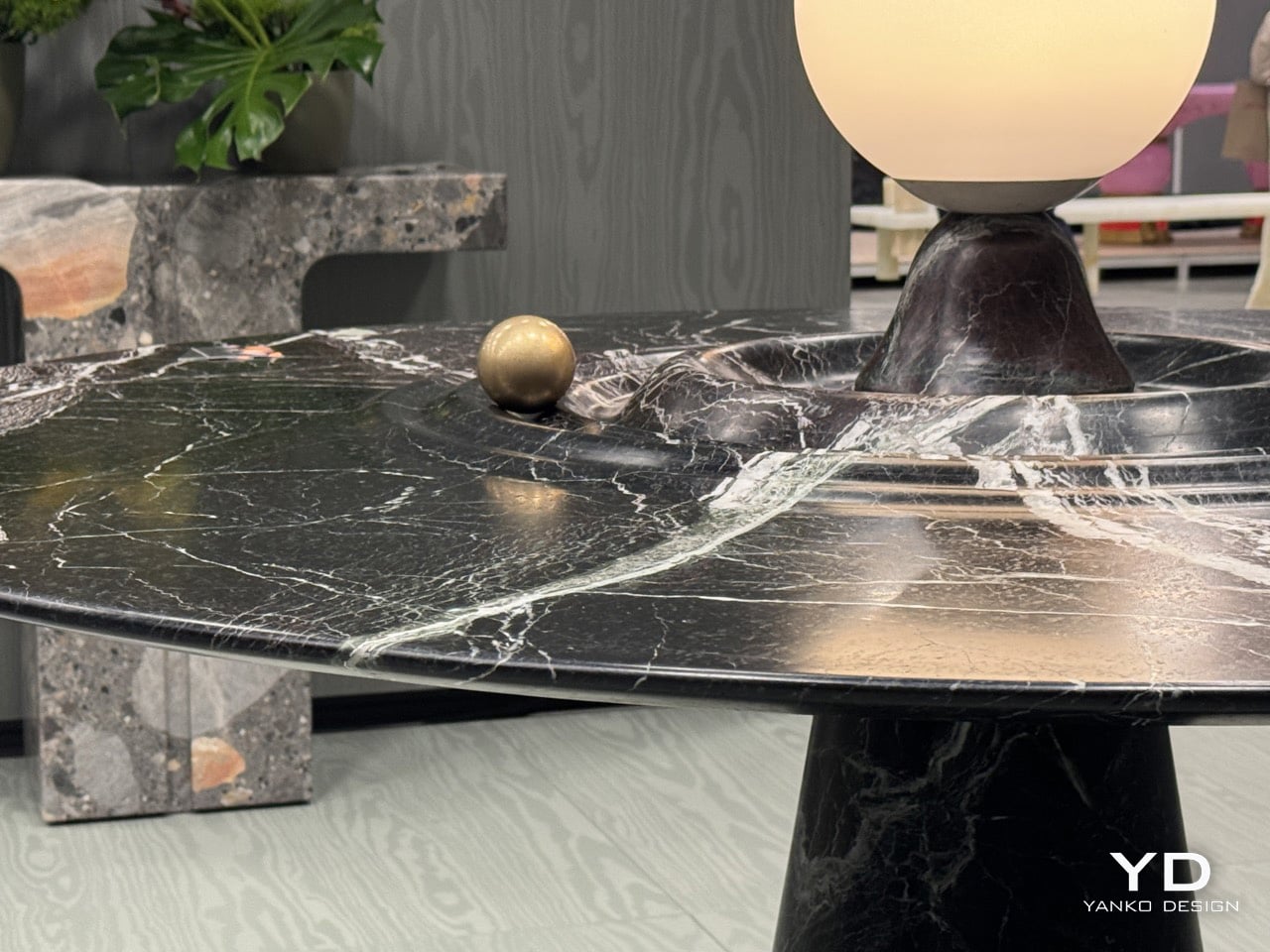
Furniture should probably stay still. That’s the basic contract between you and the table: it holds your dinner plates, you don’t worry about physics. Alessio Scalabrini decided that contract was negotiable. The Animo table, produced by Italian marble workshop Serafini, features a brass sphere that rotates around a central lamp fixture, tracing concentric ripples carved into the marble surface like a tiny planet orbiting its sun. The table functions perfectly well as a static dining surface, but it also invites you to set something in motion every time you walk past it, turning what could’ve been another high-end marble slab into an interactive kinetic object that happens to hold glassware.

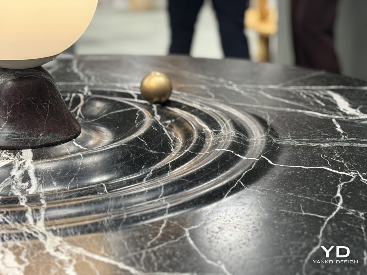
Named after the Italian word for Soul, the Animo table adds some animated joy with a dash of luxury to your space. The table, made entirely from Italian Rosso Levanto marble, is hand-finished with ripples that break the illusion of stillness, making it look fluid. Nestled in one of those ripples is a brass sphere, adding a dash of gold to the table’s ultra-dark burgundy and white-vein design. The result is furniture you can fidget with. It’s art and play combined brilliantly, with the kind of craftsmanship you can only expect from an Italian brand showcasing at Salone del Mobile!
Designer: Alessios Calabrini for Serafini

The table first attracts you with how it looks, then how it feels. The marble finish is impeccable, with the ripples crafted to absolute perfection. The perfection plays an important part here, because a brass sphere needs to seamlessly roll around the table, with the smoothness of a fidget spinner. The sphere has solid heft to it, giving it a fair amount of momentum when you nudge it around the table. It moves with little to no effort, completing tens of rotations before coming to a very gradual halt. Any other material would falter. Wood might end up deforming after years, metal would make the table feel unpleasant, rough stone wouldn’t cause the sphere to move as freely.
The central lamp adds another layer of functionality, illuminating the table from within while serving as the gravitational anchor for the sphere’s orbital path. The whole composition balances three distinct roles: functional dining surface, sculptural marble centerpiece, and interactive kinetic object. Most designers would’ve picked one and committed. Scalabrini made all three work simultaneously.

Scalabrini runs a Paris-based design studio with 18 years of experience merging traditional craftsmanship with contemporary fabrication technology, and that dual approach is visible throughout the Animo. The table uses Serafini’s established production methods, combining precision CNC machining with hand-finishing by Italian artisans who’ve been working marble their entire careers.

If you want to see the Animo table in person and experience the satisfying physics of that brass sphere yourself, Serafini is showing it at Salone Raritas during Salone del Mobile. The difference between seeing photos and actually pushing that orb around the channels is substantial. Photos capture the visual design, but they can’t communicate the tactile satisfaction of setting something that heavy into smooth, controlled motion.

The post If Fidget Spinners Were Furniture: This Marble Table Has a Brass Sphere You Push Around Endlessly first appeared on Yanko Design.