Smartphones are mostly created for those of us that are seeing or at least not visually impaired. But for those that want to be more inclusive, there are not that many similar products in the market that would cater to those that have some sort of visual impairment. Good thing that there are product designers out there who are thinking of such things and if their concepts are viable, I really hope that they get the funding to produce devices like this or at least major telecom brands adopt these ideas and create product lines for those that may need smart devices to communicate but are unable to use the usual ones.
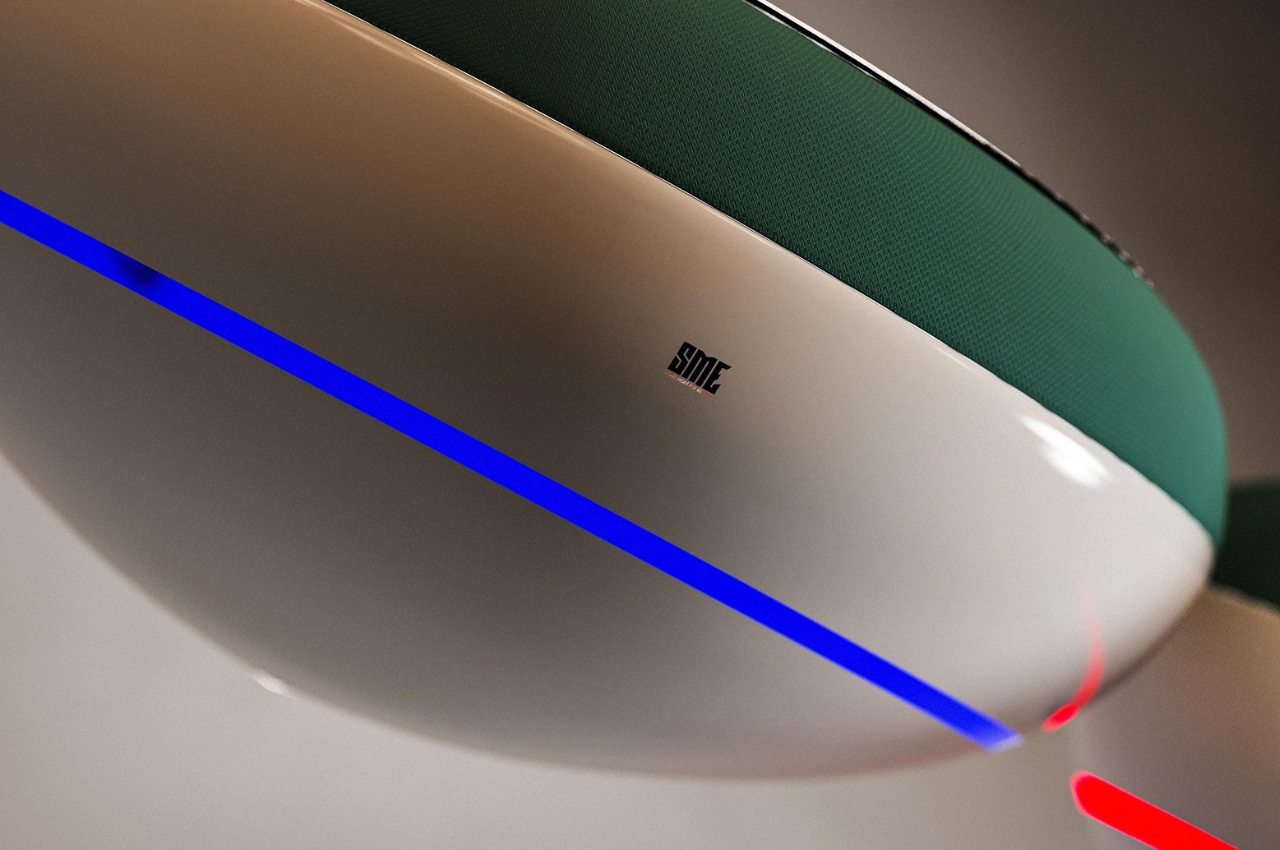
Designer: Eslam Shafik
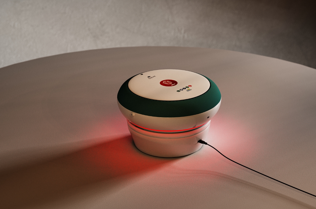
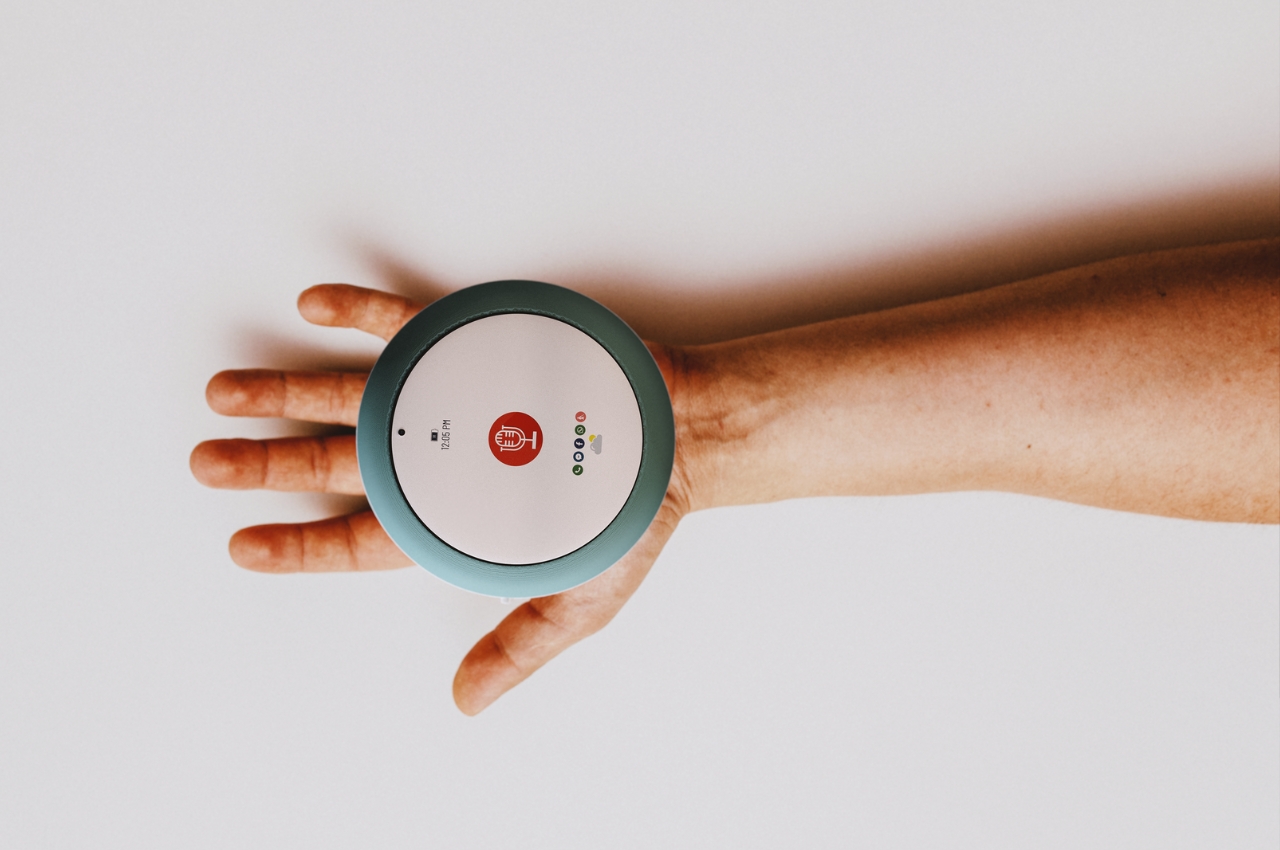
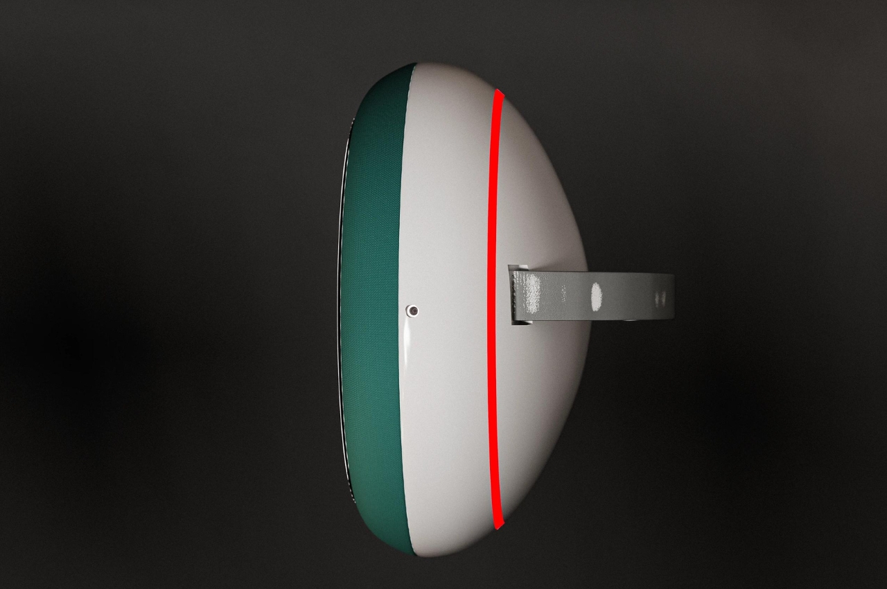
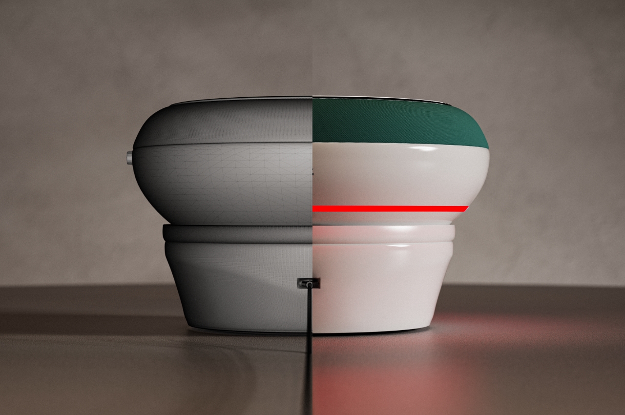
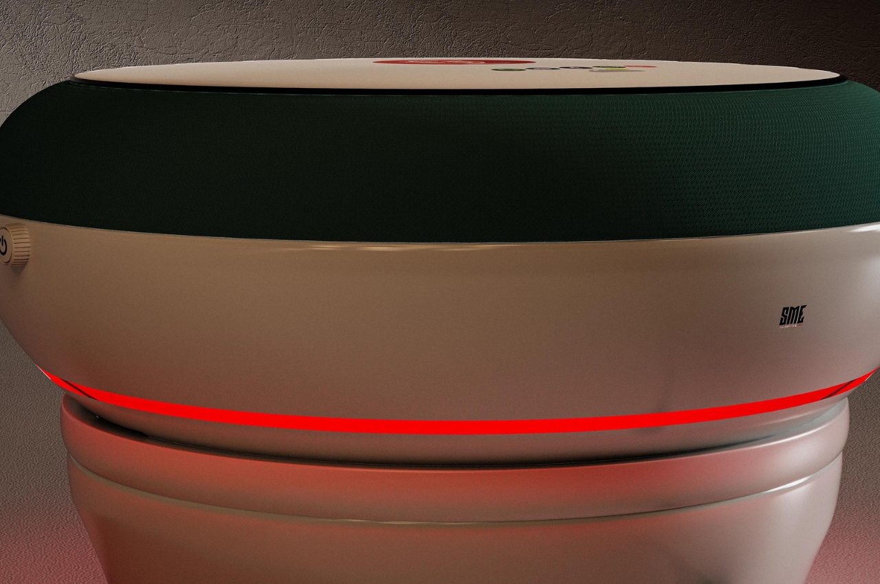
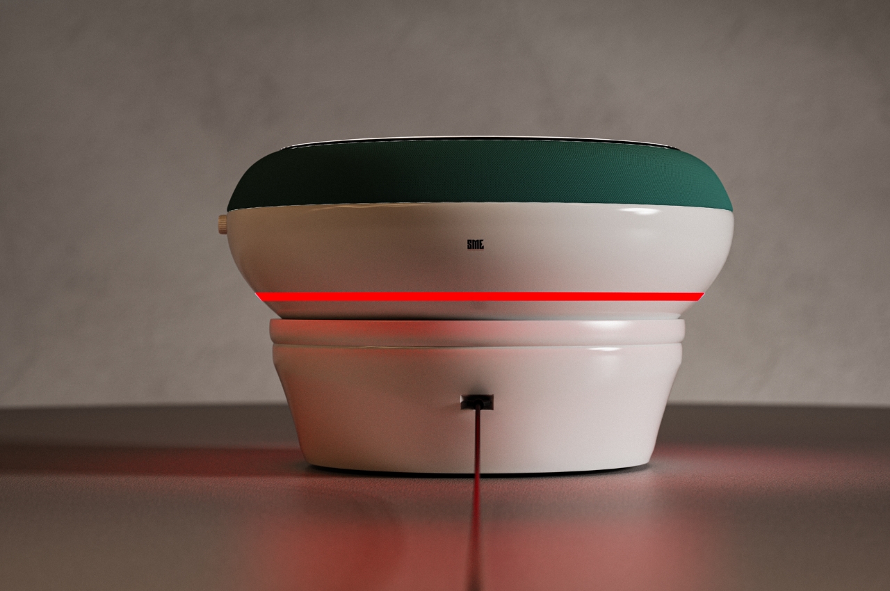
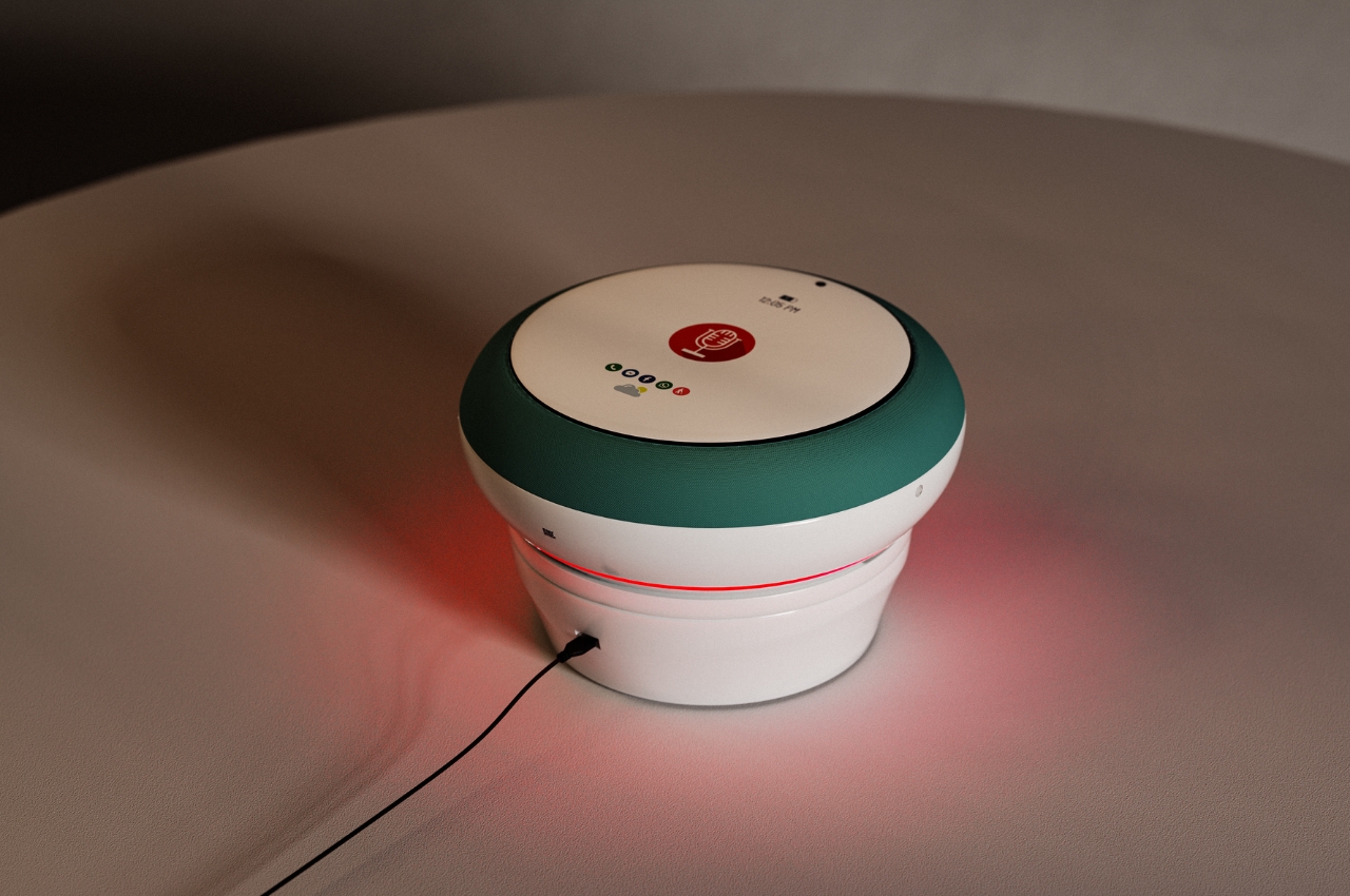
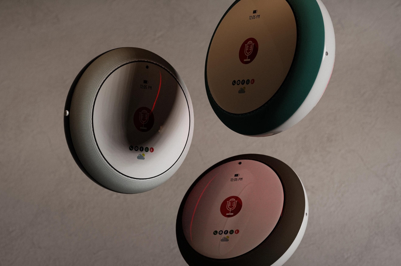
The SME is one such concept for a smart phone for the visually impaired. Unlike regular smartphones that are usually in a rectangular or square-ish shape, this one looks more like a smart speaker or a smart home hub. This a specific design direction that will make it easy for them to carry it around on the palm of their hand without a concern for its orientation. It also has a fabric mesh so you get a tactile grip on the smartphone and the materials used do not conduct heat so it’s comfortable for the user.
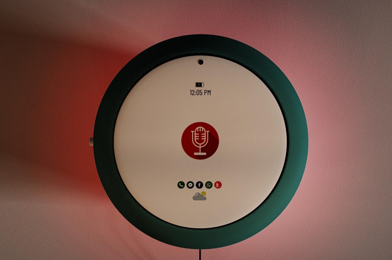
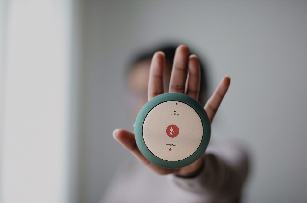
It even has a walking mode so the built-in high-quality camera will be able to guide the visually impaired as they’re walking. The voice assistant, Loutaz, can issue warnings when there are obstacles at a distance of not less than 50 centimeters. This assistant, powered by ethical AI, can also read out messages, social media posts, and other digital assistance you may need. It has a base for charging and to dock it when you’re not moving so it can still act like a smart home hub when you’re at home.
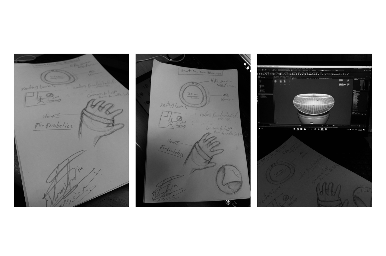
If further developed, this can be a pretty interesting, not to mention, useful device for those who need something like this. The 3D modeling seems to have dealt with the ergonomics and design aspect of the SME so what needs to be enhanced are the actual features and functions that will be truly helpful for the visually impaired.
The post SME smartphone concept aims to aid the visually impaired first appeared on Yanko Design.