PROS:
- Compact flagship design
- Bright 6.3-inch LTPO AMOLED display
- Strong all-around camera system
- Excellent battery capacity for its size
CONS:
- Global version gets a smaller battery than the Chinese version
- Haptic rattles a little in some apps and games
- Camera is a slight step down compared to the Ultra, especially the telephoto
RATINGS:
SUSTAINABILITY / REPAIRABILITY
EDITOR'S QUOTE:
The Xiaomi 17 gets a lot right by knowing exactly what it wants to be.
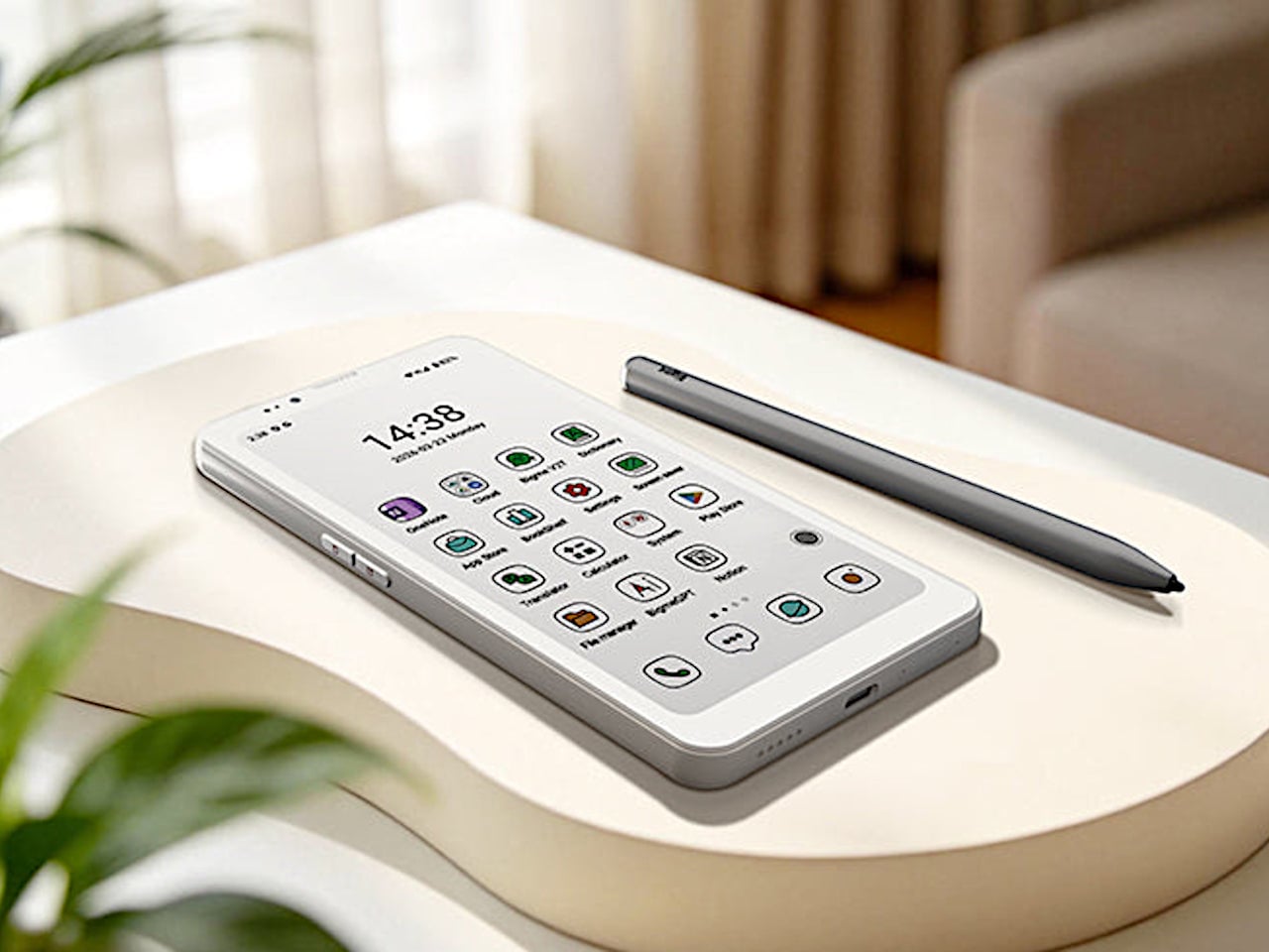
The Xiaomi 17 is a rare thing in 2026. It is a genuinely compact Android flagship that still throws around huge‑phone specs. You get a 6.3‑inch LTPO AMOLED display, a Snapdragon 8 Elite Gen 5 chipset, a Leica‑branded triple camera, and a battery that is bigger than many tablets at up to 7000 mAh in the Chinese version and 6330mAh in the global version.
Unlike its louder siblings, the Xiaomi 17 Pro, 17 Pro Max, or 17 Ultra, the standard Xiaomi 17 skips the rear secondary screen and wild camera modules. That makes it the most understated member of the family, but also the one that will fit most hands and pockets, while still behaving like a no‑compromise flagship.
Designer: Xiaomi
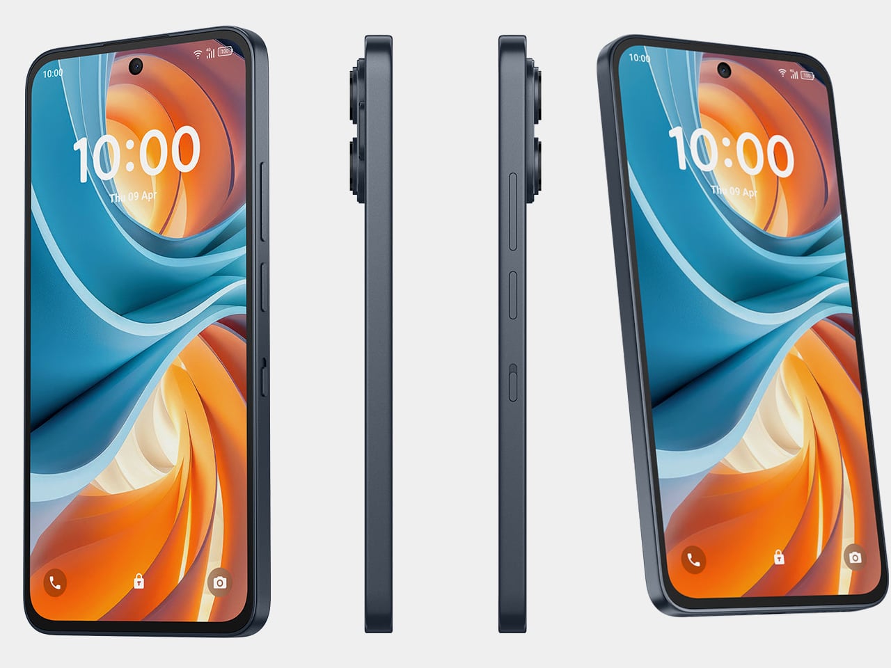
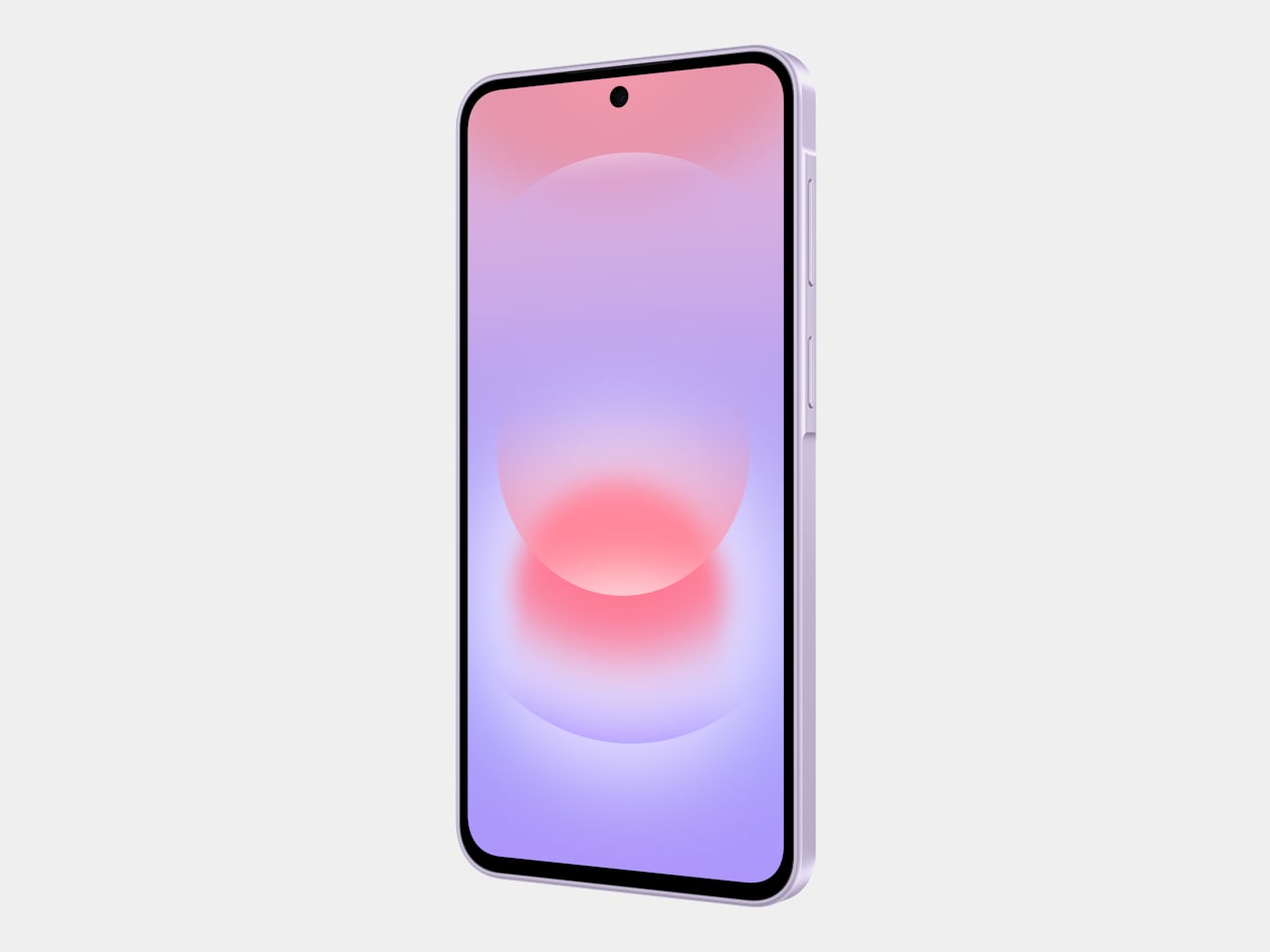
Aesthetics
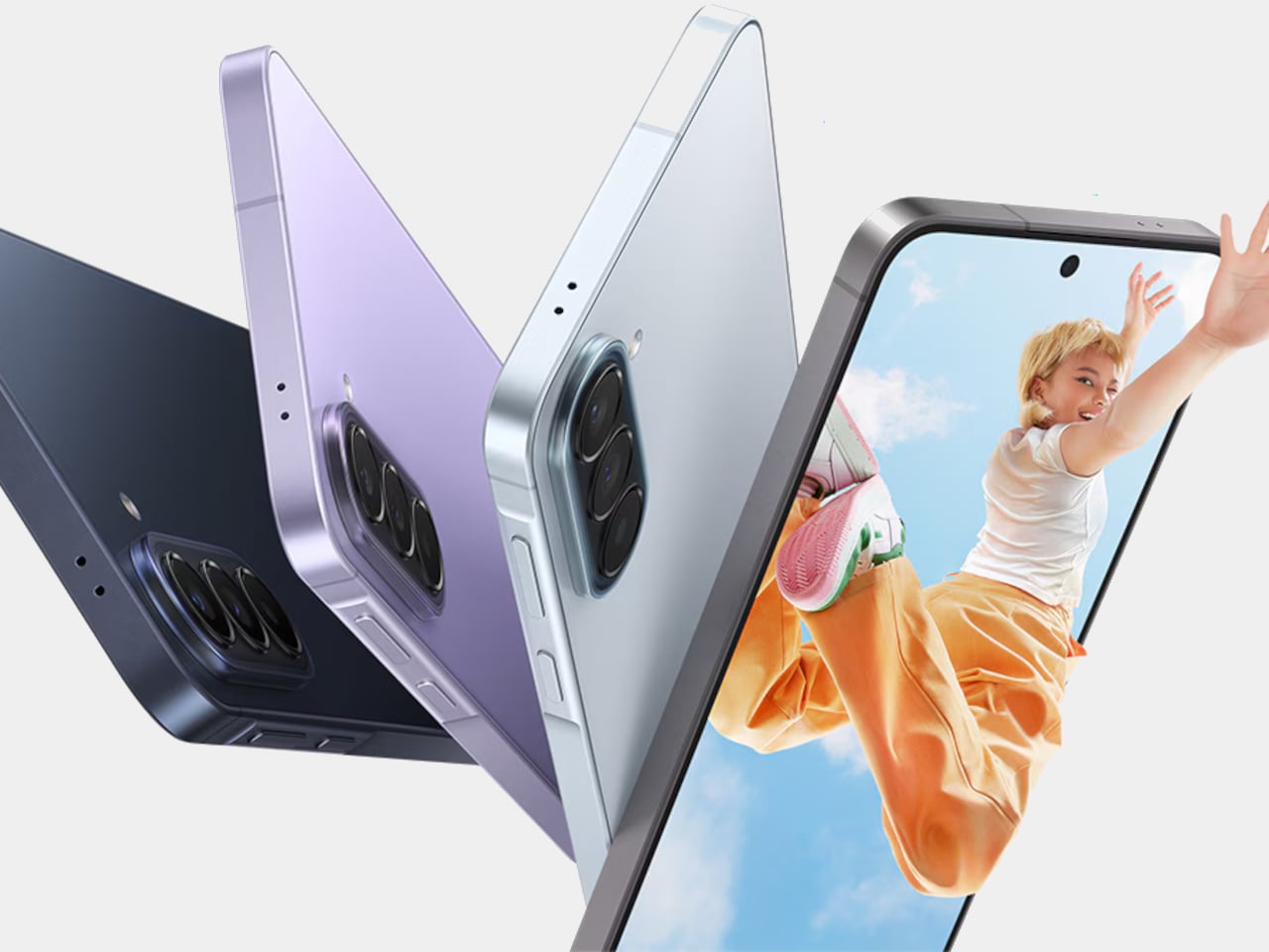
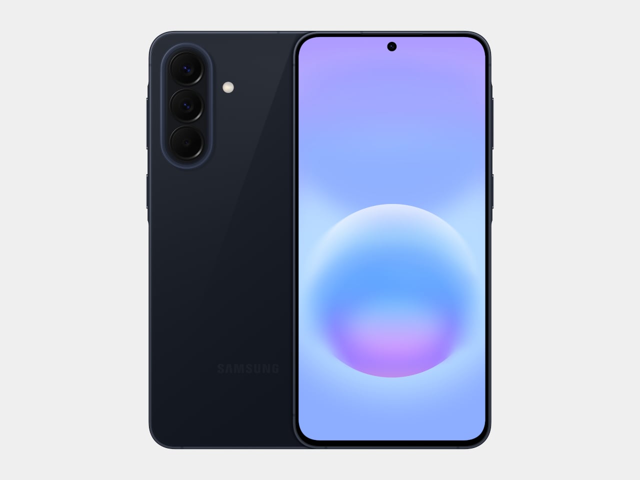
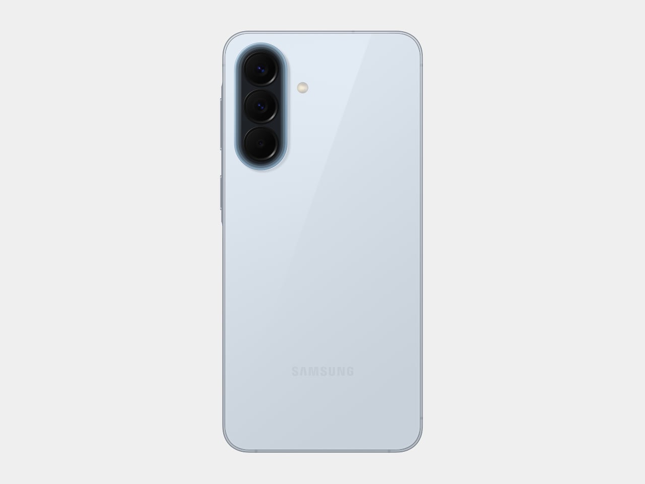
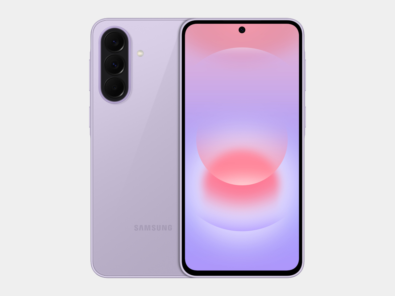
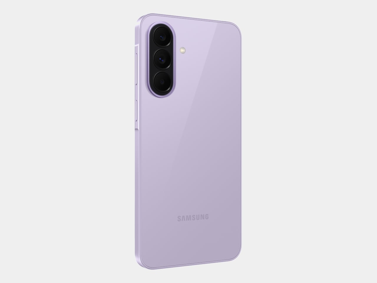
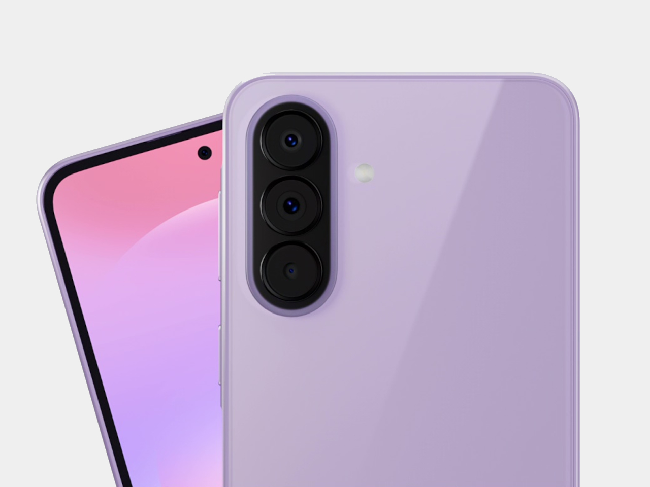
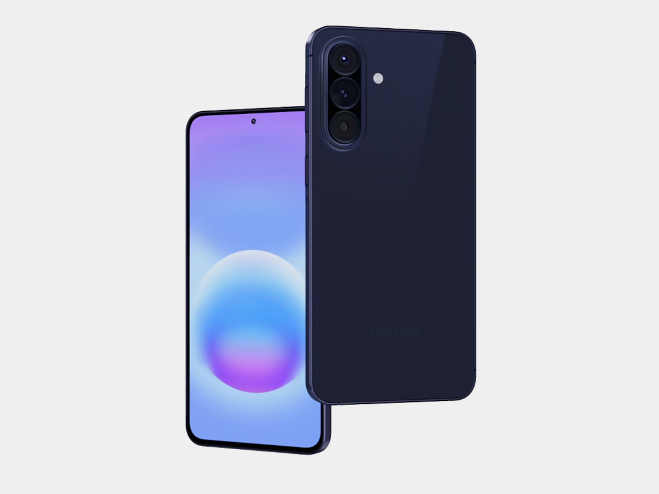
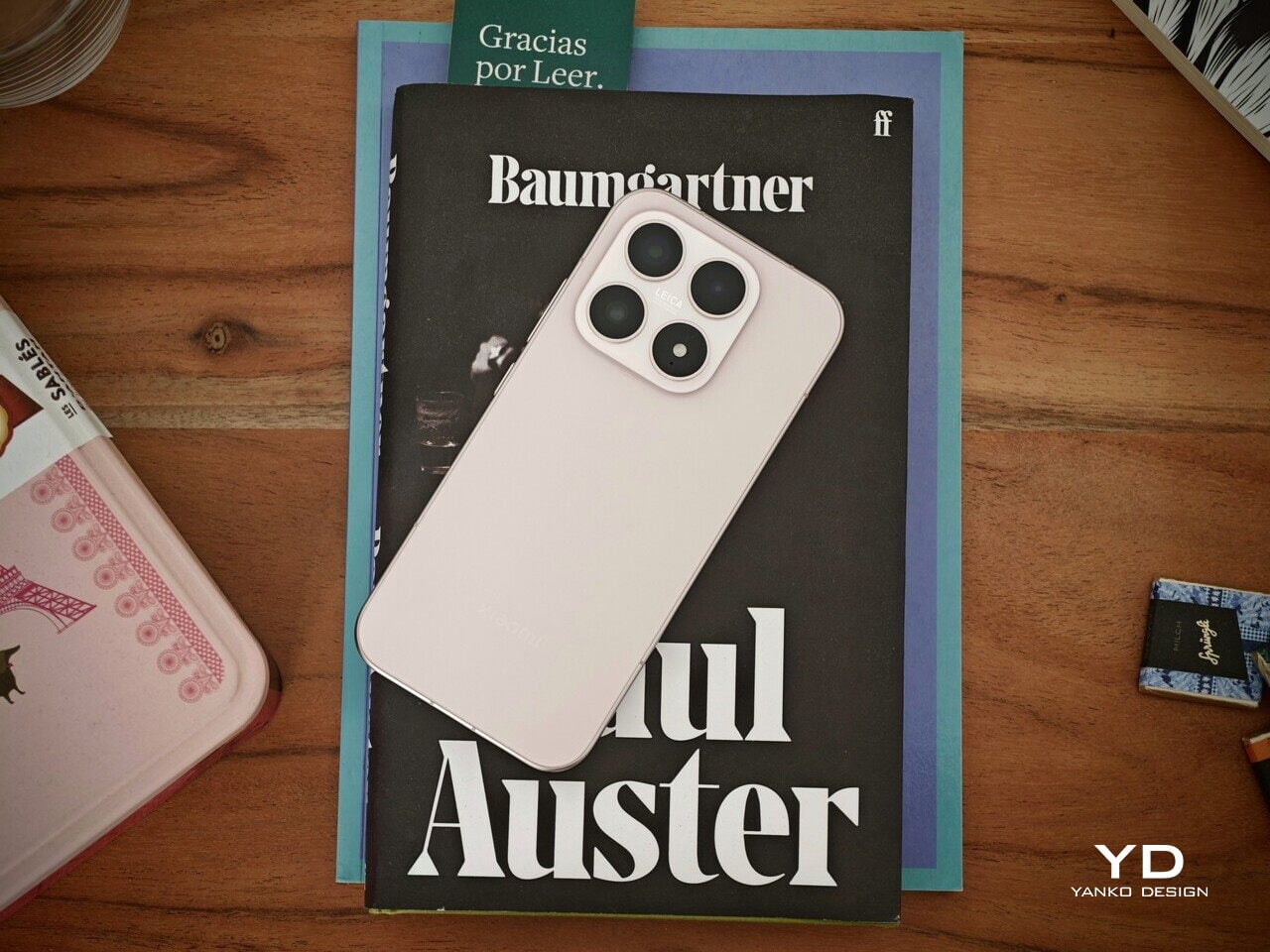
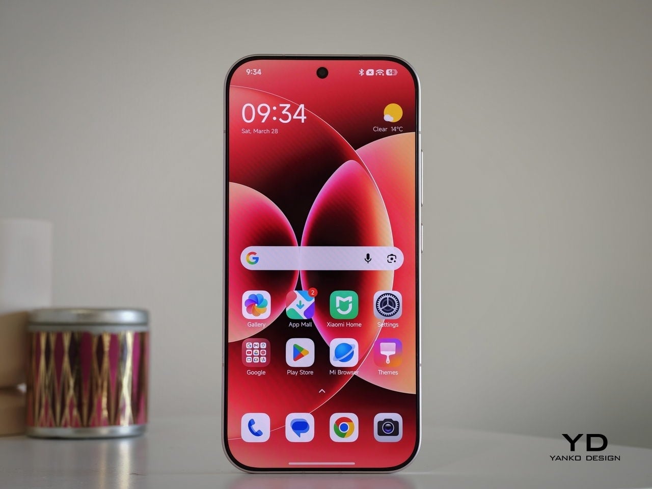
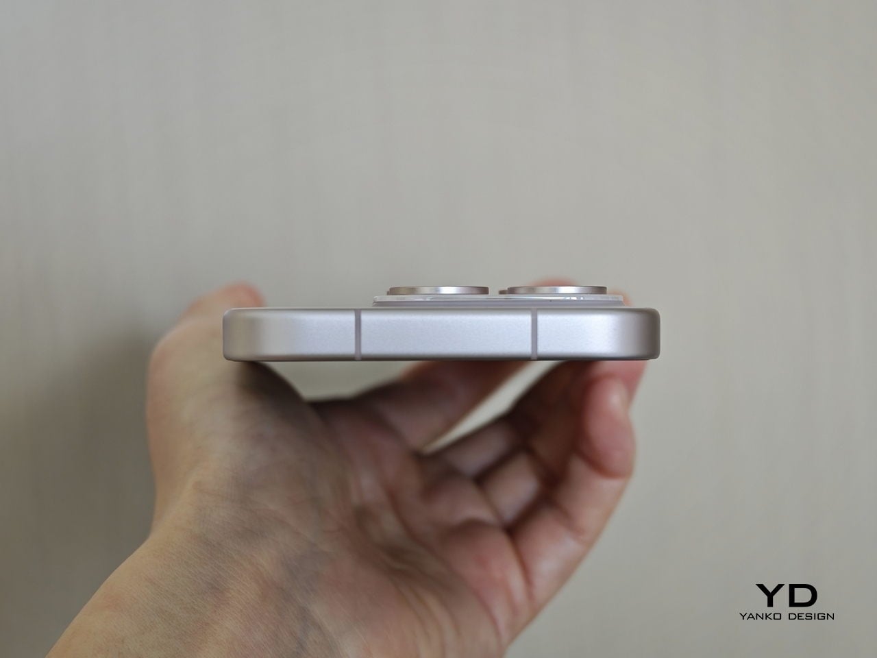
The Xiaomi 17 is the quietest looking member of the 17 family, yet it still feels unmistakably premium. Xiaomi leans into clean lines and soft geometry rather than aggressive angles, which gives the phone a calm, almost minimalist presence. The side frame is color-matched to the back, so the whole device reads as a single block, which gives it an almost monolith-like feel in the hand and on the desk. From the back, the design is deliberately restrained and avoids the visual noise you see on many flagships today.
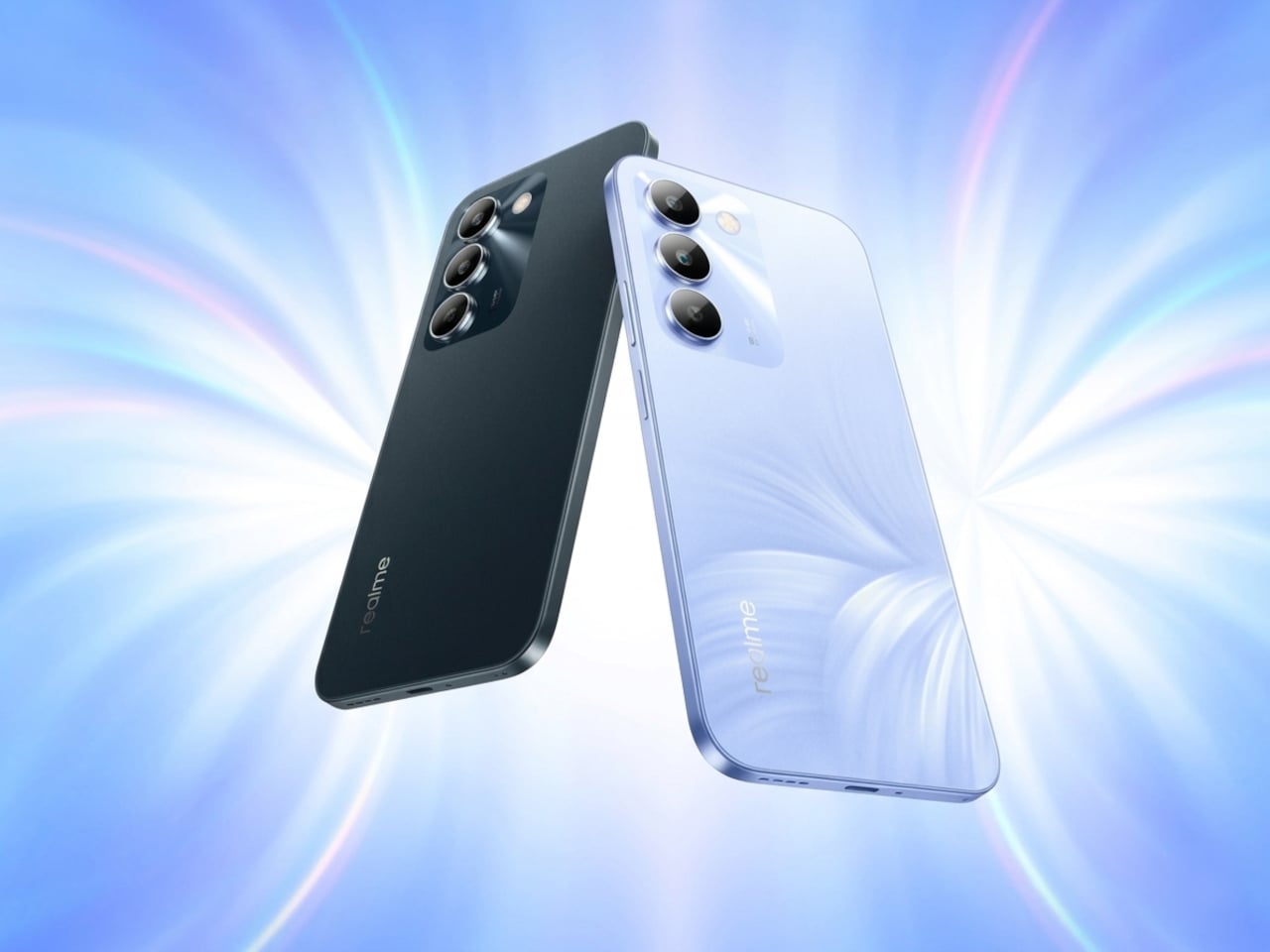
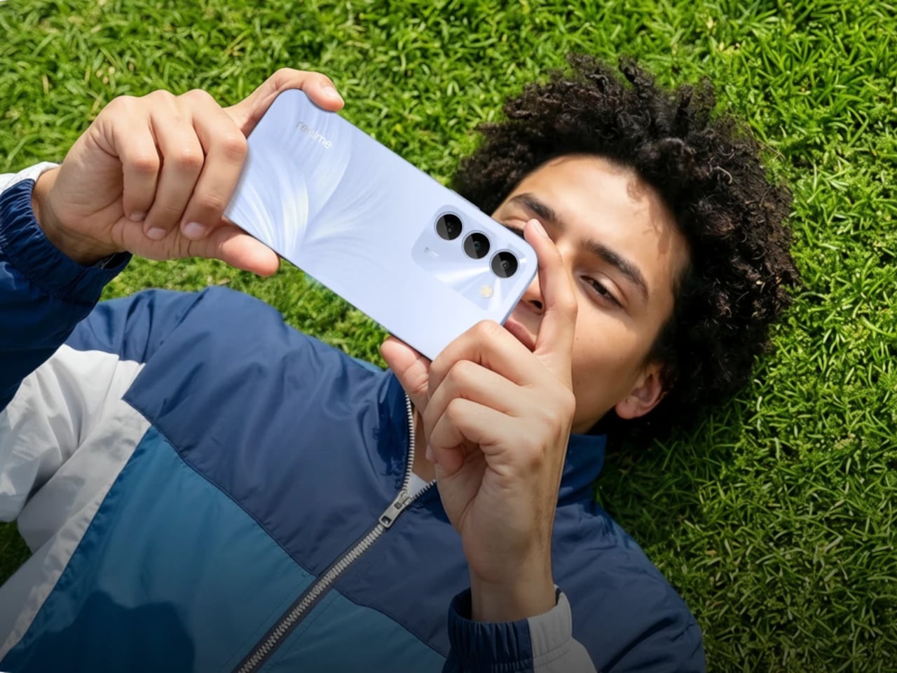
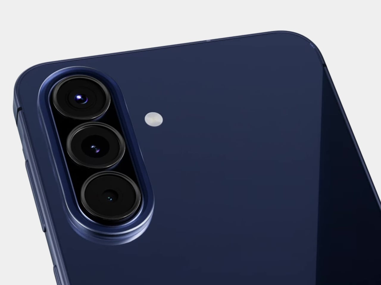
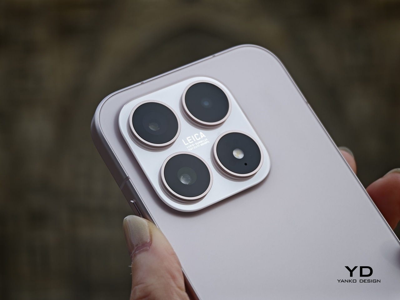
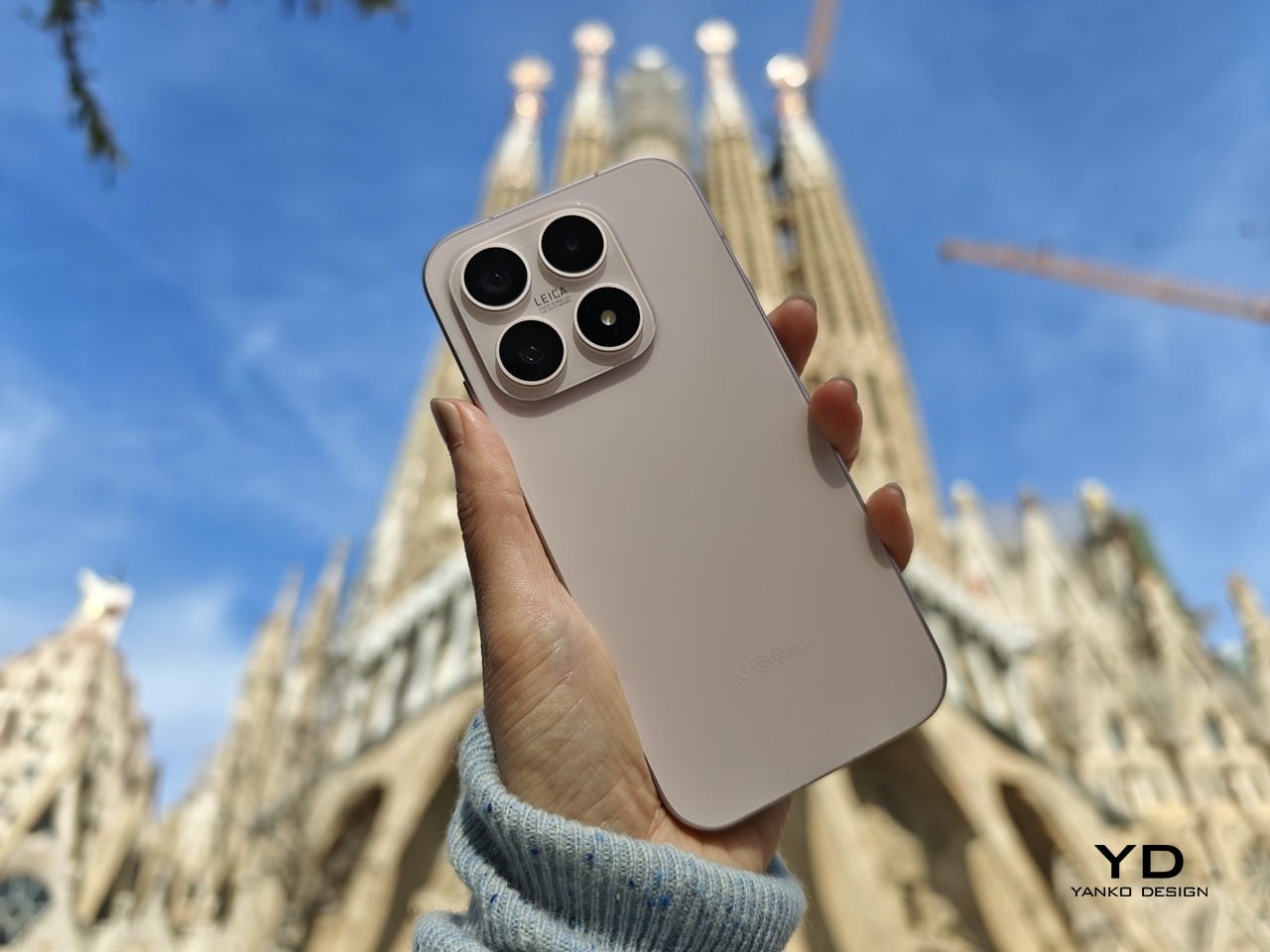
The camera island is compact and neatly integrated, without the oversized rings or dramatic steps used on some rivals and on Xiaomi’s own Pro and Ultra models. The color-matched square camera bump has a reflective finish and houses three cameras and an LED flash, each framed by its own ring.
The Xiaomi logo is treated almost like a subtle cutout in the glass, using the same base color as the back but with a glossy finish, so it only really pops when light hits it at the right angle. Matte glass finishes soften reflections across the rest of the panel and help the phone catch light in a more diffuse, satin way rather than a mirror-like glare.
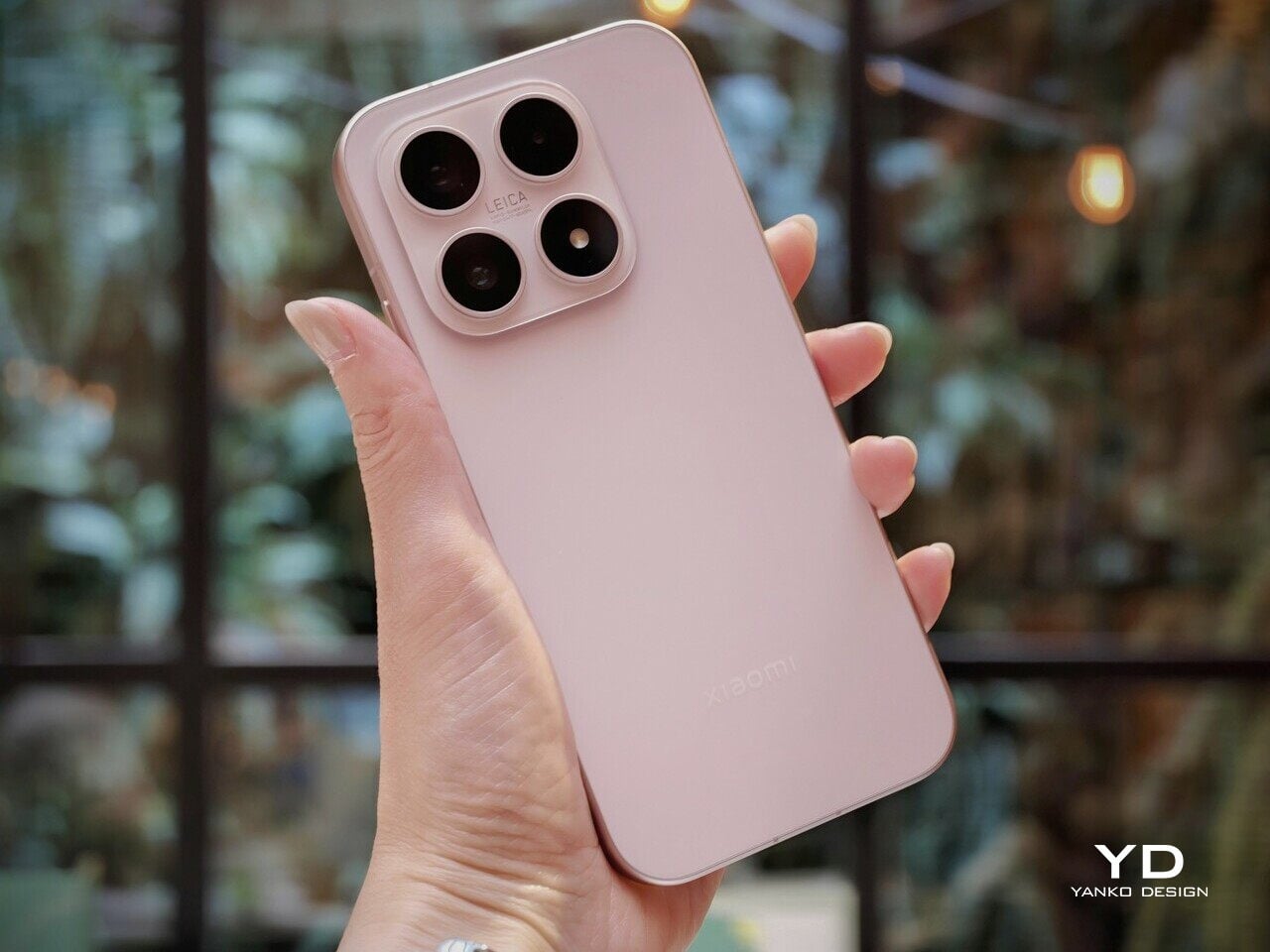
Color choices reinforce this subtle aesthetic. Global versions come in black, blue, pink, and green, which gives a mix of classic and slightly playful options without drifting into toy-like territory.
Overall, the Xiaomi 17’s aesthetic is about understatement and quiet confidence. It looks like a high-end object, but it doesn’t shout about it or demand attention. If you are tired of oversized camera bump theatrics or overly glossy finishes, this is a design that blends into your everyday environment in a very good way.
Ergonomics
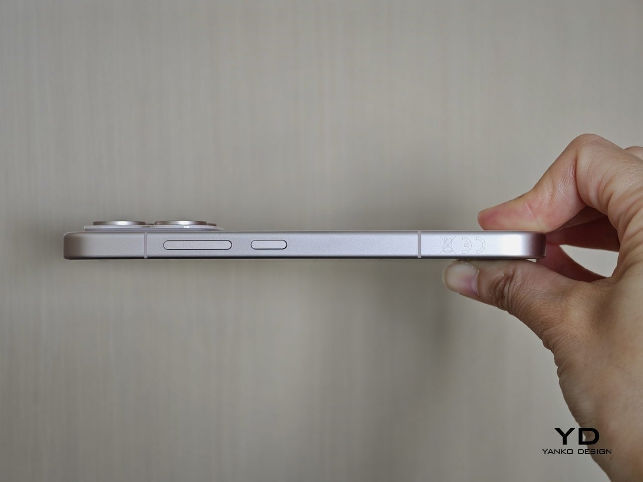
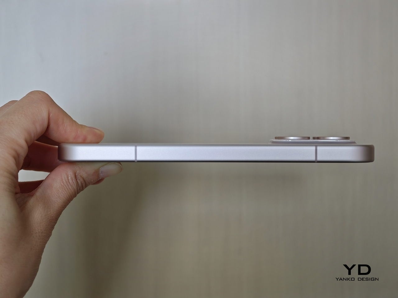
The Xiaomi 17 sits in a sweet spot at about 151.1 × 71.8 × 8.1 mm and 191 g, which makes it noticeably more compact than the typical 6.7‑inch flagship while still feeling dense and substantial. In daily use, that translates into easier one‑hand reach, less finger gymnastics for the notification shade, and a more secure grip when you are walking or commuting.
Corner radius and gently curved edges help the phone nestle into the palm without sharp pressure points, so the 191 g weight feels planted rather than fatiguing. The matte glass back adds a touch of grip compared with glossy finishes, and the relatively modest camera bump means the phone rocks less on a table when you tap the upper corners.
The fingerprint scanner is positioned well enough that you can unlock the phone and continue using it in one smooth motion, which adds to the sense that the Xiaomi 17 was designed around everyday comfort rather than just visual appeal. At the same time, its compact proportions are what really make the phone stand out. It is easier to live with than most modern flagships, especially for users who still value one-handed usability.
Performance
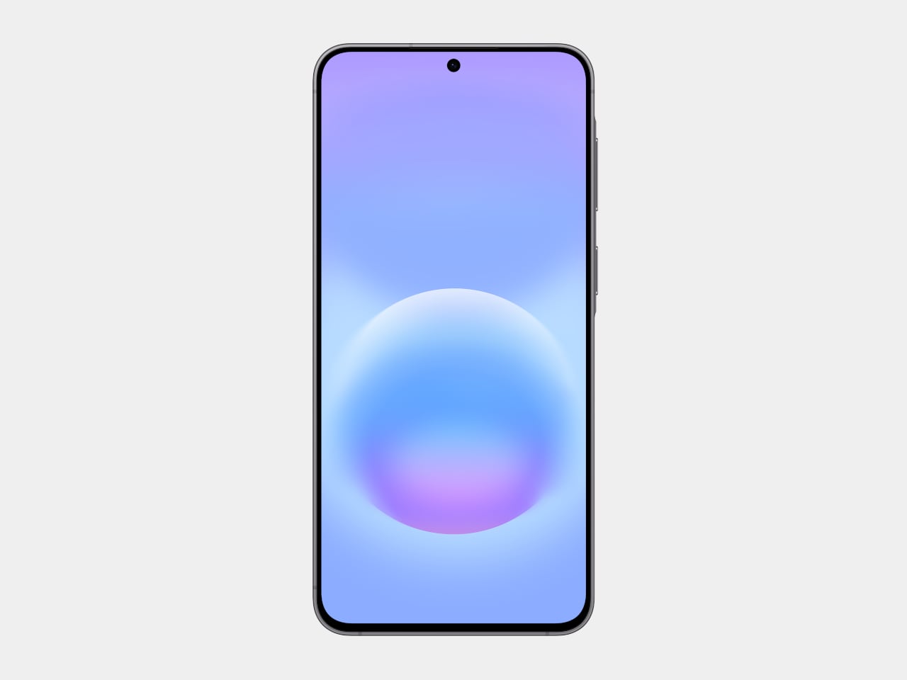
The Xiaomi 17 features a 6.3-inch LTPO AMOLED panel that runs at up to 120 Hz. Resolution is around 2656 × 1220, which Xiaomi positions as a 1.5K-class display. That gives a high pixel density without the power draw of a full 4K panel. According to Xiaomi, it can reach around 3500 nits of peak brightness.
The display looks vibrant and gets bright enough to stay comfortable in most lighting conditions. Dual speakers deliver clear sound with enough volume for videos, games, and casual listening. The only drawback is the haptic feedback, which feels a little too strong and gives the phone a faint rattling sensation that I found slightly distracting during longer sessions.
Under the hood, the Xiaomi 17 debuts Qualcomm’s Snapdragon 8 Elite Gen 5 chipset in Xiaomi’s flagship line. Configurations start at 12 GB of LPDDR5X RAM with 256 GB of UFS 4.1 storage and go up to 16 GB of RAM and 512 GB of storage for the global version.
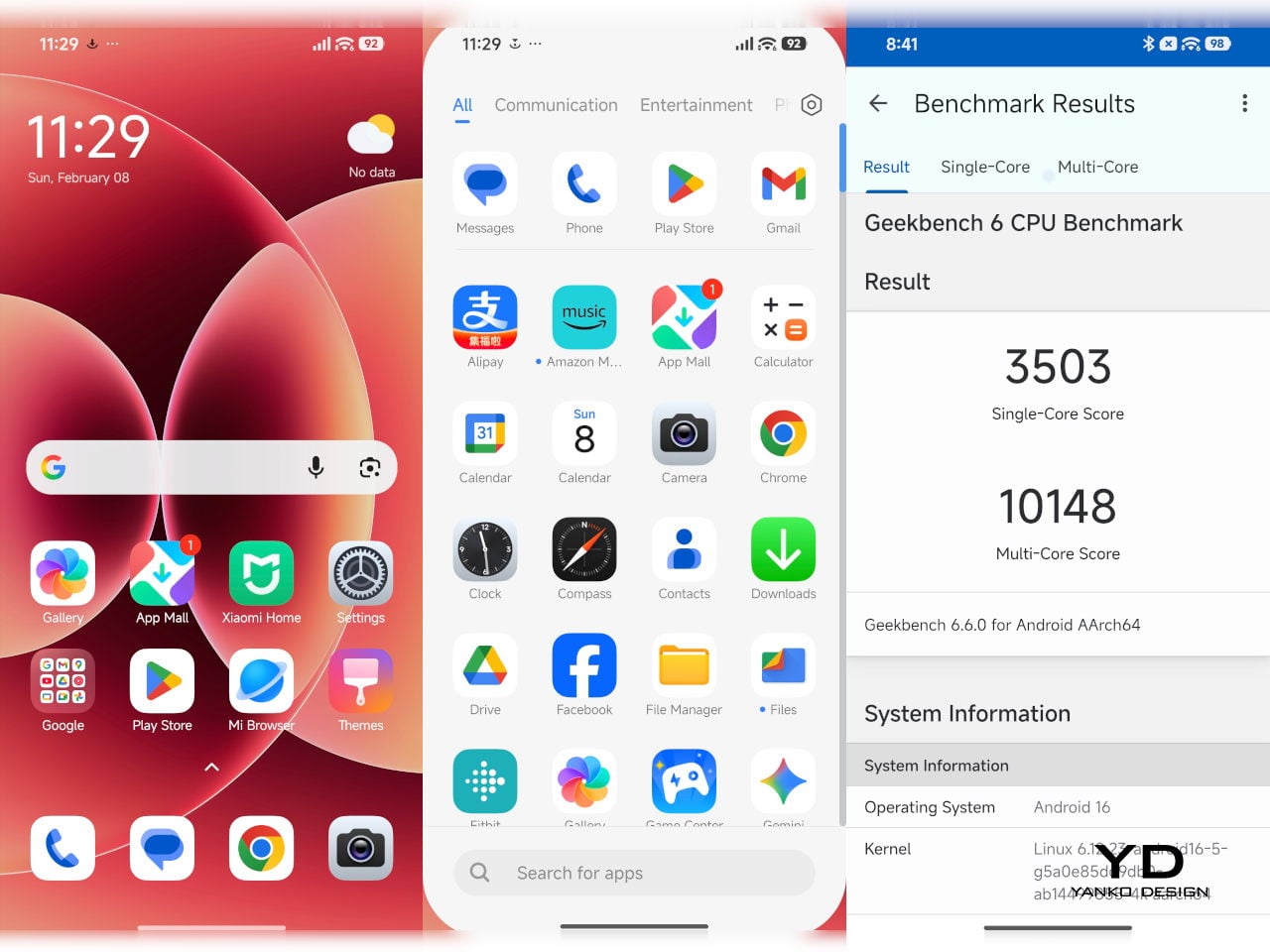
On the software side, the phone ships with HyperOS 3 based on Android 16. HyperOS is Xiaomi’s unified platform that aims to tie together phones, tablets, TVs, smart home devices, and even vehicles under a single ecosystem. The Xiaomi 17 benefits from this through features like cross-device clipboard, multi-screen collaboration, and tighter integration with Xiaomi’s smart home products.


Xiaomi continues its partnership with Leica on the Xiaomi 17. The base model gets a triple rear camera setup, with all three modules using 50 MP sensors. The main camera is a 50 MP wide unit at about 23 mm equivalent, with an f/1.7 aperture, optical image stabilization, and a relatively large sensor around the 1/1.3 inch class. This is the primary workhorse for most shots, combining high resolution with good light-gathering ability. The telephoto camera is a 50 MP module around 60 mm equivalent with an f/2.0 aperture, OIS, and roughly 2.6× optical zoom. Xiaomi advertises close focus capability down to around 10 cm, which lets this lens double as a pseudo macro option.


The third camera is a 50 MP ultrawide unit at about 17 mm equivalent with an f/2.4 aperture and around a 102 degree field of view. This keeps detail relatively high for landscape and architecture shots compared to the 8 MP or 12 MP ultrawides found on many mid-range phones.
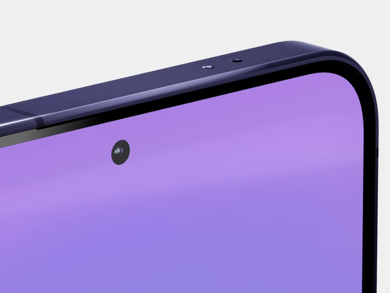
On the front, there is a 50 MP selfie camera with an f/2.2 lens around 21 mm equivalent and phase detect autofocus. That autofocus support is still not universal on front cameras, so it is a noteworthy inclusion for vloggers and selfie-heavy users.

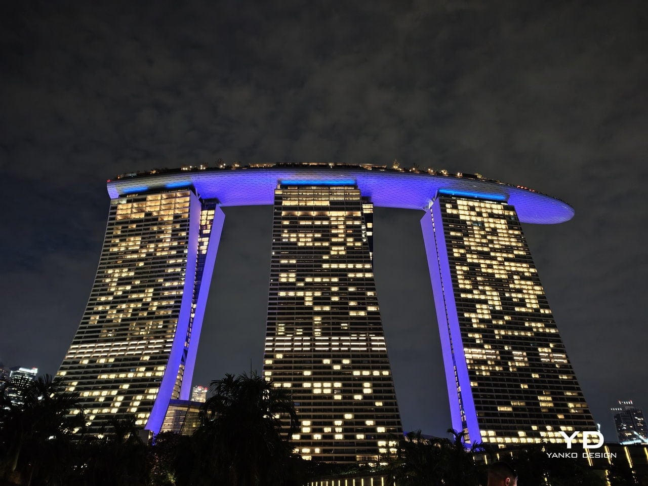
Video capture on the rear camera supports up to 8K at 30 fps and 4K at up to 60 fps, with HDR10 plus and 10-bit recording modes including Dolby Vision and log profiles. Slow motion options go up to very high frame rates at 1080p and even 720p, assisted by gyro-based electronic stabilization.

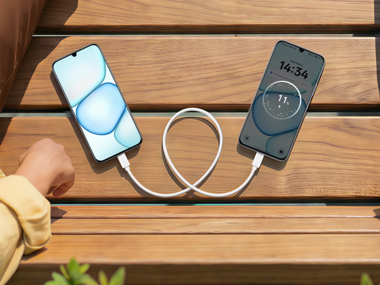
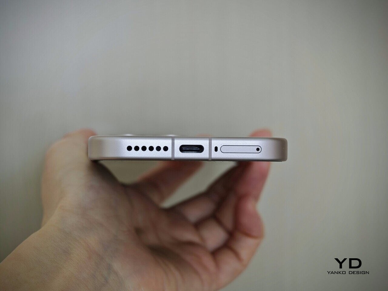
For global markets, the Xiaomi 17 packs a 6330 mAh battery, which is roughly 10 percent smaller than the 7000 mAh pack in the Chinese version. Even so, it is still impressive to see such a large battery in a compact body, and that capacity can translate to multi-day light use or very comfortable single-day heavy use. The Xiaomi 17 supports 100 W wired charging, 50 W wireless charging, and 22.5 W reverse wireless charging.
Sustainability
The Xiaomi 17 does not make sustainability a headline feature, but it does include a few things that matter for long-term ownership. It carries an IP68 rating, meaning it is dust-tight and water-resistant for immersion in up to 1.5 meters of water for 30 minutes. The display is also protected by Xiaomi Shield Glass, which should add another layer of durability against everyday wear. That kind of protection helps the phone better survive spills, rain, and minor accidents, which can reduce the risk of early replacement.
Xiaomi also promises five major Android upgrades and six years of security patches for the Xiaomi 17, which gives it a solid software support window for an Android flagship. That should help the device stay secure and usable for longer, even if Xiaomi still does not push sustainability as strongly as some rivals through repairability programs or detailed environmental claims.
Value
The Xiaomi 17 starts at €999 for the 12GB/256GB configuration, which works out to roughly $1,080 at current exchange rates. For that money, you are getting a compact flagship with a 6.3-inch LTPO AMOLED display, a Snapdragon 8 Elite Gen 5 chip, a Leica-tuned triple camera system, and a battery that is unusually large for a phone of this size.
What makes the Xiaomi 17 feel competitive is how complete the package is. The hardware feels premium, the charging speeds are still among the best in the class, and Xiaomi’s promise of 5 major Android upgrades and 6 years of security patches adds more long-term value than older Xiaomi flagships offered. It is an expensive phone, but it still makes a strong case for buyers who want top-tier specs in a smaller body without stepping into Ultra-level pricing.
Verdict
The Xiaomi 17 gets a lot right by knowing exactly what it wants to be. Instead of chasing gimmicks or trying to outdo its siblings with louder hardware, it focuses on delivering a compact flagship experience that still feels complete. The understated design, comfortable in-hand feel, strong display, capable Leica camera system, and unusually large battery all come together in a package that feels thoughtfully balanced rather than compromised.
It is not perfect. The haptics can feel a little too aggressive, and at €999, it is clearly a premium purchase rather than an easy impulse buy. Still, the Xiaomi 17 makes a convincing case for itself by offering top-tier performance, long software support, and excellent battery life in a size that is becoming increasingly rare. For anyone who wants a flagship Android phone without moving up to a much larger Pro, Max, or Ultra device, the Xiaomi 17 is one of the most appealing options in its class.
The post Xiaomi 17 Review: The Compact Flagship With a 6330mAh Battery first appeared on Yanko Design.