The smartwatch category has a battery problem it can’t seem to shake. Despite years of incremental improvements, most wearables still need to be charged every day or two, which is exactly the opposite of what a watch is supposed to be. A watch is supposed to be on your wrist and working, not sitting on a charging pad because you forgot to plug it in before bed.
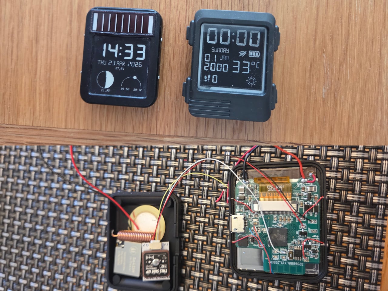
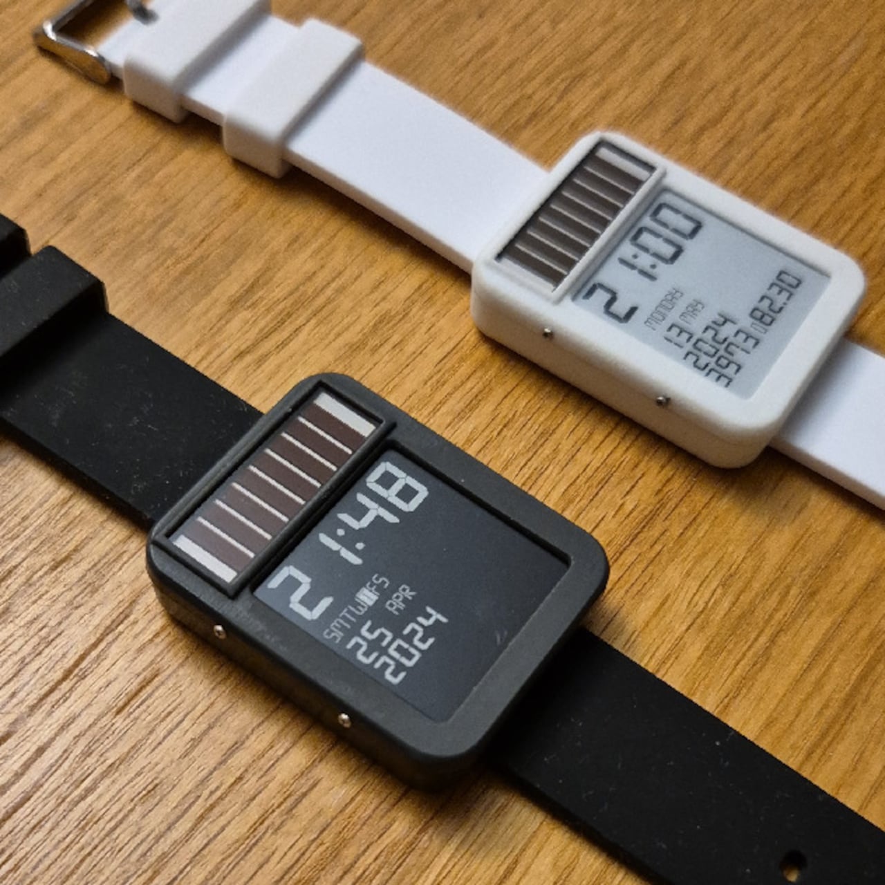
The LightInk is an attempt to solve that problem by going back to a design philosophy that worked decades ago: solar. The concept mimics the 90s solar digital watches that ran more or less indefinitely, but brings it into the present with an E-Ink display, an ESP32 microcontroller, WiFi, Bluetooth, LoRa radio, and a custom power management system built from scratch over several years.
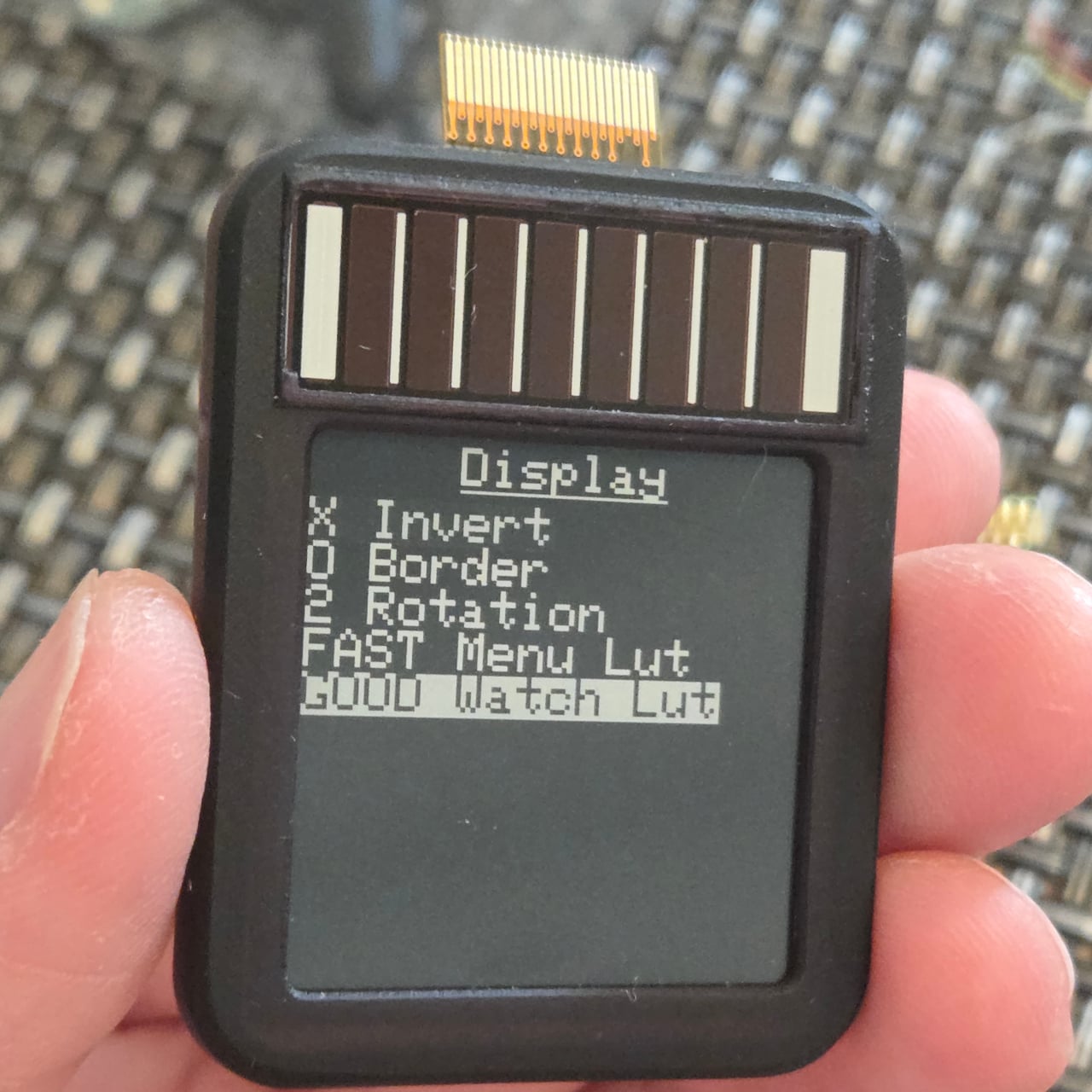
The project started in 2019 with a simple goal: build a solar-powered watch that could send LoRa packets to a receiver at home. After experimenting with early hardware and contributing display optimizations to the open-source Watchy project, the creator hit the limits of what off-the-shelf hardware could manage and built a custom PCB around a TPS63900 buck-boost converter, running the watch at 2.7V.
The biggest technical hurdle turned out to be the microcontroller itself. The ESP32 takes 28ms to boot, consuming around 1mA of current in the process, and that cycle was responsible for about 60% of the watch’s total power draw without contributing anything to the actual display update. The solution was to skip normal boot entirely and run code directly from the ESP32’s RTC memory via a wake stub.
That required reimplementing SPI communication from scratch within the RTC memory constraints, since no code outside that space can run during the stub phase. The payoff was significant: the entire boot, data send, and display update sequence now completes in under 1ms. Once the display is refreshed, the ESP32 immediately returns to deep sleep, saving an additional 1mA that would otherwise be consumed during light sleep.
The result is a watch that runs for six to 10 months on a 100mAh battery, which is already an unusual number for a device this capable. Add the solar panel, similar in type to the kind found on pocket calculators, and the power equation starts to tilt toward indefinite. One hardware revision ran for nine months on battery alone before being retired for a newer build.
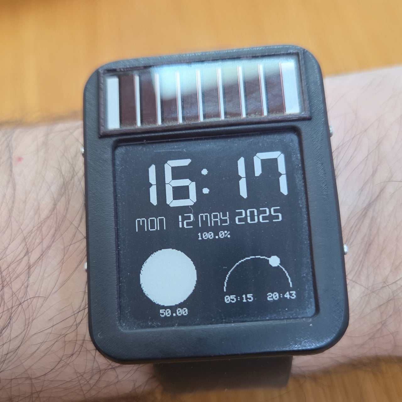
The 1.54-inch E-Ink display helps keep those numbers achievable. Electrophoretic displays only draw power when changing states and hold their image indefinitely without any power at all, which makes them an obvious fit for a watch face that updates once per minute rather than 60 times per second. Touch controls via the ESP32’s built-in capacitive touch capability handle navigation, making physical buttons unnecessary and allowing for a more compact case.
The watch supports WiFi, Bluetooth, and LoRa via a Wio-SX1262 radio module, and GPS can be added as an optional component, though the creator notes it wasn’t a particularly good idea given the space and power it consumes. The case is 3D printed in two pieces and accepts any standard 22mm wristband. Everything, including the firmware, PCB schematics, and case files, is open source and available on GitHub.
Water purifiers are practically mandatory in modern Indian homes, but for a category that handles something as critical as drinking water, they’ve never been particularly pleasant to live with. Most demand frequent service calls that add to their long-term cost, look like they were designed to be hidden under a counter, and turn something as simple as filling a bottle into a minor exercise in patience.
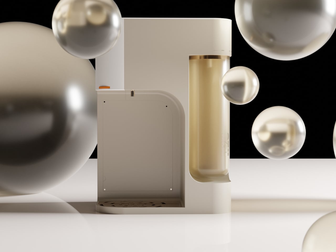
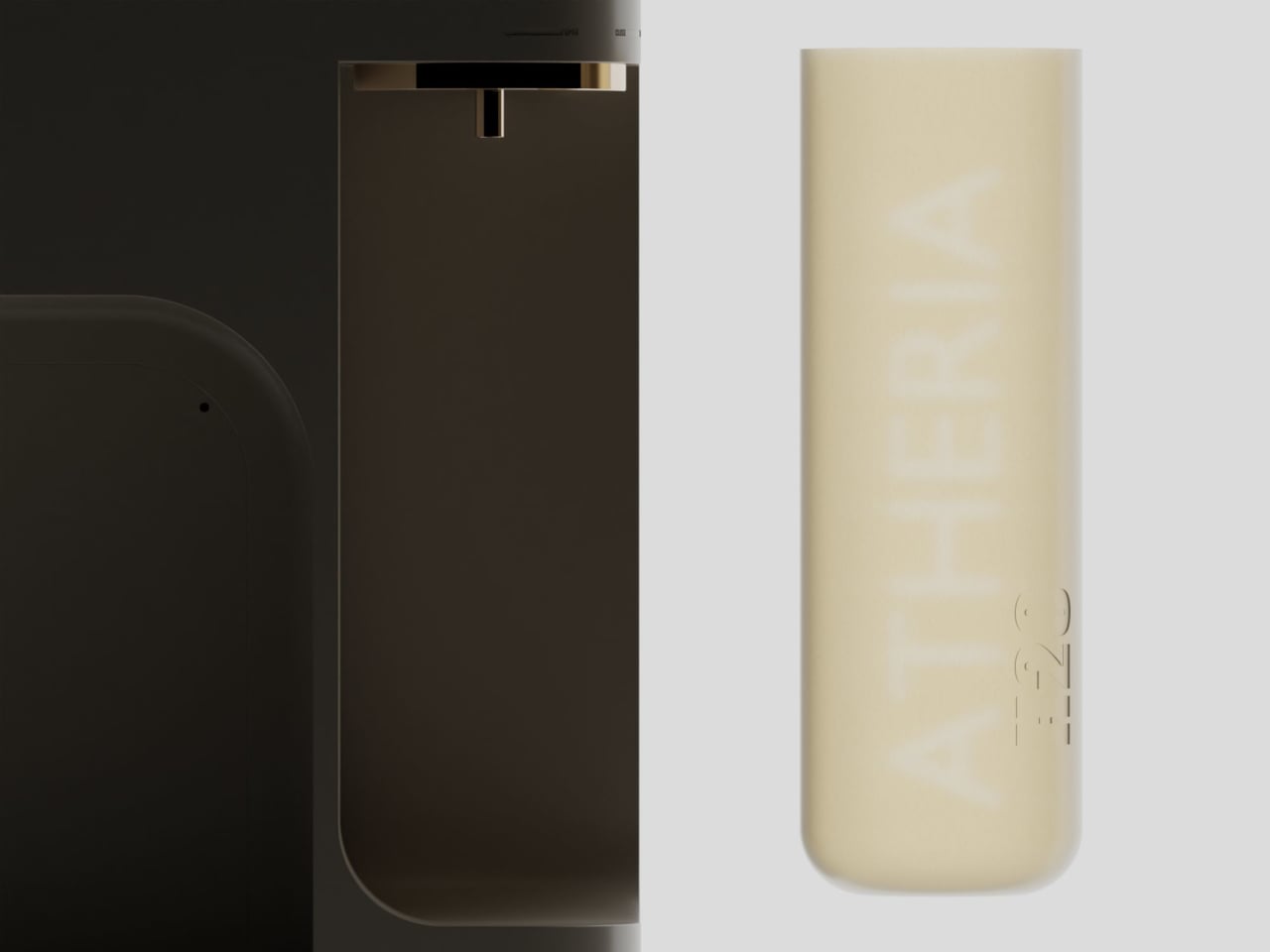
ATHERIA is a smart water purifier concept designed for modern Indian households, and it approaches the problem from multiple angles at once. Rather than improving a single element, it takes aim at several everyday friction points simultaneously, from how the unit looks on a kitchen counter to how easy it is to fill a bottle, replace a cartridge, or check water quality.
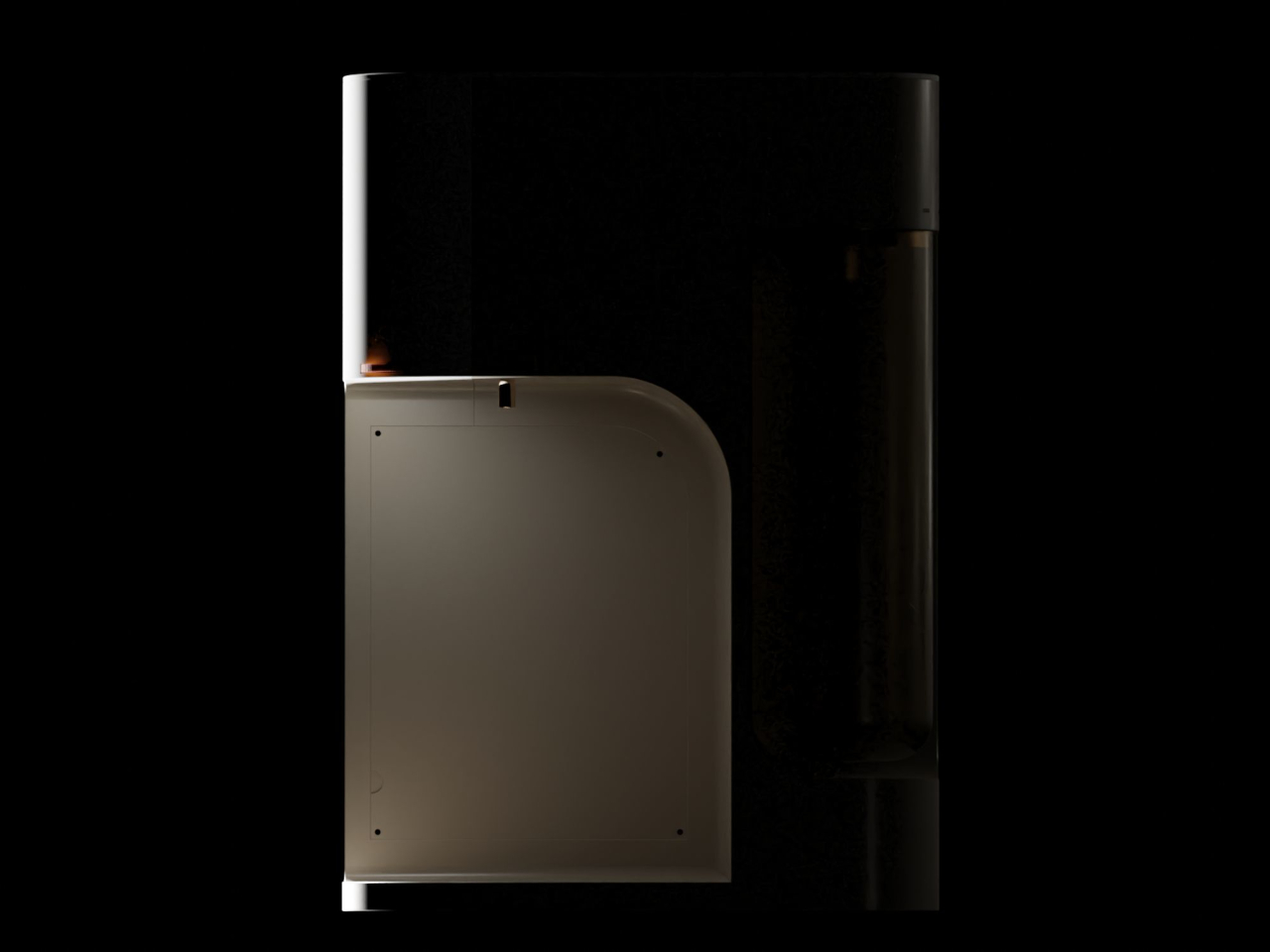
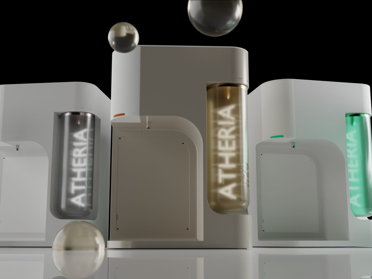
The design draws from Japandi principles, a blend of Japanese minimalism and Scandinavian sensibility focused on warmth, simplicity, and craftsmanship. The result is a compact, rounded purifier with a warm taupe and gold finish that reads more like a considered kitchen appliance than a water treatment machine. It comes in multiple colorways and sits on a countertop without dominating the space around it.
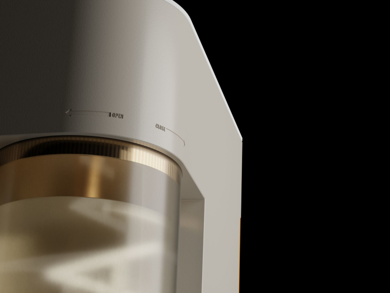
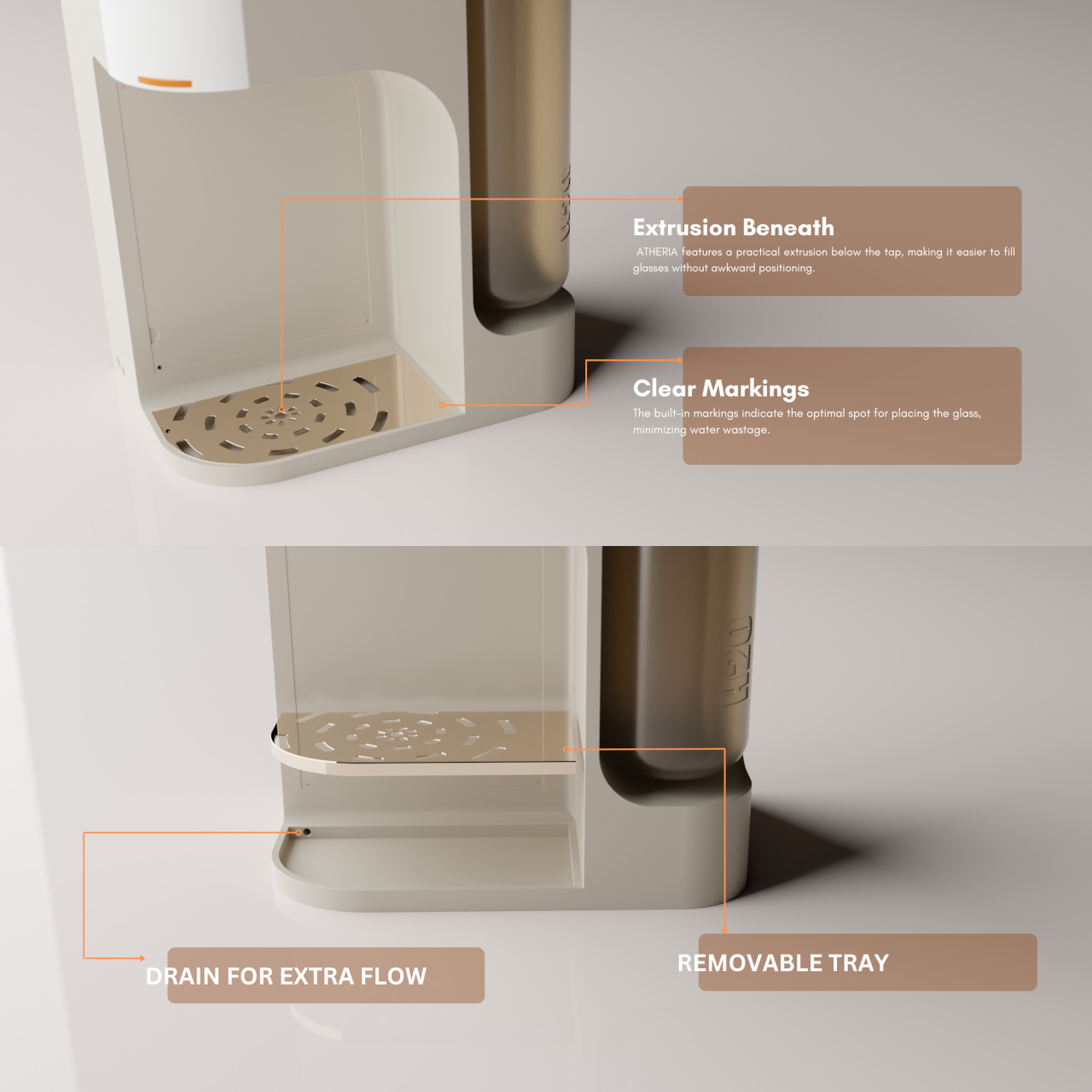
One of the more thoughtful additions is a 2.5-liter secondary detachable container. Filling a bottle or a cooking pot directly from a purifier tap can be slow and awkward, especially mid-cook. The container solves this by letting you pour pre-filled water directly into whatever you need, then reattach it to the purifier, which refills it automatically using analog weight sensors.
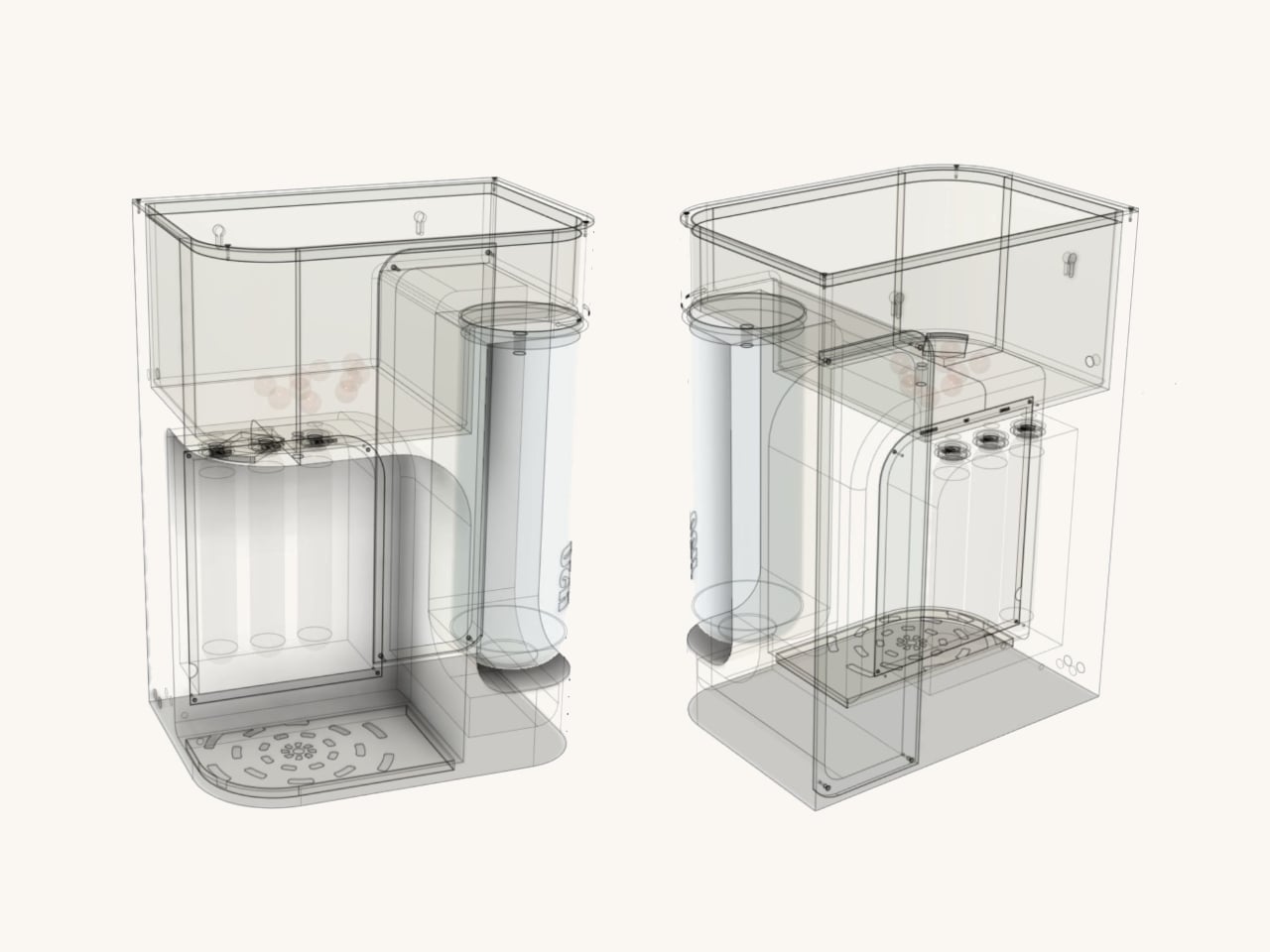
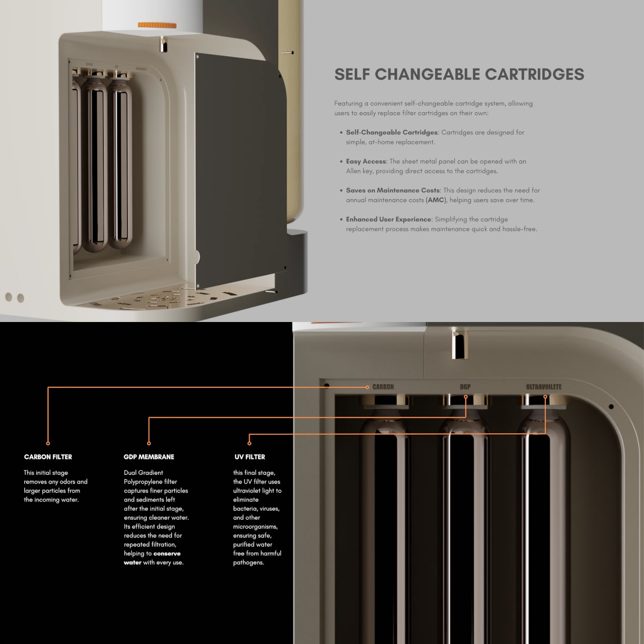
ATHERIA’s three-stage filtration runs water through a carbon filter to remove odors and larger particles, then a dual-gradient polypropylene membrane for finer sediment, and finally a UV filter to eliminate bacteria, viruses, and other microorganisms. The membrane’s efficient design reduces repeated filtration passes, conserving water in the process, which directly addresses a concern shared by 64% of users surveyed during the design research phase.
Maintenance usually drives up the long-term cost of owning a water purifier, mostly because replacing cartridges typically requires a paid technician visit. ATHERIA’s self-changeable cartridge system gets around that. The side panel opens with an Allen key, giving direct access to all three filter cartridges, each of which turns to fit or release. No service call needed, which cuts down on annual maintenance costs considerably.
The companion app displays tap TDS, output TDS, individual cartridge health, and daily water and energy usage. Output TDS is adjustable from the settings, and cartridge change reminders can be set manually. It also links to Google Nest, which can push voice alerts when TDS levels rise above safe standards or when a specific cartridge is approaching the end of its life.
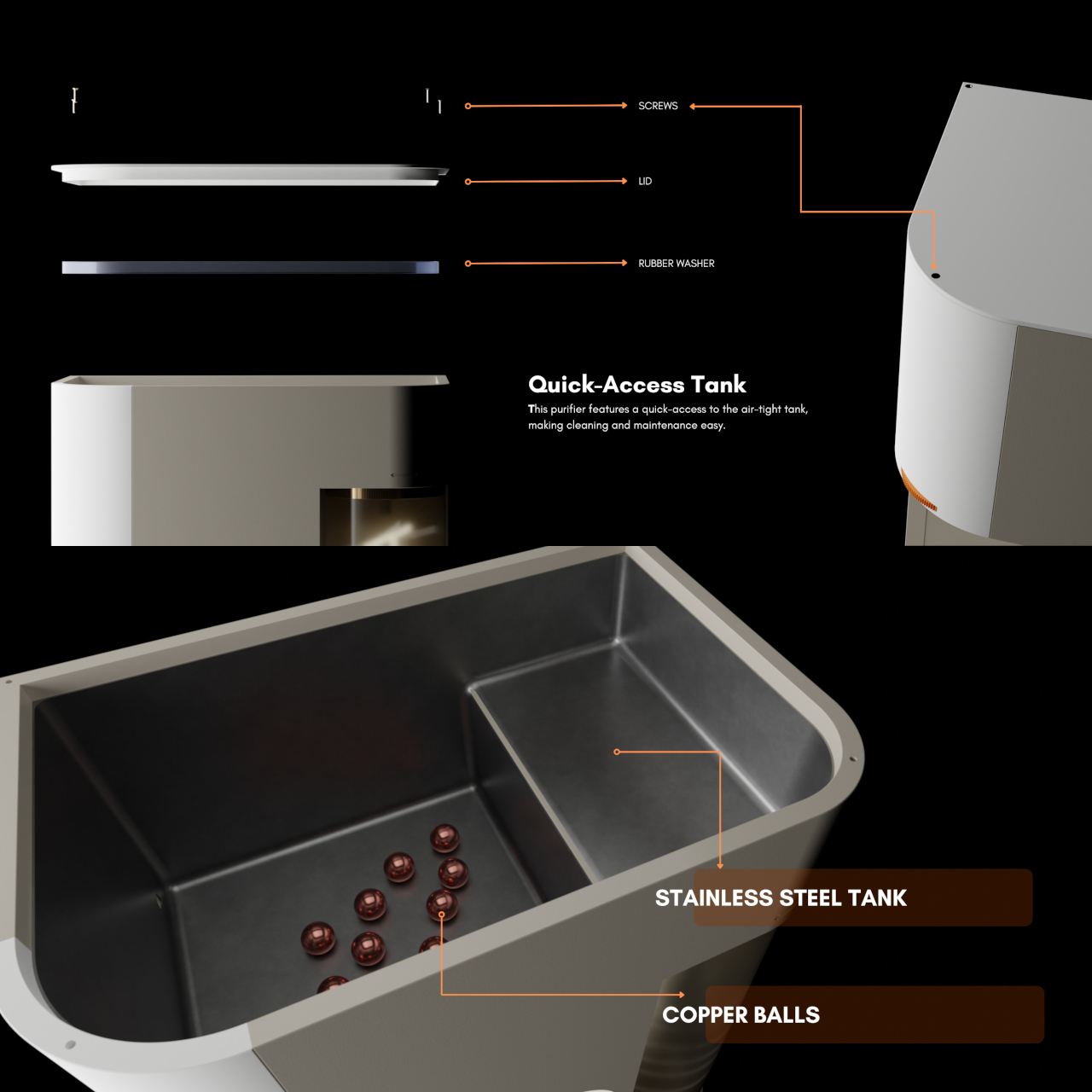
The stainless steel storage tank includes copper balls for natural antimicrobial contact, and the bi-directional ratchet tap controls flow speed by how far it’s turned, with built-in markings to minimize spillage. ATHERIA is still just a concept, but the depth of research behind each decision, from the detachable container to the cartridge access panel, gives every friction point in the experience a concrete answer rather than an afterthought.
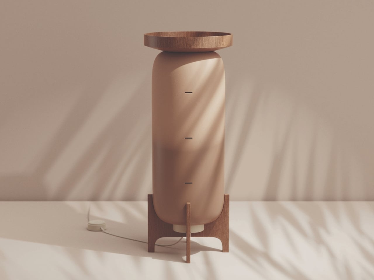
Every summer, the conversation around air conditioning goes roughly the same way. It’s hot, we turn on the AC, the electricity bill spikes, and we quietly wonder if there’s a better way while doing absolutely nothing about it. A design student from Austria named Katja Posch decided to actually do something about it. The result is MALU, a compact, low-tech cooling system built from terracotta and wood that is currently turning heads in the sustainable design world.
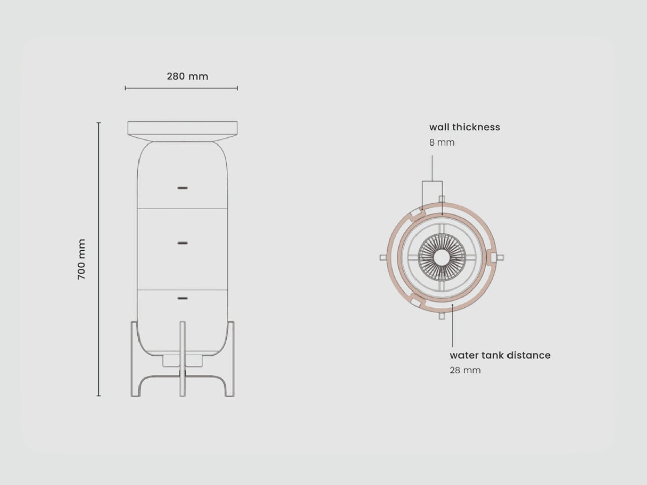
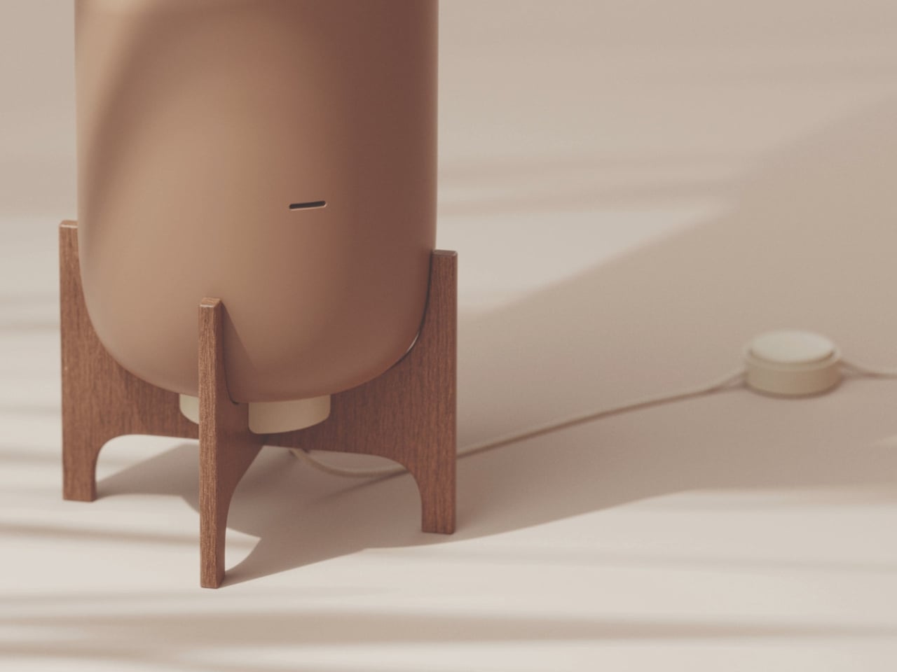
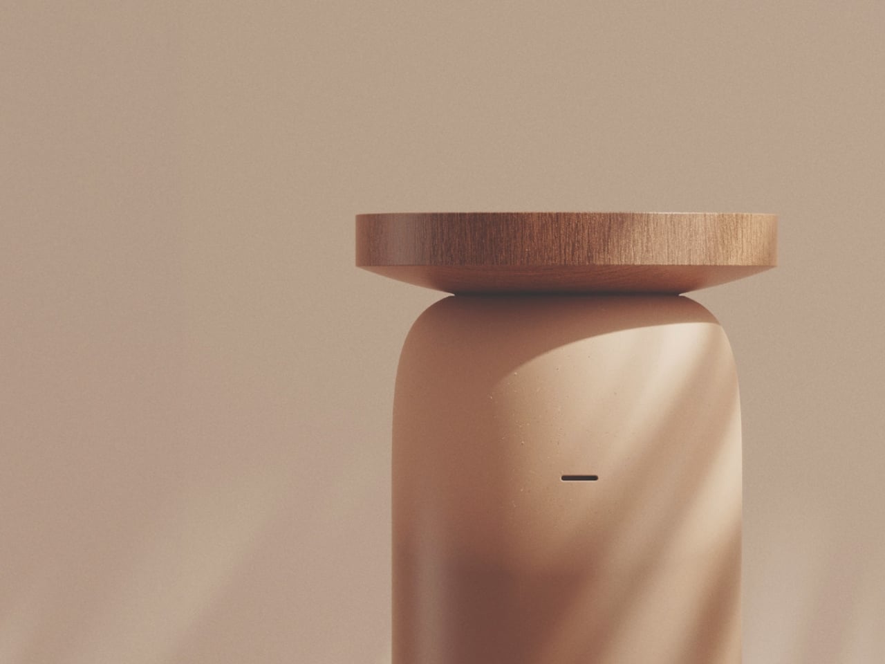
MALU is not trying to be a gadget. That is the first thing that struck me about it. Standing 700mm tall and 280mm wide, it looks far more like a considered piece of furniture than a household appliance. The form is a smooth, rounded terracotta cylinder in a warm sandy tone, topped with a wide circular wooden tray and elevated on a four-legged wooden cradle. It would look at home beside a sofa, and that is very much the point. The design is deliberately simple, rooted in the ancient science of evaporative cooling, the same principle that makes a wet cloth on your forehead feel so immediately refreshing.
Designer: Katja Posch
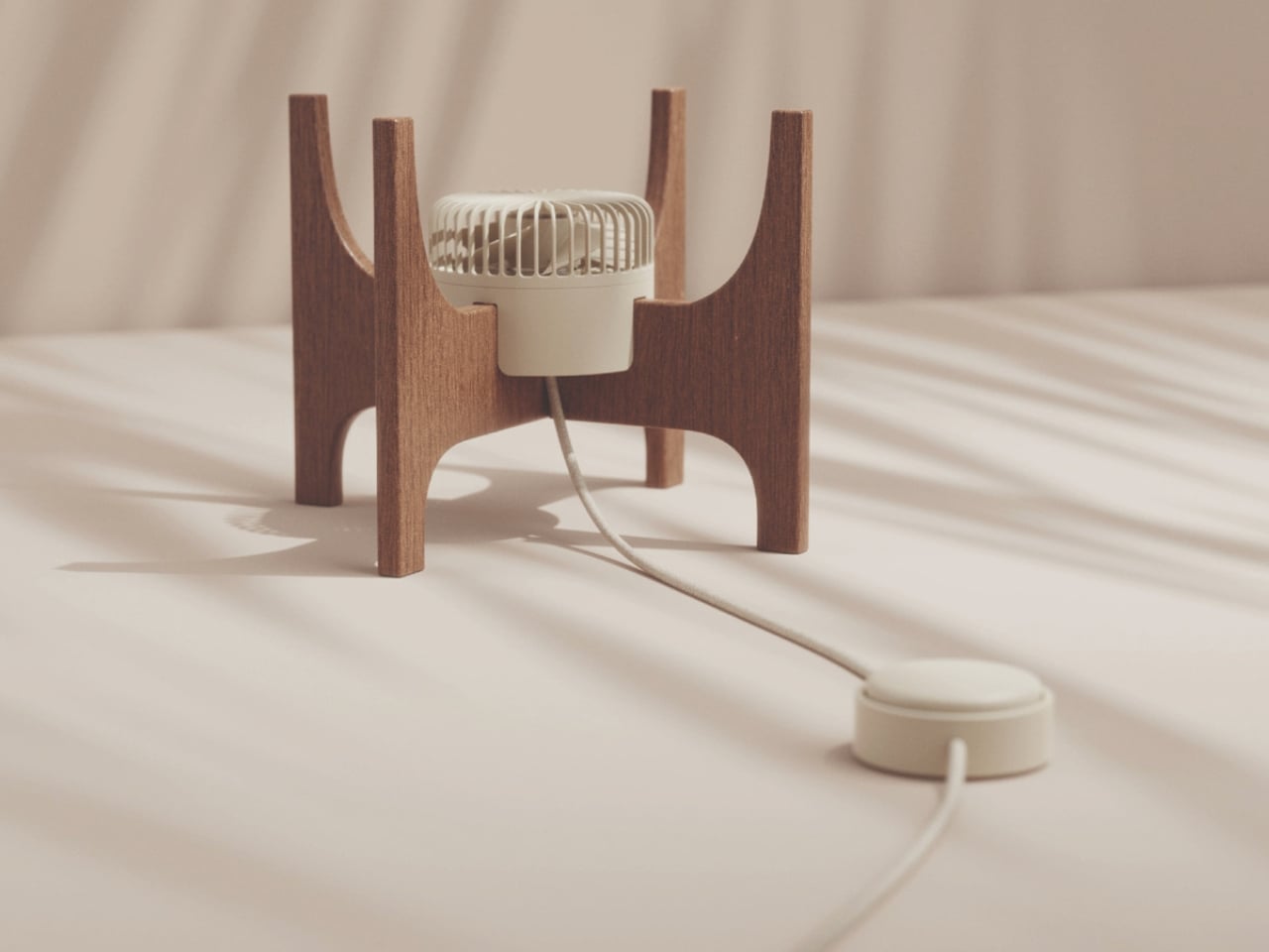
The mechanics are elegant in their restraint. Water is poured into the wooden tray at the top, which feeds slowly down through the porous terracotta body below. With walls just 8mm thick, the terracotta absorbs moisture readily and releases it through evaporation, drawing heat from the surrounding air in the process. Three narrow horizontal vents run along the body, allowing cooled air to escape into the room. At the base, nestled within the wooden stand, sits a small electric fan that draws air upward through the core of the cylinder and out through those vents. The gap between the fan and the terracotta wall is a precisely considered 28mm, enough to let air move through efficiently without overwhelming the passive cooling effect. The fan, however, is entirely optional. A small round controller sits on the floor at the end of a cord, but if you choose not to use it, MALU still works. It simply breathes on its own.
Posch completed MALU as her master’s thesis in Eco-Innovative Design at FH Joanneum in Graz. What she produced is a system that reframes the entire premise of modern cooling. Rather than asking how we make air conditioners more efficient, she asked whether we were solving the problem correctly in the first place. Historically, cultures across North Africa, the Middle East, and South Asia had already developed brilliant answers to that question, using clay, wind, and water to create comfortable spaces long before a single refrigerant was ever synthesized. MALU picks up that thread.
The irony of conventional air conditioning is by now well-documented. It cools your room while heating the planet, running on electricity that often comes from fossil fuels and using refrigerants with a warming potential thousands of times more potent than carbon dioxide. The more temperatures rise, the more we rely on AC; the more we rely on AC, the more temperatures rise. MALU does not claim to be a plug-and-play replacement for industrial HVAC systems, but it offers something the industry has largely forgotten: a way of thinking about comfort that does not come at the environment’s expense.
The material choices feel intentional beyond aesthetics. The terracotta body and wooden stand can be separated, repaired, and recycled independently. So much of our technology is designed around obsolescence. Cooling systems break down, become incompatible with updated refrigerant standards, or simply get swapped out for the next model. MALU is the opposite of that impulse. It is the kind of object you could understand, maintain, and eventually pass along.
MALU was recognized as a finalist for the Green Product Award 2026 and received a Special Prize for Design Concept at the Staatspreis Design 2026, Austria’s national design award. It is the kind of recognition that suggests the design community is genuinely warming to ideas that favor restraint over complexity, and that feels like a cultural shift worth paying attention to.
For those of us who have spent summers stacking fans in front of open windows and calling it a strategy, MALU is a genuinely exciting proposal. It will not cool a packed open-plan office on a 40-degree day, and it is not trying to. But as a rethinking of what personal cooling can look like in a hotter, resource-constrained world, it is one of the more compelling designs to come across my radar this year.
The $200 true wireless earbud market is crowded, but the brands filling it are mostly consumer electronics companies that tune for mass appeal rather than accuracy. Getting earbuds with any real audiophile pedigree under that threshold has historically meant compromising somewhere meaningful, whether on driver quality, build, or sound character. Most listeners have made their peace with that trade-off and gone with whatever Sony or Sennheiser had on the shelf.
The Noble Audio Osprey debuted at High End Vienna 2026 and starts shipping at the end of June at $199. Noble has spent years building custom in-ear monitors that sell for four figures to listeners who argue about driver counts and cable geometry. Compressing that into a sub-$200 true wireless product is a considerable stretch, and the Osprey’s choices reflect what had to be preserved and what didn’t.
The Osprey uses a hybrid dual-driver configuration, pairing a 10mm dynamic driver with a custom balanced armature. The dynamic driver handles low-end weight and warmth, delivering bass that’s smooth and thick rather than just punchy, while the balanced armature supports midrange detail and treble precision. The frequency response spans 20Hz to 40kHz, wider than most consumer earbuds at this price point.
That driver combination pays off most noticeably in the soundstage, which reviewers describe as genuinely expansive, with strong depth and layering that becomes especially clear in music with complex percussion. The signature leans slightly V-shaped, with the low end its most impressive range. Mids are full and anchoring rather than recessed, and highs are crisp and extended without tipping into harshness, a balance that works across most genres.
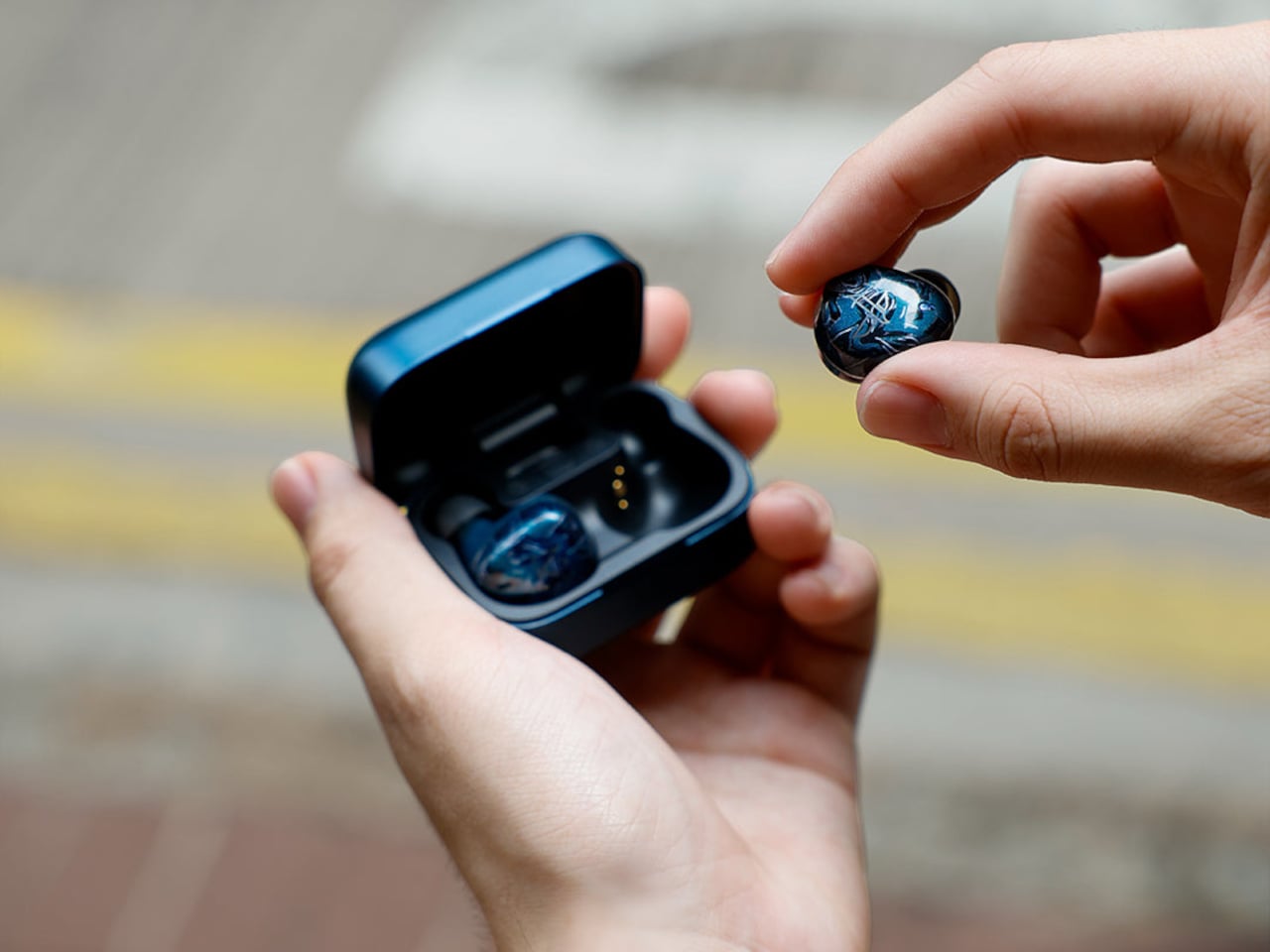
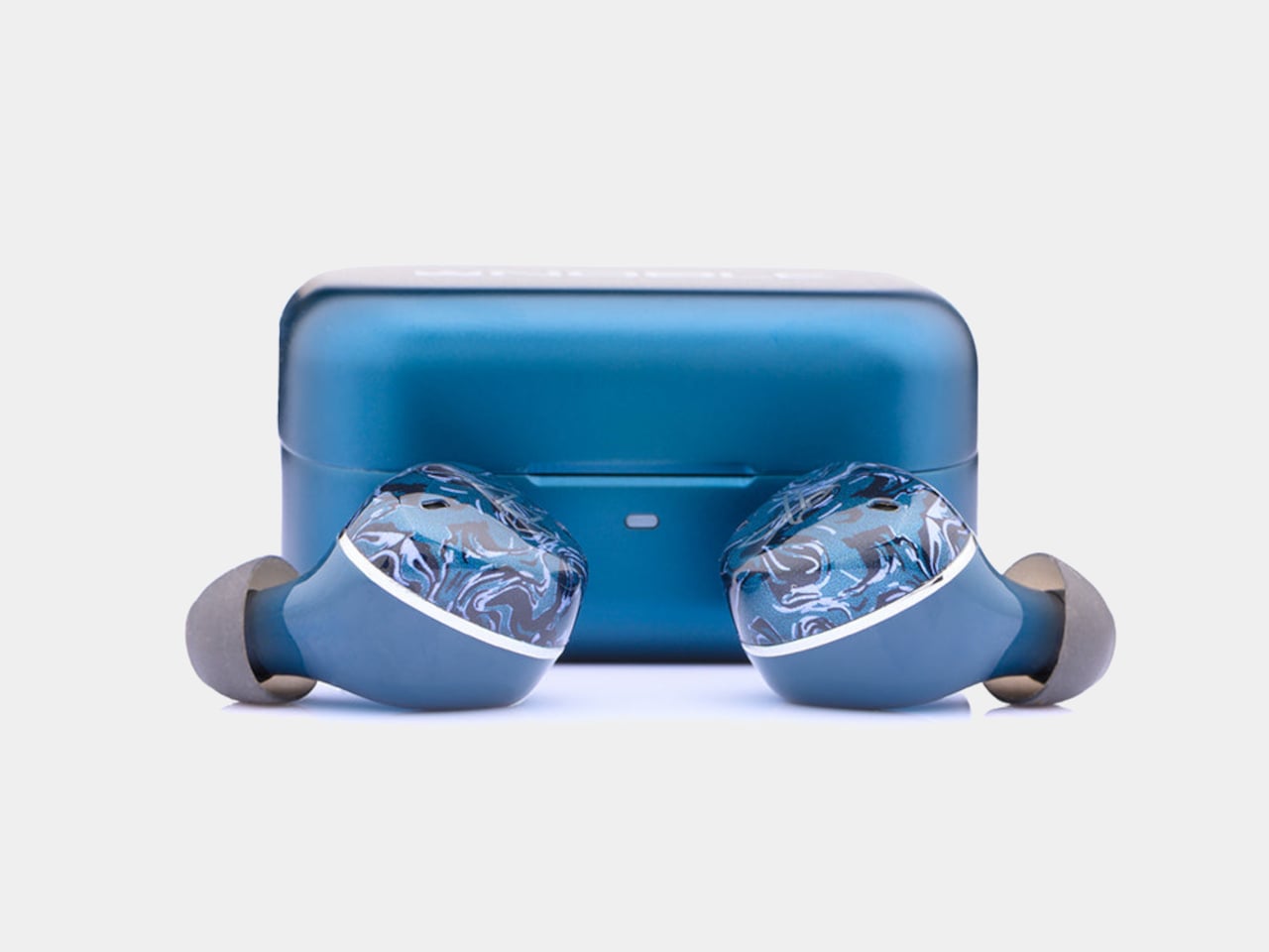
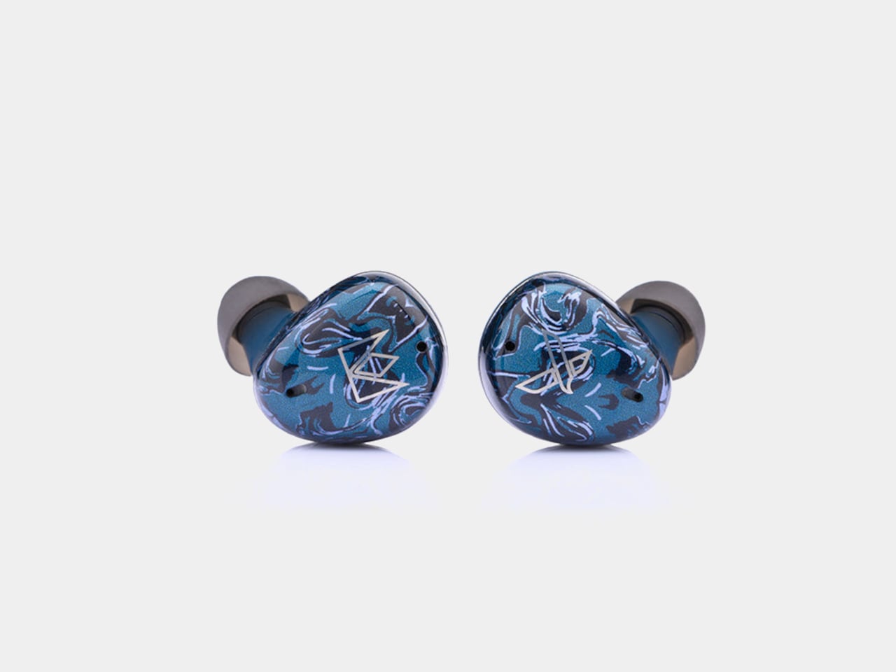
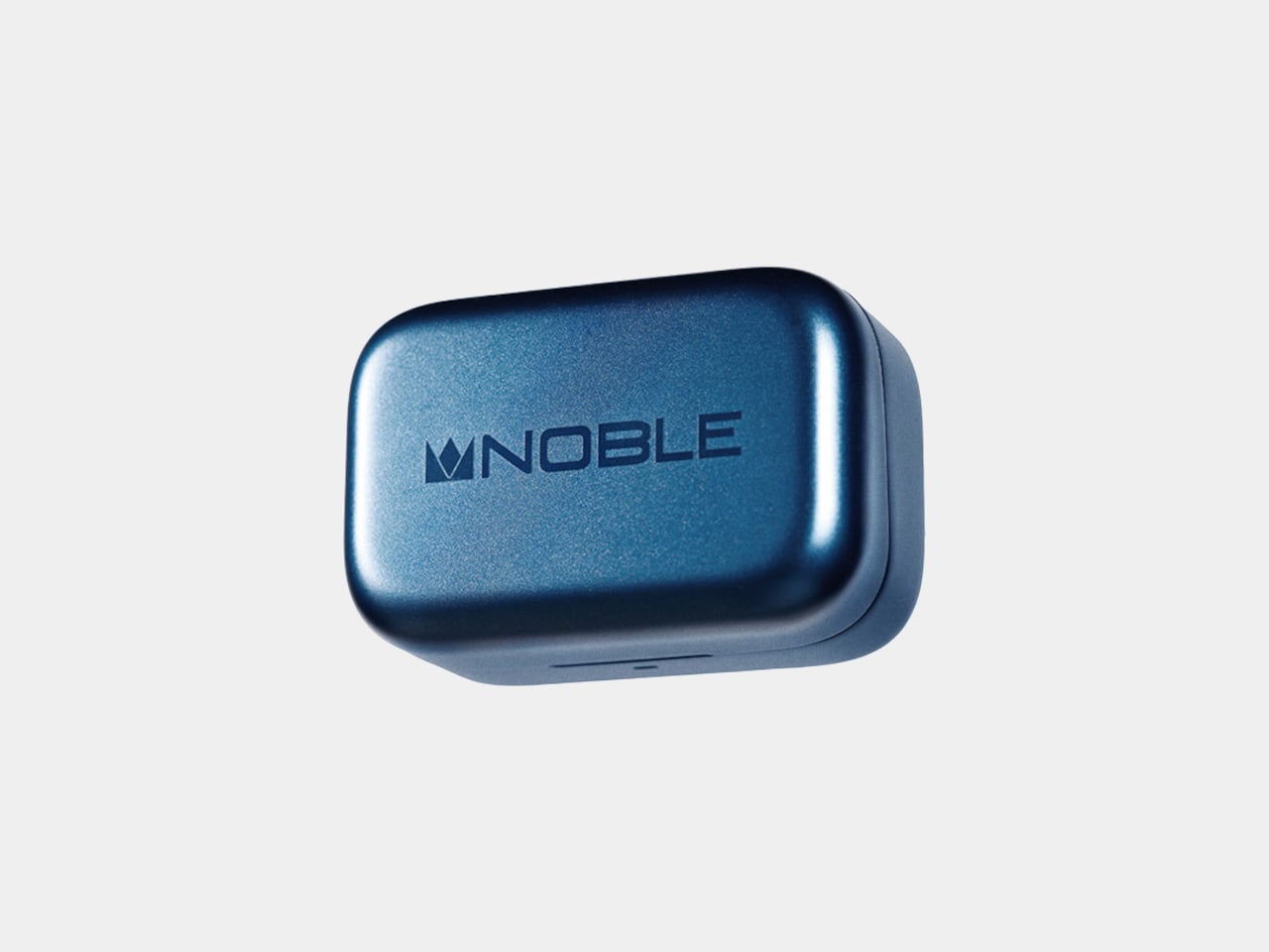
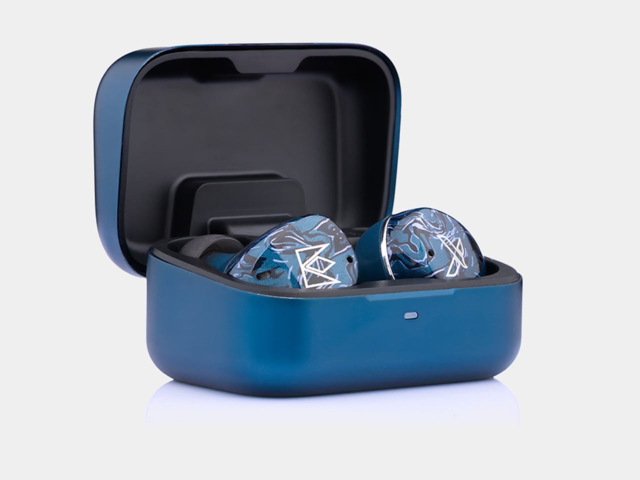
Noble kept most of its visual identity intact. The Osprey carries the marbled acrylic faceplate aesthetic from the FoKus line, with layered blues that read as deliberate rather than generic. The aluminum charging case matches the color and keeps the premium feel without adding bulk.
On the practical side, the Osprey includes hybrid ANC, a Hearing Through mode for ambient awareness, and multipoint connectivity for switching between two devices without re-pairing. ANC handles lower frequencies well, though some higher-pitched background noise still gets through. Dual microphones with cVc noise reduction handle calls, and Bluetooth 6.0 via the Airoha 1571 chipset holds a fast, stable connection even in busier wireless environments.
Battery life sits at seven hours with ANC off and five hours with it on, in line with most competitors. Quick charging is where the Osprey pulls ahead: 10 minutes in the case delivers roughly two hours of listening, a figure that outpaces several earbuds well above this price. The 500mAh aluminum case uses USB-C, and the Noble FoKus app adds a 10-band EQ, touch remapping, and over-the-air updates.
For context, Sony’s WF-1000XM6 retails at $329.95 and the Sennheiser Momentum True Wireless 4 at $299.95, putting the Osprey around $100 to $130 below either. LDAC support separates it further from mainstream earbuds at the same price, most of which cap out at AAC. Noble Audio opened pre-orders on June 4, with units shipping by the end of June, available directly at nobleaudio.com and through select retailers.
Most creator setups get built backwards. The camera comes first, the lighting comes second, and audio ends up being whatever fits in the bag. That compromise has a cost, and anyone who has sat through a well-shot video ruined by hollow, wind-wrecked, or flat dialogue knows exactly what it sounds like. The gap between professional-grade audio and genuinely portable gear has narrowed considerably in the last two years, and a lot of that credit goes to AI noise processing that actually delivers rather than just advertises.
BOYA has put forward Prime Day options that cover nearly every recording scenario a working creator runs into, at discounts that make this a reasonable time to close that gap. The five products span a wide range, from a thumb-sized lapel that disappears on clothing to a transformable four-mode wireless system to a button-sized transmitter that scales for multi-device team shoots. One of them, BOYA Notra, breaks from the creator audio format entirely and lands in the meeting room, turning live conversations into organized transcripts, summaries, and to-do lists in over 140 languages.
BOYA mini 2: the Ultra-Compact Everyday Mic
Where the BOYA Magic is built around transformation, the BOYA mini 2 is built around invisibility. Weighing only 5 grams, the transmitter is the lightest in this roundup, designed to be a set-it-and-forget-it solution for mobile creators, vloggers, and anyone who needs clean audio without the bulk. Its thumb-sized form factor clips onto clothing without pulling or weighing down fabric, making it ideal for casual shoots, social media content, and on-the-go recording where a larger microphone would be too conspicuous. The focus here is pure portability and ease of use, delivering a significant audio upgrade over a phone’s internal microphone in a package that is small enough to live in a pocket.
Despite its size, the mini 2 shares much of the same audio DNA as its larger counterparts. It features the same 48 kHz / 24-bit audio resolution and AI noise cancellation, with a “Strong” mode for loud environments and a “Light” mode to preserve natural room tone. The companion BOYA Central app allows for quick adjustments to volume, EQ, and noise cancellation levels directly from a smartphone. With a 30-hour battery life via its charging case and a robust 328-foot wireless range, the mini 2 is a surprisingly capable microphone that prioritizes convenience and discretion above all else.
BOYA Magic directly addresses the problem of carrying multiple microphones for different shooting styles. Instead of asking creators to choose between a lavalier, a handheld, a desktop, or an on-camera mic, it combines all four into one compact kit. The core of the system is a 7-gram transmitter that can be used as a discreet clip-on, but it also docks into a handheld grip for street interviews, mounts on a desktop stand for podcasts, and slides into a cold shoe adapter for on-camera use. This transformable design makes it the most physically versatile option in the lineup, built for creators who move between formats and do not want their gear to dictate their workflow.
The technical specifications are strong enough to support that flexibility. The system captures 48 kHz / 24-bit audio and uses AI noise cancellation to reduce ambient sound by up to 40 dB, which is more than enough to clean up dialogue in busy environments. It also includes thoughtful professional features like a smart limiter and a safety track to prevent audio clipping, an 80 dB signal-to-noise ratio, and up to 30 hours of total recording time with the charging case. For a creator who wants one kit that adapts to nearly any situation, from a desk recording to a field interview, the Magic is engineered to be a clever, all-in-one solution.
While mics like the mini 2 and Air SE are perfect for solo creators, the BOYALINK 3 is designed for more complex productions. This is the system for small teams, interviewers, and creators who need to feed audio to multiple devices at once. Its key feature is a 2TX-4RX expansion capability, which allows the system to scale up to support eight devices recording simultaneously. This makes it possible to run a two-person interview while sending clean audio to two different cameras and a backup recorder, all from one compact kit. It is a button-sized system that brings a level of workflow flexibility usually found in much larger, more expensive setups.
The BOYALINK 3 reinforces its professional credentials with a higher 85 dB signal-to-noise ratio for cleaner recordings and includes essential tools like automatic gain control, a limiter, and a safety track to protect against distortion. Each transmitter weighs just 9 grams and features a dustproof grille, making it durable enough for field use. With EQ tuning, real-time monitoring, and up to 30 hours of total battery life, the Link 3 is positioned as the upgrade for creators who are moving beyond basic setups and need a reliable, scalable audio hub for more demanding shoots.
The final product in the lineup takes the AI audio technology seen in the microphones and applies it to a completely different problem: remembering conversations. The BOYA Notra is not a creator tool, it is a dedicated AI note-taking device designed for professionals, students, and anyone who needs to capture meetings, lectures, or calls without losing focus. It records conversations from three sources, ambient room audio, phone calls, and Bluetooth earbuds, and then turns the raw audio into structured, usable information. This is a device built for productivity and memory relief, not for content production.
The Notra’s intelligence lies in its post-recording processing. It transcribes speech in over 140 languages, automatically identifies different speakers, and generates summaries, to-do lists, and mind maps from the conversation. All recordings are stored on its 64 GB of local storage with a private cloud backup. With up to 24 hours of continuous recording and a slim, magnetic design, the Notra is a powerful tool for anyone who has ever wished they had a perfect record of a conversation. It turns every discussion into organized, searchable knowledge, ensuring that no key details are ever missed.
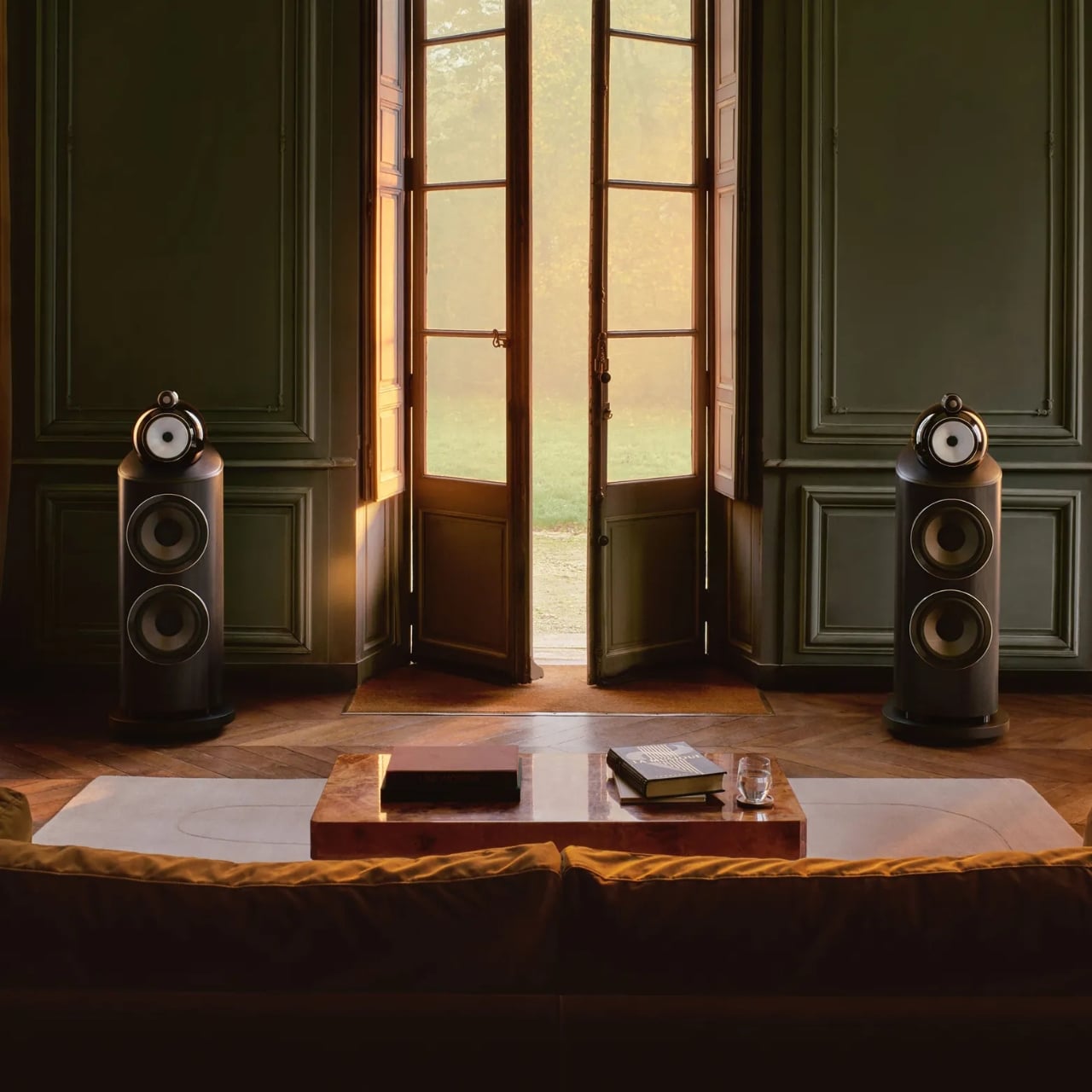
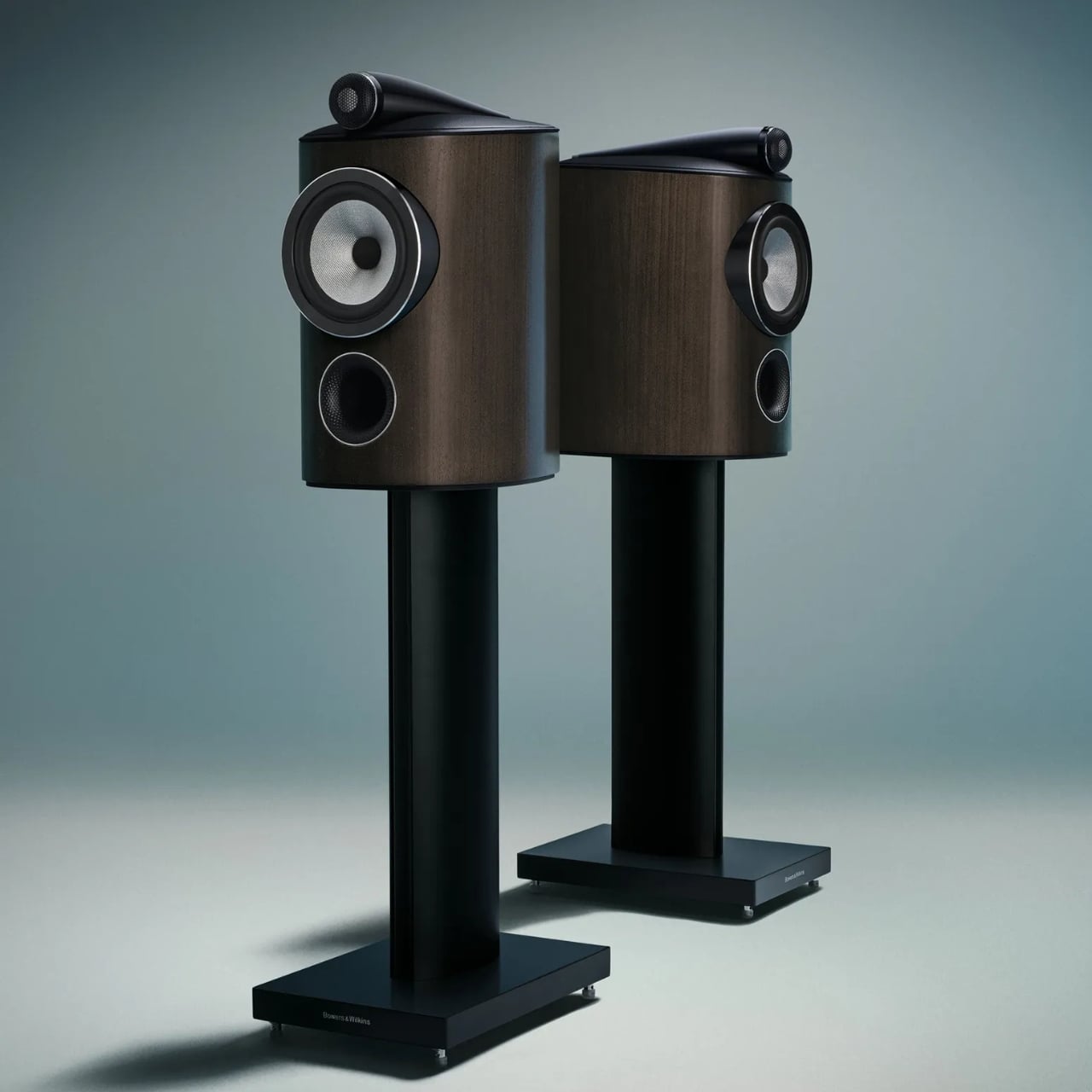
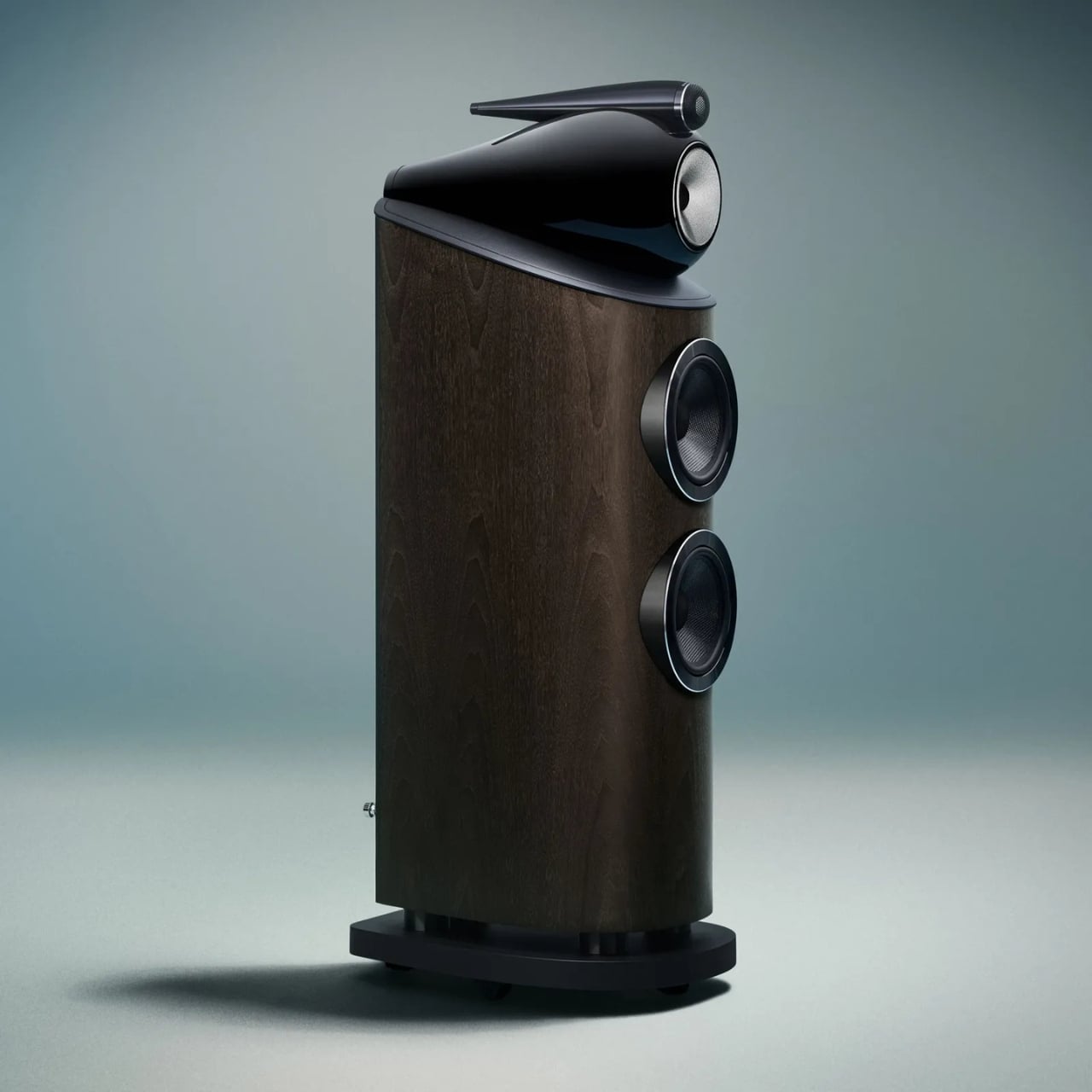
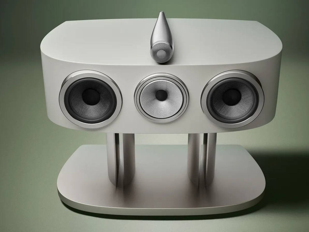
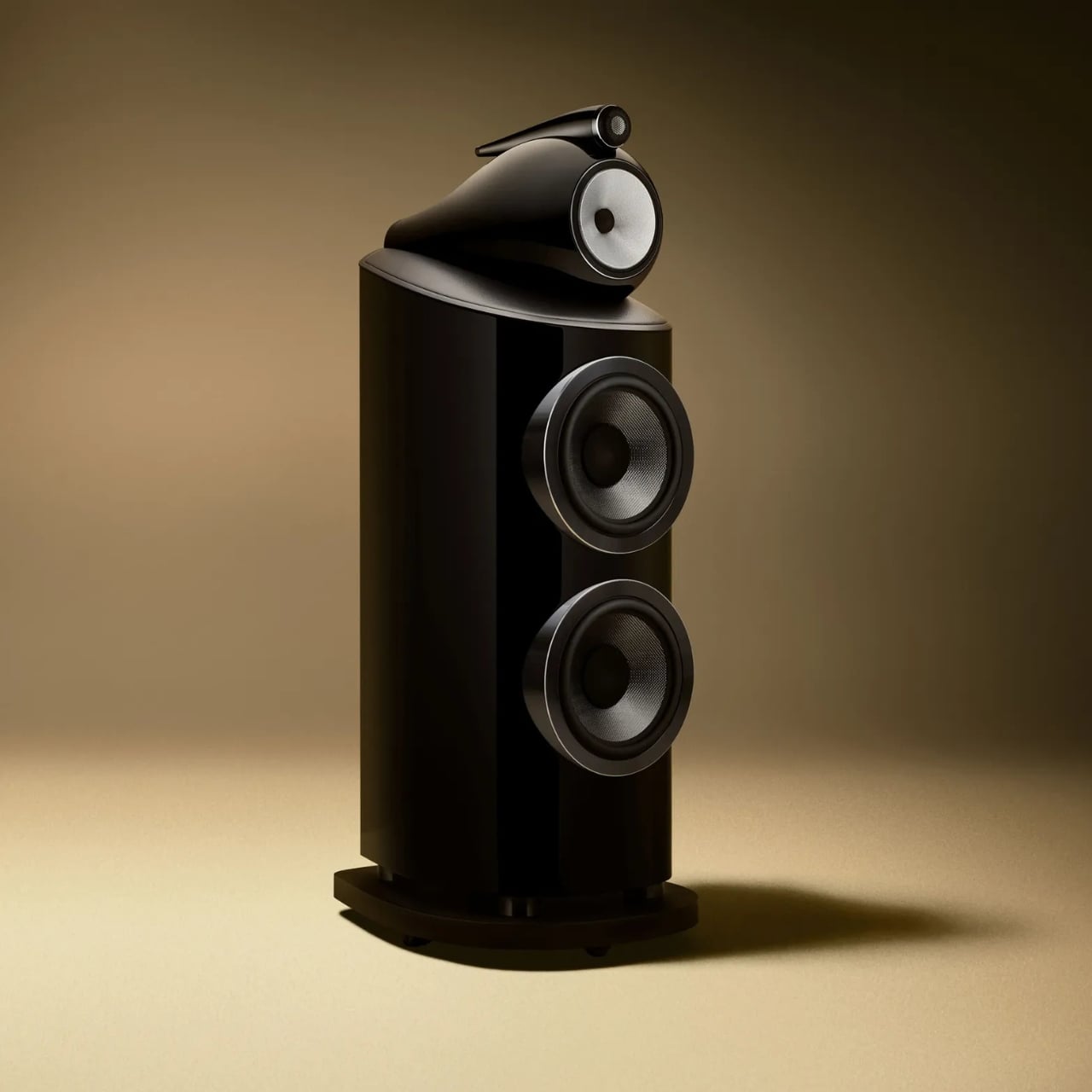
Most brands celebrate a 60th anniversary with a retrospective book or a limited-edition colorway. Bowers & Wilkins celebrated theirs by unveiling what may genuinely be the most advanced loudspeaker range they have ever made. The 800 Series Diamond D5 arrived with that kind of quiet confidence that doesn’t need fanfare to make its point, even if it was announced to considerable fanfare.
I’ve always believed that truly great audio equipment occupies a strange place between technology and sculpture. The 800 Series has lived in that space for decades. It’s the kind of speaker you find in professional recording studios around the world, at Skywalker Ranch where teams have mixed and mastered legendary film soundtracks, and also in the living room of the person who just needs the room to sound exactly right. That dual citizenship, professional and deeply personal, tells you everything about what Bowers & Wilkins has been building toward.
The D5 is the fifth generation of the Diamond series, and the tagline “60 years in the making” isn’t marketing hyperbole. It’s a mission statement rooted in John Bowers’ original True Sound philosophy: nothing added, nothing taken away. Every generation of 800 Series starts from the same question: what stands in the way of the music? The answers keep evolving. The ambition stays constant.
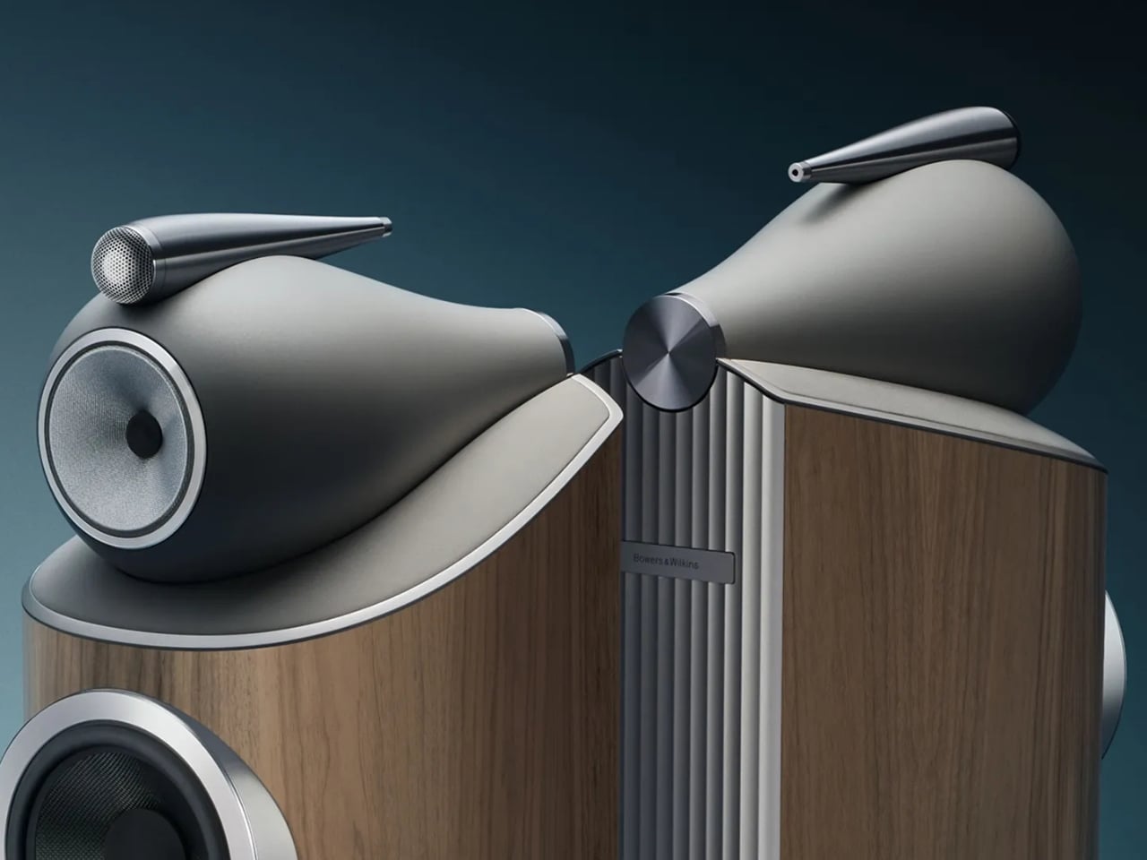
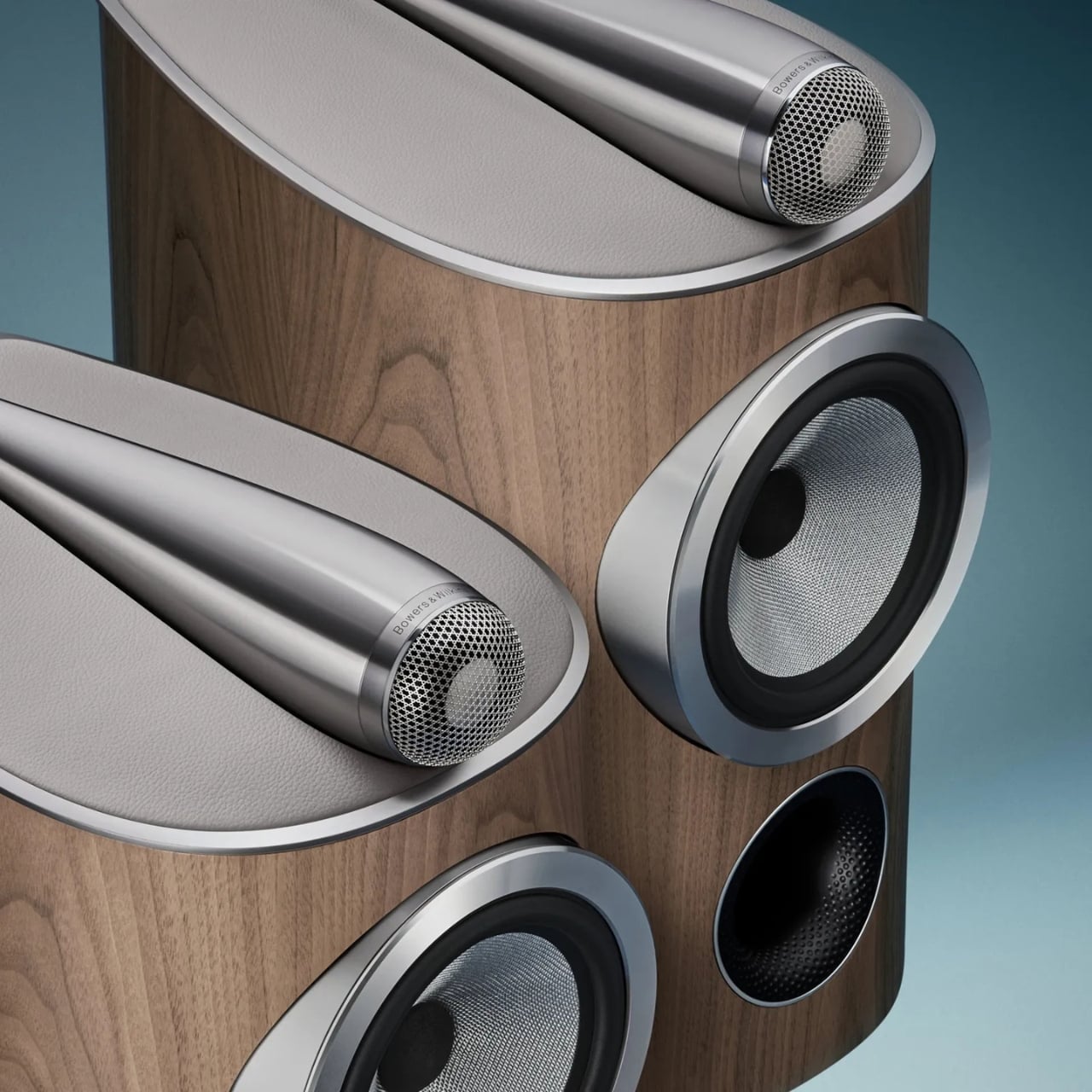
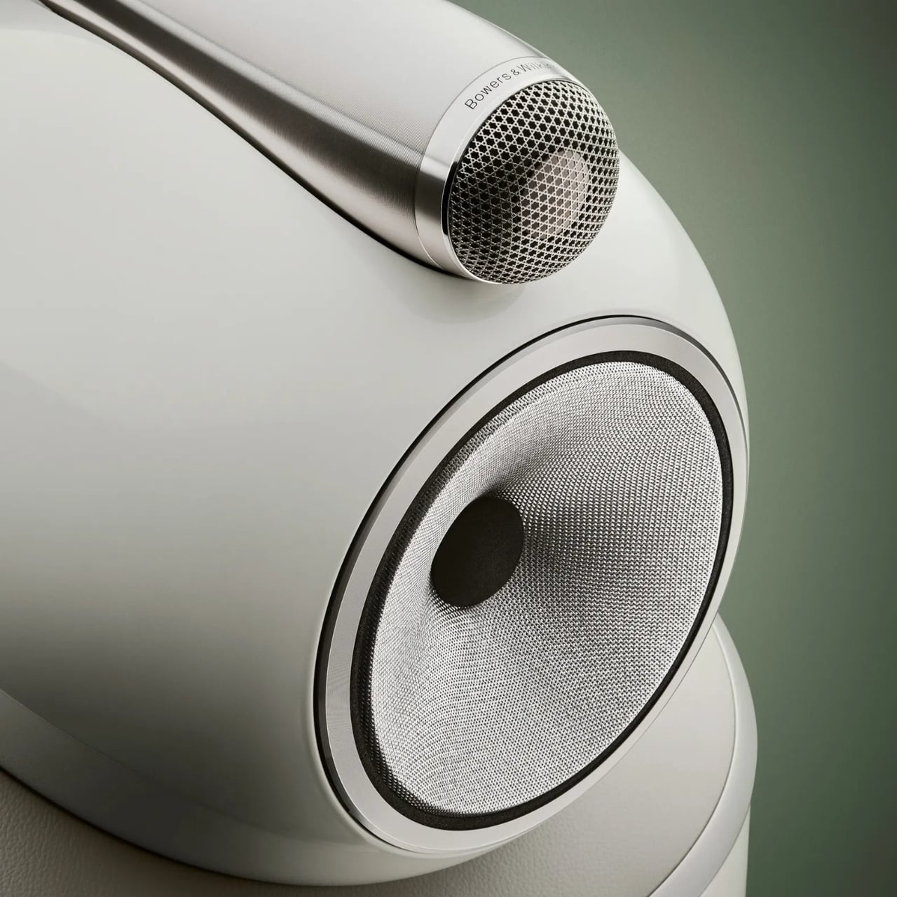
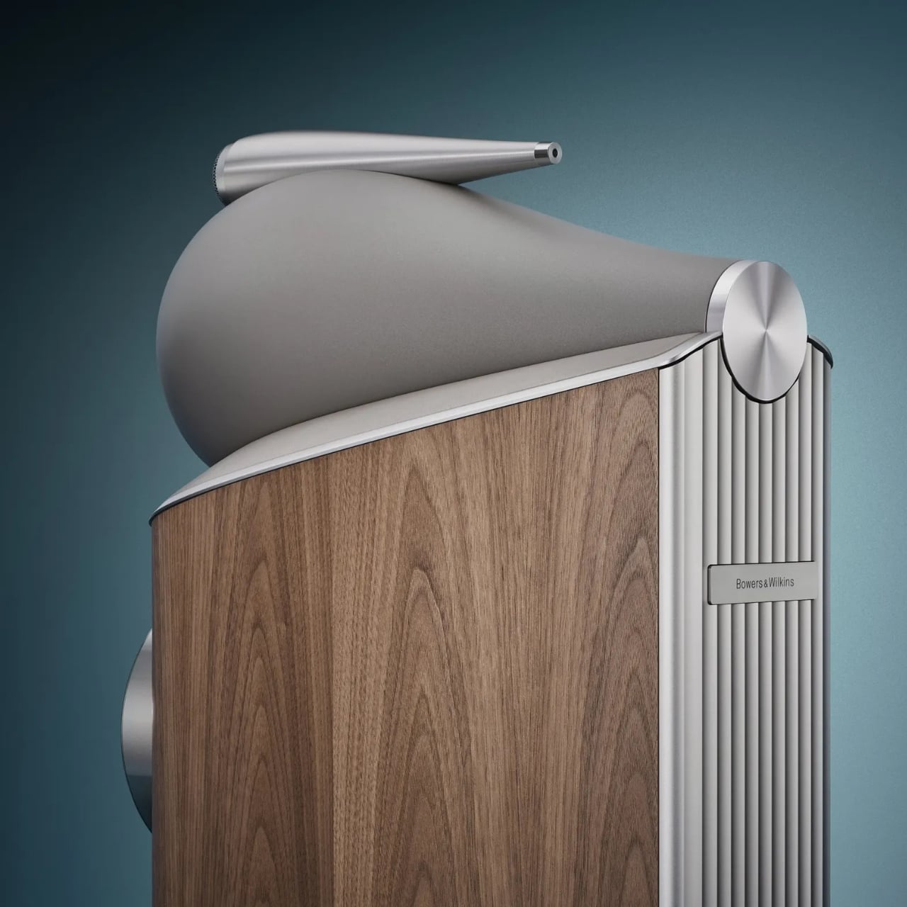
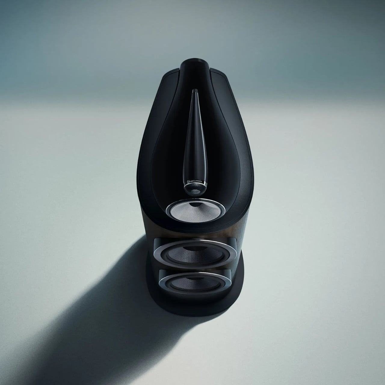
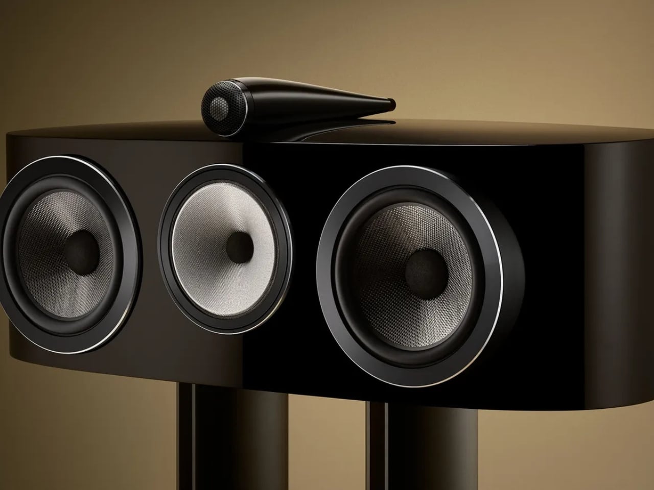
The range includes seven models, from the compact 805 D5 stand-mount to the flagship 801 D5 with its twin 10-inch bass drivers. The iconic Turbine Head, that distinctive aluminum sphere housing the midrange driver in complete acoustic isolation from the bass section, remains one of the most recognizable silhouettes in audio design. It was bold when it debuted, and it’s still striking today. It’s been refined here, not rethought, and I think that’s the right call. Some shapes earn the right to stay.
What’s new in D5 runs much deeper than the surface. The Space Frame Bracing system introduces parallel aluminum rails bolted directly to the rear Matrix cabinet bracing, making the enclosure significantly stiffer and mechanically quieter than its predecessor. A revised aluminum top plate, with thicker ribbing and updated decoupling mounts, better supports the Turbine Head and Solid-Body-Tweeter assemblies. The crossover components have been moved entirely outside the cabinet, mounted on aluminum rails at the rear, which eliminates internal air pressure fluctuations from affecting crossover behavior. As an added benefit, natural convection keeps those components running cooler during extended listening.
The Diamond Dome tweeter gets a new grille mesh, first developed for the acclaimed 801 D4 Signature, that’s more acoustically transparent while still protecting the dome. The result is better off-axis performance and noticeably improved resolution. Every midrange and bass driver across the range has also been upgraded with lower-distortion motor systems derived from Signature-grade components. That’s not a minor tune-up; that’s serious trickle-down engineering from the very top of the catalog.
Aesthetically, the D5 introduces four new finishes: Stealth Black, Warm White, Light Walnut, and Dark Walnut. The paint has been upgraded for greater depth and durability, and the design detailing across every surface, from the spine to the plinth to the drive unit pods, has been refined. These are speakers handcrafted in Worthing, UK, and they carry that provenance visibly. Luxurious isn’t too generous a word.
Where I land on all of this is that the 800 Series Diamond D5 represents something genuinely uncommon in a market crowded with premium pricing and thin justification: a product that earns its position through accumulated expertise and genuine craft. There’s real, demonstrable engineering here, the kind that takes decades to develop, and Bowers & Wilkins isn’t shy about showing their work. The D5 range is scheduled to ship in fall 2026, and the anticipation feels entirely warranted.
Sixty years of obsessive refinement, applied to a speaker that takes the living room as seriously as a professional studio, will do that. When the engineering is this thorough and the design this considered, the only question left is how loud you want to play it.
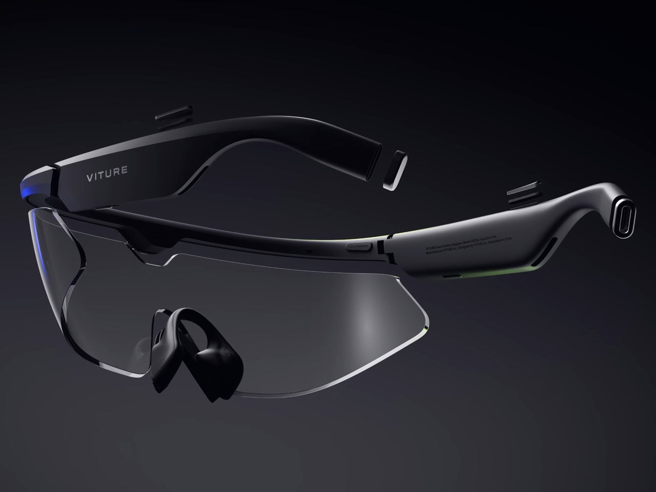
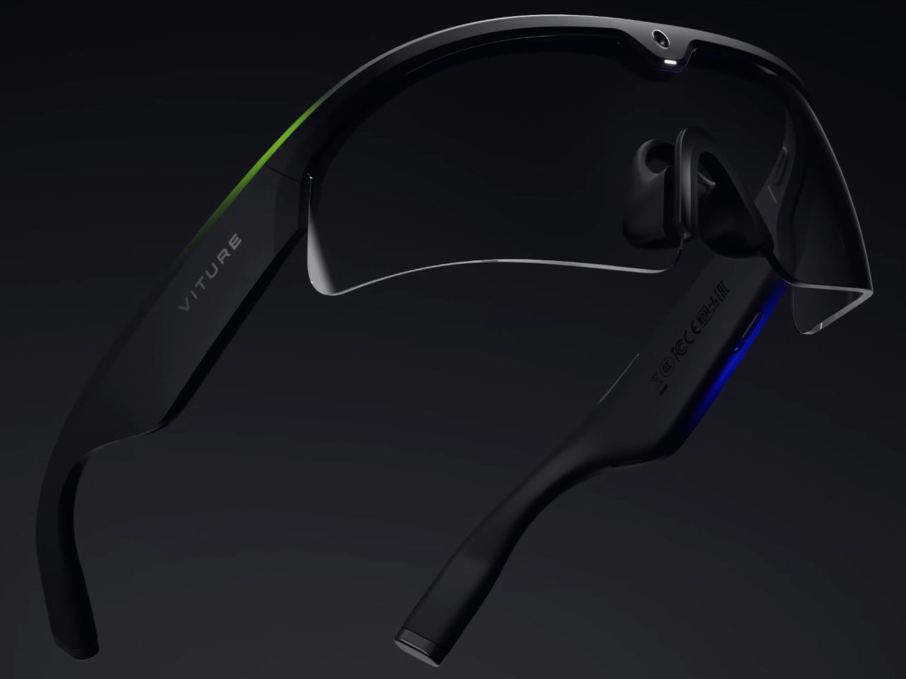
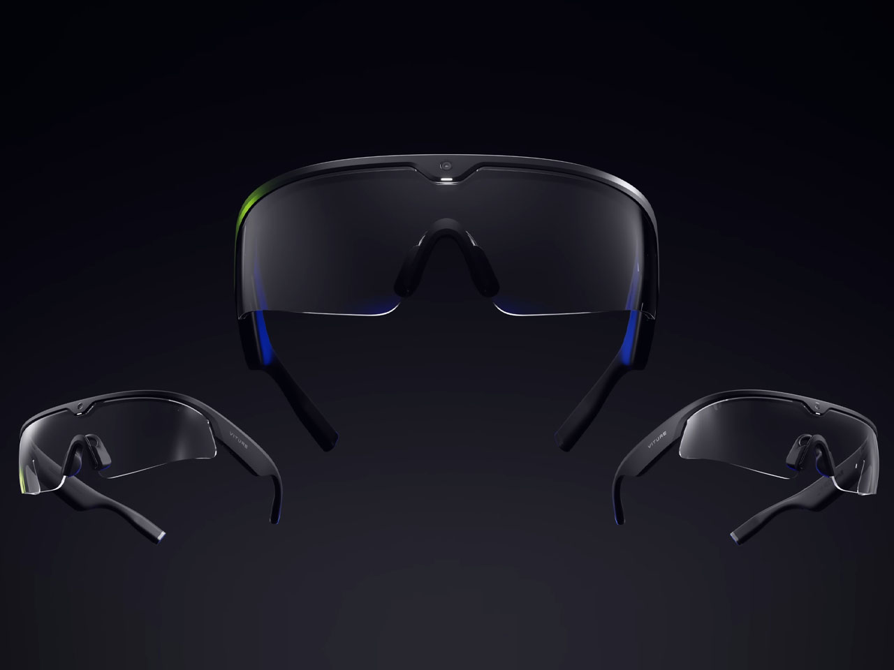
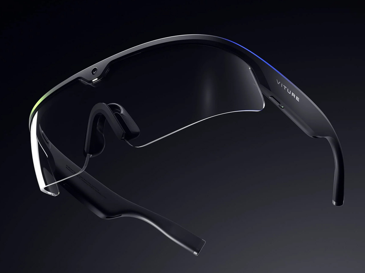
Smart glasses are having their time in the sun. Besides the fashion industry, there is a swing in the air to make things easier and interesting for the workforce with the use of AI. Primary evidence was the Innovative Eyewear’s Lucyd Armor, a smart safety eyewear designed to meet all prerequisite standards for workplace safety. Now, at the ongoing Augmented World Expo (AWE) 2026, Viture has introduced Helix, the first pair of AI safety glasses built on Nvidia’s XR AI solution.
The safety eyewear powered by AI is engineered in accordance with industrial safety standards. After its certification, which is in progress at the time of writing, the eyewear will be safe to use in labs, factories, and other regulated workflows. With the use of Nvidia’s XR AI, Helix will stream a first-person perspective of the wearer – what they see or hear – and feed it to a multimodal AI in real time, enabling “AI-assisted coaching, compliance, and full-provenance capture of every shift worn.”
In industrial, scientific, and clinical use cases – that Viture is targeting with its Nvidia collaboration – the workforce has to ensure a lot more than their regular tasks. For instance, it’s imperative to note that the machine is locked before maintenance or the correct setting of the pressure gauge in the oxygen tank. Using the Helix smart glasses, the extras could be taken care of. The AI-powered glasses can watch what a worker sees and, in real time, provide live guidance and safety warnings. It can automatically record everything that happens during the job and provide AI-assisted input to help the wearer manage the workflow better.
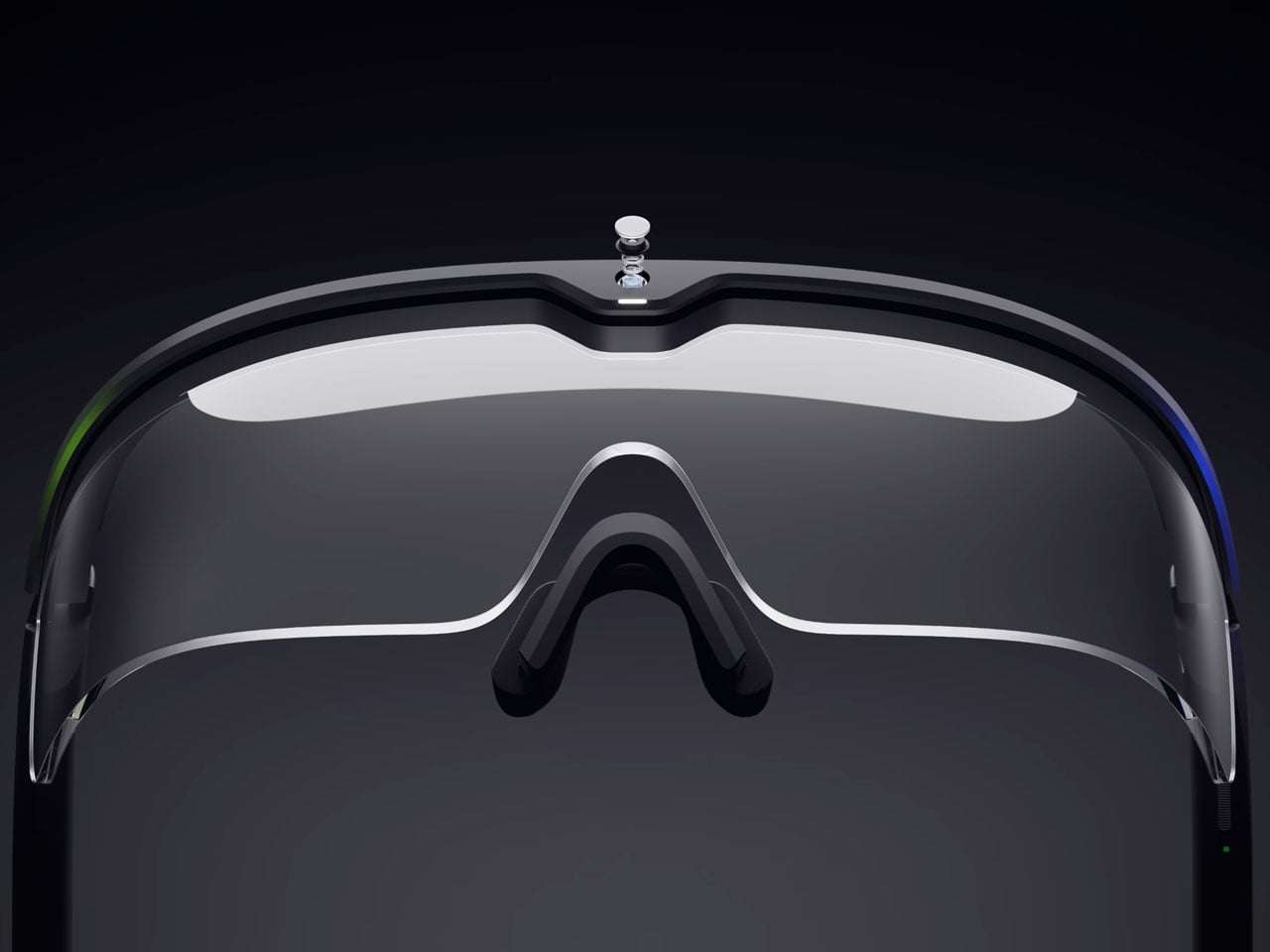
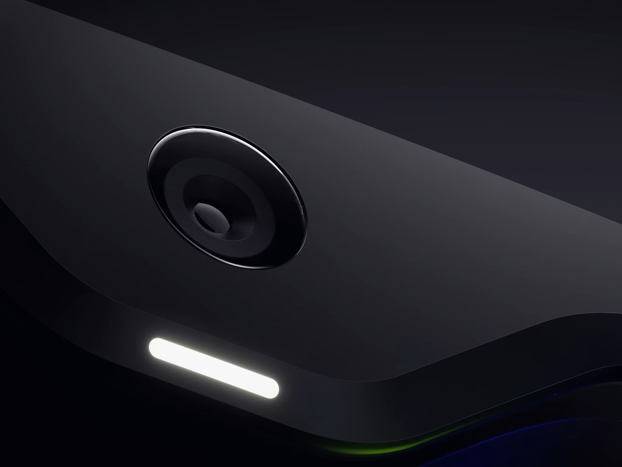
Helix is Viture’s entry into AI. It is a pair of fully transparent industrial-grade glasses without a display. Only input in live recording and voice. The glasses arrive with a 12MP first-person camera and an array of four microphones. Alongside the prerequisites for seeing and listening, the eyewear also features stereo speakers for sound, Wi-Fi, and Bluetooth 5.3 for connectivity. The glasses rely on a small battery that runs for slightly above 60 minutes on a full charge.
Viture ensures that Helix is completely independent of connectivity points and cables. It runs standalone without pairing to a companion phone to get the job done, furthering its useful capabilities for workers. Its field lenses are swappable without tools. According to press information, Viture and Nvidia worked closely over the past year, improving AI-assisted workflows to offer purposeful assistance in real-life applications.
Helix will be unveiled via a live demonstration held at the NVIDIA/Dell meeting room at AWE 2026, but the eyewear is likely to debut earliest at the beginning of next year. Viture is confident of meeting the timeline and is therefore taking early reservations for the device on its website for a $599 reservation price.
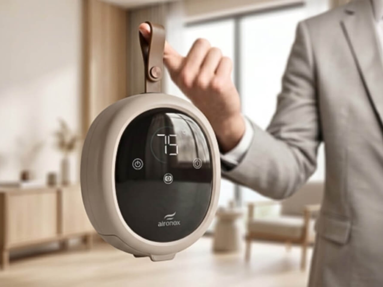
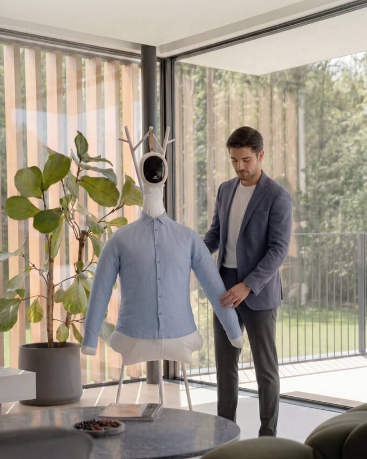
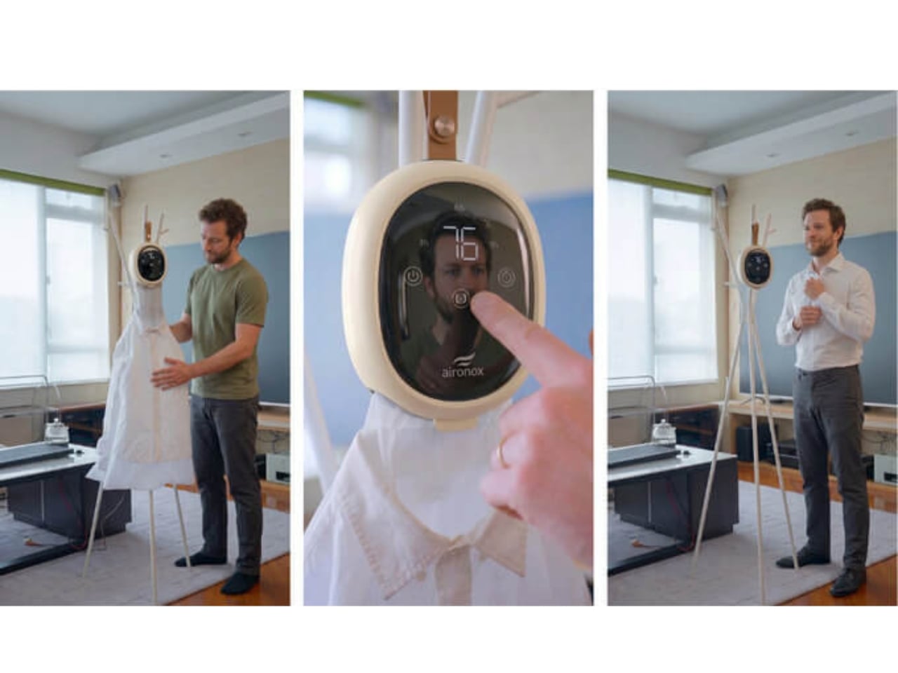
We all know the ritual. You arrive at a hotel after a long flight, unzip your suitcase, and the outfit you were going to wear to dinner looks like it lost a fight with a dryer ball. You eyeball the iron sitting in the corner of the room. It’s coated in someone else’s starch residue. You spend twenty minutes trying to remember how to use the ironing board. You burn the sleeve. I’ve been there. You’ve been there. We’ve all been there. That’s exactly the scenario Aironox designed the GO to solve, and it does it in a way that still feels a little like a magic trick until you understand how it works.
The Aironox GO is the compact travel version of the brand’s original automatic garment care system. The idea behind it is refreshingly simple: you hang your garment over a balloon-style attachment, press start, and the machine pumps warm air through the fabric while you do literally anything else. Shower. Pack. Scroll your phone. The garment inflates slightly, the warm airflow works through the wrinkles, and in about 8 to 12 minutes, you’ve got something wearable. No ironing board. No steamer. No wrestling with a hotel iron that’s been sitting in a cupboard since 2009.
Designer: Aironox
I’ll be honest: the first time I saw the original Aironox Home model, I had questions. The concept of a fabric-inflating balloon machine sounds like a prop from a science fiction short, not a real appliance you’d unpack in a hotel room. But the more you look at how it actually works, the more it starts making sense. Ironing has always been a tactile, hands-on task, and we’ve somehow accepted that for decades without stopping to ask whether there was a smarter way to do it. The Aironox GO is essentially the first product brave enough to ask that question out loud while also being small enough to fit in your carry-on.
The GO is a scaled-down, portable version of the Aironox system, specifically built for travel. It’s dual voltage, which means you can take it internationally without blowing anything up. It works with both shirts and trousers via separate attachments, and the balloon itself has adjustable side zips to accommodate different garment sizes. The brand says it handles everything from small to XXL, which is either very ambitious or genuinely thoughtful design, depending on how it performs with your particular wardrobe.
What the GO isn’t is a miracle worker. It’s not going to replicate the sharp crease of a professional press, and it won’t replace a full garment steamer for delicate fabrics that need careful handling. The Aironox Home model has more power; the GO has been built specifically around portability and travel use, which means some trade-offs come with that. The specs won’t match a home unit, and the brand is upfront about that. Knowing what a product is built to do, and what it isn’t built to do, is a big part of making a good purchasing decision. At least Aironox isn’t overselling this one.
The GO sits squarely at the intersection of practical travel essential and the kind of thing you didn’t know you wanted until someone showed it to you. For frequent travelers, particularly those who move between business meetings and events, it’s a compelling case. For the occasional holiday traveler who packs one nice outfit and hopes for the best, it’s a more personal call.
The wider design story here is worth noting, though. Aironox is part of a growing category of products rethinking domestic tasks not through incremental upgrades, but through a complete reimagining of the process itself. Removing the ironing board from the equation entirely, making garment care something the machine handles while your attention is elsewhere, is a genuinely different approach. Whether the execution fully delivers on the promise at scale is a fair question. But the idea? The idea is good. And sometimes, that’s exactly where it all starts.
The microwave has been one of the most stubbornly unchanged appliances in the modern kitchen. After decades of the same basic box design, with a spinning turntable, a membrane-covered button pad, and a side-swinging door, most manufacturers have focused their innovation elsewhere. The few that have attempted cosmetic updates have mostly just rearranged the same components into slightly different shapes without addressing the deeper frustrations most people have with them.
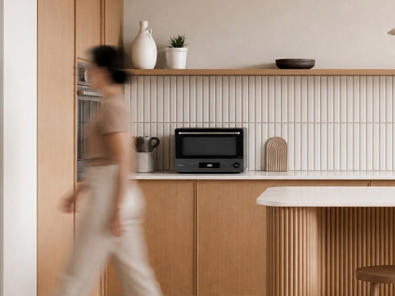
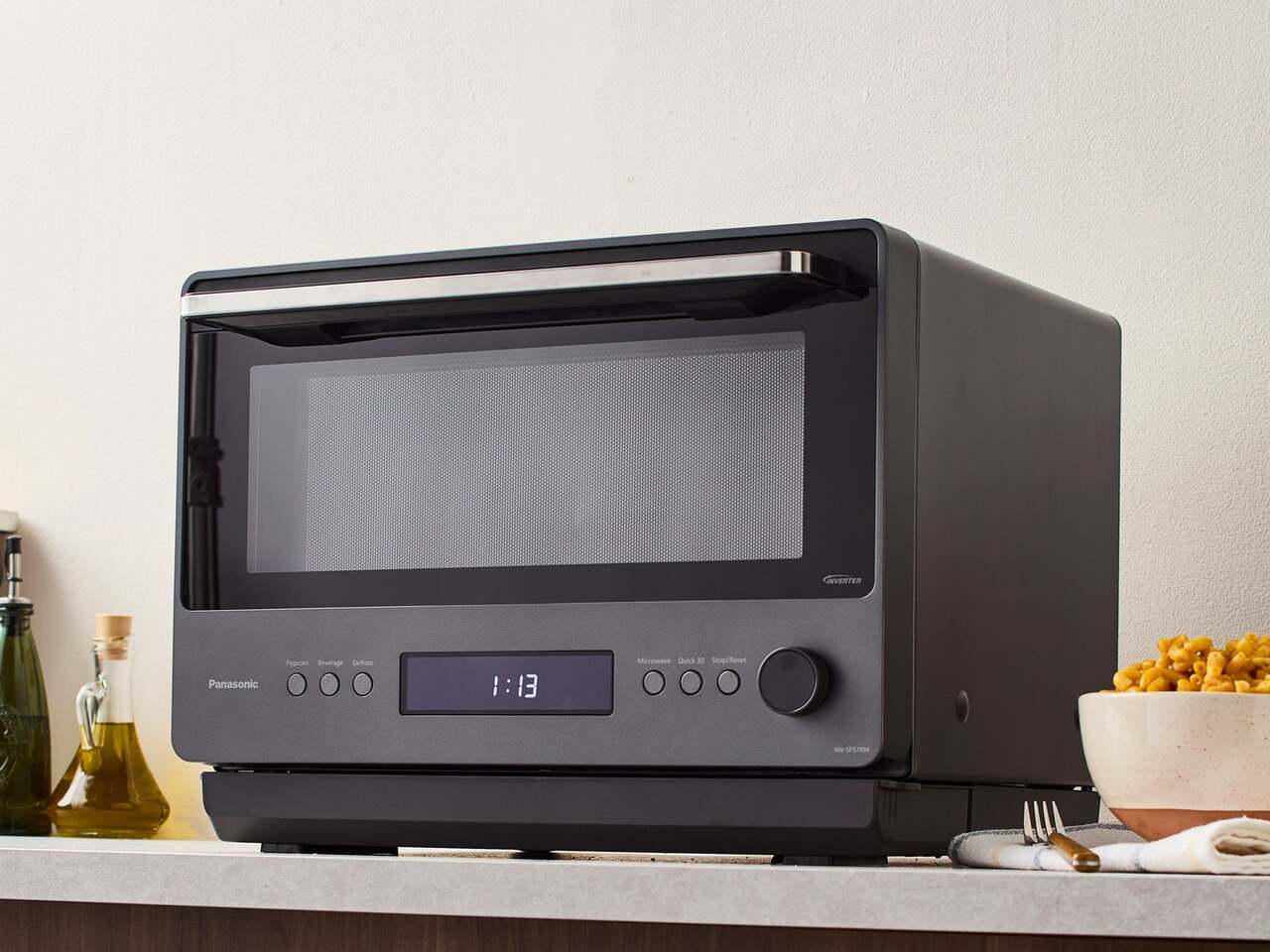
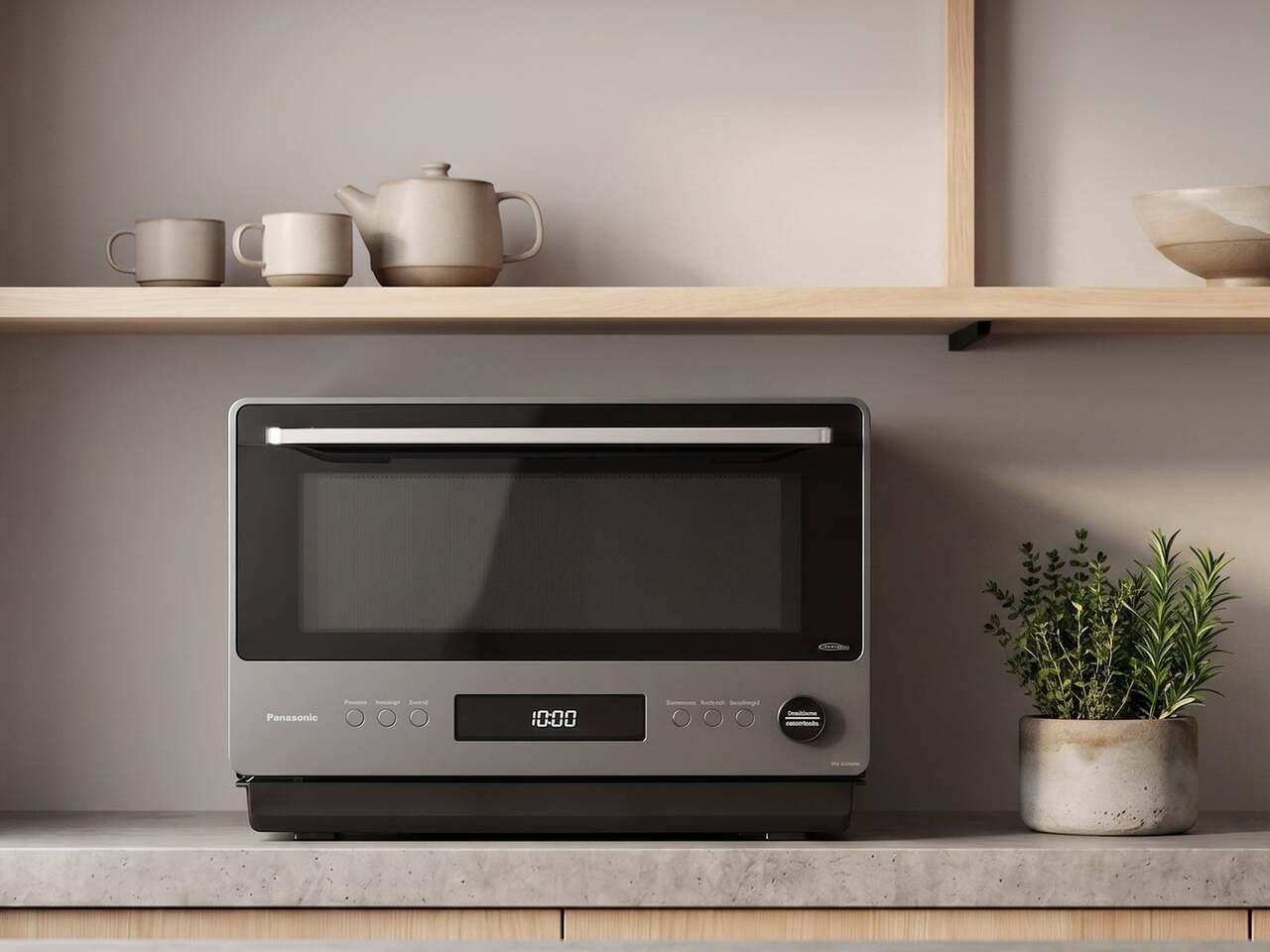
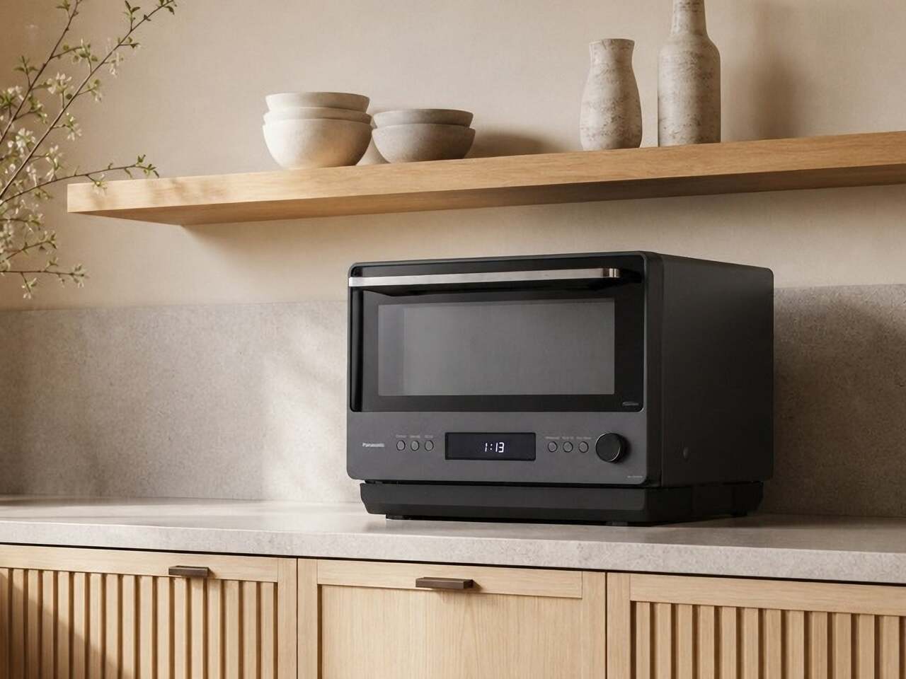
The Panasonic NN-SF57RM tries to address all of that at once. It draws on Japanese design principles to arrive at a countertop microwave that looks more like a compact built-in oven than anything most people would expect to find in a kitchen. Unlike most appliance redesigns that prioritize looks over function, this one makes a strong case that the cooking technology needed rethinking just as much as the exterior.
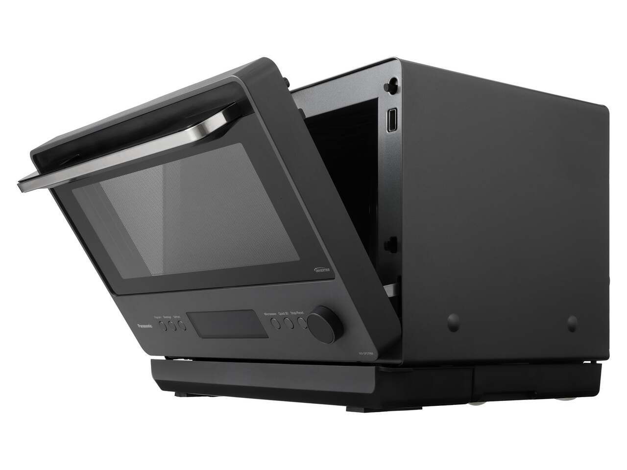
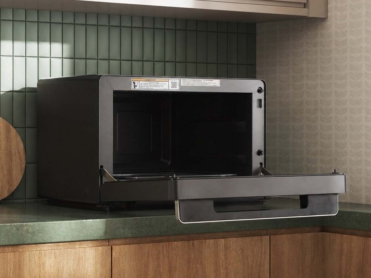
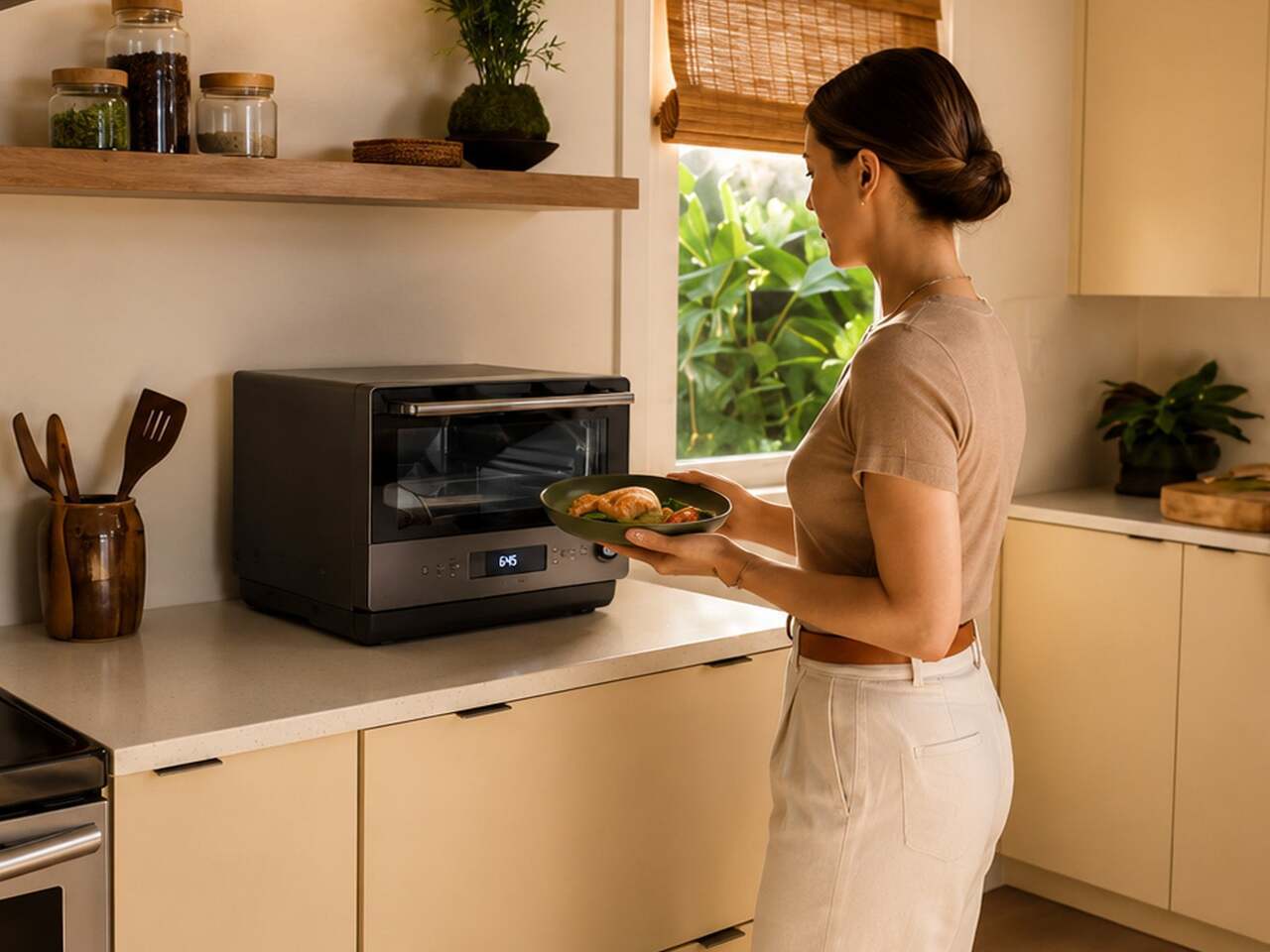
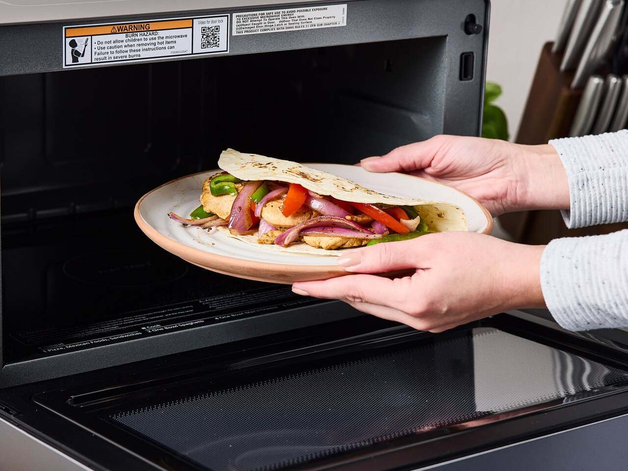
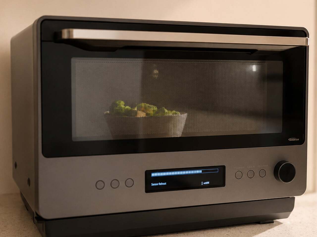
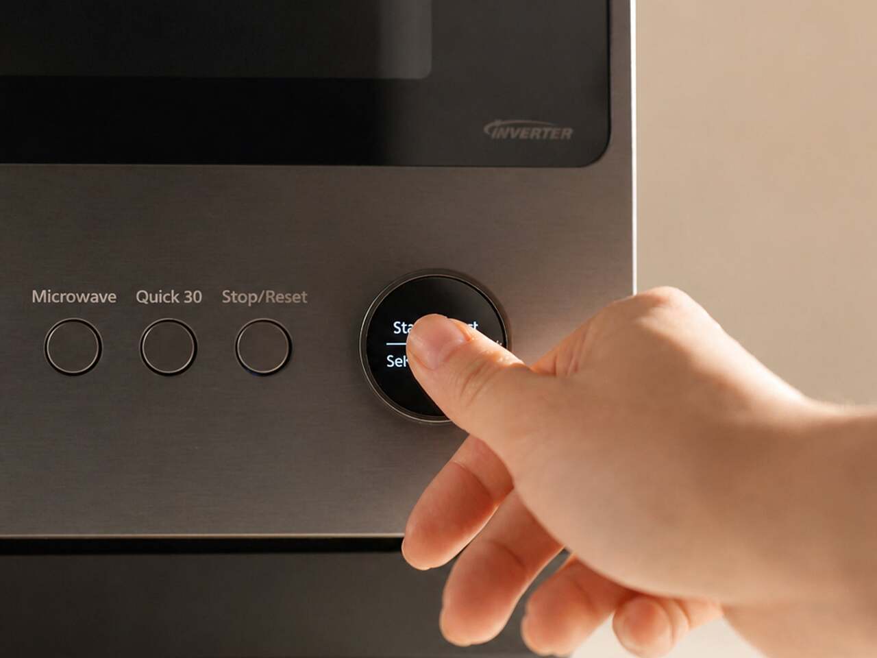
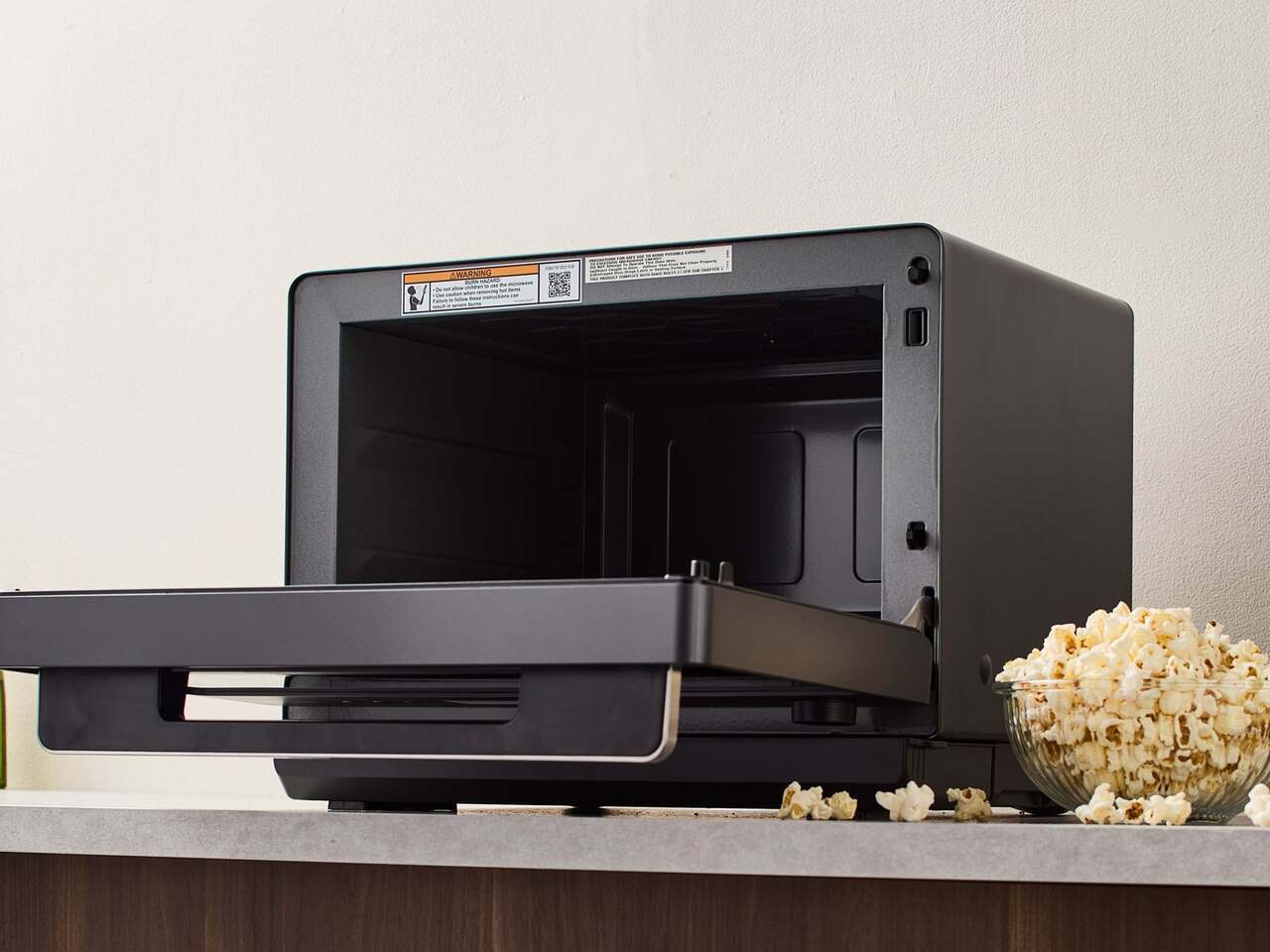
The most immediately noticeable departure from the typical microwave format is the door. Rather than the standard left-to-right hinged swing, it drops downward like a traditional oven door, making it easier to slide dishes in and out without awkward angling. Soft-close hinges slow the door’s descent to a cushioned stop. The muted graphite exterior and minimalist button-and-dial control panel complete a look that sits comfortably next to higher-end kitchen equipment.
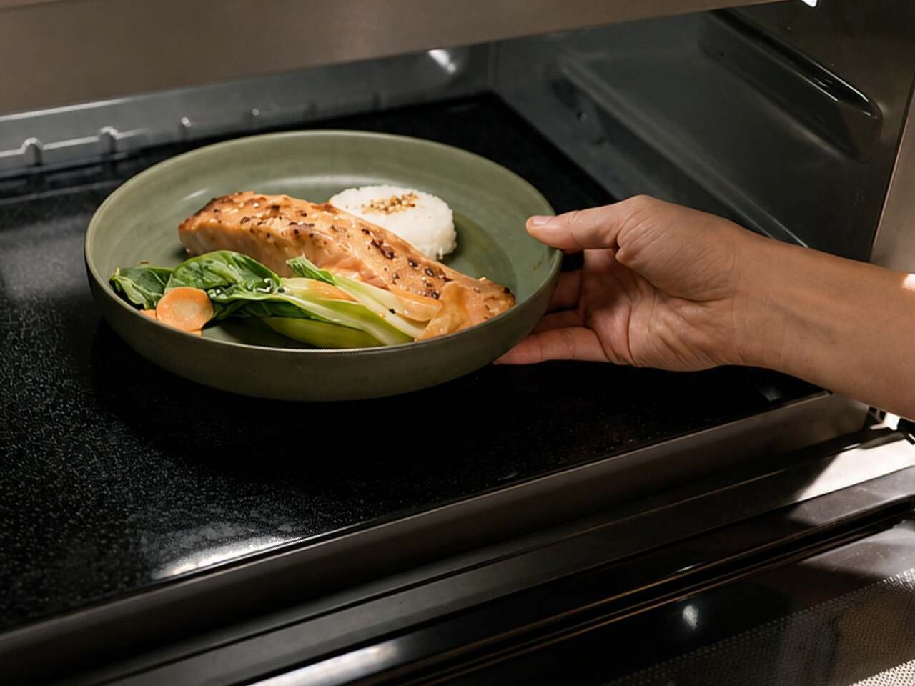
Opening the door reveals a 1.0 cu. ft., turntable-free interior that’s flat and unobstructed. Most microwaves rely on a spinning glass plate to distribute heat, but it eats into usable space and gives food residue plenty of places to hide. A hidden antenna beneath the floor rotates microwave energy around the food, directing heat toward cooler areas while avoiding spots that are already warm, resulting in more even heating.
Traditional microwaves pulse their power on and off during cooking, which explains why reheated leftovers often come out scalding in some spots and still cold in others. Inverter Technology changes this by maintaining a continuous, consistent power output throughout the entire cooking process, delivering the right level of heat at every setting without the on-off cycling that causes uneven results in most conventional models.
The Genius Sensor 2.0 adds another layer of intelligence on top of all that. Earlier versions of the technology read steam released by food to estimate doneness, which can produce inconsistent results when a plate holds multiple food types. The updated system uses thermo sensors positioned at 64 points to read surface temperatures every 0.1 second, adjusting cooking time and power levels automatically to bring everything to the right temperature.
All of this feeds into a one-push operation that removes most of the guesswork from everyday cooking. Place a dish inside, press the Sensor Heat button, and the microwave handles the rest. The same sensor intelligence extends to one-bowl meals, where the user adds ingredients for dishes like pasta carbonara or chili, and the microwave cooks the entire meal through without requiring manual monitoring or adjustments midway.
The NN-SF57RM is currently available exclusively in the US through Panasonic’s online store, priced at $429.95. That’s higher than most countertop microwaves at this size, but the combination of Inverter Technology, a 1,200W output, the turntable-free flatbed interior, and the Genius Sensor 2.0 puts it in a different category from the plain boxes that still dominate most kitchen counters. It’s an appliance that seems to actually want to be noticed.
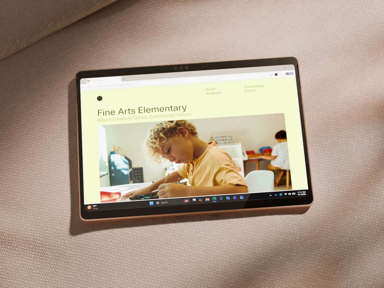
The premium laptop market has spent the last few years in a quiet but intense competition. Apple keeps raising the performance ceiling with each new M-series chip, and Windows-on-Arm devices have been working to close that gap one generation at a time. The question for most buyers has stopped being which platform is faster on paper and started being which one actually earns the asking price when you sit down to use it.
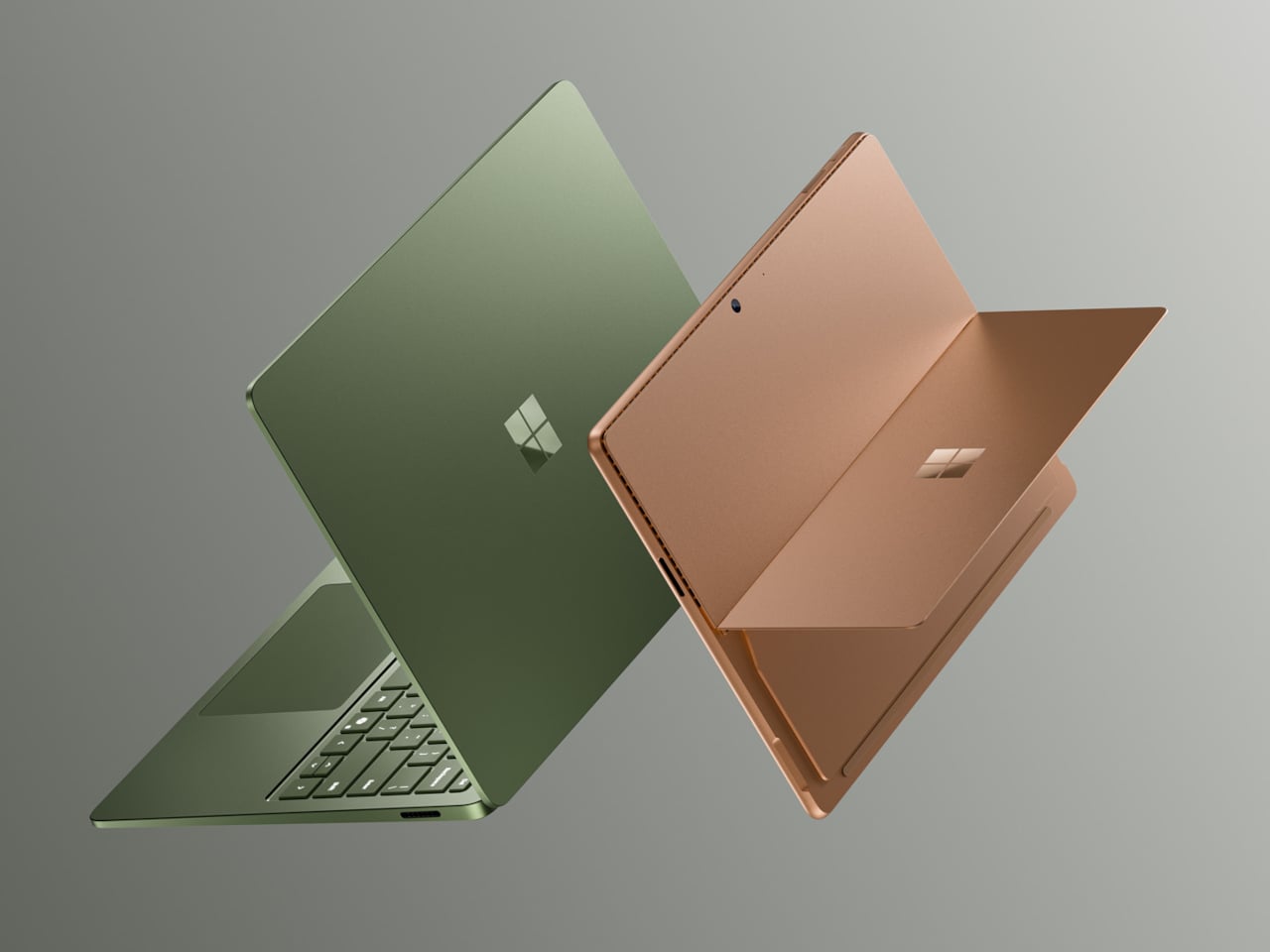
The Surface Pro 12 and Surface Laptop 8 are Microsoft’s answer, both powered by Snapdragon X2 processors and coming with more performance, longer endurance, and more refined hardware than the generation before. They’ve also gone up significantly in price, starting well above where their 2024 predecessors landed, making these among the most expensive consumer Surface devices Microsoft has put out in the lineup’s 13-year history.
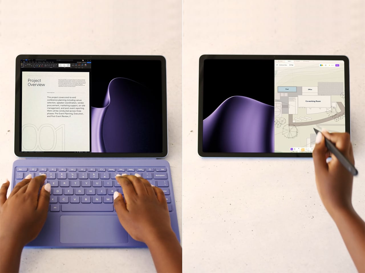
The Surface Pro 12 packs a 13-inch OLED PixelSense Flow display at 2880×1920 resolution, with a 120Hz dynamic refresh rate, 600 nits in SDR, and 900 nits at peak HDR brightness. Dolby Vision IQ is supported, and the panel is individually color-calibrated. It’s configured with either the Snapdragon X2 Plus or the X2 Elite, with up to 64GB of LPDDR5x RAM and a 1TB removable Gen 4 SSD.
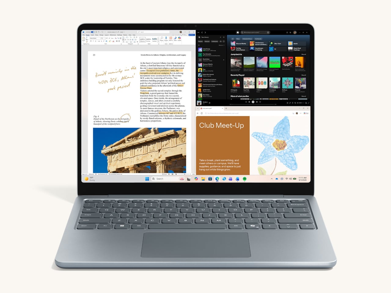
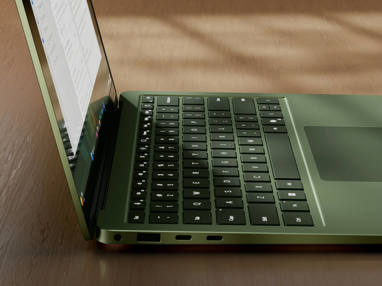
The Surface Laptop 8 comes in 13.8-inch and 15-inch sizes, with the 15-inch getting the more notable display upgrade. That model gains a 262 PPI screen at 3,270×2,180 with Dolby Vision IQ and 600 nits in both SDR and HDR modes. The 13.8-inch arrives in a new Jade colorway and earned the top spot in DXOMARK’s integrated laptop webcam rankings. Both Laptop sizes gain a new haptic trackpad.
Both devices run on Qualcomm’s Snapdragon X2 chip family, delivering 80 TOPS of AI processing through the Hexagon NPU. On the Laptop, graphics performance is up by as much as 58% over the previous generation based on Microsoft’s 3DMark testing. Battery life reaches up to 20 hours on the 13.8-inch Laptop and 19 hours on the 15-inch, while the Surface Pro 12 is rated at 15.5 hours.
The price increases are hard to miss. The Surface Pro 12 starts at $1,499 and the Surface Laptop 8 at $1,599, which are $500 and $600 more, respectively, than what those lineups cost when they launched in 2024. The higher cost is largely tied to rising component prices driven by AI hardware demand, which has pushed up what it takes to build premium Arm-based PCs at this tier.
Both devices now offer a 24GB RAM option that didn’t exist on the previous generation, filling the gap between 16GB and 32GB for users who find the former too limiting but don’t want to jump all the way up. Storage on the Laptop scales up to 2TB, and all drives across both devices are removable PCIe Gen 4 SSDs, which is a meaningful detail at this price point.
To soften the sticker shock a bit, Microsoft is bundling a free Surface Pro Keyboard with Pro purchases made before June 30, while Laptop buyers get a free Arc Mouse and 50% off Microsoft Complete. Trade-in credits of up to $900 are also available for those looking to swap out an older device. Both are on sale now for consumers, with Surface for Business variants shipping on July 14.