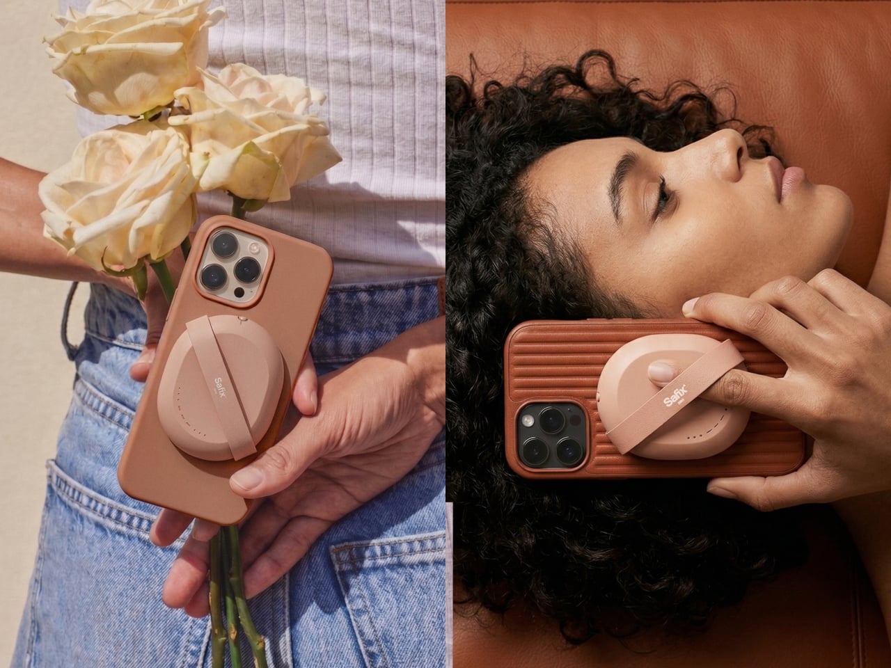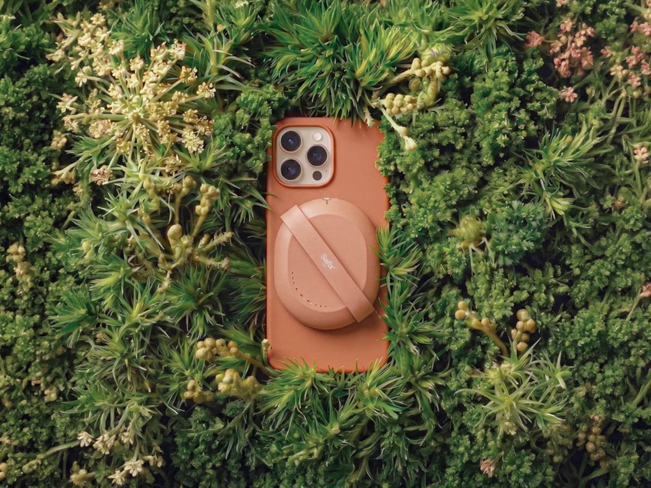
MagSafe Breadboard Turns Your iPhone Into a Circuit Prototyping Lab

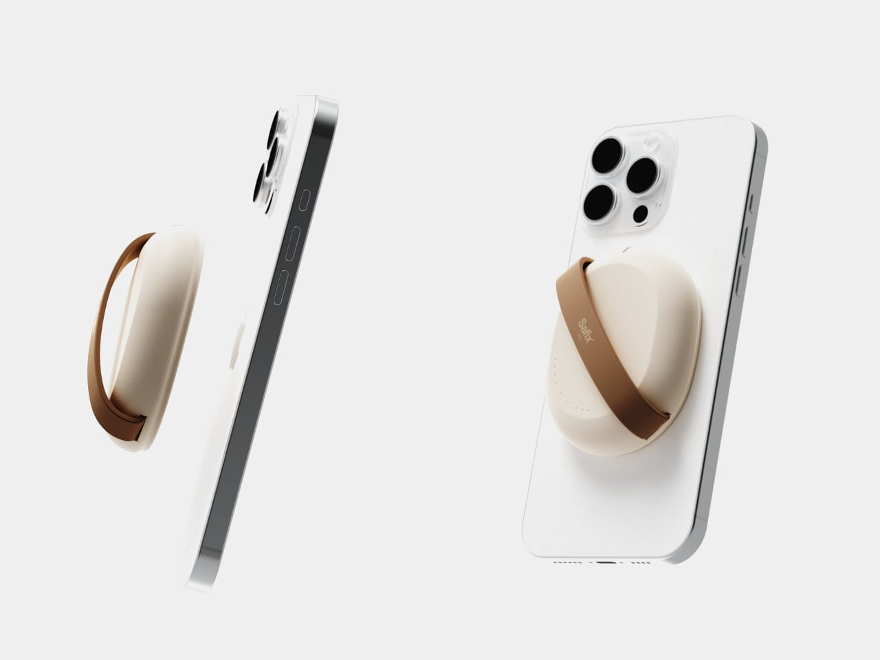
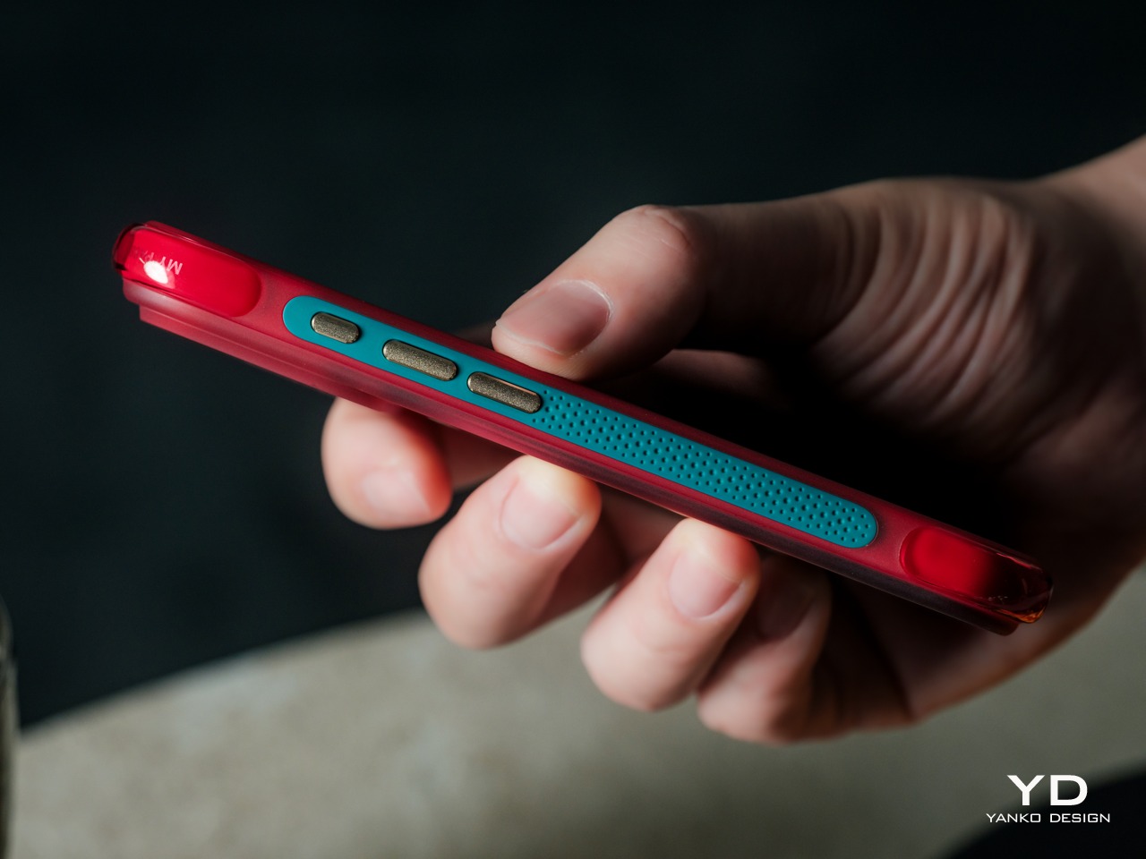
Show me another MagSafe breadboard. I’ll wait. Kevin Yang’s Commi Board is the only one, and that alone tells you something about how design students occasionally see opportunities that entire industries miss. The engineering is smarter than it looks: instead of embedding a full microcontroller and battery into a phone accessory, Yang uses GPIO communication to let your smartphone handle the processing. Your phone already has more power than an Arduino Mega, better connectivity than most dev boards, and a screen you actually want to look at. Commi Board just provides the physical interface for components and the software to make it work. You get four programming methods ranging from conversational AI to a proper IDE, real-time circuit validation, and a small display that shows execution status. Dimensions are tight: 62mm by 98mm when installed, with the board itself at 62mm by 82mm when detached.

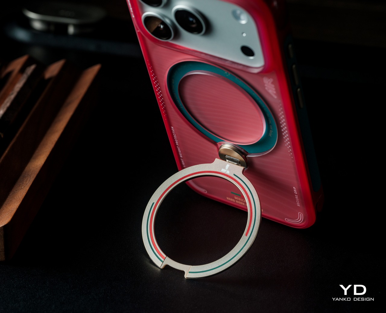
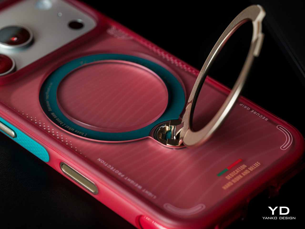
The color scheme gives strong Flipper Zero vibes, but there’s a key difference between that infamous pen-testing tool and this humble breadboard. Flipper wants to be everything: NFC reader, IR blaster, sub-GHz radio, GPIO interface, and more. Commi Board has a tighter scope and probably benefits from that focus. It’s specifically for prototyping circuits and validating code, not for pentesting your neighbor’s garage door. The modular design splits into the breadboard surface and a MagSafe mounting frame with that distinctive ring cutout for phone cameras. Everything connects through USB-C 3.2, BLE, or Bluetooth, and the cloud storage means you can start a project on your phone and pick it up later without dealing with local file management. Yang has a working theoretical PCB prototype with tested connectivity, though the full API integration is still in mockup phase. For a student project that started in June 2024, this is surprisingly far along.

Designer: Kevin Yang

Most IoT hardware tries to do everything and ends up mediocre at all of it. You get a device with its own processor, battery, screen, and connectivity stack, essentially rebuilding a worse version of the phone already in your pocket. Yang went the opposite direction. Commi Board is parasitic by design, borrowing your phone’s computational power, display, internet connection, and power management. What remains is pure interface: holes for components, GPIO pins for communication, and minimal onboard electronics to translate between physical circuits and software. This approach means lower weight, cheaper manufacturing, and no battery degradation to worry about in three years. After 3 years, swap your phone, but continue your tinkering. Sounds almost revolutionary, no?

You can tell Yang actually built and tested this thing because of how the modular split works. Sometimes you want the board magnetically stuck to your phone for portable testing. Other times you need it detached because your circuit blocks the camera or needs more space to breathe. The MagSafe frame has that circular cutout positioned exactly where iPhone camera arrays sit, which matters more than it sounds. Misalign that by a few millimeters and the magnetic connection feels sketchy. The orange border serves double duty as brand identity and a visual indicator of where the two pieces separate. Good industrial design makes functional divisions obvious without needing instruction manuals, and this pulls it off cleanly.

Four programming methods cover a wide range of experience levels, from ‘never touched circuitry in my life’ to ‘I ship builds and hardware for a living.’ Beginners can type “make an LED blink every second” and watch AI spit out working code. That builds intuition about syntax without requiring fluency first, which is how people actually learn instead of how computer science departments think they should learn. Visual block programming handles the intermediate phase where you understand logic flow but typing semicolons still feels unnatural. Puzzle-piece interfaces work surprisingly well for teaching conditionals because the physical constraints mirror logical ones. Then there’s the full IDE for anyone comfortable with text editors or shipping actual products. Most educational platforms force you to switch ecosystems as you level up, losing all your previous projects in the migration. This keeps you on the same hardware using the same project files, just changing how you communicate with the circuits.

Yang claims GPIO communication lets the phone simulate most microcontrollers, which holds up for Arduino-class applications but gets questionable under pressure. Smartphones have absurd amounts of raw compute, but they run full operating systems with schedulers and background processes that introduce latency. Blinking LEDs and reading sensors? Totally fine. Tight timing loops or bit-banging niche protocols? You’ll probably hit walls. The spec sheet lists USB-C 3.2 alongside Bluetooth and BLE, which tells me Yang ran into exactly these problems during development. USB-C handles the demanding stuff while Bluetooth covers casual wireless control. That’s the kind of tiered connectivity you see from someone who tested their assumptions and had to architect around reality.

And the Commi Board comes with cloud storage too, allowing you to save your projects/builds/experiments in a secure place that isn’t bound to your phone. Imagine the alternative – you get inspired, start wiring something up, then life happens and three weeks later you can’t remember which transistor you needed or where you saved that working code. Friction kills momentum harder than technical difficulty does. Being able to pull up a half-finished project on your phone while standing in a component aisle trying to remember your parts list solves a real problem. The project-sharing community is obviously coming next, which transforms this from a standalone product into a platform. If Yang opens the API properly for third-party development, this could turn into something way bigger than a thesis project. Right now there’s a working PCB prototype with tested connectivity, which means the core tech functions. Let’s hope Yang gets to a point where he can take this to a startup level, or even crowdfunding. I know I’d have my money ready.

The post MagSafe Breadboard Turns Your iPhone Into a Circuit Prototyping Lab first appeared on Yanko Design.
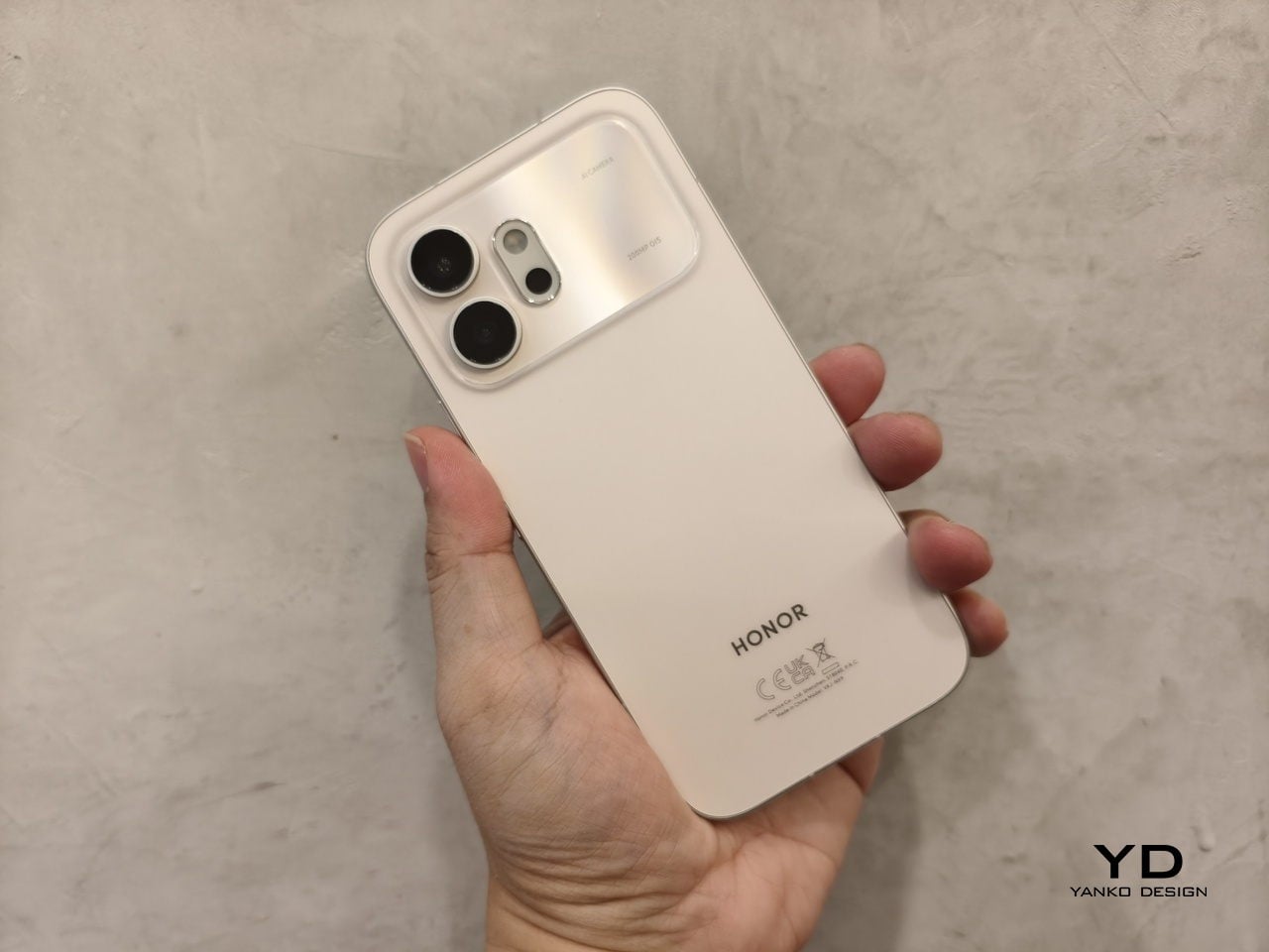
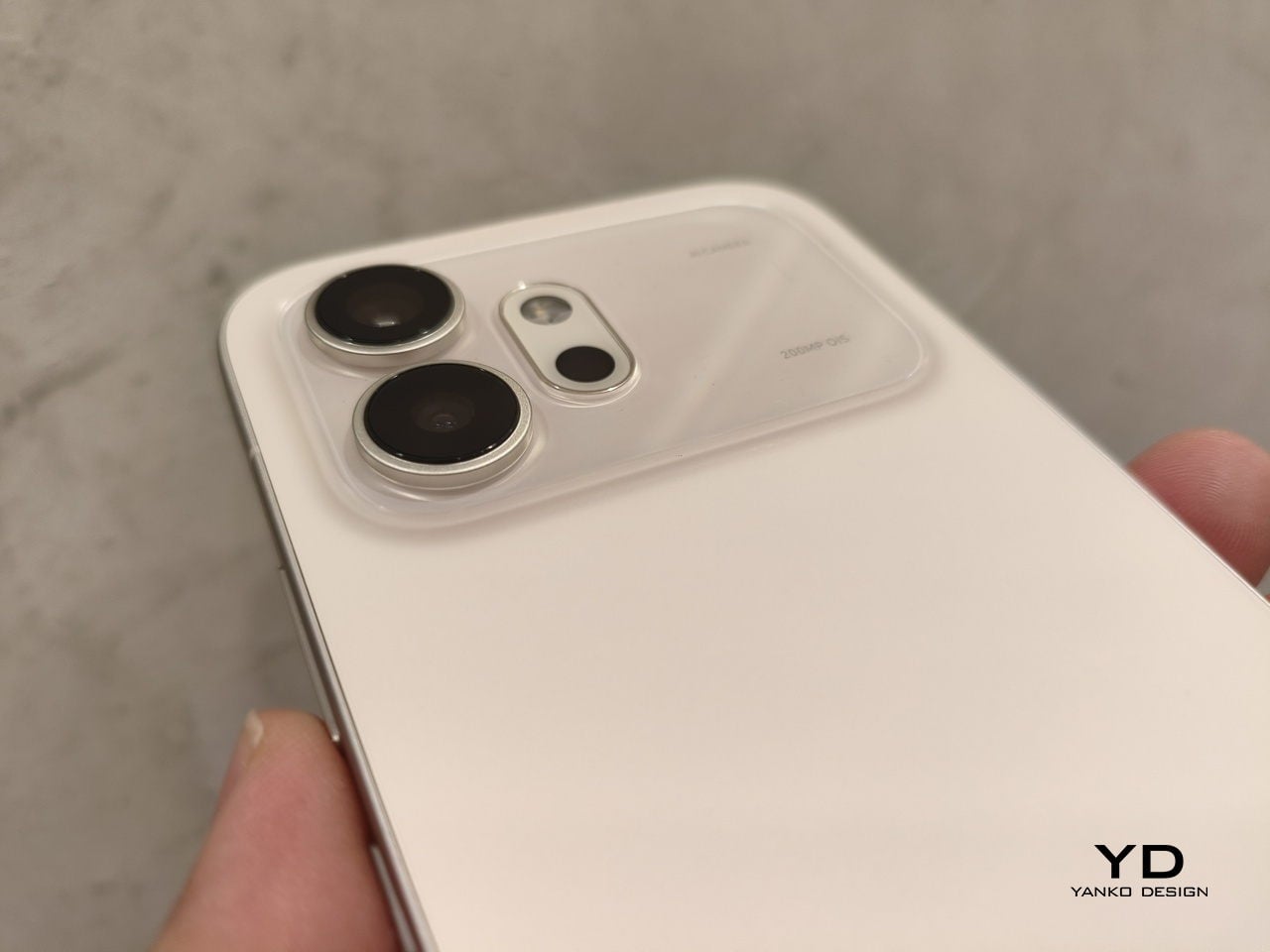
Huawei’s Dubai Trio: A Foldable That Disappears, Earbuds That Double Down, and a Router Disguised as a Mountain

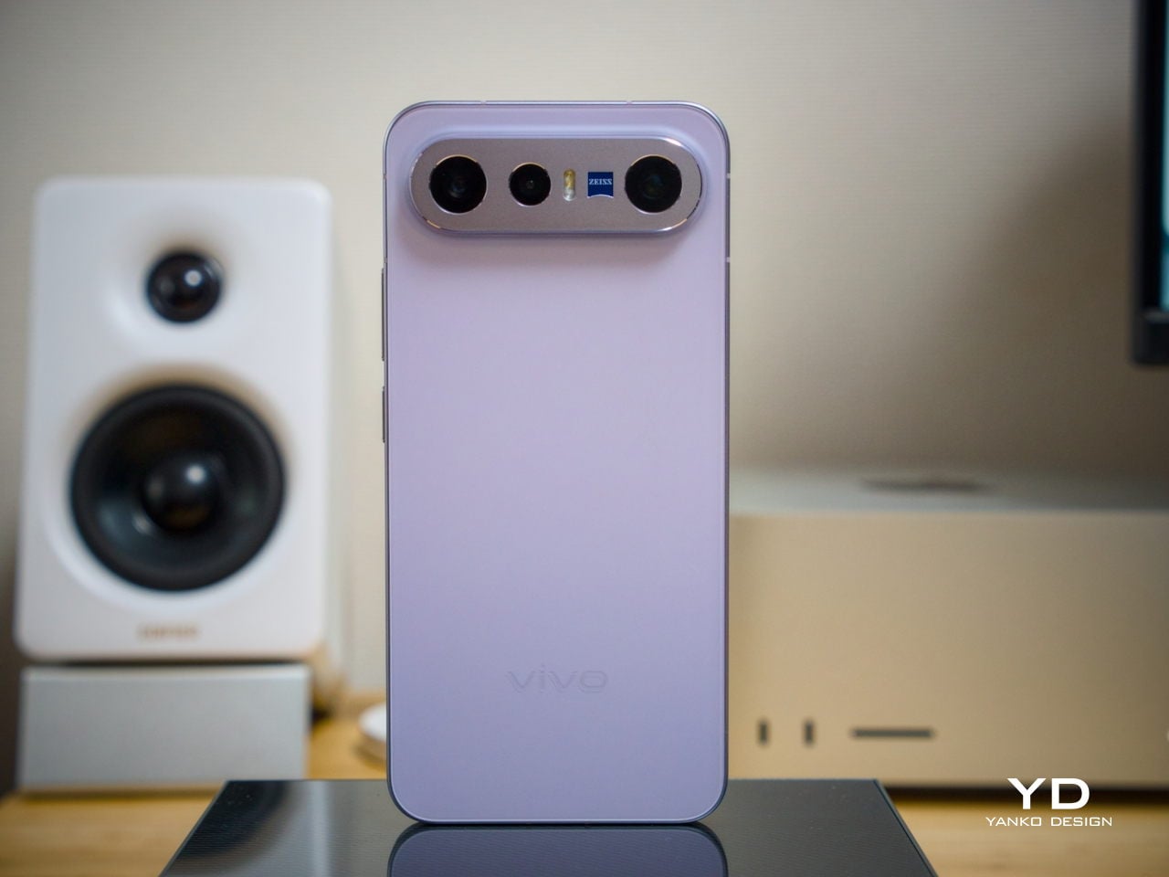
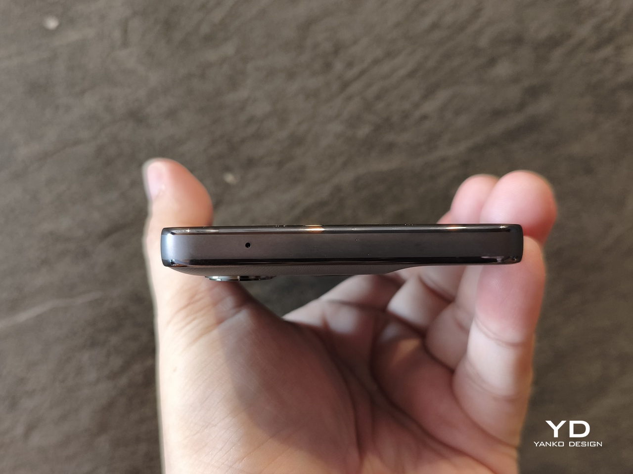
Five years into the foldable smartphone experiment, thinness remains the singular obsession. Huawei just crossed a threshold that reframes the conversation. The Mate X7, unveiled today at the company’s Dubai global launch alongside the FreeClip 2 earbuds and a Wi-Fi 7 mesh router, measures 4.5mm when unfolded. That figure matters less as specification than as experience: the fold becomes incidental to use rather than the defining characteristic of handling.

The Mate X7: Engineering the Fold Away

Huawei traces its foldable lineage to 2019, positioning itself as the category’s original commercializer. Six generations later, the design philosophy has crystallized into something specific and unambiguous: make the fold invisible to daily interaction. Quad-curved edges. A 4.5mm unfolded profile. Under 10mm closed. These dimensions place the Mate X7 closer to conventional smartphone territory than any previous book-style foldable has achieved. The engineering ambition centers not on what the fold enables, but on eliminating what the fold disrupts.

Where previous generations housed cameras in circular modules, the Time-Space Portal introduces flat edges to the protrusion. Huawei weaves between 900 and 1,700 threads into the finish, creating a textile-like visual texture that catches light across micro-patterns. This thread-woven treatment ships exclusively in China. Global variants arrive in standard colorways. The material strategy treats the camera bump as design opportunity rather than engineering compromise, an approach that signals continued investment in tactile differentiation where competitors minimize and apologize.

Both displays run at 2.4K resolution. Adaptive refresh spans 1Hz to 120Hz. The outer screen peaks at 3,000 nits while the inner reaches 2,500 nits, and high-frequency PWM dimming addresses the eye strain concerns that have plagued OLED panels since their adoption. These specifications alone would be unremarkable in any conventional flagship. Achieving them across two flexible panels within a 4.5mm envelope represents the actual engineering story, the quiet difficulty hidden beneath familiar numbers.

Durability targets the foldable’s historical weakness with measurable aggression. Drop resistance improved 100% over the previous generation according to Huawei’s internal testing. Impact resistance matched that improvement. The outer glass uses second-generation crystal armor technology. The inner screen employs a three-layer composite structure including a non-Newtonian fluid layer, material that increases rigidity under sudden impact pressure while remaining flexible during normal operation. Hinge redesign contributes over 100% improvement in bend resistance. IP59 certification covers high-temperature and water-jet resistance when open, with IP8 rating when the device closes.

Camera architecture compresses flagship-grade optics into 26% less volume than equivalent modules. A 50MP main sensor pairs with variable mechanical aperture reaching f/1.49. The 50MP telephoto deploys a vertical periscope structure, a first for the foldable category, achieving 3.5x optical zoom within constrained depth. Light intake improved 127% through these spatial optimizations. Second-generation ultrachroma sensors handle color science while LOPIC technology extends dynamic range for stills and video alike.

Battery capacity reaches 5,300mAh for global markets. The Chinese variant ships at 5,600mAh, the difference attributed to European import regulations that cap certain cell chemistries. Wired charging supports 66W. Wireless reaches 50W. Thermal management relies on an 18% larger vapor chamber paired with graphene-based loop dissipation. Additional antennas distributed around the device edges address connectivity challenges arising when folding reorients internal components relative to cell towers and Wi-Fi access points.

Wi-Fi 7 Mesh: Infrastructure as Object

Router design typically optimizes for invisibility. Mesh systems tuck behind furniture or blend into wall-mounted anonymity. Huawei inverts this assumption entirely. The main unit mimics a mountain range enclosed within a transparent dome. Extender units feature indirect lighting resembling whisky glasses set on a shelf. Touch controls on each surface adjust lighting modes and network settings. The design explicitly treats network infrastructure as decorative object rather than functional necessity demanding concealment.

Technical specifications support the visual ambition without contradiction. Wi-Fi 7 operates with six antennas, three at 2.4GHz frequency. 4K SQAM and Multilink Operation enable simultaneous connections across frequency bands for devices supporting the standard. The main router includes active cooling via internal fan for sustained high-throughput scenarios. Up to two extenders pair with each base unit.

This approach acknowledges domestic reality: mesh routers occupy visible positions in living spaces. Huawei treats that visibility as opportunity for intentional form rather than problem requiring solution.

FreeClip 2: Iteration on a Proven Form

Three million first-generation FreeClip units shipped, establishing category viability that justifies continued investment. Open-ear designs occupy a specific niche: awareness of surroundings traded against audio immersion. The sequel addresses the original’s primary limitations through incremental refinement. Weight dropped 9% to 4.1 grams per earbud. Case dimensions shrank 11% while narrowing 17%. The redesigned Seabridge improves comfort across extended wear sessions where the previous generation began to fatigue.

Dual 11mm diaphragms share a single magnetic circuit, an engineering choice that doubles bass output compared to the previous generation while reducing acoustic ball size by 11%. The architecture trades spatial efficiency for low-frequency presence that open-ear designs historically lacked. Battery life extends to 9 hours per earbud and 38 hours total with case, improvements of one and two hours respectively. IP57 certifies the earbuds while the case carries IP54.

For deeper examination of the FreeClip 2’s material execution and acoustic performance, my full review covers the dual-diaphragm engineering and comfort improvements in detail.

Automatic left/right detection, swipe volume controls, and head gesture support complete the interaction model. Huawei Audio Connect supports iOS and Samsung devices, with no Google Play availability announced. Color options span Denim Blue, Feather Sand White, Modern Black, and Rose Gold.

Market Position

Global launch proceeds December 11, 2025 from Dubai. Pricing remains unannounced. Product configuration suggests premium positioning matching or exceeding the previous generation’s placement.

For the foldable category broadly, the Mate X7’s dimensional achievements demonstrate that thinness progression continues regardless of engineering complexity. The mesh router and FreeClip 2 complete an ecosystem play: smartphone, audio, and home networking under unified design language. Huawei signals capability breadth alongside flagship ambition, using Dubai as statement of global market re-entry after years of constraint.

The post Huawei’s Dubai Trio: A Foldable That Disappears, Earbuds That Double Down, and a Router Disguised as a Mountain first appeared on Yanko Design.
AYANEO Pocket PLAY Brings Back the Slider Phone, Now With D-Pad

AYANEO is known for gaming handheld devices that run Windows and, sometimes, Android, but not phones. Most gaming phones still feel like regular slabs with RGB lights and higher refresh rates, treating games as an app category instead of the reason the device exists. Pocket PLAY is AYANEO’s first smartphone, and they are not shy about calling it “more than a phone,” framing it as a handheld console that happens to live on a SIM card instead of a desktop operating system.

AYANEO calls it “the ultimate fusion of mobile phone and gaming handheld,” built “in the name of games, made for the dreams of gamers.” The minimalist front follows golden-ratio proportions and AYANEO’s “handheld artistry” philosophy, looking like a clean black slab until you slide it open and the real personality appears. The idea is that it should not shout gamer aesthetic when you are checking email, only when you want to play.

Designer: AYANEO

The classic side-slide mechanism is a light push that reveals a full controller under the screen. Anyone who remembers Sony’s Xperia Play will feel a flicker of déjà vu, another Android phone that hid a gamepad under a slider. The difference is that Pocket PLAY arrives in a world where handheld gaming and emulation are mainstream, and AYANEO has spent years building hardware for that exact crowd, not for casual mobile gamers who might try it once.

Pocket PLAY reinterprets a standard gamepad layout in a compact way, with a D-pad, ABXY buttons, and shoulder controls tuned for the sliding mechanism. AYANEO promises crisp, light presses and fast response, and a grip shaped so your fingers land where you expect. The idea is that you slide, and you are instantly in handheld mode, no adaptation period or clip-on accessories. The D-pad and buttons are meant to bring back the pure, satisfying feel of classic handheld gaming.

The dual intelligent touchpads sit where analog sticks might go, and they can map virtual joysticks, act as traditional touch surfaces, or trigger custom input combinations. That opens up camera control, mouse-like input for streaming PC games, or macro shortcuts for complex titles. The positioning is ergonomic, and the goal is to make every swipe and tap feel natural, closing the gap between a dedicated handheld and a phone that also runs Genshin Impact or emulators.

AYANEO leans into “cyber-romanticism” language, calling handhelds a culture and a shared emotional language among players. Pocket PLAY is pitched as a tribute to classic designs and an exploration of how handheld spirit can extend to a new medium. It is meant to feel like a daily-carry extension of the devices people already use for emulation and retro gaming, not a generic Android gaming phone with triggers and marketing.

Xperia Play hinted at this form factor years ago, but the ecosystem and audience were not ready. Pocket PLAY picks up that thread with modern hardware, a serious controller, and a brand that already lives in handheld culture. For players who want a phone that slides into a console instead of just another slab with shoulder buttons, it feels like a very specific dream finally getting another shot, this time built by people who actually understand why sliders and D-pads still matter.

The post AYANEO Pocket PLAY Brings Back the Slider Phone, Now With D-Pad first appeared on Yanko Design.
This teal Nothing Phone 3a Community Edition looks like a Game Boy for grown‑ups

Nothing just pulled the curtain back on the Phone 3a Community Edition, a limited 1,000-unit drop built around a vibrant teal design inspired by late-90s gaming hardware. This special release is the result of a nine-month collaboration between Nothing’s internal teams and four winners from its community design project. The phone itself is a visual statement, swapping the brand’s typical monochrome palette for a look that feels more playful and expressive. It’s a collector’s piece for those who appreciate when a company lets its community take the wheel, resulting in a product that feels both nostalgic and distinctly modern.

Underneath the colorful new shell, the device carries internals identical to the standard Phone 3a. It is powered by a Snapdragon 7s Gen 3 chipset and features a 6.77-inch 120Hz AMOLED display with 2,160Hz PWM dimming for smooth visuals. The camera system includes a 50MP main sensor with OIS, a 50MP 2x telephoto lens, and an 8MP ultrawide. A 5,000mAh battery with 50W wired charging handles power. The single 12GB/256GB configuration is priced at £379, matching the top-tier regular model and reinforcing that this is a design-focused release, not a spec upgrade.

Designer: Emre Kayganacl

The aesthetic is where the Community Edition truly sets itself apart. The translucent teal back, designed by winner Emre Kayganacl, reveals internal components arranged as clean geometric layers. This gives the rear a deliberate, compositional quality rather than a raw, tech-exposed look. The horizontal camera module sits perfectly centered, with Nothing’s signature glyph light arcs wrapping around it to signal notifications. Small, scattered circles of yellow and magenta add playful contrast, giving the phone a character reminiscent of a limited-edition handheld console without feeling like a simple throwback.

This cohesive design language extends to the front of the phone. The software experience includes an exclusive teal-gradient wallpaper and a custom lock-screen clock designed by community winner Jad Zock. The rounded, monochrome icons of Nothing OS float above the colorful background, tying the user interface directly to the physical hardware. This thoughtful integration ensures the device feels like a single, unified object. It’s a complete visual package that considers how the phone looks both when the screen is on and off, creating a more holistic product experience.


The project began with over 700 submissions from Nothing’s community, with winners selected for hardware design, accessories, software visuals, and marketing. This co-creation process is central to the phone’s story, representing a deeper collaboration than the company’s first community project. For those hoping to get one, registration is open until December 11, with a limited sales window opening on December 12 through Nothing’s website. It’s a rare opportunity to own a device that is as much a design experiment as it is a daily driver.

The post This teal Nothing Phone 3a Community Edition looks like a Game Boy for grown‑ups first appeared on Yanko Design.
Xteink X4 is a wallet-sized eReader That Snaps Onto Your Phone

You buy a Kindle or Kobo, load it with books, then leave it on a nightstand while your phone follows you everywhere. Reading apps on phones compete with notifications and social feeds, so you end up doomscrolling instead of finishing that novel you downloaded. Xteink’s X4 tries to solve that by becoming a tiny, magnetic e‑ink sidekick that literally rides on the back of your phone, going wherever it goes.

The Xteink X4 is an ultra-thin magnetic back eReader with a 4.3-inch e‑ink screen and a footprint closer to a deck of cards than a tablet. At 114 by 69 by 5.9 millimeters and just 74 grams, it snaps onto MagSafe or Qi2 compatible phones, or onto any handset using the included adhesive magnetic ring, turning your phone into a dual-screen reading machine without much extra bulk.

Designer: Xteink

The 220 ppi e‑ink display is not as sharp as a Paperwhite, but it is perfectly fine for text at this size. There is no touchscreen and no frontlight, just physical page turn buttons and a power key, so it behaves more like a tiny paperback than a gadget. You need ambient light to read, but in return, you get a very focused, distraction-free surface that does not glow or buzz at you.

The internals are minimal: an ESP32 processor, 128 megabytes of RAM, and a bundled 32GB microSD card with support up to 512GB. The 650mAh battery lasts up to fourteen days with one to three hours of reading per day. It charges over USB-C and connects via 2.4GHz Wi‑Fi and Bluetooth for file transfers, so you can grab books wirelessly or just swap the microSD card.

The X4 only supports EPUB and TXT for documents, plus JPG and BMP for images, and does not run third-party apps or connect to any bookstore. You sideload everything, either over Wi‑Fi or by copying files to the card. For people tied to Kindle or Google Play, this is a hurdle, but for readers with DRM-free libraries, it feels refreshingly simple and vendor-neutral, just you and your files.

Xteink markets it as “More Than a Reader,” suggesting you use the X4 as a digital business card, a tiny calendar, a film production workflow board, or a reference screen for notes and checklists. Because it displays static images and text, it doubles as a little always-on panel you can stick to a monitor, fridge, or phone, not just a book page. The magnetic back makes those experiments feel natural and reversible.

The X4 is really for minimalists, tinkerers, and people who like the idea of a dedicated reading screen that goes everywhere their phone does. It is quirky, with no light, no touch, and no store, but those constraints are the point. It is a tiny reminder to read instead of scroll, thin enough to forget until you need a page instead of a feed, and cheap enough at $69 that the experiment feels worth trying even if you already own a proper eReader gathering dust at home.

The post Xteink X4 is a wallet-sized eReader That Snaps Onto Your Phone first appeared on Yanko Design.
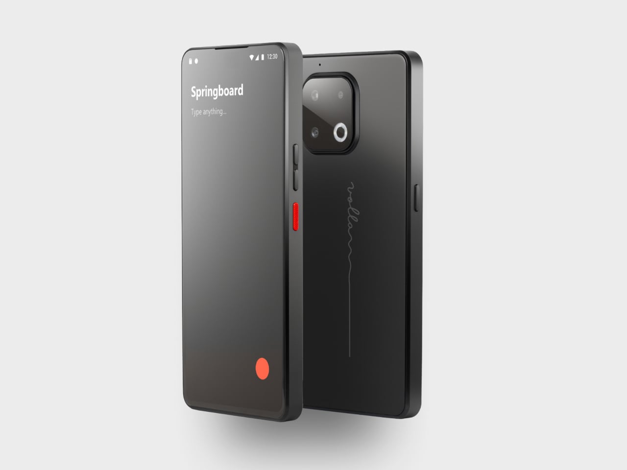
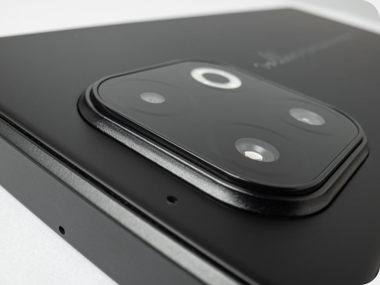
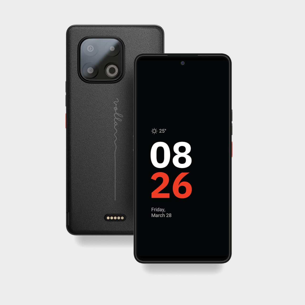
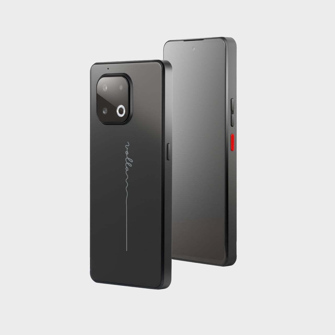
Jolla Phone Returns with a Physical Switch to Cut Off Mics and Tracking

The mobile OS graveyard is crowded. Symbian, MeeGo, Firefox OS, Windows Phone, all killed by iOS and Android’s duopoly. Most people quietly accepted that those two won and moved on. Jolla started from Nokia’s MeeGo ashes in 2013, shipped the original Jolla Phone, and somehow kept Sailfish OS alive for twelve years in the wilderness. The new Jolla Phone feels less like a comeback and more like a refusal to die.

Jolla frames it as Europe’s independent smartphone, a 5G Sailfish OS 5 device built around the pitch that every Android and iPhone phones home to California. The announcement post says this is about digital sovereignty and choice rather than nationalism, but the subtext is clear: Europe needs its own mobile platform, or it stays perpetually dependent on US and China infrastructure. It is a Linux phone you are meant to daily drive, not a dev kit or novelty.

Designer: Jolla

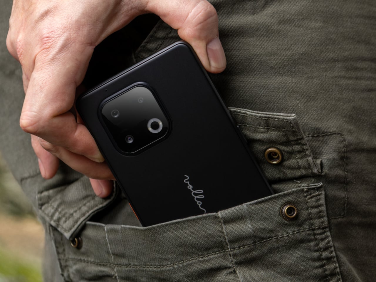
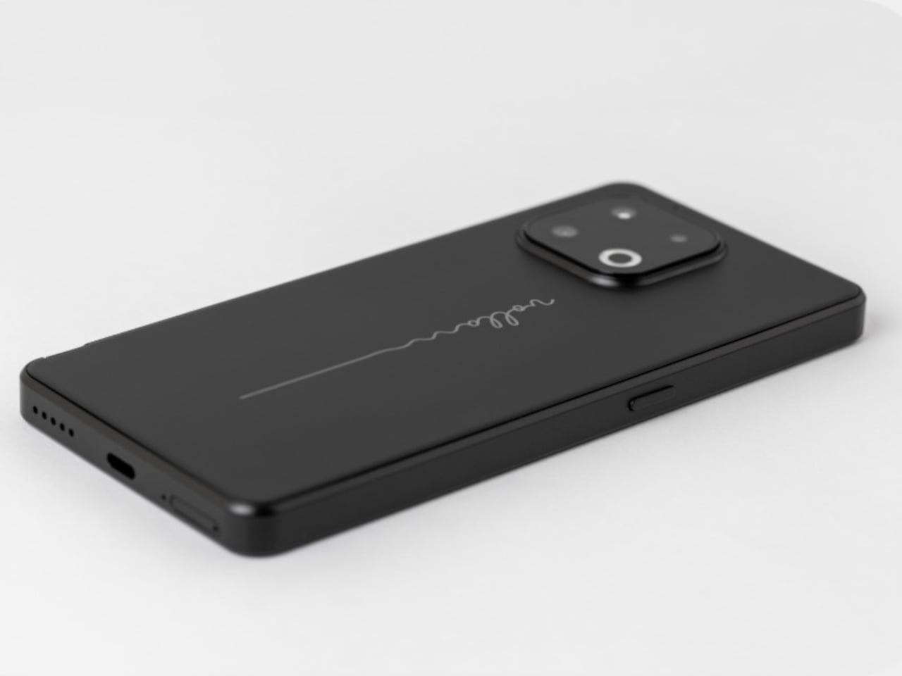
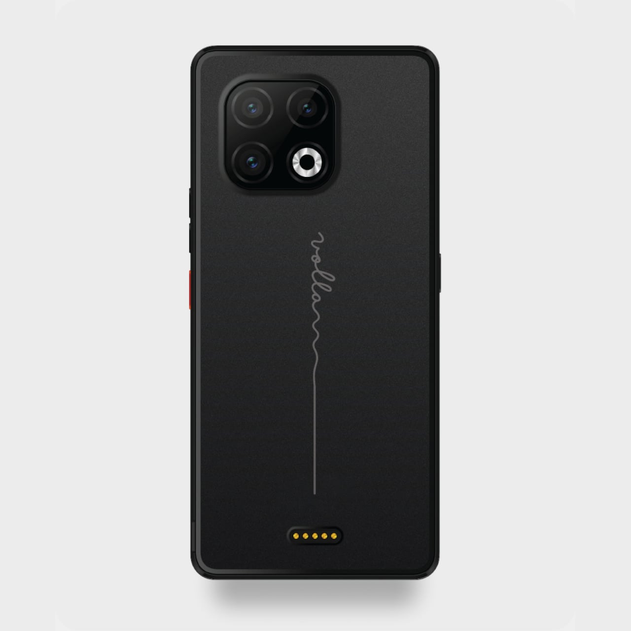
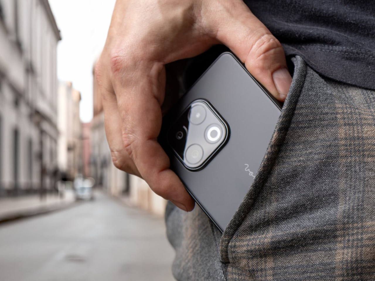
The core specs sit in upper mid-range territory. A 6.36-inch FullHD AMOLED screen, a Mediatek 5G platform, 12GB of RAM, 256GB of storage with microSD expansion up to two terabytes, dual SIM, and a 5,500 mAh battery. The flat-sided Scandinavian design offers replaceable back covers in Snow White, Kaamos Black, and The Orange, a nod to the original Jolla’s signature color. It includes a side fingerprint reader and an RGB notification LED.

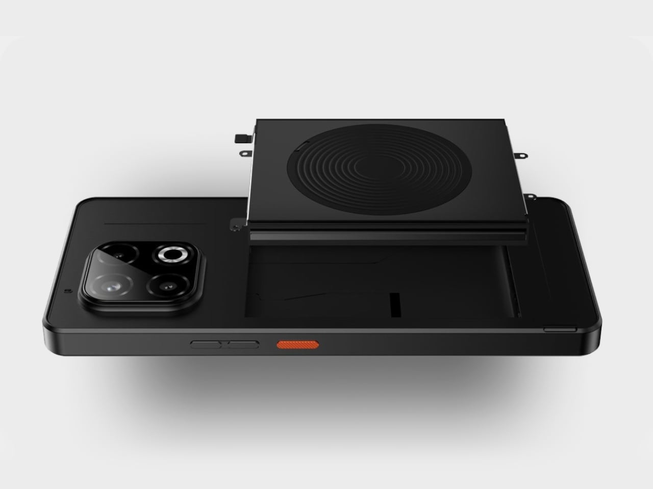
The privacy hardware choices feel almost retro. A physical privacy switch can be configured to cut off the mic, Bluetooth, Android apps, or other subsystems. The battery and back cover are user-replaceable, which feels unusual in a world of sealed slabs. Those choices align with the idea of owning your device instead of renting it, and they support Sailfish OS’s pitch as “private by design,” with no tracking or hidden analytics happening in the background.

Sailfish OS 5 is a Linux-based, gesture-heavy mobile OS that Jolla promises will get at least five years of updates without forced obsolescence. App ecosystems matter, so the phone includes Android app support via Jolla AppSupport, without Google Play Services. That means many Android apps will run, but you are not feeding data into Google’s backend every time you unlock your phone or letting services siphon usage patterns while sitting idle.

The funding model is a 99 euro fully refundable pre-order voucher toward a 499 euro final price, with production only happening if at least two thousand units are reserved. The community voted on key specs and features, and the campaign already passed its goal. The phone becomes a Do It Together project where early adopters literally decide whether it exists, and pre-order customers get a special edition back cover as a thank you.

The new Jolla Phone represents a rare, stubbornly optimistic alternative in a market that settled on two platforms years ago. It will not replace iOS or Android for most people, and there are risks around timelines and app compatibility. But for anyone who wants a phone that treats privacy, longevity, and independence as design constraints instead of afterthoughts, Jolla’s return feels like proof that small, opinionated hardware can still find oxygen if the community wants it badly enough.

The post Jolla Phone Returns with a Physical Switch to Cut Off Mics and Tracking first appeared on Yanko Design.
Sandmarc Lens Gives iPhone 17 Pro 16x Optical Zoom, No Digital Tricks

iPhone zoom has improved, especially with the 17 Pro’s tetraprism, but anything past 5x still leans heavily on digital tricks. Distant concert shots look like watercolor paintings, city skyline details collapse into mush when you pinch to zoom. If you actually care about long lenses, you usually end up carrying a separate camera and a chunky telephoto, which defeats the point of traveling light in the first place.

Sandmarc’s Telephoto Tetraprism Lens offers a different approach. It is a 48mm 2x optical telephoto that mounts directly over the 17 Pro’s 5x tetraprism camera, giving you up to 16x reach, roughly a 384mm equivalent. Real glass does the work instead of software interpolation. It is built specifically for Apple’s tetraprism module, not a generic clip on trying to cover all three lenses poorly.

Designer: Sandmarc

The lens is a multi element, multi coated cylinder weighing about 250 grams, closer to a compact mirrorless lens than a toy. The field of view narrows to 16.7 degrees, which gives you tight framing and real telephoto compression, the kind that pulls distant mountains closer or stacks city buildings into dense layers. The front element sits deep inside a metal barrel with blue anti reflection coating, machined rather than molded.

Where it shines is shooting where you physically cannot move closer. Standing on a ridge pulling in a faraway peak, shooting street portraits from across the road, grabbing architectural details from stadium seats without leaning on digital zoom that turns textures into paste. The lens only works with the 5x module, so you need a pro camera app to force the phone onto that sensor, but once dialed in, results look more like a small camera than a phone.

The front of the lens is threaded for Sandmarc’s own filters, so you can snap on an ND, polarizer, or diffusion filter just like you would on a regular camera. That opens up long exposures, glare control, and more cinematic looks. The included Ultra Slim case handles alignment and mounting without fiddling with clips, though it does mean swapping out whatever case you normally use when you want the lens attached.

The trade offs are real. The lens adds bulk and weight, only works with the 17 Pro and Pro Max tetraprism camera, needs Sandmarc’s case, and really wants a third party camera app. It is not something you leave on all day. It is the piece of kit you pack when you will be chasing distant subjects and want something better than cropped pixels, accepting your phone will feel like a small camera for a few hours.

Accessories like this make the iPhone feel less like a sealed black box and more like a modular camera system. For people who already think in focal lengths and filters, the Sandmarc Telephoto Tetraprism Lens turns the 17 Pro into a capable long lens rig, without asking you to give up having your main camera still live in your pocket when you are done shooting and need to check email or navigate to the next location.

The post Sandmarc Lens Gives iPhone 17 Pro 16x Optical Zoom, No Digital Tricks first appeared on Yanko Design.
Motorola Edge 70 Accents Pantone’s 2026 Color with Swarovski Studs

Pantone’s Color of the Year 2026, Cloud Dancer, arrived with a thesis that we are all collectively tired and need visual relief from the chaos. The soft, lofty white was pitched as clarity over clutter and presence over pressure, a quiet protest against hyper saturated everything, including the phones buzzing in our pockets. It felt less like a trend forecast and more like a group therapy session disguised as a paint chip.

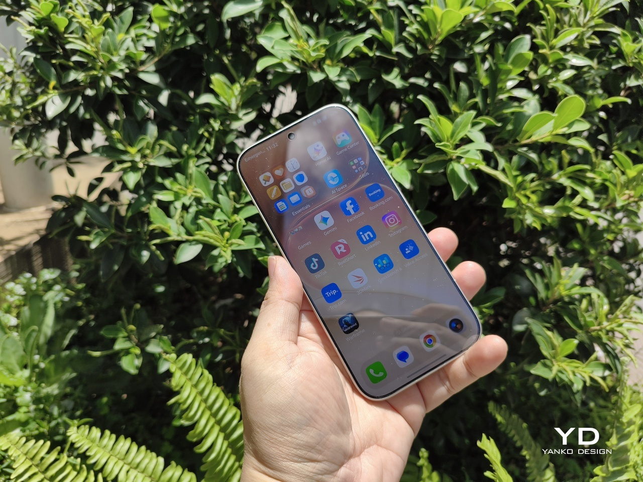
Motorola took that color story seriously. The Edge 70 special edition wraps Cloud Dancer around its thinnest chassis yet, embellished with crystals by Swarovski, continuing the design run that started with the Razr Brilliant Collection earlier this year. Where the Razr leaned extroverted and fashion forward, the Edge 70 Cloud Dancer edition feels like its quieter sibling, still sparkling but content to sit on a nightstand without demanding constant attention or Instagram documentation.
Designer: Motorola

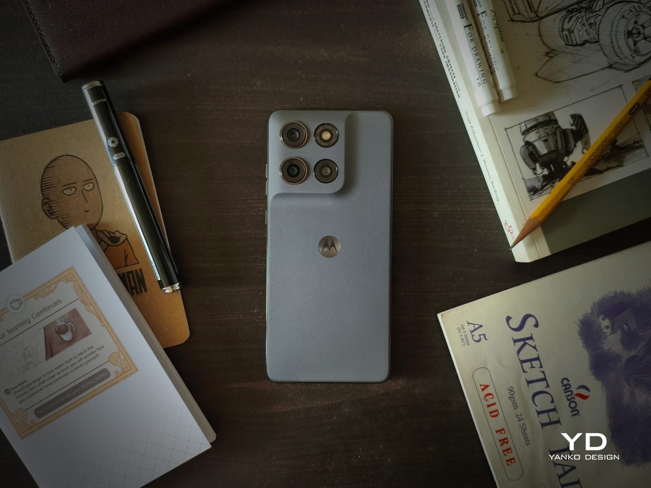
Cloud Dancer, officially Pantone 11-4201, lands on the Edge 70 as a leather inspired, quilted back that reads more like a minimal clutch than a piece of consumer electronics. The finish has a silk like sheen that shifts slightly in light, soft enough to avoid sterility but restrained enough to avoid looking like a frosted cupcake. Motorola calls it an object of clarity and quiet confidence, which fits the brief so precisely it almost sounds rehearsed.
Crystals by Swarovski are embedded into the quilted back, small enough to catch light without shouting for attention. The Brilliant Collection, which debuted with the Razr a few months ago, focuses on meticulous craftsmanship and timeless luxury, treating phones like accessories that happen to also make calls. Here, the crystals feel less like decoration and more like strategic punctuation marks on an otherwise very calm sentence, little flickers that keep the white from feeling too monastic.
Underneath sits the regular Edge 70 hardware, Snapdragon 7 Gen 4, dual 50 megapixel cameras, a bright display, and moto ai that adapts quietly. Motorola emphasizes that the device is the thinnest in its category, hedged by footnotes about regional price bands but still impressive for something packing a 4800 milliamp hour battery and full day reliability without feeling fragile in the hand.

The approach contrasts with the usual luxury phone playbook, which tends toward loud colors, heavy logos, or aggressive patterns that scream performance. Cloud Dancer is almost the opposite, a discrete white Pantone describes as conscious simplification. The quilting and crystals prevent it from becoming sterile, but the overall vibe lands somewhere between spa robe and gallery wall, an unusual place for a smartphone to occupy.

Motorola seems intent on building a design ecosystem where color forecasting and material craft matter as much as chipsets. The Razr Brilliant Collection introduced Swarovski, and now the Edge 70 ties that to Pantone’s annual ritual. We live in a world where most phones blur into identical black rectangles, so a calm white device with a quilted back and a handful of crystals starts to feel surprisingly memorable, even if memorable was never the point.

The post Motorola Edge 70 Accents Pantone’s 2026 Color with Swarovski Studs first appeared on Yanko Design.