The Corner 99.5% of Wardrobes Ignore Finally Has a Rack for It

The wardrobe is one of those household objects that seems like it has plenty of room until it doesn’t. Most people eventually find themselves pushing hangers aside to make space, folding things into corners, and stacking items on whatever flat surface presents itself. Organization accessories exist in abundance, but the majority address the visible problem rather than the structural one.

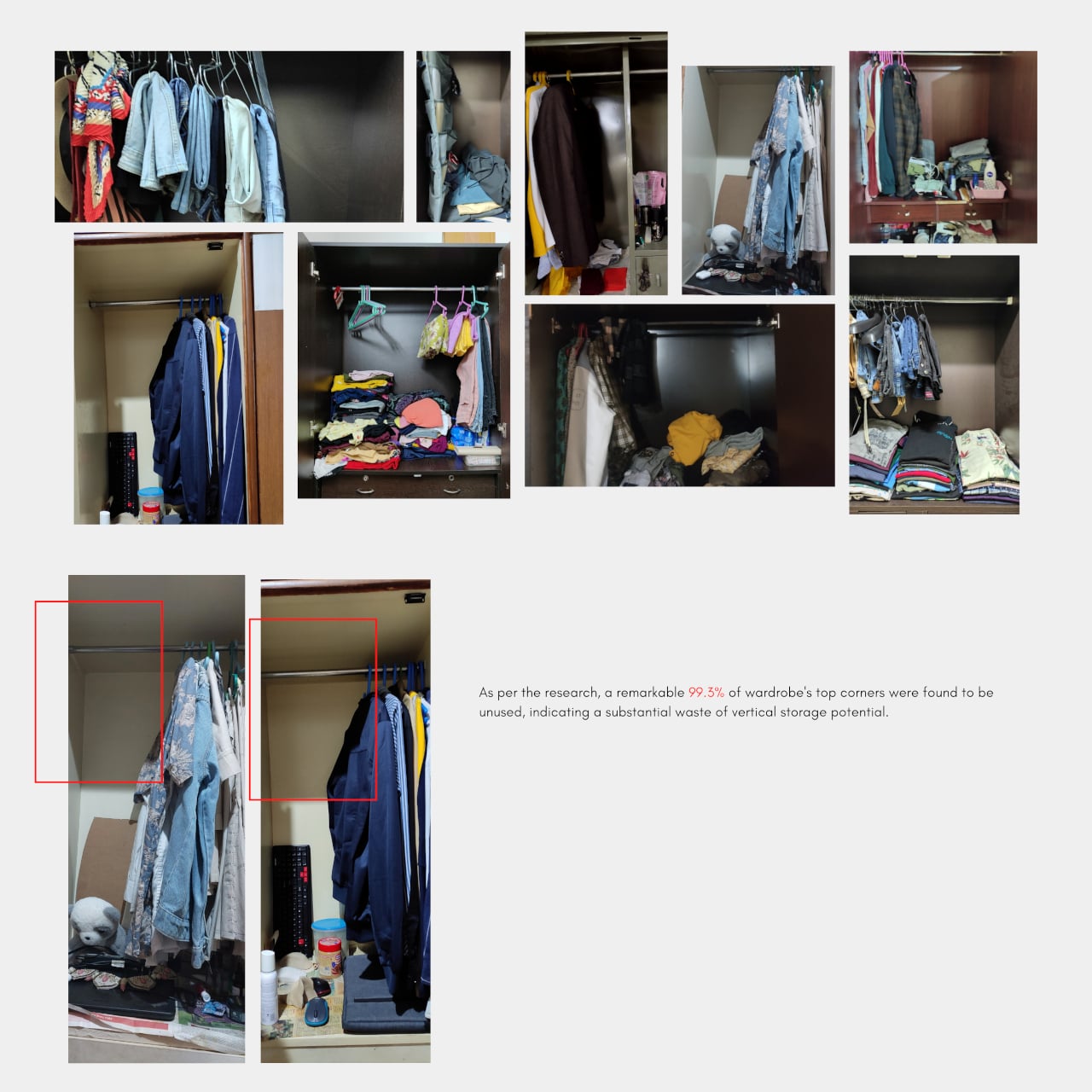
A user survey of more than 50 real wardrobes found that 99.5% of the top corners went entirely unused, prime vertical real estate that no hanging rod reaches, and no standard shelf fits. That specific insight became the starting point for CONCEPT II, a wardrobe rack designed not for the existing infrastructure of the wardrobe but for the part most people have simply given up on.

Designer: Arnav Ashwin

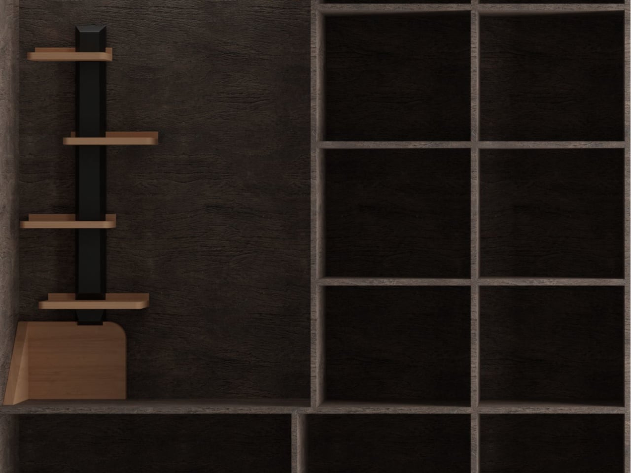
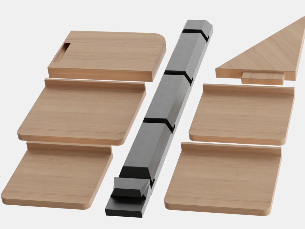
A single vertical post in a dark finish anchors the rack, with a series of wooden shelf slabs attached at staggered heights and alternating sides. The shelves vary in size, with the largest at the bottom and progressively smaller ones rising toward the top, giving the whole structure a stepped, almost branching silhouette that takes up almost no floor footprint while climbing the otherwise empty height of the corner.

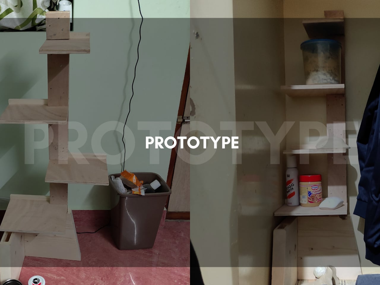
Each shelf slides into a slot in the post rather than being fixed, so the order can be changed based on what needs to go where. Taller items that wouldn’t fit between closely spaced shelves can be shifted to a wider gap. A triangular corner shelf piece also fits the post, filling the awkward dead angle that most corner storage solutions simply leave behind.
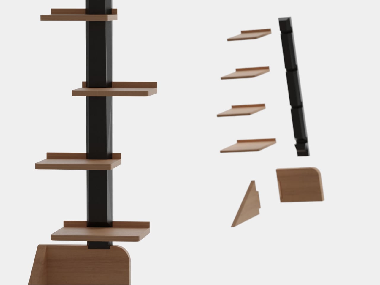
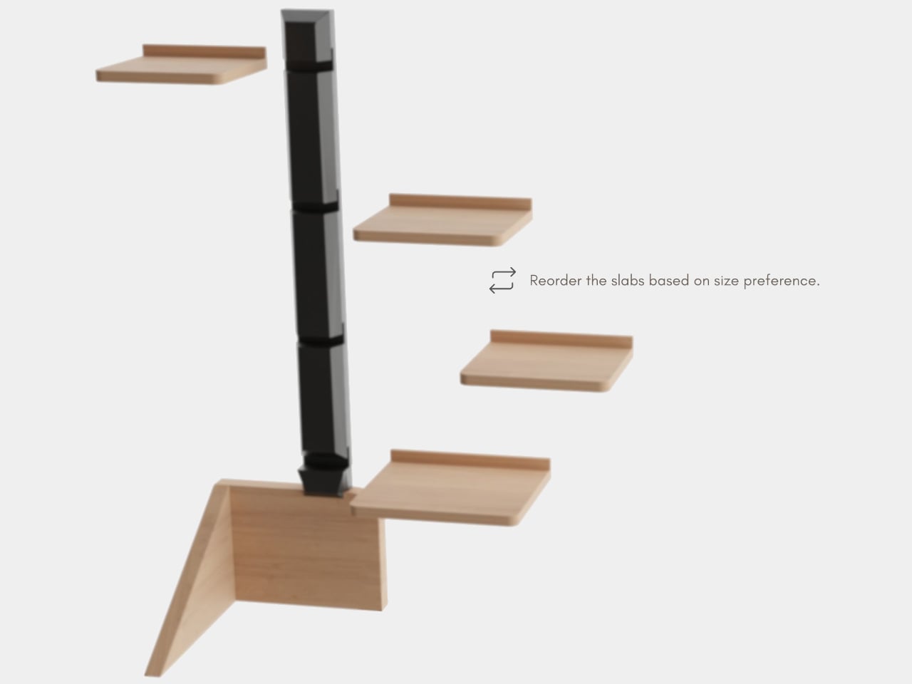
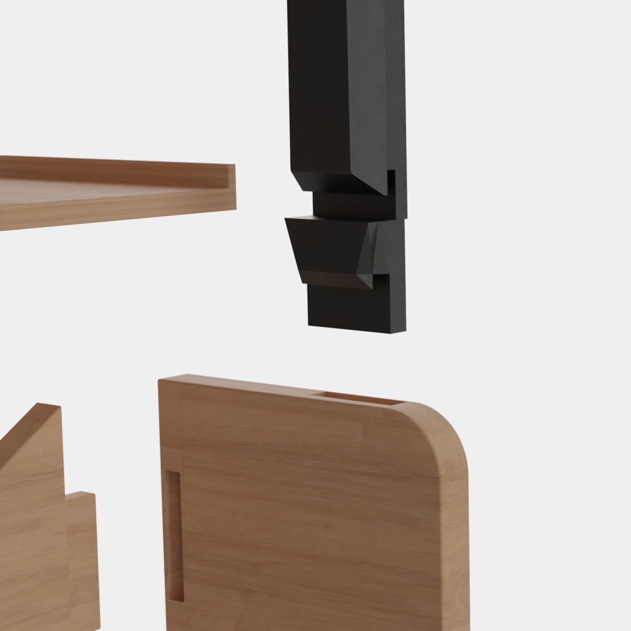
All the components come apart completely, which has a practical consequence beyond just being convenient to assemble. When it needs to move or doesn’t fit through a doorway assembled, everything lays flat for packaging. The slot-and-groove connection that makes the shelves adjustable is the same mechanism that allows the whole thing to disassemble without tools, keeping the design logic consistent from first assembly to eventual relocation.
Someone who keeps cosmetics, accessories, or chargers on the wardrobe floor because there’s nowhere else for them now has a structured option that doesn’t involve buying new furniture or installing shelves in the wall. The rack sits in the corner, takes up the space that was already empty, and gives each category of item its own level without competing with the hanging clothes.
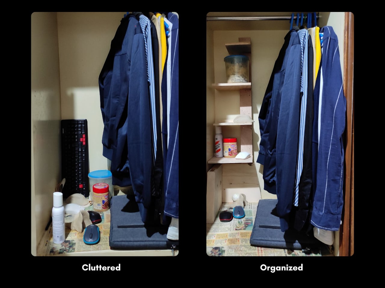
The rack doesn’t have to stay inside the wardrobe either. The warm wood tones and staggered profile work just as well against a living room wall or next to a television, where the shelves hold plants, small sculptures, or anything decorative. It’s the kind of piece that looks intentional rather than utilitarian in an open setting, which isn’t something most storage accessories can convincingly claim.

The material choice of solid wood paired with a dark post finish gives the rack a considered appearance that doesn’t telegraph “storage problem.” The user research behind it, drawn from a survey of more than 50 real wardrobes, makes the solution feel less like a product invention and more like an obvious fix that took a careful look at the actual problem to arrive at.

The post The Corner 99.5% of Wardrobes Ignore Finally Has a Rack for It first appeared on Yanko Design.

KFC Brazil Wants to Dress You the Way It Dresses Its Chicken

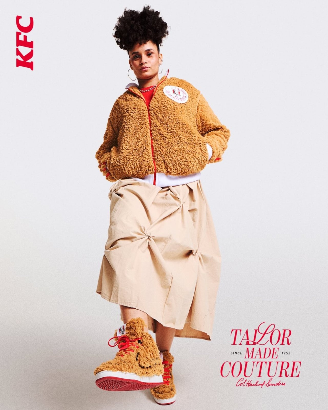
I love fried chicken as much as the next person. Probably more. So when KFC Brazil announced it was offering to customize your actual clothes with a fabric texture inspired by its iconic crispy coating, I had questions. Not the skeptical kind. More the “can they do that with a tote bag, and if so, when?” kind.

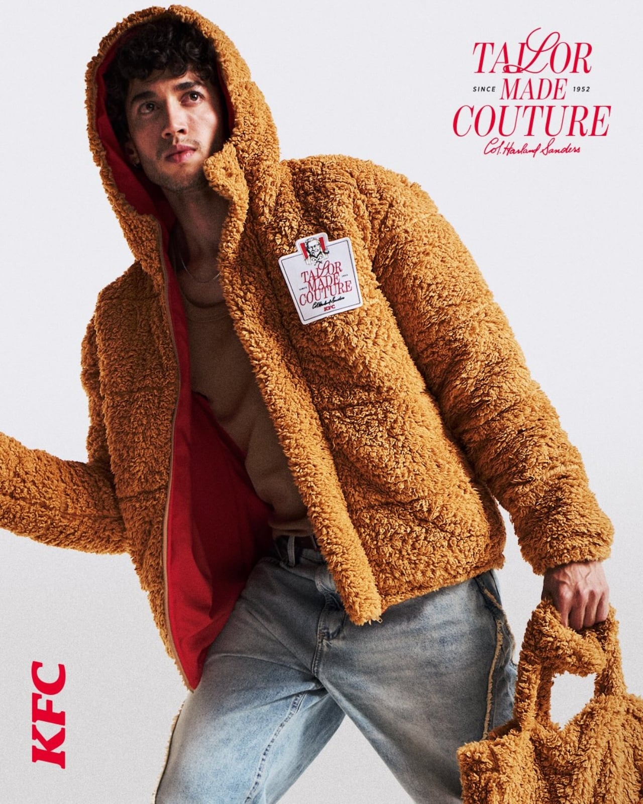
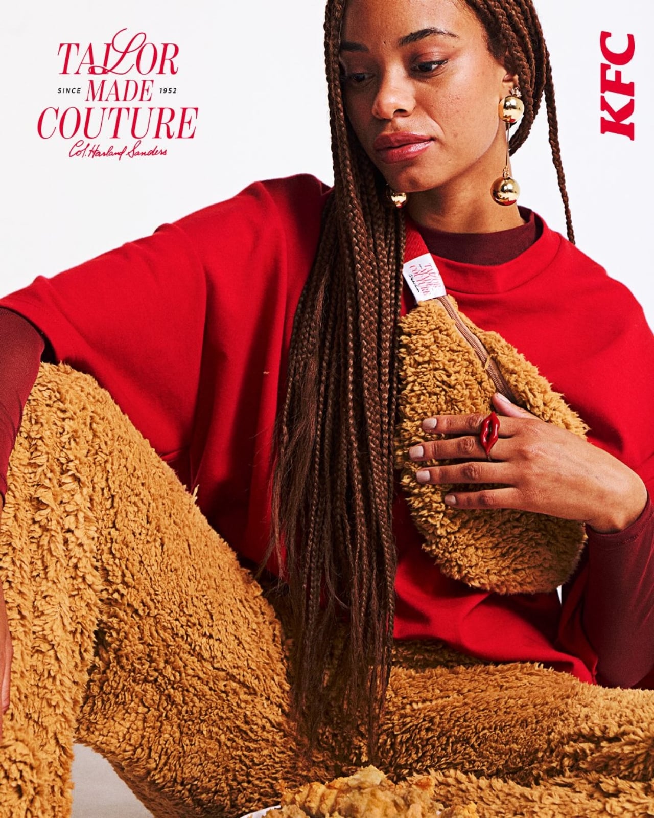
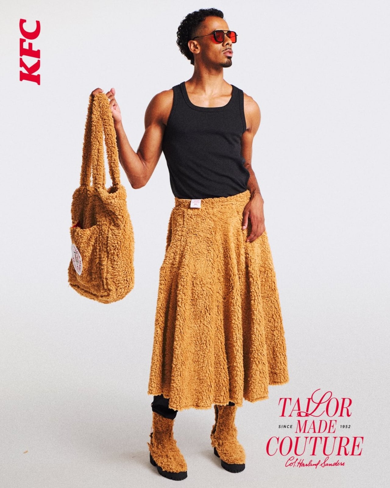
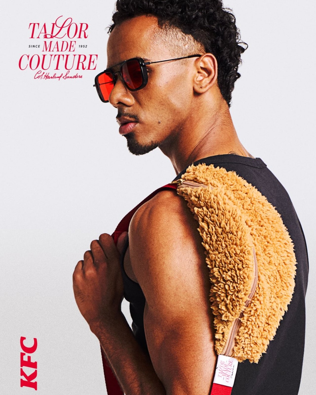
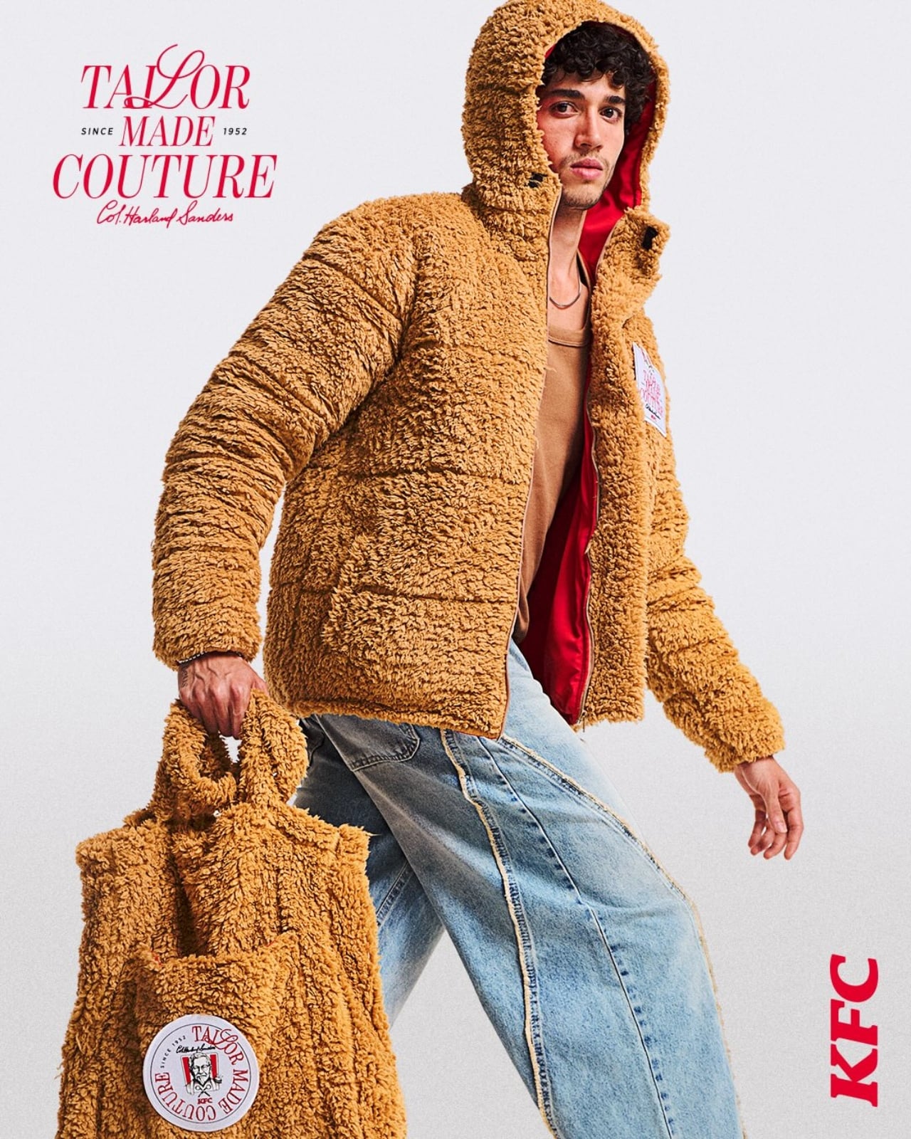
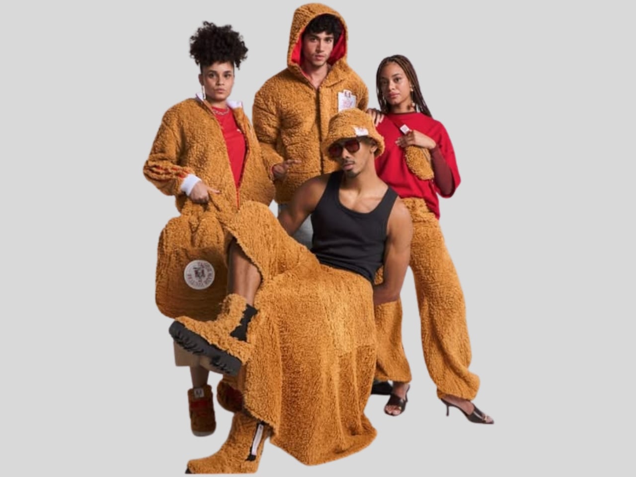
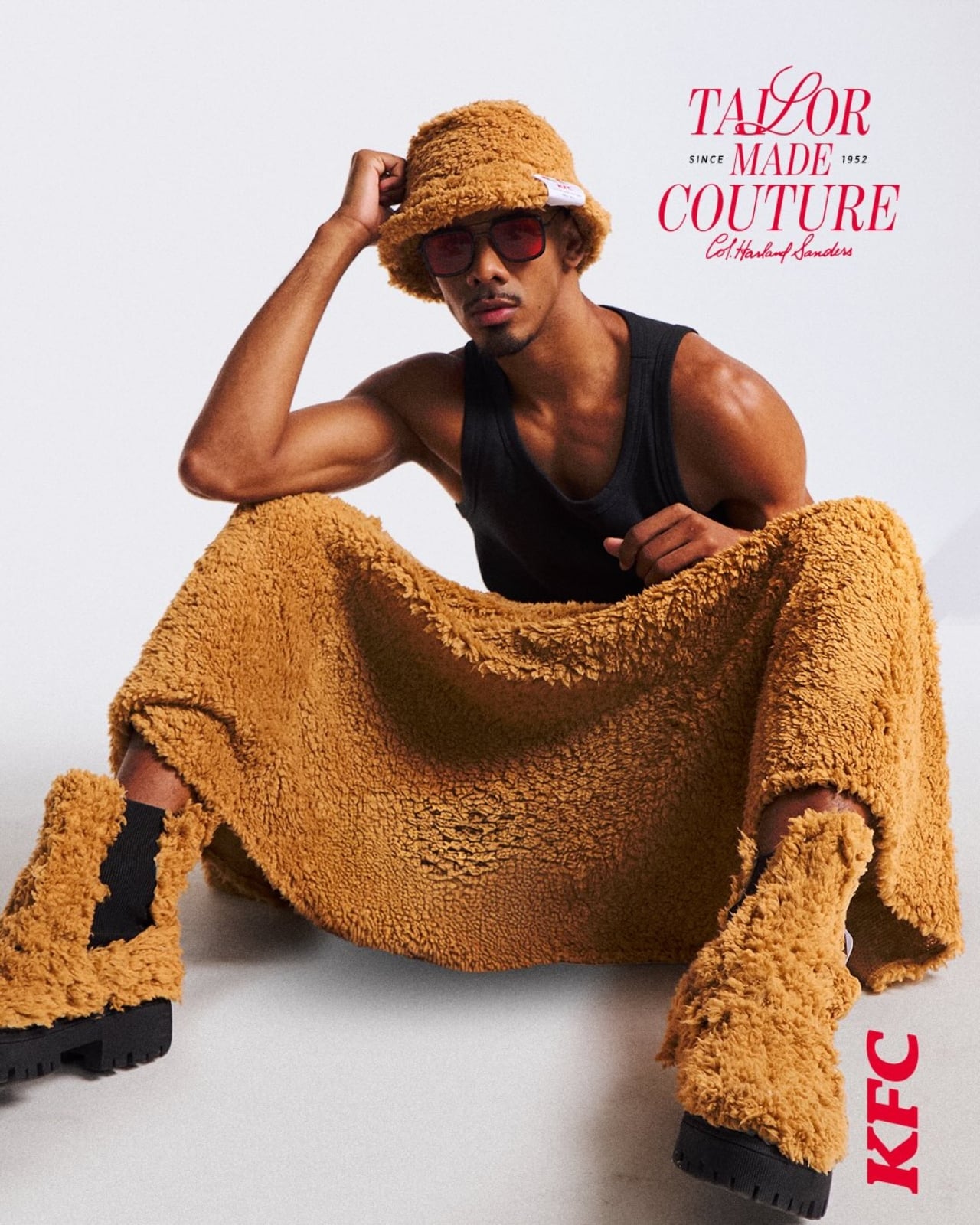
The concept is called the KFC Wardrobe, created by Lola\TBWA Brasil. The logic behind it is almost too simple to ignore. KFC’s most recognizable feature, that golden, seasoned crust Colonel Sanders spent a lifetime protecting, shares a lot of DNA with what fashion has always celebrated: something original, textured, and completely impossible to replicate. The KFC Wardrobe takes that parallel seriously and makes it completely, earnestly literal.

Designer: Lola\TBWA Brasil

Here’s how it worked: buy a medium bucket of KFC fried chicken, bring your own clothing to the brand’s flagship store in São Bernardo do Campo, and show your receipt. Eligible items included jackets, coats, jeans, skirts, bucket hats, tote bags, and waist bags. Leave them behind, and within three weeks, they’d come back to your door with a fabric treatment that mimics the texture of fried chicken breading applied to the surface. Crunchier. More textured. Somehow more interesting than before.

The promotion ran for just three days, from March 27 to 29, which makes “limited edition” feel like an understatement. It kicked off during Design Week at BAFU, described as one of São Paulo’s most prominent and respected creative hubs. KFC set the whole thing up as Colonel Sanders’ atelier. An atelier. For a fried chicken brand. I had to read that phrase twice before I could fully commit to it, and then I decided it was actually one of the most correct things anyone has said about fashion in years.

It’s worth noting that KFC has been leaning into fashion for a while now, and with increasing conviction. KFC Australia dropped a streetwear collection during Australia’s Fashion Week in 2023. KFC UK has been particularly active, releasing a ten-piece distressed leather range with Aries and collaborating with designer Sinead Gorey on a London Fashion Week show, both in 2025. At this point, the brand has clearly decided it belongs at the table, and the fashion world has quietly and somewhat bafflingly agreed.

But the KFC Wardrobe does something the earlier drops didn’t. It doesn’t ask you to buy a new KFC product. It asks to work with what you already have. That’s a fundamentally different creative stance. Most brand-adjacent fashion moves are wearable advertisements dressed up in aesthetic language. This one is a genuine collaboration with your existing wardrobe, and that’s more interesting and, honestly, a lot more respectful. KFC isn’t asking you to represent the brand. It’s asking to be part of your look, on your terms.

Fernanda Harb, KFC Brazil’s marketing director, described the initiative as a way to “expand the relationship and closeness between the brand and its customers beyond just food.” Lola\TBWA made that statement mean something real by developing an actual textile treatment, not a printed graphic or an embroidered logo, but a physical crunch-inspired texture applied to fabric. The crispy coating became the design language. That’s a design decision, not just a marketing one, and the difference shows.

The whole thing works because the metaphor at its center is genuinely earned. Fashion has always celebrated what can’t be copied. So has Colonel Sanders, for decades. You can eat KFC your whole life and never come close to the recipe. The KFC Wardrobe takes that same mystery and stitches it into your denim jacket, and that’s a creative idea worth wearing more than once.

KFC Brazil committed to the bit fully and without apology. And now there are people walking around São Paulo in textured, crunch-finished jackets, wearing their taste on their sleeves, quite literally. Fashion has come full circle, and I’ve never been this hungry for what comes next.

The post KFC Brazil Wants to Dress You the Way It Dresses Its Chicken first appeared on Yanko Design.
IKEA unveils Anchor and Unlock safety mechanism in two new collections

Every once in a while, I’ll come across a horror story on my feed about accidents involving furniture toppling over and badly hurting someone. As a regularly clumsy person, it is not outside the realm of possibility that I may be a victim of this someday. The STURDY Act (Stop Tip-overs of Unstable, Risky Dressers on Youth) is a welcome development for kids and grown-ups alike. IKEA has now become the first to apply this into their new furniture line.

Designer: IKEA

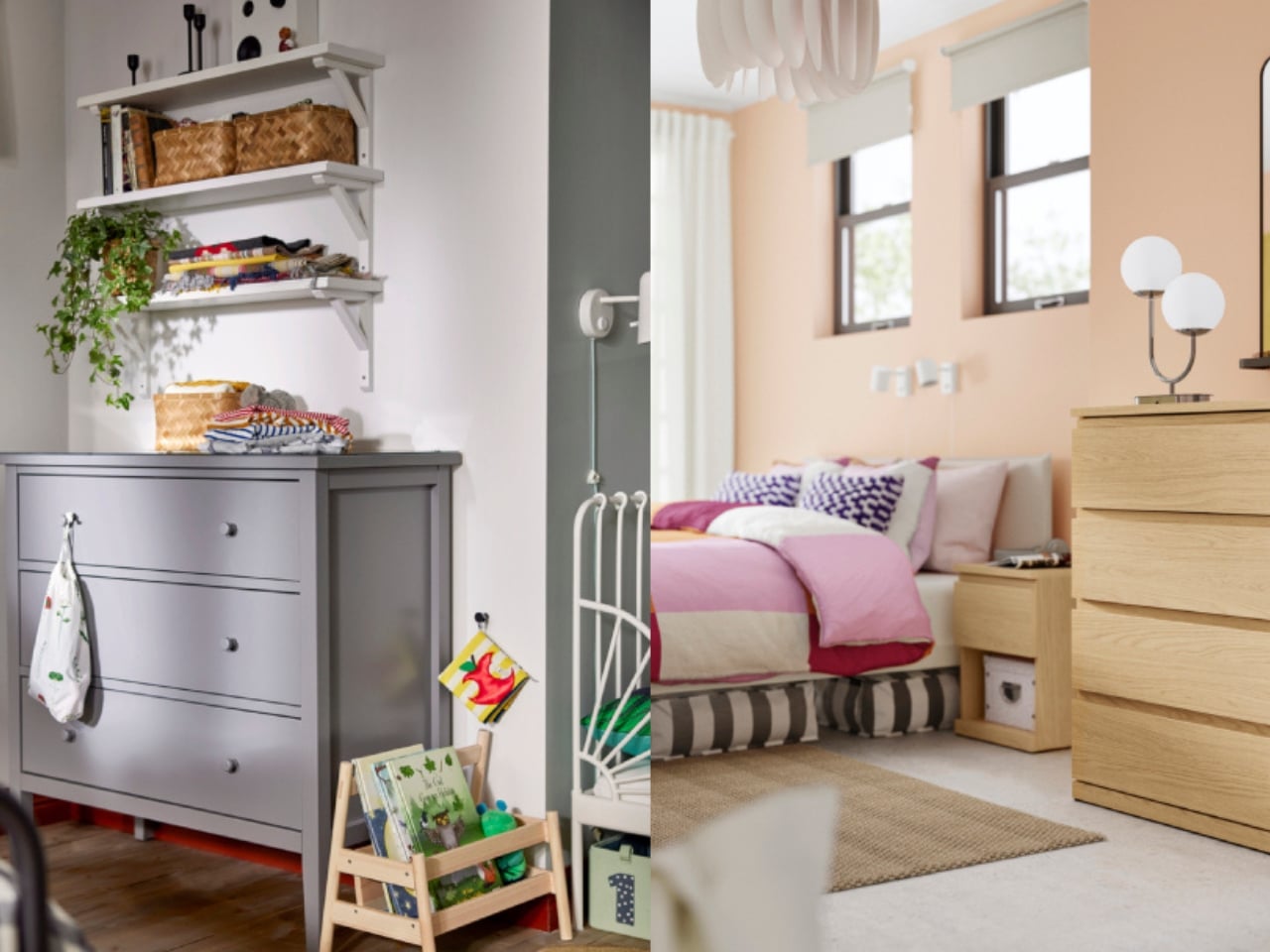
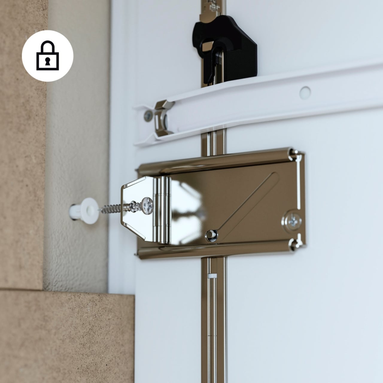
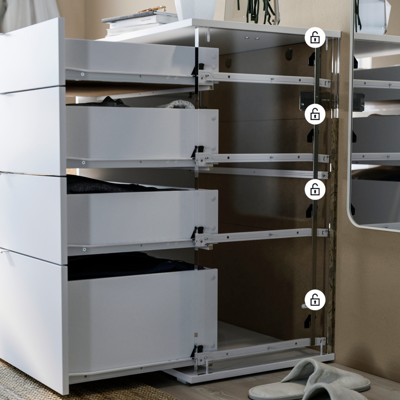
The Storklinta and Gullaberg collection from IKEA come with their patented Anchor and Unlock mechanism which took into consideration the aforementioned STURDY Act’s guidelines. This way, they have made sure that their furniture are safe especially for young kids but still have the design and style associated with the Swedish brand. When properly installed, this mechanism lets you use the items as they’re meant to be used without the risk of it tipping over, even when multiple drawers are opened.

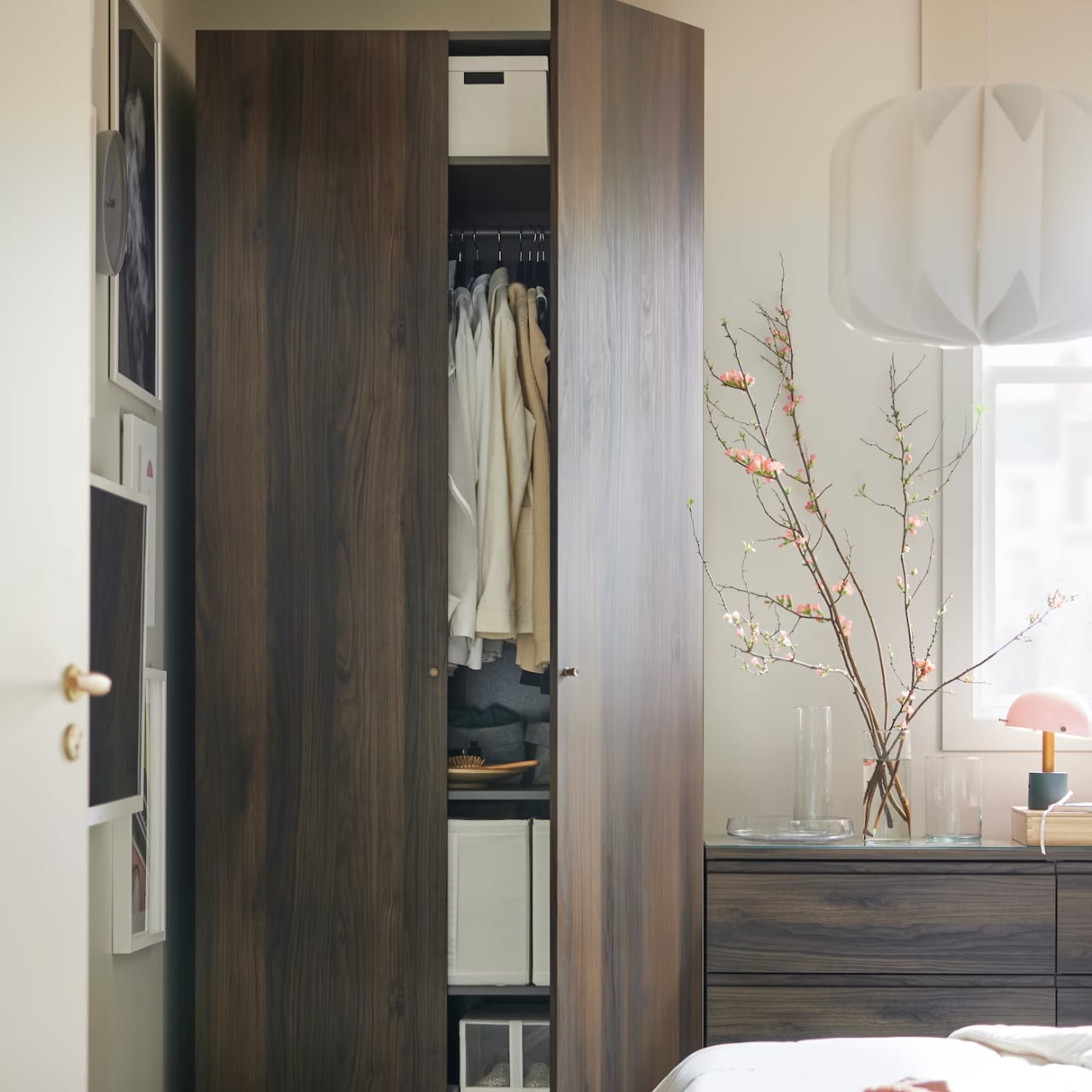
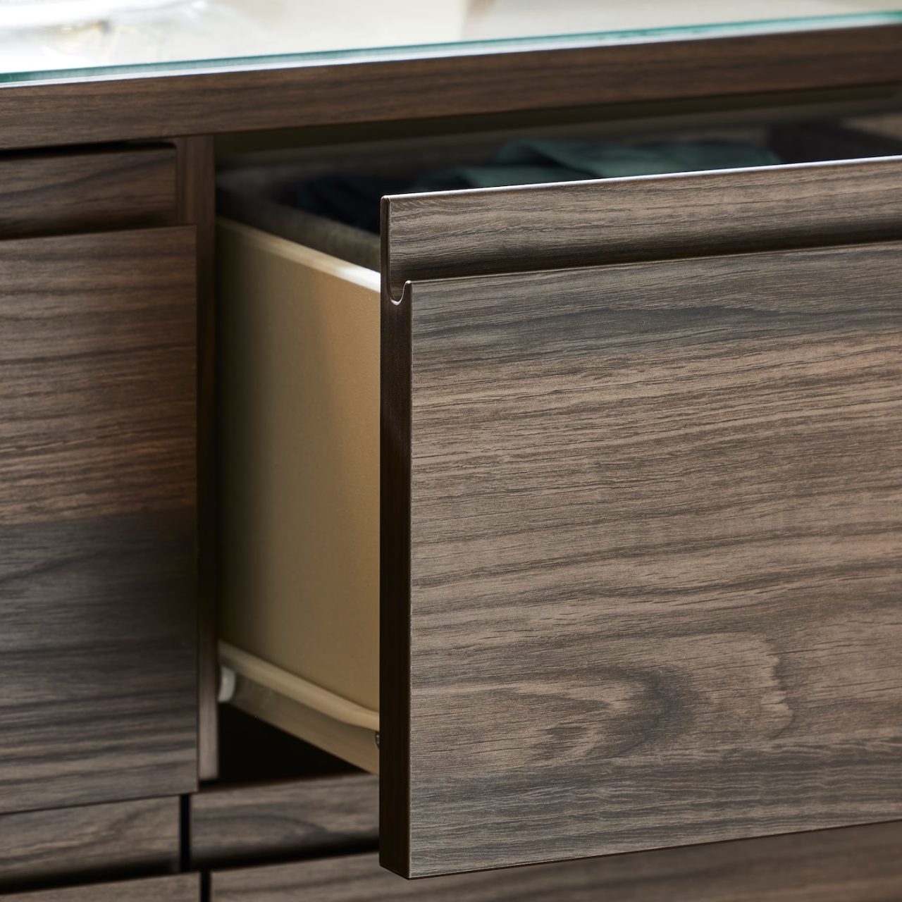
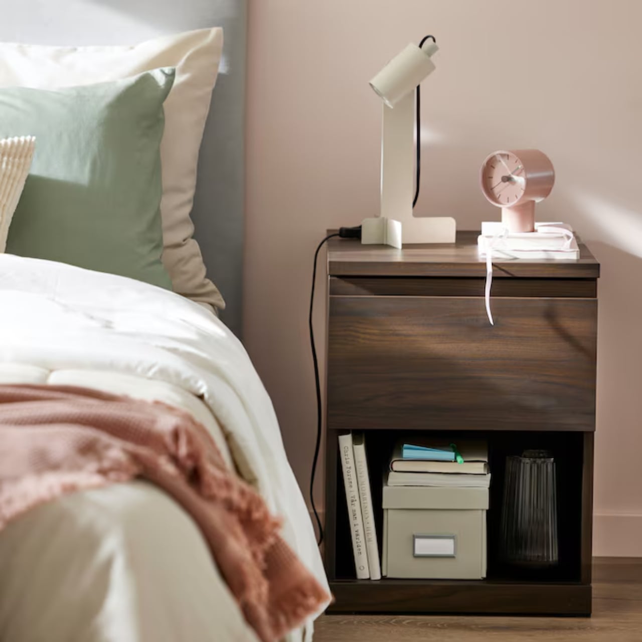
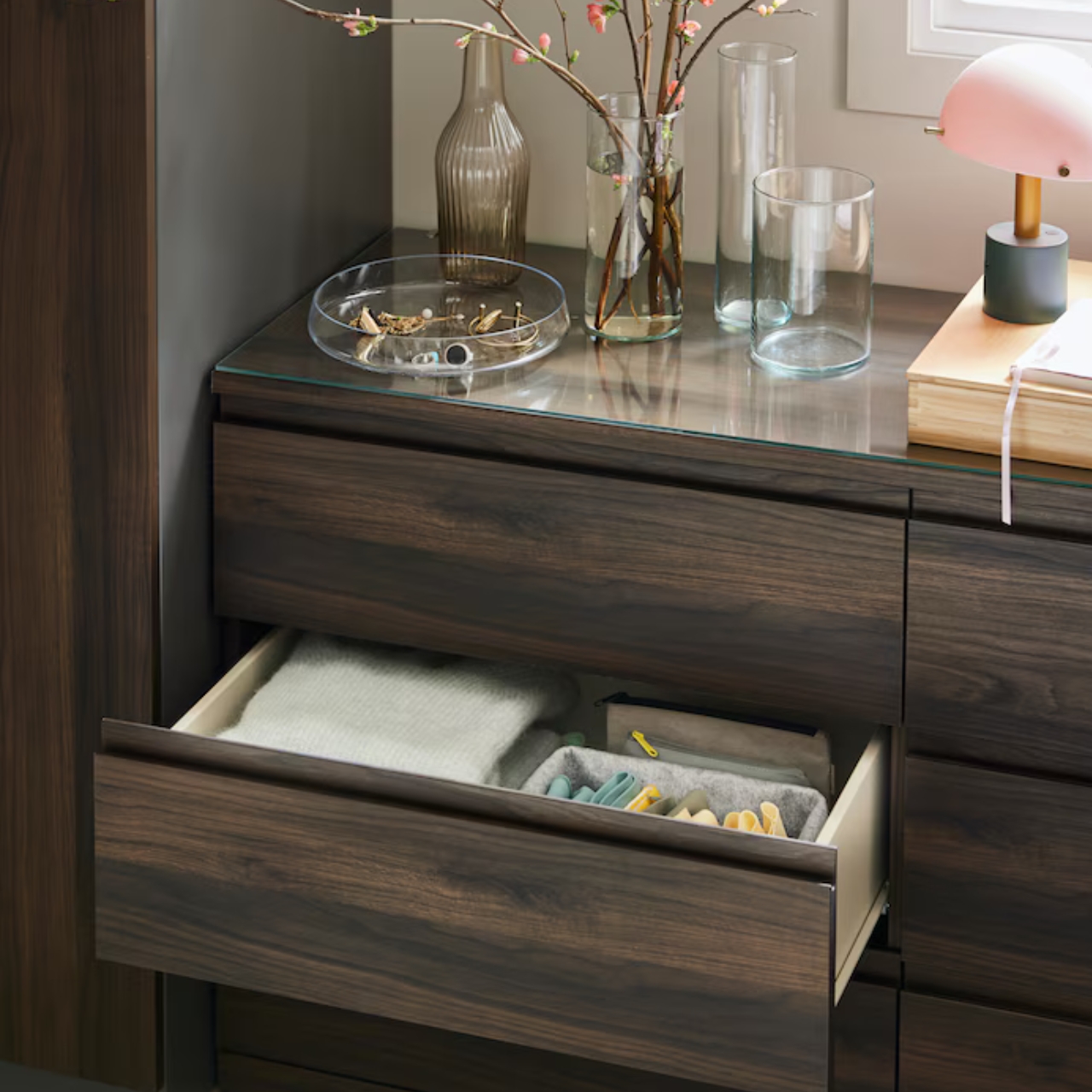
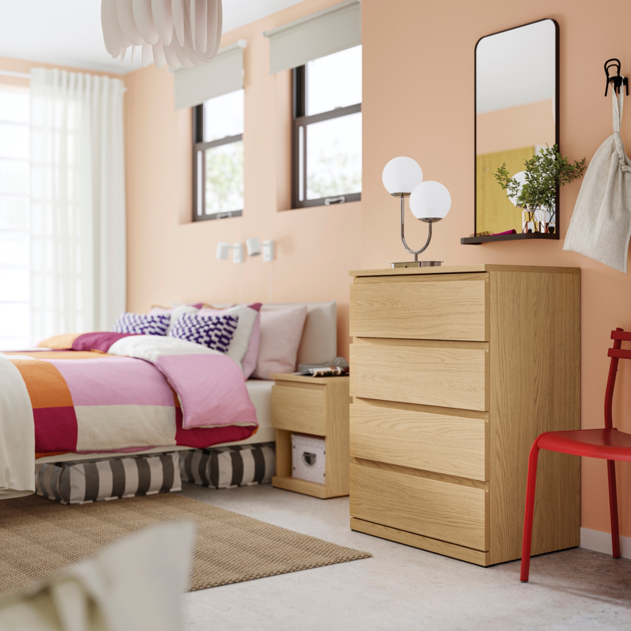
The Gullaberg collection is classic IKEA with its framed sides, tapered legs, and white and gray finishes. There are several dressers, chests, wardrobes, nightstands, and combinations available in the collection. The Storklinta has a more sleek and contemporary design and also comes with chests, drawers, bedside tables, and wardrobe combinations with the PAX system. These furniture come with clean, integrated handles.

Both collections are already available in the IKEA US stores and online but there are still some items that have limited stocks. They will also be launching more safety-enhanced designs later this year. As always, these are items that are self-assembled so you still need to be able to follow instructions on these Anchor and Unlock mechanisms for the furniture to be truly safe.

The post IKEA unveils Anchor and Unlock safety mechanism in two new collections first appeared on Yanko Design.