The Tray That Knows You Eat in Bed

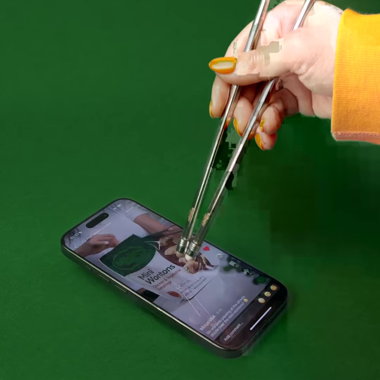
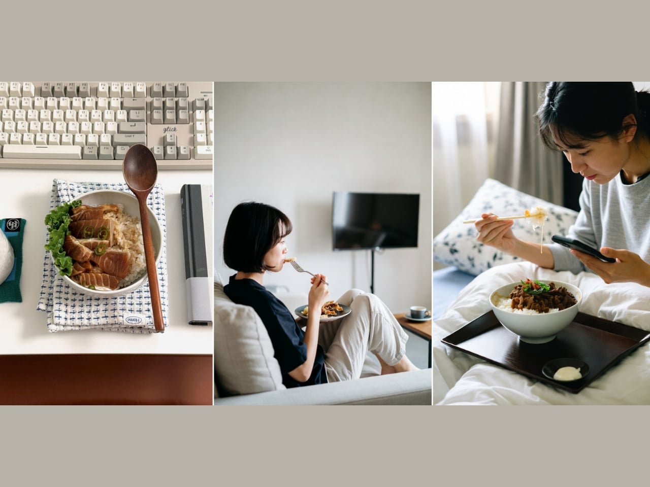
Most of us don’t eat at the dining table anymore. Not really. The pandemic accelerated something that was already quietly happening: meals migrating from the kitchen to the living room, the bedroom, the desk, the floor. We eat while watching something, while scrolling something, while half-working and half-resting. The dining table still exists, sure, but as a concept, it has become more aspirational than actual.

And yet, the tools we use to manage the air around our food haven’t moved with us. Range hoods are bolted to the ceiling above a stove. Portable air purifiers sit in corners, doing their best from across the room. Even the newer tabletop options ask you to position them just right, or carry them separately, adding friction to something that should feel effortless. For a culture that has fully embraced eating anywhere, the air solutions available to us are still very much designed for eating in one place.

Designer: Junho Han

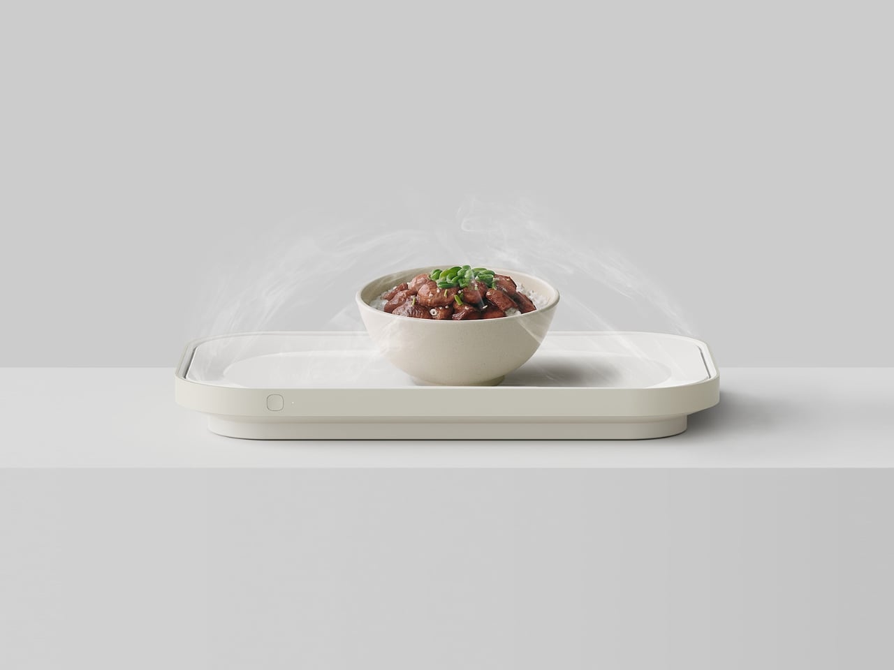
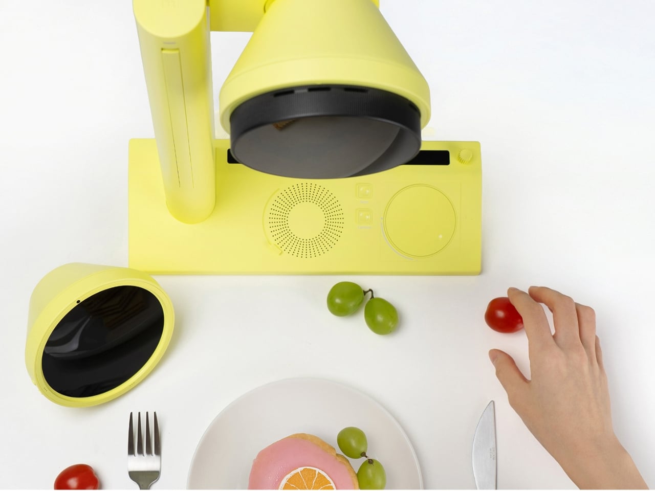
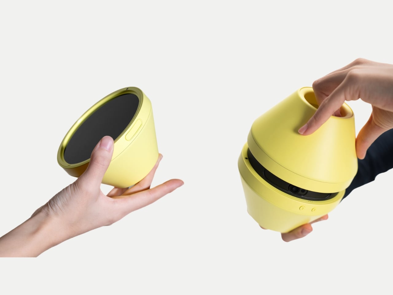
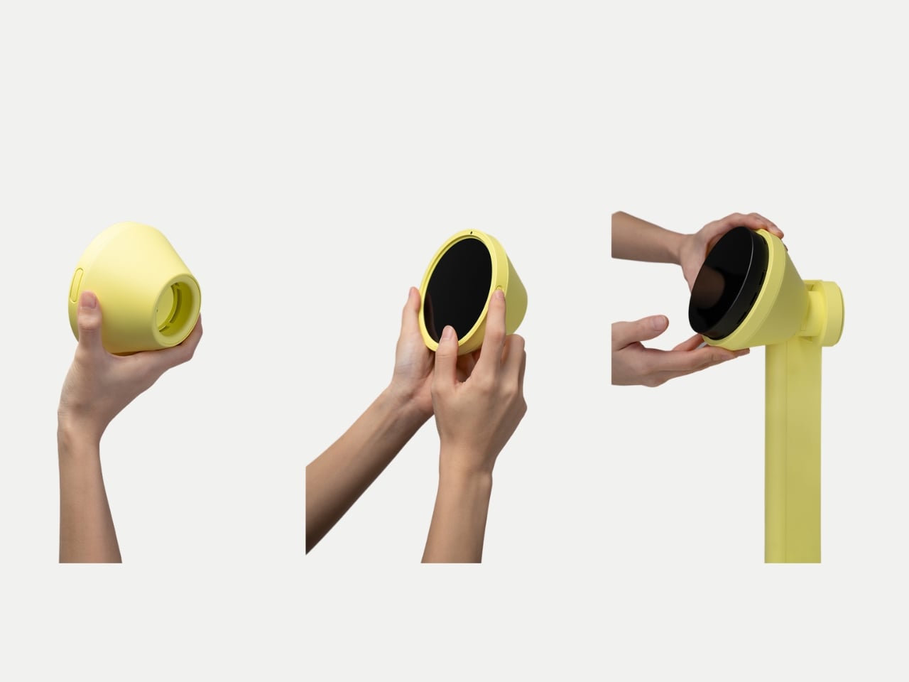
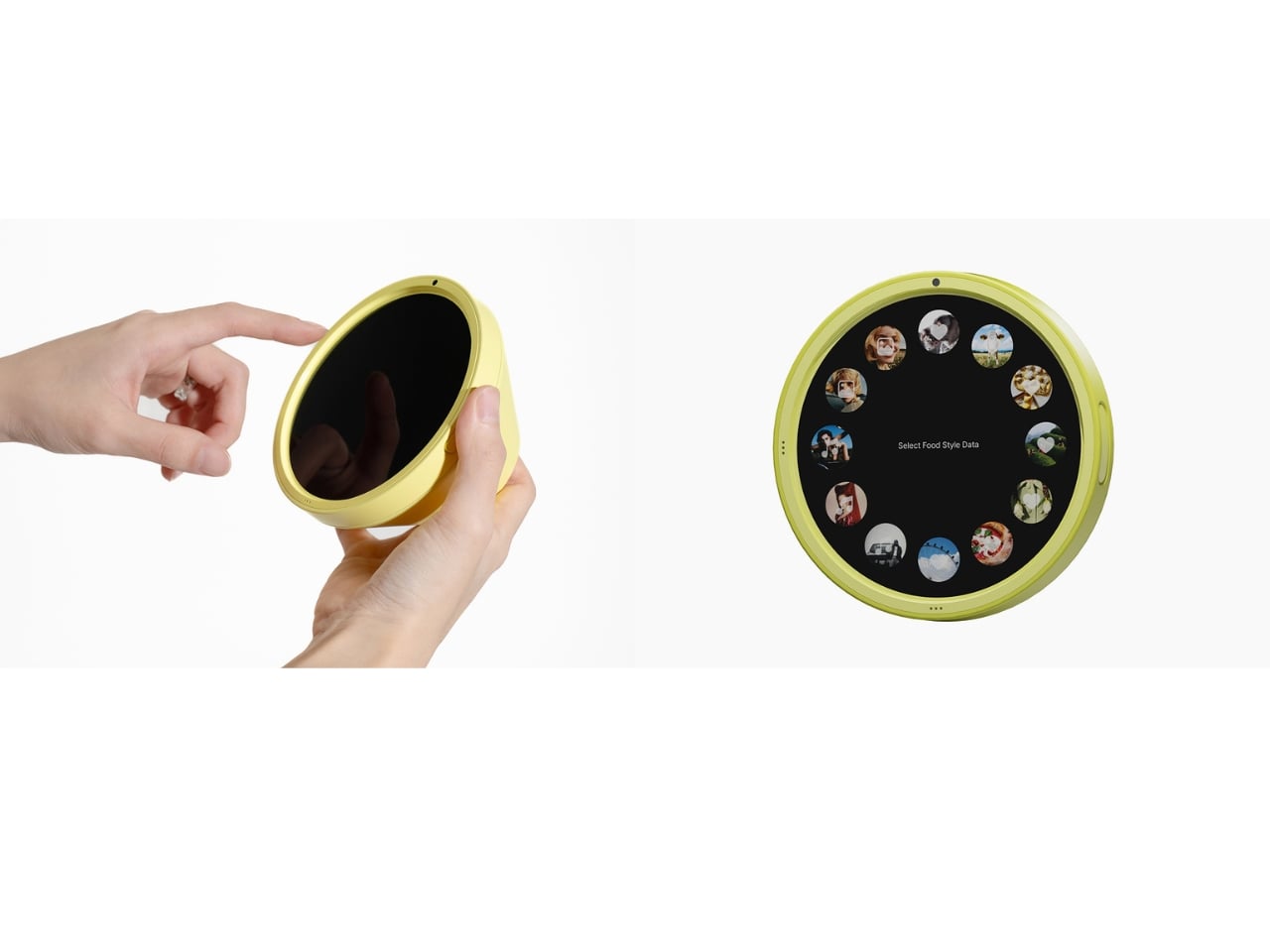
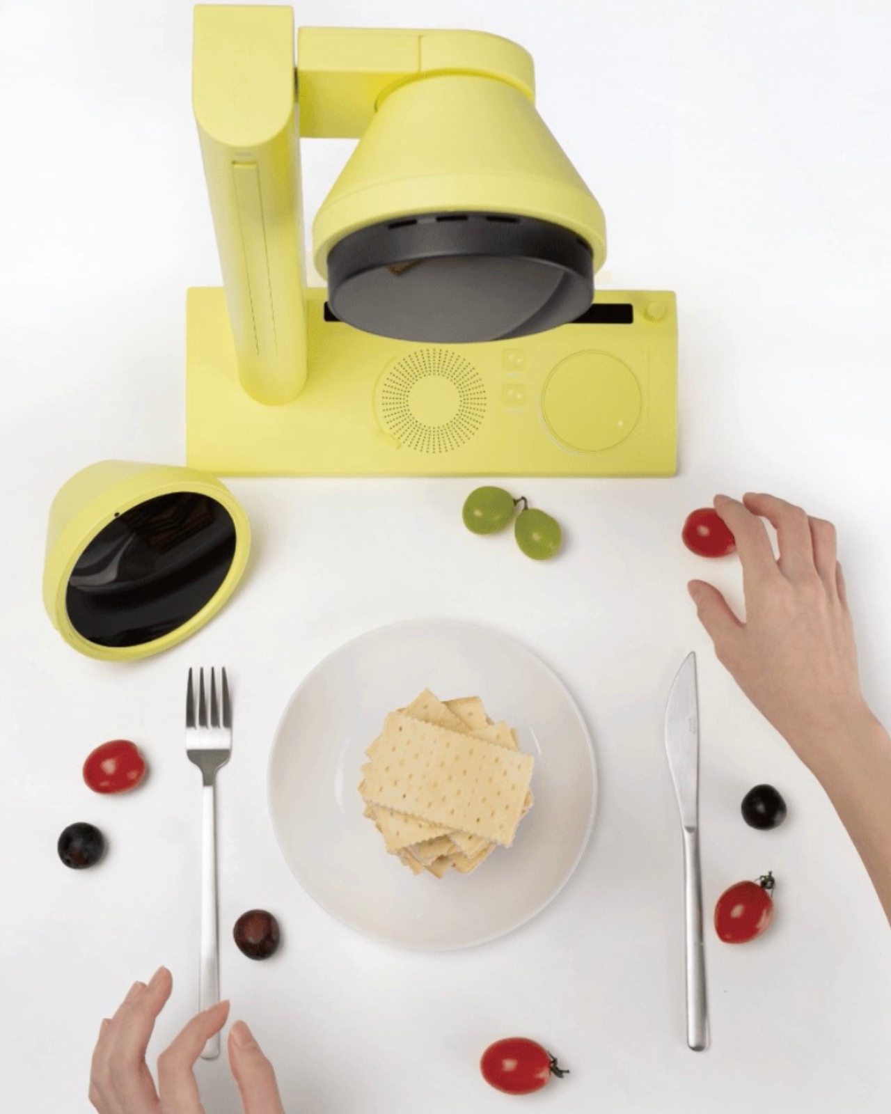
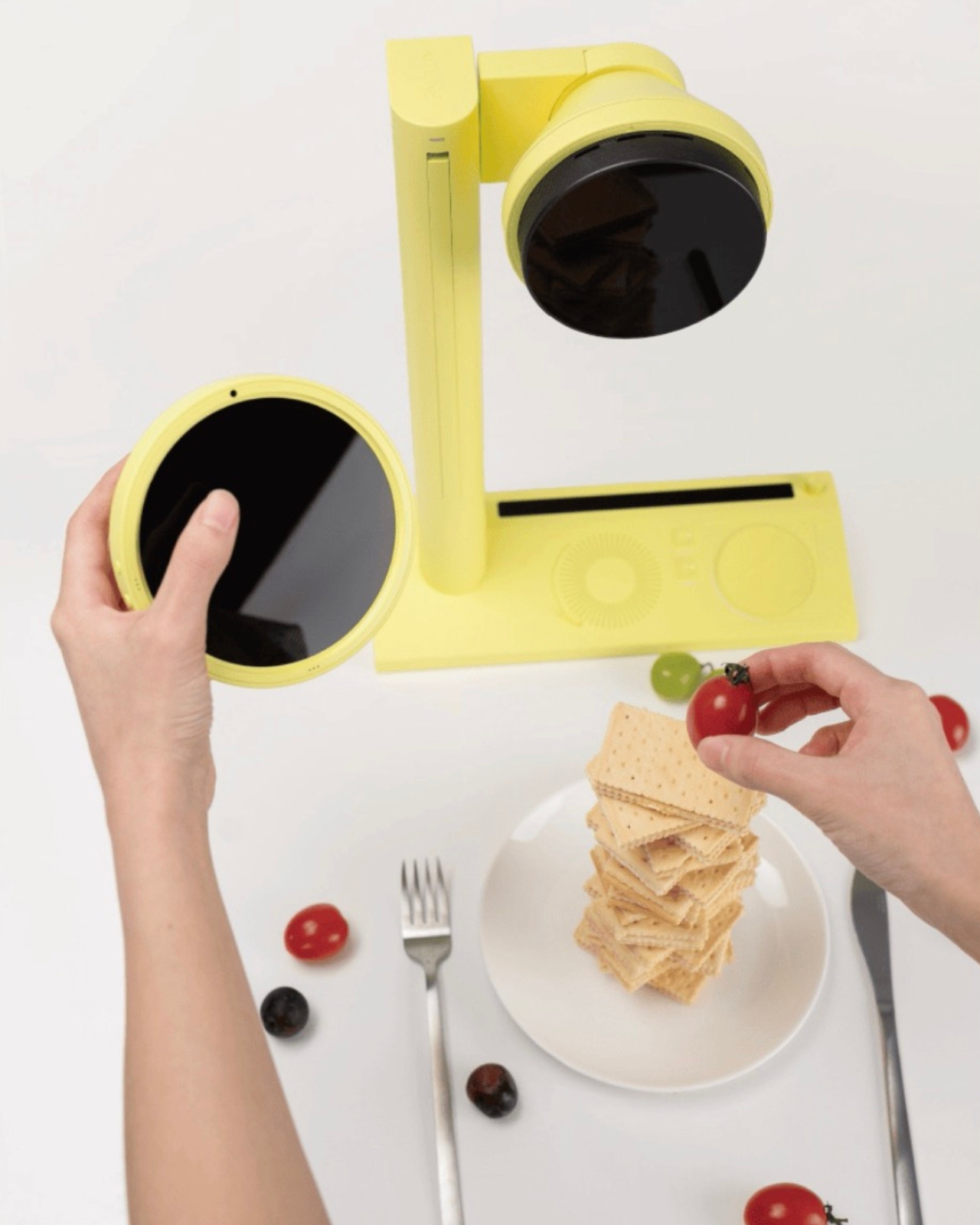
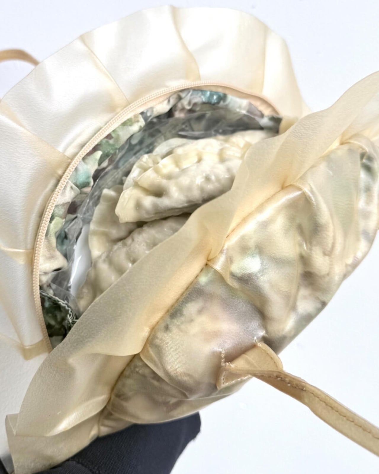
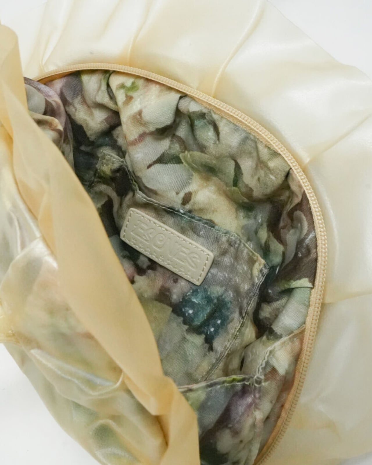
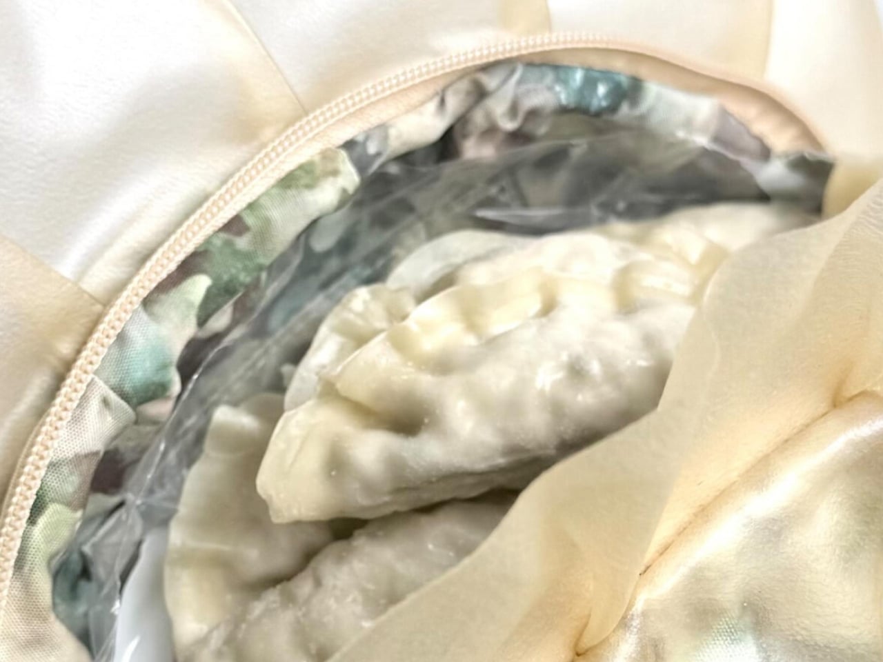
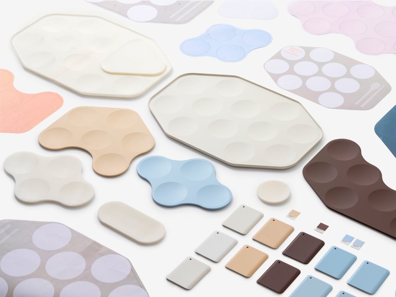
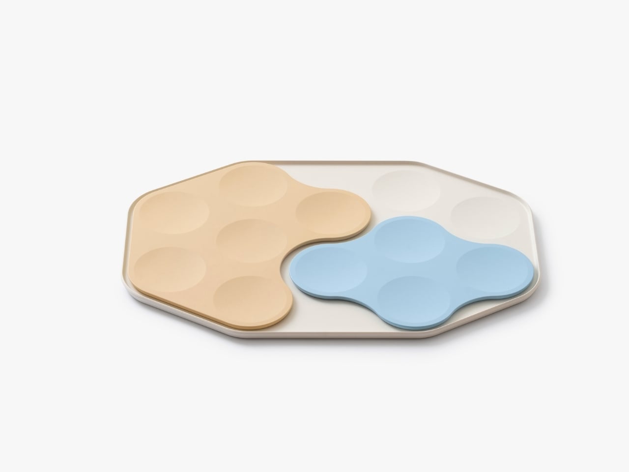
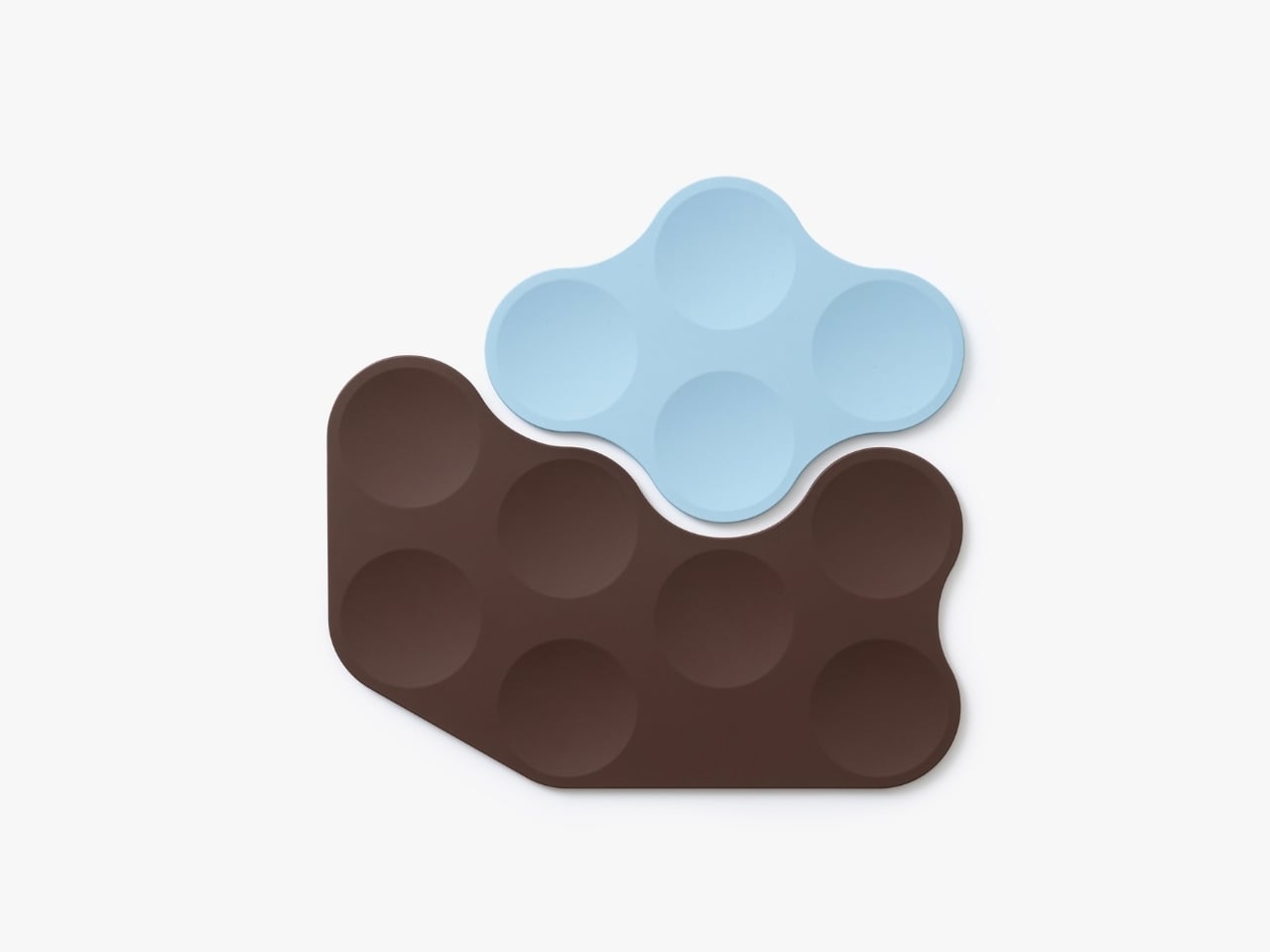
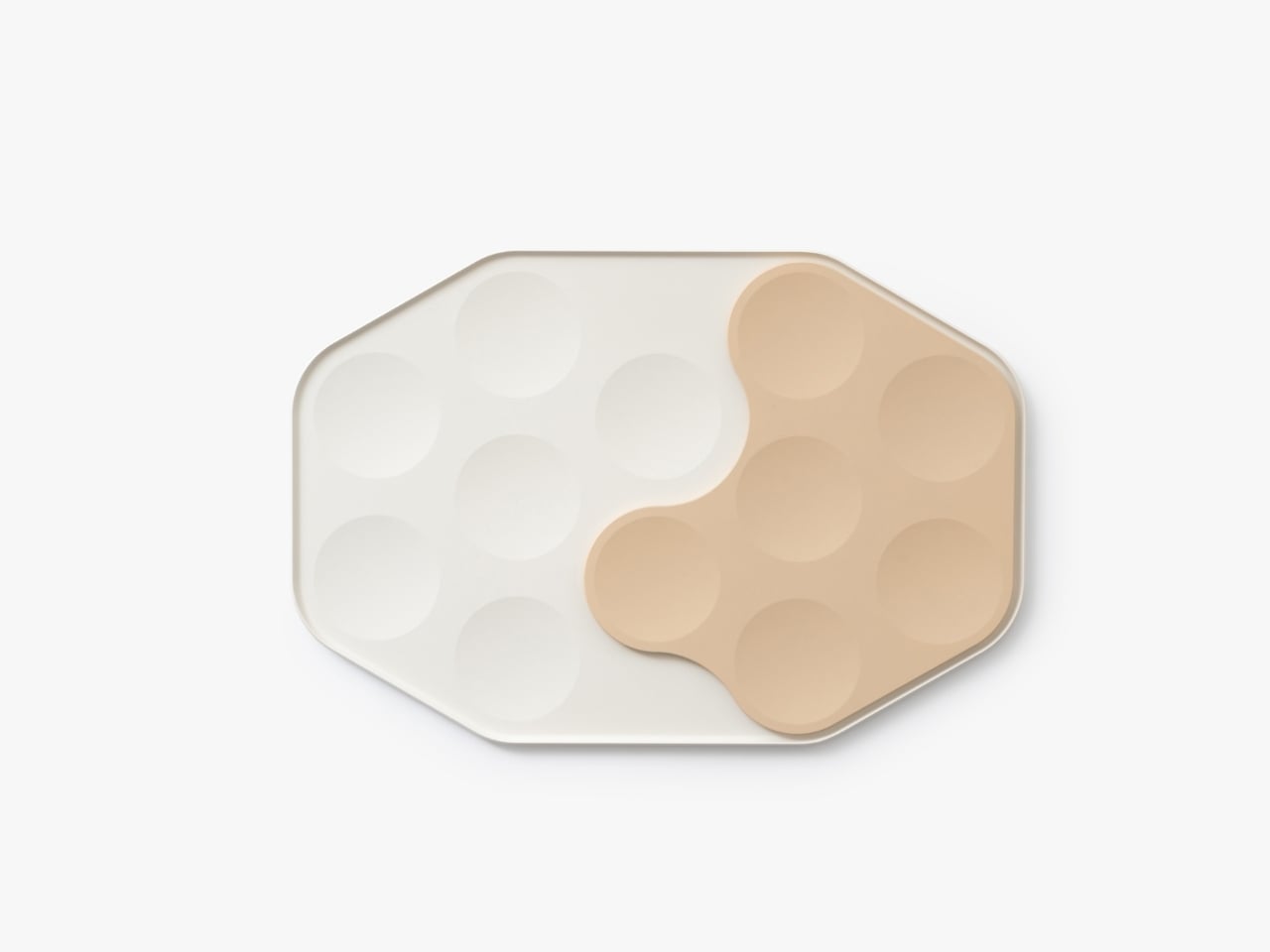
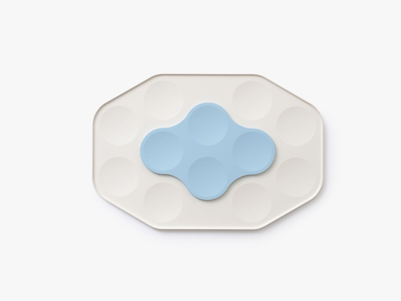
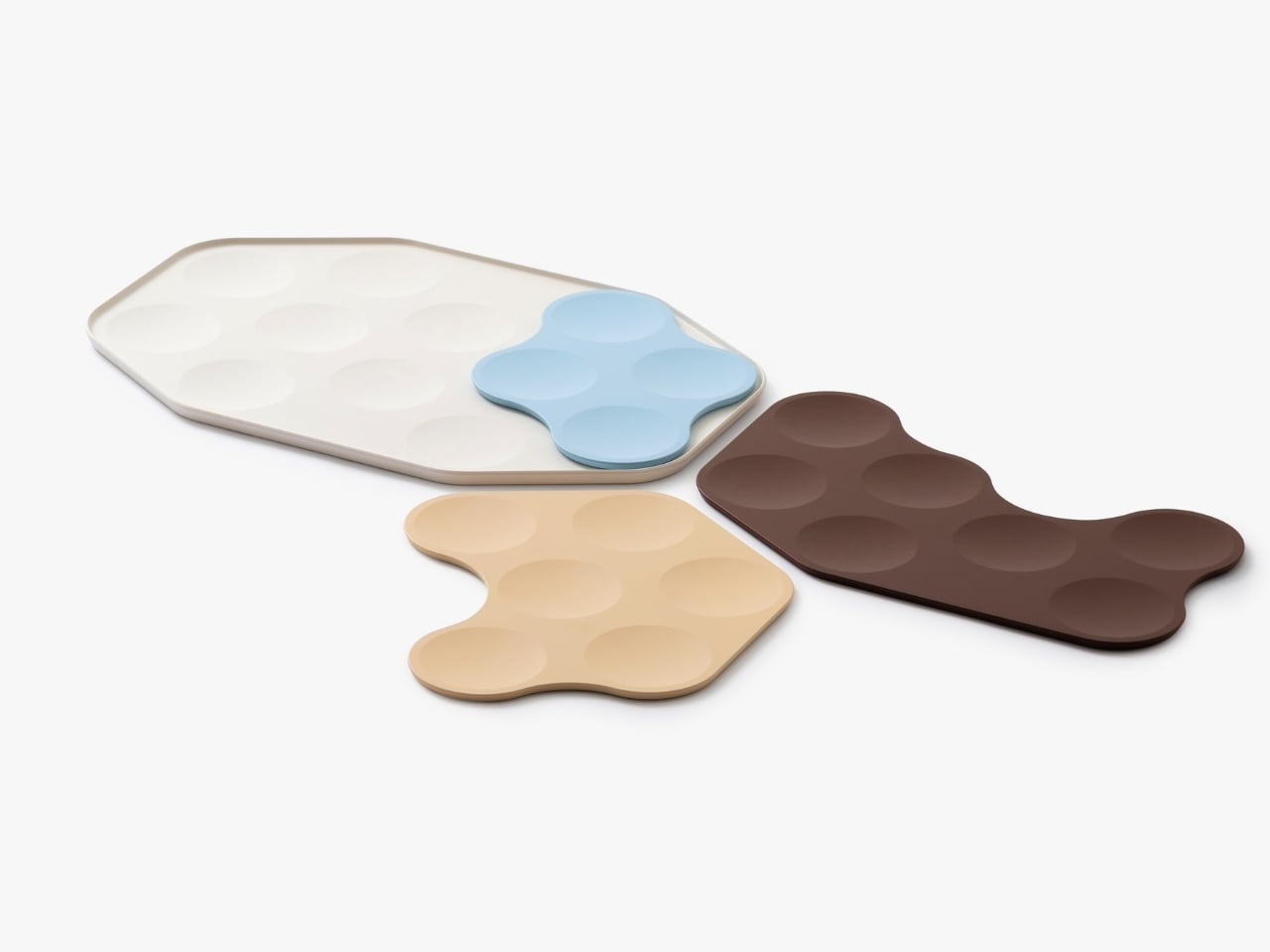
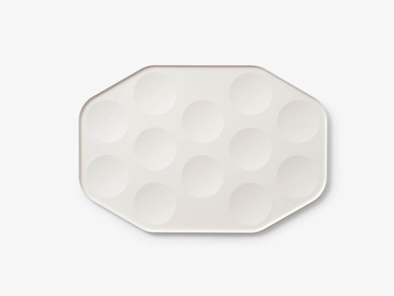
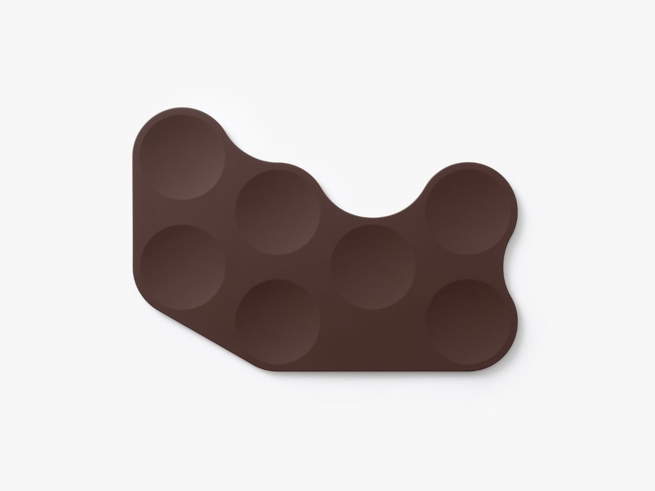
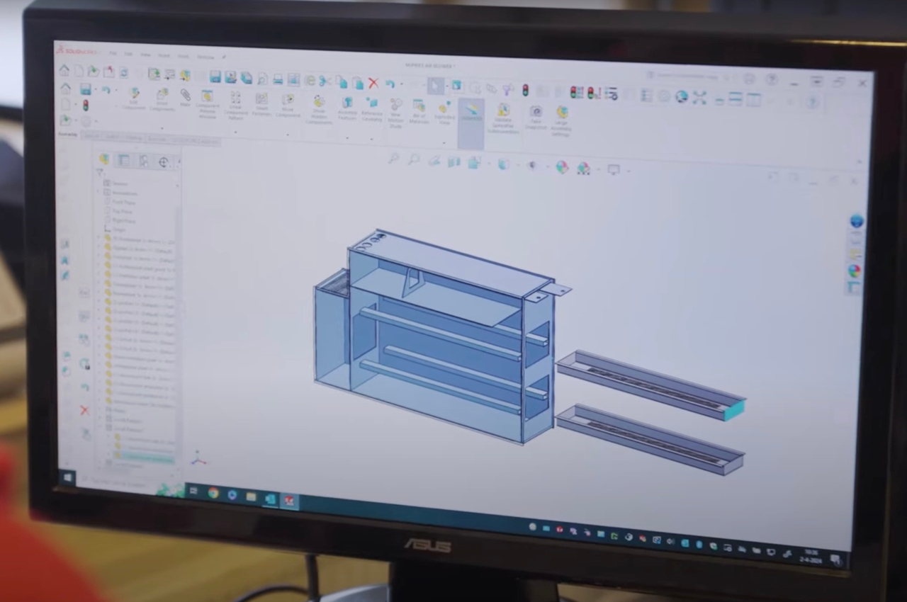
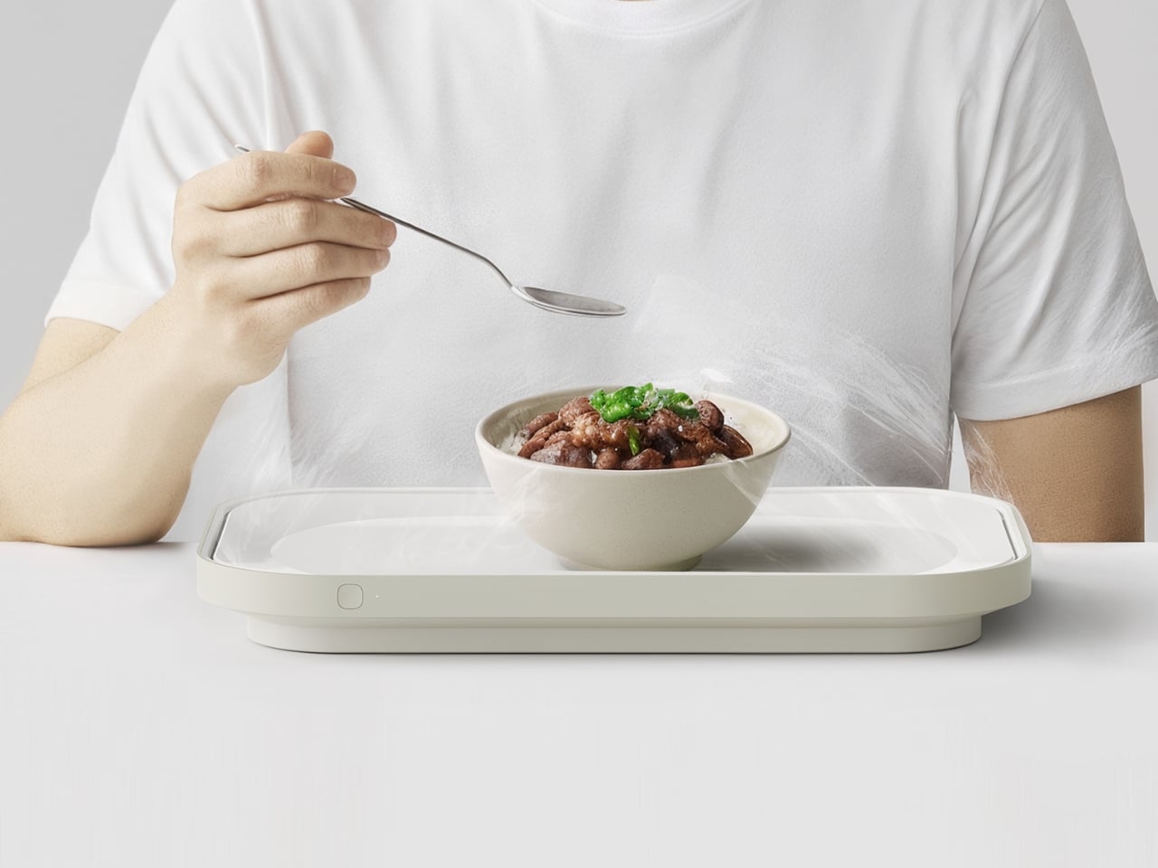
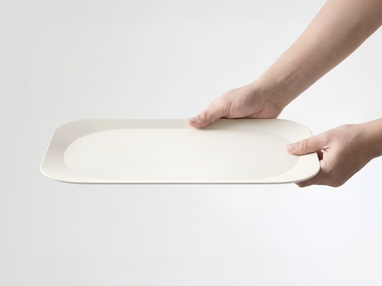
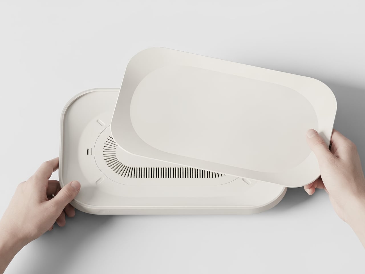
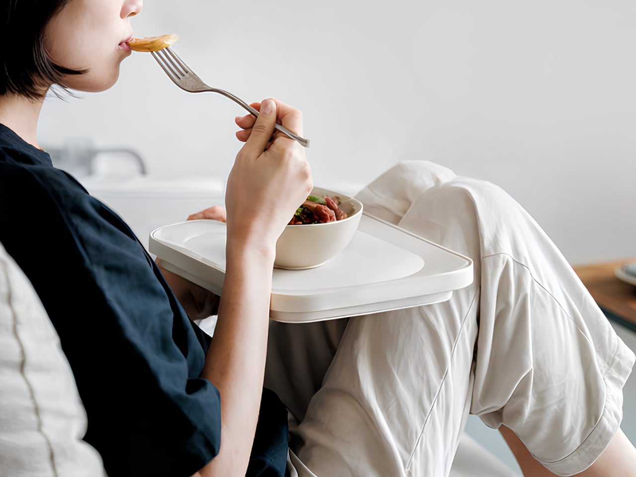
Junho Han’s Notrace:Null addresses this with a level of clarity that makes you wonder why no one thought of it sooner. The concept is simple: instead of building a separate device that you need to carry alongside your food, the air purification system is built directly into the tray. You pick up your food, and the solution comes with it. No extra steps, no reconfiguration, no reminder to bring the device. The tray is the device.

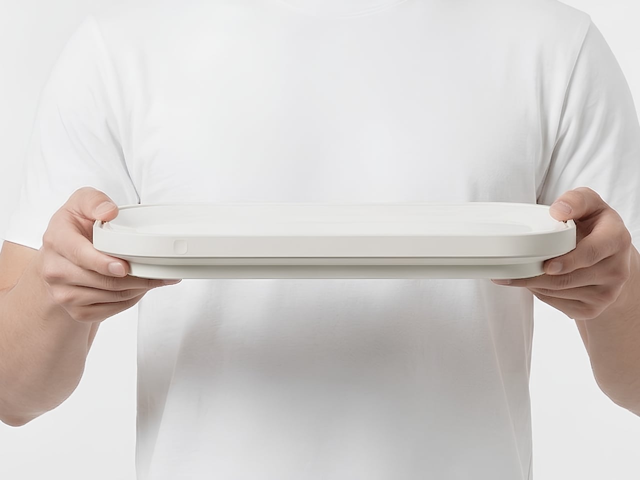
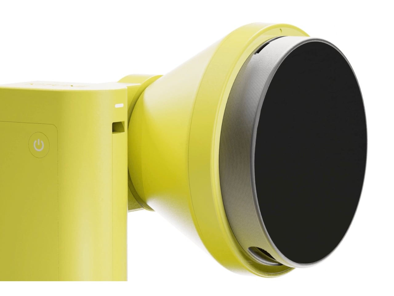
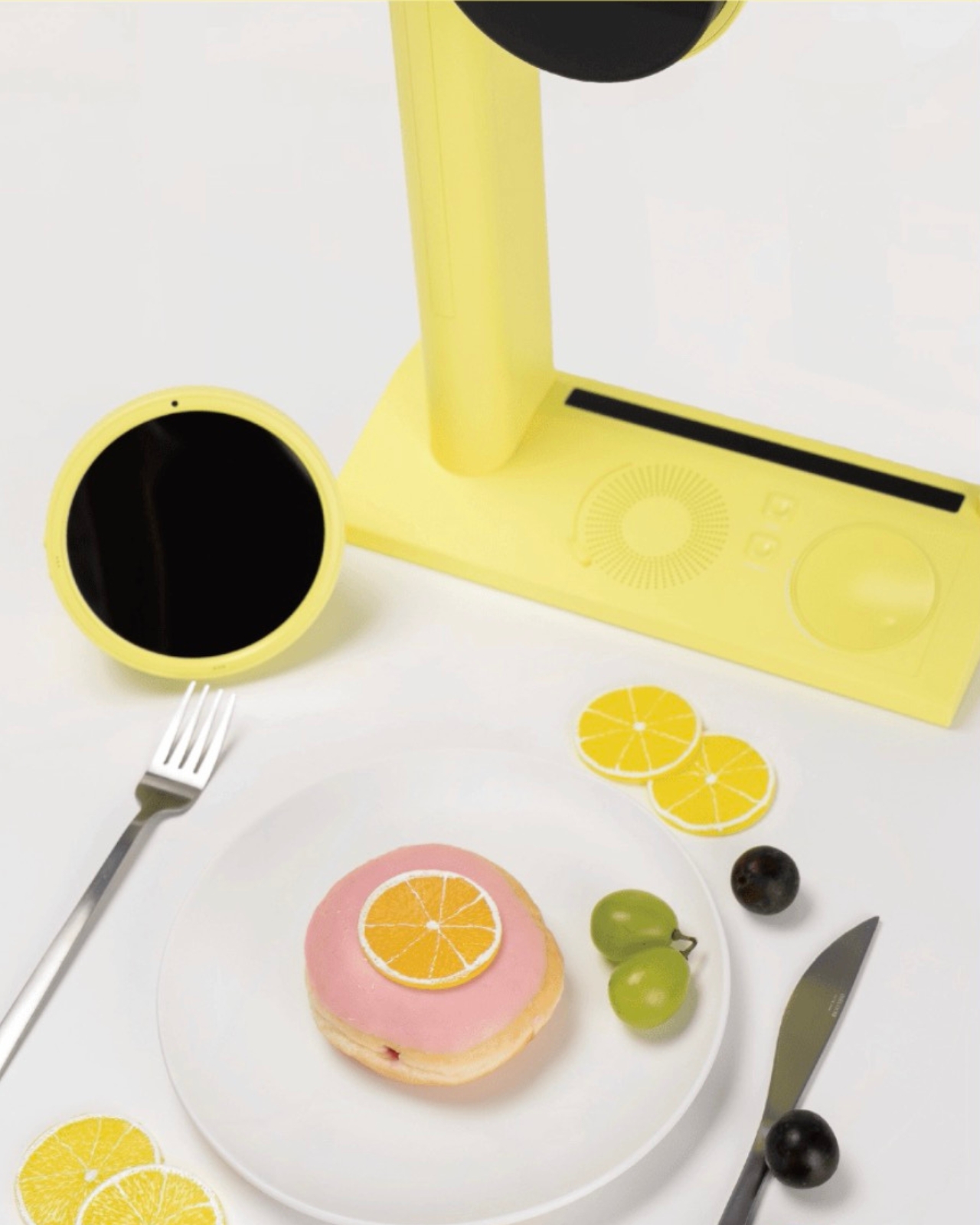
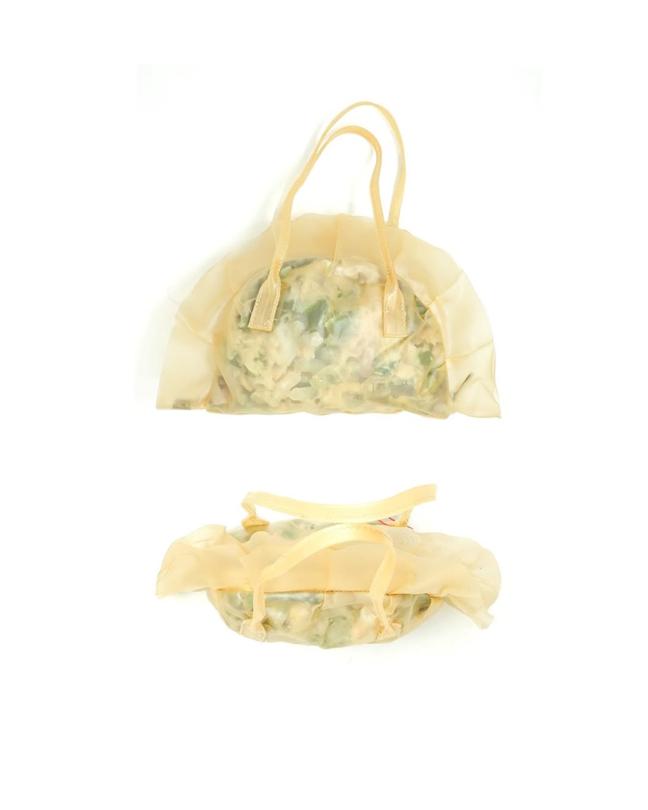
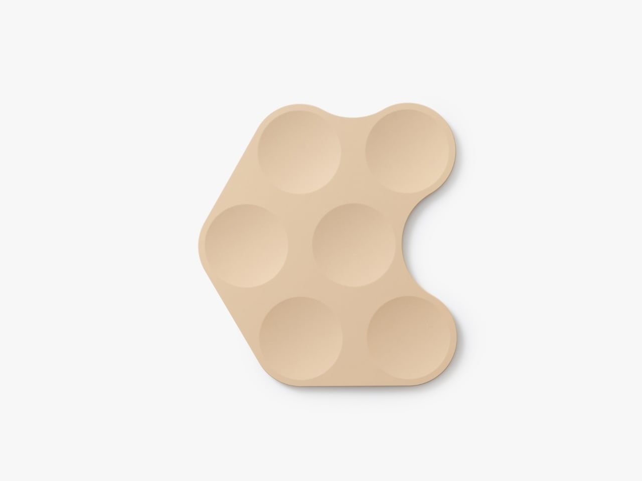
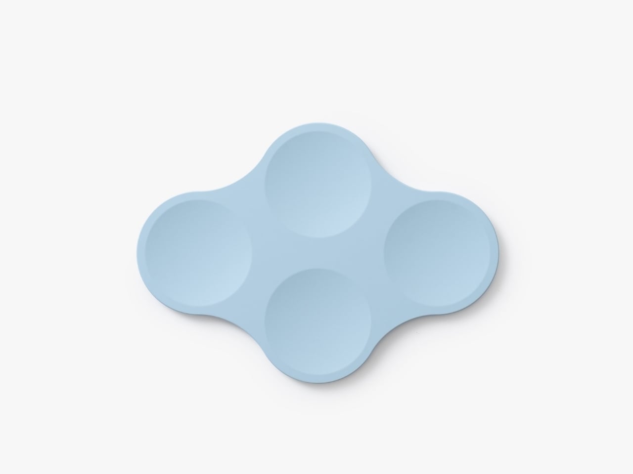
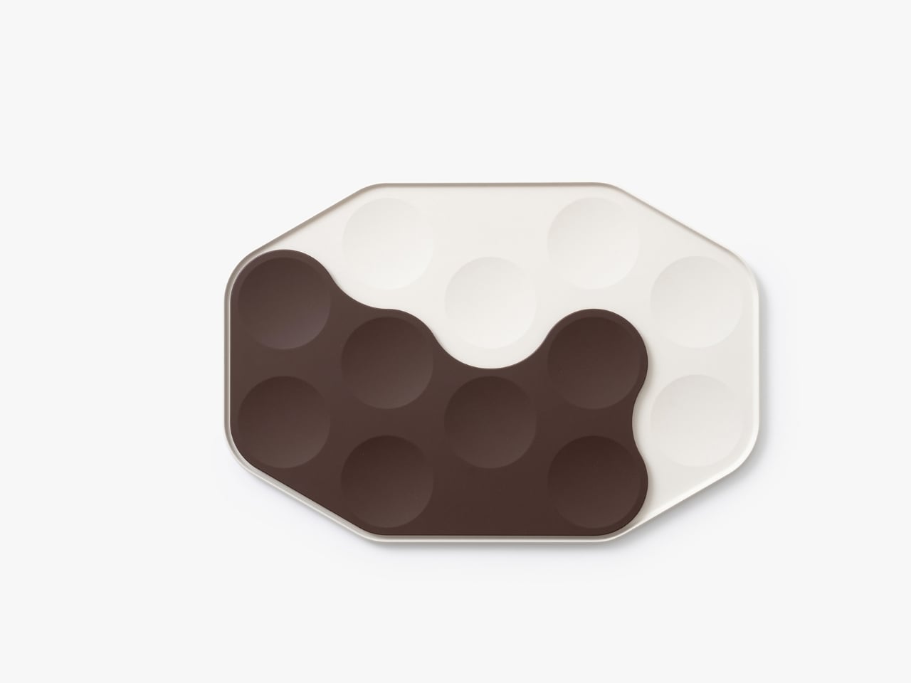
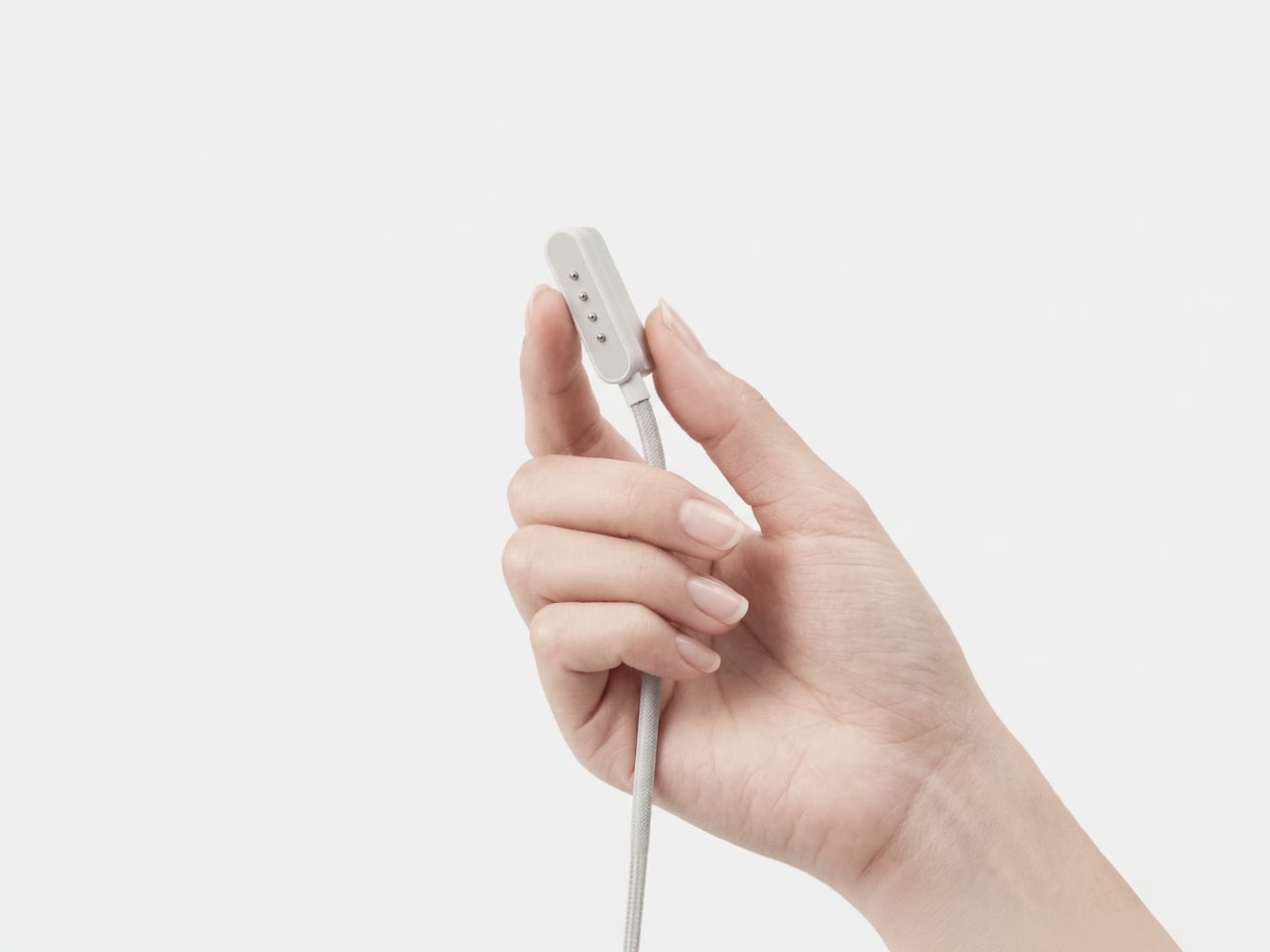
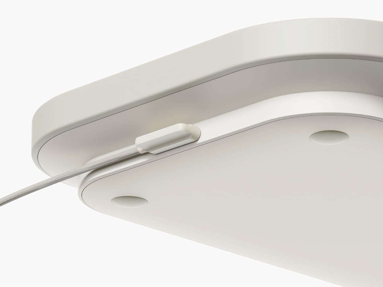
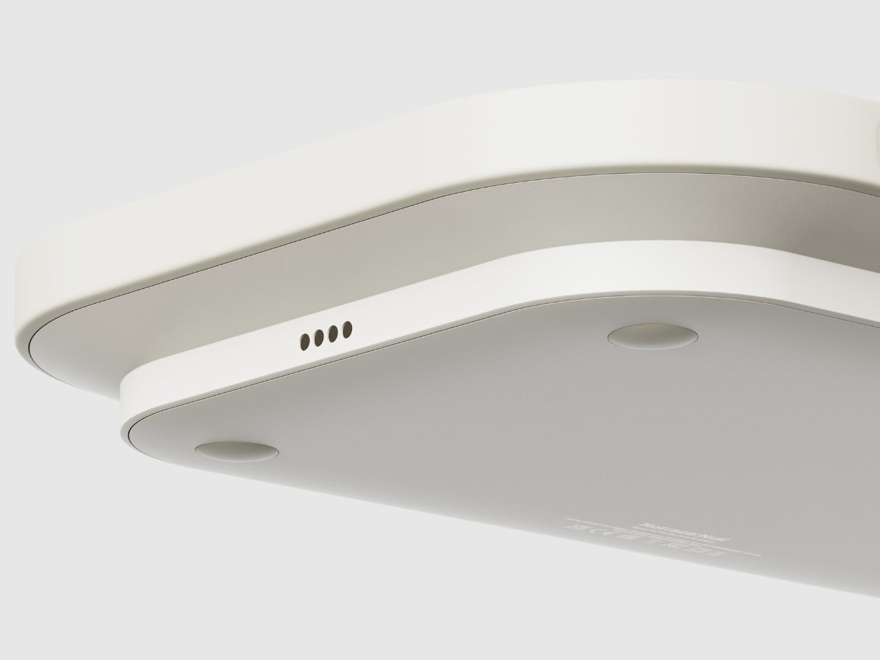
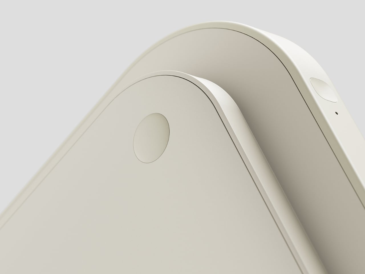
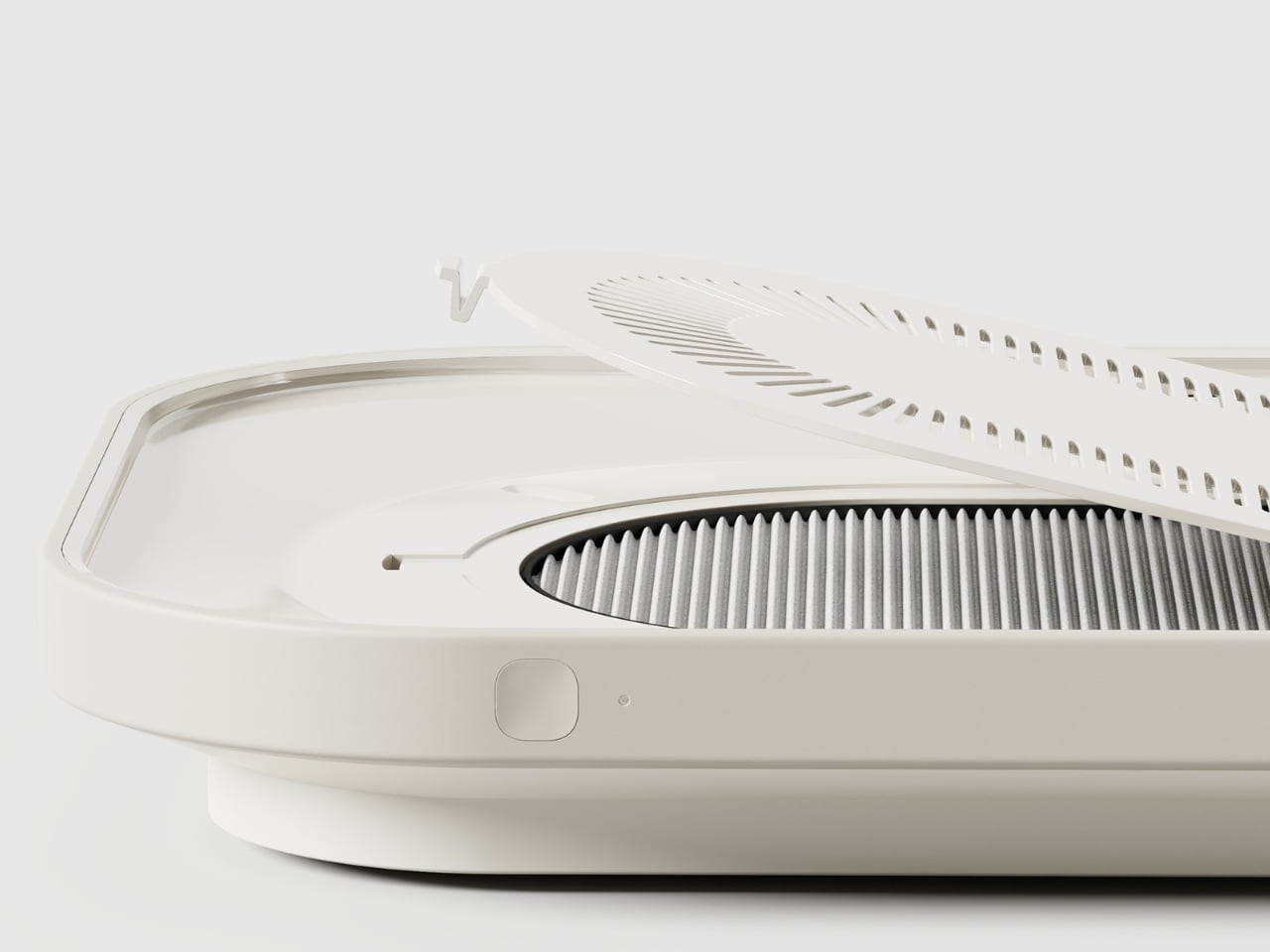
Visually, Notrace:Null makes almost no noise about what it does. The design is quiet and off-white, with a flat surface that opens to reveal an internal filter system underneath. A small button sits flush against the side, the only visible sign that this tray does anything beyond hold a bowl of ramen. The fine venting grid along the underside is equally understated. That restraint feels deliberate, and it is the right call. The best-designed things tend to look like they were always supposed to exist, and Notrace:Null has that quality.

What strikes me about this concept is that it doesn’t try to change behavior. It slots into the routine that already exists. You grab the tray, put your food on it, carry it to wherever you’ve decided to eat tonight, and that’s it. The air filtration happens as a byproduct of your usual movement. Han describes this as “the most natural solution,” and the framing holds up. Good design doesn’t demand that users adapt to it. It adapts to users instead.

The project also makes a quiet cultural observation worth sitting with. The rise of single-person households, convenience foods, and personalized streaming content has fundamentally changed where and how people eat. We don’t just eat in the kitchen anymore. We eat throughout the entire home, and that shift has real consequences for air quality. Food odors that once stayed contained now travel freely. Bedrooms carry the memory of last night’s dinner. Living rooms hold the ghost of lunch. Notrace:Null is designed around this reality rather than around the home we’re told we should have.

It’s still a concept, and that’s worth noting. As a Behance project, Notrace:Null exists in that productive space between idea and product, where the thinking is fully formed but the execution remains hypothetical. The concept feels mature enough to be producible, though. The form factor is practical, the use case is real, and the need is clearly there. If it ever makes it to market, it would fill a gap in the air quality space that nobody has managed to articulate this well before.

Design concepts like this remind me why speculative design matters. Not everything needs to ship immediately to be valuable. Sometimes a well-considered idea just needs to exist, to put the question on the table and make it harder to ignore. Notrace:Null asks a simple question: if how we eat has changed, shouldn’t the tools that support it change too? The answer is obvious. The solution, it turns out, was hiding in a tray.

The post The Tray That Knows You Eat in Bed first appeared on Yanko Design.

KFC Brazil Wants to Dress You the Way It Dresses Its Chicken

I love fried chicken as much as the next person. Probably more. So when KFC Brazil announced it was offering to customize your actual clothes with a fabric texture inspired by its iconic crispy coating, I had questions. Not the skeptical kind. More the “can they do that with a tote bag, and if so, when?” kind.

The concept is called the KFC Wardrobe, created by Lola\TBWA Brasil. The logic behind it is almost too simple to ignore. KFC’s most recognizable feature, that golden, seasoned crust Colonel Sanders spent a lifetime protecting, shares a lot of DNA with what fashion has always celebrated: something original, textured, and completely impossible to replicate. The KFC Wardrobe takes that parallel seriously and makes it completely, earnestly literal.

Designer: Lola\TBWA Brasil

Here’s how it worked: buy a medium bucket of KFC fried chicken, bring your own clothing to the brand’s flagship store in São Bernardo do Campo, and show your receipt. Eligible items included jackets, coats, jeans, skirts, bucket hats, tote bags, and waist bags. Leave them behind, and within three weeks, they’d come back to your door with a fabric treatment that mimics the texture of fried chicken breading applied to the surface. Crunchier. More textured. Somehow more interesting than before.

The promotion ran for just three days, from March 27 to 29, which makes “limited edition” feel like an understatement. It kicked off during Design Week at BAFU, described as one of São Paulo’s most prominent and respected creative hubs. KFC set the whole thing up as Colonel Sanders’ atelier. An atelier. For a fried chicken brand. I had to read that phrase twice before I could fully commit to it, and then I decided it was actually one of the most correct things anyone has said about fashion in years.

It’s worth noting that KFC has been leaning into fashion for a while now, and with increasing conviction. KFC Australia dropped a streetwear collection during Australia’s Fashion Week in 2023. KFC UK has been particularly active, releasing a ten-piece distressed leather range with Aries and collaborating with designer Sinead Gorey on a London Fashion Week show, both in 2025. At this point, the brand has clearly decided it belongs at the table, and the fashion world has quietly and somewhat bafflingly agreed.

But the KFC Wardrobe does something the earlier drops didn’t. It doesn’t ask you to buy a new KFC product. It asks to work with what you already have. That’s a fundamentally different creative stance. Most brand-adjacent fashion moves are wearable advertisements dressed up in aesthetic language. This one is a genuine collaboration with your existing wardrobe, and that’s more interesting and, honestly, a lot more respectful. KFC isn’t asking you to represent the brand. It’s asking to be part of your look, on your terms.

Fernanda Harb, KFC Brazil’s marketing director, described the initiative as a way to “expand the relationship and closeness between the brand and its customers beyond just food.” Lola\TBWA made that statement mean something real by developing an actual textile treatment, not a printed graphic or an embroidered logo, but a physical crunch-inspired texture applied to fabric. The crispy coating became the design language. That’s a design decision, not just a marketing one, and the difference shows.

The whole thing works because the metaphor at its center is genuinely earned. Fashion has always celebrated what can’t be copied. So has Colonel Sanders, for decades. You can eat KFC your whole life and never come close to the recipe. The KFC Wardrobe takes that same mystery and stitches it into your denim jacket, and that’s a creative idea worth wearing more than once.

KFC Brazil committed to the bit fully and without apology. And now there are people walking around São Paulo in textured, crunch-finished jackets, wearing their taste on their sleeves, quite literally. Fashion has come full circle, and I’ve never been this hungry for what comes next.

The post KFC Brazil Wants to Dress You the Way It Dresses Its Chicken first appeared on Yanko Design.

One Design Concept Is Treating Your Plate Like a Mood Board

We’ve seen AI make itself comfortable in our music, our fashion, and our skincare routines. It was only a matter of time before it pulled up a chair at the dinner table. Kitune, a design concept by Seoul-based designer Jiyeon Choi, is exactly that moment, arriving in the form of a compact, butter-yellow device that looks more like a studio prop than a kitchen appliance. As a concept, it’s already asking a question that most kitchen technology doesn’t bother with: what if the way your food looks was just as personal as the way you dress?

The premise is deceptively simple. Food, Choi argues, has crossed well beyond the realm of taste and into the realm of visual expression. That’s a hard argument to push back on. You only need to spend thirty seconds on any social feed to see that the way a dish looks now carries as much cultural weight as what it actually tastes like. Plating is styling. Styling is identity. Food shows up in fashion editorials, in art installations, in luxury brand campaigns. It has become its own visual language, and Kitune is a concept built entirely around that reality.

Designer: Jiyeon Choi

Here’s how the concept works. The device takes in personal data you’ve selected and tuned, your aesthetic preferences, your current mood, your lifestyle references, and uses it to generate a visual concept for how your dish should look. Not a vague suggestion, but a specific, styled direction. From there, a built-in projector casts a real-time plating guide directly onto your surface, showing you where each element should land. There are also mood-matched visual overlays that let you feel the overall atmosphere of the dish before you commit to placing a single garnish. It’s a feedback loop between your data and your plate.

That last part sounds theatrical, but I think that’s deliberately the point. Kitune isn’t trying to make you a more efficient cook. It’s trying to make cooking feel more like creative expression, and that’s a meaningful shift in what kitchen technology usually promises. Whether as a concept or an eventual product, that distinction matters.

The hardware design is genuinely considered. Kitune is conceived as a portable device that works in two configurations: a handheld form for close, controlled work and a standing version where an arm suspends the projector above your plate. Both modes carry the same cheerful yellow finish, which matters more than it might seem. That color choice softens what could easily feel like cold, clinical AI tech in a space that’s historically been warm and human. It signals that this device belongs to the experience of cooking, not just the logistics of it.

The interface is also worth attention. Instead of typing prompts or navigating flat touchscreen menus, the concept proposes interacting with a circular dial loaded with mood and lifestyle imagery that you physically rotate and select. It’s tactile, and that decision feels very deliberate. Choi seems to understand that the kitchen is not a place where people want to feel like they’re operating software. The interaction needs to feel as intuitive and sensory as the act it’s guiding.

Where Kitune really makes its case as a concept is in how it reframes what personalization means. Most AI products personalize around efficiency, faster, smarter, more optimized. Kitune personalizes around feeling. The output isn’t a quicker route or a better recommendation. It’s a visual mood built from your data that’s meant to feel like you, on a particular day, in a particular state of mind. That’s a genuinely different kind of design ambition, and one that feels more honest about the role food actually plays in people’s lives.

There are real questions the concept raises. How much data does it need to work well? Does it develop a sharper sense of you over time, or does each session reset? These are the practical gaps between a compelling concept and a working product. But Kitune doesn’t need to answer all of them right now to be worth paying attention to. As a design statement, it’s already saying something clear: that the future of kitchen technology might have less to do with what you’re cooking, and a lot more to do with how it makes you feel.

The post One Design Concept Is Treating Your Plate Like a Mood Board first appeared on Yanko Design.

Esenes Worldwide Just Made a Bag That Looks Good Enough to Eat

Fashion has a way of sneaking up on you. One minute you’re scrolling through your feed, minding your own business, and the next you’re staring at a handbag that makes you want dim sum at 10 in the morning. That’s exactly what happened when Brooklyn-based label Esenes Worldwide dropped their latest piece: a dumpling bag made from real translucent leather.

Yes, you read that right. A dumpling. A bag. One object. And somehow, it completely works. While there are a lot of dumpling-like bags already in the market (think Uniqlo, Beyond the Vines, etc), they just imitated the shape of one of our favorite snacks. This one actually took almost literally. But of course you cannot really it. You just get some dumpling cravings while carrying it.

Designer: Esenes Worldwide

Esenes Worldwide, pronounced “SNS,” short for “sorry not sorry,” was founded in 2021 by Justin Son. The brand has spent the past few years building a reputation on turning everyday objects, pop culture references, and an unapologetic sense of humor into wearable, conversation-starting designs. They’ve had viral hits before, including the Cufant clogs and the “Loose Screw” hats, but this dumpling bag feels like a new level of commitment to the bit. A very good, very delicious-looking bit.

The bag is crafted from genuine translucent leather in a pale, almost golden yellow that does a convincing job of mimicking the cooked skin of a steamed dumpling. The leather is soft and smooth to the touch, and because it’s translucent, you can see straight through to the canvas lining inside. That lining is printed with images of chopped vegetables and filling, creating a visual illusion that’s almost unsettling in the best possible way. It genuinely looks like someone cooked a dumpling, hollowed it out, and decided to put a zipper on it.

What makes it more interesting is how the construction leans into the organic nature of the food it references. Each bag has its own soft, rounded form with creases and folds that closely mirror the pleating on a real dumpling. No two pieces are exactly alike, which gives every bag a sculptural, one-of-a-kind quality that lifts it beyond novelty territory and into something you’d actually want to collect. The short, string-like handles add to the overall aesthetic, though they’re better suited for carrying in your hand or looping around your wrist rather than throwing over your shoulder.

And before you write this off as a cute conversation piece with no practical value, consider this: the canvas lining means you can actually stash your everyday things inside. Keys, cards, a lip balm, the occasional receipt you swear you’ll throw away. And of course, actual snacks. The irony of carrying your snacks inside a bag that looks like a snack is not lost on anyone, but it’s a fully functional bag, and that matters.

The drop is also very much a collector’s situation. Only 150 units were ever made, and each one retails at $150. Given the brand’s track record and the amount of attention this bag has already generated online since its release on February 20, 2026, that limited run feels more like a countdown than a leisurely shopping window.

It’s worth zooming out here, because the food-inspired handbag moment is real and it’s picking up speed. Nik Bentel’s Lidl bag shaped like a miniature shopping cart made waves not long ago, and more brands are starting to lean into the idea that accessories don’t have to take themselves seriously to be desirable. If anything, the opposite is becoming true. The more unexpected and culturally loaded an object is, the more people want to carry it around town.

Esenes Worldwide understands this better than most. They aren’t chasing trends so much as setting the terms for what a “fun” brand can look like without sacrificing craft. The dumpling bag is made from real leather, constructed with genuine attention to form, and backed by a concept that actually holds up under scrutiny. It’s playful without being cheap. It’s strange without being alienating.

Fashion at its best has always had a sense of humor, and this bag is proof that the funniest ideas can also be the most technically thoughtful ones. Whether you’re carrying it to a gallery opening or a late-night noodle spot, it’s going to start a conversation. And that, really, is the whole point.

The post Esenes Worldwide Just Made a Bag That Looks Good Enough to Eat first appeared on Yanko Design.

bibigo Just Made Chopsticks With Touchscreen Tips for Scroll-Eaters

There’s a greasy phone screen somewhere in your immediate past. Maybe it was a dumpling, maybe it was a bowl of noodles, maybe it was something with a suspiciously orange sauce. Either way, you were eating and scrolling at the same time, and the evidence is still on the glass. Nobody’s proud of it, but according to a survey bibigo ran through Angus Reid, 96% of Americans have used their phone while eating, so at least you’re in excellent company.

bibigo, the Korean food brand behind what the internet has collectively decided are its favorite dumplings, decided to design for the habit instead of lecturing about it. ScrollSticks are dual-ended chopsticks with touchscreen tips, one end for picking up food and the other for tapping, swiping, and scrolling on a phone. The premise is simple: two dedicated ends for two different jobs, keeping the oil and sauce where they belong.

Designer: bibigo

The research behind the launch is basically a monument to relatable chaos. Beyond the 96% who’ve scrolled while eating, 66% do it often during at least one meal a day. Nearly three in four people report frustrations: 41% are frustrated by getting their hands or phones dirty, 30% struggle to hold a phone comfortably while eating, and 28% can’t keep their screen clean. ScrollSticks are bibigo’s answer to all of the above, which is either very clever or a sign of the times, possibly both.

The design logic is straightforward. You eat with the food end, then flip the chopsticks and use the touchscreen-compatible tips to tap and scroll without transferring dumpling residue onto the glass. The tips work with capacitive touchscreens, so it’s not just poking the screen with metal but actually registers as a touch. One tool, two dedicated functions, and your screen stays marginally more dignified.

The cleaning situation is also handled better than you’d expect from what sounds like a novelty item. The touchscreen tips unscrew from the chopsticks, so you can dishwasher or sink-wash the metal body just like any other silverware. That modularity is doing serious practical work here. A touchscreen-tipped chopstick that you can’t properly clean would be a different, worse product.

bibigo frames ScrollSticks as part of its “food-tainment” innovations, which is a word that exists now and apparently describes branded objects that blur eating and entertainment culture. The previous entry in that line was the bibigo Dashboard Kitchen. ScrollSticks are sillier and more useful, which is a hard combination to pull off.

The chopsticks are a limited-edition drop, and the window is short. That’s fitting for something that is partly a product and partly a cultural artifact: a small, polished admission that dinner and doomscrolling are now the same meal, and if the phone is staying at the table, at least the screen deserves better than a dumpling-flavored fingerprint in the corner.

The post bibigo Just Made Chopsticks With Touchscreen Tips for Scroll-Eaters first appeared on Yanko Design.

Airline Meal Trays Are Broken: This Korean Design Fixes Them

There’s something deeply satisfying about opening a Korean meal to find those little side dishes, each in their own small bowl, arranged just so. The banchan tradition turns eating into a kind of visual feast before you even take a bite. Now, imagine bringing that same thoughtful, modular approach to one of the most notoriously cramped dining experiences: airplane meals.

That’s exactly what BKID co has done with their System Tray design, and honestly, it’s one of those ideas that makes you wonder why we didn’t think of this sooner. The project takes the organizational genius behind Korean side dish service and reimagines it for the narrow, tray-table constrained world of in-flight dining.

Designer: BKID co

Anyone who’s flown recently knows the struggle. You get your meal tray, and it’s this precarious balancing act of overlapping plastic containers, a wobbly cup threatening to spill, and utensils that somehow always end up on the floor. There’s no elegance to it, no sense that anyone actually thought about the experience beyond “how do we get food from point A to point B?” The System Tray flips that script entirely. Drawing inspiration from traditional Korean wooden trays that hold multiple small dishes, the design creates a modular system where individual plates nest together like a puzzle. Each piece has those beautiful organic, flowing shapes that lock into each other or fit perfectly within the main tray. It’s functional geometry that doesn’t look robotic or cold.

What makes this particularly clever is how it addresses real constraints. Airlines aren’t going to adopt anything that doesn’t meet strict safety standards or adds significant weight. So BKID co worked with lightweight materials like durable plastics and lightweight ceramics, keeping things practical while maintaining that elevated aesthetic. The pieces can stack when not in use, which means they take up less storage space in the galley. For airlines constantly trying to maximize every square inch of cabin space, that’s a huge selling point.

But let’s talk about the visual appeal, because this is where the design really shines. The color palette is subtle and sophisticated: soft creams, muted blues, warm beiges, and earthy browns. These aren’t the harsh primary colors or industrial grays we’re used to seeing on planes. The shapes themselves are organic and almost playful, with curved edges that interlock in unexpected ways. Laid out, they look more like modern art than airline serviceware.

There’s something almost meditative about the way the pieces fit together. You can configure them in different arrangements depending on the meal, whether it’s a full dinner service with multiple courses or a lighter snack. That flexibility is key because not every flight or passenger needs the same setup. The modular approach means the system can adapt rather than forcing one rigid solution.

This design also taps into a broader trend we’re seeing in travel and hospitality: the push to make utilitarian experiences feel special. We’ve watched airport lounges transform into design showcases. We’ve seen hotel rooms become Instagram-worthy destinations. Even train stations are getting architectural makeovers. Why should airplane meals be any different? The banchan tradition isn’t just about having multiple dishes. It’s about balance, variety, and presentation. It turns a meal into something communal and considered, where each element has its place and purpose. That philosophy translates surprisingly well to the challenge of airline food service, where space is limited but the desire for a pleasant dining experience remains.

What BKID co has created here isn’t just a better tray. It’s a rethinking of how we approach one of travel’s most mundane moments. It suggests that even in a space as constrained as an airplane cabin, there’s room for thoughtfulness and beauty. The design proves that solving practical problems doesn’t mean sacrificing aesthetics.

Will we see these trays on flights anytime soon? That’s the real question. Airlines move slowly, and switching out serviceware across an entire fleet isn’t a small undertaking. But as more carriers compete on experience rather than just price, innovations like this become more attractive. Passengers increasingly expect more, even in economy. A meal served on a thoughtfully designed tray system could become a differentiator.

For now, the System Tray stands as a brilliant example of cross-cultural design thinking, where a traditional dining practice inspires a modern solution to a very contemporary problem. It reminds us that good design often comes from looking at how people have solved similar challenges in different contexts, then adapting those insights with fresh eyes.

The post Airline Meal Trays Are Broken: This Korean Design Fixes Them first appeared on Yanko Design.

Heinz Dipper Finally Gives Fries Their Own Little Ketchup Pocket

Eating fries away from a table means improvising a ketchup situation that usually goes wrong. Packets balance on dashboards, sauce gets smeared onto napkins, or you squeeze tiny dollops directly onto individual fries like you are frosting cupcakes. It is ridiculous that we perfected crinkle cuts and waffle fries but still treat the ketchup part like an afterthought whenever we leave the safety of a tray.

Heinz Dipper is what happens when someone finally looks at a fry box and asks, “What if this thing helped?” It is a patent-pending container with a built-in condiment compartment on the front, engineered for dipping on the go. The box holds fries like usual, but also carries a small pool of ketchup or mayo right where your thumb expects it to be.

Designer: Heinz

Picture a drive-thru run or a couch session. Instead of tearing packets and hunting for a flat surface, you grab the Dipper with one hand, dip with the other, and never wonder where the ketchup went. The fry box becomes a self-contained meal kit, making it harder to justify those ketchup stains on jeans, car seats, or suspiciously sticky armrests that no one wants to talk about.

The design is basically a standard fry box with a foldable pocket on the front acting as a condiment well. That small structural change stabilizes the sauce, keeps it from sliding around, and puts it within the same footprint as the fries. No extra cups, no balancing acts, just a single object that understands fries and ketchup are a package deal, not two separate quests requiring three hands.

Heinz leans into its keystone icon here, turning the familiar label shape into both branding and a visual cue that says “dip here.” It is packaging as an interface, not just decoration. The Dipper teaches you how to use it without instructions, which is what good packaging should do when your other hand is busy steering, cheering, or trying to find the napkins you forgot to grab.

The brand cites research showing that most people have spilled ketchup while dipping on the go, and many have considered skipping sauce entirely because the packaging is so annoying. Those numbers validate that this is not a niche complaint; it is a shared embarrassment. The Dipper’s simple structure is less about reinventing fries and more about admitting we have been eating them awkwardly for years.

Heinz Dipper will not save the world, but it might save a few car interiors and shirts. It is a reminder that thoughtful design can live in cardboard geometry as much as in expensive gadgets, and that sometimes the most satisfying innovations are the ones that fix a tiny, greasy annoyance you did not realize everyone else was quietly suffering through as well.

The post Heinz Dipper Finally Gives Fries Their Own Little Ketchup Pocket first appeared on Yanko Design.

Billboard that smells like French Fries tempts you to go to McDonald’s

There’s a chocolate drink factory near our place and when the wind blows down the main street, the smell of chocolate fills the entire area and every person is brought back to their childhood drinking a cup of hot cocoa in the morning. Also, on my walk to and from the office and my house, I pass by a McDonald’s store. When I’m especially hungry, that distinct smell of burger and fries (and sometimes chicken) actually tempts me to make a detour and enter the store to buy my dinner.

Designer: TBWANeboko and Raul & Rigel for McDonalds

There are just some food brands that triggers our olfactory nerves and makes us want to buy their products to satisfy this craving brought about by smell. McDonald’s believes they’re one of those brands and in Netherlands, they’re putting this to good, creative, and aromatic use. Their ad agency TBWANeboko worked with production company Raul&Rigel to put up a series of unbranded street billboards with just the red and yellow colors. When you pass by within 5 meters of them, you get to smell the distinct aroma of McDonald’s French Fries, hopefully triggering a craving.

These scented billboards actually have a hidden compartment in them to store the aforementioned fries. There’s also an internal heat and ventilation system that is responsible for intensifying this smell and tempt anyone passing by to get fries. Of course they are located strategically near a McDonald’s, 200 meters away in fact, so that you can sate that craving and get your favorite fries (and maybe other things) because of that billboard smell.

It’s a pretty creative way to take advantage of that feeling evoked in us when we smell something so distinct. It’s bad news though for people like me who are trying to stay away from carbs. Good thing that fries-scented billboard is only in the Netherlands, although passing by that McDonald’s every day is already temptation enough.

The post Billboard that smells like French Fries tempts you to go to McDonald’s first appeared on Yanko Design.

Edible AirPods-looking earbuds are (expensive) fanciful candy

We see a lot of Airpod dupes out there in the market that are not as expensive and therefore may also not last as long as the originals. I’ve heard of some people who keep getting these non-authentic earbuds that look the same as Apple’s original because either they stop working properly or they keep losing them. And with the way that a lot of these earbuds are made, it’s not surprising that people keep losing them. What if there are AirPods though that are meant to be lost….into your mouth?

Designer: MSCHF

The Brooklyn-based art collective called MSCHF, known for their unserious and sometimes prank-ish products, have come up with their own take on the AirPods. But instead of giving you music, this may very well give you a toothache. That’s because their Candy AirPods are just exactly what the name says. They are edible earbuds that don’t have any other function except to be consumed. Well, unless, you want to keep them around for a long time even though they can’t let you listen to your favorite songs or podcasts.

The AirPods-looking candy come in a box just like the actual AirPods. They really do look like the earbuds as they are “ergonomically fitted to your ears” even though they’re not meant to be actually be put into your ears. The edible earbuds are made from isomalt, water, food coloring, and natural and artificial flavors and only contain 10 calories per container. If you have any allergies, you shouldn’t worry as they are GMO-free, fat-free, and allergen-free. They’re even manufactured in a nut-free facility so you can be sure you won’t get an allergy attack if you eat them.

Right now, it looks like they’re already sold out on the MSCHF website and we don’t know if they will still be restocking. But in case they will, it will cost you $50 which is a pretty steep price for two pieces of candy. They also can’t ship outside of Continental America since it’s not meant to travel far.

The post Edible AirPods-looking earbuds are (expensive) fanciful candy first appeared on Yanko Design.

World’s First 3D Printed Edible Eel: Sushi Ready

Hot on the heels of 3D-printed salmon comes the world’s first 3D-printed eel, made by Steakholder Foods using its line of 3D meat printers. Its current iteration of eel is plant-based, but it plans to ethically harvested eel cells and cultivate them once “economies of scale allow for price-competitive cell development.” These are fascinating times for the sushi industry!

SteakHolder’s printing process involves printing alternating layers of varied textures to as closely resemble the meat it’s printing as possible. So, it’s not just a solid block of the same texture and flavor. Its printing technology also allows the company to produce meat alternatives using significantly fewer ingredients than others currently on the market.

Above: A filet of grouper being printed.

SteakHolder Foods CEO Arik Kaufman says, “The launch of our printed eel marks a pivotal moment in the seafood industry…This technology is designed to enable partners to generate products on a potential industrial scale of hundreds of tons monthly, not only at lower costs compared to wild eel, but also with the flexibility to create a variety of printed products using the same production line.”

Would you eat 3D-printed eel? I would. As a matter of fact, I want some right now. Ideally, laid atop some rice with wasabi and soy sauce on the side. Great, now I want sushi. But I just had Mexican! I suppose I still have a little room…

[via TechEBlog]