Your Carry-On Isn’t Ready for Cherry Blossom Season in Japan — These 9 Designs Are

Cherry blossom season in Japan is one of the shortest windows in the travel calendar. Full bloom in Tokyo peaks around March 26 to April 3. Kyoto follows a few days later. Each city holds its peak for roughly a week before the petals fall. The parks fill before sunrise. The trains are packed. The days move fast, and the light does not repeat. What you brought matters more than it usually does, because there is no second shot at the season and no nearby store stocking the specific things that make the difference between a fluid trip and a frustrating one. These nine designs were not built for airport shelves or generic packing lists. They were made to be used — on the flight over, under the trees, and everywhere in between.

1. Camera (1) — A Tactile Digicam for a Screen-Tired Generation
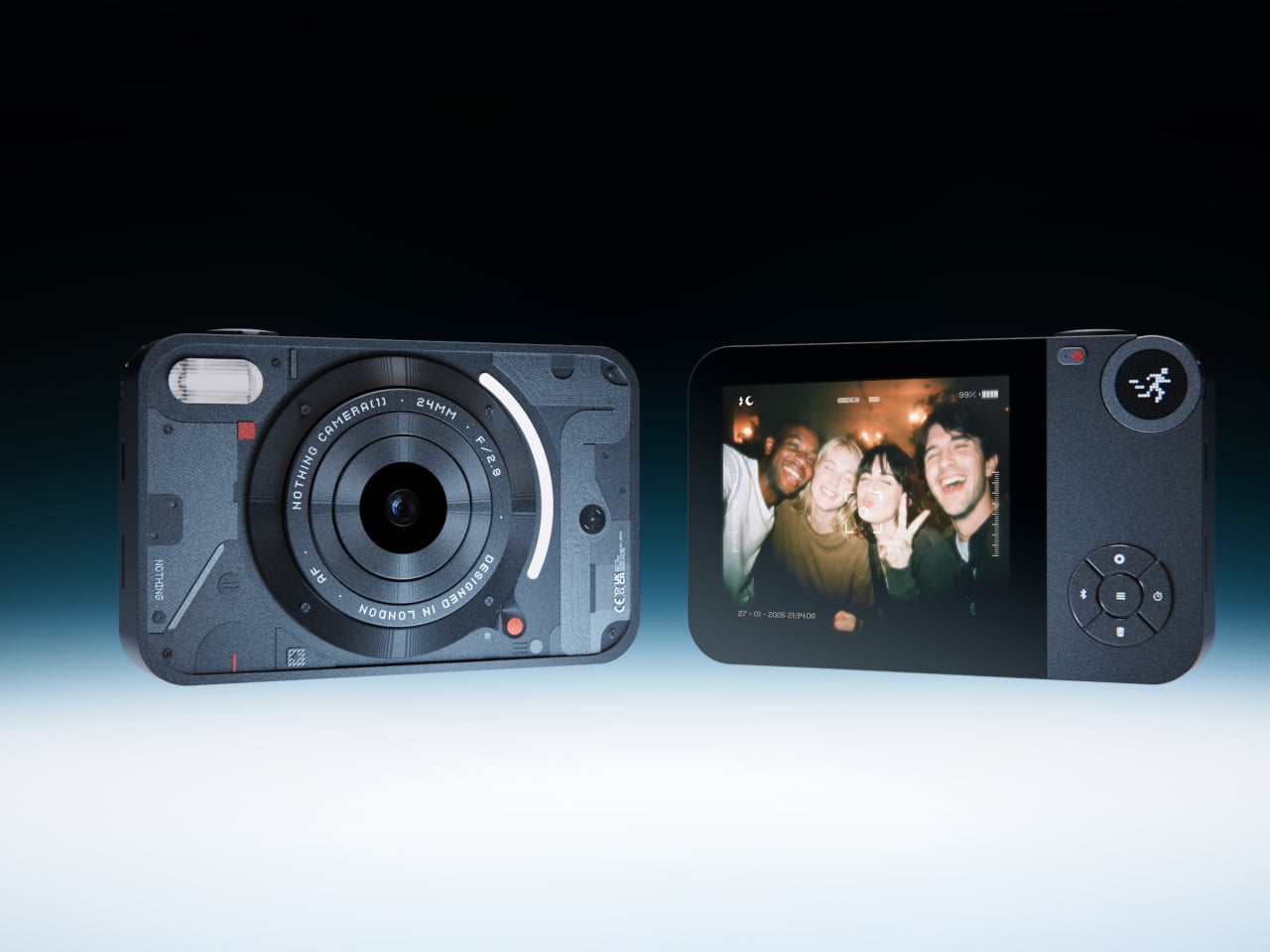
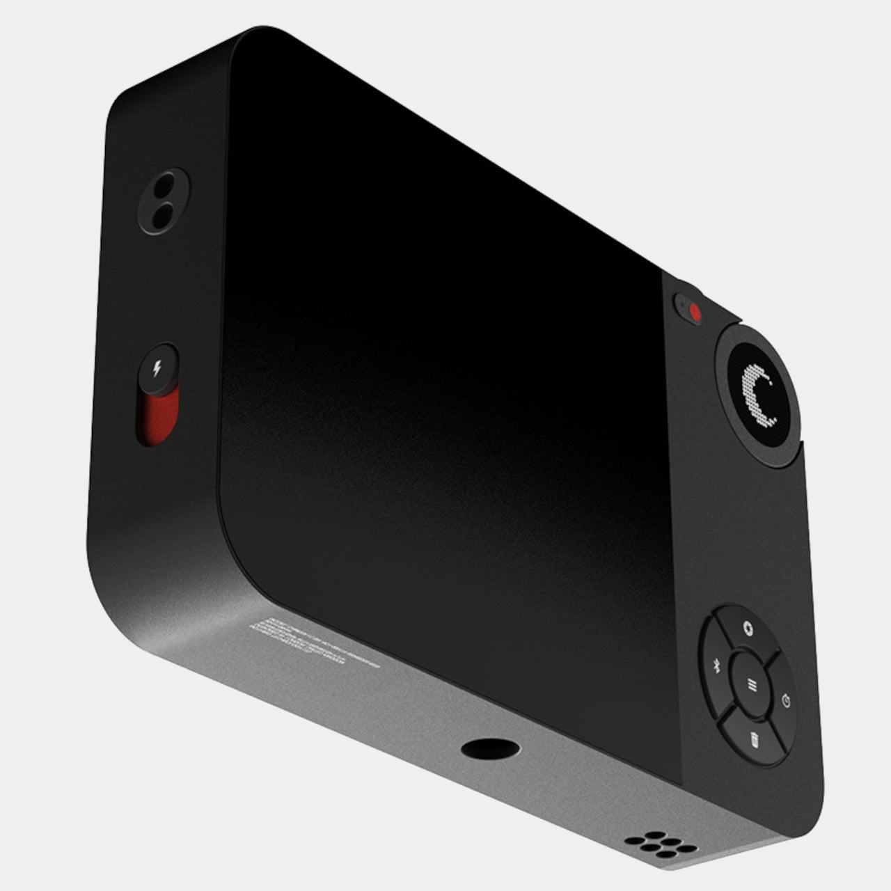
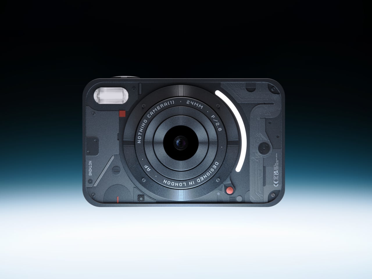
Camera (1) is a compact, metal-bodied camera with softly rounded corners, sized to slip into a pocket but solid enough to fill the hand with the right kind of weight. All the main controls live on one edge — shutter, a circular mode dial with a tiny glyph display, and a simple D-pad — reachable without shifting grip or navigating a touchscreen. Inspired by Nothing’s transparent, hardware-forward design language, it carries the confidence of a device that has thought carefully about how a person actually holds something. The rear display stays out of the way because it is designed to.

In Japan, during cherry blossom season, the light changes fast, and the best moments do not hold for a menu scroll. Petals falling across a stone lantern at Ueno. A crowded riverbank at golden hour along the Meguro. Camera (1) puts the full interaction in your fingers — twist the lens ring to frame, feel the shutter click, glance at the dial glyph to confirm mode. It encourages you to look at the scene rather than at the screen, which is the right priority when the thing in front of you is a path of blooming trees reflected in a temple pond.

What We Like

  • Single-edge control layout gives full shutter, mode, and navigation access in one hand without lifting your eyes from the scene
  • Pocketable metal body is carry-on ready and solid enough for full walking days across multiple cities

What We Dislike

  • Currently a concept design, meaning production availability and final specifications are not yet confirmed
  • No touchscreen requires an adjustment period for those accustomed to modern smartphone-style interfaces

2. StillFrame Headphones — Listening as a Physical Ritual

StillFrame wireless headphones are built around a specific idea: that listening should feel like something. The form echoes the quiet geometry of 80s and 90s CD hardware — measured proportions, nothing aggressive. The 40mm drivers deliver a wide, open soundstage that shapes quiet tracks into something more spatial, turning melodic textures into landscapes rather than noise. Noise-cancelling engages when the environment demands it. Transparency Mode opens the sound field when the world is worth hearing. Featherlight but full in the hand, it sits in quiet dialogue with a ClearFrame CD Player from a time when music had weight.

The flight to Tokyo runs roughly 14 hours from the US West Coast. Noise-cancelling carries you through the worst of the cabin without asking you to fight it. On the other side of that flight — on the Shinkansen between cities, in a ryokan at night with rain on a wooden roof, walking through a park where petals are already on the ground — Transparency Mode brings Japan back in without pulling the music out. Cherry blossom season moves at the pace of the trees, not the internet. StillFrame is designed for exactly that tempo.

Click Here to Buy Now: $245.00

What We Like

  • Noise cancelling and Transparency Mode cover the full range of environments a Japan trip demands, from the cabin to the temple garden
  • On-ear form is lighter and less fatiguing than over-ear alternatives across long travel days

What We Dislike

  • On-ear design provides less passive isolation than over-ear headphones in the noisiest cabin environments
  • Premium audio hardware adds a carefully packable item to a carry-on already optimized for volume

3, Benro Theta — The Tripod That Refuses to Compromise
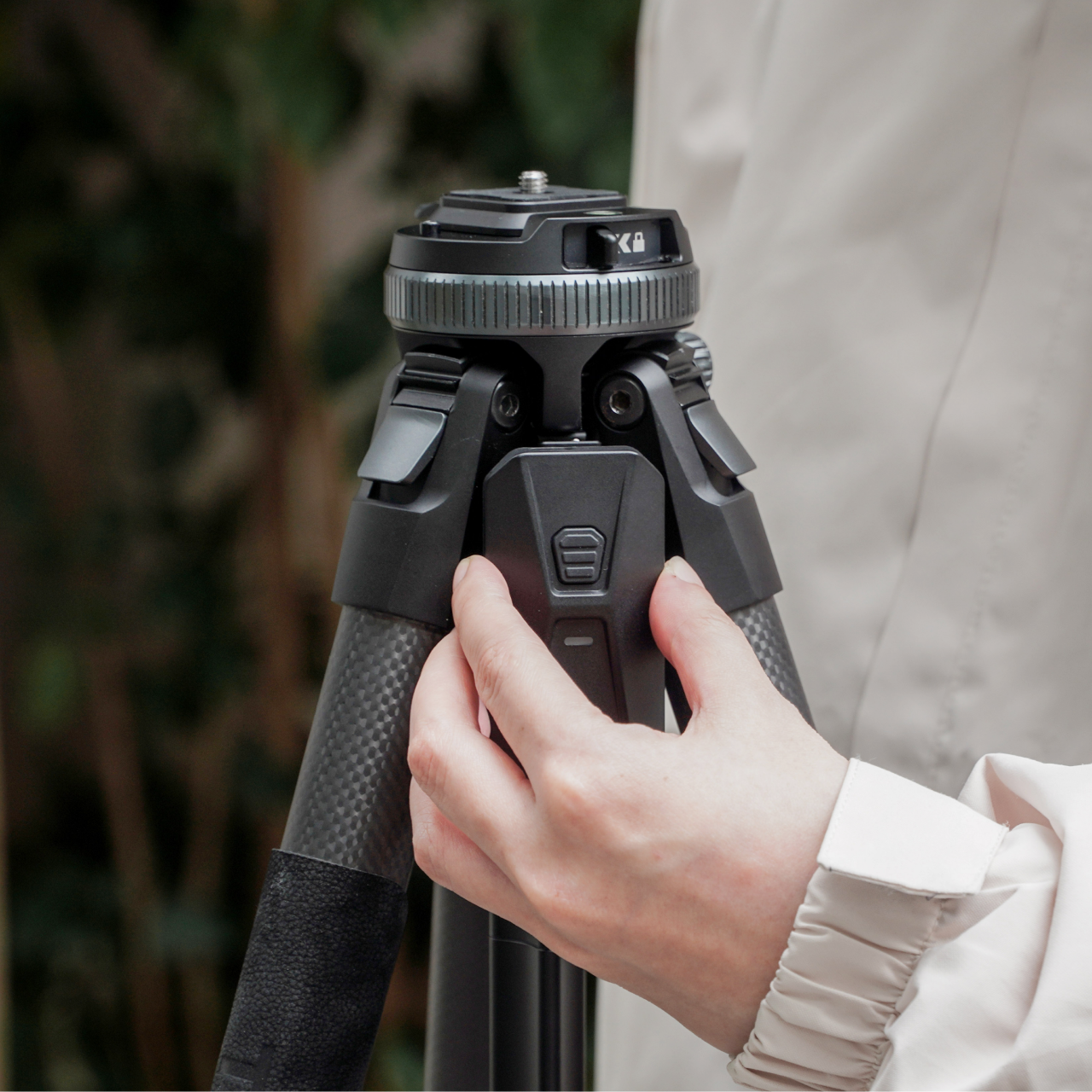
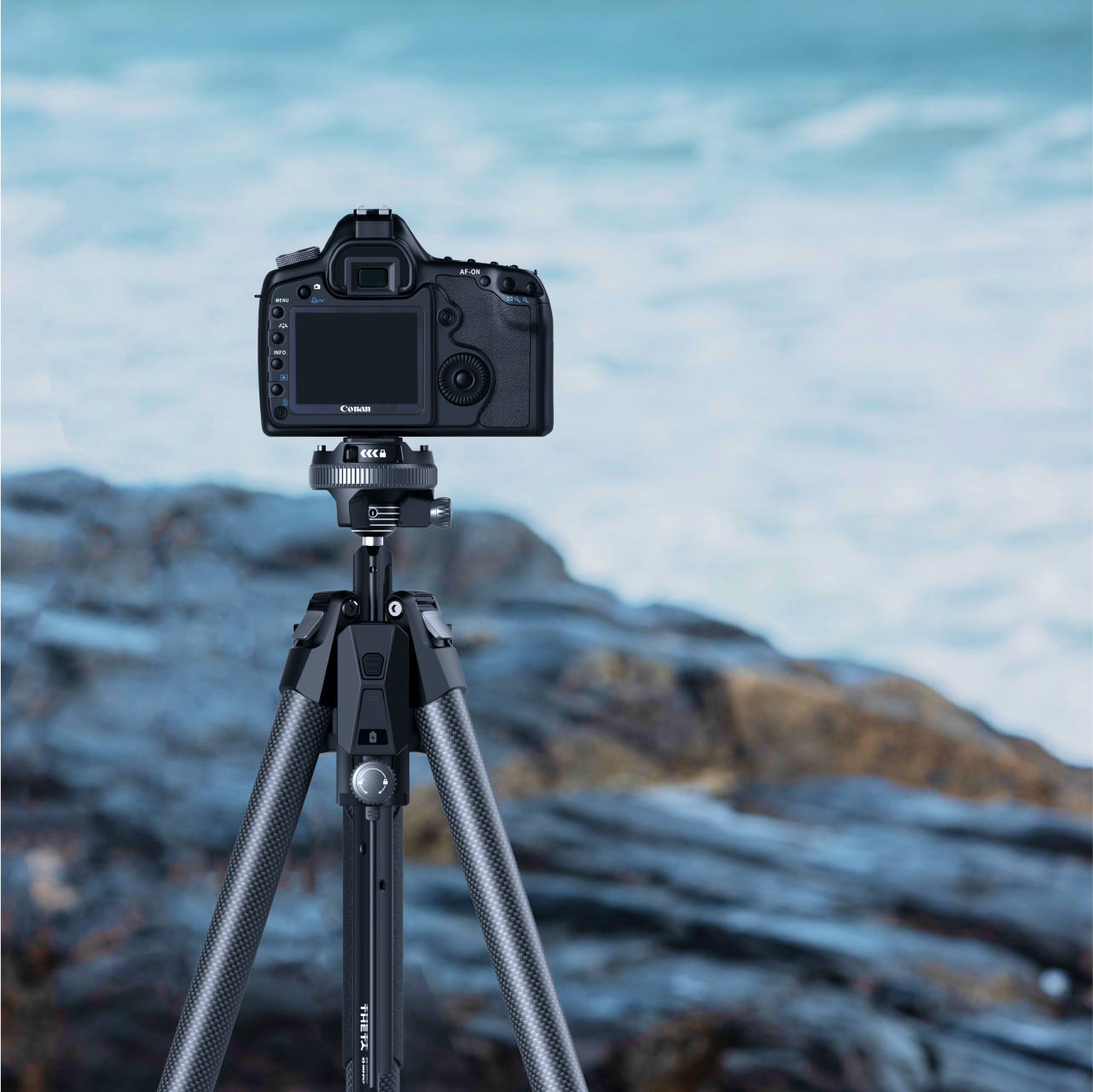
The Benro Theta is a tripod that refuses to accept the standard trade-off between portability and capability. Rapid leg deployment, automatic leveling, remote camera control, automatic exposure adjustment, and livestreaming support — all in a package compact enough to carry into a city without rethinking your bag. It does not present itself as a scaled-down version of a better product. The engineering is serious, the footprint is small, and that combination requires actual design effort to achieve, rather than simply removing features until something fits in a daypack.

Sakura season in Japan is a photographer’s season, and the locations that make the best photographs require patience, positioning, and speed. Setting up at Maruyama Park in Kyoto before the light peaks, or along the Philosopher’s Path before the morning crowds arrive, leaves no room for a slow tripod. The Theta’s rapid leg deployment means seconds between pulling it out and having a steady frame. Remote camera control means a solo traveler can step into the shot. Carry-on compatible without the overhead bin negotiation that full-size tripods demand, it earns its space before you even land.

What We Like

  • Rapid leg deployment and automatic leveling cut setup time dramatically in crowded, fast-changing outdoor locations
  • Remote camera control gives a solo photographer full control over framing without being physically behind the viewfinder

What We Dislike

  • Smart Modules that extend the Theta’s full capability are excluded from the standard pack and sold separately, increasing the total cost
  • The depth of technical features may exceed what casual photographers need on a trip built around handheld shooting

4. TMB Modular Bottle — A Bottle That Adapts to the Day
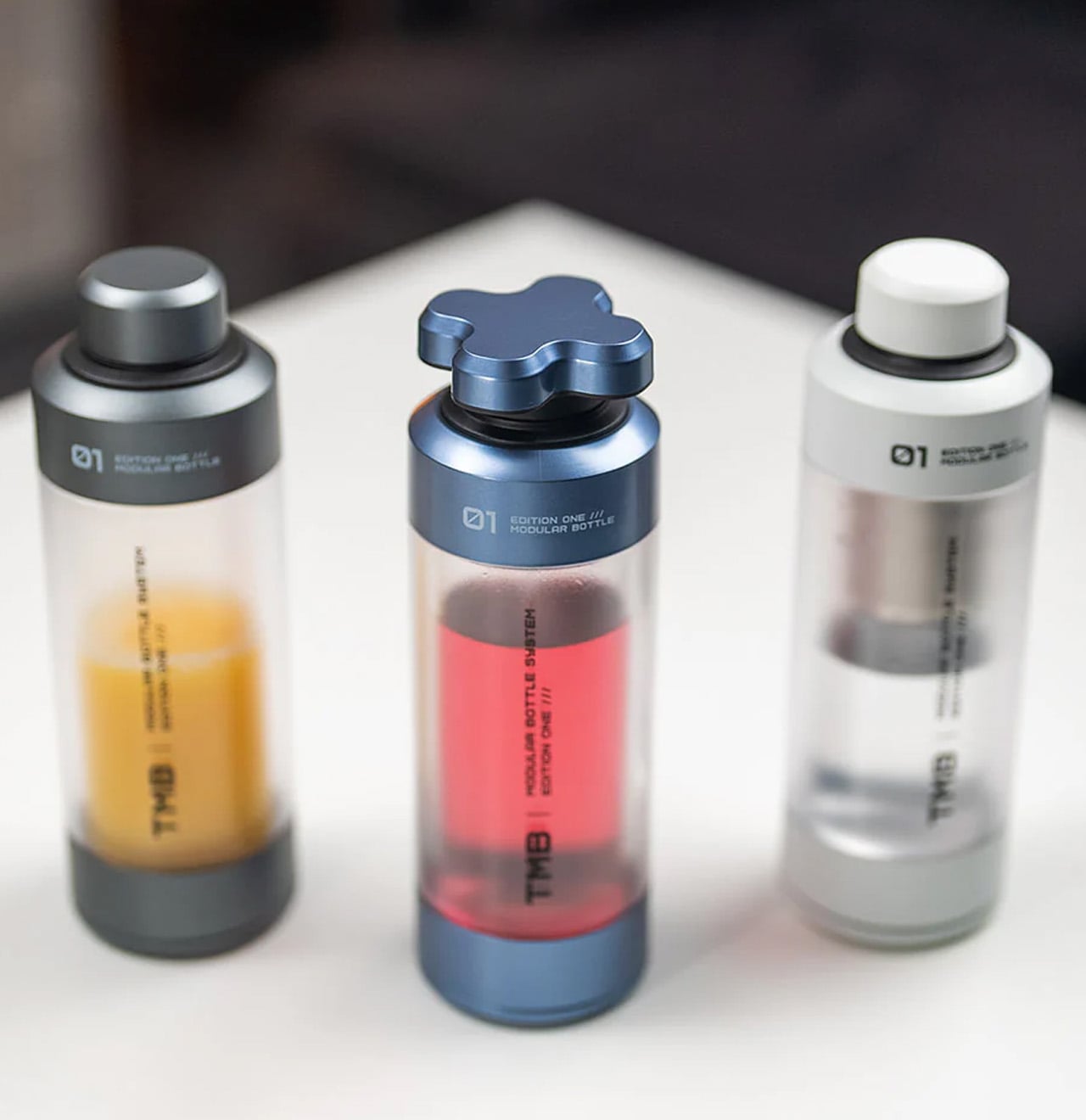
The TMB Modular Bottle starts from a premise most hydration products avoid: no single bottle works equally well for a long-haul flight, a full city day, and a trail hike. The borosilicate glass interior preserves drink flavor without absorbing taste or odor — a genuine material distinction from the steel and plastic alternatives that dominate this category. A translucent mid-section gives a constant read on remaining liquid. Every component is designed to be replaced individually, so a worn exterior case or cracked cap becomes a five-minute fix rather than a full replacement.

Japan’s tap water is among the cleanest in the world, and refilling throughout cherry blossom season is both practical and culturally appropriate in a country with almost no public trash cans. The TMB Modular Bottle handles morning tea, a full afternoon of water, and whatever comes between, without carrying the previous drink into the next. Cherry blossom season means long days on foot across multiple neighborhoods — Yanaka to Ueno, Arashiyama to Gion — and a bottle designed to adapt to those hours without failing them earns its volume in the carry-on.

What We Like

  • Borosilicate glass interior preserves drink flavor completely, with none of the taste transfer found in steel or plastic alternatives
  • Modular construction means worn components can be individually swapped, extending the product’s useful life significantly

What We Dislike

  • Glass interior is heavier and requires more careful packing than steel alternatives on a long-haul flight
  • Multiple modular components mean more individual parts to track across a multi-city itinerary

5. AirTag Carabiner — The Lightest Peace of Mind in the Bag

The AirTag Carabiner is made from Duralumin composite alloy — the same material used in aircraft, spaceships, and boats — which makes its lightness feel like a technical achievement rather than a shortcut. It clips directly onto bag straps, handles, or umbrella loops and turns an Apple AirTag into a permanent part of the bag rather than a separate object to remember. Individually hand-crafted and available in treated alloy, untreated Brass, and Stainless Steel. The AirTag itself is not included, but the carabiner makes a strong case for buying one before the trip.

The cherry blossom season is the peak of tourism in Japan. Parks like Ueno and Shinjuku Gyoen draw enormous crowds through late March and early April, trains between cities run at capacity, and moving a bag through a country where getting lost requires a language you may not speak adds a layer of cognitive friction the trip does not need. One carabiner on the main bag strap. One on the umbrellas you will inevitably set down somewhere and nearly walk away from. The GPS network handles the rest. For a carry-on trip built around doing things rather than managing them, this is a small object with an outsized return.

Click Here to Buy Now: $129.00

What We Like

  • Aircraft-grade Duralumin composite alloy delivers structural reliability at a weight that adds nothing meaningful to the overall load
  • Clips onto existing bag hardware with no case, pouch, or added setup required

What We Dislike

  • Apple AirTag must be purchased separately, adding to the total cost of a complete tracking setup
  • Designed exclusively for AirTag, making it incompatible with other location tracker formats

6. PWR 27 — The Power Bank That Actually Keeps Up

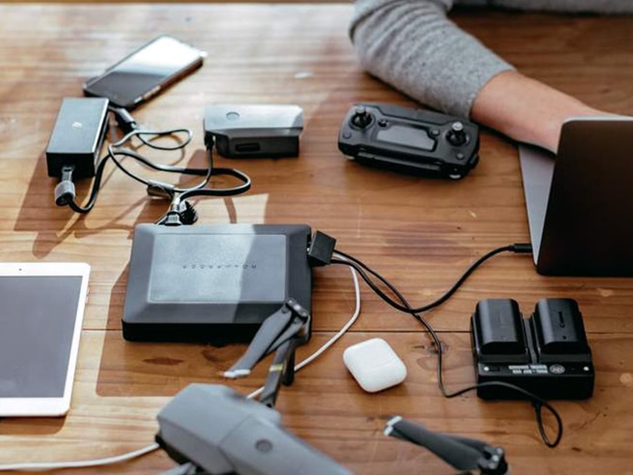
The PWR 27 is a 27,000 mAh power bank with an AC outlet, rated at 99 wH — the maximum battery capacity permitted in carry-on luggage by the TSA and all international air regulations. It charges four devices simultaneously, carries an IP67 dust and waterproof rating, is drop-proof and crushproof to significant tolerances, and features integrated solar battery life extension, an industry first for an AC power bank. It does not ask you to choose between the capacity a long trip demands and the ability to board the plane with it.

Japan runs on apps: navigation, IC transit cards, real-time translation, camera apps, and the constant map-checking that moving between Tokyo, Kyoto, and Osaka requires. A full day of cherry blossom season in any major city will drain a phone twice before dinner. The PWR 27 handles all four devices at once and keeps working in the rain, which matters in a spring season known for sudden, wind-driven showers. Power banks that are smaller and lighter are easy to find. Power banks at this capacity that fly legally, survive getting soaked, and charge a laptop mid-Shinkansen are not.

What We Like

  • Maximum TSA-permitted capacity of 99 wH guarantees full legal compliance without any sacrifice in power availability
  • IP67 waterproofing and crushproof construction make it genuinely dependable in Japan’s unpredictable spring weather

What We Dislike

  • At 27,000 mAh, the physical weight is heavier than compact power banks, which registers across full walking days

7. Ori Frameless Umbrella — The World’s First Umbrella Without Ribs
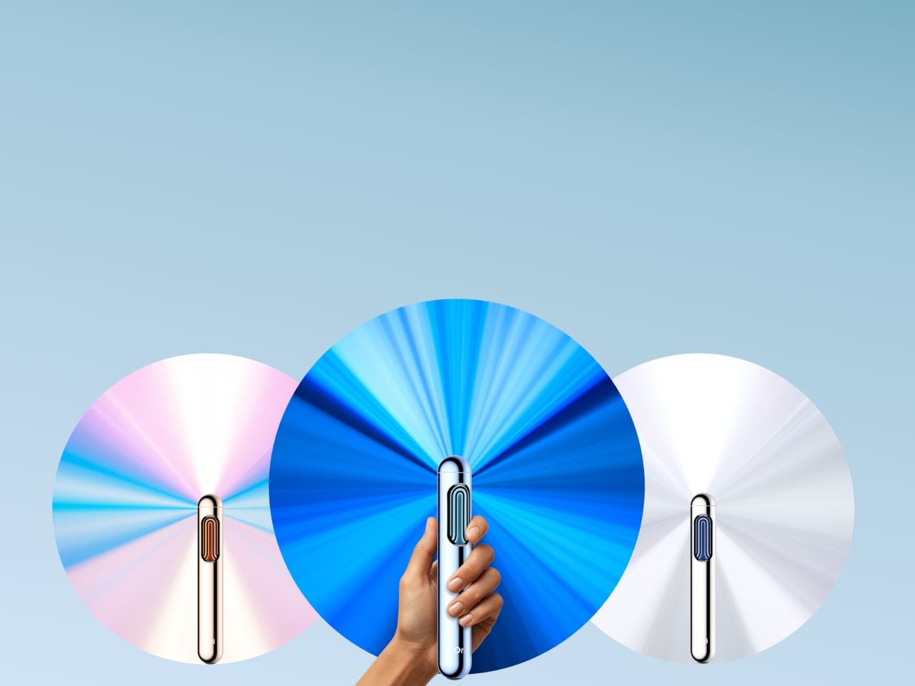
The Ori umbrella was founded by MIT engineers and origami specialists. Its canopy structure uses the Miura fold — the same origami-derived engineering NASA deploys for spacecraft structures — which means there are no metal ribs, no fabric stretched over a frame, and no traditional failure point waiting for a windy Tuesday. The canopy itself becomes the structure. The result is a compact cylinder that stores like a pen and opens into a full umbrella. Billed as the world’s first frameless umbrella, the engineering behind that claim is real, and it shows in the form.

Spring in Japan brings unpredictable rain, and sakura season specifically delivers the kind of sudden gusts that destroy conventional folding umbrellas in minutes at the worst possible moment. The Ori’s frameless construction removes the single failure mode that makes cheap travel umbrellas frustrating and expensive ones still unreliable. The cylindrical form fits a jacket inner pocket or a bag side pocket that a standard folding umbrella profile cannot reach. Walking Philosopher’s Path in Kyoto in the rain while the petals come down around you is one of the better versions of that walk. Being dry enough to stay in it makes all the difference.

What We Like

  • Frameless, rib-free construction eliminates the primary failure point of conventional compact umbrellas in wind and heavy rain
  • Cylindrical form fits pockets and bag slots that standard folding umbrella profiles cannot reach

What We Dislike

  • As a newer product, long-term durability data for the origami-based canopy in sustained heavy rain remains limited
  • Premium engineering is reflected in a price point above standard compact travel umbrellas

8. Inseparable Notebook Pen — The Pen That Never Leaves the Book

The Inseparable pen is designed to live permanently attached to a notebook. A magnetic clip holds it flush against the cover. A built-in silencer makes the detachment and reattachment quiet rather than abrupt. The form is minimal, the grip is comfortable, and the ink flow is smooth — all by deliberate design choice. It does not compete with the notebook for attention. The goal from the start was a writing instrument that becomes an extension of the book itself, always within reach, never a separate thing to locate when the thought arrives and the moment is already passing.

Japan, during cherry blossom season, produces the kind of experiences worth writing rather than photographing. The name of the temple you want to return to. The smell of a specific lane in Yanaka at dusk. The precise quality of afternoon light through sakura petals at Shinjuku Gyoen. A notebook and a pen that are never separated mean nothing interrupts the move from thought to page. Packing a journal without a reliable pen attached to it is a half measure. The Inseparable pen completes it, quietly and without asking for any attention of its own.

Click Here to Buy Now: $19.95

What We Like

  • Magnetic clip keeps the pen permanently attached to the notebook, removing the friction of searching when the moment arrives
  • Minimalist form and smooth ink flow make it a genuine pleasure to use rather than simply a functional object

What We Dislike

  • Designed specifically as a notebook companion rather than a standalone pen, limiting its versatility as a general writing tool
  • Magnetic attachment performance may vary depending on the notebook cover material and thickness

9. CleanseBot — The Travel Robot That Sanitizes the Room You Sleep In

CleanseBot is a travel robot with 18 sensors and four UV-C lamps, designed to sanitize hotel surfaces autonomously. Independently tested to kill 99.99% of E. coli, it navigates across beds, desks, and surfaces without manual direction. The UV-C light extends its sanitation capability beyond contact surfaces to airborne pathogens. It is compact enough to carry in a standard travel bag and smart enough to complete a full sanitation cycle while you unpack, check tomorrow’s weather, and figure out which train to take to the morning blossom spots.

Cherry blossom season is the busiest tourism window in Japan. Hotels and guesthouses turn over quickly during peak weeks, with rooms running at capacity from late March through early April. The CleanseBot is not a paranoid product — it is a calibrated one. Running it across the bed and key surfaces takes two minutes of setup and leaves a room measurably cleaner than the one you walked into. For a trip across multiple accommodations in Tokyo, Kyoto, and Osaka, the reassurance compounds over time. Small, autonomous, and easy to forget once it has run its cycle, which is exactly the standard a good travel object should meet.

What We Like

  • UV-C sanitation, independently verified to eliminate 99.99% of E. coli, provides measurable assurance rather than theoretical comfort
  • Autonomous operation via 18 sensors requires no manual guidance, freeing you to settle in rather than direct the process

What We Dislike

  • Adds volume and weight to a carry-on already carefully balanced for a long-haul trip
  • Maximum sanitation effectiveness requires clear, unobstructed surface access, which limits performance on heavily layered or textured bedding

Pack Smart, Stay Present — The Only Packing Philosophy That Survives Sakura Season

Cherry blossom season does not wait. The bloom window is roughly a week in each city, and the days inside it move faster than any itinerary accounts for. The nine objects on this list were chosen because each one does a specific job well — and because none of them requires your attention to do it. The camera keeps your eyes on the scene. The headphones adapt to the environment without asking. The carabiner tracks your bag silently. The CleanseBot runs while you sleep. The Ori opens in a second and closes in another. Good carry-on packing for a trip like this is not about having everything — it is about bringing only what earns its space and then forgetting it is there. These nine do exactly that.

The post Your Carry-On Isn’t Ready for Cherry Blossom Season in Japan — These 9 Designs Are first appeared on Yanko Design.
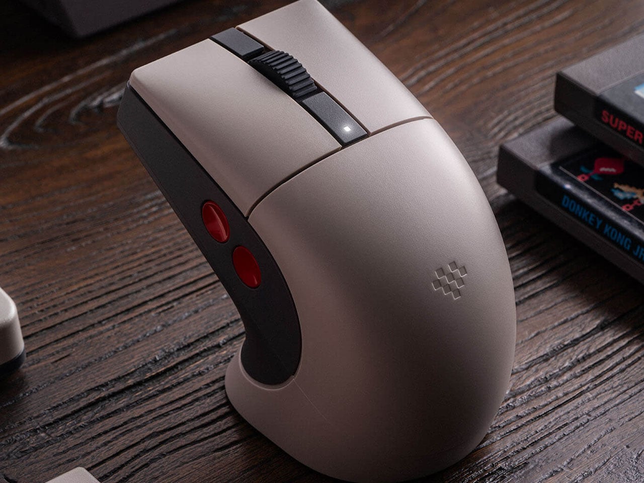

8BitDo Retro R8 C64 Edition mouse fuses Commodore 64 nostalgia with modern gaming performance

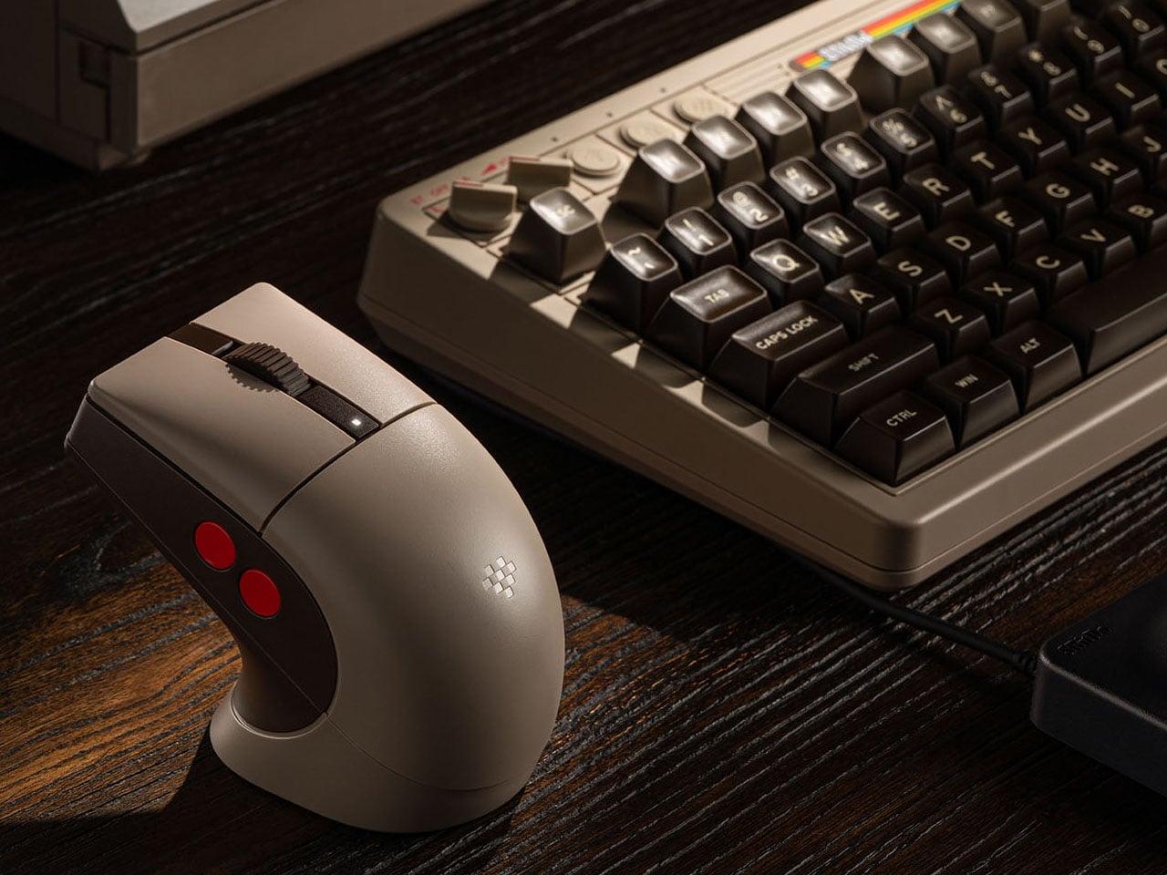
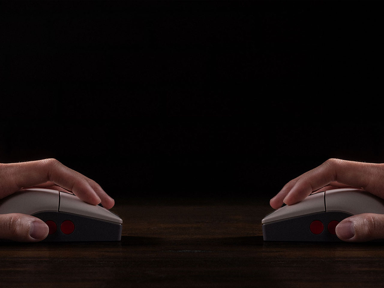
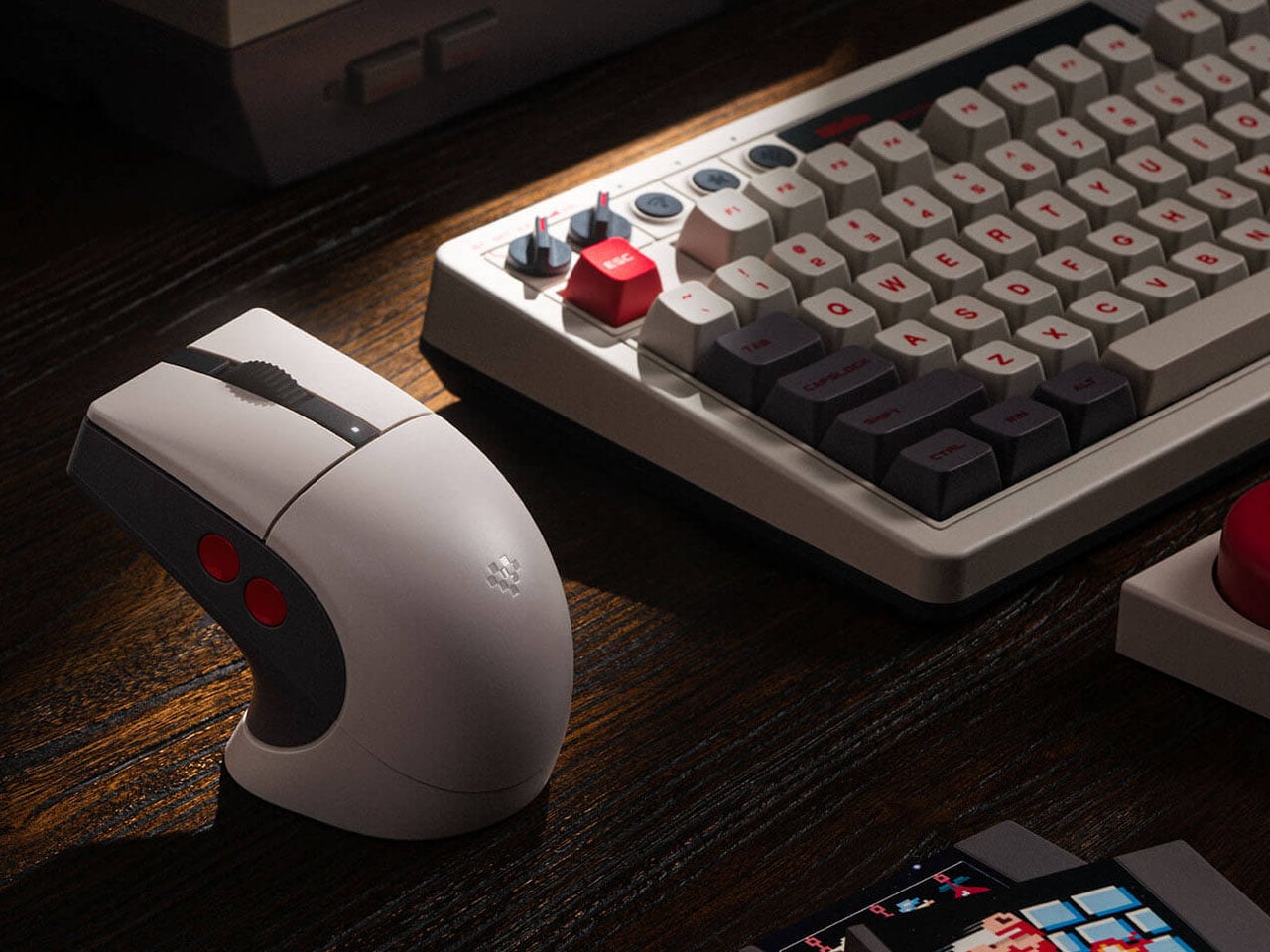
8BitDo, well-known for its quality gaming accessories, has a strong hold on retro-themed PC accessories, such as keyboards and numpads. Their Retro R8 mouse lineup, which already has the Xbox Edition and N Edition, now gets another variant of the peripheral. Like other mice in the R8 range, the C64-Edition is an eye candy mouse that pairs with your keyboard setup perfectly.

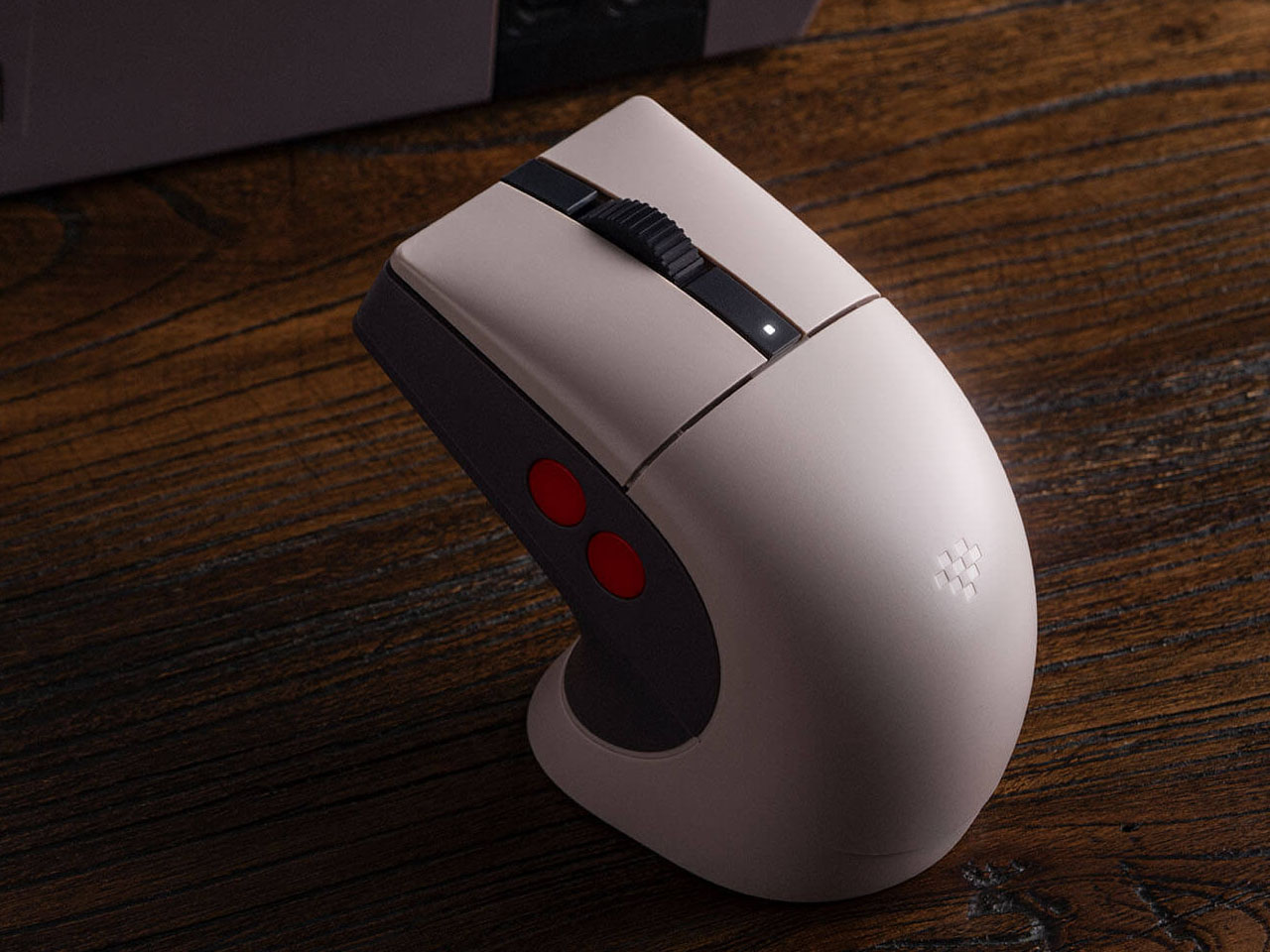
Themed on the Analouge 3D N64-themed controller, the C64 Edition evokes the nostalgic memories of the 8-bit era. Those who already own the Commodore 64 version will want to add this one to their collection. While it is unclear at this moment if this one has the Kailh Sword GM X micro switches used in the N Edition, it still gives keen gamers another one to choose from the 8BitDo lineup. The Commodore elements are slapped all over this retro mouse with the stripe logo on the charging dock and the familiar color theme.

Designer: 8BitDo

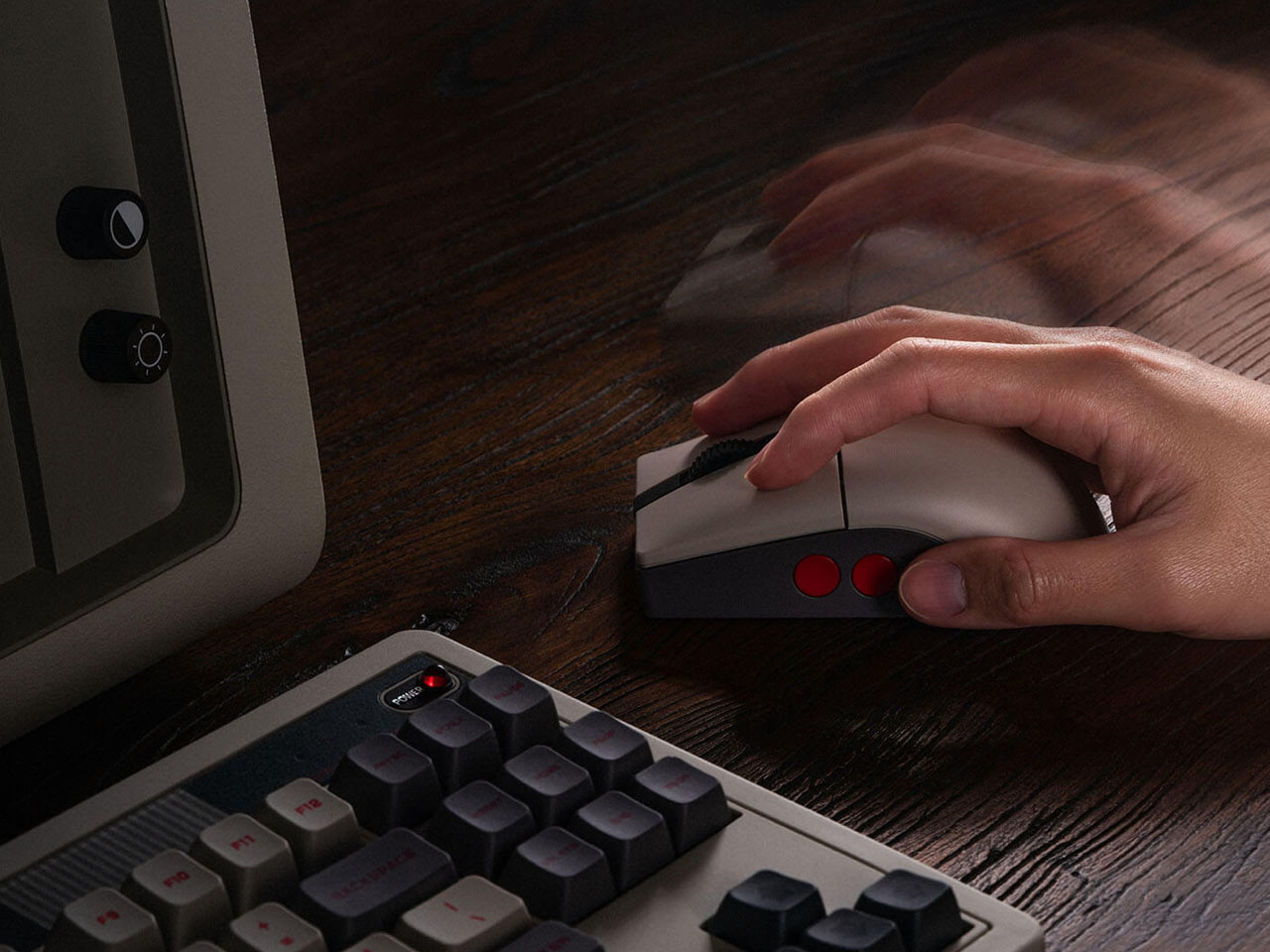
The mouse measures 115 mm x 58 mm x 39.4 mm, and the accompanying dock on which it rests is 115.17 mm x 58 mm x 45.88 mm. The dock also functions as a signal extension module for consistent wireless connectivity and negligible latency. The Retro R8’s symmetrical shape allows it to be used comfortably by both left- and right-handed users, with software support enabling quick switching between modes. Despite its vintage aesthetic, the mouse weighs just about 77 grams, making it relatively lightweight and well-balanced for long usage sessions. Customizable side buttons further enhance usability, allowing users to assign shortcuts, macros, or specific commands through the companion Ultimate Software on PC.

Retro R8 C64 N Edition can be paired to your other devices via Bluetooth LE 5.3, 2.4 GHz, and of course, wired. The signal extension mode of the dock is attributed to the 2.4 GHz connection. Like other mice in the Retro R8 family, it is designed to balance nostalgic styling with modern gaming performance. Internally, the mouse is powered by a high-performance PAW 3395 sensor that supports six adjustable sensitivity levels ranging from 50 DPI to as high as 26,000 DPI, allowing users to fine-tune cursor precision for both productivity tasks and gaming. The device also supports adjustable polling rates, reaching up to 8,000 Hz when connected through a wired setup for ultra-responsive input.

Powering the accessory is a 450 mAh rechargeable lithium-ion battery. Depending on the connection mode and polling rate settings, the mouse can deliver up to around 100 hours of battery life over Bluetooth, while the 2.4 GHz wireless mode typically offers between 26 and 105 hours of use. Charging takes approximately 2.5 hours, and the included dock doubles as a convenient stand that keeps the desk setup organized while ensuring the mouse remains ready for action. Priced at $50, the Retro R8 C64 Edition has all that it takes to bring nostalgia to your desk.

The post 8BitDo Retro R8 C64 Edition mouse fuses Commodore 64 nostalgia with modern gaming performance first appeared on Yanko Design.
Your Light Switch Is the Worst-Designed Thing in Your House. Inkslab Offers An Alternative

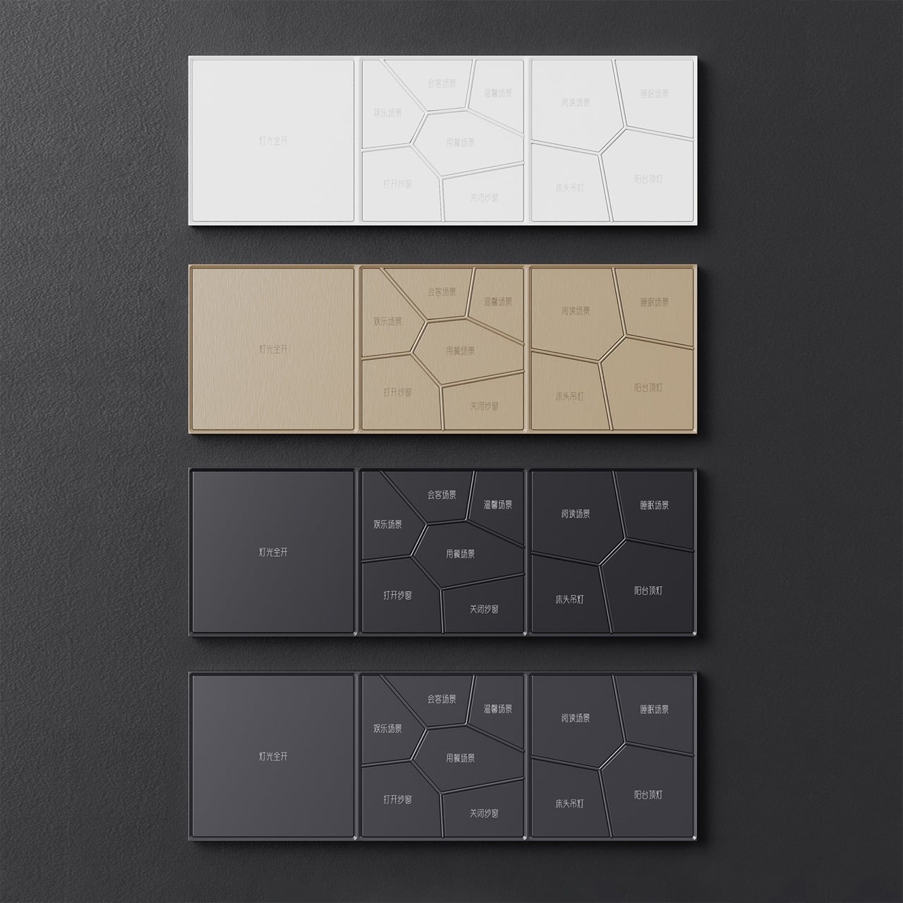
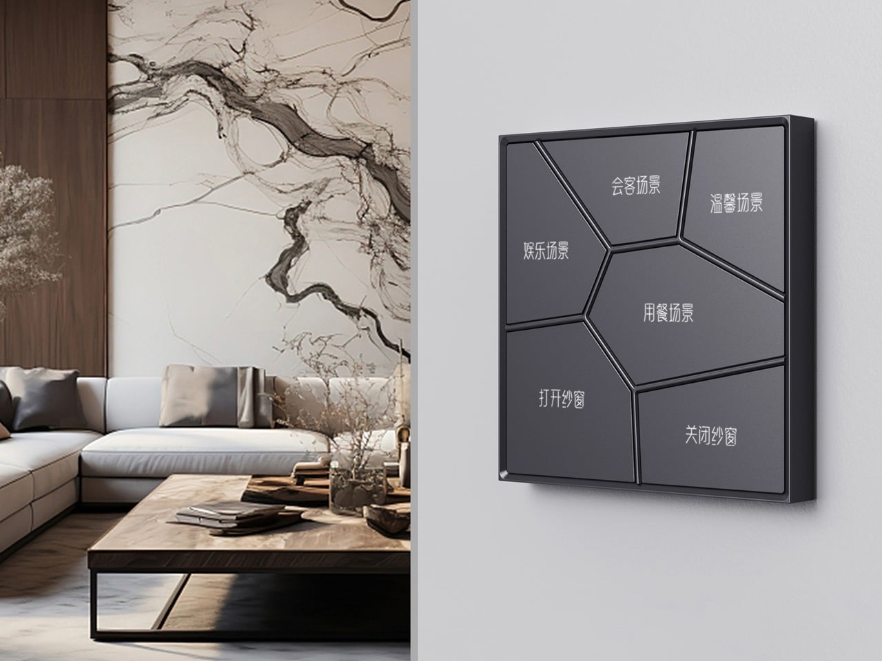
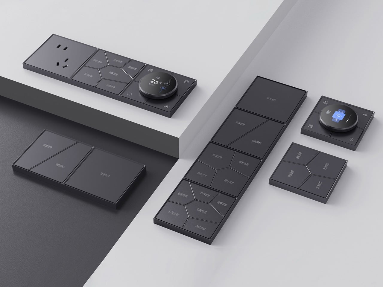
Most wall switches exist to be ignored. You flip them without looking, never registering the object itself, because there is nothing to register. HDL Automation’s Inkslab panel series makes that kind of invisibility impossible. The surface is divided into irregular polygonal cells radiating outward from a central point, a geometry lifted directly from the perforated stone lattice windows of classical Suzhou gardens. Each cell is a button. The ornament and the interface are the same thing.

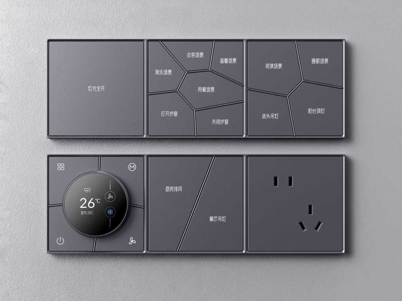
That formal discipline carries through the entire system. Inkslab is a modular series that tiles horizontally and vertically, mixing scene-selector panels, a circular HVAC control knob, power outlets, and single-button tiles into wall-mounted configurations as long or compact as the space demands. It comes in white, brushed champagne gold, matte black, and slate gray, and at 86 x 86 mm per tile, it sits flush against a wall with the quiet confidence of something that belongs there.

Designer: Hdl Automation Co., Ltd.

Classical Chinese perforated windows, called “leaky windows” in the original parlance, use irregular polygon grids to divide a wall surface into discrete framed voids. The geometry is simultaneously structural, decorative, and spatial. Inkslab takes that logic and runs it through an interface problem: how do you lay out multiple buttons on a 86 x 86 mm square without it looking like a grid of sad rectangles? The answer turns out to be Suzhou, and it works.

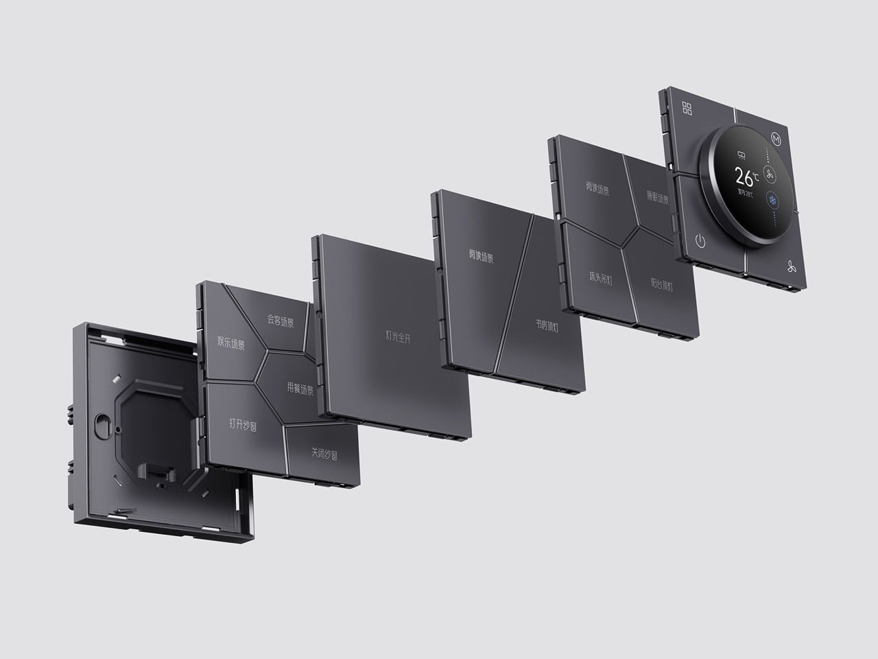
Each tile clips onto a shared wall bracket, and you can run them in any combination horizontally or vertically. The exploded product imagery shows the layering clearly: bracket, individual functional tiles, frame. Mix a three-tile scene-selector run with a power socket tile and the circular HVAC knob module, and you have a fully integrated wall panel covering lighting scenes, climate control, and power in one coherent visual strip. The round knob module in particular is well-considered, its circular display reading temperature and fan settings without interrupting the overall geometry of the panel it sits in.

Instead of manually programming scene modes through an app, the system learns from usage patterns and suggests scenes based on time of day and behavior. Paired with the proximity sensor that wakes the LED backlighting when you approach and cuts it when you leave, the panel behaves more like an attentive object than a passive one. HDL has been in the building automation space since the 1980s, when the company’s founder developed China’s first digital dimming controller, so the intelligence running underneath the Inkslab aesthetic has serious pedigree behind it.

The brushed champagne gold colorway reads closer to high-end architectural hardware than consumer electronics, and the anodizing process gives the aluminum surface a resistance to wear and corrosion that keeps it looking that way over time. Skin-friendly paint on the non-metal variants sounds like a small detail but matters on something you physically touch dozens of times a day. The 10 mm depth keeps the panel from protruding awkwardly from the wall, which is one of those specifications that sounds trivial until you see a chunky smart panel jutting off a freshly plastered surface.

The post Your Light Switch Is the Worst-Designed Thing in Your House. Inkslab Offers An Alternative first appeared on Yanko Design.
Rabbit R1’s OpenClaw Update Could Be Its Most Important Moment Yet

There is a version of the Rabbit R1 story that ends in 2024. The device launches to enormous hype off the back of a viral CES presentation, ships to early adopters who find it half-finished and frustrating, earns a wave of scathing reviews, and quietly disappears the way most failed AI gadgets do. Humane’s AI Pin followed that trajectory almost exactly, discontinued in early 2025 after HP acquired the company. The R1 did not follow it, though the reasons why have less to do with any brilliant pivot than with stubbornness, incremental software updates, and a fair amount of luck.

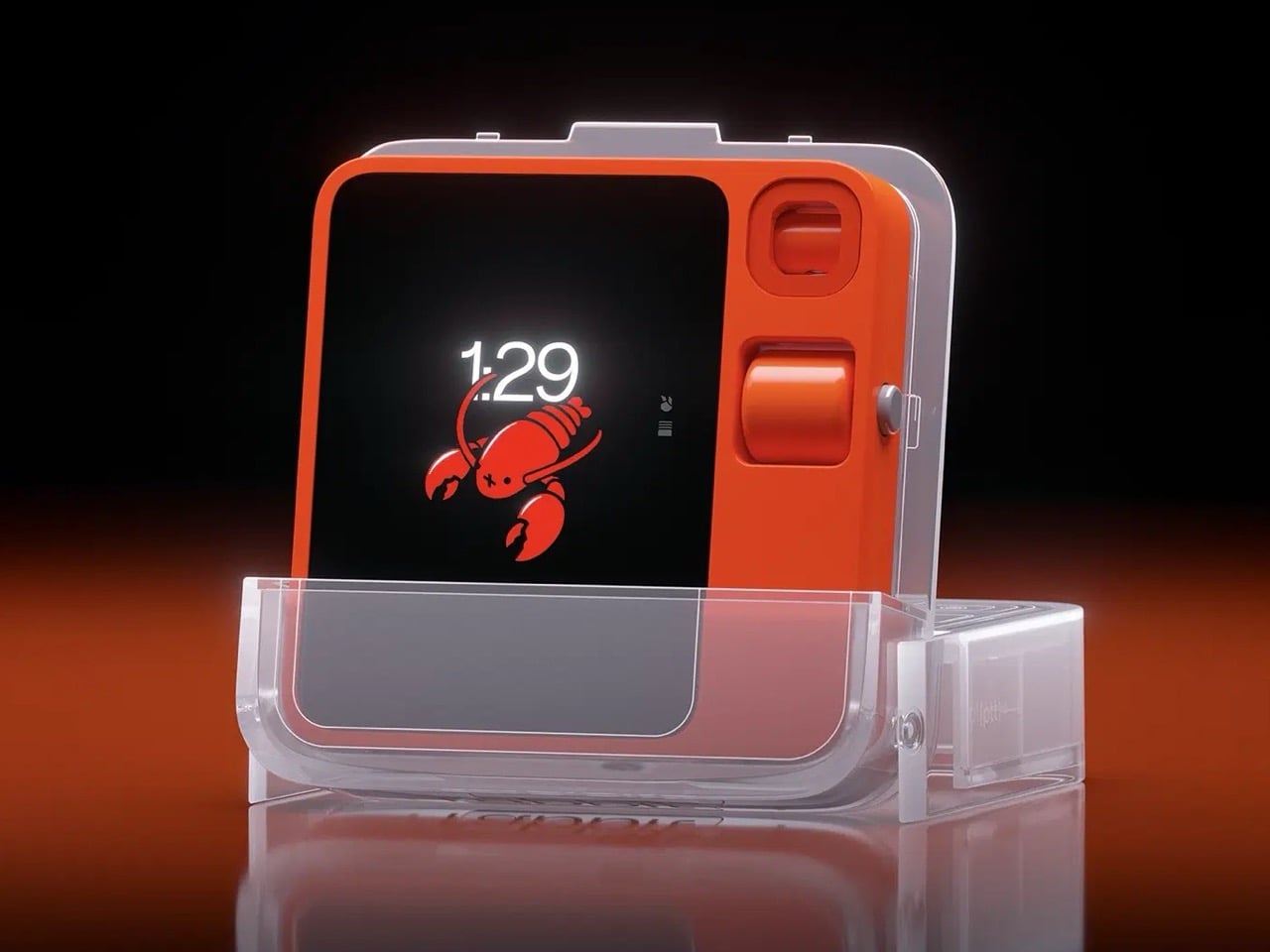
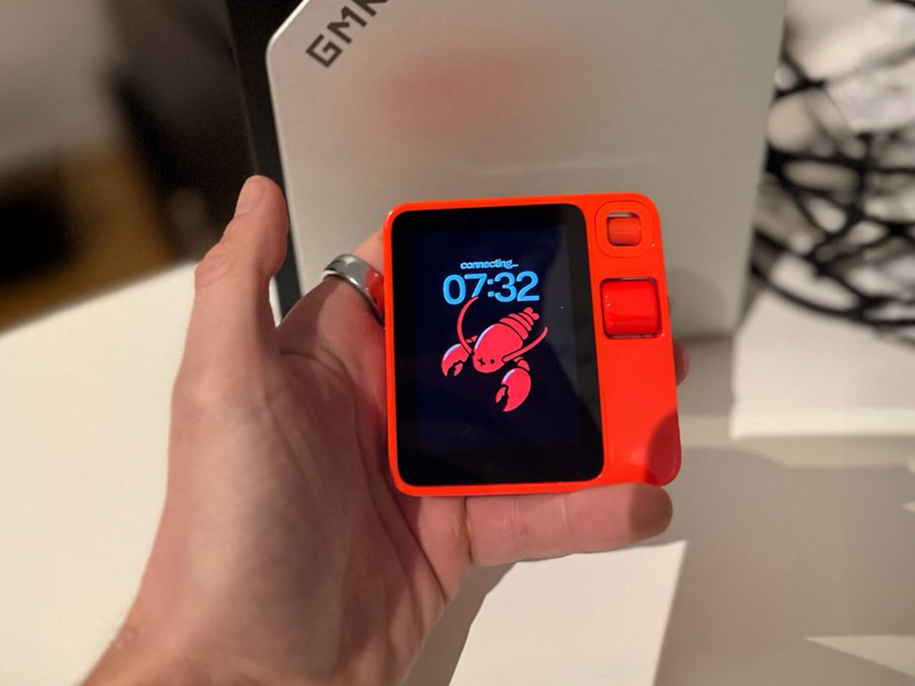
By January 2026, two years of over-the-air updates had produced a device functional enough to sustain a renewed community of users and developers. Then OpenClaw arrived on the R1, and the conversation changed in a way that felt less like a product announcement and more like something clicking into place. OpenClaw, the open-source autonomous AI agent that had exploded from obscurity to 60,000 GitHub stars in 72 hours, had always carried a hardware problem at its core. The R1, as it turned out, had most of the solution already built in.

Designer: Rabbit

OpenClaw (formerly Clawdbot, then Moltbot, changing names three times in a single week) is an open-source autonomous AI agent that exploded from 9,000 to over 60,000 GitHub stars in 72 hours in late 2025. Austrian developer Peter Steinberger built it as a self-hosted agent runtime that connects AI models to your local machine, messaging apps, calendar, email, and file system. You control it by sending messages through WhatsApp, Telegram, Discord, or Slack, like you’re DMing a particularly capable assistant. OpenClaw can browse the web, manage your inbox, schedule meetings, summarize documents, and execute shell commands autonomously, with persistent memory that lets it remember context across weeks. The problem OpenClaw always carried was the lack of native voice interaction on dedicated hardware, and the R1 had exactly that hardware sitting in a drawer gathering skepticism.

Rabbit integrated OpenClaw in January 2026 as an alpha feature, requiring users to set up their own OpenClaw gateway and connect it to the R1. Push the talk button, speak a command, and OpenClaw executes it through your existing setup. The R1 becomes a voice interface for an agent that can genuinely act on your behalf, making the device something closer to what Lyu promised two years ago. The possibilities depend entirely on how you configure OpenClaw, which can expand through over 100 community-built skills. Security risks are real and well-documented (over 400 malicious add-ons were found on the skill hub in early 2026), but for users willing to manage that complexity, the R1 finally has a use case that feels native to the hardware rather than bolted on.

The post Rabbit R1’s OpenClaw Update Could Be Its Most Important Moment Yet first appeared on Yanko Design.

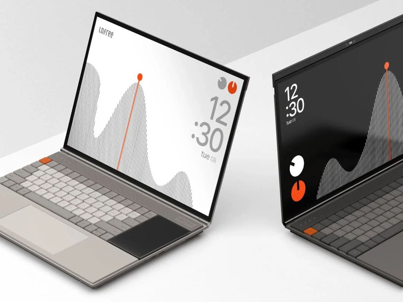
Minimalist laptop with a secondary display minimizes distractions, maximizes productivity

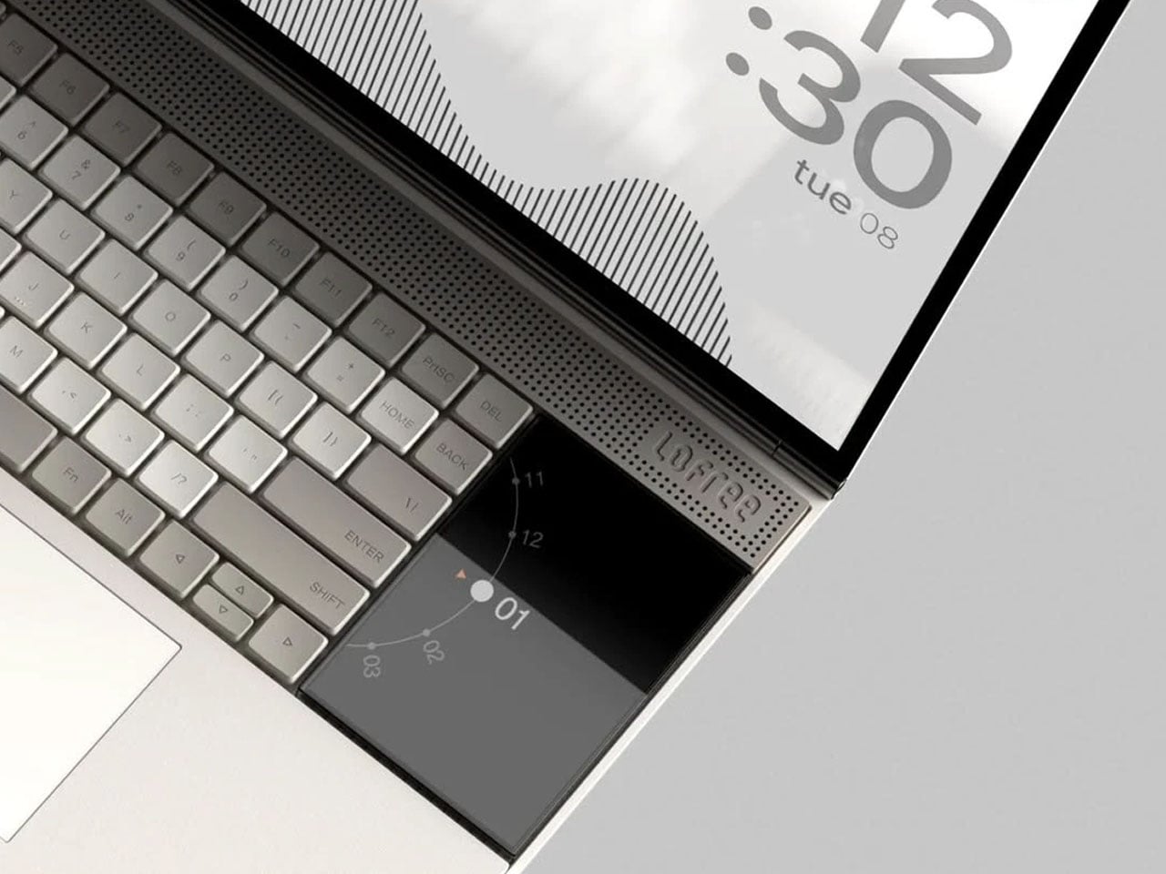
Minimalism in computing interfaces often promises clarity, yet many modern systems still struggle with cluttered notifications, layered menus, and competing visual elements. The Minimal Laptop UI concept explores what a truly distraction-free laptop experience might look like when both hardware and software are designed around the same philosophy. Inspired by the playful yet precise design language of Teenage Engineering, the concept imagines a laptop that feels equal parts creative tool and focused workspace.

The interface is built around the idea that the screen should serve the task at hand, not compete with it. Instead of filling the display with panels, toolbars, and notifications, the layout relies on strong visual hierarchy and generous spacing. Elements appear only where necessary, allowing content to take center stage. Typography is clean and consistent, icons are reduced to their most recognizable forms, and the overall interface feels calm rather than busy. The result is a digital workspace that encourages focus without sacrificing functionality.

Designer: Nicolas Fred

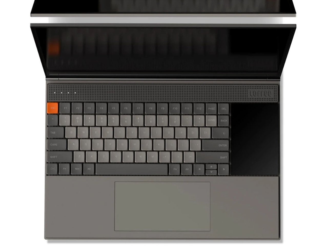
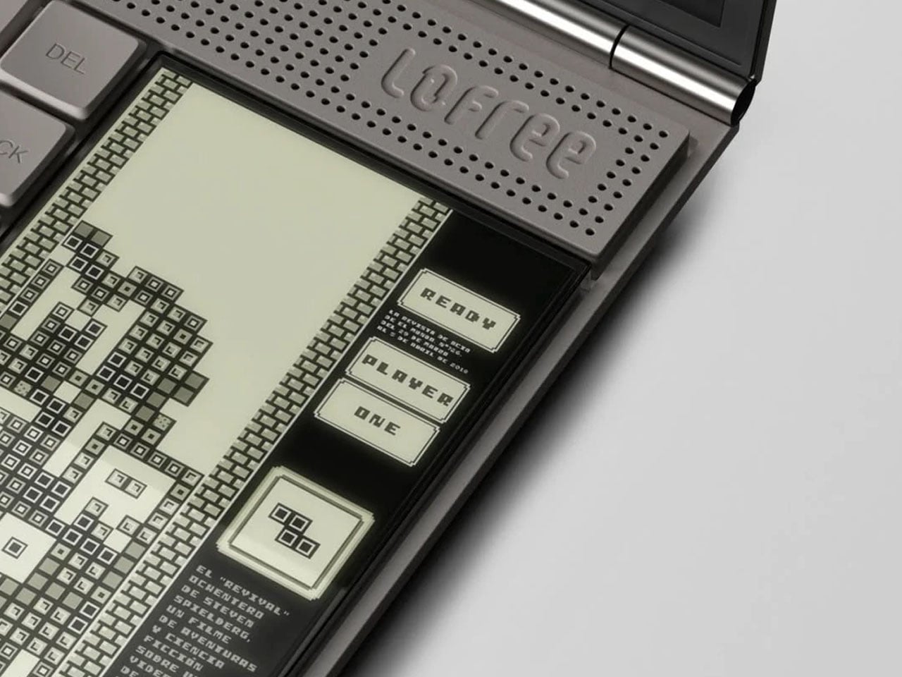
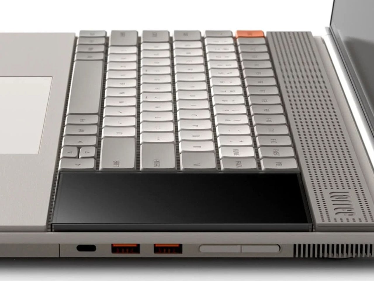
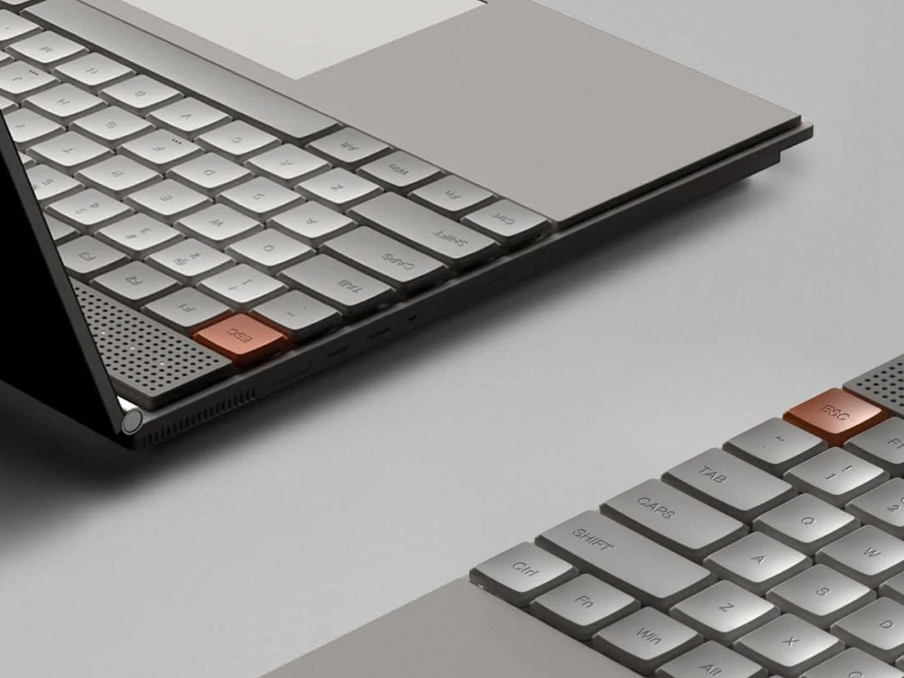
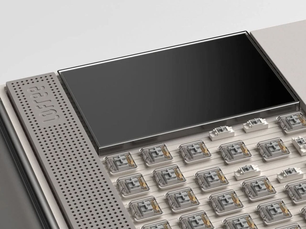
What makes the concept particularly interesting is how it integrates hardware into the experience. Just beside the keyboard sits a secondary display designed to handle the kind of information that typically interrupts the main screen. Notifications, widgets, quick system controls, and small utilities can appear here, keeping alerts visible without pulling the user away from their workflow. By shifting these elements to a separate display, the primary screen remains dedicated to productivity and creative work.

The secondary screen also introduces a playful dimension. Beyond system information and widgets, it can support lightweight interactions such as simple games or quick tools that users can access without minimizing their main task. This layered approach to interaction mirrors the philosophy behind minimal design: instead of removing functionality, it reorganizes it in a way that feels more intentional and less intrusive.

Visually, the laptop reflects the unmistakable influence of Teenage Engineering’s product design. Clean geometric forms, restrained color accents, and carefully balanced proportions give the device a distinctive character. The aesthetic leans toward soft tones and neutral surfaces, allowing subtle interface highlights to stand out without overwhelming the visual environment. It feels modern and creative, yet disciplined enough to support focused work.

Whitespace plays a significant role throughout the interface. Rather than compressing information into dense panels, the layout leaves breathing room around content, improving readability and reducing cognitive load. This approach mirrors principles often used in industrial and editorial design, where space itself becomes an essential component of the experience.


The post Minimalist laptop with a secondary display minimizes distractions, maximizes productivity first appeared on Yanko Design.
Researchers turned Sawdust Waste and Watermelon Seeds into Recyclable Fire-resistant Panels

Every sawmill in the world produces it. Every furniture factory, every timber yard, every construction site that cuts wood leaves behind a pile of the stuff, and globally that adds up to hundreds of millions of tonnes of sawdust every year. Most of it gets burned for energy, which is a reasonable enough fate except that burning it releases back into the atmosphere all the carbon the tree spent decades pulling out of the air. It is a material that manages to be simultaneously everywhere and underused, treated as a combustion problem when it is, by the structural logic of its wood fibers, one of the more cooperative raw materials on earth. Firestarter cubes are made from it. Pykrete, the wood pulp and ice composite once proposed as an aircraft carrier hull material, relied on it.

Researchers at ETH Zurich and Empa have now given sawdust another role entirely. Doctoral researcher Ronny Kürsteiner spent his thesis developing a process to bind sawdust particles with struvite, a colorless crystalline mineral composed of ammonium magnesium phosphate, using an enzyme derived from watermelon seeds to control how the crystals grow into the sawdust matrix. What comes out of the mold, after two days of cold-pressing and room-temperature drying, is a composite panel stronger in compression than spruce timber, capable of resisting a direct flame for more than three times as long as untreated wood, and fully recyclable at the end of its service life.

Designer: ETH Zurich

Struvite’s fire-retardant properties have been known for a while; the problem was always crystallization behavior. Conventional precipitation methods produce small, disorganized crystallites that can’t grip wood particles, which is why earlier attempts at this kind of composite fell apart mechanically. The watermelon seed enzyme controls nucleation, producing large interlocking crystals that physically fill the voids between sawdust particles. The binder content sits at 40% by weight. Panels are cold-pressed for two days and dried at room temperature, with no elevated curing conditions required.

When heat reaches struvite, it decomposes and releases water vapor and ammonia, drawing energy from the surrounding environment. The non-combustible gases displace oxygen, starving the fire and accelerating surface charring; that char layer slows access to unburnt material underneath. Cone calorimeter tests clocked untreated spruce igniting at 15 seconds; the struvite composite takes 45 to 51 seconds. Initial projections put it in the same fire protection class as cement-bonded particleboard, the current default for interior partition applications, though full-scale tests are still pending. Grind the panels at end of life, heat them just above 100 degrees Celsius to release ammonia, and the components separate cleanly for reuse or redirect as phosphorus fertilizer.

The post Researchers turned Sawdust Waste and Watermelon Seeds into Recyclable Fire-resistant Panels first appeared on Yanko Design.
Rokform Built a $100 Charger That Replaces Your Entire Nightstand Pile

At some point, the nightstand became a charging station. What started as a place for a glass of water and a book has evolved into a tangle of cables, pucks, and adapters competing for the same two outlets. The watch charger is somewhere near the back. The earbuds case is balanced on top of something it shouldn’t be on. And the phone is either plugged in or forgotten, depending on how tired you were when you got into bed.

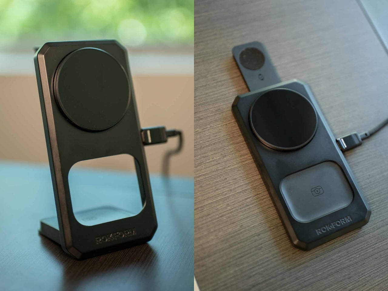
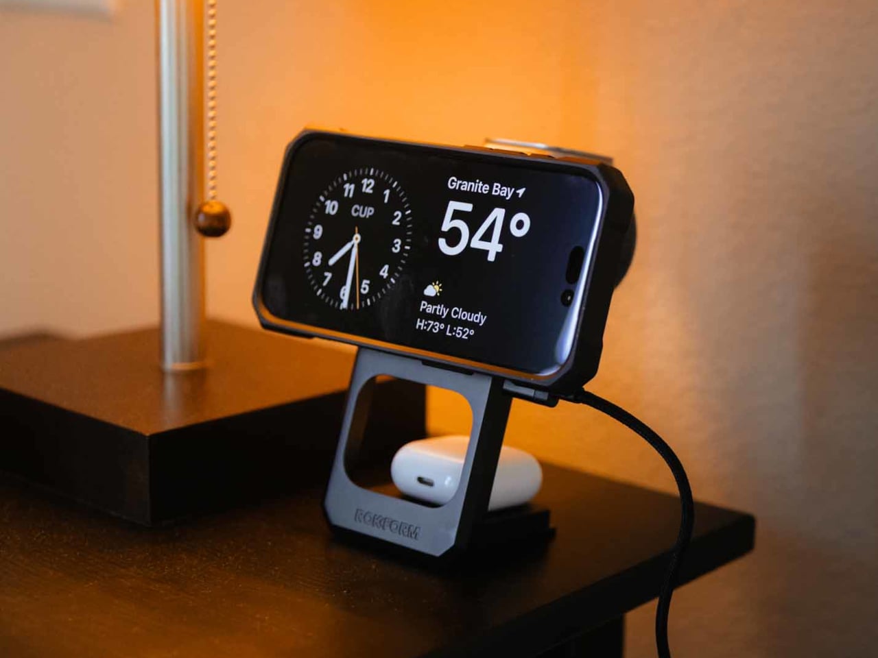
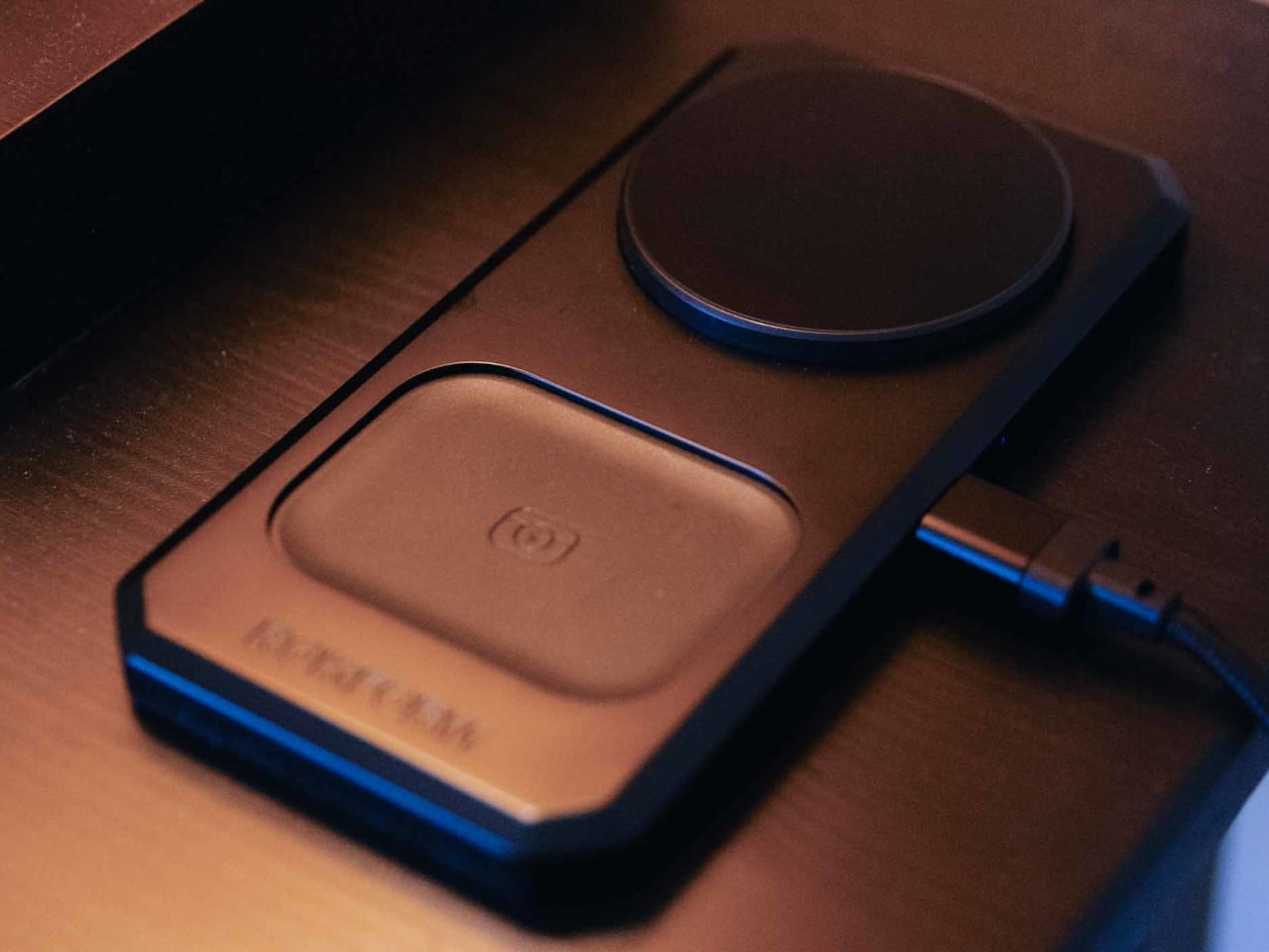
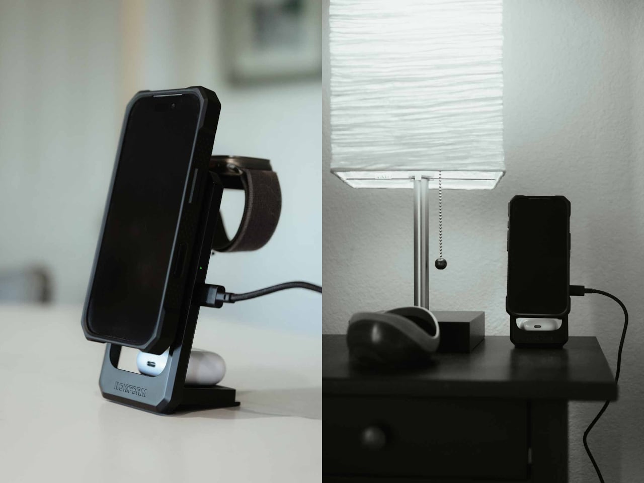
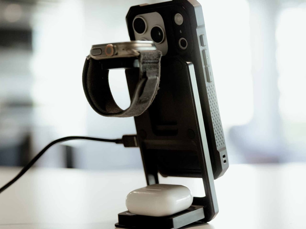
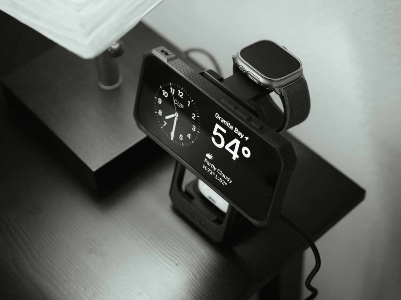
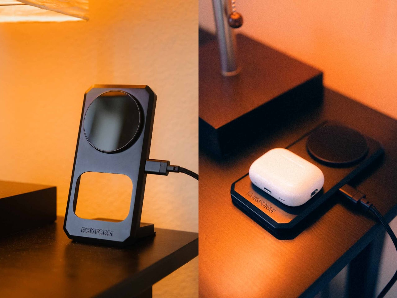
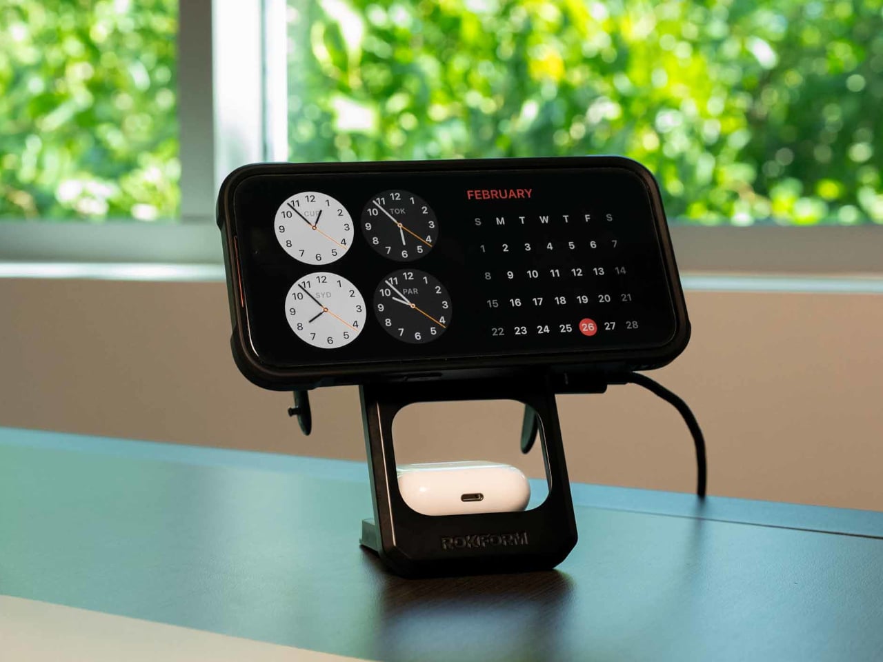
Rokform’s 3-in-1 Foldable Wireless Charging Stand addresses that specific kind of chaos with a single compact unit that charges a phone, an Apple Watch, and wireless earbuds all at once, without any cables beyond the single USB-C feeding the stand itself. The phone pad delivers up to 15W, the earbud pad handles 5W, and the Apple Watch arm tucks out when needed and folds back flat when not. One cable, three devices, done.

Designer: Rokform

The build is zinc alloy and glass, which puts it in different company than the plastic pads that flex slightly when you press on them. That combination reads as dense and grounded, designed to stay in place rather than slide around while you fumble for your phone at midnight. The phone pad adjusts between portrait and landscape, which matters if you use a nighttime clock display or want to follow a recipe without picking the phone up.

The travel argument is where the design earns its $99.99 most directly. The whole unit collapses to just over 15 mm flat, thin enough to slide into a bag without dedicated padding. Anyone who has hunted down enough hotel outlets to charge three separate devices before a morning flight will understand the appeal immediately. One folded stand and one cable replace the whole pile, though a 30W USB-C adapter is required and not included.

That last detail is worth pausing on, because the absence of a power adapter is a legitimate inconvenience. Rokform specifies a minimum 30W USB-C adapter and recommends their own PowerTrip 65W GaN Fast Charger for full performance. That is a reasonable recommendation, but it also means the stand does not actually replace your charging setup on day one without an additional purchase, unless you already own a high-wattage USB-C adapter.

The Watch pad compatibility is Apple Watch only, which Android-primary users will notice immediately. The phone and earbud pads both support Android devices with Qi wireless charging, so the stand is not completely Apple-exclusive. It does, however, skew toward households already invested in the Apple ecosystem, where the combination of iPhone, AirPods, and Apple Watch is common enough that a dedicated three-device stand makes immediate sense.

At that price tag, Rokform is competing against a field of 3-in-1 charging stands from Belkin, Anker, and others at comparable or lower price points. The zinc alloy and glass construction and the sub-16mm folded profile are the real differentiators, neither of which is trivial if you travel frequently or care about what sits on your desk. The premium over a $60 alternative is harder to justify for someone who mostly keeps it plugged in on the nightstand than for someone who packs it every week.

The post Rokform Built a $100 Charger That Replaces Your Entire Nightstand Pile first appeared on Yanko Design.
This walkable steel sculpture turns geometric chaos into an experience

Most public sculptures are meant to be looked at from the outside. You walk past, glance up, maybe take a photo, and move on. The relationship between the object and the person stops at the surface. Five Fragmented Cubes, a large-scale interactive sculpture made of painted steel, refuses that arrangement entirely: it was built specifically to be entered, climbed, and walked through, so that the thing you came to look at ends up surrounding you on all sides.

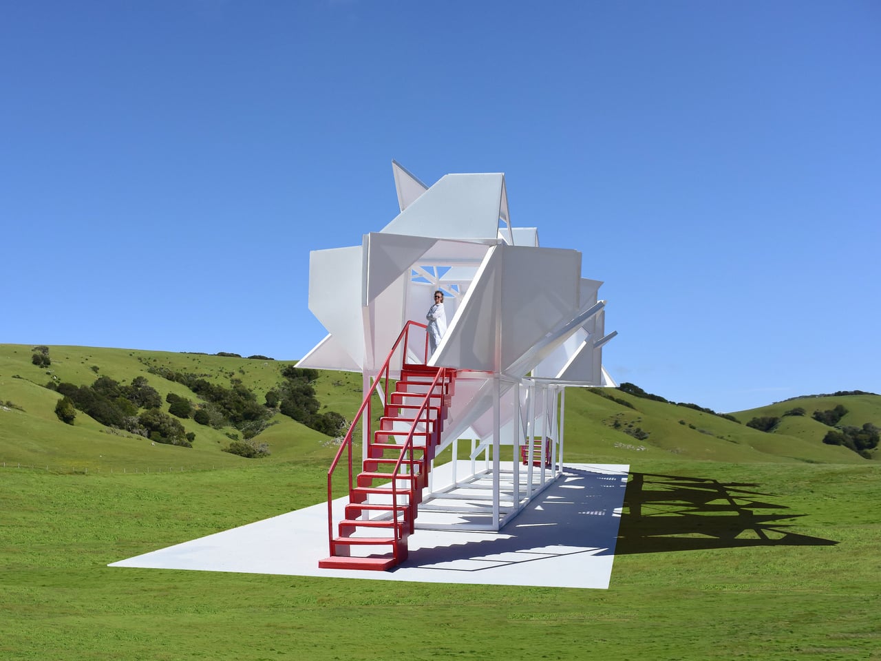
The structure consists of 10 cube frames arranged in two stacked tiers on a concrete base, with five cubes forming the lower support grid and five more sitting on top. The upper tier is where the visual action happens. Each face of those top cubes is clad with painted steel panels, and each panel face is divided into two triangles. One of those triangles is subdivided again and folded inward, while both are folded outward from the face of the cube frame and locked in place, projecting into space at fixed angles.

Designer: Michael Jantzen

What keeps the whole thing from feeling mechanical or predictable is one deliberate decision: the orientation of every triangle has been rotated randomly relative to its cube face. There is no repeating pattern, no symmetrical rhythm across the surface. Up close, the geometry is legible; from a distance, the cumulative effect reads as dense, spiky, and almost organic. The same steel panels and the same folding logic appear across every face, yet the result looks nothing like a system built from identical parts.

That tension between the simple and the complex is the actual subject of the sculpture. The designer frames it as an exploration of how identical, interconnecting, repeating parts can generate extreme perceived complexity, drawing a comparison to objects in nature, where elaborate forms frequently emerge from a limited set of rules applied at scale. Whether the built result actually produces that sense of discovery depends entirely on where you are standing.

Two red staircases, one at each end of the structure, lead up to a mid-level catwalk with red perforated steel grating underfoot and tubular red railings. The red is not subtle. Against the all-white panels and columns, it functions less as a safety feature and more as a graphic element, separating the structure’s circulation path from its expressive surface. Inside, the folded panels create a partially enclosed space, with light cutting through the gaps between triangles at angles that shift as you move.

The pastoral setting, open green hills, and clear sky make the white-and-red contrast sharper still. A sculpture this geometrically dense, placed in an undisturbed landscape, is a deliberate provocation, and it earns visual authority because of it. The mesmerizing structure does make one wonder whether the interior experience, walking the catwalk surrounded by folded steel at close range, delivers the complexity it promises from a distance, or does the chaos quietly resolve once you are standing inside it?

The post This walkable steel sculpture turns geometric chaos into an experience first appeared on Yanko Design.
Olight Oclip Pro S is a palm-sized clip-on EDC flashlight for every task

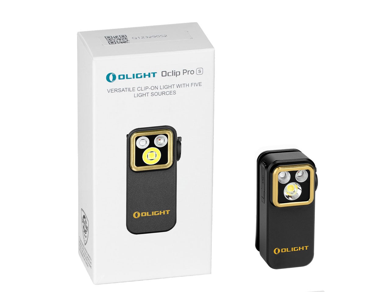
There’s a quiet shift happening in the world of everyday carry, wherein single-purpose tools are steadily giving way to compact, multi-functional companions that adapt as quickly as the situations they’re pulled into. The modern EDC kit isn’t about excess anymore; it’s about efficiency and versatility. In that context, the Olight Oclip Pro S doesn’t just arrive as another flashlight, it is a small but capable lighting system designed to keep up with unpredictable, fast-moving routines.

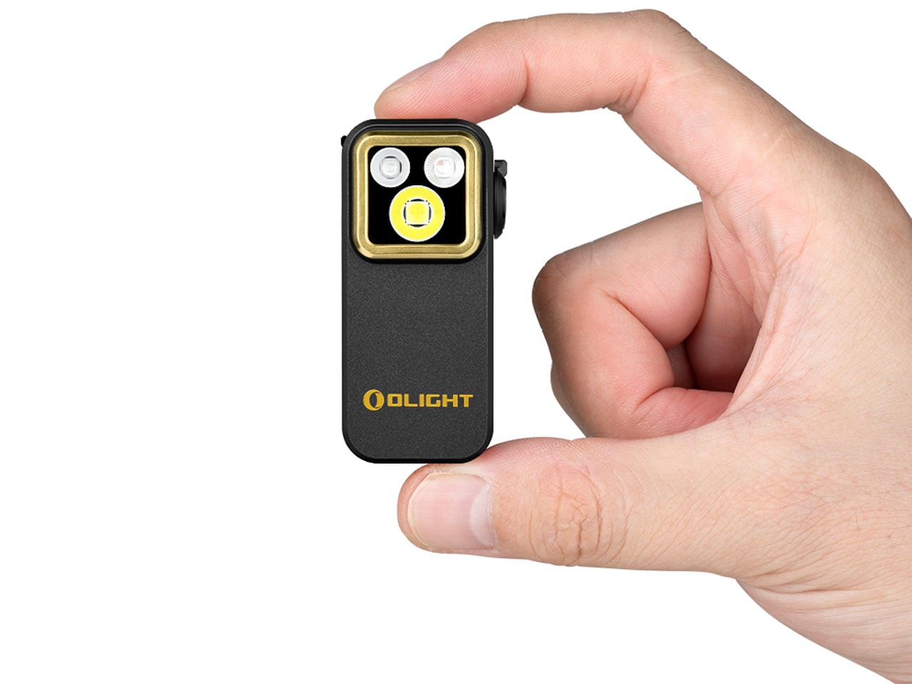
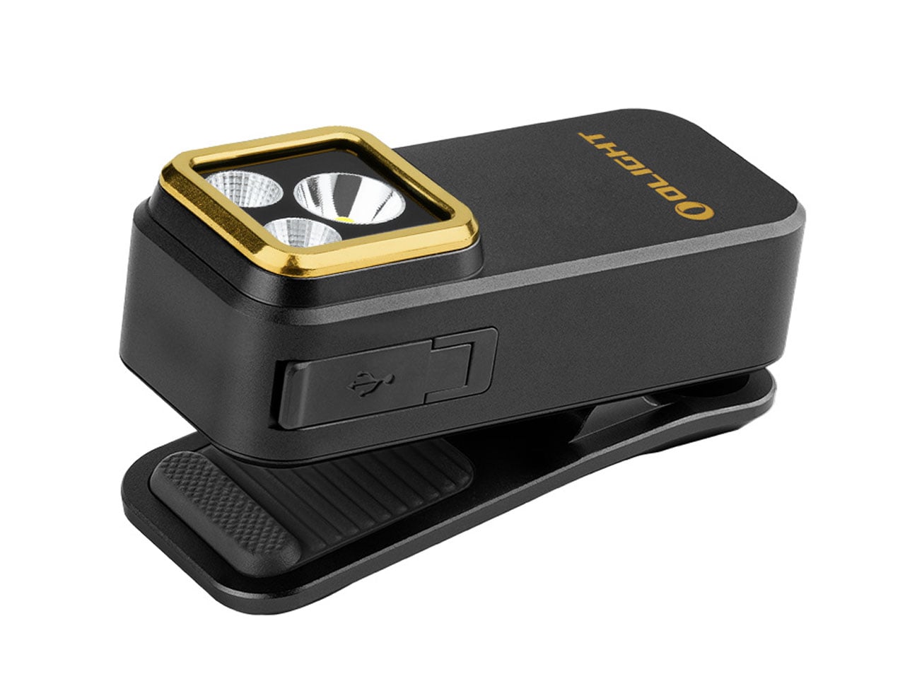
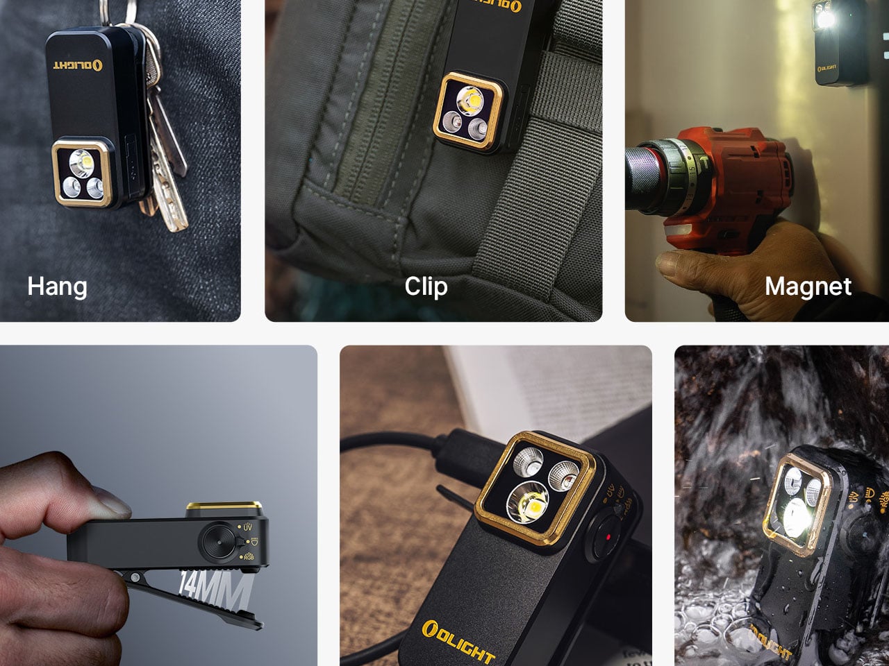
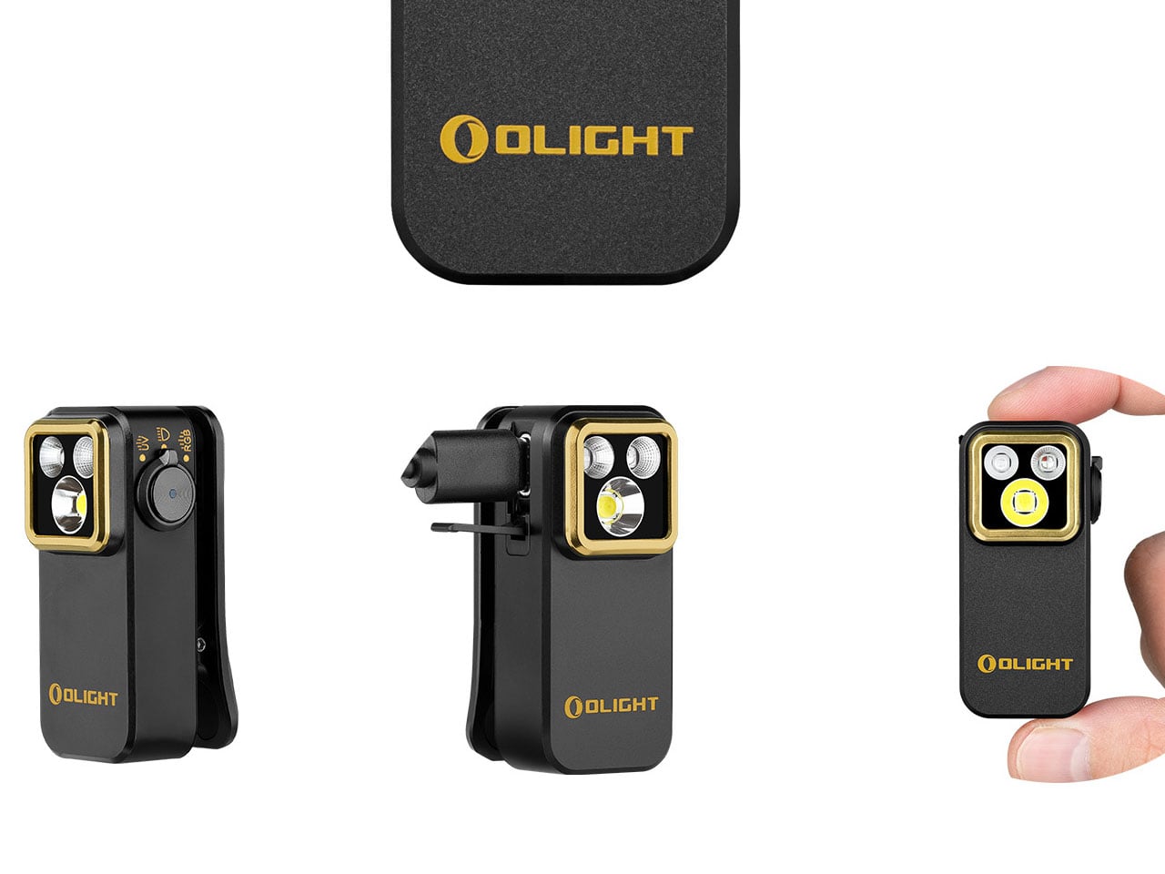
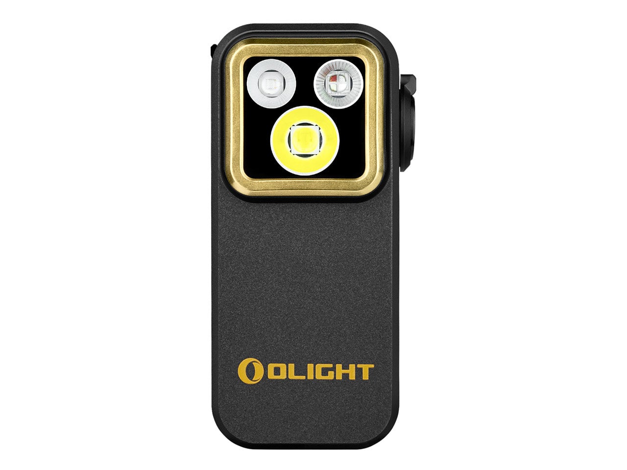
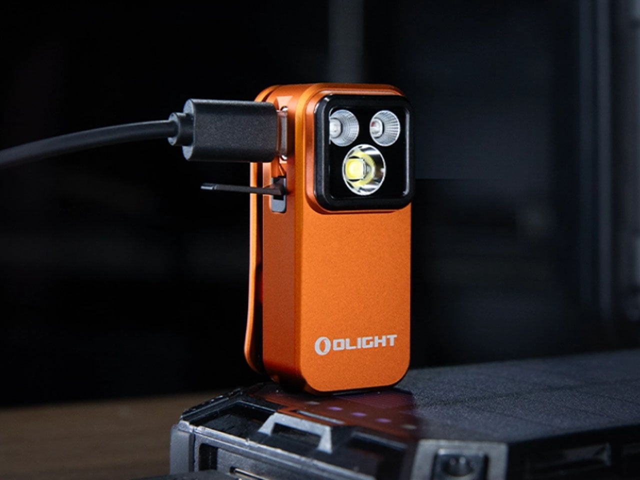
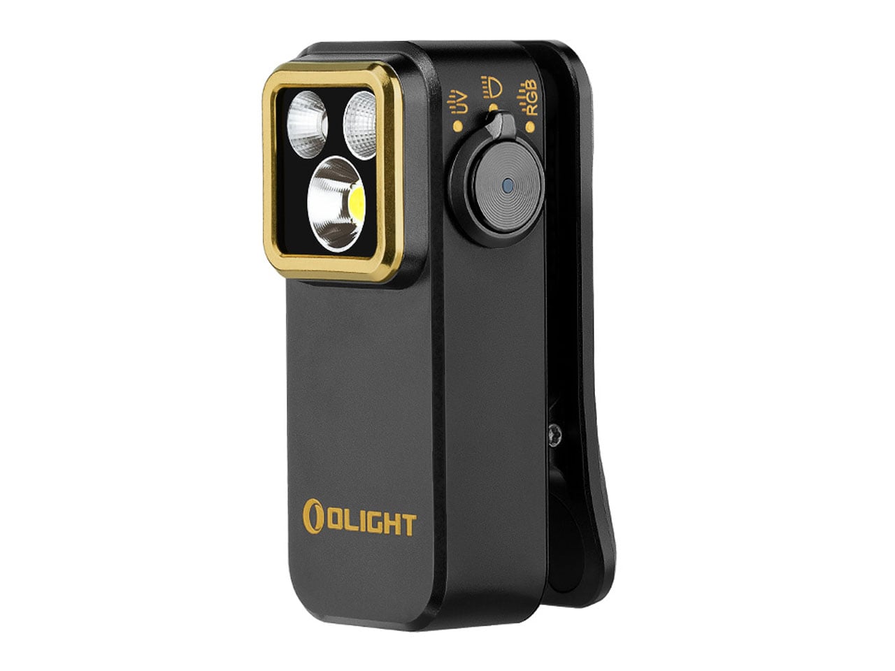
At first glance, the palm-sized Oclip Pro S feels almost understated. Its compact body, measuring just 57 × 28 × 27 mm and weighing around 53 grams, is designed to disappear into your pocket or clip unobtrusively onto your gear. Yet that minimal footprint is precisely what makes it so effective. The integrated clip, combined with the ability to hang or magnetically attach the device, allows it to transition effortlessly between a handheld light and a hands-free tool, whether you’re navigating low-light environments or tackling everyday tasks.

Designer: Olight

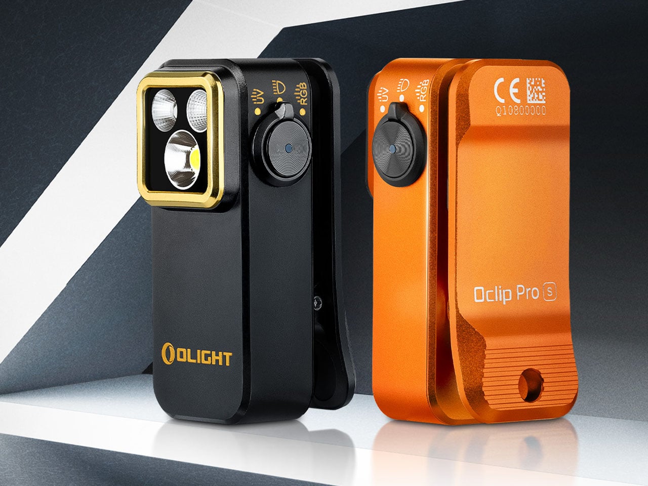
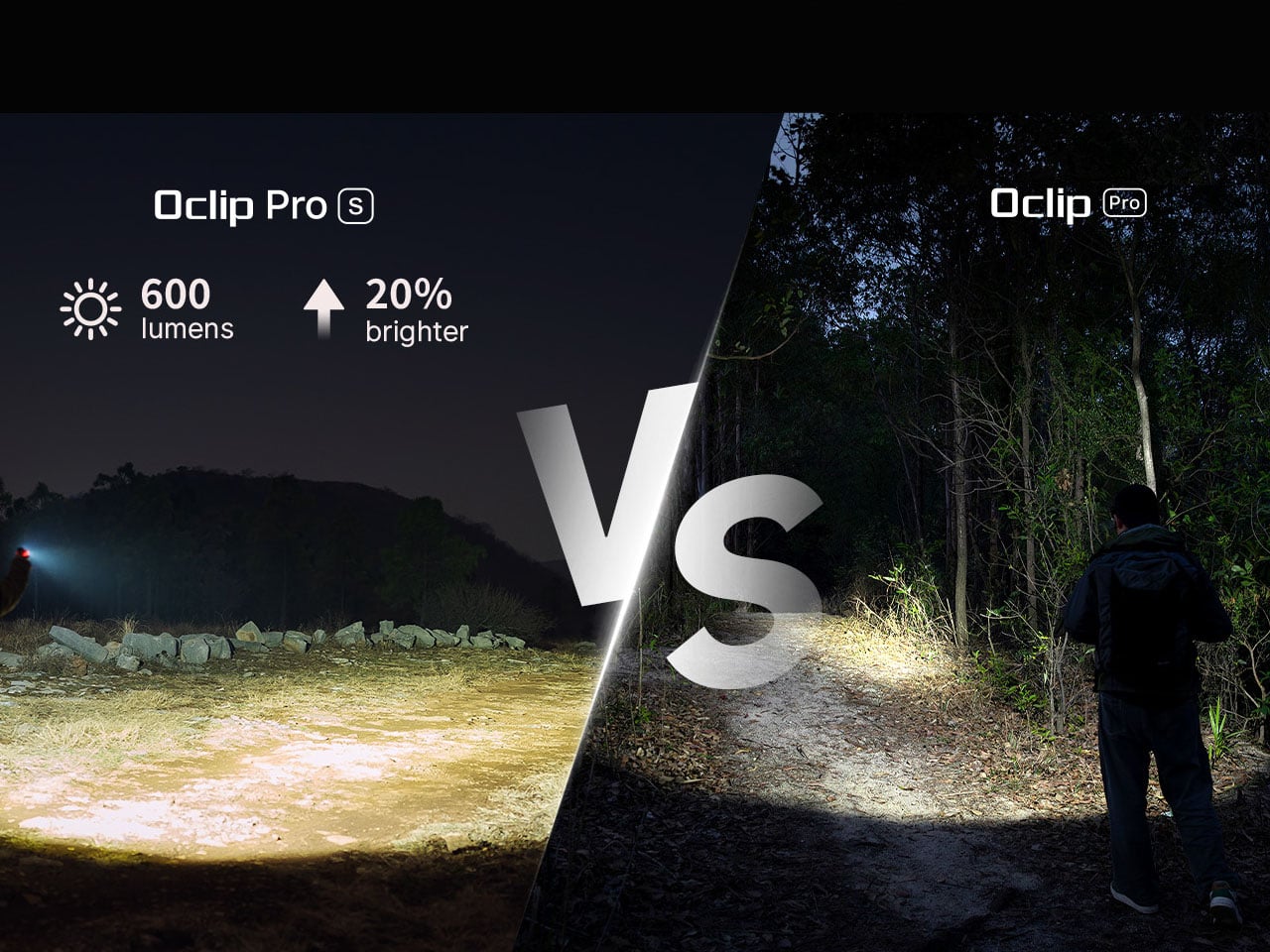
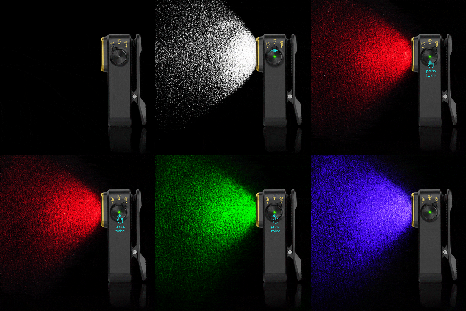
Where the Oclip Pro S begins to stand apart is in how much it manages to pack into that small frame. Instead of relying on a single beam, it integrates a 5-in-1 lighting system that combines white light, RGB illumination, and a UV light source. The primary white LED delivers up to 600 lumens, providing ample brightness for general use, with a beam distance reaching up to 80 meters. This is paired with both floodlight and spotlight modes, giving users the flexibility to switch between wide, ambient lighting and more focused illumination depending on the situation.

The addition of RGB lighting expands its role beyond simple visibility. With red, green, and blue modes, the device becomes a practical signaling tool as much as a flashlight. Whether used for nighttime visibility, marking a location, or adding a layer of safety in low-light conditions, these color options introduce a level of adaptability that feels increasingly essential in modern EDC gear. The lighting system also supports flashing patterns, further extending its functionality in dynamic or emergency scenarios.

Perhaps the most unexpected inclusion is the 365 nm UV light, which quietly transforms the Oclip Pro S into a utility tool for specialized tasks. From detecting counterfeit currency to identifying fluorescent materials or checking cleanliness in certain environments, this feature adds a layer of capability that goes beyond what most users would expect from a device of this size.

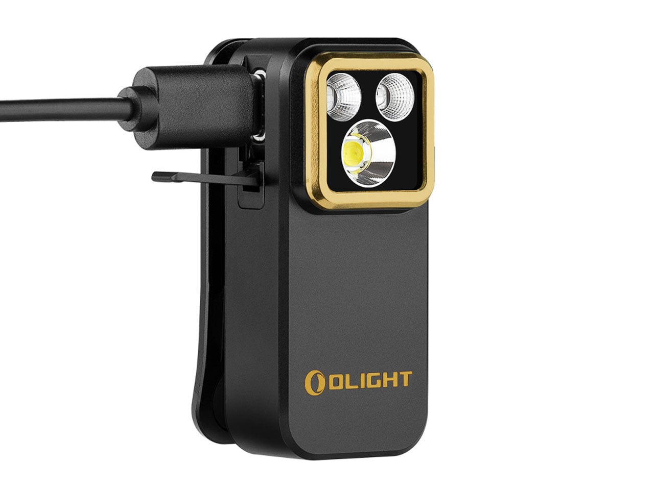
Powering all of this is a built-in battery that supports USB-C charging, aligning the device with current charging standards and making it easy to top up alongside other everyday electronics. Depending on usage, the flashlight can run for up to 144 hours in its lowest brightness mode, while higher output levels are intelligently managed to balance performance and heat.

The interface is equally streamlined, centered around a side dial that allows users to quickly toggle between white, RGB, and UV modes. This intuitive control scheme avoids unnecessary complexity, ensuring that the right light is always just a quick adjustment away. Priced at around $40 and available in a variety of finishes, the Oclip Pro S is positioned as both a functional tool and a subtle personal accessory.

The post Olight Oclip Pro S is a palm-sized clip-on EDC flashlight for every task first appeared on Yanko Design.
The Award-Winning Playground Built to Never Be Replaced

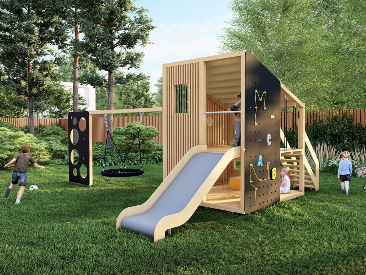
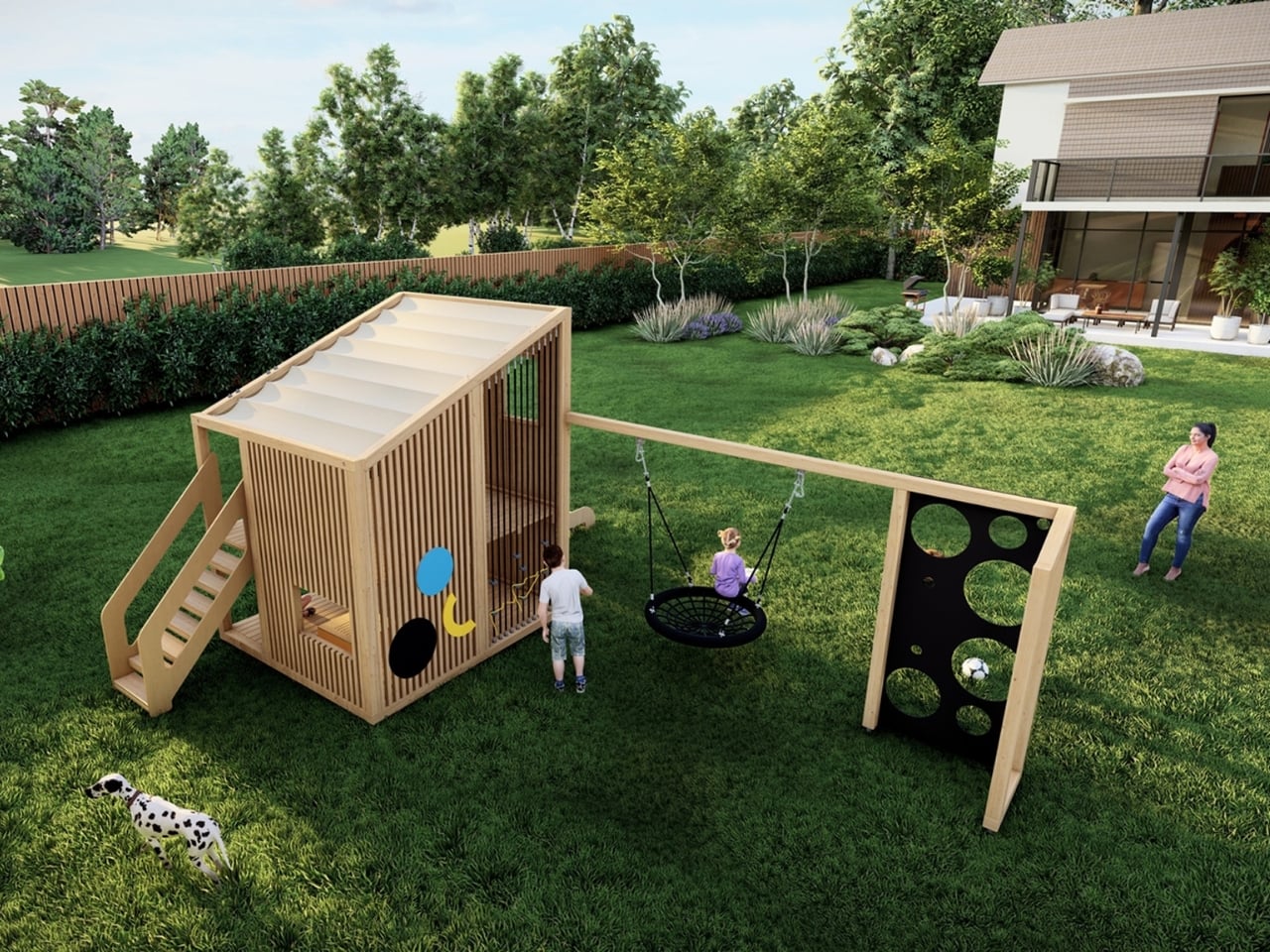
Most playground equipment exists to check boxes. There’s a slide, a climbing frame, maybe a wobbly bridge if the budget stretched far enough. You’ve seen it a thousand times at every park and school yard you’ve ever walked past. It does the job. It keeps kids occupied. And then, somewhere around year three, a panel cracks, a swing goes missing, and the whole thing quietly starts to look forgotten. That’s not what Marlena Kostrzewa and Aleksandra Kwaśniewska had in mind when they designed Nolmo Garden.

The collection, created for Polish manufacturer Nolmo, recently took home a win at the European Product Design Award 2025, earning recognition in the Outdoor category. The EPDA is no small feat to crack, with submissions arriving from designers in more than 58 countries and a jury panel of over 30 design leaders. For a playground collection to land among the winners tells you something: this wasn’t treated as background infrastructure. It was treated as design. And the philosophy behind it is what makes it worth talking about.
Designers: Marlena Kostrzewa, Aleksandra Kwaśniewska

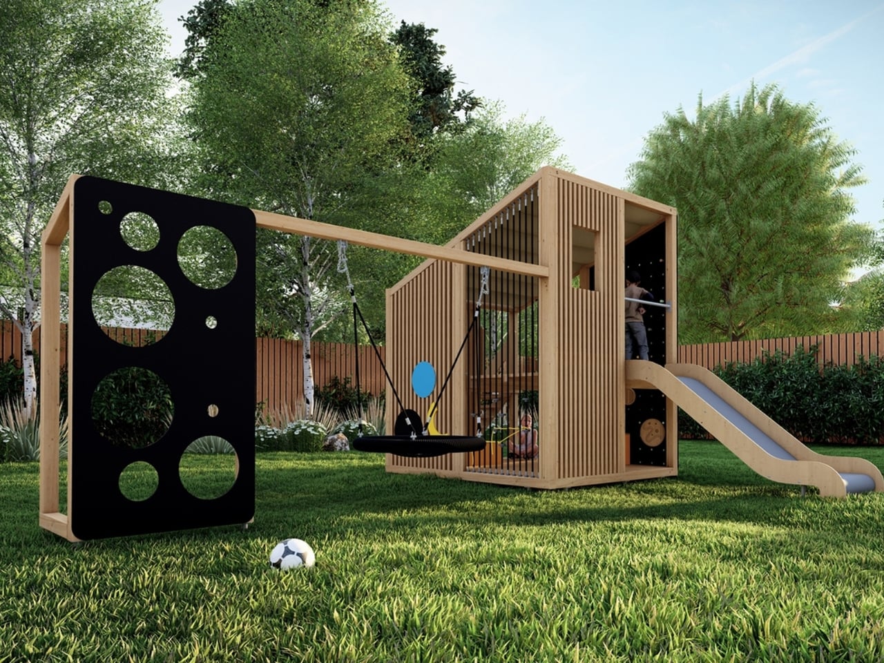
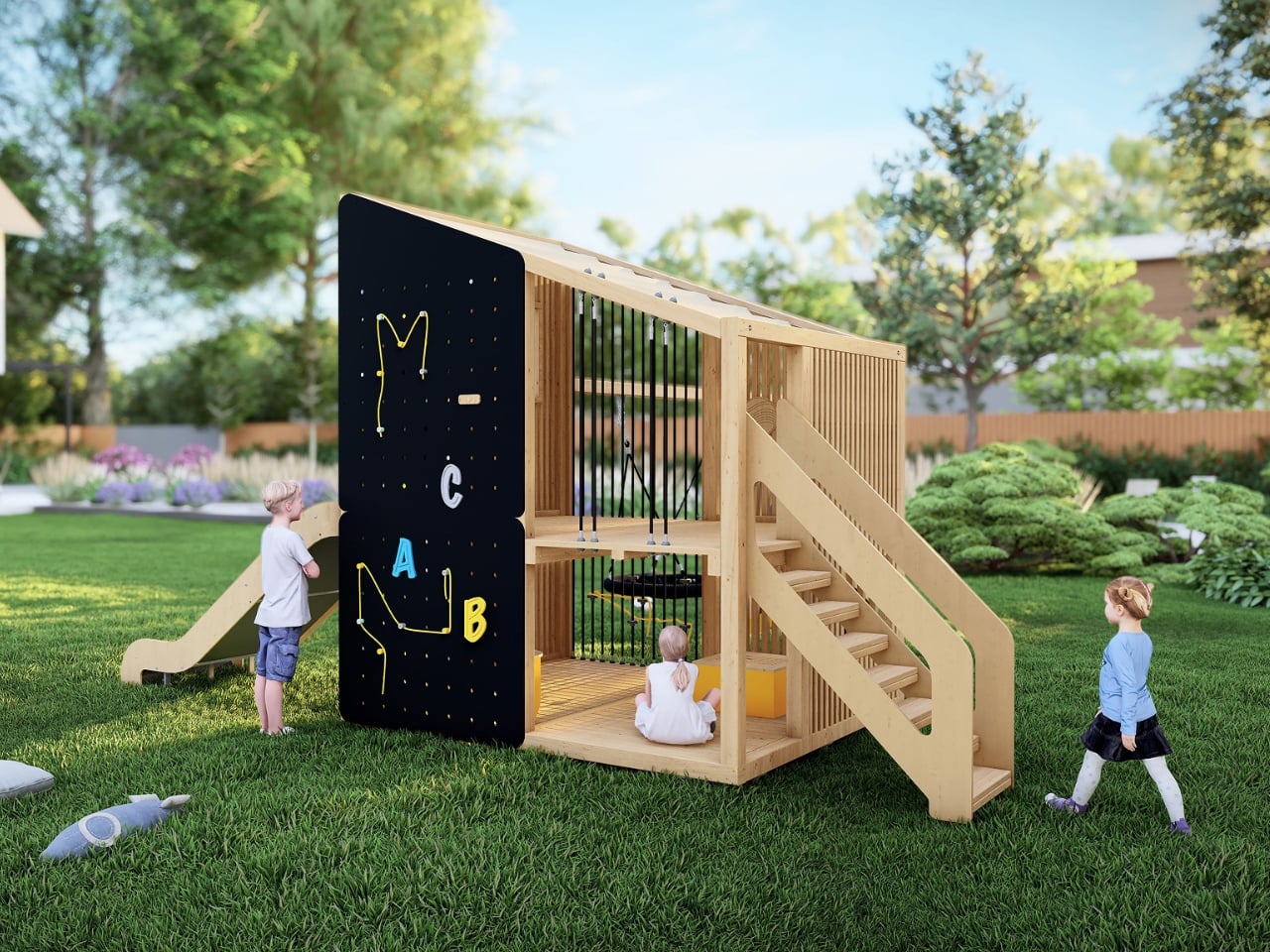
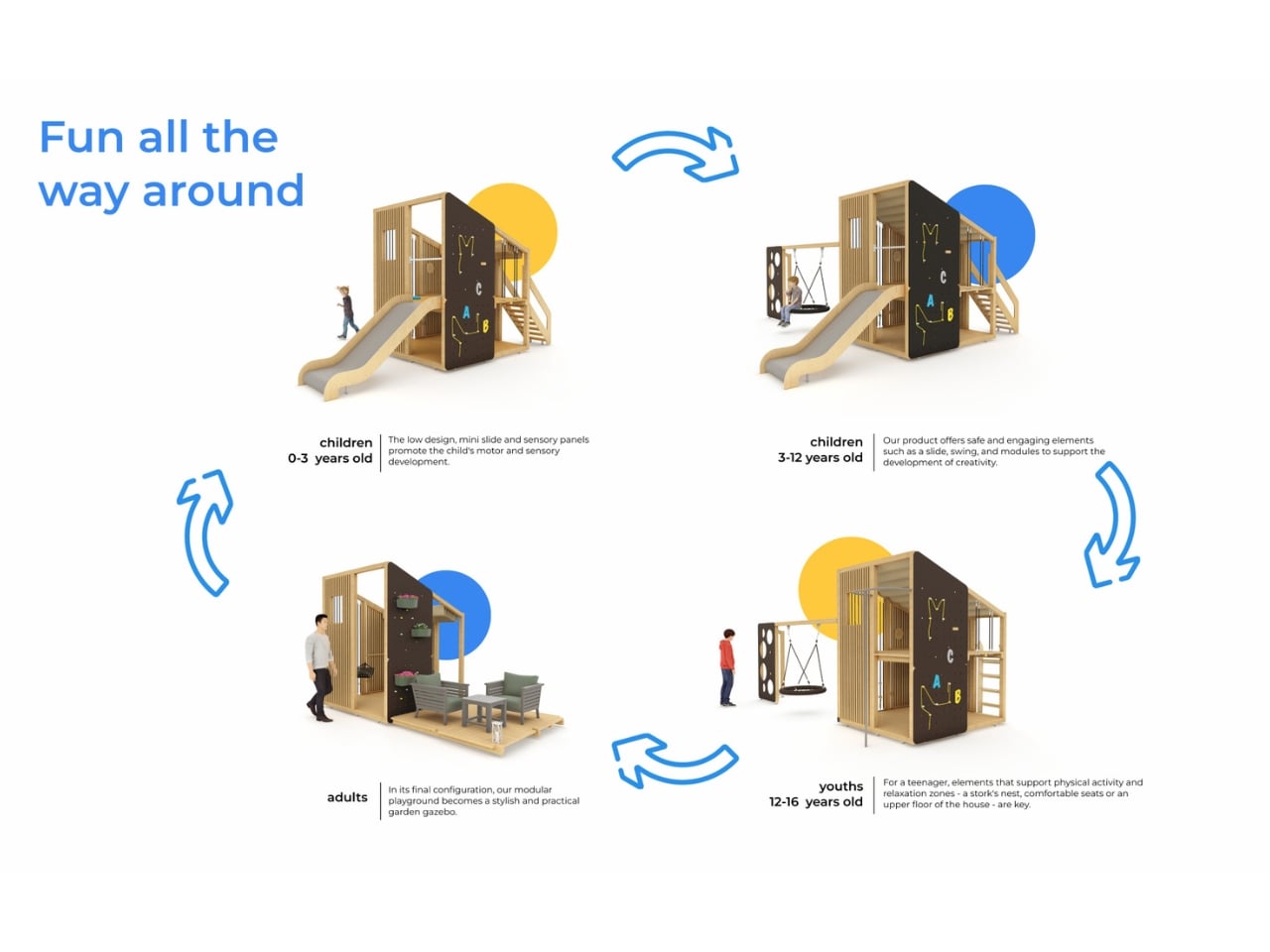
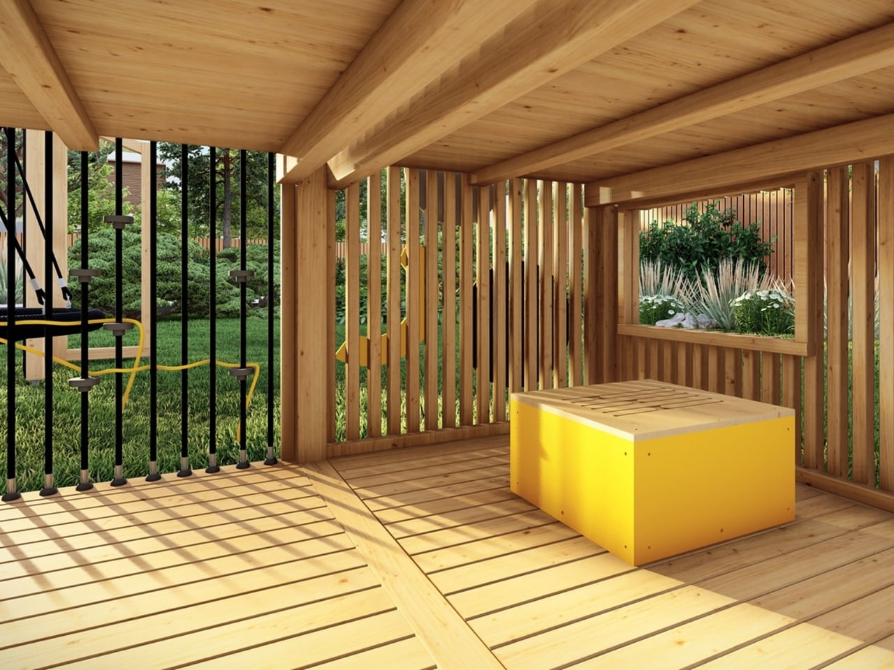
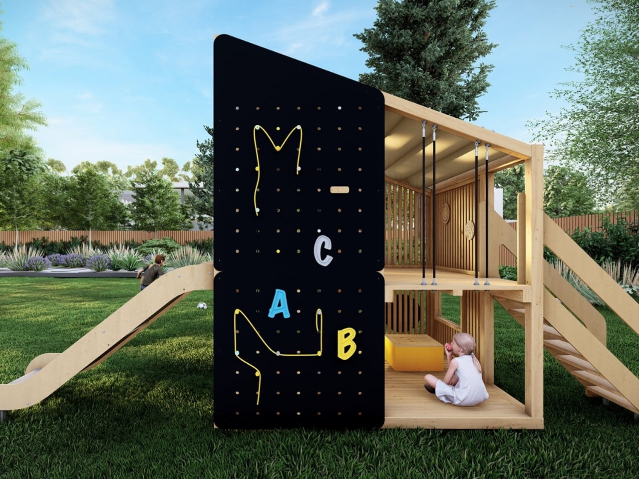
Kostrzewa and Kwaśniewska built the Garden collection around three core ideas: modularity, longevity, and circular design. Every single element in the collection was planned to be easily replaceable. Not just repairable in the vague, optimistic way that most products claim to be, but genuinely, practically swappable. Parts can be changed without tearing the whole thing apart, which means a worn-out component doesn’t automatically mean the end of the playground’s life. That’s a remarkably grown-up approach to objects that are made for children.

We often underestimate how much waste happens in public spaces. Playground equipment gets installed, gets battered by weather and daily use, and eventually gets torn out and replaced wholesale. It’s expensive and wasteful, and the communities it’s meant to serve rarely have much say in what goes in or comes out. Circular design in this context isn’t just an environmental talking point. It’s a smarter economic choice, and it’s one that most manufacturers still haven’t seriously committed to.
Nolmo, for its part, has been in this space for over 30 years. The Polish company builds public recreational areas, small urban architecture, and playground equipment, drawing on cultural contexts and contemporary design trends to create pieces that actually fit the environments they’re placed in. That context matters when you look at Garden. This is a collection that was designed to feel at home in a community, not just installed in one.

The modularity angle also speaks to something that rarely gets addressed in playground design: children grow. What works for a four-year-old doesn’t necessarily work for an eight-year-old, and a playground that only serves one narrow age bracket has a very short window of relevance. The Garden collection was built with the intention of growing alongside the children who use it, which extends its value far beyond the initial installation.

Kostrzewa and Kwaśniewska are among the designers that the EPDA specifically recognizes for combining creative vision with practical relevance. That phrase feels especially apt here. A playground isn’t a concept piece. It gets rained on, climbed over, argued about, and sometimes knocked into. The design has to hold up against all of that while still doing what good design is supposed to do: make people want to engage with it.

The fact that Garden won in the Outdoor category, beating out submissions from dozens of countries, is a good reminder that some of the most thoughtful design work happening right now isn’t in consumer electronics or luxury goods. It’s in the stuff we tend to walk past without thinking twice. The places where kids learn to take their first real risks, fall down, get up, and do it again. Nolmo Garden didn’t reinvent the playground. It just did it properly. And sometimes, that’s exactly the kind of design that deserves the most attention.

The post The Award-Winning Playground Built to Never Be Replaced first appeared on Yanko Design.