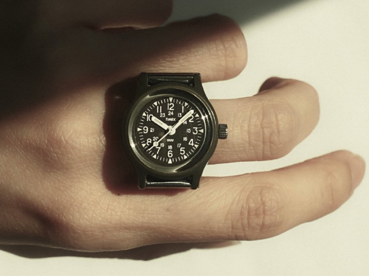
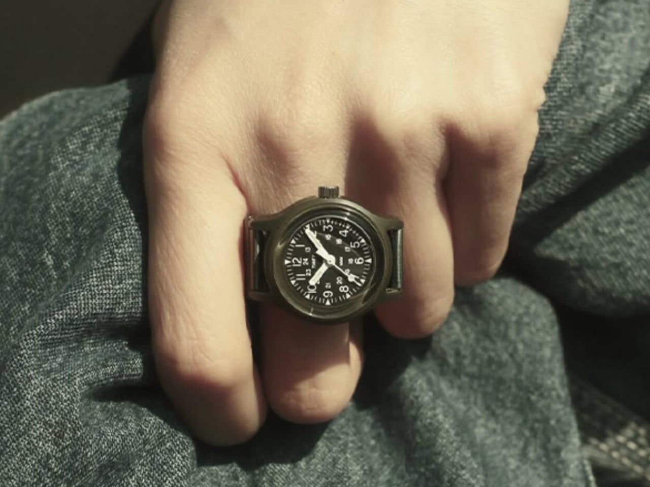
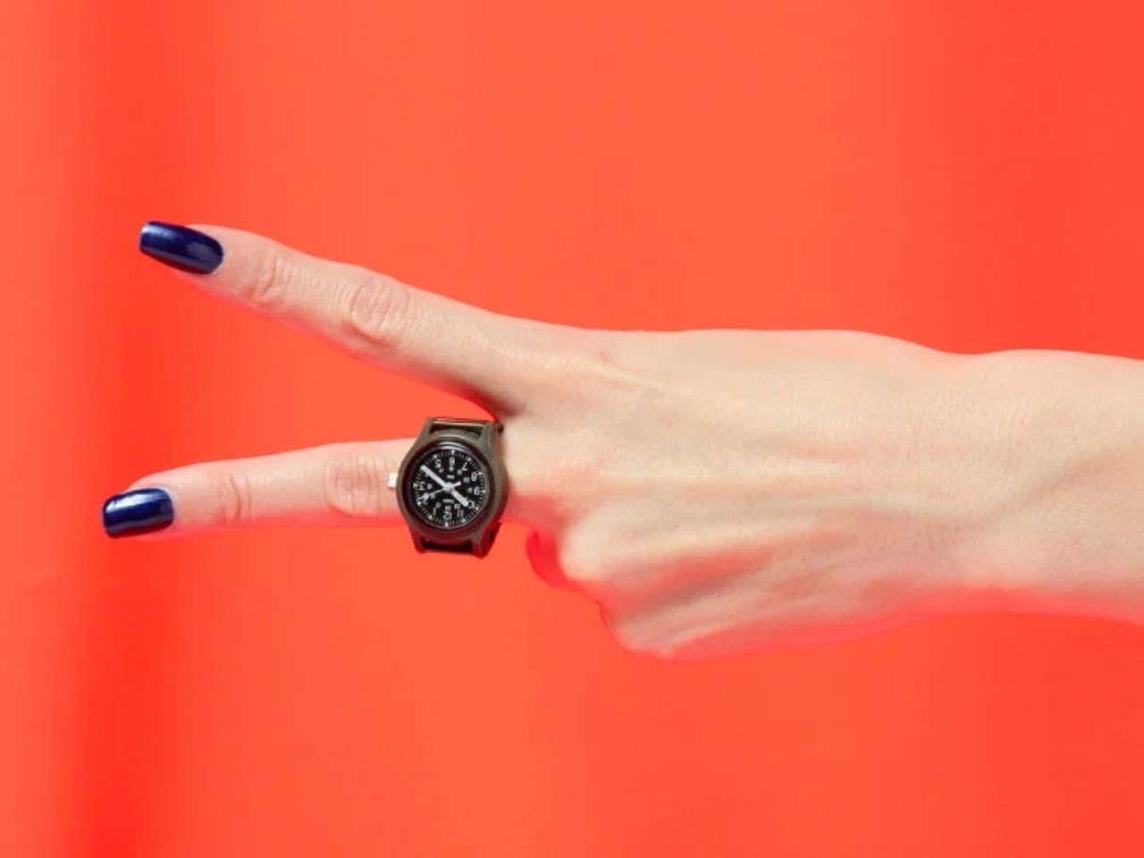
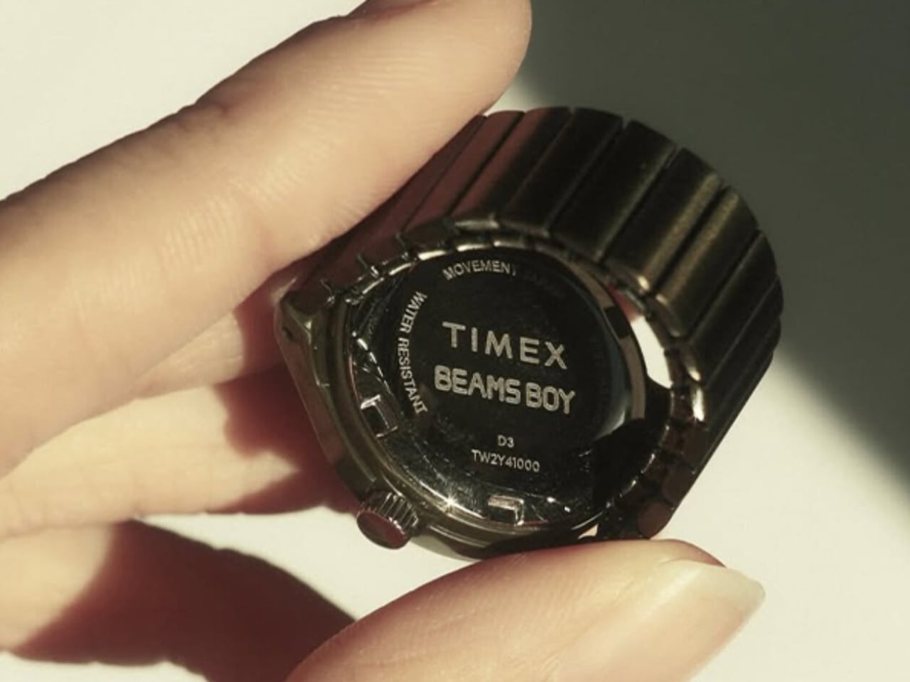
The Timex Camper has been around for decades, earning its reputation as one of those no-nonsense, reliable watches that quietly became a cult item. It’s not flashy. It doesn’t scream at you. It just sits on your wrist doing its job in that honest, military-practical kind of way that a certain type of person finds deeply appealing. So when I first heard that Beams Boy was turning it into a ring, my reaction was somewhere between “wait, really?” and “actually, that makes complete sense.”
Beams, the Japanese retailer that started as a tiny 21-square-meter Americana shop in Harajuku back in 1976, is celebrating its 50th anniversary this year. With nearly 160 locations across Japan today, they’ve spent half a century proving they understand how culture and fashion intersect in ways most brands only dream about. For their anniversary, they didn’t release a standard commemorative watch with a logo on the dial or a velvet box. They took the Timex Camper and redesigned it from a wristwatch into a fully functional ring. It’s a bold, witty, and genuinely surprising idea, and it feels very Beams to pull it off.
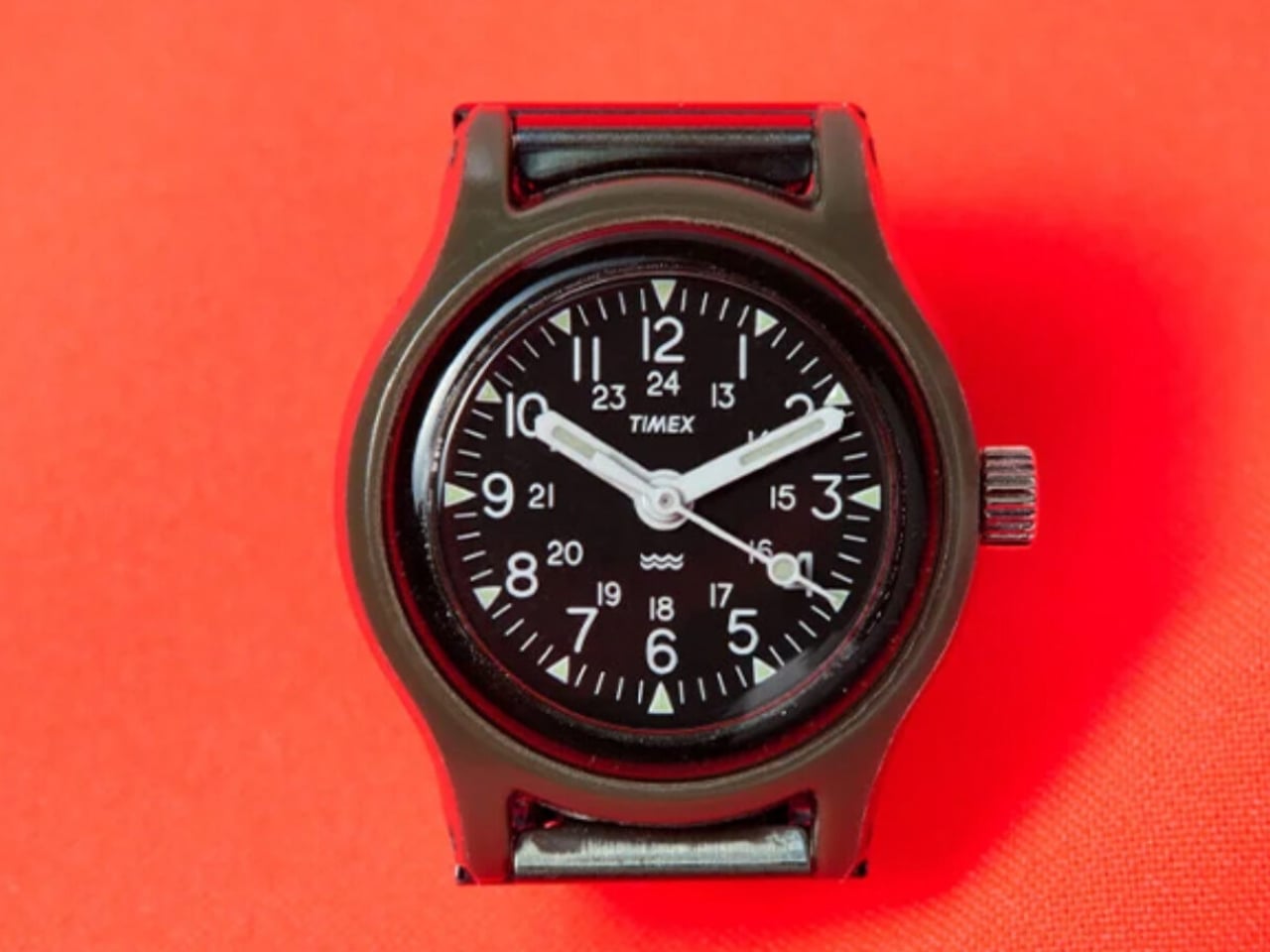
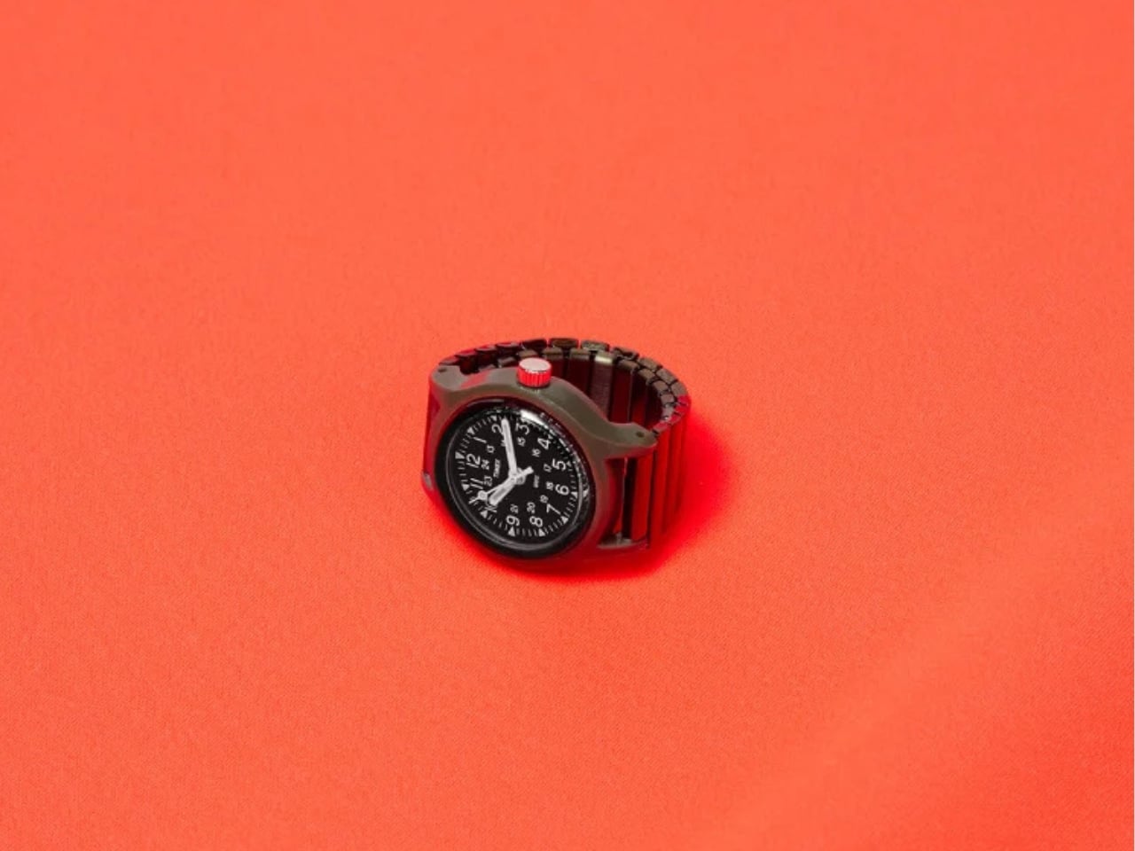
The Beams Boy x Timex Original Camper Ring Watch draws its lineage from two points in history: the 1920s tradition of converting women’s timepieces into jewelry, and the 1990s ring watch trend that briefly made a cult appearance before fading out again. What makes this release feel fresh rather than nostalgic is how it leans into function, not just form. This isn’t a decorative piece masquerading as a watch. It runs on a Japanese quartz three-hand movement, with a crown at the three o’clock position to adjust the time. It is, technically, a fully working watch. Just one you wear on your finger.
The construction is straightforward and smart. The case is lightweight resin, the crystal is acrylic, and the band is a stainless steel expansion piece that stretches to fit ring sizes 9 through 15. Because the links aren’t removable or adjustable, the flexibility does the work instead, which is practical and eliminates the fussiness of traditional ring sizing. The whole thing comes in a single olive colorway, keeping it in line with the Camper’s military DNA. I’d be lying if I said I didn’t wish for a couple of color options, but the restraint is kind of the point. It’s the Camper. Olive green is the answer.
The dial stays true to what made the Camper worth caring about in the first place. Bold numerals, minimal clutter, the kind of face that tells you the time without asking for your attention. Shrinking that down to ring scale could have easily turned it into something illegible or toy-like, but it holds together visually in a way that feels considered rather than cute. The olive resin case doesn’t try to be refined or precious. It’s matte, slightly utilitarian, and completely on-brand for a watch that was never designed to impress anyone at a dinner table.
What I find genuinely interesting is how the expansion band was handled. A nylon strap would have been the more authentic choice given the Camper’s history, but it would have been impractical on a finger. The stainless steel expansion band solves the sizing problem without introducing the kind of visual heaviness that a chunky metal bracelet would have brought. It sits quietly beneath the case, doing its structural job while keeping the focus on the watch face itself. The proportions feel right. Small enough to be a ring, substantial enough to still read as a watch.
Ring watches are quietly gaining traction again, with a few other brands testing the format recently. The format suits a culture that’s increasingly interested in accessories that carry a story and a specific point of view, where what you wear on your hand says something intentional about who you are. A functioning military watch miniaturized into a ring does that in a way that a statement ring or a charm bracelet simply can’t.
The Beams Boy x Timex Camper Ring Watch drops on April 3, 2026, exclusively through Beams, priced at ¥19,140, roughly $120 USD. Whether it makes it outside Japan is still up in the air, which will make the hunt part of the appeal for a lot of people. For a 50th anniversary piece, this is the right kind of creative risk. Not safe, not predictable, but grounded in enough history and craft to earn its existence. That’s exactly the kind of thing worth paying attention to.
The bag you carry is a design decision. Every object inside it is a small vote for how you move through the world, what you value, what you’re willing to lug, and what deserves a slot in your pocket or your pack. For too long, tech accessories defaulted to bulk. More power meant more weight. More connectivity meant more dongles. Better audio meant a bigger case. The implicit trade was always the same: capability costs space.
That trade is becoming optional. A new generation of everyday carry tech is rethinking its own geometry, collapsing into pockets, shedding grams, and using smarter materials and tighter engineering to pack more utility into less volume. These are not spec-sheet products assembled to fill a gap. They are designed to disappear into your day and show up exactly when you need them. From a power bank thinner than any phone to a keyboard built for a jacket pocket, these seven picks redefine what it means to carry less and own more.
1. Xiaomi UltraThin Magnetic Power Bank 5000 15W
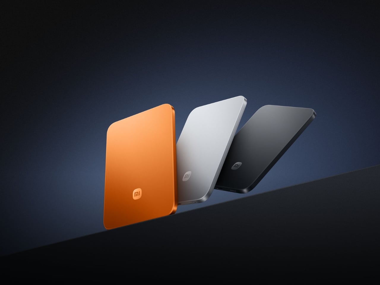
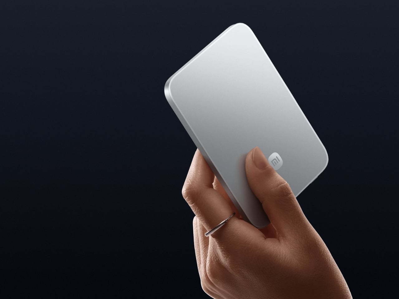
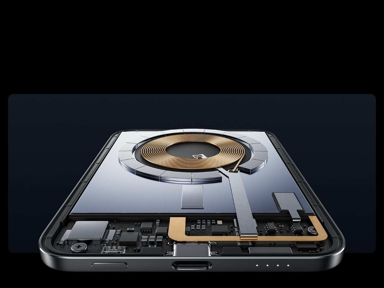
Power banks have always had a design problem. They’re essential and clunky, reliable and bulky, always appreciated but never comfortable to carry. Xiaomi’s UltraThin Magnetic Power Bank 5000 addresses that problem by starting where no other power bank has dared: at 6mm. That is thinner than most smartphones currently shipping. The aluminum alloy shell comes in Glacier Silver, Graphite Black, and Radiant Orange, each finished with a photolithographically etched logo that signals careful intention rather than assembly-line output. The fire-resistant fiberglass phone-facing surface handles heat management invisibly, keeping the exterior clean of vents or grilles. At 98 grams, it weighs less than two eggs, and carrying it feels like carrying nothing at all.
The engineering behind that form is silicon-carbon battery chemistry with 16% silicon content, enabling the energy density required to fit 5,000mAh into a body this slim. It supports 15W wireless charging for compatible Android devices, 7.5W for iPhone, and 22.5W wired via USB-C, with the practical addition of charging two devices simultaneously while being recharged itself. Showcased at MWC 2026 in Barcelona and priced at €59.99 in Europe for the Silver and Black versions, this is a power bank that earns its place by eliminating the bulk compromise the category has always required. For anyone committed to carrying less, this is the first power bank that doesn’t feel like a concession.
What We Like:
6mm profile and 98g weight make it the most pocket-friendly 5,000mAh power bank available
Silicon-carbon battery chemistry delivers a full 5,000mAh capacity without dimensional sacrifice
What We Dislike:
Wireless charging for iPhone is capped at 7.5W maximum
Rated capacity sits at 3,000mAh at 5V/2A, lower than the typical 5,000mAh figure
2. OrigamiSwift Mouse
A mouse seems immovable in form. Wide, arched, and desk-bound. The OrigamiSwift dismantles that assumption by doing exactly what the name implies: it folds. Inspired by the precision of origami, it compresses into a flat, slim profile that slips into a bag or jacket pocket without protest, then springs open in under 0.5 seconds into a full-sized, ergonomically shaped Bluetooth mouse that feels nothing like a compromise. It weighs 40 grams. That figure deserves a moment. Most full-sized mice weigh three to four times as much. The OrigamiSwift delivers all the comfort and tracking precision of a conventional mouse while occupying the footprint of a notepad when packed.
For the digital nomad setting up at a café, or the professional moving between meetings with a laptop under one arm, this is the kind of tool that quietly changes the texture of the day. The ergonomic form is shaped to fit naturally in the hand during extended work sessions, reducing the fatigue that accumulates from hours spent on a trackpad. The Bluetooth connection keeps the desk or surface clean. The ultra-thin folded profile sits flat in any bag compartment without creating bulk or claiming space disproportionate to its value. Minimalist carry is about tools that show up without announcing themselves, and the OrigamiSwift does exactly that: invisible when packed, essential when open.
Folds flat for pocket carry and opens into a full ergonomic mouse in under 0.5 seconds
At just 40 grams, it is one of the lightest full-form productivity mice available
What We Dislike:
The folding mechanism may require adjustment time for users accustomed to traditional mice
A 40-gram build may feel less substantial to users who prefer a weighted mouse
3. HubKey Gen2
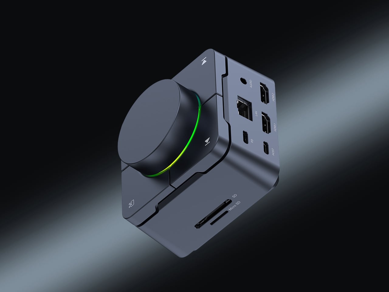
The modern desk accumulates workarounds. Two USB-C ports become four, then six, spread across a tangle of adapters that creep outward from the laptop until the workspace feels less like a setup and more like a wiring diagram. HubKey Gen2 is built to end that creep. It is an 11-in-1 USB-C hub inside a compact cube, and the more interesting detail is what lives on top: four physical shortcut keys and a central control knob that handle media playback, privacy shortcuts, and daily actions without a software menu or a keyboard combination you can never quite remember. One object consolidates what used to require a cluster of small fixes, turning a patchwork of compromises into something coherent.
Dual 4K display support makes it relevant for anyone running an expanded screen setup, while the physical controls restore a directness that software interfaces have quietly taken away. Volume knobs, mute buttons, and display toggles should not require a three-key shortcut or a settings dive. HubKey Gen2 puts that control back within arm’s reach. It handles power, storage, network, and displays from a single USB-C connection, and transforms a desk covered in small adaptations into something intentional and calm. The headline is carry less, own more, and at the desk, that translates directly: one compact cube where eleven separate solutions used to live.
What We Like:
Consolidates 11 connections and physical shortcut controls into a single compact cube
Dual 4K display support covers multi-monitor setups without additional adapters
What We Dislike:
Desk-bound design means it is a workspace consolidation tool rather than a pocketable carry item
Physical shortcut keys offer fewer customization options compared to software-based control surfaces
4. Battery-Free Amplifying iSpeakers
The charging cable is the one obligation that minimalist carry never fully escapes. Every wireless device is a deferred maintenance task, a battery you will have to tend to eventually. The Duralumin battery-free iSpeakers sidestep that dependency entirely. No power source, no cable, no charging ritual. You place your smartphone inside the enclosure, and the geometric cavity amplifies sound through acoustic engineering alone, using the golden ratio in its design to optimize resonance and distribute the audio across the room. It is the kind of object that looks precisely like it belongs on a desk and sounds as considered as it looks.
The material choice deepens the story. Duralumin is the same aluminum alloy used in aircraft construction, a combination of lightness and structural rigidity that allows the speaker to resonate without distorting. The result is a passive amplifier that genuinely improves your phone’s audio while functioning as a deliberate desktop object. Modular compatibility with the sold-separately +Bloom and +Jet sound-directing additions means it can adapt to different spatial setups without ever adding an electronic dependency. For carry with intention, this is what owning more looks like: an object that does its job through physics, needs nothing from a wall outlet, and occupies any surface as though it was designed specifically for it.
Requires no battery or electricity, making it zero-maintenance and usable anywhere
Aircraft-grade Duralumin construction delivers structural integrity alongside a refined aesthetic
What We Dislike:
Audio output is entirely dependent on the quality of the phone’s built-in speaker
Directional sound control requires purchasing the +Bloom or +Jet mods separately
5. NanoPhone Pro
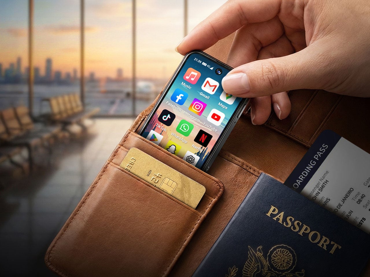
There is a version of the smartphone that has been lost in the pursuit of bigger screens and faster processors. It is the phone that fits in a coin pocket, asks nothing of your attention beyond the call and the navigation prompt, and treats connectivity as a utility rather than an experience. The NanoPhone Pro returns to that idea with a credit-card-sized 4G device running Android 12 and certified for Google Play apps. It browses, calls, navigates, plays music, and handles real-time navigation. It does not demand to be the center of your day, and that restraint is the entire point.
A 5MP rear camera and 2MP front shooter cover quick captures and video calls without positioning this as a photography device. That deliberate limitation is the product’s philosophy: it does everything a smartphone needs to do and none of what a smartphone has quietly drifted into doing over the last decade. As a secondary phone for travel, for screen-time reduction, or for users who simply want connectivity without the gravitational pull of a large-format device, the NanoPhone Pro is a precise instrument. Minimalist carry is often defined by what you leave behind, and this phone argues convincingly that you can leave behind the bulk of a modern device without surrendering any of its real utility.
What We Like:
Credit-card footprint eliminates smartphone bulk while retaining 4G connectivity and Google Play
Android 12 certification ensures a complete app ecosystem without compatibility compromises
What We Dislike:
The 5MP rear camera is not a substitute for a primary smartphone’s imaging system
Small screen dimensions limit usability for media consumption or extended reading
6. Keychron B11 Pro
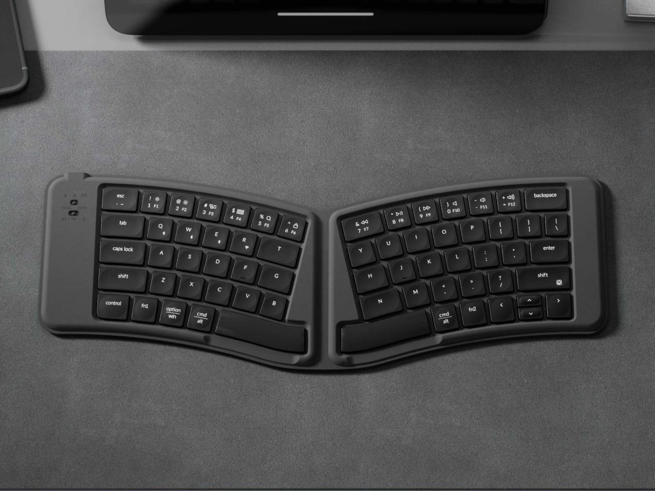
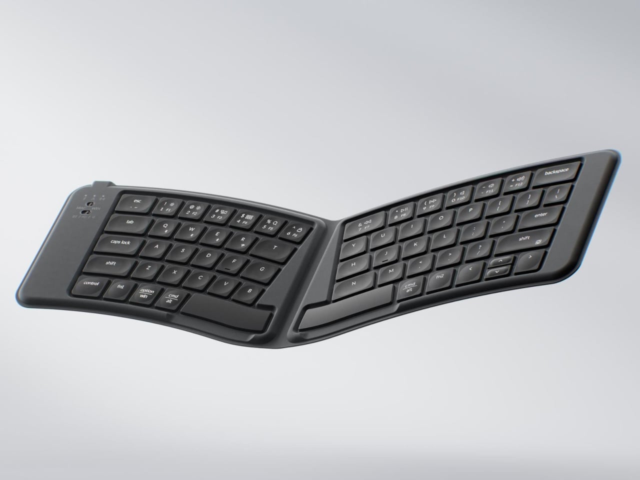
Most portable keyboards solve one problem while ignoring another. They compress the footprint but flatten the key geometry, leaving your wrists to negotiate a straight layout through a full working day in a hotel room or an airport lounge. The Keychron B11 Pro approaches the problem differently. It uses a 65% Alice layout, splitting and angling the two key clusters slightly inward for a more natural wrist position, and then folds in half when not in use. Folded, it measures 196.3 × 143mm and weighs 258 grams, closer in footprint to a paperback book than a keyboard, adding almost nothing to a bag already loaded with a laptop and a water bottle.
The Alice geometry is the more considered design decision here. Angling both hands naturally inward reduces the lateral wrist strain that builds over a long typing session away from a dedicated desk. Keychron already applies this same geometry to the desk-bound K11 Max, but putting it into a foldable form at $64.99 is an entirely different proposition. Most foldable keyboards treat compactness as the only ergonomic consideration on the road. The B11 Pro argues that wrist health doesn’t stop mattering when you leave the office. For writers, remote workers, and anyone who types seriously while traveling, this is the keyboard that proves you don’t have to choose between ergonomic design and fitting your gear into a jacket pocket.
What We Like:
The Alice split geometry reduces lateral wrist strain during long typing sessions away from a desk
Folds to 196.3 × 143mm and 258g, small enough for a jacket pocket or bag side compartment
What We Dislike:
65% layout omits the function row and numpad, which may limit certain professional workflows
The angled Alice geometry requires adjustment time for users moving from a standard keyboard layout
7. TWS Earbuds with Built-in Cameras
Every company building AI hardware is betting on a form factor. Smartglasses, pins, pocket companions: each one asks you to wear a new device, adopt a new habit, and accept a new object into your daily carry. This concept asks a quieter question. What if the best AI hardware is something you already wear? These conceptual TWS earbuds add a single modification to a familiar form: each bud carries a built-in camera positioned along an extra stem, close to your natural line of sight. Paired with ChatGPT, those lenses become a live visual feed for an assistant that lives in your ears, reading menus, interpreting signage, and guiding you through an unfamiliar city without a screen in sight.
The carry implications are significant. A case the size of a lip balm replaces a phone query, a smartwatch notification, and a spoken search. The familiarity of the earbud form is the concept’s strongest argument: people already carry these, already charge them, and already wear them for hours at a stretch. Layering AI visual capability onto that without adding bulk or asking you to change how you move through the world is exactly what makes this vision compelling. Carry less, own more: this concept takes that headline literally. If the goal is capability without compromise, an assistant that can see, hear, and understand the world from inside a pair of earbuds is the most minimal possible version of that idea.
What We Like:
AI visual and audio capability in an earbud form factor requires no new carry habits or added bulk
Familiar TWS design eliminates the adoption friction that has limited other AI hardware categories
What We Dislike:
Currently a concept product with no confirmed release date or commercial availability
Built-in cameras positioned near the face raise valid and ongoing concerns about privacy in everyday use
The Best Tech Is the Tech You Actually Carry
Minimalism in everyday carry is not about owning less for its own sake. It is about refusing to let the objects you depend on become a burden. The best gear earns its place by doing more with less, compressing capability into a form that fits your life without requiring your life to reorganize around it. Every product on this list represents that thinking: a power bank that weighs less than two eggs, a keyboard that folds into a jacket pocket, a speaker that needs no power at all, and earbuds that could soon carry an AI capable of reading the world for you.
The shift is real, and it is accelerating. Engineering is finally catching up to the design ambition that minimalist carry has always implied. You no longer have to choose between a fully equipped setup and a light bag. These seven accessories make that argument in the most convincing way possible: not with a manifesto, but with their dimensions.
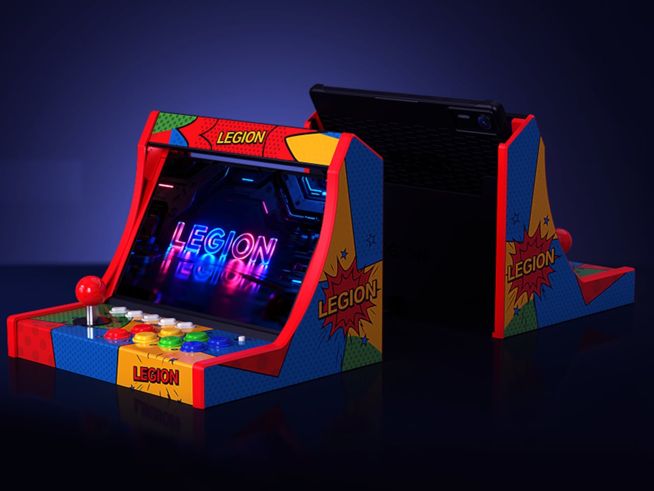
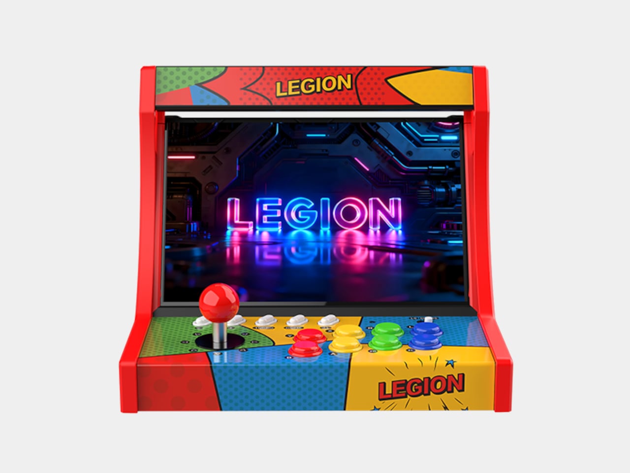
Gaming on a tablet is a strange kind of compromise. The screen is great, the hardware is often genuinely powerful, and the library is enormous, but you’re still holding a slab of glass with your thumbs smudging across virtual buttons. Controllers help, and dedicated gaming tablets like Lenovo’s Legion Tab have attracted a healthy ecosystem of accessories. None of them, though, looks quite like this.
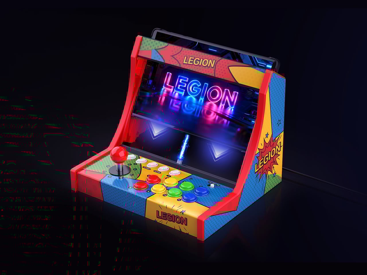
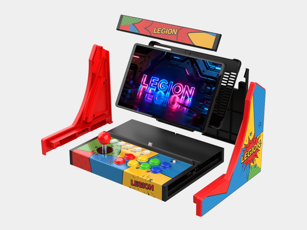
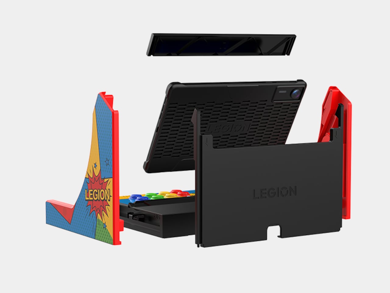
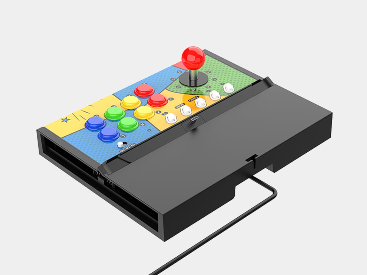
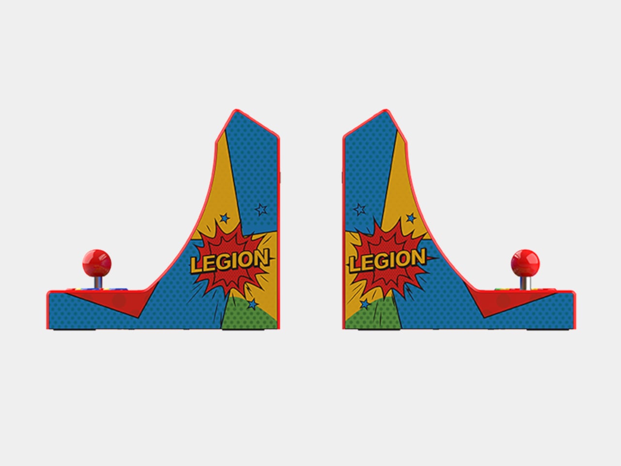
Lenovo has quietly released the Legion Y700 Tablet Arcade Dock in China, a snap-on peripheral that turns the 8.8-inch Legion Tab into a miniature arcade cabinet. The tablet slots into the dock and connects through USB-C, at which point you have a joystick, eight colored action buttons, and five additional buttons along the top edge. That’s 14 physical inputs total, which covers most of what classic arcade games and retro emulators would ever demand from a player.
The concept is straightforward, and the appeal is immediate. Retro gaming on Android has quietly matured into one of the more compelling reasons to own a powerful compact tablet, and a joystick changes the feel of that experience in a way no gamepad quite replicates. Fighting games, run-and-gun titles, and classic beat-em-ups were built around a stick and a row of buttons, and playing them with a thumbstick always involves a small but nagging sense of compromise that this dock resolves without much ceremony.
The dock is listed on Lenovo’s Chinese store for ¥399, which converts to roughly $60 stateside. For an accessory with this level of novelty, that pricing is surprisingly restrained. The Legion Tab itself carries real gaming hardware, and the dock is essentially asking whether you’d like to occasionally use it standing upright like a bartop cabinet. At $60, the answer doesn’t require much deliberation.
The more practical question is whether the controls hold up to repeated use. Arcade joysticks and buttons sit on a spectrum from satisfying to mushy, depending almost entirely on the microswitches underneath, and Lenovo hasn’t published specifications on what’s inside this one. The snap-lock installation is designed for quick assembly, which is convenient, but a docking mechanism that flexes during aggressive joystick inputs would undermine the whole point.
There’s also the matter of availability. This is currently a China-only product, compatible with the Legion Y700 Gen 4 and Gen 5 tablets. The Legion Tab Gen 5 is heading to the US and global markets at $849, but the dock has no confirmed international release alongside it. Lenovo launched a gamepad accessory for the same tablet at roughly the same time, and neither has been officially announced outside China.
For a tablet that positions itself as a serious portable gaming device, the arcade dock is either a genuinely clever extension of that identity or a fun novelty that will live mostly in social media posts and Chinese gaming cafes. The form factor has obvious charm, and the $60 price removes most of the financial hesitation. What’s less clear is whether the controls are built to survive a few hundred rounds of Street Fighter or just look great in product photos.
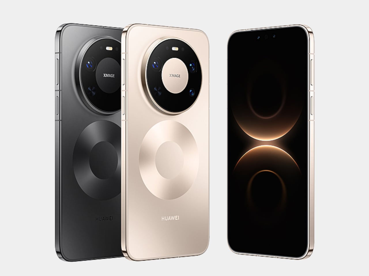
Gaming phones have had active cooling for years, strapping fans and heat pipes to the back like little mechanical tumors. They work, mostly, but they also make your phone look like it needs a pit crew. The Huawei Mate 80 Pro Max Wind Edition takes a different approach, tucking a cooling fan directly inside the phone itself. It is, quite literally, a Fan Edition, and not just in the collector’s edition sense of the word.
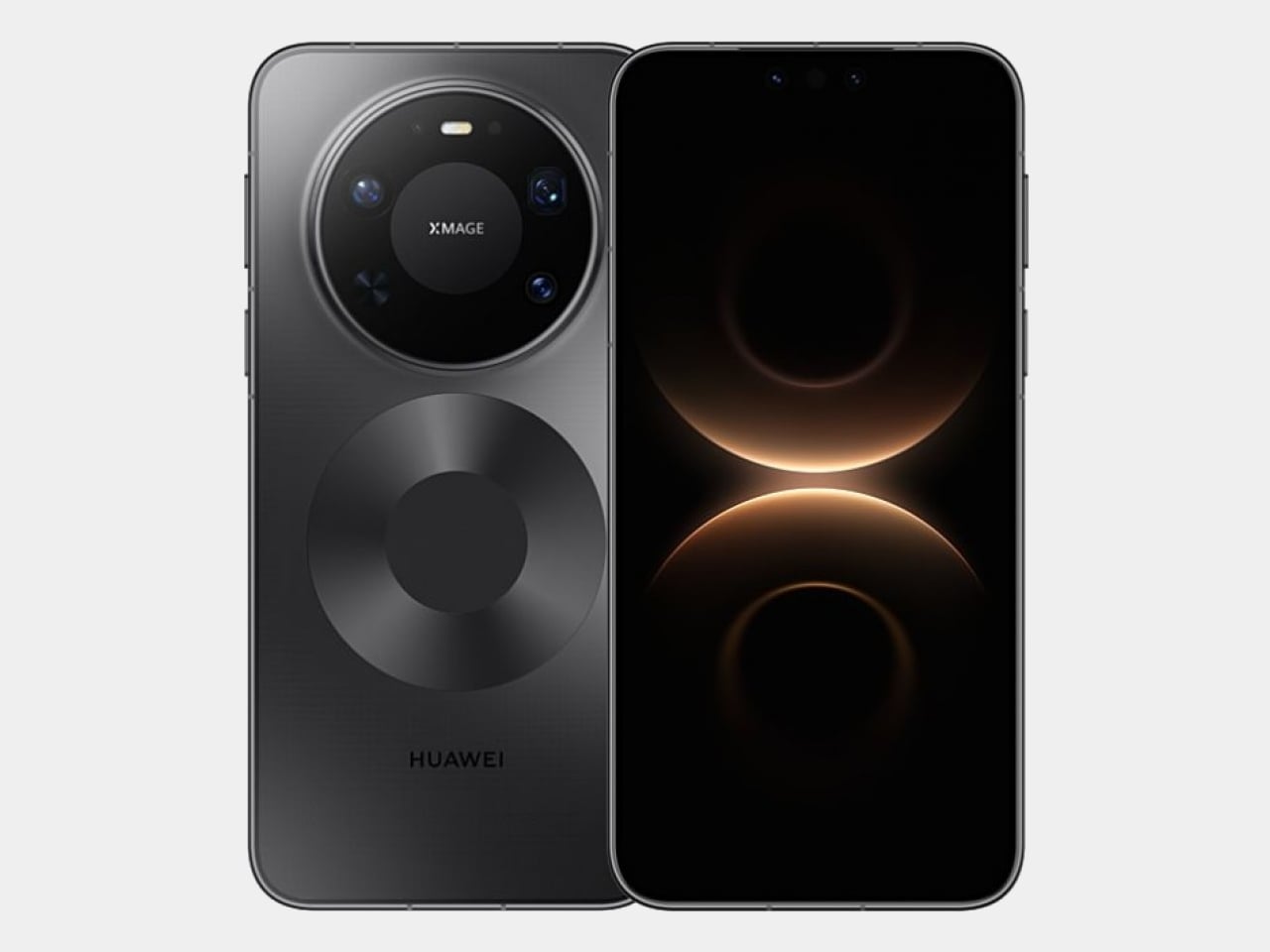
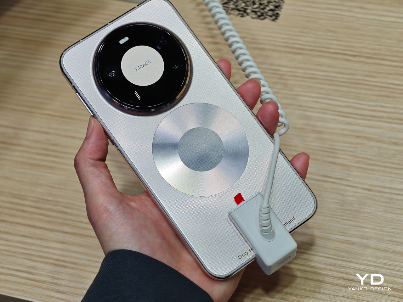
The Wind Edition is a variant of the standard Mate 80 Pro Max, currently listed for pre-order in China through Huawei’s Vmall store. It comes in Polar Night Black and Polar Day Gold, with 16GB of RAM paired with either 512 GB or 1 TB of storage. No pricing has been confirmed yet, and Huawei has yet to formally announce the device, but the listing and early images already make clear what the phone is doing and what it sacrificed to do it.
Designer: Huawei
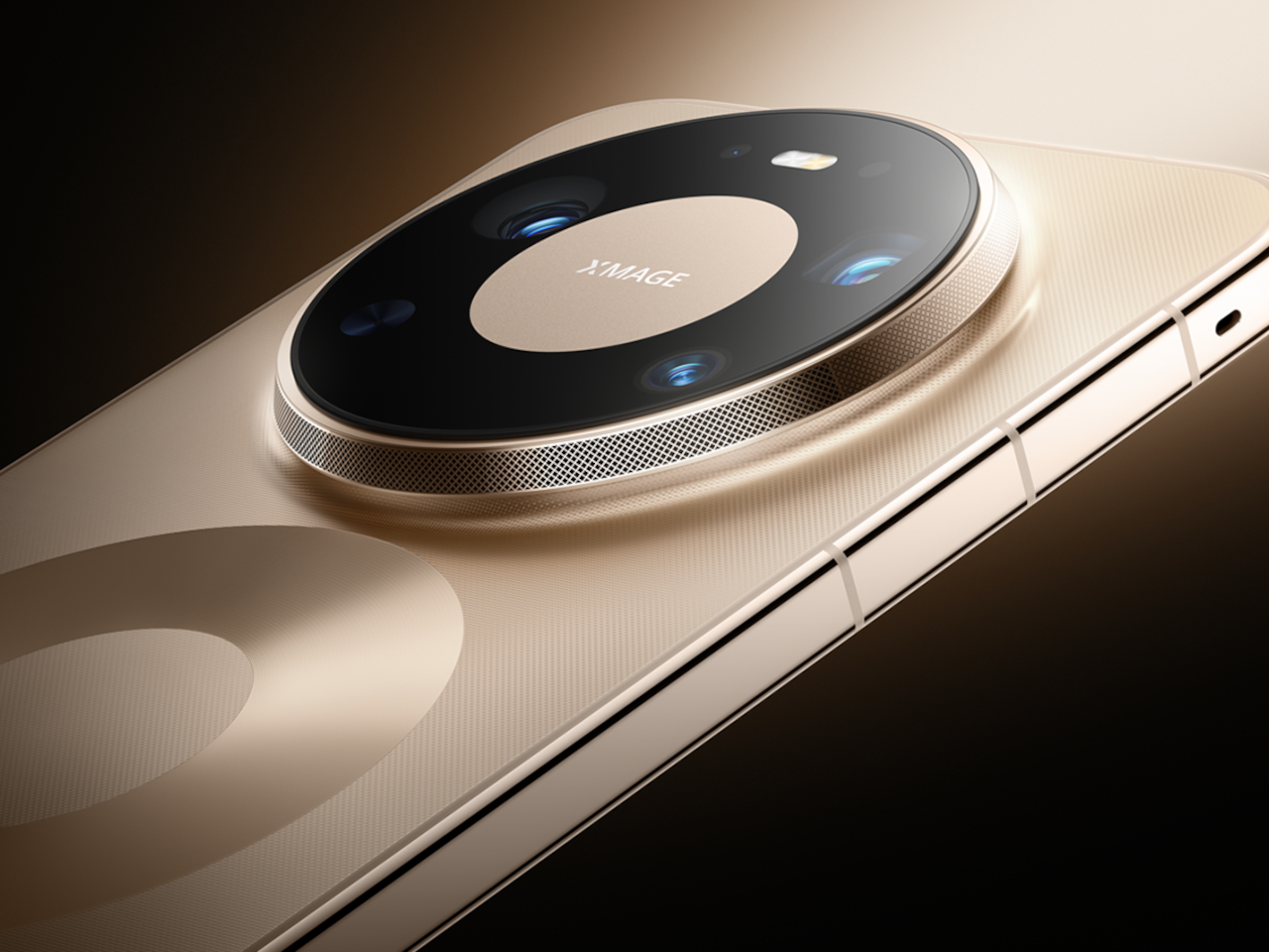
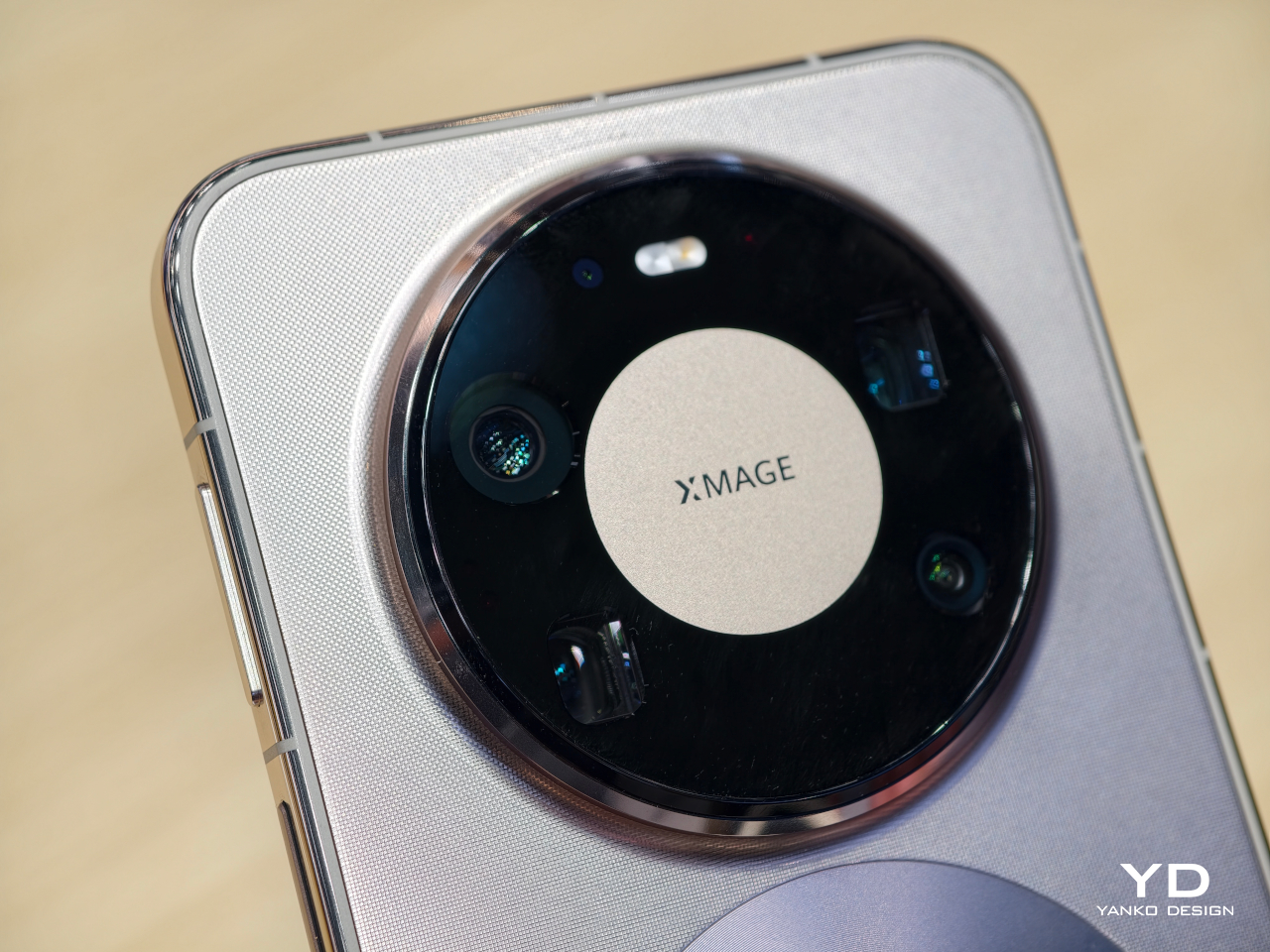
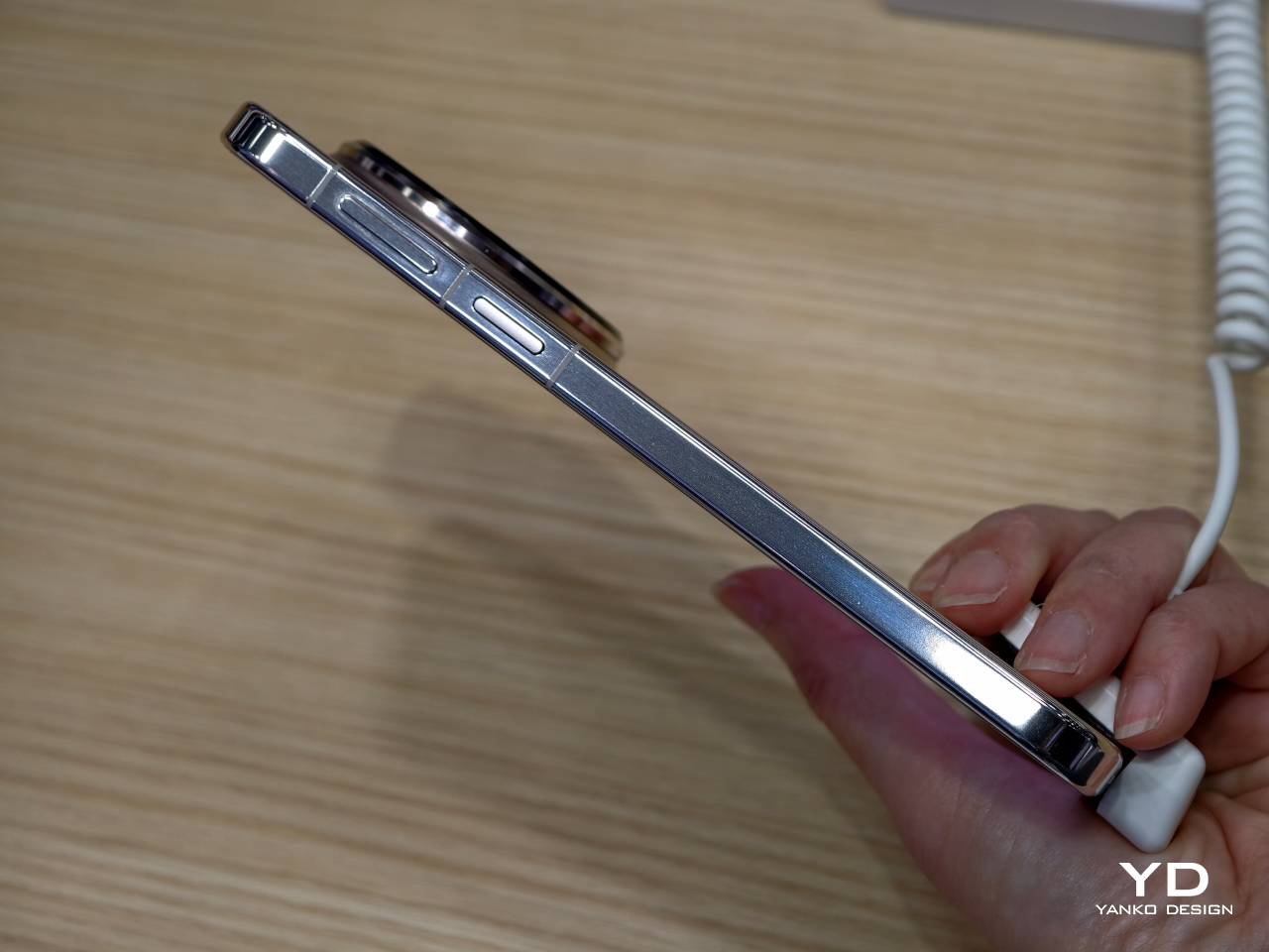
The most obvious change is in the rear camera module. The standard Mate 80 Pro Max has a quad-camera setup; the Wind Edition trims that to three sensors. The space that the fourth camera occupied now goes to the fan mechanism, and the camera ring is noticeably wider to accommodate the ventilation. The perforated ring around the module is not decorative, but it is where the air moves. That trade-off deserves a moment: a flagship phone deleting a camera to make room for a fan.
The rest of the hardware appears to carry over from the standard model, including the 6.9-inch AMOLED LTPO display, the Kirin 9030 Pro chipset, and the 6,000 mAh battery with 100W wired and 80W wireless charging. The fan is intended to help the Kirin 9030 Pro maintain performance during extended gaming or long video recording sessions, where heat buildup would otherwise force the chip to throttle and degrade output.
Active cooling in smartphones is a reasonable engineering response to a real thermal problem, but integrating a moving mechanical part into a device designed to survive drops and dust introduces variables that passive thermal systems simply do not have. Fans collect debris. They wear out. There is a potential failure mode here that no amount of vapor chamber engineering would ever introduce, and that is worth factoring in before committing.
Huawei Mate 80 Pro Max
Huawei Mate 80 Pro Max
Early reports suggest the Wind Edition will initially be sold in limited quantities through select Huawei lifestyle stores rather than the broader retail channel, which positions this less as a mass-market launch and more as a demand test. It is a cautious approach, and probably a sensible one given how different this phone is from anything Huawei has shipped before. Most people curious about it will be watching from the sidelines for now.
The Huawei Mate 80 Pro Max Wind Edition raises a question that no spec sheet can resolve: how much camera versatility is a meaningfully cooler phone actually worth? The downgrade from four sensors to three is a concrete loss, not a rounding error. For someone who pushes the chip through long gaming sessions and has watched their device thermal-throttle under load, the trade-off might make perfect sense. For a photographer who chose the Mate 80 Pro Max for its imaging range, it probably does not.
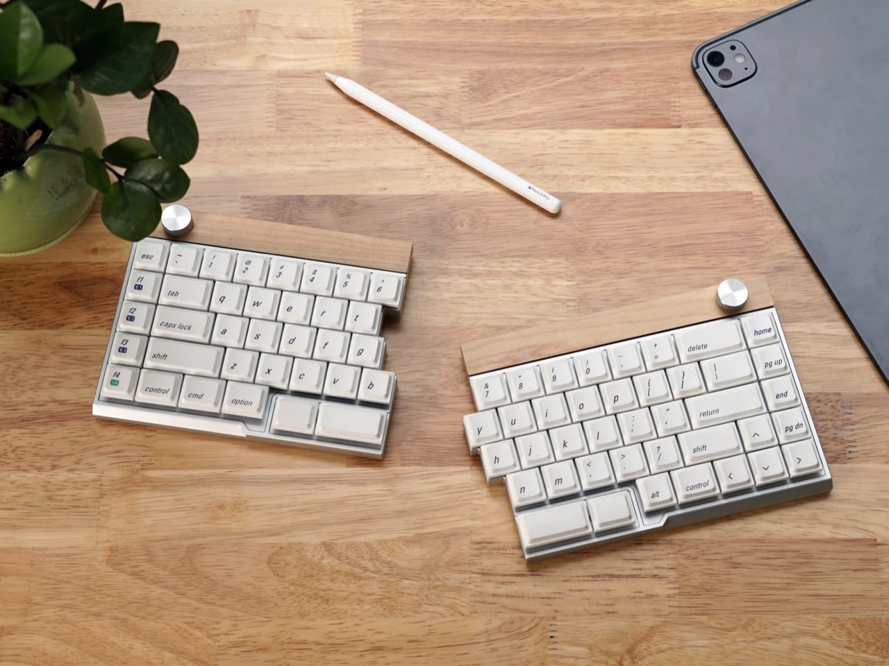
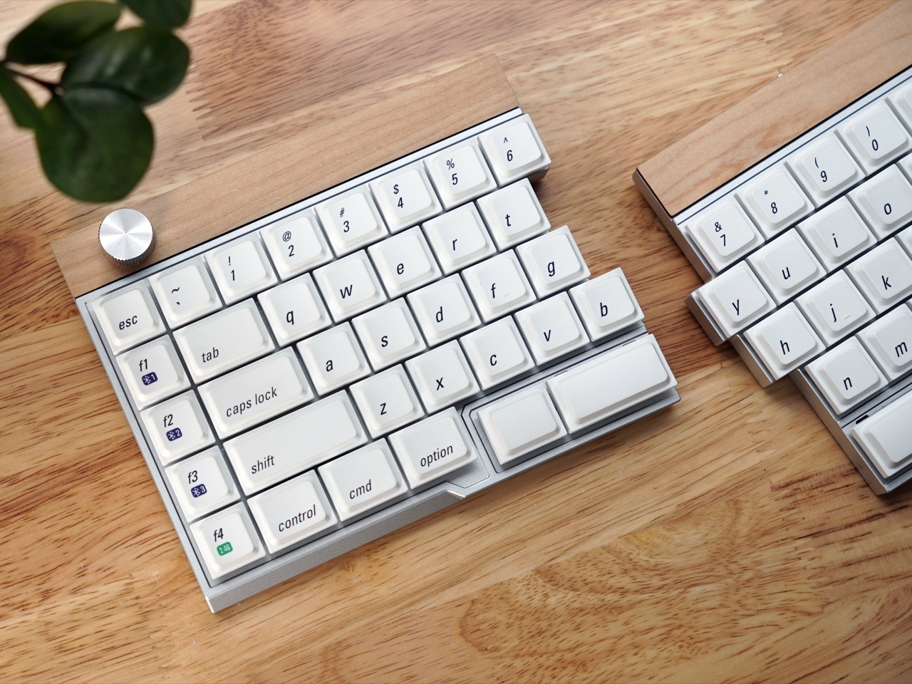
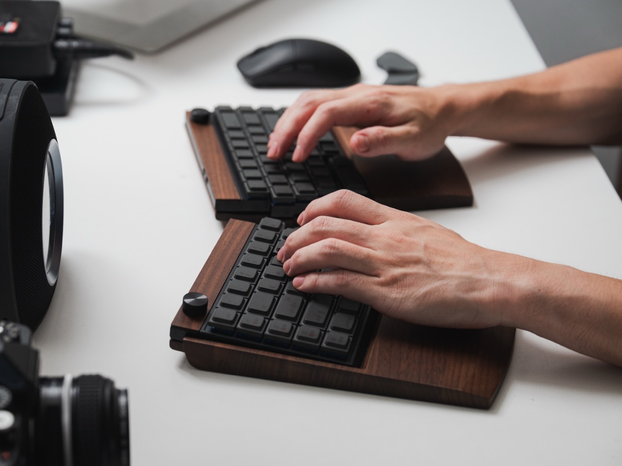
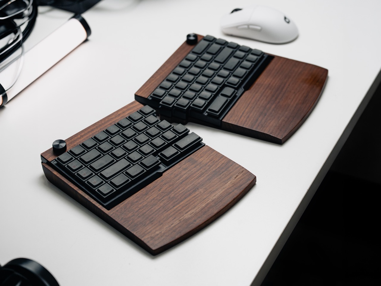
If you’ve spent any time in mechanical keyboard spaces online, you’ve probably seen someone evangelizing split keyboards as the solution to all your ergonomic problems. They’re usually right, but the barrier to entry has been high. Most split boards either require assembly, force you onto ortholinear or column-stagger layouts, or look like something out of a cyberpunk cosplay. The Jiffy75 takes a simpler approach: it’s a regular 75 percent keyboard that happens to come in two pieces.
JezailFunder, the company behind it, is running a Kickstarter campaign that’s already blown past its $5,000 goal and landed over $170,000 in pledges. The keyboard itself is CNC-machined aluminum with wood trim, fully wireless between halves and across devices, and hot-swappable so you can pick your own switches or swap them later. There’s also a programmable knob, which has become table stakes for premium keyboards at this point. Pricing starts at $199 for early backers, and shipping is planned for May if production stays on schedule.
JezailFunder’s previous product, the Cornix, found an audience in the ergonomic keyboard community, but user feedback revealed something important. People were buying it to relieve physical discomfort and strain from traditional one-piece keyboards, but the Cornix’s specialized layout created its own learning curve that made it unsuitable for everyone. That insight drove the team to build something with broader appeal, a split keyboard that keeps the familiar 75 percent row-staggered layout so the ergonomic benefit doesn’t come with weeks of retraining your muscle memory. The result is a keyboard that you can theoretically start using the day it arrives without hunting and pecking your way through your first email.
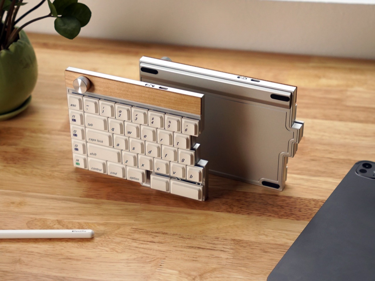
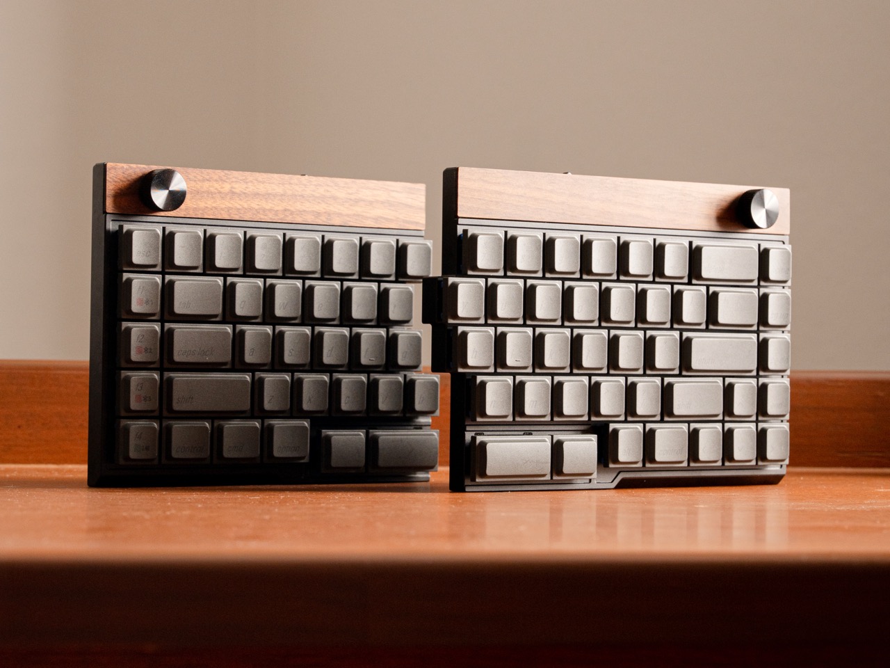
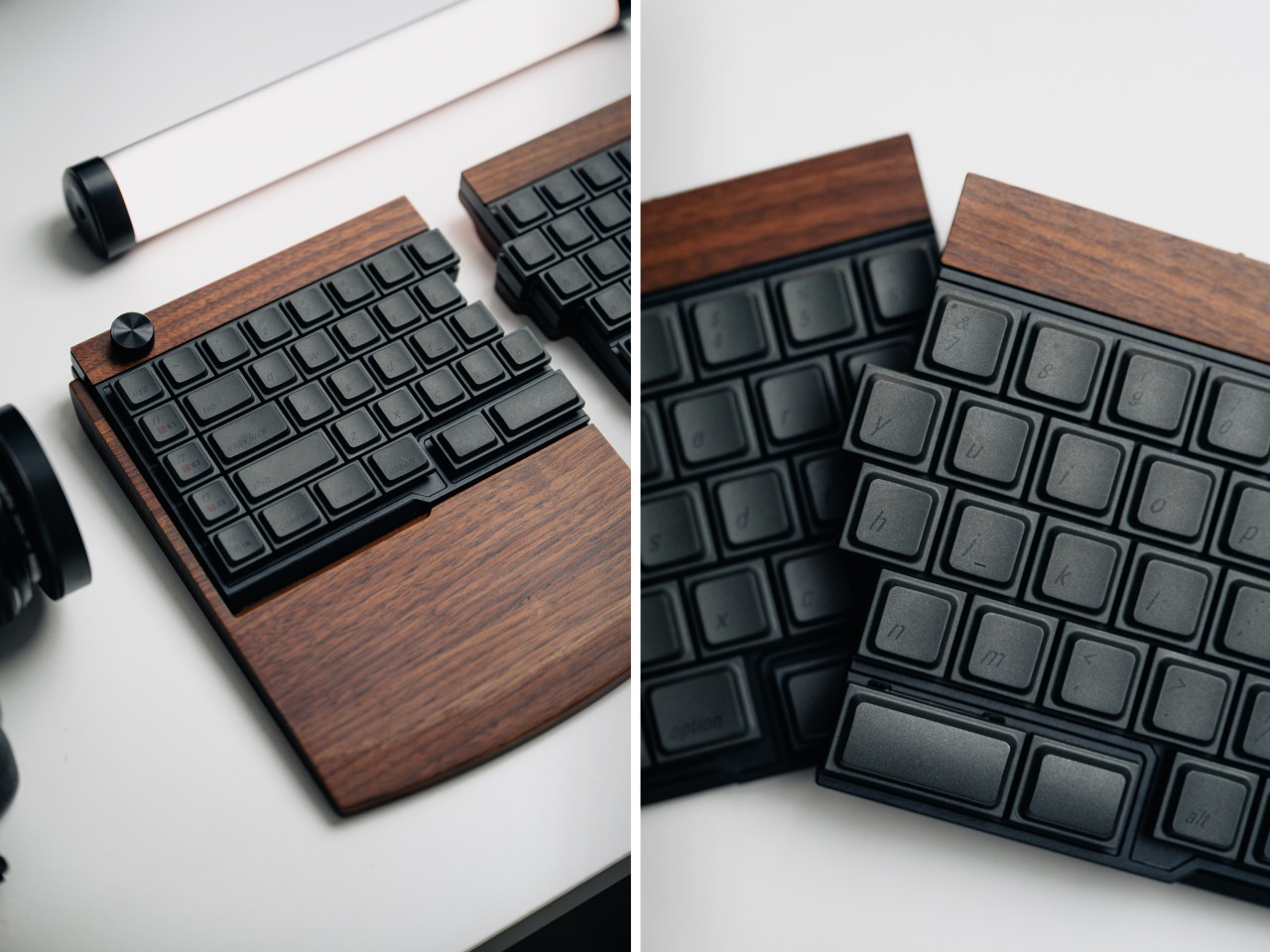
The Jiffy75’s body is CNC-machined from a single block of aerospace-grade aluminum, which JezailFunder calls a unibody construction. This approach guarantees better structural integrity and tighter tolerances than stamped metal cases, and the entire surface is anodized for a scratch-resistant finish with a subtle premium glow. A strip of natural wood runs along the top edge of each half, breaking up the metal with a warmer material accent that gives the whole thing a more furniture-like presence on a desk. Optional solid wood wrist rests come in walnut and maple, each one custom-engineered to match the keyboard’s profile with a precise slope and height calibrated to keep your wrists in a neutral position during long typing sessions.
The design philosophy here centers on the 75 percent layout, which research JezailFunder cites shows as a user favorite. Splitting that configuration relieves shoulder and wrist discomfort by allowing a more open, relaxed posture, and it also opens up the center of your workspace for tablets or other devices, which can improve workflow productivity depending on how you use your desk. That center-space argument matters more than it sounds like at first. If you’ve ever tried to reference a tablet or a notebook while typing on a full-width keyboard, you know how awkward the geometry gets. A split layout solves that by design.
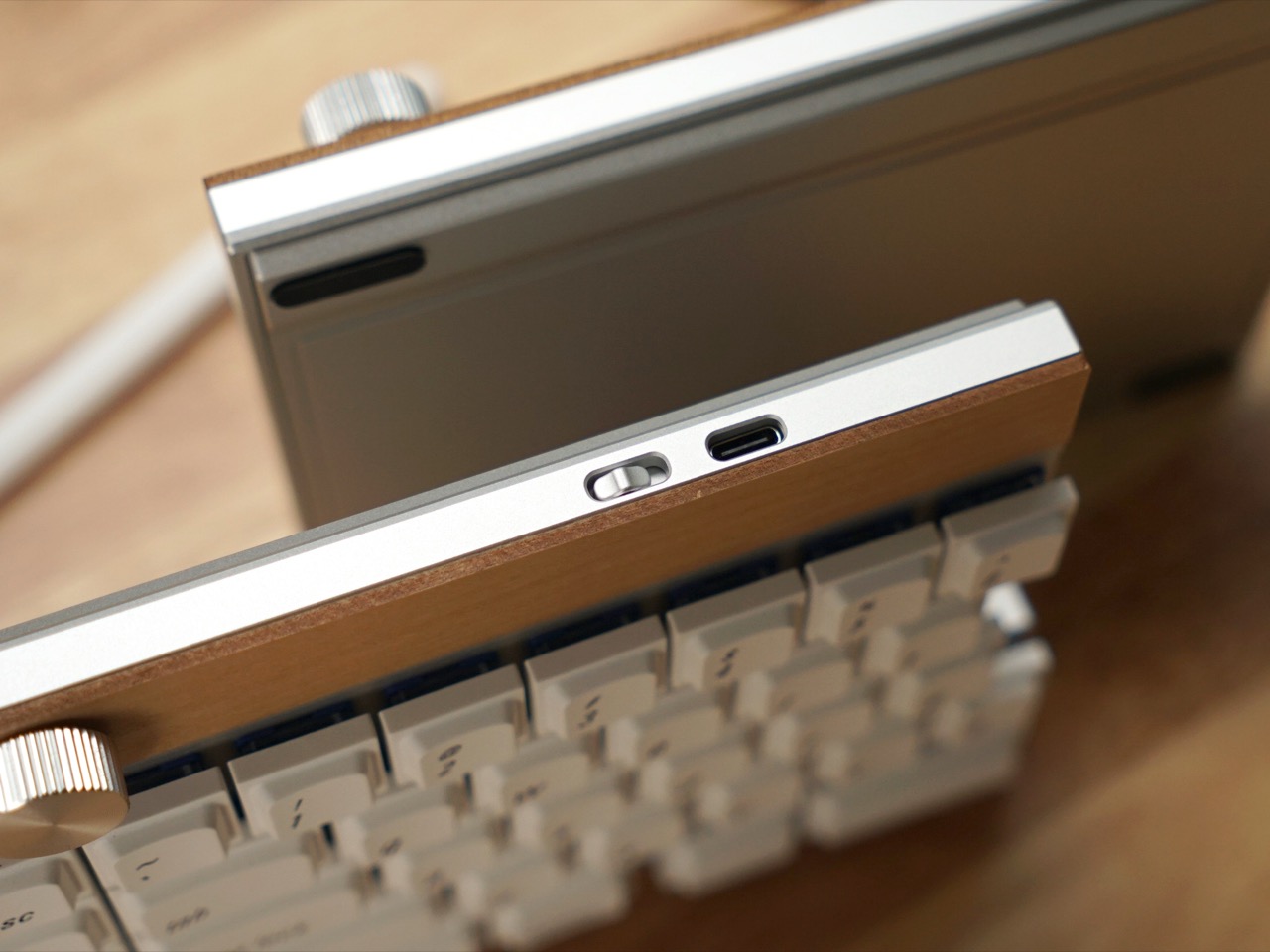
Both halves connect to each other wirelessly, and the whole keyboard supports tri-mode connectivity: USB-C, Bluetooth, and 2.4GHz wireless via an included dongle. You can pair it with up to three devices simultaneously and switch between them on the fly, which makes it useful for people who bounce between a laptop, a desktop, and a tablet throughout the day. Each half houses its own 2,800mAh battery. JezailFunder rates the left module at up to 1.5 months of battery life and the right module at up to 2 months, though real-world longevity will depend on usage patterns and whether you’re running Bluetooth or 2.4GHz most of the time.
The keyboard features a remapping tool called the Jzf Hub, which allows full-key customization. Layout arrangements, rotary knob functions, and every other input can be redefined by the user. The programmable rotary encoder can handle volume control, page scrolling, or any custom function you assign to it. Hot-swap support means you can swap switches without soldering, and the campaign offers two switch options out of the box: Cloudshell White, a linear switch, and JZF Mist, a custom 37g silent switch designed specifically for users who prioritize a quiet typing experience. JezailFunder developed the Mist based on user research showing that split 75 percent enthusiasts wanted a silent typing experience with zero disturbance to others while still delivering superior tactile feel. The custom 37g silent switch was the result.
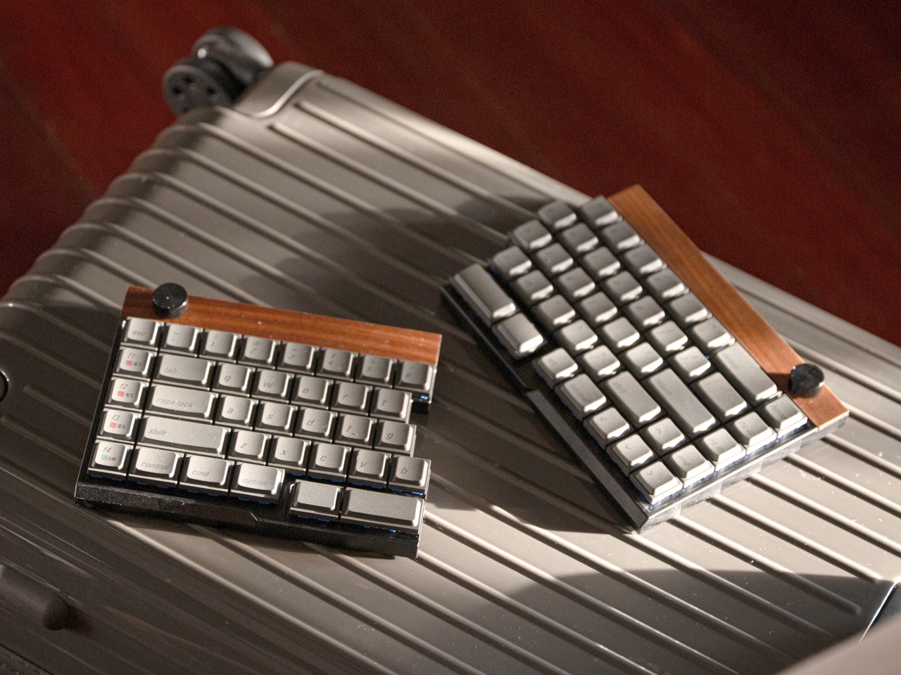
The Jiffy75’s beauty is its non-hobbyist design language. With an aesthetic that feels truly universal, JezailFunder says this keyboard’s practically for everyone. The neutral aesthetic appeals to people who love to stick to classics, while a vibrant range of colorways offers the freedom to choose a look that feels personal. Variants include ones with white, black, and pastel bodies, along with wood-accented options that lean into a Scandinavian minimalist vibe. There’s also a custom hardshell carrying case included by default, designed specifically for mobile professionals. The shock-resistant exterior shields the keyboard from impacts, the soft-fleece interior prevents scratches, and the whole thing stays compact and lightweight enough to travel with regularly.
Early bird pricing for the Jiffy75 starts at $219, and all units will include the keyboard, carrying case, USB-C cable, two backup switches, a 2.4GHz dongle, and a keycap puller. Add-ons include a keycap set for $29, low-profile Kailh switches for $39, the carrying case separately for $39, and wooden wrist rests for $99. Global shipping is planned to begin in early to mid-May 2026.
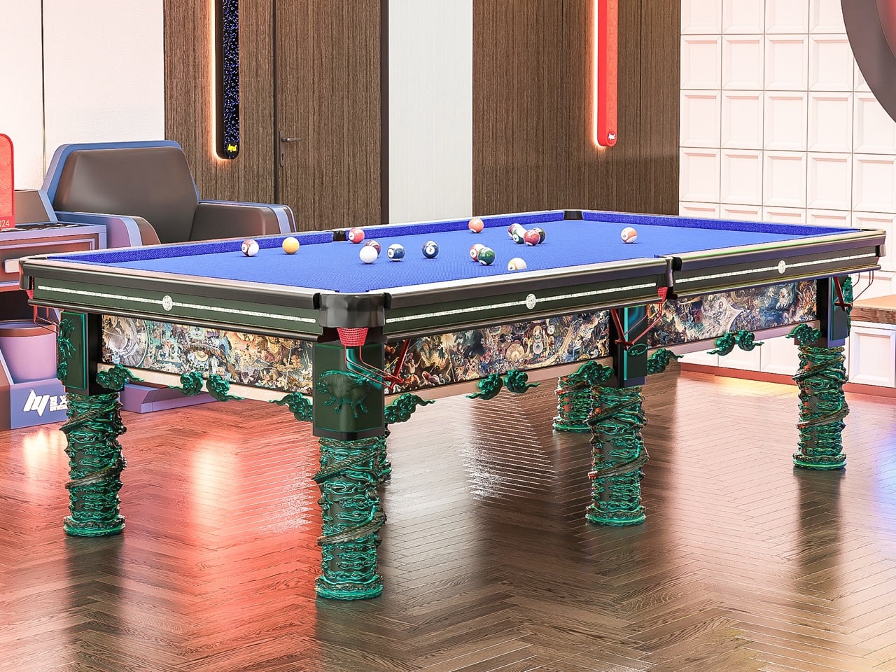
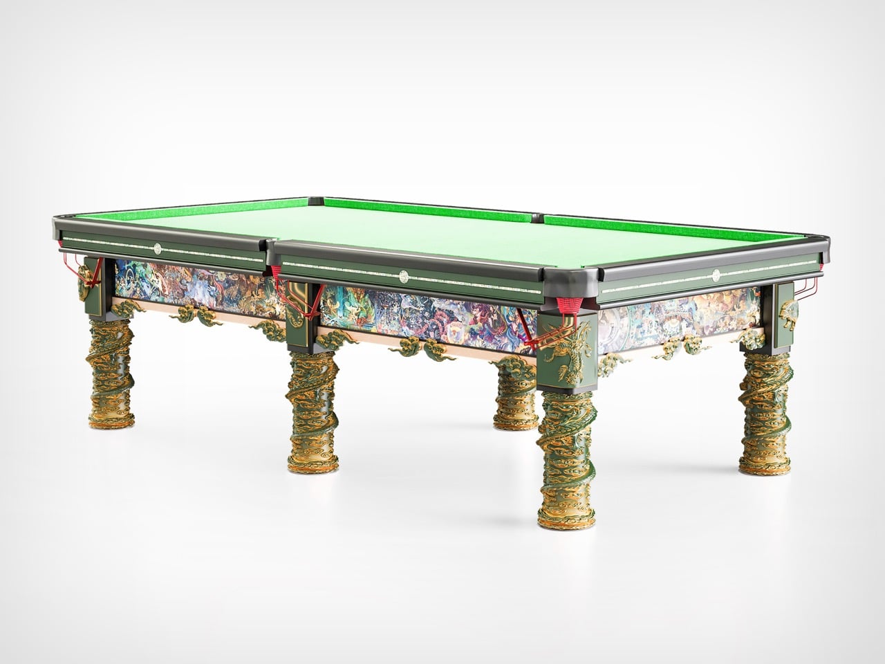
Most billiards tables do not ask much of you. You walk up, take your shot, and move on. They are designed to be neutral, quietly functional, almost invisible. This one is not interested in being invisible at all.
Designed in Shengfang, Hebei Province, and later exhibited in Beijing, this Chinese billiards table does something rare. It slows you down. It makes you look. And if you stay with it long enough, you begin to notice that the experience extends beyond the game itself.
Designer: Mingzhi Cai and Fengshi Li
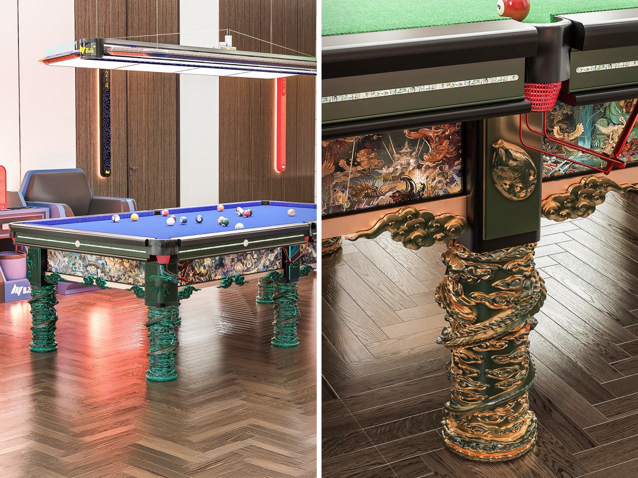
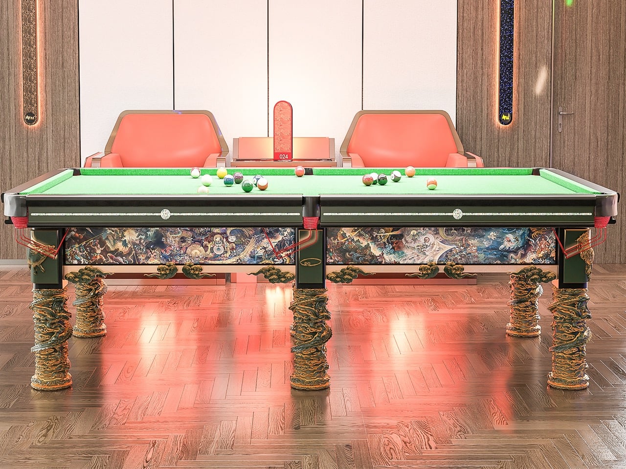
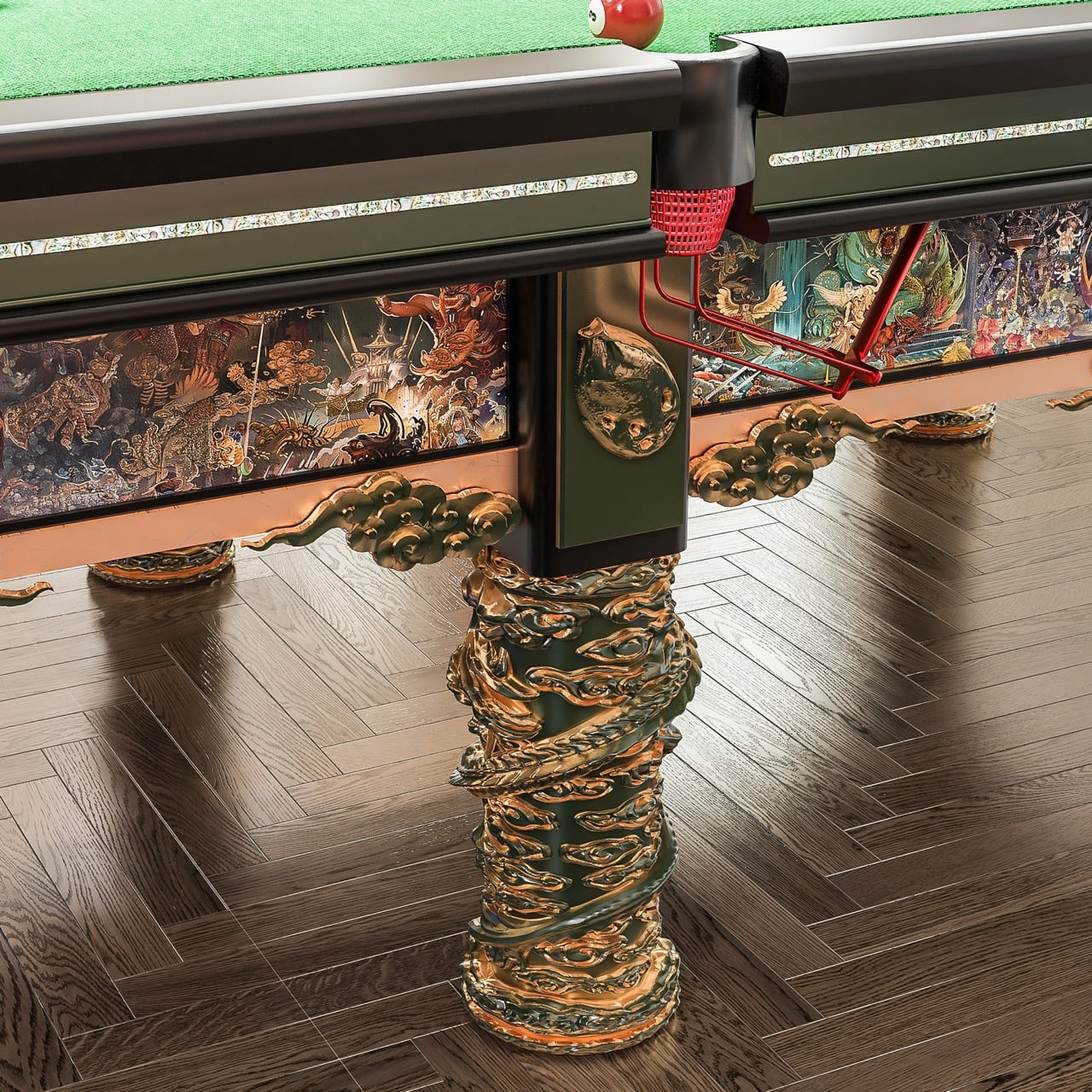
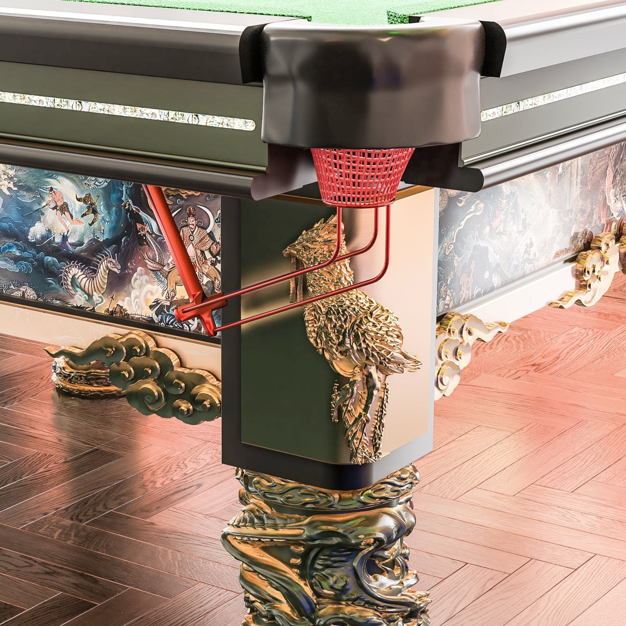
The inspiration comes from Journey to the West, a myth that sits deeply in Chinese cultural memory. Instead of simply referencing it, the designers have broken it apart and rebuilt it into the object. The table is wrapped in six narrative panels, each capturing a different moment, whether it is the intensity of the Bull Demon King, the burning of Guanyin Temple, or the surreal calm of Little Western Heaven. They do not read as surface decoration. They feel like scenes you move around, almost as if the table is holding fragments of a larger story.
This aligns naturally with how billiards is played. Every shot resets the situation. Every angle shifts your perspective. As you circle the table, the imagery changes with you, creating a rhythm between movement and narrative. The experience becomes less about a fixed viewpoint and more about continuous discovery.
There is a quiet intelligence in how symbolism is built into the structure. The six legs are shaped after the Sea God Needle, a mythological object associated with strength and transformation. Above, the six column relief references the six senses in Buddhist philosophy. It is a subtle layer, but it reframes the object. What you see, how you move, and how you interpret begin to feel connected.
The level of craft holds everything together. The reliefs are hand carved before being translated into production. The tabletop uses walnut wood, bordered with mother of pearl abalone shell inlays, a detail often found in royal furniture traditions. The paintings themselves are selected from hundreds of artists, then carefully scanned and embedded into the surface. Even the stone slabs are polished repeatedly until they reach the right balance of smoothness and durability.
Despite this richness, the table remains highly functional. The sound of the ball striking is crisp, and the movement across the surface is smooth and controlled. The visual intensity does not interfere with the game. It sits alongside it.
Color plays a similar role. The deep green and gold palette feels grounded and weighty, while the blue antique bronze variation introduces a quieter, more atmospheric tone. As light shifts across the surface, the table reveals different depths, allowing the imagery to feel active rather than static.
What becomes noticeable over time is how deliberately the design moves away from contemporary minimalism. Instead of reducing the object to its essentials, it builds layers of meaning, craft, and narrative into every surface. The process itself reflects this approach, with over 700 days of research, hundreds of iterations in modeling, and continuous refinement through collaboration.
That sense of time and attention is present in how the table is experienced. It does not reveal itself all at once. It asks for movement, for observation, for a willingness to engage with it beyond its immediate function. The act of playing becomes intertwined with noticing, reading, and interpreting.
Somewhere between the first shot and the next, the table shifts from being a surface you play on to something you are moving through.
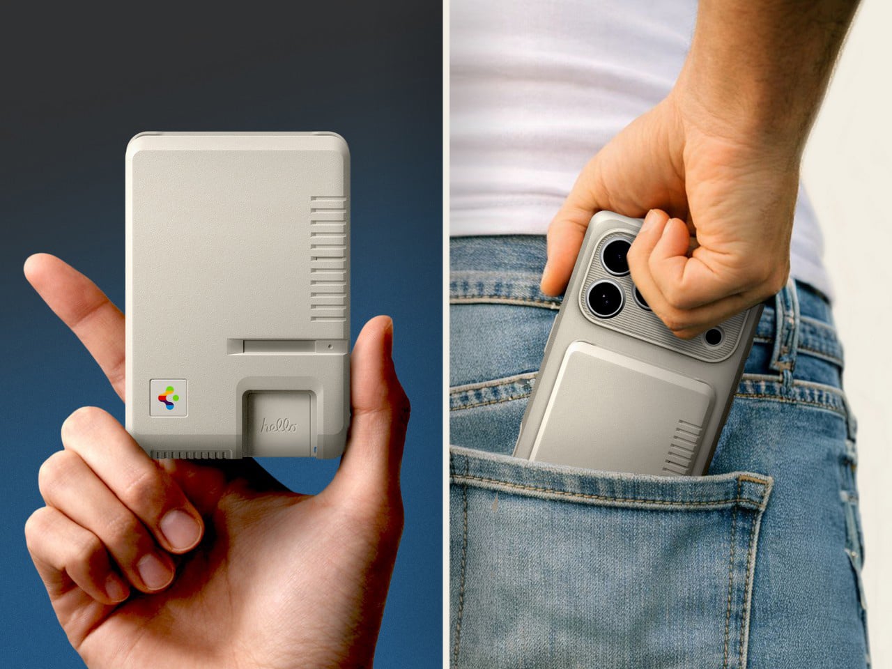
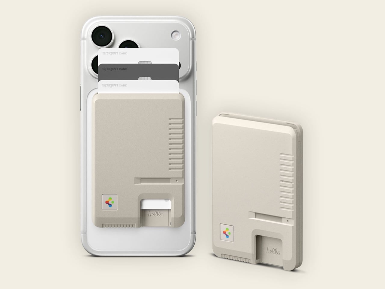
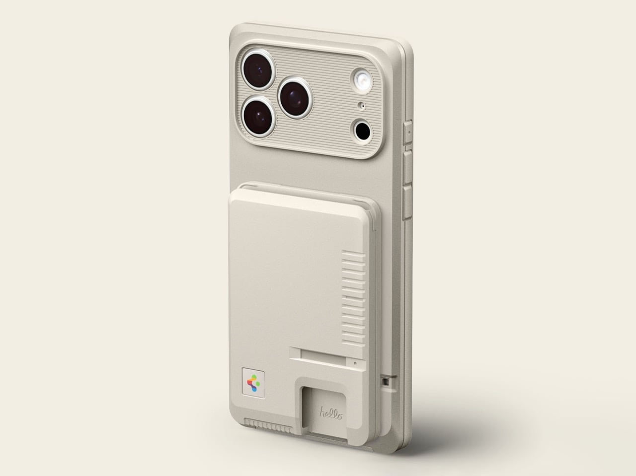
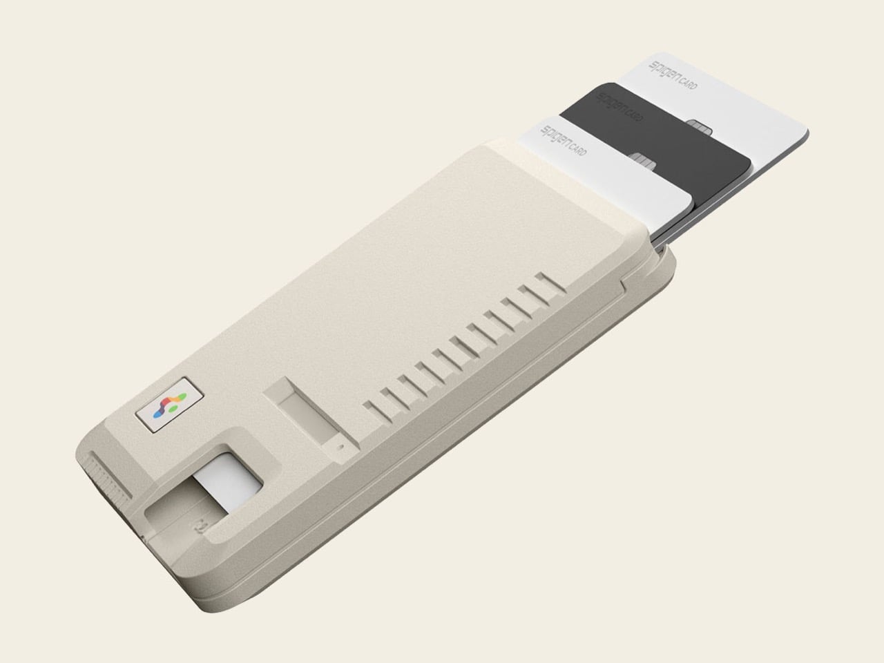
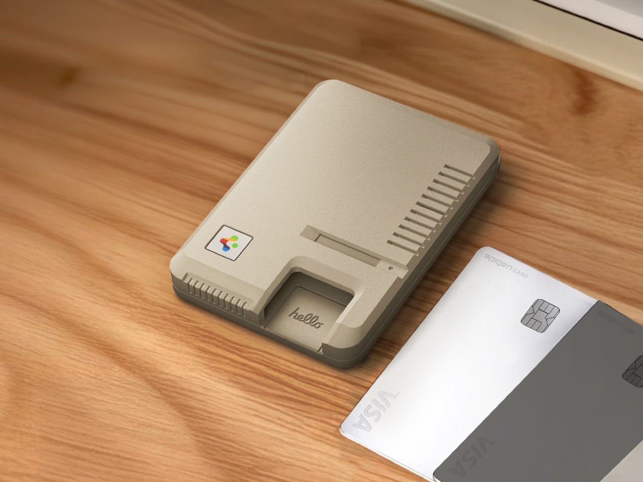
The Macintosh 128K was a beige rectangle with vents, grooves, and a floppy disk slot. Spigen’s new MagSafe wallet is also a beige rectangle with vents, grooves, and a slot (this one for cards, not diskettes). The visual rhyme is intentional. While most accessory brands slap nostalgic graphics onto generic products and call it a day, Spigen has been translating early Apple industrial design into functional modern objects, treating the Classic LS line like a miniaturized homage rather than a costume. The iPhone case kicked off that approach, shrinking the 128K’s visual language into something that could protect a phone without feeling like a novelty item. Now the brand is applying the same logic to a card wallet, and the result feels surprisingly coherent, like someone actually sat down and asked what a 1984 Macintosh would look like if it held three credit cards and magnetically attached to your iPhone.
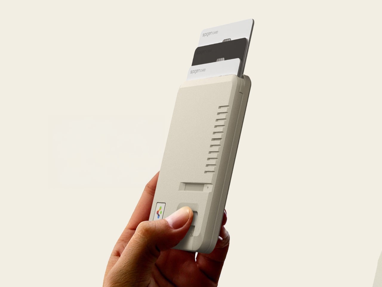
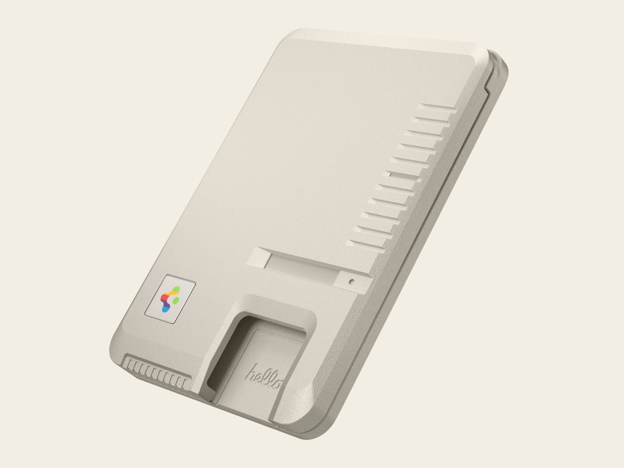
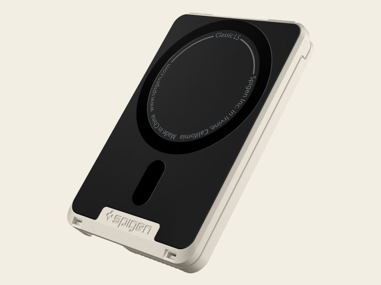
The Classic LS Card Holder (Mag Fit) is officially priced at $39.99 and works with MagSafe cases on iPhone 12 models or newer. Spigen says it stores up to three cards and uses strong MagSafe magnets for a secure attachment to your phone or other compatible accessories. The wallet includes a recessed “hello” cutout that makes it easier to push cards upward and out of the holder, addressing one of the biggest usability complaints with magnetic wallets. Visually, it matches the rest of the Classic LS ecosystem, carrying over the stone finish, floppy disk accent, keyboard-style grooves, and rainbow logo badge seen on the iPhone case, lanyard, and AirPods case. If you already own the Classic LS iPhone case, this wallet looks like it was always meant to snap onto the back of it.
Spigen could have stopped at surface-level nostalgia and called it a win, but the wallet actually translates specific Macintosh design cues into tactile, functional features. The vertical grooves running along the side mirror the cooling vents on the original 128K, giving the wallet extra grip while reinforcing the retro aesthetic. The floppy disk accent sits where a disk drive would have lived on the old Mac, complete with a tiny embossed detail that mimics the metal shutter on a 3.5-inch diskette. The rainbow-striped logo badge is a miniature version of Apple’s iconic six-color mark from that era, and the recessed “hello” cutout references the Mac’s famous startup greeting. These aren’t decorative add-ons, they’re design choices that make the wallet feel like a scaled-down piece of computing history rather than a sticker-covered MagSafe puck.
Card access is where most magnetic wallets fail. You either pry cards out with your fingernails or shake the whole assembly like a vending machine until something falls out. Spigen’s cutout solves that problem by giving you a thumb-sized recess where you can push upward on the card stack, ejecting them far enough to grab. The wallet also features a non-slip silicone grip on the back, keeping it secure in your pocket and preventing the whole thing from sliding around when magnetically attached to your phone. MagSafe compatibility means the wallet works with any MagSafe-enabled case, not just Spigen’s own Classic LS case, though pairing it with the matching case obviously completes the retro look. Spigen lists compatibility starting with iPhone 12 and extending through current models, so you’re covered whether you’re running a 12 Mini or a 16 Pro Max.
At $39.99, the Classic LS Wallet sits in the higher end of the MagSafe wallet market, especially compared to generic Amazon options that hover around $15 to $20. Apple’s own MagSafe wallet retails for $59, so Spigen undercuts Cupertino while still charging a premium over no-name competitors. The price makes sense if you’re already invested in the Classic LS ecosystem, where the wallet functions as the final modular piece rather than a standalone purchase. If you’re not already bought into the retro aesthetic, though, you’re paying extra for design nostalgia that might not register.
Spigen lists the wallet as available now on its official site in the signature Stone colorway, SKU AFA10949. If the brand follows the same trajectory as the rest of the Classic LS line, this could be the start of additional retro-tech accessories, maybe a MagSafe stand styled like a compact Mac or a charging puck that looks like a vintage mouse. For now, the wallet completes the set, turning your iPhone into a tiny monument to the beige-box computing era, one credit card at a time.
The street food vendors of Mumbai did not negotiate the terms of the Iran conflict. Neither did the factory managers in Vietnam, the government officials in Colombo, or the home cooks across a dozen nations who depend on liquefied petroleum gas. Yet the military standoff in the Strait of Hormuz, the chokepoint for 30% of the world’s traded LPG, is landing in their kitchens and economies with uncomfortable speed. In India, the government is rationing supply. In Sri Lanka, officials declared national holidays on Wednesdays specifically to curb fuel consumption. In Japan and South Korea, two of the world’s largest LPG importers, the primary energy artery is tightening, while European markets are bracing for wholesale gas prices to triple. A single geopolitical flashpoint is now determining whether millions can cook dinner.
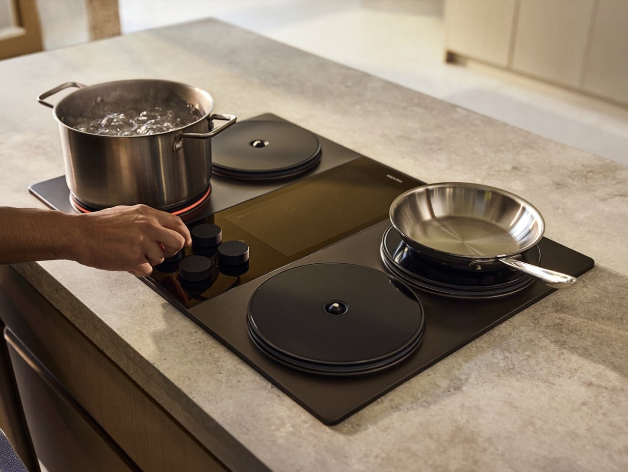
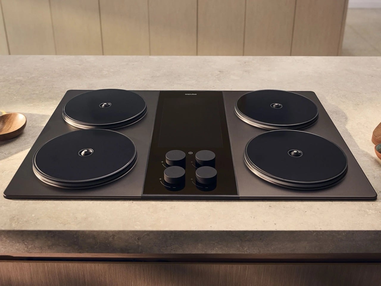
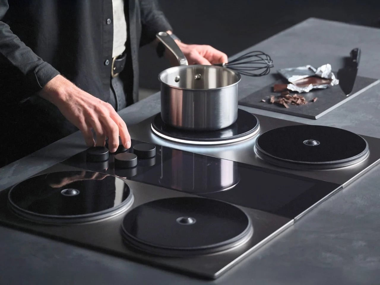
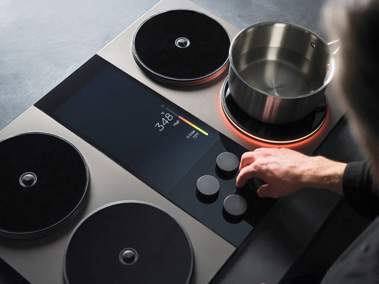
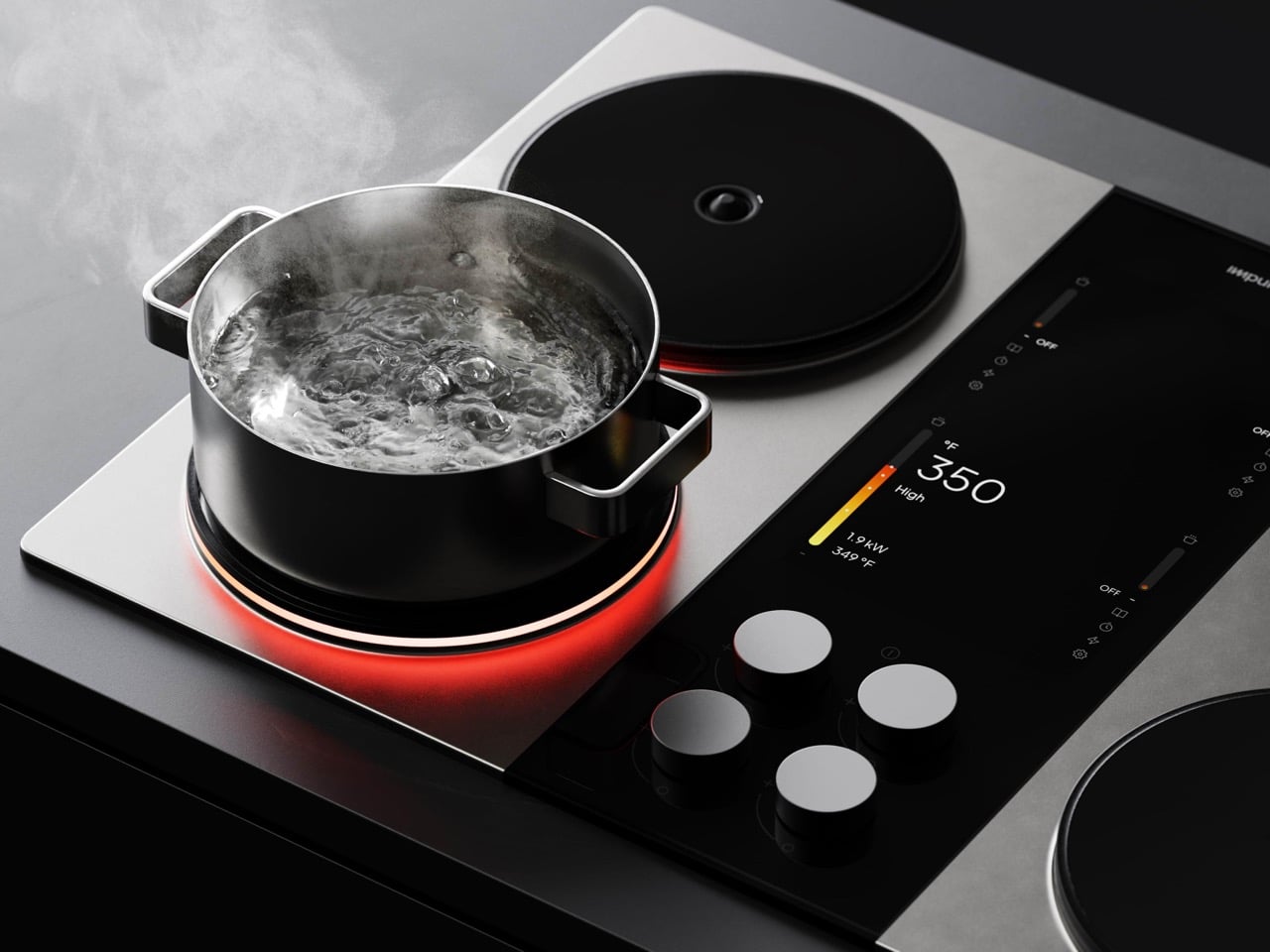
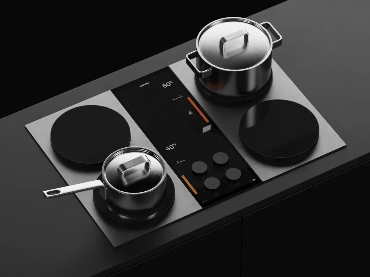
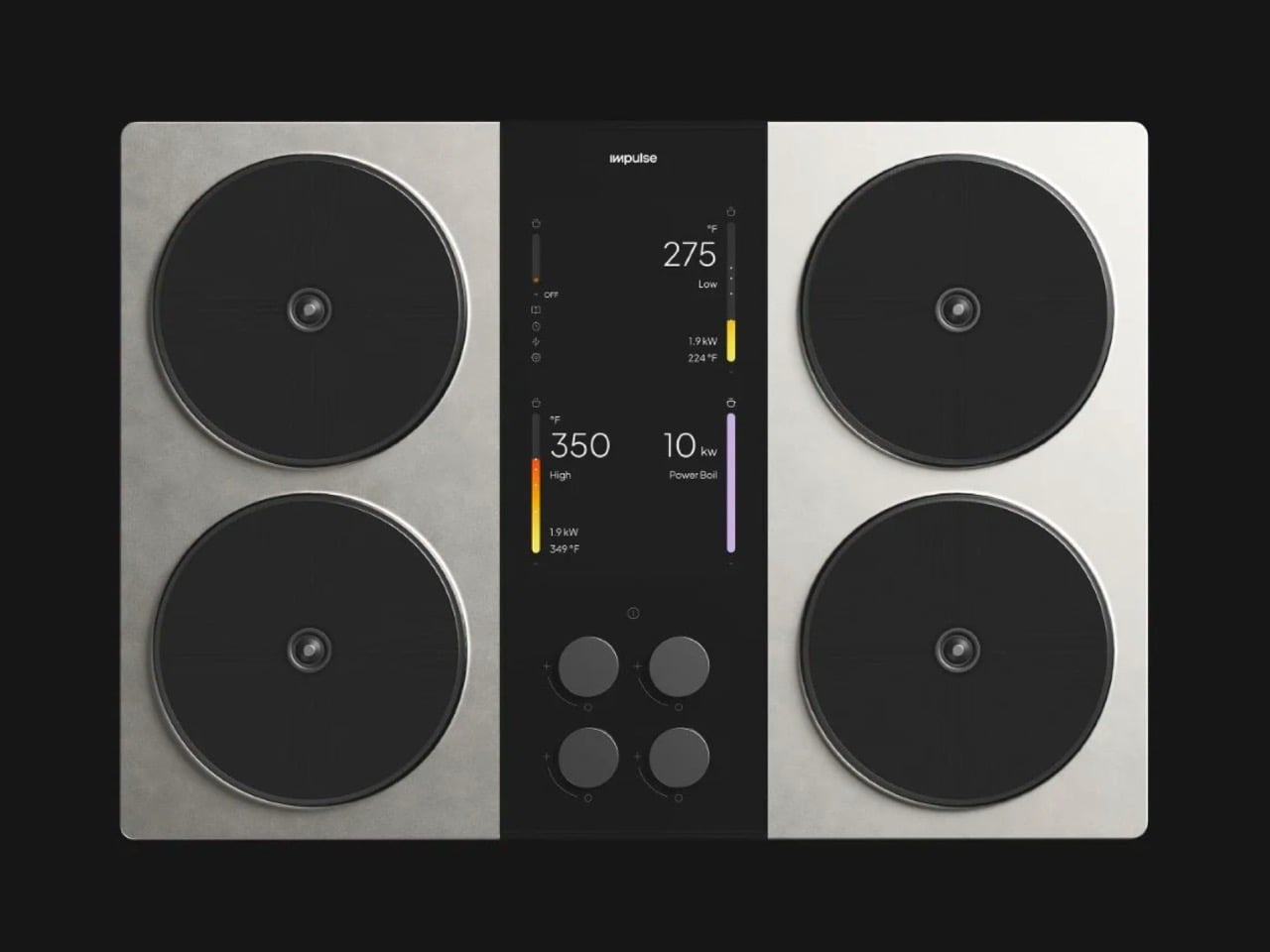
Against that dystopian backdrop, the Impulse cooktop occupies a category with very little company. The appliance, which earned the Red Dot’s Best of the Best and won Fast Company’s 2024 Innovation by Design Award, builds a battery directly into the cooktop body. It draws from stored charge and the grid simultaneously to deliver a staggering 10,000 watts per burner. BLOND, the industrial design firm behind it, gave the object the physical language of a considered luxury kitchen piece. The engineers gave it freedom from every fuel supply chain that currently has Asia and Europe in a headlock. Both things matter here; right now, one of them lands with a global urgency that the designers probably never anticipated.
Designer: BLOND
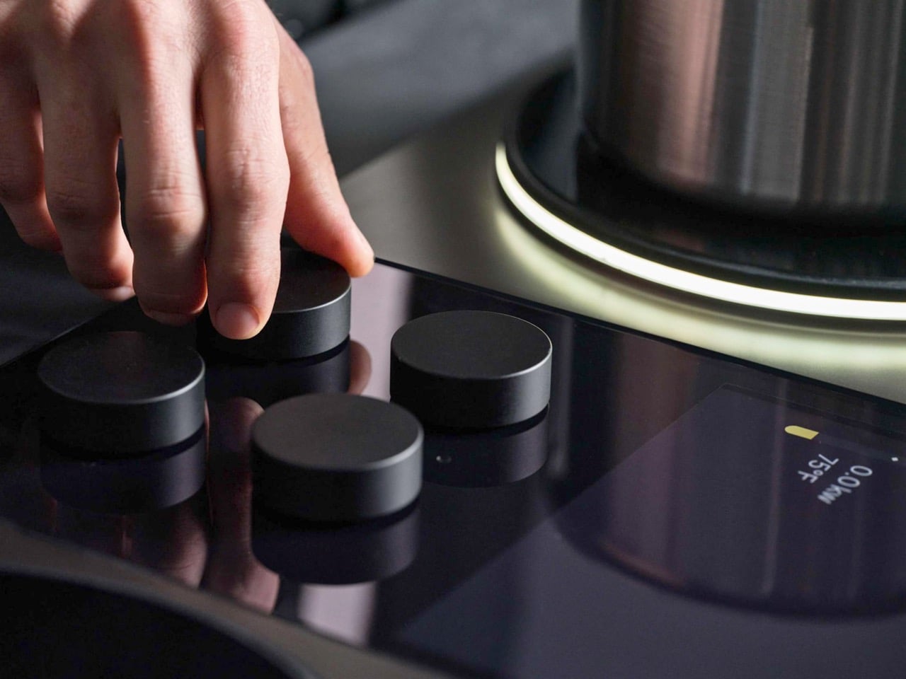
BLOND stripped the Impulse cooktop down to a precise, slab-like form with a magnetic control knob that carries the rotational weight of something deliberately engineered, and a ceramic cooking surface that reads more like high-end DJ equipment than kitchen accessories. The battery pack lives entirely inside the appliance body, with no external modules and no separate storage unit. That battery and the grid work in simultaneous tandem, together pushing up to 10,000 watts per induction zone, which is three times the output ceiling of the most powerful competing induction cooktop on the market. A standard gas burner tops out between 1,500 and 2,000 watts. A premium gas hob might hit 4,000. Impulse doubles that, through induction, from a domestic plug.
Impulse became the first battery-integrated appliance to earn UL 858 certification, the U.S. standard applied to household electric ranges, which matters because it signals a tested, production-ready product rather than a clever concept that survived the prototype stage. Most residential kitchens cannot realistically pull 10,000 watts through standard wiring without a costly electrical panel upgrade, which is the single biggest friction point in induction adoption globally. The onboard battery eliminates that bottleneck by buffering the peak load and recharging from a normal household outlet during lower-intensity cooking. The result is extreme performance on ordinary electrical infrastructure. Getting 10,000 watts into a domestic kitchen without rewiring the house turns out to be a harder problem than building a burner that can hit those numbers, and Impulse solves both in the same enclosure.
Amazon India reported induction cooktop sales jumping more than 30 times their normal volume last week as the LPG shortage deepened. That number tells you how fast behavior shifts when a supply chain snaps. The problem is that most of those units being panic-bought are budget induction plates capped around 2,000 watts, which work fine for boiling water but flounder with the kind of cooking that defines South and Southeast Asian cuisine. High-heat wok cooking, crispy dosas on cast iron, intense stir-fry; all of these demand fast, concentrated thermal output that conventional induction simply cannot generate. Impulse at 10,000 watts per zone changes that equation entirely, and it does so without a gas line anywhere in the picture.
At KBIS 2026, THOR Kitchen debuted a full induction range built on Impulse’s battery-integrated platform, and it got recognized at the show. That partnership reveals the bigger picture: Impulse Labs is positioning its engineering as a licensable platform for the appliance industry broadly, treating the consumer cooktop as proof of concept rather than end product. If that model scales, the 10,000-watt battery system becomes the architecture that a generation of kitchen appliances gets built on, with real implications for manufacturers trying to electrify product lines without sacrificing performance. Whether the business reaches that scale fast enough to meet this particular moment depends on manufacturing capacity and pricing the company has not widely publicized. But the Strait of Hormuz did not ask for a roadmap before closing, and the people queuing for gas cylinders at 3am in New Delhi are not waiting on a product launch schedule either.
If you’ve ever stared at one of Mondrian’s compositions and thought “this would make a great gear train,” congratulations, you think like a LEGO Ideas builder. The rest of us are just catching up. The Eternal Mosaic bridges the gap between abstract expressionism and mechanical engineering in a way that shouldn’t work but absolutely does, turning the rigid geometry of De Stijl into a functioning monument to exponential mathematics.
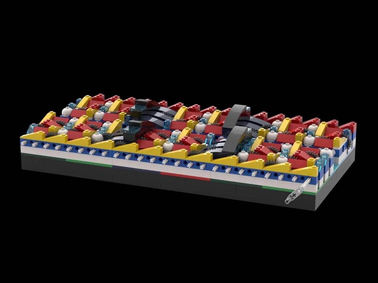
This 655-piece build contains a 46-stage compound gear reduction using 24-tooth to 8-tooth ratios at every step. When you compound that reduction across all 46 stages, you get a total ratio of roughly 9 billion trillion to 1. At a standard motor speed of 100 RPM, the first gear completes a rotation every 0.6 seconds. The final gear, embedded in a colorful Mondrian-inspired wall, will complete its first full rotation in approximately 90 trillion years. The universe is 13.8 billion years old. Do the math. This machine outlasts reality itself, and it does so while looking like it belongs in the Museum of Modern Art.
Designer: The Art of Knowledge
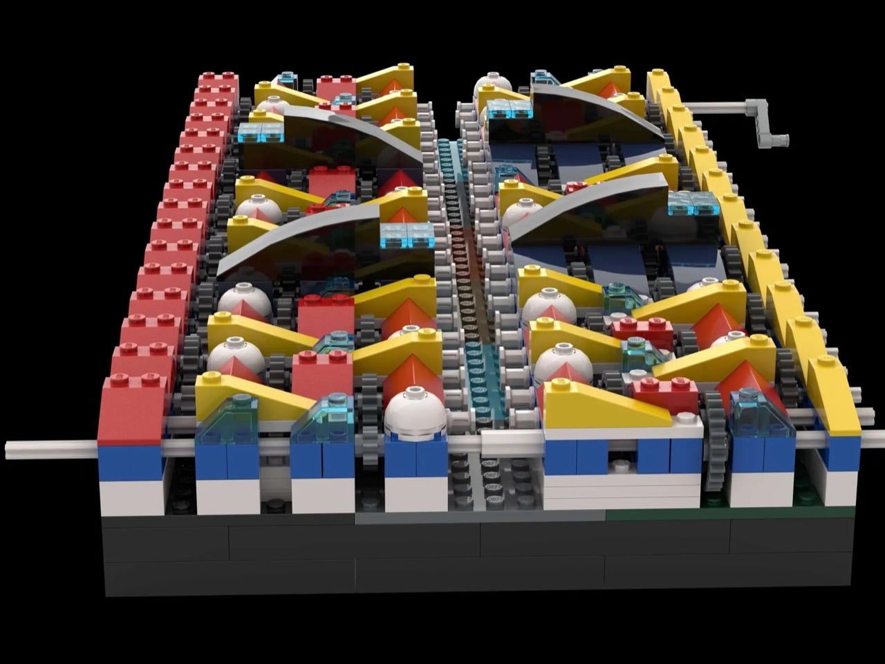
What makes this build technically fascinating is how it visualizes exponential decay in a way that your brain can actually process. The designer breaks down the timeline at key stages. Each of the 46 stages uses a simple 24-tooth to 8-tooth reduction, a 3:1 ratio that seems almost polite on its own. But compound that across 46 stages and the numbers become absurd. Stage 10 takes about 10 hours to complete one rotation, roughly a full night’s sleep. Stage 18 clocks in at around 75 years, an average human lifetime. By stage 24, you’re looking at 55,000 years, the entire span from the Stone Age to today. Stage 32 hits 4 billion years, the age of Earth itself. And then the final stage stretches out to 90 trillion years, which is 6,500 times longer than the universe has existed. Each gear is a canvas, a stepping stone through time rendered in primary colors.
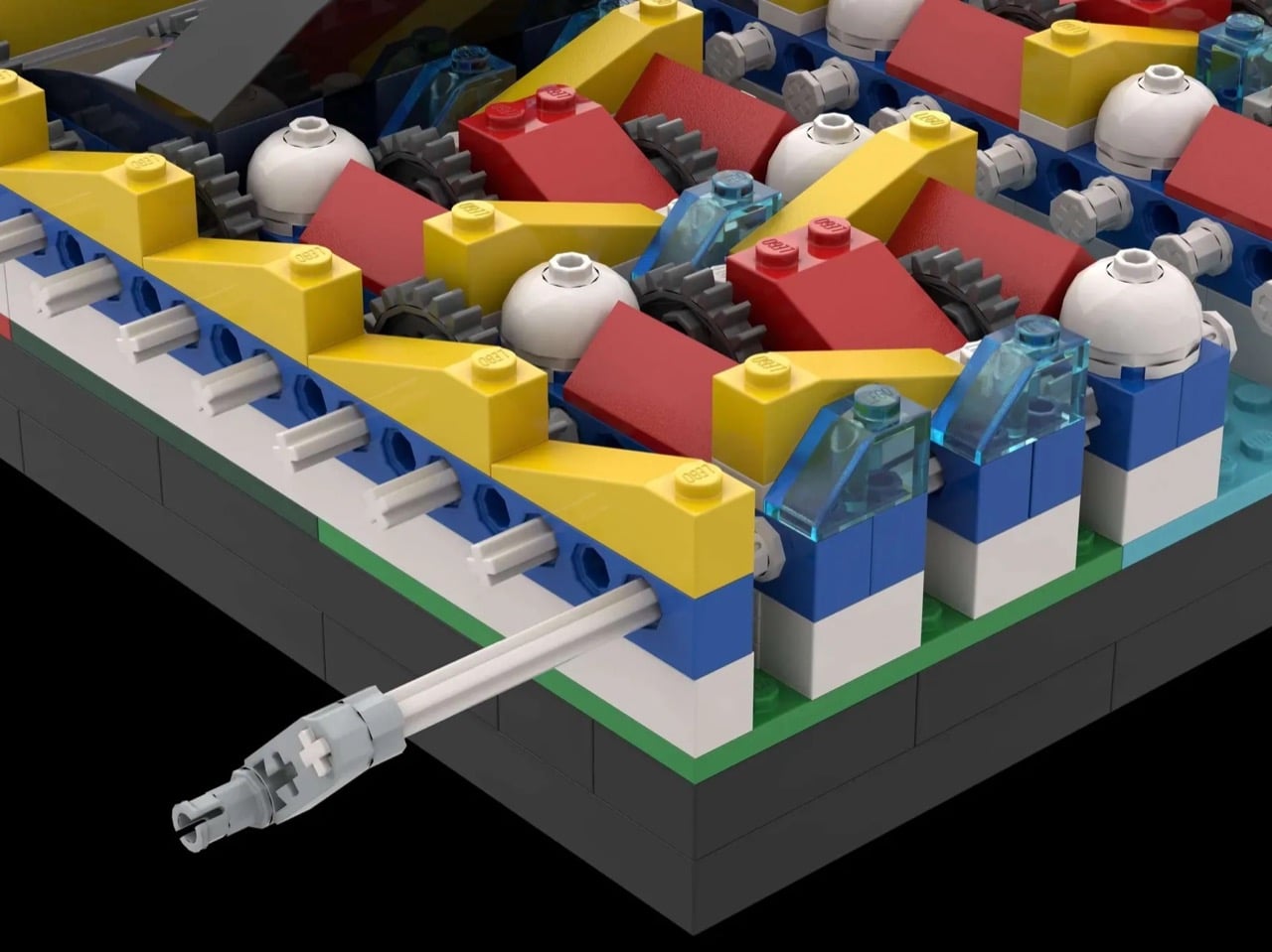
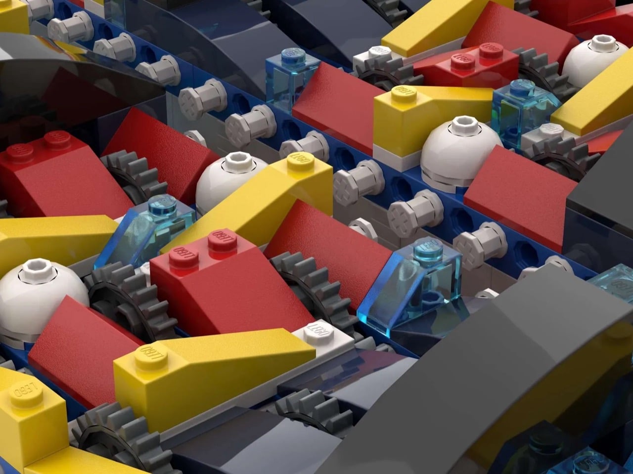
The construction itself is a hybrid of LEGO Technic and System bricks. The gears themselves are pure Technic, frictionless axles and pins doing the mechanical heavy lifting. But the structure surrounding them is classic System bricks and slopes arranged in Mondrian’s signature palette of red, yellow, blue, black, and white. Each gear stage becomes a canvas, a shifting mosaic that layers industrial function with abstract art. It’s the kind of crossover that shouldn’t work but absolutely does, turning what could have been a dry physics demonstration into something you’d actually want on display.
The build uses efficient footprint design, packing all 46 stages into a relatively compact rectangular base. The gears are stacked vertically in places, layered horizontally in others, creating a dense mechanical core that feels more like a sculpture than a gearbox. The colored slopes and bricks aren’t decorative afterthoughts, they’re structural elements that support the Technic skeleton while creating that distinctive Mondrian aesthetic. It’s museum-quality kinetic art that also happens to be a functioning lesson in exponential mathematics.
The Eternal Mosaic is currently gathering votes on the LEGO Ideas platform, sitting at 55 supporters with 58 days left to hit the first milestone of 100 votes. If you want to see this beautifully strange collision of art and engineering hit the 10,000-vote threshold and get reviewed by LEGO’s internal team, head over to the LEGO Ideas website and cast your vote. Just don’t expect to see that final gear move in your lifetime. Or anyone’s lifetime. Or the lifetime of the cosmos itself.
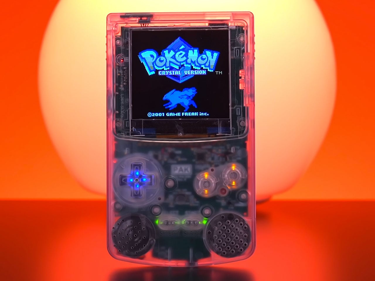
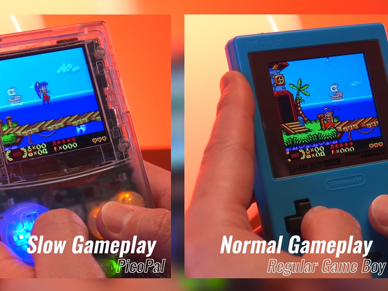
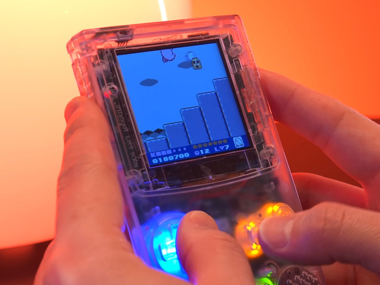
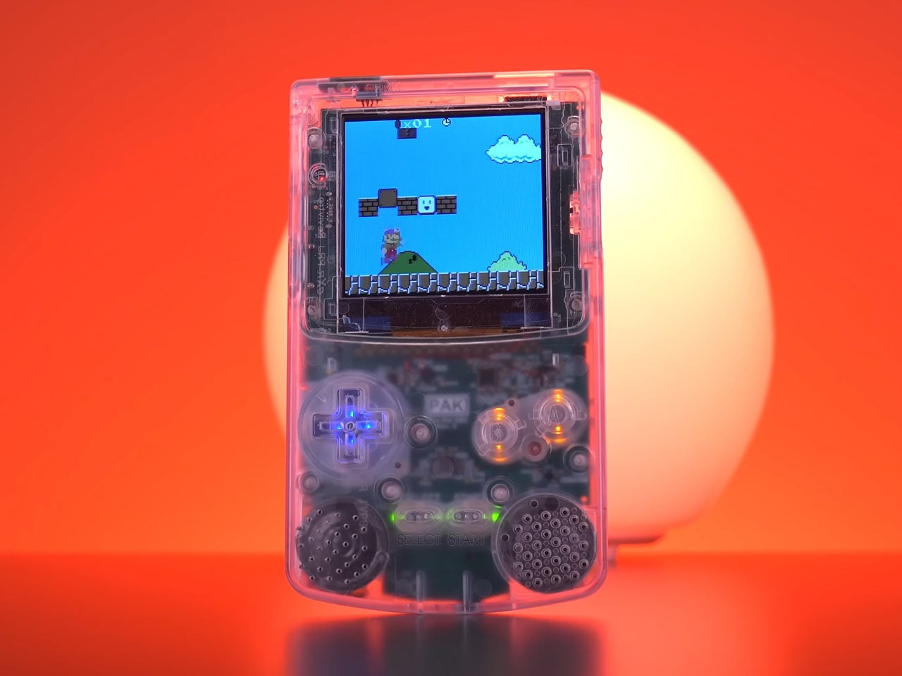
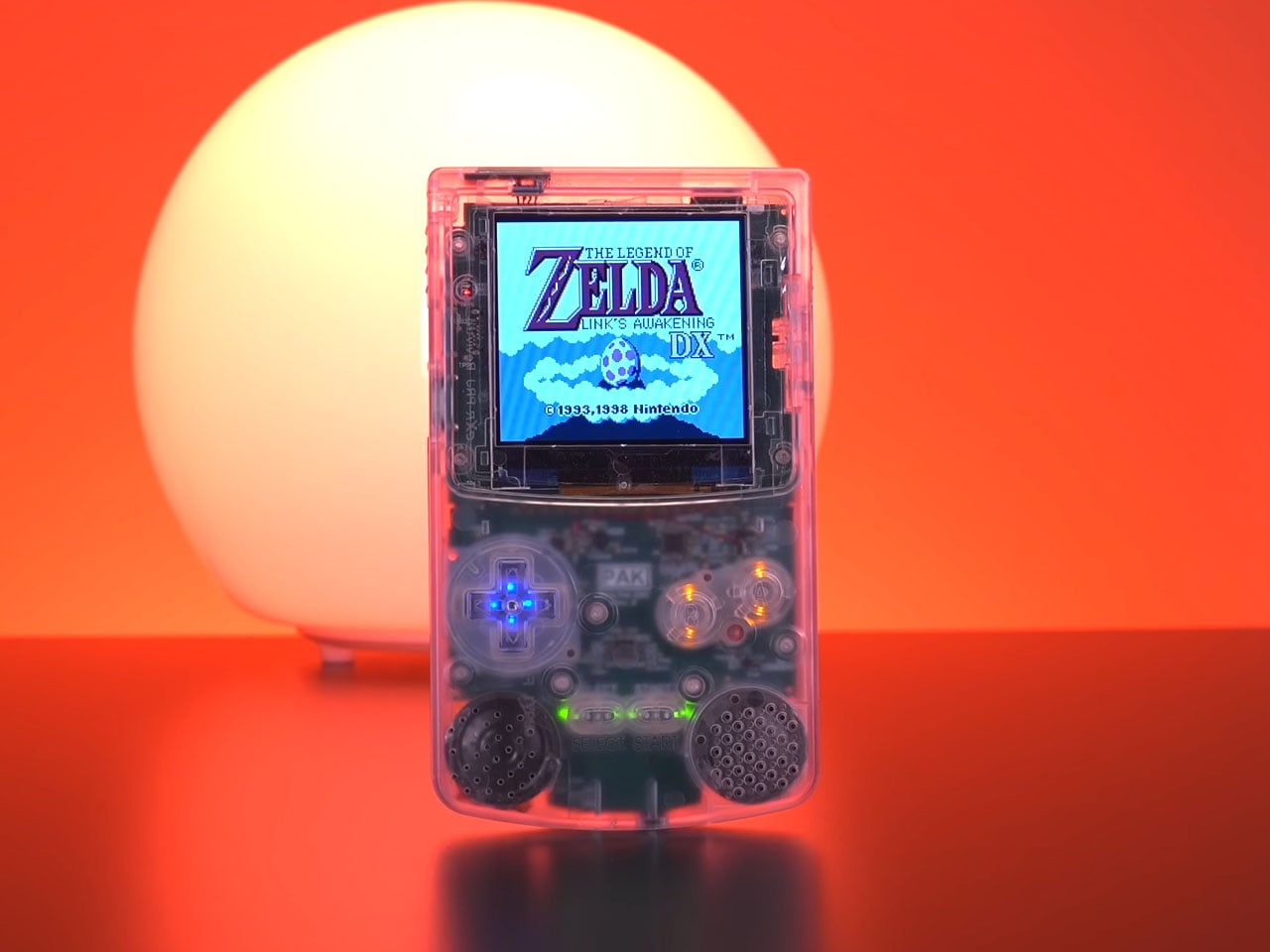
Retro gaming continues to inspire modern hardware projects, and the Pico-Pal handheld console is another thoughtful reinterpretation of one of the most recognizable portable gaming designs. Developed by hardware designer Peter Khouly, the handheld draws clear inspiration from the classic Nintendo Game Boy Color while integrating modern microcontrollers, wireless connectivity, and expanded functionality. Rather than replicating the original hardware exactly, the Pico-Pal blends nostalgia with a flexible development platform aimed at gamers and hackers alike.
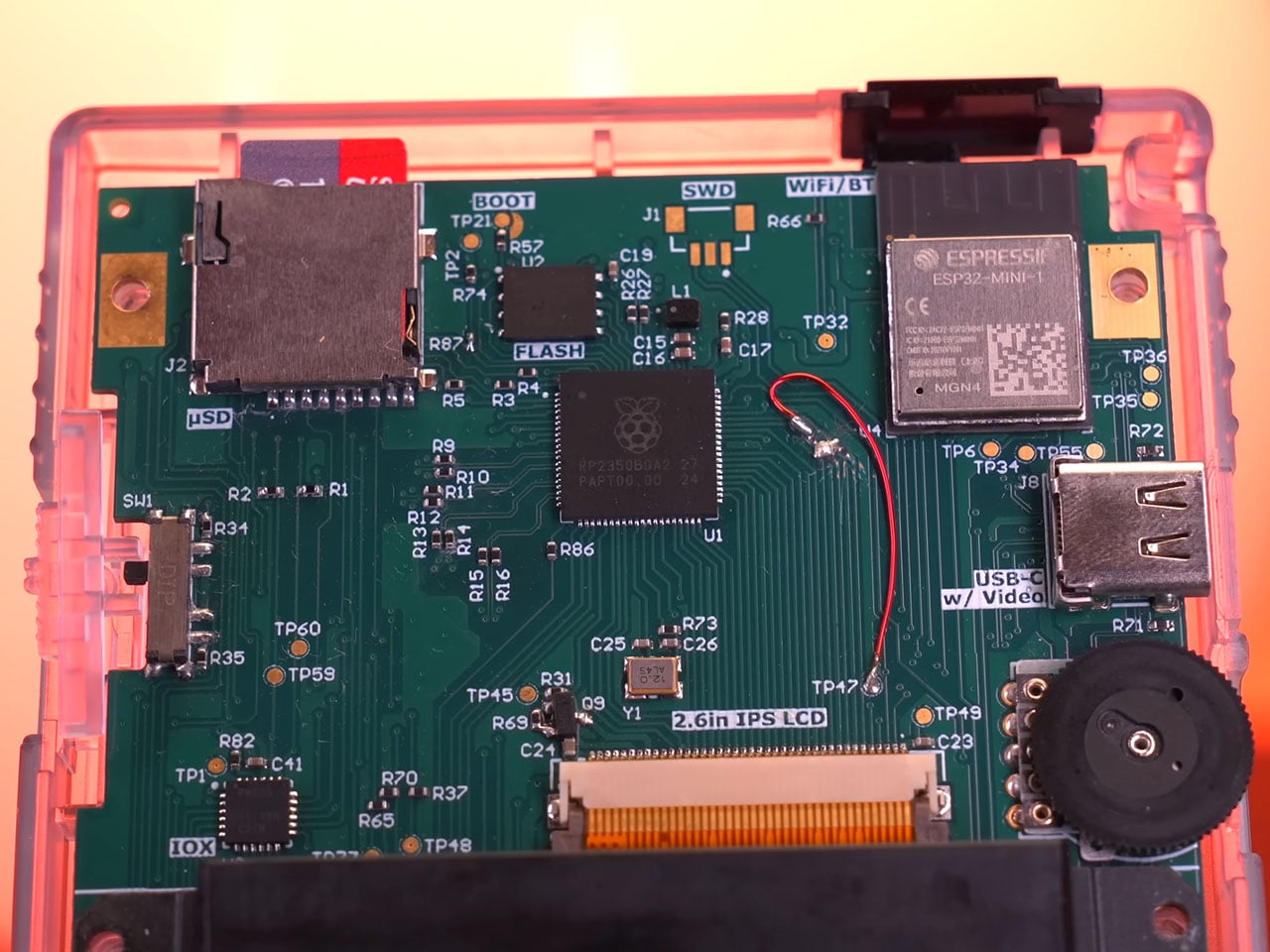
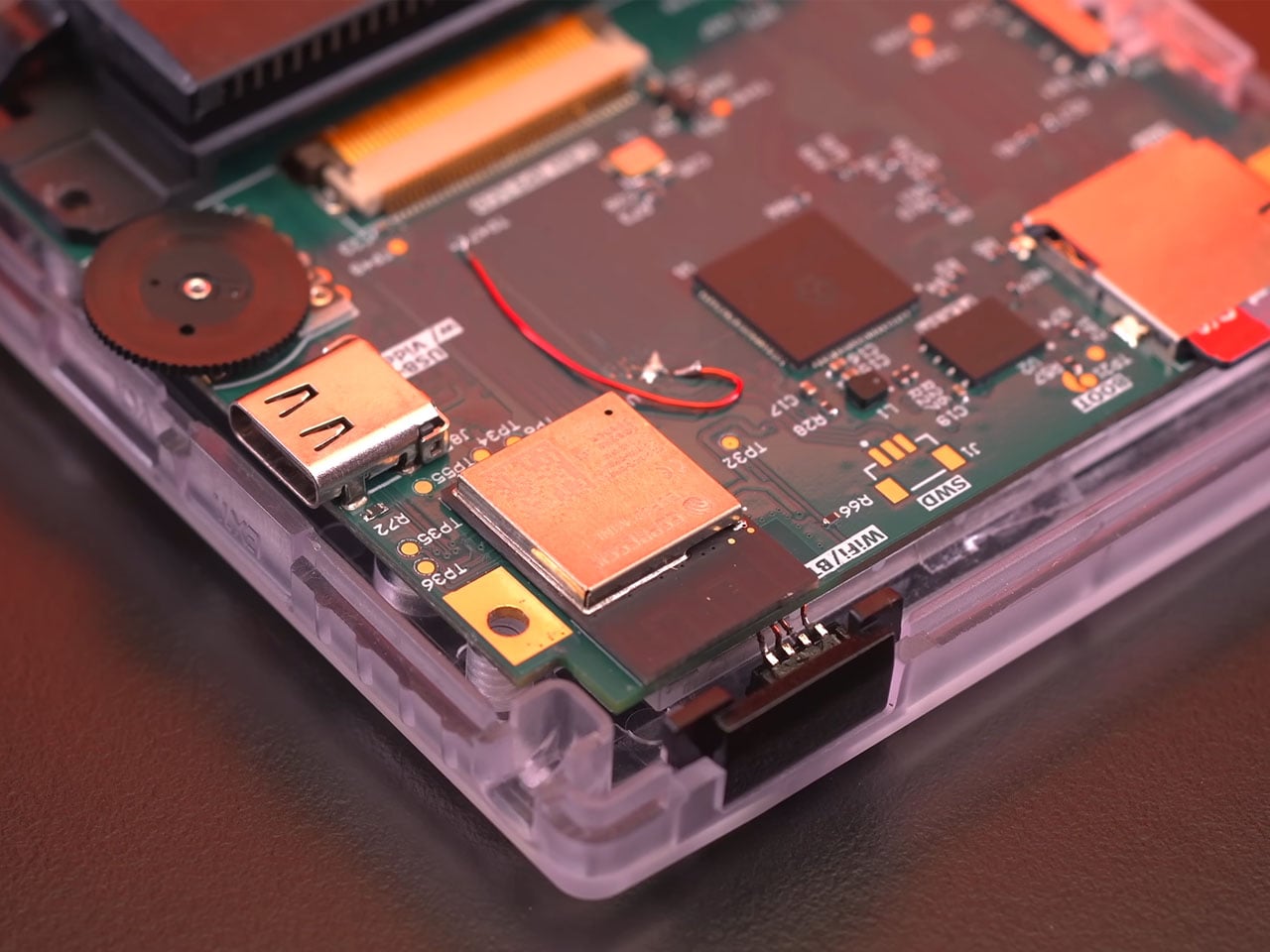
At its core, the handheld is powered by a Raspberry Pi RP2350B microcontroller paired with an Espressif ESP32 coprocessor. The RP2350B serves as the primary processing unit, handling emulation and system control, while the ESP32 provides wireless connectivity via integrated Wi-Fi and Bluetooth. This secondary chip also includes 4MB of flash storage and supports functions such as Bluetooth audio or network communication. The RP2350B itself features 16MB of flash memory, giving the device sufficient storage and processing headroom for running classic handheld titles and additional utilities.
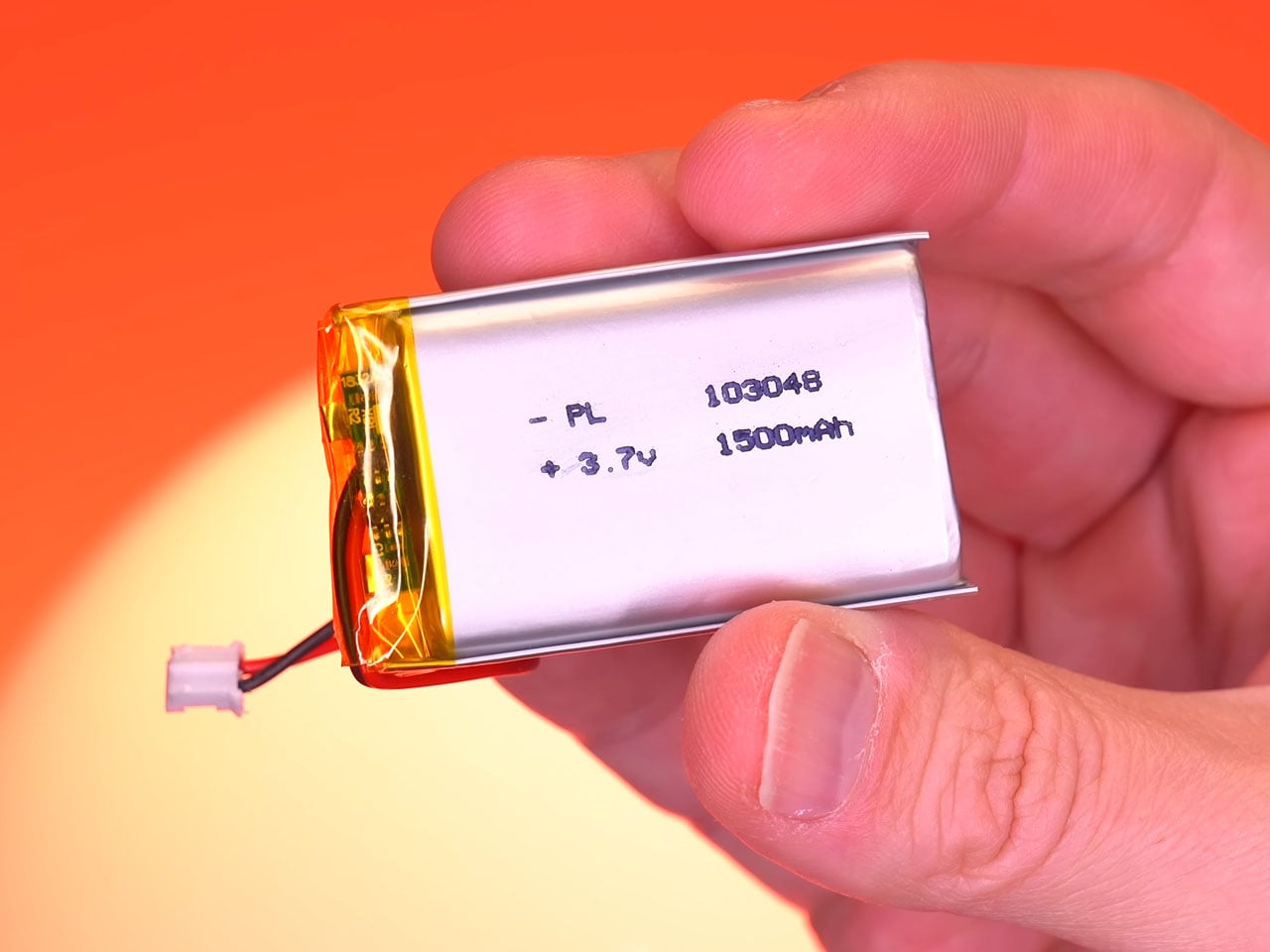
Instead of the reflective LCD panel used in the original Game Boy Color, the handheld uses a 2.6-inch IPS screen with a resolution of 320 × 320 pixels. Its square 1:1 aspect ratio suits classic handheld games particularly well, allowing retro titles to appear sharp while maintaining the visual proportions they were originally designed for. The improved screen technology also delivers wider viewing angles and brighter colors compared with older displays. Powering the device is a 1,500 mAh lithium-polymer battery that charges through a USB-C port supporting 5V/1.45A input. This rechargeable setup replaces the disposable batteries used by earlier handheld systems and provides several hours of gameplay on a single charge. Current development estimates suggest that the handheld can operate for around five hours during normal use.
Beyond its role as a retro gaming handheld, the Pico-Pal has been designed as a flexible development platform. According to Peter, the device includes various input/output capabilities and compatibility with common communication interfaces such as SPI and I²C. This allows developers to use the handheld as a portable development kit for the RP2350 platform, enabling projects ranging from custom software tools to experimental hardware integrations. The platform can even function as a universal remote, portable music player, pedometer, or security testing device capable of simulating Bluetooth or USB input signals.
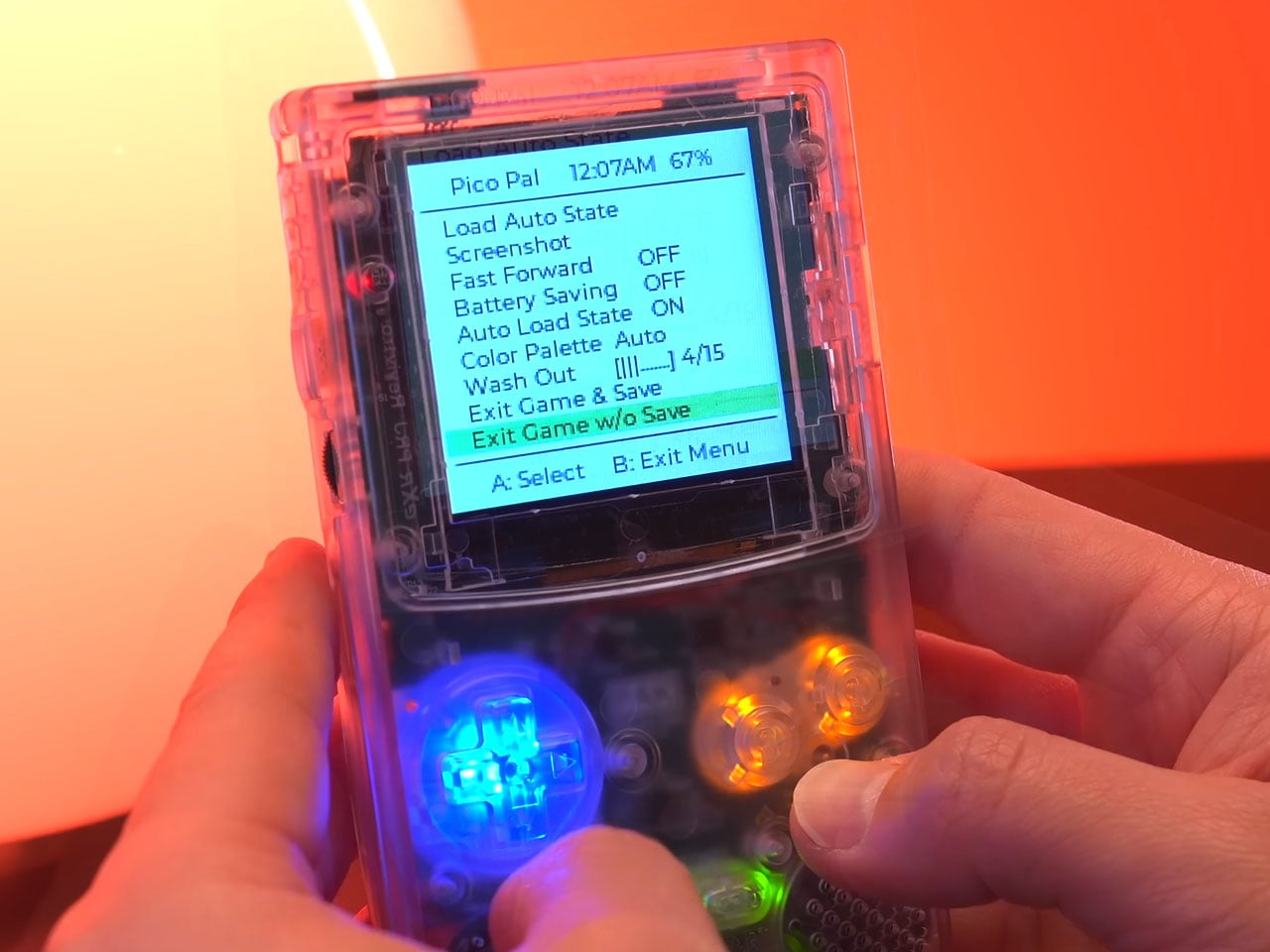
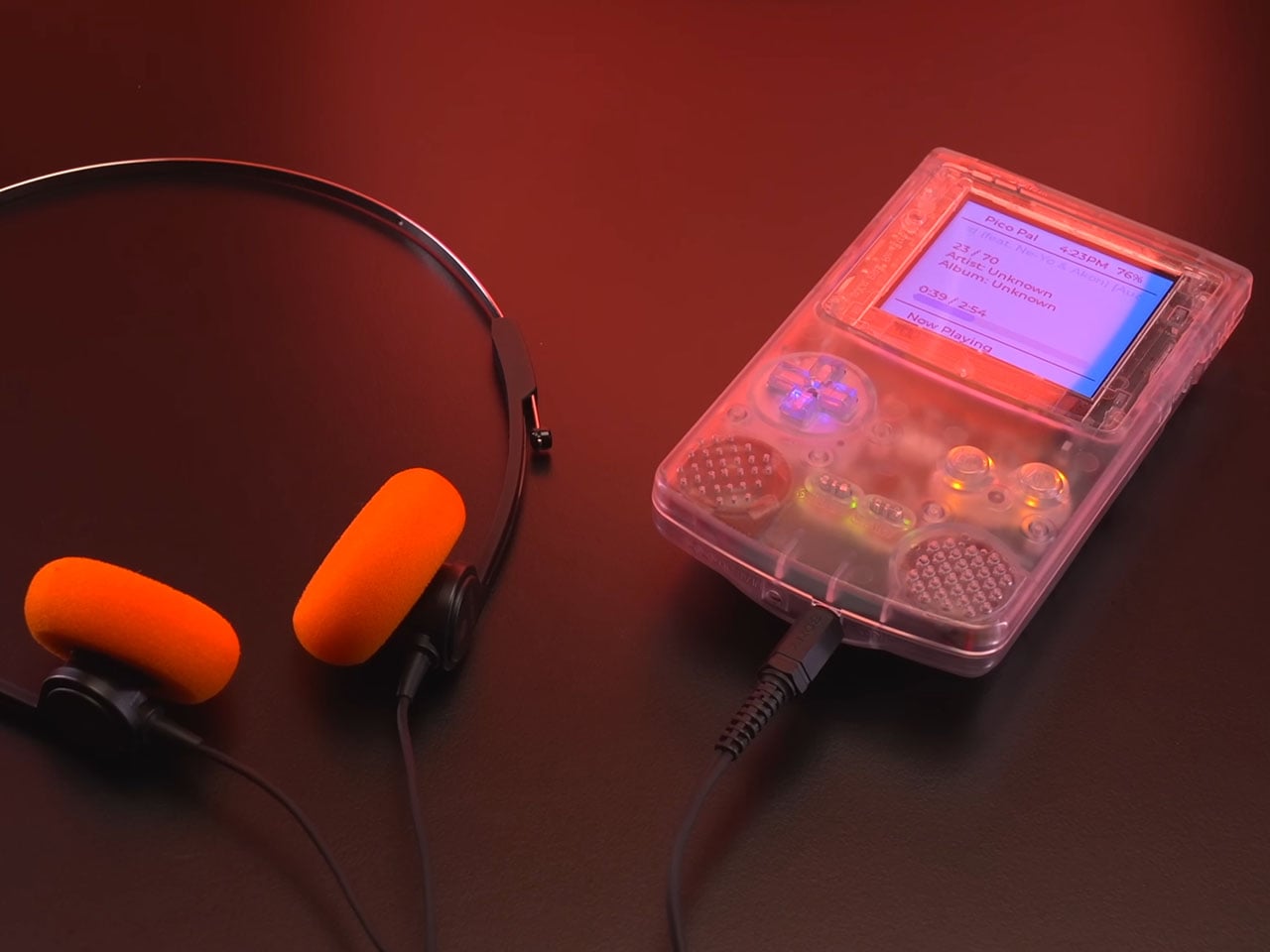
The design also incorporates several modern usability improvements compared to traditional handheld consoles. One example is the soft-power system, where the physical power switch triggers the console to save its current state before entering a low-power standby mode. Instead of abruptly cutting power like older devices, the Pico-Pal can quickly resume gameplay from where the user left off. Development updates also mention additional features such as real-time clock support for games that rely on time tracking, Bluetooth audio functionality, and digital video output that could allow the handheld to connect to external displays. Though one feature that is an absolute steal is the ability to play MP3 files off the storage, for music buffs like me.
Although the Pico-Pal closely resembles a Game Boy Color at first glance, its philosophy is quite different from modern FPGA-based retro consoles. Rather than focusing on perfect hardware recreation, the project embraces a microcontroller-driven design that balances efficiency and versatility.