This Laptop Stays Cool by Asking You to Move Your Own Keyboard

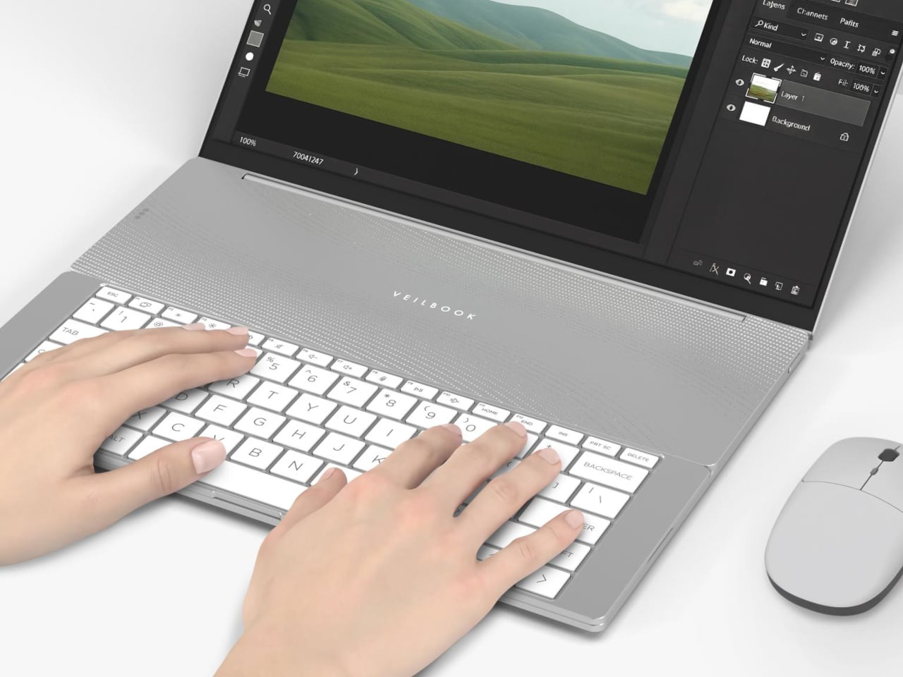
Laptop thinness has always been a trade-off dressed up as progress. The slimmer the chassis, the less room there is for the thermal infrastructure that keeps processors from throttling, and that compromise has long passed as the cost of portability. Inventec’s VeilBook, a 14-inch concept under 10 mm thick, took home an iF Design Award 2026 by rethinking not the materials but the physical behavior of the person using it.

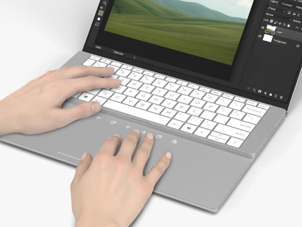
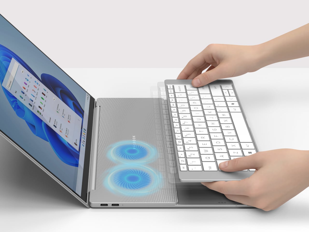
The defining feature is a detachable keyboard that doesn’t stay fixed at the front of the deck. Most laptops position those fans beneath the keyboard, which occupies the upper area of the deck, and the keyboard itself limits how freely air can escape upward. Removing that obstruction improves airflow enough to keep the processor and memory from throttling under sustained load.

Designer: Inventec

At rest, the keyboard covers the touchpad and palm rest, leaving the vent area above the cooling fans completely unobstructed. When you do need to use the touchpad, you can simply lift the keyboard and place it toward the back, a more natural position as far as traditional laptops are concerned. You can keep the keyboard there or put it back over the touchpad, depending on your needs and workflow.

That repositioning comes with a catch. To get the best thermal performance out of the VeilBook, the touchpad has to stay covered. If a workflow runs on keyboard shortcuts or an external mouse, that trade-off barely registers. For anyone accustomed to resting their palms beside the touchpad while typing, or reaching for it mid-sentence, it’s a more disruptive ask than the concept’s clean renders suggest.

When the keyboard stays back and the touchpad is exposed, it doubles as a shortcut surface, a secondary input layer available without requiring a full posture shift. The VeilBook also incorporates behavior-linked power management, tying energy consumption to actual usage states rather than running at a fixed profile. When the keyboard is stowed and input activity drops, the system scales back power draw, which at least means the thermal compromise isn’t a constant condition.

What the VeilBook makes visible is a problem the industry has spent years papering over. Thin laptops throttle partly because keyboards sit on top of vents, and the obvious fix, moving the keyboard, apparently needed a concept award to surface. Whether blocking the touchpad is an acceptable price for better sustained performance is a question every potential user will answer differently, depending on how much of their day actually runs through that glass rectangle.

The post This Laptop Stays Cool by Asking You to Move Your Own Keyboard first appeared on Yanko Design.

Skip the $20K Install: The $799 iGarden Swim Jet X Series Clamps Onto Any Pool

Most backyard pools spend their lives being thoroughly underused. They’re great for a hot afternoon cool-down and perfectly fine for the occasional float, but not exactly built for anyone who wants to swim laps. The obvious fix is a swim jet system, until you look into what installing one actually costs. Professional installation means plumbing connections, dedicated electrical work, and a contractor quote that tends to start somewhere around five figures.

The iGarden Swim Jet X Series sidesteps that problem entirely. Rather than something built into a pool, it is something you bring to one. A jet head mounts to the pool’s edge with a clamp-and-bracket assembly, no drilling required, while a separate power box sits on the deck nearby. Attach it, switch it on, and the pool becomes considerably more useful than it was ten minutes ago.

Designer: iGarden

Click Here to Buy Now: $799 $1199 (40% off). Hurry, only 27/160 left! Raised over $935,000.

That power box is worth a closer look. It is a compact cube with a brushed metal finish, a circular display showing battery level and session time, and a clean row of buttons for power, flow, and timer control. The main unit itself has suitcase-style wheels and a retractable handle, so moving the whole system poolside, storing it in the shade, or taking it somewhere else entirely takes almost no effort.

The entire system runs on a low-voltage architecture, making sure that the product is completely safe to use. The swim jet carries an IP68 waterproof rating, while the power box is rated IP65. The system will automatically cut off power if there is accidental contact or if the battery/power unit shifts out of position, and a safety grille covers the jet intake. The safety design is thorough without being complicated.

On the performance side, the flagship X35-P60 runs a 1,000W permanent magnet synchronous motor or PMSM, pushing flow speeds up to 3.5 meters per second. An AI inverter control system modulates the motor output in real time, keeping the current steady and laminar through a focused, straight-lane flow. The current remains consistent even as a swimmer pushes hard against it.

That steady resistance changes how the pool actually gets used day to day. A morning session at a moderate gear setting feels genuinely like open-water swimming, sustained and uninterrupted, without the constant wall turns. The six speed levels mean the same device works for casual paddling at the lower end and serious interval training at the top. The X35-P60 also runs for up to 10 hours on a single charge, enough for a full day of use without needing a top-up.

At the structured training end of the spectrum, the P3 and P4 settings unlock sprint programming through the companion app, with sessions configurable in blocks from 15 up to 90 minutes and workout history logged after each one. Dial the current back on a weekend afternoon, and the pool becomes a gentle flow that kids can float and play in. One device, one pool, several completely different experiences across a single day.

The iGarden Swim Jet X Series is compatible with plunge pools, fiberglass, concrete, gunite, and vinyl-lined pools, which cover almost every residential configuration. When the season ends, it packs into a storage bag, rolls on its wheels to a friend’s place when the occasion calls for it, and leaves no trace behind when removed. The pool stays exactly as it was. The swim jet is just a guest, and a rather useful one at that, starting at just $799.

To mark its launch, iGarden is throwing in a couple of reasons to move quickly. Everyone who pledges within the first 48 hours gets shipping at $25 flat, half the standard rate, and one randomly selected backer from that same 48-hour window will receive their iGarden Swim Jet X Series unit completely free. Not a bad way to kick off a launch.

Click Here to Buy Now: $799 $1199 (40% off). Hurry, only 27/160 left! Raised over $935,000.

The post Skip the $20K Install: The $799 iGarden Swim Jet X Series Clamps Onto Any Pool first appeared on Yanko Design.

Old Clothes Never Die, They Just Become Flower Pots

Most of us have a box. Or a bag, or a corner of the closet where clothes go to wait for a fate we haven’t quite settled on yet. Not trash, not donation, just quietly pushed aside. The jeans that stopped fitting but once made you feel unstoppable. The sweater that pilled after three washes but somehow survived four more years. Parting with clothes is harder than it sounds, and the fashion industry has largely treated that emotional gap as a non-problem.

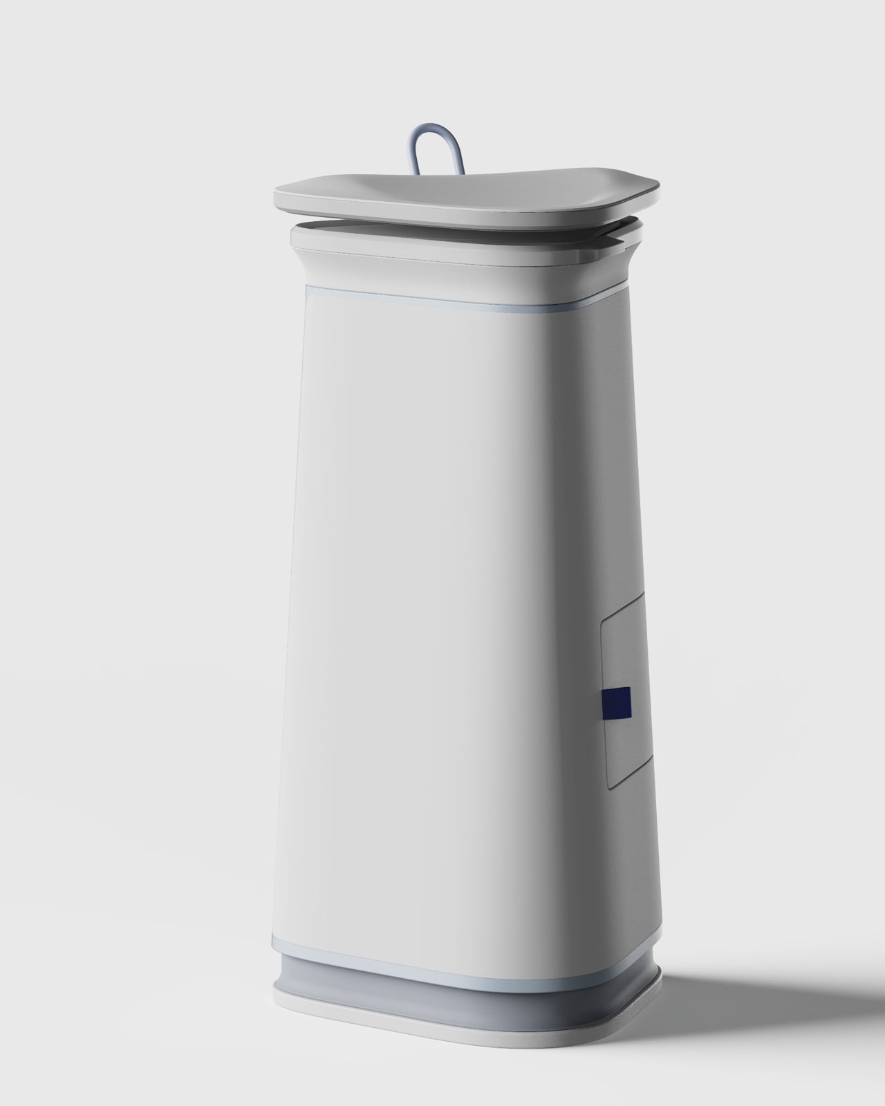
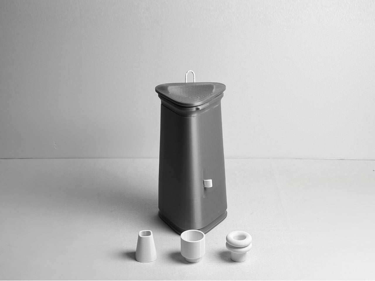
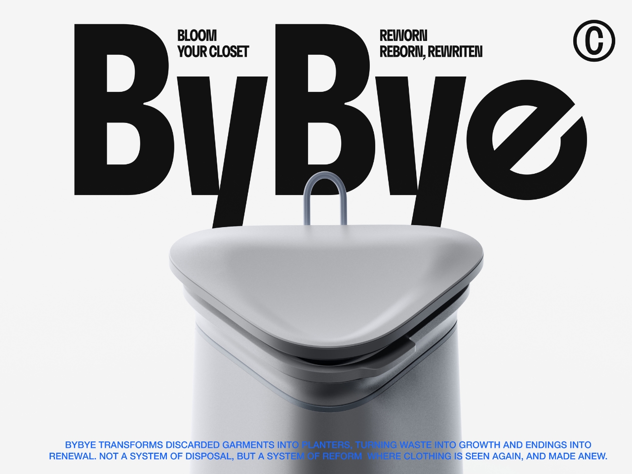
ByBye, a concept designed by Gyeong Wook Kim, Sooa Kim, Gayeon Kim, and Mingyeong Shin, disagrees with that approach in the most literal way possible. It’s a countertop-sized machine that takes your worn and discarded garments and transforms them, through a process of grinding, compression, and heat, into flower pots. Real, usable, actually beautiful flower pots.

Designers: Gyeong Wook Kim, Sooa Kim, Gayeon Kim, Mingyeong Shin

Create your own Aesthetic Render: Download KeyShot Studio Right Now!

I want to sit with that idea for a second, because it’s a genuinely clever reframe of the problem. The designers describe ByBye not as a disposal system but as a “system of reform.” That language matters. When we throw clothes away, the garments disappear. When we donate, we hand off the moral weight to someone else. But ByBye asks you to stay present for the transformation and gives you something physical to show for it.

The mechanics are straightforward but impressively considered. You feed garments into the top opening, which uses a sliding rail mechanism to regulate input and automatically closes once the designated weight is reached. Inside, a shredder breaks the fabric down into fine particles. Those particles are then fed into a flower pot mold, compressed by a pressing plate, and hardened through high-temperature treatment. The finished pots rise up from the molding mechanism. The whole process takes about ten minutes per piece, and a companion app tracks fabric weight, the number of pots produced, and total production time.

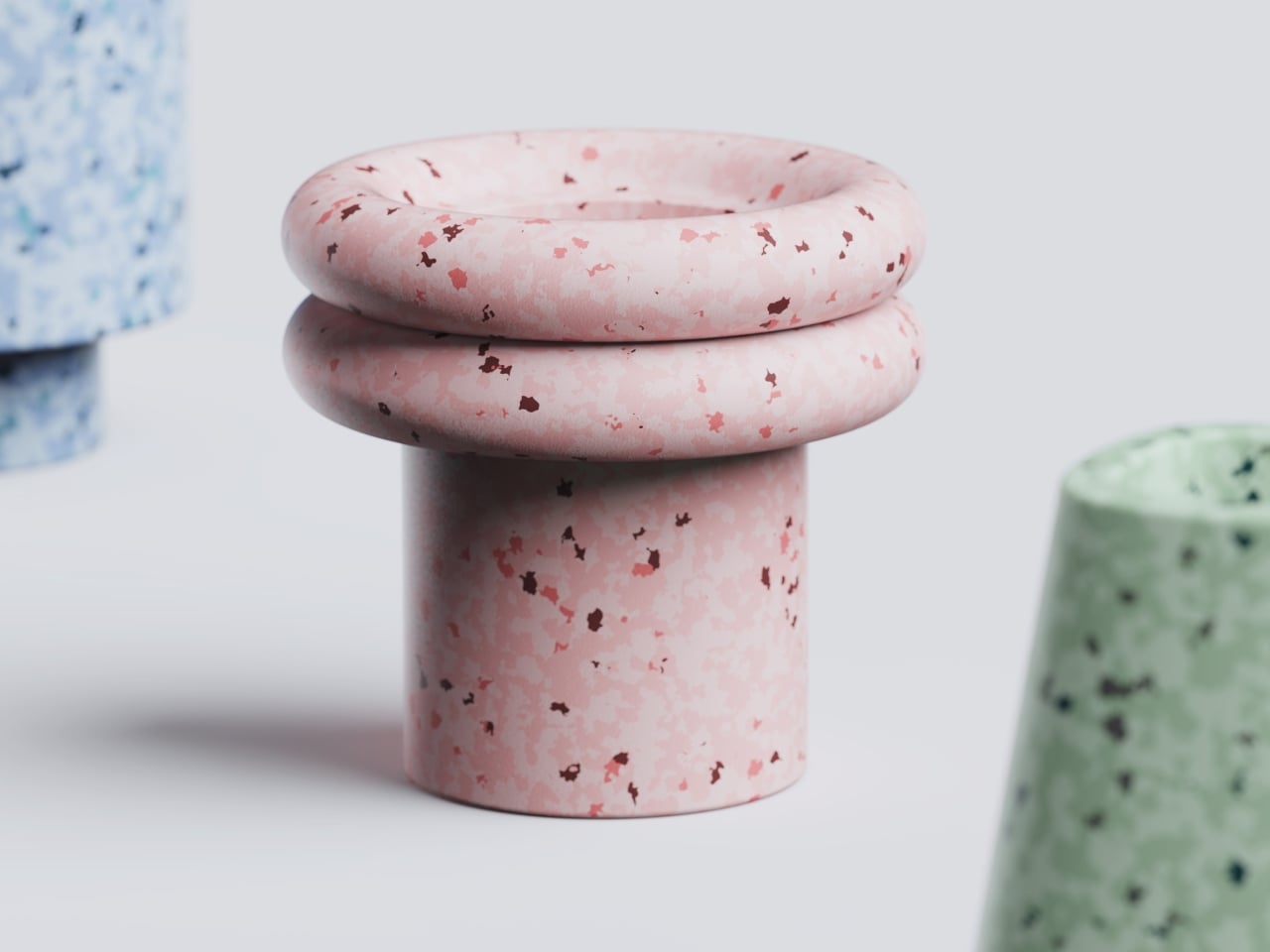
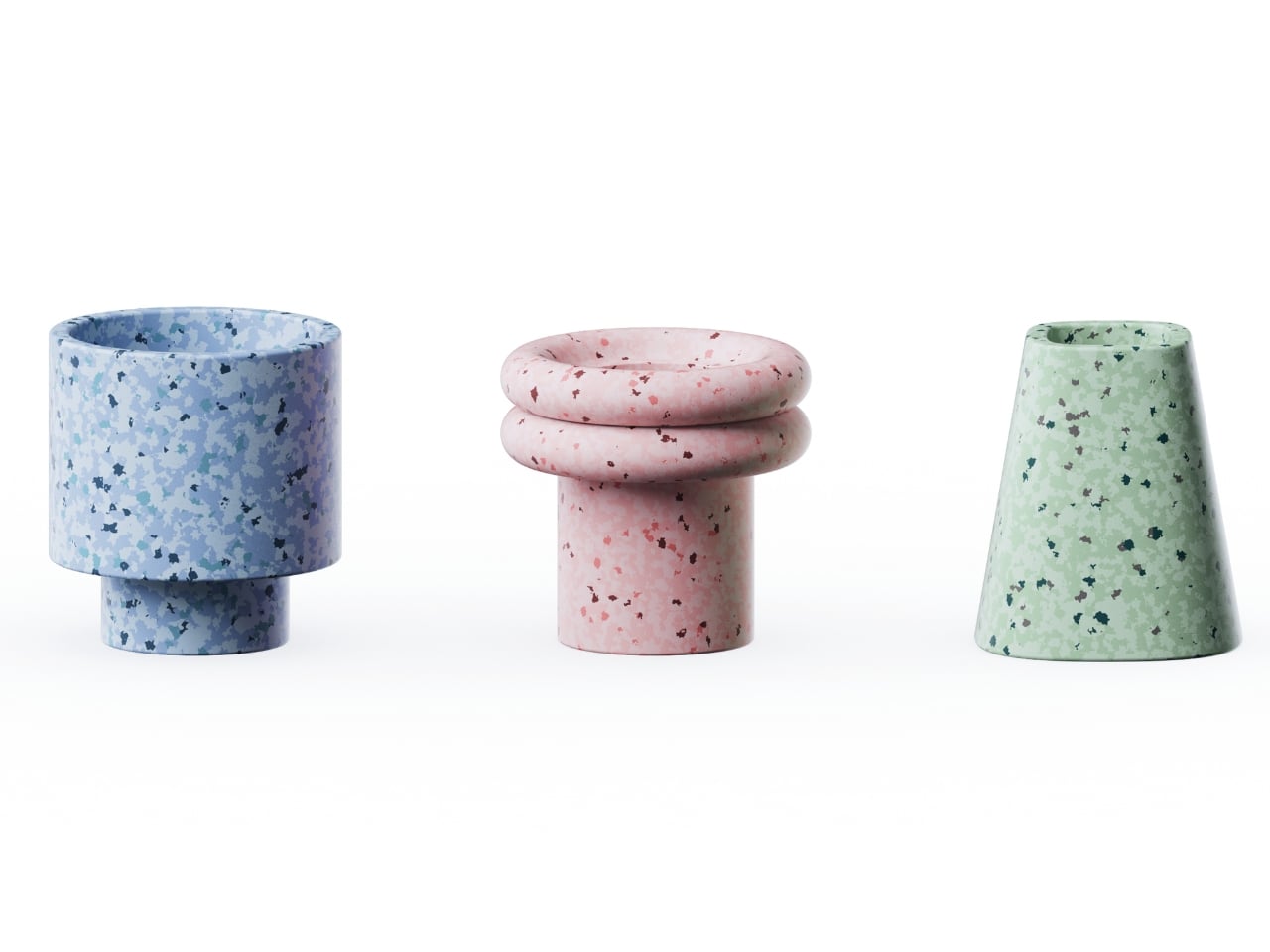
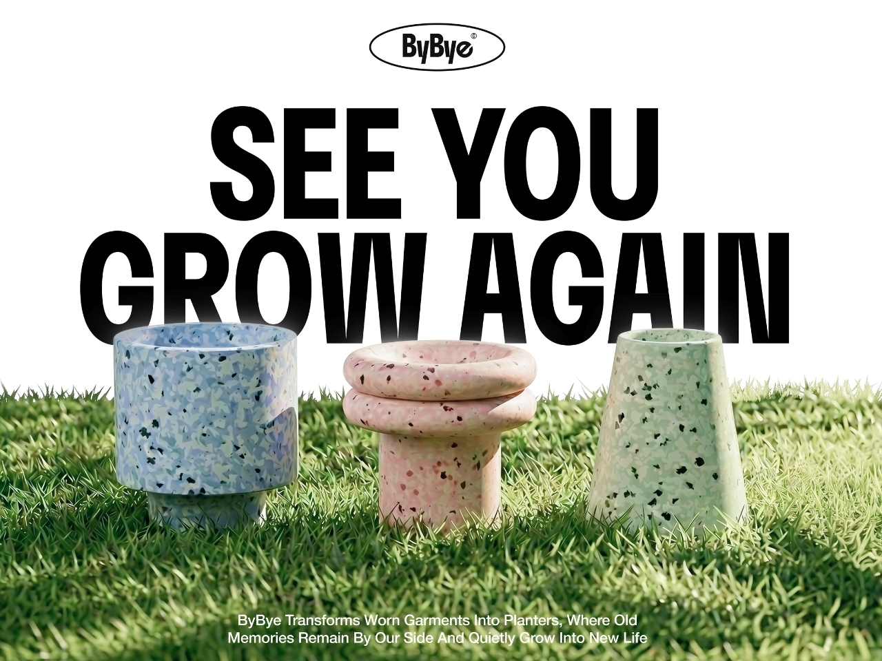
What comes out of the machine is genuinely surprising. The pots carry a terrazzo-like texture from the mixed fibers, soft and speckled in muted blues, pinks, and greens depending on the fabric input. They look like something you’d find at a design fair, not something born from a pile of worn-out t-shirts. That aesthetic outcome feels important to the whole concept. If the result were dull or utilitarian, the emotional payoff wouldn’t land. Instead, you end up with an object that holds some trace of the original garment, and then holds a plant on top of that.

The project raises questions I keep turning over. Can the machine handle all fabric types, including synthetic blends that behave very differently under heat and compression? What’s the upper limit on pot durability when working with processed textiles? These feel like the natural next steps for a concept this promising, and I genuinely hope the team is pushing toward them.

What ByBye gets absolutely right is the emotional architecture of the experience. The name alone, a gentle play on “bye bye” and “by” as in made by, signals that this isn’t designed to make you feel guilty about your wardrobe. The copy throughout the project, “Hello? Nice to Wear You,” “Let Your Clothes Begin Again,” reads more like an invitation than an environmental lecture. That tone is rare in sustainable design, which has a tendency to lead with shame rather than possibility.

The designers put it plainly in their project statement: “Not a system of disposal, but a system of reform where clothing is seen again, and made anew.” That’s a design philosophy worth paying attention to. Fashion produces staggering amounts of textile waste every year, and while no home appliance is going to fix that alone, concepts like ByBye shift the conversation in a useful direction. They make the ending feel less like a loss and more like a beginning. Parting with clothes is still going to feel like something. But now it might feel like planting something too.

The post Old Clothes Never Die, They Just Become Flower Pots first appeared on Yanko Design.

Shark ChillPill reinvents personal cooling with its 3-in-1 portable design

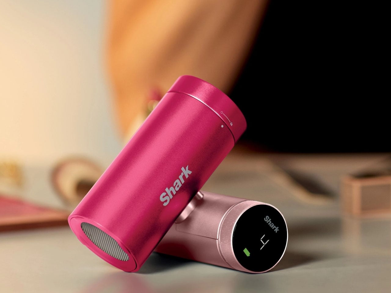
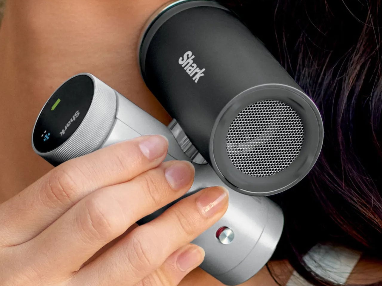
As temperatures continue to rise across many parts of the world, portable cooling devices are becoming increasingly popular for people who want relief while commuting or spending time outdoors. Recognizing this growing demand, SharkNinja has introduced the Shark ChillPill, a compact 3-in-1 personal cooling system designed to provide multiple forms of cooling in a single portable device. Combining a fan, an evaporative mister, and a direct-contact cooling plate, the gadget aims to deliver flexible comfort wherever heat becomes a problem.

The ChillPill is evolutionary when compared to traditional handheld fans that primarily circulate air. SharkNinja has designed the device to actively help cool the body using three complementary technologies. The first is a high-speed bladeless fan capable of accelerating airflow up to 25 feet per second, offering a steady breeze through ten adjustable speed settings. This allows users to tailor the cooling intensity depending on their environment, whether they need a gentle airflow indoors or stronger ventilation outdoors.

Designer: Shark Ninja

Secondly, an evaporative mist system is designed to refresh the skin without leaving it soaked. Unlike conventional spray fans that often create a wet sensation, Shark describes the ChillPill’s mist as a “dry-touch” evaporative effect. The device includes a small water reservoir that can produce mist continuously for about ten minutes per fill, or operate in an interval mode to extend usage. This feature is particularly useful in hot and dry climates where evaporation can significantly enhance cooling efficiency.

The third element is the InstaChill cooling plate, a cryo-inspired metal surface that provides direct contact cooling when pressed against the skin. According to SharkNinja, the plate can reduce skin temperature by up to 16°F within seconds, delivering an immediate cooling sensation similar to placing an ice pack on the body. This feature is designed for use on pulse points such as the neck or wrist, where cooling can quickly help regulate body temperature during intense heat.

One of the wearable’s key advantages is its versatility. It is designed to be worn, carried, clipped, or placed on a surface depending on the situation. The flexible design allows it to function as a hands-free wearable device or as a small desktop fan when needed. You can easily clip it to bags or prams, mount it on exercise equipment, or position it on a table, making it adaptable to a wide range of everyday scenarios.

Battery is also impressive as on the lowest fan setting, the ChillPill can run for up to 11 hours on a single charge, allowing it to last through long commutes, outdoor events, or extended travel days. When running at maximum airflow, the battery life drops to approximately 90 minutes, reflecting the higher energy demand of the stronger cooling output. Charging is handled via USB-C, with a full recharge taking roughly three and a half hours.

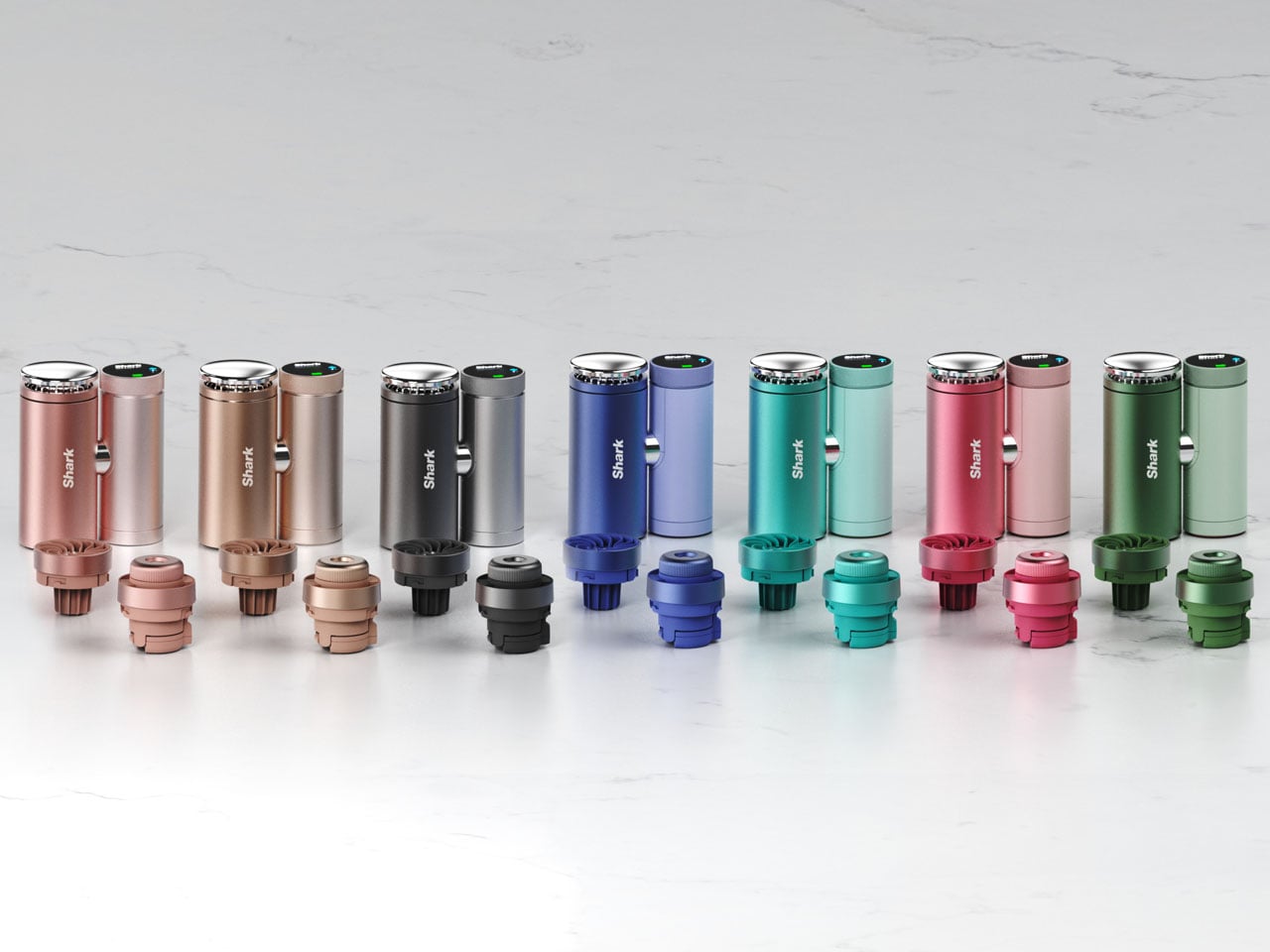
Portability and lifestyle integration are at the forefront as the portable gadget is available in several color options, including Carbon, Dragonfruit, Glacier, Haze, Iced Latte, Matcha, and Rose Gold. Optional accessories such as cross-body straps, wrist straps, clamps for strollers or bikes, and protective cases are available to expand how the device can be used. Priced at around $149.99, the Shark ChillPill is available through Amazon and Shark’s own website and other retailers. While it costs more than standard portable fans, the advantages here are undeniable.


The post Shark ChillPill reinvents personal cooling with its 3-in-1 portable design first appeared on Yanko Design.

iPhone 20 in 2027: All-Glass, Buttonless, and Highly Unlikely

The iPhone turns 20 in 2027, and Apple apparently wants to throw a party that people will remember. Sources believe that the company is targeting a radical redesign for what will likely be called the iPhone 20, skipping “iPhone 19” the same way it jumped directly to the iPhone X back in 2017. More than just a naming trick, it came with the full-screen OLED design, Face ID, and the removal of the home button, a move that felt genuinely shocking at the time. The expectation building around the iPhone 20 is that history is supposed to repeat itself, only bigger.

The appetite is clearly there. Interest in bold Apple hardware has been riding high on the back of iPhone Fold rumors, and the search interest in “iPhone 20 design” has shot up by over 3,100% year-over-year. People are hungry for a leap, not an incremental shuffle. What Apple is reportedly planning, an all-glass unibody with no physical buttons and no visible cutouts anywhere on the device, is exactly the kind of leap that generates excitement. Whether it generates anything more than that is a genuinely open question.

Images courtesy of: AppleTrack

iPhone X (2017)

What it isn’t: an all-screen phone

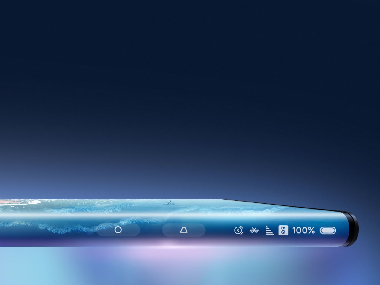
Before the imagination runs completely wild, it helps to be specific about what “all-glass” is not. This is not a Xiaomi Mi Mix Alpha situation, where the display wraps entirely around the phone like a very expensive, very fragile bracelet. That concept, for all its visual drama, would introduce a cascade of problems: iOS and most apps are built on the assumption that the back of a phone is inert. Making the entire surface interactive requires a fundamental rethinking of how software handles accidental input, palm rejection, and basic navigation, none of which Apple appears to be pursuing here.

Designer: Xiaomi

The more useful comparison is the Vivo APEX from 2019, a concept phone that was genuinely all-glass and buttonless without wrapping the display around the chassis. The APEX had no physical buttons, no headphone jack, no visible ports, and shockingly, no front camera. It was definitely a striking object. It also never made it to retail, because striking objects and reliable everyday devices are not always the same thing.


Designer: vivo

What the rumors are actually saying

The picture assembled from various sources is fairly consistent in its broad strokes. The iPhone 20 is expected to arrive with a four-sided bending OLED display that curves around all edges, a fully glass chassis with no metal frame visible from the outside, camera lenses flush against the glass back with no raised rings or seams, and an under-display front camera with Face ID sensors also moved beneath the glass. Physical buttons disappear entirely, replaced by what Apple has internally codenamed “Project Bongo,” localized haptic zones that simulate a press through piezoelectric ceramics rather than a mechanical click.

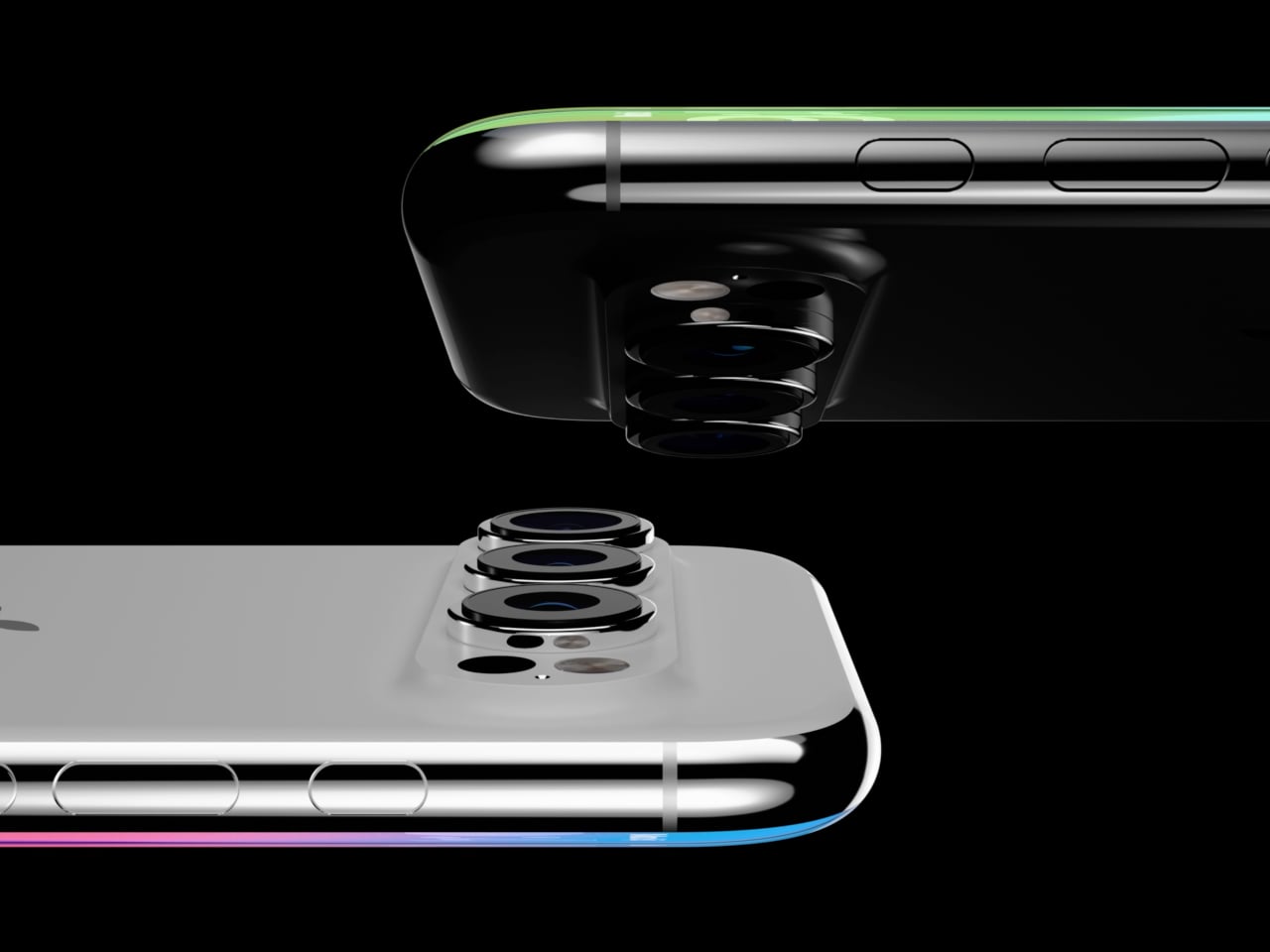
Images courtesy of: AppleTrack

Apple has been laying this groundwork for years, whether deliberately or not. MagSafe removed the last port most people used regularly. The solid-state home button on the iPhone 7 trained a generation of users to accept a simulated click as the real thing. Touch ID lived in that fake button for years before Face ID made it irrelevant. Project Bongo itself has been in development since 2021, with the haptic button solution reportedly completing functional verification for the iPhone 20 last October. The staged rollout has already begun: under-display Face ID is expected to debut on the iPhone 18 Pro in 2026, a year before the full transformation arrives.

Why Apple might actually want this

The engineering case for an all-glass, buttonless phone is stronger than it might first appear, and it goes well beyond aesthetics. Glass transmits radio frequencies with far less attenuation than metal, which means that a fully glass chassis removes the need for antenna break lines, those small plastic interruptions visible on metal-framed iPhones. For 5G mmWave frequencies, which are particularly vulnerable to obstruction, that is a meaningful structural advantage, not a cosmetic one.

Physical buttons are also apertures, meaning every button cutout is a potential entry point for water, dust, and debris, not to mention a structural point of weakness. Solid-state haptic zones flush with a continuous glass surface create a fully sealed perimeter by default. And without springs, electrical contacts, or moving parts, the mechanical failure modes that eventually wear out every physical button simply do not apply. There is also a software dimension: a haptic surface can be reprogrammed. The same zone that acts as a volume button in one context can behave differently in a camera app, or respond to a half-press the way a DSLR shutter does. That interaction vocabulary does not exist on a physical button.
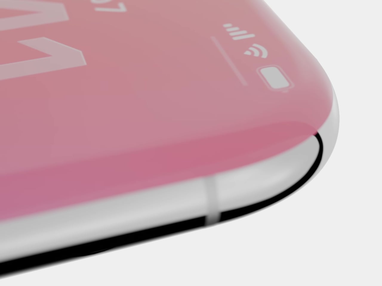

Images courtesy of: AppleTrack

The design coherence argument is worth taking seriously, too. iOS 26 introduced the Liquid Glass UI at WWDC 2025, with translucent menus, frosted panes, and depth-layered interfaces that read as software built to live inside a glass object. If the hardware catches up, the iPhone 20 would be the first Apple device where the material logic of the shell and the interface are genuinely continuous, rather than one imitating the other.

Why Apple will definitely not do it, at least not yet

The skepticism case is longer and, in several places, harder to argue around. Start with the glass itself. No glass smartphone has survived all kinds of real-world accidents unscathed, including the iPhone 16 Pro Max with Ceramic Shield 2. The current metal frame does real structural work; it absorbs and distributes impact energy in ways that glass cannot. A four-sided curved display that wraps around what used to be the frame zone eliminates that crumple zone entirely.

Thermal management is a less visible but equally serious issue. Aluminum conducts heat significantly better than glass. The metal frame in current iPhones is part of the thermal pathway, moving heat from the logic board outward. Glass is a poor conductor and a poor radiator, and with Apple Intelligence pushing sustained on-device AI inference, the thermal load is growing, not shrinking. Apple would need expanded vapor chambers or novel heat-bridge materials to compensate, none of which have been confirmed.

Then there is the under-display camera. Samsung introduced UDC technology with the Galaxy Z Fold3 in 2021 and used it through the Fold6. Image quality was consistently criticized across all four generations, and Samsung is now reportedly abandoning it for future foldables due to persistent optical and cost challenges. Apple is reportedly moving in the opposite direction, but with a twist. It might use the under-display camera primarily for Face ID’s infrared sensors rather than the selfie camera, which sidesteps the worst degradation but does not resolve long-term selfie quality under glass.


Designer: Samsung

Accessibility is a concern that gets less coverage than drop tests, but it definitely deserves more. Blind and visually impaired users rely on physically locatable controls as navigational anchors, such as the raised profile of a button. Flush haptic zones remove that landmark. There is also the “dead device” recovery problem: a bricked iPhone requires holding a specific physical button combination to enter recovery mode. Whether solid-state haptic buttons can operate at the firmware level, before iOS loads, has not been confirmed. Case and accessory compatibility adds another layer; a wraparound display that curves into what is currently the frame zone fundamentally changes how a protective case grips the device, since the element that used to grip the frame now grips the screen.


The human factor is harder to engineer than the glass

The technology story surrounding the iPhone 20 is genuinely fascinating, and some of it will almost certainly happen. Under-display Face ID on the iPhone 18 Pro is close enough to be treated as confirmed. The full vision, no buttons, no cutouts, glass everywhere, is a different question. Manufacturing challenge is described as “extraordinarily complex,” component manufacturers are on the fence, and the expected price point will likely exceed the current Pro Max tier. Those are not the conditions under which Apple tends to ship a complete reimagining all at once.

But the technical hurdles might not be the hardest part. People have strong, specific feelings about physical buttons in ways they do not always articulate until the buttons are gone. The haptic home button on the iPhone 7 worked well enough that most users stopped noticing it within weeks. Extending that same illusion across every tactile control point on the device, in cold weather, through a case, while the phone is vibrating with an incoming call, and across several years of daily use, is a different challenge than a single button in a fixed location. Whether that feels like liberation or a slow-building frustration might depend less on the engineering and more on the person holding it.
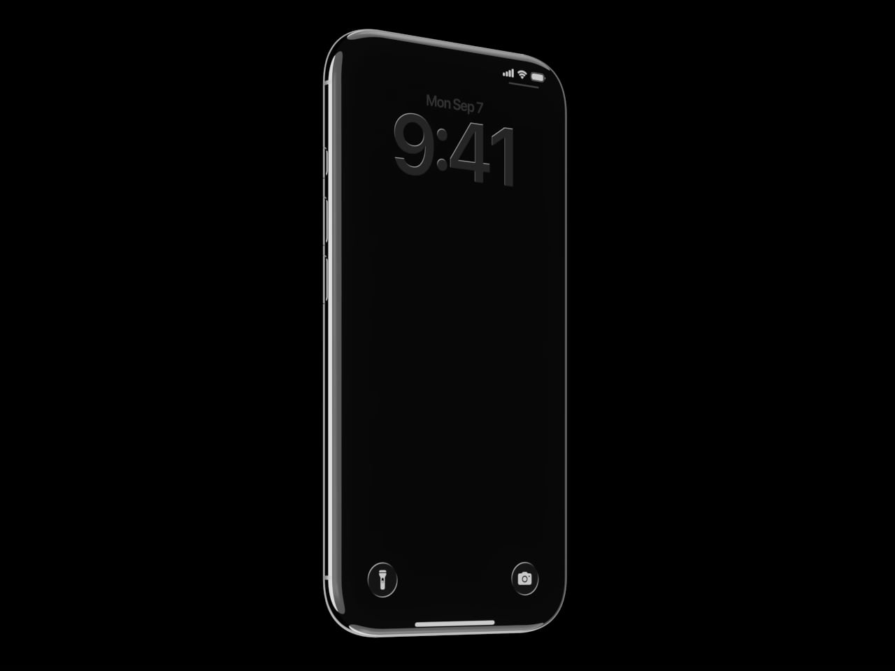
Images courtesy of: AppleTrack

The post iPhone 20 in 2027: All-Glass, Buttonless, and Highly Unlikely first appeared on Yanko Design.
This Sideboard Has Lapis Lazuli and Green Onyx Hand-Set Into Marble

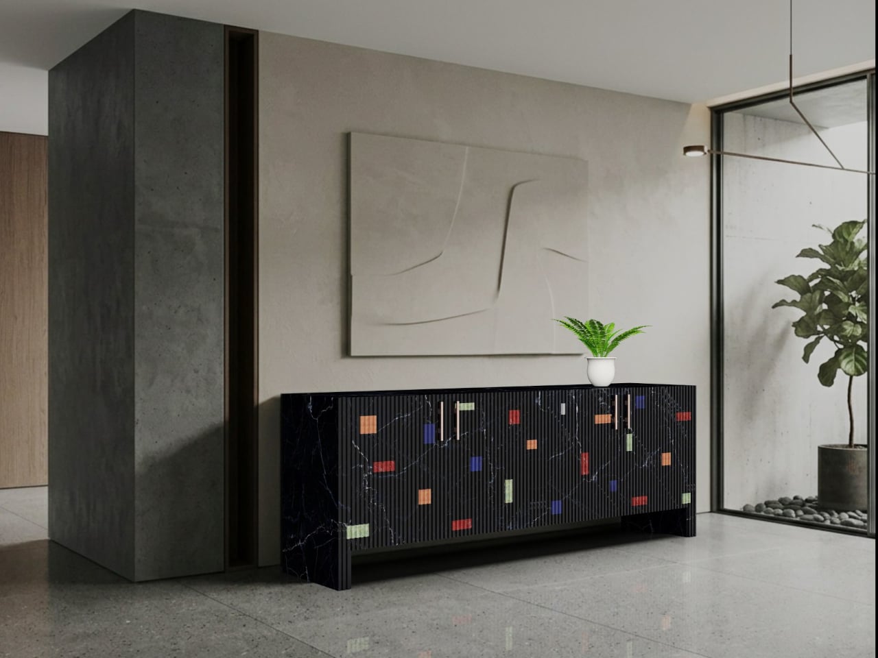
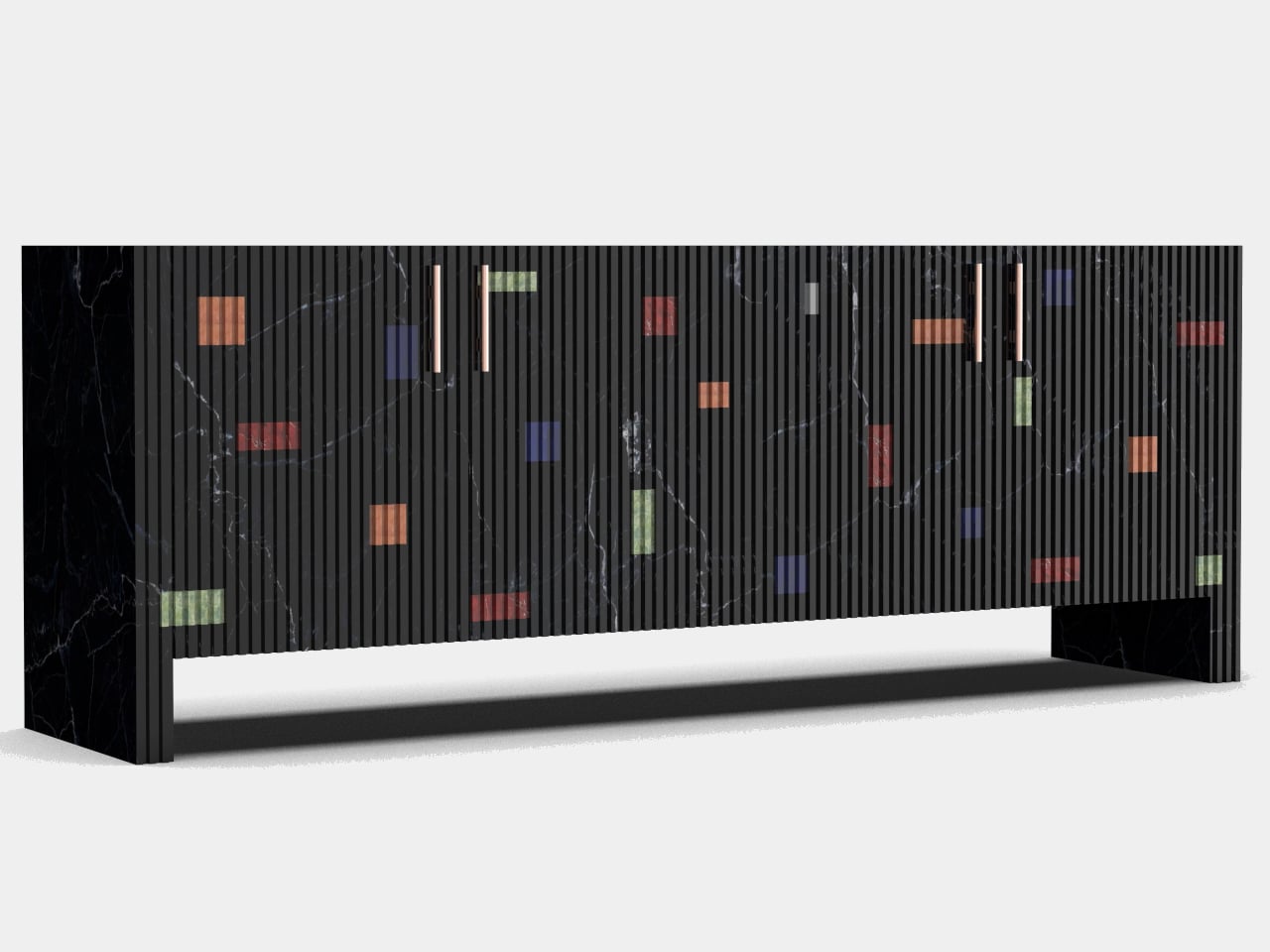
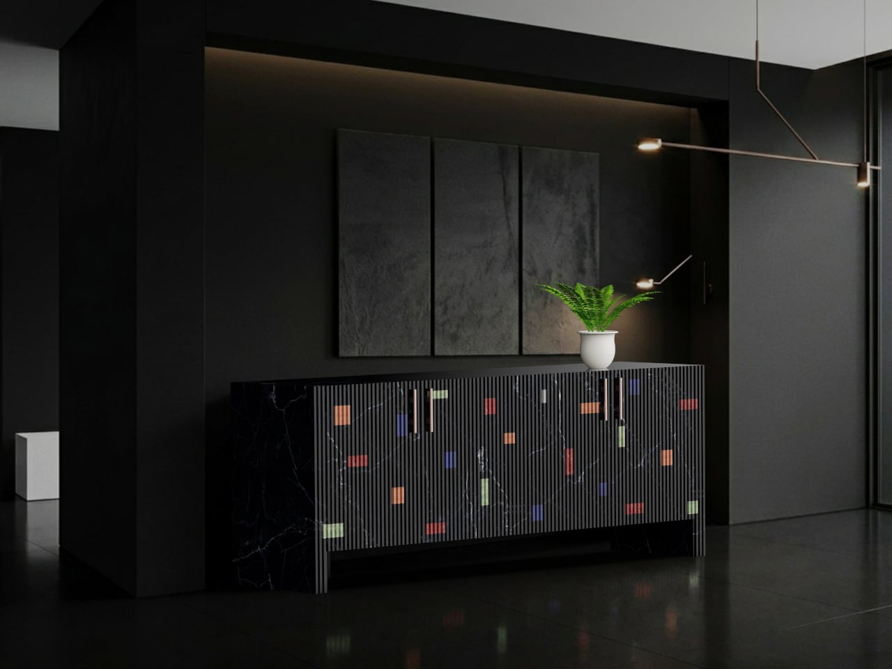
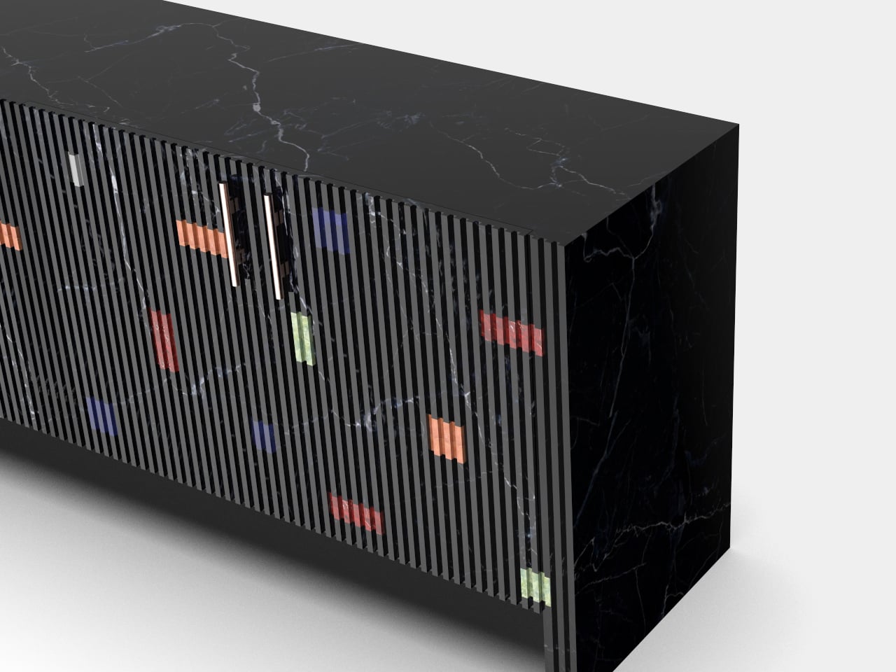
Black Marquina marble tends to command a room before anything else in it does. The material has a particular gravity, that deep, carbonized base cut through with white veining, which makes most furniture around it feel like an afterthought. Designer Himanshu Kumar Gupta leans into that authority completely with the Midnight Inlay Sideboard, then quietly subverts it the moment someone opens a door.

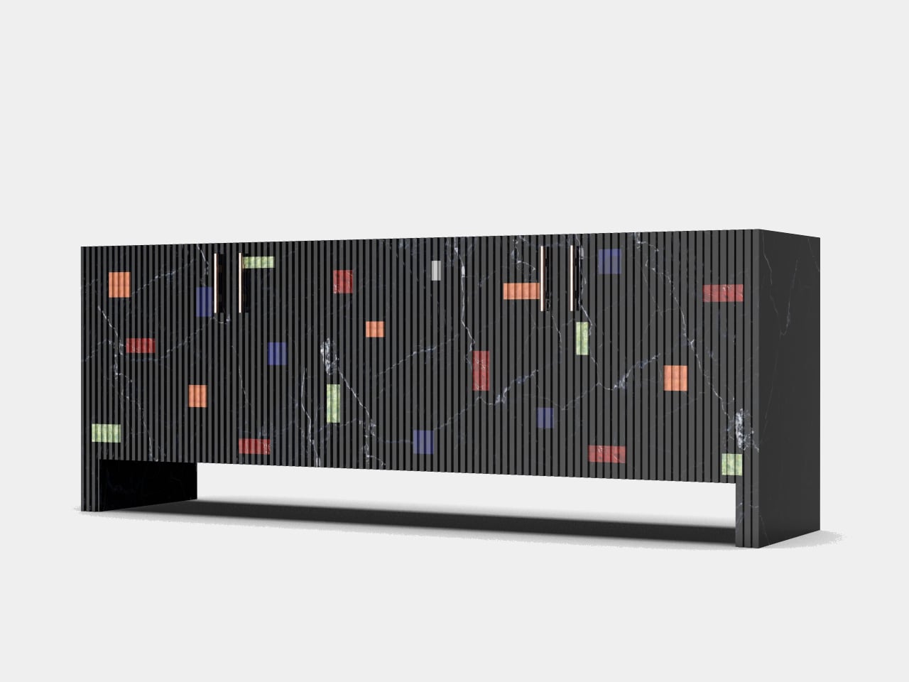
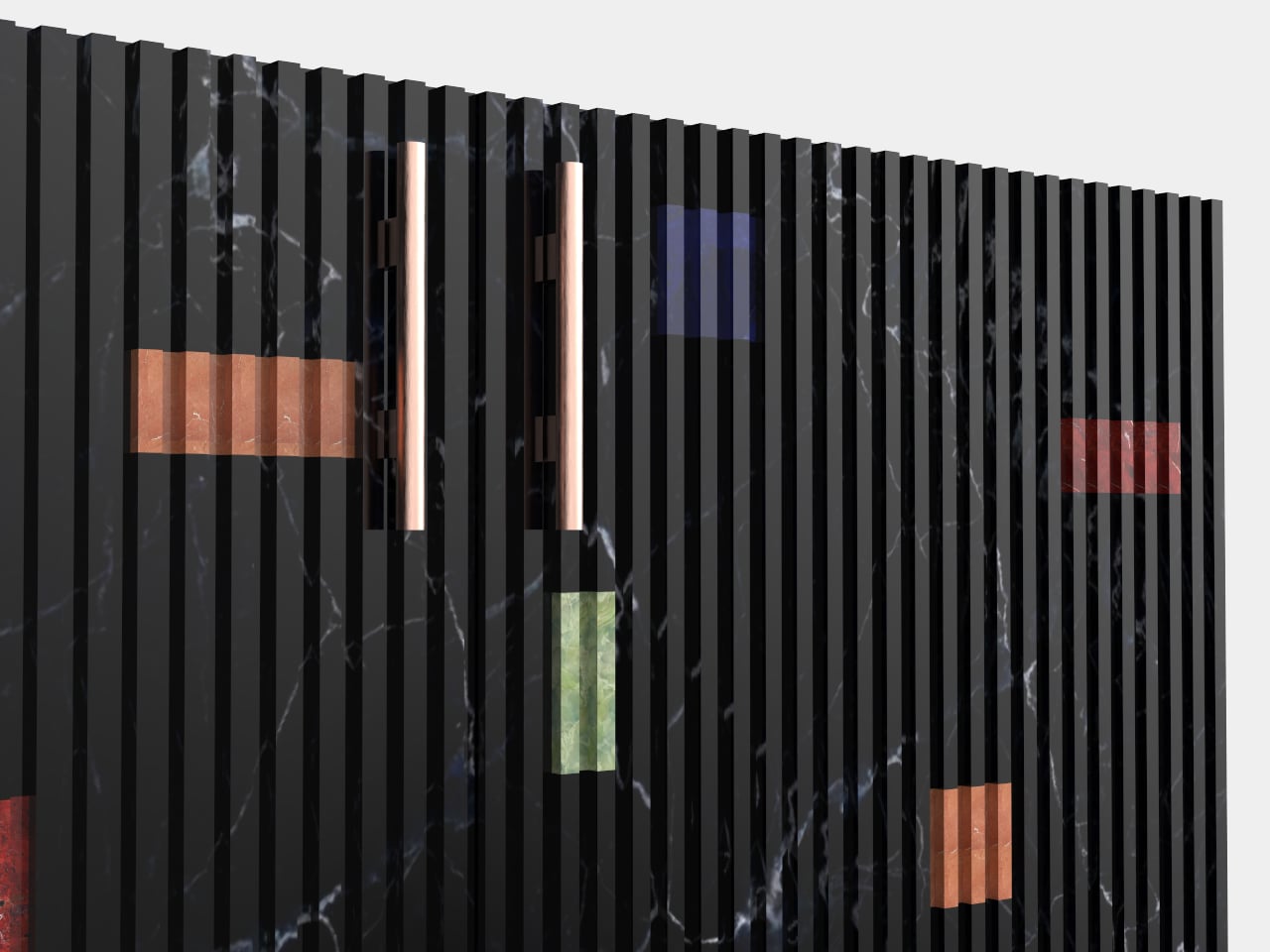
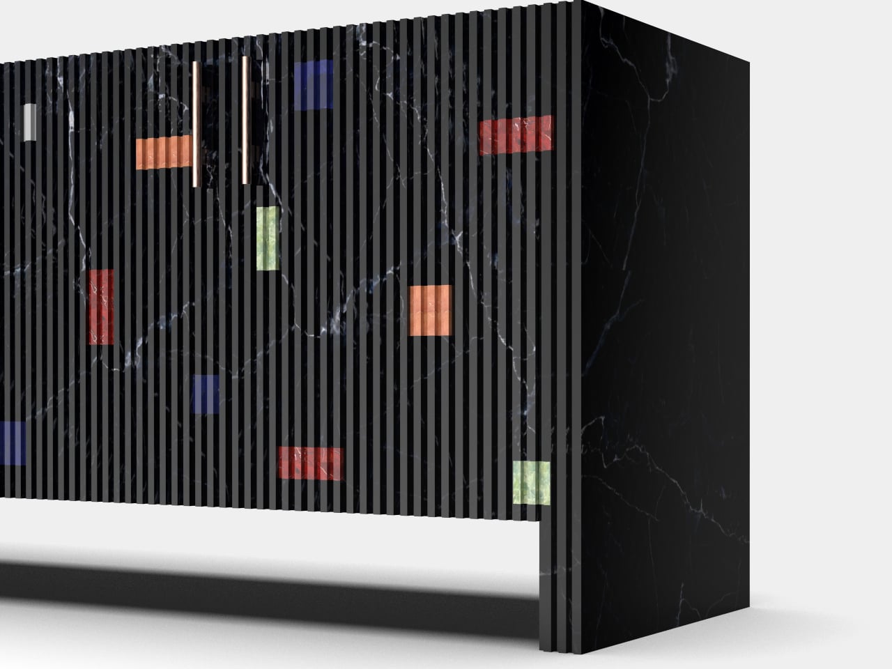
The exterior runs on strict formal logic. Vertical fluting covers the door panels from edge to edge, each ridge precisely cut into the stone so the surface ripples with shadow even under flat ambient light. On plain marble, this treatment would read as architectural severity, which is exactly the point. The fluting establishes a rhythm, almost like a grid, that makes what comes next feel genuinely disruptive.

Designer: Himanshu Gupta

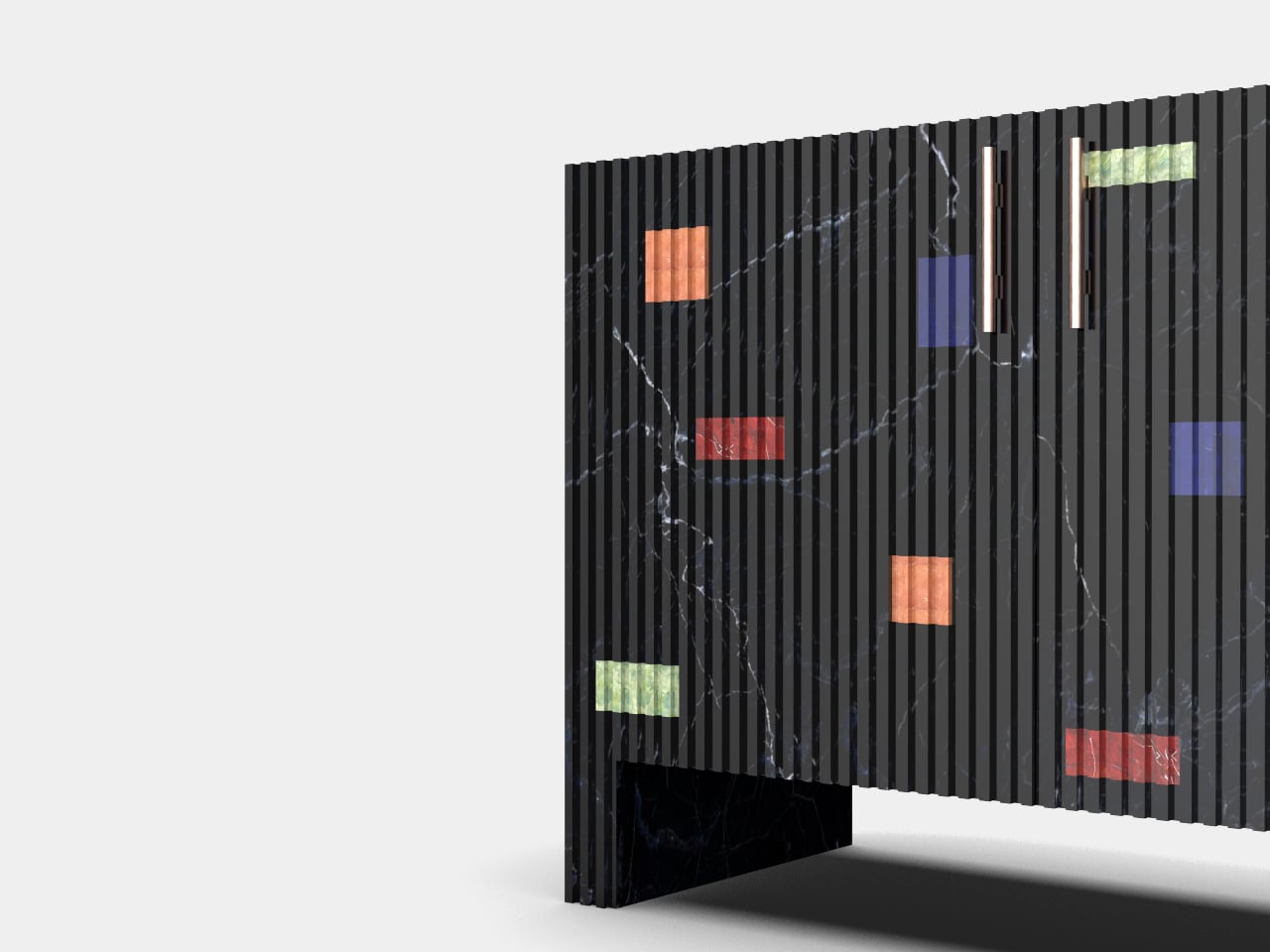
Scattered across those ridged panels are rectangular inlays in Lapis Lazuli, Red Fire marble, Alikanta, and Green Onyx, appearing at irregular intervals and orientations like signals caught mid-transmission. Each inlay sits flush within the fluting, which means the stone was routed and fitted with zero tolerance for error. A slightly proud or recessed block would break the silhouette entirely. That constraint alone separates this from surface-applied decoration.

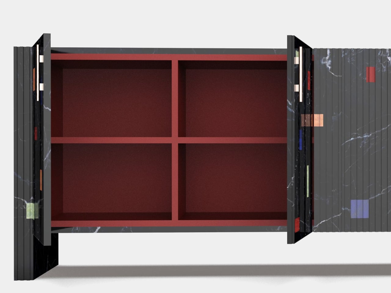
The interior is where the piece earns its sharpest contrast. Behind the cool, textured stone exterior is a cavity lined in red velvet over solid wood, a warm, almost theatrical shift in material register. Opening the doors feels less like accessing storage and more like discovering that a severe stone cabinet had a completely different personality waiting inside, the kind of detail that does not photograph well and cannot be fully appreciated without direct interaction.

Cylindrical handles in a warm copper-toned metallic finish sit vertically in the fluting, restrained enough to avoid competing with the inlays. The base is a solid slab, no tapered legs, no gap between cabinet and floor, keeping the profile ground-hugging and monolithic. The overall silhouette is low and horizontal, which helps it read as furniture rather than architecture, even with the stone’s commanding presence working against that reading.

Combining five different natural stones into a single fluted facade is a nontrivial production problem. Stone inlay of this precision typically requires hand-fitting each piece individually, since natural stone does not behave with the consistency of milled engineered material. The designer frames this as a contemporary take on traditional inlay craft, creating a beautiful tension between order and spontaneity, old and new.

The post This Sideboard Has Lapis Lazuli and Green Onyx Hand-Set Into Marble first appeared on Yanko Design.

These Shell-Inspired Lamps Cast Wing-Like Shadows on Your Walls

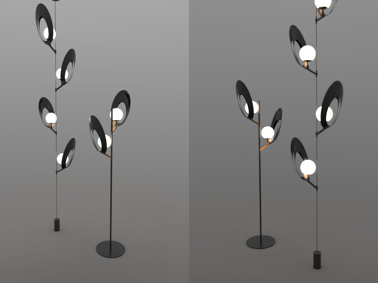
Most lamps are designed to disappear into a room. The fixture is an afterthought, a delivery mechanism for the bulb, and anything drawing attention to itself risks becoming a problem rather than a solution. Mostafa Arvandbarmchi and Lampart Lighting Solution took the opposite position with the Pelk collection, designing lamps that treat the fixture as the point, with light almost secondary to the form holding it.

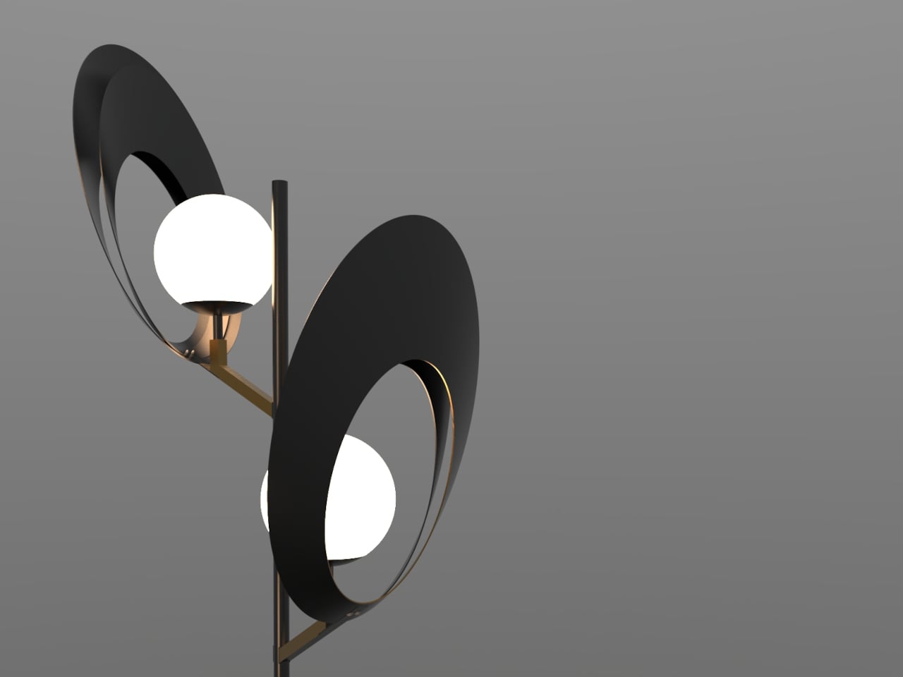
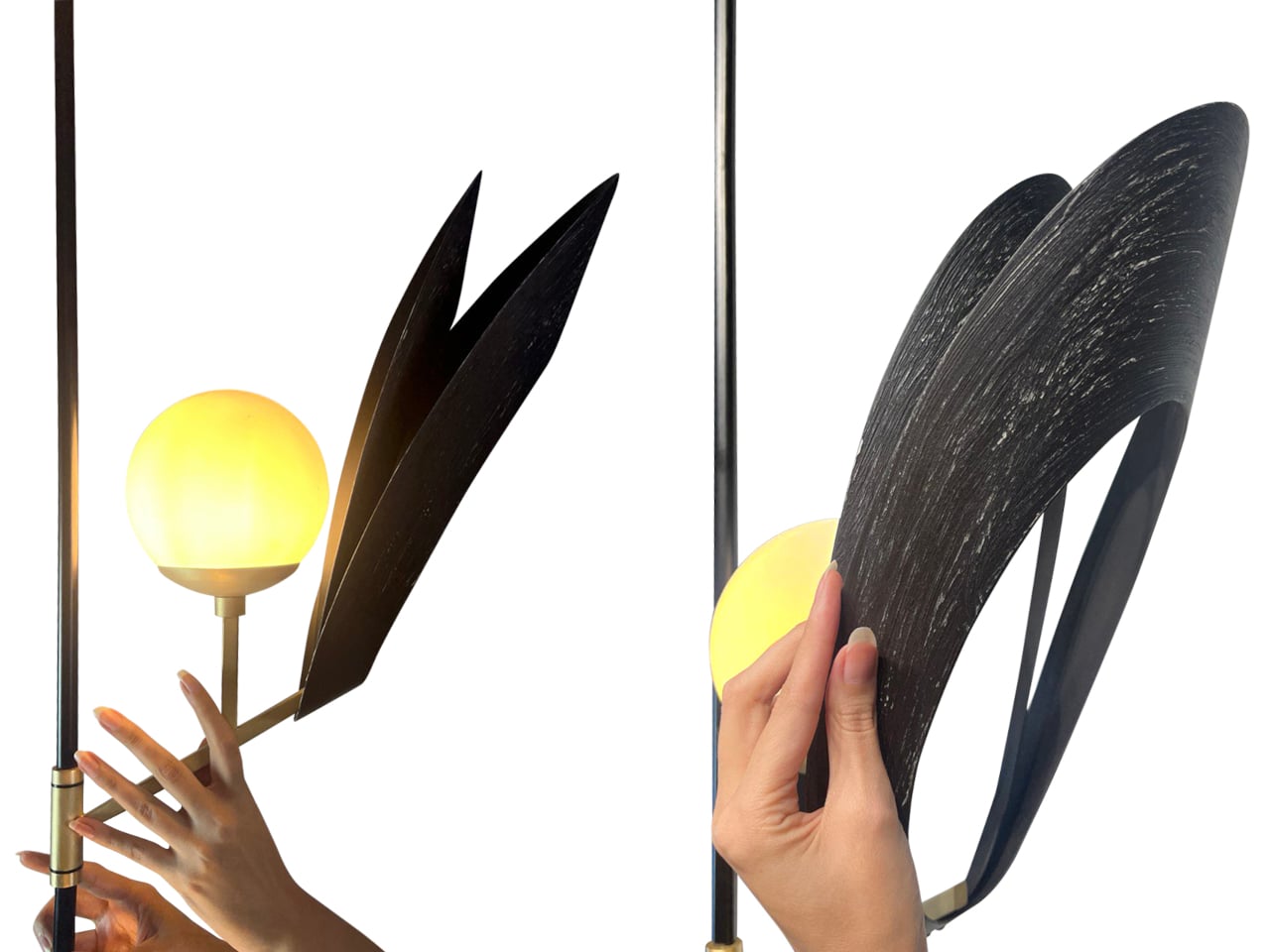
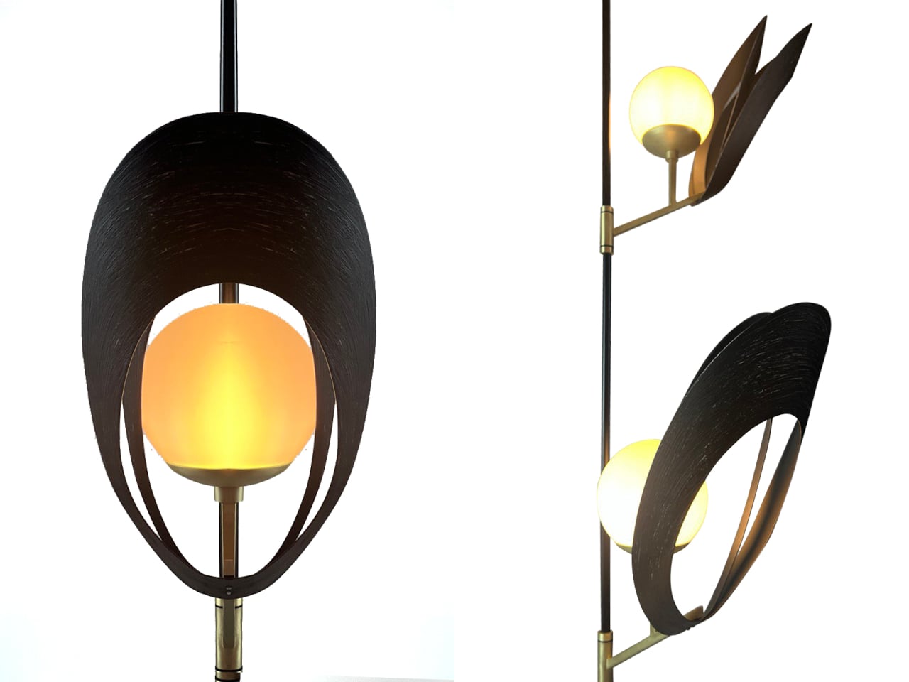
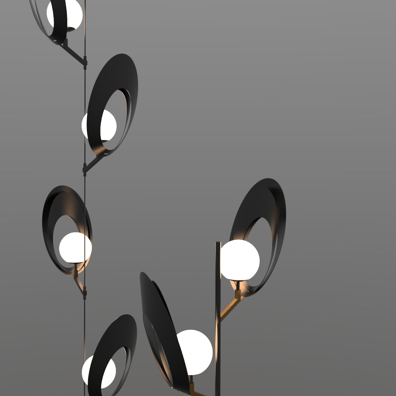
The starting reference is the black sea shell, specifically the way its structure balances curvature, layering, and quiet rhythm without any of it feeling constructed. Each Pelk module translates that logic into a pair of curved metal arcs, split open at the front, wrapping a frosted spherical globe without fully enclosing it. The arcs have a brushed, darkened finish and a visible surface texture that reads as geological up close, smooth from a distance, but clearly worked.

Designer: Mostafa Arvandbarmchi

What the shell geometry does for the light is more interesting than what it does for the form. The arcs cup the globe rather than enclose it, so light spills forward and sideways while the back of the shell stays dark. Brass-toned cylindrical connectors catch just enough ambient glow to register as a material contrast. On the wall behind, the arcs throw wide, wing-like shadows that shift with viewing angle, extending the fixture’s presence well beyond its physical footprint.

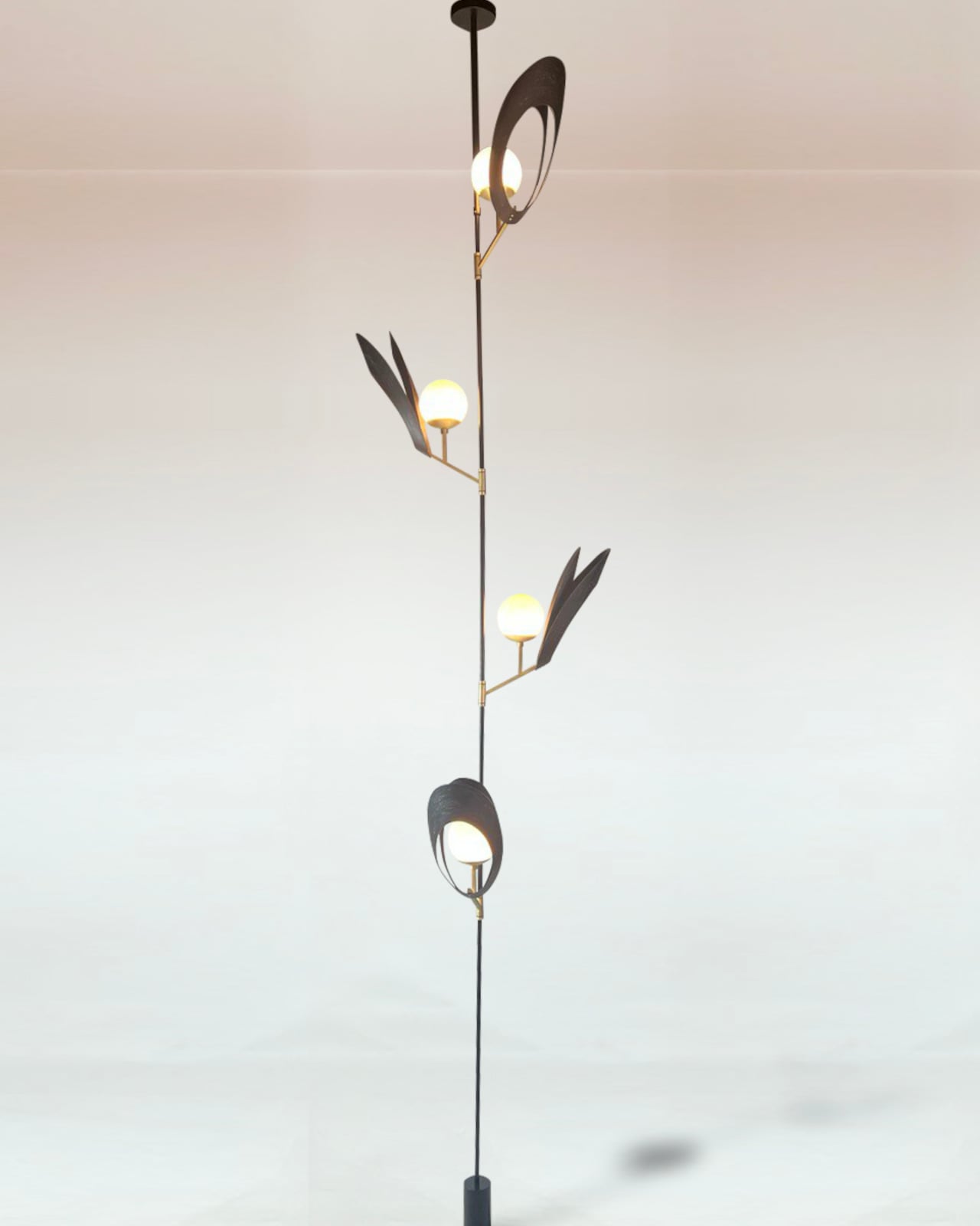
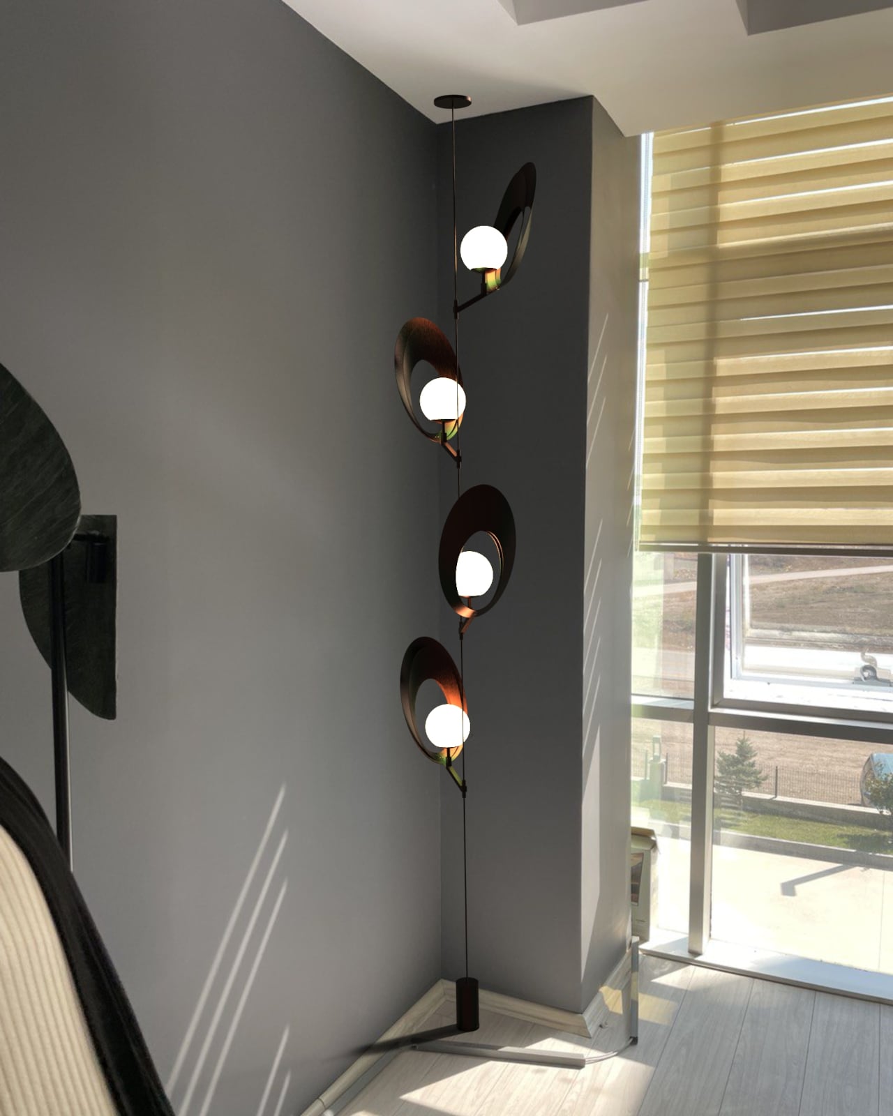
Pelk comes in two configurations. The floor lamp mounts two modules on a slender black rod above a flat circular base, staggered in height and rotated so the pair reads as a branching structure rather than a stack. The pendant version runs a thin cable from a ceiling mount down to a cylindrical floor counterweight, with four modules spiraling the full length, each rotated slightly from the last for a slow, unwinding rhythm.

That pendant version is the more spatially demanding of the two, occupying a full ceiling-to-floor span and working best against tall, uninterrupted walls where the vertical composition has room to resolve. A low ceiling or a cluttered corner fights it. The floor lamp is more forgiving, but it still performs better with clear wall space behind it, where the shadow work has somewhere to register, and the arcs read as architecture rather than decoration.

Arvandbarmchi frames Pelk as a spatial object that brings rhythm and proportion into a room, not just illumination. That ambition holds up in the pendant version especially, where the spiraling modules do something genuinely unusual with vertical space. That said, the lamp’s strong visual identity could either make it a collaborator in a room’s composition or a fixture that quietly competes with everything around it.

The post These Shell-Inspired Lamps Cast Wing-Like Shadows on Your Walls first appeared on Yanko Design.

Forget Spotify: These 5 Designer Turntables Are the Real Reason Vinyl Is Having a Moment

Vinyl outsold CDs in the U.S. for the first time since 1987 back in 2022, with 41 million records moved compared to 33 million compact discs. That number was not driven by audiophiles chasing warmer bass response. It was driven by people who missed the ritual: pulling a record from its sleeve, lowering a needle, and sitting with an album the way its creators intended. Streaming made music frictionless, and in doing so, it made music forgettable.

The turntables on this list understand that tension between convenience and ceremony. None of them are trying to replace a Spotify subscription, and none of them should. What they offer instead is a physical relationship with music that no algorithm can simulate, wrapped in design languages that range from invisible minimalism to brutalist sculpture. These five are worth the counter space.

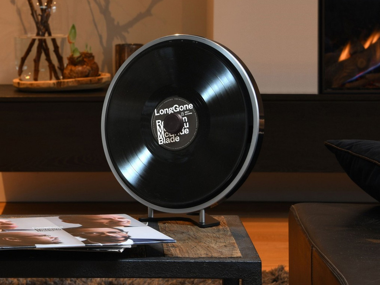
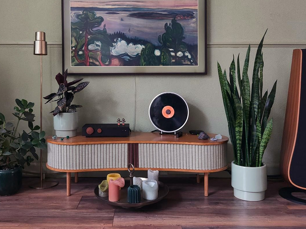
1. Miniot Black Wheel

The turntable has not changed much in form since the 1970s: platter, tonearm, plinth, visible mechanism. Miniot’s Black Wheel throws all of that away. Every electronic and mechanical component sits inside a thin circular body that disappears completely once a record is placed on top. What remains visible is the record itself, spinning in what looks like mid-air.

Standing the Wheel upright amplifies the illusion, turning a turntable into a floating disc of sound. A tactile Slide Track hidden along the edge handles volume, track selection, and even stylus weight adjustment through a single physical interface. Slide or push, and the controls respond without ever breaking the visual spell. Despite the impossibly slim profile, Miniot has not sacrificed audio quality for the sake of the trick, which is the part that separates this from a design exercise.

What we like

  • The disappearing-body design makes the record the only visible element, turning playback into a visual experience as much as an auditory one.
  • The hidden Slide Track control system is intuitive and tactile, eliminating buttons and knobs without removing physical interaction from the equation.

What we dislike

  • The minimal form factor means no dust cover, leaving the record and stylus exposed to the environment between listening sessions.
  • Repairing or servicing the internals of such a tightly integrated body is likely far more complex than working on a traditional turntable.

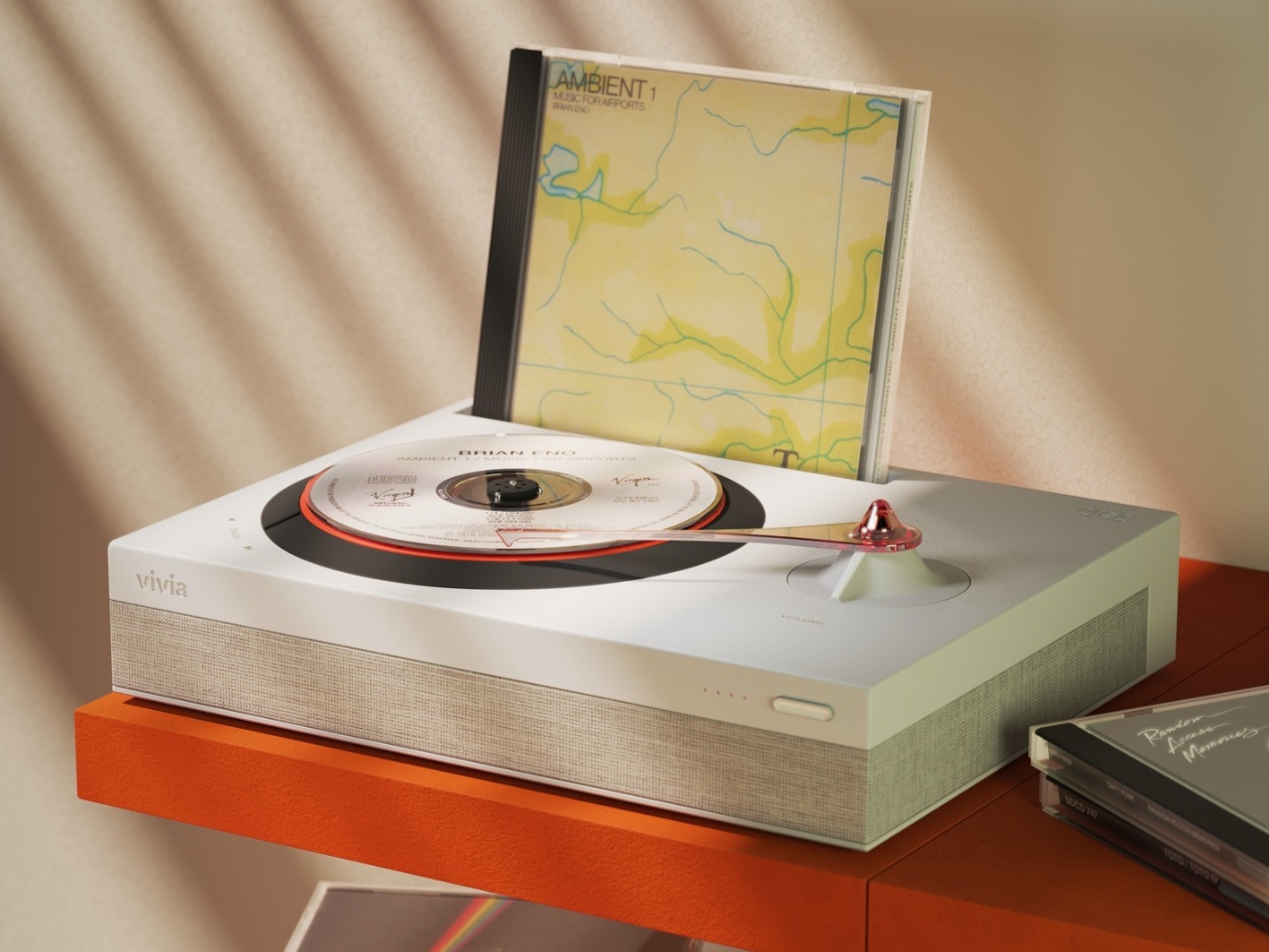
2. Vivia CD Turntable

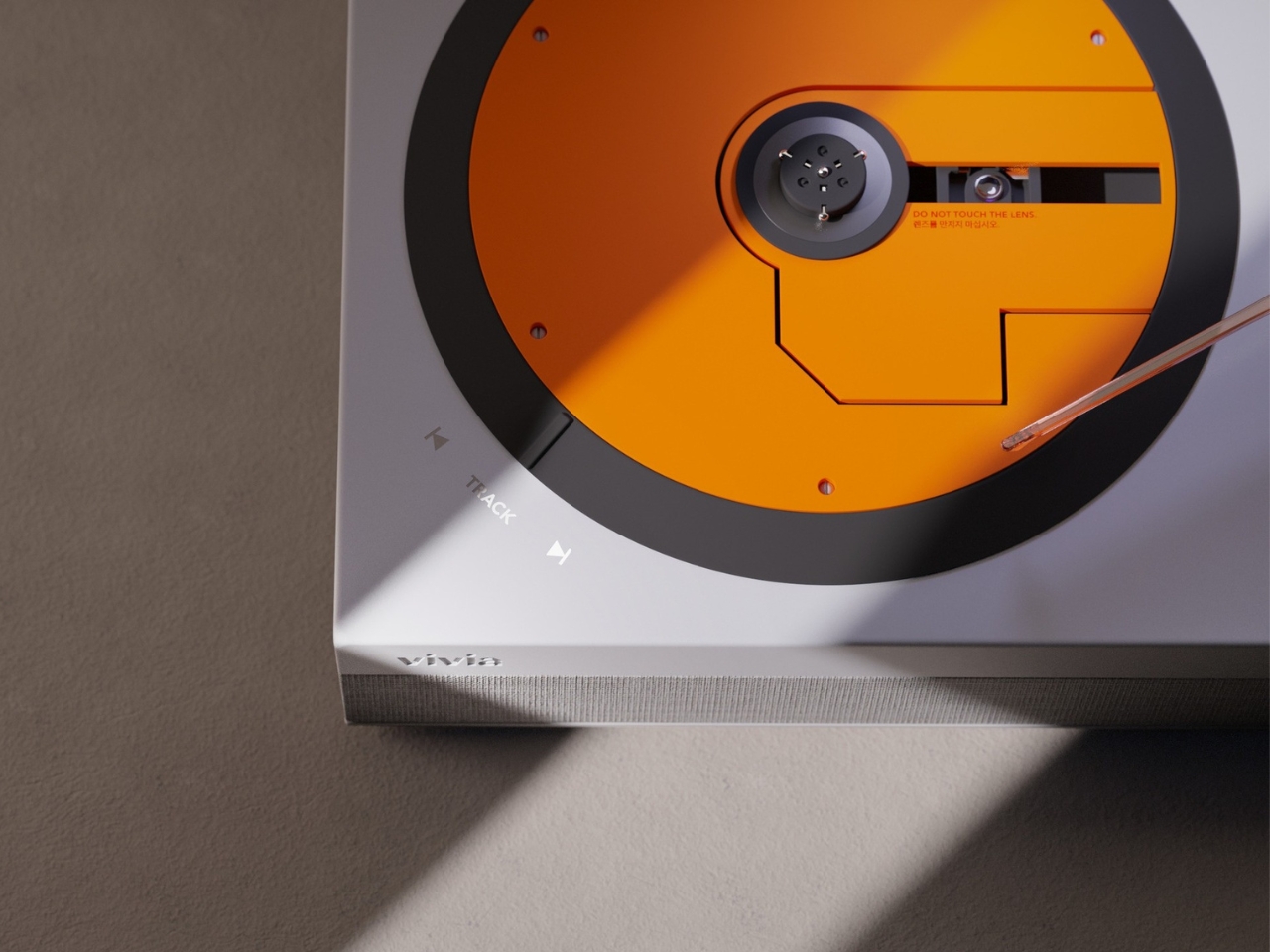
Here is where this list takes a deliberate left turn. Vivia is not a vinyl turntable at all. It is a turntable designed for compact discs, and the audacity of that idea is exactly why it belongs here. The concept takes the ritualistic appeal that drove vinyl’s comeback and applies it to a format that the industry abandoned in favor of streaming, even though CDs deliver superior audio clarity to most compressed digital files.

Vivia reimagines the CD listening experience as something tactile and intentional. Loading a disc, watching it spin, and physically interacting with playback controls recreates the ceremony that made vinyl appealing again, but for a format that has spent two decades collecting dust in storage boxes. The design borrows the visual grammar of analog turntables (the platter, the visible rotation) and translates it into a CD context that feels more like a statement about how we consume music than a product trying to compete on specs alone.

What we like

  • Visual design language borrows from analog turntables in a way that makes CD playback feel deliberate and special rather than outdated.

What we dislike

  • This remains a concept with no confirmed production timeline, pricing, or technical specifications to evaluate.
  • CD collections have shrunk dramatically, so the audience for a premium CD turntable is narrow compared to the growing vinyl market.

3. McIntosh x Sun Records Limited Edition MTI100

McIntosh has been building audio equipment since 1949, and the MTI100 carries that lineage into a format that appeals to listeners who want a complete system without a rack full of separates. This special edition, created in collaboration with Sun Records (the label that launched Elvis Presley, Johnny Cash, and Jerry Lee Lewis), packs a turntable, preamplifier, and amplifier into a single integrated unit with Bluetooth and auxiliary inputs.

The catch, and it is a deliberate one, is that speakers are not included. McIntosh recommends pairing with their own XR50 bookshelf or XR100 floorstanding speakers, but the unit connects to any audiophile-grade loudspeaker or even a pair of headphones for private listening. That flexibility is the real design move here. Instead of locking buyers into a closed ecosystem, the MTI100 acts as a hub that adapts to whatever speaker setup already exists in a room. The Sun Records branding adds a layer of music history that gives the limited edition a collectible weight beyond its audio performance.

What we like

  • The all-in-one integration of turntable, preamp, and amplifier eliminates the need for a multi-component audio rack while preserving high-fidelity output.
  • Bluetooth and auxiliary inputs mean the unit pulls double duty as a hub for digital sources alongside its vinyl playback function.

What we dislike

  • Speakers sold separately means the total system cost climbs well above the sticker price, especially if pairing with McIntosh’s own recommended models.
  • The limited edition Sun Records branding, while collectible, adds a premium that does not change the underlying audio performance of the base MTI100.

4. Samsung AI OLED Turntable

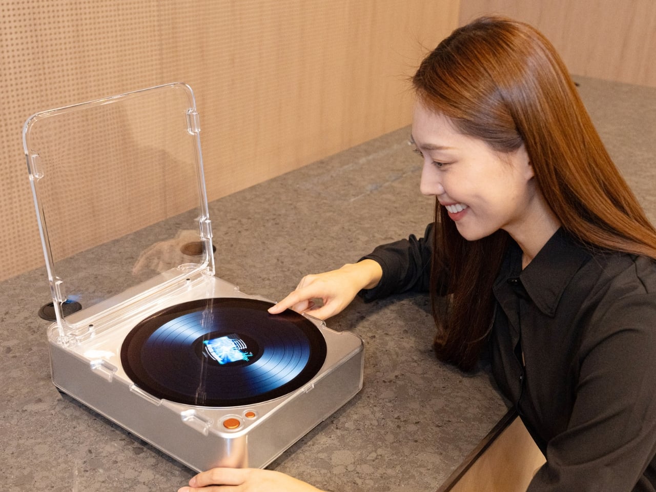
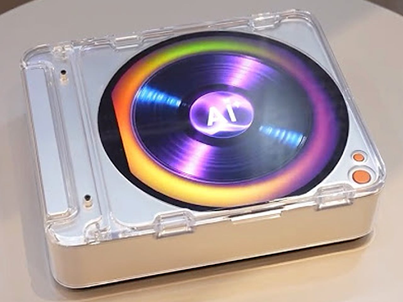
Samsung’s concept entry takes the turntable form factor and fills it with a 13.4-inch circular OLED touchscreen, turning the platter into a display surface that shows images, videos, and ambient visuals while music plays. It is part music player, part art installation, part conversation piece, and it makes no apologies about prioritizing spectacle over audiophile purity.

The circular OLED display becomes the centerpiece of whatever room it occupies, commanding attention in a way that most modern tech actively avoids. Imagine hosting friends and having the turntable surface shift between album art, ambient animations, and visual patterns that respond to the music. The design asks whether a turntable needs to be functional in the traditional sense to earn its place in a room, or whether the experience around the music matters just as much as the playback itself. Samsung has not confirmed production plans, but as a direction for where music hardware could go, this concept is more provocative than most finished products.

What we like

  • The 13.4-inch circular OLED display transforms a turntable into a visual centerpiece that adds ambiance to any room, not just sound.
  • The concept pushes the definition of what a music player can be, treating the listening experience as multi-sensory rather than purely auditory.

What we dislike

  • Concept status with no production timeline means this exists as a provocation rather than something listeners can actually buy and use.
  • The emphasis on visual spectacle raises questions about whether audio quality is a priority or an afterthought in the design.

5. RA84 Reycycled Plastic Turntable

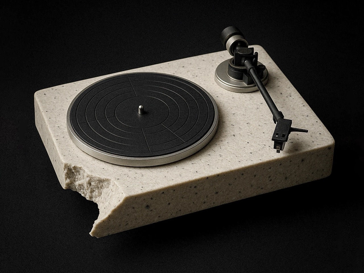
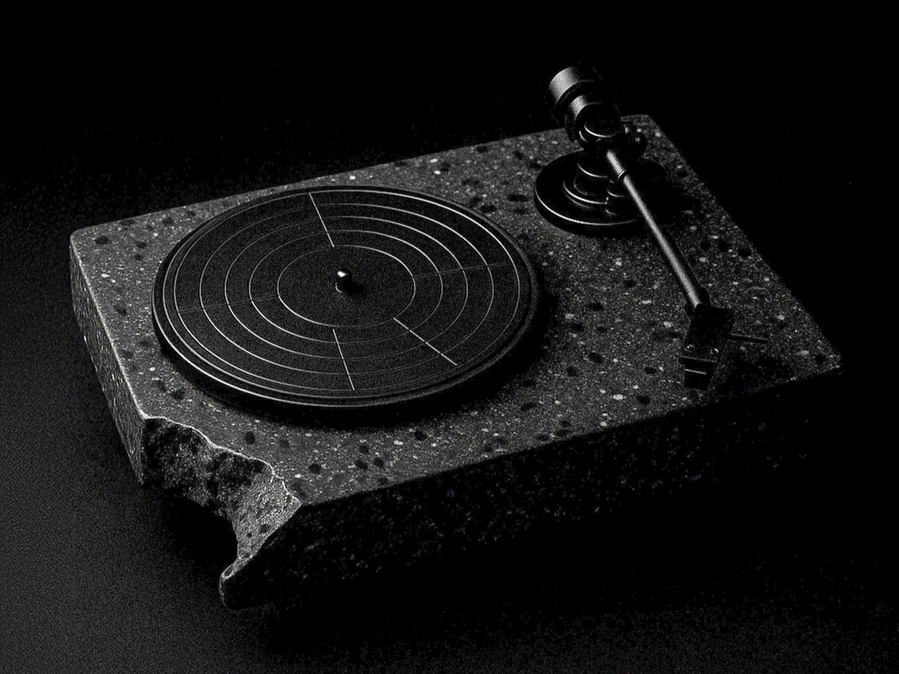
Ron Arad’s original Concrete Stereo from 1984 was a brutalist statement piece that treated audio equipment as sculpture. Stu Cole’s RA84 revives that same energy, but swaps the concrete for recycled plastic that mimics the look and weight of stone so convincingly that the difference is nearly impossible to detect without touching it. Available in concrete grey or a black finish that reads like expensive terrazzo, the RA84 is a turntable that doubles as furniture.

The material choice is more than an environmental gesture. That heft and density kill vibration, which is the enemy of clean vinyl playback. Recycled plastic performs surprisingly well acoustically in this application, delivering isolation results that rival traditional stone or concrete builds. Built-in speakers make this a complete system out of the box, and the deliberately chipped corners reveal the recycled material’s texture in a way that turns sustainability into a design detail rather than a hidden compromise. Cole’s execution proves that environmental responsibility and luxury do not need to compete with each other.

What we like

  • Recycled plastic construction achieves the vibration-dampening performance of concrete while being lighter and more environmentally responsible.
  • Built-in speakers deliver a complete, ready-to-play system that does not require separate components or additional purchases.

What we dislike

  • The brutalist aesthetic is polarizing, and the sheer visual weight of the RA84 will dominate a room whether the owner wants it to or not.
  • Built-in speakers, while convenient, limit upgrade paths for listeners who want to evolve their audio setup over time.

The needle and the algorithm

These five turntables (and one very bold CD player concept) share a common argument: that music playback is a designed experience, not just a data delivery mechanism. Streaming solved the problem of access. Every song ever recorded lives in a pocket now. But access without friction created a generation of listeners who consume music the way they scroll feeds, passively and endlessly. The turntable is the antidote to that passivity.

What makes this current wave of designer turntables different from the vinyl nostalgia of a decade ago is the ambition of the design thinking behind them. These are not retro objects cosplaying as vintage gear. They are new ideas about what a music player can look like, what it can be made from, and what role it plays in a room and a life. The best turntable in 2026 is not the one with the flattest frequency response. It is the one that makes someone sit down and listen to an entire album, start to finish, without reaching for their phone.

The post Forget Spotify: These 5 Designer Turntables Are the Real Reason Vinyl Is Having a Moment first appeared on Yanko Design.

This Planter Fits the One Balcony Spot Every Other Pot Ignores

Most balcony railings do exactly one thing: keep people from falling off. The corners, in particular, tend to collect nothing more useful than rust and pigeons. Rephorm, a Berlin-based furniture brand, has a different idea about what that corner could be doing, and the result is a planter that fits where no standard pot ever has.

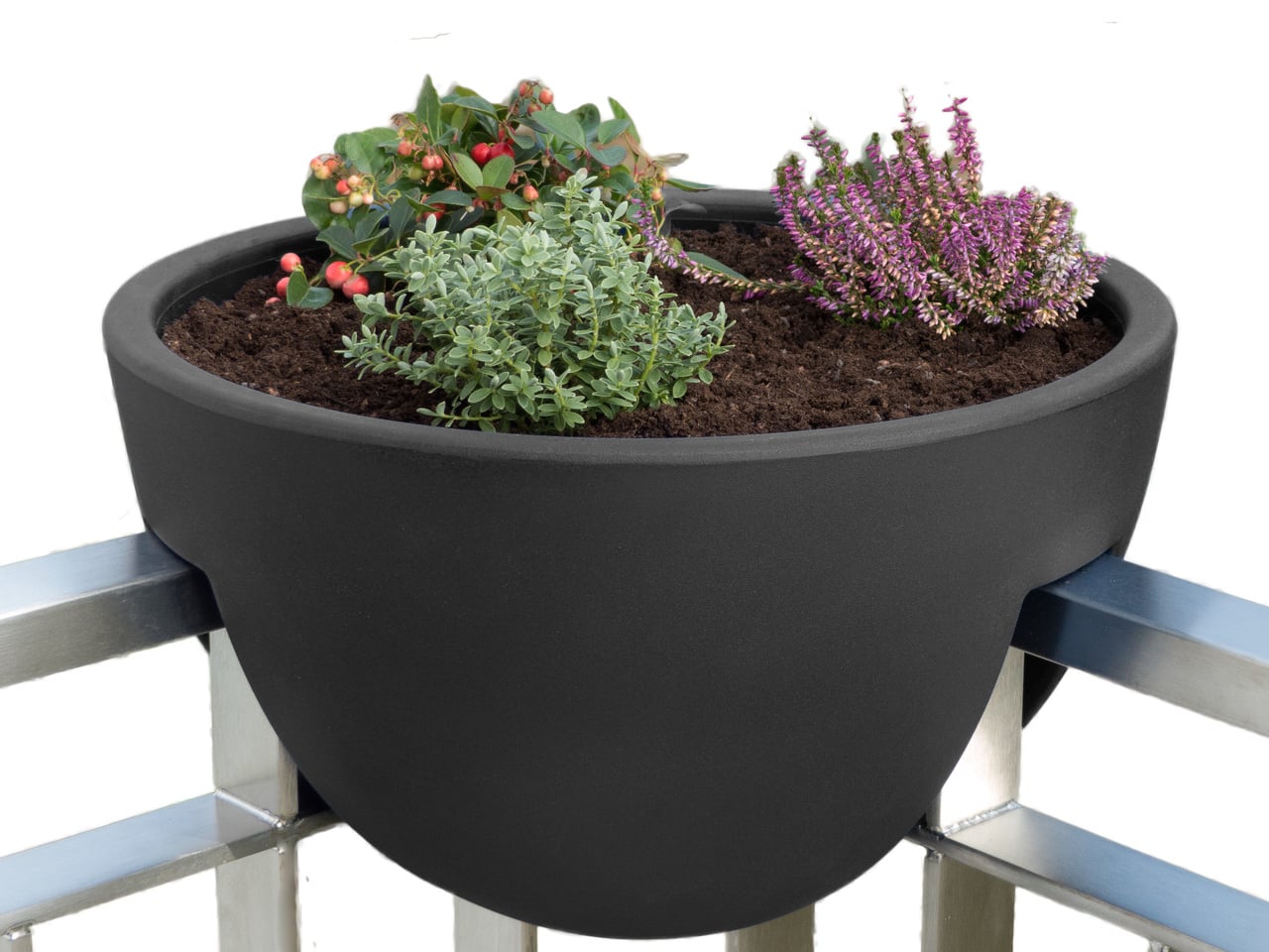
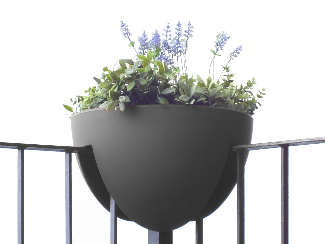
The Eckling is designed specifically for balcony corners, addressing a gap that rectangular window boxes and round hanging pots have never managed to fill. Most railing planters sit along a straight stretch of rail, so corners get skipped entirely. An L-shaped recess cut into the base of the hemispherical bowl allows it to rest squarely on two railing legs at a corner junction, no extra hardware required.

Designer: Michael Hilgers

This is actually the second generation of Rephorm’s thinking on railing planters. The brand’s original Steckling pot, developed in 2006, introduced the idea of a planter that simply drops onto the rail rather than clipping or hanging. The Eckling borrows that logic and extends it to corner placement. Two plastic cable ties hidden beneath the bowl add security in wind, and the design fits railing stock up to 80mm wide across flat steel, round, and rectangular profiles.

At roughly 44cm in diameter, the Eckling offers about double the planting area of a standard round railing pot. The bowl holds approximately 16 liters of soil, nearly three times the capacity of a typical balcony planter. For anyone who has watched a small pot dry out in a single July afternoon, that volume difference matters. More soil means deeper root runs and longer intervals between watering, practical for herbs or compact perennials filling the wide, shallow bowl.

The material is recyclable polyethylene with a wall thickness Rephorm claims is two to three times that of budget planters from hardware stores. At approximately 2.5kg unfilled, the bowl is noticeably heavier than thin-walled alternatives, and that weight is part of the structural argument. Frost resistance is built into the formulation, so the pot stays through winter rather than being hauled inside each autumn. The matte surface reads closer to coated ceramic than the hollow appearance most balcony planters carry.

One real limitation is worth knowing before ordering. If corner posts project above the top rail line, the L-shaped recess cannot seat properly. The geometry only works when corner posts are flush with or below the horizontal rail, common in modern flat-steel and tube railings but less so in older ornamental ironwork, where vertical elements continue past the handrail. That’s a non-starter for a number of older apartment balconies, so it is worth measuring the railing before committing.

The Eckling is made in Germany, and the design is by Berlin-based architect Michael Hilgers, whose broader practice around what he calls “pragmatic design” tends to focus on modest objects that improve existing infrastructure without replacing it. A balcony corner is about as modest a canvas as it gets.

The post This Planter Fits the One Balcony Spot Every Other Pot Ignores first appeared on Yanko Design.

This 1970s Desk Organizer Works in Every Room But Your Office

Desk organizers have a reputation problem. Most are either forgettable plastic trays that could have come from any office supply aisle, or overdesigned contraptions that look busier than the mess they’re meant to fix. Joe Colombo, the Milanese designer who died at just 41, had a very different take on this problem back in 1970, and it looked like nothing else on a desk then or now.

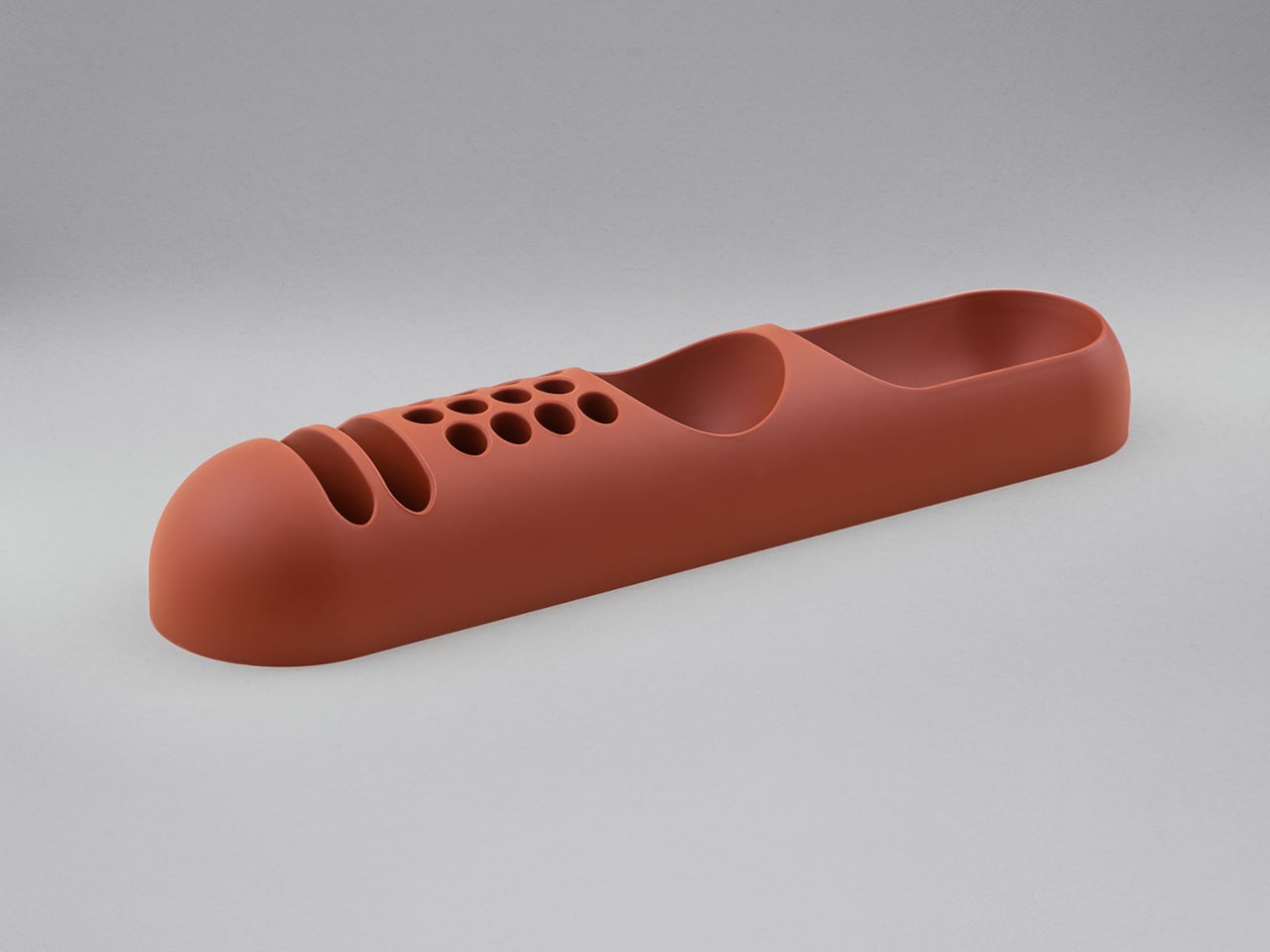
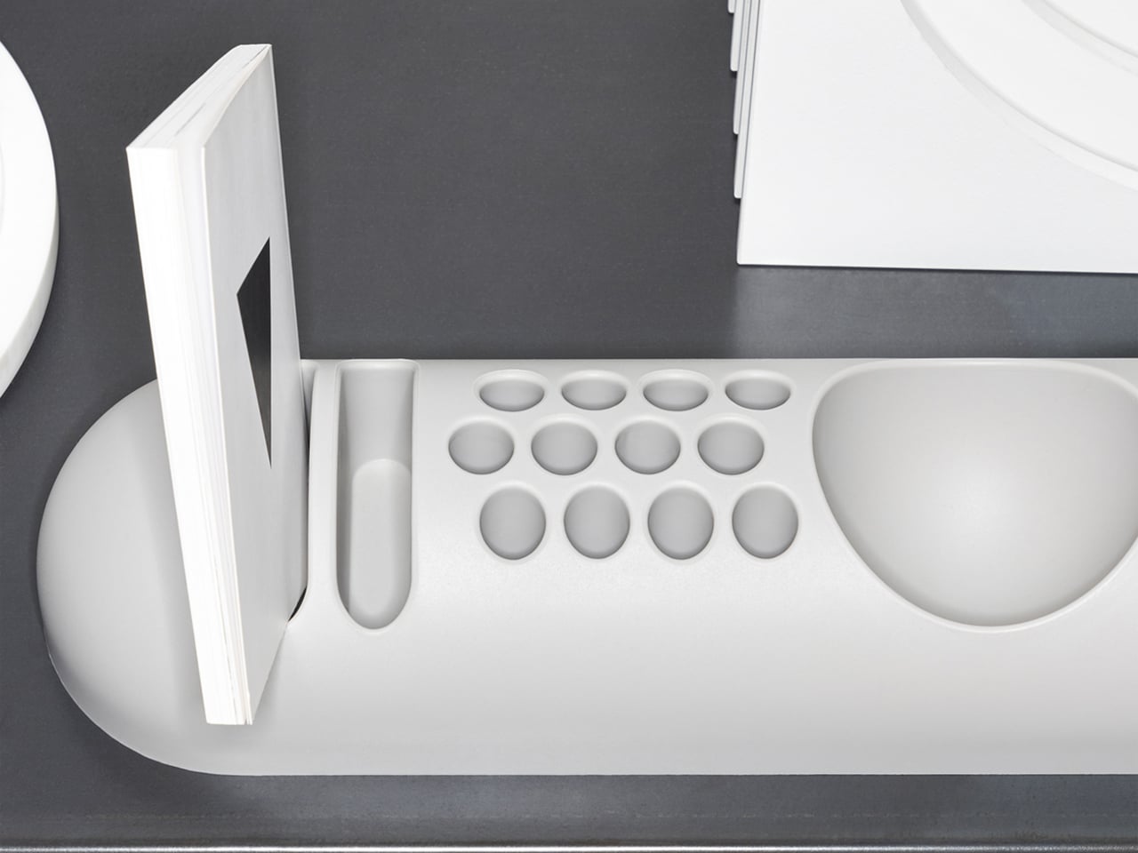
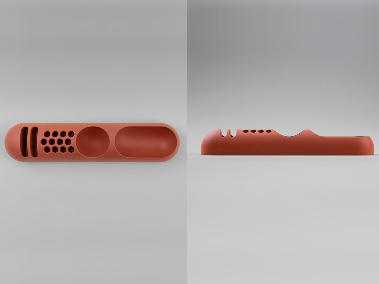
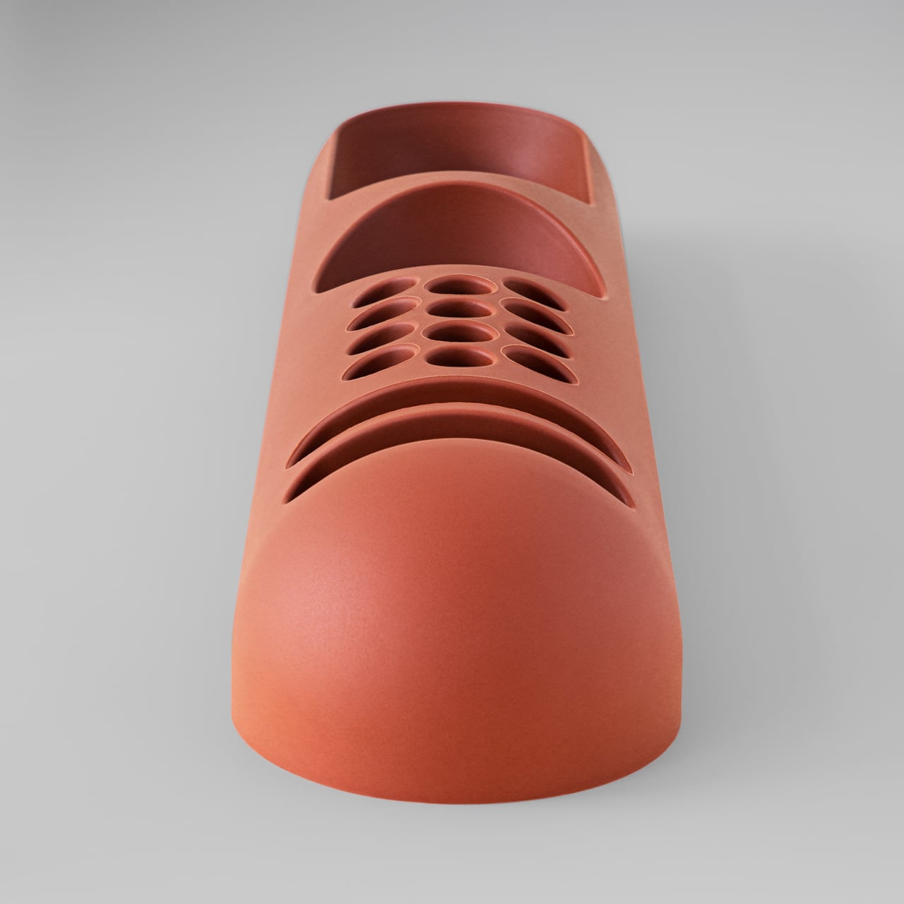
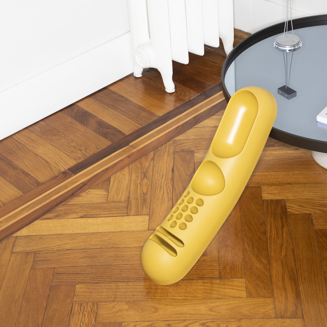
That design was BOB, a compact object holder made from polyurethane gel that Colombo shaped into something unmistakably organic. The form is elongated and low-profile, almost pill-shaped from above, with one end rising into a soft dome and the other tapering nearly flat. B-Line, an Italian label dedicated to acquiring original molds from discontinued Italian design objects, reissued it in 2023 in five colors: terracotta, slate blue, mustard yellow, warm white, and a translucent frosted version called “ice.”

Designer: Joe Colombo

The top surface divides into three zones with no visible partition between them. The dome end opens into a large oval scoop for bulkier items; the center holds a 3-by-4 grid of individual circular holes, each sized for a single pen or brush; the tapered tail has two horizontal slot grooves that hold flat objects like rulers or small notebooks upright. None of this reads as a spec sheet in person. It reads as a single continuous gesture that happens to organize things.
Colombo was working at a moment when Italian design was treating plastic not as a cheap substitute for better materials, but as a medium with its own formal possibilities. Polyurethane gel has a tactile quality most rigid desk accessories never attempt: it gives slightly under pressure, has a matte surface that’s almost skin-like, and its flexibility is what makes the low, curved profile structurally possible in the first place. A stiffer material would have needed walls. This one doesn’t.

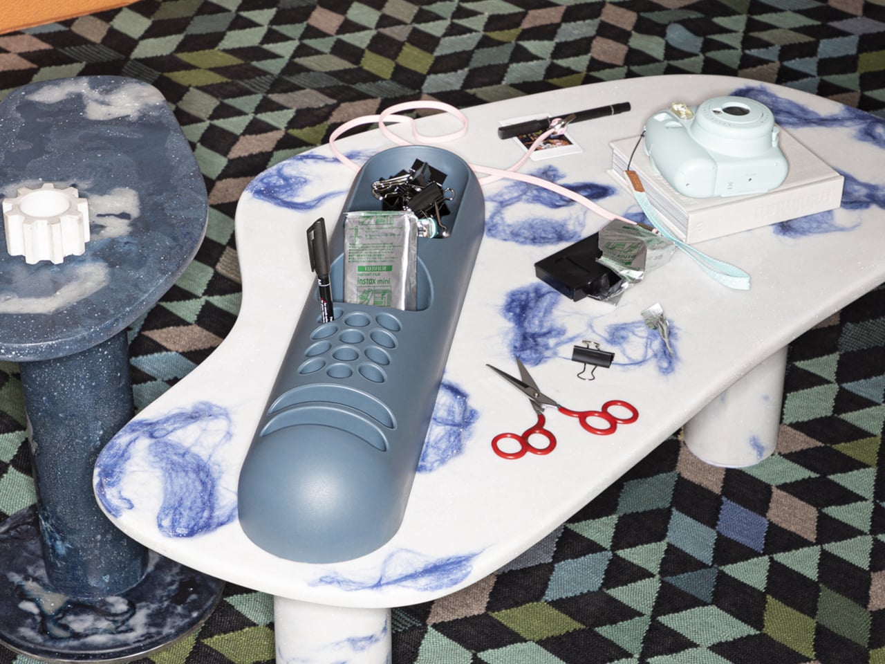
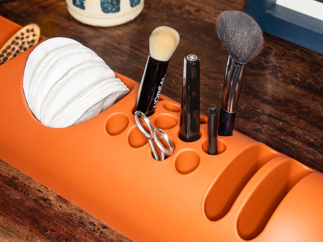
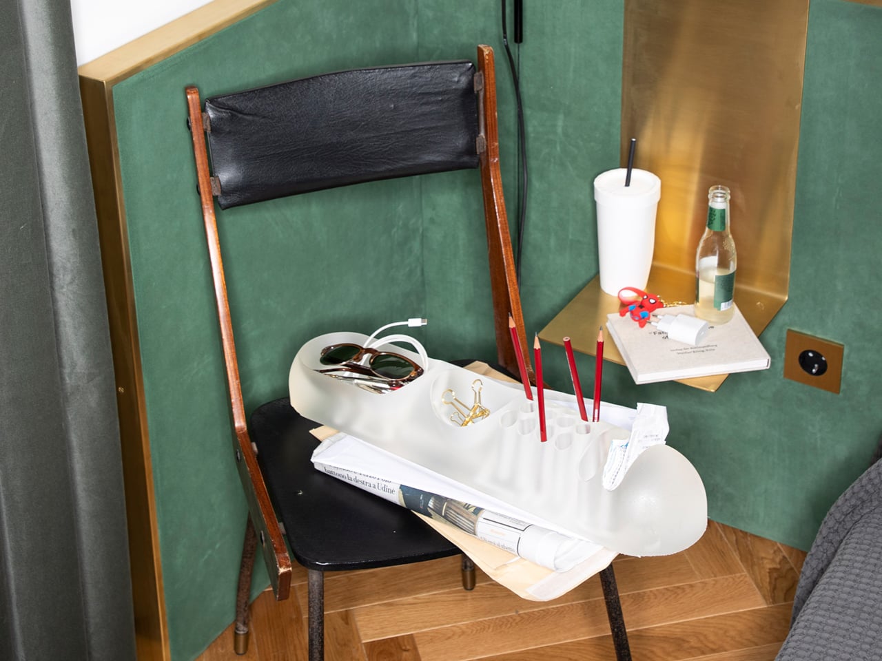
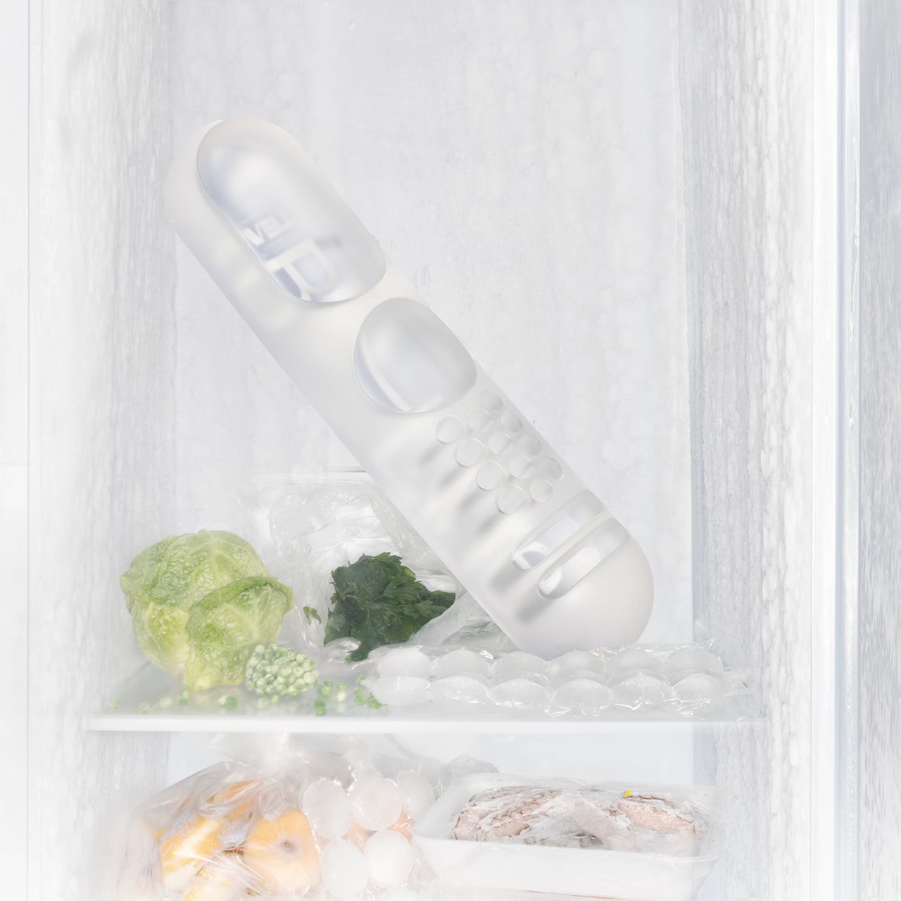
B-Line’s campaign photography makes a quiet argument for where BOB actually belongs. It appears on a marble coffee table holding binder clips and scissors, on a chair seat catching pencils and sunglasses, and on a bathroom vanity with makeup brushes in the pen holes and cotton pads in the scoop. One image places the ice-colored version inside a freezer, either a dry joke about the colorway name or a genuine hint that the flexible polyurethane handles cold fine. Probably both.

That flexibility is worth taking seriously. BOB lies nearly flat on any surface, which means it doesn’t create visual clutter the way upright organizers do. It also means the pen holes require implements long enough to stay upright on their own, which is a quiet limitation Colombo’s grid doesn’t advertise. Short lipstick caps, small erasers, and anything under roughly 10 centimeters will just rattle around rather than stand.

The price reflects provenance more than function. B-Line sells through retail partners, not directly to consumers, and those partners have set their own figures: Design Public at $190, Bauhaus 2 Your House at $427. Colombo’s other B-Line reissue, the Boby trolley, is in MoMA’s permanent collection. BOB is the quieter object from the same designer and the same era, and it raises a question the images don’t quite answer: how many rooms does a well-made desk organizer need to conquer before that price starts to feel reasonable?

The post This 1970s Desk Organizer Works in Every Room But Your Office first appeared on Yanko Design.