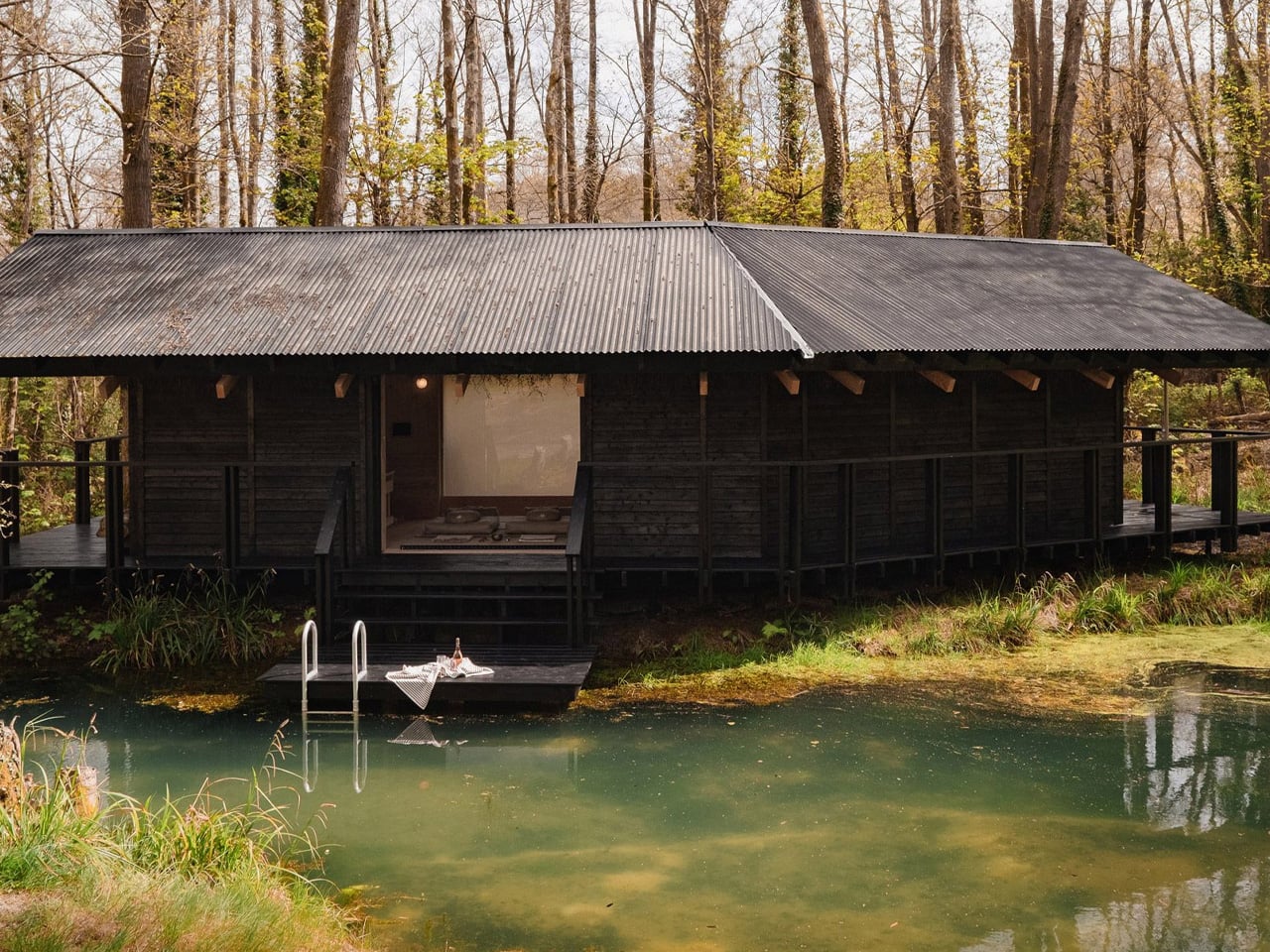
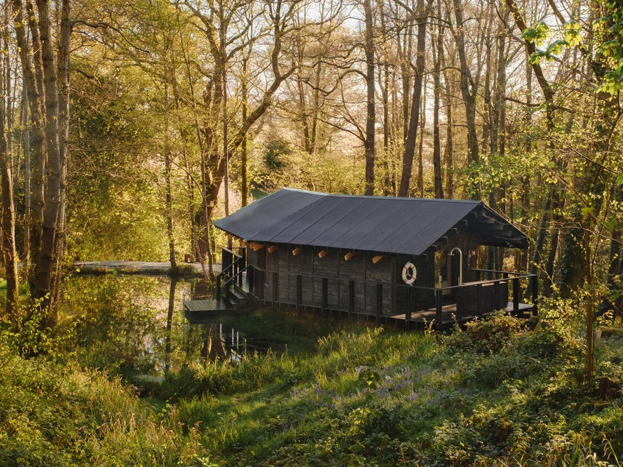
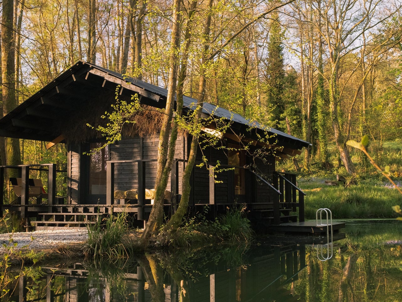
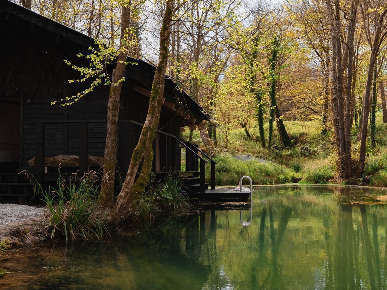
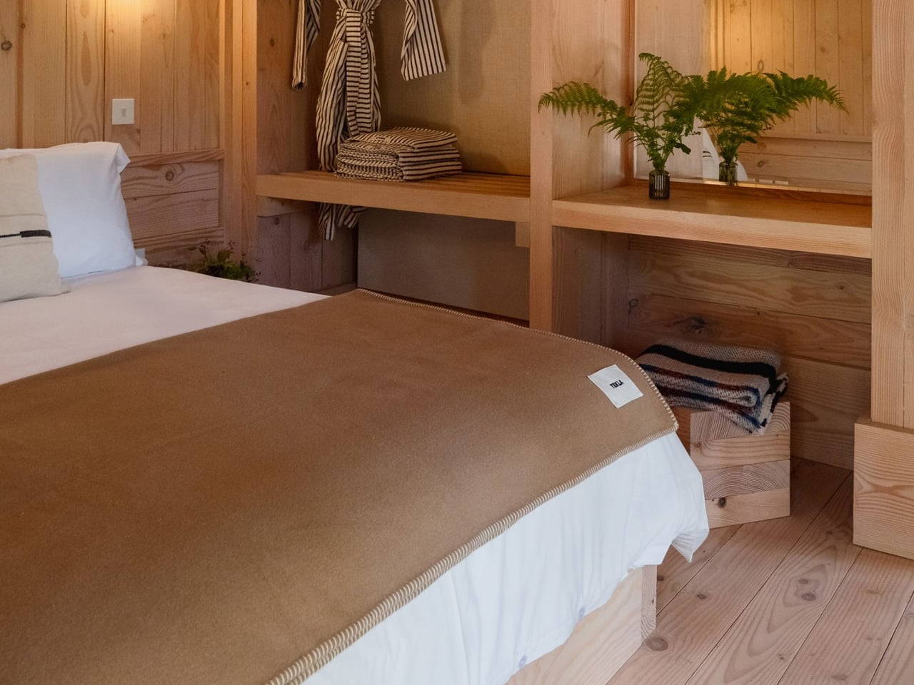
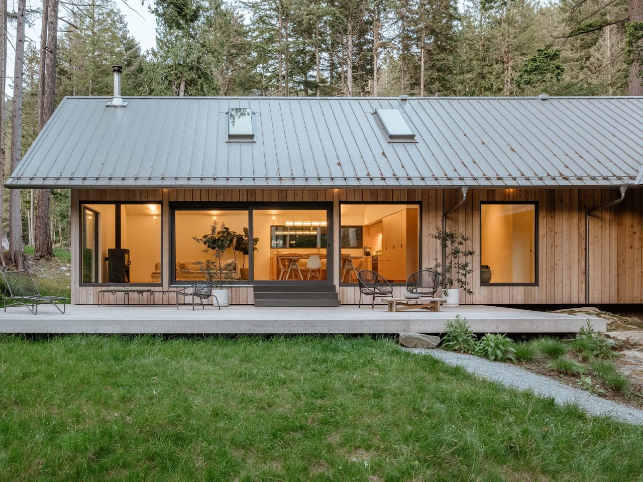
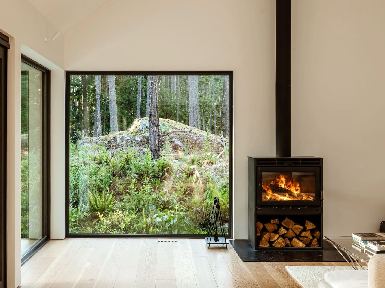
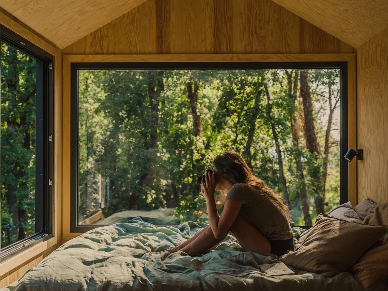
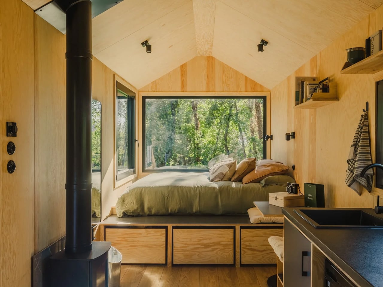
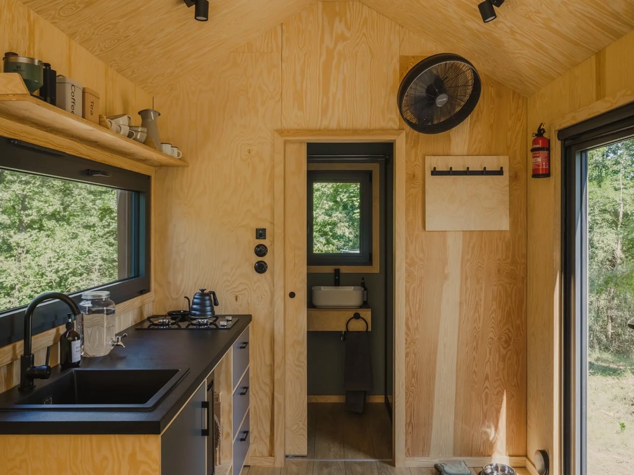
Some buildings are designed to be seen. Yogi’s Cabin, the latest project from UK studio Built Works, is designed to be felt. Nestled within the woodland of Great Park Farm in East Sussex, the 38-square-metre retreat sits alongside a natural swimming pond, designed not to impress, but to disappear into its surroundings.
The cabin was created for Architects Holiday, a hospitality company founded by the Built Works team that builds retreats around singular, restorative practices. Where their earlier project — the Drying Shed Sauna, also at Great Park Farm — was centred on heat and ritual, Yogi’s Cabin is organised around movement, stillness, and the slow passage of light through a woodland. The programme is simple: a dedicated yoga studio at the heart of a barn-like form, wrapped in materials that feel as rooted to the land as the alder trees around it.
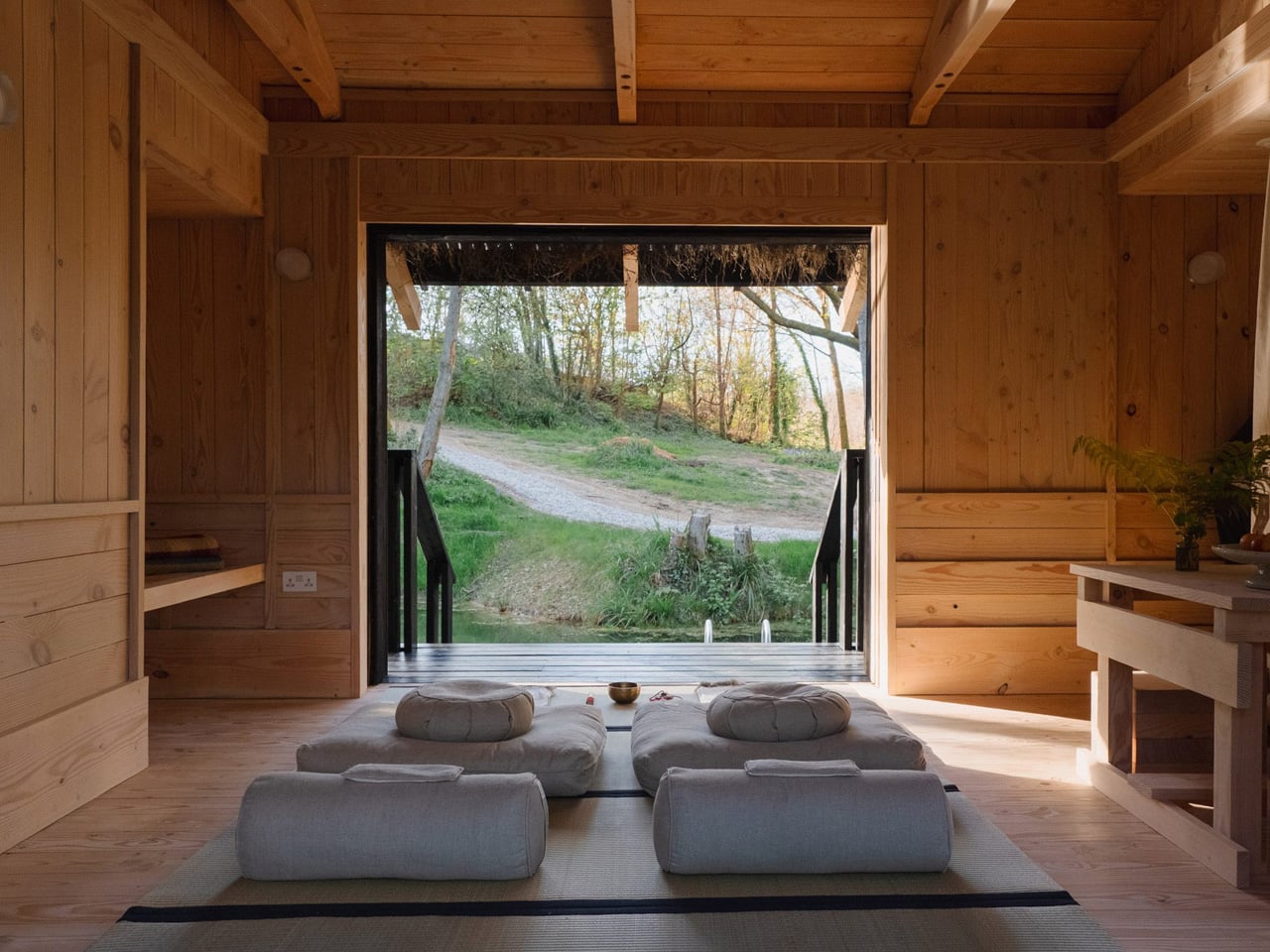
The plan runs on a clear east-west axis, with large sliding openings that frame views through the trees and across the adjacent swimming pool. The intention is for light to shape the interior throughout the day — morning light from the east drawing practitioners inward for practice, the warm evening light from the west spilling across the deck as the day winds down. It’s architecture that works with time rather than against it.
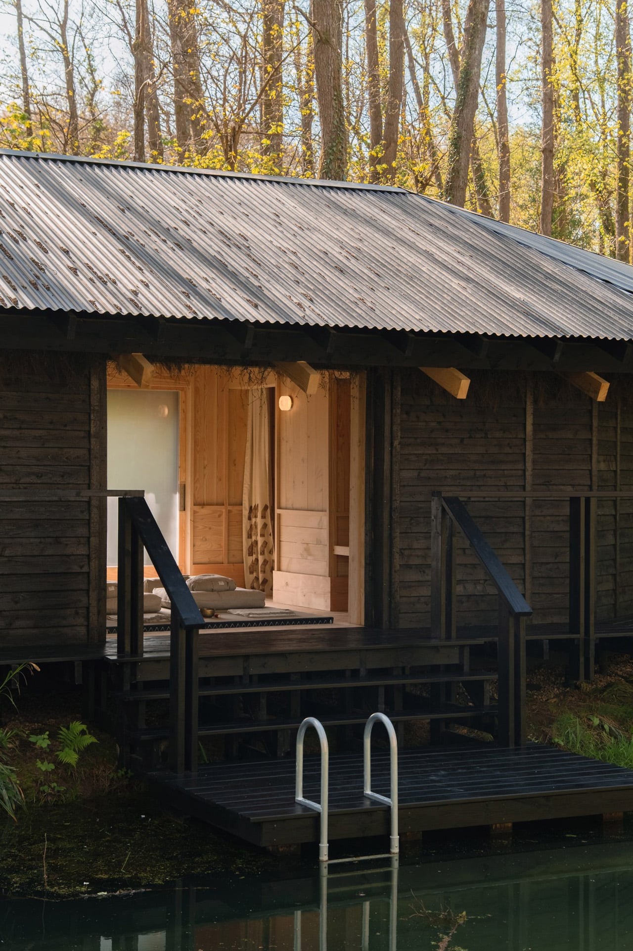
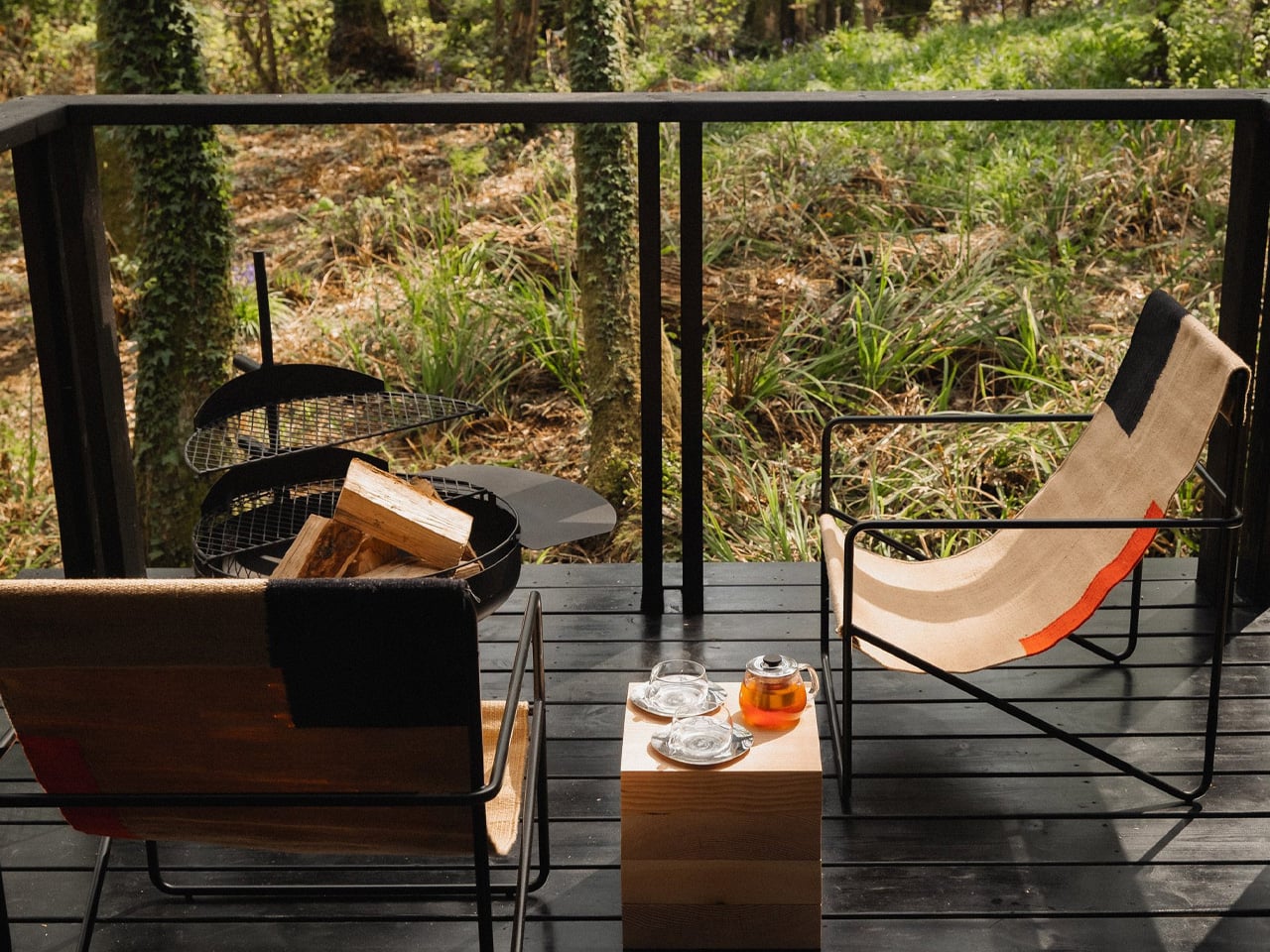
Externally, the studio drew from two distinct references: Japanese domestic architecture and local agricultural vernacular. Deep eaves and a continuous perimeter deck form a sheltered threshold between inside and out — a direct nod to the traditional Japanese engawa — while the building’s barn-like massing keeps it grounded in its rural English context. The cladding is estate-grown larch, charred on site using traditional yakisugi techniques, a process that improves durability and weather resistance while allowing the cabin to recede visually into the dark woodland behind it.
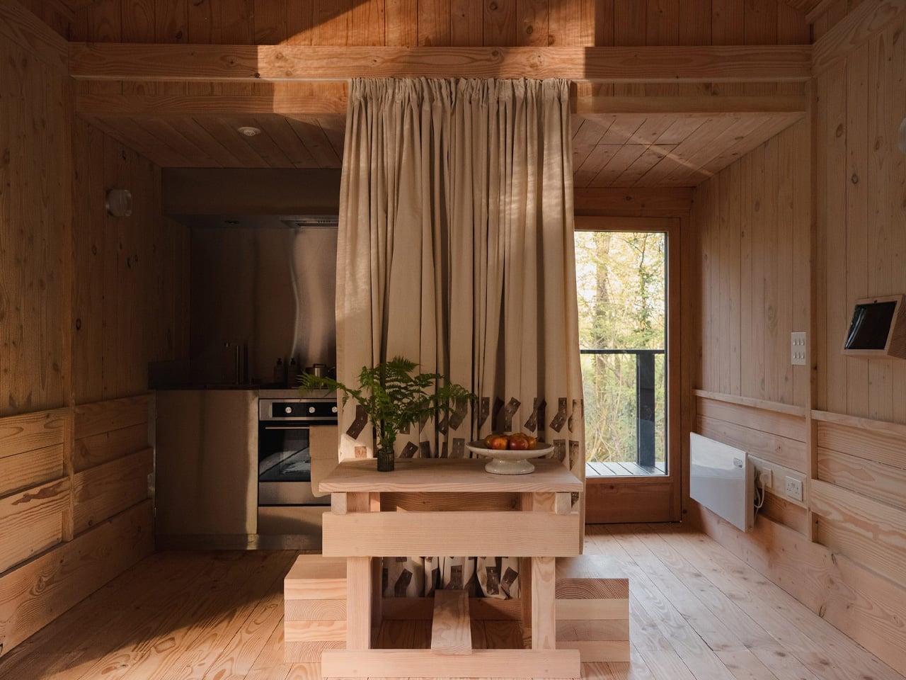
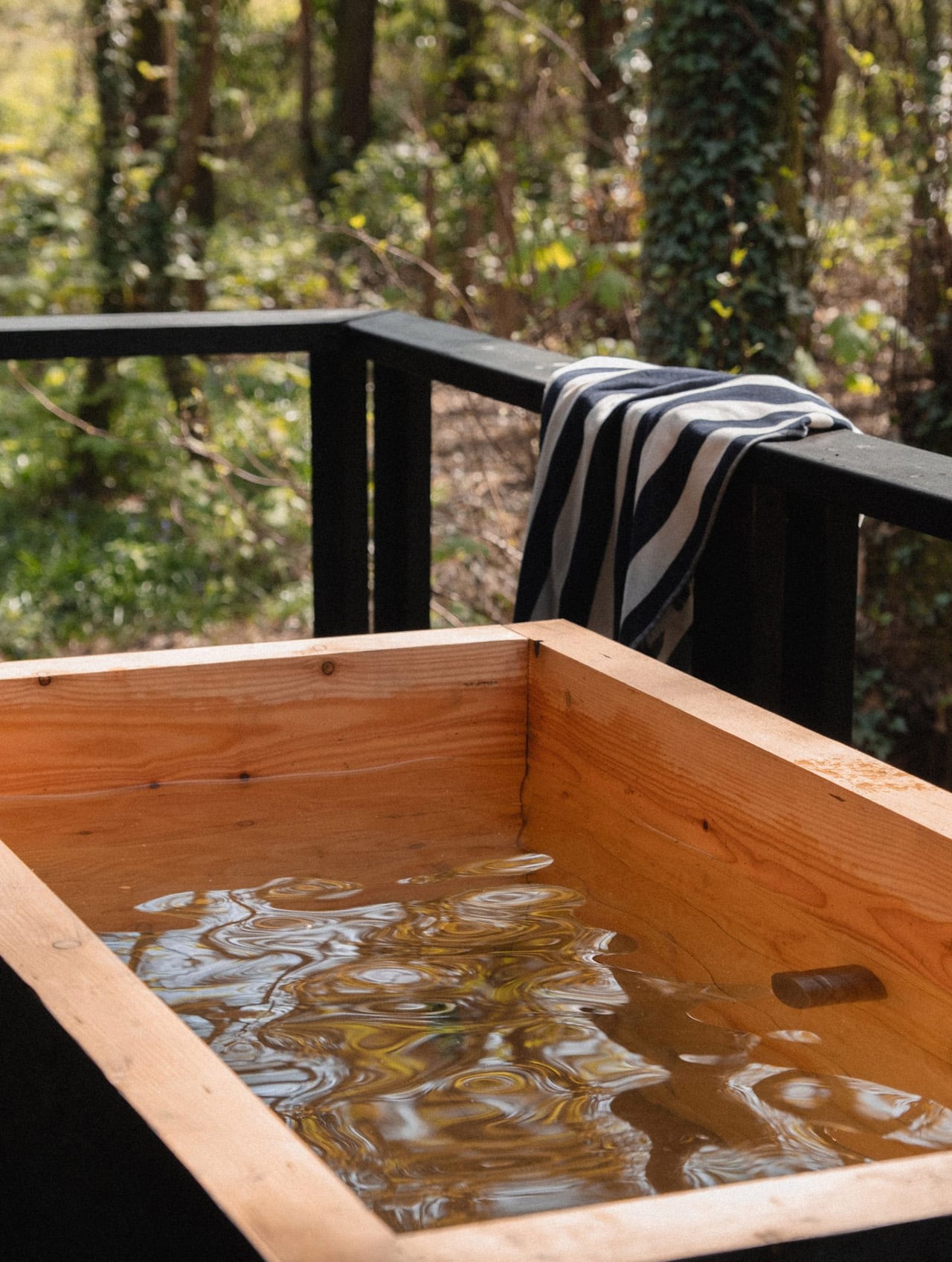
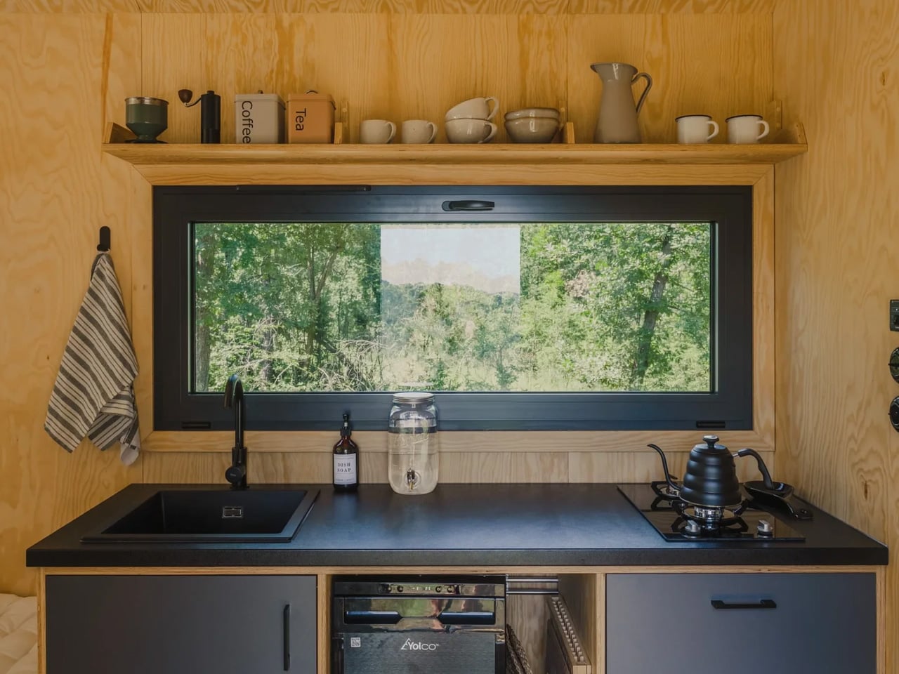
Inside, the architecture is deliberately restrained. Sliding screens, timber surfaces, and a limited material palette create a calm, adaptable space where accommodation is secondary to use. A king-size bedroom, luxury shower room, outside bath, and fully equipped kitchen complete the programme — functional, yes, but never the point.
Completed in Spring 2026, Yogi’s Cabin is a rare thing: a building that resists the urge to do too much. It holds space. It frames trees. It lets light do the talking. In a landscape of wellness architecture that often overclaims, Built Works has made something genuinely restorative — not through addition, but through careful restraint.
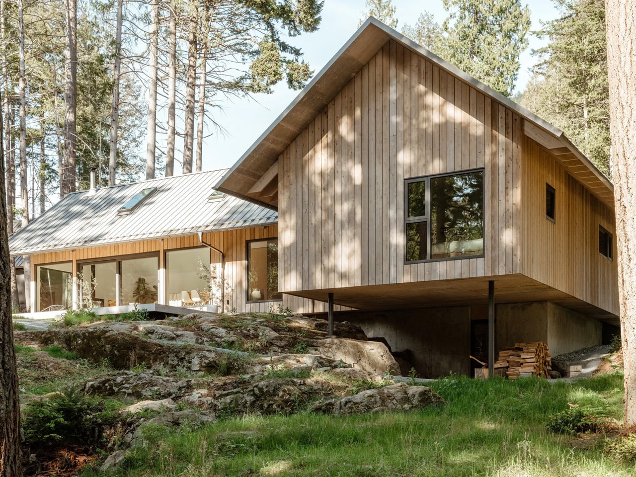
Some buildings earn their names. The Floating House by Vancouver-based SMStudio — completed in 2023 on the western ridge of Bowen Island, British Columbia — is one of them. Bowen Island sits just 20 minutes by ferry from Vancouver’s Horseshoe Bay, close enough for a commute, far enough to feel like another world.
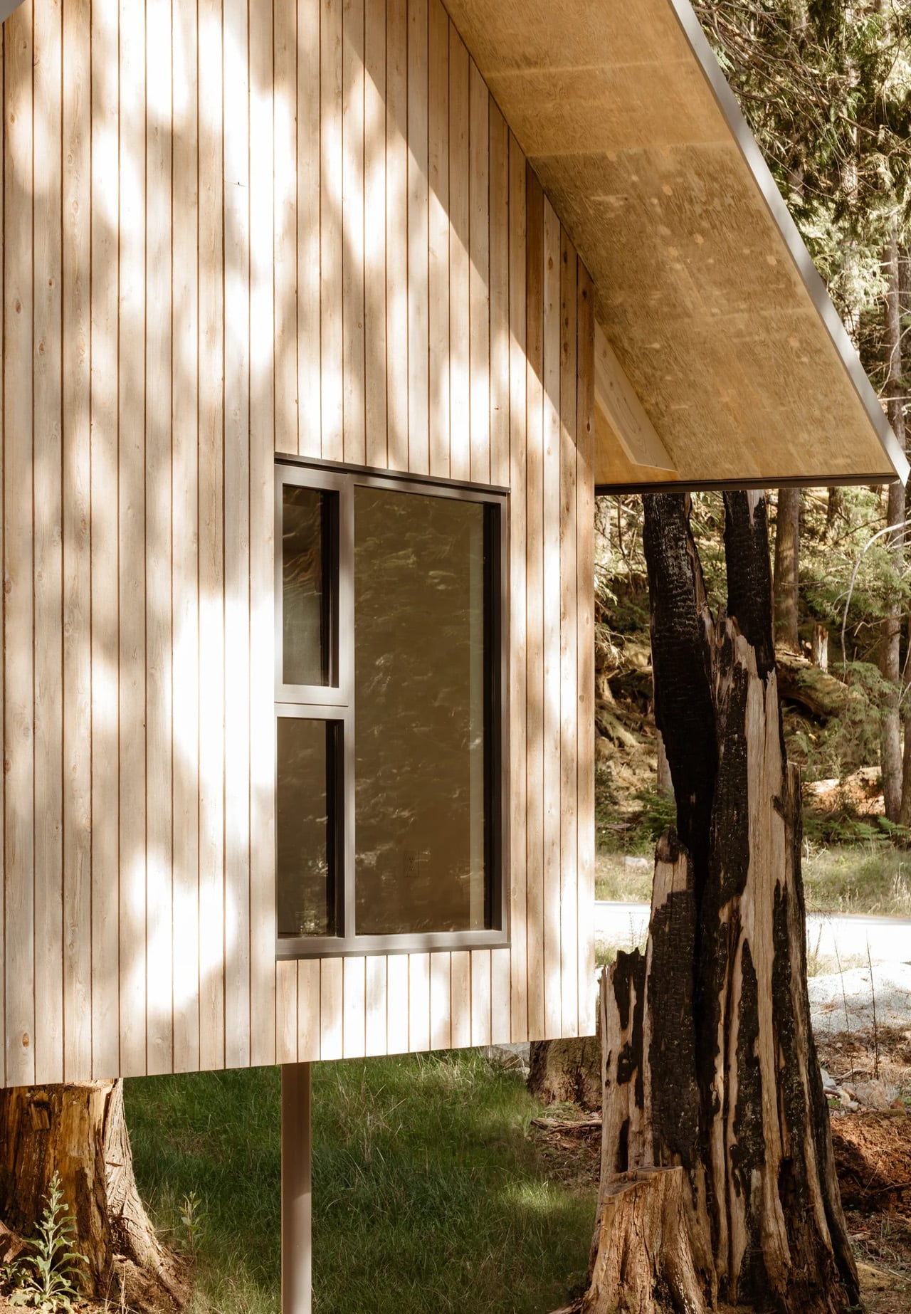
SMStudio founder Simon Montgomery found a site on a rocky ridge where two ancient, burnt-out old-growth stumps stand like sentinels over the land. Rather than clear them or work around them, he positioned the house directly between them. The building wasn’t placed on the land so much as fitted into it.
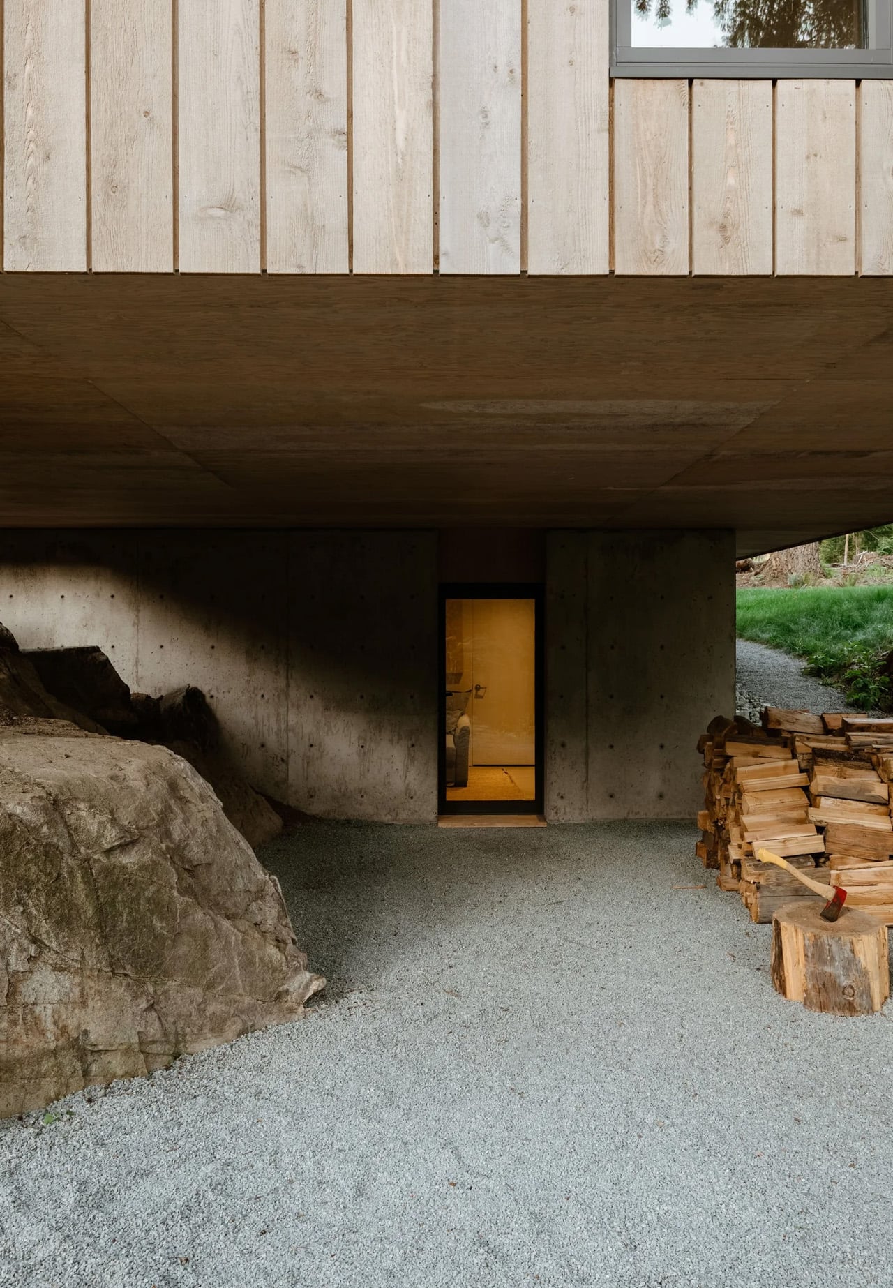
The name earns its keep. A cantilever lifts the structure fractionally off the bedrock, leaving a deliberate shadow gap at the base — a move that is at once structural and philosophical. The house appears to hover, weightless above the ground it occupies. It’s a gesture borrowed from Japanese spatial thinking, where the relationship between a building and its site is considered with almost ceremonial care.
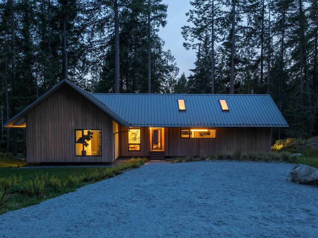
The exterior reads as elemental: a steeply pitched gable roof clad in steel standing-seam panels, cedar walls left to weather naturally into the forest palette, and a form so spare it borders on sculptural. There is no decorative noise here. Every decision is load-bearing, aesthetically speaking. The plan is simple and asymmetrical, its two wings arranged to navigate the site’s dual elevations — a higher forested platform and an open field below that drops away to reveal sky and distant treeline.
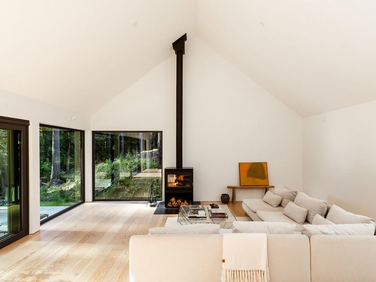
Inside, Douglas fir surfaces carry the warmth that the cedar exterior withholds. Natural light is controlled and considered, the forest pressing in from every side without ever feeling intrusive. It is the kind of interior where you notice the quality of light before you notice the furniture.
What makes the Floating House significant isn’t scale or spectacle — it’s discipline. Montgomery resisted the temptation to over-design a site that was already extraordinary. The result is a house that amplifies its surroundings rather than competing with them. In an era when architecture often mistakes loudness for confidence, that kind of restraint is genuinely rare. The Floating House is currently listed for $2.1 million through West Coast Modern.
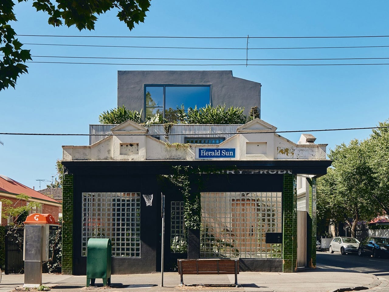
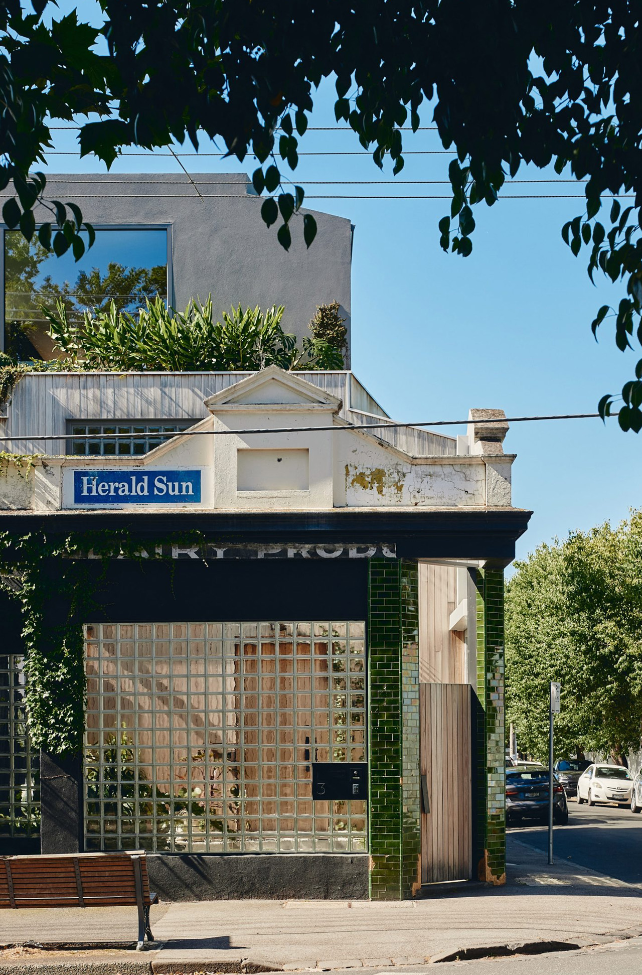
For over a century, a modest corner shop at the intersection of Murray and York streets in Melbourne’s Prahran suburb sold milk, bread, and the kind of everyday essentials that knit neighborhoods together. It closed in 2016, briefly reopened as a café, and then sat waiting. Kister Architects founder Ilana Kister saw something in it — and then decided to move in.
The project, aptly named The Corner Shop, is Kister’s own home, designed for herself and her daughters. It is a three-story residence carved out of the original 287-square-metre plot, expanded by an adjacent 90-square-metre lot that became available during construction and was immediately absorbed into the design as a garden. That garden is not a feature — it is the entire logic of the building.
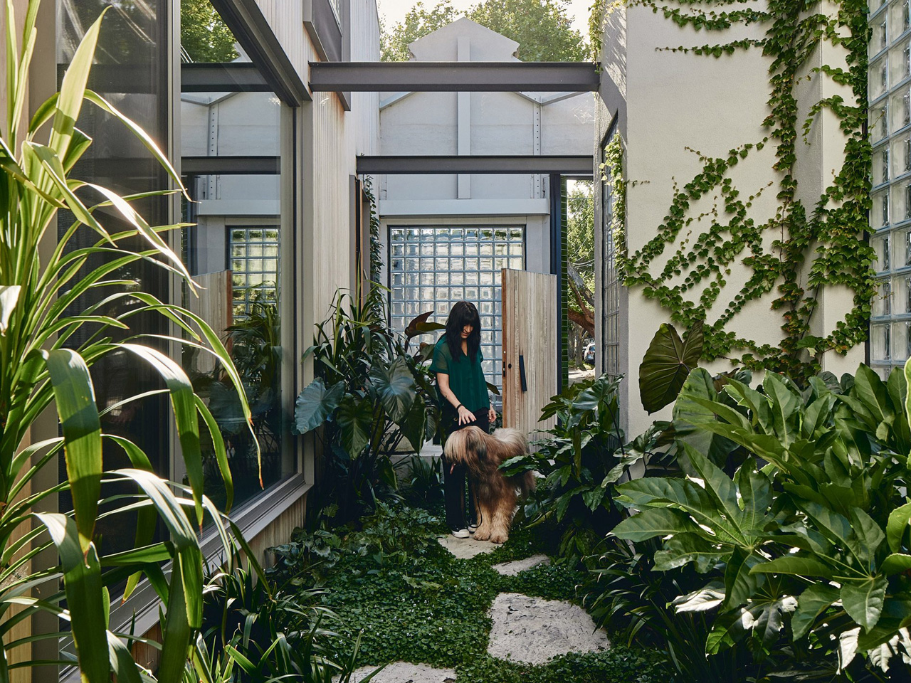
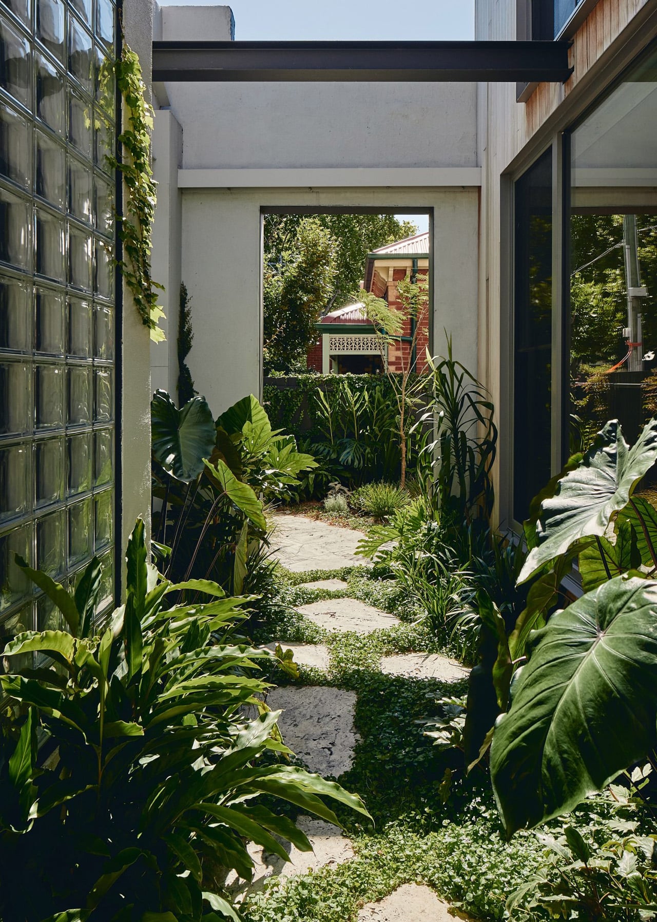
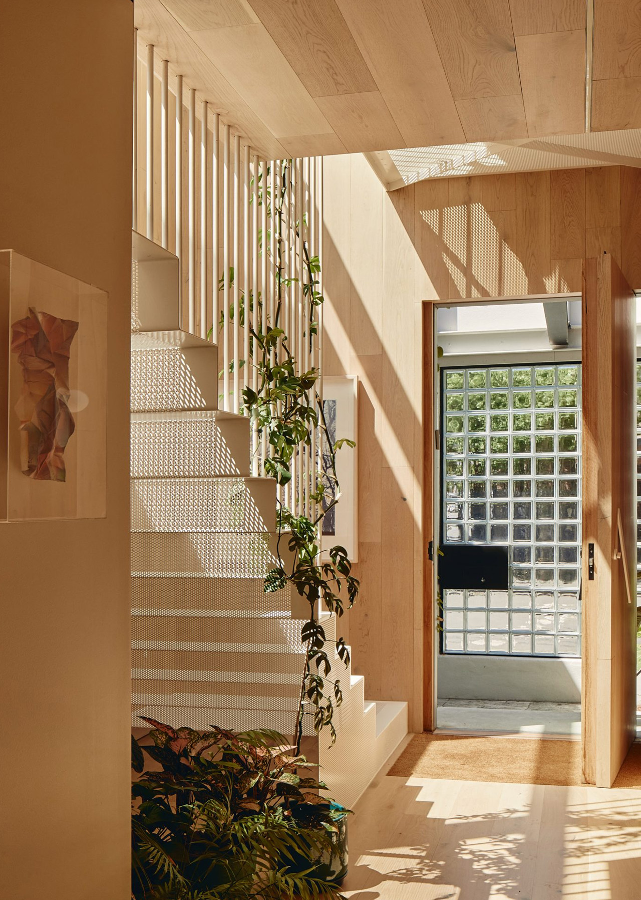
“Making the entry a courtyard was the single most important decision in the project,” Kister told Dezeen. “Entering through the original milk bar door, you land in the garden, not a hallway or foyer. By the time you reach the interior, you’ve already been outside — that sequence sets the tone for the whole house.”
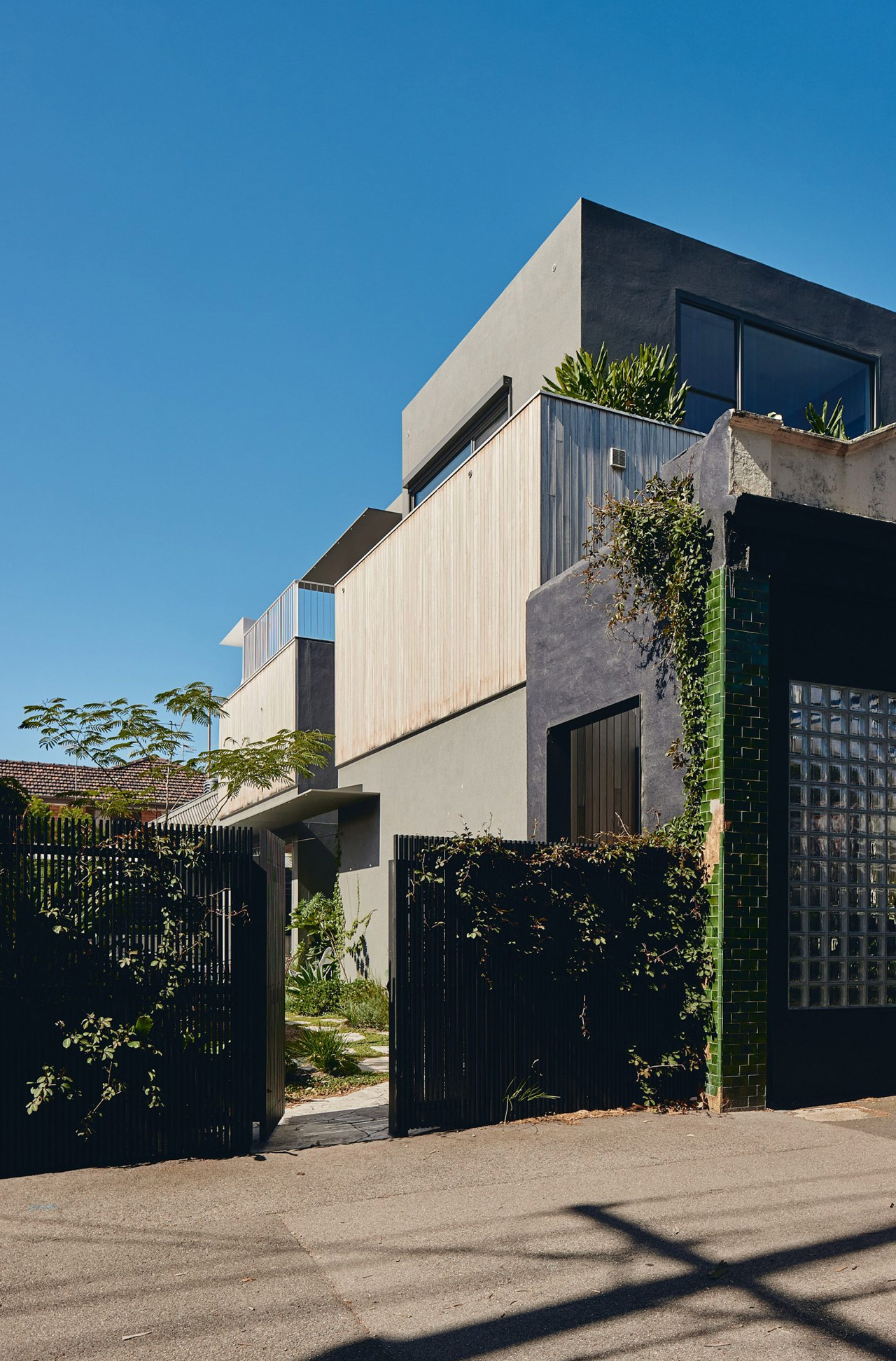
The original shopfront façade has been preserved in full, bottle-green tiles and all. Street-facing windows were replaced with glass bricks — a move that keeps the building reading as a corner shop from the outside while flooding the interior with diffused, dappled light. The external palette layers grey and black render against silvertop ash timber cladding, with climbing vegetation threading through the surface and rooftop planting crowning the upper levels. Wherever you look, something is growing.
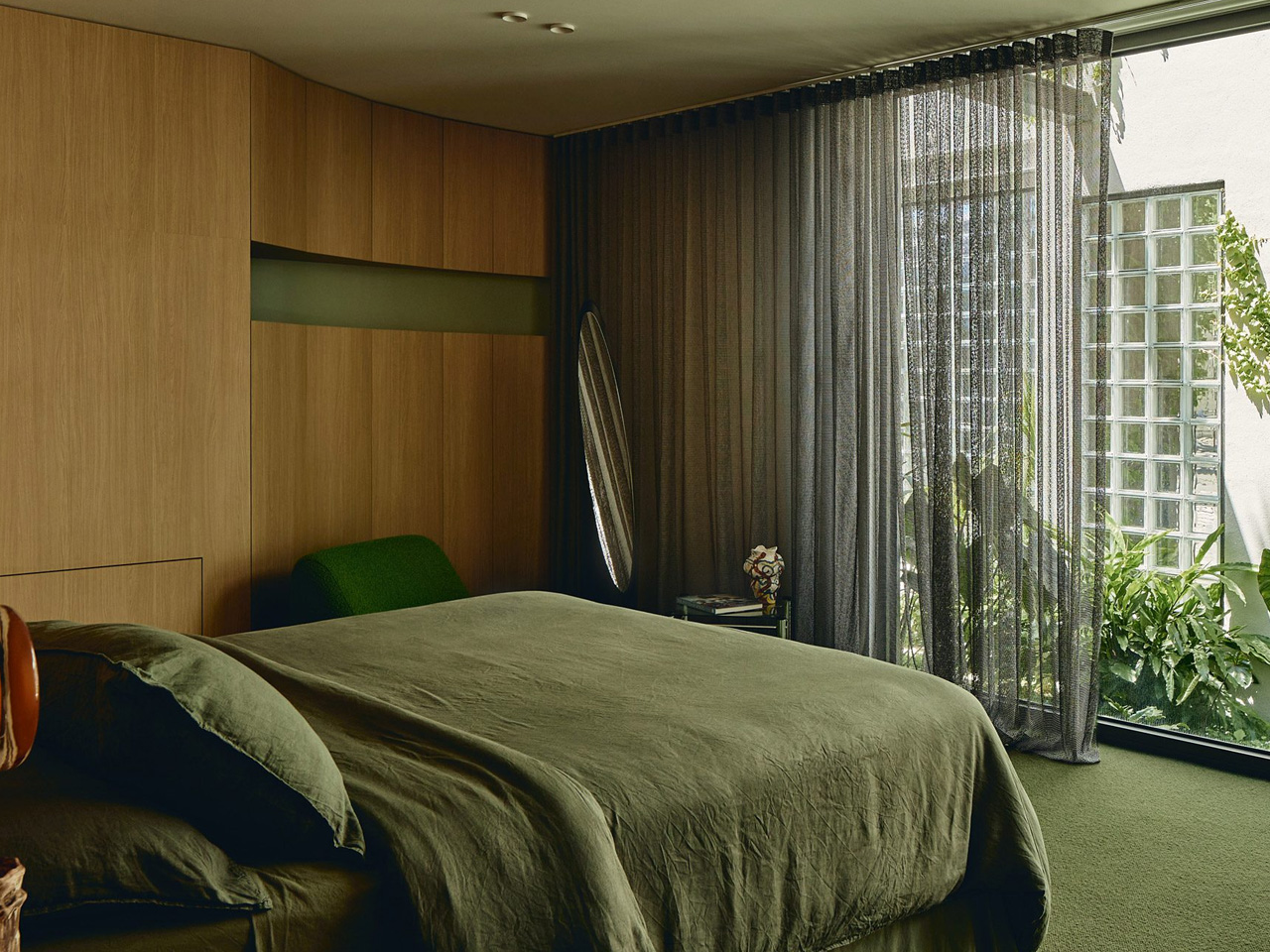
Inside, a white perforated steel staircase rises through all three floors, lit from above by a sequence of triangular skylights. Oak covers the floors, walls, and ceilings, anchoring the interior in warmth. On the second floor, three bedrooms, a family bathroom, and a living space are dressed in timber panelling and mossy-green carpet, with floor-to-ceiling windows drawing the outside in. The colour palette is deliberately restrained — natural materials do the work.
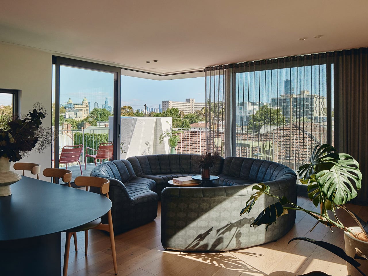
The third floor opens everything up. An open-plan kitchen, dining, and living space spills onto a silvertop ash deck with treetop views and sightlines to Melbourne’s city skyline. Below, the back garden holds a swimming pool, outdoor seating, and the kind of quiet that inner-city addresses rarely afford.
Green roofs, vertical gardens, and planted internal screens mean that no matter where you stand in the house, you can see something alive. That is not incidental — it is the brief. Kister built a home where nature is the architecture, and the century-old corner shop is simply its best possible frame.
For decades, solar panels occupied an awkward place in the built environment. Celebrated for efficiency yet criticized for their visual rigidity, they were often concealed behind parapet walls or relegated to distant landscapes. Their contribution was undeniable, but their presence was treated as a compromise rather than a composition, or always was a technical layer added after the architecture had spoken.
That perception is now undergoing a decisive shift. The rise of Solar Sculptures signals a new design language in which renewable energy becomes expressive, intentional, and visually engaging. By integrating advanced photovoltaics with bold structural forms, designers are transforming energy systems into landmarks. What was once hidden is now highlighted, allowing sustainability to move from background utility to cultural and aesthetic centerpiece.
1. Beyond the “Blue Rectangle”
For years, solar technology was visually synonymous with flat, blue-black rectangles arranged in strict grids. While functionally effective, this rigidity constrained architectural expression, forcing designers to treat solar panels as technical add-ons rather than integral design elements. The aesthetic limitations often created a tension between sustainability goals and visual harmony.
Emerging innovations are dissolving these boundaries. Flexible thin-film cells and organic photovoltaics (OPV) now enable energy-harvesting surfaces to follow curves, wrap around volumes, and adapt to complex geometries. Solar installations can become fluid, sculptural, and expressive — transforming renewable energy from a utilitarian layer into a seamless, artistic component of contemporary design.
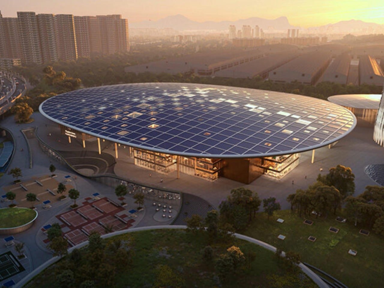
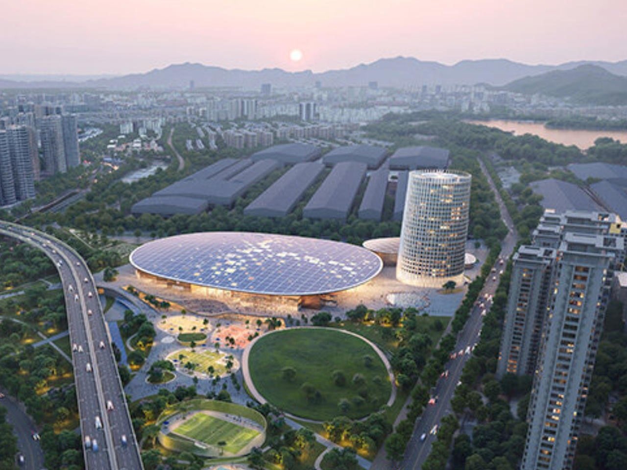
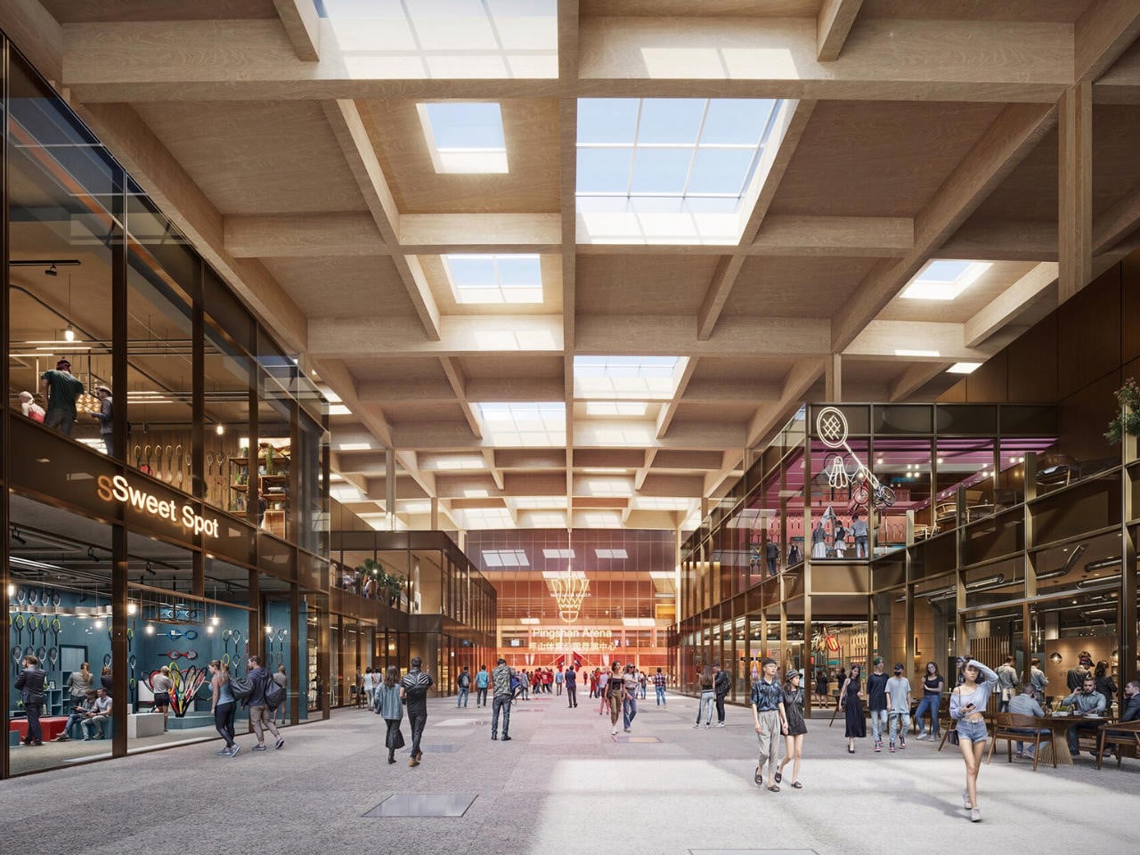
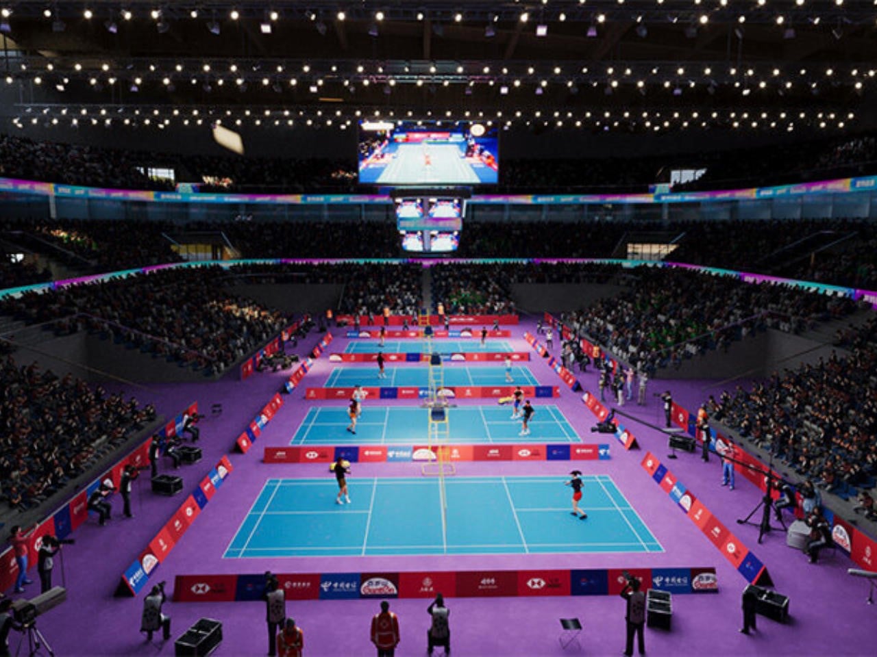
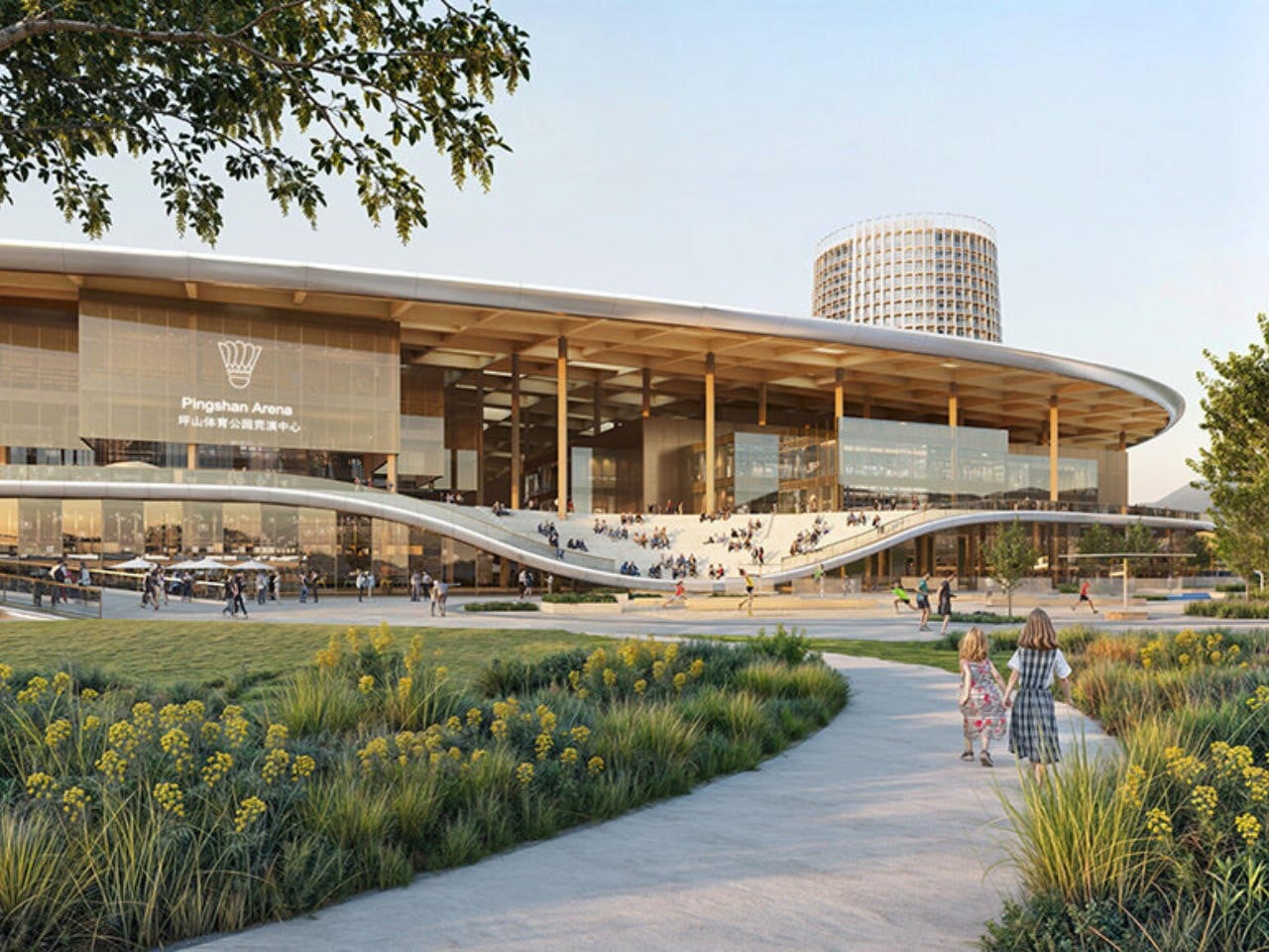
In a bold collaboration, MVRDV and Huayi Design have unveiled The Sweet Spot, a landmark sports complex in Shenzhen’s Pingshan district. Designed as a celebration of badminton, the project features a dramatic 240-metre rooftop shaped like a badminton racket head, complete with a grid structure resembling strings. Integrated photovoltaic panels transform the roof into a large-scale solar generator, allowing the complex to produce clean energy while making a powerful architectural statement. The development will house China’s National Badminton Training Centre, a professional arena, public fitness facilities, and commercial spaces under one iconic form.
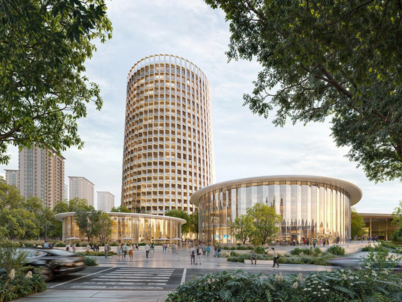
Beyond its striking silhouette, the complex is carefully zoned for elite athletes and the public. A T-shaped promenade connects key facilities and leads to a central plaza — the symbolic “sweet spot.” A 23-storey shuttlecock-inspired tower incorporates hotel rooms and athlete residences with direct private access to training areas. Surrounding parks, courts, and a National Fitness Centre extend its reach, creating a sustainable, community-driven sports destination.
2. Biomimicry and the Solar Tree Effect
Nature has become an influential guide in the evolution of solar design. Instead of imposing rigid, mechanical forms onto landscapes, designers now draw inspiration from organic structures that people instinctively recognize. Concepts such as solar “trees,” with branching arms and leaf-like panels, reinterpret renewable technology through shapes that echo the natural world.
These installations serve multiple roles beyond energy generation. They provide shade, create gathering points, and introduce sculptural landmarks within parks and plazas. By resembling trees or sun-tracking flowers, they soften the visual impact of technology, allowing clean energy systems to feel like a living extension of the urban ecosystem rather than an engineered intrusion.
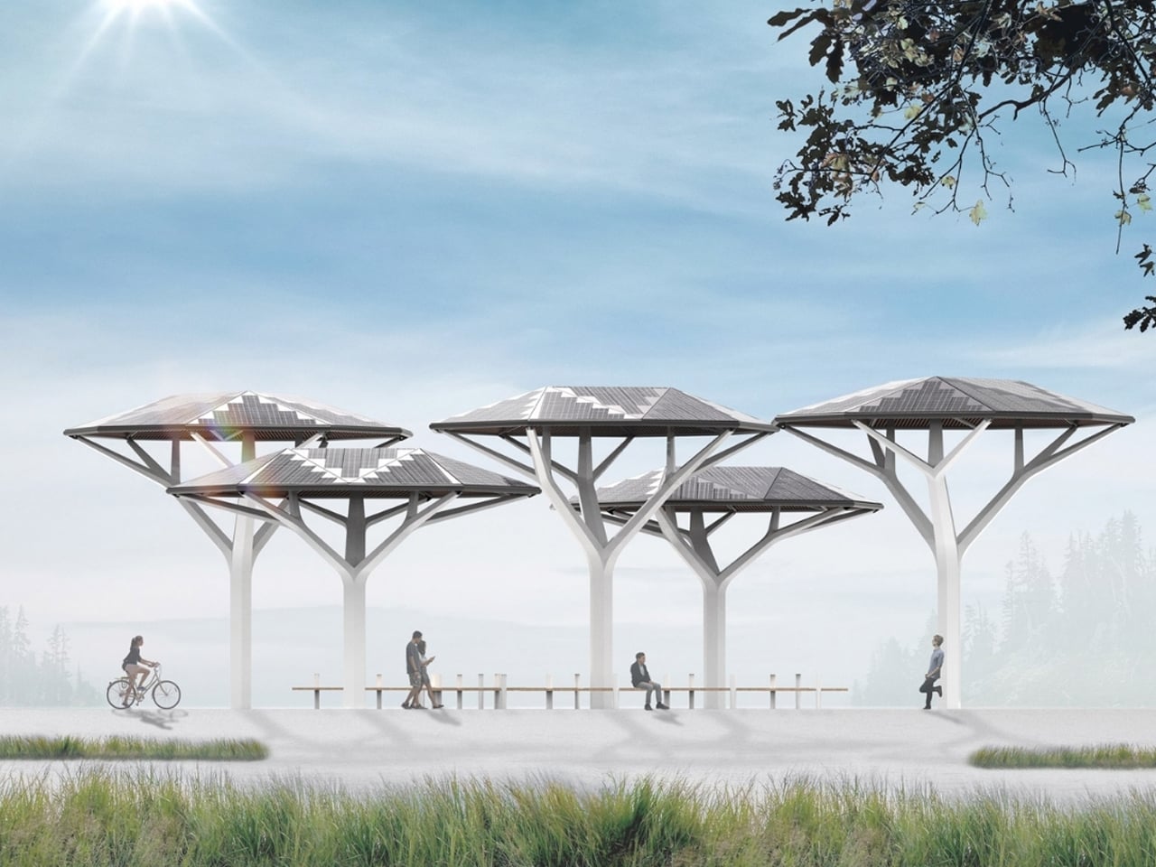
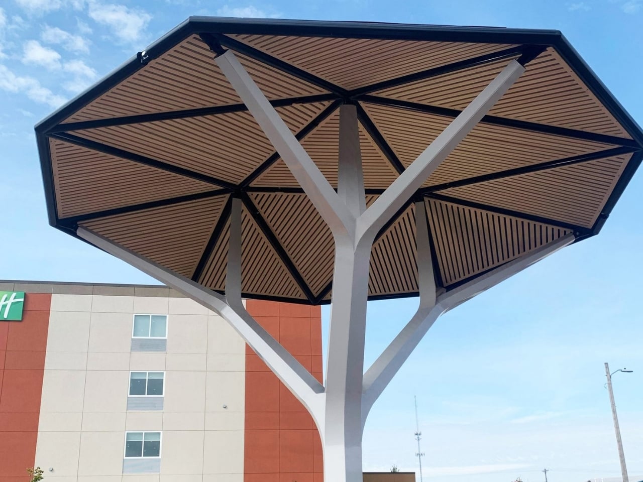
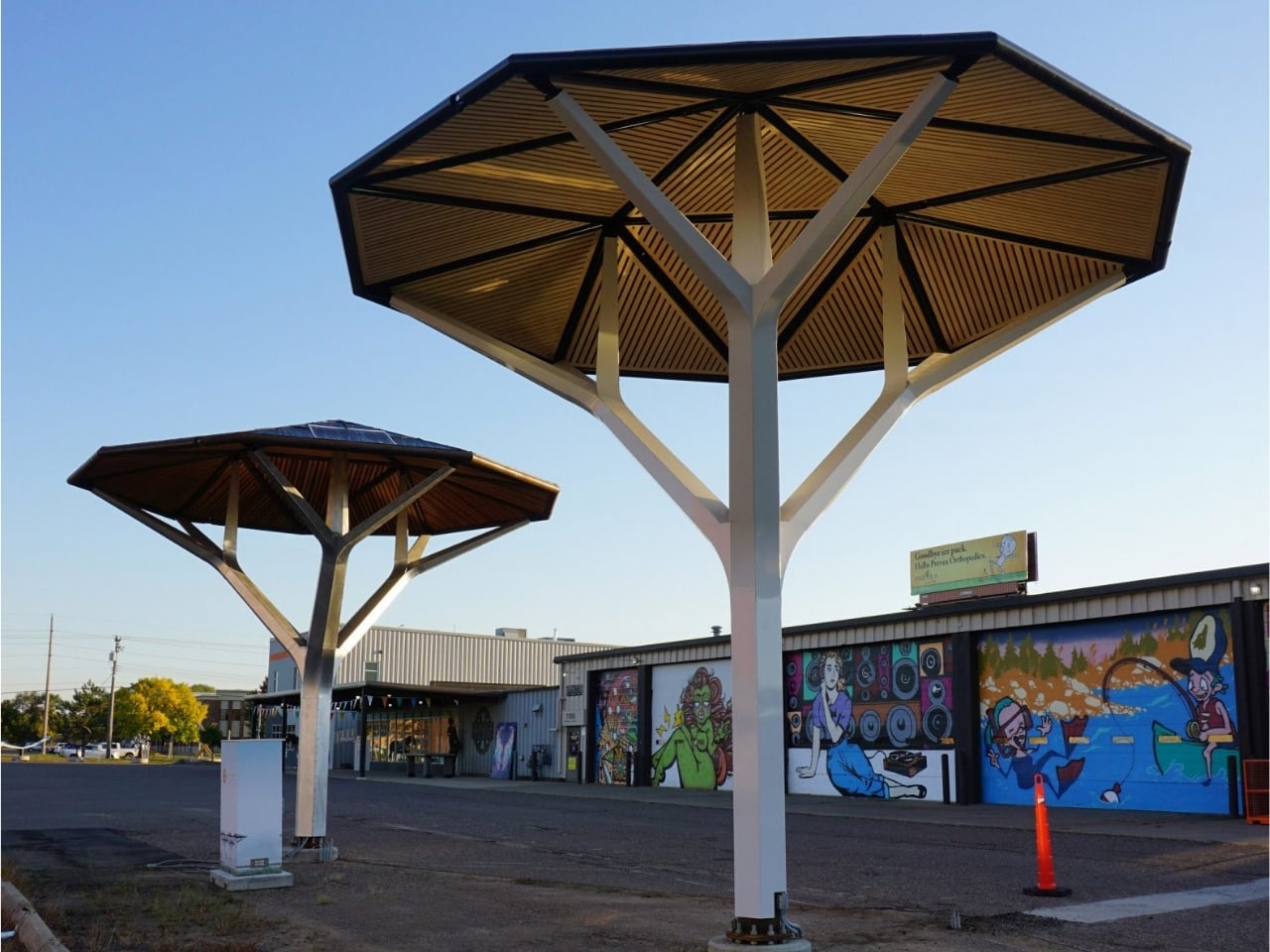
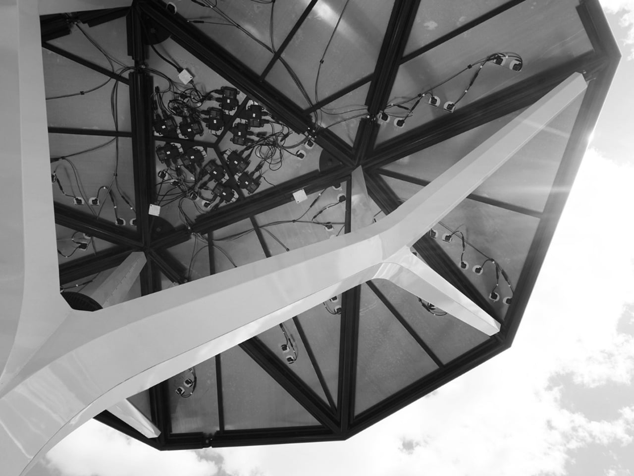
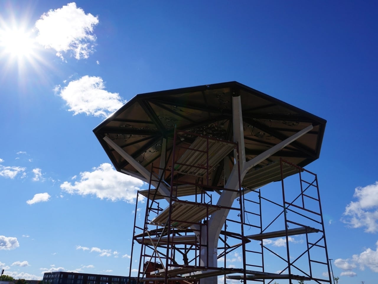
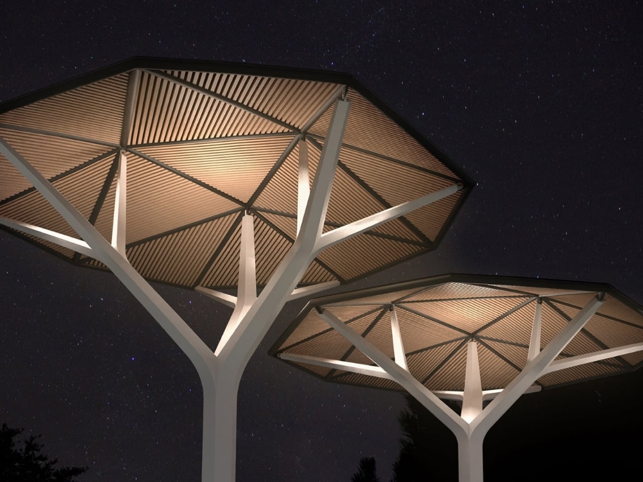
As cities look for smarter ways to integrate renewable energy into everyday life, Ecacia presents a striking solution. Designed by Samuel Wilkinson, this tree-inspired solar canopy functions as both a shade structure and a clean energy generator. Modelled after the acacia tree found in eastern and southern Africa, Ecacia features 708 monocrystalline solar panels embedded within its expansive umbrella roof. The system captures solar power to run nearby public amenities, support lighting, or even charge electric vehicles, while also offering the option to connect to the main grid.
Each structure spans seven metres in width, with a timber-lined, faceted nonagonal roof supported by a steel trunk clad in aluminium. Available in heights of 6.7 or 5.2 metres, Ecacia includes programmable LED lighting and is engineered to withstand winds of up to 160 km/h. Designed for standalone or clustered installation, it merges sustainability, durability, and urban comfort into one cohesive product.
3. Energy as a Public Spectacle
Solar sculptures are transforming energy generation into a visible, shared experience. Rather than operating silently in the background, these installations often integrate interactive lighting systems that activate after sunset. The electricity captured during the day is redirected to illuminate LED displays, creating dynamic visual compositions within public spaces.
Colors, patterns, or intensity shifts reflect the amount of energy harvested, allowing communities to witness sustainability in action. Abstract performance metrics become immersive visual narratives, turning kilowatt-hours into moments of engagement, awareness, and collective celebration.
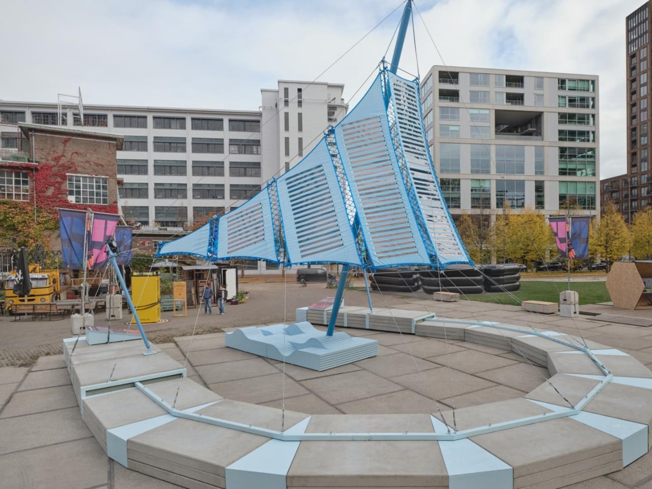
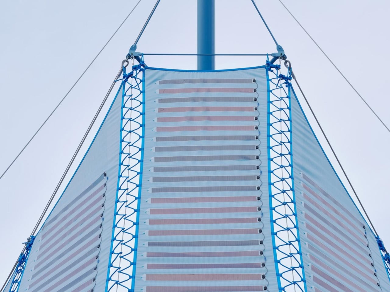
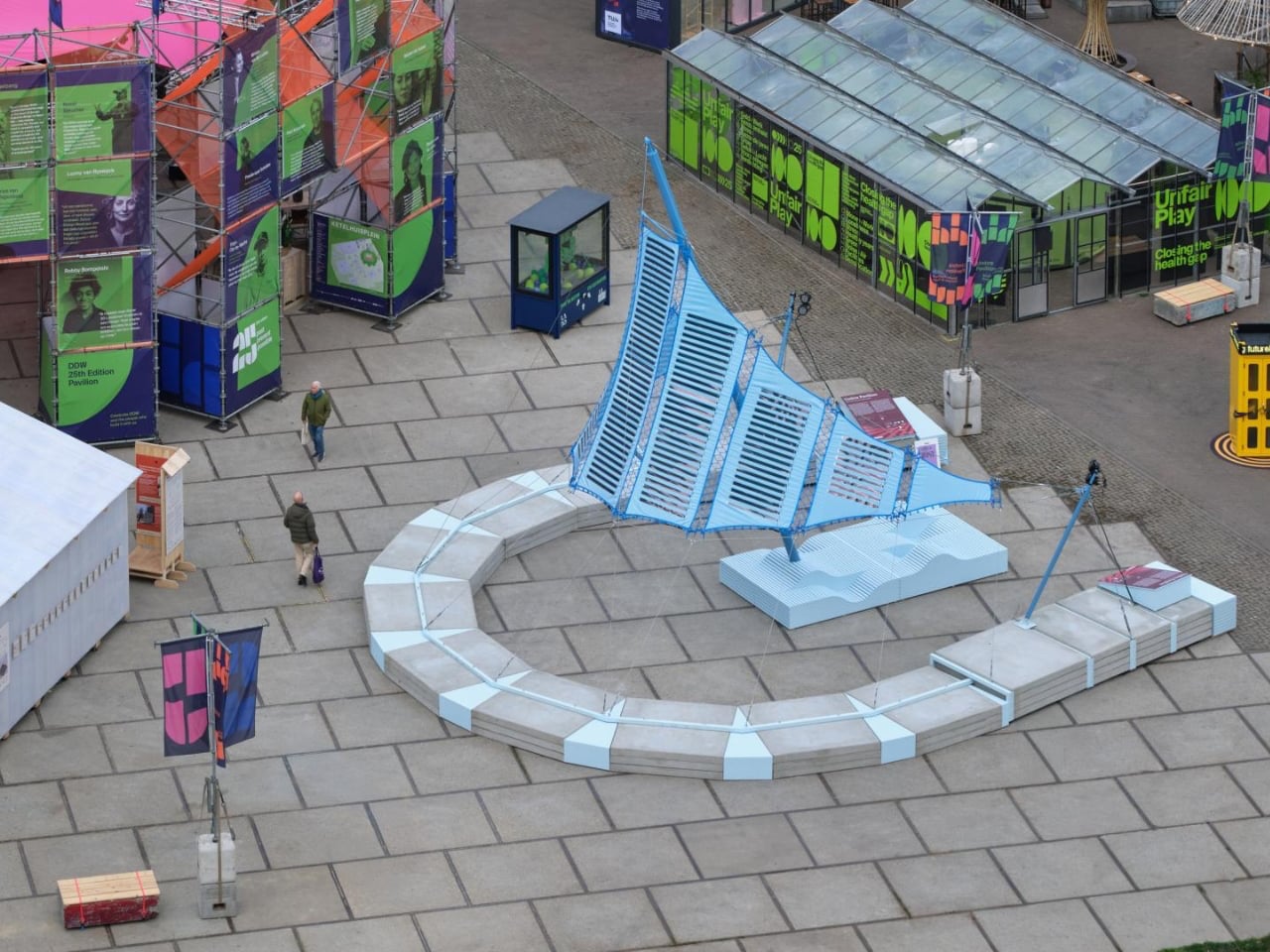
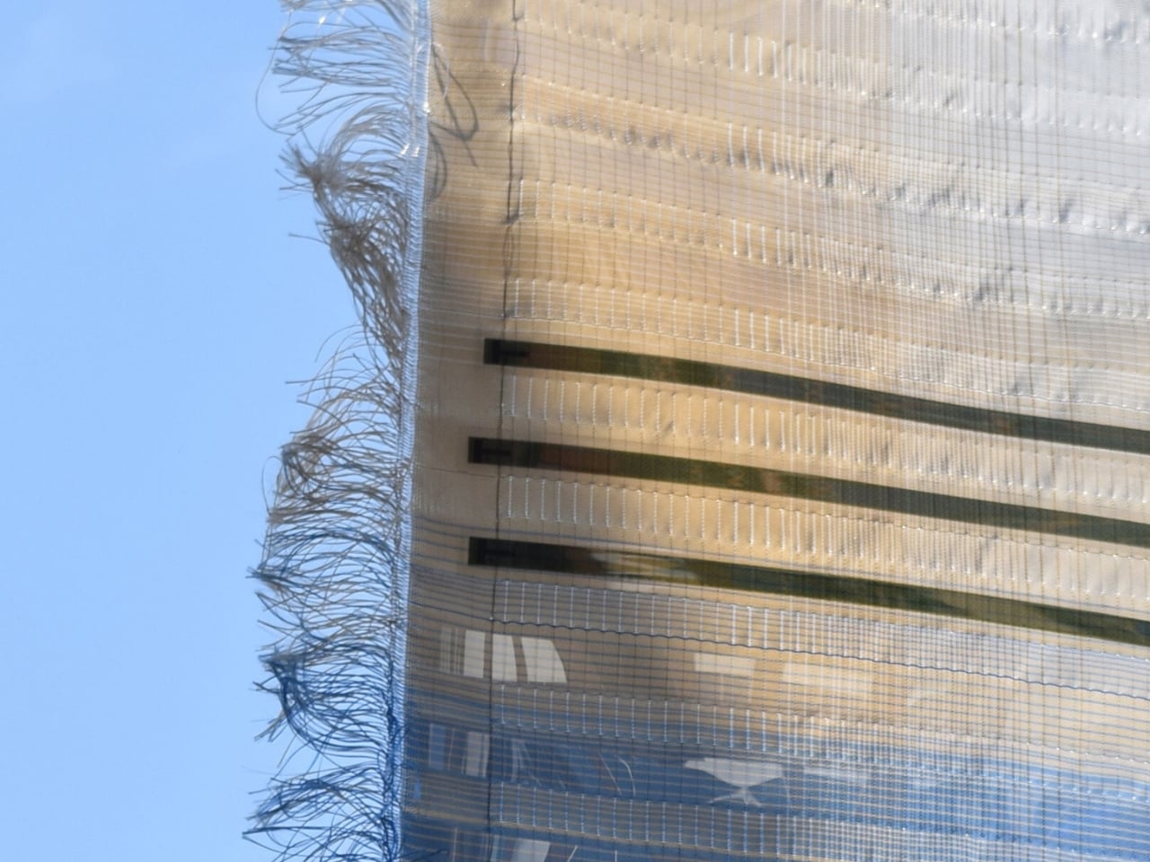
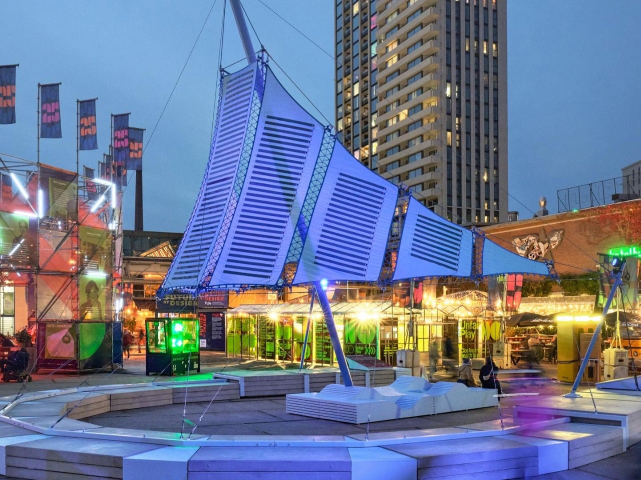
The Umbra Pavilion by Dutch designer Pauline van Dongen reimagines how a building can function, not as a passive structure, but as an active energy generator. At the heart of the product is Heliotex, a sky-blue textile canopy woven from recycled polyester yarn and embedded with 150 organic photovoltaic cells. Spanning 40 square metres and rising nearly 10 metres high, the pavilion integrates 147 solar modules with a 3,000-watt energy storage capacity. The result is a lightweight, fabric-based solar system that merges performance with architectural elegance.
Unlike rigid rooftop panels, Heliotex weaves solar cells directly into flexible fabric, allowing variation in colour, density, and transparency. The textile currently produces 53 watts per square metre and is engineered to resist UV exposure, weathering, and fire — without toxic PVC coatings. Designed for façades, shade structures, and public installations, the system generates clean energy while seamlessly serving its everyday structural purpose.
4. From NIMBY to Neighborhood Icon
Renewable energy projects have long encountered the “Not In My Backyard” response, driven largely by perceptions of visual intrusion. Large arrays and utilitarian structures were often viewed as industrial impositions rather than community assets, creating friction between sustainability objectives and neighborhood acceptance.
Solar sculptures are reshaping this narrative. When energy systems double as elegant shade canopies, artistic landmarks, or interactive installations, their presence gains cultural and social value. What once triggered resistance can now inspire attachment and pride. By aligning environmental function with visual delight, designers and developers are discovering that communities are more likely to embrace and celebrate renewable infrastructure.
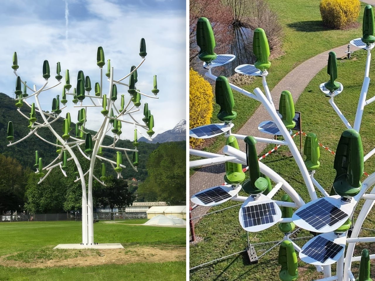
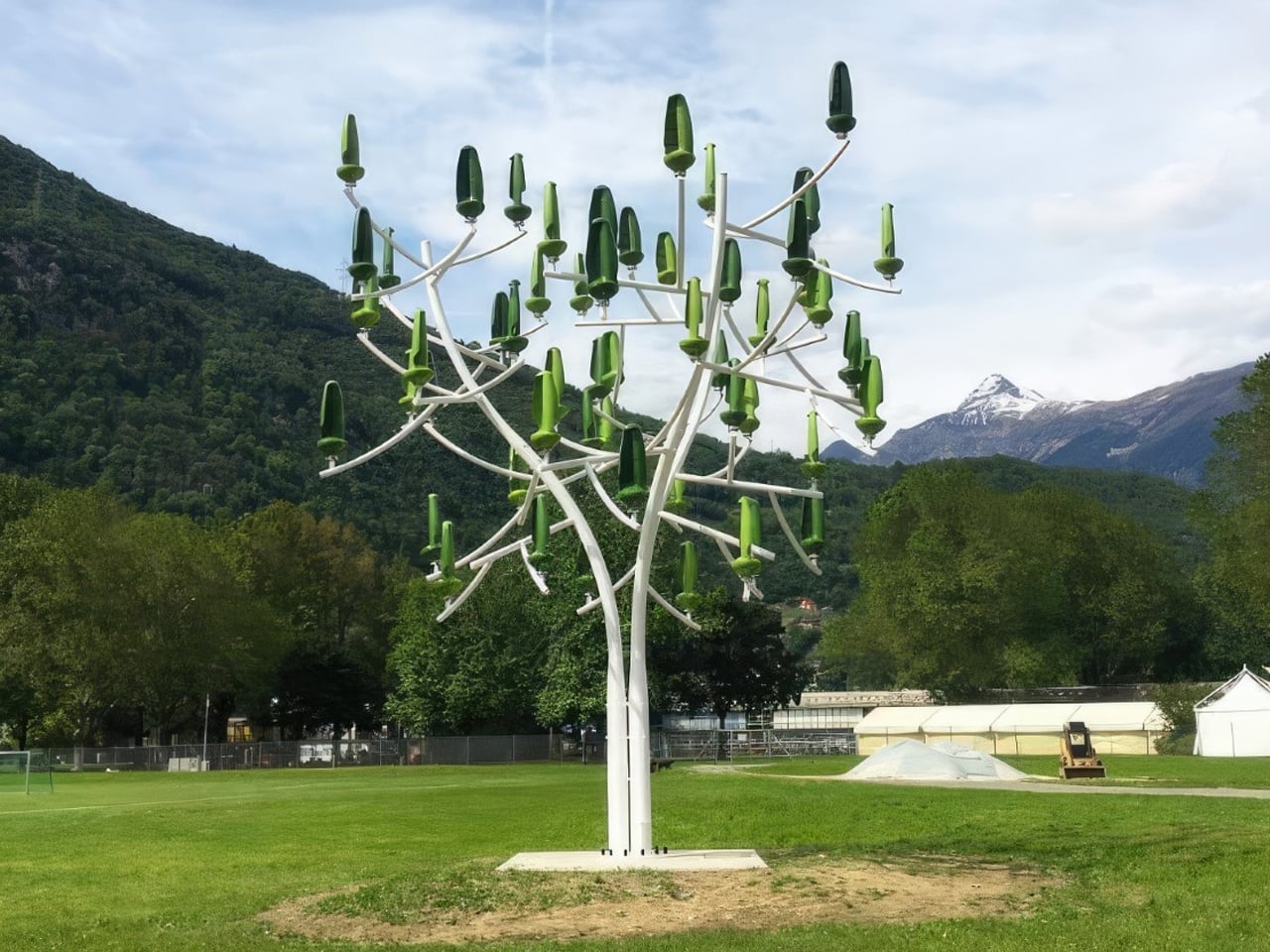
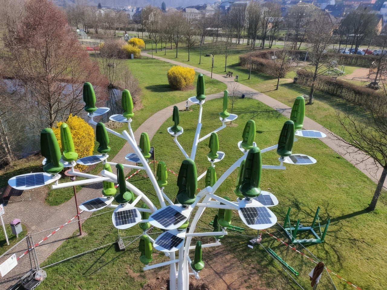
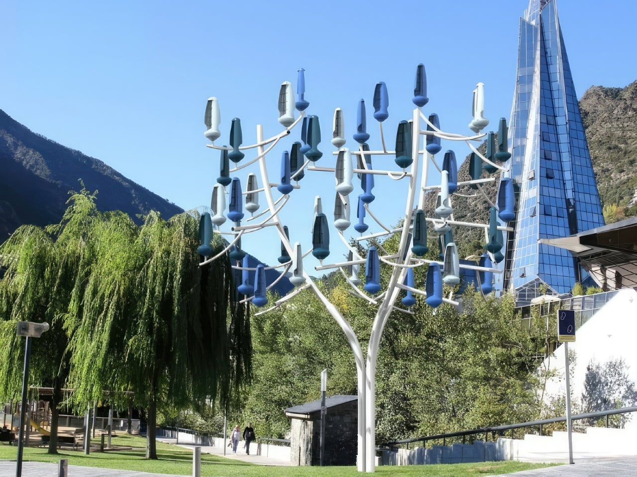
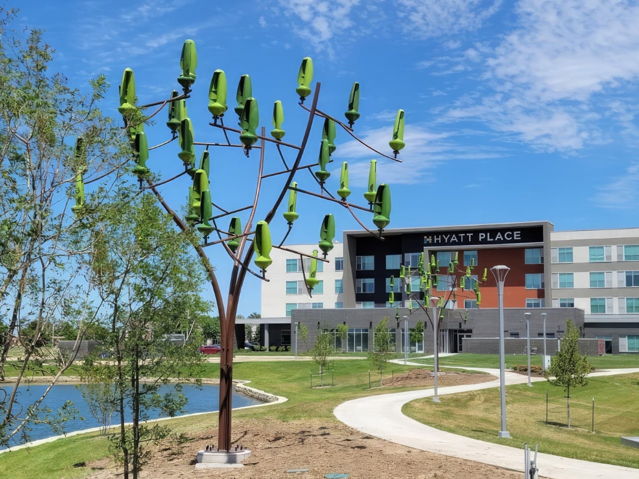
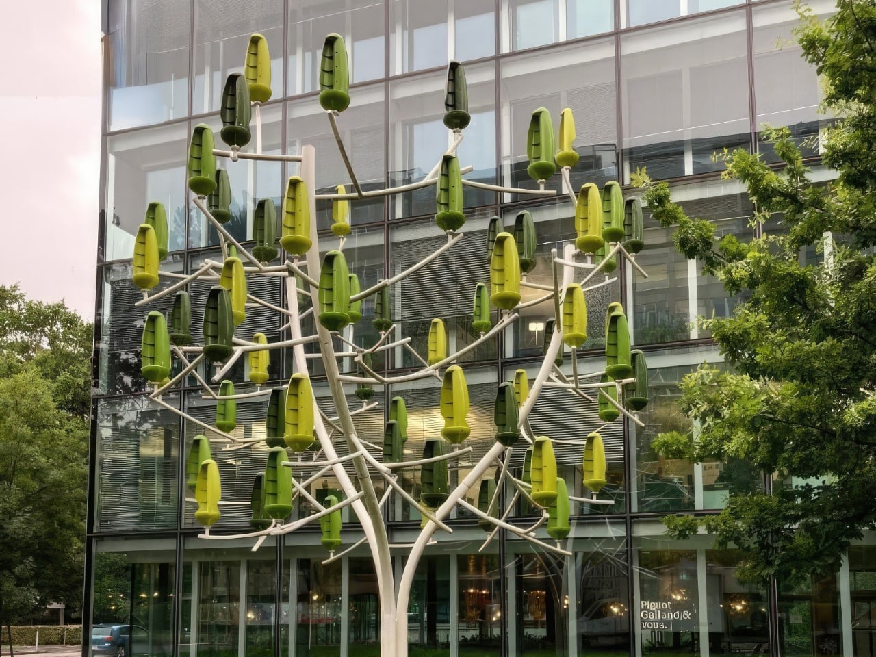
In the search for cleaner energy, New World Wind introduces the Aeroleaf Hybrid, a tree-shaped micro-wind turbine that combines wind and solar power into one integrated system. Designed as a sculptural energy solution, the product features rotating leaf-shaped turbines that capture wind from any direction, paired with discreet solar panels at the base for added generation. This dual-source approach ensures steady, efficient output while reducing reliance on fossil fuels. Unlike conventional turbines, the Aeroleaf Hybrid is compact, quiet, and visually refined, making it suitable for urban and residential environments.
Built on patented vertical-axis micro-turbine technology with permanent magnet generators, each Aeroleaf can produce a minimum of 300 watts. Available in three formats, namely Wind Tree, Wind Palm, and Wind Bush, the system adapts to different scales and locations, from rooftops to public parks. Custom colour options further enhance integration, transforming renewable infrastructure into functional, design-led energy architecture.
5. Solar Sculptures as Multi-Functional Infrastructure
Solar sculptures are redefining the role of public installations by merging energy generation with everyday utility. No longer conceived as standalone artworks or isolated power sources, they are designed as integrated smart-city hubs. Features such as shade canopies, seating, ambient lighting, and digital connectivity transform these structures into active contributors to urban life.
This layered functionality strengthens their value proposition. By incorporating Wi-Fi hotspots, device charging points, and even EV charging stations, the installations justify their spatial footprint while delivering tangible public benefits.
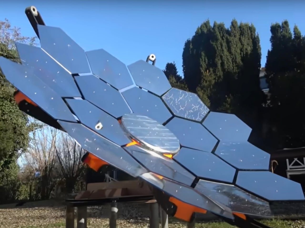
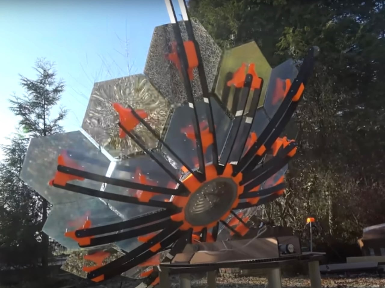
This product is designed to deliver clean, reliable energy in a compact and portable format. Ideal for emergency backup, outdoor trips, or reducing household electricity costs, this DIY generator combines efficiency with practicality. Inspired by advanced space-grade systems similar to those used in aerospace applications, it transforms sunlight into usable power through a streamlined and user-friendly setup.
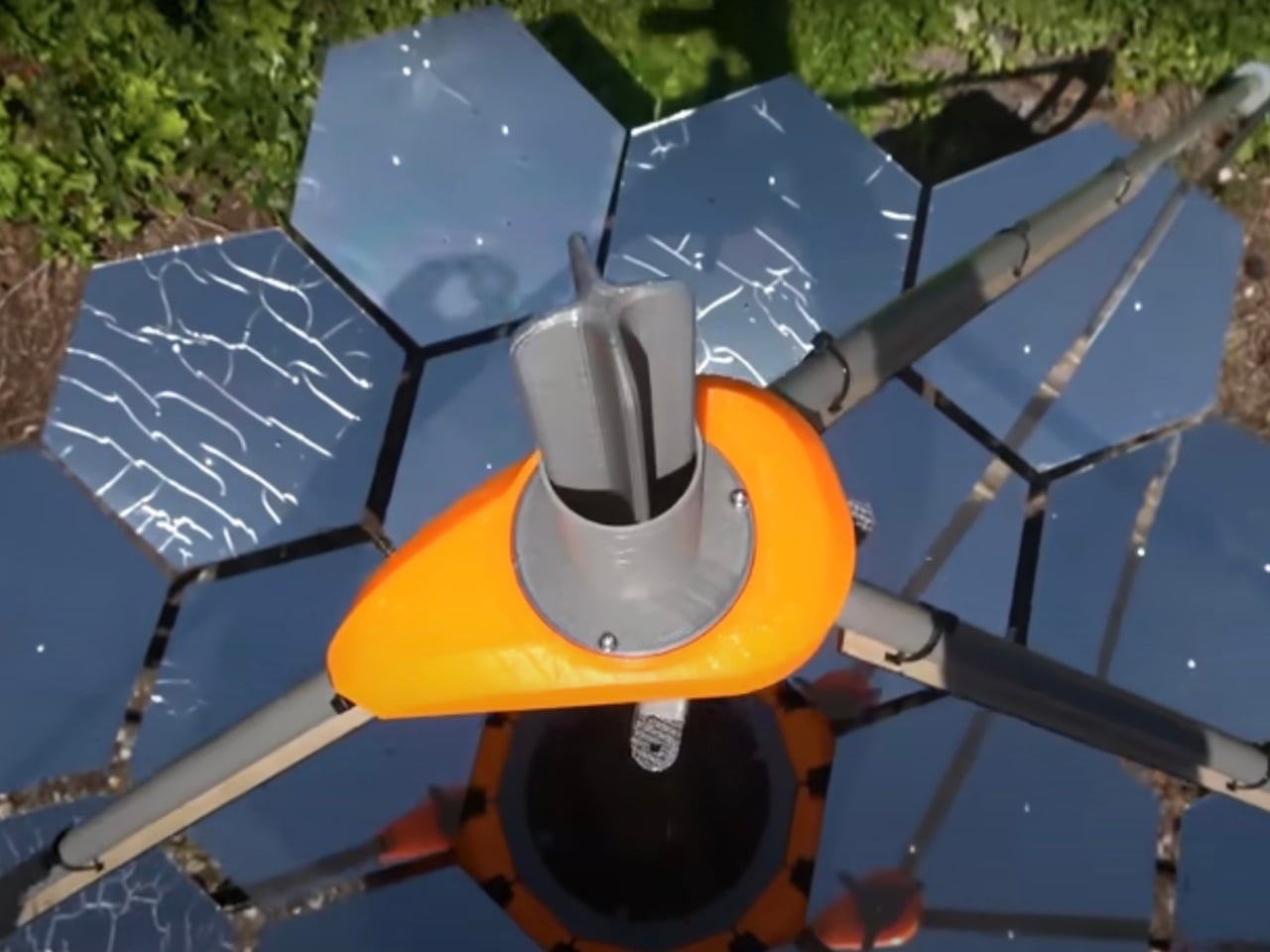
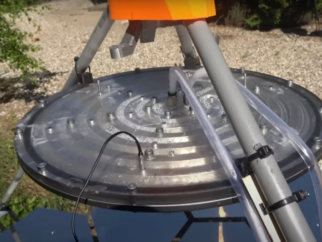
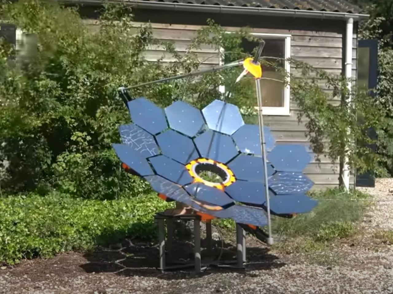
The generator includes high-efficiency solar panels, long-lasting lithium iron phosphate batteries, a charge controller, integrated power outlets, and a durable portable casing. One enhanced version features 18 mirrors that focus sunlight onto a black collector plate, generating significant thermal output — heating 20 litres of water in just over 30 minutes. Engineered for performance yet designed for real-world use, this solar generator offers dependable energy, lower operating costs, and a sustainable alternative to traditional fuel-powered systems.
Solar sculptures signal a future where clean energy and design are inseparable. What was once concealed infrastructure now shapes identity, experience, and place. As photovoltaics grow lighter, flexible, and expressive, cities will treat sunlight as a resource and muse, transforming everyday surfaces into generators of power, meaning, and beauty.
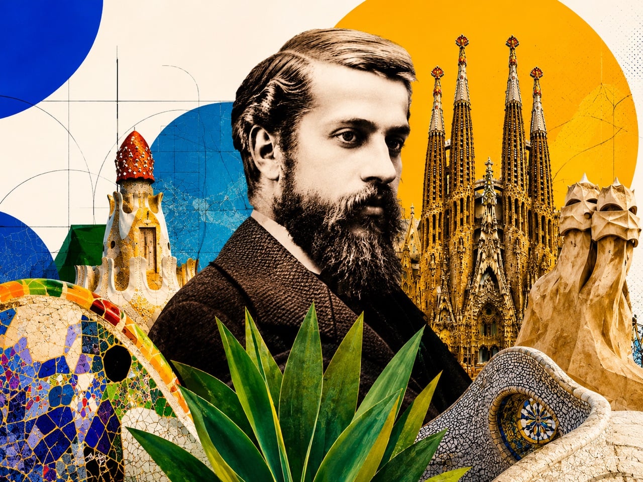
How does an architect collaborate with gravity? What happens when a building’s support system is designed to branch and spread weight just like a forest canopy? These are the kinds of questions that drove Antoni Gaudi’s work. He approached architecture with the mind of a natural scientist, seeking to understand the fundamental forces that shape the world and then allowing those forces to generate his forms. His work poses a challenge to the conventional separation of engineering and aesthetics, of structure and ornament.
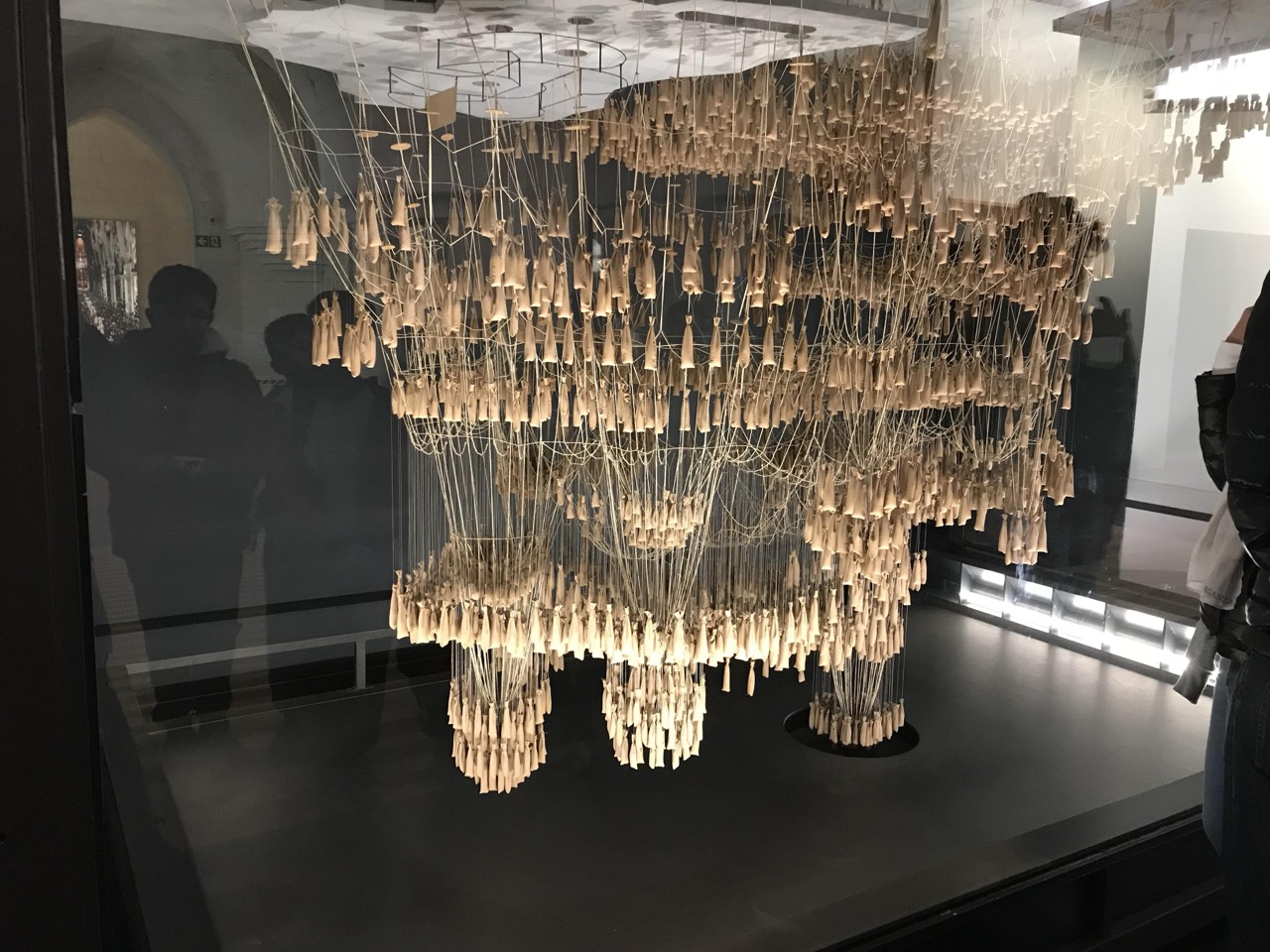
For Gaudi, the curve of a hanging chain held the secret to a perfect arch, a simple solution of pure tension that could be inverted to create a form of pure compression. This was his method: observe a principle in the physical world, understand its logic, and translate it into an architectural system. The result was an architecture that feels alive because it follows the same structural truths as living things. His buildings are not just inspired by nature; they are participants in its logic.
Think of nature as your structural engineer
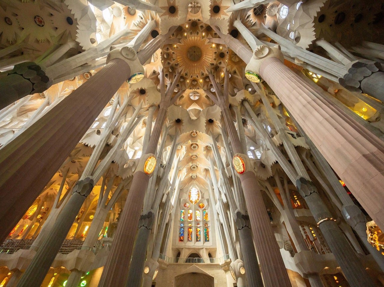
The inside of the Sagrada Familia takes inspiration from a forest, with tree trunks holding the canopy-like ceiling up
The natural world is a library of solved problems. A tree trunk thickens at its base and its roots spread wide to resist wind and carry its own weight. A skeleton uses hollow bones to achieve maximum strength with minimum material. A seashell grows in a logarithmic spiral, a pattern of expansion that maintains its proportions at every scale. For Gaudi, these were not just beautiful shapes to be copied for decoration. They were demonstrations of profound structural intelligence, blueprints for how to build with efficiency and elegance.
This principle is most breathtakingly realized in the interior of the Sagrada Família. The massive stone columns that support the central nave do not rise straight to the ceiling. Instead, they lean and branch out near the top, forking like the boughs of a tree to distribute the immense weight of the vaults. The effect is that of a colossal stone forest, but the design is pure structural logic. Gaudi performed years of analysis on the load paths, ensuring each column and branch was precisely angled and sized to carry its load down to the foundation. He was not imitating a forest; he was borrowing its engineering.
By deriving his forms from the functional principles of nature, Gaudi created a sense of organic coherence that is absent in much of modern architecture. His buildings feel less like objects assembled from parts and more like organisms that have grown into their final form. The undulating facade of Casa Milà, known as La Pedrera or “the stone quarry,” seems to have been eroded by wind and water over centuries. This effect comes from an architecture that responds to imagined natural forces, creating a dynamism that feels both inevitable and alive.
Treat Geometry as a Living Language
Gaudi used gravity to plot the parabolic curves that would make the spires of the Sagrada Familia
It is tempting to view Gaudi’s work as purely intuitive, the product of a wild and untamed imagination. This perception, however, overlooks the rigorous mathematical discipline that underpins his most fantastical creations. He was a master of complex geometry, specifically a family of shapes known as ruled surfaces. These surfaces, which include hyperboloids, paraboloids, and helicoids, may sound complex, but they share a simple characteristic: they are curved forms that can be generated by moving a straight line through space.
This geometric toolkit was both poetic and profoundly practical. The massive windows and ceiling vaults of the Sagrada Família are perforated with hyperboloids. This shape allows light to enter and spread softly throughout the interior, avoiding harsh shadows and creating a luminous, even glow. The famous spiral staircases that feature in his work are helicoids, an elegant and efficient way to move through space. Because these complex curves could be defined by straight lines, they were also buildable. A contractor could construct the formwork for a seemingly impossible vault by using a series of simple, straight boards. This was practical genius, not just artistic vision.
This use of geometry formed another bridge between his architecture and the natural world. Ruled surfaces appear everywhere in nature, from the fibrous structure of muscles and tendons to the way soap films stretch between two rings. By employing this shared mathematical language, Gaudi created buildings that feel harmonious with the world around them. What looks dreamlike and organic in his work is often, upon closer inspection, geometrically exact and structurally optimized.
Think with Your Hands, Not Just a Pen
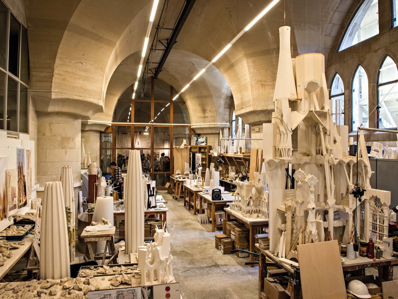
A look at Gaudi’s workshop, where he meticulously modeled with plaster before building
Traditional architecture has long been a discipline of two-dimensional representation. Buildings begin as plans, sections, and elevations, flat drawings that are later translated into a three-dimensional reality. Gaudi worked in the opposite direction. He was a sculptor of space who thought and designed in three dimensions from the very beginning. His workshop was filled not with blueprints, but with plaster, clay, and wire models. He believed that some problems of form, light, and structure could only be solved physically.
His famous hanging chain models are the most powerful example of this hands-on process, but his reliance on physical prototyping extended to nearly every aspect of his designs. He would sculpt plaster models of columns, vaults, and facades, iterating on their forms until they felt right both spatially and structurally. This allowed him to see how light would fall across a surface, how a space would feel as one moved through it, and how different forms would connect in a way that a flat drawing could never reveal. His was a process of discovery through making.
This method is precisely why his buildings feel so remarkably cohesive. The interiors and exteriors are not separate ideas assembled into a whole; they are part of one continuous, flowing volume. From the undulating facade of Casa Milà to the bone-like columns of the entrance to Park Güell, his work has a sculptural integrity that comes from being shaped in the round. He was not merely decorating a box. He was creating a complete, immersive spatial experience that was tested and refined through direct physical interaction.
A Building Should Tell a Story. Every Detail a Paragraph, Every Room a Chapter.
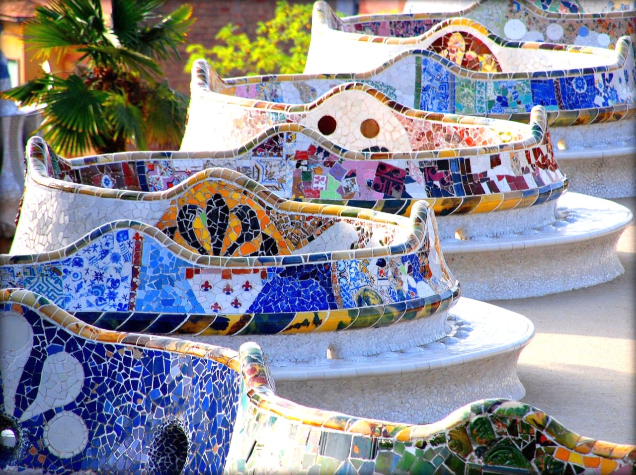
The Serpentine Bench at Park Guell is a massive, winding visual collage
For Gaudi, materials were not inert substances waiting to be shaped; they were expressive beings with their own character. He used stone for its weight and permanence, wrought iron for its ability to become a fluid, vine-like line, and ceramics for their capacity to capture light and color. The balconies of Casa Batlló are a perfect example, with their skeletal, bone-like stone supports and mask-like iron railings. The building feels less like a construction and more like a creature.
This material intelligence is on full display in his use of trencadís, the technique of creating mosaics from broken ceramic tiles. This was not just a decorative choice. It was an ingenious solution to the problem of cladding a complex, doubly-curved surface. Whole tiles would crack and fail, but a mosaic of broken pieces could flow seamlessly over any form. It was also an act of creative transformation, turning discarded tiles and plates from local factories into a vibrant, shimmering skin. The serpentine bench in Park Güell, a masterpiece of ergonomic design and public art, is brought to life by this technique.
These material and ornamental choices were never arbitrary; they were always in service of a larger narrative. Gaudi’s architecture is saturated with symbolism drawn from Catalan culture, Catholic theology, and the natural world. The entire facade of the Sagrada Família is a stone bible, with each portal dedicated to a different aspect of the life of Christ. The famous roof of Casa Batlló, with its iridescent, scale-like tiles and cross-topped turret, is a clear allusion to the legend of St. George and the Dragon, a powerful symbol of Catalan identity. The ornament is the story, fully integrated into the building’s form.
Borrow the Mindset, Not the Motifs
Gaudi’s sketches of sculptural details for the Sagrada Familia
The enduring power of Gaudi’s work offers profound lessons for designers today, but the greatest insights come from studying his process, not his style. To think like Gaudi is to ask deeper questions before beginning to design. It means studying the systems of the natural world, prototyping ideas physically, and allowing the properties of materials to guide the development of form. It means integrating structure, function, and meaning so completely that they become inseparable.
A superficial imitation of his work is a fundamental misreading of his genius, and nowhere is this temptation more apparent than in the age of artificial intelligence. AI image generators, when prompted to create something “in the style of Gaudi,” perform a sophisticated act of digital collage. They sample his signature motifs, the colorful trencadís, the skeletal balconies, the flowing lines, and recombine them into a plausible surface. The result might look like Gaudi, but it is an aesthetic echo, a skin-deep pastiche. What is absent is the intelligence, the why. The algorithm has no understanding of the catenary curve’s structural perfection, no concept of how a ruled surface can be used to sculpt light, and no sense of the narrative power behind his symbolism. It is a library of effects without a grasp of the causes.
To meaningfully think like Gaudi is a uniquely human act. It requires moving beyond the collage and embracing the cohesive system of thought that produced the work in the first place. The most unfortunate way to replicate Gaudi is to borrow his shapes without adopting his discipline. His work is a testament to the idea that the most expressive forms often arise from the most logical constraints. Gaudi’s ultimate legacy is his pursuit of a radical, integrated vision of design. In a world increasingly saturated with algorithmically generated images, his work serves as a powerful reminder that true creation is a unified whole. To think like Antoni Gaudi is to create something that feels less like an object that was built and more like an organism that has grown.
When you hear the word “observatory,” your brain probably conjures a cold, concrete dome perched on a remote mountaintop, somewhere that only astrophysicists with access badges get to enjoy. That image is about to get a serious redesign.
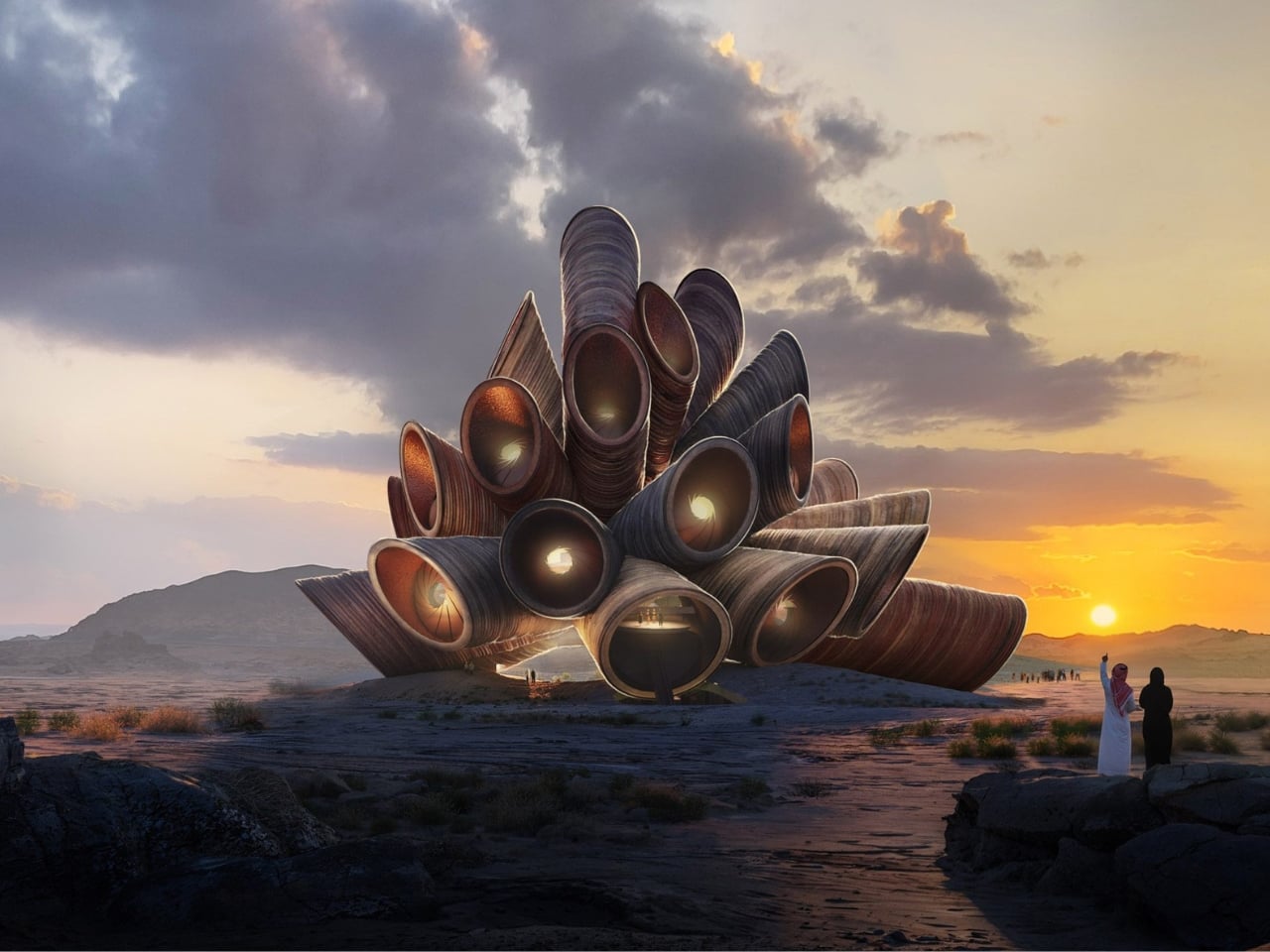
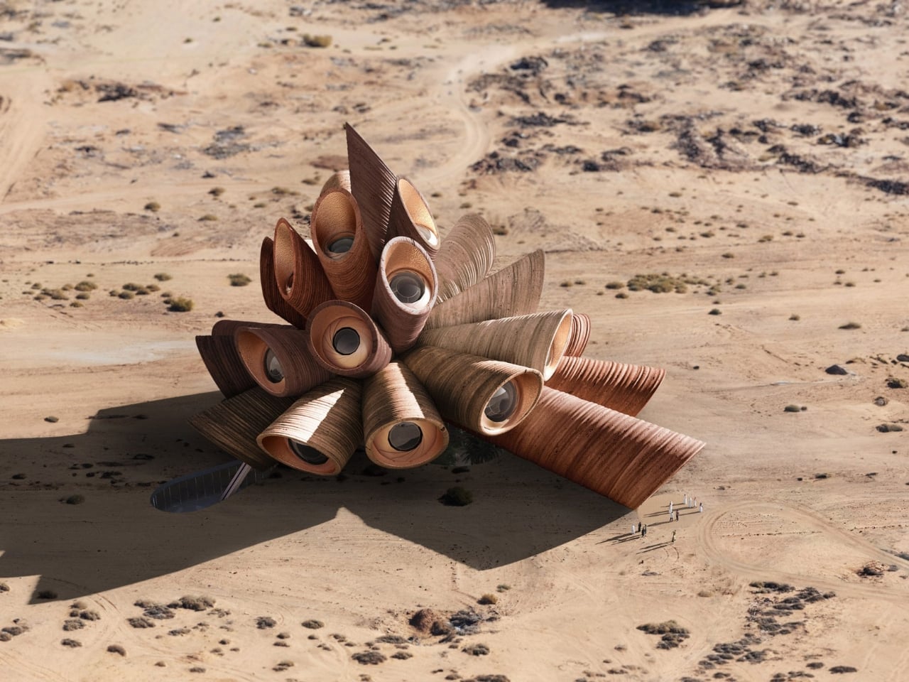
Heatherwick Studio just unveiled AlUla Manara, a stone-clad astrotourism center and observatory set to rise from the desert of northwestern Saudi Arabia, near the ancient city of AlUla. The design won an international competition and has been approved by the Royal Commission for AlUla. The name itself sets the tone: “Manara” means “lighthouse” in Arabic, and the building is exactly that, a beacon in the desert pointing not across the sea, but straight up into the cosmos.
Designer: Heatherwick Studio
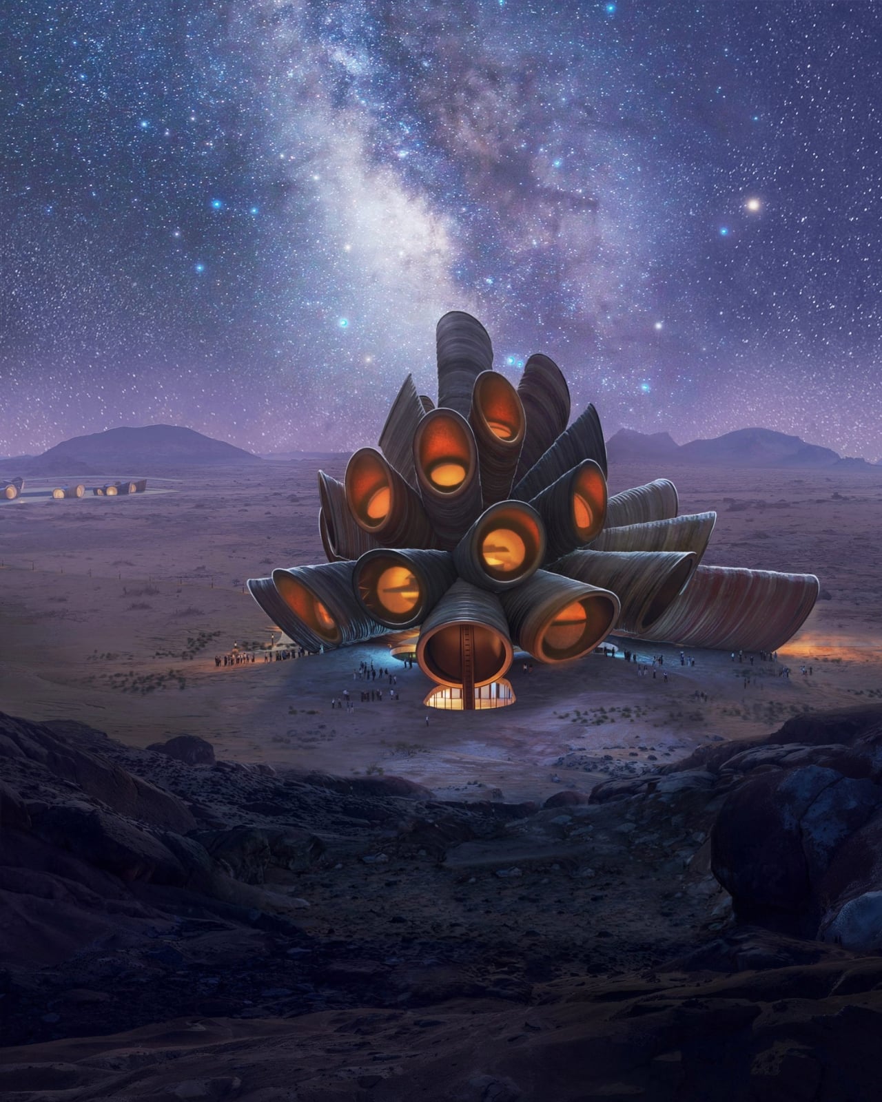
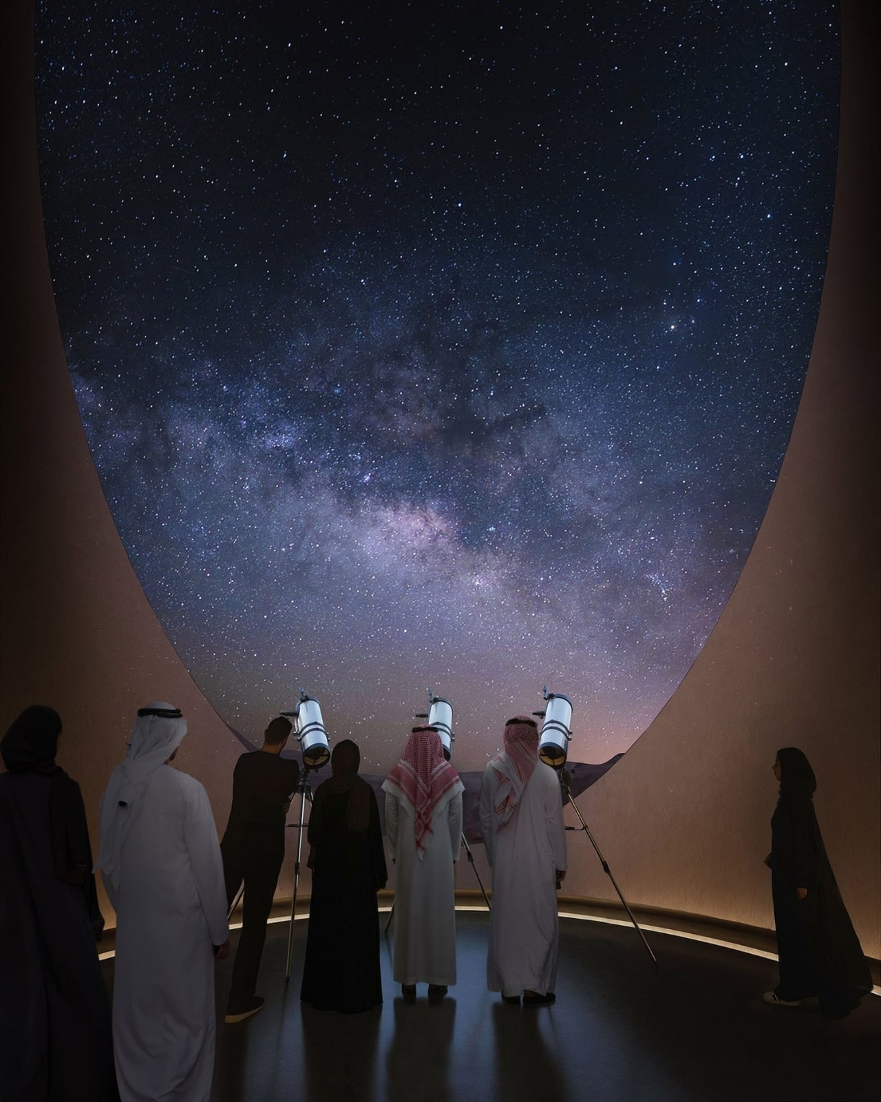
The site sits approximately 70 kilometers north of AlUla, between the Harrat Uwayrid Reserve and Gharameel, a location selected specifically for its extraordinary dark-sky conditions. Minimal light pollution, vast open terrain, and one of the clearest night skies on the planet. It’s not an arbitrary choice. AlUla already carries centuries of history tied to astronomy, and the region’s newly designated Dark Sky Park status makes it one of the most compelling places on Earth to simply look up.
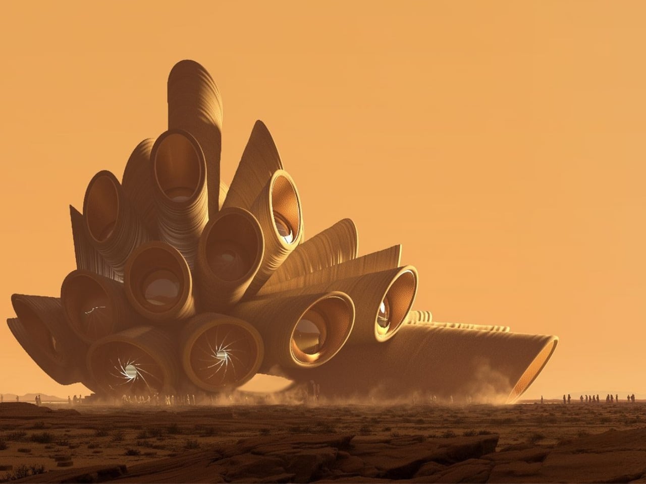
The design itself is striking, and I mean genuinely striking, not just in that polished press-release way. Heatherwick has created a cluster of tubular forms, each clad in textured stone, each turned toward the sky like enormous stone nostrils (or telescopes, depending on your imagination). The geometries were drawn from spiraling patterns found both in the cosmos and in the natural world: galaxies, planetary rings, shells, fossils. The building isn’t referencing space in an abstract, vague-inspiration kind of way. It’s actually embedding those forms into the architecture.
The materiality also tells a deliberate story. Rather than landing a glass-and-steel building in the middle of ancient sandstone terrain, Heatherwick chose locally sourced stone cladding that picks up the tones of AlUla’s dramatic landscape without mimicking it outright. It’s grounded in its context, but it doesn’t disappear into it. That balance, rare and worth noting, is harder to pull off than it looks.
Inside, the center will house galleries, a planetarium, and a rooftop observation deck. Heatherwick Studio’s executive partner Stuart Wood described the intent plainly: “Space observatories are often remote, sterile places, technical outposts that feel distant from the public. We saw an opportunity to dissolve those barriers and create a place where visitors can step inside the wonder of the cosmos.” That’s exactly the kind of brief that results in interesting architecture rather than merely functional ones.
Most observatories are built for scientists. AlUla Manara is built for everyone, which is either an exciting democratization of science or a tourism play dressed up in aesthetic clothing. Probably both, and I’m okay with that. If the result is more people standing under a legitimately breathtaking sky and feeling genuinely moved by the scale of the universe, the funding source matters a little less. Saudi Arabia has been investing heavily in cultural infrastructure under Vision 2030, and AlUla has emerged as one of its most ambitious bets. The cynical read is that it’s all soft power and spectacle. The more generous read, the one I lean toward, is that spectacle can be meaningful when the underlying design actually earns it.
Heatherwick has always worked at the intersection of the sculptural and the functional, from the Olympic Cauldron in London to the Vessel in New York, with mixed results. AlUla Manara feels like the studio at its most purposeful. The building doesn’t need to scream for attention because the desert will do that. Its job is to make people look up. That’s not a small thing. A well-designed building can shift how you experience a place. If AlUla Manara pulls that off, and I think it might, it joins a short but significant list of structures that don’t just house an experience. They become one.
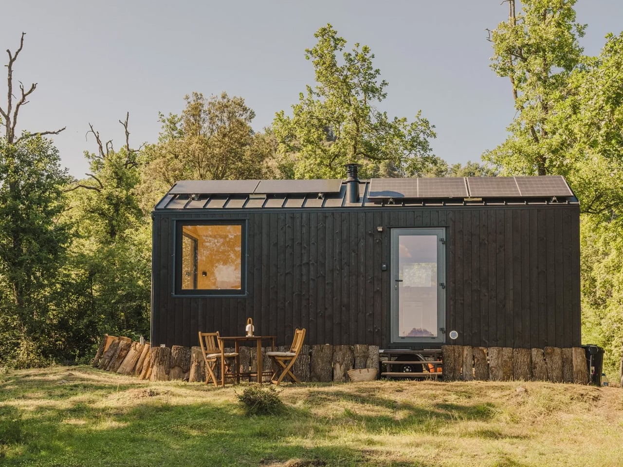
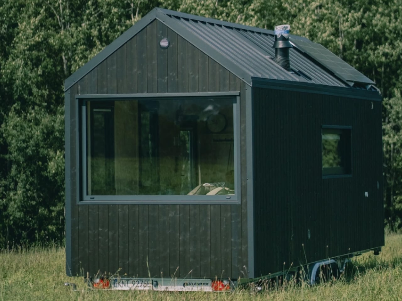
The Felicia doesn’t try to be everything; it tries to be enough. Built by Swedish tiny house maker Vagabond Haven, this 14-square-metre structure sits in the brand’s Medium category: compact, considered, and designed around clarity of living rather than excess of space.
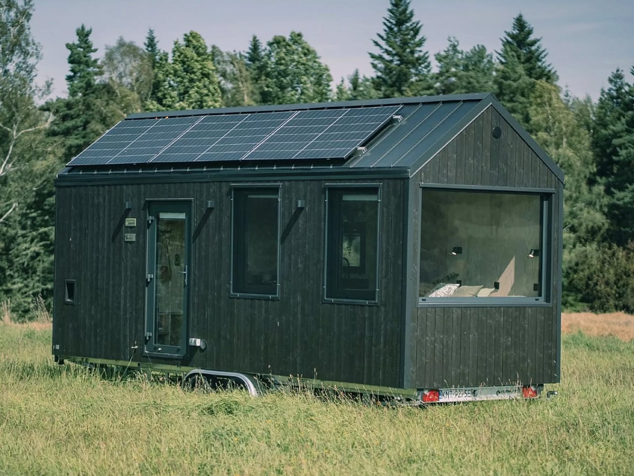
Measuring 7.2 metres long, 2.5 metres wide, and 3.94 metres tall, the Felicia rides on a double-axle lightweight trailer with a max weight of 3.5 tonnes. That footprint is modest even by tiny house standards, yet nothing about it feels like a compromise. The exterior comes in your choice of spruce, ThermoWood, oxygen wood, or Shou sugi ban — finishes that signal craft before you’ve even stepped inside. Well-insulated two-pane windows and a tempered glass door bring in light without sacrificing warmth.
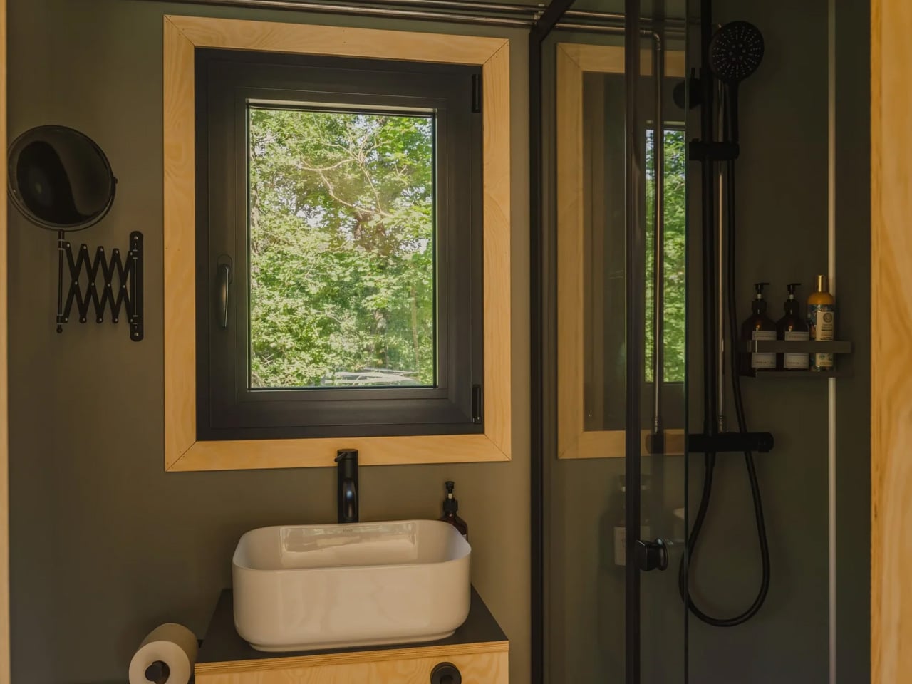
Inside, the layout is single-floor and smartly arranged. Walls and ceilings are finished in spruce or plywood, paired with laminate flooring — a palette that reads warm, not sparse. The kitchen carries a two-burner propane stove, a compact fridge, a sink, and cabinetry, all organized with the economy of a well-designed galley. The bathroom holds a glass-enclosed shower, vanity sink, and your choice of flushing, composting, or incinerating toilet — a small detail that speaks to the Felicia’s off-grid ambitions.
Off-grid capability is where the Felicia earns its edge. An optional solar system, rainwater harvesting setup, and an on-board water tank and pump mean the home can function well away from established hookups — no campsite, no trailer park required. Ventilation runs through the living room, kitchen, and bathroom, with a recuperator to maintain air quality without bleeding heat. Lighting is ceiling-mounted LED or spotlights, dimmable to match the mood.
What makes the Felicia stand out beyond the spec sheet is the presence of a dedicated storage and utility room — a rarity in a home this size, and a sign that Vagabond Haven understands that living small requires places to put things. Whether it functions as a holiday retreat, a permanent residence, or a guest house parked at the edge of a property, the Felicia adapts without apology.
It’s a home built for people who’ve decided that square footage was never the point. The Felicia doesn’t shrink your life — it edits it.
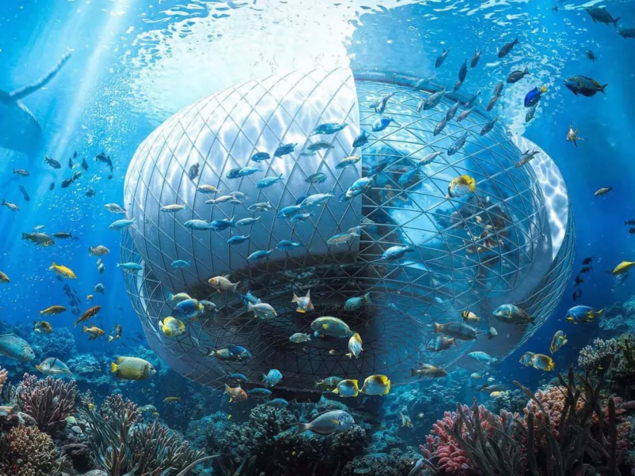
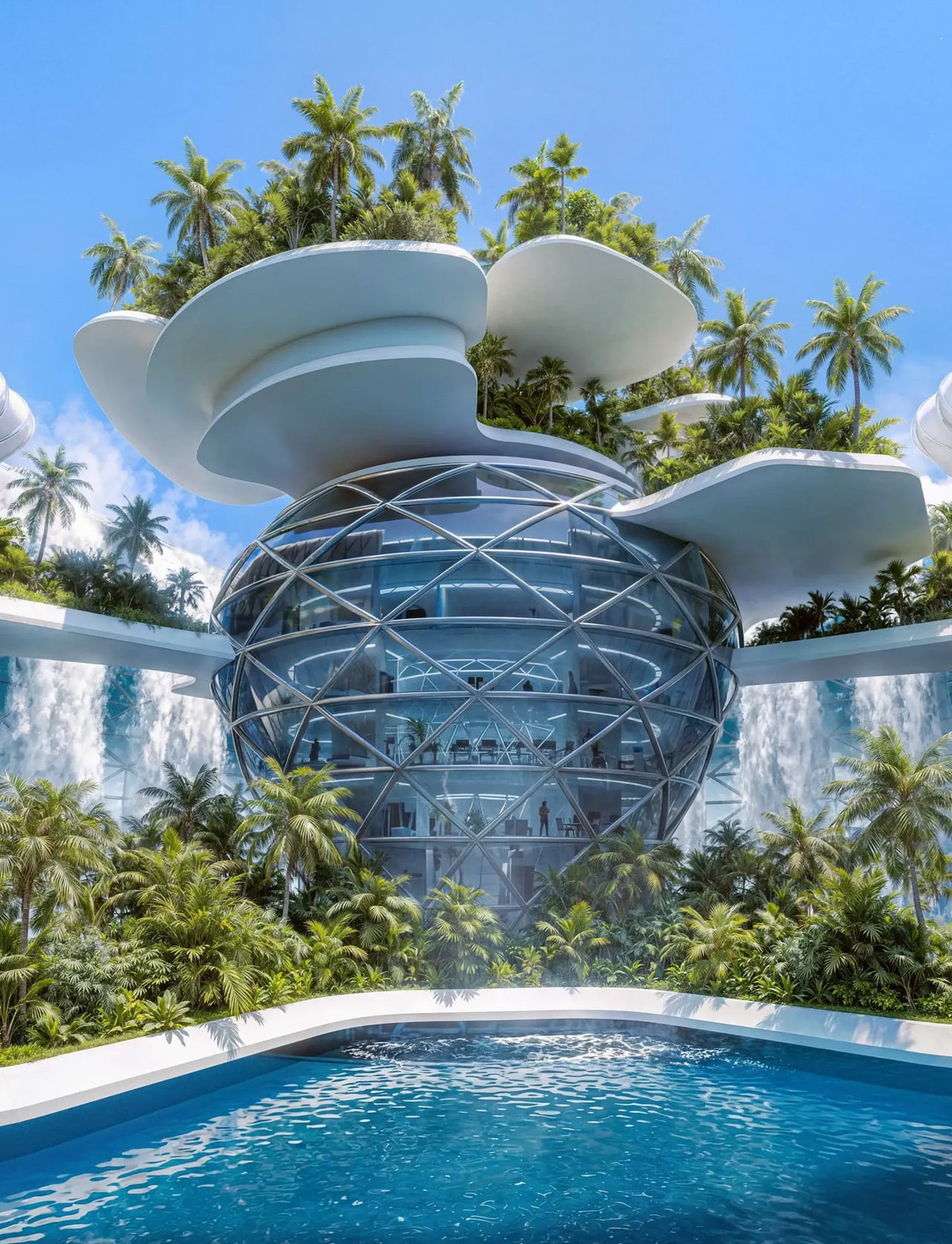
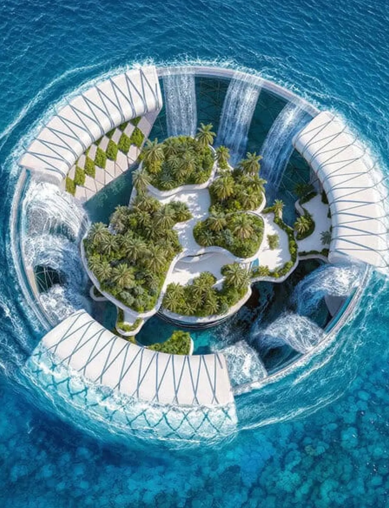
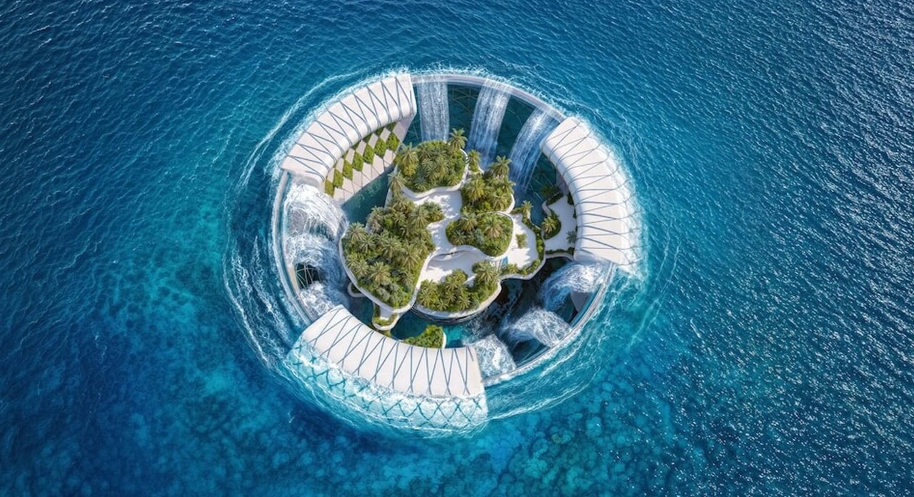
Off the southeast coast of Africa, more than 500 kilometers into the Indian Ocean, lies Madagascar — a country defined by extraordinary biodiversity, vast natural wealth, and a deepening energy crisis that leaves the majority of its population without electricity. It is here that designer Ahmad Eghtesad has set his most ambitious concept: the Baobab Waterfall, a floating mixed-use infrastructure that proposes to generate clean energy, rehabilitate society, and eventually evolve into a thriving resort — all from the open ocean.
The concept was developed as a competition entry for the prestigious Jacques Rougerie Foundation, which challenges architects and designers to imagine the future of maritime architecture. Eghtesad, working alongside collaborators Mohammad Aghaei and Nastaran Fazeli, drew his primary inspiration from the baobab tree itself — a native Malagasy symbol of resilience, capable of storing water and sustaining life in the harshest of environments. The architectural form mirrors this logic: wide at the crown, deeply rooted in its purpose, built to outlast the conditions that necessitated it.
Designer: Ahmad Eghtesad
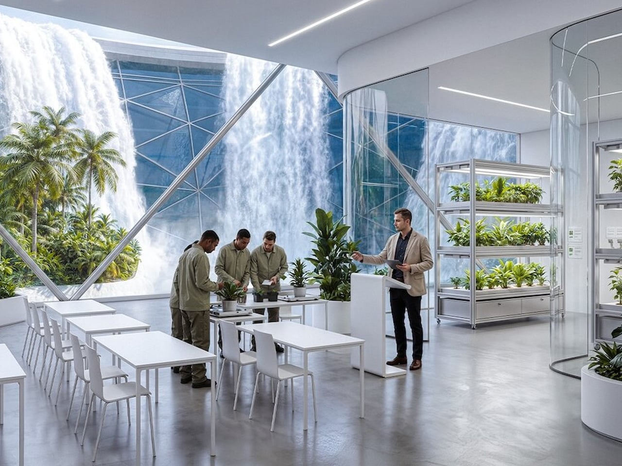
At its core, the Baobab Waterfall operates as a continuous deep-ocean waterfall system. Ocean water is redirected and channeled through the structure on a massive scale, generating renewable electricity in volumes comparable to natural hydrological forces. The structure also integrates transparent greenhouses into its central tower, layering agricultural function into what is otherwise an industrial power plant. This dual programming — energy production and food cultivation — reflects a design philosophy that refuses singular solutions.
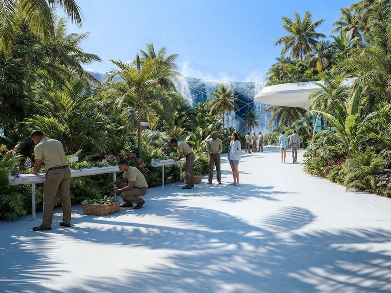
What makes the Baobab Waterfall genuinely provocative, though, is its social dimension. The structure is initially conceived as a rehabilitation center — a response to Madagascar’s overcrowded correctional facilities, themselves a symptom of poverty and energy-driven economic hardship. The idea is architectural optimism taken to its logical extreme: design not just infrastructure, but the conditions for social repair. As crime rates decline and the rehabilitation program matures, the complex is designed to seamlessly transition into a multipurpose resort and green energy hub, leaving behind a prosperous legacy rather than an institution.
Rendered with cinematic precision using Autodesk 3ds Max, Rhinoceros 3D, Grasshopper, and V-Ray, the visuals alone communicate the project’s ambition — dramatic contrasts between raw ocean forces and human engineering, scale that feels both monumental and quietly inevitable.
Whether or not the Baobab Waterfall ever leaves the realm of concept, it asks a question worth sitting with: what does it look like when architecture refuses to solve just one problem? Eghtesad’s answer floats somewhere off the coast of Madagascar, shaped like a tree that never stops giving.
The dome is no longer just an architectural curiosity. It has emerged as one of the most structurally efficient forms ever designed. Leading design firms now recognize that its natural strength and exceptional volume-to-surface ratio provide a powerful foundation for sustainable luxury and long-term performance.
Beyond structure, the dome reshapes how space is experienced. It feels both ancient and forward-looking. Contemporary design increasingly favors spatial sequencing that calms the mind, and curved interiors deliver exactly that. A domed space becomes a biophilic cocoon—capturing soft natural light, enhancing psychological comfort, and offering a strong return on investment through well-being, durability, and timeless appeal.
1. Lightness as Structure
Inflatable domes represent the most refined expression of ephemeral architecture. These pressurized forms enable rapid spatial creation that rigid structures simply cannot achieve. Their value lies in speed, adaptability, and impact—allowing designers to construct immersive, temporary pavilions with a minimal carbon footprint using advanced high-tensile, translucent membranes.
What truly sets inflatable domes apart is their sensory quality. The gentle movement of the pneumatic skin creates a space that feels alive, forming a biophilic cocoon of air and light. Contemporary polymer materials make it possible to sculpt illumination itself, transforming a lightweight structure into a resilient, rhythmic architectural experience that feels both delicate and powerful.
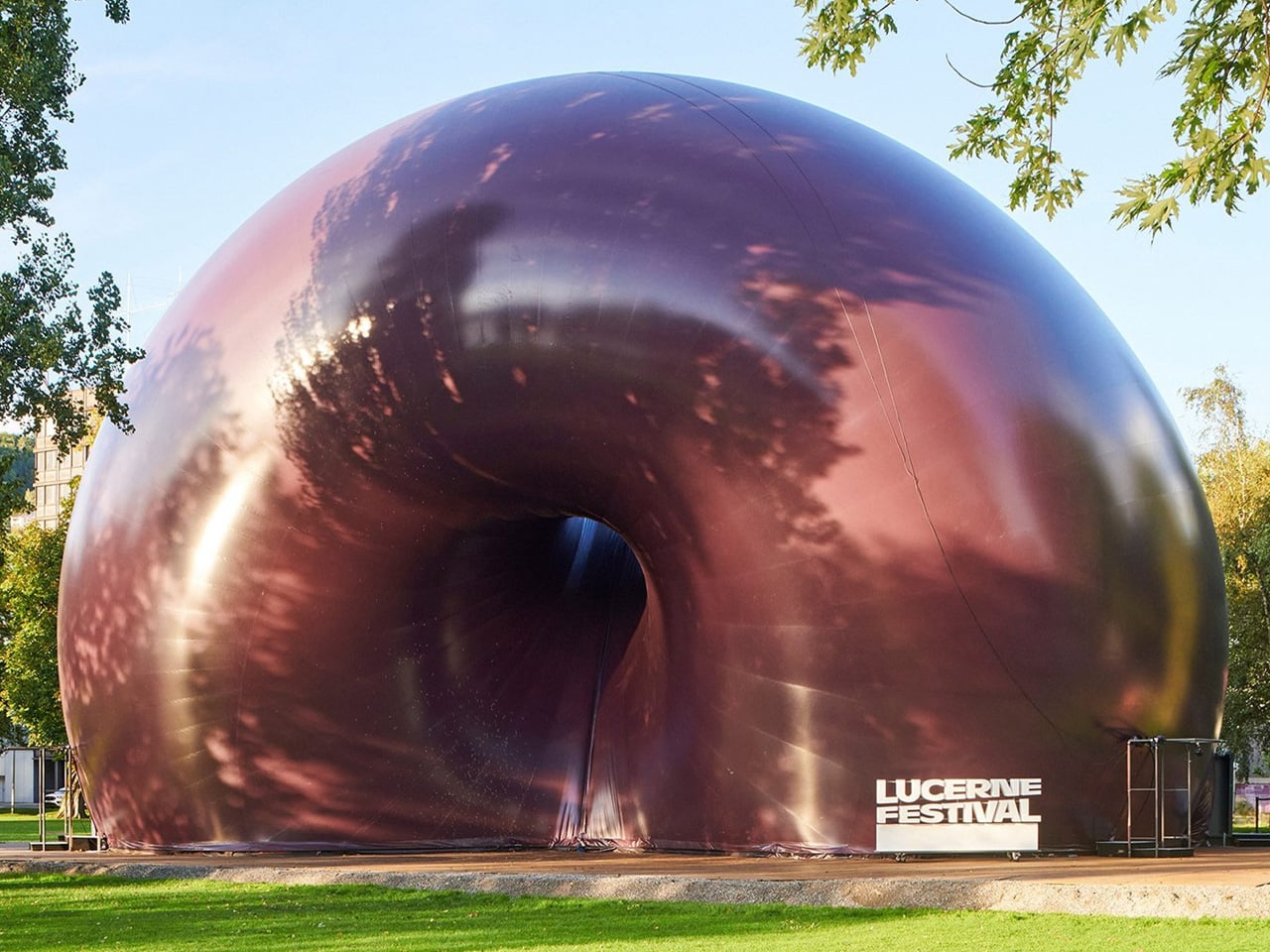
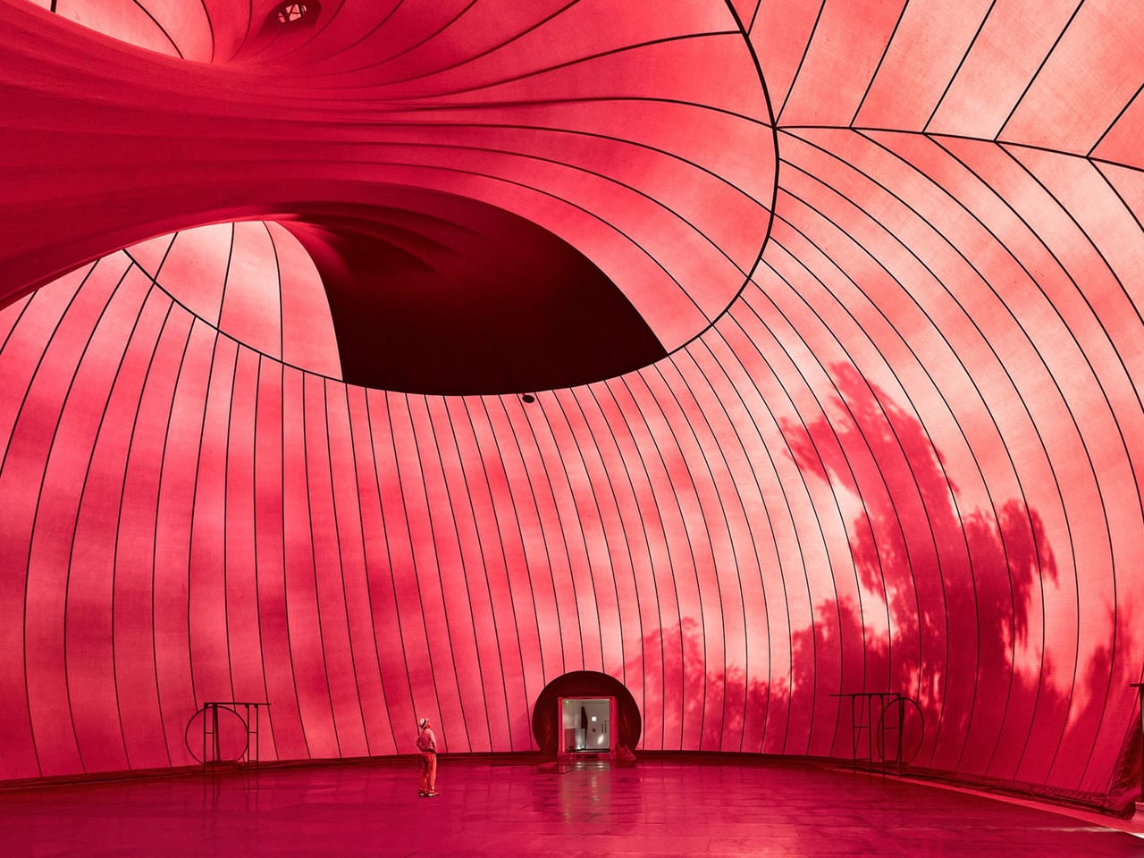
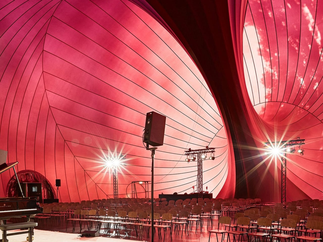
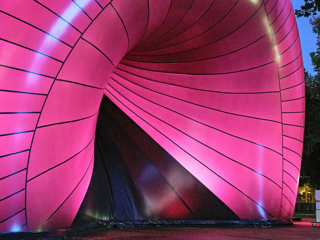
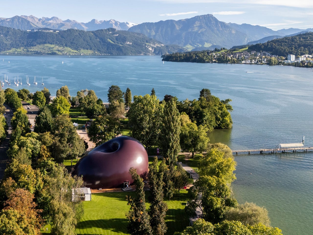
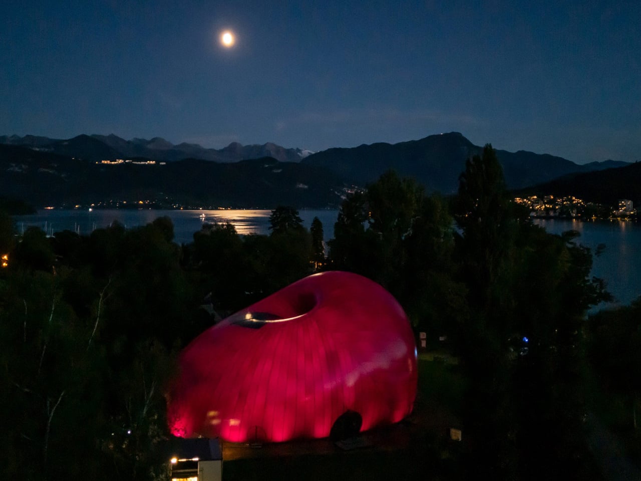
Ark Nova redefined the idea of a concert venue by replacing permanence and grandeur with mobility and sculptural expression. Created through a collaboration between British artist Sir Anish Kapoor and Japanese architect Arata Isozaki, the inflatable hall appeared as a monumental, purple, organic form that challenged traditional architectural expectations. Its soft, self-supporting membrane transformed air into structure, creating a space that felt both futuristic and welcoming. When it arrived in Europe for the first time at Switzerland’s Lucerne Festival, Ark Nova marked a new chapter in its evolving cultural journey.
Originally conceived in 2013 as a response to the Fukushima earthquake and tsunami, Ark Nova was designed to bring music and collective healing to affected communities. Its pneumatic structure required no rigid framework, allowing it to be assembled quickly and adapt to different settings. Inside, light filtered gently through the membrane, shaping an intimate acoustic environment for diverse performances. More than a venue, Ark Nova stood as a symbol of resilience, accessibility, and the power of art to travel where it is needed most.
2. Curated Sculptural Domes
Within sculptural art, the dome becomes a powerful medium for exploring scale and perspective. It is no longer just a form, but a monumental tectonic presence that anchors and defines urban space. Artists are increasingly working with 3D-printed composites, crafting perforated shells that transform sunlight into a carefully choreographed play of shifting shadows.
This evolution lifts the dome from a utilitarian roof to an architectural poem. The cultural value it generates goes beyond aesthetics, creating a strong sense of place and collective memory. Bathed in diffused light, these spaces blur the boundary between art and architecture, merging both into a single, immersive experience.
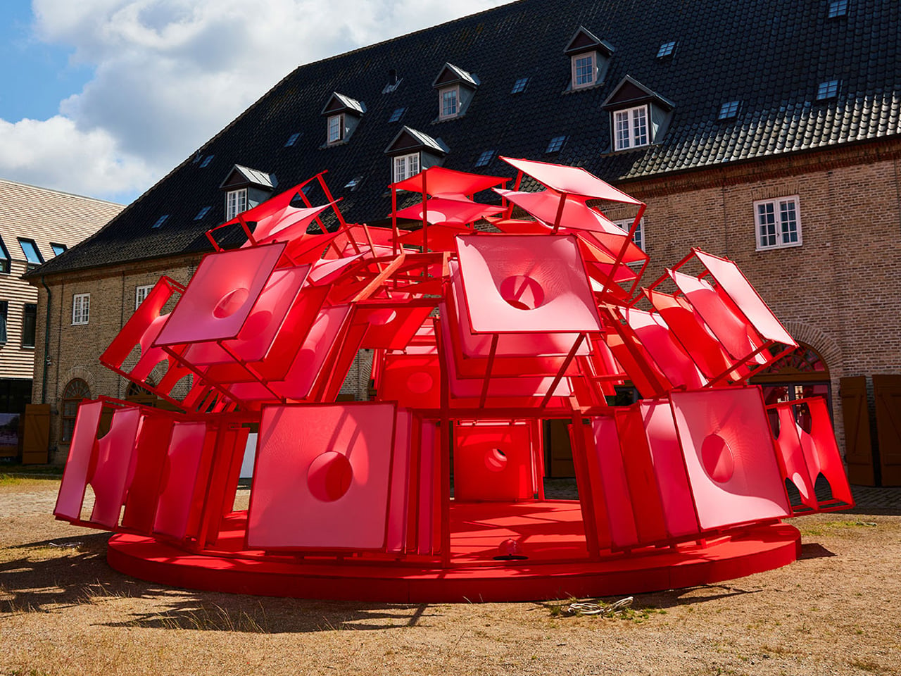
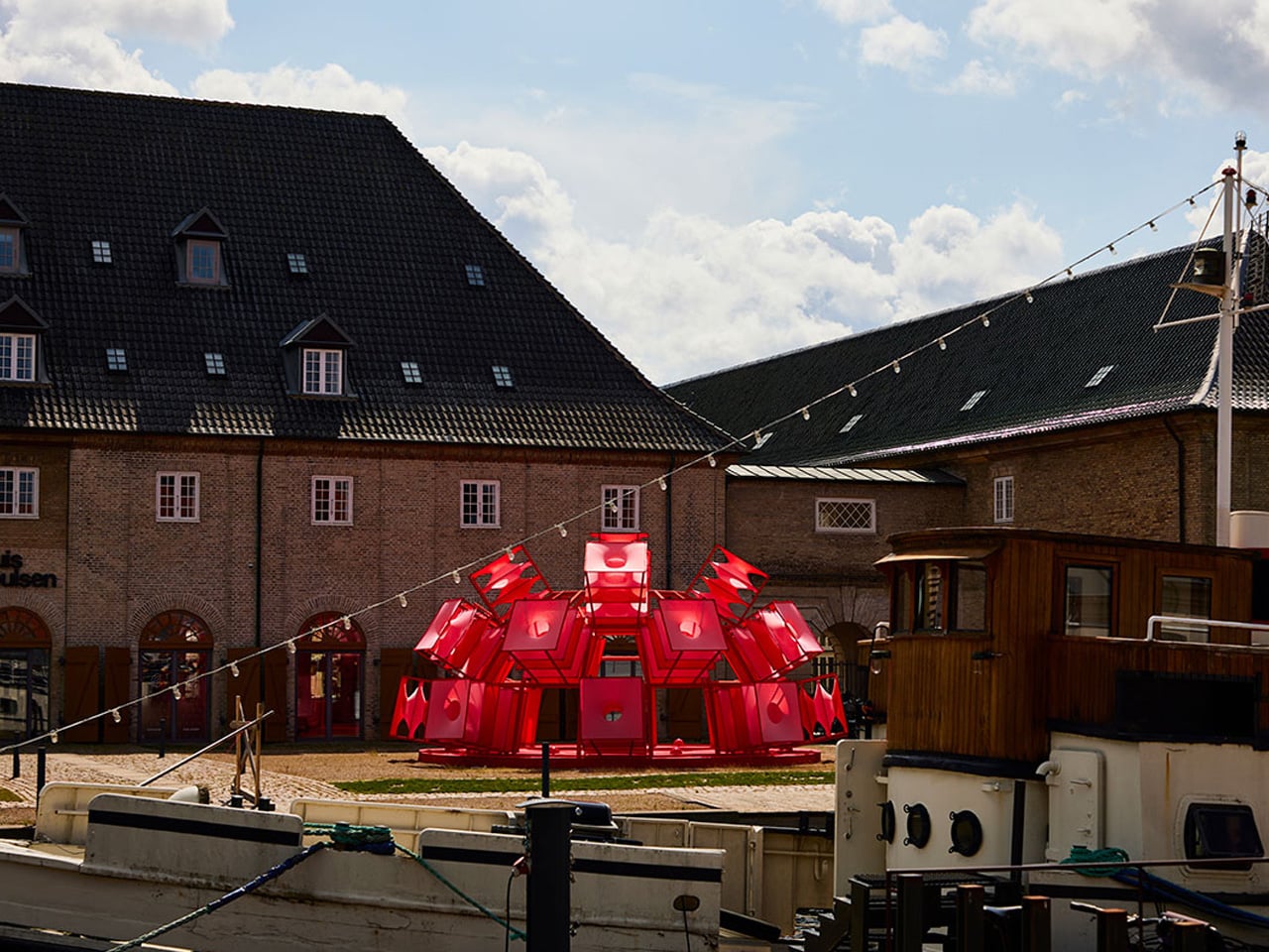
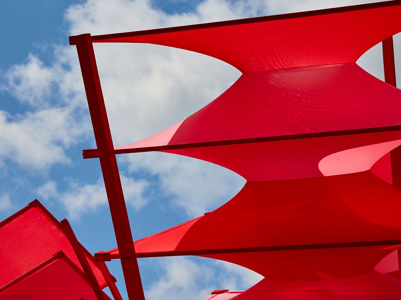
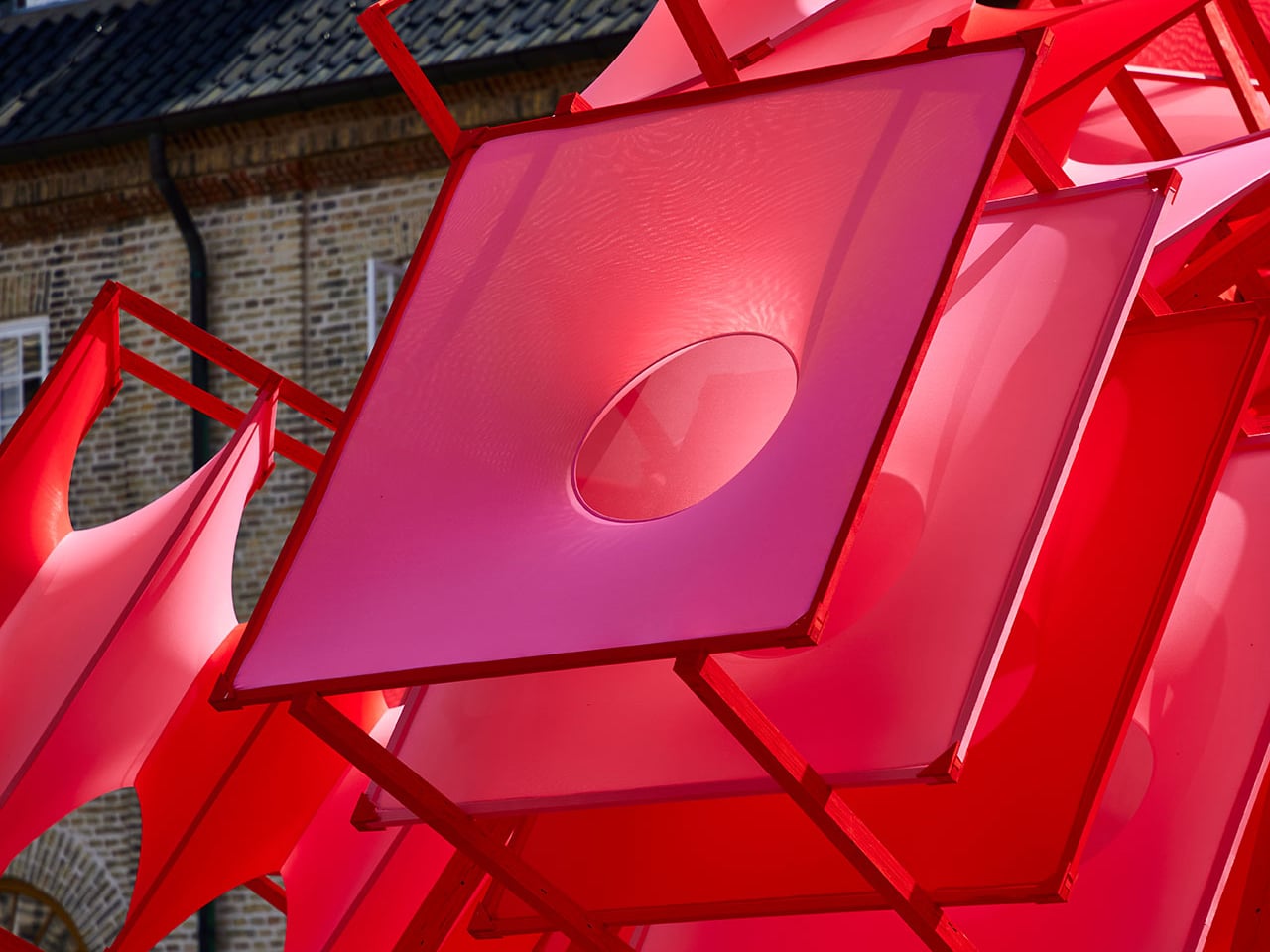
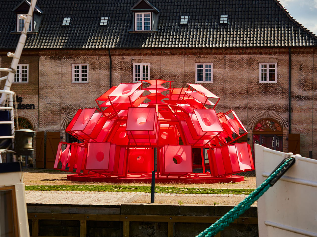
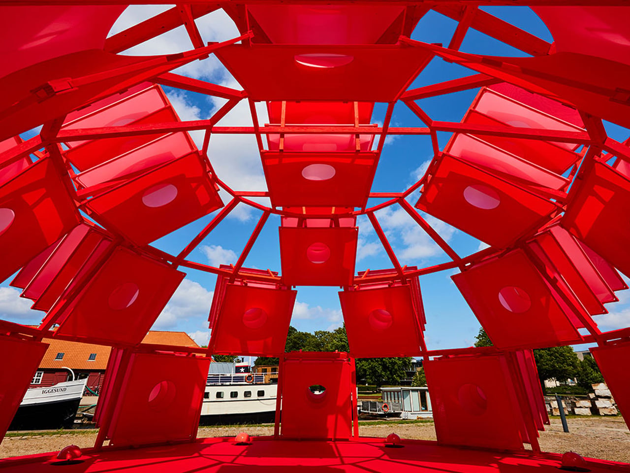
Circle Dome Square transformed the space outside Louis Poulsen’s Copenhagen showroom into a striking architectural moment. Designed by Henrik Vibskov, the dome appeared like a vivid red form caught mid-bloom, its fabric panels radiating outward from a central core. Referencing the curves and spirit of Verner Panton’s iconic Panthella lamp, the installation translated a lighting object into an immersive structure. From a distance, the dome commanded attention with its explosive geometry, while up close, its layered textile construction revealed depth, movement, and careful spatial composition.
Inside the dome, the atmosphere shifted dramatically. The bold exterior gave way to a calm, enclosed environment where soft red light filtered through the fabric skin, creating a sense of warmth and stillness. The textile walls subtly shaped acoustics and scale, turning the dome into a temporary refuge within the urban setting. More than a visual statement, Circle Dome Square demonstrated how fabric, light, and form could work together to create an experiential space that invited pause, reflection, and quiet engagement.
3. Monolithic Living Domes
Dome housing has evolved from countercultural experimentation into a model of high-performance luxury living. Its inherent geometry delivers exceptional thermal efficiency, reducing air stagnation and heat loss while lowering long-term operational costs. The seamless, monolithic concrete shell reinforces material honesty, combining structural integrity with enduring performance.
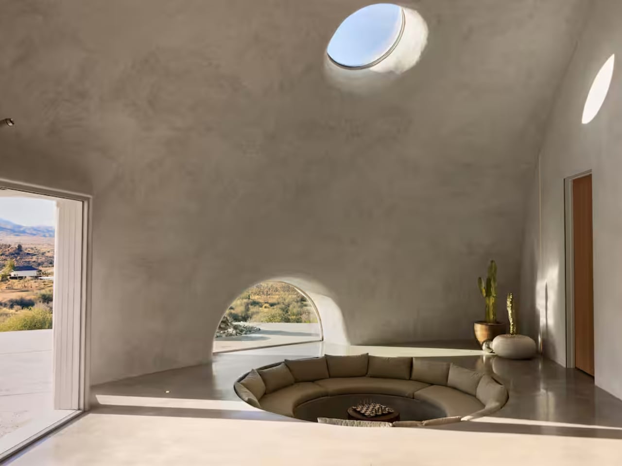
Inside, the absence of corners allows space to flow naturally. Movement feels intuitive and unforced. The double-height apex draws the gaze upward, becoming a quiet focal point that connects the interior to the sky above. Living within a dome creates a biophilic cocoon—where light, acoustics, and form work together to produce a deep sense of calm, balance, and grounded serenity.
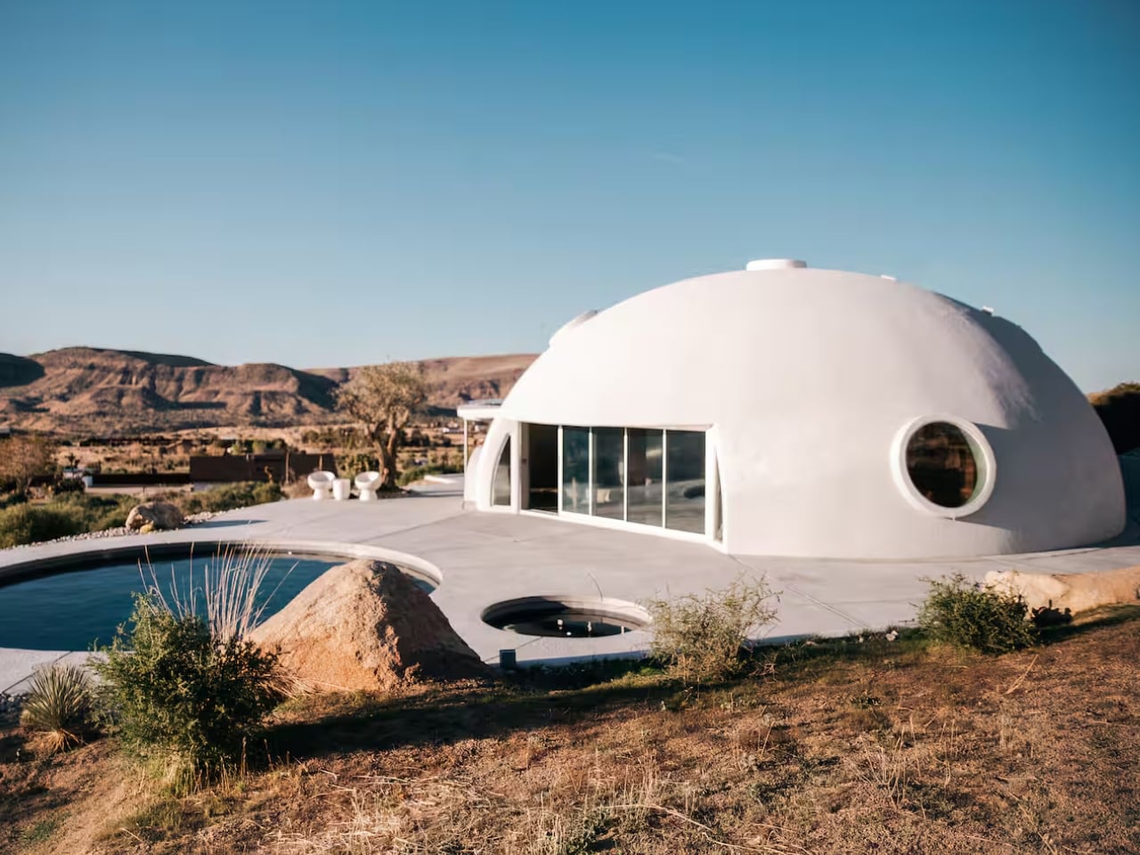
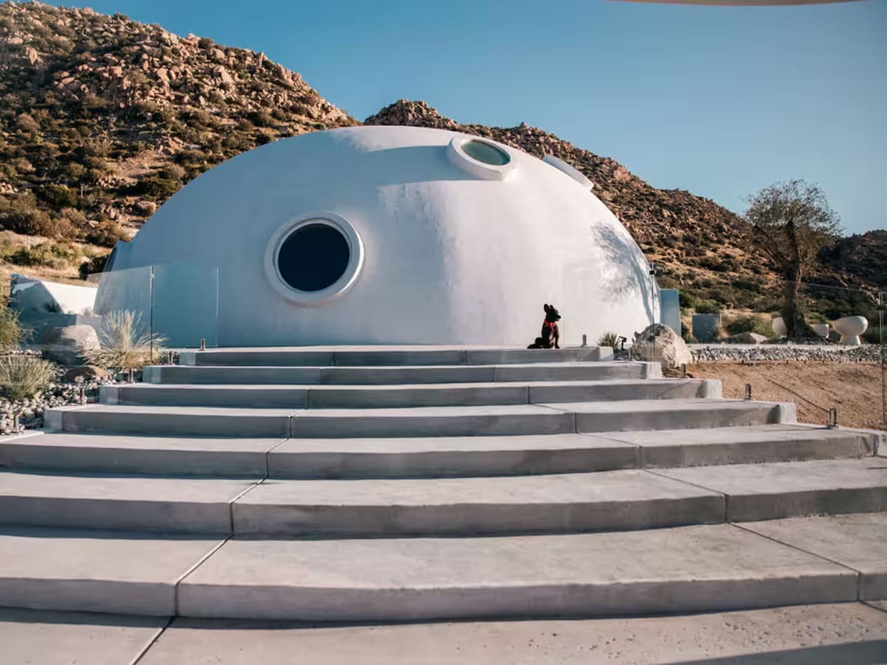
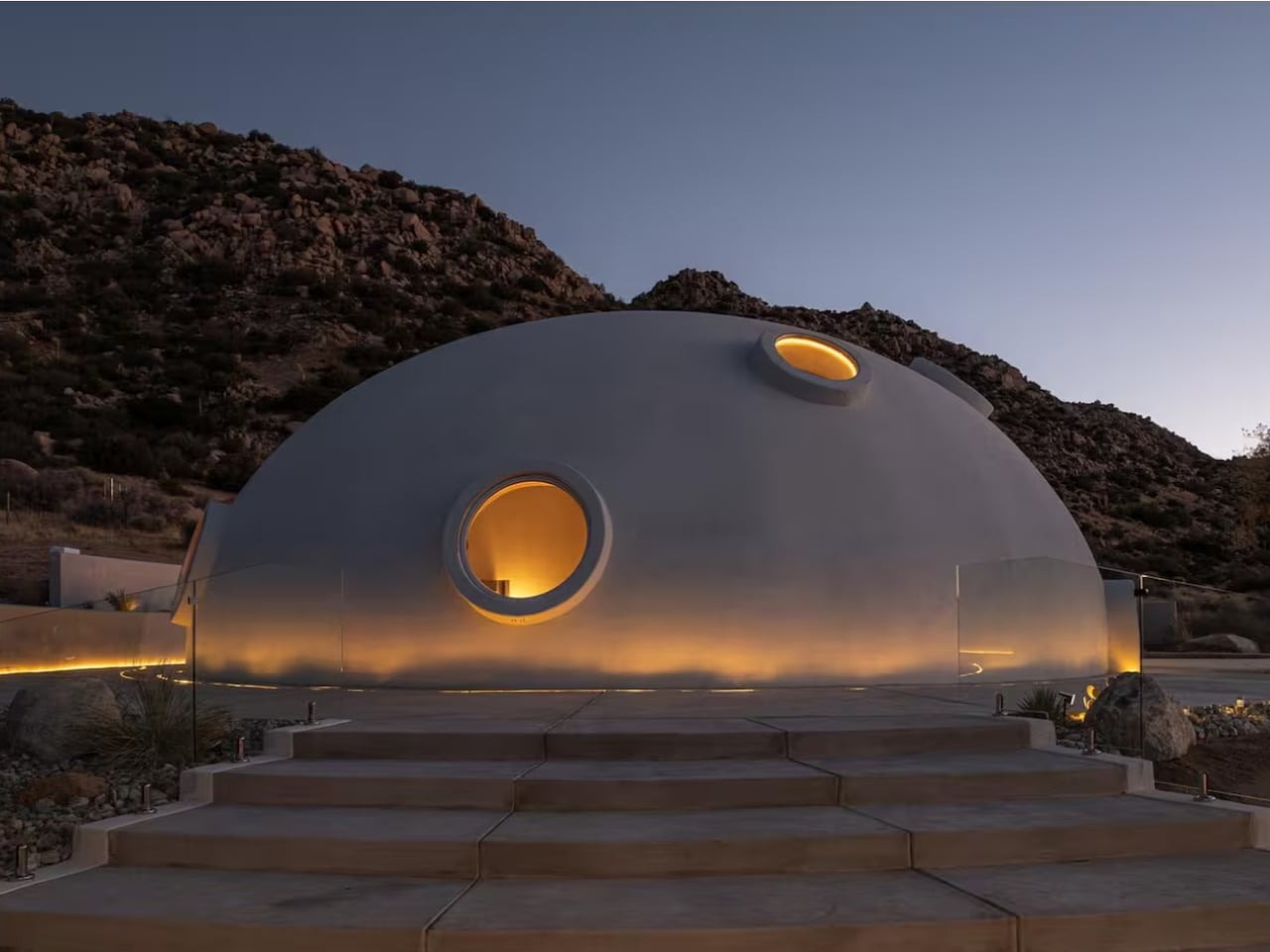
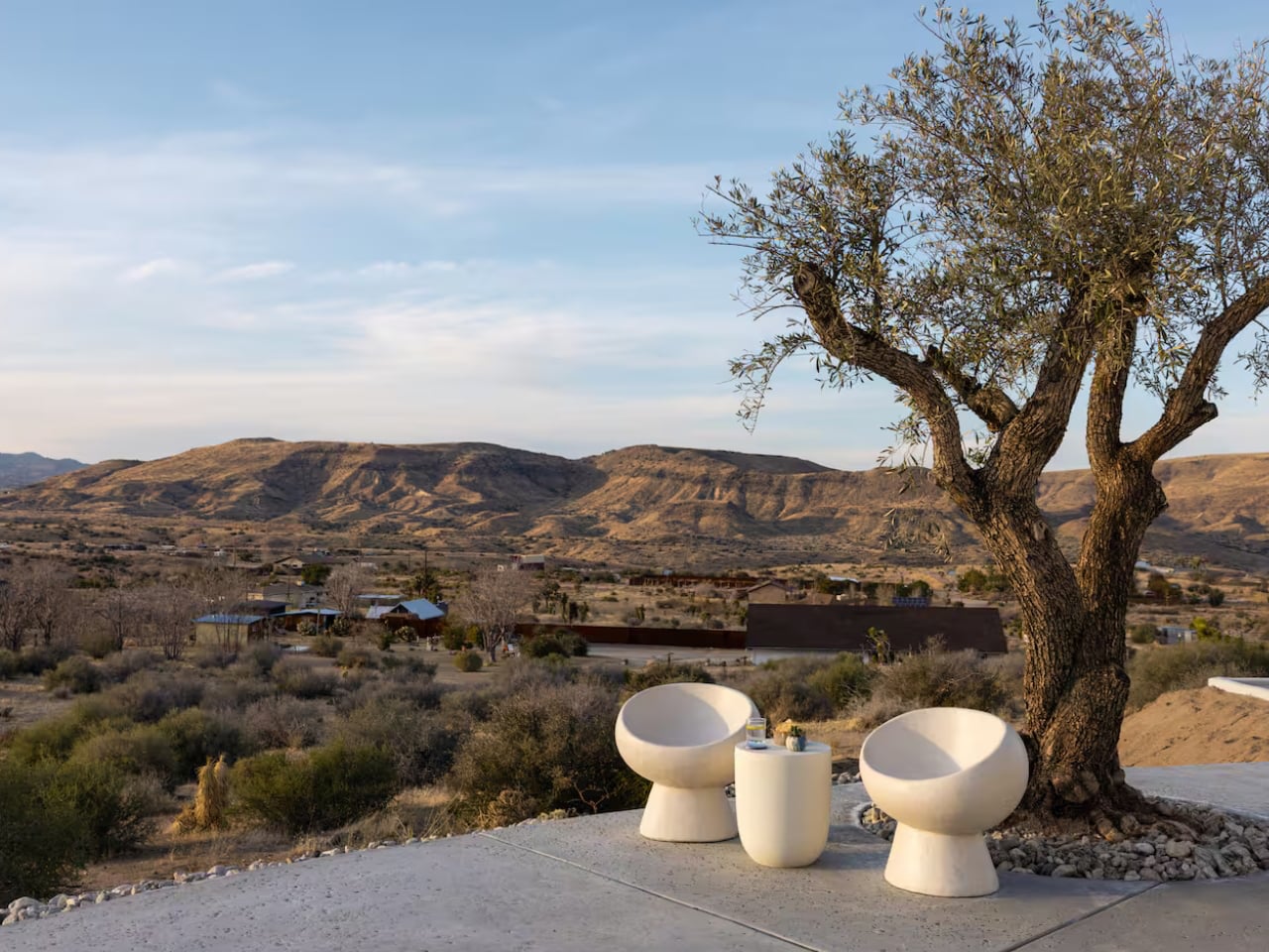
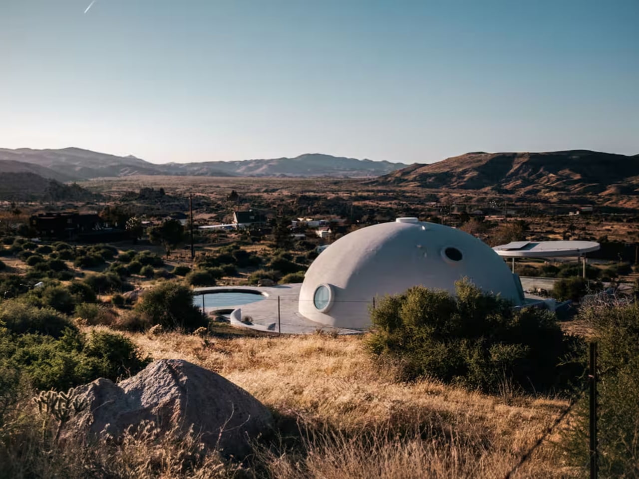
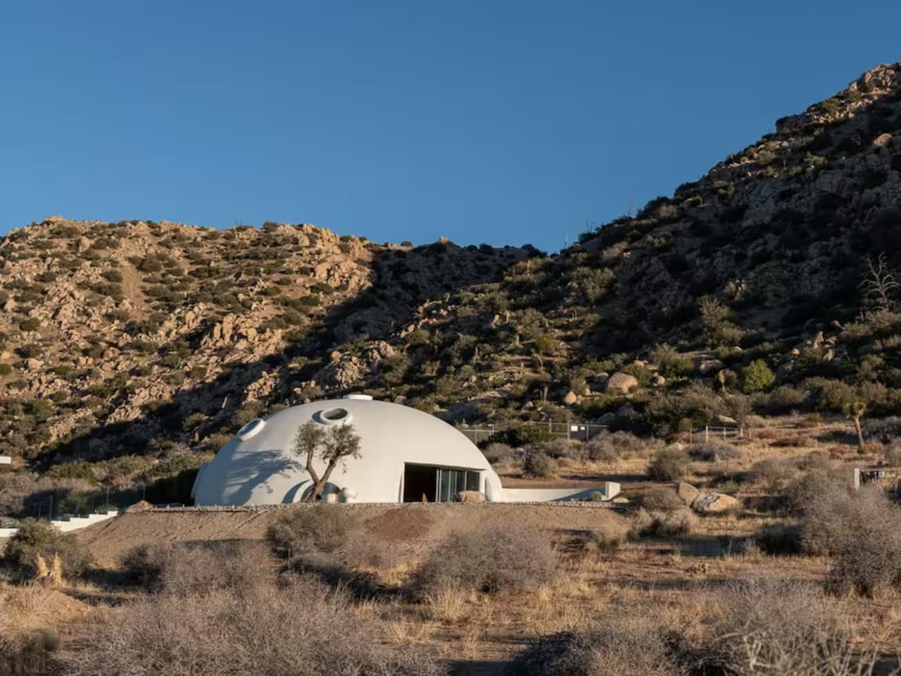
Rising unexpectedly from the desert landscape of Pioneertown, California, the HATA Dome looked like something straight out of a science-fiction film—but without any extraterrestrial mystery attached. Set against rugged terrain, the dome stood as a bold architectural presence, immediately capturing attention with its smooth, monolithic form. Rather than hinting at conspiracy, it offered something far more tangible: a place designed for human retreat and deep connection with the surrounding environment.
The HATA Dome was designed and built single-handedly by Anastasiya Dudik, guided by a “future primitive” philosophy that blended ancient building logic with contemporary thinking. Constructed using concrete, rebar, and shotcrete, the dome prioritised durability, fire resistance, and seismic safety while naturally regulating temperature through passive thermal mass. Inside, soaring ceilings, soft natural light, and sculpted interiors created a calm, immersive refuge. Both raw and refined, the dome functioned not just as an architectural statement but as a liveable, sustainable shelter or one that could be experienced firsthand as a desert escape.
4. Orchestrating the Ephemeral Glow
Lighting within a dome is less about fixtures and more about control. The curved surface naturally redistributes light, allowing illumination to be indirect, layered, and calm. By keeping sources discreet and concealed, light appears to emerge from the architecture itself rather than from visible hardware.
This method reinforces the purity of the form. Shadows soften, edges dissolve, and the space feels continuous rather than segmented. Light becomes a guiding force, shaping movement and mood without drawing attention to its origin. At night, the dome reads as a quiet, expansive enclosure—intimate, protective, and atmospherically balanced, where illumination supports presence rather than spectacle.
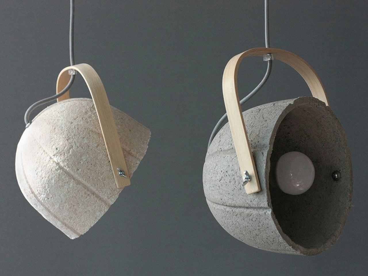
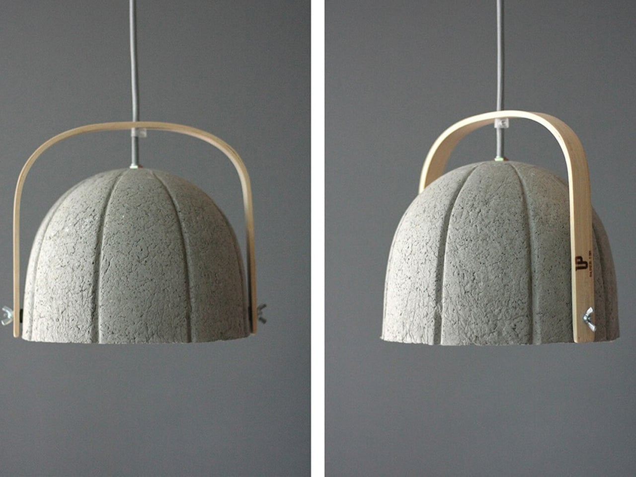
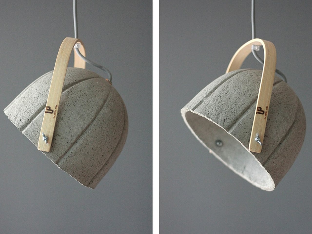
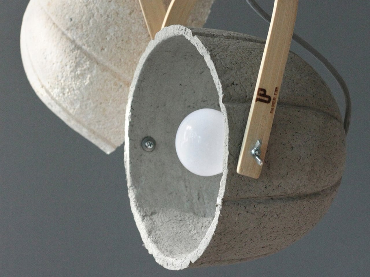
At first glance, the Dome lamp’s domical form draws you in with its quiet strength and sculptural presence. Shaped like a small architectural dome, the design feels grounded and balanced, transforming the lamp from a simple lighting object into a statement piece inspired by structural forms found in buildings.
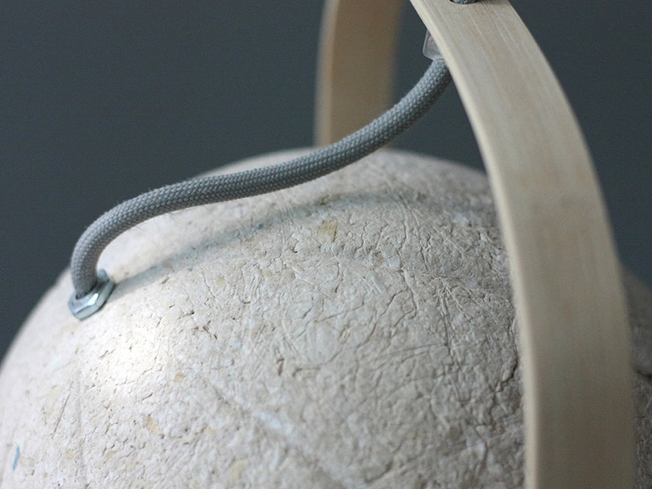
The curved silhouette is paired with a bent bamboo strap that visually echoes the dome’s softness while adding warmth and contrast. Together, the rounded shade and flowing strap create a harmonious composition, where even the wire follows the curve, reinforcing the lamp’s cohesive, domed design language.
5. Biospheric Urban Farming
Urban agriculture finds a powerful ally in dome design. As cities move toward localized food systems, these biospheric structures offer a highly efficient growing environment. Their inherent thermal performance supports year-round cultivation, while the height-to-width ratio naturally accommodates vertical farming maximizing yield per square meter and reducing the carbon footprint of food production.
Beyond productivity, these agricultural domes act as biophilic anchors within dense urban fabric. They reconnect built form with landscape, reintroducing nature into the city core. Lightweight ETFE panel systems ensure optimal light transmission and climate control, allowing the interior to function as a resilient ecosystem delivering long-term value through food security, education, and improved community health.
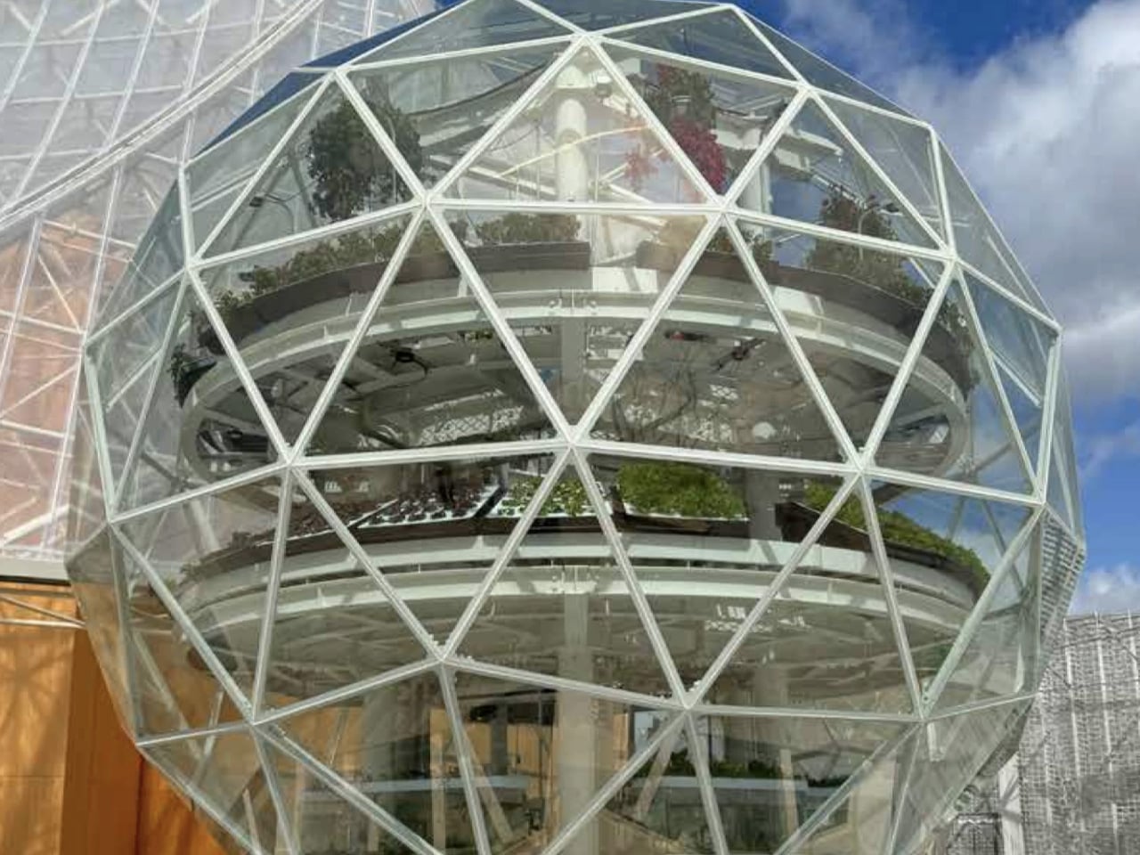
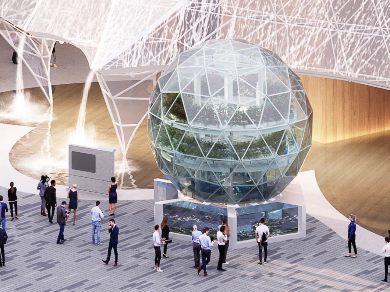
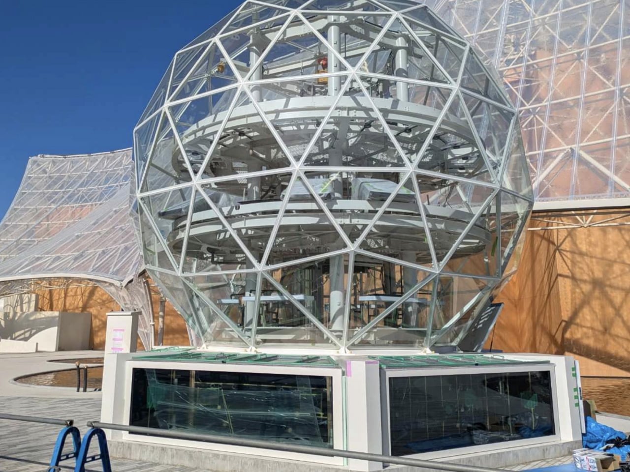
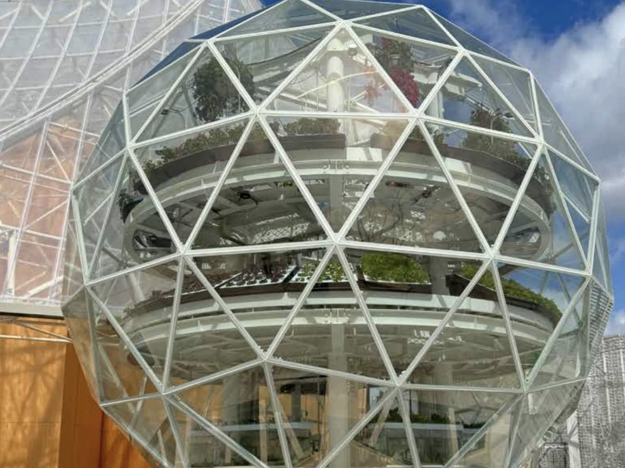
At Expo 2025, the Osaka Health Pavilion hosted Inochi no Izumi, or Source of Life, a translucent, 21-foot-high dome that reimagined urban food systems. Inside, aquatic life and plants coexisted in a vertically stacked ecosystem, with fish swimming below and crops growing above. Four water zones including seawater, brackish water, and two freshwater layers supported different species, each paired with hydroponic plants suited to its conditions, forming parallel ecosystems within a single compact structure.
The system operated on a closed-loop aquaponic cycle. Fish waste was naturally converted into nutrients that fed the plants, which in turn returned purified water to the tanks below. Nothing was wasted and nothing left the dome. Enclosed within a lightweight geodesic shell designed to maximise sunlight and maintain a stable microclimate, the structure demonstrated how ecological intelligence and space-efficient design could work together.
Ultimately, the dome endures because it unites logic with feeling. Its geometry delivers resilience, efficiency, and longevity, while its form evokes calm and wonder.
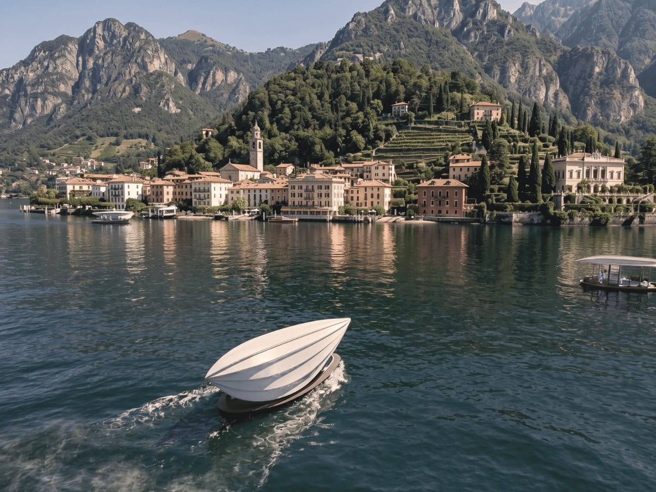
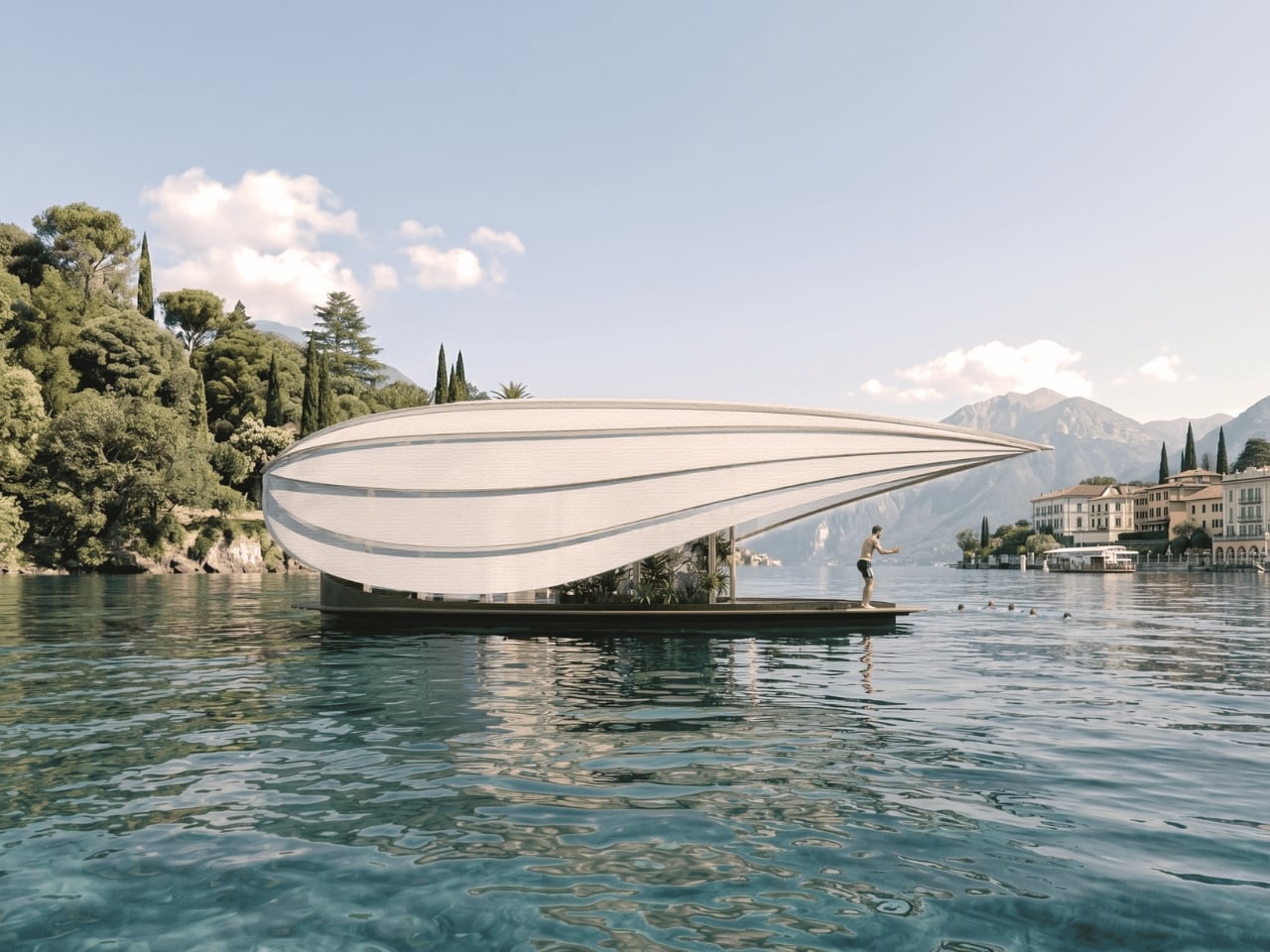
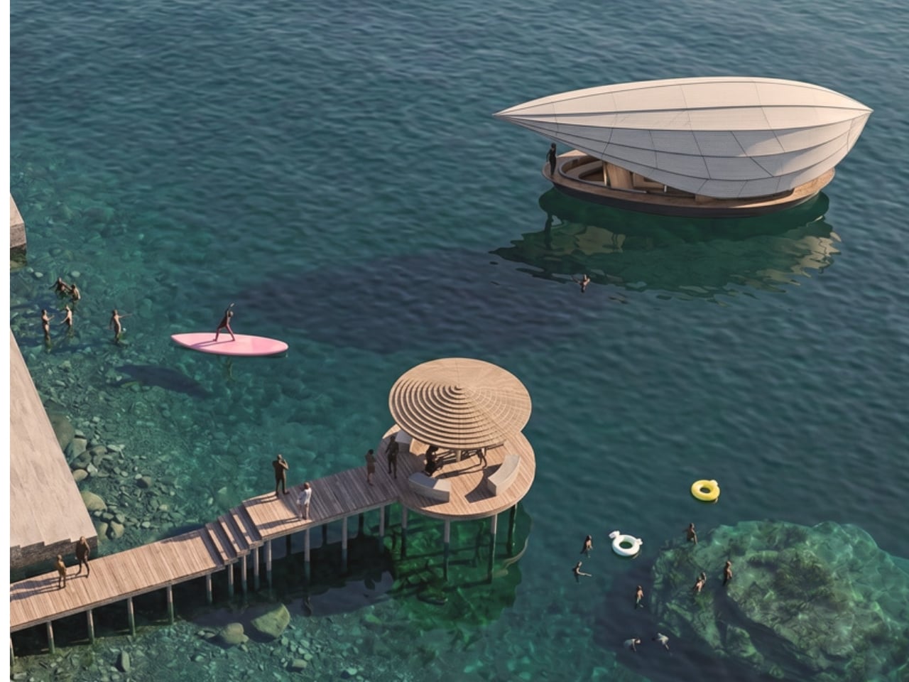
When I first saw images of Lucia floating across the glassy surface of Lake Como, I thought someone had photoshopped a Giorgio Armani showroom onto a boat. The structure is white, impossibly clean, and moves across the water like it belongs there. Which, technically, it does.
Lucia is the brainchild of uau studio, a concept micro-home designed to drift across one of Italy’s most storied lakes. The name, the setting, the whole premise feels almost too cinematic to be real. But the more you look at it, the more you realize this isn’t just a pretty render. It’s a genuine rethinking of what a home can be and where it can go, and it deserves a moment more than the usual scroll-and-double-tap.
The design draws its soul from the batèl, a traditional flat-bottomed fishing vessel that appears in Alessandro Manzoni’s 19th-century novel The Betrothed. For anyone who didn’t have to read it in school, Manzoni’s book is essentially the Italian equivalent of a national literary treasure. That detail alone gives Lucia a kind of cultural weight that most micro-homes simply don’t carry. uau studio isn’t just designing a floating box. They’re threading it into a centuries-old relationship between the people of Lake Como and the water they live beside. That’s a different kind of ambition, and it shows.
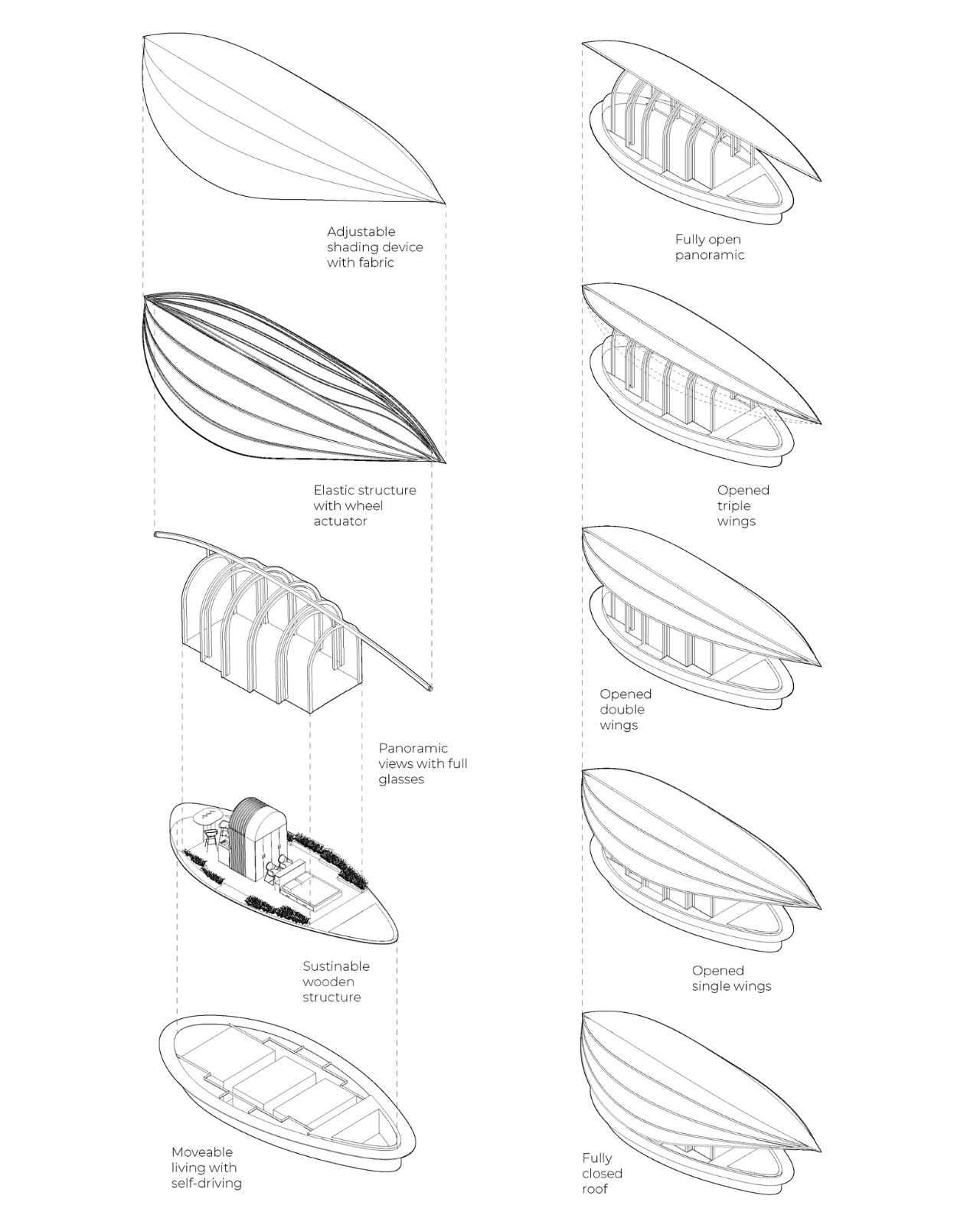
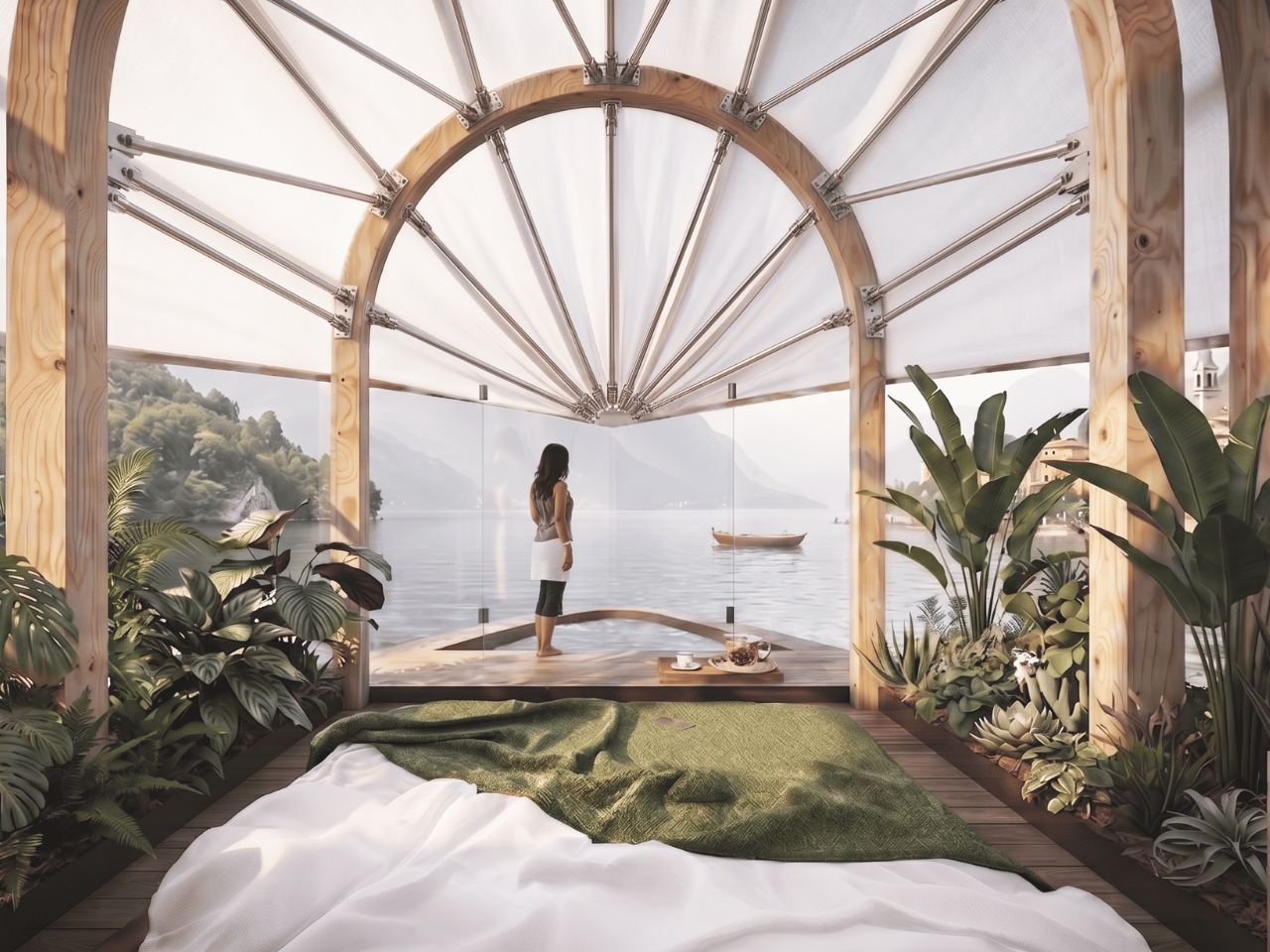
The signature feature is a foldable canopy roof that opens and closes depending on how much of the lake you want to let in. Fully open, the interior feels like an extension of the water itself. Closed, it becomes a more private, sheltered space, quieter and more contained. That flexibility matters more than you might think. Living on a lake means negotiating between exposure and enclosure constantly, and Lucia gives you full control over that tension without asking you to compromise on either.
The interior is single-floor, fully accessible, and built around modular, multifunctional furniture that can be reconfigured depending on how you’re using the space. It’s compact by design, not by compromise. uau studio was deliberate about this: nothing is wasted, nothing is redundant, and the materials prioritize reuse over novelty. For a project set against one of the most photographed backdrops in Europe, that kind of restraint is actually a design statement in itself.
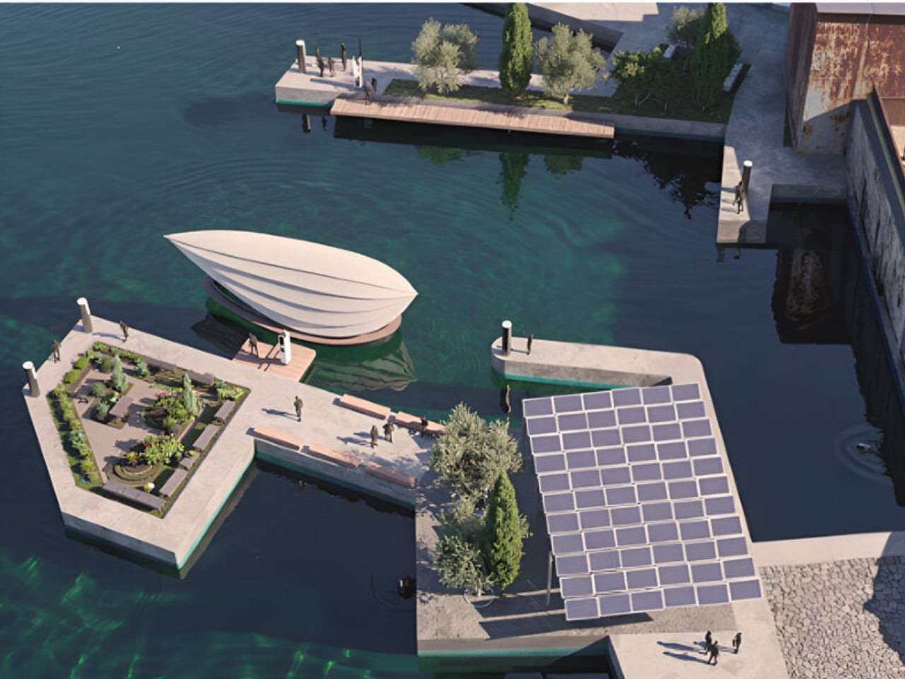
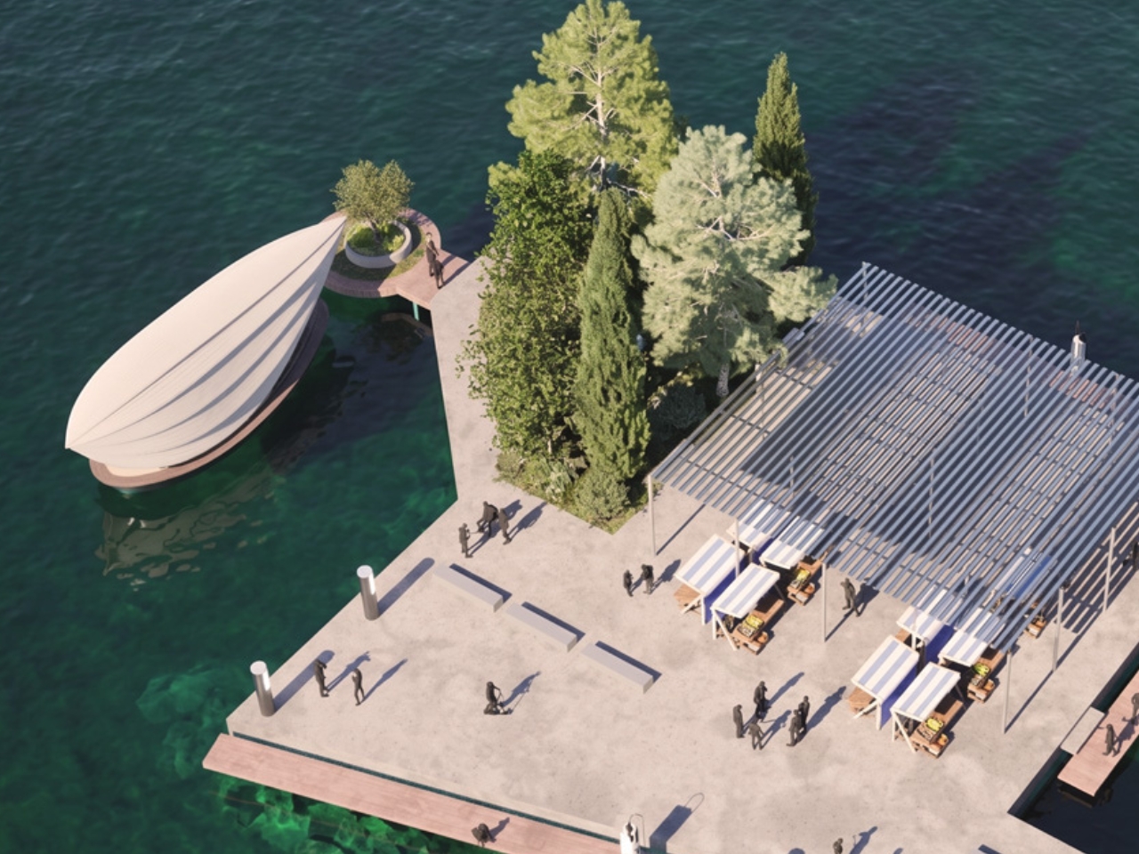
Lucia also plugs into what the studio calls Darsena Link, a network of solar-powered docking hubs around the lake that would support the vessel’s movement and keep it charged. The infrastructure isn’t an afterthought. It’s part of the concept. You can wake up anchored at one point on the lake and, by afternoon, quietly motor to another. The house follows you, or you follow it.
I’ll be transparent: Lucia is still a concept, not something you can book or buy today. But I think that’s exactly what makes it worth paying attention to right now. It represents a direction more designers and architects should be exploring. The tiny home movement has largely been a land-based conversation, with the water version mostly limited to houseboats that feel more nautical than architectural. Lucia doesn’t feel like a boat trying to be a house. It feels like a house that happens to float, and that distinction is more meaningful than it sounds.
The project also positions itself as a kind of social connector on the lake, what uau studio calls a “pollinator,” meant to move through different communities, bring people into contact with corners of the lake they might not otherwise reach, and revive its cultural fabric for a younger generation. Whether that vision scales beyond the concept stage or stays beautifully poetic is still an open question. But the intention gives the project a dimension that stretches well beyond aesthetics.
Lake Como already has villas, yachts, and Grand Hotel terraces competing for your attention. Lucia proposes something quieter: a life on the water that is small, considered, and genuinely mobile. Not every home needs to be rooted to the ground. Some of the best ones, apparently, simply drift.