Note apps are frictionless. That is supposed to be their advantage. You open one in two taps, type something forgettable, close it, and lose it somewhere between screenshots and grocery lists. The problem is that “frictionless” and “memorable” are not the same thing. Japanese stationery designers figured this out long ago, which is why they keep building analog tools that feel more considered than anything a software update has ever produced.
Every product here solves a specific friction point you have probably accepted as normal: a pen that vanishes when you need it, a clipboard that fights back when you add a sheet, a tape dispenser that looks like it escaped from a supply closet. These five finds fix all of that without an app store, a subscription, or a settings menu.
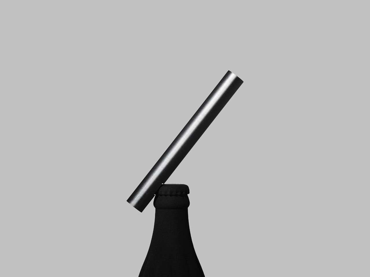
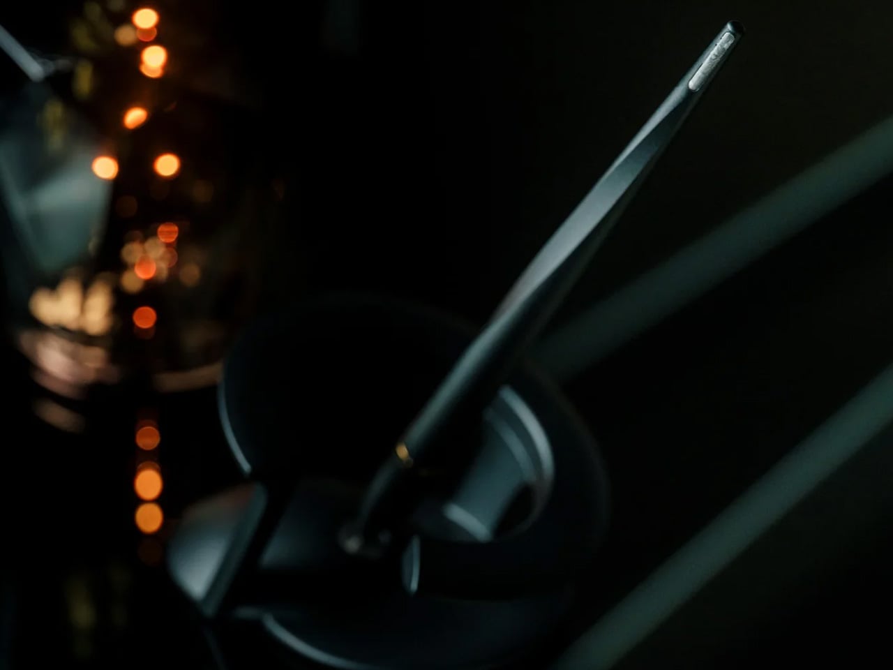
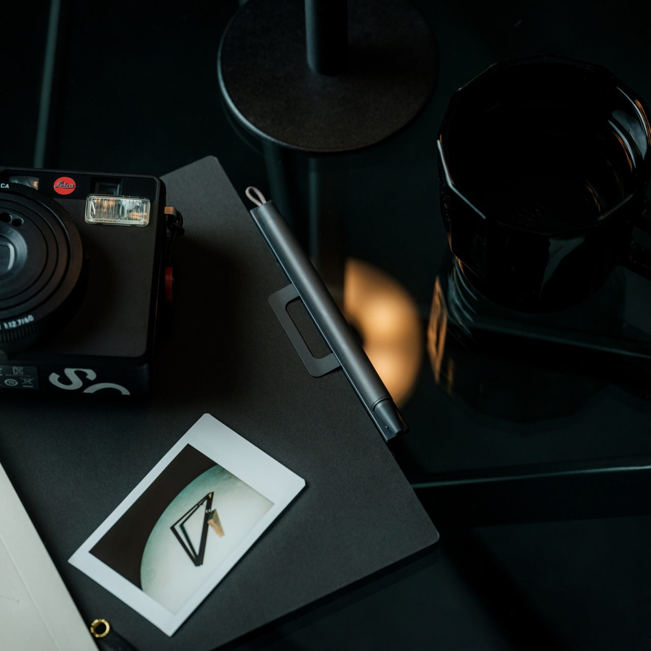
1. Inseparable Notebook Pen
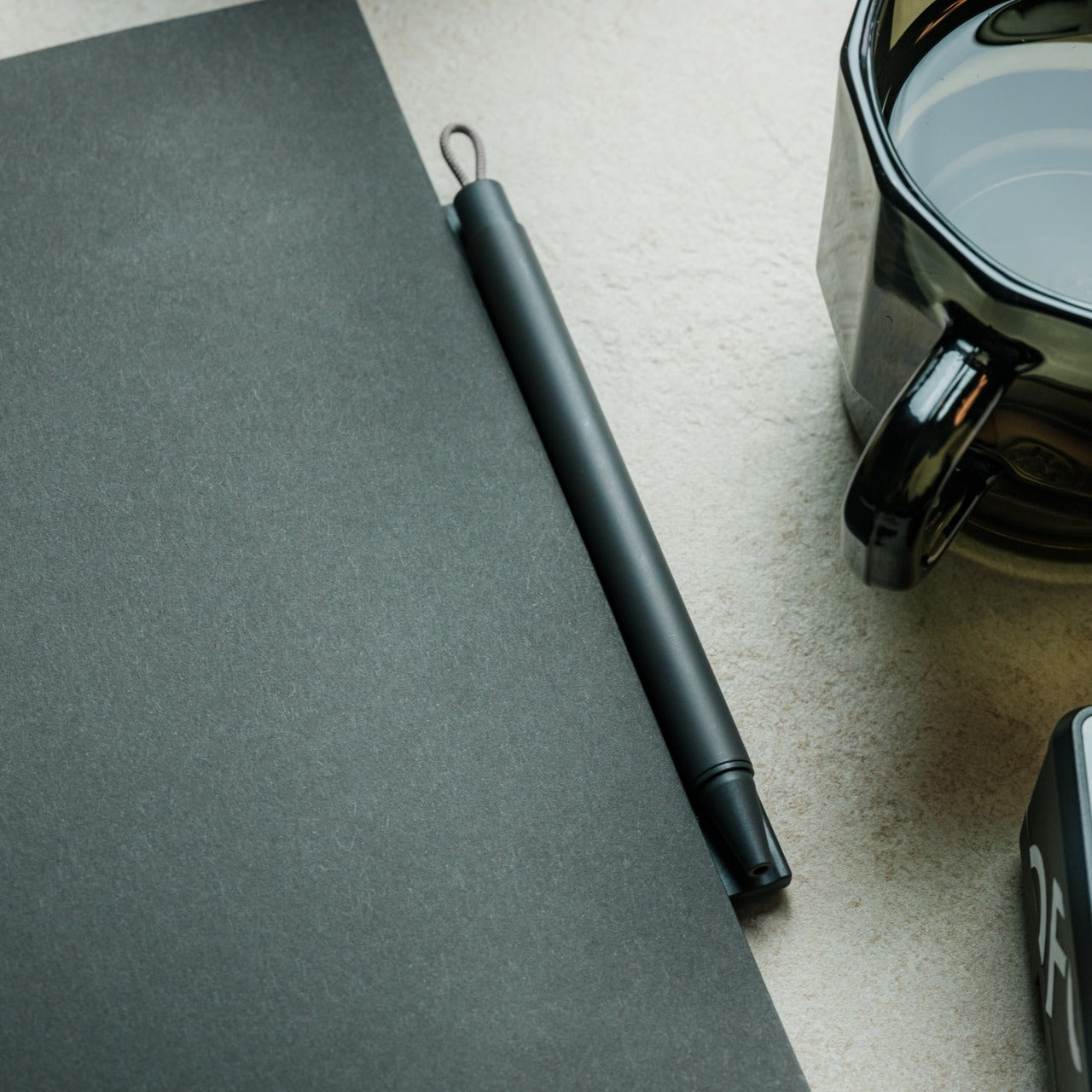
Most pens exist independently of the surface they write on. The Inseparable Notebook Pen rejects that assumption, using a magnetic clip that locks it to your notebook cover every single time. A built-in silencer dampens the attachment so there is no click, no rattle, just a quiet lock into place. The barrel is slim, the gel ink immediate, and the whole system rests on a principle Japan has long understood: the best tools are the ones you eventually stop noticing.
The gap between reaching for a pen and writing is small but real. In a meeting, on a train, mid-thought at a cafe table, that search breaks momentum in a way you feel but rarely name. By attaching itself to the notebook, the Inseparable closes that gap completely. It arrives wherever the notebook goes, leaves when the notebook leaves, and sits almost invisible against the cover. At $19.95, it is a quiet fix for an annoyance most people have long stopped trying to solve.
What we like
- The magnetic clip holds firm during transit but releases instantly the moment you need it
- The built-in silencer makes every attachment feel deliberate rather than mechanical
What we dislike
- The slim barrel may feel too narrow for anyone who prefers a wider, more substantial grip
- Ink cartridge options are limited, which restricts customization for specific writing preferences
2. Stalogy Editor’s Series 365-Day Notebook (A6)
The Stalogy Editor’s Series 365-Day Notebook packs 368 pages into an A6 form factor that still slides into a coat pocket. Each page carries minimal printed detail: faint dates, a light grid, time indicators running along the margin. Use them or ignore them entirely. The paper is ultra-thin but writes with a smooth resistance that makes ink feel like it belongs on the page rather than sitting on top of it. Gel pens, ballpoints, and lighter fountain pen inks all perform cleanly without feathering.
Most planners assume they know how your day should be structured. The Stalogy steps back. The faint markings give you reference points without enforcing a system, which means the same notebook works for bullet journaling, meeting notes, rough sketching, and daily records without ever feeling like you are working against the page. For anyone who has cycled through five different note apps looking for the one that finally fits their brain, this is what that search was actually about.
What we like
- Thin paper keeps 368 pages from becoming heavy, maintaining genuine pocketability throughout
- Minimal page markings suit both rigid planning systems and completely freeform, unstructured use
What we dislike
- Heavy fountain pen inks will ghost through the thin paper, limiting compatibility with certain instruments
- Date and time markings are printed very small, making them difficult to read comfortably in low light
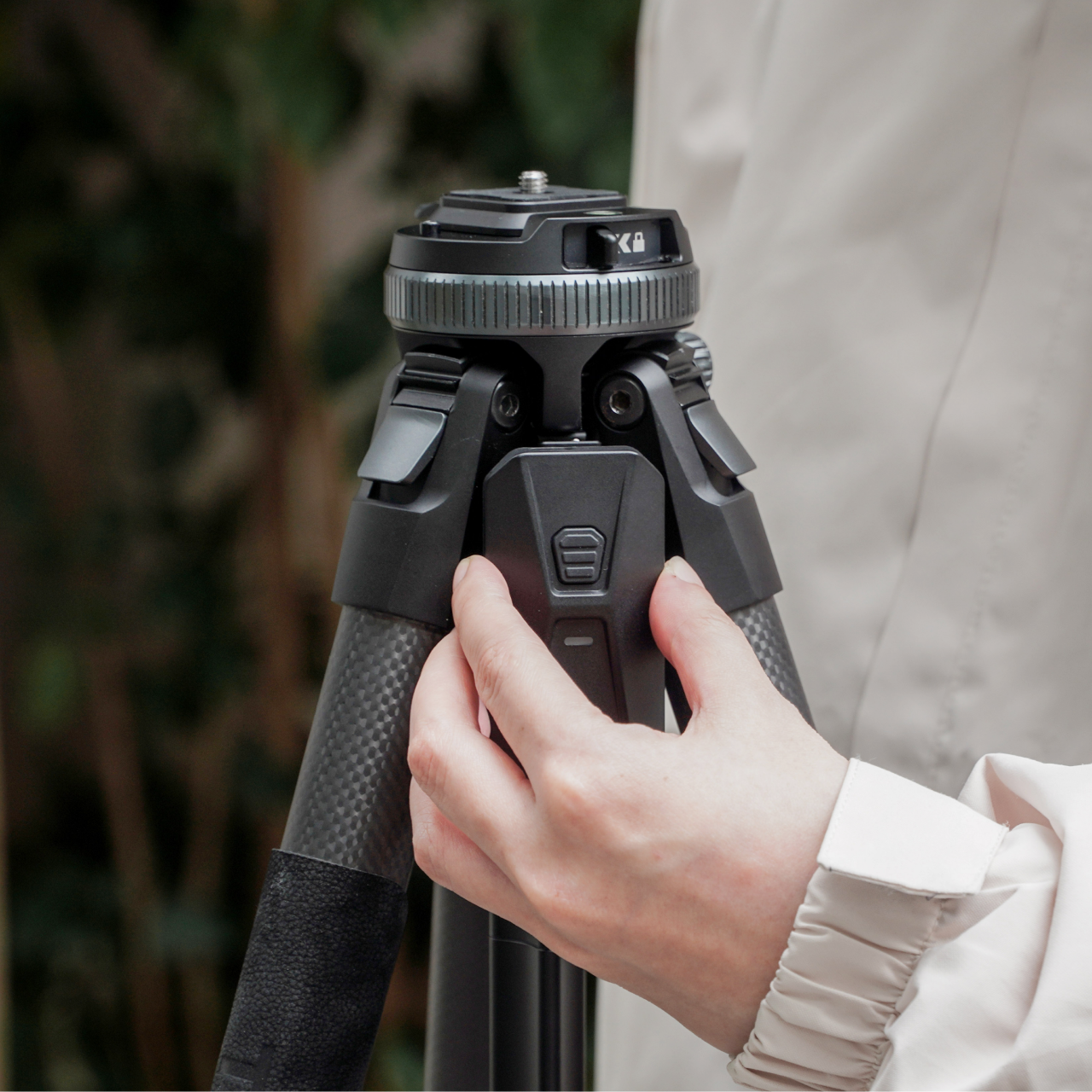
3. MagBoard Clipboard

Most clipboards run on the same tired mechanism: a spring-loaded lever that crushes paper at the top and leaves the rest of the sheet free to shift around below. The MagBoard replaces all of that with a magnetic and lever system that holds up to 30 sheets securely, without the grip marks. The hardcover backing is stiff enough to write on while standing, and the water-resistant surface means it survives bag life in a way paper-covered clipboards rarely manage.
The real advantage is speed. Adding or removing a sheet from most clipboards requires two hands and patience. The MagBoard lets you slide paper in and out cleanly, which changes how you interact with your notes during a meeting or a site walkthrough. It is the kind of improvement that sounds trivial until the first time you need it in a moment where fumbling costs you. At $45, it earns its place on the desk and equally off it.
What we like
- The magnetic system holds sheets flat without grip marks or any pressure damage to the paper
- The water-resistant hardcover handles bag use and outdoor conditions better than standard clipboards
What we dislike
- Bulkier than a standard clipboard, which can be a tight fit inside slimmer bags and sleeves
- The magnetic hold may feel less secure with very thick paper stocks or layered sheets of card
4. Classiky Wooden Tape Dispenser
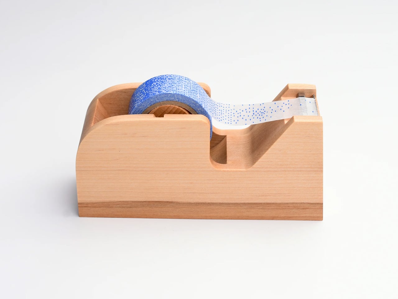
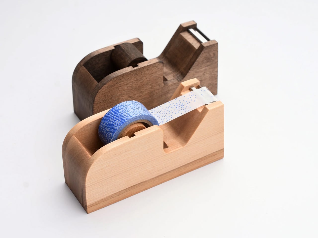
The tape dispenser is the most overlooked object on any desk. It sits in a corner, accumulates dust, and looks like it arrived from a supply closet rather than a considered workspace. Classiky’s version, cut from varnished Japanese wood with rounded, sculpted edges, refuses that role entirely. The grain is warm, the weight satisfying in the hand, and the mechanism precise enough to produce a clean tear every time. It quietly raises the standard for everything else sharing the same surface.
Classiky is a Japanese zakka brand that applies the same material thinking to everyday objects that most designers reserve for furniture. The Wooden Tape Dispenser is that philosophy made literal: a utilitarian desk tool reconsidered from the outside in, built from a material that improves with handling. The varnished wood deepens over time, picking up warmth from the room and the hands that reach for it daily. At $42, it makes every other object on your desk look like it is still waiting to be properly replaced.
What we like
- The varnished wood looks considered at rest and develops a warmer character with regular handling over time
- The mechanism produces a clean, controlled tear that most plastic dispensers never consistently manage
What we dislike
- Sized for standard tape rolls, so it will not accommodate wider washi tape or specialty roll sizes
- The wood surface will mark with use over time, which reads as earned patina to some and damage to others
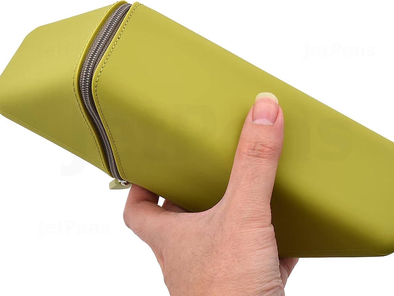
5. Sonic Kakusta Portable Pen Stand
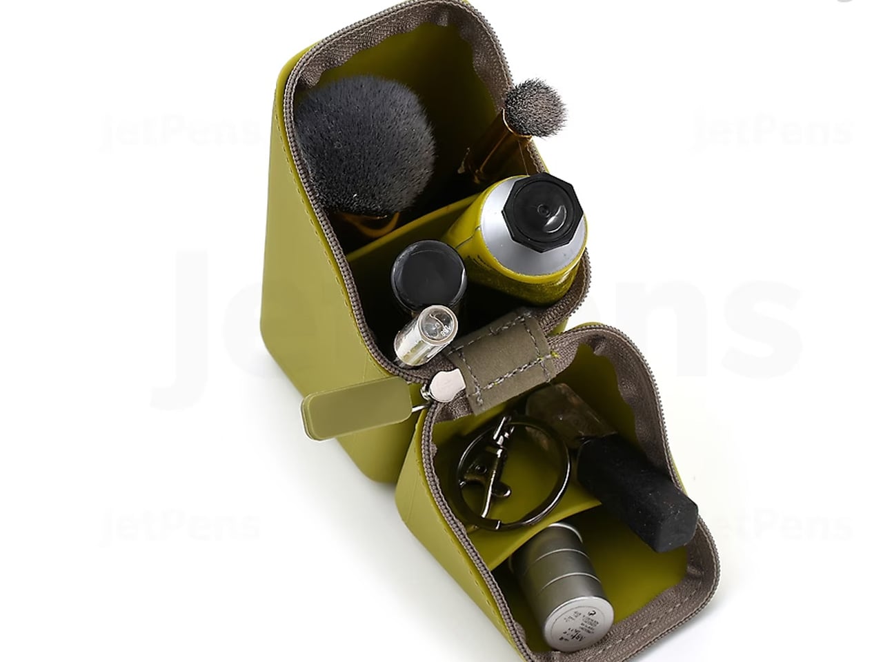
The Sonic Kakusta starts as a flat soft pen case and folds into a triangular desk stand in a single motion. Open, it props pens at a 60-degree angle: steep enough to show pen caps for quick identification, shallow enough that instruments slide out without tipping the whole case over. A built-in divider splits the interior into two sections, and a second divider in the lid creates a small shelf for erasers or sticky notes. Strong magnets hold the stand shape reliably on any flat surface.
For anyone moving between home, office, library, and studio, this is the object that makes carrying stationery feel considered rather than improvised. The case lies flat in a bag without occupying more space than a notebook. On a desk, it becomes a proper display stand, keeping what you need visible rather than buried at the bottom of a pouch. That transition from flat to functional in one fold is precisely the kind of engineering detail that separates Japanese stationery design from everything else in the category.
What we like
- The magnetic lid holds the stand shape firmly, even on slightly uneven or textured surfaces
- The lid divider creates a genuinely usable small shelf, an extra that most pen cases never think to include
What we dislike
- The soft material offers limited protection against crushing when a bag is packed tightly around it
- The triangular footprint when open takes up noticeably more desk space than a flat case would
The Best Tools Don’t Get Updated. They Get Better.
These five objects share one quality that note apps cannot replicate: they get better the more you use them. The wood deepens. The magnetic mechanism smooths out. Each session leaves a trace in the material that accumulates into something that is unmistakably yours. That is not sentimentality; it is the material logic of objects built to outlast a software cycle. Japanese stationery design at its best does not chase novelty. It makes the ordinary interaction between a person and a tool feel like it was worth designing in the first place.
The note app on your phone is not going anywhere. But after a week with these on your desk, you might find you reach for it less. Not because analog is inherently better, but because the right physical tool makes thinking feel different from typing. Slower, more deliberate, more yours. That is a harder thing to engineer than an app. Japan has been doing it for a long time.
The post 5 Japanese Stationery Finds So Satisfying You’ll Delete Every Note App on Your Phone first appeared on Yanko Design.