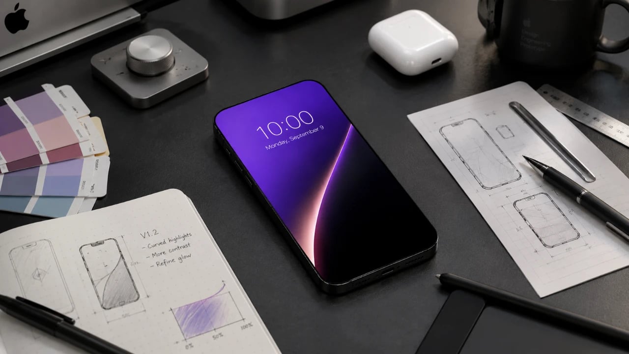
8 iPhone Apps You Should Download Right Now

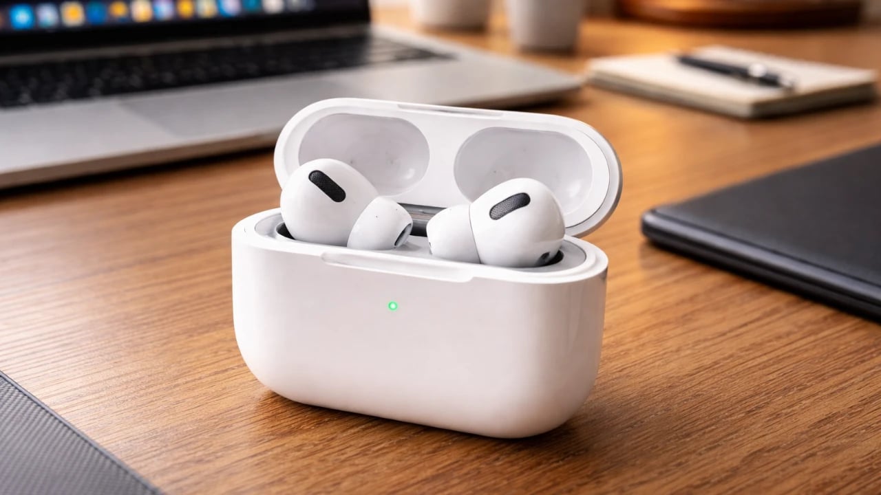
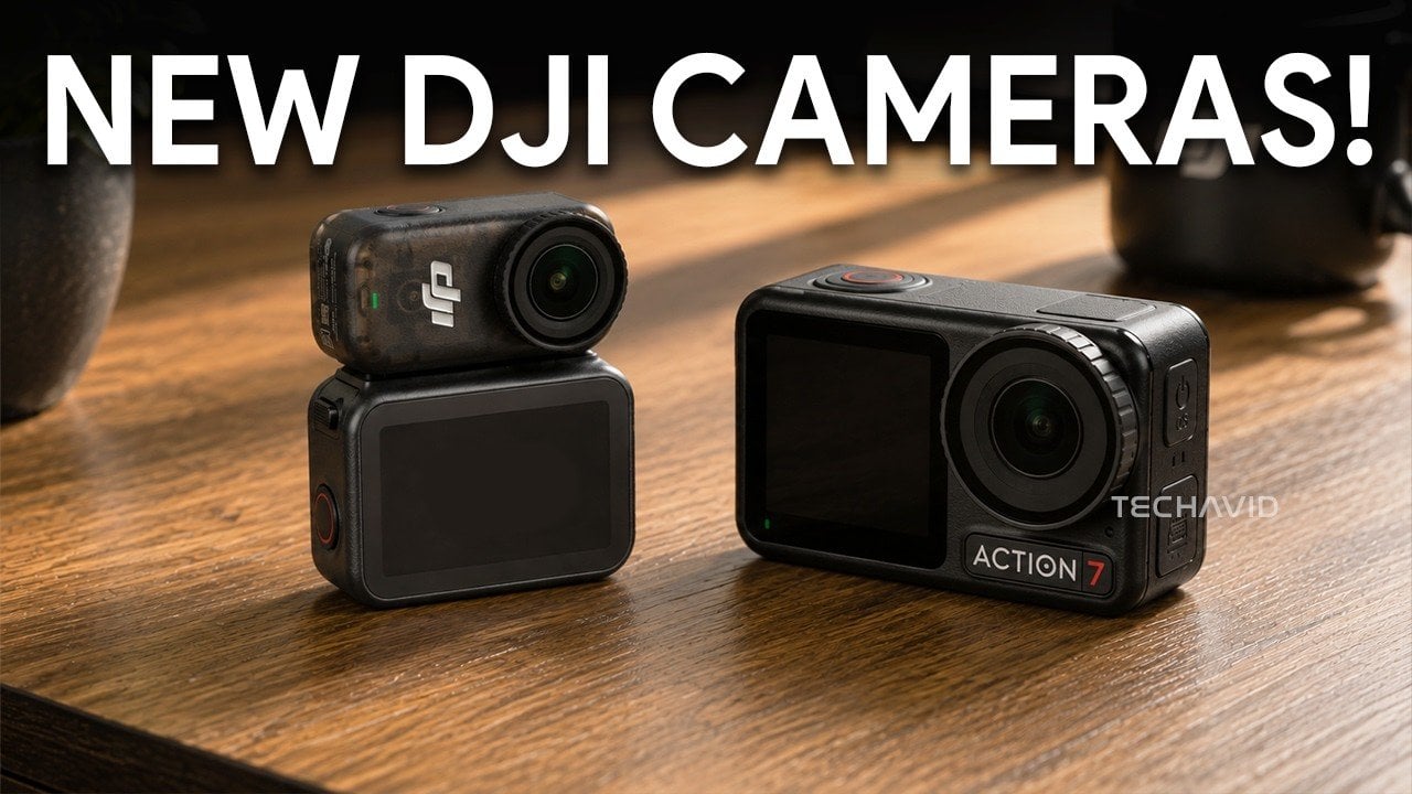
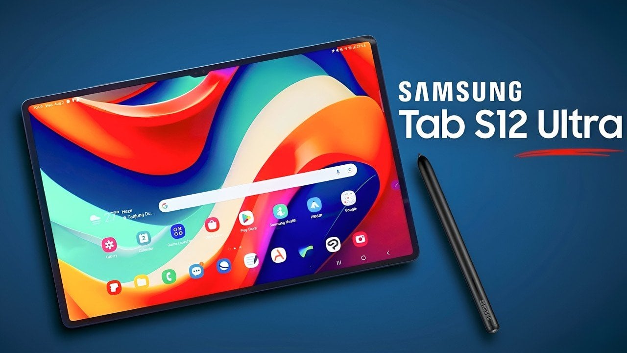
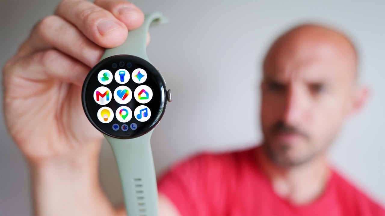
8 iPhone Apps You Should Download Right Now Illustration of allows you related to the article topic.

Your iPhone is more than just a communication tool; it’s a versatile device capable of adapting to your lifestyle and needs. With the right apps, you can unlock its full potential without spending a dime. Here are eight free apps that can expand your iPhone’s functionality, simplify your daily routines, and add a personal touch […]

The post 8 iPhone Apps You Should Download Right Now appeared first on Geeky Gadgets.
Posted in Uncategorized

The 21.5-Inch Transparent Speaker That Animates Lyrics to Match Your Music

Most home speakers today have settled into a comfortable invisibility. Whether they’re slim soundbars pushed against a wall or cylindrical mesh towers parked on a bookshelf, the design goal is essentially the same: stay out of the way. They’re meant to be heard and rarely looked at, and even the ones that look interesting rarely offer much to see once the music starts.

MorningBlues has a clear thesis about music, and it has a lot to do with how the things we listen to can also be things worth looking at. Its SonicGlass A1 is a hi-fi speaker built around a transparent glass driver that lets you watch sound in motion as music plays. It’s the kind of object that sits on a shelf the way art does, with intention, and with something to say even before you press play.

Designer: MorningBlues

Click Here to Buy Now: $646 $999 (35% off). Hurry, only 16/205 left! Raised over $360,000.

The SonicGlass A1’s front face is a 21.5-inch TFT panel with high-transparency tempered glass, framed in black with over 90% light transmission. The transparent driver sits behind it, fully visible, which is both an acoustic feature and a design statement. There’s no grille hiding anything, no fabric obscuring the view. What you see is the working interior of the speaker, presented like an exhibit rather than concealed like a component.

When a song plays, lyrics appear across the glass surface in motion styles drawn from the track’s rhythm, pace, and emotional character. MorningBlues calls this MoodLyric, built on data from hundreds of millions of playbacks to animate text in ways that feel tied to what the song is actually doing. All lyrics are licensed through LyricFind, meaning the display does right by the artists whose words it borrows.

Beyond the lyrics, a feature called SceneSync adds a visual layer that responds to music genres. Pop, hip-hop, R&B, and rock each trigger different visual aesthetics on screen, generated in real time by AI. The idea is that the speaker shouldn’t just play a song; it should match the world the song is coming from. It’s a more cinematic take on the standard music visualizer.

The MorningBlues app lets you upload a personal photo that AI uses to place your face inside a genre-matched music video, displayed on the speaker’s screen. It’s the kind of feature that’s genuinely fun at a gathering, or just for yourself on a slow afternoon. You can also load the speaker with your own photos and videos to use as background content, turning it into a personal display.

When the music stops, the SonicGlass A1 doesn’t go blank. It has ambient display settings that keep it working as a room fixture, with options like ambient backgrounds, dynamic clock faces, and an ASMR sleep mode for winding down at night. That always-on character makes the speaker feel less like a device you switch off and more like something that already belongs in the room.

Pair the A1 with a microphone, and it becomes a home karaoke setup with licensed lyrics scrolling on screen in sync as you sing. The MorningBlues Music Hub 1, a dedicated controller for phone-free playback, rounds out the experience by letting you manage everything from a single tactile device, so your phone doesn’t need to be part of the evening at all. The large glass screen handles the rest.

The SonicGlass A1 isn’t angling to be the most powerful speaker in the room or the one with the most impressive spec sheet. It’s made for people who think about music the way they think about other things they choose to live with, considering both what those things do and how they look doing it. MorningBlues is asking a direct question: what if your speaker was worth watching?

Click Here to Buy Now: $646 $999 (35% off). Hurry, only 16/205 left! Raised over $360,000.

The post The 21.5-Inch Transparent Speaker That Animates Lyrics to Match Your Music first appeared on Yanko Design.

The iPhone Ultra Feels Like the Opposite of What People Want From Apple Right Now

Something interesting happened when Apple released its most affordable Mac in years. The shelves emptied. Without the circus of a world-changing keynote or the pressure of a decade-long category bet, the MacBook Neo sold out. The sheer stillness around its success might be the loudest signal Apple’s product calendar has sent in a long time.

It would be easy to read that moment as a simple story about pricing. Cheaper product sells more. That is commerce 101. But the broader economic and design conversation is more interesting than that. The MacBook Neo did not succeed because it is cheap. It succeeded because it makes the value of owning a well-designed Apple laptop feel instantly, almost effortlessly, accessible. There is no fine print. No compromised chassis, no confusing lineup position, no asterisk that makes you feel like you settled. It is a real Mac at a price that does not require justification.

Designer: Apple

Contrast that with what Apple is likely building toward with the iPhone Fold. Foldables have been circling the conversation for years now, and every major Android manufacturer has taken a swing. Samsung’s Galaxy Z series, Google’s Pixel Fold, Motorola’s Razr revival; the form factor has matured enough to feel like a real category rather than a prototype. But it still has not broken into genuine mass-market territory. The numbers tell one story. The design tells another.

Fold a phone in half and you are immediately negotiating with physics. The crease is probably still there. The inner display, no matter how refined, still communicates “work in progress” to anyone running a finger across it. The hinge, while increasingly sophisticated, adds thickness and fragility that a flat slab simply does not carry. App ecosystems are still catching up. Battery life is still a compromise. These are not dealbreakers for a certain kind of buyer, but that buyer is the enthusiast, and enthusiasts alone do not make a product category.

Apple has historically entered categories late precisely because it waits until it can remove these friction points. The original iPhone did not invent the smartphone; it redesigned the experience of using one until the tradeoffs felt invisible. The AirPods did not invent wireless earbuds; they made pairing feel so frictionless that every alternative started feeling clunky by comparison. When Apple gets it right, the design makes the decision feel obvious. That is the standard the iPhone Fold will be held to, and right now, no foldable on the market has cleared that bar convincingly.

The Vision Pro is worth bringing into this conversation, carefully. Its commercial struggles were not purely a pricing problem, though the $3,499 entry point did not help. The deeper issue was behavioral. Wearing a spatial computer on your face asks something significant of the user; it separates you from the room, demands a specific posture, and narrows use cases in ways that feel limiting for most daily routines. Vision Pro is genuinely brilliant in ways that are hard to overstate, but brilliant and necessary are not the same thing. Expensive things can succeed when they feel necessary. When they feel like a solution searching for a problem, even the most sophisticated engineering loses the argument.

The iPhone Fold risks landing closer to Vision Pro than to MacBook Neo on that spectrum. Not because it will be a bad product, but because the “why” is still fuzzy for most consumers. A larger screen that folds into your pocket is appealing in theory. In practice, it means paying significantly more for a phone that is heavier, thicker when closed, and still slightly compromised in display continuity. The design wins have to be overwhelming to justify that list of concessions.

There is also the iPhone E to consider. Apple’s lower-cost iPhone has not exactly set records, which is where the argument gets complicated. It would be tempting to say consumers want value across the board, but the E’s underwhelming reception is not evidence against affordability; it is evidence that value without design conviction falls flat. A product can be inexpensive and still feel like a consolation prize, and no one wants to buy the version of Apple that does not quite believe in itself.

What the MacBook Neo proved is that conviction and accessibility are not opposites. When Apple makes something genuinely well-designed and prices it without apology, the market responds with conviction of its own. The lesson for the iPhone Fold is not to be cheap. It is to be undeniable. The crease needs to go, or come as close to invisible as current materials science allows. The hinge needs to feel architectural rather than mechanical. The software experience on the unfolded display needs to justify the real estate in ways that go well beyond “bigger screen.” The weight needs to stop reading as a penalty for wanting something different.

Until the iPhone Fold can walk into a room and make every other smartphone feel like it is leaving something on the table, the MacBook Neo’s sellout status is less a green light and more a mirror. Consumers are not rejecting premium products. They are rejecting expensive compromises. That is a distinction Apple knows better than anyone, and it is the only standard that will matter when the Fold finally arrives.

The post The iPhone Ultra Feels Like the Opposite of What People Want From Apple Right Now first appeared on Yanko Design.

Mini House 300 x 600 Is the Back-to-Basics Tiny Home Built for Two

Poland’s Mini Domy has been quietly refining the tiny home formula across several designs, and the Mini House 300 x 600 might be their most focused yet. It doesn’t try to do everything. It tries to do the essentials well, and that clarity of intent is exactly what makes it compelling. At 247.5 square feet, it’s built for a couple who want to downsize without making every day feel like an exercise in spatial compromise.

The home rides on a double-axle trailer, measuring 20 feet long and 9.8 feet wide. That extra width is the defining design choice here. Most tiny homes are corridor-thin by necessity, and while that works for solo living, it creates a kind of perpetual negotiation of space when two people call it home. The 300 x 600 sidesteps that problem entirely. The 9.8-foot width means a towing permit is required on public roads, but the interior breathing room that results from it makes the trade-off easy to rationalize.

Designer: Mini Domy

The exterior pairs metal cladding with timber accents, a restrained combination that reads more European cabin than American trailer, and sits comfortably against a forest clearing or a field edge. Large glass sliding doors provide the main entry point, drawing in natural light and forging a strong visual connection between the interior and the outdoors. Inside, walls finished in white-painted tongue-and-groove paneling keep the space feeling light and warm without relying on tricks.

The open plan arranges the living area and kitchen side by side. The living room comes unfurnished, but there’s clearly room for a sofa and a media unit, along with a wall-mounted mini-split air conditioning unit already in place. The kitchen is deliberately uncomplicated: an induction cooktop, a sink, upper and lower cabinetry, and flex space for additional appliances. A wooden barn-style sliding door leads from the kitchen to the bathroom, which contains a glass-enclosed shower, a sink, and a flushing toilet. Small, but resolved.

A storage-integrated staircase leads up to the loft bedroom, and it’s one of the more considered details in the whole design. In a home this size, every structural element should carry more than one purpose, and the staircase earns its footprint. The bedroom itself is carpeted, fits a double bed comfortably, and includes built-in cabinetry along both sides for storage, keeping the space genuinely usable rather than merely sleepable.

Pricing isn’t publicly listed, and Mini Domy asks prospective buyers to contact them directly for a quote. That’s standard practice for a manufacturer working across custom specifications and varying delivery requirements. For a couple who’ve spent any amount of time sketching out a simpler life, the 300 x 600 seems like it’s worth the conversation.

The post Mini House 300 x 600 Is the Back-to-Basics Tiny Home Built for Two first appeared on Yanko Design.

The Hydroponic Garden That Finally Looks Good on Your Counter

Growing your own herbs and greens at home sounds great in theory. In practice, it usually means a windowsill cluttered with sad little pots, a perpetually soggy grow kit that came in a box with cartoon vegetables on it, or a hydroponic setup that looks like it belongs in a laboratory rather than your kitchen. For a long time, the options were either charming but ineffective or effective but genuinely ugly. Pip Tompkin and Peter Kaltenbach, working with Pump Studios for Lettuce Grow, decided that was no longer acceptable.

The result is the Counterstand and Glow Lamp, a hydroponic kitchen garden that is, without question, one of the most thoughtfully designed objects I have seen in the home living space in a while. It is the kind of product that makes you reconsider what “functional” is even allowed to look like.

Designers: Pip Tompkin and Peter Kaltenbach with Pump Studios

Each Counterstand is made from tinted borosilicate glass, the same material used in quality lab equipment and premium kitchenware, which means it is both delicate-looking and genuinely durable. The glass is thin-walled enough to feel refined, and the tinting gives each pod a quiet, sophisticated presence on a counter. There are no plastic tubs here, no humming pumps, no blinding grow lights. Each Counterstand holds a single nutrient-dense plant in a completely soil-free, plastic-free environment. The design is clean enough to sit comfortably in a kitchen, a dining room, or even a living space, which is a sentence you could never write about most grow kits.

The Glow Lamp, which can support up to three Counterstands, is where the engineering gets interesting. It uses a specialized light spectrum calculated to support plant growth, but the designers were careful to balance the color temperature so it reads as warm and livable rather than clinical and blue-purple the way most grow lights do. That is not a small thing. Anyone who has ever walked into a room with a standard grow light knows exactly how much it can wreck the ambiance of a space. Tompkin and Kaltenbach clearly thought about this from a human perspective, not just a horticultural one. Every detail, from the geometry of the circuit board to the choice of materials, was considered with the household environment in mind.

Lettuce Grow supplies pre-sprouted seedlings with the system, and harvests are possible in as little as three weeks. You can grow herbs, leafy greens, and edible flowers, which means you are not just feeding yourself; you are also adding something genuinely beautiful to your home. The Counterstand set arrives ready to go from day one, which matters because the biggest barrier to home growing is usually not lack of interest; it is friction.

The broader context here is worth thinking about. Lettuce Grow has been working in the hydroponic home-growing space for a few years now, previously releasing the Farmstand and the Farmstand Nook, a vertical system capable of growing up to 20 plants at once. The Counterstand feels like a natural evolution of that mission, one that trades scale for intimacy and accessibility. Not everyone has the space or commitment for a full vertical garden. But a single glass pod on a kitchen counter? That is approachable for almost anyone.

What the Counterstand and Glow Lamp ultimately represent is a design philosophy that refuses to accept utility and beauty as a trade-off. That sounds obvious when you say it out loud, but the home gardening category has stubbornly resisted it for years. Most grow kits prioritize function so aggressively that they look like they were designed for a garage, not a kitchen. Tompkin, Kaltenbach, and Pump Studios made a product that doubles as a living centerpiece, and that distinction is exactly why it matters.

The best design disappears into your life. You stop thinking about the object and start thinking about what it gives you. With the Counterstand, what you get is fresh food, low effort, and something genuinely worth looking at. That is a rarer combination than it should be.

The post The Hydroponic Garden That Finally Looks Good on Your Counter first appeared on Yanko Design.

PEEL Turns Discarded Fruit Skins Into Living Textile

There is something quietly radical about looking at a fruit peel and refusing to see waste. Salak and lychee skins are usually treated as the most disposable part of the fruit, peeled off, discarded, and forgotten almost instantly. PEEL begins at that exact moment of dismissal. Instead of blending the skins down, disguising them, or forcing them to behave like leather, the project lets them remain visibly themselves.

Developed by designer Anthony Guevara, PEEL transforms discarded salak and lychee skins into a durable, biodegradable textile made without adhesives, synthetic polymers, or toxic chemical treatments. The material offers a regenerative alternative to leather and petroleum-based vegan substitutes, with estimated CO₂ emissions up to 95% lower. What makes the work compelling is that it does not rely on the usual visual language of “sustainable design.” It is not trying to look clean, neutral, or overly polished. It carries the roughness, colour shifts, scale-like patterns, and irregular surfaces of the skins it comes from.

Designer: Nefeli Vitoraki

The project is deeply rooted in Indonesia, where salak and lychee are widely consumed, and their skins are discarded in large quantities every day. These fruits also have a short shelf life, which means their peels are consistently available through existing food systems. This matters because PEEL does not depend on growing a new crop or creating an additional supply chain for material production. It begins with what already exists, what is already abundant, and what is already being thrown away.

The process is careful rather than overly industrial. After the fruits are consumed, the skins are collected and dried through a controlled low-heat process. This step preserves the natural structure and pliability of each peel, which is essential for turning it into a textile. The skins are then treated with naturally derived materials to improve durability and water resistance. Once stable, they are stitched onto biodegradable backing structures such as cotton muslin or linen.

That stitching is important. Many plant-based leather alternatives are processed into uniform sheets, often requiring synthetic binders or coatings to hold everything together. In doing so, they erase the character of the original material. PEEL takes the opposite route. Each skin is treated and applied individually, so the final textile carries visible traces of the fruit’s form, colour, and texture. The result feels less like imitation leather and more like a material with its own identity.

From a design perspective, honesty is one of the strongest parts of the project. Sustainable materials often get pushed into proving themselves by looking like something familiar. Mushroom leather has to look like leather. Cactus leather has to look like leather. Grape waste, apple waste, pineapple fibre, all of them are frequently judged by how convincingly they can replace an existing material. PEEL resists that pressure. It does not apologize for the fact that it used to be fruit skin. It builds its visual and tactile language from that origin.

The development process also reveals the material’s stubbornness. PEEL began with salak alone, with no guarantee that the skins could become usable. Early experiments focused on drying methods because the peels were too brittle to stitch by machine. The first prototype, a stool, had to be hand-stitched throughout. More than fifty tests followed, adjusting combinations of naturally derived treatments until the material became flexible, durable, and workable. The second prototype, a bag, expanded the system to lychee and four other tropical fruit peels.

Home testing across abrasion, water, heat, humidity, and bend fatigue showed promising results across all six materials. Every peel demonstrated high heat and humidity resistance, and samples have remained stable for over a year. These early results suggest that the project is more than a beautiful material experiment. It has the potential to become a practical textile system, especially for applications where biodegradability, local sourcing, and distinctive surface quality are valuable.

The local production model makes the idea stronger. Since the skins can be sourced where the fruits are processed or consumed, PEEL imagines a closed regional loop: fruit is eaten, skins are collected, material is made, and products are produced within the same community. This keeps the material connected to the place. It also creates an opportunity for small local workshops in Indonesian fruit-growing regions, turning a low-value waste stream into a new economic resource.

The next step is bringing more rigour to the testing and supply chain. Guevara is working toward partnerships with Indonesian fruit processing factories where skins are currently discarded, creating a zero-cost raw material source. In parallel, collaboration with Imperial College London aims to formalise lab testing for tensile strength, abrasion resistance, and long-term durability.

PEEL is interesting because it does not frame sustainability as a finish, a label, or a moral claim attached to the end of a product. It begins with material behaviour. It asks what a peel can do before deciding what it should become. That shift feels important. The project is not just about replacing leather. It is about expanding the designer’s imagination around overlooked matter and treating waste as something with form, memory, and potential still left in it.

The post PEEL Turns Discarded Fruit Skins Into Living Textile first appeared on Yanko Design.

Your Tent Folds, Your Outdoor Chair Packs Flat, Your Solar Charger Should Too

Portability is the invisible hero of outdoor design. It’s why a multitool can replace a drawer full of hardware, why a folding chair feels like a luxury earned through engineering, and why a tent can create a private room from a bundle of fabric and poles. The outdoors asks every object the same blunt question: how much can you do without becoming a burden? The products that answer well become staples. The ones that don’t stay home.

A folding solar panel answers that question in a very modern way. The NESTOUT 4-Panel Solar Charger takes a function that used to feel bulky and specialized and reshapes it into something that behaves like everyday camp gear. It folds into a compact carry format, keeps its system organized, and opens into a usable power solution wherever daylight is available. In the same way your stove, seat, and shelter have learned to collapse for the journey, this charger brings portable energy into the same neatly packed ecosystem.

Designer: Nestout

Click Here to Buy Now

Its ripstop-style tan fabric border and backing speak a design dialect already fluent to anyone who has handled quality outdoor soft goods. It has more in common visually with a waxed canvas field kit or a durable tactical organizer than with the consumer electronics aisle, and that distance is clearly intentional. This is a Japanese product from Elecom’s NESTOUT sub-brand, and Japanese outdoor brands tend to understand that gear which looks like it belongs outdoors actually gets taken outdoors. The color palette, earthy, warm, and cohesive across every component, tells you that someone made a deliberate choice to prioritize belonging over visibility. A solar charger in generic black with off-the-shelf webbing would disappear into a pile of tech accessories; this one looks at home leaning against a pack on a sun-baked trail.

Every portable solar panel generates a secondary problem: what do you do with the regulator, the cables, and the battery bank that actually make the thing useful? Most competing products leave you to solve that on your own, resulting in the cable chaos that haunts every outdoor kit. NESTOUT builds the answer in. The semi-rigid zip pouch folded into the charger’s right side houses a solar regulator with an LED display showing real-time wattage output, cables nested in a mesh pocket, and enough room for the brand’s own 10,000 or 15,000 mAh battery banks. That integration transforms a panel-plus-accessories situation into a single self-contained unit, and it’s the kind of design decision that makes the difference between gear you manage and gear you simply use.

Unfolded, the four panels arrange themselves in an accordion geometry that has a quietly architectural quality. Each panel is roughly the same width, and the tan fabric hinges between them maintain even spacing, giving the whole surface a composed, deliberate rhythm rather than an improvised sprawl. Corner grommets and a carabiner loop at the top offer multiple deployment options: lean it against a pack, hang it from a branch or tent line, stake it toward the sun, or lay it flat across a warm rock. That variety acknowledges a fundamental truth about portable solar, namely that sunlight is directional, inconsistent, and rarely cooperative with a fixed setup.

Under the ETFE-coated glass panels sit Maxeon solar cells, widely regarded as among the most efficient technology available in portable solar applications. The 4-panel configuration generates up to 28 watts total, with each panel contributing roughly 7 watts under ideal conditions. Real-world output will be lower depending on angle, cloud cover, and ambient temperature, which is the honest reality of any portable solar product, but 28W is a genuinely useful ceiling for keeping phones, GPS units, and headlamps topped up through a full day outside. NESTOUT positions the charger as part of a broader outdoor charging ecosystem alongside its own rugged power banks, and the built-in regulator and storage pouch clearly reward buying into that system. It is an ecosystem product in the best sense: capable enough to work with anything that has a USB port, and cohesive enough to function beautifully alongside a NESTOUT battery bank.

For the people this charger is actually built for, the appeal is pretty straightforward. Outdoor gear has spent years learning how to fold, compress, and multitask, turning shelter, seating, cooking, and storage into portable systems that travel lightly and set up fast. Power has lagged behind that curve for a while, often split between oversized stations for parked setups and forgettable accessories for everyone else. The NESTOUT 4-Panel Solar Charger makes a strong case for a middle path. At $134.99, it brings solar charging into the same design language as the rest of your kit, compact when packed, useful when deployed, and easy to live with. That is why it makes sense for backpackers, tailgaters, anglers, hikers, and anyone whose outdoor setup depends on mobility. In a world where every essential has learned to collapse into a smarter, smaller format, portable power finally feels like it got the memo too.

Click Here to Buy Now

The post Your Tent Folds, Your Outdoor Chair Packs Flat, Your Solar Charger Should Too first appeared on Yanko Design.