ecal x Google Just Imagined 10 Phones Beyond the Slab

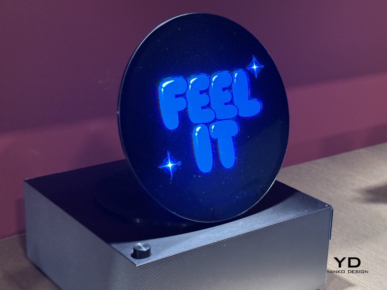
At ECAL’s collaboration with Google’s Industrial Design team, the smartphone is no longer treated as a fixed icon of consumer tech. In A Message from Tomorrow, it becomes something far more fluid, a design question that deserves to be reopened. The brief invited ECAL’s Master Product Design students to develop mobile-focused concepts inspired by daily rituals, with an emphasis on storytelling and the human dimension of technology. That framing gives the exhibition its real energy. Instead of chasing the usual upgrades in speed, resolution, or sleekness, the projects ask how mobile devices might evolve if they were designed around touch, companionship, movement, energy, and the subtle gestures that shape everyday life.

That shift feels especially relevant now. Smartphones have absorbed nearly everything, from cameras and maps to notebooks, music players, and assistants, yet the object itself has become strangely stagnant. For all the complexity hidden inside, the form remains stubbornly familiar, a smooth slab built around endless visual attention. A Message from Tomorrow pushes against that stagnation by imagining mobile hardware as a much broader territory. Here, devices can be expressive, self-sufficient, spatial, tactile, or emotionally responsive. The exhibition does not present one neat answer to the future of the phone. It presents a series of alternate directions, each exposing something our current devices no longer do well.

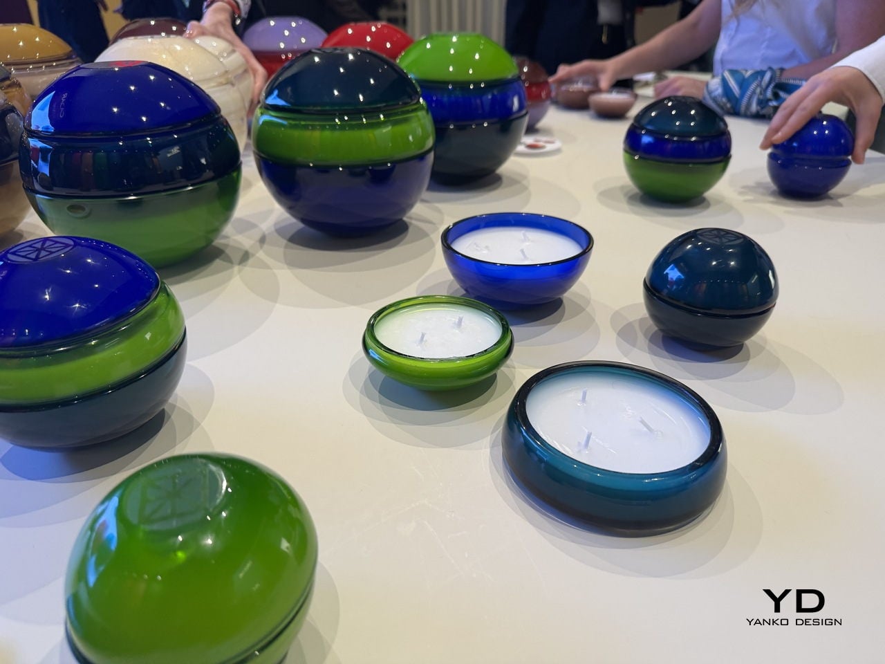
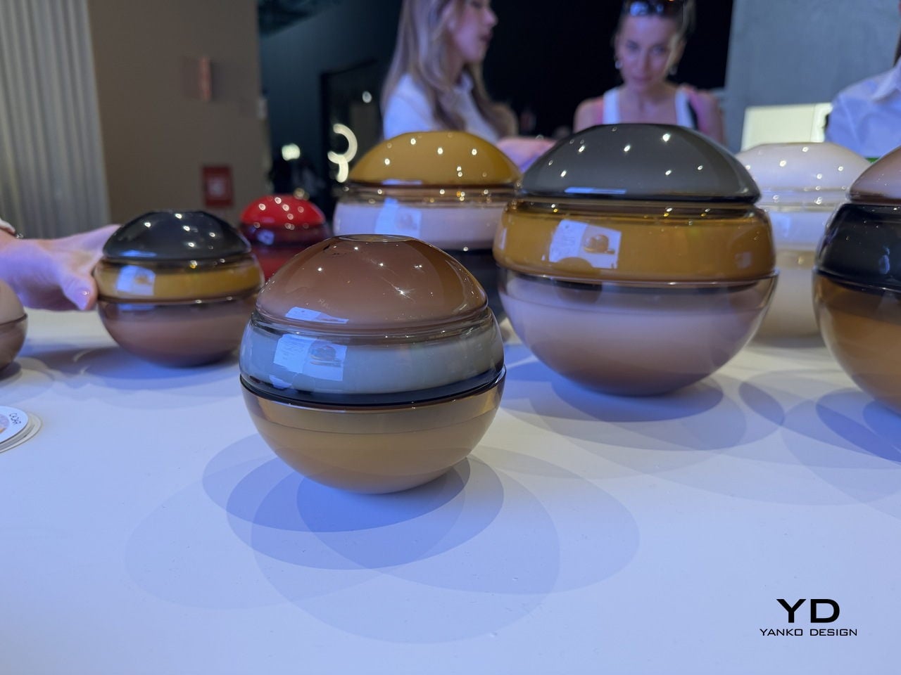
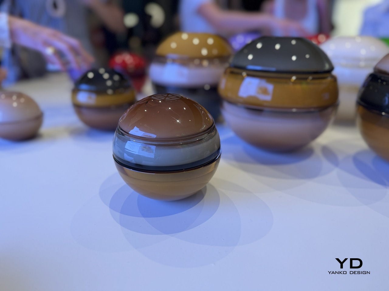
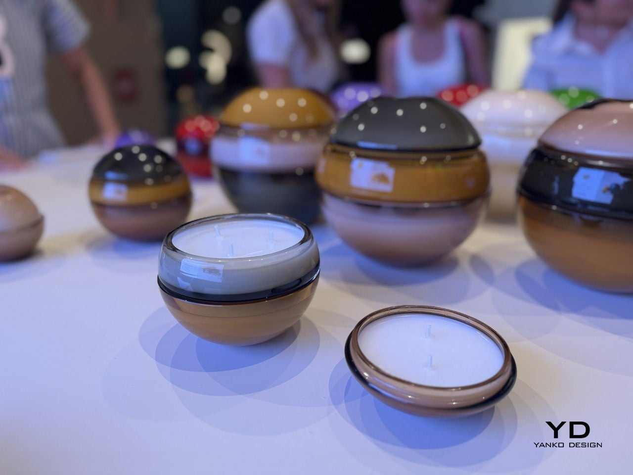
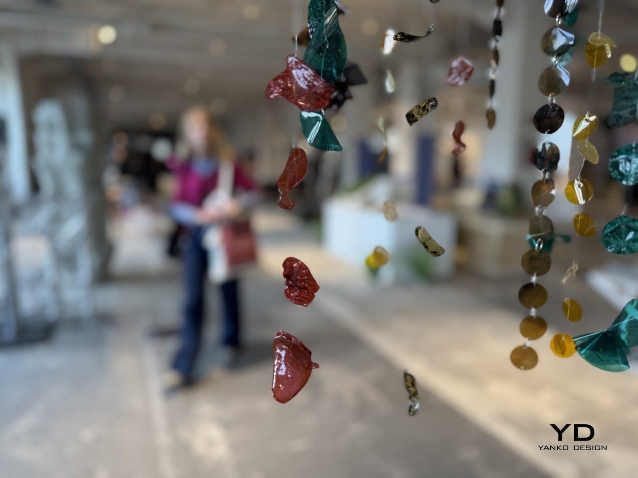
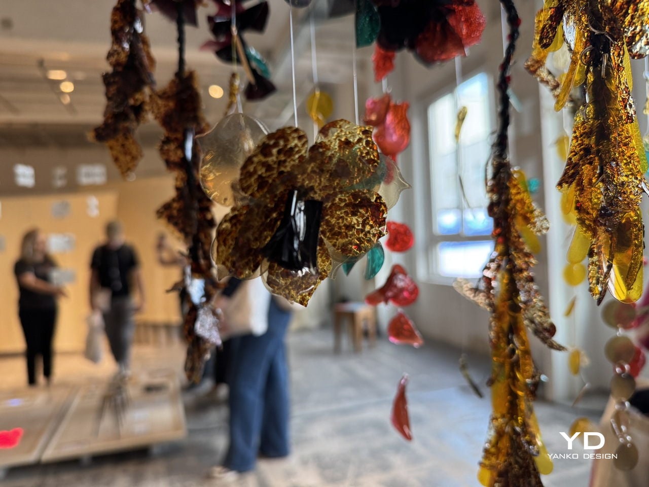
Deigner: ECAL/University of Art and Design Lausanne x Google ID

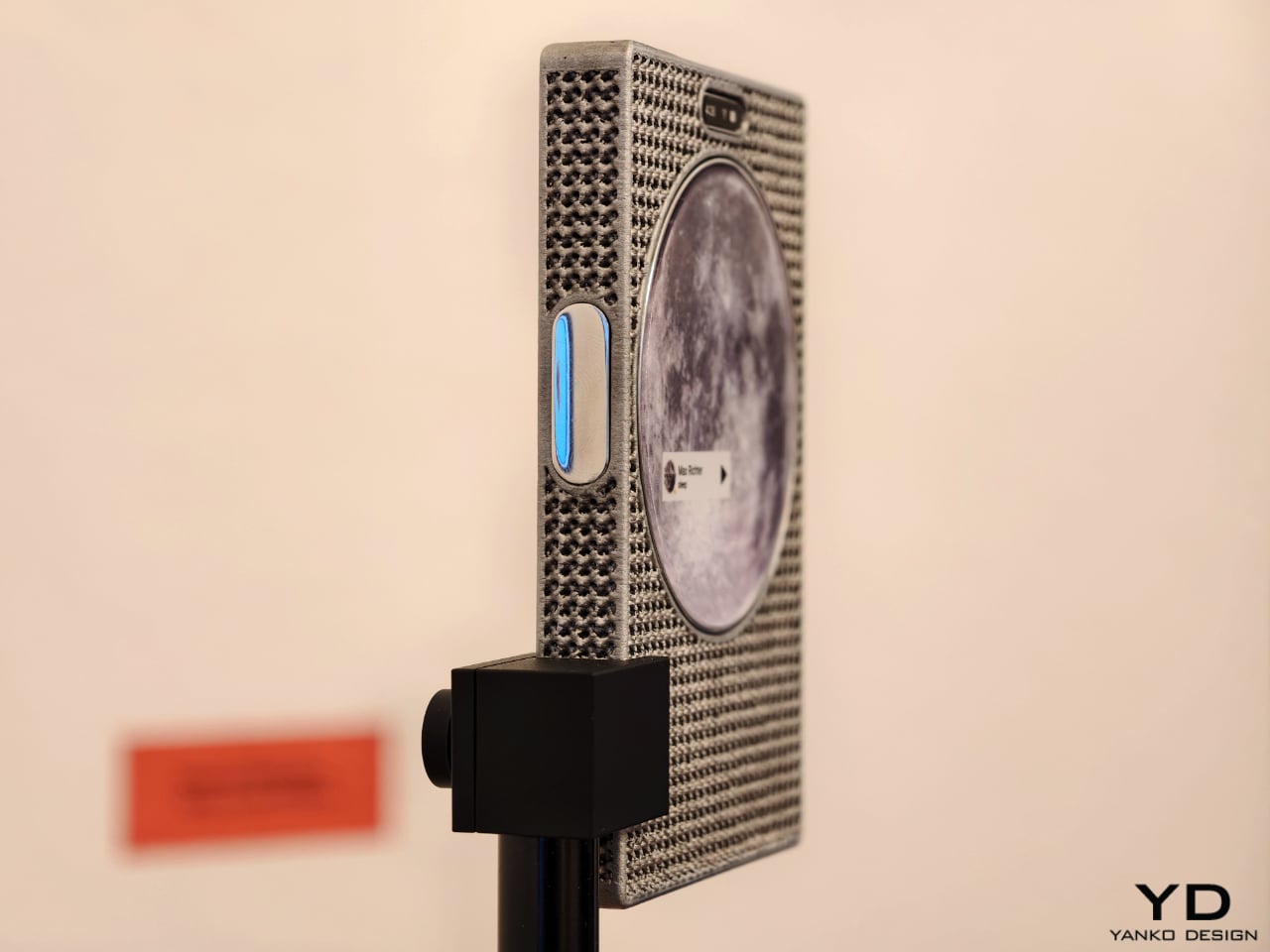
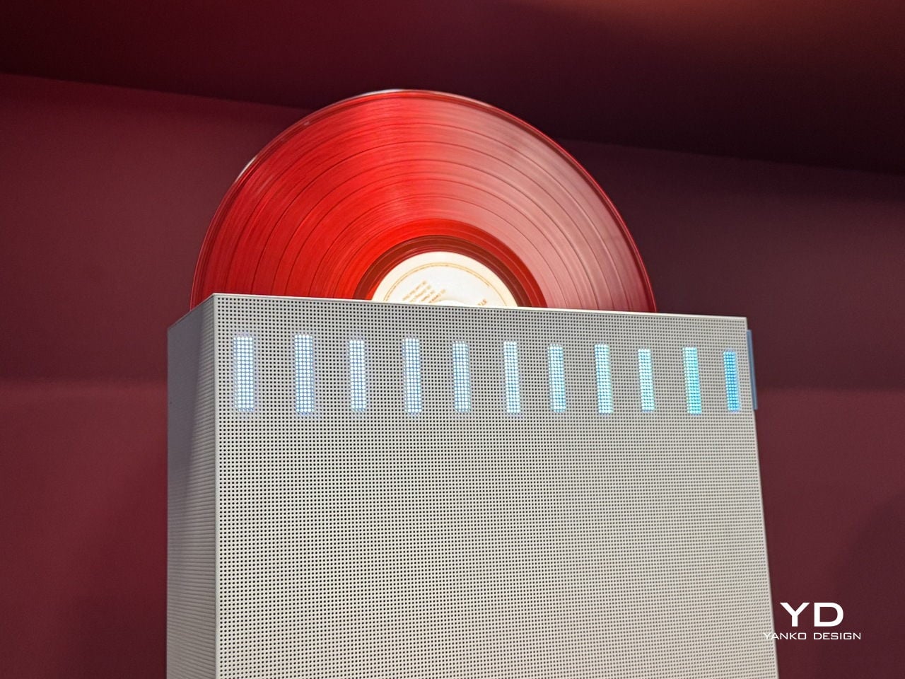
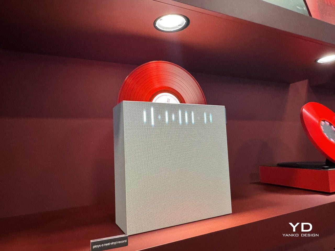
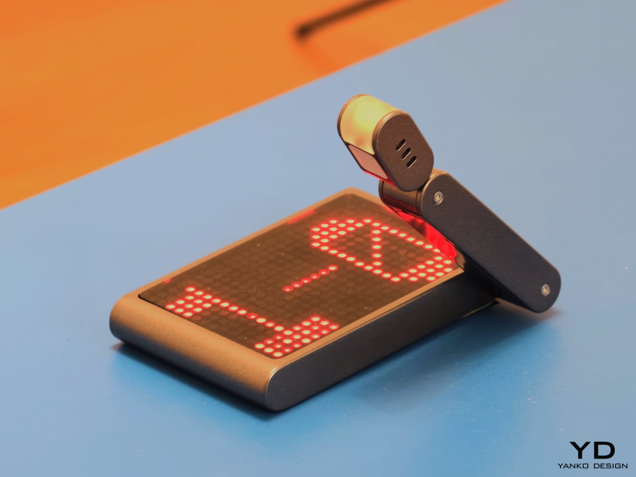
One of the show’s strongest ideas is that the future of mobile technology may not be screen-first at all. Several projects deliberately loosen the screen’s dominance and focus instead on sound, physical presence, or integration with the surrounding world. Sound Machine, by Xose Lois Piñeira, rebuilds the phone around voice. Its 3D-printed aluminum lattice body is acoustically transparent, allowing sound to move through a layered assembly while a contact transducer on the back transmits audio through surfaces or through the body when worn against the sternum. A small circular screen handles only the essentials. It is a compelling proposition because it refuses the idea that a phone must always function as a miniature display first and everything else second.

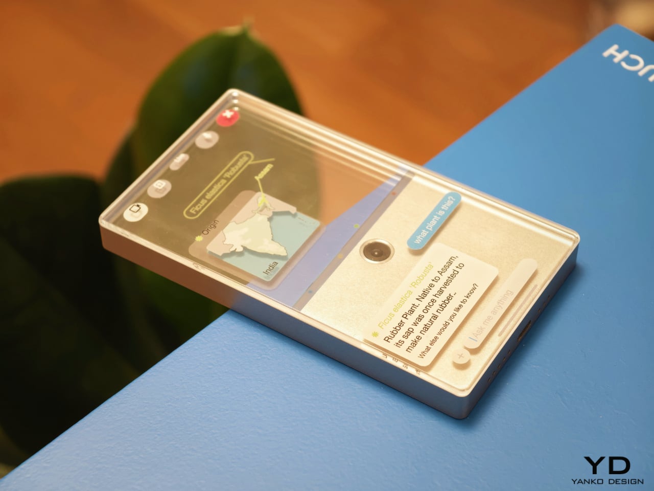
Liminal Frame, by Ehrat Lee, offers another escape from flat-screen logic. Its four-layer display can shift between opaque and transparent states, letting digital content coexist with the physical world rather than replacing it. The device allows users to look through the phone, place information in space, and return to it later without relying on a headset. It turns the phone into a kind of portal rather than a closed surface. In a moment when spatial computing is often imagined through bulky wearables, this project feels especially elegant. It suggests that the phone itself could evolve into a lighter and more natural bridge between digital and physical experience.

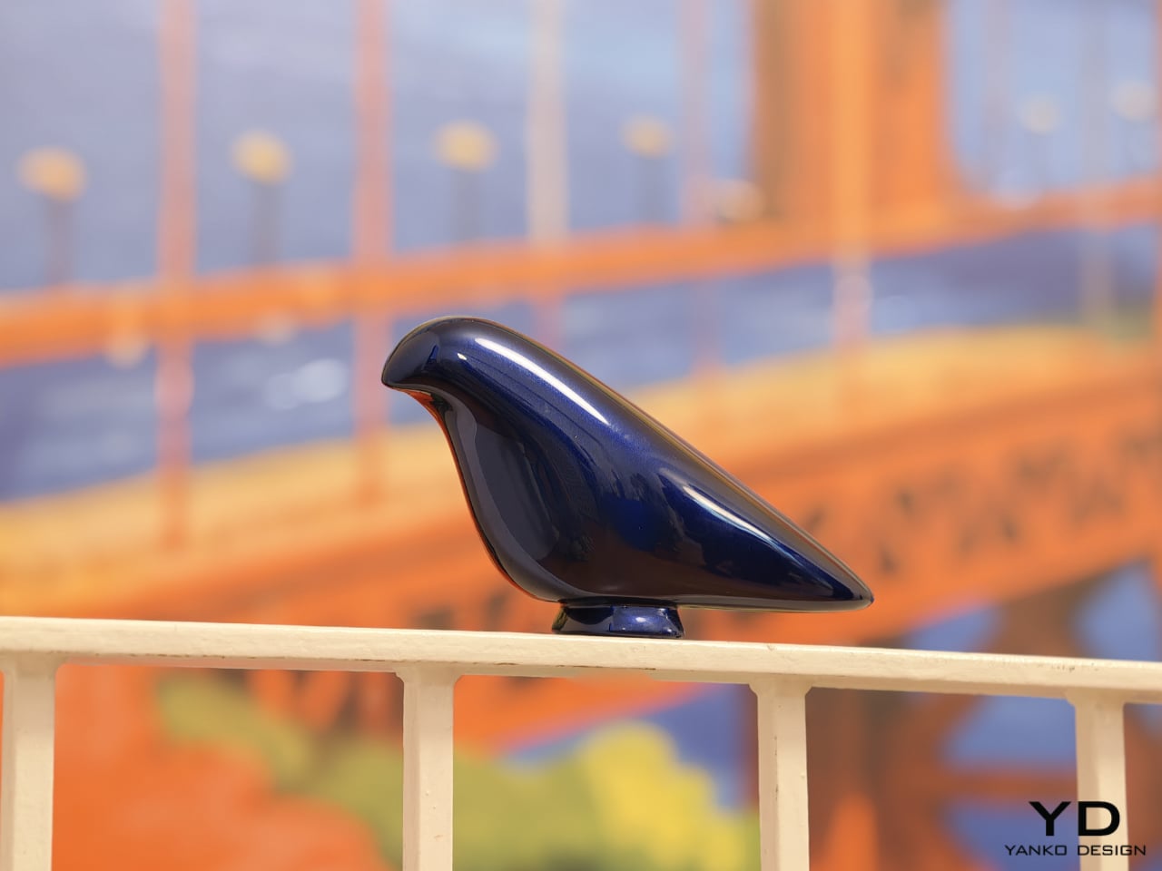
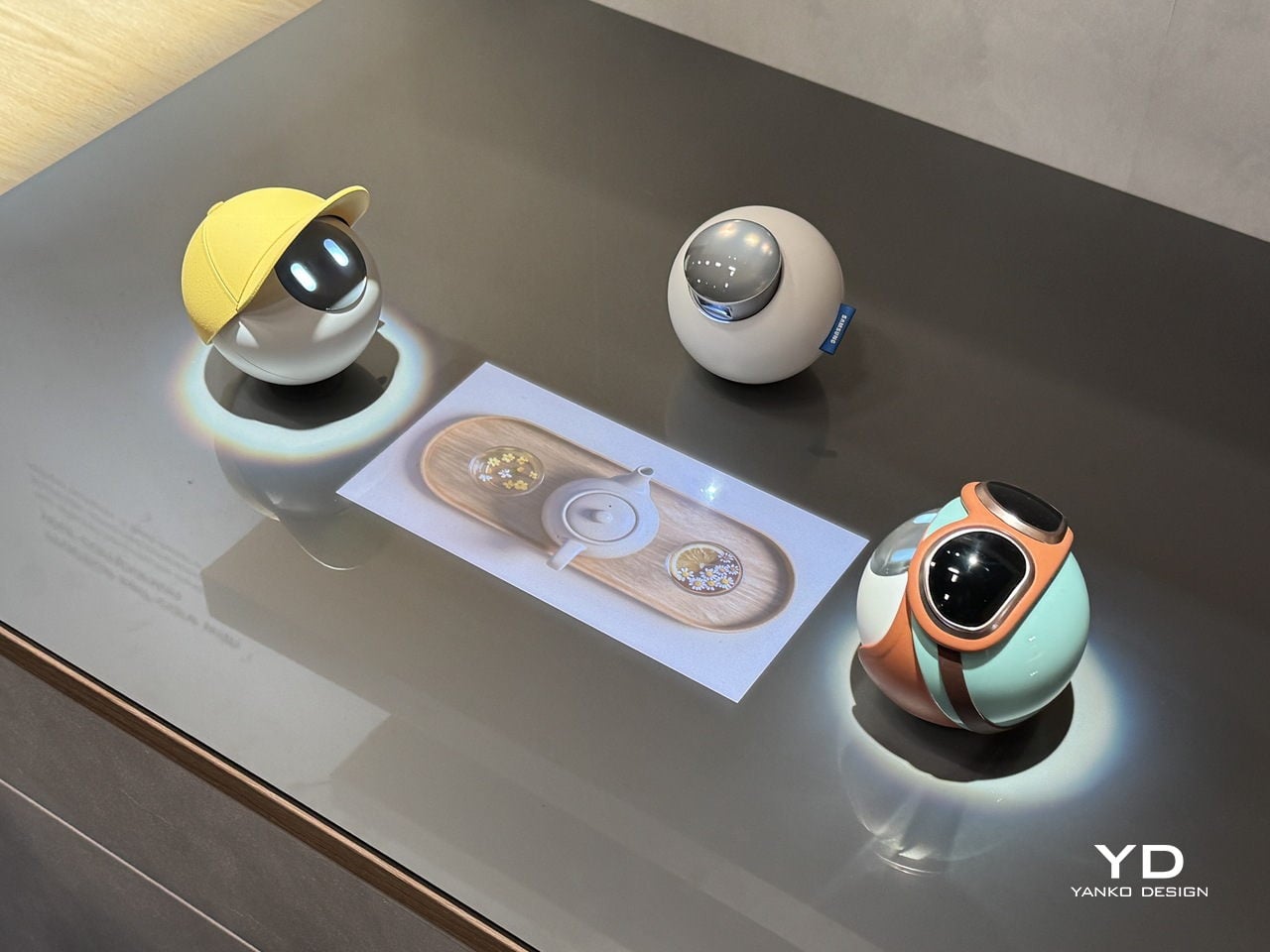
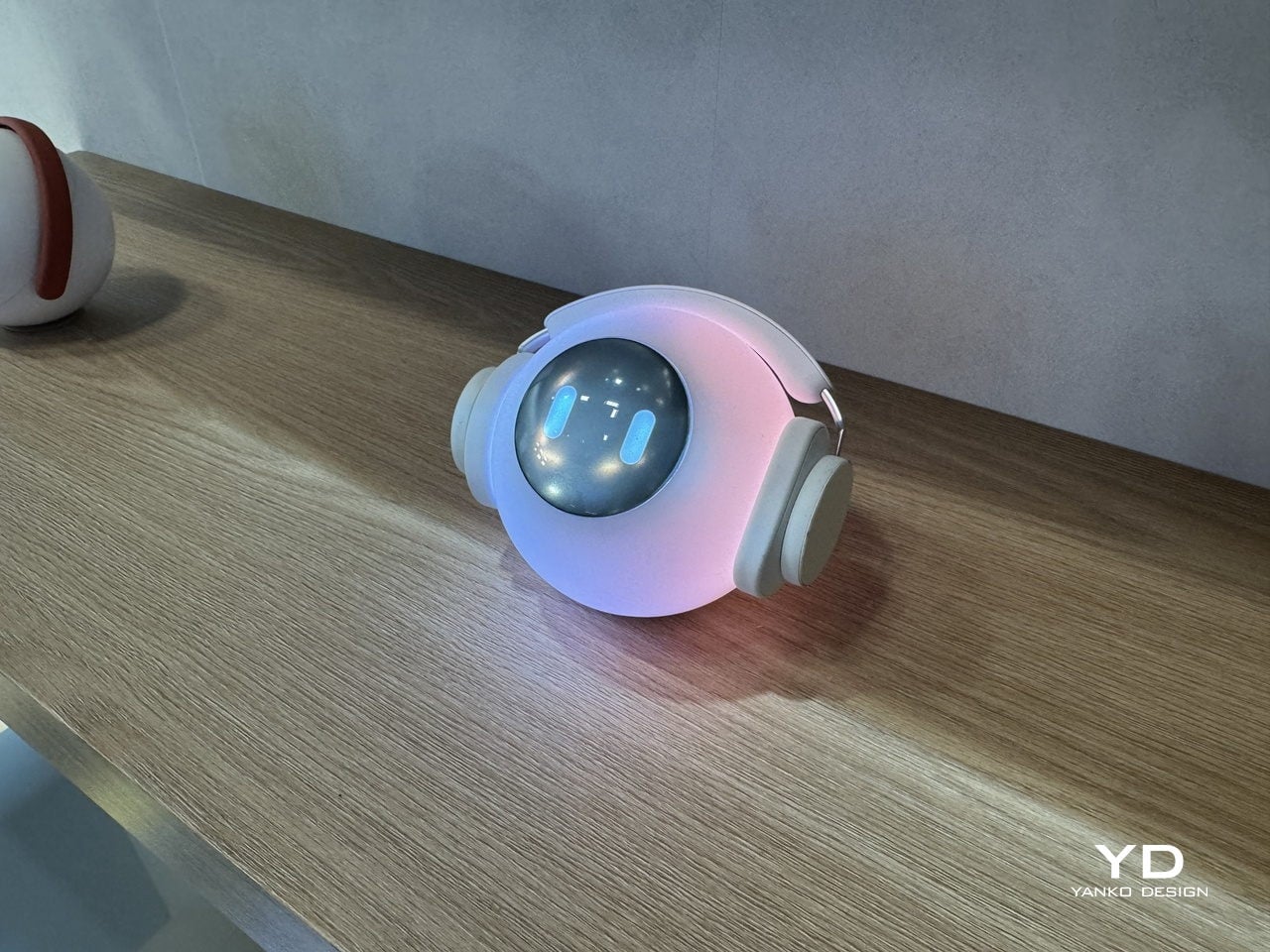
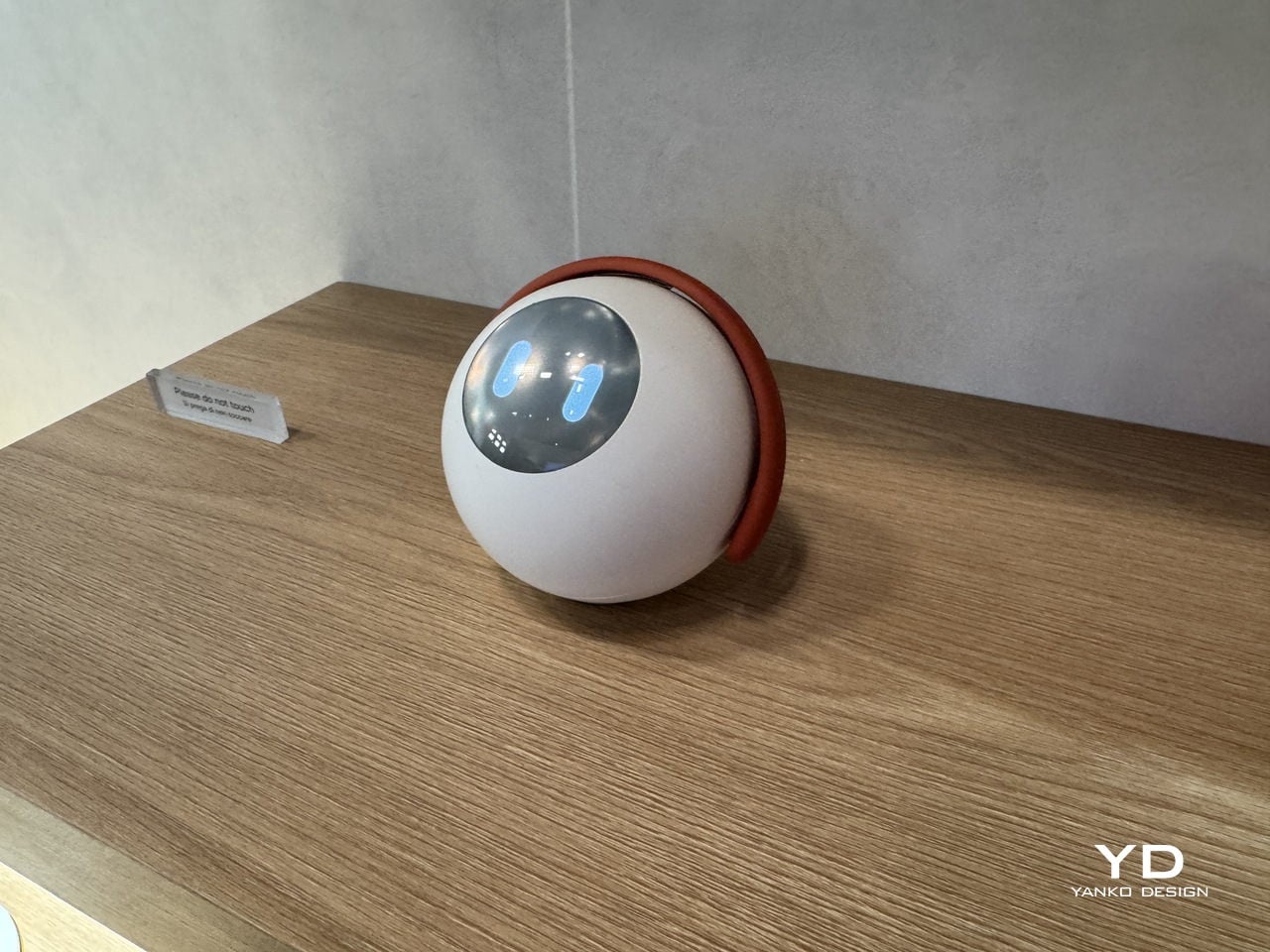
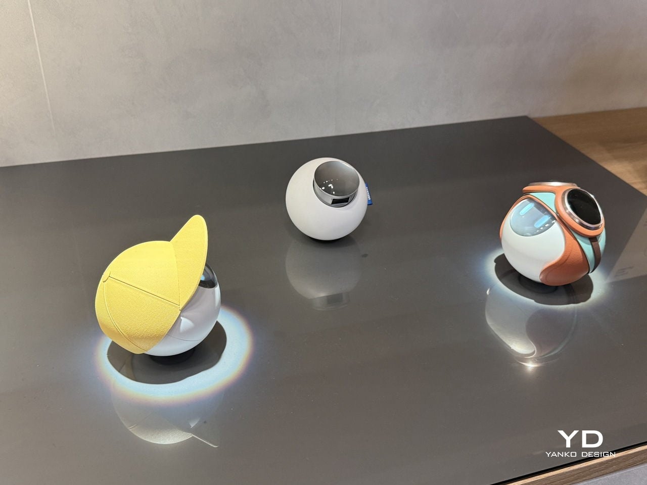
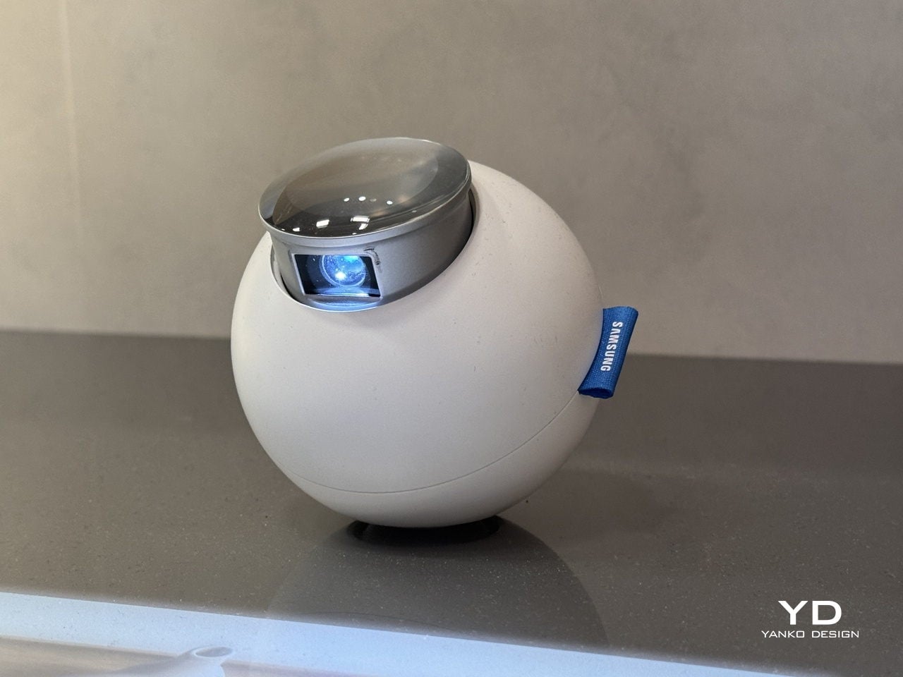
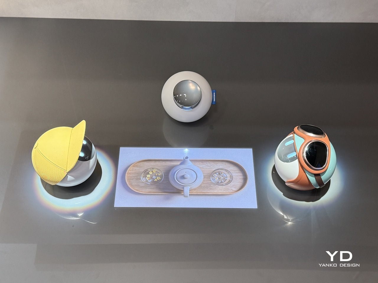
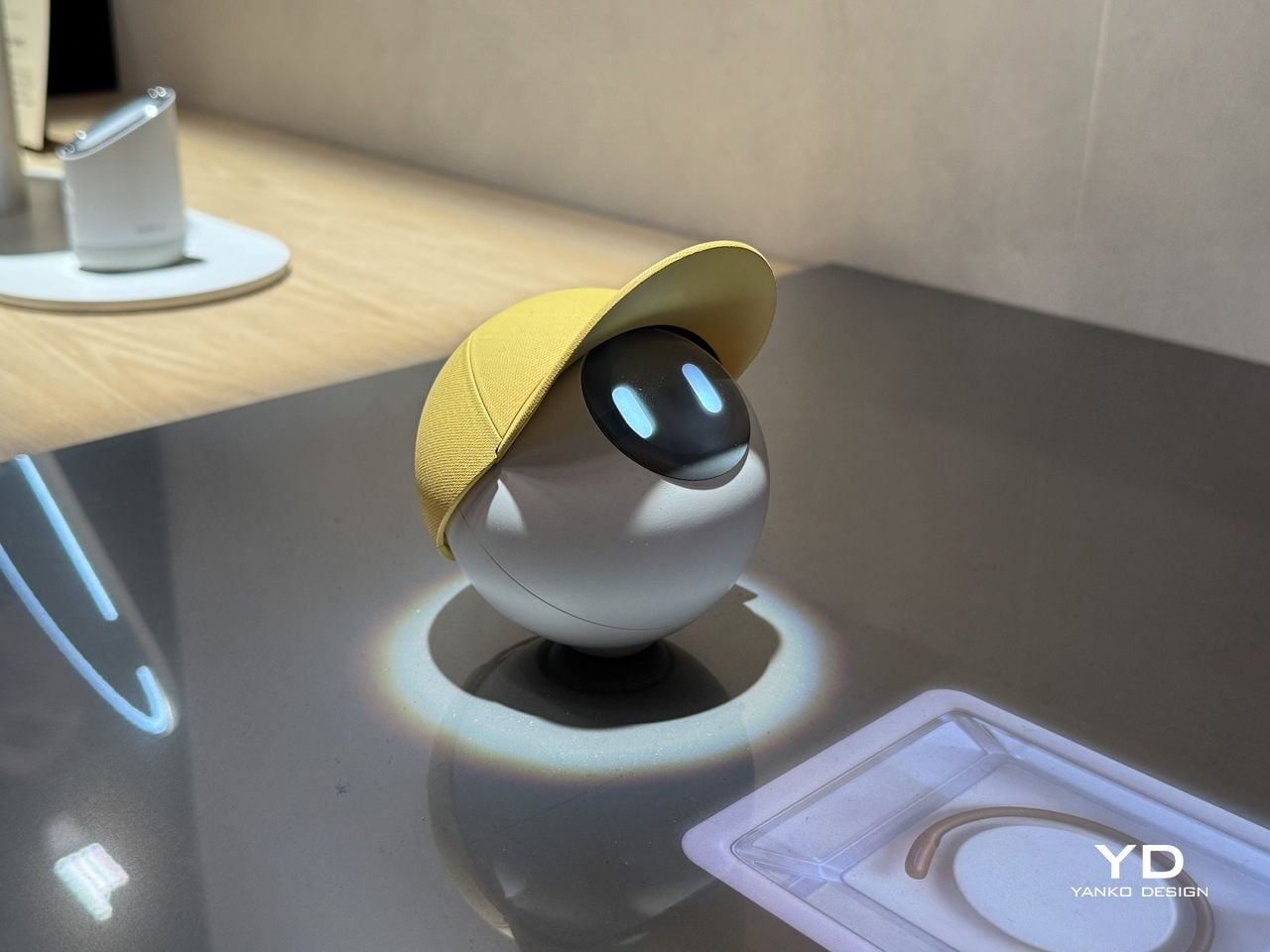
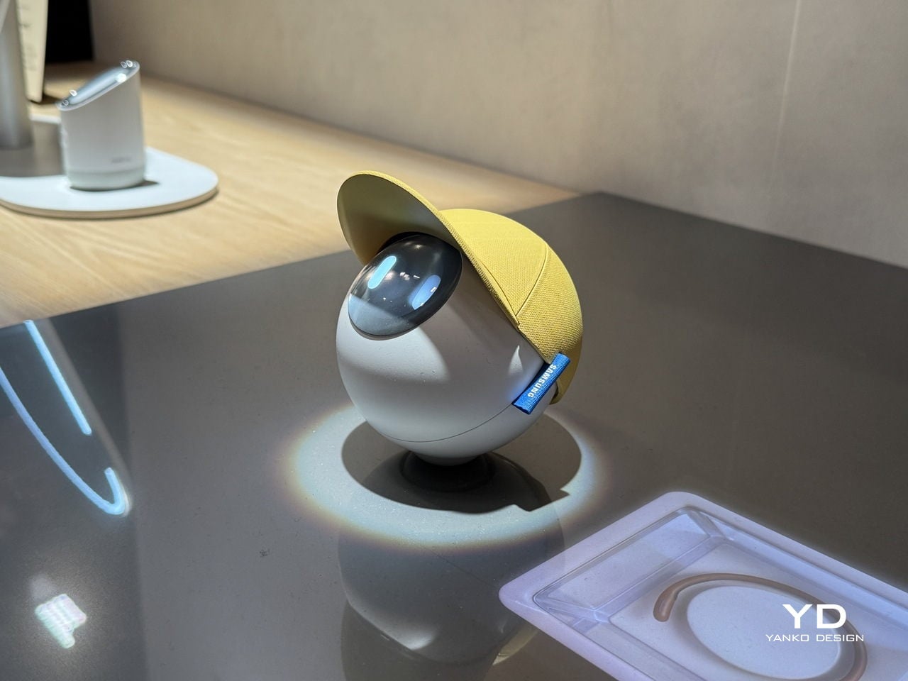
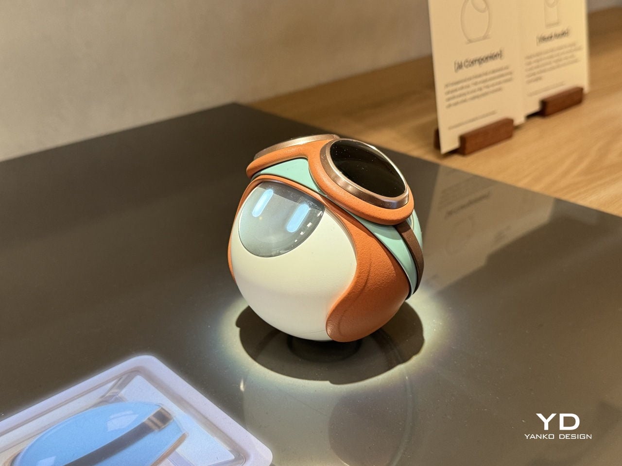
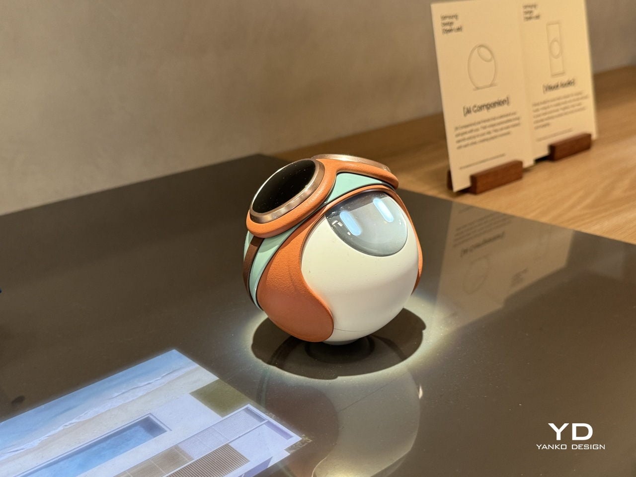
Some of the exhibition’s most memorable concepts explore personality as much as function. Robin, by Gyuhan Park, imagines a mobile device modeled on pet-bird behavior. Cameras become eyes, a beak-like feature acts as sensor and speaker, and the object communicates like a companion rather than a conventional assistant. It can tease, joke, or sulk while also helping with planning, messages, and everyday tasks. The concept is playful, but it also raises a serious question about the future of devices. As AI becomes more embedded in daily life, will our relationship with technology become less transactional and more behavioral.

That same willingness to rethink familiar habits appears in The Finger Phone by Hugo Von Hofsten. Starting from the frustration that phones always need to be held, it introduces an animated finger-like extension carrying a camera, light, and touchpad. The idea is delightfully odd, but also surprisingly practical. It imagines a device that can stand on its own, assist in small moments, and illuminate more than just its own screen. In a market dominated by polished uniformity, The Finger Phone feels refreshingly unconcerned with conventional elegance. It is willing to be useful, strange, and memorable all at once.

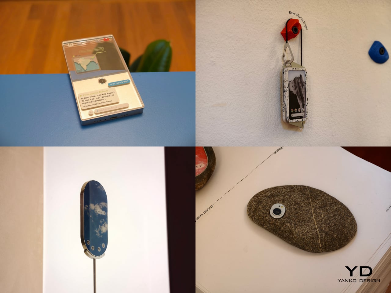
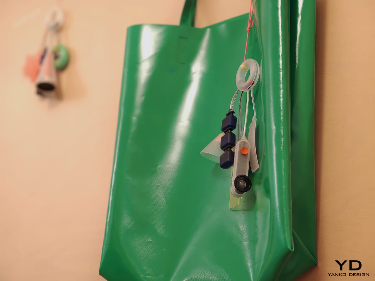
The exhibition also includes projects that challenge the smartphone’s dependence on charging infrastructure and standardized use cases. Rove, by Moritz Engel, is designed for off-grid wilderness and uses a pull-cord system to generate power through an axial flux generator. One minute of pulling creates twenty minutes of battery life, while the Dyneema cord doubles as a carrying strap and the spool becomes a tactile control wheel. Dyno, by Julia Siebert Cáceres, tackles the same problem from a more everyday angle, using body movement and electromagnetic induction to generate electricity throughout the day. Its visible rotor and magnet system make the act of charging tangible rather than hidden, giving the device an honesty that most sealed electronics lack.

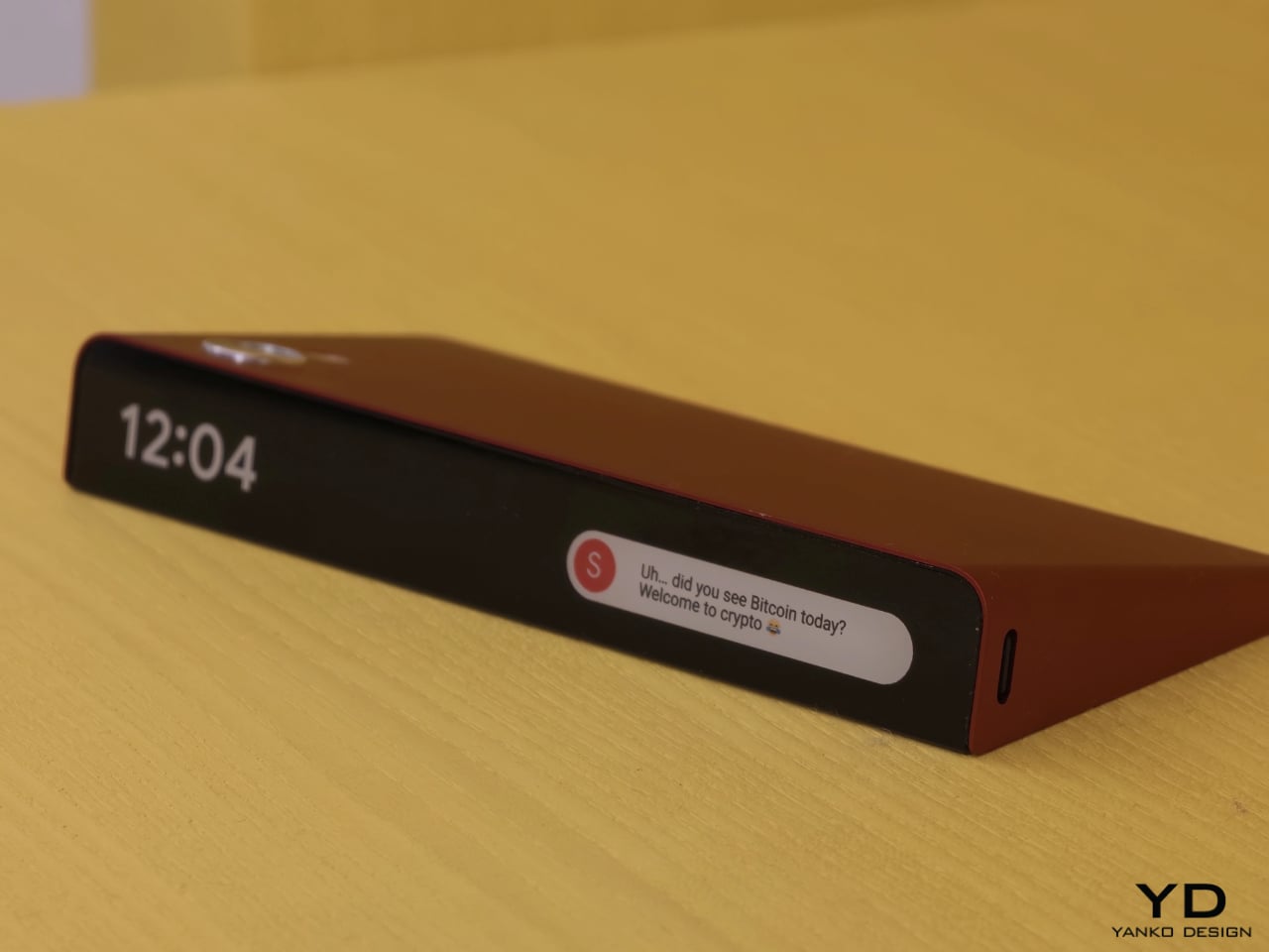
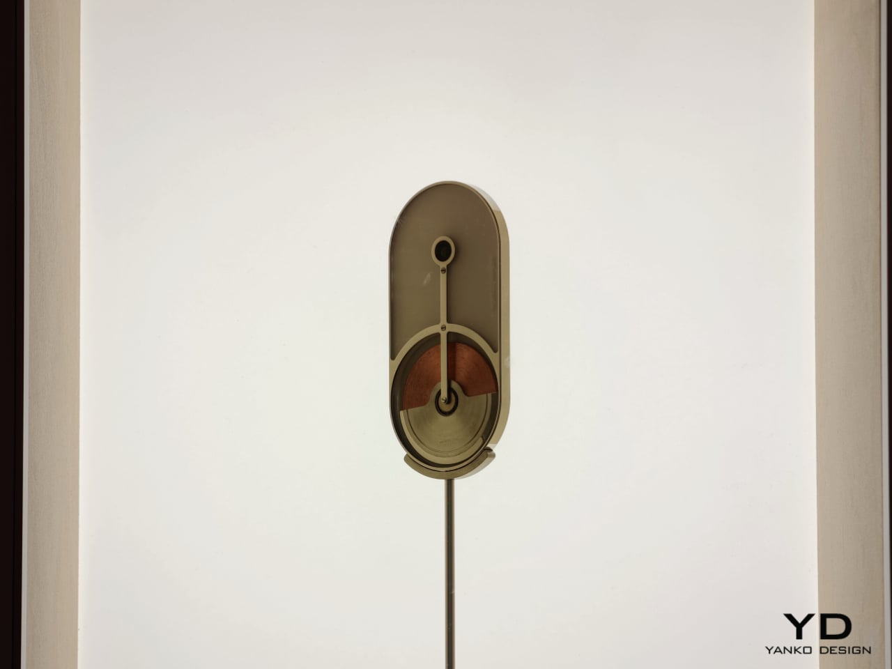
Other projects focus on what the phone means as a physical object in domestic and personal life. Everydaycarry, by Motong Yang, critiques the smartphone as a standardized entity that contains everything yet expresses very little. It proposes a more adaptive device whose character can still reflect the identity of the person carrying it. Totem, by Paul Quentin, reshapes the phone into a wedge so it can function more naturally as a tabletop object for video calls, media viewing, or AI assistance. When laid flat, its edge becomes a subtle notification interface. These projects are not simply formal experiments. They rethink how devices occupy space, signal presence, and fit into routines beyond the hand and pocket.

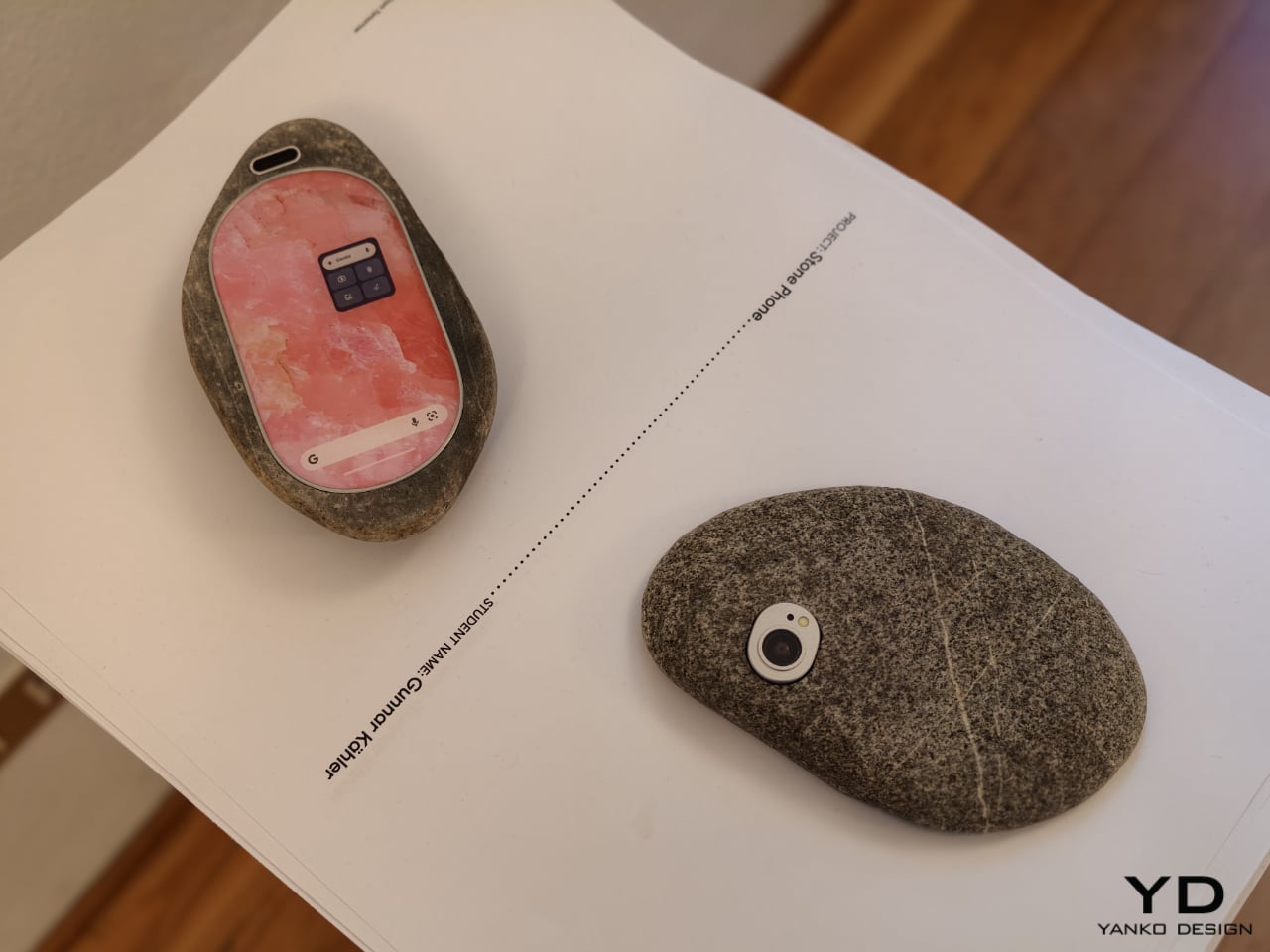
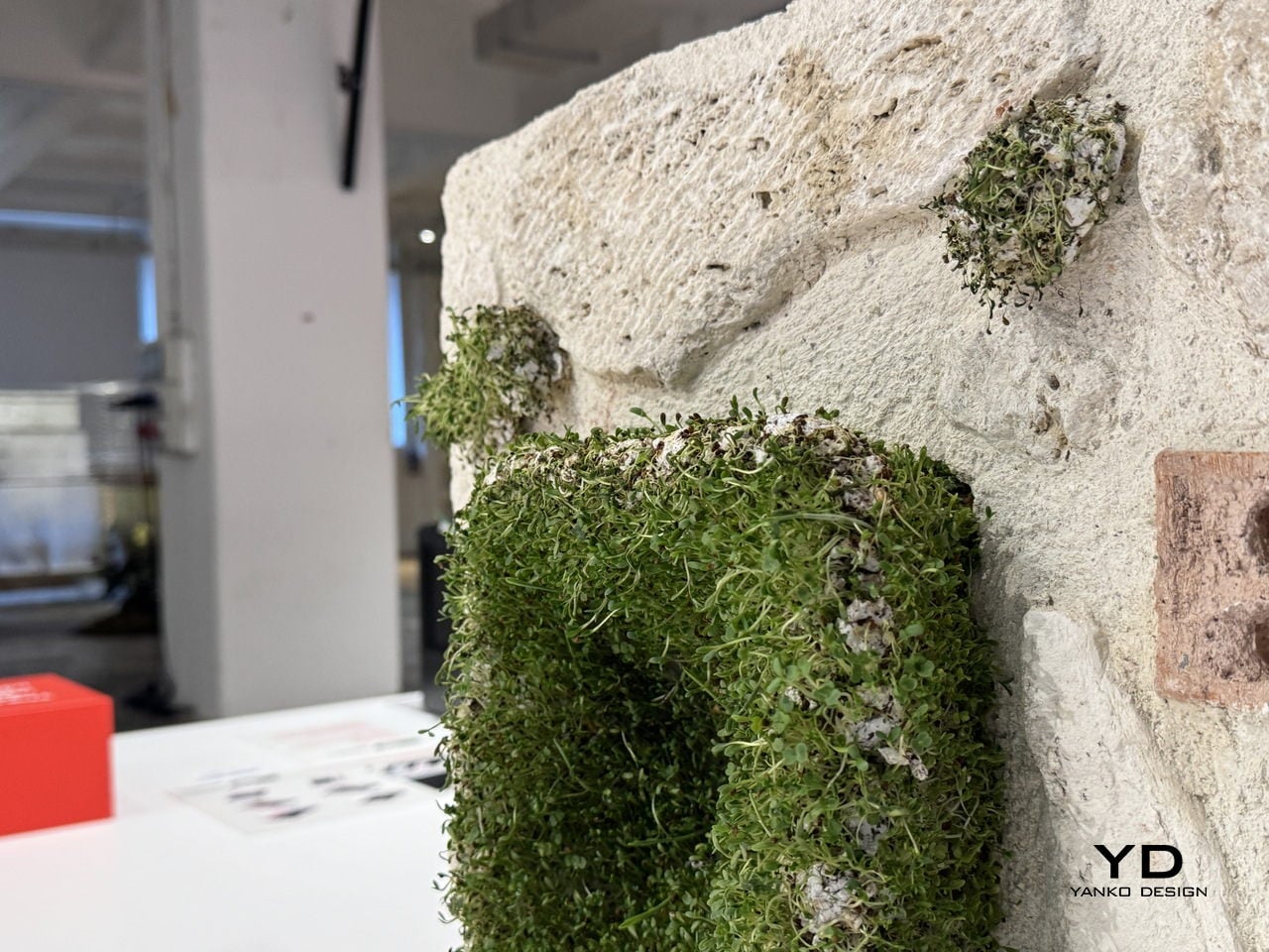
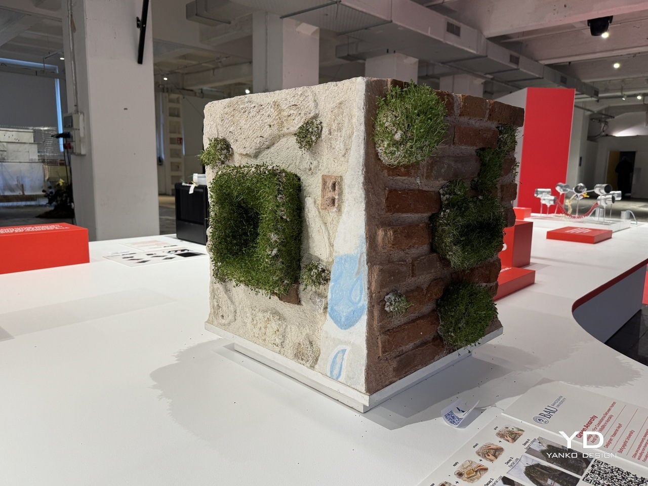
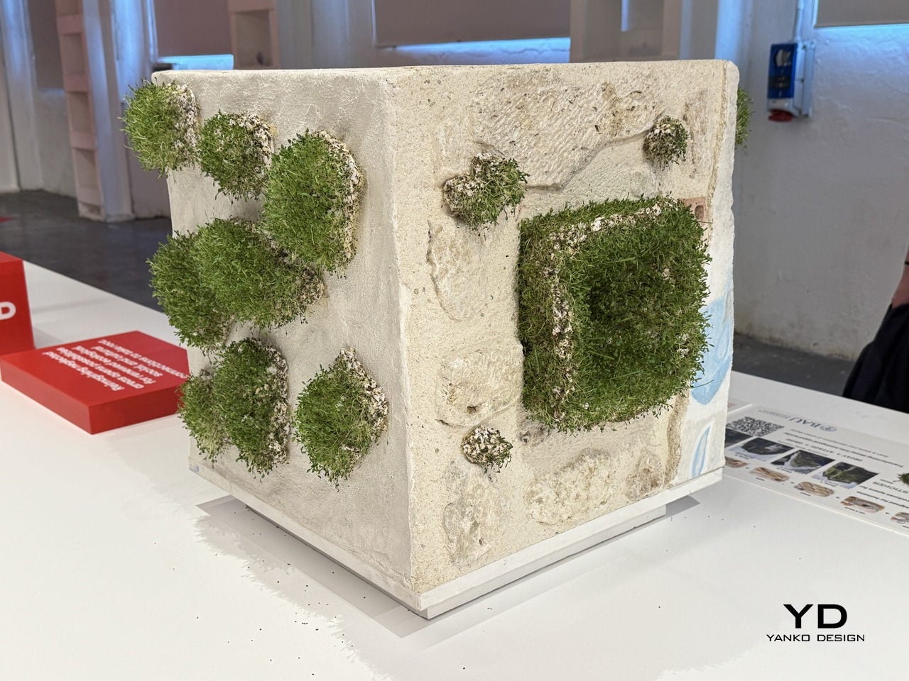
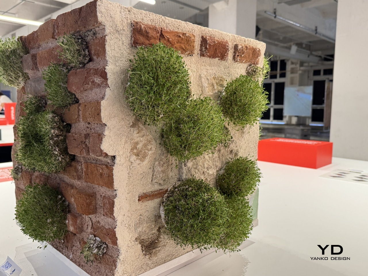
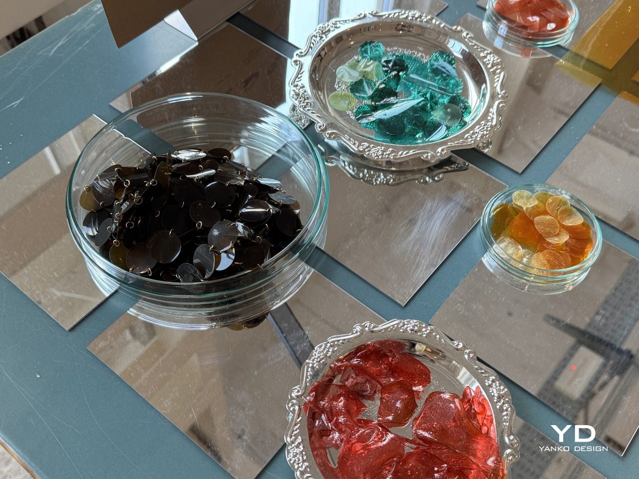
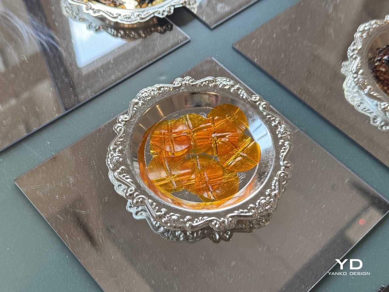
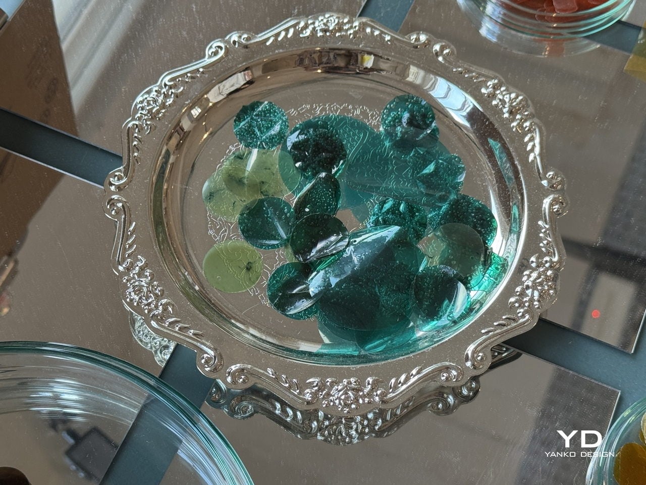
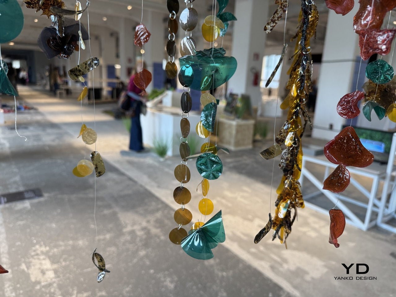
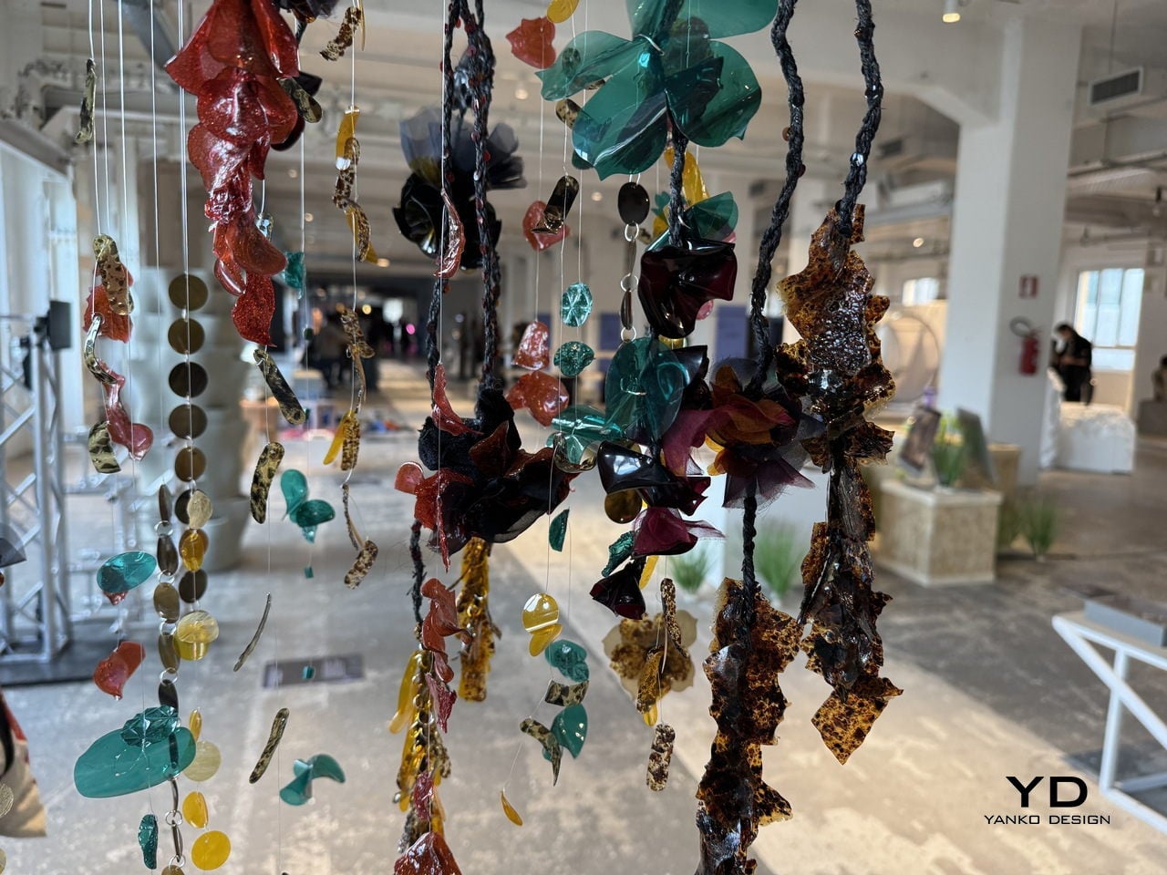
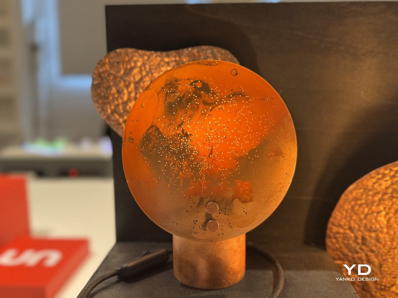
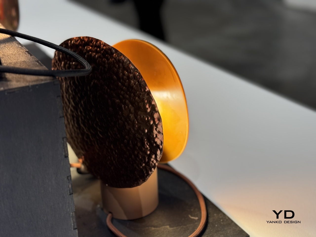
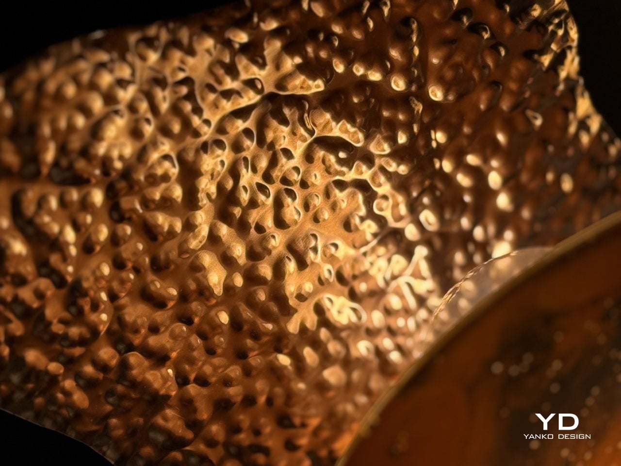
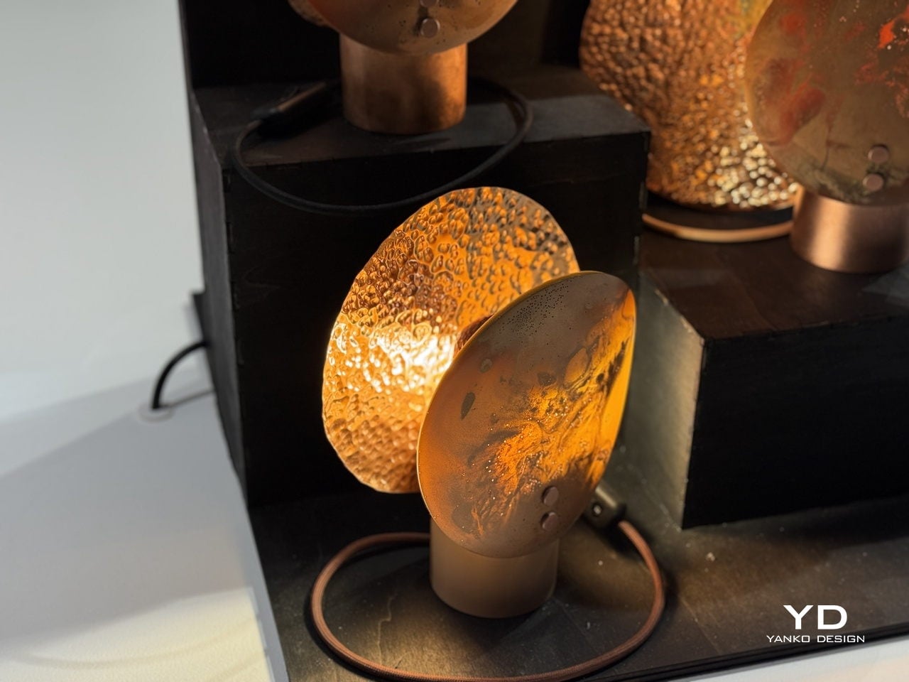
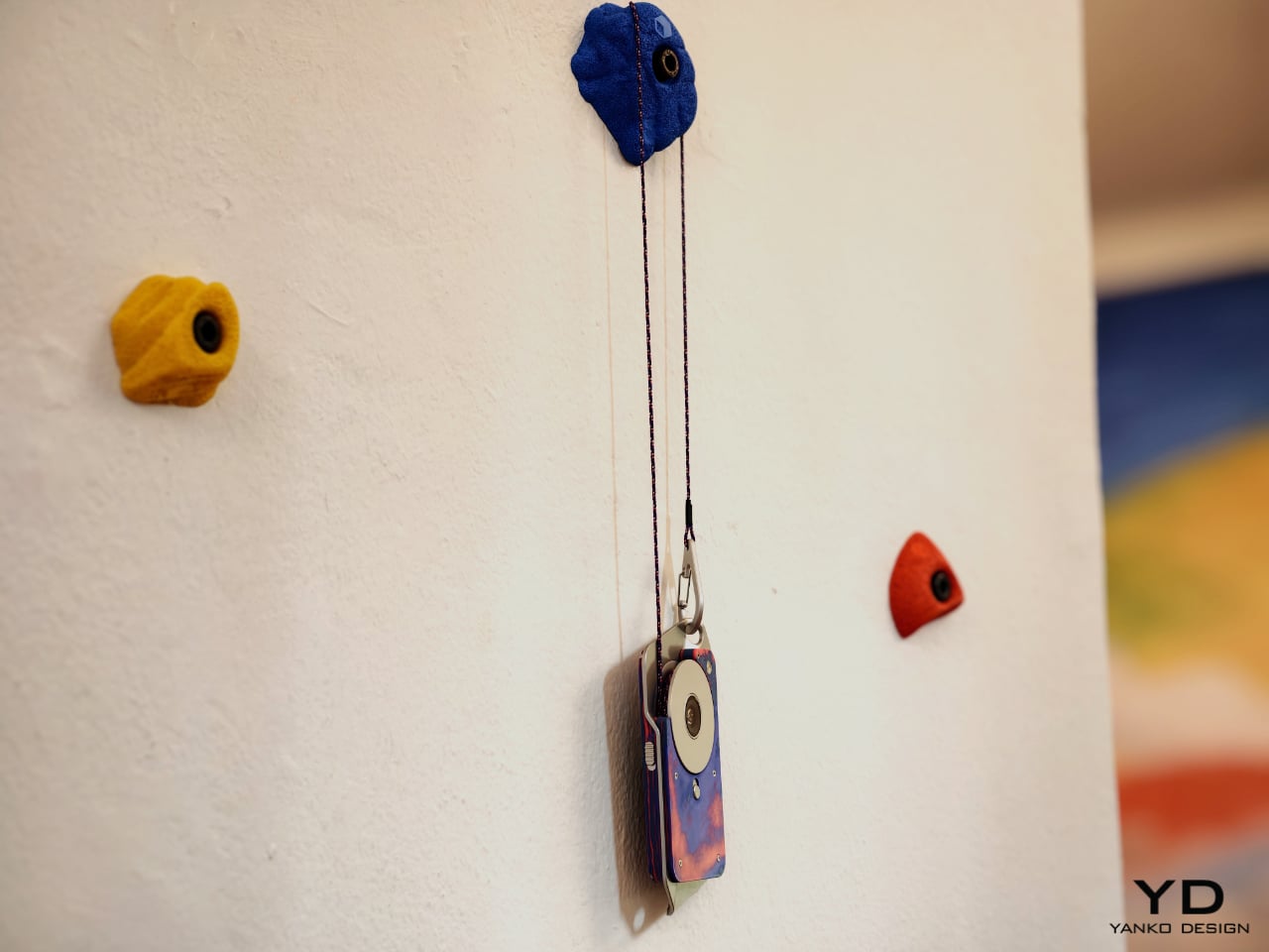
Then there is Stone Phone by Gunnar Kähler, one of the exhibition’s most quietly affecting concepts. Inspired by the instinctive act of picking up a stone from a beach or riverbank and choosing the one that feels right in the hand, the project imagines smartphones in an endlessly varied range of shapes. Instead of accepting industrial uniformity as a given, Stone Phone suggests that users might choose a device based on texture, comfort, and tactile pleasure. It blurs the line between archaic tool and advanced technology, making the smartphone feel less like a mass-produced command and more like a personal object discovered through touch. In a show full of speculative gestures, this one stands out for its simplicity. It reminds us that before a device does anything, it is first something we hold.

What makes A Message from Tomorrow compelling is not that every concept seems ready for mass production. It is that each one identifies a real tension in our relationship with mobile technology and gives it a physical form. Together, the projects reveal how narrow the current smartphone archetype has become. More importantly, they show that industrial design still has the power to meaningfully reshape our technological future. In an era when innovation is often framed as software alone, this exhibition argues that form, material, behavior, and ritual still matter deeply.

The post ecal x Google Just Imagined 10 Phones Beyond the Slab first appeared on Yanko Design.

Leave It to a Jewelry House to Make the Most Beautiful Candle

When Cadar showed up at Salone del Mobile this April, it did not bring jewelry. It brought candles. And not the kind you grab in a gift shop because they smell nice. These are hand-blown Murano glass spheres in colors so saturated and glossy they look less like home objects and more like something you might find in a collector’s vitrine. The moment you see them on a table, you want to pick one up. That instinct tells you everything about how well this design is working.

The form is deceptively simple. Each Circle of Light vessel is a sphere, composed of two to three separate hand-blown glass parts that stack and lock together into one seamless orb. The bottom is a wide, bowl-shaped candle vessel. A middle section can be added for a taller configuration, and the top is a smooth dome that caps the whole thing off. When assembled, the seam between pieces is visible but refined, almost like a deliberate detail rather than a structural necessity. When pulled apart, each piece becomes its own open candle vessel, low and round, sitting flat on a surface with quiet confidence.

Designer: Cadar Designs

The colors are where this collection makes its boldest statement. Cadar and Venini did not play it safe. There is a deep cobalt blue paired with emerald green. A ruby red domed over a rich burgundy base. A warm amber sitting beneath a charcoal gray cap. A dusty lavender paired with a smoky brown. The combinations read like color theory exercises carried out by someone with very good instincts and zero fear. Looking at a table full of them, the effect is almost planetary. Each sphere feels like its own small world, and together they create something closer to a color installation than a product display.

That display at the Venini booth reinforced the point. The booth itself was organized as a full-spectrum rainbow wall, with each color column housing its corresponding spheres on glass shelves. It was theatrical in the best way, the kind of presentation that makes you understand what a product is about before anyone explains it to you. The candles did not need signage. The visual language was that clear.

The glass itself deserves attention. Venini has been making Murano glass for 105 years, and you feel that history in the material. The surface has a depth to it that paint or glaze simply cannot replicate. Some of the dome tops carry a subtle engraved motif, a geometric pattern consistent with Cadar’s jewelry aesthetic, which grounds the collection in the brand’s visual identity without announcing itself loudly. The finish across all pieces is high-gloss and lacquered-looking, which amplifies the color and gives each sphere an almost liquid quality in certain light. Picked up and turned in your hands, the glass has real weight.

Cadar, founded in 2015 by designer Michal Kadar, built its reputation on 18k gold jewelry defined by bold minimalism and fluid movement. Michal’s background is in fashion, and it shows in the way her pieces are conceived with the body in mind, with proportion and balance as non-negotiable starting points. That same sensibility applies here. The sphere is not an arbitrary choice. It is a form Cadar has returned to repeatedly, and in translating it from fine metal to hand-blown glass, the design team found a material that responds to light in an entirely different, arguably more democratic way. Gold catches light and keeps it. Glass catches light and gives it back.

The fragrances, composed by master perfumer Alberto Morillas, are tied to Cadar’s existing jewelry collections: Light, Water, and Bloom. The idea that a scent corresponds to a visual collection is not new, but it works here because the objects themselves feel like they carry a mood. You would choose your sphere the way you choose what to wear, based on color, on scale, on what kind of atmosphere you are trying to create.

The collection is available for pre-order at the Cadar flagship boutique in New York’s Meatpacking District and online at cadar.com. It is the kind of thing you put on a shelf and look at before you even light it. And that, ultimately, is the whole point.

The post Leave It to a Jewelry House to Make the Most Beautiful Candle first appeared on Yanko Design.

These Stickers Turn Crumbling City Walls Into Tiny Living Ecosystems

Cities are built almost exclusively for people. Every surface, every wall, every façade is designed, maintained, and repaired with human use in mind. But cities aren’t just inhabited by humans, and the idea that urban decay, those crumbling plaster patches and cracked brick faces, is purely a problem to be fixed ignores the potential it quietly holds for other species.

That’s the provocation at the heart of Green Anarchy, a project by Yasemin Keyif of Bahçeşehir University in Istanbul, presented as part of the UNFOLD 2026 exhibition at BASE Milano during Milan Design Week. Rather than treating a cracked or crumbling façade as something to be patched over, Keyif asks what happens when designers choose to work with decay instead of against it.

Designer: Yasemin Keyif (Bahçeşehir University)

The answer takes the form of a small, biodegradable sticker pressed directly onto damaged building surfaces. Each unit is made from a blend of paper pulp, coco peat, perlite, and seeds in its main body, with an adhesive system of gum arabic, methyl cellulose, and glycerin that lets it bond to roughened or degraded masonry without any synthetic materials.

The process is surprisingly simple: the stickers are soaked, mixed, shaped, and applied by hand directly onto the wall. Over time, the seeds embedded in the substrate germinate and take root in the existing cracks and recesses, gradually turning neglected building surfaces into small, self-sustaining ecosystems. The name for this sequence, decay, attach, grow, also doubles as the project’s driving logic.

Keyif developed the concept with Karaköy, a dense historic neighborhood in Istanbul, as the pilot context. The project maps four escalating stages of urban decay, from minor surface cracks to severe structural collapse, and identifies each stage as a viable entry point for the stickers. The greater the damage, the more surface area becomes available for attachment and growth, turning the most deteriorated walls into the most fertile ground.

The deeper idea is a repositioning of architecture itself. Buildings, in this framework, aren’t just infrastructure for human activity but potential interfaces between human and non-human life. Cities already host birds, insects, mosses, and small animals that quietly inhabit the spaces we overlook, and Green Anarchy asks whether design can actively make room for that, rather than continually squeezing it out.

Presented as part of UNFOLD 2026, Domus Academy’s annual international design showcase held under the theme “Engage Friction: Designing Through Conflict,” Green Anarchy fits the brief almost too well. It doesn’t try to resolve the tension between the built city and the natural world so much as give them a way to grow into each other, slowly, without asking anyone’s permission.

The post These Stickers Turn Crumbling City Walls Into Tiny Living Ecosystems first appeared on Yanko Design.

These Sequins Are Made From Industrial Dye Sludge and Still Sparkle

The fashion industry has a water problem that most people never see. Dyeing fabric is one of the most chemically intensive steps in garment production, and the wastewater that comes out of that process carries synthetic dyes, heavy metals, and other pollutants that routinely end up in rivers and soil. By the time a sequined dress reaches a store, the environmental cost of making it sparkle is already long gone and mostly forgotten.

CQ Studio, a London-based regenerative textiles lab, tackled that problem head-on with a material experiment that turns the very wastewater from textile dyeing into the sequins themselves. The result, called Detox Bio-Embellishments, was on show at BASE Milan during Milan Design Week 2026 as part of the studio’s debut exhibition, Transient Gradients.

Designer: Cassie Quinn (CQ Studio)

The process starts by running textile-dye wastewater through a detox capture system that uses food waste to pull out the contaminants. Once the water is cleaned and separated, the leftover sludge doesn’t get thrown away. Instead, it’s processed into thin, flexible sheets that look and feel like plastic, but are bio-based, biodegradable, and recyclable. Sequins are then die-cut from those sheets, and whatever scraps remain from the cutting are folded back into the process.

What makes the material particularly clever is how far it extends the concept of nothing wasted. It handles both synthetic-dye and natural-dye wastewater, keeping the synthetic version from ever reaching waterways, while the natural-dye version becomes safe enough to compost into soil. The sheets can also be made using food waste and natural pigments, giving designers a way to produce embellishments in a wide range of colors without any virgin plastic.

The visual result doesn’t look like a sustainability project at all. The sequins and embellishment pieces come out in deep blacks, jewel-like teals, warm ambers, rich reds, and tortoiseshell-patterned fragments that carry a high-shine finish. Strung onto braided cords and translucent threads for the Milan installation, they hung in dense cascading curtains that looked more like haute couture jewelry than anything born from industrial sludge.

For the fashion industry, where sequins are almost universally made from petroleum-based PET plastic and are notoriously difficult to recycle, having a material that can match the visual appeal of conventional embellishments while being fully bio-based is a genuinely significant step. A garment made with Detox Sequins wouldn’t just sparkle; it would also carry a story worth telling, one that runs from a dyeing vat through a detox system and out the other side as something a designer can actually use.

The post These Sequins Are Made From Industrial Dye Sludge and Still Sparkle first appeared on Yanko Design.

A Copper-Wax Lamp Revives a Slovak Forge and Glows Like Stained Glass

Industrial heritage sites have a way of disappearing quietly. The machinery goes silent, the workers move on, and the buildings either get repurposed or left to rust. What rarely survives is the craft knowledge, the particular way a community understood and worked a material. Slovakia’s copper-processing history is one of those stories, rooted in a small central region that once hummed with the sounds of metalwork and fire.

That’s the history Laura Zolnianska, a student at the Slovak University of Technology’s Faculty of Architecture and Design, decided to pull back into the present. Exhibited at BASE Milano as part of the 2026 Fuorisalone UNFOLD showcase, Echoes of Copper is a lamp collection drawing from the copper-processing traditions of Medený Hamor in central Slovakia, combining them with digital fabrication and an entirely experimental material of her own development.

Designer: Laura Zolnianska (Slovak University of Technology, Faculty of Architecture and Design)

The material is the most interesting part. Zolnianska created a copper-wax composite that forms the shades, a substance that behaves differently every time it’s worked. Some shades come out smooth and disc-like, with swirling oxidation patterns that look almost planetary when lit. Others emerge heavily textured and volcanic, their deeply pitted surfaces catching and scattering light in ways that can’t be planned or predicted. No two pieces are the same.

Each lamp sits on a polished copper cylinder base with a matching copper-toned cord. When lit, the shades glow a deep amber orange, with translucent sections illuminating like stained glass while the denser, hammered areas cast dramatic, irregular shadows. The warmth of the light feels almost geological, as if it’s being filtered through something that took centuries to form rather than a material coaxed into shape in a studio.

The project isn’t purely a lighting exercise, though. Zolnianska designed Echoes of Copper around a workshop model where participants can create their own version of the lamp at the former Medený Hamor site itself. The idea is to bring people back to a place of faded industrial significance and give them a hands-on connection to the craft traditions that once defined their community.

Medený Hamor, which translates roughly to “Copper Hammer,” was a copper-processing site in central Slovakia’s Banská Štiavnica region, an area with a centuries-old metallurgical history. Using that heritage as a creative prompt rather than a museum exhibit is itself a meaningful design decision. Of course, craft doesn’t have to end up behind glass to be preserved; sometimes it ends up glowing amber on someone’s bedside table.

Echoes of Copper was exhibited at BASE Milano during Milan Design Week 2026 as part of UNFOLD, a student showcase bringing together emerging designers from institutions across Europe. It’s the kind of project that deserves more attention than student exhibitions typically get. Zolnianska didn’t just make a lamp; she made an argument that industrial communities don’t have to lose their identity to time.

The post A Copper-Wax Lamp Revives a Slovak Forge and Glows Like Stained Glass first appeared on Yanko Design.

This Chair Looks Normal Until It Needs to Keep You Afloat in a Flood

Flooding has gone from a rare calamity to a recurring reality for millions of households. As climate patterns grow more unpredictable, the spaces people call home have become increasingly vulnerable to forces they were never designed to withstand. Most domestic objects offer no answer to this shift, and furniture has remained stubbornly indifferent to the idea that the room it sits in might one day be underwater.

That’s the gap a team of Domus Academy Milano students decided to close. Exhibited at BASE Milano as part of the 2026 Milan Design Week, AquaForma is a transformable furniture piece designed under the theme “Conflict: Human vs Nature.” Created by Valentina Algorta, Lorenzo Gennari, and Sabrina Lounis under faculty guidance, it explores how an everyday domestic object can quietly hold the capacity to save a life.

Designers: Valentina Algorta, Lorenzo Gennari, Sabrina Lounis (Domus Academy Milano)

The starting point is a familiar one: a chair. In its default configuration, AquaForma functions as low-profile floor seating with a cushioned backrest and seat upholstered in deep burgundy fabric. A white structural shell wraps around the cushioned elements in flowing, organic curves, giving the piece a sculptural quality that sits comfortably within contemporary furniture design. Nothing about it announces its other purpose.

That other purpose becomes clear when flooding hits. The piece uses modular panels, a ratchet buckle mechanism, and buoyant materials that allow it to be reconfigured into a flotation device. The modules interlock and can be reoriented, with individual components separating and reassembling into a completely different arrangement. What sits quietly in a living room can, in theory, keep someone afloat.

The ratchet strap across the midsection does more than hold the piece together; it’s the key mechanism that allows components to be tightened, secured, and adjusted depending on the configuration the piece needs to take. This kind of dual-purpose hardware thinking keeps the design grounded in practicality. There’s no single feature here that’s gratuitous, with everything pulling double duty between the domestic and the emergency.

What makes AquaForma particularly compelling is how invisible its emergency function is in everyday life. You wouldn’t sit on it and think about rising water, and that’s precisely the point. Resilience embedded in ordinary objects doesn’t announce itself until it needs to, and that restraint is what separates a clever concept from a genuinely useful one. The designers didn’t design for a crisis; they designed around it.

AquaForma was shown as part of the UNFOLD exhibition at BASE Milano during Milan Design Week 2026, a student showcase that puts emerging design ideas at the center of one of the world’s most design-saturated weeks. It’s the kind of project that’s easy to underestimate at first glance. A chair that becomes a flotation device sounds like a design school exercise until you remember how often people need exactly that.

The post This Chair Looks Normal Until It Needs to Keep You Afloat in a Flood first appeared on Yanko Design.

Elanco Made Dog-Shaped Furniture Because Your Sofa Has a Flea Problem

Pet ownership and interior design have always had an uneasy relationship. You pick out a sofa carefully, and within months, it’s covered in fur, scratch marks, or the lingering evidence of a bad flea season. Design spaces rarely acknowledge the animal that shares the room, and pet health brands rarely think to communicate through furniture. Most of the time, these two worlds simply don’t talk to each other.

Elanco, a global animal health company, had other ideas. For the 2026 Fuorisalone, it partnered with Milan-based architecture and design studio Parasite 2.0 to bring the Pet Collection to BASE Milano. The result is a limited-edition series of four pet-inspired furniture pieces that are equal parts campaign, design statement, and visual joke, all presented at one of Milan’s most forward-thinking creative venues.

Designers: Elanco, Parasite 2.0

The whole thing starts from a simple but uncomfortable truth. Fleas don’t just live on pets; they infest homes too, spreading through the furniture and floors that pets and people share. Elanco’s point is that your sofa and your dog aren’t as different as you think, at least not from a flea’s perspective. The collection makes that idea impossible to ignore.

Each piece is a pun on both a breed and a furniture type. The Basset Longue is a chaise longue upholstered in wavy, brown-striped faux fur, shaped after a Basset Hound, and mounted on chrome legs with a tail detail at one end. The Dalmatian is a wide sofa in black-spotted white plush with dark, rounded backrests that look like a dog curled up in place.

The Yorkchair is a chunky armchair draped entirely in long, golden faux fur with a small chrome detail on the back, very much like a Yorkshire Terrier wearing a collar. Then there’s the Gattond, which departs from the canine theme and becomes a feline-inspired coffee table, its polished metal top sitting on a rounded, fuzzy golden base with a tail sticking out from the side.

The Pet Collection is on view at BASE Milano as part of the 2026 Fuorisalone, and it’s the kind of exhibit that sticks with you long after you’ve left the room. Not because the furniture is particularly comfortable, mind you, but because the message is hard to unsee once you’ve seen it. Your sofa and your dog are, apparently, not so different after all.

The post Elanco Made Dog-Shaped Furniture Because Your Sofa Has a Flea Problem first appeared on Yanko Design.

What Streaming Took From Music, Samsung Design Just Gave Back

Music used to take up space in the most satisfying way. There was a record sleeve to pull from a shelf, a cassette to slot into a deck, a disc to slide into a tray. Each was a small, deliberate act that made listening feel like a choice rather than a background default. Streaming replaced all of that with convenience, and something tactile and visual quietly disappeared along the way.

Samsung Design seems to think that loss is worth addressing. At Milan Design Week 2026, it presented Visual Audio, a collection of music player concepts that reinterpret the forms of LPs, cassettes, and CD players through tailored displays. Rather than smart speakers with screens bolted on, they’re objects designed to make listening visible again, giving digital music a presence that largely disappeared with the vinyl era.

Designer: Samsung Audio

The appeal of analog formats was never really about fidelity. It was about having something to look at while the music played, a record spinning on a platter, tape reels turning inside their housing, a disc glowing in a transparent tray. Each gave listening a visual rhythm you could follow without thinking. Streaming quietly removed all of that, leaving the experience invisible in a way that’s only grown more obvious.

Visual Audio addresses this with objects that are clearly players but also clearly more. One recalls the boxy silhouette of a cassette deck, its screen animating spinning reels as the music plays. Another takes the form of a circular piece that simulates vinyl in motion, with a rotating label at the center. Each has a visual identity tied to the analog format it evokes, and that’s very much the point.

What these objects do differently from regular speakers or streaming devices is make playback legible. When something is playing, you see it happening. The interface isn’t a generic progress bar on an app; it’s a reel turning, a record label spinning, album art presented in a way that matches the physical form of the device. That makes sitting down to listen feel more like an occasion than a habit.

There’s also how these pieces actually live in a room. A speaker that looks like a cassette deck or a miniature turntable doesn’t need to be tucked in a corner; it contributes to the space around it, the way a record collection or a well-placed audio rack once did. Keep one on a desk, and it quietly communicates something about taste and how seriously you take the act of listening.

None of the Visual Audio concepts are headed for retail, and Samsung Design is upfront about that. They’re experiments, open questions about what music players could look like if they treated the emotional intelligence of analog formats as a design priority. The interesting thing is how specific and considered they are for objects not going anywhere near a store, which suggests this line of thinking goes beyond the exhibition itself.

The post What Streaming Took From Music, Samsung Design Just Gave Back first appeared on Yanko Design.

Samsung Design’s Milan 2026 AI Sphere Lifts Its Face Like It’s Alive

Smart home devices have come a long way from the plain white boxes we once hid behind sofas. Voice assistants sit openly on shelves now, and small robotic helpers are slowly making their way into living spaces. For all their usefulness, though, most still feel more like appliances than companions. They respond when spoken to, perform tasks, then go quiet, making the whole relationship feel transactional rather than warm.

Samsung Design seems to think there’s a better way. At Milan Design Week 2026, its Open Lab unveiled the AI Companion, a small spherical robot designed to feel less like a gadget and more like a genuine presence. The concept frames these companions as friends that “understand you and grow with you,” bringing delight and warmth to daily life rather than simply waiting for the next voice prompt.

Designer: Samsung Design

The AI Companion’s form is its first deliberate statement. It’s a near-perfect orb, compact and smooth, with a presence that feels more like a creature than a consumer device. There are no sharp edges, glowing rings, or intake vents, none of the usual signals of smart home hardware. What it has instead is a small circular screen that reads as expressive eyes, giving it a quiet, almost attentive quality.

That face is where the design becomes truly surprising. The upper section of the sphere lifts open, almost like a creature raising its head, to reveal a compact projector tucked inside. It’s a small mechanical gesture that carries outsized meaning. The transition from sealed orb to open, projecting device doesn’t feel like pressing a button; it feels like watching something wake up and decide to share a moment with you.

With that projector now exposed, the AI Companion can cast games, animations, and interactive content directly onto the surface in front of it. The experience shifts from a one-on-one interaction to something more communal, turning a tabletop into a small shared stage. It’s the kind of feature that makes the device feel genuinely social, designed for moments between people rather than a single user quietly issuing voice commands.

Part of what makes the AI Companion feel so considered is how personality has been worked into its physical design. It comes in distinct variants, each with its own visual character, from a minimal white orb to one with a yellow cap-like shell to another wrapped in teal and rust-orange. These aren’t cosmetic afterthoughts; they suggest that each companion is meant to reflect the personality of whoever it lives with.

Samsung Design also sees these companions as inherently social. They can interact with each other, creating the kinds of playful exchanges that make them feel more like characters sharing a space than devices sitting on a shelf. The AI Companion is explicitly a concept and isn’t headed for retail, but it lays out a compelling vision for home AI that’s designed to be felt, not just heard.

The post Samsung Design’s Milan 2026 AI Sphere Lifts Its Face Like It’s Alive first appeared on Yanko Design.

The Zig-Zag Chair That Shows Rimadesio at Its Most Expressive

Every April, you could spend an entire week in Milan chasing novelty. Salone del Mobile is full of it: the flashy, the concept-heavy, the beautifully photographed pieces that look better in a press release than they ever would in a real room. That’s what makes the Ori chair by Giuseppe Bavuso for Rimadesio so easy to stop at. It looks just as interesting on paper as it probably does in person, and against everything else being shown this week, that’s already a significant thing.

At its core, it’s a solid ash chair with a backrest. Except the backrest doesn’t go straight. It zigs. It zags. And somehow, it works with a kind of quiet conviction that makes you want to understand why.

Designer: Giuseppe Bavuso for Rimadesio

Rimadesio is not exactly a newcomer to this conversation. Founded in 1956 in the Brianza district north of Milan, the Italian brand has built its reputation around precision manufacturing and architectural intelligence. For decades, it has been the brand that architects reach for when they need sliding panels, modular shelving, or doors that close with the kind of satisfying weight that makes you feel like you live in a well-designed life. Furniture, in the traditional sense, has always played a supporting role. Ori feels like a shift.

Giuseppe Bavuso has been Rimadesio’s designer and art director for years, and the long-term relationship is visible in the collection’s consistency. There’s a particular design language at Rimadesio, one that values restraint without ever feeling cold. But Ori does something slightly different. The zig-zagging backrest introduces a kind of visual energy that isn’t typical of the brand. It feels expressive in a way Rimadesio rarely allows itself to be, turning the brand’s famous manufacturing precision toward something more overtly sculptural.

The choice of material matters here. Solid ash is warm, tactile, honest. It doesn’t pretend to be anything it isn’t, which makes it the right call for a piece that’s already making a visual argument with its form. Against the angular drama of the backrest, the naturalness of the wood acts as a stabilizer. The chair doesn’t feel aggressive or purely decorative. It feels considered. Like a piece that was worked out over a long time before anyone was allowed to see it.

The timing is also interesting. Rimadesio is celebrating its 70th anniversary at Salone del Mobile 2026 under the concept BECOMING, a theme that brings together design, architecture, art, and relationships. Introducing a chair as expressive as Ori at this particular moment feels intentional. Seventy years is long enough to have a strong point of view. It’s also long enough to know when to surprise people.

I think about this whenever I see brands with deep institutional histories try to evolve. It doesn’t always land. Sometimes it reads as a brand chasing relevance instead of generating it, making louder and louder declarations in the hope that someone notices. But Ori doesn’t feel like that. It feels like a designer who has been sitting with an idea for a while, one that has been refined until it became undeniable.

Design, at its best, has an opinion. It makes a choice and defends it without apology. The Ori chair’s backrest could have been straight. It wasn’t. That single decision, seemingly small, changes the entire character of the piece. It makes a chair worth looking at twice, which is harder to achieve than it sounds when you’re working in a material as familiar as wood. Whether or not you’d put it in your home is almost beside the point. Ori is the kind of piece that expands the conversation about what a chair can be, especially within the vocabulary of a brand that has spent seven decades being impeccably precise rather than openly expressive. The fact that both qualities now exist side by side in this chair is what makes it compelling.

Milan Design Week runs April 20 to 26, and if you’re in the area and you’re curious to see Ori in person, you should go. Some pieces change when you’re standing in front of them. I have a feeling this is one of them.

The post The Zig-Zag Chair That Shows Rimadesio at Its Most Expressive first appeared on Yanko Design.