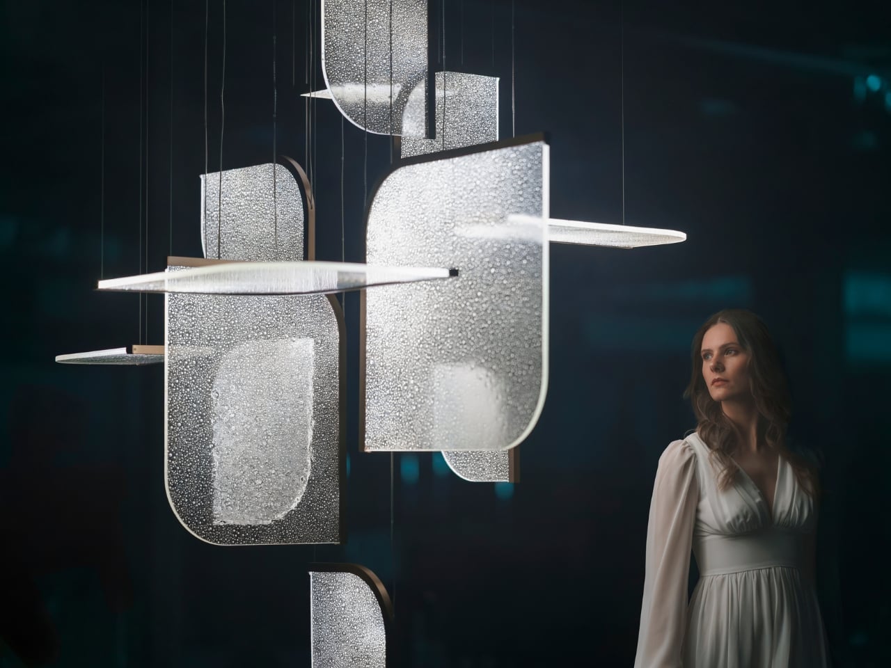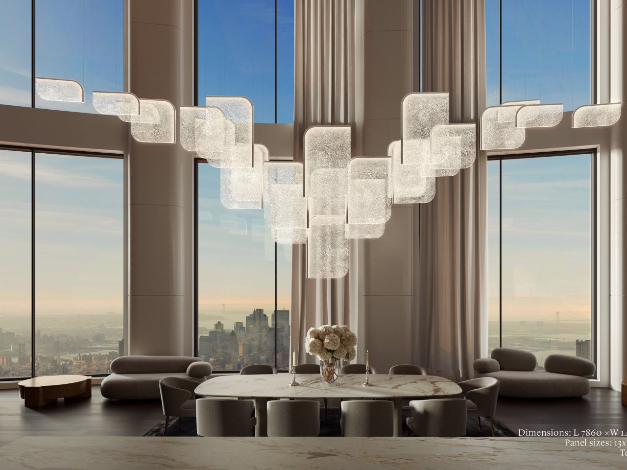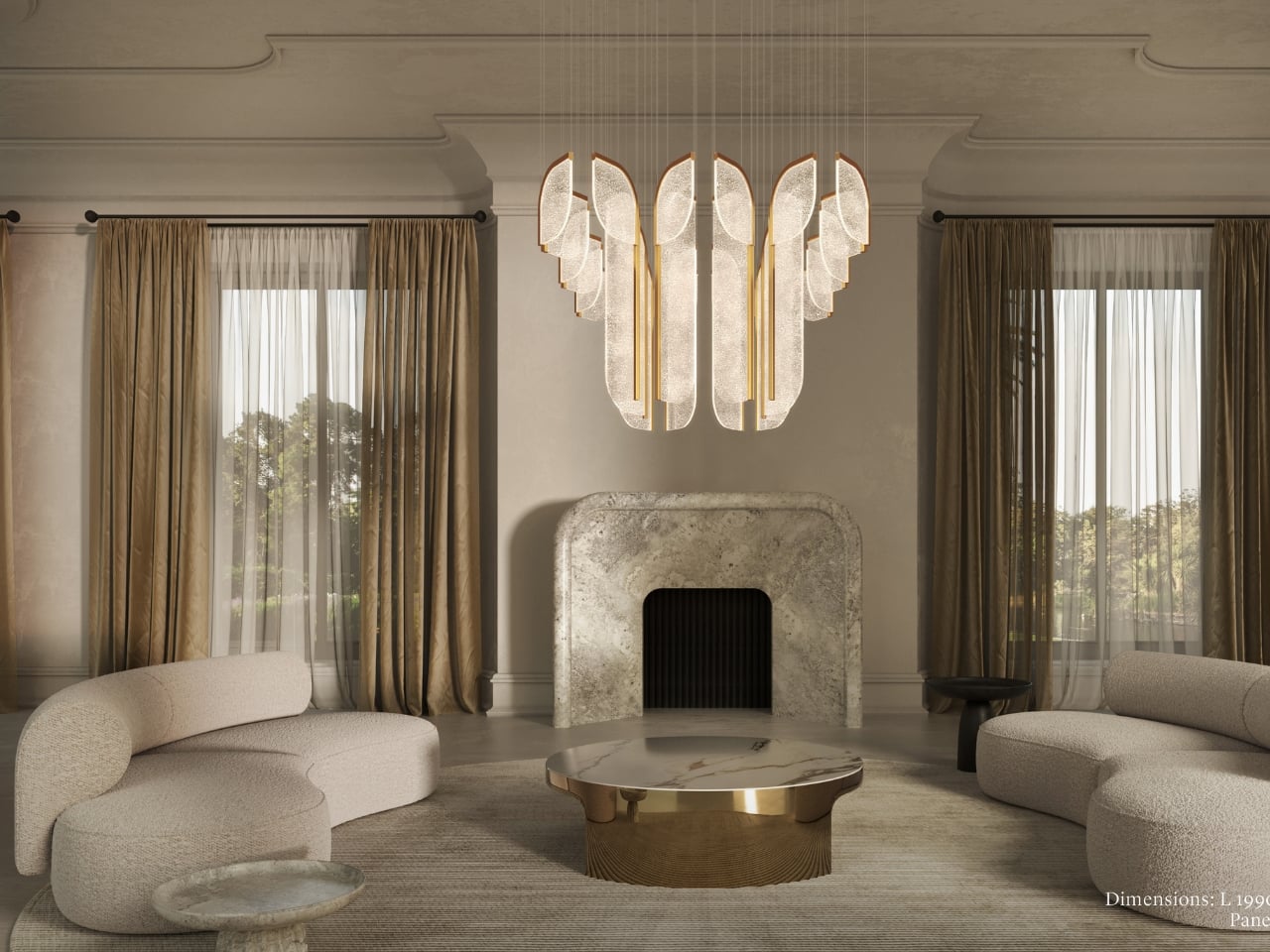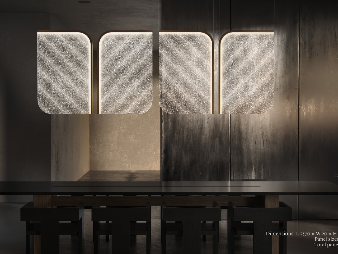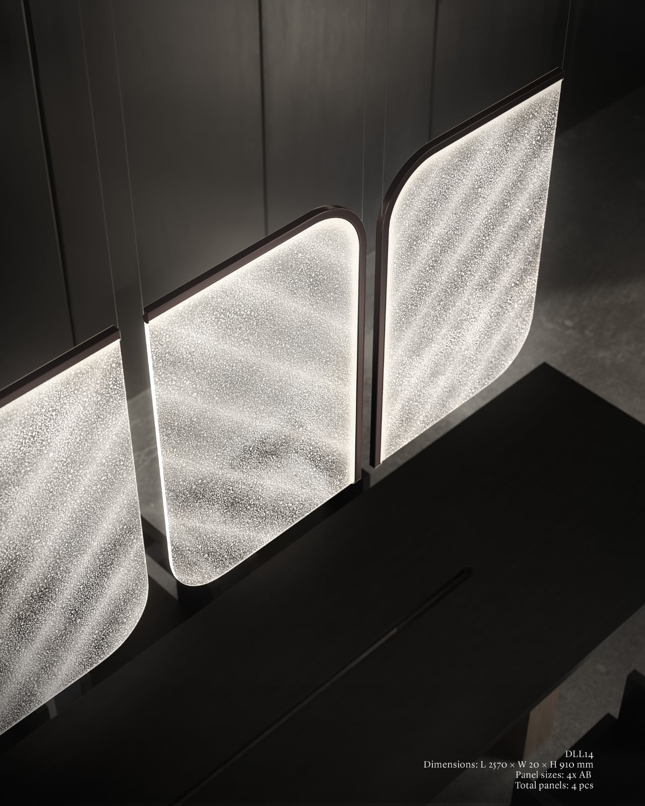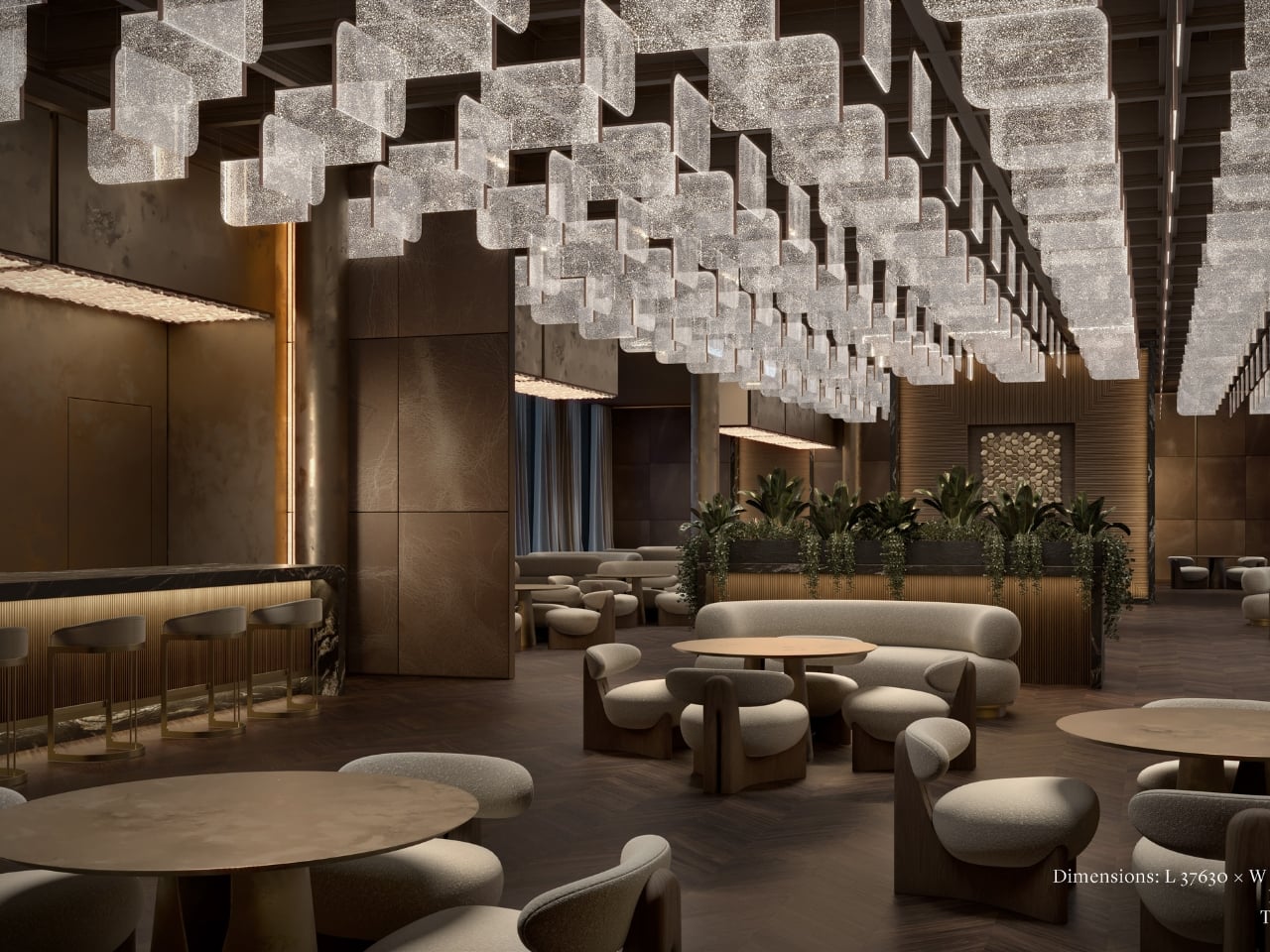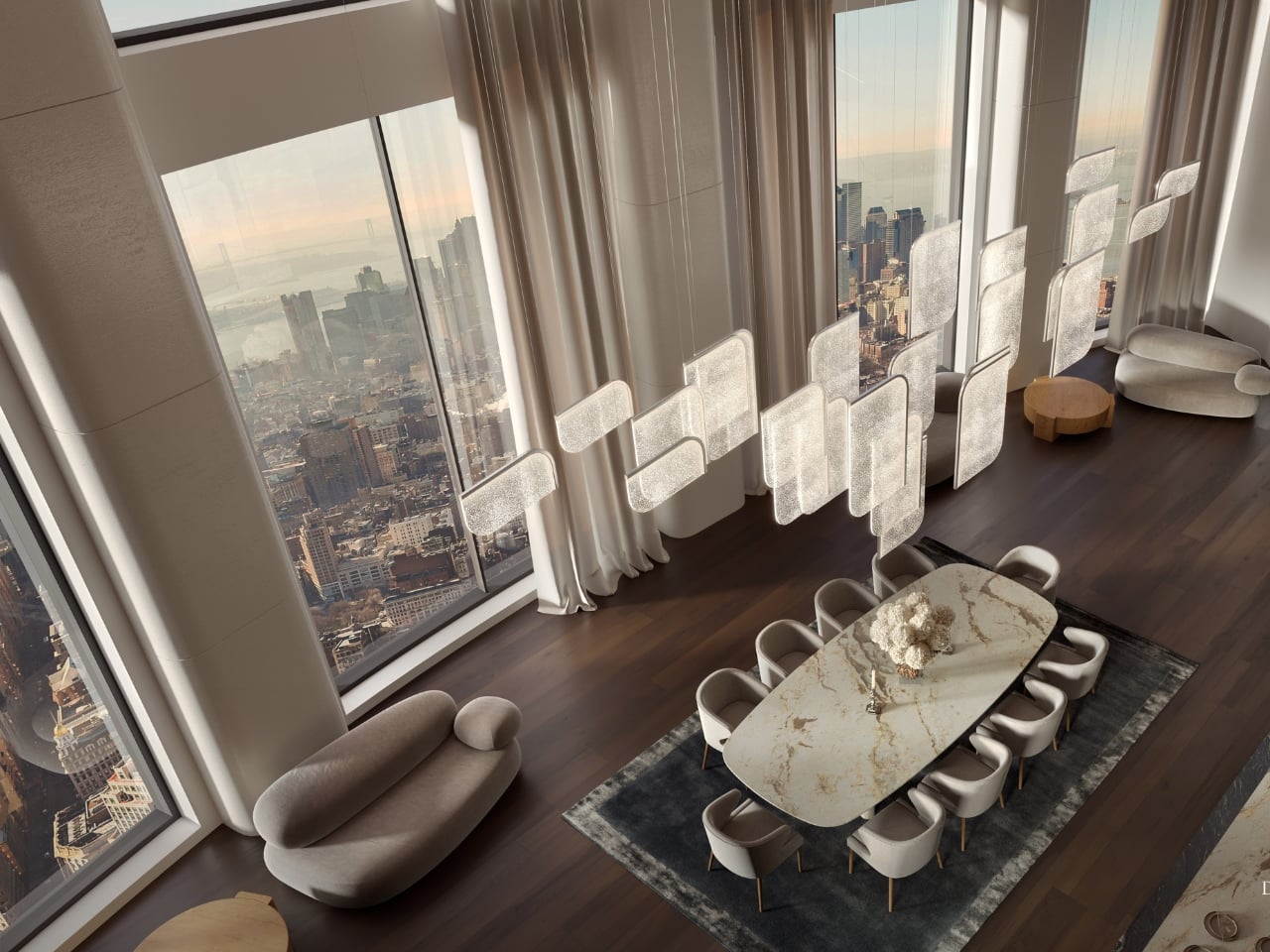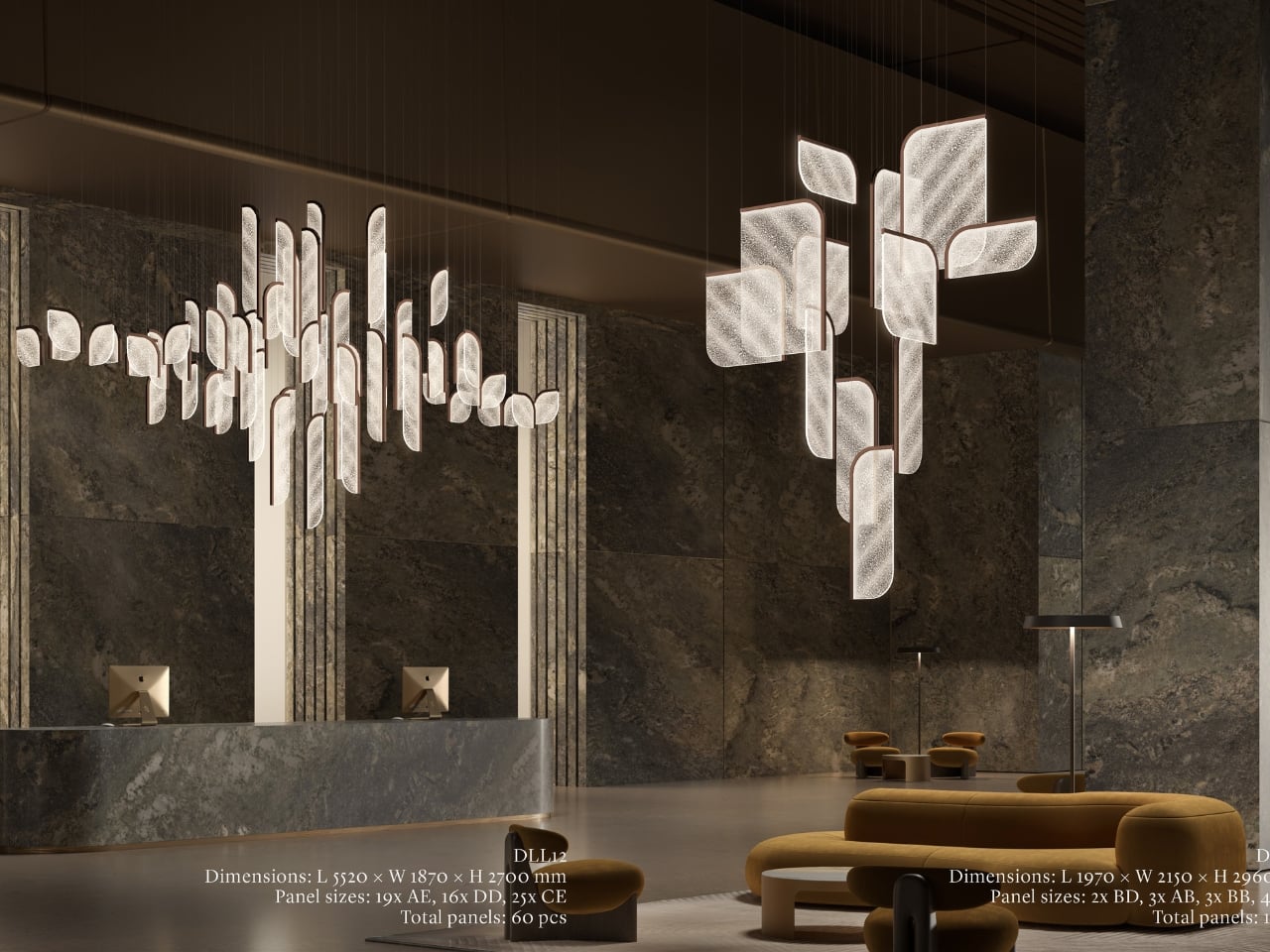
Every few years, design circles get swept up in nostalgia for a very specific era: the 1960s vision of the future. The curved furniture, the orbital shapes, the warm glow of a lamp that feels both alien and oddly cozy. We keep returning to it because, as futures go, it was a beautiful one to imagine, full of optimism and clean lines and a belief that living beautifully was something everyone deserved.
RETROCORE, the latest project from the team behind WOLOLOW, understands that pull completely. Designed by Arthur Koshatahyan and Kostya Trunov, it’s a modular wall and ceiling lighting system that borrows the visual language of Space Age design and reframes it as something you can actually build into your home, your studio, or anywhere light and personality intersect.
Designers: Arthur Koshatahyan and Kostya Trunov
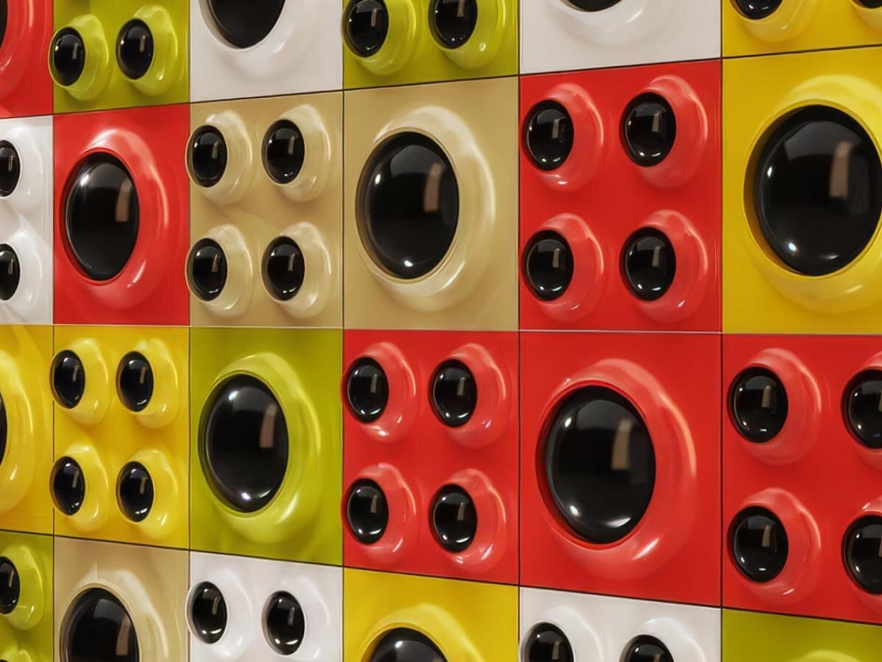
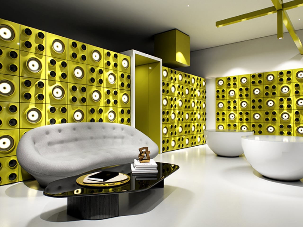
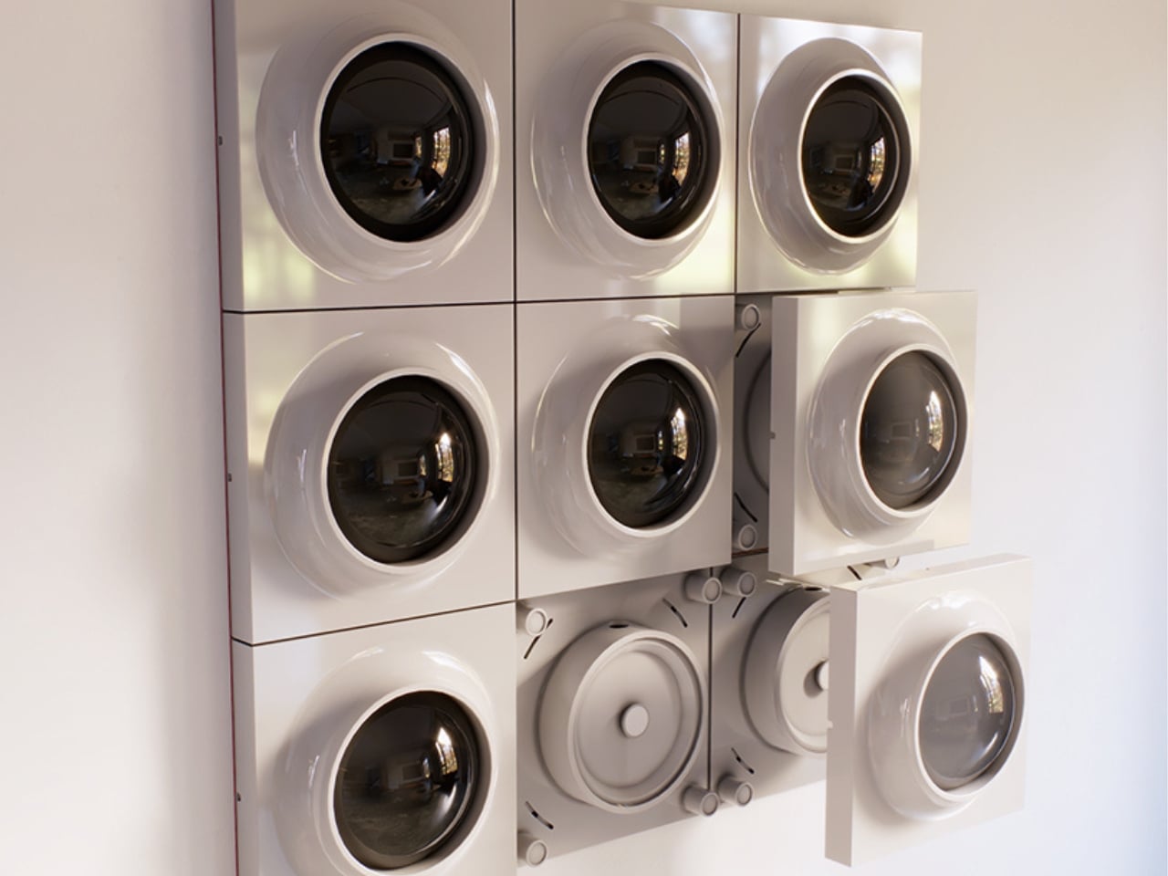
The concept is deceptively simple. At its core, RETROCORE is made up of individual light panels that combine into custom configurations, scaling up from a single accent piece to a full architectural installation. Two panel types do the heavy lifting: MONO, which features a single illuminated aperture, and QUATRO, which carries four within the same square format. Snap them together in different arrangements and you’re essentially composing with light, the way someone might arrange art on a wall or tiles across a floor. The configurations can stay small and subtle or grow into something that commands the room entirely.
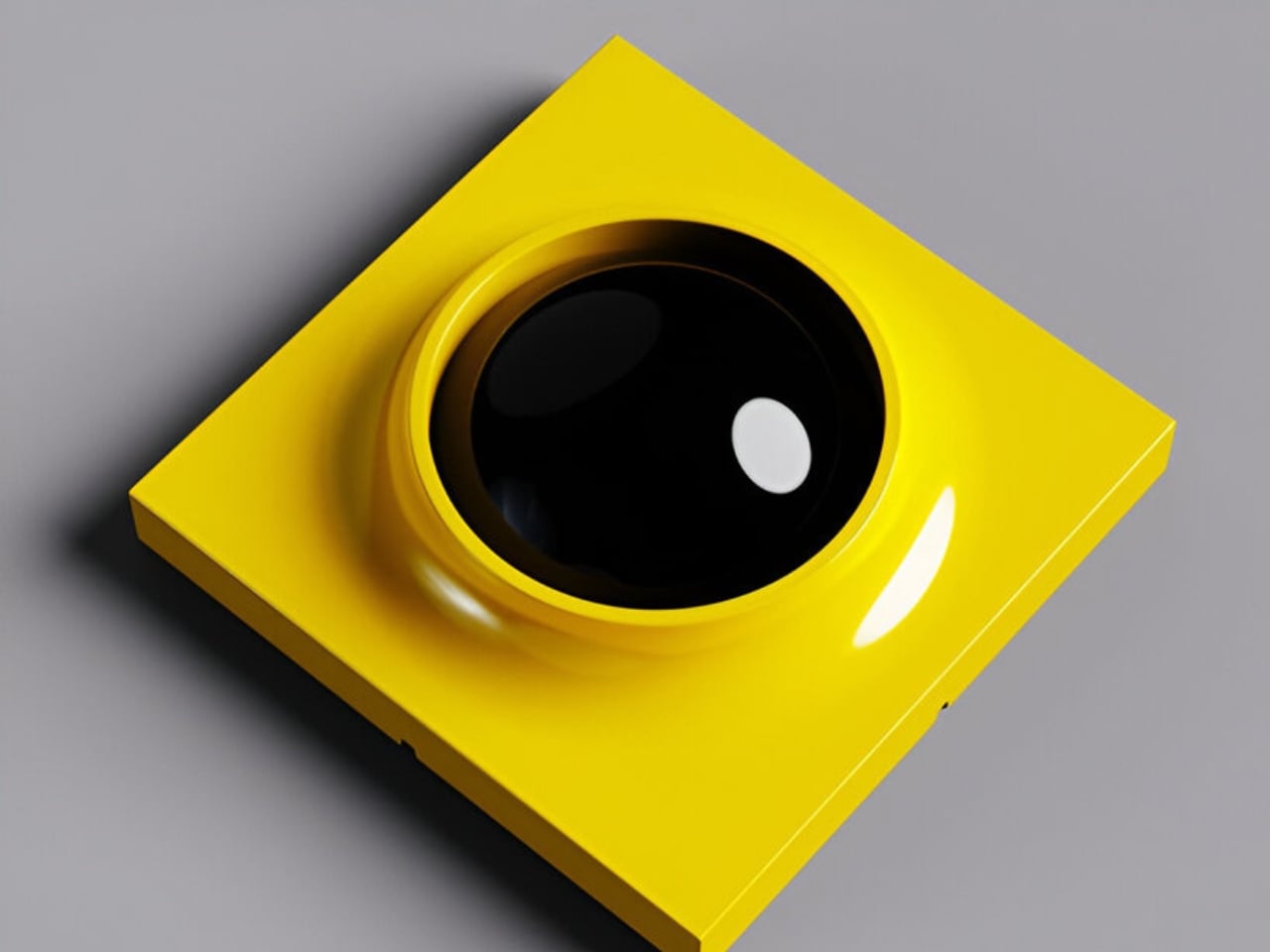
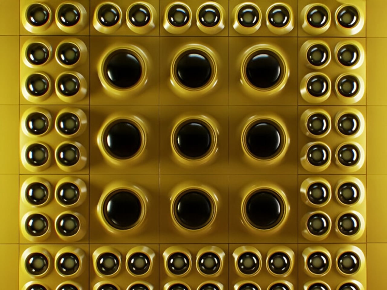
That modularity is the whole point, and it’s where RETROCORE separates itself from the usual retro-inspired lighting piece that looks great in a showroom and then sits stubbornly in one corner forever. Koshatahyan and Trunov describe it as “a new way to bring Space Age design into modern interiors, not only as a lamp, but as a modular building block of light.” And that framing matters. It positions RETROCORE not as decor, but as infrastructure, something that can grow, change, and adapt alongside the spaces it inhabits.
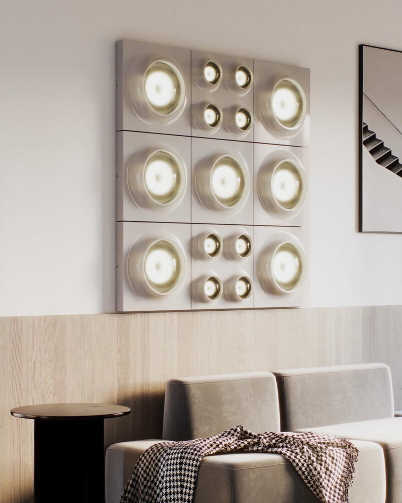
The backstory is worth knowing. WOLOLOW began as a UFO-shaped night light, a miniature riff on the iconic Futuro House, that tiny flying-saucer dwelling designed by Finnish architect Matti Suuronen in the late 1960s. That first product found an audience, went through the full crowdfunding process, and the lessons from building, manufacturing, and shipping a physical design object directly shaped what came next. RETROCORE isn’t a pivot so much as an evolution, a deeper commitment to the same aesthetic universe but with far more ambition built in.
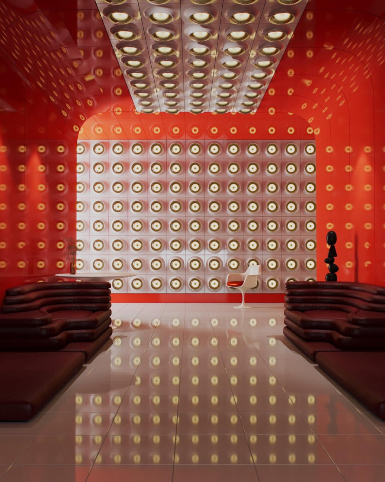
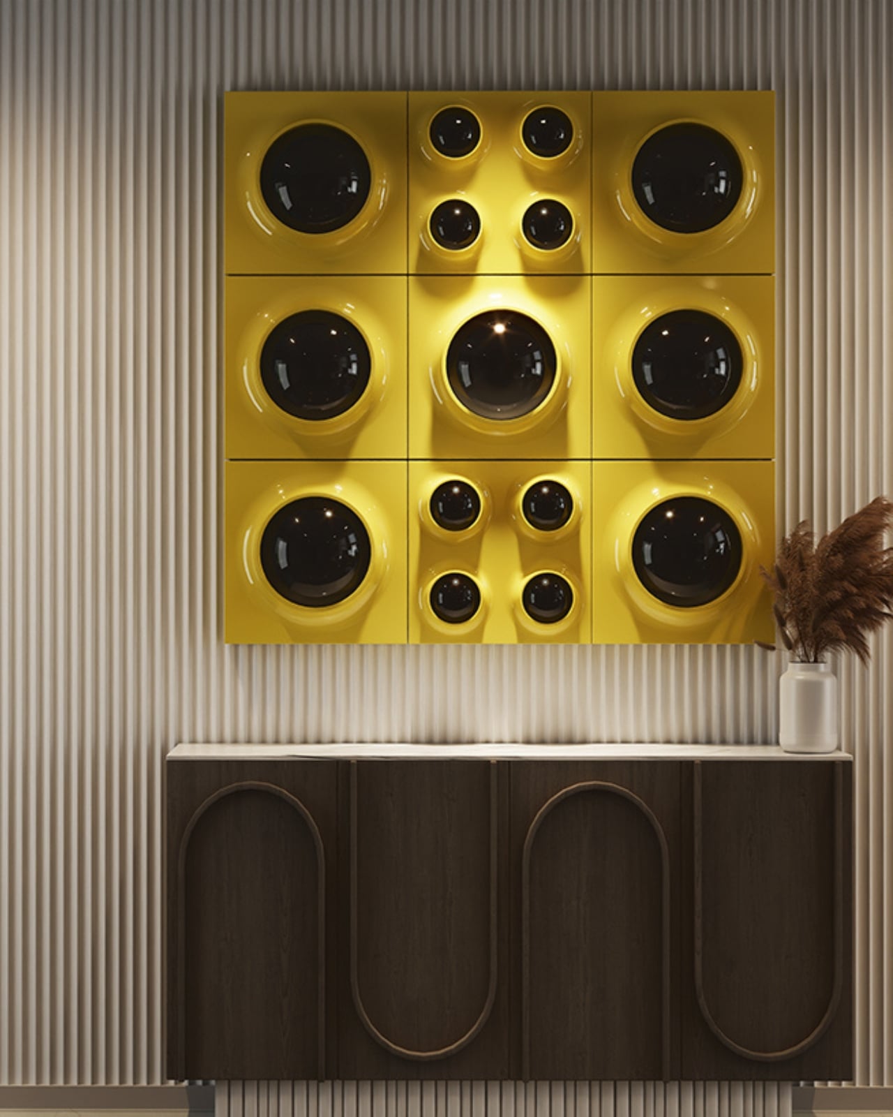
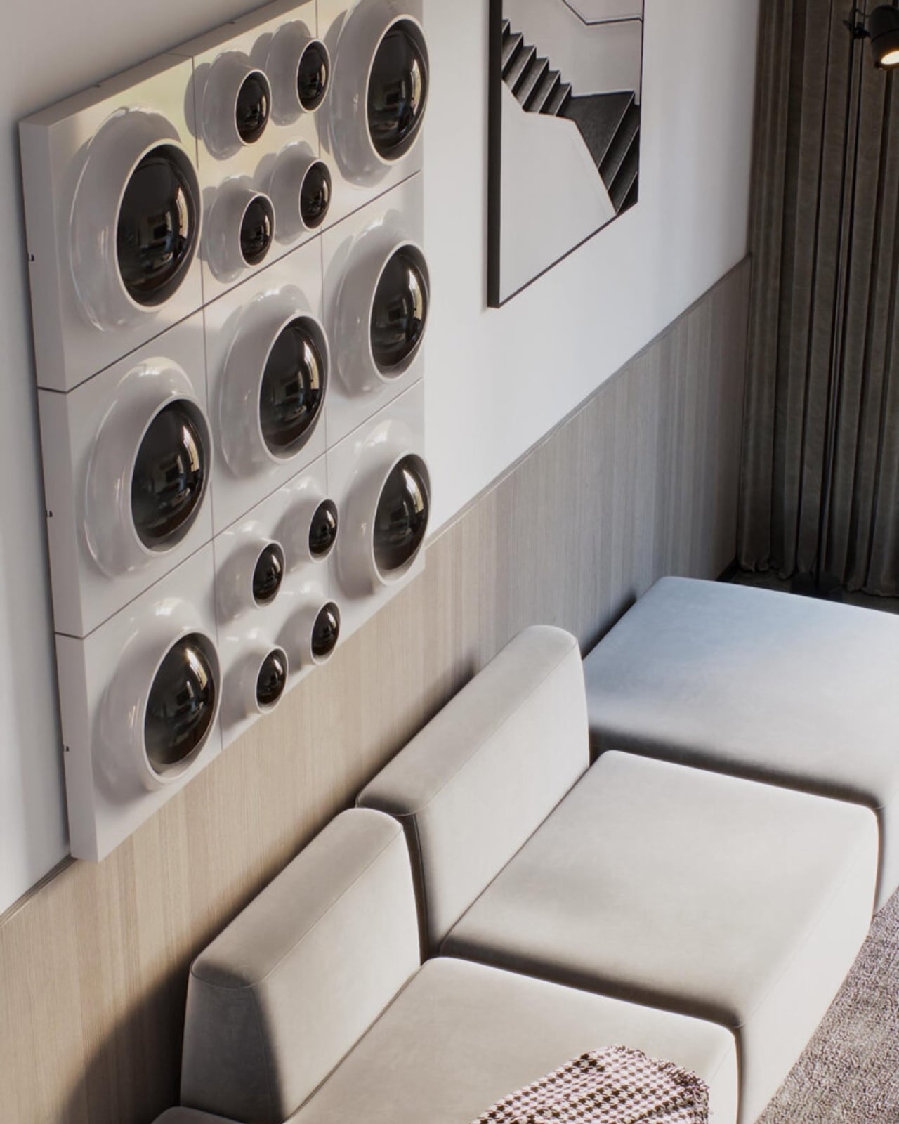
One quietly clever detail: the white version of the panels can be repainted after installation. That means the lighting can blend seamlessly into a surface, disappearing into the ceiling or wall and leaving only the glowing apertures visible, or it can be deliberately contrasted against a painted background. It’s a small thing, but it shows the kind of considered thinking that separates a product designed to be sold from one designed to be lived with over time.
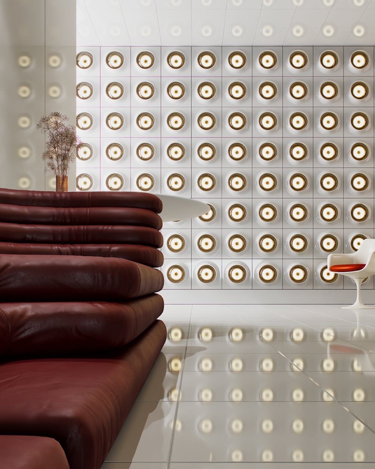
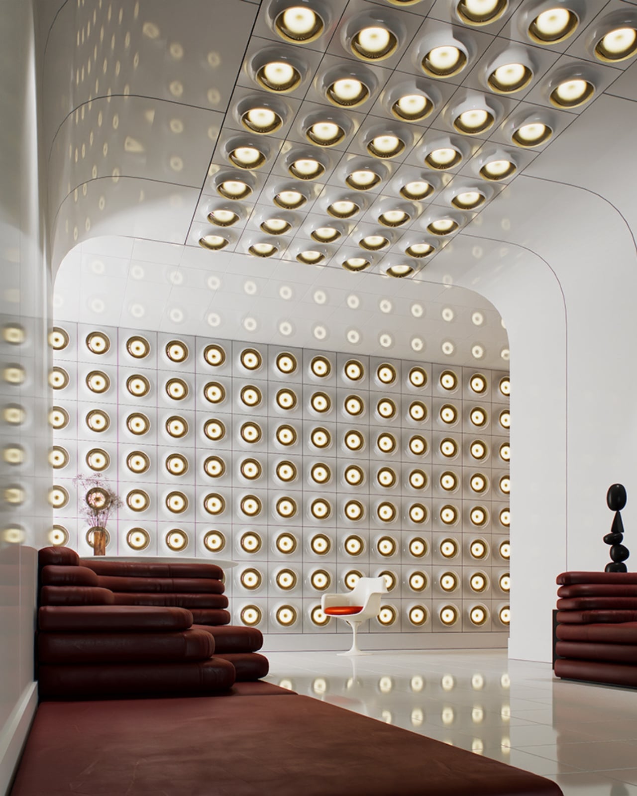
Retro-futurism as an aesthetic tends to get treated as a costume. You slap some Jetsons curves on a lamp, call it Space Age, and move on. RETROCORE doesn’t quite fall into that trap. The modular logic behind it feels genuinely contemporary, even as the visual references are firmly rooted in mid-century optimism. It’s the difference between wearing a vintage look and actually understanding why it worked in the first place, and why it still does.
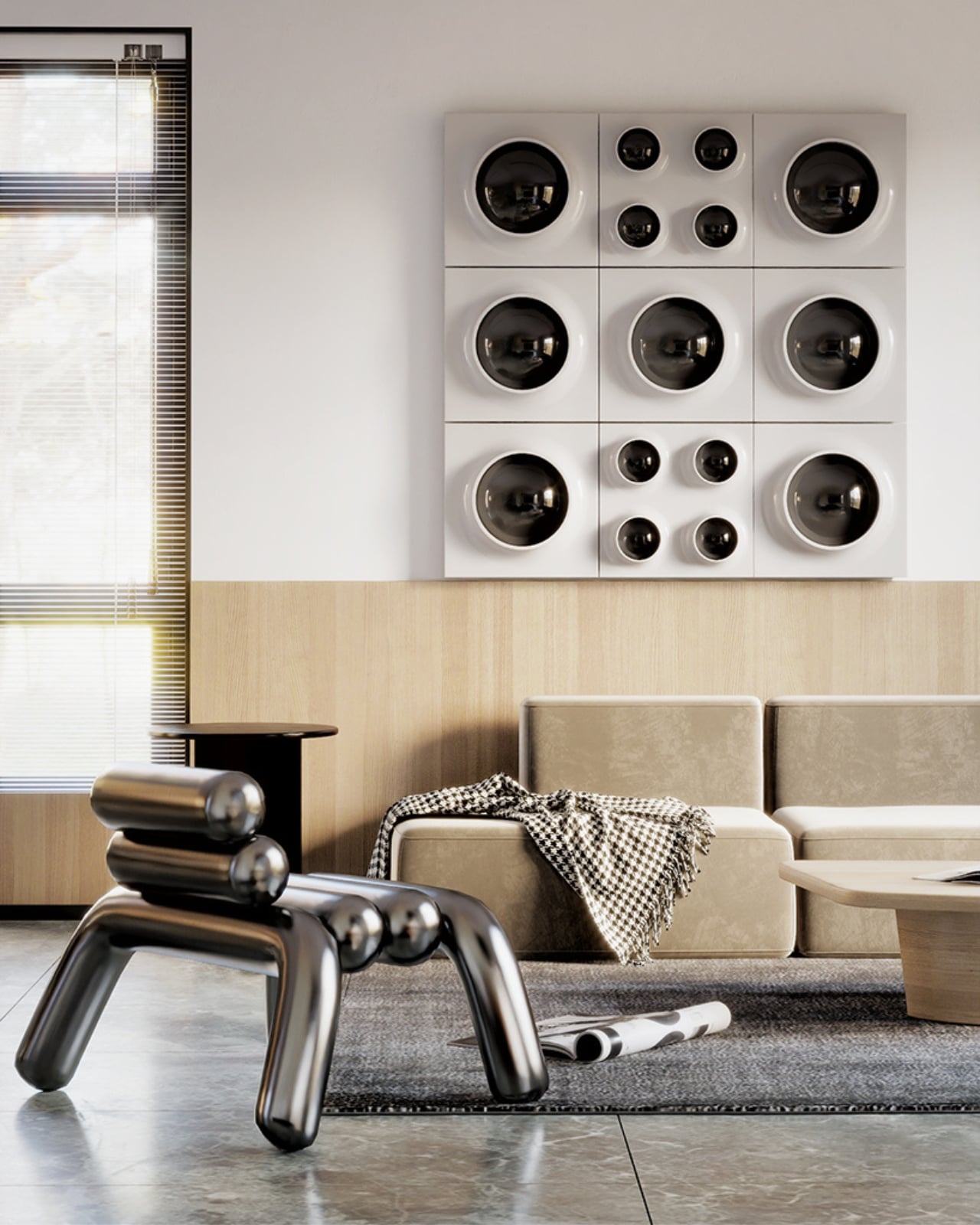
Whether you install one panel as a quiet nod to the era or map out an entire ceiling composition, RETROCORE offers what a lot of statement lighting simply can’t: the ability to keep editing. Your room changes, your taste shifts, your wall gets repainted, and the system accommodates all of it without you having to start over.
For a design moment that often prizes the singular, precious object, there’s real appeal in something built to be rearranged. RETROCORE is currently on Kickstarter, and if it delivers on what the images promise, it could work just as well in a minimalist apartment as it does in a maximalist creative studio. That flexibility, more than the retro aesthetics, is the actual sell.
The post The Space Age Never Left, RETROCORE Just Made It Official first appeared on Yanko Design.