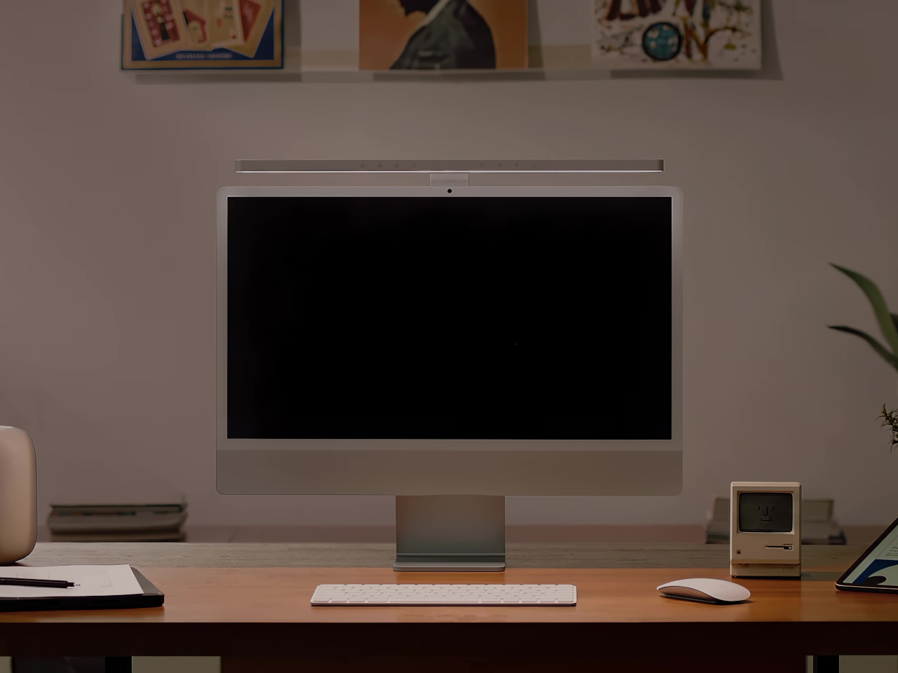
The iMac has always had a light bar problem. You could put any number of BenQ ScreenBars on top of one, but they’d cover the camera, block the microphone, or clip over the Apple logo on the back. None of them were made for it. The BenQ iScreenBar is the first that actually is, and it arrives at $189, looking like it was designed by the same people who designed the computer it sits on.
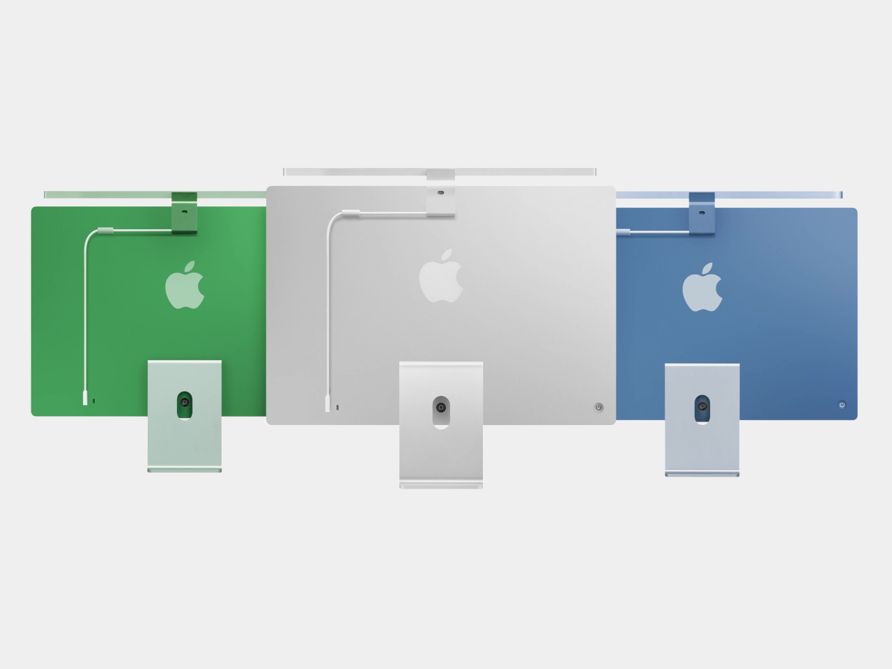
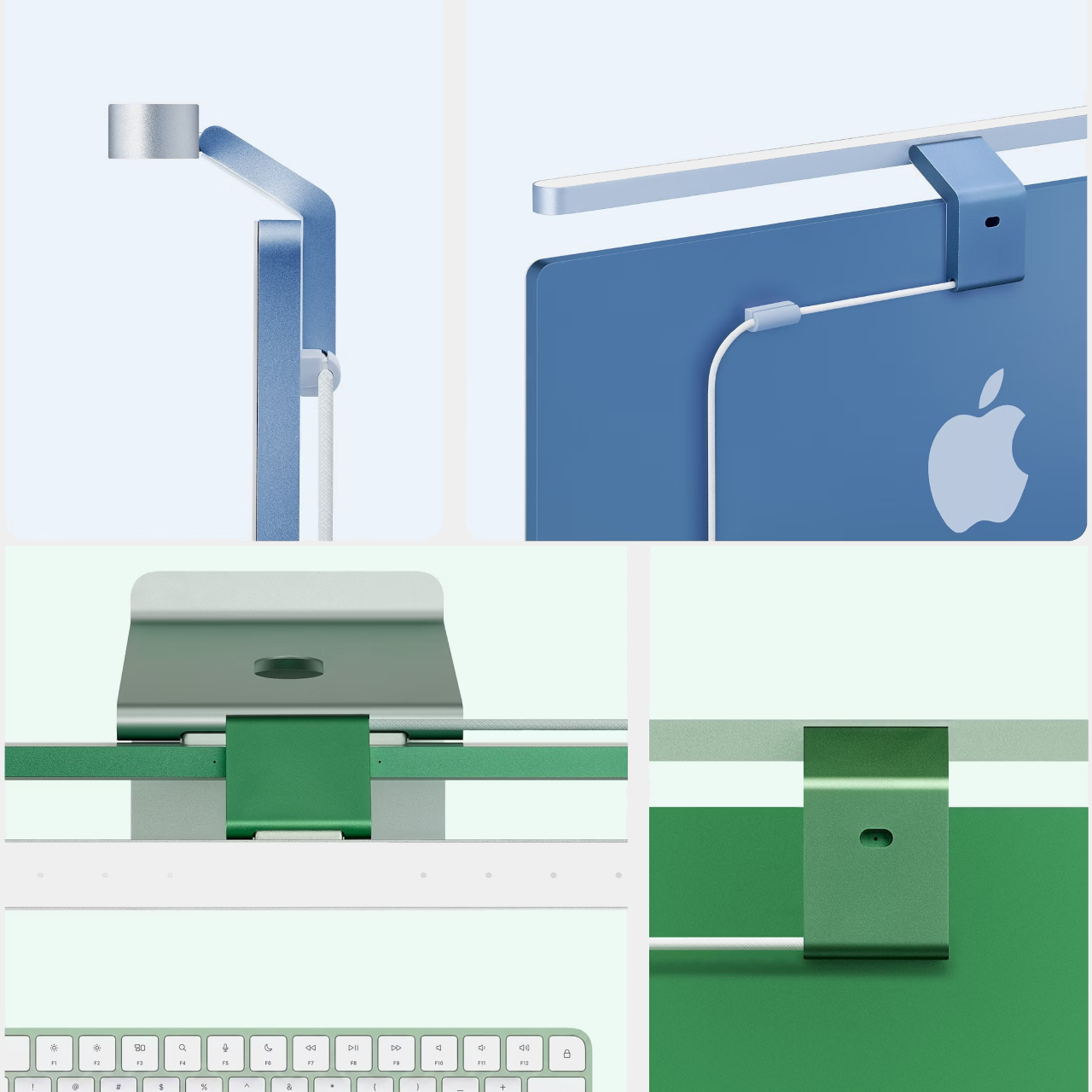
The construction makes the case immediately. Unibody aluminum with a glass touch panel, finished in Silver to match the iMac directly, mounting via a custom magnetic clamp on the back rather than a standard monitor clip. A magnetic cable clip routes the USB-C power cord out of view. The rear logo, the camera, and the microphone all remain unobstructed. It’s the kind of detail that should have been obvious from the start but apparently wasn’t until now.
Compatibility is specifically tuned to the 24-inch iMac from 2021 onward. That USB-C connection does more than just carry power. It lets the iScreenBar communicate with the iMac directly, enabling a dedicated macOS app for software control of brightness and color temperature. It also means the light bar knows when the camera is active, which feeds into one of the more useful features here.
That feature is Video Mode. When the iMac’s built-in webcam turns on, the iScreenBar automatically shifts its output to reduce bright spots on the user’s face, giving calls and recordings a more balanced, flattering light rather than the harsh overhead glow that most desk setups produce. Nobody wants to look like they’re being interrogated from below during a team call, and Video Mode addresses that without any manual intervention.
The light itself uses BenQ’s ASYM-Light optical design, which angles illumination downward toward the desk rather than toward the screen. That means no glare, no hotspots reflecting back from the display, and lighting that reaches an area of roughly 33.5in x 19.7in at 500 lux. The glass touch panel on the bar handles brightness and color temperature adjustments directly, and auto-dimming keeps the workspace at a consistent level as conditions change.
Blue and Green colorways, two of the iMac’s most popular colors, are planned for late 2026. The Silver version is the only one available at launch, which is also the most versatile option since it matches every iMac color reasonably well. For buyers committed to a Blue or Green iMac, the wait might be worth it for a more cohesive result, but the Silver still looks deliberately matched rather than generically attached.
BenQ’s existing ScreenBar lineup has been a reference point in desk lighting for years, with options ranging from $109 for the standard bar to $179 for the Halo 2 and $289 for the new ScreenBar Max built for dual-monitor setups. The iScreenBar slots in at $189, making it competitive with the premium end of that range while offering something none of the others can: a mount that actually fits the iMac the way it was intended, rather than sitting on top of it like an afterthought.
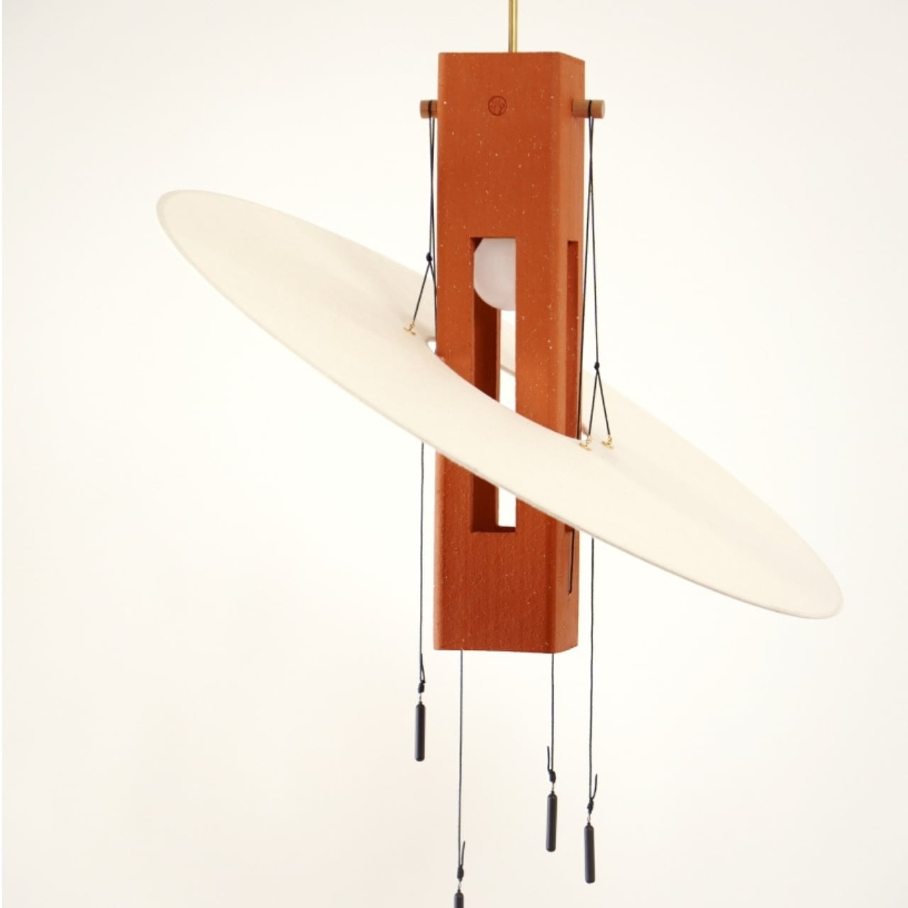
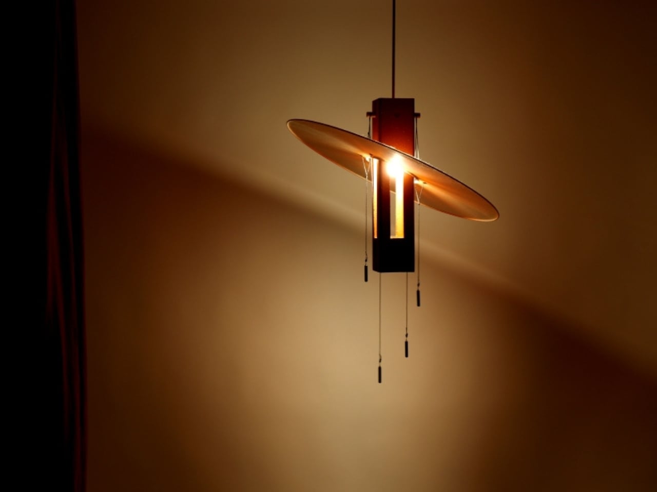
Most lighting collections come with a concept attached, some blurb about inspiration and intention that sounds compelling on paper but doesn’t survive contact with an actual room. Aura, the latest collection from French design studio Maison Cédrat, is the exception. It’s quietly confident in a way that doesn’t need to announce itself, and that alone is worth paying attention to.
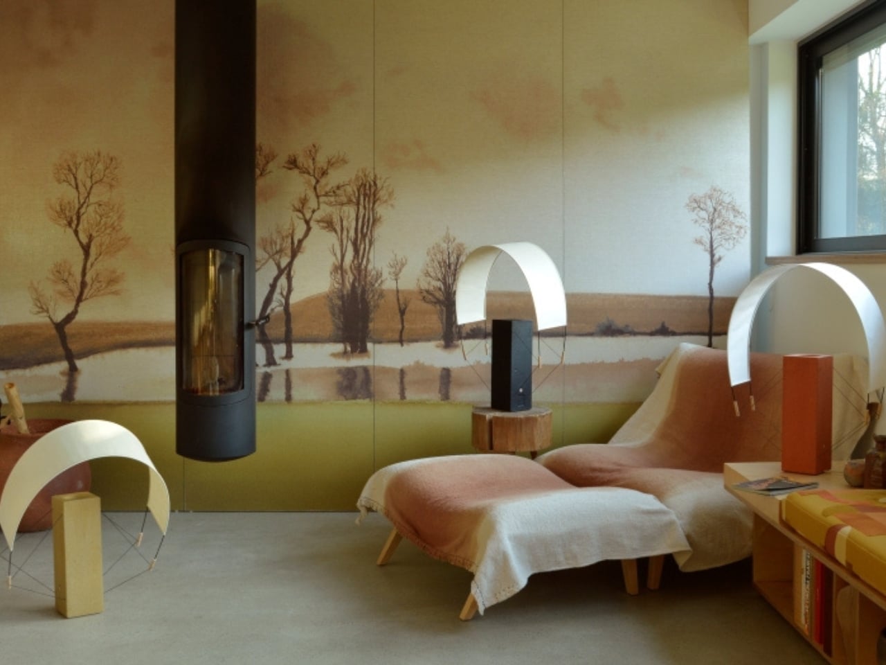
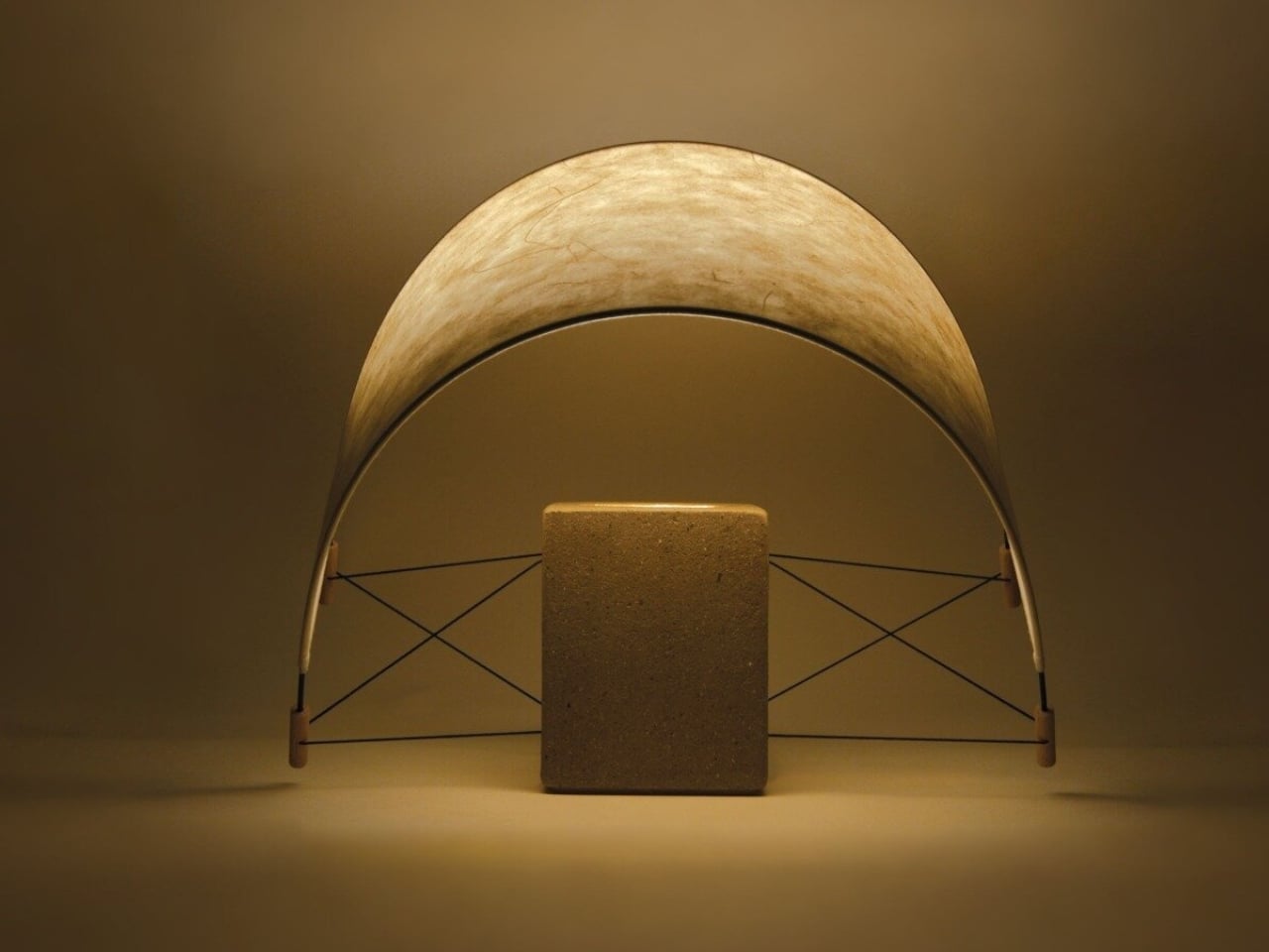
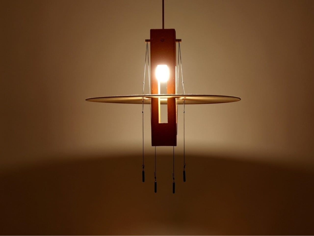
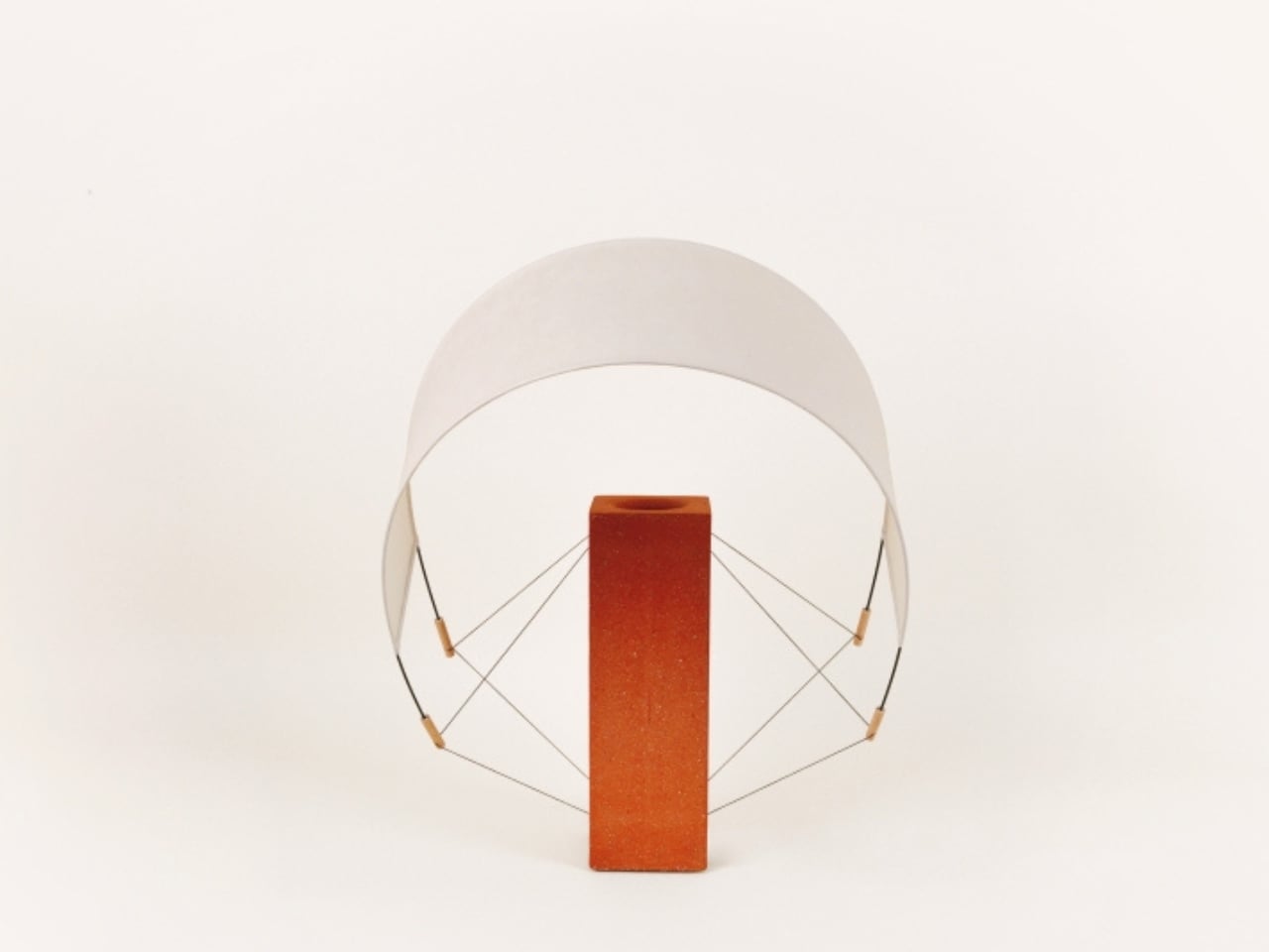
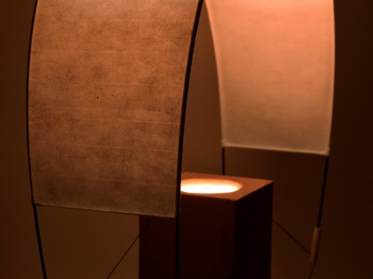
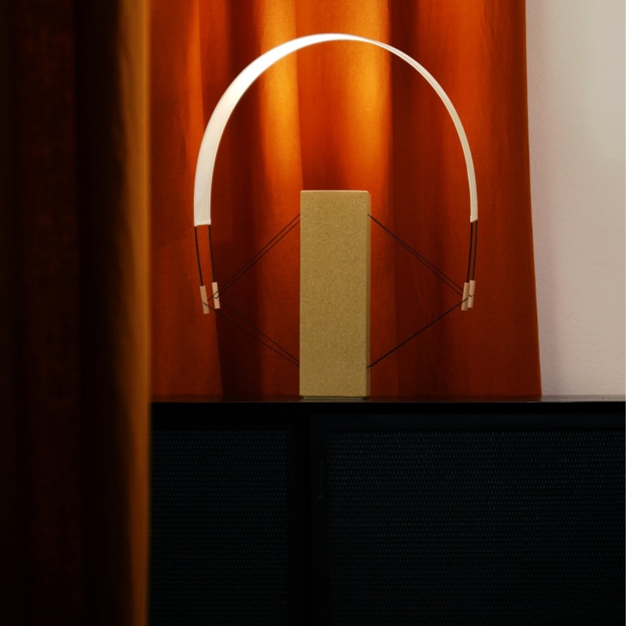
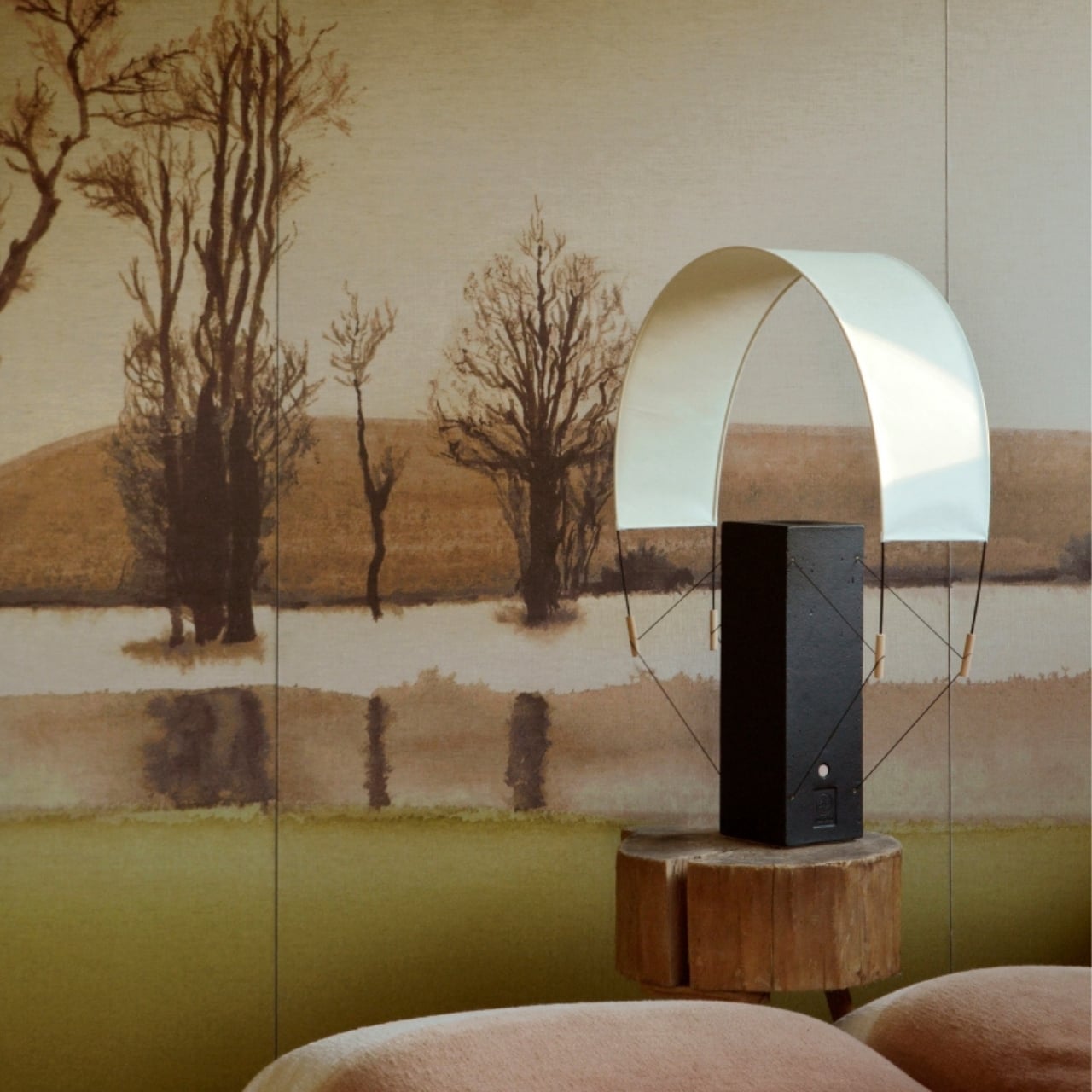
Designed by Pierre Samouilla and Alix Lalucaa, Aura is a family of three luminaires named Lumia, Écla, and Nova. The material pairing at the heart of the collection is deceptively simple: handcrafted clay and translucent washi paper. On the surface, it reads as an obvious contrast, mineral weight against near-weightlessness. But the real conversation between the two materials happens at the light source, and that’s where the design earns its keep.
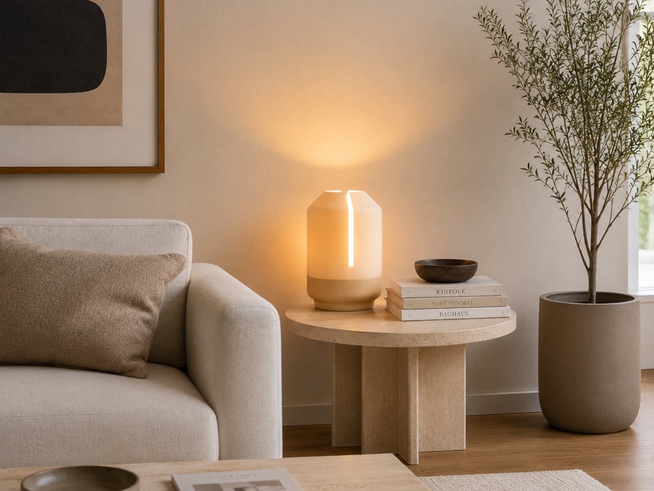
By day, the lamps read as sculptural objects. The clay bases carry a tactile, geological presence, their surfaces retaining the warmth and slight irregularity of something shaped by hand. The washi paper shades sit in quiet tension against them, delicate enough to feel almost temporary. Then night falls, and the whole equation flips. The paper glows, softly and evenly, while the clay recedes into the background. The same lamp, two entirely different characters depending on the hour. That kind of dual personality takes real consideration to pull off, and here it feels effortless.
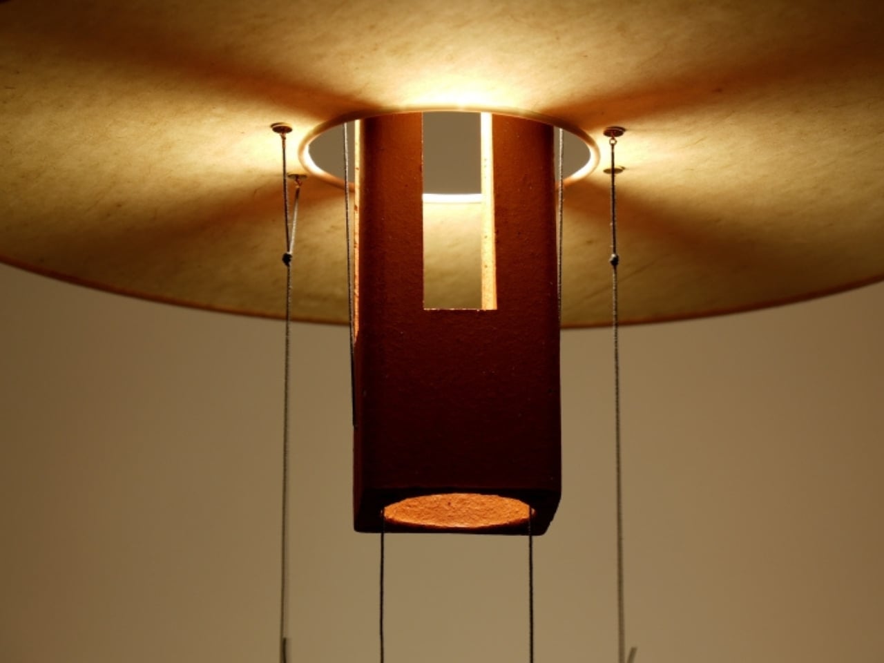
The three pieces each occupy a different position in a room. Lumia is the large table lamp of the family, the anchor. Its proportions are generous without being imposing, and it carries the kind of presence that draws the eye without demanding it. Écla scales the composition down into something more intimate. Its curved form evokes the arc of a setting sun, a reference that could have felt obvious but lands with enough restraint to feel earned. Nova takes the most expressive turn as the pendant of the three: a cloud-like washi paper shade wraps around an extruded terracotta core that hangs with a quiet, considered drama. The natural fibres of the paper are visible up close, catching light in a way that machine production simply cannot replicate.
What holds the three pieces together as a family is their shared commitment to balanced proportions and restrained geometry. There are no unnecessary flourishes here, no decorative moves made to catch attention in a product photo. The visual interest comes entirely from the material contrast and the way light moves through and around the forms. For a collection that’s fundamentally about illumination, it’s remarkable how little it relies on the light itself to do the heavy lifting. The objects are already doing it.
The colour palette stays close to the earth. Raw clay, terracotta, muted blacks. These are not lamps designed to coordinate with a trend cycle. They’re designed to belong to a room, to feel like they were always there. That quality of quiet permanence is increasingly rare in contemporary lighting, where the temptation to chase novelty tends to produce objects that look exciting in isolation and exhausting in a home.
Lighting is often the last thing people commit to when designing a space. It gets treated as a functional afterthought, something solved with a budget pick or a standard floor lamp ordered at midnight. Aura makes a quiet argument for reconsidering that habit. Not loudly, not with a manifesto, but with three objects that seem to understand the rooms they’ll eventually inhabit.
The handmade quality is not incidental to the design. It is the design. The slight variation in the clay surfaces, the visible texture of the washi fibres, the way each lamp carries a trace of the hands that made it: all of it feeds back into the visual experience. You can feel the intention in the objects, and more importantly, you can feel it in the light they cast.
Maison Cédrat is not the first studio to work with clay and natural materials, and it won’t be the last. But Aura has an ease to it that’s rare, a sense that the collection was not forced into existence but arrived at gradually, the way most good things do.
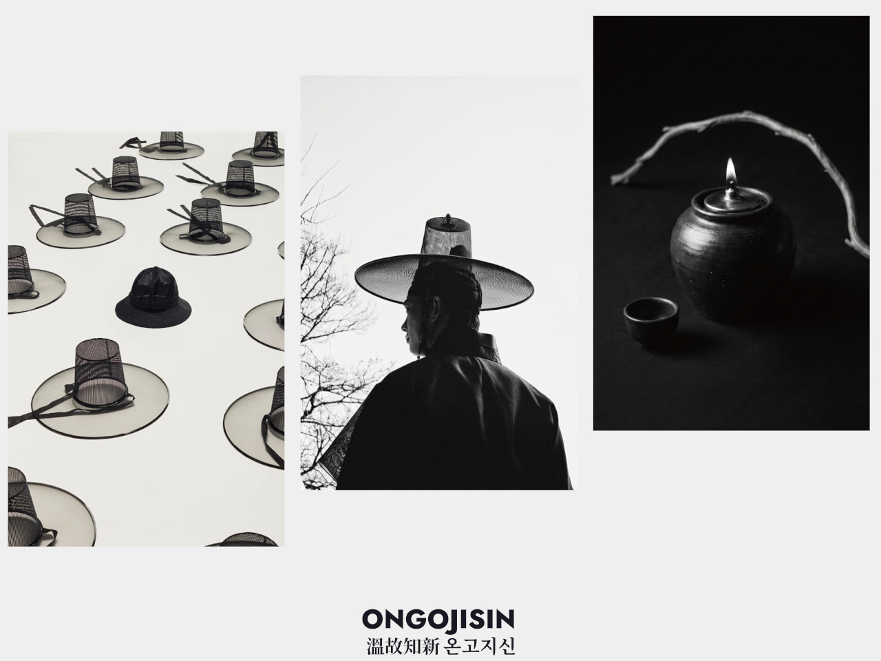
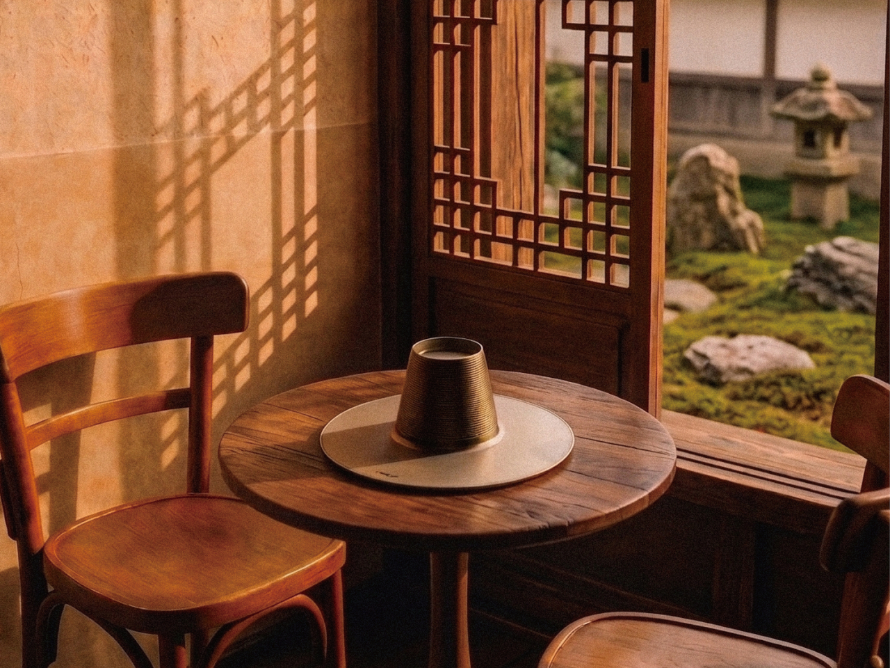
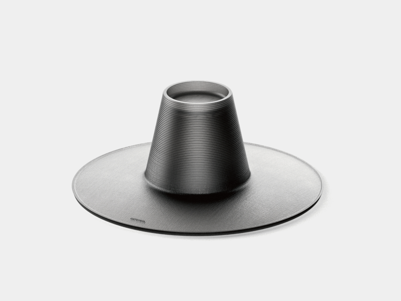
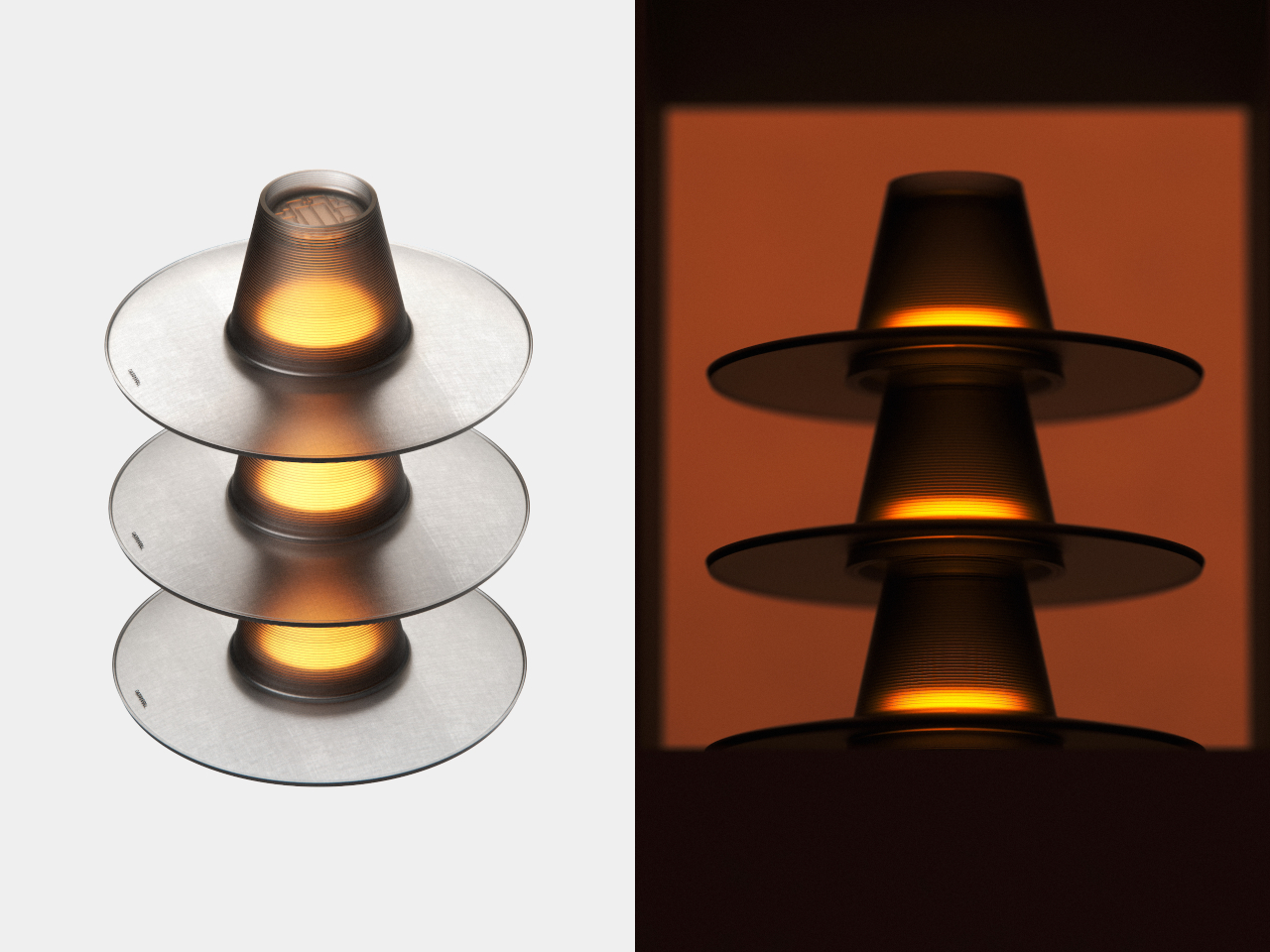
The gat is one of the more distinctive objects in Korean material culture. Woven from horsehair and bamboo and worn by scholars and noblemen during the Joseon Dynasty, it communicates social standing through form alone. Its silhouette, a tall cylindrical crown on a flat, wide brim, is immediately recognizable. What that shape might become in a different time is a question the GAT lamp was designed to answer.
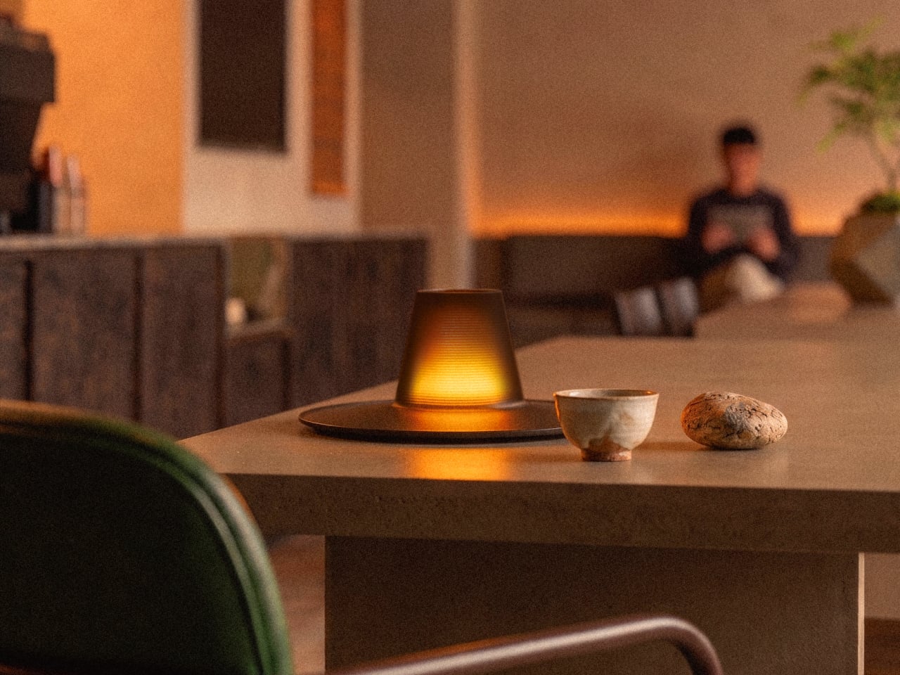
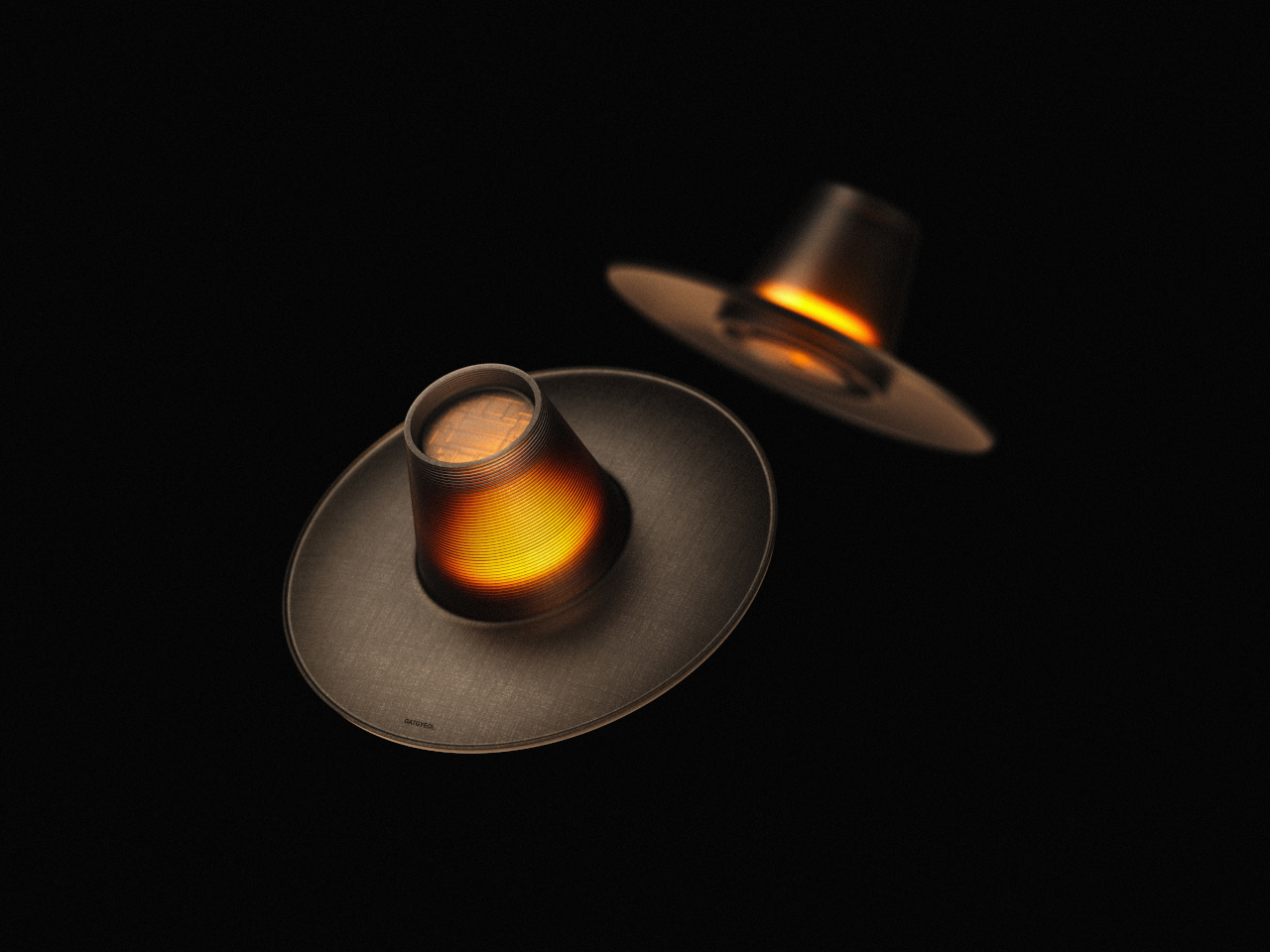
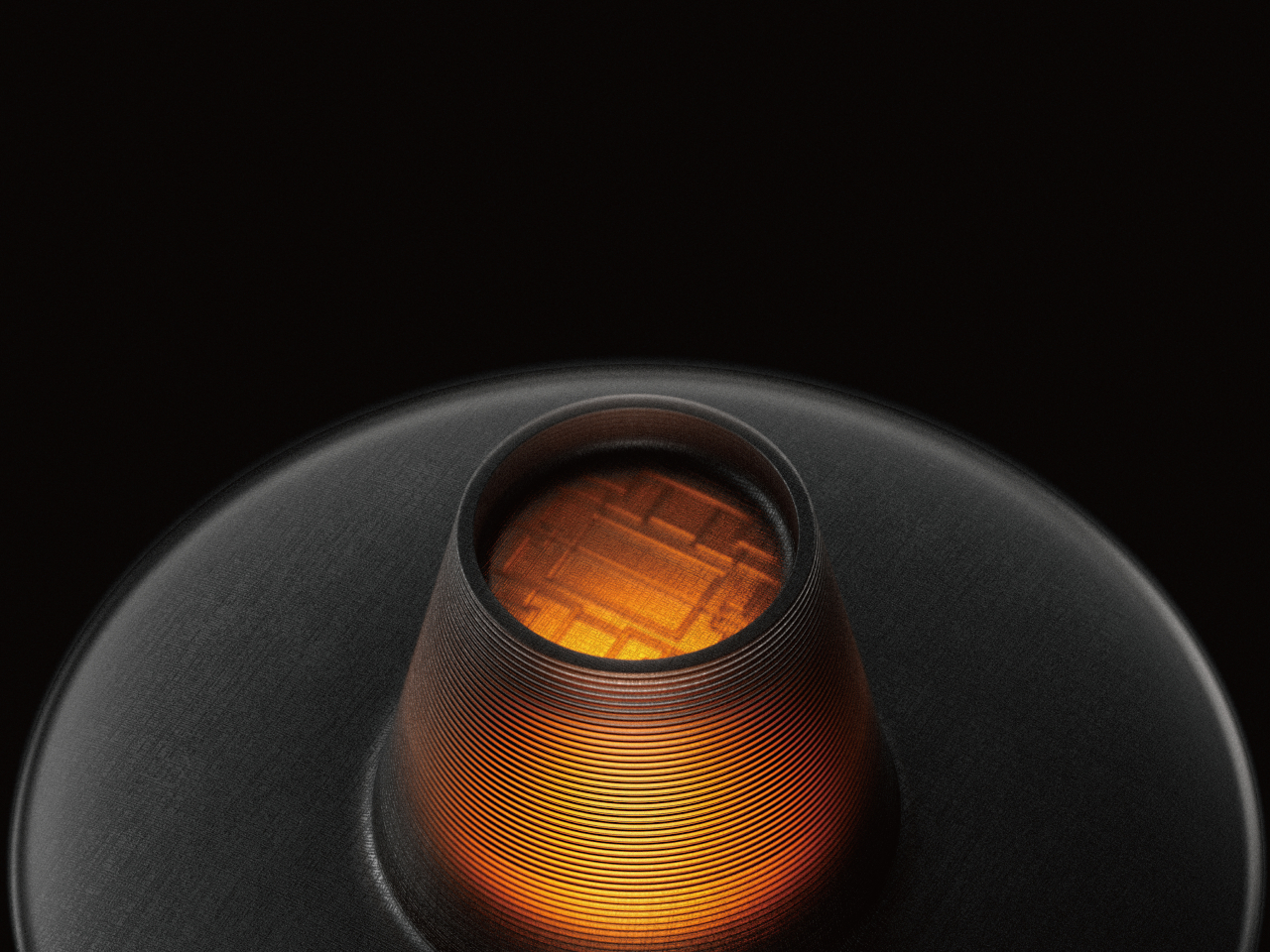
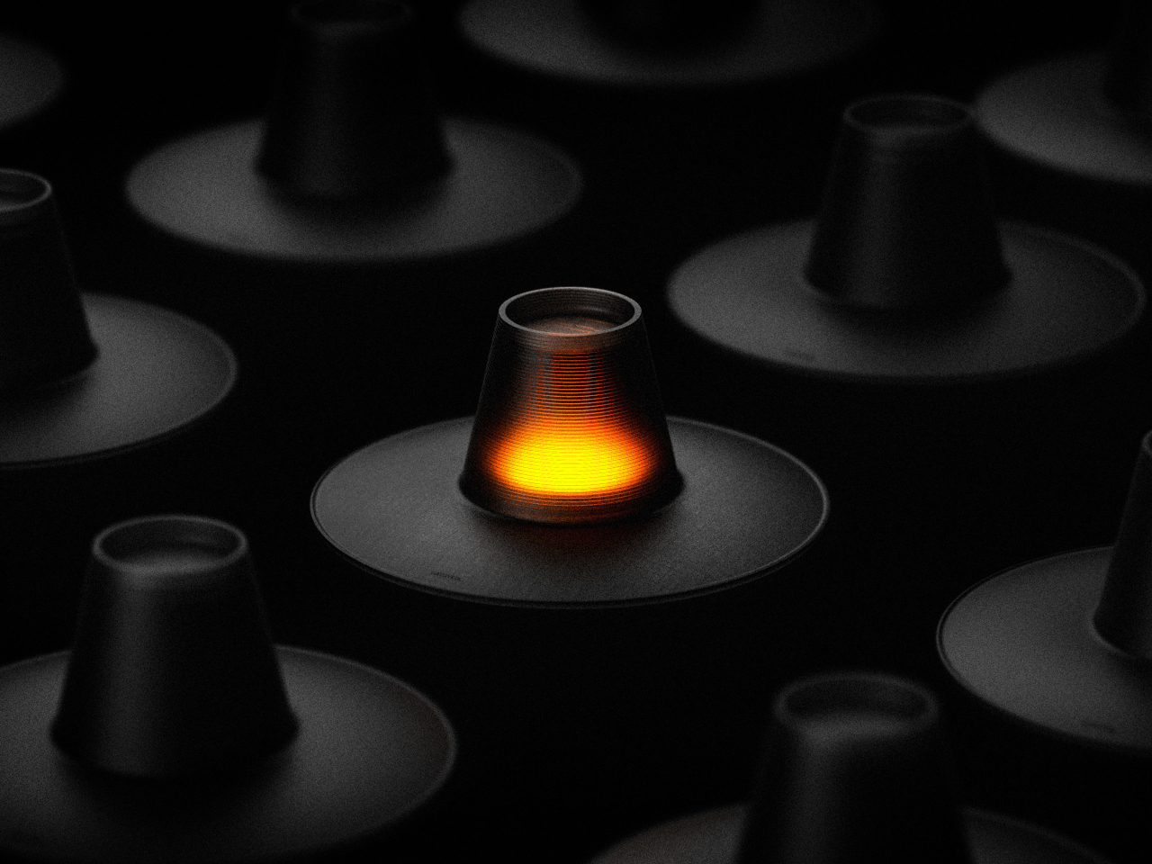
The lamp takes its name and form from the gat, guided by the concept of Ongojisin, a Confucian idea about discovering new value through tradition rather than reproducing it. The central body replicates the gat’s tall crown, covered in fine horizontal ridging that echoes the woven texture of traditional horsehair. The broad disc below re-creates the brim as a gently expanding, dish-like volume.
Ongojisin is usually translated as “warming the old to know the new.” The product title treats that not as a passive historical sentiment but as an active design instruction. Rather than styling a lamp to look vaguely traditional, the GAT takes the gat’s actual structure and recomposes it into a functioning lighting object, keeping every proportion and surface detail connected to a specific precedent.
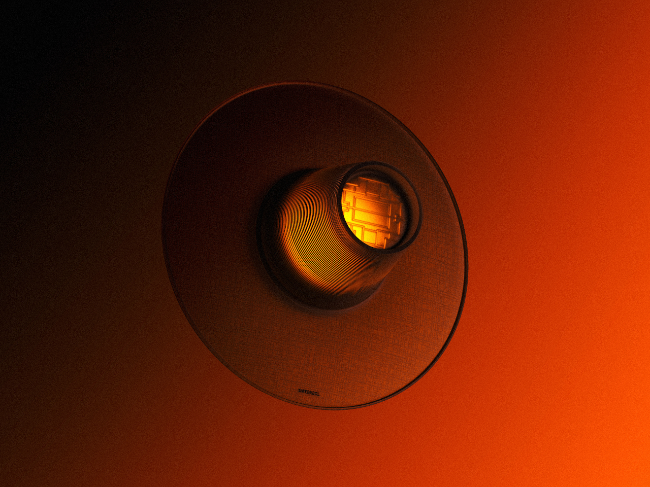
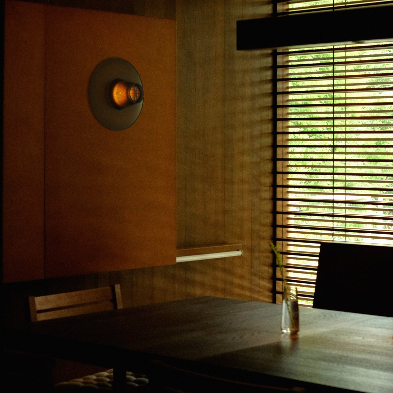
The interior of the crown carries a lattice pattern drawn from traditional Korean window screens, invisible in ordinary light. Switched on, warm amber filters through the ribbed surface much as it once moved through hanji paper, producing the same quality of diffused, indirect glow that gave candlelit rooms their particular atmosphere. Off, the lamp holds its form as a sculptural object without needing to perform.
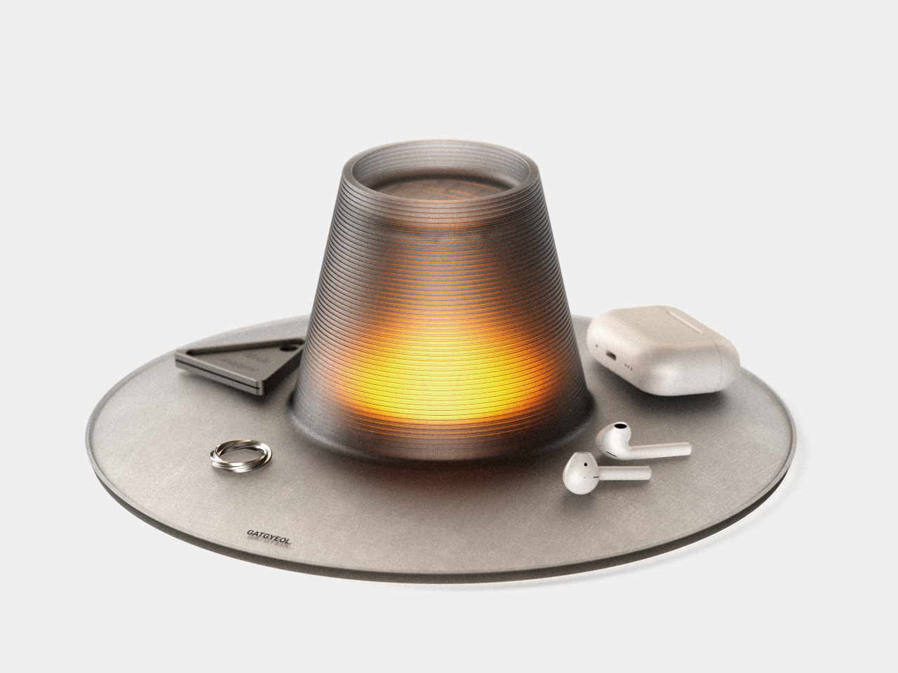
The wide disc does more than anchor the form. It serves as a tray, holding rings, earbuds, and whatever accumulates beside a lamp. Combining lighting with surface storage in a single object is uncommon in its category, and the gat’s broad brim is a natural vessel for it. An object worn historically to signal status is repurposed to hold what you put down at the end of the day.
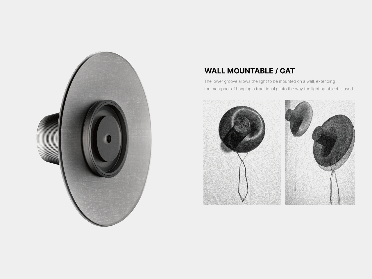
A groove on the underside allows the lamp to mount on a wall. A gat hung on a wall is a familiar image in traditional Korean households; the mounted lamp reproduces that image exactly but as a functioning light. The object becomes what the mounted gat always was: something that signals presence and considered taste in a room without requiring any explanation from its owner.
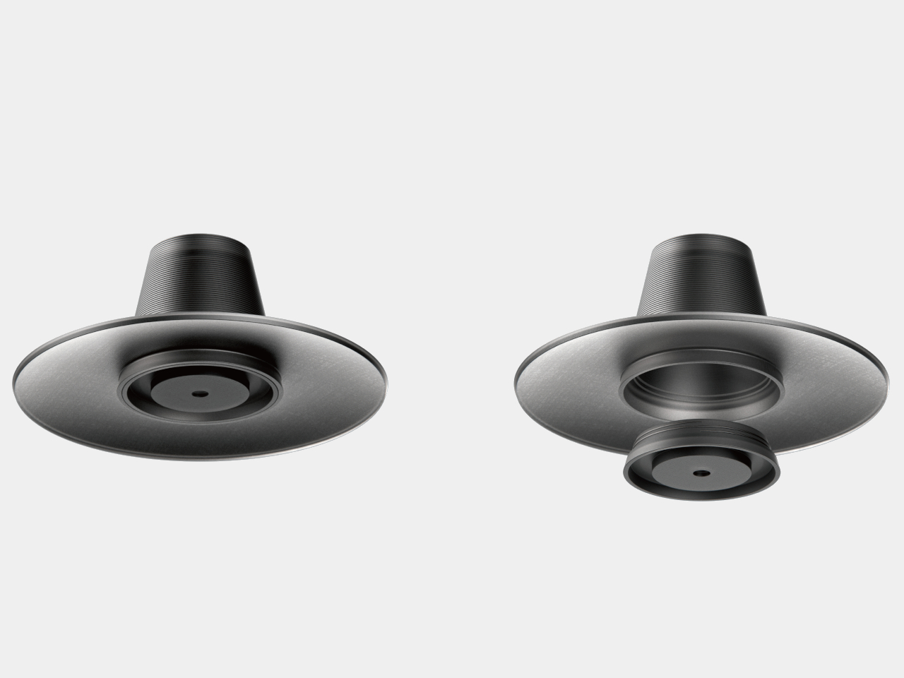
The lighting module attaches by twisting into place, mirroring how a traditional gat settled on the head: placed, rotated, secured. Multiple units can be stacked together. At no point does the design lose sight of the original. The horizontal ridging, the lattice pattern inside, the brim that becomes a tray, the groove that becomes a wall hook; each element traces back to the form it came from.
A gat was historically placed over a lamp to diffuse its flame; the hat and the light were always paired. The name for what covers a flame and the name for what sits on the head are the same word. The GAT lamp closes that loop, making the act of wearing light not a metaphor but the actual, literal function of the object.
The desk lamp has been, essentially, a solved problem since Edison. A light source, a shade to direct it, and a switch. Every design evolution since then has adjusted the aesthetics or added a dimmer; the functional premise, that a lamp sits passively until pointed and switched, has remained largely untouched for more than a century. Watti is an attempt to challenge that premise at every level, simultaneously and on purpose.
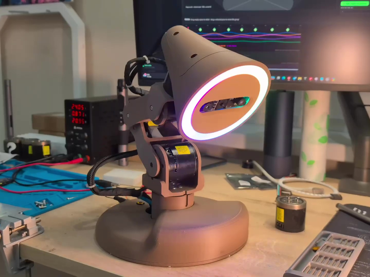
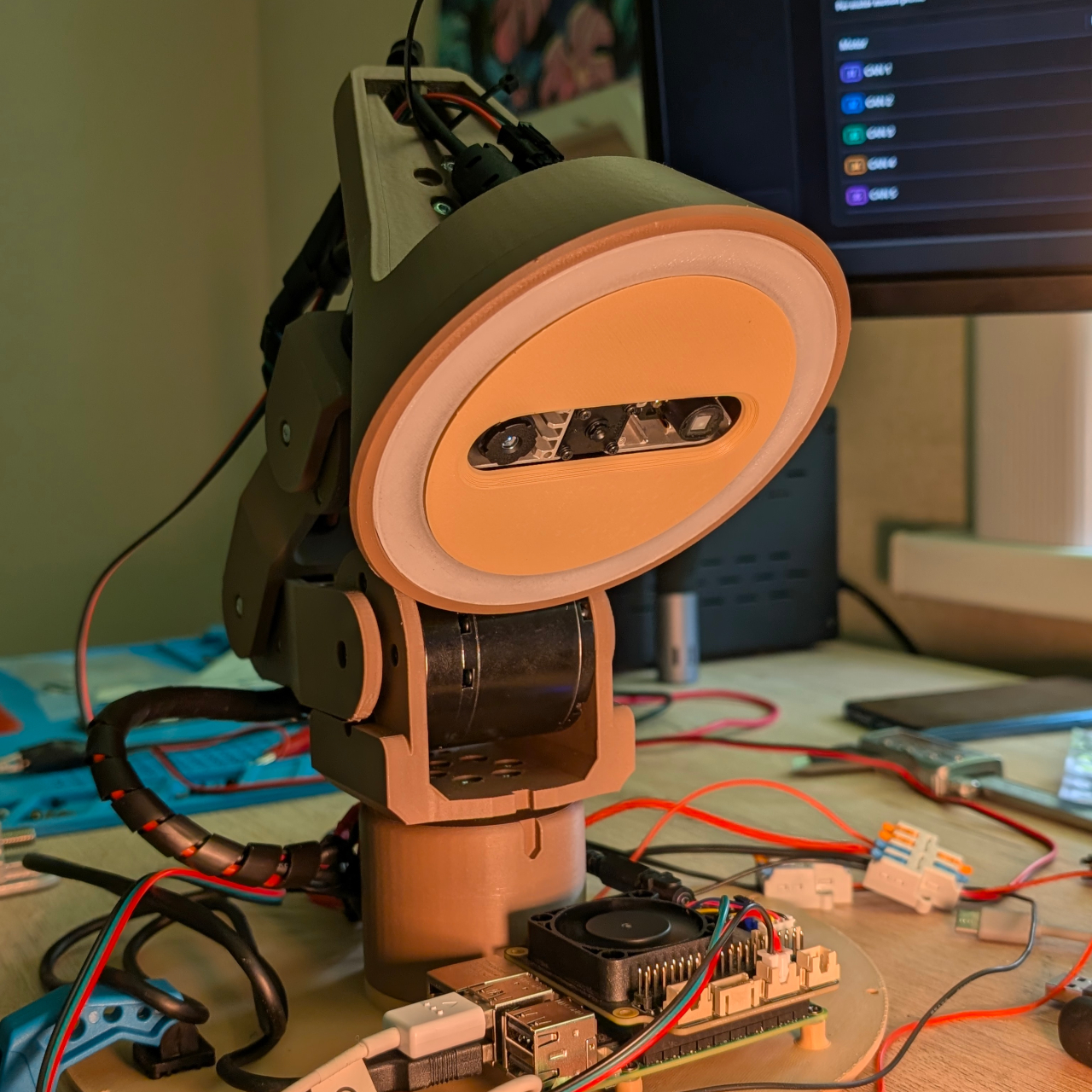
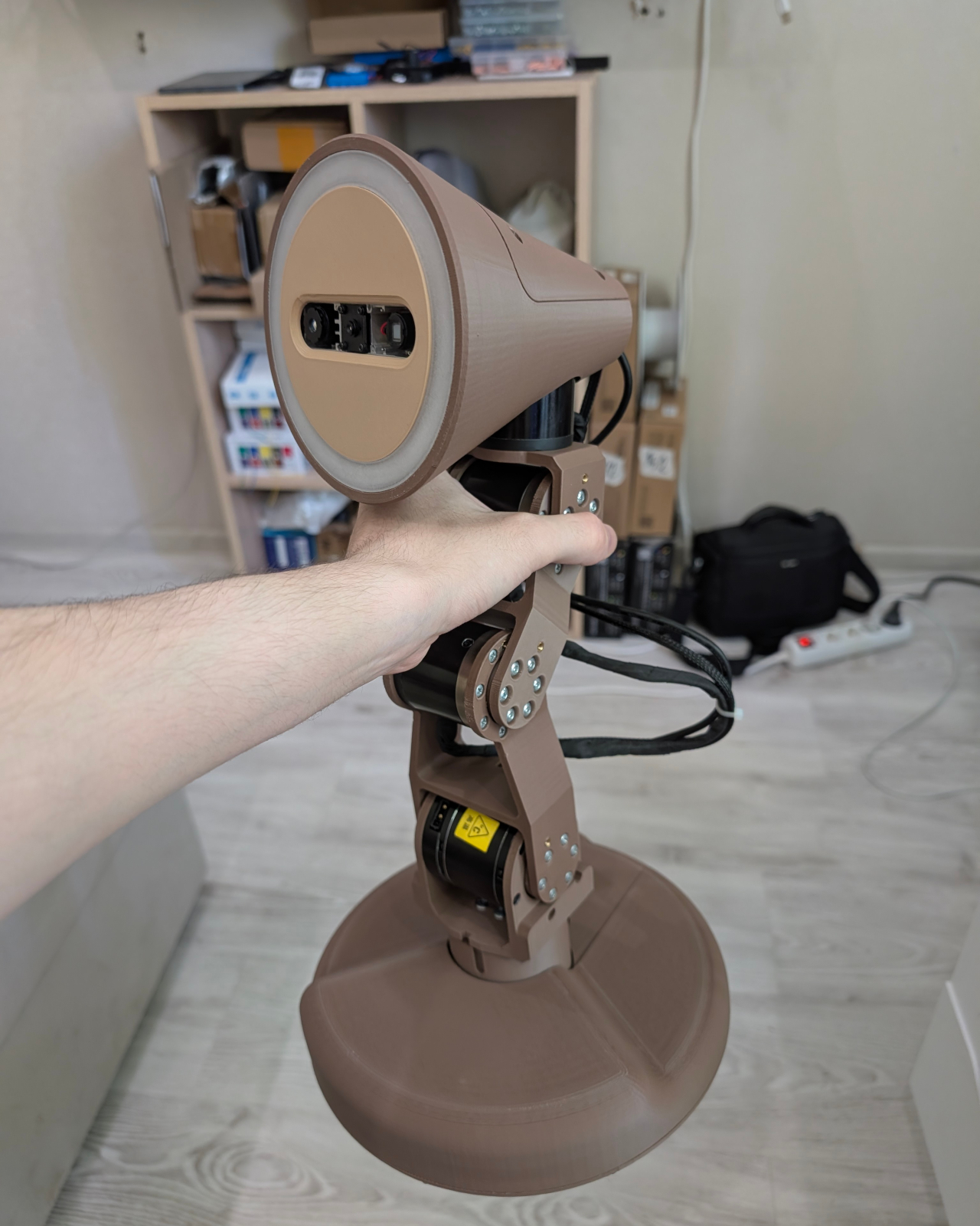
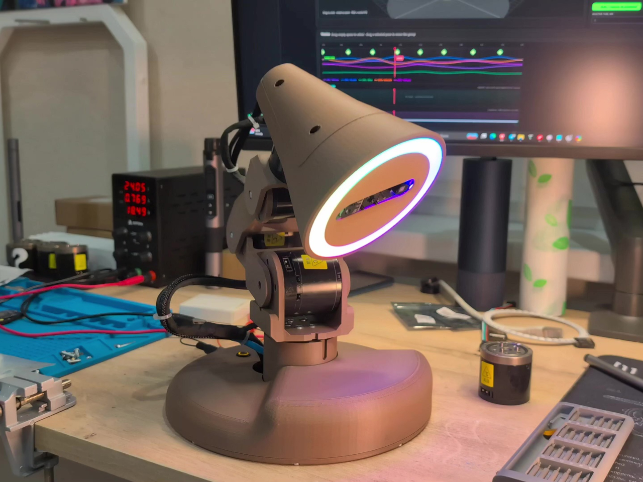
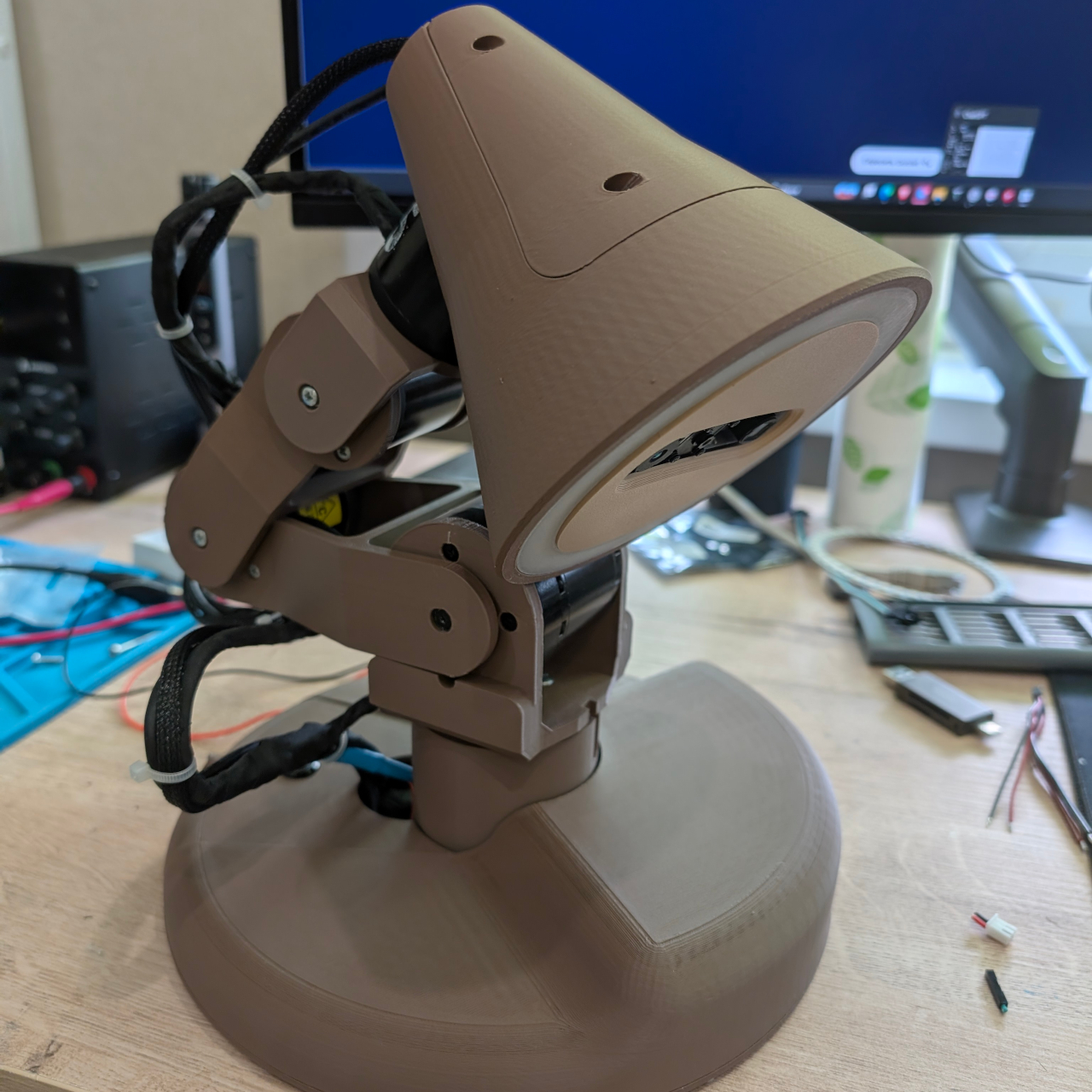
At first glance, Watti reads as a robotic arm that happens to have a light on the end. Five independently motorized axes control the base, shoulder, elbow, neck, and head, each driven by a RobStride motor that reports its position back to the computer. That range of motion gives the lamp the articulation of a traditional Anglepoise-style design, except it can get there on its own with measured precision.
A ring of 45 individually addressable WS2812 RGB LEDs provides the actual light output, and a Raspberry Pi 5 running ROS 2 coordinates the whole system. The camera is what separates Watti from a sophisticated motorized fixture. An Orbbec Astra Mini S captures both color and depth data at 640×480 resolution and 30 frames per second, giving the system a three-dimensional view of whatever sits in front of it.
Those streams are visible in the companion software but not yet acted on in a meaningful way; the lamp can see the desk without fully understanding what’s happening there. That gap is precisely what the project is working to close. Hand tracking, automatic work-area illumination, and 3D scanning are all on the development roadmap, which would let the lamp decide where to point itself based on where hands are positioned and what is being worked on, without any manual adjustment.
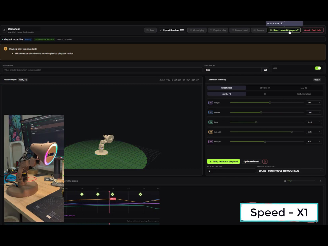
Even before those features arrive, Watti is already more programmable than most dedicated lighting tools. Watti Studio, a browser-based visual editor, lets users compose scenes that coordinate motion and light on a shared timeline. A virtual model of the five-axis lamp renders in the editor so poses and LED configurations can be arranged, previewed, and refined without a physical unit present. When a scene is ready, it’s packaged and transferred to the Raspberry Pi, which runs it locally without a continuous connection back to the browser.
The prototype runs on an external 24 V, 10 A power supply and uses approximately $700 worth of parts. That puts it firmly in research and enthusiast territory for now. Plans to release hardware files, the bill of materials, electrical diagrams, the communication protocol, and example scenes would eventually make it a fully buildable project for others who want to take the concept further.
What Watti points toward is a lamp that treats lighting as a spatial and contextual problem rather than a manual adjustment. A light that can track where work is happening, adapt its position in real time, and coordinate color and intensity without interrupting the task at hand is a fundamentally different object than a lamp with a flexible neck. The premise sounds obvious once stated, which is usually a sign that someone should have built it sooner.
Desk lighting has long been a compromise between task and atmosphere. Professional lamps tend to lean one way or the other: too directional and harsh for extended use, or too diffuse to support fine detail work. A lamp that’s good for examining physical samples often isn’t comfortable over long stretches, and one that’s gentle on the eyes doesn’t always deliver when you need a hard, directed beam.
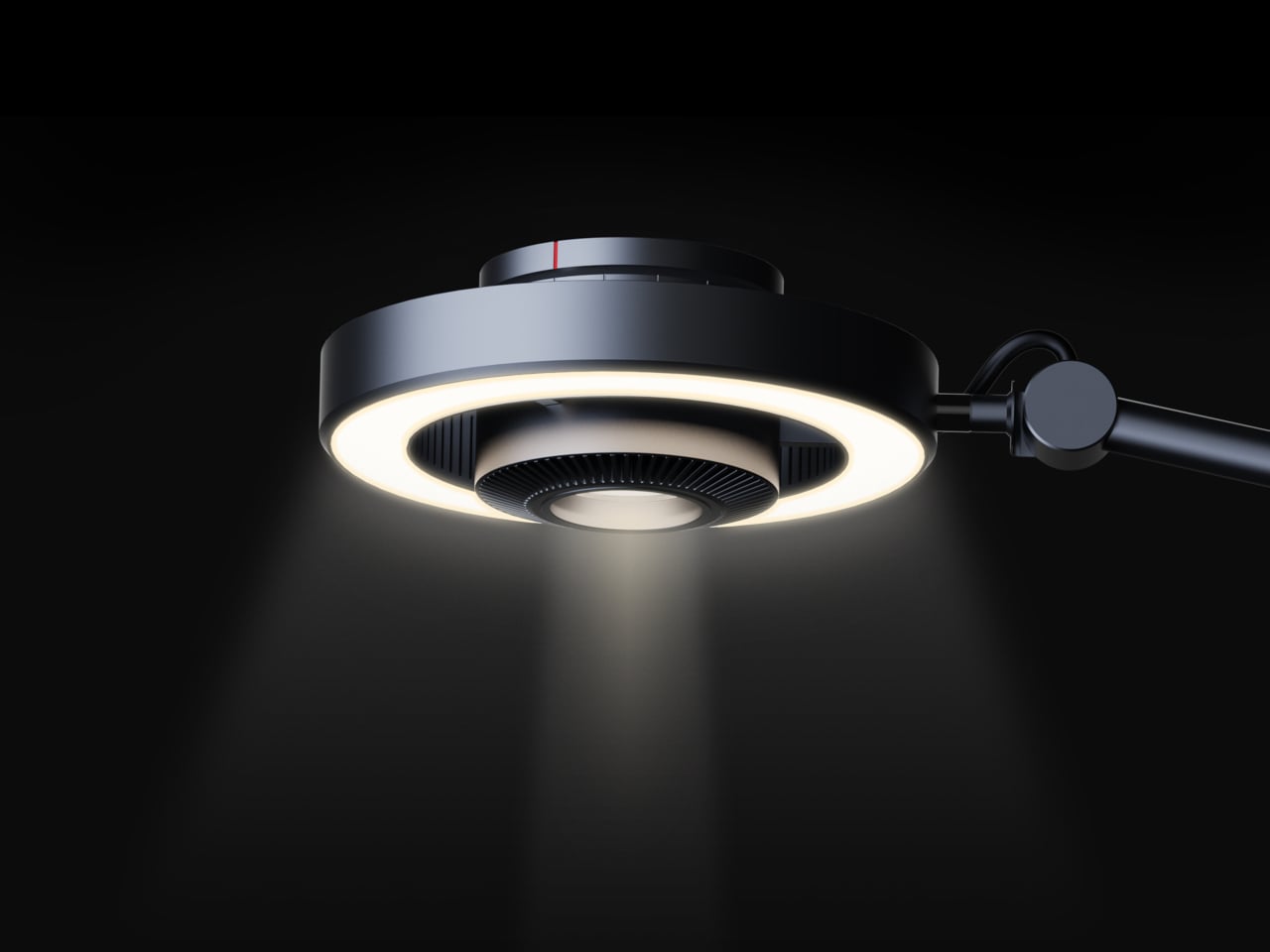
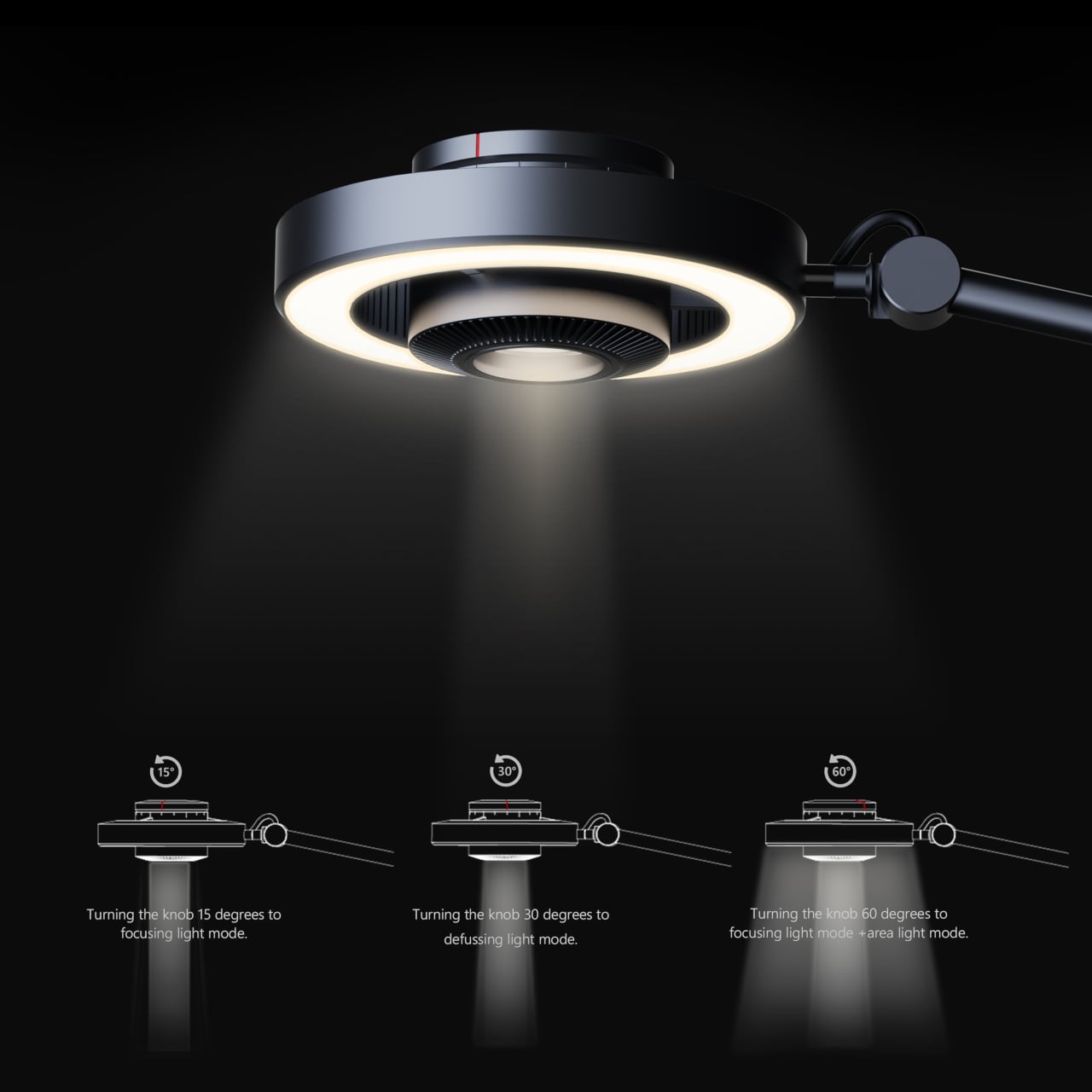
The Focus Light is a desktop lamp concept built around a different premise. Rather than committing to one kind of output, it combines two independent light sources into a single lamp head, giving the user the ability to shift between a precise, concentrated beam and a broad ambient glow, or run both at once. All of it’s controlled by a single rotary knob, and there aren’t any menus, apps, or extra switches involved.
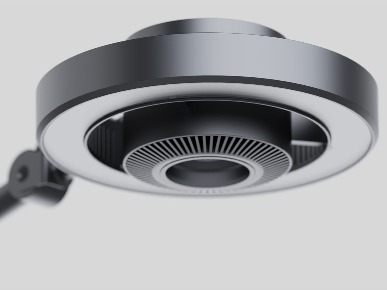
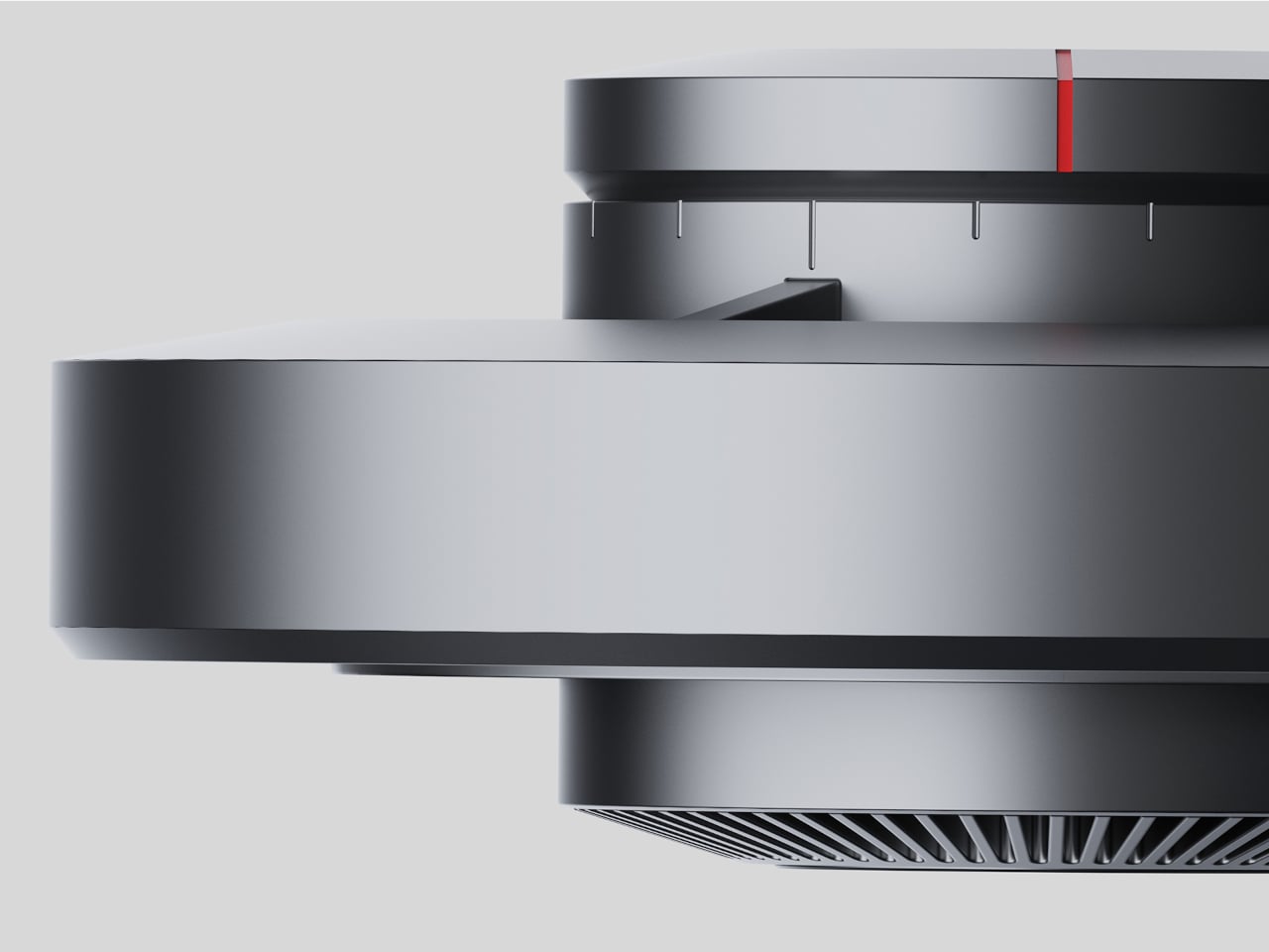
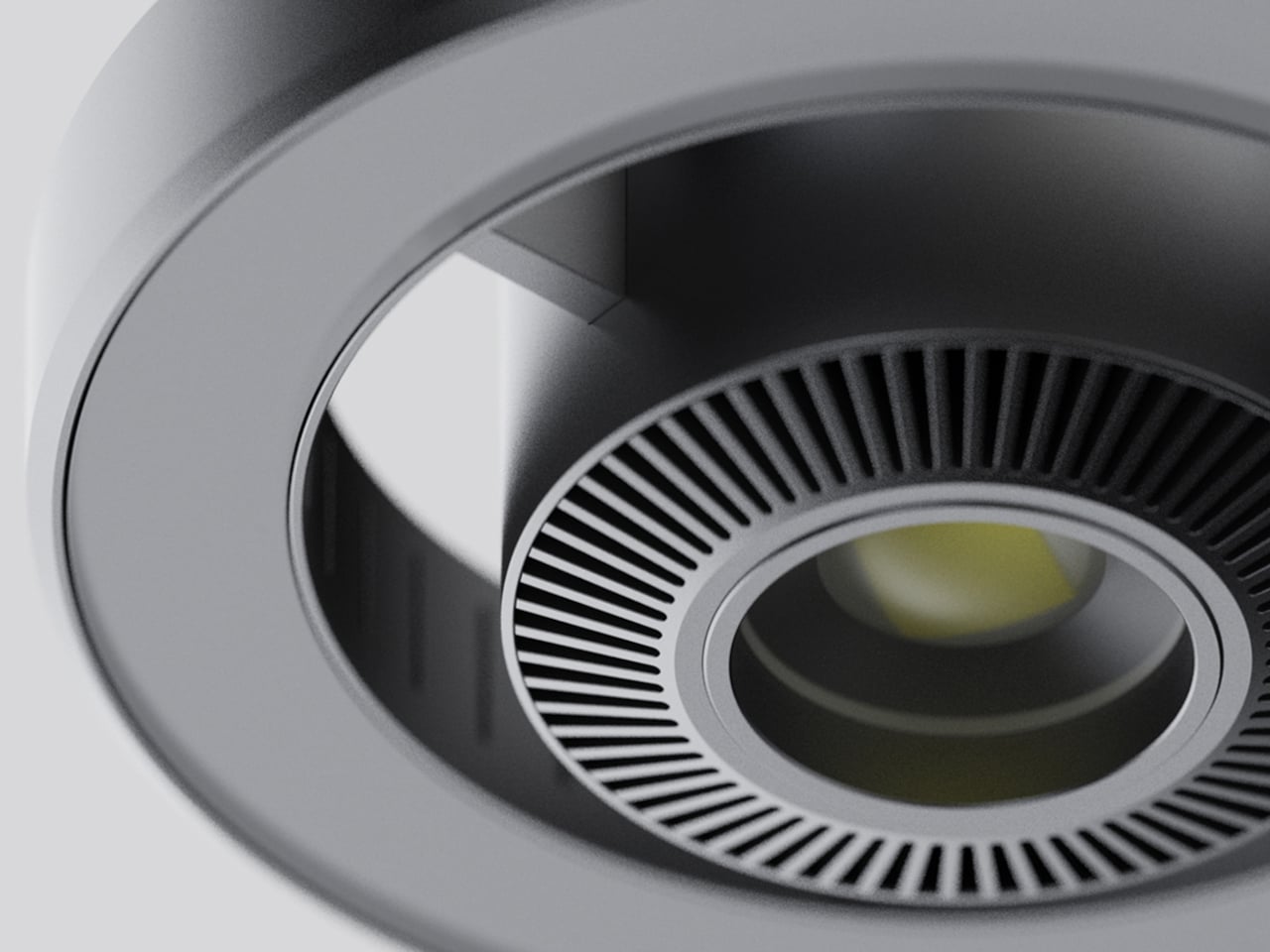
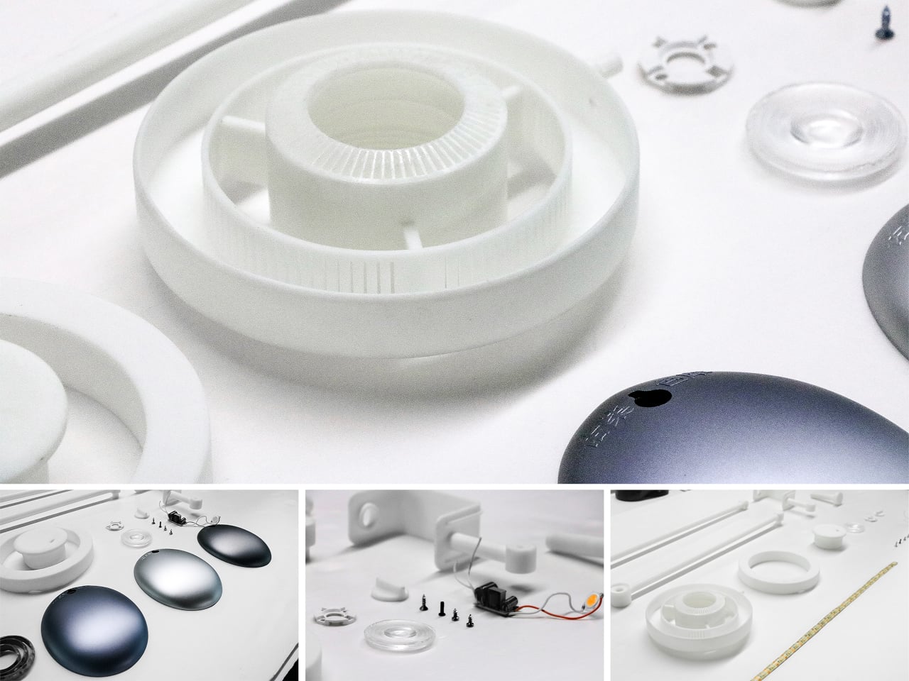
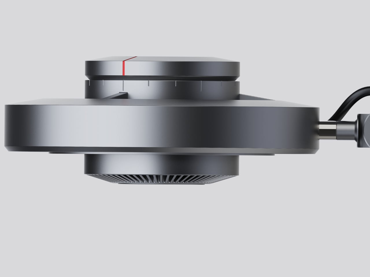
The lamp head is organized concentrically: an outer ring delivers ambient light while a central optical lens handles the focused beam. That layout has both functional and visual logic to it. Both sources sit in deliberate, concentric relation to each other, and the overall form looks as precise as it performs. The whole thing is finished in space gray metal, which lends it a professional, precision-tool character.
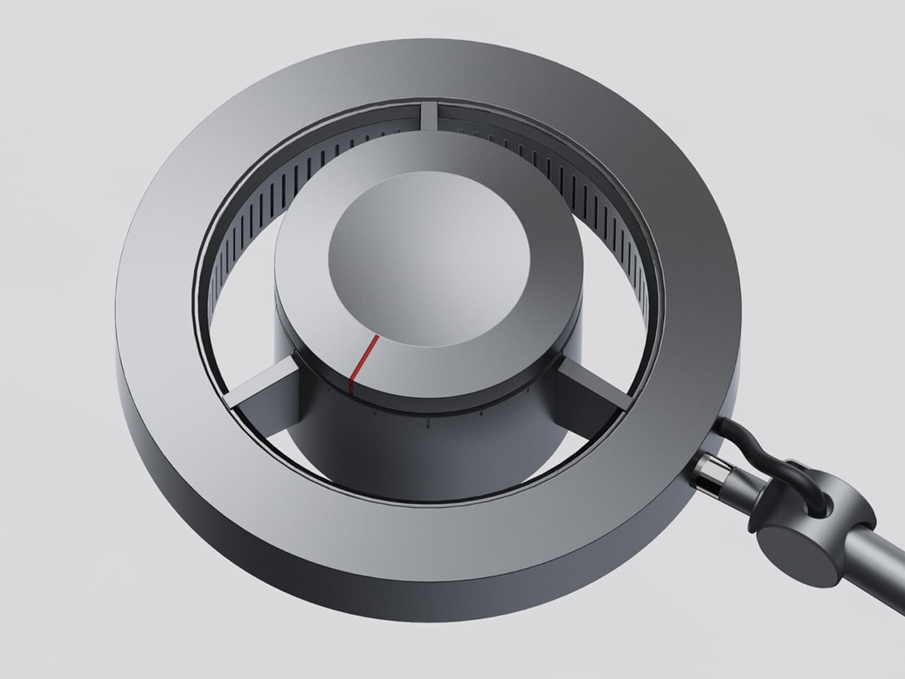
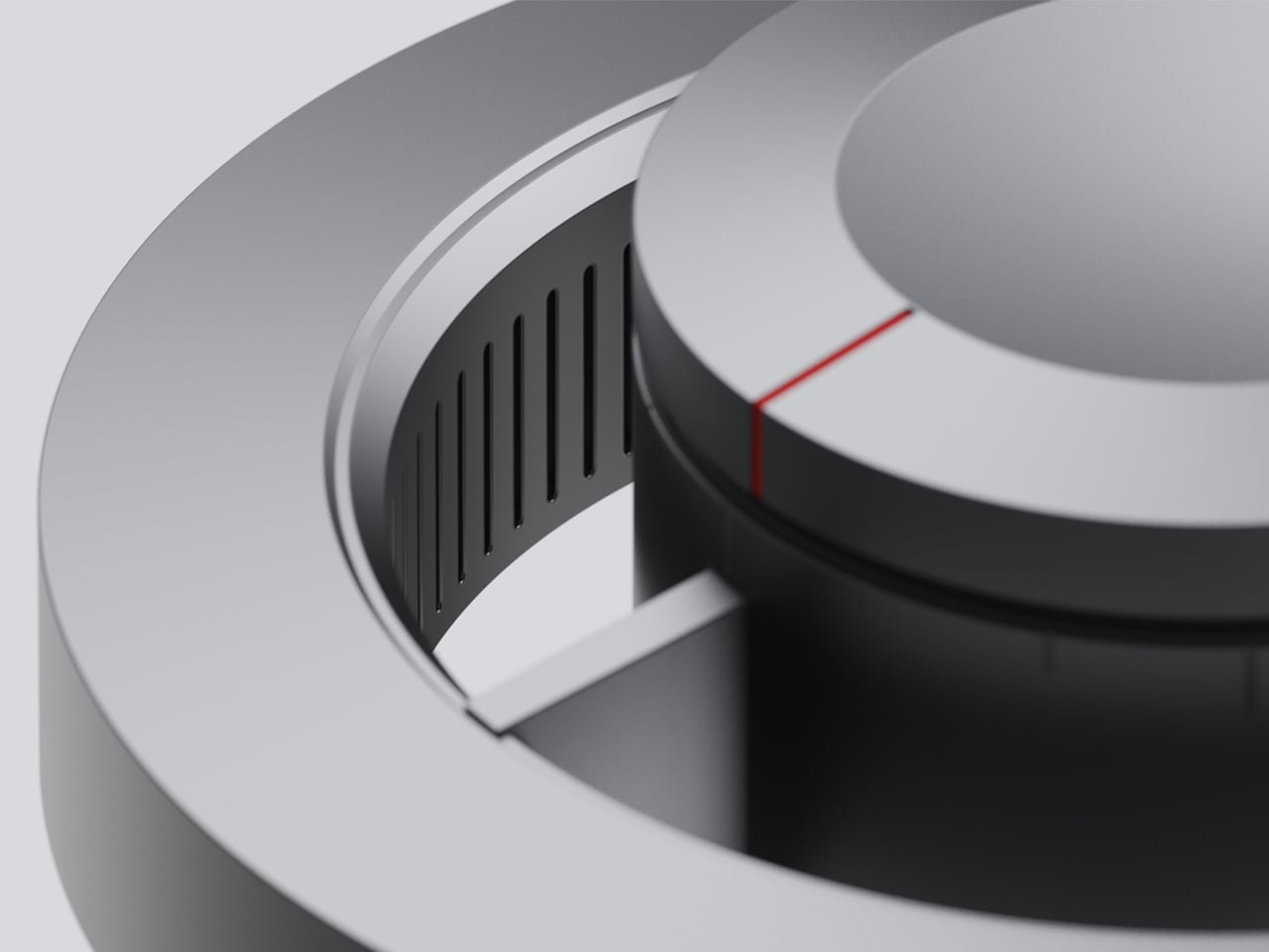
Control comes from a rotary knob on top, marked with a red indicator line. Rotating it 15 degrees activates focusing mode, sending a tight, concentrated beam straight down. At 30 degrees, the lamp shifts into diffusing mode, spreading the output into something closer to fill light. Push it to 60 degrees, and both sources run simultaneously, combining the central spot with the ambient ring for a layered workspace light.
For detailed hands-on tasks, being able to shift between modes without touching an app or dimmer panel makes a real difference. An illustrator tracing fine lines benefits from the precision of the focused beam, but that same beam creates harsh contrast against a dark surrounding surface. Bringing in the ambient ring softens that contrast, and having both running at once makes moving between close-up precision work and wider desk visibility much more seamless.
The same flexibility serves anyone who switches between different types of work at the same desk. Reading calls for something even and non-glare; marking up documents or working with small physical components benefits from a harder, more directed light. The Focus Light doesn’t ask the user to swap lamps or reposition the arm for each shift. The knob handles it, and the change is immediate.
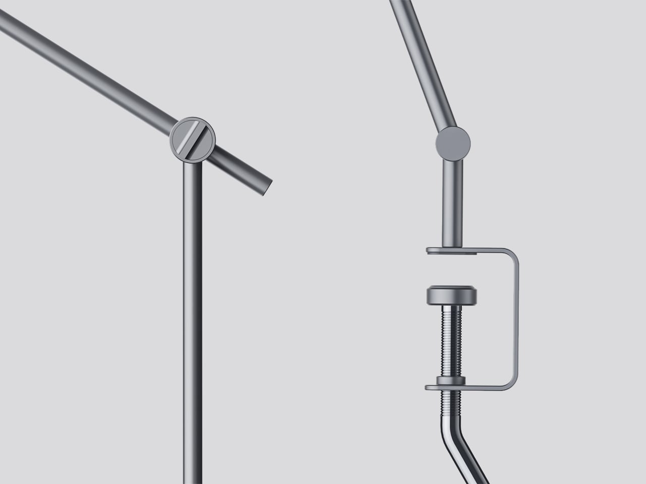
The physical form reflects the precision the lamp is meant to support. The lamp head is a clean disc with radiating heat fins arranged around the inner lens assembly, and the arm connects at a ball joint that allows repositioning without loosening a series of screws. A threaded desk clamp handles the mounting, so it doesn’t demand a grommet hole or take up surface area with a weighted base.
What stands out about the concept isn’t just the dual-source setup, but that a single physical control manages both. There’s no menu to scroll, no app to open. The red indicator on the knob tells you exactly where you are, and the three positions are distinct enough that you’d find your way back to any of them by feel after just a few days.
Most lighting gets chosen the same way people pick curtains: functional, inoffensive, and quickly forgotten. You walk through a showroom, you point at something that won’t clash with the sofa, and that’s more or less the end of the design conversation. That’s not a criticism of how people live; it’s just an observation of how light, despite being the single most transformative element in any space, rarely gets to have fun.
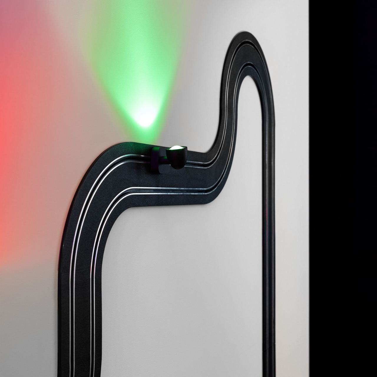
Davide Groppi’s Race of Lights is the exception to all of that. The Italian lighting brand, based in Piacenza and known for making some of the most quietly radical lamps in contemporary design, released Race of Lights in 2025. On paper, it is a modular wall lamp. In reality, it is a slot-car racing track that someone decided should also be your light source, and the whole thing somehow works beautifully.
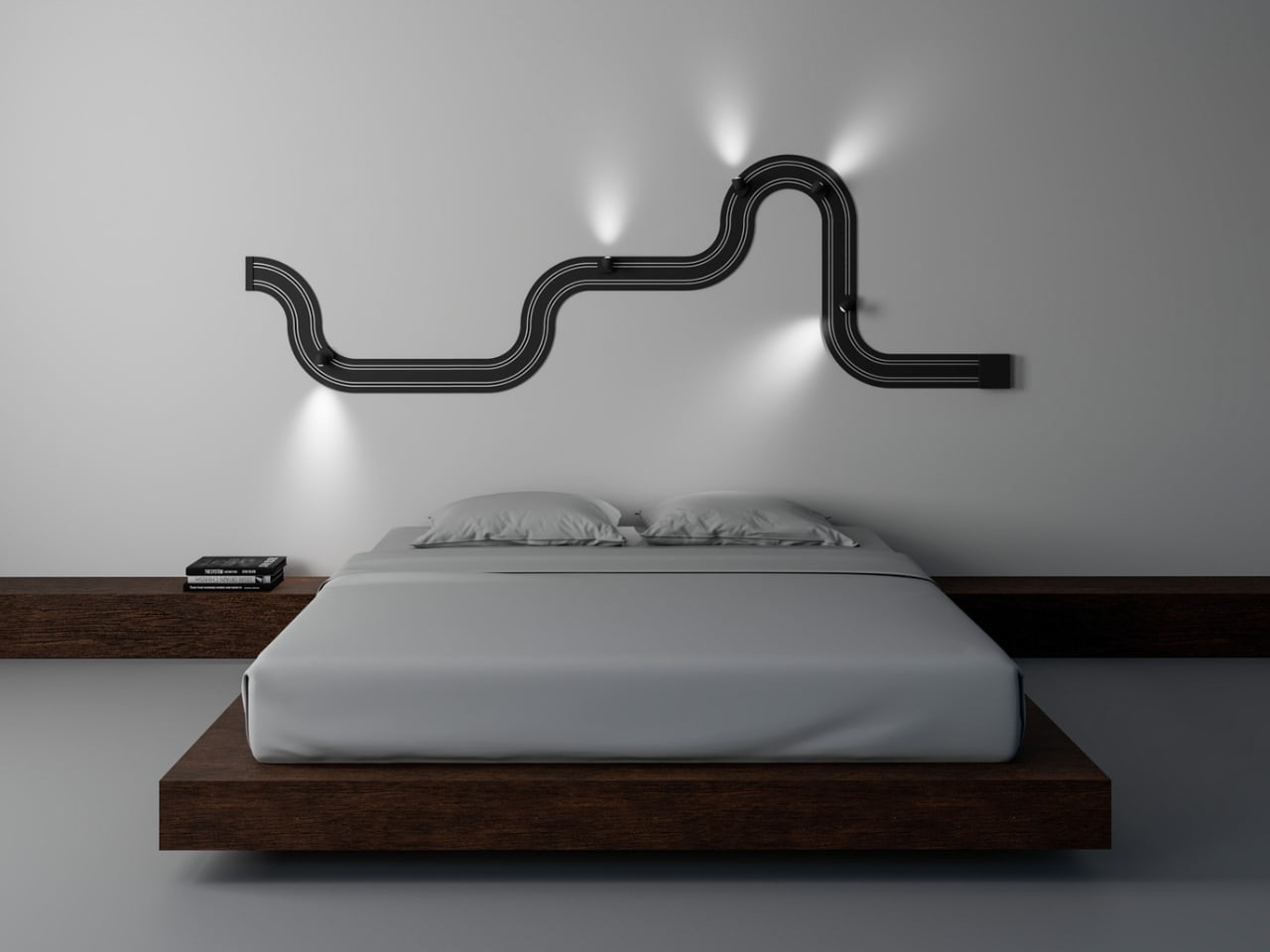
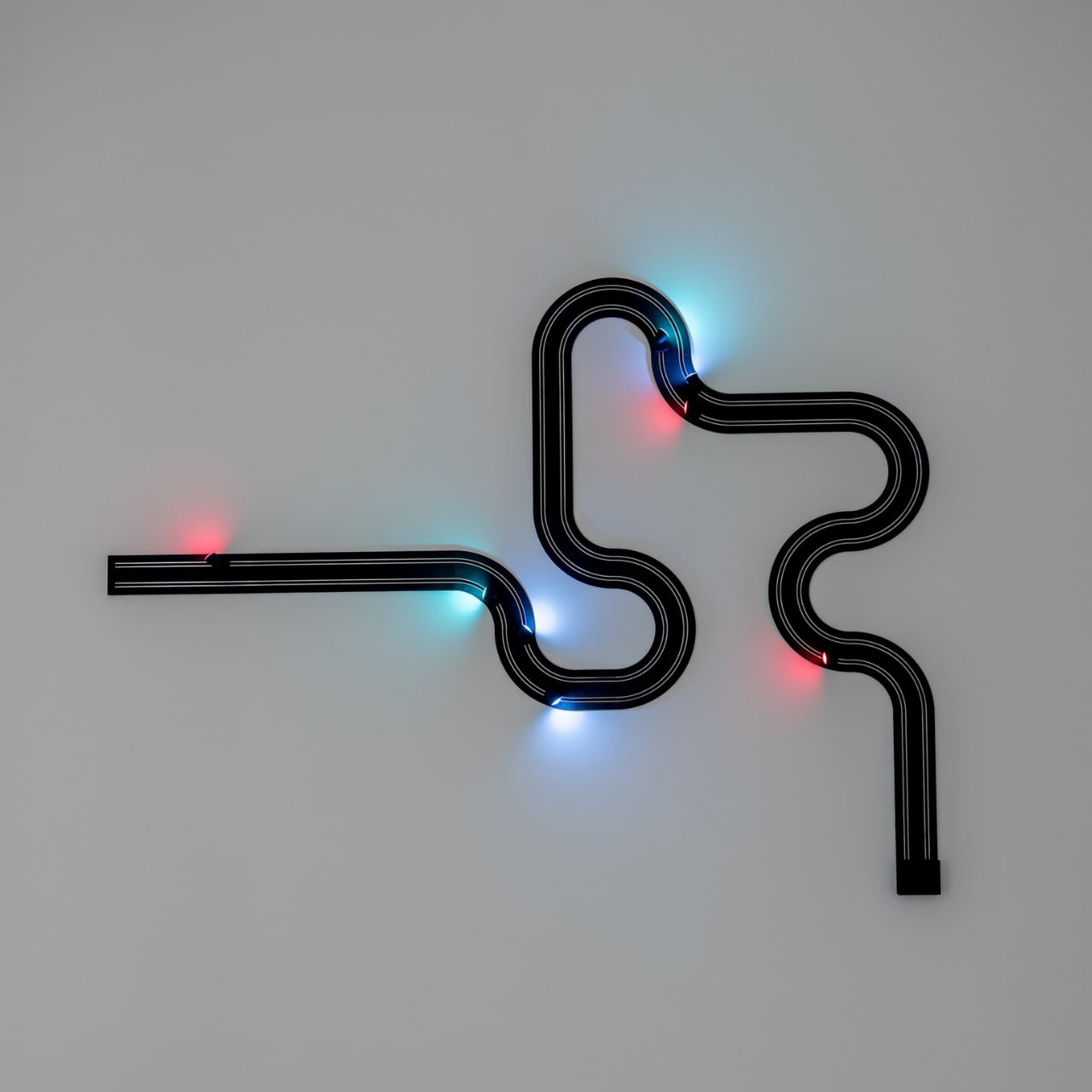
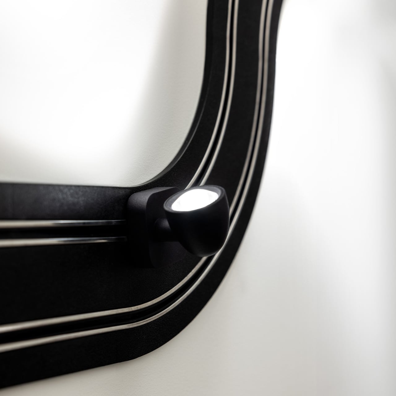
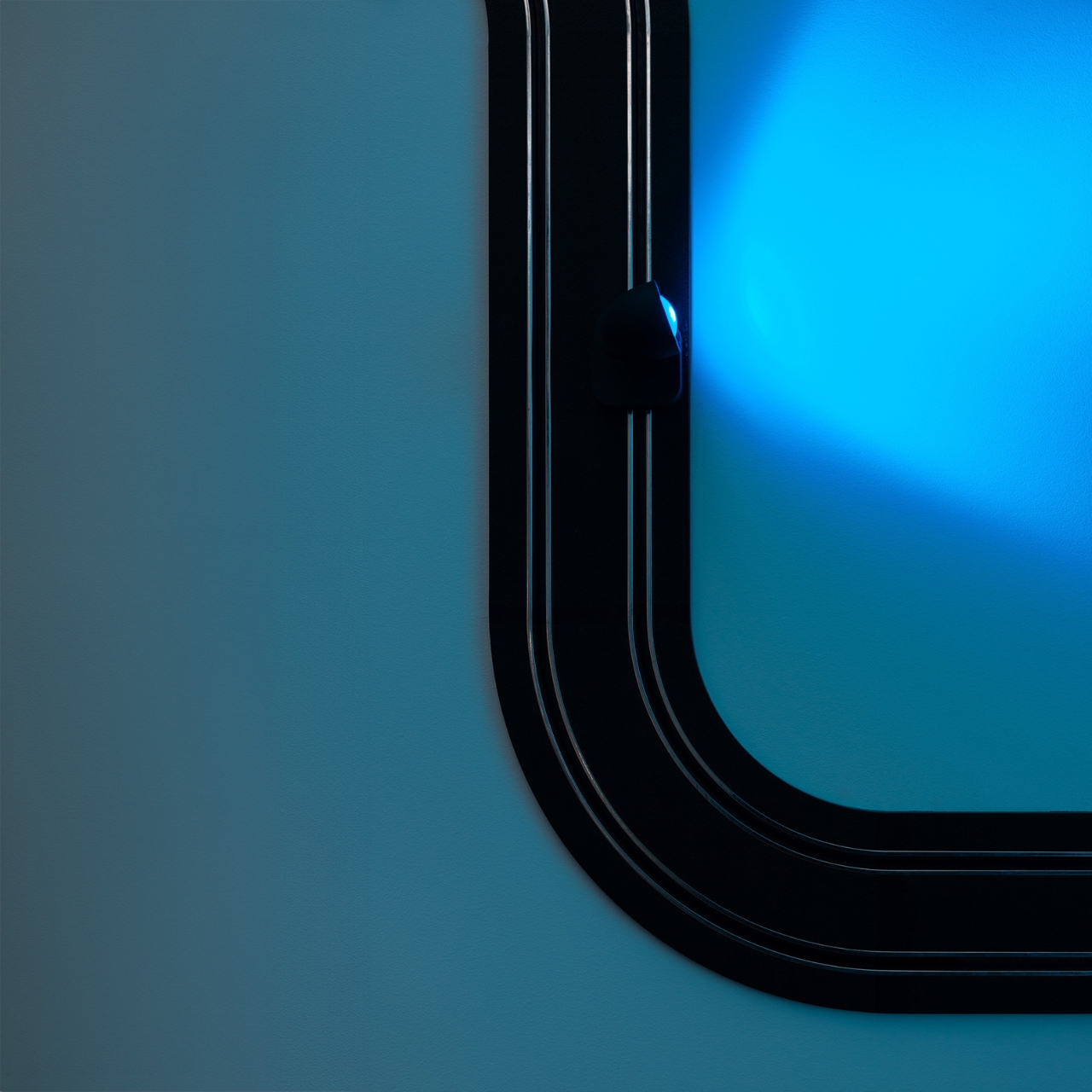
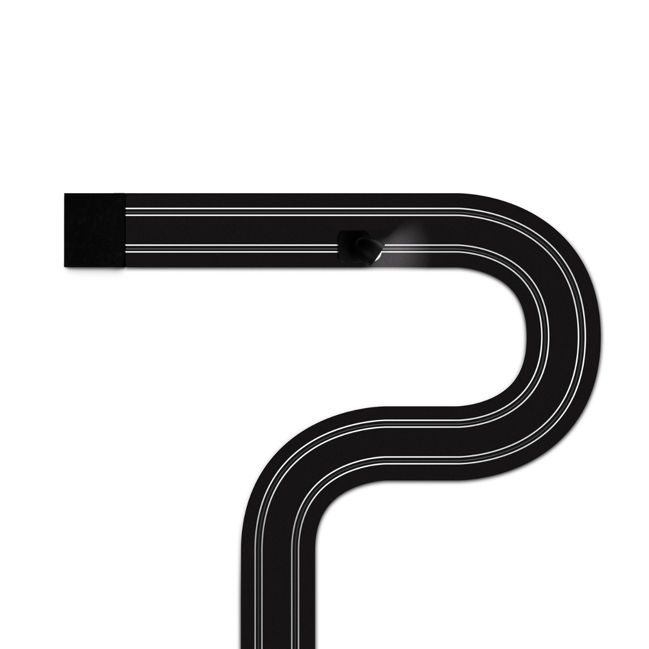
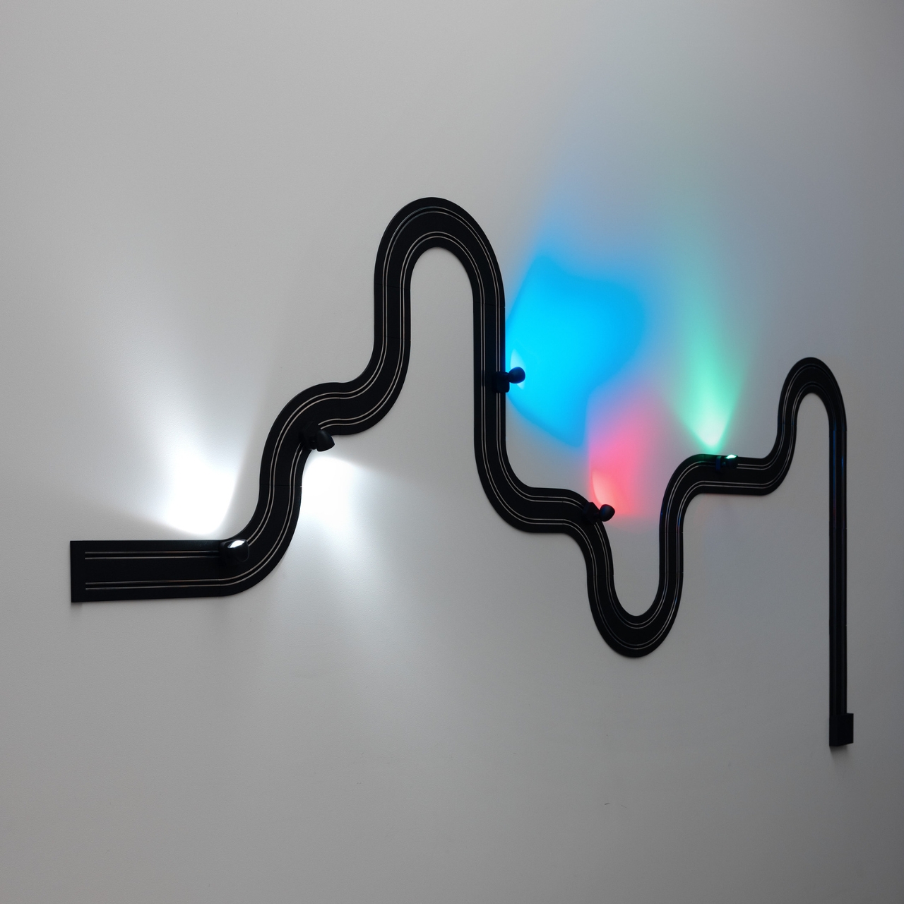
The concept is exactly what it sounds like. An electrified track, made from textured matte black polyethylene, gets mounted on the wall in whatever configuration you want. The track carries current, and the light sources are tiny car-shaped spotlights that snap into place magnetically and can be moved, repositioned, or rearranged any time the mood strikes. The basic kit includes two short straight modules, four longer sections, six curves, and four colored light-cars in green, white, blue, and red. The whole system can run up to five metres across your wall and power up to eight spotlights, each with an adjustable head so you can direct the beam exactly where you want it. This is, objectively, absurd. It is also one of the most genuinely exciting things to come out of the lighting world in years.
What makes Race of Lights so interesting to think about is how it sits within Davide Groppi’s broader body of work. This is a designer who built his reputation on doing less. His lamp Nulla, which won the Compasso d’Oro in 2014, measures just 18 millimetres in diameter and is practically invisible in a ceiling. The name literally translates to “nothing.” The philosophy has always been that the lamp should disappear so the light can remain. Race of Lights does not disappear. It sits on your wall, looped and curved, with little colored cars parked along the track. It makes a statement in the exact opposite direction of everything Groppi has been doing, and yet it makes complete sense.
Because the brand has never really been about minimalism for minimalism’s sake. The design language has always carried a sense of emotion. Groppi has spoken about light as a tool for seduction and curiosity, about design emerging from the heart as much as the mind. Race of Lights just takes that emotional dimension and makes it literal. The inspiration was childhood, specifically the memory of electric slot-car racing sets, the kind where small cars zip around a winding track spread across the living room floor. The track moves to the wall; the cars stay put and illuminate. Play becomes design, and the object retains the spirit of the original thing it was borrowing from.
The result is a piece that functions as a legitimate lighting solution and as a conversation starter and as something closer to a sculptural installation. You can compose it in a new shape whenever you want. That kind of flexibility tends to age well in a space, because you never quite exhaust the possibilities.
Cynics will say it is a gimmick. I understand the instinct, but I think that reading misses the point. Good design has always borrowed from play. The best chairs make sitting feel effortless. The best lamps make light feel intentional. Race of Lights makes light feel like something you chose with genuine enthusiasm rather than resigned practicality.
Lighting does not have to be a decision you make and then stop thinking about. Davide Groppi has spent decades proving that point in quietly different ways. Race of Lights is just the first time the argument came painted in red, white, blue, and green, with tiny cars attached.
Most lighting gets chosen the same way people pick curtains: functional, inoffensive, and quickly forgotten. You walk through a showroom, you point at something that won’t clash with the sofa, and that’s more or less the end of the design conversation. That’s not a criticism of how people live; it’s just an observation of how light, despite being the single most transformative element in any space, rarely gets to have fun.
Davide Groppi’s Race of Lights is the exception to all of that. The Italian lighting brand, based in Piacenza and known for making some of the most quietly radical lamps in contemporary design, released Race of Lights in 2025. On paper, it is a modular wall lamp. In reality, it is a slot-car racing track that someone decided should also be your light source, and the whole thing somehow works beautifully.
The concept is exactly what it sounds like. An electrified track, made from textured matte black polyethylene, gets mounted on the wall in whatever configuration you want. The track carries current, and the light sources are tiny car-shaped spotlights that snap into place magnetically and can be moved, repositioned, or rearranged any time the mood strikes. The basic kit includes two short straight modules, four longer sections, six curves, and four colored light-cars in green, white, blue, and red. The whole system can run up to five metres across your wall and power up to eight spotlights, each with an adjustable head so you can direct the beam exactly where you want it. This is, objectively, absurd. It is also one of the most genuinely exciting things to come out of the lighting world in years.
What makes Race of Lights so interesting to think about is how it sits within Davide Groppi’s broader body of work. This is a designer who built his reputation on doing less. His lamp Nulla, which won the Compasso d’Oro in 2014, measures just 18 millimetres in diameter and is practically invisible in a ceiling. The name literally translates to “nothing.” The philosophy has always been that the lamp should disappear so the light can remain. Race of Lights does not disappear. It sits on your wall, looped and curved, with little colored cars parked along the track. It makes a statement in the exact opposite direction of everything Groppi has been doing, and yet it makes complete sense.
Because the brand has never really been about minimalism for minimalism’s sake. The design language has always carried a sense of emotion. Groppi has spoken about light as a tool for seduction and curiosity, about design emerging from the heart as much as the mind. Race of Lights just takes that emotional dimension and makes it literal. The inspiration was childhood, specifically the memory of electric slot-car racing sets, the kind where small cars zip around a winding track spread across the living room floor. The track moves to the wall; the cars stay put and illuminate. Play becomes design, and the object retains the spirit of the original thing it was borrowing from.
The result is a piece that functions as a legitimate lighting solution and as a conversation starter and as something closer to a sculptural installation. You can compose it in a new shape whenever you want. That kind of flexibility tends to age well in a space, because you never quite exhaust the possibilities.
Cynics will say it is a gimmick. I understand the instinct, but I think that reading misses the point. Good design has always borrowed from play. The best chairs make sitting feel effortless. The best lamps make light feel intentional. Race of Lights makes light feel like something you chose with genuine enthusiasm rather than resigned practicality.
Lighting does not have to be a decision you make and then stop thinking about. Davide Groppi has spent decades proving that point in quietly different ways. Race of Lights is just the first time the argument came painted in red, white, blue, and green, with tiny cars attached.
The sustainable home goods market has a specific credibility problem. Products marketed as eco-conscious often get there through incremental adjustments, reducing a percentage of virgin plastic, switching to a recyclable box, or sourcing from a slightly shorter supply chain. The result is a kind of sustainability theater that satisfies certification requirements without fundamentally changing either what objects are made from or how they find their way into a home.
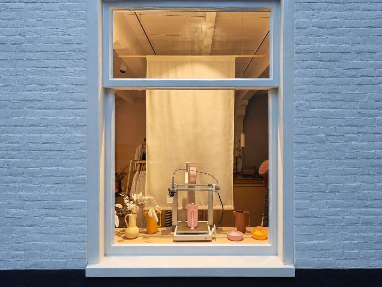
Artefilo approaches that question differently. Based in Edam in the Netherlands, the independent design atelier makes contemporary home objects from materials most manufacturers wouldn’t consider: elephant grass combined with recycled plastic, reclaimed wood fibres, brick dust, and salvaged hospital cabinetry. Each piece is made locally in small batches, and the materials are chosen with the specific intention of giving discarded resources a renewed place in a living space.
The choice of Edam isn’t incidental. The city has a long tradition of ceramics craftsmanship, and Artefilo draws on that heritage without replicating it, taking the spirit of making by hand and applying it to a different material palette. Elephant grass combined with recycled plastic, for example, produces a surface that reads as handmade pottery without the environmental cost of extracting virgin clay or new plastic.
The rest of the material list is equally unexpected. Reclaimed wood fibres and brick dust bring texture and warmth to objects that might otherwise feel too composed, while recycled hospital cabinets contribute rigidity and durability that wouldn’t be obvious from the source. Finding these materials requires locating waste streams that industry hasn’t already claimed, then working out what form they can credibly take in a domestic setting.
Making in small batches has real consequences for what the objects can be. It means pieces that are genuinely one-of-a-kind, because material conditions are never exactly repeatable from one batch to the next. Brick dust carries different tones from different sources; reclaimed wood fibres vary in density and grain. That variability isn’t a flaw in the production model; it’s built into it deliberately.
The underlying premise is that objects shape the atmosphere of a space, not dramatically, but persistently. Something placed on a windowsill or bookshelf gets seen many times a day, and that repetition adds up. Artefilo’s design philosophy treats each piece as something that participates in the daily texture of a home rather than simply occupying it. The materials reinforce that, each carrying a visible trace of its previous life.
The atelier distributes through its own online store and through a local stockist in Edam. The collection is small, deliberately so, and the material sourcing means it isn’t trying to scale into something it isn’t. For a design category that often talks about slowing down without quite managing it, Artefilo appears to have structured itself around that idea from the ground up.
Lamp switches don’t get much design attention. They’re usually a small toggle on the cord, a push button under the shade, or a touch-sensitive strip on the base that’s easy to miss in the dark. They get the job done, but they’re rarely treated as a meaningful part of the object. It’s one of those details that most lamp designers seem perfectly happy to leave to the supplier catalog.
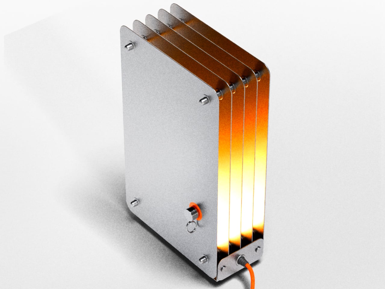
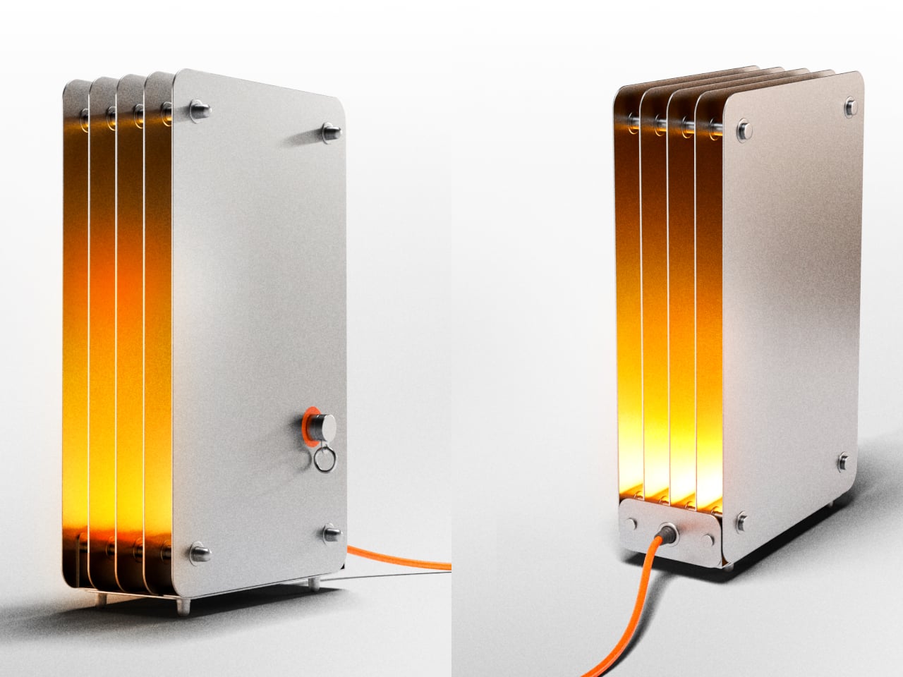
The Strata lamp takes a different position on both counts. It’s a handmade steel table lamp that earns its name from geological rock formations, those compressed, layered bands of sedimentary stone that build up over time into something structurally dense and visually striking. The lamp translates that geological idea directly into stacked steel panels, and pairs it with a switching mechanism that makes turning a lamp on feel unexpectedly deliberate.
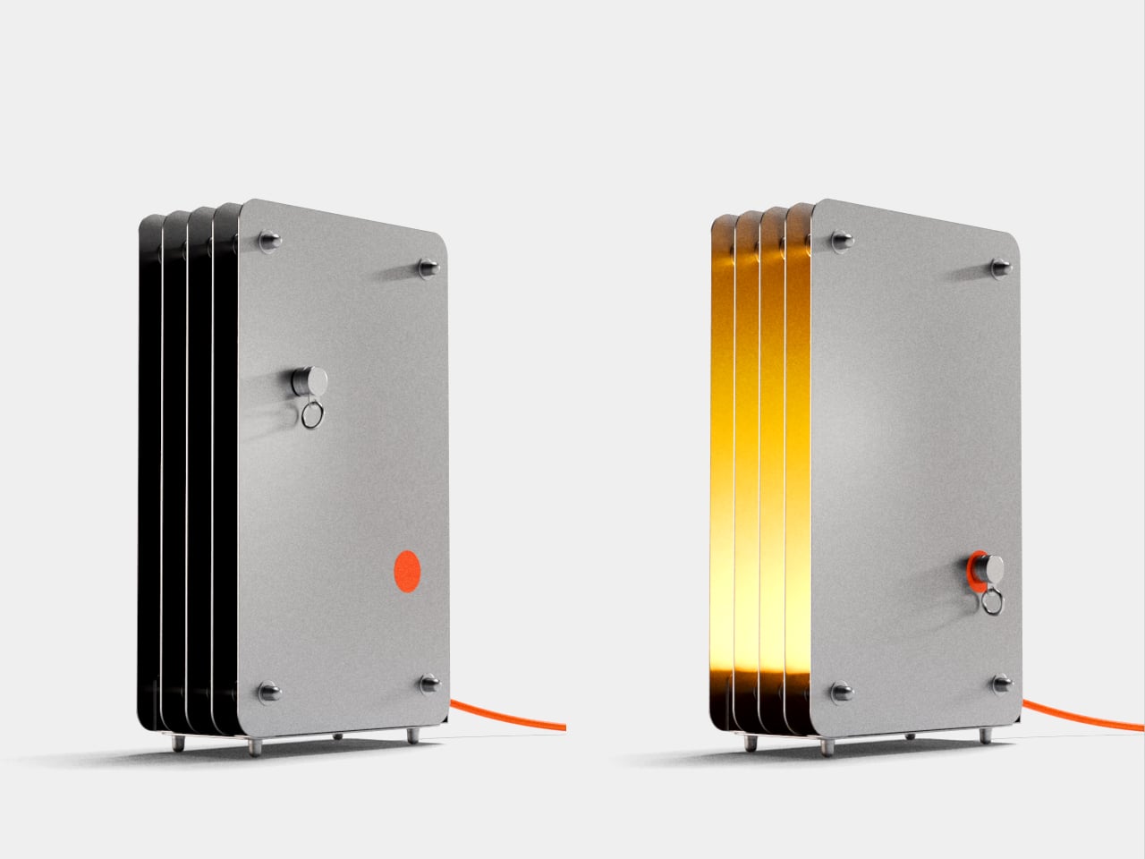
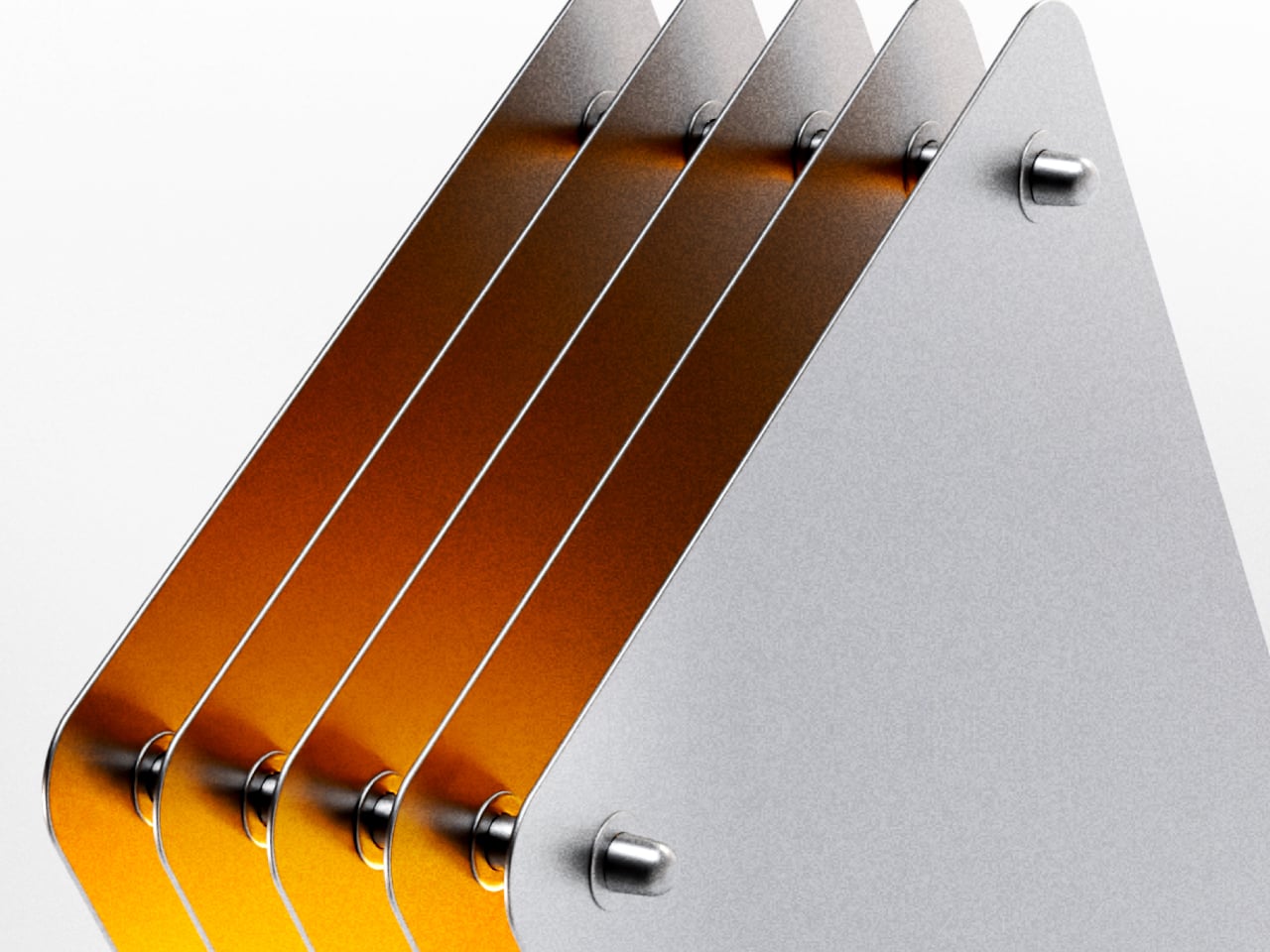
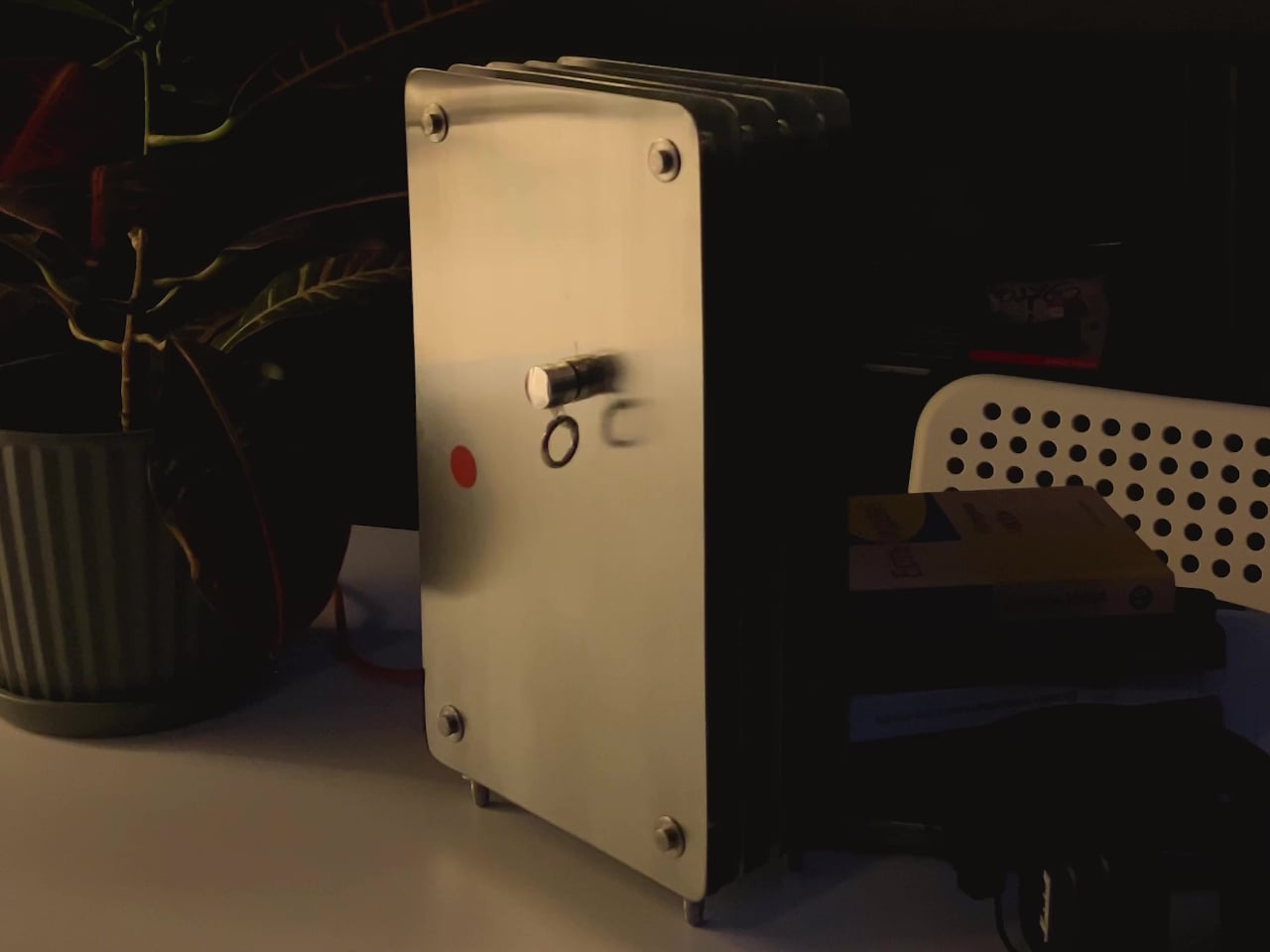
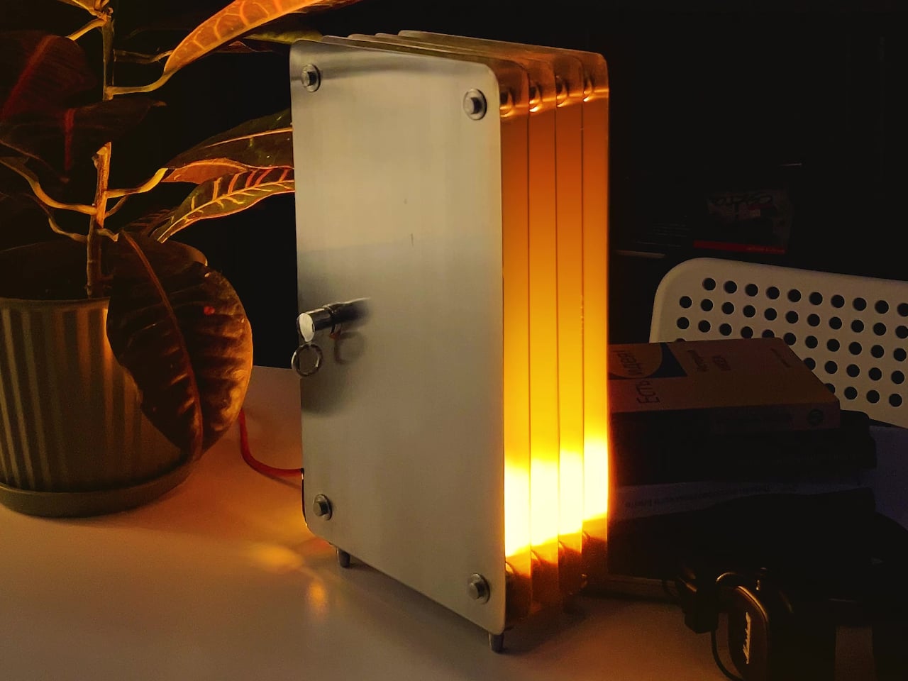
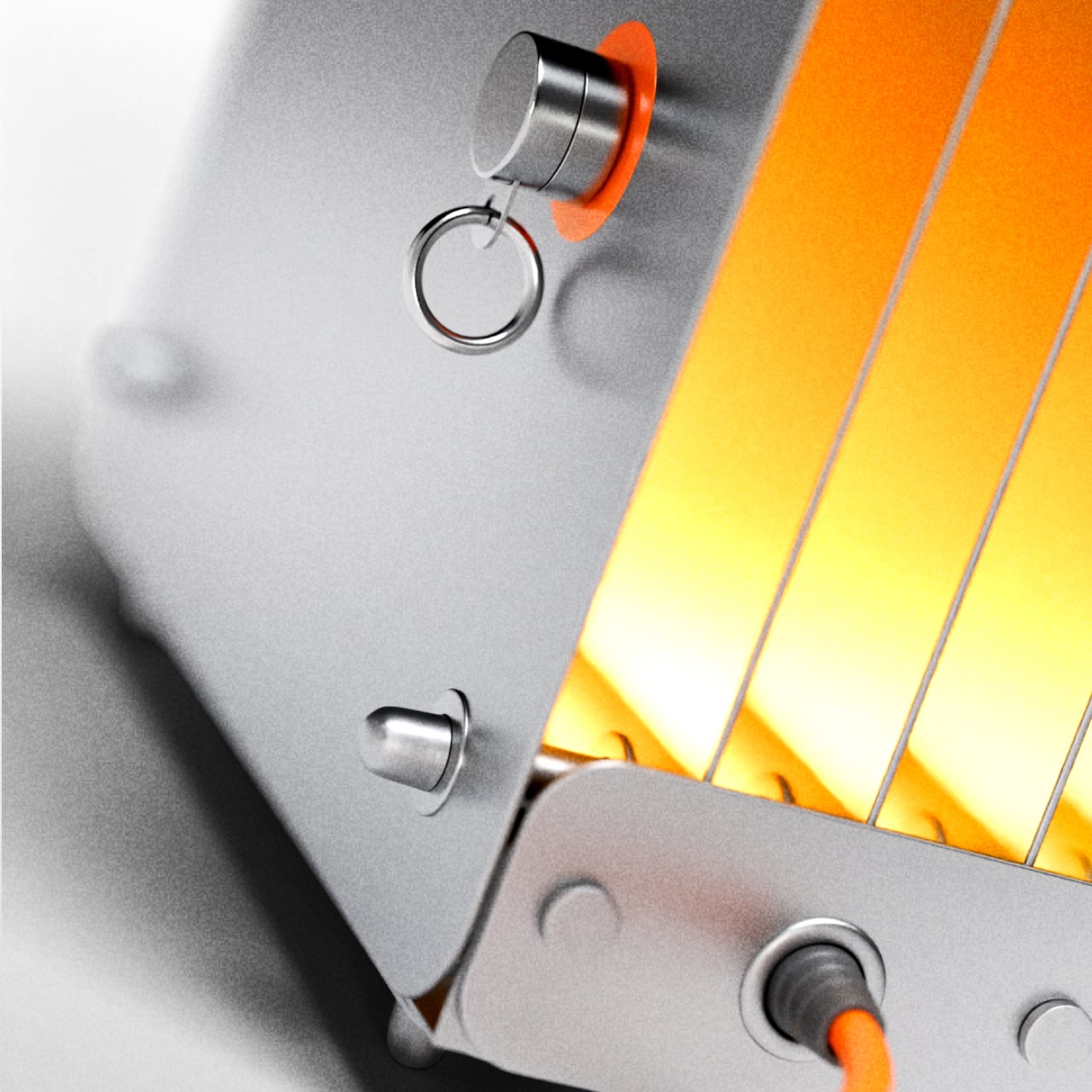
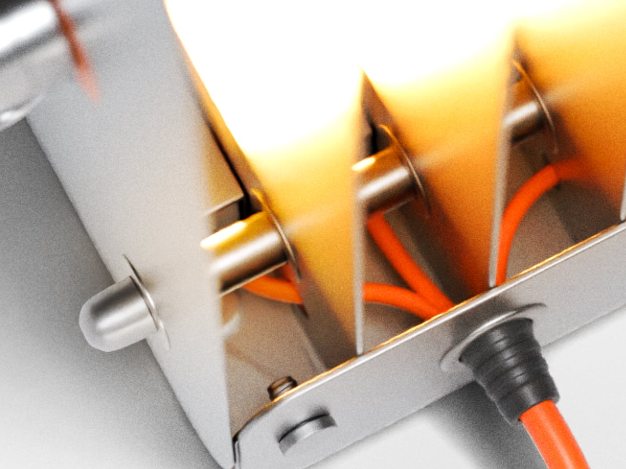
The body is built from individual steel plates with rounded rectangular corners, held in parallel by cylindrical steel standoffs at each corner and center. When lit, warm amber light radiates from the gaps between every plate and from the open front edge, creating a layered glow that shifts from deep orange near the top of the lamp to a brighter, more diffused yellow further along each inner steel surface.
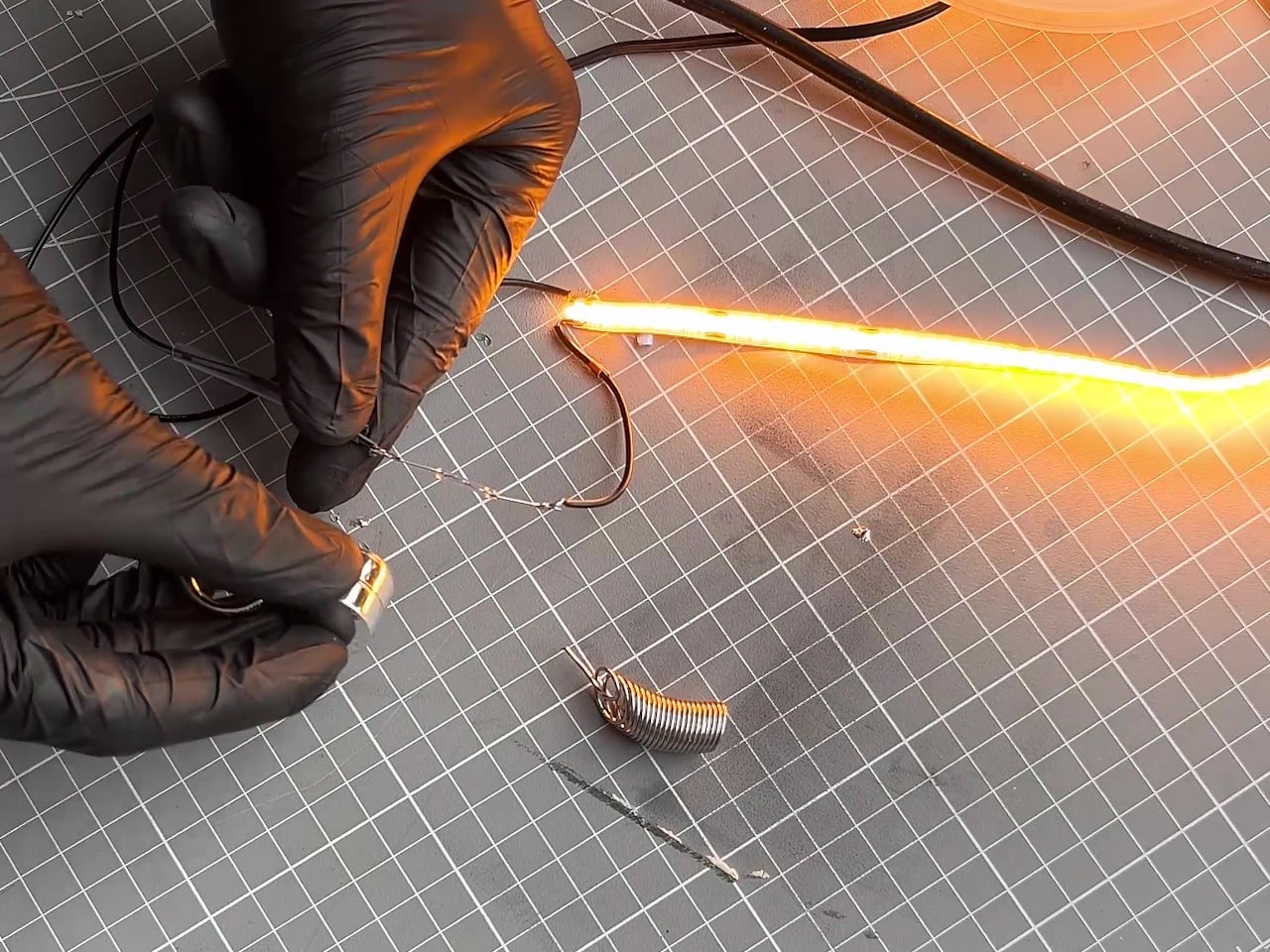
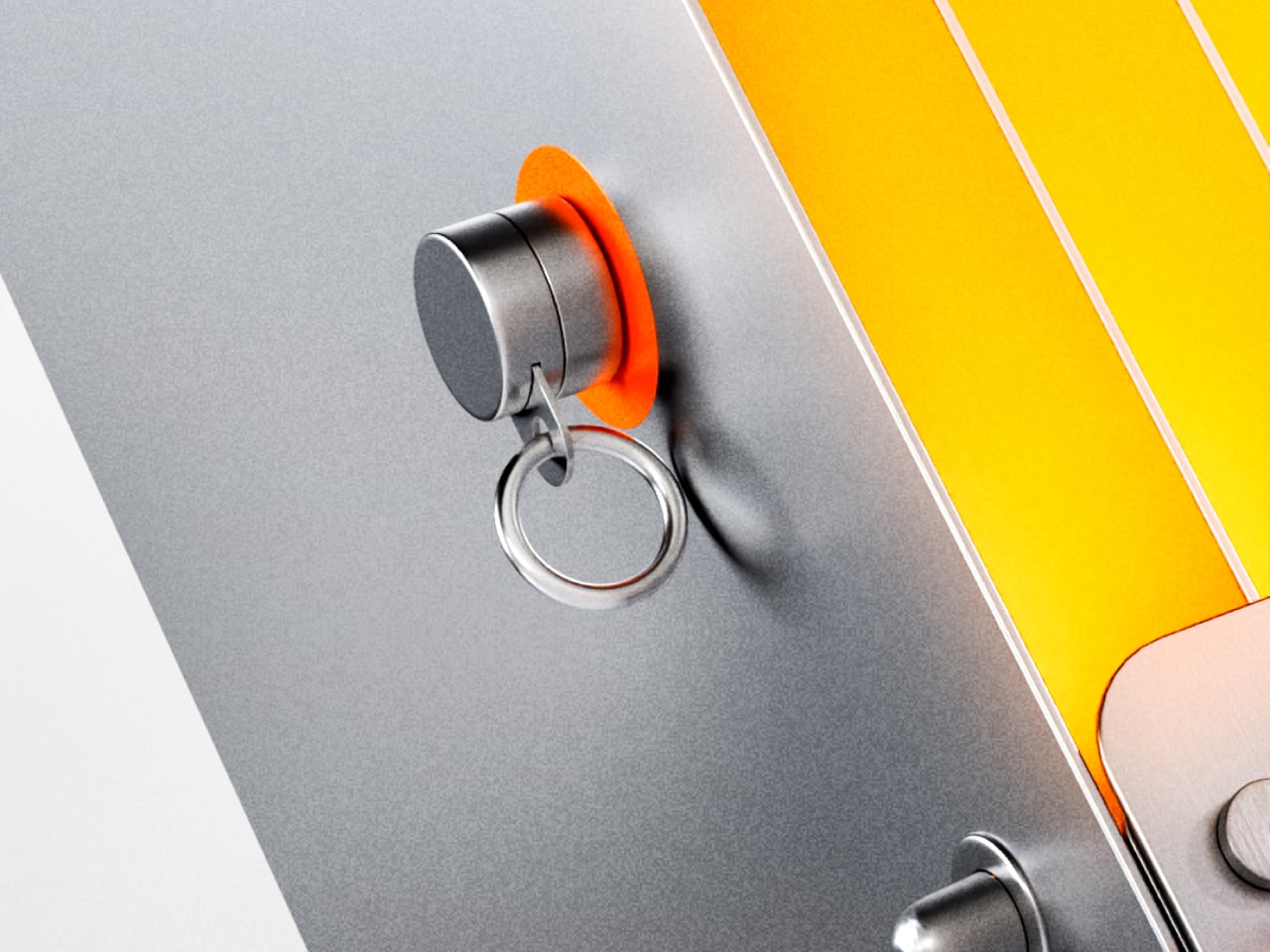
The switch is a magnetic reed switch, one of the simpler components you can put inside a lamp. A small cylindrical magnet, tethered to the body by a metal ring, acts as the key. Set it on the orange circle marked on the front panel, and the lamp turns on. Lift it away, and it turns off. The magnet parks on a small post when it’s not in use.
That interaction is a harder thing to design well than it sounds. Reed switches are decades-old technology, and the magnet-on, magnet-off logic is genuinely simple. But the way it’s set up here gives the action more weight than it would otherwise have. You’re not flipping a switch. You’re placing something intentionally, and removing it just as deliberately. It’s the kind of small habit that starts to feel like a routine.
The rest of the construction follows the same thinking. The steel plates, the standoff hardware, and the small feet that lift the base all stay visible rather than concealed, and an orange power cord exits from the bottom without apology. That cord color, matched to the activation circle on the panel, is the one deliberate accent in an otherwise entirely industrial material palette of matte gray and polished steel.
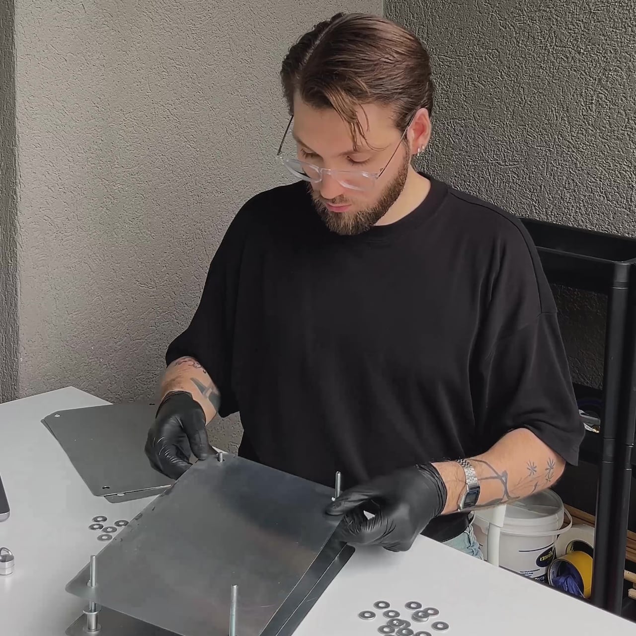
Strata was built by hand, and that’s evident in the quality of each component rather than any sense of roughness. The plates are cut cleanly, the standoffs are consistent, and the glow that fills the gaps between the sheets has a warmth that a simple LED strip wouldn’t normally produce on its own. The steel acts as both housing and reflector, which is about as economical as structural decisions get.
The rechargeable table lamp has been around for a while, but it hasn’t always been something designers were excited to work on. For most of its life, it was a category of hotel patios and restaurant terraces, objects tolerated for their practicality and forgiven for looking like camping gear. Most of them leaned on lantern shapes, chunky handles, and rubberized finishes that communicated utility before anything else.
That started to change noticeably around Milan Design Week 2026, when the cordless lamp stopped being a hospitality accessory and became something designers were treating as a proper object type. Alexander Pott did one for IKEA’s PS Collection. Studiopepe built an entire lamp family around it for Rakumba. Patrick Jouin wrapped one in micro-perforated leather for Longchamp. Suddenly, the rechargeable table lamp had a design argument behind it.
IKEA PS 2026 brings Alexander Pott’s cordless lamp to the mainstream
There’s a certain logic to watching what IKEA does with its PS Collection. The line has a history of giving up-and-coming designers a platform to push against convention, which means that when a rechargeable lamp shows up there, it’s worth paying attention. It signals that portable lighting has moved far enough into the mainstream that it deserves a considered, well-designed answer at an accessible price point.
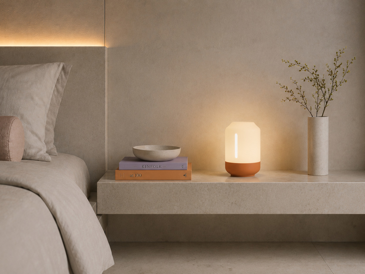
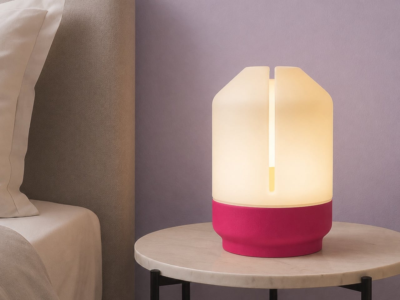
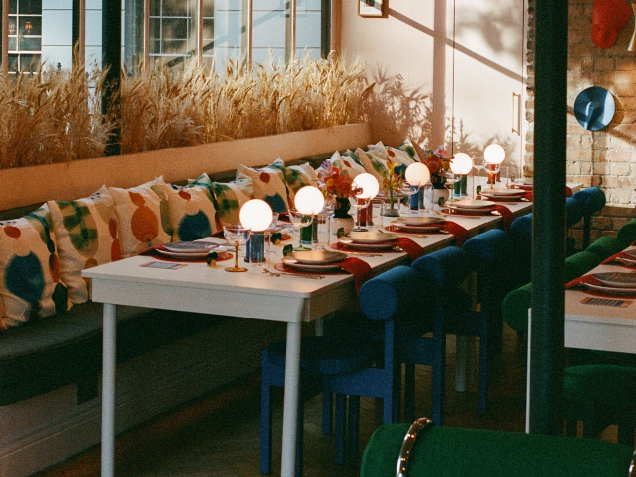
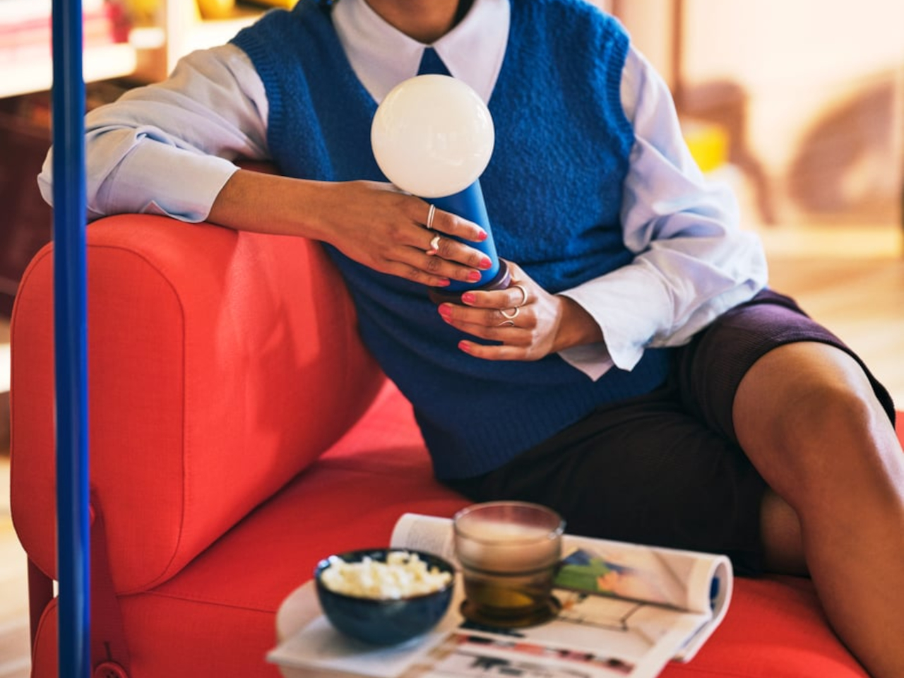
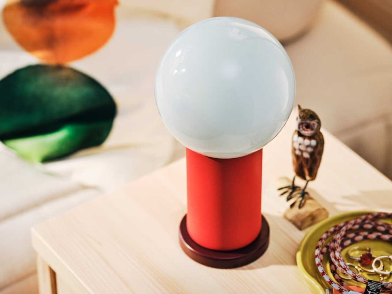
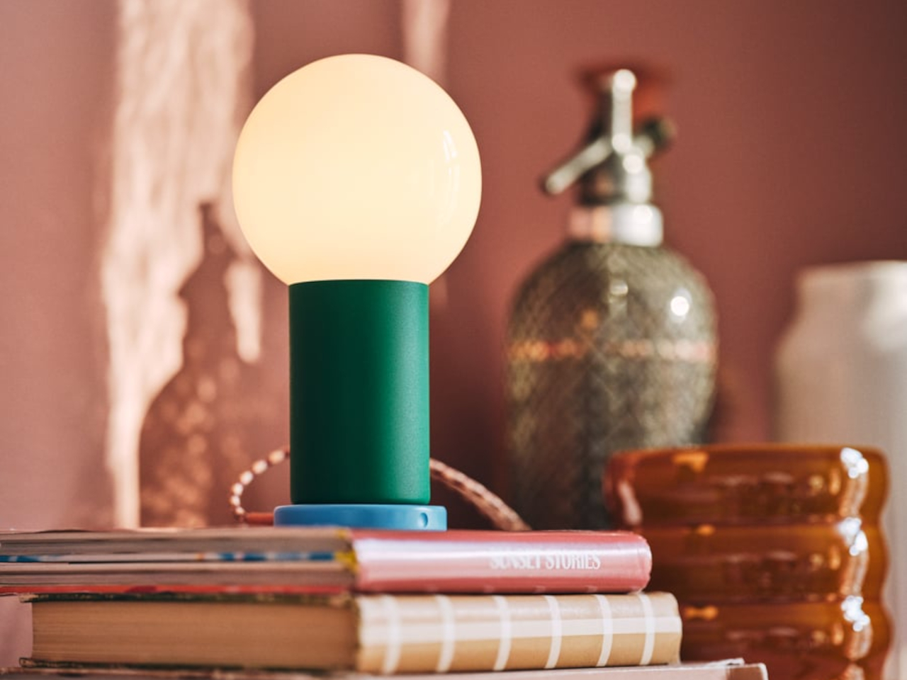
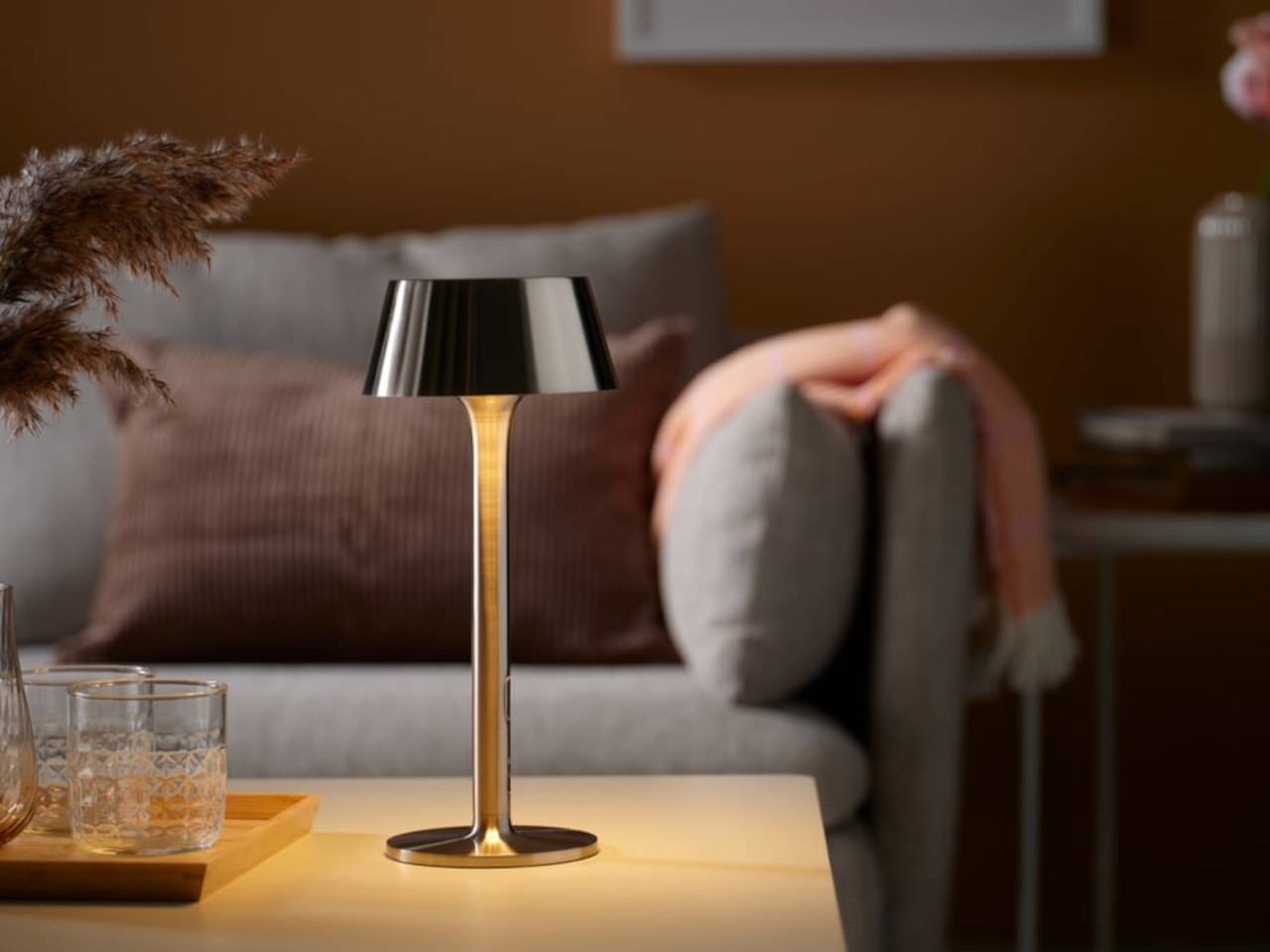
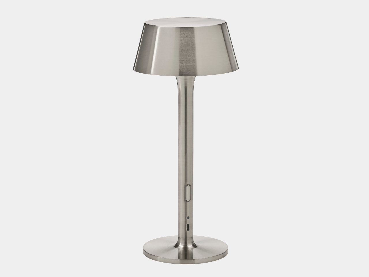
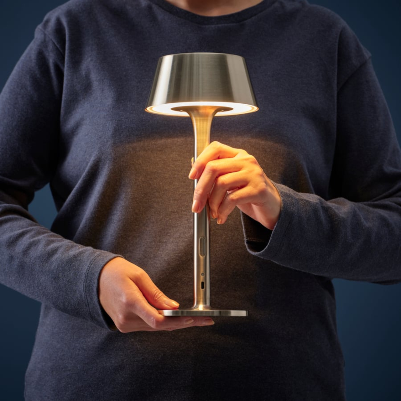
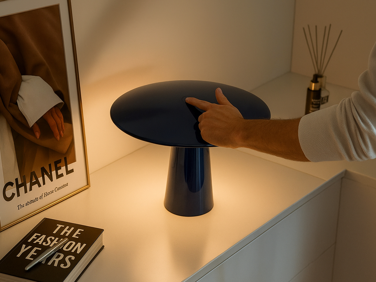
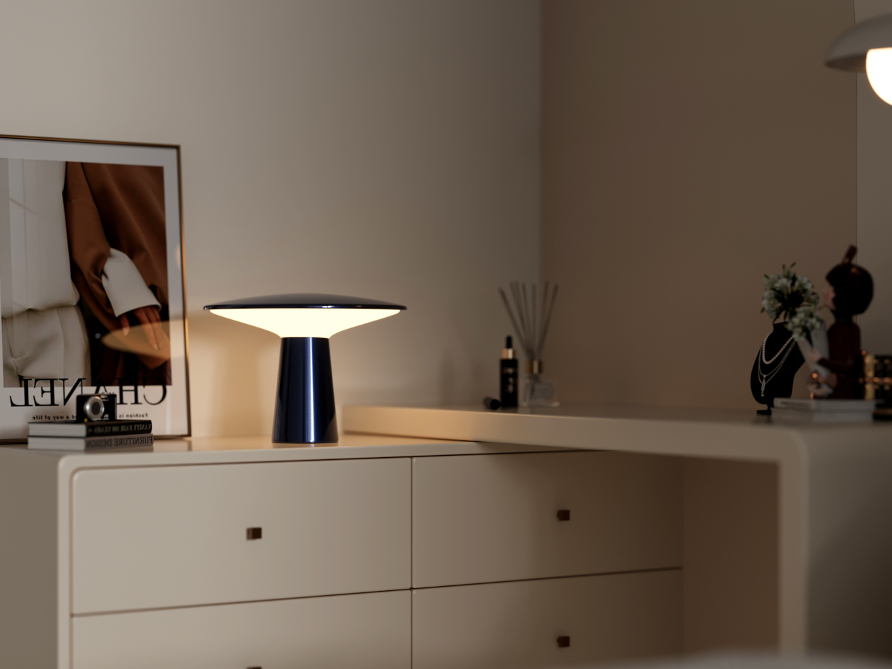
Alexander Pott’s design for the IKEA PS 2026 line keeps things deceptively simple: a metal-and-glass body with three dimming levels and a battery that frees you from thinking about where the nearest socket is. It comes in a few color combinations that make it feel more playful than precious, and it’s light enough to move from a dining table to a windowsill without making it a whole thing.
Studiopepe’s Torre family gives Rakumba a fully rechargeable lamp line
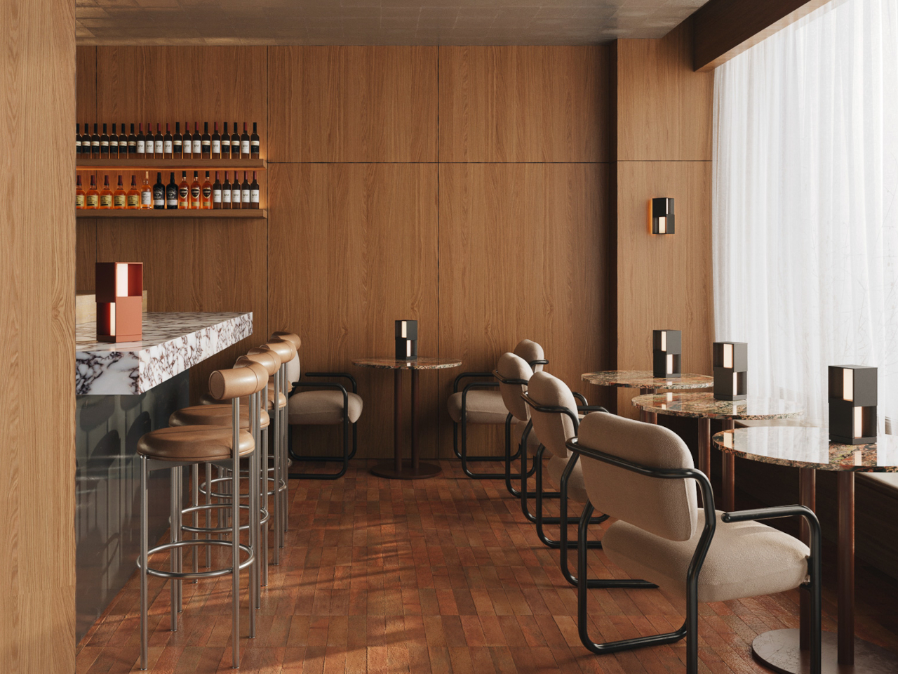
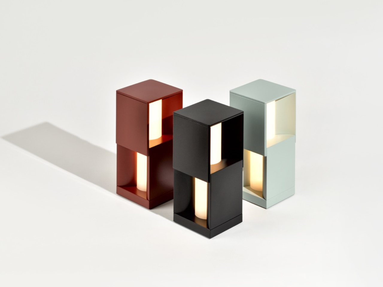
One-off cordless lamps are easy enough to find, but a whole family of them built around a consistent design language is something else. It suggests that whoever made it isn’t treating the rechargeable lamp as an afterthought or a novelty but as a genuine product category worth investing in. That’s the kind of thinking Studiopepe brought to their Torre line for Rakumba, and it shows.
The Torre family doesn’t try to hide what it is. The forms are clean and architectural, built for spaces where the lighting is meant to feel intentional rather than improvised. The concealed light source keeps it calm in a room, and being rechargeable means it can move between an indoor shelf and an outdoor table without losing any of that composure in the process.
Ostara is what happens when Longchamp and Patrick Jouin design a lamp together
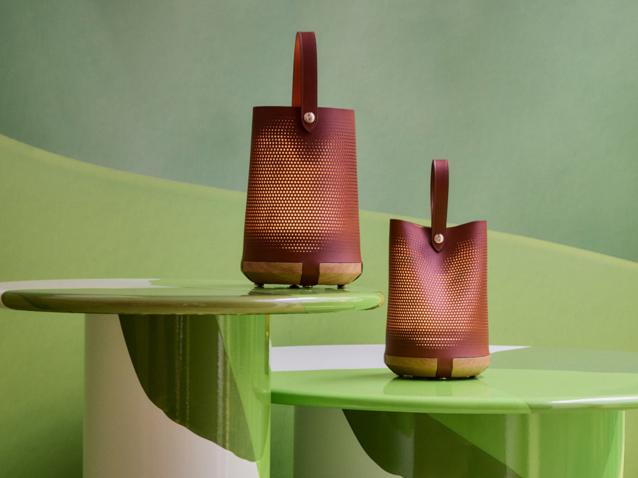
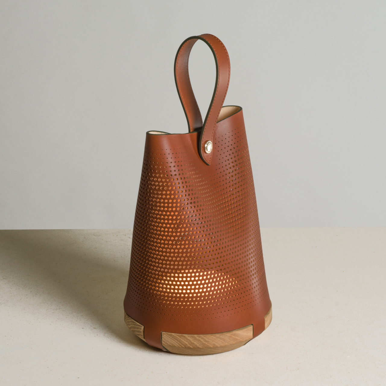
Fashion and luxury brands don’t wander into product design unless they see a genuine opportunity to say something with the object. The result is usually either impressive or awkward, with little in between. With Ostara, Longchamp and Patrick Jouin landed on the right side of that line, producing a rechargeable lamp that feels less like a lifestyle extension and more like a considered design object.
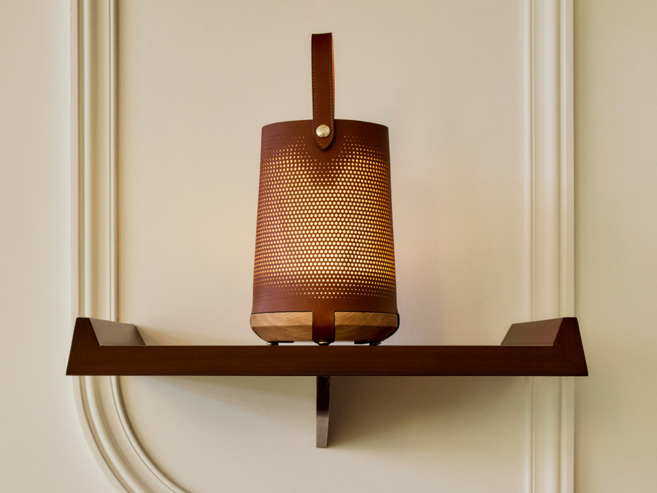
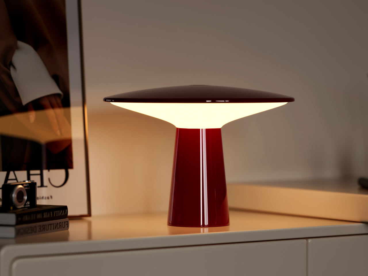
Jouin used micro-perforated leather for the shade, which gives the light that comes through it a texture that’s harder to achieve with glass or plastic. Being wireless and rechargeable means it can sit on a dining table or a bedside surface without the visual interruption of a cord, which matters more in a lamp built around intimacy and atmosphere than around raw output.
IKEA AVHÅLL goes outdoors without looking like it belongs there
There’s a frustrating design problem at the heart of most outdoor-rated portable lamps. They want to be taken seriously as practical objects, so they usually adopt a rugged aesthetic that makes them look slightly out of place indoors. Bringing one in from the balcony feels like dragging a piece of patio furniture into the living room, which is exactly the kind of visual compromise most people don’t want to make.
The AVHÅLL handles that transition more gracefully than most. It’s a metal lamp with three dimming settings and enough weather tolerance to live on a terrace, but it doesn’t dress itself up in tactical styling or rubberized finishes to make that point. At $39.99, it’s the kind of object that can light an outdoor dinner, come back inside afterward, and not look out of place in either setting.
The Anywhere-Use Lamp makes the case for AA batteries over built-in cells
Not every cordless lamp needs to carry a built-in battery to justify its place in this conversation. The Anywhere-Use Lamp makes a different kind of case: four AA batteries instead of a sealed internal cell, which sounds like a step backward until you factor in that rechargeable AAs are widely available, easy to swap, and don’t degrade the way built-in batteries do after a couple of years of daily use.
It moves freely between a desk, a bookshelf, a bedside table, or an outdoor corner without needing a socket or a charging cable. Four brightness levels cycle through a tap of the cap, and the whole thing breaks down flat when you need to pack it. At $149, it isn’t cheap, but the placement freedom it offers is the kind that genuinely changes how you think about where light belongs.
Melt is one of the more dramatically finished lamps on this list
Once the rechargeable lamp stopped having to justify itself as a practical solution, designers had more room to get expressive. The form no longer had to be neutral or apologetic, which opened the door for objects that could hold their own in a room even when they weren’t switched on. That’s a higher bar than most lamps are held to, and one worth reaching for.
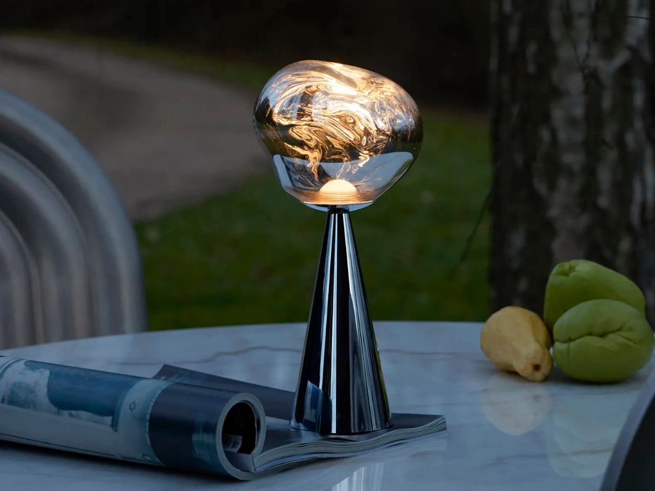
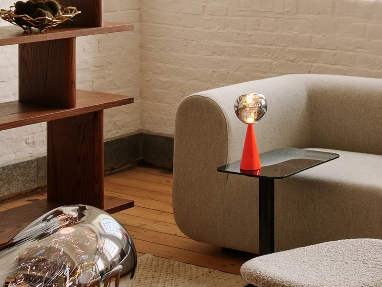
Melt leans into that idea pretty directly. Its surface treatment mimics the look of metal mid-pour, giving it a kind of arrested-motion quality that makes it genuinely interesting to have around. It also runs for up to 10 hours on a single charge, which means it can handle a long evening without going dark before the conversation does. At around $300, it’s the most overtly expressive lamp on this list.
Monir skips the app, the cord, and all the usual complications
There’s a growing exhaustion with lamps that want to be smart home hubs. At some point, the dimming app, the voice controls, and the tunable spectrum start feeling like overhead for something that’s supposed to quietly light a corner of the room. Not every lamp needs to be a connected device, and it’s becoming clearer that the most relaxed interiors are often lit by the least complicated objects.
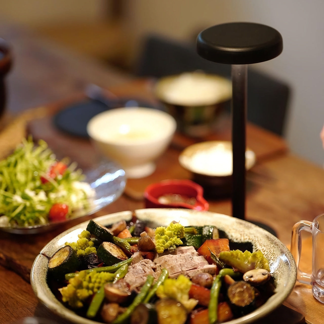
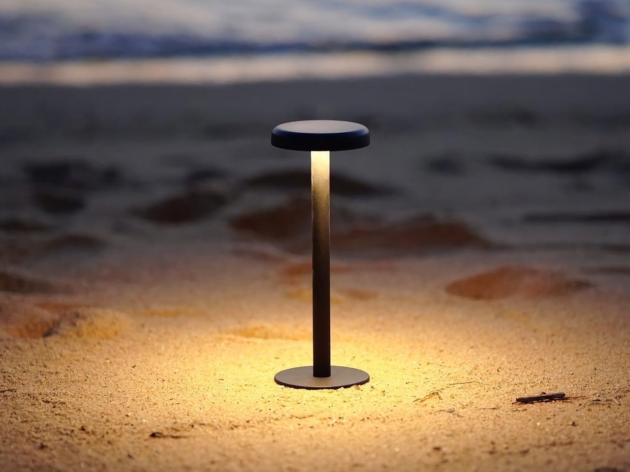
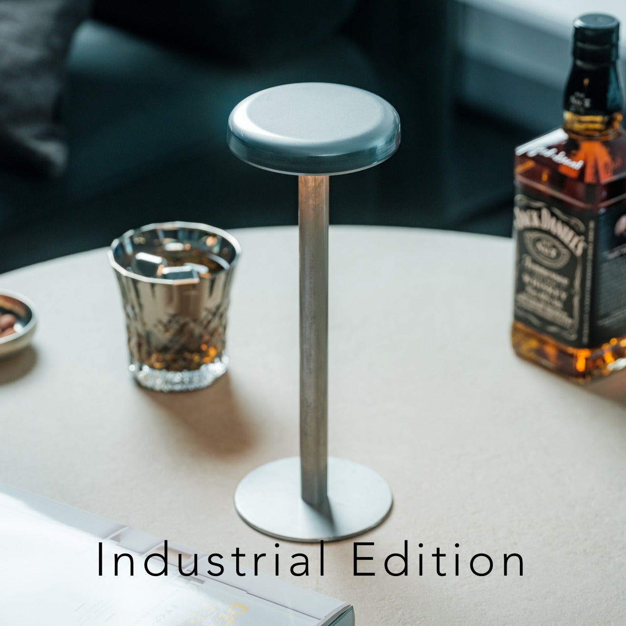
Monir makes no effort to be anything other than a lamp. No app required, no cord in sight, and the whole thing is built from 100% recycled aluminum, which gives it a quieter kind of design intention than most objects in this space. Its moon-inspired form is soft enough to fit into a bedroom or reading corner without demanding attention, just providing a warm, ambient glow when you need it.
Fluted questions what the portable lamp’s silhouette should look like
The lantern is the oldest visual reference point in portable lighting, and it’s also one of the hardest to escape. Designers keep reaching for it because it signals mobility and self-sufficiency, but it also carries a lot of campsite and emergency-preparedness baggage that’s difficult to shed. Younger designers seem more interested in questioning those associations rather than just refining them, which is where things get more interesting.
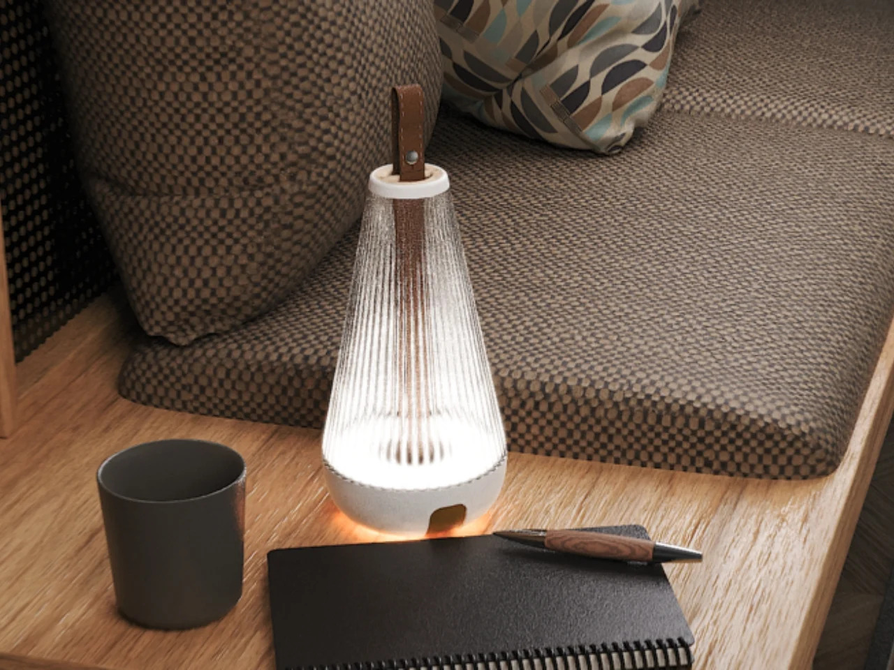
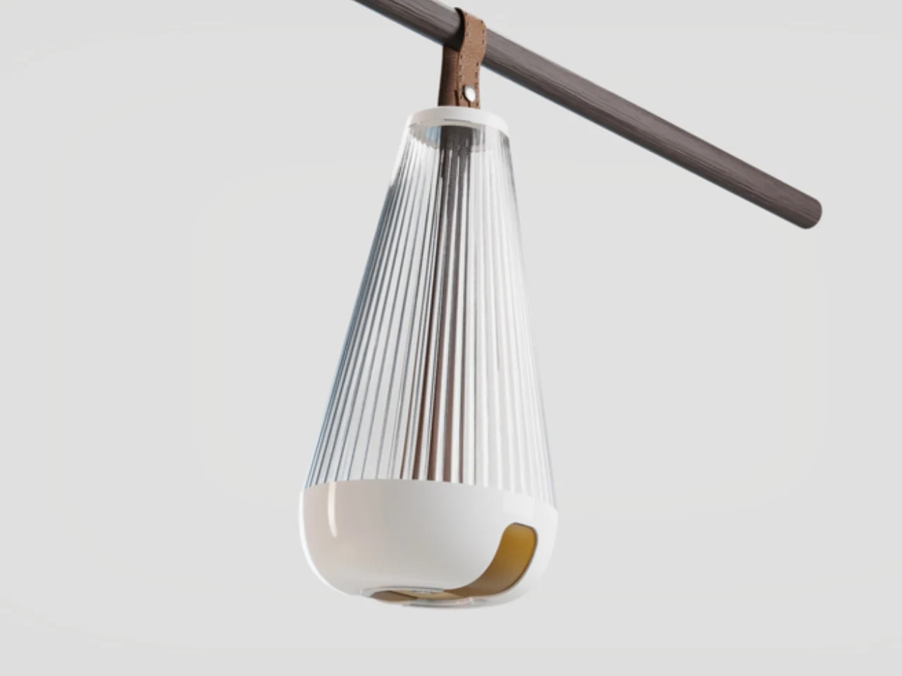
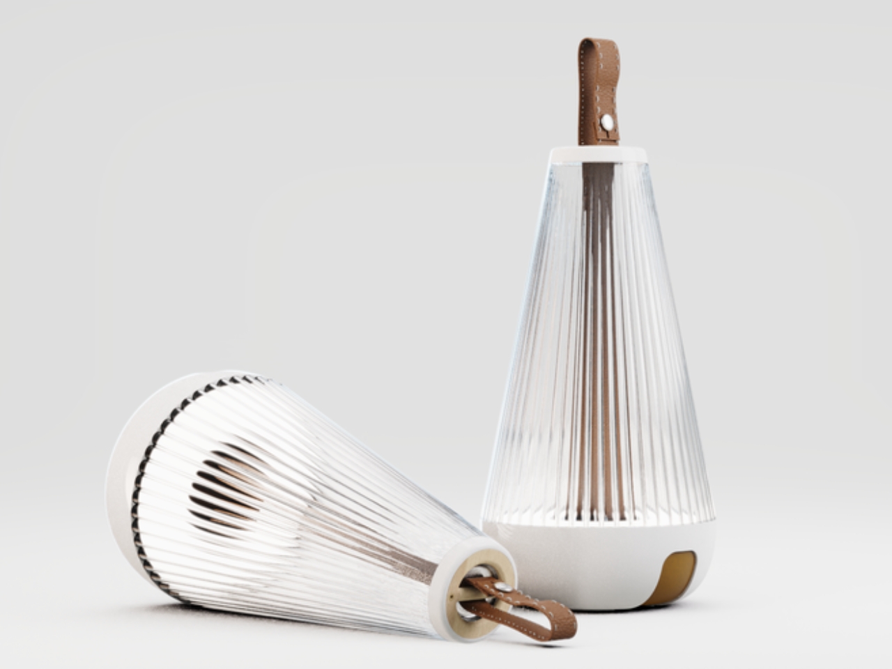
Fluted, a student project recognized at the Core77 Design Awards, does exactly that. It borrows the lantern’s silhouette but softens its edges and refines its finish into something that reads less like outdoor gear and more like an object you’d actually want to keep on a shelf. It’s a concept rather than something you can order today, but it points at where the category’s visual language could go next.
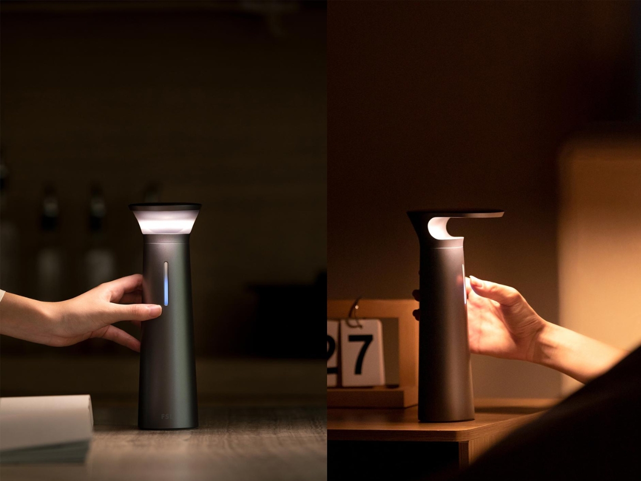
The FSL Wireless Portable Desk Lamp doesn’t know which category it belongs to
Desk lamps and table lamps have always played by slightly different rules. A desk lamp is positioned and pointed; a table lamp is placed and left alone. That distinction made a lot of sense when both types were tethered to a wall, but it starts to feel less rigid when the power source is no longer doing the work of keeping the object in one place.
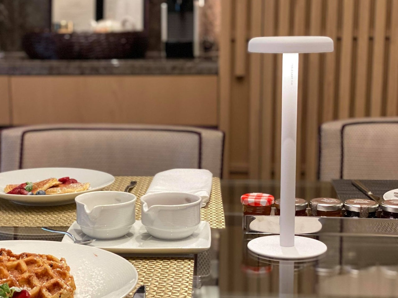
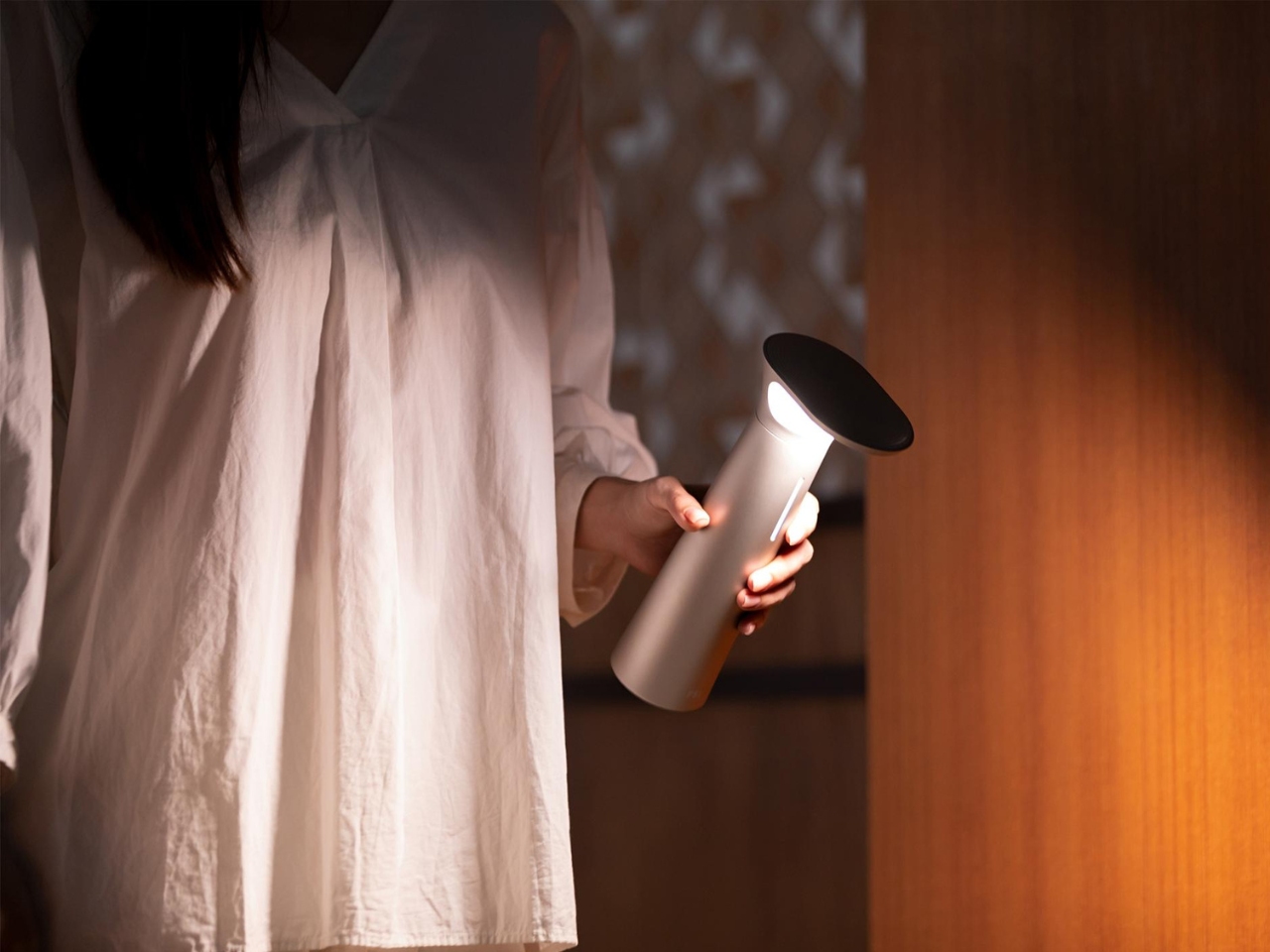
The FSL Wireless Portable Desk Lamp sits comfortably in that gap. It carries the directed functionality of a task light with the portability of an object that doesn’t belong to any single corner of the room. It can move from a desk to a dining table to a nightstand without asking for a socket along the way, which quietly makes the case for what cordless lighting could become.