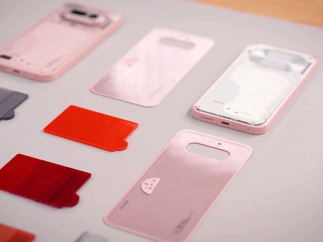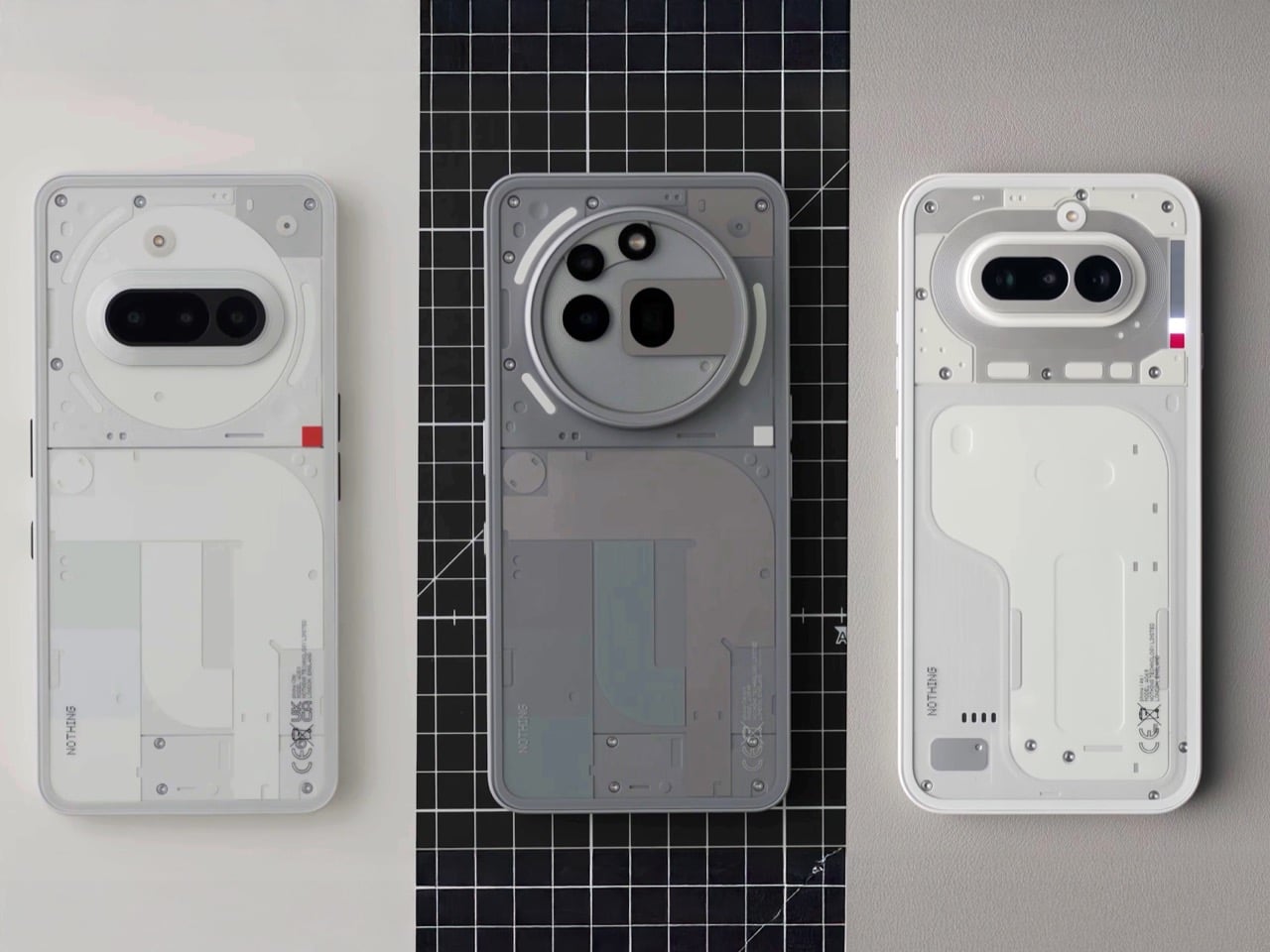
Nothing has a flair for the dramatic – their MWC setup was no exception. Instead of a stuffy booth, they dropped a mysterious shipping container in an open square. It cranked open to reveal the Phone (4a) in its four colorways, a slick bit of industrial theater that gets people talking. We’d all seen the white and pink versions on YouTube, but seeing them in person alongside the brand new black and blue models changes the calculus entirely. It immediately became clear there are two versions of this phone you should absolutely buy, and two you should probably skip. The reasons are not what you might think, and it all comes down to the subtle interplay of material, color, and finish.
Lined up under glass, the quartet looked impressive. The initial reveal was just that, a visual presentation to let the press get their shots and build some hype. Nothing clearly knew which colors were their heroes; the white and pink that led their digital marketing campaign were positioned prominently. The black and blue felt like they were held back for this physical debut, and it makes sense why. In the controlled lighting of the display, they all looked sharp. But a phone isn’t a museum piece, it’s an object you hold and interact with in countless environments, and that’s where the story took a sharp turn later that evening.
Designer: Nothing
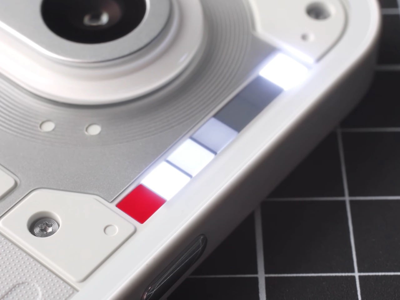
Later that night, the glass came off. At Nothing’s party, they had operational units for everyone to actually handle. First impressions… The device feels solid, and the overall form is a refinement of their established language. As I wrote last week, this is easily Nothing’s most confident design yet; it feels less like a startup experiment and more like a statement from a company that knows exactly what it’s doing. We cycled through the Glyph lights, pairing them with the classic and new generative ringtones, and the effect is still as cool as ever. But my focus was on how the materials felt, and how the colors held up in the real world.
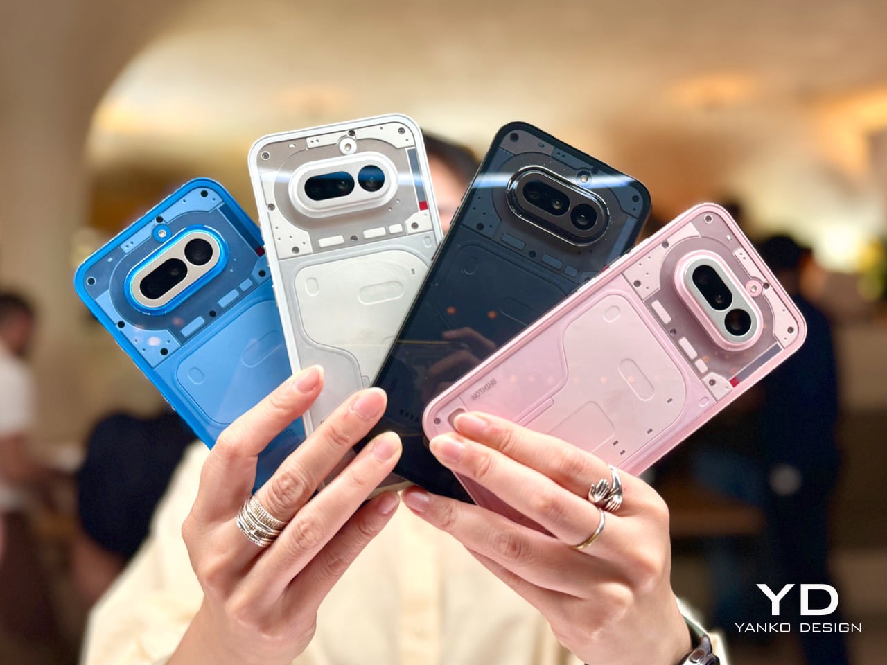
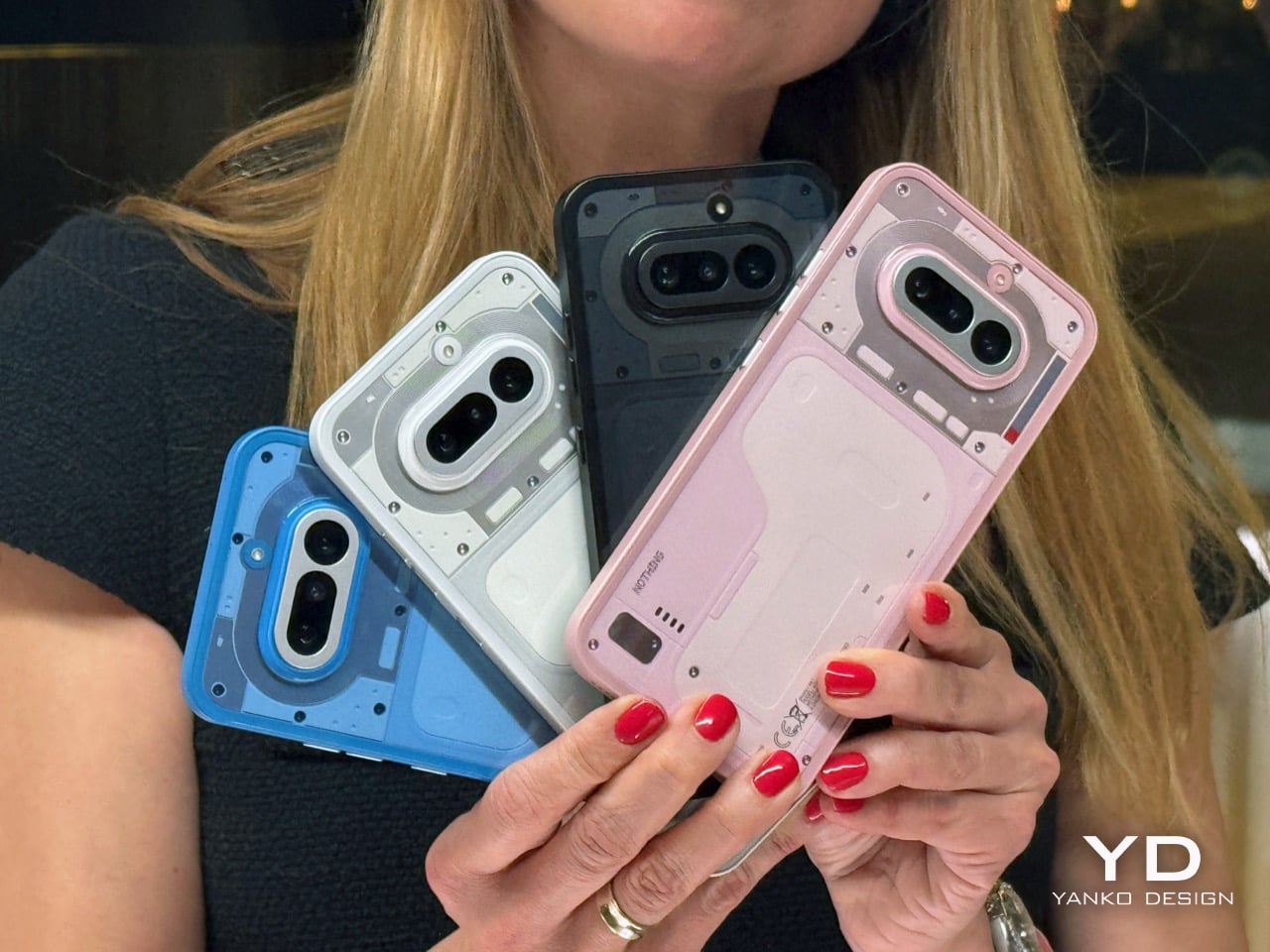
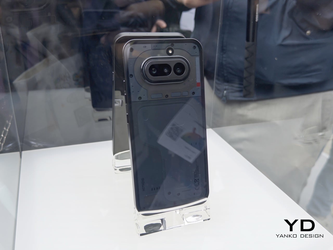
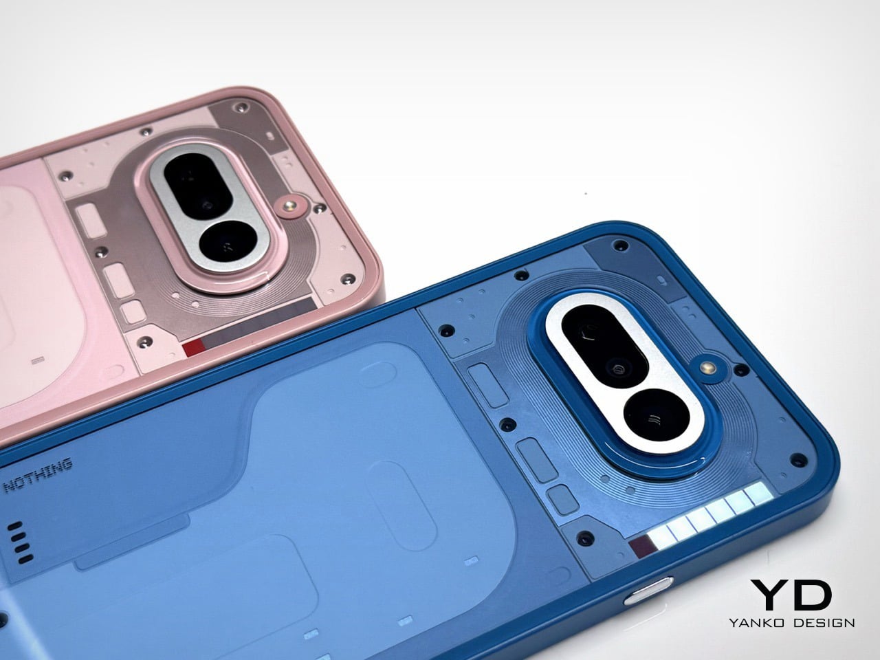
Let’s get right to it: avoid the black. I know it’s the default safe choice for many, but it betrays the entire Nothing ethos. The earlier grey versions of their phones created a beautiful contrast, letting you peer in and appreciate the texture and layout of the components underneath. This new black is just pitch black. In low light, it becomes an amorphous blob, and under direct light, the glass back turns into a smudgy mirror, catching chaotic reflections that obscure any sense of depth. It loses all the nuance and visual intrigue that makes these phones special. You’re left with a simple black rectangle, and frankly, you can get that from anyone.
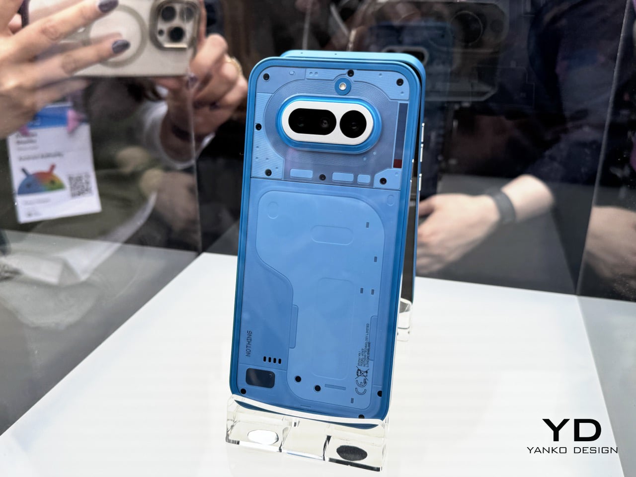
The blue is a more complicated story, and a more disappointing one. The shade of blue itself is fantastic, a vibrant choice that really stands out. The frame is the culprit here. Nothing uses plastic for its frames, which is fine, but the finish on the blue model makes it look and feel overtly like plastic. It has a certain sheen that reads as “budget-ish,” undermining the otherwise premium and considered design of the phone. While the frames on the white and black models have a finish that elevates them, the blue’s just doesn’t stick the landing. It’s a small detail that makes a huge difference in desirability. Thankfully, it’s a problem that can be solved with a good metal bumper case, if you’re truly set on the color.
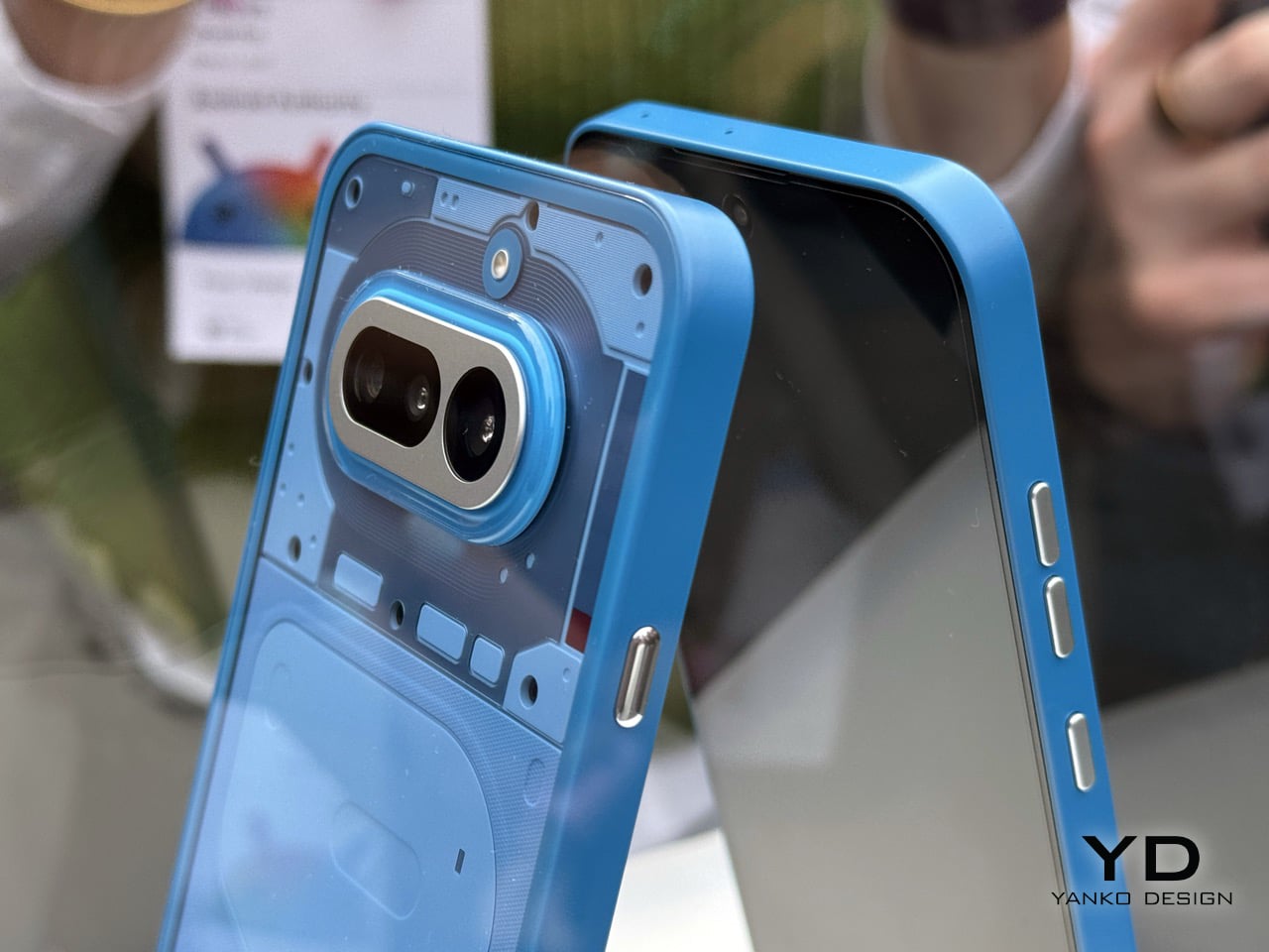
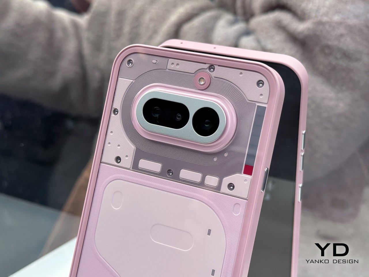
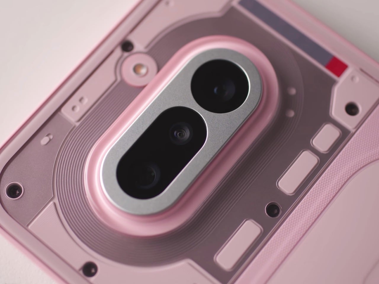
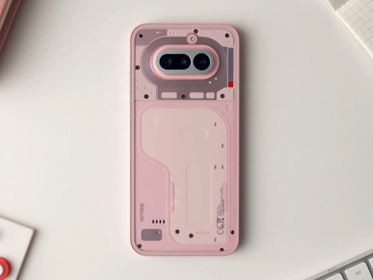
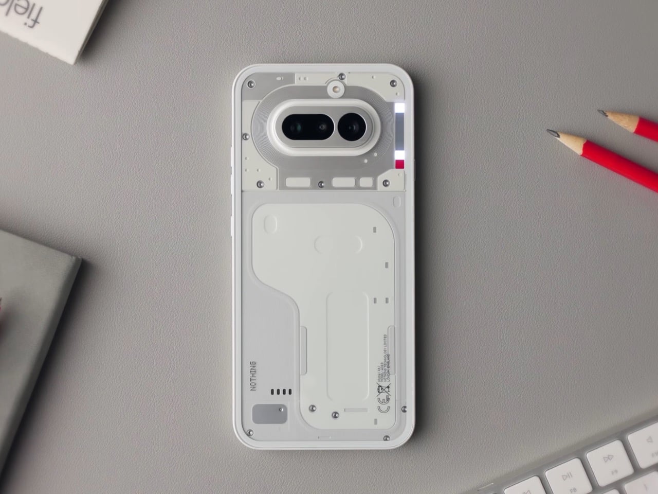
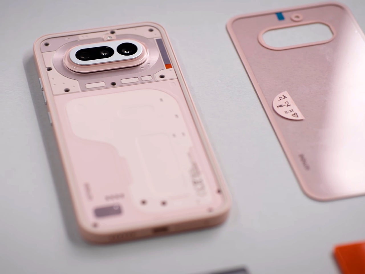
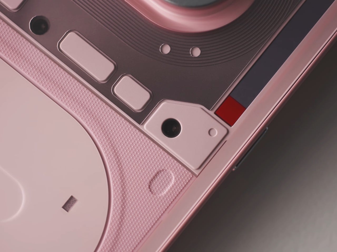
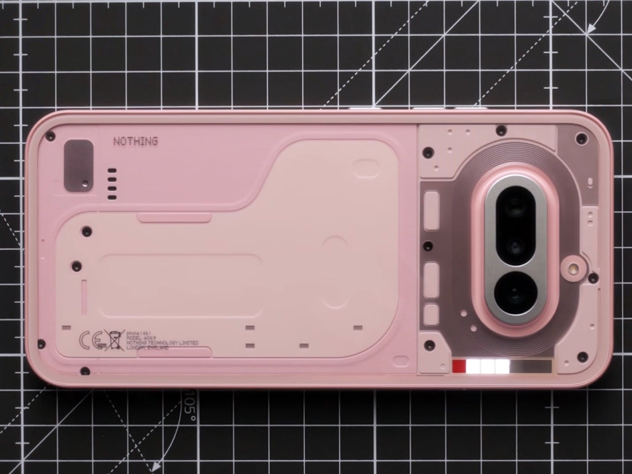
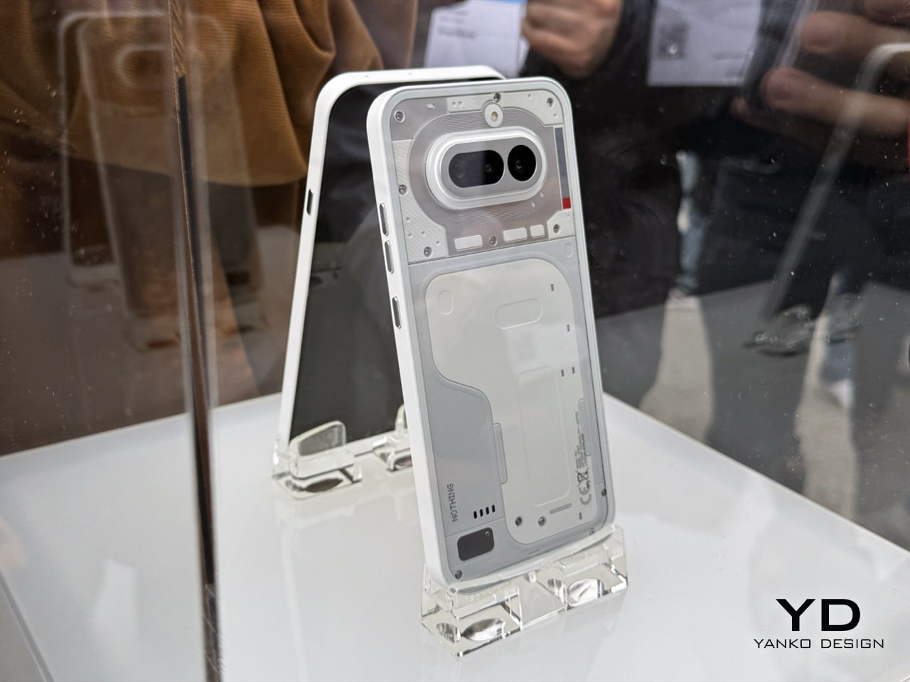
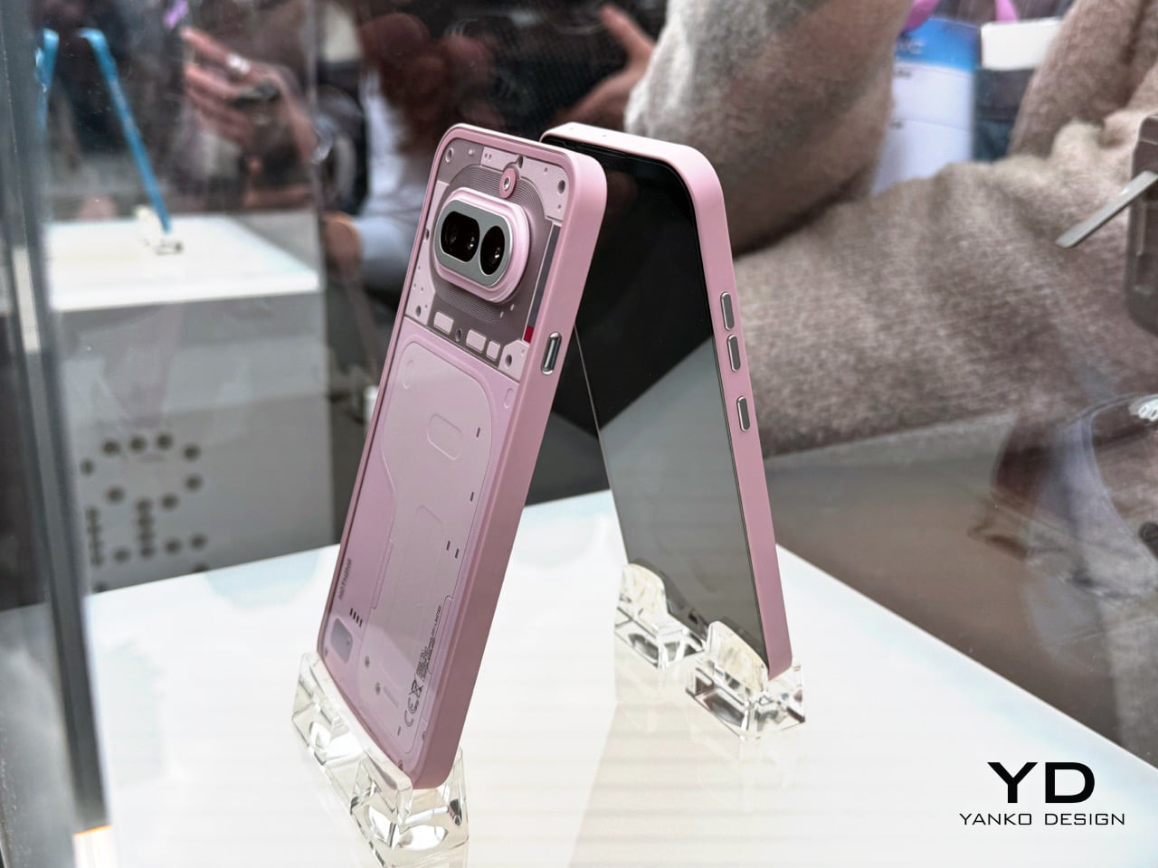
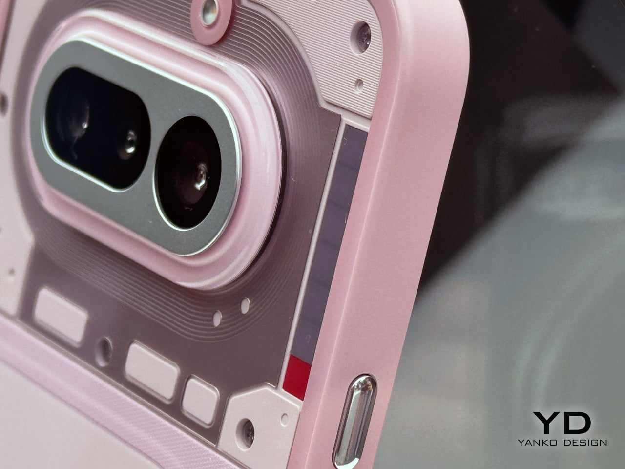
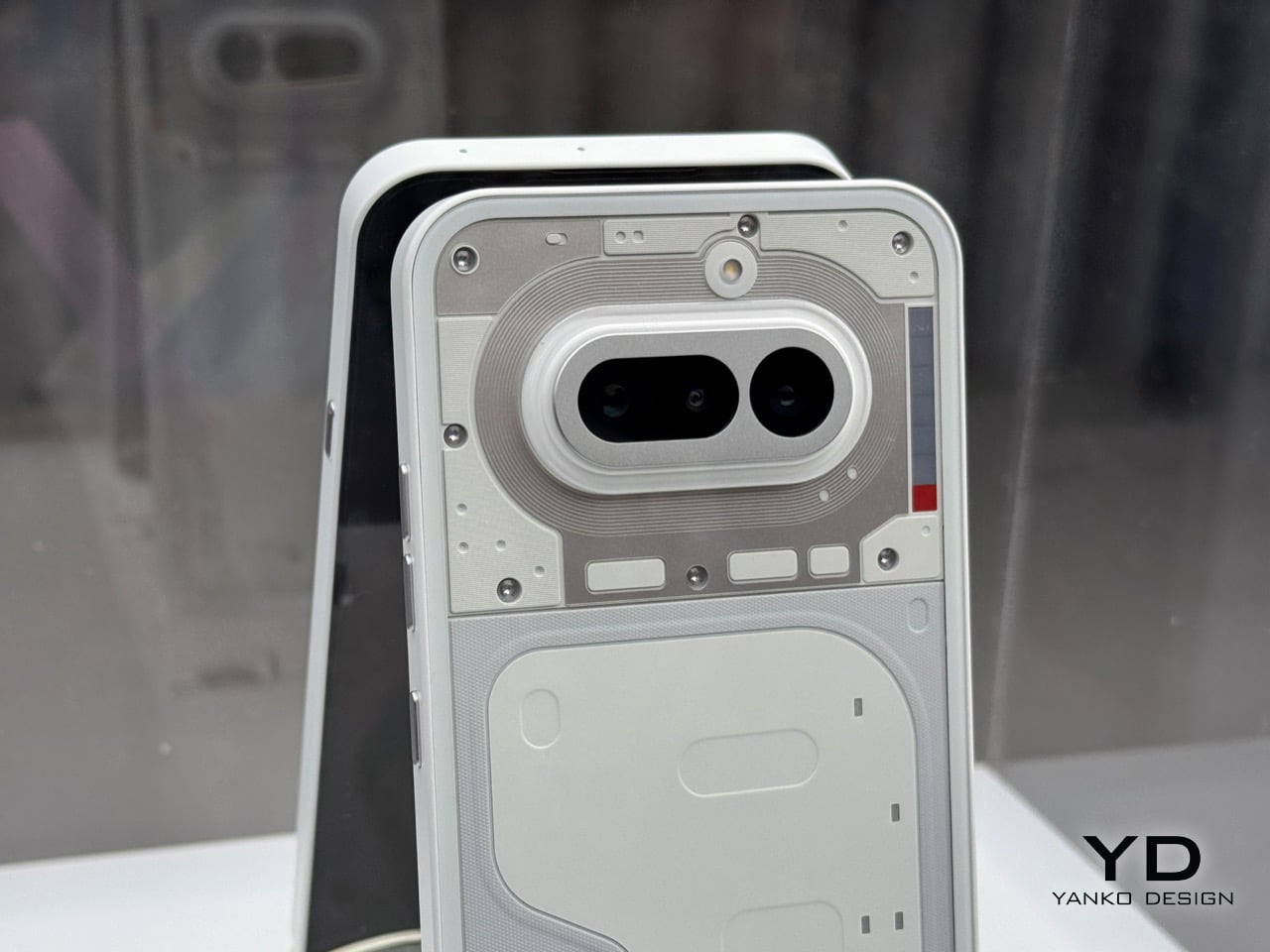
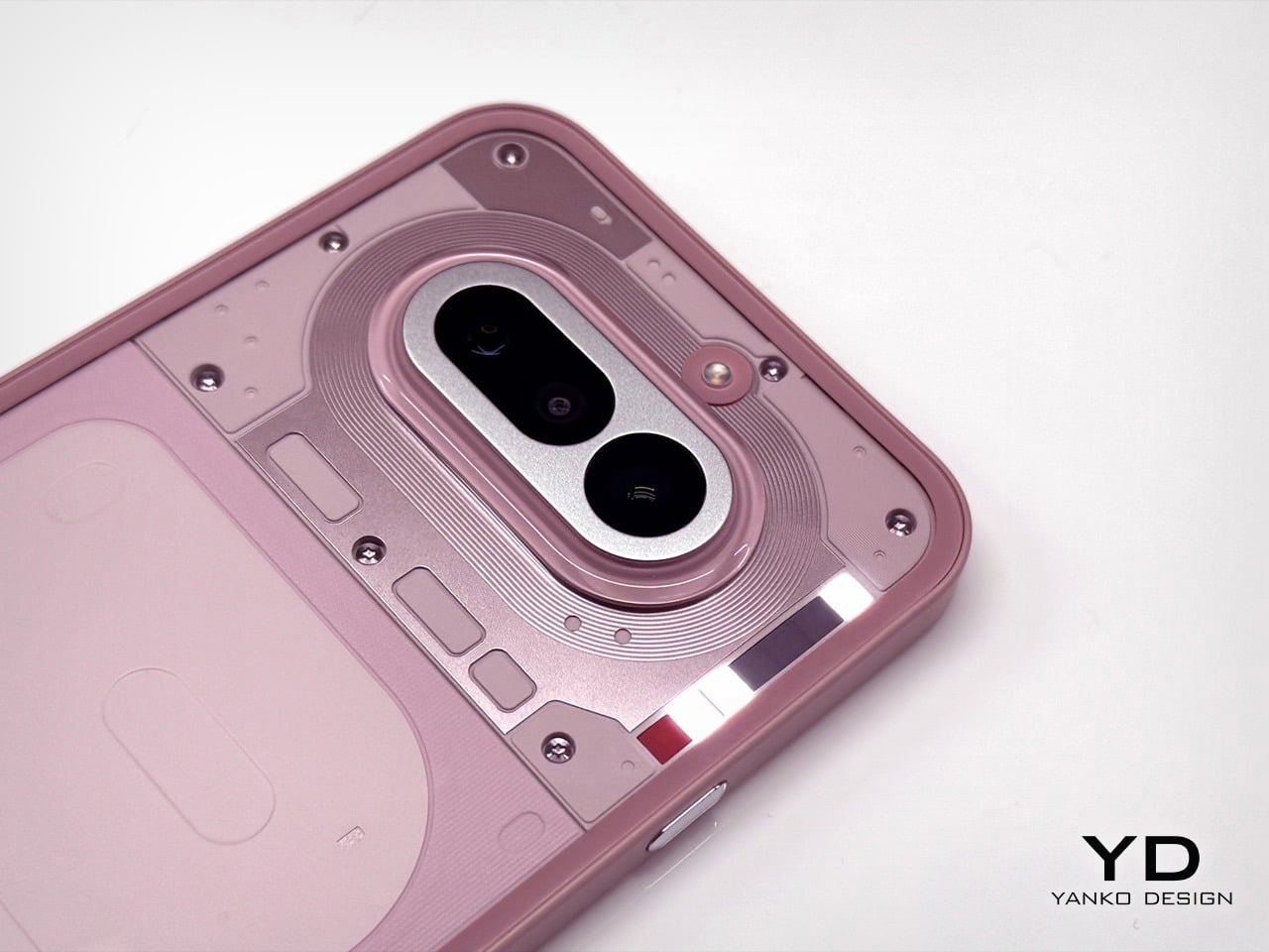
This is why the white and pink versions are the ones to get. The white is the quintessential Nothing look; clean, architectural, and it showcases the internal components and Glyph system perfectly. The frame’s finish looks gorgeous and intentional. The pink is the surprise winner. It’s a fantastic, almost salmon-like shade that is both playful and sophisticated, and the finish on its frame works in harmony with the color. It feels fun without feeling cheap. Both of these colors feel like they were the primary focus of the design team, where the material choices and color selection are in perfect sync to create a cohesive and desirable object.
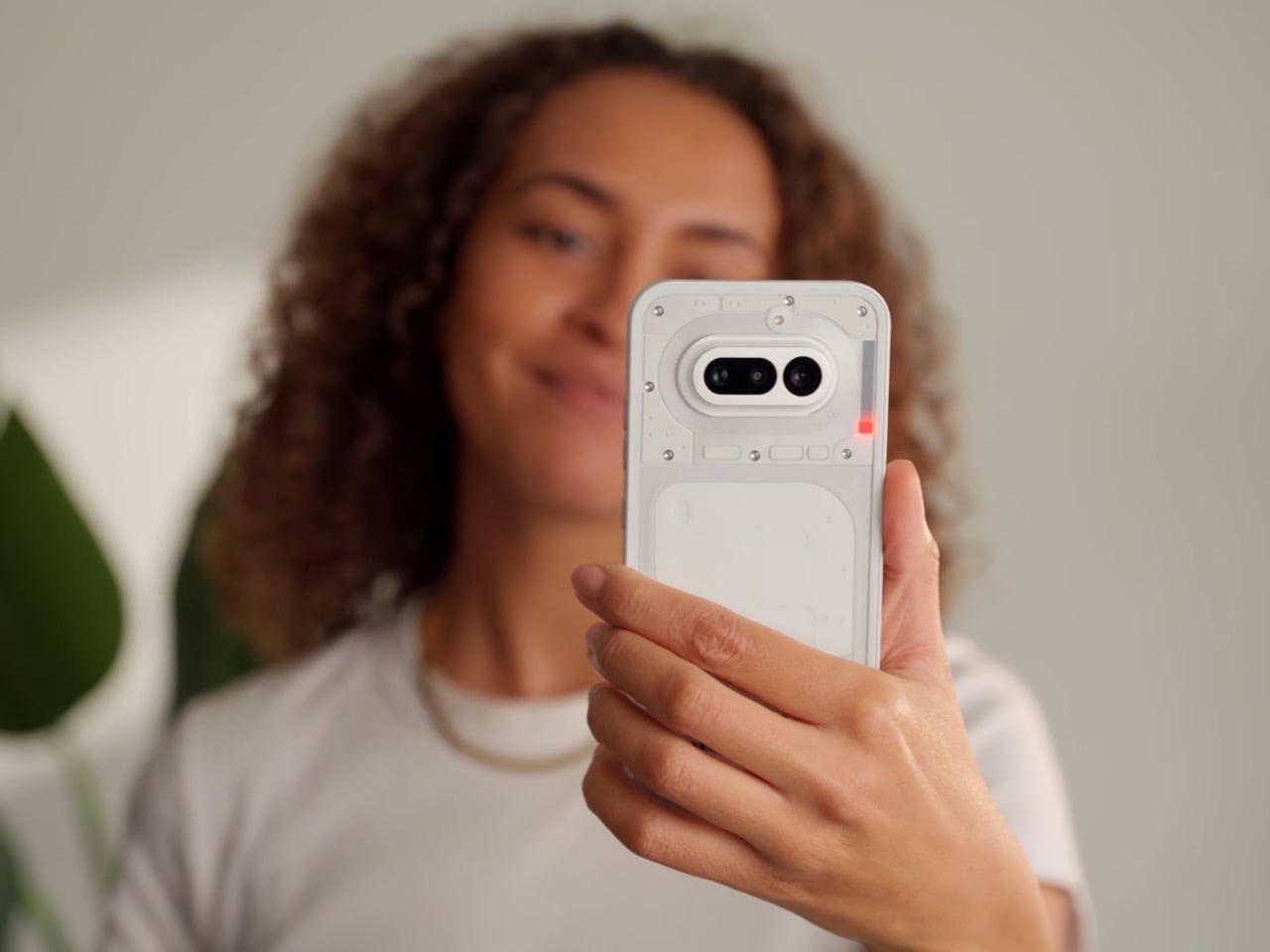
Of course, the phone is more than its colorway. The camera is genuinely impressive for this bracket. I took a few shots in the less-than-ideal lighting of the party, and while the processing takes a beat longer than you’d expect, the results are worth it. I was seriously impressed by the quality coming from the 3.5x lens; it’s sharp and holds detail well. The software felt snappy, and the screen is bright and responsive. It’s a proper smartphone experience, wrapped in a design that still turns heads and starts conversations, which has always been Nothing’s core strength.
This MWC party was just the appetizer for the main course. Nothing is holding another event on March 5th, where the full, official launch will happen. That’s when we’ll get the final specs, pricing, and availability. There is also a persistent rumor that the company will use that event to debut a more powerful Phone (4a) Pro model. Given the confidence on display in Barcelona, Nothing is clearly holding a few cards back for the big reveal. They got our attention with the hardware, now we wait to see the full strategy.
The post Nothing Phone (4a) Hands-on at MWC 2026: Here’s which color NOT to buy… first appeared on Yanko Design.