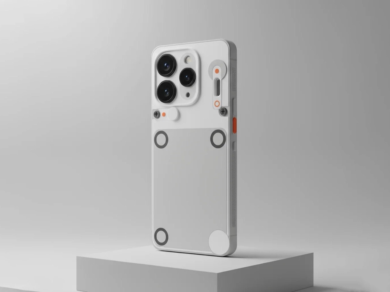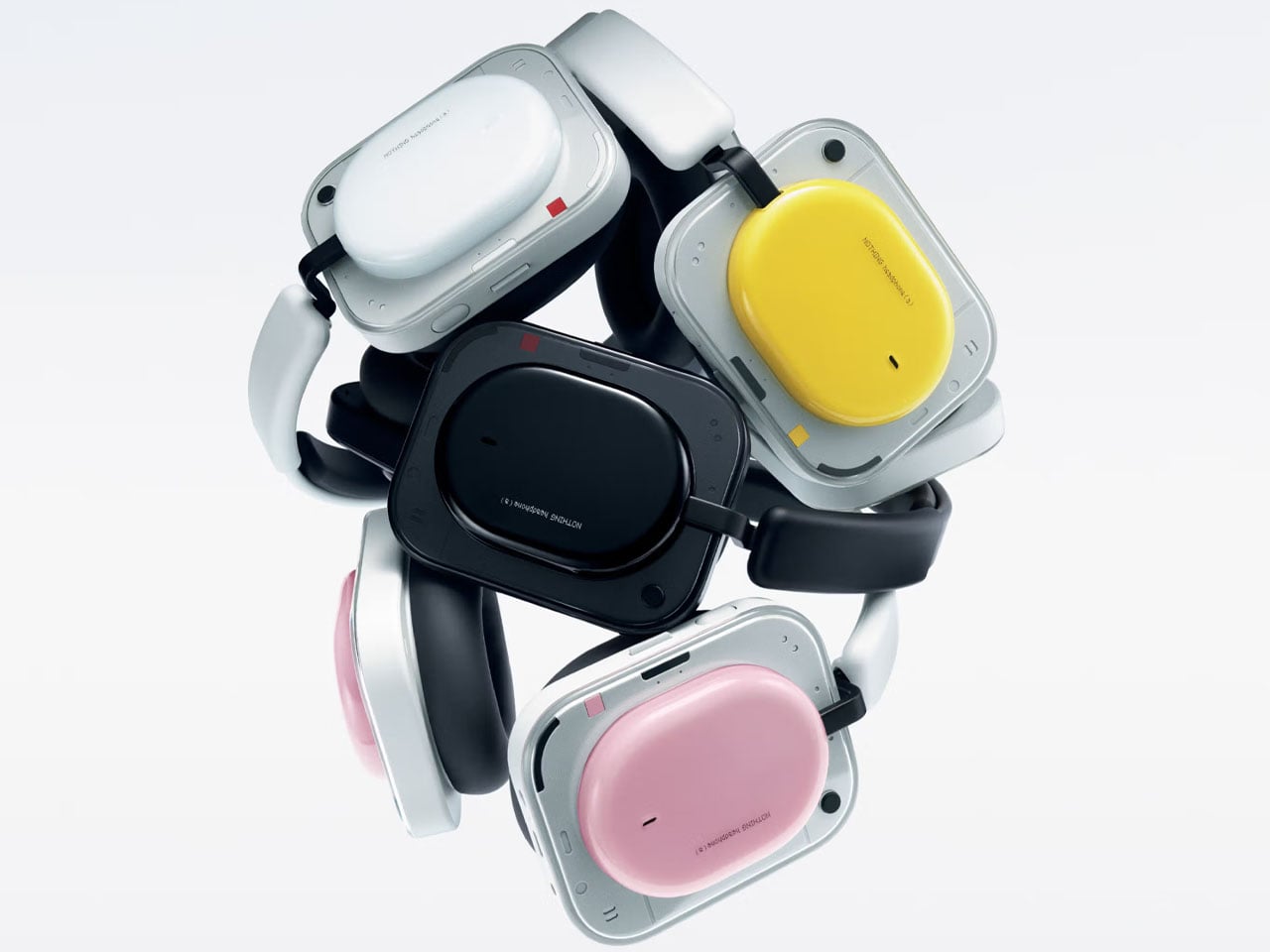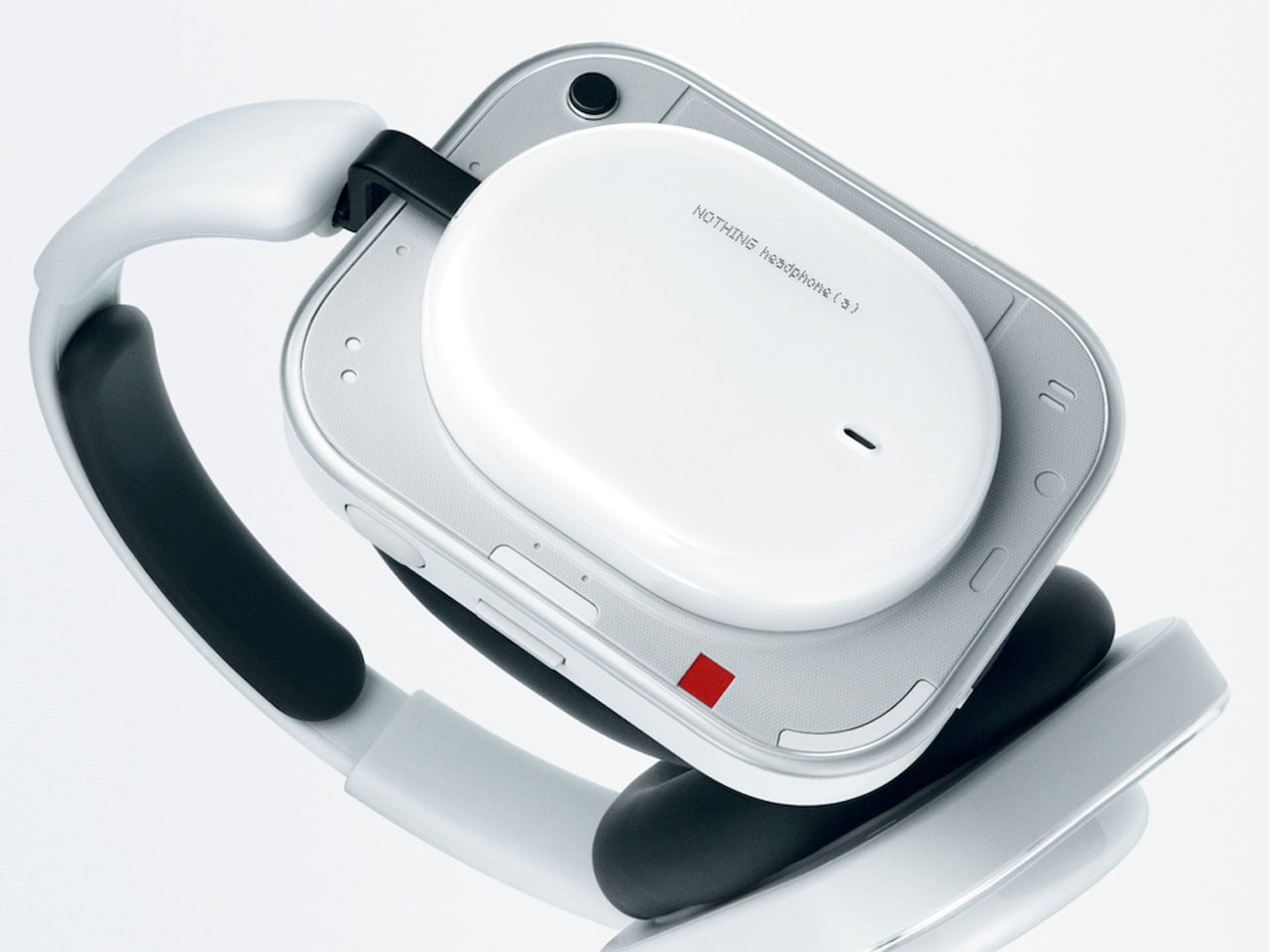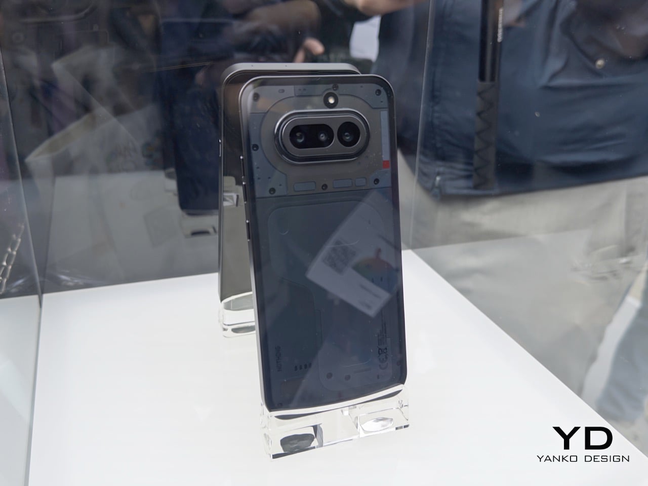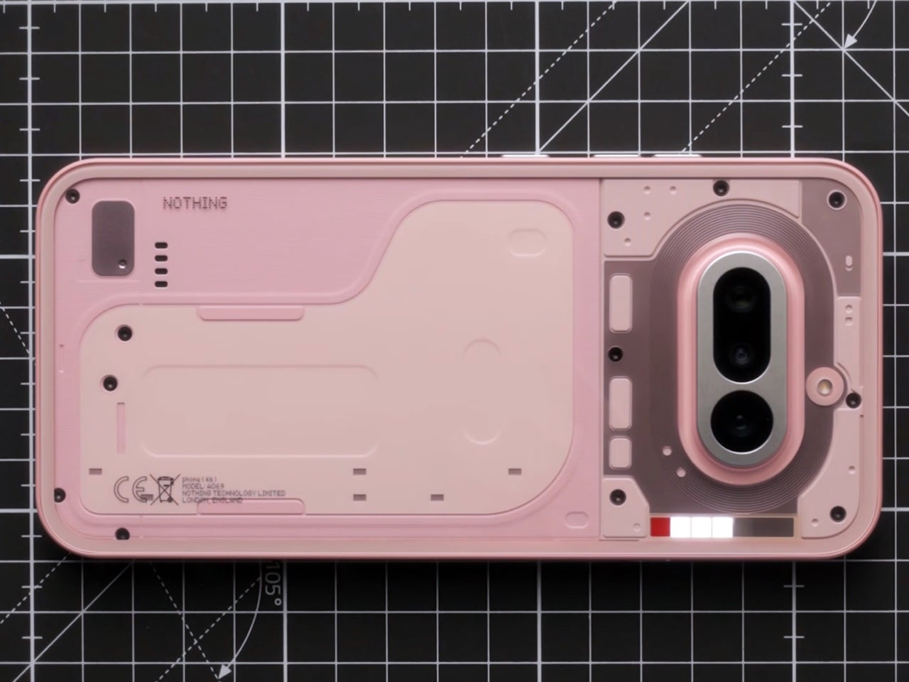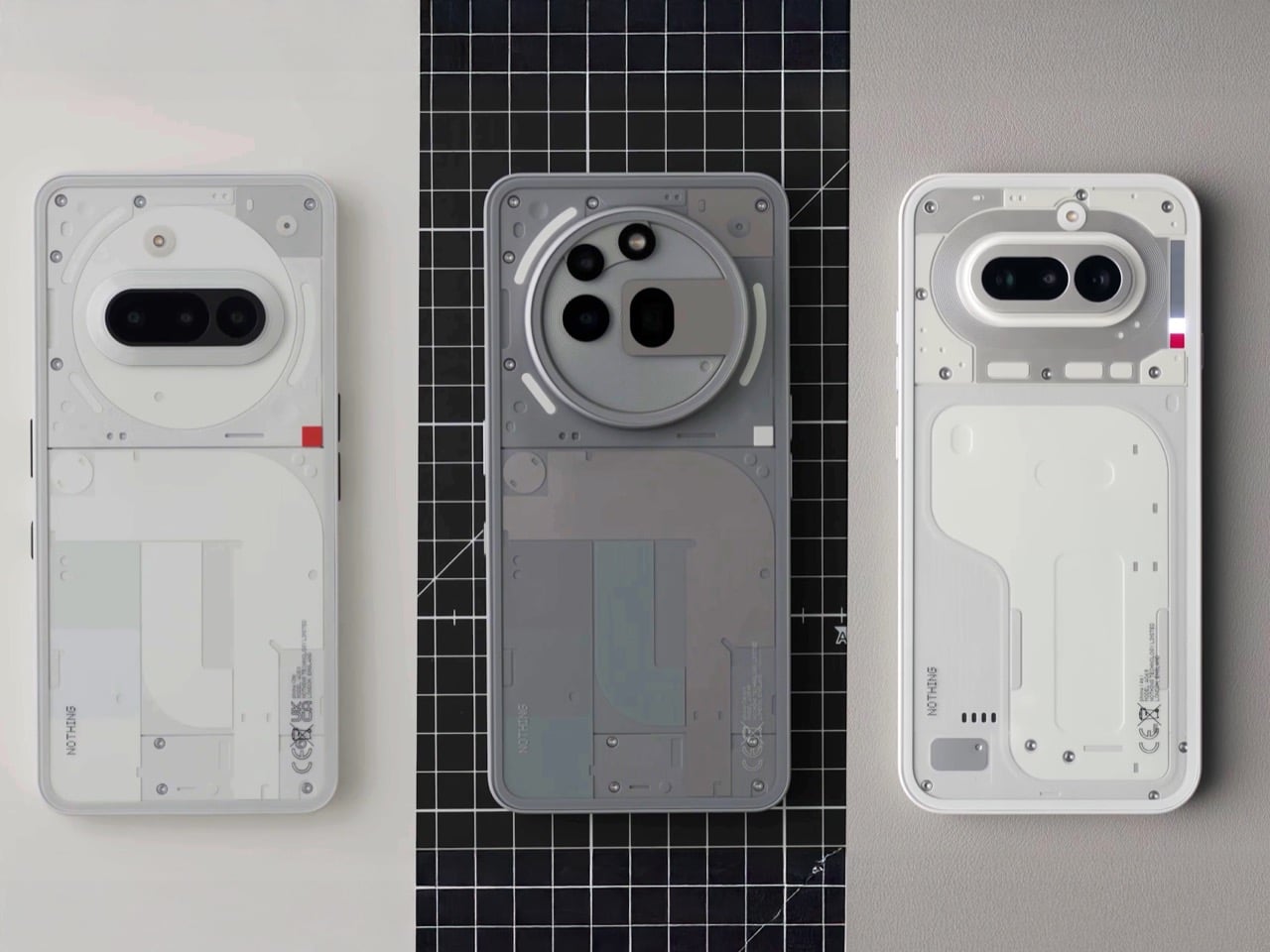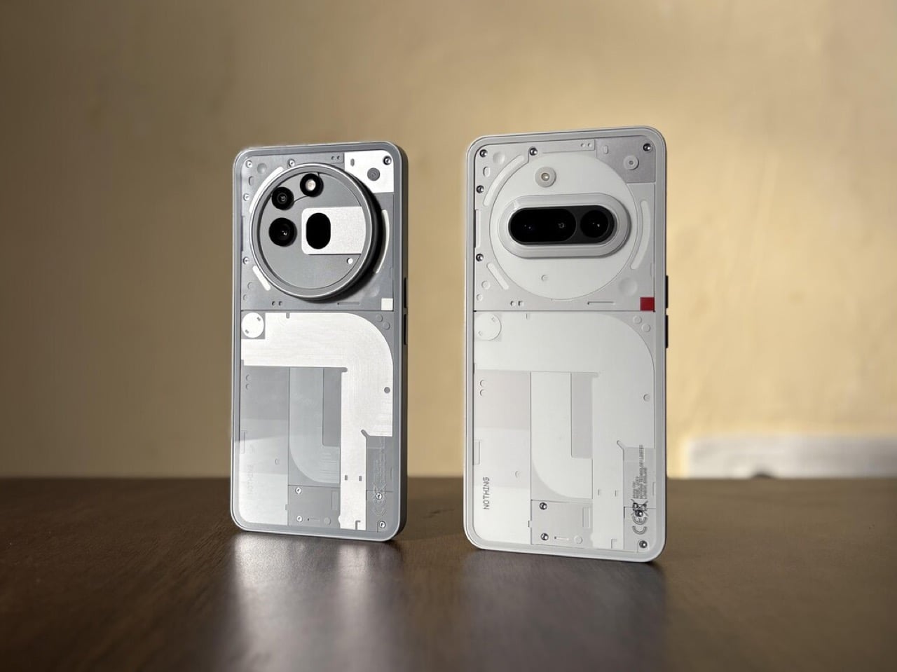
Nothing has revived and redefined the see-through design aesthetics that blew up in the late 1990s and early 2000s. That era was highlighted by colorful polycarbonate plastic material for translucent casings for the futuristic, fun vibe. Carl Pie took the bold step and weaved his brand’s design philosophy around clean minimalism and see-through designs in colorless aesthetics.
Over the years, Nothing’s products have inspired countless designs and concepts for good reason. Battery banks, headphones, turntables, vacuum cleaners, and whatnot. So how could we not bet against a Nothing-themed laptop tailored for gamers and creators?
Designer: Nikita Bukoros Design
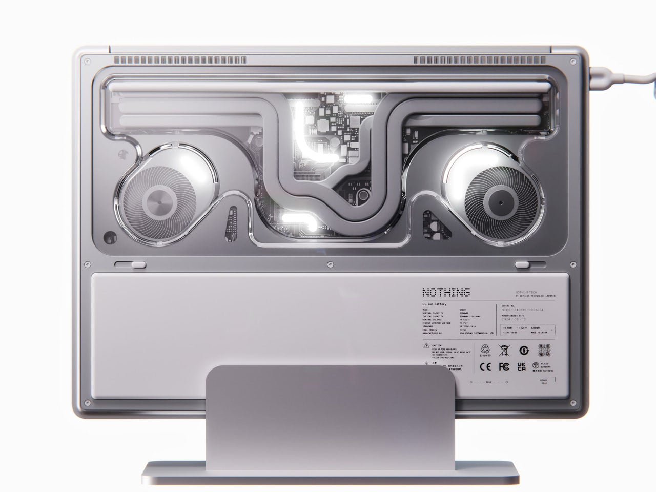
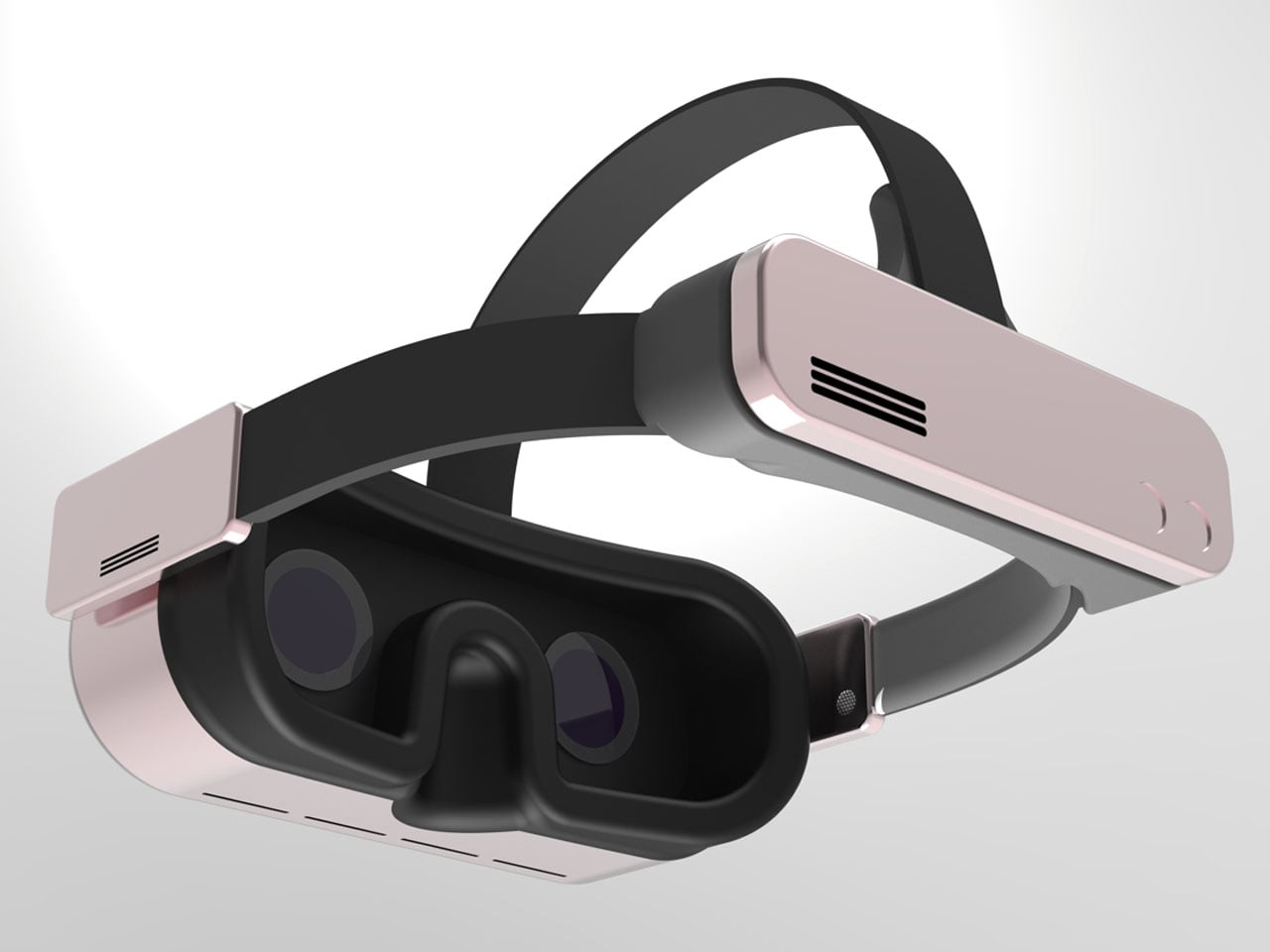
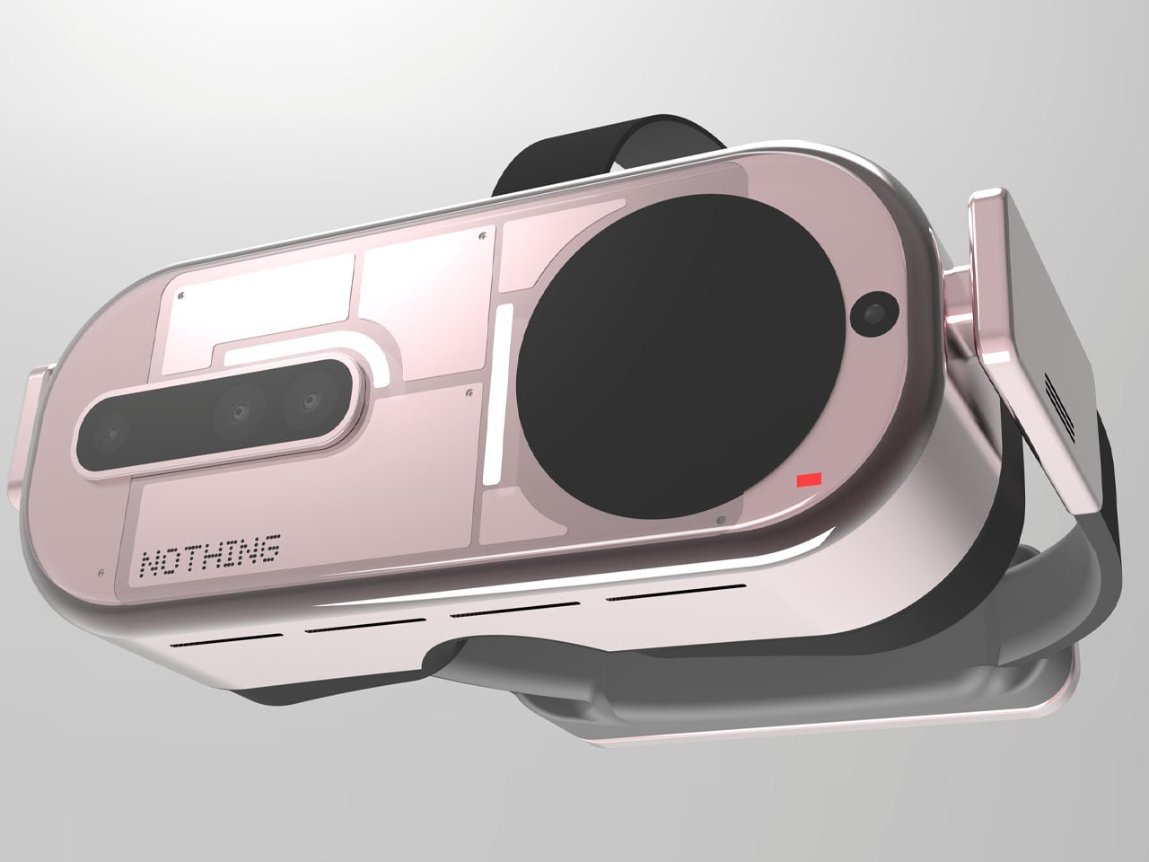
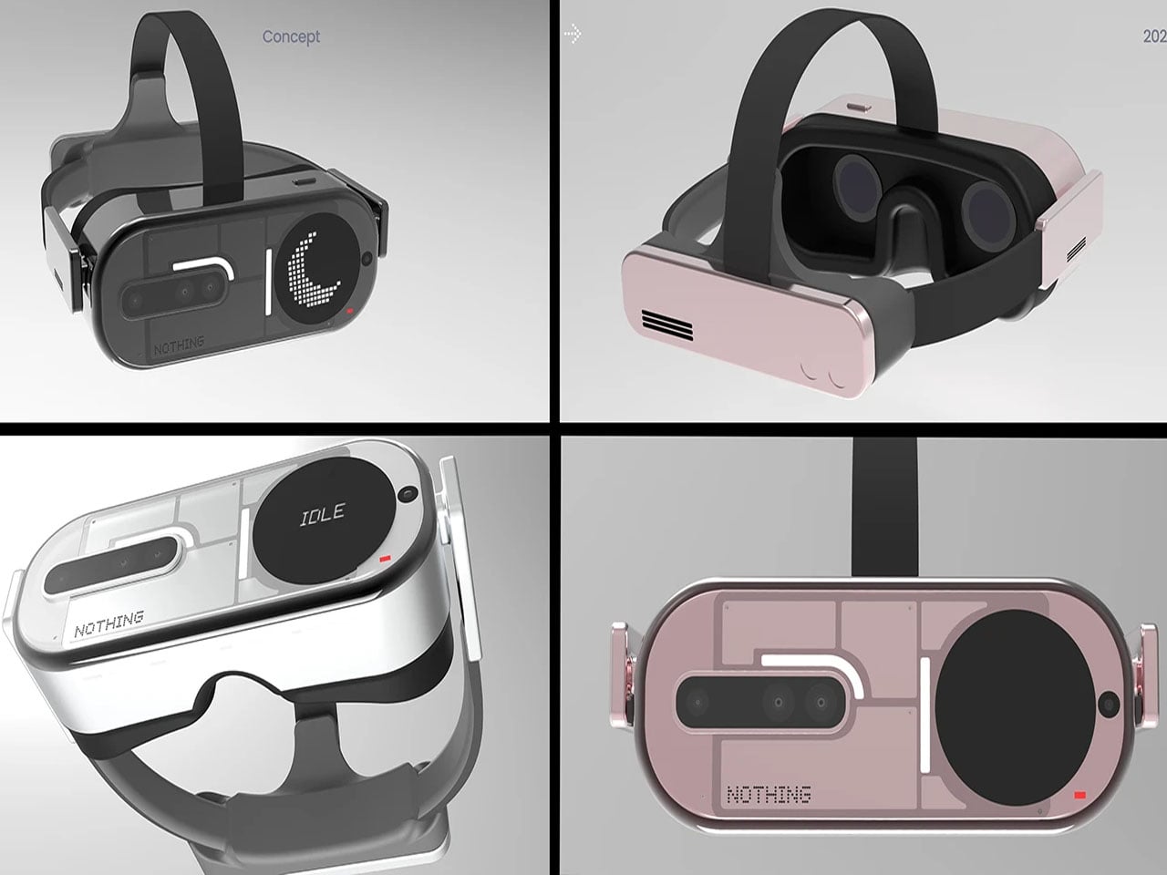
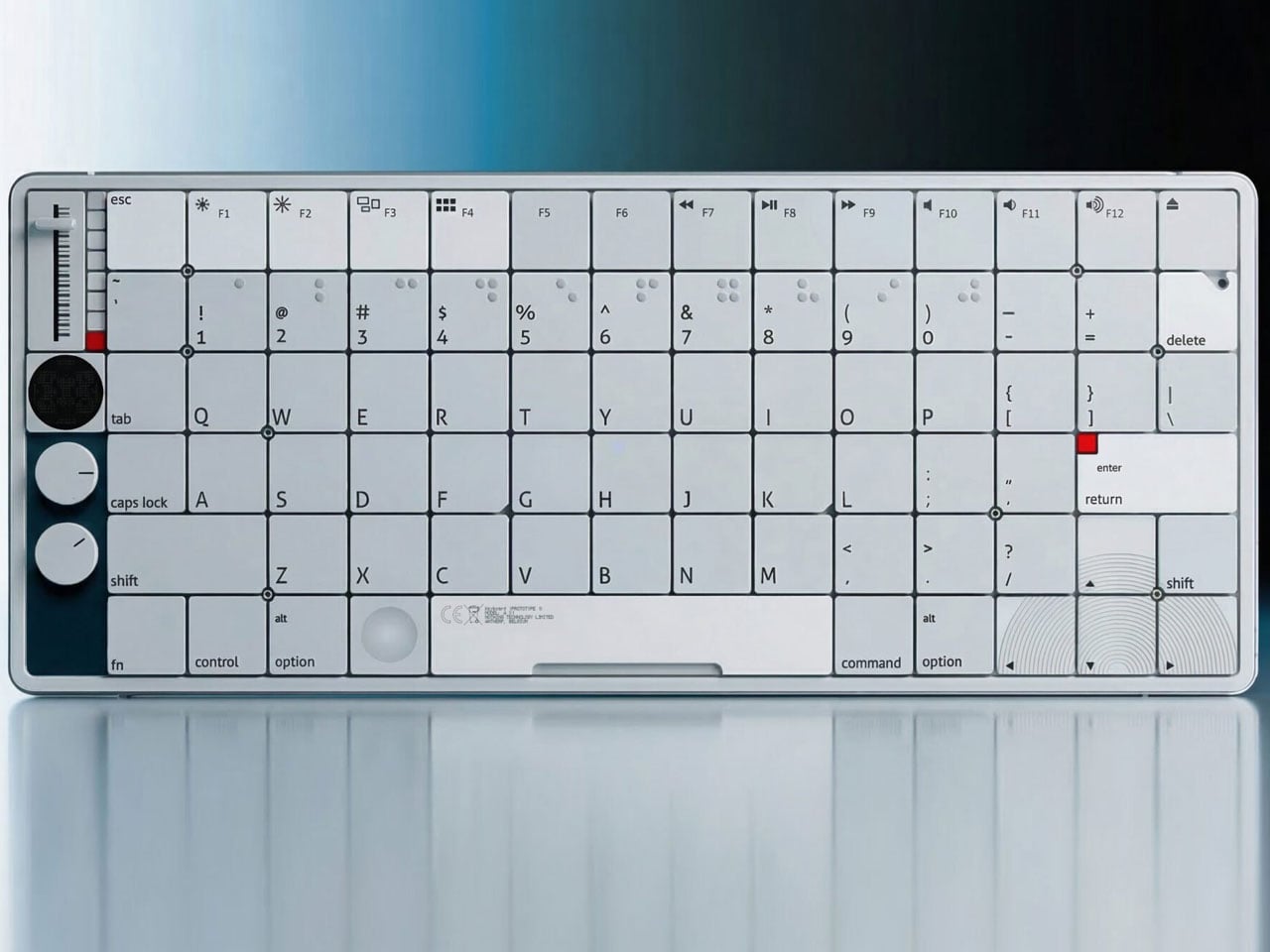
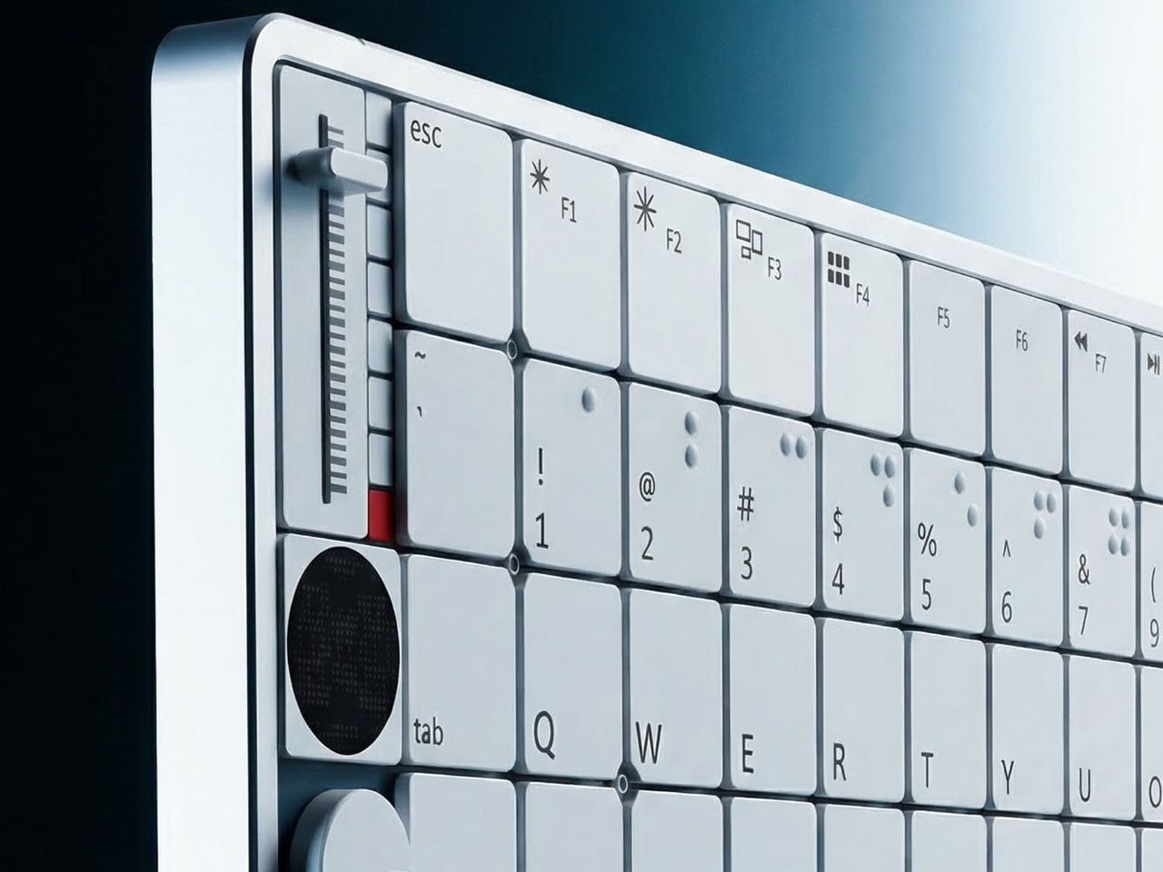
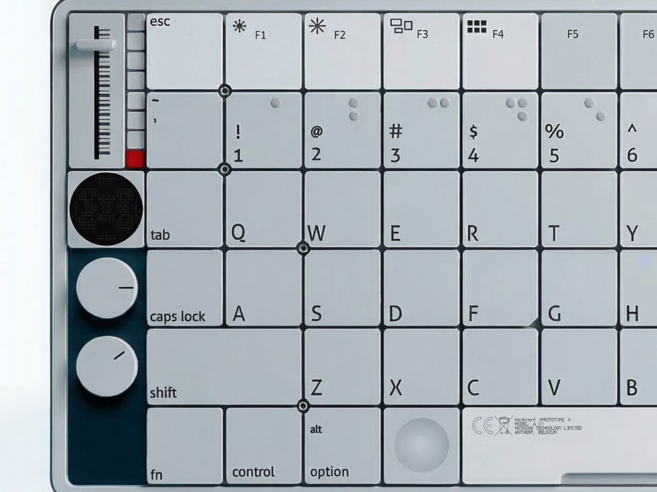
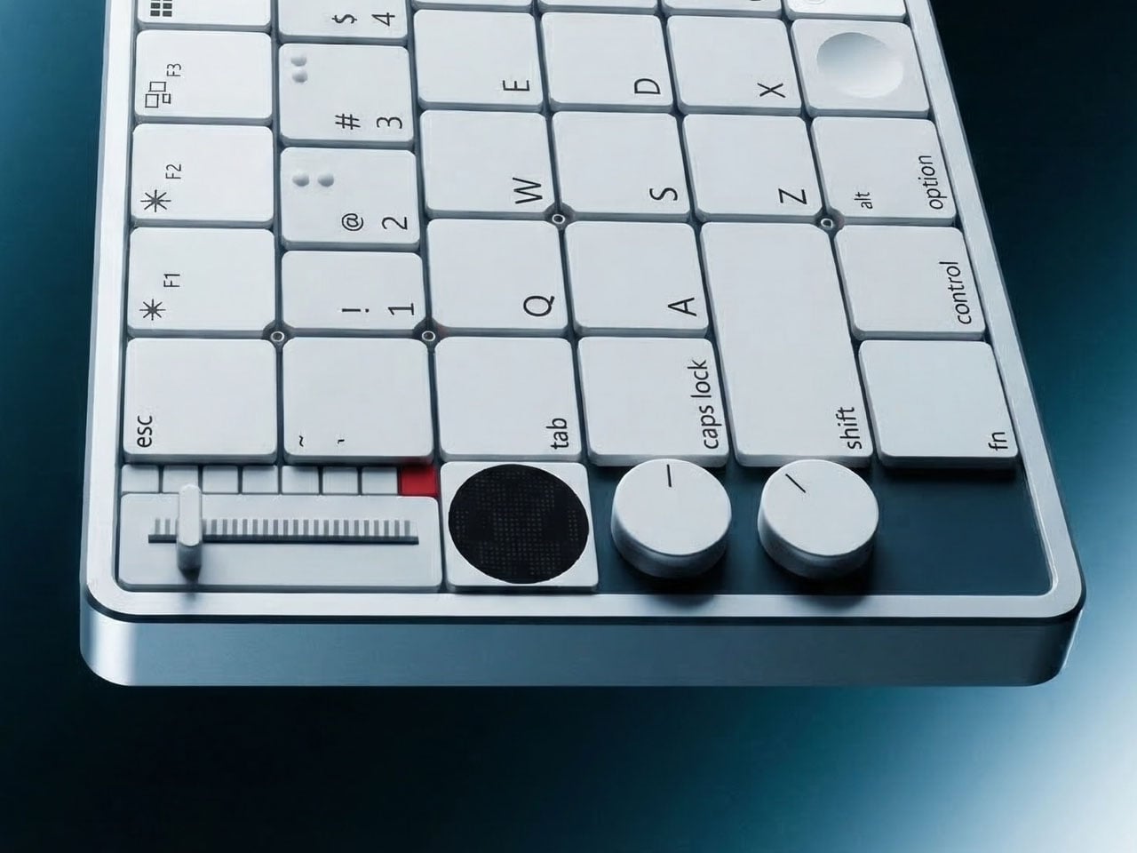
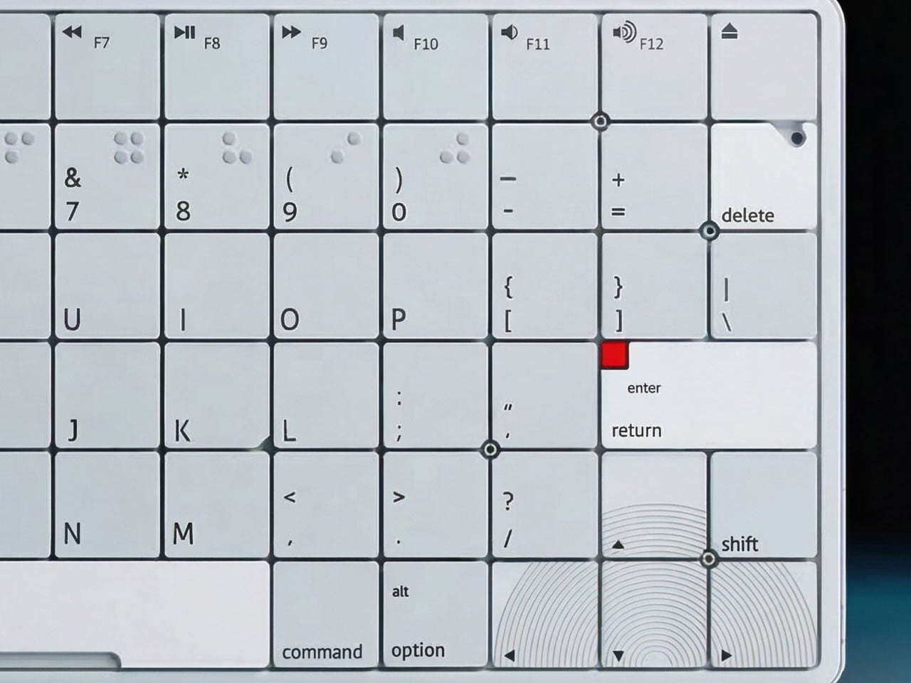
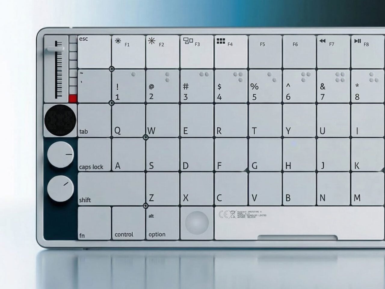
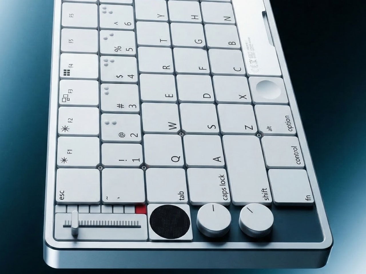
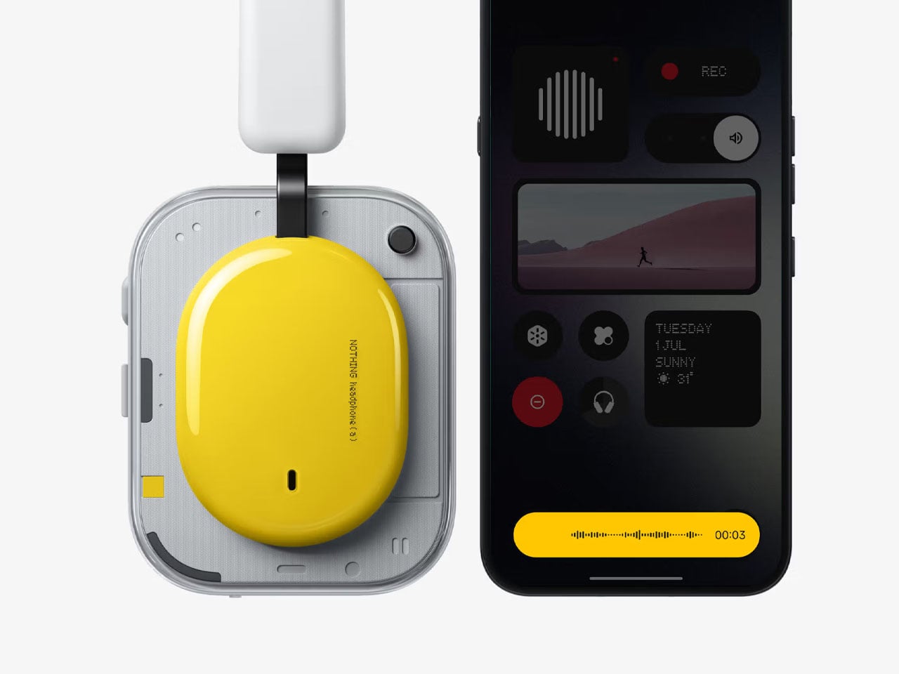
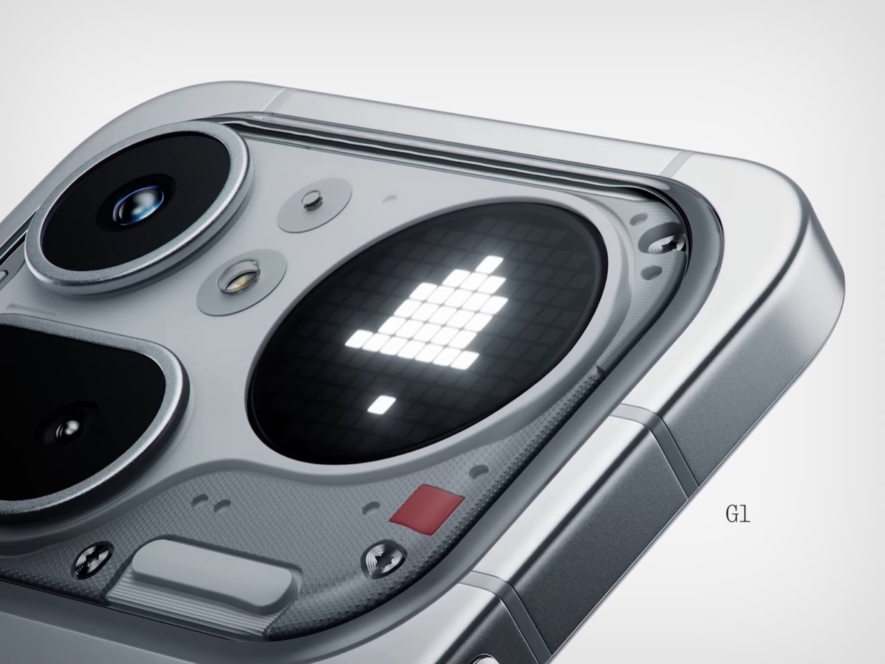
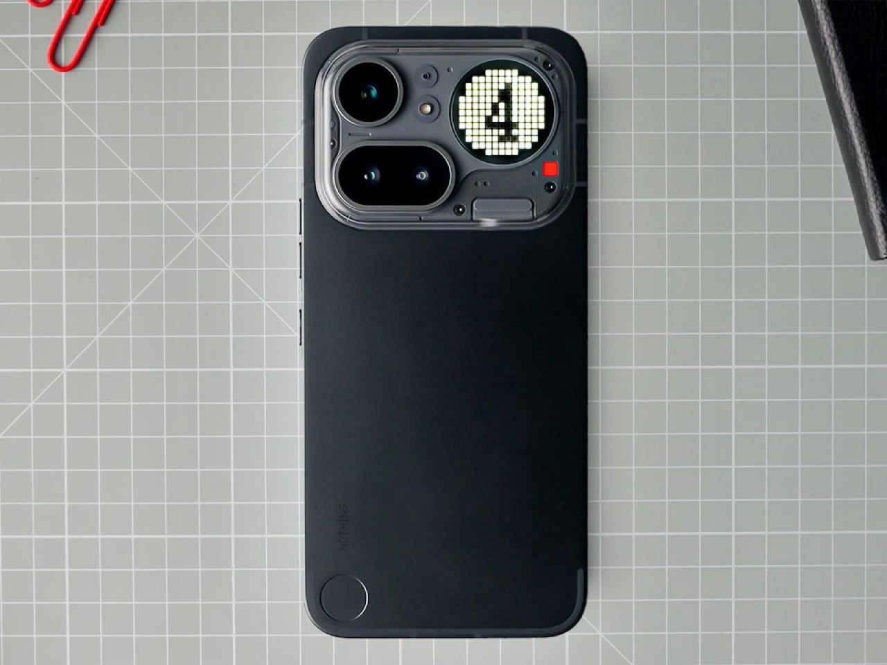
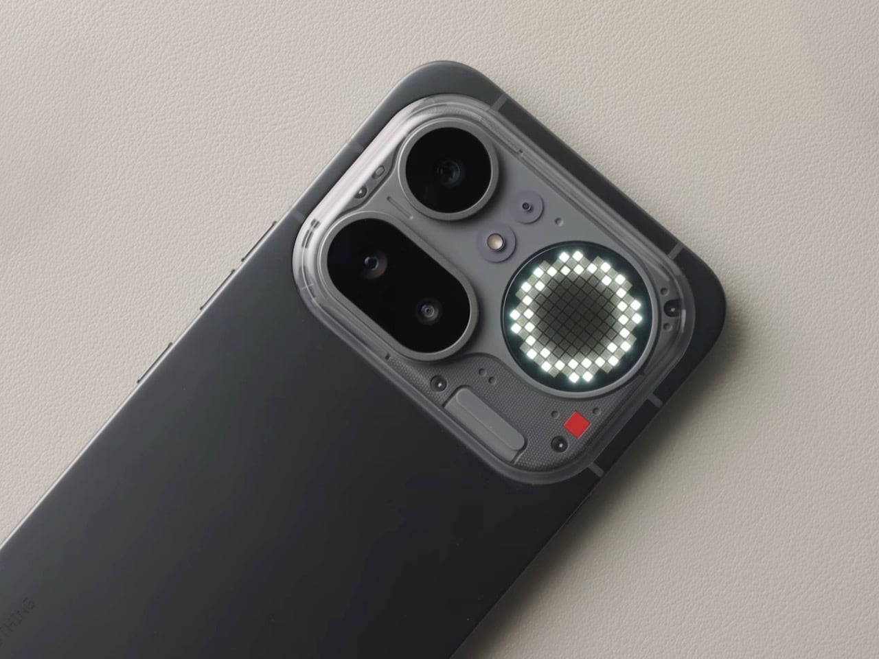
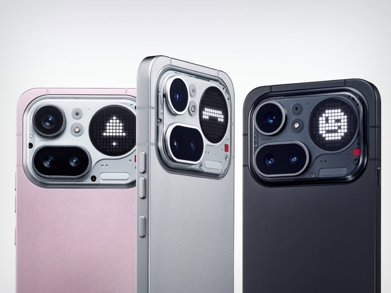
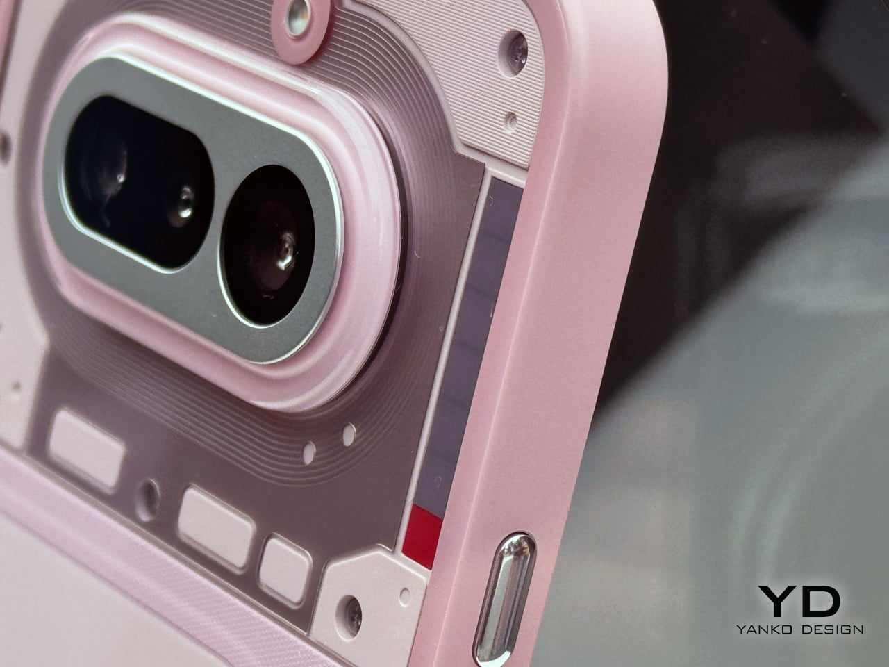
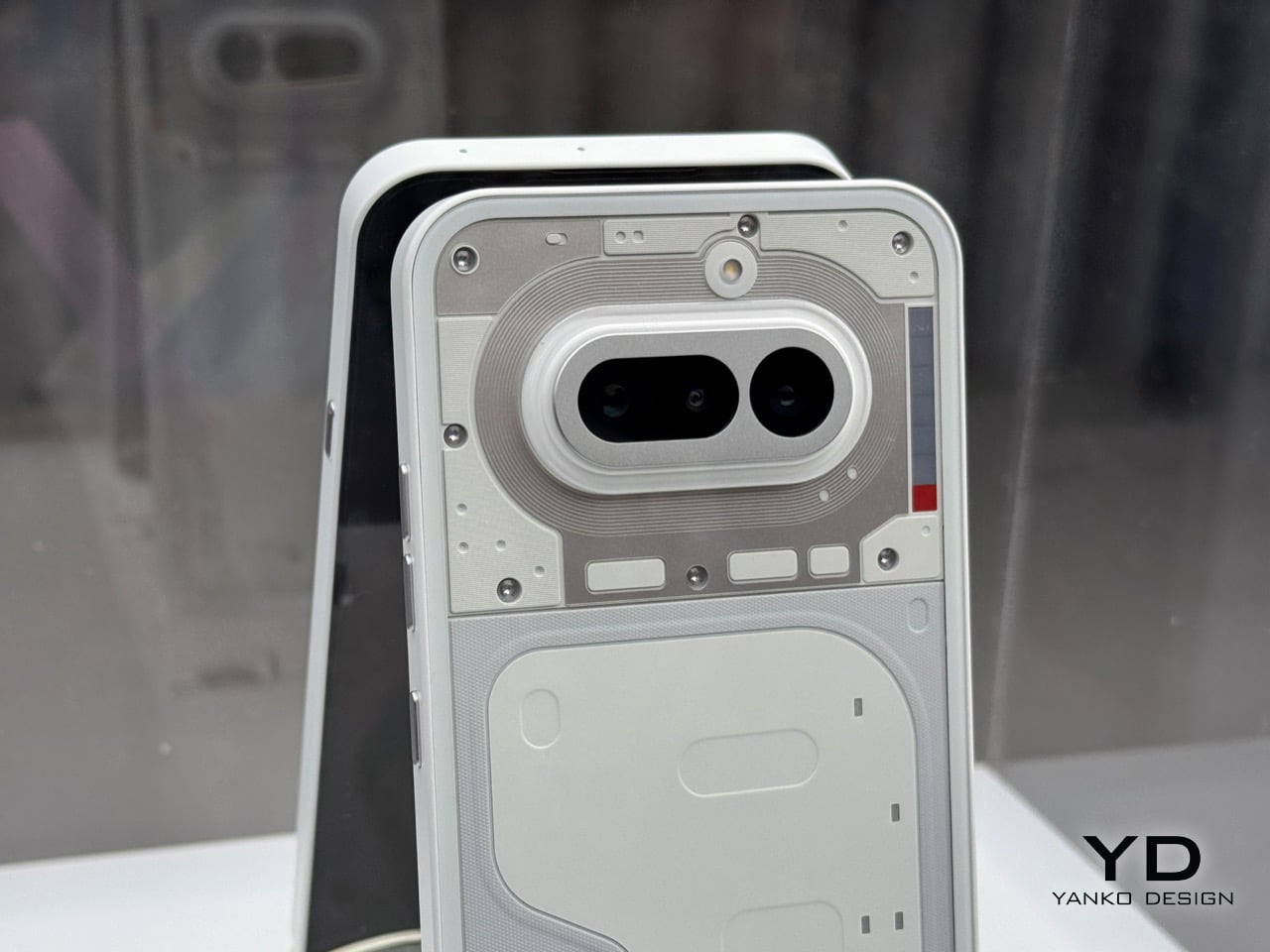
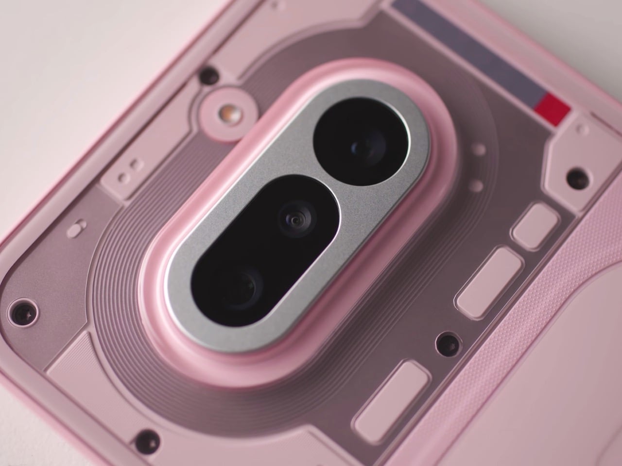
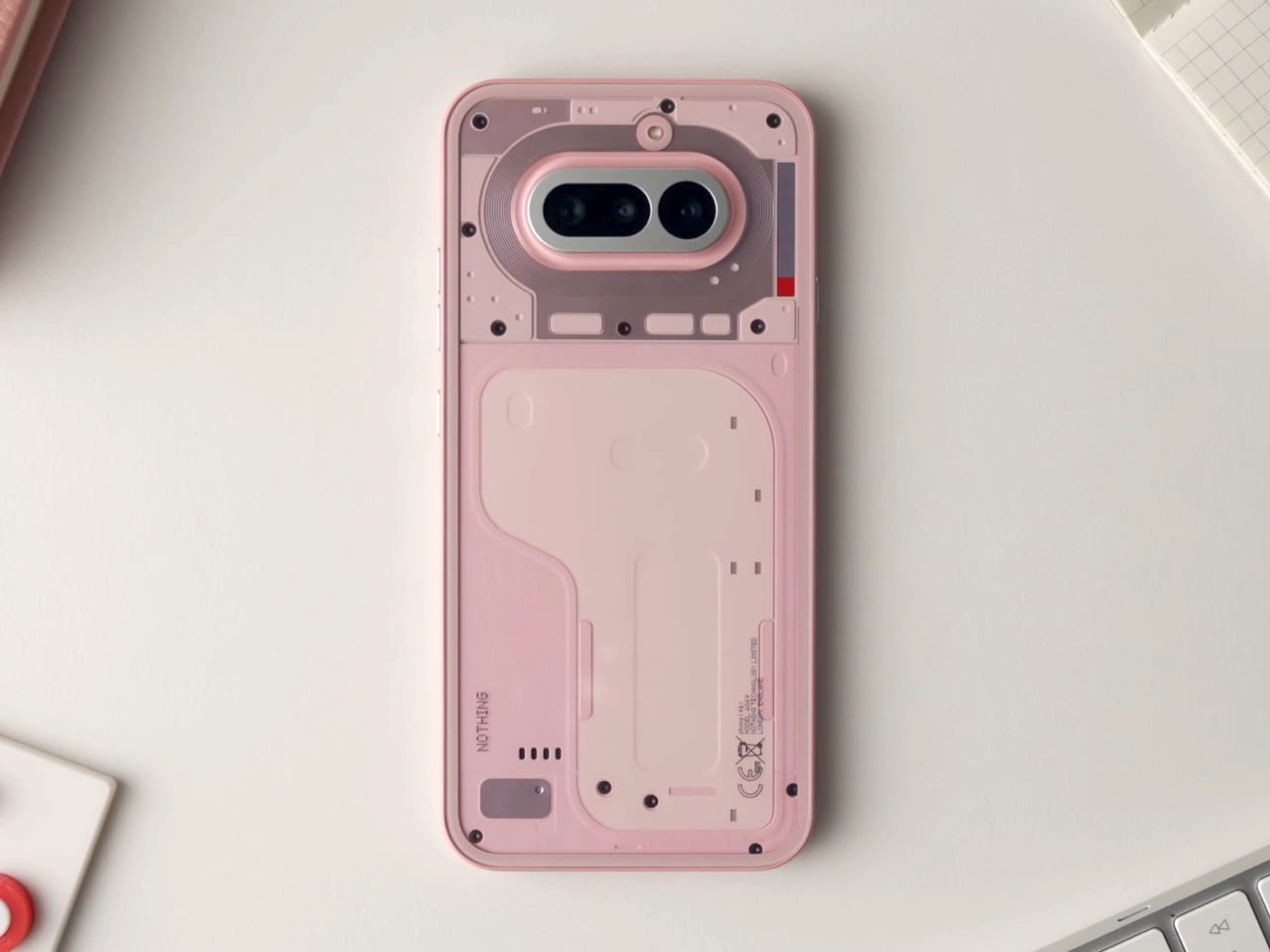
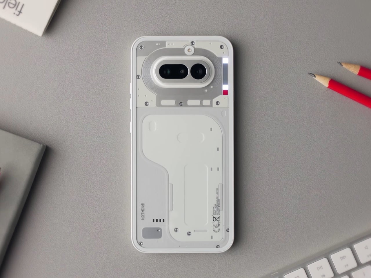
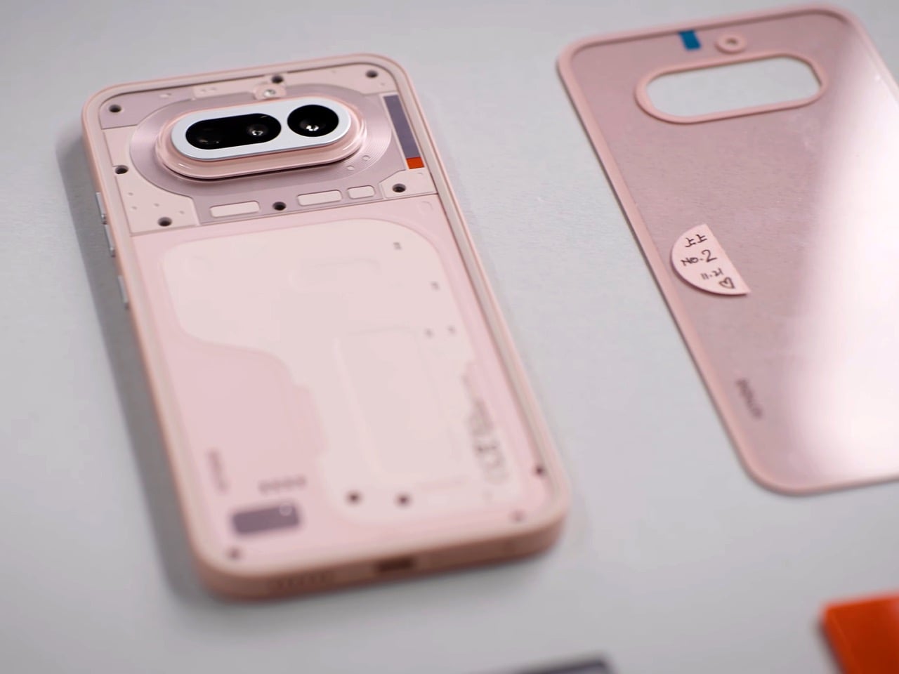
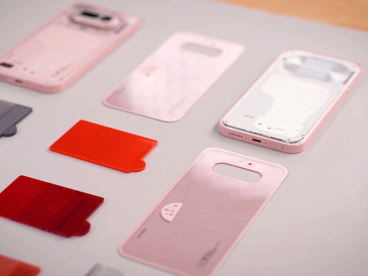
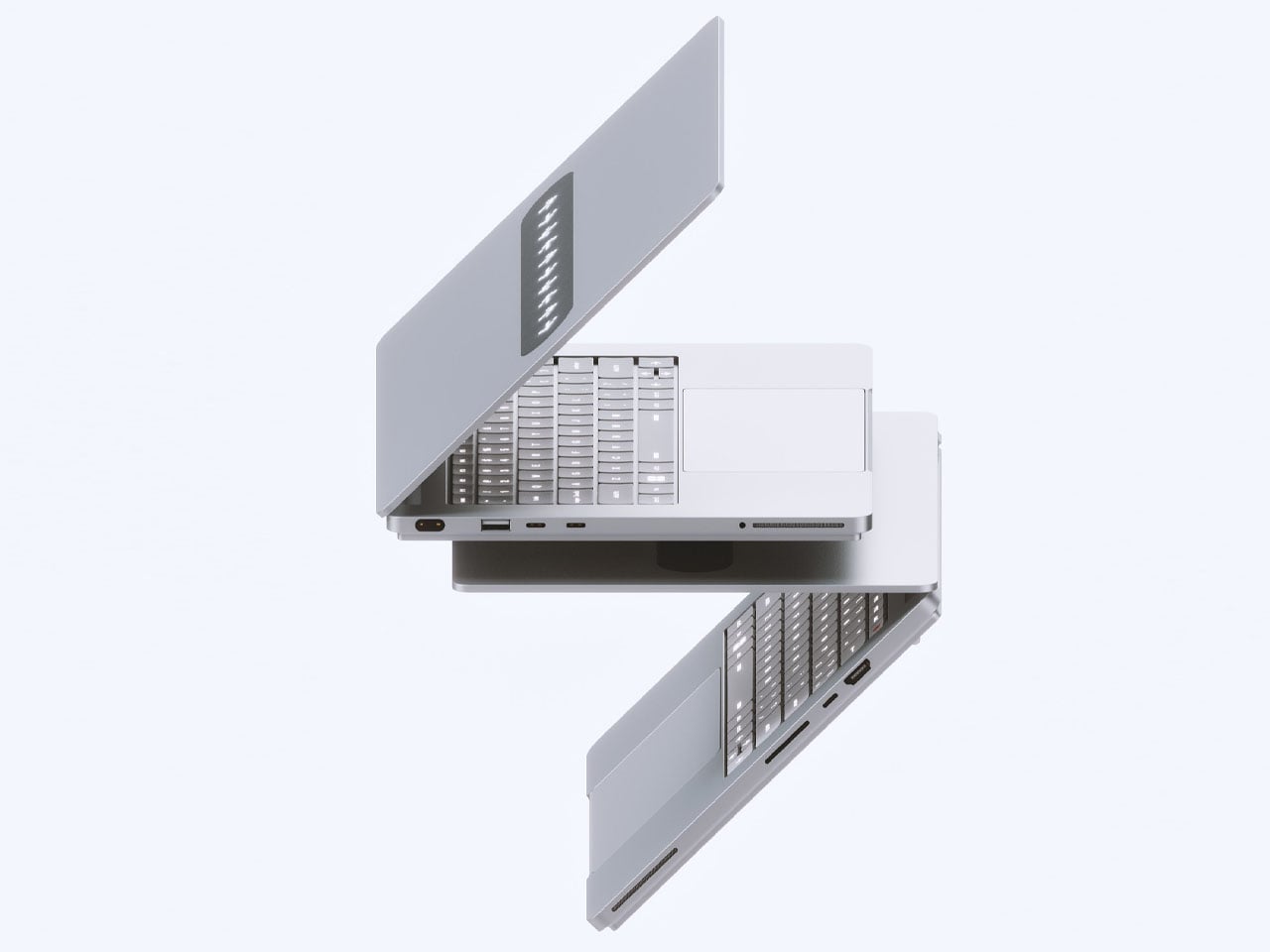
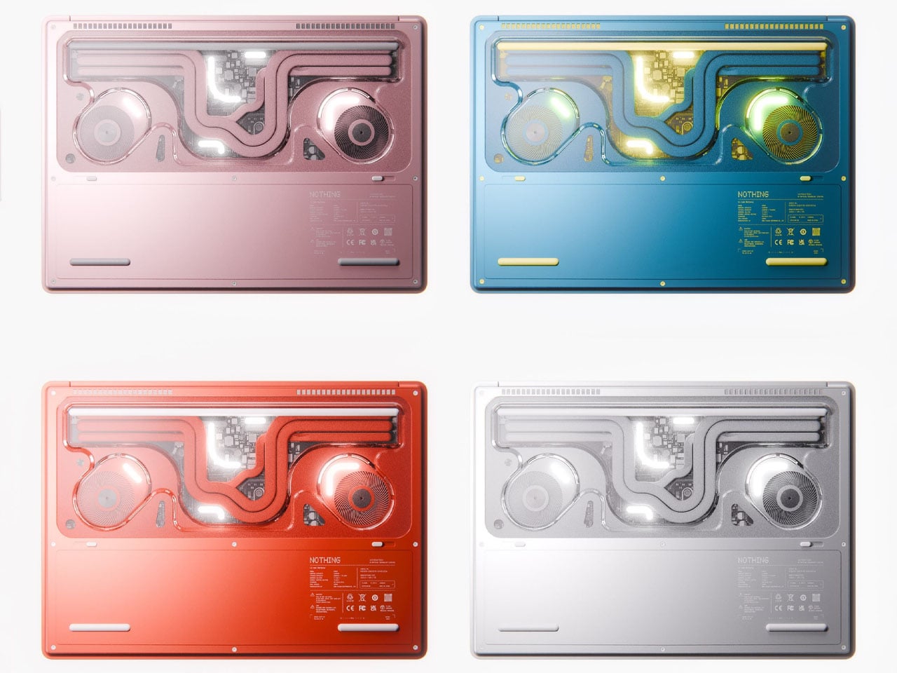
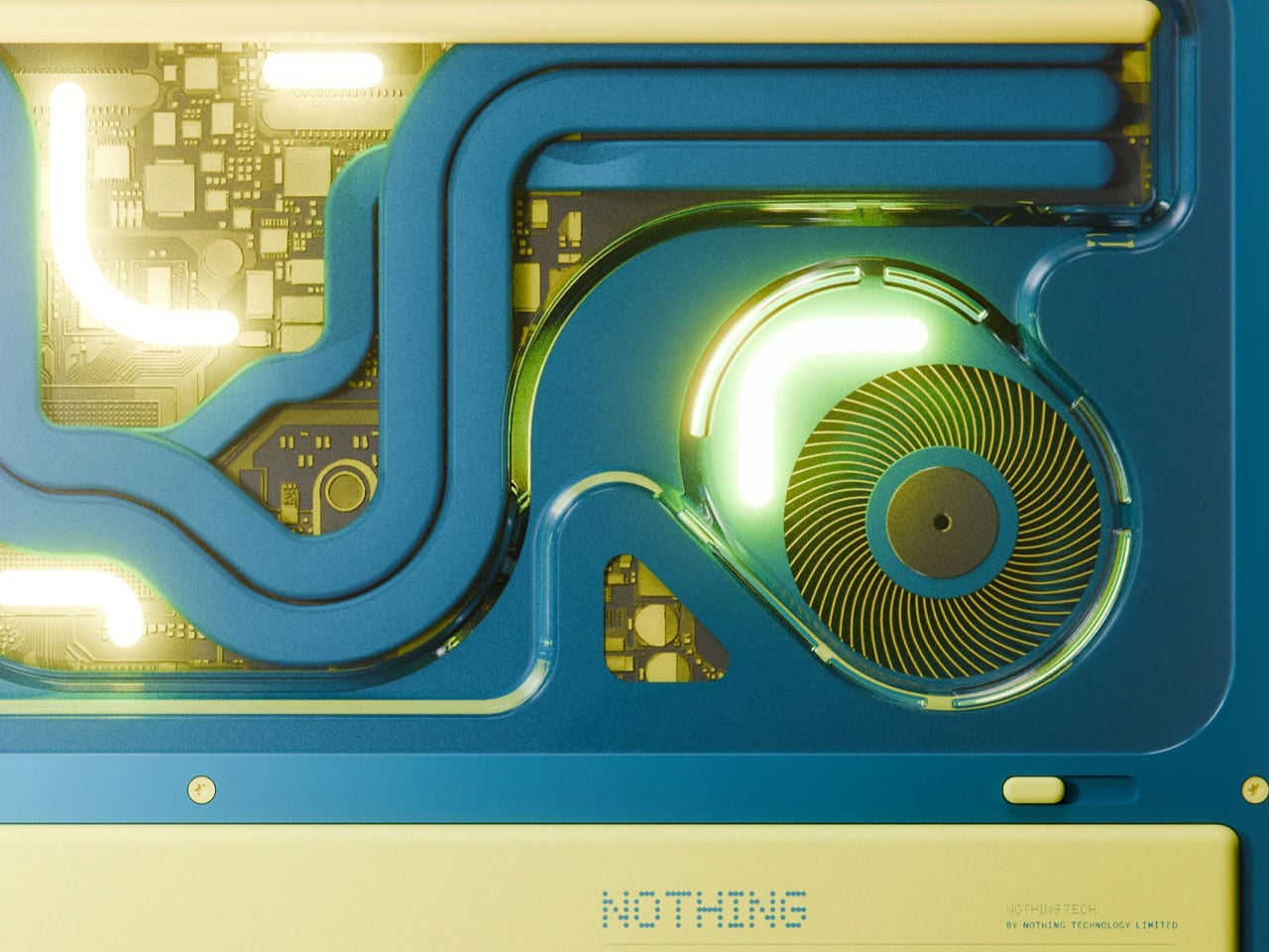
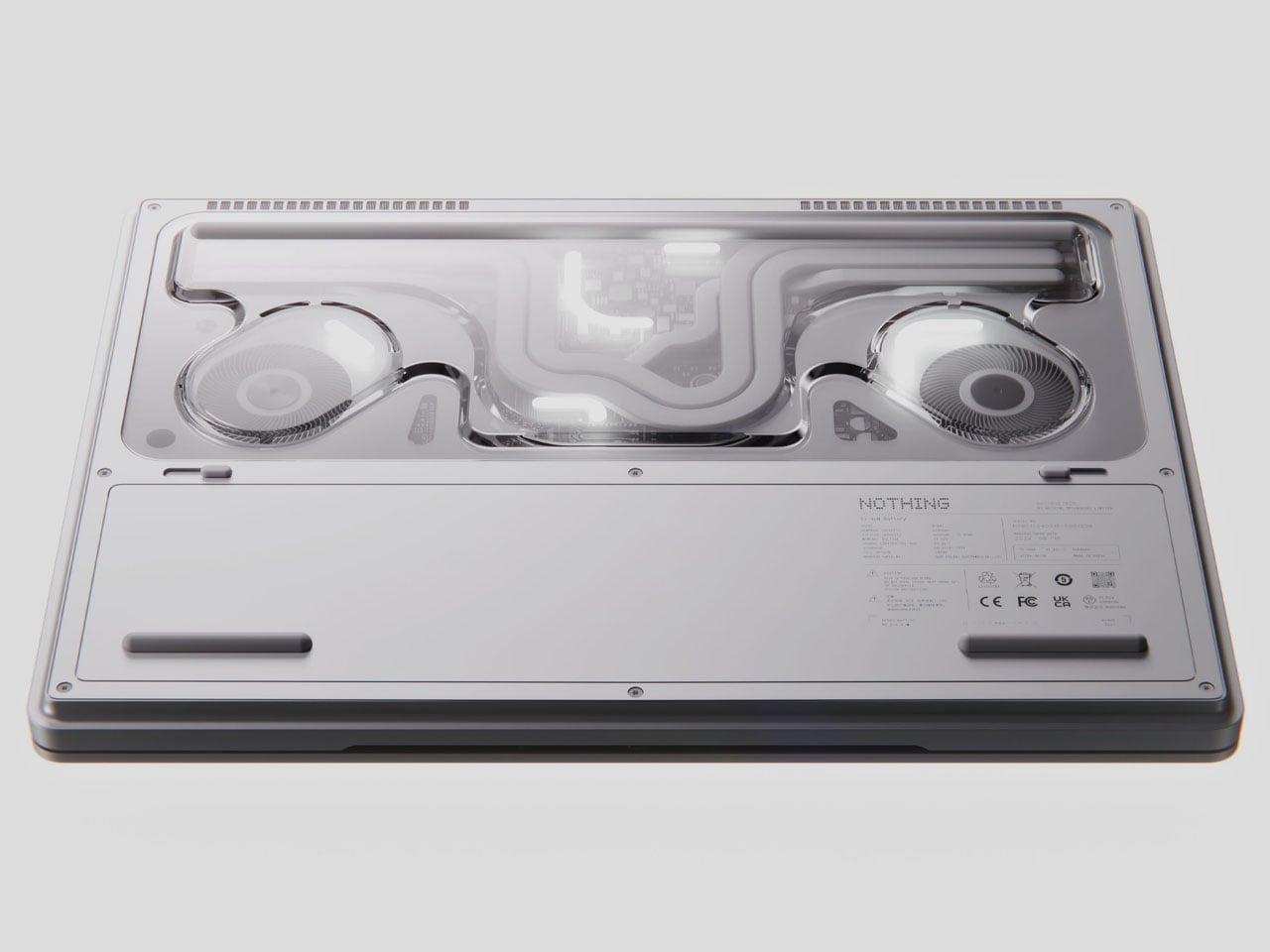
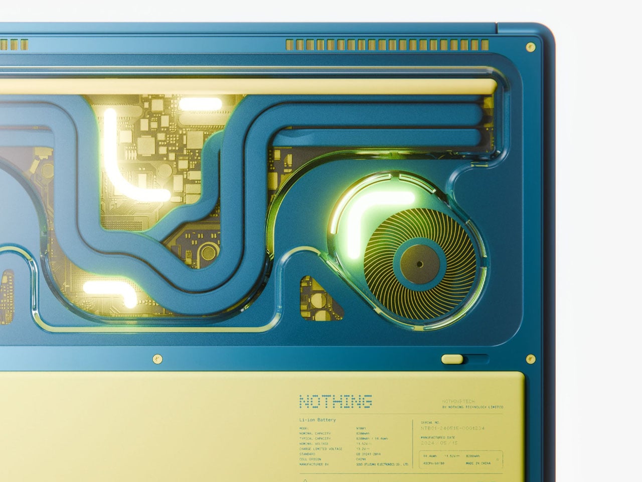
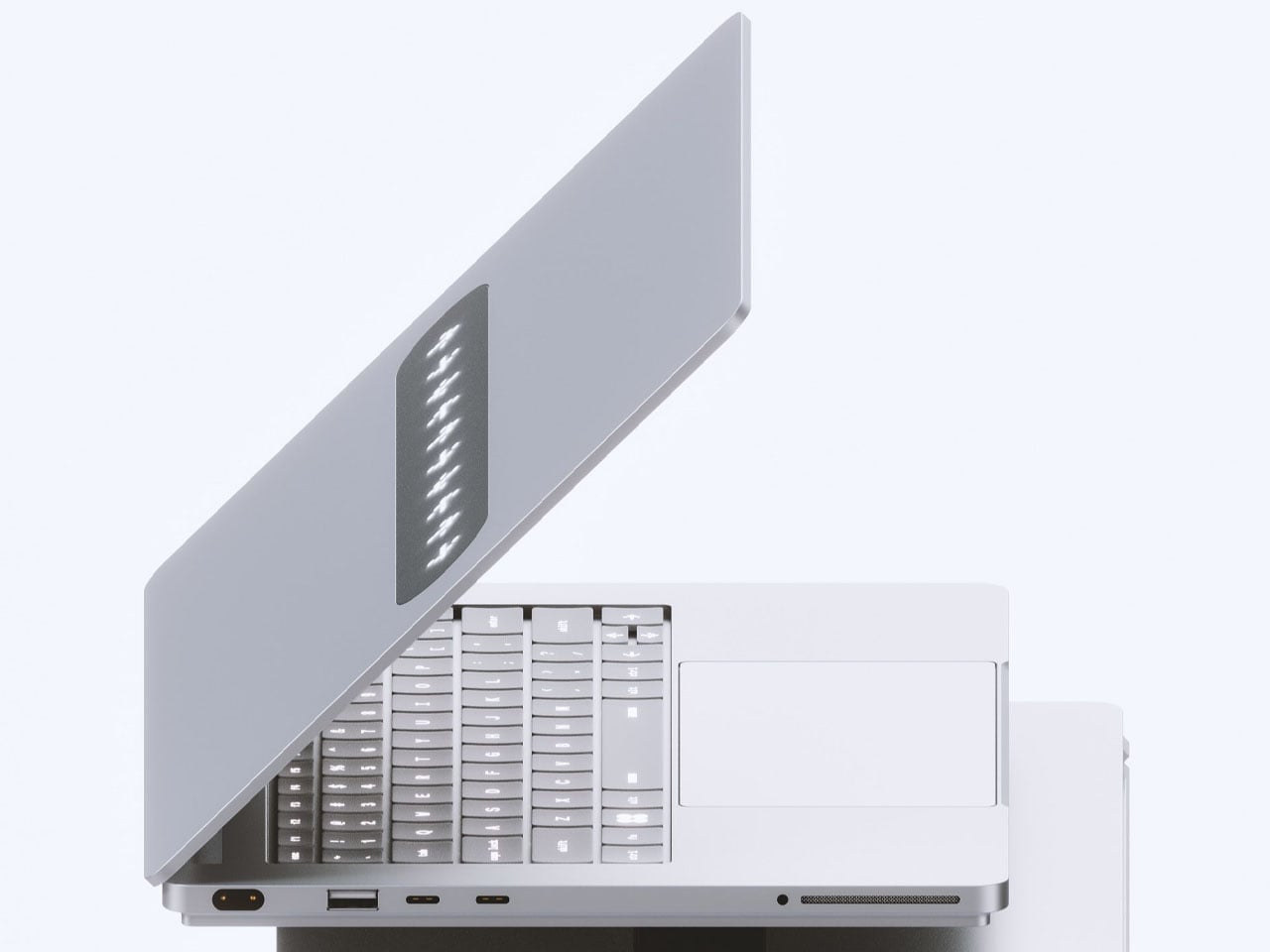
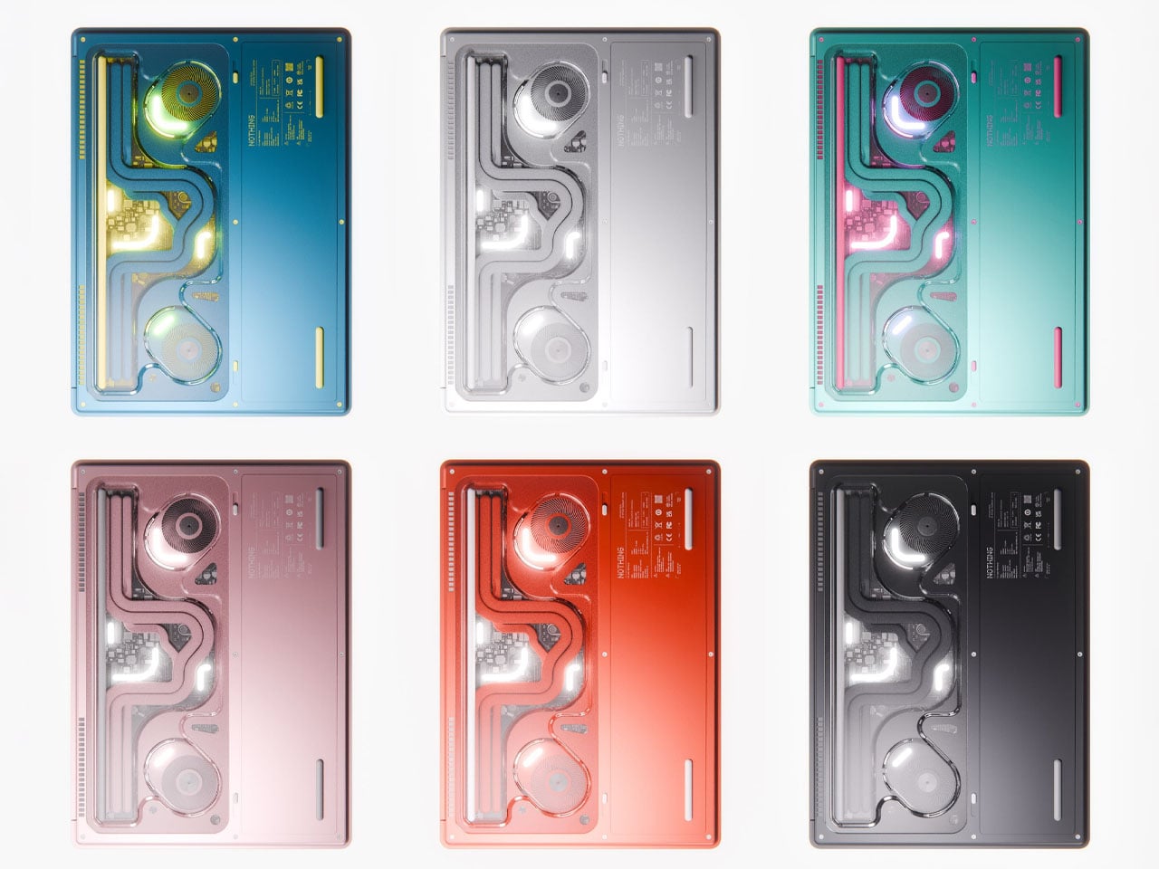
The designer wants to grow on the idea of a Nothing laptop that Carl hinted at years earlier when the brand was taking its baby steps. The highly anticipated gadget never came to fruition thus far, and left Nothing fans yearning for one. Nikita wants to give the fans another reason to keep believing and perhaps subtly remind Carl of the prospect. He calls it the Nothing Book, and his idea is to reveal the complexity underneath, much like a see-through gaming PC case that reveals the innards in their glory. Everything from the inner architecture, dynamic cooling system boards, to the other components is layered in a hypnotic composition.

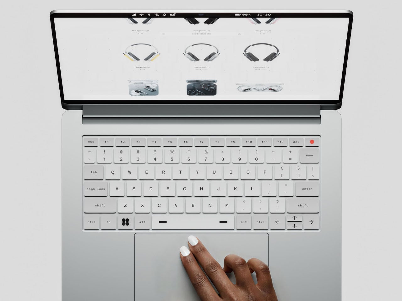
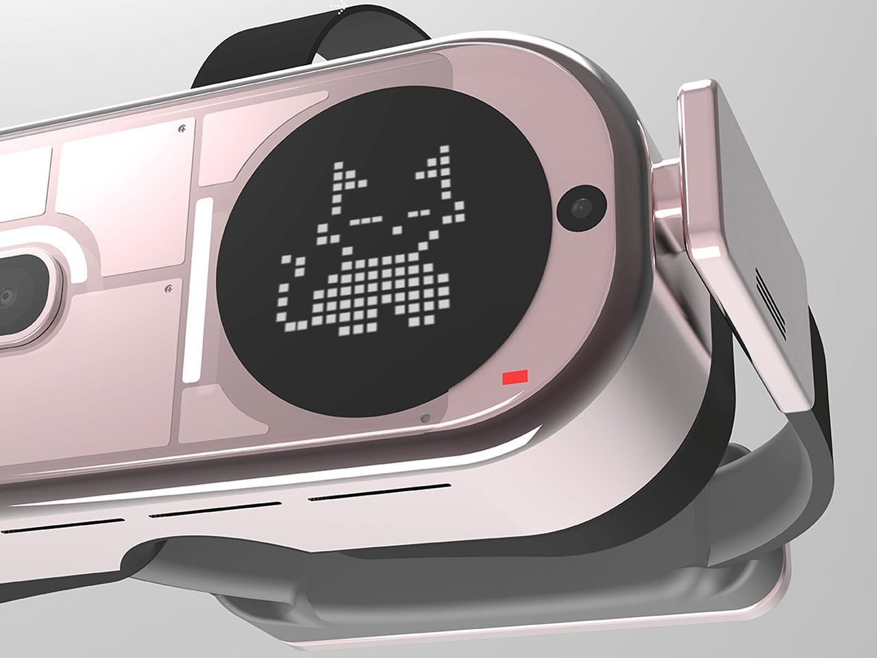
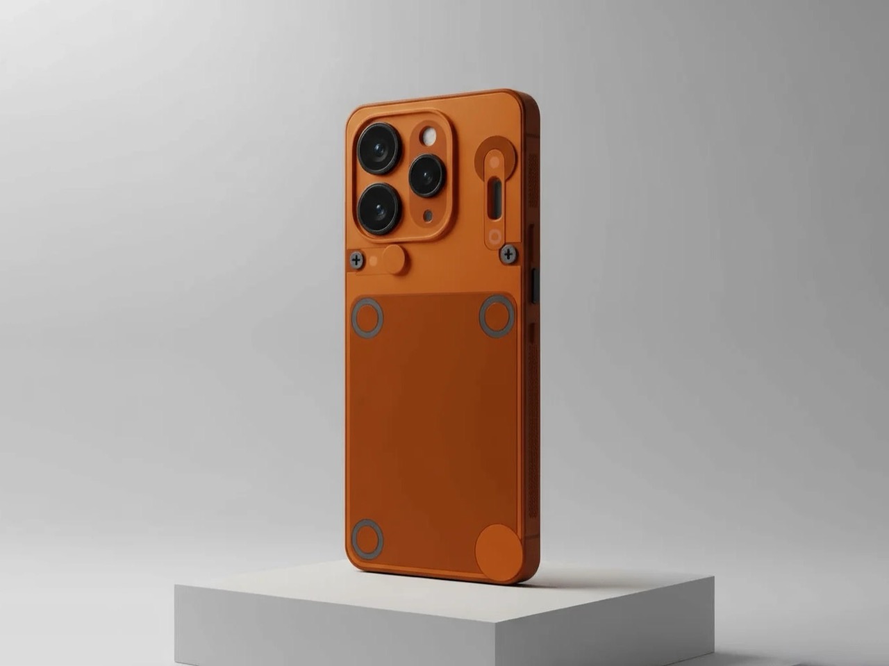
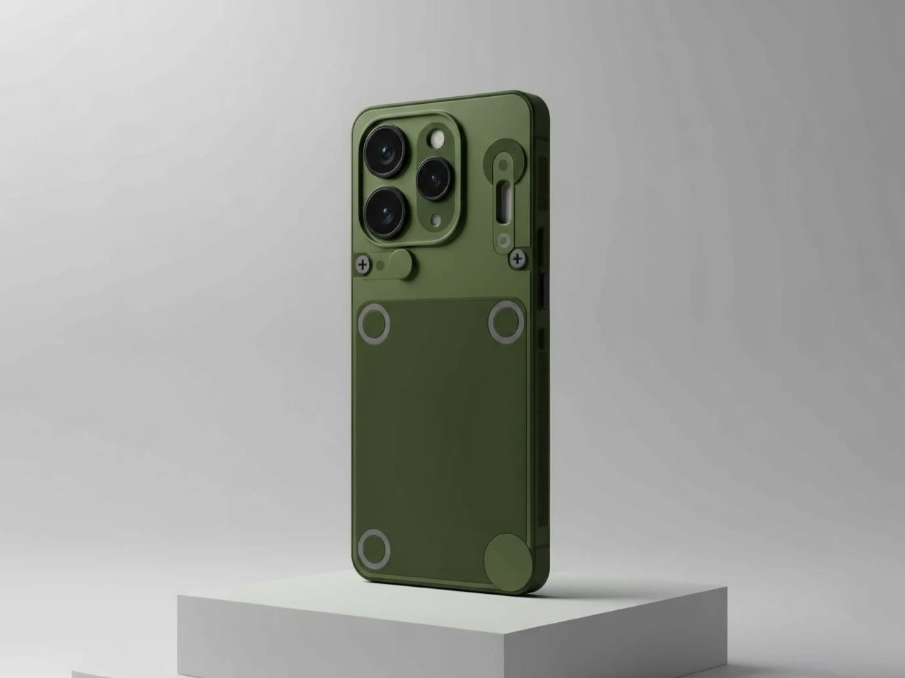
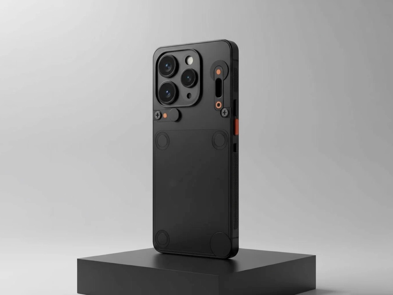
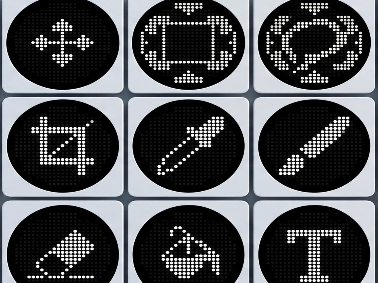
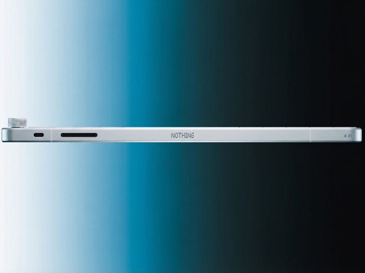
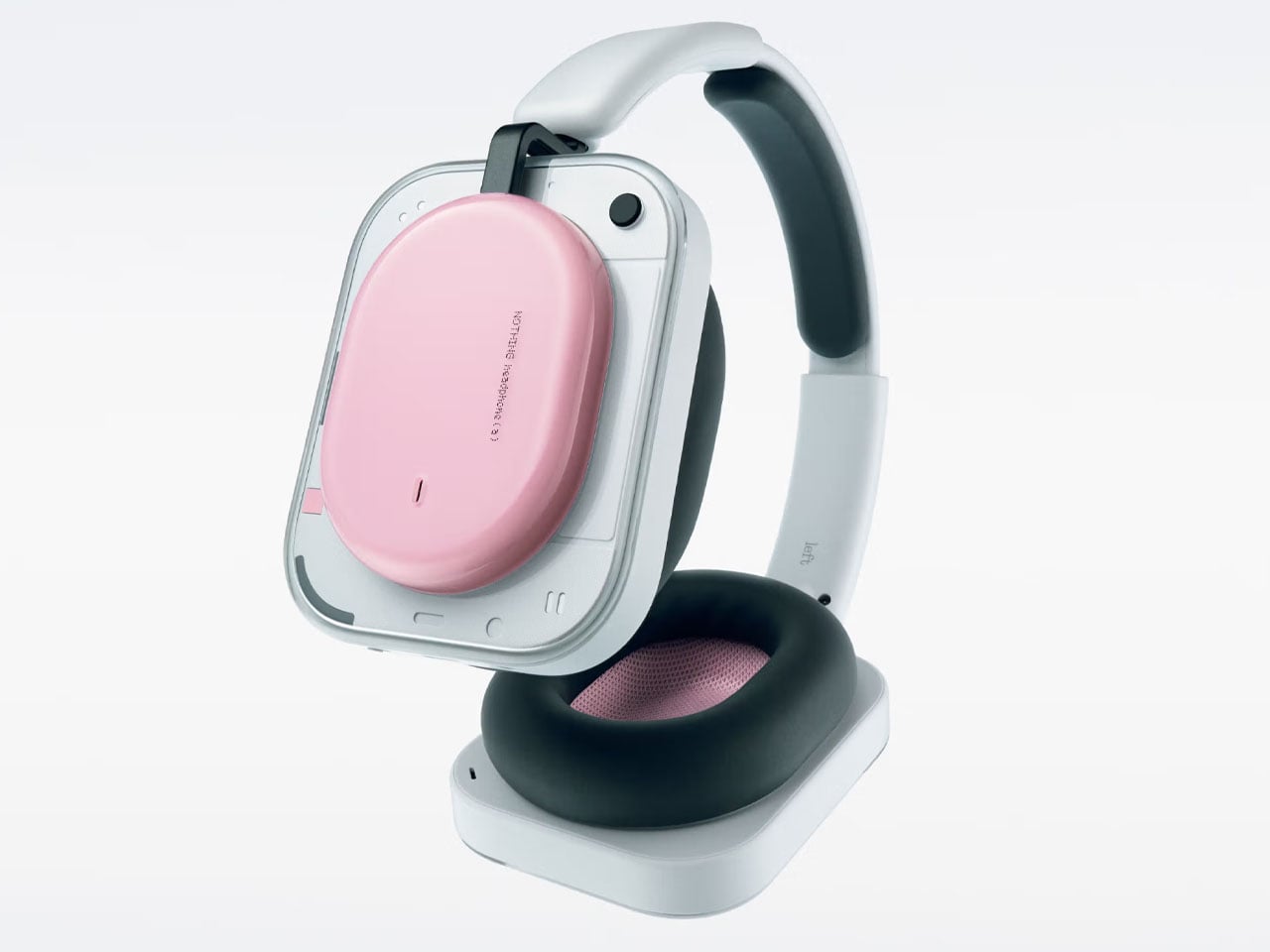
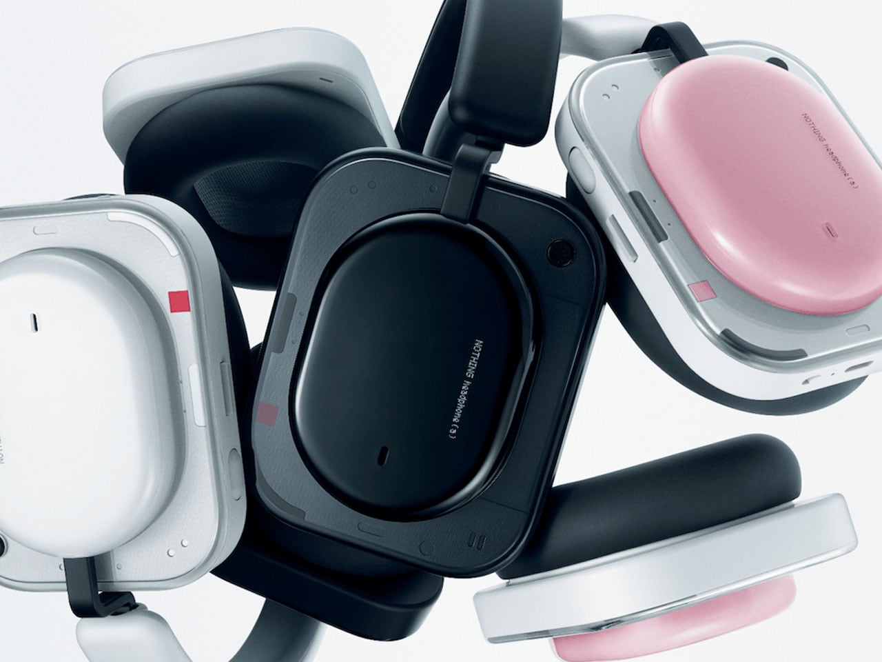
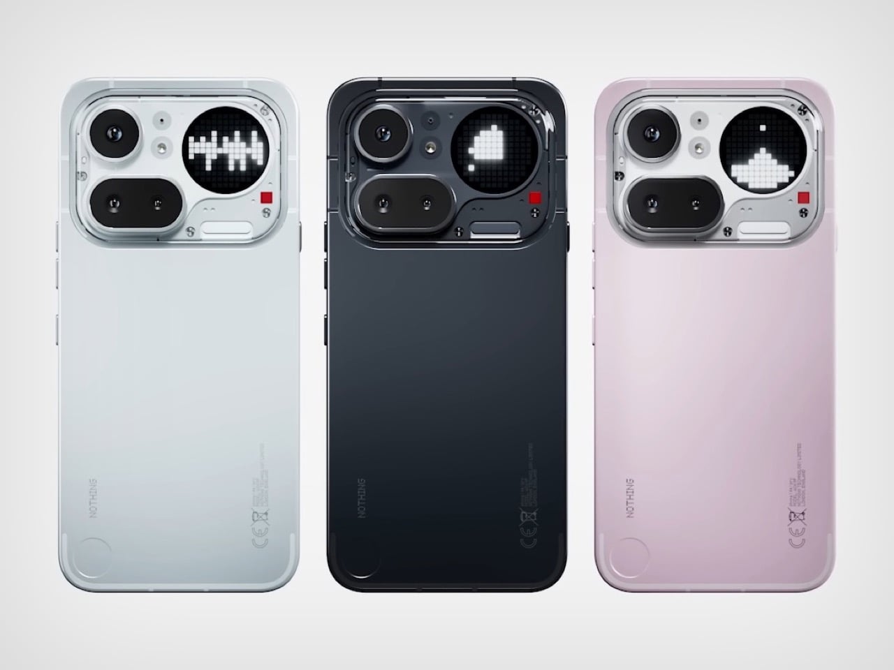
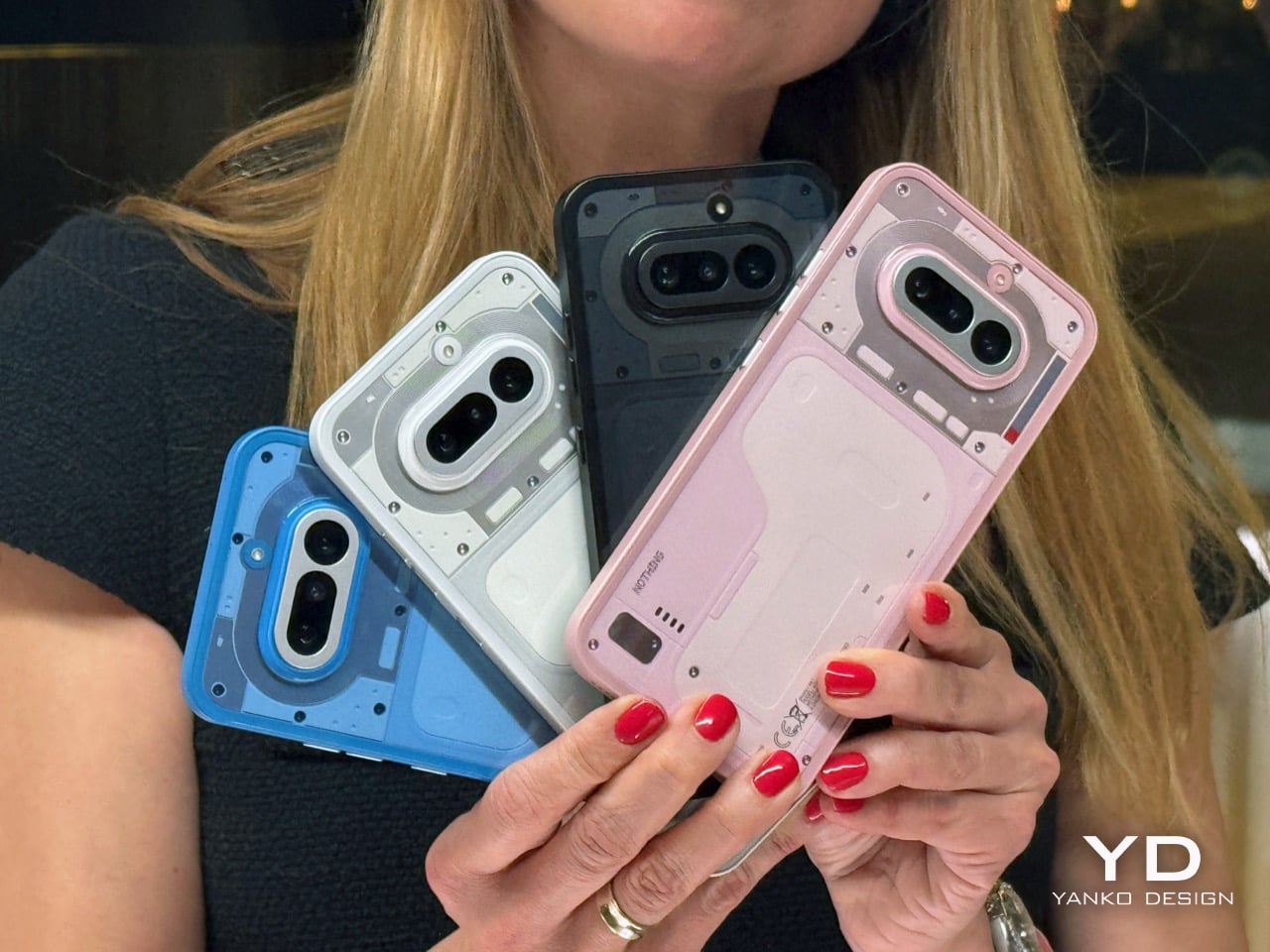
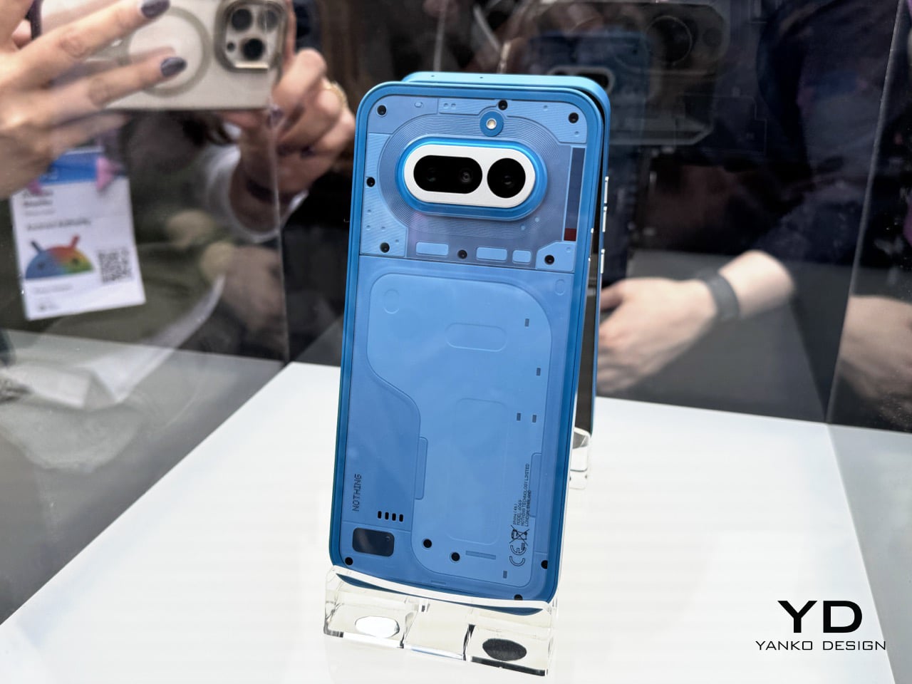
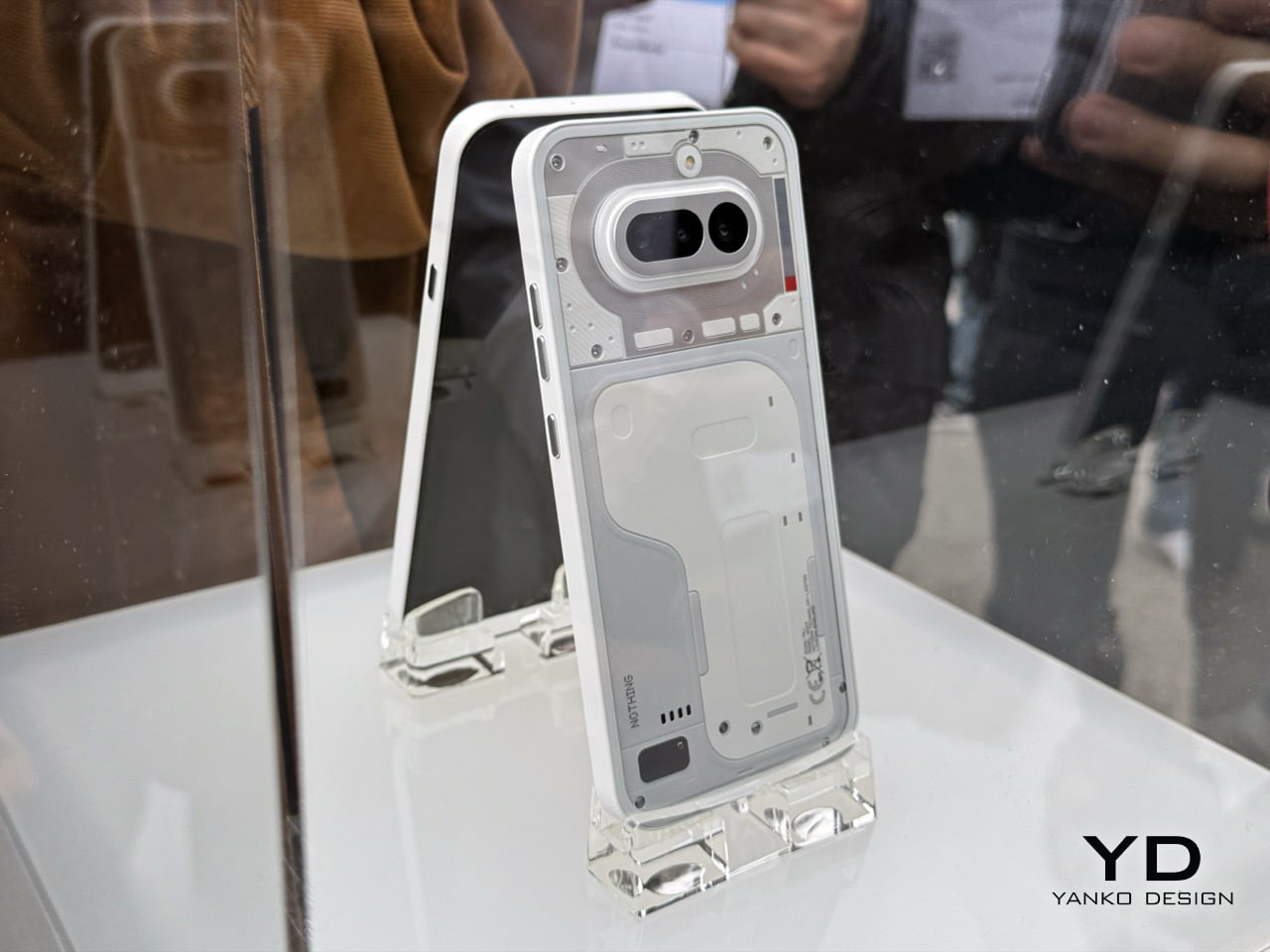
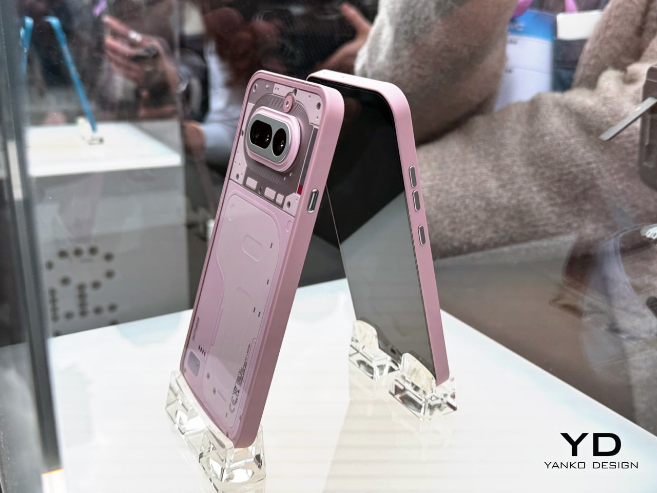
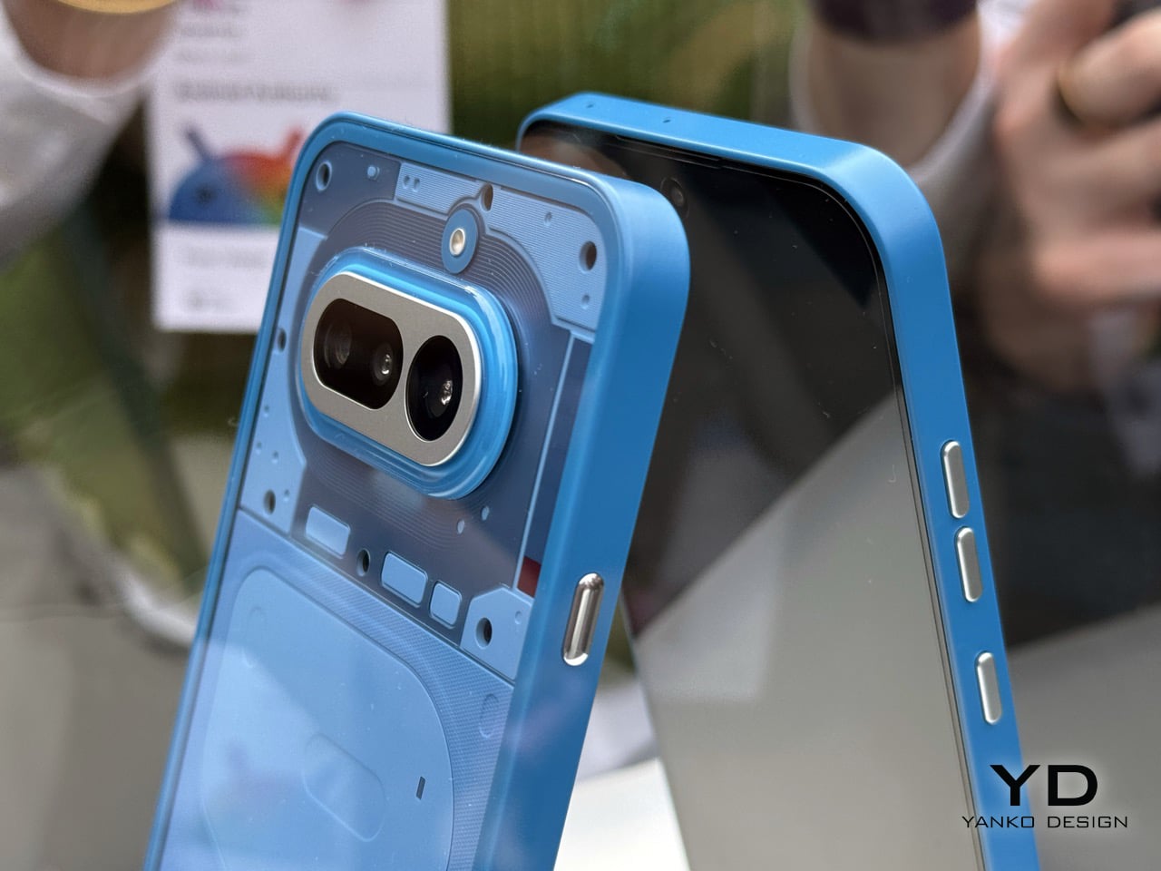
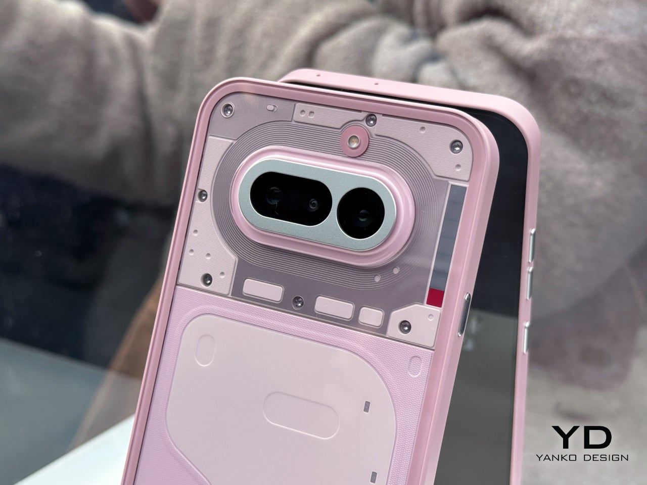
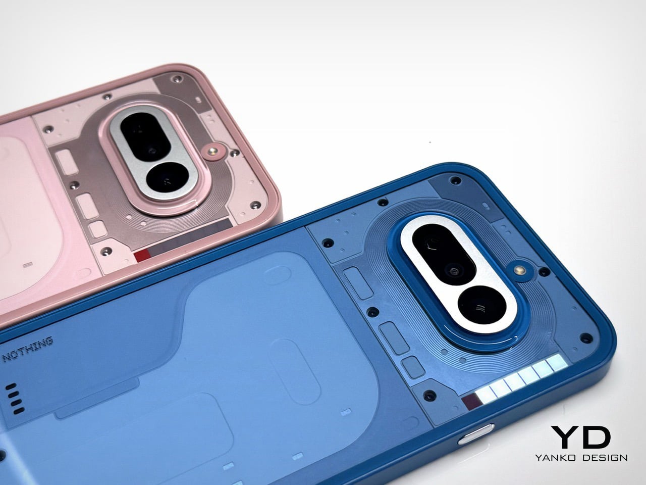
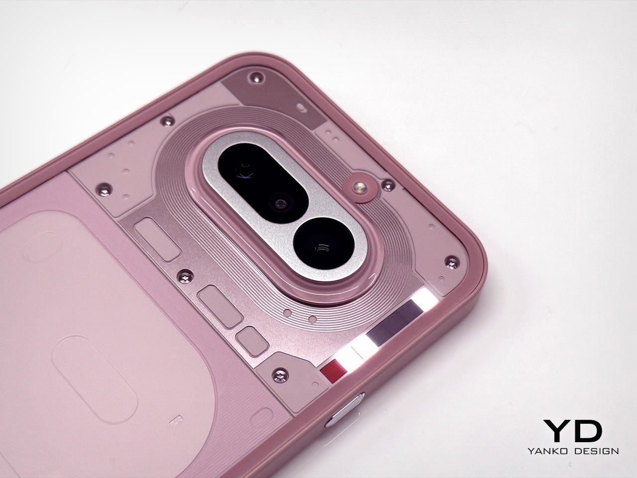
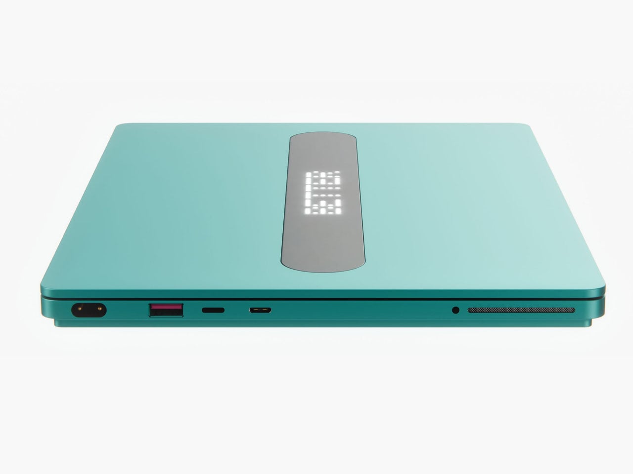
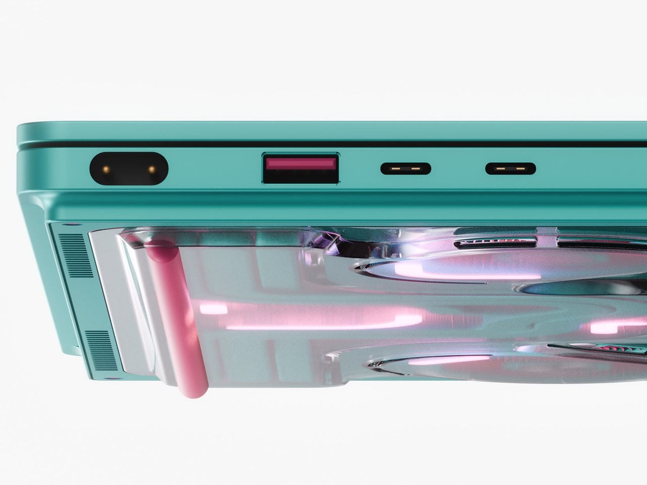
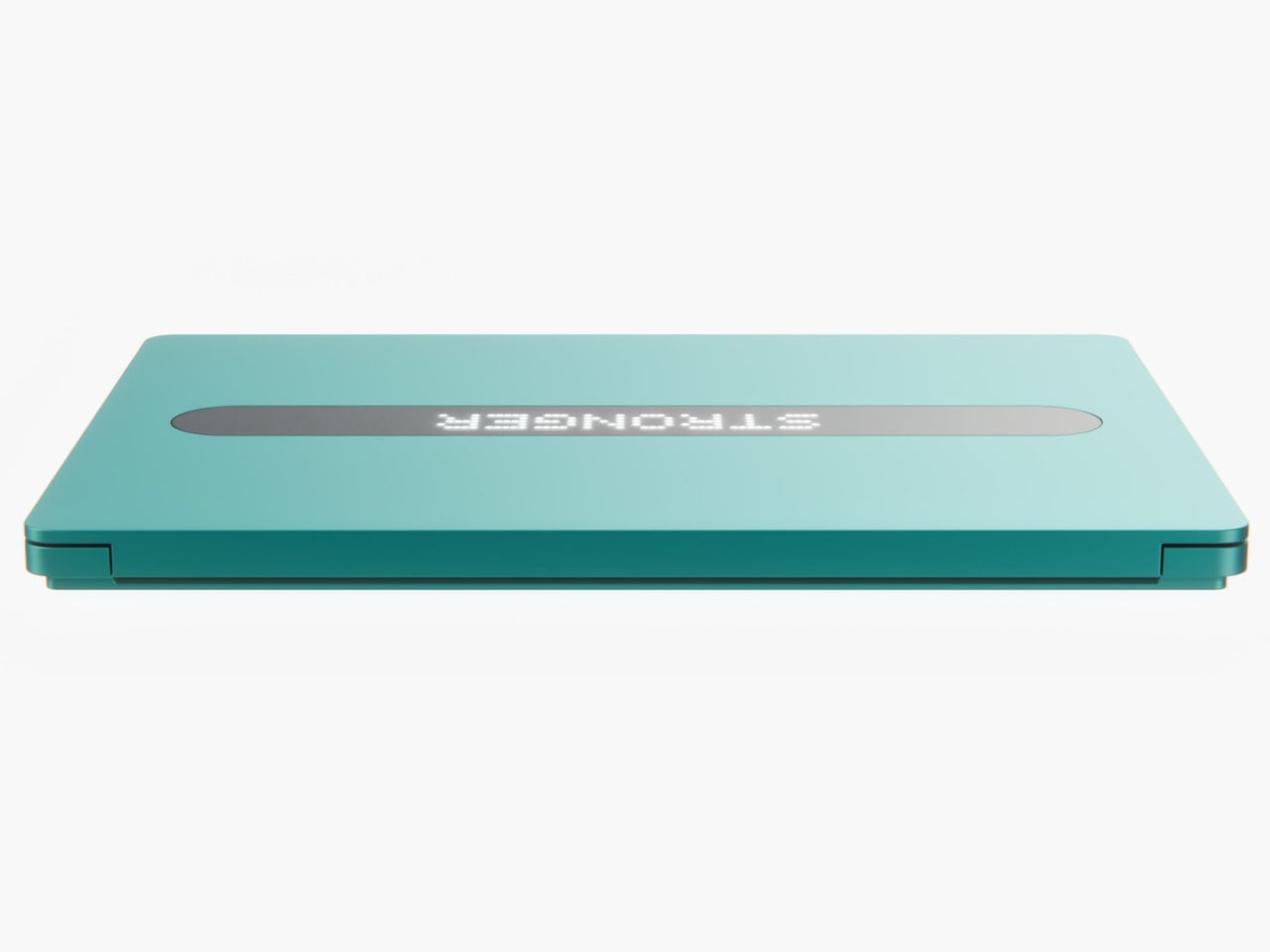
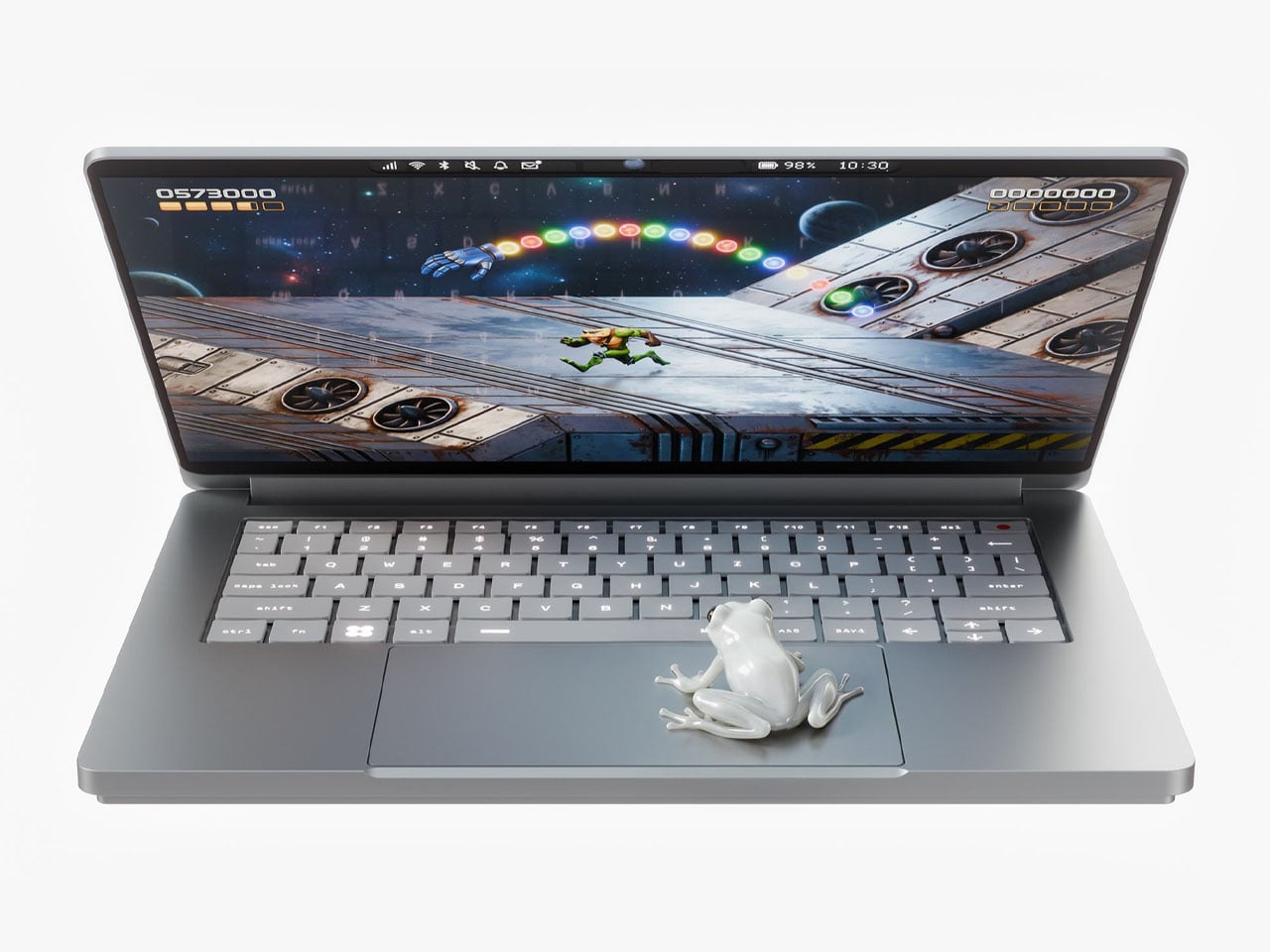
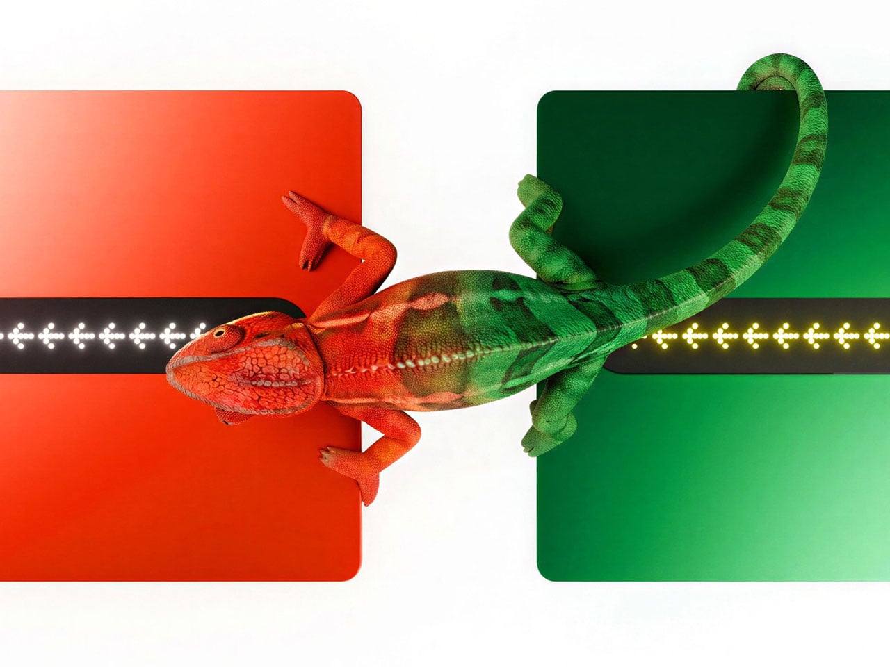
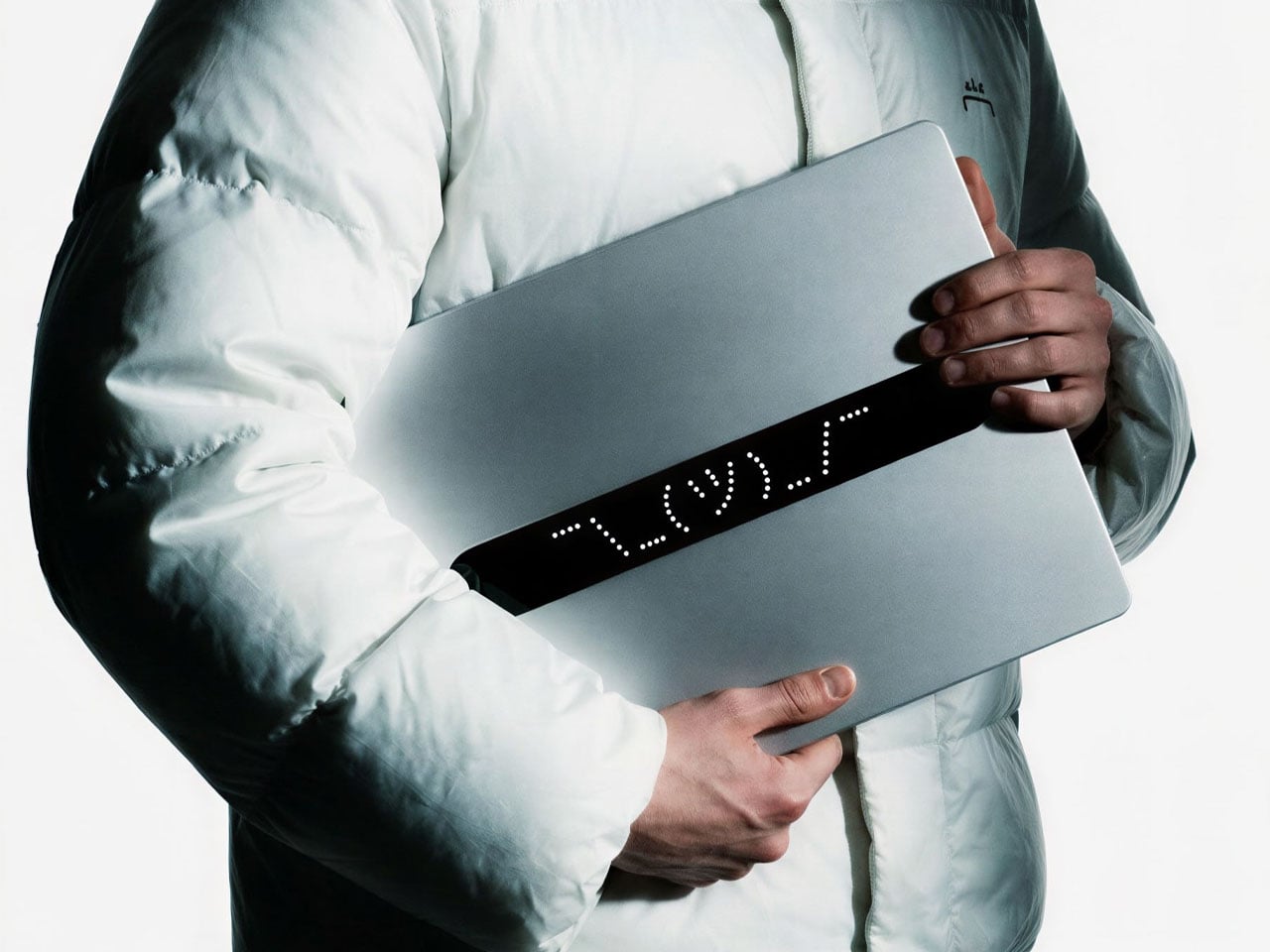
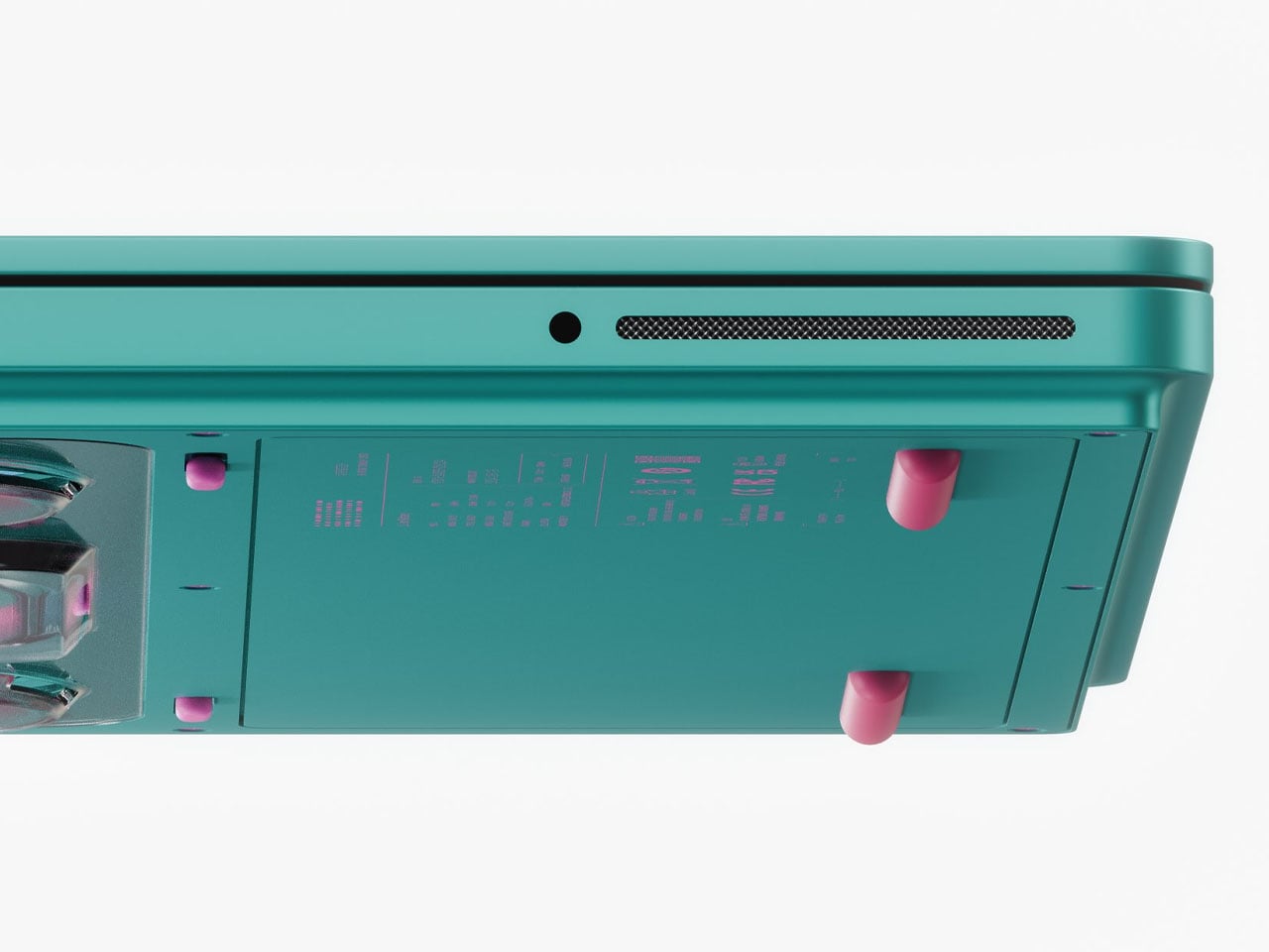
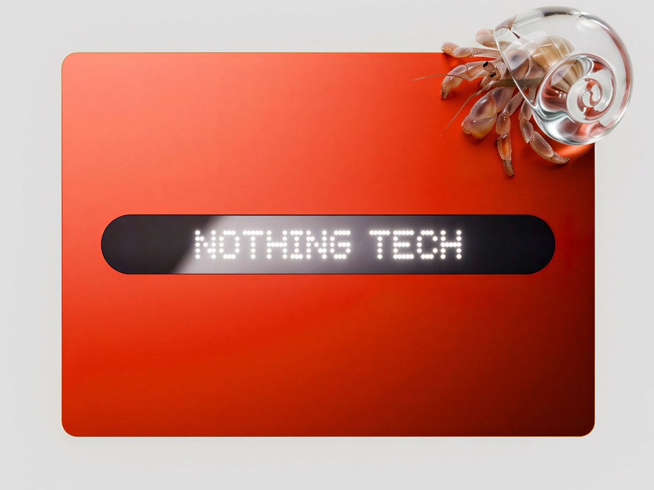
The designer labels the performance laptop as an industrial art piece, more than a high-end consumer electronics gadget. I totally agree with the emotion, as the PC, when flipped over, reveals all the inner electronics. One unique element that defines this laptop is the secondary screen on the lid of the machine. This external display breaks the monotony of the machines we are accustomed to, as you can show off any messages, symbols, emojis, or other elements in the classic Nothing font. To spice things up, Nikita goes beyond the monochrome color scheme and offers the concept laptop in peppy options. You can have it in hot red, cool green, subtle pink, or magnetic teal hues as well.
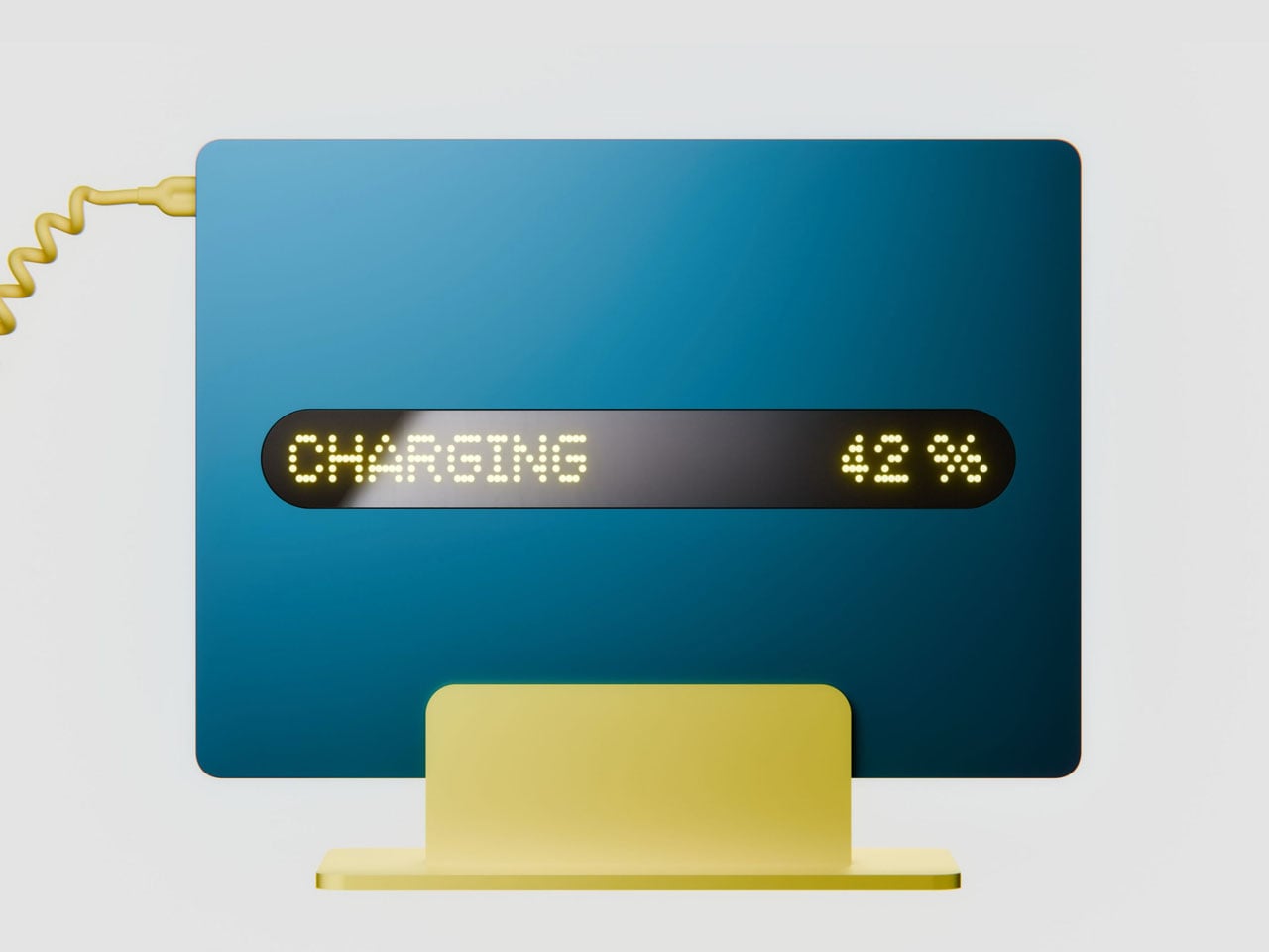
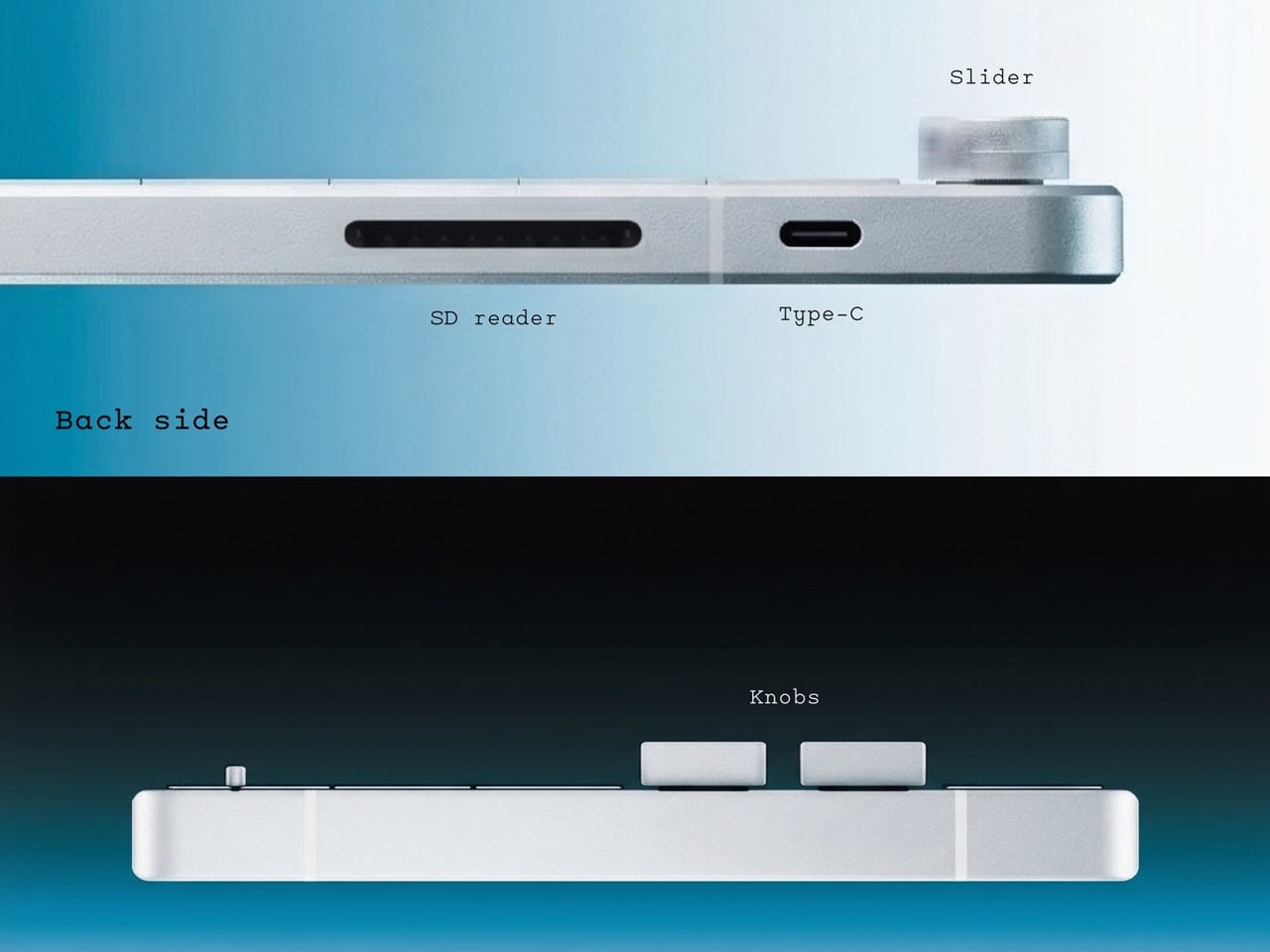
Going with the modern design aesthetics of the creator-focused laptop, the accompanying charging dock is purpose-built to flaunt the attractive make of the machine. When docked in, the cool charging animation is displayed on the secondary screen. At the end of the day, the laptop has to be highly practical, hence, it comes with the customary HDMI, USB-C, USB, and wired charging port.
Whether Nothing will release a laptop anytime soon is anybody’s guess, but one thing is for sure: the brand needs to look at it very seriously. The design aesthetics of the modern-day laptops are quite muted and predictable, and this concept gives fans one more reason to believe.

The post Nothing Book laptop concept let’s you be more expressive with a slender secondary screen on the lid first appeared on Yanko Design.