This human refrigerator chills you the in peak summer heat – anytime, anywhere

Summer temperatures are rising globally, leading to uncomfortable heatwaves even in regions where summers were earlier a pleasant affair. This has prompted manufacturers to develop innovative ways to handle heat when not in the cozy comfort of home or your vehicle. The latest trend has revolved around personal coolers like the Sony REON Pocket Pro Plus, Dyson HushJet Mini Cool, and the Aecooly Cold Air Ultra.

Please add more to the list from the Land of the Rising Sun, which has not been spared by the brutal summers this year. Thinking out of the box, Japanese refrigeration and vending machine manufacturer SDRS has collaborated with industrial equipment supplier TRUSCO Nakayama for a human refrigerator. The idea is to have a portable machine a person can walk into on a hot day.

Designer: TRUSCO Nakayama and SDRS

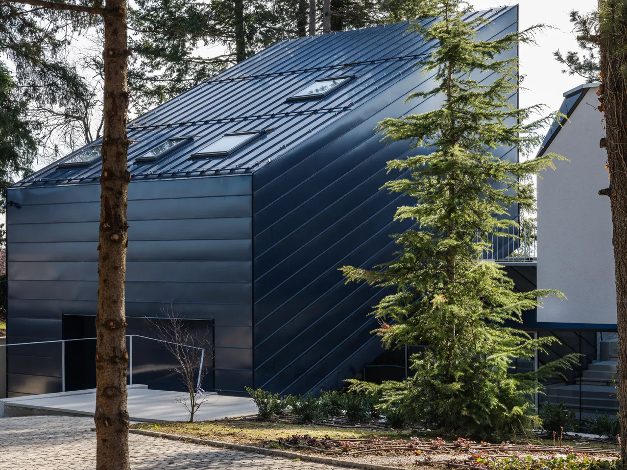
This one-person cooling booth, dubbed Do Hiemon Box, looks like a commercial refrigerator and is designed to provide rapid cooling when exposed to intense heat. In fact, the solution is inspired by Japan’s popular vending machines that can be found in virtually every corner of the cities. The booth maintains an ambient temperature of around 15 degrees Celsius on the inside, which is a welcome relief for anyone exposed to the peak summer Sun. To provide rapid cooling, 5 degrees Celsius chilled air is directed towards the head, neck, and shoulders. This reduces the symptoms associated with heat exhaustion within 10 minutes.

Of course, accelerated cooling after being exposed to extreme heat in a very short time frame can also be dangerous. Keeping this in mind, the cooling booth has three cooling modes and an automatic shut-off timer after 20 minutes. This helps the body adapt to the sudden temperature change, as eventually the user has to step out into the Sun again. Do Hiemon Box is intended for commercial use in places with high temperatures like factory floors, construction sites, warehouses, schools, outdoor events, or city centers. The fact that the cooling booth has caster locking wheels, runs off any standard 100-volt outlet, and uses only 0.51-kilowatt-hour power (half the electricity required by a spot AC), makes it a highly practical solution with global warming on the rise.

Measuring approximately 2 meters tall, 93 cm wide, and 1.2 meters deep, the IPX3-rated cooling booth made out of stainless-steel panels has polystyrene insulation boards for maximum cooling efficiency. Do Hiemon Box’s standard model comes at 1.5 million yen before taxes (approximately $9,200). The versions with crane eyebolts and more options like a portable power station cost extra. Operating at a cost of around 16 yen per hour (roughly $1), the cooling solution is destined to be a popular choice around the globe.

The post This human refrigerator chills you the in peak summer heat – anytime, anywhere first appeared on Yanko Design.
The Plywood Chair That Becomes a Castle in 2 Moves

Plywood chairs are everywhere. You’ve seen them stacked in cafes, pulled up to dining tables, photographed on every other design account you follow. They’re functional, they’re affordable, and they’re largely forgettable. So when Irish furniture designer James Murphy sat down to create one for his university final project, the logical thing would have been to make something clean and well-proportioned and move on. Instead, he made a chair that unfolds into a castle, and now I can’t stop thinking about it.

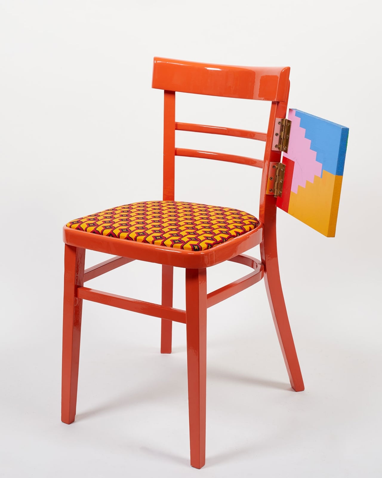
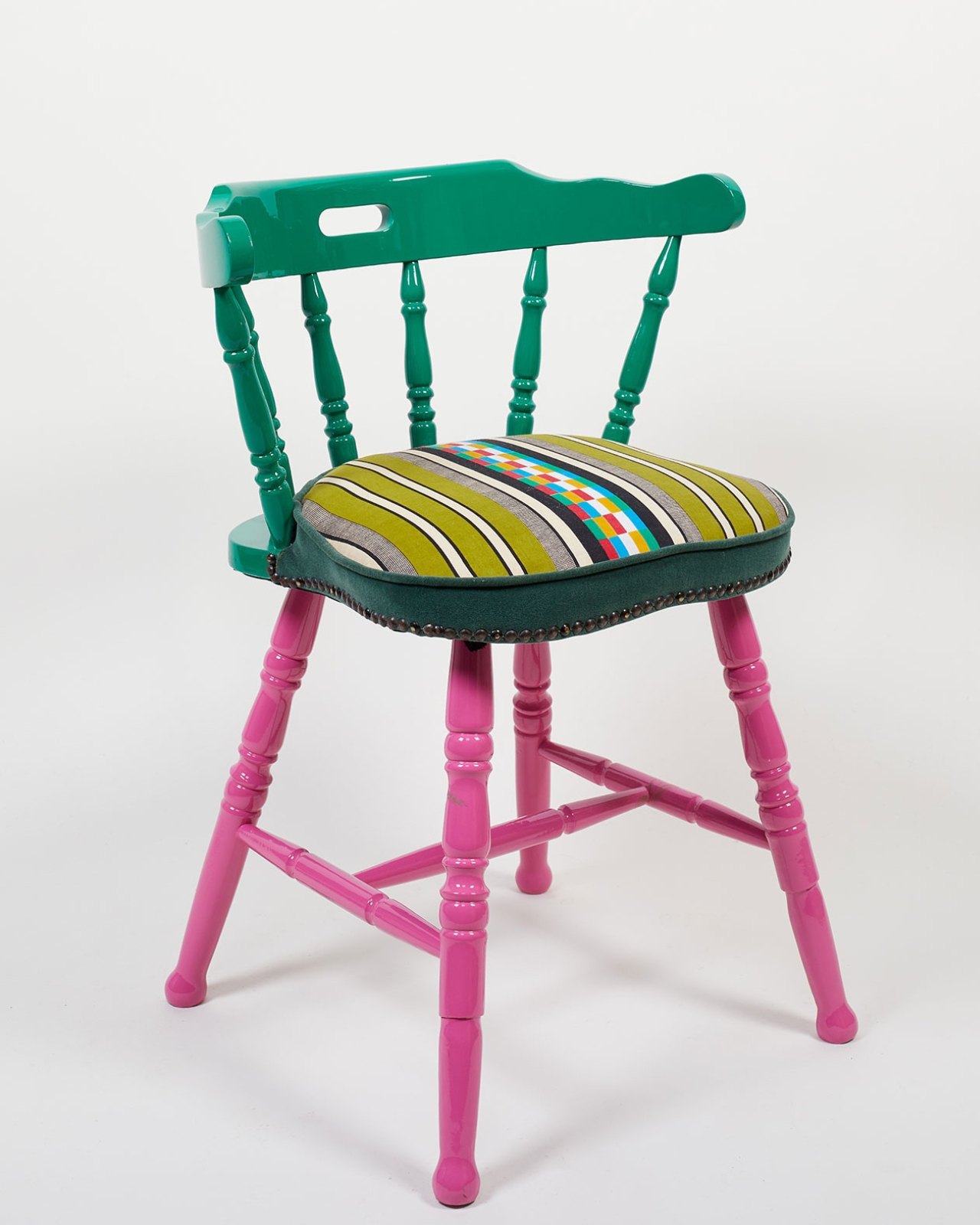
The Casul chair is a children’s seat that, in just two moves, transforms into an abstract plywood castle with battlements, shelves, and enough narrative potential to fuel an entire afternoon. In its closed form, it has the neat, compact profile of a small throne. Flip the seat panels open, fold the legs out to the sides, and suddenly you have something that looks like a doll’s house crossed with a medieval fort. The panels that held the seat become shelves. The window cutouts in the backrest align with the fortifications. The whole thing opens up the way good architecture does: logically, inevitably, like it couldn’t have been designed any other way.

Designer: James Murphy

Murphy’s path to this project is worth noting. He began as a furniture designer, then did a work placement at Lego during university and came back with a new obsession. “Designing products for children is just really fun and rewarding,” he said. His final-year brief became a mission to marry both interests, and also to address something a lot of parents quietly worry about: how to pull kids away from screens without making it feel like a punishment.

The design references he leaned on are genuinely interesting. He looked back at post-war transformable children’s furniture, particularly Hans Brockhage’s Schaukelwagen from the 1950s, a rocking chair that flips into a toy car. That piece had a real ingenuity to it, born from an era when materials were scarce and cleverness was a necessity. Murphy borrowed the spirit of it but updated the logic entirely. The castle setting was a deliberate choice: gender-neutral enough for any child, open-ended enough for any game.

The engineering behind it is more nuanced than it looks. The jigsaw joints cut into the wooden seat panel interlock to keep the chair stable during use, but release easily to form the castle’s outer walls. Specialized friction hinges hold the opened panels at whatever angle the child wants, while also preventing fingers from getting caught. Triangular buttresses at the back keep the whole structure from tipping, and the combined weight of the piece means younger kids can’t accidentally knock it over. Murphy tested a remarkable number of hinge types to get the movement right. “I didn’t even know there were that many types of hinges,” he admitted, which tells you more about the obsessive detail of the process than any portfolio description could.

Two versions exist. One is finished in chalkboard paint, so children can redecorate the castle walls as often as they like. The other hides foam swords under the seat and cushions that convert into shields, the kind of detail that makes you realize this was genuinely designed with play behavior in mind, not just aesthetics. Both discoveries came partly from play-testing with real children. A girl who kept wanting to draw all over the clean plywood prototype was the reason the chalkboard version exists. The same test sessions turned the castle into a unicorn cafe, a besieged fort, and Bowser’s Castle from Super Mario, which is probably the most useful design feedback any furniture designer has ever received.

The Casul chair has since won one of the top prizes at London’s New Designers showcase, and it deserves the recognition. Good children’s design is harder than it looks, because the standards are unforgiving. Kids don’t pretend to like things. If a toy doesn’t hold their attention, it’s on the floor in ten minutes. The fact that Murphy’s chair passed that test, across multiple children and multiple imaginary worlds, tells you everything about how well he understood the brief.

The post The Plywood Chair That Becomes a Castle in 2 Moves first appeared on Yanko Design.
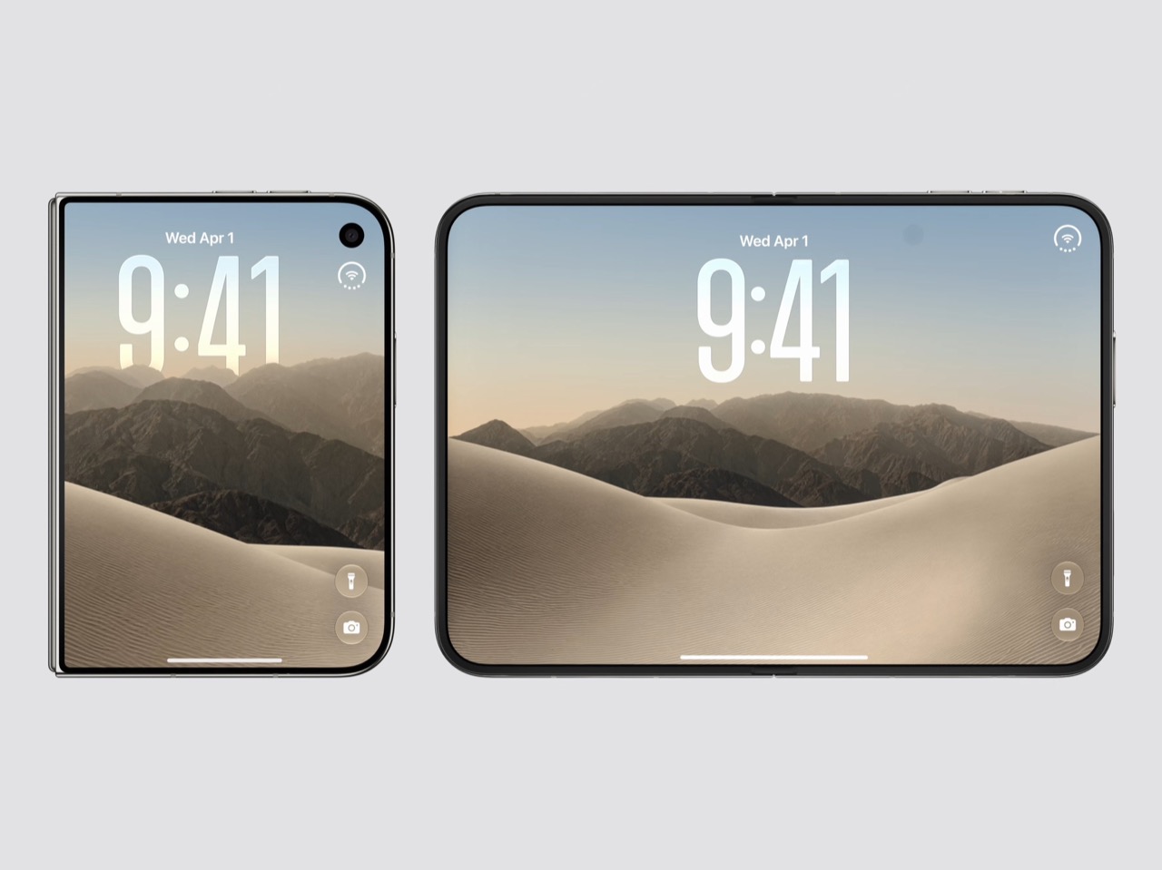
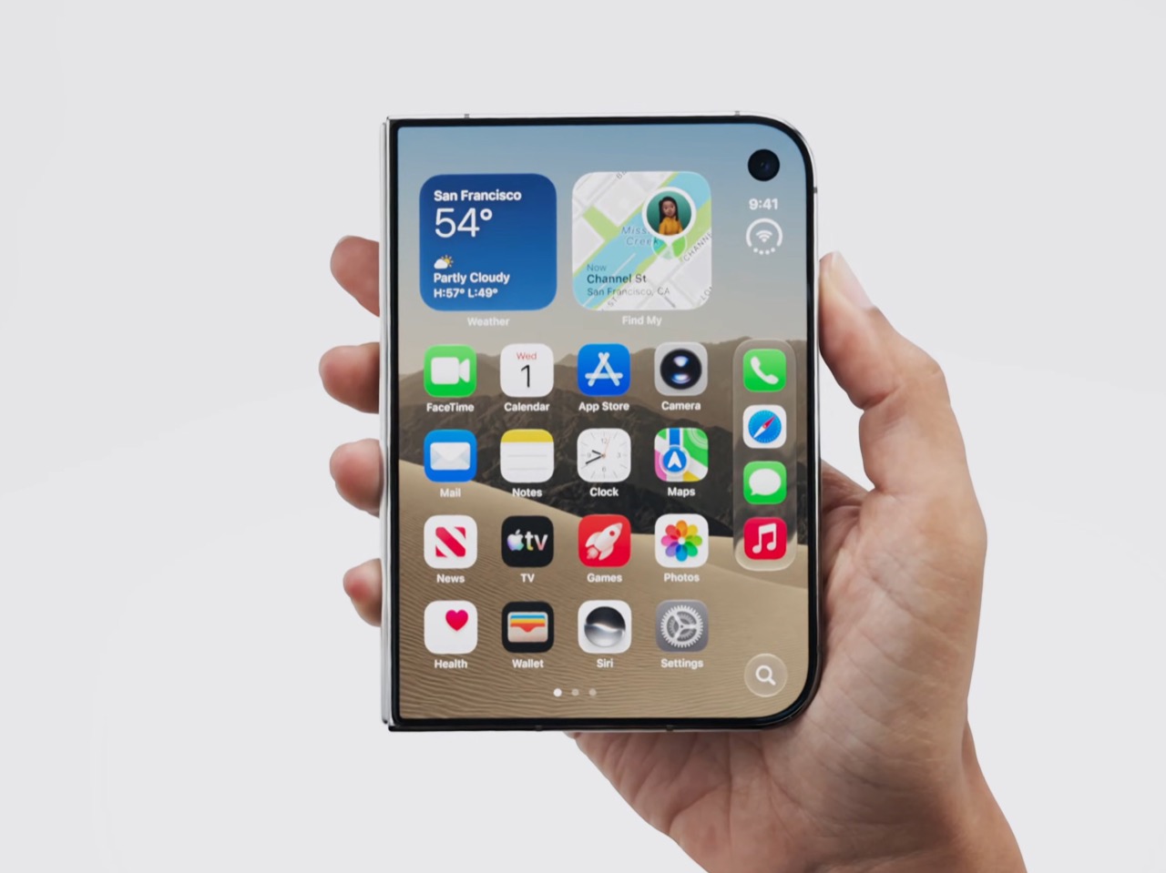
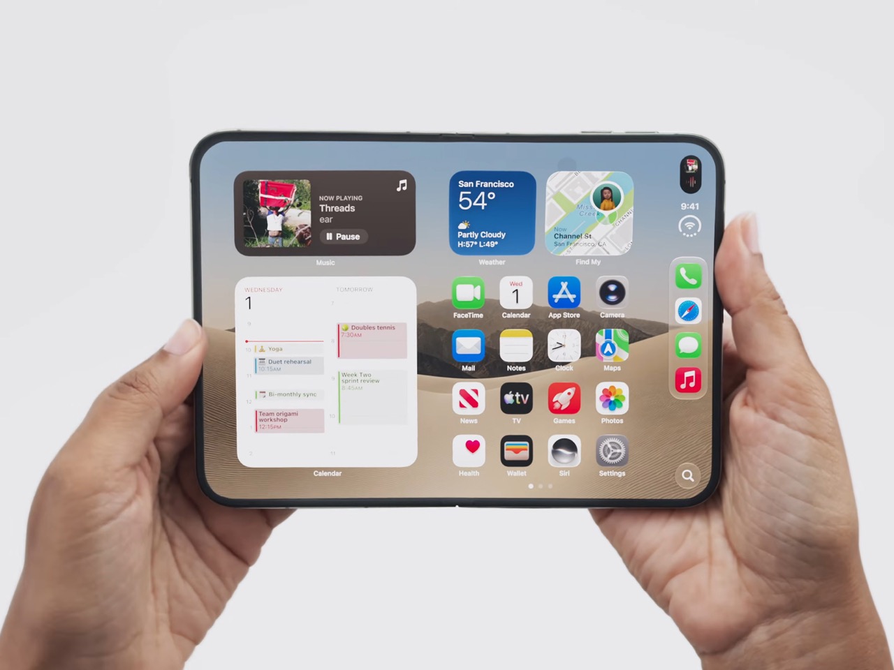
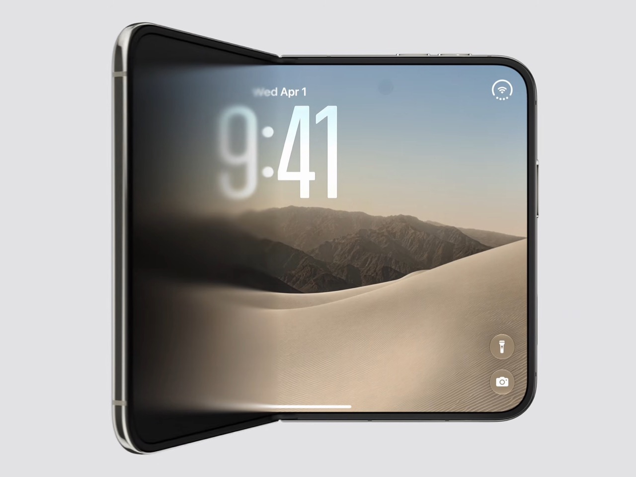
Apple’s Secret Foldable: Everything Leaked About the iPhone Ultra Fold

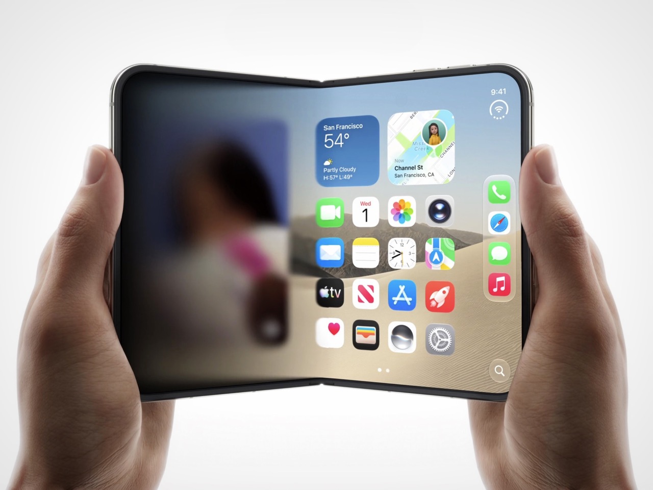
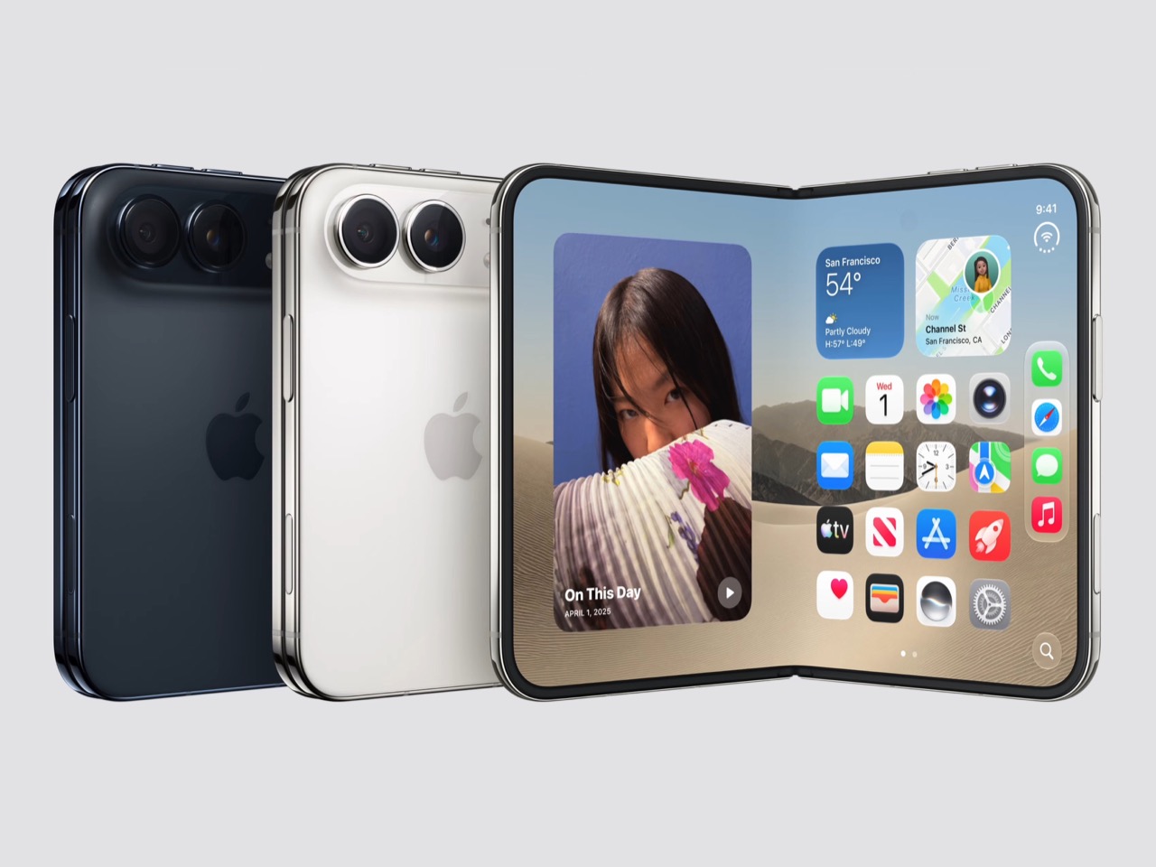
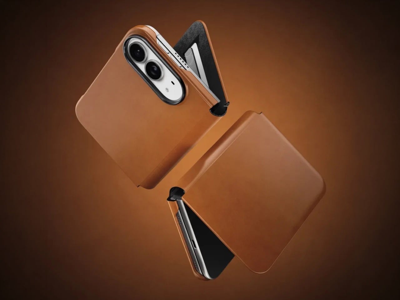
Apple’s Secret Foldable: Everything Leaked About the iPhone Ultra Fold Concept render of a book-style foldable iPhone.

Apple is reportedly gearing up to launch its first-ever foldable iPhone, potentially named the iPhone Ultra Fold. This highly anticipated device is expected to debut alongside the 20th-anniversary iPhone, marking a significant milestone in Apple’s journey. With its innovative design, advanced engineering, and innovative technology, the iPhone Ultra Fold could reshape the foldable smartphone market […]

The post Apple’s Secret Foldable: Everything Leaked About the iPhone Ultra Fold appeared first on Geeky Gadgets.

Posted in Uncategorized

adidas Hyperboost Euphoria: The Foam That Outgrew the Track

Performance sneakers have a habit of making promises they can’t quite keep outside of the gym. They arrive looking like they were engineered on a space station, and the moment you wear them to brunch, you realize the rocker sole is pushing you forward like you’re perpetually late for a sprint. adidas knows this tension well, which is probably why the Hyperboost Euphoria exists.

The Euphoria is the lifestyle sibling of the Hyperboost Edge, the performance running shoe adidas dropped in March. Where the Edge was built for the track, the Euphoria is built for the life you actually live, the one that involves a lot of walking, standing, sitting in cafés, and occasionally jogging for a bus. adidas pulled the same Hyperboost cushioning technology, the pebbled supercritical foam that made the Edge genuinely exciting, and reworked everything else around it. The midsole is carved out to save weight. The stance is wider. The heel extends out. The rocker is intentionally dialed back so the shoe doesn’t feel like it’s trying to propel you somewhere you didn’t ask to go. The result is a platform that is stable and grounded in a way that actually makes sense for daily wear.

Designer: adidas

The upper is where things get interesting from a pure design standpoint. A large TPU net structure wraps the sidewalls, giving the silhouette a kind of exoskeleton quality that reads as technical without being loud about it. The semi-transparent nylon material plays against the structured cage nicely, hinting at the construction underneath. adidas also swapped out the mountain logo on the tongue for the Trefoil, a small but deliberate move that signals exactly what this shoe is: an Originals product, not a performance one. It is the kind of detail that only obsessives notice, and yet it matters.

There is an argument to be made that adidas is exceptionally good at this particular move, taking foam technology born in performance and migrating it into lifestyle. The Boost lineage did it. The 4D midsole has done it. The Hyperboost is following that same arc, and it makes sense commercially and creatively. If you develop something genuinely good, you eventually want it to live in more places.

The Euphoria has also already been spotted off the pitch on Jude Bellingham, Lionel Messi, and Pedri during the FIFA World Cup. That kind of high-profile visibility is not accidental, and it reinforces the positioning. adidas is clearly not treating this as a minor side release.

Colorway-wise, the launch lineup covers blue, black, and white, an all-black option, white and black, and a red that carries the same energy as the more expressive iterations. Bold but not chaotic, which tracks with the overall aesthetic of the shoe.

What I keep thinking about is how the sneaker market has recalibrated around comfort in a way that would have seemed overcorrected a decade ago. The chunky foam wave came, peaked, and landed somewhere permanent. Consumers who once wanted flat, minimal silhouettes are now completely comfortable in a stacked platform, and brands like adidas have gotten very good at making that stack feel intentional rather than excessive. The Hyperboost Euphoria does not feel like a compromise between performance and lifestyle. It feels like a shoe that was designed for exactly where it ended up.

Ilka Liebmann, VP of Design Footwear at adidas Originals, described it best: the shoe was created for those who embrace a sport-inspired lifestyle, people who prioritize spontaneity, comfort, and energy, and let movement lead them. That framing is a little aspirational by nature, but it is also accurate to the product. The Euphoria wears confidently. It does not demand context. You could pair it with technical trousers or track pants or denim and the shoe holds its own across all three.

adidas has made a genuinely considered thing here, and it lands at a moment when the performance-to-lifestyle pipeline feels more refined than ever.

The post adidas Hyperboost Euphoria: The Foam That Outgrew the Track first appeared on Yanko Design.
Streamlined Kimi K3 AI Model Targets Mid-Scale Coding Tasks

Streamlined Kimi K3 AI Model Targets Mid-Scale Coding Tasks Diagram showing the sparse architecture and 896 experts of the Kimi AI model.
The Kimi K3, as explored by Prompt Engineering, represents a streamlined yet capable sibling to the larger Kimi K3 model. While it operates with fewer parameters than its 3-trillion-parameter counterpart, the K3 focuses on delivering efficiency and accessibility for organizations with more constrained computational resources. Its design emphasizes a balance between performance and practicality, particularly […]

The post Streamlined Kimi K3 AI Model Targets Mid-Scale Coding Tasks appeared first on Geeky Gadgets.

Posted in Uncategorized