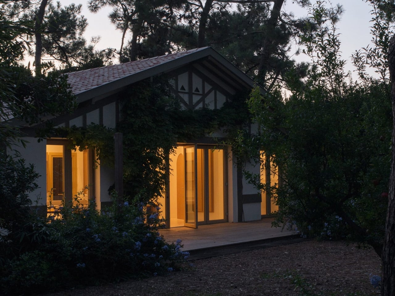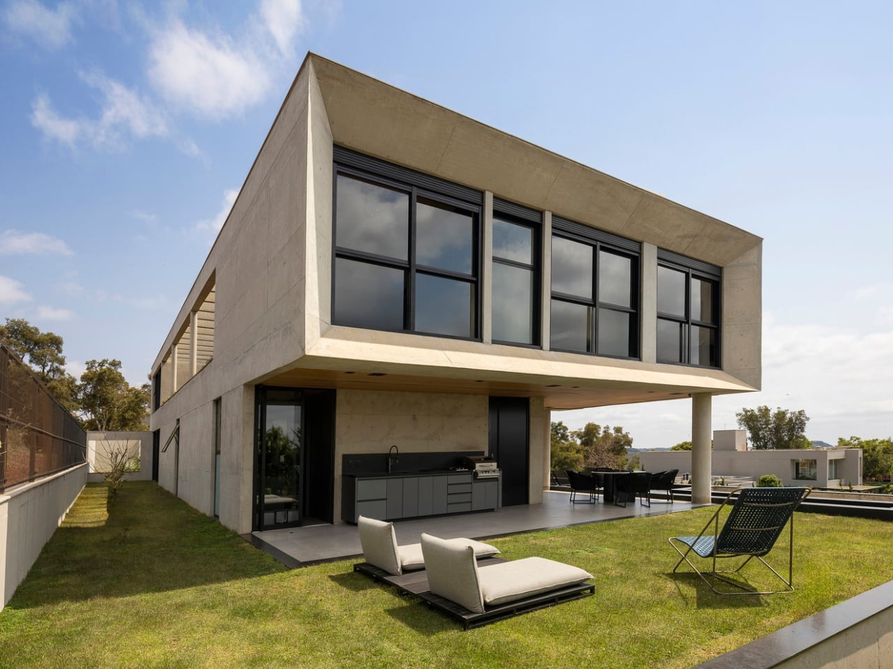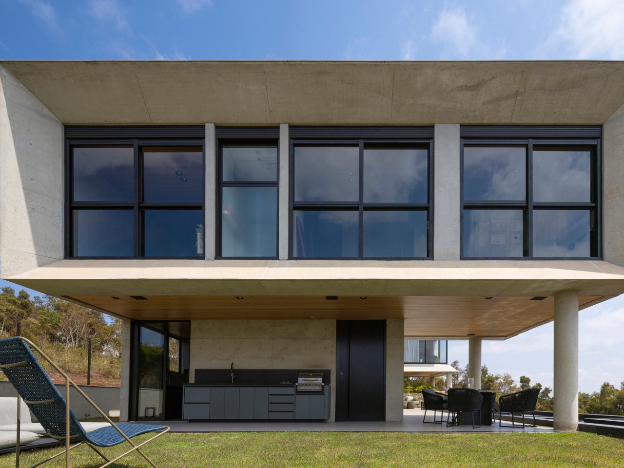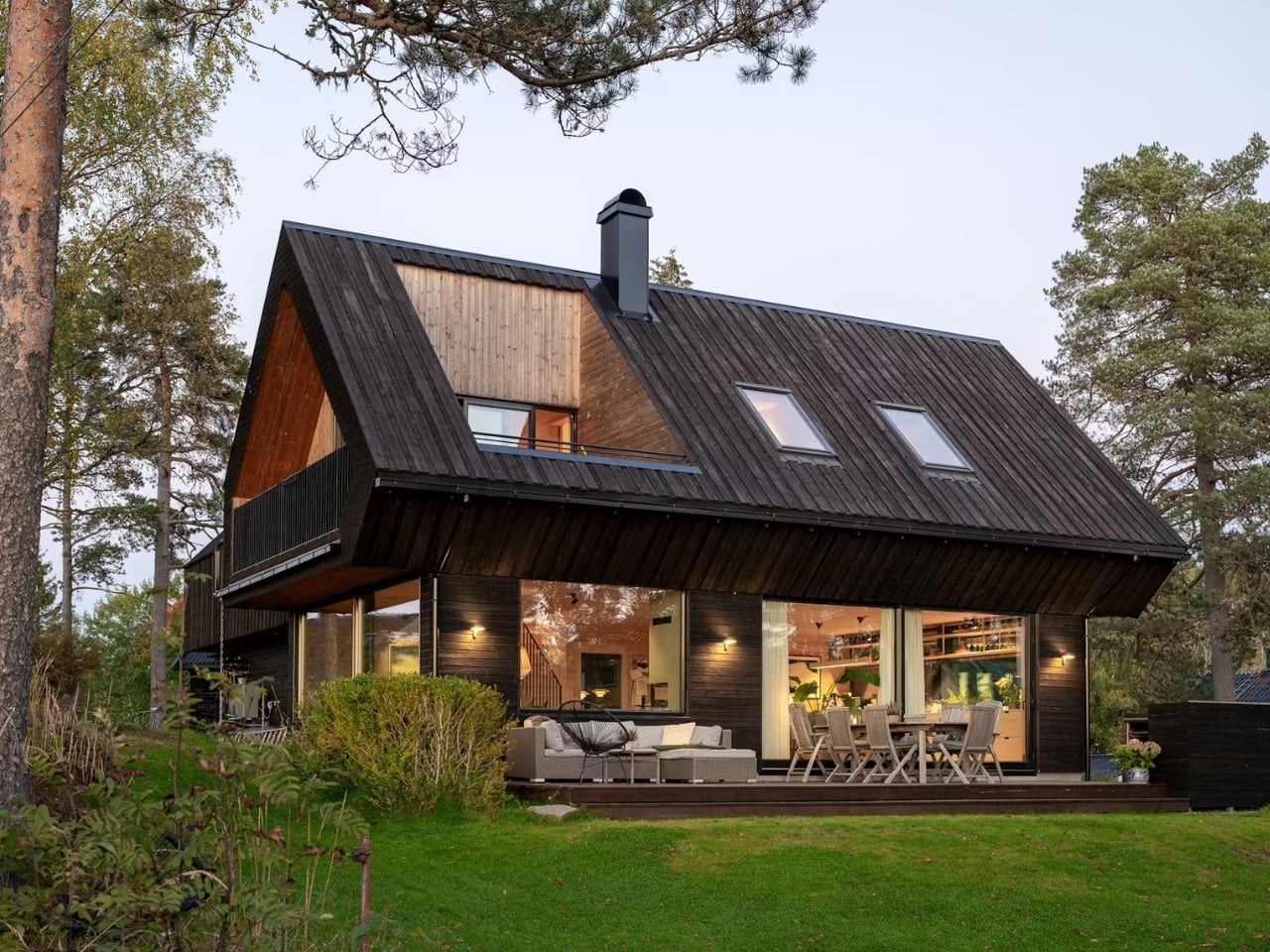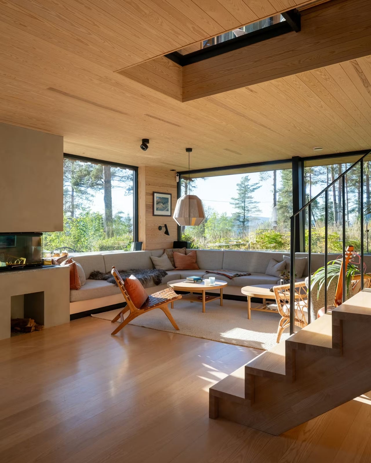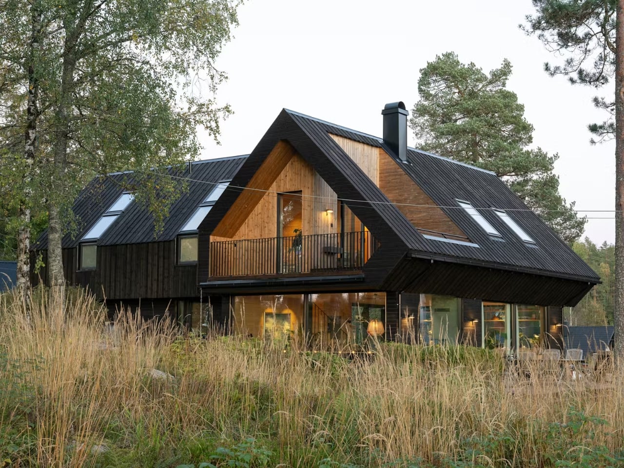
Most tropical homes try to open up. Floor-to-ceiling glass, wraparound terraces, the constant push-pull between inside and outside air. It’s practically a formula at this point. So when a house comes along that deliberately turns away from that instinct, you stop and pay attention.
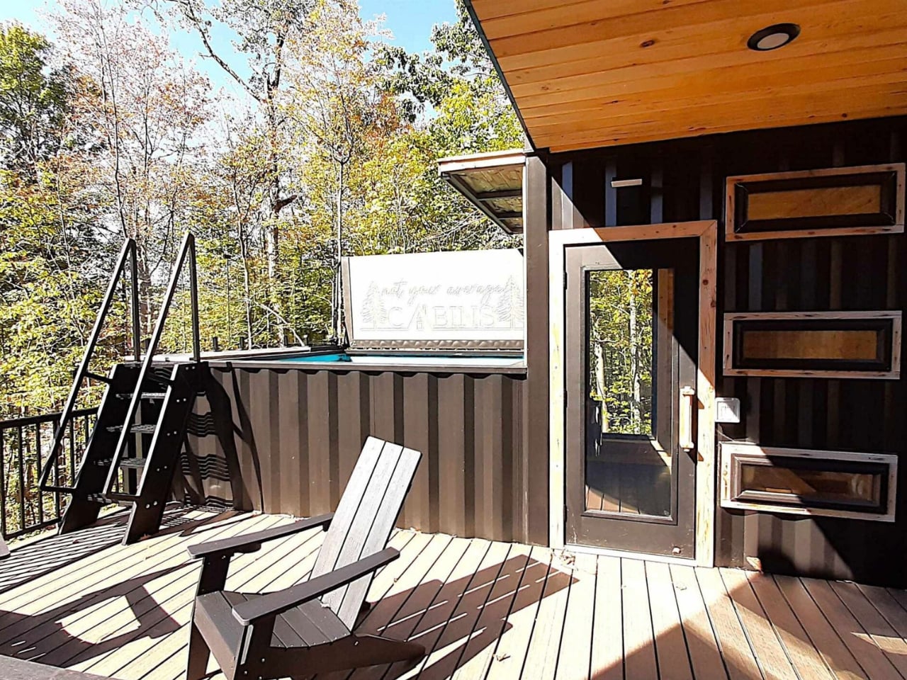
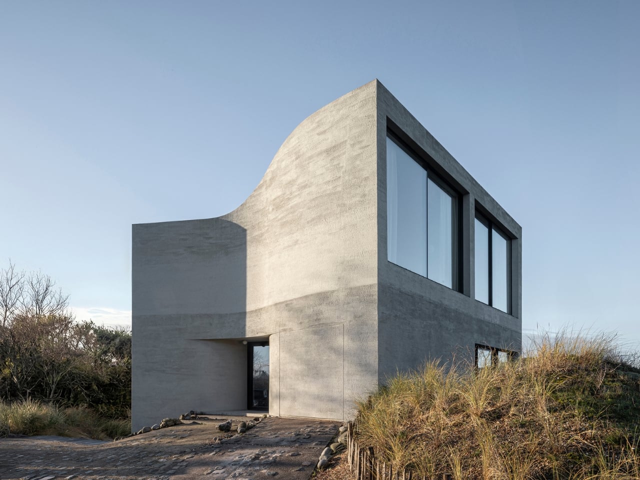
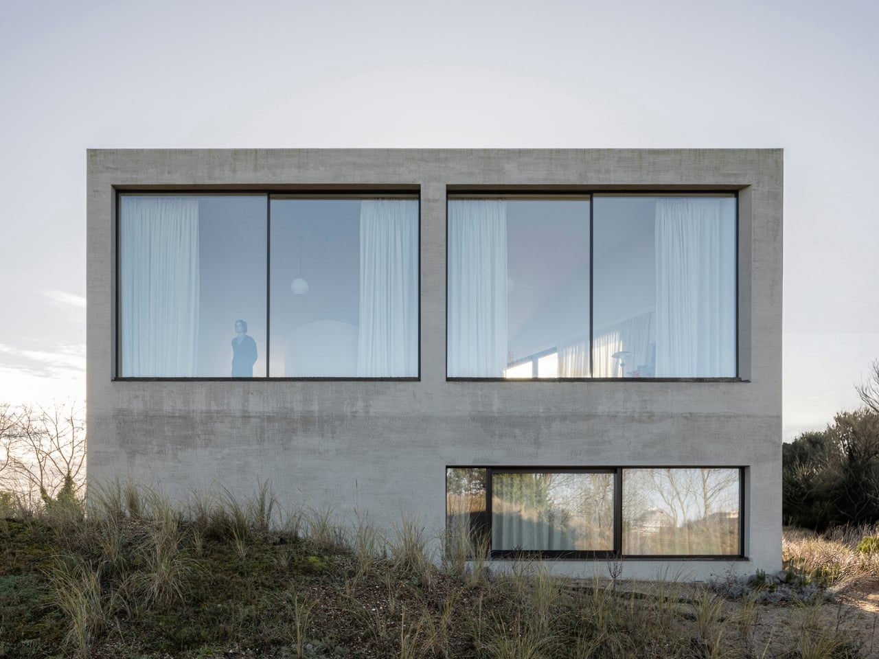
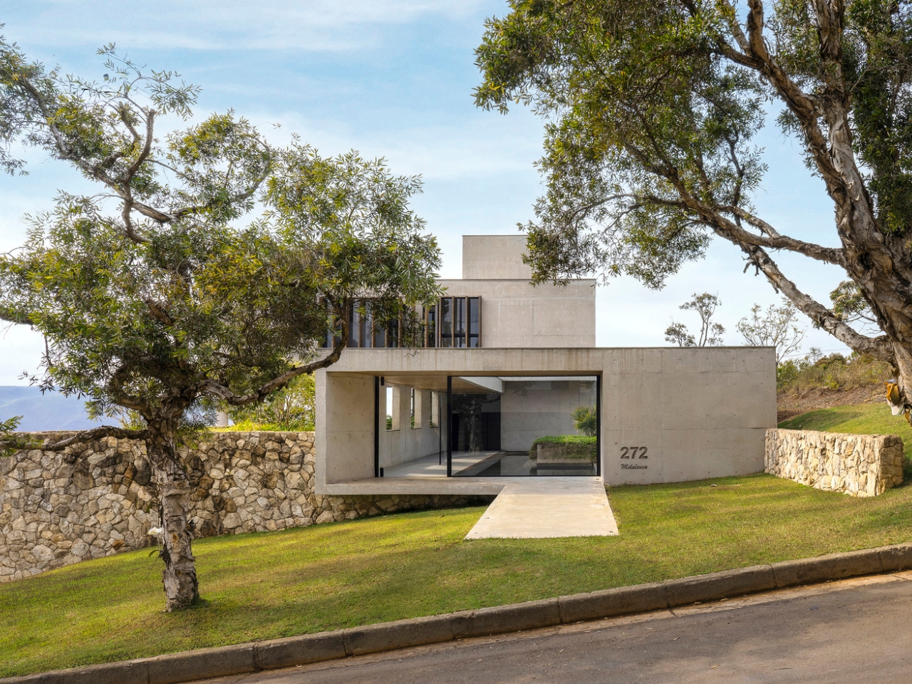
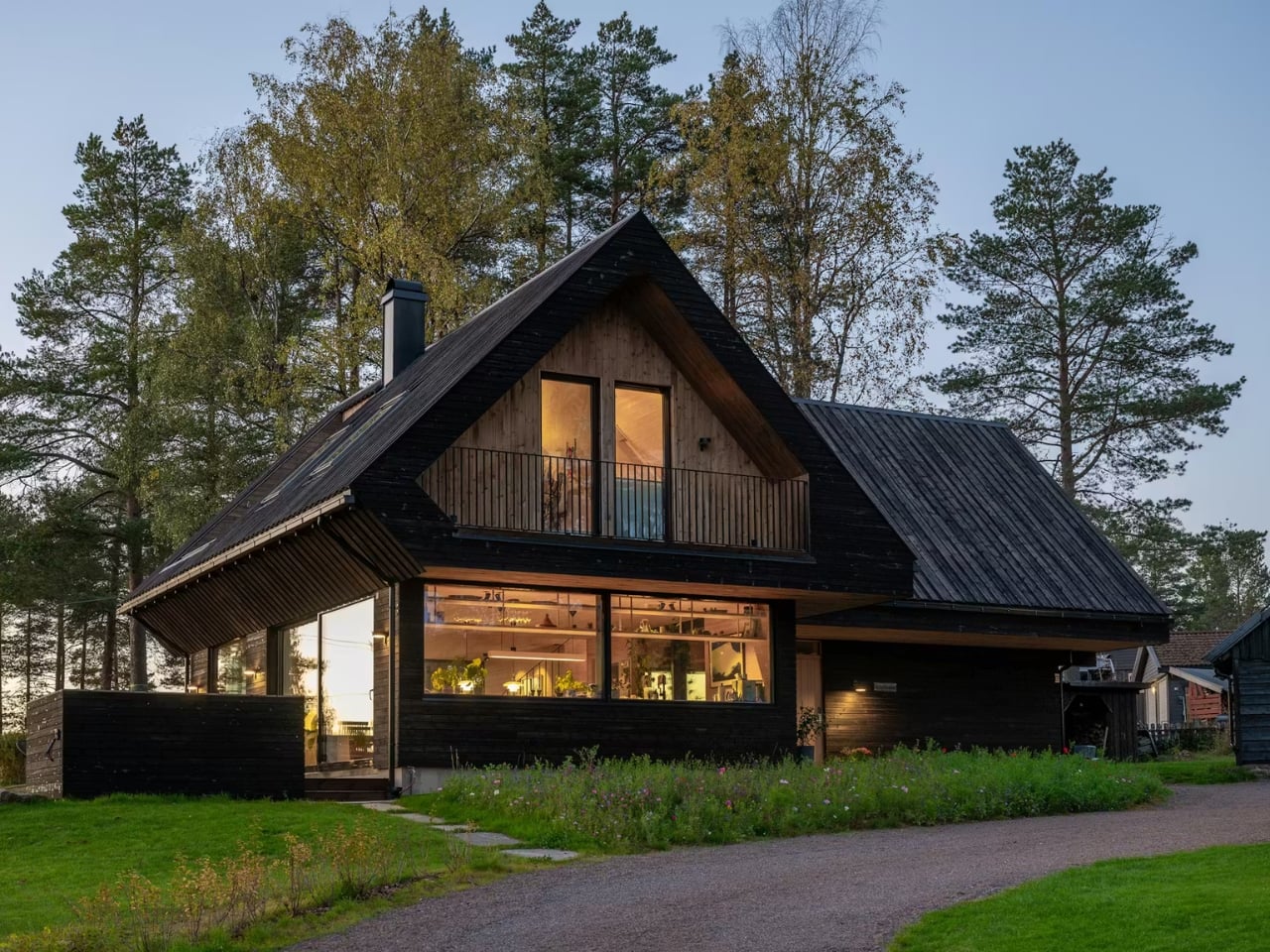
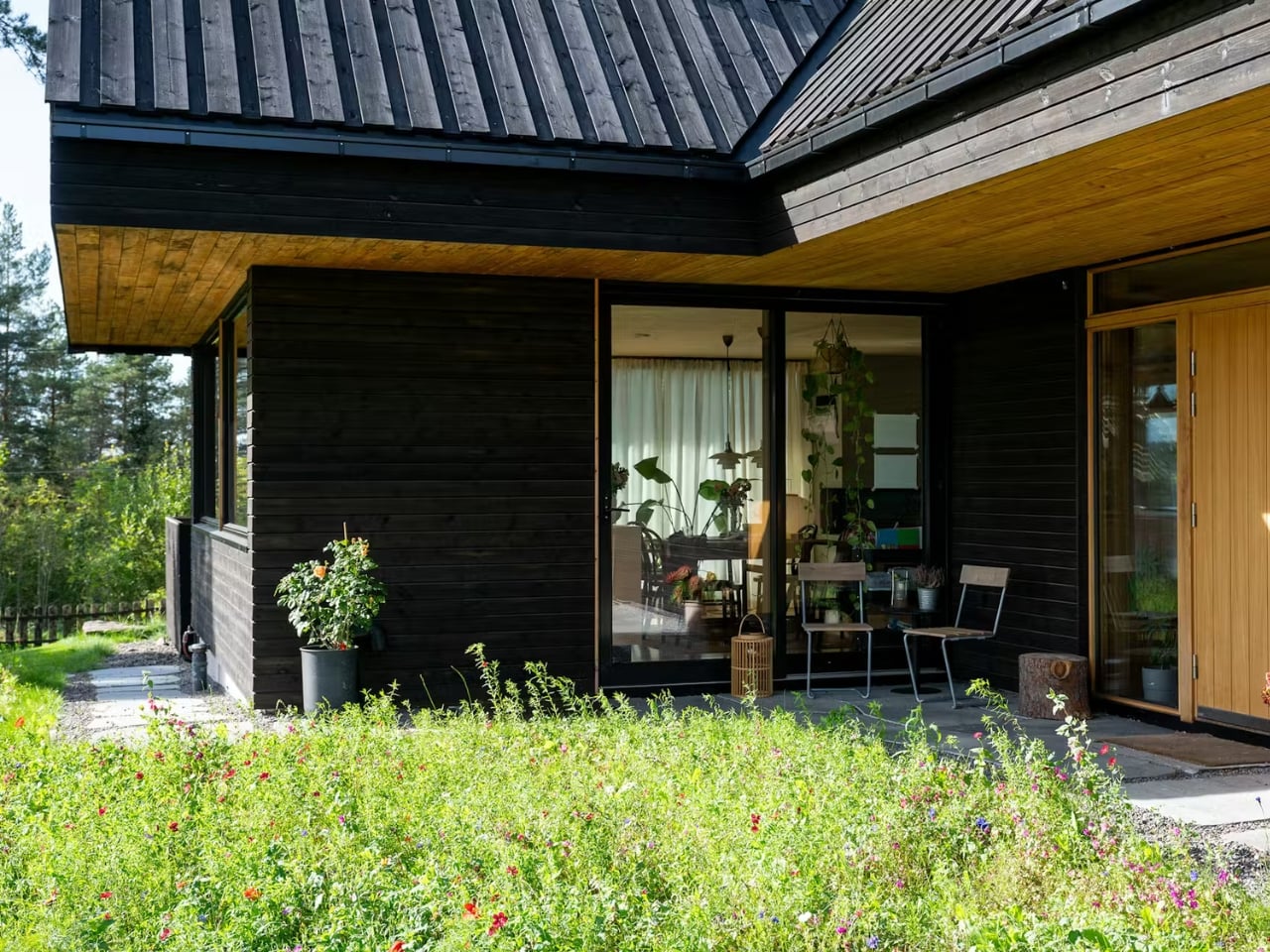
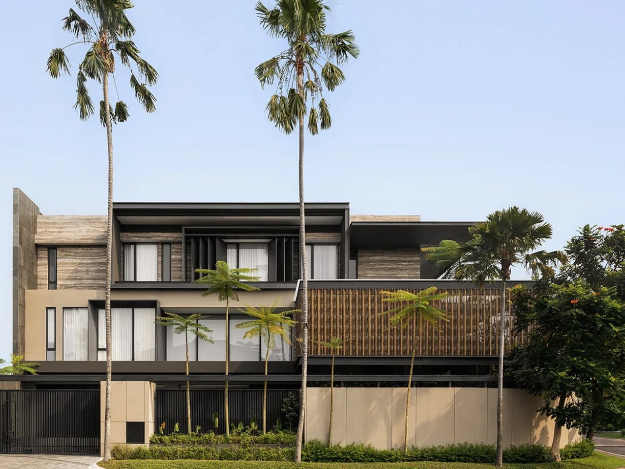
SE House, designed by Giovanni Gunawan of Surabaya-based studio KantorGG, sits at one of the city’s most recognizable residential corners and does something quietly radical: it pulls inward. Not to close off or shut the world out, but to create a kind of depth that most houses spend their entire floor plan actively avoiding.
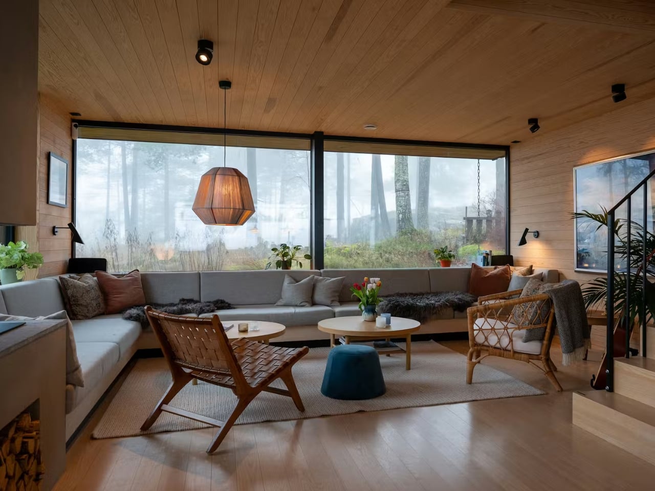
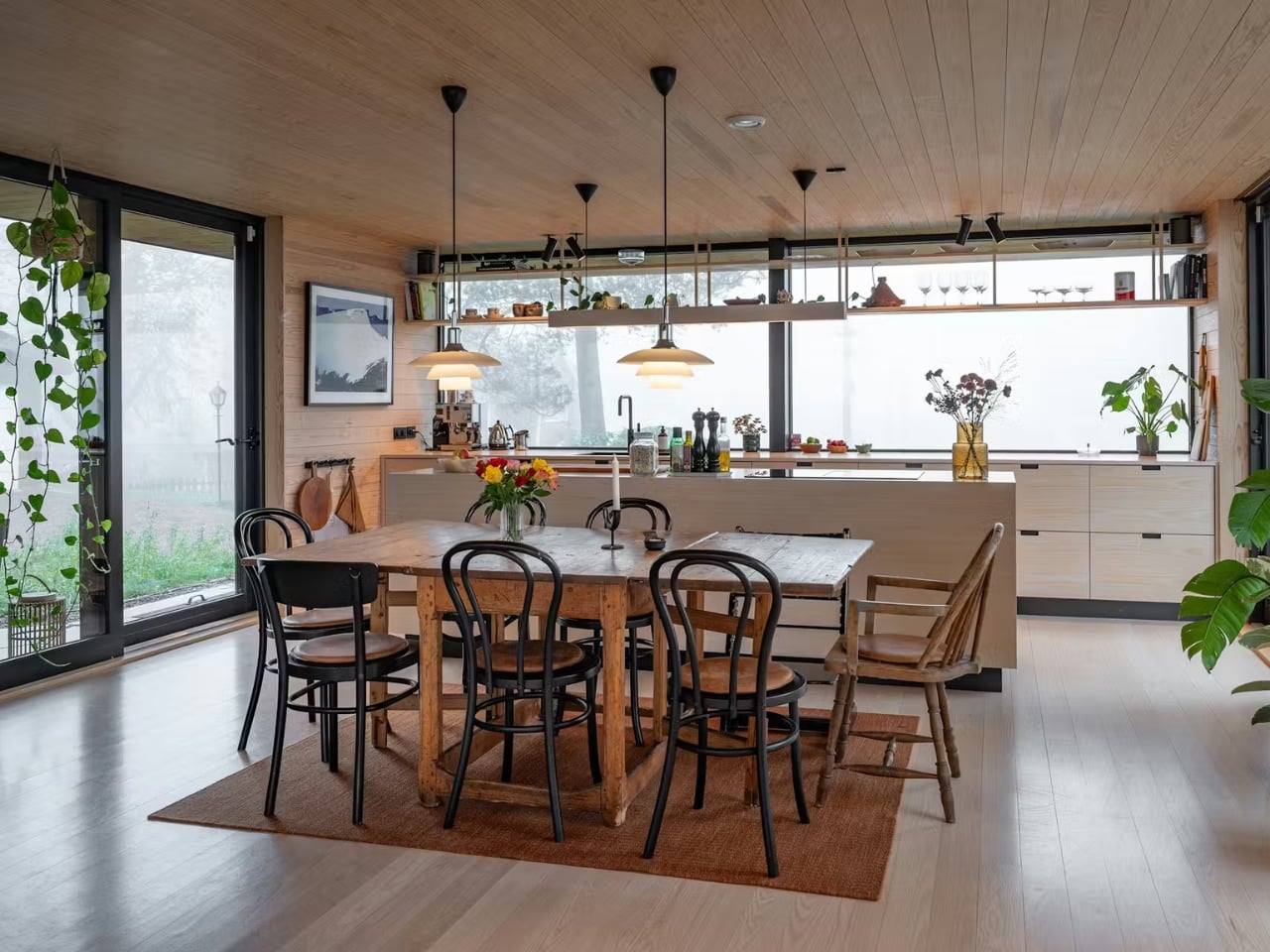
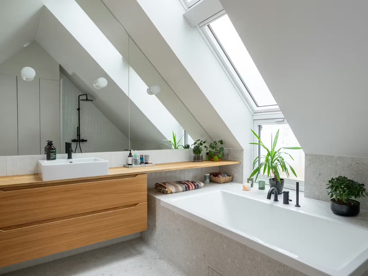
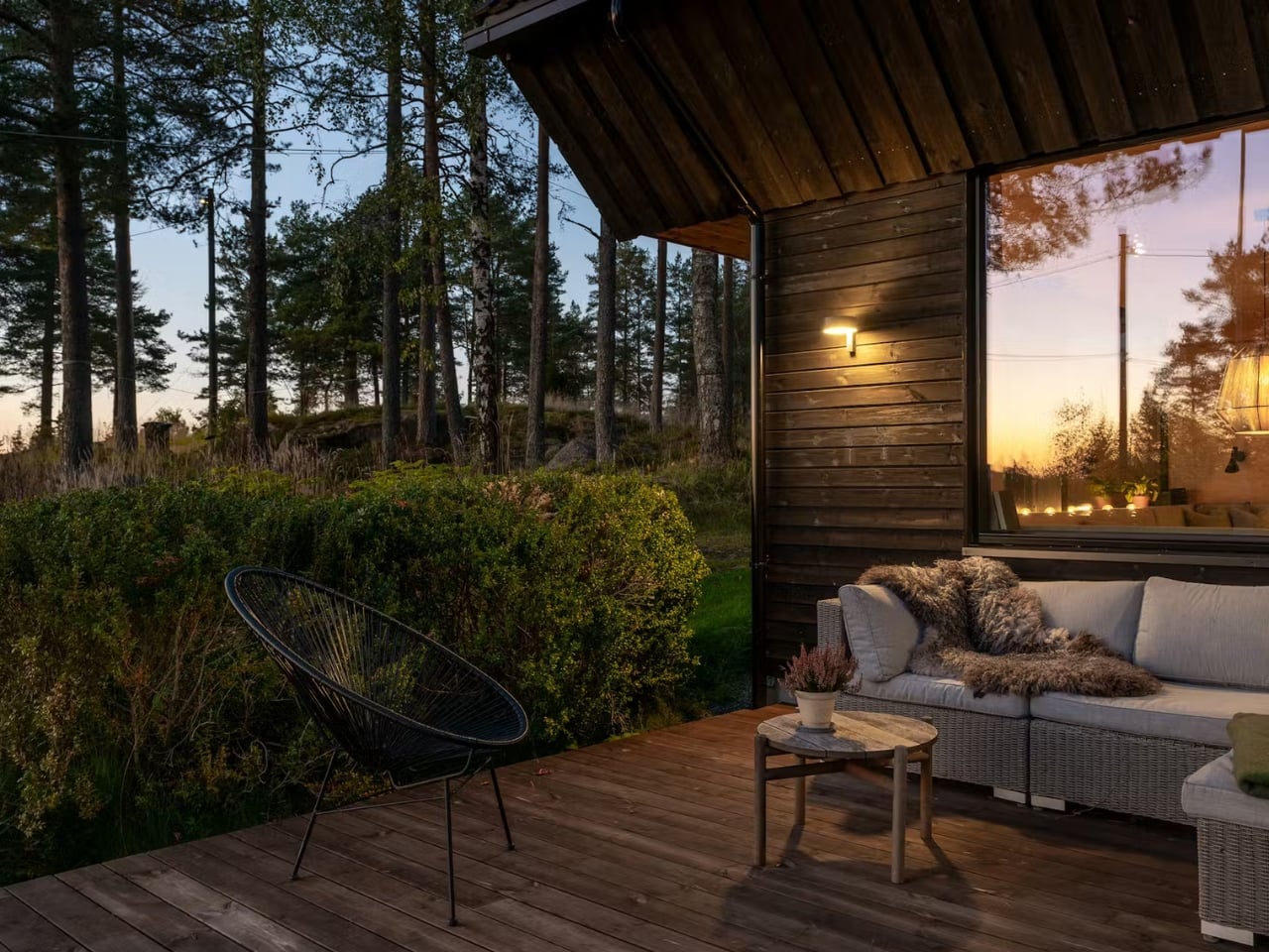
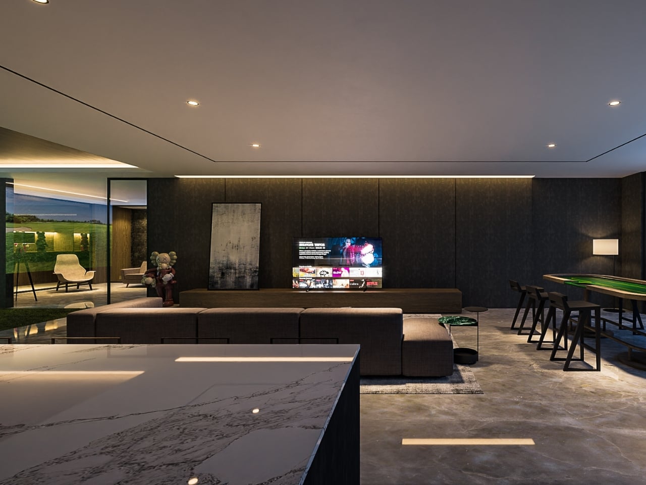
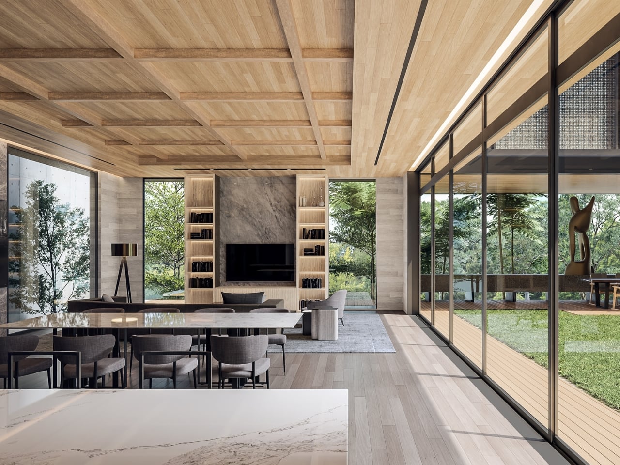
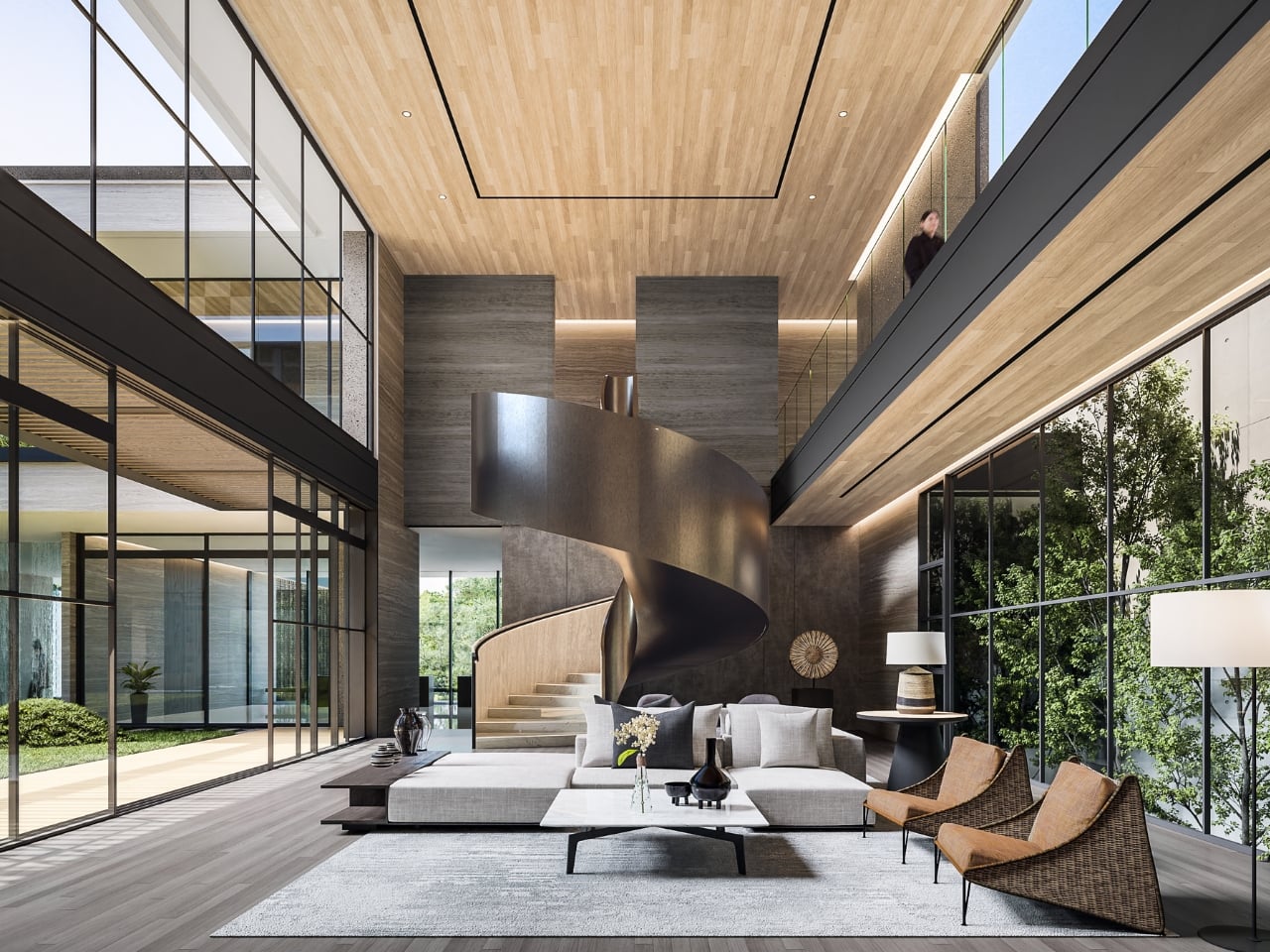
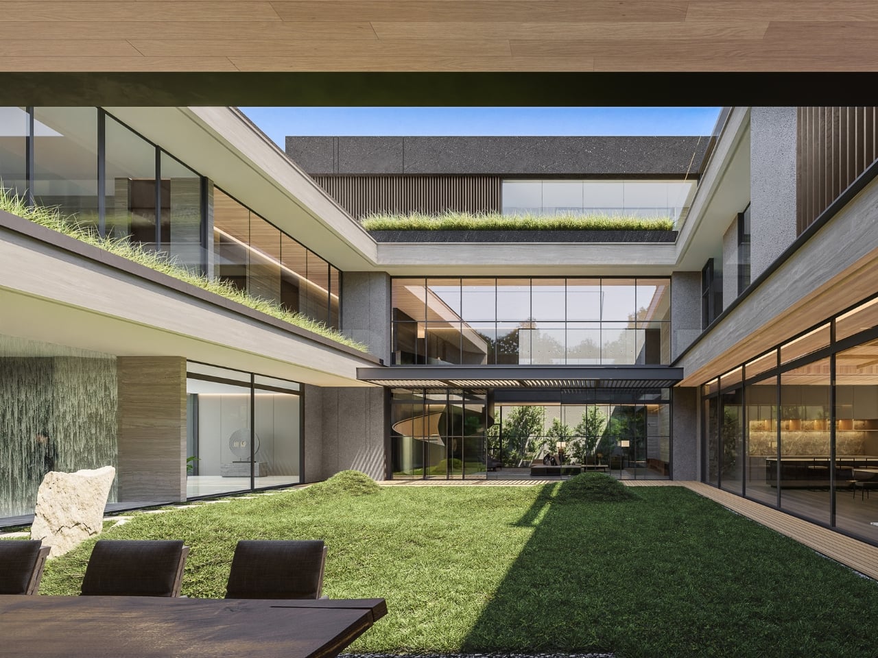
Designer: Giovanni Gunawan for KantorGG (photos by Tristan Salim)
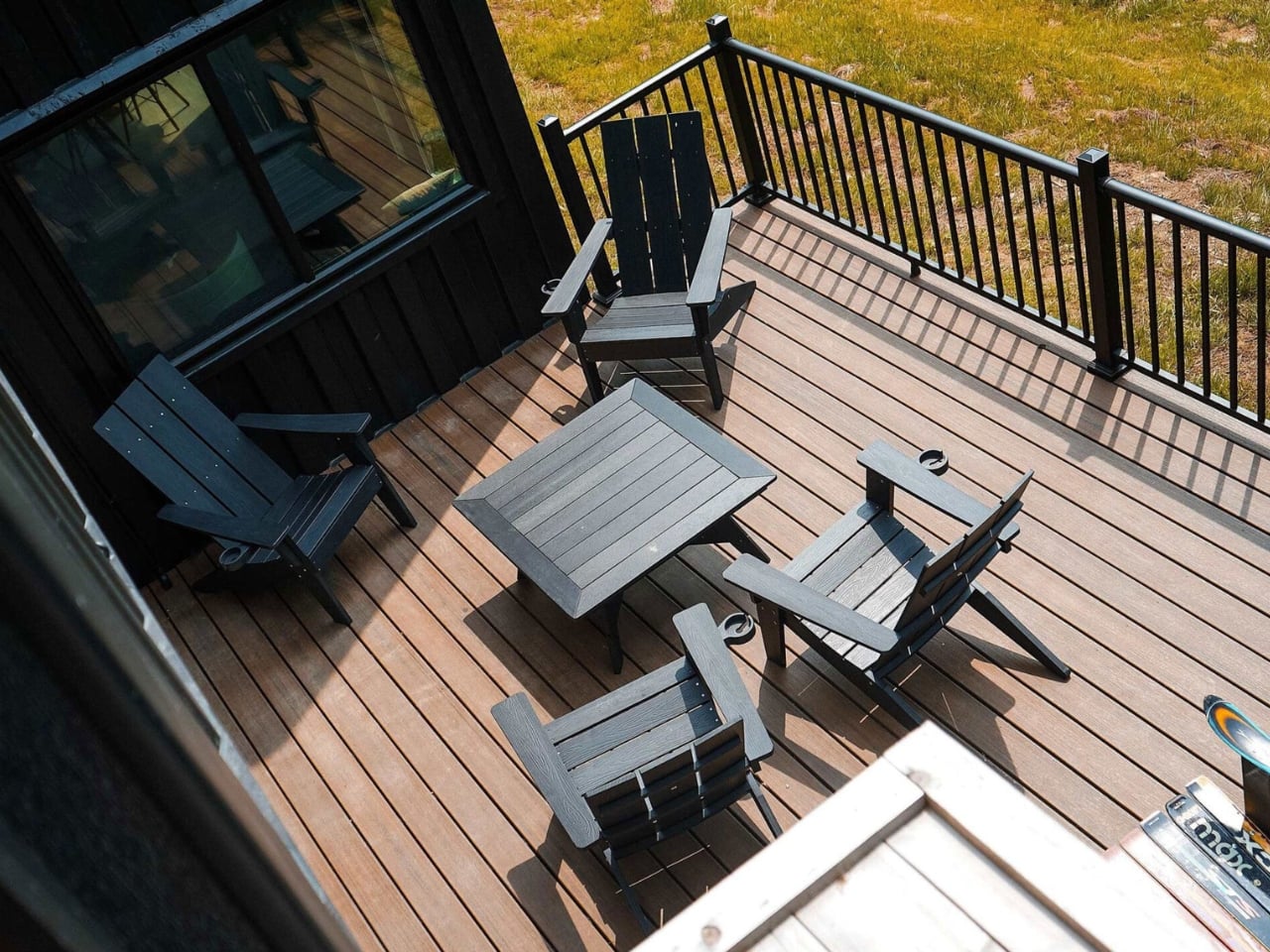
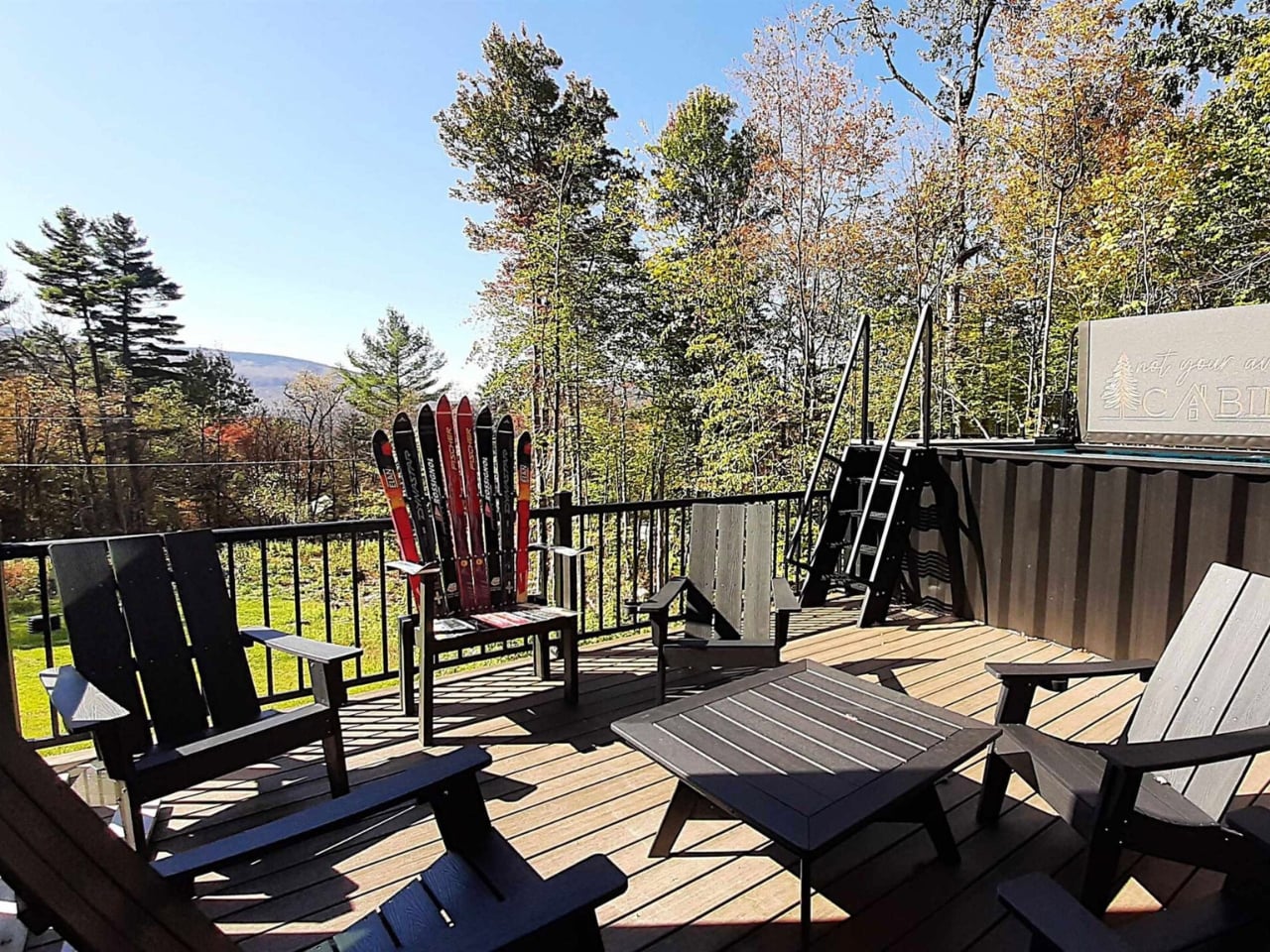
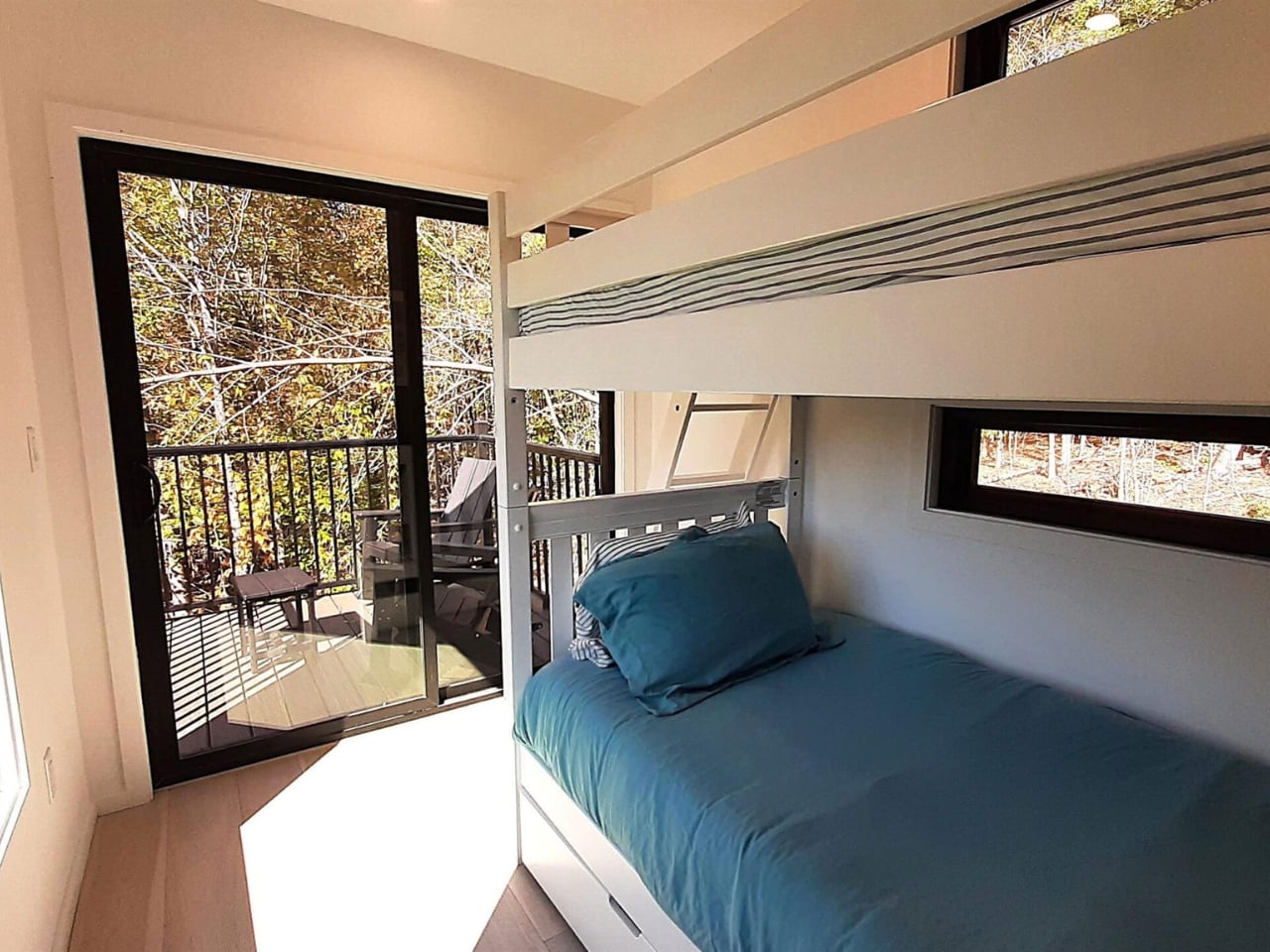
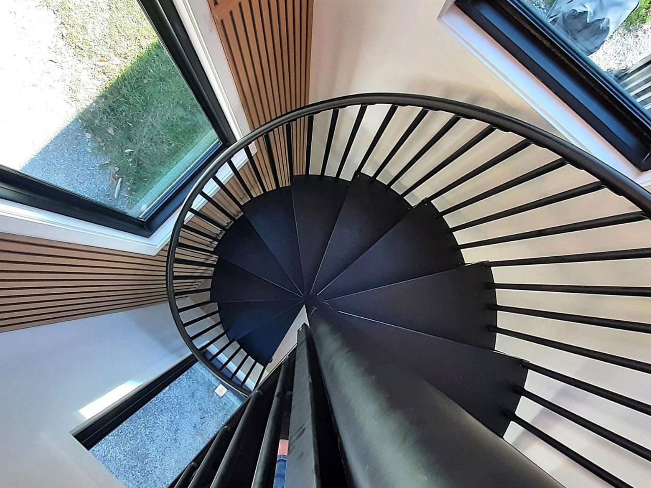
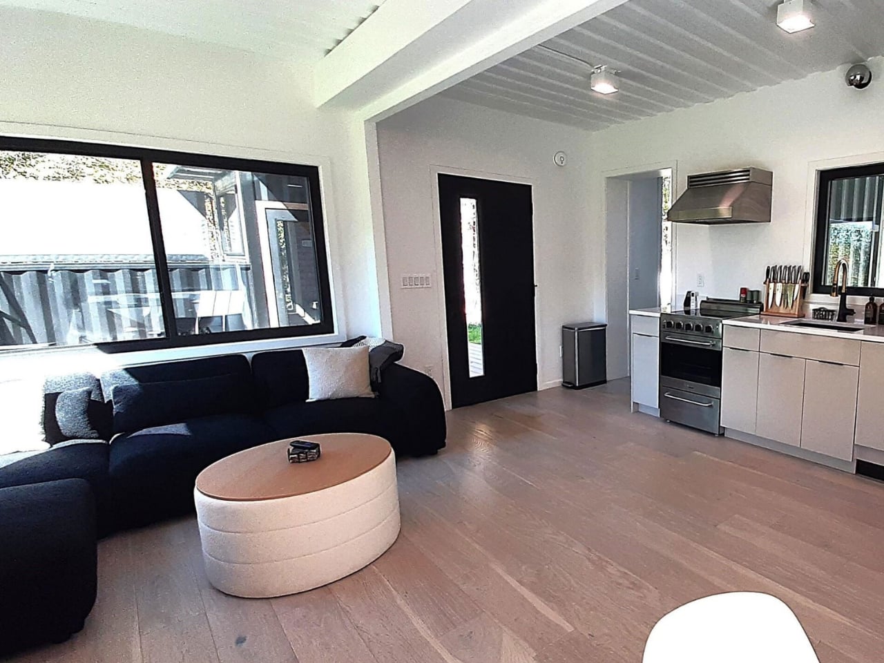
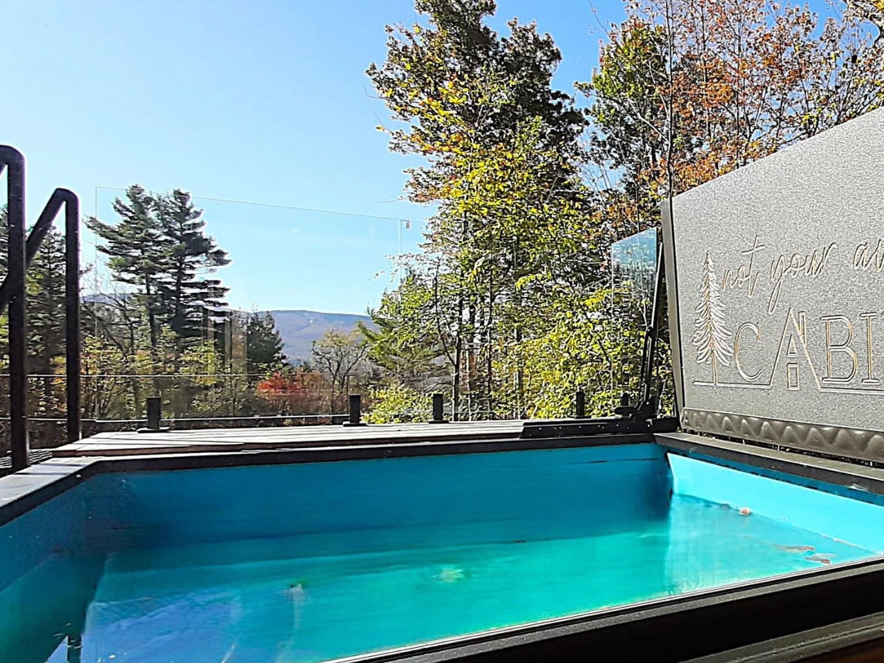
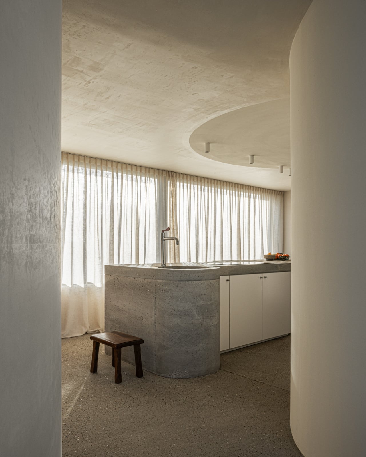
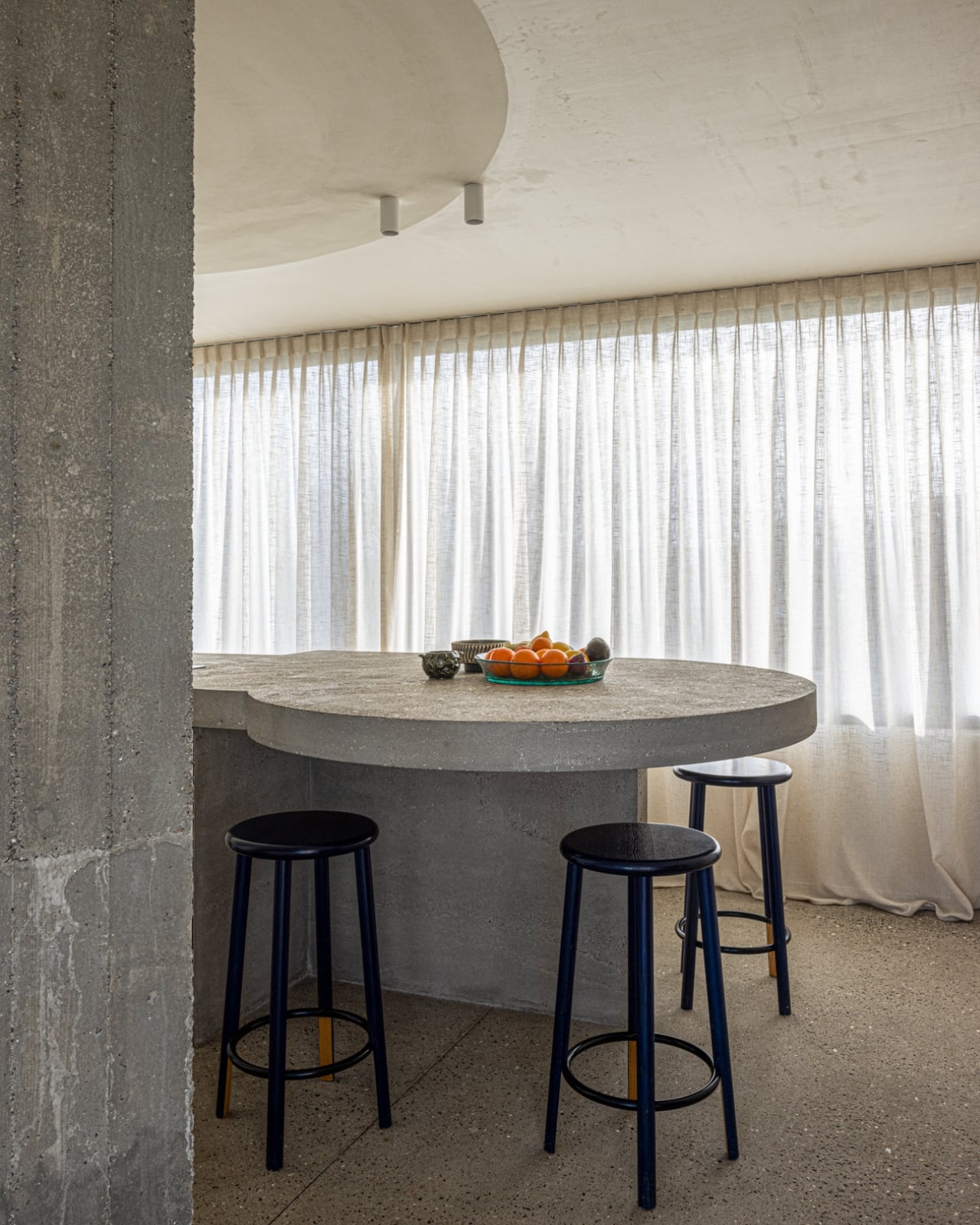
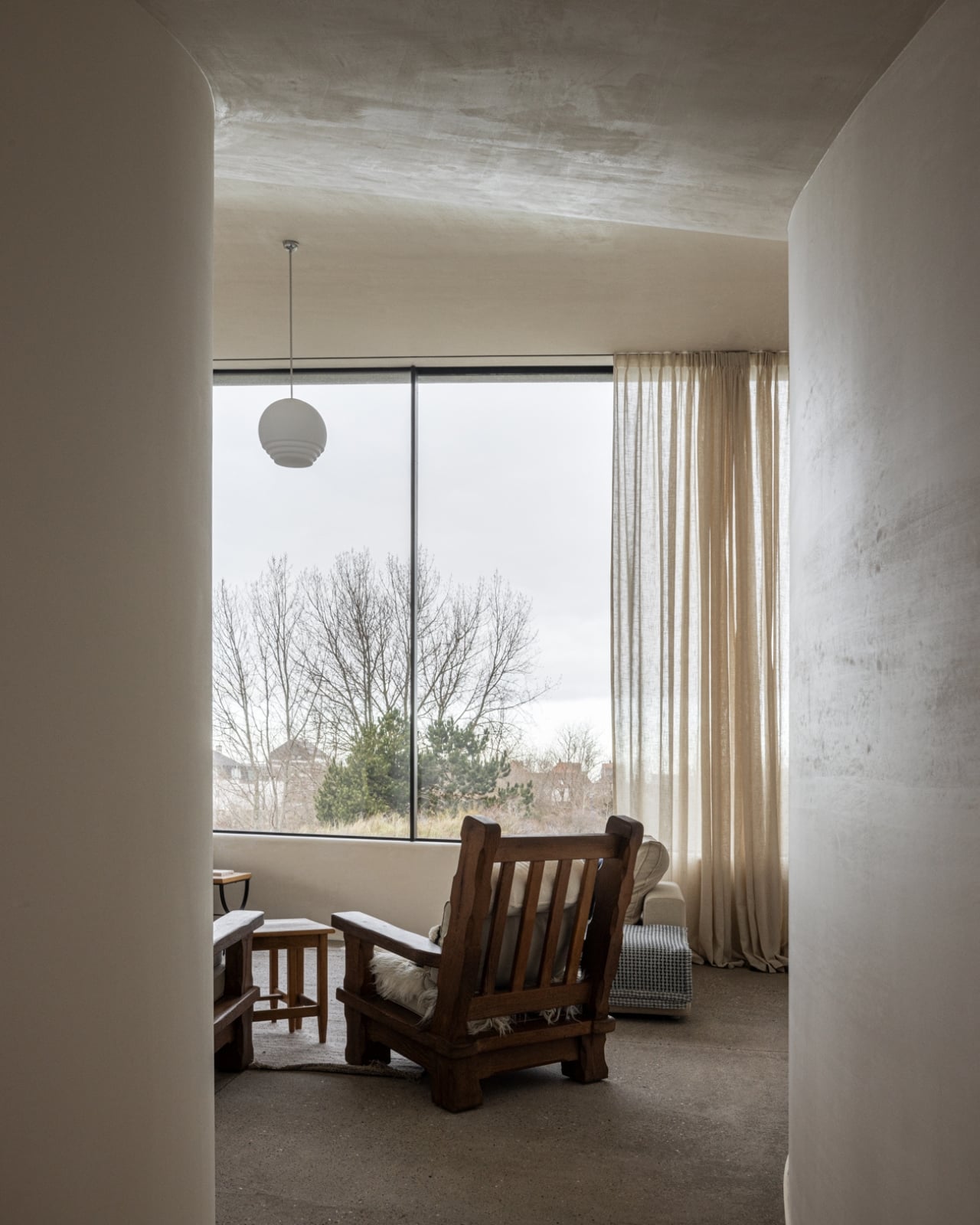
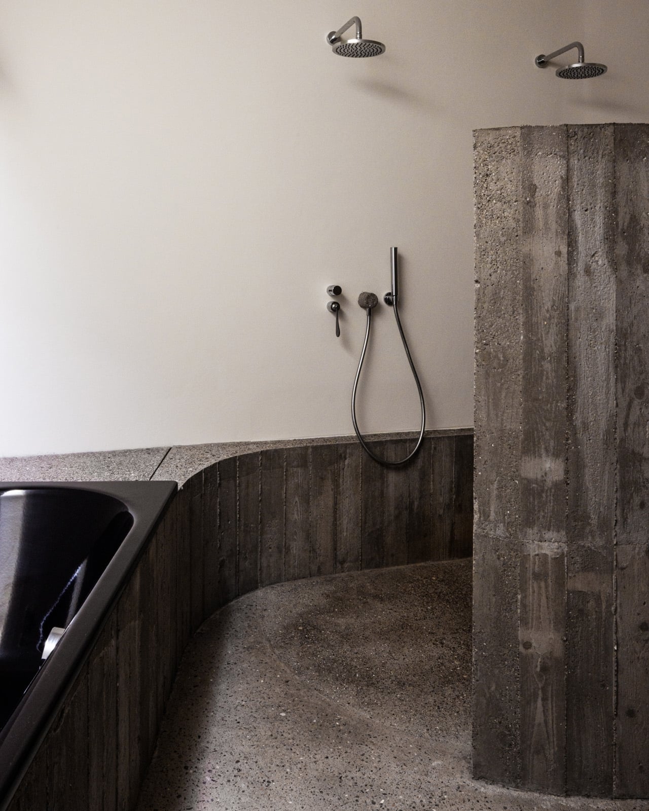
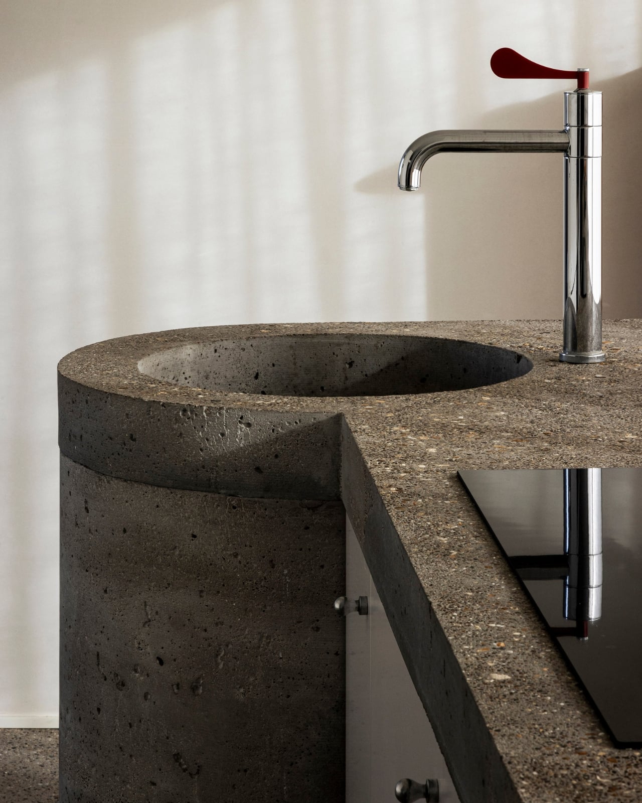
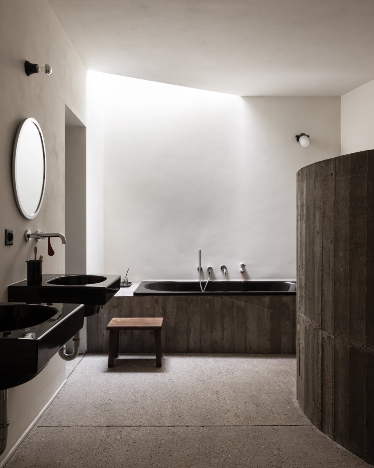
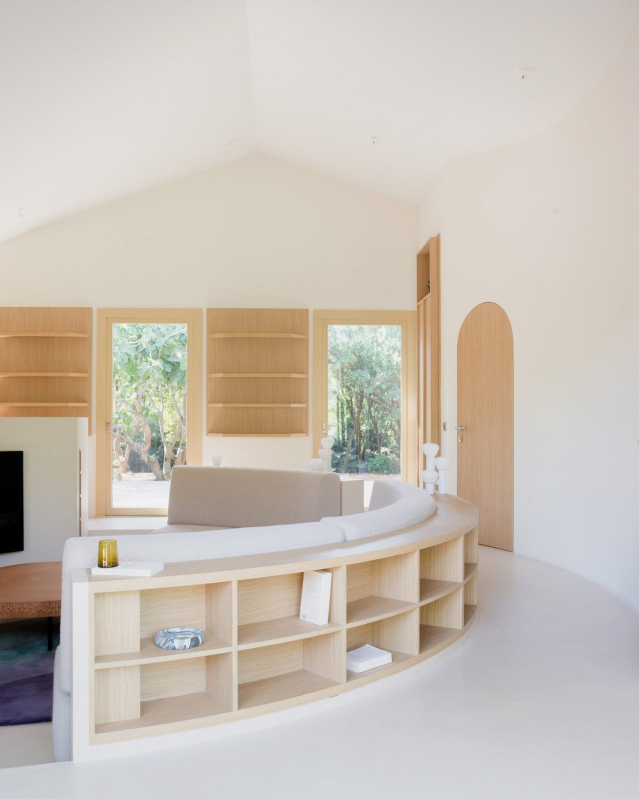
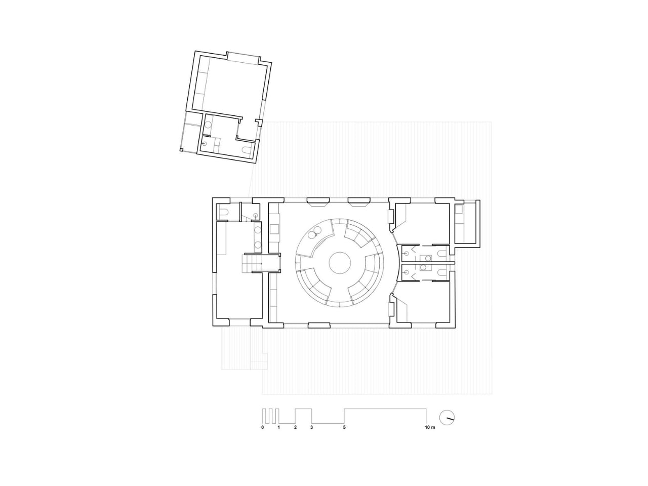
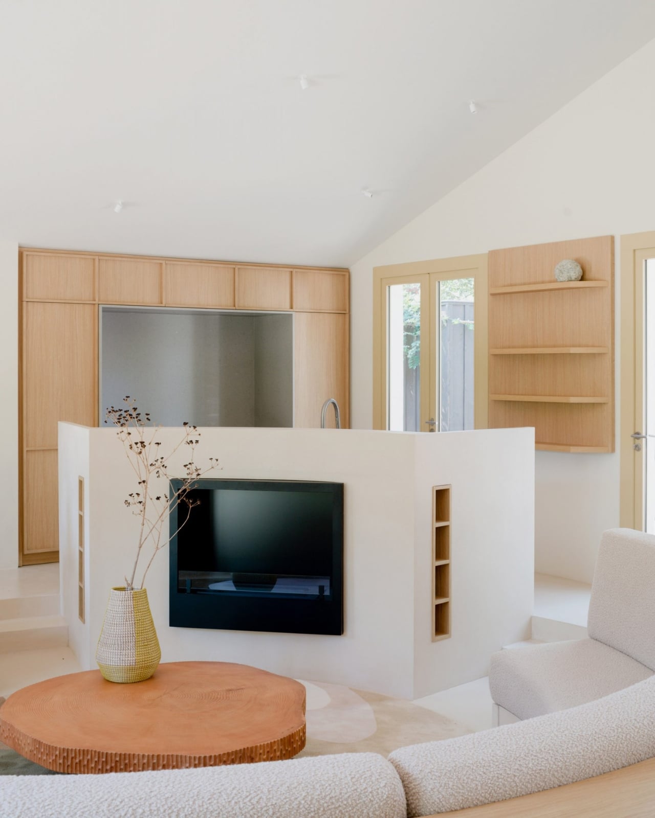
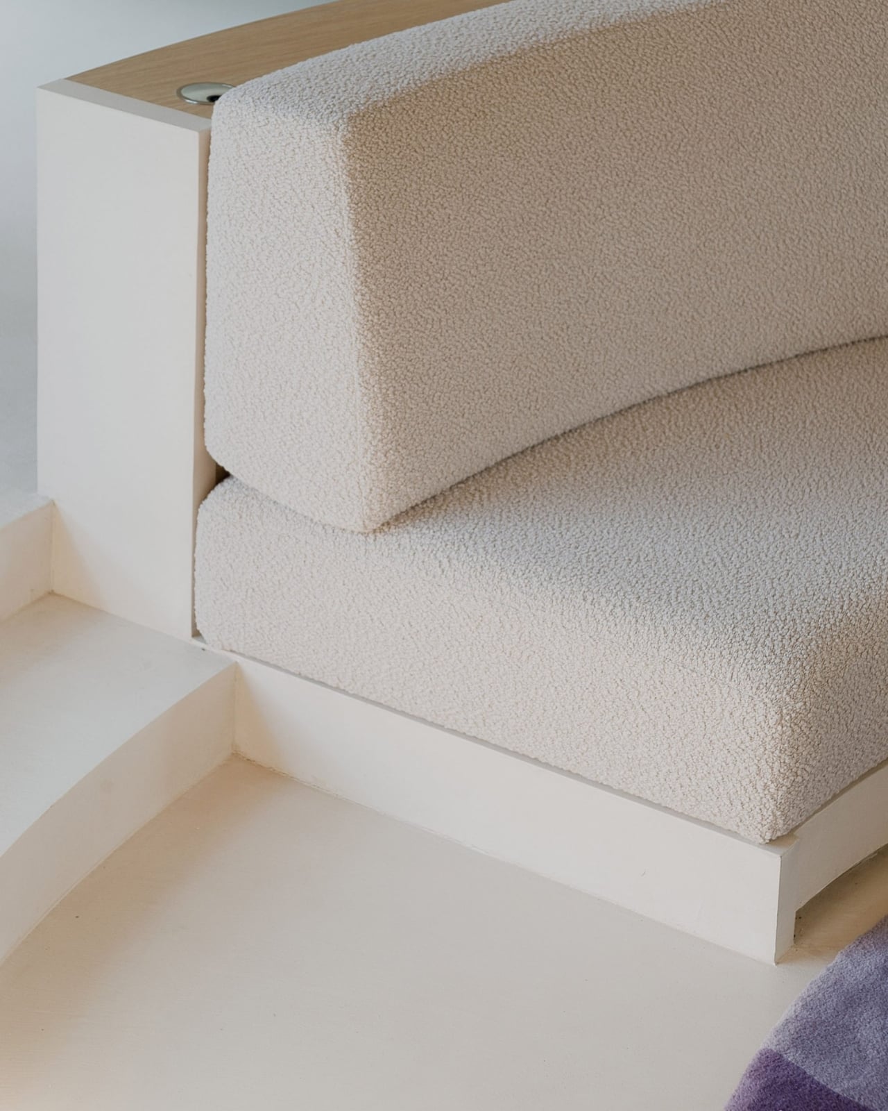
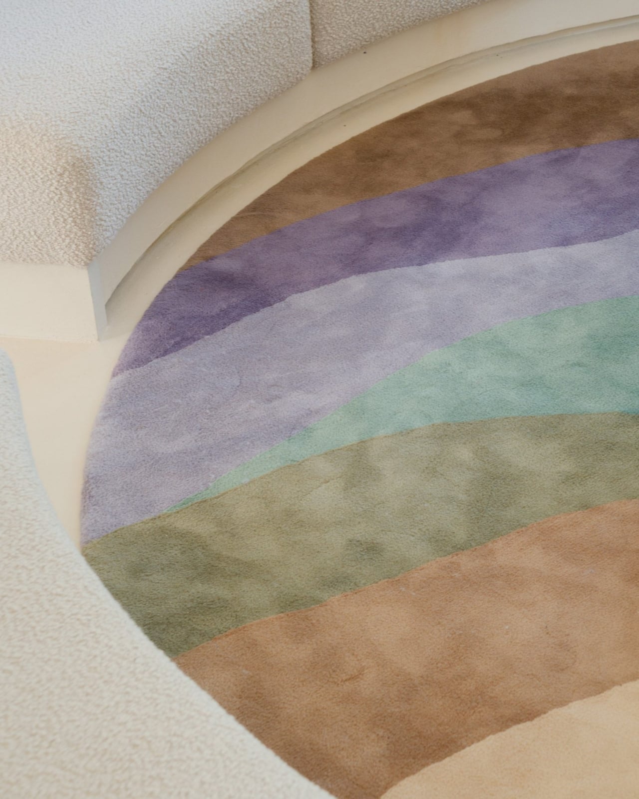
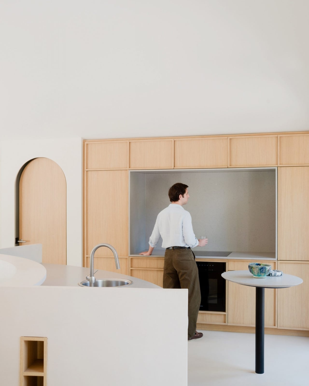
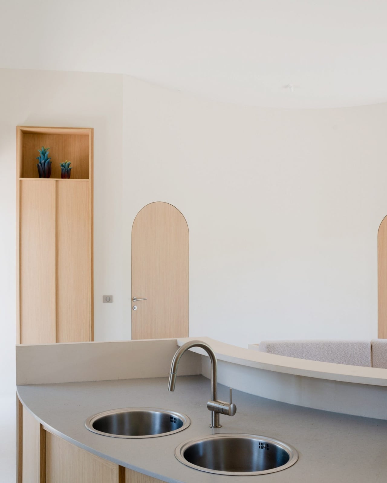
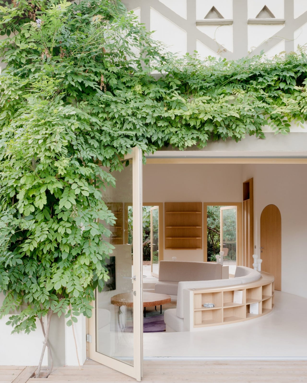
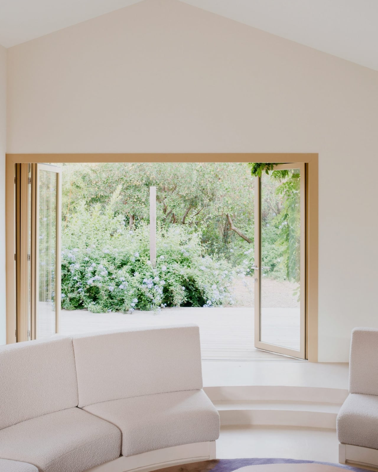
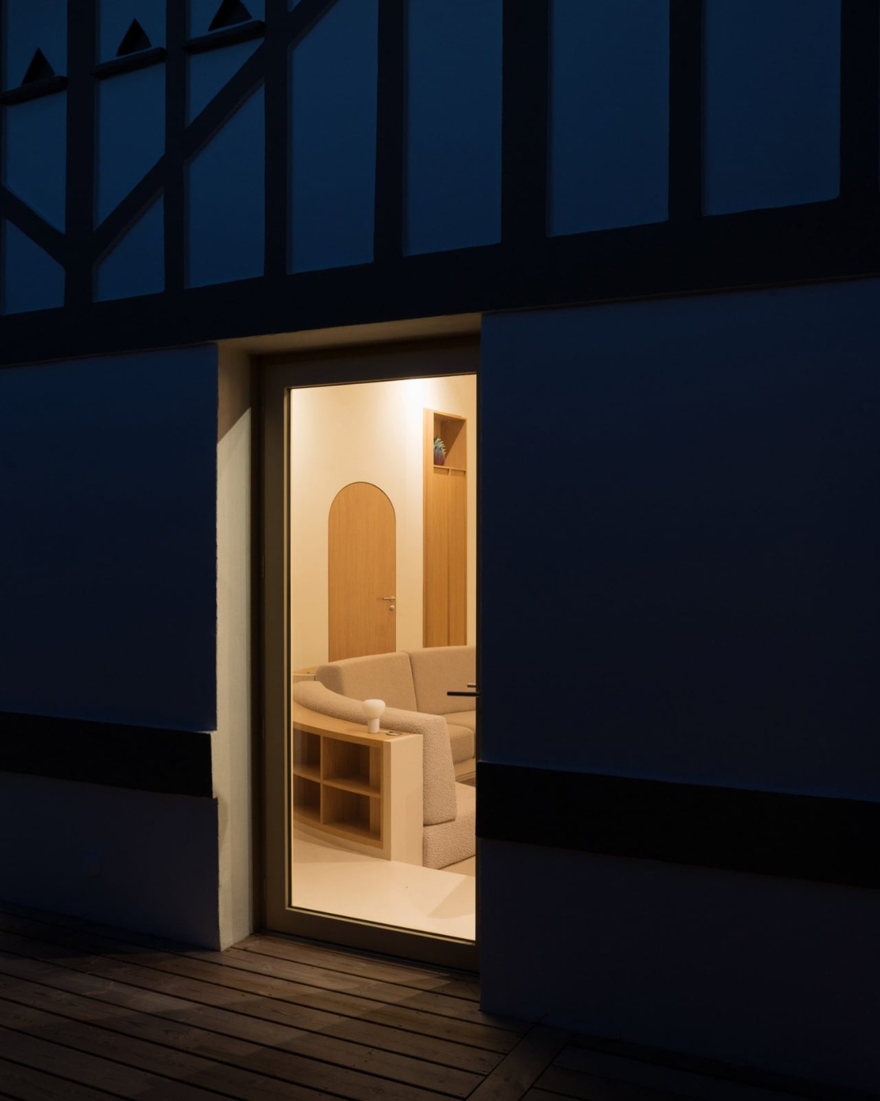
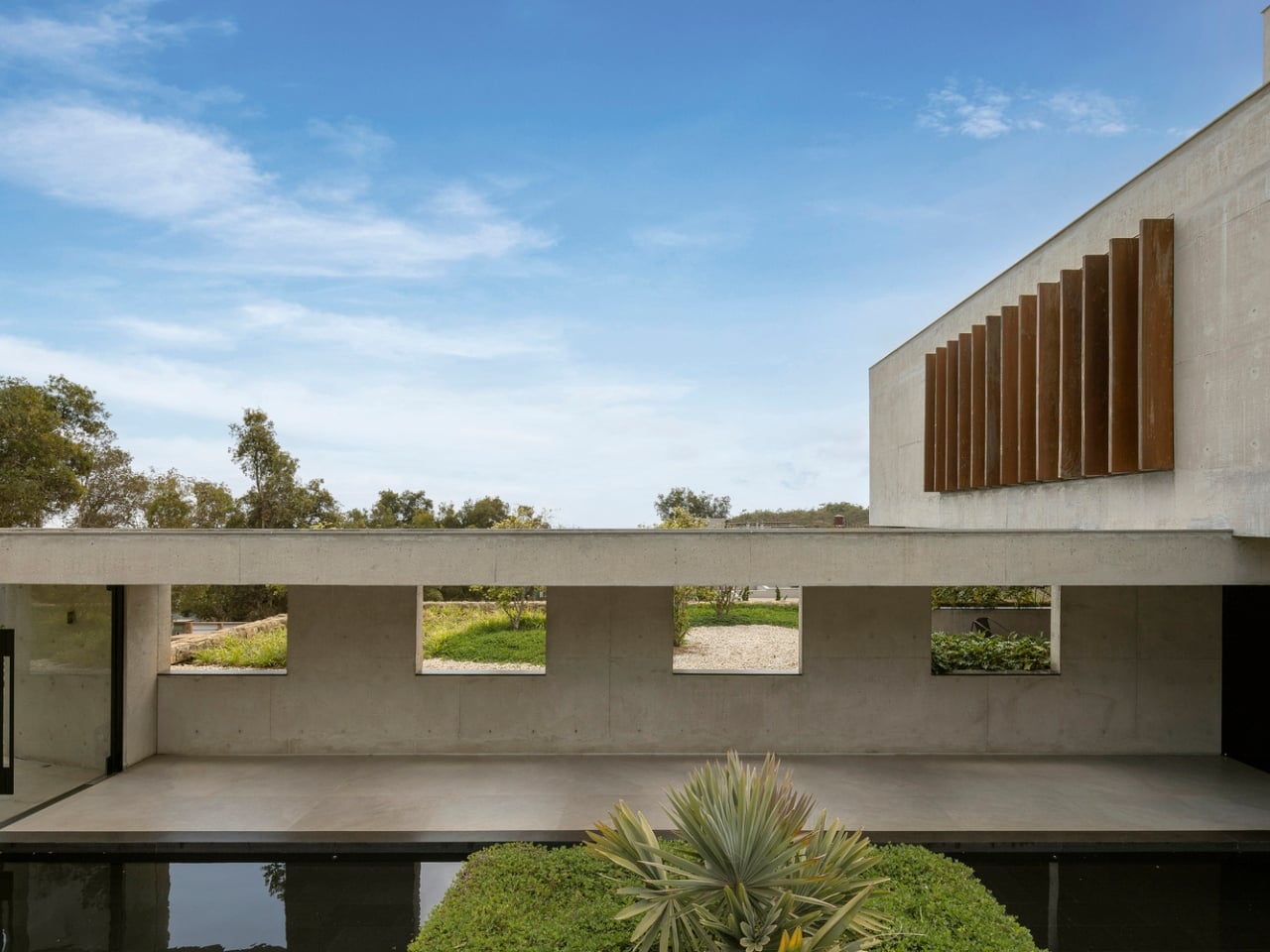
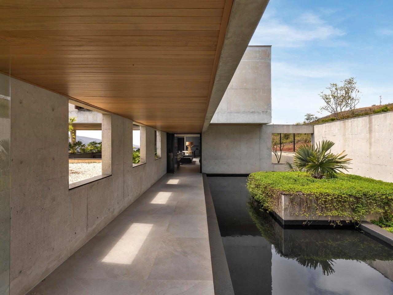
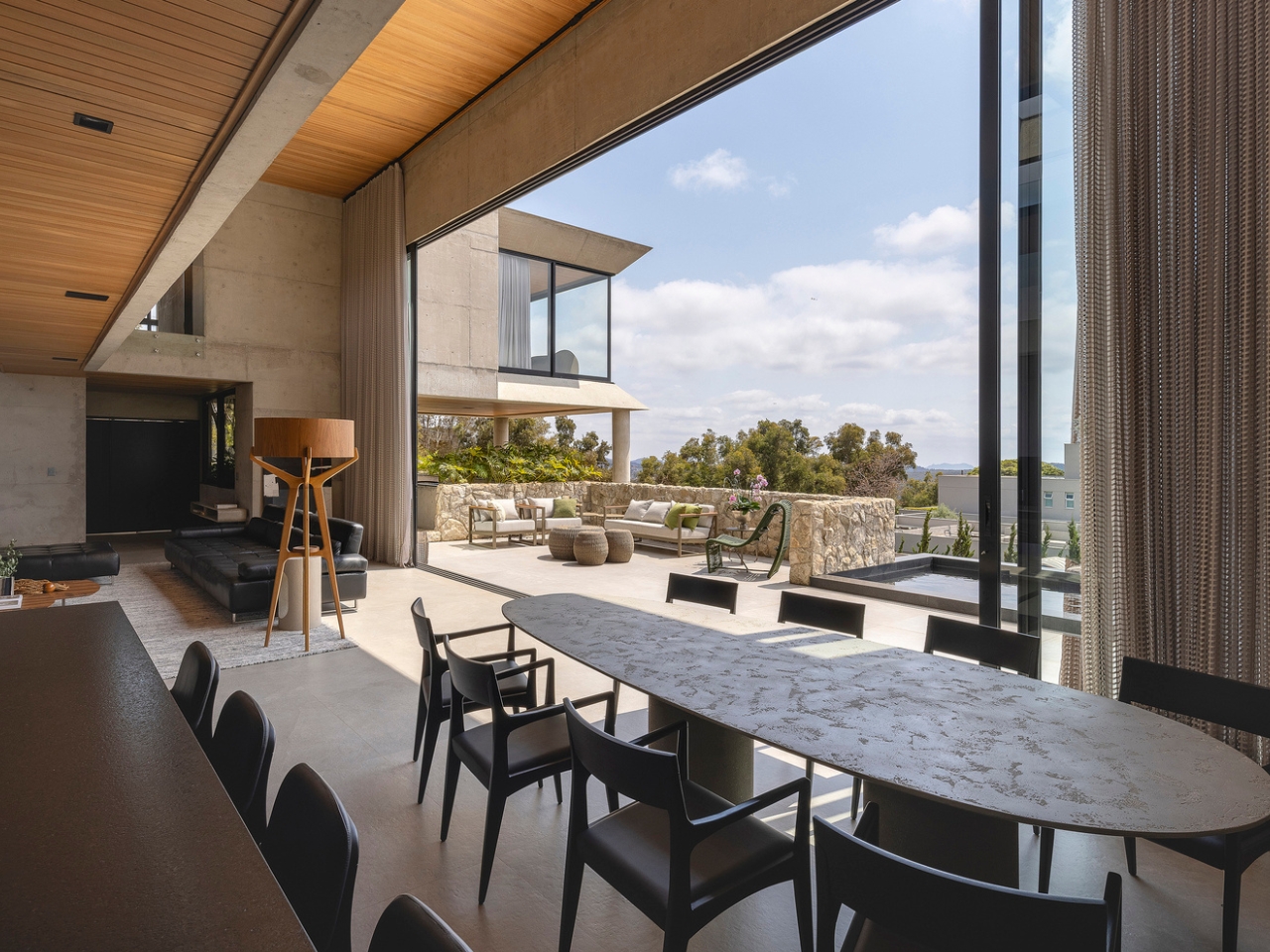
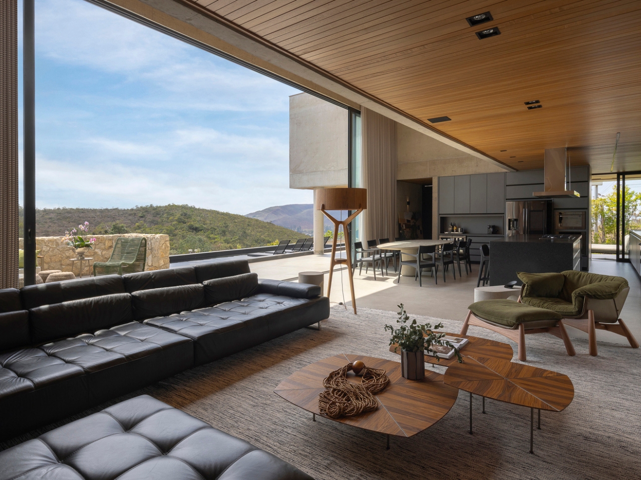
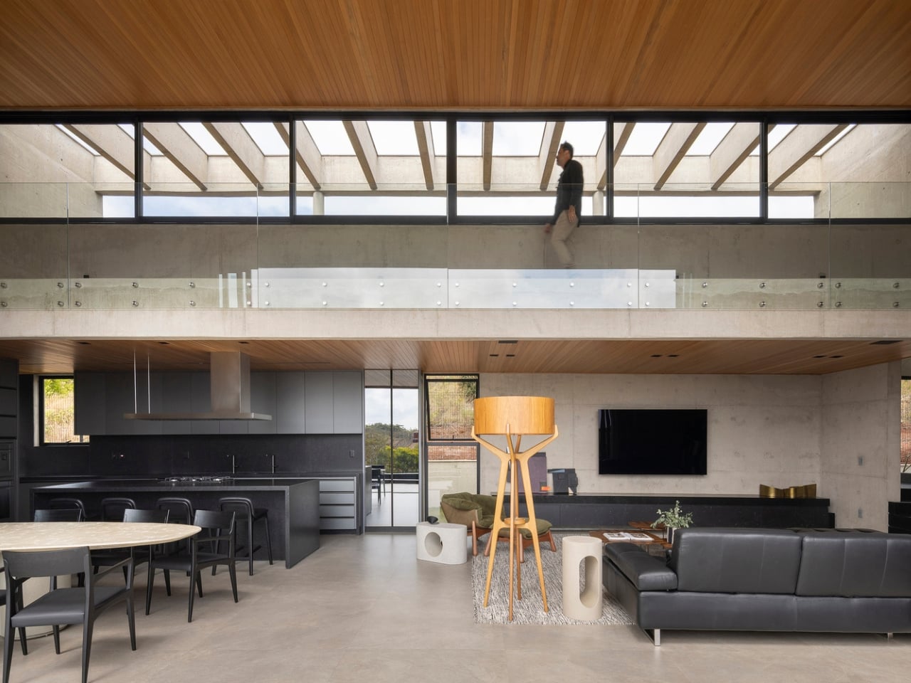
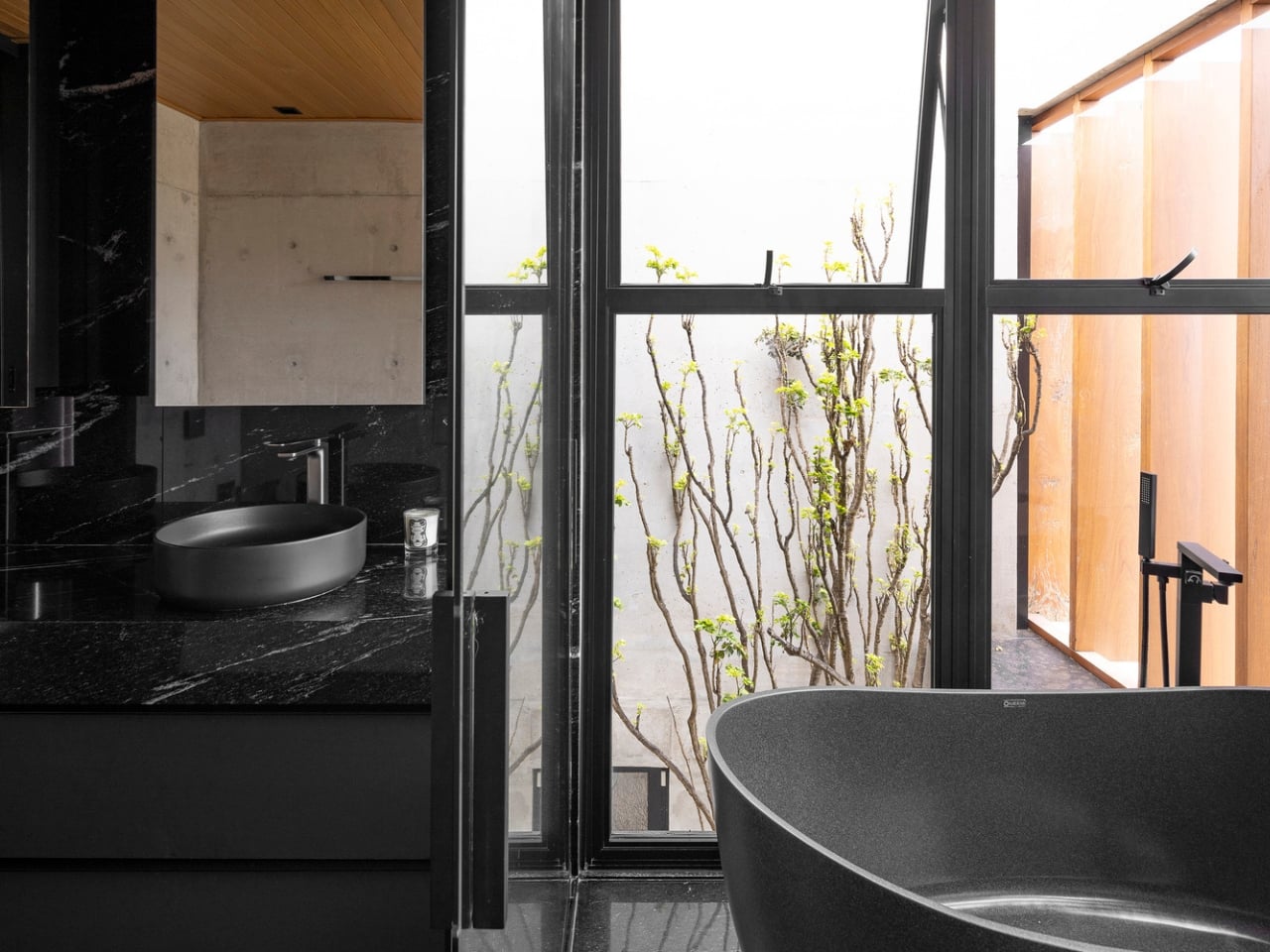
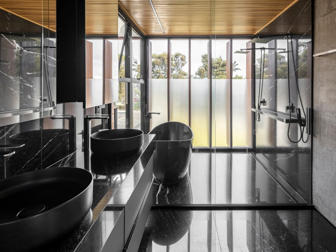
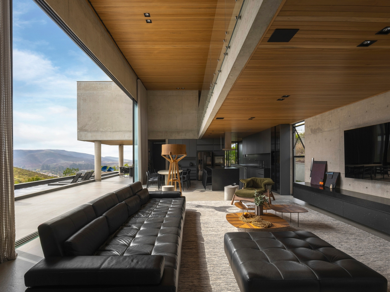
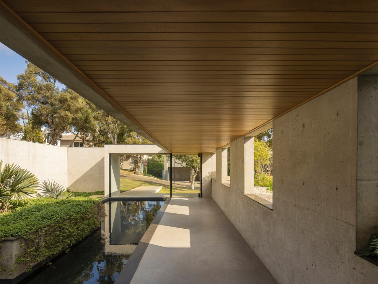
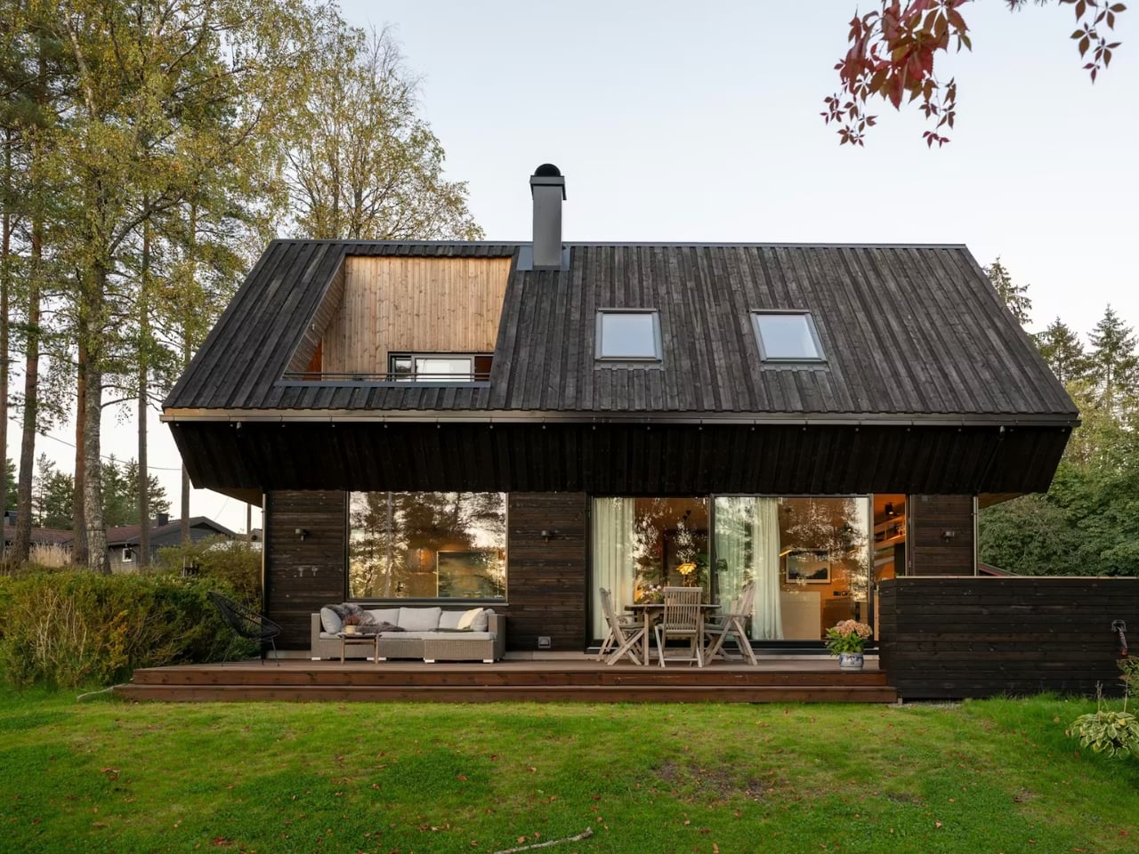
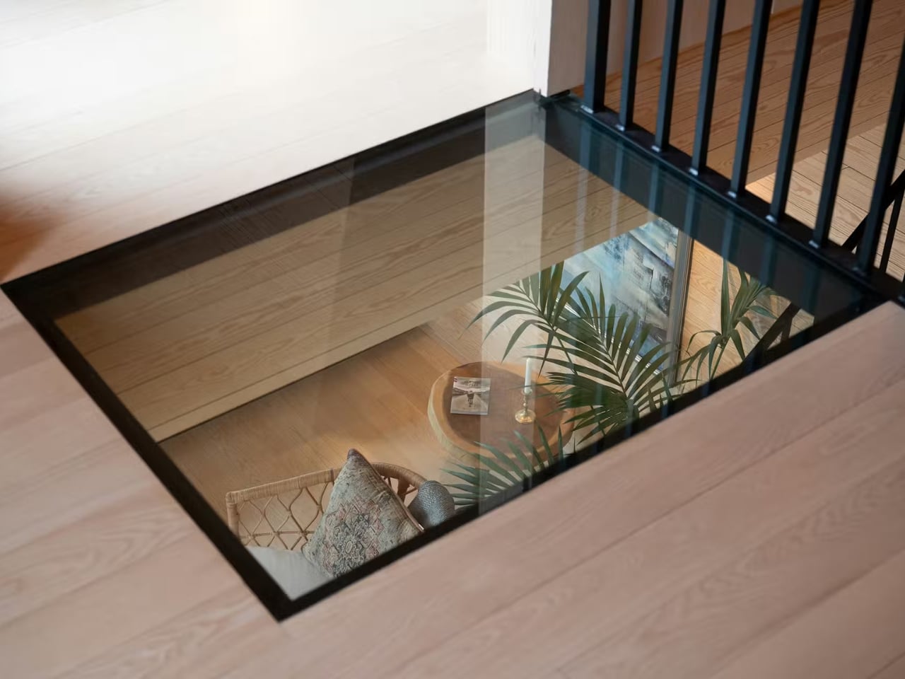
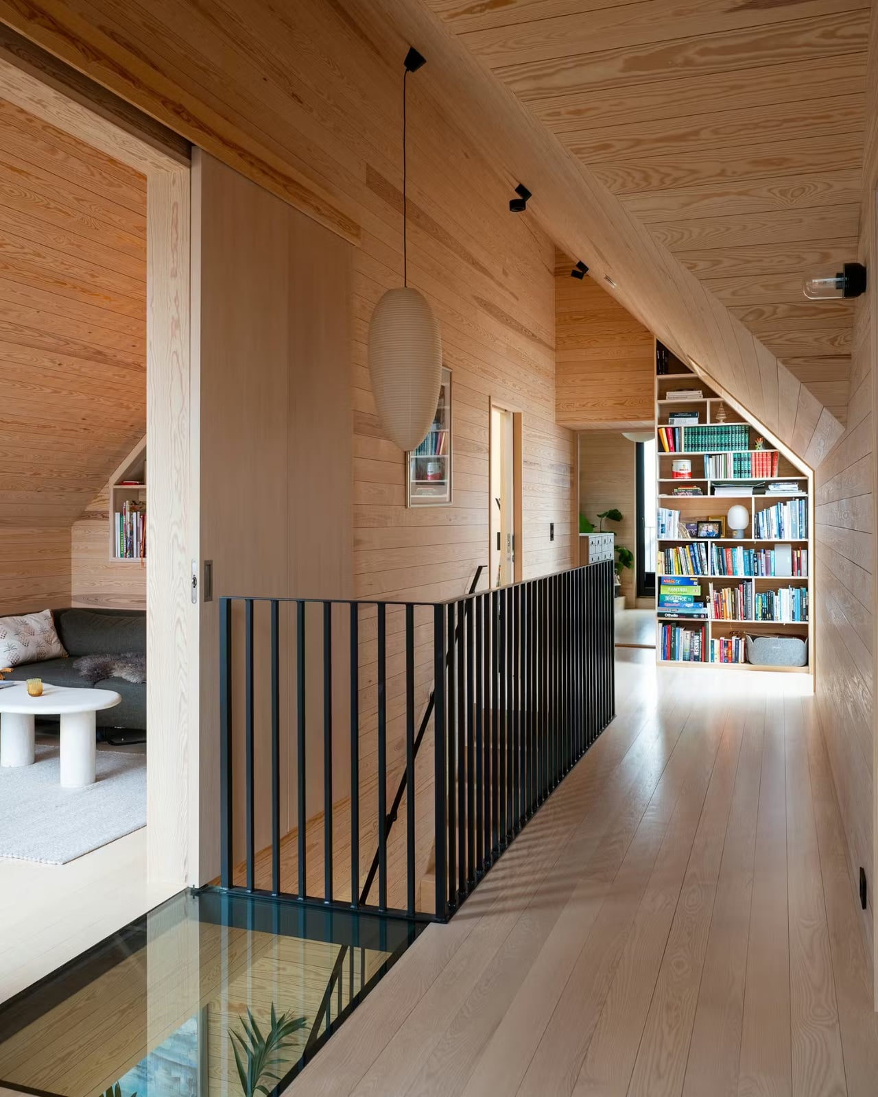
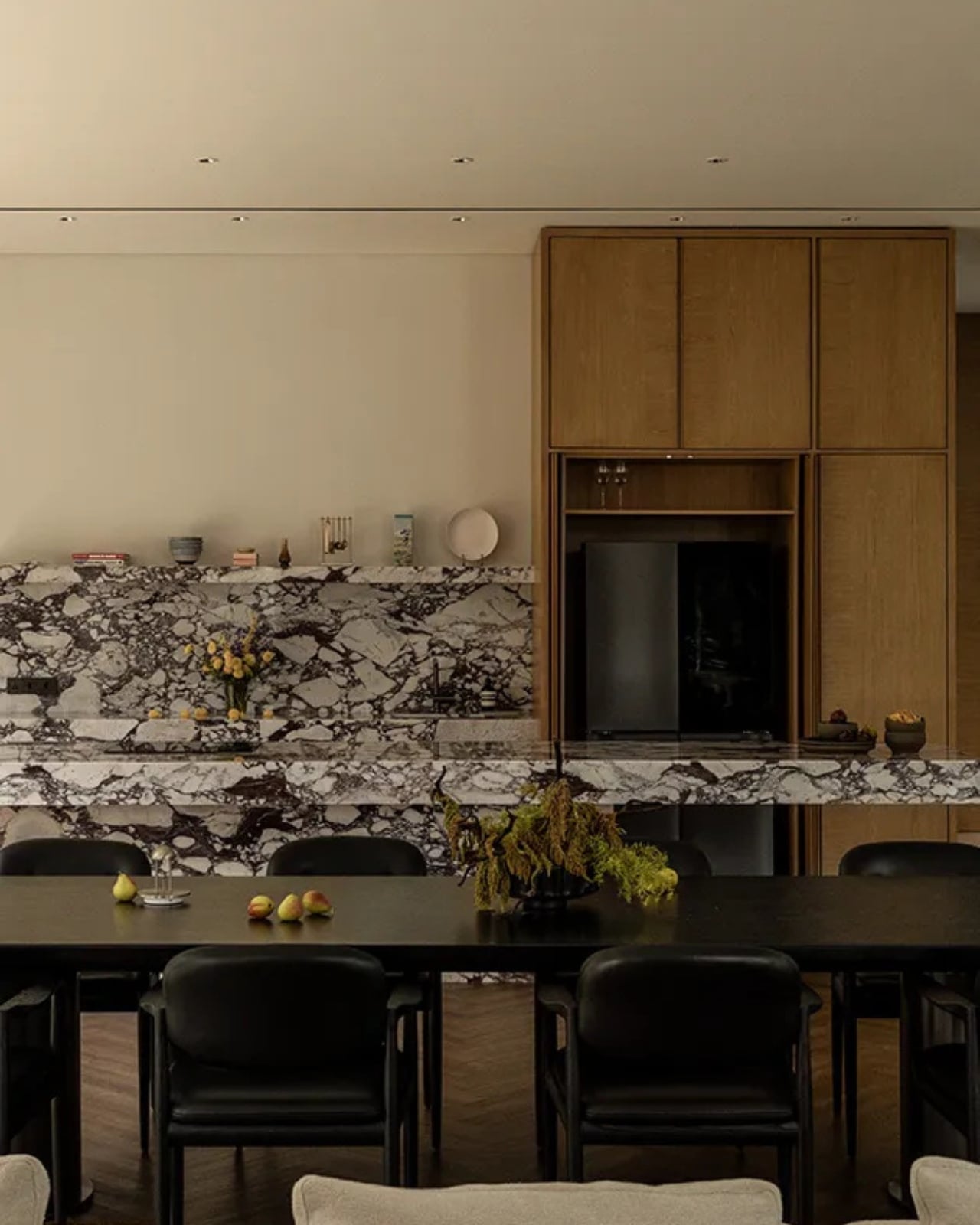
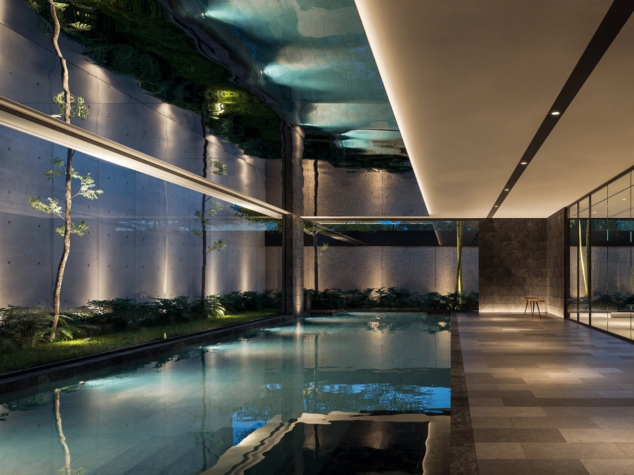
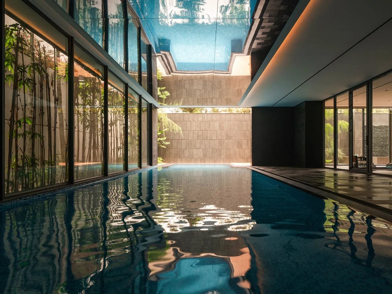
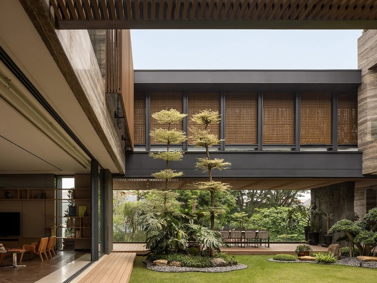
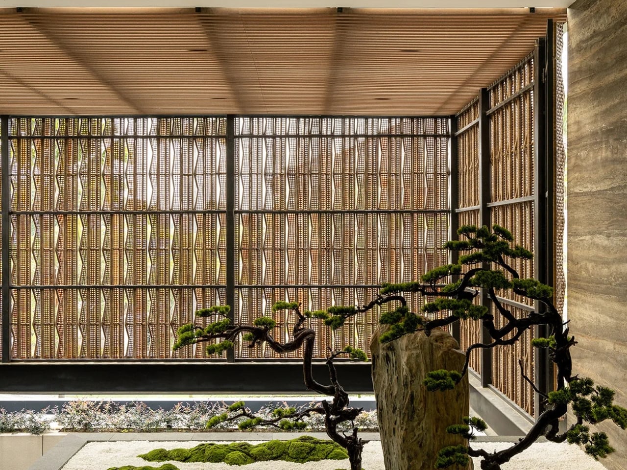
The concept is organized around a central courtyard, natural airflow, dry gardens, and the kind of deliberate voids that make space feel intentional rather than accidental. Gunawan placed dry gardens between the masses and the voids so residents experience the outdoors without sacrificing the comfort of being inside. It sounds simple enough. The execution is anything but. This is Gunawan’s stated interpretation of what tropical living can actually become, and I think he’s asking a question the design world has been skating past for years. We’ve gotten very good at making tropical homes look beautiful in photographs. We are considerably less practiced at making them feel like somewhere genuinely worth inhabiting on an ordinary Tuesday.
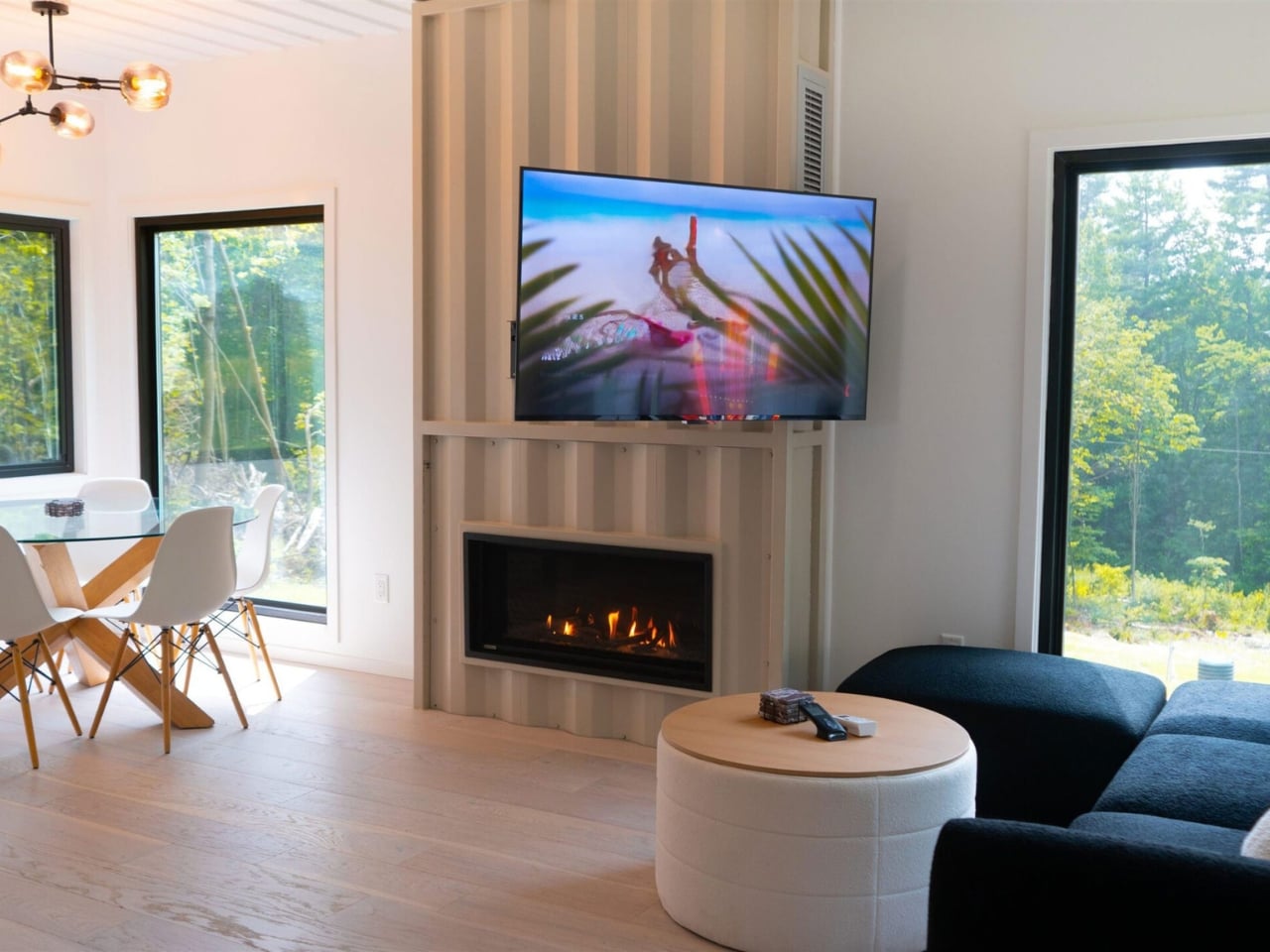
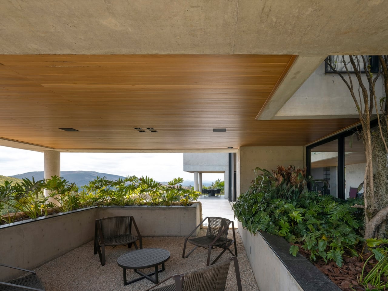
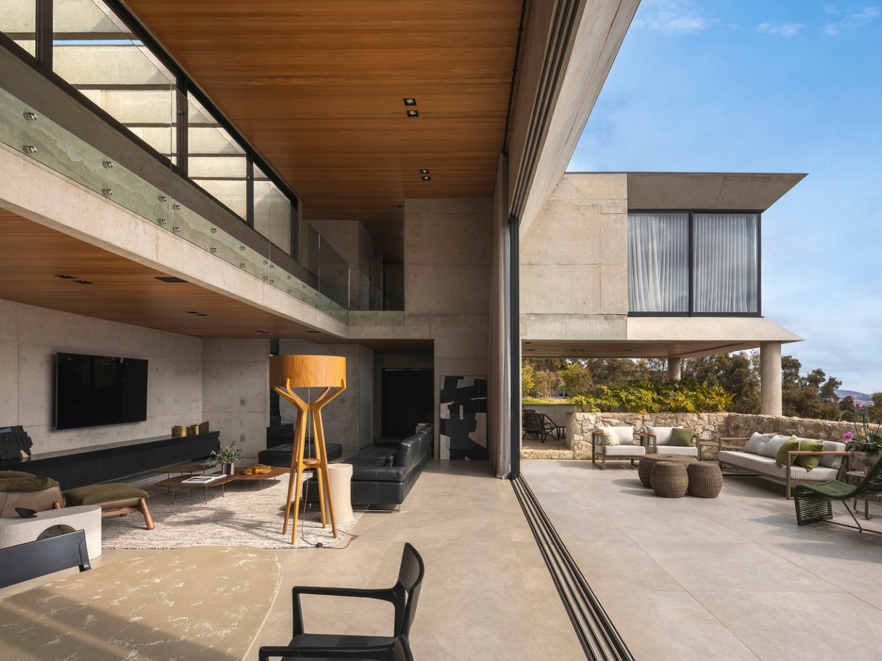
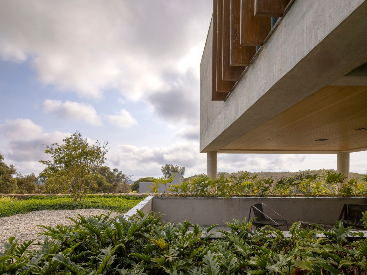
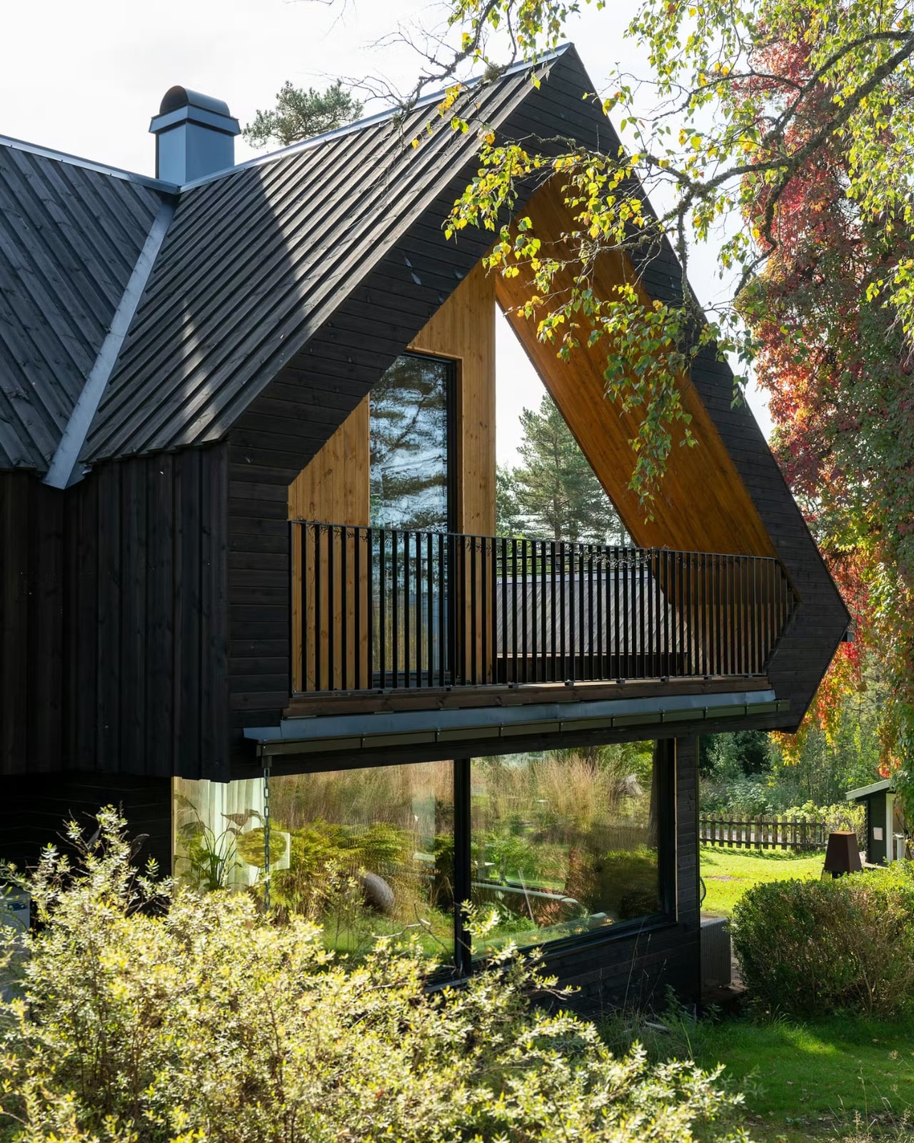
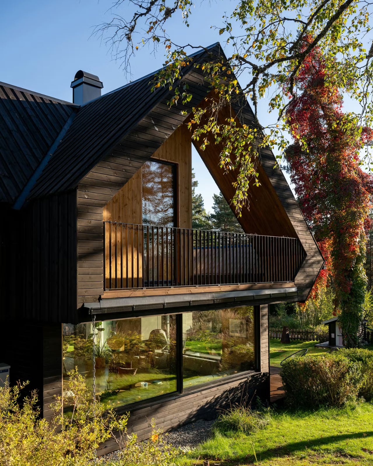
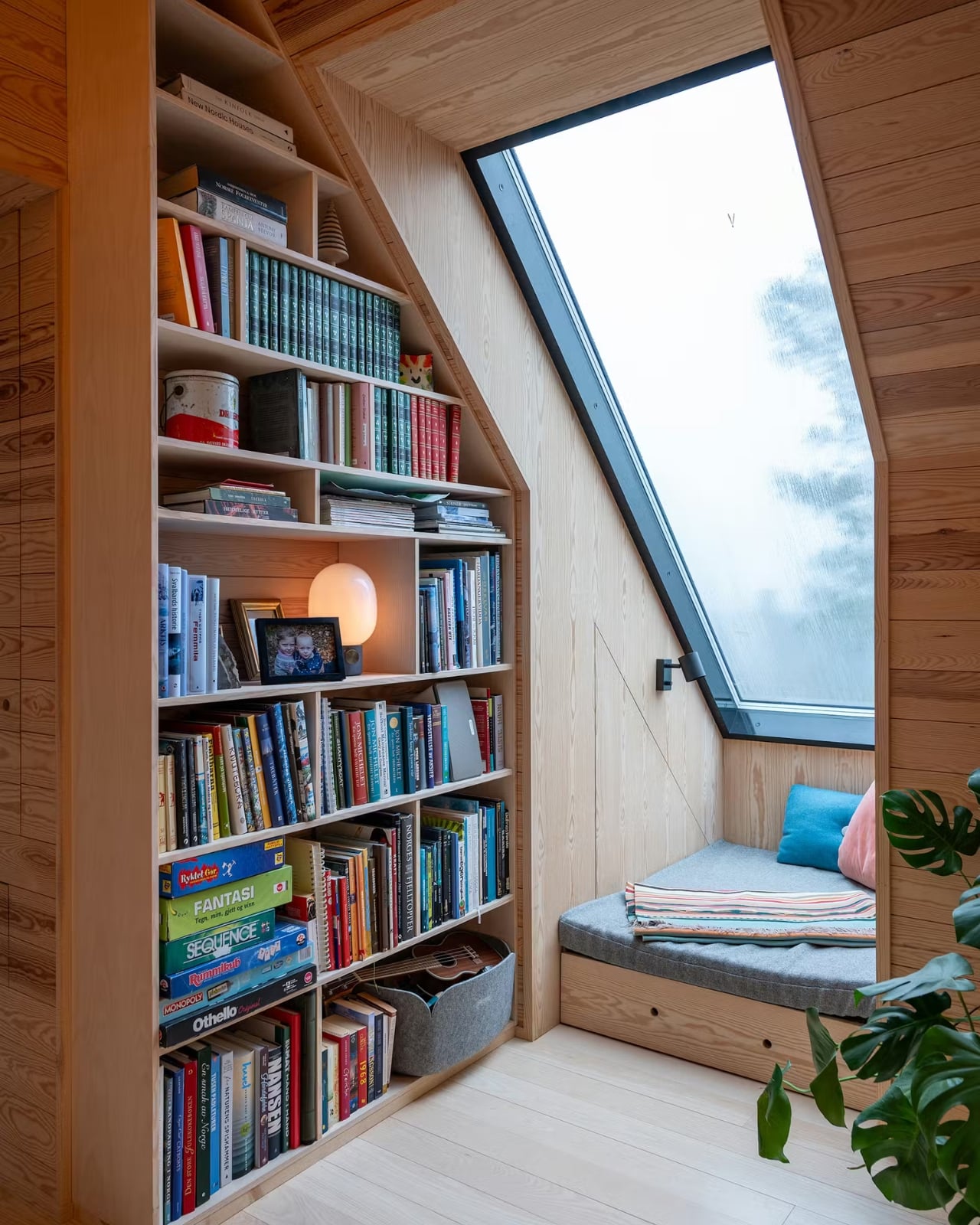
KantorGG’s design ethos centers on “living with nature, inside and out,” and SE House is probably the clearest expression of that philosophy yet. The existing mature trees on the site weren’t cleared to make room for clean lines. They were preserved as spatial anchors, the kind of decision that takes real confidence because it limits what you can do architecturally, and then rewards you generously in return. Shaded seating under dappled light, shifting reflections, the particular quality of sitting beneath something old and rooted. That’s not something you can manufacture after the fact.
The Australian-inflected sensibility woven through the design deserves a closer look. Gunawan studied abroad, and that cross-pollination shows up in SE House’s structure without being heavy-handed about it. The house doesn’t read as imported or imitated. It reads as absorbed and reissued through a sensibility that is distinctly Indonesian. That tension between influences, when handled well, produces architecture that belongs nowhere else and everywhere at once.
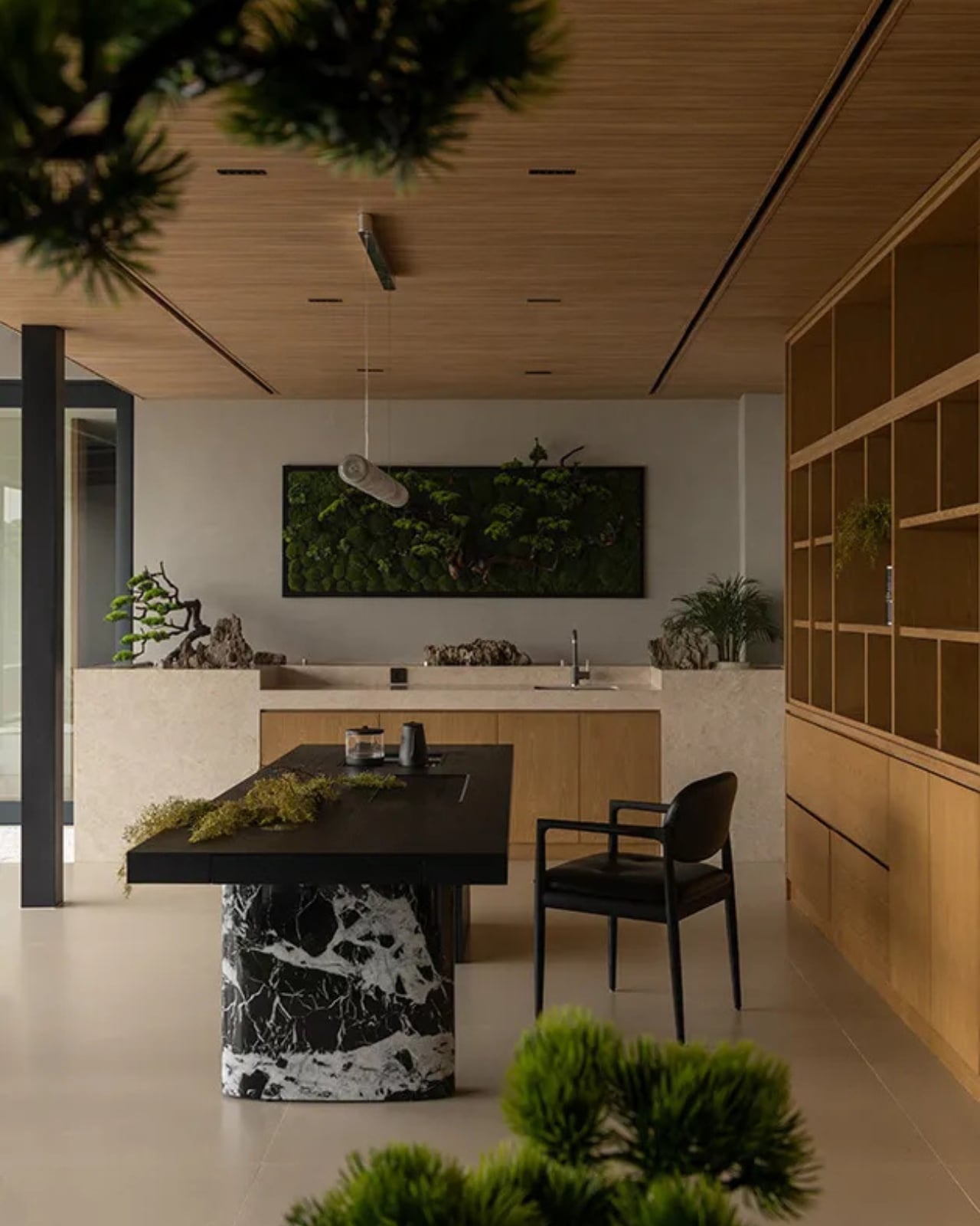
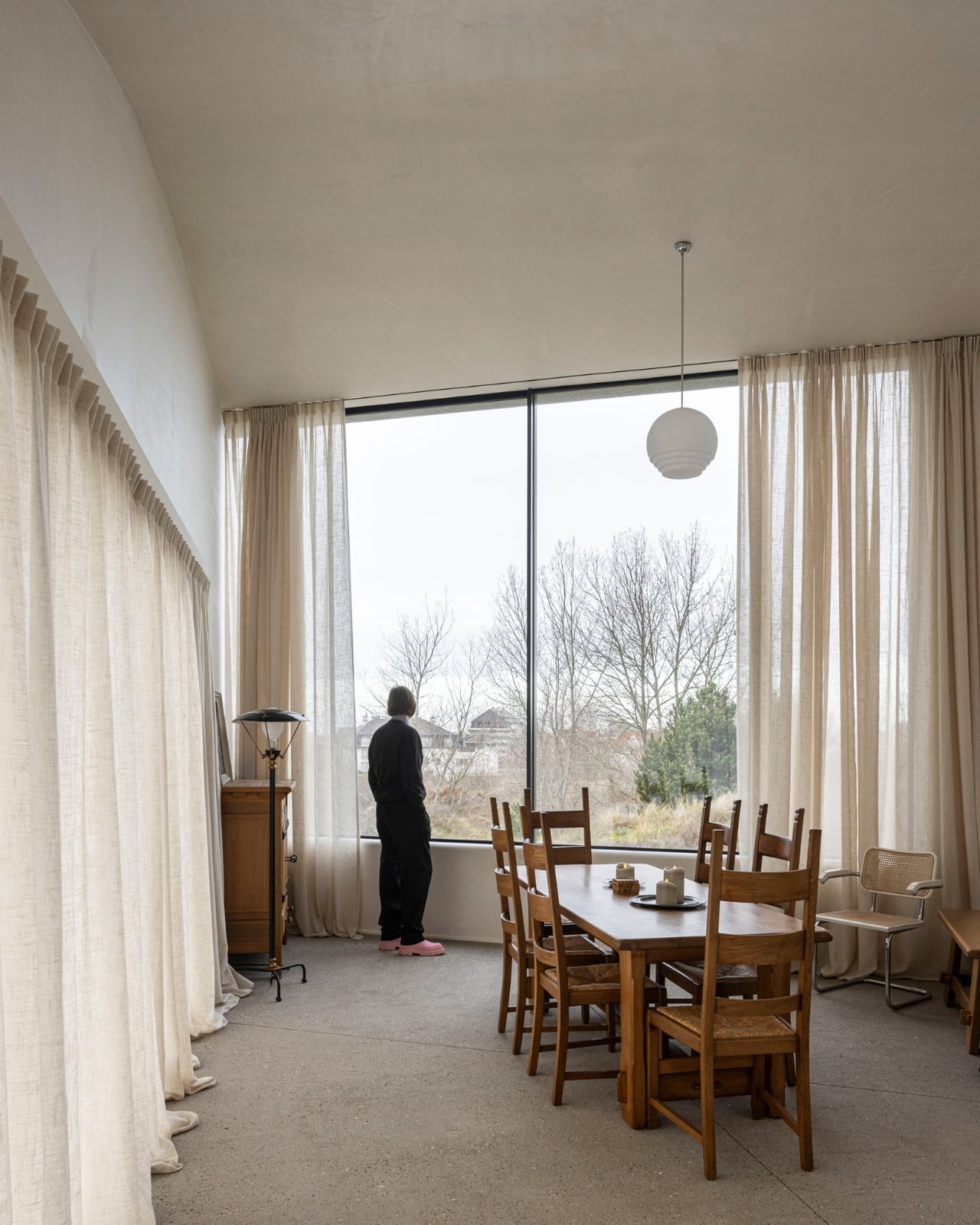
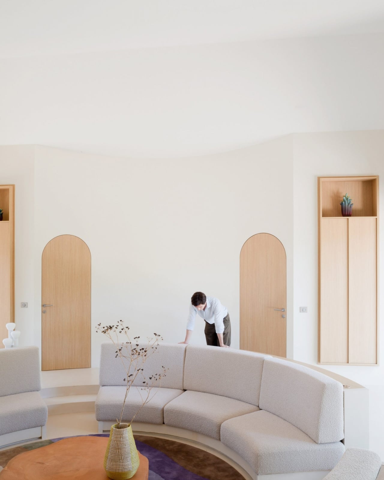
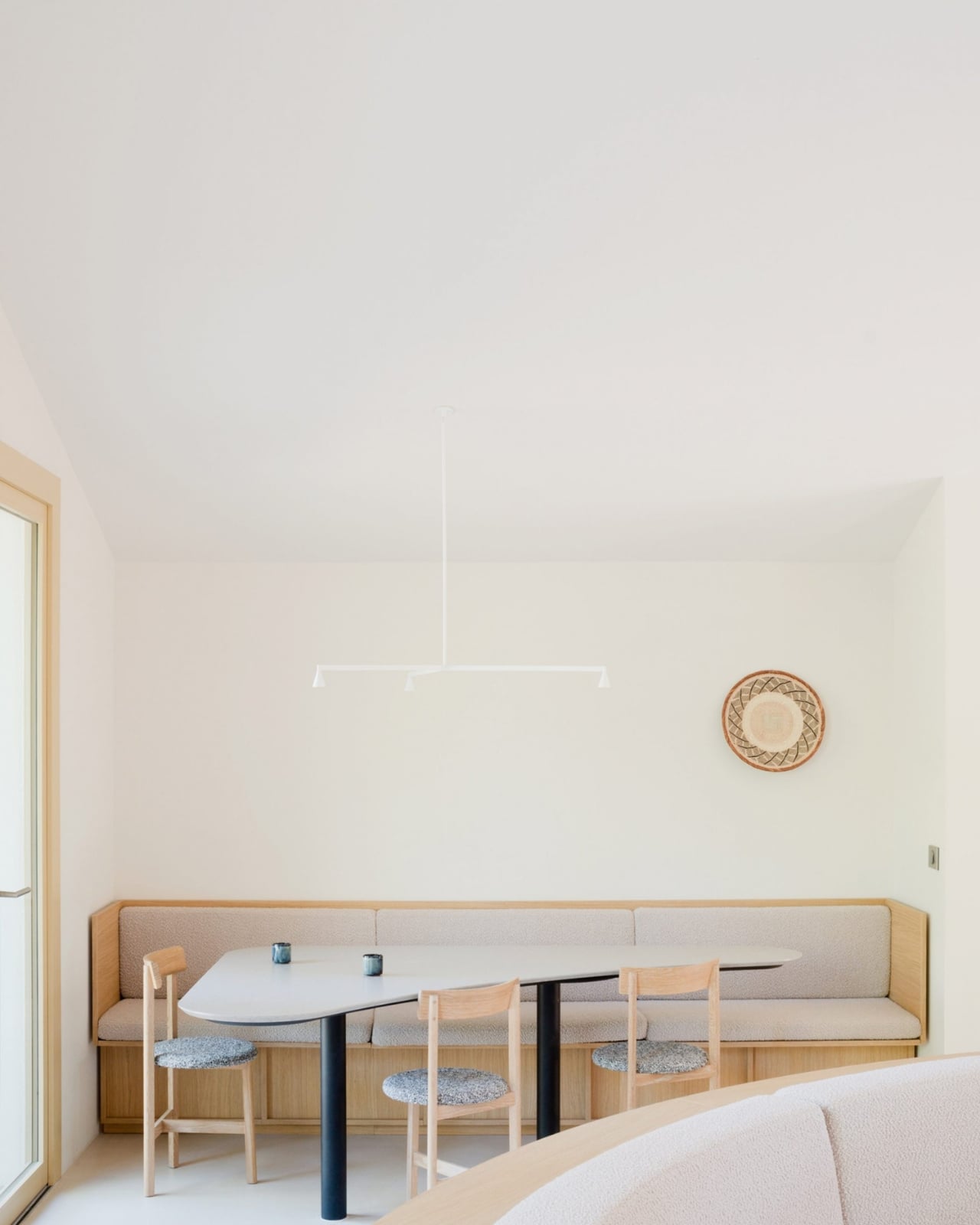
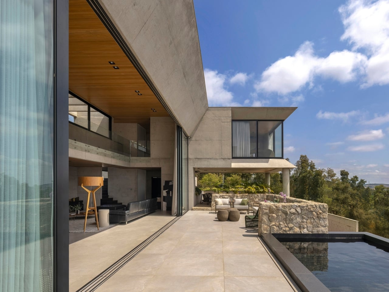
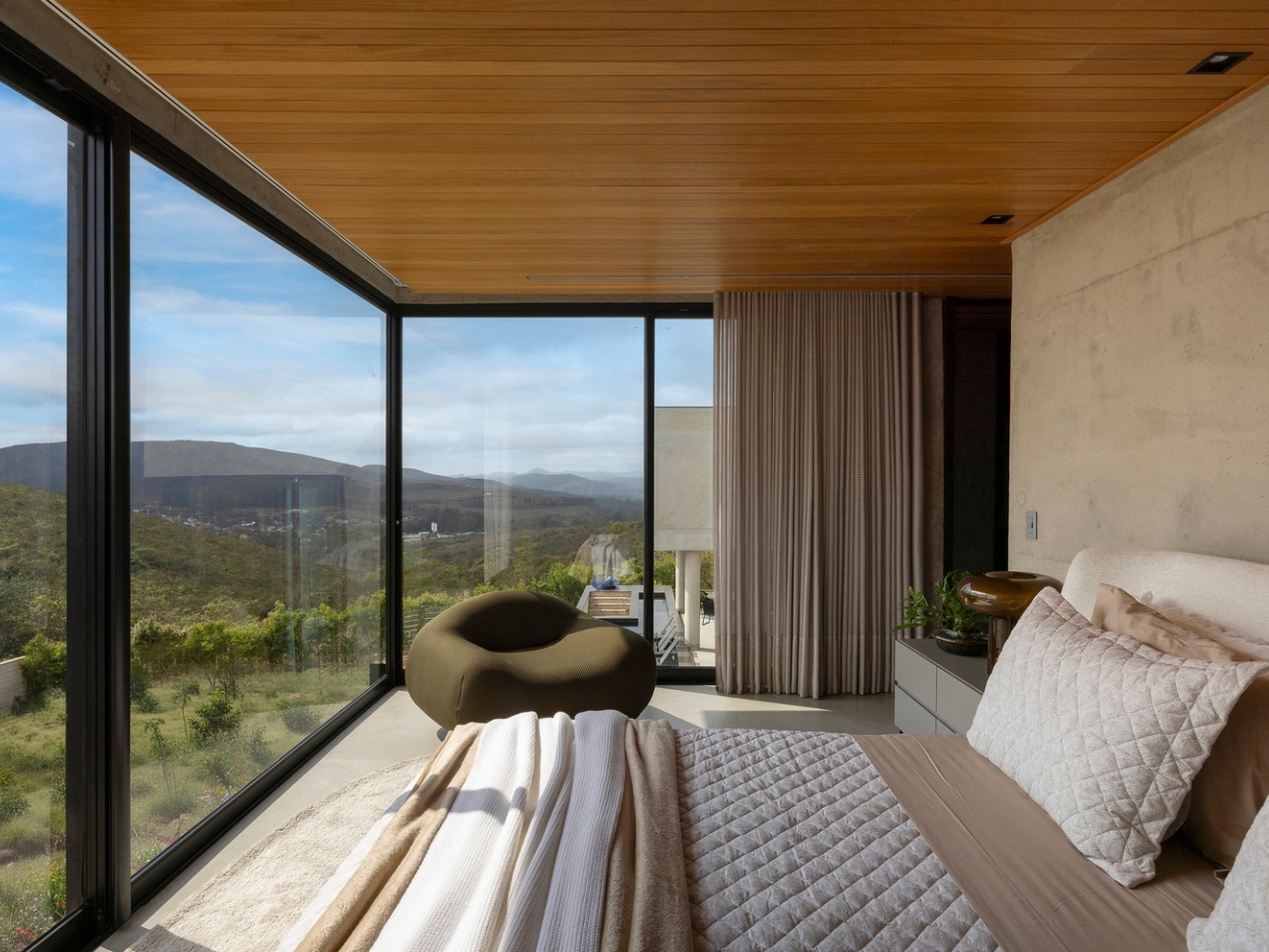
The 360-degree courtyard layout is worth sitting with on its own terms. It means the house has no single dominant view, no privileged front-row seat. Every room must negotiate with the central space, which keeps the architecture from becoming a spectacle and makes it a place to actually live inside. I find that rare, and more genuinely considered than most high-concept residential projects that pass through design media these days.
SE House has attracted the kind of attention that usually gravitates toward buildings with louder ambition. The buildings that announce themselves as you walk in. This one whispers, and that’s precisely why people are listening. Gunawan described it as a quiet manifesto for tropical living, and the word choice matters. A manifesto doesn’t have to be loud to carry weight.
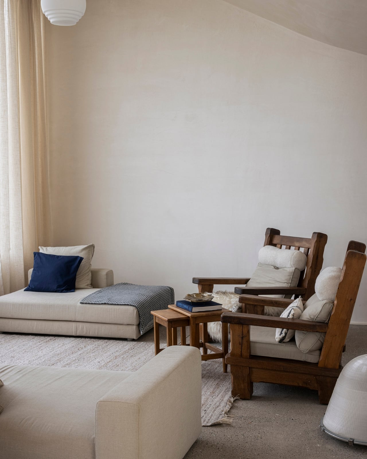
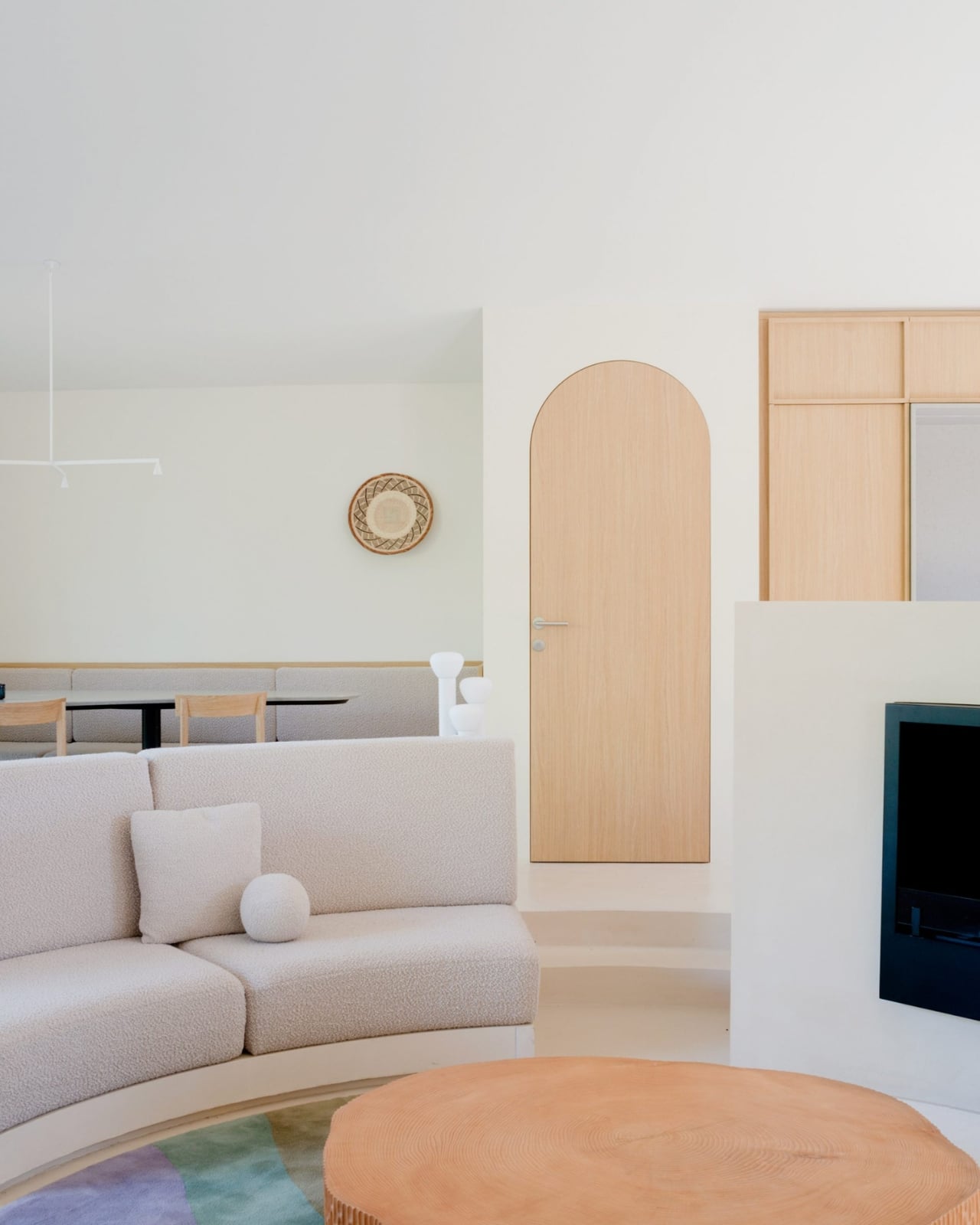
The broader argument SE House seems to be making is that restraint isn’t the enemy of richness. The absence of visual noise isn’t emptiness. The voids aren’t what’s missing from the design. They are the design, or at least a fundamental part of what makes the rest of it land. That’s an architectural lesson, but it also translates well into how we think about design at every scale, from the objects we choose to live with to the spaces we build up around ourselves over time.
SE House is the kind of project that stays with you not because of one striking image but because of the underlying logic. It makes you want to look at your own spaces differently, and ask whether you’ve been opening up when you should have been pulling inward the whole time.
The post KantorGG Just Built a Tropical Home That Faces the Wrong Way first appeared on Yanko Design.