The Skincare Device Concept That Makes Every Other One Look Lazy

The beauty industry has been promising us “personalized skincare” for years. What usually comes out the other end is a quiz, a starter kit, and a monthly subscription box full of products you may or may not actually need. So when I came across Elio, a concept skincare device by Korean industrial designer Taehyeong Kim, I sat up a little straighter. Not because it makes bold promises, but because it looks exactly like something that already belongs on your counter, and that’s entirely the point.

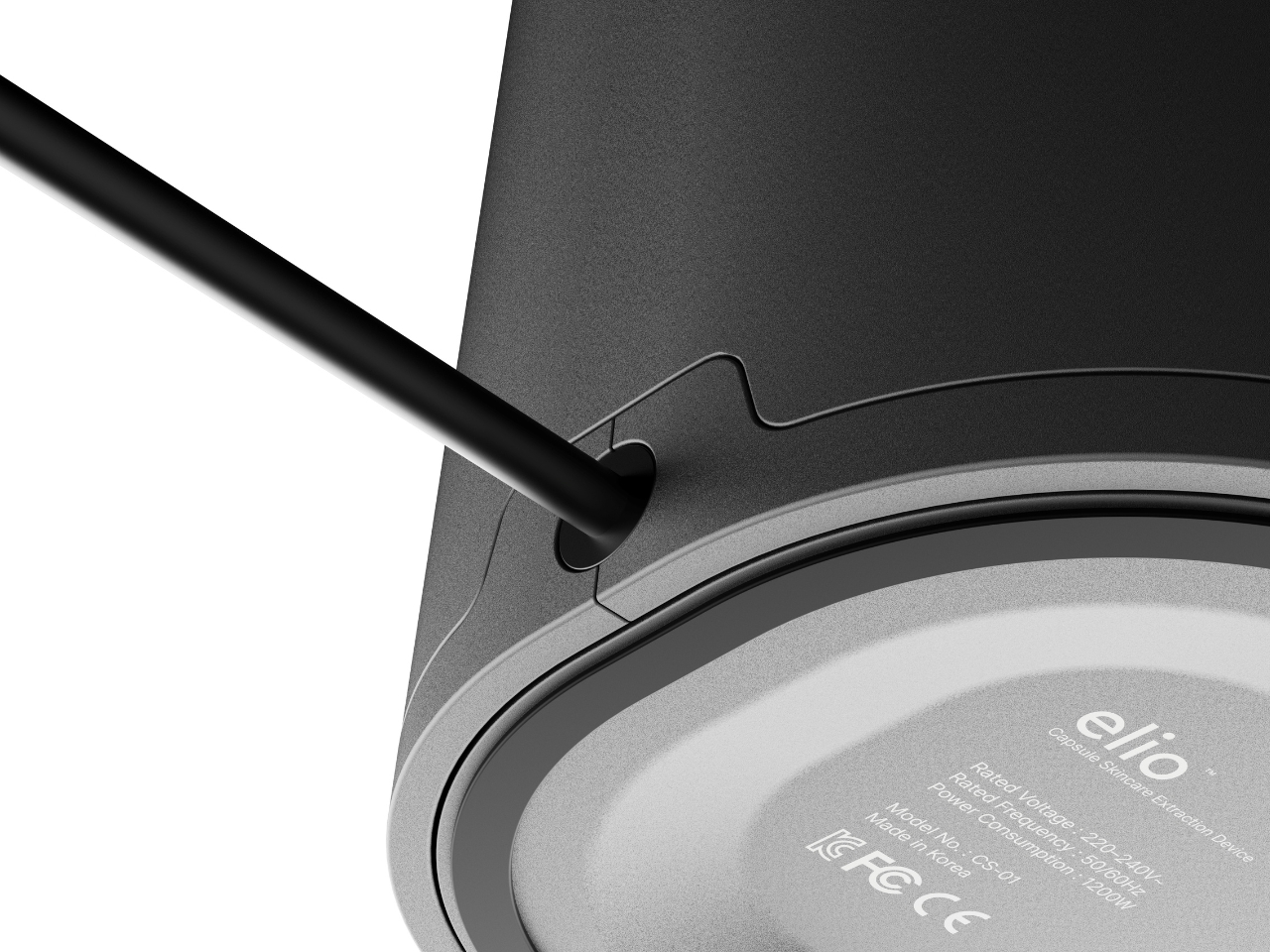
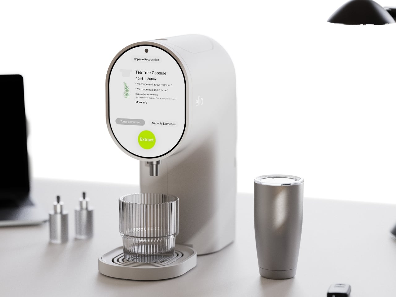
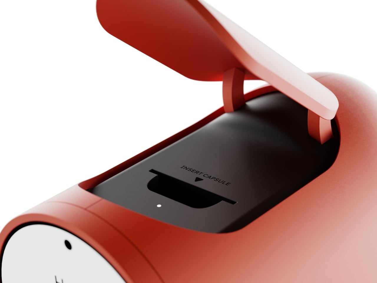
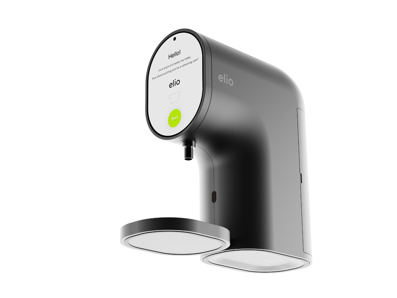
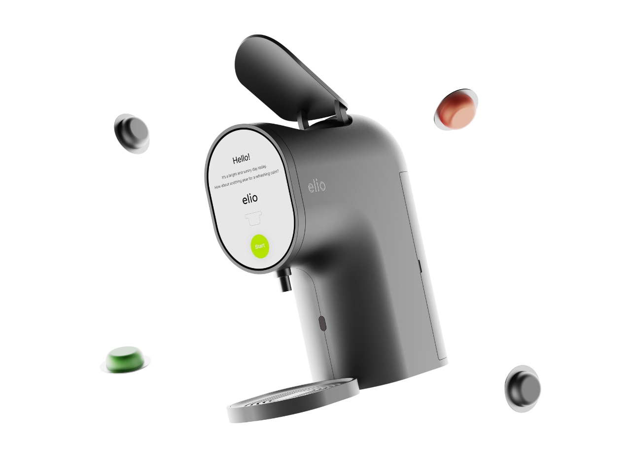
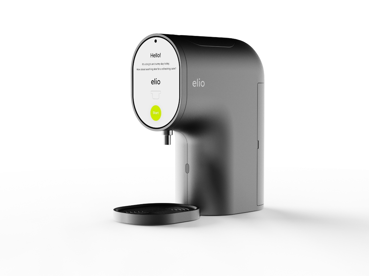
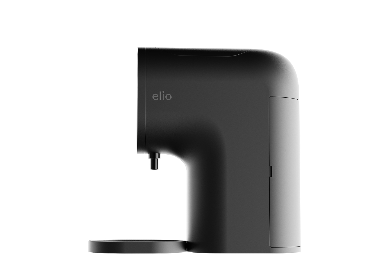
Elio looks like a coffee machine. Specifically, it looks like the kind of sleek pod coffee machine you’d find in a well-designed apartment kitchen. The body is compact and rounded, with a smooth curved neck that sweeps forward and a circular display face mounted front and center. A small nozzle sits just below the screen, and a flat tray rests at the base. Flip open the top lid and you’ll find a slot that literally reads “INSERT CAPSULE.” If you told someone this was a new Nespresso colorway, they’d believe you without question. That’s not a criticism at all. It’s one of the smartest design decisions in the whole concept.

Designer: Taehyeong Kim
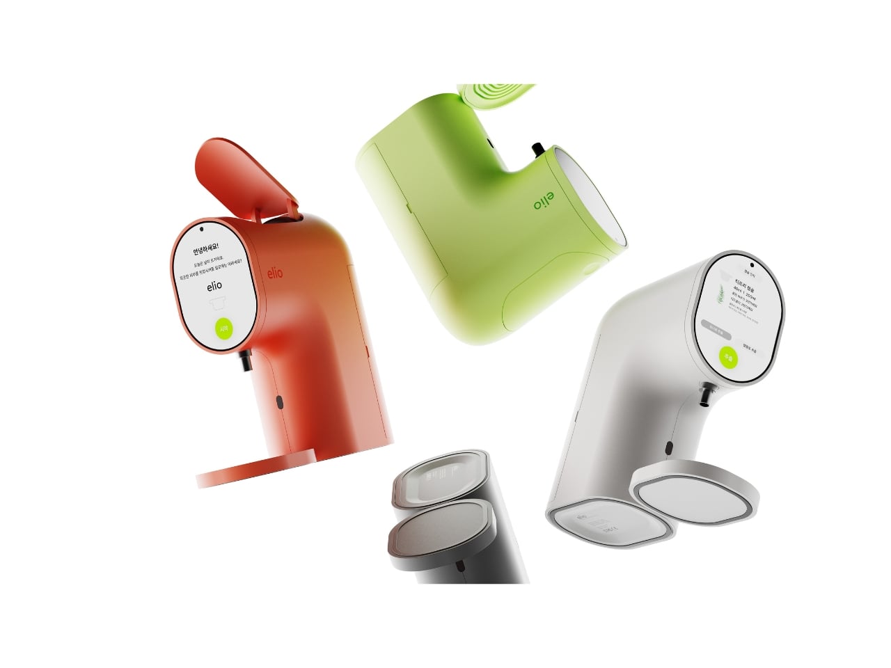
The familiarity is doing real work here. One of the biggest friction points in getting people to actually use a skincare device consistently is that most of them look clinical, complicated, or just strange sitting on a bathroom shelf. Elio sidesteps all of that by borrowing the visual language of something people already love and trust. The rounded silhouette, the satisfying top-load mechanism, the single glowing green button on the display. It reads as approachable before you even know what it does.
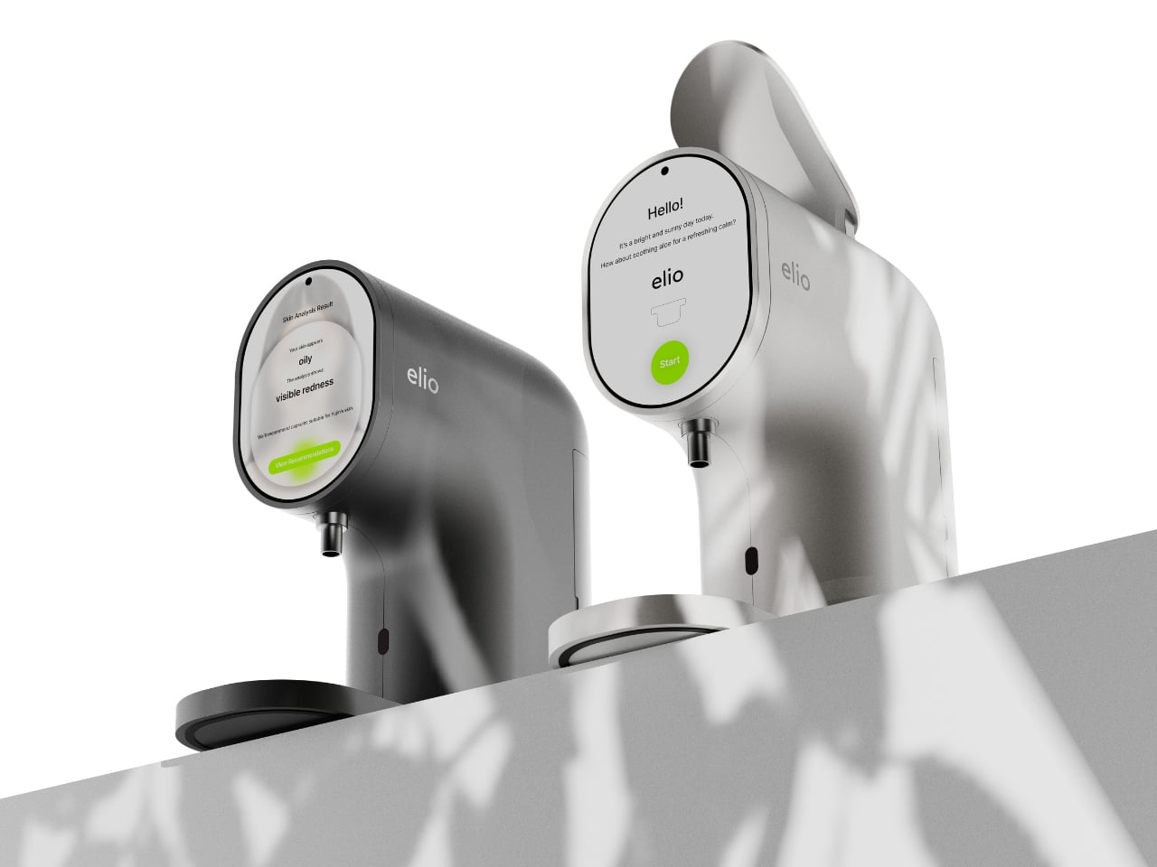
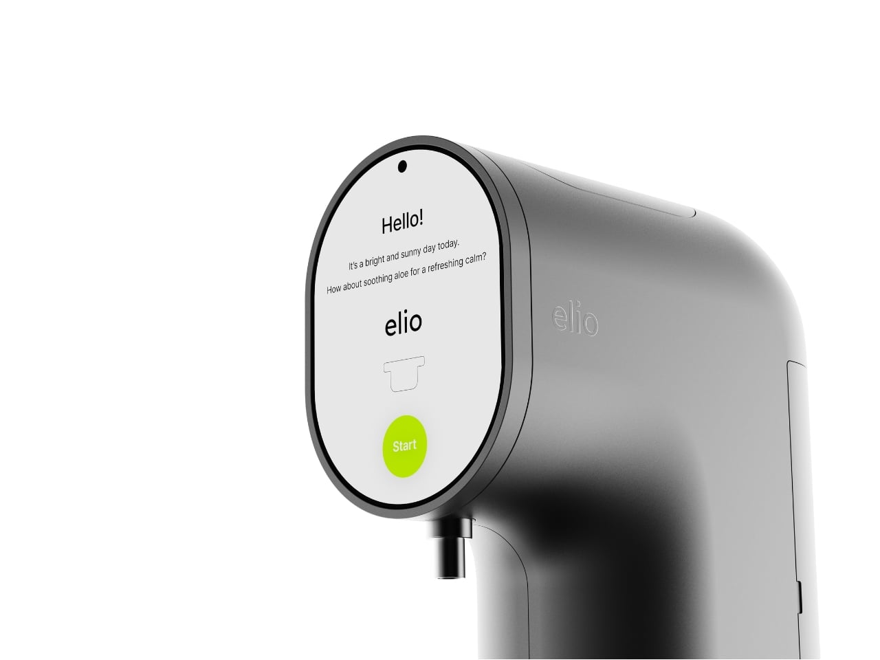
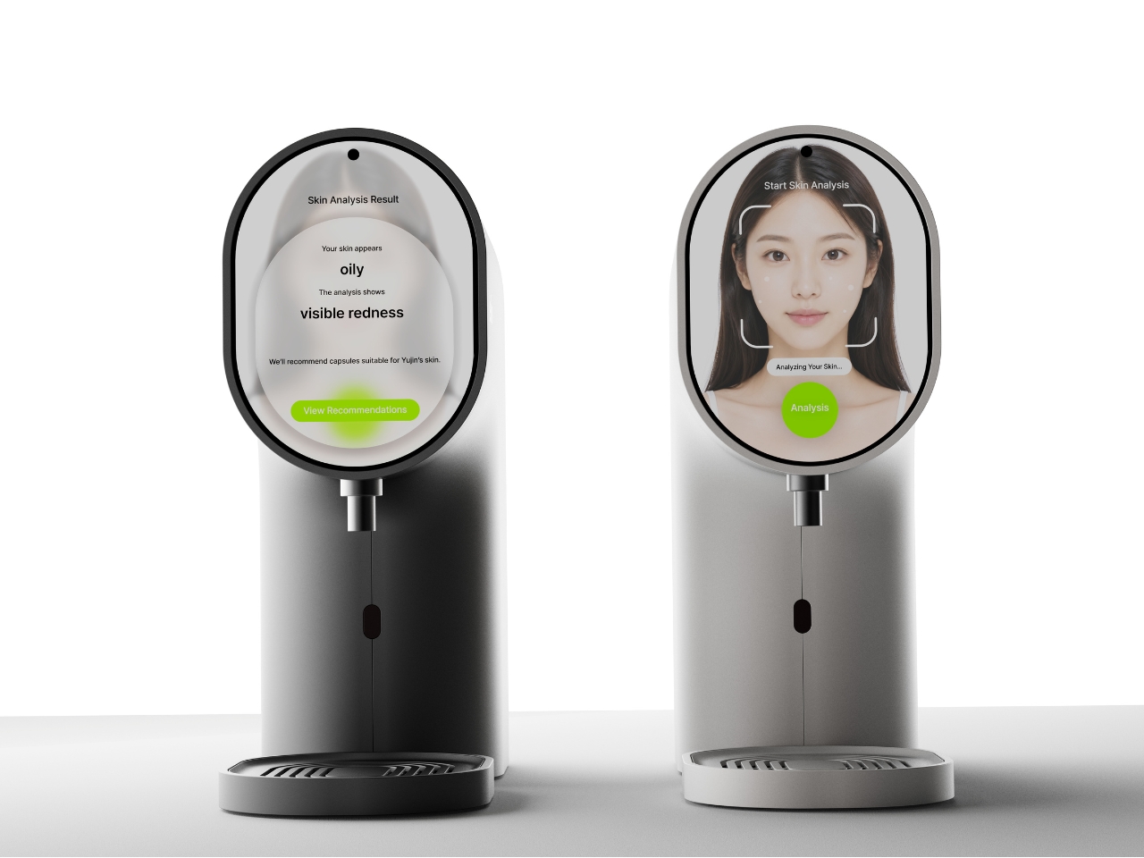
What it does is genuinely clever. Elio is an AI-powered skincare system that scans your skin in real time, reads your condition, and then dispenses a custom-formulated serum through a capsule-based delivery system. The circular display shows your skin analysis results directly, flagging things like oiliness or redness, then recommends the right capsule formula for that specific day. You load the capsule into the top slot, press the green button, and the device does the rest. The capsules themselves are small, pill-shaped, and almost jewel-like in the renders, orbiting the machine like they have somewhere important to be.
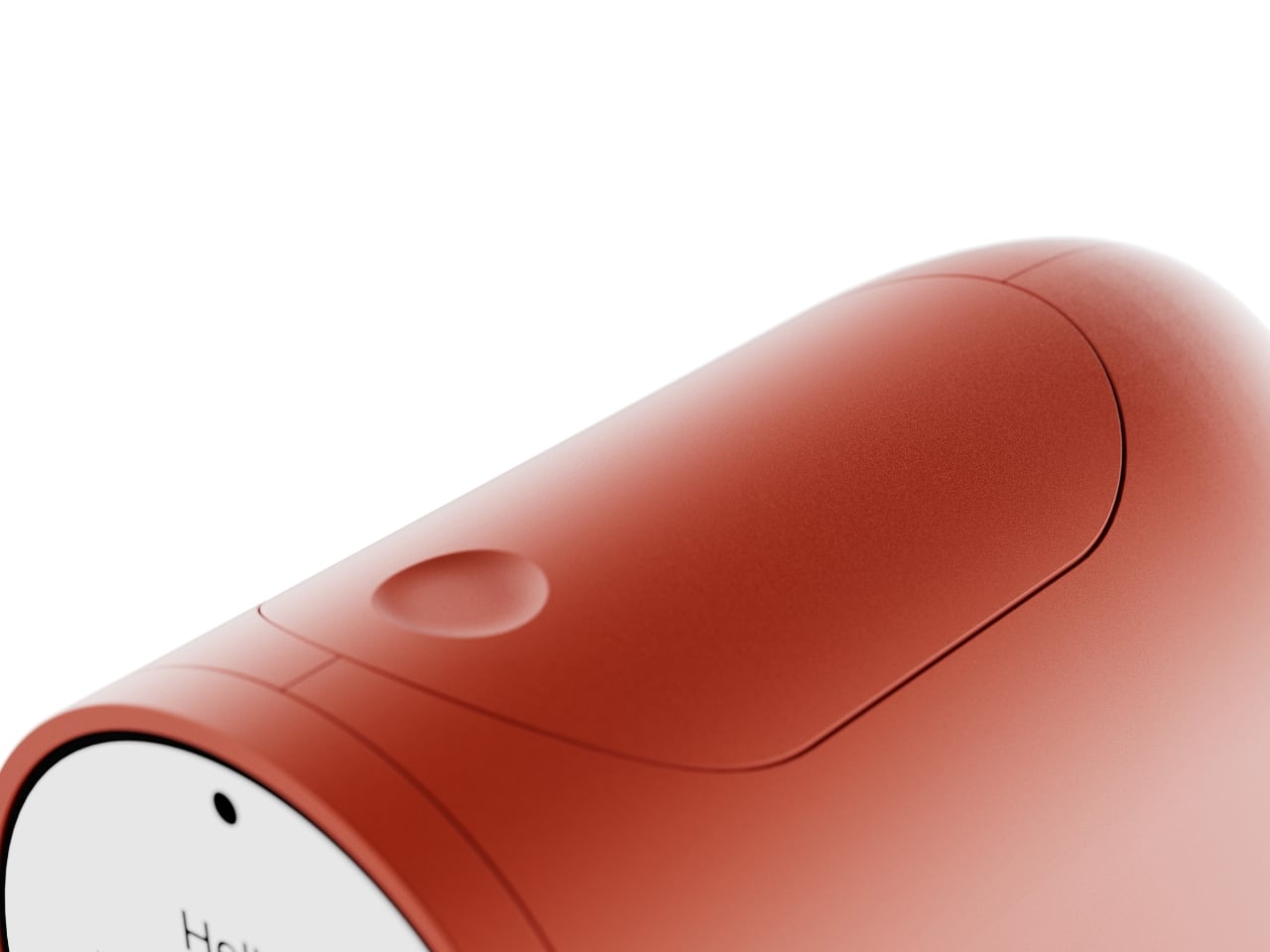
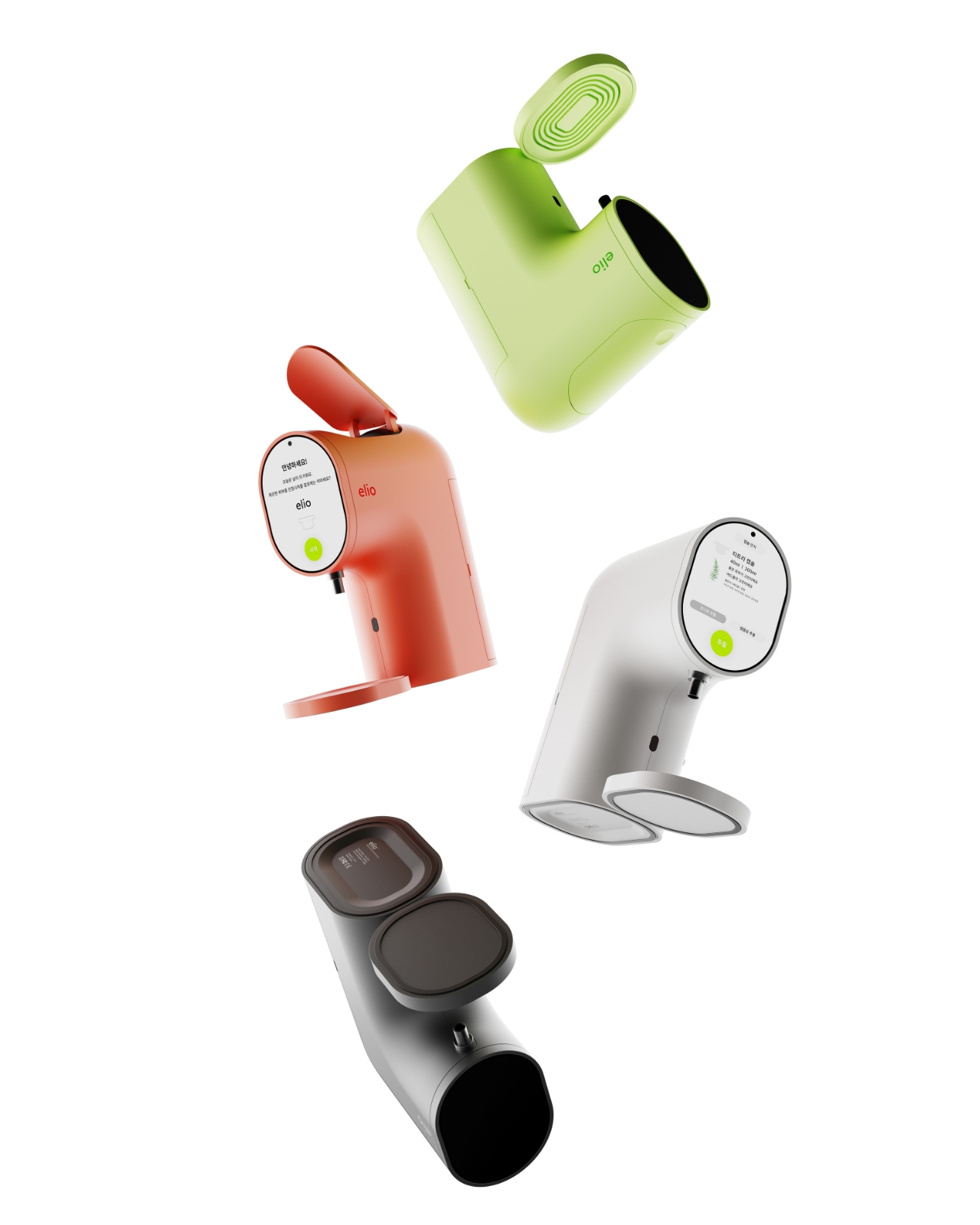
The color range is also worth talking about. Most skincare devices default to clinical white or muted grey and call it a day. Elio comes in a deep charcoal, a warm terracotta, a bold lime green, and a soft white. They all work, but the terracotta and lime green versions in particular feel like a deliberate statement. They want to be seen. They want to sit on your counter the way a designer object sits in a living room, as something you chose because you liked how it looked, not just what it did.
The detail I keep returning to is the skin scanning interaction. In the lifestyle renders, the user leans in close to the circular display, which doubles as the analysis interface. It’s an intimate, quiet moment, more ritual than routine, and it reframes what getting ready in the morning can feel like. Not a chore, not a checklist, but a small daily check-in with yourself. Whether or not that reads as overly poetic, the design actively encourages that interaction, and that’s intentional.

Kim is still a student designer based in Daegu, South Korea, and Elio has already picked up a Red Dot Design Award in 2025 alongside Gold and Silver wins at the Spark Design Awards. That’s a significant return for any portfolio piece. It also says something about where Korean industrial design is right now, producing work that doesn’t just look good in renders but thinks clearly about behavior, habit, and the emotional relationship between a person and the objects they live with.
Elio is a concept, not a product you can buy today. But it’s the kind of concept that makes you look at your current skincare shelf and feel a little impatient for the future.
The post The Skincare Device Concept That Makes Every Other One Look Lazy first appeared on Yanko Design.


Kinari Might Be the Most Important Material You’ve Never Heard Of

Plastic has a PR problem, and it has for years. We know it. Brands know it. And yet, the stuff is everywhere, because for all its environmental baggage, petroleum-based plastic is cheap, durable, and remarkably easy to manufacture at scale. Finding a material that can honestly compete with it has been one of the quieter design challenges of the last decade. Kinari, developed by Panasonic’s MI Division, is making a compelling case that the answer was growing in the ground the whole time.

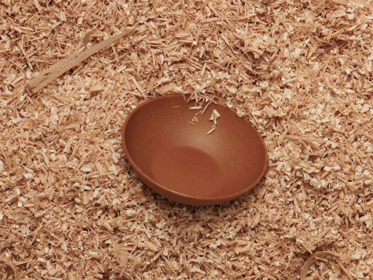
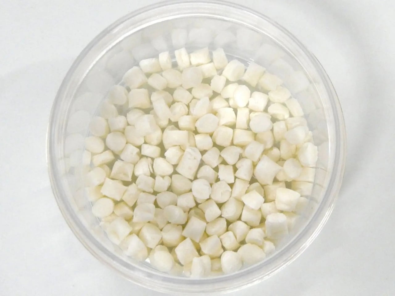
Kinari is a cellulose-based composite resin made primarily from plant fibers. Not a novelty material reserved for concept art and trade show booths, but a functional, moldable, colorable material designed for home appliance casings, building materials, and automotive components. It currently contains up to 85% cellulose fibers, and the team has been steadily pushing that number upward since work began in 2015. Back in 2019, the formulation sat at 55% biomass. By 2022, it had reached 90%. The goal, eventually, is 100%. That trajectory tells you something. This isn’t a splashy announcement material cooked up for a sustainability report. It’s a slow, deliberate material science project with a very clear destination, and that kind of patience is rare in an industry that tends to reward the bold launch over the quiet improvement.

Designer: MI Division of Panasonic Holdings Corporation

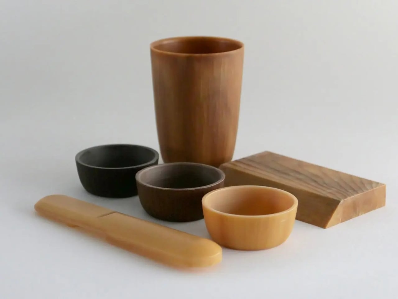
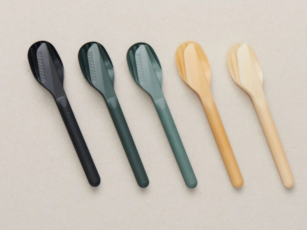
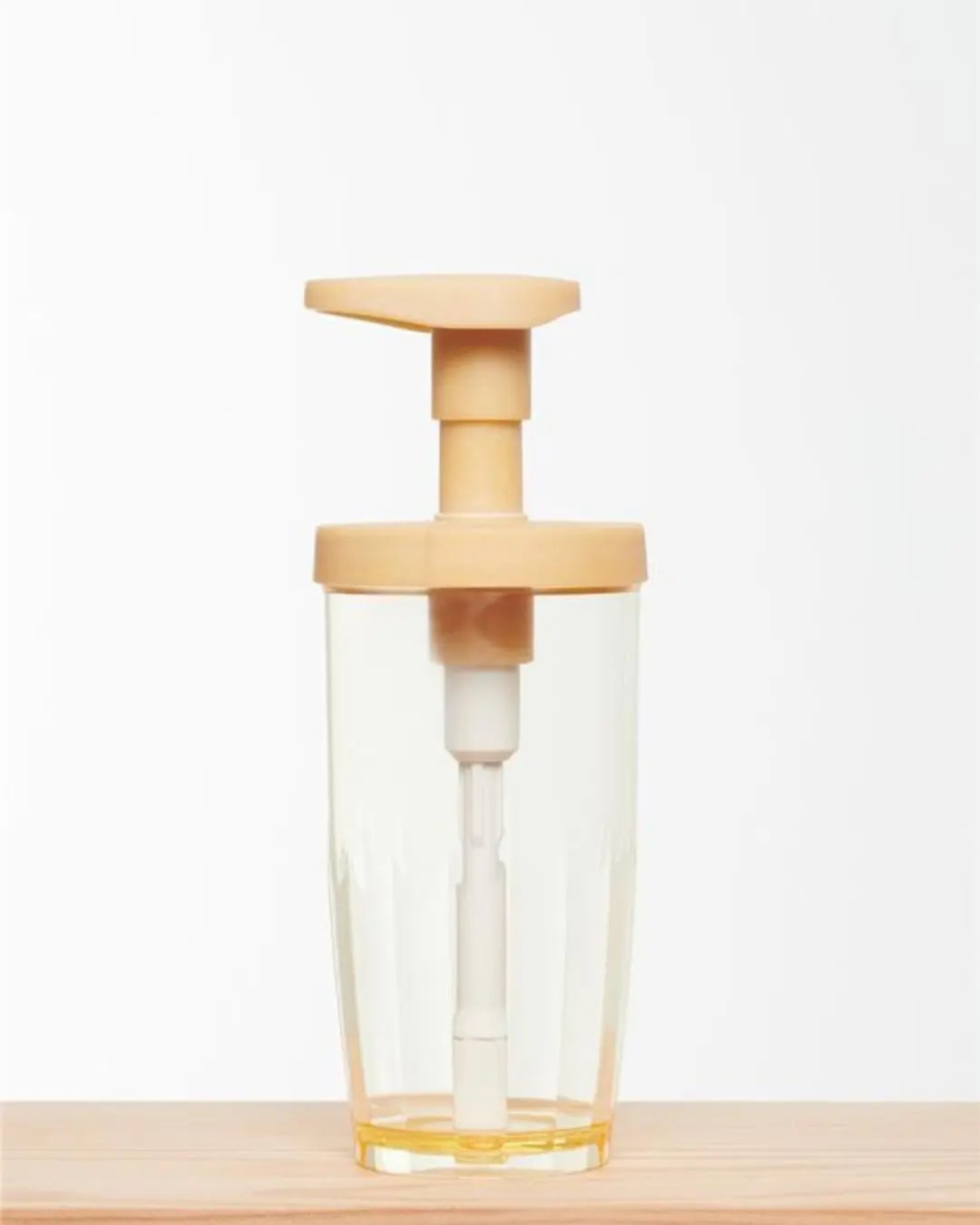
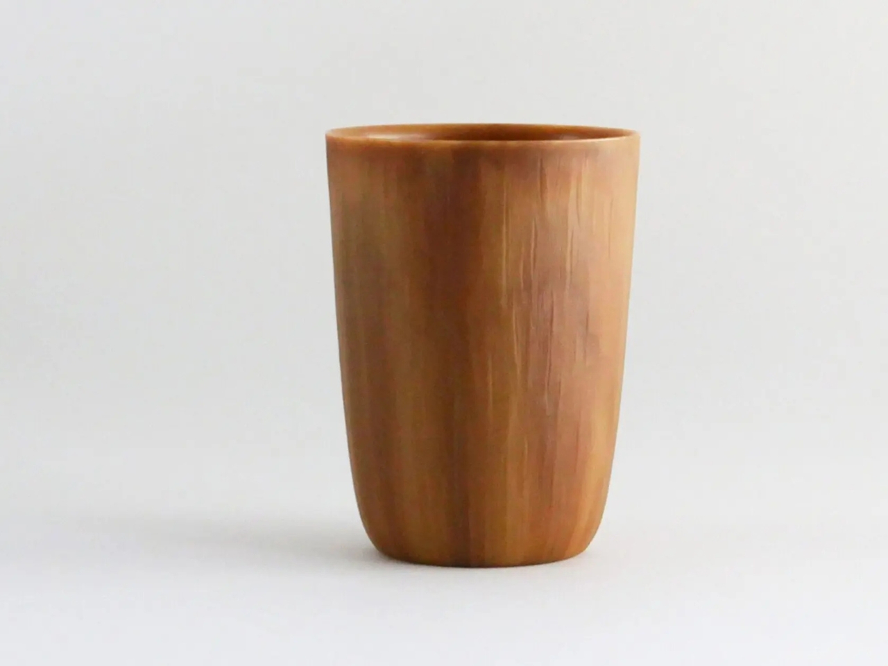
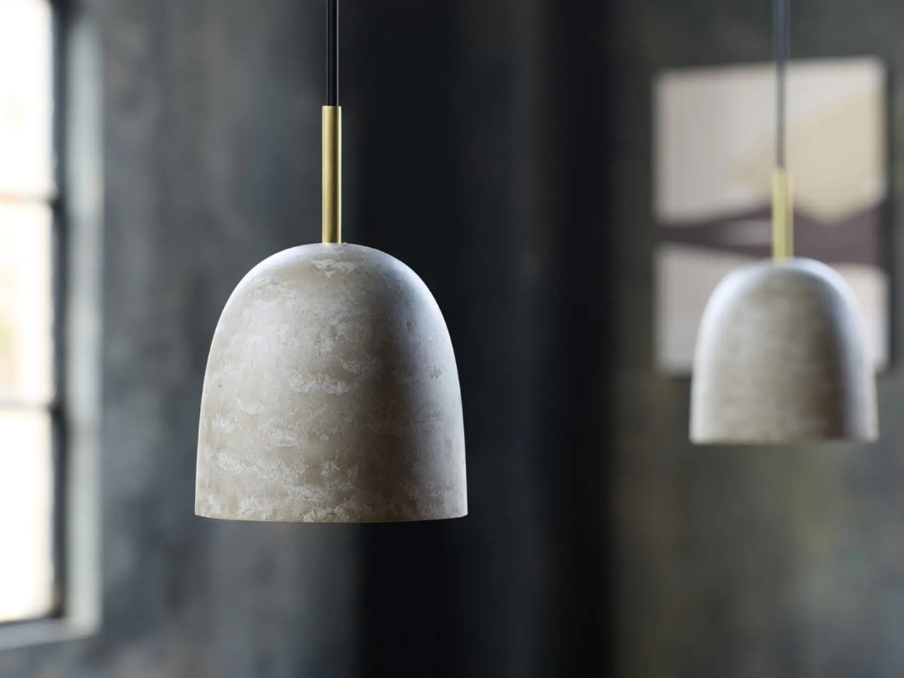
The products already made from kinari help tell the story better than any specification sheet could. There are spoons in matte black and deep forest greens that look like something between resin and lacquered wood. Bowls in warm terracotta tones that sit naturally alongside ceramics without trying to impersonate them. A tumbler with the kind of rich, grain-like surface you’d expect from a hand-turned wooden cup. A soap dispenser pump in honeyed amber. Pendant lamps with a softly mottled, stone-like finish. These aren’t prototypes staged for press photos. They’re finished objects that feel considered, tactile, and genuinely desirable, which is not something you often say about sustainable alternatives to plastic.

That’s the part that matters most, beyond the environmental credentials. Kinari doesn’t ask you to compromise on aesthetics to feel good about your choices. The material carries a warmth that conventional plastic simply can’t replicate, and the range of colors and finishes it’s capable of makes it versatile enough to work across product categories without looking like it’s trying too hard to be natural.

Beyond the plant-based headline, kinari’s most compelling quality is how practical it’s designed to be for manufacturers. One of the most persistent criticisms of sustainable alternatives is that they demand too much: new equipment, new processes, new supply chains. Kinari sidesteps all of that. Manufacturers can switch to it without investing in new machinery, because it behaves like conventional plastic during production. The most elegant sustainable solution is always the one that removes friction rather than adding it.

The production process adds to the case. Kinari uses an all-dry manufacturing method, eliminating water entirely, which significantly reduces energy consumption and CO₂ emissions compared to conventional plastic manufacturing. Petroleum use drops by 55 to 70 percent depending on the formulation. These aren’t rounding-error improvements. They represent a meaningful shift in how much environmental cost gets built into a material before it even becomes a product.

The end-of-life story is equally worth attention, even if it’s harder to photograph and harder to market. The team is developing a two-pronged recycling approach aimed at creating a genuinely closed-loop system. A material that can be recovered, processed, and remade is categorically different from one that just gets discarded in a slightly less guilty way. Circularity is easy to put in a brand statement. Building it into the actual material science is another thing entirely.

The honest question with any sustainable material is whether it can scale without losing what makes it worth scaling. That’s still being answered. But Panasonic has been working on kinari quietly and methodically since 2015, improving the biomass content year over year, and that level of sustained commitment sets it apart from the concept-stage bioplastics we’ve seen come and go.

Design moves fast. Materials take longer. Kinari is proof that the most consequential innovation isn’t always the loudest one. Sometimes it’s the one that’s been in the lab for a decade, getting a little better every year, waiting for the world to finally catch up.

The post Kinari Might Be the Most Important Material You’ve Never Heard Of first appeared on Yanko Design.
The 3D Printed Pencil Holder That Shames Everything Else on Your Desk

Most of us have a pencil holder we never actually chose. It’s the ceramic mug you retired from coffee duty, or the branded giveaway from a conference two years ago, or the squat plastic cup that came bundled with a stapler. It works. It holds pens. But you have never once looked at it and thought, “I genuinely love that thing.”

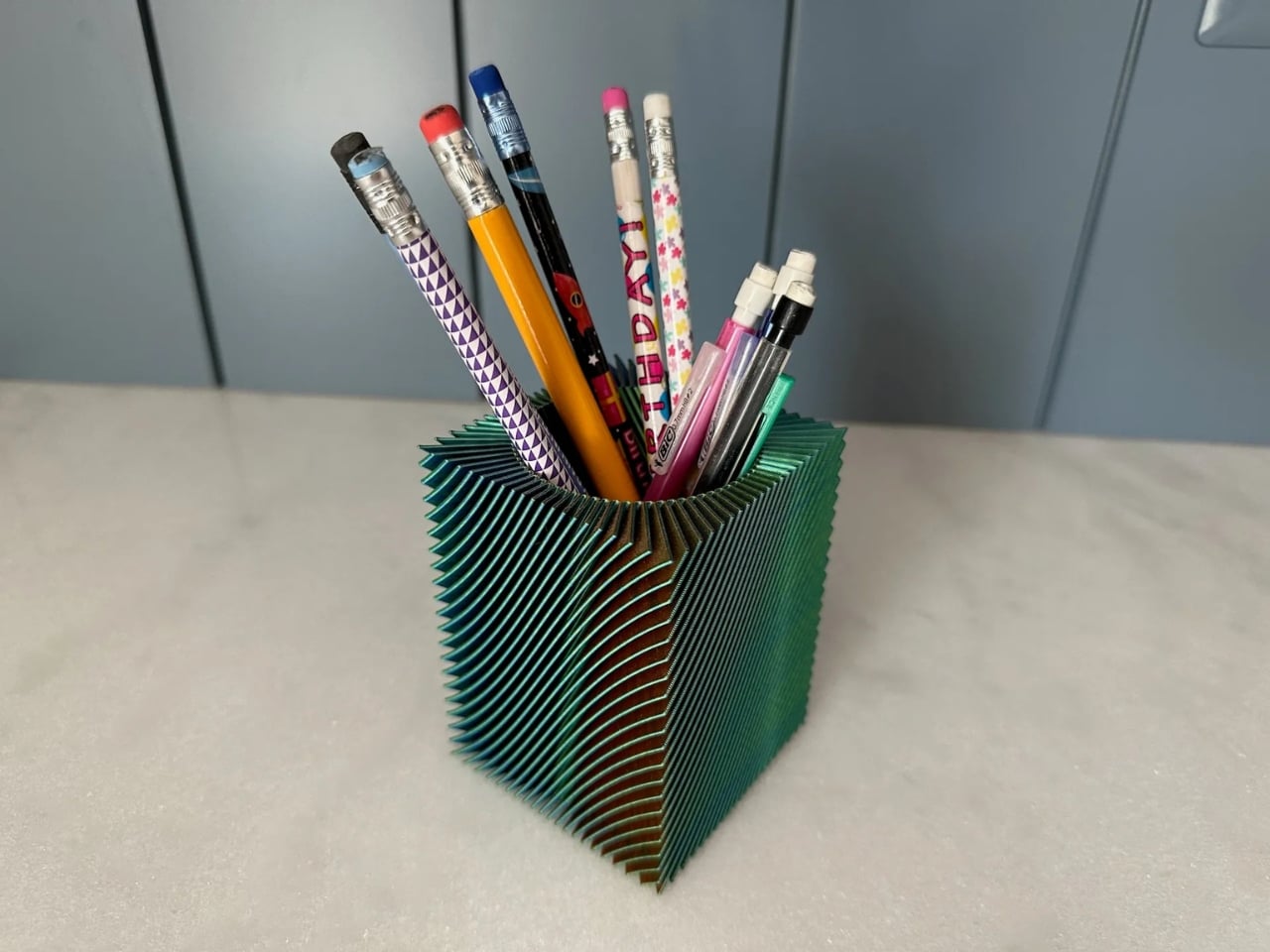
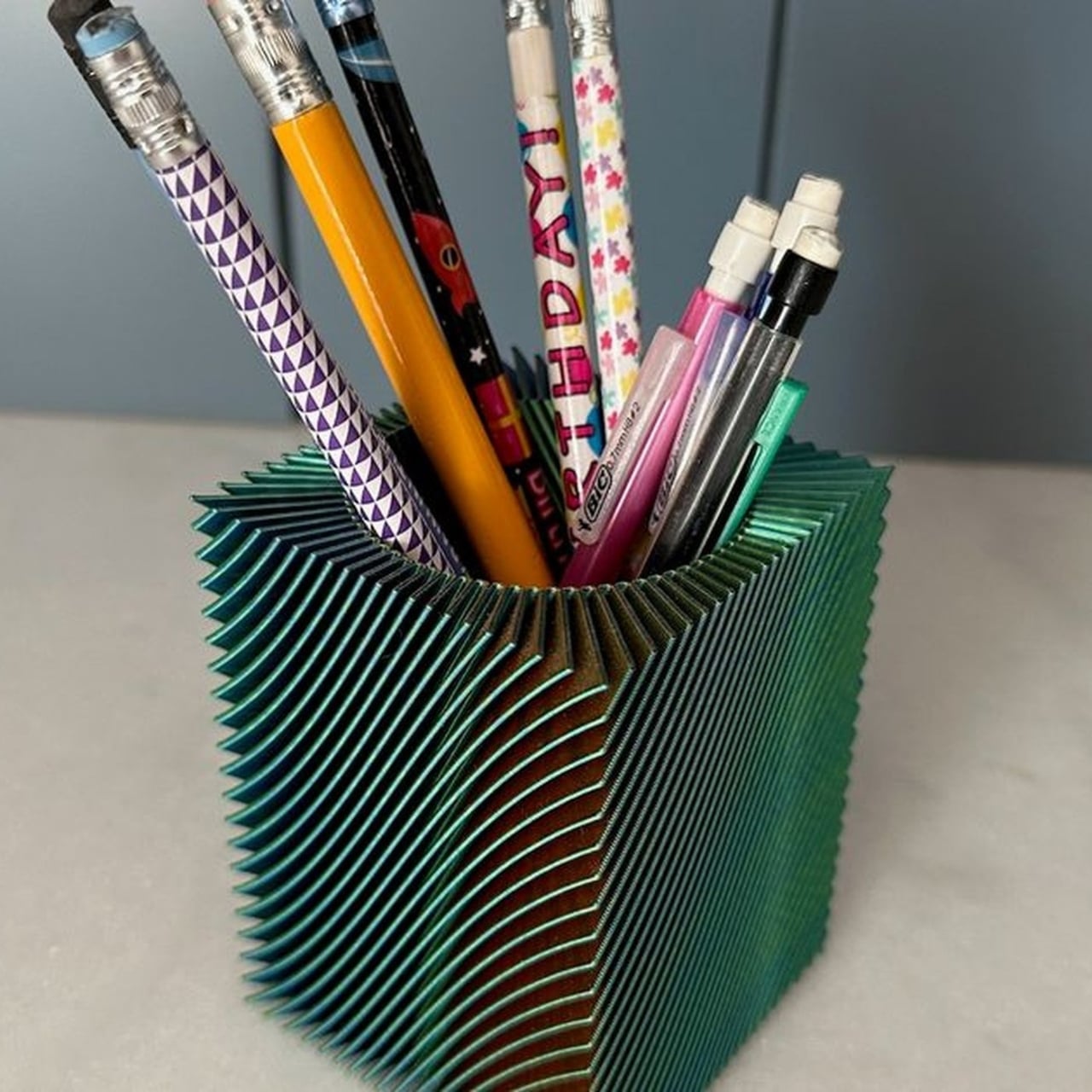
Nechiswa’s spiral vase pencil holder is the kind of object that changes that. It’s a free, downloadable 3D print model shared on Printables, and it’s been quietly making its way through design communities after being featured on Abduzeedo this week. It doesn’t look like a typical 3D print. It doesn’t look like a typical anything. It looks like someone took a mathematical idea, translated it into filament, and set it on a desk.

Designer: Nechiswa

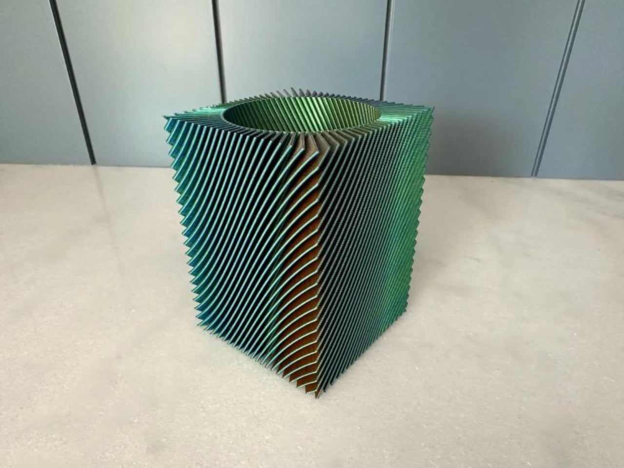
The design is built around one print technique: spiral vase mode. For those unfamiliar with 3D printing, vase mode is a setting where the nozzle travels in one continuous, uninterrupted path from the base all the way to the top of the object. No seams, no layer starts, no breaks in the extrusion. The printer just keeps going, spiraling upward in a steady, unceasing motion. At 0.6mm line width and 0.2mm layer height, the result is a thin, faceted wall that carries a quality the original feature description calls “drawing-like in detail but rigid enough to hold pens upright.” That is a precise description. It looks delicate but it isn’t.

The tri-color filament element is where it gets especially compelling. Rather than outputting a pencil holder in a single solid color, Nechiswa uses multi-color filament that transitions as the print climbs. The spiral form and the color shift work together in a way that feels deliberate at every level. Color and geometry are cooperating, and neither one is showing off at the expense of the other. The result is an object that reads completely differently depending on where you’re standing and how the light hits it. It has the visual energy of something much more expensive and much harder to make.

What strikes me about this design is that it refuses to perform utility. A lot of desk accessories are burdened with looking useful. They come with dividers, rubberized bases, stackable tiers, and ergonomic profiles. They announce themselves as products solving a problem. Nechiswa’s pencil holder announces itself as an object. The kind you position near a window so the light catches the spiral walls. The kind you instinctively move to the front of your desk, even though, functionally, placement doesn’t matter at all.

The maker community has quietly validated it. The model has been added to over 130 collections on Printables, which is a reliable indicator that something is resonating beyond a casual like or a save. The file is free, the recommended settings are straightforward, and the designer has documented everything needed to print it successfully. Vase mode at 0.6mm line width. That’s really it. No complicated slicer configurations, no support structures to wrestle with. Just a solid printer, the right filament, and some patience.

This is also a good moment to acknowledge what 3D printing continues to do for independent design. There’s a persistent idea that consumer-level 3D printing exists mainly for functional fixes: replacement clips, custom mounts, cable organizers. And it does all of that. But Nechiswa’s pencil holder is the kind of project that gently dismantles that assumption without making any big declarations. It just exists as a beautiful object, designed by someone with a clear sense of form, available for free to anyone with a printer.

If you have a 3D printer, this is worth a spool of good filament and an afternoon. If you don’t, it’s still worth a look, because it illustrates something easy to forget: that good design doesn’t require a big budget, a studio, or a production run. Sometimes it’s just a thoughtful spiral, climbing upward, one continuous line. Your current pencil holder is probably fine. But it isn’t this.

The post The 3D Printed Pencil Holder That Shames Everything Else on Your Desk first appeared on Yanko Design.
9 Massive iPhone 18 Leaks You Need to See Before Upgrading

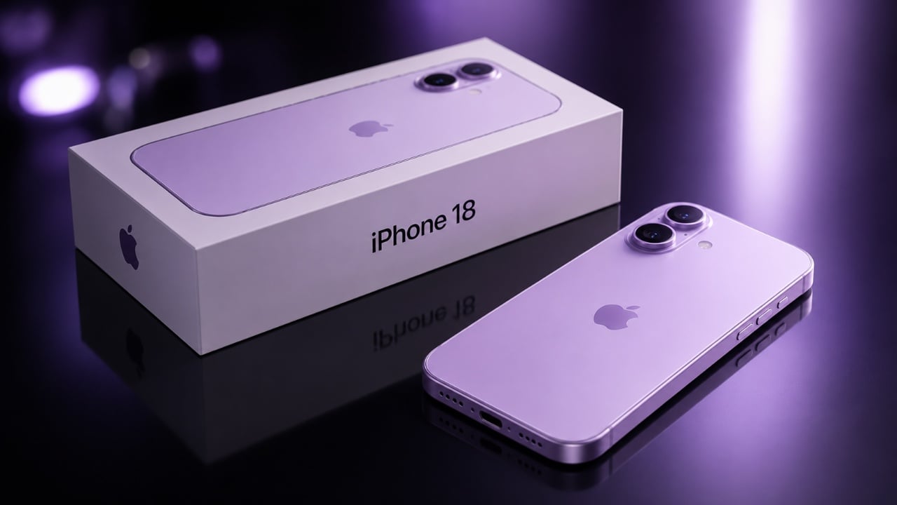
9 Massive iPhone 18 Leaks You Need to See Before Upgrading iphone 18

Apple’s upcoming iPhone 18 is shaping up to be a significant release, blending advanced technology with strategic adjustments to its production and launch timeline. Scheduled for release in early 2027, the iPhone 18 introduces a range of upgrades in performance, design and functionality. However, its staggered launch, where the Pro models are expected to debut […]

The post 9 Massive iPhone 18 Leaks You Need to See Before Upgrading appeared first on Geeky Gadgets.

Posted in Uncategorized

Why Amazon is Regretting Its Strict AI Adoption Mandate

Why Amazon is Regretting Its Strict AI Adoption Mandate Human workers providing oversight for automated AI systems

Amazon’s approach to artificial intelligence (AI) has faced significant challenges, as highlighted by Brendan Dell. One notable issue is the company’s reliance on strict adoption metrics, such as requiring 80% usage of its internal AI coding system, Kira. This focus on compliance has led to inefficiencies, including employee frustration and operational setbacks, such as delays […]

The post Why Amazon is Regretting Its Strict AI Adoption Mandate appeared first on Geeky Gadgets.

Posted in Uncategorized