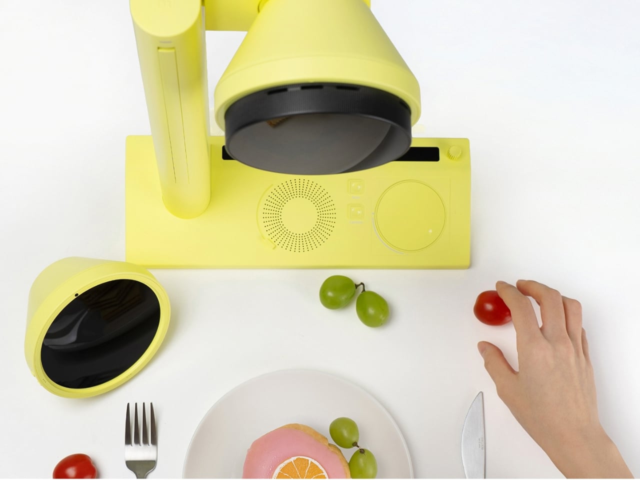
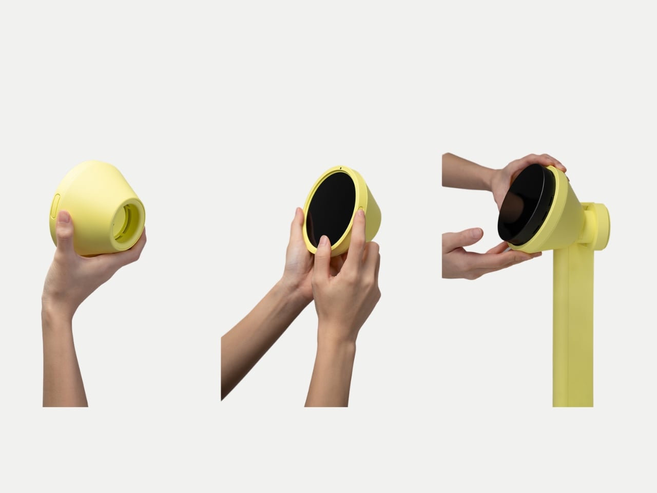
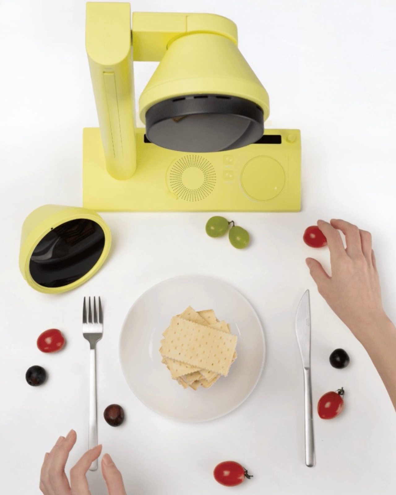
We’ve seen AI make itself comfortable in our music, our fashion, and our skincare routines. It was only a matter of time before it pulled up a chair at the dinner table. Kitune, a design concept by Seoul-based designer Jiyeon Choi, is exactly that moment, arriving in the form of a compact, butter-yellow device that looks more like a studio prop than a kitchen appliance. As a concept, it’s already asking a question that most kitchen technology doesn’t bother with: what if the way your food looks was just as personal as the way you dress?
The premise is deceptively simple. Food, Choi argues, has crossed well beyond the realm of taste and into the realm of visual expression. That’s a hard argument to push back on. You only need to spend thirty seconds on any social feed to see that the way a dish looks now carries as much cultural weight as what it actually tastes like. Plating is styling. Styling is identity. Food shows up in fashion editorials, in art installations, in luxury brand campaigns. It has become its own visual language, and Kitune is a concept built entirely around that reality.
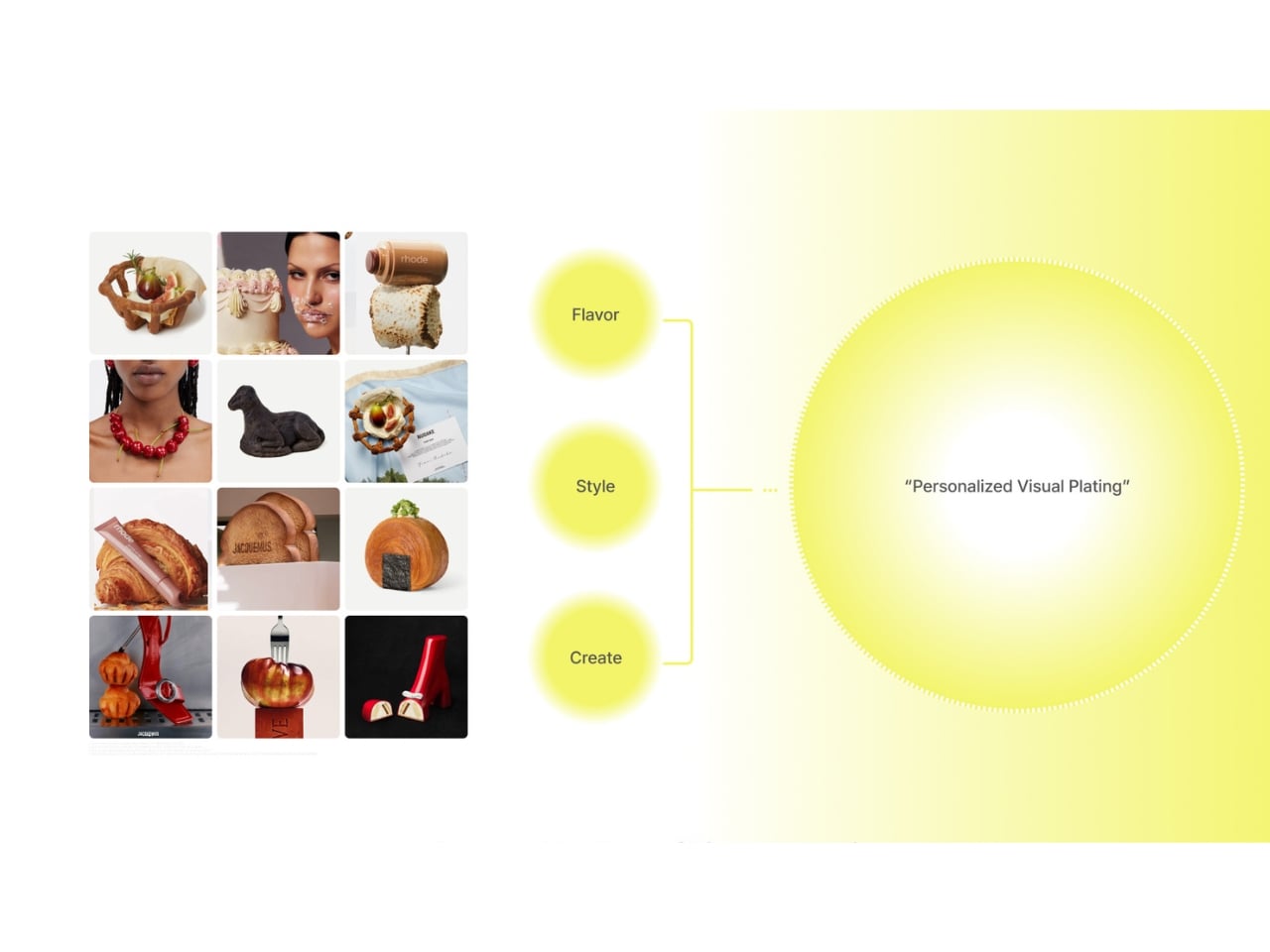
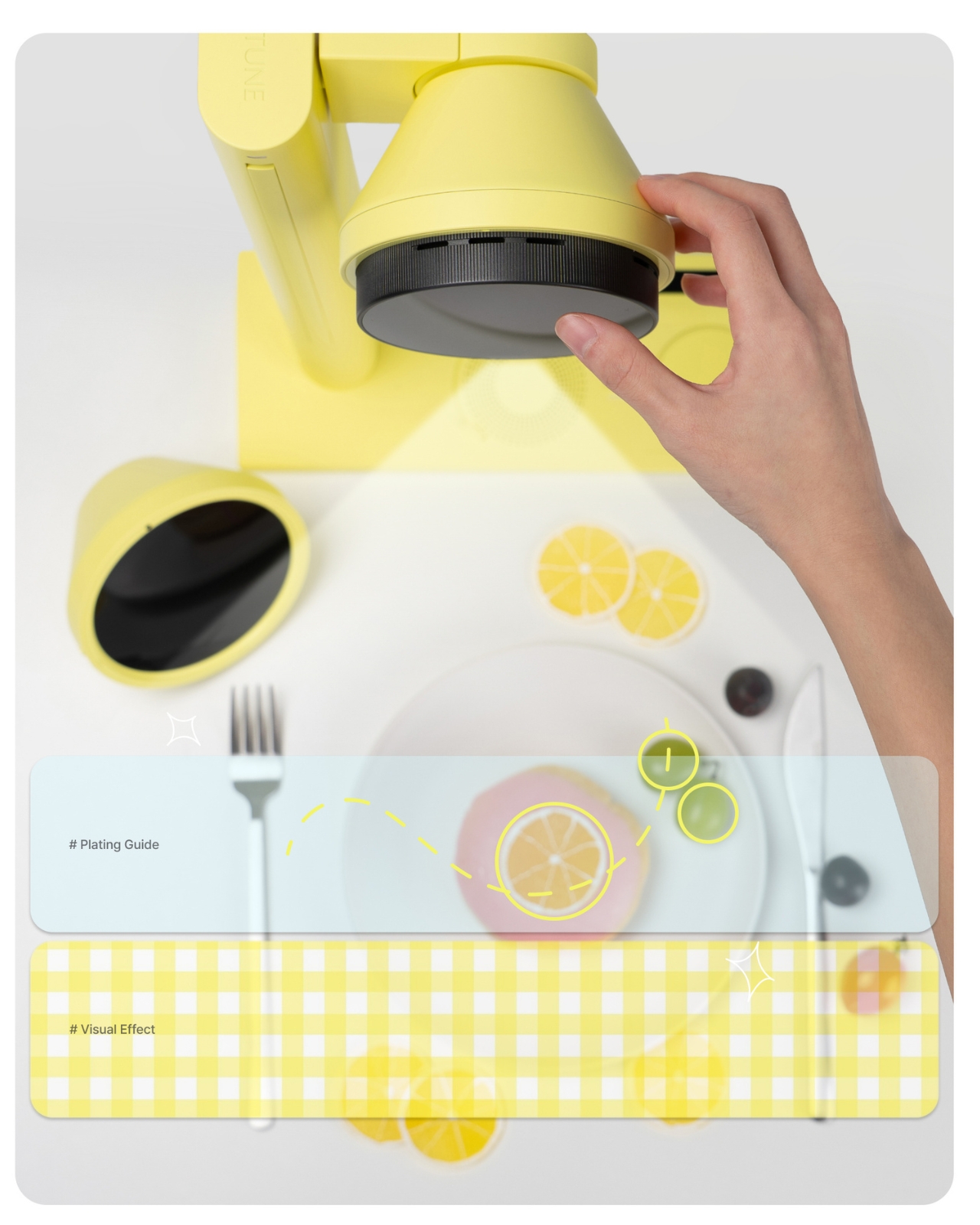
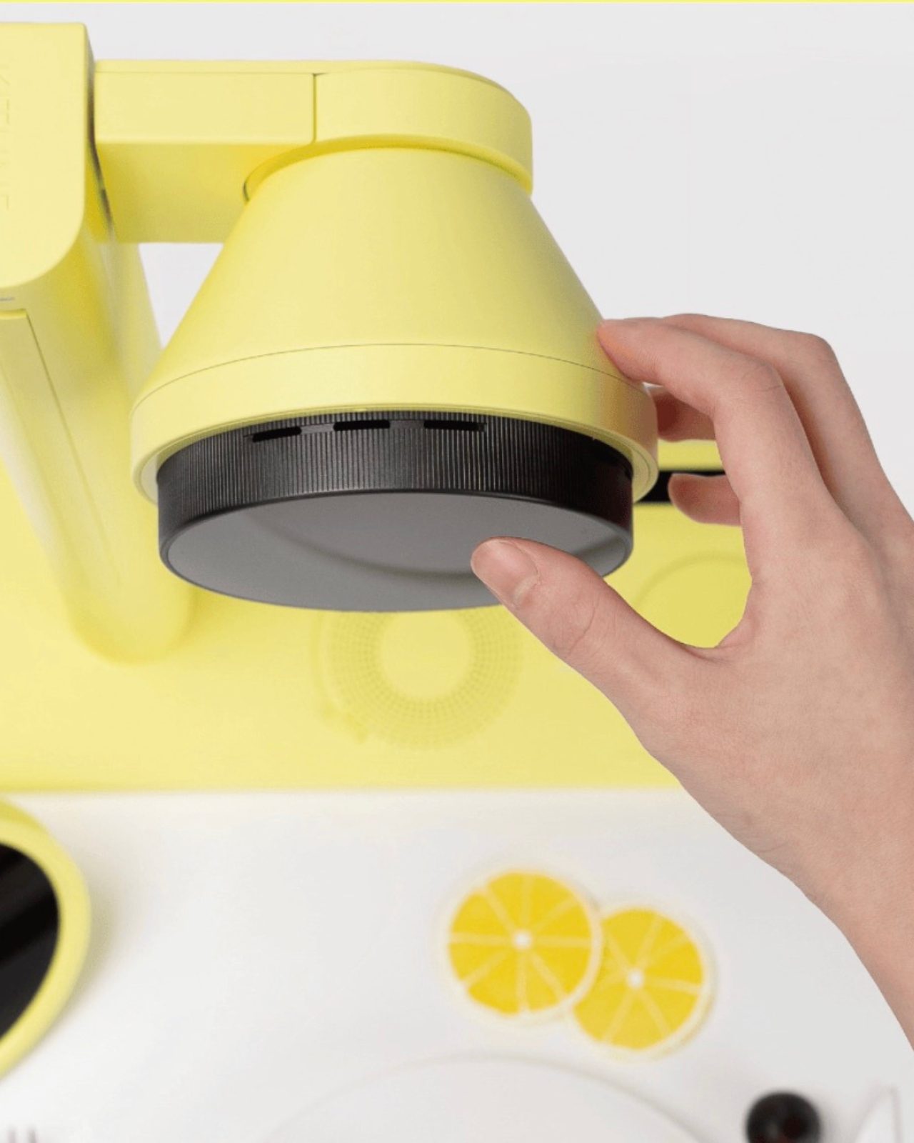
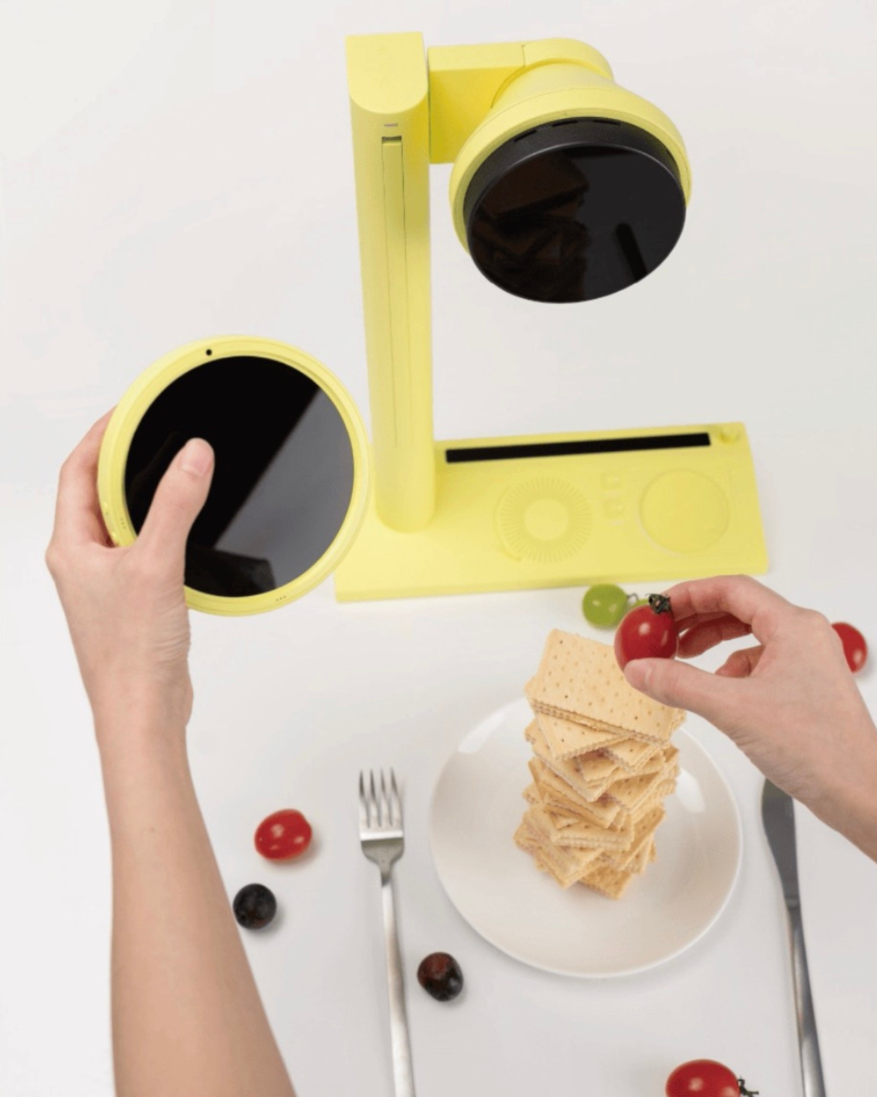
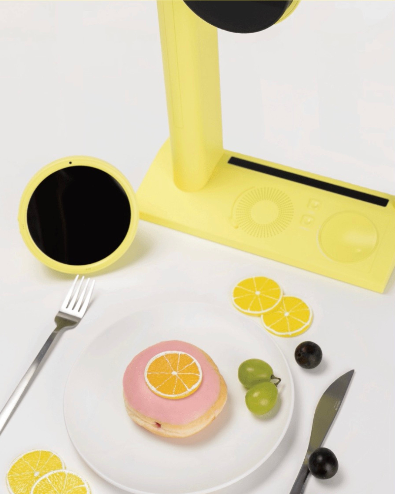
Here’s how the concept works. The device takes in personal data you’ve selected and tuned, your aesthetic preferences, your current mood, your lifestyle references, and uses it to generate a visual concept for how your dish should look. Not a vague suggestion, but a specific, styled direction. From there, a built-in projector casts a real-time plating guide directly onto your surface, showing you where each element should land. There are also mood-matched visual overlays that let you feel the overall atmosphere of the dish before you commit to placing a single garnish. It’s a feedback loop between your data and your plate.
That last part sounds theatrical, but I think that’s deliberately the point. Kitune isn’t trying to make you a more efficient cook. It’s trying to make cooking feel more like creative expression, and that’s a meaningful shift in what kitchen technology usually promises. Whether as a concept or an eventual product, that distinction matters.
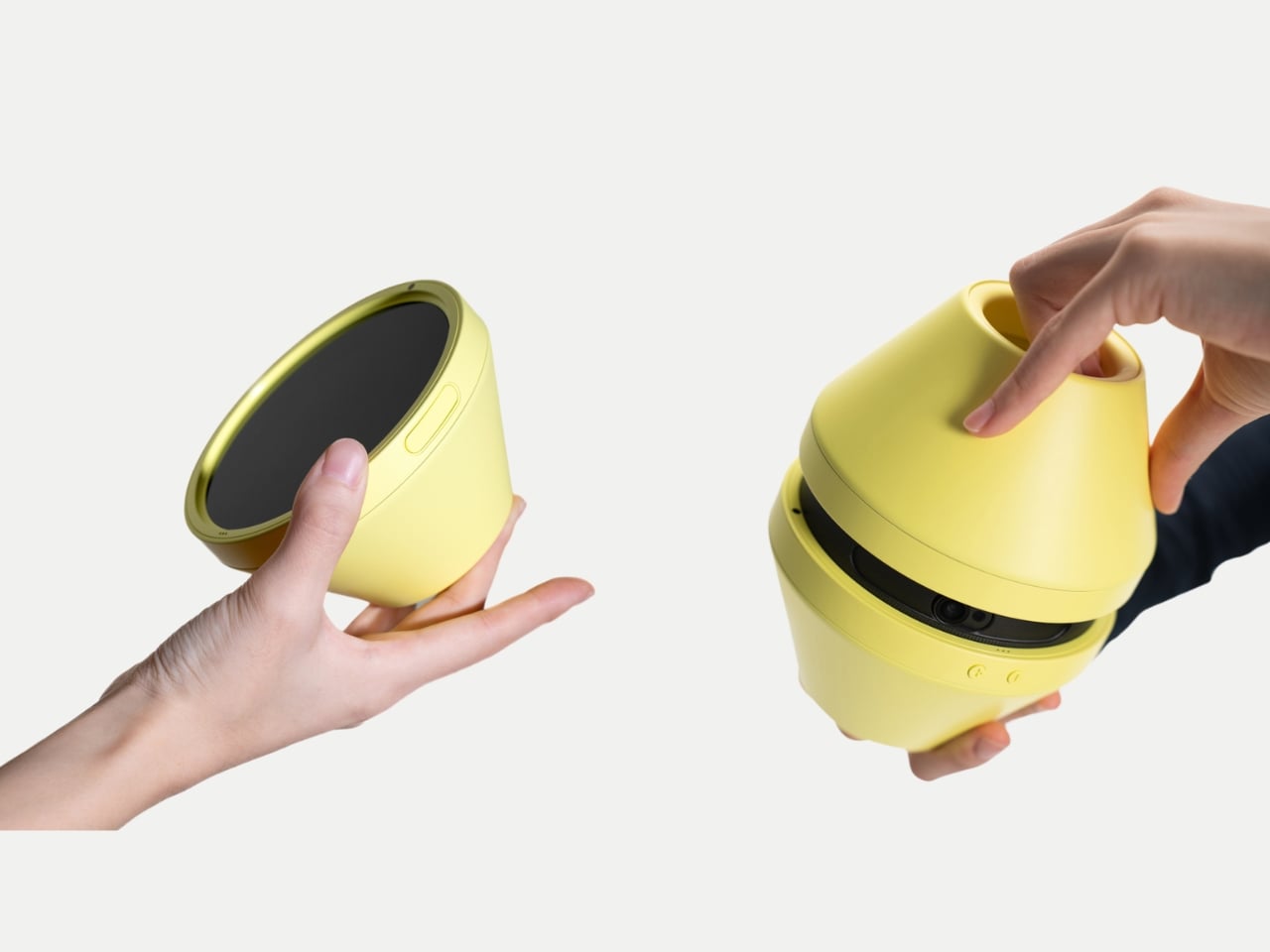
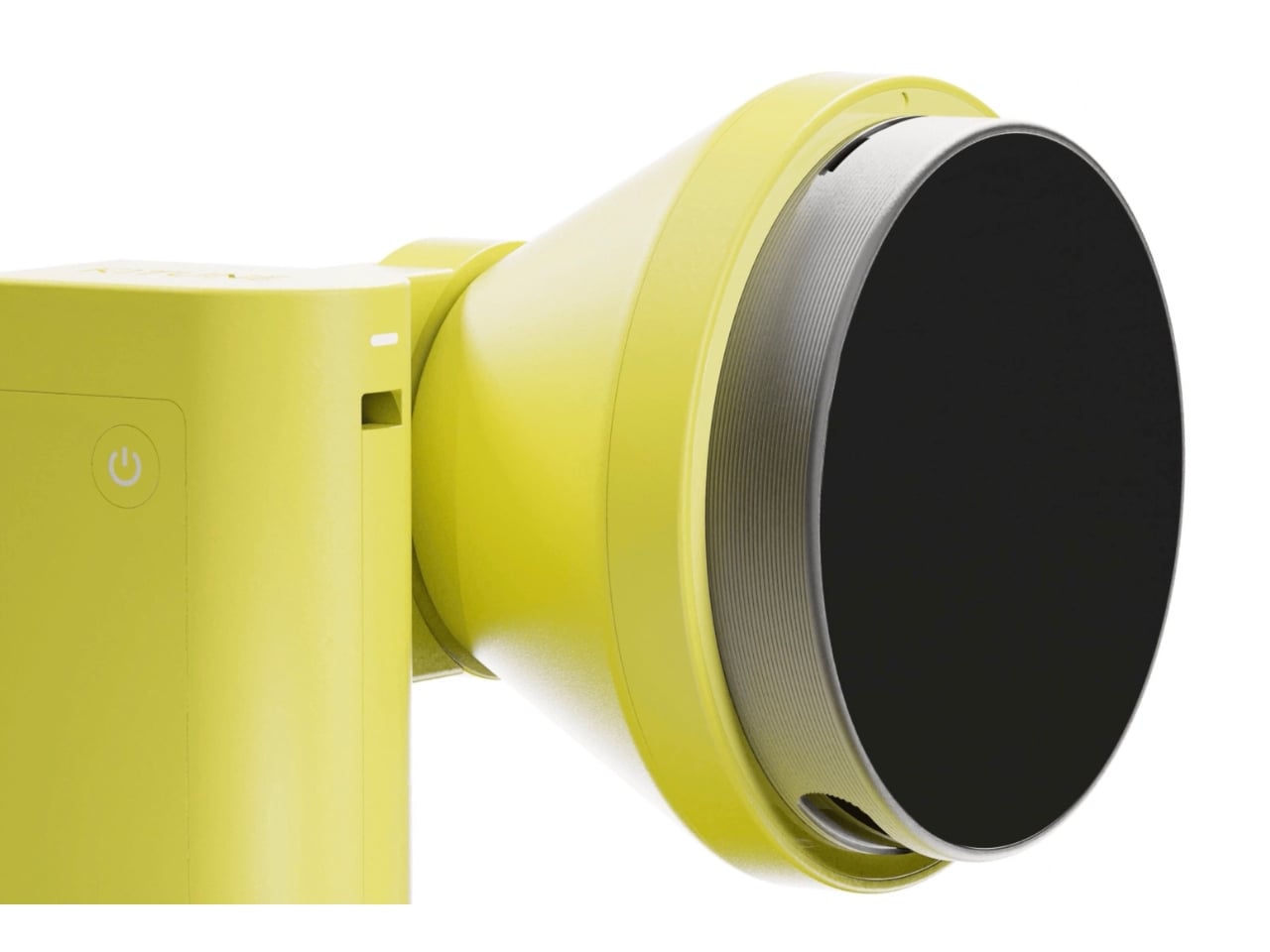
The hardware design is genuinely considered. Kitune is conceived as a portable device that works in two configurations: a handheld form for close, controlled work and a standing version where an arm suspends the projector above your plate. Both modes carry the same cheerful yellow finish, which matters more than it might seem. That color choice softens what could easily feel like cold, clinical AI tech in a space that’s historically been warm and human. It signals that this device belongs to the experience of cooking, not just the logistics of it.
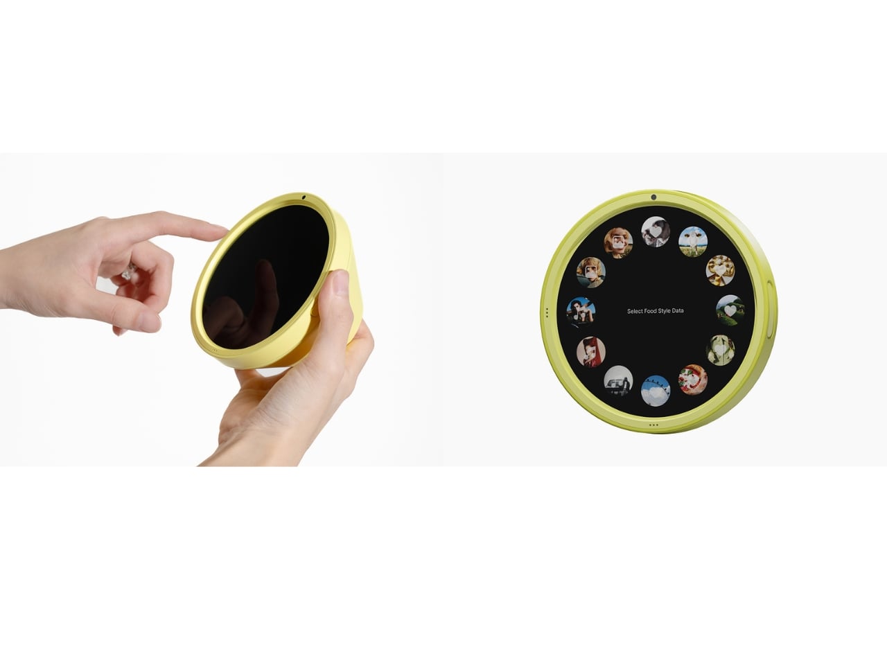
The interface is also worth attention. Instead of typing prompts or navigating flat touchscreen menus, the concept proposes interacting with a circular dial loaded with mood and lifestyle imagery that you physically rotate and select. It’s tactile, and that decision feels very deliberate. Choi seems to understand that the kitchen is not a place where people want to feel like they’re operating software. The interaction needs to feel as intuitive and sensory as the act it’s guiding.
Where Kitune really makes its case as a concept is in how it reframes what personalization means. Most AI products personalize around efficiency, faster, smarter, more optimized. Kitune personalizes around feeling. The output isn’t a quicker route or a better recommendation. It’s a visual mood built from your data that’s meant to feel like you, on a particular day, in a particular state of mind. That’s a genuinely different kind of design ambition, and one that feels more honest about the role food actually plays in people’s lives.
There are real questions the concept raises. How much data does it need to work well? Does it develop a sharper sense of you over time, or does each session reset? These are the practical gaps between a compelling concept and a working product. But Kitune doesn’t need to answer all of them right now to be worth paying attention to. As a design statement, it’s already saying something clear: that the future of kitchen technology might have less to do with what you’re cooking, and a lot more to do with how it makes you feel.
Spring changes the way students think about their tools. The semester finds its stride, the days stretch longer, and the quiet audit of what is actually working versus what has simply been tolerated becomes impossible to defer. For tech-savvy students, this impulse is never casual. It turns into a deliberate reckoning with every device in the bag, every cable on the desk, and every piece of hardware that earns or fails to earn its place in a schedule already running at capacity.
Most gadget guides aim too low. They recycle the same categories, suggest the predictable safe picks, and miss the specific texture of what a tech-savvy student’s day actually looks like in spring. Tools that genuinely serve that day are portable without sacrifice, precisely designed, and specific enough in their purpose to feel built for the exact problem they solve. The wishlists circulating among students who think carefully about design land on exactly that — and every product here was chosen to reflect it.
1. OrigamiSwift Folding Mouse
The mouse is the peripheral that students consistently overlook until a trackpad fails them mid-session. The OrigamiSwift changes that calculation. Drawing on origami’s structural logic, this Bluetooth 5.2 mouse collapses flat and springs into a full-sized ergonomic device in under 0.5 seconds. At 40 grams and 0.18 inches thin when folded, it disappears into a jacket pocket without adding noticeable weight. Soft-click buttons suit shared study spaces, and a USB-C battery sustains three months on a single charge.
For students moving between a library desk, a café table, and a campus bench in one afternoon, this is the mouse that travels without being noticed until needed. Compatible across Mac, Windows, Android, and iPadOS, it works equally on a personal laptop and a shared lab machine with no additional setup. The ergonomic form handles extended sessions without fatiguing the wrist, turning a recurring compromise into a peripheral that finally earns its place.
Folds to 0.18 inches and 40 grams, fitting into a jacket pocket without adding meaningful bulk to the daily carry
Three-month USB-C battery life removes it entirely from the weekly charging routine, so one less thing to think about
What We Dislike:
Bluetooth-only connectivity limits use on older shared desktops or lab machines that lack wireless support
The folding mechanism takes a brief adjustment period for students accustomed to the immediate grip of a conventional fixed-body mouse
2. Xiaomi UltraThin Magnetic Power Bank 5000 15W
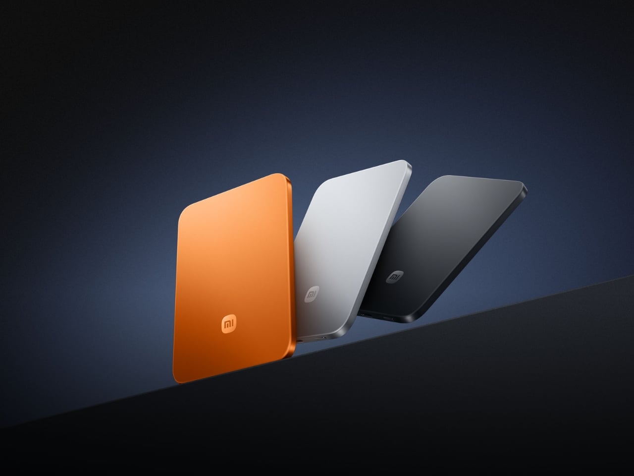
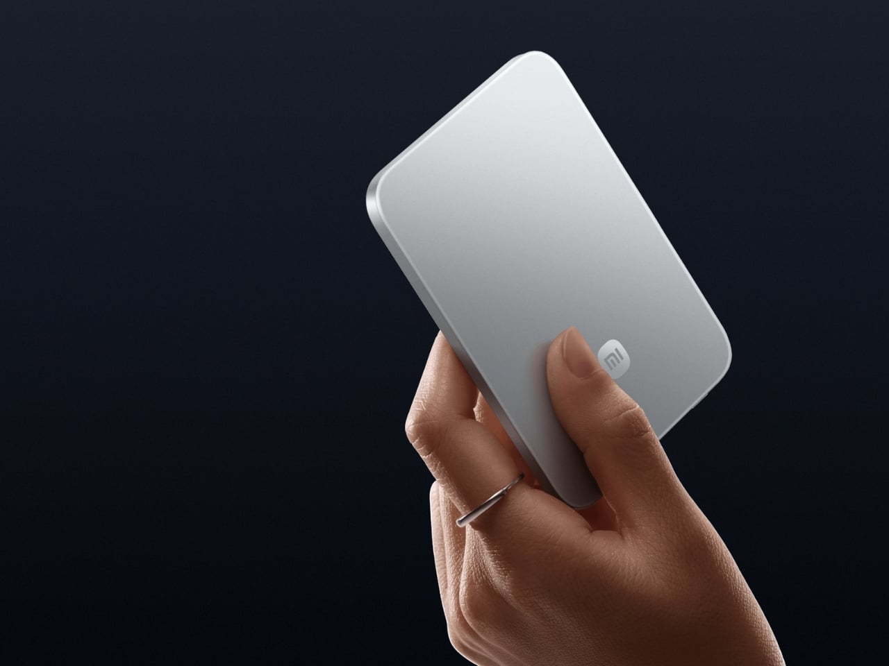
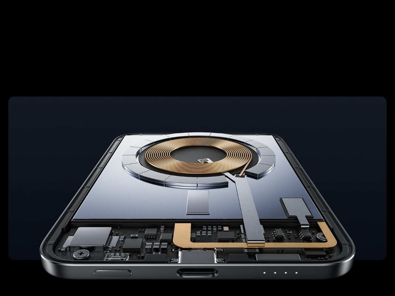
Power banks occupy a strange design dead zone. Most work as promised and are forgotten the moment they enter a bag. The Xiaomi UltraThin Magnetic Power Bank 5000 15W reframes the category. At 6mm thin — slimmer than any current smartphone — it holds 5,000mAh inside an aluminum alloy shell. Silicon-carbon battery chemistry with 16% silicon content enables higher energy density without expanding the footprint, and a fire-resistant fiberglass rear surface manages heat during wireless charging.
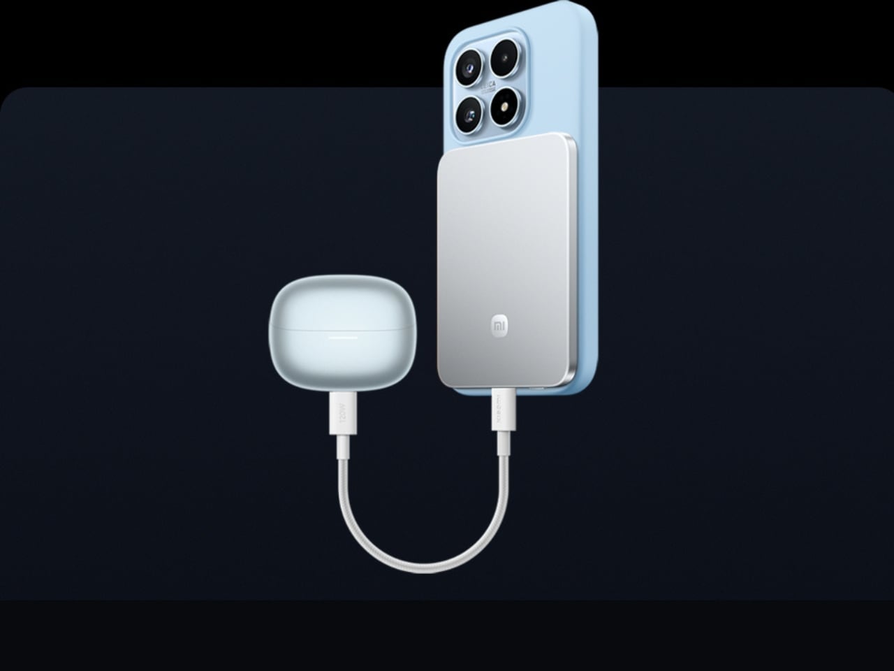
This solves the persistent problem of the charging backup that stays home because it feels too heavy to justify. At 6mm, it sits magnetically against a compatible phone and delivers 15W wirelessly while moving between buildings, sitting through a lecture, or waiting at a transit platform. No cable between bank and phone, no rummaging for the right end. It sits in a pocket as an extension of the device rather than a separate burden to manage throughout the day.
What We Like:
Silicon-carbon chemistry achieves 5,000mAh within a 6mm profile, making it the thinnest power bank available at this capacity tier
Magnetic cable-free attachment delivers 15W wirelessly while the phone stays pocketed between classes, with zero management required
What We Dislike:
5,000mAh covers roughly one full smartphone charge, which falls short on heavy-use days involving continuous navigation, recording, and streaming
Magnetic wireless charging is limited to compatible phone models, restricting the cable-free feature for students outside that ecosystem
3. HubKey Gen2
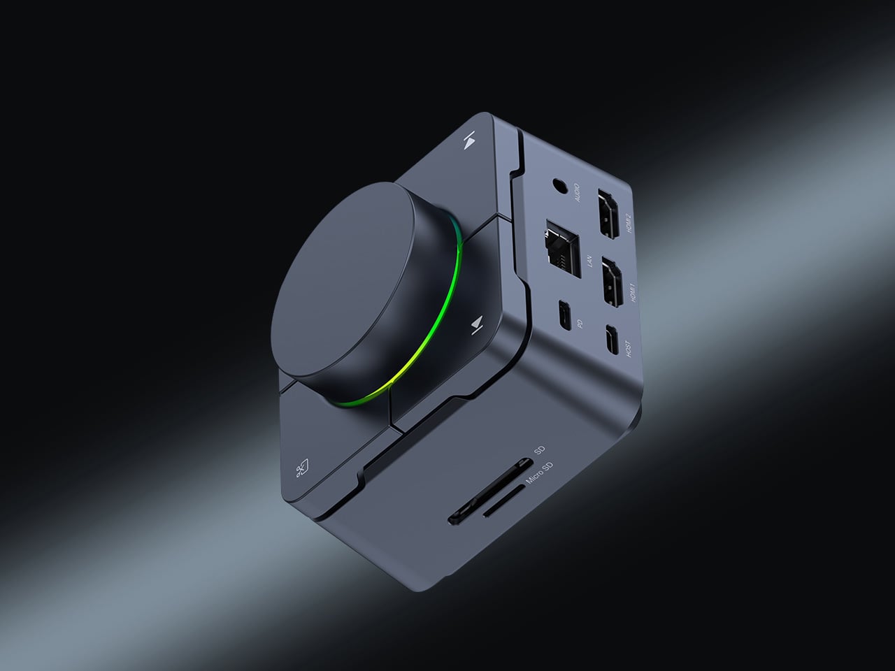
The average student laptop setup involves a quiet accumulation of compromises: a dongle for the display, a separate hub for ports, a cable for audio, and none of it cohering. The HubKey Gen2 addresses this from a single USB-C connection. An 11-in-1 hub in a compact cube, it adds two HDMI ports, each capable of driving a 4K display at 60Hz, four fully customizable physical shortcut keys, and a central control knob that handles everyday actions without navigating software menus.
Spreading a research document across two 4K panels changes the quality of a work session in ways only understood from the inside. Reference material stays open while the draft stays active. Code and documentation share the same eyeline. The shortcut keys reduce the cognitive overhead of memorizing keyboard combinations, and the central knob delivers volume control with tactile immediacy that no software slider replicates. For students working across design, development, or video, this cube earns its place on day one.
What We Like:
Dual 4K HDMI outputs at 60Hz each simultaneously expand a laptop into a proper two-monitor workstation from a single connection
Physical shortcut keys and a central control knob bring immediate, tactile control to routine tasks that software menus handle more slowly
What We Dislike:
Cube form factor suits a stationary desk, but does not pack into a travel bag as cleanly as a flat or cable-style hub alternative
Full 11-in-1 performance depends on the connected laptop’s USB-C port supporting the required power delivery and data bandwidth specifications
4. BraX open_slate
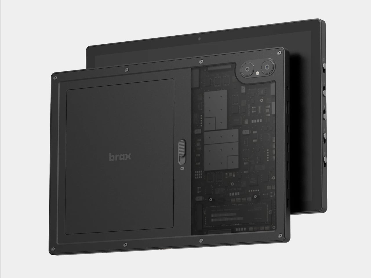
Almost every tablet arrives sealed, with decisions already made inside the chassis: fixed storage, an inaccessible battery, a software support window that closes on the manufacturer’s schedule. The BraX open_slate rejects that model. This 12-inch 2-in-1 includes an M.2 2280 slot for user-swappable storage, a replaceable 8,000mAh battery rated at 20 hours of runtime, and a 120Hz display driven by a MediaTek Genio 720 chip paired with either 8GB or 16GB of RAM.
The open_slate removes the most predictable frustration of the tablet ownership cycle: the moment a device slows enough to become an obstacle, and the only available response is full replacement. Swappable storage means a capacity upgrade takes an afternoon. A user-replaceable battery means two years of student use does not write off the entire device. For students making a deliberate, multi-year investment in one tablet, this is currently the only option making that argument with hardware to back it.
What We Like:
User-replaceable M.2 storage and battery extend the device’s usable lifespan well beyond the typical two-to-three year sealed-tablet replacement cycle
A 20-hour claimed battery runtime on a 120Hz display covers a full academic day without requiring a charge mid-session
What We Dislike:
MediaTek Genio 720 is a capable mid-range chip, but it is not suited for students with intensive video rendering or compute-heavy creative workloads
The open modular hardware requires a degree of technical confidence that students coming from fully managed, sealed device ecosystems may need time to build
5. Battery-Free Amplifying iSpeakers
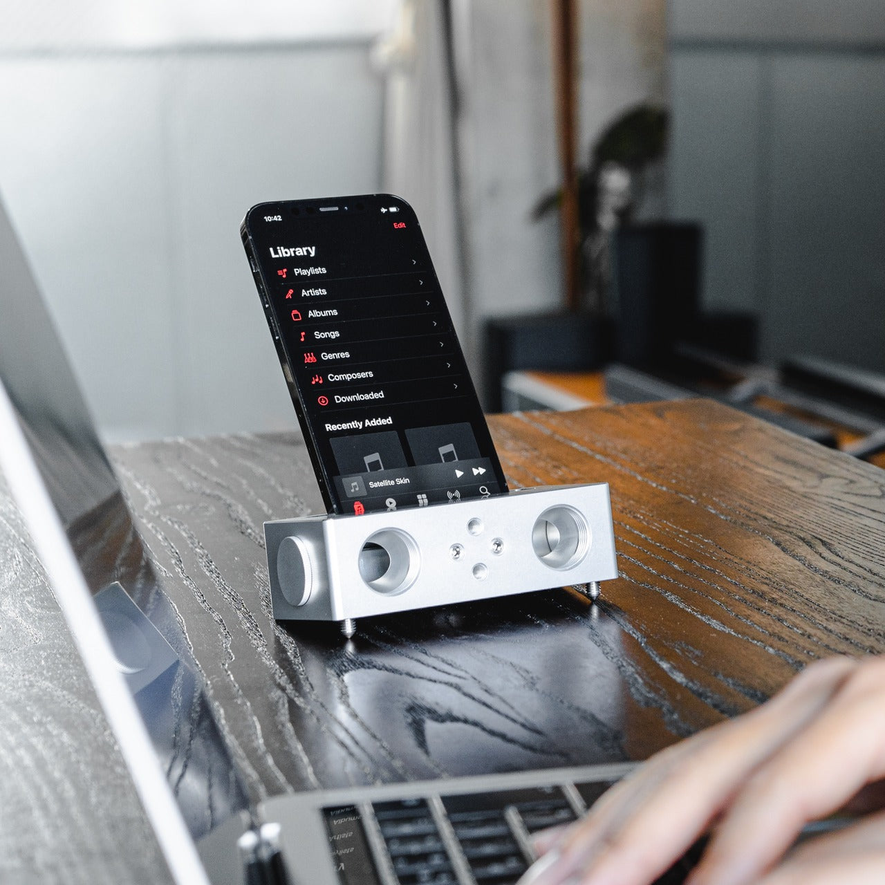
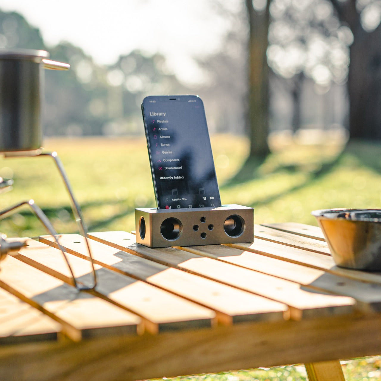
The Battery-Free Amplifying iSpeakers operate on a principle that is easy to underestimate until the sound fills the room. A smartphone sits in the machined Duralumin cradle, and sound waves are directed and amplified through the chamber without any electrical input. The body is the same aluminum alloy used in aircraft construction, chosen for its vibration resistance and acoustic properties. Chamber proportions were developed using the golden ratio, a structural decision that shapes the internal acoustic geometry deliberately.
No charging reminder, no Bluetooth pairing, no firmware update mid-session. A phone in the cradle and the room shifts immediately, audio gaining presence and warmth that a phone speaker lying flat on a desk cannot approach. For study sessions running on focus music, ambient sound, or a lecture replay, the difference registers in seconds. Duralumin handles daily movement without showing wear, and because it operates entirely outside the electrical ecosystem, it performs identically in ten years as it does today.
Zero power requirement means no charging, no battery degradation, and no dependency on any cable or power source at any point
Aircraft-grade Duralumin construction delivers acoustic quality and physical durability that holds across years of regular daily use without deterioration
What We Dislike:
Passive acoustic amplification improves meaningfully on bare phone speaker output, but cannot match the volume or bass depth of even entry-level powered speakers
Cradle sizing is optimized for specific smartphone dimensions, and compatibility may vary with larger phones or thick protective cases
The Setup That Actually Works for You
The five products here do not share a category, price point, or use case. What they share is design precision that addresses real daily friction rather than just performing a feature list. A wishlist built on that standard holds up across the full stretch of any semester. These are tools chosen because someone thought carefully about the problem first, and that clarity comes through every time you reach for one.
Spring is short. It moves quickly from the first warm afternoon to the last exam, and the tools you work with shape how much of that time goes toward actual output. The difference between owning something well-considered and tolerating what came with freshman year becomes obvious around week ten. Choosing now means spending the rest of the semester working with something that performs exactly the way a well-chosen tool should.
At some point, music stopped being an event and became wallpaper. You don’t really choose what plays anymore. A playlist starts, an algorithm decides what comes next, and before you know it, three hours have passed and you couldn’t name a single song. We used to sit with albums. We used to commit to them. That shift in how we listen is so gradual, so seamless, that most of us didn’t even notice it happening.
Arindam Kalita noticed. The multidisciplinary industrial designer, based in New York City and currently studying at Parsons School of Design, is betting that plenty of us miss that older, more intentional way of engaging with music. His project, called Analog, is a transparent CD player, and it is one of the more quietly compelling design statements to emerge from the current wave of nostalgia around physical media.
The premise is almost aggressively simple. Analog has a power button and a volume knob. That’s it. No screen, no algorithm, no shuffle function, no “Up Next” queue pulling you in six directions. You put in a CD and you listen to it. The whole thing. In order. The way the artist intended. Kalita describes it as a “distraction-free music listening device designed to restore intention and commitment to the act of listening,” and that framing matters because it isn’t merely a product description. It is a design philosophy made physical.
The transparency is what makes Analog visually arresting. The casing is clear, which means you can watch the disc spin, follow the mechanics working in real time, and see the whole process of recorded sound become something tangible. Kalita calls it “a sculptural window into your sound,” and that description earns itself. You watch the CD move and you’re suddenly reminded that music is a material thing, that it exists somewhere beyond a server farm. That reminder turns out to be surprisingly moving. It’s the kind of design detail that rewards you for paying attention.
The timing of this project feels deliberate. The vinyl revival has been going strong for years, and CDs are quietly following a similar arc. Sales have been steadily climbing, thrift store bins are getting picked over with real intention, and people are rediscovering what it feels like to have a physical relationship with music they love. Analog fits right into that conversation, but it isn’t trying to be retro for the sake of aesthetics. The design is clean and modern, and the transparency gives the whole thing a contemporary, almost scientific quality that keeps it from sliding into nostalgia bait.
The more interesting argument Analog makes is about constraint. Most of us have a streaming library that is effectively infinite, and that abundance, paradoxically, makes both choosing and listening more passive. When you only have the album you put in, you pay attention differently. You stop skipping. You let the slow tracks breathe. You remember that albums have pacing and arc, and that the track you used to fast-forward through is actually one of the best ones. You start actually listening instead of just having music on. Kalita’s design is making a case through form alone that fewer options can create a richer experience.
Kalita believes that humans connect to objects and experiences through tangibility and sight, placing designers in a position of great power and responsibility. Analog is a direct expression of that. It asks you to see your music, to physically interact with it, to be present for it. That feels almost radical in 2026, and I think that’s precisely the intention.
Whether or not Analog ever goes to market is, in a way, beside the point. The best concept design doesn’t just propose a product. It poses a question. What do we actually want from music? Convenience or connection? Background noise or something you can recall the next day? I know my answer, and I suspect if a lot of people stopped to think about it, they’d know theirs too.
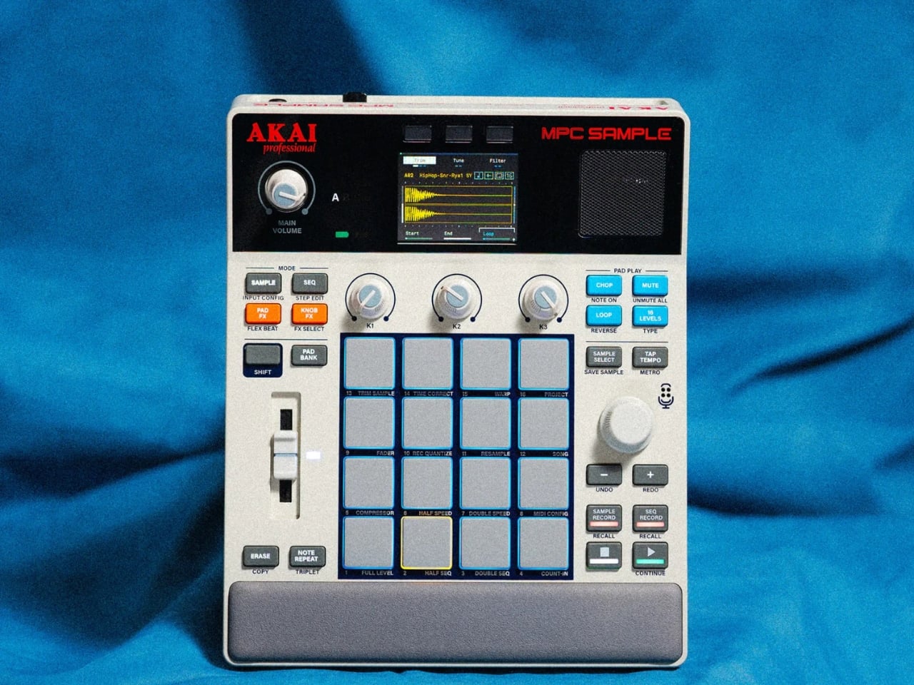
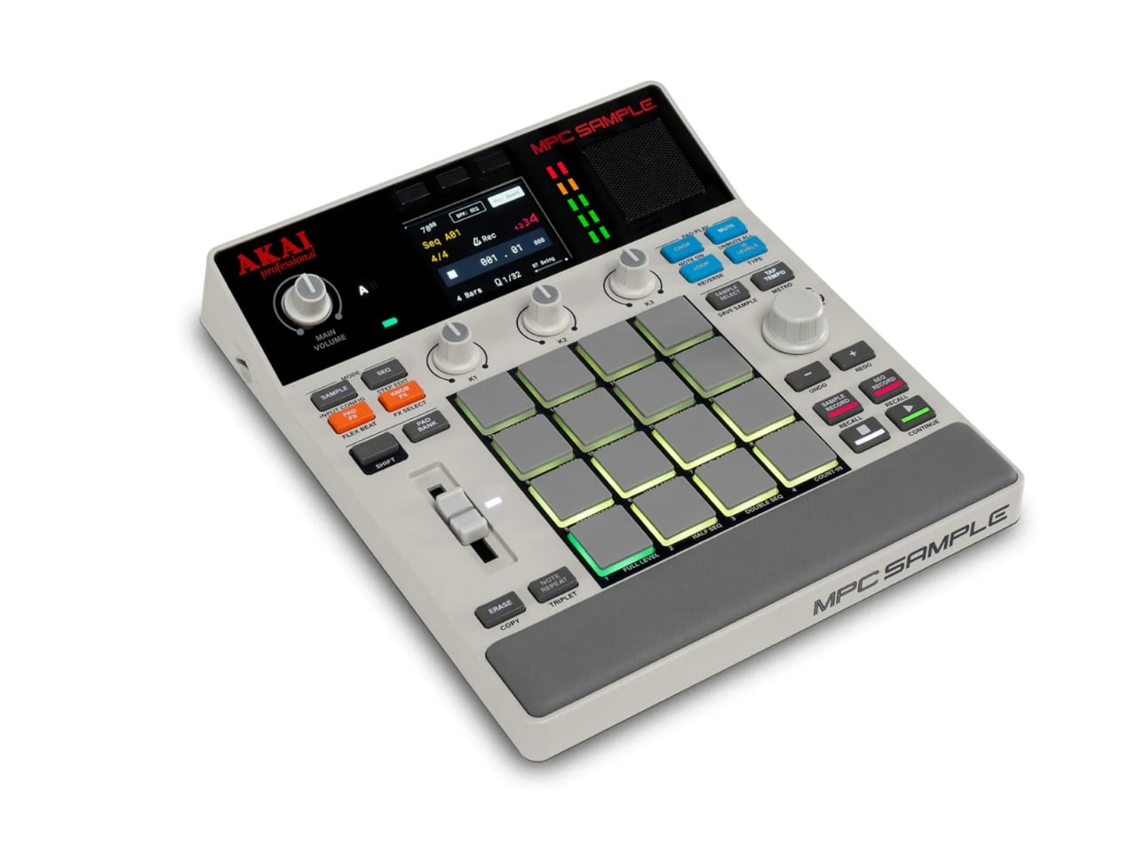
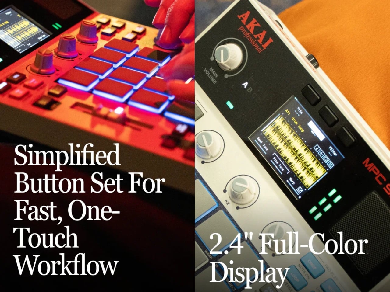
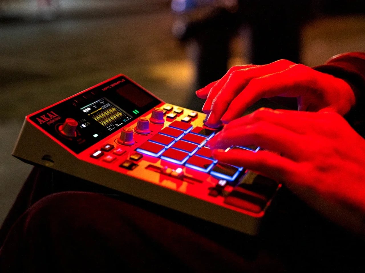
The MPC is one of those rare objects that carries cultural weight beyond its function. Since the MPC60 landed in 1988, that grid of rubber pads has been behind some of the most iconic beats ever made, from hip-hop to electronic music to whatever genre-bending thing your favorite producer is cooking up right now. So when Akai Pro quietly dropped the MPC Sample at $399, it felt like the kind of announcement worth paying attention to, even if you’ve never touched a drum pad in your life.
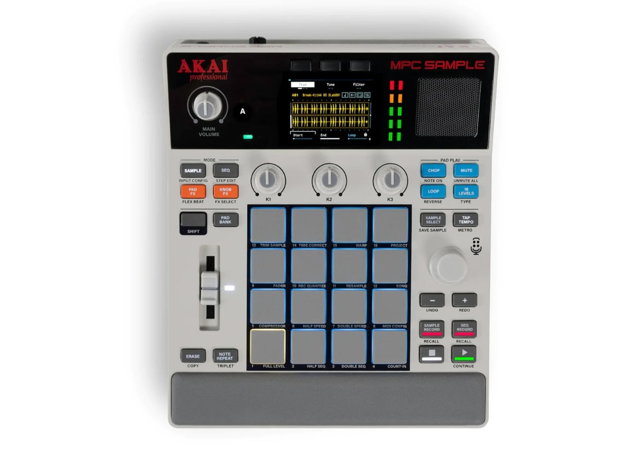
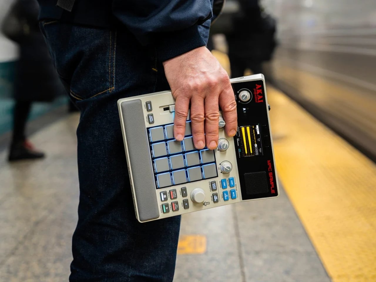
The MPC Sample is compact in a way that actually surprises you. At 23.6 × 19.4 × 5.0 cm and just under a kilogram, it fits comfortably in a backpack. It runs on a rechargeable lithium-ion battery that lasts up to five hours, has a built-in microphone and a 3-watt speaker, and connects via a single USB-C port for audio, MIDI, charging, and file transfer. That’s a lot of functionality packed into something that looks like it belongs on a desk alongside a cup of coffee and a sketchbook.
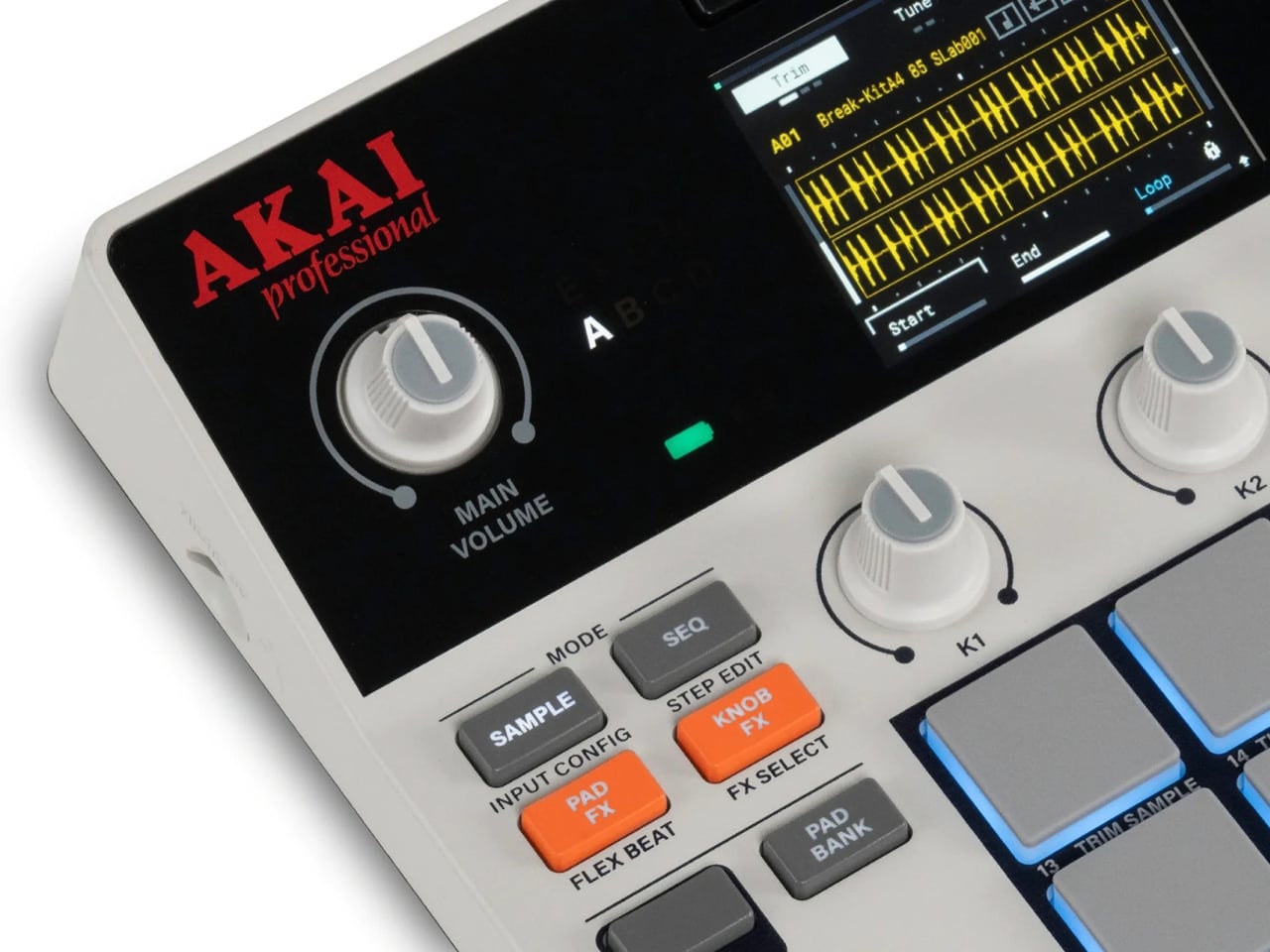
The design is where things get really interesting. The MPC Sample draws direct visual inspiration from the MPC60, one of the most beloved pieces of music hardware ever made. The color palette is restrained and tasteful. The layout is clean. The 16 RGB velocity-sensitive pads sit front and center with that familiar grid arrangement, and the inclusion of a legacy parameter fader is a genuinely nice nod to the hardware that built the MPC name. The Verge called it a favorite portable beat maker, and you can see why the moment you look at it. It feels considered in a way that a lot of modern gear doesn’t.
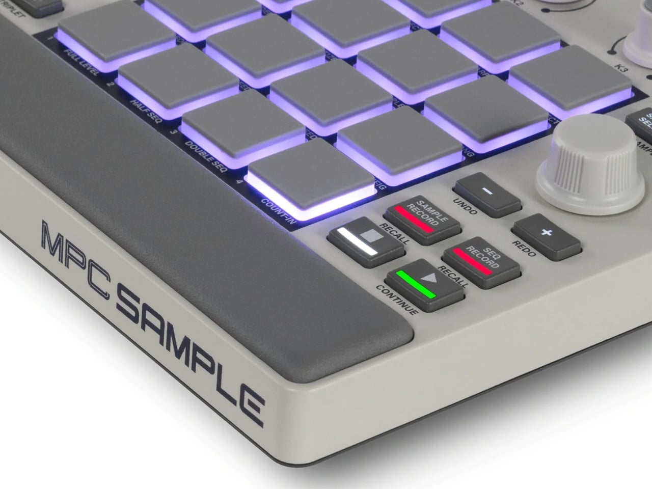
Look at it a little longer and you start noticing the smaller decisions. The padded wrist rest. The way the button layout doesn’t fight for your attention. The muted color scheme that feels closer to a vintage synthesizer than a modern gadget. A lot of companies chasing the retro aesthetic tend to overcook it, leaning so hard into nostalgia that the product starts to feel like a costume. The MPC Sample avoids that entirely. It looks like something that was always going to exist, not something designed to remind you of something else. The proportions are right. The materials feel intentional. For a $399 device, the level of design restraint on display is genuinely impressive, and honestly a little rare.
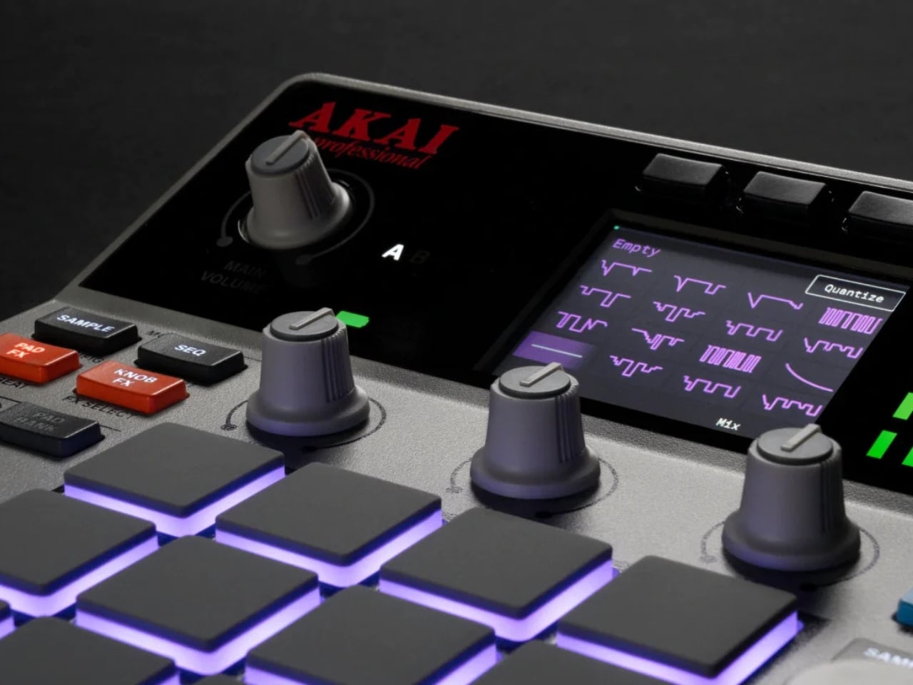
That last point is worth dwelling on. Hardware design in the music world tends to fall into two camps: either overloaded and intimidating, or stripped down to the point of being frustrating. The MPC Sample sits in a much more interesting middle ground. The 2.4-inch full-color display is there when you need to visualize your waveform. The three real-time control knobs handle effects on the fly. The Instant Sample Chop mode, the real-time timestretch and repitch, the 60 effect types spread across four engines: it’s capable without being overwhelming. For someone new to sampling, that balance is almost everything.
It’s worth noting the price context here. The original MPC60 launched in 1988 at $4,999.95, which works out to roughly $13,800 in today’s money. The MPC Sample does things the MPC60 couldn’t dream of, for $399. That’s not just a deal; that’s a philosophical shift in who gets to make music with professional-grade tools. The fact that it ships loaded with over 100 factory kits, 2GB of RAM, and 8GB of internal storage, with room to expand via microSD, makes the entry point feel even more generous.
Nothing is without trade-offs, though. Five hours of battery life is solid for a focused session but won’t carry you through a full travel day. The built-in speaker works fine for quick monitoring, but you’ll want headphones for anything serious. And the MPC ecosystem, while powerful, has always carried a learning curve for newcomers. The MPC Sample softens that curve considerably, but it doesn’t disappear entirely.
What makes the MPC Sample feel culturally significant isn’t only its portability or its price point. It’s the way it takes something with nearly 40 years of creative history and makes it genuinely accessible without watering it down. The design respects the legacy. The features serve the workflow. The whole thing is small enough to go anywhere, which might actually be the most radical thing about it. Creativity has always been portable in theory. The MPC Sample is making it portable in practice. At $399, it’s the kind of object that quietly makes you reconsider where, and how, you make things.
Easter arrives on April 5, giving you ten days to find something that doesn’t feel purchased in panic. The candy basket is covered. What makes the morning memorable is the object that makes him pause because the thing in his hands is worth looking at. These seven picks aren’t pulled from a generic roundup — they’re designed objects built with enough conviction that engineering and aesthetics arrive at the same answer
None of these need an explanation on the card. Some ship immediately; others are in production with lead times worth checking before checkout. Shop products move quickly during gift windows, and objects like this rarely wait for last-minute decisions. Order now, check shipping windows, and show up April 5 with something he didn’t know to ask for — which is the only kind of gift worth giving.
1. GPD Win 5 Gaming Handheld
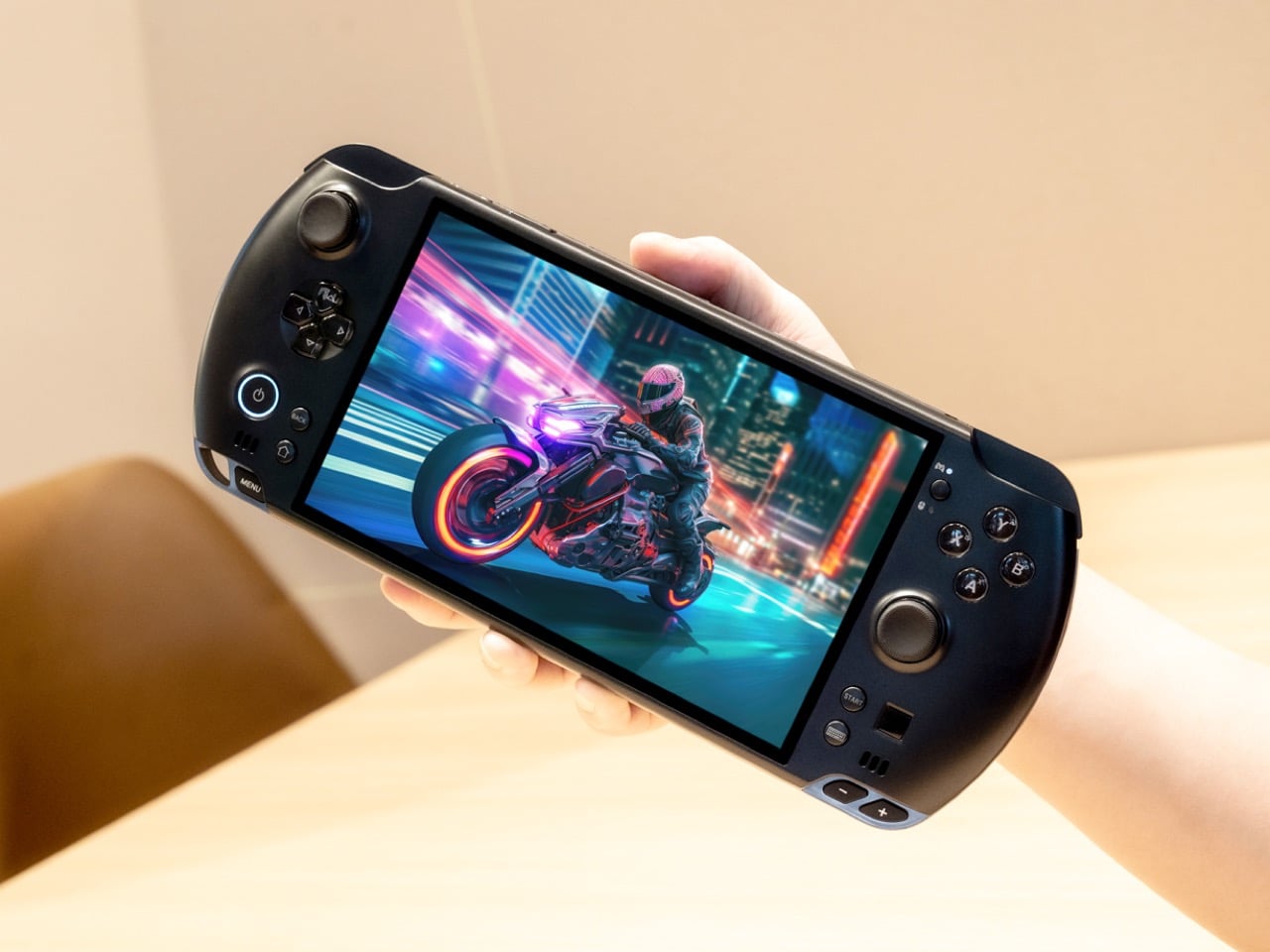
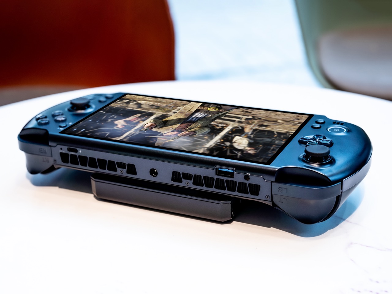
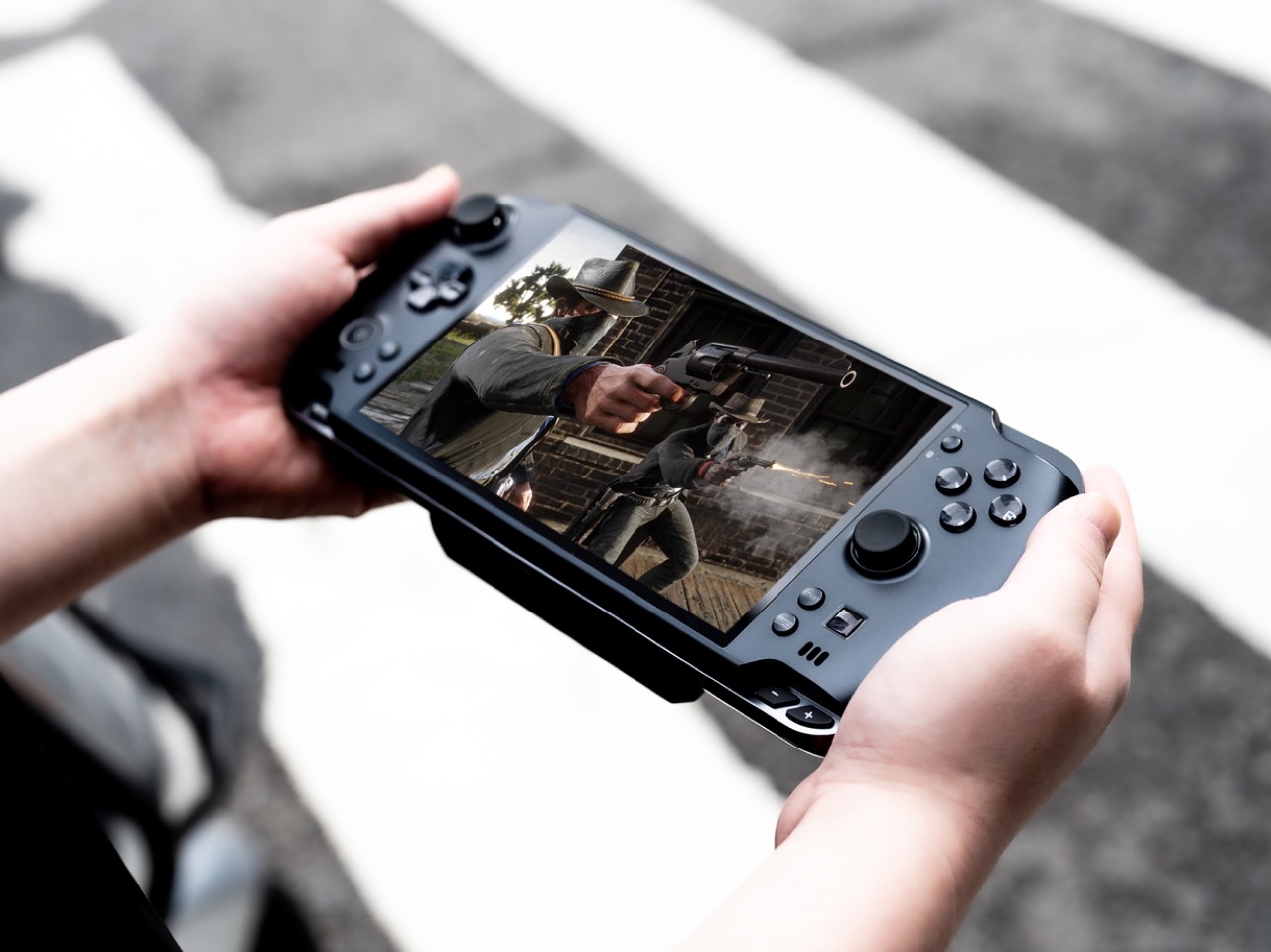
The PSP’s silhouette never really died — it just kept getting more ambitious inside. The GPD Win 5 takes the wide landscape layout we’ve known for twenty years and fills it with an AMD Ryzen AI Max 395 processor and a full terabyte of storage — a desktop-level decision wrapped inside a handheld form. The result is a device that plays any PC game at settings no portable console would dare suggest.
The engineering required to keep it running is written directly onto the chassis. Quad heat pipe cooling, a proprietary Mini SSD slot, hall effect triggers, and a detachable 80Wh battery extend sessions well beyond what the internal cell could manage. The 7-inch 16:9 display sits centered between capacitive joysticks with zero deadzone in a layout that feels immediately familiar. This is not a gaming device that compromises on performance — it refuses to.
What We Like
The AMD Ryzen AI Max 395 delivers genuine desktop-class performance from a body that still fits in a bag
Hall effect triggers and capacitive joysticks with zero deadzone give it a precision edge over every portable console alternative
What We Dislike
The thickness and thermal venting make it visually dense — this is not a subtle object
The price positions it well above impulse territory, narrowing its natural audience considerably
2. Side A Cassette Speaker
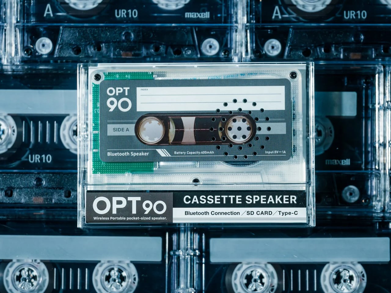
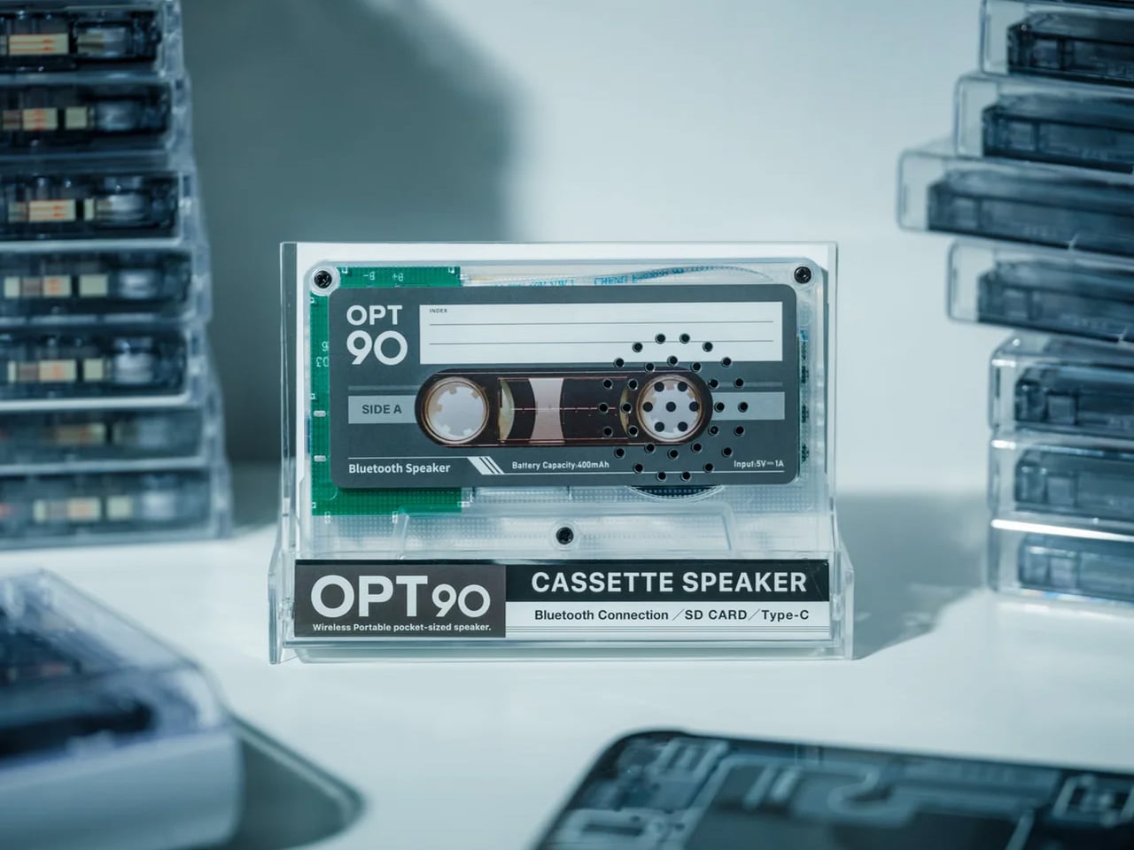
Everything about the Side A Cassette Speaker is designed to make you pick it up. The transparent shell exposes its mechanics the way a skeleton watch exposes its movement — not to perform engineering, but to invite curiosity. The cassette form is faithful enough to earn a double-take and modern enough to pair via Bluetooth 5.3 without cognitive dissonance. It looks like a mixtape from 1997 and sounds like something bought this year.
For under fifty dollars, it streams wirelessly, supports microSD offline playback, and delivers warm-tuned sound that rewards the retro framing rather than undermining it. The clear case doubles as a stand, which means it sits upright on a desk looking intentional rather than abandoned. This is the gift that earns visible placement — the kind of object someone keeps out not because they have to, but because it says something about the shelf it lives on.
The transparent cassette shell creates instant visual storytelling before it’s even switched on
At under $50, it’s the most accessible pick on the list — approachable price, zero sense of compromise
What We Dislike
The smaller cabinet limits low-end response — bass is present, but won’t satisfy anyone comparing it to a full-size speaker
Best suited for near-field listening; it won’t carry sound convincingly across a large room
3. RingConn Gen 2 Smart Ring
The RingConn Gen 2 makes the case that wearable health tracking never needed to live on your wrist. It’s a ring — thinner and lighter than its predecessor — that runs 10 to 12 days on a single charge and tracks sleep, heart rate, and respiratory variations through AI analysis, claiming 90.7% accuracy in identifying sleep risk events. No subscription. No display competing for attention. Just a slim band doing quiet overnight work.
The appeal for someone who refuses a smartwatch is genuine. There’s no screen to check, no notification buzzing against the wrist, no social permission for the device to interrupt your day. The AI sleep tracking surfaces insights about breathing patterns and nighttime respiratory variations that standard fitness bands don’t reach with the same depth. It tracks without performing the act of tracking, which is its entire design philosophy. Wear it and forget it is the point.
What We Like
A 10 to 12-day battery life removes the nightly charging ritual that makes most wearables feel like obligations
AI-powered sleep insights with no subscription fees eliminate both the friction and the ongoing cost
What We Dislike
Sizing matters significantly for a ring — gifting one requires knowing the recipient’s ring size in advance
The value of the health data depends entirely on the wearer engaging with the insights it surfaces
4. Soundcore Sleep Earbuds
Sleep earbuds have always been a comfort problem disguised as an audio problem. Soundcore’s answer involves 3D ergonomic shaping built around the concha cavity’s actual geometry, an Air Wing hollow structure that distributes contact pressure across a wider surface area, and a stacked charging pin architecture that repositions hardware away from the ear entirely. The result is an earbud designed to be forgotten during use — not because it lacks presence, but because its presence feels like nothing.
Noise blocking keeps external sound out while a soft audio profile handles whatever you use to fall asleep. The Air Wing’s flexibility adapts across different ear shapes rather than demanding the ear adapt to it — the distinction that separates earbuds built for sleeping from earbuds people merely attempt to sleep in. For anyone whose sleep is light or interrupted, this is the category of gift that earns its place by how someone feels the next morning.
What We Like
The 3D ergonomic shaping and hollow Air Wing design solve the pressure and slippage problems that have historically made sleep earbuds impractical
Stacked charging pin architecture removes the most common comfort complaint in the category without sacrificing charging functionality
What We Dislike
Fit is deeply individual — what disappears for one person may still feel present for another, depending on ear geometry
Noise blocking effectiveness varies with ear canal shape and the sleep position someone naturally defaults to
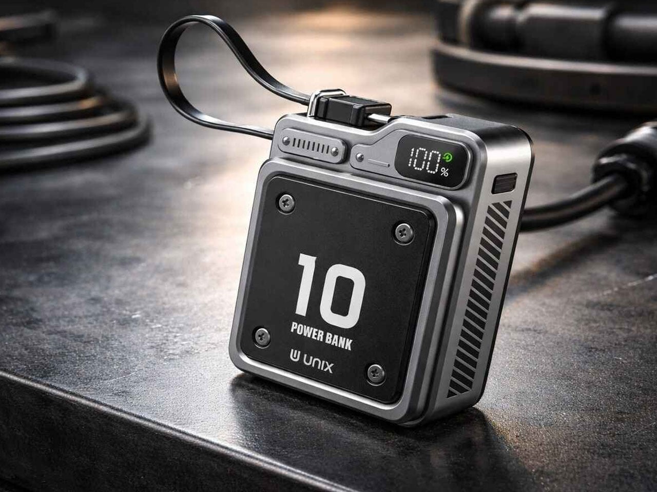
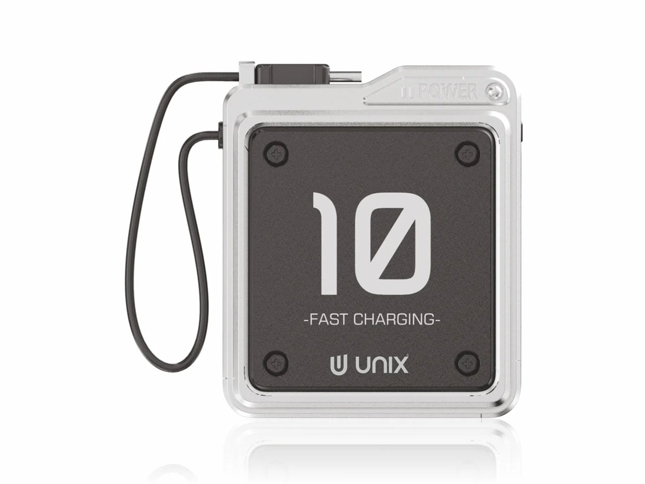
5. Unix UX-1519 NEOM Power Bank
Power banks exist in a visual category that design has largely abandoned — they are rectangles. The Unix UX-1519 NEOM is still a rectangle, but it looks like it was designed at the same meeting as the rest of your gear rather than found in an airport convenience store. The industrial finish, considered proportions, and built-in Type-C carry loop cable elevate it into an object worth keeping visible rather than buried at the bottom of a bag.
Under that exterior sits a 10,000mAh cell delivering 22.5W fast charging, dual output ports for simultaneous device charging, and the S-Power smart chipset managing stable discharge throughout each session. The cable that serves as a carry loop supports 12V output, pulling fast charging performance through the same thing you grip to retrieve it. That level of integration — where every detail earns its presence — is what separates this from the generic category it technically belongs to.
What We Like
The built-in Type-C carry loop cable is the kind of small detail that makes the whole object feel more considered than anything at this price point
22.5W fast charging with dual output and smart chipset management handles the functionality without any concessions
What We Dislike
At 10,000mAh, larger capacity banks will outlast it across multi-day travel without wall access
The industrial aesthetic is confident and specific — some will read it as premium, others as heavy-handed
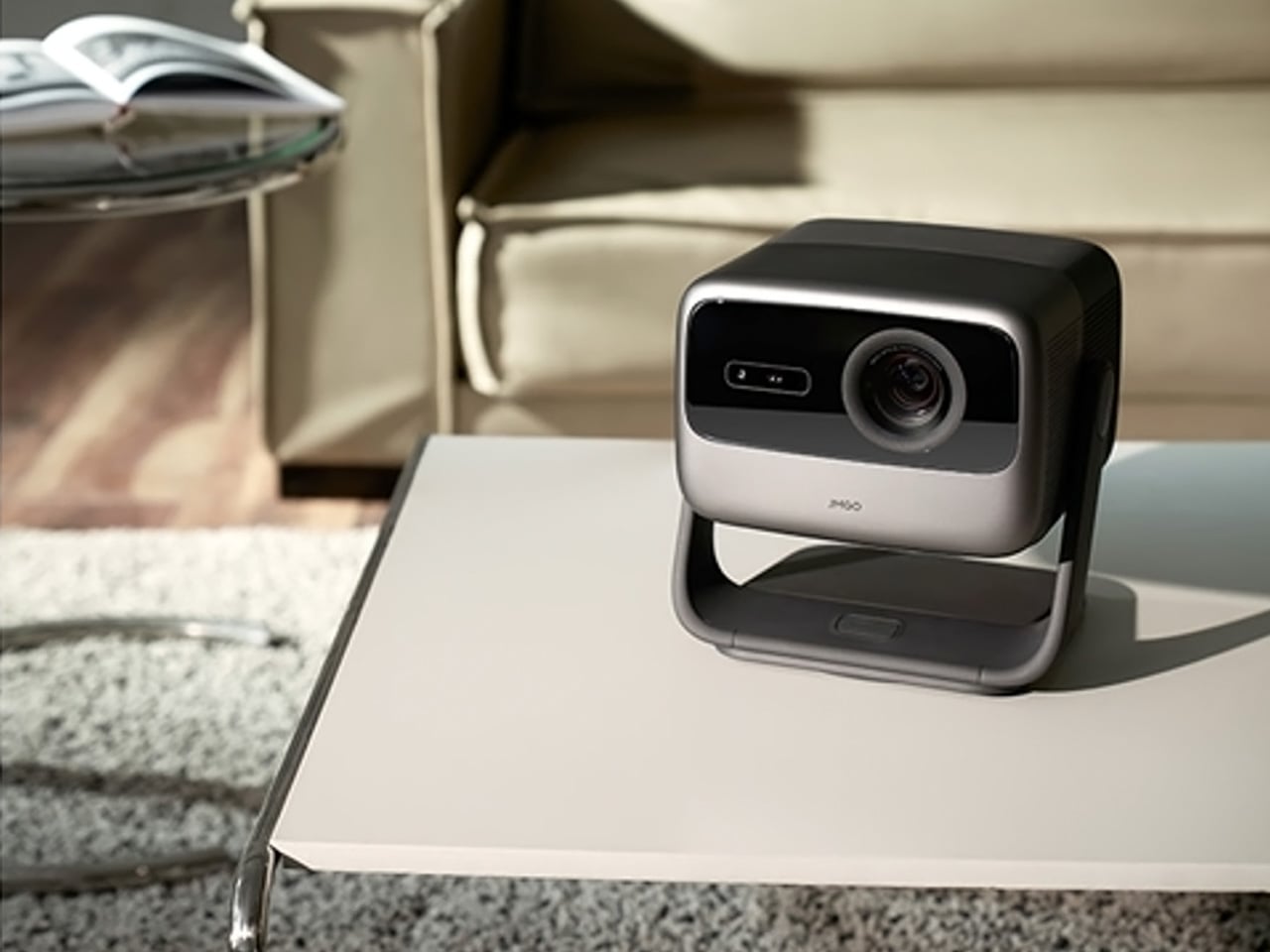
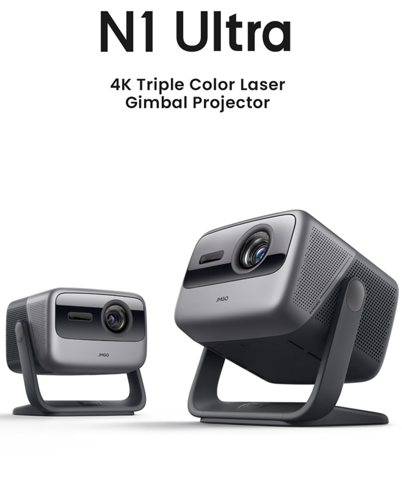
6. JMGO N1 Ultra 4K Laser Projector
The JMGO N1 Ultra solves the problem that has historically made projectors aspirational rather than practical: setup. The gimbal tilts automatically, focus locks without a hand on the lens, keystoning corrects itself, and obstacle detection keeps the image where it belongs. At 2800 ISO lumens from RGB triple-color laser optics, it works in a lit room, which means it lives in a living room without requiring the space to be reorganized before every use.
The color accuracy from tricolor laser projection has a saturation and richness that lamp projectors simply cannot reach. HDMI 2.1 with eARC handles connectivity, and 20W dual speakers with Dolby Digital Plus and 45Hz bass extension fill a room without requiring a separate soundbar. This is a projector for people who want cinema at home without the ceremony of installing one. Point it at a wall, let it calibrate in seconds, and the room becomes something else entirely.
What We Like
The smart adaptive system handles focus, keystone correction, and brightness automatically — setup takes seconds, not an evening of calibration
RGB triple-color laser at 2800 ISO lumens performs in ambient light, removing any requirement to design a room around it
What We Dislike
The price positions it as a considered purchase rather than a spontaneous gift — it requires a genuinely enthusiastic recipient
The gimbal and automated systems add complexity that may feel like more setup than expected for buyers anticipating a simple plug-in experience
7. Rolling World Clock
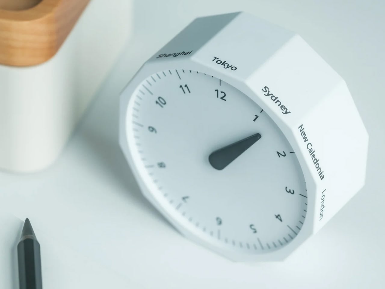
Not every great tech gift has a circuit board inside it. The Rolling World Clock is a 12-sided dodecahedron that tells global time through the simplest possible mechanism: roll it to a city face, read the single hand. London, Tokyo, New York, Shanghai, Sydney, and seven more time zones are built into its geometry. For anyone navigating remote work across multiple cities, this solves a daily frustration through pure physical design.
What earns it a place on a tech gift list is exactly that clarity of purpose. Most remote workers live inside four different time zone tabs, a world clock widget, and a mental arithmetic habit they never asked for. The Rolling World Clock replaces all of that with an object you can hold. Roll it to a city face and a single hand tells the time there — no toggling between apps, no unlocking a screen. It sits on the desk between the monitor and the coffee, available in black and white, and asks nothing from you except the decision to pick it up. Sometimes the most considered technology is the kind that gets out of your way entirely.
The 12-sided dodecahedron form solves a genuinely common remote work problem — global time tracking — through tactile physical interaction rather than another screen
The fully analog mechanism means no charging, no setup, and no interface to learn — it works the moment it lands on a desk
What We Dislike
Coverage is limited to 12 major cities — travelers or remote workers operating in less-represented time zones will find gaps
The single-hand display reads cleanly, but requires a moment of orientation for anyone unfamiliar with the face layout
The Gift That Earns Its Place Before He Opens It
Seven products, seven completely different problems solved. A gaming handheld that refuses to compromise on desktop performance. A cassette speaker that makes Bluetooth feel like something worth displaying. A smart ring tracking sleep from a finger. Earbuds engineered around the geometry of the ear rather than against it. A power bank that looks like it belongs with the rest of your gear. A projector that sets itself up. A dodecahedron that tells time in twelve cities without asking anything of you.
The best gifts don’t need wrapping to communicate their value — they do it the moment someone picks them up. Each of these objects was built with a specific person in mind, which means the person who receives one will feel that immediately. Check shipping windows before checkout, move quickly on anything with limited stock, and resist the instinct to wait. April 5 has a way of arriving before the decision gets made.
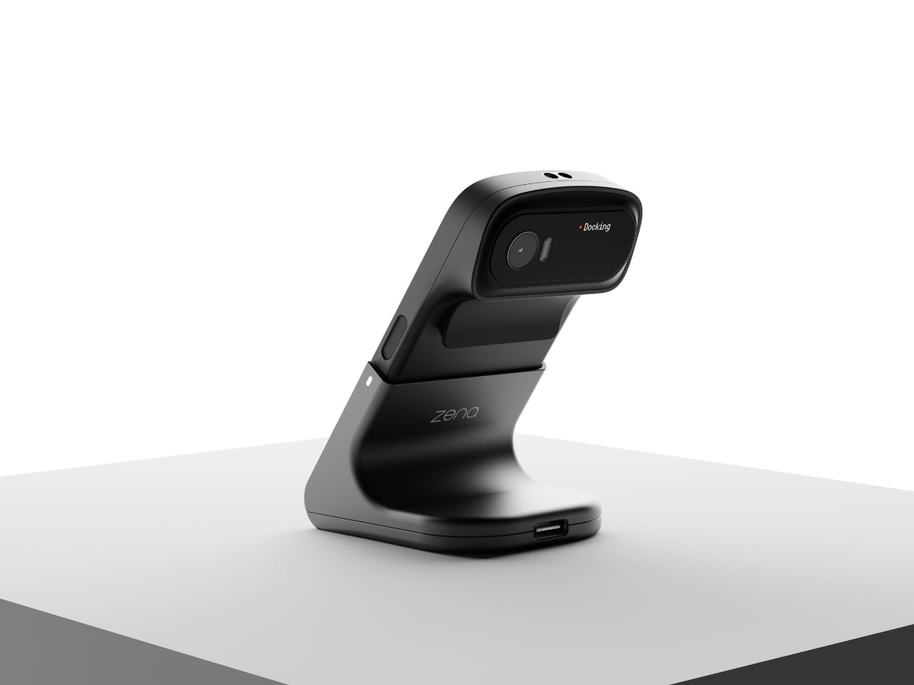
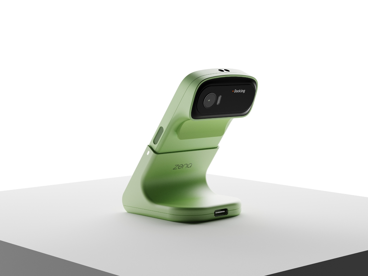
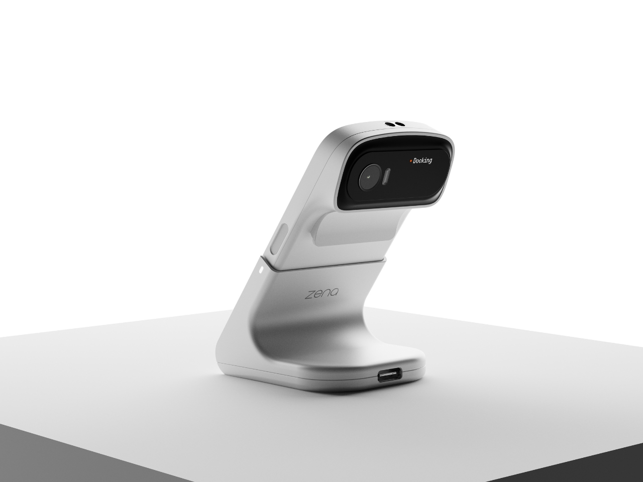
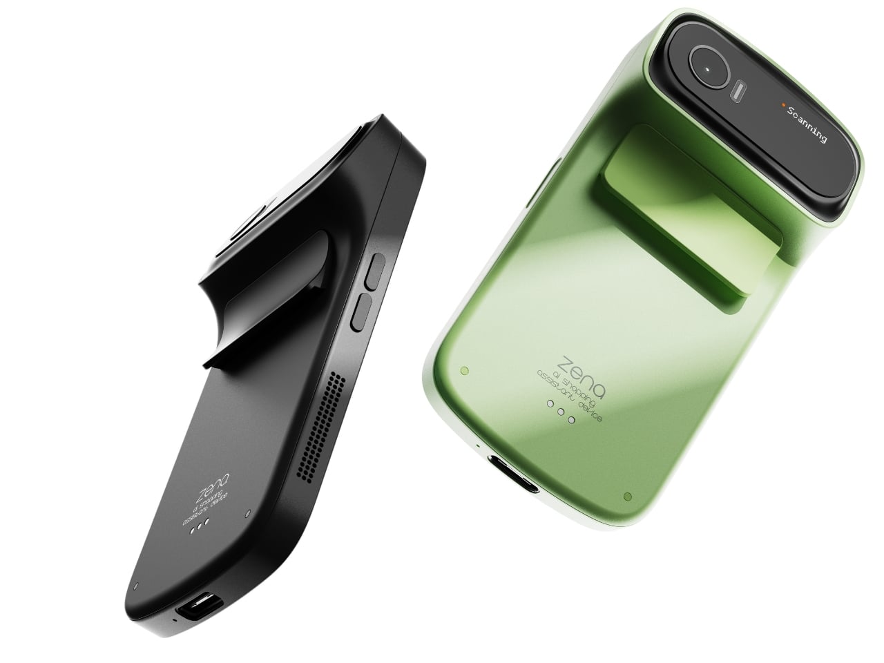
If you’ve ever ordered something from an international retailer only to be blindsided by a customs bill at your door, you already know the frustration that designers Taehyeong Kim and Yu Jeong Choi were sitting with when they created zena. It’s a concept device that reads like the future of shopping, but it addresses a problem that is very much happening right now.
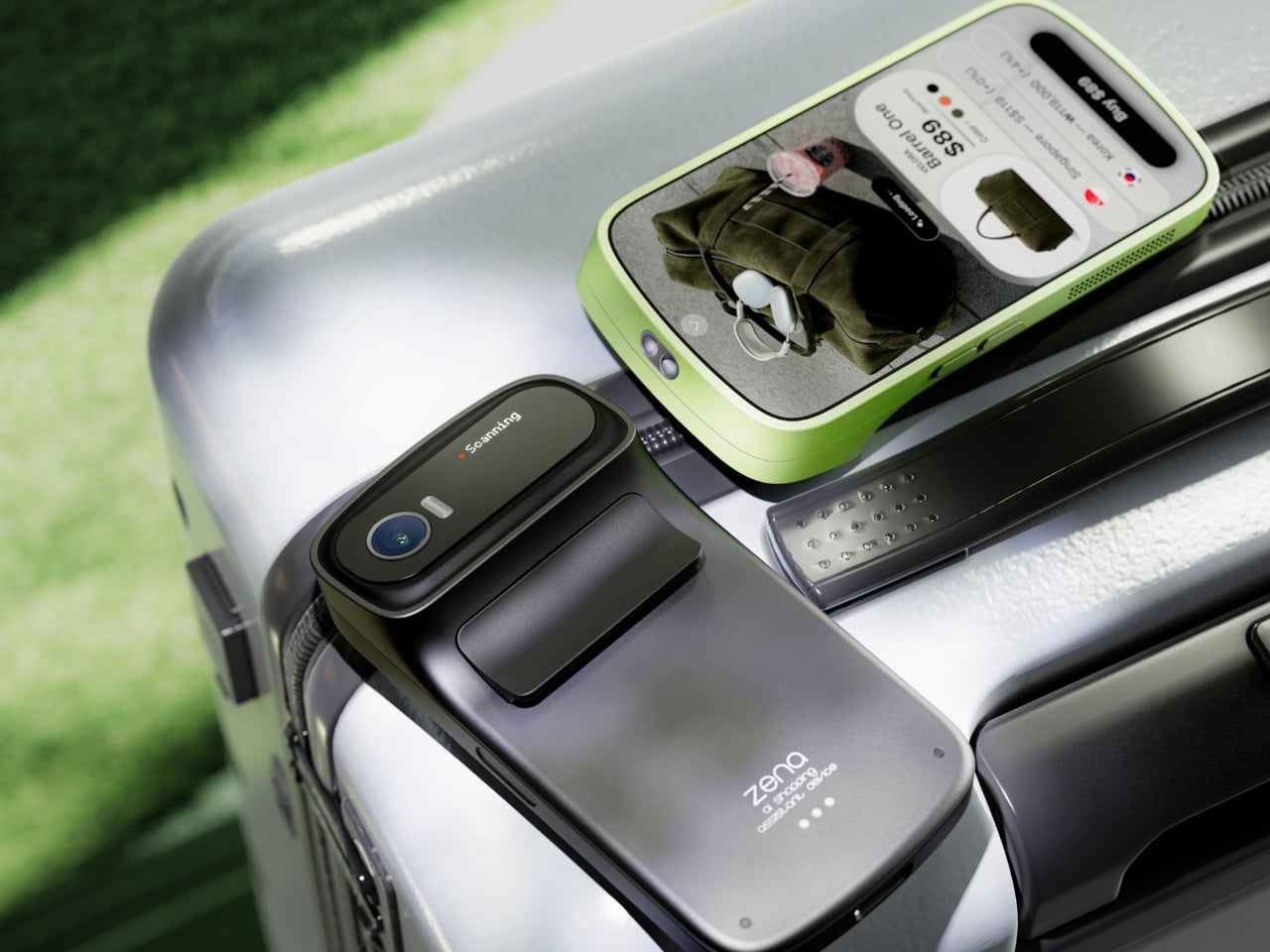
The premise is deceptively simple. You point zena at a product, it scans it, and within seconds you have a full breakdown: the item’s price, real-time exchange rates across multiple currencies, applicable duties, and the best purchasing options available. Not the price the retailer wants you to see. The actual, landed cost. The number that follows you home.
The design team’s background research puts the stakes into perspective. Citing Avalara’s 2024 global consumer survey, their project notes that 68% of shoppers reported a negative experience tied to unexpected cross-border costs. 75% said they wouldn’t repurchase from a retailer after a customs surprise. And 49% refused delivery altogether. That last number is staggering when you sit with it. Nearly half of the people who encountered surprise fees just sent the package back. That’s not only a UX failure. That’s an industry-wide trust problem that e-commerce at large seems unmotivated to solve. So two industrial designers from Daegu, Korea, decided to take a direct swing at it.
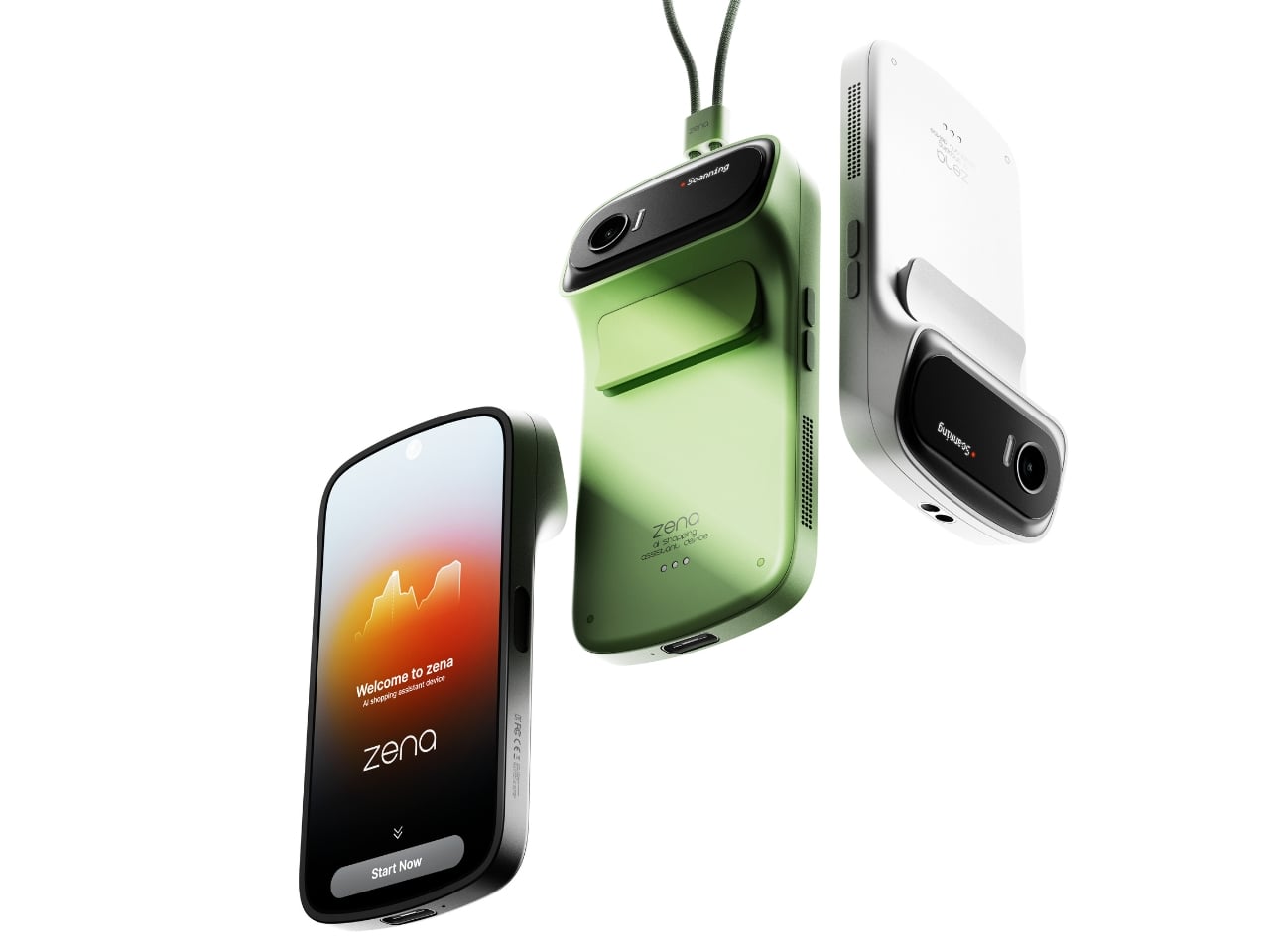
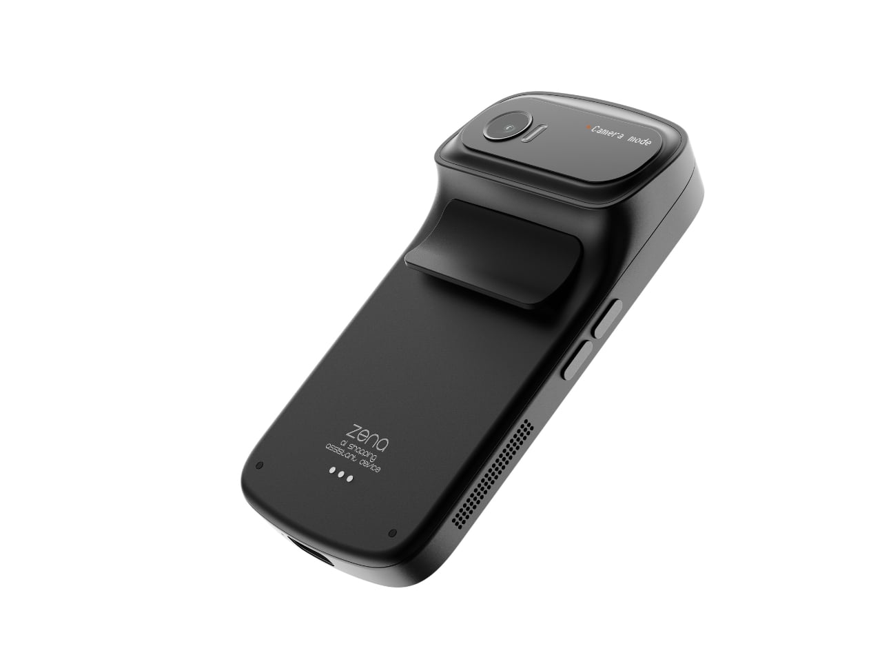
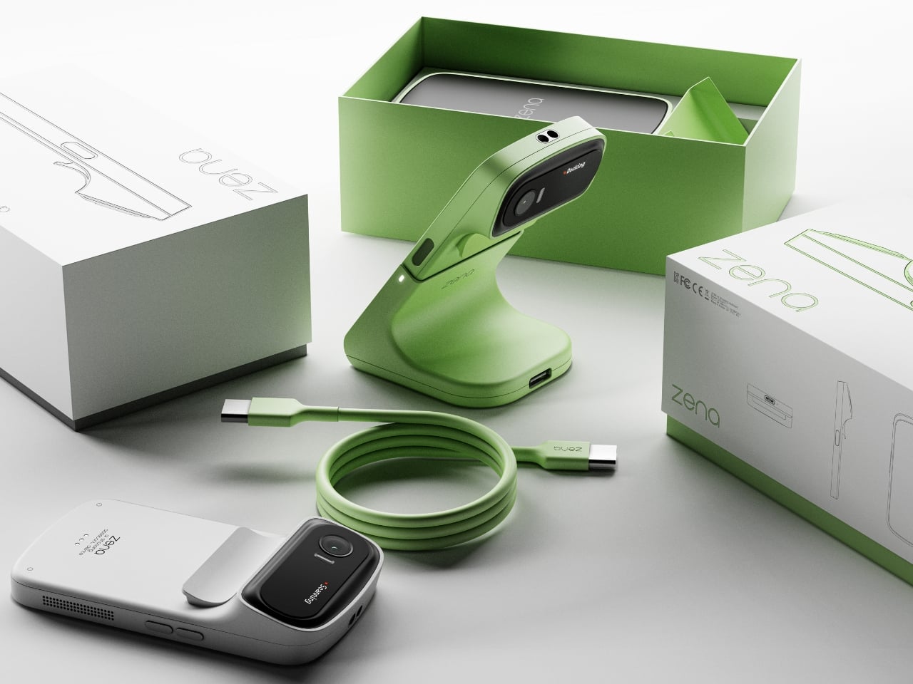
The way they’ve approached the physical design is just as compelling as the concept itself. Zena is small, handheld, and wears its function confidently. The camera module sits on a rotating head at the top, giving it a form that feels like a high-end digital camera crossed with a barcode scanner from a much more considered future. It comes in matte black, soft silver, and a sage green that is genuinely lovely, with a woven lanyard strap running through a flush metal eyelet on the side. That strap detail alone signals that these designers cared about the object beyond its utility. It’s the kind of quiet decision that separates a good concept from a great one.
The docking station is worth mentioning too. Docked, zena tilts its camera head upward like it’s curious about something, giving it a personality that feels almost alive. It sits on a desk in a way that makes you want to look at it, which is more than you can say for most gadgets. The dock functions as a charging station as well, which means the device is always ready to go when you reach for it.
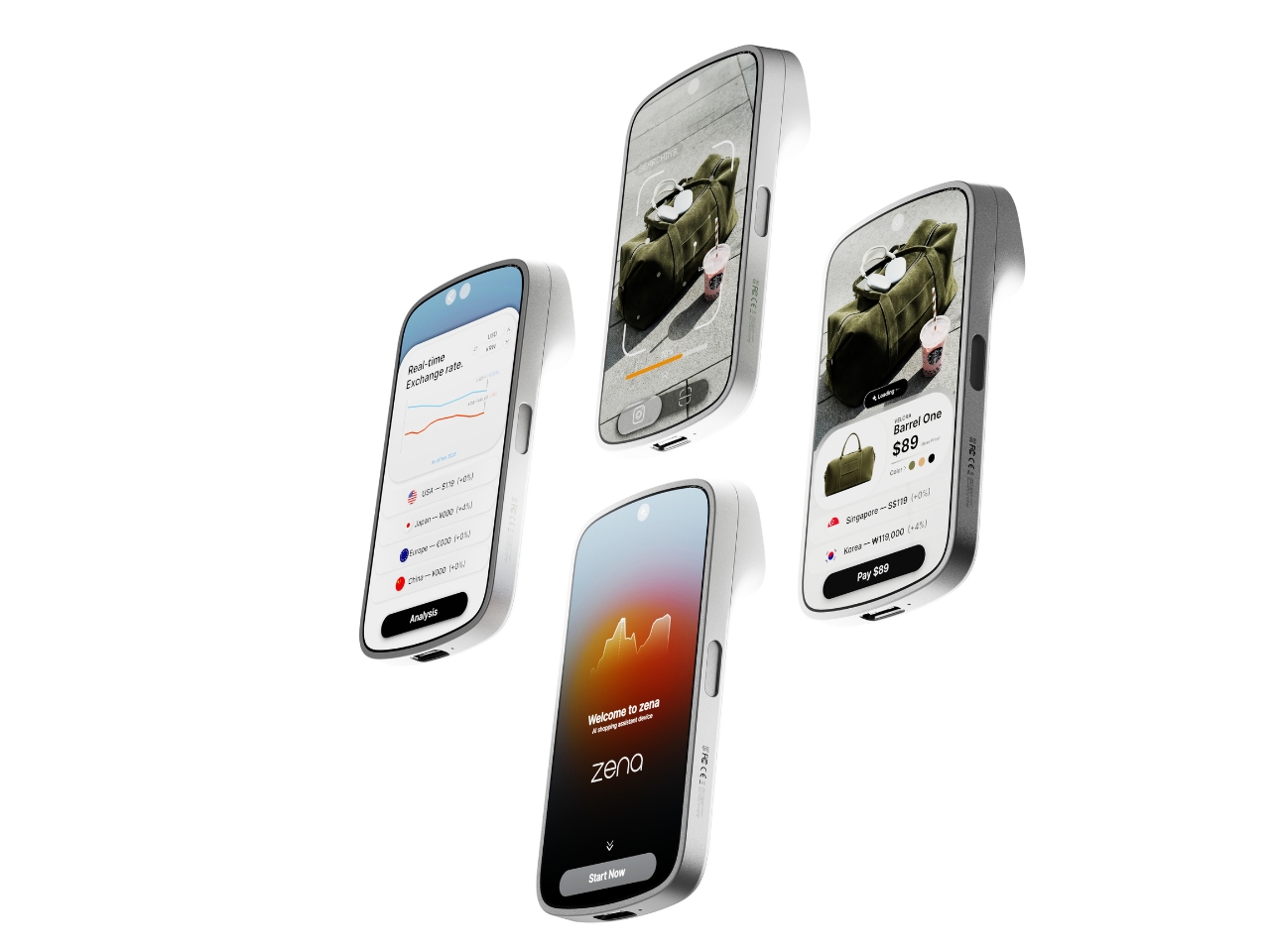
On the software side, the UI is clean and intentional. Once zena scans a product, it surfaces the item’s name, price, color options, and a list of purchase prices sorted by country and currency, with duty percentages clearly noted beside each one. A real-time exchange rate graph runs alongside. You pick your preferred price, preferred purchase location, and complete the transaction immediately. The workflow is scan, search, analyze, buy. No extra apps, no tab-switching, no mental math in a foreign currency.
The part that sticks with me is how practical this feels specifically as a travel companion. Imagine walking through a boutique in Tokyo or a market in Paris and actually knowing, before you commit, whether you’re getting a fair price or paying for the privilege of proximity. Right now that calculation happens mostly in your head, half-guessed and usually wrong.
Zena isn’t something you can buy yet. It’s a concept living on Behance for now. But it speaks to a real gap in how we shop globally, and it does so in a package that respects both form and function equally. In a design space full of concepts that look polished but feel purposeless, this one carries a clear point of view. Kim and Choi aren’t just designing a gadget. They’re designing against a system that has been profiting from consumer confusion for years. That’s the kind of ambition that deserves more than just a scroll-past.
The handheld gaming PC market has a design problem. For every device that earns a second look, there are three more that look like they escaped from a toy aisle — chunky plastic grips, aggressive LED halos, fonts borrowed from energy drink cans. It adds up to a category that has historically rewarded specs over sensibility, power over the kind of quiet confidence that makes an object worth owning.
That’s starting to change. A new wave of devices is rethinking what portable gaming hardware should look and feel like: objects you’d carry without embarrassment, leave on a clean desk, or hand to someone who doesn’t play games, so they can appreciate the craft before they’ve touched a button. Some of these seven handhelds earn their place through industrial restraint. Others earn it through engineering honesty — upgradeability, connectivity, or a refusal to treat the buyer as someone who only needs to be impressed in the first five minutes. What they all share is an understanding that good design is a feature, not a finish.
1. AYANEO 3
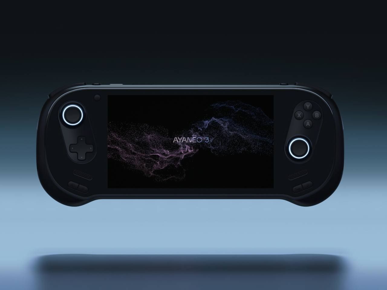
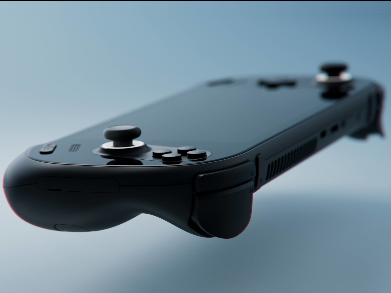
The curves are the story. AYANEO’s third flagship iteration takes a category that has historically prioritized power over personality and gives it something more interesting: softness. The smooth, pleasing curves on the AYANEO 3 extend beyond the ergonomic grip area on the back to the corners of the device itself, rounding off every edge that might otherwise make the hardware feel aggressive or alienating. It is a small visual distinction that makes an enormous tonal difference. The result is a device that looks like it was designed for people rather than exclusively for the kind of person who already knows what a TDP setting is and can tell you why it matters.
The diagonal orientation of the analog joysticks and D-Pad mirrors the Xbox controller arrangement, which is one of those invisible ergonomic improvements you only register when a device gets it wrong. The larger back buttons are a genuine upgrade in theory, giving players more surface area to work with during extended sessions. Their positioning, though, introduces the real possibility of accidental presses during intense gameplay. This trade-off will feel familiar to anyone who has tried to improve on a layout that was already functional. The AYANEO 3 makes the strongest argument for design as a feature in its own right. Whether that argument is worth the price is the question you’ll be asking yourself after you pick it up for the first time.
What We Like:
Rounded, curve-forward chassis makes it the most approachable-looking handheld in its category
Diagonal joystick and button orientation mirrors Xbox ergonomics for more natural long-session play
What We Dislike:
Back button placement may result in accidental presses during fast-paced gameplay
Softened design language may not satisfy players who want their hardware to read as purposeful and performance-oriented
2. Acer Nitro Blaze 7
Acer enters the handheld arena with something the market actually needed: a device that solves Windows gaming’s most persistent pain point before you even load your first title. The AMD Ryzen 7 8840HS packs 39 AI TOPS, placing it on the same performance tier as many AI-powered laptops currently on the market. Paired with the AMD Radeon 780M and 16GB of RAM, the Nitro Blaze 7 arrives as serious hardware in a compact form. The 7-inch 1920×1080 144Hz IPS touchscreen with 100% sRGB color gamut coverage is the kind of display specification that makes comparable handhelds feel like compromises — vibrant and bright enough that even the darkest visual environments read clearly on screen.
What separates the Nitro Blaze 7 from the competition isn’t the chip — it’s the software thinking wrapped around it. The Acer Game Space feature consolidates titles from every platform and source into a single unified library, removing the multi-menu navigation friction that makes Windows gaming handhelds feel like a productivity task compared to SteamOS devices. Touchscreen support lets players interact directly with interface elements rather than routing everything through controller input, which matters more than it sounds when you are three minutes into a launch session and still navigating settings. The dedicated hotkey that drops you straight into your library is a small thing that solves a real and recurring problem, and that is exactly the kind of design thinking this category needs to normalize.
What We Like:
Acer Game Space consolidates multi-platform libraries into one interface, fixing Windows gaming’s biggest UX friction point
144Hz IPS display with 100% sRGB delivers premium visual quality for a 7-inch handheld screen
What We Dislike:
The IPS panel means the Blaze 7 lacks the contrast depth and blacks of OLED competitors
At 7 inches, the display is smaller than the growing number of competitors now shipping with 8-inch screens
3. Steam Deck OLED Limited Edition White
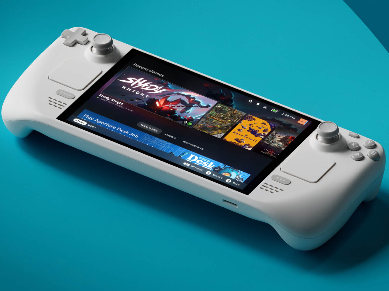
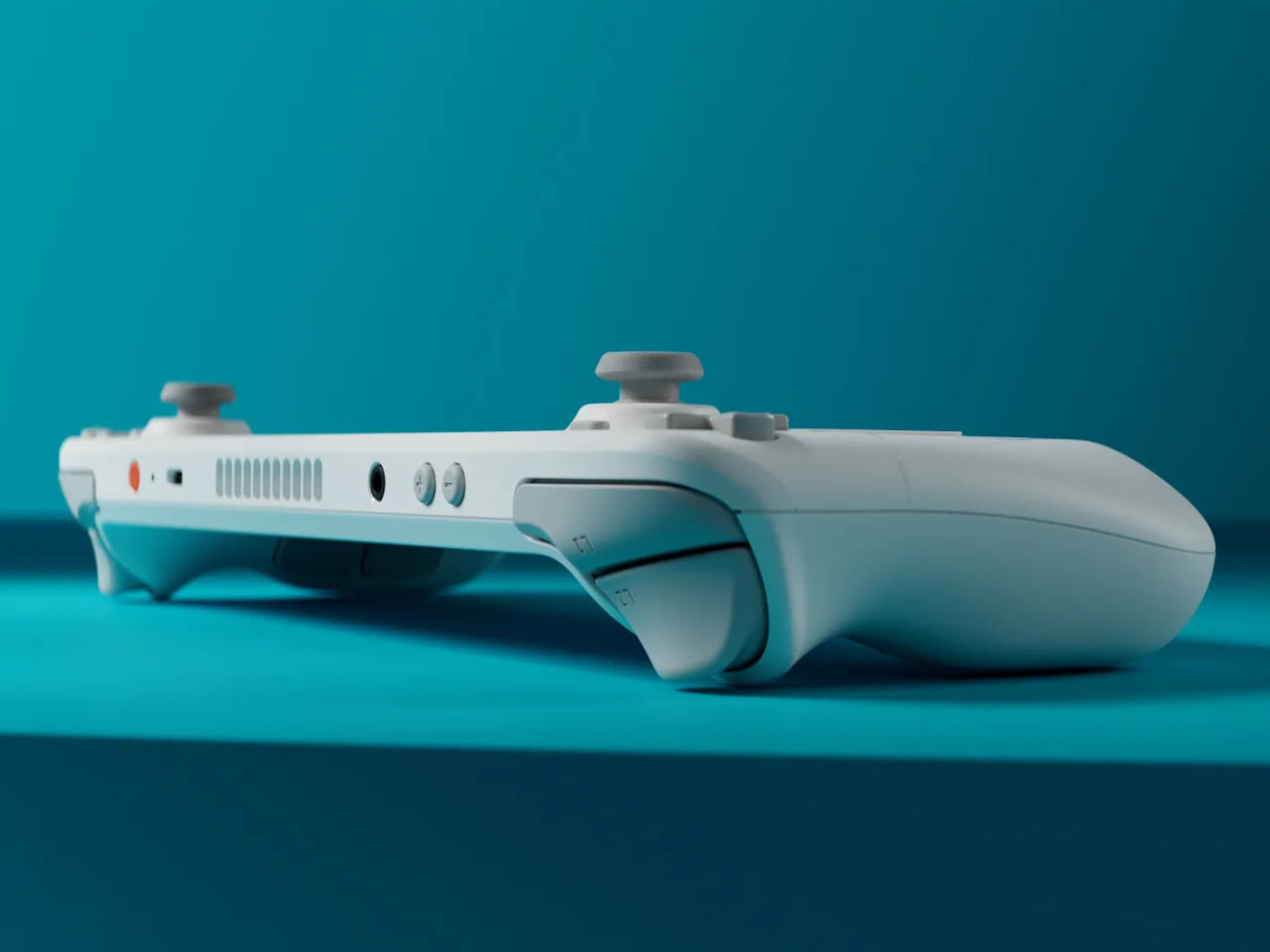
Valve’s limited edition white Steam Deck is the rare hardware release that justifies its price premium through object quality alone. The off-white shell with gray buttons and a single orange power button is a restrained, confident color story that most hardware brands spend years failing to tell. The OLED panel with HDR support already positioned the standard Steam Deck a visual step above the LCD models, and the white chassis makes that contrast even more vivid — display colors read differently against a lighter surround, and the overall effect is closer to a premium consumer electronics object than a gaming peripheral. Valve pairs the device with a matching white carrying case and a microfiber cloth, because they know exactly what that surface will attract daily.
Available only in the 1TB configuration, the limited edition white Steam Deck is not a casual purchase — it is priced above the standard black variant, and that premium is entirely about the colorway rather than any specification difference. Valve has been direct about the potential for further bold color options depending on how this version performs in the market, and the design language of this release suggests they genuinely understand that hardware can carry emotional weight beyond its spec sheet. Their stated commitment to continued software and hardware improvements also changes the calculus on what the purchase represents. You are not buying a device at its peak; you are buying into an object that the people who made it intend to keep improving.
What We Like:
The off-white and orange colorway is the most considered visual design statement in the handheld gaming category
1TB OLED configuration with HDR support represents the best display quality available in a handheld gaming PC
What We Dislike:
The white shell will show dirt and wear significantly faster than the black variant, demanding frequent cleaning
Limited edition pricing premium is cosmetic rather than functional, which makes it a harder case to make to practical buyers
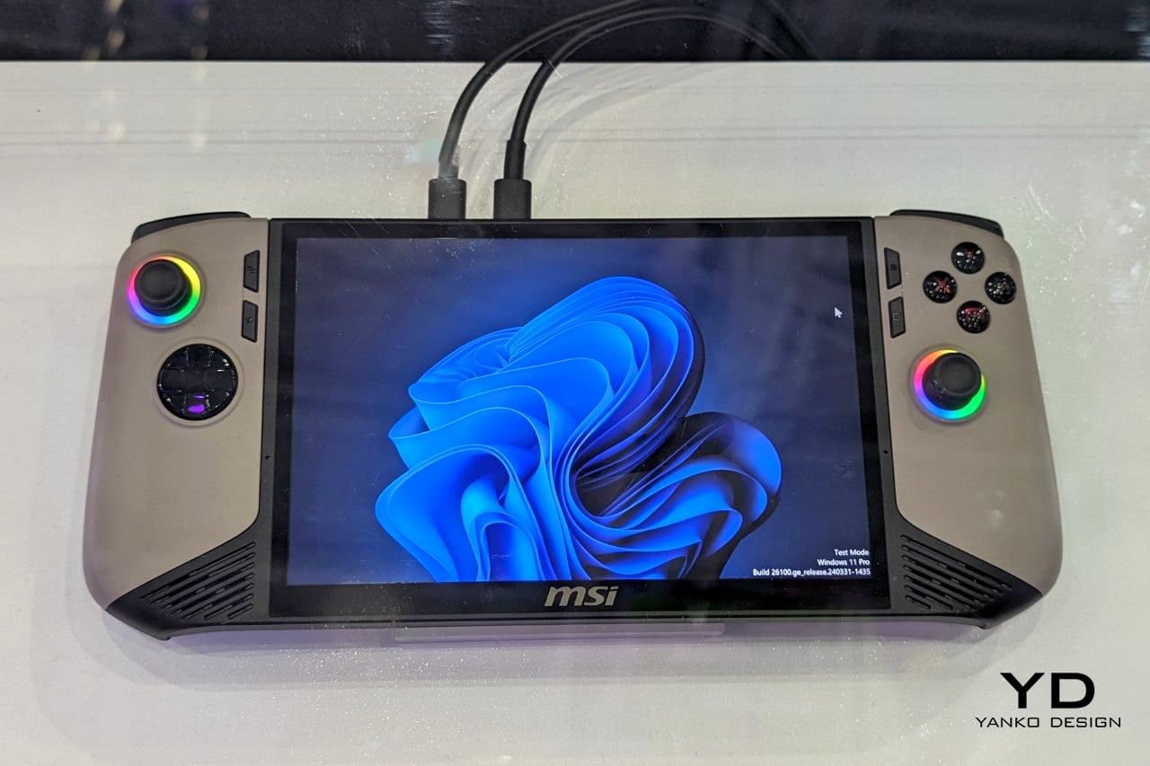
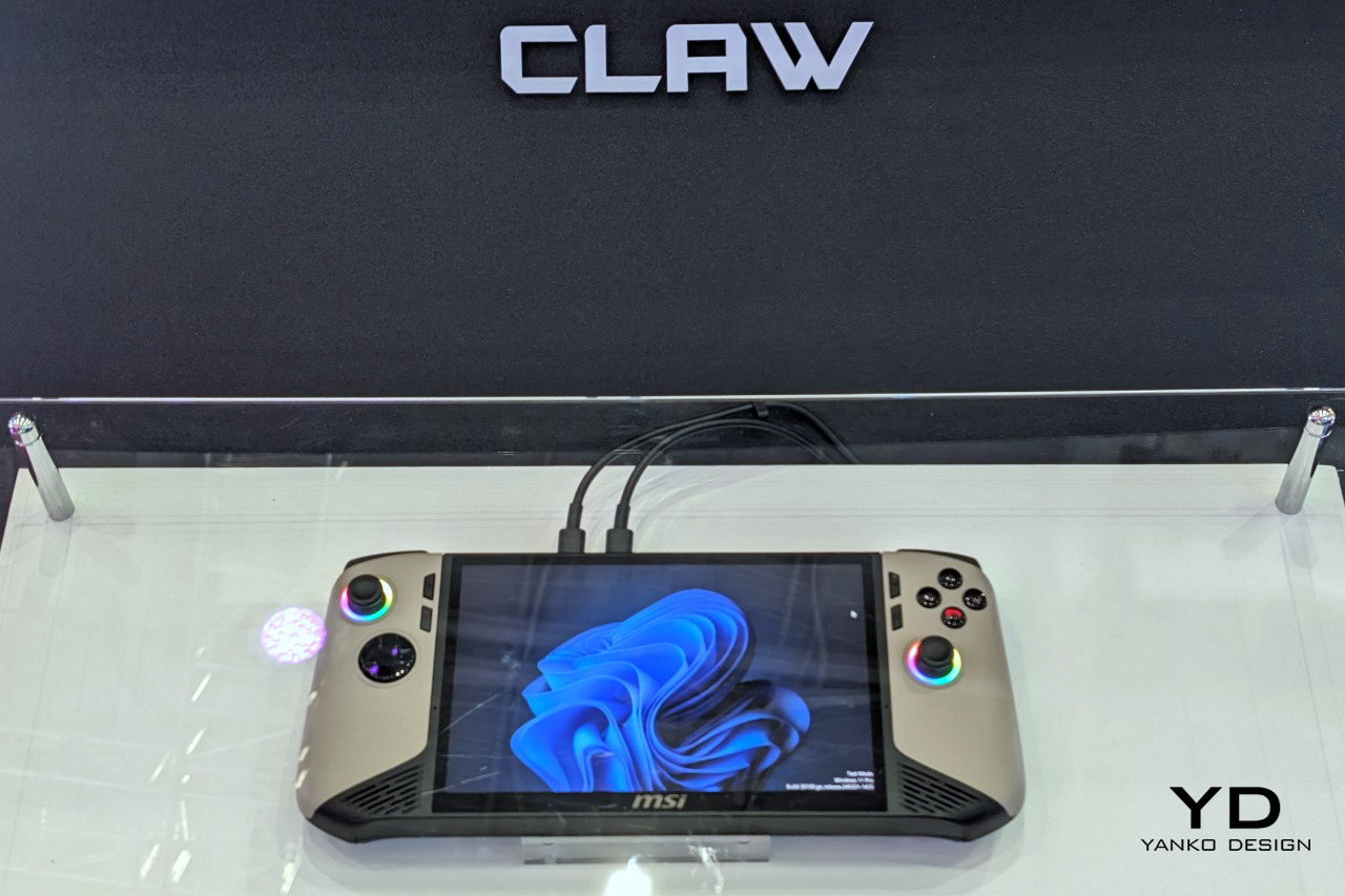
4. MSI Claw 8 AI+
MSI’s second attempt at a handheld gaming PC makes a strong case for listening. The original Claw’s 53Wh battery was one of the most discussed disappointments in gaming hardware, and the Claw 8 AI+ responds with an 80Wh unit that matches the ROG Ally X — immediately removing that criticism from the conversation. The redesigned chassis is more comfortable to hold than the original, which sounds like a modest correction but represents the difference between a product you use and one you tolerate through a session. The 8-inch display at 1080p and 120Hz is the screen you can actually picture using across several hours without fatigue, and the overall hardware package reflects a manufacturer that took its first attempt as useful data rather than a finished result.
The dual Thunderbolt ports are the detail that separates the Claw 8 AI+ from most of its direct competition. In a category where connectivity has generally been an afterthought, Thunderbolt transforms the device into something more versatile than a dedicated gaming handheld. It can drive an external display, connect high-speed peripherals, and function as a desktop replacement when docked — a use case that justifies the form factor for people who travel and need their hardware to earn its carry weight across more than one context. MSI’s continued driver support for the original Claw also signals something about the relationship they want to build with buyers, which matters when you are deciding which ecosystem to invest in for the long term.
What We Like:
80Wh battery resolves the original Claw’s most criticized weakness, matching the ROG Ally X for endurance
Dual Thunderbolt ports offer versatility that positions the device beyond pure gaming into broader portable computing
What We Dislike:
1080p resolution on an 8-inch screen sits at the market standard rather than pushing the category forward
The redesigned chassis was not available for hands-on evaluation at launch, leaving the real-world grip feel unconfirmed
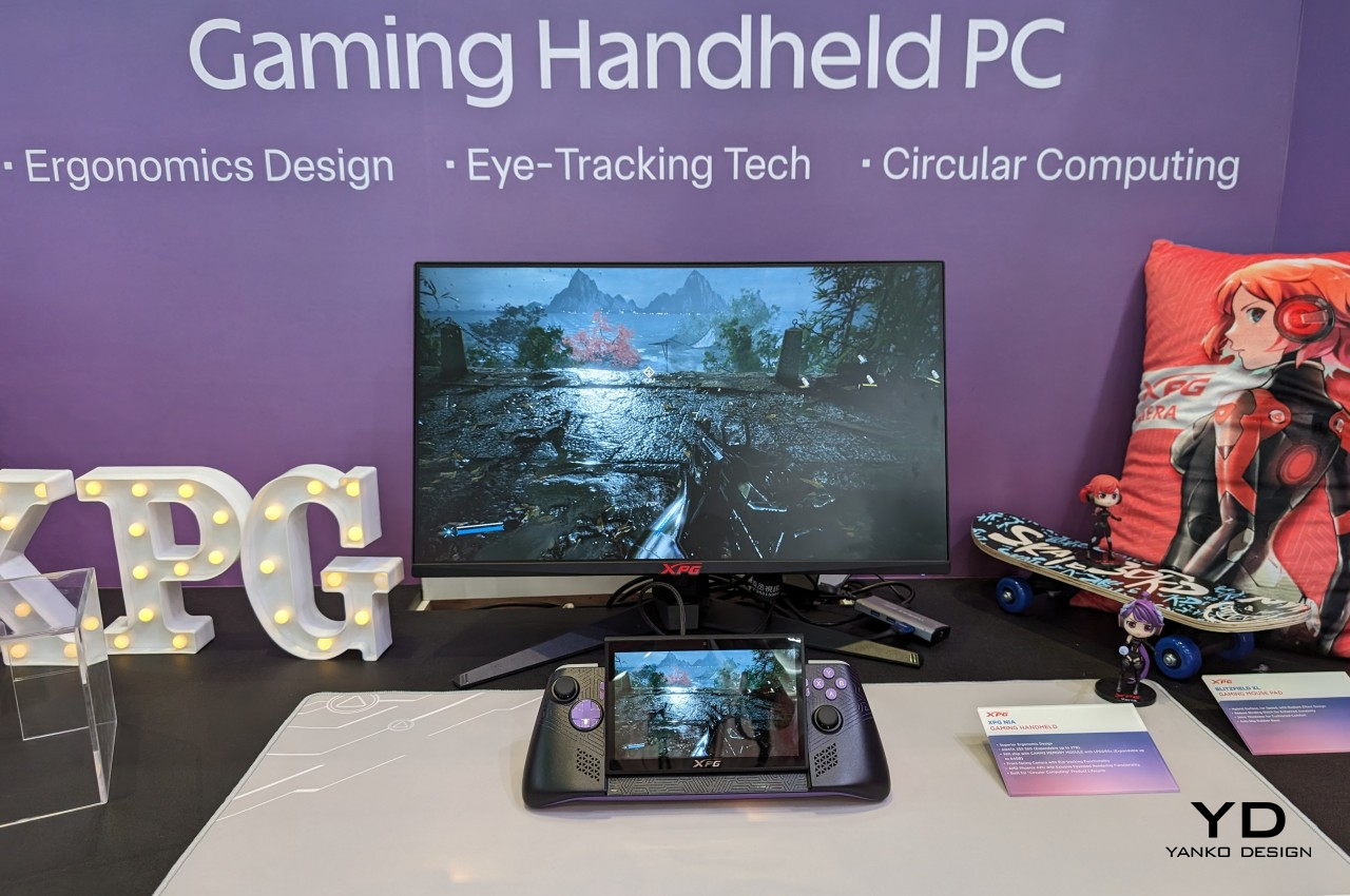
5. ADATA XPG Nia
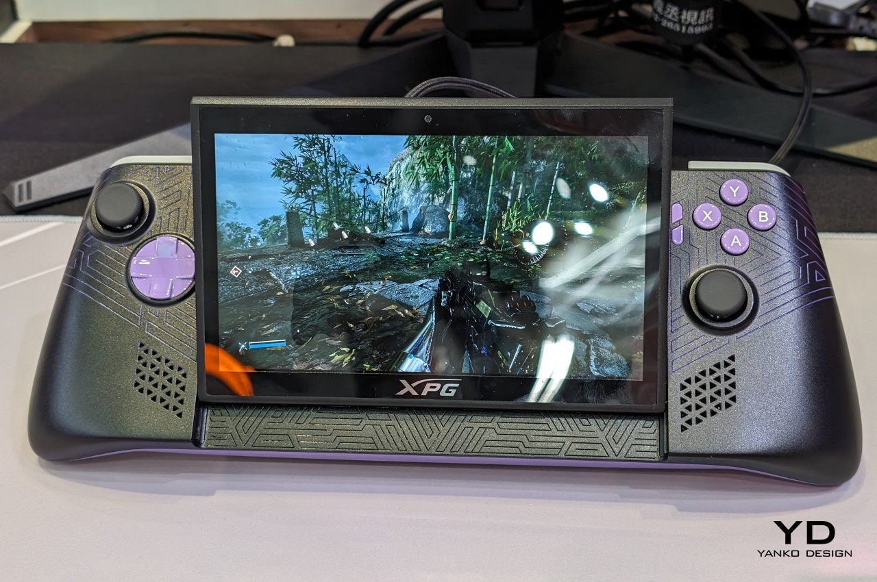
The XPG Nia arrives with a design philosophy that most handheld manufacturers have been too conservative to commit to: repairability as a genuine feature. The use of LPCAMM2 memory modules, which are not soldered to the motherboard, makes this one of the very few handheld gaming PCs where upgrading the RAM is a realistic possibility rather than a route to a voided warranty. The M.2 2230 SSD slot handles storage upgrades in the same way, borrowing the kind of upgrade-friendly architecture that better laptops have offered for years. ADATA, better known for its data storage solutions than gaming hardware, brings exactly the right technical background to a product that treats longevity as a design consideration rather than an inconvenience.
This matters more than it sounds in a category that has normalized the idea of buying new hardware every two years because your existing device can’t be updated. Handheld PCs are essentially miniature laptops running laptop-grade hardware with constrained cooling, which has traditionally meant buyers are locked into the specs they purchase on day one. The XPG Nia pushes back against that assumption. It may not carry the brand recognition of Valve or ASUS, but the decision to make memory and storage user-upgradable in a handheld gaming PC is genuinely forward-thinking hardware design. The category is full of devices optimized for the unboxing moment. The XPG Nia is designed for year three.
What We Like:
Upgradable RAM via the LPCAMM2 module makes it one of the only handhelds built for long-term ownership
Upgradable M.2 2230 SSD slot extends the device’s useful lifespan well beyond its launch-day specifications
What We Dislike:
Real-world ease of RAM upgrades remains unproven, as LPCAMM2 is a relatively new memory format
ADATA’s identity as a storage brand creates unanswered questions around long-term software support and gaming ecosystem depth
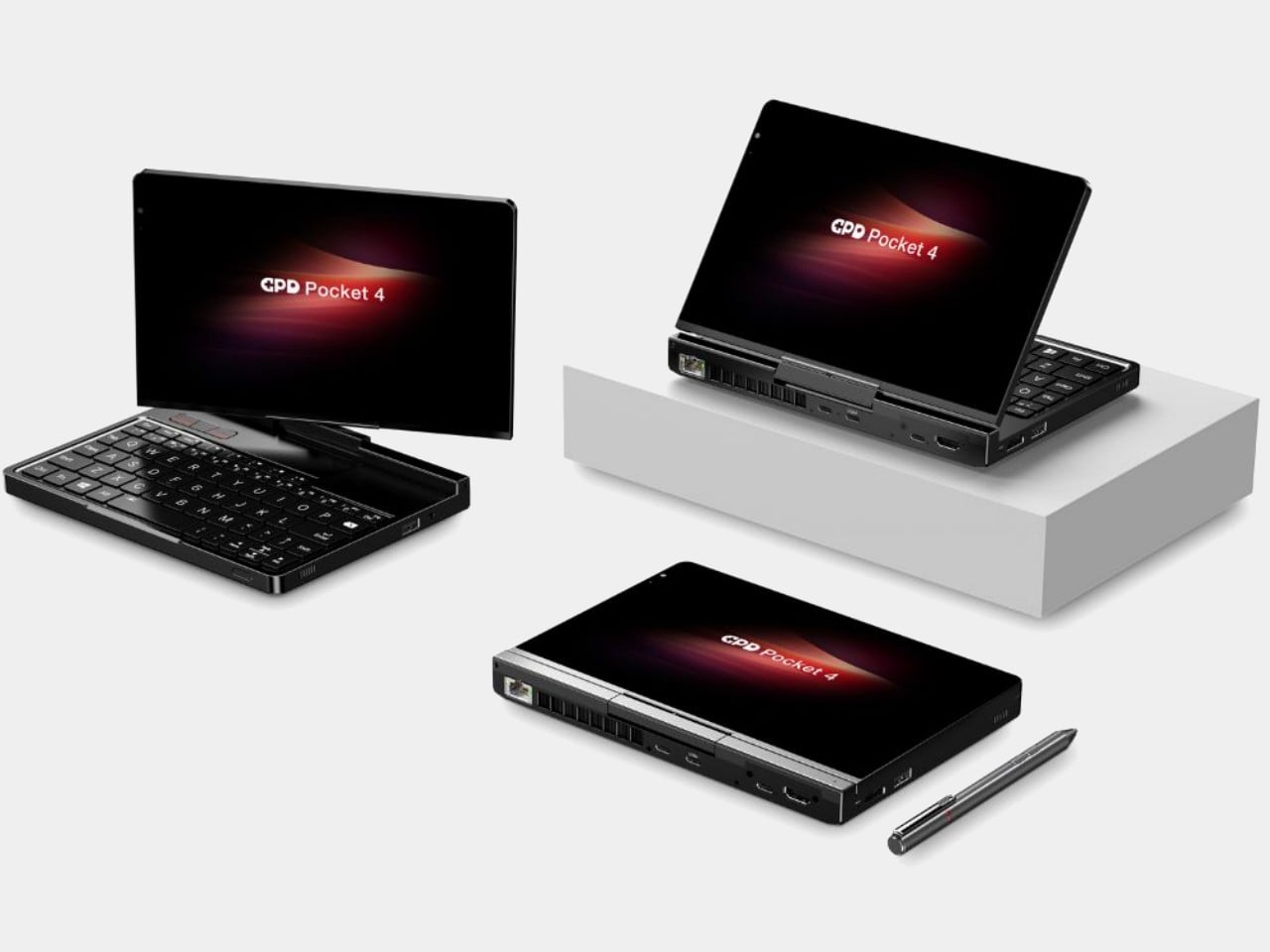
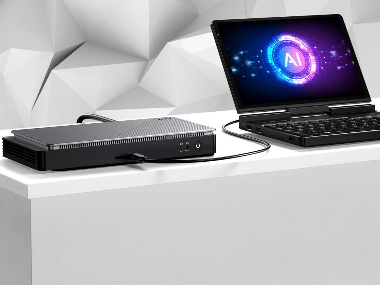
6. GPD Pocket 4
The GPD Pocket 4 does not belong in this list by conventional logic, and that is precisely why it does. There are no joysticks, no D-pad, no face buttons. What it has instead is a compact clamshell form factor built around a full QWERTY keyboard, a small touchpad in the upper right corner designed for right-thumb operation in a two-handed grip, and mouse buttons positioned on the opposing side for the left thumb. The AMD Ryzen AI 9 HX 370 with AMD Radeon 890M graphics, 64GB of RAM, and up to 4TB of upgradable NVMe SSD storage inside this chassis is a genuine statement about what a pocket-sized device can accomplish. It is a handheld PC for the person who refuses to separate productivity from portability.
Where most devices in this roundup are gaming handhelds that can also browse the web, the Pocket 4 is a legitimate laptop replacement that can also play games within certain limits. Content creation, entertainment, productivity, and travel computing are all addressed by hardware that fits in a jacket pocket. The 44.8Wh battery is the honest trade-off — you are carrying a compressed laptop, not an augmented gaming console, and the battery reflects that compromise directly. For the person who travels constantly and wants one device that handles most things well rather than two devices that each do one thing perfectly, the Pocket 4 makes more sense than almost anything else in this roundup. It is the most unusual recommendation here, and the most interesting.
What We Like:
Full laptop-grade specifications, including up to 64GB RAM and 4TB upgradable storage in a genuinely pocketable form factor
Functions as a true laptop replacement for content creation and productivity without requiring a second device
What We Dislike:
No gaming controls confine its gaming capability to keyboard-compatible titles only
The 44.8Wh battery is significantly smaller than competitors that prioritize gaming endurance over overall portability
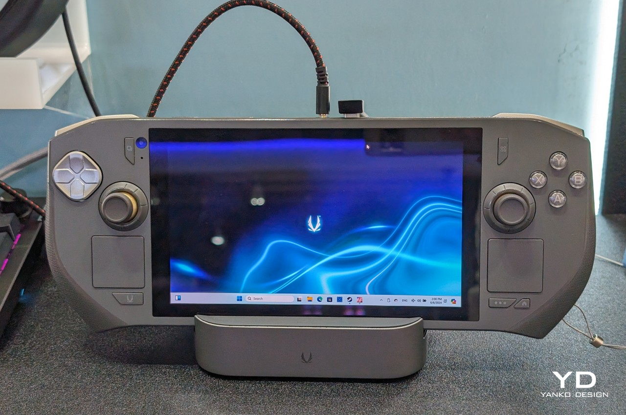
7. ZOTAC ZONE
The ZOTAC ZONE wears its Steam Deck influence openly and then raises the conversation. The OLED display puts it in rare company — most handheld gaming PCs are still shipping IPS panels, and the presence of an OLED screen here is not incidental. The PlayStation-style button layout mirrors Valve’s device directly, setting it apart from the Xbox-influenced arrangement that the rest of the Windows handheld market has effectively standardized around. The built-in kickstand is the detail that reveals the ZONE’s genuine design thinking. It is an obvious feature that a surprising number of handheld PCs have decided to leave out, and its presence changes how the device lives in practice — on a plane tray table, a cafe counter, or a hotel room desk, where you’d rather not hold the thing for two hours straight.
The configurable controls are where the ZONE earns its premium positioning. Two-stage adjustable triggers and programmable dials around each joystick represent the most granular control customization available on any handheld gaming PC currently on the market. It runs more recent hardware than the Steam Deck, inside a chassis that clearly understands what it is trying to be. The steep price is a real barrier, and the ZONE will not make sense for every buyer. For the player who has worked through two or three handheld PCs already and knows precisely what they want from their next one — better controls, better display, a stand, and hardware that will not feel dated inside eighteen months — this is the device that was built with them specifically in mind.
What We Like:
Built-in kickstand and OLED display address two genuine gaps in the Steam Deck’s design, both meaningfully improving day-to-day use
Two-stage adjustable triggers and programmable joystick dials offer the deepest control customization in the handheld gaming PC category
What We Dislike:
Premium pricing places the ZONE significantly above most competing devices, narrowing its realistic audience
Strong visual and layout parallels to the Steam Deck make it a difficult upgrade pitch for buyers already in Valve’s ecosystem
The Category Grows Up
The seven devices above represent a category finally learning to want more from itself. Some of them get there through craft — the AYANEO 3’s considered curves, the ZOTAC ZONE’s OLED display and kickstand, the Steam Deck’s limited edition color story. Others earn their place through a harder kind of honesty: the XPG Nia’s upgradable RAM, the GPD Pocket 4’s refusal to be just one thing, the Claw 8 AI+’s willingness to publicly correct its own mistakes.
What unites all seven is a seriousness about the object itself — a sense that the person holding the device deserves hardware that respects their intelligence, their living space, and the money they are spending. The Fisher-Price era of handheld gaming PCs is not entirely over. But these seven devices are making a strong case for what comes after them.
Battery life has been one of the laptop industry’s most persistent design headaches, especially among Windows notebooks. Despite significant gains in chip efficiency, the display consistently ranks among the biggest power consumers in any portable computer. Most laptop screens refresh at a fixed rate regardless of what’s actually on them, which means the panel keeps drawing full power even when you’re sitting completely still, reading a document with nothing on screen changing at all.
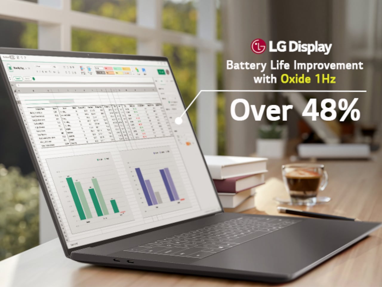
LG Display’s new Oxide 1Hz panel is the first mass-produced LCD laptop screen that doesn’t work that way. Rather than holding a fixed rate, it reads what’s on screen and drops to 1 Hz when the content is static, then scales back up to 120 Hz for video or gaming. LG began mass production on March 22, 2026, claiming the first-ever achievement of this at scale.
The technology relies on custom circuit algorithms and a new oxide material applied to the panel’s thin-film transistor. That oxide holds an electric charge longer than conventional LCD materials, letting the screen maintain a still image without continuously refreshing it. LG claims the result is up to 48% more use on a single charge versus existing solutions, which is a significant number if it holds up in everyday use.
In practice, this matters most during the parts of a workday you spend the bulk of your time in. Checking emails, reading through documents, and sitting on a static slide during a meeting are all moments where a 60 Hz or 120 Hz screen burns power for no real benefit. The Oxide 1Hz panel handles those scenarios at a fraction of the usual draw without any visible difference.
When you do pull up a video or launch something that demands smooth motion, the panel doesn’t hesitate. It detects the change and jumps back up to 120 Hz automatically. There’s no mode to switch into, no setting to toggle, and no trade-off to manage. It just adjusts based on what’s happening on screen, which is how this kind of feature should work in the first place.
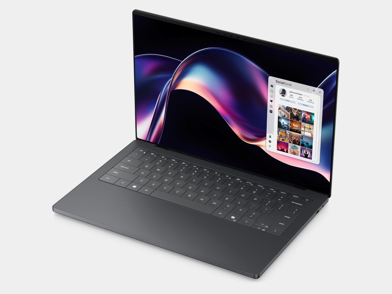
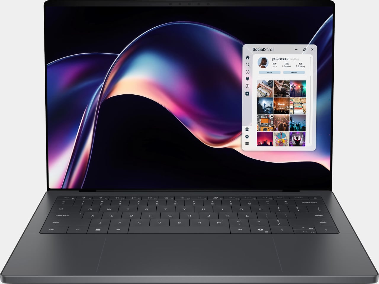
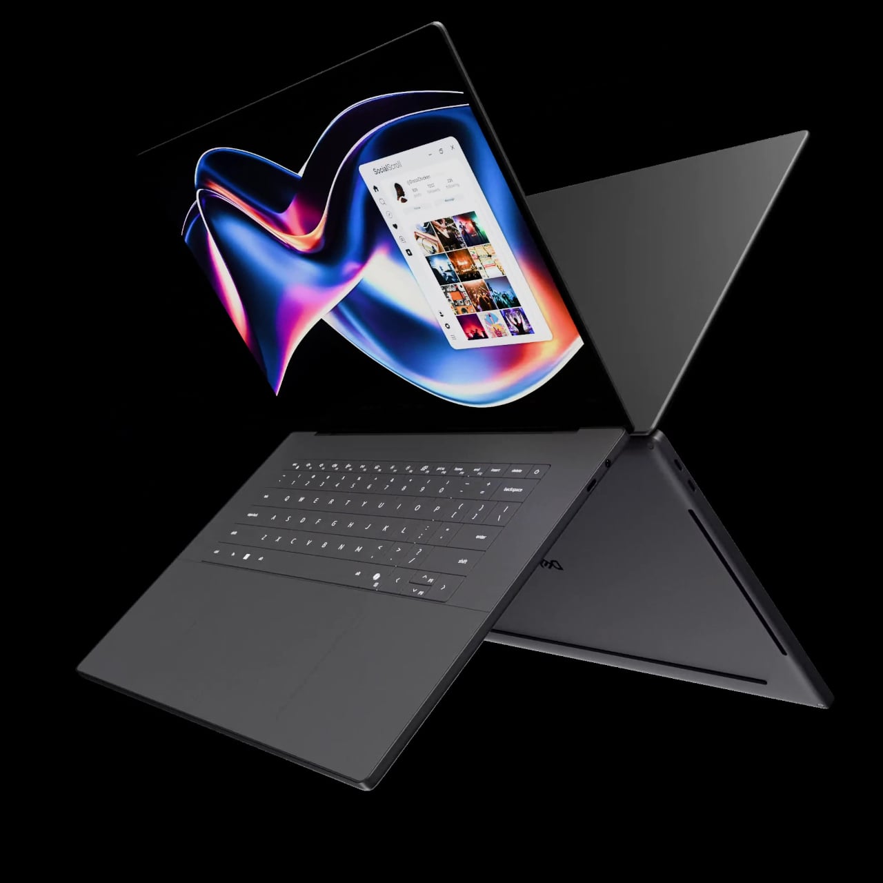
The first laptops to ship with this panel are the Dell XPS 14 and Dell XPS 16 for 2026, both unveiled at CES 2026 in January. The LCD option on both models runs at 1920 x 1200 pixels and 500 nits of brightness. Dell’s OLED option only drops as low as 20 Hz, which means the more affordable LCD configuration actually wins on low-power behavior.
Here’s where it gets interesting from a design standpoint. The display is one of the biggest power consumers in any laptop, so a screen drawing significantly less power during typical use creates real headroom for designers. They can use that headroom to maintain battery size and gain extra runtime, or to trim the battery slightly for a lighter, thinner chassis without giving up the battery life buyers already expect.
Of course, LG is already planning a 1 Hz OLED version of this technology for 2027, which is when things could get more interesting. OLED handles contrast and color in ways LCD can’t match, and pairing that quality with proper low-refresh-rate behavior could push portable laptop design further than it’s been able to go. For now, the Oxide 1Hz LCD is in something you can actually go out and buy.
The bag you carry is a design decision. Every object inside it is a small vote for how you move through the world, what you value, what you’re willing to lug, and what deserves a slot in your pocket or your pack. For too long, tech accessories defaulted to bulk. More power meant more weight. More connectivity meant more dongles. Better audio meant a bigger case. The implicit trade was always the same: capability costs space.
That trade is becoming optional. A new generation of everyday carry tech is rethinking its own geometry, collapsing into pockets, shedding grams, and using smarter materials and tighter engineering to pack more utility into less volume. These are not spec-sheet products assembled to fill a gap. They are designed to disappear into your day and show up exactly when you need them. From a power bank thinner than any phone to a keyboard built for a jacket pocket, these seven picks redefine what it means to carry less and own more.
1. Xiaomi UltraThin Magnetic Power Bank 5000 15W
Power banks have always had a design problem. They’re essential and clunky, reliable and bulky, always appreciated but never comfortable to carry. Xiaomi’s UltraThin Magnetic Power Bank 5000 addresses that problem by starting where no other power bank has dared: at 6mm. That is thinner than most smartphones currently shipping. The aluminum alloy shell comes in Glacier Silver, Graphite Black, and Radiant Orange, each finished with a photolithographically etched logo that signals careful intention rather than assembly-line output. The fire-resistant fiberglass phone-facing surface handles heat management invisibly, keeping the exterior clean of vents or grilles. At 98 grams, it weighs less than two eggs, and carrying it feels like carrying nothing at all.
The engineering behind that form is silicon-carbon battery chemistry with 16% silicon content, enabling the energy density required to fit 5,000mAh into a body this slim. It supports 15W wireless charging for compatible Android devices, 7.5W for iPhone, and 22.5W wired via USB-C, with the practical addition of charging two devices simultaneously while being recharged itself. Showcased at MWC 2026 in Barcelona and priced at €59.99 in Europe for the Silver and Black versions, this is a power bank that earns its place by eliminating the bulk compromise the category has always required. For anyone committed to carrying less, this is the first power bank that doesn’t feel like a concession.
What We Like:
6mm profile and 98g weight make it the most pocket-friendly 5,000mAh power bank available
Silicon-carbon battery chemistry delivers a full 5,000mAh capacity without dimensional sacrifice
What We Dislike:
Wireless charging for iPhone is capped at 7.5W maximum
Rated capacity sits at 3,000mAh at 5V/2A, lower than the typical 5,000mAh figure
2. OrigamiSwift Mouse
A mouse seems immovable in form. Wide, arched, and desk-bound. The OrigamiSwift dismantles that assumption by doing exactly what the name implies: it folds. Inspired by the precision of origami, it compresses into a flat, slim profile that slips into a bag or jacket pocket without protest, then springs open in under 0.5 seconds into a full-sized, ergonomically shaped Bluetooth mouse that feels nothing like a compromise. It weighs 40 grams. That figure deserves a moment. Most full-sized mice weigh three to four times as much. The OrigamiSwift delivers all the comfort and tracking precision of a conventional mouse while occupying the footprint of a notepad when packed.
For the digital nomad setting up at a café, or the professional moving between meetings with a laptop under one arm, this is the kind of tool that quietly changes the texture of the day. The ergonomic form is shaped to fit naturally in the hand during extended work sessions, reducing the fatigue that accumulates from hours spent on a trackpad. The Bluetooth connection keeps the desk or surface clean. The ultra-thin folded profile sits flat in any bag compartment without creating bulk or claiming space disproportionate to its value. Minimalist carry is about tools that show up without announcing themselves, and the OrigamiSwift does exactly that: invisible when packed, essential when open.
Folds flat for pocket carry and opens into a full ergonomic mouse in under 0.5 seconds
At just 40 grams, it is one of the lightest full-form productivity mice available
What We Dislike:
The folding mechanism may require adjustment time for users accustomed to traditional mice
A 40-gram build may feel less substantial to users who prefer a weighted mouse
3. HubKey Gen2
The modern desk accumulates workarounds. Two USB-C ports become four, then six, spread across a tangle of adapters that creep outward from the laptop until the workspace feels less like a setup and more like a wiring diagram. HubKey Gen2 is built to end that creep. It is an 11-in-1 USB-C hub inside a compact cube, and the more interesting detail is what lives on top: four physical shortcut keys and a central control knob that handle media playback, privacy shortcuts, and daily actions without a software menu or a keyboard combination you can never quite remember. One object consolidates what used to require a cluster of small fixes, turning a patchwork of compromises into something coherent.
Dual 4K display support makes it relevant for anyone running an expanded screen setup, while the physical controls restore a directness that software interfaces have quietly taken away. Volume knobs, mute buttons, and display toggles should not require a three-key shortcut or a settings dive. HubKey Gen2 puts that control back within arm’s reach. It handles power, storage, network, and displays from a single USB-C connection, and transforms a desk covered in small adaptations into something intentional and calm. The headline is carry less, own more, and at the desk, that translates directly: one compact cube where eleven separate solutions used to live.
What We Like:
Consolidates 11 connections and physical shortcut controls into a single compact cube
Dual 4K display support covers multi-monitor setups without additional adapters
What We Dislike:
Desk-bound design means it is a workspace consolidation tool rather than a pocketable carry item
Physical shortcut keys offer fewer customization options compared to software-based control surfaces
4. Battery-Free Amplifying iSpeakers
The charging cable is the one obligation that minimalist carry never fully escapes. Every wireless device is a deferred maintenance task, a battery you will have to tend to eventually. The Duralumin battery-free iSpeakers sidestep that dependency entirely. No power source, no cable, no charging ritual. You place your smartphone inside the enclosure, and the geometric cavity amplifies sound through acoustic engineering alone, using the golden ratio in its design to optimize resonance and distribute the audio across the room. It is the kind of object that looks precisely like it belongs on a desk and sounds as considered as it looks.
The material choice deepens the story. Duralumin is the same aluminum alloy used in aircraft construction, a combination of lightness and structural rigidity that allows the speaker to resonate without distorting. The result is a passive amplifier that genuinely improves your phone’s audio while functioning as a deliberate desktop object. Modular compatibility with the sold-separately +Bloom and +Jet sound-directing additions means it can adapt to different spatial setups without ever adding an electronic dependency. For carry with intention, this is what owning more looks like: an object that does its job through physics, needs nothing from a wall outlet, and occupies any surface as though it was designed specifically for it.
Requires no battery or electricity, making it zero-maintenance and usable anywhere
Aircraft-grade Duralumin construction delivers structural integrity alongside a refined aesthetic
What We Dislike:
Audio output is entirely dependent on the quality of the phone’s built-in speaker
Directional sound control requires purchasing the +Bloom or +Jet mods separately
5. NanoPhone Pro
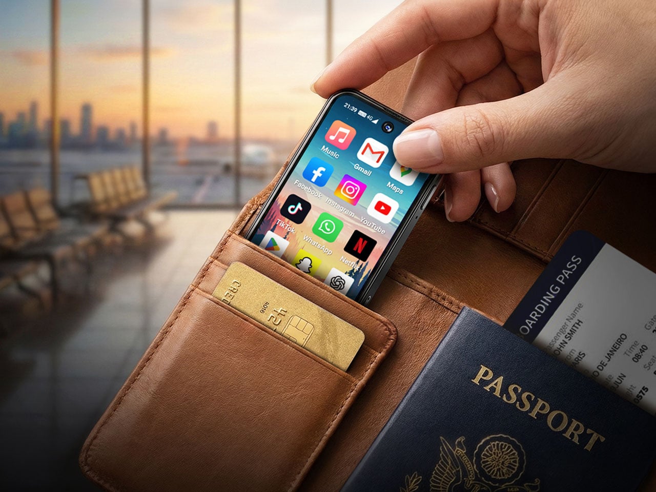
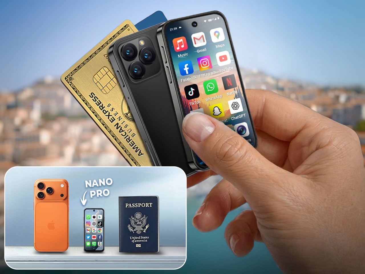
There is a version of the smartphone that has been lost in the pursuit of bigger screens and faster processors. It is the phone that fits in a coin pocket, asks nothing of your attention beyond the call and the navigation prompt, and treats connectivity as a utility rather than an experience. The NanoPhone Pro returns to that idea with a credit-card-sized 4G device running Android 12 and certified for Google Play apps. It browses, calls, navigates, plays music, and handles real-time navigation. It does not demand to be the center of your day, and that restraint is the entire point.
A 5MP rear camera and 2MP front shooter cover quick captures and video calls without positioning this as a photography device. That deliberate limitation is the product’s philosophy: it does everything a smartphone needs to do and none of what a smartphone has quietly drifted into doing over the last decade. As a secondary phone for travel, for screen-time reduction, or for users who simply want connectivity without the gravitational pull of a large-format device, the NanoPhone Pro is a precise instrument. Minimalist carry is often defined by what you leave behind, and this phone argues convincingly that you can leave behind the bulk of a modern device without surrendering any of its real utility.
What We Like:
Credit-card footprint eliminates smartphone bulk while retaining 4G connectivity and Google Play
Android 12 certification ensures a complete app ecosystem without compatibility compromises
What We Dislike:
The 5MP rear camera is not a substitute for a primary smartphone’s imaging system
Small screen dimensions limit usability for media consumption or extended reading
6. Keychron B11 Pro
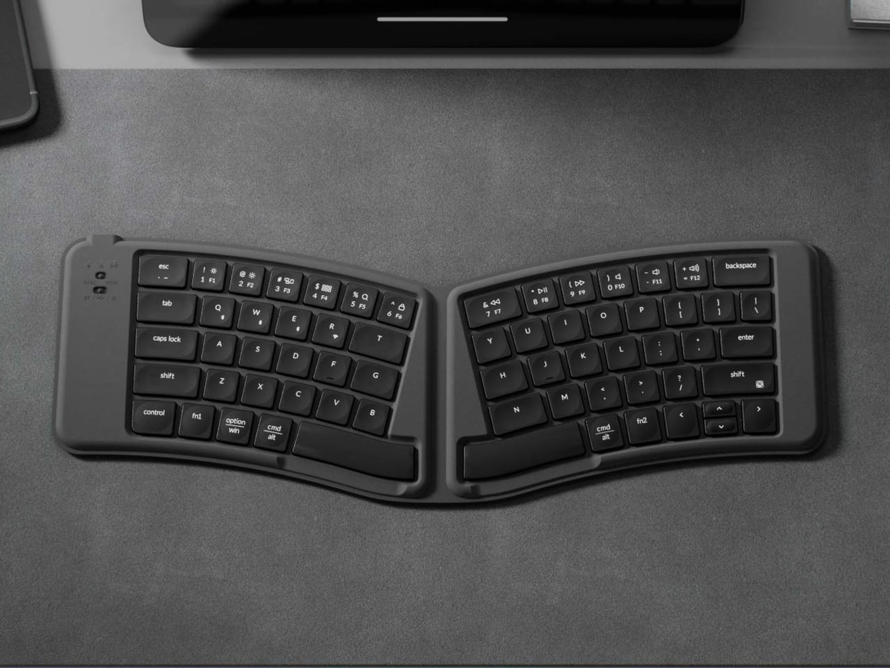
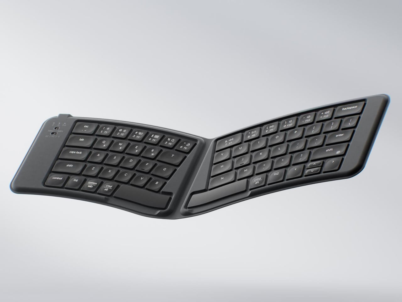
Most portable keyboards solve one problem while ignoring another. They compress the footprint but flatten the key geometry, leaving your wrists to negotiate a straight layout through a full working day in a hotel room or an airport lounge. The Keychron B11 Pro approaches the problem differently. It uses a 65% Alice layout, splitting and angling the two key clusters slightly inward for a more natural wrist position, and then folds in half when not in use. Folded, it measures 196.3 × 143mm and weighs 258 grams, closer in footprint to a paperback book than a keyboard, adding almost nothing to a bag already loaded with a laptop and a water bottle.
The Alice geometry is the more considered design decision here. Angling both hands naturally inward reduces the lateral wrist strain that builds over a long typing session away from a dedicated desk. Keychron already applies this same geometry to the desk-bound K11 Max, but putting it into a foldable form at $64.99 is an entirely different proposition. Most foldable keyboards treat compactness as the only ergonomic consideration on the road. The B11 Pro argues that wrist health doesn’t stop mattering when you leave the office. For writers, remote workers, and anyone who types seriously while traveling, this is the keyboard that proves you don’t have to choose between ergonomic design and fitting your gear into a jacket pocket.
What We Like:
The Alice split geometry reduces lateral wrist strain during long typing sessions away from a desk
Folds to 196.3 × 143mm and 258g, small enough for a jacket pocket or bag side compartment
What We Dislike:
65% layout omits the function row and numpad, which may limit certain professional workflows
The angled Alice geometry requires adjustment time for users moving from a standard keyboard layout
7. TWS Earbuds with Built-in Cameras
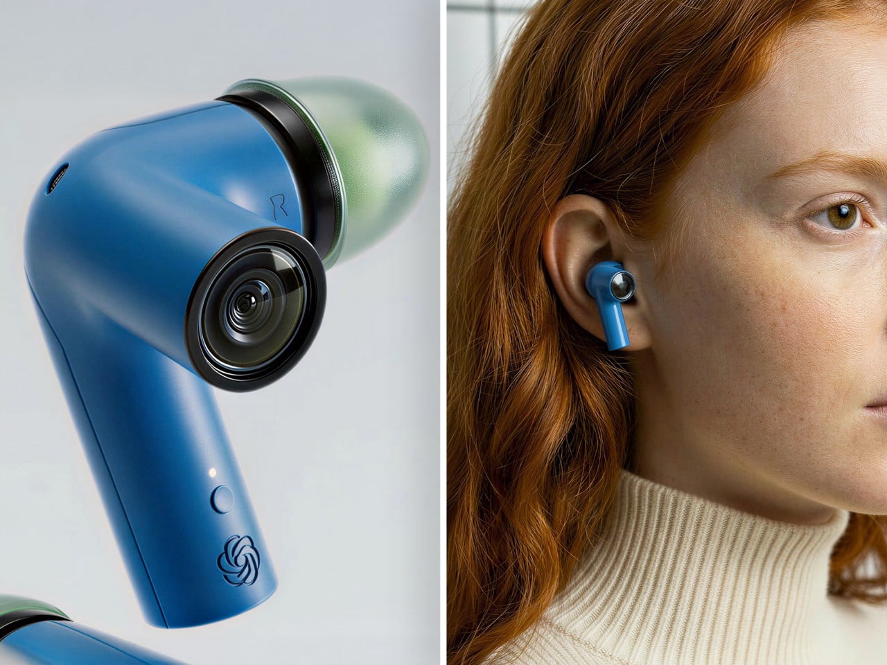
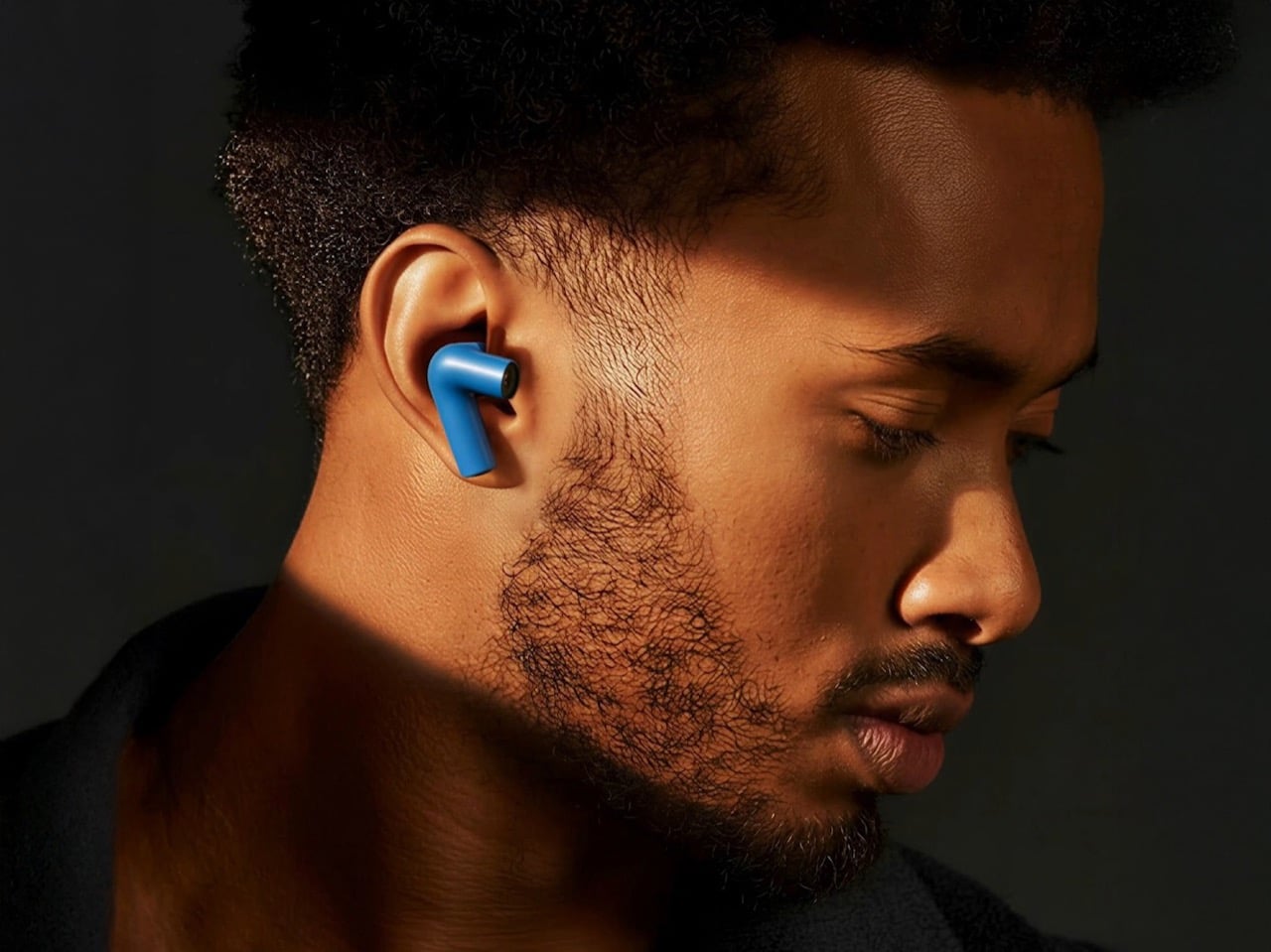
Every company building AI hardware is betting on a form factor. Smartglasses, pins, pocket companions: each one asks you to wear a new device, adopt a new habit, and accept a new object into your daily carry. This concept asks a quieter question. What if the best AI hardware is something you already wear? These conceptual TWS earbuds add a single modification to a familiar form: each bud carries a built-in camera positioned along an extra stem, close to your natural line of sight. Paired with ChatGPT, those lenses become a live visual feed for an assistant that lives in your ears, reading menus, interpreting signage, and guiding you through an unfamiliar city without a screen in sight.
The carry implications are significant. A case the size of a lip balm replaces a phone query, a smartwatch notification, and a spoken search. The familiarity of the earbud form is the concept’s strongest argument: people already carry these, already charge them, and already wear them for hours at a stretch. Layering AI visual capability onto that without adding bulk or asking you to change how you move through the world is exactly what makes this vision compelling. Carry less, own more: this concept takes that headline literally. If the goal is capability without compromise, an assistant that can see, hear, and understand the world from inside a pair of earbuds is the most minimal possible version of that idea.
What We Like:
AI visual and audio capability in an earbud form factor requires no new carry habits or added bulk
Familiar TWS design eliminates the adoption friction that has limited other AI hardware categories
What We Dislike:
Currently a concept product with no confirmed release date or commercial availability
Built-in cameras positioned near the face raise valid and ongoing concerns about privacy in everyday use
The Best Tech Is the Tech You Actually Carry
Minimalism in everyday carry is not about owning less for its own sake. It is about refusing to let the objects you depend on become a burden. The best gear earns its place by doing more with less, compressing capability into a form that fits your life without requiring your life to reorganize around it. Every product on this list represents that thinking: a power bank that weighs less than two eggs, a keyboard that folds into a jacket pocket, a speaker that needs no power at all, and earbuds that could soon carry an AI capable of reading the world for you.
The shift is real, and it is accelerating. Engineering is finally catching up to the design ambition that minimalist carry has always implied. You no longer have to choose between a fully equipped setup and a light bag. These seven accessories make that argument in the most convincing way possible: not with a manifesto, but with their dimensions.
Most concept designs exist to generate buzz, collect awards, and then quietly disappear. The BeoLens Horizon, a projector concept imagined by French industrial designer Baptiste Baumeister, feels different. It feels like a glimpse into a future that Bang & Olufsen should absolutely be building right now.
If you’re not familiar with B&O, the short version is this: the Danish audio brand has been setting the benchmark for luxury consumer electronics since 1925. Their products don’t just sound good; they’re designed to be desired as objects. The BeoSound Shape, the BeoVision Harmony, the Beosound Theatre, all of them treat your living room like a gallery wall. Baumeister clearly understands that DNA, and with BeoLens Horizon, he runs with it in a direction that feels genuinely exciting.
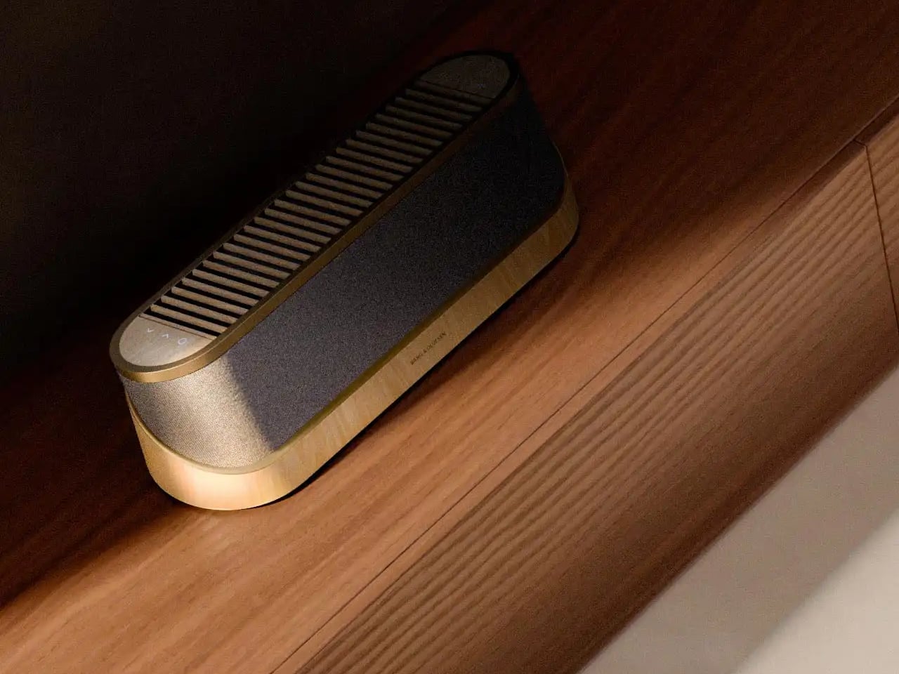
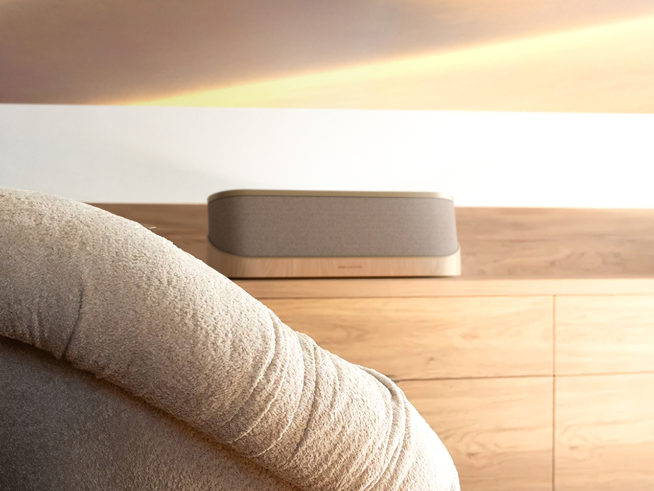
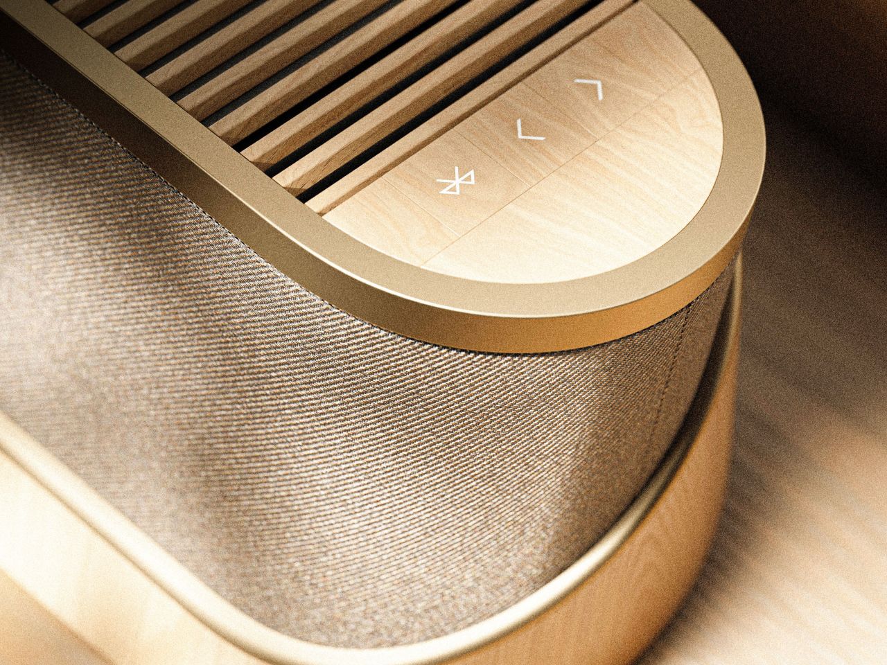
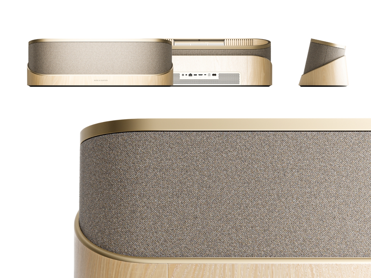
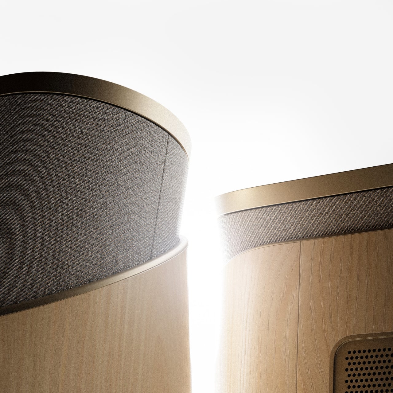
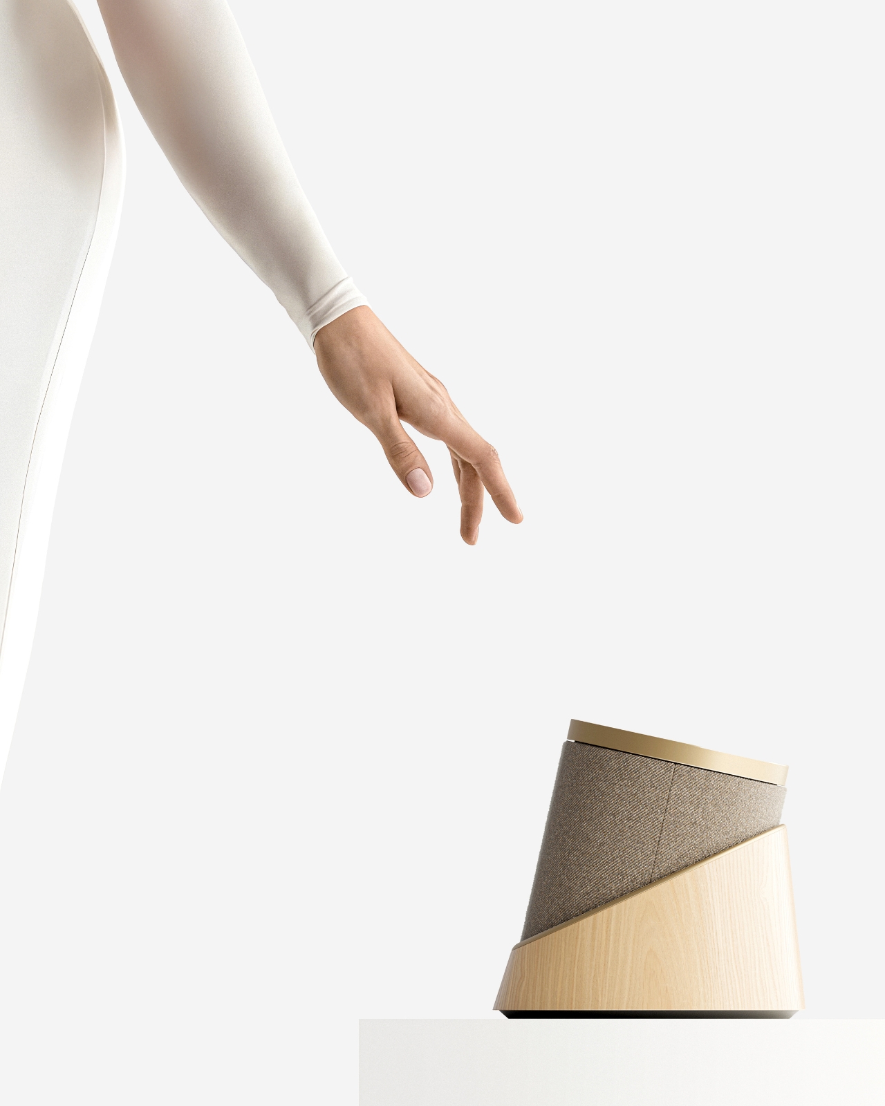
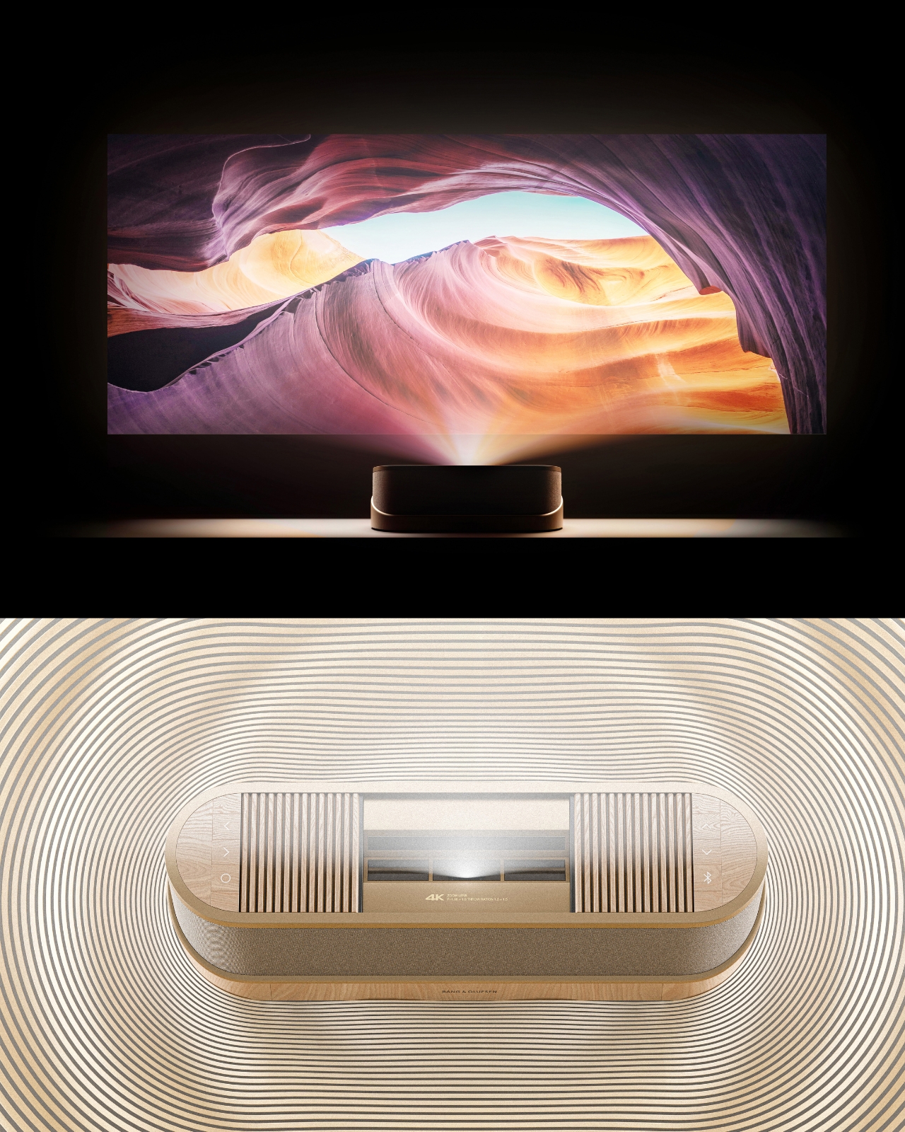
The design comes in two distinct configurations. The first is a horizontal, low-profile unit that sits flat on a surface like a refined soundbar crossed with a Scandinavian jewelry box. The second is a taller, cylindrical form that reads more like a speaker column or a sculptural object you’d place on the floor. Both share the same material vocabulary: light ash wood, brushed gold-toned aluminum, and tightly woven acoustic fabric in warm grey. It’s the kind of material combination that makes you think of an architect’s weekend house rather than a tech showroom.
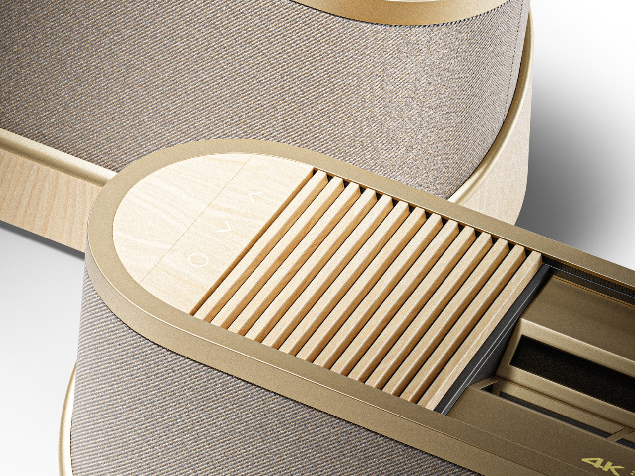
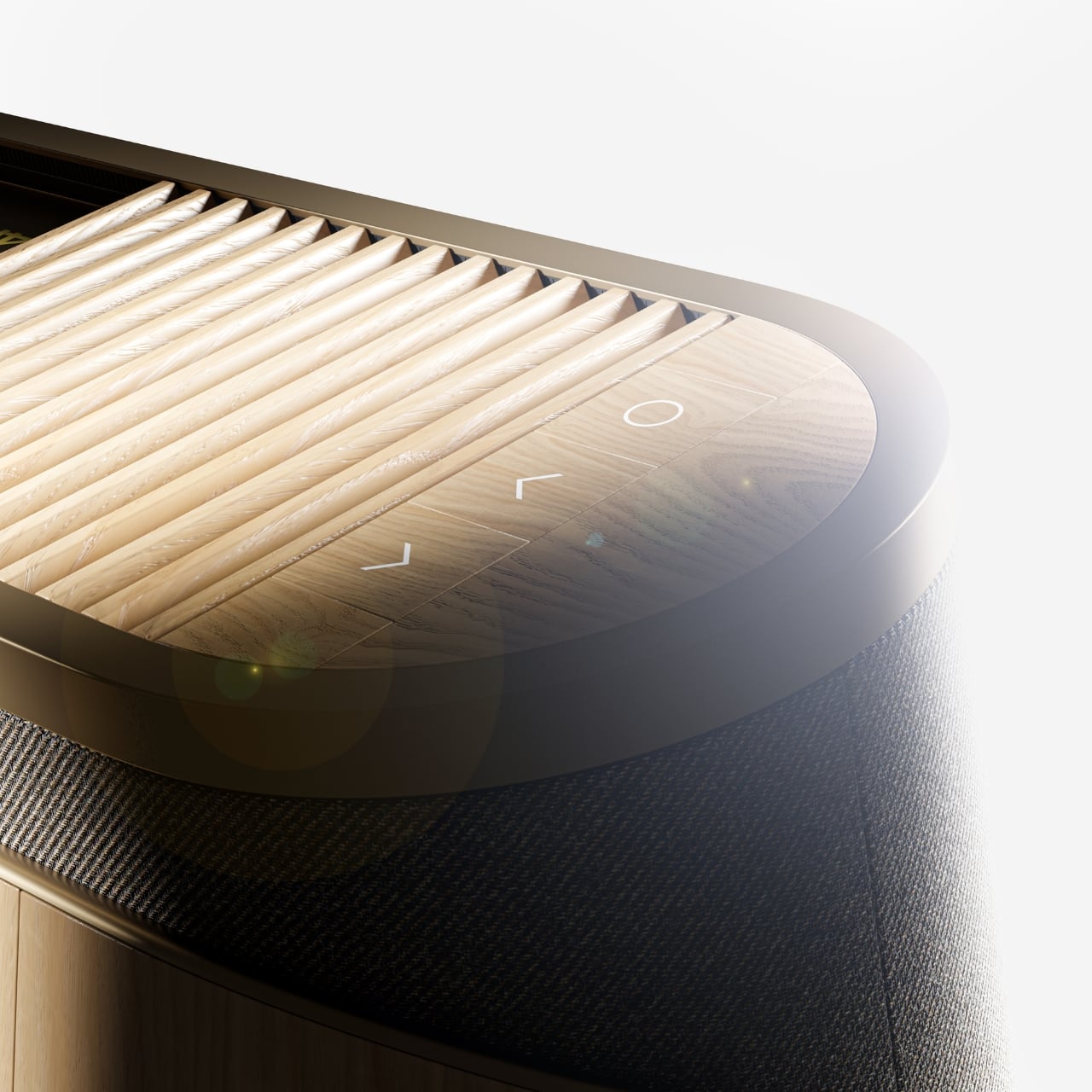
The horizontal unit is particularly interesting because of how it conceals the projector itself. A wooden slat panel sits on top, almost like a miniature version of those slatted screens you see in high-end Japanese interiors, and the lens assembly slides out from beneath it. The 4K projection capability is written right into the design, quietly labeled without fanfare. There are no aggressive vents, no branding that screams for attention, no black plastic anywhere. It’s restrained in a way that feels almost provocative in a market where most projectors try hard to look “cinematic” and end up looking aggressive instead.
The controls are worth noting too. Rather than a touchscreen or a button cluster, Baumeister places minimal icon-etched controls directly into the wood panel. A Bluetooth symbol, a pair of directional arrows, a power circle. They’re barely visible until you know to look for them, which feels very much in keeping with how B&O has always approached interaction design, treating it as something that should feel intuitive and slightly magical rather than mechanical.
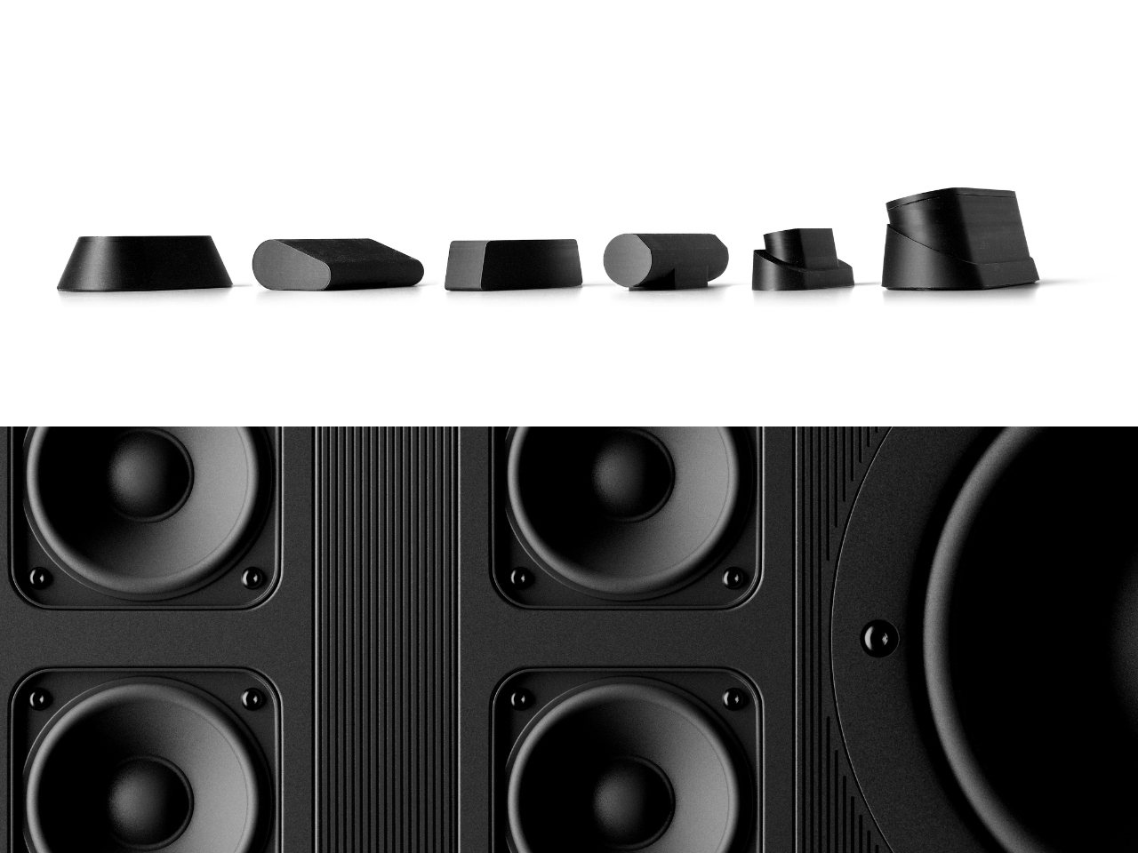
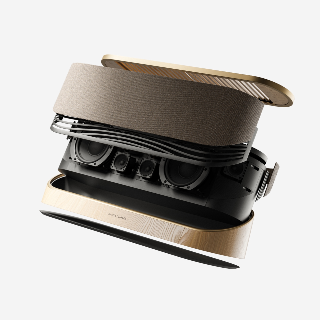
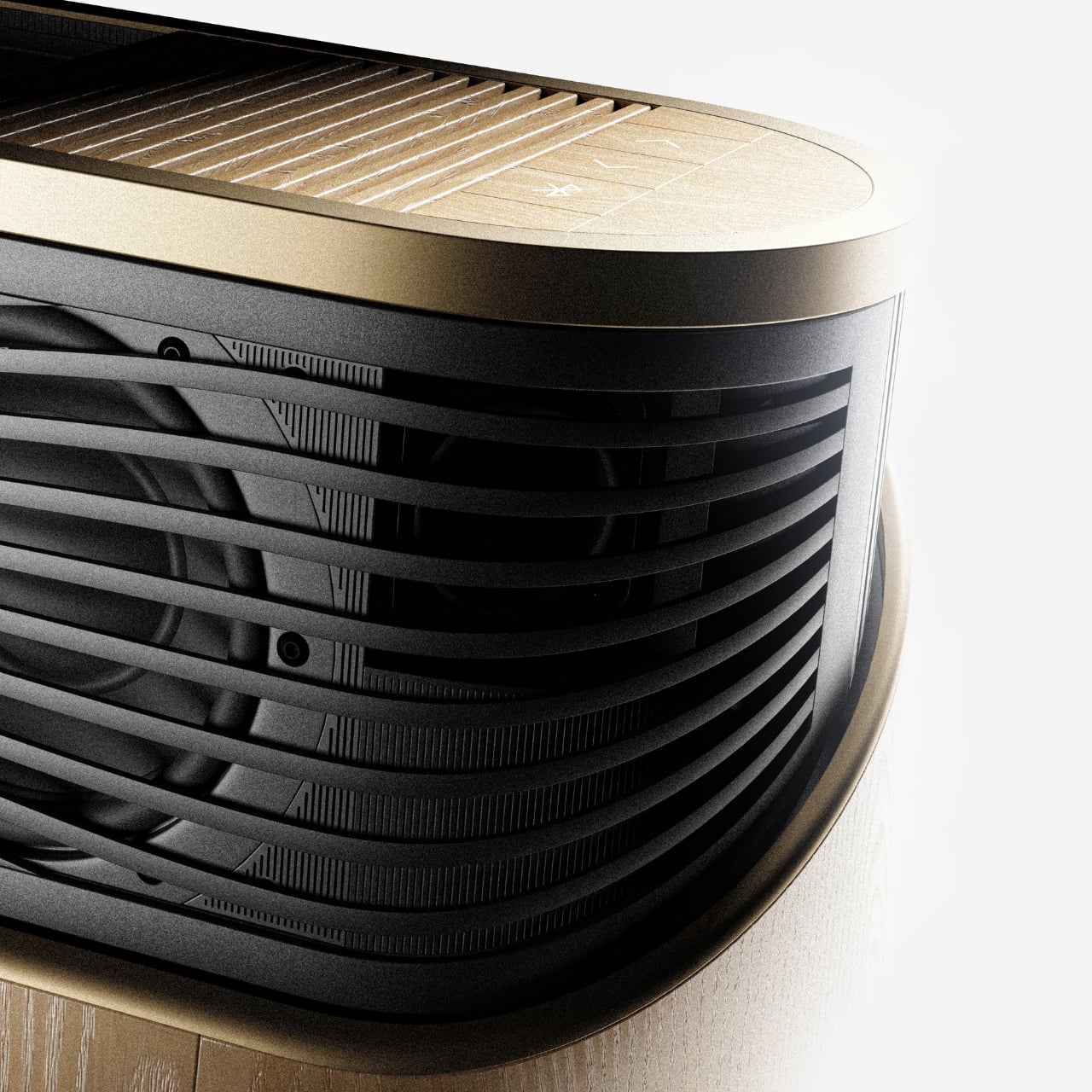
Looking at the exploded view of the horizontal model, you can see just how much thought went into the layering of components. The speaker array sits sandwiched between the wood base and the metal-framed top, with the projector mechanism occupying the central cavity. It’s genuinely elegant engineering, even if this is still a concept. Baumeister also developed a series of small-scale physical prototypes exploring the form from different angles, which you can see in a lineup of matte black study models. That process matters. It tells you this isn’t just a pretty render; it’s a design that was worked through with real hands.
Here’s my honest opinion: the TV industry has been coasting on size for years. Bigger screens, thinner bezels, more pixels. But the BeoLens Horizon asks a more interesting question. What if the device itself was worth looking at even when it was off? What if the experience of owning the hardware was part of the experience of using it? These aren’t new ideas in the B&O world, but a projector built around this philosophy feels like a genuinely fresh proposition, especially as ultra-short-throw technology continues to improve.
Baumeister is a young designer out of Strate, a design school in Lyon, and BeoLens Horizon joins a portfolio that already shows a real feel for the intersection of material craft and technology. Whether Bang & Olufsen ever picks this up or not, the concept makes a compelling case that the future of home cinema doesn’t have to look like a gadget. It can look like something you actually want to live with.