Horizon Worlds, Meta's first pass at a metaverse, will be inaccessible via virtual reality headset after June 15, 2026. The company shared plans to separate Horizon Worlds from Quest VR platform and focus exclusively on the smartphone version of the app in February, and now in a new post on its community forums, Meta detailed when the VR version of Horizon Worlds will be deprecated.
By March 31, Meta says individual Horizon Worlds and Events will no longer be listed in the Quest's Store and headset owners will be unable to visit worlds like "Horizon Central, Events Arena, Kaiju and Bobber Bay." Then, after June 15, the app will be removed from Quest headsets and worlds will be completely unavailable to visit in VR. From that point on, the easiest place to visit Horizon Worlds will be in the Meta Horizon app for iOS and Android.
Additionally, Hyperscape Capture, a recently added beta feature that allows Quest headset owners to capture, share and visit each other in detailed 3D scans of real-life locations, is also being removed from Horizon Worlds. Meta says users will still be able to capture and view Hyperscapes, "but sharing, inviting, and co-experiencing Hyperscapes with others will no longer be supported."
While Meta's original blog detailing its 2026 VR strategy left open the possibility that a committed Quest owner might still be able to access some part of Meta's original VR metaverse, that apparently was never the company's plan. Meta saw enough "positive momentum" focusing on supporting the mobile version of Horizon Worlds in 2025 that it made sense to completely abandon the VR one in 2026. While that seems to run contrary to Meta’s positioning as a "metaverse company," it does reflect where the company is spending the most money and seeing the most (relative) success: AI and smart glasses.
This article originally appeared on Engadget at https://www.engadget.com/ar-vr/meta-will-shut-down-vr-horizon-worlds-access-in-june-222028919.html?src=rss
Apple has started providing small security updates to iOS, iPadOS and macOS devices. These are dubbed Background Security Improvements that will offer minor system updates between the larger software updates. According to the company, these are meant to "deliver lightweight security releases for components such as the Safari browser, WebKit framework stack, and other system libraries that benefit from smaller, ongoing security patches between software updates."
These updates should download in the background, as the name implies, although the device will need to be restarted to complete the process. In practice, we found that applying a Background Security Improvement was faster than a typical software update from Apple. On an iPhone, the restart was more of a power cycle taking under a minute compared with the 5 to 10 minutes a standard update takes a device out of commission.
The inaugural Background Security Improvement was released today with a patch for WebKit. These updates will be supported and enabled on devices running iOS 26.1, iPadOS 26.1 and macOS 26.1. Details can be reviewed under the Privacy & Security section of the Settings menu.
This article originally appeared on Engadget at https://www.engadget.com/computing/apple-releases-its-first-background-security-improvement-for-macos-ios-and-ipados-214052311.html?src=rss
Tiramisu has a strong claim to being the world’s most universally loved dessert. It crossed out of northeastern Italy sometime in the late 1960s, hit restaurant menus across Europe and America through the 80s and 90s, and somewhere along the way became the default “fancy dessert” of the home cook who wanted to impress without turning on the oven. The name translates roughly to “pick me up,” which is exactly what a shot of espresso-soaked ladyfingers and mascarpone cream does. LEGO Ideas creator Micdud has now built one out of 1,106 bricks, nearly at 1:1 scale, and the result is the kind of MOC that makes you do a double-take.
The build is a corner slice served on a decorative round plate, complete with chocolate drizzle, cream dollops, and a fork mid-bite suspended in the air on a transparent support. The cocoa topping alone is a masterclass in using disparate brown elements to simulate an organic, dusty texture. Micdud even hid a raspberry made from a red clown hairpiece and blueberries built from purple astronaut helmets under the garnish. Food MOCs live and die by their surface detail, and this one gets every layer right.
Designer: Micdud
The corner piece allows you to see the full lady-fingers without their cross-sections. There’s just so much detail that it’s easy to get lost focusing on just one part. Although that’s exactly what makes this ‘dish’ such a winner. It triggers a primordial response of hunger the minute you see it. The colors are perfect, the cross section is gorgeous, and the details even on the plate WILL make your mouth water. Cutting two faces open lets those layers read in amber and white bricks, while the outer two faces show the savoiardi as rounded bumps with cream spilling over them. The build is doing two different surface textures at once, and pulling both off cleanly at 27 by 27 centimeters is no small thing for a 1,106-piece model.
The MOC (My Own Creation) is presented on a round plate, adding to its flair. The chocolate scroll work and cream rosettes ringing the edge give the whole scene a plated, restaurant-ready quality that keeps it from reading as a lone brick sculpture sitting on a flat disc. The suspended fork is the finishing touch, a freshly cut bite floating mid-air on a transparent support brick, the kind of detail that commits fully to the storytelling and makes the whole thing feel like a frozen moment rather than a display piece.
Unlike most LEGO Ideas submissions, this one isn’t rendered. From the looks of it, and just the imprefections in the detail, Micdud already built the design out. That’s impressive on its own, because it shows exactly what the Tiramisu would look like. For the uninitiated, LEGO Ideas is the company’s portal for fan-made submissions, allowing enthusiasts to create their own LEGO builds and vote for their favorite ones. Any MOC that crosses the 10,000 vote mark gets reviewed by LEGO’s internal team and then potentially turned into a box set. Micdud’s Tiramisu is just mere days old on the platform and it’s already amassed 240 votes (including my own). If you want to have it hit that 10k mark, head down to the LEGO Ideas forum and cast your vote (it’s free!) Let’s get this MOC produced before October this year so we can enroll it in the Tiramisu World Cum in Italy this year!
What a short, strange journey it's been for FBC: Firebreak; Remedy announced that the final update for the online multiplayer game is available today. But while this Open House update will be the end of new content, the studio said it plans to keep the game available.
"FBC: Firebreak will stay online and continue to be playable for years to come," Remedy said. "We have done engineering work to ensure we can sustain the upkeep of the relay servers when the player volume is lower."
Remedy has won lots of fans for creating the eerie, surreal world where its hits Control and Alan Wake are set. FBC: Firebreak, which was released last year, is also based in that universe. However, this multiplayer game took a beating in reviews, largely due to its poorly received onboarding experience and Remedy shared plans to improve the first few hours of the game. Its CEO also left the company last year and sparked a shakeup in the leadership at the studio.
The Open House update will add some new in-game content, but the more interesting changes seem aimed at making FBC: Firebreak more accessible. The base price has been dropped to $20, and the game has added a feature called Friend's Pass that will allow people who don't own the game to accept match invites from players who do own it.
This article originally appeared on Engadget at https://www.engadget.com/gaming/remedy-releases-its-final-content-update-for-fbc-firebreak-212000463.html?src=rss
Spotify is introducing a way for subscribers to get bit-perfect playback of songs if they listen on Windows. The company's newly announced "Exclusive Mode" gives the music streaming app complete control of audio processing on your PC so you can listen to songs exactly as they were mastered.
"Without Exclusive Mode turned on, your computer may alter audio before it reaches your DAC by resampling it, mixing other system sounds in, and changing the volume," Spotify writes. With the mode enabled, all other sounds from your computer are disabled so Spotify can deliver the highest quality and most accurate version of a song possible. Exclusive Mode will help maintain fidelity while you’re playing a song, but to make sure you're not losing quality anywhere else in the chain, you'll still want to listen with wired headphones connected to a DAC or digital-to-analog converter, and opt to use Spotify’s lossless streaming option.
Exclusive Mode is only available on Windows for now, but Spotify says it'll come to the macOS version of the Spotify app "in a future release." Provided you're a Spotify Premium subscriber, enabling the feature is fairly simple:
Open Spotify.
Click on Settings.
Scroll down to Playback.
Toggle Exclusive Mode to "On" under the Output section.
Spotify launched its Lossless streaming option as a perk for Premium subscribers in September 2025. The company was rumored to be working on the feature as far back as 2017 and even formally announced it as Spotify HiFi in 2021, opening up the possibility it could be a more expensive add-on to a normal subscription. Now both lossless audio and “bit-perfect” playback are included as part of the same $13 per month you pay for a Premium subscription.
This article originally appeared on Engadget at https://www.engadget.com/entertainment/music/spotify-rolls-out-bit-perfect-playback-in-windows-app-211036176.html?src=rss
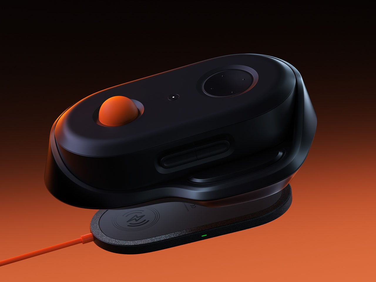
In an era where gaming peripherals are constantly evolving, designers are increasingly experimenting with new ways to rethink the relationship between the hand and the controller. Control PlusArc concept controller challenges the familiar joystick-and-button layout with a more tactile and deliberate approach to movement. Interestingly, this exploration arrives around the same time as other unconventional input devices, such as a mouse that doubles as a hidden game controller.
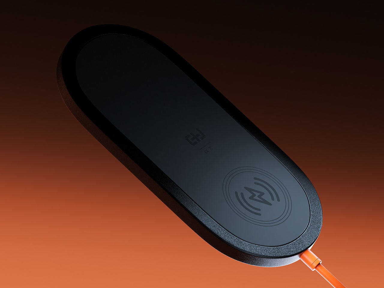
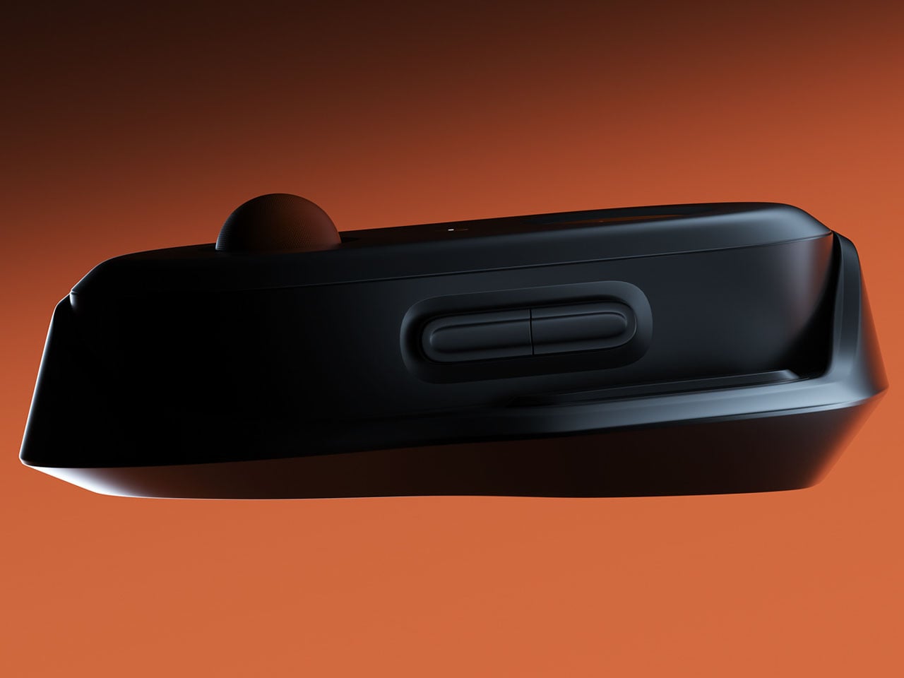
Control PlusArc is built around the idea that interaction should feel natural rather than mechanical. Instead of relying on standard analog sticks, the design introduces a semi-spherical control mechanism that encourages controlled, intentional movement. The controller’s overall oval form factor reflects this philosophy as well. Rather than forcing the user into rigid hand placements, the shape allows the device to sit comfortably within the palms, encouraging a continuous grip that feels fluid and stable during gameplay.
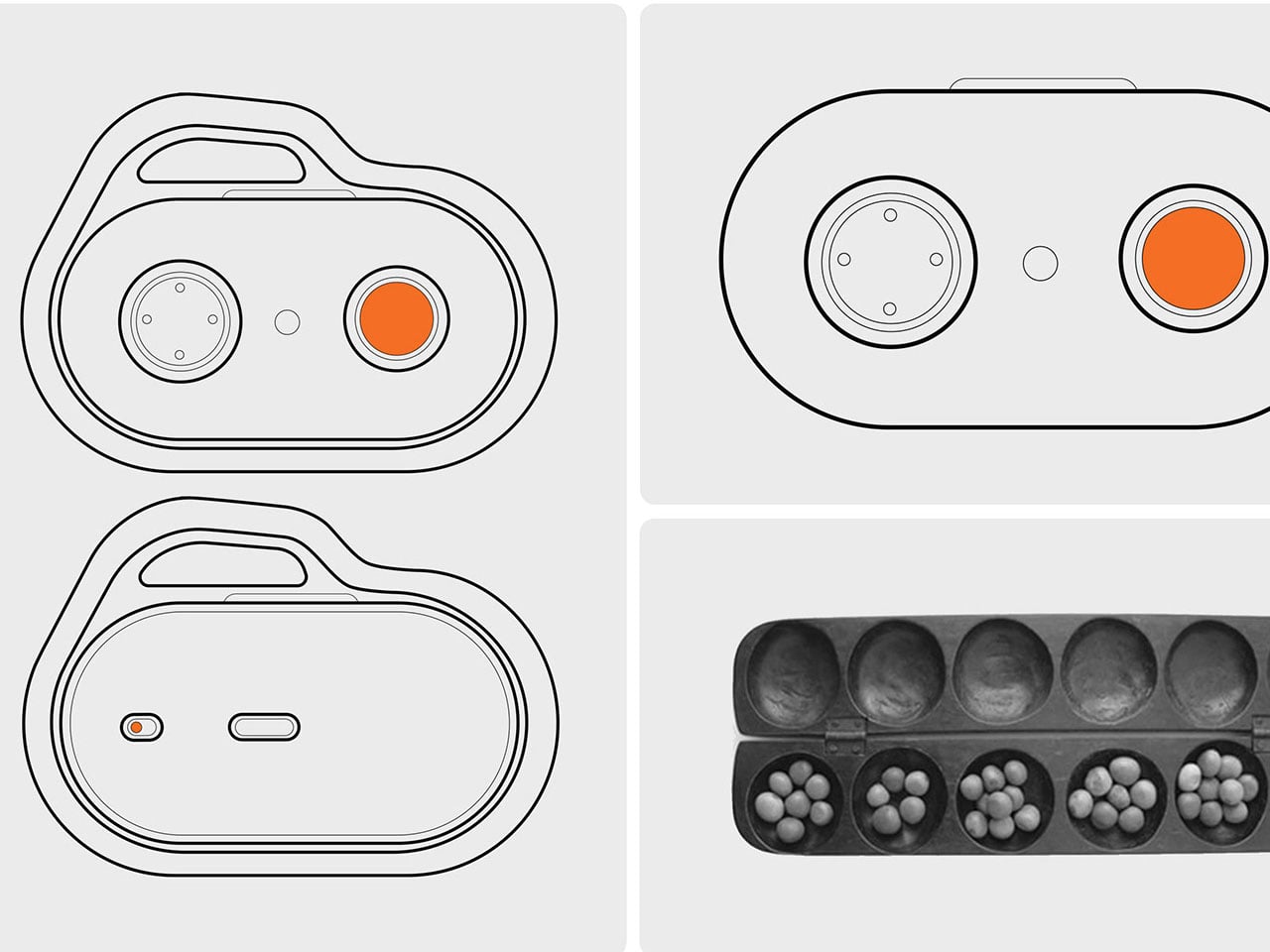
The concept controller is inspired by Oware, known for its rhythmic and thoughtful movement of pieces across carved pits on a wooden board. Instead of mimicking the visual style of the game, the Control PlusArc borrows its philosophy of deliberate interaction. The controller’s oval shape emphasizes the organic contours of an Oware board, creating a tactile connection between hand movement and the act of play.
This influence becomes even more evident in the controller’s semi-ball control mechanism. Unlike a full trackball or freely spinning joystick, the half-ball structure introduces clear boundaries to movement. Players can roll the control surface in different directions, but the restricted geometry ensures that movement remains precise and predictable. This design choice prevents the kind of uncontrolled spinning that often accompanies traditional trackballs, instead reinforcing a sense of intentional navigation.
The half-ball interface effectively becomes the centerpiece of the interaction. Because the surface sits partially embedded in the controller body, it balances freedom and constraint. The user can perform quick directional adjustments while still maintaining tactile awareness of the controller’s limits. The result is a control system that feels less like manipulating a mechanical stick and more like guiding motion across a defined space.
Most modern gamepads still follow a layout popularized by early console designs: two sticks, directional inputs, and face buttons. By rethinking the primary control surface itself, this gaming controller questions whether future controllers might shift toward more tactile, sculptural interfaces that respond more intuitively to the way hands naturally move.
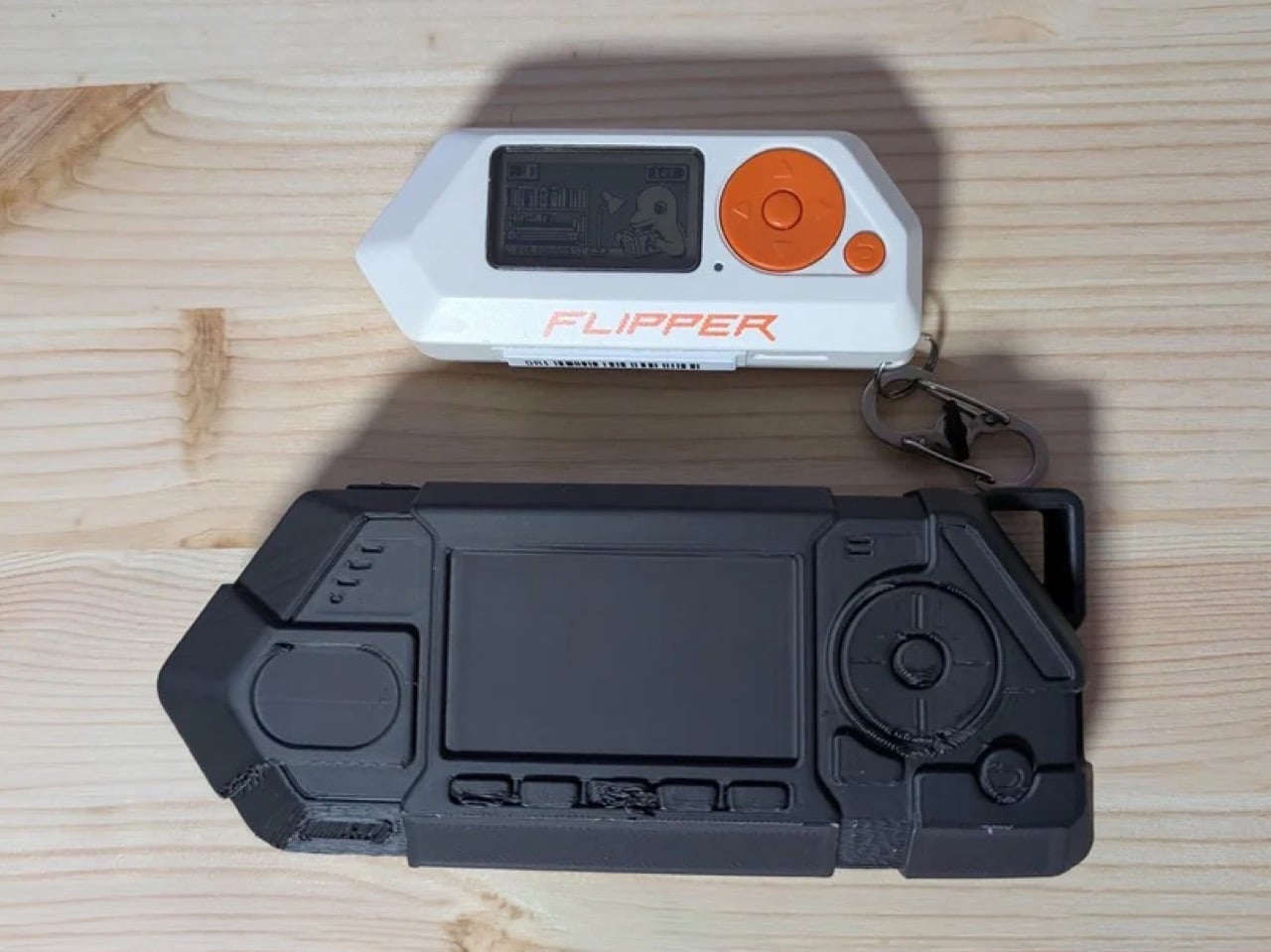
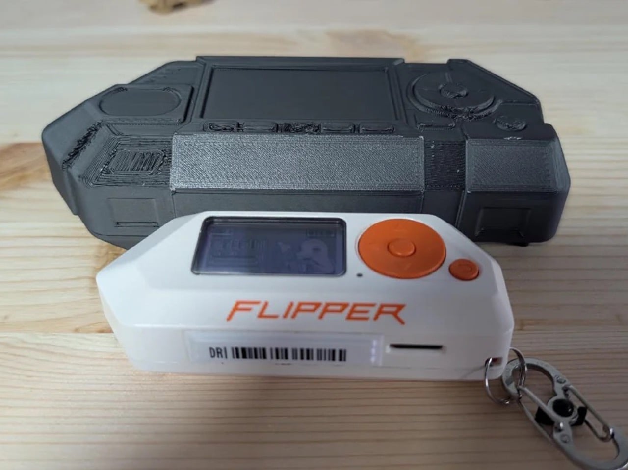
Someone has already printed the Flipper One. Not a real one, but rather a prototype model to show its size compared to the Flipper Zero. First reaction, it’s massive. Second reaction, where did they get the 3D file from? Well, Flipper Devices actually published full mechanical enclosure files for their upcoming Linux-powered handheld on Github. Here’s the link just in case you want to print yours too.
The CAD files put it at 152.6mm wide, against the Zero’s 97.5mm, a difference that becomes viscerally obvious in photos. The front face alone tells you what this device is for: a wide display recess for the 256×144 screen, four function buttons, a D-pad with integrated OK button, a dedicated joystick, and a lanyard/carabiner loop suggesting field carry over pocket carry. A Rockchip RK3576 SoC running Linux, an M.2 slot for modular radios, and dual-processor architecture all need somewhere to live, and Flipper gave them a proper home.
Designer: Flipper Devices
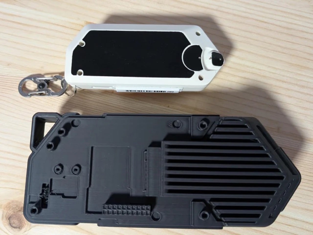
The repository breaks the enclosure into three published parts. The body is the main shell containing everything: display, controls, electronics. It ships as a solid exterior with an intentionally hollow interior in the public files, meaning Flipper is sharing enough geometry for accessory makers to work with while keeping the internal mechanical layout proprietary. The back plate, which covers the M.2 expansion port and swaps out depending on what module you have installed, is published in full including internal surfaces. Same goes for the antenna rail, a separate bracket for routing SMA antenna cables before the back plate closes, a decision born from actual testing where routing cables through an integrated back plate kept damaging connectors during assembly. These are not arbitrary design choices; every split in the enclosure reflects a specific problem someone ran into during prototyping and solved deliberately.
The modular back plate represents a fairly new (and exciting) direction for the Flipper One’s community. Because the back plate geometry is fully open, third-party manufacturers can design their own versions tailored to specific module configurations without waiting on Flipper. Someone building a custom SDR module with a non-standard antenna setup can design a matching back plate that fits the same screw pattern. The Zero had a thriving accessory ecosystem built on top of its GPIO header, and Flipper seems to be seeding the same dynamic for the One, except this time the third-party entry point is baked into the enclosure architecture from day one rather than discovered after launch.
The sheer size of the Flipper One printed next to the Zero tells you something important about where Flipper Devices thinks the market has moved. The Zero was designed for a world where the coolest thing a pocket device could do was clone your hotel key card. The One is designed for a world where security researchers want a full Kali Linux environment, SSH access, and swappable radio hardware on their person during a pentest, without pulling out a laptop. The cyberdeck community has been hand-building devices like this for years at significant cost and effort. Flipper is essentially productizing that whole category, and publishing the enclosure files before the device even ships is a very deliberate signal about who they’re building it for.
It's only been two years since Dune: Part Twotook over multiplexes, but we already have a trailer for the third installment. The appropriately-named Dune: Part Three is an adaptation of Frank Herbert's Dune Messiah book from 1969.
Just like the book, the latest film takes place a number of years after Dune: Part Two. "If the first movie was contemplation, a boy exploring a new world, and the second one is a war movie, this one is a thriller," according to The Hollywood Reporter. "It is action-packed and tense. More muscular.”
Despite the time jump, most primary actors are returning. This includes Timothée Chalamet, Zendaya and Javier Bardem. Anya Taylor-Joy, who briefly appeared in the second film, is also coming back. The same goes for Jason Momoa, despite his Duncan Idaho character dying in the first film. Book readers will likely understand what that means.
The trailer also highlights the antagonist Scytale, as portrayed by Robert Pattinson. He should be a more nuanced villain than Baron Harkonnen, though that's not exactly a high bar.
The release date is coming up fast. Dune: Part Three hits theaters on December 18. That's this year. Villeneuve had intended to take a break after making the second one to focus on a smaller and more personal film, but said that he kept "waking in the middle of the night" with potential images from the third installment.
This article originally appeared on Engadget at https://www.engadget.com/entertainment/tv-movies/the-dune-part-three-trailer-introduces-robert-pattinsons-villainous-new-character-173758393.html?src=rss
Kalshi has been sued by Arizona's attorney general for operating an illegal gambling business in the state and unlawfully allowing people to place bets on elections. "Kalshi may brand itself as a 'prediction market,' but what it's actually doing is running an illegal gambling operation and taking bets on Arizona elections, both of which violate Arizona law," the state's Attorney General Kris Mayes said.
The company defines itself as a prediction markets platform, where users make bets on the outcomes of events ranging from sporting matches to political actions. Kalshi has claimed that it operates under the auspices of the Commodity Futures Trading Commission and shouldn't be faced with the state-level charges of running unlicensed gambling.
The case follows a similar action against Kalshi filed in Nevada last month. Kalshi also made headlines this year when an employee of popular YouTuber MrBeast was accused of insider trading on the platform.
This article originally appeared on Engadget at https://www.engadget.com/big-tech/arizona-attorney-general-sues-kalshi-on-illegal-gambling-charges-172006290.html?src=rss
Spring in Japan is not a season of accumulation. It is a season of editing, of noticing what was already there, of letting a single branch in a ceramic vessel do the work of an entire floral arrangement. The Japanese approach to domestic space has always understood something Western interiors still struggle with: that less does not mean empty, it means deliberate. And in a tiny room, deliberation is everything.
We have rounded up eight products that carry this philosophy without turning it into a marketing exercise. These are not trendy minimalism props or aspirational mood-board fillers. They are functional objects rooted in Japanese craft traditions, seasonal awareness, and the kind of spatial intelligence that makes a 300-square-foot apartment breathe like a room twice its size. Spring is the perfect excuse to start.
1. Fire Capsule Oil Lamp
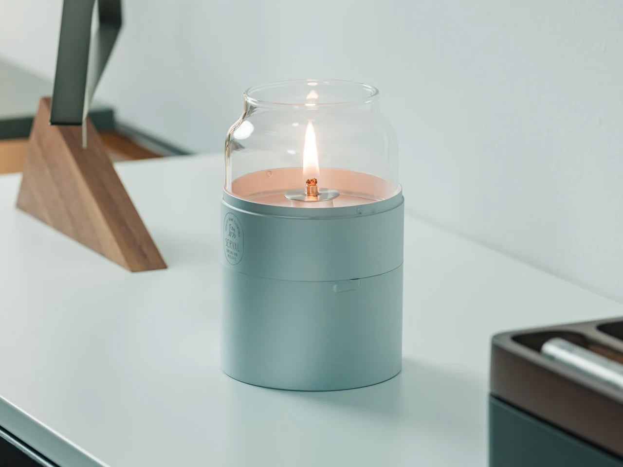
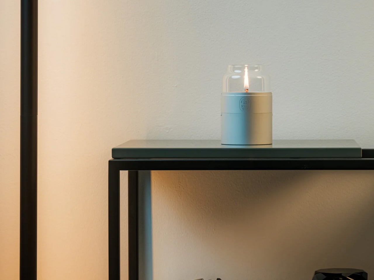
Most ambient lighting products try too hard. They pile on features, app connectivity, color-changing LEDs, and lose the one thing that makes warm light feel warm: simplicity. The Fire Capsule oil lamp goes the other direction entirely. It is a cylindrical glass-and-metal lamp with an 80ml fuel capacity, good for up to 16 hours of continuous flame.
The precision-engineered lid keeps the glass chimney clean between uses, which is a small detail that solves a persistent annoyance with oil lamps (dust settling on the glass and clouding the glow over time). An included aroma plate lets the flame double as a scent diffuser, and the flat-topped design means multiple units stack for storage. The cylindrical form ships with a drawstring pouch for portability, so it works just as well on a campsite as it does on a bedside shelf. In a small room, a single real flame on a low table changes the entire atmosphere without any electrical infrastructure.
16-hour burn time from a single 80ml fill is generous enough for an entire evening gathering or a long weekend of ambient use.
Stackable design and included carrying pouch make storage painless in apartments where every drawer counts.
What we dislike
Open flame in a tiny apartment with limited ventilation requires careful placement and awareness, especially around curtains and textiles.
Paraffin oil refills are not always easy to source locally, and the lamp does not work with standard candle wax or tea lights.
2. Kyoto Yusai Linen Noren
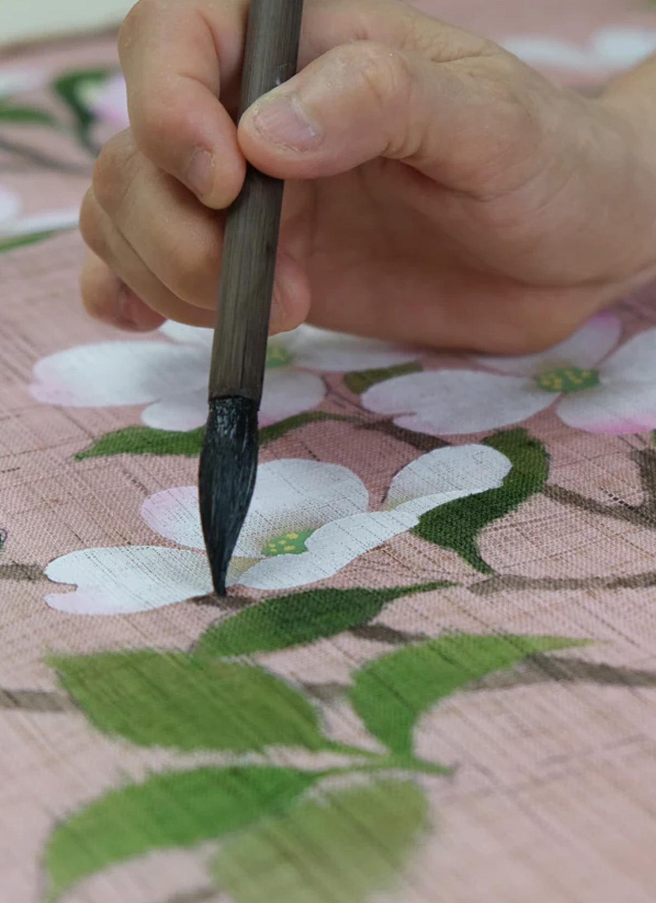
A doorway without a door is just a gap. A doorway with a noren is a conversation between two rooms that never quite ends, a soft boundary that lets light, air, and movement pass through while still giving each space its own identity. This linen noren from Kyoto Yusai, printed with a dogwood motif, does precisely that.
What makes the noren so effective in small apartments is its relationship with ma, the Japanese concept of meaningful negative space. The fabric hangs in split panels with intentional gaps, and those gaps become part of the composition. Light filters through. Silhouettes soften at the edges. In a narrow studio where the sleeping area bleeds into the kitchen, a well-placed noren restructures how the whole room reads without touching the floor plan. Swap it seasonally, and it becomes a rotating design object with zero storage cost.
What we like
Splits the room without blocking airflow or natural light, which is rare for any room divider at this price point.
Seasonal swapping means the interior changes character four times a year with no permanent commitment.
What we dislike
Linen wrinkles easily after washing, so it needs careful steaming to maintain that clean drape.
The standard sizing may not fit non-Japanese doorframes without minor alterations or a tension rod swap.
3. Brass Ikebana Kenzan
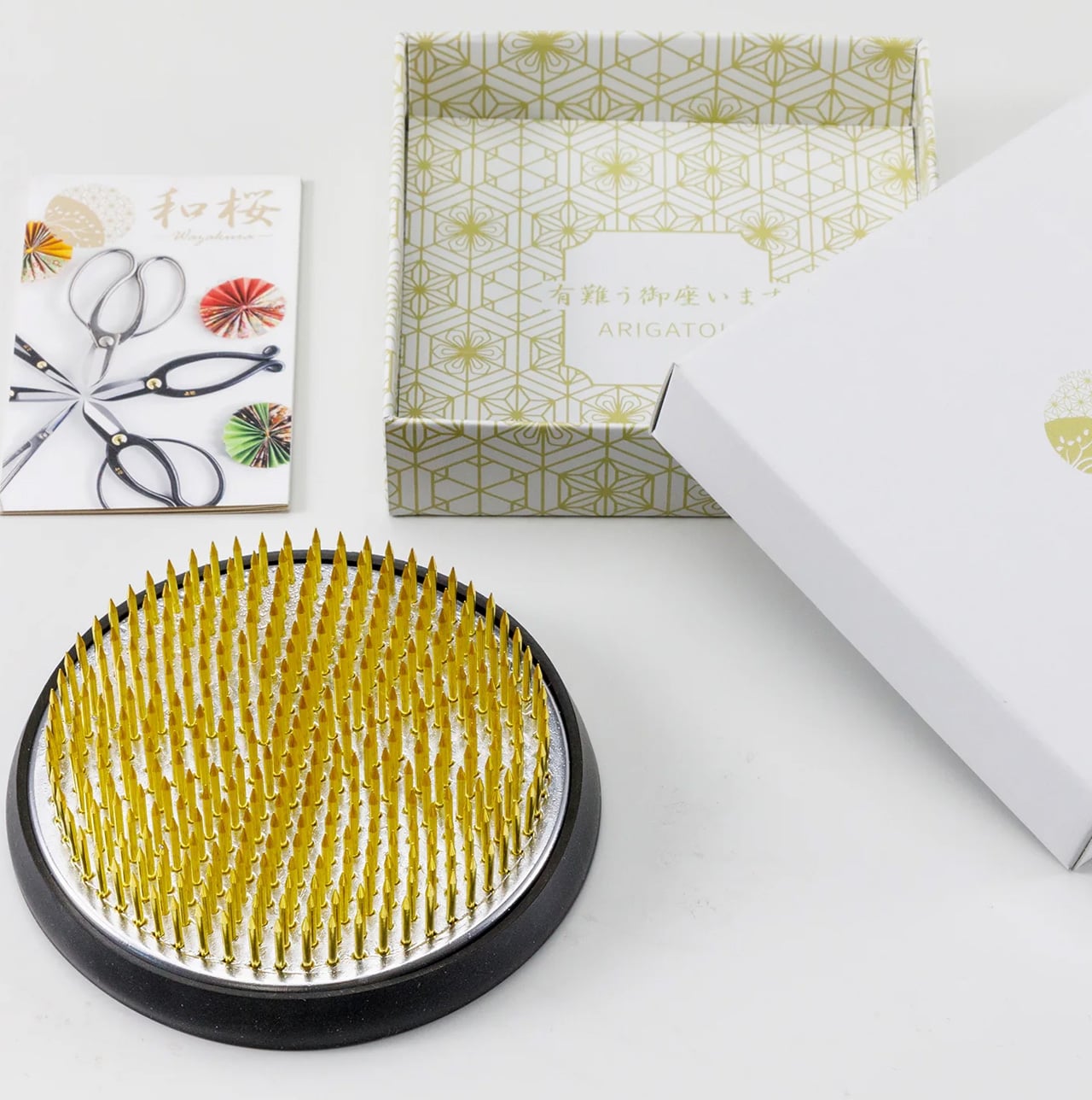
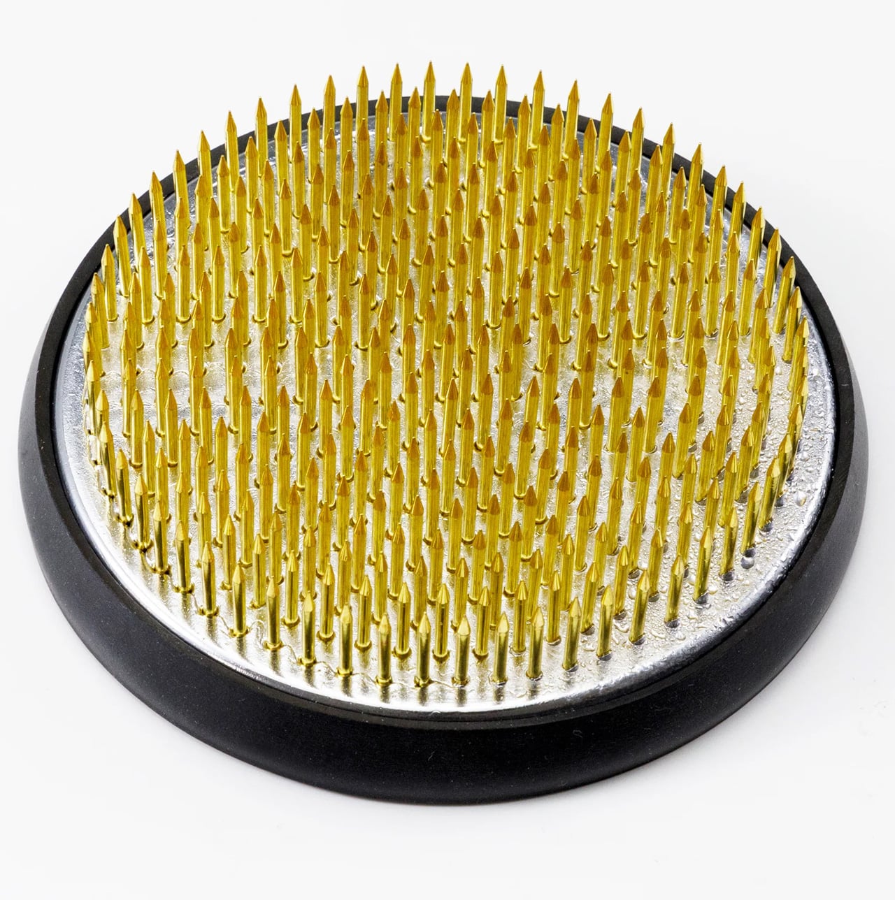
Ikebana looks effortless. A single stem angled just so, a branch suspended at an improbable tilt, a few leaves arranged with the kind of negative space that makes the whole composition feel like a held breath. The kenzan is the hidden mechanism that makes all of it possible, a heavy brass pin frog that sits at the bottom of a shallow vessel and grips stems in place with rows of sharp, fixed needles.
This particular kenzan comes from Sanjo, Niigata Prefecture, a city with metalworking lineage stretching back to the 17th century. The artisans behind it have over 50 years of experience, and the difference shows in the needle sharpness and base weight. Cheap kenzans tip under a heavy branch. This one stays put. The removable rubber gasket protects the vase from scratches and keeps the unit from sliding, and the brass construction means it will outlast the disposable floral foam it replaces entirely. No chemical waste, no single-use plastic, just a solid chunk of metal that holds flowers upright and keeps the water clean longer.
What we like
Brass construction from veteran Sanjo artisans means this will last decades without bending, rusting, or losing needle sharpness.
Eliminates floral foam, which is a meaningful environmental upgrade for anyone who arranges flowers regularly.
What we dislike
A 3.5-inch round kenzan is suited to small-to-medium arrangements only; larger branches or tall statement pieces need a bigger base.
Sharp needles require careful handling and storage, especially in households with children or pets.
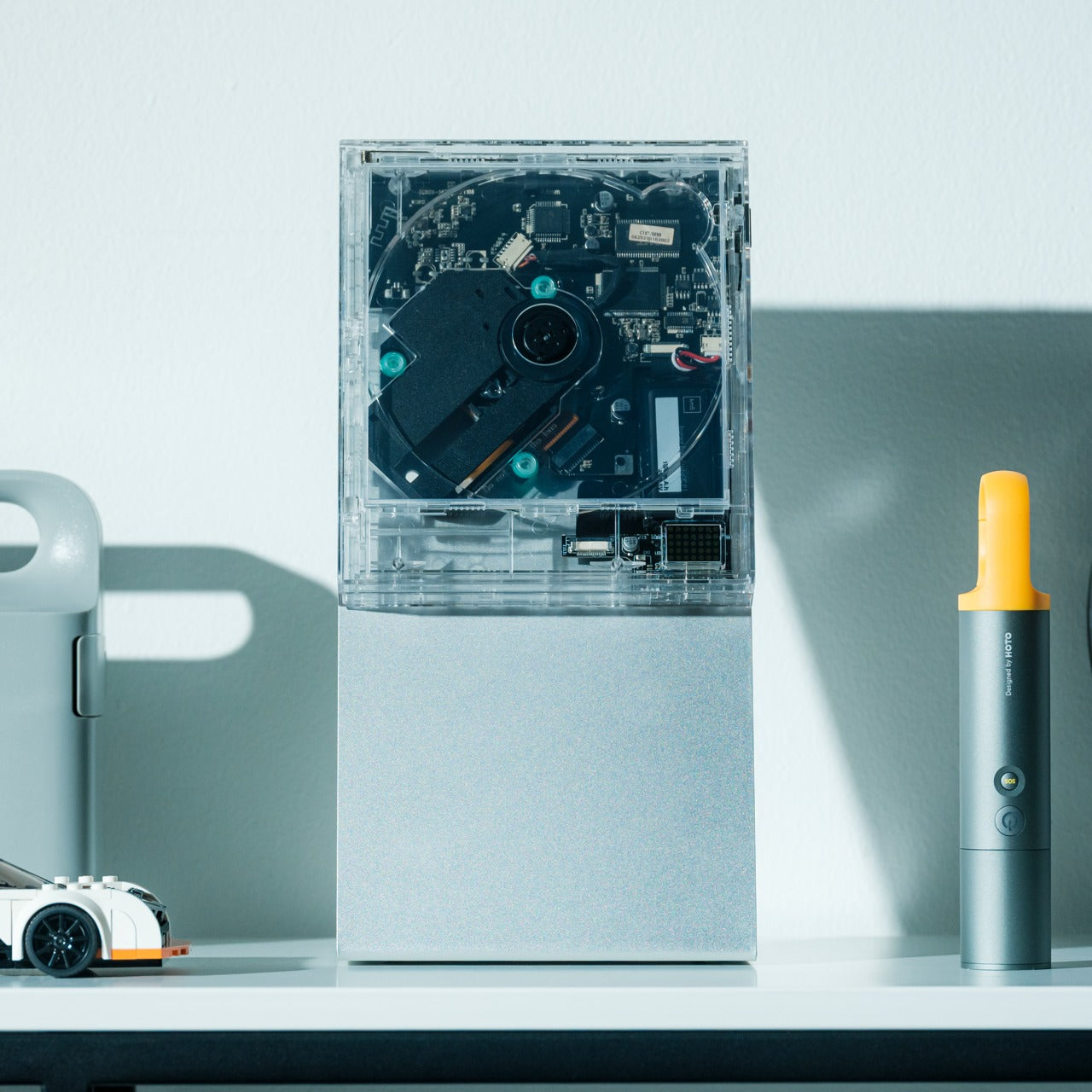
4. ClearFrame CD Player
Physical media has a specific gravity that streaming cannot replicate. The act of choosing a disc, sliding it into a tray, and watching it spin is a ritual, not a convenience. The ClearFrame CD player leans into that completely, housing the mechanism inside a crystal-clear polycarbonate shell that frames each album cover like a miniature art exhibit, while the black circuit board sits fully exposed behind it.
Bluetooth 5.1 support and a 7-hour rechargeable battery mean it works wirelessly on a shelf, a desk, or mounted on a wall. Multiple playback modes handle full albums and single-track loops. The square silhouette reads more like a design object than consumer electronics, which is the entire point: in a small room, every object occupies visual real estate, and the ClearFrame earns its shelf space by being something worth looking at even when it is not playing. The exposed circuitry is a deliberate aesthetic choice that shares DNA with the wabi-sabi appreciation of process, of letting the inner workings be part of the beauty rather than hiding them behind a seamless shell.
Wall-mountable and wireless, so it does not consume any surface area in a room where counter space is precious.
Transparent body turns the CD cover into wall art and the circuitry into a visual feature, doubling the object’s function.
What we dislike
CD collections are increasingly niche, and anyone without a back catalog will need to start buying physical media to get real value from this.
Polycarbonate scratches over time, and a transparent shell means every scuff and fingerprint is visible.
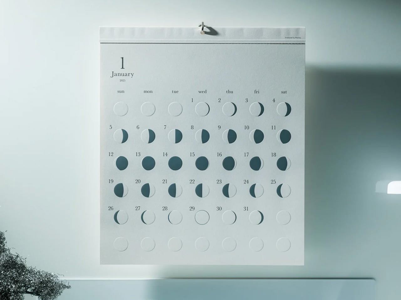
5. Oboro Silver Moon Calendar
Wall calendars are usually the first thing to look dated in a room. They pile up with scribbled appointments, faded ink, and a design sensibility that peaked in the office supply aisle. The Oboro moon calendar, a limited-edition 10th-anniversary piece by Japanese brand Replug, operates on an entirely different register. It tracks the lunar cycle on greige paper with reflective silver foil phases and embossed moon textures that shift with the light.
The name comes from “oboro” (朧), a Japanese word evoking the soft, hazy glow of a partially obscured moon. It is a wall piece that functions more like a meditative object than an organizational tool. The silver foil catches and transforms ambient light throughout the day, so the calendar looks different at dawn than it does at midnight. The embossed texture invites touch, which turns checking the date into something tactile and grounding. In a small room, a single well-chosen wall object can set the tone for the entire space, and the Oboro does that with restraint rather than volume.
Reflective silver foil creates dynamic light play that changes throughout the day, making it feel alive rather than static.
Embossed lunar texture adds a tactile dimension that most wall decor completely ignores.
What we dislike
A lunar calendar is not a practical replacement for a standard date calendar, so this supplements rather than replaces existing scheduling tools.
Limited-edition status means availability is unpredictable, and replacement for the following year is not guaranteed.
6. Pop-up Book Vase
A vase that is also a book. Open the cover and a three-dimensional paper cutout rises from the page, forming a vessel shaped to hold fresh stems. Three different designs sit on successive pages, so flipping through the book changes the vase silhouette and the entire presentation of the arrangement. Turn the whole thing upside down, and the perspective shifts again.
Made from 100% natural pulp with a water-resistant coating, the construction is more durable than it first appears. The paper engineering behind each pop-up is precise enough to support a real bouquet without collapsing, and the book form factor means it folds flat for storage or travel. In a tiny room, where a traditional ceramic vase competes for shelf space with everything else, a vase that disappears into a closed book when not in use is a spatial gift. The playfulness of the form also cuts against the sometimes austere reputation of Japanese-inspired interiors, a reminder that wabi-sabi is not allergic to delight.
Three vase designs in a single book mean variety without needing three separate vessels taking up shelf space.
Folds completely flat when not in use, which is a storage advantage no ceramic or glass vase can match.
What we dislike
Water-resistant coating has limits, and prolonged contact with water will eventually degrade the paper over repeated uses.
The whimsical form factor may clash with more austere or serious interior styles that lean heavily into earth tones and raw materials.
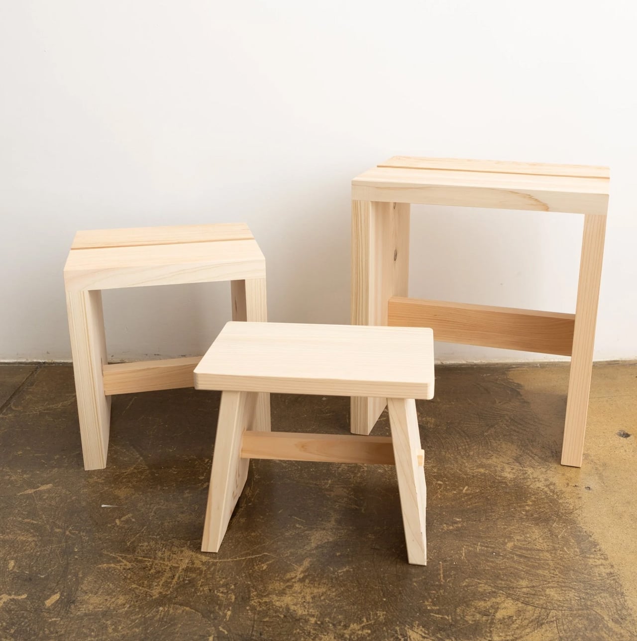
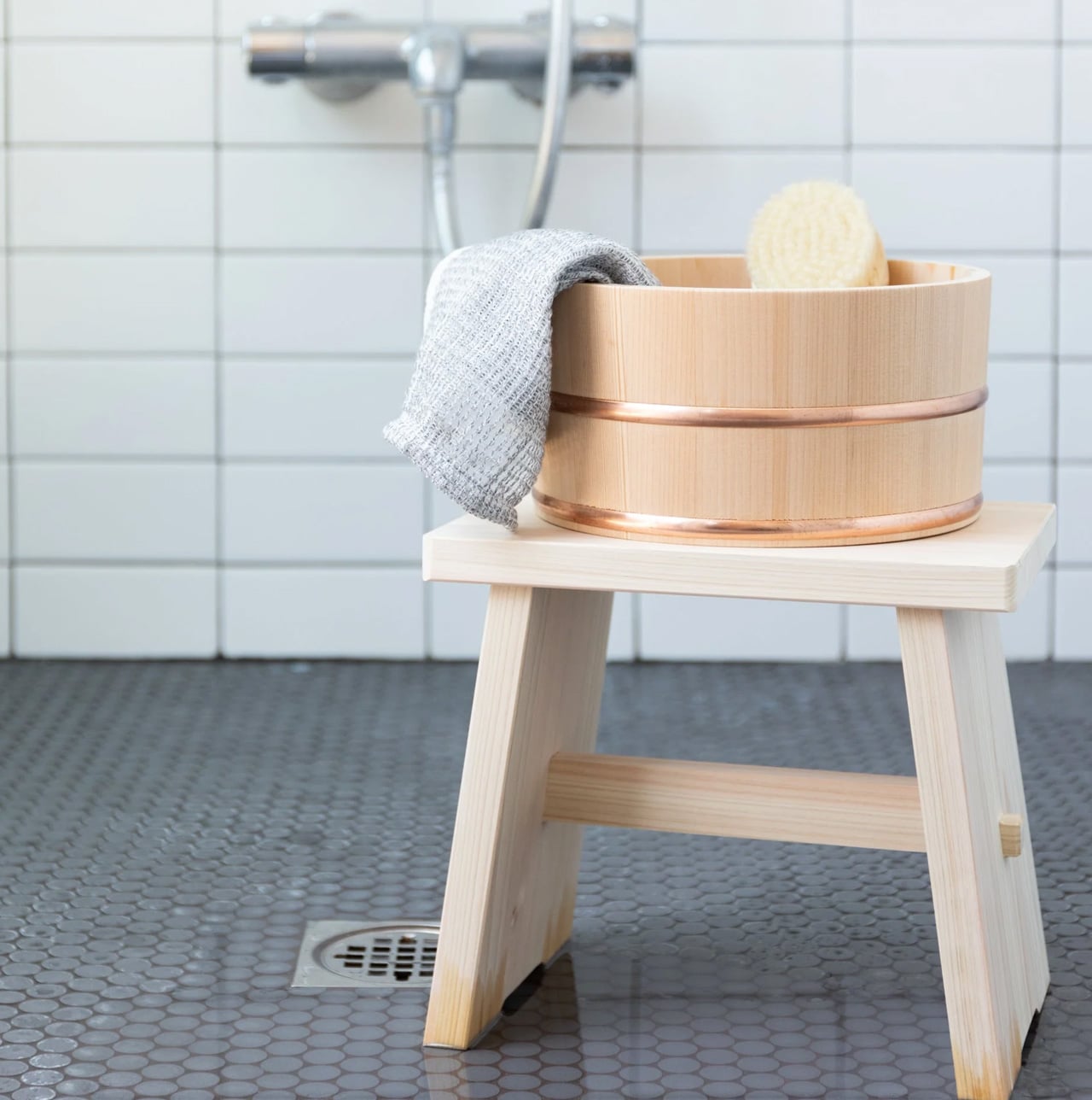
7. Tosaryu Hinoki Bath Stool
Japanese bathing is not a quick rinse. It is a seated, deliberate process where the stool is as important as the water. Tosaryu’s hinoki cypress bath stools are made by woodworkers in the mountains of Kochi who have been refining their craft since the 1970s. The wood is dried naturally for three to six months without chemical agents, which preserves the aromatic oils that give hinoki its distinctive calming scent.
Place one of these stools in a bathroom, shower room, or home sauna, and the scent fills the space every time steam or warm water contacts the wood. The antibacterial properties of hinoki resin mean the stool resists mold and bacteria without coatings or treatments. Three sizes are available: the Umezawa (10.5 x 7 x 9 inches), the short sauna stool (10.5 x 9 x 11.75 inches), and the tall stool (13.75 x 9.75 x 15.75 inches). Tosaryu operates as stewards of local forests and lakes, using sustainable harvesting methods. In a small bathroom, the stool replaces the generic plastic shower seat with something that smells like a forest and ages like furniture.
What we like
Natural hinoki oils provide antibacterial protection and aromatherapy without any chemical treatments or synthetic fragrances.
Sustainable production by Tosaryu’s Kochi-based woodworkers means the stool comes with genuine craft lineage, not just marketing copy about nature.
What we dislike
Hinoki requires proper drying between uses to prevent cracking; bathrooms without good ventilation will shorten its lifespan.
The high stool incurs a $25 shipping surcharge due to its size and weight, which adds to an already premium price.
8. Kintsugi Repair Kit
Kintsugi is the Japanese practice of mending broken ceramics with lacquer and powdered gold, turning the fracture into a visible seam that becomes part of the object’s history rather than a flaw to hide. Poj Studio’s kit packages this tradition into a hands-on experience, providing the materials and master-class guidance needed to repair a chipped or broken plate at home.
The philosophy behind kintsugi aligns with wabi-sabi at its most literal: the acceptance of imperfection, the beauty of age, and the idea that damage does not diminish value. In practice, the kit turns a broken mug or cracked bowl into something more interesting than it was before the accident. For anyone living in a small space where every dish and vessel matters (both functionally and visually), the ability to restore rather than replace is both economical and aesthetically resonant. The gold seams catch light in a way that flat, unblemished surfaces cannot, adding character to a kitchen shelf that could otherwise feel monotonous.
What we like
Transforms breakage into a design feature, which fundamentally changes the relationship with fragile objects in a small household.
Master-class guidance makes the repair process accessible to beginners, not just experienced ceramicists.
What we dislike
Urushi lacquer requires careful handling and curing time, so this is not a quick afternoon fix; patience is part of the process.
The standard kit is designed for chips and clean breaks; items with missing fragments need the separate advanced kit.
Where spring takes us from here
The thread running through all eight of these products is not minimalism as deprivation, but minimalism as attention. A noren does not block a doorway. It choreographs how light and bodies move through it. A kenzan does not just hold flowers. It holds the space around them. A kintsugi kit does not fix a broken cup. It reframes what broken even means.
Spring in a tiny room does not need a renovation, a new furniture set, or a Pinterest board full of aspirational layouts. It needs a few well-chosen objects that understand the difference between filling a space and inhabiting it. These eight do that, each in a way that respects the room, the season, and the craft tradition it comes from. The smallest upgrades, when they come from the right place, tend to change the most.