A Net-Zero Research Building That Actually Respects Its Landscape

Most university research facilities share a certain visual language. You know the one: utilitarian, slightly apologetic in appearance, the kind of building that exists to check boxes and contain equipment rather than inspire the people who work inside it. The University of Toronto’s Koffler Scientific Reserve is not that building.

Completed in May 2025 and designed by Toronto-based Montgomery Sisam Architects, the 2,680-square-metre facility sits on 350 hectares in the Oak Ridges Moraine in King Township, Ontario, about an hour north of the city. It serves as a research and teaching base for ecology and environmental biology students and faculty, combining dormitory space, a dining hall, a classroom, and a common room into a single, beautifully considered structure. On paper, that sounds modest. In execution, it’s one of the more thoughtful buildings to come out of Canada recently.

Designer: Montgomery Sisam Architects
What makes the Koffler Reserve stand out is how deliberate its design philosophy is. Principal Robert Davies put it plainly: “Researchers there study the smallest changes in organisms to understand systems at a global scale, and that relationship between the micro and the macro became the lens through which we evaluated every design decision.” That’s not just a nice quote for a press release. You can actually feel that thinking in the architecture.


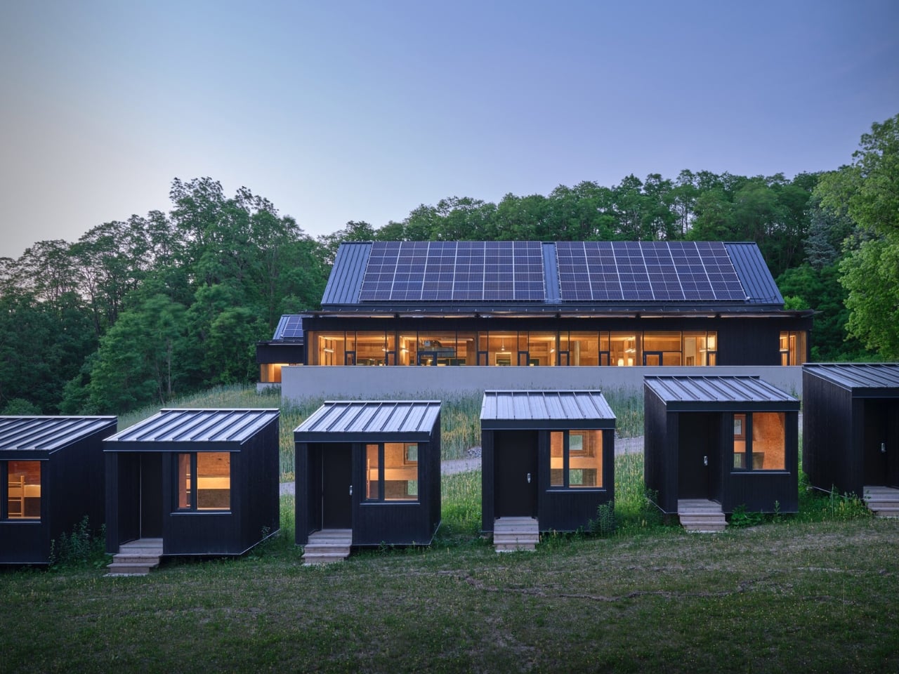
The building’s two prominent shed roofs, for instance, aren’t purely aesthetic choices. They’re angled precisely to optimize solar panel placement based on the site’s latitude, which in turn informed the entire formal expression of the structure. The flat roof and sunshade over the common room’s pitched elevation are carefully positioned to welcome the warming winter sun while blocking the uncomfortable heat of summer rays. Every element earns its place, and that’s exactly the kind of intentional design thinking that makes a building worth talking about.


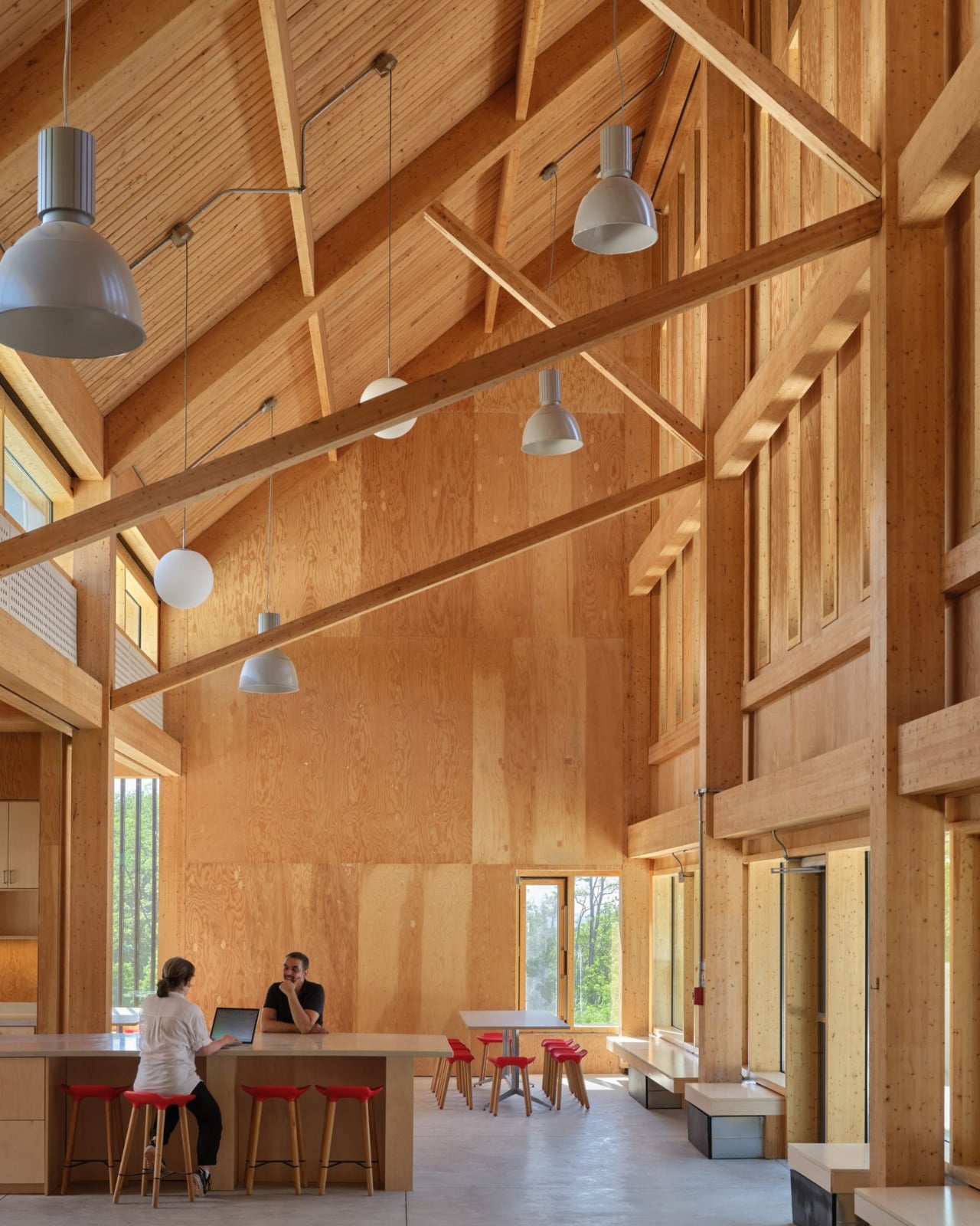
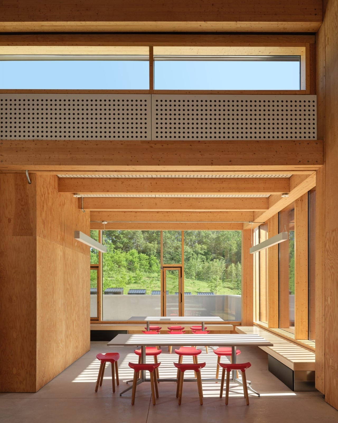
The material choices reinforce this sensibility. The structure is a hybrid of mass timber and conventional light-frame wood construction, using glulam columns and beams with a tongue-and-groove roof. The exterior is clad in shou sugi ban wood, the Japanese technique of partially charring wood to increase its water-resistance and durability. It’s a material that ages honestly and fits the agrarian character of the site, which started life as a series of agricultural plots, became an equestrian centre in the 1950s, and was donated to the university by philanthropists Murray and Marvelle Koffler in 1995. The building knows where it is, and that’s a quality that is rarer than it should be.
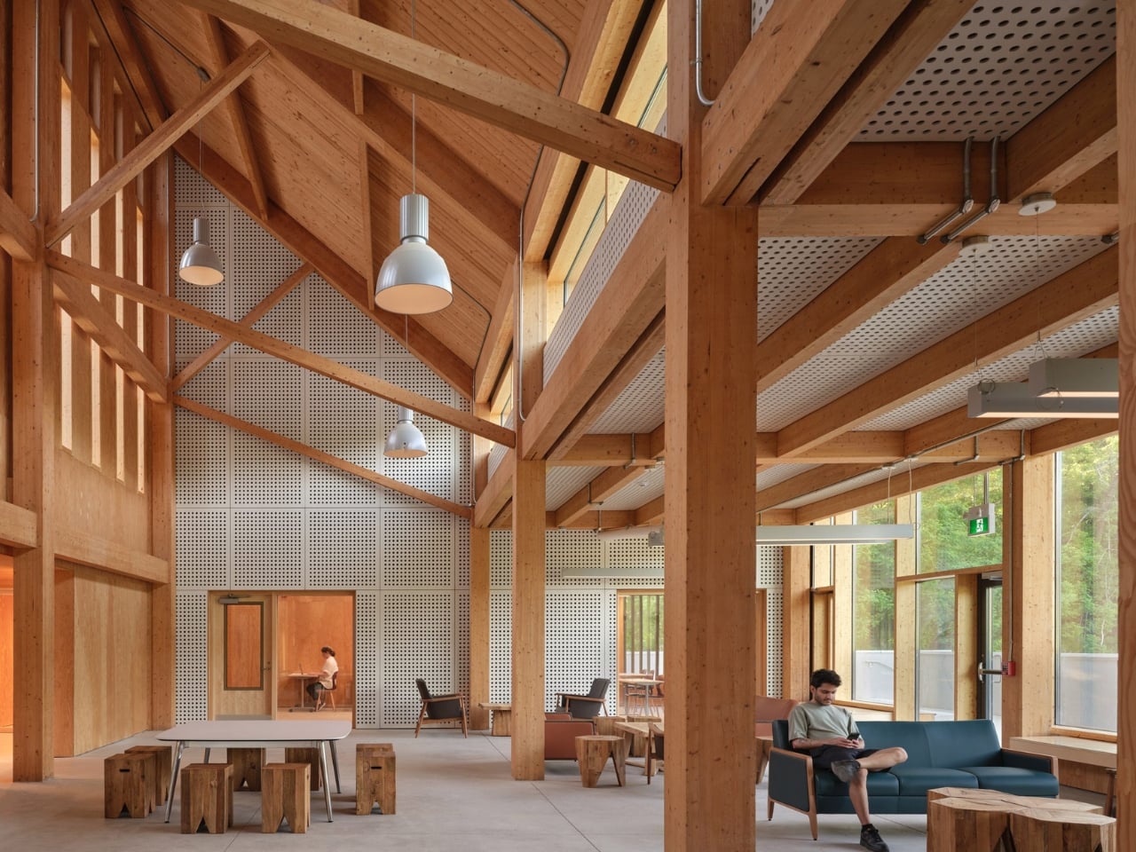
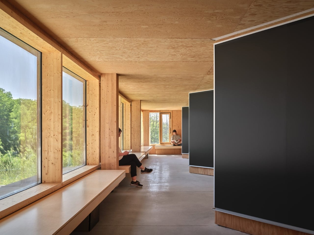
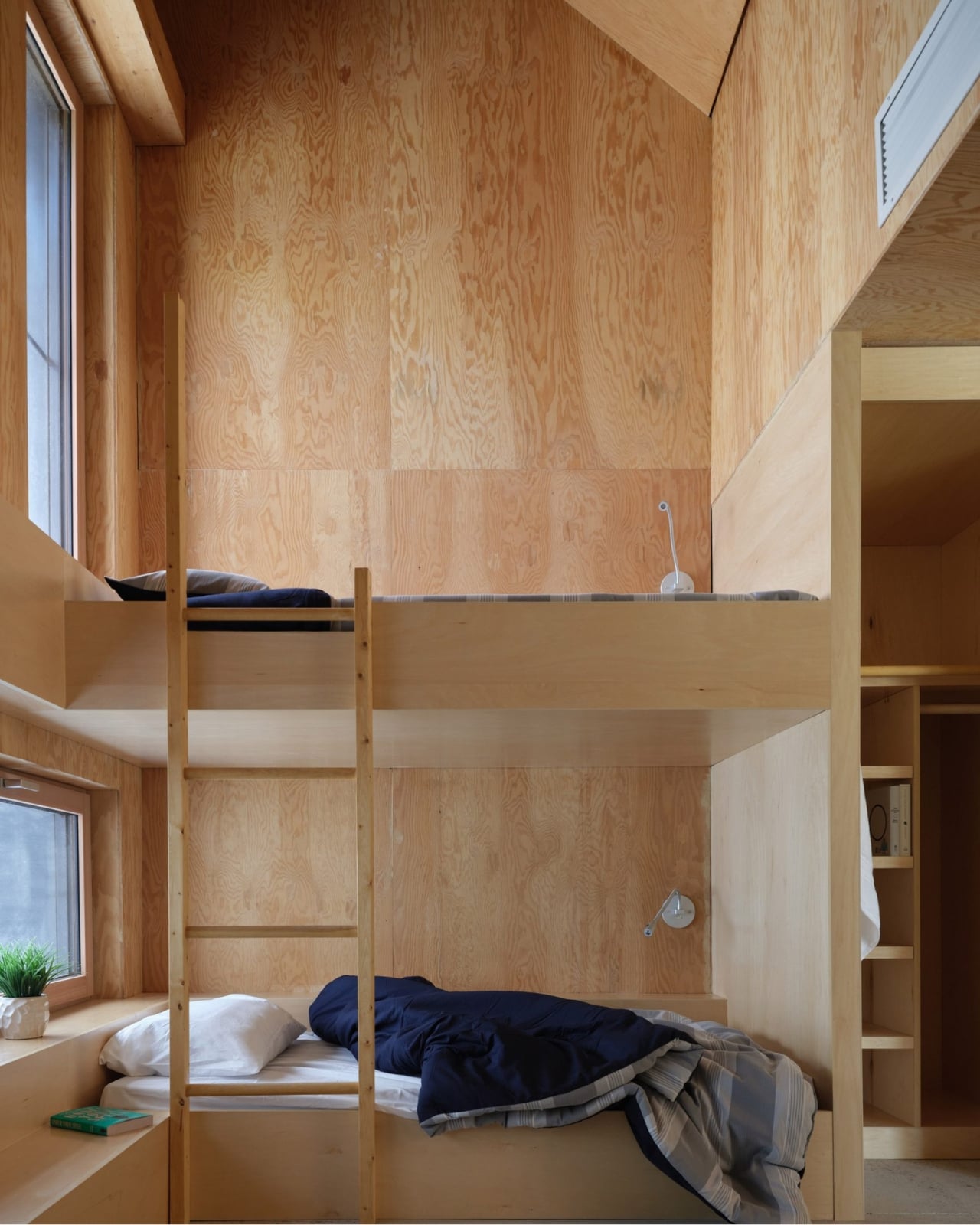
The Reserve’s C-shaped main building houses 20 students, while a cluster of 20 separate bunkies accommodates up to 40 more. The shared amenities, including the kitchen, bathrooms, and living spaces, are deliberately oversized to support larger summer populations and to encourage the kind of informal gathering that actually makes collaborative research work. The design is thinking about people, not just program. That distinction matters more than most architects will admit.
Below grade, a ground source heat pump circulates fluid through deep underground pipes to warm the building in winter and cool it in summer. Paired with the solar panels and passive design strategies, the project is working toward net-zero carbon and energy goals. I’ll be honest: sustainability claims in architecture have become so reflexive and routine that they’ve started to lose meaning. But at Koffler, the sustainable systems are so deeply woven into the structure’s formal logic that they feel like genuine convictions rather than marketing additions.

The Reserve sits within a landscape of wetlands, forests, and grasslands that scientists there study every single day. The building respects that by not trying to compete with it. It settles into the site rather than announcing itself, which takes real confidence for an architect to pull off. Confidence, and a genuine understanding of why the building exists in the first place. It would be easy to overlook this project because it doesn’t carry the dramatic scale or cultural visibility of a museum or a concert hall. But the Koffler Scientific Reserve is the kind of work that quietly raises the bar for what institutional architecture can be, and it deserves attention for exactly that reason.

The post A Net-Zero Research Building That Actually Respects Its Landscape first appeared on Yanko Design.


Quickly Build Apps, Games & Dashboards Fast With Gemini Canvas

Quickly Build Apps, Games & Dashboards Fast With Gemini Canvas D solar system model rendered in Gemini Canvas, letting users rotate planets and adjust viewing angles.

Gemini Canvas, powered by Google’s Gemini AI, provides a structured platform for creating applications, dashboards and even games without requiring coding knowledge. According to Teacher’s Tech, users can generate up to eight functional apps in just 15 minutes, thanks to features like its interactive workspace. For example, users can create and customize outputs such as […]

The post Quickly Build Apps, Games & Dashboards Fast With Gemini Canvas appeared first on Geeky Gadgets.

Posted in Uncategorized

Don’t Get Fooled by the Design: What’s Actually Different Inside the AirPods Max 2

Don’t Get Fooled by the Design: What’s Actually Different Inside the AirPods Max 2 AirPods Max 2

Apple has unveiled the AirPods Max 2, an eagerly awaited upgrade to its premium over-ear headphones, originally introduced in 2020. Featuring the advanced H2 chip, enhanced active noise cancellation, and AI-powered functionalities, the AirPods Max 2 aims to redefine the listening experience. While the design and price remain consistent with the original, the technological advancements […]

The post Don’t Get Fooled by the Design: What’s Actually Different Inside the AirPods Max 2 appeared first on Geeky Gadgets.

Posted in Uncategorized

Apple Just Pushed a "Silent” Update to Your iPhone: Why You Need iOS 26.3.1 (a)

Apple Just Pushed a Privacy & Security screen with Background Security Improvements option and an Install button ready to tap.

Apple has officially rolled out iOS 26.3.1A, a significant update aimed at improving the security and functionality of iPhones, iPads, and Macs. This release addresses critical vulnerabilities while introducing essential background security enhancements to protect your device from potential cyber threats. Whether you prefer automatic updates or manual installation, making sure your device is running […]

The post Apple Just Pushed a “Silent” Update to Your iPhone: Why You Need iOS 26.3.1 (a) appeared first on Geeky Gadgets.

Posted in Uncategorized

The $199 VITA RING Wakes You Up Mid-Apnea Before You Ever Know It Happened Thanks To AI Health Tracking

The fact that you have to charge your Apple Watch every 48 hours means there’s a small sliver of time in the day where it isn’t capturing data. Your body uses sleep to run its most important maintenance cycles, and the biometric signals during those hours carry real diagnostic weight: heart rate variability, breathing quality, blood oxygen levels during deep rest. These are the readings that can flag early signs of atrial fibrillation, sleep apnea, or chronic stress load well before symptoms appear in your waking hours. A device sitting on your nightstand during this window captures none of it. The form factor that makes the most sense for genuine 24/7 health tracking turns out to be one that never needs to come off. Something like a ring.

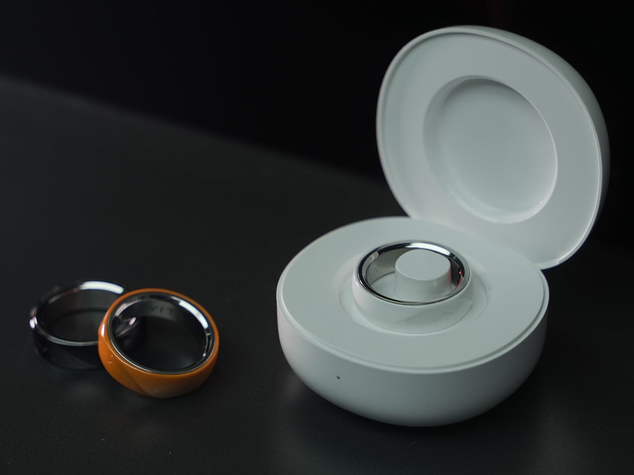
The VITA RING leans into this idea with a design that prioritizes both elegance and endurance. It uses a polished Aerospace Ceramic for its outer body, a material that feels more like a piece of refined jewelry than a piece of consumer electronics, and is 3x harder and scratch-resistant compared to titanium. This results in a device you are willing to live with twenty-four hours a day. With a battery that lasts up to a week on a single charge, it closes the data gap left by other wearables and operates silently in the background, using gentle haptic vibrations to deliver important alerts. It’s a design that ensures the ring remains forgotten until it has something important to share.

Designer: VITA TECHNOLOGY INC

Click Here to Buy Now: $199 $399 ($200 off).

VITA’s core proposition organizes around three verbs: Alert, Advise, Act. The ring’s Multi-Agent Health System tracks over 17 health metrics continuously, watching for deviations from your personal baseline rather than population-level averages. When something shifts meaningfully, a gentle haptic pulse is the only output, keeping the alert channel completely separate from the noise of your phone screen. The AI layer contextualizes what it finds, identifying patterns across sleep, stress, recovery, and activity to surface insights specific to your body. For a market that has treated data volume as a proxy for intelligence, that distinction matters.

Where VITA separates itself is in how it handles sleep. Most trackers deliver a score after the fact; VITA monitors sleep stages, breathing quality, and runs Apnea Intervention in real time. The ring detects disrupted breathing and responds with a gentle vibration prompting the user to shift position, often helping restore a more regular breathing pattern. Sleep apnea affects an estimated 936 million people globally, the majority of them undiagnosed, and real-time intervention at the consumer level addresses a clinical gap most wearables have stepped around entirely. The seven-day battery earns its keep here specifically, because consistent nightly data is how health patterns actually emerge.

“In Tune With You” is VITA’s attempt to build women’s health tracking around biology rather than calendar math, covering cycle awareness, fertility window detection, and pregnancy monitoring, all anchored in continuous biometric data. Most mainstream wearables approach this space with a period date counter and little else. Layering temperature shifts and HRV patterns onto reproductive health tracking delivers a different category of insight, capable of identifying a fertile window or flagging a physiological change earlier than any date-based system. Women’s health has been chronically under-engineered in consumer wearables, and making it a first-class feature is a deliberate product statement.

Circle of Care extends private health monitoring into a shared experience, letting users choose which wellness insights to share with trusted contacts alongside AI-guided care tips and relevant context. The Emergency SOS feature lets users send their live GPS location to those same contacts with a single tap when they cannot reach their phone. For adult children with aging parents, or anyone managing a chronic condition within a family dynamic, this broadens the ring’s utility considerably. Health monitored in isolation often goes unacknowledged, and VITA has built the architecture to change that.

Oura Ring charges $5.99 a month for premium features on top of the hardware cost. WHOOP’s entire model is subscription-based, with users paying around $30 a month to access their own data. VITA is different: core health tracking is completely free, but AI Health features require a subscription. Kickstarter backers get 1 year of AI Health features at no extra cost. The VIP pre-launch price sits at $179, representing 53% off eventual retail, and early backers who sign up before March 17 receive a free sizing kit. The real measure of whether it all holds up comes when hardware reaches users, but the pricing structure alone will earn serious attention in a market that has normalized subscription fatigue.

Click Here to Buy Now: $199 $399 ($200 off).

The post The $199 VITA RING Wakes You Up Mid-Apnea Before You Ever Know It Happened Thanks To AI Health Tracking first appeared on Yanko Design.

These $18 Chattering Teeth Pot Holders Are Stupidly Adorable and Oven-Safe, and I Need Them Immediately

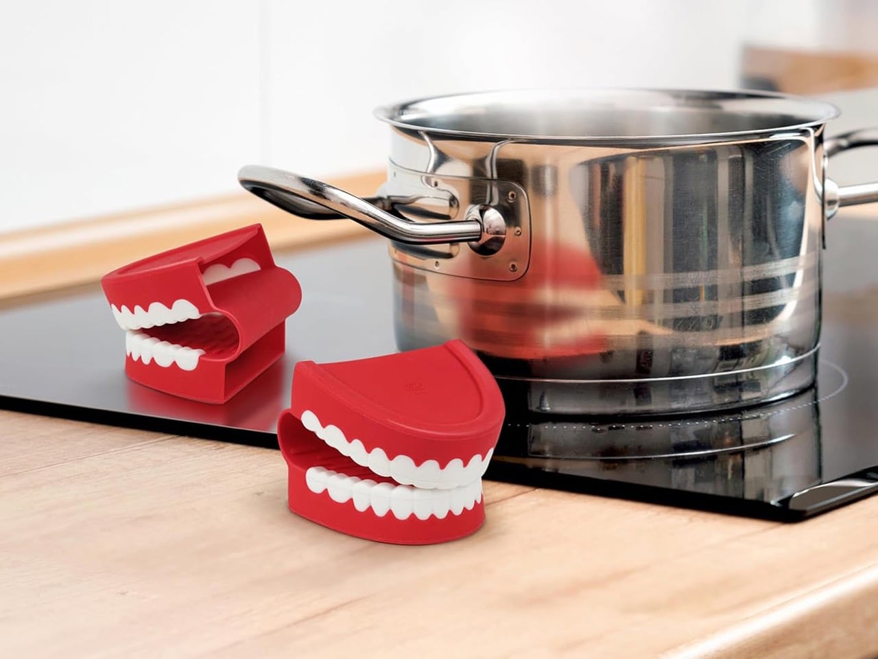
Your kitchen drawer probably has a sad, stained oven mitt that you keep meaning to replace. Chomp is the universe telling you it’s time. Fred’s newest pot holders are shaped like classic wind-up chattering teeth, molded in heat-resistant silicone, and completely aware of how ridiculous they look gripping both sides of your Sunday pot roast. You will use them once, cackle, and then refuse to use anything else for the rest of your cooking life. This is not a warning. This is a promise.

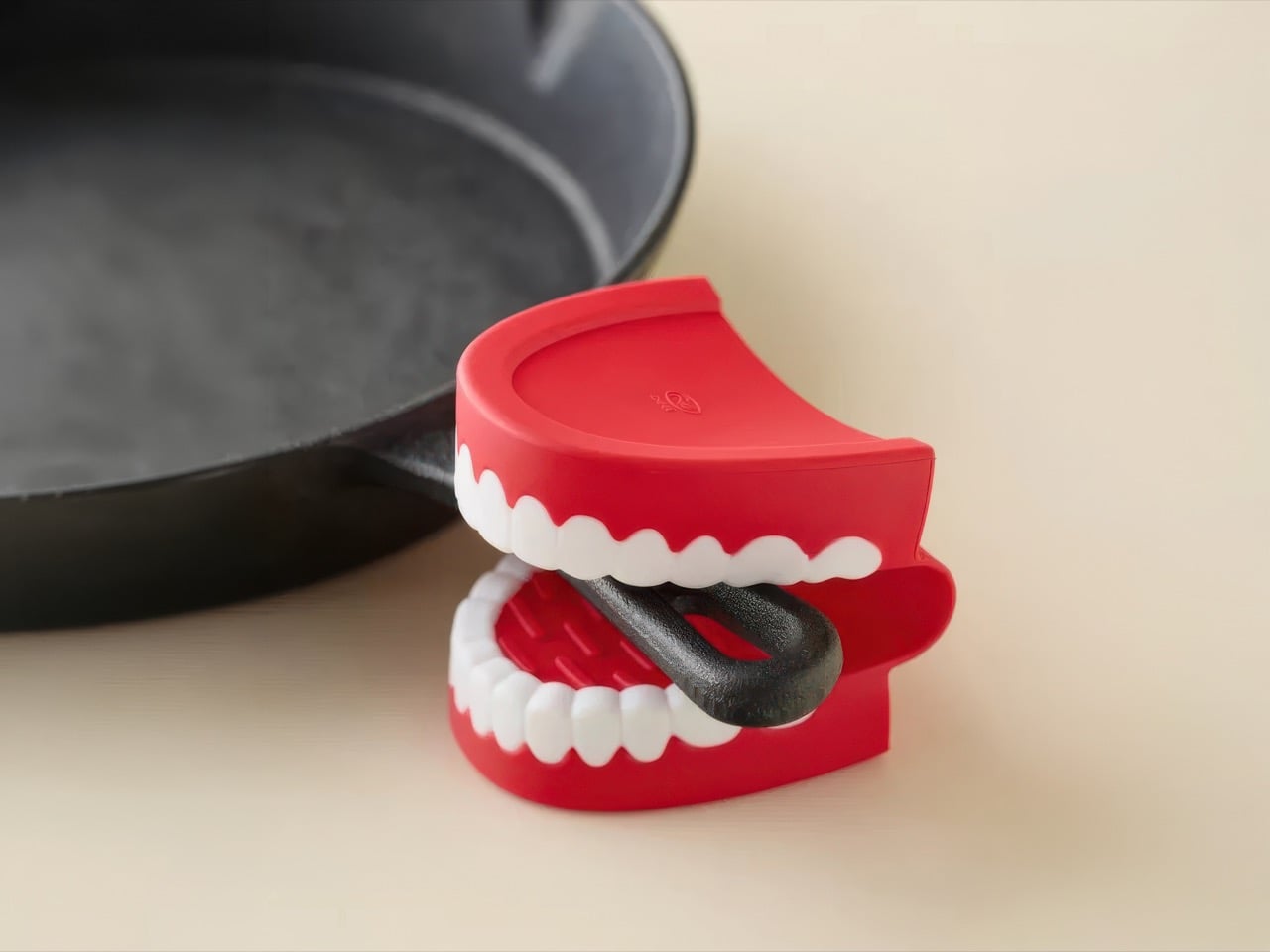
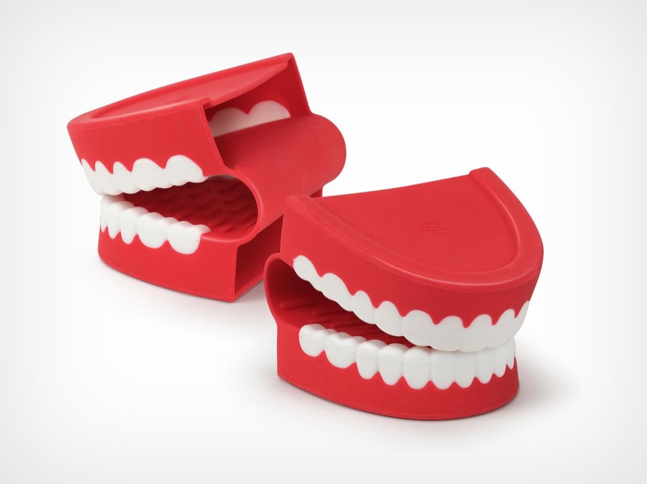
The concept is almost insultingly simple: a set of two silicone pot holders shaped like classic wind-up chattering teeth, designed to grip hot pots and handles while looking like your cookware is being accosted by novelty dentures. You slip your fingers into the top jaw, curl them around a handle, and suddenly a completely ordinary Tuesday pasta situation becomes a bit. The pot is being chomped. The pot has opinions. The pot wants to talk. Nobody at the dinner table will be able to explain why this is so funny, but everyone will agree that it is.

Designer: Jennifer Norwood (Fred Studio)

Click Here to Buy Now

Functionally, the Chomp hasn’t cut corners to serve the joke. They’re made from BPA-free, heat-resistant silicone rated up to 450 degrees Fahrenheit (230 degrees Celsius), which covers everything from stovetop handles to oven roasting pans without breaking a sweat. The inside surface is grippy, the mitts lay flat for drawer storage, and the whole set is dishwasher safe, so post-roast chicken cleanup doesn’t require any special handling of your unhinged dentistry accessories. The compact form factor is a deliberate choice too. These work as mini mitts for grabbing handles, lifting lids, and pulling racks rather than full-coverage gloves, which is honestly the more useful format for everyday cooking anyway.

Fred (a kitchen accessory company, not a person named Fred), based out of Pawtucket, Rhode Island, has always been in the business of taking functional everyday products and twisting them into something unexpected and funny. They’ve done creature-mouth oven mitts before, but Chomp hits differently because the chattering teeth aren’t just a cute mouth shape lifted from nowhere. The wind-up chattering teeth toy has been a Halloween staple, a joke shop fixture, and a universal shorthand for low-budget absurdist comedy for decades. Applying that specific cultural weight to kitchen silicone is a genuinely sharp act of object quotation, the kind that makes you wonder why nobody did it sooner.

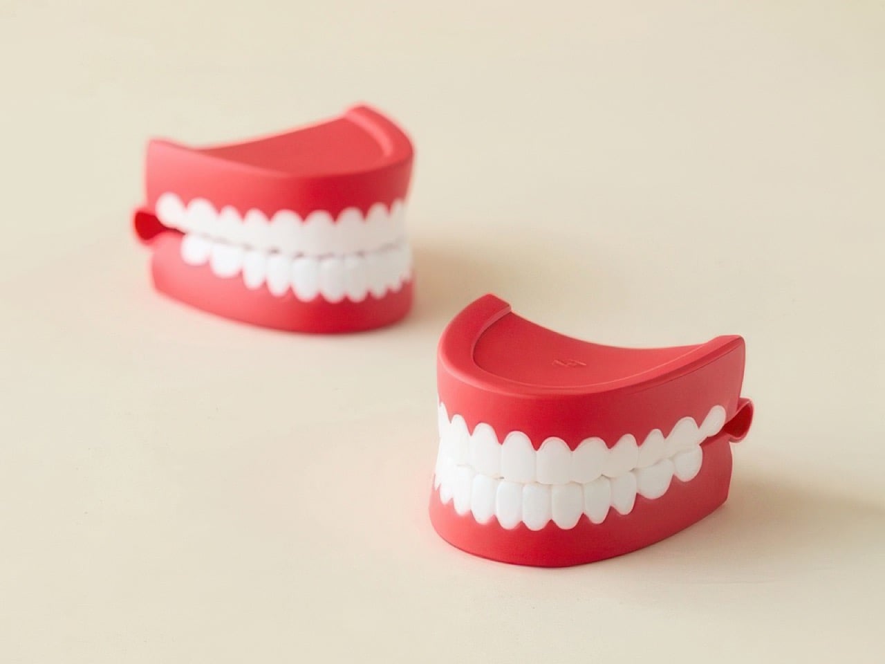
The set was designed by Jennifer Norwood at Fred Studio, and the sculpting earns its keep. The white molded teeth have the right rounded, cartoonish geometry that reads as instantly recognizable rather than vaguely tooth-shaped, the red gum color lands vivid without tipping into garish, and the two pieces together form a perfectly matched pair. Sitting on a counter, they look like a prop from a sketch show. Clamped onto a cast iron skillet, they look like the skillet has developed a strong personality and several unresolved grievances. Both are correct. Both are good.

At $18.60 for the pair, Chomp is an easy call. It’s a justifiable impulse buy for yourself and a completely effortless gift decision for anyone who spends time in a kitchen, which is most people. The bar for a great housewarming gift is “useful and memorable,” and a pot holder that makes someone laugh out loud the first time they use it clears that bar with room to spare.

Click Here to Buy Now

The post These $18 Chattering Teeth Pot Holders Are Stupidly Adorable and Oven-Safe, and I Need Them Immediately first appeared on Yanko Design.

This Off-Grid Mobile Tiny Home Has Two Full Workspaces & A Bedroom — & You Can Tow It Anywhere

Remote work has reshaped how people think about office space, and Sol Tiny’s latest build takes that rethinking to its logical extreme. The Off-Grid Luxury Mobile Double Office is a trailer-based unit that packs two fully independent workspaces and a sleeping area into a 26-ft (7.9-m) frame, all while running entirely on solar power.

Built on a double-axle trailer, the unit spans 10 ft (3 m) wide, broader than a standard tow, which means it requires a permit for road transport. The wheels have been removed in the current listing photos, but can be reattached for relocation. On the outside, the office is clad in cedar with a standing seam metal roof, giving it a clean, modern appearance that wouldn’t look out of place next to a residential property.

Designer: Sol Tiny

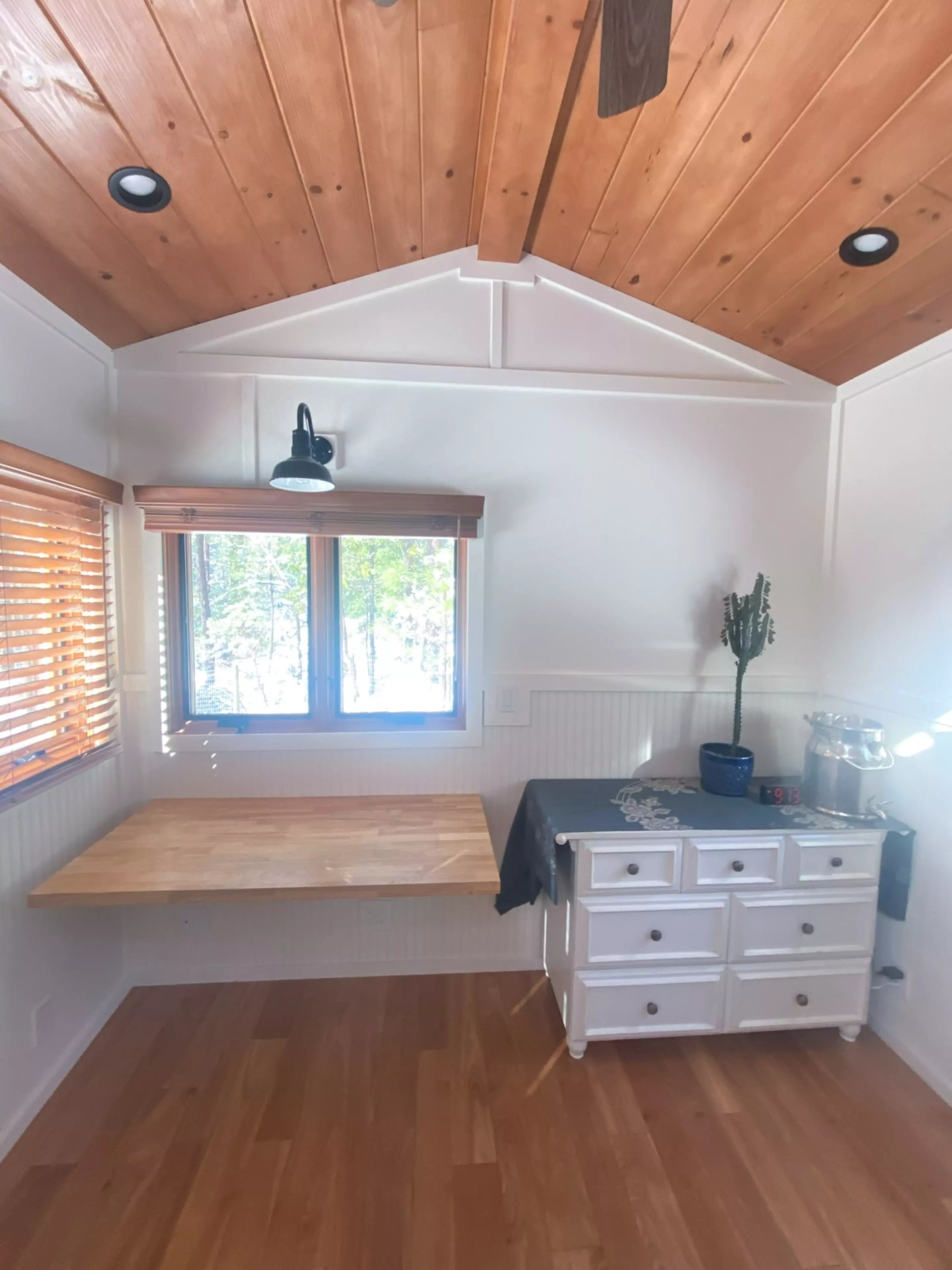
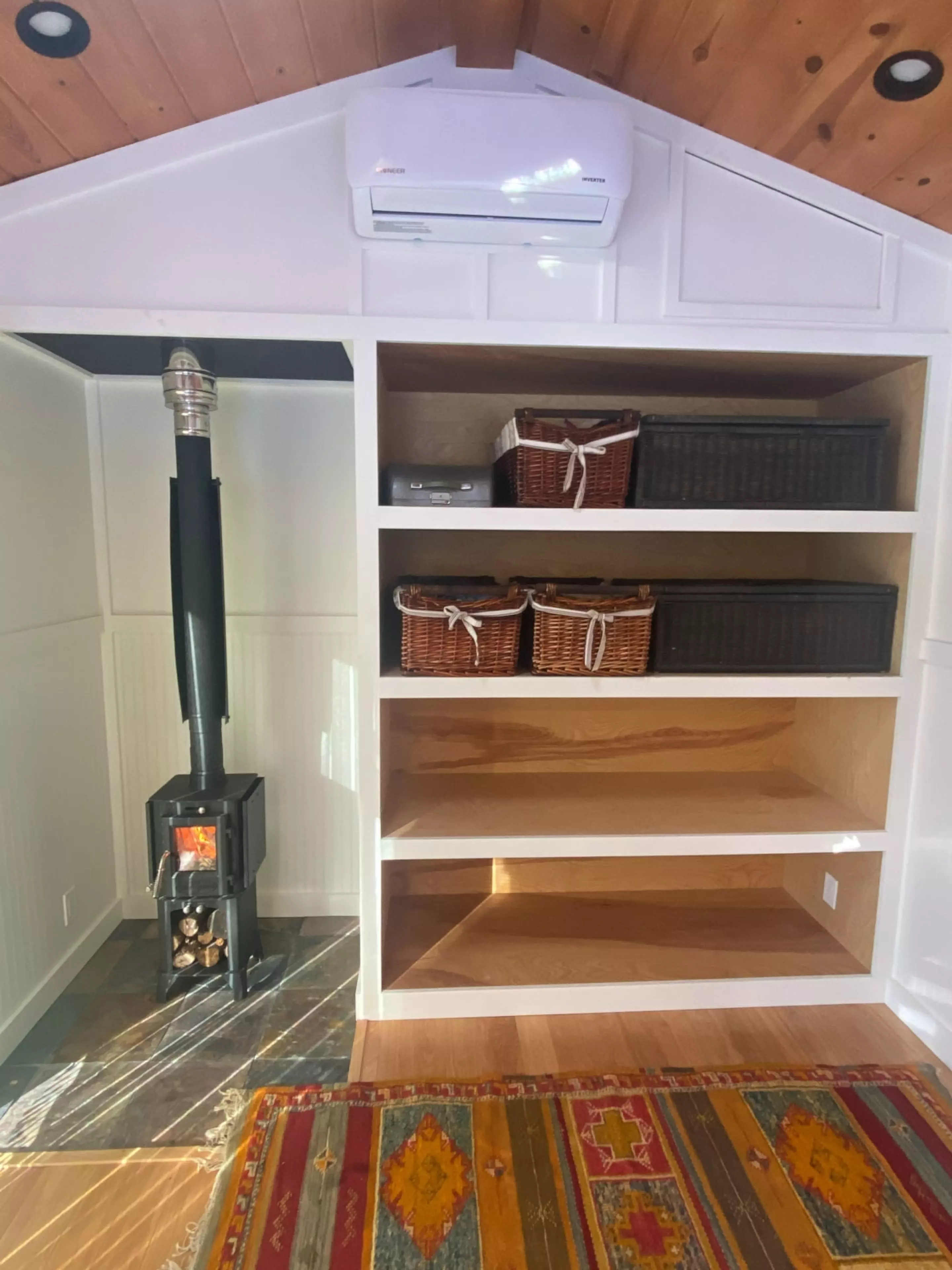
Inside, the layout is split into two distinct rooms, both finished in board-and-batten paneling with generous glazing and skylights that keep the interiors bright. The larger of the two workspaces is accessed through a single door and includes a desk, bookshelves, a small wood-burning stove, and a mini-split air-conditioning system. It also features a queen-sized Murphy bed that folds down from the wall, making it possible to stay overnight after a long work session without heading back to the main house.

The smaller workspace, entered through double glass doors, mirrors much of the same setup with its own desk, bookshelves, stove, and climate control. It trades the sleeping option for a more compact footprint, and there’s even room for an optional treadmill for those who like to move while they work. Neither space includes a bathroom, so the unit is best suited for use alongside an existing home or building with access to those facilities.

Power comes from eight 420-W solar panels mounted on the roof, backed by a battery system that keeps things running off-grid. There’s also the option to plug into the electrical grid when needed. For connectivity, a Starlink system handles high-speed internet, which makes the office functional in remote locations where traditional broadband isn’t available.

The Off-Grid Luxury Mobile Double Office is currently listed for sale at $98,000, not including delivery, and is located in Nevada City, California. For anyone looking to add a dedicated work setup to their property without the commitment of a permanent structure, Sol Tiny’s dual-office concept offers a flexible alternative that can, quite literally, be moved whenever plans change.

The post This Off-Grid Mobile Tiny Home Has Two Full Workspaces & A Bedroom — & You Can Tow It Anywhere first appeared on Yanko Design.

Subnautica 2 might finally be entering early access in May

Subnautica 2 has weathered the storm and has rescheduled its early access release. IGN reported today that the sequel to the underwater survival game will begin early access on PC and Xbox in May, although a more specific date was not provided. 

The news comes a day after a judge ruled that former Unknown Worlds Entertainment CEO Ted Gill should be rehired at the game studio. That decision capped off a dramatic year for the team behind Subnautica, which was acquired by Krafton in 2021. The studio and its new owners entered a legal battle because the purchase of Unknown Worlds included a promise of an up to $250 million payout from Krafton if the team met certain performance goals by the end of 2025. In July of that year, however, Krafton fired several studio leaders and then delayed the sequel's early access launch. The court case has raised questions about which side was trying to either secure or avoid making that multi-million payment. 

With yesterday's ruling, a rep from Krafton said that "we are evaluating our options as we determine our path forward." It's unclear if that path, or the other litigation still underway over the project, will create further delays to the planned early access date.

This article originally appeared on Engadget at https://www.engadget.com/gaming/subnautica-2-might-finally-be-entering-early-access-in-may-223747369.html?src=rss

A Chair Shaped by the Soft Curves of a Classic British Scally Cap

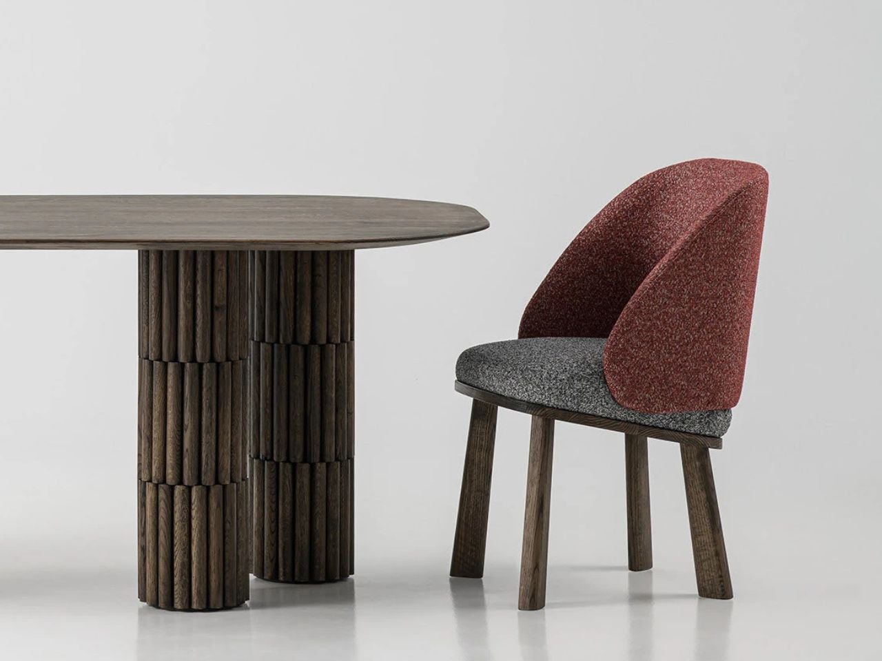
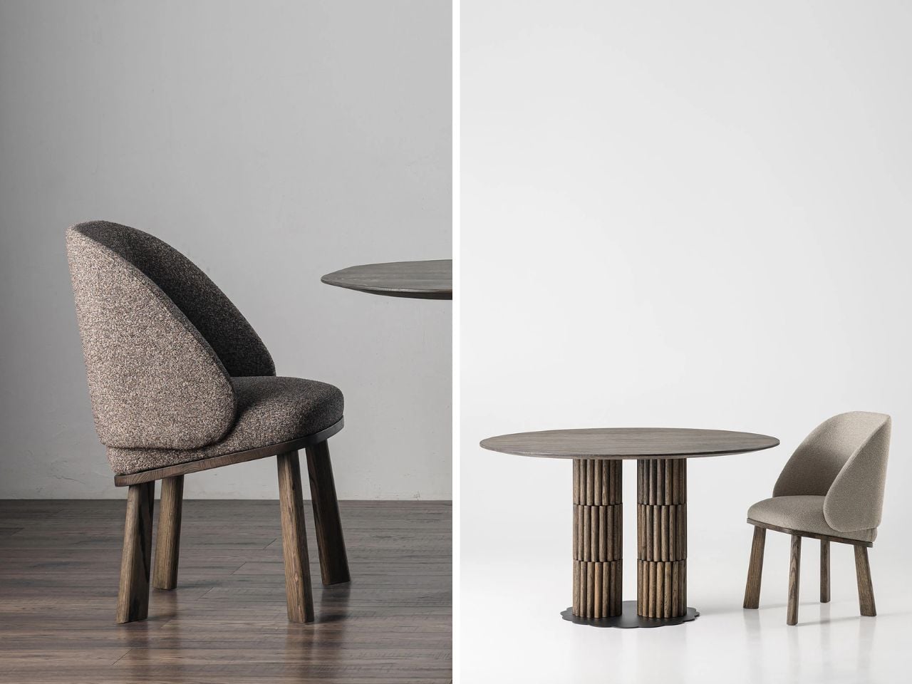
In a market full of furniture that competes loudly for attention, the pieces that often stay with us the longest are the ones that begin with a simple idea and a strong story. The Scally Chair is a beautiful example of this kind of design thinking. Its inspiration comes from something very familiar in British culture, the classic men’s scally cap. What is fascinating is how a small everyday object, such as a cap, can inspire the form of a chair and translate into a thoughtful piece of furniture.

The starting point of the design is an image. Instead of beginning with strict structural rules or purely functional decisions, the designer began with the recognizable shape of the scally cap. These caps are known for their soft, rounded crown and their distinct front visor. They have personality and a casual confidence that people instantly recognize. The Scally Chair translates these qualities into furniture in a subtle and elegant way.

Designer: Julia Kononenko

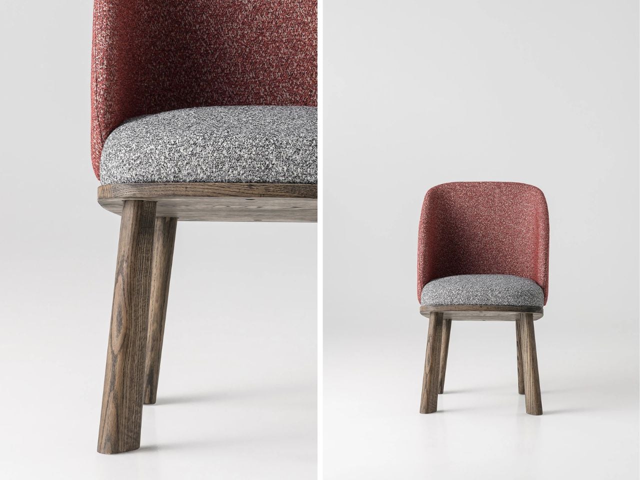
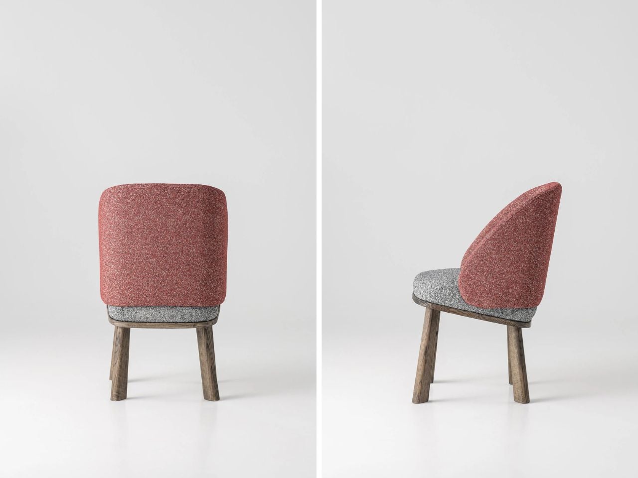
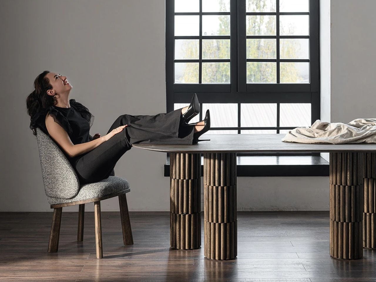
The rounded backrest is the most noticeable expression of this inspiration. It curves around the seat in a gentle way that recalls the soft crown of the cap. The form feels inviting and protective, almost as if the chair quietly embraces the person sitting in it. This small gesture adds a sense of intimacy and comfort while maintaining a clean and confident silhouette.

Another thoughtful detail appears at the front of the seat. The edge is slightly lifted in a gentle curve that echoes the visor of the cap. At first glance, the detail is subtle and easy to miss, but once you notice it the connection becomes clear. Instead of making the design too literal or predictable, this small reference adds character to the chair without overwhelming its form. It also introduces a sense of lightness and movement to the silhouette, making the chair feel more dynamic and visually balanced.

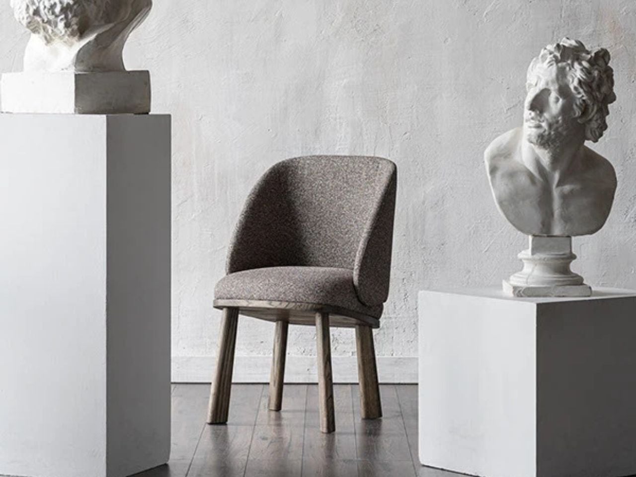
Material plays an important role in the experience of the Scally Chair. The use of wood brings warmth and authenticity to the design. Wood has a timeless quality that connects furniture to craftsmanship and longevity. It adds natural texture and depth to the chair while grounding the form in something familiar and tactile. The presence of wood also allows the chair to age gracefully over time, making it feel like a lasting object rather than a temporary trend.

The muted tones used in the chair are equally important. Instead of relying on bold colors to stand out, the design embraces restraint. These softer tones allow the chair to blend naturally into different environments. In modern and contemporary interiors, this quality becomes incredibly valuable. The chair does not try to dominate the room. Instead, it quietly complements the space around it.

Because of this, the Scally Chair works beautifully in many settings. It can sit comfortably in a minimalist living room, a warm Scandinavian-inspired interior, or even a more contemporary dining space. Its presence feels calm and balanced rather than loud. It supports the atmosphere of the room while still offering a strong sense of design.

What makes the chair particularly interesting is how the story behind it changes the way we experience it. Once you know about the scally cap inspiration, you begin to notice the details more carefully. The curve of the backrest, the slight lift of the seat, and the careful proportions suddenly feel intentional and thoughtful. The experience of the chair becomes more layered.

This is what gives the Scally Chair its quiet strength. It shows how everyday objects can inspire other everyday objects in unexpected ways. A familiar cap becomes the starting point for a piece of furniture that feels both contemporary and timeless. Through subtle form, warm materials, and restrained color, the chair proves that thoughtful design does not need to demand attention. Sometimes the most meaningful designs are the ones that simply fit into our spaces and lives with effortless ease.

The post A Chair Shaped by the Soft Curves of a Classic British Scally Cap first appeared on Yanko Design.

Meta will shut down VR Horizon Worlds access in June

Horizon Worlds, Meta's first pass at a metaverse, will be inaccessible via virtual reality headset after June 15, 2026. The company shared plans to separate Horizon Worlds from Quest VR platform and focus exclusively on the smartphone version of the app in February, and now in a new post on its community forums, Meta detailed when the VR version of Horizon Worlds will be deprecated.

By March 31, Meta says individual Horizon Worlds and Events will no longer be listed in the Quest's Store and headset owners will be unable to visit worlds like "Horizon Central, Events Arena, Kaiju and Bobber Bay." Then, after June 15, the app will be removed from Quest headsets and worlds will be completely unavailable to visit in VR. From that point on, the easiest place to visit Horizon Worlds will be in the Meta Horizon app for iOS and Android.

Additionally, Hyperscape Capture, a recently added beta feature that allows Quest headset owners to capture, share and visit each other in detailed 3D scans of real-life locations, is also being removed from Horizon Worlds. Meta says users will still be able to capture and view Hyperscapes, "but sharing, inviting, and co-experiencing Hyperscapes with others will no longer be supported."

While Meta's original blog detailing its 2026 VR strategy left open the possibility that a committed Quest owner might still be able to access some part of Meta's original VR metaverse, that apparently was never the company's plan. Meta saw enough "positive momentum" focusing on supporting the mobile version of Horizon Worlds in 2025 that it made sense to completely abandon the VR one in 2026. While that seems to run contrary to Meta’s positioning as a "metaverse company," it does reflect where the company is spending the most money and seeing the most (relative) success: AI and smart glasses.

This article originally appeared on Engadget at https://www.engadget.com/ar-vr/meta-will-shut-down-vr-horizon-worlds-access-in-june-222028919.html?src=rss