adidas x DIOS Put Houston Car Culture on a $180 Sneaker

Most sneaker collaborations start with a mood board. The DIOS x adidas Originals Megaride 01 feels like it started with a city. Specifically Houston, specifically at night, specifically the kind of night where car culture and Southern pride and a very particular kind of handmade craftsmanship all converge in one place. The design is dense with meaning in a way that rewards attention, and I think that’s exactly the point.

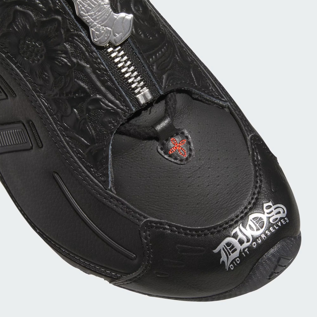
The first thing you notice is the restraint. The entire upper is Core Black leather, no gradient, no contrasting panels, no bold colorblock moment to grab your eye from across the room. DIOS and adidas made the deliberate choice to work almost entirely within one tone, which puts the pressure entirely on texture and form to carry the design. That’s a harder thing to pull off than it sounds, and the shoe earns it.

Designers; adidas Originals x DIOS

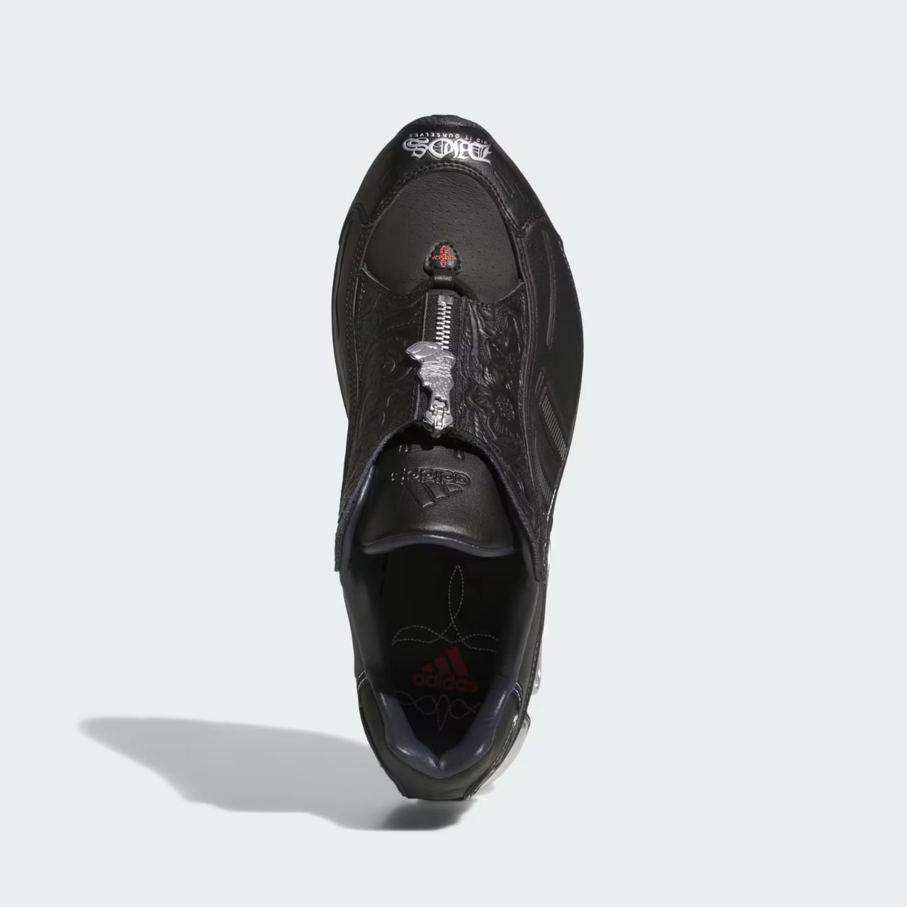
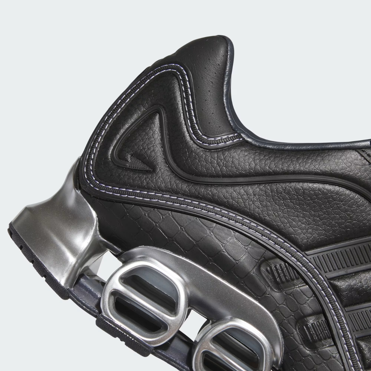
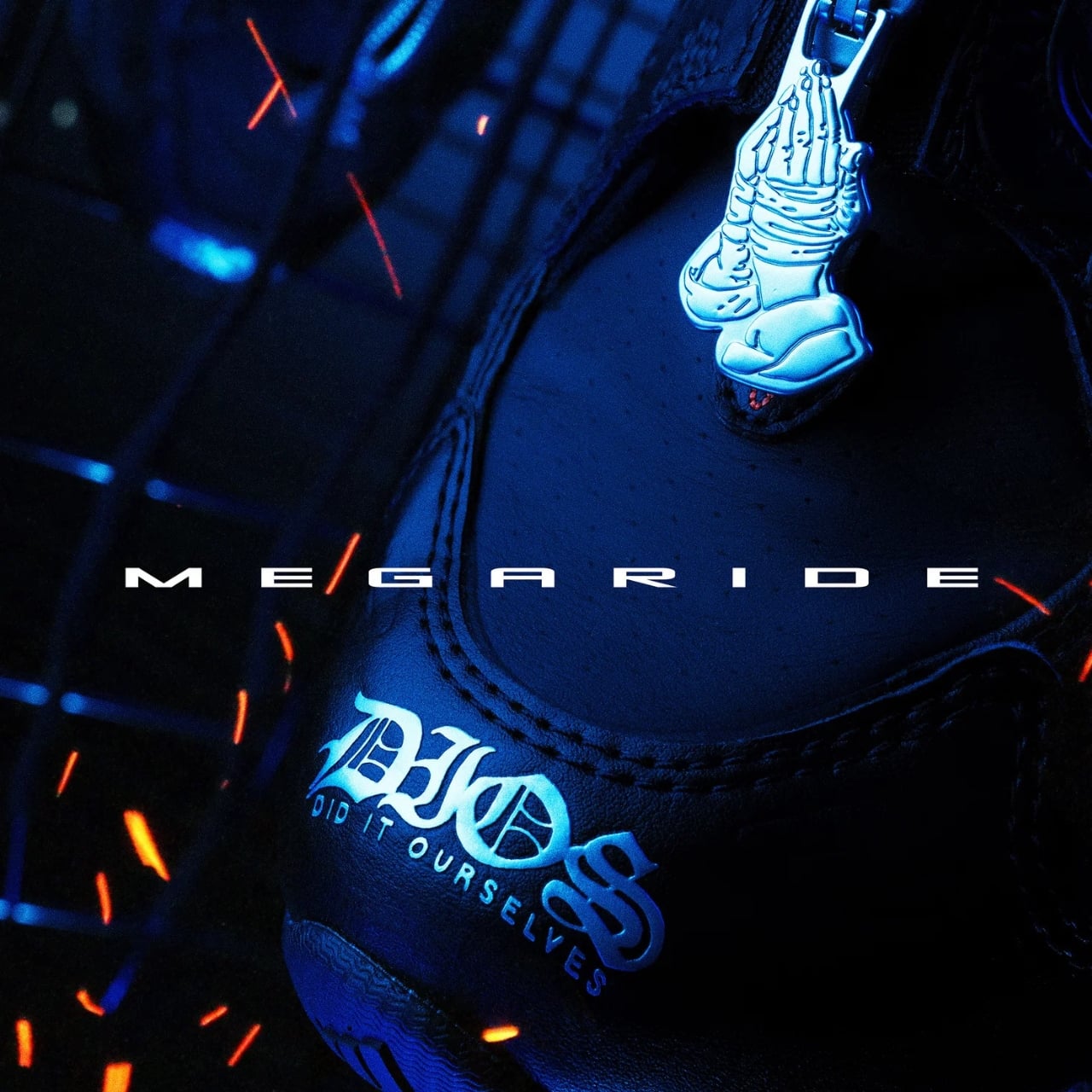
The cowboy boot references are the most discussed part of the design, and for good reason. The DIOS-branded toecap, stamped in Old English gothic lettering reading “DIOS Did It Ourselves,” is the shoe’s most striking typographic moment. It sits right where the toe cap of a traditional cowboy boot would be reinforced, borrowing that structural logic and translating it into something that reads as streetwear without losing the original reference. The lace shroud is covered in dense embossed floral leather, the kind of ornamental detailing you’d find on fine boot craftsmanship, and a snakeskin-textured panel sits just above the heel, anchoring the Western narrative with a material that has long been associated with Texas boot-making culture.
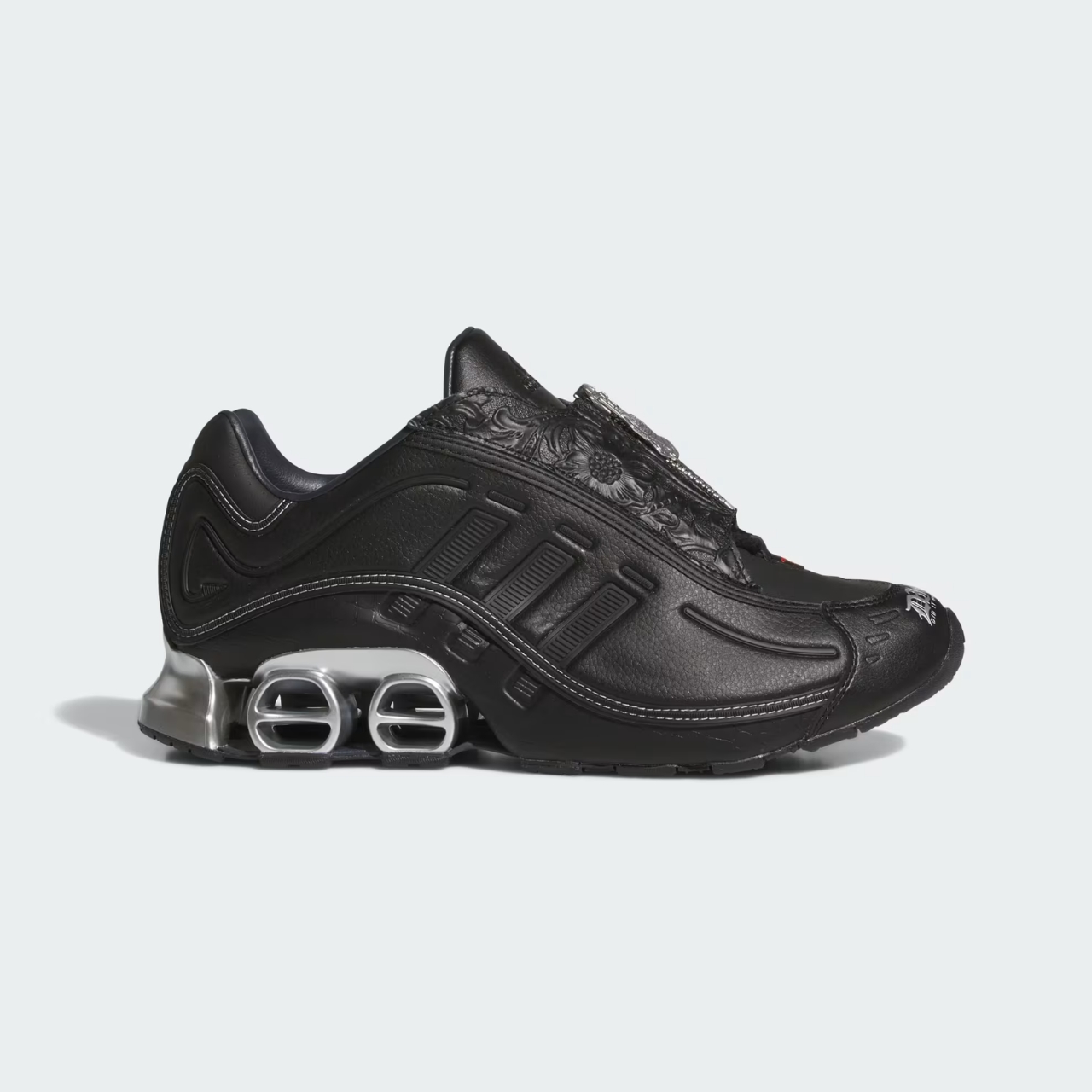
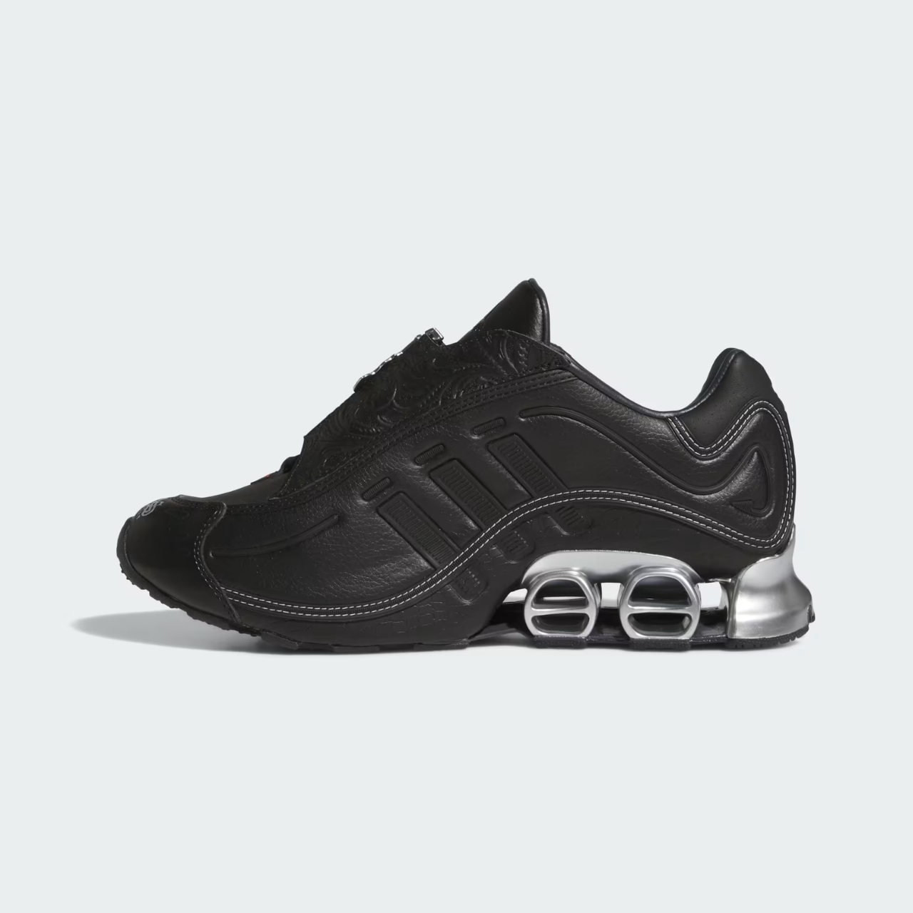
Then there’s the zipper closure. A silver zip runs across the midfoot where laces would ordinarily sit, which changes the silhouette profile considerably. It’s a cleaner, more architectural line that gives the shoe a slightly futuristic edge while simultaneously calling back to Western riding boots. The zipper pull is where things get genuinely interesting: a metal skeletal praying hands charm hangs from it, the kind of detail that shouldn’t work but absolutely does. It’s equal parts devotional and defiant, which is more or less DIOS in a single object.
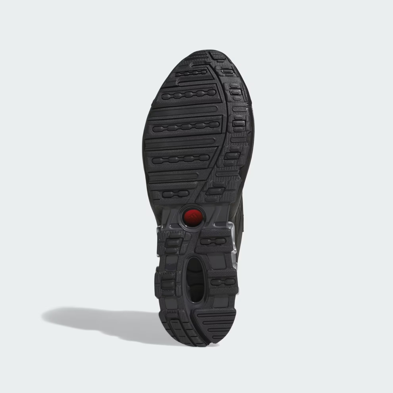
The Houston car culture element lives in the hardware and the midsole. Chrome accents thread through the upper in subtle ways, but the real statement is the Megaride cushioning unit at the heel, finished in metallic silver. Photographed from behind, it reads almost like a chrome bumper, low and wide and polished. It’s a clever translation of an idea that could easily have been too literal, but the scale and placement keep it feeling like design rather than costume.


The heel counter carries DIOS iconography on both sides: a coiled serpent logo on one side, praying skeleton hands on the other. Both are worked in against the black leather with enough contrast to be visible without screaming for attention. The embossed star detail pressed into the top of the heel counter is quieter still, the kind of thing you clock after a second look. Contrast stitching traces the contours of the heel panels, reinforcing the handcraft quality the whole design is working to communicate.
The insole is unexpected in the best way. Against the otherwise all-black exterior, the lining is printed with a rope or lasso pattern in white, and the adidas logo is rendered in pink. It’s the one moment of warmth in an otherwise cool, severe design, and it functions almost like a private detail. The person wearing the shoe knows it’s there. Everyone else has to look closer.
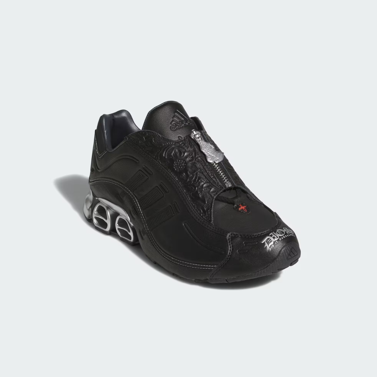
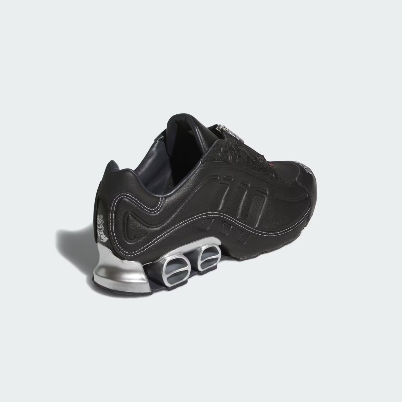
Looking at the Megaride 01 as a whole design object, what I keep returning to is how resolved it feels. Every element connects to either cowboy boot craft, Houston car culture, or DIOS identity specifically, and none of those threads feel like they’re competing. That kind of coherence is genuinely rare in collaborative sneaker design, where the temptation to layer references without editing usually wins. DIOS and adidas resisted that, and the shoe is better for it.

The post adidas x DIOS Put Houston Car Culture on a $180 Sneaker first appeared on Yanko Design.
What Happens When You Let 90 Kids Design a Birdhouse

Most of us have a pretty fixed idea of what a birdhouse looks like. A small wooden box, a round hole, maybe a little perch. It’s one of those objects so familiar it barely registers anymore. Designer Taekhan Yun decided to blow that idea up entirely, and he handed the job over to the last people anyone in the design industry would think to consult: ninety children in Siem Reap, Cambodia.

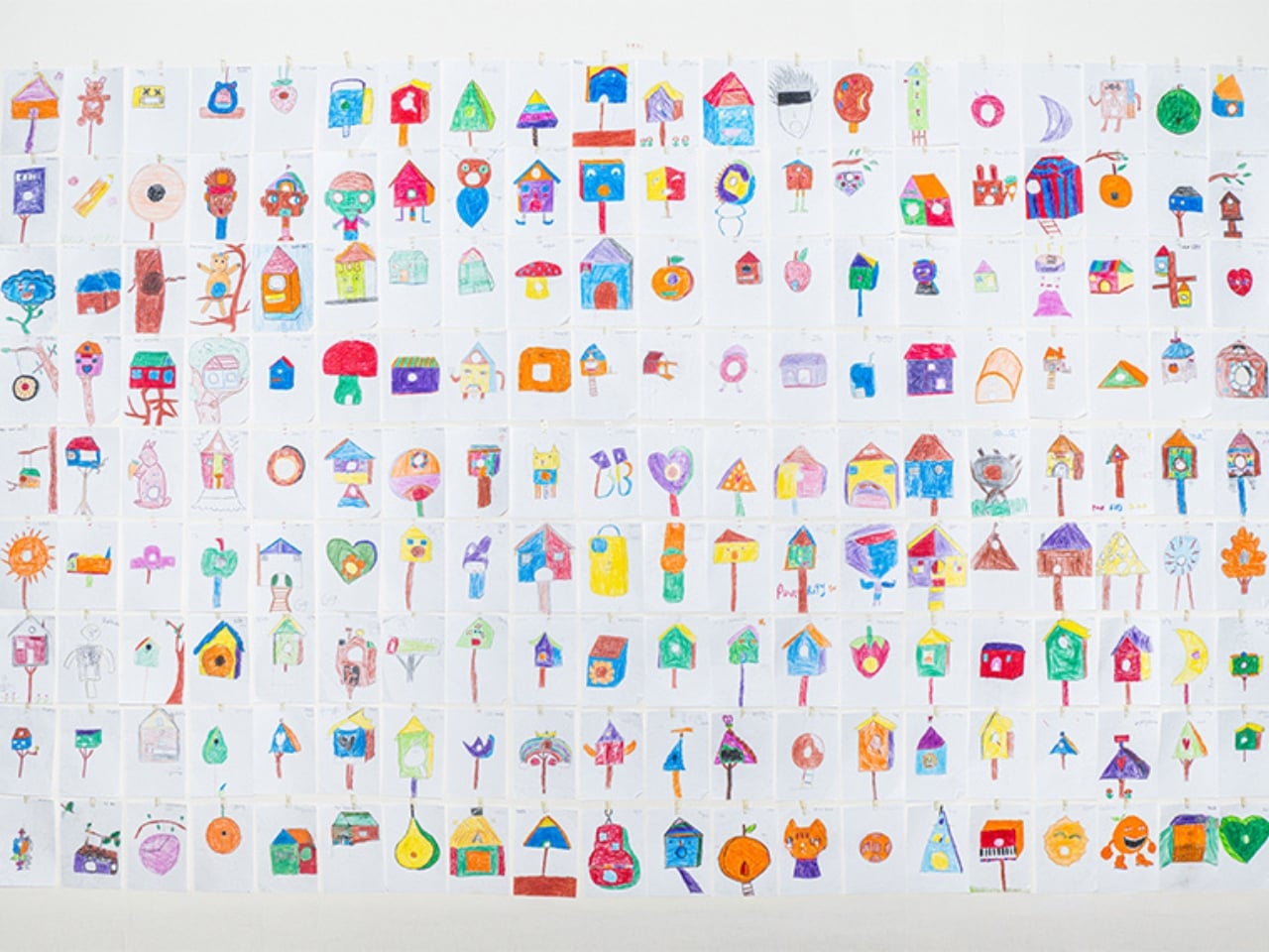
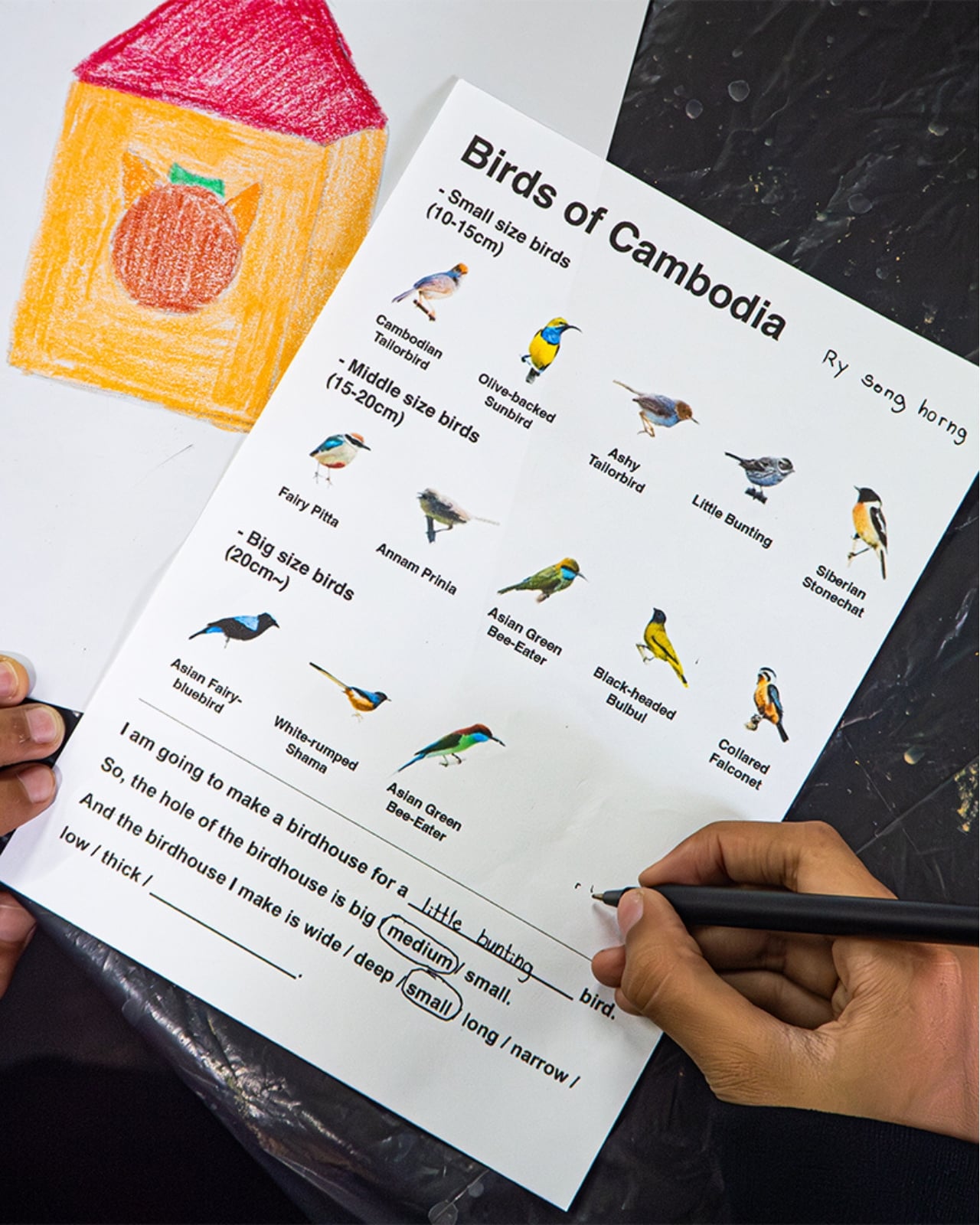
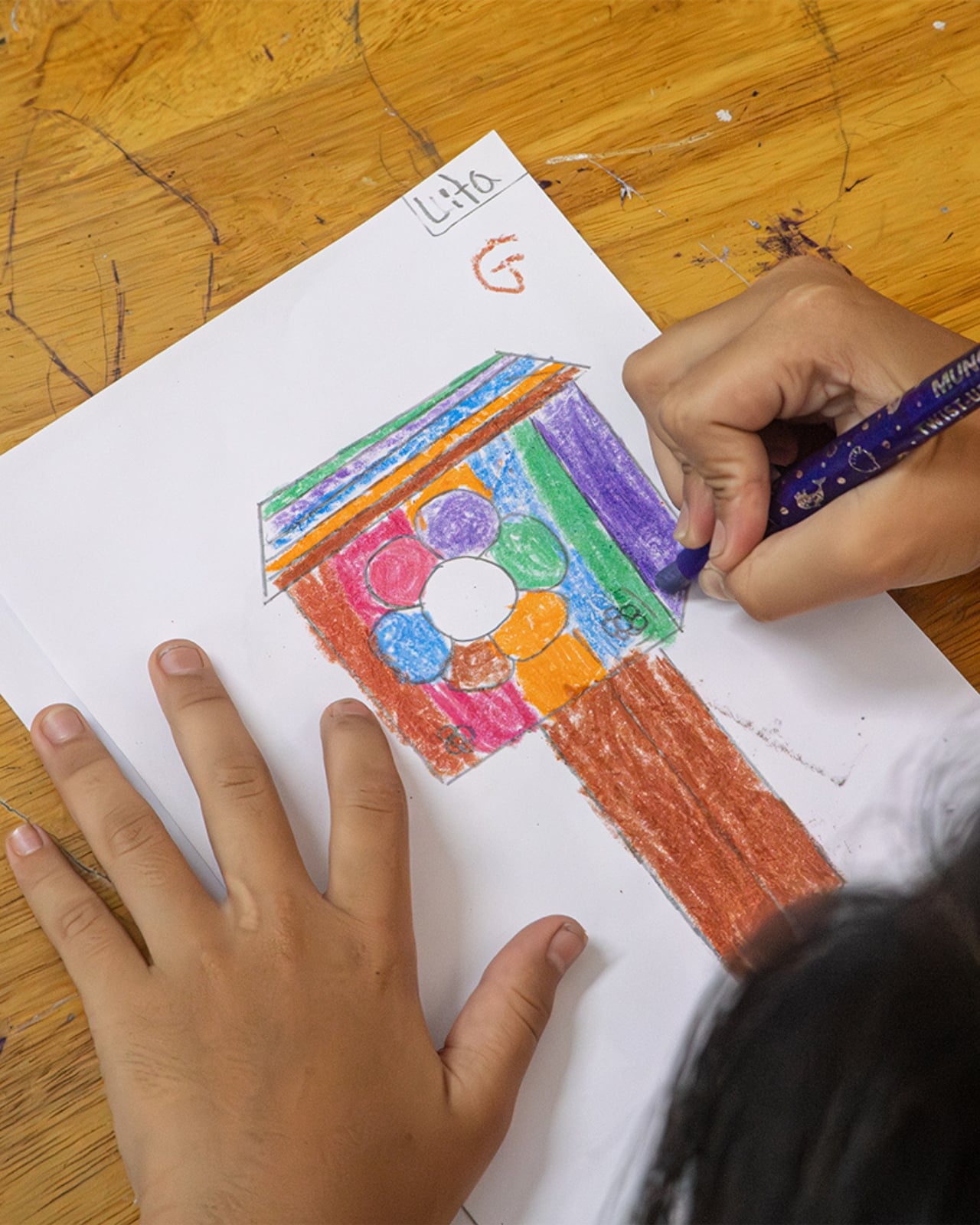
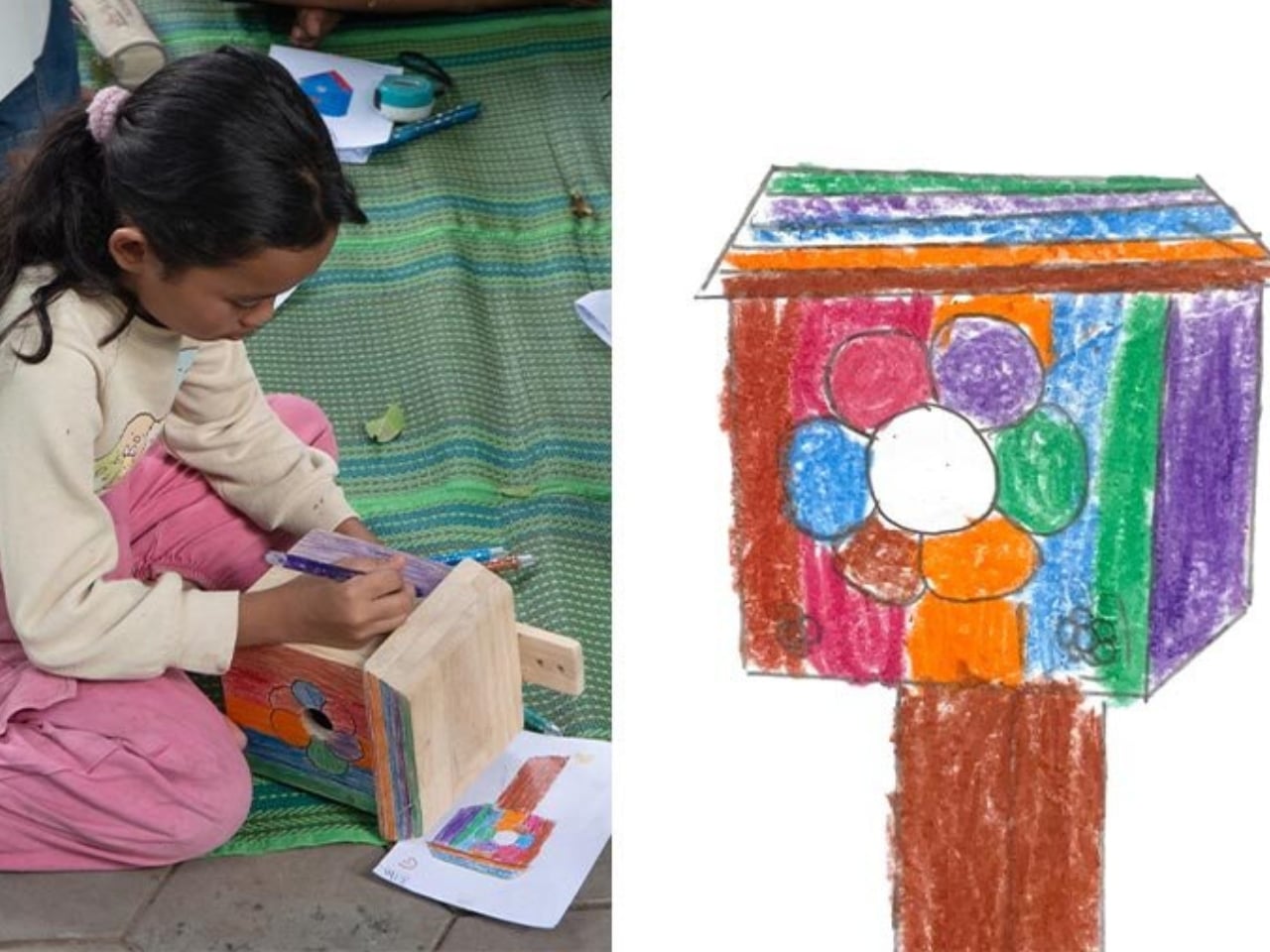
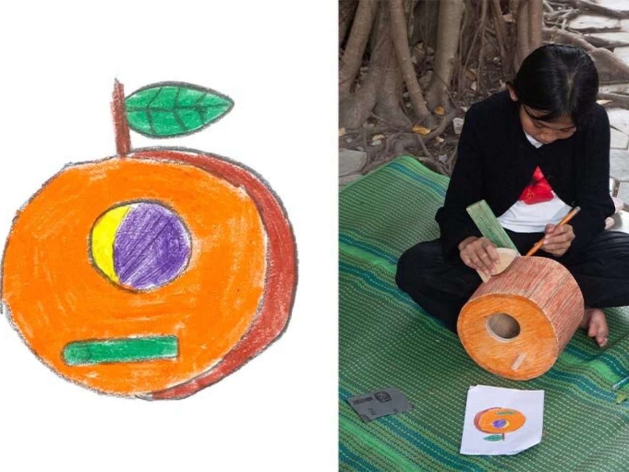
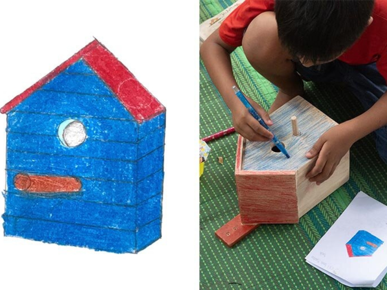
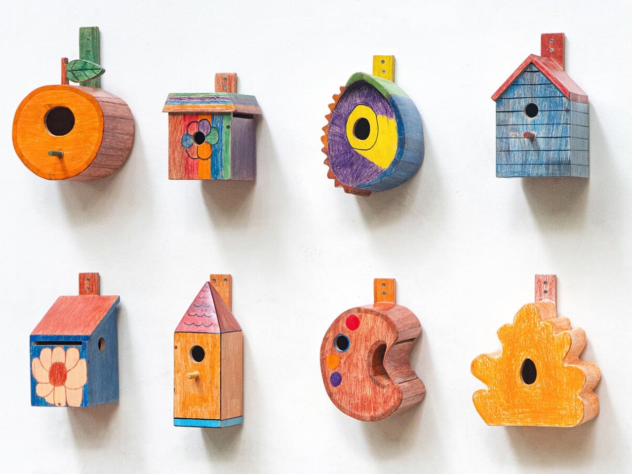
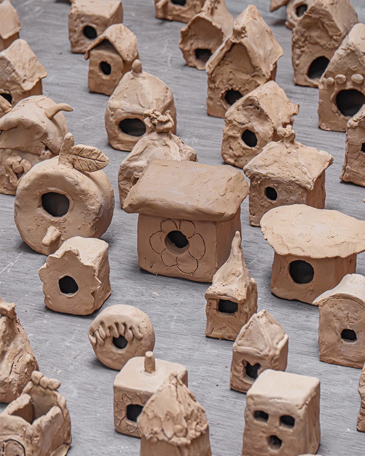
The project is called “Birdhouse by Kids,” and it is exactly what it sounds like, though the execution is far more considered than the name lets on. Yun, a Korean designer currently based in Cambodia, started the process by introducing the children to local bird species and basic birdhouse typologies. Not to teach them the “right” answer, but to give them just enough context before letting them loose with pencils and paper. The drawings that came out of that session were, predictably, wonderfully unruly. Rooftops that curve like waves, doors shaped more like portals, proportions that make zero structural sense and all the visual sense in the world.

Designer: Taekhan Yun

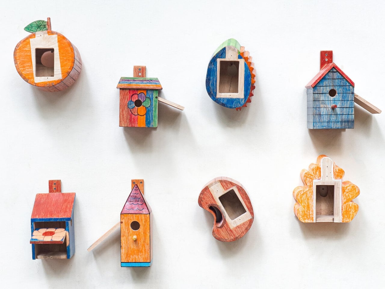
What Yun did next is the part that elevates this from a cute community project to something genuinely worth talking about. He didn’t correct the drawings. He translated them. There’s a massive difference between those two things, and most professional designers, trained to optimize and problem-solve, would have instinctively done the former. Yun chose the harder path, which was to honor the original intention of each design while figuring out how to make it stand upright, hold together, and actually function as a home for a bird.

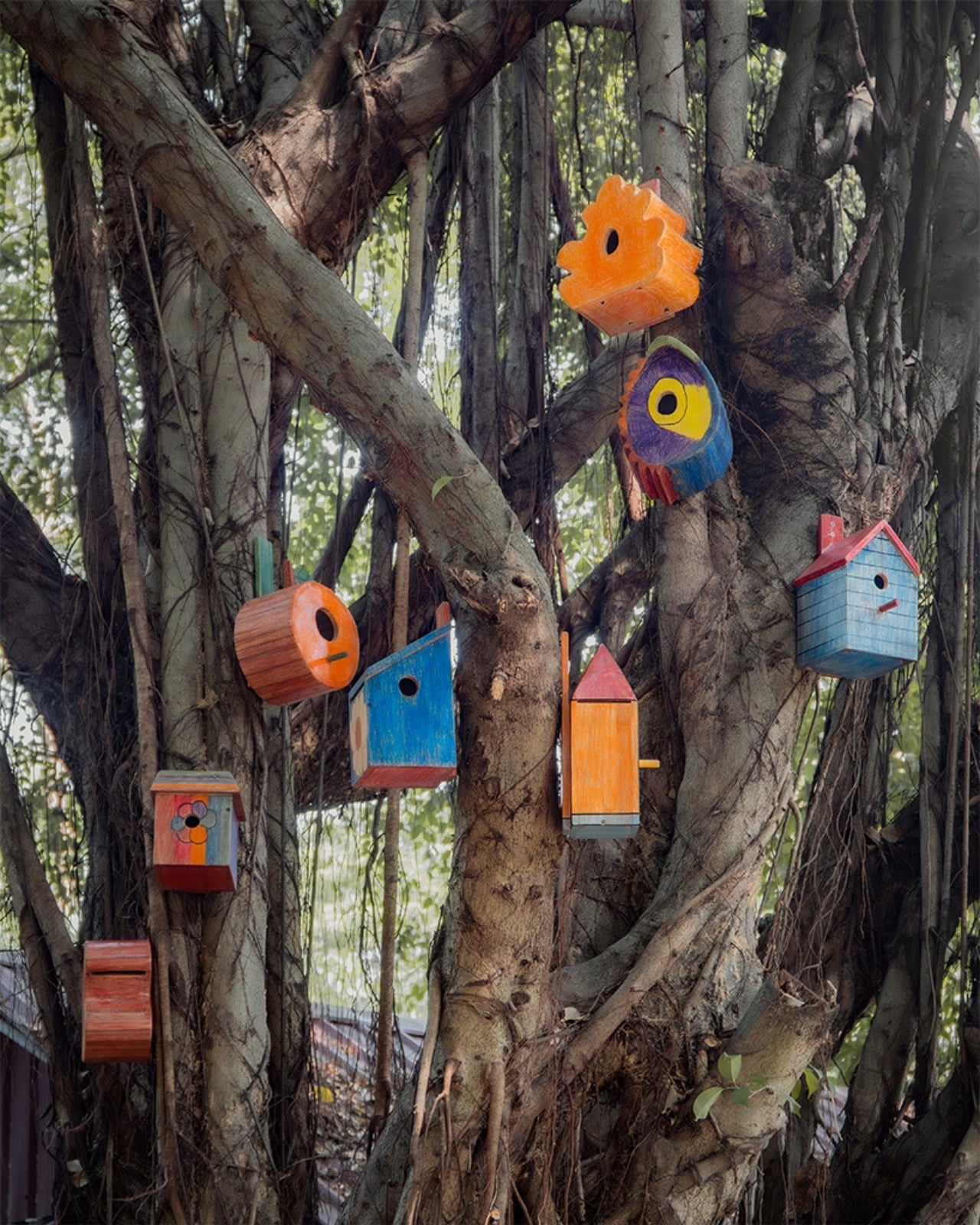
The children then made clay prototypes of their own designs, turning two-dimensional sketches into three-dimensional objects with their own hands. Eight of those designs were ultimately selected and built into full-scale birdhouses, with the children participating in the finishing process alongside Yun. The completed birdhouses now live at the school, sitting in the kind of spaces where children play and gather, and they look like nothing you’ve ever seen in a garden center or a hardware store. They look like imagination made solid, which, technically, is exactly what they are.

I keep thinking about how rarely the design world genuinely invites this kind of collaboration. There’s plenty of design “for” children, but design “by” children is a different conversation altogether. Yun has been exploring this territory for a while now. His earlier project, “Chair for Kids,” followed a similar participatory model, where children at the English School of Siem Reap drew their own chair designs, measured their bodies, and helped build the final pieces. His philosophy seems rooted in the idea that design is not just a skill for making objects but a way of thinking, and that children, unburdened by convention, are actually very good at it.

The birdhouse project also does something quietly radical in terms of concept. It shifts the design brief away from humans entirely. The end user isn’t a child or an adult. It’s a bird. Yun has described this as moving from human-centered design toward designing for other species, using children’s perspectives as the starting point. That framing might sound academic, but the result is tangible and a little poetic: a group of kids in Cambodia drawing houses for birds, without a single preconception about what a birdhouse is “supposed” to look like.

Good design often works this way. It finds a new angle by removing the assumptions. Yun removed two at once: the assumption that designers must be trained professionals, and the assumption that form should follow function in the most literal, efficient way possible. The forms these kids invented follow something else, something closer to feeling or instinct, and the objects are richer for it. They are also, somehow, more honest.

We talk a lot about innovation in design, about breaking from convention and thinking outside the box. It turns out one very reliable way to do that is to ask someone who has never been in the box to begin with.

The post What Happens When You Let 90 Kids Design a Birdhouse first appeared on Yanko Design.
Pringles x Crocs Designed A Pair of Playful Boots That Looks Like a Sore Thumb

Welcome to Sneaker Sunday on Yanko Design! Today, we’re diving into a wild and wacky collaboration that will make you smile. Crocs has teamed up with Pringles to create a collection that’s both fun and practical, guaranteed to get people talking. Let’s break down the design details and see what makes this collection pop.

Designers: Pringles x Crocs

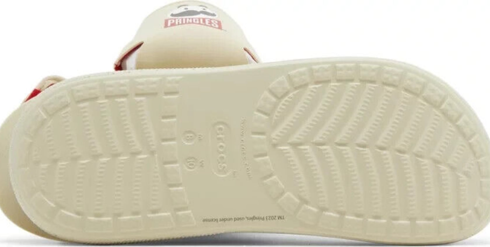
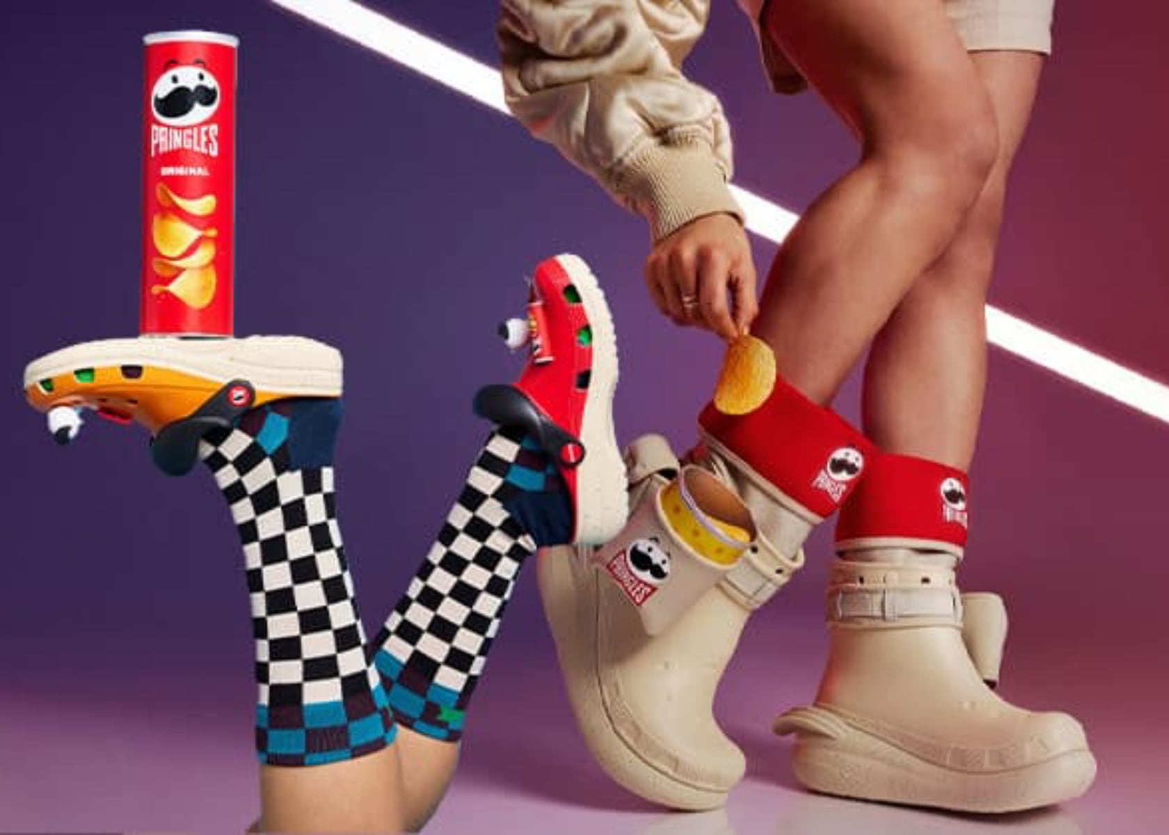
First, let’s kick things off with the Pringles x Crocs boots. These boots are a playful mix of functionality and fun, designed to grab attention. The primary color is a versatile chill beige, which pairs well with almost anything in your wardrobe. But Crocs and Pringles didn’t stop there—they added bold red accents that scream, “Hey, look at me!” The Pringles logo is prominently displayed on the cuff and the side pocket, giving these boots a snack-tastic vibe. If you don’t mind sticking out like a sore thumb (pun intended), these boots are perfect for you!

PRINGLES X CROCS CLASSIC CRUSH BOOT

The structure of these boots is something else entirely. The chunky sole means business, ready to handle all your adventures while keeping you comfortable. And those signature Crocs holes on the upper? They’re perfect for breathability, ensuring your feet stay cool and comfy all day long. The materials used blend the classic cushy Crocs foam with a sturdier upper, giving you the best of both worlds—comfort and style.

Now, let’s talk about that quirky little pocket on the side, because it’s more than just for show. It’s actually practical, perfect for stashing small items or just adding a bit of playful flair to your look. The pocket is even designed to hold a can of Pringles, making it a functional and fun addition. The red cuff adds more than just a pop of color. It’s padded, ensuring your legs stay cozy and comfy, adding an extra layer of comfort and style.

Style-wise, these boots blend streetwear trends with Crocs’ casual comfort. They’re perfect for anyone who loves to make a bold impression while keeping things comfy. The neutral beige base keeps things versatile, while the red highlights ensure you’re not blending into the background. Whether running errands or hanging out with friends, these boots will ensure you do it in style.

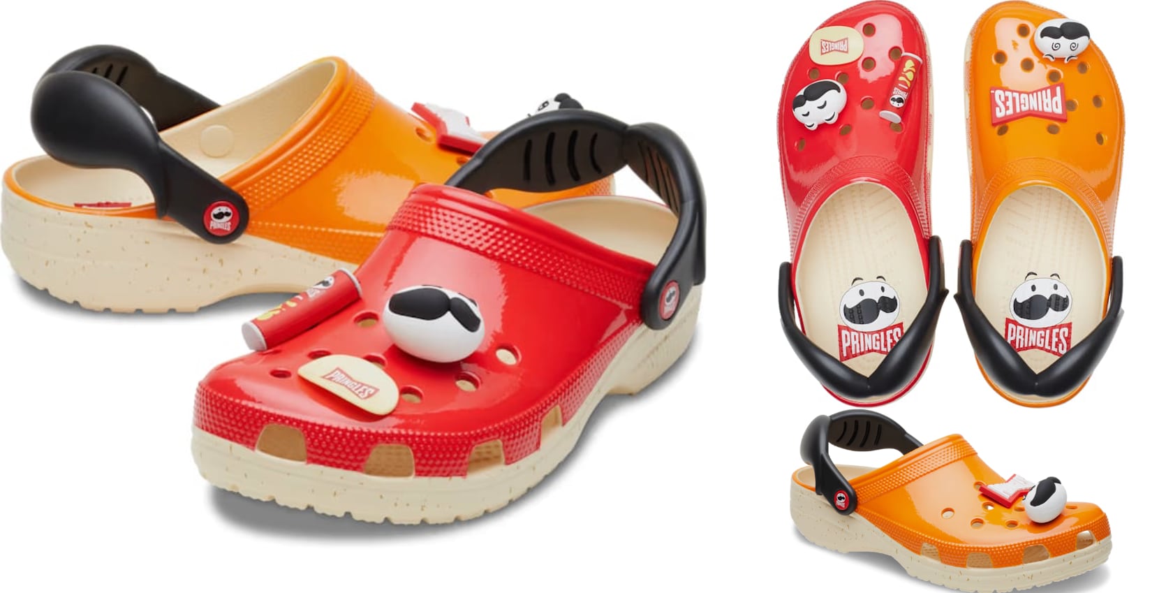
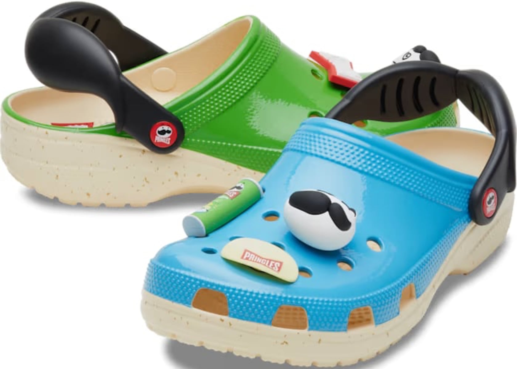
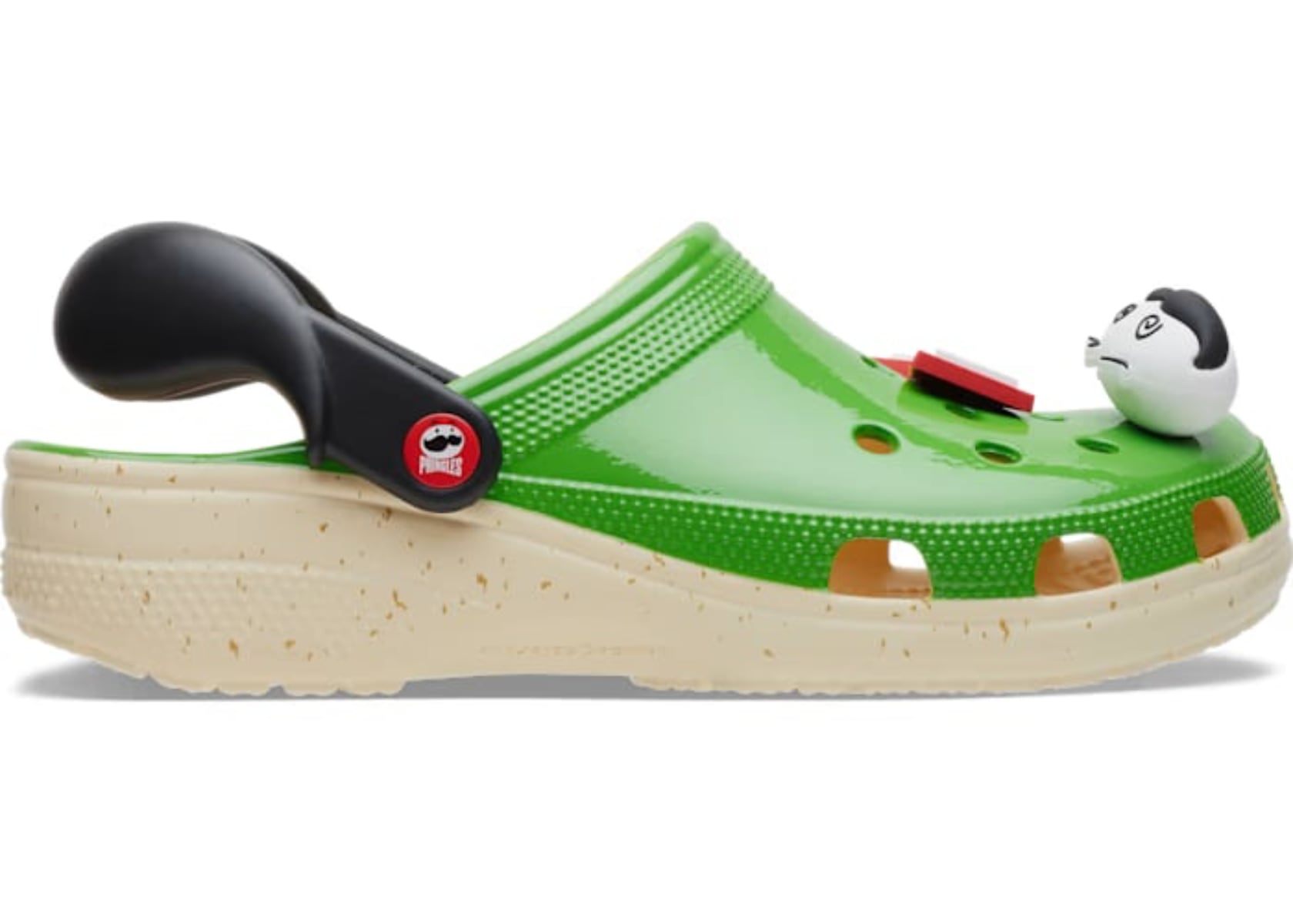
Next, the Pringles x Crocs Classic Clog, which comes in mismatched pairs of bright green, blue, red, and orange. These colorways are perfect for those who can’t choose just one favorite flavor. The glossy finish on these clogs makes the colors pop, ensuring they catch everyone’s eye.

Pringles x Crocs Classic Clog

Each shoe is adorned with exclusive Pringles Jibbitz charms, including the iconic Pringles can and Mr. P’s mustache, adding a playful touch to the already vibrant design. With its shiny finish, the green clog gives off a refreshing vibe reminiscent of Pringles’ sour cream and onion flavor, while the blue one feels cool and bold, like the original flavor. The red and orange pairs are equally eye-catching, with the red clog giving off a spicy vibe, perhaps nodding to the hot and spicy Pringles, and the orange one being bright and lively, perfect for cheese lovers.

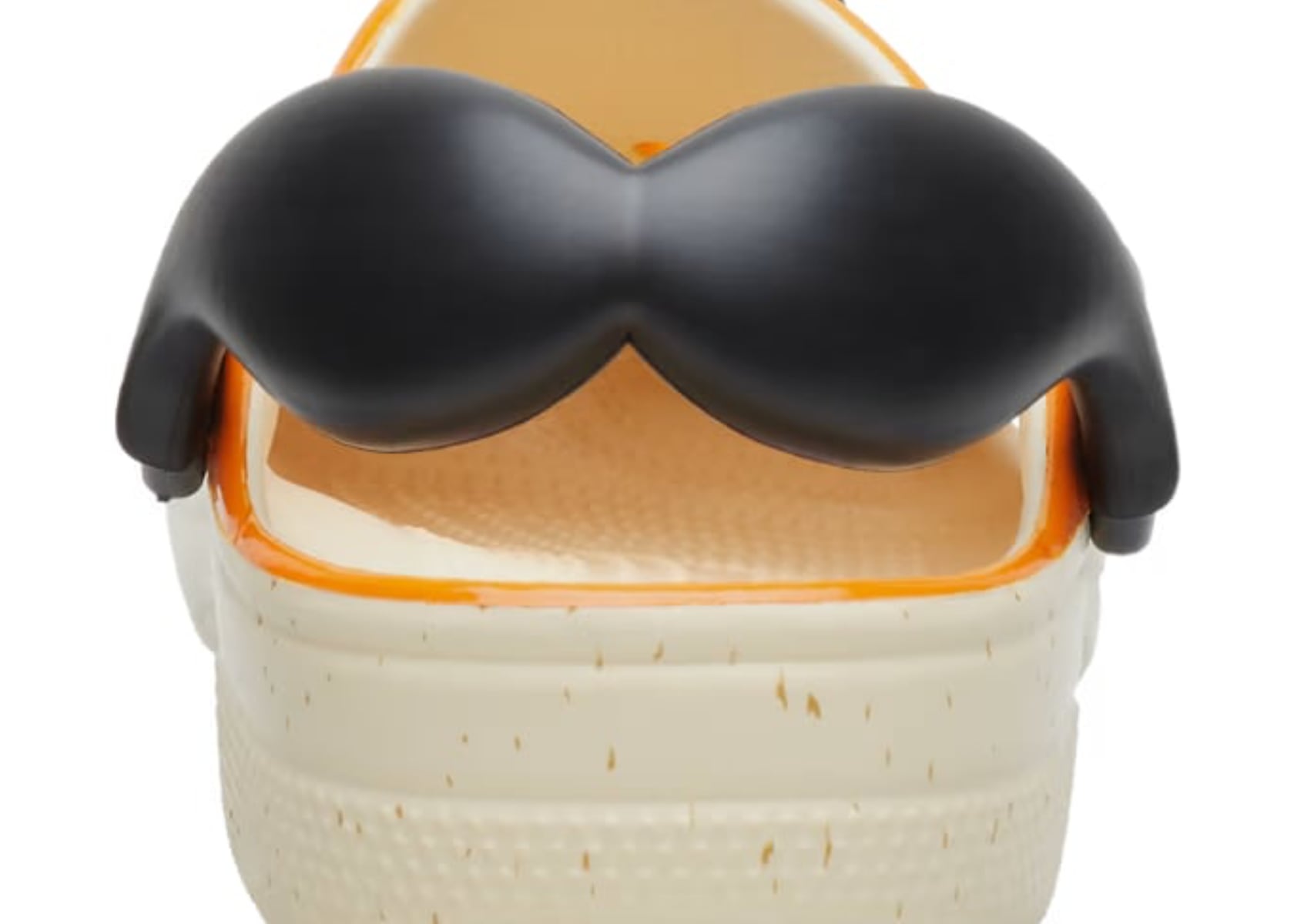
The puffy heel strap mimics Mr. P’s iconic mustache, offering a unique style feature while providing a secure fit. This detail adds to the fun aesthetic and enhances the functionality by ensuring the clogs stay securely on your feet. The black strap contrasts nicely with the bright colors, adding a bit of edge to the playful design.

These clogs are incredibly light and fun to wear. They are water-friendly, buoyant, and weigh only ounces, making them perfect for various activities. Ventilation ports add breathability and help shed water and debris, ensuring your feet stay comfortable and dry. Plus, they’re easy to clean and quick to dry, which is always a bonus.

The Classic Clogs feature Iconic Crocs Comfort with lightweight, flexible, 360-degree comfort. The mismatched colors and fun charms make a bold statement, perfect for showing off your snack style. Whether at a beach, a pool party, or just out for a casual stroll, these clogs ensure you do it in style.

But let’s not forget the design elements that tie this entire collection together. The consistent use of bold, playful design elements and the iconic Pringles branding makes each piece instantly recognizable. From the chunky-soled boots to the colorful clogs and monochrome slides, this collection incorporates the familiar Crocs comfort and functionality while adding a unique, snack-inspired twist. The bright colors, fun charms, and clever use of the Pringles logo create a cohesive and unified look that’s both fun and fashionable.

The Pringles x Crocs collection also stands out for its versatility. Whether you’re into vibrant colors or prefer a more understated look, there’s something here for everyone. The mismatched clogs allow you to mix and match your favorite flavors, while the monochrome slides offer a more subtle yet equally playful option. This versatility ensures that there’s a pair of Pringles x Crocs for every occasion and every style.

In terms of branding, the collection does an excellent job of integrating the iconic Pringles imagery with the classic Crocs design. Using the Pringles logo and Mr. P’s mustache is clever and adds a unique touch to each piece. This seamless integration of branding and design makes the collection feel cohesive and well-thought-out rather than just a gimmicky collaboration.

The Pringles x Crocs collection has an overall feel of playful, fun, and casual comfort. Both brands have put a lot of thought into creating a collection that’s not only stylish but also practical and comfortable. Whether you’re a longtime fan of Crocs, a lover of Pringles, or just someone who appreciates fun and unique collaborations, this collection has something to offer.

In conclusion, the Pringles x Crocs collection is a delightful blend of fun, bold design, and practical comfort. From the chunky-soled boots to the vibrant clogs and playful slides, each piece is designed to make a bold impression while keeping you comfortable. Bold colors, fun charms, and clever branding create a cohesive and instantly recognizable look that’s perfect for showing off your snack style. So, if you want to add a touch of whimsy to your wardrobe, the Pringles x Crocs collection is worth checking out.

The post Pringles x Crocs Designed A Pair of Playful Boots That Looks Like a Sore Thumb first appeared on Yanko Design.

A Masterpiece Emerges from the Collaboration Between John Mayer and Audemars Piguet

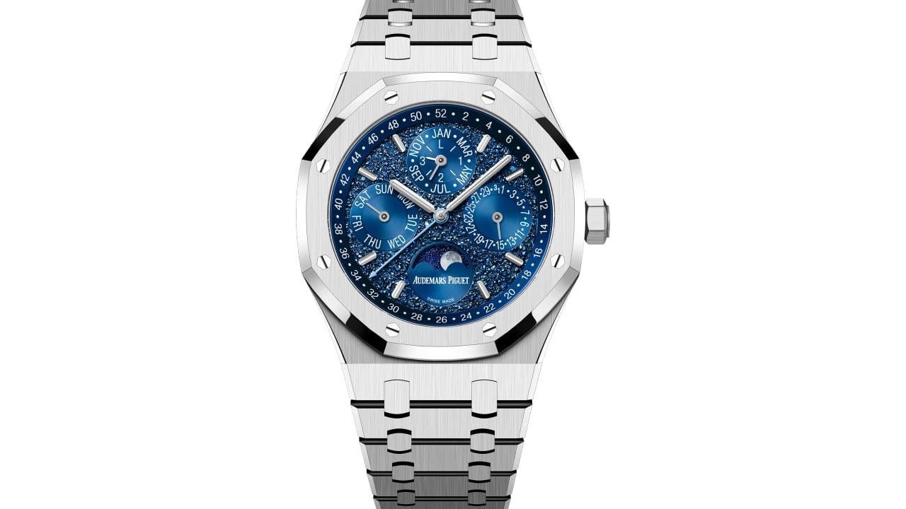
In crafting the Royal Oak Perpetual Calendar “John Mayer” Limited Edition, Audemars Piguet redefines the concept of special timepieces, creating a category entirely on its own. This collaboration with John Mayer enhances the watch’s allure, blending his artistic sensibility with the brand’s commitment to innovation, passion, and a profound respect for the craft of watchmaking. The result is a timepiece that transcends traditional boundaries, emerging as a unique collector’s item and a demonstration of meticulous craftsmanship and aesthetic perfection. This collaboration secures its place as an iconic piece in the world of luxury watches.

Designer: Audemars Piguet + John Mayer

John Mayer brings a unique perspective to this partnership, channeling his creative flair and imaginative intuition into the creation of the watch. His approach mirrors his music philosophy—each element must resonate with emotion and depth, akin to a chord striking a soulful note. Each component of the watch is designed to reverberate with feeling, enhancing the overall sensory experience of the timepiece. Mayer’s favorite watches are those where the dial is not just observed but experienced, a concept that deeply influenced the design of the “Crystal Sky” dial. Describing it, he likens the watch’s face to a picture window—one looks through it into another world. In this case, the dial is a portal to a moonless, starlit sky, vast and boundlessly deep, offering a sense of the infinite and the eternal. This deep link between the dial’s design and the natural world transforms the watch from simply measuring time to reflecting the timeless expanse of the universe.

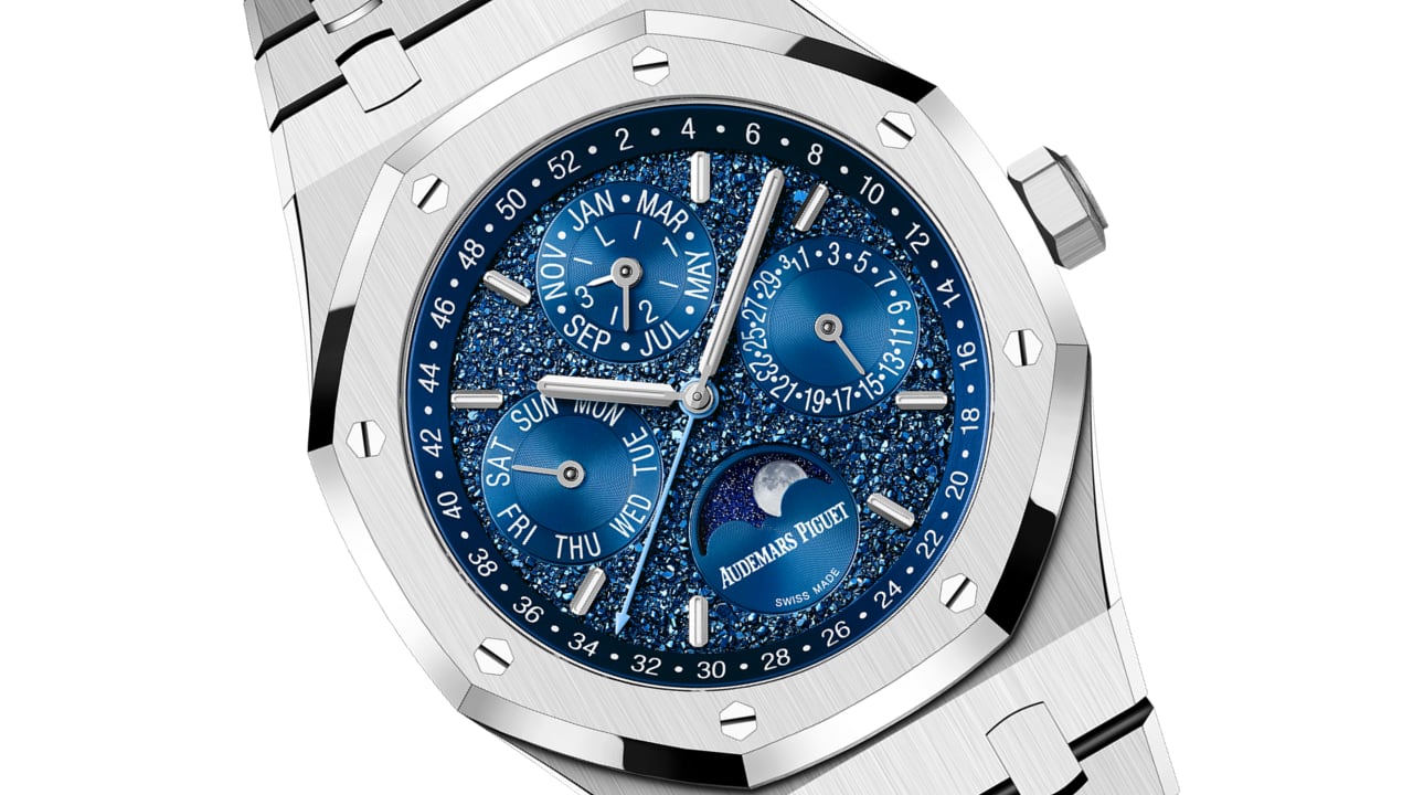
The dial is a masterpiece of design, featuring an embossed motif resembling a spread of irregularly shaped crystals. This choice is intentional, echoing the natural crystalline forms found in rock formations and ice, elements that transform under the weight of time itself. The texture adds visual depth and a tactile dimension that begs to be touched and closely inspected. Audemars Piguet used a precise electroforming process to achieve this intricate detail that constructs the dial’s motif atom by atom, reflecting the brand’s dedication to micro-mechanical innovation.

Audemars Piguet’s Royal Oak “John Mayer” Limited Edition dial detail and self-winding Calibre 5134 movement

The watch’s technical specifications are equally impressive. The heart of the timepiece is the Manufacture’s self-winding Calibre 5134, a movement that maintains a slim profile despite its complexity, measuring just 4.3 mm in thickness. This calibre is an evolution of the Calibre 2120/2800, first launched in 1978 during the quartz crisis—a pivotal moment when mechanical watchmaking proved its enduring value against the rising tide of quartz technology. The Calibre 5134 adapted to a larger 41 mm case size while keeping the streamlined elegance that the Royal Oak is known for. This movement also features a perpetual calendar, one of the most poetic complications in watchmaking, which measures the time in a way that needs no adjustment for months of varying lengths or even leap years.

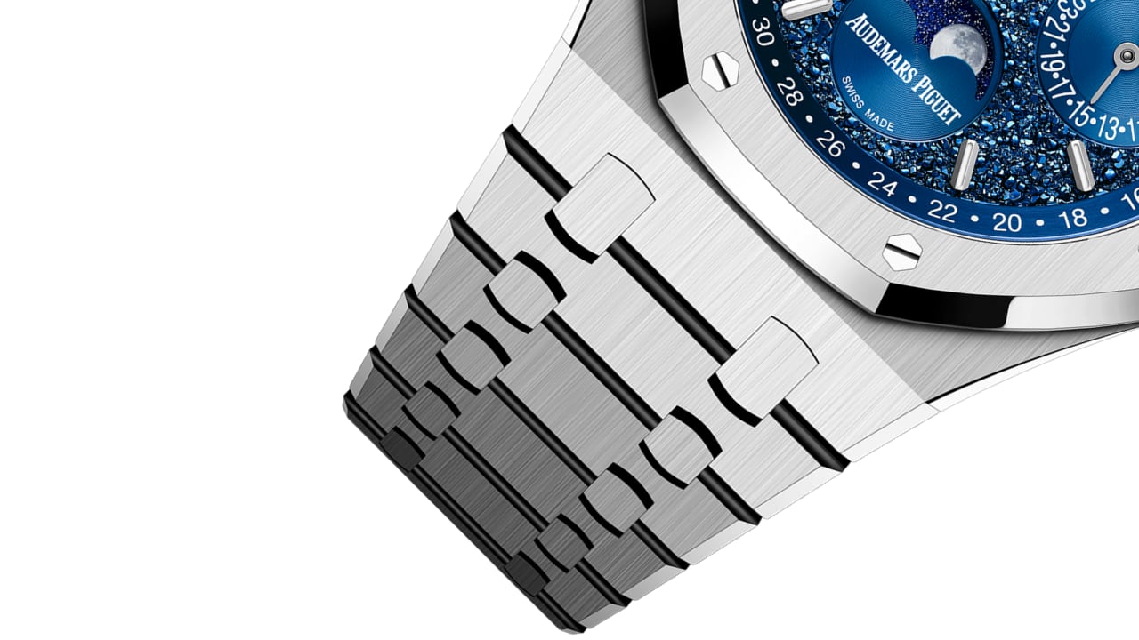
The Royal Oak Perpetual Calendar “John Mayer” Limited Edition case is crafted from 18-carat white gold, matched with a bracelet of the same material. The use of white gold not only enriches the watch with luxe sophistication but also serves as the perfect canvas to highlight the striking blue “Crystal Sky” dial. While this quarter-million-dollar watch boasts a water resistance of 20 meters, I’d say it’s more for peace of mind than for actual deep-sea diving. After all, who really plans to test those limits with such a masterpiece on their wrist?

18-carat white gold matching bracelet

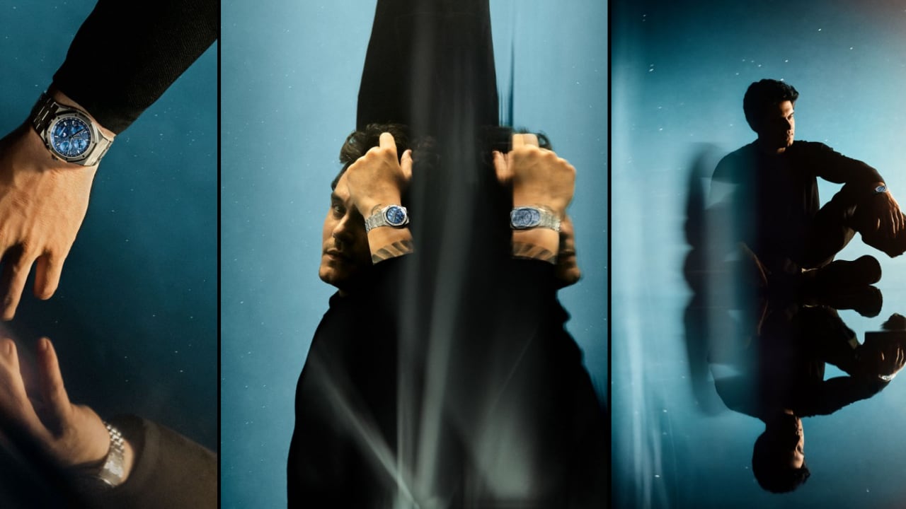
John Mayer’s passion for this watch is clearly evident through his words and deep involvement in the design process. He views the watch as a portal to a deeper experience and an artistic expression that invites contemplation and connection. “My favorite watches have dials that you can stare endlessly at,” Mayer explains. “A great watch dial feels like a picture window—you look into it, not at it. In the case of this QP, it’s like looking up at a moonless sky. There is a true sense of nature in it.” This reflection captures the watch’s essence, showing it as a canvas that reflects Mayer’s profound appreciation for the nuanced artistry of watchmaking.

Mayer’s engagement was comprehensive; he was involved in every decision, from choosing materials to refining the dial’s specific finish, to ensure that every aspect of the watch aligned with his aesthetic sensibilities. This dedication underscores how the watch goes beyond its functional role to serve as a canvas that mirrors his deep appreciation for the nuanced artistry of watchmaking. Every element of its design, informed by Mayer’s keen artistic eye, invites those who seek not just to tell time but to tell a story.

Audemars Piguet’s Royal Oak “John Mayer” Limited Edition

Only 200 pieces of the Royal Oak Perpetual Calendar “John Mayer” Limited Edition will be crafted, making it a rare collectible item for watch enthusiasts and Mayer fans alike. Each piece is a tribute to the legacy of the Calibre 5134 and a celebration of Audemars Piguet’s enduring dedication to excellence in design and functionality. This watch is a masterful blend of precise engineering and striking design, serving as a pinnacle of technical skill and a vivid expression of beauty. It embodies the seamless integration of form and function, where every component measures time and tells a story of artistic excellence.

The post A Masterpiece Emerges from the Collaboration Between John Mayer and Audemars Piguet first appeared on Yanko Design.