Gaming and watchmaking have been circling each other for years, trading collaborations that usually land somewhere between cynical and forgettable. The Hamilton x Call of Duty watch exists. The G-Shock x Street Fighter collection exists. Casio has licensed more IP than most studios at this point. Nubeo looked at all of that and apparently decided the only interesting move was to go deeper, not louder.
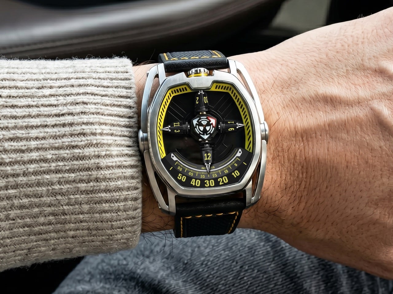
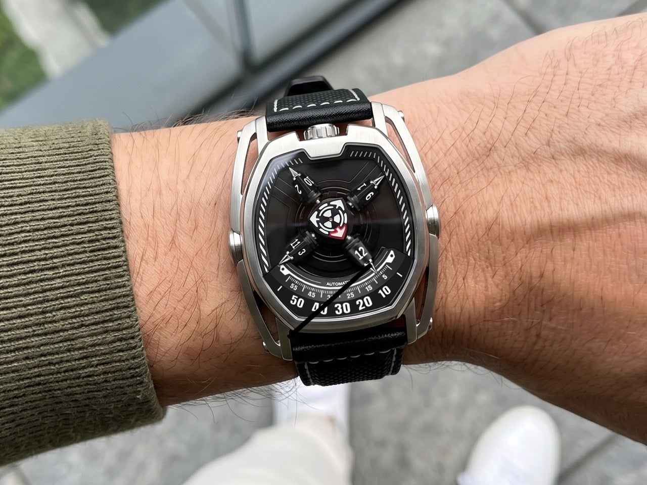
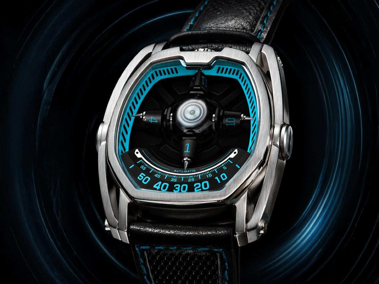
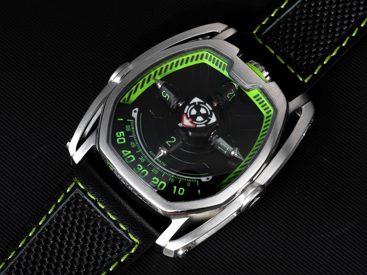
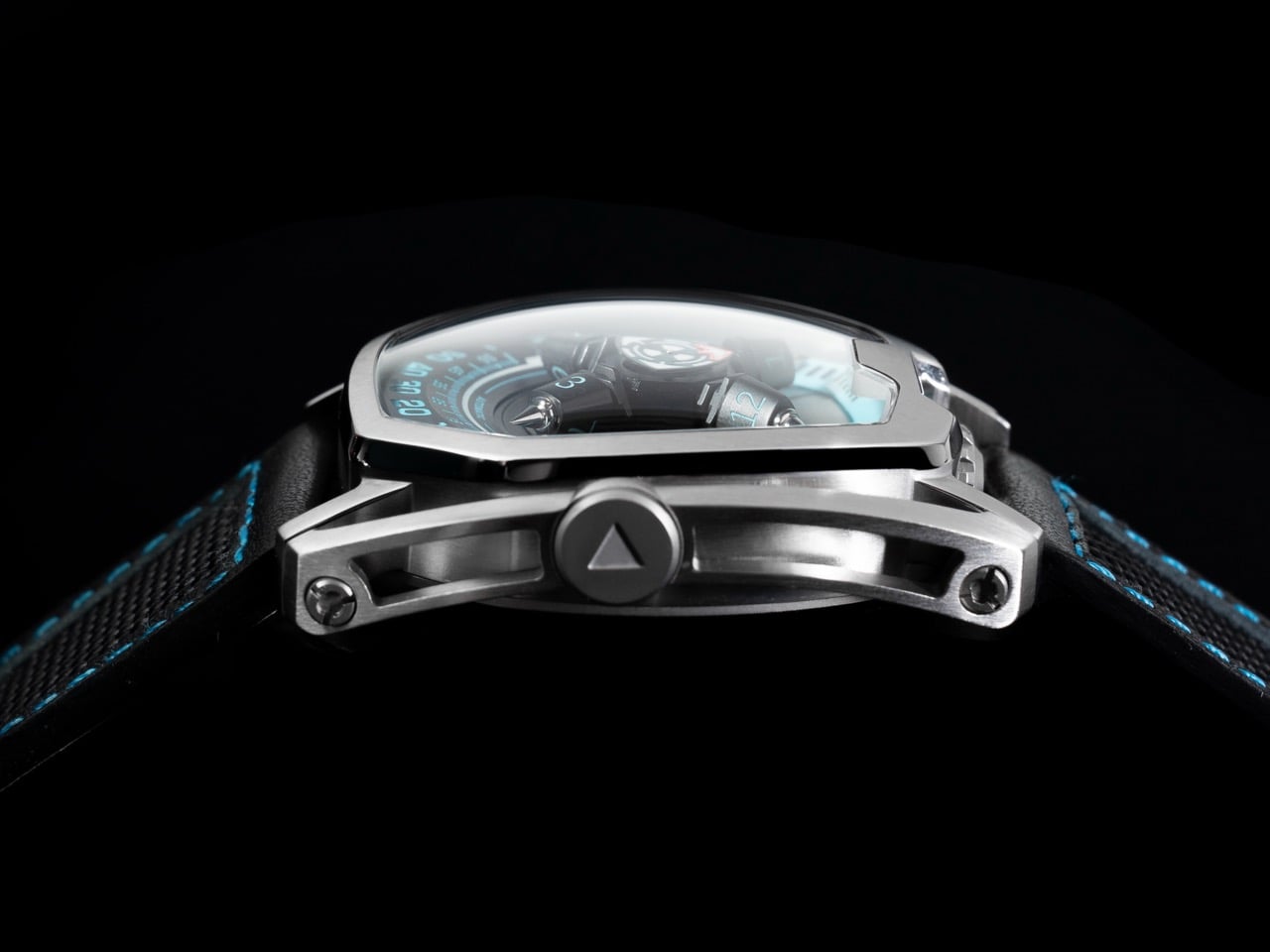
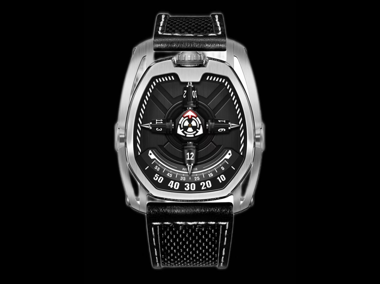
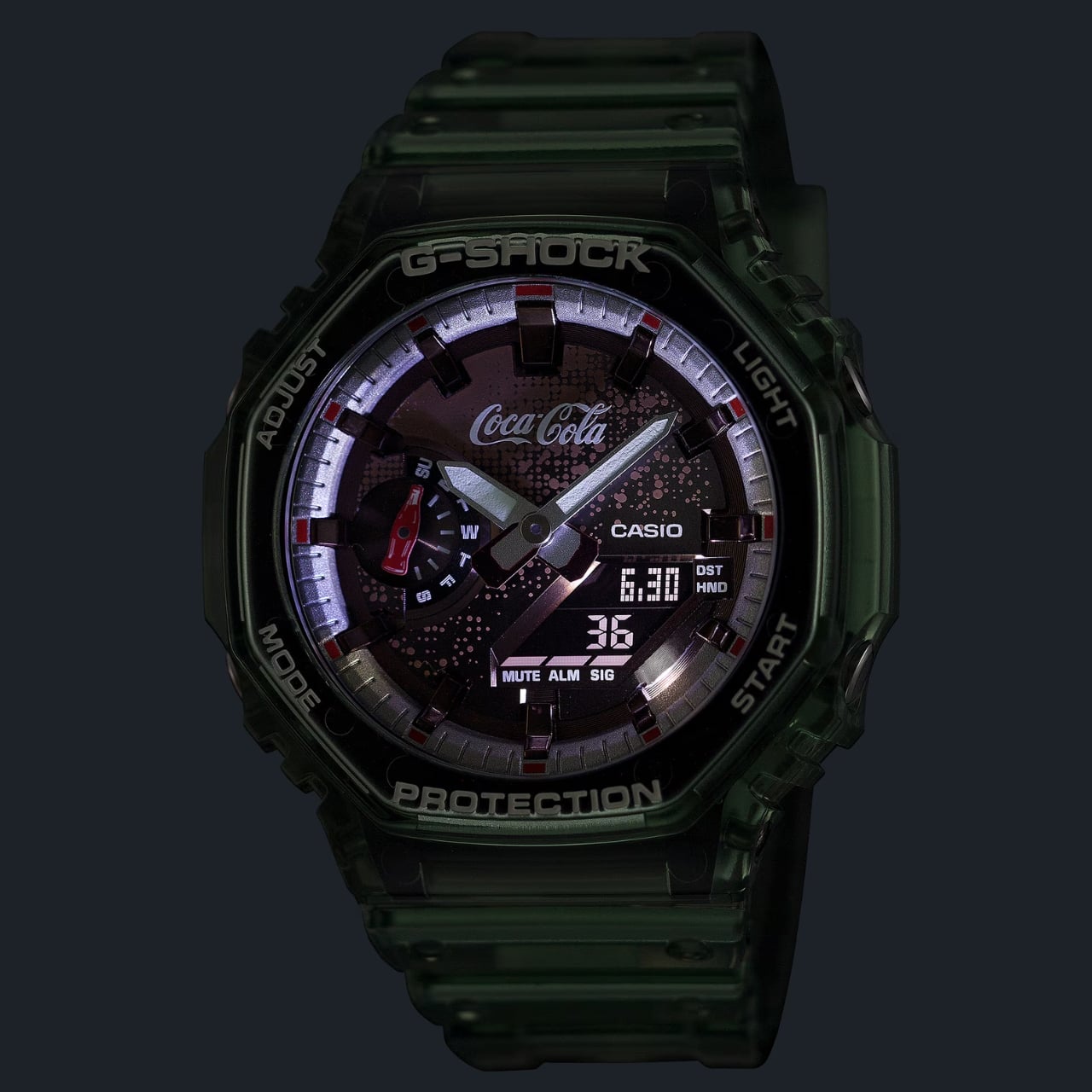
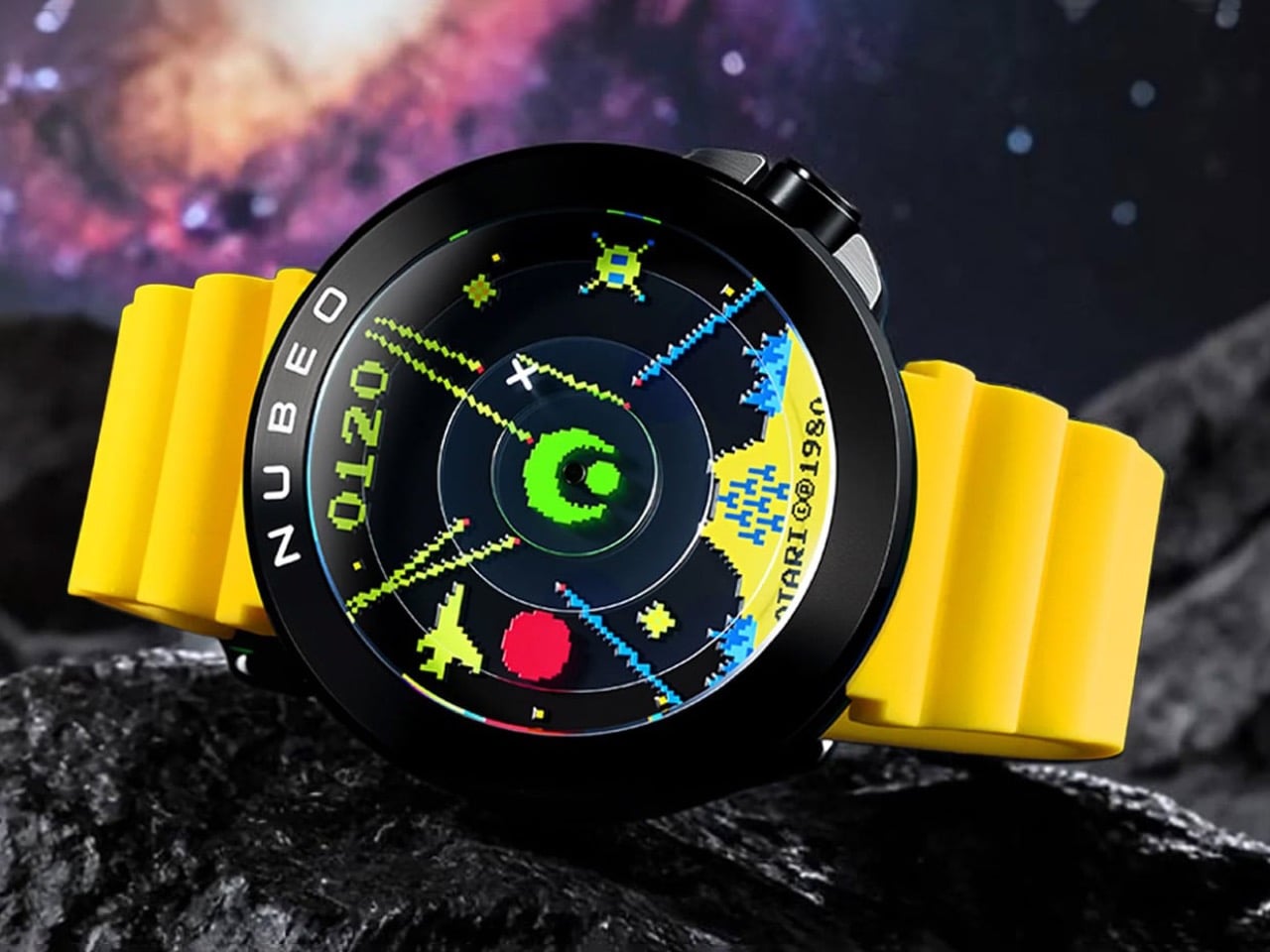
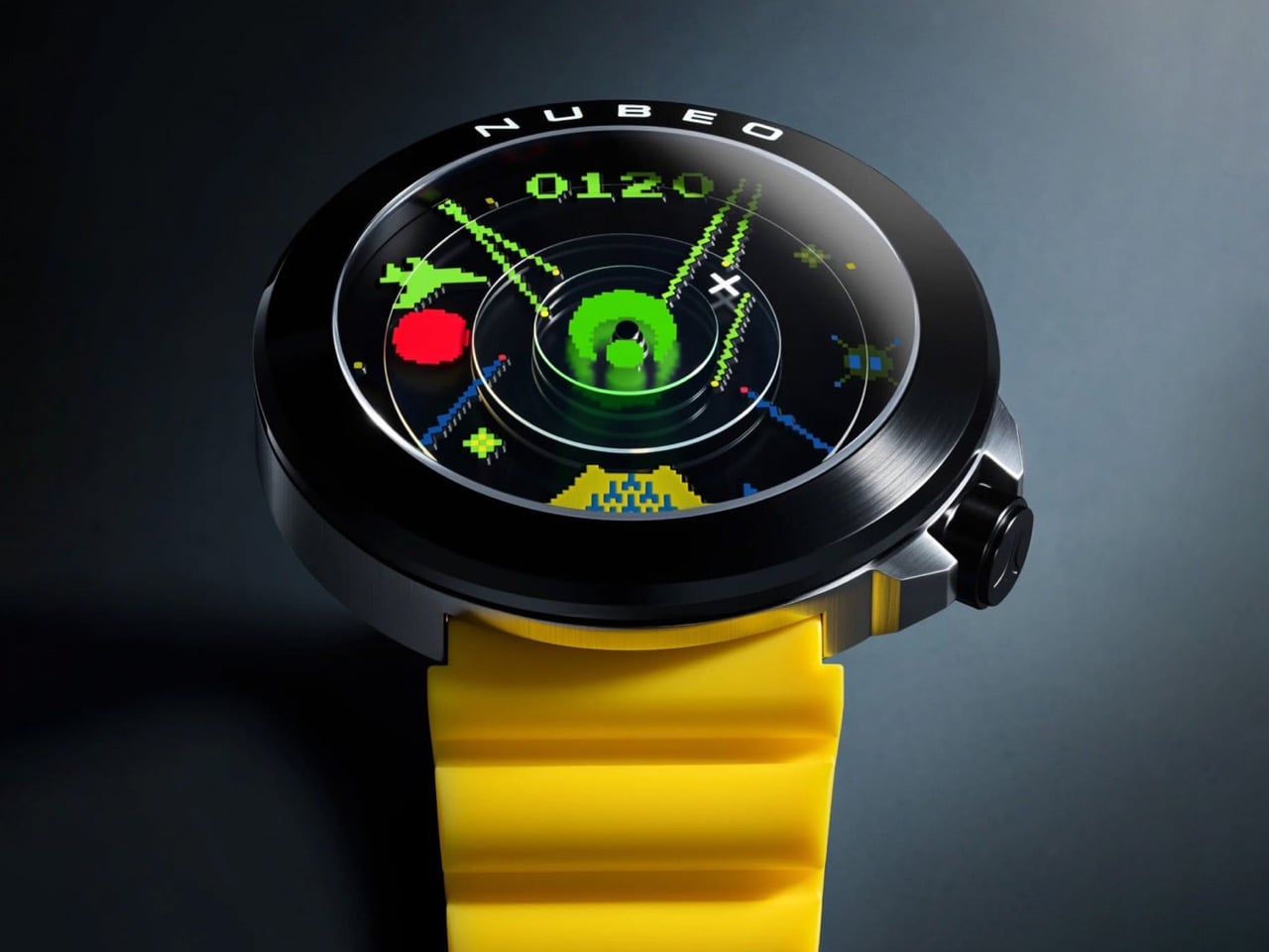
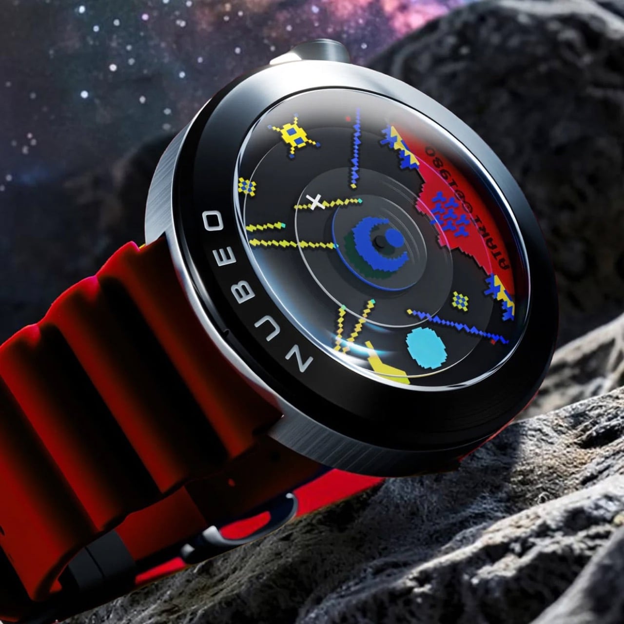
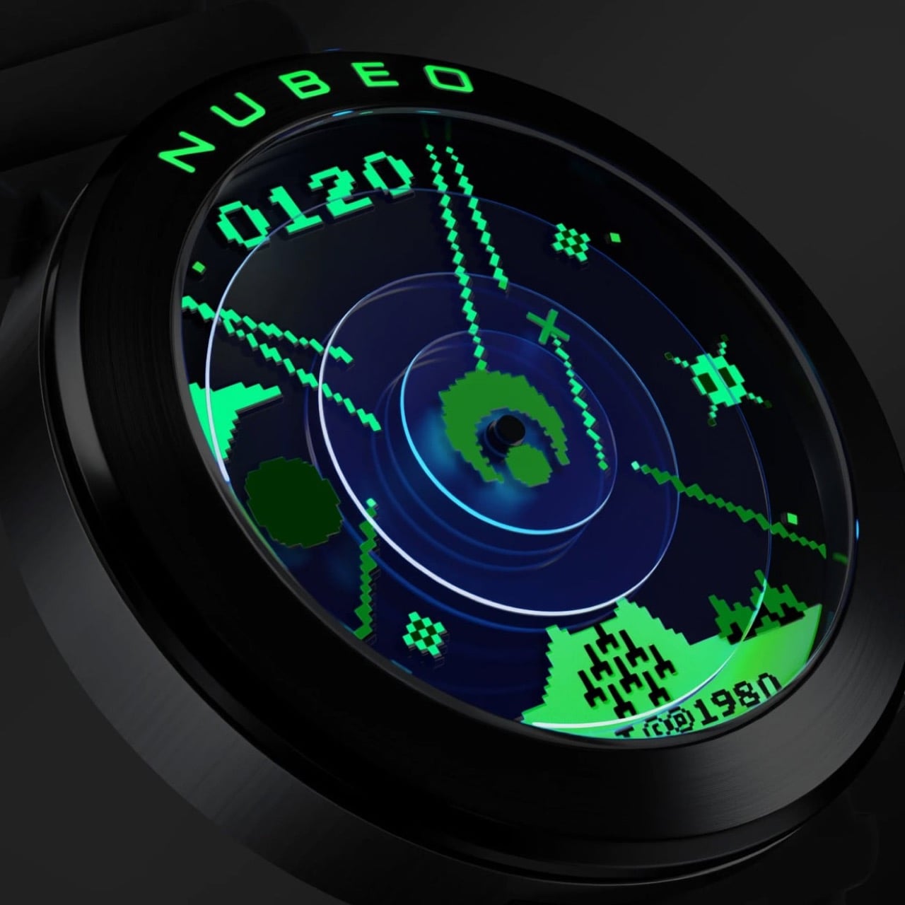
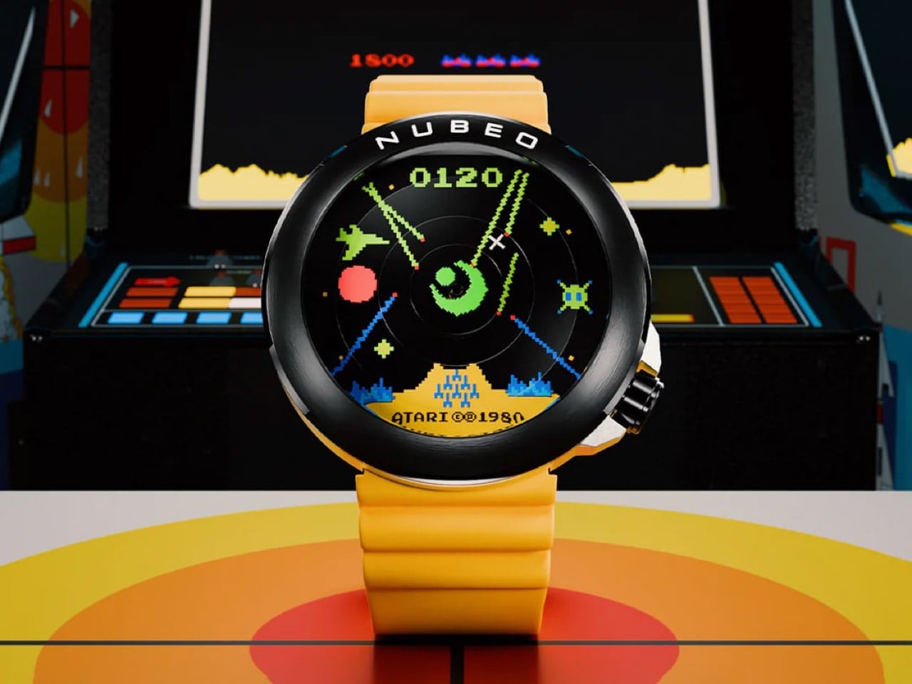
The Ventana Automatic Missile Command takes the full visual grammar of Atari’s 1980 arcade classic and builds it into a 50mm mechanical watch limited to 100 individually numbered pieces per colorway. The dial layers pixelated missile trails, fighter jet sprites, and a concentric radar system over a multi-disc mechanical assembly, with the “0120” score display anchoring 12 o’clock and the “Atari ©1980” copyright stamp sitting at 6. The exhibition caseback frames the Miyota 8215 automatic movement inside the original arcade cabinet artwork, giving the watch a second face as compelling as the first. Kill the lights and the Super-LumiNova does something unexpected: the full-color scene collapses into monochrome green, the exact phosphor glow of a 1980 CRT screen, and suddenly the whole design logic becomes obvious. Nubeo built five colorways at $500 each, Assault Yellow, Strike Green, Vector Red, Command Black, and the Impact Blue exclusive to Atari.com, and every one of them rewards that kind of attention.
Designer: Nubeo x Atari
Designer: Nubeo
Missile Command arrived in arcades in 1980 carrying a psychological weight that most games of its era never attempted. Designer Dave Theurer has spoken about the nightmares the project gave him during development, because the premise was deliberately unwinnable: nuclear warheads are falling on your cities, you can slow the assault but never stop it, and eventually the screen fills with fire. That Cold War dread, rendered in chunky pixels and trackball physics, made it one of the most culturally loaded games ever put into a cabinet. It migrated to the Atari 2600 and into living rooms across America, and an entire generation grew up memorizing its visual language: the radar rings, the missile trails, the pixelated cityscape at the bottom of the screen waiting to be vaporized. Nubeo clearly grew up with it too, and the Ventana is the design evidence.
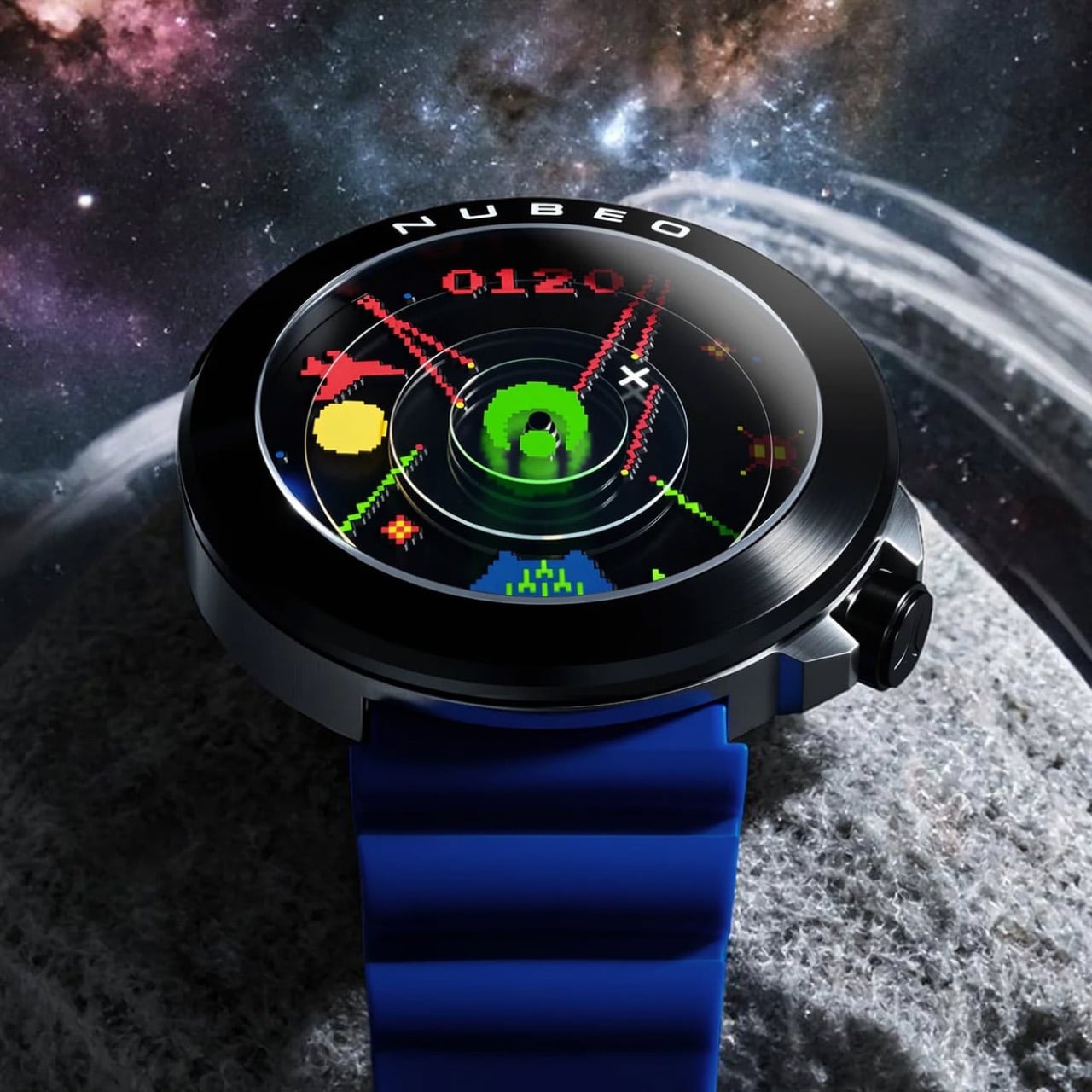
A multi-layered disc system gives the scene genuine physical depth rather than the flat printed look that sinks most licensed watches. The concentric radar rings at center sit on a separate disc plane, catching light differently from the pixelated imagery surrounding them and creating a parallax effect that shifts as you move the watch. The central turret hub anchors the second hand and reads exactly as the game’s targeting reticle, while the minute hand carries an X crosshair and the hour hand a red sun symbol. These are not decorative flourishes bolted onto a standard layout. They are the timekeeping system rebuilt around the game’s iconography from the ground up, which is a fundamentally different design brief than most collaborations ever attempt.
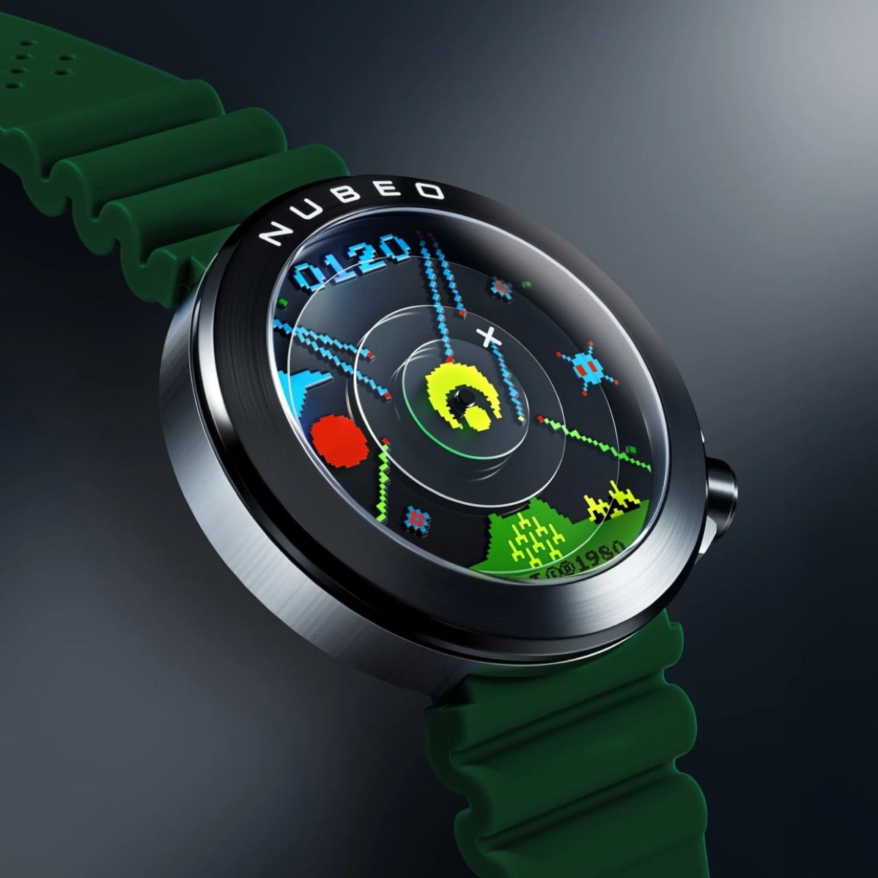
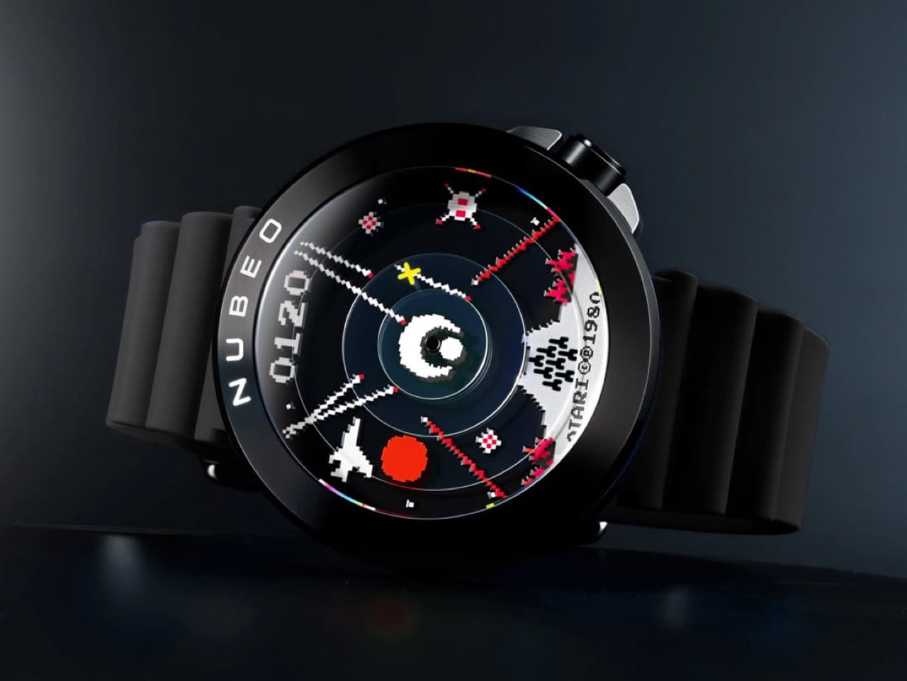
Super-LumiNova was applied across the full dial surface, which means in daylight you are reading a full-color Missile Command scene in vivid greens, yellows, reds, and blues, and in darkness all of that color information drops away into a pure monochrome green glow that is a dead ringer for the phosphor output of a 1980 CRT monitor. The design team understood that the game existed in two visual registers, the color of the arcade cabinet screen and the green-tinted memory of everyone who played it in a darkened room, and encoded both into a single material decision. Every pixel, every missile trail, every sprite glows with the same uniform intensity, uniform in the way that analog phosphor was uniform, which is to say warm and slightly imprecise at the edges. That quality is almost impossible to fake with modern lume application and the fact that Nubeo pulled it off suggests this collaboration went well beyond a licensing agreement into something closer to genuine obsession.
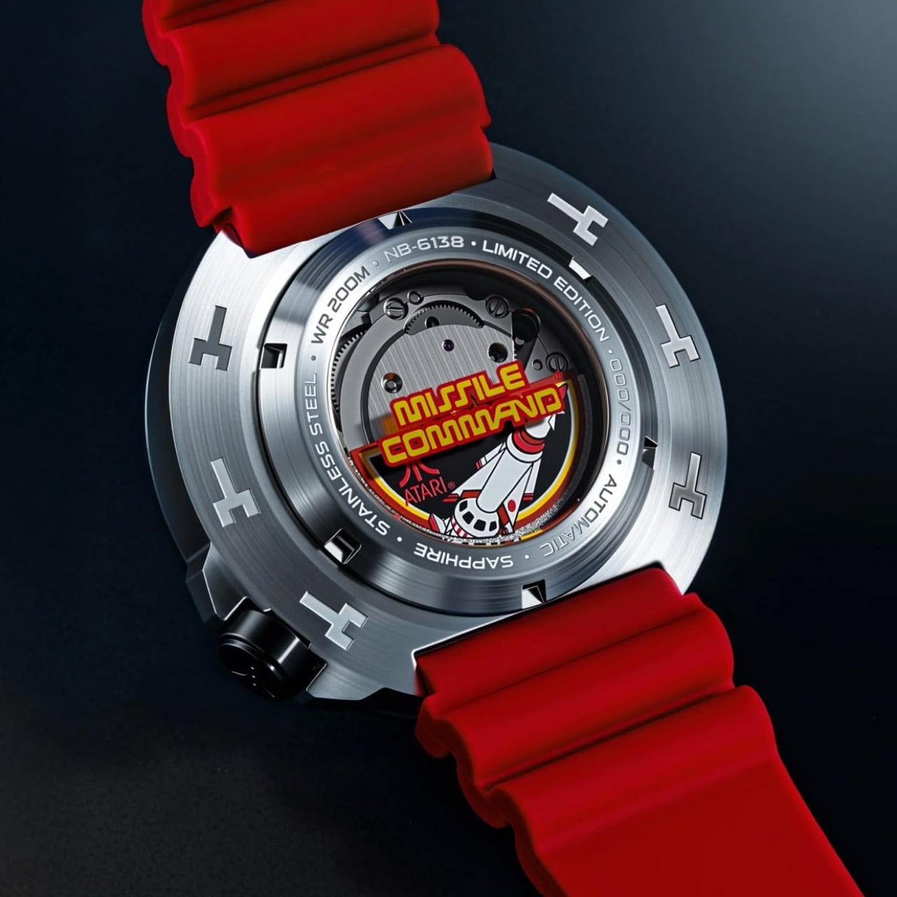
Through the exhibition window you can watch the Miyota 8215 automatic rotor spin, but the real draw is the original Missile Command arcade cabinet artwork surrounding it, complete with the bold red and yellow logo treatment, the rocket imagery, and the Atari mark printed onto the inner caseback disc. The outer ring is engraved with the model reference NB-6138, the water resistance rating, the limited edition designation, and the individual piece number. Wearing this watch means carrying two museum-quality presentations simultaneously, one facing the world and one facing your wrist, which is an unusually generous design decision for a $500 release.
The hardware specifications match the ambition of the concept without overreaching. The 50mm stainless steel case runs 16mm thick, the Miyota 8215 is a Japanese automatic workhorse that stays reliably out of the way of the dial story, sapphire crystal with AR coating protects the scene, and the screwdown crown at 4:30 delivers 200M water resistance. The chunky segmented rubber straps in each colorway add a tactile sportiness that ties the whole package back to the arcade cabinet’s joystick-era aesthetic, and at 179 grams the watch has the kind of presence on the wrist that reminds you it is there. At $500 for a sapphire-crystalled, 200M-rated, individually numbered automatic with this level of dial craft, Nubeo found the third path that the gaming collaboration space rarely bothers looking for: mid-tier pricing with upper-tier design intent. All five colorways are available now at nubeowatches.com, with Impact Blue held exclusively at atari.com, and with production capped at 500 pieces total across all variants, the cities on your dial may be perpetually under attack but the watch defending them is built to outlast every arcade cabinet that ever ran the original game.
The post Atari’s 1980 Arcade Classic Just Became a Limited Edition Automatic Watch first appeared on Yanko Design.