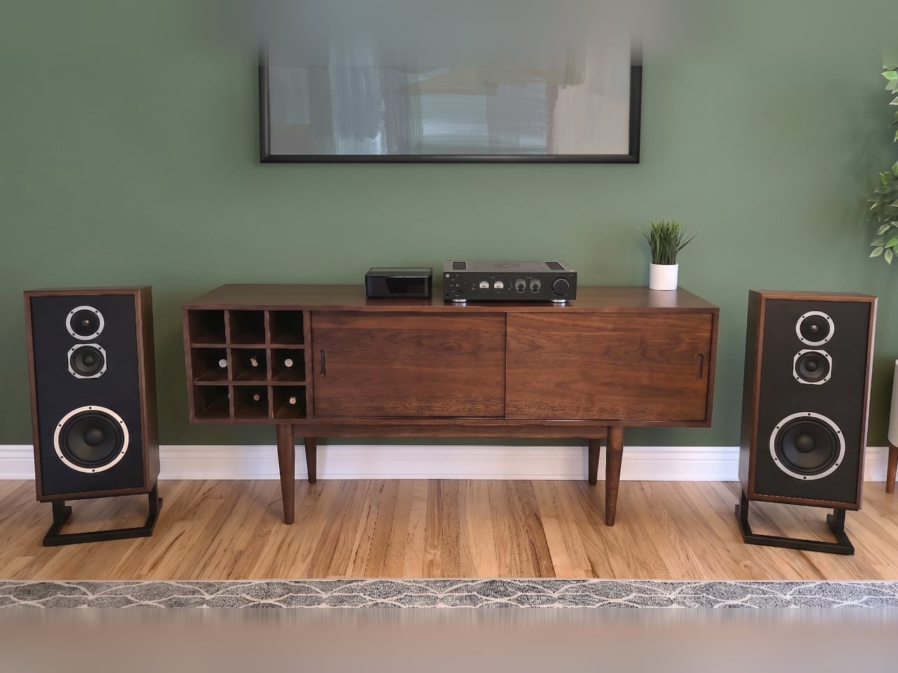
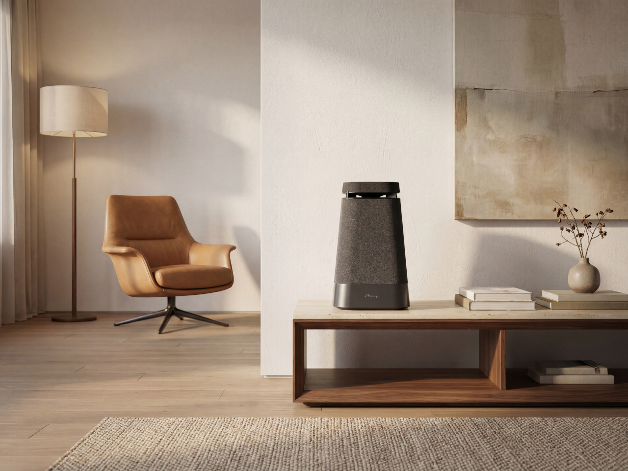
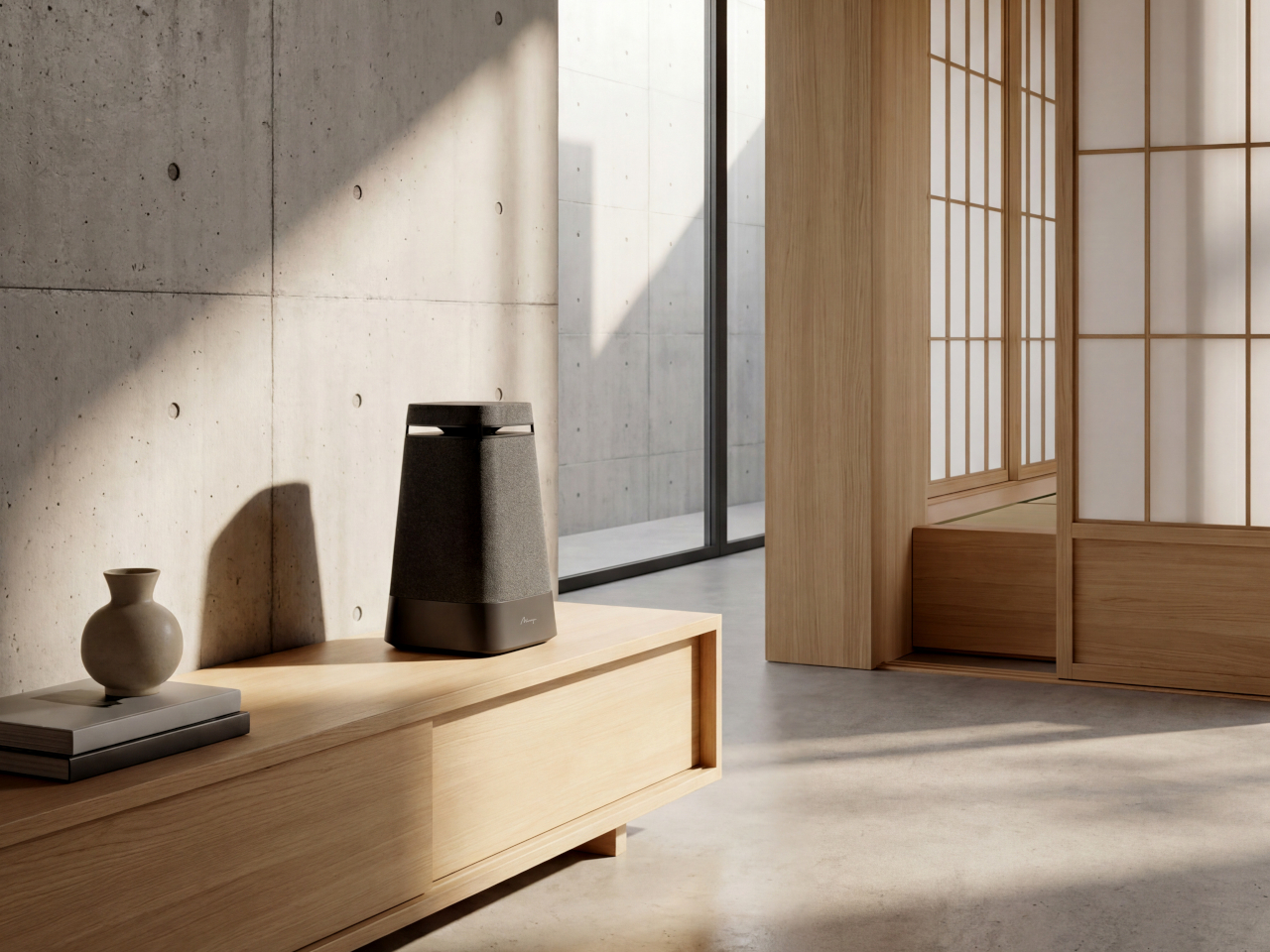
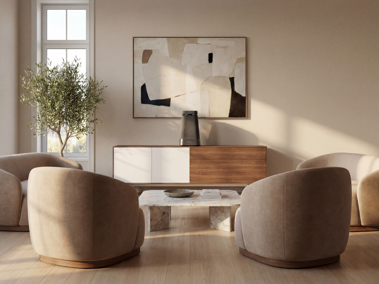
Most wireless speakers look like speakers. They announce themselves with grilles and ports and branding, and they tend to disappear into a corner or a shelf where the acoustic compromise of their placement gets quietly accepted. The room works around the speaker rather than the other way around. For a category that has grown enormously in the past decade, the design ambition behind most of what’s on the market hasn’t quite kept pace with the technology inside.
The Mirage Onda concept comes at that problem from two directions at once. On one side is a five-decade-old Canadian audio brand whose reputation was built on omnidirectional sound, long before the concept became a selling point for portable speakers. On the other is a design studio that has treated the speaker not as a functional box but as a sculptural object with genuine presence in a room.
Designer: Andrea Ponti (Ponti Design Studio)
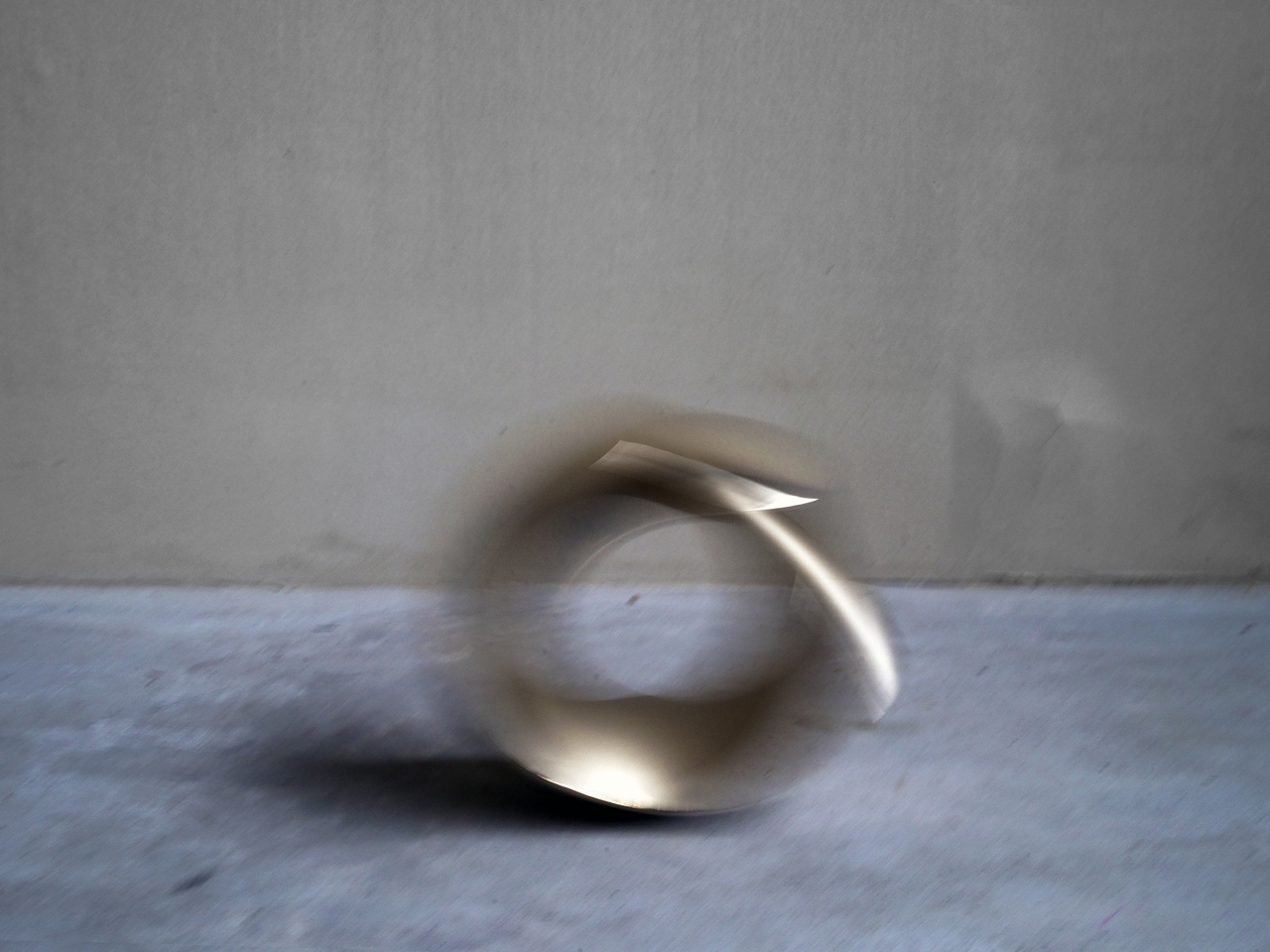
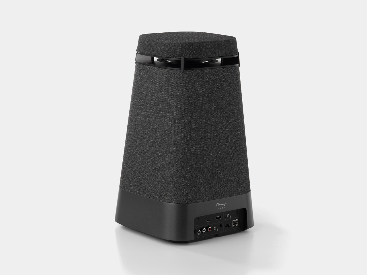
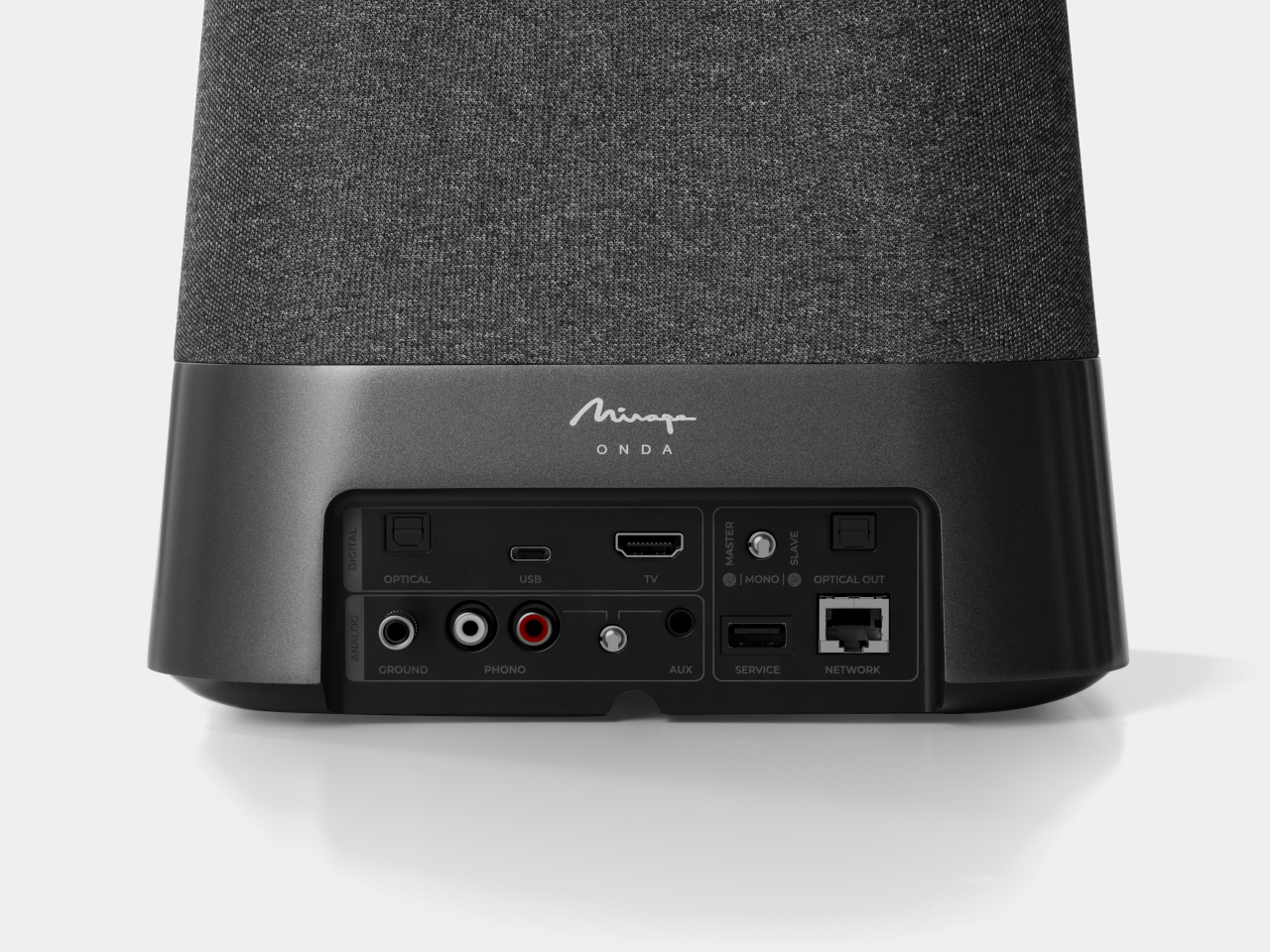
The brand history matters here. Mirage introduced the world’s first bipolar speaker in 1987, and spent the following decades developing omnipolar technology, the idea that sound should radiate in all directions as it does in a live space, rather than being aimed at a single listening position. That philosophy is what the Onda is built around. The speaker delivers a true 360-degree audio experience through its acoustic architecture: four woofers at the base produce warm, rounded bass that fills the room with depth and body, while an upward-facing midrange driver with a diffuser ensures even sound distribution, and a tweeter paired with a dedicated diffuser handles crisp high frequencies.
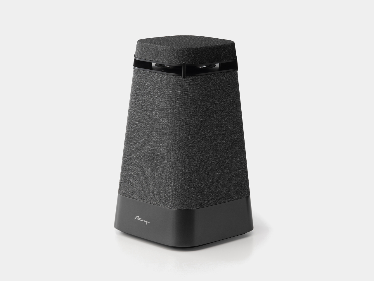
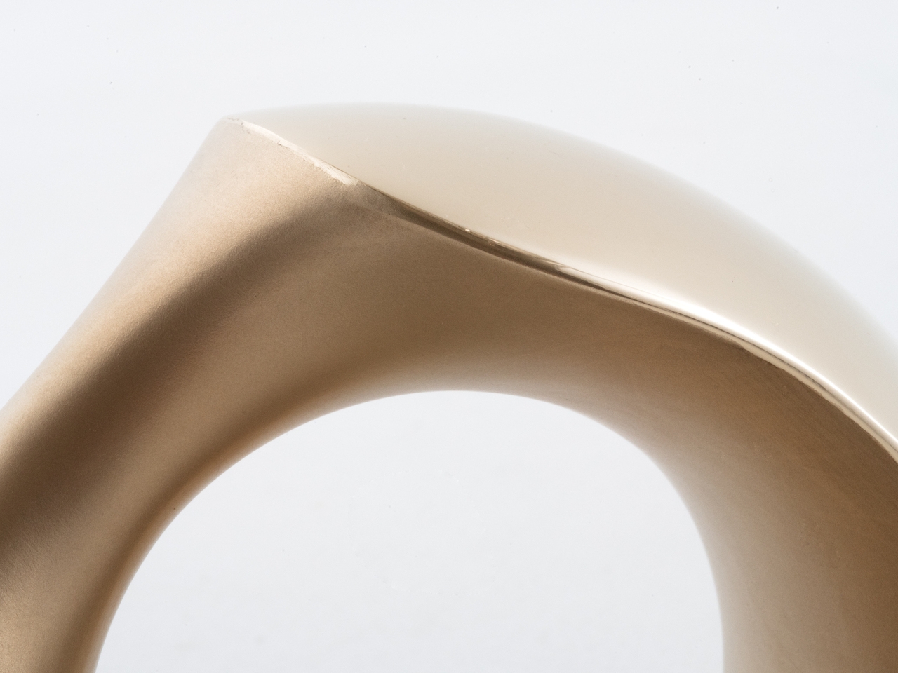
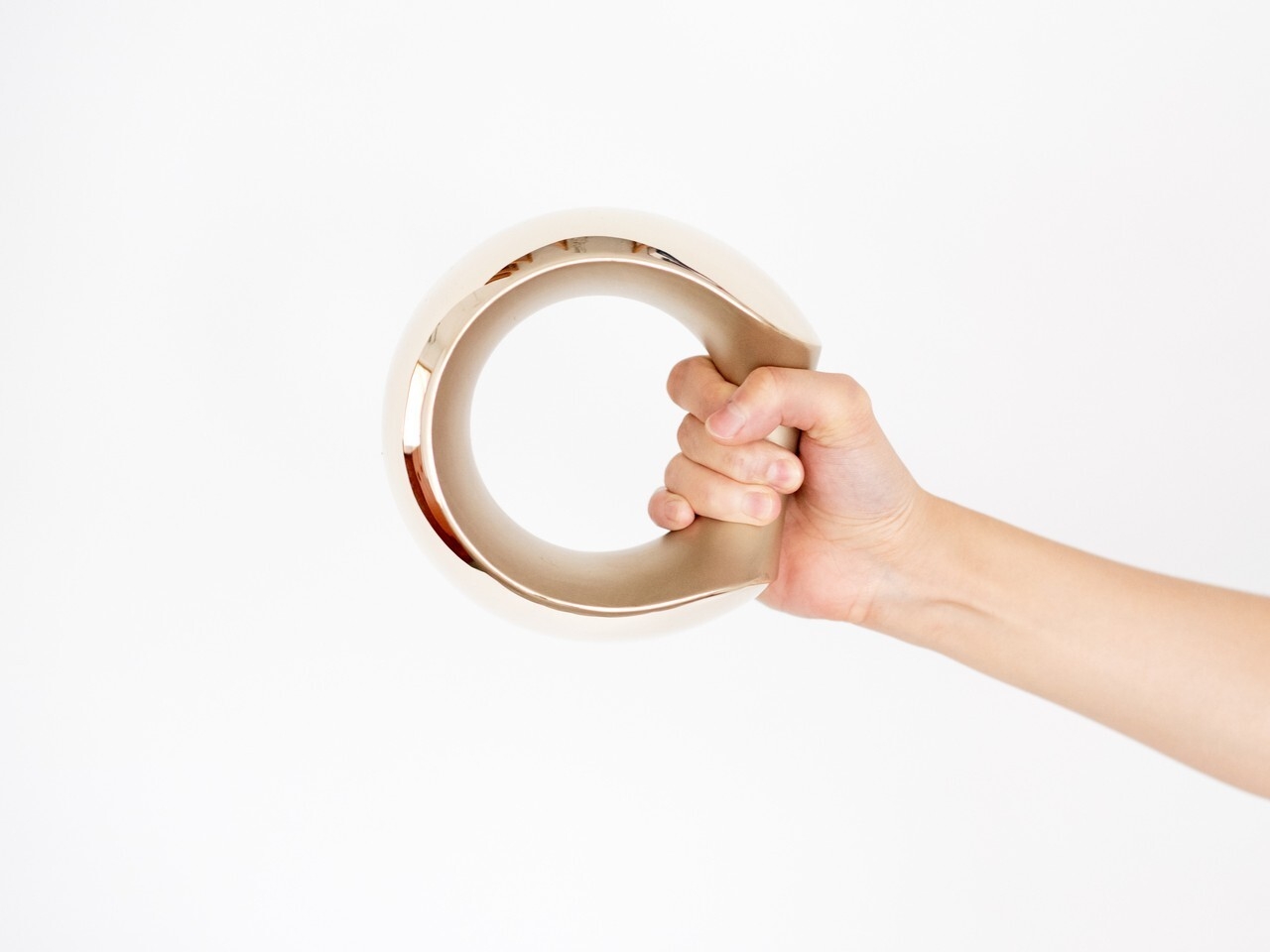
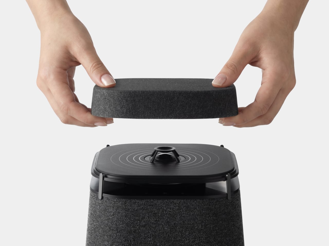
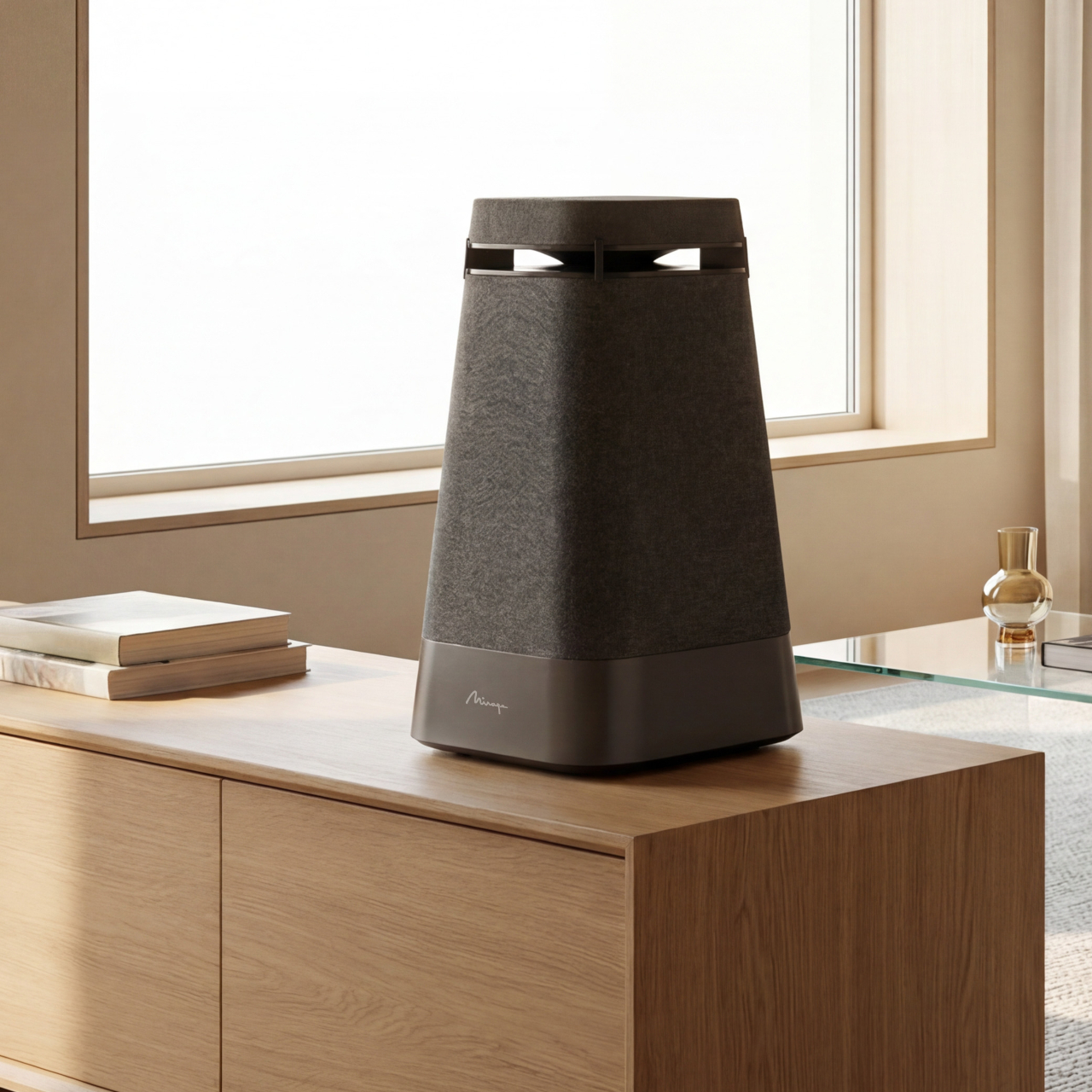
The result is a speaker that doesn’t ask you to position yourself relative to it. A discreet backlit touch interface sits between the lower body and the upper platform, while the removable magnetic upper grille lifts away to reveal the tweeter in Mirage’s signature deep purple. That upward-firing arrangement, coupled with the diffusers above and below, is what sends sound outward into the room in all directions rather than toward a fixed sweet spot.
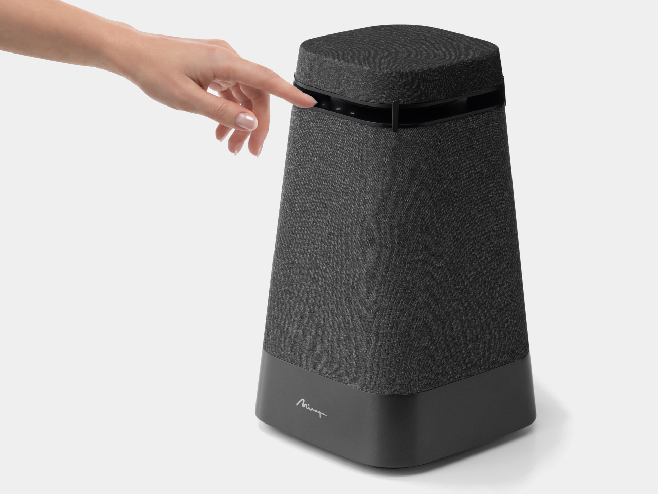
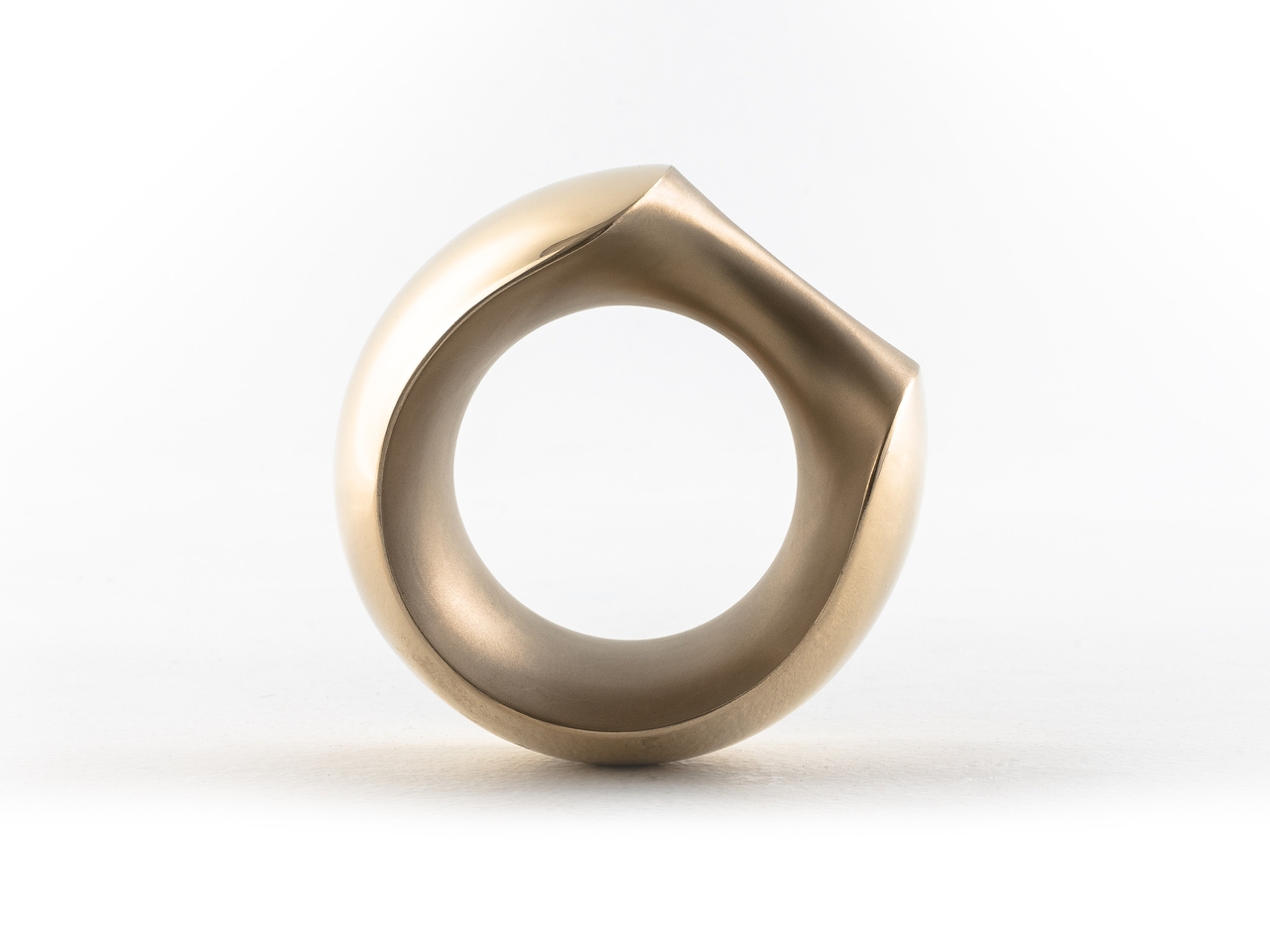
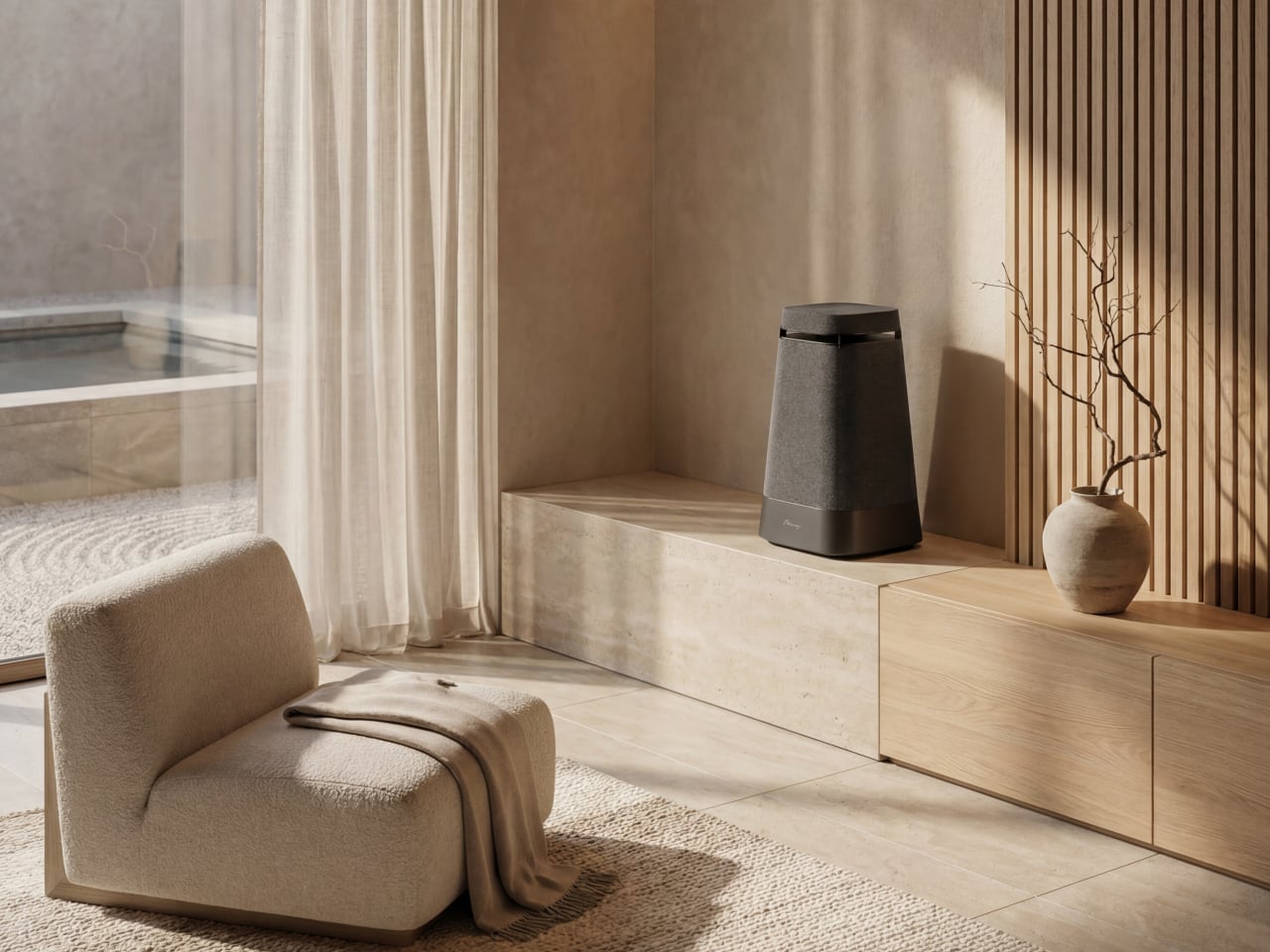
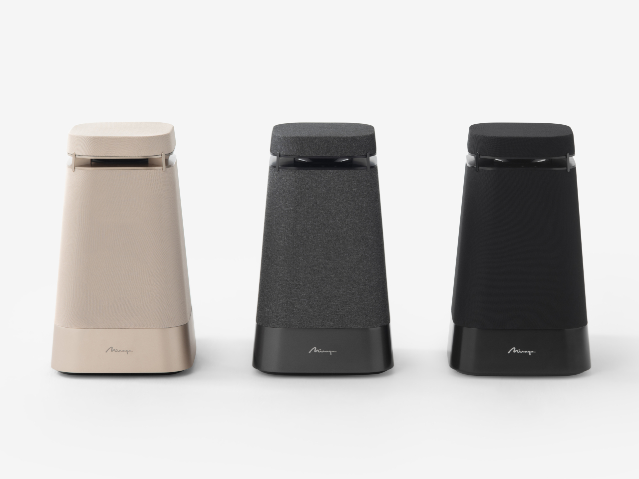
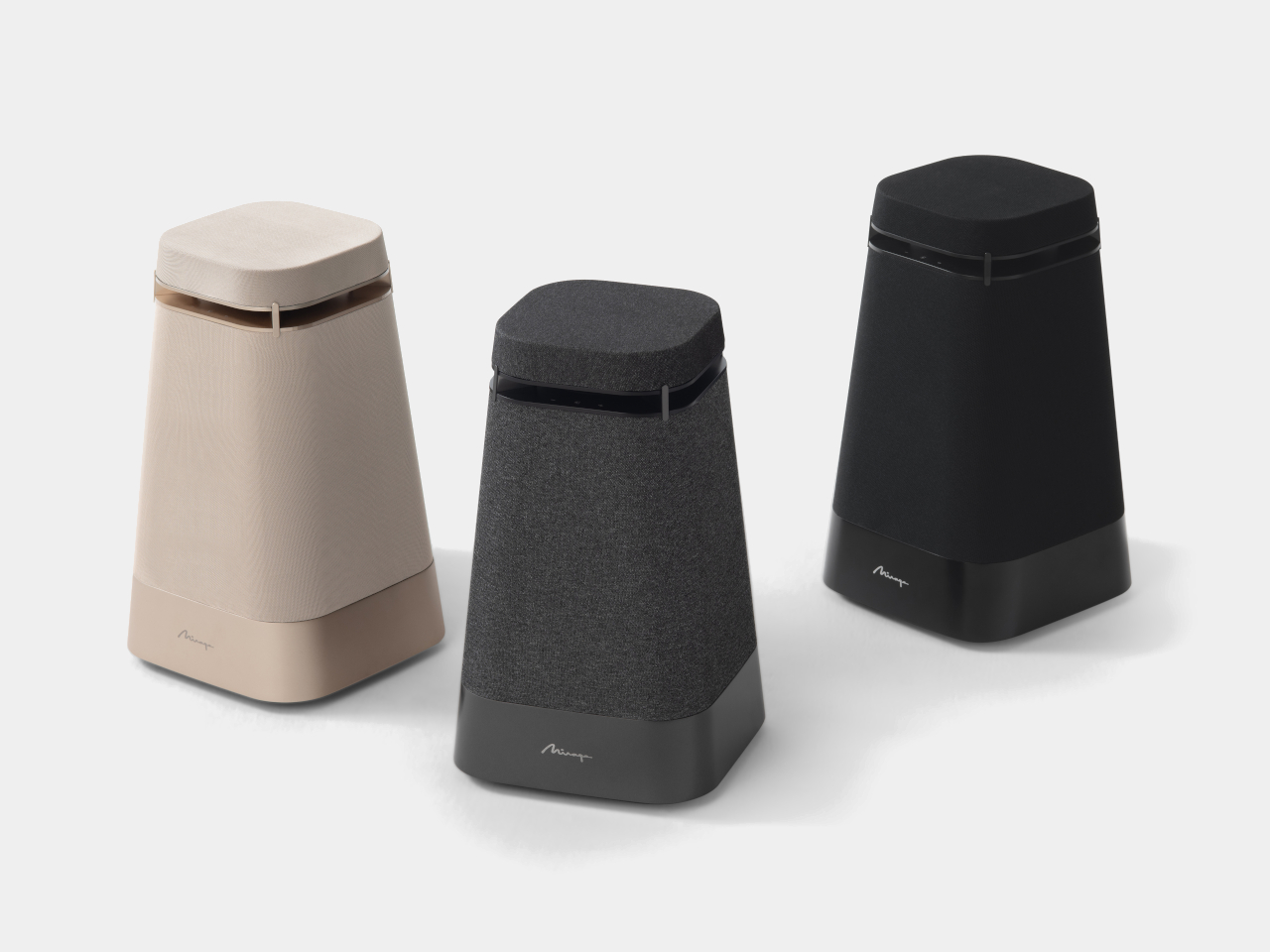
Four polished aluminum pillars connect the lower body to the upper platform in a striking suspended configuration, while the distinctive rounded-square footprint, softened edges, and monolithic silhouette give the speaker a timeless character that integrates effortlessly into modern environments. The fabric grille wraps the body in a dual-color textile that adds warmth to what could otherwise be a purely hard-edged industrial form. Three colorways are available, ranging from a warm sand tone to charcoal and all-black, each one giving the Onda a different character while keeping its proportions unchanged.
Put it in the center of a room, and it works. Put it on a side table or near a sofa, and it still works, because the sound isn’t dependent on where you happen to be sitting relative to the driver. That’s the practical promise of omnidirectional audio at the room scale, and it’s something that most mainstream speakers, regardless of price, simply don’t attempt.
Onda builds on Mirage’s legacy, blending heritage with minimalism and contemporary sophistication. The design reflects clarity, balance, and sculptural presence, which is a rare combination in an audio product that still has to justify its place in a room by actually sounding good. Both sides of that equation matter here, and the Mirage Onda takes both of them seriously.
The post The Sculptural Speaker Concept That Sounds Good From Every Spot in the Room first appeared on Yanko Design.