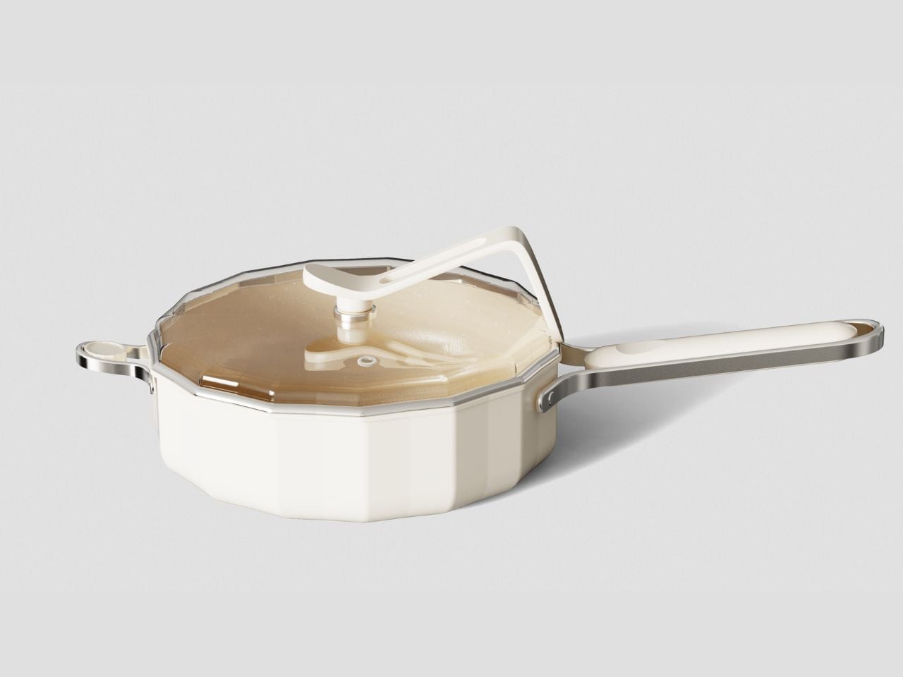
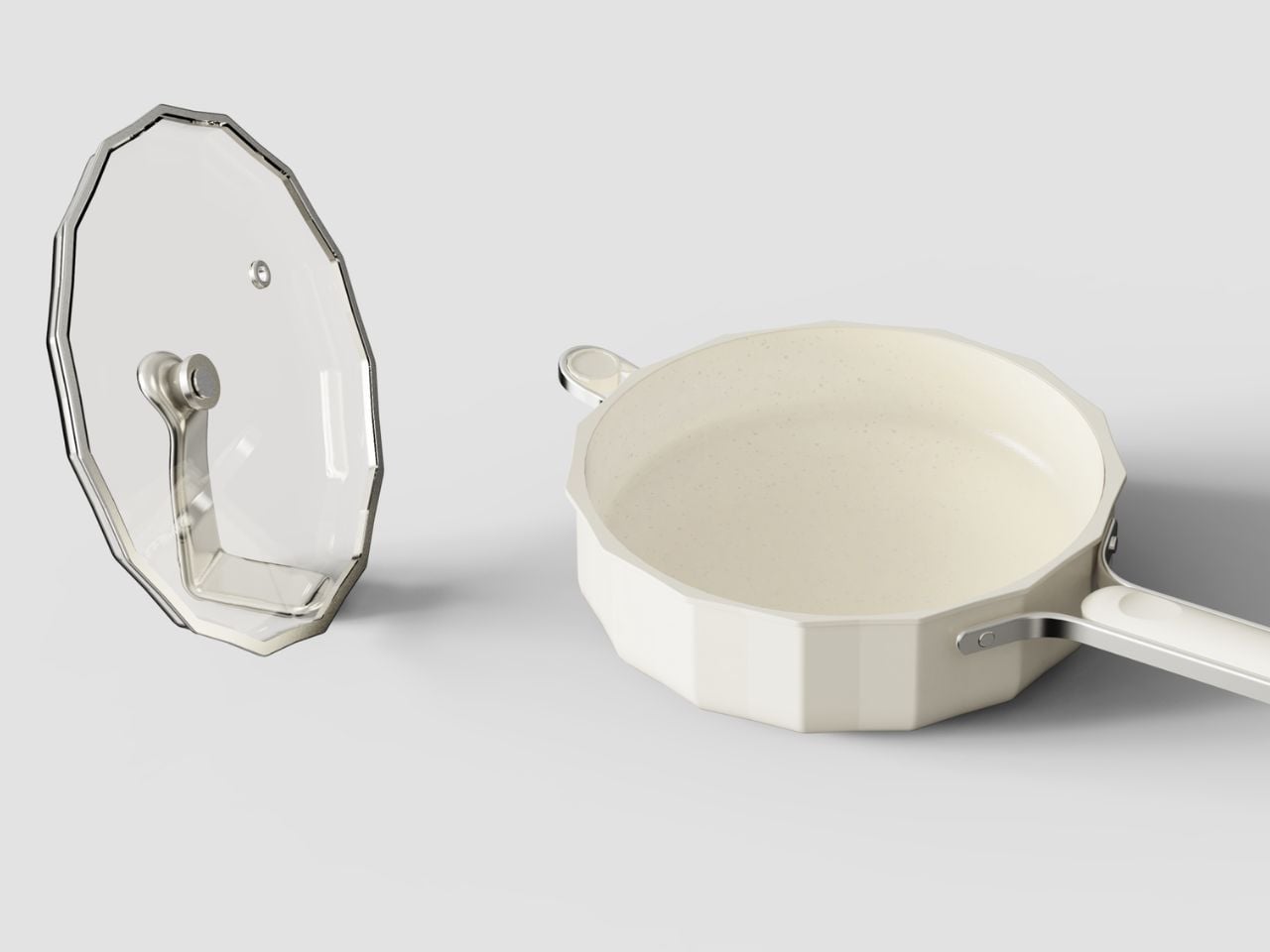
Genius Saucepan Lid Design Sits Vertically On Your Kitchen Counter While You Cook

Cookware is one of those product categories where familiarity can easily disguise bad design. A pan heats up, a lid comes off, a handle gets held. These actions are so routine that small frustrations are often accepted as part of cooking. Gresland Benc Artisan Cast Cookware approaches the category differently, treating each of these familiar interactions as an opportunity to reconsider how cookware should perform, feel, and age in a contemporary kitchen.

The cookware, designed by Christophe Paul Gresland for Gresland Benc Technology, was recognized as a 2025 European Product Design Award winner in the Home and Kitchen Accessories category. Much of its innovation sits beneath a deliberately restrained exterior. Its revolutionary multi-layered core, developed through advanced metallurgy, achieves greater thermal responsiveness and retention, heating 40% faster and distributing heat 30% more evenly than traditional cast counterparts while eliminating hotspots. For the cook, those numbers translate into something much more tangible: less waiting, more predictable results, and fewer areas of the cooking surface demanding constant attention.

Designer: Gresland-Benc Technology (Foshan) Co., Ltd., United Kingdom
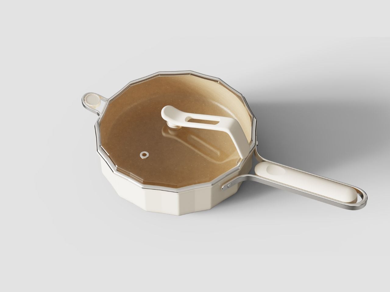
That performance is paired with some surprisingly thoughtful decisions around everyday use. The sculpted handle has been engineered for balance and comfort, but its more interesting contribution is how it responds to one of cooking’s most common and rarely addressed hazards. Removing a lid can release a concentrated burst of steam directly toward the hand. Here, the handle geometry has been considered specifically to reduce the risk of scalding from lid release steam. It is a small interaction, but one that reveals where the product’s priorities lie. Good kitchen design is rarely about adding more features. Often, it is about noticing where the user has quietly learned to compensate for the product.

The same thinking appears in details that are less dramatic but equally relevant. A flat base makes the cookware suitable for induction cooking ranges as well as conventional stovetops. It may seem like an expected feature today, yet it matters because cookware is usually purchased to last much longer than the appliance beneath it. Designing for different cooking environments makes the object more adaptable to changing kitchens and a broader range of users.
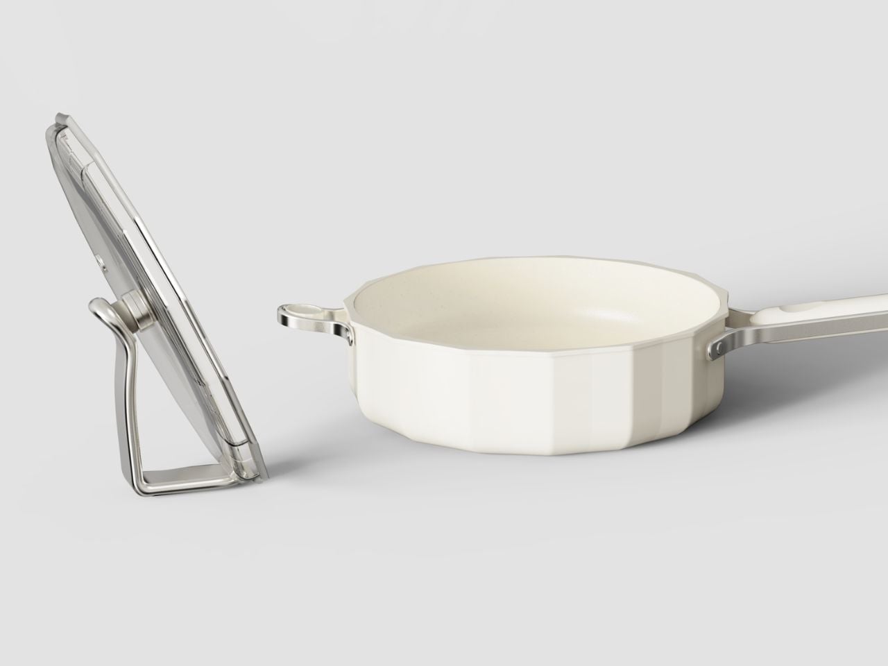
The external chamfered edges also bring function and form closer together. When the cookware is cold, the softened geometry provides a more comfortable surface to grip and maneuver. Visually, those edges prevent the form from appearing unnecessarily heavy, giving an otherwise substantial piece of cast cookware a more considered profile. It is an example of detailing that earns its place because it improves both handling and character.

Material choices extend that thinking beyond the immediate cooking experience. The cookware uses 85% recycled stainless steel alongside locally sourced components, while its zero-waste casting process is stated to meet B Corp environmental standards. For an object whose value is tied to durability, this feels particularly relevant. Sustainability is more convincing when it is embedded into how a product is manufactured rather than treated as an additional feature attached to it afterward.
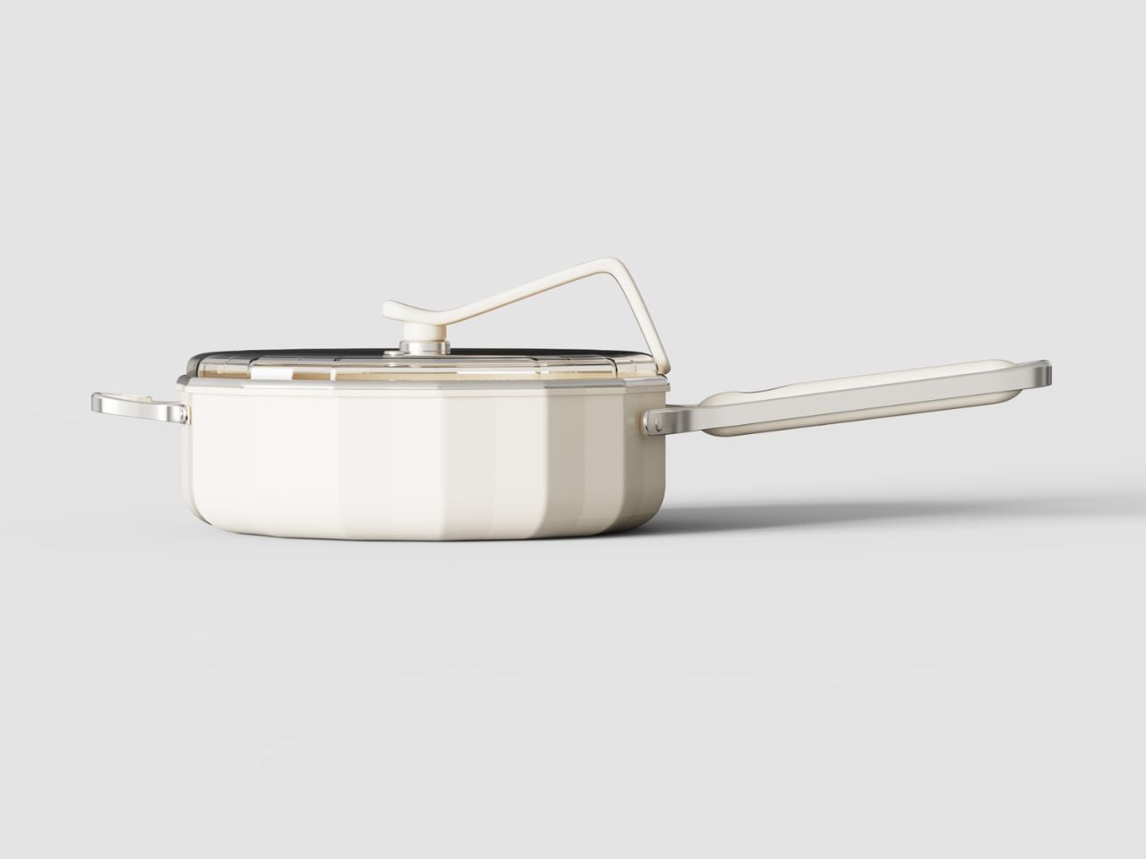
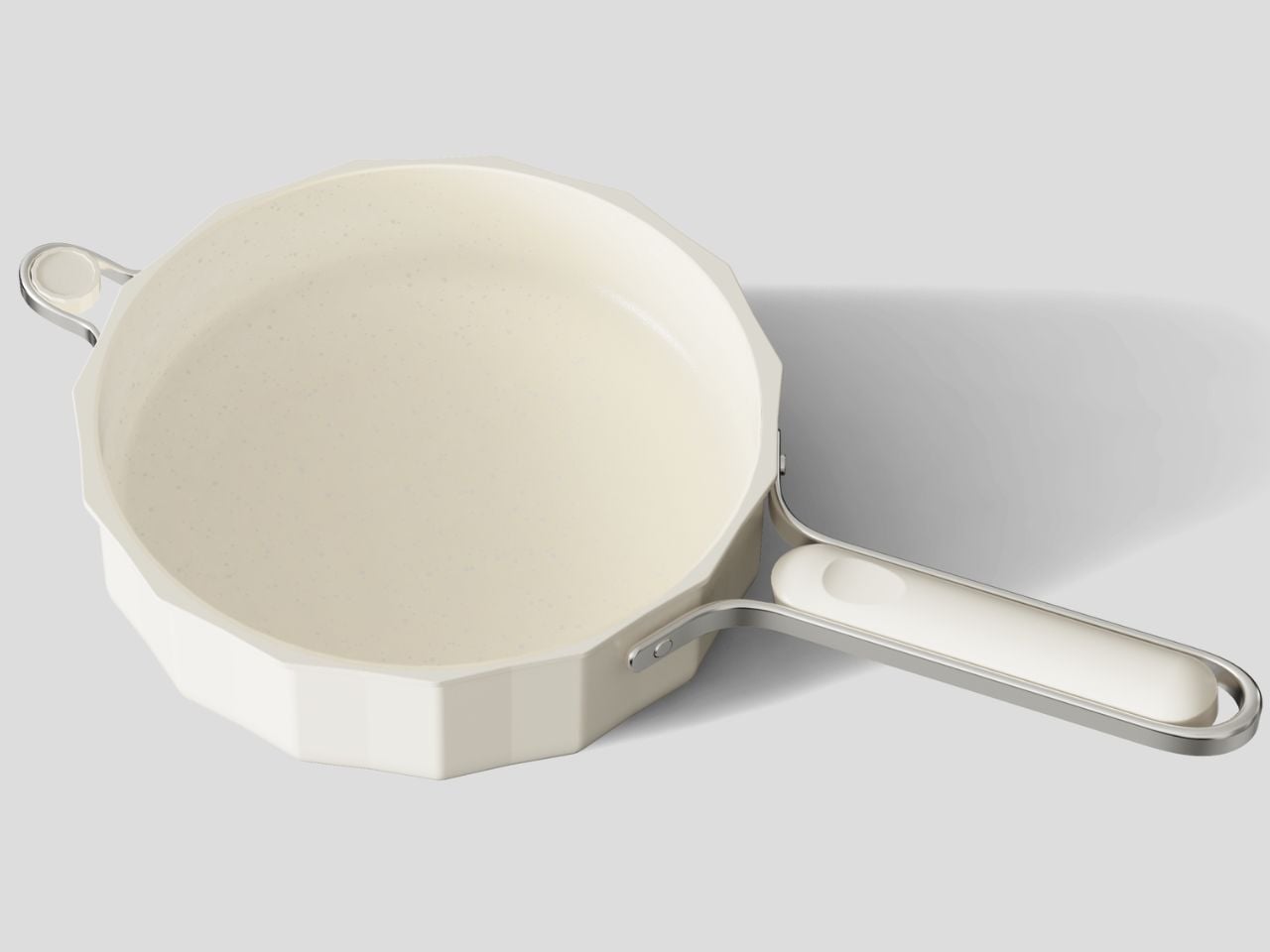
There is still one consideration that deserves attention. A metal handle can potentially absorb and retain heat during prolonged cooking. Depending on the final thermal isolation and construction of the handle, users may still need to remain aware of its temperature, particularly during extended stovetop use. It does not undo the strength of the design, but it is exactly the kind of practical behavior that matters in a product built around everyday physical interaction.

What makes Gresland Benc Artisan Cast Cookware compelling is that its most meaningful decisions are not limited to one headline innovation. Thermal performance, safer lid handling, induction compatibility, comfortable edges, material responsibility, and visual restraint all contribute to the same experience. It is cookware designed with an understanding that refinement often happens in the moments people barely notice, until someone designs them better.
The post Genius Saucepan Lid Design Sits Vertically On Your Kitchen Counter While You Cook first appeared on Yanko Design.
What If Your Spoon Could Evolve? This Designer Found Out

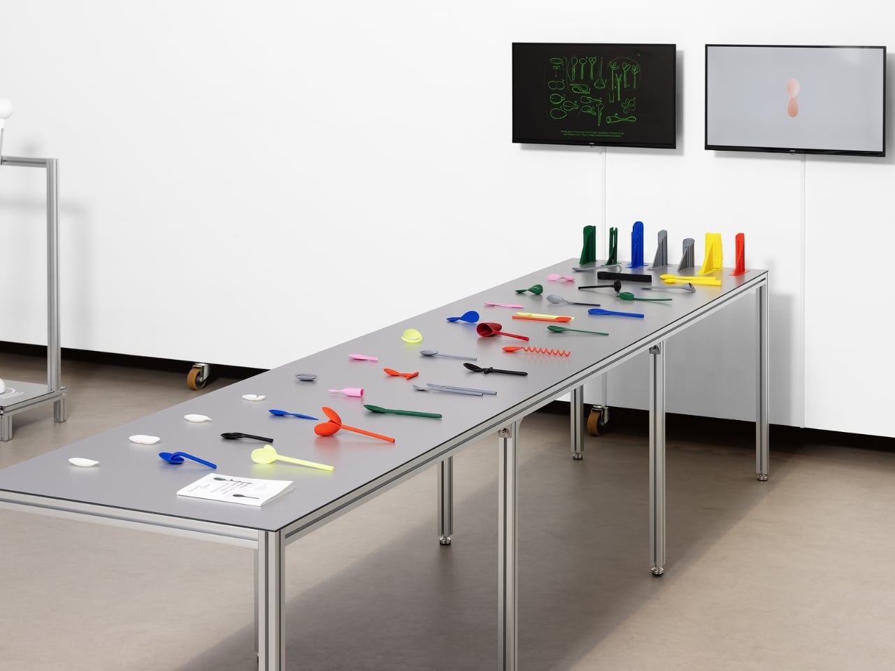
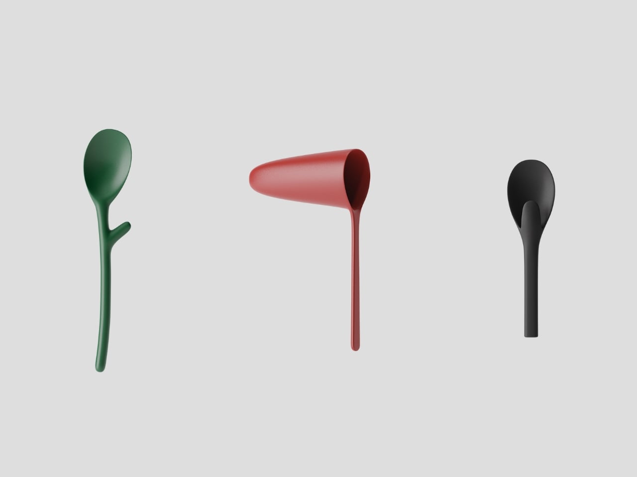
We use spoons dozens of times a day without giving them a second thought. They’re just there, scooping soup, stirring coffee, delivering cereal to our mouths with mechanical reliability. But BKID co asked a question that sounds almost absurd at first: what if spoons were alive? What if they could evolve like living organisms, adapting to their environment through the same forces that shaped every creature on Earth?

The result is Evolving Spoon, a project that treats cutlery like a species subject to Darwin’s rules. It’s part design experiment, part philosophical thought exercise, and entirely fascinating to look at.

Designer: BKID co

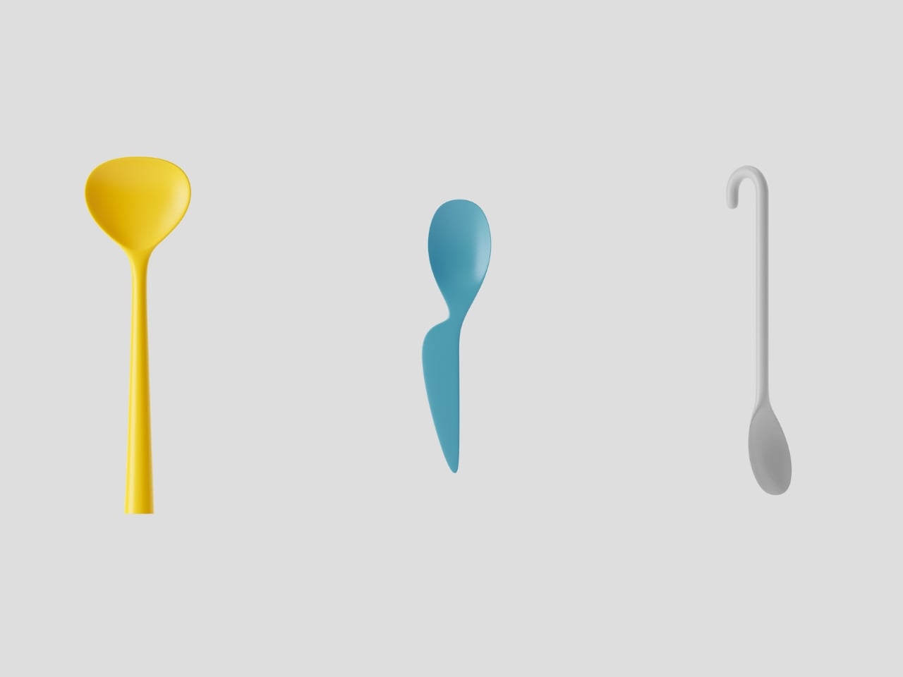
The premise starts with a simple observation. Spoons exist in a constantly changing ecosystem of human behavior. We eat different foods, adopt new dining styles, and our household compositions shift over time. If a spoon were a living thing responding to these environmental pressures, how would it transform? Would it grow branches to grip noodles better? Develop a hook for hanging? Split into multiple heads for sharing?

BKID co applied four key principles of Darwinian evolution to answer these questions. Recombination, where traits from different “parent” spoons merge to create hybrid offspring. Mutation, introducing random variations that might prove useful or utterly bizarre. Natural selection, where the most functional forms survive while impractical ones fade away. And the handicap principle, the counterintuitive idea that sometimes a costly trait signals quality, like a peacock’s unwieldy tail.

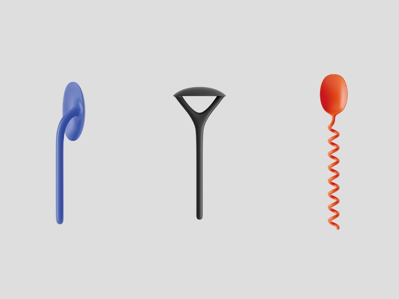
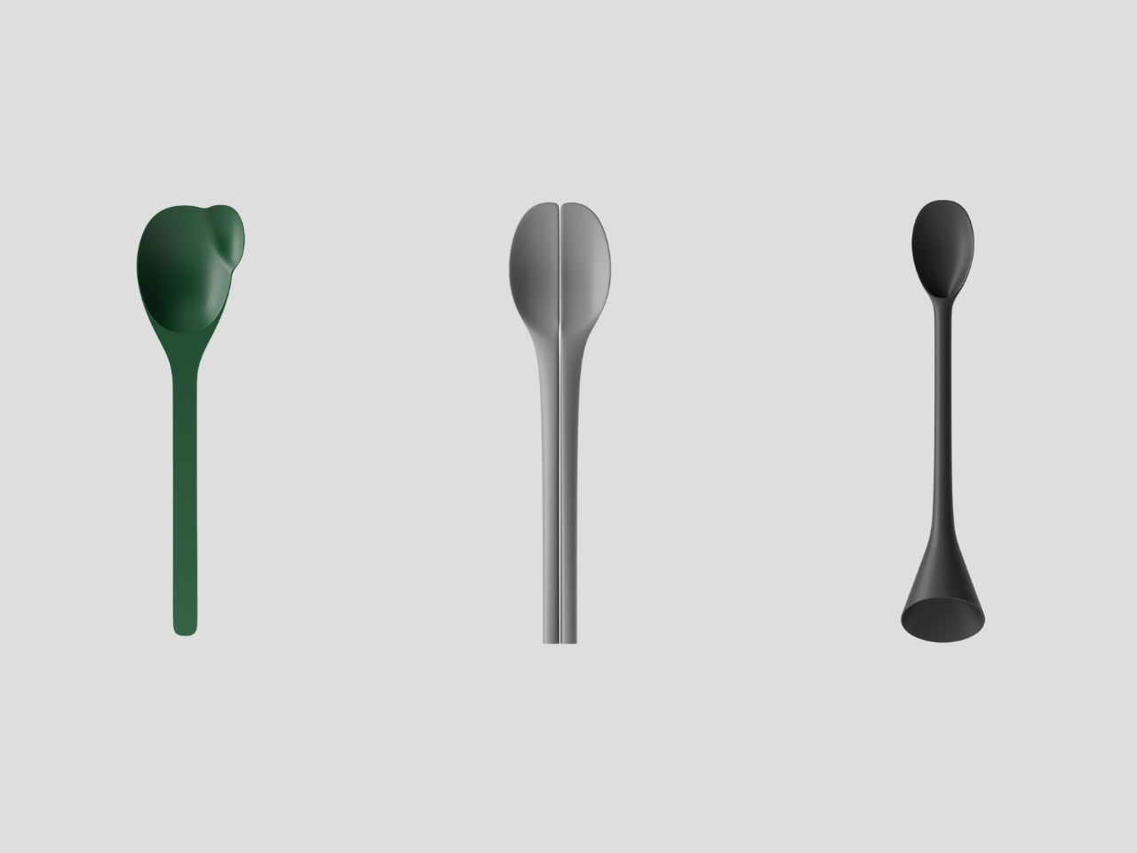
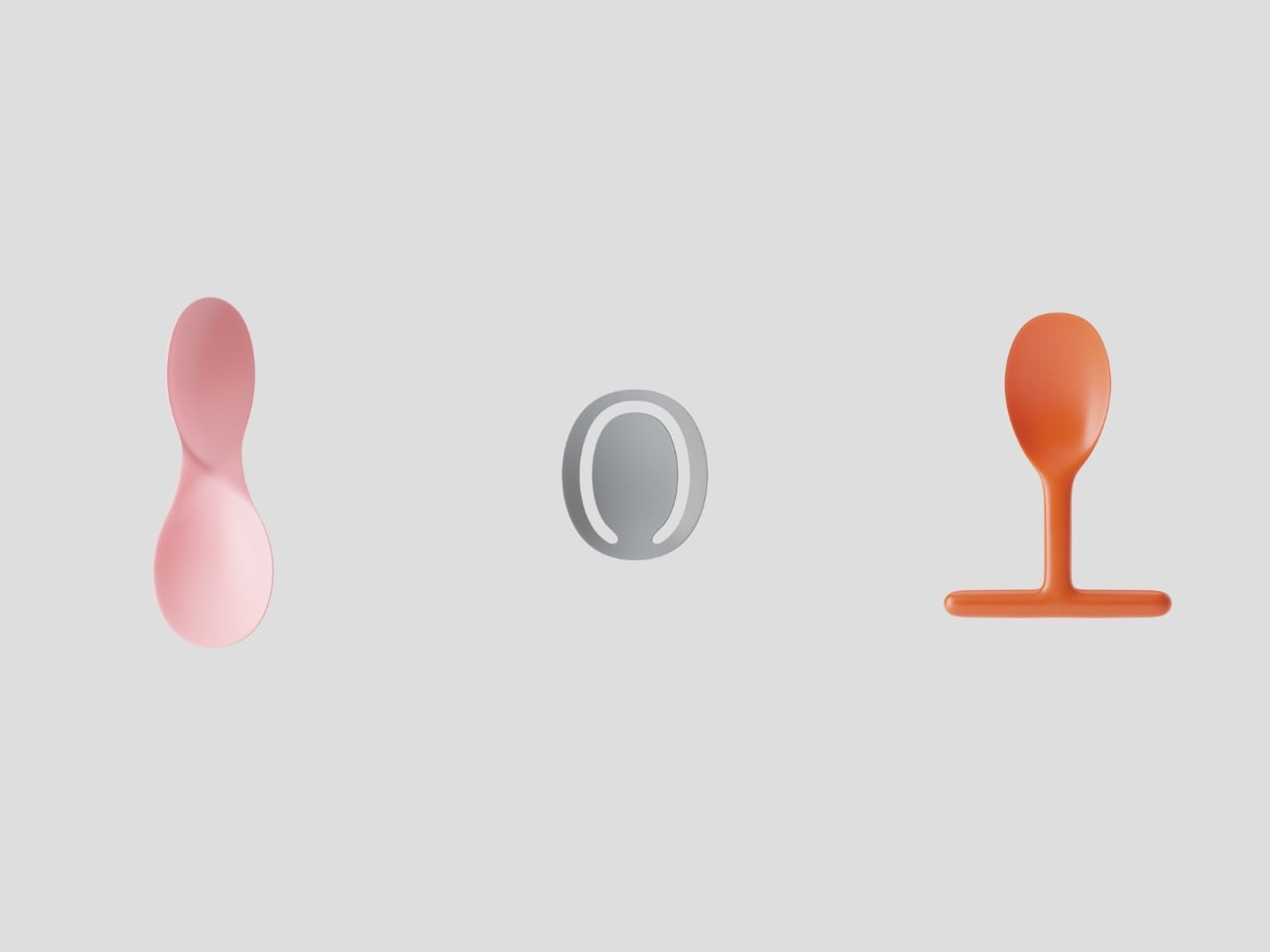
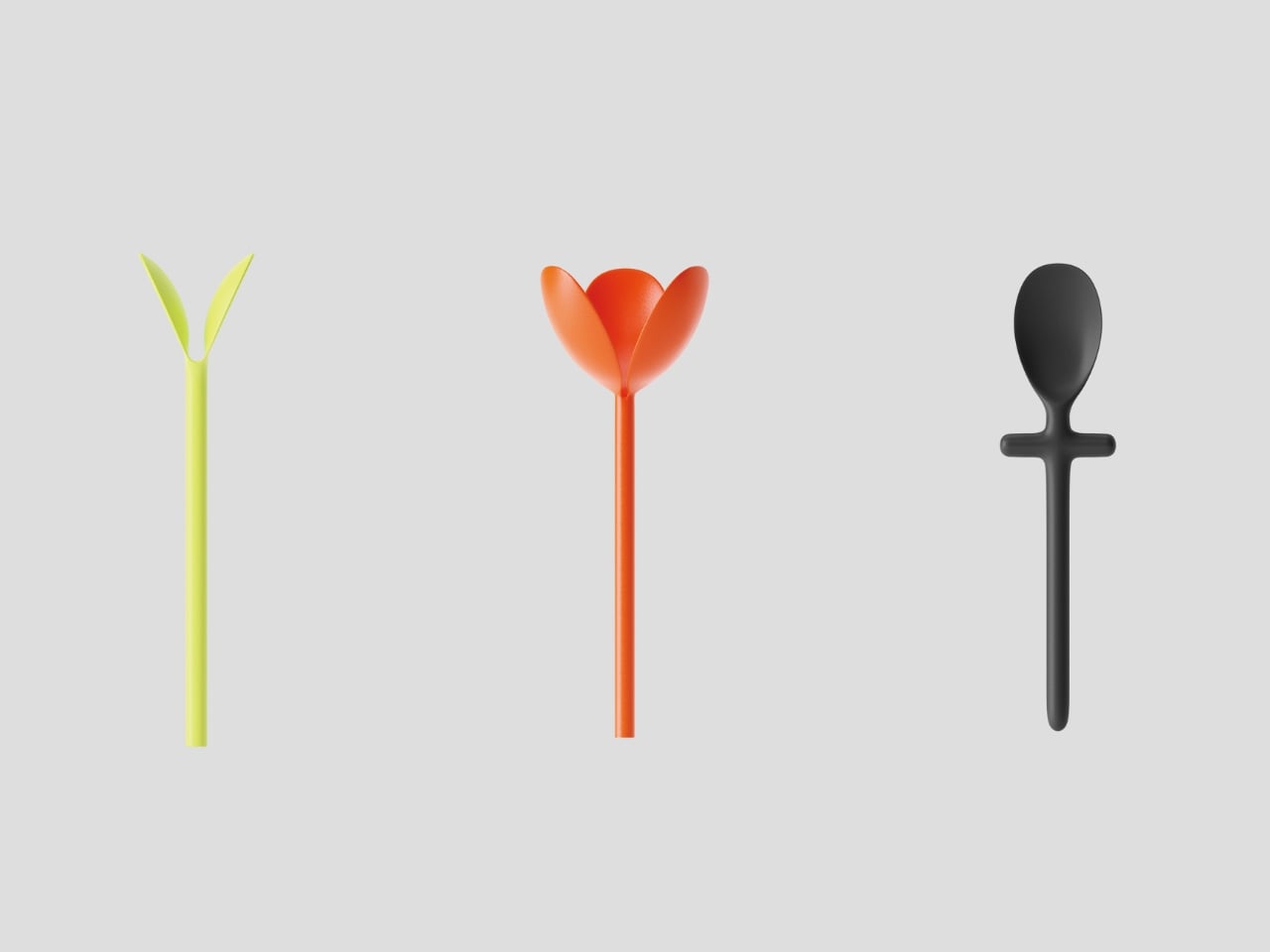
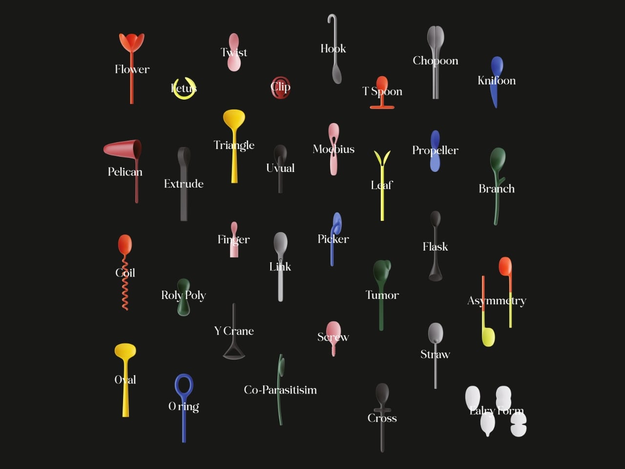
What emerges from this framework is a collection of spoons that look like they belong in a natural history museum of an alternate universe. There’s one with a spiraling corkscrew handle, as if it adapted to stir thick liquids with maximum efficiency. Another splits into a tulip shape at the bowl, perhaps “evolving” to let multiple people eat from the same dish. A green spoon sprouts a small branch from its handle, like it’s halfway between cutlery and plant life.

Some designs feel almost uncomfortably organic. A pink spoon curves with an hourglass figure that suggests it mutated for ergonomic grip. A black spoon with a triangular cutout in its handle looks like it underwent natural selection for lighter weight and material efficiency. Others border on the absurd, which is precisely the point. Evolution doesn’t always produce sleek perfection. Sometimes it creates the platypus or the blobfish, creatures that work despite looking deeply weird.

The technical execution deserves attention too. BKID co used FDM 3D printing, a process that deposits material layer by layer, making each spoon a physical artifact of a future that doesn’t exist. The designers describe it as creating fossils of imaginary life forms. That framing transforms these objects from mere design experiments into something more poetic. They’re evidence of parallel evolution, proof that form follows function even in hypothetical scenarios.

The project’s real brilliance lies in how it makes us reconsider the ordinary. We think of spoons as finished objects, perfected centuries ago and now simply manufactured in endless identical copies. But Evolving Spoon suggests that even the most mundane tools exist in dialogue with their environment. They could adapt, specialize, diversify. A spoon for soup doesn’t need to look like a spoon for ice cream, which doesn’t need to resemble a spoon for medicine.

It also raises questions about design philosophy in an age of digital fabrication. When 3D printers can produce any shape as easily as they produce standard forms, why do we keep making the same objects over and over? Evolution thrives on variation. Maybe our material culture should too. Displayed together, these mutant spoons create a taxonomy of possibilities. Some would actually work better than conventional designs for specific tasks. Others are pure speculation, beautiful or strange but not particularly functional. All of them challenge the assumption that objects are static, that a spoon in 2026 should look identical to a spoon from 1926.

BKID co hasn’t just designed weird spoons. They’ve built a bridge between biology and product design, using evolutionary theory as a creative engine. The result is playful, thought-provoking, and visually arresting. It reminds us that even in the mundane act of eating, there’s room for imagination, adaptation, and a little bit of evolutionary chaos.

The post What If Your Spoon Could Evolve? This Designer Found Out first appeared on Yanko Design.
This Cutlery Set Celebrates the Machine That Made It

There’s something inherently rebellious about celebrating the process instead of hiding it. But most products are still designed to look effortlessly smooth, polished to perfection, and stripped of any trace of how they came to be. Atelier Andy Carson’s G-Code flatware takes the opposite approach. This cutlery set doesn’t just acknowledge its manufacturing origins, it flaunts them.

The name itself is a clever nod to the digital backbone of modern production. G-code is the programming language that tells CNC machines exactly where to cut, mill, and carve. It’s the invisible blueprint that translates design into reality, one precise coordinate at a time. By naming this flatware collection after that very code, Australian-based designer Andy Carson and his collaborator Sam Collett are making a bold statement: the machine is not just a tool, it’s part of the story.

Designer: Atelier Andy Carson

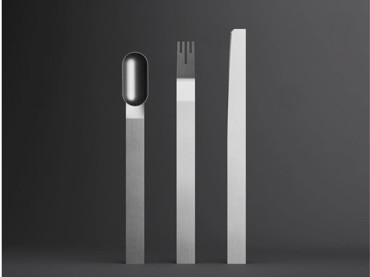
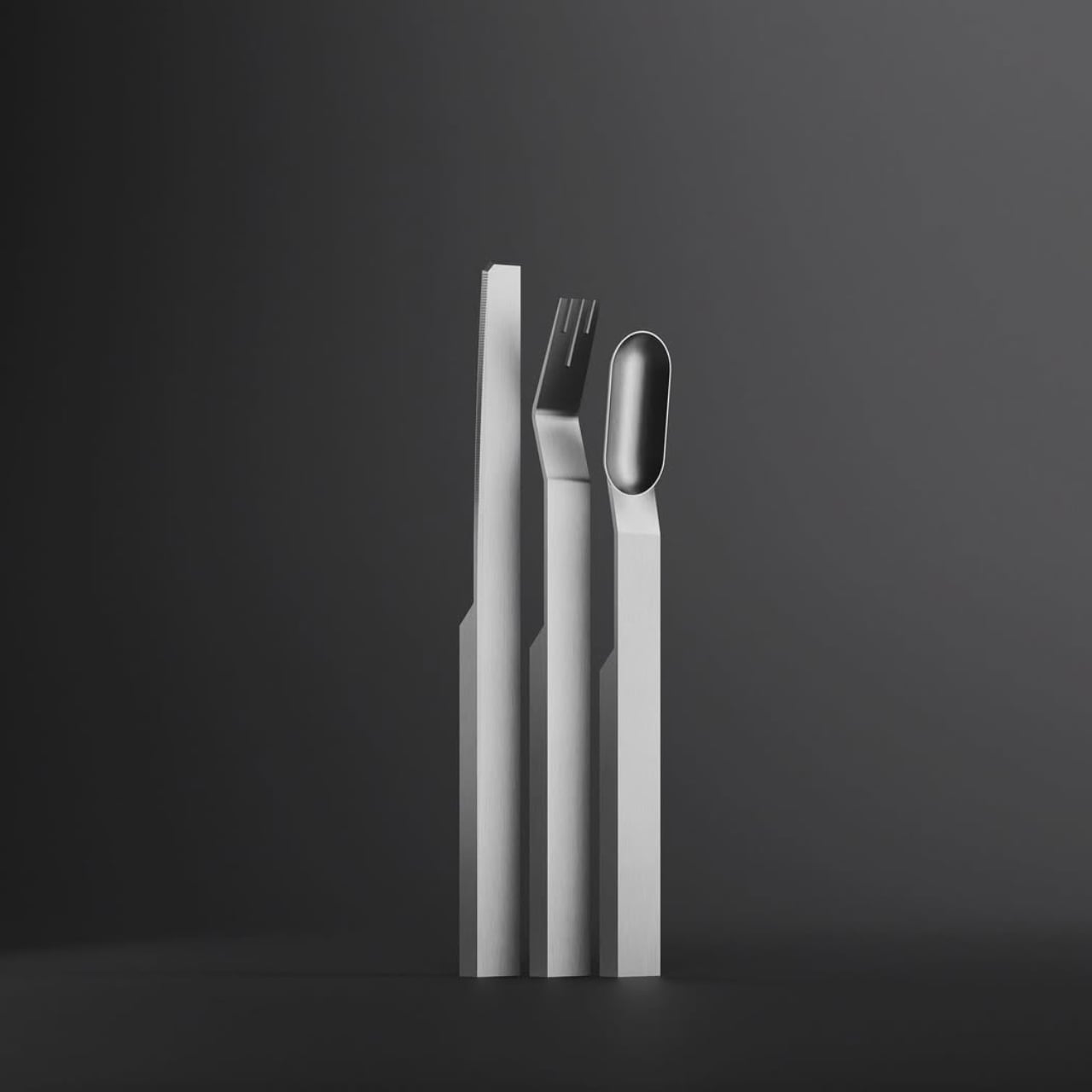
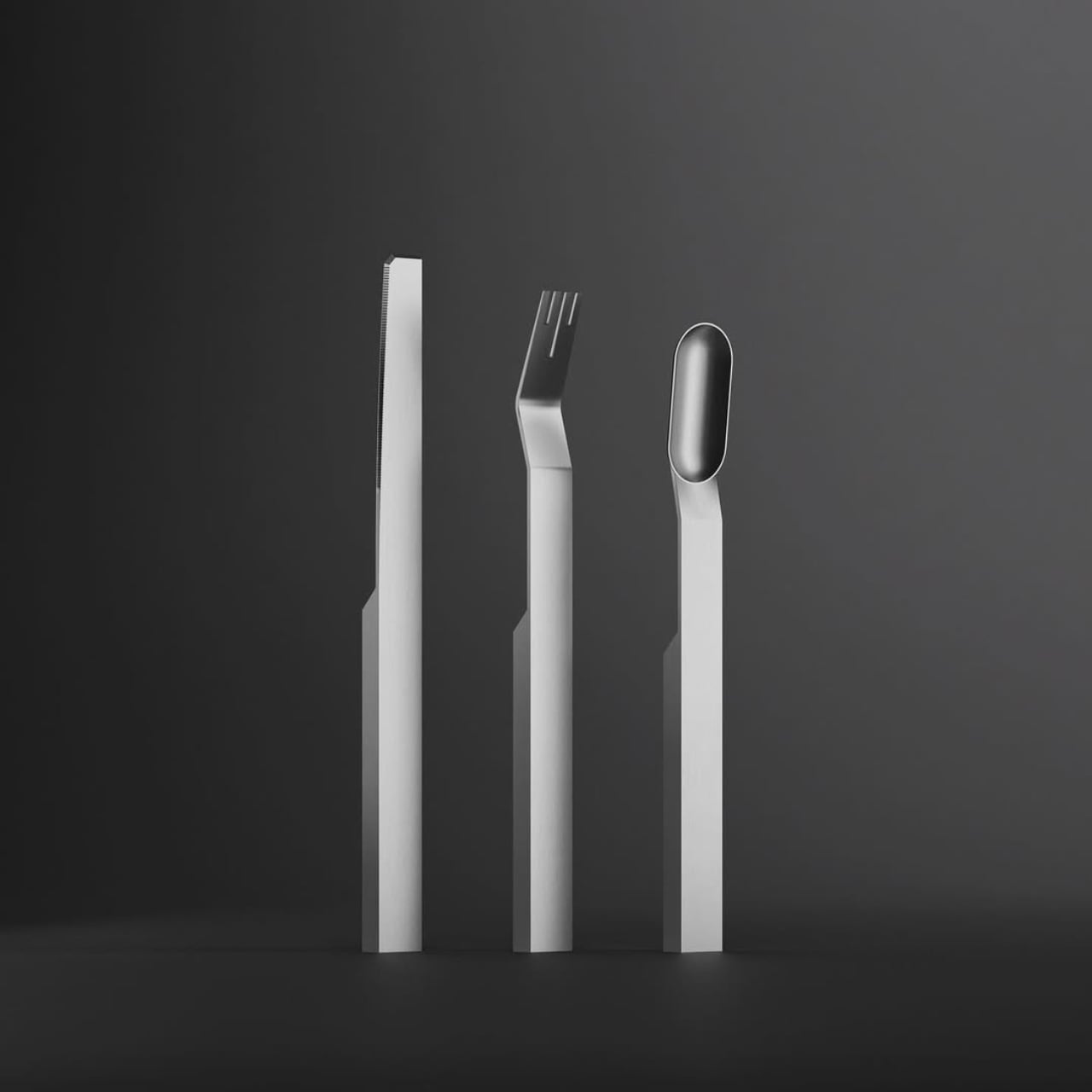
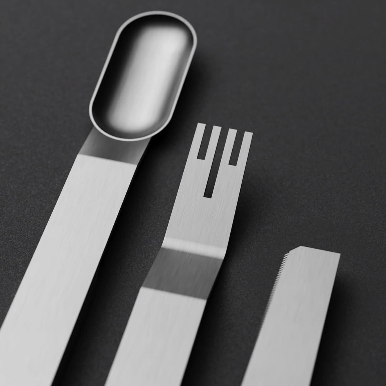
You can see that story in every angle of these pieces. Each implement in the set, a knife, fork, and spoon, is milled from solid stainless steel bar stock. There’s no stamping, no casting, no traditional manufacturing shortcuts that would smooth away the evidence of creation. Instead, what you get are geometric forms with crisp edges, flat planes, and subtle facets that catch the light in unexpected ways.

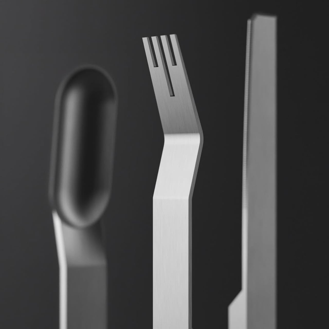
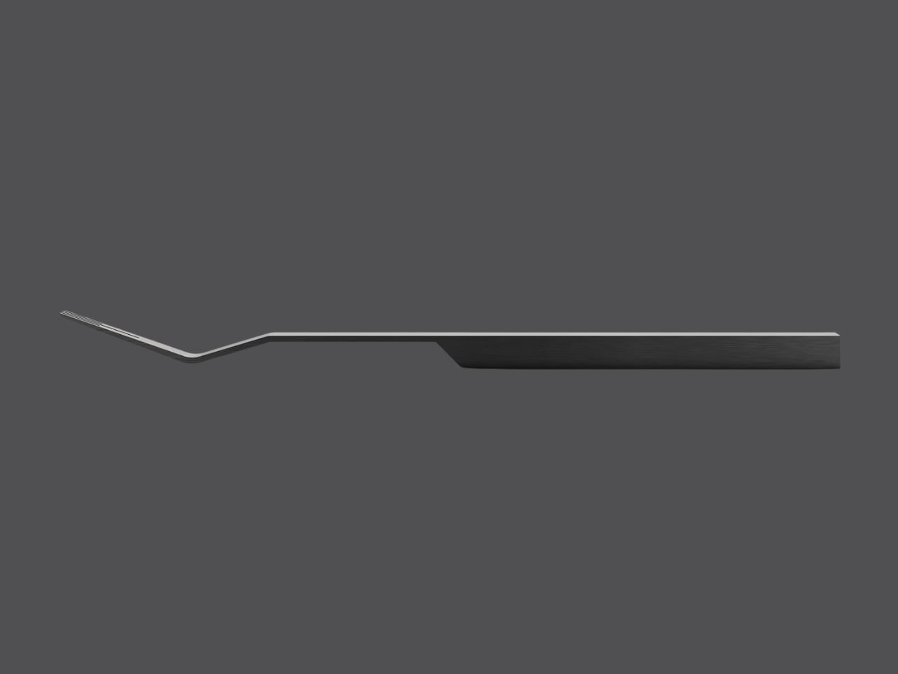
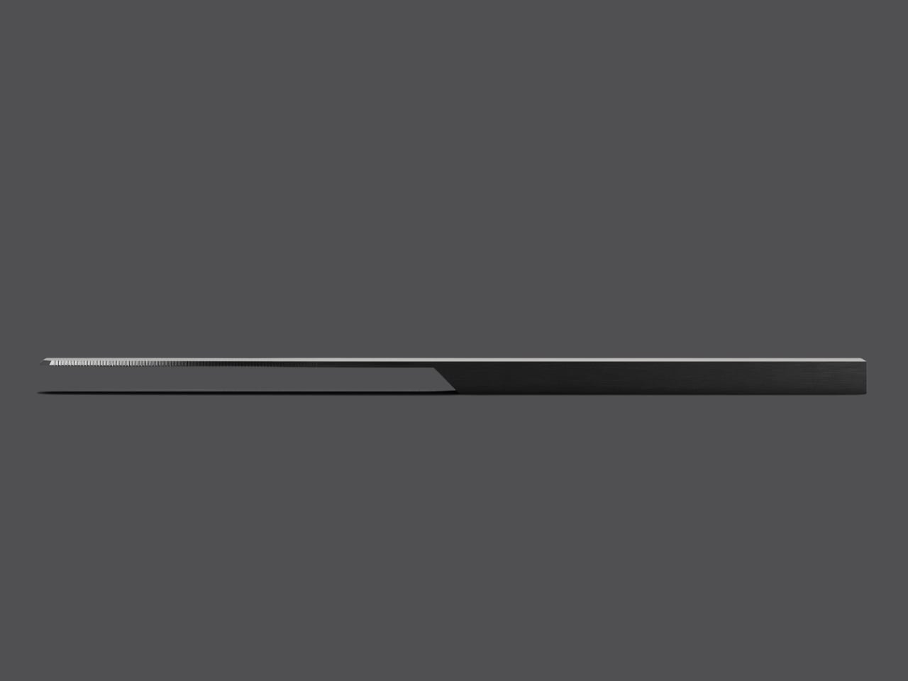
The aesthetic is unapologetically industrial, yet somehow it doesn’t feel cold or impersonal. The handles are rectangular and minimalist, tapering slightly as they extend toward the functional end. The fork features an intriguing angular bend that adds sculptural interest while maintaining perfect balance. The spoon’s oval head sits atop its geometric handle like a carefully considered punctuation mark. Even the knife, with its serrated edge, feels more like a piece of architecture than a simple eating utensil.

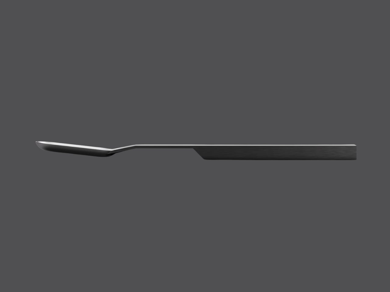
What makes this design particularly smart is how form and function work together so seamlessly. The weighted handles aren’t just about aesthetics or that satisfying heft you feel when you pick one up. They serve a practical purpose, ensuring that the head of each utensil hovers above the table surface when you set it down. It’s a thoughtful touch that addresses hygiene without requiring a separate knife rest or worrying about sauce staining your tablecloth. This approach challenges the conventions of how cutlery is typically made and what it’s supposed to look like. Most flatware relies on stamping or casting to achieve smooth, anonymous forms that disappear into the background of a meal. G-Code does the opposite. It asks to be noticed, to be appreciated not just as a functional object but as a celebration of precision manufacturing.

There’s a broader conversation happening here about honesty in design. In an era when so much of what we consume is mass-produced but styled to look artisanal, G-Code takes the reverse path. It’s a product that embraces its machined origins and turns them into a virtue. The flat surfaces, the geometric precision, the visible traces of the milling process, these aren’t flaws to be hidden. They’re features to be celebrated.

The monochromatic photography that accompanies the project only reinforces this philosophy. Shot against dark gray backgrounds, the flatware pieces stand like monoliths, their shadows as carefully composed as the objects themselves. The lighting emphasizes every edge, every transition from one plane to another, revealing the complexity within apparent simplicity. It’s worth noting that this isn’t just an exercise in theoretical design. These pieces are meant to be used, held, experienced. The matte finish on the stainless steel provides just enough grip without feeling rough. The proportions are calibrated for comfort. The balance point of each piece feels natural in your hand.

In a design landscape often dominated by either hyper-ornamentation or bland minimalism, G-Code carves out its own territory. It proves that celebrating manufacturing processes doesn’t mean sacrificing elegance, and that industrial aesthetics can coexist with everyday functionality. It’s flatware that makes you think about how things are made, why certain choices matter, and what it means when a designer decides to show their work rather than hide it. For anyone who appreciates when form, function, and manufacturing philosophy align perfectly, G-Code is a masterclass in intentional design. It’s proof that sometimes the most interesting stories are told not by what we conceal, but by what we choose to reveal.

The post This Cutlery Set Celebrates the Machine That Made It first appeared on Yanko Design.