The Most Creative Public Space Design Right Now Is Made of Trash

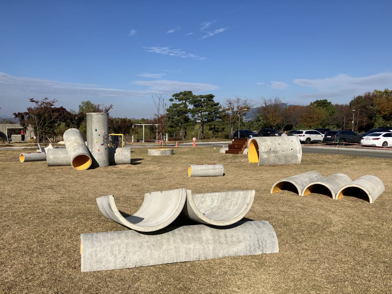
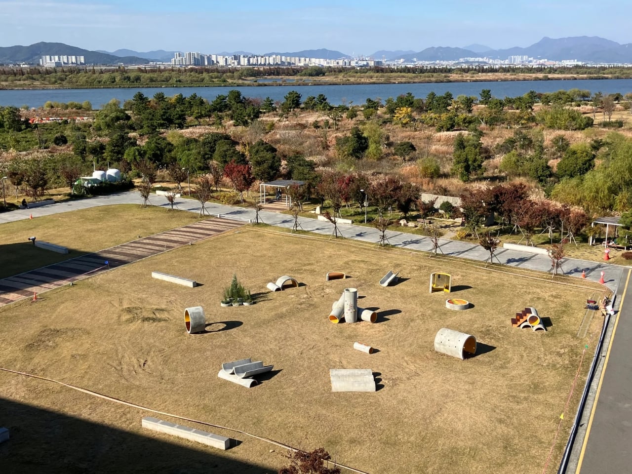
The first time I saw images of Concrete Utopia, I assumed it was a render. The kind of thing that circulates on design Instagram before quietly disappearing into the “concepts that never got built” pile. Chunky grey pipes arranged in an open courtyard, people moving through and around them like it was always supposed to be this way. But the project is real, it lives outside the Museum of Contemporary Art Busan in South Korea, and the more I sat with the images, the more I found myself studying them the way you study something that seems simple until it isn’t.

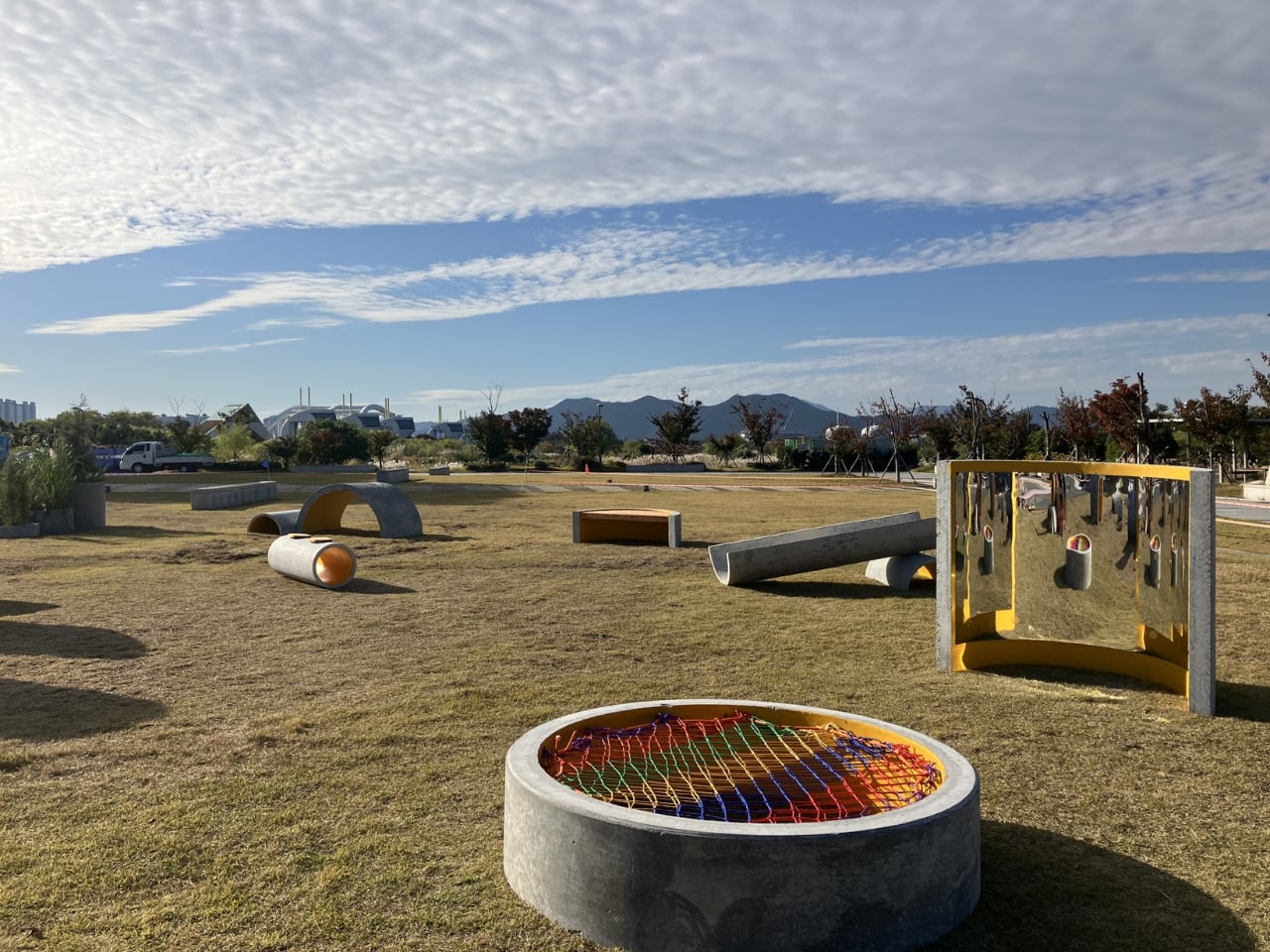
Concrete Utopia is the work of South Korean designer Hyunje Joo. The material is straightforward: discarded concrete pipes, the kind used in construction infrastructure and typically hauled away once a build wraps up. What Joo does with them is the interesting part. Rather than disguising or dramatically transforming them, he arranges the pipes into a configuration that preserves exactly what they are while completely changing what they do. The cylinders are grouped and stacked at varying orientations, creating a composition that reads less like a salvage pile and more like a spatial argument. You can tell it was designed. You just can’t immediately tell how.

Designer: Hyunje Joo

The circular geometry is doing a lot of work here. Repetition is a classic design tool, but it tends to flatten things when overused. Joo avoids that by letting the pipes vary in how they cluster and orient without introducing anything new to the material vocabulary. The result is a rhythm that feels considered without feeling controlled. There’s a looseness to the arrangement that invites you in rather than holding you at a visual distance, which is harder to pull off than it looks.

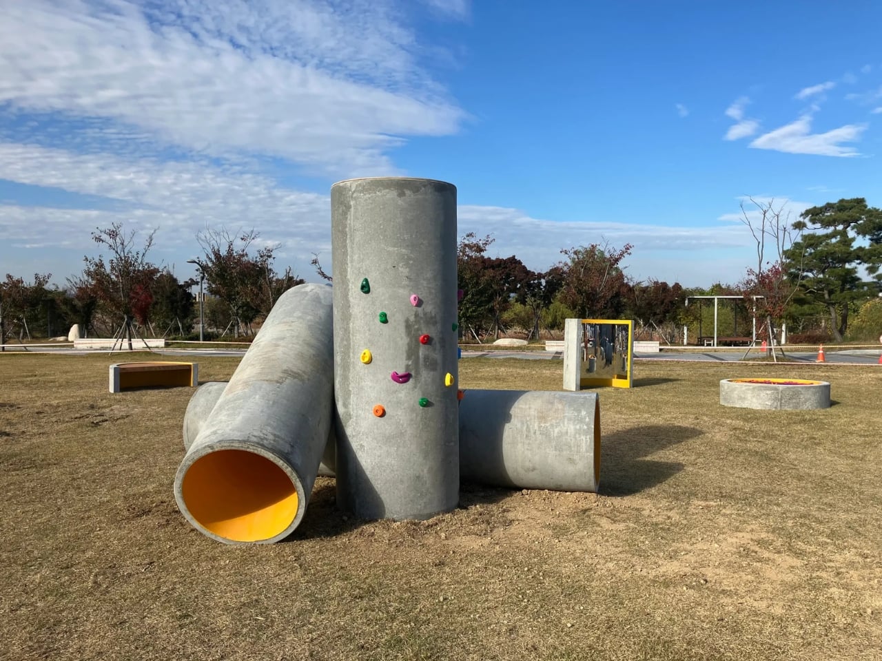
What the design gets genuinely right is the question of scale. These are large industrial pipes, and placing them in a public setting without any softening or mediation could easily read as aggressive or alienating. Instead, the proportions end up working in the project’s favor. The openings in the pipes are wide enough to pass through, to sit inside, to lean against. The structure accommodates a body without being designed around one specific use. A child runs through it differently than an adult pauses inside it, and the design makes room for both without trying to orchestrate either. That kind of spatial generosity is something a lot of more considered, more expensive design projects fail to achieve.

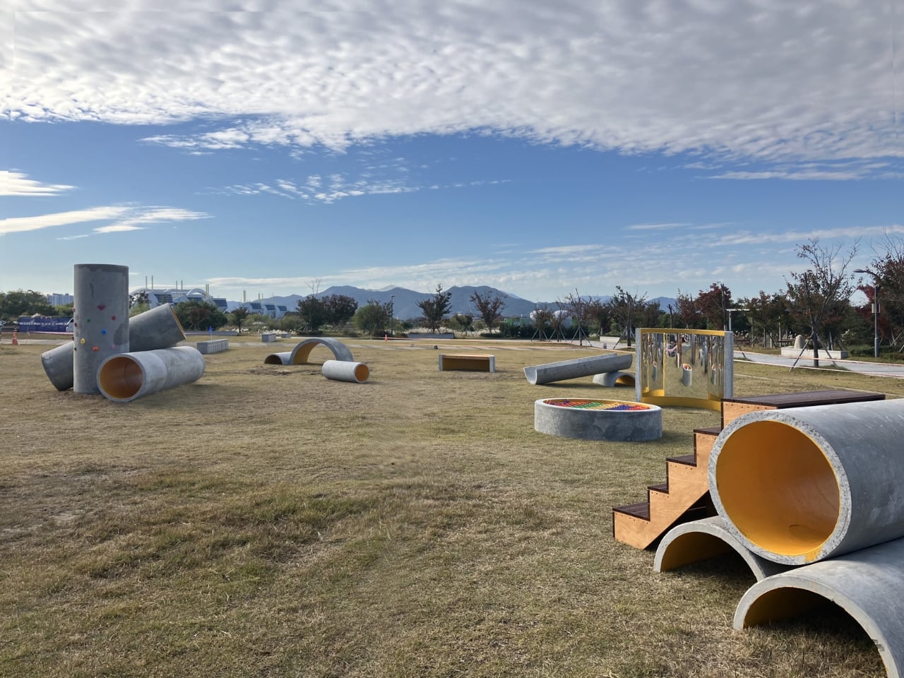
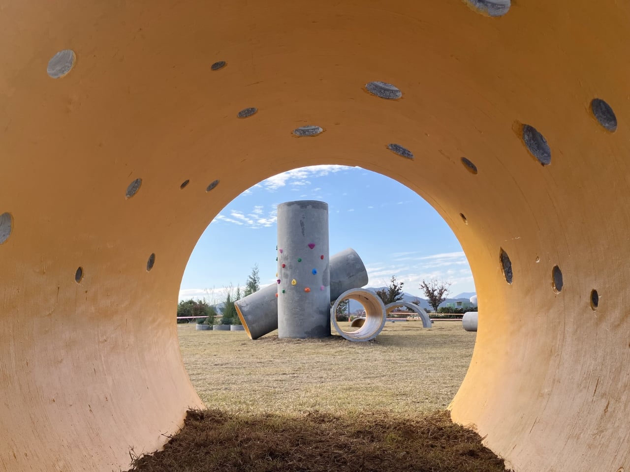
The surface quality matters too. Concrete has a particular visual weight that doesn’t disappear regardless of context. It doesn’t soften under museum lighting or become decorative just because it’s been repositioned. Joo leans into that rather than working against it. The rawness of the material is part of the design language, not an obstacle to it. Up close, the texture of the pipes carries the evidence of their previous life, which gives the project a material honesty that polished surfaces simply can’t replicate.

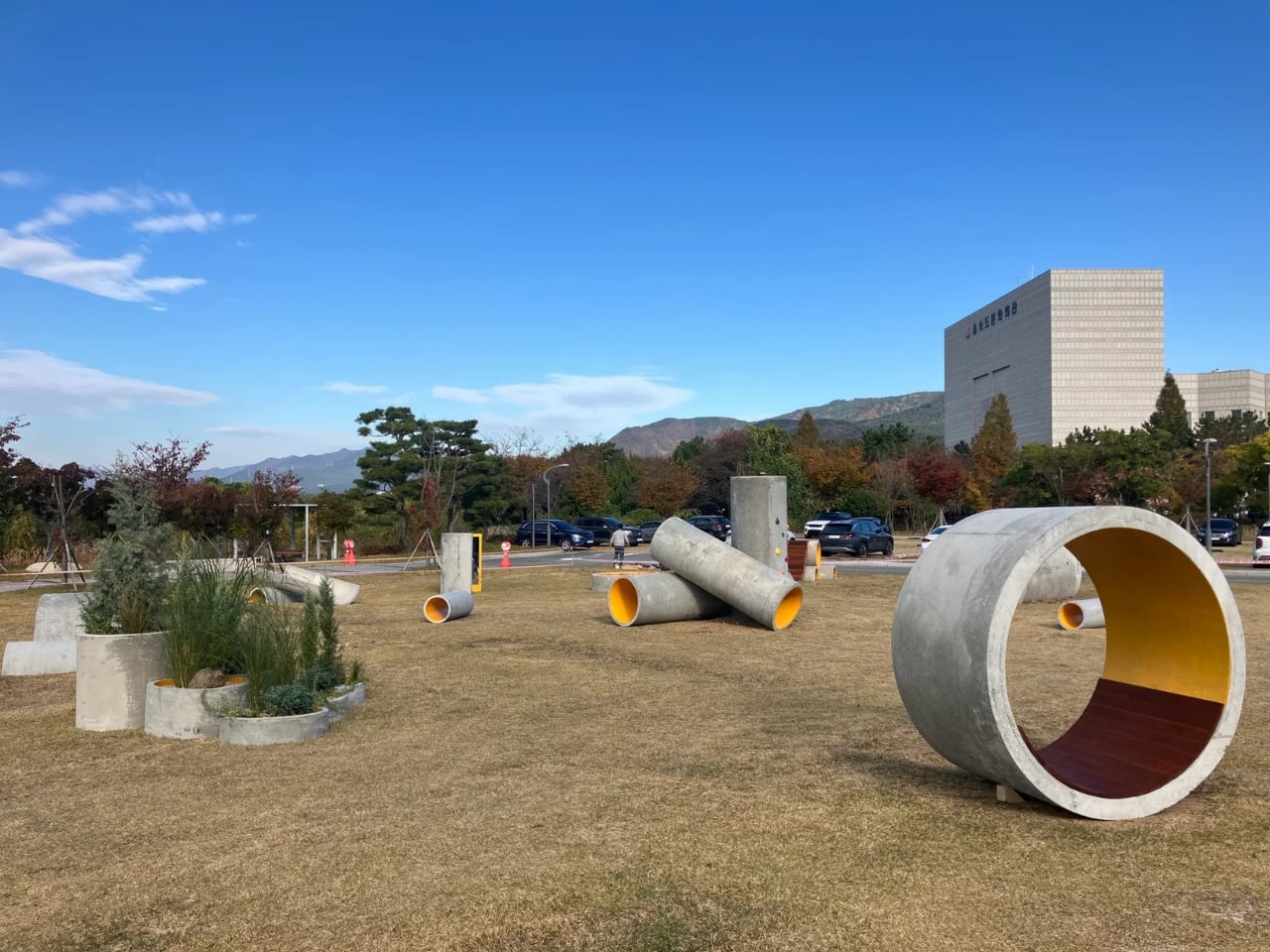
The layout itself avoids fixed hierarchy, meaning there’s no obvious front or back, no primary axis that tells you where to stand or which direction to face. That’s a deliberate compositional choice, and it changes how the space feels to move through. Most public structures, even good ones, have a logic that steers you. Concrete Utopia doesn’t. You arrive at your own reading of it, and that openness is built into the arrangement rather than incidentally landing there.

Placed within the grounds of a contemporary art museum, the project sits in an interesting position between sculpture and architecture. It functions like a building but doesn’t resolve like one. It reads like an installation but behaves like infrastructure. That in-between quality is where the design lives, and it’s what makes Concrete Utopia more compelling than a straightforward sustainability gesture or a purely formal exercise would have been. Joo found a space where the design question and the material answer are the same thing. That’s not a given. Most design keeps those two things at a distance from each other for the whole project.

The post The Most Creative Public Space Design Right Now Is Made of Trash first appeared on Yanko Design.

The Award-Winning Playground Built to Never Be Replaced

Most playground equipment exists to check boxes. There’s a slide, a climbing frame, maybe a wobbly bridge if the budget stretched far enough. You’ve seen it a thousand times at every park and school yard you’ve ever walked past. It does the job. It keeps kids occupied. And then, somewhere around year three, a panel cracks, a swing goes missing, and the whole thing quietly starts to look forgotten. That’s not what Marlena Kostrzewa and Aleksandra Kwaśniewska had in mind when they designed Nolmo Garden.

The collection, created for Polish manufacturer Nolmo, recently took home a win at the European Product Design Award 2025, earning recognition in the Outdoor category. The EPDA is no small feat to crack, with submissions arriving from designers in more than 58 countries and a jury panel of over 30 design leaders. For a playground collection to land among the winners tells you something: this wasn’t treated as background infrastructure. It was treated as design. And the philosophy behind it is what makes it worth talking about.

Designers: Marlena Kostrzewa, Aleksandra Kwaśniewska

Kostrzewa and Kwaśniewska built the Garden collection around three core ideas: modularity, longevity, and circular design. Every single element in the collection was planned to be easily replaceable. Not just repairable in the vague, optimistic way that most products claim to be, but genuinely, practically swappable. Parts can be changed without tearing the whole thing apart, which means a worn-out component doesn’t automatically mean the end of the playground’s life. That’s a remarkably grown-up approach to objects that are made for children.

We often underestimate how much waste happens in public spaces. Playground equipment gets installed, gets battered by weather and daily use, and eventually gets torn out and replaced wholesale. It’s expensive and wasteful, and the communities it’s meant to serve rarely have much say in what goes in or comes out. Circular design in this context isn’t just an environmental talking point. It’s a smarter economic choice, and it’s one that most manufacturers still haven’t seriously committed to.

Nolmo, for its part, has been in this space for over 30 years. The Polish company builds public recreational areas, small urban architecture, and playground equipment, drawing on cultural contexts and contemporary design trends to create pieces that actually fit the environments they’re placed in. That context matters when you look at Garden. This is a collection that was designed to feel at home in a community, not just installed in one.

The modularity angle also speaks to something that rarely gets addressed in playground design: children grow. What works for a four-year-old doesn’t necessarily work for an eight-year-old, and a playground that only serves one narrow age bracket has a very short window of relevance. The Garden collection was built with the intention of growing alongside the children who use it, which extends its value far beyond the initial installation.

Kostrzewa and Kwaśniewska are among the designers that the EPDA specifically recognizes for combining creative vision with practical relevance. That phrase feels especially apt here. A playground isn’t a concept piece. It gets rained on, climbed over, argued about, and sometimes knocked into. The design has to hold up against all of that while still doing what good design is supposed to do: make people want to engage with it.

The fact that Garden won in the Outdoor category, beating out submissions from dozens of countries, is a good reminder that some of the most thoughtful design work happening right now isn’t in consumer electronics or luxury goods. It’s in the stuff we tend to walk past without thinking twice. The places where kids learn to take their first real risks, fall down, get up, and do it again. Nolmo Garden didn’t reinvent the playground. It just did it properly. And sometimes, that’s exactly the kind of design that deserves the most attention.

The post The Award-Winning Playground Built to Never Be Replaced first appeared on Yanko Design.

Belgian Designer Just Built the Alien Playground Kids Dream About

When you think of Belgian fashion designer Walter Van Beirendonck, you probably picture bold runway shows and provocative collections that push boundaries. As a member of the legendary Antwerp Six, the group that put Belgian fashion on the global map in the 1980s, Van Beirendonck has built a reputation for work that’s colorful, fantastical, and always thought-provoking. But his latest project isn’t something you can wear. Instead, it’s something you can climb, jump on, and explore.

Welcome Little Stranger, which opened at C-mine in Genk, Belgium this month, marks Van Beirendonck’s first venture into interactive play design. The installation transforms an old industrial warehouse into an extraterrestrial playground where kids can meet a mysterious alien visitor through soft-play structures, vibrant colors, and immersive environments that feel like stepping onto another planet.

Designer: Walter Van Beirendonck (photos by Selma Gurbuz)

The project is part of C-mine’s new PLAYGROUND initiative, which invites artists to reimagine what play spaces can be. Rather than traditional playground equipment, these are designed as artistic environments where creativity and physical activity merge. For Van Beirendonck, this meant translating his signature aesthetic (think neon colors, fantastical creatures, and bold shapes) from fabric and runway to foam and physical space.

What makes this particularly interesting is Van Beirendonck’s stated motivation. He wanted to create an environment that encourages imagination without screens or digital distractions. It’s a refreshing stance from someone known for addressing contemporary themes like technology and identity in his fashion work. The space invites kids to wonder about the universe, discover new possibilities, and play together without boundaries.

The alien theme isn’t random. Van Beirendonck’s fashion work has long explored ideas about identity, diversity, and what it means to be different. By framing the playground around encountering a “little stranger” from another world, he’s essentially asking kids to think about otherness, curiosity, and welcome. These are heavy concepts, but they’re delivered through climbing structures and colorful shapes rather than lectures.

The design process itself was collaborative. C-mine worked with artist Emma Ribbens, an alumna of LUCA School of Arts, to run workshops where children from Genk contributed ideas and shared their thoughts. This participatory approach meant kids weren’t just the audience for the final product but had ownership in shaping what the space would become. It’s an increasingly common approach in public art and design, recognizing that the people who will use a space often have the best insights into what it needs.

Van Beirendonck’s visual language translates surprisingly well to this new medium. His fashion collections have always featured exaggerated proportions, vibrant patterns, and elements that feel like they could belong in science fiction or fantasy worlds. Those same qualities make for compelling playground design, where safety requirements mean everything needs to be soft and rounded anyway.

The location adds another layer to the story. C-mine is a former coal mining site in Genk that’s been transformed into a cultural and creative hub. It’s the kind of post-industrial regeneration project you see across Europe, where old warehouses and factories become galleries, theaters, and community spaces. Housing a whimsical playground in what was once an industrial building creates an interesting contrast between the building’s austere past and its colorful present.

For Van Beirendonck, who’s known for work that balances playfulness with provocation, this project sits comfortably in his career arc. He’s done book illustrations, scenography, and various collaborations outside traditional fashion. Welcome Little Stranger just happens to be one you can physically inhabit rather than view from a distance. Genk’s mayor noted that the project positions the city as creative and innovative while giving families and schools from across the region a new destination. It’s the kind of cultural infrastructure that smaller cities increasingly use to attract visitors and define their identity beyond industrial heritage.

Whether Welcome Little Stranger becomes a model for future artist-designed play spaces remains to be seen. But it does suggest interesting possibilities for what happens when designers step outside their usual mediums and apply their vision to physical environments meant for pure, unstructured play. Sometimes the best design isn’t about making something look good but about creating spaces where imagination can run wild.

The post Belgian Designer Just Built the Alien Playground Kids Dream About first appeared on Yanko Design.

This Award-Winning Swing Feeds Birds When Kids Aren’t Playing

There’s something delightfully clever about design that refuses to pick just one job. You know what I’m talking about: those rare pieces that make you stop and think, “Wait, it does what?” Birddy, a recent award-winning furniture design by Korean designers Yejin Hong and Seyeon Park, is exactly that kind of creation. It’s a children’s swing when sunny days call for play, and a bird feeder when rain clouds roll in. Simple as that sounds, it’s the kind of thoughtful design that makes you wonder why we don’t see more of it.

The concept earned Hong and Park an Excellence Prize at the 2024 Kengo Kuma & Higashikawa KAGU Design Competition, and for good reason. The competition, known for championing furniture designs that bridge functionality with social awareness, found in Birddy exactly what contemporary design should aspire to be: useful, beautiful, and quietly compassionate.

Designers: Yejin Hong, Seyeon Park

At first glance, Birddy looks like a refined wooden swing, the kind that would fit perfectly in a minimalist backyard or a community park. But flip it upside down on a rainy day, and suddenly you’ve got a protected feeding station for birds seeking refuge and sustenance when the weather turns harsh. It’s this elegant duality that makes the design so compelling. Rather than forcing two functions into an awkward compromise, the designers found a natural harmony between them.

What strikes me most about Birddy is how it normalizes empathy through everyday objects. We’re used to thinking about children’s play equipment and wildlife care as separate concerns, occupying different mental compartments in our design-thinking. Hong and Park challenge that separation. Their design suggests that caring for nature and creating joyful spaces for children aren’t competing priorities but complementary ones. When kids aren’t using the swing, why shouldn’t it serve another purpose? When birds need shelter and food, why can’t the solution be something that already exists in our yards?

The execution shows restraint and respect for both users, human and avian. The wood construction feels appropriate for outdoor use while maintaining aesthetic appeal. There’s no garish attempt to make it “cute” or child-themed. Instead, the design trusts that good form works for everyone. This kind of confidence in simplicity is harder to achieve than it looks. Many designers would be tempted to add unnecessary flourishes or overcomplicate the transformation mechanism. Hong and Park resist that urge entirely.

From a practical standpoint, Birddy addresses real needs without requiring users to sacrifice space or budget for separate items. Urban and suburban dwellers increasingly want to support local wildlife, but bird feeders can feel like visual clutter. A swing is already part of many family landscapes. Combining them removes barriers to participation in backyard conservation. It’s environmental design through integration rather than addition.

The timing feels right too. We’re seeing a broader cultural shift toward multipurpose design as people become more conscious of consumption and space constraints. Furniture that pulls double or triple duty isn’t just trendy anymore, it’s becoming an expectation. But Birddy elevates the concept beyond mere space-saving. This isn’t about cramming more functionality into less area. It’s about finding poetic connections between different forms of care.

There’s also something wonderfully cyclical about the design. Children playing on the swing bring energy and life to a space during fair weather. Birds visiting the feeder bring that same vitality during storms. The object becomes a constant source of animation in the landscape, just with different performers depending on conditions. Parents watching kids swing on Tuesday might find themselves watching sparrows perch on Friday. That kind of continuous engagement with an object creates attachment and value beyond its material worth.

What Hong and Park have created isn’t revolutionary technology or groundbreaking engineering. Birddy succeeds precisely because it doesn’t try to be either. Instead, it represents something equally valuable: thoughtful observation of how we live and a willingness to imagine better arrangements. The best design often comes from asking simple questions like “What else could this do?” and “Who else could this serve?” Birddy answers both beautifully, proving that furniture can be generous in more ways than one.

The post This Award-Winning Swing Feeds Birds When Kids Aren’t Playing first appeared on Yanko Design.