Portable monitors have become a legitimate part of the modern mobile workspace, with countless options available across every price range. But almost all of them share one fundamental constraint: they’re flat, rigid panels in protective cases, indistinguishable from each other in form even when they vary in quality. The screen that travels in your bag looks exactly the same as it did before you packed it.
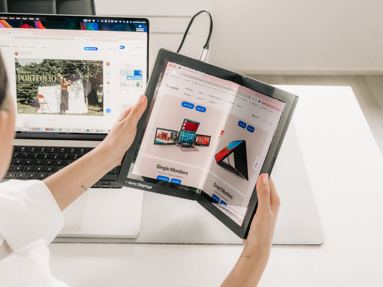
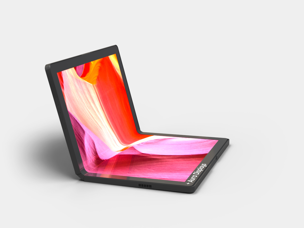
Foldable display technology has been reshaping the smartphone market for years, but making it work meaningfully for laptop accessories has proven far more complicated. Aura Displays’ Single Flex Pro Gen 1 is a portable monitor that does exactly that, introducing FlexMatrix technology that lets the screen bend, fold, and adapt to angles and surfaces that no rigid display can match.
Designer: Aura Displays
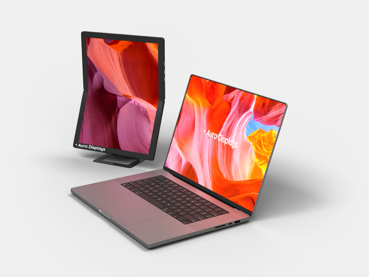
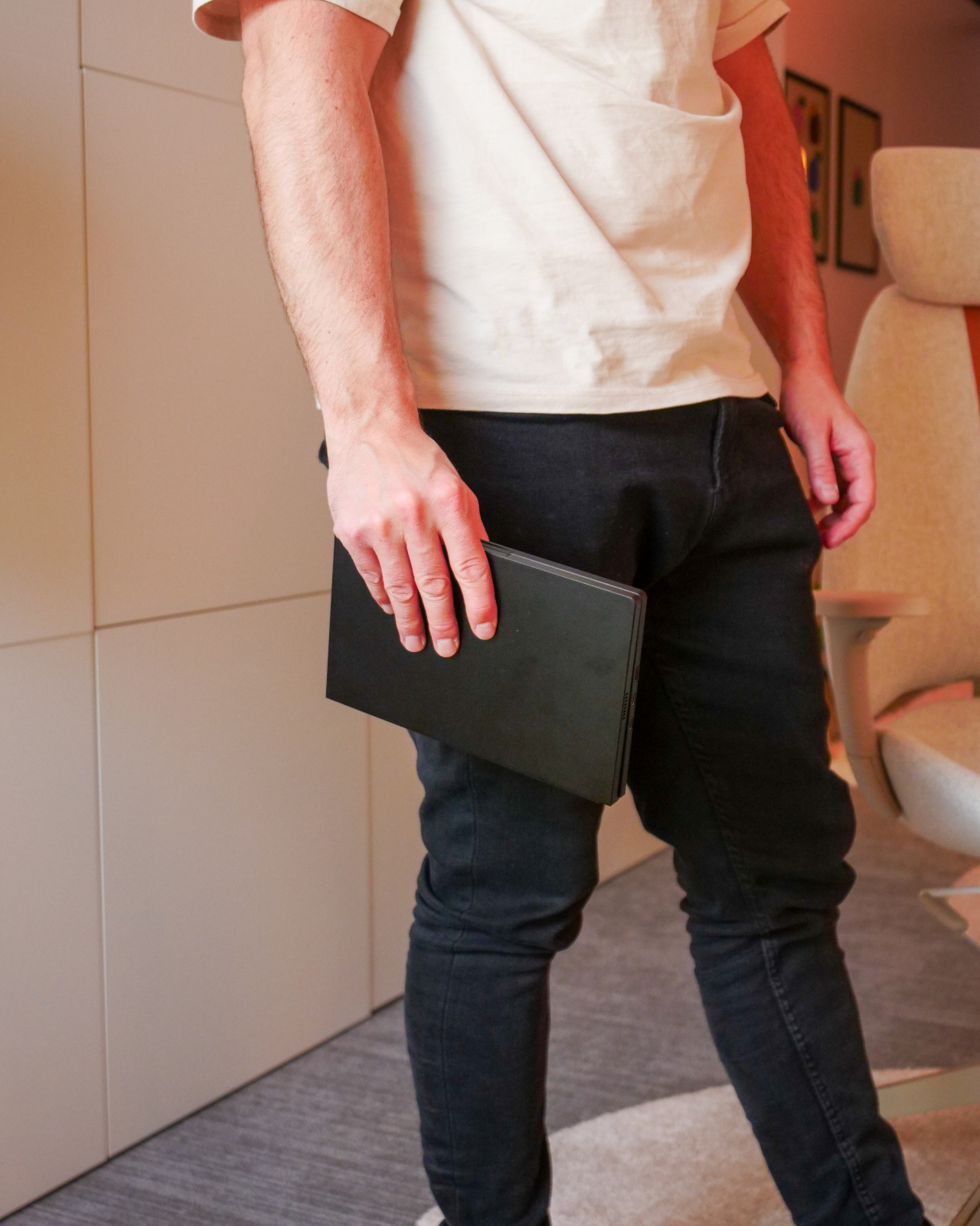
Consider what it actually means to carry a second screen around all day. With conventional portable monitors, you’re always working with the same fixed rectangle, propped up at the same angle, regardless of the surface. A display that folds to just 6.1 by 9.3 inches and opens flat in seconds turns that into a fundamentally different proposition: the form factor adapts to the space, not the other way around.

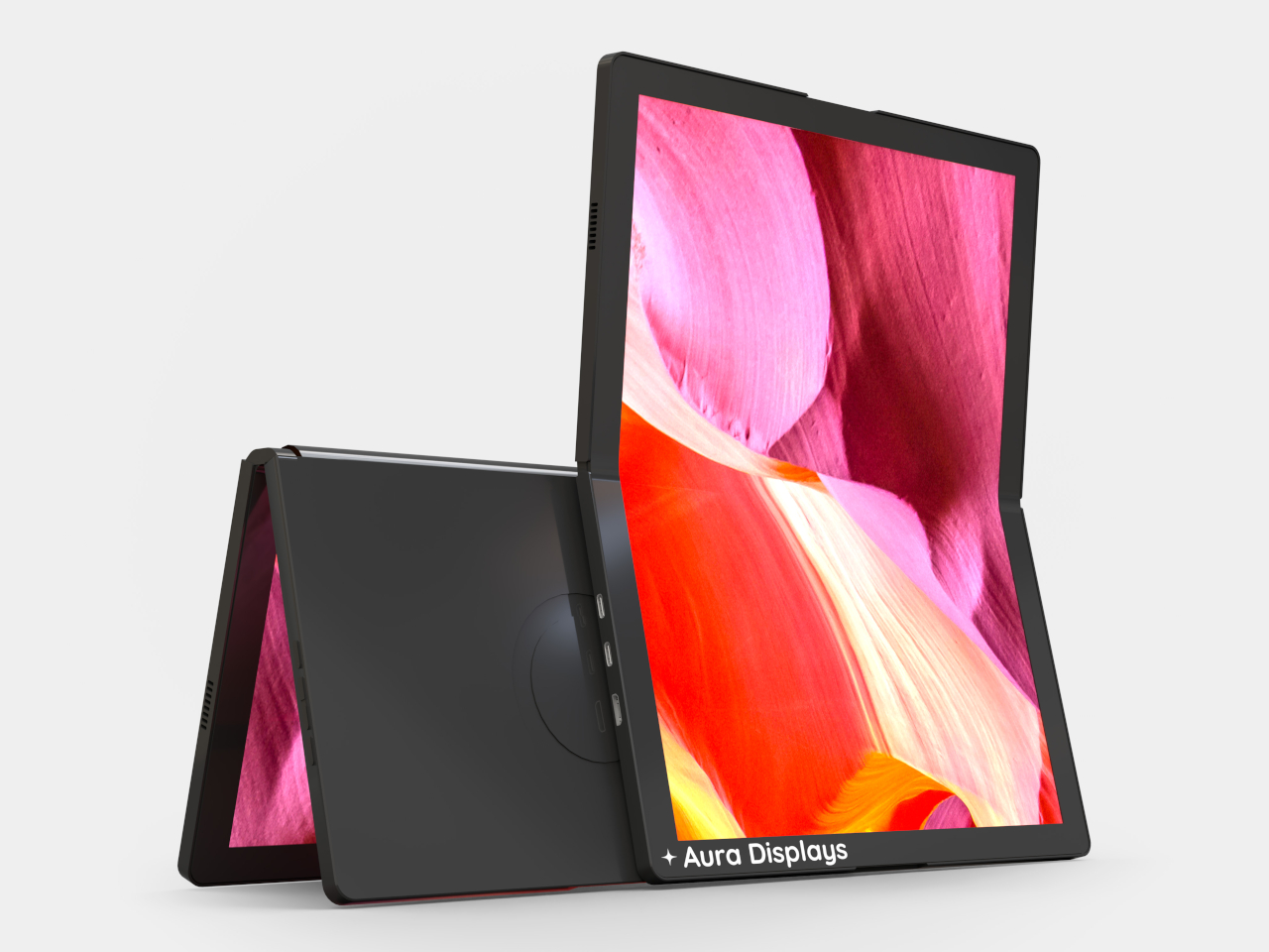
The actual display is a 13.3-inch AMOLED panel with a 1536×2048 resolution at a 3:4 aspect ratio, meaning it’s portrait-oriented rather than the standard widescreen format. That’s a deliberate choice for someone editing a document, annotating a PDF, or reviewing design layouts in a vertical workflow. The screen covers 117% of the NTSC color gamut, with a 2ms response time and touch input support built in.
AMOLED as a panel technology brings practical advantages worth noting. Contrast is technically infinite since each pixel generates its own light and can switch off entirely, so blacks are genuinely black rather than a deep gray approximation. For anyone reviewing color-critical artwork or working on dark-themed interfaces for long stretches, those aren’t trivial differences; they affect how accurately you read what’s on screen throughout the day.
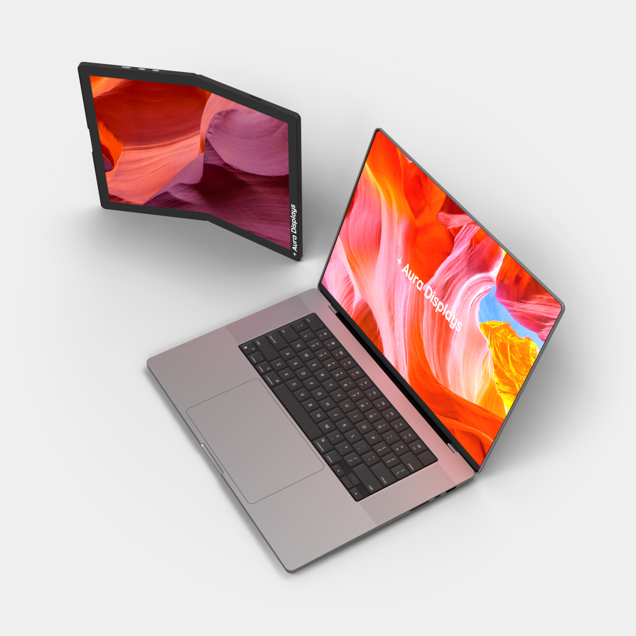
The physical construction is built around pro-grade hinges and a premium aluminum chassis, keeping the whole unit to 1.54lb despite the structural complexity of a panel that needs to flex repeatedly without degrading. Folded, the monitor is just about 0.63 inches thick; unfolded, it drops to 0.31 inches. Connectivity runs entirely through USB-C, plug-and-play, with no drivers or software installations needed before you can start using it.

There’s also a 17-inch version in the works, currently in pre-production and expected to arrive in June 2026. That suggests Aura isn’t treating this as a one-off experiment but as the beginning of a product line built around this flexible form factor. The Gen 1 name further implies future revisions, which is a reasonable expectation for a product type that genuinely hasn’t existed before now.
The Single Flex Pro Gen 1 is on sale at $1,299, down from its regular $1,499 price, available in Midnight Black. It ships with a USB-C to USB-C cable and a USB-C to USB-A adapter, backed by a one-year warranty. For something claiming a genuine category first, that price reflects both the novelty of the technology inside and the engineering required to keep a flexible AMOLED panel reliable through daily use.
The post Most Portable Monitors Are Rigid Slabs, This $1,299 One Folds first appeared on Yanko Design.